Voting period is over. Please don't add any new votes.Voting period ends on 31 May 2014 at 20:44:17 (UTC)
Visit the nomination page to add or modify image notes.
Featured picture candidates/File:Casco viejo de Dubrovnik, Croacia, 2014-04-13, DD 18.JPGCommons:Featured picture candidates/File:Casco viejo de Dubrovnik, Croacia, 2014-04-13, DD 18.JPG
InfoWalls of the old city of Dubrovnik (UNESCO World Heritage), Croatia. The walls, with the Minčeta Tower in the foreground, were constructed between the 12th–17th centuries, and have an uninterrupted course of almost 2 km of length and a maximum height of 25 m. All by me, Poco220:44, 22 May 2014 (UTC)[reply]
Voting period is over. Please don't add any new votes.Voting period ends on 4 Jun 2014 at 20:54:18 (UTC)
Visit the nomination page to add or modify image notes.
Featured picture candidates/File:Sunset in Miranda Park, Caracas.jpgCommons:Featured picture candidates/File:Sunset in Miranda Park, Caracas.jpg
Oppose The direct sun is giving too many lens problems, and the grass in the foreground looks unnatural. Either due to some exposure blending of several photos taken with different apertures (and the grass moved meanwhile (but the EXIF indicates it is a single shot photos)), or due to some postprocessing gone haywire. Besides that it looks pretty, but the composition is not really convincing for me. Sorry. --Slaunger (talk) 20:30, 27 May 2014 (UTC)[reply]
Voting period is over. Please don't add any new votes.Voting period ends on 3 Jun 2014 at 14:46:26 (UTC)
Visit the nomination page to add or modify image notes.
Featured picture candidates/File:Örebro slott May 2014 01.jpgCommons:Featured picture candidates/File:Örebro slott May 2014 01.jpg
Info Panorama of Örebro castle in the city center of Örebro, Sweden. The castle's history goes back to the 1300s and castle has played a central role in Swedish history. The castle was besieged 9 times before 1568. The castle was captured three times during the last century of the Kalmar Union; 1434 by Engelbrekt Engelbrektsson during Engelbrekt rebellion in 1434 against Eric of Pomerania, 1520 by Christian_II_of_Denmark; and 1520 by Gustav Vasa. The castle was one of Gustav Vasa's most important during his reign 1523-1560. The building was rebuilt 1573-1625 and later around 1900. Since the 1700s it has been the residence of the governor of the Örebro County. Please note that the bridge rail is not straight. Created, uploaded and nominated by -- Arild Vågen (talk) 14:46, 25 May 2014 (UTC)[reply]
Thank you Julian. I think you are right and I uploaded a new version. I removed all sharpening and shadow brightening done after I created the panorama. The new version is also darker (0,2 EV). --ArildV (talk) 17:22, 25 May 2014 (UTC)[reply]
Support Very crisp, high detail level, good light and colors. To be honest the composition/crop does not work optimally for me. The tree in the foreground is a bit distracting, yet I suppose it is virtually impossible to get an unobstructed view? Next, the left-right alignment of the castle seems a bit unbalanced as well for me. But my own attempts at framing it otherwise has not been succesful. So I guess what you have is near-optimal, . --Slaunger (talk) 19:52, 26 May 2014 (UTC)[reply]
Thank you Slaunger. It is possible to avoid the tree by going to the right, but you get a less dramatic and interesting composition imo (see here file:Örebro slott May 2014 02.jpg. I chose this angle and composition because I liked the dramatic triangle shape with the stream in the foreground. If I had gone to the left, I had get a bridge in the foreground (see here file:Örebro_slott_May_2014_03.jpg). I added a geolocation (Google have street view for Örebro). Regards --ArildV (talk) 11:20, 29 May 2014 (UTC)[reply]
Voting period is over. Please don't add any new votes.Voting period ends on 1 Jun 2014 at 16:54:22 (UTC)
Visit the nomination page to add or modify image notes.
Oppose The bee and flower image is an FP classic with a lot of competition. I'm sorry but I do not think this one passes the bar. A not so interesting angle of the bee is shown and the bee obscures the flower. The composition is a bit arbitrary as well, I get a point and shoot impression when I see it. Sorry. --Slaunger (talk) 20:54, 23 May 2014 (UTC)[reply]
Support Composition, quality and colors. All work for me. The crop is maybe a bit tight (background), however the image is at FP level IMO -- Christian Ferrer (talk) 05:44, 25 May 2014 (UTC)[reply]
Oppose Too much of the blured plant on top, rather low resolution for a 16MP cam, neither the plant nor the bee are clearly visible. --P e z i (talk) 18:00, 27 May 2014 (UTC)[reply]
Voting period is over. Please don't add any new votes.Voting period ends on 1 Jun 2014 at 07:04:25 (UTC)
Visit the nomination page to add or modify image notes.
Featured picture candidates/File:HH Polizeihauptmeister MZ.jpgCommons:Featured picture candidates/File:HH Polizeihauptmeister MZ.jpg
Support I have always loved this photo since I first saw it several years ago, and I actually thought it was a Commons FP already. But I remembered wrong, it it featured on several of the wikipedias, but not Commons. I would normally say that the crop of the police man is unfortunate, but for some reason the composition works for me. --Slaunger (talk) 20:26, 23 May 2014 (UTC)[reply]
Oppose Nice, but by no means outstanding. I’d like at least to see the torso and its tools entirely. Both elbows, one hand and antenna cropped out → oppose. By the way, hands and radio are entirely out of focus. --Kreuzschnabel (talk) 15:03, 29 May 2014 (UTC)[reply]
Voting period is over. Please don't add any new votes.Voting period ends on 5 Jun 2014 at 08:59:50 (UTC)
Visit the nomination page to add or modify image notes.
Featured picture candidates/File:Peterskirche Blansingen.jpgCommons:Featured picture candidates/File:Peterskirche Blansingen.jpg
Voting period is over. Please don't add any new votes.Voting period ends on 1 Jun 2014 at 20:43:00 (UTC)
Visit the nomination page to add or modify image notes.
Featured picture candidates/File:Canal Bourgogne vers Fulvy.jpgCommons:Featured picture candidates/File:Canal Bourgogne vers Fulvy.jpg
1046
9
3203
2757
4258
2776
very good
9
9
1037
2757
4258
2776
very bad
Info A view of the Burgundy Canal (canal de Bourgogne), between two locks, in a spring day. All by Myrabella
Support -- Excellent composition. The reflection on the water makes the difference to an otherwise trivial (good) photograph. -- Alvesgaspar (talk) 15:32, 24 May 2014 (UTC)[reply]
Oppose beautiful reflection, but bad cut and hideous first floor, the definition is nice but this is a double-edged sword: it creates a real punch in the eye that bush. It occupies part too much to be ignored, very unbalanced, too. --Pava (talk) 01:10, 31 May 2014 (UTC)[reply]
To me, it matters to show the vegetation growing on the banks, because flora of the rivers banks is often quite specific. So we can consider that on the contrary, it may add encyclopedic value. --Myrabella (talk) 07:11, 31 May 2014 (UTC)[reply]
this is a photo art, not documentary, just look angle, looking for suggestions and comments of other users, is a picture that wants to capture emotion, does not lead the reader to analyze the flora .. and the research of emotional, is unfortunately ruined by a disharmony, for me. Without the left side of the picture would be completely different, and that's what I think the goal that he wanted to get the photographer .. the right side, but unfortunately did not take account of the left, which completely ruined the final goal. i have add two notes: try to imagine the picture with just the right part: everything changes. --Pava (talk) 18:09, 31 May 2014 (UTC)[reply]
I agree with Pava here. I have a sense what a great image this could have been if the composition were a bit different. That said it is still nice. Saffron Blaze (talk) 05:32, 1 June 2014 (UTC)[reply]
Voting period is over. Please don't add any new votes.Voting period ends on 1 Jun 2014 at 21:24:21 (UTC)
Visit the nomination page to add or modify image notes.
Info I have a photo taken two years earlier at the same spot under almost identical conditions, but I prefer this one. The light was very special, and I have not done any postprocessing, except a crop to improve the composition. --Slaunger (talk) 21:24, 23 May 2014 (UTC)[reply]
Indeed!: It is an intentional effect in order to draw the attention to the walking couple, which is surrounded by "walls of waves". . --Slaunger (talk) 08:18, 24 May 2014 (UTC)[reply]
OK, but I don't think you needed to do that ... the viewer IMO would be drawn to the couple regardless of how focused the foreground is. And what's the EV here, anyway ... artistically it's great, but how might this be useful in telling us something about this particular beach, or the aesthetics of photography under these circumstances? Daniel Case (talk) 04:55, 25 May 2014 (UTC)[reply]
Support -- A marvelous picture! The relatively poor image quality is well mitigated by the magic mood and ecellent composition. This is what a FP is about! -- Alvesgaspar (talk) 15:28, 24 May 2014 (UTC)[reply]
I would guess that the standard processing of most RAW converters already improve the image. But my idea would be a little more colour noise reduction, a little less key noise reduction and fixing the chromatic aberration that is quite visible on the birds. Everything beyond that is a matter of taste I guess, and not really necessary as the atmosphere is very good. — Julian H.✈ (talk/files)21:03, 26 May 2014 (UTC)[reply]
@Kleuske: That's OK. For me, it is actually more about the couple in a wide space, but I acknowledge that different people see it differently. And the oppose leaves some exitement back for the final result . --Slaunger (talk) 18:18, 26 May 2014 (UTC)[reply]
Info@King of Hearts: , @Saffron Blaze: , @Daniel Case: , @Alvesgaspar: , @Graphium: , @Alchemist-hp: , @Caecilius Mauß: , @Christian Ferrer: , @Julian Herzog: , @Godot13: , @Laitche: , @Kleuske: Julian Herzog had a point in making a new raw development, especially for correcting the CA. So I have uploaded a new version. I also applied a little more chroma noise reduction, changed the white balance from 'auto' to 'cloudy', fixed color distortion and various other minor tweaks. I think the changes are all improvements, but here is a heads up if any of you reviewers object or if the changes triggers you to alter your review. If you are just silent, I assume the edit has not given rise to any change in your vote on the candidate. Thanks. --Slaunger (talk) 20:07, 27 May 2014 (UTC)[reply]
I can understand the corrections for CA and chroma noise, but the other changes have altered the mood of the image sufficiently such that I find a real preference for the warmer lighting and colour of the original. I won't change my vote as it is still a fine image. Saffron Blaze (talk) 23:29, 27 May 2014 (UTC)[reply]
The quality issues are much better now, thanks. The WB doesn't feel that different to me, although I would have probably kept it at the cooler setting. — Julian H.✈ (talk/files)09:14, 28 May 2014 (UTC)[reply]
Info@Julian Herzog: , @Saffron Blaze: The change I had made in the white balance was also one where I was in doubt myself if the original 'auto' setting was actually better, and since you both prefer the original white balance, I have now changed back to 'auto' in my raw converter, converted a new jpg and made the same crop and uploaded it. --Slaunger (talk) 17:43, 28 May 2014 (UTC)[reply]
Voting period is over. Please don't add any new votes.Voting period ends on 7 Jun 2014 at 04:45:37 (UTC)
Visit the nomination page to add or modify image notes.
Oppose And for such a plane object the focus is too soft as well and the light too dull. Moreover, I think it should be added to the file page where the photo was taken. --Slaunger (talk) 22:39, 29 May 2014 (UTC)[reply]
Comment i respectfully disagree with both your objections. 1) The focus might appear soft only because the colours themselves are used in such a manner as to give the impression that they are blurry, rather than well delineated. 2) i took the photo with unobstructed light shining from above and still brightened the image a little to more accurately render its colour. If you are under the impression that the "white" parts of the photo are actually white then you are mistaken. --MoTorleeb (talk) 05:44, 30 May 2014 (UTC)[reply]
Thanks for you explanation. The colors are indeed washed out on the tiles themselves, which gives a false impression of the photo being very much soft in focus. In a few places, there are flakes, which has fallen out, where you get a better impression of the focus, and I do not think it is good enough for FP for this kind of plane object, where it is easy to get a near-perfect focal distance to all parts of the surface. I was not under the impression that the whitish parts should be white. Thanks for explaining about the light source. Good that you have given this thought and effort. But still the end result does not have the wow I expect for an FP, sorry. And still, the file page could use more information about the tiles themselves. It is not only the photo we are reviewing, but also the metadata and how easy it will be for people to find exactly these tiles if they look for them for a specific purpose. --Slaunger (talk) 06:26, 30 May 2014 (UTC)[reply]
Voting period is over. Please don't add any new votes.Voting period ends on 2 Jun 2014 at 20:34:01 (UTC)
Visit the nomination page to add or modify image notes.
Featured picture candidates/File:FullColourGIF.gifCommons:Featured picture candidates/File:FullColourGIF.gif
As I understand, you break the normal 256 color limit in a GIF by splitting it into 16 squares, each with its own local pallete of 156 colors, and animate the patches with a frame delay of zero. Now in principle such a patchwork of 16 GIFs could contain up to 16x256=4096 distinct colors, but since some of the colors are reused in different patches due to the manner the color pattern is created, you do not get so many different distinct colors in the end and "only" end up with 1880 distinct colors when you combine the 16 local palettes. It is explained very detailed in the file page (not why it ends up with 1880 though). --Slaunger (talk) 21:33, 24 May 2014 (UTC)[reply]
I understand now. That perhaps should be explained in the description. Also I used the small file for the thumb so people can actually see the effect. Saffron Blaze (talk) 15:19, 25 May 2014 (UTC)[reply]
In my view it is explained: "Further improvements in image quality could be obtained by selecting the blocks more carefully such that each block has no more than 255 colours in the original image; the blocks also need not be contiguous regions. Alternatively, smaller blocks could be used: a 16x16 block has 256 pixels so would contain at most that many colours and would be a suitable choice for all but the most complex of images. "
Also, I've put the image back to the full size GIF. That's the file that's being nominated and has much more wow factor than the smaller version which is for use only in Wikipedia articles to get around technical limitations. GDallimore (talk) 00:25, 26 May 2014 (UTC)[reply]
Actually the image is being displayed at full size because I removed the hard pixel size. Originally it was set to 300px thus the effect was borked. I used the smaller file so as not to fill people's screens. That aside, if you think that is a good explanation of my original question so be it. Saffron Blaze (talk) 01:24, 26 May 2014 (UTC)[reply]
Voting period is over. Please don't add any new votes.Voting period ends on 6 Jun 2014 at 16:47:09 (UTC)
Visit the nomination page to add or modify image notes.
Featured picture candidates/File:Iglesia Nova Gracanica, Trebinje, Bosnia y Herzegovina, 2014-04-14, DD 17-19 HDR.jpgCommons:Featured picture candidates/File:Iglesia Nova Gracanica, Trebinje, Bosnia y Herzegovina, 2014-04-14, DD 17-19 HDR.jpg
Neutral The wow is there, the colors are great and I nearly get dizzy when I imagine myself lying on the floor and looking up to see that view. So thanks for the ride! But, I can't help noticing immediately in preview that the sought for perfect symmetry is not there in the middle, and I find it distracting. Even more so when I look at it in full scale. Also some exposure issues at the open door. Sorry. --Slaunger (talk) 19:18, 28 May 2014 (UTC)[reply]
IMO, even lying on the floor and looking up, you never should see that view, because you have a human eye, not a "fish" eye...;)--Jebulon (talk) 19:25, 29 May 2014 (UTC)[reply]
I withdraw my nomination Sorry for interrupting the conversation, I have replaced this nomination by a new one. Thanks for the feedback, Poco208:38, 1 June 2014 (UTC)[reply]
Voting period is over. Please don't add any new votes.Voting period ends on 2 Jun 2014 at 05:51:02 (UTC)
Visit the nomination page to add or modify image notes.
Featured picture candidates/File:Sedov (ship, 1921) and Kruzenshtern (ship, 1926), Sète, France.jpgCommons:Featured picture candidates/File:Sedov (ship, 1921) and Kruzenshtern (ship, 1926), Sète, France.jpg
Oppose sorry, but the building behind the ship is for me to distracting. The sky can be also a bit less noisy. Otherwise a nice image. --Alchemist-hp (talk) 07:56, 24 May 2014 (UTC)[reply]
Comment I find it quite fine dockside portrait. Composition is excellent. I would correct the sky noise and perhaps check white balance or exposure, as it seems a bit warm/dark even for the late sun. This may help with the perception of vignetting (although here it doesn't detract and one could say frames the subject). Saffron Blaze (talk) 14:54, 24 May 2014 (UTC)[reply]
Done Thanks, this photo was taken at the first sun rays (29mn after the dawn), just before to go to my job. New version with less noise in the sky and a new WB. --Christian Ferrer18:09, 24 May 2014 (UTC)[reply]
Oppose That darn building in the bg is regrettably a killer for me as for Alchemist-hp. Very nice light and subject though. Sorry. --Slaunger (talk) 21:00, 24 May 2014 (UTC)[reply]
Support I have looked at this several times and I can't see the big deal about the building. I like the light and composition very much. Saffron Blaze (talk) 03:49, 27 May 2014 (UTC)[reply]
Oppose What a pity. Great shot but the background kills it for me. If only you’d been standing a bit closer to hide most of the housing behind the ship. --Kreuzschnabel (talk) 15:10, 29 May 2014 (UTC)[reply]
Oppose beautiful ship but the buildings ruined everything, the location is beautiful and the light does not go well. For ship like this we wanted a beautiful and spectacular landscape, like Venice .. or on the high seas or with only a pier ... but I understand that you could not move the ship :D . However, here the background "dirty" the very subject, making it difficult to read and the light penalizes a lot --Pava (talk) 01:07, 31 May 2014 (UTC)[reply]
Voting period is over. Please don't add any new votes.Voting period ends on 2 Jun 2014 at 16:01:51 (UTC)
Visit the nomination page to add or modify image notes.
Featured picture candidates/File:UK-2014-Oxford-All Souls College 03.jpgCommons:Featured picture candidates/File:UK-2014-Oxford-All Souls College 03.jpg
Support I like it, and it triggered me to read the Wikipedia article about the college. Intruiging... Very well executed with good light and exposure and focus control. It is evident from the file history that you have really tweaked this around to almost perfection, regarding, e.g., the symmetry. So I do not know if it is now I should mention that the tower to the right is just a liiiittle bit taller than the left one - I noticed it as I had the photo shown in full resolution and I was panning around. Absolutely not something you have to do anything about though. --Slaunger (talk) 21:53, 24 May 2014 (UTC)[reply]
Voting period is over. Please don't add any new votes.Voting period ends on 3 Jun 2014 at 00:40:26 (UTC)
Visit the nomination page to add or modify image notes.
Featured picture candidates/File:Vista de Ohrid, Macedonia, 2014-04-17, DD 02.JPGCommons:Featured picture candidates/File:Vista de Ohrid, Macedonia, 2014-04-17, DD 02.JPG
Support I also like the view although the weather was unfortunately not the best. Thanks again Kiril! Poco208:20, 25 May 2014 (UTC)[reply]
Oppose It is a good photo of high technical quality, but I do not find it sufficiently eye-catching for FP, sorry. --Slaunger (talk) 10:19, 25 May 2014 (UTC)[reply]
Voting period is over. Please don't add any new votes.Voting period ends on 7 Jun 2014 at 10:14:50 (UTC)
Visit the nomination page to add or modify image notes.
Voting period is over. Please don't add any new votes.Voting period ends on 4 Jun 2014 at 10:02:35 (UTC)
Visit the nomination page to add or modify image notes.
Featured picture candidates/File:RiP2013 Paramore Hayley Williams 0003.jpgCommons:Featured picture candidates/File:RiP2013 Paramore Hayley Williams 0003.jpg
I think there is a vast difference between a single filling deep in the recesses of a mouth of an otherwise brilliant smile and that of gunk filled front teeeth with stains. Save that kind of detail for the cathedrals :-) Saffron Blaze (talk) 15:37, 27 May 2014 (UTC)[reply]
Oppose It is a great picture, but it doesn't look as though any chroma noise reduction has been applied. At 10MP, I can't really ignore such objectionable noise the way I might at 36MP. As an aside, if Sven0705 can re-process from RAW, then it should be exported as sRGB for the web, not AdobeRGB. -- Colin (talk) 12:16, 27 May 2014 (UTC)[reply]
Oppose Agree with Colin, Chroma noise reduction should be applied, ideally from RAW but if not, any of us should be able to apply the chroma noise reduction. As it stands, the chroma noise is quite objectionable. Diliff (talk) 14:33, 27 May 2014 (UTC)[reply]
Support. Better now, although slightly more colour noise correction could have been applied without affecting detail IMO. Diliff (talk) 07:19, 3 June 2014 (UTC)[reply]
Comment hand? There is plenty of space left, you can cut it to remove even that bad out-of-focus hand? removing just the piece below also, as you can not kill for the size. The rest is perfect! --Pava (talk) 01:18, 31 May 2014 (UTC)[reply]
Voting period is over. Please don't add any new votes.Voting period ends on 8 Jun 2014 at 19:34:01 (UTC)
Visit the nomination page to add or modify image notes.
Featured picture candidates/File:Calligraphy in the shape of a hoopoe- bismillah ar-rahman ar-rahim (in the name of God, Most Graciou... - Google Art Project.jpgCommons:Featured picture candidates/File:Calligraphy in the shape of a hoopoe- bismillah ar-rahman ar-rahim (in the name of God, Most Graciou... - Google Art Project.jpg
Voting period is over. Please don't add any new votes.Voting period ends on 8 Jun 2014 at 14:09:06 (UTC)
Visit the nomination page to add or modify image notes.
Featured picture candidates/File:Білий слон.jpg/2Commons:Featured picture candidates/File:Білий слон.jpg/2
Support There appears to be some posterization of the sky, but for me it is a minor problem and overcompensated by a huge wow and otherwise good image quality. Very nice. --Slaunger (talk) 19:48, 30 May 2014 (UTC)[reply]
Comment -- Very nice and unusual composition. A pity that the tower is hown at rigth an that one of the men is in the shadow. Alvesgaspar (talk) 19:22, 3 June 2014 (UTC)[reply]
Comment Men are not to there beauty, and appeared at the right time to scale ... It's not a podium, where the temperature at -25... Thank you. Swift11 (talk) 06:15, 4 June 2014 (UTC)[reply]
I think there might be a communication problem here. I said two things: about one alpinist being too dark in the photo; and about the stone structure at right. What has the temperature to do with it? The two alpinists look quite healthy to me!... Alvesgaspar (talk) 18:27, 4 June 2014 (UTC)[reply]
Voting period is over. Please don't add any new votes.Voting period ends on 10 Jun 2014 at 08:25:01 (UTC)
Visit the nomination page to add or modify image notes.
Featured picture candidates/File:Iglesia de San Marco, Zagreb, Croacia, 2014-04-13, DD 01.JPGCommons:Featured picture candidates/File:Iglesia de San Marco, Zagreb, Croacia, 2014-04-13, DD 01.JPG
Oppose the church tower is too distorted for me, it looks unnatural. Proposal: take one image more from the right side, made a panorama and crop it. --Alchemist-hp (talk) 09:40, 1 June 2014 (UTC)[reply]
Voting period is over. Please don't add any new votes.Voting period ends on 9 Jun 2014 at 22:55:11 (UTC)
Visit the nomination page to add or modify image notes.
Featured picture candidates/File:Schloss Marienburg bei Raureif.jpgCommons:Featured picture candidates/File:Schloss Marienburg bei Raureif.jpg
Oppose Sky around the castle needs to be fixed. I like the perspective and composition but not certain the focus choice is right. Do you have the same shot with the focus on the castle? Saffron Blaze (talk) 23:44, 31 May 2014 (UTC)[reply]
Again, I don't think it's a focus issue. f/32 (!!!) was used in this case so focus is almost certainly not the issue. The image is in focus, but will be significantly diffraction-limited. The castle is probably slightly softer due to atmospheric conditions. Diliff (talk) 11:47, 1 June 2014 (UTC)[reply]
I don't actually care what the cause of the issue is. I just want to see it addressed. I will add I can't believe people are supporting an image with the technical issues this presents with. Saffron Blaze (talk) 16:22, 1 June 2014 (UTC)[reply]
Well, what the issue is determines whether it could be addressed. ;-) I completely agree that the artifacts in the sky should preclude it from being supported and I suspect the others did not notice it. Diliff (talk) 07:11, 2 June 2014 (UTC)[reply]
Voting period is over. Please don't add any new votes.Voting period ends on 9 Jun 2014 at 00:25:10 (UTC)
Visit the nomination page to add or modify image notes.
Featured picture candidates/File:St John The Baptist Church.jpgCommons:Featured picture candidates/File:St John The Baptist Church.jpg
Oppose The nominator is asked to take a look at other church interior shots that are featured and decide if this meets that standard. I am certain you will find this is lacking on several technical matters not the least of which is the insufficient DoF. Saffron Blaze (talk) 05:15, 31 May 2014 (UTC)[reply]
Oppose. Agree with Saffron Blaze, although I don't think DoF is the issue here. f/9 at 10mm (16mm full frame equivalent) should be sufficient to get almost the entire frame in focus. But in looking at the image at 100%, I'm finding that there really isn't anywhere from the foreground all the way to the altar that is particularly sharp. In fact, the sharpest part of the image seems to be the far left edge which is rather strange. I've noticed a similar issue in previous images by the same photographer so I suspect the lens itself is poor/faulty. In addition, the HDR processing is not well done and there are resulting artifacts in the brightly lit areas of the pillars near the ceiling. Diliff (talk) 10:32, 31 May 2014 (UTC)[reply]
Voting period is over. Please don't add any new votes.Voting period ends on 7 Jun 2014 at 16:19:55 (UTC)
Visit the nomination page to add or modify image notes.
Featured picture candidates/File:Na Golem Krchin.jpgCommons:Featured picture candidates/File:Na Golem Krchin.jpg
Oppose It is a lovely composition, but there are quality issues with the background and the texture of the saddle looks artificial. Sorry. --Slaunger (talk) 22:46, 29 May 2014 (UTC)[reply]
Oppose Per opposers. Looks like if it was a photomontage, background seems unnatural. Some overexposed parts on the back of the horse.--Jebulon (talk) 17:20, 31 May 2014 (UTC)[reply]
Oppose I like the DoF and the background, the noise can be improved, however the unnatural sky and the overexposed back-horse are for me issues -- Christian FerrerTalk06:58, 1 June 2014 (UTC)[reply]
Voting period is over. Please don't add any new votes.Voting period ends on 6 Jun 2014 at 19:36:30 (UTC)
Visit the nomination page to add or modify image notes.
Featured picture candidates/File:Mukri raba 2.jpgCommons:Featured picture candidates/File:Mukri raba 2.jpg
Comment The landscape is very descriptive and you don't always need a "real subject" in landscape photo. But the panorama is slightly distorted. Left side goes up and it's so obvious I don't understand why you can't see it. Should be easy to fix. --193.110.198.717:24, 29 May 2014 (UTC)[reply]
Descriptive of what? The bush in the front? The unfeatured lone tree on the right? The two cut off ponds? Of course an image doesn't always have to be descriptive, but in this case, since there is nothing to feature, it should have been. Nothing in this image draws you in. In fact I would say the elements actualy drag you to the sides. Even if I were to concede the light is nice, which I don't, you'd still be left with nice light on an ill advised composition. Saffron Blaze (talk) 19:08, 29 May 2014 (UTC)[reply]
Comment One more thing. The sky is darker in the middle. That's what happens when you use one of the auto exposure modes instead of manual in photographing panorama. --193.110.198.717:32, 29 May 2014 (UTC)[reply]
Just a remark - your conclusion about using auto exposure modes is wrong. Exposure was in manual mode for all pictures used for making this panorama. Darker sky in the middle of the panorama is caused by the polarizing filter. --Vamps (talk) 07:36, 30 May 2014 (UTC)[reply]
Oppose I think the light on the vegetation is good, but the exposure control on the sky is bad. The landscape is interesting, but I do not see a clear idea with the composition. --Slaunger (talk) 22:52, 29 May 2014 (UTC)[reply]
Voting period is over. Please don't add any new votes.Voting period ends on 4 Jun 2014 at 18:37:52 (UTC)
Visit the nomination page to add or modify image notes.
Featured picture candidates/File:NET-Margraten-American Cemetery 01.jpgCommons:Featured picture candidates/File:NET-Margraten-American Cemetery 01.jpg
Support Initially reluctant in preview as I found the composition boring. Now convinced after being taken aback by the extremely good image quality. (That is one craaazy camera you have there). --Slaunger (talk) 19:40, 26 May 2014 (UTC)[reply]
Comment hmmmm... A little bad faith question : Let's feature a boring composed picture because taken by a good camera ? --Jebulon (talk) 21:49, 26 May 2014 (UTC)[reply]
@Jebulon: : For me it is a bit like this this recent FP, which also looked non-convincing in preview (and where you voted support "Per Slaunger" ), but once you started scrutinize it, you noticed a lot of interesting details. Same here, and the little details are seen, because the camera is really, really good. --Slaunger (talk) 20:20, 27 May 2014 (UTC)[reply]
Oppose I don't think the tall crop is working, with the figure in the middle. The bottom of the reflection, with the clouds, is not adding anything, and is in fact distracting. I see you experimented with almost-square crops and I think a crop of 6345 from the top is optimal. With that crop, the image is much more balanced and stronger imo. -- Colin (talk) 12:05, 27 May 2014 (UTC)[reply]
Thanks for the input. I did experiment with different crops, however this version is already featured at Wikipedia FP so I'm not sure I can really alter it here.--Godot13 (talk) 15:14, 27 May 2014 (UTC)[reply]
@Godot13: In that case you should not change this version, but a different crop could be uploaded under a new file name and be nominated as an alternative. Colin may have a point. --Slaunger (talk) 20:20, 27 May 2014 (UTC)[reply]
Colin - I want to make sure I'm doing this correctly... The crop you suggest basically centers the image on the tower, with roughly equal space above and below, yes?-Godot13 (talk) 21:49, 27 May 2014 (UTC)[reply]
Support I've uploaded an alternate, which is basically the cropped version I initially proposed on WP:FP. I tried an additional crop, which doesn't really work. If I am following the suggestion above properly, the reflecting pool (which drew me to the image), dimensionality, and additional source of reflected light are all gone. It would be a "nice" image but, IMHO, would not do the subject justice.--Godot13 (talk) 22:47, 27 May 2014 (UTC)[reply]
Support I have flipped back and forth a few times and I think I'd give this the edge for visual impact. The reflection is a stronger element here even though there is less of it. In the land of hindsight I would offer that if you had gotten a bit lower or wider and was able to have the pool edges as leading lines (from the bottom corners) it would have been the ultimate. Saffron Blaze (talk) 23:19, 27 May 2014 (UTC)[reply]
Support This is better. I agree there is less reflection here and the dark near part of the pool in the first nomination has potential, but the cloud spoils the symmetry of the reflection and if the frame was wider you could have the diagonals extending nearer to the base rather than only 2/3 down. With this one, the reflection is symmetrical and one focuses more on the reflected figure too. -- Colin (talk) 07:18, 28 May 2014 (UTC)[reply]
Support I like this one as well, but unlike Saffron I actually think the previous version of the alt where the edge of the pool meets the lower corners is the best composition of them all. However, I seem to be pretty alone regarding this opinion, and I will not push for a change to that version or a third alternative based on my opinion alone. --Slaunger (talk) 18:59, 28 May 2014 (UTC)[reply]
Voting period is over. Please don't add any new votes.Voting period ends on 6 Jun 2014 at 08:15:13 (UTC)
Visit the nomination page to add or modify image notes.
Featured picture candidates/File:15th Arrondissement of Paris as seen from Pont de Bir-Hakeim 140507 1.jpgCommons:Featured picture candidates/File:15th Arrondissement of Paris as seen from Pont de Bir-Hakeim 140507 1.jpg
Comment Thanks Claus for the nomination! I tried removing the gray cloud in the upper right corner, but I have not found a solution that is sufficiently realistic and true to reality and so I would prefer not to change it. --DXR (talk) 10:18, 28 May 2014 (UTC)[reply]
Support I like it! The composition is good, the light delicate and the detail level very high. And please keep the grey cloud! --Slaunger (talk) 19:10, 28 May 2014 (UTC)[reply]
Support One of those photos you don't think would work, but it does—I like the perspective lines from the buildings and the water. A good demonstration of how Paris's architectural beauty is not limited to its historic buildings. Daniel Case (talk) 21:41, 28 May 2014 (UTC)[reply]
Oppose image off, half of the faces of the buildings facing the viewer are in the shade. Also, do not send me particular emotion or beauty. PS: you should use some of the subjects' newest showcase for these images, now they are all the same proposals --Pava (talk) 01:00, 31 May 2014 (UTC)[reply]
Sorry Pava, I don't really understand your comments (language-wise). Would you be kind enough to explain your last sentence? If you meant showing single towers, then I have to say that this is impossible due to commons' copyright rules which mean that basically no modern building in France can be pictured alone. Also, if you look at the position, it's pretty much impossible to get both the NNE and the NWW facades in perfect light at the same time. --DXR (talk) 06:40, 31 May 2014 (UTC)[reply]
Yes but this light, this angle, is not the best choice among the possible. All the facades of the buildings facing the target (the one who sees the photo) are in the shade. There is a strong imbalance of light between left (dark) and right (bright), and that cloud (top right) is a real black eye "a punch in the eye". OT: Then here we discuss the quality of the photo, we all know the limitations of NO FOP, even Italy (the country with the most beautiful buildings in the world), does not have the freedom alas, landscape, killing literally photography and promotion of the area (that cunning -. -) I understand a lot of what you mean, I'm Italian, this serious problem I have at home. --Pava (talk) 18:01, 31 May 2014 (UTC)[reply]
Support Well, P e z i has made a useful suggestion to brighten the cloud a bit. I have done that and while it is a minor change, I think this balances the image much better while remaining faithful to the truth of the scene. --DXR (talk) 21:52, 3 June 2014 (UTC)[reply]
Voting period is over. Please don't add any new votes.Voting period ends on 5 Jun 2014 at 09:34:34 (UTC)
Visit the nomination page to add or modify image notes.
Featured picture candidates/File:Abies pinsapo var. tazaotana, Wakehurst Place, UK - Diliff.jpgCommons:Featured picture candidates/File:Abies pinsapo var. tazaotana, Wakehurst Place, UK - Diliff.jpg
Oppose Even if this were a 100 mpix image of a tree the detail would not offset the banality of it. Moreover, the tree is not well isolated. Saffron Blaze (talk) 17:39, 27 May 2014 (UTC)[reply]
Oppose This is a valuable photo of the species, and could be a candidate for a COM:VI within the scope of the species. It is also a good quality photo, but it is not at all sufficiently eye-catching for FP. --Slaunger (talk) 20:38, 27 May 2014 (UTC)[reply]
Voting period is over. Please don't add any new votes.Voting period ends on 5 Jun 2014 at 16:53:44 (UTC)
Visit the nomination page to add or modify image notes.
Featured picture candidates/File:Aleppo Pines grove, Pinet, Hérault.jpgCommons:Featured picture candidates/File:Aleppo Pines grove, Pinet, Hérault.jpg
Thanks for your suggestion of crop Colin but the foreground contributes to highlight the trail enlightened by the sun, and to the dramatic aspect of the scene which is the key point of this image, it's a bit like a painting, this is why I nominated it... and nobody want and have to crop a painting, for exemple this image is well cropped and centered... but it lack a little something. --Christian Ferrer11:12, 28 May 2014 (UTC)[reply]
Oppose I think the shadowed foreground is an unwelcome distraction in an image that easily repeatable under better lighting. The motif has some windswept drama worth featuring, but not when the lighting is less than perfect. Saffron Blaze (talk) 14:26, 29 May 2014 (UTC)[reply]
I can understand you point because it's my delibarate choice (position, zoom) to integrate the foreground. However a different lighting will product another image with a different mood and a different texture aspect of the trees, the image will lose a part of it's dramatic aspect. Maybe a solution could another photo taken with the same light closer from the trees or/and with a less wider angle (here 16mm). Me I like this one because the beauty of the nature is contrast, contrast between lights and shadows, contrast between colors and shadows, contrast bteween life and death. It is all the imperfections of the nature that make it sublime. The nature is shadowded, this photo too. My choice was here to show that. But I easily understand that some consider it as an error of taste. -- Christian FerrerTalk04:59, 30 May 2014 (UTC)[reply]
OpposeI do not like the cut, I do not like the light .. also the one who sees the picture will be distracted by the most fascinating part of the picture, because this is distracting. It is emotional for me.--Pava (talk) 01:04, 31 May 2014 (UTC)[reply]
Voting period is over. Please don't add any new votes.Voting period ends on 9 Jun 2014 at 17:23:20 (UTC)
Visit the nomination page to add or modify image notes.
Featured picture candidates/File:Butter Ball, Mahabalipuram.jpgCommons:Featured picture candidates/File:Butter Ball, Mahabalipuram.jpg
Voting period is over. Please don't add any new votes.Voting period ends on 5 Jun 2014 at 13:04:12 (UTC)
Visit the nomination page to add or modify image notes.
Featured picture candidates/File:Miranda en la Carraca by Arturo Michelena.jpgCommons:Featured picture candidates/File:Miranda en la Carraca by Arturo Michelena.jpg
Support Excellent photograph and very high historical and educational value. Try to use the Template:Artwork instead of the normal description, it makes the picture more interesting.--Jebulon (talk) 14:22, 27 May 2014 (UTC)[reply]
Support Not only is the quality excellent, the subject is also valuable in two ways: 1. In showing an important painting by Arturo Michelena. 2. In illustrating an important historical person: Francisco de Miranda. I knew nothing about either of them before seeing the painting, but it made me curious to read their wikipedia articles, and I found that very interesting! --Slaunger (talk) 20:48, 27 May 2014 (UTC)[reply]
Voting period is over. Please don't add any new votes.Voting period ends on 6 Jun 2014 at 04:52:03 (UTC)
Visit the nomination page to add or modify image notes.
Featured picture candidates/File:Zaden rijpen aan Cyclaam Coum 02.JPGCommons:Featured picture candidates/File:Zaden rijpen aan Cyclaam Coum 02.JPG
Comment The strength of this image would be in its simplicity and composition. I find the extra bit near the stem at the bottom distracting. I also find the composition a bit unbalanced and not featuring the plant enough. Perhaps an occasion to invoke the golden ratio? Saffron Blaze (talk) 16:52, 28 May 2014 (UTC)[reply]
Comment If the seeds of a cyclamen ripen, the leaves are sloppy on the ground. That would, in my view the photo disturbing. I Cyclamen few days monitored until the spiral shapely high enough above the plant sticking out. At that moment, I have pictures. In my eyes a pretty special photo that you almost never encounter on Wikimedia.--Famberhorst (talk) 04:50, 29 May 2014 (UTC)[reply]
Support The complementary colors, spiral motive and delicacy, in addition to the botanical interest, give your image my vote. --Myrabella (talk) 06:57, 5 June 2014 (UTC)[reply]
weak Support Composition and complementary colors are really good. I wished the detail quality had been better (only 2,6 Mpx with only less details). --Tuxyso (talk) 12:59, 5 June 2014 (UTC)[reply]
Voting period is over. Please don't add any new votes.Voting period ends on 9 Jun 2014 at 14:18:57 (UTC)
West entrance/exit.
Platform
Connection between platforms.
East entrance/exit.
InfoKungsträdgården Metro station built 1977 (east entrance 1987) is probably the most dramatic metro station in Stockholm. The set consists of four images showing the main parts of the station; one of the platforms, the two tunnels that connect the platforms to the entrance/exit, and the connection between the platforms. All by me -- Arild Vågen (talk) 14:18, 31 May 2014 (UTC)[reply]
Support Metro stations builders are definitely crazy in Sweden, aren't they ? Never seen before something like that, could be a very good scenery for episodes of Äkta människor IMO. Each of your picture of this series could be a FP IMO don't mind of some ghosts. Excellent photographs, and wonderful place ! I love it/them ! --Jebulon (talk) 17:37, 31 May 2014 (UTC)[reply]
That's a good question. It doesn't seem clear from Commons:Freedom_of_panorama#Sweden. It says that FoP applies only to 'artworks' that are outdoors, but it doesn't specify whether this means that there is no FoP for the interiors of buildings, or only to separate artworks that are located indoors. I'd be interested to know the answer to this also. Diliff (talk) 16:12, 1 June 2014 (UTC)[reply]
Pictures of buildings (exteriors and interiors) is uncontroversial in Sweden. Both in Law and practice (no architects demands copyright for architecture images for example). Artwork is another thing, but this is a building's interior (and no close-ups of individual works of art).--ArildV (talk) 16:57, 1 June 2014 (UC)
Support. And thanks for the explanation regarding FoP in Sweden. Perhaps this should be amended on the Commons Freedom of Panorama page so this confusion doesn't keep coming up. Diliff (talk) 07:16, 2 June 2014 (UTC)[reply]
Voting period is over. Please don't add any new votes.Voting period ends on 10 Jun 2014 at 17:35:37 (UTC)
Visit the nomination page to add or modify image notes.
Featured picture candidates/File:Char Renault clairière armistice Rethondes Oise.jpgCommons:Featured picture candidates/File:Char Renault clairière armistice Rethondes Oise.jpg
Support The famous french tank of the World War One, the "Renault FT 17", on display at the Clairière de l'Armistice in Rethondes, Oise, France. This one is from 1918. -- Jebulon (talk) 17:35, 1 June 2014 (UTC)[reply]
Question That color scheme of the tank seems quite different from other photos of the FT 17 on Commons? My immediate thought was that it had just returned from a makeover at "Pimp My Tank" as the colors seems quite far away from camouflage colors, and more like: "Here, here, I' m over here!". But as so often before, I am probably mistaken, and there is a perfectly good reason the colors are as they are? --Slaunger (talk) 20:02, 1 June 2014 (UTC)[reply]
Remember it was something completely new, even as concept. General Estienne named it "rush artillery", to break the front line quickly, it was an offensive tool, with machine guns and not cannons. I guess amouflage was on this purpose.--Jebulon (talk) 22:43, 1 June 2014 (UTC)[reply]
Voting period is over. Please don't add any new votes.Voting period ends on 6 Jun 2014 at 19:36:21 (UTC)
Visit the nomination page to add or modify image notes.
Featured picture candidates/File:Mukri raba 1.jpgCommons:Featured picture candidates/File:Mukri raba 1.jpg
707
1511
6795
347
8321
2800
This part of the image looks "weird" to me, as if an attempt has been been done to hightlight shadows more than the signal/noise ratio could justify. POssibly combined with a too agressive noise reduction. --Slaunger (talk) 22:56, 29 May 2014 (UTC)[reply]
Reluctant oppose I have been revisiting this photo a few times to make up my mind. The mood, atmosphere and wow is there, but I am not entirely convinced about the value. Lake + fog + fir + sunrise. Very pretty, but is it among "our finest" when we also consider value? Moreover, I think there some semi-serious image quality issues in the transition from lake to trees, see image note. (And sorry I spoiled the support party). --Slaunger (talk) 23:00, 29 May 2014 (UTC)[reply]
@Saffron Blaze: Per our guidelines: 'beautiful does not always mean valuable'. I think there is also a regional aspect in this. The view here has similarities to views I get in spring or autumn in the early morning, when commuting to work, so for me it is perhaps not as valuable as for others. I fully respect that others find it valuable based on their mindset and cultural values. --Slaunger (talk) 06:55, 30 May 2014 (UTC)[reply]
Whoever added that statement to the guidelines was a Wikipedian not a Commoner nor a photographer I suspect. I think many would agree our guidelines are a pile of contradictory or unclear shit. You can make them support just about any argument. That's why you rarely see me appeal to them for authority. If you had said, "pretty, but no value to me because I see this every day" Then I would not have pointed out beauty has value. However, if you compare this to our finest landscapes, it holds up well. Saffron Blaze (talk) 15:03, 30 May 2014 (UTC)[reply]
Support I like it enough to overlook the quality issues. There is some CA at the lower left corner (ok at this resolution) and the shadow areas are somewhat undefined, but it's almost impossible to get better shadow definition at this dynamic range. — Julian H.✈ (talk/files)07:24, 30 May 2014 (UTC)[reply]
Voting period is over. Please don't add any new votes.Voting period ends on 10 Jun 2014 at 08:35:10 (UTC)
Visit the nomination page to add or modify image notes.
Oppose Top and right are a bit disturbing, the right is a bit unsharp, the top is a bit dark. The same picture but taken with a less wider angle, without the right part and the top, would have produced a nice effect. The idea of the frame can work with less than 4 sides. I tried to crop these parts and the result is better IMO. But I don't ask you to crop this one because myself I don't like very much to crop my pictures. And the composition is now done and I don't want to vote for a piece of image. And also maybe you don't want to crop your image. -- Christian FerrerTalk17:11, 1 June 2014 (UTC)[reply]
Voting period is over. Please don't add any new votes.Voting period ends on 14 Jun 2014 at 17:03:25 (UTC)
Visit the nomination page to add or modify image notes.
Voting period is over. Please don't add any new votes.Voting period ends on 15 Jun 2014 at 04:57:31 (UTC)
Visit the nomination page to add or modify image notes.
Featured picture candidates/File:Hokora, Kyoto.jpgCommons:Featured picture candidates/File:Hokora, Kyoto.jpg
Voting period is over. Please don't add any new votes.Voting period ends on 14 Jun 2014 at 08:18:59 (UTC)
Visit the nomination page to add or modify image notes.
Featured picture candidates/File:Huatian.jpgCommons:Featured picture candidates/File:Huatian.jpg
Thank you for nominating this image. Unfortunately, it does not fall within the Guidelines and is unlikely to succeed for the following reason: No FoP exception in France — Preceding unsigned comment added by Saffron Blaze (talk • contribs)
Anyone other than the nominator who disagrees may override this template by changing {{FPX}} to {{FPX contested}} and adding a vote in support. Voting will then continue in the usual way. If not contested within 24 hours, this nomination may be closed.
Voting period is over. Please don't add any new votes.Voting period ends on 11 Jun 2014 at 14:21:39 (UTC)
Visit the nomination page to add or modify image notes.
Featured picture candidates/File:Allium sindjarense 1.jpgCommons:Featured picture candidates/File:Allium sindjarense 1.jpg
Regarding the focus issue: the focus is as good as you can get with a single shot. It's about time that the community here acknowledge the reality of plant photography and start promoting photos of three-dimensional plants with the obvious "perspective" effect and not only those flat parts of plants which are perfectly parallel to the lens. The number and diversity of promoted plant FPs is pathetic when considering the diversity of plants all around us and their easy accessibility - compare to the huge number of insect FPs. Gidip (talk) 19:26, 3 June 2014 (UTC)[reply]
Voting period is over. Please don't add any new votes.Voting period ends on 8 Jun 2014 at 06:15:56 (UTC)
Visit the nomination page to add or modify image notes.
Oppose It has wow, but I am not convinced regarding the technical quality and the light. It is good, but not quite FP level for me. Sorry. --Slaunger (talk) 19:52, 30 May 2014 (UTC)[reply]
Neutral Wow to me for subject and moment, lighting and DoF acceptable, but the sharpness (or call it size) it not at FP level and the branch in the foreground cut off the tail of one of the lizzards, Poco215:42, 6 June 2014 (UTC)[reply]
Voting period is over. Please don't add any new votes.Voting period ends on 12 Jun 2014 at 13:43:52 (UTC)
Visit the nomination page to add or modify image notes.
Featured picture candidates/File:Orlando Rodríguez - GP Camión de España 2013 - 01.jpgCommons:Featured picture candidates/File:Orlando Rodríguez - GP Camión de España 2013 - 01.jpg
Info Truck pilot Orlando Rodríguez burning out his tires at the Spain Truck GP 2013. Created, uploaded and nominated by -- Kadellar (talk) 13:43, 3 June 2014 (UTC)[reply]
It's ok if you don't like composition, but this picture is about smoke, how can there be too much? Are there too many trees in a forest picture? --Kadellar (talk) 18:46, 4 June 2014 (UTC)[reply]
No, there aren't too many trees, but smoke is hardly something you can call "the composition", more like something that adds to the composition. But if it is the composition, then I don't like the "composition". It doesn't really matter to me if the truck or the smoke is the composition. If the smoke is, then there's too much truck. If the truck is, then there's too much smoke. --AmaryllisGardenertalk19:30, 4 June 2014 (UTC)[reply]
Oppose I think the composition don't work here, the truck is too much centered. There is too much space at left and not enough on the right where there is your subject the smoke. Or maybe a wider angle would have better work -- Christian FerrerTalk05:14, 7 June 2014 (UTC)[reply]
Oppose I get that the smoke is supposed to be there but I dislike how the entire picture has smoke/dust in it so it prevents you from getting that good quality picture of... well... anything in the shot. -- Dainomite (talk) 06:47, 7 June 2014 (UTC)[reply]
Voting period is over. Please don't add any new votes.Voting period ends on 8 Jun 2014 at 18:33:22 (UTC)
Visit the nomination page to add or modify image notes.
Featured picture candidates/File:Tam za tumanamy Goverla.jpgCommons:Featured picture candidates/File:Tam za tumanamy Goverla.jpg
Oppose Nice, pretty, good, but "FP outstanding" ? My own answer is no, it seems to me that I've seen this picture (or similar) many times. Sorry.--Jebulon (talk) 17:16, 31 May 2014 (UTC)[reply]
Oppose Lack of size is not acceptable for that type of image imo (it hardly covers my laptop screen). --DXR (talk) 14:36, 1 June 2014 (UTC) Okay now. --DXR (talk) 15:53, 1 June 2014 (UTC)[reply]
Oppose I concur with Jebulon's and Alvesgaspar's statements. Very nice picture, originality medium, quality rather low Poco215:45, 6 June 2014 (UTC)[reply]
Voting period is over. Please don't add any new votes.Voting period ends on 9 Jun 2014 at 00:48:17 (UTC)
Visit the nomination page to add or modify image notes.
Featured picture candidates/File:Blond-haired Vanuatu boy.jpgCommons:Featured picture candidates/File:Blond-haired Vanuatu boy.jpg
Comment I do not know, face in shadow, the cutting of the hair above the limit .. I do not know .. if you get other positive votes I also vote YES --Pava (talk) 01:21, 31 May 2014 (UTC)[reply]
Oppose Interesting and different subject, nice colours, good sharpness but very poor lighting ruining IMHO the claims for FP Poco215:46, 6 June 2014 (UTC)[reply]
Voting period is over. Please don't add any new votes.Voting period ends on 9 Jun 2014 at 07:22:21 (UTC)
Visit the nomination page to add or modify image notes.
Featured picture candidates/File:Dürnstein Panorama 01.JPGCommons:Featured picture candidates/File:Dürnstein Panorama 01.JPG
WeakSupport Dramatic lighting, nice composition. A bit on the soft side though, and whites are slightly burnt. --King of♥♦♣ ♠ 05:33, 1 June 2014 (UTC)[reply]
Oppose Nice indeed but also unsharp, maybe improvable with a little sharpening and a downdsampling to 3800 or 4000px but not sure. In more for informations, the right is leaning in and there is a dustspot in the middle of the sky. And to avoid the overexposition you made an edit a bit dark and not enough contrasted IMO. I made on my pc all what I said and I can upload an alternative if you want -- Christian FerrerTalk07:44, 1 June 2014 (UTC)[reply]
Yes but as said by Ivar the noise reduction is too strong at full resolution. IMO here the only solution to avoid the noise or/and the noise reduction issues is a big downsampling. And even with a big downsampling you should put down a bit the NR. -- Christian FerrerTalk16:47, 1 June 2014 (UTC)[reply]
Oppose Very nice pic but unfortunately unsharp; can't imagine noise reduction is the problem (with ISO 160 on a D7100?), I think this lens is just unable to cope with the resolution of the camera. --P e z i (talk) 10:51, 4 June 2014 (UTC)[reply]
Oppose Nice subject, composition ok (probably better showing more of the right side but under those lighting conditions that would be a problem), but poor quality with considerable lack of detail (e.g. the ruins in the top). Poco215:57, 6 June 2014 (UTC)[reply]
Voting period is over. Please don't add any new votes.Voting period ends on 9 Jun 2014 at 09:45:08 (UTC)
Visit the nomination page to add or modify image notes.
Oppose I don't understand how people can use the term "good enough" for a project that is supposed to feature the "finest'. The subject here deserves to be featured for sure and the composition is fine, but there is no need for that shadow as it is more than a little distracting. A scale reference would be nice too. Saffron Blaze (talk) 13:08, 2 June 2014 (UTC)[reply]
Oppose I agree that the subject has FP potential, but the timing causing those shadows (to me the one on the pediment is more distracting) was unfortunately not the best Poco216:07, 6 June 2014 (UTC)[reply]
Voting period is over. Please don't add any new votes.Voting period ends on 10 Jun 2014 at 08:53:15 (UTC)
Visit the nomination page to add or modify image notes.
Info I would like to propose a photo of a monument with some human presence and spirit. The plain composition of this image of the church of the abbey of Fontenay aims to call up the intended simplicity of Cistercian architecture -- Myrabella (talk) 08:53, 1 June 2014 (UTC)[reply]
weak support Great composition, especially with the man, but it doesn't have enough detail to the building to warrant a full support from me. --Lewis Hulbert (talk) 12:44, 2 June 2014 (UTC)[reply]
Weak oppose Interesting subject, quality acceptable and lighting ok to me, but none of them outstanding. On the other side, the composition is too simple, resulting in a flat picture lacking perspective feeling. Poco216:59, 6 June 2014 (UTC)[reply]
Info@Poco a poco: The composition is totally intended. This is a Cistercian church. Cistercian architecture was deliberately simple, utterly sober, even austere, with as less ornementation as possible and if any, it was kept strictly simple. So my intend was to refer to this style by a straight and simple composition. At the same time, the Cistercian Order developed a great spirituality - to me, referred in the image by the windows inside the building (note their geometric motives), and the man entering. --Myrabella (talk) 18:51, 6 June 2014 (UTC)[reply]
understand your comment and assumed that the composition is intentionally like it is, but overall I am not convinced with the static result. If you wanted to shoot the facade from a parallel plain then I'd have at least tried to capture more of the grass (like here) to give to the picture some dynamic with help of the lines of the mowing machine. Poco211:58, 7 June 2014 (UTC)[reply]
Your current nom is the superior image because of the inclusion of the human element. A combination of the two might have been better but I am happy with my vote. Saffron Blaze (talk) 15:38, 7 June 2014 (UTC)[reply]
Voting period is over. Please don't add any new votes.Voting period ends on 9 Jun 2014 at 15:04:11 (UTC)
Visit the nomination page to add or modify image notes.
Featured picture candidates/File:Angel on Písek Stone Bridge in winter 2013 (1).JPGCommons:Featured picture candidates/File:Angel on Písek Stone Bridge in winter 2013 (1).JPG
Oppose Great quality, interesting subject and background but the composition is not striking to me. Maybe a picture from a further distance to "impregnate" the angel with the foggy atmosphere would have made it. Poco216:18, 6 June 2014 (UTC)[reply]
Comment I understand your issues with bottom, however, when I tried, I did not like the composition and found this as more interesting :) Thanks to everybody for your votes and comments. So hopefully next time I will succeed with another image! Regards --Chmee2 (talk) 20:41, 6 June 2014 (UTC)[reply]
Voting period is over. Please don't add any new votes.Voting period ends on 10 Jun 2014 at 20:13:28 (UTC)
Visit the nomination page to add or modify image notes.
Featured picture candidates/File:Anthidium May 2014-1.jpgCommons:Featured picture candidates/File:Anthidium May 2014-1.jpg
Info A Mason or Potter Bee (Anthidium florentinun) on a Onion flower. Notice the modified mandibles, used to cut leaves. All by Alvesgaspar (talk) 20:13, 1 June 2014 (UTC)[reply]
Comment - I disagree about the DOF: every part of the animal in the foreground is rasor sharp, including the legs! As you know, DOF at this small shooting distance is of the order of one or two millimeters; increasing the f number to 16 or so wouldn't make such a difference. Yes, the white flowers are slightly overexposed but that is a small price to pay for a well exposed subject (the bee). -- Alvesgaspar (talk) 18:16, 4 June 2014 (UTC)[reply]
Support The centered composition is a bit boring, for my personal taste a few too much room at the top. Nonetheless the detail quality is very good and the seperation from the background well done. --Tuxyso (talk) 12:44, 5 June 2014 (UTC)[reply]
Voting period is over. Please don't add any new votes.Voting period ends on 9 Jun 2014 at 16:53:29 (UTC)
Visit the nomination page to add or modify image notes.
Featured picture candidates/File:Grand mât Hermione Rochefort sur Mer.jpgCommons:Featured picture candidates/File:Grand mât Hermione Rochefort sur Mer.jpg
Support The french frigate "L' Hermione" launched in 2012 is the replica of the frigate "L' Hermione" launched in 1779, and used in 1780 by La Fayette to cross the ocean again, to join the American Insurgents Army. Still under construction nowadays, this replica is built with the 18th-century's techniques (as far as possible, due to the current navigation rules...), dockyard with the ship are on display in Rochefort-sur-Mer, Charente-Maritime, France. The travel to Boston (MA) is to begin in 2015. -- Jebulon (talk) 16:53, 31 May 2014 (UTC)[reply]
Oppose sympatique composition mais le sens de lecture de l'image est pour moi du bas vers le haut, et la première vergue coupée aux extrénités casse à mon avis la composition et la dynamique de l'image. Nice but to be outstandind the image need a not-cut yard. -- Christian FerrerTalk07:52, 1 June 2014 (UTC)[reply]
Support -- I like the geometry of the composition (nice to see she has a mast now, wasn't the case whan I saw her some years ago). --Myrabella (talk) 21:42, 4 June 2014 (UTC)[reply]
She has all her masts now. The three main masts are unfinished, it lacks the upper part (built, but not in place, due to the risk of tempests).--Jebulon (talk) 11:28, 5 June 2014 (UTC)[reply]
Comment An example of the usual Jebulon's good photographer eye. Still, I believe that the picture is ccw tilted (as both, horizontals and verticals are tilted in the same direction). Poco216:28, 6 June 2014 (UTC)[reply]
Voting period is over. Please don't add any new votes.Voting period ends on 11 Jun 2014 at 10:29:29 (UTC)
Visit the nomination page to add or modify image notes.
Featured picture candidates/File:Klosterkirche zum Heiligsten Herzen Jesu Riedenburg, Bregenz.JPGCommons:Featured picture candidates/File:Klosterkirche zum Heiligsten Herzen Jesu Riedenburg, Bregenz.JPG
Oppose We have a lot VERY good interior pics of churches on Commons. This one is relatively small, the quality is average and the motive imho not outstanding enough to become featured. --Tuxyso (talk) 12:42, 5 June 2014 (UTC)[reply]
Voting period is over. Please don't add any new votes.Voting period ends on 10 Jun 2014 at 18:12:13 (UTC)
Visit the nomination page to add or modify image notes.
Featured picture candidates/File:Madrid May 2014-8a.jpgCommons:Featured picture candidates/File:Madrid May 2014-8a.jpg
Info - A new version was uploaded where a serious crop mistake has been fixed and the brightness was slightly adjusted. As for the CA, it was so minor that only working at 200% could I fix it partially by cloning. Of course, nothing of that would be perceptible on printing! @Christian Ferrer: for a moment I thought you were joking. But you were not, were you?.. Alvesgaspar (talk) 17:49, 4 June 2014 (UTC)[reply]
I am a little disappointed that you do not take me seriously. In the first place it was necessary to me only a few seconds the first time I opened your file at 100% (not 200%!) to see the CA. It's true that it is a very minor CA, and this is why I don't oppose your nice picture for that minor default. However like a good and nice gentleman, it's my duty to announce you all the corrigible defects which I notice, even the very minor defects. You don't see it, it's ok. You don't thanks me, it's ok. Because me too, I don't thank you to make me waste my time for a so small defect :) -- Christian FerrerTalk23:48, 4 June 2014 (UTC)[reply]
Voting period is over. Please don't add any new votes.Voting period ends on 15 Jun 2014 at 04:57:31 (UTC)
Visit the nomination page to add or modify image notes.
Featured picture candidates/File:Male human head louse.jpgCommons:Featured picture candidates/File:Male human head louse.jpg
Today PotD on the English WP. It was nominated before, but received little attention, and I think it deserves the flag. Yann (talk) 08:04, 6 June 2014 (UTC)[reply]
Voting period is over. Please don't add any new votes.Voting period ends on 10 Jun 2014 at 09:23:31 (UTC)
Visit the nomination page to add or modify image notes.
Featured picture candidates/File:Saint Andrew church in Feldthurns.JPGCommons:Featured picture candidates/File:Saint Andrew church in Feldthurns.JPG
Support Excellent mood and good light, sharpness acceptable even not perfect, very nice scenery, with a lovely composition... but where is Heidi ;) ?--Jebulon (talk) 13:59, 1 June 2014 (UTC)[reply]
There is nothing wrong with shadows. The problem I see with the shadows here is that the church, as you placed it into the scene, is the most important part, your main object. The main object should (just my personal taste) not be in shadow but should be well lid. Shadows in general are surely necessary to create a nice contrast in a scene. --Tuxyso (talk) 13:22, 5 June 2014 (UTC)[reply]
WeakSupport. I see what Tuxyso is saying, and I usually prefer for subjects to be well-lit, but somehow it works here. --King of♥♦♣ ♠ 11:31, 6 June 2014 (UTC)[reply]
Voting period is over. Please don't add any new votes.Voting period ends on 19 Jun 2014 at 06:48:44 (UTC)
Visit the nomination page to add or modify image notes.
Featured picture candidates/File:Common_snapping_turtle_in_garden.jpgCommons:Featured picture candidates/File:Common_snapping_turtle_in_garden.jpg
Voting period is over. Please don't add any new votes.Voting period ends on 24 Jun 2014 at 13:42 (UTC)
Visit the nomination page to add or modify image notes.
Featured picture candidates/File:Սողուն 111.jpgCommons:Featured picture candidates/File:Սողուն 111.jpg
Thank you for nominating this image. Unfortunately, it does not fall within the Guidelines and is unlikely to succeed for the following reason: Size of picture is too small. --Graphium05:16, 10 June 2014 (UTC)[reply]
Anyone other than the nominator who disagrees may override this template by changing {{FPX}} to {{FPX contested}} and adding a vote in support. Voting will then continue in the usual way. If not contested within 24 hours, this nomination may be closed.
Voting period is over. Please don't add any new votes.Voting period ends on 24 Jun 2014 at 13:42 (UTC)
Visit the nomination page to add or modify image notes.
Featured picture candidates/File:Թիթեռ.JPGCommons:Featured picture candidates/File:Թիթեռ.JPG
Comment Please read the guidelines and try to nominate in COM:QIC first to get a through review. Removing nominations without moving to the log will affect our record keeping. Jee14:14, 9 June 2014 (UTC)[reply]
Thank you for nominating this image. Unfortunately, it does not fall within the Guidelines and is unlikely to succeed for the following reason: Lighting, sharpness, bad colours, no wow and whatever else you can think of. --Graphium04:59, 10 June 2014 (UTC)[reply]
Anyone other than the nominator who disagrees may override this template by changing {{FPX}} to {{FPX contested}} and adding a vote in support. Voting will then continue in the usual way. If not contested within 24 hours, this nomination may be closed.
Voting period is over. Please don't add any new votes.Voting period ends on 11 Jun 2014 at 19:14:06 (UTC)
Visit the nomination page to add or modify image notes.
Featured picture candidates/File:Hommik Mukri rabas.jpgCommons:Featured picture candidates/File:Hommik Mukri rabas.jpg
Oppose Colors have been boosted to a great extent which makes the image, perhaps pretty and eye-catchy. I have to say no, as I would rather like to see a landscape as natural as possible --Dey.sandip (talk) 07:27, 6 June 2014 (UTC)[reply]
Comment The colors here are not boosted; they are even a bit muted actually. Even the rgb histogram suggests rather balanced than saturated colors. Except the sunrise red on the clouds. Yet this red cast is natural, can't help with that. It seems to me the oversaturation problem is probably related to Internet Explorer's inability to interpret color profiles embedded to the pictures. The only way I see the oversaturation here is with IE, the other browsers I tried (Firefox, Chrome, Safari, Konqueror) show, similarily to each other, smoother colors here. No plans of starting a browser war, it's just what I found when browsing this photo on 3 different computers. Amadvr (talk) 06:35, 8 June 2014 (UTC)[reply]
Support That's the problem with the high performance of today's image processing software: If we see a scene that looks too beautiful to be true, we instantly suspect that there was heavy post-production involved. And often it is, but even that's not necessarily a bad thing: More often than not, a camera is simply not able to reproduce what the human eye would have seen, making PP a necessary tool in order to get a picture that resembles "reality". So, at which point does an image become "overprocessed"? It's difficult to draw the line, especially if you weren't there when the picture was taken. In the end the question is: "Do I belive the photographer that his/her work resembles what s/he saw at that moment?". After careful consideration, for me the answer is: "Yes, I do". Interestingly, for me it's getting far less surreal when when viewed at full resolution. --El Grafo (talk) 09:42, 10 June 2014 (UTC)[reply]
@El Grafo: My definition of "overprocessed" is if the (processed) photo does not represent reality. If the reality was not captured in the unprocessed photo and lots of processing has to be done to show the reality, it's fine with me. Anyways, how is that "overprocessed", and I wouldn't know how much processing had been done as well by the original creator. --Graphium10:18, 11 June 2014 (UTC)[reply]
@Graphium: Sorry if I didn't express myself clearly enough: that was a purely rhetorical question and it seems like we have the same answer to it (does the picture show reality?). In cases like this, where we both weren't there, it boils down to (not) believing the judgement of the author. I do, you obviously don't, and that's perfectly fine imho. Cheers, --El Grafo (talk) 11:23, 11 June 2014 (UTC)[reply]
Voting period is over. Please don't add any new votes.Voting period ends on 11 Jun 2014 at 19:19:11 (UTC)
Visit the nomination page to add or modify image notes.
Featured picture candidates/File:Karula vaade.jpgCommons:Featured picture candidates/File:Karula vaade.jpg
Off topic Comment: I think that a "weak support" is just incompatible and inconsistent with the FP spirit... If the support is "weak", it is because of reasons which should bring to an "oppose" vote.--Jebulon (talk) 17:12, 7 June 2014 (UTC)[reply]
Comment This was -22°C evening, with winter haze, and the horizon is more than 20km away. What clearness and detail would one possibly expect (without some extensive processing of course)? The soft horizon is only natural here. This picture is also blended from 2 shots, so yes, a bit more work than just "fire&forget". With a scene having dynamic range alike this blending gives actually a lot more "natural" result than just one exposure (which would left either the sky completely burn white or the distant landscape charred almost black). Also, I don't agree with this oversaturation rebuke either. I have this photo printed out and don't see the oversaturation neither here online nor on paper. Amadvr (talk) 07:44, 8 June 2014 (UTC)[reply]
Interesting comment indeed. But I try to review with a great care and attention, I read frequently wat is written here, and I've no further explanations to provide, sorry. And I hope there are never "fire&forget" shots here in FPC...--Jebulon (talk) 14:23, 10 June 2014 (UTC)[reply]
Voting period is over. Please don't add any new votes.Voting period ends on 12 Jun 2014 at 07:01:07 (UTC)
Visit the nomination page to add or modify image notes.
Featured picture candidates/File:Annie Besant, LoC.jpgCommons:Featured picture candidates/File:Annie Besant, LoC.jpg
Info High resolution picture of a famous personality after restoration. Annie Besant was a prominent British socialist, theosophist, women's rights activist, writer and orator and supporter of Irish and Indian self-rule.
Oppose -- I don't see anything really remarkable in this picture other than being old. Most of the picture is unsharp (due to upsamplimg?) and part of it is severely overexposed. These faults would be mitigated by an extraordinary rarity or historical value, which is not tye case. -- Alvesgaspar (talk) 19:06, 3 June 2014 (UTC)[reply]
Oppose Susan Sontag has said that "all photographs are interesting as well as touching if they are old enough". But unfortunately I don't yet see it as old enough to overcome the technical shortcomings. Kruusamägi (talk) 22:49, 3 June 2014 (UTC)[reply]
@Alvesgaspar, Kruusamägi, Christian Ferrer: I think it is wrong to judge the quality of a picture from the 19th century by modern DSLR standard. Also this is high resolution scanned from a print or a negative, therefore, you have to judge the sharpness on the size of the original. Regards, Yann (talk) 13:56, 4 June 2014 (UTC)[reply]
@Yann: you are right about the need to evaluate the picture in the original size. The problem is that we don't have it! Maybe the scanned image should be resampled to the size of the original print! -- Alvesgaspar (talk) 17:59, 4 June 2014 (UTC)[reply]
Just some years later, when this image was taken, there was an Estonian photographer named Johannes Pääsuke, who took hundreds of images on glass negatives. Many of them have far better quality and they could be scanned with even higher resolutions. I haven't managed to convince the museum to let thous scans for public use (currently only images with ridiculously small size of 640 px are available), but thous stand as the benchmarks for me to show what was possible back then. In compassion, this images just don't stand out. Sorry. Kruusamägi (talk) 22:22, 4 June 2014 (UTC)[reply]
Support If someday we are shown a picture of God, they are always those who find the misplaced or overexposed picture. This lady is not God, but what a pleasure to see her there.--Archaeodontosaurus (talk) 15:51, 6 June 2014 (UTC)[reply]
Oppose For sure an interesting picture, very useful for our encyclopedias, but the technical quality could be better, and this one does not fit the FP criteria in my humble opinion, even for an old picture, I'm sorry. --Jebulon (talk) 17:20, 7 June 2014 (UTC)[reply]
Voting period is over. Please don't add any new votes.Voting period ends on 16 Jun 2014 at 11:45:27 (UTC)
Visit the nomination page to add or modify image notes.
Thank you all for your reviews, I'll try to do better next time. Actually, I wasn't sure about this one, but still I wanted to try. Maybe it's a bit overexposed, but in this case I don't think that's a big problem, the butterfly is white and the sunlight was strong. About details, maybe I could blame the lens haha :P it's great but it's supposed to be worse near the long end (300mm), that could be one reason, maybe a should also have put a narrower f. Everything was very quick, I was actually walking and doing landscape photography and just came across this. --Kadellar (talk) 10:51, 11 June 2014 (UTC)[reply]
Voting period is over. Please don't add any new votes.Voting period ends on 12 Jun 2014 at 21:32:56 (UTC)
Visit the nomination page to add or modify image notes.
Comment -- This is a very nice picture of a nice place. But I find the framing unbalanced at right and sharpness could be better. -- Alvesgaspar (talk) 18:01, 4 June 2014 (UTC)[reply]
I don't know how I could fix that, if the ship is further to the left it would be over the buildings (especially the Zuraw -crane-, the black squared building) and ruin the composition. As alternative I could offer this one where the ship is a bit further and seen from the front. Poco211:40, 7 June 2014 (UTC)[reply]
Well, masts, buildings, etc. as you see in the alternative picture. Going further to the right the composition changes dramatically, and that was not anymore my intention Poco211:31, 8 June 2014 (UTC)[reply]
Voting period is over. Please don't add any new votes.Voting period ends on 12 Jun 2014 at 05:24:57 (UTC)
Visit the nomination page to add or modify image notes.
Featured picture candidates/File:Dawn on Sète and the Étang de Thau.jpgCommons:Featured picture candidates/File:Dawn on Sète and the Étang de Thau.jpg
Oppose Plants on the left are a little too oversaturated for my taste, but otherwise a great FP-worthy photo. --Graphium05:07, 10 June 2014 (UTC)[reply]
Voting period is over. Please don't add any new votes.Voting period ends on 12 Jun 2014 at 21:47:23 (UTC)
Visit the nomination page to add or modify image notes.
Featured picture candidates/File:Galleria Umberto I Naples n01.jpgCommons:Featured picture candidates/File:Galleria Umberto I Naples n01.jpg
Voting period is over. Please don't add any new votes.Voting period ends on 12 Jun 2014 at 17:23:04 (UTC)
Visit the nomination page to add or modify image notes.
Support I don't mind the CA on the edge much (as I know how difficult it is to remove them sometimes on ultra-wide angle), but if they can be removed, it'd be even greater. Amadvr (talk) 08:15, 8 June 2014 (UTC)[reply]
Voting period is over. Please don't add any new votes.Voting period ends on 12 Jun 2014 at 09:49:52 (UTC)
Visit the nomination page to add or modify image notes.
Featured picture candidates/File:Rainbow at jadipai jhorna Bandarban.jpgCommons:Featured picture candidates/File:Rainbow at jadipai jhorna Bandarban.jpg
Oppose The idea is good, but the image looks quite flat to me. It has neither a foreground nor a background. --Tuxyso (talk) 12:30, 5 June 2014 (UTC)[reply]
Voting period is over. Please don't add any new votes.Voting period ends on 12 Jun 2014 at 08:30:10 (UTC)
Visit the nomination page to add or modify image notes.
Featured picture candidates/File:St Jean de Montmartre 2nd Horseman of Apocalypse DSC 1118w.jpgCommons:Featured picture candidates/File:St Jean de Montmartre 2nd Horseman of Apocalypse DSC 1118w.jpg
Oppose -- Sorry but I don't see the special touch required for winning the star. The horse and man also appear too fat, which suggests that the proportions are not correctly depicted. This kind of distortion happens when we take the image from below and correct the vertical lines after. -- Alvesgaspar (talk) 19:00, 3 June 2014 (UTC)[reply]
Comment I can't produce the "special touch", but I could try to reduce the distortion a bit more than I have already done. Do you think this could improve the image? --P e z i (talk) 17:08, 5 June 2014 (UTC)[reply]
Of course it would improve the image! The problem is that we usually don't know what the exact proportions are, unless we have some other image taken more or less in the horizontal. -- Alvesgaspar (talk) 18:34, 5 June 2014 (UTC)[reply]
I gave it a try; @Yann: , @Moroder: hope this is OK for the supporters. For the "real view" I can only tell, that it was taken with rather long focal length from the other side of the nave and therefore the perspective correction was not so heavy. --P e z i (talk) 18:55, 5 June 2014 (UTC)[reply]
Voting period is over. Please don't add any new votes.Voting period ends on 12 Jun 2014 at 07:38:41 (UTC)
Visit the nomination page to add or modify image notes.
Featured picture candidates/File:Zimski pejzaz nad Kozjak.jpgCommons:Featured picture candidates/File:Zimski pejzaz nad Kozjak.jpg
Support Noise is not really an issue here. Might be an HDR, but the result is convincing for me, looks very pleasant. --Tuxyso (talk) 12:33, 5 June 2014 (UTC)[reply]
weak Oppose there is something interesting however the composition is too much geometrical for my tastes, centered river, centered sun, a very big centered shadowded area... -- Christian FerrerTalk05:04, 7 June 2014 (UTC)[reply]
The introduction text on this page clearly states that simple votes of opposition, not to talk about something like "strong oppose", with no reason are not helpful and only show a full disrespect to the author of the image. Please follow the rules of civility and our code of conduct before I take the matter further and report you for your behaviour to higher authorities. People simply don't like to put efforts on something that is going to be averted in a such cruel way. My advice for you is to inform yourself about the rules on voting in the intro or simply follow what the others do.--Kiril Simeonovski (talk) 06:55, 10 June 2014 (UTC)[reply]
@Kiril Simeonovski: Hi there. I'm sorry that you feel offended. Just to make things clear, it is acceptable to add "weak" or "strong" to the "support" or "oppose" vote to show the degree of it. I have added a reason for the strong oppose. Cheers. --Graphium08:36, 10 June 2014 (UTC)[reply]
Frankly I find it objectionable that people place the extra ephasis of 'strong' or 'weak'. The former implies the opinion should carry more weight and the latter shows a lack of commitment to one's opinion. They should be done away with as I think both are incompatible (I think Jeb said this earlier) with the ideals of this project. Saffron Blaze (talk) 13:30, 10 June 2014 (UTC)[reply]
Nobody here objects on using 'strong' or 'weak' support or oppose. The problem is that it's not acceptable to oppose something with no reason, and the fact it was a 'strong oppose' is even a bigger problem. My personal view on it is that a 'strong oppose' must always reflect numerous problems with the nominated image. It's also unacceptable to emphasise the opposition as 'strong' by using a reason that was previously used by others to support their 'oppose' or 'weak oppose' votes.--Kiril Simeonovski (talk) 12:59, 12 June 2014 (UTC)[reply]
Voting period is over. Please don't add any new votes.Voting period ends on 14 Jun 2014 at 17:27:32 (UTC)
This is a nearly-complete set of images from Urania's Mirror - the Library of Congress is missing two of them, and, unfortunately, while I found decent replacements, the resolution is insufficient on those two. This has pretty much been the main focus of my restoration work since the start of the year.
Voting period is over. Please don't add any new votes.Voting period ends on 18 Jun 2014 at 00:54:50 (UTC)
Visit the nomination page to add or modify image notes.
Featured picture candidates/File:Plaza de Toros de Maracaibo Monumental 3.jpgCommons:Featured picture candidates/File:Plaza de Toros de Maracaibo Monumental 3.jpg
Oppose -- Sorry The Photographer, but quality isn't here: the image is too soft, the white balance seems wrong and colors are oversaturated. -- Alvesgaspar (talk) 17:02, 10 June 2014 (UTC)[reply]
Voting period is over. Please don't add any new votes.Voting period ends on 18 Jun 2014 at 00:56:41 (UTC)
Visit the nomination page to add or modify image notes.
Featured picture candidates/File:Pyrgus em Isla Margarita.jpgCommons:Featured picture candidates/File:Pyrgus em Isla Margarita.jpg
Weak oppose 1. Front-focusing. Because photographer was not parallel/level to the butterfly. 2. Not parallel/level = Straight fail for me (not enough wow) --Graphium04:57, 10 June 2014 (UTC)[reply]
Voting period is over. Please don't add any new votes.Voting period ends on 19 Jun 2014 at 06:43:30 (UTC)
Visit the nomination page to add or modify image notes.
Voting period is over. Please don't add any new votes.Voting period ends on 18 Jun 2014 at 11:32:10 (UTC)
Visit the nomination page to add or modify image notes.
Featured picture candidates/File:Chiesa di San Pietro, Porto Venere, Cinque Terre (tramonto).jpgCommons:Featured picture candidates/File:Chiesa di San Pietro, Porto Venere, Cinque Terre (tramonto).jpg
Oppose A little cluttered ... I think you could do without the hill in the foreground, especially under these light conditions, since it's going to have that distracting shadow. Daniel Case (talk) 02:08, 10 June 2014 (UTC)[reply]
Voting period is over. Please don't add any new votes.Voting period ends on 14 Jun 2014 at 17:16:47 (UTC)
Visit the nomination page to add or modify image notes.
Featured picture candidates/File:John Lorimer Worden - Mathew Brady - left photograph.jpgCommons:Featured picture candidates/File:John Lorimer Worden - Mathew Brady - left photograph.jpg
Info This was one of the easier restorations I've done from Mathew Brady - plate was in amazingly good condition, whereas something like my forthcoming Robert Smalls restoration has about ten thousand little white specks to fix, which, while easy enough on the background, takes ages on the face. Still, it's hardly work-free if you do it properly - this image, if I do say so myself, looks amazing at full resolution for an albumen photograph. Oh, and if you're wondering about "left photograph", a glance at File:John Lorimer Worden - Mathew Brady - full plate.jpg will make it clear. Adam Cuerden (talk) 17:16, 5 June 2014 (UTC)[reply]
Support Considering the age of this photo it is really great. I like the expression of authority. Now, I had never heard about John Worden, I had only briefly heard about the ironclads. The photo triggered me into reading several articles on Wikipedia. --Slaunger (talk) 20:45, 5 June 2014 (UTC)[reply]
I'm a little uncomfortable with cropping Mathew Brady, as he's such an iconic photographer. I figure it's better to promote an uncropped version, as crops can always be made from that as needed. Adam Cuerden (talk) 04:23, 7 June 2014 (UTC)[reply]
I was going to comment on the crop, but I am convinced by your argument in this case. Screwing with the work of a notable photographer would be rude and damage the EV. Saffron Blaze (talk) 15:29, 7 June 2014 (UTC)[reply]
Neutral Excellent restoration of course (still one or two spots in the beard), but I don't find this one so extraordinary from a technical point of view, sorry. Sharper pictures exist from this time. And of course such a composition would be unacceptable today. Very high encyclopedic value however.--Jebulon (talk) 22:25, 7 June 2014 (UTC)[reply]
@Jebulon: : It can be difficult to tell spots on a beard from small shadowy areas on the beard; I think I got everything that's 100% certain to be a spot, but there's a few spots that one could argue either way, and I decided to leave those. Adam Cuerden (talk) 07:33, 13 June 2014 (UTC)[reply]
Voting period is over. Please don't add any new votes.Voting period ends on 18 Jun 2014 at 10:18:54 (UTC)
Visit the nomination page to add or modify image notes.
Featured picture candidates/File:SlidingCenterSanki.jpgCommons:Featured picture candidates/File:SlidingCenterSanki.jpg
Voting period is over. Please don't add any new votes.Voting period ends on 18 Jun 2014 at 22:49:58 (UTC)
Visit the nomination page to add or modify image notes.
Info Part of the new campus of the Vienna University of Economics and Business; Library and Learning Center to the left (architect: Zaha Hadid), Departement 1 and Teaching Center to the right (architect: Laura Spinadel)
Support Great picture of a fascinating architectural work (I'd like to see those dust spots in the notes cleaned up, all the same). Daniel Case (talk) 02:03, 10 June 2014 (UTC)[reply]
Support Nice architecture shot. I also really like the light which accentuates the plasticity of the building. But I wonder why the image quality at the right side (near border) is remarkable poorer than on the left side. Did you crop on the left side in a way that the left side is not the real edge area of your lens? Which lens was used? The Nikon AF-S 10-24? --Tuxyso (talk) 09:38, 13 June 2014 (UTC)[reply]
Comment Thanks for review and support (also to all the other supporters). Considering your question about image quality/crop: There was slightly more cropped at the left side, but I think the main difference is the considerably longer distance to the object at the right side. Some effect could also come from perspective correction. And yes, it was taken with AF-S DX Nikkor 10-24mm f/3.5-4.5G ED (which one I like very much :-)) --P e z i (talk) 10:11, 13 June 2014 (UTC)[reply]
Thanks for the information. Nice to see that the 10-24 is also on the higher resolution sensor of the D7100 a top-performer. I would say that the 10-24 lens is also my favorite lens :) --Tuxyso (talk) 10:19, 13 June 2014 (UTC)[reply]
Support I envy you for having the opportunity to take such a picture of an amazing set of contemporary buildings... and to upload it under a free licence! (That was my "no-FOP in France" ranting ;) --Myrabella (talk) 12:44, 14 June 2014 (UTC)[reply]
Voting period is over. Please don't add any new votes.Voting period ends on 15 Jun 2014 at 04:49:24 (UTC)
Visit the nomination page to add or modify image notes.
Featured picture candidates/File:Geiko Kimiha.jpgCommons:Featured picture candidates/File:Geiko Kimiha.jpg
Info For what it's worth, it's not a cropping issue but a framing issue, so there's little to be done about that, unless you want to photoshop in a new background. I think the photo is unique enough to warrant featured status nonetheless, considering we're not actually missing out on anything except more shoji doors. (how many full-body photos are there on the commons of actual geisha?? this one isn't a street snapshot either but she agreed to the modelling) Japanexperterna.se (talk) 04:45, 7 June 2014 (UTC)[reply]
There are several more images, but I only had a 50mm lens and wasn't physically able to get further back. I have a horizontal one of her upper body (the obi and up) which is more spacious left and right and it is also rather aesthetically pleasing but is it more valuable for encyclopedic use? No.Japanexperterna.se (talk) 05:20, 7 June 2014 (UTC)[reply]
Fair enough, but COM:FPC is about featuring excellent images not simply celebrating EV. EV is just one of several things that is considered. en:FP would be the place to have an image featured primarily for its EV. Saffron Blaze (talk) 15:25, 7 June 2014 (UTC)[reply]
The page you were looking at is not the "source page", it's a different take on the same raw. That picture is much smaller, has a different color balance and also unfortunately some color clipping.Japanexperterna.se (talk) 15:16, 7 June 2014 (UTC)[reply]
Question Should voting be put on hold? Or is it OK to renominate it after the whole OTRS/deletion thing has been cleared? It's obviously confusing and seems to have put an end to all votes, both supporting and opposing. Marcus/JPNEX (talk) 12:21, 9 June 2014 (UTC)[reply]
::I think a "hold" is a good idea. I think it is likely that this image is OK, but we've had enough impersonators that I am by no means certain of that. I don't know how long the OTRS backlog is now, but a hold -- or closing this with the understanding that it can be reopened, would be good because it might be several weeks before it is cleared. . Jim . . . . (Jameslwoodward) (talk to me) 12:42, 9 June 2014 (UTC)[reply]
Unfortunately we've no "hold" option as FPC is bot handled. The author can re nominate it after OTRS confirmed. Jee14:08, 9 June 2014 (UTC)[reply]
Voting period is over. Please don't add any new votes.Voting period ends on 19 Jun 2014 at 04:43:58 (UTC)
Visit the nomination page to add or modify image notes.
Featured picture candidates/File:Torii in the mist v1.JPGCommons:Featured picture candidates/File:Torii in the mist v1.JPG
Info Other version with contrast pulled up on the right (it's also a little more saturated). Personally I prefer the original version (which is as it came out of the camera) because it's much closer to what my naked eye saw. v2, autocontrast and somewhat more saturatedMarcus/JPNEX (talk) 04:43, 10 June 2014 (UTC)[reply]
What is real when we are talking digitally captured images? An image straight out of the camera might have had the exposure or white balance wrong. Some images you need to adjust the colour or contrast to get back to what was seen. Regardless, I think the nominator has shot himself in the foot with all these alternates. Saffron Blaze (talk) 12:03, 10 June 2014 (UTC)[reply]
I have ever been to a place in the world where it is that dark in the middle of the afternoon. That aside, if I were to complain about these images it would be based on the technical faults that are readily apparent such as how soft it is. A softness that is not accounted for by the mist. Saffron Blaze (talk) 18:13, 10 June 2014 (UTC)[reply]
Voting period is over. Please don't add any new votes.Voting period ends on 15 Jun 2014 at 12:24:24 (UTC)
Visit the nomination page to add or modify image notes.
Featured picture candidates/File:CV-22 at sunset.jpgCommons:Featured picture candidates/File:CV-22 at sunset.jpg
Support Per nom. Wide dramatic angle, reflection, backlit subject, sunset moody light... hard to go wrong. Some minor technical issues (soft, tilted) but who cares here? - Benh (talk) 21:01, 6 June 2014 (UTC)[reply]
Oppose YAFS. The main subject is hardly discernable, quality is rather underwhelming and the (Yet Another F...ing) Sunset does not make up for that. Kleuske (talk) 07:50, 7 June 2014 (UTC)[reply]
Oppose Mediocre quality, somewhat boring composition (4:3 doesn't help here imo), would prefer either proper lighting or silhouette. --DXR (talk) 08:00, 7 June 2014 (UTC)[reply]
Support Per nom. Excellent lighting contrasting the subject with its environment and amazing reflections on the ground. Mnmazur (talk) 10:08, 7 June 2014 (UTC)[reply]
Voting period is over. Please don't add any new votes.Voting period ends on 19 Jun 2014 at 10:43:15 (UTC)
Visit the nomination page to add or modify image notes.
Featured picture candidates/File:Giuliano Amato - Festival Economia 2013.JPGCommons:Featured picture candidates/File:Giuliano Amato - Festival Economia 2013.JPG
Voting period is over. Please don't add any new votes.Voting period ends on 15 Jun 2014 at 21:15:46 (UTC)
Visit the nomination page to add or modify image notes.
Featured picture candidates/File:Iglesia de San Pedro, Novi Pazar, Serbia, 2014-04-15, DD 07.JPGCommons:Featured picture candidates/File:Iglesia de San Pedro, Novi Pazar, Serbia, 2014-04-15, DD 07.JPG
My attempt here was to have a nice composition of a definitely featurable place under a weather that IMHO is aligned with a picture full of gravestones. Poco211:30, 7 June 2014 (UTC)[reply]
With the elaborated description of the nomination I usually try to state the particularity of the place depicted in the picture. This is a UNESCO world heritage site (one of 3 in Serbia excluding Kosovo) and the oldest church in the country. Actually, I drove half a day to get to this place, so obviously (at least to me) it is something particular. Poco215:14, 7 June 2014 (UTC)[reply]
Comment: I rather like the grey weather. It makes for a more atmospheric picture - the whole world doesn't have to be sunny all the time. --Slashme (talk) 21:44, 9 June 2014 (UTC)[reply]
Comment I'd love some crop on the right side so the church would be no more nearly exact in the middle. Man hätte dann eine optische Balance zwischen dem großen Grabstein im Vordergrund links und dem diagonal gegenüber angeordnetem Kirchengebäude, eine Situation, die gleichzeitig Spannung und Ausgewogenheit liefern würde. -- Smial (talk) 09:22, 10 June 2014 (UTC) Ps: My imgage notice is only a suggestion, the crop can be more or less.[reply]
Hi Smial, thanks for your feedback. I tried out your proposal and you convinced me. I uploaded a new version and hope that this candidate still counts with the endorsement of the other supporting voters. Thanks, Poco218:42, 10 June 2014 (UTC)[reply]
I don't know exactly the FPC rules, but would like to Support the new version. The soft lighting allows watching all fine details which often get lost in hard and bright sunshine. --Smial (talk) 09:07, 11 June 2014 (UTC)[reply]
There is no rule that prevents you from supporting the current version. Actually if anybody could have any problem about the new version would just be those that supported the previous one (therefore pinging Christian Ferrer, Dainomite and User:Martin Falbisoner). I think that the change was not essential to the nomination and actually the change improved it, but that's of course my opinion, and everyone shall decide it alone. Poco217:53, 11 June 2014 (UTC)[reply]
Voting period is over. Please don't add any new votes.Voting period ends on 19 Jun 2014 at 17:12:40 (UTC)
Visit the nomination page to add or modify image notes.
Featured picture candidates/File:Bobolice, zamek.jpgCommons:Featured picture candidates/File:Bobolice, zamek.jpg
Voting period is over. Please don't add any new votes.Voting period ends on 20 Jun 2014 at 05:57:44 (UTC)
Visit the nomination page to add or modify image notes.
Featured picture candidates/File:Indian Pond Heron in Perundurai.jpgCommons:Featured picture candidates/File:Indian Pond Heron in Perundurai.jpg
Oppose very soft, almost looks like a painting at full resolution. Can't really find the error though: ISO 320 should be fine so probably no sensor noise, focal length of 144 mm is far away from the extremes of the zoom range, doesn't look like motion blur … only thing remaining seems to be the aperture – can the DSC-HX200V really be that bad at f/5.6? --El Grafo (talk) 09:41, 11 June 2014 (UTC)[reply]
Sorry, I was wrong: 144 mm actually is maximum zoom (I got confused by the 35mm equivalent used but not explicitely mentioned here). It's not very surprising that a lens with such a long zoom range performs relatively weak at the long end. If I were you, next time I'd try to get as close to the bird as possible, trying to avoid having to zoom in that much. However, if viewed at smaller sizes this is still a very nice picture! --El Grafo (talk) 15:41, 12 June 2014 (UTC)[reply]
Voting period is over. Please don't add any new votes.Voting period ends on 16 Jun 2014 at 15:10:30 (UTC)
Visit the nomination page to add or modify image notes.
Featured picture candidates/File:Black-tailed Godwit Uferschnepfe.jpgCommons:Featured picture candidates/File:Black-tailed Godwit Uferschnepfe.jpg
Voting period is over. Please don't add any new votes.Voting period ends on 20 Jun 2014 at 18:15:57 (UTC)
Visit the nomination page to add or modify image notes.
Featured picture candidates/File:Casco viejo de Dubrovnik, Croacia, 2014-04-14, DD 07.JPGCommons:Featured picture candidates/File:Casco viejo de Dubrovnik, Croacia, 2014-04-14, DD 07.JPG
Info Early morning view of the Old Town of Dubrovnik and its city walls, an UNESCO Heritage Site since 1979. The former Republic of Ragusa was a maritime republic centered on the city of Dubrovnik (Ragusa in Italian and Latin) in Dalmatia (today in southernmost modern Croatia), that existed from 1358 (end of the sovereignty of Venice) to 1808 (conquered by Napoleon's French Empire). It reached its commercial peak in the 15th and the 16th centuries, under the protection of the Ottoman Empire. It had a population of about 30,000 people, of whom 5,000 lived within the city walls. All by me Poco218:15, 11 June 2014 (UTC)[reply]
Support - as already proposed on QIC. It's a very fine choice of the time of day, weather, and lighting; and it is certainly not just "yet another cityscape". Excellent work for me! --A.Savin18:55, 11 June 2014 (UTC)[reply]
Support Unfortunate light direction imo (almost flash-like directly from behind, making everything very flat), but otherwise excellent. — Julian H.✈ (talk/files)10:34, 14 June 2014 (UTC)[reply]
Voting period is over. Please don't add any new votes.Voting period ends on 20 Jun 2014 at 20:54:31 (UTC)
Visit the nomination page to add or modify image notes.
Featured picture candidates/File:Lisboa June 2014-1.jpgCommons:Featured picture candidates/File:Lisboa June 2014-1.jpg
Info Three elements: air, water and earth. Taken at the Gardens of Water, Park of the Nations, Lisbon. This place was the venue of Expo 1998. All by- Alvesgaspar (talk) 20:54, 11 June 2014 (UTC)[reply]
Oppose I think it will be better, for this kind of images, to have a more sharp shoot: with less then 1/1000s ?! Now we see only a blurred image. --Alchemist-hp (talk) 10:54, 14 June 2014 (UTC)[reply]
Voting period is over. Please don't add any new votes.Voting period ends on 20 Jun 2014 at 22:15:39 (UTC)
Visit the nomination page to add or modify image notes.
Featured picture candidates/File:Madrid May 2014-43a.jpgCommons:Featured picture candidates/File:Madrid May 2014-43a.jpg
Voting period is over. Please don't add any new votes.Voting period ends on 21 Jun 2014 at 06:44:15 (UTC)
Visit the nomination page to add or modify image notes.
Featured picture candidates/File:Sabino Cassese - Festival Economia 2014.JPGCommons:Featured picture candidates/File:Sabino Cassese - Festival Economia 2014.JPG
Voting period is over. Please don't add any new votes.Voting period ends on 17 Jun 2014 at 16:15:45 (UTC)
Visit the nomination page to add or modify image notes.
Featured picture candidates/File:Karula rahvuspark 2.jpgCommons:Featured picture candidates/File:Karula rahvuspark 2.jpg
Voting period is over. Please don't add any new votes.Voting period ends on 17 Jun 2014 at 19:47:54 (UTC)
Visit the nomination page to add or modify image notes.
Graphium, thanks for your comment, but imho a centered composition would destroy a lot. The shape of the plant requires imho a non-centered composition. I have added some lines to clarify the compsitional idea with golden ratio here. --Tuxyso (talk) 05:26, 10 June 2014 (UTC)[reply]
Voting period is over. Please don't add any new votes.Voting period ends on 17 Jun 2014 at 16:15:56 (UTC)
Visit the nomination page to add or modify image notes.
Featured picture candidates/File:Saare mõisa järveallee suvel.jpgCommons:Featured picture candidates/File:Saare mõisa järveallee suvel.jpg
Comment I do agree that this picture is contrasty indeed, yet I have to note that summer daylight really creates strong contrasts. Yes, some leaves are burnt out, but their amount is marginal and does not damage the overall feeling and atmosphere here. A that's what matters also, isn't it -- to provide not just a plain document of the place but embed something more, suggest about how this place feels like. I do not agree with "un-natural" end of the tunnel though. What you see there are leaves in the shade, under blue sky. And as the leaves reflect some amount of blue back, this greenery does appear somewhat "bluer". Next time in the nature, please be more alert to the tones and you'll see that the greenery is not always just green, as the snow is almost never just white.. Amadvr (talk) 20:11, 10 June 2014 (UTC)[reply]
I am not convinced by this argument. You may have captured reality in the image and that certainly has its uses, but I look for visually striking images, or beautiful moods captured, etc. This just comes across as harsh and I don't think it actually captures the mood of the dynamic lighting one would normally see in this situation. Saffron Blaze (talk) 15:13, 11 June 2014 (UTC)[reply]
Voting period is over. Please don't add any new votes.Voting period ends on 17 Jun 2014 at 14:49:24 (UTC)
Visit the nomination page to add or modify image notes.
Featured picture candidates/File:Schloss Werneck, 3.jpegCommons:Featured picture candidates/File:Schloss Werneck, 3.jpeg
Voting period is over. Please don't add any new votes.Voting period ends on 17 Jun 2014 at 13:04:27 (UTC)
Visit the nomination page to add or modify image notes.
Featured picture candidates/File:Stegø Mølle.jpgCommons:Featured picture candidates/File:Stegø Mølle.jpg
Voting period is over. Please don't add any new votes.Voting period ends on 18 Jun 2014 at 19:32:34 (UTC)
Visit the nomination page to add or modify image notes.
Featured picture candidates/File:Basel - Spalentor.jpgCommons:Featured picture candidates/File:Basel - Spalentor.jpg
Info all by Wladyslaw. High resolution image of the Gate of Spalen in Basel, Switzerland (build in the 2nd half of the 14th century). This beautiful gate is difficult to photography because it is located at a very busy street with disturbing traffic. Otherwise there are also disturbing power lines of the trams so so have to choose a location that shows the gate in a nice way and avoids distration of those points. -- Wladyslaw (talk) 19:32, 9 June 2014 (UTC) P.S. In case of interest you can check out my new photo web page ;-) http://www.sojka.photo[reply]
Neutral bitte folgendes überdenken: Deine Entzerrungen scheinen viel zu sehr in die Höhe gezogen zu werden. Dadurch wirkt der Turm bzw. der obere Teil viel zu hoch im Vergleuch zur seiner Umgebung. Schon dieses Bild: zeigt es deutlich. --Alchemist-hp (talk) 10:25, 15 June 2014 (UTC)[reply]
Dass wir hier keine völlig entzerrungsfreie Ansicht haben ist normal und liegt in der Natur der Sache. Allerdings kann von einem VIEL an Verzerrung kaum die Rede sein wenn die Winkel des Dreiecks sind nicht mal um 10% unterscheiden. Dass dein Beispielbild an anderen Dingen krankt müssen wir glaube ich nicht erörtern. Meine schräge Ansicht hat zudem den Vorteil, dass man den Vorbau deutlich besser erfassen kann. Ein Bild hat auch weit mehr Aspekte als absolute Verzerrungsfreiheit. --Wladyslaw (talk) 04:26, 16 June 2014 (UTC)[reply]
Voting period is over. Please don't add any new votes.Voting period ends on 17 Jun 2014 at 19:30:33 (UTC)
Visit the nomination page to add or modify image notes.
Featured picture candidates/File:Misumena vatia (2).JPGCommons:Featured picture candidates/File:Misumena vatia (2).JPG
QuestionMuscari seems an old user. But this is the only contribution this year; nothing in last year too. So whether that vote can be considered as eligible? Jee04:31, 18 June 2014 (UTC)[reply]
In fact, we cannot disqualify them: they have far more than 10 days and 50 edits; no indices for any abuse of multiple accounts so far. --A.Savin23:06, 18 June 2014 (UTC)[reply]
Voting period is over. Please don't add any new votes.Voting period ends on 22 Jun 2014 at 09:07:20 (UTC)
Visit the nomination page to add or modify image notes.
Featured picture candidates/File:North rose window of Notre-Dame de Paris, Aug 2010.jpgCommons:Featured picture candidates/File:North rose window of Notre-Dame de Paris, Aug 2010.jpg
Question Really? One of the most beautiful stained glass windows in the world and this doesn't wow you? I can't support this because it is indeed too soft but I can still appreciate that it is a magnificent work of art. Saffron Blaze (talk) 22:50, 16 June 2014 (UTC)[reply]
There are plenty of no wow photos whom subjects is a beautiful work (Eiffel tower, pyramids of Giza, ...). Stained glasses being a recurring and fairly easy to take subjects, one can certainly understand Claus. - Benh (talk) 23:19, 16 June 2014 (UTC)[reply]
Images of those subjects if composed well and rendered in good light are usually "wow". This image is well composed, from a good perspective and the light is beautifully managed... all that is missing is some fine detail. This window is huge and looking at examples on the internet make me think it isn't so easy to take them well. Saffron Blaze (talk) 23:41, 16 June 2014 (UTC)[reply]
Voting period is over. Please don't add any new votes.Voting period ends on 22 Jun 2014 at 09:15:06 (UTC)
Visit the nomination page to add or modify image notes.
Featured picture candidates/File:Tomb of the Unknown Soldier (Moscow, 2004).jpgCommons:Featured picture candidates/File:Tomb of the Unknown Soldier (Moscow, 2004).jpg
Voting period is over. Please don't add any new votes.Voting period ends on 23 Jun 2014 at 15:23:03 (UTC)
Visit the nomination page to add or modify image notes.
Featured picture candidates/File:Panoramic view of Santa Rosa Fort 360°.jpgCommons:Featured picture candidates/File:Panoramic view of Santa Rosa Fort 360°.jpg
Voting period is over. Please don't add any new votes.Voting period ends on 19 Jun 2014 at 07:27:42 (UTC)
Visit the nomination page to add or modify image notes.
Featured picture candidates/File:Ischnura elegans LC0357.jpgCommons:Featured picture candidates/File:Ischnura elegans LC0357.jpg
Info Male Blue-tailed Damselfly (Ischnura elegans); created, uploaded and nominated by Jörg Hempel
Voting period is over. Please don't add any new votes.Voting period ends on 23 Jun 2014 at 15:09:04 (UTC)
Visit the nomination page to add or modify image notes.
Featured picture candidates/File:La vara rota 1892 by Arturo Michelena.JPGCommons:Featured picture candidates/File:La vara rota 1892 by Arturo Michelena.JPG
Voting period is over. Please don't add any new votes.Voting period ends on 19 Jun 2014 at 20:55:24 (UTC)
Visit the nomination page to add or modify image notes.
Featured picture candidates/File:Panaeolus semiovatus LC0334.jpgCommons:Featured picture candidates/File:Panaeolus semiovatus LC0334.jpg
Info Shiny Mottlegill (Panaeolus semiovatus), a mushroom growing on dung; created, uploaded and nominated by Jörg Hempel
Voting period is over. Please don't add any new votes.Voting period ends on 23 Jun 2014 at 23:05:26 (UTC)
Visit the nomination page to add or modify image notes.
Featured picture candidates/File:A squirrel in Skansen.JPGCommons:Featured picture candidates/File:A squirrel in Skansen.JPG
Voting period is over. Please don't add any new votes.Voting period ends on 19 Jun 2014 at 21:03:30 (UTC)
Visit the nomination page to add or modify image notes.
Featured picture candidates/File:Mosaico traslazione San Marco Venezia.JPGCommons:Featured picture candidates/File:Mosaico traslazione San Marco Venezia.JPG
Support I don't understand why works of art in general are so neglected here in FPC. And how it is difficult to obtain the 7 supports. Please have a careful look at this one. Colors, level of details, sharpness, historical and encyclopedic value are here, and IMO the FP star is deserved. And no, the mosaic building does not need any perspective correction. I said.--Jebulon (talk) 12:50, 15 June 2014 (UTC)[reply]
Voting period is over. Please don't add any new votes.Voting period ends on 25 Jun 2014 at 21:48:38 (UTC)
Visit the nomination page to add or modify image notes.
Info Sandstone head of Buddha surrounded by the roots of a Bodhi tree in Wat Mahathat, old city of Ayutthaya, today Ayyuthaya Historical Park, a UNESCO World Heritage site in Thailand. The city of Ayutthaya was founded by King Ramathibodi I in 1350 and was the capital of the country until its destruction by the Burmese army in 1767. The head of Buddha in Ayyuthaya is one of the most famous landmarks of Thailand. According to a myth the head was stolen and hidden in this place. When the thief came back to recover his loot, he couldn't because the Bodhi tree held it. All by me, Poco221:48, 16 June 2014 (UTC)[reply]
Oppose Wow for the composition and subject but. Sorry I was going to support but the quality is to low for FP imo. The head are not very sharp with few details, maybe the focus is just behind the head. --ArildV (talk) 22:03, 17 June 2014 (UTC)[reply]
Voting period is over. Please don't add any new votes.Voting period ends on 20 Jun 2014 at 11:56:51 (UTC)
Visit the nomination page to add or modify image notes.
Featured picture candidates/File:Aleppo Pine and the sandspit, Sète.jpgCommons:Featured picture candidates/File:Aleppo Pine and the sandspit, Sète.jpg
Voting period is over. Please don't add any new votes.Voting period ends on 24 Jun 2014 at 08:47:52 (UTC)
Visit the nomination page to add or modify image notes.
Featured picture candidates/File:Bee with pollen (14416137894).jpgCommons:Featured picture candidates/File:Bee with pollen (14416137894).jpg
Voting period is over. Please don't add any new votes.Voting period ends on 24 Jun 2014 at 06:56:50 (UTC)
Visit the nomination page to add or modify image notes.
Featured picture candidates/File:Cologne Germany Flora-Köln-00-1.jpgCommons:Featured picture candidates/File:Cologne Germany Flora-Köln-00-1.jpg
Voting period is over. Please don't add any new votes.Voting period ends on 20 Jun 2014 at 08:25:19 (UTC)
Visit the nomination page to add or modify image notes.
Featured picture candidates/File:Patricia De León.jpgCommons:Featured picture candidates/File:Patricia De León.jpg
2321
3762
176
88
3300
4290
Transparent lower part of her shoe... or fake dust pattern added to the shoe
2299
3641
209
187
3300
4290
Too dark to be in sunlight, yet her dress casts a shadow
2343
3894
198
154
3300
4290
Transparent rose, one of many
2530
3652
275
220
3300
4290
Lower resolution than her foot
2750
3938
264
99
3300
4290
Another transparent rose
2145
1221
110
143
3300
4290
Poor masking: Bull does not have hair
1661
1485
429
330
3300
4290
Shadow on dress does not match shadow on ear
2497
1628
363
627
3300
4290
Harsh shadows on the bull, yet no harsh shadows on her arm
1903
2596
374
1100
3300
4290
Her dress is in front of the bull's leg, yet her foot is behind
Oppose The photography itself is outstanding, and it's great that this image was donated under a free license. But the entire background just looks wrong. Look at the way the shadows fall on the ground behind the model. They imply a much steeper slope than does the distance to the grandstands. Powers (talk) 12:45, 11 June 2014 (UTC)[reply]
Support An engaging and technically excellent shot, studio or otherwise. I would welcome the personality right template being added though. Saffron Blaze (talk) 14:24, 11 June 2014 (UTC)[reply]
Support This is very different from what we are used to see here style-wise. Strange, but excellent. --El Grafo (talk) 16:33, 11 June 2014 (UTC) I kinda like the fact that we can only see two of her toes – works well with the hooves ;-)[reply]
Changed to Oppose per comments below. "Photoshopped" isn't necessarily a bad thing, but even I can see that the artificial dirt on the roses just looks wrong. --El Grafo (talk) 08:33, 13 June 2014 (UTC)[reply]
Oppose I'm pretty sure that the woman, bull, roses and backdrop are separate images photoshopped together (look at her foot, the impossible position (!) of her foot, the resolution of her foot compared to the hooves, and the weird semi-transparent roses; the light on the woman comes from all sides, on the bull it doesn't)... I think it's even far from being well done. That only leaves us with an interesting idea poorly executed. --Kabelleger (talk) 16:49, 11 June 2014 (UTC)[reply]
@Kabelleger: the photo is legitimate, one can see the rear hoof of the bull below the dress on the left hand side. The backdrop may not be real -- but that doesn't affect the subject of the photo. russavia (talk) 18:02, 11 June 2014 (UTC)[reply]
Comment Look at the two front hooves and her foot in between. Pretty much everything is wrong about that, from the lighting to different resolution, impossible position, weird semi-transparent lower part of her shoe, and the semi-transparent roses. --Kabelleger (talk) 18:13, 11 June 2014 (UTC)[reply]
You've misunderstood my position; the fact that this image and the other images are promotional is not so much the issue; it's that this one is particularly "tacky" and poorly done. A plane flying over attractive coastline – fine – planes do that sometimes. An actress in an impeccable and impractical gown hugging a subdued bull in a dusty ring with perfect roses at her feet, all fake and conjured from some marketer's wild imagination – is promotional tat. Julia\talk00:25, 12 June 2014 (UTC)[reply]
Oppose. I'm 100% certain that it is photoshopped and she was not physically there, posing with the bull. As per all the other comments/annotations, the resolution/sharpness of the bull is much lower, the 'hair' of the bull when it overlaps her arm is much finer and is a different texture than elsewhere on its body, the poor transitions at her feet, the ridiculous shadows and the obviously fake roses... the list goes on. Diliff (talk) 22:39, 12 June 2014 (UTC)[reply]
Voting period is over. Please don't add any new votes.Voting period ends on 24 Jun 2014 at 21:15:16 (UTC)
Visit the nomination page to add or modify image notes.
Oppose Leading lines are not used effectively, the composition doesn't offer us much in way of a featured element, the lighting is dull and while accepting this is an old district there seems to be some perspective or tilt issues. Saffron Blaze (talk) 21:26, 17 June 2014 (UTC)[reply]
Voting period is over. Please don't add any new votes.Voting period ends on 20 Jun 2014 at 17:43:12 (UTC)
Visit the nomination page to add or modify image notes.
Featured picture candidates/File:Charles Soulier, Panorama de Paris - Pris de la tour Saint Jacques, ca. 1865.jpgCommons:Featured picture candidates/File:Charles Soulier, Panorama de Paris - Pris de la tour Saint Jacques, ca. 1865.jpg
Comment Looking at the original, it's clear a few bits have been cropped out. We can probably forgive the text, as the photograph appears to be mounted atop the paper with the text, which probably counts as sufficient distinction, but some elements of the photo are lost (probably easiest to see if you compare the windows that cross the edge of the paper in the house in the lower left) Adam Cuerden (talk)
Voting period is over. Please don't add any new votes.Voting period ends on 20 Jun 2014 at 18:49:21 (UTC)
Visit the nomination page to add or modify image notes.
Featured picture candidates/File:Hackescher Markt November 2013.jpgCommons:Featured picture candidates/File:Hackescher Markt November 2013.jpg
Info Interior of Berlin Hackescher Markt, a historic railway station opened 1882 in the Mitte district of Berlin, Germany. Beside Bellevue it is the only Stadtbahn station preserved in its original condition. Created, uploaded and nominated by -- Arild Vågen (talk) 18:49, 11 June 2014 (UTC)[reply]
Voting period is over. Please don't add any new votes.Voting period ends on 24 Jun 2014 at 16:26:44 (UTC)
Visit the nomination page to add or modify image notes.
Featured picture candidates/File:L'Hermione stern reflection Rochefort sur Mer.jpgCommons:Featured picture candidates/File:L'Hermione stern reflection Rochefort sur Mer.jpg
Support The french frigate "L' Hermione" launched in 2012 is the replica of the frigate "L' Hermione" launched in 1779, and used in 1780 by La Fayette to cross the ocean again, to join the American Insurgents Army. Still under construction nowadays, this replica is built with the 18th-century's techniques (as far as possible, due to the current navigation rules...), dockyard with the ship are on display in Rochefort-sur-Mer, Charente-Maritime, France. The travel to Boston (MA) is to begin in 2015.-- Jebulon (talk) 16:26, 15 June 2014 (UTC)[reply]
Oppose Sorry, I don't think the water reflection works here, or the general composition. The reflection is quite muted and dull, not really symmetrical due to the high position of the camera above the water and there is no water horizon creating a nice horizontal divider. Also, cutting off the mast at a third of the height doesn't work in my opinion. A detail shot of the central element might work (although I'm not sure if it would have the sufficient wow for FP), but this general composition doesn't convince me. — Julian H.✈ (talk/files)09:31, 18 June 2014 (UTC)[reply]
Voting period is over. Please don't add any new votes.Voting period ends on 21 Jun 2014 at 20:20:51 (UTC)
Visit the nomination page to add or modify image notes.
What do you mean by 'flaps inside the lens head'? If you mean the red and blue band visible on the lens glass itself, this is pretty normal and not a defect of the photo. It is the lens itself causing it (perhaps the coating of the lens, or internal reflections inside the lens), not a defect of the camera taking the photo. I don't think there is any chromatic aberration in the image at all. Diliff (talk) 08:20, 13 June 2014 (UTC)[reply]
There is nothing white on the lens. That's just the background that's refracted through the lens glass elements. And CA on there is unavoidable, that's just what a lens does if you don't use it in front of the camera but across the front. — Julian H.✈ (talk/files)21:00, 16 June 2014 (UTC)[reply]
Oppose Good "exercice de style" (don't know how to say this in English, sorry), but IMO the focus stacking job is not enough for a star, I'm sorry.--Jebulon (talk) 13:21, 15 June 2014 (UTC)[reply]
Voting period is over. Please don't add any new votes.Voting period ends on 21 Jun 2014 at 19:18:09 (UTC)
Visit the nomination page to add or modify image notes.
Featured picture candidates/File:Robber fly, South Africa, 2012.jpgCommons:Featured picture candidates/File:Robber fly, South Africa, 2012.jpg
More detailed photographically, or more detailed identification? If the latter, did you notice that this is identified to genus level? The Asilidae specialist who ID'd this said anything further than the species group would be unlikely without dissection. Julia\talk05:20, 13 June 2014 (UTC)[reply]
Voting period is over. Please don't add any new votes.Voting period ends on 21 Jun 2014 at 13:42:43 (UTC)
Visit the nomination page to add or modify image notes.
Featured picture candidates/File:Galería Nacional de Arte, Skopie, Macedonia, 2014-04-17, DD 47.JPGCommons:Featured picture candidates/File:Galería Nacional de Arte, Skopie, Macedonia, 2014-04-17, DD 47.JPG
Voting period is over. Please don't add any new votes.Voting period ends on 22 Jun 2014 at 06:11:38 (UTC)
Visit the nomination page to add or modify image notes.
Featured picture candidates/File:Fillette coquille Leopold Morice pont Alexandre-III Paris.jpgCommons:Featured picture candidates/File:Fillette coquille Leopold Morice pont Alexandre-III Paris.jpg
Info This girl on Alexandre-III bridge (a work by the sculptor Léopold Morice) seems to listen the rumour of Paris in her shell. Nowadays, she would be portrayed with a cell phone maybe... Photo by Myrabella - uploaded by Myrabella - nominated by Myrabella -- Myrabella (talk) 06:11, 13 June 2014 (UTC)[reply]
I noticed the twisted posture of this statue, so I shot it on purpose as she had adopted this position to enter into the frame :) --Myrabella (talk) 12:30, 14 June 2014 (UTC)[reply]
I don't really see how leaving a little more space all-round, or at least a little more sky on top, would drastically change that effect. — Julian H.✈ (talk/files)12:56, 14 June 2014 (UTC)[reply]
Neutral I agree with Julian. Upper space is now ok, but I think a little more space on the left would be more important. I'm not sure, but for this kind of composition maybe a wider ratio 2:3 would work better. It's a nice pic, nevertheless, I'm sorry. --Kadellar (talk) 17:00, 14 June 2014 (UTC)[reply]
Voting period is over. Please don't add any new votes.Voting period ends on 25 Jun 2014 at 00:31:28 (UTC)
Visit the nomination page to add or modify image notes.
Featured picture candidates/File:Brazil and Croatia match at the FIFA World Cup 2014-06-12 (57).jpgCommons:Featured picture candidates/File:Brazil and Croatia match at the FIFA World Cup 2014-06-12 (57).jpg
Oppose I'm a fan of the Brazil team, but unfortunately I have to oppose. 1. Composition is not good. There is too much space on the right, and too little on the left. The players are generally facing slightly left of the photographer, so the composition is imbalanced. 2. (minor reason) Only about half of the players are maintaining eye contact with the camera. Inevitable anyway since there should be many photogs on the ground. --Graphium11:24, 16 June 2014 (UTC)[reply]
Sorry but I beg to differ from your opinion. The slight imbalanced composition is absolutely normal, during a world cup match you'll get so many photographer in the area to take that kind of picture that it is impossible to be exactly centered. For the same reason the players will be looking at different photographer. --PierreSelim (talk) 15:39, 16 June 2014 (UTC)[reply]
I understand that. I agree with Saffron's comment below. If we want something better than this, one of us will just need to source for a better image, and convince the photographer to release more rights if the photo is not free. This photo is just not outstanding enough. Sorry. --Graphium01:53, 17 June 2014 (UTC)[reply]
Oppose PierreSelim is right, but I see other problems. I think this is a very useful picture, but not FP. Why the strong vignetting? I also find the shadows a bit dark, specially on the bending players. imo, a tighter crop would have been better as well (zooming in directly, not croping), so you get some more blur on the background (the huge t-shirt is quite disturbing, though you can't forbid that ;) ) The moment is somehow special, but the picture isn't special enough for FP imo, not "one of the finest" on Commons. If there are nice pictures from the game, they will probably be more impressive than this one. --Kadellar (talk) 22:09, 16 June 2014 (UTC)[reply]
Voting period is over. Please don't add any new votes.Voting period ends on 25 Jun 2014 at 00:24:04 (UTC)
Visit the nomination page to add or modify image notes.
Featured picture candidates/File:Sept 11 monument in NYC - August 2004.jpgCommons:Featured picture candidates/File:Sept 11 monument in NYC - August 2004.jpg
Voting period is over. Please don't add any new votes.Voting period ends on 28 Jun 2014 at 17:43:22 (UTC)
Visit the nomination page to add or modify image notes.
Featured picture candidates/File:Kreutzwaldi park 2013.jpgCommons:Featured picture candidates/File:Kreutzwaldi park 2013.jpg
Voting period is over. Please don't add any new votes.Voting period ends on 27 Jun 2014 at 01:45:29 (UTC)
Visit the nomination page to add or modify image notes.
Featured picture candidates/File:VacuumChamberWindow.JPGCommons:Featured picture candidates/File:VacuumChamberWindow.JPG
Request I think it will be better for an FP image, to see additional something from inside in the vacuum chamber?! Perhaps "a cold atom" ;-) --Alchemist-hp (talk) 07:00, 18 June 2014 (UTC)[reply]
Oppose The focus should really be on the central element, and it is far behind that. Also, to really show this, a smaller aperture would be necessary in my opinion. Of course, you would need even higher ISO then, and the noise is already very strong. In other words: I don't think this shot can be taken without a tripod, when expecting FP quality standards. — Julian H.✈ (talk/files)09:37, 18 June 2014 (UTC)[reply]
Voting period is over. Please don't add any new votes.Voting period ends on 26 Jun 2014 at 21:42:57 (UTC)
Visit the nomination page to add or modify image notes.
Featured picture candidates/File:Vista Panorâmica de São Paulo Noite.jpgCommons:Featured picture candidates/File:Vista Panorâmica de São Paulo Noite.jpg
Voting period is over. Please don't add any new votes.Voting period ends on 26 Jun 2014 at 01:29:25 (UTC)
Visit the nomination page to add or modify image notes.
Featured picture candidates/File:Sunrise Over Cadillac Mountain.jpgCommons:Featured picture candidates/File:Sunrise Over Cadillac Mountain.jpg
Oppose No wow. The sunrise/sunset category here has high competition. Secondly, the rocks in the foreground spoil the picture. --Graphium01:55, 17 June 2014 (UTC)[reply]
Oppose While I sincerely applaud the effort to get up there in time for the sunrise, I don't think mother nature helped you out much. This is too dark and lacks details. The light isn't that dramatic either. Saffron Blaze (talk) 16:56, 17 June 2014 (UTC)[reply]
Voting period is over. Please don't add any new votes.Voting period ends on 25 Jun 2014 at 18:19:53 (UTC)
Visit the nomination page to add or modify image notes.
Featured picture candidates/File:Big Sur Waterfall.jpgCommons:Featured picture candidates/File:Big Sur Waterfall.jpg
Not completely sure. I didn't take the picture, but I've been there and it's certainly within the realm of possibility. It really depends on camera settings and yes, postprocessing. —Mono (how to reply) 19:06, 16 June 2014 (UTC)[reply]
I should have did this before commenting (as I usually do) but I took the time to look at other images of this spot. That bright almost luminescent colour seems to be common to most of the images. Quite striking actually. Saffron Blaze (talk) 02:56, 17 June 2014 (UTC)[reply]
Voting period is over. Please don't add any new votes.Voting period ends on 25 Jun 2014 at 10:42:27 (UTC)
Visit the nomination page to add or modify image notes.
Featured picture candidates/File:Typewriter Underwood 1945.jpgCommons:Featured picture candidates/File:Typewriter Underwood 1945.jpg
Voting period is over. Please don't add any new votes.Voting period ends on 23 Jun 2014 at 20:11:52 (UTC)
Visit the nomination page to add or modify image notes.
Featured picture candidates/File:Berlin-Koepenick Schloss1 05-2014.jpgCommons:Featured picture candidates/File:Berlin-Koepenick Schloss1 05-2014.jpg
Voting period is over. Please don't add any new votes.Voting period ends on 25 Jun 2014 at 11:19:11 (UTC)
Visit the nomination page to add or modify image notes.
Voting period is over. Please don't add any new votes.Voting period ends on 25 Jun 2014 at 05:31:05 (UTC)
Visit the nomination page to add or modify image notes.
Voting period is over. Please don't add any new votes.Voting period ends on 24 Jun 2014 at 20:12:34 (UTC)
Visit the nomination page to add or modify image notes.
Featured picture candidates/File:Bockwindmühle Krippendorf 2014.jpgCommons:Featured picture candidates/File:Bockwindmühle Krippendorf 2014.jpg
Voting period is over. Please don't add any new votes.Voting period ends on 28 Jun 2014 at 14:45:30 (UTC)
Visit the nomination page to add or modify image notes.
Featured picture candidates/File:Mammoth Hot Springs - Terracing - August 2011.JPGCommons:Featured picture candidates/File:Mammoth Hot Springs - Terracing - August 2011.JPG
Voting period is over. Please don't add any new votes.Voting period ends on 28 Jun 2014 at 18:10:31 (UTC)
Visit the nomination page to add or modify image notes.
Featured picture candidates/File:An interior shot of the Joint Services Command and Staff College (JSTC) at the Defence Academy, Shrivenham MOD 45148053.jpgCommons:Featured picture candidates/File:An interior shot of the Joint Services Command and Staff College (JSTC) at the Defence Academy, Shrivenham MOD 45148053.jpg
Comment I hated command and staff college, but I won't hold that against you or your image. However, this room is tilted. This probably needs both a horizontal and vertical perspective correction. Saffron Blaze (talk) 21:31, 19 June 2014 (UTC)[reply]
Voting period is over. Please don't add any new votes.Voting period ends on 28 Jun 2014 at 21:21:11 (UTC)
Visit the nomination page to add or modify image notes.
Featured picture candidates/File:Biblioteca marciana Venezia nudo maschile balaustra2.jpgCommons:Featured picture candidates/File:Biblioteca marciana Venezia nudo maschile balaustra2.jpg
Do you mean "obscene" because the phallus is exactly at the crossing of the two diagnonals of the picture? Then you are right. That was done on purpose and the obelisc, was left there because it ist THE phallic symbol and gives the image a lift. It's a matter of taste ;-) --Wolfgang Moroder (talk) 18:43, 20 June 2014 (UTC)[reply]
Voting period is over. Please don't add any new votes.Voting period ends on 29 Jun 2014 at 15:45:27 (UTC)
Visit the nomination page to add or modify image notes.
Featured picture candidates/File:Vista panoramica de las afueras de Barquisimeto.jpgCommons:Featured picture candidates/File:Vista panoramica de las afueras de Barquisimeto.jpg
Voting period is over. Please don't add any new votes.Voting period ends on 29 Jun 2014 at 15:43:10 (UTC)
Visit the nomination page to add or modify image notes.
Featured picture candidates/File:Vista panorámica del Parque Nacional Mochima II.jpgCommons:Featured picture candidates/File:Vista panorámica del Parque Nacional Mochima II.jpg
Voting period is over. Please don't add any new votes.Voting period ends on 29 Jun 2014 at 15:35:17 (UTC)
Visit the nomination page to add or modify image notes.
Featured picture candidates/File:Weingarten Orgel Prospekt.jpgCommons:Featured picture candidates/File:Weingarten Orgel Prospekt.jpg
Voting period is over. Please don't add any new votes.Voting period ends on 2 Jul 2014 at 08:31:31 (UTC)
Visit the nomination page to add or modify image notes.
Featured picture candidates/File:Reddish egret fishing.pngCommons:Featured picture candidates/File:Reddish egret fishing.png
257
189
69
69
3797
2574
Shot near the bay of Lac Cai on the east side of Bonaire, a small island in the Dutch Caribbean (BES Islands). Mangroves fringe the backwaters of the bay where a reddish egret was fishing from a 4 ft (1.2 m) high perch for a "bird's-eye" view of the water.
Oppose Works pretty well from a compositional point of view. The pose is rather striking. However, the quality level of especially the egret is in my opinion not on par with our usual FPs of birds. The feathers look washed-out, especially those in shadow, and they are also noisy. I think shadows have already been highlighted, but yet the parts of the egret in shadow is not detailed anough. I also miss information in the file page about the shooting location. I am also confused about the time of day, which says 01:43:44?? A geocode would be helpful as well for re-users of the image. Sorry. --Slaunger (talk) 11:40, 23 June 2014 (UTC)[reply]
Hi, thanks for adding some information about the location. But please add it to the file page as this is the place any additional information about a photograph should be added. It is unlikely that people stumbling on your image, looking for more information, will incidentally notice a small annotation on an FPC nomination page, where the image was used. --Slaunger (talk) 05:07, 24 June 2014 (UTC)[reply]
Oppose—the wall of vegetation and the sliver of sky at the top makes for a pretty unattractive background, and it's a bit too bright almost shilouetting the bird—Love, Kelvinsongtalk21:45, 23 June 2014 (UTC)[reply]
Comment - Shouldn't this image be in the .jpg format? For a 8MP image, the size seems to be too large. Do we accept .png formats also at FPC? Nikhil (talk) 01:53, 25 June 2014 (UTC)[reply]
Voting period is over. Please don't add any new votes.Voting period ends on 2 Jul 2014 at 05:31:30 (UTC)
Visit the nomination page to add or modify image notes.
Reluctant oppose The biggest asset of this image is the value, depicting a red-listed species, and I am happy to see the photo has obtained VI status. The technical quality is also good. But for FP I find the centered composition unappealing (no wow) and the light is rather dull as well.If you know what you are looking at, of course you go wow instantly, but I think one of the main points of FP is to prvide an immediate 'wow' for the non-professional, which may trigger a viewer not normally interested in the subject of plants to open the file page and learn more. Finally, I have a question about the geolocation. Normally I would not recommend a precise geolocation for a red-listed plant, unless it is already widely publicly known. You state it is from a botatical garden. Has it been planted there and is part of the garden with name plate and all or does it happen to grow in the vicinity of the botanical garden? You might also want to clone out the flower seen in the lower right corner. --Slaunger (talk) 11:54, 23 June 2014 (UTC)[reply]
Please do not change the composition of a file, which has already been assessed as QI and VI. I think you should revert it. A centralised composition is a very adequate choice for, e.g., a VI, as it suits well for use in, e.g., and infobox about the plant. But for FP you often need to do something radically different compositionally to attract the attention of the casual viewer, who was not particularly looking for this particular species. --Slaunger (talk) 05:22, 24 June 2014 (UTC)[reply]
Comment The orchid was in an old botanical garden at the Hortus. There were only a few plants, so there was not to find out. An orchid plant is naturally stiff.--Famberhorst (talk) 18:23, 23 June 2014 (UTC)[reply]
Oppose—Good quality but the flat lighting makes for a boring photo compared with the other flower FP's we have. The slightly-off centered composition is also annoying—Love, Kelvinsongtalk21:47, 23 June 2014 (UTC)[reply]
Voting period is over. Please don't add any new votes.Voting period ends on 2 Jul 2014 at 02:01:13 (UTC)
Visit the nomination page to add or modify image notes.
Featured picture candidates/File:Uni v Toads 2014-06-21 Tough judge 2.jpgCommons:Featured picture candidates/File:Uni v Toads 2014-06-21 Tough judge 2.jpg
Thank you for nominating this image. Unfortunately, it does not fall within the Guidelines and is unlikely to succeed for the following reason: Poor composition, dull light, not sharp at all, etc. No chance to gain FP status. Please read the guidelines. Yann (talk) 10:10, 24 June 2014 (UTC)[reply]
Anyone other than the nominator who disagrees may override this template by changing {{FPX}} to {{FPX contested}} and adding a vote in support. Voting will then continue in the usual way. If not contested within 24 hours, this nomination may be closed.
Voting period is over. Please don't add any new votes.Voting period ends on 23 Jun 2014 at 08:27:55 (UTC)
Visit the nomination page to add or modify image notes.
Featured picture candidates/File:Cologne Germany Flora-Köln-00.jpgCommons:Featured picture candidates/File:Cologne Germany Flora-Köln-00.jpg
Voting period is over. Please don't add any new votes.Voting period ends on 22 Jun 2014 at 12:11:52 (UTC)
Visit the nomination page to add or modify image notes.
Comment I like the idea, but I think it would work better with a tighter crop, such that no green grass was seen, and it appeared to be "a sea of horse heads". Of course that will remove information, as the grass at the edges indicates the finite size of the herd. On the other hand a crop, where it appears infinite leads in my mind to a cleaner composition and to a greater curiosity for the observer to ask himself the question: How many horses are there actually? To get an idea of what I am thinking about see, e.g., this or this for examples of that idea. --Slaunger (talk) 20:17, 13 June 2014 (UTC)[reply]
Fixed Thanks für your hint. I've changed the drop at the top, right and bottom. There are now only very small parts of visible grass. You're right, it's better.--XRaytalk03:50, 14 June 2014 (UTC)[reply]
Voting period is over. Please don't add any new votes.Voting period ends on 26 Jun 2014 at 16:08:27 (UTC)
Visit the nomination page to add or modify image notes.
Featured picture candidates/File:Mirny in Yakutia.jpgCommons:Featured picture candidates/File:Mirny in Yakutia.jpg
Support Wow! Didn't appreciate the scale of this till I looked at full-res and saw the apartment blocks in the background. A little noisy in the bottom pool but not enough to care. Daniel Case (talk) 05:26, 18 June 2014 (UTC)[reply]
Support - Impressive. I only regret you didn't go further so we see the whole bottom (I'm aware it's probably because you couldn't). It's also tilted to the right, though the nature of the subject doesn't make it obvious. - Benh (talk) 11:50, 18 June 2014 (UTC)[reply]
Voting period is over. Please don't add any new votes.Voting period ends on 23 Jun 2014 at 16:47:57 (UTC)
Visit the nomination page to add or modify image notes.
Featured picture candidates/File:Monumento a Alfonso XII de España en los Jardines del Retiro - 04.jpgCommons:Featured picture candidates/File:Monumento a Alfonso XII de España en los Jardines del Retiro - 04.jpg
Really? I focused on the very centre, on the basement below the horse. Boats are further from me than what it seems, but obviously closer than the monument, maybe that's why the seem to have more detail (have they?). --Kadellar (talk) 00:12, 15 June 2014 (UTC)[reply]
Voting period is over. Please don't add any new votes.Voting period ends on 22 Jun 2014 at 16:38:14 (UTC)
Visit the nomination page to add or modify image notes.
Featured picture candidates/File:Voltairine de Cleyre (Age 35).jpgCommons:Featured picture candidates/File:Voltairine de Cleyre (Age 35).jpg
Comment This was an interesting one - I hadn't heard of her before, but she's a notable anarchist and feminist writer, who lived an interesting life and, when I saw the nomination in the en-wiki FPC queue, I was quite happy to step in and help out with a restoration. She actually ended up being English Wikipedia's International Woman's Day Picture of the Day. So, success! Anyway, I think the purpose of Commons' FPC is surely to bring a good image to the attention of more wikis, so... nomination it is!
Oppose I looked at the fist version uploaded in the file history, and I much prefer the less (no) colored version, but I'm not sure I can support the fist too because it seem a bit too much overexposed for my tastes, sorry -- Christian FerrerTalk17:13, 18 June 2014 (UTC)[reply]
Voting period is over. Please don't add any new votes.Voting period ends on 24 Jun 2014 at 07:58:13 (UTC)
Visit the nomination page to add or modify image notes.
Featured picture candidates/File:William Simpson - George Zobel - England and America. The visit of her majesty Queen Victoria to the Arctic ship Resolute - December 16th, 1856.jpgCommons:Featured picture candidates/File:William Simpson - George Zobel - England and America. The visit of her majesty Queen Victoria to the Arctic ship Resolute - December 16th, 1856.jpg
Comment If it weren't for the stains and spotting, this would be an easy one; as it was, several days' work had to go into it. I think the result is lovely, though.
Voting period is over. Please don't add any new votes.Voting period ends on 1 Jul 2014 at 18:12:50 (UTC)
Visit the nomination page to add or modify image notes.
Support! I am very happy and thankful that you nominate this picture, Tomer. I enjoyed the view very much although it took me almost 2 hours to get to this place and the location from where I took the picture was not really easy to access (the road was so narrow that I had hardly a chance to make a U-turn). I just added the geodata to prove that :) Poco218:55, 22 June 2014 (UTC)[reply]
Voting period is over. Please don't add any new votes.Voting period ends on 4 Jul 2014 at 18:39:49 (UTC)
Visit the nomination page to add or modify image notes.
Featured picture candidates/File:Pinet, Hérault 09.jpgCommons:Featured picture candidates/File:Pinet, Hérault 09.jpg
Oppose Christian, you need to take photographs in Estonia if you want a dirt track and a tree to get FP! It can be blurry at 6MP and still the votes will come :-) Seriously, though, that picture does have better lighting and composition than this, though I still think the other's lighting and composition isn't FP standard. This nom is technically superior with sharpness at 17MP but lacks artistry. The sky isn't interesting, the track less well defined or arranged and the trees nothing special. The track asks they eye to follow it but isn't rewarded -- either with something or someone. -- Colin (talk) 19:36, 26 June 2014 (UTC)[reply]
Voting period is over. Please don't add any new votes.Voting period ends on 3 Jul 2014 at 06:33:37 (UTC)
Visit the nomination page to add or modify image notes.
Featured picture candidates/File:Weil am Rhein - Vitra Slide Tower16.jpgCommons:Featured picture candidates/File:Weil am Rhein - Vitra Slide Tower16.jpg
I don't think this type of towers (architecture, with a slide) are common but for sure it's also a matter of subjective sensation. --Wladyslaw (talk) 20:14, 24 June 2014 (UTC)[reply]
Comment There's a significant stitching error where the child climbing the stairs has no legs. If this can't be fixed, I'd change this to Oppose I'm afraid. -- Colin (talk) 12:26, 25 June 2014 (UTC)[reply]
Conditional oppose A nice experience to study in full detail, but as Colin points out there is a serious amputation problem. If this is fixed I will be happy to support. --Slaunger (talk) 20:55, 25 June 2014 (UTC)[reply]
It's not a big deal to fix this, but hopefully I have time before I go to vacation. Otherwise I'll renominate this image a few weeks later. --Wladyslaw (talk) 04:50, 26 June 2014 (UTC)[reply]
Voting period is over. Please don't add any new votes.Voting period ends on 2 Jul 2014 at 12:43:38 (UTC)
Visit the nomination page to add or modify image notes.
Featured picture candidates/File:Edificio España (Madrid) 2014-02-10 perspective corrected.jpgCommons:Featured picture candidates/File:Edificio España (Madrid) 2014-02-10 perspective corrected.jpg
Kelvinsong Regarding the perceived tilt: I would claim there is no tilt, but since the perspective correction applied is rather extreme due to the severe limitations of space (see other version for the original uncorrected version) there are some minor second order effects left - more complicated than a simple barrel distortion which gives the geometry a hardly noticeable rubber-like appearance. I do not know if there is a way to correct that, but if so, it is beyond my editing capabilities. I, of course, accept you perceived lack of wow. --Slaunger (talk) 14:35, 24 June 2014 (UTC)[reply]
Frankly I cannot understand how someone could look at that building and not go wow. Sure, argue the technicals but saying "no wow"? Sure, to each his own, but is there no common baseline? Saffron Blaze (talk) 15:49, 24 June 2014 (UTC)[reply]
Oppose I know this highrise in Madrid. It is very hard to make a good image of it because there is not enough space. Sadly the foreground is disturbing and the technical accomplishment is not so good too. --Wladyslaw (talk) 06:31, 24 June 2014 (UTC)[reply]
Comment The lighting looks rather flat, which is surprising given that it was taken during the golden hour. Perhaps the WB is too blue? --King of♥♦♣ ♠ 00:56, 25 June 2014 (UTC)[reply]
Voting period is over. Please don't add any new votes.Voting period ends on 28 Jun 2014 at 17:59:41 (UTC)
Visit the nomination page to add or modify image notes.
Featured picture candidates/File:Spitfire Fighter Aircraft 'Hot Starting' Engines MOD 45156196.jpgCommons:Featured picture candidates/File:Spitfire Fighter Aircraft 'Hot Starting' Engines MOD 45156196.jpg
Comment Maybe because it was entered to the RAF Picture of the Year 2013 competition and Mr. Taylor won the Photographer of the Year award? It's rather memorable … --El Grafo (talk) 09:45, 20 June 2014 (UTC)[reply]
Oppose First of all, I really like this photo. But I can't, with a good conscience, support it being severely oversharpened and then scaled up by a factor of what looks like something around three. I don't know why that is the case with the photos from this competition (iirc, several of those files were scaled up) but it can't meet FP quality standards that way imo. — Julian H.✈ (talk/files)17:55, 23 June 2014 (UTC)[reply]
Weak Oppose Have to agree with Julian that there's some crude processing gone on with this picture. This seems to happen with competitions where the judges look at small copies on their screen but the winners turn out to be too poor quality to print let alone display in a gallery. The image is heavily posterised like they overworked a JPG. -- Colin (talk) 11:42, 26 June 2014 (UTC)[reply]
Voting period is over. Please don't add any new votes.Voting period ends on 28 Jun 2014 at 17:43:30 (UTC)
Visit the nomination page to add or modify image notes.
Featured picture candidates/File:Lümati künnapuu 2.jpgCommons:Featured picture candidates/File:Lümati künnapuu 2.jpg
Oppose It's not bad at all, but the brightness gradient shouldn't be that obvious in my opinion. And nothing really stands out to me making this FP worthy. — Julian H.✈ (talk/files)18:03, 23 June 2014 (UTC)[reply]
Oppose Perhaps because I live in Canada where this sight is so common it pains me to see it nominated as a FP. In does not invoke the lone tree motif nor the lonely road. Saffron Blaze (talk) 02:10, 27 June 2014 (UTC)[reply]
Voting period is over. Please don't add any new votes.Voting period ends on 28 Jun 2014 at 09:26:07 (UTC)
Visit the nomination page to add or modify image notes.
Featured picture candidates/File:MK12875-79 Rüdesheim am Rhein.jpgCommons:Featured picture candidates/File:MK12875-79 Rüdesheim am Rhein.jpg
@Alchemist-hp: Das ist die Spätnachmittagssonne und die kommt in unseren Breiten nunmal aus Westen ;) Das Schlaglicht zur Mittagzeit und das Gegenlicht am Morgen halte ich hier nicht wirklich für Alternativen und einfach Rumdrehen kann man Stadt und Fluß auch leider nicht. --Martin Kraft (talk) 11:34, 20 June 2014 (UTC)[reply]
Voting period is over. Please don't add any new votes.Voting period ends on 28 Jun 2014 at 20:15:15 (UTC)
Visit the nomination page to add or modify image notes.
Featured picture candidates/File:Catedral de la Resurrección de Cristo, Podgorica, Montenegro, 2014-04-14, DD 09-11 HDR.jpgCommons:Featured picture candidates/File:Catedral de la Resurrección de Cristo, Podgorica, Montenegro, 2014-04-14, DD 09-11 HDR.jpg
Support A bit sad you didn't go 8mm (as it is composition is a bit messy), but the quality is fine, and it looks valuable. Thumbnail doesn't do it justice - Benh (talk) 11:34, 21 June 2014 (UTC)[reply]
Benh: I could have gone to a lower focal length (14 or even 13mm) without black areas but but my target was to get the roof and due to the popularity of the place, it was crowded. I could keep them away from the camera (with help of a local) but I had no chance to do it with lower mm (see here as an example the result at 13 mm). Note that the camera was on the floor. Poco212:20, 21 June 2014 (UTC)[reply]
Claus, can you please elaborate your comment? I haven't understood the reason why I must rotate 90° that otherwise makes you oppose. Poco217:35, 24 June 2014 (UTC)[reply]
He is saying the symmetry is unidirectional with this image and he would prefer half be presented to the left eye and half to the right. To do this you would have to rotate 90 deg. Saffron Blaze (talk) 16:39, 25 June 2014 (UTC)[reply]
Rotating it highlights that the suspended light structure isn't perfectly symmetrical in the shot. But for the walls, one really has to keep rotating the image as one scans around. So I don't think there is any "right" way up. -- Colin (talk) 11:48, 26 June 2014 (UTC)[reply]
What aren't you sure about? The symmetry in your picture is top to bottom, not left to right (as per the eyes). Unfortunately your image is not even that symmetrical top to bottom. Rotating the image would only make this lack of symmetry more visible. So, the advice is... leave it alone. No rotation. Saffron Blaze (talk) 18:33, 26 June 2014 (UTC)[reply]
I was trying to say that I'm not convinced either about rotating the picture. So, I'd prefer to leave it as it is. Poco219:54, 26 June 2014 (UTC)[reply]
Voting period is over. Please don't add any new votes.Voting period ends on 2 Jul 2014 at 20:34:09 (UTC)
Visit the nomination page to add or modify image notes.
Featured picture candidates/File:Berlin Schloss Schoenhausen 06-2014.jpgCommons:Featured picture candidates/File:Berlin Schloss Schoenhausen 06-2014.jpg
Voting period is over. Please don't add any new votes.Voting period ends on 2 Jul 2014 at 17:46:31 (UTC)
Visit the nomination page to add or modify image notes.
Featured picture candidates/File:SQM GE 289A Boxcab Quillagua - Barriles.jpgCommons:Featured picture candidates/File:SQM GE 289A Boxcab Quillagua - Barriles.jpg
Comment At least in 2013 (and probably still now, I don't have any up-to-date information), SQM's GE 289A Boxcabs built in the 1920s were certainly some of the world's oldest electric locomotives still in everyday commercial use, hauling nitrate from Barriles down to Tocopilla, Chile.
Comment There's a Youtube video (not by me) with some scenes from this very unique railroad.
Support As usual, I really admire the result (landscape, composition...), but also how much preparation this must demand to have all conditions met for the shot. Some little niggles to be thorough : 1. lighting is really flat, but I understand you wait for the train and not the sun ; 2. NR seems a tad too strong. - Benh (talk) 15:47, 27 June 2014 (UTC)[reply]
Voting period is over. Please don't add any new votes.Voting period ends on 29 Jun 2014 at 15:20:07 (UTC)
Visit the nomination page to add or modify image notes.
Featured picture candidates/File:MK11591 Hafenspitze Düsseldorf.jpgCommons:Featured picture candidates/File:MK11591 Hafenspitze Düsseldorf.jpg
@-donald-: I choose the frame in favor of an more exciting composition (golden ratio) and due to the fact, that with a bigger field of view, there would have been distracting parts (boots and the jetty) visible in the lower left corner. Here's a photo from the same occasion with the full refection but only showing the towers. --Martin Kraft (talk) 17:11, 24 June 2014 (UTC)[reply]
Oppose I think the reflection is essential to making the photo stand out, and it fails on that count per donald. The lighting isn't amazing enough without that to be FP imo. And I have to say that at 4MP the image is not detailed or sharp enough for an FP architectural image. We have nominators who submit 36+MP images and get them torn to shreds for the tiniest CA or softness, so I'd expect something downsized to 4MP to be absolutely perfect. -- Colin (talk) 11:58, 26 June 2014 (UTC)[reply]
Voting period is over. Please don't add any new votes.Voting period ends on 29 Jun 2014 at 18:57:59 (UTC)
Visit the nomination page to add or modify image notes.
Featured picture candidates/File:Orahovac, Bahía de Kotor, Montenegro, 2014-04-19, DD 01.JPGCommons:Featured picture candidates/File:Orahovac, Bahía de Kotor, Montenegro, 2014-04-19, DD 01.JPG
Support but I propose the following changes of the crop: 1. The water's edge should be in the middle of the picture, to horizontally divide it into two symmetrical parts. 2. Either show more of the rocks on the left side, or they should not be visible at all. --Uoaei1 (talk) 06:09, 24 June 2014 (UTC)[reply]
Oppose Nice but not outstanding. Doesn't look like a "picturesque fishing village" -- more like a handful of expensive modern holiday houses. -- Colin (talk) 16:53, 28 June 2014 (UTC)[reply]
Voting period is over. Please don't add any new votes.Voting period ends on 29 Jun 2014 at 20:46:42 (UTC)
Visit the nomination page to add or modify image notes.
Featured picture candidates/File:Uranus diagram.svgCommons:Featured picture candidates/File:Uranus diagram.svg
Support Finally hear from you again. :) It's interesting how some pictures of Uranus show that it's turquoise, while others show that it's greenish-blue or so blue that its colours are indifferentiable from that of Neptune's. Looking forward to your Neptune diagram. ;) --Graphium03:29, 21 June 2014 (UTC)[reply]
Comment the bright area at the middle is very bright and it's hard to see where stop the 3 arrows at left (water-amonia ocean, molecular hydrogen,...) -- Christian FerrerTalk20:39, 21 June 2014 (UTC)[reply]
Voting period is over. Please don't add any new votes.Voting period ends on 30 Jun 2014 at 09:57:06 (UTC)
Visit the nomination page to add or modify image notes.
Featured picture candidates/File:Flatruetvägen June 2014.jpgCommons:Featured picture candidates/File:Flatruetvägen June 2014.jpg
Info Road between Funäsdalen and the small village Mittådalen in Jämtland County, Sweden. The road cross a high plateau, just on the tree line. The images was taken at 10pm to capture the nice summer evening light (sunset was 23:12, but it not even civil twilight here during the night in late June). Created, uploaded and nominated by -- Arild Vågen (talk) 09:57, 21 June 2014 (UTC)[reply]
Comment Imo its not a boring landscape, rather a fascinating and unusual landscape with unusually visible remains of the end of the last ice age (shape of the mountain to the left, the ridges that characterize the high plateau). It is also the highest located forest in Sweden (this area has highest treelines in Sweden). The mountains is obvious smaller and less dramatic than in some other mountain areas in the world but that does not make the landscape less interesting imo (just different). The picture is also deliberately taken in the middle of summer, late at night to capture the bright summer nights.--ArildV (talk) 13:23, 27 June 2014 (UTC)[reply]
Oppose I'm afraid I agree with Yikrazuul. It is magical to see the sun light up trees with a dark sky behind. But it is a relatively common occurrence and the trick is to get something more interesting in the frame when it happens. There's way too much road and the two interesting hills are small and in the edges of the frame. -- Colin (talk) 16:09, 28 June 2014 (UTC)[reply]
Voting period is over. Please don't add any new votes.Voting period ends on 30 Jun 2014 at 07:30:48 (UTC)
Visit the nomination page to add or modify image notes.
Featured picture candidates/File:Monument Valley Arizona october 2012 sunrise view nv.jpgCommons:Featured picture candidates/File:Monument Valley Arizona october 2012 sunrise view nv.jpg
Oppose Don't like the framing -- too much sky. A crop out half the sky and half the foreground and the image is much more dramatic. -- Colin (talk) 16:59, 28 June 2014 (UTC)[reply]
You are welcome to your opinion and to keep it cropped how you like. But imo, the big open space is much better expressed by a wide panorama than by this aspect. And they eye has a wonderful ability to continue the sky up to infinity, even when cropped. The sky here is available even in crowded London, and including too much of it only makes the ground seem smaller. -- Colin (talk) 21:22, 28 June 2014 (UTC)[reply]
Comment The right colours are the colours you see at the time you take the picture and I promise they were like this. "Your" photo was taken in the evening, in May with an overcast sky. There is no comparison with mine. Thanks for your comment --Wolfgang Moroder (talk) 20:53, 28 June 2014 (UTC)[reply]
I thought the comparison was a valid one. One is almost all red the other a mix of red and yellows. It raises the question. I'll take your word that this is an accurate portrayal of what you saw. Saffron Blaze (talk)
Voting period is over. Please don't add any new votes.Voting period ends on 4 Jul 2014 at 12:17:56 (UTC)
Visit the nomination page to add or modify image notes.
Featured picture candidates/File:Triomfboog Jubelpark 4.JPGCommons:Featured picture candidates/File:Triomfboog Jubelpark 4.JPG

 Info Walls of the old city of Dubrovnik (UNESCO World Heritage), Croatia. The walls, with the Minčeta Tower in the foreground, were constructed between the 12th–17th centuries, and have an uninterrupted course of almost 2 km of length and a maximum height of 25 m. All by me, Poco2 20:44, 22 May 2014 (UTC)
 Support -- Poco2 20:44, 22 May 2014 (UTC)
 Comment The right is leaning in --Christian Ferrer 17:48, 23 May 2014 (UTC)
 Done I have improved that, and also worked the noise Poco2 20:31, 23 May 2014 (UTC)
 Question Pincushion distortion ?--Jebulon (talk) 19:25, 30 May 2014 (UTC)

 Oppose The direct sun is giving too many lens problems, and the grass in the foreground looks unnatural. Either due to some exposure blending of several photos taken with different apertures (and the grass moved meanwhile (but the EXIF indicates it is a single shot photos)), or due to some postprocessing gone haywire. Besides that it looks pretty, but the composition is not really convincing for me. Sorry. --Slaunger (talk) 20:30, 27 May 2014 (UTC)
 . --Slaunger (talk) 19:52, 26 May 2014 (UTC)


 Neutral Interesting perspective. However, there is a sense of lack of symmetry, the move left edge look blurring (see note). --Wilfredo R. Rodríguez H. (talk) 16:56, 28 May 2014 (UTC)
 I withdraw my nomination Sorry for interrupting the conversation, I have replaced this nomination by a new one. Thanks for the feedback, Poco2 08:38, 1 June 2014 (UTC)
_and_Kruzenshtern_(ship,_1926),_S%C3%A8te,_France.jpg)


 ? --Jebulon (talk) 21:49, 26 May 2014 (UTC)
.jpg)


 West entrance/exit.
 Platform
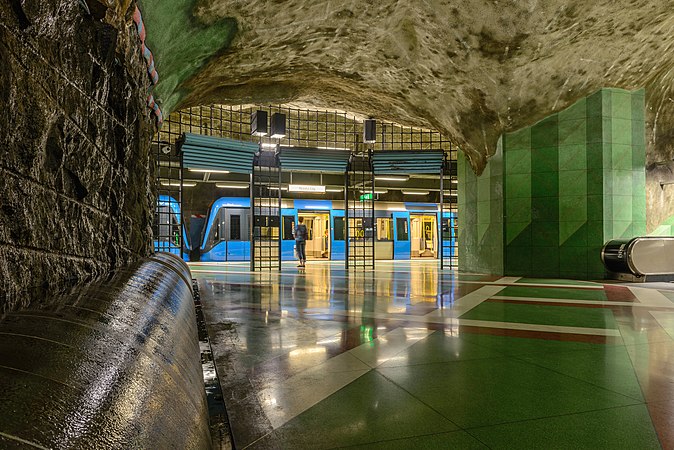 Connection between platforms.
 East entrance/exit.


 Request do have Sweden FoP inside in the buildings? I think unfortunately no, so this images constitutes are a copyright violation. Sorry. --Alchemist-hp (talk) 10:00, 1 June 2014 (UTC)


.JPG)


 Plate 1: Draco and Ursa Minor
 Plate 3: Cassiopeia
 Plate 4: Cepheus
 Plate 5: Gloria Frederici, Andromeda, and Triangula (An obsolete plural form of the name of the constellation Triangulum)
 Plate 6: Perseus and Caput Medusæ
 Plate 7: Auriga
 Plate 8: Lynx and Telescopium Herschilii
 Plate 9: Ursa Major
 Plate 11: Hercules and Corona Borealis


 Plate 16: Aries and Musca Borealis
 Plate 17: Taurus
 Plate 18: Gemini
 Plate 19: Cancer
 Plate 21: Virgo
 Plate 22: Libra
 Plate 23: Scorpio
 Plate 25: Capricornus
 Plate 27: Pisces
 Plate 28: Psalterium Georgii, Fluvius Eridanus, Cetus, Officina Sculptoris, Fornax Chemica, and Machina Electrica

 Plate 32: Noctua, Corvus, Crater, Sextans Uraniæ, Hydra, Felis, Lupus, Centaurus, Antlia Pneumatica, Argo Navis, and Pyxis Nautica

.jpg)


.jpg)


_and_Kruzenshtern_(ship,_1926),_Sète,_France.jpg,_not_featured)
.JPG,_not_featured)
.jpg,_not_featured)
.JPG,_featured)
.jpg,_not_featured)
.jpg,_not_featured)
.jpg,_not_featured)
_at_the_Defence_Academy,_Shrivenham_MOD_45148053.jpg,_not_featured)
_Hortus_Haren.JPG)
.jpg,_featured)
_2014-02-10_perspective_corrected.jpg)
.jpg)
_and_Kruzenshtern_(ship,_1926),_S%C3%A8te,_France.jpg&action=edit§ion=T-1)
_and_Kruzenshtern_(ship,_1926),_S%C3%A8te,_France.jpg)
_and_Kruzenshtern_(ship,_1926),_Sète,_France.jpg,_not_fe)
_and_Kruzenshtern_(ship,_1926),_Sète,_France.jpg,_not_fe)
.jpg)
.JPG&action=edit§ion=T-1)
.JPG)
.JPG,_not_featured)
.JPG,_not_featured)
.jpg&action=edit§ion=T-1)
.jpg&action=edit§ion=T-1)
.jpg)
.jpg,_not_featur)
.jpg)
.jpg,_not_featur)


 zeigt es deutlich. --Alchemist-hp (talk) 10:25, 15 June 2014 (UTC)
.JPG&action=edit§ion=T-1)
.JPG)
.JPG)
.JPG,_featured)
.JPG,_featured)
.JPG,_featured)

.jpg&action=edit&redlink=1)
.jpg&action=edit§ion=T-1)
.jpg)
.jpg)
.jpg,_not_featured)
.jpg,_not_featured)


.jpg)


.jpg&action=edit§ion=T-1)
.jpg)
.jpg)
.jpg,_not_featured)
.jpg,_not_featured)


_over_Italy.jpg)
.jpg)


 . --Alchemist-hp (talk) 10:45, 14 June 2014 (UTC)


.jpg&action=edit&redlink=1)
.jpg&action=edit§ion=T-1)
.jpg)
.jpg,_not_fea)
.jpg,_not_fea)


_at_the_Defence_Academy,_Shrivenham_MOD_45148053.jpg&action=edit§ion=T-1)
_at_the_Defence_Academy,_Shrivenham_MOD_45148053.jpg)
_at_the_Defence_Academy,_Shrivenham_MOD_45148053.jpg)


_Hortus_Haren.JPG&action=edit§ion=T-1)
_Hortus_Haren.JPG)
_Hortus_Haren.JPG)
_Hortus_Haren.JPG)
_Hortus_Haren.JPG)
_Hortus_Haren.JPG-1)


.jpg&action=edit§ion=T-1)
.jpg)
.jpg)
.jpg,_featured)
.jpg,_featured)


_2014-02-10_perspective_corrected.jpg&action=edit§ion=T-1)
_2014-02-10_perspective_corrected.jpg)
_2014-02-10_perspective_corrected.jpg)
_2014-02-10_perspective_corrected.jpg)
_2014-02-10_perspective_corrected.jpg)
_2014-02-10_perspective_corrected.jpg)


 Abstain as author -- Kabelleger (talk) 17:46, 23 June 2014 (UTC)


