Commons:Graphic Lab School/Images to improve/Archive/Resolved 2
German State Police patches - Photographs[edit]
Photograph of a Rhineland-Palatinate State Police patch[edit]
-
 Rhineland-Palatinate State Police patch
 -
 SVG version


Article(s):
Request:
- Please remove reflections and improve alignment -- Mattes (talk) 16:50, 27 December 2008 (UTC)
Graphist opinion:
- I've made an svg Richardprins (talk) 17:19, 4 February 2009 (UTC)
Photograph of a Berlin Police patch[edit]
-
 Berlin Police patch
 -
 SVG version


Article(s):
Request:
- Please remove reflections and improve alignment -- Mattes (talk) 16:50, 27 December 2008 (UTC)
Graphist opinion:
- I've made an SVG Richardprins (talk) 17:19, 4 February 2009 (UTC)
Photograph of a Brandenburg Police patch[edit]
-
 Brandenburg Police patch
 -
 SVG
SVG


Article(s):
- after improvement: de:Polizei Brandenburg
Request:
- Please remove reflections and improve alignment -- Mattes (talk) 16:50, 27 December 2008 (UTC)
Graphist opinion:
- I've done an SVG. Inductiveload (talk) 06:36, 4 February 2009 (UTC)
- great, but the typeface gotta be modified (look at the O). The background seems being too white, too. Someone does have provide a good photo for proper SVG adapation. --77.4.44.157 19:25, 4 February 2009 (UTC)
- Hi 77.4.44.157, I don't think you understand. The heraldic stuffs are the official shields already on the commons. The font is like the emblem below. I think that the differences in font and whitecolor are because it's hard to seam an emblem perfectly.
- In my opinion, the svg emblems are almost perfect. Richardprins (talk) 14:21, 5 February 2009 (UTC)
Photograph of a Mecklenburg-Vorpommern Police patch[edit]
-
 Mecklenburg-Vorpommern Police patch
 -
 SVG
SVG


Article(s):
- after improvement: de:Polizei Mecklenburg-Vorpommern
Request: Please remove reflections and improve alignment -- Mattes (talk) 16:50, 27 December 2008 (UTC)
Graphist opinion:
- Have an SVG instead :-) Inductiveload (talk) 00:41, 4 February 2009 (UTC)
- Great, but the SVG file seems to be too white (silver/grey is right I guess?!). There needs to be a good photograph or heraldric description for adoptation. --77.4.44.157 19:27, 4 February 2009 (UTC)
- Hi 77.4.44.157, the same as above applies here. The heraldic stuffs are the official shields already on the commons. I think that the differences in whitecolor are because it's hard to seam an emblem perfectly.
- In my opinion, the svg emblems are almost perfect and do not have to be changed. Richardprins (talk) 14:21, 5 February 2009 (UTC)
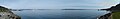
May Revolution[edit]
-
 May Revolution

Article(s): es:Revolución de Mayo and related articles
Request: Like the one with San Martin, a photo took in the museum was slightly ruined by the reflection of the lights over it. Fortunately, the effect is lower here. -- Belgrano (talk) 19:35, 10 January 2009 (UTC)
Graphist opinion:
- Hmm, the ideal way to deal with a photo like this would be to take another couple photos of the same painting from (very) different angles. The pictures can then be perspective corrected and combined. With just one image, it's quite a difficult problem to separate texture of the painting surface from texture intended by the artist, particularly with the standing man, where there's probably irrecoverable information loss. Some darkening may be able to reduce the visual impact. Dcoetzee (talk) 00:02, 19 February 2009 (UTC)
- I will try to get to the place again and take more photos, but this may take a while (perhaps a pair of months, or even july if my year gets too busy). Feel free to archive this request, it would be better if I simply made a new one when and if I finally got such needed photos Belgrano (talk) 13:42, 19 February 2009 (UTC)
Here you go. It was a tough job, but I think it is an improvement. Julielangford
-
 May Revolution

Snoqualmie Falls panorama[edit]
-
 1
1 -
 2
2 -
 3
3 -
 4
4 -
 5
5 -
 6
6 -
 panorama


Request: Stitch together these six panes into a gigantic panorama. Keep in mind these when stitching:
- I was standing on a very unstable surface, which means the camera may have shook up and down a little when taking the photo
- The falls were spewing out mist that traveled as I took the panorama
- Lighting could be inconsistent due to the fact that I used a "Spot" metering mode to adjust for light
When finished:
- Upload under the same license
- Use the name File:Snoqualmie-Falls-panorama.jpg
- Move File:Snoqualmie-Falls-panorama_6.jpg to File:Snoqualmie-Falls-pano_6.jpg for consistency.
Thanks,
Deathgleaner (talk) 22:37, 17 January 2009 (UTC)
- I did a very basic stitching to show up the issues:
- the mists are really disturbing, althought it does not appear much on the final result. Still It is visible when you look on the picture. It can be probably corrected, but I am unsure of it. I think the light exposure amplify the effect here. The hugin preview was ugly, I am almost amazed of the result I got. Imo, Always try to shot fast pans, maybe with more overlapping so you reduce the risk of strangeness.
- There are missing pans up and down. Imo, always try to shot the top and bottom part of the final panorama or they'll be missing. I think this is the main problem of this panorama.
- Esby (talk) 23:16, 18 January 2009 (UTC)
- Enblend is a pretty amazing program, isn't it? :) Blends just about anything. Anyway, it seems you didn't use any vertical guides for your stitch? I uploaded a new version with the pitch corrected so that the fences, houses and trees are roughly vertical. I still didn't do any exposure or vignetting correction: I did try, but hugin kept interpreting the moving fog as an exposure change and giving really absurd results. —Ilmari Karonen (talk) 03:50, 19 January 2009 (UTC)
- yeah, I did not use any vertical guides, I tends to retake the photographs when I find those situation in my pano. hugin exposure correction sometimes works, but sometimes it does not. I wish there could be a way to easily adjust the settings manually while previewing the panorama. Esby (talk) 08:58, 19 January 2009 (UTC)
Tacoma beachfront panorama[edit]
- The following discussion is closed, and will be archived soon.
-

-

-

-

-

-

-
 stitched


As usual, stitch a panorama. I realise that some of the areas are out of focus, but do your best, even if it means blurring the other photos before making a panorama, and then resizing the image until it doesn't look blurred. Deathgleaner (talk) 04:05, 7 April 2009 (UTC)
- Here's the best I could do. It turned out nicer than I expected, but I couldn't really do much about some of the frames being out of focus (I scaled it down by 50%, but I'd have to scale it down a lot more to hide the blurring), and the exposure correction couldn't really get the water in one of the frames to match. In the future, may I suggest trying to take more pictures: ideally, every pixel in the final panorama ought to be found in at least two original pictures. That not only makes the stitching and exposure correction much less error prone, but it also means that a single blurred image is much less of a disaster. —Ilmari Karonen (talk) 20:31, 10 April 2009 (UTC)
Wow. You did good despite my bad cameramanship. Deathgleaner (talk) 04:43, 11 April 2009 (UTC)
- The above discussion is closed, and will be archived soon.
Lacrosse diagrams[edit]


Article(s): en:Lacrosse strategy
Request: SVG versions of all of these (should be super simple and easy even though its a lot) with green backgrounds preferably. You might want to use File:Mens lacrosse diagram.svg even if its only to get a sense of what its supposed to look like. Thanks! -- Yarnalgo (talk) 06:35, 8 April 2009 (UTC)
Graphist opinion:
- I did one of them. I don't know anything about lacrosse so I don't know if it's correct. Richardprins (talk) 20:01, 26 April 2009 (UTC)
- Did another one. Richardprins (talk) 20:01, 26 April 2009 (UTC)
Those look great thanks! --Yarnalgo (talk) 20:43, 26 April 2009 (UTC)
PDF to SVG[edit]
Hello, I was just granted permission to upload two files on Commons under CC-BY-SA-3.5: a map and a brochure. Both are in SVG but they are encapsulated in PDFs. I followed the instructions on Wikipedia: installed Inkscape, opened the file, clicked OK and saved as SVG. The first file - about 5 MB - converted but the resulting SVG was very distorted and parts of it were missing. The second one is a high detail relief map 16 MB of size - only crushed my computer several times.
Question: How do I convert it properly or how do I upload it on Commons so that professionals like you could convert it?
Thanks in advance and best regards! --Chech Explorer (talk) 08:07, 9 April 2009 (UTC)
- Can you give me the link/location of the PDF file? --Jackl (talk) 03:23, 10 April 2009 (UTC)
- Hi, I managed to extract the SVGs from the PDF but they grew even larger and Commons doesn't generate thumbs for them: Category:The Rhodopes on The Paths Of Orpheus And Eurydice Project. I am also awaiting instructions how to confirm the copyright status of the images via OTRS. Can something be done to reduce the size and load time of the two SVGs? Also, why there are no thumbnails? --Chech Explorer (talk) 10:15, 10 April 2009 (UTC)
- I've had some luck in using Scribus to convert PostScript to SVG. It might be worth a try. Of course, you'd need to convert the PDF to PostScript first, but a simple converter like pdf2ps ought to do that. —Ilmari Karonen (talk) 18:53, 10 April 2009 (UTC)
OK, now since we have the SVGs here, can somebody fix the errors, reduce their size and/or extract PNGs out of them for easier use? --Chech Explorer (talk) 23:45, 11 April 2009 (UTC)
- It might help if we knew exactly what you want to do with these files. I can extract at least some of the photos from the SVG quite easily, but none of them seem to be of particularly high quality — even the biggest are only about 1 megapixel, many of them look pixelated or heavily compressed, some have what looks like watermarking and they all seem to be converted from JPEG images with a fuzzy border added. They work just fine to illustrate the brochure, but they seem pretty useless on their own. —Ilmari Karonen (talk) 18:46, 12 April 2009 (UTC)
- Yeah, the images on the brochure are not top quality. They are for illustration purposes only. I think the map is more important. --Chech Explorer (talk) 19:41, 12 April 2009 (UTC)
If you can provide the PDF source I can try to re-convert it with a (hopefully) smaller result. You can upload the PDF here at Commons. --Yarnalgo (talk) 03:59, 25 April 2009 (UTC)
- Also see COM:OTRS for instructions on how to confirm permission. --Yarnalgo (talk) 04:52, 25 April 2009 (UTC)
- Hi, I talked with the person who provided the PDFs. He said he's going to send me the files in SVG and/or PNG. Then we will fix the OTRS. If something goes wrong, we will first confirm the permission and then probably you could help. But anyway we will wait until next week - I communicate with the person by his official e-mail (not available on weekends and there were Orthodox Christmas holidays in Bulgaria recently) and he has to contact the studio which created the map and the brochure for him and his institution, so it takes some time. Best regards --Chech Explorer (talk) 15:15, 26 April 2009 (UTC)
Flag of Europe: Incorrect representation[edit]
-
 European flag, upside down
 -
 European flag, incorrect star rotation
 -
 European flag, incorrect star positions


Article(s): en:Flag of Europe
Request: Three incorrect representations of the European flag. I think, this should be mentionend on the pictures like "Specimen" on a banknote. -- Kolja21 (talk) 11:47, 4 May 2009 (UTC)
Graphist opinion: ... I don't think so... It's not like someone would accidentally put it in an article when they would have to type in "incorrect star rotation" or whatever. The watermark would make it look really bad. --Yarnalgo (talk) 19:08, 9 May 2009 (UTC)
- Instead of marking the image I think a template on the image description page would be helpful. Unfortunately I don't know what it would say or what icon to use. --Commander Keane (talk) 07:56, 30 June 2009 (UTC)
- I found {{Fake flag}} and added it to the image description pages.--Commander Keane (talk) 11:42, 1 July 2009 (UTC)
Transparency[edit]

Article(s): w:Chinese character classification
Request: I need the image to have a transparent background. Also, can someone tell me how to create that effect in Inkscape. --The New Mikemoral (talk) 01:38, 5 June 2009 (UTC)
Graphist opinion:
 Done Wow, that intermediate version sure was a mess: I don't know what you did to fill it with dozens of invisible objects, but that's what there was. (Or, actually, I just had a nasty suspicion that I do: no, you cannot make something transparent by putting a transparent object on top of it.)
- Anyway, the only think wrong with the original version was that it had a white opaque square behind the other objects that needed to be deleted. Also, the "holes" in the drawing were actually separate white objects on top of the black background; I turned them into actual holes using the "Path → Difference" tool.
- By the way, for checking in advantage whether your drawing is actually transparent, you can go to the document properties ("File → Document Properties...") and adjust the background color to something non-white and non-transparent: this should produce a visible change in the editing window. If it doesn't, or if only some areas change, there's some white object blocking the background from showing through. Just remember to set the background back to transparent white (#ffffff00) before saving. —Ilmari Karonen (talk) 16:34, 5 June 2009 (UTC)
Judges Cupola Nuvola Icon[edit]
-

-
 SVG
SVG


Please convert to SVG, this image is in horrible quality. Connormah (talk) 04:30, 14 June 2009 (UTC)
- That good? Pbroks13 (talk) 00:48, 18 June 2009 (UTC)
- Those are judges?! 76.117.247.55 23:29, 7 August 2009 (UTC)
360° Panorama Dörenberg look out[edit]

Article(s):
http://de.wikipedia.org/wiki/D%C3%B6renberg
http://de.wikipedia.org/wiki/Hermannsturm_(Georgsmarienh%C3%BCtte)
Request: The panorama needs to be brightened up as a whole. I managed to get pretty good results for either the foreground or the background but unfortunately never for the whole panorama - just don't know how to do that. BTW: If you would prefer to recreate the panorama from scratch I still have all single photos - just contact me.
Graphist opinion:
- I edited the image with Gimp, tweaked the luminance with levels, Hoping it will fit your needs. Esby (talk) 15:17, 19 June 2009 (UTC)
Bellevue to Seattle panorama[edit]
A look at Bellevue and Seattle, it must be stitched into a panorama.
These three images:


Notes: The second picture is a little problematic in terms of brightness. Perhaps adjust that, or the first and third pictures.
Deathgleaner (talk) 01:21, 24 June 2009 (UTC)
The file shoud be uploaded under "Image:Bellevue to Seattle pano.jpg", same license.
 Doing… but the third picture is just a zoomed in version of the first, right? --Yarnalgo (talk) 07:16, 24 June 2009 (UTC)
- Done--Yarnalgo (talk) 07:42, 24 June 2009 (UTC)

- Uploaded a new version, tweaked the levels before merging, used a rectilinear projection. Esby (talk) 16:55, 29 June 2009 (UTC)
Convert to svg[edit]
-
 World Games medals compilation
 -
 SVG
SVG -
 African record icon
 -
 SVG
SVG


Article(s): medal tables of World Games (a lot of articles)
Request: I would like this image was converted to svg, because of the better quality and transparent background. Filipe Ribeiro Msg 17:43, 13 July 2009 (UTC)
Graphist opinion:
- Is this OK? —Ilmari Karonen (talk) 10:35, 14 July 2009 (UTC)
- I apologize for not thanking immediately the work. If it's not asking much, I wish that more images were also converted: the ones in this category, except the squares. I'm very grateful. Filipe Ribeiro Msg 22:48, 26 July 2009 (UTC)
- Does File:Sport records icon AF.svg look OK? If so, I can make the rest of the set easily enough (or you should be able to do it yourself, too). I changed the font from what appears to be Berlin Sans Demi to BitStream Vera Sans Bold, since the latter is a free font, and thus available directly on the Wikimedia servers. If it has to be Berlin Sans, I'd have to convert the text to paths to get it to render. I can make the font bolder, though, if you want. —Ilmari Karonen (talk) 12:34, 27 July 2009 (UTC)
 Perfect! Thank you so much for the help. Filipe Ribeiro Msg 18:14, 27 July 2009 (UTC)
- While wonderful, if you can increase the font size they will appear better in the articles. It1s my fault, I didn't notice that the files were previously with a small font size. Thanks again. Filipe Ribeiro Msg 18:18, 27 July 2009 (UTC)
- Better now? I went ahead and uploaded the entire set; they're almost identical anyway, just the letters and the colors differ. —Ilmari Karonen (talk) 20:28, 27 July 2009 (UTC)
- Perfect again! Thank you, Ilmari. Filipe Ribeiro Msg 21:00, 27 July 2009 (UTC)
Spacings.svg[edit]
-
 An example of a distribution, samples, and the spacings of the value of the cumulative distribution function between samples.

Article(s): w:Maximum spacing estimation
Request: The braces need to be thinner and in proportion to the rest of the image so that the labels can be seen. -- Avi (talk) 18:26, 3 August 2009 (UTC)
Graphist opinion:
John C. Breckinridge Photo[edit]
-
 original version
 -
 Restored version


Request: Please remove scratches. Connormah (talk) 01:28, 4 August 2009 (UTC)
- Graphist opinion: I've given it go, but please note, this is my first ever attempt at this kind of retouching, and it probably shows. Someone else may still do a better job of it. AJCham ᵀᴬᴸᴷ 05:57, 4 August 2009 (UTC)
- I've made a second attempt, which I'm much happier with. AJCham ᵀᴬᴸᴷ 07:48, 4 August 2009 (UTC)
- Great job, thank you so much! --Connormah (talk) 15:46, 4 August 2009 (UTC)
- I've made a second attempt, which I'm much happier with. AJCham ᵀᴬᴸᴷ 07:48, 4 August 2009 (UTC)
Is WB/contrast/sharpness OK here?[edit]


Request: I recently changed the camera body, the monitor AND editing software... too much of a change in one week and I cannot get used to the new feel. Take a look, are the settings OK? The first pic was taken in broad daylight (see file history for the original camera .jpg), the second - inside a shady courtyard (also on a sunny day). Files are straight from Bibble Raw, shrunk to 1/2 of original pixel count.NVO (talk) 08:44, 20 June 2008 (UTC) Graphist opinion:
- I corrected the perspective on your first image, second one looks really good visually. --Mozillaman (talk) 17:15, 19 September 2008 (UTC)
Can you improve this picture (decreasing the noise)?[edit]
-

-
 derivated version by Flekstro

.jpg)
Article(s): Digitalis purpurea and w:fr:Digitale pourpre
Request: I found the DOF of this picture excellent -showing a nice plant in its natural environment- and i would like to improve the quality of this picture. Is it possible to reduce the noise? -- Guérin Nicolas (messages) 16:57, 23 September 2008 (UTC)
Graphist opinion: I blurred the background to bring the flowers out: Image:Vallée du Marcadau 100 new.JPG How does it look? Maybe a crop would also be good? (I'm new on Commons, so I couldn't replace the original). Tadpole9 (talk) 02:49, 3 November 2008 (UTC)
- I think that the modified image looks very unnaturally (like a collage of image of the plant and image of mountains). Distant objects should be blurred more than close objects. Anyway Guérin Nicolas asked for reducing the noise and I think that there is not much noise (worth of reducing) in the image. --Pabouk (talk) 10:06, 3 November 2008 (UTC)
- It's interesting also to have this image with a blurred background, if you want to focus on the plant only. But effectively, i wanted something else: it's difficult to identify a plant in its natural environment, so a clear background is an asset to show it. I would like to propose such picture for COM:QPC, that's why before i would like to know if it's possible to reduce the global noise of such picture (background and foreground) to meet the Commons:Image guidelines. Thanks. Guérin Nicolas (messages) 15:49, 3 November 2008 (UTC)
- Okay, it was worth a try. I'm not sure what you mean by "noise". Tadpole9 (talk) 17:27, 3 November 2008 (UTC)
- Indeed, the image does not seem particularly noisy to me. —Ilmari Karonen (talk) 16:46, 7 November 2008 (UTC)
- Now, I uploaded a derivative image, in which I emphasized the plant as shown above. This could meet Guérin Nicolas' needs, doesn't it?--Flekstro (talk) 10:24, 16 May 2009 (UTC)
- It's interesting also to have this image with a blurred background, if you want to focus on the plant only. But effectively, i wanted something else: it's difficult to identify a plant in its natural environment, so a clear background is an asset to show it. I would like to propose such picture for COM:QPC, that's why before i would like to know if it's possible to reduce the global noise of such picture (background and foreground) to meet the Commons:Image guidelines. Thanks. Guérin Nicolas (messages) 15:49, 3 November 2008 (UTC)


Hello, can somebody detour the record label like those at Image:ListenToTheMockingBird.gif? Waylon (talk) 19:54, 12 November 2008 (UTC)
- Sure, how about this? —Ilmari Karonen (talk) 23:26, 12 November 2008 (UTC)
- I note a possible issue with the licensing, though: you've tagged the original image with {{PD-US-no notice}}, but it actually contains text that says "LABEL COPYRIGHT 1936 BY BRUNSWICK RECORD CORP."(!). Assuming that indeed means what it appears to mean, and that we can't show the copyright wasn't renewed, it looks like the image would have to rest on the {{PD-ineligible}} claim alone. Which the presence of the notice also makes a bit less obvious than it would otherwise be — evidently at least somebody at some point believed the label to be eligible for copyright, if they bothered to print a notice. —Ilmari Karonen (talk) 23:54, 12 November 2008 (UTC)
- Thank you for detouring. I think we should make a differnce between the label which is showed in this picture, and the picture itself. The picture itself is a scan, and I think a scan is absolutely ineligible for copyright, there's no creativity in this image. The label itself also contains IMO only information. Waylon (talk) 15:03, 13 November 2008 (UTC)
- Yes, the image is a slavish reproduction of a two-dimensional label, and thus (at least in the U.S., per Bridgeman v. Corel) not separately copyrightable. However, if the label itself passes the threshold of originality, and if the copyright has been renewed on time, then "Brunswick Record Corp." (or whoever has acquired the rights from them) own the copyright to both the label and any derivative of it.
- Anyway, I've posted a question at Commons talk:Licensing#Text-only record label with copyright notice. Hopefully getting more eyes on the matter will help settle it one way or another. —Ilmari Karonen (talk) 20:29, 13 November 2008 (UTC)
Snow in Seattle needs improvement[edit]
Image reflection cleanup[edit]
gallery


info
These images here were taken inside a house near a window. Obviously, windows will reflect light. Most of these exposures all have either raindrops on them or there is a camera lens. Please overwrite the old files when uploading, and be sure to upload under the same license. If anyone can remove these artefacts, that would be much appreciated. Thank you and happy holidays!
CommonMaster (talk) 03:07, 23 December 2008 (UTC)
Panorama 1[edit]
The full four parts of the panorama are below:


Please stitch these together. You may also want to consider:
- Enhancing the colors, they seem quite dull; and/or
- Making some of the snow flakes smaller, or even cloning them out
Upload these files under File:Snowinseattle2008Pano1.jpg

- Here you go. I uploaded it as File:Snowinseattle2008Pano-1.jpg (with a dash), which is what you'd used on the image pages. I hope it's ok. I think the snowflakes are fine, myself: the picture is about snow, surely it's only proper that it has some snow in it. :) —Ilmari Karonen (talk) 18:44, 26 December 2008 (UTC)
- Since there will be another panorama, I would recommend File:Snowinseattle2008Pano1.jpg. CommonMaster (talk) 04:24, 29 December 2008 (UTC)
- Okay, reuploaded. —Ilmari Karonen (talk) 12:28, 29 December 2008 (UTC)
- Since there will be another panorama, I would recommend File:Snowinseattle2008Pano1.jpg. CommonMaster (talk) 04:24, 29 December 2008 (UTC)
Panorama 2[edit]
The full six parts of the panorama are below:
-
-

-

-

-

-

-
 Stitched


CommonMaster (talk) 04:42, 29 December 2008 (UTC)
Collaboration[edit]
I'm not really sure where you want to go with these. I stitched a quick rectilinear panorama out of these, like you could've taken yourself if you'd had a wide-angle lens. I could probably have made a slightly better job of it, but I wanted to first hear if it's anything like what you wanted. In particular, some of your images are a bit out of focus, so there are some blending lines between sharp and blurred areas that are pretty noticeable especially at full size. Some of those could probably be moved to slightly less conspicuous locations by doing the blending by hand, but that'd take some work and the result still wouldn't be perfect. —Ilmari Karonen (talk) 14:37, 29 December 2008 (UTC)
- I don't have a "wide-angle lens", these photos were taken with a standard digital 5.0MPX camera. Upload the image to commons and I'll preview it. CommonMASTER (talk) 03:11, 30 December 2008 (UTC)
- It's already here. :) File:Snowinseattle2008Pano2.jpg. (Ps. Thanks for the barnstar!) —Ilmari Karonen (talk) 15:12, 30 December 2008 (UTC)
- could you remove those streaks of light? CommonMASTER (talk) 03:52, 31 December 2008 (UTC)
- It's already here. :) File:Snowinseattle2008Pano2.jpg. (Ps. Thanks for the barnstar!) —Ilmari Karonen (talk) 15:12, 30 December 2008 (UTC)
Title[edit]
-
 José de San Martín
.jpg)
Article(s): en:José de San Martín and many others
Request: I have replaced the small image available with a photo of the original portrait I took at the museum. Unfortunately, there was a disrupting light on the top part. Can this be fixed, so the image has an overall equal appearence? -- Belgrano (talk) 00:02, 10 January 2009 (UTC)
Graphist opinion:
- I tried, but there's only so much I could do. I've uploaded the retouched version over your original, feel free to revert if you don't think it's an improvement. —Ilmari Karonen (talk) 04:55, 10 January 2009 (UTC)
opened-up piano[edit]

Unblur this image as much as possible.
Deathgleaner (talk) 22:46, 17 January 2009 (UTC)
- I suggest you take a new one, and use better lightning and a tripod and without those pillows :-). Or maybe use this File:Upright piano inside.jpg — SKvalen (talk) 19:43, 24 January 2009 (UTC)
Inside Channel Tunnel wagon[edit]

Article(s): Various Wikipedias (eg) Request: To remove the orange colour cast. I think you can call this a whitebalance issue. -- Commander Keane (talk) 01:06, 20 January 2009 (UTC)
Graphist opinion:
- I can remove the yellow cast, but the original image is very small, and suffers from JPG compression artifacts when the color cast is removed. If you can upload a higher quality version, I can fix it for you. —Zzubnik (talk) 11:55, 20 January 2009 (UTC)
- I tried. Deathgleaner (talk) 03:45, 21 January 2009 (UTC)
- I think that Deathgleaners result was really bad. I made a new version using the original image. This one has less noise, and made the light pure white. I don't know if the light really was purely white, because I haven't been in the tunnel. I hope this is how the picture was intended. Richardprins (talk) 16:44, 6 February 2009 (UTC)
- I'm not an image editing geek, so I just did the best as I could: Adjust the white-point and black-point. So how did you do it? Deathgleaner (talk) 17:53, 11 February 2009 (UTC)
- I think that Deathgleaners result was really bad. I made a new version using the original image. This one has less noise, and made the light pure white. I don't know if the light really was purely white, because I haven't been in the tunnel. I hope this is how the picture was intended. Richardprins (talk) 16:44, 6 February 2009 (UTC)
- I tried. Deathgleaner (talk) 03:45, 21 January 2009 (UTC)
Conversion to SVG[edit]
-

-

-

-
 First try.
 -
 Try 2
Try 2


Article(s): Use in Wikipedia for coverage about the field hockey tournament
Request: SVG format could make all this image more effective. I need some help because i don't how to convert it, can somebody take this task? -- Aleenf1 (talk) 15:07, 15 February 2009 (UTC)
Graphist opinion:
- I gave this a shot. Had some issues because I'm more used to Illustrator than Inkscape. I have no idea how to get the default font that thick/bold. It may not be possible. I could convert a fatter font to outlines, but then that sort of defeats the purpose of SVG. Also, I had some transparency issues as well. Anyone care to work on the file I created? If those two issues are address, then it would be easy for anyone to change the letter combination to anything they want. Just curious, why do wou think SVG would be more effective?-Andrew c (talk) 02:25, 22 February 2009 (UTC)
- I think to represent a ball, a radial gradient is better than a linear gradient. How does try 2 look? Pbroks13 (talk) 02:34, 22 February 2009 (UTC)
- I wasn't even thinking of the object (hey, what do you know.. it's supposed to be a field hockey ball!). I was just trying to recreate identically what I saw. Looks good (though it may be a bit too gray. It may pop more with a larger white highlight). What'd you do to get the letters bolder?-Andrew c (talk) 15:11, 22 February 2009 (UTC)
- I increased the stroke size by like 20. So, how's that? Pbroks13 (talk) 06:29, 23 February 2009 (UTC)
- I wasn't even thinking of the object (hey, what do you know.. it's supposed to be a field hockey ball!). I was just trying to recreate identically what I saw. Looks good (though it may be a bit too gray. It may pop more with a larger white highlight). What'd you do to get the letters bolder?-Andrew c (talk) 15:11, 22 February 2009 (UTC)
- I think to represent a ball, a radial gradient is better than a linear gradient. How does try 2 look? Pbroks13 (talk) 02:34, 22 February 2009 (UTC)
- Here is the original"Ball" SVG: File:Field hockey ball.svg. That text on this ball... and you will have an identical recreation. J.smith (talk) 23:54, 25 February 2009 (UTC)
w:File:WandJHorizontalLogo.svg (NFC, so it is shown as a link)
Article(s):w:Washington & Jefferson College
Request: -- I made a vector version of this image:[3], located here: w:File:WandJHorizontalLogo.svg. I couldn't get the fonts to look right, so I would like some help. Please? Here's the deal: I think the word "college" is Franklin Gothic, and it matches pretty closely, parts of the word "Washington & Jefferson" look to be Garamond, but some letters don't fit that font. 1) The "W" in the logo is not crossed in the middle, like it would under Garamond. 2)The "right leg" of the R intersects with the round part at the intersection with the vertical part, but Garamond's R intersects further out. 3) The Fs and the Es have smaller middle serifs than Garamond's version.
So, my question is this: are the words in this logo a mixture of multiple fonts, or is it made from a font that I'm not thinking of? --Jwilkinsen (talk) 18:47, 25 February 2009 (UTC)
Graphist opinion:
Coat of Arms of British Columbia[edit]
Article(s): British Columbia
Request: We'd like a clean line-art SVG of the Coat of Arms of British Columbia. It should not look like a bad-quality autotraced bitmap. It cannot be manually traced from File:Coat of Arms of British Columbia.png, as that is non-free. -- Denelson83 (talk) 01:49, 28 February 2009 (UTC)
Graphist opinion:
- Surely that must be a derivative work. /Lokal_Profil 03:09, 28 February 2009 (UTC)
- Are you saying no? -- Denelson83 (talk) 06:06, 3 March 2009 (UTC)
- If the description page for the "non-free one" is correct, then wouldn't {{PD-old}} apply? Pbroks13 (talk) 18:23, 3 March 2009 (UTC)
- The BC coat of arms were published more the 50 years ago, and was subject to crown copyright, so they are now in the public domain. Full history is here, and a good resolution version here. I wouldn't suggest using File:Coat of Arms of British Columbia.png as your base image, vector-images.com drew that representation and specifically asks people don't vectorized from it (whether if legally can claim they can own their representation of someone elses work is a matter of debate). Also the image File:BC-Arms.jpg might not be public domain, I would call the Legislature and ask when they were installed, it it was 50 years ago then I would tag it {{PD-Art|PD-Canada}}. --Svgalbertian (talk) 23:15, 27 July 2009 (UTC)
- If the description page for the "non-free one" is correct, then wouldn't {{PD-old}} apply? Pbroks13 (talk) 18:23, 3 March 2009 (UTC)
- Are you saying no? -- Denelson83 (talk) 06:06, 3 March 2009 (UTC)
Problem with appearance of image in any web page[edit]
I uploaded Media:Wheeler_experiment_problems.svg and thought I must have uploaded the wrong one because there is an intrusive inclusion of one of the graphic elements. There should be four things that look a little like
\\\\ or ////
A fifth one shows up when the image appears on a page. Downloading that image I get a png with the intrusive element in it. So I assume that there is an on-the-fly method of turning svg images into png images for display on web pages.
The extra image is very intrusive and reduces the explanatory value of the diagram.
- That problem disappeared after I reuploaded a vanilla svg version, but the text at the top is still spilling over its intended bounds. The size of the font must be going wrong.Patrick Edwin Moran 23:57, 7 December 2007 (UTC)
Strangely, it shows up correctly when coded as "media" above, but see the part at the end of the top green line.
 Any way to fix this? Patrick Edwin Moran 05:51, 1 December 2007 (UTC)
The problem seems to be with the freeware available, Inkscape. There are two versions of SVG, one is Inkscape-specific, and one is vanilla SVG. Using vanilla works better. Patrick Edwin Moran 17:02, 6 December 2007 (UTC)
People are asked to use the SVG format rather than GIF or other low bandwidth applications, but the available information on how to use the freeware program Inkscape is poor. The "book" about Inkscape on Wikipedia is a bad joke. The help file for Inkscape doesn't give responsive help. It happens that I have SVG software available from my university, but that route is not available to the majority of people. I think it is unrealistic/impolite to give people wolf tickets for uploading files in other formats that somebody thinks could be supplied in SVG format unless there are adequate means to supply those files. Patrick Edwin Moran 23:53, 7 December 2007 (UTC)
- Hi sorry for the lack of replys. As you found out saving the file as "plain svg" tends to work better then "inkscape svg". There is currently an ongoing discussion about writing a SVG help page (should be on Help:SVG at some point in the future) but that project has just got of the ground. The Text problem is probably due to issues between how the wikimedia software interprets the font (compared to how every other program interprets it) this is a quite common bug and can sometimes be fixed but switching to one of the supported fonts (info on help:SVG). I'll take a look at the file and see if I can fix the last problem. /Lokal_Profil 00:44, 8 December 2007 (UTC)
- Text no longer crosses the image elements but it might be a tad small instead. /Lokal_Profil 00:49, 8 December 2007 (UTC)
- When moving SVG files between platforms, I found text to be an issue, more specifically the non-availability of a common font. Somehow I feel unable to blame that on Inkscape. -- Klaus with K (talk) 20:00, 10 January 2009 (UTC)
- The typical way to correct text problems is simply to convert them to paths (ctrl-shift-c) before saving the image. Technically speaking, text rendering is left at the discretion of the rendering client - most Linux systems (including the Wikimedia servers) use an abnormally wide font, which will mess up text positioning.
- As a side note, I have never experienced any problems with Inkscape, apart from using the blur property, which does not get rendered by non-Inkscape clients and thus would not work on Wikimedia. INVERTED (talk) 15:48, 15 July 2009 (UTC)
- I've fixed your file. How do you like it? --Shandris (talk) 19:15, 22 July 2009 (UTC)
- Text no longer crosses the image elements but it might be a tad small instead. /Lokal_Profil 00:49, 8 December 2007 (UTC)
Need a way to turn 21 seperate images into a single app-like image.[edit]
-
 Ballaugh
 -
 Bellacraine
 -
 Central Region
 -
 Crosby
 -
 Pit area in central Douglas
 -
 Central Douglas
 -
 East Douglas
 -
 North Douglas
 -
 West Douglas
 -
 Douglas overview
 -
 Glen Vine
 -
 Kirk Michael
 -
 Overview of the northeast area including Ramsey
 -
 Overview of the northwest area
 -
 South Ramsey
 -
 West Ramsey
 -
 Overview of the Ramsey area
 -
 Overview of the southern-most portion of the course
 -
 Sulby
Sulby -
 Union Mills
 -
 The starting point for the entire series; Shows the entire course


Article(s):
Request: -- I want to take all the images above (all members of Category:Snaefell mountain course circuit maps) and link them together. I have two prototypes of the Douglas overview image with some JS added. One, [4] uses SVG links to change the current image. However, that system requires that I either have a central JS file for quite a bit of code (several functions) or copy the code to all 21 files. I am NOT doing the latter.
The other option requires that I combine the images into a single image. Each "image" becomes a layer. This can be seen at [5]. However, even though that file only has layers for the Douglas area (just 6 of them, not 20), its code is very slow as it takes time for Firefox (or whatever) to move the layers around and change z-orders as needed. (The z-order is used to highlight links to other maps in both systems.)
Not only do I need a place to put the JS code, but then I need a way to display it. I am told that <embed> and <object> tags are not allowed. Yet they would be ideal unless IFRAMES are allowed. Simply adding a link to the image won't work as no one would reach it and see the interactive stuff. Will (Talk - contribs) 01:11, 12 November 2008 (UTC)
- BTW: Two samples with code are below. Neither has been uploaded to Commons with code and won't be until the above problems are resolved.
- Will (Talk - contribs) 02:49, 12 November 2008 (UTC)
Graphist opinion: Ever think about using an imagemap? Old-school, I know, but it could work. --J.smith (talk) 19:47, 12 November 2008 (UTC)
- How would an imagemap help? It won't let me switch maps. It won't help me embed the map. I also have overlapping regions. (That is why the rects used to detect the mouse don't have a fill.) Will (Talk - contribs) 21:19, 12 November 2008 (UTC)
- No, it wouldn't be exactly the same, but it gives you alternate way of presenting the maps given the tools we have here. --J.smith (talk) 08:39, 13 November 2008 (UTC)
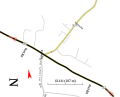
Map of pirate attacks[edit]

Article(s): w:List of ships attacked by Somali pirates
Request: Should be marked with the locations of pirate attacks, color coded for sucessful and unsucessful ones — Mike.lifeguard | @en.wb 20:29, 4 December 2008 (UTC)
Graphist opinion: Do you have coordinates of the locations or a link to a map for inspiration? I also think that a non-topographic map with country borders would be more suitable for the subject. bamse (talk) 15:45, 5 December 2008 (UTC)
- Here's a link, but unfourtunately doesn't include the Maersk Alabama attack or the French ship attack either. Try searching that up? Deathgleaner (talk) 22:09, 11 April 2009 (UTC)
- Here: http://toolserver.org/~para/cgi-bin/kmlexport?article=List_of_ships_attacked_by_Somali_pirates
Blank World Subdivisions Map (Conversion to SVG)[edit]
Could someone please convert this .png file to an .svg? Or, could anyone add the major political subdivisions (states, provinces, etc.) to this one? Any help would be greatly appreciated. - Ken_Thomas (talk) 05:39, 11 January 2009 (UTC)
- Is one of this useful --SKvalen (talk) 18:50, 24 January 2009 (UTC)
- Unfortunately, no. See, I'm working on making a set of templates for creating range maps of animal species. Some species have worldwide distribution, and those are pretty easy to display on a worldwide map, but for species that only exist in a small geographic area, you need to be able to zoom in on much smaller sections of the map, which is why I need an .svg file. The problem is that when you're only showing a small section of map, you need the smaller regional subdivisions (states, provinces, internal districts, etc.) for what you're looking at to make any sense. - Ken_Thomas (talk) 12:48, 26 January 2009 (UTC)
Tokamak scheme[edit]
A relatively straightforward, but a very useful addition would be an SVG scheme of a tokamak device. It could be based on one of the existing pictures...
-
 ... such as this one, only labeled

The reason that I'm requesting this is that I've been cleaning inadequately labeled images on :sl Wikipedia and noticed this one. It's very informative, so I'd like to replace it in the article instead of just deleting. I can provide translation of the labels if necessary.
- Bump. Is this too much work for the scope of this project? If so, where else can I make this request? --Yerpo (talk) 08:44, 11 April 2009 (UTC)
Article(s): en:Tokamak
Request: -- Yerpo (talk) 09:04, 4 March 2009 (UTC)
Graphist opinion:
-
![This is a possible SVG graphic illustration of a Coat of Arms used by the Vichy Regime during WW2. original file is in [1] which is in [2].](https://upload.wikimedia.org/wikipedia/commons/thumb/8/84/Informal_emblem_of_the_French_State_%281940%E2%80%931944%29.svg/99px-Informal_emblem_of_the_French_State_%281940%E2%80%931944%29.svg.png) This is a possible SVG graphic illustration of a Coat of Arms used by the Vichy Regime during WW2. original file is in [1] which is in [2].
This is a possible SVG graphic illustration of a Coat of Arms used by the Vichy Regime during WW2. original file is in [1] which is in [2].
![This is a possible SVG graphic illustration of a Coat of Arms used by the Vichy Regime during WW2. original file is in [1] which is in [2].](/wiki/File:Informal_emblem_of_the_French_State_(1940%E2%80%931944).svg)
Article(s):
Request: My request is:
- To correct the part of the axe's blade where the white part is missing (as it should be from left to right Red-White-Blue.
- To correct the ribbon with the motto so that it would be in the right size and shape according to [6].
- And to stylize the words of the motto so it would be compatible with the ribbon.
Oren neu dag (talk) 10:30, 14 March 2009 (UTC)
Graphist opinion:
Coat of amrs of Serbian towns[edit]
A administrator on Serbian Wikipedia told me that designs of coat of arms are in public domain, but images are free only if they are made under free licence. So, can someone create vector versions of this few images [7], [8] and [File:Grb Vranje.jpg|this]? --BokicaK (talk) 05:46, 21 March 2009 (UTC)
- It wouldn't be as simple as that. I guess what he means is that the design i.e. the text description (en:blazon) which defines the coat of arms are free. In order to create free CoAs one would then need access to the blazon and then based on that (and only that without being influenced by any "official" interpretation) create new coat of arms. /Lokal_Profil 20:33, 21 March 2009 (UTC)
Panorama of Museum of Glass in Tacoma[edit]


First of all, the pictures need to be rotated.
Picture 3 needs to have its brightness decreased. Picture 1 needs slight brightness increase.
Then, begin the stitching. After done, the file should be located at File:MuseumOfGlassPano.jpg.
Deathgleaner (talk) 04:09, 6 April 2009 (UTC)
- Done I know the sky changes color on the left but I thought it's pretty good for my first pano. I can try again if you want or someone else can make a better one. --Yarnalgo (talk) 23:26, 8 April 2009 (UTC)

- That is quite amazing for your first panorama. Did you try increasing the luminosity/brightness on the first slide? And yes, the color change is a bit problematic. Deathgleaner (talk) 04:19, 9 April 2009 (UTC)
- Kinda curious to know how are the background buildings in reality... right or inclined? The horizon looks strange, I tried myself with the panorama but also got horizon problems too... Esby (talk) 08:12, 9 April 2009 (UTC)
- I believe that when I was there, the ground on the right was slightly higher than on the left, but the horizon looks like a sideways "S". Deathgleaner (talk) 04:05, 10 April 2009 (UTC)
- P.S.: The big building (Museum of Glass) is supposed to be inclined, but all the other buildings are not. Deathgleaner (talk) 04:06, 10 April 2009 (UTC)

- Here's a version with a straightened horizon. I haven't cropped this one yet — it really needs some fake sky in the top right corner, otherwise I'd have to crop off part of the museum building itself. :( —Ilmari Karonen (talk) 02:20, 11 April 2009 (UTC)
- Looking from that I'm guessing I tilted my camera while taking the pics. Oops. Deathgleaner (talk) 04:41, 11 April 2009 (UTC)
- What I got as result was near what Ilmari Karonen got, missing sky in top right part, maybe it could be reconstructed, not sure, I havn't tried, usually I always shot the sky & ground in other pans when I do a panorama, so I can use part of them if needed. Esby (talk) 14:05, 11 April 2009 (UTC)
- Yeah, my bad. Since multiple people have tried but haven't gotten a good result, just tell everybody not to try again. We will generate fake sky, and mayybe fake ground. Deathgleaner (talk) 02:38, 13 April 2009 (UTC)
- I just got around to trying to fix the missing sky, and what do you know, resynthesizer got it perfectly the first time. Wow! My usual experience with faking blue sky has been pretty bad (since the resynthesizer can only clone pixels, not extrapolate gradients), but apparently there were enough dark areas in the existing sky to make it work this time. Anyway, I took the liberty of uploading my new version over your original, Yarnalgo — I hope you don't mind. —Ilmari Karonen (talk) 13:35, 13 April 2009 (UTC)
Plug-in hybrids, etc.[edit]
-
 Series hybrid electric vehicle without a plug; please replace with existing or new diagram as appropriate
 -
 Serial hybrid bus with fuel cell and no plug to charge the battery; please replace with existing or new diagram as appropriate
 -
 Series-parallel hybrid from w:Hybrid vehicle drivetrain (please see related diagrams there) but still no plug to charge the battery


Article(s): w:Plug-in hybrid, w:Hybrid vehicle, w:Hybrid electric vehicle, w:Hybrid vehicle drivetrain, w:Automobile, w:Bus, etc.
Request: Please select existing suitable diagrams from w:Hybrid vehicle drivetrain for w:Plug-in hybrid if possible, or SVGify the hand drawings offered at w:Talk:Plug-in hybrid#Type diagrams with internationalization in mind. Please explicitly include plug charging for w:Plug-in hybrid. Please consider whether it would be best to include depiction of w:regenerative breaking on any or all new or existing diagrams. Please see w:BYD F3DM#Principles of operation for Chinese language diagrams of the first production plug-in hybrid, a Series-parallel hybrid. Thank you very much for your help with this. -- 69.228.193.173 14:08, 6 April 2009 (UTC)
Graphist opinion:
Director chair[edit]
Could somebody create an icon of a director chair like this one with the clapperboard and that thing(don't know the name) too; I'd like to use as icon for sutbs about movie director's articles and to transform it in an icon for use on infoboxes pictograms. Mizunoryu 大熊猫❤小熊猫 (talk) 13:50, 13 April 2009 (UTC)
Clean House and University Map Symbols (16x16 Pixel PNG with transparent background, max. 20 KB)[edit]
Article(s): -
Request: I would appreciate some clean (simple, but recognizable) House and University Google Map Symbols (16x16 Pixel, PNG with transparent background, max. 20 KB) in blue (and maybe some other colors). -- 94.220.200.142 13:16, 15 April 2009 (UTC)
Graphist opinion:
Stitching job[edit]
-
 left
left -
 right
right -
 best I could do


Article(s):
Request: Could someone please stitch those two images? Could someone also create a short help page about how to stitch images?-- Diaa abdelmoneim (talk) 14:45, 21 April 2009 (UTC)
Graphist opinion:
- I can try, but I doubt it'll stitch cleanly: the pictures seem to be taken from different positions. The first rule of panoramic photography is that, with some very rare exceptions, one should always shoot the pictures to be stitched from as close to the same spot as possible. To be precise, you want to hold the focal point of the camera (which lies somewhere between the lens and the camera body) fixed and rotate the camera around it. That way, all the pictures will have the same perspective and they'll therefore stitch cleanly. Otherwise you'll get mismatches. (The main exceptions are perfectly flat surfaces, which can be stitched even if the camera is moved, and objects that are so distant that you'd have to move a very long way before the perspective would change noticeably. Your wall sculpture might just be flat enough to stitch acceptably, but I doubt there's any way to get the arch itself to come out right.) —Ilmari Karonen (talk) 16:39, 24 April 2009 (UTC)
- Check out http://hugin.sourceforge.net/tutorials/index.shtml for tutorials on how to stich images. --Yarnalgo (talk) 21:46, 24 April 2009 (UTC)
- As I guessed, the perspective difference was pretty bad. I managed to get the sculptures and the frame to more or less line up by putting a few control points on the knobbly thing (torch?) to the left of the top of the arch and a lot of horizontal line controls on the lines above it. The real trick was to let hugin optimize the "x shift" values together with the usual roll/pitch/yaw parameters in order to correct for the varying camera position. (I tried optimizing the "y shift" values too, but I didn't have enough good control points to get a sensible solution with that many degrees of freedom, so I just left them at zero which worked out well enough.) The view through the arch is, of course, completely FUBAR, but at least the sculpture itself looks fairly OK if you don't look at it too closely. Anyway, maybe it can at least serve as a warning example: "This is what you'll get if you move the camera while shooting a panorama." —Ilmari Karonen (talk) 22:30, 24 April 2009 (UTC)
- Thanks for the great help and if u could create a Help:Stitching it would benefit the whole community.--Diaa abdelmoneim (talk) 16:30, 26 April 2009 (UTC)
- I attempted to fix the interior a bit, and uploaded over the first stitched version. Hope this helped. INVERTED (talk) 16:55, 15 July 2009 (UTC)
SVG problems[edit]
I translated Image:Mauna Loa Carbon Dioxide-en.svg using SVGTranslate tool and than made some minor changes using Inkscape. The result ([9])i am not able upload to commons, while getting "The file is corrupt or has an incorrect extension. Please check the file and upload again."
- you added a comment after the final svg tag which isn't allowed. removing that should make that file work
Also a few moths ago i tried to update File:Skyscrapercompare.svg using Inkscape, but result did not show up.
- here you simply embedded a raster image inside the vector file, which defeats the purpose of using a vector format. the raster image (swfc.png) is simply linked to from the svg file, and when uploaded that file (which is on your hard drive) is clearly not found.
I am not SVG expert, so any explanation why both images looks ok in Inkscape, but did not work is welcomed. --Jklamo (talk) 22:36, 26 April 2009 (UTC)
- see comments inline. regards /Marmelad (talk) 10:48, 29 April 2009 (UTC)
Hi, can somone make said image a svg file with clear background? Good work is needed as the image will be displayed in many many articles in the Hebrew Wikipedia, as well as in the main page - it is our featured article symble. Thanks, Yonidebest Ω Talk 21:37, 16 May 2009 (UTC)
- It seems user:Yuval Y did it for you, the svg is called file:Article MediumPurple.svg Richardprins (talk) 20:23, 28 May 2009 (UTC)
- Have you tried asking the original author? —Ilmari Karonen (talk) 22:57, 16 May 2009 (UTC)
- No, she is no longer active. The image is free, I do not see a problem. Yonidebest Ω Talk 23:13, 16 May 2009 (UTC)
- I just asked because the GIF has clearly been rasterized from a vector image, so simply converting the original version to SVG would've been easier than trying to recreate it from the tiny raster version. —Ilmari Karonen (talk) 15:54, 24 May 2009 (UTC)
- No, she is no longer active. The image is free, I do not see a problem. Yonidebest Ω Talk 23:13, 16 May 2009 (UTC)
Hemicicle graphics made with Paint[edit]

Hello, I have made this archive with Paint. How can I make this file better? Thanks --Lagurion (talk) 09:32, 25 May 2009 (UTC)
- For start, by using a vector graphics program, like GIMP (it's free and not too complicated to learn). --Yerpo (talk) 13:02, 25 May 2009 (UTC)
- Gimp is a vector graphics program??? I would have said Inkscape. --Eusebius (talk) 13:20, 25 May 2009 (UTC)
- Bah, of course I meant Inkscape. Sorry. --Yerpo (talk) 07:10, 27 May 2009 (UTC)
A lot of Thanks to all--Lagurion (talk) 13:57, 25 May 2009 (UTC)
- But I look for a program that make hemicicles, election simulator or samething like that. --Lagurion (talk) 20:39, 25 May 2009 (UTC)
- Making hemicircles with Inkscape is easy. A specialized election simulator program will be hard to find, a free one even harder. --Yerpo (talk) 07:10, 27 May 2009 (UTC)
- Wrote a little script that draws vector versions of your semicircles based on lists of numbers. [10]. Let me know if you need help/have suggestions. Regards /Marmelad (talk) 20:35, 6 June 2009 (UTC)
- Cute. But political parties are often associated with colors so you might offer the user a choice of color for each entry. --Yerpo (talk) 06:56, 7 June 2009 (UTC)
- Good idea. Added colour support, and possibility of direct links. See eg [11] /Marmelad (talk) 09:18, 7 June 2009 (UTC)
- Nice work. The only thing left to do is to write instructions (I could guess that for colors you have to enter hex values with # in front, but not everybody has experience in web design) and provide a suitable license for use in Commons. Although the result is probably simple enough to not be eligible for copyright anyway. Still might be worth clearing that up. --Yerpo (talk) 06:47, 8 June 2009 (UTC)
- Valid CSS color names seem to work too: [12]. —Ilmari Karonen (talk) 10:40, 8 June 2009 (UTC)
Dinosaur skeleton with bad reflections[edit]
Article(s): main image in the Wikipedia article about this dinosaur genus (see Mononykus)
Request: Hi, this image on the right suffers from reflections caused by the skeleton being inside a glass montre I think. Would it be possible to remove these reflections, and make the affected parts of the skeleton look like the rest? And maybe give the entire image a colour correction so the yellow tint disappears, and remove the shadow on the left edge of the image? Thanks in advance.
The image is the main image in the Wikipedia article about this dinosaur genus. FunkMonk (talk) 13:40, 7 June 2009 (UTC)
Graphist opinion:
Maybe I can handle it... Just gimme awhile okay? Ivan Akira (talk) 11:56, 5 August 2009 (UTC)

Done, just view the image at the right side... How do you think? Do you like it? Or maybe my work is not good enough for you? I'm dunno... But if you don't like it, you can delete it at once. Ivan Akira (talk) 13:42, 5 August 2009 (UTC)
- Looks good, thanks, i'll use it! FunkMonk (talk) 14:26, 7 August 2009 (UTC)
- You're welcome... I'm glad you like it! Ivan Akira (talk) 03:00, 8 August 2009 (UTC)
- There is a slight problem with your edit. I presume you cloned away the parts of the image with reflections, which is ok by itself, but I think by doing it you changed the shape of vertebrae in the tail a bit. That kind of details are important in palaeontology so please consider doing it more precisely. --Yerpo (talk) 15:04, 8 August 2009 (UTC)
- This request should reopened then... I'm really appreciate about your concern, And I do know that. I'm really sorry for that. So, maybe there is other who can do well? Ivan Akira (talk) 16:24, 8 August 2009 (UTC)
- Doesn't have to be reopened, just tweaked a bit. You think you can do it? FunkMonk (talk) 06:29, 10 August 2009 (UTC)
- It appears that you deleted the original image in Commons and point the source reference to the flickr, because this problem is not resolved yet, I don't think that is a good decision (I think it's better to delete my fix than the original, at least that what I think). And I'm really sorry that I can't accomplish this request. Please skilled Wikigraphist to help on this request... Ivan Akira (talk) 11:07, 30 August 2009 (UTC)
- Original is now restored to Commons (and really should not be deleted). - Jmabel ! talk 23:27, 30 August 2009 (UTC)
- This request should reopened then... I'm really appreciate about your concern, And I do know that. I'm really sorry for that. So, maybe there is other who can do well? Ivan Akira (talk) 16:24, 8 August 2009 (UTC)
- There is a slight problem with your edit. I presume you cloned away the parts of the image with reflections, which is ok by itself, but I think by doing it you changed the shape of vertebrae in the tail a bit. That kind of details are important in palaeontology so please consider doing it more precisely. --Yerpo (talk) 15:04, 8 August 2009 (UTC)
-
 Original
 -
 Ivan Akira's version

Animation of flag requested (Rome)[edit]
-
 Flag of the City of Rome (today)
 -


Article(s): All Rome articles throughout the Wikipedia world
Request: Please create an animated version. -- Mattes (talk) 08:56, 8 June 2009 (UTC)
Graphist opinion:
What do you mean by animated? How do you want it animated? --Yarnalgo (talk) 02:06, 9 June 2009 (UTC)
- Perhaps a more relevant question first - why do you want it animated? I really don't think that an animated flag icon is suitable for stub and other templates because the movement adds no information whatsoever and it gets annoying very quickly. --Yerpo (talk) 13:27, 10 June 2009 (UTC)
- Oh, you don't know the animated GIF flags at Commons... OK, here we go → Category:Animated flags (overall amount: 281). Animated flags are used in many Wikipedia editions (mostly not in the article namespace, I guess). I'd use it for Commons:WikiProject Rome and the user namespace (User:Mattes/Projects/Rome, babel). My opinion: Yes, animated flags does not support information. Yes, they might annoy people if they come by the 100s. Some people like them, though (it's more vivid). We're providing "the stuff" here, and I'm sure that this animated Rome flag will be used somewhere soon (besides me). --Mattes (talk) 10:01, 14 June 2009 (UTC)
Adjust a plane's horizonal level[edit]
-
 Dragonair A330-300 (B-HWG) with 20-year Anniversity special color theme
 -
 Asiana Airlines A320-200 (HL7722) old color theme


Article(s):
Request:It need to be adjust the horizonal level. if possible, adjust to make the plane body more clear-- Ellery (talk) 12:07, 21 June 2009 (UTC)
Graphist opinion:
- I have uploaded a modified version of the A330-300 here: File:Dragonair A330-300 B-HWG mod.jpg. I had to crop away a little more of the tail but I hope it will be well. /Fluff (talk) 07:39, 22 June 2009 (UTC)
Image Artifacts[edit]


Article(s):
Request: This old picture has some artifacts. Is it possible for someone with some photoshop skills to remove some of them? Thanks everyone!--GrapedApe (talk) 05:17, 24 June 2009 (UTC)
Resolution: Here is my try. It's Gimped though, not photoshoped. --Jak (talk) 15:51, 27 June 2009 (UTC) Graphist opinion:
Marco Polo's Journey[edit]
-
 General layout

Article(s):
Request: -- Diaa abdelmoneim (talk) 12:21, 6 July 2009 (UTC) Marco Polo is a very prominent explorer and his article is visited by thousands every day. We currently have the one above which is very bad considering general route maps we have. Could someone create an svg route map of his journey, which could later contain the names he gave to the cities he stopped in and so on? Possible references would be
- I would also appreciate work on this subject. Thanks in advance! LouriePieterse (talk) 16:10, 14 July 2009 (UTC)
I added a basic SVG created by one of our contributors. Please if there are any questions ask.--Diaa abdelmoneim (talk) 21:15, 19 July 2009 (UTC)
Graphist opinion:
John Quincy Adams Daguerreotype[edit]

Can the crack, and some white spots be removed? Connormah (talk) 18:20, 29 July 2009 (UTC)
- I uploaded hi-res version, did some crop and try to polish bit that cracks. --Jklamo (talk) 18:58, 29 July 2009 (UTC)
Here is another cleaned up and enhanced version for you Julielangford (talk) 23:31, 29 July 2009 (GMT)

![[3]](http://www.washjeff.edu/uploadedImages/External_Relations/W%26J-horiz-blk-box-5.jpg)
![[4]](http://will.pittenger1.googlepages.com/SnaefellMountainCourse-Douglasareaov.svg)
![[5]](http://will.pittenger1.googlepages.com/SnaefellMountainCourse-Interactive.svg)
![[1]](http://www.annefrankguide.net/fr-FR/content/patriefamille.jpg)
![[7]](https://sr.wikipedia.org/wiki/%D0%A1%D0%BB%D0%B8%D0%BA%D0%B0:Grb-karlovci.png)
![[8]](https://sr.wikipedia.org/wiki/%D0%A1%D0%BB%D0%B8%D0%BA%D0%B0:Grb_Vranja.jpg)
![[9]](http://www.klamo.org/Mauna_Loa_Carbon_Dioxide-cs.svg)
- Wow, that looks great! Thank you so much! Connormah (talk) 17:42, 30 July 2009 (UTC)