Commons:Graphic Lab/Illustration workshop/Archive/2013

Banner of the King of Scots[edit]
-
 File without raster graphics.

Request: I converted a PNG file to SVG, but it is embedded with raster graphics I am told and should be made with vector graphics. I am unfamiliar with SVG processes, could someone re-make it with vector graphics? The other files of this banner were created with the wrong proportions, and should be 5:4 like the file presented to you. I used File:Royal Arms of the Kingdom of Scotland.svg as my source. Bellae artes (talk) 21:23, 13 April 2012 (UTC)
Graphist opinion(s):
![]() Done — Daniel FR: Talk to me on Commons/in Germany! 18:32, 26 July 2012 (UTC)
Done — Daniel FR: Talk to me on Commons/in Germany! 18:32, 26 July 2012 (UTC)
Kcell[edit]
-
???
Request: Remove TeliaSonera's purple pebble, it is not in PD-shape and should be renamed to "Kcell wordmark.svg". --OP-670856 (talk) 14:07, 8 May 2012 (UTC)
Graphist opinion(s):
![]() Done File uploaded (File:Kcell wordmark.svg). I will also request deletion of File:Kcell_Logo.svg, as it has a copyrighted element. --Jackl (talk) 16:33, 12 May 2012 (UTC)
Done File uploaded (File:Kcell wordmark.svg). I will also request deletion of File:Kcell_Logo.svg, as it has a copyrighted element. --Jackl (talk) 16:33, 12 May 2012 (UTC)
TeliaSonera[edit]
Request: Outdated SVG logo: Please match with the current wordmark. --OP-670856 (talk) 14:13, 8 May 2012 (UTC)
Graphist opinion(s):
![]() Done:
Done:
Icosahedron cell diagram[edit]
-
 Cell diagram of the icosahedron

Request: Convert to SVG, making sure that all the labels are centralised in their boxes. --Double sharp (talk) 12:57, 2 June 2012 (UTC)
Graphist opinion(s):
![]() Request taken by Gauravjuvekar (talk)
Is the f1 in the centre meant to be in italics?--Gauravjuvekar (talk) 12:24, 8 July 2012 (UTC)
Request taken by Gauravjuvekar (talk)
Is the f1 in the centre meant to be in italics?--Gauravjuvekar (talk) 12:24, 8 July 2012 (UTC)
- Should there be borders on the boxes?--Gauravjuvekar (talk) 13:33, 8 July 2012 (UTC)
- Should the background be transparent?--Gauravjuvekar (talk) 13:40, 8 July 2012 (UTC)
The central f1 (but not the one on the left) should be in italics. Borders would look good (black, preferably). I would prefer a transparent background. Double sharp (talk) 11:27, 9 July 2012 (UTC)
- Partly
 Done. File:Icosahedron cell diagram.svg I'm optimizing the file now.--Gauravjuvekar (talk) 06:52, 10 July 2012 (UTC)
- Partly
![]() DoneGauravjuvekar (talk) 07:12, 11 July 2012 (UTC)}}
DoneGauravjuvekar (talk) 07:12, 11 July 2012 (UTC)}}
 Thank you. Double sharp (talk) 10:01, 11 July 2012 (UTC)
Update to flag[edit]
-
 Can someone make this SVG image....
 -
 ...look like this one please?


Request: Update the SVG so it matches the png please. Thank you. --Jza84 (talk) 19:28, 3 June 2012 (UTC)
Graphist opinion(s):
- Hey there. I looked up the flag on Google Images and it seems that both designs exist (?). Are you sure that the .png version is the official design? Thanks. --Wylve (talk) 16:51, 6 June 2012 (UTC)
- According to the traditional rules of heraldry, the two have equivalent blazons, and so are minor artistic variants of the same basic heraldic banner. But I have no idea how the Greater Manchester government views the matter... AnonMoos (talk) 03:40, 30 June 2012 (UTC)
- Done --Wylve (talk) 06:09, 16 July 2012 (UTC)
-
 Latvian
Problem: Does not display. -- Common Good (talk) 17:45, 7 June 2012 (UTC)
Graphist opinion(s):![]() Done --Fred the Oyster (talk) 18:23, 7 June 2012 (UTC)
Done --Fred the Oyster (talk) 18:23, 7 June 2012 (UTC)
PNG file backround[edit]
-
 Video CD logo
Request: This logo needs it's backround transparent. Can somebody do it, please ? Thank you beforehand !
Sincerely, --Hoikka1 (talk) 13:52, 3 July 2012 (UTC)
Graphist opinion(s):
- File:VCDlogo.svg on English Wikipedia exists and it is the vector version of the image above. However, the en.wiki version is marked as copyrighted. I am not sure if the image meets the threshold of originality or not. --Wylve (talk) 08:26, 7 July 2012 (UTC)
- There are plenty of logos like that in here:
- File:Laserdisc logo.png
- File:Pioneer logo.png
- File:Pioneer logo.svg
- Category:CD logos
- Category:DVD logos
- Category:Logos of companies of Japan
- Those all seem to have this:
- Those all seem to have this:
- The previous version of the logo had transparent backround. But the "Digital Video" text was not like in the official logo. That's why I updated it.
- Hoikka1 (talk) 15:28, 7 July 2012 (UTC)
- Done --Sreejith K (talk) 00:09, 12 August 2012 (UTC)
- Thank you very much, Sreejithk2000 !
- Hoikka1 (talk) 04:33, 12 August 2012 (UTC)
- Thank you very much, Sreejithk2000 !
- The previous version of the logo had transparent backround. But the "Digital Video" text was not like in the official logo. That's why I updated it.
Black boxes in Inkscape[edit]
-
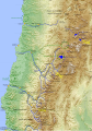 Cuencas hidrográficas de la Región de Atacama

Request: There are two black boxes in the thumb of the image. These boxes are neither in the "normal" image of commons nor in Inkscape editing. Can anyone says why and erase the black boxes?. --Createaccount 21:04, 3 July 2012 (UTC)
Graphist opinion(s):
- Mysterious black rectangles in SVG are almost always due to the stupid Inkscape "flowtext" nonsense, which can be diagnosed at Commons:SVG Check... AnonMoos (talk) 00:52, 4 July 2012 (UTC)
- Fixed "flowtext" nonsense, but that doesn't affect the problem that text rendering isn't that great at small font sizes... AnonMoos (talk) 01:23, 4 July 2012 (UTC)
- Why do you ever link only to the SVG Check and not to the explaining main page for MediaWiki SVG newbies (with the most important bugs)?!? Flowtext is not Inkscape rather SVG 1.2. -- πϵρήλιο ℗ 14:56, 4 July 2012 (UTC)
- SVG 1.2 is not an officially-adopted standard, and the current "working draft" hasn't been updated for over 7 years!! As far as I can tell, SVG 1.2 gave guidance to mobile-phone software writers as to which minimal subset of features to support ("SVG Tiny") and threw out some interesting ideas, but it really hasn't set any meaningful new standards in the non-Tiny area. According to en:SVG, "SVG Full 1.2 has had a W3C Working Draft in process for years, but now will be dropped soon in favor of a SVG 2.0". Frankly, the Inkscape developers seem to display a degree of assholish tendencies on this subject, since they're fully aware that "flowtext" causes interoperability problems, but they don't seem to care too much, and even saving as "Plain SVG" does nothing to resolve flowtext problems (or that's true of the most recent version that I know about...). -- AnonMoos (talk) 16:28, 4 July 2012 (UTC)
- Anyway, you might be a little annoyed too, if you had fixed this problem in roughly 200 or so SVG files, the way I have... AnonMoos (talk) 16:32, 4 July 2012 (UTC)
- *Oh* Excuse me, so exactly I did not know that. Yes, then it's understandable. I know that the Inkscape developers don't support many SVG objects (only fully a rect?) and they also say "Who cares a lean small code!?" -- πϵρήλιο ℗ 20:25, 4 July 2012 (UTC)
- Hi AnonMoos,
- thanks a lot for the fix. --Createaccount 12:56, 5 July 2012 (UTC)
treemap svg does not show thumbs[edit]
-
 Treemap of countries by area

Request: Can someone please find the bug or error that I made with this svg? I don’t know why the pngs/thumbs are not working. Thank You --Mapmarks (talk) 14:06, 13 September 2012 (UTC)
Graphist opinion(s):
Currently-uploaded SVG files must have xmlns="http://www.w3.org/2000/svg" in the header (though this was not always enforced in the past). AnonMoos (talk) 03:21, 14 September 2012 (UTC)
![]() Done
Done
- Thank You for Your help and for fixing the file --Mapmarks (talk) 09:29, 14 September 2012 (UTC)
Flag of Serbia 1835[edit]
.svg)
Request: Can someone vektorise this photo. This can be used for olive and oak branches. -- Bojan Talk 12:26, 14 September 2012 (UTC)
Graphist opinion(s):
Vectorization![edit]

Please make a translatable SVG version of this. Thanks :) −ebraminiotalk 10:48, 5 October 2012 (UTC)
![]() Request taken by :In progress--Gauravjuvekar (talk) 19:37, 10 October 2012 (UTC)
Request taken by :In progress--Gauravjuvekar (talk) 19:37, 10 October 2012 (UTC)
- Would it be better if the CPU on the left was vertical?(see image note).--Gauravjuvekar (talk) 07:31, 11 October 2012 (UTC)
- Hmm, I don't know. Do whatever you think is right about it :) −ebraminiotalk 11:13, 11 October 2012 (UTC)
- Done:
- Hmm, I don't know. Do whatever you think is right about it :) −ebraminiotalk 11:13, 11 October 2012 (UTC)

Please mark as resolved if fixed. Note that I added an arrowhead on the CPU line. Tell me if I should remove it. I didn't include the image title as it should be included in the image caption on the pages where it is used thus being easier to translate rather than embedding in the file itself.--Gauravjuvekar (talk) 18:29, 11 October 2012 (UTC)
- Thanks a lot! I put that on [2]! Can you have a look at #OpenJDK Logo also? :) −ebraminiotalk 20:00, 11 October 2012 (UTC)
Coat of Arms of Sverdlovsk oblast[edit]
-
 Coat of Arms of Sverdlovsk oblast

Request: There are errors in the file. According official website of Sverdlovsk oblast griffins should be without penises but sable should be with a penis. --Ю. Данилевский (talk) 06:46, 9 October 2012 (UTC)
Graphist opinion(s):
![]() Done I`ve also improved and optimzed some things. --
Done I`ve also improved and optimzed some things. -- πϵρήλιο ℗ 10:12, 18 October 2012 (UTC)
Flag of Little Rock[edit]
-
 Flag of Little Rock, Arkansas

Request: The SVG file appears to be broken. Can anyone here fix it? —Angr 20:51, 17 October 2012 (UTC)
Graphist opinion(s):
- Done With software upgrades, the SVG renderer is getting pickier and pickier about what headers it will accept. Previously seen at File:Bread and wine.svg... -- AnonMoos (talk) 21:24, 17 October 2012 (UTC)
- This bug (or feature?) is one year old Bugzilla:31122. But anyway, there is still no proper SVG help page on En: !? --
πϵρήλιο℗ 21:53, 17 October 2012 (UTC)
- This bug (or feature?) is one year old Bugzilla:31122. But anyway, there is still no proper SVG help page on En: !? --
- Not really the same problem; this one is about referring to a non-standard DTD... AnonMoos (talk) 22:06, 17 October 2012 (UTC)
- Oh yes, I see now. --
πϵρήλιο℗ 10:11, 18 October 2012 (UTC)
- Oh yes, I see now. --
- P.S. For another recent increase in SVG header persnickitiness which is creating problems for some files, see the current discussion on Commons:Village pump... AnonMoos (talk) 13:55, 18 October 2012 (UTC)
typo in File:Zentralasien topo.png[edit]
-
 map of central asia

Request: There’s a typo in this map. The name of India’s capital ist „Delhi“, not „Dheli“. Is it possible to fix this? In addition, there’s a red dot outside the map (on the right side). It’s probably Seoul, but since the Korean Peninsula isn’t visible on the map, there’s no need for this dot. Please remove it. --Schniggendiller (talk) 23:50, 2 August 2012 (UTC) and 23:57, 2 August 2012 (UTC)
Graphist opinion(s):
![]() Done --Wylve (talk) 13:20, 3 August 2012 (UTC)
Done --Wylve (talk) 13:20, 3 August 2012 (UTC)
- Thank you. Regards --Schniggendiller (talk) 14:14, 4 August 2012 (UTC)
Another Vectorization![edit]
-
Original
Request: Please make a vector version of this diagram with better colors and design :) −ebraminiotalk 12:57, 9 December 2012 (UTC)
Graphist opinion(s):
![]() Request taken by Frédéric (talk): I have uploaded a proposal
Request taken by Frédéric (talk): I have uploaded a proposal
Thanks! −ebraminiotalk 14:41, 17 December 2012 (UTC)
Dutch Parliament's coat of arms need lion replacement[edit]


Request: The lion in these symbols is non-free. They were previously deleted but other files with the same lion were able to stay because they got a lion replacement. I was able to get these undeleted with the hope of a lion replacement like the other ones. Please replace the lion with the one from File:Arms of the Netherlands (with crown).svg. Be aware that these three files were created in Adobe Illustrator, so you may have difficulty cause they don't want to edit in inkscape (which is why I had to make a GL request). Thanks so much to whoever does this. Fry1989 eh? 22:04, 12 January 2013 (UTC)
Graphist opinion(s):
 Question What do you mean with "they don't want to edit in inkscape"? --Ricordisamoa (talk) 22:15, 12 January 2013 (UTC)
- He meant that there may be difficulty opening them with Inkscape, due to Adobe-Inkscape interoperability problems. If you ever open an SVG file which has gone through both Inkscape and Illustrator in a plain-text editor (as I have), it's usually not a pretty sight... AnonMoos (talk) 22:22, 12 January 2013 (UTC)
- Yes, when I open them in inkscape, the individual elements aren't clickable, the whole file is one big clump together. I wish I could do it myself but I have no clue. I'm really hoping someone in the Graphic Lab can do it. Fry1989 eh? 22:47, 12 January 2013 (UTC)
- It is not an Adobe-Inkscape interoperability problem. It is a clone of an object. You can unlink a clone from the original by pressing Shift+Alt+D whilst the clone is selected.―― Phoenix7777 (talk) 05:33, 13 January 2013 (UTC)
- Ahh coool!! Thanks, I'll be able to fix it myself now, awesome. Fry1989 eh? 07:11, 13 January 2013 (UTC)
- It is not an Adobe-Inkscape interoperability problem. It is a clone of an object. You can unlink a clone from the original by pressing Shift+Alt+D whilst the clone is selected.―― Phoenix7777 (talk) 05:33, 13 January 2013 (UTC)
- Yes, when I open them in inkscape, the individual elements aren't clickable, the whole file is one big clump together. I wish I could do it myself but I have no clue. I'm really hoping someone in the Graphic Lab can do it. Fry1989 eh? 22:47, 12 January 2013 (UTC)
- He meant that there may be difficulty opening them with Inkscape, due to Adobe-Inkscape interoperability problems. If you ever open an SVG file which has gone through both Inkscape and Illustrator in a plain-text editor (as I have), it's usually not a pretty sight... AnonMoos (talk) 22:22, 12 January 2013 (UTC)
Gyermekbarát program karika.jpg[edit]
-
 Original (raster) image
 -
 Requested image
 -
SVG

Request: I'd like an svg version of the image above under the name above (for a template in huwiki). It is a pictogram for one of the levels of the Hungarian media content rating system. Thanks for helping. – Matthew (leave me a message) 18:01, 24 August 2012 (UTC)
Graphist opinion(s):
![]() Request taken by Perhelion (talk)
Request taken by Perhelion (talk)
![]() Done: --Perhelion (talk) 18:02, 6 September 2012 (UTC) The filling should also be transparent? -- πϵρήλιο ℗ 18:02, 6 September 2012 (UTC)
Done: --Perhelion (talk) 18:02, 6 September 2012 (UTC) The filling should also be transparent? -- πϵρήλιο ℗ 18:02, 6 September 2012 (UTC)
- Thank you very much! Yes, it would be good if that was transparent too. – Matthew (leave me a message) 20:18, 7 September 2012 (UTC)

Request: There is a typing errer in this svg file: At the end of "Gummigranulatschich" a "t" is missing. Could anyone please correct this? Chaddy (talk) 00:42, 13 August 2012 (UTC)
Graphist opinion(s):
![]() Done:Plese mark as resolved--Gauravjuvekar (talk) 15:15, 13 August 2012 (UTC)
Done:Plese mark as resolved--Gauravjuvekar (talk) 15:15, 13 August 2012 (UTC)
- Thanks! :) Chaddy (talk) 19:30, 13 August 2012 (UTC)
rsvg bug[edit]
Hi! How I can fix rendering of this svg? Thanks! :) −ebraminiotalk 21:29, 17 August 2012 (UTC)
- Apparently rsvg didn't like how some of the nodes on the e were on top of each other, or some such. Because some of the nodes seem to be on top of each other for some reason, and deleting them fixed it. -— Isarra ༆ 04:30, 18 August 2012 (UTC)
- Hmmm, could you help me a bit more? :)
- How I must fix "m187.9375,80.1875c-0.4037-0.0008-0.7855.0024-1.1875.0313-5.3598.3842-10.4698,3.3347-13.3438,8.3125-4.5983,7.9645-1.8395,18.2455 6.125,22.8438s18.2142,1.8395 22.8125-6.125l-5.5313-3.1875c-2.8635,4.9597-9.134,6.5822-14.0938,3.7188-2.7997-1.6164-4.5264-4.2936-5-7.2188h16.3438 4 6.4688c0.6476-6.446-2.5309-12.805-8.2813-16.125-2.6134-1.5088-5.4868-2.2444-8.3125-2.25zm-0.0312,6.375c1.7371.0064 3.4976.4667 5.125,1.4063 1.9009,1.0975 3.3468,2.7163 4.2188,4.5938h-18.6875c0.1288-0.2753.2511-0.5438.4063-0.8125 1.7897-3.0998 4.9025-4.9266 8.1875-5.1563 0.2464-0.0172.5018-0.0322.75-0.0313z" and remove nodes that are on top of each other? For example, for a known bug like Librsvg bugs#Path I did this regex '/([^\d])(\.\d)/\10\2/g'. I guess same bug caused on rendering of this. −ebraminiotalk 12:24, 18 August 2012 (UTC)
- Haven't the foggiest, sorry; I'm a painter, not... someone who has any idea what's going on. I mostly just opened it in inkscape and removed some pointless nodes (ones showing in the same position as each other and ones on an already straight line which weren't adding anything to the line) and then replaced the bad path with the new one. If that helps at all, yay, but it probably doesn't and I'm sorry for not being more useful. -— Isarra ༆ 16:47, 18 August 2012 (UTC)
- Also, librsvg sucks. I feel like I've neglected to mention that lately. -— Isarra ༆ 16:56, 18 August 2012 (UTC)
- Also also, it may be pointy-node-related. Curvy nodes don't do that, apparently. Or something. I don't know; this is why I usually stick to painting. >.> -— Isarra ༆ 18:20, 18 August 2012 (UTC)
- Oh, thanks a lot :) −ebraminiotalk 21:55, 18 August 2012 (UTC)
-
 1896 election cartoon

Request: Can the discoloration due to the fold be minimized? Many thanks. --Wehwalt (talk) 00:39, 20 August 2012 (UTC)
Graphist opinion(s):
I can do it for you, but I suppose you should post this kind of requests in the Photography Workshop - it's bitmap graphic, not vector (SVG).
![]() Request taken by Jembezmamy (talk)
Request taken by Jembezmamy (talk)
![]() Done: Jembezmamy (talk) 14:02, 3 February 2013 (UTC)
Done: Jembezmamy (talk) 14:02, 3 February 2013 (UTC)
- Thank you most kindly.--Wehwalt (talk) 13:49, 12 February 2013 (UTC)
Typo in PNG chart[edit]
-
 IPA chart 2005

Request: The chart says "(existance disputed)" in the "consonants (co-articulated)" section, 4th line. I have Gentium installed, but can't get the antialiasing quite right. Could this be fixed? --ἀνυπόδητος (talk) 19:28, 11 September 2012 (UTC)
Graphist opinion(s):
![]() Done Now it says "existence".--Hic et nunc (talk) 21:07, 11 September 2012 (UTC)
Done Now it says "existence".--Hic et nunc (talk) 21:07, 11 September 2012 (UTC)
- Thanks, that was quick! --ἀνυπόδητος (talk) 17:31, 12 September 2012 (UTC)
White Area Erase on a Transparent Background-PNG File[edit]
-
 The logo I've created for my Self graphic making project about Turkey.
Request: But accidently, I did a mistake and saved the .png file without realizing it. You see a white area above Turkey map if you largen the picture. This is a .png file and I wish that white area to be erased while transparent background stays. I've tried to erase it with Inkscape and GIMP but the transparent background had gone. So can you erase that white area while you don't harm the transparent background, and it is a little urgent.
(talk) 20:15, 13 October, 2012 (UTC)
- Can someone please help ? Berkaysnklf (talk) 23:37, 20 October, 2012 (UTC)
![]() Done: You mean this? -- Perhelion (talk) ℗ 16:12, 26 October 2012 (UTC)
Done: You mean this? -- Perhelion (talk) ℗ 16:12, 26 October 2012 (UTC)
 Request taken by Berkaysnklf (talk) this ! Yes, exactly ! Thanks a lot ! -- Berkaysnklf (talk) 09:53, 03 November, 2012 (UTC)
[edit]

Request: Well this is long overdue, can't believe we've missed it. The jack should have an arch of 8 stars now, like the national flag of Venezuela. Please correct. Fry1989 eh? 05:11, 30 January 2013 (UTC)
Graphist opinion(s):
![]() Done: Created File:Naval Jack of Venezuela.svg (see above, right). Lifted arc of stars from 2006 version of flag of Venezuela and transplanted it to the pre-2006 version of the naval jack. — Quicksilver@ 08:23, 7 February 2013 (UTC)
Done: Created File:Naval Jack of Venezuela.svg (see above, right). Lifted arc of stars from 2006 version of flag of Venezuela and transplanted it to the pre-2006 version of the naval jack. — Quicksilver@ 08:23, 7 February 2013 (UTC)
- Thank you, but it should have been uploaded over the current file, and the version with 7 stars uploaded separately as a historical version. I will do so. Fry1989 eh? 20:40, 7 February 2013 (UTC)
File:Marquage-palette.jpg to English[edit]
-
 Europallet IPPC markings explained in French
 -
 in English


Request: I would like to have the captions translated in English to create a new diagram for the Enlish Wikipedia. I can do the translation, but I don't have the skills to extract the wording and re-apply the English translation. I can email the translated text, if someone can simply change the French wording for the English translations. Oaktree b (talk) 19:09, 7 February 2013 (UTC)
Graphist opinion(s): Like this ? Penyulap ☏ 18:01, 8 February 2013 (UTC)
- Ok, that looks good. The translation isn't as "wordy" as the French one, but it's good. Thanks! Oaktree b (talk) 19:10, 8 February 2013 (UTC)
- I'll be happy to add to it, if there is one thing I like it's talk, talk, talking. :D
- Marking as resolved for now. Penyulap ☏ 20:38, 8 February 2013 (UTC)
The Men From Snowy River flag is missing words[edit]

Request: I'm no good at text, so could someone please add "The Men From Snowy River" to the lower half of this flag? The sources are [3], [4] and [5]. Thank you. Fry1989 eh? 18:11, 19 February 2013 (UTC)
Graphist opinion(s): I added basic text (nothing fancy). AnonMoos (talk) 19:36, 19 February 2013 (UTC)
- Whoo-hoo!!! I really gotta learn how to do text ;) Thanks. Fry1989 eh? 20:26, 19 February 2013 (UTC)
2013 Punggol East By-election results.png[edit]

Request: Please change "Votes casted" to "votes cast" to correct the grammatical error. Thanks. — SMUconlaw (talk) 13:37, 20 February 2013 (UTC)
Graphist opinion(s):
![]() Done OK? --Ricordisamoa 19:09, 20 February 2013 (UTC)
Done OK? --Ricordisamoa 19:09, 20 February 2013 (UTC)
- Yes, that looks great! Thanks. — SMUconlaw (talk) 21:12, 20 February 2013 (UTC)
- Thanks for this, I didn't have time to process the request myself (it was posted on my talk page). --Hydriz (talk) 12:44, 22 February 2013 (UTC)
Sydney Ferries flag[edit]

Request: Could somebody finish off the flag by adding the red saltire and the "S" & "F" like in the photo please? Thanks. Fry1989 eh? 22:58, 25 February 2013 (UTC)
Graphist opinion(s):
![]() Done AnonMoos (talk) 00:04, 26 February 2013 (UTC)
Done AnonMoos (talk) 00:04, 26 February 2013 (UTC)
- How you do that???? See I have no idea how I would even start doing the saltire. Anyhow thanks :) Fry1989 eh? 00:14, 26 February 2013 (UTC)
- Basically by hand in a text editor (with some auxiliary programs to help semi-automate certain things). I barely ever use Inkscape to edit SVG files (only to test and convert SVG files). I can give a mini-tutorial on how I made the new red saltire be half the width of the old white saltire, but I don't think that it would help you to do similar things within Inkscape... AnonMoos (talk) 00:35, 26 February 2013 (UTC)
- «...some auxiliary programs to help semi-automate certain things...»?!? --Ricordisamoa 10:21, 26 February 2013 (UTC)
- Actually, when I'm doing serious revision of an SVG file, I usually convert the SVG to PostScript, and such programs operate on the resulting Postscript. Programs such as Ghostscript and/or pdftops in the xpdf package can transform PostScript into canonical form (with all translations, rotations, and scalings resolved). For editing of selected outline paths, the Fontforge program can be useful; it has some limitations, since it's a font editor, not a general vector editor, but it has powerful outline simplification and optimization capabilities not seen in most general vector editors. There are also some little shell scripts that I hand wrote. My way of modifying SVGs is rather idiosyncratic to myself, but it generally works for the things I want to do... AnonMoos (talk) 13:52, 26 February 2013 (UTC)
- WOW! I simply edit manually the SVG code... --Ricordisamoa 12:56, 2 March 2013 (UTC)
- I do that too, to eliminate unnecessary constructs inserted by Adobe Illustrator or Inkscape, to simplify syntax, etc. However, casting contours into simplest canonical form sometimes requires more heavy-duty manipulations... AnonMoos (talk) 14:36, 2 March 2013 (UTC)
Dirección de Inteligencia Nacional[edit]
-
 PNG
PNG -
 SVG
SVG


Request: vectorize... --Kintetsubuffalo (talk) 09:04, 2 January 2013 (UTC)
Graphist opinion(s):
![]() Request taken by Jembezmamy (talk)
Request taken by Jembezmamy (talk)
![]() Done
Done
- Thank you!--Kintetsubuffalo (talk) 05:38, 17 February 2013 (UTC)
Liberian Counties' flags[edit]
-
 Bomi
Bomi -
 Gbarpolu
 -
 Grand Gedeh
 -
 Grand Kru
 -
 Bong
Bong -
 Lofa
Lofa -
 Margibi
 -
 Maryland
 -
 Montserrado
 -
 Nimba
Nimba -
 River Cess


Request: Ok, this looks like a big request but it's actually more simple. I've re-created the county flags above of Liberia, they just are missing certain features I can't do. You can see the missing element for each flag by clicking the county name here. Please make the missing elements and apply them to each flag, thanks. Fry1989 eh? 23:38, 4 March 2013 (UTC)
Graphist opinion(s):
![]() Not done First four image's done. That's all for today. I'm want to sleep, and can't currently draw a good looking hand --MDragunov (talk) 02:02, 5 March 2013 (UTC)
Not done First four image's done. That's all for today. I'm want to sleep, and can't currently draw a good looking hand --MDragunov (talk) 02:02, 5 March 2013 (UTC)
- They're coming along good, but I have to ask that you not change any proportions like on File:Flag of Grand Gedeh County.svg. They're all supposed to be the same proportions. Fry1989 eh? 01:39, 5 March 2013 (UTC)
- Alrighty, looking forward to tomorrow :) Fry1989 eh? 02:15, 5 March 2013 (UTC)
- Rest of the flags were taken care of by someone else. Fry1989 eh? 22:32, 20 March 2013 (UTC)
- Alrighty, looking forward to tomorrow :) Fry1989 eh? 02:15, 5 March 2013 (UTC)
- They're coming along good, but I have to ask that you not change any proportions like on File:Flag of Grand Gedeh County.svg. They're all supposed to be the same proportions. Fry1989 eh? 01:39, 5 March 2013 (UTC)
Logo for Strategic planning wiki[edit]
Request: Wikimedia Strategic planning currently has no logo associated with it aside from the meta logo. Concept should perhaps be "chess" as google images imply. -- とある白い猫 ちぃ? 10:47, 5 November 2011 (UTC)
Graphist opinion(s):![]() Request taken by LadyofHats (talk). :) I will make some sketches.
Request taken by LadyofHats (talk). :) I will make some sketches.
- HERE please have a look and chose which one you like or what changes you want: Image link-LadyofHats (talk) 22:13, 27 February 2012 (UTC)
- WOW. So many of them are awesome! Do you think you can upload all of them separately to commons? I hope to have a vote with them as I do not want to be alone in the decision. :) -- とある白い猫 ちぃ? 17:59, 29 February 2012 (UTC)
- will do it over the weekend-LadyofHats (talk) 16:19, 1 March 2012 (UTC)
- WOW. So many of them are awesome! Do you think you can upload all of them separately to commons? I hope to have a vote with them as I do not want to be alone in the decision. :) -- とある白い猫 ちぃ? 17:59, 29 February 2012 (UTC)


-LadyofHats (talk) 18:26, 4 March 2012 (UTC)
-
- Comment. Logo #2 might somehow have issues with religious symbolism, but its layout implies directions that go both ways. I'd rule out anything that resembles naval insignia (compass) or NATO, chess, arrows in only one direction, and fists.
- Logo #4 is in the process of being eaten up by Pacman. Logo #8 is like running in circles. Logo #9 is like a traffic sign, zigzagging away at speed. Logo #10 implies use of a firearm. The "head" of logo #12 is a nice mushroom (no-no), then again, its arrow layout and directions are nearly perfect. Logo #15... Greenland or Outback? The middle invokes imageery of a thermonuclear explosion. Logo #17 resembles an earthquake marker. -Mardus (talk) 23:47, 15 March 2012 (UTC)
- Voting is at m:Logo for Wikimedia Strategic Planning wiki -- とある白い猫 ちぃ? 08:39, 21 April 2012 (UTC)
Wikipedia for World Heritage logos[edit]
-
 German logo
 -
 English logo
 -
 Spanish logo
 -
 French logo
 -
 Italian logo
 -
 Dutch logo
 -
 Portuguese logo
 -
 Russian logo
-
 Thai logo 1
 -
 Thai logo 2
 -
 Thai logo 3
Request: Wikipedia for World Heritage has far too few languages. The idea here is the logo should be translated to as many languages as possible. Thai version has three variants and I am not sure which one is the "best". -- とある白い猫 ちぃ? 11:11, 5 November 2011 (UTC)
Graphist opinion(s): Please be more specific about your request. NikNaks talk - gallery - wikipedia 18:21, 21 January 2012 (UTC)
- The second one (Thai logo 2) is the best. Sodacan (talk) 03:56, 19 February 2012 (UTC)
Doner murders timeline[edit]

Request: Please SVGify without the German and using ISO format for dates (yyyy-dd-mm) when relevant. Also the timeline is outdated. See en:Döner murders or de:Mordserie Bosporus for more info on topic. -- とある白い猫 ちぃ? 20:55, 14 November 2011 (UTC)
- there is a non-text version available File:Bosporusmurders_no_text.png There is also an OpenOffice file which may be helpful:
- http://www.mediafire.com/file/n7djt0haqbew62t/Bosporus.ods --Hundehalter (talk) 23:19, 23 November 2011 (UTC)
Graphist opinion(s):
SVG Seal of Puerto Rico needs some fixes[edit]
-
 PNG
PNG -
 SVG
SVG -
 Flag
Flag


Request: Slashme did a wonderful job creating an SVG, however it still needs a couple tweaks to bring it up to snuff. The inscription was traced, it could use a proper redo in font. Also the flags on either side are configured wrong, and should be wavy. The cross on the staff the lamb is using to hold up the white banner should be re-configured to look like in the PNG as the religious symbolism from the coat of arms was removed by the Americans when they made the seal for Puerto Rico. The F and I and their crowns could use a nice redo, they're currently traced, and the white banner too please. The linked flag is also dependent on the seal. Fry1989 eh? 18:58, 4 December 2011 (UTC)
Graphist opinion(s): I've had a go at some of the changes. I'm not sure what needs doing on the F, I and crowns, and the waving flag is beyond my capabilities, and I can't work out which extension on Inkscape creates that effect. However, the rest should hopefully be done. NikNaks talk - gallery - wikipedia 18:37, 16 February 2012 (UTC)
- Well, the F, I and their crowns are just very choppy. It would be nice if they could be redone, they don't have to be font, just done a little nicer. The flags that should be wavy, that's not the only problem, they also need to be alternated, right now the two different flags that incorporate the design are side by side on top of each other. Fry1989 eh? 21:40, 16 February 2012 (UTC)
- Is this done now? If it's just the lions I can have a dig for a better one, but the rest seems finished. NikNaks talk - gallery - wikipedia 21:25, 22 March 2013 (UTC)
- Well, the F, I and their crowns are just very choppy. It would be nice if they could be redone, they don't have to be font, just done a little nicer. The flags that should be wavy, that's not the only problem, they also need to be alternated, right now the two different flags that incorporate the design are side by side on top of each other. Fry1989 eh? 21:40, 16 February 2012 (UTC)
Logo for Wikimedia Outreach[edit]
Request: Wikimedia outreach wiki currently has no logo associated with it aside from the Foundation logo. Concept should perhaps be "holding hands" as google images imply. -- とある白い猫 ちぃ? 10:47, 5 November 2011 (UTC)
Graphist opinion(s):
I would steer away from using holding hands in this as it tends to look like a "deals" or business logo. I've used outward arrows from a central point to focus on the outreach aspect of the foundation. It puts more emphasis on the external that way.
Puerto Rico variant seals[edit]
-
 Seal of the Governor
 -
 First variant of the Governor's seal
 -
 Seal of the Secretary of State

.svg)

Request: Above are three seals of the Puerto Rican government. However, there are several variants, which I would appreciate being made. The Governor's main seal is above, along with the first instance of a variant I have seen, but there are two more, this one and this one. There is also a version used Sila María Calderón when she was (to date) the only female Governor, and it uses "Gobernadora" instead of "Gobernador", as Spanish distinguishes male and female offices, but other than that, it's the same as the third variant. Along with the Secretary of State's seal, there is also a this older variant, as well as a seal of the Department of State. Please use the naming scheme I have set below. Thank you, Fry1989 eh? 01:25, 11 December 2011 (UTC)
File:Seal of the Governor of Puerto Rico (variant 2).svg
File:Seal of the Governor of Puerto Rico (variant 3).svg
File:Seal of the Governor of Puerto Rico (Sila María Calderón).svg
File:Seal of Puerto Rico Secretary of State (variant).svg
File:Seal of the Puerto Rico Department of State.svg
Graphist opinion(s): I'm going to leave these until DieBuche's bot has a go at reducing their size. I'm certain Inkscape would just crash on me otherwise. NikNaks talk - gallery - wikipedia 21:32, 16 February 2012 (UTC)
- There's a filesize reduction bot? Didn't know that. They don't crash my inkscape (surprisingly), but I understand your cautionary approach. Fry1989 eh? 22:53, 16 February 2012 (UTC)
-
 This
This -
 and this
-2.svg)

Request: Please create the requestet file using the two images above Antemister (talk) 19:31, 25 December 2011 (UTC)
Graphist opinion(s):
![]() Request taken by Connormah (talk | contribs)
Request taken by Connormah (talk | contribs)
- Looks like Illustrator won't load this one for me. Sorry. I'll ask User:Sodacan to see what he can do about it. Connormah (talk | contribs) 20:19, 18 February 2012 (UTC)
- I have submitted it to DieBucheBot for optimisation, but if that doesn't work, I can't do this one, either. NikNaks talk - gallery - wikipedia 20:32, 18 February 2012 (UTC)
SVG diagram[edit]

Request: Can someone creat an SVG diagram of Sakura (Cherry blossom), something like this one? --Z 23:36, 29 December 2011 (UTC)
Graphist opinion(s): I'm lousy at making things photo-realish but if you can settle for this? I have no idea what the proper colours should be and I don't know if you want it labelled. If so let me know and I'll use numbers for the labelling so it can be multi-lingual. --Fred the Oyster (talk) 16:20, 9 January 2012 (UTC)
- Thank you! Looks fine. Yes labelled (by numbers or words) version would be better, and, can you please add some bracts to it, like this one (see the lowest part of it)? --Z 23:54, 20 January 2012 (UTC)
Make SVG[edit]


Request: Make SVG using this image. Anatoliy (talk) 13:58, 9 January 2012 (UTC)
Graphist opinion(s):
Don't really feel like trying to duplicate the ornamental scrollwork,. but File:Rivne Oblast coat of arms.svg was in need of some radical cleanup! AnonMoos (talk) 02:29, 15 January 2012 (UTC)
- Done. NikNaks talk - gallery - wikipedia 20:35, 16 February 2012 (UTC)
- Well, other user also made CoA image,but I think that your CoA is better. ABout flag: you should made little corrections. See tags on the image.--Anatoliy (talk) 22:59, 18 February 2012 (UTC)
- All done now. NikNaks talk - gallery - wikipedia 16:15, 27 March 2012 (UTC)
- Well, other user also made CoA image,but I think that your CoA is better. ABout flag: you should made little corrections. See tags on the image.--Anatoliy (talk) 22:59, 18 February 2012 (UTC)
Make SVG COAs[edit]
-
 1a. Coloured coat of arms of town.
 -
 1b. Town COA in black and white with description from 19th century book.
 -
 2a. Coloured provincial and provincial center COA, which used at the top of town COA.
 -
 2b. Provincial COA in black and white with description from 19th century book.

.jpg)

.jpg)
Request: Make the coat of arms of Bazaliya town (images 1a and 1b). At the top part of the town COA is provincial COA (2a, 2b), and provincial COA based on the state COA (3). So you should draw state COA, then draw provincial COA based on state COA, and then draw town COA based on provincial COA.Anatoliy (talk) 01:02, 15 January 2012 (UTC)
Graphist opinion(s):
AEBN logo[edit]
Request: This is uploaded in JPEG format and was licensed with CC tag. However, this is ineligible for copyrights, so I wonder if anyone can be able to create SVG format. George Ho (talk) 05:44, 23 February 2012 (UTC)
Graphist opinion(s):
- If that is a trademark (as it seems), any redrawing wouldn't help making it CC. It should be deleted and moved to the wikipedias where the image is exclusively used in terms of fair use. --Flekstro (talk) 15:23, 7 September 2012 (UTC)
SVG for logos[edit]
-
 Wikimedia Labs logo Done->File:Wikimedia Labs logo.svg
 -
 Test wiki logo
 -
 Done -- πϵρήλιο
 -
 Incubator-notext Done
 -

-
 Mediawiki-logo File:MediaWiki logo 1.svg
 -
 Nuvola mimetypes log
 -
 Done -- πϵρήλιο
 -
 Wikimedia Usability Initiative Logo Done


Request: Please create an SVG for these and also a no-text version when applicable -- とある白い猫 ちぃ? 21:04, 3 March 2012 (UTC)
Graphist opinion(s):
- I've done File:Wikimedia Labs logo.svg. --Robot8A (talk) 15:22, 8 March 2012 (UTC)
- I've done File:Wikipedia-logo-test v2.svg. -- πϵρήλιο ℗ 10:56, 11 March 2012 (UTC)
- I will not anymore fulfill requests here, for IP's, or for no reasons, they are then not used. This is not a single case of unused fulfilled!? This is a bit annoying. -- πϵρήλιο ℗ 09:59, 13 April 2012 (UTC)
- Wiki-tech and medaiwiki are used. -- とある白い猫 ちぃ? 07:27, 21 April 2012 (UTC)
- Did you try searching? There are already SVG versions of the MediaWiki logo, but none that everyone could agree to last time the issue was raised. Jarry1250 (talk) 10:33, 25 April 2012 (UTC)
- Wiki-tech and medaiwiki are used. -- とある白い猫 ちぃ? 07:27, 21 April 2012 (UTC)
- I will not anymore fulfill requests here, for IP's, or for no reasons, they are then not used. This is not a single case of unused fulfilled!? This is a bit annoying. -- πϵρήλιο ℗ 09:59, 13 April 2012 (UTC)
{{resolved|1=NikNaks talk - gallery - wikipedia 16:50, 24 March 2013 (UTC)
-
 Remove unnecessary blank spaces and vectorize

Request: Remove unnecessary blank spaces and vectorize. Thanks. Jun Tarashchalev (talk) 02:24, 5 April 2012 (UTC)
- It's been requested many many times. I wouldn't get my hopes up. Fry1989 eh? 02:47, 5 April 2012 (UTC)
- Crop immediately now! --Jun Tarashchalev (talk) 03:18, 5 April 2012 (UTC)
- Commanding people isn't going to increase the chances of this request being completed. Infact, it will probably decrease it. Fry1989 eh? 03:30, 5 April 2012 (UTC)
- Crop immediately now! --Jun Tarashchalev (talk) 03:18, 5 April 2012 (UTC)
- It's been requested many many times. I wouldn't get my hopes up. Fry1989 eh? 02:47, 5 April 2012 (UTC)
Graphist opinion(s):
- In any case, it's a raster graphic so it should be over in the Photography Workshop. --Fred the Oyster (talk) 07:52, 5 April 2012 (UTC)
No, it's not a photo, it's an illustration, so this is the right place. :P Still, yeah, this one's been round the block a few times. NikNaks talk - gallery - wikipedia 11:38, 5 April 2012 (UTC)
- Done by user:Perhelion. --McZusatz (talk) 13:00, 5 April 2012 (UTC)
- ... Done where exactly? o.O I can't find an SVG version on enwiki or on Commons. NikNaks talk - gallery - wikipedia 13:26, 5 April 2012 (UTC)
- Sry, I ment Cropped by Perhelion. --McZusatz (talk) 13:38, 5 April 2012 (UTC)
I actually attempted to vectorise this myself a few months back, but the result was decidedly off in terms of both colour and shading. While it would still probably be better than nothing were those the only issues, the svg renderer Wikimedia uses wouldn't be able to process it properly, not because the svg invalid (although it may be for all I know), but because the renderer is simply too inaccurate when dealing with complex vector graphics of this sort. Should I bother to upload it and demonstrate? There wouldn't be much other purpose in doing so at this point; the image becomes completely borked when rendered at typical sizes. -— Isarra ༆ 00:42, 30 June 2012 (UTC)
Flag and coat of arms of en:Serbian Vojvodina from 1848-1849[edit]
-
 Done: Flag
 -
 Done: Coat of arms


Request: I have request for creation of two SVG images that would show flag and coat of arms of en:Serbian Vojvodina from 1848-1849: 1. the first image should be the flag and it should be made in accordance with this source: [6] (it is a Pančevo city museum web page: [7] - page is in Serbian, but translation of the description below the flag would be "flag of Serbian Vojvodina from 1848"), 2. the second image should be the coat of arms and it should be made in accordance with this source: [8] (it is linked from these pages: [9], [10] - the Serbian description there says "coat of arms of Serbian Vojvodina, 1848-1849). So, is there a possibility that somebody make these two free SVG images for Wikipedia? I am not good in work with software that creating SVG images, but I think that there is a possibility of automatic trace of lines in original image and creation of a new SVG image that would accurately represent the original image. Am I correct? PANONIAN (talk) 09:17, 6 April 2012 (UTC)
Graphist opinion(s):
Autotracing would actually give fairly horrible results from those images, but someone (not me) could combine standard elements (double-headed eagle, heraldic "pavilion", shield with white cross on red, etc.) to approach the desired results... AnonMoos (talk) 15:31, 7 April 2012 (UTC)
I'll redraw it. ![]() Request taken by Jembezmamy (talk) 10:28, 28 December 2012 (UTC)
Request taken by Jembezmamy (talk) 10:28, 28 December 2012 (UTC) ![]() Done
Done
Colours of the Sri Lanka Air Force[edit]


.svg)


Request: Please recreate the Colours of the Sri Lanka Air Force. The source is from the SLAF website, however, since the roundel was changed in 2010, presumably the colour has changed as well, so I've provided both air force ensigns above. Please create the colour with the 1971-2010 roundel like the source, and one with the current roundel. Thanks. Fry1989 eh? 00:34, 23 May 2012 (UTC)
Graphist opinion(s): ![]() Done
Done
Not 100% sure what you mean about the different colours, as the flag, which the colours derive from, seems to be the same for both ensigns. NikNaks talk - gallery - wikipedia 18:12, 23 March 2013 (UTC)
US Presidential Library logos[edit]

.jpg)

I noticed recently that none of the US presidential libraries had their logos in their articles, so I have been working on uploading them all. Most of these are small JPGs, and these are the official images from the National Archives' staff files. They could use vectorizing. I'm also including the presidential library system seal and the Nixon logo, which are the only ones in SVG, because I think they could use some better cropping. I'm not sure what is going on with the Clinton logo's thumbnail, but the text shows up if you download the full version. Thanks! Dominic (talk) 19:49, 21 June 2012 (UTC)
- Doing. -— Isarra ༆ 22:55, 23 June 2012 (UTC)
- Done -— Isarra ༆ 22:40, 1 July 2012 (UTC)
Text corrections to cocaine stereoisomers[edit]
-
 Stereoisomers of cocaine

Request: Could somebody change the two occurrences of "allocaine" to "allococaine"? For some reason, I can't edit the text in Inkscape. And ideally, all image descriptions should start with a lowercase letter (but the "R"s and "S"s should remain capitalised and in italics). Thanks --ἀνυπόδητος (talk) 17:04, 24 June 2012 (UTC)
Graphist opinion(s): You can change them in a text editor. --Fred the Oyster (talk) 18:35, 24 June 2012 (UTC)
- Done. I think I completed the task, but not sure if my uploading the new image is what you want. The Upload Wizard is not currently working for me, so I saved the image here. -- Thekohser (talk) 17:50, 28 June 2012 (UTC)
- Thanks, Thekohser, but the image you pointed me to still contains some caps. I've just uploaded the corrected version to its original location. Thanks for the trouble nonetheless. --ἀνυπόδητος (talk) 07:57, 29 June 2012 (UTC)
Poker chip target[edit]
-
 Description of image
 -
 Done
Done


Request: I would be pleased if the white rectangle behind the target could be removed, so that the blue background is blended flush with the edge of the target. --Thekohser (talk) 17:23, 28 June 2012 (UTC)
Graphist opinion(s): That looks like a screenshot from msword2007(notice the design in top-left corner. Redrawing it entirely in svg would be better.--Gauravjuvekar (talk) 12:21, 8 July 2012 (UTC)
Someone who has the Bitstream Charter font installed needs to open this SVG and convert the text to path, the sample is useless right now because wikimedia renders it with the liberation sans font. Or are there legal obstacles? Richardprins (talk) 13:29, 15 July 2012 (UTC)
- Bitstream Charter font is installed in the Wikimedia server. See meta:SVG fonts. (Although this list is not maintained.) So the File:Bitstream Charter sample.svg is rendered correctly with Bitstream Charter font as far as I can see the PNG files. Probably you clicked the SVG file and rendered it by your web browser. ―― Phoenix7777 (talk) 22:17, 15 July 2012 (UTC)
Does File:BSicon uextBS2l.svg render?[edit]

Request: I uploaded a new version of File:BSicon uextBS2l.svg. I can view the SVG in IE/Firefox/Safari. But I am not sure if it renders on Commons its rasterized PNG's all seem to be empty. Kxx (talk) 18:25, 31 July 2012 (UTC)
Graphist opinion(s):
- I do not think Common's renderer supports <mask>. --Wylve (talk) 15:27, 1 August 2012 (UTC)
-
JPG flag
-
 SVG flag with bad CoA and crown
 -
 SVG with right CoA and crown
.svg)

Request: On SVG flag there are crown from XV century and CoA from beginning of XX century. Please replace them with right emblems. Malarz pl (talk) 06:59, 19 August 2012 (UTC)
Graphist opinion(s):
![]() Done: (self) Malarz pl (talk) 21:15, 4 September 2012 (UTC)
Done: (self) Malarz pl (talk) 21:15, 4 September 2012 (UTC)
Rūdolfs Blaumanis' signature[edit]
-
 Image of Rūdolfs Blaumanis' signature
 -
 Rudolfs Blaumanis signature.svg
Request: Could somebody make the white transparent? Or more better would be if signature could be vectorised :) --Edgars2007 (talk) 04:32, 6 September 2012 (UTC)
Graphist opinion(s):
![]() Done ―― Phoenix7777 (talk) 10:31, 6 September 2012 (UTC)
Done ―― Phoenix7777 (talk) 10:31, 6 September 2012 (UTC)
- Thanks :) --Edgars2007 (talk) 05:23, 7 September 2012 (UTC)
Governor's Seals[edit]


.svg)


Request: Alrighty, these should be the last Governor's seals to be made (except California's). First, we have the seal of the LT. Governor of Connecticut. Then we have the seal of Governor of Delaware. I must ask that instead of the Governor's name, you put "State of Delaware", so we don't have to constantly update it, or make new ones for new Governors . Please create two of this file, the one in the source, which is Ruth Ann Minner, and then one for the current governor Jack Markell. Next is the seal of the Governor of North Carolina (the image in this link adds "OBSM", I lost my image of the one without it, so please exclude "OBSM"). Next is the seal of the Governor of Ohio. Next is the seal of the Governor and LT. Goveror of Rhode Island. Next is the seal of the LT. Governor of South Carolina. Lastly, the seal of the Governor of Wyoming.
They should all be mostly straightforward, with all neccesary SVG elements provided above. As always, thank you. Fry1989 eh? 21:24, 25 February 2012 (UTC)
Graphist opinion(s): For those that are greyed out or recoloured, would you prefer to have the original CoA colours included, or the colours that appear on the sources? For instance, should the RI Lt Governor's be coloured all blue, or should it be blue and yellow like the CoA? NikNaks talk - gallery - wikipedia 16:54, 25 March 2012 (UTC)
- Delaware and Wyoming, I'd like in full colour, Rhode Island's LG might as well do it all blue like shown, South and North Carolina, you can do them grey-scale, and Ohio's is also monochrome, but I'd probably do it more of a light black like this rather then blue. Fry1989 eh? 19:49, 25 March 2012 (UTC)
- Finally getting to these! NikNaks talk - gallery - wikipedia 14:33, 23 March 2013 (UTC)
- Oh what a wonderful thing to wake up to! :) Fry1989 eh? 16:16, 23 March 2013 (UTC)
- Finally getting to these! NikNaks talk - gallery - wikipedia 14:33, 23 March 2013 (UTC)
- Okay, I've done them all except Rhode Island; looking at those two, it seems that they're using a different design for the CoA (different order of words, wider ribbons, different design of the shield etc), so I can either leave them for now or use the version we have with a view to it being replaced. I don't mind either way!
- For the others, I'm not sure which license to use (are they all PD-US?) so let me know and I can add those, or if you're feeling industrious you could do so yourself! Anyway, the rest are done, and only a year after I said!! NikNaks talk - gallery - wikipedia 16:20, 23 March 2013 (UTC)
- For Rhode Island, you can try to do the more fancy shield if you want and I'll be patient, or you can use the current coat of arms file we have and redo it later, either way is fine. I'm not gonna be picky. Fry1989 eh? 17:04, 23 March 2013 (UTC)
- Alright, I'll return to the seal at a later date. Has it changed or is this just a special alternate design? NikNaks talk - gallery - wikipedia 17:26, 23 March 2013 (UTC)
- For Rhode Island, you can try to do the more fancy shield if you want and I'll be patient, or you can use the current coat of arms file we have and redo it later, either way is fine. I'm not gonna be picky. Fry1989 eh? 17:04, 23 March 2013 (UTC)
- For the others, I'm not sure which license to use (are they all PD-US?) so let me know and I can add those, or if you're feeling industrious you could do so yourself! Anyway, the rest are done, and only a year after I said!! NikNaks talk - gallery - wikipedia 16:20, 23 March 2013 (UTC)
Comment: In regards to the Seal of the Governor of Delaware, I do not believe we should add something to the seal that does not belong there, even something as mundane as "State of Delaware". It could be left blank and easily explained away in the text supporting the image. Another option would be to use the Latin phrase "Nomen Nescio", meaning "name is needed here", rather than an actual name. Although, I would not think it too burdensome to simply create a new file for each new Governor as needed, as it would liekly be four to eight years before we need update the seal. Bellae artes (talk) 06:06, 14 April 2012 (UTC)
- That issue was actually previously discussed on the talk page of the seal of the Governor of Utah. It's also gonna come up with California's gubernatorial seal, which also uses roman numerals for each governor. I don't think there's really any good way of going about this, but I also requested replacing the person's name with the name of the state on the seal of the Pennsylvania Auditor General, and when it comes to seals having names on them, I just think it's the best option. Fry1989 eh? 22:01, 14 April 2012 (UTC)
- You mentioned that if an editor is not careful with the personalised seals he could end up placing the wrong numbered-or-named seal in an article,[11] but at least this would present to the public a actual seal recognised by the state. It would be disingeous and betray the trust of our readers to present an altered image and claim it as the official seal of a Governor when.
I suggest having a generic version with the personalised portion left blank, noting in the desription that the Governor's name or number was omitted in the image and that this information would best be presented to readers when the image is used in an article. Next, I suggest we create seperate and personalised versions for each Governor, or at least personalised files for the more current Governors and the and more historic ones. We could easily link each file together so an editor can clearly see his options and choose the accurate iamge. I would think it would help if we label these personalised files in a manner such as "Seal of the Governor of Delaware without name" and "Seal of Governor John Smith of Delaware" for further clarification. Bellae artes (talk) 08:10, 15 April 2012 (UTC)
- What I have done on my article for all the governor's seals, is give reference links so everyone can see the real thing, and on the article for the Governor of Utah I created a paragraph about the seal, explaining the roman numerals and how therefore each governor has their "own seal". I'm fully open to having all the seals back to the first governor made, the problem is, we don't know when the governor's seals were first adopted, so they may only go back a few, or they may go back all the way to the beginning. The situation is particularly complicated for Massachusetts, where there is both a general seal (which I did request and has since been made on Commons), and a personal seal (so far, I have been able to find three, Governors Romney, Weld and Patrick). Assuming we do create them all the way back, or even part way back, I'll have to create individual articles for the governor's seals of California, Delaware, Massachusetts and Utah. While I'm not opposed to doing that, and I do think that having them all is ideal, it is alot of work and I'm not 100% sure if the benefits outweigh the negatives. If we do do that though, I would suggest the naming scheme be as follows: For all 4, leave the current file as "Seal of the Governor of state", and this file can be updated every time there's a new governor. Then for California and Utah (which both use roman numerals), once a new governor is in, upload the old version as "Seal fo the 16th Governor of" (where the number is variable). For Delaware, do the same, but upload the older version as "Seal of Governor name of Delaware". For Massachusetts, just upload the personal seals as "Personal seal of Governor name of Massachusetts". Fry1989 eh? 22:36, 16 April 2012 (UTC)
- We seem to be in argeement then, a seal for each Governor. No need to create all the way back jsut yet, but only for those we do know about. Afterall, seals and such have changed overthe years and there is no need to invent some anachronism here. Asa side note, I think in the article covering the seals of the Governors you could get away with using the current one or simply adding an asterick and then explain the state affords a new seal for each newly elected Governor. This way, we can avoid so many seperate articles. But, that is more a Wikipedia issue and not something for Commons. Bellae artes (talk) 09:34, 17 April 2012 (UTC)
- Yeah, ya know, after thinking about it, I figure we might as well. I crossed out my request for changing the name to "State of Delaware", and asked for the one in the source (Ruth Ann Minner, the last governor) to be made, and then one for the current guy. Once all these requests are done, I'll start asking for the 3 personal seals of Massachusetts we know of, and for a few back on Utah's. California's gubernatorial seal is still a long way from being requested, because it's a complicated one, but in time, we can that done too. If you ever come across any more yourself, let me know :) Fry1989 eh? 20:02, 17 April 2012 (UTC)
- We seem to be in argeement then, a seal for each Governor. No need to create all the way back jsut yet, but only for those we do know about. Afterall, seals and such have changed overthe years and there is no need to invent some anachronism here. Asa side note, I think in the article covering the seals of the Governors you could get away with using the current one or simply adding an asterick and then explain the state affords a new seal for each newly elected Governor. This way, we can avoid so many seperate articles. But, that is more a Wikipedia issue and not something for Commons. Bellae artes (talk) 09:34, 17 April 2012 (UTC)
- What I have done on my article for all the governor's seals, is give reference links so everyone can see the real thing, and on the article for the Governor of Utah I created a paragraph about the seal, explaining the roman numerals and how therefore each governor has their "own seal". I'm fully open to having all the seals back to the first governor made, the problem is, we don't know when the governor's seals were first adopted, so they may only go back a few, or they may go back all the way to the beginning. The situation is particularly complicated for Massachusetts, where there is both a general seal (which I did request and has since been made on Commons), and a personal seal (so far, I have been able to find three, Governors Romney, Weld and Patrick). Assuming we do create them all the way back, or even part way back, I'll have to create individual articles for the governor's seals of California, Delaware, Massachusetts and Utah. While I'm not opposed to doing that, and I do think that having them all is ideal, it is alot of work and I'm not 100% sure if the benefits outweigh the negatives. If we do do that though, I would suggest the naming scheme be as follows: For all 4, leave the current file as "Seal of the Governor of state", and this file can be updated every time there's a new governor. Then for California and Utah (which both use roman numerals), once a new governor is in, upload the old version as "Seal fo the 16th Governor of" (where the number is variable). For Delaware, do the same, but upload the older version as "Seal of Governor name of Delaware". For Massachusetts, just upload the personal seals as "Personal seal of Governor name of Massachusetts". Fry1989 eh? 22:36, 16 April 2012 (UTC)
- You mentioned that if an editor is not careful with the personalised seals he could end up placing the wrong numbered-or-named seal in an article,[11] but at least this would present to the public a actual seal recognised by the state. It would be disingeous and betray the trust of our readers to present an altered image and claim it as the official seal of a Governor when.
Fix Upload Wizard image[edit]


Request: This page needs a file named Licensing tutorial tr.svg. I've tried to create it from File:Licensing tutorial tr.png and failed (still need to master the skills). My first upload in File:Licensing tutorial tr.svg looks fine in my Firefox, but is not parsed by wikimedia software. Second is parsed, but has low quality. Both files are too large (see Category:Wikimedia Commons licensing tutorial). Can someone fix that (create svg from the png file)? Thanks a lot. Materialscientist (talk) 07:31, 29 June 2012 (UTC)
- The way is to translate the original SVG (File:Licensing tutorial en.svg) to Turkish (e.g. using SVG-translate as suggested on that page). You can't easily convert a raster graphic with text into a vector graphic, or at least you'll get wired results. -- RE rillke questions? 09:56, 5 July 2012 (UTC)
Graphist opinion(s):
![]() Done. The new image is uploaded over the vector traced image under the file name File:Licensing_tutorial_tr.svg. Please kindly check for any mistakes with the textual content. Thanks. --Wylve (talk) 15:21, 15 July 2012 (UTC)
Done. The new image is uploaded over the vector traced image under the file name File:Licensing_tutorial_tr.svg. Please kindly check for any mistakes with the textual content. Thanks. --Wylve (talk) 15:21, 15 July 2012 (UTC)
Typo in logo[edit]
File:Wikipedia-logo-v2-io.svg should read "La libera enciklopedio", not ea- (see m:User:Cbrown1023/Logos). It's a one character fix but sadly I'm not able to use Inkscape... Thanks, Nemo 16:21, 27 September 2012 (UTC)
- Did quick partial fix. Got tired of tweaking the y="..." parameter in the <text... element to exactly position the "n", but you can adjust that in a text editor, if you like (no Inkscape required)... AnonMoos (talk) 01:10, 28 September 2012 (UTC)
- Thank you. However, the n seems to be slightly bigger then the other characters to me, ok for the rest. --Nemo 08:56, 28 September 2012 (UTC)
Text cut out while rendering PNG[edit]
-
 created with Inkscape.

Request: I created this file with Inkscape. It is all well in .svg format, but while rendering it as a PNG on Commons and Wikipedia, some part of the text is missing. I rechecked the SVG file, there is no problem with SVG. I have used this file in Secularism in India; it does not look good with the cut-out text. Please help, and guide me why this happened. Thanks --Shivashree (talk) 01:01, 30 September 2012 (UTC)
Graphist opinion(s): The problem was caused by the font substitution by the Wikimedia server. Your Sans font was substituted to DejaVu Sans which is larger than Sans/Arial. DejaVu Sans is similar size to Verdana. The best way to solve the problem is to install DejaVu Sans in your computer and use it. Another workaround is to use Verdana or Arial which seems to be substituted to similar size Liberation Sans. You can preview your SVG file by SVG Check[12] before uploading to Wikimedia.―― Phoenix7777 (talk) 03:50, 30 September 2012 (UTC)
- Thanks for information. I will download the Deja vu Sans font and reupload the file. Shivashree (talk) 16:17, 30 September 2012 (UTC)
SVG scrubbing[edit]
It would be nice is someone who knows about SVG scrubbing with http://codedread.com/scour/ could comment at Commons:Administrators'_noticeboard#Edit_requests_asking_to_replace_protected_SVGs_take_3. Thanks, Rd232 (talk) 19:25, 17 October 2012 (UTC)
Incorrect coat of arms[edit]

Request: Would someone please remove the pallium attached to this image that is supposed to represent the coat of arms of Cardinal Ravasi. The pallium is granted only to metropolitan archbishops. Ravasi was never a metropolitan archbishop. The uploader is indefinitely banned, and so I cannot ask him to correct it. --Esoglou (talk) 20:36, 25 October 2012 (UTC)
Graphist opinion(s):
![]() Done―― Phoenix7777 (talk) 09:23, 28 October 2012 (UTC)
Done―― Phoenix7777 (talk) 09:23, 28 October 2012 (UTC)
- Thanks. It would be good to extend the staff of the cross to below the scroll with the motto (behind the scroll of course), and the two words of the motto could be brought closer together. An earlier version of Ravasi's coat of arms as a titular archbishop (not a metropolitan archbishop), when his arms had the galero and tassels in green, while now as cardinal these are red and with an extra row of tassels, is represented here. It did not, of course, have the pallium. Esoglou (talk) 10:23, 28 October 2012 (UTC)
- Done ―― Phoenix7777 (talk) 23:15, 28 October 2012 (UTC)
- Thank you again. Excellent work. Esoglou (talk) 07:05, 29 October 2012 (UTC)
Two flags[edit]
.svg)
.svg)
Request: For the first flag, it just needs that inkscape junk removed, whatever is causing those black objects. For the second flag, can you please change it to have the same proportions and square canton as File:Swedish and Norwegian naval ensign 1815–1844.svg. Thanks. -Fry1989 eh? 19:22, 10 January 2013 (UTC)
Graphist opinion(s):
- File:Royal Standard of Norway (1844-1905).svg Done Removed most of the "Inkscape junk" and "black objects" --Ricordisamoa (talk) 09:31, 11 January 2013 (UTC)
- Thanks. Fry1989 eh? 22:05, 11 January 2013 (UTC)
- What still needs to be done here? NikNaks talk - gallery - wikipedia 17:40, 23 March 2013 (UTC)
- The second flag's canton still needs to be made square. Fry1989 eh? 17:47, 23 March 2013 (UTC)
![]() Done
Done
- Wonderful my friend! Fry1989 eh? 18:37, 23 March 2013 (UTC)
== SVG graphics from
| LaTeX | This work was created by free software; you can redistribute it and/or modify it under the terms of the LaTeX Project Public License, version 1.3c. See the License for more details. |
file ==
Request: I can't manage
| LaTeX | This work was created by free software; you can redistribute it and/or modify it under the terms of the LaTeX Project Public License, version 1.3c. See the License for more details. |
files very well; I would like to create an SVG file similar to this but with Italian accented letters.
The
| LaTeX | This work was created by free software; you can redistribute it and/or modify it under the terms of the LaTeX Project Public License, version 1.3c. See the License for more details. |
file should look similar to this:
\documentclass{article}
\usepackage[italian]{babel}
\usepackage{antpolt}
\usepackage[utf8]{inputenc}

\begin{document}

AÀBCDEÉÈFGHIÌJKLMN

OÒPQRSTUÙVWXYZXZ

aàbcdeéèfghiìjklmnoòpq

rstuùvwxyz 1234567890

\end{document}
Could you please help me? Thanks in advance.--Carnby (talk) 21:47, 28 January 2013 (UTC)
Graphist opinion(s):
- You should have an extension to Inkscape such as TexText. After completing installation of all the necessary programs, you should create a preamble file as follows:
\usepackage[italian]{babel}
\usepackage{antpolt}
\usepackage[utf8]{inputenc}
- Then click Extensions>Tex Text and set "Preamble file" and enter the data inside \begin{document} and \end{document}.
- The font may not be available by default, then you are asked to install the font. You should choose "internet" and choose a Polish FTP sight.―― Phoenix7777 (talk) 00:13, 29 January 2013 (UTC)
- Above explanation is based on using Inkscape. There may be a Latex to SVG converter without using Inkscape. ―― Phoenix7777 (talk) 01:04, 29 January 2013 (UTC)
- I have downloaded all the requested stuff but Inkscape 0.46 gives me neither output nor errors under TexText.--Carnby (talk) 10:02, 30 January 2013 (UTC)
- I solved it with Linux. Thanks anyway.--Carnby (talk) 18:23, 1 February 2013 (UTC)
- I have downloaded all the requested stuff but Inkscape 0.46 gives me neither output nor errors under TexText.--Carnby (talk) 10:02, 30 January 2013 (UTC)
Firebrace coat of arms[edit]
-
 Arms of the Firebrace baronets
 -
 new SVG


Request: The crescents should be in black, as in the blazon: "Azure, on a bend or, between two roses argent, three crescents sable". --DrKiernan (talk) 17:09, 4 February 2013 (UTC)
Graphist opinion(s):
- I could make a heraldically-equivalent SVG with black crescents, but it would be in a completely different artistic style from the JPEG, since it would combine existing SVG files of heraldic elements. (In my opinion, the JPEG has a semi-poor heraldic artistic style.) -- AnonMoos (talk) 00:54, 5 February 2013 (UTC)
- That sounds great, thanks. DrKiernan (talk) 09:12, 5 February 2013 (UTC)
![]() Done: There's the SVG; in a different style, as I said... AnonMoos (talk) 21:48, 5 February 2013 (UTC)
Done: There's the SVG; in a different style, as I said... AnonMoos (talk) 21:48, 5 February 2013 (UTC)
- P.S. The baronet himself would have the special red hand symbol in his arms, though other members of his family would not... AnonMoos (talk) 00:00, 7 February 2013 (UTC)
File:BD-propagande-2 (en).jpg to Russian[edit]

Request: Please make a Russian version. Another user, Iluvatar, provided a translation: Комикс, объясняющий недостатки «некоммерческих» лицензий.
- Текст
- Отличная идея, моя дорогая Зеа! Я буду давать свои фотографии, чтобы ты могла размещать их в Википедии! Но я бы хотел лицензировать их под некоммерческой лицензией.
- Спасибо, дядя Филипп! Но было бы лучше, если бы ты разрешил их коммерческое использование.
- Ха, моя дорогая! Я бы не хотел, чтобы издательства обогащались за счёт историй о моих приключениях!
- Ты знаешь, дядя Филипп, на самом деле, для большинства издательств, у которых есть средства, проще взять свои собственные фотографии, чем использовать твои.
- Кроме того, даже если бы они это сделали, твои фотографии по-прежнему оставались бы свободными. А они бы только помогли тебе в их распространении.
- С другой стороны, запрещая коммерческое использование, ты запрещаешь использование твоих фотографий на недорогих DVD-дисках и в книгах, опубликованных Википедией.
- На этих последних словах дядя Филипп восклицает:
- Боже милостивый! Думая, что преграждаю путь богатым спекунлянтам, я собирался задушить свободный обмен знаниями! Ты права, выкладывай мои приключения под CC-BY-SA!
Thanks WhisperToMe (talk) 11:05, 6 February 2013 (UTC)
- Done. File uploaded as File:BD-propagande-2 (ru).jpg. Please mark this section as resolved when there are no further improvements to be made to the translated version. --Wylve (talk) 08:24, 12 February 2013 (UTC)
- I asked Iluvatar to take a look. I think there's nothing else to do. Thank you, Wylve! WhisperToMe (talk) 09:05, 13 February 2013 (UTC)
File:Illinois Services.svg[edit]
-
 Services map for Illinois Service.

Request: The thumbnails don't render properly--there's lots of missing information. I created this in Inkscape and tried going back and saving as a plain SVG but that doesn't seem to have helped. Thanks for any assistance. --Mackensen (talk) 16:23, 3 March 2013 (UTC)
Graphist opinion(s):
![]() Done. Don't you mind if i will make fonts little bigger, to do labels more readable? --MDragunov (talk)
Done. Don't you mind if i will make fonts little bigger, to do labels more readable? --MDragunov (talk)
- Thanks!--Mackensen (talk) 18:16, 3 March 2013 (UTC)
Tibang Muntooa (William Farquhar Collection, 1819–1823).jpg[edit]
.jpg)
Request: Please remove the words. Thanks. — Cheers, JackLee –talk– 18:06, 18 March 2013 (UTC)
Graphist opinion(s): like this ? Penyulap ☏ 19:16, 18 March 2013 (UTC)
- Wow, that was quick. Yes, thanks! — Cheers, JackLee –talk– 19:19, 18 March 2013 (UTC)
- No problem, I've also cleaned up a bit and pulled the corners of the frame in. Penyulap ☏ 20:39, 18 March 2013 (UTC)
- Sorry, I just noticed something. Can the pencilled caption below the drawing be restored? I should have been clearer; I meant only the removal of the words "Courtesy of the National Museum of Singapore". — Cheers, JackLee –talk– 12:55, 19 March 2013 (UTC)
- Yes that's fine. The image is small, would it help if I make the lettering more pronounced at the same time ? Penyulap ☏ 13:07, 19 March 2013 (UTC)
- Sorry, I just noticed something. Can the pencilled caption below the drawing be restored? I should have been clearer; I meant only the removal of the words "Courtesy of the National Museum of Singapore". — Cheers, JackLee –talk– 12:55, 19 March 2013 (UTC)
- No problem, I've also cleaned up a bit and pulled the corners of the frame in. Penyulap ☏ 20:39, 18 March 2013 (UTC)
Actually, you might like to tell me what that writing says, as I can't actually read it. Would it be on another painting, or somewhere else ? Penyulap ☏ 13:11, 19 March 2013 (UTC)
- I believe it's a description of the subject in copperplate: "Tibang Muntooa". It's an attempt by someone from the Royal Asiatic Society of Great Britain and Ireland, which originally owned the work, to render the Malay name of the bird. Thus, I think it's historically significant. Sure, I think making it clearer is fine. — Cheers, JackLee –talk– 14:56, 19 March 2013 (UTC)
- I've added it, is the script ok ? Penyulap ☏ 15:12, 19 March 2013 (UTC)
- Er, I think it would be better to just restore the original handwriting rather than replace it with a font. The point is that it is historically significant that someone from a scholarly association tried to identify the bird. Thanks. — Cheers, JackLee –talk– 15:26, 19 March 2013 (UTC)
- I'm a bit busy, perhaps someone else can do this one, or just split off the old file for you. Penyulap ☏ 15:50, 19 March 2013 (UTC)
- Er, I think it would be better to just restore the original handwriting rather than replace it with a font. The point is that it is historically significant that someone from a scholarly association tried to identify the bird. Thanks. — Cheers, JackLee –talk– 15:26, 19 March 2013 (UTC)
- I've added it, is the script ok ? Penyulap ☏ 15:12, 19 March 2013 (UTC)
OK, thanks for your help. Could someone else assist? — Cheers, JackLee –talk– 16:01, 19 March 2013 (UTC)
- Is that what you're looking for? NikNaks talk - gallery - wikipedia 19:00, 23 March 2013 (UTC)
- Yes! Thanks very much for your help. — Cheers, JackLee –talk– 05:05, 24 March 2013 (UTC)
Text out of space[edit]

I made this drawing in CorelDraw, exported it to SVG, opened it in InkScape and saved it again. It all looked good, intil I uploaded it at Commons. See the text. It's out of place. Is there some way to fix it? --Finn Bjørklid (talk) 22:42, 18 March 2013 (UTC)
![]() Done There was a whole font embedded inside the SVG that was taking up a lot of space but didn't seem to be doing much good; I replaced it with a generic font... AnonMoos (talk) 07:35, 19 March 2013 (UTC)
Done There was a whole font embedded inside the SVG that was taking up a lot of space but didn't seem to be doing much good; I replaced it with a generic font... AnonMoos (talk) 07:35, 19 March 2013 (UTC)
- I further simplified it, converted CSS style declarations into element-specific ones, etc. Now the text renders perfectly, even in the browser (I still had problems with AnonMoos' version). --Ricordisamoa 19:13, 19 March 2013 (UTC)
- Great, much better! Maybe it's better to add text in InkScape than CorelDraw? --Finn Bjørklid (talk) 19:36, 19 March 2013 (UTC)
- No, it's better to use pure SVG code! ;) --Ricordisamoa 20:04, 19 March 2013 (UTC)
- Great, much better! Maybe it's better to add text in InkScape than CorelDraw? --Finn Bjørklid (talk) 19:36, 19 March 2013 (UTC)
Maria Callas' vocal range - File:Callas's Vocal Range.svg[edit]
 File:Callas's Vocal Range.svg SVG format
 File:Callas's Vocal Range.gif, fuzzy but flexible format, nice and showy for a performer, faster to understand. Also good because I can do gif, but Svg has to wait.
Request: Folks, we received an e-mail at OTRS saying that the red dot signifying the lower end of the range is not clear in the thumbnail version - and I couldn't see it either until I clicked the thumbnail for the larger version, where it is still not very clear (red on black is the problem - I also replaced the JPG version with the SVG version to see if that helps, but it does not). The SVG uploader has not contributed recently (but I did leave them a message). My SVG manipulation skills are non-existent, so I was wondering whether someone could take a look at it to see if it can be made clearer, perhaps by using a different colour for the bottom of the range marker (maybe yellow which would stand out better against the black), or by adding a red circle around the red dot? Other ideas? Thanks in advance. --ukexpat (talk) 14:13, 21 March 2013 (UTC)
Graphist opinion(s): If you were asking for png or jpg it would be done already, it's easy to manipulate the shading like this with an overlay to improve contrast of the text, or in this case the dot. Would another format be ok ? Penyulap ☏ 14:29, 21 March 2013 (UTC)
- JPG would be fine too - the JPG version is File:Callas's Vocal Range.JPG. Thanks!--ukexpat (talk) 15:02, 21 March 2013 (UTC)
- Don't dare to upload JPG ;-) . If you really want to do a raster graphics this should be done in PNG with the SVG as source. However it would be a much better to edit the SVG directly (e.g. color the whole keys or mark the range as in the other files in Category:Tessitura. -- Patrick87 (talk) 15:09, 21 March 2013 (UTC)
- Pah ! svg takes all day. but if you have a moment Patrick, can you convert this to svg for me ? :)
- Don't dare to upload JPG ;-) . If you really want to do a raster graphics this should be done in PNG with the SVG as source. However it would be a much better to edit the SVG directly (e.g. color the whole keys or mark the range as in the other files in Category:Tessitura. -- Patrick87 (talk) 15:09, 21 March 2013 (UTC)
- How about this or something like it ? Penyulap ☏ 15:14, 21 March 2013 (UTC)
- I've changed the original SVG as well, making the red key larger. Don't forget to hold down shift and click refresh. Penyulap ☏ 15:24, 21 March 2013 (UTC)
- Honestly I don't like the animation and the green an blue notes in the original are only reference points, the range itself is not important. I'd also leave out the note names since they're given in the images description on en:Maria Callas. Besides that it's fine! -- Patrick87 (talk) 15:36, 21 March 2013 (UTC)
- I enlarged all the color marks in the SVG so it should be really easy to see them now, even if rendered at small resolutions. -- Patrick87 (talk) 17:07, 21 March 2013 (UTC)
- Thanks for jumping on this so quickly - both look good. The article uses the svg version, so I will leave it there. Much appreciated.--ukexpat (talk) 02:45, 22 March 2013 (UTC)
- I've changed the original SVG as well, making the red key larger. Don't forget to hold down shift and click refresh. Penyulap ☏ 15:24, 21 March 2013 (UTC)
- How about this or something like it ? Penyulap ☏ 15:14, 21 March 2013 (UTC)
Wrong translation in Administrative divisions of Germany[edit]
-
 Administrative divisions of Germany (SVG version)
 -
 Administrative divisions of Germany (PNG version)
 -
 Original German version of the image (PNG version)
 -
 Original German version of the image (SVG version)


Request: The English version of the diagram is translated from an older version of the German one (probably this one) which still used the word "Ämter" where the new German version more correctly uses "Gemeindeverbände". This resulted in a bad translation "office" where "collective municipality" (as in en:Category:Collective municipalities in Germany) or "municipal association" as used in en:Template:Infobox German location is a more appropriate translation. Could someone please correct the English images? --S.K. (talk) 11:51, 1 May 2012 (UTC)
Graphist opinion(s):
![]() Done And whilst I was at it I optimised the code (now roughly 75% smaller) and replaced the traced text with editable text. --Fred the Oyster (talk) 20:24, 1 May 2012 (UTC)
Done And whilst I was at it I optimised the code (now roughly 75% smaller) and replaced the traced text with editable text. --Fred the Oyster (talk) 20:24, 1 May 2012 (UTC)
- Thanks a lot for the speedy change! One more comment: The bottom left section still contains the text "Municipalities of an office/district". In the German version it was discussed, what to write there and since no good official name exists, the decision was to use simply "Gemeinde"/"municipality" and rely on the relative positioning in the diagram to convey the meaning. Thanks, --S.K. (talk) 06:40, 2 May 2012 (UTC)
- I've made the changes, at least I changed it to what I think you meant, please let me know if I got it wrong. One thing I should point out though is that whoever created the image in the first place, rather than editing the original German SVG they used the PNG version and used autotrace on the heraldry and the text (which is why I replaced the traced text with editable text). This has resulted in some rather awful mini images of the heraldry. If I get some time at some point I'll replace the bad traces with the correct SVG images. --Fred the Oyster (talk) 10:18, 2 May 2012 (UTC)
- Thanks again and apologies, since I wasn't clear. I think the text should simply be "municipalities", since all other boxes also use just the English names.
For background: This section stands for municipalities like all the others, but in German they are sometimes given more specific names to indicate they are member of a collective municipality. But the precise name given depends on the type of collective muncipality, so sometimes they are called "amtsangehörige Gemeinde", "Ortsgemeinde", "Verbandsangehörige Gemeinde", ..., but there exists no generic term for all of them. So just labeling the section "municiaplities" is the compromise agreed upon. Sorry for the additional work needed. Thanks, --S.K. (talk) 06:09, 4 May 2012 (UTC)
Call of Duty[edit]
-

-

-
 done some months ago
Request: Match with the current logo (w/o subtitle). --OP-670856 (talk) 14:16, 8 May 2012 (UTC)
Graphist opinion(s):
- Is your request can do make some changes? --112.210.71.220 00:21, 9 June 2012 (UTC)
-
 he
he

Problem: flowed text --Common Good (talk) 19:21, 20 May 2012 (UTC)
Graphist opinion(s): There seems to be a part in the Hebrew version missing when compared to the original image, File:Crématorium_II_auschwitz.svg. Do you want me to leave it as it is, or shall I wait until you put in the missing part? --Wylve (talk) 16:19, 22 May 2012 (UTC)
- Please leave it as it is. The uploder removed it intentionally. -- Common Good (talk) 17:56, 22 May 2012 (UTC)
- It appears that the code is kind of messed up. I have converted the text into paths for now. I will upload a version with editable text in the future (once I get hold of an SVG valid version of the diagram). --Wylve (talk) 13:53, 23 May 2012 (UTC)
Simple map update[edit]
-
 Image in question
 -
 Example image
 -
 Third map
 -

-


Request: This is very simple! Can someone just update LocationYugoslavia2.png in the same manner (and size) as Location Yugoslavia.png? Only third map should be croped from the file, and added bellow other one. I would do it my self, but i dont know to edit svg... :( --WhiteWriter speaks 21:53, 5 August 2012 (UTC)
Graphist opinion(s): ![]() Done NikNaks talk - gallery - wikipedia 15:19, 25 March 2013 (UTC)
Done NikNaks talk - gallery - wikipedia 15:19, 25 March 2013 (UTC)
Sun parts[edit]
-
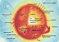 Sun parts, English
 -
 Sun parts, Svedish
 -
 Sun parts,blank with numbers
 -
 Sun parts,blank with numbers (larger)


Request: Can you provide an Arabic version of this same file? if not then a blank version and i'll add the Arabic text--باسم (talk) 15:50, 3 September 2012 (UTC)
Graphist opinion(s): I removed the text and added numbers. So various languages can be added for discription.--Hic et nunc (talk) 13:53, 4 September 2012 (UTC)
- Not bad, can you do something with this? -- πϵρήλιο ℗ 14:32, 4 September 2012 (UTC)
- On first view it seems to be the same pic, but enlarged. On second view there is a different description and a additional object at the left lower corner. Is it the same object or is it the sun? I downloaded it and tried some things. I think it could be usable. The source seems to be NASA too. But I'm not sure about the possible title of the jpeg if I would upload it.--Hic et nunc (talk) 17:05, 5 September 2012 (UTC)
- Thank you :-)--باسم (talk) 01:56, 5 September 2012 (UTC)
- Not bad, can you do something with this? -- πϵρήλιο ℗ 14:32, 4 September 2012 (UTC)
![]() Done How suggested I added a larger version. It would be nice if you could add the arabic desription.--Hic et nunc (talk) 20:59, 11 September 2012 (UTC)
Done How suggested I added a larger version. It would be nice if you could add the arabic desription.--Hic et nunc (talk) 20:59, 11 September 2012 (UTC)
Crop and stretch the chart[edit]
-
 Graph of top-20 most populated places in Buldhana district

Request: Please make a crop. Wide stretch the image to make it look better and easy to read.. --Shivashree (talk) 08:05, 26 September 2012 (UTC)
Graphist opinion(s):
- I adjusted the margins and did some light fixes, but the chart in this image is actually a large embedded PNG (not vector data). AnonMoos (talk) 13:06, 26 September 2012 (UTC)
- Suggest you redo this using w:en:Template:Vertical bar chart. Matt (talk) 14:33, 8 November 2012 (UTC)
- I have created a chart using the template which now resides on the enwiki talk page for Buldana district. NikNaks talk - gallery - wikipedia 17:16, 24 March 2013 (UTC)
- Suggest you redo this using w:en:Template:Vertical bar chart. Matt (talk) 14:33, 8 November 2012 (UTC)
E. coli Pathovars[edit]
-
 pathogenic E. coli at the intestinal mucosa,
blurry JPEG

Request: It would be great if this could be redone in a vector graphic. I suggest to split it up into five separate images. See http://www.nature.com/nrmicro/journal/v8/n1/fig_tab/nrmicro2265_ft.html for some scientific accurate inspiration. This would really help to make the difference between EHEC, ETEC, EPEC, EIEC, EAggEC easily understandable for the general public. Matt (talk) 14:23, 8 November 2012 (UTC)
Graphist opinion(s):
![]() Request taken by Frédéric (talk)
Request taken by Frédéric (talk)


Bad rendering my file[edit]
-
 Simple introduction osmosis between areas of high and low concentrations of molecules.

Request:Wikipedia bad renders gdarients in my file, I tried to do something, but it no works... Is there somebody who can repair it? Adam Rędzikowski (talk) 04:36, 5 February 2013 (UTC)
- To be precise, it's the three \-slanted corpuscles, which should look more like the two /-slanted ones... AnonMoos (talk) 08:32, 5 February 2013 (UTC)
Graphist opinion(s): Messed with it for a while and it seems to be fixed now. NikNaks talk - gallery - wikipedia 18:39, 23 March 2013 (UTC)
![]() Done
Done
- Only one small technical question: What did you change? What was causing the render bug? Or did you fix it by trial and error? -- Patrick87 (talk) 14:37, 25 March 2013 (UTC)
- I have no idea what was causing the error! I simply removed the broken corpuscles and replaced them with duplicates of the ones that rendered correctly until it worked. No wizardry here! NikNaks talk - gallery - wikipedia 14:49, 25 March 2013 (UTC)
- Only one small technical question: What did you change? What was causing the render bug? Or did you fix it by trial and error? -- Patrick87 (talk) 14:37, 25 March 2013 (UTC)
Sede vacante[edit]
-
 Ugly svg.
 -
 Sede vacante (draft)
 -
 new svg


Article(s): Sede vacante and many others.
Request: Hello. The coat of arms of the sede vacante in svg, much used in these days, is really bad done. Visually and graphically is flat and ugly. There is a better version of the same coat of arms, but it's in jpg. Can you do something to improve the svg version? Thank you! 95.232.198.247 (talk) 01:38, 6 March 2013 (UTC) (RiccardoP1983 on italian Wiki)
Graphist opinion(s):
Some would say that it's the JPEG which is of poor quality (see Commons:Deletion requests/File:Sede vacante.jpg). The SVG has some quirks, but it pretty much accomplishes what it sets out to do (whether or not that's adequate to represent the Vatican symbol), while the same could not be said of the JPEG... AnonMoos (talk) 18:59, 9 March 2013 (UTC)
- Is it possible improve the SVG, making its details similar to the JPG?--Vanzanten (talk) 21:10, 9 March 2013 (UTC)
- There is enormous scope in the subject, a LOT of different styles and choices. Penyulap ☏ 23:39, 9 March 2013 (UTC)
- Good, who can improve it?--82.52.128.132 00:03, 10 March 2013 (UTC)
- A GENIUS ! :) Penyulap ☏ 00:30, 10 March 2013 (UTC)
- The symbol appears in various forms on coins and all sorts of things. The Vatican is displaying a rather crude version on it's website at the moment, so there is not much to compete with. Penyulap ☏ 00:33, 10 March 2013 (UTC)
- This is a draft, the possibilities are very wide, it's been around for a long time, there are many images on coins, in cuts, in marble ! I don't know what to do with the key shape as yet, but I figure I better put up the draft as another option to put to use. I'll annoy the shape now and then, please make suggestions, comments, feedback. Penyulap ☏ 12:04, 12 March 2013 (UTC)
- The symbol appears in various forms on coins and all sorts of things. The Vatican is displaying a rather crude version on it's website at the moment, so there is not much to compete with. Penyulap ☏ 00:33, 10 March 2013 (UTC)
- A GENIUS ! :) Penyulap ☏ 00:30, 10 March 2013 (UTC)
- Good, who can improve it?--82.52.128.132 00:03, 10 March 2013 (UTC)
- There is enormous scope in the subject, a LOT of different styles and choices. Penyulap ☏ 23:39, 9 March 2013 (UTC)
Anyway, the separate version File:Sede_vacante.svg was uploaded, and we're now out of sede vacante, so the urgency is gone... AnonMoos (talk) 15:37, 14 March 2013 (UTC)
- I was still waiting for a genius to arrive (I suck at svg) but I am happy to do more. Penyulap ☏ 16:23, 14 March 2013 (UTC)
- The 3D ray-traced approach is visually interesting, but it has little to do with established conventions of heraldic artwork... AnonMoos (talk) 00:00, 15 March 2013 (UTC)
- Nor does Jpg, Svg or the Internet in general, but today, the Vatican is using all three. I guess you can't stop progress. Penyulap ☏ 10:48, 19 March 2013 (UTC)
- I wasn't referring to technical image formats, but to artistic styles. AnonMoos (talk) 15:43, 19 March 2013 (UTC)
- Well, the Sede vacante has often turned up on coins, they don't work so well here, and as for works in marble like this well, just don't get me started on the problems with marble so we're stuck with computer FX and photographic images until advances like smell-o-vision from futurama arrive. I think the thrust of your argument is that because all previous images have been entirely 2-D then all future images should follow suit. I don't see it. I see the relentless march of svg into places it just _should_not_go_ and don't say a word, because it's like, ok I guess. As for artistic style I was asking for input there, and haven't had any. Plus, seems like demand has died. Penyulap ☏ 06:20, 21 March 2013 (UTC)
- I wasn't referring to technical image formats, but to artistic styles. AnonMoos (talk) 15:43, 19 March 2013 (UTC)
- Nor does Jpg, Svg or the Internet in general, but today, the Vatican is using all three. I guess you can't stop progress. Penyulap ☏ 10:48, 19 March 2013 (UTC)
- The 3D ray-traced approach is visually interesting, but it has little to do with established conventions of heraldic artwork... AnonMoos (talk) 00:00, 15 March 2013 (UTC)
WikiDittoThink[edit]

Request: Convert to svg, maybe a bit more narrow (vertical) as well. --Penyulap ☏ 06:46, 11 March 2013 (UTC)
Graphist opinion(s): What is this for exactly? NikNaks talk - gallery - wikipedia 19:47, 23 March 2013 (UTC)
- help editors blow off a bit of steam now and then, I come across a lot of tension between editors. It might help prompt people to do less lynching and more thinking, but maybe I hope in vain. It would scale a lot better in svg to the small conversational sizes that don't overwhelm discussions.
- The message is the important thing, in a vertical format, not the colours fonts or layout or even the figures, any figures would be ok. Penyulap ☏ 05:34, 24 March 2013 (UTC)
- I still don't understand where this would be used or why this is necessary. NikNaks talk - gallery - wikipedia
- That's cool, it's far from necessary and would be used by only a few people who understand it, if any. I wouldn't worry about it. Penyulap ☏ 12:32, 24 March 2013 (UTC)
- Then please mark this as resolved so that we can archive it. With all due respect, we are not here to make comedy images for a small audience! This page is full of requests of late and it is important that it isn't unnecessarily clogged. Sorry if I sound harsh!! NikNaks talk - gallery - wikipedia 17:30, 24 March 2013 (UTC)
- Amazing as it may seem, I have noticed that it's full of requests of late.
- As for the request, I think I'll wait for another opinion. Penyulap ☏ 19:00, 24 March 2013 (UTC)
- Why don't you draw it yourself? The image is quite simple and should be easy to do even with little to no knowledge of vector graphics drawing. It's a rather ungrateful work to do since it will never be included in any article, that's probably why nobody has taken it yet (including NikNaks and me). -- Patrick87 (talk) 19:06, 24 March 2013 (UTC)
- I like rendering at the moment, and Gimp. I'm not so much into inkscape yet, I can in a pinch, but the image is so easy and the concept so popular it's bound to catch the eye of someone with the skills and the frustration from experiencing it recently. Then again, I notice a LOT of editors lately who seem to experience pain whenever they come across humour, it seriously gets up their noses, why I was discussing it here just the other day.
- I find not every request at the FX lab needs to be done right away, some I take my time with, some I don't even do. But if it worries you that much, you know, about tidying up the page, I'll be the first to delete it entirely when the other requests on the page are resolved, that way it'll be just nice and lovely and tidy. Unless of course the humour causes you pain, in which case I'll delete it right away, so tell me, does it give you like stabbing sharp pain in the sinuses, or double vision, or make it hard to think generally ? Penyulap ☏ 19:24, 24 March 2013 (UTC)
- I just wanted to help, but you seem to be a little resistant... My personal experience is, that requests not taken after about a week are unlikely to be resolved but if you want to wait feel free to do so. And please: Don't always get things too personal and cut down on that suggestive, nearly sarcastic writing. -- Patrick87 (talk) 19:38, 24 March 2013 (UTC)
- Well that's good advice and I'm grateful for it, now if by way of thank-you I can offer you a little in return, in the graphics lab, the best response to a request might not be "Why don't you draw it yourself?", just sayin' :) Penyulap ☏ 19:42, 24 March 2013 (UTC)
- I just wanted to help, but you seem to be a little resistant... My personal experience is, that requests not taken after about a week are unlikely to be resolved but if you want to wait feel free to do so. And please: Don't always get things too personal and cut down on that suggestive, nearly sarcastic writing. -- Patrick87 (talk) 19:38, 24 March 2013 (UTC)
- Why don't you draw it yourself? The image is quite simple and should be easy to do even with little to no knowledge of vector graphics drawing. It's a rather ungrateful work to do since it will never be included in any article, that's probably why nobody has taken it yet (including NikNaks and me). -- Patrick87 (talk) 19:06, 24 March 2013 (UTC)
- Then please mark this as resolved so that we can archive it. With all due respect, we are not here to make comedy images for a small audience! This page is full of requests of late and it is important that it isn't unnecessarily clogged. Sorry if I sound harsh!! NikNaks talk - gallery - wikipedia 17:30, 24 March 2013 (UTC)
- That's cool, it's far from necessary and would be used by only a few people who understand it, if any. I wouldn't worry about it. Penyulap ☏ 12:32, 24 March 2013 (UTC)
- It is nothing to do with the humour as you well know. It just seems unfair of you to request an image which would really only be used by yourself and one or two others. However, I echo the call for you to try it yourself. It really isn't a hugely complex image and would be ideal for learning the program. NikNaks talk - gallery - wikipedia 11:15, 25 March 2013 (UTC)
- Humour varies from place to place and culture to culture. Thank goodness that people are not all exactly the same or you wouldn't need a mirror in the morning you'd just look at your partner to see an exact copy of yourself. Eeeew. I think the image is funny, no doubt there are other people out there who think it's funny, not every successful comedy show/movie/book/comic appeals universally to all people everywhere and that is OK, it doesn't make them any less of a commercial and cultural success.
- I still don't understand where this would be used or why this is necessary. NikNaks talk - gallery - wikipedia
- As for the request, I haven't seen anything to indicate that you guys have to answer it, I don't believe any request is compulsory and I have seen many just go unanswered, get marked as 'stale' and eventually get archived. I can't see why this simple request needs to be such a great conversation starter, maybe it's because it does not appeal to the mainstream W:Systemic bias. Honestly, I feel the same way when I see a lot of what passes for 'humour' coming out of hollywood, a lot of it is so banal it makes me want to vomit. But I don't mind other people enjoying it, good luck to them, there is something for everyone. As for telling me 'It is nothing to do with the humour as you well know' well, my natural reaction is to say 'bullshit' but I won't, because that's potty talk. I will point out that you are not qualified to tell me what I do or do not think, or to know what I do or do not know, what I do or don't find funny, and I sure as hell won't let you choose my partner for me. Sorry, but your opinions are your own and you're welcome to have them and air them, but don't tell me what I do or don't know. This image is quite funny to me, and I expect others as well. Just because it won't go viral across the Internet doesn't mean it will never get a laugh. Not all jokes go viral and that is ok. Penyulap ☏ 11:41, 25 March 2013 (UTC)
- You seem to have missed my point. It is nothing to do with the humour of the piece. It is the fact that the image would have a very limited audience and scope and seems to be something only you and a few others would actually use. If you would like me to find some Inkscape tutorials, do say so and I can point you in the right direction. NikNaks talk - gallery - wikipedia 12:29, 25 March 2013 (UTC)
- Yes, well, I think were having a heated AGREEMENT here. I've already mentioned it '..would be used by only a few people who understand it, if any' so if you can't stop agreeing with me soon, I think we'll go on agreeing for some time before an argument breaks out there.
- Thanks for the offer of tutorials, I can find those on my own no problem. The request is for vectorisation/improvement and it is NOT COMPULSORY. Do you think we can yell at each other that it is NOT COMPULSORY to answer this request so we can have a heated agreement there as well ? I think it'll move us closer to an end to the seemingly endless discussion this is becoming. :) Penyulap ☏ 12:52, 25 March 2013 (UTC)
- If the image is not necessary to improve an article or a template or whatever, then I would argue that such a request shouldn't be made here. If that is not the opinion of the other editors on this page, then I will not repeat this argument in future. NikNaks talk - gallery - wikipedia 14:29, 25 March 2013 (UTC)
- You seem to have missed my point. It is nothing to do with the humour of the piece. It is the fact that the image would have a very limited audience and scope and seems to be something only you and a few others would actually use. If you would like me to find some Inkscape tutorials, do say so and I can point you in the right direction. NikNaks talk - gallery - wikipedia 12:29, 25 March 2013 (UTC)
- As for the request, I haven't seen anything to indicate that you guys have to answer it, I don't believe any request is compulsory and I have seen many just go unanswered, get marked as 'stale' and eventually get archived. I can't see why this simple request needs to be such a great conversation starter, maybe it's because it does not appeal to the mainstream W:Systemic bias. Honestly, I feel the same way when I see a lot of what passes for 'humour' coming out of hollywood, a lot of it is so banal it makes me want to vomit. But I don't mind other people enjoying it, good luck to them, there is something for everyone. As for telling me 'It is nothing to do with the humour as you well know' well, my natural reaction is to say 'bullshit' but I won't, because that's potty talk. I will point out that you are not qualified to tell me what I do or do not think, or to know what I do or do not know, what I do or don't find funny, and I sure as hell won't let you choose my partner for me. Sorry, but your opinions are your own and you're welcome to have them and air them, but don't tell me what I do or don't know. This image is quite funny to me, and I expect others as well. Just because it won't go viral across the Internet doesn't mean it will never get a laugh. Not all jokes go viral and that is ok. Penyulap ☏ 11:41, 25 March 2013 (UTC)
- Done @ File:Metoo.svg -FASTILY (TALK) 03:38, 27 March 2013 (UTC)
- thank you very much for your help Fastily, that's awesome. Penyulap ☏ 07:45, 27 March 2013 (UTC)
SVG flag dimensions for: "Flag of Montgomery County, Maryland.svg"[edit]
-
 Flag of Montgomery County, Maryland. The colors are accurate, but dimensions are slightly off. Official specifications can be found here.

Article(s): Montgomery County, Maryland
Request:
- The current SVG flag's dimensions are not completely accurate, in regards to proportions. Colors are accurate, but dimensions (with the rings and fleur-de-lis) are not. Official specifications can be found here. May somebody please edit the SVG so it is identical to the linked GIF, in terms of dimensions/proportions? Also, there appears to be some aliasing or something around the edges, where the blue and red meet. I don't know whether or not this or the usual. I'd do these myself, but unfortunately, my knowledge of editing SVGs is very limited. Cheers! Illegitimate Barrister (talk) 16:50, 4 May 2013 (UTC)
Graphist opinion(s):
- Done Dewclouds (talk) 20:51, 4 May 2013 (UTC)
 Not done Thanks a bunch for fixing the proportions of the flag itself, however, the dimensions of the fleur-de-lis and rings are still not fixed. Sorry for not mentioning this earlier, apologies. I have updated the external link with an image of the exact dimensions of the rings and fleur-de-lis. Regards, Illegitimate Barrister (talk) 20:58, 4 May 2013 (UTC)
- Don't worry about the confusion; I should probably have thought of that. Anyway, the proportions of the fleur-de-lis and rings have been fixed, along with the crenelated line. The construction map doesn't show how wide the fleur-de-lis and rings should be, but the page says they should be proportional, so I hope I haven't misunderstood anything. Dewclouds (talk) 22:11, 4 May 2013 (UTC)
- Done Looks like everything's fixed. Thanks again! Illegitimate Barrister (talk) 22:34, 4 May 2013 (UTC)
Transparency issues for: Coat of arms of Montgomery County, Maryland.svg[edit]
-
 Coat of Arms of Montgomery County, Maryland. There are places within the seal that should be transparent, but rather, they are opaque.

Article(s): Montgomery County, Maryland
Request:
- There are places within the seal that should be transparent, but rather, they are opaque. When viewed against a checkerboard background, these places can be seen. Please fix them so the crevices are transparent. Thank you! Illegitimate Barrister (talk) 23:48, 6 May 2013 (UTC)
Graphist opinion(s):
- Request taken by Patrick87 (talk) 00:11, 7 May 2013 (UTC)
- Done Should be fixed now. --Patrick87 (talk) 01:01, 7 May 2013 (UTC)
- Done Looks like it is! Thanks, danke! Illegitimate Barrister (talk) 02:18, 7 May 2013 (UTC)
Tatmadaw[edit]

_of_Myanmar.svg)
Request: Recreate as vector version. Also vectorize the following flags seen on en:Myanmar Army at enwiki, thanks. --112.210.71.220 00:17, 9 June 2012 (UTC)
Graphist opinion(s):
![]() Request taken by Lpagola (talk): I'm working on a vectorial version. It has some details to improve yet, but is uploaded at File:Myanmar Armed Forces Emblem.svg--Lpagola (talk) 21:55, 28 March 2013 (UTC)
Request taken by Lpagola (talk): I'm working on a vectorial version. It has some details to improve yet, but is uploaded at File:Myanmar Armed Forces Emblem.svg--Lpagola (talk) 21:55, 28 March 2013 (UTC)
Improvement of portrait painting[edit]
-
The current file
-
by Penyulap
Request: The painting above is being used in the wikipedia article w:en:Uudam because there's currently no free (CC, PD etc.) photo of Uudam out there. However, the quality is not really good (as you see?). Any improvement would be nice. Non-free photos can be found e. g. at his official facebook profile at http://www.facebook.com/pages/Uudam-Michael-Wudamu/136715259767442 --Flekstro (talk) 15:32, 7 September 2012 (UTC)
Graphist opinion(s):Like this ? Penyulap ☏ 17:04, 30 March 2013 (UTC)
- Excellent! This is a far, far better image than the original. I hope it's okay from a copyright point of view so we can finally close this!! NikNaks talk - gallery - wikipedia 14:54, 1 April 2013 (UTC)
- It's an interesting issue, if the manner in which de minimus and transformation applies to the medium we'd have a LOT more potential work to do :D
- So far I've run into what I feel are slightly corporate perspective lawyer-types, rather than middle of the road break new ground in common-sense docs and guidelines types. Doesn't matter, there is enough to do elsewhere.
- Also, I've just reduced the original which makes it a lot better. If you don't get too close to an oil painting you don't realise how ugly it really is. Penyulap ☏ 15:57, 1 April 2013 (UTC)
- Thanks a lot Penyulap! I've just put your work on the above-mentioned En. Wikipedia article. Sorry for reacting a bit late. I'm quite confident this wouldn't pose any copyright issues as hardly any originality of the photograph you used is still noticeable.--Flekstro (talk) 18:41, 1 April 2013 (UTC)
- You're welcome, though it may not be finished yet if people are unable to adjust to the idea of using software to draw, but I have other ideas as well. Penyulap ☏ 20:02, 1 April 2013 (UTC)
- Thanks a lot Penyulap! I've just put your work on the above-mentioned En. Wikipedia article. Sorry for reacting a bit late. I'm quite confident this wouldn't pose any copyright issues as hardly any originality of the photograph you used is still noticeable.--Flekstro (talk) 18:41, 1 April 2013 (UTC)
Renderbug - Please make the image viewable[edit]
-
 At the moment just rendered as black and white..

Request: Please validate this image, that the Wikimedia rendering works correct. With Inkscape I have no problems. --Pyfisch (talk) 16:23, 12 February 2013 (UTC)
Graphist opinion(s): It's pretty much fixed -- the original file was trying to do something clever with centrally-defined styles which probably was a little too clever. AnonMoos (talk) 14:50, 17 February 2013 (UTC)
- Thanks a lot. But in the bottom right corner is the text align incorrect. You can't read it because it is behind the circles. Pyfisch (talk) 19:53, 19 February 2013 (UTC)
- Almost none of the text is readable unless you view the image at approaching full 2000px resolution. I may eventually get around to trying to fix it... AnonMoos (talk) 15:43, 19 March 2013 (UTC)
- Done I just uploaded a new version of the file Rendering should be fully fixed now. Anything left to do or can we mark this as resolved? -- Patrick87 (talk) 14:15, 24 March 2013 (UTC)
Abkhazia recontsruction[edit]
-
 Original file
 -
Corrected symmetrical shield

Request: The original file has problems with the horseman and stars. I have recreated a symmetrical shield (the previous was not), but I need help applying the horse figure and the stars. Sources for the horseman and stars are [13] and [14], and it would be great if they could be redrawn like this. Please apply any changes to my temp file on the right, then once everything is complete it can be applied to the original file on the left. Thank you. Fry1989 eh? 00:01, 14 February 2013 (UTC)
Graphist opinion(s): Is this done? NikNaks talk - gallery - wikipedia 17:40, 23 March 2013 (UTC)
- I've had another go based on the first source and copied the bow from the other SVG. It seems like it might need to be a bit more compressed vertically. What do you think? NikNaks talk - gallery - wikipedia 16:30, 24 March 2013 (UTC)
- IDK what to say really. I appreciate the effort, but honestly it's just such a hideous emblem the way the Abkhazian Government has chosen to make it look. Fry1989 eh? 16:39, 24 March 2013 (UTC)
- It doesn't matter if it's a hideous design! I thought the point was to make our version accurate. :P NikNaks talk - gallery - wikipedia 17:17, 24 March 2013 (UTC)
- I think that's some kind of ... ahem ... dagger on the warrior's side? I'd suggest you make it look more like one (a dagger), similar to the reference image here. If you look closely, it (the dagger) is in one piece and more pointed at the bottom. (Indeed, what a horrible design!) -- Orionist ★ talk 20:47, 24 March 2013 (UTC)
- Ah, I see. I wasn't really sure what that was meant to be but it does make sense now you say it! I've updated the SVG. NikNaks talk - gallery - wikipedia 14:41, 25 March 2013 (UTC)
- I think that's some kind of ... ahem ... dagger on the warrior's side? I'd suggest you make it look more like one (a dagger), similar to the reference image here. If you look closely, it (the dagger) is in one piece and more pointed at the bottom. (Indeed, what a horrible design!) -- Orionist ★ talk 20:47, 24 March 2013 (UTC)
- It doesn't matter if it's a hideous design! I thought the point was to make our version accurate. :P NikNaks talk - gallery - wikipedia 17:17, 24 March 2013 (UTC)
- IDK what to say really. I appreciate the effort, but honestly it's just such a hideous emblem the way the Abkhazian Government has chosen to make it look. Fry1989 eh? 16:39, 24 March 2013 (UTC)
Can't we have just one correct picture of something? (Coat of arms of Pope Francis)[edit]
moved from the village pump by Penyulap ☏ 16:13, 26 March 2013 (UTC)
-
 1
1 -
 2
2 -
3
-
4
-
 5
5 -
6
-
 7
7


.svg)
.svg)
Request: I wonder if we can have only one correct representative of the coat of arms of Pope Francis. There are now 10 images in the category, and now none of them look exactly like the one in the official Vatican page. Previously, there were 3 files (this, this, and this) which looked very similar to the first released coat of arms, and all the file creators seemed to want their pictures present in Commons and try to change the pictures to be very similar to one another. I mean, why can't we have just one file for this? Sentausa (talk) 16:04, 26 March 2013 (UTC)
Graphist opinion(s): Well, for me, the PNGs and JPEG should go as they're of equal quality to the SVGs at best. Number 7 is gorgeous and I would say it should be kept as an alternative depiction, for artistic merit if nothing else. Numbers 4, 5 and 6 above all use the wrong style of keys; the others are all essentially identical, so I would say we should either delete all but the first uploaded, or instead keep the one with the most appropriate name. Then we can touch it up to match the Vatican's version as closely as we desire. I do predict edit warring, whatever happens! NikNaks talk - gallery - wikipedia 16:48, 26 March 2013 (UTC)
Unfortunately, there was a mass-deletion nomination (Commons:Deletion requests/Fictional Papal Arms) which was made prematurely by an anonymous IP and largely supported with poorly-reasoned arguments, so that it hasn't brought much clarity to the overall situation. It's hard to see how there can be too much cleanup without uploading new images until the deletion nomination is somehow resolved.
In any case, in traditional European heraldry, there's not necessarily only "one correct picture" of a coat of arms -- many different artistic renderings based on the authoritative textual blazon may all be acceptable... AnonMoos (talk) 18:19, 26 March 2013 (UTC)
- I quite agree that there is not one "correct" image, hence why I see no reason to remove the last of the displayed SVGs. However, the others are so very similar it really doesn't seem necessary to have six different copies. NikNaks talk - gallery - wikipedia 19:08, 26 March 2013 (UTC)
- Actually none of them looks like the image found on Vatikan's homepage: http://www.vatican.va/holy_father/francesco/elezione/stemma-papa-francesco_it.html. Probably they should be deleted all together or at least be marked as imprecise. -- Patrick87 (talk) 19:13, 26 March 2013 (UTC)
- The first three are all very close to it, but could all be improved to be more like it, yes. But which one do we improve when there are so many nearly identical copies? I think that is the question here. NikNaks talk - gallery - wikipedia 19:26, 26 March 2013 (UTC)
- Actually none of them looks like the image found on Vatikan's homepage: http://www.vatican.va/holy_father/francesco/elezione/stemma-papa-francesco_it.html. Probably they should be deleted all together or at least be marked as imprecise. -- Patrick87 (talk) 19:13, 26 March 2013 (UTC)
- No. 1 is up-to-date and a Valid SVG. But still the dscussion continues as the image shows now a fruit-like spikenard which wont be the final version. Hopefully there is a senior heraldist working on this in the Vatican now. --maxxl2 - talk 21:59, 26 March 2013 (UTC)
- As expected, #2 has now borrowed the banner from #1. NikNaks talk - gallery - wikipedia 19:50, 27 March 2013 (UTC)
- No. 1 is up-to-date and a Valid SVG. But still the dscussion continues as the image shows now a fruit-like spikenard which wont be the final version. Hopefully there is a senior heraldist working on this in the Vatican now. --maxxl2 - talk 21:59, 26 March 2013 (UTC)
Discussion has moved here, and there seems to be no requirement for editing the images at this point, so I am marking this as resolved. If the arms need to be updated or combined once the DR is resolved, we can re-open or re-post this. NikNaks talk - gallery - wikipedia 12:19, 4 April 2013 (UTC)
NATO Military structure[edit]
-
 Current used File
 -
 new
new


Request: This NATO structure Diagram is outdated! It should be updated and posibly saved as an SVG so various translations can be made easily. The official structure is listed here: [15] (only the Military structure part). Furthermore please do not add the deactivated HQ's to this diagram. Regards --Flor!an (talk) 09:16, 31 March 2013 (UTC)
Graphist opinion(s):
![]() Request taken by Snaevar (talk)
Request taken by Snaevar (talk)
The file is at File:NATO Military structure.svg.--Snaevar (talk) 20:58, 11 April 2013 (UTC)
- There are two minor mistakes in it!
- The Military Committee is on the same "level" as International Military Staff or Allied Command Operations (ACO) and
- NATO Headquarters Skopje (NHQSk) has no connection to Joint Headquarters Lisbon (even wrong icon on the nato website) --Flor!an (talk) 09:14, 12 April 2013 (UTC)
- The "main" Headline could be "Military Structure of NATO". Furthermore, can you please align the names of the sub-divisions of the International Military Staff either to the left or center them? --Flor!an (talk) 09:19, 12 April 2013 (UTC)
- There are two minor mistakes in it!
- I have fixed those issues. I decided to center the names of the sub-divisions of the International Military Staff.--Snaevar (talk) 20:39, 14 April 2013 (UTC)
- Thank you very much! --Flor!an (talk) 14:42, 15 April 2013 (UTC)
![]() Done
Done
Skjár Einn[edit]
-
 Logo of the Icelandic TV channel "Skjár einn"

Request: Remove the text "Einfaldlega betra en RÚV". --Snaevar (talk) 18:31, 4 April 2013 (UTC)
![]() Done: --maxxl2 - talk 18:40, 4 April 2013 (UTC)
Done: --maxxl2 - talk 18:40, 4 April 2013 (UTC)
- Thanks.--Snaevar (talk) 21:14, 11 April 2013 (UTC)
unwanted change of font in SVG files[edit]
-
 icon for problems with upload, has a problem
 -
 variant, this one is fine
 -
 variant, has a problem


Request: For the first and last images, in the thumbnails made by the Mediawiki software, the exclamation point looks different from the way it looks when I view the vector images in my browser, or in Inkscape. I used three different fonts; Upload-problem2.svg displays correctly. It's as though the ones with the problem are shown in a font that I didn't intend. --Rybec (talk) 03:11, 7 April 2013 (UTC)
Graphist opinion(s):
- Should be fixed now: MediaWiki didn't display the font "OpenSymbol", so I converted the font to a path with Inkscape. I'm going to do a further simplification... --Ricordisamoa 06:36, 7 April 2013 (UTC)
HSSWikidata![edit]
-
 Wikidata Logo
 -

Request: Well, I do not find a HS version for Wikidata logo (the one with the grey halo, like here). Is it possible to do it ? Thanks a lot ! — Preceding unsigned comment added by Cgolds (talk • contribs) 15:34 7 April 2013 (UTC)
![]() Done --maxxl2 - talk 16:46, 7 April 2013 (UTC)
Done --maxxl2 - talk 16:46, 7 April 2013 (UTC)
- Just wanted to start this myself when I saw you already uploaded an image: What do you think of enlarging the "barcode" to actually fill the circle? Like most of HS icons#Geography HS icons that show a (normally) rectangular flag? -- Patrick87 (talk) 16:51, 7 April 2013 (UTC)
- As you may have experienced already before: i am old school ;). That means i believe in neat blank spaces around items to stand free. If you find that it is required to make it more common with the other icons of this category, pls feel free to edit. But pls keep in mind: its a barcode and no flag - a barcode - on whatever packaging it is - is never cut to fit in another shape than rectangular. --maxxl2 - talk 17:01, 7 April 2013 (UTC)
- Also eigentlich ein klares nein. Barcode ist wo auch immer rechteckig und niemals beschnitten, weil es ihn dann in seiner Funktion beeinträchtigen würde. Also besser im Originalzustand belassen. --maxxl2 - talk 17:07, 7 April 2013 (UTC)
- Yes, I see your point and it's far from optimal to change the shape. However it's hardly visible as an icon in the current size (
 ) that's why I would have changed it. -- Patrick87 (talk) 17:10, 7 April 2013 (UTC)
 - If you still do not want to change it to circular shape you should at least increase the size of the barcode to the maximum (reasonably) possible and check the centering (it is shifted down a little right now). -- Patrick87 (talk) 17:16, 7 April 2013 (UTC)
- Yes, I see your point and it's far from optimal to change the shape. However it's hardly visible as an icon in the current size (
- Kein Problem. Wenn Du es möchtest, kannst Du es gerne ändern. Auf los, geht's los. :) --maxxl2 - talk 17:33, 7 April 2013 (UTC)
- No problem from my side, too. I changed it accordingly. Just didn't want to change "your" image without asking you first. -- Patrick87 (talk) 17:45, 7 April 2013 (UTC)
- Das ist ja sehr nett und höflich von dir, aber an dieser Stelle hier doch sehr ungewöhnlich. Also war ich zunächst verdutzt. Die Lizenz lautet doch auf "PD" und damit ist jede Bearbeitung freigestellt. Wenn ich eine Datei hier einstelle, so ist das für mich, wie wenn ein erwachsenes Kind das Haus verlässt. Ich habe keine Rechte und Ansprüche mehr. Also hau rein und machet - ich bin da nicht empfindlich. --maxxl2 - talk 17:57, 7 April 2013 (UTC)
- Solange der ursprünglich Autor noch "um die Ecke" ist, finde ich es nur gerecht wenn man ihn die Datei selber fertigstellen lässt. Mit public domain hast du zwar Recht, nur müsste man streng genommen ja jede Änderung unter neuem Dateinamen und mit neuen Infos zu Autor, Lizenz, etc. hochladen statt die alte Datei einfach zu überschreiben. Von 100 nur leicht unterschiedlichen Wikidata-Logos hat aber natürlich auch niemand was. -- Patrick87 (talk) 18:15, 7 April 2013 (UTC)
- Merci, Thank you, Vielen Dank... And sorry for the absence of signature, I do not know how I did (not) do this. Cordialement, --Cgolds (talk) 17:04, 8 April 2013 (UTC) (this time...)
-
 A700 side and front view.gif English version
 -

-
 Adam a700 fr.png French version
 -


Request: Can you replace the English text in the box with the following in French: réservoir externe central de carburant. If you want to convert either image to SVG or PNG, please do so (not sure which is better in this case). Thanks, this should be an easy one.--Oaktree b (talk) 16:01, 8 April 2013 (UTC)
![]() Done: --maxxl2 - talk 16:33, 8 April 2013 (UTC)
Done: --maxxl2 - talk 16:33, 8 April 2013 (UTC)
Some signatures[edit]
-
 Denis Diderot signature Done
 -
 Kārlis Ulmanis signature Done
 -
 Vaira Vīķe-Freiberga signature Done
 -
 Valdis Zatlers signature Done

Article(s): en:Denis Diderot, en:Kārlis Ulmanis, en:Vaira Vīķe-Freiberga, en:Valdis Zatlers
Request:
- Could somebody convert it to svg? -- Edgars2007 (talk) 07:42, 13 April 2013 (UTC)
Graphist opinion(s):
I'm doing the Kārlis Ulmanis one. Rybec (talk) 07:39, 14 April 2013 (UTC)
- Thanks, Rybec. --Edgars2007 (talk) 08:02, 14 April 2013 (UTC)
- I did all four.

Rybec (talk) 19:41, 14 April 2013 (UTC)
- Thanks :) --Edgars2007 (talk) 12:19, 16 April 2013 (UTC)
Add an arrow[edit]
-
 Spinal and hip x-
 -
 Image with arrow


Article(s): Sacralization of the fifth lumbar vertebra
Request:
- The image has a "tagged" area to the right, showing "Sacralization of L5". Can someone put an arrow pointing there so that it shows up on the picture? Don't overwrite the old file, simply create a new one with an arrow pointing to the sacrilization part. Thanks! -- Oaktree b (talk) 17:19, 17 April 2013 (UTC)
Graphist opinion(s):
- Done I added an arrow and already put the image into the article. If anything still needs to be changed just leave a comment. -- Patrick87 (talk) 19:50, 18 April 2013 (UTC)
SVG patch[edit]
Request:
- Can someone fix the black patch showing up on File:Lion_Reintro_Sites.svg Shyamal (talk) 02:40, 25 April 2013 (UTC)
Graphist opinion(s):
- I think you already fixed this yourself now? Or is there anything left to do? -- Patrick87 (talk) 12:02, 26 April 2013 (UTC)
- Ah ok, I guess there was a cache problem. Shyamal (talk) 13:38, 26 April 2013 (UTC)
For the record, mysterious black rectangles in SVG files are almost always due to Inkscape "flowtext" nonsense, which can be diagnosed at Commons:SVG Check. AnonMoos (talk) 04:45, 28 April 2013 (UTC)
![]() Done
Done
Chord diagrams[edit]
-
 Sevenths chords by scale, needing cropping
 -
 Sevenths chords by circle of fifths (fourths) chord progression, needs cropping


Article(s): Major thirds tuning, Guitar chord
Request:
- Both images need cropping, to reduce whitespace, please. Thank you! :) Kiefer.Wolfowitz (Discussion) 23:02, 11 May 2013 (UTC)
Graphist opinion(s):
- Done, anything left to do? --Patrick87 (talk) 23:33, 11 May 2013 (UTC)
- Wow! Thanks so much!
- You might consider upgrading the morbidly obese pdf files to the new trim svg files on Guitar chord, if you have the time. (I've been blocked by a Belgian after objecting to the repeated smearing of a liberal editor as a Nazi.)
- Thanks so much for your great help! Kiefer.Wolfowitz (Discussion) 09:08, 12 May 2013 (UTC)
Coat of Arms of Riga[edit]
-
 'dodgy' svg version Done
 -
 COA of Riga
 -

-


Request:
- These should be redrawn as SVG. This has SVG already, but to my mind it is too bad. --Edgars2007 (talk) 08:01, 21 April 2012 (UTC)
Graphist opinion(s):
- Please explain what you mean by "too bad"? --Fred the Oyster (talk) 18:44, 22 April 2012 (UTC)
- OK, not too bad but the colour isn't correct (the below side and lions), also the lions are "interesting" in SVG version. --Edgars2007 (talk) 12:27, 23 April 2012 (UTC)
- Is this fixed now, or are there still issues? NikNaks talk - gallery - wikipedia 14:29, 28 March 2013 (UTC)
- Done: I did the File:Coat of Arms of Riga.svg by chance a few days ago (without remembering this request at all). Additionaly I recreated the File:Flag of Daugavpils.svg as SVG with the vector data of the COA already provided by McSush. Therefore the request should be resolved now. --Patrick87 (talk) 23:48, 30 May 2013 (UTC)
- Is this fixed now, or are there still issues? NikNaks talk - gallery - wikipedia 14:29, 28 March 2013 (UTC)
- OK, not too bad but the colour isn't correct (the below side and lions), also the lions are "interesting" in SVG version. --Edgars2007 (talk) 12:27, 23 April 2012 (UTC)
National Archives logos/seals[edit]
-

-
 Done (partially) – w:Information Security Oversight Office
 -

-
 Done – (Click through, thumbnail isn't displaying correctly for me)
 -
 SVG version
 -
 SVG version
similar image in black and white -
 SVG version
 -
 SVG version


Request:
- A few more logos for National Archives and Records Administration offices/agencies with articles which could use vectorizing.. Dominic (talk) 01:17, 30 June 2012 (UTC)
Graphist opinion(s):
- You'll be lucky to get the Information Security Oversight Office logo done in the 'chrome' finish as it's either going to be a pixel based filter effect, or a very time consuming gradient effect. Neither of which lend themselves well to SVG files. --Fred the Oyster (talk) 09:26, 1 July 2012 (UTC)
- Gradients actually tend to work better in vector graphics than raster, but even if someone were to go to the trouble with that image, it still wouldn't render properly until librsvg is replaced with something that works. -— Isarra ༆ 22:39, 1 July 2012 (UTC)
- This request is really old, but I have managed to find the vector versions of two of them: File:Office of Government Information Services logo.svg, and File:Controlled Unclassified Information Office logo.svg. --Wylve (talk) 18:16, 29 March 2013 (UTC)
- Gradients actually tend to work better in vector graphics than raster, but even if someone were to go to the trouble with that image, it still wouldn't render properly until librsvg is replaced with something that works. -— Isarra ༆ 22:39, 1 July 2012 (UTC)
Added B/W vectorized ISOO seal (File:Information_Security_Oversight_Office_Seal_bw.svg). Noticed that ISOO uses a seal based on the Department of State in their Briefing matrials, so based b/w ISOO seal off of the Dep't of state seal in use on WP (File:Department_of_state.svg). Ruxda (talk) 21:00, 31 March 2013 (UTC)
- Just for clarity: Two done, one partially, one not done. --Patrick87 (talk) 01:23, 17 May 2013 (UTC)
Added the Vecorized ERA logo. I think it's done? It was based on a different image from the Ntn'l archives which, now that I look at it, is ever so slightly different (http://img.youtube.com/vi/oRiY_3ojjho/0.jpg) Ruxda (talk) 07:15, 8 June 2013 (UTC)
- Looks OK I think. Given the fact that there is no high-res source this is probably the best that can be done. --Patrick87 (talk) 11:48, 20 June 2013 (UTC)
Yandex[edit]

http://uk.wikipedia.org/wiki/%D0%A4%D0%B0%D0%B9%D0%BB:Yandex_ua.png
http://yandex.st/morda-logo/i/l-logo-by.png
http://yandex.st/morda-logo/i/l-logo-kz.png
Request: Vectorize the Yandex logos in other languages... --112.210.125.202 04:45, 30 November 2012 (UTC)
Graphist opinion(s):
![]() Request taken by Snaevar (talk)
Request taken by Snaevar (talk)
![]() Done Please check whether I inserted the right letters. The files are: File:Yandex-tt.svg
File:Yandex ua.svg, File:Yandex-kz.svg and File:Yandex-by.svg.--Snaevar (talk) 23:32, 4 April 2013 (UTC)
Done Please check whether I inserted the right letters. The files are: File:Yandex-tt.svg
File:Yandex ua.svg, File:Yandex-kz.svg and File:Yandex-by.svg.--Snaevar (talk) 23:32, 4 April 2013 (UTC)
Irish road signs[edit]
-
 This sign has a transparent center. It should be white. Done
 -
 The 50 is in the wrong font. The "0" curves out in the middle when it should be straight. Done
 -
 Photo of sign to compare. Done
 -
 Number in the wrong font again. Done
 -
 This svg sign looks different to the other svg signs. Done
 -
 Other svg signs look like this. Done


Article(s): en:Road signs in Ireland
Request:
- I can't figure out what font the speed limit signs are supposed to be in. I thought it might have been Motorway, but the number "3" looks completely different [16][17] I was also wondering if those signs were fixed if the other speed limit signs could be made also:
- 120 km/h
- 100 km/h
- 80 km/h
- 60 km/h
- 30 km/h Thanks -- 86.40.38.133 16:06, 2 May 2013 (UTC)
Graphist opinion(s):
- Done How do those look? I didn't upload over the 50 sign cos it's under a viral license and I prefer PD –moogsi (talk) 08:04, 17 May 2013 (UTC)
- They look perfect. I didn't realize just how wrong the 50 sign actually was. 86.41.185.241 19:45, 21 May 2013 (UTC)
Please turn into SVG[edit]
-

-

-

-
 Monumentenschildje Westland.svg example


Article(s): Template:Municipal identification number Netherlands to protective sign
Request:
- Could these shields be turned into SVG's? Thanks in advance -- Vera (talk) 16:12, 12 May 2013 (UTC)
Graphist opinion(s):
- Request taken by Maxxl2 - talk 10:15, 1 June 2013 (UTC)
- Done--Maxxl2 - talk 14:42, 1 June 2013 (UTC)
- Thanks! Looks Awesome! --Vera (talk) 14:49, 1 June 2013 (UTC)
Coat of arms (Wappen) / Espinosa de los Monteros (Burgos) / German Wikipedia[edit]
The image of the coat of arms of Espinosa de los Monteros (Burgos) is too small
-
 JPG
JPG -
SVG
.svg)
Article(s): Espinosa de los Monteros (Burgos) (German Wikipedia)
Request:
- The image is too small. There would be a nicer one on Google-Images: 'Espinosa de los Monteros escudo' - I think it's free... -- ArnoldBetten (talk) 15:07, 22 May 2013 (UTC)
Graphist opinion(s):
- There's vector data available at http://escudosybanderas.burgos.es/espinosa-de-los-monteros. Sadly we can't use that because of copyright. --Patrick87 (talk) 15:54, 22 May 2013 (UTC)
New Zealand signs need text[edit]
.svg)

![[1]](/wiki/File:New_Zealand_RG-3.svg)
Request: Can someone good with text and fonds finish these signs for me? Thanks. Fry1989 eh? 19:04, 25 May 2013 (UTC)
Graphist opinion(s):
![]() Done: sorry, only lettering but no soups (fonds) on sale atm. --Maxxl2 - talk 20:19, 25 May 2013 (UTC)
Done: sorry, only lettering but no soups (fonds) on sale atm. --Maxxl2 - talk 20:19, 25 May 2013 (UTC)
- I meant fonts ;), didn't notice that typo darn it. Fry1989 eh? 22:25, 25 May 2013 (UTC)
- Well, I mean it is a typical Freudian mistake: typed while being hungry or thirsty--Maxxl2 - talk 12:16, 26 May 2013 (UTC). ;)
- I'm always hungry haha. Thank you for your help. Fry1989 eh? 18:10, 26 May 2013 (UTC)
- Well, I mean it is a typical Freudian mistake: typed while being hungry or thirsty--Maxxl2 - talk 12:16, 26 May 2013 (UTC). ;)
Create a UK WLM logo[edit]
-
 The current US logo
 -
 UK Logo


Article(s): WLM project in the UK
Request: The WLM project in the UK needs a logo, please, the same as File:WLM USA.svg, but with 'UK' instead of 'USA'. (note the file needs to be named '-United Kingdom' rather than '-UK' as a Ukrainian version already exists). Many thanks. --MichaelMaggs (talk) 08:53, 26 May 2013 (UTC) Graphist opinion(s):
![]() Done --Maxxl2 - talk 10:06, 26 May 2013 (UTC)
Done --Maxxl2 - talk 10:06, 26 May 2013 (UTC)
- Thank you very much. --MichaelMaggs (talk) 11:31, 26 May 2013 (UTC)
Template Image[edit]


Article(s): en:Template:Cr-BPL/Flags (this template used in en & bn wikipedia)
Request:
- Need SVG version for those 7 images. Can someone do it. -- Aftab1995 (talk) 14:19, 26 May 2013 (UTC)
Graphist opinion(s):
- Request taken by Patrick87 (talk) 15:03, 26 May 2013 (UTC). Are the official RGB values documented somewhere or should I take them from the JPGs with a pipette tool?
- There is no RGB values document. (suggestion:if u have confusion go here en:Category:Bangladesh Premier League teams - in this 7 Articles, u find every team logo & u can get some idea about color) And thanks for Taken :) --Aftab1995 (talk) 16:41, 26 May 2013 (UTC)
- Done:I created the SVGs (see second line of gallery). If you need further colors just let me now. --Patrick87 (talk) 16:47, 26 May 2013 (UTC)
- Ok. Thank you. --Aftab1995 (talk) 16:53, 26 May 2013 (UTC)
- There is no RGB values document. (suggestion:if u have confusion go here en:Category:Bangladesh Premier League teams - in this 7 Articles, u find every team logo & u can get some idea about color) And thanks for Taken :) --Aftab1995 (talk) 16:41, 26 May 2013 (UTC)
bn SVG file[edit]
-
SVG Version (English)
-
 SVG Version (Bengali)
 -
 PNG version (Bengali)
Request:
- Need a bn wikidata SVG logo. make a new images like this (File:Wikidata-logo-en.svg in the place of wikidata, add this উইকিউপাত্ত colour is same but i think text size is not same) see this, i made this one File:Wikidata-logo-bn-156px.png. Can anyone do it? -- Aftab1995 (talk) 17:50, 30 May 2013 (UTC)
Graphist opinion(s):
- Done, what do you think? If you have other recommendations regarding font type or size let me now. --Patrick87 (talk) 23:06, 30 May 2013 (UTC)
- Thanks for help. Try to fix it. see this for উইকিউপাত্ত size. and use Siyam Rupali normal for writting উইকিউপাত্ত. (Siyam Rupali download link i think ur PC have this font). --Aftab1995 (talk) 18:14, 31 May 2013 (UTC)
- I uploaded a new version with the font you mentioned (it would be helpful if you gave additional information, like font names, from the beginning next time). However it looks ugly to my eyes (being used to Latin fonts only, though). Especially since there seems to be no bold font face available for Siyam Rupali, whereas the English Wikidata logo uses a bold font.
- One personal concern: I hope it's only some translation problems on your side, but your comments (both here as well as on my talk page) sound rather impolite. Maybe you could try to improve upon it a little. --Patrick87 (talk) 20:08, 31 May 2013 (UTC)
- Ich bin nicht gut in Englisch :P
- Ok. Again thanks. --Aftab1995 (talk) 21:33, 31 May 2013 (UTC)
- Thanks for help. Try to fix it. see this for উইকিউপাত্ত size. and use Siyam Rupali normal for writting উইকিউপাত্ত. (Siyam Rupali download link i think ur PC have this font). --Aftab1995 (talk) 18:14, 31 May 2013 (UTC)
Image extraction and sharpening[edit]
-
 baseball player Tom Griffith
 -


Article(s): en:Tommy Griffith
Request:
- Can the headshot be extracted from this cartoon and get cleaned up? I don't know if we can sharpen it up somehow, the source is of rather poor quality. It was cropped from a pdf at the Library of Congress.-- Oaktree b (talk) 03:37, 1 June 2013 (UTC)
Graphist opinion(s):
- I uploaded a version of your source image with higher resolution so it's better suitable to do modifications. I also gave it a try to crop the image and do some sharpening. It's not perfect but maybe sufficient already? --Patrick87 (talk) 18:28, 1 June 2013 (UTC)
- I like the version you uploaded. Thank you! Oaktree b (talk) 22:44, 1 June 2013 (UTC) --Patrick87 (talk) 13:00, 3 June 2013 (UTC)
Absorption and emission spectra for beryllium and boron[edit]
![]() moved from VP by Penyulap
moved from VP by Penyulap


Request:
| Extended content |
|---|
|
Hi! I am hoping someone can answer a question regarding copyrights on spectra. On the page violet astronomy, to illustrate the emission and absorption line locations for beryllium and boron, which are important metals in star formation, I have uploaded two such spectra calculated by the person credited. But in principle these spectra may be calculated by anyone and perhaps presented as this individual has done, without the company components of course. Are these spectra as calculated and presented subject to copyright? Thank you in advance for your kind attention to this matter. --Marshallsumter (talk) 17:32, 1 June 2013 (UTC)
Here's the NIST reference:
let me know if you have questions or problems. Absorption spectra are calculated with the line removing color from the spectra. --Marshallsumter (talk) 00:17, 3 June 2013 (UTC)
|
- continued from VP, (collapsed section copied from VP). Penyulap ☏ 00:35, 3 June 2013 (UTC)
Graphist opinion(s): is something like this what you're after ? Penyulap ☏ 00:35, 3 June 2013 (UTC)
- Yes! Awesome!!! --Marshallsumter (talk) 00:56, 3 June 2013 (UTC)
- Despite my concerns regarding copyright (the foreground is simply copied from a copyrighted image) I mentioned in the original request on village pump: Could you please fix the background on the far right (the red sections)? There are some ugly discontinuities in the gradient. --Patrick87 (talk) 01:19, 3 June 2013 (UTC)
- I am glad you're happy Marshallsumter, I didn't figure it would be that easy. The second one may have a 'dirtier' background, maybe Patrick87, you might like to help cleanup the images ?, you seem rather concerned about them. Penyulap ☏ 01:22, 3 June 2013 (UTC)
- No, as said in the other discussion I currently don't have the time to do it currently. But as you said before you're quite good with raster graphics so I assume it won't be hard for you to fix it yourself. The second image has a transparent line of pixels at the bottom by the way. --Patrick87 (talk) 02:12, 3 June 2013 (UTC)
- Yes, there is a poor crop thank you for noticing (the two images are different sizes also). I would like to ask Marshallsumter what resolution and aspect ratio they consider idea for their article, I could resize all the images in the article or just these two, whatever looks best. Penyulap ☏ 02:24, 3 June 2013 (UTC)
- You took the data form alexpetty which does not include the relative intensity as information. Though I think for the color plot it is a must have to include the rel. int. Maybe I'll find some time this afternoon to have a look at this req... --McZusatz (talk) 07:20, 3 June 2013 (UTC)
- I don't see why any reasonable person would extract the data from the image, rather they'd just use the actual data. The illustration is to describe the dataset, and I'd say it does a decent job of it. I would say the people working with these signatures would recognise them quite well by my description image. That said, if nothing else, I've certainly stirred a competitive spirit to do the task :D a win win win situation. :D Hoo Yeah ! (does a little dance) Penyulap ☏ 07:47, 3 June 2013 (UTC)
- I finished the job and noticed the height is possibly too great. Should I reduce the height to 50%? Btw. I also uploaded sprectra for 96 other elements. For those of you who are interested can find them in Category:Atomic_spectra. --McZusatz (talk) 17:13, 3 June 2013 (UTC)
- Wow, looks great! Actually I just checked how to display images ignoring their aspect ratio but it doesn't seem possible to do it in MediaWiki software. So probably it would be better to reduce the height. One thing I noticed: You should give sort key for Category:Atomic_spectra (from category description: "Please, keep the category sorted! [
[Category:Atomic spectra|01]]for H, [[Category:Atomic spectra|02]]for He, etc."). - Out of curiosity: Which software / what data did you use to produce the spectra? --Patrick87 (talk) 17:43, 3 June 2013 (UTC)
- See the permission tab for details on the source. I reuploaded them in 7430x1280 but any other height is fine. Just let me know. --McZusatz (talk) 17:57, 3 June 2013 (UTC)
- Ah, I see, the thing I linked. Nice you actually used it . I think the height is fine now (it's easy to change height if needed anyway) and the width should be large enough to always provide good quality. One could even use CSS transforms to change height without modifying the file:
- Ah, I see, the thing I linked. Nice you actually used it
- See the permission tab for details on the source. I reuploaded them in 7430x1280 but any other height is fine. Just let me know. --McZusatz (talk) 17:57, 3 June 2013 (UTC)
- Wow, looks great! Actually I just checked how to display images ignoring their aspect ratio but it doesn't seem possible to do it in MediaWiki software. So probably it would be better to reduce the height. One thing I noticed: You should give sort key for Category:Atomic_spectra (from category description: "Please, keep the category sorted! [
- I finished the job and noticed the height is possibly too great. Should I reduce the height to 50%? Btw. I also uploaded sprectra for 96 other elements. For those of you who are interested can find them in Category:Atomic_spectra. --McZusatz (talk) 17:13, 3 June 2013 (UTC)
- You rock!!! Thank you for both beryllium and boron spectra! I'm putting them into blue astronomy and many others. I've also categorized them. --Marshallsumter (talk) 00:28, 4 June 2013 (UTC)
DR3 Logo[edit]
-
 DR3
DR3
Article(s): en:DR3
Request:
- Convert into SVG, and correct into official color like this. -- John123521 (talk) 08:53, 7 June 2013 (UTC)
Graphist opinion(s):
- Like this?

- Hellerick (talk) 04:13, 8 June 2013 (UTC)
- It's okay.--John123521 (talk) 23:29, 8 June 2013 (UTC)
Polynesiantraiangle.jpg[edit]
Request:
- This image was uploaded to the Commons in 2004 under a claim that it is in the public domain, but the information given on the file description page indicates that the image is from the Bishop Museum in Hawaii. Since it is clearly a modern map, I am not sure that the photograph is in fact in the public domain. Thus, I think the image will have to be nominated for deletion. Before this is done, can someone please create a free map with the same information (which isn't a direct copy of this map)? The image is in use in a number of projects. Thanks.
- Also, can I suggest that the new file be named something like "Map of the Polynesian Triangle.jpg", in line with "en:Polynesian Triangle"? The original name contains a spelling error (traiangle instead of triangle). — Cheers, JackLee –talk– 06:08, 10 June 2013 (UTC)
Graphist opinion(s):
- Why you aren't satisfied with this map? Do you insist on using a physical map? Hellerick (talk) 11:21, 10 June 2013 (UTC)
- I didn't realize "Polynesia-triangle.png" existed. Thanks for highlighting that fact. In fact, I found an even better image: "File:Polynesian triangle.svg". In that case, I'll just nominate "Polynesiantraiangle.jpg" for deletion and request that all uses of it be replaced by "Polynesian triangle.svg". Thanks. — Cheers, JackLee –talk– 12:07, 10 June 2013 (UTC)
File:Christian world map.png[edit]
Dear Wikigraphists,

Request: Can this PNG map be updated to include the borders of South Sudan? If it could, then two things should be done. Firstly, South Sudan should be coloured purple since the respected 2012 Pew Forum on Religion says that South Sudan had a population which was 60.5% Christian in 2010. (you can scroll down through the table for 'South Sudan') In contrast, Arab Sudan should just be coloured grey since the same Pew report says that Sudan had a population which was only 5.4% Christian. (ie. less than 10% Christian) So, the map above showing the religious composition of this country is badly out of date today in 2012/2013. It also shows a united North and South Sudan which is also wrong. Best Regards, --Leoboudv (talk) 06:33, 13 June 2013 (UTC)
Graphist opinion(s):
![]() Done. Refresh the cache if the change not seen. Hellerick (talk) 16:39, 13 June 2013 (UTC)
Done. Refresh the cache if the change not seen. Hellerick (talk) 16:39, 13 June 2013 (UTC)
 Comment: Thanks for your help on drawing and colouring the two Sudans. I was wondering, however, if you or someone can also colour the 3 African states of Liberia, Mozambique and Cameroon purple (as a final request) since they all have a population which is more than 50% Christian from this wiki web site for Liberia (more than 85% Christian), this wiki link (56% Christian in Mozambique) and this wiki page Here (70% Christian) for Cameroon? The Pew Religion table states that in 2010, Liberia's population was 85.9% Christian, Mozambique's population was 56.7% Christian while Cameroon's population was 70.3% Christian. (you can scroll down to see the data for these states from Pew) So, all 3 states are more than 50% Christian and the map above is not accurate. Best Regards, --Leoboudv (talk) 20:36, 13 June 2013 (UTC)
- like this ? Penyulap ☏ 10:26, 14 June 2013 (UTC)
- Yes. Thank you for both your help Hellerick and Penyulap. Please consider this request succesfully resolved. Best Regards, --Leoboudv (talk) 18:44, 14 June 2013 (UTC)
- You're most welcome. Penyulap ☏ 19:18, 14 June 2013 (UTC)
Low Res Logo To SVG[edit]
-
The official logo of the Archdiocesan Boy Choir of Philadelphia
-
SVG Version by Maxxl2
Article(s): en:Archdiocesan Boy Choir of Philadelphia
Request:
- Hello! I have been asked to take over the Choir's internet outreach in the next few months. In the past few years, the choir has gained increased significance, coming more under the control of the Diocese as well as, as it always has been, gaining the distinction of the only and official Boy Choir for the Archdiocese of Philadelphia. As such, the Choir's logo needs to be incorporated into the Wikipedia article of the choir as well as the website. Currently, I have been given the highest resolution image available, which is available on the website as well. We require a high resolution SVG file for not only Wikipedia and our website, but also for flyers, etc. I tried to upsample the logo in Photoshop, but this resulted in poor quality. Since this logo is very simple, only 3 colors, could someone please trace this out in a smooth SVG for high resolution use? Thank you! -- Andrewrp (talk) 03:00, 7 June 2013 (UTC)
Graphist opinion(s):
- Request taken by Maxxl2 - talk 17:14, 7 June 2013 (UTC)
- This section was archived on a request by: Patrick87 (talk) 20:15, 16 July 2013 (UTC)
Compass rose[edit]
- Hebrew series
-

-

-

-

-

-

-

-

-

-

-

-

-

-

-

-


- English series
-

-

-

-

-

-

-

-

-

-

-

-

-

-

-

-


- German series
-

-

-

-

-

-

-

-

-

-

-

-

-

-

-

-


- French series
-

-

-

-

-

-

-

-

-

-

-

-

-

-

-

-
-


Article(s): template:Map and Template:Compass rose file
Request:
- Above 16 images for 16 compass points are localized to Hebrew language. I need English versions which will be added to template:Map and Template:Compass rose file. The names should be File:Compass Rose en small E.svg, etc. -- Jarekt (talk) 14:53, 20 June 2013 (UTC)
Graphist opinion(s):
- Request taken by Patrick87 (talk) 15:05, 20 June 2013 (UTC): Sounds interesting. Should labels always be aligned horizontally (like in the Hebrew version) or should they rather turn with the rose as in a real compass? --Patrick87 (talk) 15:05, 20 June 2013 (UTC)
- I uploaded the first version of the English series. Any suggestions for improvement? Otherwise I'll do the rotated versions in the same style. --Patrick87 (talk) 18:08, 20 June 2013 (UTC)
- Thanks, that looks good. As for labels, I think they should always be aligned horizontally (like in the Hebrew version), that way South will not have "M" for West and ∃ (backwards E) for East. --Jarekt (talk) 18:35, 20 June 2013 (UTC)
- I uploaded the first version of the English series. Any suggestions for improvement? Otherwise I'll do the rotated versions in the same style. --Patrick87 (talk) 18:08, 20 June 2013 (UTC)
![]() Done: I made all the English versions (see gallery). Let me know if they are fine and if there is anything left to do. --Patrick87 (talk) 18:17, 21 June 2013 (UTC)
Done: I made all the English versions (see gallery). Let me know if they are fine and if there is anything left to do. --Patrick87 (talk) 18:17, 21 June 2013 (UTC)
- Since it was a trivial change and I'm German I additionaly made a German series of compass roses with the same style! --Patrick87 (talk) 21:26, 21 June 2013 (UTC)
- and I made a french series!!!! <3 --Addihockey10 (talk) 19:59, 23 June 2013 (UTC)
- Nice, thanks! You can add them to Template:Compass rose file if you want.
- One quick question regarding categorization: I tried to tidy up Category:Compass roses yesterday and I already created the Category:Romanic compasses for Compasses with N,S,O,E labels (because multiple romanic languages seem to share the same letters). Do you have a good idea on how to not split up those? Just move the files from Category:French Compasses and maybe create a redirect? --Patrick87 (talk) 20:17, 23 June 2013 (UTC)
- Thank you. I will put them in the template--Jarekt (talk) 13:32, 1 July 2013 (UTC)
- and I made a french series!!!! <3 --Addihockey10 (talk) 19:59, 23 June 2013 (UTC)
- This section was archived on a request by: Patrick87 (talk) 20:19, 16 July 2013 (UTC)
Coat of arms of Peñaranda de Duero[edit]
Article(s): en:Peñaranda de Duero
Request:
- Coat of arms exists but is missing --ArnoldBetten (talk) 07:22, 23 June 2013 (UTC)
Graphist opinion(s):
- Sorry, can you clarify a bit? Where can the COA be found? Also please remember to add a heading to your requests in future (I fixed it for you)!
- Sorry, I'm not an expert in all these technical things... COA can be found in Escudos de la provincia de Burgos -> Peñaranda de Duero. Thanks for your help! --213.196.221.211 13:30, 23 June 2013 (UTC)
- Just give a link to the page you're talking about please. I'm not able to find the place you're talking about with this rare information. --http://escudosybanderas.burgos.es/escudos?page=11 Patrick87 (talk) 13:52, 23 June 2013 (UTC)
- Here's the link - I hope it works: [18] --213.196.221.211 17:01, 23 June 2013 (UTC)
- Hello! Two days ago I gave you the link to the side on which COA of Peñaranda de Duero can be found - since then nothing happened. You also found the side yourself - there are some COA's on this side but there is only one COA of Peñaranda de Duero - so what's the problem? Please reply! Greetings --ArnoldBetten (talk) 12:13, 25 June 2013 (UTC)
- Fist of all: Be patient and stay friendly – two days is close to nothing, some requests stay here for weeks or even months until somebody works on them. It all depends on when a volunteer (we are all volunters after all) get's interested in the request and is willing to donate some of his spare time. Sorry if my answer caused confusion on you side but I only wanted to make sure we have a valid request with a valid link (requests without any given source are most unlikely to be done). I didn't intend to personally work on the request.
- As to why this request is problematic (maybe you're not familiar with Commons:Licensing?): We can't just use the image you posted. It's copyrighted. We have to recreate a new one from scratch using the image you posted as a guideline on how the final image should look (e.g. which elements need to be in it). This is a lot of work, especially on a complex COA like the one in question. --Patrick87 (talk) 14:05, 25 June 2013 (UTC)
- Hello! Two days ago I gave you the link to the side on which COA of Peñaranda de Duero can be found - since then nothing happened. You also found the side yourself - there are some COA's on this side but there is only one COA of Peñaranda de Duero - so what's the problem? Please reply! Greetings --ArnoldBetten (talk) 12:13, 25 June 2013 (UTC)
There's a PostScript file at http://escudosybanderas.burgos.es/penaranda-de-duero which I could probably fairly quickly convert to SVG if legally allowed... AnonMoos (talk) 06:05, 27 June 2013 (UTC)
- No, of course you can't. Read at the bottom of the page: "© 2011 Excma. Diputación Provincial de Burgos. Todos los derechos reservados. Prohibida la reproducción total o parcial de los datos contenidos sin permiso expreso de la Excma. Diputación Provincial de Burgos."
- Maxxl2 pointed out on my talk page however, that you can copy most elements from Category:SVG coat of arms elements to create a new representation of the image. --Patrick87 (talk) 12:09, 27 June 2013 (UTC)

![]() Request taken by Maxxl2 - talk 15:31, 27 June 2013 (UTC)
Request taken by Maxxl2 - talk 15:31, 27 June 2013 (UTC)
- This section was archived on a request by: Patrick87 (talk) 20:20, 16 July 2013 (UTC)
Paralympic Winter Sports pictograms[edit]
-
 Description of first image
 -

-

-

-

-


Request:
- Please re-trace these SVGs, these are just bitmaps embedded in an SVG and their quality is absolutely terrible. --174.2.173.49 18:32, 25 June 2013 (UTC)
Graphist opinion(s):
- Done --Maxxl2 - talk 11:21, 28 June 2013 (UTC)
- This section was archived on a request by: Patrick87 (talk) 20:21, 16 July 2013 (UTC)
Problem with image[edit]
-
 American football pictogram

Article(s): American football
Request:
- First, I don't know if that is the right place for the problem, so sorry if I made a mistake. About the problem, i just updated the file above but it is not shown properly. Can someone tell me where I went wrong? Thank you! --Teo's89 msg 08:29, 8 July 2013 (UTC)
Graphist opinion(s):
- Done – there was some strange (and invalid) namespace definition inside your file. I uploaded a corrected version. You can check an SVGs validity and see any problems with the W3C Validator. Saving as "plain SVG" in Inkscape might help in some situations (although some information like layers might be lost). --Patrick87 (talk) 10:06, 8 July 2013 (UTC)
- Thank you man, I owe you one! ;) --Teo's89 msg 15:24, 9 July 2013 (UTC)
- This section was archived on a request by: Patrick87 (talk) 20:22, 16 July 2013 (UTC)
Low Res Logo To SVG[edit]
-
The official logo of the Archdiocesan Boy Choir of Philadelphia
-
SVG Version by Maxxl2
Article(s): en:Archdiocesan Boy Choir of Philadelphia
Request:
- Hello! I have been asked to take over the Choir's internet outreach in the next few months. In the past few years, the choir has gained increased significance, coming more under the control of the Diocese as well as, as it always has been, gaining the distinction of the only and official Boy Choir for the Archdiocese of Philadelphia. As such, the Choir's logo needs to be incorporated into the Wikipedia article of the choir as well as the website. Currently, I have been given the highest resolution image available, which is available on the website as well. We require a high resolution SVG file for not only Wikipedia and our website, but also for flyers, etc. I tried to upsample the logo in Photoshop, but this resulted in poor quality. Since this logo is very simple, only 3 colors, could someone please trace this out in a smooth SVG for high resolution use? Thank you! -- Andrewrp (talk) 03:00, 7 June 2013 (UTC)
Graphist opinion(s):
- Request taken by Maxxl2 - talk 17:14, 7 June 2013 (UTC)
- This section was archived on a request by: Patrick87 (talk) 20:15, 16 July 2013 (UTC)
Compass rose[edit]
- Hebrew series
-
-
-
-
-
-
-
-
-
-
-
-
-
-
-
-
- English series
-
-
-
-
-
-
-
-
-
-
-
-
-
-
-
-
- German series
-
-
-
-
-
-
-
-
-
-
-
-
-
-
-
-
- French series
-
-
-
-
-
-
-
-
-
-
-
-
-
-
-
-
-
Article(s): template:Map and Template:Compass rose file
Request:
- Above 16 images for 16 compass points are localized to Hebrew language. I need English versions which will be added to template:Map and Template:Compass rose file. The names should be File:Compass Rose en small E.svg, etc. -- Jarekt (talk) 14:53, 20 June 2013 (UTC)
Graphist opinion(s):
- Request taken by Patrick87 (talk) 15:05, 20 June 2013 (UTC): Sounds interesting. Should labels always be aligned horizontally (like in the Hebrew version) or should they rather turn with the rose as in a real compass? --Patrick87 (talk) 15:05, 20 June 2013 (UTC)
- I uploaded the first version of the English series. Any suggestions for improvement? Otherwise I'll do the rotated versions in the same style. --Patrick87 (talk) 18:08, 20 June 2013 (UTC)
- Thanks, that looks good. As for labels, I think they should always be aligned horizontally (like in the Hebrew version), that way South will not have "M" for West and ∃ (backwards E) for East. --Jarekt (talk) 18:35, 20 June 2013 (UTC)
- I uploaded the first version of the English series. Any suggestions for improvement? Otherwise I'll do the rotated versions in the same style. --Patrick87 (talk) 18:08, 20 June 2013 (UTC)
![]() Done: I made all the English versions (see gallery). Let me know if they are fine and if there is anything left to do. --Patrick87 (talk) 18:17, 21 June 2013 (UTC)
Done: I made all the English versions (see gallery). Let me know if they are fine and if there is anything left to do. --Patrick87 (talk) 18:17, 21 June 2013 (UTC)
- Since it was a trivial change and I'm German I additionaly made a German series of compass roses with the same style! --Patrick87 (talk) 21:26, 21 June 2013 (UTC)
- and I made a french series!!!! <3 --Addihockey10 (talk) 19:59, 23 June 2013 (UTC)
- Nice, thanks! You can add them to Template:Compass rose file if you want.
- One quick question regarding categorization: I tried to tidy up Category:Compass roses yesterday and I already created the Category:Romanic compasses for Compasses with N,S,O,E labels (because multiple romanic languages seem to share the same letters). Do you have a good idea on how to not split up those? Just move the files from Category:French Compasses and maybe create a redirect? --Patrick87 (talk) 20:17, 23 June 2013 (UTC)
- Thank you. I will put them in the template--Jarekt (talk) 13:32, 1 July 2013 (UTC)
- and I made a french series!!!! <3 --Addihockey10 (talk) 19:59, 23 June 2013 (UTC)
- This section was archived on a request by: Patrick87 (talk) 20:19, 16 July 2013 (UTC)
Coat of arms of Peñaranda de Duero[edit]
Article(s): en:Peñaranda de Duero
Request:
- Coat of arms exists but is missing --ArnoldBetten (talk) 07:22, 23 June 2013 (UTC)
Graphist opinion(s):
- Sorry, can you clarify a bit? Where can the COA be found? Also please remember to add a heading to your requests in future (I fixed it for you)!
- Sorry, I'm not an expert in all these technical things... COA can be found in Escudos de la provincia de Burgos -> Peñaranda de Duero. Thanks for your help! --213.196.221.211 13:30, 23 June 2013 (UTC)
- Just give a link to the page you're talking about please. I'm not able to find the place you're talking about with this rare information. --http://escudosybanderas.burgos.es/escudos?page=11 Patrick87 (talk) 13:52, 23 June 2013 (UTC)
- Here's the link - I hope it works: [19] --213.196.221.211 17:01, 23 June 2013 (UTC)
- Hello! Two days ago I gave you the link to the side on which COA of Peñaranda de Duero can be found - since then nothing happened. You also found the side yourself - there are some COA's on this side but there is only one COA of Peñaranda de Duero - so what's the problem? Please reply! Greetings --ArnoldBetten (talk) 12:13, 25 June 2013 (UTC)
- Fist of all: Be patient and stay friendly – two days is close to nothing, some requests stay here for weeks or even months until somebody works on them. It all depends on when a volunteer (we are all volunters after all) get's interested in the request and is willing to donate some of his spare time. Sorry if my answer caused confusion on you side but I only wanted to make sure we have a valid request with a valid link (requests without any given source are most unlikely to be done). I didn't intend to personally work on the request.
- As to why this request is problematic (maybe you're not familiar with Commons:Licensing?): We can't just use the image you posted. It's copyrighted. We have to recreate a new one from scratch using the image you posted as a guideline on how the final image should look (e.g. which elements need to be in it). This is a lot of work, especially on a complex COA like the one in question. --Patrick87 (talk) 14:05, 25 June 2013 (UTC)
- Hello! Two days ago I gave you the link to the side on which COA of Peñaranda de Duero can be found - since then nothing happened. You also found the side yourself - there are some COA's on this side but there is only one COA of Peñaranda de Duero - so what's the problem? Please reply! Greetings --ArnoldBetten (talk) 12:13, 25 June 2013 (UTC)
There's a PostScript file at http://escudosybanderas.burgos.es/penaranda-de-duero which I could probably fairly quickly convert to SVG if legally allowed... AnonMoos (talk) 06:05, 27 June 2013 (UTC)
- No, of course you can't. Read at the bottom of the page: "© 2011 Excma. Diputación Provincial de Burgos. Todos los derechos reservados. Prohibida la reproducción total o parcial de los datos contenidos sin permiso expreso de la Excma. Diputación Provincial de Burgos."
- Maxxl2 pointed out on my talk page however, that you can copy most elements from Category:SVG coat of arms elements to create a new representation of the image. --Patrick87 (talk) 12:09, 27 June 2013 (UTC)
![]() Request taken by Maxxl2 - talk 15:31, 27 June 2013 (UTC)
Request taken by Maxxl2 - talk 15:31, 27 June 2013 (UTC)
- This section was archived on a request by: Patrick87 (talk) 20:20, 16 July 2013 (UTC)
Paralympic Winter Sports pictograms[edit]
-
Description of first image
-
-
-
-
-
Request:
- Please re-trace these SVGs, these are just bitmaps embedded in an SVG and their quality is absolutely terrible. --174.2.173.49 18:32, 25 June 2013 (UTC)
Graphist opinion(s):
- Done --Maxxl2 - talk 11:21, 28 June 2013 (UTC)
- This section was archived on a request by: Patrick87 (talk) 20:21, 16 July 2013 (UTC)
Problem with image[edit]
-
American football pictogram
Article(s): American football
Request:
- First, I don't know if that is the right place for the problem, so sorry if I made a mistake. About the problem, i just updated the file above but it is not shown properly. Can someone tell me where I went wrong? Thank you! --Teo's89 msg 08:29, 8 July 2013 (UTC)
Graphist opinion(s):
- Done – there was some strange (and invalid) namespace definition inside your file. I uploaded a corrected version. You can check an SVGs validity and see any problems with the W3C Validator. Saving as "plain SVG" in Inkscape might help in some situations (although some information like layers might be lost). --Patrick87 (talk) 10:06, 8 July 2013 (UTC)
- Thank you man, I owe you one! ;) --Teo's89 msg 15:24, 9 July 2013 (UTC)
- This section was archived on a request by: Patrick87 (talk) 20:22, 16 July 2013 (UTC)
sperm whale head[edit]
-
 Sagittal and transverse cross-section of the sperm whale head.
 -
 Preliminary Arabic version
Article(s): حوت العنبر on Arabic Wikipedia.
Request:
- Can you please translated it to Arabic, the names of the organs are as follows:
- Left Image
- Spermaceti Organ: العضو العنبري
- Right nasal passage: المعبر الأنفي اليميني
- Junk (Melon): مقدمة الوجه المستديرة (البطيخة)
- upper Jaw: الفك العلوي
- L: يسار
- R: يمين
- Transverse: مقطع عرضي
- Right Image
- Frontal sac: الكيس الأمامي
- Bony narial tube: القناة العظمية الأنفية
- Spermaceti Organ: العضو العنبري
- Left nasal passage: المعبر الأنفي اليساري
- Right nasal passage: المعبر الأنفي اليميني
- Blow hole: فتحة النفث
- Phonic lips: الشفاه الصوتية
- Distal Sac: الكيس القاصي
- Junk (Melon): مقدمة الوجه المستديرة (البطيخة)
- Upper jaw: الفك العلوي
- Lower jaw: الفك السفلي
- Sagittal: مقطع سهمي
Thank you --باسم (talk) 10:45, 13 July 2013 (UTC)
Graphist opinion(s):
- I uploaded a preliminary Arabic version. Can you check if the text is correct everywhere? If not you can fix it yourself with SVGTranslate. Once the translations are correct I'll reposition the labels, they are a bit off now. --Patrick87 (talk) 18:25, 18 July 2013 (UTC)
- Thank you, i have fixed a few things and uploaded a new version of the file, thanks a lot!--باسم (talk) 10:51, 20 July 2013 (UTC)
- You're welcome! --Patrick87 (talk) 13:08, 20 July 2013 (UTC)
- Thank you, i have fixed a few things and uploaded a new version of the file, thanks a lot!--باسم (talk) 10:51, 20 July 2013 (UTC)
- This section was archived on a request by: Patrick87 (talk) 13:08, 20 July 2013 (UTC)
Missing objects in SVG and smaller PNGs[edit]
-
 9th USAF emblem WWII.svg
 -
 PNG file that new SVG would replace.
 -
 JPG of the same emblem.
.svg)


Article(s): 375 articles on 5 wikis
Request:
- I thought I had figured out how to fix problems with the media-wiki rendering of SVGs ... apparently not. All of the SVG versions I've tried so far are missing at least the red circle inside the star; the 2000px PNG renders correctly, but as the PNGs get smaller more objects disappear until we're left with nothing but the blue shield and gold ellipse. Any help would be much appreciated. --Wine Guy (talk) 16:50, 26 July 2013 (UTC)
Graphist opinion(s):
- This is most probably a result of bugzilla:42090. There's not much you can do, except removing the blur filter effect from the image. I think this would be a workable workaround, though, since I don't understand why you used it in this image anyway. --Patrick87 (talk) 17:21, 26 July 2013 (UTC)
- Removing the blur seems to have done the trick. I used the blur because the image seemed less flat with it, but it certainly is not necessary. Thanks for your help. -Wine Guy (talk) 17:52, 26 July 2013 (UTC)
- This section was archived on a request by: Wine Guy (talk) 18:44, 26 July 2013 (UTC)
Colours and alignment[edit]
-
 Warped and distorted version with incorrect colors.
 -
 Properly-aligned version with correct colors.


Article(s): Caroline County, Maryland
Request:
- Please make it so that the SVG (on the left) version's colours are identical to that of the PNG version (on the right). Also, if possible, try to mold the SVG's shape so it aligns up with the PNG. The SVG version's shape is warped and distorted at a strange angle at the moment (possibly due to being based on a photograph). However, the colours are the top priority for now. Thank you. Illegitimate Barrister (talk) 03:28, 28 July 2013 (UTC)
Graphist opinion(s):
- I fixed the color and cleaned up the SVG a bit, but I'm afraid the vectorization is rather bad. Instead of investing time removing the distortion (which will not make it look great in the end), a re-vectorization would probably be the better idea (if anybody want's to do it, and the graphics is worth the effort). --Patrick87 (talk) 14:53, 28 July 2013 (UTC)
- This section was archived on a request by: Thanks to Fulvio for having fixed the warping issue, and to Patrick for fixing the colors! Illegitimate Barrister (talk) 18:09, 30 July 2013 (UTC)
Help with jumbling text at lower resolutions[edit]
-
 Text appears jumbled; more pronounced at smaller sizes.
 -
 Text appears jumbled; more pronounced at smaller sizes.


Article(s): Bureau of Indian Affairs
Request:
- When rendered at lower resolutions, these two images have their text and wording all jumbled up and misaligned, bunching up. Indeed, even at higher resolutions, the text appears misaligned and off-kilter. Illegitimate Barrister (talk) 14:16, 29 July 2013 (UTC)
Graphist opinion(s):
- Done -- Fulvio 314 17:08, 30 July 2013 (UTC)
- This section was archived on a request by: Looks much better now, many thanks! Illegitimate Barrister (talk) 18:10, 30 July 2013 (UTC)
Please add transparency[edit]
-
 Please add transparency to the background of this image.

Article(s): Bureau of Land Management
Request:
- Please add transparency to the background of this image. I tried to do it myself, but my Inkscape won't open it. --Illegitimate Barrister (talk) 00:58, 31 July 2013 (UTC)
Graphist opinion(s):
- Done -- Fulvio 314 11:23, 31 July 2013 (UTC)
- This section was archived on a request by: Looks much better now, many thanks! Illegitimate Barrister (talk) 17:01, 31 July 2013 (UTC)
Lion of St Mark[edit]
-
 Flag of the Most Serene Republic of Venice
 -


Article(s): en:Portal:Venice
Request:
- Could someone please create an image of the Lion of St Mark with a transparent background, extracted from the above file, as a logo for the Venice Portal on the English Wikipedia? Thanks. --Ham (talk) 08:44, 1 August 2013 (UTC)
Graphist opinion(s):
- Done --Patrick87 (talk) 21:46, 1 August 2013 (UTC)
- This section was archived on a request by: Thank you! Ham (talk) 22:14, 2 August 2013 (UTC)
Wrong URL - File:Falta.png[edit]
-
 PNG version with wrong link
 -
 Similar SVG version


Request:
- Please consider taking a look @ File talk:Falta.png and correcting the link in the image. Thank you. // Gikü said done Tuesday, 16 July 2013 21:10 (UTC)
Graphist opinion(s):
- Is there a reason to have different text in PNG and SVG version? Should the text of both versions be unified so they look the same? --Patrick87 (talk) 17:09, 18 July 2013 (UTC)
![]() Done Ok, only did a quick fix then. The file seems to be mainly unused anyway so it's probably not worth to put much more effort into it. --Patrick87 (talk) 23:50, 5 August 2013 (UTC)
Done Ok, only did a quick fix then. The file seems to be mainly unused anyway so it's probably not worth to put much more effort into it. --Patrick87 (talk) 23:50, 5 August 2013 (UTC)
- This section was archived on a request by: Patrick87 (talk) 23:50, 5 August 2013 (UTC)
Transparency, size, alignment for SVG[edit]
-
 San Bernardino county seal.

Article(s): San Bernardino County, California
Request:
- Please enlarge the seal for the default view (it is too small at the moment) and remove transparency from places that need them (notably the California flag at the top of the SVG). Also, the background is not properly aligned (the clouds and such) with the bordering, please fix that as well. Cheers! Illegitimate Barrister (talk) 09:42, 3 August 2013 (UTC)
Graphist opinion(s):
- Done --Patrick87 (talk) 01:05, 4 August 2013 (UTC)
- This section was archived on a request by: Patrick comes through for me again, many thanks! Illegitimate Barrister (talk) 14:54, 4 August 2013 (UTC)
Annunciation and Seven Saints lunettes by Fra Filippo Lippi[edit]
-
 Annunciation lunette by Fra Filippo Lippi
 -
 ...with transparent bkgnd
 -
 Seven Saints lunette by Fra Filippo Lippi
 -
 ...with transparent bkgnd also


Article(s): en:Annunciation (Filippo Lippi, London), en:Seven Saints (Filippo Lippi, London)
Request:
- Versions of these images with transparent backgrounds would be very much appreciated. --Ham (talk) 22:48, 3 August 2013 (UTC)
Graphist opinion(s):
- Done -- Fulvio 314 19:09, 5 August 2013 (UTC)
- This section was archived on a request by: Excellent work; thank you! Ham (talk) 19:25, 6 August 2013 (UTC)
SVG won't open in Inkscape[edit]
-
 This SVG won't open in Inkscape. Confirmed for multiple users.
 -
 SVG flag


Article(s): United States Department of Homeland Security
Request:
- Hello, in trying to make an SVG flag using that logo, another user and I have both confirmed that the SVG will not open in Inkscape. If possible, please remedy this issue by making the SVG editable. Also, if possible, please make a flag for the U.S. DHS, using that SVG logo (this is completely optional; only if you'd like to make one.). A PNG version of the flag can be found linked above and official specifications regarding the flag can be found here and here. --Illegitimate Barrister (talk) 01:12, 6 August 2013 (UTC)
Graphist opinion(s):
- Done
I "de-Adobized" the seal headers, and it should open in Inkscape. I'll look into the flag... AnonMoos (talk) 03:44, 6 August 2013 (UTC)
- Did the flag... AnonMoos (talk) 04:11, 6 August 2013 (UTC)
- This section was archived on a request by: Looks amazing, thanks a bunch, mate! Cheers! Illegitimate Barrister (talk) 04:22, 6 August 2013 (UTC)
Optimize SVG[edit]
-
 Please clean up this SVG

Article(s): Morgan Hill, California
Request:
- There appear to be a few issues with this SVG. The edges along the bordering appear to be grayish and standing out prominently. The logo may not be centered correctly. Please address these issues, thanks! Illegitimate Barrister (talk) 21:52, 6 August 2013 (UTC)
Graphist opinion(s):
- Done I removed the gray lines on the left and centered the logo in the flag. Was this what you intended? --Patrick87 (talk) 23:17, 6 August 2013 (UTC)
- This section was archived on a request by: Precisely! Thank you very much! Illegitimate Barrister (talk) 01:13, 7 August 2013 (UTC)
Article(s): en:SAIC (U.S. company)
Request:
- There are some issues with the way (R) is rendered. It looks correct when you look at the source but mediawiki rendering is wrong. --Jarekt (talk) 16:16, 9 August 2013 (UTC)
Graphist opinion(s):
- Done by overwriting with an official version (in contrast to the former auto-traced version) and leaving out the unnecessary (R) completely. --Patrick87 (talk) 17:03, 9 August 2013 (UTC)
- Thanks --Jarekt (talk) 18:24, 9 August 2013 (UTC)
- This section was archived on a request by: Patrick87 (talk) 18:30, 9 August 2013 (UTC)
Black artifact on map[edit]

Article(s): Request:
- The SVG file shows a black rectangle and I don't know how to remove it, so it's better to delete the file. by C T Johansson.
- I hope you guys might be able to help out, File was nominated for speedydeletion by uploader because of the black rectangle. --Hedwig in Washington (mail?) 02:47, 20 August 2013 (UTC)
Graphist opinion(s):
![]() Done
Done
- It's the same old Inkscape "flowtext" problem which has been dealt with a number of times here... AnonMoos (talk) 04:35, 20 August 2013 (UTC)
- Thanks a bunch! --Hedwig in Washington (mail?) 05:05, 20 August 2013 (UTC)
- This section was archived on a request by: Hedwig in Washington (mail?) 05:05, 20 August 2013 (UTC)
Featured Picture Removal Candidate icon[edit]


Article: to be used in {{FPC-notice-removal}}
Request:
- Good morning! Would it be possible to create a vector image like FPCandiateicon.svg using Cscr-former.svg instead of Cscr-featured.svg? Thanks a lot, — TintoMeches, 15:17, 23 August 2013 (UTC)
Graphist opinion(s):
- Done – I just modified the original image, I think the result is equivalent to what you requested? --Patrick87 (talk) 17:49, 23 August 2013 (UTC)
- Wow, what a quick response! It's exactly what I was looking for: good job! Thank you Patrick! BTW, sorry about the title... :-) — TintoMeches, 20:13, 23 August 2013 (UTC)
- You don't need to be sorry. Since you're not the first one to forget to enter a title, there seems to be a more fundamental problem. But I can't imagine a single way how to make this tiny little "Subject/headline:" field more prominent. Maybe it happens to match the blind spot somehow, who knows
 --Patrick87 (talk) 20:26, 23 August 2013 (UTC)
- That may be a good reason... :-) Why don't you add a void template like {{subst:Void|Remind to fill the subject/headline title in the box above here.}} just after the gallery images? — TintoMeches, 20:43, 23 August 2013 (UTC)
- It was there once, but upset many people who did not now what the void-template was, or were not even familiar with templates at all. I therefore removed it and added a default header so sections (so - like in this case - at least this default header is used. Previously often no header was given at all resulting in request being added to the previous request's section). On German Wikipedia we even have a preload at the top explicitly stating "Step 1: Give a header" [20] but even there requests are often added without adding the header. So forgetting the header seems to be human somehow . --Patrick87 (talk) 21:37, 23 August 2013 (UTC)
- Ok, forlorn hope; I give up. IMO hypothesis 1 is correct: it's a genetic trait of the human being. ;-) Anyway... have a good day and thanks again! See you! — TintoMeches, 21:49, 23 August 2013 (UTC)
- It was there once, but upset many people who did not now what the void-template was, or were not even familiar with templates at all. I therefore removed it and added a default header so sections (so - like in this case - at least this default header is used. Previously often no header was given at all resulting in request being added to the previous request's section). On German Wikipedia we even have a preload at the top explicitly stating "Step 1: Give a header" [20] but even there requests are often added without adding the header. So forgetting the header seems to be human somehow
- That may be a good reason... :-) Why don't you add a void template like {{subst:Void|Remind to fill the subject/headline title in the box above here.}} just after the gallery images? — TintoMeches, 20:43, 23 August 2013 (UTC)
- You don't need to be sorry. Since you're not the first one to forget to enter a title, there seems to be a more fundamental problem. But I can't imagine a single way how to make this tiny little "Subject/headline:" field more prominent. Maybe it happens to match the blind spot somehow, who knows
- Wow, what a quick response! It's exactly what I was looking for: good job! Thank you Patrick! BTW, sorry about the title... :-) — TintoMeches, 20:13, 23 August 2013 (UTC)
- This section was archived on a request by: — TintoMeches, 20:13, 23 August 2013 (UTC)
Google Glass[edit]
-
 Google Glass logo
Article(s): Google Glass
Request:
- SVG version to be used on Wikipedia articles :) --−ebraminiotalk 10:07, 29 August 2013 (UTC)
- And please don't just trace it. In my opinion it needs path lines with fixed width size. −ebraminiotalk 10:39, 29 August 2013 (UTC)
Graphist opinion(s):
- Done (certainly still improvable though): File:Google Glass logo.svg darkweasel94 14:42, 30 August 2013 (UTC)
- Thank you. −ebraminiotalk 10:20, 5 September 2013 (UTC)
- This section was archived on a request by: −ebraminiotalk 10:20, 5 September 2013 (UTC)
Fantasy basketball flag[edit]
-
 Fantasy Flag for Valencia Baskt (first version)
 -
 Original Valencia FOOTBALL club flag


Article(s):
Request:
- Hi! There was a awesome fantasy flag for Valencia FC (used primarilly in :it) that I tried to adapt to Valencia Basket. To the moment, in both :it and :ca, the VCF flag was used for Valencia Basket, but that could give some mistake, because they are different teams, and the use of black and white of the football team could link the baskt club to the football one. So I tried to make a flag with the orange colour of the Basketball team, changing white for orange. The result is ok, but no perfect because the image has some cleared corners that are not in use in the white section, so when changing white for orange it looks a little weird. Could someone please create a cleared corner for the orange section in the "Taronja Valencià photo" taking as example the "bianco e nero" one? (and optional: changing black for purple, second colour of the team, despite it does not appear in the shield. Thanks. --Coentor (talk) 11:56, 30 August 2013 (UTC)
- Coentor -- the name for what you want is a pseudo-bevel effect. I'll give it a try... AnonMoos (talk) 05:49, 4 September 2013 (UTC)
Graphist opinion(s):
- They both should be converted into SVG. --Ricordisamoa 14:04, 30 August 2013 (UTC)
- Actually, there are many hundreds of PNG "Fantasy football flags"... AnonMoos (talk) 05:49, 4 September 2013 (UTC)
Thanks!--Coentor (talk) 10:38, 4 September 2013 (UTC)
- This section was archived on a request by: Thanks a lot!Coentor (talk) 10:38, 4 September 2013 (UTC)
PNG flag proportions[edit]
-
 PNG flag needing adjustment to match JPEG sheet.
 -
 JPEG construction sheet with specifications.
 -
 U.S. Army SVG seal, may assist in SVG flag-making.


Article(s): United States Army
Request:
- Please edit the PNG so its proportions and dimensions match the specifications given on the construction sheet (adjusted for differences in resolution, of course). Also, if possible, please make and upload an SVG (based on spec sheet proportions), but if it is too much work, then don't worry about it. Thanks! Illegitimate Barrister (talk) 02:50, 18 August 2013 (UTC)
Graphist opinion(s):
- This section was archived on a request by: Request withdrawn. Illegitimate Barrister (talk) 14:24, 7 September 2013 (UTC)
Distinctive mark for monuments in Leidschendam-Voorburg[edit]
-
 Distinctive mark for Leidschendam-Voorburg
 -
 Example
 -
 3-D
3-D


Article(s): Template:Municipal identification number Netherlands to protective sign
Request:
- Please turn into an SVG -- Vera (talk) 11:59, 8 June 2013 (UTC)
Graphist opinion(s):
- Request taken by Maxxl2 - talk 12:17, 9 June 2013 (UTC)
- Hmm, I prefer taking the outline the municipality itself choice (like I did with Alkmaar, Eindhoven and Woensdrecht). This one is tricky in the 3D aspect in it. I'm probably too much of an perfectionist, but Arch used to be really good at adding that effect to his SVG's...--Vera (talk) 18:53, 9 June 2013 (UTC)
- U bent van harte welkom. You simply have to ask for it. And if possible we will fulfil the detailed described demands. But I dont have clairvoyant ball right here. ;) --Maxxl2 - talk 21:31, 9 June 2013 (UTC)
- This section was archived on a request by: Patrick87 (talk) 15:00, 18 September 2013 (UTC)
pigeon barnstar?[edit]

|
The Tireless Pigeon Barnstar |  |
| 1st line of message second line of message third line Penyulap ☏ 08:09, 11 July 2013 (UTC) |
|
|
The Tireless Pigeon Barnstar |  |
| 1st line of message second line of message third line Penyulap ☏ 08:09, 11 July 2013 (UTC) |
Article(s): cs:Wikipedistka:Bodlina
Request:
- Hallo, anyone to create a barnstar for a very active pigeon author? (fancy pigeons) He already wrote articles to all breeds of Czech origin and is still working... (80+ since May) --PigeonIP (talk) 14:57, 10 July 2013 (UTC)
Graphist opinion(s):
- Like this ? Penyulap ☏ 08:09, 11 July 2013 (UTC)
- great
 --PigeonIP (talk) 09:09, 11 July 2013 (UTC)
- great
- This section was archived on a request by: Patrick87 (talk) 14:59, 18 September 2013 (UTC)
Incorrect diagram - File:Open cluster HR diagram ages.gif[edit]
-
 Description of first image

Article(s): en:Hertzsprung–Russell diagram and a number of other places
Request:
- As pointed out by an editor on the file's talk page, the label of the diagram's vertical axis needs to be changed. Either the text of the label should be changed to "Luminosity" or, if the text "Absolute magnitude" is retained, the arrow should point downward rather than upward. (I prefer the first one myself, but the second is OK if it's easier.) An editor attempted to fix this a few days ago but uploaded a corrected version at a weird size, so that thumbnails showed a tiny graph with white space to the right of and below it. When I brought this to his attention, he reverted to the original version, so the diagram is incorrect again. The original uploader is long inactive, and I have no idea how to change the image myself. --Deor (talk) 14:44, 20 August 2013 (UTC)
Graphist opinion(s):
![]() Done
Done
- I followed Bakharev's simple visual solution, but without the technical problems of his image version... AnonMoos (talk) 16:39, 20 August 2013 (UTC)
- This section was archived on a request by: Patrick87 (talk) 14:41, 18 September 2013 (UTC)
cutting out some portraits of sultans[edit]
-
 Bottom Raw, left to right, count 3 sultans, start from the fourth

-
 Mustafa IV
 -
 Mahmud II
 -
 Abdulmajid I
 -
 Abdulaziz I
 -
 Murad V
 -
 Abdulhamid II
.jpg)
.jpg)
.jpg)
.jpg)
.jpg)
.jpg)
Request:
- All Ottoman Sultans have their own seperate "typical" Portrait in commons, except these 6 sultans (Mustafa IV to Abdulhamid II) Check this file for example. Is it possible to cut out each single portrait of these last 6 Sultans and make it larger so it resembles the rest of the portraits? Thak you... --باسم (talk) 10:12, 23 August 2013 (UTC)
Graphist opinion(s):
- The quality is low but it seems possible. But who is who? --Hic et nunc (talk) 14:24, 23 August 2013 (UTC)
- Last raw, 4th sultan: Mustafa IV, Mahmud II, Abdulmajid I (Abdulmacid I), Abdulaziz, Murad V, Abdulhamid II. Thats their names--باسم (talk) 15:58, 23 August 2013 (UTC)
![]() Done I hope that all have their right names. --Hic et nunc (talk) 14:09, 26 August 2013 (UTC)
Done I hope that all have their right names. --Hic et nunc (talk) 14:09, 26 August 2013 (UTC)
- Yeah thats it, thank you :-)--باسم (talk) 10:23, 27 August 2013 (UTC)
- This section was archived on a request by: Patrick87 (talk) 14:39, 18 September 2013 (UTC)
Barnstars for Wiki Loves Monuments helpers from the UK[edit]
-
 The WLM logo
 -
 The winners' logo


Article(s): For use in Userspace on Commons and on en WP.
Request:
- Several volunteers have given significant amounts of to help prepare for the UK's first contribution to the Wiki Loves Monuments competition, and we would like to be able to award some barnstars. I could probably make my own by plonking the WLM logo on top of a standard barnstar, but I wondered if a graphist might be able to do something more professional :) The barnstars would in any event need to look a bit different from the logo above, which is used to indicate one of the winning images in the competition. If it's difficult to incorporate the WLM logo into something new, perhaps something with a camera theme would work, as it is a photographic competition.
- If possible, I'd like two, please, a standard WLM barnstar and a gold WLM barnstar. Thanks for any help you can give. --MichaelMaggs (talk) 12:30, 28 August 2013 (UTC)
- This can be closed. It was done for me on the English Wikipedia. --MichaelMaggs (talk) 17:27, 13 September 2013 (UTC)
- This section was archived on a request by: Patrick87 (talk) 14:39, 18 September 2013 (UTC)
SVG with unwanted black box[edit]
File:GCHQ TURMOIL.svg (deleted)
Article(s): en:Bullrun (code name)
Request:
- The thumbnail has a black box at the right, where a router, an icon of someone with a magnifying glass, and some text are supposed to be. I'm asking for help in getting the thumbnail to show correctly. A caution for the cautious: the information in this diagram is from a secret GCHQ file leaked by Edward Snowdwn. Rybec (talk) 06:50, 8 September 2013 (UTC)
Graphist opinion(s):
- Okay, that does kinda scare me, so I don't really want to reupload that (since my real name is on here). But I think I know the problem. In layer one, there's flowRoot47196. Just remove that, and the underlying flowRegion, rectangle (which is probably the black thing you see, since these flowroots don't render properly) and flowPara. Lemmens, Tom (talk) 08:25, 8 September 2013 (UTC)
- Thank you, that fixed it. I wasn't sure you wanted to be credited so I didn't, let me know if that was wrong. -- Rybec 08:50, 8 September 2013 (UTC)
- No need to, just try to remember it. :-p These Flowroots are usually the cause of black boxes. Lemmens, Tom (talk) 09:35, 8 September 2013 (UTC)
- Just a general note - you shouldn't use Inkscape flowed text with any SVG that is supposed to be used outside of Inkscape. These elements aren't in the SVG spec so no other software supports it, or needs to support it. darkweasel94 09:42, 8 September 2013 (UTC)
- No need to, just try to remember it. :-p These Flowroots are usually the cause of black boxes. Lemmens, Tom (talk) 09:35, 8 September 2013 (UTC)
- Thank you, that fixed it. I wasn't sure you wanted to be credited so I didn't, let me know if that was wrong. -- Rybec 08:50, 8 September 2013 (UTC)
- This section was archived on a request by: Patrick87 (talk) 14:23, 18 September 2013 (UTC)
PDF without a thumbnail[edit]

Article(s): en:2013_mass_surveillance_disclosures
Request:
- I've noticed that other PDF files have thumbnails, but none has been generated for this one. Warning: this is likely to be a leaked NSA document. --Rybec (talk) 23:43, 11 September 2013 (UTC)
Graphist opinion(s):
- Actually it was not even a problem with the document. A simple purge was enough in the end to create the preview. --Patrick87 (talk) 13:32, 18 September 2013 (UTC)
- This section was archived on a request by: Patrick87 (talk) 13:32, 18 September 2013 (UTC)
WikiProject Scouting Japan[edit]


Article(s): WikiProject Scouting Japan
Request:
- create free-use WikiProject Scouting Japan.svg using the genericized USA emblem and the coloration and chrysanthemum of the Japanese imperial banner, thanks... --Kintetsubuffalo (talk) 12:43, 28 September 2013 (UTC)
Graphist opinion(s):
- What about this one? Hellerick (talk) 02:21, 29 September 2013 (UTC)
- That's a great start, but please reverse the gold and burgundy on the emblem itself, so it is burgundy with a gold border, and please use the gold from the flag, not yellow, thank you!--Kintetsubuffalo (talk) 05:04, 29 September 2013 (UTC)
- You mean, like this?

- Hellerick (talk) 01:42, 2 October 2013 (UTC)
- That's a great start, but please reverse the gold and burgundy on the emblem itself, so it is burgundy with a gold border, and please use the gold from the flag, not yellow, thank you!--Kintetsubuffalo (talk) 05:04, 29 September 2013 (UTC)
- Yeah, fantastic, thank you so much!--Kintetsubuffalo (talk) 10:42, 2 October 2013 (UTC)
- This section was archived on a request by: Kintetsubuffalo (talk) 10:42, 2 October 2013 (UTC)
Life imprisonment sentence map[edit]

Article(s): -
Request:
- Vatican City must be in blue, as Pope Francis abolished the life imprisonment law in July 2013. --InfattiVedeteCheViDice (talk) 14:10, 3 October 2013 (UTC)
Graphist opinion(s):
- Done – For future map requests you can also consider to use the more specific map workshop. --Patrick87 (talk) 04:07, 4 October 2013 (UTC)
- This section was archived on a request by: Patrick87 (talk) 04:07, 4 October 2013 (UTC)
Optimizing Google Logo SVG[edit]
-
 Google Logo
Article(s): Google
Request:
- This logo seems need optimization, 500kb (or even 200-300kb) for such simple text logo seems very huge. I even fear it had some hidden annotations or data. I hope someone will optimize it without change its appearance so it will be more usable for web/mobile apps to use or embed it (and of-course it will consumes less resource from WikiMedia servers that has less importance). --−ebraminiotalk 08:57, 7 October 2013 (UTC)
Graphist opinion(s):
- I'm afraid this Logo has to be redone from scratch. The current file is a "pixel-perfect" vectorization of a raster graphics (e.g. one Pixel was converted to a small rectangle of the same size). --Patrick87 (talk) 11:09, 7 October 2013 (UTC)
- Done (from scratch) -- Fulvio 314 16:44, 7 October 2013 (UTC)
- Thanks! :) −ebraminiotalk 17:52, 7 October 2013 (UTC)
- This section was archived on a request by: −ebraminiotalk 17:52, 7 October 2013 (UTC)
File:NakhichevanASSRFlag1937.svg[edit]
-
 Nakhichevan flag
.svg)
Article(s): az:İsa Nəcəfov (hakim), en:Nakhchyvan Autonomous Soviet Socialist Republic, etc.
Request:
- All I know about this is that it's a SVG used on many pages that isn't appearing any more. Can someone fix it up to be proper SVG? --Prosfilaes (talk) 22:04, 13 October 2013 (UTC)
Graphist opinion(s):
- Done – Hellerick (talk) 05:24, 14 October 2013 (UTC)
- Thanks.--Prosfilaes (talk) 11:09, 15 October 2013 (UTC)
- This section was archived on a request by: Prosfilaes (talk) 11:09, 15 October 2013 (UTC)
Rhodesia & Nyasaland[edit]
Request: Recent work by User:Fenn-O-maniC makes it possible to recreate some flags of Rhodesia & Nyasaland.
Modify the shield of File:Coat of Arms of Nyasaland.svg according [21][22][23] and add it into File:Flag of Nyasaland.svgRecreate File:Flag of the Federation of Rhodesia and Nyasaland.svg using File:Coat of arms of the Central African Federation.svg- Use the lion of File:Coat of Arms of Malawi.svg to modify File:Coat of Arms of the Republic of Malawi.svg
Replace the eagle and the fish in File:Flag of Northern Rhodesia-1939.svg by the one from File:Coat of arms of the Central African Federation.svg
--Antemister (talk) 20:25, 31 March 2013 (UTC)
Graphist opinion(s): The third on your list appears to have the same file linked twice. Which file did you actually want editing? NikNaks talk - gallery - wikipedia 14:49, 1 April 2013 (UTC)
- 3) Corrected it, replace the lion in the greater arms by the one from the lesser one, which quality is better.--Antemister (talk) 15:04, 1 April 2013 (UTC)
- I don't think we should modify Sodacan's arms in this way. Unlike the other requests here, that was created as one coherent piece of artwork, not just a composite of existing elements. If you can show a source where the lion in the first image is more accurate, then I will consider making the change.
- Also, regarding the first one, did you just want the shield's shape to be altered, or is there some other thing that needs to be changed as well? NikNaks talk - gallery - wikipedia 15:48, 1 April 2013 (UTC)
- I personally would suggest not altering the lion in Sodacan's File:Coat of Arms of the Republic of Malawi.svg. It's style is in the same feel as the rest of the image. Fry1989 eh? 15:50, 1 April 2013 (UTC)
- 3) Corrected it, replace the lion in the greater arms by the one from the lesser one, which quality is better.--Antemister (talk) 15:04, 1 April 2013 (UTC)
Concerning the first one, it's only the shape of the field which should be modified according to the sources, the image itself is excellent artwork. Concering Sodacan's heraldry, I'll ask himself what to do, as it seems for me that he took this lion from another image.--Antemister (talk) 17:42, 1 April 2013 (UTC)
- I've altered the shield as you requested. In lieu of a reply from Sodacan, this request is now resolved. NikNaks talk - gallery - wikipedia 12:14, 4 April 2013 (UTC)
It seems Sodacan made a change in the opposite direction, but as they're consistent now, I think this is done. NikNaks talk - gallery - wikipedia 14:03, 20 October 2013 (UTC)
- This section was archived on a request by: NikNaks talk - gallery - wikipedia 14:03, 20 October 2013 (UTC)
Fix transparency[edit]
-
The line that separates the outer brown ring from the inner green circle is transparent, but needs to be a solidly-opaque white hue.
Article(s): Caroline County, Maryland
Request:
- The line that separates the outer brown ring from the inner green circle is transparent, but needs to be a solidly-opaque white hue. --Illegitimate Barrister (talk) 23:07, 19 October 2013 (UTC)
Graphist opinion(s):
![]() Done I also removed the weird layer setup in the file which is probably what prevented it being fixed sooner. NikNaks talk - gallery - wikipedia 12:57, 20 October 2013 (UTC)
Done I also removed the weird layer setup in the file which is probably what prevented it being fixed sooner. NikNaks talk - gallery - wikipedia 12:57, 20 October 2013 (UTC)
- This section was archived on a request by: Thanks a bunch! Illegitimate Barrister (talk) 09:17, 22 October 2013 (UTC)
Distinctive emblems for gemeentelijke monumenten[edit]
-
 Distinctive emblem for gemeentelijke monumenten in Wijchen
 -
 no.1
no.1 -
 Distinctive emblem for gemeentelijke monumenten in Beuningen
 -
 no.2
no.2 -
 Distinctive emblem for gemeentelijke monumenten in Culemborg
 -
 no.3
no.3


_woonhuis_Past.v.d.Marckstraat_11_monumentschildje.JPG)


Article(s): Articles and lists about nl:Gemeentelijk monument in the concerned subcategories of nl:Categorie:Gemeentelijk monument
Request:
- SVG-files from the emblems on the photographs, see Category:Distinctive emblems for gemeentelijke monumenten for other exemples. --Havang(nl) (talk) 11:53, 1 November 2013 (UTC)
Graphist opinion(s):
- no.1 Done -- Fulvio 314 17:55, 2 November 2013 (UTC)
- no.2 Done -- Fulvio 314 18:52, 2 November 2013 (UTC)
- no.3 Done -- Fulvio 314 19:24, 2 November 2013 (UTC)
- Thanks a lot, nice pictures.--Havang(nl) (talk) 07:30, 3 November 2013 (UTC)
- no.1
- This section was archived on a request by: Havang(nl) (talk) 07:30, 3 November 2013 (UTC)
Remove "watermark" from image soon to be on Main Page[edit]
-
 Illustration from Mark Twain's Joan of Arc book

Article(s): Currently in en:Frank DuMond and will be on en:Main Page
Request:
- I've heard that there's a tool which will remove watermarks. This may be a little trickier, as the "watermark" actually consists of holes punched in the paper. I would greatly appreciate it if this could be cleaned up, as I've included it in a DYK nomination. Although the markings won't show up in the 100px thumbnail when it's on the Main Page, thousands of people may click through to the article and/or on the image. If a cleanup isn't possible, I guess the bottom (as well as the border) could just be cropped off. Thanks! XARAdNAM • MAИbAЯAX 22:51, 7 October 2013 (UTC)
Graphist opinion(s):
- Done There's no tool but the possibility of handmade cleaning and Fournier analysis. I did it.--Hic et nunc (talk) 07:07, 10 October 2013 (UTC)
- Thank you very much! It looks great, and I truly appreciate the work you put in. XARAdNAM • MAИbAЯAX 06:05, 11 October 2013 (UTC)
- This section was archived on a request by: Patrick87 (talk) 15:09, 6 November 2013 (UTC)
Background[edit]
(retouched).png)
Request:
- Please create a version without background (sorry I am not a graphics guy, so am not entirely sure how to properly describe this request). Many thanks. --Skeezix1000 (talk) 15:09, 8 October 2013 (UTC)
Graphist opinion(s):
- Normally one would convert everything that is white now to transparency. Only question: Do you want the "white parts" of the beaver himself to be transparent, too, or should those be kept opaque (white) as they are now and only the surrounding white areas removed? --Patrick87 (talk) 23:43, 8 October 2013 (UTC)
- The first option would be best, but the latter would be fine if it is easier. Thank you for your help with this. Much appreciated. --Skeezix1000 (talk) 12:46, 10 October 2013 (UTC)
- Done – It's even easier this way... The only downside is that the beaver will be invisible on black background and hardly visible on dark backgrounds, that's why I asked first. --Patrick87 (talk) 15:53, 10 October 2013 (UTC)
- Thanks. That will work great.--Skeezix1000 (talk) 20:53, 10 October 2013 (UTC)
- The first option would be best, but the latter would be fine if it is easier. Thank you for your help with this. Much appreciated. --Skeezix1000 (talk) 12:46, 10 October 2013 (UTC)
- This section was archived on a request by: Patrick87 (talk) 15:09, 6 November 2013 (UTC)
Texts[edit]
Hello. Why texts of this image is unclear in small sizes?
-
 Inside the earth

Please correct it. Thank -- Armanjafari (talk) 07:52, 10 September 2013 (UTC)
Graphist opinion(s):
- This file is about 632 KB, but the original only 122 KB: you have inserted lots of junk codes there (including an embedded PNG image), it's wiser to re-create it using SVGtranslate. --Ricordisamoa 14:44, 10 September 2013 (UTC)
This page gives an error. What should I do? -- Armanjafari (talk) 21:58, 10 September 2013 (UTC)
- Edit manually the code of File:Earth-crust-cutaway-japanese.svg; if you don't know how to do it, please provide the Persian translation here and I'll re-upload the file. --Ricordisamoa 23:05, 10 September 2013 (UTC)
Please do it. Please tell me how you do it. Thank -- Armanjafari (talk) 14:08, 11 September 2013 (UTC)
- I recreated the translated version from File:Earth-crust-cutaway-japanese.svg. Please have a look at it and check if it's ok. --Patrick87 (talk) 14:19, 18 September 2013 (UTC)
- For me it's ok, let's ping Armanjafari too. --Ricordisamoa 22:16, 2 November 2013 (UTC)
- Seems he's not active anymore lately... I think it's save to mark this as resolved for the time being. If anything else is left do Armanjafari probably knows how to reach us. --Patrick87 (talk) 00:19, 9 November 2013 (UTC)
- Seems he's not active anymore lately... I think it's save to mark this as resolved for the time being. If anything else is left do Armanjafari probably knows how to reach us.
- For me it's ok, let's ping Armanjafari too. --Ricordisamoa 22:16, 2 November 2013 (UTC)
- This section was archived on a request by: Patrick87 (talk) 00:19, 9 November 2013 (UTC)
Montreal melon extraction[edit]
-
 Montreal
 -
.jpg)
.jpg)
Article(s): Montreal melon Request:
- Please extract the image of the melon. Can it also be rotated 90 degrees and mirrored so the slice looks like it is being taken from the right side of the melon? --Oaktree b (talk) 15:33, 21 October 2013 (UTC)
Graphist opinion(s):
- Request taken by Fulvio 314 09:01, 23 October 2013 (UTC)
- Done -- Fulvio 314 09:25, 23 October 2013 (UTC)
- This section was archived on a request by: Patrick87 (talk) 00:22, 9 November 2013 (UTC)
1M Logo[edit]
-
 1M Logo (Russian)
 -
 An SVG version

Request:
- Please, vectorize this logo (with and without the inscription "Википедия. Свободная энциклопедия"). -- Dmitry Rozhkov (talk) 10:42, 13 May 2013 (UTC)
- Wikipedia's official artists should have a vector version of this file. This looks like it was drawn with a vector drawing app.Kurzon (talk) 05:23, 26 July 2013 (UTC)
- I think there was an SVG version uploaded in the meantime, see File:Wikipedia-logo-v2-ru-million.svg. Is this fiele OK or is there anything left to do with this request? --Patrick87 (talk) 15:03, 18 September 2013 (UTC)
- Wikipedia's official artists should have a vector version of this file. This looks like it was drawn with a vector drawing app.Kurzon (talk) 05:23, 26 July 2013 (UTC)
- This section was archived on a request by: Patrick87 (talk) 01:46, 14 November 2013 (UTC)
signature needed[edit]
-
 Description of first image

Article(s): ar:مصطفى النحاس
Request:
- Make an Black "SVG" Version from this signature --Emara (talk) 16:18, 28 August 2013 (UTC)
Graphist opinion(s):
- This section was archived on a request by: Patrick87 (talk) 01:47, 14 November 2013 (UTC)
BD Districts LOC[edit]
- This section was archived on a request by: Aftab1995 (talk) 15:11, 15 November 2013 (UTC)
Request:
- Need a bengali version of this svg file like this File:BD Districts LOC bn.svg (Text: 0 km= ০ কিমি 50 km= ৫০ কিমি 100 km= ১০০ কিমি BAY OF BENGAL= বঙ্গোপসাগর then add those text (see here ->File:BD Districts LOC bn.svg)→ (ভারত) , আসাম , মেঘালয় , ত্রিপুরা , পশ্চিমবঙ্গ [my recommend:Use Siyam Rupali font download link, I think your PC have this font] After making this svg file, upload here as a new version -> File:BD Districts LOC bn.svg. --Aftab1995 (talk) 15:52, 26 August 2013 (UTC)
Graphist opinion(s):
- Done by myself.--Aftab1995 (talk) 15:11, 15 November 2013 (UTC)
William C. Parke signature[edit]
- This section was archived on a request by: KAVEBEAR (talk) 03:15, 26 November 2013 (UTC)
Article(s): [[]]
Request:
- Please create a svg vectorized version of this signature... --KAVEBEAR (talk) 21:58, 15 August 2013 (UTC)
Graphist opinion(s):
- Done, see File:William Cooper Parke signature.svg. --Patrick87 (talk) 14:57, 18 September 2013 (UTC)
Flag of the Principality of Seborga[edit]
-
 Flag to be modified

Article(s): See here
Request:
- The flag, as it is now, is wrong. The correct version is this one: no blue vertical line to the left of the horizontal bands, different crown (more stylized), the group of the crown and the coat of arms (to be fixed too) is larger (the two items touch on virtually the top edge and the lower), proportions are more similar to those of the Italian flag (2:3) rather than to those of the Mexican one (4:7) (as it would appear from the wrong version), furthermore the left part with the crown and the crest must correspond to 1/3 while the horizontal bands occupy 2/3 of the flag. Is it possible to create a vector file and load it as the correct version of the file in the gallery? Thank you! --InfattiVedeteCheViDice (talk) 16:34, 13 September 2013 (UTC)
Graphist opinion(s):
- (not working on this, just a comment) I searched the Web for "seborga flag" and opened three pages from the results,
- http://www.worldofflags.co.uk/index.php?app=gbu0&ns=prodshow&ref=Seborga-Flag
- http://www.flags.net/SEBO.htm
- http://www.mapsofworld.com/flags/seborga-flag.html
All three have the vertical blue line like the SVG, with a crown that looks like the Dropbox version. I saw two different aspect ratios. Rybec (talk) 07:47, 14 September 2013 (UTC)
- I know that on the Internet there are almost only versions with vertical blue line, but they are wrong too! Look here: it is the Facebook profile of a former minister of the time of Giorgio I, who complains about the incorrectness of the flags with the line. Also, there is no reference to the blue vertical line in the article about the flag in the General Statutes of Seborga: "The Flag of the Principality of Seborga is divided into 2 parts. The left side, corresponding to 1/3 of the length, has white background, with a blue shield and a white cross surmounted by the crown of the Holy Roman Empire; the right side, corresponding to 2/3 of the length, is made up of alternating horizontal bands of white and blue in a number equal to 9". --InfattiVedeteCheViDice (talk) 09:14, 15 September 2013 (UTC)
- I noticed that Commons has also this version of the flag, which is more realistic than the SVG file above. The new file I am requesting should be essentially a vectorized version of this file to be uploaded as a new version of the file in the gallery above. --InfattiVedeteCheViDice (talk) 09:21, 15 September 2013 (UTC)
![]() Done I have done it by myself. --InfattiVedeteCheViDice (talk) 11:36, 25 November 2013 (UTC)
Done I have done it by myself. --InfattiVedeteCheViDice (talk) 11:36, 25 November 2013 (UTC)
- This section was archived on a request by: InfattiVedeteCheViDice (talk) 11:36, 25 November 2013 (UTC)
Walmart Chile logo[edit]
-
 Walmart logo
 -

-

Article(s): en:Walmart Chile, es:Walmart Chile
Request:
- Creation of the logo of Walmart Chile. --Warko (talk) 20:15, 26 November 2013 (UTC)
Graphist opinion(s):
- Done – I did both variants, see above. --Patrick87 (talk) 00:08, 8 December 2013 (UTC)
- Thank you! --Warko (talk) 01:21, 9 December 2013 (UTC)
- This section was archived on a request by: Patrick87 (talk) 00:39, 14 December 2013 (UTC)
File:Yhaplotree.JPG[edit]

Article(s): Haplogroup B-M60, Haplogroup CF (Y-DNA), Haplogroup CT, Haplogroup D-M174 and Haplogroup P-M45 on English Wikipedia
Request:
- A SVG version :) −ebraminiotalk 10:16, 15 October 2013 (UTC)
Graphist opinion(s):
- Request taken by Goran tek-en (talk) 18:38, 16 December 2013 (UTC)
- I haven't got any feedback so far so I made one anyway trying to make it as equable as I could. I don't know if the positions had any relevance so you have to get me feedback on it, Yhaplotree. --Goran tek-en (talk) 16:32, 18 December 2013 (UTC)
- @Goran tek-en: Thank you. Please upload it :) −ebraminiotalk 23:08, 20 December 2013 (UTC)
- It's uploaded now but you should check the description of the svg file. Haplogroup
- @Goran tek-en: Thank you. Please upload it :) −ebraminiotalk 23:08, 20 December 2013 (UTC)
- I haven't got any feedback so far so I made one anyway trying to make it as equable as I could. I don't know if the positions had any relevance so you have to get me feedback on it, Yhaplotree. --Goran tek-en (talk) 16:32, 18 December 2013 (UTC)
![]() Done --Goran tek-en (talk) 14:46, 21 December 2013 (UTC)
Done --Goran tek-en (talk) 14:46, 21 December 2013 (UTC)
- This section was archived on a request by: −ebraminiotalk 09:40, 24 December 2013 (UTC)
R&D[edit]
-
 Research and development

Article(s): en:Research and development
Request:
- A SVG version please :) --−ebraminiotalk 15:24, 18 December 2013 (UTC)
Graphist opinion(s):
- Request taken by Goran tek-en (talk) 16:35, 18 December 2013 (UTC)
- You can have a look at one here, give me feedback. --Goran tek-en (talk) 16:54, 18 December 2013 (UTC)
- Great. I think it would be nice if "Figure 1" being omitted from it. Anyway I agree with any enhancement you want do on it or not beforehand, please upload it ASAP :) −ebraminiotalk 12:05, 19 December 2013 (UTC)
- Uploaded now. Cycle of Research and Development
- Great. I think it would be nice if "Figure 1" being omitted from it. Anyway I agree with any enhancement you want do on it or not beforehand, please upload it ASAP :) −ebraminiotalk 12:05, 19 December 2013 (UTC)
- You can have a look at one here, give me feedback. --Goran tek-en (talk) 16:54, 18 December 2013 (UTC)
![]() Done --Goran tek-en (talk) 14:34, 21 December 2013 (UTC)
Done --Goran tek-en (talk) 14:34, 21 December 2013 (UTC)
- This section was archived on a request by: −ebraminiotalk 09:41, 24 December 2013 (UTC)


Request: The .JPG files currently in the baghouse article are from the OSHA website, and are too small to read the annotations. I contacted OSHA enquiring after the original image, they referred me to the library at the Mine Health and Safety Academy where I received a .PDF scan of the publication (the source of the above .PNG's). Now that they're legible, we can make nice .SVG's out of them. --Hobart (talk) 19:53, 13 March 2013 (UTC)
Graphist opinion(s):
![]() Request taken by Goran tek-en (talk)
Request taken by Goran tek-en (talk)
- At this link Shaker you can have a look at a suggestion I made. Tell me what you think and how to improve it or likewise. I want some feed back before I finish it and make the other ones, thanks. --Goran tek-en (talk) 19:57, 5 December 2013 (UTC)
- Hi Goran tek-en, great work! Some small proposals for improvement:
- Remove the Baghouse name from the SVG. It's not necessary and fits better into the image description.
- Make the other texts larger so they can be read when the image is embedded in thumbnail size (=width of 220px).
- You could consider tuning the filling patterns a little. Personally I'd like a more homogeneous look.
- The "shakers" could be improved a little (one sees you traced them from the raster graphics).
- --Patrick87 (talk) 22:21, 5 December 2013 (UTC)
- I will do some changes and let you know. No I have not traced it but I have kept it close to the original as I thought that was the idea. --Goran tek-en (talk) 13:44, 6 December 2013 (UTC)
- Hi Goran tek-en, great work! Some small proposals for improvement:
- Here is a new svg version Shaker svg
- Here is a png_220 image Shaker png
- I have adjusted the fillings but I think it should not be homogeneous as this is dirt particles and what I can see, it's like that in the drawing also.
- I haven't changed the appearance of the shakers as I don't know what they look like in real (this a drawing of something), all I have to go on is the drawing. If you still think they should be changed you have to tell me more exactly what you mean and I will look at it. Nothing is traced, it's all done from scratch. --Goran tek-en (talk) 16:00, 6 December 2013 (UTC)
- Here is a new svg version Shaker svg
- Now you can look at them here;
- Shaker svg
- Shaker png
- Air svg
- Air png
- Jet svg
- Jet png
- Let me know what you think so I can finish this, thanks. --Goran tek-en (talk) 19:29, 11 December 2013 (UTC)
![]() Comment I have asked @Hobart: @Patrick87: to look at the provided draft and give me feedback. At this point I haven't received any feedback so I will now upload this version.
Comment I have asked @Hobart: @Patrick87: to look at the provided draft and give me feedback. At this point I haven't received any feedback so I will now upload this version.
This is the image Reverse-Jet.svg.
This is the image Reverse-Air.svg.
This is the image Mechanical-Shaker.svg.
If you by any other point need changes, just contact me, thanks. --Goran tek-en (talk) 15:28, 3 January 2014 (UTC)
- Since you specifically mentioned me: You ignored most of the advice I initially gave you (and I think it's still valid) so you probably can guess yourself why I didn't give any further feedback... --Patrick87 (talk) 17:42, 3 January 2014 (UTC)
- @Patrick87: I did not ignore your advices;
- Remove the Baghouse name..., I did so.
- Make the other texts larger..., I did so.
- You could consider tuning..., I did tune it but this is a matter of personal liking as you wrote yourself.
- The "shakers" could be improved..., I did improve them and as I wrote before I did not use any tracing device.
- So why this should make you feel some kind of hurt and not together helping us all do the best I can't understand.
- The hole idea with this is that we are doing it together so one persons thoughts is not what have is the truth.
- I'm sorry if I hurt you in any way but I can't really see how. Talk to me and we can make something good together. --Goran tek-en (talk) 21:58, 3 January 2014 (UTC)
- OK, maybe there was some misunderstanding here. To clarify my suggestions:
- I'd remove the whole descriptive text ("Mechanical Shaker", "Reverse Air" and "Reverse Jet") from the image. This text should be included in the image description and should be included in an appropriate manner when embedding the image. It should not be part of the image itself. This will also make the image clearer and reduce vertical space needed when embedded in articles.
- You slightly increased the size of texts but it is still very small to read when embedded in the default size (220px width, see gallery above where I added your images in this rendering size).
- The fill pattern you used to depict dirty gas is in fact tuned to the one you used in your original version. This is probably OK now.
- With the shakers I only wanted to express that they look a bit bulky (as if automatically traced, sorry if this wasn't the case) and could potentially use some polishing. But this is your decision as it is your interpretation of the source and I concur that it is hard to tell how these parts should look from the source and even harder to create something on one's own if one does not know the actual appearance of such parts.
- I'd be happy if you would reconsider these points but the graphics are already very good as they are now so it is up to you. --Patrick87 (talk) 00:04, 4 January 2014 (UTC)
- But I don't understand, I just explained that I did change according to your thoughts for the most. So what else would you have differently? I'm always open to constructive feedback. --Goran tek-en (talk) 00:14, 4 January 2014 (UTC)
- Read again especially points one and two... They still apply for your current images and are not yet fixed. Points three and four are (as I wrote) mostly fixed, I just wanted to clarify here. The important points are (and were) one and two! --Patrick87 (talk) 00:44, 4 January 2014 (UTC)
- But I don't understand, I just explained that I did change according to your thoughts for the most. So what else would you have differently? I'm always open to constructive feedback. --Goran tek-en (talk) 00:14, 4 January 2014 (UTC)
- OK, maybe there was some misunderstanding here. To clarify my suggestions:
- @Patrick87: I did not ignore your advices;
How good that we took this discussion for as usual it's all a misunderstanding. I have now changed the drawings again with your better explanations as base. I hope the size of the texts are OK now because to me they are very close to a point were they get to big and kind of overtake the drawing. It's not always possible to be able to read text in such a small size without destroying the hole drawing. One can use some of the png versions which are rendered automatically; 200 500 1000 2000px to be able to view it larger.
As for the shakers I'm happy to change them if you provide me with som other information on how they looked. It's also so that they try to show some kind of shaking movement to them. I hope all of this make us both as happy as we can regarding this and that we can work together in the future. Thanks for explaining and talking to me, I think that is a better way then just be silent. --Goran tek-en (talk) 12:56, 4 January 2014 (UTC)
- Great, much better now! I added your images to the article. Everything OK User:Hobart? --Patrick87 (talk) 14:01, 4 January 2014 (UTC)
- This section was archived on a request by: Goran tek-en (talk) 12:56, 4 January 2014 (UTC)
Hawaii crown[edit]
-

-

-

-

Actual heraldic crown. This is the best one made. Use this one.. Can someone please create a derivative image of the crown on File:Royal Coat of Arms of Hawaii.svg made by User:Sodacan? Also shown on File:Royal Monogram of Queen Emma of Hawaii.svg. -

Upload a cropped version of the crown on the coat of arms (above) and upload over this one. This one is less well made. -
 Done, the crown from the coat of arms alone


.svg)
Article(s): w:Hawaii
Request:
Please replaced the royal crown on the first three with the actual heraldic crown of Hawaii shown in the fourth one. Also upload a cropped version of the crown on the coat of arms (the fourth) and upload over the fifth image. --KAVEBEAR (talk) 21:36, 16 August 2013 (UTC)
Can someone please create a derivative image of the crown on File:Royal Coat of Arms of Hawaii.svg made by User:Sodacan? Also shown on File:Royal Monogram of Queen Emma of Hawaii.svg. --KAVEBEAR (talk) 12:24, 17 August 2013 (UTC)
Graphist opinion(s):
- Why do you think overwriting the existing files was an acceptable solution? If you can agree with the original uploaders that your proposed version fits better this might be acceptable, otherwise the derivative work needs to be uploaded with a new name. Overwriting would substantially change the files content and therefore clearly violate COM:OVERWRITE. --Patrick87 (talk) 22:26, 16 August 2013 (UTC)
- For the first three, User:Glasshouse has changed the crowns many time including the crown I suggested. I will just go remind him on those three. As for overwriting the fifth one, I am not going to argue with you, although I really don't like it. So can someone please create a derivative image of the crown on File:Royal Coat of Arms of Hawaii.svg made by User:Sodacan?--KAVEBEAR (talk) 03:57, 17 August 2013 (UTC)
- Thank you for your understanding. I don't want to be the spoilsport here, but changing files around to ones personal needs is disallowed for good reasons (e.g. messing up copyright in a way that files can't be easily reused when not giving all the names of the uploaders – who strictly speaking never stated that they wanted to use the license applied to the original upload and never stated how the wanted to be attributed). Even the multiple changes of Glasshouse do not really comply with COM:OVERWRITE and would have been uploaded under a new name. --Patrick87 ([[User talk:Patrick87|<span
- For the first three, User:Glasshouse has changed the crowns many time including the crown I suggested. I will just go remind him on those three. As for overwriting the fifth one, I am not going to argue with you, although I really don't like it. So can someone please create a derivative image of the crown on File:Royal Coat of Arms of Hawaii.svg made by User:Sodacan?--KAVEBEAR (talk) 03:57, 17 August 2013 (UTC)
Can someone please create a derivative image of the crown on File:Royal Coat of Arms of Hawaii.svg made by User:Sodacan? Also shown on File:Royal Monogram of Queen Emma of Hawaii.svg.--KAVEBEAR (talk) 12:24, 17 August 2013 (UTC) class="signature-talk">talk]]) 10:51, 17 August 2013 (UTC)
- Done; Should have seen this and uploaded it earlier, since it is a derivative of my own work. Sodacan (talk) 04:38, 27 November 2013 (UTC)
- This section was archived on a request by: Goran tek-en (talk) 20:29, 5 January 2014 (UTC)
San Marino flag map[edit]

Article(s): See here
Request:
- Please adapt it to the new law about San Marino's flag and coat of arms (see the flag for comparison). Thank you. --InfattiVedeteCheViDice (talk) 16:45, 22 October 2013 (UTC)
Graphist opinion(s):
- Request taken by SiBr4 (talk) 18:59, 22 October 2013 (UTC)
- Done. Replaced the background flag with File:Flag of San Marino.svg while keeping the outline. SiBr4 (talk) 19:29, 22 October 2013 (UTC)
- This section was archived on a request by: Goran tek-en (talk) 20:26, 5 January 2014 (UTC)
Floor plan of Buda Castle[edit]
-
 PNG version

Article(s): Budavári Palota, Buda Castle
Request:
- Could someone create a SVG version of this picture in English and Hungarian? The Hungarian text would be the following:
- A–B–C–D épület: Magyar Nemzeti Galéria
- E épület: Budapesti Történeti Múzeum
- F épület: Országos Széchényi Könyvtár
- Thanks, --Einstein2 (talk) 18:25, 24 November 2013 (UTC)
Graphist opinion(s):
- You have to give me the Hungarian word for "Building" --Goran tek-en (talk) 20:56, 7 December 2013 (UTC)
- Request taken by Goran tek-en (talk) 20:56, 7 December 2013 (UTC)
- You can look at them on those two links
- Enlish
- Hungarian
- Have a look at them and tell me if you want me to change anything. --Goran tek-en (talk) 19:55, 8 December 2013 (UTC)
- Very good, thanks. Einstein2 (talk) 14:57, 10 December 2013 (UTC)
- You can look at them on those two links
![]() Done
You can find them here:
Done
You can find them here:
I do need some help because I'm not sure what to put on the page of the images. Could someone please check those two and give me feed back if I should change anything. I haven't yet understod all about this with versions/derivates/authors and so on, thanks. --Goran tek-en (talk) 16:44, 10 December 2013 (UTC)
- Thanks a lot! I edited the file pages of the images. Einstein2 (talk) 12:43, 15 December 2013 (UTC)
- This section was archived on a request by: Goran tek-en (talk) 20:25, 5 January 2014 (UTC)
Transparency for wordmark[edit]
-
 MTSU wordmark

Request:
- I'm looking for someone to make the outside white area transparent. I've tried to do this myself with Paint Shop Pro 9 and just can't do it without leaving an ugly white border around the letters. Any advice on that would be appreciated as well. Thanks! — Huntster (t @ c) 03:09, 27 December 2013 (UTC)
Graphist opinion(s):
![]() Done
Done
- Added simple pixel-based transparency (alpha-channel transparency would theoretically be better, but I'm not sure it would add much in this case). AnonMoos (talk) 12:40, 27 December 2013 (UTC)
- Thanks AnonMoos, but I was hoping to avoid the white border issue, as I alluded to in my request. If someone else can pull this off, it would be appreciated. — Huntster (t @ c) 14:59, 27 December 2013 (UTC)
- Done --Patrick87 (talk) 20:13, 27 December 2013 (UTC)
- Thanks Patrick. Any suggestions on how I might do this myself in the future? — Huntster (t @ c) 00:04, 28 December 2013 (UTC)
- I'm always using GIMP for the job. For easy images one can just use the "fuzzy selection" (aka magic wand) and/or "select by color" tools to select and delete the background. For more complex images with full alpha channel and to prevent the mentioned white border issue "layer -> transparency -> color to transparency" is the way to go (It might cause transparency in areas which should be opaque, though. This can be fixed by working with multiple layers and combining them appropriately but is a little bit more work.). --Patrick87 (talk) 00:29, 28 December 2013 (UTC)
- Heh, thanks. I tried using GIMP as well, but I'm obviously incompetent with it as I could not obtain a similar result. Ah well. Thanks for everyone's help here. — Huntster (t @ c) 02:00, 28 December 2013 (UTC)
- I'm always using GIMP for the job. For easy images one can just use the "fuzzy selection" (aka magic wand) and/or "select by color" tools to select and delete the background. For more complex images with full alpha channel and to prevent the mentioned white border issue "layer -> transparency -> color to transparency" is the way to go (It might cause transparency in areas which should be opaque, though. This can be fixed by working with multiple layers and combining them appropriately but is a little bit more work.). --Patrick87 (talk) 00:29, 28 December 2013 (UTC)
- Thanks Patrick. Any suggestions on how I might do this myself in the future? — Huntster (t @ c) 00:04, 28 December 2013 (UTC)
- Thanks AnonMoos, but I was hoping to avoid the white border issue, as I alluded to in my request. If someone else can pull this off, it would be appreciated. — Huntster (t @ c) 14:59, 27 December 2013 (UTC)
- This section was archived on a request by: Goran tek-en (talk) 20:14, 5 January 2014 (UTC)
Latvia stubs[edit]
-
 Flag of Latvia
 -
 Bio stub for Latvia
 -
 General stub for Latvia


Article(s): stubs of Latvia and Latvian people
Request:
- Could someone create similar stub images for Latvia (as for Estonia and Germany). --Edgars2007 (talk) 07:14, 31 December 2013 (UTC)
Graphist opinion(s):
- Done?--Carnby (talk) 20:25, 3 January 2014 (UTC)
- Thanks! It will be good. --Edgars2007 (talk) 08:54, 4 January 2014 (UTC)
- This section was archived on a request by: Goran tek-en (talk) 20:13, 5 January 2014 (UTC)
Already available in SVG?[edit]
-
 Presidential Emblem of the French Third Republic
 -
 Variant of the National Emblem of France (I think it's the version displayed at the United Nations hall)

.png)
Article(s):
Request:
- I wonder if a SVG version of these emblems already exist, otherwise they should be created even if it would be definitely a difficult task. --Carnby (talk) 22:24, 4 December 2013 (UTC)
Graphist opinion(s):
- We are graphists doing graphic work not research. It would help us a lot if you did the research yourself and then requested if necessary.
- I will code this for archiving and then you can put in a new request after your research, thanks. --Goran tek-en (talk) 09:52, 8 January 2014 (UTC)
- This section was archived on a request by: Goran tek-en (talk) 09:52, 8 January 2014 (UTC)
Portal Icon[edit]
-
 Raouché Rock Formation
 -
 Coat of arms of beirut
.JPG)

Article(s): A New icon for a new portal in ar. wiki
Request:
- Is it possible to mix the rock and the coat of arms in one image and make it an icon such as this file? If not then can you please just make an similar icon from the rocks only--باسم (talk) 13:31, 26 December 2013 (UTC)
Graphist opinion(s):
- Request taken by Goran tek-en (talk) 16:50, 2 January 2014 (UTC)
- Have look here and tell me if this is something like you wanted. Give me feedback and what you like to change. --Goran tek-en (talk) 17:28, 2 January 2014 (UTC)
- Actually i meant it to be like the icon of Jerusalem i posted in my request. If you can keep the two rocks and add that purple shape around them--باسم (talk) 21:05, 5 January 2014 (UTC)
- Then I don't understand. You wrote "mix the rock and the coat of arms in one image" and that is wh at I did. Now yo say to mix the rocks and that purple oval. Why did you then talk about and add that coast of arms?
- I want you to tell me exactly what you want because right now I'm confused. --Goran tek-en (talk) 21:35, 5 January 2014 (UTC)
- See this file, i want the same background (purple oval shape) but instead of the mosque, i want the rock. Thank you--باسم (talk) 13:59, 6 January 2014 (UTC)
- I want you to tell me exactly what you want because right now I'm confused. --Goran tek-en (talk) 21:35, 5 January 2014 (UTC)
- Then I don't understand. You wrote "mix the rock and the coat of arms in one image" and that is wh at I did. Now yo say to mix the rocks and that purple oval. Why did you then talk about and add that coast of arms?
- Actually i meant it to be like the icon of Jerusalem i posted in my request. If you can keep the two rocks and add that purple shape around them--باسم (talk) 21:05, 5 January 2014 (UTC)
- Have look here and tell me if this is something like you wanted. Give me feedback and what you like to change. --Goran tek-en (talk) 17:28, 2 January 2014 (UTC)
Do you want the rocks (bigger and smaller) without or with background? --Goran tek-en (talk) 16:33, 6 January 2014 (UTC)
- without please--باسم (talk) 12:42, 7 January 2014 (UTC)
- Have look here and give me feedback.
- You would also have to give me a name for the image, information and category/ies for when I upload it, get back to me thanks. --Goran tek-en (talk) 16:22, 7 January 2014 (UTC)
- This is It, thank you very much :-) Its name would be: P Beirut-Raouché Rocks Formation. Categories: P icons, Grotte aux pigeons. As for the info, i guess the following is enough: Portal icon of Beirut, Capital of Lebanon. Showing is the City's icon: Raouché Rocks Formation. Thanks again--باسم (talk) 06:25, 8 January 2014 (UTC)
- Here it is File:P Beirut-Raouché Rocks Formation.png
- This is It, thank you very much :-) Its name would be: P Beirut-Raouché Rocks Formation. Categories: P icons, Grotte aux pigeons. As for the info, i guess the following is enough: Portal icon of Beirut, Capital of Lebanon. Showing is the City's icon: Raouché Rocks Formation. Thanks again--باسم (talk) 06:25, 8 January 2014 (UTC)
- Have look here and give me feedback.
![]() Done --Goran tek-en (talk) 13:10, 8 January 2014 (UTC)
Done --Goran tek-en (talk) 13:10, 8 January 2014 (UTC)
- Thanks, Sorry if it was troublesome :-)--باسم (talk) 11:56, 9 January 2014 (UTC)
- This section was archived on a request by: Goran tek-en (talk) 13:10, 8 January 2014 (UTC)
Busted old CoA needs replacing[edit]
-
Amazonas CoA
Article(s): a few pages
Request:
- There a few interpretations of this CoA available online, I'm wondering if anyone can knock together something to replace this before it's deleted (it's never had a license and the claim of 'own work' is a bit iffy). It doesn't have to be vectorized or even any good. Is there anywhere that vexillology freaks hang out that I can make requests like this? –moogsi (blah) 18:28, 9 May 2013 (UTC)
Graphist opinion(s):
- In this case, you probably want to get in touch with the people over at Commons:WikiProject_Heraldry. Dewclouds (talk) 00:56, 11 May 2013 (UTC)
- This section was archived on a request by: Goran tek-en (talk) 18:19, 10 January 2014 (UTC)
Add Tabloid/Ledger comparison to the image, atop A3[edit]
-
 comparison of A sized paper, and North American Letter&Legal

Article(s): w:en:Paper size
Request:
- Add an overlay for ledger/tabloid size atop the A3 box, to compare the size of the relatively common North American Ledger/Tabloid with the European A3. I would say blue should be use to contrast to the existing red, as a new overlay would overlap the red.
--65.94.76.3 13:39, 26 December 2013 (UTC)
Graphist opinion(s):
- Request taken by Goran tek-en (talk) 15:30, 2 January 2014 (UTC)
- Have a look at a draft here.
- I did it in some other way as it got complex where they all meet. Give me feedback, thanks. --Goran tek-en (talk) 15:55, 2 January 2014 (UTC)
- Have a look at a draft here.
![]() Done
Uploaded as new version. --Goran tek-en (talk) 17:31, 14 January 2014 (UTC)
Done
Uploaded as new version. --Goran tek-en (talk) 17:31, 14 January 2014 (UTC)
- This section was archived on a request by: Goran tek-en (talk) 17:31, 14 January 2014 (UTC)
Help with SVGs that won't open in Inkscape 0.48.4[edit]
-
 Won't open in Inkscape 0.48.4; error message states: "FAILED TO LOAD THE REQUESTED FILE".
 -
 Won't open in Inkscape 0.48.4; error message states: "FAILED TO LOAD THE REQUESTED FILE".


Article(s): U.S. Department of Commerce and U.S. Department of Energy
Request:
- It is not possible to edit these files at the moment, as they won't open in Inkscape. An error message pops up, saying: "FAILED TO LOAD THE REQUESTED FILE". Please fix this, thank you. Illegitimate Barrister (talk) 00:37, 17 December 2013 (UTC)
Graphist opinion(s):
- Both opened perfectly in Inkscape 0.48 on Windows XP. Could it be an Inkscape problem (plugins perhaps) or some other issue. Shyamal (talk) 03:03, 17 December 2013 (UTC)
- I've managed to open up the Commerce one (using Inkscape 0.48.4 on Windows 7), but the Energy one is not opening for me. Another user, Fry1989 is also experiencing some issues with opening them. Also, the Commerce SVG seems to be overlapping out of the SVG's boundaries. Illegitimate Barrister (talk) 05:26, 17 December 2013 (UTC)
- Ubuntu 12.04 and Inkscape 0.48. Commerce open and Energy won't open but it opens in Gimp as bitmap. I looked in the code and it's made with Illustrator so maybe someone with that could try to open it there and then save it in a svg version not depending on Illustrator to try that an upload that version. --Goran tek-en (talk) 12:42, 18 December 2013 (UTC)
- I've managed to open up the Commerce one (using Inkscape 0.48.4 on Windows 7), but the Energy one is not opening for me. Another user, Fry1989 is also experiencing some issues with opening them. Also, the Commerce SVG seems to be overlapping out of the SVG's boundaries. Illegitimate Barrister (talk) 05:26, 17 December 2013 (UTC)
Sorry I didn't see this before, but I've just now removed the Adobe nonsense from File:US-DeptOfEnergy-Seal.svg, so it should work better with non-Adobe programs... AnonMoos (talk) 12:26, 27 December 2013 (UTC)
- Thanks a bunch. One last thing, the top part of the Commerce seal seems to be overlapping out of bounds. Could you fix that please? Thanks. Illegitimate Barrister (talk) 15:58, 28 December 2013 (UTC)
- I don't see this in the PNG rendering, or in any SVG-viewing program that I have on my computer... AnonMoos (talk) 17:01, 29 December 2013 (UTC)
- Cant' see anything either so then this would be solved thanks to @AnonMoos: . --Goran tek-en (talk) 18:49, 29 December 2013 (UTC)
- I don't see this in the PNG rendering, or in any SVG-viewing program that I have on my computer... AnonMoos (talk) 17:01, 29 December 2013 (UTC)
It's not visible at first glance. To see what I am referring to, please open up the Commerce seal SVG in Inkscape and follow these instructions:
1.) Click "Edit" on the top bar.
2.) From the drop down menu, click "Select All"
3.) Go to File, and then to Document Properties.
4.) Resize page to drawing/selection.
Regards, Illegitimate Barrister (talk) 16:10, 14 January 2014 (UTC)
- I have a semi-obsolete version of Inkscape (which I don't actually use to edit SVG files) on my computer, and US-DeptOfCommerce-Seal.svg looks fine in it, but the File menu doesn't have a "Document Properties" option, so I'm afraid I can't do that, Dave. If a problem only appears in a few versions of one program (but not in other programs or other versions of the same program), then the bug is likely to be with the program, not the file... AnonMoos (talk) 08:12, 15 January 2014 (UTC)
- I uninstalled my Inkscape, did a clean install using the latest version of the program available on the program's website, and I still get the same error. I think the problem might be with a background layer that extends beyond the boundaries of the SVG. Selecting the entire SVG in Inkscape and resizing the page to that boundary resizes the page to 931.62 by 1171.18 pixels. Illegitimate Barrister (talk) 09:39, 15 January 2014 (UTC)
- I have a semi-obsolete version of Inkscape (which I don't actually use to edit SVG files) on my computer, and US-DeptOfCommerce-Seal.svg looks fine in it, but the File menu doesn't have a "Document Properties" option, so I'm afraid I can't do that, Dave. If a problem only appears in a few versions of one program (but not in other programs or other versions of the same program), then the bug is likely to be with the program, not the file... AnonMoos (talk) 08:12, 15 January 2014 (UTC)
![]() Done
Yes I found it and removed it. New version is uploaded. --Goran tek-en (talk) 12:59, 15 January 2014 (UTC)
Done
Yes I found it and removed it. New version is uploaded. --Goran tek-en (talk) 12:59, 15 January 2014 (UTC)
- However, that would be a strictly Inkscape-internal error, which no other program would know about or care about, and which would not affect PNG rendering... AnonMoos (talk) 09:17, 16 January 2014 (UTC)
- Might be so, but is it not always better to have an as clean image as possible. --Goran tek-en (talk) 12:15, 16 January 2014 (UTC)
- This section was archived on a request by: Goran tek-en (talk) 12:59, 15 January 2014 (UTC)
Coat of Arms of Pope John Paul II[edit]
-
 Image to be modified

Article(s): See here
Request:
- The bows of the keys are a little bit different, the superior part of the shield is more curved and the blue is lighter: see the original coat of arms on the website of the Holy See. --InfattiVedeteCheViDice (talk) 11:42, 25 November 2013 (UTC)
Graphist opinion(s):
- Yes there are some differences but if one looks around there are several different images all with some differences so its hard to tell which one is the right one. The same with the color, it's really hard to decide from images you find some where. To be absolutely sure one should have a written definition and I don't think there is one. Then the color of an image also depends on where it's viewed, different screens, prints and so on. It's almost impossible to get a true color. So I'm not sure what to do, maybe someone who has been around longer here can give some insight. --Goran tek-en (talk) 18:35, 16 December 2013 (UTC)
- However, given that the website of the Holy See is a reliable and official source, we could change the coat of arms adapting it at least to the one shown on the Holy See's website... --InfattiVedeteCheViDice (talk) 11:59, 17 December 2013 (UTC)
- Yes there are some differences but if one looks around there are several different images all with some differences so its hard to tell which one is the right one. The same with the color, it's really hard to decide from images you find some where. To be absolutely sure one should have a written definition and I don't think there is one. Then the color of an image also depends on where it's viewed, different screens, prints and so on. It's almost impossible to get a true color. So I'm not sure what to do, maybe someone who has been around longer here can give some insight. --Goran tek-en (talk) 18:35, 16 December 2013 (UTC)
![]() Request taken by Goran tek-en (talk) 20:24, 5 January 2014 (UTC)
Request taken by Goran tek-en (talk) 20:24, 5 January 2014 (UTC)
But then you have to think about if it should be uploaded as a new version or instead of the existing one? --Goran tek-en (talk) 20:24, 5 January 2014 (UTC)
- Look at a draft here and give me feedback. Also think about my question above. --Goran tek-en (talk) 18:52, 8 January 2014 (UTC)
- @InfattiVedeteCheViDice: I need your feedback as above if you want me to be able to complete your request, thanks. --Goran tek-en (talk) 19:01, 17 January 2014 (UTC)
![]() Done Uploaded as a new version of the previous one. --Goran tek-en (talk) 14:10, 18 January 2014 (UTC)
Done Uploaded as a new version of the previous one. --Goran tek-en (talk) 14:10, 18 January 2014 (UTC)
- This section was archived on a request by: Goran tek-en (talk) 14:10, 18 January 2014 (UTC)
Accurate vectorization of Byzantine Eagle[edit]
-
 The most detailed image we've got of a Byzantine eagle.
 -
 Another primary image
 -
 Note the double-headed eagles on the empress' vestments
 -
 The image that we have now. Unfortunately its merely based on this image and not on primary source material. Its essentially a-historical.


Article(s): Oh this can and would certainly be used on a huge number of articles related to Roman and Byzantine history, across multiple projects I imagine. en:Byzantine Empire, en:Byzantine emperors, en:Double-headed eagle, en:Byzantine insignia, etc. etc.
Request:
- Hello gents. Its recently become obvious we need a proper and accurate SVG vectorization of the actual historical double-headed eagle used by the Byzantine Empire (which is in effect the original double-headed eagle in history). The only image currently available is a modification of the flag of the Greek Orthodox Church, and is not based on primary sources.
- Submitted above are two images depicting the Byzantine double-headed eagle. Others as well as myself working on Byzantine history articles would greatly appreciate it if we had a historically-accurate vector version based on one or more of them (preferably the first, more detailed image). The eagle is historically on a red background (see shades in the above SVG image), but we could use another version with no background as well.
- None of this is to say the image need necessarily be a 100% faithful rendition, those images are primitive Medieval artwork after all: Imo feel free to take some license in making the eagle (particularly the heads) look more regal and/or "cool", if you will, but its general appearance should be faithful. In other words, it need not quite look so much as the Imperial Double-Headed Happy Duck, as opposed to an eagle :).
- Thanks in advance, --DIREKTOR (TALK) 17:49, 30 July 2013 (UTC)
- I support DIREKTOR's request, such a rendering would be highly desirable. Further cases of the "Byzantine-style" double-headed eagle can be found here and here. --Constantine ✍ 18:45, 30 July 2013 (UTC)
- Judging by the example pictures, there was no such thing as "Byzantine-style" double-headed eagle. Everyone was simply drawing it the way they could, and if you mimic them, you won't make it more Byzantine than the modern rendition by the Orthodox church. Hellerick (talk) 02:31, 2 August 2013 (UTC)
- Not so. As you can see from the first two images in the gallery above, a level of "standardization" did exist, when the eagle was used in larger scale. And these "standard" versions look nothing like the modern-day Greek version. It is upon these that we believe a proper, historical eagle might be based. As things are, the obvious derivative, dare I say, "national(ist)", nature of the current eagle limits its use. --DIREKTOR (TALK) 08:38, 2 August 2013 (UTC)
- As a Russian I must say, that our two-headed eagle isn't that much standardized. On the coat of arms, on the coins, as used by the military, in emblems of different organizations it looks somewhat differently. As far as I know in Germany the situation is pretty much the same. I doubt in the Middle Age heraldic emblems were more conform. Anyway, isn't this image what you need? Hellerick (talk) 16:24, 5 August 2013 (UTC)
- I don't see what this matters? The point is that we don't have a double-headed eagle based on Byzantine primary sources: i.e. a real image. And no, that image is not what we need: that image is based on the church flag also, and the eagle is on a red field, or its not Byzantine. --DIREKTOR (TALK) 17:20, 7 August 2013 (UTC)
- You should take another look at the linked file. It is not based on the church flag, but on the images given. The main difference is of course the tail. It shouldn't be too hard to make a derivative version with a red field. Lemmens, Tom (talk) 14:25, 19 December 2013 (UTC)
- I don't see what this matters? The point is that we don't have a double-headed eagle based on Byzantine primary sources: i.e. a real image. And no, that image is not what we need: that image is based on the church flag also, and the eagle is on a red field, or its not Byzantine. --DIREKTOR (TALK) 17:20, 7 August 2013 (UTC)
- As a Russian I must say, that our two-headed eagle isn't that much standardized. On the coat of arms, on the coins, as used by the military, in emblems of different organizations it looks somewhat differently. As far as I know in Germany the situation is pretty much the same. I doubt in the Middle Age heraldic emblems were more conform. Anyway, isn't this image what you need? Hellerick (talk) 16:24, 5 August 2013 (UTC)
- Not so. As you can see from the first two images in the gallery above, a level of "standardization" did exist, when the eagle was used in larger scale. And these "standard" versions look nothing like the modern-day Greek version. It is upon these that we believe a proper, historical eagle might be based. As things are, the obvious derivative, dare I say, "national(ist)", nature of the current eagle limits its use. --DIREKTOR (TALK) 08:38, 2 August 2013 (UTC)
Graphist opinion(s):
- Request taken by Goran tek-en (talk) 20:40, 5 January 2014 (UTC)
- I do also think that there is NOT one way to draw these old figures. I will make a new one based on the images you mention but I really think it should be uploaded as a version. --Goran tek-en (talk) 20:40, 5 January 2014 (UTC)
- Have a look at a draft here and give me feedback. --Goran tek-en (talk) 16:48, 12 January 2014 (UTC)
- @DIREKTOR: I need your feedback as above if you want me to be able to complete your request, thanks. --Goran tek-en (talk) 19:03, 17 January 2014 (UTC)
- Terribly sorry for my belated response. The draft looks great, and I agree it should be posted separately. In terms of feedback I first must say I admire your attention to detail, but do suggest that the symbol be a bit more stylized, and symmetrical: yes, the Byzantine eagle from the source image is not quite symmetrical, but I think we can assume it was intended to be such. Its up to you, however; your work will be appreciated equally either way, and I'm sure it'll be all over the projects in no time. Regards --DIREKTOR (TALK) 15:28, 19 January 2014 (UTC)
- @DIREKTOR: I need your feedback as above if you want me to be able to complete your request, thanks. --Goran tek-en (talk) 19:03, 17 January 2014 (UTC)
- Have a look at a draft here and give me feedback. --Goran tek-en (talk) 16:48, 12 January 2014 (UTC)
I did it a bit more symmetrical but the heads are not symmetrical either so I stopped there. What I understand you were thinking about keeping it a bit more simple, less lines/details. As you did notice I'm a detail person and to me that gives the whole illustration it's value. Of course sometimes you really want a very simple illustration and that's fine but this I would like to keep like this. I understand when you show just a thumb everything is not visible but then you can make the thumb larger or download any of the png versions which are created on the same file page.
You can find the new version here Byzantine Eagle and you should probably have a look at the categories, description and so on, thanks. --Goran tek-en (talk) 20:08, 19 January 2014 (UTC)
![]() Done
Done
- This section was archived on a request by: Goran tek-en (talk) 20:08, 19 January 2014 (UTC)
BPL.png[edit]

Request:
- Convert this image to SVG. (look here then convert in SVG) -- Aftab1995 (talk) 14:21, 13 May 2013 (UTC)
Graphist opinion(s):
- The PNG seems to be a version rendered from an existing vector source (you actually see the anti-aliasing artifacts). Could you try to find it? It's never really reasonable to vectorize logos by hand. --Patrick87 (talk) 14:38, 13 May 2013 (UTC)
- This is the main picture (http://upload.wikimedia.org/wikipedia/it/8/88/BPL-LOGO.jpg). i Convert it into png.--Aftab1995 (talk) 14:47, 13 May 2013 (UTC)
![]() Done: by me --Aftab1995 (talk) 00:24, 22 March 2014 (UTC)
Done: by me --Aftab1995 (talk) 00:24, 22 March 2014 (UTC)
- This section was archived on a request by: Aftab1995 (talk) 00:24, 22 March 2014 (UTC)
New flower compartment[edit]
-
 Vector recreation of the Coat of Arms of Canada

.svg)
.svg)
.jpg)
.svg)
![[4]](http://pete-n-pam.com/pams%20journal%20pics/07%2004/flag.jpg)
.svg&action=edit&redlink=1)
.svg&action=edit&redlink=1)
.svg&action=edit&redlink=1)
.svg&action=edit&redlink=1)
.svg&action=edit&redlink=1)
.svg)
.svg)
.svg)
![[6]](http://www.muzej-pancevo.org.rs/images/4.%20zastava%20Srpskog%20Vojvodstva%20iz%201848.%20godine.jpg)
![[8]](http://www.slobodanjovanovic.org/wp-content/uploads/2011/04/grb-srpske-vojvodine-txt.png)
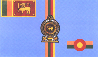
.svg)
.svg)
.svg)
![[11]](https://commons.wikimedia.org/w/index.php?title=File_talk%3ASeal_of_the_Governor_of_Utah.svg&diff=57176201&oldid=57175407)
.jpg)
.jpg)
.jpg)
.jpg)
.jpg)
.jpg)
.jpg)
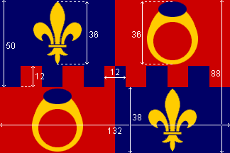
.svg)
![[13]](http://www.stavropolye.tv/upload/iblock/2b5/GERB.jpg)
![[14]](http://photo2.kavkaz-uzel.ru/system/attachments/0001/4038/pervstr_view.jpg)
![[17]](https://img.rasset.ie/0002fcf7-314.jpg)
![[1]](http://www.drivingtests.co.nz/images/question-images/lsz-sign.gif)
.jpg)
Request:
- A more natural compartment would be great. I really suck at drawing flora, and my attempts seem to make it worse.
You can take inspiration from these designs: [https://en.wikipedia.org/wiki/File:Canadian_Compartment.svg The compartment of the official version. (Do not copy or trace this in any way!), the 1957 version.
The description of this compartment is A wreath of roses, thistles, shamrocks and lilies proper.
This file has a different rendition of the thistle, if you judge it to fit better in the compartment. --Lemmens, Tom (talk) 13:43, 3 September 2013 (UTC)
.png)
Graphist opinion(s):
![]() Done by Gül Baiken
Done by Gül Baiken
:This section was archived on a request by: Lemmens, Tom (talk) 13:02, 26 March 2014 (UTC)
Historic (1981) UK Road signs[edit]
Request:
- I note these scans are B/W. It would be nice to replace the B/W diagrams with appropriate color vector diagrams, so that they can be included in a future Wikisource transcription. --Sfan00 IMG (talk) 13:52, 9 November 2013 (UTC)
Graphist opinion(s):
- Most of the signs are icluded In This Category
- (... but sorry, only creating the missing ones for a perhaps possible adaption of the theme
- looks a little as an employment-creation measure for unemployed ? ;-)
- • Jaybear • ...disc. • 20:53, 18 January 2014 (UTC)
- This section was archived on a request by: -- Maklaan (talk) 11:01, 31 January 2015 (UTC)
Blazon[edit]
I didn't know where to ask about this, but since many heraldry interested people contribute here, I try here:
What would a blazon in English for File:Berenberg COA.svg look like? The German language blazon is: "Im goldenen Felde auf einem grünen Schildfuß ein nach rechts aufgerichteter schwarzer Bär mit goldenem Halsband, in den Vorderpranken einen grünen Zweig haltend" Vanasan (talk) 12:35, 1 December 2013 (UTC)
- Have you looked for this section: en:Blazon#Grammar? (at the image-comments)
- But yes,
manymost of this CoA-English-Nobility are really poorly documented about their blazon ... - ... looks as if you have more to investigate in the (web-)references of each CoA!
- • Jaybear • ...disc. • 23:33, 18 January 2014 (UTC)
- This section was archived on a request by: -- Maklaan (talk) 11:01, 31 January 2015 (UTC)