This is an archive of past discussions. Do not edit the contents of this page. If you wish to start a new discussion or revive an old one, please do so on the current talk page.
Request: The wikipedia logo within all these cheatsheets render the term वि in the extreme left of the wikiglobe incorrectly. Specifically, the ि should appear before व with the dotted circle being replaced by the latter. The correct rendering can be seen at File:Wikipedia-logo-v2-en.svg. Odder was kind enough to help me over IRC and try to fix File:Cheatsheet-en.svg, and it's png thumbnail renders correctly. But W3C validation (I'm not sure I did it right) seems to suggest that there may be errors which cause the svg to render incorrectly. (It seems to render incorrectly for me across three browsers and inkscape).
Also, the original reason which led me to find this error was the need to translate the cheatsheet into hi. I only know enough svg to translate text in it. I can't fix (or change) the logo. Would someone please upload a version of the en cheatsheet replacing the logo with the hi logo with a correct rendering? I'd then be able to translate the text and upload a new version. Thanks a lot.--Siddhartha Ghai (talk) 01:49, 13 April 2012 (UTC)
Note:File:Cheatsheet-en.svg seems to be rendering correctly (despite the validation errors). Also, most of the cheatsheets are probably using the old logos. Updating them to use the new svg globe should probably fix the problem.--Siddhartha Ghai (talk) 10:36, 15 April 2012 (UTC)
Graphist opinion(s):
My observations are that in the SVG cheatsheets all the text is outlined so is no longer text editable. The other thing is that I couldn't get them to render properly in Illustrator. The globe in the cheatsheet wouldn't render at all even though the globe in the standalone V2 globe rendered perfectly. The PDFs (at least the English one anyway) seem to have been put together in InDesign so the text is editable in Illustrator, but whoever created it used a raster image for the globe.
All in all though I believe the problem is that the main bulk of the cheatsheet has been put together in Inkscape then the globe has been pasted into it. It's at this point I think things have gone wrong and Inkscape has created a non-conforming SVG (no doubt thanks to the Sodipodi code inside it. Considering all the problems I believe that the cheatsheet needs to be either created from scratch in Inkscape by someone who knows what they are doing, or in Illustrator 15.1 which creates much more standard code (and 50% of the size of the Inkscape code too). --Fred the Oyster (talk) 09:21, 13 April 2012 (UTC)
I don't think that whether a file opens in Adobe Illustrator is the arbiter of SVG correctness, and Adobe Illustrator can have its own problems of placing huge amounts of garbage in SVG files. However, try the latest version of File:Cheatsheet-en.svg. If there's a major problem with the file, it's that each separate letter is put into its own <tspan>...</tspan> element. By the way, the small Wikimedia logo at bottom left is an embedded raster image... AnonMoos (talk) 13:52, 13 April 2012 (UTC)
Versions of Illustrator prior to the current v15.1 did put an unnecessary amount of code in the SVG, especially if the file was tagged to remain editable in AI, but even so there's still nowhere near the amount of bloat that Inkscape creates. In any case, I wasn't using AI as the final arbiter of whether the file was coded correctly, I used the W3C validator. Having said that though, if an SVG can't be opened in AI, then there's going to be every likelihood that something is wrong with the file.
I'm sorry, but that's simply not the case. It's true that Inkscape can carry along a bunch of useless definitions of gradients and such from previous file versions if not purged, but Adobe Illustrator often overwhelms a tiny amount of code with a huge amount of useless garbage, as I've seen repeatedly over the last 5 years or more, from 2006 to 2012. I'm far from an enthusiastic defender of Inkscape (which has its own annoyances, such as "flowtext" nonsense), and I don't actually use Inkscape to edit SVG files (only to test and convert them), but when it comes to garbageflooding internal to an SVG file, Inkscape yields the crown to Adobe... AnonMoos (talk) 22:03, 13 April 2012 (UTC)
We shall have to agree to disagree then. Along with the fact that there isn't a single one SVG file created by Inkscape that I haven't been able to reduce in size up to 75% by the simple expedient of using Illustrator. I simply make sure that I don't tick the box requesting that I keep the file in Illustrator editable format, I keep the precision to 1 point and "use fewer tspan elements". I suppose it all comes down to how one uses the program, and after 20 years I feel I have a reasonably good idea on how to do that. --Fred the Oyster (talk) 08:25, 14 April 2012 (UTC)
If you can get Illustrator to emit lean and clean code, then that's great for you personally, but there's strong accumulated evidence that many others are not able to use the program as successfully... AnonMoos (talk) 03:19, 15 April 2012 (UTC)
Request: I have a Excel spreadsheet of air pollution data in China that I want to have turned into a graph. I think the R programming language is quite a nice way of doing it? I can email the data or should I dump it somewhere on the web? -- Alan Liefting (talk) 00:19, 24 April 2012 (UTC)
Graphist opinion(s):What type of graph? You can use the data in excel to create an excel graph which can be copied as an image and uploaded here. You can use SVGmaker to export the graph to SVG.
Then you'll have to remove the watermarks that SVG maker puts(pretty easy in a text editor/inkscape). Best if you can upload the excel file somewhere.--Gauravjuvekar (talk) 10:24, 24 April 2012 (UTC)
Actually I just did some experimentation with LibreOffice (it's been a while since I've used it) and the results and the procedure are truly horrible. First off you have to create the graph, then you have to click inside the chart and do a Ctrl-A (if it lets you that is), then you have to copy and past the result into either Libre Draw or Inkscape. At which point you discover that (depending on which chart type you chose) what you have copied and pasted is actually a bitmap that has to be traced if you don't want the SVG to be an envelope containing a single raster graphic. So basically, not the simple solution you suggested. --Fred the Oyster (talk) 11:43, 25 April 2012 (UTC)
I would have hoped that Commons would have some sort of commonly used graphing methods in place by now. I suppose most stuff comes in as images rather than the raw data that I am presenting. Alan Liefting (talk) 01:31, 26 April 2012 (UTC)
Alas no, other than maybe encapsulated in a PDF (which is sort of frowned upon). If you let me know what sort of graph/chart you want and where I can download the spreadsheet from (email me the details if you don't want to make them public) and I will happily do what's required. --Fred the Oyster (talk) 21:04, 26 April 2012 (UTC)
Request: Please can you redraw the above image and vectorise/save as an svg image. A previous attempt was made at File:Greater coat of arms of Copenhagen.svg. but that had multiple issues (the positions need to be rather exact). If you could save over the second file that would be easier. This other outline may help as a guide: [1]. Thanks. --000peter (talk) 22:58, 13 June 2012 (UTC)
Graphist opinion(s):
Not accurate in SVG to implement, respectively maybe not without pay. It would be a complete unofficial redesign. -- πϵρήλιο℗08:17, 14 June 2012 (UTC)
Request:File:The_Cutter's_Practical_Guide_1898_Edition_Part_1.djvu has a number of 'pattern' plates,
It would seem reasonable for these to be in an appropriate vector format, hence I am requesting the
assistance of the graphics lab in converting them, in a consistent style.
Sounds fun :). I'll prepare the first of these pattern plates and give it to you to comment. Other illustrations in this work are in my opinion too complex to be coverted to SVG. Request taken by Jembezmamy (talk) 10:41, 23 February 2013 (UTC)
I've drawn the first pattern. There is one little rendering error ("The" in a title isn't italic), which I'll fix in a future. Now I have a new idea: wouldn't it be practical to make this SVG interactive, so everyone could just type in their measurements and print their own pattern in 1:1 scale? I can write an open source JavaScript code that makes it possible. I think it would be nice. I will make sewing much easier for amateurs. I'll consult this also with my friend, who is a fashion designer, to find out whether it is worth the effort. --Jembezmamy (talk) 12:04, 2 March 2013 (UTC)
The Shirt System
The Shirt System
Yes, adapting this so it can be used to generate custom patterns would be PRECISELY what as Wikimedia project should do :) Sfan00 IMG (talk) 10:57, 22 May 2013 (UTC)
Correct capitalization in Croatian Water cycle diagram
It concerns this image: File:Watercycle-croatian.jpg an official translation of the USGS water cycle image - User:Kubura says the capitalization is wrong. He says:
"They can copy the text as it is located on the older Croatian translation; but, not to use the capital letters, but the "small" ones. In the title, first word is written with the capital letter, the other one not. (Hidrološki ciklus, Vodni ciklus, not Vodni Ciklus"
The newer Engish version (basis of Watercycle-croatian.jpg) is File:Watercyclesummary.jpg. The older English version (basis of the Wikipedian-made Kruženje vode-hidrološki ciklus.png and the official Watercyclecroatianhigh.jpg) is File:Water cycle.png
Thank you for making an edited version of that one. Unfortunately it was not what I was looking for. I would like a version of the new image File:Watercycle-croatian.jpg but with modified text that fits what Kubura is looking for, and with altered capitalization. WhisperToMe (talk) 14:41, 28 June 2013 (UTC)
"[5] Nice improvement, thank You for the prompt reaction. I would add (evaporation + transpiration) under "evapotranspiracija" (as in picture from hr.wiki), since that coined word confuses, so it needs explanation.
Also it is needed "zračenje sunca" (=Sun radiation) near the Sun.
Further: "ponornica", "izvori", "podzemni dotok", as on picture from hr.wiki.
To replace: "voda u atmosferi" (=water in atmosphere) instead of "atmosfera".
To replace: "jezero" (=lake) instead of "površinske vode" (=surface waters).
No need to write twice "zalihe podzemne vode". One can be "tok podzemne vode" (groundwater flow), the other "zalihe podzemne vode" (groundwater storage). As here [6] on the original site.
This picture contains error in grammar case: zalihe podzemne vodA", correct is zalihe podzemne vode.
Compared with the original picture, "plant uptake", "flora and fauna", "vents and volcanos" and "dew" were not translated and they are missing."
COA of articles mentioned above are missing. Images are available on following websites [7], [8] and [9]. I've written or will write the german articles myself... Thank you very much for your help --ArnoldBetten (talk) 15:10, 6 July 2013 (UTC)
Whoever wants to work on this request, I'd recommend to move the old files (and e.g. append (old) to the filename) and upload the updated versions with the current filename so it is automatically updated across the articles which use those images. --Patrick87 (talk) 17:15, 4 August 2013 (UTC)
I was thinking the same thing because of all the projects they are on. I just sent them an email to see if they have svg versions for us. If they don't respond in a few days then commons will have to make their own. I think the png ones came from their pdfs here: http://www.esrb.org/about/media_library.jsp --Canoe1967 (talk) 17:50, 4 August 2013 (UTC)
They would also like me to let them know when the .svgs are done. Should I hit them up for a WMF donation to get them faster? We could even do all of their graphics for donations if they are paying people now. (joke)--Canoe1967 (talk) 18:34, 9 August 2013 (UTC)
OK, I uploaded the official PNG versions (@Canoe1967: Maybe you can update the source information if appropriate) and found a source for most of the new icons including the newly introduced "interactive elements" icons. There are however still three missing rating category icons: File:ESRB 2013 Early Childhood.svg, File:ESRB 2013 Adults Only.svg and File:ESRB 2013 Rating Pending.svg. Most parts should be possible to recreate with the help of the old SVGs, but the texts at the top changed so it's not easy to correctly rebuild them. If anybody feels like it, then go for it! Otherwise we can still wait for official SVGs. --Patrick87 (talk) 23:39, 19 September 2013 (UTC)
It's a squared logo, but the image is slighty unframmed. I believe that someone with knowledge in editing images should fit it easily --Coentor (talk) 10:24, 7 January 2014 (UTC)
It's ok to change the styles, just need the basic diagram. Note the slight hight differences of each reservoir. Thanks a million! Rehman13:06, 21 January 2014 (UTC)
River surface to be the same colour as the reservoir surface, as well as the river labels.
Change the thick line to normal thickness. Their diagram is actually misleading as they are all basically the same thing.
Turbines outlets to reach back to into the river (immediately before the reservoir), as they really do.
The turbines to be equal distance from the top of the vertical axis.
Transparent background.
And finally, if you could reduce the overall diagram height (by reducing dam/reservoir heights, etc), it would be great.
Once again sorry for the steep changes and delays. All this time I was actually trying to get in touch with the Mahaweli Authority officials, as there is few clear info online. I will get back to you on the Laxapana separately. Million thanks! Rehman16:03, 23 January 2014 (UTC)
You should check the names with a red underline of the HPS's as I think you had some wrong in your sketch.
I don't understand what you mean by: "Change the thick line to normal thickness. Their diagram is actually misleading as they are all basically the same thing."
Do you mean horizontal axis as I did it? "The turbines to be equal distance from the top of the vertical axis."
To change the overall height of the illustration means a lot of work without disturbing relations, shapes etc so it's not something that I just do like that.
That's great, thanks. Just one tiny thing: The river beds after Rantembe Dam and Moragahakanda Dam. Please ignore the thick line thing, I forgot to backspace it off... The underlined spellings are also correct. For the Laxapana diagram, I will post a separate request, as I think there needs to be more updates done on that...
For the page desc and categories, just put "Laxapana hydroelectric complex, Sri Lanka." and "Category:Hydroelectric power stations in Sri Lanka". I will expand from there. Thanks again. Best regards, Rehman02:08, 25 January 2014 (UTC)
You wrote "Just one tiny thing: The river beds after Rantembe Dam and Moragahakanda Dam.", what is to be changed with them?
You wrote: "Laxapana hydroelectric complex, Sri Lanka." but I guess you meant "Mahaweli hydroelectric complex, Sri Lanka."?
Haha, sorry, too many things in my head. For the first point, the river beds are missing in the images. For the second, yes you're right, I meant Mahaweli. :) Rehman14:27, 25 January 2014 (UTC)
Request for help fixing an SVG file of a chemical skeletal formula so the file may be used on Wikipedia
Chemical structure of Melanotan II updated from the version formerly used on the Melanotan II article to more accurately represent the chemical structure of this compound in a way that better follows the rules and accepted standards of chemical skeletal formula notation. Technical Details: B/W vector image in SVG format, created in ChemDraw Ultra 12.0.2.1076.
I would like to be able to use this file on the Melanotan II article, where it is sorely needed as a replacement for the current vague and confusing skeletal formula, but there are some issues with the SVG that need to be corrected before that can be done. The errors are highlighted in File:Corrections to be made to 'Chemical structure of Melanotan II Updated.svg'.png. Any help with the corrections would really be appreciated!TheCook (talk) 11:11, 30 January 2014 (UTC)
Graphist opinion(s):
Please check if the corrections made are as requested. The overlap of the H2N on the bond is a minor problem in the SVG thumbnailer and does not exist in the full size SVG. Shyamal (talk) 15:46, 30 January 2014 (UTC)
I took the liberty to clean up behind you two guys, fixing the position of the H2N-group (the rendering error which Shyamal's version did not fix in the first place) and correcting the vertical spacing of the NH-groups (which Goran tek-en's version regressed again) so everything should be eventually correct now. Or did I miss something else TheCook? --Patrick87 (talk) 01:28, 31 January 2014 (UTC)
Excellent work guys! I'm really glad you were able to take care of it all so fantastically and in such a prompt manner. I really appreciate it! --TheCook (talk) 01:28, 31 January 2014 (UTC)
Can you zoom on his face so we can create a clear portrait? some thing like this? if its hard to make it clear, can you try with this photo instead? Thank you ... --باسم (talk) 15:46, 26 January 2014 (UTC)
I guess its fine, we can still control its size in the template right? if that's true then please upload it. thank you--باسم (talk) 21:25, 31 January 2014 (UTC)
I don't understand what you mean by "control its size in the template"? The size you see is the biggest and then you can make it smaller as any other image.
If you want me to upload it >I need the following;
Never mind. The category is: Harun al-Rashid, file name is: Harun al-Rashid cropped. Description: Cropped image of the face of the Abbasid Caliph Hārūn al-Rashīd--باسم (talk) 12:26, 2 February 2014 (UTC)
Hi, I know the image above is not one of the sharpest/cleanest ones out there, but I would greatly appreciate it if someone can vectorize the signature just after the typewriter text. Thanks. --Wylve (talk) 12:41, 12 January 2014 (UTC)
Graphist opinion(s):
You are only talking about the signature inside the red line on this image:
This is the best vector file we've got. As I understand it, the image uses crowned lions from some Dutch heraldic symbol: they are not roaring or frowning, and their crowns seem to be of the wrong shape. The mouth is generally of a strange shape.
The historical coat of arms of the Kingdom of Dalmatia, the lions from this image best correspond with the traditional perception (ofc, the heraldic accouterments show here are not necessary, nor is the shape relevant today)
Hello all. If anyone feels like giving it a shot, am requesting a proper vector coat of arms for Dalmatia. It basically amounts to putting together a heraldic golden lion head: #1 front-facing, #2 maned, #3 frowning, #4 roaring, and #5 "langued" (that is to say the tongues are visible). The technical terms are "azure, with three crowned golden leopards heads affrontes Or, langued in gules". To anyone inclined to acquiesce to the request, I suggest following the appearance of the lions (in particular their crowns) from File:Wappen Königreich Dalmatien.jpg (shown above) - but with less elaborate and wavy manes. I myself recommend basing the manes on this image.
Further, I would be very much obliged if a crowned version of the coat of arms could be put together, for use as the coa of the Kingdom of Dalmatia (though this is ofc secondary to the above request). The crown could preferably be the same one as used on the lions, i.e. the version above the lion heads in File:Wappen Königreich Dalmatien.jpg. As regards the appearance of the shield itself, I recommend the classic rounded shape, as seen here.
Finally, an older version exists, which is red instead of blue, with the lions (i.e. heraldic leopards) in white, wearing golden crowns, their tongues in gold as well ("gules, with three silver leopard heads affrontes Argent, langued and crowned Or"). Though this is just a colour change, and I reckon I could manage that myself if I give it a proper try. Either way though, I hope it will be possible to colour the crown on the lion heads, and their tongues, separately from the actual heads. Thanks in advance. --DIREKTOR(TALK)15:25, 25 January 2014 (UTC)
Graphist opinion(s):
I don't really follow you and let's just concentrate on the first part.
You want us to take one of the lion heads from the top right picture, make a vector version of it and put it in three times as the top left picture? Let me know if I understood you right. --Goran tek-en (talk) 21:31, 30 January 2014 (UTC)
Yup. With the further request that the manes need not be as luxurious and "wavy" as in the right (and left) image. I pretty much ascribe that to the general fancy look of the old coas (see manes here for a better example in that particular respect). Otherwise, the above right-hand image is best. A couple additional points:
Its also not necessary to copy exactly the "3D" look of the lions on the right image, which I believe is achieved by them having "shadows".
The crowns on the lions are, in some versions, colored differently than the lion heads themselves, so it would be great if they and the (red) tongues could remain separate "objects" (is that the right term?) to facilitate future colour changes. (The crowns should, ofc, remain in contact with the heads)
My thanks. Just a note: I'm an enWiki editor, primarily. I'll certainly be checking here often, but probably will reply sooner if you link my username in you comment or post on my Commons talkpage. --DIREKTOR(TALK)22:44, 3 February 2014 (UTC)
@DIREKTOR: Now you can look at a draft here. Give me feedback on it. The crown and tongue are in separate layers as you requested.
Eventually I will need the following;
It looks great. In terms of feedback I'd be happy to see following further modifications (pls be aware these are just suggestions on possibly improving what is really an excellent job):
The mouths of the lions are framed only by their mane, which gives them a somewhat disembodied, "cartoonish" look. The chin is a bit hard to perceive. The heads in general can be larger in proportion to the shield. See this precursor coa from the Early Middle Ages (where the lions are facing right and are not 'affrontes').
The mane looks great, but it appears more as a "beard". Its really a detail, but I would maybe add a "tuft" or two pointing upwards (not downwards) at the point where the mane ends near the ears.
The proportions of the crown appear slightly off. If you have a look at the above right-hand image, the three leaf-like "outcroppings" on the crowns (worn by the lions in the coat of arms) are farther-off from each-other than appear on the SVG image.
Besides the changes to the model itself, this is a coat of arms that's well over a 1,000 years old, so, as I mentioned before, there are some alternate historical versions that I think shouldn't be all that difficult to bring about. Three that I know of:
There is a version exactly like this one, but with the shield crowned (with the same crown the lions use). This is for use as the coat of arms of the Kingdom of Dalmatia. Hoping this will be a slightly modified crown than that one in the current version (per above), but again - its a suggestion.
And there's the Venetian version, which is like this one, but the shield is red, whereas the lions, their crowns, and their tongues are gold (so the whole lion head is gold on a red shield, presumably the gems in the crown can remain white, though).
Hope I've managed to be clear enough, thanks again for your work. Rest assured its appreciated, and will be widely used. In fact this will probably be 'the' coa of Dalmatia from this point on. As for the name and description etc., I figure we can just overwrite the left-hand image I myself uploaded. --DIREKTOR(TALK)13:58, 9 February 2014 (UTC)
@DIREKTOR: I did it in that manner "cartoonish" because you didn't want that much 3D-look but now I have made the changes and there is two versions for you to look at.
When I said "shadows" I meant "shadows" the lions as a whole cast on the shield - I certainly don't object to using shadows within the lion heads themselves. Apologies if I was not specific. The second version certainly seems the better one. --DIREKTOR(TALK)21:01, 12 February 2014 (UTC)
I can't see who wrote this last comment and I would like to know if the shadows on the shield should be removed and if it's Done? --Goran tek-en (talk) 20:13, 13 February 2014 (UTC)
Agh, damn.. was just about to post. Note I've modified the appearance of the shield slightly (with my very amateurish Illustrator skills.. I don't think the heads are 100% aligned :)). I'd be obliged if you used a narrower shield as in the new upload. Re the two versions:
If I'm not mistaken, the crown ought to somehow stretch significantly more across the shield's top, yet not so much that the tips of the crown extend too far beyond the sides of the shield (see here, for example). A narrower shield might help in that regard. For inspiration, I recommend the crown on the bottom-most lion head in this image.
In the Venetian version, I think we can keep the teeth and eyes white (i.e. the whites of the eyes), and ofc the narrower shield. The irises and mouth openings (on either side of the tongues) could also remain entirely black as in the original. That is to say, the only difference besides the red shield ought to be the gold tongues. Otherwise, its great.
@DIREKTOR: OK, i did have to upload a new version of your narrow shield version. When you change the size of the drawings area or position of any object which include gradients/fill/pattern you have to include those in the movement (you have to check some buttons, in Inkscape any way) otherwise they will be misplaced. I used gradients (shadows) so it's a bit complicated drawing, you have to know what you do when you move things. If you download your version you will see that the eyes and other has been misplaced.
Now you can look at new versions on the links above but reload the page. Give me feedback, thanks. --Goran tek-en (talk) 20:27, 15 February 2014 (UTC)
Yeah.. I realized I also didn't include the pearls on the crown of the lowest lion head in my upload, so I tried to fix it but then read your post and realized I better leave that to people who know what they're doing. Anyway, the pearls are missing there, on all versions - terribly sorry :(. As I said: very poor Illustrator skills. Aside from that little glitch, I think the Venetian version is done with for good.
Re the crowned version.. I can't help but feel I might've been mistaken in thinking the crown off the lions can just be extended across the top of the shield. Its elements just seem too big compared to the detail of the lions themselves. If you feel like putting together a more detailed crown for the top of the shield, that'd be great - if not, wonderful work either way :). Have a look at this crown here (found here). I tried to extend it somewhat but ofc failed in that it just turned out looking stretched (I did manage to change its colour appropriately, though). --DIREKTOR(TALK)20:42, 15 February 2014 (UTC)
@DIREKTOR: Now I have replaced the missing pearls and uploaded it.
For Coat_of_arms_of_Dalmatia_venetia I need the following;
Name of the file
Description
Category/ies
to be able to upload it.
Then for the crowned version you can look at this draft and give me feedback.
Many people think that it's just to enlarge or reduce something like that but almost always you have to adjust the proportions/lines and a lot of other things. It's the same with text, you can't just go from 12px to 120px without adjusting the spaces between letters. Anyway now there is the draft as above. --Goran tek-en (talk) 20:41, 16 February 2014 (UTC)
Coat of arms of Dalmatia (Venetian); "The Coat of arms of Dalmatia as used by the Republic of Venice"; pretty much the same cats as the main coa image. Will fix that up myself.
Re the crowned version, looks great :). As far as feedback goes.. maybe the crown could be a tad taller, its spikes a tiny bit farther away from each other, maybe. Not sure about further apart, though.
Am pretty handy with Photoshop, but I'm struggling to get my head around Illustrator. Not easy at all. For example, I thought I'd just desaturate the tongues a bit, give them a dimmer shade of red to go with the subdued colors. Didn't think it was worth bothering others about such a tiny change. Couldn't figure it out :). --DIREKTOR(TALK)00:27, 17 February 2014 (UTC)
P.s. Since I'm shamelessly exploiting your work to advance my project along, I thought I might also request if you could vectorize just the shield from this image, into a vector image that uses the same shield proportions as currently the new Dalmatia coa? Then I'm hoping to place the two shields side-by-side in a single image: like this - except the Croatian checkerboard would be properly vectorized as per the aforementioned source image, and not compressed. I can then use the combined coas to represent the historical en:Kingdom of Croatia and Dalmatia. --DIREKTOR(TALK)01:06, 17 February 2014 (UTC)
I didn't understand if you wanted me to help you with that desaturated version or you just wanted to write it of you?
For your P.s. I will help you, of course. But as this section has got very long I would like you to start a new request for that. Write in the Graphist opinion that I will take it and notify me when you have created it and we will take it from there. --Goran tek-en (talk) 15:31, 18 February 2014 (UTC)
Sure, looks good. I think the cross looks a bit our of place, but otherwise, I think its done. In either case, I feel uncomfortable posting further "demands" :)
Yup, it occurred to me to try and desaturate the red of the tongues just a bit, all other colours being subdued also. Could you do it since I seem to just mess up the images whenever I touch them.
Did you perhaps upload the Venetian version? I'm eager to put it up. If possible, it'd be great if its shade of red could match that on this image.
It's OK to have demands, it's for your use we create those images and some things you don't see/realize until you are a bit into the process.
They are all uploaded now with the cross removed (gem instead), tongues desaturated a bit and coat color changed.
I did overwrite your versions of the "Coat of arms of Dalmatia" and "Coat of arms of Dalmatia crowned" as I understood this was what you wanted. Coat of arms of Dalmatia (Venetian) is also uploaded and then this would be done, thanks. --Goran tek-en (talk) 10:48, 19 February 2014 (UTC)Done
Article(s): Wikidata Template that links to Reasonator
Request:
Can anybody improve this so the logo looks good at 12 px size (normal screens) or roughly text size (on very high resolution screens). All my attempts turn out blurry. --Tobias1984 (talk) 10:54, 17 February 2014 (UTC)
Thanks for trying. I guess the screen technology or (my) human eye is the limitation. We will just have to use something around 16 px: --Tobias1984 (talk) 13:58, 17 February 2014 (UTC)
16px
Ok I think 12 is just too small. I am quite happy with this one with 16x16 px (
Article(s): I'm going to write an article nl:Andirobine on Dutch Wikipedia
Request:
Is it possible to have an image (preferably svg) of the structure formula of andirobin, as shown on this page? The isomeric SMILES are given on that page. Thank you, LeRoc (talk) 13:22, 12 February 2014 (UTC)
I didn't know if it should be 0 zero or O the letter o, you have to tell me. Also right now there is no background at all, if you want so tell me, thanks. --Goran tek-en (talk) 19:13, 17 February 2014 (UTC)
@Goran tek-en: Thank you. It seems to me however that Wikipedia has some kind of standard form for presenting chemical structure formulas. I'd prefer it to be in that form, but I guess some chemical drawing program would be needed for that. LeRoc (talk) 15:16, 18 February 2014 (UTC)
@LeRoc: Now I have made it using one tool for that. This is what i got created with SketchEl. As you can see there are some differences. The partly red surrounding O didn't appear, the grey part by H didn't show up either. Down in the right hand corner the double lines has an opening at the top (which it did by it self), to the left almost at the bottom the line inside couldn't I find any automatic way to create so it's handmade.
This is a kind of semi automatic program which changes things when I for instance put in O somewhere and so on. So this is what it gave me and i need your feedback on this, thanks. If there is anyone else who has done this before that you know of please ask them to check this. --Goran tek-en (talk) 19:17, 18 February 2014 (UTC)
@Goran tek-en: . To be honest, I don't need the greys and the reds very much. I wouldn't mind if everything were black and white, like most chemical structure formulas on Wikipedia. I would like to get rid of the opening at the top of the double lines though, that should be closed. Do you think that is possible? LeRoc (talk) LeRoc (talk) 19:36, 18 February 2014 (UTC)
@LeRoc: Changed as above. When you look at the link maybe you have to reload the page to get the new version.
Then I will need the following;
Name of the file
Description
Category/ies
to be able to upload it. It would have been good (for the next time) if you told the person to work on it those things, black and white, has to be drawn in a special program and so on. It saves time and reduces the mistakes, thanks. --Goran tek-en (talk) 19:54, 18 February 2014 (UTC)
Sorry, I've been travelling without internet access the last couple of days. It looks great! The filename could be Andirobin_structure_formula.svg. The description: "Chemical structure formula of andirobin (C32H27O7), a limonoid found in the oil of Carapa guianensis Aubl.". Category:Limonoids. Greetings, LeRoc (talk) 12:26, 20 February 2014 (UTC)
@Goran tek-en: Thank you very much! I'll need three or more structure formulas for other substances like this one, but I suggest that I'll try to play around with SketchEl for myself a bit, and if I encounter any problems I'll ask questions here, if that's ok. LeRoc (talk) 15:53, 20 February 2014 (UTC)
Of course. I did try to import the files you can export from PubChem into SketcEl and that work fine. The problem for me was that it imported to much, there were more than one formula so it got too complicated for me. I had to build it from scratch. But maybe you with your knowledge can export/import just what you need because then it's done. It seems to be a good program to do just this. --Goran tek-en (talk) 16:21, 20 February 2014 (UTC)
@Goran tek-en: I'll have a look around. Thanks again for your help. Sorry that I didn't formulate my question clearly enough the first time. LeRoc (talk) 22:02, 20 February 2014 (UTC)
Essentially these images consist of #1 the Croatian shield and #2 the Dalmatian shield, #3 each surmounted by a crown of the same model.
Basically we need a coat of arms of Croatia that follows the appearance of the 1495 medieval arms, both in shape and in the specific layout of the checkerboard pattern; we need it to be crowned as depicted; and it can be bordered in red (as in here). Secondly, we need a Dalmatian shield that has the same proportions as the aforementioned Croatian arms, surmounted with the same crown. The Dalmatian shield itself should not be difficult, as its possible to basically just modify the proportions of this shield, compliments of Goran tek-en.
Needless to say, neither shield need be yellowed-out or follow exactly the worn-out appearance of the medieval depiction. A simple white and red checkerboard pattern (corresponding in layout to the image, and bordered in red) will more than suffice. As regards the precise shade of red, the shade found here would be best imo. --DIREKTOR(TALK)13:45, 24 February 2014 (UTC)
What I'd propose is maybe to have their crowns slightly less tall and a bit wider across the top of the shield. Other than that - another impressive piece of work. --DIREKTOR(TALK)14:52, 4 March 2014 (UTC)
New version for you to look at and give me feedback, maybe you have to reload the pages;
to be able to upload them as new files or if you want me to upload them as a versions of any existing files, you have to tell me. --Goran tek-en (talk) 14:54, 6 March 2014 (UTC)
The merged file can probably overwrite this file, I'll add necessary categories.
The Croatian checkerboard arms can be uploaded as a new version of this file.
The Dalmatian arms can, I suppose, be uploaded separately. Name: "File:Coat of arms of Dalmatia 1495.svg"; Description: "Coat of arms of Dalmatia, 1495 (Innsbruck, Austria)". Cats are the same as here, minus the "Coats of arms of Austria-Hungary" cat.
Now you can find them here but their pages need some editing;
Coat of arms of Croatia and Dalmatia 1495 I would have liked the license to be CC-BY-SA and I read on this page Commons:Coats_of_arms that there is a difference between the coat itself and the depicting of a coat. But I don't really understand how this should be shown on this page. Also maybe some of the templates could be removed, sources and versions corrected.
There are so many different versions now that I don't know which to connect together or which is version of what, you would have to do that if it's needed. thanks. --Goran tek-en (talk) 16:57, 8 March 2014 (UTC)
That the text on the left-hand side ("Refuting the Central Point", "Refutation", "Counterargument", etc.) be changed to black boldface, rather than the rainbow of colors, in order to make it readable when scaled down. It's actually much more legible right now than the gallery pic would imply; en:Template:Rational shows it where it is now. --Meteor sandwich yum (talk) 08:21, 4 March 2014 (UTC)
Graphist opinion(s):
Done I've changed the coloured text to black and changed the font size from 22 to 26 point. I also changed it from title case to lowercase, so the "responding to tone" line wouldn't be too cramped at the larger size. Rybec (talk) 11:42, 4 March 2014 (UTC)
Juetho How do you want it "simplified", what do you mean by that?
This svg has an image in the background but I will draw that in the svg file insteed so tell me what you want removed, thanks. --Goran tek-en (talk) 19:03, 10 March 2014 (UTC)
Oops, where's an image? I was surprised at the file size, but I can't see any image. It would be enough to see the following items: axises, scales (including "Im" and "Re", without the "i"), grid, unit lines, and vectors (including values). -- Juergen (talk) 19:59, 10 March 2014 (UTC)
Actually almost everything you see is an image and then above it the arrows are redrawn and then the colored text added.
Oh my goodness. An svg file should combine geometric items in a simple way, shouldn't it? What did the original author may think about? I'll wait for your help; don't be in a hurry. -- Juergen (talk) 13:24, 11 March 2014 (UTC)
Juetho Now you can look at this draft and give me feedback.
The grid in the included image didn't have the exact same distances between the values so there is some change to my version.
Once this is approved by you I would need the English name for it and description, I can't see it above.
I also put a white background in the image, if you don't want it just tell me, thanks. --Goran tek-en (talk) 18:56, 11 March 2014 (UTC)
Thank, it looks pretty good. White background is OK.
Horizontal and vertical distances: I'm not sure, are they equal or different? Equal distances would be better.
The distances are different but if I change them (to equal), the angel of the colored arrows will be different and is that correct?
I miss the unit lines: horizontal and vertical at . I prefer a continuous line instead of the dashed lines (color may be the same).
If you mean by value 1 they are there, I made them some what more visible. Changed the lines.
Standard cartesian coordinates use the same unit size on each axis. If you stretch the Im-axis, the vectors and angles will be stretched by the same factor. Why not?
All of the grid lines maybe dashed. Only the lines at value 0 (the axises) and 1 (that I called unit lines) maybe continuous.
This is not a subject I have any deep knowledge in so I went by the original image but now I have changed it to equal distances and the other changes, I hope any way. Just tell me if I misunderstood anything.
That's alright now. The "i" in the formulas are correct: a complex number is written by .
I downloaded the file and was surprised at the file size again (now 57490 bytes vs. 33910 bytes). I removed the image, and the only effect was an enlargement of the whole graphic. I don't understand what the image should do. In the current state, the graphic shows what it should show. You may reduce the code, or you may upload the file as ready. Your work is very useful, thank you very much! -- Juergen (talk) 10:39, 16 March 2014 (UTC)
The file I showed you was a draft and not the final image that I upload, it's a working copy for me. I have now uploaded a new version of the file but it can take some time for the preview to update also. This final image is 37kb in size. Just contact me if I can help you, thanks. --Goran tek-en (talk) 12:45, 16 March 2014 (UTC)
Done -- I agree. Juergen (talk) 07:03, 17 March 2014 (UTC)
I'm the author of the original image. I uploaded an unlabeled SVG version of the image (added to gallery) which anyone could work with to have labels in the local language of his or her choice.... (also needs cropping of whitespace). Didn't have an SVG editor on the machine that generated the SVG version.... Sailsbystars (talk) 18:50, 10 March 2014 (UTC)
Done. I basically opened it in Inkscape, saved as Optimized SVG and then fixed the remaining validation errors in Notepad. SiBr4 (talk) 18:20, 12 March 2014 (UTC)
Hey! I've tried making the image background transparent, however I think I didn't do it properly, also cropping the photo so it could only be outside the circle. --///EuroCarGT22:14, 13 March 2014 (UTC)
This section was archived on a request by: Perhelion (talk) 13:26, 26 March 2014 (UTC): I replaced all with real circle element with real adjustment to the dimensions
Flag of Afar
till 2012
Article(s): numerous
Request:
In 2012, the flag of Afar was modified. Is possible to create an SVG of the new one? And some improvements with the emblem? --Antemister (talk) 10:52, 5 March 2014 (UTC)
Perfect! IF we do not have a high resolution version from an officail document, it is a waste of time if you try to redraw any detail. Just upload it.--Antemister (talk) 08:36, 2 April 2014 (UTC)
Maxxl2 Absolutely not, it's one of my things ahead to, learn to do this. Right now I do the creating part in Inkscape but I can see that it would be an advantage to know how to optimize the code. I'm don't think you really have to do it all the time but it's good to know. The only problem I can see that not all people who can do graphic work is really to much interested in the code so it's a work that never will end. --Goran tek-en (talk) 17:55, 2 April 2014 (UTC)
Please align the drop-shadow so it is directly behind the star, rather than offset at an angle. This will resolve alignment issues. After re-aligning, please crop the file so any unused space is removed. --Illegitimate Barrister 21:22, 16 February 2014 (UTC)
This is a bitmap image so I did a svg version Bronze-service-star-3d on which you can give me feedback. I think svg is to be preferred in this case. I have done it in some other ways than what the other stars like Award-star-gold-3d which has some rendering problems which I hope this one doesn't have. --Goran tek-en (talk) 15:34, 17 February 2014 (UTC)
Sorry for the delay. It's good, although the bronze stars are a different shape than the gold ones. They are more smaller and obtuse, I think is the word. Illegitimate Barrister 14:02, 19 February 2014 (UTC)
The series labelled "Sonstige" (grey) needs to be corrected to a value of 11,0 (11.0) percent in 2013, which can easily be verified when adding the percentages of AfD, Piraten, NPD and Sonst. from de:Bundestagswahl 2013 together. --Komischn (talk) 15:12, 9 April 2014 (UTC)
Why does the PNG renderer do so badly with patterns (see other sizes). Is there a workaround possible? Thanks. --Shyamal (talk) 05:52, 11 April 2014 (UTC)
Graphist opinion(s):
It's not really the fault of the PNG renderer — it happens on Web browsers too — the spacing of the lines is below the Nyquist frequency of the rendered pixels, resulting in moiré patterns. Possible fixes: use a coarser pattern, or solid colours. cmglee (talk) 12:50, 11 April 2014 (UTC)
DoneI've removed the central worse pattern, cropped and removed to high scale values. I think it is not necessary. -- Perhelion (talk) 22:30, 13 April 2014 (UTC)
Hi every body. I am a rookie in draw objects by AI.(also I cant speak english very well :)) I drew a cute goldfish by AI CS6 but it size is out of standard. I dont know what must I do to reduce it size to normal size for this shape. Can you do it for me? and teach me abstract?
Did you draw this with some graphics tablet? The reason for the disproportionate file size is, that all paths consist of hundreds of nodes (instead of only few with the curves between them defined by mathematical functions as it is usual for vector graphics). Also some paths overlay themselves multiply (as if you draw something with a pencil using multiple strokes to draw one line, thats why I asked for the tablet). While one can in principle simplify the paths automatically after drawing the image one will always loose some precision there. Retrace the outlines would be possible too but probably inconvenient in most cases. Therefore you should probably optimize your workflow from the start, so less nodes are created in the first place. We can't help you on this thoug, as long as we do not have further information on how you've actually drawn the image. --Patrick87 (talk) 13:41, 26 January 2014 (UTC)
Thank you Patrick for your good help. I changed mode of the Painting to «Create Outline» and just moved Effective lines to a new artboard. It did work and I have a goldfish with 66.3kb size! :) thank you again.SaMin SAmIN (talk) 09:18, 27 January 2014 (UTC)
I made the three metal variations of File:Camera2 mgx.svg as a quick solution for the photo challenge winners in January (without any real graphic skills) and I'm not too happy with the colours... if possible, it would probably be nice to develop something for the photo challenge winners (I don't know where I could ask for that), but for the moment I think that correcting/improving those three would be great. --Anna reg (talk) 22:48, 1 March 2014 (UTC)
Graphist opinion(s):
Here are three alternative proposals. Tell me what you think. I'll fix the apparent RSVG rendering error which I just noticed in the meantime and will try to play around with some glow/gloss effects. --Patrick87 (talk) 23:45, 1 March 2014 (UTC)
I love the silver one. The gold one seems a bit yellow/black to me and I never know with bronze (other than that it's a lot better than my try)... I just tried to find some gold/bronze pictures as 'references' - perhaps they can help? and
OK, I tuned the color a bit and tried some filter effects to give the cameras a more realistic look (wasn't too succesfull though because auf RSVG rendering errors). I think the current result is fine too, though, or do you have any further wished what to change? --Patrick87 (talk) 16:56, 2 March 2014 (UTC)
Once more, thanks for your help. I like the colours a lot more like that. Now I just need the template they should be part of... ;-> Anna reg (talk) 18:08, 2 March 2014 (UTC)
Should we not go for a more neutral camera like this High-contrast-camera-photo-2 and it's a svg file. I think this is more equivalent to the different stars we have, just a thought. --Goran tek-en (talk) 18:32, 2 March 2014 (UTC)
Request:: Please recreate the following executive seals of the US, neccessary derivative parts are provided above. Colorado's which says "Executive Office". Connecticut's which says "Executive Department". New York's "Executive Branch" graphic and "Executive Privy Seal". Washington's seal. Wisconsin's "Executive Privy Seal". Wisconsin's is difficult to make out, I emailed the Governor's office and he explained it. It uses the badger and banner "Forward" from the state coat of arms, and below it is another fancy banner which says "1848". Thanks. Fry1989eh?02:21, 25 June 2013 (UTC)
Graphist opinion(s):
A few done (belatedly). Not sure what's going on in the Connecticut one around the edge - are they stars? - and I'll hopefully get to the others in the not too distant future. NikNakstalk - gallery - wikipedia14:00, 20 October 2013 (UTC)
And another. I really had nothing to go on colours-wise for the Washington one, so feel free to change them. I just used the ones from the state seal. NikNakstalk - gallery - wikipedia16:36, 3 May 2014 (UTC)
Okay, I've made a start on the last one. If you can find another image of the second banner, I can have a go at making it, but I can't really do much without a better reference. If you find something that looks vaguely similar, then that could be a placeholder, for sure. NikNakstalk - gallery - wikipedia16:50, 3 May 2014 (UTC)
Wonderful job. I don't have any other pics of Wisconsin, but enlarging the photo it looks like a scroll with the ends rolled up, and it slants downward from right to left. That's really all I can say, I'm trying to find an image I could help to visualize. Fry1989eh?00:33, 4 May 2014 (UTC)
These two "icon" are not horizontally aligned (de: schief). This is not looking so good I request to create two more svg graphic files that are like + - Thanks, --Mattes (talk) 11:52, 18 January 2014 (UTC)
Just the test.wiki logo for use when recreating the logo in svg
SVG now
Article(s): Various userboxes on en and otherwise.
Request:
It would be nice if this image was vectorized. Alternatively, since in the .png the globe is a bit squashed, the picture could be remade with a non-squashed version of the globe (see gallery) and the mop. --APerson (talk) 18:48, 4 March 2014 (UTC)
"Showing the SVG file directly in a browser window" means that the file is displayed by a program on your local computer, not the SVG-to-PNG rendering program installed on Wikimedia servers. When viewed in the SVG program on my local computer, the files do not look OK. The "Testfile" version has strange internal code formatting, but I did some simple text adjustments on the other version... AnonMoos (talk) 08:25, 19 January 2014 (UTC)
Yes, I've thought about this "local displaying" too.
I'm not really shure if the svg-thumbs I'm viewing in my browser here are the same as the ones others get to see.
Fact is: All the text on the image should look exactly like on the thumb of file-version (1) in my screenshot!
.
And I'm nearly sure, that at the beginning of my uploads all the text on the thumb of file-version (2) was looking exactly in the way as the one of file-version (1).
Is it somehow possible, that (at least the thumbnail-versions) of an archived previous-version file can be changed, when uploading a new file-version?
I did some test with this and then tested it with the tool for it [13] and there it looked fine. I can't tell now when I uploaded it because sometimes it takes time for the preview to update. If this doesn't work then we maybe have to convert the text to paths. --Goran tek-en (talk) 21:54, 30 January 2014 (UTC)
I'm a little late, but Thanks for the nonce.
It looks significantly better in this version! ;-) – at least in my Firefox-browser here ...
... that are on the whole strange effects with text-rendering in the WM-commons server-generated png-subversions.
Someone disagreeing to set this issue's status to done ?
Requesting a vector SVG version of the above 'Flag of Split'. And also for the 'Historical Arms' (pictured above).
Further, would be grateful if proper vector versions could be put together for the 'Coat of arms of Split' and the 'Historical Flag' (also pictured above). These files do have SVG versions, but of rather poor quality.
Re the 'Historical Flag', I know its pretty bad quality, but its supposed to be the walls and belfry from the coat of arms in white, on a blue flag. Without the little shields and the square border of course. --DIREKTOR(TALK)19:29, 3 May 2014 (UTC)
Requesting a vector version of the historical flag of Split. The images shown above are crude representations of the old flag. The symbol on the blue flag should be the white outline of the walls and belfry, appearing as in the coat of arms as shown above (of course without the small shields and the checkered frame). Many thanks in advance. --DIREKTOR(TALK)20:19, 7 May 2014 (UTC)
@NikNaks, thanks a lot. I hope I wont seem nitpicky if I further request the palace-and-belfry emblem be moved just a tiny bit downward on the flag? :) Just a little bit, so as to center it better. --DIREKTOR(TALK)21:48, 7 May 2014 (UTC)
There are some similar coat of arms already in SVG format that could need some improvement, too. I also found a coat of arms of Malaya that is very similar to the one in the requested file (see second gallery). -- Patrick87 (talk) 12:00, 26 April 2013 (UTC)
Just wanted to point out that "Coat of arms of Malaysia (1963-1965).jpg" is not identical to those other coats of arms, in case this hasn't been noticed. The coat of arms was altered after Singapore left the Federation of Malaysia in 1965. — Cheers, JackLee–talk–14:56, 27 April 2013 (UTC)
It is a crest from the arms of the (British) North Borneo Chartered Company(right), and this website describes it as "two arms hold[ing] flag flowing to the sinister Or charged with lion guardant Gules" (there are illustrations on the website). The commentary on the website says "The crest shows two human arms grasping a flag flying to the right. One of these arms appears to be that of a Caucasian and the other that of a person of darker hue." What I cannot tell is the design of the tiny flag held by the two arms. Originally it was a red lion, but the one on the coat of arms of Malaysia doesn't seem to be that. It may have been the Flag of Sabah used between 1963 and 1982 (below right). — Cheers, JackLee–talk–08:32, 11 May 2014 (UTC)
Can you provide a text version of the non-Latin script for me? Typing it out on here would be fine.
A discussion at the page mentioned above has yielded "برصکوتو برتبح موتو" as a possibility, but this isn't an official transliteration. — Cheers, JackLee–talk– 17:23, 11 May 2014 (UTC) (Don't use this for the time being; waiting for a friend to provide a better transliteration. — Cheers, JackLee–talk–19:08, 12 May 2014 (UTC))
Are the Prince of Wales feathers meant to be that blue-green colour, or is that an artifact of the image itself?
Coat of arms of Penang
I suppose it is whatever colour the Prince of Wales feathers usually are (white, I assume). According to "Coat of arms of Penang", the blazon is "Barry wavy of eight Azure and Argent upon a chief crenellée Or a plume of three ostrich feathers surmounted by a riband of the First on the riband the words Ich Dien in letters of the Third". See the image on the right, though I'm guessing the azure colour is wrong. — Cheers, JackLee–talk–08:32, 11 May 2014 (UTC)
If you can answer those I should be able to finish it to a reasonable degree. Unfortunately getting the tigers to look more presentable is a bit beyond my capabilities, so they'll have to do for now.
Also, if you could identify the crown and text on the Malay States arms as well, I can make a better vector of that using this graphic, rather than the horrible traced version we have at the moment. NikNakstalk - gallery - wikipedia00:22, 8 May 2014 (UTC)
Again, an unofficial translation from the English Wikipedia reference desk yielded "دڤليعاراء لله" as a possibility. — Cheers, JackLee–talk–17:23, 11 May 2014 (UTC)
Managed to get in touch with someone who knows Jawi. The correct transliteration is "د ﭬﻠﻴﻬﺎﺭا اﻟﻠﻪ", but because it is written in a calligraphic form, he suggests that you follow the style in the file that I'm going to e-mail you. — Cheers, JackLee–talk–16:26, 12 May 2014 (UTC)
Right, I've found that the coat of arms on Flag_of_Putrajaya.svg are far superior to other versions available, so I've pulled the tigers, the scrolls (which include the text already - is it correct?) and the hoisting hands from that. I've modified the flag on the hoist to look much more like the flag of Sabah, which seems to look right to me.
I've also used the crown from the Sarawak flag, and the crown and stars from the flag of Singapore itself. It now looks pretty much finished unless you can spot any errors in the text. I will do as you suggested on the email and look for missing linking lines, and then I'll start work on the others and get them up to the same standard. NikNakstalk - gallery - wikipedia19:21, 12 May 2014 (UTC)
Another version of the royal heraldic badge of the Prince of WalesThe coat of arms of Malacca
The first word of the motto is "BERSEKUTU", not "BERSEK". Can't confirm the Jawi words yet; will have to wait for my friend to provide the text.
The Prince of Wales's royal heraldic badge you used looks slightly different from the one on "File:Penang coat of arms.jpg", which appears to have the riband going right across the base of the three feathers (rather like the photograph on the right) and no crown. However, if your version better matches the blazon (which I can't really make much sense of!), stick to it.
As for the Sabah emblem, "File:BNBCC-Logo.png" indicates that it is the arm on our left which has a darker skin tone, while the arm on our right is wearing a sleeve (and so is presumably that of a white man). This appears to be confirmed by this website, which also has the emblem in colour, though I have no idea whether the colours used were simply imagined by the artist.
I don't mean to keep jumping back and forth between pages, but seeing as this discussion is starting to clutter the page, I've collapsed it here and moved it to my userspace (link). I'm going to list all the files that have the CoA or elements of it and try to get them all to the same point, probably not today, but at some point. Please feel free to post further comments there. NikNakstalk - gallery - wikipedia13:20, 13 May 2014 (UTC)
Historical flag and coat of arms of Split (19th century)
Requesting a vector version of the 19th century historical coat of arms of the city of Split. See a raster version here. Please use the shade of blue from this image; the border used by the linked coa imo isn't necessary. The shape of the shield can be taken from this image.
This (as opposed to the previous images) is the much older design used before the mid-20th century. I'm working to properly present the heraldry of the region on enWiki, and, as before, would be very grateful for assistance with vector images. (sorry if I didn't file this correctly)
The tower and walls depicted there (the north walls of Diocletian's Palace and the Saint Domnius Cathedral belfry) were also used on the city's contemporary flag, so, aside from the shield, they can also just be copy/pasted on a 1:2 blue rectangle (as crudely depicted here) and we have the historical flag for the period as well. --DIREKTOR(TALK)15:58, 8 May 2014 (UTC)
Graphist opinion(s):
Am I right in thinking that you want a similar flag and CoA to the one requested before, but with the shape of the towers and buildings slightly different? NikNakstalk - gallery - wikipedia20:15, 9 May 2014 (UTC)
What I'd need is this exact coat of arms on a shield of that basic shape, with the following modifications:
the walls need not actually come into contact with the left and right edges of the shield, as in the image
I don't think we need a black border (or any border) around the shield
I would suggest using the shade of blue from the previous flag and coat of arms.
I also not fully understand what you want, a flag with the COA shape or without the shape? You can not put a blue shape an a blue flag and (especially not without border) and "shade" also normally don't exist in the Vexillology.
@COA: You want a SVG of a "historical" COA or a flag? In other meaning the COA would in your description be useless because it is only for a ("copy-paste") flag and "not historical" without all the heraldic characteristics. -- Perhelion (talk) 10:47, 10 May 2014 (UTC)
Ok, I'll try again. This exact coat of arms, as it appears there, with the following minor modifications:
As you can see, that coat of arms there has a black border around the blue shield. I don't think we need that in an SVG image.
The exact shade of blue used in the shield, can be taken from this image. Naturally, I am talking only about the escutcheon - the tower and walls of course remain white. It would also be good if they didn't touch the border of the shield (as they do in the image [14]).
Naturaly I don't mean that the surrounding text and numbers, or anything outside the actual coat of arms be used. The flag will be very easy once we have the coa, so lets forget about the flag for now.
Hope I was clear enough this time. Please do ask for clarifications if any are necessary. And thank you for taking the time. --DIREKTOR(TALK)11:39, 10 May 2014 (UTC)
Ok ok and ok, but I don't agree with "minor modifications" because this is a "modern" behavior, black border around the shield is very common! -- Perhelion (talk) 12:03, 10 May 2014 (UTC)
It may be common, but its not correct in terms of accurate depiction of heraldry. There are some actual coats of arms that are rimmed in black by design, and a proper depiction of a coat of arms shouldn't have any element that isn't part of its design. The coat of arms we have here, is simply the white walls and tower (in the shape as depicted), on a blue background.
The shade of blue on the stamp isn't quite accurate because its yellowed out and faded due to age (at least 80 years). Imo best to use the modern-day shade of blue used by the city. Its close enough.. for all we know that might actually have been the original colour. --DIREKTOR(TALK)17:40, 10 May 2014 (UTC)
Sorry, I really don't like it. It may look great for other "normal people" (and my criticism seems incomprehensible), but for me, almost everything is bad you could make bad (as graphist). You have extremely emphasized the weaknesses of the tiny JPEG stamp and striped off for this little things that could still heraldic guess somewhat. Is there not in the English WP something like an Heraldry lab? -- Perhelion (talk) 12:27, 15 May 2014 (UTC)
From a heraldry point of view I must say that this is a poor rendition. Essential details are missing as the portcullis of the main gate for instance. --Maxxl2 - talk12:49, 15 May 2014 (UTC)
Unfortunately I am a "normal person", and by no means a heraldry expert. If you can provide some more specific mistakes or things you think should be changed, I am happy to have a go at fixing them, but just saying "it is bad in terms of heraldry" isn't something I can act on. I can only vectorise what I see. NikNakstalk - gallery - wikipedia14:40, 15 May 2014 (UTC)
Ok, then let me say:
1. It is good did you use clones but this is visible on the blue hairline in the middle - make a small overlap.
2. Remove the brown tincture because this is unheraldic if this is not emblazoned (what's the case here). The brown comes from black line which are blurred on the bad quality stamp, make a small extra black contour line.
4. Make all windows right and as normal arched windows like (also the full ovals in the middle) File:Coat of arms of Split.svg (this coa should not have to do with Orient windows)
5. Take a (bit) thicker contour in all
6. about the gate I'm not sure but I guess it is needed.
I would second these points, and add my previous suggestion that the walls need not necessarily reach all the way to the edge of the escutcheon. Thank you for your work, NikNaks :). --DIREKTOR(TALK)09:34, 18 May 2014 (UTC)
I wasn't completely sure what you meant with by #4, but I've tried to make most things parallel to the ground. Is that what you meant? I've followed the rest of your instructions though, and the oval window is now like the others, as well. NikNakstalk - gallery - wikipedia16:33, 20 May 2014 (UTC)
Thanks a lot NikNaks, top quality work. To wrap this up, requesting a small modification of this file, just noticed a tiny inaccuracy. Namely, there are some elements which remain white (argent), and ought to be blue when presented on a blue background. Specifically a) the windows on the belfry; three of them: two on the upper level, and the one wider, semicircular window below. b) the opening of the gate. These (altogether four) spaces ought to be blue, given the blue background of the flag. Analogous to NikNaks' images, in fact. They are white now only because the device was taken from the arms, that have a white background. Hope I managed to be clear enough. --DIREKTOR(TALK)21:08, 20 May 2014 (UTC)
the green bracket should be more professional. The left ends is correct, the right one is a little too short. The bracket and the colour should be the same as the arrow (also not quite good), they mark an area of the wing. For the future it may be helpful, if I know where I can get brackets. I can handle them afterwards with GIMPS myself. --Siga (talk) 13:01, 26 May 2014 (UTC)
I don't know if you are asking me. If yes, then my answer is, that I don't know anything about SVG. Just the wing itself should remain as a photo from nature --Siga (talk) 14:05, 26 May 2014 (UTC)
Ok, yes I asked you because I'm the graphist and I think it should be SVG (and I or someone would do so). This is, because there are no photographic details needed, this is only a schematic graphic (with good possible contrast lines). But your are the requester... SVG is the most preferred format on Wikipedia. -- Perhelion14:18, 26 May 2014 (UTC)
This is a case where I'd actually vote for an SVG with added annotations and the wing itself embedded as raster graphics (or maybe just PNG would work, too; JPG is bad for illustrations). I totally like that a realistic image used here to illustrate the annotations and I would not want to cut it down to a "boring" schematic. --Patrick87 (talk) 20:46, 26 May 2014 (UTC)
@Perhelion I like <Accolate H9> best, but it schould be not horizontal, but on the left side deeper - or the wing horizontal. Thanks for the link to brackets.--Siga (talk) 14:01, 27 May 2014 (UTC)
Just as I wanted, thanks a lot. I replaced already the four versions in use. I did not understand the deletion procedure. --Siga (talk) 05:55, 28 May 2014 (UTC)
Oh ok thats fine, after your large specification. :P @Deletion: I mean you have on the very left site of each file a deletion link (function). Normally this is not a sufficient deletion reason (if I would made this DR) but you as author can do this, see you. -- Perhelion23:25, 28 May 2014 (UTC)
Requesting an SVG flag to replace the GIF flag. The flag looks just like the above GIF image, except that the colours in the GIF are a bit off. The correct colour shades are those found in the above SVG coat of arms, which, I hope, can be used in the flag to render its creation much easier.
So just to be clear, requesting an SVG flag that looks like the GIF flag, except that its colour shades are those from the above-pictured SVG coat of arms. Thanks in advance. --DIREKTOR(TALK)03:59, 30 May 2014 (UTC)
Request:
I hope this is the right place for my question. Can anybody edit this picture to something like this? That would be great. Yours faithfully -- Feuermond16 (talk) 16:57, 3 June 2014 (UTC)
I have some problem with the file. Could somebody change the font to Garamond (for some reasons it doesn't changes when I change it) or something much more better? --Edgars2007 (talk) 06:06, 5 June 2014 (UTC)
Graphist opinion(s):
Unfortunately Garamond isn't one of the fonts available to the renderer. There's a list of fonts that are available here. Take a look at the "Complete List" section and see if there's anything suitable there. If not, and you want to keep Garamond, you'll have to convert the text to a path. If you're not sure what that means, just say so and I can find a tutorial. NikNakstalk - gallery - wikipedia08:44, 5 June 2014 (UTC)
(Edit conflict) Done by converting text to paths in Inkscape. This has the disadvantages of not being editable as text anymore and increasing the filesize (in this case the overall file size is smaller because I cleaned unused definitions and cloned some letters), but unfortunately it is necessary to make sure the text looks right in all browsers, especially with non-standard fonts. SiBr4 (talk) 09:06, 5 June 2014 (UTC)
Done - @Hedwig in Washington: von der Ausgangsdatei war nichts zu gebrauchen. Die Form war oval und nicht rund, die Farben stimmten nicht, der Vogel ist in Wirklichkeit ein Condor und kein Falke. Ich habe die Ausgangsdatei als reines Fantasieprodukt zur Löschung vorgeschlagen. - Maxxl² - talk09:24, 24 June 2014 (UTC)
This SVG is meant to resemble a garrison military rank collar device. These insignia are usually grey and silver in color with a metallic and chrome finish. However the SVG is currently only a two-dimensional color scheme, very bland. Other rank insignia SVGs have the full chrome finish applied. Therefore, please recolor the SVG so that black is a dark grey and the white is a light grey. Also add a metallic-style chrome finish similar to that found on 1/2/3. You may adjust the colors to your liking. Reference images for comparison here: 1/2/3/4. Also, if possible please upload a yellow/gold SVG with the chrome finish as well. Regards, Illegitimate Barrister (talk) 16:18, 14 January 2014 (UTC)
Graphist opinion(s):
@Illegitimate Barrister: I've uploaded a version in grey with some pseudo-3D shading. However the PNG thumbnails generated by the Wikimedia software don't look right. File:US-O6 insignia shaded.svgRybec (talk) 03:49, 5 March 2014 (UTC)
Comment Thanks, it's a step in the right direction. There appears to be an issue with the transparency. It is translucent at the moment, when it should be opaque. Best regards, Illegitimate Barrister12:05, 10 March 2014 (UTC)
I just removed the transparency. I think it's lost a little lustre but it still looks decent, and the thumbnails it generates are a lot more reasonable. NikNakstalk - gallery - wikipedia18:58, 27 May 2014 (UTC)
Great work! But why in 160px, 144px and 128px resolutions shadows behind the "i" letter are generated the other way? Maybe it's a MediaWiki render bug? --Rezonansowy (talk) 11:19, 23 January 2014 (UTC)
It's really a little annoying with the different, server-generated thumbnails ...
Why not all of the smaller ones are simply a scaled-down version of the greater ((2))-706px-version?
Most strange is the different rendering of "i"-char-shadow and general icon-shadows.
If this problem persists, may be the original png-image is the better choice for the template?
IMO that's not a major problem with rendering on smaller thumbnails, maybe this bug is even on Bugzilla... Let's just finish this and again - Great work! --Rezonansowy (talk) 17:18, 24 January 2014 (UTC)
Remove Adobe headers, crop out empty space, increase saturation
Remove Adobe headers, crop out empty space, increase saturation.
Similar image
Article(s):
Request:
Please remove the Adobe Illustrator headers to make this compatible with Inkscape, crop out unused empty space, and increase the color saturation of the image to make it more yellowish-goldish. --Illegitimate Barrister 16:27, 16 February 2014 (UTC)
There appears to be issues with that file when shown at small resolutions, where it appears black rather than yellow. Illegitimate Barrister 14:01, 19 February 2014 (UTC)
The Illustration is partly WRONG. Could someone please fix the Arrows of these two Illustrations? The Arrow starting at Cheese Curd is Incomplete. The Sweet-Whey Arrow is wrong.
Could you please remove the Line from Sweet Whey to the Cheeses that originate from Cheese Curd in the Illustrations? Also: Thanks! This has bothered me for a long time. --ParisTJoyce (talk) 21:08, 16 May 2014 (UTC)
I'm not entirely sure which line you're referring to, but I'll have another look. The thing that worries me most, though, is that this seems to still be very different to the original German version, with extra lines and products, but also different routes between the common elements. Is there any reason for that? I would have thought manufacture of cheese would be a pretty standard thing and not vary across languages!
Also, Perhelion has cleaned up the German file, so it would probably be better in the long run to try to build on that instead of trying to maintain two separate versions. I'm trying to get good at using the <switch> method of translation - see here for some examples - and this looks like it would be perfect for that. NikNakstalk - gallery - wikipedia22:22, 16 May 2014 (UTC)
Languages can have different Products. The Charts do not feature the same Selection of Products.
There is alsow the Problem of Fitting everything perfectly in.
I'd be happy if the Error in the Chart would be fixed, for now.
The Offending Line Connects the Arrow that goes legitimately from "Sweet whey" to "Whey Cheese", to the Arrows that originate from "Cheese Curd" to "Soft / Soft ripened" / "Semi-soft" / "Semi-hard" / "Hard".
Please make two Chinese versions by replacing the English text. The Simplified Chinese version should say "美国专题" and the Traditional Chinese version should say 美國專題 - Thanks! --WhisperToMe (talk) 12:02, 14 June 2014 (UTC)
JPG needing SVG conversion. Under Mexican law apparently this is not subject to copyright, though I also am seeming to read that said protection is for logos of political divisions (states, municipalities, etc.) Raymie (talk) 20:09, 14 June 2014 (UTC)
I'd like to help with that. What I need for this task is a .txt file that can be merged with the graphics. Can you provide this file? -- Maxxl² - talk10:14, 6 July 2014 (UTC)
As I don't speak Breton, I dare not to write the text myself. Please find somebody who is capable to extract the wording. -- Maxxl² - talk15:55, 6 July 2014 (UTC)
In the past, some people have uploaded images with 3:2 aspect ratio and transparent background, which is unfortunately the worst of both worlds -- as I've pointed out several times before, if it's a flag, it can't have a transparent background; while if it's an emblem, it can't have a 3:2 aspect ratio... AnonMoos (talk) 01:10, 25 April 2014 (UTC)
Looks like it is a flag indeed; forget about the transparency then, it's not needed. Somebody needs to rename the file to "Flag of the League of Nations.svg" to avoid any confusion. What we can do to solve this quandary is to have two files one will have a 3:2 aspect ratio and transparent background under the present name, whereas the second file will have the name "Flag of the League of Nations.svg" and will be identical to the present one. Regards, Illegitimate Barrister10:25, 1 May 2014 (UTC)
Hi, I want to include this picture in a candidate to Featured Article. I request to split the picture in 3 parts. The big one describing the orbit, the left one showing the red spot and the right and center one showing bpth theories about origin of the cristaline ice (the 1st showing the composition of the dwarf planet and the second with their moons). Or separate in 4, as you wish. Except for the labels of 1st and 4th picture, no other letter is needed. Thanks a lot. --Ganímedes (talk) 20:20, 27 April 2014 (UTC)
This logo is pretty terrible quality, because the source image is such low-resolution. Is it possible to redraw it as an SVG to replace in articles? --Dominic (talk) 21:42, 8 July 2014 (UTC)
Graphist opinion(s):
I couldn't find a PDF source to extract the logo, but a far better PNG version will do for the moment. -- Maxxl² - talk06:43, 9 July 2014 (UTC)
Requesting a vector SVG version of above coat of arms and making of SVG flag of Osijek. Current version of coat of arms is in PNG format and it has few errors. Also, nuances of colours should be checked, because correct nuances are cobalt blue, gold and silver. For SVG flag, I request file modeled on above Flag of Osijek (just model), but in bigger size and with above given coat of arms (after converting to SVG) and with white and cobalt blue colour. --IvanOS (talk) 20:03, 14 July 2014 (UTC)
Graphist opinion(s):
The colours of the flag are adjusted as requested. I cant see any errors with the PNG format. Cobalt blue is just a colour name but not a specification. Gold and silver cant be rendered as there is no monitor able to display them properly. Instead of those metals yellow and white are applied in heraldry. The present PNG version is of such a good quality that converting into SVG would not result in any quality gain on commons due to its renderer rsvg. -- Maxxl² - talk18:38, 15 July 2014 (UTC)
If there is no point in vectorizing the CoA as Maxxl says, would it help if a PNG version of the flag was created from the much-higher-resolution PNG coat of arms? SiBr4 (talk) 11:58, 17 July 2014 (UTC)
The text in the middle of the image seems to have a fixed font size, which means that all the text runs together when the image is scaled down (such as when it's used in articles). Would it be possible for you guys to change the fixed font size to something else, such as the size of the graph labels on the bottom? APerson (talk) 13:39, 30 July 2014 (UTC)
Graphist opinion(s):
Request taken by → User: Perhelion (Commons: = crap?) 16:35, 30 July 2014 (UTC) This could be around 1000 files, there was also for years ago a bot-request to DieBuche (but he was also inactive then). I'll try to fix them all (in this week around, without bot) → User: Perhelion (Commons: = crap?)16:35, 30 July 2014 (UTC)
Done This was a librsvg weakness which is now fixed, all misshapen thumbs (from this sort of age pyramids) are only in the cache, which only need purged. → User: Perhelion (Commons: = crap?)11:45, 2 August 2014 (UTC)
I'm looking for black and white icons (if possible svg) for the new FP galleries template and have difficulties finding something for 'other animals' (e.g. molluscs), 'fungi', 'satellite images' and 'interior'. The first three are probably quite easily solved if somebody could help me by changing one of the two snail/fungi pictures into a filled black and white svg icon (You have to be able to see what is meant with a height of 15px).
'Interior' is much more difficult to find something fitting (as it's quite abstract). My best idea so far is to try a room perspective - perhaps simply a corner with a table or a picture/window on the wall? The three pictures I put in the gallery are the best I found so far but still much too complicated... interior 4 is my try to simplify those. --Anna reg (talk) 14:26, 30 July 2014 (UTC)
Have you tried it without the Python script? It's a bit of a no-no to have SVGs containing scripts. If the generation script is really important then I suggest you paste it into a code section on the description page rather than in the file itself. After all the file is already quite large for what it is.--Fred the Oyster (talk) 21:40, 1 September 2014 (UTC)
Done Thanks for the notifications. It seems I messed up the source, so the new one looks quite different. The hiccup is still there. I hope it will do:
Hello ديفيد عادل وهبة خليل 2 and Perhelion, I am glad you like it.
To close the loop smoothly I need to find two frames in my simulation where the flags have (at least) the same position and speed for each point. And I can't. In Blender you just define a flag and a wind source (a gross simplification), and it runs. In this kind of simulation I lack the ability to predict which two frames will be equal. So now, I render 400 frames and manually try to find a periodic cycle. As you see, it doesn't really work flawlessly, but it's the best I can do for now. I will keep working on this. - Regards Snaily (talk) 01:35, 3 September 2014 (UTC)
Yeah, it does seem skinny by comparison, but when I tried increasing thicknesses down at it's correct size (ie 10px x 20px) it looked a mess. --Fred the Oyster (talk) 13:33, 20 October 2014 (UTC)
No probs, but could you save the file out as a "Plain SVG" rather than as an "Inkscape SVG" and re-upload it to cut down on the bloat? It's a PITA to do it manually. --Fred the Oyster (talk) 11:23, 21 October 2014 (UTC)
Edit: I have a little problem with ellipse's stroke, it should be a perfect circle. It looks OK in Inkscape, but on MediaWiki. --Rezonansowy (talk) 11:25, 21 October 2014 (UTC)
This is a image for use in {{NMoK}}. I think svg file is better than gif file, and this only have some lines, so this should be easy for you. — revimsg12:12, 2 November 2014 (UTC)
If possible, could this be vectorized and shrunk, as the original doesn't have a background and it currently looks very weird as a .jpg. Thanks! --Kevin Rutherford (talk) 17:19, 11 November 2014 (UTC)
@WhisperToMe: Now I have made a draft for the English version english draft and I want you to give me feedback on it. I want to start with that so I have that as a base for the different languages version. Tell me what you think and what to edit, you have the knowledge and knows what you want, I'm the tool to make it happens.
@Goran tek-en: - I did a double-check, and if it's okay there are some additional things I noticed. 1. The row numbers. 2. The "ABCDEFGHJK" of the seats. The letters may be found in row 1, row 5, row 9, row 19, row 22 (next to the "3R"), and in row 37. If the English map is not clear enough, you are welcome to use the Japanese map.
@WhisperToMe: When I work on an illustration or map I always try to put in as little information as possible to start with. Then by feedback I put in what the requester wants. I don't like when you have to much unnecessary information, it just makes it so hard to view and "read" it.
Indonesian translation given as requested. I'm not sure the translation for purser, so I just used the term for the same occupation but in road transportation (i.e. bus or train)
Pretty simple: the y-axis title needs to be changed from 'Millions' to 'Thousands' (as in the previous version of the image and as in the description). -- 1Rabid Monkey (talk) 23:47, 21 November 2014 (UTC)
@1Rabid Monkey: Why can't you do it yourself? The SVG is just a text file. Open it in a text editor, scroll all the way down to the very last word, right at the end, just before </svg>, where it says "Millions". Change that word to "Thousands" and then re-upload it. Hardly rocket science. No graphics or coding skills required at all. --31.6.38.2500:48, 22 November 2014 (UTC)
Please edit the pictures into svg versions. See also the versions on the right, but they are without the name of the Eco Pfad, which is important (for me). There is also an example of a "Hessenweg.svg". -- Feuermond16 (talk) 17:27, 29 November 2014 (UTC)
There's a brief moment where, when calculating the distance to node 4, the inequality "22 < 11 + 9" appears, which is clearly incorrect. (Misc: I note also the previous uploader made a similar mistake with node 6 which was subsequently corrected.) --TeleComNasSprVen (talk) 07:20, 6 December 2014 (UTC)
The above animated GIF shows images of 67P as the Rosetta spacecraft approached. Unfortunately, the rendering software cannot display an animated thumbnail of the above. I'd like for someone with GIF-fu to downsample the above and create a new GIF where the thumbnail will animate properly in the article. Thanks! — Huntster (t@c)02:15, 8 December 2014 (UTC)
Graphist opinion(s)
Done The problem seems to be the 12.5MP limit. Cropping brings the gif down to 360x540, which still is above the limit.
I decided to animate the y-position of the canvas, which means:
@Goran tek-en: Goran, your new version matches the old version! One suggestion: Change "Korean air" to "Korean Air." Anyway, is the new version good as a color blind version, if so I can link to it from the English KAL801 page WhisperToMe (talk) 05:06, 4 December 2014 (UTC)
@WhisperToMe: Do you have any idea why your ping doesn't reach me?
Now the English svg version is uploaded Seat map of Korean Air 801 (English) and yes, I think this should be good for colorblind. I try to make them so but there are so many different ways to be colorblind so it's not easy.
If the reader uses English, the blue is "Occupied" and the Gray is "Vacancy" - For the Japanese version, use 使用席 for "occupied" and 空席 for "vacant". - The key is needed for passengers and crew with minor and serious injuries but the key may be put outside of the image and into the file description if need be. I am not sure if we need the table in the injuries layout.
The mid-air incident involved two aircraft but injuries only occurred on JAL Flight 907.
I have added what I think should be in the legend. The other information can be put in the Information section of the page. I will also need the translation, get back to me, thanks. --Goran tek-en (talk) 12:34, 12 December 2014 (UTC)
   "Door" is "ドア" in the Japanese Garuda report http://jtsb.mlit.go.jp/jtsb/aircraft/download/pdf/97-6-PK-GIE-03.pdf (p. 68 (PDF 11/18)) so I think it should be "ドア" here
   Occupied [Seat]/使用席
   Vacancy [Seat not occupied]/空席
   Compartment/コンパートメント
   Minor injury/軽傷
   Serious injury/重傷
   passengers/乗客
   Crew/乗務員
   "Seat arrangement chart"/搭乗者の負傷情況及び座席位置 per page 213
   "Upper deck"/アッパーデッキ
   "Main deck"/メインデッキ
   24 super [class seats]/24 スーパーシート
   458 economy [class seats]/458 普通席
   Compartment/コンパートメント
Most value labels on axes and label of vertical axis are lost after rasterization (while in SVG they are visible). It would be also better if somebody will be able to replace -'s on pretty −'s. There is something wrong with the file, it's very difficult to edit texts in Inkskape. --Ignatus (talk) 21:37, 28 December 2014 (UTC)
Graphist opinion(s)
Done The text elements of the svg file were messed up. There were duplicate or contradicting style information on text and group elements. Sometimes whitespaces before tspan elements. Also some unused glyphs. It seems Inkscape added a lot of unncessesary information to the svg file from your graph plotting software. To avoid those problems try to adjust the graphs layout only in you plotting software and not in Inkscape.
I fixed the svg by moving all text elements to the end of the file and removing all problematic attributes. I also made the viewport slightly bigger. I increased the size of the axes labels and changed the style form italic to normal, because wiki commons doesn't render italic DejaVu. -- Maklaan (talk) 05:22, 29 December 2014 (UTC)
I would like to request a vectorized version of this file (into .SVG file), which is actually derived from File:Archimollusc-en.svg. The picture is currently under nomination for featured picture (see here). The article, in which the file is used, is also under nomination for featured article (see here). Regards, --Archangel (talk) 18:54, 18 December 2014 (UTC)
There is only one more thing, I would like to request - could you correct the following text on the svg image: Plevrlna ganglija -> Plevralna ganglija (letter "a" is missing) and Spoini celici -> Spolni celici (l is correct). Thanks, --Archangel (talk) 17:55, 19 December 2014 (UTC)
As the artist who generated the original picture, let me thank you for translating it into Slovenian! I am flattered it has received your attention— my thanks to you for that. KDS4444 (talk) 07:41, 24 December 2014 (UTC)
Thank you, @Maklaan: . If you want I can ask a Korean editor what is best for "Injuries" and zones. For "Door ??" it's fine as is. The number would be the same in Korean as it is in English (1L in English is 1L in Korean) WhisperToMe (talk) 05:52, 30 December 2014 (UTC)
@WhisperToMe: Yes, it would be nice, if you could get a translation from a korean editor.
Regarding the doors: While the numbers will stay the same, it might be worth to translate the letters. The letter 'L' is used to indicate the 'left' side and 'R' is used to indicate the 'right' side of the plane. If possible try to also get Korean words or symbols for 'left' and 'right'. -- Maklaan (talk) 07:32, 30 December 2014 (UTC)
Can you please Make the face of the man riding the Camel in front totally blank (no features, same color as the skin, derevative file). This man is supposadly Caliph Umar, most Muslims don't accept drawing any one of the prophets or sahaba for religious reasons, and when is that done the facial features are usually removed. Even the historical drawings are debated. Anyway, can you please make a derevative of this file with no facial features so it can be used without starting any unnessary wastful debate. Thank you --باسم (talk) 12:13, 22 December 2014 (UTC)
As far as I can see, there are two persons that have almost no relation put together in one category. There is no article of Ira Barnes Dutton. -- Maxxl² - talk11:57, 10 July 2014 (UTC)
Please make a color seat map based upon http://www.fss.aero/accident-reports/dvdfiles/ET/1996-11-23-ET.pdf Page 53, Appendix D 1 of 8, PDF document Page 59 of 99. If you have difficulty understanding the map, you may cross-check it with the lists of surviving and deceased passengers and surviving and deceased crew members:
Appendix E (Page 1 of 6), p. 61 (PDF document 67/99) - List of Surviving Crew Members (Table 1), List of Fatally Injured Crew Members (Table 2).
The passenger lists: Appendix E Pages 2-6 of 6, p. 62-66 (Pages 68-72/99 of the PDF document) - List of Fatally Injured Passengers (Table 4) on pages 3-6 of Appendix E, p. 63-66 - List of Surviving Passengers (Page 2 of Appendix E, p. 62)
According to the official report, 119 passengers and 6 crew members died, 38 passengers and 6 crew members received serious injuries, 2 passengers received minor injuries, and 4 passengers received no injuries. (p. 2, Page 8/99 of the PDF document)
Thanks, Fred! In regards to the seat designations: I'll repeat the numbers of the seats with survivors as seen in the official document Page 68/99. Seats marked "S" are seats of those with injuries (either minor or serious) and seats marked "N" are those with no injury. There should be only four "N" seats, and the other survivors are the "S" seats. However note that there seems to be discrepancies between the survivor list and the seat map! and When the seat map and passenger manifest conflict, use the seat map since my research suggests that the seat map is the best indicator of the actual seating arrangement when the plane hit the water
According to the seat map: The three cabin crew in the front died. In the back two cabin crew survived while the other two died.
PASSENGER SURVIVORS according to the passenger manifest:
::7C
8A, 8B, 8F
9A, 9F, 9G
10G
13D
14E
22C, 22D
23C, 23E
24C, 24E, 24F
25C, 25D, 25E, 25G
26D, 26E, 26F, 26G
27E, 27F, 27G
28B, 28F, 28G
29G
31E, 31D
32D
33C, 33D, 33E, 33F, 33G
34C, 34D, 34E, 34F
The four "N" seats are 26D, 33F, 34D, 34E. The other survivors are "S" seats. The seats not having survivors are either unoccupied (Blank) or fatality seats (Marked with an "F").
Fatality seats
:1A, 1E, 1G
2A, 2C
7A, 7B
8C
10C, 10E
11A, 11B, 11C, 11D, 11E, 11F, 11G
12A, 12C, 12D, 12E, 12F, 12G
13A, 13B, 13C, 13F, 13G
14A, 14B, 14C, 14D, 14F, 14G
17A, 17C, 17D, 17E, 17F, 17G
18A, 18B, 18C, 18D, 18E, 18F, 18G
19A, 19B, 19C, 19D, 19E, 19F, 19G
20A, 20B, 20C, 20D, 20E, 20F, 20G
21A, 21B, 21C, 21D, 21E*, 21F, 21G
22A, 22B, 22E, 22F, 22G
23A, 23B, 23D, 23F, 23G
24A, 24B, 24D, 24G
25A, 25B**, 25F
26A, 26B
27A, 27D
28A, 28C, 28D, 28E
29A, 29B, 29F
30A, 30B, 30C, 30D, 30E, 30F, 30G
31A, 31B**, 31C, 31F, 31G
32A, 32B, 32C**, 32F, 32G
33A, 33B
34A, 34B, 34G
=Same seat listed twice on the manifest for two different passengers
=Hijacker's seat
NOTES A: Ethiopian Airlines seems to have marked 22C, 22D, 25G, and 34E as unoccupied seats (blank) on the seat map, but the manifest says they were occupied by survivors
NOTES B: Ethiopian Airlines seems to have marked 7F, 9C, 9E, and 10B as survivor seats (S) on the seat map, but I haven't found passengers in those seats on the manifest.
UPDATE: I understand why the discrepancy is in place. The passengers for 22C and 22D were Frank "Pancho" Huddle and his wife Chanya "Pom" Huddle. Huddle says he got a last minute upgrade to business class - So I think what happened was that the four seats were economy class passengers upgraded to business class at the last minute. In that case, please in case of a conflict between the passenger manifest and seat map, use the seat map
Possibly the cabin crew may have occupied some of the other seats: the jet only shows seven cabin crew seats but there were nine cabin crew on the flight
NOTE C: The manifest stated that the hijackers had occupied seats 25B, 31B, and 32C. AFAIK they were NOT in their seats when the plane crashed (at the time they were fighting the pilots and/or standing guard outside). But I don't think it was an error to show their seats as fatalities on the seat map.
NOTE D: The map stated that 7D and 29E had fatalities but I did not see a 7D or a 29E in the passenger fatalities manifest
NOTE E: The same seat is listed twice on the manifest for a fatality: 21E: Ahmed Ibrahim (Egypt) and 21E: CE Grace (Nigeria)
Sorry, I'd uploaded this before I saw your extra comments. I'm taking a break from the computer for a short while but I'll get back to correcting the disparities. Also if there's anything else you want to me to change or add/take out then please let me know. --Fred the Oyster (talk) 18:40, 18 August 2014 (UTC)
It's okay. If you based it on the seat map alone, it's fine. I checked my research and found that the seat map in probability is more "up to date" than the manifest (I cross checked Frank Huddle's empty seat with the story of his last minute upgrade to business class). I do have: Requested corrections and additions: Passengers in rows 11-14 in seats A, B, F, and G were all dead. Seat 12B is unoccupied. Seat 21E had a fatality. The person in Seat 33A did not survive: He/she was a fatality. Also, please add the seat lettering: A, B, C, E, F, G for business class and A, B, C, D, E, F, G for economy class.
New request #1: Is it okay if you have French version? The French: Legende = Legend, Decès = Dead, Survivants avec blessure grave ou legère = Survivors with severe or minor injury, Survivants sans blessure = Uninjured, Siege un occupe = Empty - Seat map = Occupation des sièges par des passagers, Galley = Cuisine, avatory = Toilette , Flight attendant seat = Siège des agents de bord, Closet = Placard WhisperToMe (talk) 18:46, 18 August 2014 (UTC)
New request #2: By the way, if you want to do one more: PDF p. 60/99 (French: PDF p. 88/89) has another graphic showing the fractures in the airplane body. Are you interested in making a graphic on this one? Anyway, thank you so much for your help so far! WhisperToMe (talk) 19:04, 18 August 2014 (UTC)
I've done the French version as above, a couple of the legends you didn't translate so I let Google do the work. If I've got it wrong then please feel free to edit it yourself. It's only a text file file and all the wordage is near the bottom of the file and is easily changed. As for the other diagram. I can't do it right now, but if you don't get any other takers in the next couple of days I'll try to fit it in. I did use the seat plan for the entire thing as I was too busy messing with the graphics rather than crass-checking things. There is always the possibility that I added to the errors by getting my colours confused, so it may be worthwhile not accepting that I got it right the first time round! --Fred the Oyster (talk) 19:41, 18 August 2014 (UTC)
Thank you so much, Fred! I really appreciate it! If/when you correct the colors for seats A/B/F/G of rows 11-14, 12B (empty), 21E, and 33A in both the English and French versions, please let me know so I can add the seat map to various Wikipedia versions. WhisperToMe (talk) 20:31, 18 August 2014 (UTC)
I've corrected the ones you spotted and a few others you hadn't! Oh the joys of copy and pasting allied with a bad memory. I've re-uploaded the corrected versions. Whilst I was at it I also tidied up some things to make them clearer and in the process lost the white background for the plane (just this minute noticed that. It's not that important so as I'm knackered now so I'll sort that in the morning.--Fred the Oyster (talk) 22:31, 18 August 2014 (UTC)
Thanks Fred! One more thing: F/G of rows 11-14 should also be fatalities. For the French: Attendant seat = Siège des agents de bord. I think Closet is Placard but I'll ask a French speaker. WhisperToMe (talk) 03:12, 19 August 2014 (UTC)
Oops, I'd missed those seats. They changed colour as I'd accidentally grouped a series of seats with some further back down the plane and when I changed their colour... well you get the idea. :) Anyway, all sorted, along with the translations. I've also set the two documents up to look alike (view window) with the exception of the text. I don't know why I didn't do that before, it would have been far easier for me. Talk about a major brain fart! --Fred the Oyster (talk) 10:06, 19 August 2014 (UTC)
Thank you so much for your help! I really appreciate what has been made. Before these maps were made its likely the public wasn't aware of this and they had to hunt inside the document to find this information. Now it's been presented clearly and openly. I'm going to check with the Amharic (national language of Ethiopia) speakers to see if they are interested in making an Amharic version WhisperToMe (talk) 11:08, 19 August 2014 (UTC)
On page 59 (PDF document page 73/165): http://www.webcitation.org/65TjpsymL -- there is a seat map of people on board Air China Flight 129. Please make a new seat map using the same information as the one in the report (because I do not know the copyright status of this report, so I do not know if it can be freely used) - Thank you! WhisperToMe (talk) 13:12, 23 August 2014 (UTC)
All done. All text is raw text and is easily edited with a text editor. It's all grouped in logical groups which are titled, so should anyone want to translate it then it should be easy. I really can't be arsed to use the switch facility in SVGs to make translations automatic from just one file, but should anyone want to do so I won't stand in their way. --Fred the Oyster (talk) 18:06, 20 October 2014 (UTC)
Thank you! I'll look for somebody to help get the translations for Korean and Mandarin Chinese. I'll let you know once I secure the translations. WhisperToMe (talk) 06:21, 22 October 2014 (UTC)
Unless there's any major text alignment issues, or text being moved then it's simplicity for anyone to replace existing text just using a text editor. I deliberately format all SVGs I do with all the text grouped together in one layer on top of everything else. This way if one were to open the file in a text editor all the text is grouped together (in editable form) in one block right at the end of the file. I find this to be a happy medium instead of me having to go through all the mither of setting up the switch facility (a way of automatically presenting the in your own language, depending on which language is setup in your Commons' user preferences). So ultimately I'm not required in the process for translation. Anyone can do it, and it's relatively easy to do it without needing any XML markup skills, at least on most of the SVGs I do. It's even easier to do if one uses a text editor that supports syntax highlighting like Notepad++ so that the raw text is highlighted and therefore easy to find.--Fred the Oyster (talk) 10:13, 22 October 2014 (UTC)
Please make a French version and a German version. FRENCH: Cabin crew/flight attendants = Equipage de cabine, Survivors = Survivant, Deceased/Dead = Décédé -- GERMAN: Cabin crew/flight attendants = Flugbegleiter, Survivors = Überlebender, Deceased/Dead = Todesopfer
Could somebody please recreate this file from Hungarian Wikipedia in SVG? The text would be the following: Független // Tarlós // István // Főpolgármester-jelölt.
Chinese Taipei football team uses File:Flag of Chinese Taipei for Olympic games.svg now, so this page is redirect page. But This flag that replaces the Olympic rings with the taijitu was actually used in a period of 1981-2006, also used in FIFA's website until 2012(Webarchive). The probably same image was deleted by "Copyright violation", but I think National flags or equivalent flags have no copyright. Please make this flag image in any format. --紫陽花の下 (talk) 16:14, 22 September 2014 (UTC)
On hold Thank you for information. Please be on hold this request, until the deletion discussion is concluded. --紫陽花の下 (talk) 15:47, 24 September 2014 (UTC)
There are almost not any photos could prove the "team flag" was used as a national flag. It could just a flag for the team but not a equivalent of national flag.--Jitcji (talk) 14:45, 24 September 2014 (UTC)
Thanks! Well done! But could you have another look the the Brest Voblast image, it seems there are stell same black at the right blue-red border as well as the red rectangulars. Look like a "shadow"
Nope, it's an optical illusion, most probably due to the way the display works with the red and blue pixels right next to each other. They represent the total opposites of the light spectrum that we can see. The only black strokes in the image are on the bull. It was probably that effect that the original artist threw in the original strokes to attempt to counteract that effect. --Fred the Oyster (talk) 20:36, 7 October 2014 (UTC)
It was rough as it was a low resolution PNG inside the SVG, I've redone it from scratch as a true vector. It's a lot smoother now. Hopefully that will suffice? --Fred the Oyster (talk) 10:46, 30 October 2014 (UTC)
Please make maps from the Japanese and English versions of the final accident report. After the first maps are made, I will arrange translations from English to French and Chinese (both simplified and traditional) and post the requests here.
@Goran tek-en: Thank you! Unfortunately I had missed something. The "Coat stowage" had a typo so it reads "Coal stowage" - Sorry for missing it! Great news, though: We have the Japanese courtesy of Oda Mari:
Seat arrangement chart/客室座席配置図
Airbus/エアバス
Wing position/主翼位置
Seats occupied by survivors/は生存者座席位置
Seats were not occupied/は空席で、
All other seats occupied by the deceased/その他は死亡者が着座
@WhisperToMe: I have tried to contact the creator and I have sent him a new email today. It's really really hard to edit the png files so that they will work better for colorblind. So there is not much I can do right know. --Goran tek-en (talk) 11:50, 27 March 2015 (UTC)
@WhisperToMe: I have now got hold of the original files but they are extremely "heavy" and it takes a lot of computer power to work on them, it's really hard and very slow.
The result is that the images actually are pretty good and well done and taking in consideration colorblind issues. Only on one of the different color problem you can test on that site the images has a problem. If you have "typical achromatopsia" then it can be hard to see difference between green and orange.
Other then that the colors work for what you can test at that site. So to me there is not much to be done, I have no other way to test if color combinations work for colorblind or not. If you or anyone else has other knowledge please tell me and others so we can improve this work.
Having found an Emblem of the Gouvernement général de l'Indochine in an official publication, see[16], I am looking for some guy who can vectorize it.--Antemister (talk) 12:51, 2 November 2014 (UTC)
Really, I did almost forget this request (and also the notification). Looks really good (better than in plain black)!--Antemister (talk) 22:51, 4 March 2015 (UTC)
Pleas create all three new, as I haven't found any of them, or please show me where I can find the three images. -- Dqfn13 (talk) 20:39, 19 April 2014 (UTC)
Any body who cares to react? This section is here for nearly a month and nobody has reacted! I've only added the Dutch articles, but there are many other languages with the articles about the places.
@Dqfn13: Please try to give this to an Heraldry project like en:Wikipedia:WikiProject Heraldry and vexillology or similar (because also "graphist only" does almost a bad job here). But anyway I'm also not sure about the permission here, most of this are declared as "Picture used with permission, do not reproduce." So this is your reason for the SVG, because we can get permission? -- Perhelion13:55, 26 May 2014 (UTC)
No reaction on en.wikipedia either... maybe the coats of arms are to difficult or are they not interesting enough? Dqfn13 (talk) 15:33, 13 June 2014 (UTC)
As Perhelion remarked above, there are serious concerns about the copyright of these images. Having this in mind there will no one wanting to spend many hours on the artwork that is deleted shortly after publication. - Maxxl² - talk15:21, 4 July 2014 (UTC)
I wrote new... so there won't be an issue of copyright as the images will be slightly different if you make them completly new. So copyright is on the .jpg drawings themselves. Dqfn13 (talk) 20:07, 4 July 2014 (UTC)
If not done sticks I'll ask somebody else to make them for me, from scratch, like the Coat of arms of The City of London, which is also on that site. People are affraind because they want to copy the original file, instead of creating a completly new arms. Dqfn13 (talk) 20:09, 4 July 2014 (UTC)
As anybody can see, it can be done from scratch. This file is online since early July! The differences are big enough not to be copy right violations. If nobody else will do the same I'll ask Archmedus to do the other two even though he's not familiar with the English rules of heraldry. File is also placed on City of Rochester-upon-Medway, and nobody has complained. Also the owner of http://www.civicheraldry.co.uk/ told me the files are always free as the arms are always PD. Dqfn13 (talk) 09:46, 20 September 2014 (UTC)
No, just fed up with this... I've done my request months ago (April), given proof images are legal to use (July) and nobody ever asked me what I wanted or how I think it can be done legal... Only two or three reactions: ask on enwiki and: not legal can't be done because of restrictions on the given website... I know enough, this section can be removed, I'll ask a creator who does want to help even though this isn't his expertise. Dqfn13 (talk) 21:55, 24 September 2014 (UTC)
Boo-hoo. no-one here owes you anything. There's a good old saying that says "to ask a question invites a refusal". I guess you just got yours. Frankly I'm not surprised given your attitude. There's also a pretty good chance that any further requests you make will go unanswered too. I certainly won't take on one, not with the attitude you've demonstrated. Seeing how this place is supposed to be educational, let me advance your education a little. Do not come here and demand anything, because if you do you will leave with nothing. We are not here at your (or anyone else's for that matter) beck and call, we are volunteers like you. We spend hours doing difficult art for bugger all money or anything else really, but maybe a bit of gratitude and some self satisfaction. However when people like you come along with your entitlement attitude we all end up with a sour taste in our mouths. My advice... download Inkscape or buy Illustrator and start learning to do your own. Maybe you'll then get an appreciation for just how difficult this sort of vector work is. As it is you don't currently appear to get it. --Fred the Oyster (talk) 22:47, 24 September 2014 (UTC)
I've written nearly 800 articles by hand (meaning no bot), i've used about 2 or 3,000 vector images in lists and articles. I know what I appreceate and that is the work you guys put in to them. I realy respect all of you. I only do not like it when people give me the feeling I'm being ignored, even though I asked it very politly at first. As you can see I've waited about a month before I asked the second time. I only started being pissed off after the needless refusal. And now... this item may be deleted, I'll write my articles without images or hope somebody else can help me. Dqfn13 (talk) 19:51, 25 September 2014 (UTC)
Tough shit. You got ignored, get over it. Just like everyone else here, you're not that important. Now grow up, stop spitting your dummy out and don't expect other people to do your bidding when you ask. So what if you got pissed off, keep it to yourself. No-one else cares, and they care even less when you have a go at the very people you are asking a favour from. $Deity helps us from the Millenial sense of entitlement. --Fred the Oyster (talk) 20:10, 25 September 2014 (UTC)
Flag and Coat of arms of Kafr El-Sheikh Governorate
Flag of Kafr El-Sheikh Governorate, Egypt
correct flag behind The Governor in his office
Article(s): More than 200 articles, most in Arabic Wikipedia
Request:
I request this flag to be SVG version, this is the official flag of Kafr El-Sheikh Governorate in North Egypt (official website). and make SVG coat of arms, it's the same design, just put the boat of flag in a circle (as colour of the boat), and background the same colour of background of the flag (example on the building)
Note: The correct colour of rice spikes (not green as PNG version) that same colour of the boat, as in governor's photo, and so simile design of spikes... Thanks a lot... --Faris El-Gwely (talk) 02:53, 27 September 2014 (UTC)
Will this do? There are differences with your png, such as the vertical stripes on the sail and the colour of the rings. The photo with the flag in tha background shows no stripes and the rings appear to be grey rather than yellow. I've also tried to match the colour of the boat with the flag, but it was hard to sample any one colour that matched properly. --Fred the Oyster (talk) 11:10, 30 September 2014 (UTC)
Thank you for your great work. all colours true ... just I've a note, the color of sail is white. Is it possible to make episodes more dark more dark? and can you cut enlighten from the sea in left to be like right part (like this or this).
I realise that we have a translation issue going on here and I apologise for not understanding your instructions properly. By "episodes", do you mean darken the rings on the sail? And by "enlighten" do you mean the 'highlights' on the bow and the stern of the boat? Do you want the left side of the boat to be a mirror image of the right? I'm guessing as I'm not getting what you are describing as "cut enlighten from the sea in left to be like right part". As for the CoA, that will be no problem once we get these little tweaks sorted --Fred the Oyster (talk) 14:16, 30 September 2014 (UTC)
I think, this logo should be deleted from Commons. It's officially registered in U.S. Copyright Office, so it's does meet the threshold of originality(the complexity of the accurate vectorisation also confirms this). We can't alter this logo, and Microsoft Corporate Logo Guidelines did't allow use it in way that Wikipedia does. Vectorization will not convert copyrighted logo to free-licensed. I'm personally not a Microsoft lower, but law is law. Sorry. --Sergey Rufanov (talk) 14:22, 11 November 2014 (UTC)

 Description of image


.png)


.svg)
.svg)
.svg)
 Slighty un-frammed photo
 Request taken by Goran tek-en (talk) 12:02, 7 January 2014 (UTC)
 Done.--Coentor (talk) 21:04, 13 January 2014 (UTC)
 SVG of Mahaweli Complex
 'Antarah Ibn Shaddād al-'Absī (far left)
 Portrait

 Chemical structure of Melanotan II updated from the version formerly used on the Melanotan II article to more accurately represent the chemical structure of this compound in a way that better follows the rules and accepted standards of chemical skeletal formula notation. Technical Details: B/W vector image in SVG format, created in ChemDraw Ultra 12.0.2.1076.
 Hārūn al-Rashīd (farthest left, sitting)
 Original Copy
 Extracted Test-Signature
 Vectorized Version
 ... already existing Version
 1912 svg-Version
 This is the best vector file we've got. As I understand it, the image uses crowned lions from some Dutch heraldic symbol: they are not roaring or frowning, and their crowns seem to be of the wrong shape. The mouth is generally of a strange shape.
 The historical coat of arms of the Kingdom of Dalmatia, the lions from this image best correspond with the traditional perception (ofc, the heraldic accouterments show here are not necessary, nor is the shape relevant today)

 Reasonator logo
 Simplification
 Simplification with wider white stripes
 1495 depiction of Croatian arms
 1495 depiction of Dalmatian arms
 Previous attempt at rendering a combined, vector version of these arms.
.png)
.png)

 A pyramid detailing Graham's heirarchy of disagreement
 Meteor sandwich yum (talk) 22:32, 12 March 2014 (UTC)
 Complex plane (Gauss) and examples


 Please center the text.
 Illegitimate Barrister 00:59, 21 March 2014 (UTC)
 Comment - Thanks a bunch guys.
  Flag
Flag Coat of arms
.svg)
.svg)
 PNG
PNG SVG
SVG

 English version
 unlabeled version


 till 2012
.svg)
 Original image
 Translated to Malay

 Please align shadow
 Flag of the Amhara Region
 German parliamentary elections diagram


 Gold Camera (Photo challenge)
 Silver Camera (Photo challenge)
 Bronze Camera (Photo challenge)
 Gold Camera (Photo challenge)
 Silver Camera (Photo challenge)
 Bronze Camera (Photo challenge)


 and
and 


 (unfinished Wisconsin seal)


 Symbol oppose vote
 Symbol support vote


 . Some more round icons with "+" and "-" symbols can be found at Category:+ and Category:-. SiBr4 (talk) 13:00, 18 January 2014 (UTC)
 Admin logo for test.wiki users
 Just the test.wiki logo for use when recreating the logo in svg
 SVG now
 English version


 Original Files' Page
 My uploaded Test-Version


 Flag of Split
 Historical Arms
 Coat of arms of Split; now better SVG
 Historical Flag
.png)


 now SVG
 now SVG
 better SVG still open
.svg)

 Chemiosmosis
 Example of the image which had been translated (in Spanish)
 Done
Done


.jpg)


.svg)
.svg)
.svg)


 PNG now
 Ok? -- Perhelion 17:26, 27 May 2014 (UTC)
 SVG coat of arms of Split-Dalmatia County
 GIF flag of Split-Dalmatia County
 SVG now


 Hiking sign Grimmsteig
 SVG version

 Logo of WikiProject Latvia
 Alles zu seiner Zeit. Sieht fuer mich OK aus, ueberlasse ich komplett Dir. --Hedwig in Washington (mail?) 14:43, 13 June 2014 (UTC)
 Eco Pfad Kloster Hasungen
 Kaufungerwaldweg
 SVG
SVG


 Old png-Version
 Test-SVG-Version
 Test-SVG-Version (2)


 doesn't fit?
 are now available


 Remove Adobe headers, crop out empty space, increase saturation.
 Similar image

 Illustration of Milk Product Production Process
 Illustration of Milk Product Production Process

 English version
 Traditional Chinese version
 Simplified Chinese version
 Logo of Imevisión, Mexican public broadcaster in the 80s
 2010FIFA World Cup NED vs ESP Line-Ups
 arabic translation


 Line-up for the FIFA World Cup 2006 match Italy-France
 Line-ups for the 2002 FIFA World Cup Final between Germany and Brazil at International Stadium, Yokohama on 30 June 2002

 English version
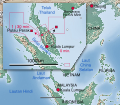 Malay version

 Please align the text (centered) with the logo,
.svg)

.jpg)
.jpg)
.jpg)
 JPG
JPG PNG
PNG Coat of arms of Osijek
 Flag of Osijek (just model)

 Age pyramid for Marshall County, Minnesota, United States of America, based on census 2000 data
 snail 1
 snail 2
 new icon
 fungi 1
 fungi 2
 new icon
 satellite
 new icon
 interior 1
 interior 2
 interior 3
 interior 4
 new icon


 Niacin.png Niacin.png
 NA, N and NR.svg Structures of salvageable forms of the NAD+ precursors nicotinic acid, nicotinamide and nicotinamide riboside

 Thumbnail generation error


 Looks pretty good! Only one little thing, the loop is not that smooth closed (pinged the requester). Regards PS: is it right that the ping on red user-pages don't work? → User: Perhelion (Commons: = crap?) 07:55, 2 September 2014 (UTC)


 Logo of National Museum of Korea
 Anti-censorship Barnstar
 Wikipedia editors are predominantly male
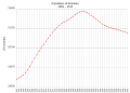 Graph in question


 Habichtswaldsteig
 Hessenweg 6
 Eco Pfad Baunatal
 Eco Pfad Bad Emstal


 Habichtswaldsteig
 Hessenweg 6
 Eco Pfad Baunatal
 Eco Pfad Bad Emstal
.svg)
.svg)
 Mid-America Intercollegiate Athletics Association logo
 now SVG
 Animated GIF of Comet Churyumov-Gerasimenko...that isn't animated as a thumbnail
 Animated
.gif)
 Korean version
 Tracy—Widom distribution
 Anatomski prikaz hipotetičnega posplošenega mehkužca
 SVG version

 English version


 Ricardo Arias, football player and Valencia CF legend.
 Full picture.
.jpg)

 Illustration of Caliph Umar bin Al-Khattab entrence to Jerusalem


 Raster version of the signature
 Vector version of the signature
 Color seatmap of Ethiopian Airlines Flight 961
 French translation
 Seatmap of Air China Flight 129
.svg)
 English seatmap
 English
 Spanish
.svg)
.svg)


 On hold
 Remove the contours between red and blue, these are inappropriate for a flag image
 Vectorize, using File: Yogyakarta COA.svg
 Vectorize, using File:Coat of arms of East Java.svg


 English version
 CAAC Flight 301 (zh-tw)
 CAAC Flight 301 (zh)
.svg)
.svg)
.svg)
 Seal of the Ministry of Internal Affairs of Libya
 Ethnicity of Detroit (not colorblind-friendly)
 Ethnicity of Houston (not colorblind-friendly)

 Vînător de munte
.jpg)

 now SVG
 Coat of arms of Medway (England) http://www.civicheraldry.co.uk/weald_downs.html#medway%20bc
 Coat of arms of Chatham http://www.civicheraldry.co.uk/kent_ob.html#chatham%20bc


 PNG version
 Incorrect design; target name
 PNG version of the coat of arms
.svg)

 Flag of Kafr El-Sheikh Governorate, Egypt
 correct flag behind The Governor in his office


_–_all_png-thumbnails_seem_to_be_rendered_wrong)
.jpg)
![[1]](https://freepages.genealogy.rootsweb.ancestry.com/~us4allen/graphics/denmark/danishnational.jpg)
![[2]](http://icons.wxug.com/hurricane/2012/number_of_disasters.png)
![[3]](http://icons.wxug.com/hurricane/2012/tstormlosses_640.png)
![[5]](https://hr.wikipedia.org/wiki/Datoteka:Watercycle-croatian.jpg)
.svg&action=edit&redlink=1)
.svg)
![[11]](http://validator.w3.org/check?uri=http%3A%2F%2Fcommons.wikimedia.org%2Fwiki%2FFile%3ANowruz_fa.wikipedia_logo.svg&charset=%28detect+automatically%29&doctype=Inline&group=0)
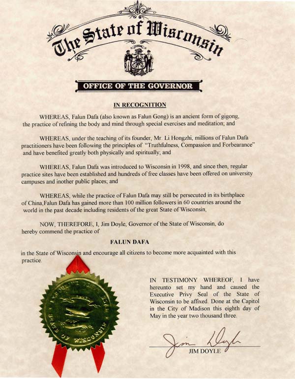
.svg)
_–_all_png-thumbnails_seem_)
_–_all_png-thumbnails_seem_)
.jpg)
.jpg)
.jpg)
.jpg)
.svg)
.jpg)
.svg)
%22.svg&action=edit&redlink=1)
![[15]](https://upload.wikimedia.org/wikipedia/commons/thumb/f/f5/Comparison_pi_infinite_series.svg/200px-Comparison_pi_infinite_series.svg.png)
.gif&action=edit&redlink=1)
.svg)
.svg)
.svg)
.svg)
.svg)
.svg)