Commons:Quality images candidates/Archives September 2010
-

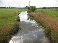
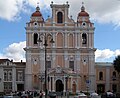
- Nomination A mountain in the region of Vila Velha de Rodão, Portugal -- Alvesgaspar 00:00, 28 September 2010 (UTC)
- Promotion Good--Lmbuga 00:23, 28 September 2010 (UTC)
-

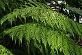
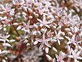
- Nomination Prunus dulcis (Almonds) in Spain. Branch, foliage, fruits--Jebulon 23:43, 27 September 2010 (UTC)
- Promotion Good--Lmbuga 00:22, 28 September 2010 (UTC)
-

- Nomination Mosaic Puffball (Handkea utriformis also Calvatia utriformis) --George Chernilevsky 19:54, 27 September 2010 (UTC)
- Promotion Good, with a very nice light IMO.--Jebulon 21:06, 27 September 2010 (UTC)
-
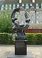
- Nomination International brigade memorial in London. --Vizu 17:30, 27 September 2010 (UTC)
- Decline Strong CA around the fingers of the statue, and the masts (?) in the corner left above.--Jebulon 23:52, 27 September 2010 (UTC)
-

-

- Nomination No money no honey-poverty driven refugee --Ikiwaner 17:02, 27 September 2010 (UTC)
- Promotion Very impressive --George Chernilevsky 11:13, 28 September 2010 (UTC)
-

-

-

- Nomination Red Banded Polypore (Fomitopsis pinicola) by User:Littlejohn --George Chernilevsky 13:02, 27 September 2010 (UTC)
- Promotion
 Support Could by sharper in parts, but I like the droplets. --Quartl 07:41, 28 September 2010 (UTC)
-

-

-
-

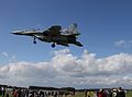
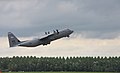
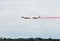
- Nomination Pilatus P-2 -- Rama 10:16, 27 September 2010 (UTC)
- Promotion QI for me. --Johannes Robalotoff 18:57, 27 September 2010 (UTC)
-
-

-

- Nomination The city hall of Guadix, Andalusia, Spain--Jebulon 23:48, 26 September 2010 (UTC)
- Promotion Excellent shot!!! Perhaps you should nominate it for the featured pictures. --A.Ceta 15:24, 27 September 2010 (UTC)
 Info Removal of disturbing foliage in the corner left above, after promotion --Jebulon 21:01, 27 September 2010 (UTC).
Support QI status confirmed after retouching (foliage removal). --Cayambe 07:33, 28 September 2010 (UTC)
-

- Nomination Preparation for a whale burial at Ocean Beach in San Francisco--Mbz1 19:15, 26 September 2010 (UTC)
- Promotion
The image was promoted with no signature so put to discussion.--Mbz1 19:10, 27 September 2010 (UTC)
Support good --George Chernilevsky 19:57, 27 September 2010 (UTC)
-

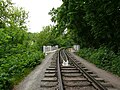
- Nomination Children's railway, Kharkov. by Ace^eVg --Vizu 18:39, 26 September 2010 (UTC)
- Promotion good --George Chernilevsky 07:25, 28 September 2010 (UTC)
-

-

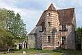
- Nomination Former guesthouse in Schwieberdingen, Germany --Harke 17:43, 26 September 2010 (UTC)
- Promotion Good technical quality and well presented main subject.--MrPanyGoff 12:47, 27 September 2010 (UTC)
-

-
-

-

- Nomination Tanea lineata --Butko 14:58, 24 September 2010 (UTC)
- Decline Very low DOF. --Johannes Robalotoff 18:48, 27 September 2010 (UTC)
-
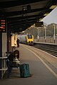
- Nomination: 221137 arrives at Bristol Parkway. Mattbuck 09:40, 22 September 2010 (UTC)
- Review needed
-

- Nomination: 158767 passes through Pilning. Mattbuck 09:40, 22 September 2010 (UTC)
- Review needed
-

- Nomination: Pharrell Williams and Shay Haley performing in Pori Jazz 2010. --kallerna 05:12, 22 September 2010 (UTC)
- Review
 Comment - can you bring out the hair of the guy on the right to make it blend into the background kess?>
-
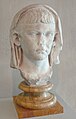
- Nomination: Bust of Julius Nero Caesar (Cabinet des Médailles, Paris)--Siren-Com 13:37, 21 September 2010 (UTC)
- Review needed
-

- Nomination Meerkat (Suricata suricatta) by User:Amada44 --4028mdk09 06:55, 21 September 2010 (UTC)
- Decline Please provide a better image description and state at least the country where this was shot. --Ikiwaner 14:18, 21 September 2010 (UTC) Info Done by uploader. --4028mdk09 18:35, 22 September 2010 (UTC) Comment Very cute, but the image looks oversharpened to me. --Quartl 05:28, 25 September 2010 (UTC)
Oversharpened, noisy BG. Lycaon 12:01, 28 September 2010 (UTC)
-

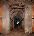
- Nomination Tunnel near the Fort de Roppe. --ComputerHotline 20:37, 20 September 2010 (UTC)
- Decline poor lightning, unsharp --Carschten 16:25, 27 September 2010 (UTC)
-

- Nomination Steam locomotive Pt47-104 and tender 34D74-54 in Muzeum Kolejnictwa, Warsaw, Poland . --Crusier 19:14, 20 September 2010 (UTC)
- Decline sky is too overxposed imo --Carschten 16:25, 27 September 2010 (UTC)
-

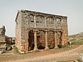
- Nomination House in Serjilla, Syria --Bgag 15:04, 20 September 2010 (UTC)
- Decline
 chromatic aberrations --Carschten 16:25, 27 September 2010 (UTC)
-

- Nomination Tatra T6A5 at Krematorium Motol, Prague — Jagro 22:34, 19 September 2010 (UTC)
- Promotion Support sky a bit overexplosed, but main object is well captured --George Chernilevsky 10:58, 28 September 2010 (UTC)
-
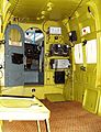
- Nomination Inside a soviet-built Antonov AN-2. --High Contrast 23:04, 26 September 2010 (UTC)
- Decline Very interesting, but far below of QI standards IMO (Noise, flash, overexposure) --Jebulon 00:07, 27 September 2010 (UTC)
-

- Nomination Building on the central square of Plattling, Bavaria. --High Contrast 23:04, 26 September 2010 (UTC)
- Promotion Good--Lmbuga 07:10, 27 September 2010 (UTC)
-

- Nomination Garmisch-Partenkirchen and the mountain ranges Wetterstein (South) and Ammergauer Alpen (West and North). (by User:Octagon) --High Contrast 22:05, 26 September 2010 (UTC)
- Decline Sorry, visible seamlines. Parallax errors?--Lmbuga 07:27, 27 September 2010 (UTC)
-
-

- Nomination Citron Amanita (Amanita citrina). --George Chernilevsky 19:04, 26 September 2010 (UTC)
- Promotion Nice composition:Autumn leaves and mushroom!--Mbz1 19:18, 26 September 2010 (UTC)
-

- Nomination Slippery Jack mushroom (Suillus luteus) --George Chernilevsky 19:04, 26 September 2010 (UTC)
- Promotion QI--Mbz1 19:18, 26 September 2010 (UTC)
-

-

-

- Nomination Urartian cuniform. Old tablet. --Vizu 18:36, 26 September 2010 (UTC)
- WARNING: third template parameter added – please remove.
-

-
-

-
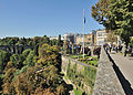
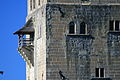
- Nomination Luxembourg City, fortress structure facing the Petrusse valley. --Cayambe 16:40, 25 September 2010 (UTC)
- Promotion nice composition --Carschten 17:08, 26 September 2010 (UTC) Info New version, with bad cloning remains removed from the sky. --Cayambe 21:23, 25 September 2010 (UTC) Support with improvements. Good picture IMO --Jebulon 21:30, 26 September 2010 (UTC)
-

- Nomination Gazania rigens cultivar -- Alvesgaspar 16:24, 26 September 2010 (UTC)
- Promotion yes QI for me. --Alchemist-hp 18:06, 26 September 2010 (UTC)
-

- Nomination Gazania rigens cultivar -- Alvesgaspar 16:24, 26 September 2010 (UTC)
- Promotion very good --Ianare 16:47, 26 September 2010 (UTC)
-
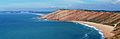
- Nomination Stretch of the western Portuguese coast -- Alvesgaspar 16:05, 26 September 2010 (UTC)
- Promotion OK for me. Please add a geotag. --Alchemist-hp 18:10, 26 September 2010 (UTC)
-

- Nomination Neckarwestheim nuclear power plant -- Felix Koenig 14:58, 26 September 2010 (UTC)
- Promotion Good quality and useful. Alofok 15:15, 26 September 2010 (UTC)
-

-

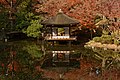
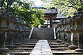
- Nomination Five-storied Pagoda of Zentsu-ji --663highland 13:45, 26 September 2010 (UTC)
- Promotion CA acceptable here. Nice monument--Jebulon 22:09, 26 September 2010 (UTC)
-

- Nomination Golden Hall of Zentsu-ji --663highland 13:45, 26 September 2010 (UTC)
- Decline Some strong red CA on the superior roof, and it is a pity.--Jebulon 22:04, 26 September 2010 (UTC)
-
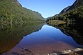
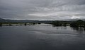
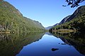
- Nomination The Tagus River, Portugal. View from near Vila Velha de Ródão. -- Alvesgaspar 11:34, 26 September 2010 (UTC)
- Promotion Support QI & Useful --Archaeodontosaurus 12:47, 26 September 2010 (UTC)
-

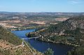
- Nomination The Tagus River at Portas de Ródão, Portugal. -- Alvesgaspar 11:34, 26 September 2010 (UTC)
- Promotion Good composition and quality, IMO.--Jebulon 21:11, 26 September 2010 (UTC)
-

- Nomination The Facho promontory. São Martinho do Porto, Portugal. -- Alvesgaspar 11:34, 26 September 2010 (UTC)
- Promotion Good to me. A geocode would help for use in projects, IMO.--Jebulon 21:09, 26 September 2010 (UTC) --
 Done Alvesgaspar 22:04, 26 September 2010 (UTC)
-
-

-

- Nomination Bombus ternarius ----Calyponte 07:16, 26 September 2010 (UTC)
- WARNING: third template parameter added – please remove.
-

- Nomination Relief of CoA of king Fernando el Catolico, from 1513. Cathedral of Granada, Spain--Jebulon 23:57, 25 September 2010 (UTC)
- Promotion Good. --Cayambe 06:16, 26 September 2010 (UTC)
-

-

- Nomination a decorative roman-like trophy, XVIIth century, painted on a wall, Château de Vaux-le-Vicomte, France--Jebulon 23:16, 25 September 2010 (UTC)
- Promotion Support QI & Useful --Archaeodontosaurus 12:51, 26 September 2010 (UTC)
-

- Nomination Chorthippus parallelus, Bastavaliños, Bastavales, Brión, Galicia, Spain--Lmbuga 22:51, 25 September 2010 (UTC)
- Promotion Good. --Cayambe 06:19, 26 September 2010 (UTC)
-

- Nomination Julius Caesar --Jebulon 16:48, 25 September 2010 (UTC)
- Promotion QI & Useful --Archaeodontosaurus 05:56, 26 September 2010 (UTC) Info New version uploaded, after Archaeo's private comments. --Jebulon 21:05, 26 September 2010 (UTC)
-
-

-

- Nomination Statue of Victor Hasselblad in Gothenburg. --Ankara 15:10, 24 September 2010 (UTC)
- Promotion Could be crop right and left IMO...--Jebulon 22:28, 25 September 2010 (UTC) Crop done.--Ankara 11:52, 26 September 2010 (UTC) I find it much better. Thanks !--Jebulon 21:21, 26 September 2010 (UTC)
-

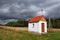
- Nomination Hermitages camaldolese in Wigry -- Albertus teolog 11:00, 24 September 2010 (UTC)
- Promotion Good to me.--Jebulon 21:59, 26 September 2010 (UTC)
-

- Nomination Church of Saint-André-de-Double in Double forest (Dordogne, France)--Jmp48 08:30, 24 September 2010 (UTC)
- Decline Resolution far below QI minimum of 2 MP. Perspective would have to be corrected, if the resolution were not already a reason to decline. --Johannes Robalotoff 18:56, 26 September 2010 (UTC)
-

-

-

- Nomination Begin of a building near the Fort de Roppe. --ComputerHotline 20:37, 20 September 2010 (UTC)
- Promotion QI --Ianare 16:49, 26 September 2010 (UTC)
-

- Nomination: Euphorbia virosa (Willd). — Lycaon 16:53, 20 September 2010 (UTC)
- Review needed
-
- Nomination: Detail of a house in Serjilla, Syria --Bgag 15:04, 20 September 2010 (UTC)
- Review needed
-

-

-

- Nomination Picture of Grenoble. For me, composition and lighting are nice. I add localization, informations and some notes on the picture. --Vomirencostard 12:58, 19 September 2010 (UTC)
- Decline Very noisy sky. Sorry --Jebulon 10:03, 27 September 2010 (UTC)
-

- Nomination Common Pheasant, Female. Notice camouflage effect of colourisation. --Thermos 12:36, 19 September 2010 (UTC)
- Promotion CommentGood image, but slightly underexposed. -- Archaeodontosaurus 14:02, 19 September 2010 (UTC) Info I uploaded a new version --Carschten 20:03, 26 September 2010 (UTC)
-

-

-

- Nomination Green Monkey Skull -- Archaeodontosaurus 16:50, 18 September 2010 (UTC)
- Promotion Excellent. --Cayambe 18:35, 17 September 2010 (UTC)
-

-

-

- Nomination Fasanus in the dunes of Amrum --Mbdortmund 11:30, 18 September 2010 (UTC)
- Promotion Disturbing grasses... but the sharpness of the head saves the pic imo. --Cayambe 09:19, 24 September 2010 (UTC)
-

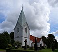
- Nomination Sveti Sedmochislenitsi (The Seven Saints) church, Sofia. --MrPanyGoff 19:33, 17 September 2010 (UTC)
- Promotion Very good. --Cayambe 18:39, 17 September 2010 (UTC)
-

-

-

-

- Nomination Skull of Babirusa --Archaeodontosaurus 07:07, 26 September 2010 (UTC)
- Promotion Support Very good, lots of details --Llez 08:07, 26 September 2010 (UTC)
-

- Nomination Archaeopteryx lithographica, Replica of the London specimen --Llez 05:53, 26 September 2010 (UTC)
- Promotion Support QI for the picture.--Archaeodontosaurus 06:02, 26 September 2010 (UTC)
-

- Nomination The Clown Triggerfish, Balistoides conspicillum --Llez 05:33, 26 September 2010 (UTC)
- Promotion Support QI & useful --Archaeodontosaurus 07:07, 26 September 2010 (UTC)
-

-

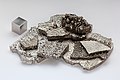
- Nomination the chemical element rhenium --Alchemist-hp 20:33, 25 September 2010 (UTC)
- Promotion of course --Carschten 21:01, 25 September 2010 (UTC)
-

-

-

-
-

-

-

-

- Nomination The Broadbarred firefish, Pterois antennata --Llez 16:04, 25 September 2010 (UTC)
- Promotion Some correctible CA on the fish due to the water, IMO--Jebulon 16:51, 25 September 2010 (UTC)
Done As far as possible --Llez 17:04, 25 September 2010 (UTC) Still little CA, but visible only at highest resolution. Nice view an useful. Thanks for improvements.--Jebulon 22:02, 25 September 2010 (UTC)
-

-

-
-

- Nomination Uspensky Organ. --Vizu 23:19, 24 September 2010 (UTC)
- Decline Overexposed parts. Need perspective correction --Archaeodontosaurus 09:01, 26 September 2010 (UTC)
-

-

-

- Nomination Polished Neolithic ax in sillimanite --Archaeodontosaurus 14:21, 24 September 2010 (UTC)
- Promotion * Comment New version meaning reflection --Archaeodontosaurus 06:05, 26 September 2010 (UTC)
Support Good --George Chernilevsky 09:31, 26 September 2010 (UTC)
-

-

- Nomination Commemorative coin. 2 hryvnia Ukraine --Butko 14:00, 24 September 2010 (UTC)
- Promotion Nice. What event of the civil war does it commemorate ?--Jebulon 22:26, 25 September 2010 (UTC)
en:Battle of Kruty --Butko 06:33, 26 September 2010 (UTC)
-

-
-

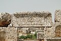
- Nomination Funerary stele, Syria --Bgag 20:14, 21 September 2010 (UTC)
- Promotion Support QI for me --Archaeodontosaurus 09:07, 26 September 2010 (UTC)
-

-

-

- Nomination Tsingys of Ankarana, Madagascar. --Marco Schmidt 14:14, 20 September 2010 (UTC)
- Decline Not sharp enough--Jebulon 10:10, 26 September 2010 (UTC)
-

- Nomination: Panorama from Aurinkolahti beach. --kallerna 11:34, 20 September 2010 (UTC)
- Review needed
-

- Nomination: The West Somerset Railway passing Blue Anchor Bay --Geof Sheppard 07:50, 20 September 2010 (UTC)
- Review needed
-

- Nomination Malagasy Giant Chameleon, Furcifer oustaleti --Marco Schmidt 10:33, 20 September 2010 (UTC)
- Decline Not sharp enough--Jebulon 10:11, 26 September 2010 (UTC)
-
- Nomination Leaves decaying in a pot --Mrmariokartguy 22:23, 19 September 2010 (UTC)
- Decline Low dof, hard shadows, need id. --Quartl 10:04, 26 September 2010 (UTC)
-
- Nomination Darter in the sun -- Alvesgaspar 17:26, 19 September 2010 (UTC)
- Promotion The harsh reflection on the wing is disturbing, but the rest of the darter is good. --Quartl 10:01, 26 September 2010 (UTC)
-

- Nomination Sharon Jones & The Dap-Kings performing in Pori Jazz 2010. --kallerna 15:10, 17 September 2010 (UTC)
- Promotion Very good, I linke it. -- Felix Koenig 10:39, 26 September 2010 (UTC)
-

-
-
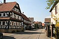
- Nomination The village of Hunspach, Alsace. --Lutz Fischer-Lamprecht 14:43, 16 September 2010 (UTC)
- Decline Need a perspective correction, and maybe a crop of the car wheel, IMO.--Jebulon 22:03, 21 September 2010 (UTC) No improvements almost a week later...--Jebulon 10:14, 26 September 2010 (UTC)
-

-

-

-

- Nomination Rusty Gilled Polypore. --Quartl 19:24, 24 September 2010 (UTC)
- Promotion even if I'm not George ;-) DOF could be a bit better on the top and I think a color-enhance because of the (hard) flash light would be nice, but otherwise very good. --Carschten 19:44, 24 September 2010 (UTC) Comment turned down brightness a bit. --Quartl 05:03, 25 September 2010 (UTC)
-

- Nomination Harvestman Oligolophus tridens. --Quartl 17:55, 24 September 2010 (UTC)
- Promotion Support QI & Useful --Archaeodontosaurus 05:29, 25 September 2010 (UTC)
-
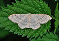
- Nomination Riband Wave. --Quartl 17:55, 24 September 2010 (UTC)
- Promotion Support QI & Useful --Archaeodontosaurus 05:29, 25 September 2010 (UTC)
-

- Nomination Birch Shield Bug. --Quartl 17:55, 24 September 2010 (UTC)
- Promotion Support QI & Useful --Archaeodontosaurus 05:29, 25 September 2010 (UTC)
-

- Nomination Pistolet modèle An IX, made in Liège in 1802. -- Rama 16:42, 24 September 2010 (UTC)
- Promotion Support QI & Useful --Archaeodontosaurus 05:29, 25 September 2010 (UTC)
-

- Nomination Fruits, Opuntia engelmannii. --Alchemist-hp 16:25, 24 September 2010 (UTC)
- Promotion very good and sharp -- Felix Koenig 16:28, 24 September 2010 (UTC)
-

- Nomination Portal of the church in Arucas, Gran Canaria. -- Felix Koenig 16:14, 24 September 2010 (UTC)
- Promotion Very good -- Albertus teolog 16:24, 24 September 2010 (UTC)
-

- Nomination Paliurus spina-christi --Butko 14:00, 24 September 2010 (UTC)
- Promotion Support QI & Useful --Archaeodontosaurus 14:55, 24 September 2010 (UTC)
-

- Nomination Larva of a Green Shield Bug. --Quartl 20:30, 23 September 2010 (UTC)
- Promotion Support QI & Useful --Archaeodontosaurus 14:53, 24 September 2010 (UTC)
-

-

-

- Nomination Canonet GIII QL-19 -- Rama 18:09, 21 September 2010 (UTC)
- Promotion Support QI & Useful --Archaeodontosaurus 14:51, 24 September 2010 (UTC)
-

- Nomination Public baths in Serjilla, Syria --Bgag 15:04, 20 September 2010 (UTC)
- Promotion OK for me -- Albertus teolog 13:29, 24 September 2010 (UTC)
-
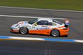
- Nomination Panning shot of Porsche racing car --AngMoKio 19:19, 18 September 2010 (UTC)
- Promotion very good -- Albertus teolog 13:24, 24 September 2010 (UTC)
-

- Nomination Tower of the church in Gáldar, Gran Canaria. -- Felix Koenig 18:26, 18 September 2010 (UTC)
- Promotion Good image... and the moon adds to its value :-) --Pouts31 23:14, 13 May 2007 (UTC)
-

- Nomination Surf at Praia Grande. Porto Covo, Portugal. -- Alvesgaspar 18:45, 17 September 2010 (UTC)
- Promotion Spectacular. Could do with sharpening and some extra contrast, but QI anyway. Mattbuck 16:34, 24 September 2010 (UTC)
-

-

- Nomination Meriken Park in Kobe --663highland 14:00, 17 September 2010 (UTC)
- Decline Comment - Would benefit from perspective correction. -- Rama 08:36, 18 September 2010 (UTC)
 Oppose - large areas of overexposure. Mattbuck 16:39, 24 September 2010 (UTC)
-

- Nomination WC inside an underground troop shelter, near the Fort de Roppe. --ComputerHotline 13:44, 17 September 2010 (UTC)
- Decline I don't really like the composition. Mattbuck 16:39, 24 September 2010 (UTC)
-

-

- Nomination The village of Niederlauterbach, Alsace. --Lutz Fischer-Lamprecht 14:43, 16 September 2010 (UTC)
- Decline Comment - Sehr ruhiger Bildaufbau (kein Verkehr!) und gute Belichtung. Ohne weiteres QI, wenn der Sensorstaub entfernt und die Perspektive entzerrt ist. --Ikiwaner 18:27, 16 September 2010 (UTC) Oppose - Dust spots. Mattbuck 13:12, 24 September 2010 (UTC)
-
- Nomination House of the commander in the former Knights Templar commandery of Coulommiers (France) --Myrabella 06:46, 24 September 2010 (UTC)
- Promotion The main subject is well presented, good informative composition and quality.--MrPanyGoff 07:09, 24 September 2010 (UTC)
-
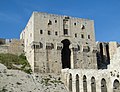
- Nomination Aleppo Citadel, Syria --Bgag 00:01, 24 September 2010 (UTC)
- Promotion good --George Chernilevsky 10:35, 24 September 2010 (UTC)
-

- Nomination Nefertiti Bust --Spongie555 03:11, 24 September 2010 (UTC)
- Promotion very good -- George Chernilevsky 10:26, 24 September 2010 (UTC)
-
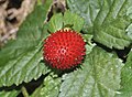
- Nomination Mock Strawberry. --Quartl 20:30, 23 September 2010 (UTC)
- Promotion QI. Main object is very sharp --George Chernilevsky 10:37, 24 September 2010 (UTC)
-

- Nomination Baobab (Adansonia digitata) in Namibia --Marco Schmidt 20:19, 23 September 2010 (UTC)
- Promotion Support QI & Useful --Archaeodontosaurus 05:44, 24 September 2010 (UTC)
-

-

- Nomination Pico de Gáldar with a part of city Gáldar, Gran Canaria. Whits parts aren't overexposured, the houses really were totally white. -- Felix Koenig 14:34, 23 September 2010 (UTC)
- Promotion QA--Mbz1 15:09, 23 September 2010 (UTC)
-

-
-

- Nomination They took it away just to bring it back 5 minutes earlier. --Airwolf 13:27, 23 September 2010 (UTC)
- Decline Unfortunately, the object itself (truck and tank) is a bit too dark. --High Contrast 15:26, 23 September 2010 (UTC)
-

-

-

-

- Nomination The Church of St. St. Constantine and Helena - Plovdiv. Ornament of the ceiling in the portico. --MrPanyGoff 20:26, 22 September 2010 (UTC)
- Promotion Very good.--Jebulon 23:30, 23 September 2010 (UTC)
-

- Nomination El Gran Capitan --Jebulon 21:06, 21 September 2010 (UTC)
- Promotion Comment Slight underexposure --Archaeodontosaurus 12:08, 22 September 2010 (UTC) Done I tried to improve. Better now ?--Jebulon 23:36, 23 September 2010 (UTC)
Support good now --Archaeodontosaurus 05:47, 24 September 2010 (UTC)
-

- Nomination Flag of Bhutan.--Spongie555 03:58, 21 September 2010 (UTC)
- Decline Not from a wikipedian. --Letartean 15:46, 23 September 2010 (UTC)
-

- Nomination: A poached pear--Jonathunder 09:19, 18 September 2010 (UTC)
- Review needed
-

- Nomination: Portrait of Czech astronomer --Gumruch 02:07, 18 September 2010 (UTC)
- Review needed
-

-

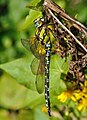
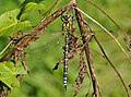
- Nomination: Southern Hawker, head and thorax closeup. --Quartl 19:43, 17 September 2010 (UTC)
- Review needed
-

- Nomination: Southern Hawker, head and thorax closeup. --Quartl 19:43, 17 September 2010 (UTC)
- Review needed
-

-

- Nomination Several bronze age burial mounds in Scania, Sweden --Ainali 20:42, 16 September 2010 (UTC)
- Decline heavy chromatic aberrations at the right and left end, needs also crop at the left. Nice lightning though. If you would correct the issues I will promote it. --Carschten 19:40, 23 September 2010 (UTC)
-

- Nomination Shurakuen Garden in Tsuyama --663highland 16:34, 16 September 2010 (UTC)
- Decline too small DOF imo, unsharpness, CA, heavy overexposed sky --Carschten 19:40, 23 September 2010 (UTC)
-
- Nomination Nara National Museum in Nara --663highland 16:34, 16 September 2010 (UTC)
- Decline chromatic aberrations, color noise --Carschten 19:40, 23 September 2010 (UTC)
-

- Nomination The village of Hunspach, Alsace. --Lutz Fischer-Lamprecht 14:43, 16 September 2010 (UTC)
- Decline tilted or/and distortions --Carschten 19:40, 23 September 2010 (UTC)
-

- Nomination An-2 --Airwolf 08:12, 16 September 2010 (UTC)
- Decline Some CA in the trees above, right and left.--Jebulon 22:04, 21 September 2010 (UTC) Oppose chromatic aberrations, gray haze --Carschten 19:40, 23 September 2010 (UTC)
-

-

-

-

- Nomination Painted wooden beehives -- Jonathunder 17:41, 14 September 2010 (UTC)
- Decline Nice and useful... can you denoise the hives in the shadow? --Cayambe 08:40, 20 September 2010 (UTC) Oppose noisy --Carschten 19:24, 23 September 2010 (UTC)
-
-

-

- Nomination Chapelle de la commanderie des Templiers de Villemoison datée du 12ème siècle, située dans le département de la Nièvre en France.--Thesupermat 07:03, 23 September 2010 (UTC)
- Promotion Great encyclopedic photo with very good technical quality.--MrPanyGoff 08:53, 23 September 2010 (UTC)
-
- Nomination In Gère-Bélesten, in the French Pyrenees. --Myrabella 06:25, 23 September 2010 (UTC)
- Promotion Support QI for me --Archaeodontosaurus 06:44, 23 September 2010 (UTC)
-

- Nomination Loading an IFV onto a lorry --Airwolf 00:01, 23 September 2010 (UTC)
- Promotion Promote, quick, before is runs afoul of 2010 Wikimedia Study of Controversial Content! Rama 07:10, 23 September 2010 (UTC)
-
-
-

- Nomination Scrambled 3x3x3 Rubik's cube. -- Rama 12:07, 22 September 2010 (UTC)
- Promotion The cube is a bit old ;-) QI omo. -- Felix Koenig 20:20, 22 September 2010 (UTC)
-

- Nomination Wooden toy polyhedron -- Rama 08:25, 22 September 2010 (UTC)
- Promotion Support QI for me --Archaeodontosaurus 12:02, 22 September 2010 (UTC)
-

- Nomination Ange de pierre sur un granit noir, cimmetière de Passy, Paris. --Siren-Com 05:42, 22 September 2010 (UTC)
- Promotion nice --Mbdortmund 15:41, 22 September 2010 (UTC)
-
-

-

- Nomination Griffon Vulture, portrait. --Quartl 00:19, 22 September 2010 (UTC)
- Promotion Support QI & Useful --Archaeodontosaurus 12:04, 22 September 2010 (UTC)
-

- Nomination Ferruginous Hawk, portrait. --Quartl 00:19, 22 September 2010 (UTC)
- Promotion Good. --Johannes Robalotoff 18:03, 22 September 2010 (UTC)
-

-

-

-

-

-

- Nomination Orangery in Kempten. Alofok 19:28, 21 September 2010 (UTC)
- Promotion Very good compsoition, a bot more sky would be good, but QI imo. -- Felix Koenig 16:55, 22 September 2010 (UTC)
-

- Nomination Vanessa atalanta. --Trachemys 08:10, 20 September 2010 (UTC)
- Decline Many overexposed regions. --Johannes Robalotoff 18:36, 22 September 2010 (UTC)
-

-

- Nomination: Rosa 'Fruite', Ryosen-ji Rose Garden, Japan by Hamachidori; nominated by Anna reg 06:40, 17 September 2010 (UTC)
- Review needed
-

-

-
- Nomination View of Biourière river in Aubrac montains (Massif central, France)--Jmp48 11:54, 14 September 2010 (UTC)
- Promotion Comment Overexposure of the meadow at the top of the image. Cropping save the photo --Archaeodontosaurus 06:00, 20 September 2010 (UTC) Info done. Rama 14:40, 22 September 2010 (UTC) Support good now --Archaeodontosaurus 05:47, 23 September 2010 (UTC)
-

- Nomination Omi-jingu --663highland 16:31, 11 September 2010 (UTC)
- Promotion Need perspective correction IMO--Jebulon 13:53, 19 September 2010 (UTC) Info done. Rama 14:39, 22 September 2010 (UTC) Support good now --Carschten 15:26, 22 September 2010 (UTC)
-
- Nomination Omi-jingu --663highland 16:31, 11 September 2010 (UTC)
- Promotion Need perspective correction IMO--Jebulon 13:53, 19 September 2010 (UTC) Info done. Rama 14:39, 22 September 2010 (UTC) Support good now --George Chernilevsky 08:58, 23 September 2010 (UTC)
-

- Nomination Malá Fatra - red trail blazing to Pekelník --Pudelek 08:45, 22 September 2010 (UTC)
- Promotion Good --George Chernilevsky 09:14, 22 September 2010 (UTC)
-

-

- Nomination Steppe Eagle, portrait. --Quartl 00:19, 22 September 2010 (UTC)
- Promotion good --Mbdortmund 02:15, 22 September 2010 (UTC)
-

-

-

-

- Nomination XVIIth century statue of Saint Nicholas, Cathedral of Cordoba, Spain--Jebulon 23:01, 21 September 2010 (UTC)
- Promotion Bon :-) -- Albertus teolog 09:57, 22 September 2010 (UTC)
-
- Nomination Church of St. Casimir in Vilnius -- Albertus teolog 21:45, 21 September 2010 (UTC)
- Promotion Good, with some minor chromatic aberration (green fringe).
-

- Nomination Leica IIIf + focus stacking demo -- Rama 20:57, 21 September 2010 (UTC)
- Promotion good --Mbdortmund 23:29, 21 September 2010 (UTC)
-

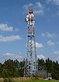
- Nomination Tower185 in Frankfurt am Main, Germany -- Der Wolf im Wald 20:22, 21 September 2010 (UTC)
- Promotion Great! --kallerna 06:59, 22 September 2010 (UTC)
-

-

-

-

- Nomination The vaulted nave of the old Hagia Sophia Church in Sofia. --MrPanyGoff 19:39, 21 September 2010 (UTC)
- Promotion FP ? --Jebulon 20:31, 21 September 2010 (UTC)
-

-

- Nomination Small concert hall in Luxembourg City. --Cayambe 16:11, 21 September 2010 (UTC)
- Promotion QI and useful -- George Chernilevsky 19:42, 21 September 2010 (UTC)
-

-

-

- Nomination Pano of Golden Gate Bridge and San Francisco from Twin Peaks --Mbz1 13:16, 21 September 2010 (UTC)
- Promotion what would you do without the Golden Gate Bridge?!? ;-D --Carschten 14:45, 21 September 2010 (UTC)
A wrong question. The right one would have been "what would you do without Golden Gate Bridge in fog --Mbz1 14:52, 21 September 2010 (UTC)
-
-

-

- Nomination Chorthippus brunneus, Bamio, Vilagarcía de Arousa--Lmbuga 08:05, 21 September 2010 (UTC)
- Promotion Comment I am not sure about the species and if it can be determined from the two images you provided. --Quartl 08:36, 21 September 2010 (UTC)
I'm not an expert, but in this page, two experts have considered Chorthippus brunneus (the grasshopper is the same, in the two images: I'm the author of the images)--Lmbuga 11:41, 21 September 2010 (UTC)
Thank you, this proof is good enough to me. --Quartl 12:14, 21 September 2010 (UTC)
Thanks. It's a female--Lmbuga 12:17, 21 September 2010 (UTC)
-

-
- Nomination Small way in the château park of Moers --Carschten 20:14, 19 September 2010 (UTC)
- Decline A bit dark, wouldn't be bad if there would be a better perspective. -- Felix Koenig 18:59, 21 September 2010 (UTC)
-

- Nomination Male domestic goat in the château park of Moers --Carschten 20:14, 19 September 2010 (UTC)
- Promotion Nice composition and good quality. -- Felix Koenig 18:59, 21 September 2010 (UTC)
-

- Nomination the chemical element Nickel --Alchemist-hp 19:59, 19 September 2010 (UTC)
- Promotion Support The green crystals on the nodule, are they the annabergite? -- Archaeodontosaurus 05:56, 20 September 2010 (UTC) InfoNo, there are other nickel salts from the elektrolysis. --Alchemist-hp 22:12, 21 September 2010 (UTC)
-

- Nomination Opening of an art exhibition at Museum der Moderne, Salzburg --Arne mueseler 16:44, 19 September 2010 (UTC)
- Promotion Good, but a bit tilted cw IMO --Jebulon 23:10, 19 September 2010 (UTC) Info i uploaded a new, corrected version --Arne mueseler 23:49, 19 September 2010 (UTC) Very good now. Something different in QIC. --Jebulon 22:07, 21 September 2010 (UTC)
-

- Nomination Opened fruit of the Ohio Buckeye, Aesculus glabra --Llez 12:19, 18 September 2010 (UTC)
- Promotion good picture of the main object but background imo oversaturated --Mbdortmund 00:14, 21 September 2010 (UTC)
Done Better now? --Llez 04:50, 21 September 2010 (UTC) Hard colors, but this post processing looks good to me. QI IMO.--Jebulon 21:59, 21 September 2010 (UTC)
-
- Nomination Grey Shrikethrush, Dorrigo, --Alchemist-hp 21:26, 17 September 2010 (UTC)
- Promotion Good, but a little bit too dark. Alofok 19:46, 21 September 2010 (UTC) Infonow corrected. --Alchemist-hp 22:16, 21 September 2010 (UTC)
-

-
-
- Nomination Church in the southern part of Sweden.--Ainali 18:13, 17 September 2010 (UTC)
- Promotion tilted --Mbdortmund 23:44, 17 September 2010 (UTC)
 Fixed--Ainali 16:51, 20 September 2010 (UTC)QI--Jebulon 09:50, 22 September 2010 (UTC)
-

- Nomination: Boeing 737-600 --Airwolf 08:12, 16 September 2010 (UTC)
- Review needed
-

- Nomination: Blackberry--Butko 07:28, 16 September 2010 (UTC)
- Review needed
-

- Nomination Pilatus PC-9 Airwolf 21:29, 15 September 2010 (UTC)
- Promotion Is good Albertus teolog 21:52, 21 September 2010 (UTC)@ Albertus teolog : A "Pilatus" is good ? --Jebulon 09:30, 22 September 2010 (UTC)
-

- Nomination: Old Polish letterbox in Gdańsk, Poland. --DerHexer 16:30, 15 September 2010 (UTC)
- Review needed
-

-

-

- Nomination: Prunus armeniaca --Butko 07:03, 15 September 2010 (UTC)
- Review Comment Almost identical image was declined 3 months ago. --Kae 12:35, 15 September 2010 (UTC)
-

-

- Nomination Wayside cross in Bertamiráns, Ames, Galicia (Spain)--Lmbuga 21:04, 13 September 2010 (UTC)
- Promotion Good. --Cayambe 16:26, 21 September 2010 (UTC)
-

-

- Nomination: Boletus erythropus--Captainpixel 15:06, 14 October 2006 (UTC)
- Review needed
-

- Nomination Contax III camera with macrophotographic equipment (goggles in front of the rangefinder and dedicated viewfinder to compensate for parallax). -- Rama 09:26, 21 September 2010 (UTC)
- Promotion Support QI for me --Archaeodontosaurus 10:05, 21 September 2010 (UTC)
-

-

-

-

- Nomination Female European Pied Flycatcher by User:OhWeh --4028mdk09 09:05, 21 September 2010 (UTC)
- Promotion QI to me. --V-wolf 09:46, 21 September 2010 (UTC)
-

- Nomination After a previous withdrawn version, a new one, improved, of Marcus Tullius Cicero--Jebulon 22:58, 20 September 2010 (UTC).
- Promotion very good --George Chernilevsky 09:03, 21 September 2010 (UTC)
-

-

-
- Nomination Opuntia quimilo. --Alchemist-hp 22:03, 20 September 2010 (UTC)
- Promotion good --Mbdortmund 23:58, 20 September 2010 (UTC)
-

-

- Nomination Tricyrtis hirta. Alofok 19:18, 20 September 2010 (UTC)
- Decline Flowers overexposed and out of focus. --V-wolf 09:46, 21 September 2010 (UTC)
-

- Nomination the belfry of Église Saint-Germain-l'Auxerrois de Paris. Maedin 19:17, 20 September 2010 (UTC)
- Promotion QI !! -- MJJR 21:16, 20 September 2010 (UTC) CommentIsn't it tilted a litte bit CW? --V-wolf 22:24, 20 September 2010 (UTC) It looks so, but through a grid, it is not. Visual impression maybe due to the light ?--Jebulon 23:02, 20 September 2010 (UTC)
-

-

-

-

- Nomination Vernal crab (Liocarcinus vernalis). — Lycaon 17:05, 20 September 2010 (UTC)
- Promotion good --Mbdortmund 19:41, 20 September 2010 (UTC)
-

-

-

- Nomination Protea cynaroides, South Africa. --Marco Schmidt 14:18, 20 September 2010 (UTC)
- Promotion Good. Lycaon 16:55, 20 September 2010 (UTC)
-
-

- Nomination Public Viewing in Vienna during UEFA Euro 2008 --Arne mueseler 10:44, 20 September 2010 (UTC)
- Promotion very good --Carschten 15:20, 20 September 2010 (UTC)
-

-
- Nomination Myrtle Warbler --Cephas 19:40, 19 September 2010 (UTC)
- Promotion good --Mbdortmund 23:53, 20 September 2010 (UTC)
-
- Nomination Darter in the sun -- Alvesgaspar 17:26, 19 September 2010 (UTC)
- Promotion good --Mbdortmund 23:54, 20 September 2010 (UTC)
-

- Nomination Chaffinch eating a worm --Thermos 11:58, 19 September 2010 (UTC)
- Promotion not perfect but good docu --Mbdortmund 00:12, 21 September 2010 (UTC)
-

- Nomination Gonipterus scutellatus from Coira, Portosín, Porto do Son, Galicia, Spain--Lmbuga 06:32, 17 September 2010 (UTC)
I'm not sure: DOF?, blurry?--Lmbuga 06:32, 17 September 2010 (UTC) - Promotion Comment Dof could be a bit better, but to me it would be still ok. Size is just below 2 mpx, though. --Quartl 07:44, 17 September 2010 (UTC)
More size (2,101 × 1,578) from RAW--Lmbuga 07:19, 21 September 2010 (UTC)
Good to me now. --Quartl 07:29, 21 September 2010 (UTC)
- Nomination Gonipterus scutellatus from Coira, Portosín, Porto do Son, Galicia, Spain--Lmbuga 06:32, 17 September 2010 (UTC)
-

- Nomination Forest Bug on pavement. --Quartl 14:59, 16 September 2010 (UTC)
- Promotion QI --Mbdortmund 23:56, 20 September 2010 (UTC)
-

- Nomination: Lavandula angustifolia --Butko 07:03, 15 September 2010 (UTC)
- Review needed
-
- Nomination: Lavandula angustifolia --Butko 07:03, 15 September 2010 (UTC)
- Review needed
-

- Nomination: Nerium oleander --Butko 07:03, 15 September 2010 (UTC)
- Review needed
-

- Nomination: Betula pendula --Butko 07:03, 15 September 2010 (UTC)
- Review needed
-

- Nomination: Prunus armeniaca --Butko 07:03, 15 September 2010 (UTC)
- Review Comment Almost identical image is already rated as QI. Why nominate yet another one? --Kae 11:58, 15 September 2010 (UTC)
-
- Nomination: Church tower in Winterberg --Mbdortmund 21:08, 14 September 2010 (UTC)
- Review needed
-

- Nomination: It's a french map : map of the underground troop shelter, near fort de Roppe (abri-caverne du fort de Roppe). --ComputerHotline 17:35, 14 September 2010 (UTC)
- Review needed
-
- Nomination: It's a french map : underground galleries in the fort de Roppe (galeries souterraines du fort de Roppe). --ComputerHotline 17:35, 14 September 2010 (UTC)
- Review needed
-

- Nomination: It's a french map : map of the Fort des Basses Perches (plan du fort des basses perches). --ComputerHotline 17:35, 14 September 2010 (UTC)
- Review needed
-

- Nomination: Osaka Maritime Museum in Osaka --663highland 16:03, 14 September 2010 (UTC)
- Review Comment CA correction and perspective correction needed. (Buildings left and right from the museum lean inward. --Johannes Robalotoff 16:36, 14 September 2010 (UTC)
-

-

- Nomination Härjångsfjället--Ankara 15:32, 14 September 2010 (UTC)
- Decline Nice view, but too noisy, partially overexposed and unsharp. --kallerna 10:44, 21 September 2010 (UTC)
-

- Nomination A goose near Lago di Toblino --Mystère Martin 14:44, 14 September 2010 (UTC)
- Decline Quite small, partially overexposed, bit noisy, sorry. --kallerna 10:44, 21 September 2010 (UTC)
-

- Nomination: Vonkaputous in Linnanmäki, Helsinki. --kallerna 14:23, 14 September 2010 (UTC)
- Review needed
-

- Nomination: Jätkäjätkät performing in Pori Jazz 2010. --kallerna 14:23, 14 September 2010 (UTC)
- Review needed
-
-

- Nomination Forest amphitheatre near Likava castle, Slovakia --Pudelek 21:57, 13 September 2010 (UTC)
- Promotion Good photo Albertus teolog 08:15, 21 September 2010 (UTC)
-

- Nomination Prince at Porthmadog Harbour railway station. Mattbuck 14:47, 13 September 2010 (UTC)
- Promotion Good result in a very dark day --George Chernilevsky 13:54, 20 September 2010 (UTC)
-

-

- Nomination: Romanian orthodox Comana monastery. --Andrei Stroe 10:31, 12 September 2010 (UTC)
- Review CommentThere is a black bit in the sky (cf. note) and something strange in the blue sky on the right side. Otherwise good. --Coyau 21:27, 14 September 2010 (UTC)
-

- Nomination Sanxenxo, Galicia (Spain)--Lmbuga 15:01, 11 September 2010 (UTC) Comment There is a dust spot at the upper right in the sky. Otherwise good. --Cayambe 20:39, 15 September 2010 (UTC)
OK New version. Best wishes--Lmbuga 07:34, 21 September 2010 (UTC) - Promotion Good now. :-) --Cayambe 09:09, 21 September 2010 (UTC)
- Nomination Sanxenxo, Galicia (Spain)--Lmbuga 15:01, 11 September 2010 (UTC)
-

- Nomination Claudia Ciesla modeling.--Spongie555 02:19, 20 September 2010 (UTC)
- Decline I'm truly sorry, but the image is too small (< 2 mpx) for QI. --Quartl 06:16, 20 September 2010 (UTC)
-

- Nomination Claudia Ciesla modeling somewhere in Spain.--Spongie555 04:14, 20 September 2010 (UTC)
- Decline Too small — and I'm talking about resolution here ;-). --Quartl 06:16, 20 September 2010 (UTC)
-

- Nomination Gaius Aurelius Valerius Diocletianus, Emperor of Rome.--Jebulon 21:26, 19 September 2010 (UTC)
- Promotion Support QI & Useful --Archaeodontosaurus 05:52, 20 September 2010 (UTC)
-

- Nomination Laetiporus sulphureus also known as "chicken-of-the-woods", prepared dish. --George Chernilevsky 20:21, 19 September 2010 (UTC)
- Promotion Yummy--Mbz1 22:42, 19 September 2010 (UTC)
-
-

- Nomination Town hall of Las Palmas de Gran Canaria. -- Felix Koenig 16:49, 19 September 2010 (UTC)
- Promotion Da wär ich jetzt gern.... --Mbdortmund 17:24, 19 September 2010 (UTC)
-

- Nomination Golden Gate Bridge at sunset--Mbz1 16:25, 19 September 2010 (UTC)
- Promotion Very nice view, good quality and nice composition. -- Felix Koenig 16:49, 19 September 2010 (UTC)
-

- Nomination Golden Gate Bridge at sunset--Mbz1 16:14, 19 September 2010 (UTC)
- Promotion Nice --George Chernilevsky 16:51, 19 September 2010 (UTC)
-

-

- Nomination Two bridges in Luxemb. City. --Cayambe 14:40, 19 September 2010 (UTC)
- Promotion Sehr gut! -- George Chernilevsky 19:08, 19 September 2010 (UTC)
-

- Nomination Shellfish Jurassic of Bavaria--Archaeodontosaurus 14:20, 19 September 2010 (UTC)(UTC)
- Promotion As always.--Mbz1 16:14, 19 September 2010 (UTC)
-

- Nomination Delftware (XVIIth century) with chinese motives, Chateau de Vaux-le-Vicomte, France--Jebulon 13:37, 19 September 2010 (UTC)
- Promotion QI --George Chernilevsky 19:13, 19 September 2010 (UTC)
-

-

-
- Nomination Mekhanik Cherny Cargo Ship (Motor Hopper) --George Chernilevsky 21:14, 18 September 2010 (UTC)
- Promotion Support QI & informative -- Archaeodontosaurus 07:53, 19 September 2010 (UTC)
-

- Nomination Bagermejster Zvekov Cargo Ship (Motor Hopper) --George Chernilevsky 21:14, 18 September 2010 (UTC)
- Promotion Good. --Cayambe 19:16, 19 September 2010 (UTC)
-

- Nomination Bagermejster Zvekov Cargo Ship (Motor Hopper) --George Chernilevsky 21:14, 18 September 2010 (UTC)
- Promotion Also good. --Cayambe 19:16, 19 September 2010 (UTC)
-

-

- Nomination Inside an underground troop shelter, near the Fort de Roppe. --ComputerHotline 13:44, 17 September 2010 (UTC)
- Promotion Good. --Cayambe 08:20, 20 September 2010 (UTC)
-

- Nomination A fireplace in an underground troop shelter, near the Fort de Roppe. --ComputerHotline 13:44, 17 September 2010 (UTC)Good. --Cayambe 18:03, 19 September 2010 (UTC)
- Promotion
-

- Nomination A fireplace and an underground entry in an underground troop shelter, near the Fort de Roppe. --ComputerHotline 13:44, 17 September 2010 (UTC)
- Promotion Also ok to me. --Cayambe 18:03, 19 September 2010 (UTC)
-

- Nomination Underground gallerie inside an underground troop shelter, near the Fort de Roppe. --ComputerHotline 13:44, 17 September 2010 (UTC)
- Promotion Also good. --Cayambe 08:21, 20 September 2010 (UTC)
-

-

- Nomination Rasos Cemetery -- Albertus teolog 09:57, 17 September 2010 (UTC)
- Promotion Ok to me. --Cayambe 08:23, 20 September 2010 (UTC)
-

- Nomination Bildhauersymposion Lindabrunn, Takera Narita, 1968 --Herzi Pinki 06:40, 17 September 2010 (UTC)
- Promotion Good. --Cayambe 08:25, 20 September 2010 (UTC)
-

- Nomination Kondo-cho, Gokasho in Higashiomi --663highland 14:45, 15 September 2010 (UTC)
- Promotion Good, though shadows are a bit harsh. --Cayambe 08:32, 20 September 2010 (UTC)
-

-

- Nomination White mahogany (Khaya anthotheca) board. --MrPanyGoff 22:34, 14 September 2010 (UTC)
- Promotion Not that exciting, but quality is ok and could be useful. --Cayambe 08:34, 20 September 2010 (UTC)
-

- Nomination Way side cross in Bertamiráns, Ames, Galicia (Spain)--Lmbuga 17:49, 14 September 2010 (UTC)
- Promotion Ok to me. --Cayambe 08:39, 20 September 2010 (UTC)
-

- Nomination Omi-jingu in Otsu --663highland 16:03, 14 September 2010 (UTC)
- Promotion Ok to me. --Cayambe 08:42, 20 September 2010 (UTC)
-

- Nomination Dessert --663highland 16:03, 14 September 2010 (UTC)
- Decline Good idea, but the pink cake is unsharp--Jebulon 13:42, 19 September 2010 (UTC)
-

- Nomination: Sho River in Shirakawa-go --663highland 15:55, 13 September 2010 (UTC)
- Review needed
-

- Nomination: A farmhouse at Plaffeien with the alps of Fribourg in the background. --LuFiLa 13:35, 13 September 2010 (UTC)
- Review needed
-
- Nomination Cyathea dregei in the tropical glasshouse of the Jardin des Plantes of Paris --Jebulon 23:11, 11 September 2010 (UTC)
- Promotion Nice shot! --A.Ceta 14:53, 19 September 2010 (UTC)
-

- Nomination Persea indica in the tropical glasshouse of the Jardin des Plantes of Paris--Jebulon 23:05, 11 September 2010 (UTC)
- Decline Technical problems: although it is a useful photo, the composition or the FOP is the problem: Many parts are unsharp of which one could expect it is the main focus of the photo. For instance the shaft is sharp, which is not interesting. --A.Ceta 14:53, 19 September 2010 (UTC)
-

- Nomination Joseph's Catholic Church in a town in Bavaria near the Danube. --High Contrast 22:21, 11 September 2010 (UTC)
- Promotion Good photo. Nice details. --A.Ceta 14:53, 19 September 2010 (UTC)
-
-
-
- Nomination The chemical element cobalt. --Alchemist-hp 00:43, 19 September 2010 (UTC)
- Promotion Sehr gut --George Chernilevsky 07:36, 19 September 2010 (UTC)
-

- Nomination House in Serjilla, Syria --Bgag 21:55, 18 September 2010 (UTC)
- Promotion Very interesting subject. QI requirements met.--MrPanyGoff 23:39, 18 September 2010 (UTC)
-
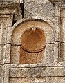
- Nomination A lintel in Sergilla, Syria --Bgag 21:55, 18 September 2010 (UTC)
- Promotion Well presented detail.--MrPanyGoff 23:42, 18 September 2010 (UTC)
-
- Nomination The village Inn in Sergilla, Syria --Bgag 21:55, 18 September 2010 (UTC)
- Promotion Great colors. QI requirements met.--MrPanyGoff 23:39, 18 September 2010 (UTC)
-

-

- Nomination the Teapot --George Chernilevsky 21:14, 18 September 2010 (UTC)
- Promotion good quality --Mbdortmund 22:16, 18 September 2010 (UTC)
-

- Nomination Gediminas' Tower -- Albertus teolog 19:35, 18 September 2010 (UTC)
- Decline Sorry, but the tower is almost completely invisible, --Herzi Pinki 20:56, 18 September 2010 (UTC)
-

-

- Nomination The Town hall in St. Pölten --AleXXw 17:34, 18 September 2010 (UTC)
- Promotion Very good. --The High Fin Sperm Whale 18:28, 18 September 2010 (UTC)
-

-

-

-

-

-
- Nomination Wakayama Castle Nishinomaru Garden --663highland 14:00, 17 September 2010 (UTC)
- Promotion QI. --Jovianeye 20:44, 18 September 2010 (UTC)
-

-

-
-
- Nomination: Main street of Saint-Imier, Switzerland --Badener 06:43, 13 September 2010 (UTC)
- Review needed
-

- Nomination: Little house at Sågudden Open Air Museum, Arvika, Sweden --Xauxa 11:01, 13 September 2010 (UTC)
- Review needed
-

- Nomination: Vonkaputous in Linnanmäki, Helsinki. --kallerna 15:11, 12 September 2010 (UTC)
- Review needed
-

- Nomination: Yyteri beach during Yyteri Beachfutis. --kallerna 15:11, 12 September 2010 (UTC)
- Review needed
-

-
- Nomination Omi-jingu --663highland 16:31, 11 September 2010 (UTC)
- Promotion Unreservedly Albertus teolog 19:44, 18 September 2010 (UTC)
-

-

- Nomination Buffers at St Philips Marsh T&RSMD. Mattbuck 10:49, 11 September 2010 (UTC)
- Promotion QI --George Chernilevsky 08:21, 19 September 2010 (UTC)
-

- Nomination Flower of a Common Hibiscus -- Alvesgaspar 22:37, 10 September 2010 (UTC)
- Promotion Very good. --The High Fin Sperm Whale 18:31, 18 September 2010 (UTC)
-
- Nomination Flower of a Common Hibiscus -- Alvesgaspar 22:37, 10 September 2010 (UTC)
- Promotion Very good. --The High Fin Sperm Whale 18:31, 18 September 2010 (UTC)
-

- Nomination a Gassho-dukuri house in Shirakawa-go, Japan --663highland 12:35, 10 September 2010 (UTC)
- Promotion Very good. --The High Fin Sperm Whale 18:31, 18 September 2010 (UTC)
-

- Nomination Togarashi farm at Shirakawa-go, Japan --663highland 12:35, 10 September 2010 (UTC)
- Decline Too soft. --The High Fin Sperm Whale 18:31, 18 September 2010 (UTC)
-

- Nomination Telstra Tower Canberra. Good exposure, nice, sharp photo with great cloud formations. Sorry if I have not given the proper technical terms --Adam.J.W.C. 03:19, 18 September 2010 (UTC)
- Decline You forgot one technical term, image size, which is too small (< 2 mpx) for QI. --Quartl 04:38, 18 September 2010 (UTC)
-

- Nomination Common Darters mating. --Quartl 20:48, 17 September 2010 (UTC)
- Promotion good --Mbdortmund 23:43, 17 September 2010 (UTC)
-
-

- Nomination Sand Lizard, head closeup. --Quartl 20:15, 17 September 2010 (UTC)
- Promotion Support QI & Useful --Archaeodontosaurus 10:30, 18 September 2010 (UTC)
-
- Nomination Southern Hawker, dorsal view. --Quartl 19:43, 17 September 2010 (UTC)
- Promotion Support QI & Useful --Archaeodontosaurus 10:31, 18 September 2010 (UTC)
-

-

- Nomination Common Gull (Larus canus). --kallerna 15:10, 17 September 2010 (UTC)
- Promotion Very good. --The High Fin Sperm Whale 16:50, 17 September 2010 (UTC)
-

- Nomination The rare parasitic bolete on a common earth ball. — Lycaon 14:39, 17 September 2010 (UTC)
- Promotion Very good. --The High Fin Sperm Whale 16:50, 17 September 2010 (UTC)
-
- Nomination A condamned entry of an underground troop shelter, near the Fort de Roppe. --ComputerHotline 13:44, 17 September 2010 (UTC)
- Promotion good --Mbdortmund 11:39, 18 September 2010 (UTC)
-

-

- Nomination panoramic view from Gornergrat --Tobi 87 20:47, 16 September 2010 (UTC)
- Promotion Perfect! Try nominate it as FP candidate --George Chernilevsky 11:24, 18 September 2010 (UTC)
-

- Nomination Neuffen city centre. --Quartl 19:40, 16 September 2010 (UTC)
- Promotion Good technical quality imo, very informative.--MrPanyGoff 13:37, 17 September 2010 (UTC)
-

- Nomination Pinus albicaulis (Whitebark Pine), seed cone --Wsiegmund 17:42, 16 September 2010 (UTC)
- Promotion Support QI & Useful --Archaeodontosaurus 10:19, 18 September 2010 (UTC)
-

- Nomination Monument to Constitution of the Ukrainian Air Force. Old Soviet jet fighter MiG-21. -- George Chernilevsky 09:23, 16 September 2010 (UTC)
- Promotion Support QI for me --Archaeodontosaurus 10:16, 18 September 2010 (UTC)
-

- Nomination Luxembourg City, Pfaffental church and surroundings. --Cayambe 15:51, 15 September 2010 (UTC)
- Promotion As a whole it's OK imo.--MrPanyGoff 07:56, 18 September 2010 (UTC)
-
-

-

- Nomination Himekawa River in Hakuba --663highland 15:55, 13 September 2010 (UTC)
- Decline Not so good exposition.--MrPanyGoff 07:51, 18 September 2010 (UTC)
-
-

- Nomination St. Jakobus Winterberg --Mbdortmund 21:16, 12 September 2010 (UTC)
- Promotion Good -- George Chernilevsky 06:21, 18 September 2010 (UTC)
-

- Nomination Tan-y-Bwlch railway station. Mattbuck 16:22, 12 September 2010 (UTC)
- Promotion Good --George Chernilevsky 06:19, 18 September 2010 (UTC)
-

- Nomination Panorama from Mustakivenpuisto. --kallerna 15:11, 12 September 2010 (UTC)
- Promotion As a whole I think it's OK.--MrPanyGoff 07:49, 18 September 2010 (UTC)
-
- Nomination Water near the bottom of Rainbow Falls. --The High Fin Sperm Whale 18:05, 11 September 2010 (UTC)
- Promotion Good --George Chernilevsky 06:14, 18 September 2010 (UTC)
-

- Nomination: Port of Portosín, Porto do Son, Galicia (Spain)--Lmbuga 14:56, 11 September 2010 (UTC)
- Review The left 20% is OOF, the rest is good. How come? Lycaon 23:17, 11 September 2010 (UTC)
-
![* Nomination: Yuriev Monastery in Novgorod, Russia. --S[1] 14:21, 11 September 2010 (UTC) I like it, but I think that the clouds are something blue--Lmbuga 15:04, 11 September 2010 (UTC) * * Review needed](https://upload.wikimedia.org/wikipedia/commons/thumb/f/f9/Novgorod_-_View_on_Yuriev_Monastery_from_Volkhov_02.jpg/120px-Novgorod_-_View_on_Yuriev_Monastery_from_Volkhov_02.jpg)
-

- Nomination: Ochsenburger Brücke by User:AleXXw, retouched by me --Carschten 12:27, 11 September 2010 (UTC)
- Review needed
-

- Nomination A swan on Lake Tal-y-llyn. Mattbuck 10:49, 11 September 2010 (UTC)
- Promotion QI for me --George Chernilevsky 06:11, 18 September 2010 (UTC)
-

- Nomination Podgornaya sloboda in Pereslavl (literally Piedmont sloboda). Vivid demonstration of tilt-shift effect.--PereslavlFoto 22:22, 10 September 2010 (UTC)
- Promotion Interesting, showing DOF effect, can be promoted.--MrPanyGoff 07:30, 18 September 2010 (UTC)
-

- Nomination The view from Bury Ditches hill fort. Mattbuck 17:21, 10 September 2010 (UTC)
- Promotion Good --George Chernilevsky 06:09, 18 September 2010 (UTC)
-

- Nomination Underwater vehicle LTS-7 “Greześ” in Gdańsk, Poland. --DerHexer 00:32, 10 September 2010 (UTC)
- Promotion OK --George Chernilevsky 06:07, 18 September 2010 (UTC)
-

-

- Nomination House of a day labourer in the open-air museum Beuren. --Quartl 06:43, 17 September 2010 (UTC)
- Promotion Very good -- George Chernilevsky 08:29, 17 September 2010 (UTC)
-

- Nomination Sagawa Art Museum in Moriyama --663highland 16:34, 16 September 2010 (UTC)
- Promotion Good, though I think there is too much of 'bottom' here. --Cayambe 17:47, 16 September 2010 (UTC)
-

- Nomination Teatro Pérez Galdós, Las Palmas de Gran Canaria. -- Felix Koenig 14:59, 16 September 2010 (UTC)
- Promotion QI for me. CA in trees--Lmbuga 19:34, 16 September 2010 (UTC)
-

- Nomination Monument to Constitution of the Ukrainian Air Force. Old Soviet jet fighter MiG-21. -- George Chernilevsky 09:23, 16 September 2010 (UTC)
- Promotion good --Mbdortmund 19:54, 16 September 2010 (UTC)
-

- Nomination Gasshodukuri-minkaen in Shirakawago --663highland 14:45, 15 September 2010 (UTC)
- Promotion QI to me. --Cayambe 17:50, 16 September 2010 (UTC)
-

- Nomination Underground troop shelter under the fort de Giromagny. --ComputerHotline 09:11, 15 September 2010 (UTC)
- Promotion Good. --Cayambe 17:52, 16 September 2010 (UTC)
-

- Nomination In the double caponier in the fort de Giromagny. --ComputerHotline 09:11, 15 September 2010 (UTC)
- Promotion Also good. --Cayambe 17:52, 16 September 2010 (UTC)
-

- Nomination Mustard Adrian helmet of the African troops of the French Army, model 1915. -- Rama 23:02, 14 September 2010 (UTC)
- Promotion crop could imo be tighter --Mbdortmund 22:27, 16 September 2010 (UTC)
-

- Nomination Sailing boat in Zanzibar --Ikiwaner 15:17, 13 September 2010 (UTC)
- Promotion
Tilted (can be fixed), but unfortunately also unsharp (difficult to fix). Lycaon 15:28, 13 September 2010 (UTC)
rotated 0.4° --Ikiwaner 19:40, 13 September 2010 (UTC)
Too nice to oppose. Lycaon 07:07, 17 September 2010 (UTC)
-

-

- Nomination Door in Fougères (France). --Coyau 23:59, 12 September 2010 (UTC)
- Promotion OK --Mbdortmund 04:44, 17 September 2010 (UTC)
-

- Nomination Church of Santa María de Guía de Gran Canaria -- Felix Koenig 17:16, 11 September 2010 (UTC)
- Promotion good --Carschten 18:05, 16 September 2010 (UTC)
-

- Nomination Church in Ingenio, Gran Canaria. Felix Koenig 16:48, 11 September 2010 (UTC)
- Decline tight crop at bottom, the top of the church is very blurry and unsharp --Carschten 18:05, 16 September 2010 (UTC)
-
- Nomination: The Bridgwater and Taunton canal at Durston. Mattbuck 10:49, 11 September 2010 (UTC)
- Review needed
-

-
- Nomination Church dome in Nagorye village.--PereslavlFoto 22:22, 10 September 2010 (UTC)
- Decline Overexposure --Kae 18:18, 16 September 2010 (UTC)
-

-
- Nomination: Hopton Heath railway station. Mattbuck 17:21, 10 September 2010 (UTC)
- Review nice except the crop of the house, but perspective should be corrected, look at tilted bridge and rails --Mbdortmund 17:39, 10 September 2010 (UTC)
-

-

-

-
- Nomination Liptovská Mara - church tower and water reservoir --Pudelek 16:13, 9 September 2010 (UTC)
- Promotion Comment Perspective correction needed. On the other picture nominated here I can see that the tower is not leaning in reality. --Johannes Robalotoff 18:36, 15 September 2010 (UTC) Support IMO it looks more interesting without correction. --Kae 18:35, 16 September 2010 (UTC)
-

- Nomination Liptovská Mara - church tower and water reservoir --Pudelek 16:13, 9 September 2010 (UTC)
- Promotion Good Albertus teolog 10:35, 17 September 2010 (UTC)
-

-

- Nomination Adachi Museum of Art Garden --663highland 13:26, 9 September 2010 (UTC)
- Promotion good composition --Mbdortmund 04:46, 17 September 2010 (UTC)
-

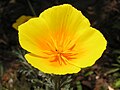
- Nomination Eschscholzia californica --Butko 15:32, 8 September 2010 (UTC)
- Promotion Also good. --Cayambe 08:50, 17 September 2010 (UTC)
-

-

-

-

- Nomination Tor der Erkenntnis, Symposion Lindabrunn, a 1988 sculpture. --Herzi Pinki 22:35, 15 September 2010 (UTC)
- Promotion QI--Mbz1 02:38, 16 September 2010 (UTC)
-

-

-

-

- Nomination Panorama from Aurinkolahti beach. --kallerna 14:45, 15 September 2010 (UTC)
- Promotion Good quality, good composition and informative.--MrPanyGoff 22:22, 15 September 2010 (UTC)
-

- Nomination Pin. Ca. 2500 - 2200 BCE. -- Rama 09:49, 15 September 2010 (UTC)
- Promotion Support QI & Useful --Archaeodontosaurus 18:49, 15 September 2010 (UTC)
-

- Nomination Salvia splendens --Butko 07:03, 15 September 2010 (UTC)
- Decline Here petals are also very strongly overexposed in the red channel. --Johannes Robalotoff 18:04, 15 September 2010 (UTC)
-

- Nomination Alcea rosea --Butko 07:03, 15 September 2010 (UTC)
- Decline Not really sharp and strongly overexposed in read and green channel. You should not rely on automatic exposure measurement with such subjects. You need to correct your camera manually. --Johannes Robalotoff 17:55, 15 September 2010 (UTC)
-

- Nomination Aesculus carnea --Butko 07:03, 15 September 2010 (UTC)
- Decline Not really sharp and lots of overexposed areas. --Johannes Robalotoff 17:43, 15 September 2010 (UTC)
-

- Nomination Aesculus carnea --Butko 07:03, 15 September 2010 (UTC)
- Decline A bit sharper than the other one, but also overexposed in the red channel. --Johannes Robalotoff 17:47, 15 September 2010 (UTC)
-

- Nomination Aesculus hippocastanum --Butko 07:03, 15 September 2010 (UTC)
- Promotion OK. --Johannes Robalotoff 17:49, 15 September 2010 (UTC)
-

- Nomination SWX Stock exchange --Ikiwaner 18:29, 14 September 2010 (UTC)
are the wires disturbing? I don't know, but I think that it's impossible other image--Lmbuga 18:56, 14 September 2010 (UTC) - Promotion Support technically satisfactory --Archaeodontosaurus 06:25, 16 September 2010 (UTC)
- Nomination SWX Stock exchange --Ikiwaner 18:29, 14 September 2010 (UTC)
-

- Nomination panoramic view from Rotenboden, Zermatt --Tobi 87 17:46, 14 September 2010 (UTC)
- Promotion Good image. Informative image description. --Johannes Robalotoff 18:46, 15 September 2010 (UTC)
-

-

-

- Nomination Water cascading near the top of Bridal Veil Falls, British Columbia. --The High Fin Sperm Whale 23:19, 11 September 2010 (UTC)
- Promotion Good. --Cayambe 20:35, 15 September 2010 (UTC)
-
- Nomination Marattia salicina, young whole plant, in the tropical glasshouse of Jardin des Plantes of Paris --Jebulon 23:18, 11 September 2010 (UTC)
- Promotion Good. --Cayambe 20:35, 15 September 2010 (UTC)
-

-

-

- Nomination: Nogat river and Malbork Castle (Poland) in evening light. --DerHexer 23:22, 9 September 2010 (UTC)
- Review needed
-

-

- Nomination: Clematis cultivarsClematis cultivars --Butko 15:28, 9 September 2010 (UTC)
- Review needed
-

- Nomination Eschscholzia californica --Butko 15:32, 8 September 2010 (UTC)
- Promotion Very good. --Cayambe 08:30, 11 September 2010 (UTC)
-
- Nomination Berberis thunbergii --Butko 15:28, 8 September 2010 (UTC)
- Decline Red channel extremely blown. Only small area in focus. --Johannes Robalotoff 18:33, 15 September 2010 (UTC)
-
- Nomination: Church of St. Casimir in Vilnius -- Albertus teolog 13:40, 8 September 2010 (UTC)
- Review Please have a look on your talk page--Jebulon 23:36, 9 September 2010 (UTC) -- Thank you for the correction of perspective Albertus teolog 10:41, 10 September 2010 (UTC)
-

-

-

-
-

-

- Nomination In the double caponier in the fort de Giromagny. --ComputerHotline 09:11, 15 September 2010 (UTC)
- Promotion Very good technical quality no matter that there is small overlighted area near the floodlight source.--MrPanyGoff 11:45, 15 September 2010 (UTC)
-

- Nomination In the fort de Giromagny. --ComputerHotline 09:11, 15 September 2010 (UTC)
- Promotion Very good sense of space. Rama 09:51, 15 September 2010 (UTC)
-

- Nomination Baptismal font -- Albertus teolog 08:47, 15 September 2010 (UTC)
- Decline Sorry but it is very noisy. Moreover, the light is somehow not good too.--MrPanyGoff 11:36, 15 September 2010 (UTC)
-

- Nomination Spotted Wolf Spider von Hoary Ragwort. --Quartl 06:46, 15 September 2010 (UTC)
- Promotion Support QI & Useful --Archaeodontosaurus 10:09, 15 September 2010 (UTC)
-

- Nomination Schloss Schielleiten south front --Herzi Pinki 23:05, 14 September 2010 (UTC)
- Promotion Classic composition, good technical quality, highly informative.--MrPanyGoff 23:33, 14 September 2010 (UTC)
-
- Nomination Devil's Coach Horse Beetle. --Quartl 20:40, 14 September 2010 (UTC)
- Promotion Support QI & Useful --Archaeodontosaurus 05:50, 15 September 2010 (UTC)
-

-

- Nomination Swedish bronze age megalith. --Ainali 20:37, 14 September 2010 (UTC)
- Promotion Support QI of me --Archaeodontosaurus 10:12, 15 September 2010 (UTC)
-

- Nomination Swedish bronze age megalith.--Ainali 20:37, 14 September 2010 (UTC)
- Promotion Support QI & Useful --Archaeodontosaurus 05:52, 15 September 2010 (UTC)
-

-

-

- Nomination Wooden deck close-up. --MrPanyGoff 17:03, 14 September 2010 (UTC)
- Decline Overesposed screw,
not sharp enough, composition--Lmbuga 18:47, 14 September 2010 (UTC)
-

- Nomination Two bridges over the Alzette river in Luxemb. City. --Cayambe 16:57, 14 September 2010 (UTC)
- Promotion Support QI for me --Archaeodontosaurus 19:41, 14 September 2010 (UTC)
-

-

- Nomination sunset behind Cologne Cathedral --Tobi 87 14:00, 14 September 2010 (UTC)
- Promotion very, very good composition (sun between the towers, the cathedral, the TV tower, the bird in the sky), nice play with lights, good quality (some artifacts, but overall above-average). IMHO it could be featured... --Carschten 15:38, 14 September 2010 (UTC)
-

- Nomination Vilnius Cathedral -- Albertus teolog 09:46, 14 September 2010 (UTC)
- Decline Distortion, not sharp enough, chromatic aberration (purple hazing at contrast edges on tower)--Lmbuga 19:23, 14 September 2010 (UTC)
-

-

- Nomination Skull of Woolly Rhinoceros Pleistocene --Archaeodontosaurus 19:22, 13 September 2010 (UTC)
- Promotion QI for me. --Johannes Robalotoff 17:02, 14 September 2010 (UTC)
-
-

- Nomination L-39 Albatros --Airwolf 16:28, 13 September 2010 (UTC)
- Promotion Very good -- George Chernilevsky 06:15, 15 September 2010 (UTC)
-

-

- Nomination Paraglider at Happo-one in Hakuba --663highland 15:55, 13 September 2010 (UTC)
- Decline The wires are disturbing. People are not sharp--Lmbuga 19:40, 14 September 2010 (UTC)
-

- Nomination Lantern in Paris --Jebulon 17:43, 12 September 2010 (UTC)
- Promotion Nice --George Chernilevsky 06:19, 15 September 2010 (UTC)
-

-
- Nomination: Sedum album --Butko 15:28, 8 September 2010 (UTC)
- Review needed
-
- Nomination: Eschscholzia californica --Butko 15:28, 8 September 2010 (UTC)
- Review needed
-

-

- Nomination: Panorama of Malbork Castle, Poland. --DerHexer 13:24, 8 September 2010 (UTC)
- Review needed
-

- Nomination: Panorama of Malbork Castle, Poland. --DerHexer 13:24, 8 September 2010 (UTC)
- Review needed
-

- Nomination: Model of Malbork Castle, Poland. --DerHexer 13:24, 8 September 2010 (UTC)
- Review needed
-

- Nomination Dansker (toilet tower) in Malbork, Poland. --DerHexer 00:48, 8 September 2010 (UTC)
- Promotion Good - Albertus teolog 08:50, 15 September 2010 (UTC)
-

- Nomination: Hirafuku in Sayo, Hyogo pref. --663highland 13:30, 7 September 2010 (UTC)
- Review Comment CA visable even at 1/3 of the full resolution. Overexposed rooftops on the left. --Johannes Robalotoff 16:59, 8 September 2010 (UTC)
-

-

-

-

-

-

-

-

- Nomination Panoramic view seen from the viewpoint inside the fort de Giromagny. --ComputerHotline 16:46, 6 September 2010 (UTC)
- Decline quality imo not good enough --Carschten 16:13, 14 September 2010 (UTC)
-

-

-

- Nomination Sedum album --Butko 13:17, 6 September 2010 (UTC)
- Decline looks like wrong white balance, unlike the first version --Ikiwaner 10:14, 15 September 2010 (UTC)
-

- Nomination Sedum album --Butko 13:17, 6 September 2010 (UTC)
- Decline looks like wrong white balance, unlike the first version --Ikiwaner 10:14, 15 September 2010 (UTC)
-

-

-

-

-
- Nomination Gediminas Monument in Vilnius -- Albertus teolog 21:17, 13 September 2010 (UTC)
- Promotion Ok for me --Pudelek 21:57, 13 September 2010 (UTC)
-

- Nomination St. Jakobus, Winterberg --Mbdortmund 20:45, 13 September 2010 (UTC)
- Promotion Great technical quality though I would prefer the whole window not just a crop.--MrPanyGoff 22:01, 13 September 2010 (UTC)
It is very long and small and upper and lower parts show mainly decorative elements --Mbdortmund 09:32, 14 September 2010 (UTC)
-

-
-
- Nomination Door in Fougères (France). --Coyau 04:08, 13 September 2010 (UTC)
- Promotion Good :-) Albertus teolog 22:01, 13 September 2010 (UTC)
-
- Nomination Cicero, Marble bust, XVIIth century, Château de Vaux-le-Vicomte, France
- Withdrawn Very coarse cut of object from original background --Kae 05:17, 13 September 2010 (UTC)Sorry, it is my first attempt, and I'm not sure I understand very well what you mean. Could you explain or show me with annotations, please ? Thanks for review.--Jebulon 09:33, 13 September 2010 (UTC) OK I'll try to improve, I've seen what is wrong.--Jebulon 09:15, 14 September 2010 (UTC)
-

- Nomination Blossoms. --Trachemys 15:46, 12 September 2010 (UTC)
- Decline Comment Name of the species and geotagging would be useful --Llez 18:28, 12 September 2010 (UTC) Comment I don't know what is it, but geotagging was added. --Trachemys 19:10, 12 September 2010 (UTC) Oppose No ID's. --kallerna 10:34, 13 September 2010 (UTC) Comment Are you kidding ? This is a serious reason why this is not a quality image ? I'm not a botanist, and I don't found name of this species on the internet. --Trachemys 12:48, 13 September 2010 (UTC) Comment Quote from guidelines: "Quality images must be categorized, have a meaningful title and description. This should include the Taxa naming for organisms." --kallerna 10:07, 14 September 2010 (UTC)
-

- Nomination Blossoms. --Trachemys 15:46, 12 September 2010 (UTC)
- Decline Name of the species and geotagging would be useful --Llez 18:28, 12 September 2010 (UTC) Comment I don't know what is it, but geotagging was added. --Trachemys 19:10, 12 September 2010 (UTC) Oppose No ID's. --kallerna 10:34, 13 September 2010 (UTC) Comment Are you kidding ? This is a serious reason why this is not a quality image ? I'm not a botanist, and I don't found name of this species on the internet. --Trachemys 12:48, 13 September 2010 (UTC) Comment Quote from guidelines: "Quality images must be categorized, have a meaningful title and description. This should include the Taxa naming for organisms." --kallerna 10:07, 14 September 2010 (UTC)
-

-
- Nomination Sveti Sedmochislenitsi (The Seven Saints) church, Sofia, Bulgaria. South elevation fragment. --MrPanyGoff 13:00, 12 September 2010 (UTC)
- Promotion QI for me, in spite of some remaining subtle distortion effects. --Johannes Robalotoff 17:48, 13 September 2010 (UTC)
-

- Nomination The bell tower at Comana monastery, Romania. --Andrei Stroe 10:48, 12 September 2010 (UTC)
- Decline Sorry, bit underexposed. --kallerna 10:39, 13 September 2010 (UTC)
I corrected the exposure a bit. —Andrei Stroe 20:37, 13 September 2010 (UTC)
-
- Nomination The Central Bus Station of the Bavarian City Passau. --High Contrast 23:02, 11 September 2010 (UTC)
- Decline Composition is not good enough IMO: 1/3 on top and 1/3 in bottom looks too empty. --Kae 03:45, 13 September 2010 (UTC) Comment The composition was wanted like this: I find it appreciated if the bus sign on the street is visible. That would fit especially for a central bus station. --MrPanyGoff 18:38, 13 September 2010 (UTC)
I understand your accent on bus sign, but foreground is too empty IMO.--Kae 18:44, 13 September 2010 (UTC)
-

- Nomination Iglesia de la Concepción in Agaete, Gran Canaria. -- Felix Koenig 15:58, 11 September 2010 (UTC)
- Promotion I think it is OK for QI though it needs some perspective correction. The composition is OK. The photo is highly informative.--MrPanyGoff 22:26, 13 September 2010 (UTC)
-

- Nomination Natural monument Bachmač in Czech Republic --Chmee2 15:19, 11 September 2010 (UTC)
- Decline Sorry! Poor technical presentation of the grass and trees here.--MrPanyGoff 19:07, 13 September 2010 (UTC)
-

-
-

- Nomination Kondo of Mii-dera in Otsu --663highland 12:58, 6 September 2010 (UTC)
- Promotion Pity that there are people, but the crop and the quality is good Albertus teolog 21:57, 13 September 2010 (UTC)
-

-

- Nomination Mangetsuji temple in Otsu --663highland 14:23, 5 September 2010 (UTC)
- Promotion good --Carschten 18:36, 13 September 2010 (UTC)
-

- Nomination Breaking waves -- Alvesgaspar 10:31, 5 September 2010 (UTC)
- Promotion spots to be removed in the sky --Jebulon 22:09, 7 September 2010 (UTC)-- Done DOne -- Alvesgaspar 23:01, 7 September 2010 (UTC) Support nice --Carschten 18:36, 13 September 2010 (UTC)
-

- Nomination Barringtonia neocaledonica, new in "Commons" (I'm very proud!) --Jebulon 16:57, 12 September 2010 (UTC)
- Promotion QI for me. --Johannes Robalotoff 18:59, 12 September 2010 (UTC)
-

-

- Nomination A Bristol and West balloon flies over Bath. Mattbuck 16:22, 12 September 2010 (UTC)
- Decline There is a sharpening halo around the balloon. The balloon has also very low resolution. The image is not much above the QI limit of 2 MP. If one crops a lot of empty sky, it falls far below the limit. --Johannes Robalotoff 18:52, 12 September 2010 (UTC)
-

-

- Nomination View of Vega de San Mateo, Gran Canaria. -- Felix Koenig 16:01, 12 September 2010 (UTC)
- Decline Sorry, nice view but too blurry and bit overexposed. --kallerna 10:37, 13 September 2010 (UTC)
-

-

-

- Nomination Isome-shi Garden in Otsu --663highland 14:17, 12 September 2010 (UTC)
- Decline Overexposed and composition bit random. --kallerna 10:42, 13 September 2010 (UTC)
-

- Nomination Mt. Bizan view from port of Tokushima --663highland 14:17, 12 September 2010 (UTC)
- Decline Sorry, IMO bit odd composition. --kallerna 10:42, 13 September 2010 (UTC)
-

- Nomination Jin Homura Art Museum in Shirakawa-go --663highland 14:17, 12 September 2010 (UTC)
- Promotion Ok, althought the car is bit overexposed. --kallerna 10:42, 13 September 2010 (UTC)
-

- Nomination New species of pterosaur --Archaeodontosaurus 13:13, 12 September 2010 (UTC)
- Promotion QI and high EV --Llez 15:19, 12 September 2010 (UTC)
-

-
-

-
![* Nomination Nativity Church in Novgorod, Russia. --S[1] 14:21, 11 September 2010 (UTC) * Decline unfortunate crop right and left, sorry.--Jebulon 15:36, 12 September 2010 (UTC)](https://upload.wikimedia.org/wikipedia/commons/thumb/a/ae/Novgorod_-_Church_of_the_Nativity_in_Antoniev_Monastery.jpg/80px-Novgorod_-_Church_of_the_Nativity_in_Antoniev_Monastery.jpg)
-

- Nomination Grandmaster's Palace, Valletta, Malta --MrPanyGoff 13:00, 10 September 2010 (UTC)
- Decline Comment I think this is a useful picture and at that moment it was the best that you could achieve with your camera. But for QI noise is too strong in the midtones and shadows. I like the image, but it does not meet QI criteria IMHO. --Johannes Robalotoff 19:15, 12 September 2010 (UTC)
-

-

-

-
- Nomination Mii-dera in Otsu --663highland 13:30, 7 September 2010 (UTC)
- Decline Very bad light over the roof. Please see annotation. Sorry--Jebulon 15:25, 12 September 2010 (UTC)
-

- Nomination: Cotinus coggygria --Butko 09:43, 7 September 2010 (UTC)
- Review needed
-

- Nomination: Cotinus coggygria --Butko 09:43, 7 September 2010 (UTC)
- Review needed
-

- Nomination: Cotinus coggygria --Butko 09:43, 7 September 2010 (UTC)
- Review needed
-

-

- Nomination: Cornus mas --Butko 10:07, 7 September 2010 (UTC)
- Review needed
-

-

- Nomination: Magnolia grandiflora --Butko 10:07, 7 September 2010 (UTC)
- Review needed
-

- Nomination: Basilica of 1935 --Butko 10:07, 7 September 2010 (UTC)
- Review needed
-

- Nomination: Gazebo from Sherbakov's park in Donetsk --Butko 10:07, 7 September 2010 (UTC)
- Review needed
-

- Nomination: Liptovský Mikuláš, Slovakia - pedestrian zone --Pudelek 07:25, 7 September 2010 (UTC)
- Review needed
-

- Nomination 180° Panorama du Four solaire d’Odeillo --Llez 05:27, 7 September 2010 (UTC)
- Decline Sehr gute Bildidee, hohe Auflösung. Trotzdem finde ich die Bereiche am oberen Bildrand, wo das Blau gemalt wirkt, nicht akzeptabel. Ferner gibt es am unteren Bildrand Geister, und bei den senkrechten Pfosten sieht man deutliche Fehler. --Ikiwaner 11:02, 13 September 2010 (UTC)
-

- Nomination: American Alligator, portrait. --Quartl 04:59, 7 September 2010 (UTC)
- Review needed
-

- Nomination: Detail of the fontaine de Montreuil, Paris. --Coyau 00:22, 7 September 2010 (UTC)
- Review needed
-

- Nomination A Sherman tank assaulting a beach full of innocent people :) --Airwolf 21:58, 6 September 2010 (UTC)
- Promotion {{{2}}}
-

- Nomination: Shoro of Mii-dera in Otsu --663highland 12:58, 6 September 2010 (UTC)
- Review needed
-

- Nomination Shuho-kannon statue of Mii-dera in Otsu --663highland 12:58, 6 September 2010 (UTC)
- Promotion Good. --Cayambe 19:50, 12 September 2010 (UTC)
-

-

- Nomination M28 Skytruck --Airwolf 12:27, 6 September 2010 (UTC)
- Promotion IMO, not already promotted because of the tight crop... But otherwise good, hard to decline ! let's wait...--Jebulon 17:08, 10 September 2010 (UTC)
Support QI IMO --George Chernilevsky 14:54, 12 September 2010 (UTC)
-

- Nomination Amaranthus caudatus, Jardin des Plantes, Paris--Jebulon 00:32, 12 September 2010 (UTC)
- Promotion QI.--Mbz1 01:12, 12 September 2010 (UTC)
-

- Nomination Crepuscular rays--Mbz1 00:18, 12 September 2010 (UTC)
- Promotion The trees are a bit too dark, but for something with such bright and dark areas there isn't much you can do. --The High Fin Sperm Whale 00:59, 12 September 2010 (UTC)
Yes, the trees are not even dark, they are almost as silhouettes because the image was taken against the sun.--Mbz1 01:15, 12 September 2010 (UTC)
-

- Nomination former stables in château de Vaux-le-Vicomte, France--Jebulon 22:47, 11 September 2010 (UTC)
- Promotion Support QI & Useful --Archaeodontosaurus 07:59, 12 September 2010 (UTC)
-
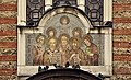
- Nomination Mosaic icon of Sveti Sedmochislenitsi (The Seven Saints) above the main gate of the church of the same name in Sofia. --MrPanyGoff 20:47, 11 September 2010 (UTC)
- Promotion good--Jebulon 22:29, 11 September 2010 (UTC)
-

- Nomination Bridal Veil Falls, British Columbia. --The High Fin Sperm Whale 19:44, 11 September 2010 (UTC)
- Promotion very good--Jebulon 22:31, 11 September 2010 (UTC)
-
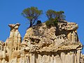
-

- Nomination The main beach in Biarritz. --Eusebius 13:42, 11 September 2010 (UTC)
- Promotion Oui. Mais j'en aurais mis moins à gauche et plus à droite, non ? --Jebulon 13:53, 11 September 2010 (UTC)
J'ai dû couper à droite, il y a une espèce de parapet très moche dans le cadre. Mais on peut toujours couper le rocher à gauche si on veut... --Eusebius 14:52, 11 September 2010 (UTC)
-

-

- Nomination Necklace from Bronze Age --Archaeodontosaurus 10:39, 11 September 2010 (UTC)
- Promotion Not absolutely sharp at highest resolution, but otherwise very good and impressive.--Jebulon 13:45, 11 September 2010 (UTC)
-

- Nomination Baroque gardens of Vaux-le Vicomte, perspective--Jebulon 23:03, 10 September 2010 (UTC)
- Promotion Meets the QI criteria. Good. --High Contrast 23:21, 11 September 2010 (UTC)
-

- Nomination Trier, Herz-Jesu-Kirche --Berthold Werner 11:30, 10 September 2010 (UTC)
- Promotion Good quality and composition. Alofok 20:01, 11 September 2010 (UTC)
-

- Nomination Vaux-le-Vicomte Castle (France). Origin of the fountain is visible, and tourists are not unfortunately cropped !!--Jebulon 23:33, 9 September 2010 (UTC)
- Promotion --Berthold Werner 17:38, 10 September 2010 (UTC) Much better! Shadows are slightly burnt but QI nevertheless. --Ikiwaner 15:18, 11 September 2010 (UTC)
-

- Nomination World co., ltd. headquarters building in Kobe --663highland 13:24, 9 September 2010 (UTC)
- Decline Sorry, Perspective distortion. Needs correction--Lmbuga 21:04, 9 September 2010 (UTC)such strong perspective is uncorrectable without excessive distortions. It could be considered interpreting architecture photography but for that I don't like the cut buildings on the left and on the right. --Ikiwaner 15:18, 11 September 2010 (UTC)
(&) Noised for me, see the color of the sky--Lmbuga 00:10, 12 September 2010 (UTC)
-

- Nomination Using a sextant --The High Fin Sperm Whale 04:21, 7 September 2010 (UTC)
- Promotion Yes. Very good. Technically good and of course encyclopedic useful. --High Contrast 22:47, 11 September 2010 (UTC)
-

-

- Nomination: Bijection between compositions (different ways to write a number as a sum) and binary numbers --Lipedia 09:47, 6 September 2010 (UTC)
- Review needed
-

-

- Nomination: Mangetsuji temple in Otsu --663highland 14:23, 5 September 2010 (UTC)
- Review needed
-

-
- Nomination Busena Resort in Okinawa pref. --663highland 15:42, 4 September 2010 (UTC)
- Decline perspective distortion correction needed, heavy CA on the left --Carschten 12:55, 11 September 2010 (UTC)
-

-
- Nomination Tarentola mauritanica in Calabria (Italy) --Mystère Martin 13:52, 4 September 2010 (UTC)
- Promotion Comment Honestly, I'd prefer a shot in natural environment. --Quartl 11:01, 7 September 2010 (UTC) Comment It's impossible approach to the gecko in natural environment --Mystère Martin 09:39, 10 September 2010 (UTC)
It requires a lot of patience and maybe a remote for your camera but it is very possible. Technically the image is QI though. Lycaon 22:34, 11 September 2010 (UTC)
-

-

-

-

-
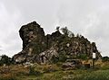
-

-

- Nomination Entrance to Middle Castle of Malbork Castle, Poland. --DerHexer 11:32, 3 September 2010 (UTC)
- Promotion Das Foto ist ohne Zweifel gut, könnte aber noch etwas verbessert werden, wenn Du die Lichter an einigen Stellen etwas nachbelichten würdest, ich würde sogar insgesamt etwas dunkler belichten. mfg --Mbdortmund 16:57, 3 September 2010 (UTC) Comment Laut Histogramm passt eigentlich alles; Grundtenor eher zu dunkel; teilweise über- oder unterbelichtete Stellen sind reduziert. Wo meinst du, wäre eine Änderung noch sinnvoll? RAW ist noch da. --DerHexer 23:06, 3 September 2010 (UTC)
Die Personengruppe (weiße Kleidung) vor dem Haus links und das Pflaster könnte imo etwas Belichtung vertragen; die Personen im Eingang zu stark aufgehellt (Rauschen); weiße Schilder hinter dem Schloss. --Mbdortmund 23:27, 3 September 2010 (UTC) Done --DerHexer 00:12, 4 September 2010 (UTC)
OK --Mbdortmund 23:41, 11 September 2010 (UTC)
-

- Nomination Nets. Fishing in Galicia (Spain)--Lmbuga 00:02, 1 September 2010 (UTC)
- Promotion Quality very good, but I think the has a gray film. Could you correct it please? --Carschten 16:25, 7 September 2010 (UTC) Good enough for QI IMO.--Jebulon 22:13, 9 September 2010 (UTC)
Thanks for your version, Carschten--Lmbuga 22:53, 11 September 2010 (UTC)
-

- Nomination André Le Nôtre --Jebulon 23:48, 10 September 2010 (UTC)
- Promotion Very good.--Mbz1 01:30, 11 September 2010 (UTC)
-

- Nomination Market in Ma'arrat al-Numan, Syria --Bgag 23:35, 10 September 2010 (UTC)
- Promotion Support QI & Useful --Archaeodontosaurus 10:04, 11 September 2010 (UTC)
-

-
- Nomination Bud of Zinnia elegans -- Alvesgaspar 22:37, 10 September 2010 (UTC)
- Promotion There is a dustspot IMO. Please see annotation.--Jebulon 23:54, 10 September 2010 (UTC) -- Done -- Thanks, Alvesgaspar 00:07, 11 September 2010 (UTC) Delicate & poetic, nice quality even not absolutely perfect. QI--Jebulon 10:28, 11 September 2010 (UTC)
-
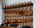
- Nomination Collection of copper saucepans, XVIIth century--Jebulon 22:36, 10 September 2010 (UTC)
- Promotion Support Despite the crop of the terrine at the right bottom. Nice set with glints. Could have a description in French. --Myrabella 08:33, 11 September 2010 (UTC) Thanks. Done --Jebulon 10:38, 11 September 2010 (UTC)
-

-

- Nomination Kite-tailed Robberfly. --Quartl 20:46, 10 September 2010 (UTC)
- Promotion Support QI & Useful --Archaeodontosaurus 10:05, 11 September 2010 (UTC)
-

-

- Nomination Lesser Marsh Grasshopper. --Quartl 20:46, 10 September 2010 (UTC)
- Promotion Support QI & Useful --Archaeodontosaurus 10:01, 11 September 2010 (UTC)
-

- Nomination Buffalo Treehopper. --Quartl 20:46, 10 September 2010 (UTC)
- Promotion Support QI & Useful (FP?) --Archaeodontosaurus 09:59, 11 September 2010 (UTC)
-

- Nomination A male Blue-tailed damselfly -- Alvesgaspar 20:45, 10 September 2010 (UTC)
- Promotion Good. --Quartl 20:50, 10 September 2010 (UTC)
-

- Nomination A scaldfish (Arnoglossus laterna) from the Southern Northsea. Lycaon 19:31, 10 September 2010 (UTC)
- Promotion Support QI & Useful --Archaeodontosaurus 09:58, 11 September 2010 (UTC)
-

- Nomination Plant of Cannabis sativa --Chmee2 18:59, 10 September 2010 (UTC)
- Promotion Support QI & Useful... --Archaeodontosaurus 10:08, 11 September 2010 (UTC)
-

- Nomination Bury Ditches hill fort. Mattbuck 17:21, 10 September 2010 (UTC)
- Promotion nice --Mbdortmund 17:41, 10 September 2010 (UTC)
-

- Nomination Bridgwater railway station. Mattbuck 17:21, 10 September 2010 (UTC)
- Promotion nice --Mbdortmund 17:42, 10 September 2010 (UTC)
-

- Nomination Iglesia de San Juan, Bautista, Telde (Gran Canaria). -- Felix Koenig 13:55, 10 September 2010 (UTC)
- Promotion Good technical quality with a nice blue sky. Alofok 16:40, 10 September 2010 (UTC)
-

- Nomination Skeleton of Mesohippus --Llez 13:11, 10 September 2010 (UTC)
- Promotion good --Mbdortmund 17:43, 10 September 2010 (UTC)
-

-

- Nomination Church and calvary of Hédé --Coyau 23:50, 9 September 2010 (UTC)
- Promotion --Berthold Werner 17:48, 10 September 2010 (UTC)
-

- Nomination Other view of south façade of Château de Vaux-le-Vicomte, France--Jebulon 23:48, 9 September 2010 (UTC)
- Promotion --Berthold Werner 17:38, 10 September 2010 (UTC)
-

- Nomination Belt buckle, 7th century CE. Iron with silver encrusts. -- Rama 21:59, 9 September 2010 (UTC)
- Promotion Support QI & Useful --Archaeodontosaurus 15:50, 10 September 2010 (UTC)
-

- Nomination Kite-tailed Robberflies mating. --Quartl 17:20, 9 September 2010 (UTC)
- Promotion Support QI & Useful --Archaeodontosaurus 15:48, 10 September 2010 (UTC)
-
- Nomination The flower of cultivated Gladiolus murielae. --Bff 13:03, 9 September 2010 (UTC)
- Decline underexposed --Archaeodontosaurus 10:11, 11 September 2010 (UTC)
-

-

- Nomination Trier, Welschnonnenkirche --Berthold Werner 08:31, 7 September 2010 (UTC)
- Promotion Good; very good description page.--Jebulon 11:30, 11 September 2010 (UTC)
-

-
- Nomination Reliquary of the martyrs of Vilnius Albertus teolog 09:51, 6 September 2010 (UTC)
- Decline Noisy, unsharp, bad flash light, shadows and reflections IMO. Sorry--Jebulon 17:05, 10 September 2010 (UTC)
-

- Nomination INAX MUSEUMS --663highland 14:44, 3 September 2010 (UTC)
- WARNING: third template parameter added – please remove.
-

- Nomination INAX MUSEUMS --663highland 14:44, 3 September 2010 (UTC)
- Decline noisy, pespective distortion correction needed --Carschten 18:05, 10 September 2010 (UTC)
-

- Nomination Kumagawa-juku --663highland 14:44, 3 September 2010 (UTC)
- Decline Strong distortion left IMO. Could easily be corrected--Jebulon 00:06, 6 September 2010 (UTC)
distortions, CA, overexposed sky --Carschten 18:05, 10 September 2010 (UTC)
-

-
-

-

-
-

- Nomination A field of Hotentot Figs (panorama), corrected version -- Alvesgaspar 10:40, 10 September 2010 (UTC)
- Decline Sorry, there are still stitching errors all over the image, I marked some (not necessarily all) for you. Honestly, I also find the shifting focus disturbing, maybe try with a smaller subset of the panorama? --Quartl 11:38, 10 September 2010 (UTC)
-

- Nomination Żuraw in Gdańsk, Poland. --DerHexer 00:32, 10 September 2010 (UTC)
- Promotion Informative, Useful, Good technical quality. --MrPanyGoff 10:35, 10 September 2010 (UTC)
-

-
- Nomination Church of Hédé --Coyau 22:33, 9 September 2010 (UTC)
- Promotion Informative, Useful, the quality is good enough.--MrPanyGoff 10:41, 10 September 2010 (UTC)
-

-

- Nomination Coat of arms of the brotherhood of fishermen of Portosín, Porto do Son, Galicia (Spain)--Lmbuga 19:38, 9 September 2010 (UTC)
- Promotion QI --Coyau 21:22, 9 September 2010 (UTC)
-

- Nomination Great Green Bush-cricket. --Quartl 17:20, 9 September 2010 (UTC)
- Promotion Needs a 90° CW rotation. Urtica doesn't grow horizontally :-). Lycaon 17:25, 9 September 2010 (UTC)
You are entirely correct :-). --Quartl 17:58, 9 September 2010 (UTC)
Very good--Lmbuga 19:50, 9 September 2010 (UTC)
-

-

-
-

-

- Nomination Mermaid Plaza in Obama --663highland 13:26, 9 September 2010 (UTC)
- Decline Sorry, Perspective distortion.--Lmbuga 21:08, 9 September 2010 (UTC)
-

-

-

- Nomination Gastropacha quercifolia --Loz 12:16, 9 September 2010 (UTC)
- Promotion Comment The butterfly is captured very well, but the blurry rock in front is a bit disturbing. Maybe crop it more from the right? --Quartl 12:41, 9 September 2010 (UTC) Done I cropped it to a square. Better now?--Loz 13:59, 9 September 2010 (UTC)
Better, but the crop at the left side is a bit tight now, a bit more room there and I can support. --Quartl 14:57, 9 September 2010 (UTC) DoneOk, is besser--Loz 15:37, 9 September 2010 (UTC)
Jetzt ist gut :-). --Quartl 16:16, 9 September 2010 (UTC)
-

- Nomination Vilnius Cathedral -- Albertus teolog 10:36, 9 September 2010 (UTC) Comment need perspective correction (left part)--Ankara 23:54, 9 September 2010 (UTC)
- Promotion Yes, a little perspective correction can be done but in the right part I think. The Dome and the lines in the right are not vertical. So, with this correction, I find the photo very informative and useful.--MrPanyGoff 11:34, 10 September 2010 (UTC)
- Nomination Vilnius Cathedral -- Albertus teolog 10:36, 9 September 2010 (UTC)
-

-

- Nomination Goniometer made by Develey le Jeune in Lausanne, late 18th/early 19th century. -- Rama 20:25, 8 September 2010 (UTC)
- Promotion Support QI & useful --Archaeodontosaurus 17:03, 9 September 2010 (UTC)
-

- Nomination Tenshochi park in Kitakami --663highland 14:11, 8 September 2010 (UTC)
- Decline CA problems and blown sky RGB(255,255,255). Lycaon 14:25, 9 September 2010 (UTC)
-

- Nomination Panorama of Malbork Castle, Poland. --DerHexer 13:24, 8 September 2010 (UTC)
- Promotion
 Question Any particular reason why you call these panoramas? Were they stitched? Look like 'lowish' landscapes to me. Lycaon 14:28, 9 September 2010 (UTC) Comment „A panorama (formed from Greek πᾶν "all" + ὅραμα "sight") is any wide-angle view or representation of a physical space“; the whole side of Malbork Castle can be seen there; not stitched. I could of course rename them, but is that really needed for QIC? Does it harm the quality of the images? --DerHexer 20:11, 9 September 2010 (UTC)
Nope, no need to rename them, it was just a technical question... Lycaon 22:37, 9 September 2010 (UTC) "Ah, permettez, de grâce, que pour l'amour du grec, Monsieur, on vous embrasse !" Molière, les Femmes Savantes. QI to me--Jebulon 22:48, 9 September 2010 (UTC)
-

-

- Nomination Hirafuku in Sayo, Hyogo pref. --663highland 13:30, 7 September 2010 (UTC)
- Promotion QI --Pudelek 16:14, 9 September 2010 (UTC)
-

-
- Nomination Balearica regulorum, Grey Crowned Crane (originally nominated as Balearica pavonina, Black Crowned Crane) --Llez 16:01, 5 September 2010 (UTC)
- Promotion I think this is a Balearica regulorum. Luc Viatours picture of the same place has this caption. --Ikiwaner 18:48, 5 September 2010 (UTC)
Done Sorry, my mistake and thanks for the hint. You are right, it is B. regulorum, the Grey Crowned Crane. I changed the description and the category and the file is renamed. --Llez 16:40, 7 September 2010 (UTC) Support now, good portrait. --Quartl 07:20, 10 September 2010 (UTC)
-

- Nomination The port of Porto Covo. An improved retake of this other picture and a real stitching challenge, due to the moving subject. -- Alvesgaspar 01:01, 5 September 2010 (UTC)
- Promotion done with success, IMO. The canoeists sunk very discreetly--Jebulon 22:36, 9 September 2010 (UTC)
-

- Nomination The Praia Pequena in a summer day (panorama). Porto Covo, Portugal. -- Alvesgaspar 18:54, 4 September 2010 (UTC)
- Decline Sorry, stiching errors. --kallerna 09:03, 10 September 2010 (UTC) Question -- Where, please? Alvesgaspar 10:03, 10 September 2010 (UTC)
-

-

-

- Nomination The dovecote tower of Château de Breteuil, France--Jebulon 16:59, 4 September 2010 (UTC)
- Promotion Nice --George Chernilevsky 05:52, 10 September 2010 (UTC)
-

- Nomination Panoramic view of Lake Cochinas --Cesco77 16:20, 4 September 2010 (UTC)
- Decline * Comment Can you correct the tilt? An object should be aligned with is reflection. Lycaon 08:37, 7 September 2010 (UTC) * Info Tilt corrected, is it better now? --Cesco77 12:01, 7 September 2010 (UTC)
Tilt is corrected, but the crop below is very unfortunate IMO.--Jebulon 22:31, 9 September 2010 (UTC)
-

- Nomination: Composition with water falling over a dam.--Jebulon 10:37, 4 September 2010 (UTC)
- Review needed
-

- Nomination Part of the vineyard, and the village of Vougeot, Burgundy, France--Jebulon 10:23, 4 September 2010 (UTC)
- Promotion Good --George Chernilevsky 05:54, 10 September 2010 (UTC)
-

-

-

- Nomination Columns in Palmyra, Syria, 2009. --High Contrast 00:51, 3 September 2010 (UTC)
- Promotion Good light, colors and sharpness. Not sure about the compo, but it is a matter of taste. QI, IMO.--Jebulon 22:25, 9 September 2010 (UTC)
-

- Nomination Port of Portosín, Porto do Son, Galicia (Spain)--Luis Miguel Bugallo Sánchez 17:10, 2 September 2010 (UTC)
- Promotion Good Albertus teolog 12:59, 9 September 2010 (UTC)
-

- Nomination Tokoname in Aichi pref.--663highland 15:41, 2 September 2010 (UTC)
- Decline noisy --Carschten 18:55, 9 September 2010 (UTC)
-
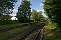
-

- Nomination Llandudno Junction railway station. Mattbuck 01:27, 2 September 2010 (UTC)
- Promotion OK --George Chernilevsky 05:49, 10 September 2010 (UTC)
-

-

- Nomination Under the dome of the Sagrario church, Granada, Spain--Jebulon 22:06, 1 September 2010 (UTC)
- Decline too tight crop at top and bottom, image full of artifacts --Carschten 16:25, 7 September 2010 (UTC) No worries with the "decline" because of the crop, but what do you means with "artifacts" please ?--Jebulon 22:22, 9 September 2010 (UTC)Composition and colours very close to excellence imo. Sadly technical quality is mediocre because of a combination of colour noise and lack of sharpness. --Ikiwaner 06:00, 10 September 2010 (UTC)
-

- Nomination Balley of Filippo Taglioni, by User:Inisheer. --Ikiwaner 17:32, 1 September 2010 (UTC)
- Decline Comment Nice shot but somewhat unsharp and noisy (2500 ISO). Difficult however to catch such a dance figure. --Myrabella 22:16, 1 September 2010 (UTC) Comment Noise is inherent to indoor action photography. But I have some better, more in-focus shots taken the same day. + this was downscaled, which is not a very good idea. Inisheer 18:04, 2 September 2010 (UTC) Then decline ?--Jebulon 22:19, 9 September 2010 (UTC)
-

- Nomination a Ruddy Darter --Leviathan1983 10:20, 1 September 2010 (UTC)
- Promotion Comment Good, but in this one the tail is slightly out of focus, so it falls off in comparison to the others. --Quartl 10:56, 1 September 2010 (UTC) I've allready thought sth like this... ;-) --Leviathan1983 11:22, 1 September 2010 (UTC) PS.: But I like the soft background at this one and think the dof problem is just small. bg Leviathan1983 10:44, 2 September 2010 (UTC) Comment I cannot support it, but also would not decline it outright. Maybe someone else takes the decision. --Quartl 11:28, 7 September 2010 (UTC) OK, I dare to take the decision: Not perfect as a FP, but good enough for a QI. --Jebulon 22:16, 9 September 2010 (UTC)
-
- Nomination Four-spotted Chaser (Libellula quadrimaculata) --The High Fin Sperm Whale 21:30, 8 September 2010 (UTC)
- Promotion Good, and good DOF--Lmbuga 08:18, 9 September 2010 (UTC)
-

- Nomination Zlin 143LS. --Airwolf 20:40, 8 September 2010 (UTC)
- Promotion Good --The High Fin Sperm Whale 23:59, 8 September 2010 (UTC)
-

- Nomination Portulaca grandiflora --Butko 15:32, 8 September 2010 (UTC)
- Decline This one is also strongly overexposed in the red channel. Sorry. --Johannes Robalotoff 16:23, 8 September 2010 (UTC)
-

- Nomination Eschscholzia californica --Butko 15:28, 8 September 2010 (UTC)
- Decline Very strong overexposure in the red channel resulting in strong color deviations, especially on the flower in the middle. --Johannes Robalotoff 16:20, 8 September 2010 (UTC)
-

- Nomination Portulaca grandiflora --Butko 15:28, 8 September 2010 (UTC)
- Decline Here the green channel is even stronger blown than the red channel. Apart from color deviations this means that all detail is lost on the second flower counted from the left upper corner of the image. --Johannes Robalotoff 16:34, 8 September 2010 (UTC)
-
- Nomination UAZ-452 --Airwolf 14:46, 8 September 2010 (UTC)
- Promotion Good --The High Fin Sperm Whale 23:59, 8 September 2010 (UTC)
-

- Nomination Tonomine highlands in Kamikawa, Hyogo pref, Japan --663highland 14:26, 8 September 2010 (UTC)
- Decline Pixelated. --The High Fin Sperm Whale 23:59, 8 September 2010 (UTC)
-
- Nomination Kappa-buchi in Tono --663highland 14:11, 8 September 2010 (UTC)
- Promotion Good --The High Fin Sperm Whale 23:59, 8 September 2010 (UTC)
-

-
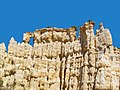
- Nomination Les Orgues d’Ille sur Têt, France --Llez 13:00, 8 September 2010 (UTC)
- Promotion Support QI for me --Archaeodontosaurus 17:16, 8 September 2010 (UTC)
-

- Nomination Gère-Bélestan in the Ossau Valley, Pyrénées. --Myrabella 11:17, 8 September 2010 (UTC)
- Promotion QI for me. --Johannes Robalotoff 16:40, 8 September 2010 (UTC)
-

- Nomination Trier, Streetcrossing Dominikanerstraße - Predigerstraße --Berthold Werner 11:09, 8 September 2010 (UTC)
- Promotion okay --Carschten 12:47, 8 September 2010 (UTC)
-

-

- Nomination Church of the Holy Trinity in Vilnius -- Albertus teolog 09:37, 7 September 2010 (UTC)
- Withdrawn Comment Perspective correction would be nice. --Coyau 16:57, 7 September 2010 (UTC) -- Withdrawn Albertus teolog 13:44, 8 September 2010 (UTC)
-
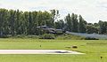
-

- Nomination Inside the fort de Giromagny. --ComputerHotline 16:46, 6 September 2010 (UTC)
- Promotion Very good Albertus teolog 13:48, 8 September 2010 (UTC)
-
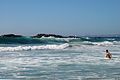
- Nomination Breaking waves -- Alvesgaspar 10:31, 5 September 2010 (UTC)
- Promotion spots to be removed in the sky --Jebulon 22:15, 7 September 2010 (UTC) -- Done DOne -- Alvesgaspar 23:01, 7 September 2010 (UTC)I like the swimmer in the composition --Ikiwaner 17:48, 8 September 2010 (UTC)
-

-

-
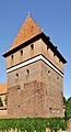
- Nomination: Dansker (toilet tower) in Malbork, Poland. --DerHexer 11:32, 3 September 2010 (UTC)
- Review needed
-

-
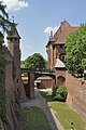
-

-

-
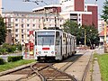
-

- Nomination Isome-shi Japanese Garden in Otsu --663highland 15:55, 31 August 2010 (UTC)
- Decline bad light, some CA right (wooden structure)--Jebulon 18:16, 8 September 2010 (UTC)
-

- Nomination Female and male of mallard (Anas platyrhynchos). --Trachemys 21:05, 30 August 2010 (UTC)
- Decline Comment Trying to get a male and female mallard on the same image is certainly a good goal (compare this image), but here the female obstructs the male (which is oof anyway) and the outline of the male irritates the view of the female. --Quartl 11:53, 1 September 2010 (UTC) decline for reasons above.--Jebulon 18:12, 8 September 2010 (UTC)
-

-

- Nomination An Eastern Cottontail (Sylvilagus floridanus) --The High Fin Sperm Whale 22:40, 7 September 2010 (UTC)
- Promotion Good. Lycaon 07:00, 8 September 2010 (UTC)
-

- Nomination La Comédie-Française in Paris--Jebulon 22:07, 7 September 2010 (UTC)
- Promotion Support QI & Useful --Archaeodontosaurus 09:39, 8 September 2010 (UTC)
-

- Nomination Nicolas Fouquet, first owner of Château de Vaux-le-Vicomte--Jebulon 16:14, 7 September 2010 (UTC)
- Promotion Borderline case. Near oversaturation in red channel, near overexposure in highlights and very slight CA. Still, size and overall quality prevail. Lycaon 07:07, 8 September 2010 (UTC)
-

- Nomination Other view of Chateau de Vaux-le-Vicomte--Jebulon 15:58, 7 September 2010 (UTC)
- Promotion QI & Useful --Archaeodontosaurus 17:09, 7 September 2010 (UTC)
-

-
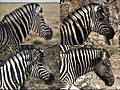
- Nomination Variation in skin pattern in Equus quagga burchellii. Lycaon 06:53, 7 September 2010 (UTC)
- Promotion Support QI & useful Archaeodontosaurus 17:09, 7 September 2010 (UTC)
-

- Nomination Seal of Lausanne -- Rama 06:56, 7 September 2010 (UTC)
- Promotion Very good --George Chernilevsky 07:51, 7 September 2010 (UTC) despite (or because ?) the print was not made by the device...--Jebulon 10:15, 8 September 2010 (UTC)
-

-

- Nomination Copperhead, portrait. --Quartl 04:59, 7 September 2010 (UTC)
- Promotion Support QI & Useful Archaeodontosaurus 17:09, 7 September 2010 (UTC)
-

-
- Nomination A field of Hottentot Figs (panorama). -- Alvesgaspar 18:54, 4 September 2010 (UTC)
- Withdrawn Stitching errors. --Quartl 11:51, 7 September 2010 (UTC) -- Thanks for noticing. A corrected version is on the way -- Alvesgaspar 22:50, 7 September 2010 (UTC)
-

-
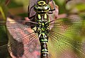
- Nomination Southern Hawker, head and thorax dorsal closeup. --Quartl 12:07, 3 September 2010 (UTC)
- Promotion While more depth of field would make the eyes and thorax hairs sharper, an f-stop slower than f/16 will produce noticeable diffraction. Focus stacking would help but that may not be practical for an image of an unrestrained subject taken in the wild. I don't wish to be too critical of macro photography under such conditions. Wsiegmund 16:22, 7 September 2010 (UTC)
-
-

- Nomination Modern art gallery in Luxembourg, see the intentional mix of letters, INCAOS, for CASINO. --Cayambe 10:29, 3 September 2010 (UTC)
- Promotion Support QI for me Archaeodontosaurus 17:09, 7 September 2010 (UTC)
-

-

- Nomination The Moehne Reservoir in Germany, 2007. Garver 18:35, 1 September 2010 (UTC))
- Decline composition is very good, but image is full of artifacts, I'm sorry :-( --Carschten 16:25, 7 September 2010 (UTC)
-

- Nomination Rien in Eurockéennes 2010.--ComputerHotline 18:35, 1 September 2010 (UTC)
- Promotion good --Carschten 16:25, 7 September 2010 (UTC)
-

- Nomination Gallows in Eurockéennes 2010.--ComputerHotline 18:35, 1 September 2010 (UTC)
- Decline noisy --Carschten 16:25, 7 September 2010 (UTC)
-

- Nomination Singer of groupe Gallows in Eurockéennes 2010. --ComputerHotline 18:35, 1 September 2010 (UTC)
- Decline overexposed t-shirt, noisy (ISO 2500), unsharp --Carschten 16:25, 7 September 2010 (UTC)
-

- Nomination Ishibutai-kofun in Asuka, Nara --663highland 15:36, 1 September 2010 (UTC)
- Promotion good --Carschten 16:25, 7 September 2010 (UTC)
-

- Nomination Common Hazel - leaf. --Trachemys 12:49, 1 September 2010 (UTC)
- Promotion Comment The overall detail is good, but, unfortunately, the harsh top light spoils the image. --Quartl 11:30, 7 September 2010 (UTC) Support I think is a interesting part of the image. QI imo --Carschten 16:25, 7 September 2010 (UTC)
-

- Nomination Boat life-guard in fishing boat of Portosín, Porto do Son, Galicia (Spain)--Lmbuga 00:18, 1 September 2010 (UTC)
- Promotion Very good --Carschten 16:25, 7 September 2010 (UTC)
-

- Nomination Avenue of cherry blossoms, Japan --Jnn 15:39, 29 August 2010 (UTC)
- Decline Comment For me blurring of a face like the woman's face on the right spoils a high resolution picture, although respecting her personality in this way is praiseworthy of course. For QI I would try to shoot a picture where it is not necessary to make people anonymous by postprocessing. There is also CA on the far left and far right side, as well as a fair amount of overexposed pixels. --Johannes Robalotoff 20:59, 30 August 2010 (UTC)
Disturbing CA at the edges. Lycaon 11:32, 8 September 2010 (UTC)
-
-

- Nomination Beppu Bay --663highland 05:58, 29 August 2010 (UTC)
- Decline It's a bit noisy in the sky, and the docks could use sharpening, but I'll promote if you just remove that big dust spot. Mattbuck 19:37, 30 August 2010 (UTC)...as there seems to be no improvement. --Ikiwaner 13:48, 7 September 2010 (UTC)
-

- Nomination Liptovský Mikuláš, Slovakia - city center --Pudelek 07:25, 7 September 2010 (UTC)
- Promotion Nice -- George Chernilevsky 07:48, 7 September 2010 (UTC)
-

- Nomination Cottontop Tamarin, portrait. --Quartl 21:13, 6 September 2010 (UTC)
- Promotion Support Good portrait and useful --Archaeodontosaurus 06:06, 7 September 2010 (UTC)
-

-

- Nomination Rhinoceros Iguana, opening its mouth. --Quartl 21:13, 6 September 2010 (UTC)
- Decline Oppose Crop too tight. Yann 05:59, 7 September 2010 (UTC)
I agree about the unfortunate framing. This was a chance picture. The iguana suddenly opened its mouth and all I could do is press the release before it closed it again. --Quartl 07:43, 7 September 2010 (UTC)
-

- Nomination Central court inside the fort de Giromagny. --ComputerHotline 16:46, 6 September 2010 (UTC)
- Promotion SupportGood photos, stupid filenames: Concider Commons:File renaming --Lipedia
-

- Nomination Inside the fort de Giromagny. --ComputerHotline 16:46, 6 September 2010 (UTC)
- Promotion SupportGood photos, stupid filenames: Concider Commons:File renaming --Lipedia
-

- Nomination Inside the fort de Giromagny. --ComputerHotline 16:46, 6 September 2010 (UTC)
- Promotion SupportGood photos, stupid filenames: Concider Commons:File renaming --Lipedia
-

- Nomination Inside the fort de Giromagny. --ComputerHotline 16:46, 6 September 2010 (UTC)
- Decline OpposeThe light area is overexposed - which is of course unavoidable. Good image. --Lipedia
-

- Nomination Inside the fort de Giromagny. --ComputerHotline 16:46, 6 September 2010 (UTC)
- Promotion SupportGood photos, stupid filenames: Concider Commons:File renaming --Lipedia
-

- Nomination winter impression --Ikiwaner 15:28, 6 September 2010 (UTC)
- Promotion Nice, like a watercolor picture --George Chernilevsky 20:35, 6 September 2010 (UTC)
-

- Nomination The river Alzette in Luxembourg City. --Cayambe 14:44, 6 September 2010 (UTC)
- Promotion Sehr gut --George Chernilevsky 20:32, 6 September 2010 (UTC)
-

- Nomination a young, female Azure Damselfly --Leviathan1983 14:37, 6 September 2010 (UTC)
- Promotion Good, the broken wing is not the fault of the photographer. --Quartl 08:59, 7 September 2010 (UTC)
-

- Nomination Trier, Gate in the Windstraße --Berthold Werner 12:13, 6 September 2010 (UTC)
- Promotion Good. --Cayambe 15:20, 6 September 2010 (UTC)
-

- Nomination Bust of Turenne, Marshall of France--Jebulon 22:18, 5 September 2010 (UTC)
- Withdrawn I didn't notice how it was unsharp at high res. Sorry! --Jebulon 17:14, 6 September 2010 (UTC)
-

-

-

-

- Nomination Extinct semi-aquatic, mammal -- Archaeodontosaurus 13:58, 5 September 2010 (UTC)
- Promotion QI --George Chernilevsky 06:44, 6 September 2010 (UTC) Question Can you add some dimensions? Lycaon 06:54, 6 September 2010 (UTC)
Done --Archaeodontosaurus 12:13, 6 September 2010 (UTC)
-

-

-

-

-

- Nomination Horse riding --НикаАссоль 11:40, 4 September 2010 (UTC)
- Decline Posterization, strong jpeg compression artifacts. --Kae 20:26, 6 September 2010 (UTC)
-

- Nomination Port of Portosín, Porto do Son, Galicia (Spain)--Lmbuga 17:58, 2 September 2010 (UTC)
- Promotion Good. Nice colours, nice place. --Cayambe 10:33, 7 September 2010 (UTC)
-
-

- Nomination Tokoname in Aichi pref. --663highland 15:41, 2 September 2010 (UTC)
- Decline OpposeInteresting photo. But the edges of objects are green and magenta. Bad lense? -Lipedia
-

- Nomination Rosa 'Maiden's Blush' by Ausis. --Anna reg 15:40, 2 September 2010 (UTC)
- Decline Very nice rose, but the dof is insufficent here. --Quartl 11:38, 7 September 2010 (UTC)
-

- Nomination Larus michahellis, Portosín, Porto do Son, Galicia (Spain)--Lmbuga 23:14, 31 August 2010 (UTC)
- Promotion Good. It's a juvenile, please make an addition to the file descr. :-) --Cayambe 18:51, 6 September 2010 (UTC)
-
- Nomination Natural reservation Písečný přesyp u Vlkova near Vlkov village, Czech republic. --Chmee2 22:31, 31 August 2010 (UTC)
- Promotion Good. --Cayambe 18:54, 6 September 2010 (UTC)
-

- Nomination Larus michahellis, Portosín, Porto do Son, Galicia (Spain)--Lmbuga 21:58, 31 August 2010 (UTC)
- Promotion Good. Same remark as for the image above :-) --Cayambe 18:54, 6 September 2010 (UTC)
-

- Nomination: Luxembourg, reflections (Luxembourg Philharmony building and two towers) in the glass windows of the Congress Center. --Cayambe 19:43, 31 August 2010 (UTC)
- Review needed
-

-

- Nomination: Podolí port as seen from Vyšehrad Castle, Prague, Czech Republic.--Václav Velíšek 16:15, 31 August 2010 (UTC)
- Review Comment The buildings on the left are distorted, +CA (see the edge of the hills). --Myrabella 08:00, 1 September 2010 (UTC)
-

- Nomination: Kannonin Japanese Garden in Tottori --663highland 15:55, 31 August 2010 (UTC)
- Review needed
-

- Nomination: Kasumi Coast in Kami, Hyogo --663highland 15:55, 31 August 2010 (UTC)
- Review needed
-

- Nomination: Deganwy railway station. Mattbuck 13:15, 31 August 2010 (UTC)
- Review needed
-

-
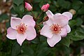
- Nomination Rosa 'The Charlatan', Bagatelle Rose Garden, Paris, France; by Okki.--Anna reg 11:07, 31 August 2010 (UTC)
- Decline Insufficient dof, the focus seems to be somewhat off the mark as well. --Quartl 11:17, 7 September 2010 (UTC)
-
-

- Nomination A portrait of a domestic goat --Von.grzanka 09:46, 31 August 2010 (UTC)
- Decline Lacks sharpness, disturbing background. --Quartl 11:20, 7 September 2010 (UTC)
-
- Nomination: Partal pavilion, Alhambra, Granada, Spain--Jebulon 23:34, 30 August 2010 (UTC)
- Review Comment There are ghosts. --Myrabella 06:39, 31 August 2010 (UTC) Yes. Two shots HDR. The best I have among 4 or 5... Impossible to take without tourists. Don't know how to improve. Somebody can help ? --Jebulon 09:23, 31 August 2010 (UTC)
I'll give it a shot, though I can't guarantee anything, of course. Rama 00:30, 1 September 2010 (UTC)
-

- Nomination Lighthouse of Hel, Poland. --DerHexer 09:11, 29 August 2010 (UTC)
- Promotion Comment please correct the perspective distortion --Carschten 15:54, 5 September 2010 (UTC) Done --DerHexer 16:55, 5 September 2010 (UTC) Comment there are still distortions --Carschten 17:05, 5 September 2010 (UTC) Comment I now used ShiftN default correction. --DerHexer 23:23, 5 September 2010 (UTC)
I think it still keels over but it's better now. Weak Support --Carschten 16:42, 6 September 2010 (UTC)
-

- Nomination Coat of arms at the Old Castle in Münchingen --Harke 10:48, 28 August 2010 (UTC)
- Promotion Very nice, I like it. But I think this pic needs a correction with better scaling of the height, as visible at high res on the pic of the castle. Thoughts ?--Jebulon 15:45, 28 August 2010 (UTC)
I tried a cautious improvement- better now? --Harke 17:01, 29 August 2010 (UTC) I've tried something, and reverted to your version. Please have a look on the file page, and compare with the detail on the castle. IMO the scale is better.--Jebulon 17:43, 29 August 2010 (UTC)
Please consider, that the perspective on the castle wall is distorted- the horizontals are shortened because of the inclined view. IMO you overstretch the verticals in your version 17:35, 29. Aug. 2010. I would prefer not to modify the original too much. But, I don't know. --Harke 17:24, 30 August 2010 (UTC)
I don't understand Jebulons problem but the quality of the image is very good --Carschten 12:31, 5 September 2010 (UTC) I don't have any "problem", thanks, I just say that the report between width and height is not good, due to perspective from below, and need a correction IMO. For example the helms over the schilds look very unnatural to me.--Jebulon 14:43, 6 September 2010 (UTC)
-

- Nomination Panoramic view of the Fort of Salses, France --Llez 05:05, 6 September 2010 (UTC)
- Promotion Support QI & Useful --Archaeodontosaurus 05:48, 6 September 2010 (UTC)
-

-

-

-

-

- Nomination Château de Vaux-le-Vicomte, France, main entrance--Jebulon 23:22, 5 September 2010 (UTC)
- Promotion Good result -- George Chernilevsky 08:08, 6 September 2010 (UTC)
-
- Nomination Château de Vaux-le-Vicomte, France--Jebulon 22:02, 5 September 2010 (UTC)
- Promotion nice --Mbdortmund 22:44, 5 September 2010 (UTC)
-

- Nomination Monument to the Soviet pilots in Vinnitsa. Old Soviet jet fighter MiG-15. --George Chernilevsky 19:38, 5 September 2010 (UTC)
- Promotion good --Mbdortmund 22:47, 5 September 2010 (UTC)
-

- Nomination Monument to the Soviet pilots in Vinnitsa. Old Soviet jet fighter MiG-15. --George Chernilevsky 19:38, 5 September 2010 (UTC)
- Promotion Good.--Jebulon 22:05, 5 September 2010 (UTC)
-

- Nomination A Marabou stork flying --Ikiwaner 18:42, 5 September 2010 (UTC)
- Promotion Support Great! -- Archaeodontosaurus 19:15, 5 September 2010 (UTC)
-

- Nomination A Piper Cub --Airwolf 18:04, 5 September 2010 (UTC)
- Promotion Good -- George Chernilevsky 19:39, 5 September 2010 (UTC)
-
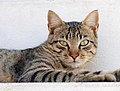
- Nomination Portrait of a street male tabby cat -- Alvesgaspar 15:33, 5 September 2010 (UTC)
- Promotion Support Good. Yann 07:51, 6 September 2010 (UTC)
-

- Nomination Portrait of a street male tabby cat -- Alvesgaspar 15:33, 5 September 2010 (UTC)
- Promotion Support Good. Yann 07:51, 6 September 2010 (UTC)
-

- Nomination A street male tabby cat -- Alvesgaspar 15:33, 5 September 2010 (UTC)
- Promotion Support Good. Yann 07:51, 6 September 2010 (UTC)
-

- Nomination Mangetsuji temple in Otsu --663highland 14:23, 5 September 2010 (UTC)
- Promotion QI for me -- Archaeodontosaurus 19:18, 5 September 2010 (UTC)
-
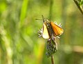
- Nomination Ochlodes faunus. --Trachemys 13:00, 5 September 2010 (UTC)
- Decline OpposeLeft wing overexposed -- Archaeodontosaurus 13:13, 5 September 2010 (UTC)
-
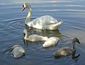
- Nomination Mute Swans (Cygnus olor). --Trachemys 13:00, 5 September 2010 (UTC)
- Promotion OK --Mbdortmund 22:49, 5 September 2010 (UTC)
-

- Nomination Mausoleum of Babazhi Khatun, Kazakhstan --Stomac 12:09, 5 September 2010 (UTC)
- Decline Oppose One side of the roof overexposed, but mostly, CA to the left side of the roof (pb de date sur la photo, si tu as le fichier RAW tu dois pouvoir modifier) -- Archaeodontosaurus 13:10, 5 September 2010 (UTC)
-
- Nomination Sturnus vulgaris in Napa Valley--Mbz1 00:31, 5 September 2010 (UTC)
- Promotion Support QI & Useful -- Archaeodontosaurus 13:16, 5 September 2010 (UTC)
-

-

- Nomination Franziskanerkirch, Salzburg, Austria. --MathKnight 14:41, 4 September 2010 (UTC)
- Promotion Very good. --Cayambe 16:57, 5 September 2010 (UTC)
-

-

-

- Nomination Grunwald - The ruins of the chapel -- Albertus teolog 13:45, 3 September 2010 (UTC)
- Decline The compo is not good imo (crop on both sides). I'm really sorry. --Jebulon 00:05, 6 September 2010 (UTC)
-
- Nomination Hotel Doubletree by Hilton, Košice, Slovakia. --Rl91 10:41, 3 September 2010 (UTC)
- Decline white balance is off --Mbdortmund 16:59, 3 September 2010 (UTC) Comment Fixed. --DerHexer 01:47, 4 September 2010 (UTC) tilted to the right and barrel distortion --Ikiwaner 19:29, 5 September 2010 (UTC)
-

-

-

- Nomination Corridor to Toilet tower in Malbork, Poland. --DerHexer 17:41, 2 September 2010 (UTC)
- Promotion The sharpness in foreground left and right is so-so, but the light is very good, especially on the vault. Il like the green and red (stained glass?) reflection too. QI to me--Jebulon 00:00, 6 September 2010 (UTC)
-

- Nomination: Luxembourg, where the hermit Schetzel lived (+1138 or 1139). --Cayambe 09:03, 31 August 2010 (UTC)
- Review needed
-

- Nomination Another shot of Rabí Castle, South Bohemia, Czech Rep. --Chmee2 07:18, 31 August 2010 (UTC)
- Promotion Good quality -- Albertus teolog 10:05, 6 September 2010 (UTC)
-

-

- Nomination Nordkirchen castle, one of the portals --Mbdortmund 21:37, 30 August 2010 (UTC)
- Promotion very nice lightning --Carschten 16:11, 5 September 2010 (UTC)
-

- Nomination Yama-jigoku of Beppu Onsen --663highland 15:07, 30 August 2010 (UTC)
- Promotion good --Carschten 16:11, 5 September 2010 (UTC)
-

- Nomination Umi-jigoku of Beppu Onsen --663highland 15:07, 30 August 2010 (UTC)
- Promotion good --Carschten 16:11, 5 September 2010 (UTC)
-

-
- Nomination Sad rhino in captivity by User:Frank C. Müller --Elekhh 04:32, 30 August 2010 (UTC)
- Promotion good --Carschten 16:11, 5 September 2010 (UTC)
-

- Nomination Dizengoff square, Tel-Aviv, Israel. --Rastaman3000 17:53, 29 August 2010 (UTC)
- Decline Good... but needs a perspective correction. --Cayambe 09:16, 31 August 2010 (UTC) Oppose distortions and bad crop at the top --Carschten 14:01, 5 September 2010 (UTC)
-
-

-

- Nomination Edersee, Hesse, Germany. --Bartiebert 15:06, 29 August 2010 (UTC)
- Promotion Comment good, but please remove the border --Carschten 14:01, 5 September 2010 (UTC) Support good now --Carschten 18:26, 5 September 2010 (UTC)
-
-

-

-

-
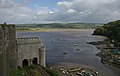
-

-

-

- Nomination: Kenelis perform at Nottingham Pride. Mattbuck 17:56, 19 August 2010 (UTC)
- Review Comment Good, but I would crop the bottom to remove the bottle. Yann 09:00, 24 August 2010 (UTC)
I have created a cropped version at File:Nottingham Pride MMB 84c Kenelis.jpg - cropping out the bottle entirely made it seem a bit unbalanced. Mattbuck 11:50, 26 August 2010 (UTC)Looks like a supermarket employee advertising for mineral water, IMO...--Jebulon 09:58, 30 August 2010 (UTC)
I don't think supermarkets allow employees to wear fishnet tops and belts with skulls on. Mattbuck 12:52, 30 August 2010 (UTC)
I'm not absolutely sure about all english customs ;)... Well, technically good pic, however...--Jebulon 17:33, 30 August 2010 (UTC)
-

- Nomination Skeleton of Merychippus --Llez 05:52, 5 September 2010 (UTC)
- Promotion QI & Useful -- Archaeodontosaurus 07:22, 5 September 2010 (UTC)
-

-

- Nomination Lifeguard in Praia Grande.Porto Covo, Portugal. -- Alvesgaspar 18:54, 4 September 2010 (UTC)
- Promotion I would have cut off some of the sky, but if you like it this way, it is ok.--Mbz1 00:31, 5 September 2010 (UTC)
-

- Nomination Lifeguard in Praia Grande.Porto Covo, Portugal. -- Alvesgaspar 18:54, 4 September 2010 (UTC)
- Promotion good--Mbz1 00:31, 5 September 2010 (UTC)
-

-

- Nomination Narrenkopf (what is it in engl.?) on a church in Münchingen, Germany--Harke 17:47, 4 September 2010 (UTC)
- Promotion Nice w:Grotesque IMO.QI--Jebulon 21:02, 4 September 2010 (UTC)
-

-

-

-

- Nomination Numerical simulation of the Benard experiment (Sorry, not visible as thumb)--Harke 17:15, 2 September 2010 (UTC)
- Decline Below 2 mpx limit. --Quartl 06:52, 3 September 2010 (UTC) Comment Question: Requirement for png graphics? --Harke 17:26, 3 September 2010 (UTC) Comment Don't see why requirement shouldn't be applicable. Pixels look pixely in PNG, too. Should anyway be SVG. --Ikar.us 23:01, 4 September 2010 (UTC)
-

- Nomination: Mixed beachfootball in Yyteri Beachfutis. --kallerna 11:32, 30 August 2010 (UTC)
- Review needed
-

- Nomination: Yyteri beach during Yyteri Beachfutis. --kallerna 11:32, 30 August 2010 (UTC)
- Review needed
-

- Nomination: Water supply Tower (Registered Tangible Cultural Property of Japan) --Jnn 15:39, 29 August 2010 (UTC)
- Review needed
-
-

-
- Nomination Dorna River in Vatra Dornei, Romania. --Andrei Stroe 21:25, 28 August 2010 (UTC)
- Decline the chromatic aberration at the right and the left are imo too hard, I'm sorry. When it be corrected I would support. --Carschten 11:59, 5 September 2010 (UTC)
-

- Nomination Railway station in Vatra Dornei, Romania. --Andrei Stroe 20:49, 28 August 2010 (UTC)
- Promotion good --Carschten 11:59, 5 September 2010 (UTC)
-

- Nomination The dome with star of David in Tbilisi, Georgia.--Gaeser 16:08, 28 August 2010 (UTC)
- Decline Comment Space on left side is bigger than right part. It not look nice. Crop? Chmee2 18:39, 28 August 2010 (UTC) Done?--Gaeser 05:43, 29 August 2010 (UTC) Oppose bad crop at bottom and top imo --Carschten 11:59, 5 September 2010 (UTC)
-

-
- Nomination Engelberg-Titlis cableway. --NatanFlayer 14:51, 27 August 2010 (UTC)
- Promotion very good --Carschten 11:45, 5 September 2010 (UTC)
-

-

- Nomination a Nymphaea at Kobe kachoen --663highland 12:33, 27 August 2010 (UTC)663highland 14:02, 28 August 2010 (UTC)~
- Decline Comment please add description of the shown plant(s). --Quartl 13:04, 27 August 2010 (UTC)
Sorry, Nymphaea is too unspecific, imho. --Quartl 07:19, 1 September 2010 (UTC) Oppose per Quartl, needs a definite identification --Carschten 11:47, 5 September 2010 (UTC)
-
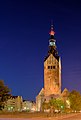
-
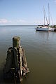
- Nomination Harbour in Nowa Karczma --Przykuta 06:19, 27 August 2010 (UTC)
- Promotion The boats are a bit softish, or is it me? Rama 23:21, 1 September 2010 (UTC)
no, it isn't you, but he focussed the wood in foreground which were sharp. I llike the composition, imo good enough to be a QI --Carschten 11:45, 5 September 2010 (UTC)
-

- Nomination View of the "Sultana's Garden", Generalife, Granada, Spain--Jebulon 09:59, 4 September 2010 (UTC)
- Promotion QI for me --Archaeodontosaurus 10:04, 4 September 2010 (UTC)
-

- Nomination Philips Leonardo TV set, approx. 1959 --Berthold Werner 08:47, 4 September 2010 (UTC)
- Promotion QI - I am very attracted by the prehistory --Archaeodontosaurus 09:50, 4 September 2010 (UTC)
-
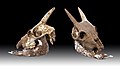
- Nomination fossil of Balearian mouse-goat --Archaeodontosaurus 07:34, 4 September 2010 (UTC)(UTC)
- Promotion Very good and interesting and useful. --Cayambe 08:28, 4 September 2010 (UTC)
-

- Nomination Bastions of Malbork Castle, Poland. --DerHexer 01:43, 4 September 2010 (UTC)
- Promotion a bit dark in shadow, but good (evening ?) light otherwise. Nice place. A geocode would be appreciated. Thanks.--Jebulon 10:26, 4 September 2010 (UTC) Comment See EXIF data: 19:03. ;o) Will try to add geodata. --DerHexer 11:03, 4 September 2010 (UTC)
-
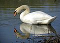
-

-

- Nomination Rosa 'Sahara' by Okki, --Anna reg 18:24, 3 September 2010 (UTC)
- Promotion Very sharp and otherwise also good. --Cayambe 08:47, 4 September 2010 (UTC)
-

- Nomination The sky in the port of Sada, Galicia (Spain)--Lmbuga 18:14, 3 September 2010 (UTC)
- Promotion Nice place (for rich people :-)) and good image. --Cayambe 08:47, 4 September 2010 (UTC)
-

- Nomination Turkish Stars' NF-5B. --Airwolf 14:06, 3 September 2010 (UTC)
- Promotion QI -- George Chernilevsky 19:33, 3 September 2010 (UTC)
-

- Nomination A Belgian F-16. --Airwolf 14:06, 3 September 2010 (UTC)
- Decline Poor composition. --The High Fin Sperm Whale 23:45, 3 September 2010 (UTC)
-

-

-

-

- Nomination Shouthern Hawker, head and thorax lateral closeup. --Quartl 12:07, 3 September 2010 (UTC)
- Promotion QI for me --Archaeodontosaurus 12:45, 3 September 2010 (UTC)
-

-

- Nomination stucco plasterer on an aerial work platform in Munich. --High Contrast 09:53, 3 September 2010 (UTC)
- Withdrawn OK --Mbdortmund 17:02, 3 September 2010 (UTC) Oppose The very same image has been declined in April, why promote now? And why should I keep reviewing images at QI if failed candidates are repeatedly renominated? --Elekhh 22:24, 3 September 2010 (UTC)
-

- Nomination Belt buckle, bronze, 7th century CE.-- Rama 08:57, 3 September 2010 (UTC)
- Promotion should imo be cropped --Mbdortmund 17:02, 3 September 2010 (UTC)
Support good now...Are you sure this is not a bottle opener? :)--Archaeodontosaurus 07:42, 4 September 2010 (UTC)
-

-

- Nomination Luxembourg City, Kirchberg, place de l'Europe. See image annotations for explanations. --Cayambe 18:40, 1 September 2010 (UTC)
- Promotion Like the composition of buildings. Unfortunate there was not a blue sky that day to contrast more with the concrete. Rwendland 13:59, 3 September 2010 (UTC)
-

- Nomination Alemayehu Eshete in Eurockéennes 2010. --ComputerHotline 18:35, 1 September 2010 (UTC)
- Decline very sharp, but compositionwise not QI to me.--Elekhh 22:35, 3 September 2010 (UTC)
-

- Nomination Reproduction of a statuette of Anubis (focus stacking) -- Rama 14:46, 1 September 2010 (UTC)
- Promotion QI & Useful --Archaeodontosaurus 07:52, 4 September 2010 (UTC)
-

- Nomination Siemens mobile phone S45i from approx. 2002 --Berthold Werner 17:05, 31 August 2010 (UTC)
- Promotion Warum soviel Rand? --Mbdortmund 19:54, 31 August 2010 (UTC)
Tja, warum? Ich hab's mal geändert. --Berthold Werner 18:13, 1 September 2010 (UTC)
gut --Mbdortmund 23:32, 3 September 2010 (UTC)
-

- Nomination Slovakian MiG-29 --Airwolf 09:52, 31 August 2010 (UTC)
- Promotion Good --The High Fin Sperm Whale 23:46, 3 September 2010 (UTC)
-

- Nomination The dam of Rules, on Guadalfeo river, Andalusia, Spain--Jebulon 23:37, 30 August 2010 (UTC)
- Promotion I like it. The curtain of water looks like it got there via copy & paste... - Till.niermann 12:41, 3 September 2010 (UTC)
-

- Nomination: Louka, village at South Bohemian Region, Czech Republic.--Juan de Vojníkov 07:26, 29 August 2010 (UTC)
- Review needed
-

- Nomination: Church of Mugni, Tbilisi, Georgia.--Gaeser 16:08, 28 August 2010 (UTC)
- Review needed
-

- Nomination: Sankt Goarshausen, Rhine, Germany. --Johannes Robalotoff 15:21, 28 August 2010 (UTC)
- Review needed
-

- Nomination: Kinpusenji in Yoshino, Nara --663highland 14:04, 28 August 2010 (UTC)
- Review needed
-

- Nomination Reconstruction of tram crossroad in Košice — Jagro 16:13, 27 August 2010 (UTC).
Comment I'm willing to promote... but please add a proper category and geotag. --Cayambe 07:33, 1 September 2010 (UTC) Done Category fixed and GPS added. —Jagro 15:18, 3 September 2010 (UTC) - Promotion Ok now :-). --Cayambe 18:20, 3 September 2010 (UTC)
- Nomination Reconstruction of tram crossroad in Košice — Jagro 16:13, 27 August 2010 (UTC).
-
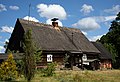
-

- Nomination Apple II computer. On display at the Musée Bolo, EPFL, Lausanne. -- Rama 22:15, 24 August 2010 (UTC)
- Decline high in resolution and carefully done, but I think a white background for a black object is inaproppriate. The contrast almost hurts my eye. --Ikiwaner 18:29, 1 September 2010 (UTC)
Right, black is the new black. Good point, thank you! Rama 23:08, 1 September 2010 (UTC)
There are (HDR?) artifacts in the apple II logo. - Till.niermann 12:36, 3 September 2010 (UTC)
-

-

-
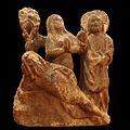
- Nomination Creation of Eve, sandstone from Montbenon (Lausanne), circa 1515. -- Rama 01:10, 3 September 2010
- Promotion Support QI & Useful --Archaeodontosaurus 05:56, 3 September 2010 (UTC)
-
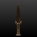
- Nomination Dagger, bronze, ca. 1800 BCE. Found at the Bourdonette in Lausanne. -- Rama 21:53, 2 September 2010 (UTC)
- Promotion Comment The black background is not very legible, a gray background or gradient would be better. --Archaeodontosaurus 05:55, 3 September 2010 (UTC)
Thank you, the idea of a gradient is excellent. Rama 06:12, 3 September 2010 (UTC)
Godd now --Archaeodontosaurus 09:30, 3 September 2010 (UTC)
-

- Nomination Port of Portosín, Porto do Son, Galicia (Spain)--Lmbuga 19:28, 2 September 2010 (UTC)
- Promotion Good. --Cayambe 08:36, 3 September 2010 (UTC)
-
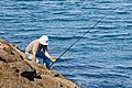
- Nomination Fishing, Portosín, Porto do Son, Galicia (Spain)--Lmbuga 18:22, 2 September 2010 (UTC)
- Promotion Good. --Cayambe 08:36, 3 September 2010 (UTC)
-

-

- Nomination Tombstone of Family Rump in Malbork, Poland. --DerHexer 17:41, 2 September 2010 (UTC)
- Promotion Readable very well. Question does D really mean Datum, not Domini? --Ikar.us 09:22, 3 September 2010 (UTC) Comment All other word in German and Domini behind the year … well, I removed my interpretation. --DerHexer 10:27, 3 September 2010 (UTC)
-

- Nomination Mobile phone Motorola M3888, from approx. 2000 --Berthold Werner 17:40, 2 September 2010 (UTC)
- Promotion I used to have one of those. I still do, somewhere... Airwolf 07:36, 3 September 2010 (UTC)
-

- Nomination Roman key mounted as a ring. -- Rama 07:01, 2 September 2010 (UTC)
- Promotion QI and Useful --Archaeodontosaurus 05:51, 3 September 2010 (UTC)
-

-

- Nomination Larus michahellis, Portosín, Porto do Son, Galicia (Spain)--Lmbuga 22:20, 31 August 2010 (UTC)
- Promotion Support The best one IMO: great light, good contrast and composition. Yann 12:20, 2 September 2010 (UTC)
-

-
-

- Nomination: Biało-Czerwone Iskry --Airwolf 11:30, 28 August 2010 (UTC)
- Review needed
-

- Nomination: Su-27UB --Airwolf 11:30, 28 August 2010 (UTC)
- Review needed
-

- Nomination: Tram no. 20 by night.--Juan de Vojníkov 07:47, 28 August 2010 (UTC)
- Review needed
-

- Nomination: Bus face by night.--Juan de Vojníkov 07:47, 28 August 2010 (UTC)
- Review needed
-

- Nomination: Apamea, Syria --Bgag 00:16, 28 August 2010 (UTC)
- Review needed
-
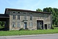
- Nomination: A house in Lorraine. --Coyau 00:02, 28 August 2010 (UTC)
- Review needed
-

- Nomination Cloister of Fontevraud Abbey. --Coyau 00:13, 27 August 2010 (UTC). Comment There are several dust spots in the sky. What about cropping away the unattractive wall at right? --Cayambe 07:30, 1 September 2010 (UTC) Info duspots removed (I left the birds), and well (not wall) croped. --Coyau 13:18, 2 September 2010 (UTC)
- Promotion Ok now. --Cayambe 14:02, 2 September 2010 (UTC)
- Nomination Cloister of Fontevraud Abbey. --Coyau 00:13, 27 August 2010 (UTC).
-
- Nomination Roman ring -- Rama 05:59, 2 September 2010 (UTC)
- Promotion Very "moving" testimony of past. Need further explanation IMO (period? material? Founding ?) I would like to know more about !--Jebulon 08:44, 2 September 2010 (UTC)
Description now improved. It's a funny one, the motif in the bezel can be seen only under a certain angle. Rama 09:05, 2 September 2010 (UTC)
-

- Nomination Pont Croesor in Gwynedd. Mattbuck 01:27, 2 September 2010 (UTC)
- Promotion good --Mbdortmund 04:35, 2 September 2010 (UTC)
-

-
-

-

-

-

- Nomination Liptovský Hrádok (Neuhäusel in der Liptau, Liptóújvár) - World War II socialist memorial - part --Pudelek 22:12, 1 September 2010 (UTC)
- Promotion good -- George Chernilevsky 05:18, 2 September 2010 (UTC)
-

- Nomination From above, the Rio Guadalfeo falling down over the Rules dam in Spain.--Jebulon 20:44, 1 September 2010 (UTC)
- Promotion Good --George Chernilevsky 05:20, 2 September 2010 (UTC)
-

-

-

-

-

- Nomination Larus michahellis, Portosín, Porto do Son, Galicia (Spain)--Lmbuga 22:16, 31 August 2010 (UTC)
- Promotion great --Mbdortmund 22:58, 31 August 2010 (UTC) see FP-nom --Ikiwaner 14:25, 1 September 2010 (UTC)
-

- Nomination Portal in Nordkirchen --Mbdortmund 19:29, 31 August 2010 (UTC)
- Promotion QI. Perspective is OK for this angle of look -- George Chernilevsky 05:25, 2 September 2010 (UTC)
-

-

-

- Nomination Detail on a rail at Pont Croesor. Mattbuck 03:15, 29 August 2010 (UTC)
- Promotion imo a bit boaring, perhaps better at an interesting point, e.g. a track switch --Mbdortmund 18:43, 29 August 2010 (UTC) Support probably not so high EV but good photography in terms of composition (diagonal band) and colour intensity contrast (red rust against neutral grey BG) --Ikiwaner 18:12, 1 September 2010 (UTC)
-

- Nomination Home of Stan Ioan Pătraş in Săpânţa, Romania. --Andrei Stroe 22:40, 28 August 2010 (UTC)
- Decline Completely blown out sky, overexposed. --Coyau 19:15, 1 September 2010 (UTC)
-

-

-
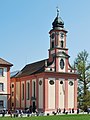
-

-

-
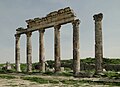
-
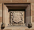
- Nomination Sandstone crest at Sydney University. --99of9 12:51, 27 August 2010 (UTC)
- Promotion Good -- George Chernilevsky 18:02, 1 September 2010 (UTC)
-

- Nomination Sandstone crest at Sydney University. --99of9 12:51, 27 August 2010 (UTC)
- Promotion good -- George Chernilevsky 18:02, 1 September 2010 (UTC)
-

- Nomination Sandstone crest at Sydney University. --99of9 12:51, 27 August 2010 (UTC)
- Promotion Good --George Chernilevsky 18:04, 1 September 2010 (UTC)
-

- Nomination Sandstone crest at Sydney University. --99of9 12:51, 27 August 2010 (UTC)
- Promotion Good --George Chernilevsky 18:05, 1 September 2010 (UTC)
-

- Nomination Sandstone crest at Sydney University. --99of9 12:51, 27 August 2010 (UTC)
- Promotion Good -- George Chernilevsky 18:06, 1 September 2010 (UTC)
-
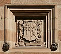
- Nomination Sandstone crest at Sydney University. --99of9 12:51, 27 August 2010 (UTC)
- Promotion Good. Nice set. -- George Chernilevsky 18:08, 1 September 2010 (UTC)
-
-
-

- Nomination: Emma Pooley. Cycling world championship, Mendrisio in Switzerland. --Ludo29 09:27, 27 August 2010 (UTC)
- Review needed
-

- Nomination Statue of Saint Catherine of Alexandria in Dzierzgon --Przykuta 06:19, 27 August 2010 (UTC)
- Decline Comment Blue empty sky above the statue should be cropped. Otherwise QI IMHO. Some overexposed parts on the statue do not harm as it is very white anyway. --Johannes Robalotoff 17:28, 30 August 2010 (UTC) The dark blue sky looks really too harsh and unnatural to me. Sorry.--Jebulon 15:12, 1 September 2010 (UTC)
-
-

- Nomination: Tal-y-Cafn railway station. Mattbuck 02:25, 27 August 2010 (UTC)
- Review needed
-

- Nomination Beddgelert, viewed from Aberglaslyn. Mattbuck 02:25, 27 August 2010 (UTC)
- Promotion Comment The description should be changed. I presume Beddgelert is the village (which is hardly visible) not the mountain (which is the focus of this image). --Quartl 07:12, 1 September 2010 (UTC)Description is correct. Nice intense colours and full of athmosphere --Ikiwaner 18:25, 1 September 2010 (UTC)
-

-
- Nomination: Matsukawa River at Hakuba, Japan --663highland 14:27, 26 August 2010 (UTC)
- Review Comment tilted approx 1.5 deg cw. --Quartl 14:59, 26 August 2010 (UTC)
-

- Nomination: Kumagawa-juku --663highland 14:27, 26 August 2010 (UTC)
- Review needed
-

- Nomination: Kumagawa-juku --663highland 14:27, 26 August 2010 (UTC)
- Review needed
-

- Nomination larus fuscus -- Ludo29 13:54, 26 August 2010 (UTC)
- Promotion CommentI liked the white BG. It would be useful in prints and pages with white BG. But the bird itself has strong blue cast. And inside of the nose should be black. --Nevit 16:29, 26 August 2010 (UTC) Comment agree about white balance but the hole for the nose goes all the way through the beak, and is therefore correct. --Ianare 21:26, 26 August 2010 (UTC)
Good to me. Rama 23:10, 1 September 2010 (UTC)
-

-

-

- Nomination Yyteri beach during Yyteri Beachfutis. --kallerna 19:47, 24 August 2010 (UTC)
- Decline Comment Generally very good. But people in the left lower corner are too distorted for me to promote. (They are broader than in reality if they sit/stand upright. The guy bending his back has a huge upper part of the body and short legs, which is probably not an anatomic abnormality, but an optical distortion.) --Johannes Robalotoff 17:00, 30 August 2010 (UTC) Oppose So many cropped people, taken at the worst time of high noon sun. --Ikiwaner 18:34, 1 September 2010 (UTC)
-

- Nomination The main square of Porto Covo (detail), west coast of Portugal -- Alvesgaspar 17:45, 23 August 2010 (UTC)
- Promotion Very good. I'm willing to promote once the small dust spot at left in the sky will be removed :-).--Cayambe 08:54, 28 August 2010 (UTC)
Can you also paint out that tv aerial please? Mattbuck 18:31, 30 August 2010 (UTC) -- I'll be out of town for some time. Will someone be so kind as to make the job for me?... -- Alvesgaspar 09:47, 2 September 2010 (UTC) Done Dust spots and crane removed from the sky. Tv antenna not removed, as it is a 'permanent' structure there. Needs to be promoted by sb else. --Cayambe 18:26, 1 September 2010 (UTC)
Promotion it is then. Rama 23:04, 1 September 2010 (UTC)
-

- Nomination a Ruddy Darter --Leviathan1983 10:20, 1 September 2010 (UTC)
- Promotion Very good quality. --Quartl 10:56, 1 September 2010 (UTC)
-

- Nomination a Ruddy Darter --Leviathan1983 10:20, 1 September 2010 (UTC)
- Promotion Very good quality. --Quartl 10:56, 1 September 2010 (UTC)
-

- Nomination a Ruddy Darter --Leviathan1983 10:20, 1 September 2010 (UTC)
- Promotion Very good quality. --Quartl 10:56, 1 September 2010 (UTC)
-

- Nomination Fragement of an oil lamp, Gallo-Roman, ca. 1st or 2nd century. -- Rama 00:08, 1 September 2010 (UTC)
- Promotion Support QI for me --Archaeodontosaurus 06:23, 1 September 2010 (UTC)
-

- Nomination The Counter seal of the Great Seal (device) of Emperor Napoleon Ist (1804-1805)--Jebulon 23:26, 31 August 2010 (UTC)
- Promotion Support QI for me; some imperfections, but it is not a studio work. --Archaeodontosaurus 05:48, 1 September 2010 (UTC)
-

- Nomination The Great Seal (device) of Emperor Napoleon Ist (1804-1815) --Jebulon 22:56, 31 August 2010 (UTC)
- Promotion good -- George Chernilevsky 07:11, 1 September 2010 (UTC)
-

- Nomination Larus michahellis, Portosín, Porto do Son, Galicia (Spain)--Lmbuga 22:24, 31 August 2010 (UTC)
- Promotion good --Mbdortmund 22:59, 31 August 2010 (UTC)
-

-

-

- Nomination Paleolithic Biface of South Africa --Archaeodontosaurus 20:08, 31 August 2010 (UTC)
- Promotion good --Mbdortmund 23:01, 31 August 2010 (UTC)
-

- Nomination Blossom of Mirabelle plum --Trachemys 18:07, 31 August 2010 (UTC)
- Promotion The "wrong" aperture looks nice here --Mbdortmund 19:52, 31 August 2010 (UTC)
-

- Nomination Common Brimstone (Gonepteryx rhamni) --Trachemys 18:07, 31 August 2010 (UTC)
- Decline overexposured --Mbdortmund 19:53, 31 August 2010 (UTC)
-

-

-

- Nomination A male Impala. --Ikiwaner 12:57, 31 August 2010 (UTC)
- Promotion Very nice. --Von.grzanka 13:35, 31 August 2010 (UTC)
-

-

- Nomination Atlantes in chains, Oloron Cathedral, France. --Myrabella 10:47, 31 August 2010 (UTC)
- Promotion Support QI & Useful --Archaeodontosaurus 05:51, 1 September 2010 (UTC)
-

- Nomination Fungi in the winter. --Trachemys 10:38, 31 August 2010 (UTC)
- Promotion These mushrooms are propably Flammulina velutipes, but I'm not an expert and I might be wrong. --Von.grzanka 13:35, 31 August 2010 (UTC)
-

- Nomination Walls towers and roofs of the Alhambra, view from Generalife, Granada, Spain--Jebulon 23:00, 30 August 2010 (UTC)
- Promotion QI -- George Chernilevsky 10:02, 1 September 2010 (UTC)
-

- Nomination Rabí castle in South Bohemia, Czech Rep. --Chmee2 19:15, 30 August 2010 (UTC)
- Promotion Comment Nice colours. But too much sky distracts from the castle IMHO. Would support if sky were cropped so that image is about 1700 pixels high. --Johannes Robalotoff 20:42, 30 August 2010 (UTC) Done --Chmee2 07:49, 31 August 2010 (UTC) Support Good now. --Johannes Robalotoff 16:29, 31 August 2010 (UTC)
-

- Nomination Bozu-jigoku of Beppu Onsen --663highland 15:07, 30 August 2010 (UTC)
- Promotion Support QI & Useful --Archaeodontosaurus 12:13, 31 August 2010 (UTC)
-

- Nomination Rosa 'Bubikopf', Uetersen Rosarium, Germany; by Southgeist. --Jebulon 22:06, 29 August 2010 (UTC)
- Decline Flat colors, soft. --Quartl 07:24, 1 September 2010 (UTC)
-

- Nomination Erroneous reading of an analog multimeter due to a parallax --Harke 17:08, 29 August 2010 (UTC)
- Promotion gute Doku --Mbdortmund 23:07, 31 August 2010 (UTC)
-
- Nomination Parallax-free reading on a mirror scale --Harke 17:07, 29 August 2010 (UTC)
- Promotion gute Doku --Mbdortmund 23:07, 31 August 2010 (UTC)
-

- Nomination The north-eastern tower on the Reichstag building --Carschten 15:19, 29 August 2010 (UTC)
- Promotion better now --Mbdortmund 23:09, 31 August 2010 (UTC)
-

- Nomination Common House Martins (Delichon urbica) on wires.--Juan de Vojníkov 07:26, 29 August 2010 (UTC)
- Promotion Comment I like the composition (who wrote the song?) but please crop away the half note (cut wing) at the top. --Quartl 09:06, 30 August 2010 (UTC) CommentI have cropped it. Is that better?--Juan de Vojníkov 11:29, 31 August 2010 (UTC)
Thanks, I support now. --Quartl 14:38, 31 August 2010 (UTC)
-

-

- Nomination Part of the "Phillipskurie", build in 1750 --Berthold Werner 17:03, 27 August 2010 (UTC)
- Promotion Good. --Cayambe 20:37, 31 August 2010 (UTC)
-

-

-

-

-
-

- Nomination: The forest of columns in the hypostyle hall of the mosque of Cordoba--Jebulon 23:04, 25 August 2010 (UTC)
- Review needed
-
- Nomination The Conwy estuary. Mattbuck 22:37, 25 August 2010 (UTC)
- Decline nice composition but the foreground is too unsharp imo --Mbdortmund 00:05, 27 August 2010 (UTC)
Considering I took this through a train window, I'm surprised it came out as well as it did. The foreground is not unsharp, merely in motion. Mattbuck 12:49, 30 August 2010 (UTC) Oppose Nice, but should be sharper for QI. --Quartl 07:07, 1 September 2010 (UTC)
-

- Nomination: Peter tatchell at Nottingham pride. Mattbuck 22:37, 25 August 2010 (UTC)
- Review The portrait is good, but I've got the impression that the colour balanceis a bit shifted towards the yellow. Also, the background is a bit distracting and the composition is a bit static. I'd do something along those lines, what do you think? Rama 06:40, 26 August 2010 (UTC) CommentI agree with color shifts, but composition has issues too. --Nevit 07:52, 26 August 2010 (UTC)
Yeah, that looks quite good, though I think you've gone a bit too far with the colour balancing. Mattbuck 10:18, 26 August 2010 (UTC)
-

-

- Nomination: Parea Wakasa --663highland 15:33, 25 August 2010 (UTC)
- Review needed
-

- Nomination: Kumagawa-juku --663highland 15:33, 25 August 2010 (UTC)
- Review needed
-

-

-
- Nomination Mature ears of field corn --Jonathunder 12:42, 25 August 2010 (UTC)
- Promotion Clear QI to me. --Cayambe 20:25, 31 August 2010 (UTC)
-

- Nomination Ohio Scientific Challenger 2P, with optional double disk unit. On display at the Musée Bolo, EPFL, Lausanne. -- Rama 10:20, 25 August 2010 (UTC)
- Promotion Good and useful. --Cayambe 07:21, 1 September 2010 (UTC)
-

-

- Nomination: Bavaria, Marktbreit, timber framend building --Berthold Werner 06:21, 25 August 2010 (UTC)
- Review I know it's an old house, nevertheless the perspective looks wrong somewhere IMO --Jebulon 09:46, 25 August 2010 (UTC)
Now I see it too. I uploaded a new, less corrected version and the uncorrected to compare. --Berthold Werner 17:40, 25 August 2010 (UTC) What do you think, as author ? IMO this one is not enough corrected at right--Jebulon 21:39, 25 August 2010 (UTC)
with more perspective corrected the gable looks more strange :-( --Berthold Werner 07:58, 26 August 2010 (UTC)
-

- Nomination The train station in Storvik. --Ainali 18:47, 22 August 2010 (UTC). Comment There is a dust spot at the left of the spire. Will promote once removed. :-) --Cayambe 15:24, 24 August 2010 (UTC) Fixed --Ainali 18:56, 30 August 2010 (UTC)
- Promotion Ok now. --Cayambe 07:18, 1 September 2010 (UTC)
- Nomination The train station in Storvik. --Ainali 18:47, 22 August 2010 (UTC).
-

- Nomination Nordkirchen castle, "Ehrenhof" --Mbdortmund 21:37, 30 August 2010 (UTC)
- Promotion Sehr gut -- George Chernilevsky 21:40, 30 August 2010 (UTC)
-

- Nomination Nordkirchen castle, one of the portals, detail --Mbdortmund 21:37, 30 August 2010 (UTC)
- Promotion Nice and good. --Cayambe 09:06, 31 August 2010 (UTC)--Cayambe 09:06, 31 August 2010 (UTC)
-

- Nomination Orange Spider Conch (Lambis crocata) -- George Chernilevsky 15:59, 30 August 2010 (UTC)
- Promotion SupportGood. --Nevit 16:56, 30 August 2010 (UTC)
-

- Nomination Orange Spider Conch (Lambis crocata) -- George Chernilevsky 15:59, 30 August 2010 (UTC)
- Promotion SupportGood. --Nevit 16:56, 30 August 2010 (UTC)
-

-

-

- Nomination Flooding near Pont Croesor. Mattbuck 15:56, 30 August 2010 (UTC)
- Promotion Good -- George Chernilevsky 16:11, 30 August 2010 (UTC)
-

-

- Nomination Luxembourg City, City Hall,with the spires of the cathedral in the background. --Cayambe 15:24, 30 August 2010 (UTC)
- Promotion QI -- George Chernilevsky 16:10, 30 August 2010 (UTC)
-

- Nomination Vase in Nordkirchen --Mbdortmund 09:49, 30 August 2010 (UTC)
- Promotion Sehr gut -- George Chernilevsky 18:05, 30 August 2010 (UTC)
-
- Nomination Templar chapel in Laon. --Coyau 03:02, 30 August 2010 (UTC) Info CA reduced. --Coyau 12:14, 30 August 2010 (UTC)
- Promotion QI for me, in spite of a slightly overexposed sky and small (and thus minor) blue borders around the roof and the building in the right background (visible at full resolution). --Johannes Robalotoff 17:45, 30 August 2010 (UTC)
- Nomination Templar chapel in Laon. --Coyau 03:02, 30 August 2010 (UTC)
-

-

-

- Nomination Narrow street in the museum Fuggerei, Augsburg. --High Contrast 23:25, 29 August 2010 (UTC)
- Promotion Good -- George Chernilevsky 16:06, 30 August 2010 (UTC)
-

- Nomination a ring to tie horses, with Charles V's motto, Alhambra, Granada, Spain--Jebulon 22:37, 29 August 2010 (UTC)
- Promotion Good -- George Chernilevsky 16:05, 30 August 2010 (UTC)
-

- Nomination Rosa 'Bella Rosa', Rosarium Uetersen, Germany; by Huhu Uet. --Jebulon 22:06, 29 August 2010 (UTC)
- Promotion Good. --Cayambe 09:14, 31 August 2010 (UTC)
-

- Nomination Rosa 'Dart's Red Dot', Rosarium Uetersen, Germany; by Huhu Uet. --Anna reg 20:56, 29 August 2010 (UTC)
- Promotion Also good. --Cayambe 09:14, 31 August 2010 (UTC)
-
- Nomination Foggy sunrise--Mbz1 17:39, 29 August 2010 (UTC)
- Promotion
Support QI for me --Archaeodontosaurus 06:05, 30 August 2010 (UTC) CommentCriteria 2 clearly requires identification. Here we have two organisms. One a predator bird and it's catch. They are a major part of picture. Please use you vote according to criteria, or do a rewrite for exceptions. --Nevit 08:31, 30 August 2010 (UTC) Support Beautiful image, the description "Buteo jamaicanensis with a mouse" is sufficient to me. --Quartl 08:44, 30 August 2010 (UTC) CommentI'm not sure if the identification is correct or not, but withdraw my oppose since criteria are met. --Nevit 09:36, 30 August 2010 (UTC)
Status set to promotion. --Quartl 09:52, 30 August 2010 (UTC) Why nobody asked for the correct ID of this poor mouse ?--Jebulon 22:23, 30 August 2010 (UTC)
-

- Nomination Kinpusenji in Yoshino, Nara --663highland 05:58, 29 August 2010 (UTC)
- Decline Comment I find the way the face of the girl is blurred makes her appear as a monster. --Elekhh 21:14, 30 August 2010 (UTC)
*It looks like the faces of the people were blurred in purpose. This image cannot get QI status like that of course.--Mbz1 22:08, 30 August 2010 (UTC)
-
- Nomination Kumamoto Castle --663highland 05:58, 29 August 2010 (UTC)
- Promotion good quality, and we need real-perspectives too. --Elekhh 21:14, 30 August 2010 (UTC)
-

-

-

- Nomination Wellmich, Rhine, Germany. --Johannes Robalotoff 17:52, 28 August 2010 (UTC)
- Promotion Nice place, good image, though sharpness could be a bit better. --Cayambe 17:27, 30 August 2010 (UTC)
-
-

- Nomination Gniew castle courtyard, Pomorskie voivodship, Poland --Przykuta 06:19, 27 August 2010 (UTC)
- Decline Decline because of wrong white balance. Noise and noise reduction effects are also quite strong. They could be acceptable, but correcting the white balance would increase noise. So probably nothing can be done here for QI. --Johannes Robalotoff 17:16, 30 August 2010 (UTC)
-

- Nomination: Apple II computer. On display at the Musée Bolo, EPFL, Lausanne. -- Rama 11:28, 25 August 2010 (UTC)
- Review needed
-

- Nomination Apple II computer. On display at the Musée Bolo, EPFL, Lausanne. -- Rama 11:28, 25 August 2010 (UTC)
- Promotion Good. Jonathunder 22:58, 30 August 2010 (UTC)
-

- Nomination: Ohio Scientific Challenger 2P, with optional double disk unit. On display at the Musée Bolo, EPFL, Lausanne. -- Rama 10:20, 25 August 2010 (UTC)
- Review needed
-

- Nomination: Ohio Scientific Challenger 2P, with optional double disk unit. On display at the Musée Bolo, EPFL, Lausanne. -- Rama 10:20, 25 August 2010 (UTC)
- Review needed
-

- Nomination White-browed Sparrow-weaver Plocepasser mahali, in nest, Tanzania. --Nevit 23:13, 23 August 2010 (UTC)
- Decline Comment It was probably not easy to shoot this picture. But I think the reason why nobody has promoted it so far is that the bird can be seen only in a small area within a confusing surrounding. (Good for the survival of the bird, less good for the image.) The nest is also partly overexposed so that some halms appear plain white. --Johannes Robalotoff 16:43, 30 August 2010 (UTC) Oppose - Nice bird, but as Johannes noted, some areas are overexposed. Mattbuck 18:31, 30 August 2010 (UTC)
-

- Nomination Bakery in fort du Bois d'Oye --ComputerHotline 18:09, 23 August 2010 (UTC)
- Promotion Good. Mattbuck 18:31, 30 August 2010 (UTC)
-

- Nomination Woman in tribal village, Umaria district, India. Yann 13:43, 23 August 2010 (UTC)
- Decline CommentSoft. Off center composition adds nothing to the image. --Nevit 08:03, 26 August 2010 (UTC) Comment Well it follows the rule of thirds. Yann 06:44, 27 August 2010 (UTC) CommentYes, it does - if you take the nose/eye lines. But while I don't think that it should be centered, it seems a bit 'cut off' at the left and upper edge - perhaps you should take the whole head fore your rule of thirds instead of these two lines... --Anna reg 21:06, 29 August 2010 (UTC) Oppose on composition grounds. Mattbuck 18:31, 30 August 2010 (UTC)
-
- Nomination Residential buildings from the 1920s designed by Sven Wallander.-Ankara 19:06, 22 August 2010 (UTC)
- Decline Bad composition and overexposed windows. Mattbuck 18:26, 30 August 2010 (UTC)
-

- Nomination Protestant church in Haigerloch, Germany. -- Felix Koenig 15:06, 22 August 2010 (UTC)
- Decline Decline for composition, sorry. Too large portions of the church are behind the plants. --Johannes Robalotoff 16:31, 30 August 2010 (UTC)
-
-

- Nomination University of P. J. Šafárik in Košice, Slovakia --Rl91 07:00, 22 August 2010 (UTC)
- Decline Comment Nice, but sky is imo too noisy and the pic looks a bit oversaturated, too. If you could correct it I would support. --Carschten 12:52, 22 August 2010 (UTC) Comment Slightly corrected --Rl91 15:22, 22 August 2010 (UTC) Oppose - grainy and haloed. Mattbuck 18:26, 30 August 2010 (UTC)
-

- Nomination Polyfunctional object Cassovar in Košice, Slovakia --Rl91 07:00, 22 August 2010 (UTC)
- Decline Comment Need perspective correction.--Ankara 09:36, 22 August 2010 (UTC) Comment Done. --Rl91 09:42, 22 August 2010 (UTC) Comment strong halo --Carschten 13:15, 22 August 2010 (UTC) Oppose - I like the building, and I think it's a great angle, but as noted there's a bad halo effect, it seems a bit grainy and the sky in the top right seems a bit weird. Mattbuck 18:26, 30 August 2010 (UTC)
-

- Nomination Portal with lions in Nordkirchen --Mbdortmund 09:49, 30 August 2010 (UTC)
- Promotion Nice light and composition. --Nevit 10:35, 30 August 2010 (UTC)
-

- Nomination Statue of a lion in Nordkirchen --Mbdortmund 09:49, 30 August 2010 (UTC)
- Promotion Sehr gut. Nice colors at sunrise -- George Chernilevsky 10:44, 30 August 2010 (UTC)
-

- Nomination Sailing boat at Zanzibar --Ikiwaner 05:17, 30 August 2010 (UTC)
- Promotion Nice --George Chernilevsky 08:19, 30 August 2010 (UTC)
-

- Nomination Hardangervidda, Norway. --Bartiebert 04:04, 30 August 2010 (UTC)
- Promotion Very nice. The geocode should ideally also include a heading field, to indicate which direction the camera was pointing. --Avenue 09:27, 30 August 2010 (UTC)
-

- Nomination King Jigme Khesar Namgyel Wangchuck - Spongie555 30 August 2010 (UTC)
- Decline Doesn't qualify: Not by Wikipedian, below 2MP. --Elekhh 03:53, 30 August 2010 (UTC)
-

- Nomination view of the basin and pavilion of the "Partal", Alhambra, Granada, Spain --Jebulon 22:06, 29 August 2010 (UTC)
- Promotion
Support Some areas of overexposure, which does not spoil a good composition --Archaeodontosaurus 09:28, 30 August 2010 (UTC)
-

- Nomination Buildings in Luxemb City. Perspective corrected version of a version that failed in Sept. 2009:-) --Cayambe 17:48, 29 August 2010 (UTC)
- Promotion Support QI now --Archaeodontosaurus 18:00, 29 August 2010 (UTC)
-

- Nomination Municipal hall in Münchingen, Southern Germany --Harke 17:12, 29 August 2010 (UTC)
- Promotion
Nice. Meets the QI criteria. --High Contrast 10:44, 30 August 2010 (UTC)
-

- Nomination GPIB cable --Harke 17:10, 29 August 2010 (UTC)
- Promotion QI --Mbdortmund 18:38, 29 August 2010 (UTC)
-

-

-

- Nomination The “Man-Swallower” and two Elders, Oloron Cathedral, France. --Myrabella 12:35, 29 August 2010 (UTC)
- Promotion CommentHas multiple issues. Tone are aggregated at the center of hisogram, it can be corrected with curves. There is also a blue tint. --Nevit 14:16, 29 August 2010 (UTC) Info New version uploaded. --Myrabella 06:53, 30 August 2010 (UTC) CommentBetter now. --Nevit 09:33, 30 August 2010 (UTC)
Support Good now --Archaeodontosaurus 09:46, 30 August 2010 (UTC)
-

- Nomination Passenger ship catamaran "Khadzhibey". Same project as Żegluga Gdańska -- George Chernilevsky 12:13, 29 August 2010 (UTC)
- Promotion CommentThe white of ship is almost mid-tone gray. --Nevit 14:19, 29 August 2010 (UTC) InfoPhoto taken in a very dark day --George Chernilevsky 17:40, 29 August 2010 (UTC) CommentI will neither promote nor oppose. Let's take another opinion. --Nevit 18:07, 29 August 2010 (UTC) Support White can look gray on rainy days. Looks OK to me. --Mbdortmund 18:41, 29 August 2010 (UTC)
-
- Nomination Stonehenge. Maedin 09:18, 29 August 2010 (UTC)
- Promotion Good -- George Chernilevsky 18:54, 29 August 2010 (UTC)
-

- Nomination Żegluga Gdańska in Hel, Poland. --DerHexer 09:11, 29 August 2010 (UTC)
- Promotion QI for me. Nice atmosphere -- George Chernilevsky 19:08, 29 August 2010 (UTC)
-

- Nomination Crosses in the Merry Cemetery in Săpânţa, Romania. --Andrei Stroe 23:40, 28 August 2010 (UTC)
- Promotion
Slightly overexposed (sky and tomb stones at lower right).Exposure ok on my 2nd, calibrated sccreen. I'm willing to promote once the half-cut cross and the person at the left will have been cropped away. Please, also add geotag. --Cayambe 18:52, 29 August 2010 (UTC)
Done. –Andrei Stroe 19:45, 29 August 2010 (UTC). Ok now. --Cayambe 06:42, 30 August 2010 (UTC)
-

- Nomination Crosses in the Merry Cemetery in Săpânţa, Romania. --Andrei Stroe 22:57, 28 August 2010 (UTC)
- Promotion Nice and good. --Cayambe 18:34, 29 August 2010 (UTC)
-

- Nomination Interior of St. Catherine’s Church in Gdańsk, Poland. --DerHexer 21:18, 28 August 2010 (UTC)}
- Promotion Comment Perspective correction needed. --Johannes Robalotoff 10:43, 29 August 2010 (UTC) Comment Better? --DerHexer 11:30, 29 August 2010 (UTC) Support OK now. --Johannes Robalotoff 13:41, 29 August 2010 (UTC)
-

- Nomination Vineyard in Napa--Mbz1 14:08, 28 August 2010 (UTC)
- Promotion CommentPlease sign your vote when promoting. --Nevit 20:44, 28 August 2010 (UTC) InfoI changed the status to nomination, since it was unclear who promoted the image. May be the nominator has some time to search the logs and find the voter. --Nevit 14:28, 29 August 2010 (UTC)
I did that, and will do again. A wonderful image. --Gaeser 19:06, 29 August 2010 (UTC) CommentPlease sign your votes before doing it again. I found the vote: Revision ID: 43254871 --Nevit 19:26, 29 August 2010 (UTC)
-

-

-

-

- Nomination Nelumbo nucifera and Victoria amazonicaat Kobe kachoen --663highland 12:33, 27 August 2010 (UTC)663highland 14:02, 28 August 2010 (UTC)~
- Promotion Comment please add description of the shown plant(s). --Quartl 13:04, 27 August 2010 (UTC) Support--Nevit 15:47, 29 August 2010 (UTC)
-

-
-

-

-
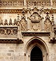
- Nomination cropped and reworked version of File:Capilla real granada1.jpg, maybe better--Jebulon 12:57, 26 August 2010 (UTC)
- Promotion CommentThis image is already in Consensual Review process. --Nevit 13:35, 26 August 2010 (UTC) Sorry no it is not. Maybe the same basic file, but strongly reworked (distortion, framing, contrast, colors).--Jebulon 15:35, 26 August 2010 (UTC) Support Very good. Yann 09:16, 30 August 2010 (UTC)
-

- Nomination Larva of a Dock Bug. --Quartl 19:53, 24 August 2010 (UTC)
- Decline CommentNot sharp enough imo. --Cayambe 09:07, 28 August 2010 (UTC) CommentAgree with Cayambe. --Nevit 20:50, 28 August 2010 (UTC) Decline per Cayambe and Nevit. --Johannes Robalotoff 13:45, 29 August 2010 (UTC)
-

- Nomination a Gate of Matsumoto Castle --663highland 12:57, 22 August 2010 (UTC)
- Decline the crop is not well chosen (e.g. roof on the left)--Anna reg 11:16, 30 August 2010 (UTC)
-
-
- Nomination: The main square of Porto Covo (detail), west coast of Portugal -- Alvesgaspar 17:45, 23 August 2010 (UTC)
- Review Very good. I'm willing to promote once the small dust spot at left in the sky will be removed :-).--Cayambe 08:54, 28 August 2010 (UTC)
Can you also paint out that tv aerial please? Mattbuck 18:31, 30 August 2010 (UTC) -- I'll be out of town for some time. Will someone be so kind as to make the job for me?... -- Alvesgaspar 09:47, 2 September 2010 (UTC)


.jpg)


.JPG)
.JPG)


.jpg)

.jpg)


.JPG)


.JPG)


.jpg)
_-_dried.jpg)


.JPG)


.JPG)


.jpg)
.jpg)


.jpg)


.jpg)


.JPG)


![* Nomination: Yuriev Monastery in Novgorod, Russia. --S[1] 14:21, 11 September 2010 (UTC) I like it, but I think that the clouds are something blue--Lmbuga 15:04, 11 September 2010 (UTC) * * Review needed](/wiki/File:Novgorod_-_View_on_Yuriev_Monastery_from_Volkhov_02.jpg)


.jpg)


,_heurtoir.jpg)


_-_evanjelick%C3%BD_kostol.JPG)


.JPG)


.jpg)


.jpg)
.jpg)


.JPG)

.JPG)
.jpg)


.JPG)
![* Nomination Nativity Church in Novgorod, Russia. --S[1] 14:21, 11 September 2010 (UTC) * Decline unfortunate crop right and left, sorry.--Jebulon 15:36, 12 September 2010 (UTC)](/wiki/File:Novgorod_-_Church_of_the_Nativity_in_Antoniev_Monastery.jpg)


.JPG)


.JPG)


.jpg)


.JPG)


.jpg)


.jpg)
.JPG)
.jpg)


_-_castle1.jpg)


.jpg)
.JPG)


.jpg)

.JPG)


.jpg)


.JPG)


.jpg)


.jpg)

.jpg)
.jpg)
_-_male.jpg)


.JPG)


.jpg)


.jpg)


.jpg)


.JPG)
.jpg)


.JPG)


.jpg)


_-_male.jpg)
.jpg)


_v_pohledu_z_louky_z_jihu_(001).JPG)


.JPG)
.JPG)


_-_WWII_memorial.JPG)
_-_WWII_memorial_-_part.jpg)


.JPG)
.JPG)
.jpg)


.jpg)
.jpg)


_d%C3%A9tour%C3%A9e.jpg)


.jpg)
.jpg)
.jpg)


.JPG)


.jpg)
.jpg)


.JPG)


-retouched.jpg)
.JPG)


.JPG)
.JPG)


,_N%C3%A1chod_04.JPG)


.jpg)


.JPG)


.jpg)

.jpg)


Consensual Review[edit]
File:Arabesk alhambra granada.jpg[edit]

- Nomination Arabesk and mosaics in Alhambra of Granada, Spain --Jebulon 21:01, 22 August 2010 (UTC)
- Promotion
- Support Also good. --Cayambe 14:54, 23 August 2010 (UTC)
- Oppose Composition. The script and decorations at right and left are a whole. --Nevit 10:31, 26 August 2010 (UTC)
- I do regret these systematic oppositions, looking like personal attacks and I really don't understand why... I'm sorry for other reviewers, really...--Jebulon 12:08, 26 August 2010 (UTC)
- Support OK for me. Yann 12:46, 26 August 2010 (UTC)
- During the review process can you explain your views according to criteria? It would bo more helpful than a vote alone. --Nevit 08:16, 27 August 2010 (UTC)
- Comment Until today, it was generally admitted that a support vote don't need other explanations. Explanations are more required for oppositions.--Jebulon 16:28, 27 August 2010 (UTC)
- Comment During the review process It would be more useful to describe your opinion along the vote. The subject is symmetrical motif composed of a script and symmetrical decorations on both sides, above and below. --Nevit 17:41, 26 August 2010 (UTC)
- Comment Not perfectly symetrical (look at the colours below, and script in itself not symetrical). --Elekhh 21:14, 26 August 2010 (UTC)
- The tile below the decoration have P1 symmetry. If you mention it, it can be another issue. Writings in English are not symmetric too, but the script and bounding box and the symmetrical decorations at both side are a whole. IMO The crop is careless here. --Nevit 08:09, 27 August 2010 (UTC)
- P1? sorry don't know the code. --Elekhh 10:36, 27 August 2010 (UTC)
- Category:Wallpaper group p1--Nevit 11:02, 27 August 2010 (UTC)
- I still don't see the relationship --Elekhh 21:22, 28 August 2010 (UTC)
- Category:Wallpaper group p1--Nevit 11:02, 27 August 2010 (UTC)
- P1? sorry don't know the code. --Elekhh 10:36, 27 August 2010 (UTC)
- The tile below the decoration have P1 symmetry. If you mention it, it can be another issue. Writings in English are not symmetric too, but the script and bounding box and the symmetrical decorations at both side are a whole. IMO The crop is careless here. --Nevit 08:09, 27 August 2010 (UTC)
- I'm sorry my english is not good enough to understand very well what you mean all about symetry. Some infos :
- -mosaics below are not symetrical in real, they cannot be a reference.
- -I wanted to show that it is an endless pattern. From right to left (arab writing) You have the coat of arms of Nasrid kings with a "squarred" decoration, then an arab motto, then the CoA, then a motto and so on. The crop is very careful, the "squarred" decoration is a bit cropped out right, but you may find the missing part left. (not sure I'm clear in english, sorry)--Jebulon 09:09, 27 August 2010 (UTC)
- Comment To be simple current cropping is like (----------) O correct composition for me to support: O (----------) O --Nevit 11:02, 27 August 2010 (UTC)
- Comment for further explanation, please see this picture, already promotted. The crop suggested just above would be artificially symetrical IMO.--Jebulon 16:24, 27 August 2010 (UTC)
- Comment I think your intention to show the endless pattern would have worked better if you don't crop the image at the exact edges where a pattern ends, which makes the image look static. using the above hieroglyph, somethning like )(----------) O ( --Elekhh (talk) 21:23, 28 August 2010 (UTC)
File:Gentau Pic du Midi Ossau.jpg[edit]

- Nomination Lake Gentau in the Pyrenees. --Myrabella 06:45, 24 August 2010 (UTC)
- Promotion Support Very nice! --Kuli 11:52, 24 August 2010 (UTC)
- Comment Nice, but leaning 0.5° to the left. A reflection on a horizontal surface is always perpendicular. The cows seem overexposed to me. Not much detail to see there. --Ikiwaner 17:55, 24 August 2010 (UTC)
- Info Thanks for your eye; new version uploaded. --Myrabella 22:05, 24 August 2010 (UTC)
- Info They are nearly white cows actually. --Myrabella 10:52, 25 August 2010 (UTC)
- Comment Withdraw my oppose, but no support. I think it would suffice to pass. --Nevit 12:15, 25 August 2010 (UTC)
- Support Yann 16:15, 25 August 2010 (UTC)
- Oppose Lovely composition, but a bit overexposed and not so sharp as it could be. --PetarM 11:09, 27 August 2010 (UTC)
- Support The change of tones, simulates colors that we could see in the 50s. Interresting --Archaeodontosaurus 12:33, 27 August 2010 (UTC)
- Oppose per PetarM --Carschten 11:58, 28 August 2010 (UTC)
- Info New new version uploaded. --Myrabella (talk) 13:05, 28 August 2010 (UTC)
- Support Good IMO.--Jebulon 14:50, 28 August 2010 (UTC)
- Support Gorgeous. --99of9 09:51, 29 August 2010 (UTC)
- Support Nice composition. --High Contrast 23:34, 29 August 2010 (UTC)
- Support Nice composition.--Lmbuga 22:42, 31 August 2010 (UTC)
File:Halichoerus grypus in Hel.jpg[edit]

- Nomination Swimming Gray Seal in Hel, Poland. DerHexer 23:30, 28 August 2010 (UTC)
- Withdrawn
- Support Very good. Yann 12:02, 29 August 2010 (UTC)
- CommentI'd rather prefer a whole shot of animal or a portrait. --Nevit 14:22, 29 August 2010 (UTC)
- Oppose Depicting a swimming seal is certainly difficult, but, despite the small exposure time, the head is quite soft and the whole body is motion blurred. Also the view from slightly behind is not optimal. --Quartl (talk) 12:17, 30 August 2010 (UTC)
- Oppose Unfortunate light conditions: Overexposed region on head, strongly underexposed on the eye and around it. Blurry back. --Johannes Robalotoff 20:18, 30 August 2010 (UTC)
- I tried to fix both but would prefer to archive that nomination because I knew those disadvantages but wanted to read other opinions about it. Kind regards, DerHexer 23:17, 30 August 2010 (UTC)
File:Torch IMG 2976-white.jpg[edit]

- Nomination Surefire 6P flashlight. -- Rama 17:04, 27 August 2010 (UTC)
- Promotion
- Is it a support? It's a high quality image with a huge resolution. --Drbug 19:28, 28 August 2010 (UTC)
- Should be a bit better now. Thanks for the advice. Rama 14:14, 29 August 2010 (UTC)
- I don't have time to review anymore (leaving on a break), so I'll just remove my opposition and rely on other reviewers. --Eusebius 14:28, 29 August 2010 (UTC)
![]() Support --Ianare 00:27, 30 August 2010 (UTC)
Support --Ianare 00:27, 30 August 2010 (UTC)
File:Smaky 100 IMG 4149.jpg[edit]

- Nomination Smaky 100 computer. On display at the Musée Bolo, EPFL, Lausanne. -- Rama 23:53, 25 August 2010 (UTC)
- Promotion
- Comment Overexposed ? let's discuss. --Ianare 21:09, 26 August 2010 (UTC)
- CommentWe have a lot of open discussions. I changed discuss to original value, since there are no votes yet. --Nevit 09:05, 27 August 2010 (UTC)
- Comment Agree with Ianare. Discussion should take place if a user asks for it. :-) --Cayambe 09:15, 28 August 2010 (UTC)
- Support imo OK, good details, would be nice, if some spots on the screen would be corrected --Mbdortmund 14:29, 28 August 2010 (UTC)
- Should be a bit better now. Rama 22:00, 28 August 2010 (UTC)
- Support --Cayambe 09:10, 1 September 2010 (UTC)
[edit]

- Nomination One of the five naves of the Cathedral of Granada, Spain--Jebulon 23:41, 24 August 2010 (UTC)
- Promotion
- I'm sorry, no.--Jebulon 15:38, 25 August 2010 (UTC)
- Support OK for me. Yann 14:58, 28 August 2010 (UTC)
- Done I tried something. Better now ?--Jebulon 15:26, 29 August 2010 (UTC)
- InfoRemoved oppose. --Nevit 15:31, 29 August 2010 (UTC)
- Thanks !--Jebulon 17:06, 29 August 2010 (UTC)
- Support I think it worked. --Johannes Robalotoff 20:33, 29 August 2010 (UTC)
- Support Despite the columns are not absolutely vertical. --Drbug 03:26, 30 August 2010 (UTC)
- Comment Thanks for review. I'll try to improve soon.--Jebulon 09:34, 30 August 2010 (UTC)
- Done Drbug was right. The right column too, now.--Jebulon 22:33, 31 August 2010 (UTC)
File:Парад невест 377.JPG[edit]

- Nomination Girl in Snow White costume --Butko 14:44, 25 August 2010 (UTC)
- Promotion
- Support Nice and usefull. --Nevit 14:54, 25 August 2010 (UTC)
- Motion blur on the lilac over the left hand. need a discussion. --Jebulon 12:18, 26 August 2010 (UTC)
- Support Yann 22:30, 28 August 2010 (UTC)
- Support Avenue 09:45, 1 September 2010 (UTC)
File:Boletus_impolitus_2010_G1.jpg[edit]

- Nomination Iodine bolete Boletus impolitus. New improved version of photo -- George Chernilevsky 19:44, 24 August 2010 (UTC)
- Decline
- SupportGood photographs, nice colours (reminds of me of The Wind in the Willows for some reason. Rama 21:28, 26 August 2010 (UTC)
- Oppose The light source used (Flash) seems too harsh to me. --Nevit 08:54, 27 August 2010 (UTC)
- Oppose Agree that flash lighting and shadow are harsh. --Elekhh 22:09, 27 August 2010 (UTC)
- Support--Mbz1 02:46, 29 August 2010 (UTC)
- Oppose flash is too harsh --Ianare 00:21, 30 August 2010 (UTC)
File:Arabesk alhambra granada.jpg[edit]
- Nomination Arabesk and mosaics in Alhambra of Granada, Spain --Jebulon 21:01, 22 August 2010 (UTC)
- Promotion
- Support Also good. --Cayambe 14:54, 23 August 2010 (UTC)
- Oppose Composition. The script and decorations at right and left are a whole. --Nevit 10:31, 26 August 2010 (UTC)
- I do regret these systematic oppositions, looking like personal attacks and I really don't understand why... I'm sorry for other reviewers, really...--Jebulon 12:08, 26 August 2010 (UTC)
- Support OK for me. Yann 12:46, 26 August 2010 (UTC)
- During the review process can you explain your views according to criteria? It would bo more helpful than a vote alone. --Nevit 08:16, 27 August 2010 (UTC)
- Comment Until today, it was generally admitted that a support vote don't need other explanations. Explanations are more required for oppositions.--Jebulon 16:28, 27 August 2010 (UTC)
- Comment During the review process It would be more useful to describe your opinion along the vote. The subject is symmetrical motif composed of a script and symmetrical decorations on both sides, above and below. --Nevit 17:41, 26 August 2010 (UTC)
- Comment Not perfectly symetrical (look at the colours below, and script in itself not symetrical). --Elekhh 21:14, 26 August 2010 (UTC)
- The tile below the decoration have P1 symmetry. If you mention it, it can be another issue. Writings in English are not symmetric too, but the script and bounding box and the symmetrical decorations at both side are a whole. IMO The crop is careless here. --Nevit 08:09, 27 August 2010 (UTC)
- P1? sorry don't know the code. --Elekhh 10:36, 27 August 2010 (UTC)
- Category:Wallpaper group p1--Nevit 11:02, 27 August 2010 (UTC)
- I still don't see the relationship --Elekhh 21:22, 28 August 2010 (UTC)
- Category:Wallpaper group p1--Nevit 11:02, 27 August 2010 (UTC)
- P1? sorry don't know the code. --Elekhh 10:36, 27 August 2010 (UTC)
- The tile below the decoration have P1 symmetry. If you mention it, it can be another issue. Writings in English are not symmetric too, but the script and bounding box and the symmetrical decorations at both side are a whole. IMO The crop is careless here. --Nevit 08:09, 27 August 2010 (UTC)
- I'm sorry my english is not good enough to understand very well what you mean all about symetry. Some infos :
- -mosaics below are not symetrical in real, they cannot be a reference.
- -I wanted to show that it is an endless pattern. From right to left (arab writing) You have the coat of arms of Nasrid kings with a "squarred" decoration, then an arab motto, then the CoA, then a motto and so on. The crop is very careful, the "squarred" decoration is a bit cropped out right, but you may find the missing part left. (not sure I'm clear in english, sorry)--Jebulon 09:09, 27 August 2010 (UTC)
- Comment To be simple current cropping is like (----------) O correct composition for me to support: O (----------) O --Nevit 11:02, 27 August 2010 (UTC)
- Comment for further explanation, please see this picture, already promotted. The crop suggested just above would be artificially symetrical IMO.--Jebulon 16:24, 27 August 2010 (UTC)
- Comment I think your intention to show the endless pattern would have worked better if you don't crop the image at the exact edges where a pattern ends, which makes the image look static. using the above hieroglyph, somethning like )(----------) O ( --Elekhh (talk) 21:23, 28 August 2010 (UTC)
File:Gentau Pic du Midi Ossau.jpg[edit]
- Nomination Lake Gentau in the Pyrenees. --Myrabella 06:45, 24 August 2010 (UTC)
- Promotion Support Very nice! --Kuli 11:52, 24 August 2010 (UTC)
- Comment Nice, but leaning 0.5° to the left. A reflection on a horizontal surface is always perpendicular. The cows seem overexposed to me. Not much detail to see there. --Ikiwaner 17:55, 24 August 2010 (UTC)
- Info Thanks for your eye; new version uploaded. --Myrabella 22:05, 24 August 2010 (UTC)
- Info They are nearly white cows actually. --Myrabella 10:52, 25 August 2010 (UTC)
- Comment Withdraw my oppose, but no support. I think it would suffice to pass. --Nevit 12:15, 25 August 2010 (UTC)
- Support Yann 16:15, 25 August 2010 (UTC)
- Oppose Lovely composition, but a bit overexposed and not so sharp as it could be. --PetarM 11:09, 27 August 2010 (UTC)
- Support The change of tones, simulates colors that we could see in the 50s. Interresting --Archaeodontosaurus 12:33, 27 August 2010 (UTC)
- Oppose per PetarM --Carschten 11:58, 28 August 2010 (UTC)
- Info New new version uploaded. --Myrabella (talk) 13:05, 28 August 2010 (UTC)
- Support Good IMO.--Jebulon 14:50, 28 August 2010 (UTC)
- Support Gorgeous. --99of9 09:51, 29 August 2010 (UTC)
- Support Nice composition. --High Contrast 23:34, 29 August 2010 (UTC)
- Support Nice composition.--Lmbuga 22:42, 31 August 2010 (UTC)
File:Porthmadog MMB 01.jpg[edit]

- Nomination The rooftops of Porthmadog. Mattbuck 02:48, 28 August 2010 (UTC)
- Decline
- Oppose Image is too dark, will be good wait for better weather -> noisy Chmee2 12:04, 28 August 2010 (UTC)
- Comment I like Mattbucks bad weather pictures --Mbdortmund 18:45, 28 August 2010 (UTC)
- Support I like too. And they are particularly hard to take because of the well-known nice weather of Wales. I don't see unacceptable noise here, and this one is a QI to me.--Jebulon 21:44, 29 August 2010 (UTC)
- Oppose imo too grainy, would be better with ISO 100 (and tripod?) --Carschten 13:36, 30 August 2010 (UTC)
File:Fountain and Vineyards in Napa Valley.jpg[edit]

- Nomination Fountain and Vineyards in Napa Valley--Mbz1 04:36, 2 September 2010 (UTC)
- Decline {{{2}}}
File:Ishibutai-kofun Asuka Nara pref03n4592.jpg[edit]

- Nomination Ishibutai-kofun in Asuka, Nara --663highland 15:36, 1 September 2010 (UTC)
- Decline
- Support Nice and useful. Please have a look here to understand what it is. Very interesting concerning the old japanese history. --Jebulon 17:06, 1 September 2010 (UTC)
- Oppose For me many part of the picture si blurry or really unsharp --Croucrou 11:29, 2 September 2010 (UTC)
- Oppose bluuuuuurry --Carschten 12:32, 2 September 2010 (UTC)
File:European Robin (Erithacus rubecula) 2.jpg[edit]
_2.jpg)
- Nomination European Robin (Erithacus rubecula). --Trachemys 13:04, 31 August 2010 (UTC)
- Promotion
- Support Good job. :)--Von.grzanka 13:23, 31 August 2010 (UTC)
- Needs some contrast. Washed out colours. Lycaon 12:49, 1 September 2010 (UTC)
- Comment I'm sorry, but the light was very bad. It was taken in the winter. --Trachemys 13:16, 1 September 2010 (UTC)
- Oppose poor DOF --Carschten 12:24, 2 September 2010 (UTC)
- Support Nice bird, OK composition. Not bad for compact. --PetarM 22:07, 2 September 2010 (UTC)
File:Feral pigeon.jpg[edit]

- Nomination Feral pigeon (Columba livia). --Von.grzanka 10:03, 31 August 2010 (UTC)
- Promotion
- Oppose High technical quality but poor photography. I dislike the concrete background and the composition with the head in the center. DOF is shallow too. --Ikiwaner 18:06, 1 September 2010 (UTC)
- CommentI always don't like to argue with decisions of others rating my photos, normally I just get over it and try to make better photos (this is a very good motivation). This time though, I just feel I have to disagree. This photo represents the subject, which is a feral bird, living in cities full of concrete. If you dislike the photo just because of the concrete, I have to express my concern. Please excuse me if by "the concrete background" you meant a background which does not allow the extraction of the subject. --Von.grzanka 18:45, 1 September 2010 (UTC)
- Support quality very good, DOF okay, background natural and not disturbing. Of course a QI to me --Carschten 12:20, 2 September 2010 (UTC)
- Support Good enough IMO, even the tail looks a bit OoF. Backround good for this kind of subject. Composition: maybe not very artistic nor original, but good enough too for an encyclopedical use. QI, at the end.--Jebulon (talk) 16:51, 2 September 2010 (UTC)
- Support Its good. --PetarM 22:10, 2 September 2010 (UTC)
File:Tedom C12, Radnica Starého mesta.jpg[edit]

- Nomination Tedom C12G, Košice — Jagro 21:49, 31 August 2010 (UTC)
- Promotion
{{support}} - It's good to me, I think--Lmbuga 22:30, 31 August 2010 (UTC)- Oppose - overexposed. Mattbuck 00:01, 1 September 2010 (UTC)
- Info Hmm, last week I set up my display and maybe it wasn't a good idea… I exported new version of this image from source raw file – is this one better? — Jagro 15:37, 1 September 2010 (UTC)
- Support Good for me--Lmbuga 16:05, 1 September 2010 (UTC)
- Support the white front is overexposed but no detail gets lost since it's just a plain white surface. Illustrative, EV, sharp, but not very photographic. --Ikiwaner 18:44, 1 September 2010 (UTC)
- Support I don't find it overexposed. --High Contrast 01:02, 3 September 2010 (UTC)
File:Písek, Kamenný most.jpg[edit]

- Nomination Stone bridge in Písek, Czech Republic. Václav Velíšek -- 17:05, 31 August 2010 (UTC)
- Decline
- Support good --Mbdortmund 23:02, 31 August 2010 (UTC)
- Oppose Strong CA, isn't it? See the bridge and the post on the right, the building on the left. --Myrabella 08:00, 1 September 2010 (UTC)
- Oppose as Myrabella --Berthold Werner 18:04, 1 September 2010 (UTC)
- Oppose per Myrabella --Carschten 12:33, 2 September 2010 (UTC)
File:Helianthus annuus qtl1.jpg[edit]

- Nomination Sunflower. --Quartl 04:38, 27 August 2010 (UTC)
- Promotion
- Info Converted color space to Adobe RGB, better now? --Quartl 20:45, 30 August 2010 (UTC)
- Comment Your new version seems to have indeed slightly (nearly invisible) better detail. But the upper right petals are still overexposed in the red channel (and less in the green channel) and therefore the yellow is shifted more towards that of a lemon. Besides also simple conversion of the original first version to Adobe RGB makes the histogram look better. However this is just numerics, and you obviously can't get information back that was lost before. So let us wait what other people say. --Johannes Robalotoff 20:58, 31 August 2010 (UTC)
- Thank you for your considerations, I see what you're referring to now. I still have the RAW, so I can try to correct things a bit. I reduced the lights, so the histogram looks good in all channels now. --Quartl 04:34, 1 September 2010 (UTC)
- Support The latest version which you uploaded today is very good. --Johannes Robalotoff 17:06, 1 September 2010 (UTC)
- Support very good --Carschten 12:36, 2 September 2010 (UTC)
File:Land Rover xWHR MMB 01 desat blur.jpg[edit]

- Nomination A Land Rover in the rain. Mattbuck 02:25, 27 August 2010 (UTC)
- Decline
- Support good colour-key, good panning (motion blur in the background), it catches the rainy wheather feeling. --Ikiwaner 17:55, 1 September 2010 (UTC)
- Oppose I hate to say that, but the wheels look arefrozen by a quick shutter and that doesn't agree with the motion blur. Rama 23:16, 1 September 2010 (UTC)
- So would it be better if I blurred the wheels too? Mattbuck 12:27, 2 September 2010 (UTC)
- Oppose nice idea, but it looks like that the car has photographed in another situation and has put in subsequently in the image. Quality imo not good enough, too. --Carschten 12:17, 2 September 2010 (UTC)
- Imho (!) it does not only look so, it was faked. You can see small errors of cutting the car out of another image. Kind regards, DerHexer 00:52, 6 September 2010 (UTC)
- Oppose Oppose per Rama and Carschten. Not a QI. BTW, composition is poor too: if you want to show movement, then leave more space in front of object than behind it. --Kae 15:26, 3 September 2010 (UTC)
File:Seven-spotted ladybug (Coccinella septempunctata).jpg[edit]
.jpg)
- Nomination
- Promotion Seven-spotted ladybug. --Trachemys 14:55, 3 September 2010 (UTC)
File:Foggy morning at Lake Merced.jpg[edit]

- Nomination Foggy morning at Lake Merced--Mbz1 19:31, 31 August 2010 (UTC)

- Promotion
- Support Nice atmosphere -- George Chernilevsky 05:24, 2 September 2010 (UTC)
- Oppose Artifacts of processing (see notes on image) --Kae 10:11, 3 September 2010 (UTC)
- Well, I fixed the stitching error, but the claims such as "clouds cannot look so dark through the fog" or saying that the reflection is not right did upset me because it is always upsetting, when a reviewer claims something that he/she has no idea about. Guess what those are not dark clouds, but just more dense fog as is seen at one of the originals. I could have uploaded more originals to show the reflection in the water, but I see no reason in loosing my time.--Mbz1 (talk) 16:36, 3 September 2010 (UTC)
- Support --The High Fin Sperm Whale 23:49, 3 September 2010 (UTC)
- Support --Archaeodontosaurus 08:00, 4 September 2010 (UTC)
- Support A really excellent picture, with a great mood. --Cayambe 08:36, 4 September 2010 (UTC)

File:Portopia Hotel03n4272.jpg[edit]

- Nomination Portopia Hotel in Kobe --663highland 14:04, 28 August 2010 (UTC)
- Promotion
- Support Good.--Mbz1 14:11, 28 August 2010 (UTC)
{{opp}}I like it, but the perspective would have to be corrected--Lmbuga 22:50, 31 August 2010 (UTC)- Info I have taken the liberty of correcting the perspectives. -- Rama 06:51, 2 September 2010 (UTC)
*
![]() Support Technically good, particularly the exposure and colours. Rama 06:51, 2 September 2010 (UTC)
Support Technically good, particularly the exposure and colours. Rama 06:51, 2 September 2010 (UTC)
- I retract my vote as I have edited the image, to ensure integrity as much as possible. Rama 09:03, 3 September 2010 (UTC)
- Support very good --Carschten 12:37, 2 September 2010 (UTC)
- Support very good. Thanks, Rama--Lmbuga 19:33, 2 September 2010 (UTC)
- Support--Archaeodontosaurus 08:03, 4 September 2010 (UTC)
File:Gottéron - Zvolen 2010-08-24 - Kristin Matej-2.jpg[edit]

- Nomination Kristin Matej, Slovakia -- Ludo29 12:50, 26 August 2010 (UTC)
- Promotion
- Strong Support. Not far of FP, IMO. --Jebulon 12:59, 26 August 2010 (UTC)
- Oppose Very noisy, not the sharpest, overexposed red. --kallerna 13:31, 26 August 2010 (UTC)
- OpposeIn full resolution IMO too noisy --Rl91 14:04, 26 August 2010 (UTC)
- Noisy : It's a photography at ISO 3200. If you reduce noise, you loose détails ... Overexposed red : It's sportswear... Ludo29 14:05, 26 August 2010 (UTC)
- CommentNoise is inevitable here, it's indoor sport photography. I do not think that entire genres should be banned from QI. Rama 14:13, 26 August 2010 (UTC)
- Support This type of image this very important resolution is inevitably noisy. QI for me --Archaeodontosaurus 14:27, 26 August 2010 (UTC)
- Comment You could manage with much lower ISO than 3200. Of course in images like this there are noise, but this is just too much. --kallerna 14:40, 26 August 2010 (UTC)
- 300 mm, f/2.8, 1/320 s It's impossible to choose a better ISO than 3200. Ludo29 15:23, 26 August 2010 (UTC)
- What was your lens? --kallerna 16:13, 26 August 2010 (UTC)
- A Minolta 300mm f/2,8 Ludo29 16:17, 26 August 2010 (UTC)
- What was your lens? --kallerna 16:13, 26 August 2010 (UTC)
- 300 mm, f/2.8, 1/320 s It's impossible to choose a better ISO than 3200. Ludo29 15:23, 26 August 2010 (UTC)
- OpposeWith current criteria noise is important. Perhaps we should change that for difficult images. --Nevit 16:36, 26 August 2010 (UTC)
![]() Comment First of all: This image could be improved by reducing noise with an appropriate software such as NoiseNinja. I don't do it because I pay Internet per Megabyte.
Comment First of all: This image could be improved by reducing noise with an appropriate software such as NoiseNinja. I don't do it because I pay Internet per Megabyte.
- But then: Judging a 16 MP image at 100% on a computer screen is nonsense! Normal photography (and also paintings) is intended to be viewed at once. We should judge pictures when viewing them from about 1-1.5 times the image diagonal. That's device independant and roughly the field of view of the human eye. When we judge this picture at 100% on a state of the art 1600*1200 screen we see only about 1/8 of the image. Those who say "there is too much noise" should honestly precise "in that 1/8th of the image my screen could show". Now the famous very high resolution screen of the future comes into play. If this will ever exist: Will it make sense to stand in front of it with the same viewing distance than your today's 1600*1200 screen? I'll give the answer: No, because your eyes field of view is limited you will automatically step back until the viewing distance is about the screen's diagonal.
- No rule without exception: Panoramics are a species of images that are not meant to view them at once. For those we shall recommend i.e. a viewing distance of 1-1.5 times the shorter side.
- What to do: Judge pictures resized to full screen and avoid the following problems:
- Contributors uploaing a higher resolution than the minimum requirement get punished
- Pictures that are optimized (sharpening, grain) for optimal viewing distance get punished
- Regards --Ikiwaner 15:04, 27 August 2010 (UTC)
- Very nice comment. It deserves discussion, but might be inappropriate to discuss under this photo. Can you move the topic under Commons_talk:Quality_images_candidates/candidate_list --Nevit 23:20, 27 August 2010 (UTC)
- Oppose, unsharp, grainy + CA. Juliancolton 15:10, 27 August 2010 (UTC)
- Support It's a good photograph of indoor sport. Defects such as "grainy" of "not razor-sharp" stem from the very genre of the photography; they would be disturbing for a studio shot of an unanimated object, but are normal for this sort of image. Rama 16:59, 27 August 2010 (UTC)
- Support Excellent image, noise is not a problem. --King of Hearts 03:58, 28 August 2010 (UTC)
- Support Great action shot. Color noise is absent. Given the file size, luminance noise won't be noticed on a 20-30 cm print. Pixel-peeping makes no sense. Inisheer 17:15, 28 August 2010 (UTC)
- Comment I have seen more noisy pictures at much lower ISO on this page. And the slight overexposure is still bearable here. So this is still very good as indoor action photography. However all the noise discussion above means that the picture was uploaded with higher resolution than the resolution at which it can be actually used. No information is lost if one downscales to about 6 MP here. (This is not only due to noise but also contrast and motion blur.) So to comment on Ikiwaner's statement above: IMHO pictures should be uploaded and judged at a resolution that is appropriate for the amount of detail contained in a picture. The viewing distance rule is not device-independent as most (all?) monitors have lower DPI than good prints and the human eye can see that. If I look on this picture as a 6 MP picture, noise is actually no problem, only the inappropriately large file size (14 MB with 16 MP for only 6 usable MP) is somewhat inconvenient to handle. --Johannes Robalotoff 09:46, 29 August 2010 (UTC)
- Oppose nice composition, nice action shot, but ISO 3600 was too much. Too noisy, sharpness imo not convincing, sorry --Carschten 13:41, 30 August 2010 (UTC)
- I can see what you mean about sharpness, but the sensitivity was impeccable: 1/300s for a 300mm lens that you can't open more than f/2.8. Rama 19:10, 30 August 2010 (UTC)
- Support, great action shot. Noise not really a problem. --Avenue 09:49, 1 September 2010 (UTC)
- Oppose Though I can follow Ikiwaners reasoning, in this case it is just too much. Noise is indeed visible scaled to my 1440*900 laptop screen. Lycaon 17:27, 1 September 2010 (UTC)
- Comment Too much noise, but isn't the noise artistic in this image? Better without noise, but I like it here--Lmbuga 19:47, 2 September 2010 (UTC)
- Support. On 1/320 sec, f/2.8 indoors, one must use a high ISO, and thus expect some noise. The image is really good! Regards, --Kjetil_r 20:41, 3 September 2010 (UTC)
File:Nest of Common Blackbird (1).jpg[edit]
.jpg)
- Nomination Nest of Common Blackbird with 4 chicks. --Trachemys 13:00, 5 September 2010 (UTC)
- Decline
- Oppose Closeup nest photography is unethical (and often illegal) and should be discouraged. Lycaon 06:58, 6 September 2010 (UTC)
- Support Good. Yann 07:51, 6 September 2010 (UTC)
- Oppose Many areas overexposed. The league protecion birds (in France) do recommend to stay away from nests. --Archaeodontosaurus 17:07, 6 September 2010 (UTC)
File:Dóm_svätej_Alžbety.jpg[edit]

- Nomination St. Elisabeth Cathedral, Košice, Slovakia --Rl91 12:21, 3 September 2010 (UTC)
- Decline
- Support nice composition --Mbdortmund 16:54, 3 September 2010 (UTC)
- Oppose Nice composition but oversaturated, the clouds are blue. Correction necessary. --Archaeodontosaurus 07:39, 4 September 2010 (UTC)
- Comment Slightly corrected.--Rl91 07:45, 4 September 2010 (UTC)
- Comment I tried to fix them in File:Dóm svätej Alžbety.jpg. But there are also many chromatic aberrations around the church. DerHexer 01:05, 6 September 2010 (UTC)
- Oppose still two blue --Carschten 16:35, 6 September 2010 (UTC)
- Comment I tried to fix it.--Rl91 16:50, 6 September 2010 (UTC)
File:TheTower-Ouranopolis-Athos-Greece.jpg[edit]

- Nomination The Old Byzantine Tower in Ouranopolis, Athos Peninsula, Greece. --MrPanyGoff 23:23, 2 September 2010 (UTC)
- Decline Support-Lipedia 14:26, 8 September 2010 (UTC) Oppose Perspective correction needed. Questionable white balance. Let us discuss. --Johannes Robalotoff 17:10, 8 September 2010 (UTC)
- Oppose I find it very "yellow", i'm afraid.--Jebulon 22:09, 9 September 2010 (UTC)
- Oppose Perspective correction and I find it very "yellow"--Lmbuga 07:21, 10 September 2010 (UTC)
- Both done in File:TheTower-Ouranopolis-Athos-Greece-revised.jpg. Kind regards, DerHexer 23:31, 11 September 2010 (UTC)
- Please nominate as a new nomination then. Lycaon 23:33, 11 September 2010 (UTC)
- Both done in File:TheTower-Ouranopolis-Athos-Greece-revised.jpg. Kind regards, DerHexer 23:31, 11 September 2010 (UTC)
File:Ursus_thibetanus_01.JPG[edit]

- Nomination Two Asian Black Bears fighting for food --Llez 20:35, 7 September 2010 (UTC)
- Decline
- Oppose Rather noisy and lacking detail. Lycaon 07:01, 8 September 2010 (UTC)
- Oppose Lack of detail due to noise reduction and underexposure of bears. --Johannes Robalotoff 16:12, 8 September 2010 (UTC)
File:Koyasan Station01s4s3200.jpg[edit]

- Nomination Koyasan Station --663highland 14:04, 28 August 2010 (UTC)
- Decline
- Support very good --Carschten 12:31, 5 September 2010 (UTC)
- Oppose Disturbing CA and unfortunate perspective. Lycaon 11:25, 8 September 2010 (UTC)
- I see just some small parts with CA, and they are not a bit disturbing imo. We habe pictures with much more CA which were promoted. But nice to see that I'm not the only one who checks the old candidates which had no review for over a week. --Carschten 12:56, 8 September 2010 (UTC)
- So try I to do, mein Freund. I begin always my visits in QIC by the end... You'll never walk alone...--Jebulon 18:10, 8 September 2010 (UTC)
- Oppose Requires correct perspective --Archaeodontosaurus 17:22, 8 September 2010 (UTC)
File:Ochsenburger Brücke.JPG[edit]
![]()
- Nomination 2nd: Bridge over the Austrian Traisen river, in the background Schloss Ochsenburg --AleXXw 13:40, 28 August 2010 (UTC)
- Decline

Alternative by kaʁstn Disk/Cat - Support a bit unsharp, but imo okay --Carschten 12:31, 5 September 2010 (UTC)
- Oppose Strong CA, especially right side. Lycaon 11:24, 8 September 2010 (UTC)
- Oppose agree with Lycaon, especially on the metallic structure --Jebulon 18:06, 8 September 2010 (UTC)

File:San Francisco Bay with Golden Gate Bridge, a boat, dolphins and Marin layer.jpg[edit]

- Nomination San Francisco Bay with Golden Gate Bridge, a boat, dolphins and Marin layer.--Mbz1 01:30, 11 September 2010 (UTC)
- Withdrawn
- Support Special, unusual and good. --Jebulon 13:56, 11 September 2010 (UTC)
- Oppose Nothing in focus. Failed picture. Why even upload?? Lycaon 14:23, 11 September 2010 (UTC)
- The image was taken in a fog. Everything was in fog, and the dolphins were not only in the fog, but also in the water. This image is not about being sharp, and not about the focus, this image about a, very special mood of San Francisco Bay. I would also like to ask you, lycaon, please avoid telling me what I should, and should not upload. OK?--Mbz1 19:46, 11 September 2010 (UTC) --
- Comment -- I don't think focus to be the problem but this kind of artsy pictures is seldom welcome here in Commons. On the other hand, your personal attack on another user is unacceptable. -- Alvesgaspar 22:42, 11 September 2010 (UTC)
- Where do you see personal attack? I simply linked to CU report to explain how such harassing review came about. About "artistry images" that are not welcome on Commons. I assure you this image is not "artistry" at all. The image was not even post processed except stitching. It is a very realistic image of San Francisco Bay the way it looked yesterday. May I please kindly ask ask you do not tell me what is welcome and what is not welcome on commons? Let me please remind you what is artistry image. It is this one File:The Photographer.jpg Remember?--Mbz1 22:54, 11 September 2010 (UTC)
- Harassing? Opposing a nomination is now considered harassment? God, I should phone the FBI. And my attorney. Do you honestly want to suggest that if person A had some personal issues with here with person B, person B cannot express a negative opinion on the works of person A, and vice versa? Airwolf 13:48, 12 September 2010 (UTC) PS File:The Photographer.jpg is one of the most educational photos I've seen here on Commons, a perfect explanation of a certain optical ilusion whose name in English I cannot recall right now.
- Yes, I said it was "harassing" and I repeat it. The user could have said "nothing is in focus" and stop right there, but he continued "Failed picture. Why even upload??" What was this said for? Did it add anything to description of the image problems? No, it did not. And yes, if a person A has the issues with a person B as lycaon has issues with me, it calls being involved with each other, and voting on each other nominations should be avoided. It is not a small "personal issues" he has with me. I was the one who discovered his sock account, that was used to make a double opposes on my nominations. lycaon lost his administrator's status because of that, and was not contributing to Commons a few months after that. Those "issues" should be enough to stop voting on my nominations once and for all. --Mbz1 (talk) 14:07, 12 September 2010 (UTC)
- Oppose Nothing in focus and bad presentation of fog--Lmbuga 23:12, 11 September 2010 (UTC)
- Did I understand you right? You're trying to explain to me how San Francisco Bay fog should be represented?--Mbz1 13:58, 12 September 2010 (UTC)
Archaeodontosaurus 07:59, 12 September 2010 (UTC)(Not sure how Archaeodontosaurus signature got here after my comment. So I fixed it, if Archaeodontosaurus voted or made a comment it should be repeated I guess.--Mbz1 13:58, 12 September 2010 (UTC)
- Did I understand you right? You're trying to explain to me how San Francisco Bay fog should be represented?--Mbz1 13:58, 12 September 2010 (UTC)
- Oppose This is simply not a quality image, sorry. Neither is it educational or artistic (your own words: not about being sharp, and not about the focus, this image about a, very special mood). Compare for all three factors: File:San Francisco with approaching fog.jpg and File:San francisco in fog with rays.jpg). Airwolf 13:48, 12 September 2010 (UTC)
- Please do not put words in my mouth. I have never said the image is not educational. Of course it is. It shows San Francisco Bay's Marin Layer, it shows the dolphins deep inside the Bay, close to Golden Gate Bridge, and it shows the towers of the Bridge popping up behind the fog.--Mbz1 14:12, 12 September 2010 (UTC)
- No, not you. I am saying that it's not educational. An educational picture needs sharpness and focus, and you said - allow me to repeat myself - not about being sharp, and not about the focus, this image about a, very special mood (19:46, 11 September 2010). So, I fail to see the artistic value (i.e. the mood), and thus, I oppose. Airwolf 14:17, 12 September 2010 (UTC)
- And I am absolutely fine with your oppose. It is a matter of taste and opinion that could differ of course. The image has a very high EV. It is probably the only image at commons that shows a pod of dolphins in San Francisco Bay. I am not so fine with your comment above because IMO to make a comment like that one should know the whole story, and I am sure you do not. I have every reason in the world to believe that lycaon's opposes on my nominations have nothing to do with the quality of my images.--Mbz1 14:36, 12 September 2010 (UTC)
- Support It is a picture of fog and as such it does very good job. ברוקולי 14:45, 12 September 2010 (UTC)
- Support Yes, good picture of fog with fine composition and good quality -- George Chernilevsky 14:51, 12 September 2010 (UTC)
- Oppose Per Airwolf. --kallerna 15:23, 12 September 2010 (UTC)
- Oppose Per Airwolf too --Chmee2 15:42, 12 September 2010 (UTC)
- Oppose I can see the idea. But too little bridge, too little boat and too little dolphins can be seen to reach the desired effect. So I think that Airwolf is right. --Johannes Robalotoff 18:38, 12 September 2010 (UTC)
- Than nomination is a very good lesson to me that some images should be kept off commons or off review boards for that matter not because they have no EV, they do, but because they are way too special to throw them up here. Thanks for your inspiring reviews.
 --Mbz1 19:42, 12 September 2010 (UTC)
- Comment I’m not worried about the picture being promoted or not, it has an artsy look and some minimalist charm. However, it can hardly be considered as an example of what a quality image should be, per the reasons already invoked by others. What I want to emphasize is the fact that no user has the right to harass the participation of other users or insult them personally, like Mbz1 did with Lycaon in this thread, and also here, and with myself (here, where she refers to the insults of Tomas Castelazzo). If Mbz1 is incapable of respecting the other participants in these forums, something has to be done about it, despite her valuable contributions to the project. -- Alvesgaspar 19:53, 12 September 2010 (UTC)
- Dear Alves, it looks to me that you are confused a little bit. If in your opinion "something has to be done about" me, it should be reported to AN/U. I understand you do not feel comfortable reporting me there after your last failed attempt to block Tomas, but still, Alves, report user problems in between QI nominations is rather a strange place to do it, don't you think so? . Ah, whatever... BTW thank you very much for a nice laugh. I mean it. After I read that complain posted here I had my best laugh of the last month! The second best laugh was, when you asked a second opinion about your dead mosquito. I mean it was almost as a patient asking a second opinion from a doctor, if there is any way to help him to recover.
About so called harassment on my part. There is none. A user, who used a sock to cast a second oppose vote on my nominations, and was caught while doing that by me is involved with me, and should avoid voting on my nominations It is as simple as that, and no matter what others will say, or what is going to be done to me about that, the most important thing to me is knowing that I am right.--Mbz1 00:09, 13 September 2010 (UTC)- Would the two of you PLEASE discuss this issue somewhere else? Airwolf 07:17, 13 September 2010 (UTC)
File:Ancien débit de boisson, rue Jean-Poulmarch 02.jpg[edit]

- Nomination Old shop. --Coyau 15:56, 12 September 2010 (UTC)
- Withdrawn Very good ;) ! --Jebulon 16:18, 12 September 2010 (UTC) Oppose Sorry, IMO far too unsharp considering the subject. --kallerna 10:49, 13 September 2010 (UTC)
- Yes, you're right.--Coyau (talk) 15:41, 13 September 2010 (UTC)
File:Plan-fort-roppe-fr-FR.svg[edit]

- Nomination Map of fort de Roppe --ComputerHotline 14:55, 4 September 2010 (UTC)
- Promotion
- Support good imo --Carschten 12:55, 11 September 2010 (UTC)
- Created from old maps in the public domain because created by Raymond Adolphe Séré de Rivières --ComputerHotline 09:05, 12 September 2010 (UTC)
- Merci. Please add to the description. Lycaon 09:17, 12 September 2010 (UTC)
- Info That's it. --ComputerHotline 10:53, 12 September 2010 (UTC)
File:Belosarayskaya kosa 06.jpg[edit]

- Nomination Aggradational shoals on Belosarayskaya kosa --Butko 10:07, 7 September 2010 (UTC)
- Decline
- Oppose Sorry. There is nothing important that can be seen. The photo is not useful at all.--MrPanyGoff 11:21, 10 September 2010 (UTC)
- Comment This photo used in en:Spits of Azov Sea, fr:Golfe de Taganrog, ru:Белосарайская коса, ru:Список кос Азовского моря --Butko 12:57, 10 September 2010 (UTC)
- Support Usefulness is not the purpose of QI, IMO ( and IT IS useful to me...) Furthermore the quality is very good. Could be promoted, i think. Let's discuss ! --Jebulon 10:55, 11 September 2010 (UTC)
- Oppose Agree with Jebulon about 'usefulness' not being the issue at QIC. However the technical part is also lacking here. The image is not crisp (little detail) and the horizon is tilted. Lycaon 22:19, 11 September 2010 (UTC)
- Oppose Tilted + per Lycaon. --kallerna 15:29, 12 September 2010 (UTC)
File:St Jean le baptiste chapelle breteuil 1.jpg[edit]

- Nomination St John the Baptist and the Lamb of God, Stained glass window, chapel of Château de Breteuil, France--Jebulon 21:35, 4 September 2010 (UTC)
- Promotion
- Support I find it informative and useful. The quality and composition are good.--MrPanyGoff 11:02, 10 September 2010 (UTC)
- Opposewhite parts are overexposed (face, feet, hands) and dark parts are underexposed. --Coyau 19:29, 10 September 2010 (UTC)
- Info I tried some improvements (this window is very old, and not very clean...--Jebulon 10:50, 11 September 2010 (UTC)
- Support Ok now imo. --Cayambe 08:53, 11 October 2010 (UTC)
- Support good now -- George Chernilevsky 14:48, 12 September 2010 (UTC)
File:Tono-furusato-mura17n3872.jpg[edit]

- Nomination Tono-furusato-mura in Tono --663highland 14:11, 8 September 2010 (UTC)
- Decline
- Support Good --The High Fin Sperm Whale 23:59, 8 September 2010 (UTC)
- Oppose Sadly 3.1 % of the image is pure white and there is some disturbing CA on the left side. Lycaon 14:23, 9 September 2010 (UTC),
- Oppose nice mood, sadly overexposed --Ikiwaner 17:03, 9 September 2010 (UTC)
- Oppose blown out sky, bad quality --Carschten 12:24, 11 September 2010 (UTC)
- Oppose Bad quality and nonnatural green color--Lmbuga 22:57, 11 September 2010 (UTC)
File:Hammerfest.jpg[edit]

- Nomination Hammerfest, Norway. --Ludo29 13:31, 8 September 2010 (UTC)
- Decline
- Nice colors. You should geotag, though. --Coyau 15:10, 8 September 2010 (UTC)
- Artifacts in the sky (at least one, see annotation). Seems to me somewhat noisy in the sky and at the bottom, in the water. --Myrabella 22:58, 9 September 2010 (UTC)
- Oppose Sky has only two coulours and sharp border between them. --Ikar.us 05:10, 10 September 2010 (UTC)
- Oppose Unnatural colors. Oversaturated--Lmbuga 23:01, 11 September 2010 (UTC)
File:Vase vaux le vicomte.jpg[edit]

- Nomination A garden vase with musical instruments, Vaux-le-Vicomte, France--Jebulon 22:35, 7 September 2010 (UTC)
- Promotion
- Support Excellent. --DerHexer 23:05, 7 September 2010 (UTC)
- Oppose not really bad but far away from being excellent. The main subject is half hidden in a harsh shadow. It's not that difficult with a static subject to either wait for a dizzier day or brighten it up with a flash/reflector. I had preferred a shallow DOF which would also avoid the distracting people in the background. Intrested to hear other opinions. --Ikiwaner 16:52, 9 September 2010 (UTC)
- Comment “half hidden”, well, that's exaggerated … but I would have prefered a shallow DOF for the background, too. I tried to do that in my modification but disabled it because of a bad result. --DerHexer 20:18, 9 September 2010 (UTC)
- I think one can see all details of music instruments, and the shadow gives a good effect IMO. One of the "distracting people in background" is my son, and he is sacred !! :)--Jebulon 22:44, 9 September 2010 (UTC)
- Support QI for me --Archaeodontosaurus 10:15, 11 September 2010 (UTC)
- Support QI for me --Lmbuga 23:27, 11 September 2010 (UTC)
File:Vaux-le-Vicomte jet eau.jpg[edit]

- Nomination Château de Vaux le Vicomte, France.--Jebulon 15:36, 7 September 2010 (UTC)
- Decline
- Support Could have tried a longer exposition to render the fountain as a flow, but QI in any case. Rama 11:59, 8 September 2010 (UTC)
- Oppose Unfortunate crop at the bottom. --Johannes Robalotoff 16:46, 8 September 2010 (UTC)
- Oppose cut off people are distracting and I don't like that the source of the fountain is not in the image. --Ikiwaner 15:29, 9 September 2010 (UTC)
![]() Comment That's was a try... I put my camera on the ground, and try to have the whole fountain and the castle. I agree the cut off tourists are not very good...--Jebulon 22:11, 9 September 2010 (UTC)
Comment That's was a try... I put my camera on the ground, and try to have the whole fountain and the castle. I agree the cut off tourists are not very good...--Jebulon 22:11, 9 September 2010 (UTC)
- Oppose per Ikiwaner. /Dcastor 12:25, 13 September 2010 (UTC)
File:Saint Eustache church Paris P1060101.JPG[edit]

- Nomination Saint-Eustache, Paris --Pline 11:08, 28 August 2010 (UTC)
- Promotion
- Oppose nice composition but details of the church could be better --Mbdortmund 18:42, 28 August 2010 (UTC)
- Support details are okay, composition is very, very good --Carschten 12:31, 5 September 2010 (UTC)
- Oppose Agree with Mbdortmund. Lycaon 11:22, 8 September 2010 (UTC)
- Comment details are OK enough, IMO. Please see annotation about the composition--Jebulon 18:03, 8 September 2010 (UTC).
- Support With or without a crop at the bottom, it is a QI to me.--Jebulon 16:18, 10 September 2010 (UTC)
- Support, good to me. DerHexer 23:33, 11 September 2010 (UTC)
- Support Agree with Carschten. /Dcastor (talk) 12:23, 13 September 2010 (UTC)
File:Chroicocephalus_ridibundus_01.jpg[edit]
![]()
- Nomination Gulls on a fence (Four are missing!) --Llez 07:20, 5 September 2010 (UTC)
- Decline
- Support Very funny. A pity for the four missing.--Jebulon 22:39, 9 September 2010 (UTC)
- Oppose The right most quarter is too OOF to have been included. Lycaon 08:42, 12 September 2010 (UTC)
- Oppose the idea is good, but quality and composition are very bad, sorry. --Carschten 13:55, 12 September 2010 (UTC)
- Comment There is also at least two different species there, of which C. ridibundus is far in the minority. Lycaon 15:36, 13 September 2010 (UTC)
File:Busena Resort05bs3200.jpg[edit]

- Nomination Busena Resort in Okinawa pref. 663highland 15:42, 4 September 2010 (UTC)
- Decline {{{2}}}
File:Cour clos de Vougeot.jpg[edit]

- Nomination The main courtyard of "Clos-Vougeot", famous vineyard in Burgundy, France.--Jebulon 10:10, 4 September 2010 (UTC)
- Decline
- Oppose overexposed --Carschten 12:55, 11 September 2010 (UTC)
- Done but I can not vote --Archaeodontosaurus 08:26, 12 September 2010 (UTC)
File:Aichi Tokoname32n4272.jpg[edit]
- Nomination Tokoname in Aichi pref. --663highland 15:41, 2 September 2010 (UTC)
- Decline
- Support okay --Carschten 18:55, 9 September 2010 (UTC)
- Oppose I see quite a bit of noise in the darker parts and a CW tilt. Lycaon 22:22, 11 September 2010 (UTC)
- both is corrected now! --Carschten 14:19, 14 September 2010 (UTC)
- Comment it seems there is a problem with the FOP. It has been nominating for a speedy deletion. So it's better to decline now. --Carschten 14:19, 14 September 2010 (UTC)
File:Giraffa camelopardalis reticulata qtl1.jpg[edit]

- Nomination Reticulated Giraffe, portrait. --Quartl 21:13, 6 September 2010 (UTC)
- Promotion
- Support--Lipedia 13:57, 8 September 2010 (UTC)
- Info Cropped. --Quartl 04:14, 9 September 2010 (UTC)
- Support much better now. --Ikiwaner 13:18, 9 September 2010 (UTC)
- Support QI--Lmbuga 23:05, 11 September 2010 (UTC)
File:Deganwy railway station MMB 05.jpg[edit]

- Nomination Deganwy railway station. Mattbuck 16:22, 12 September 2010 (UTC)
- Decline
- Oppose Needs crop of the borders. --kallerna 10:35, 13 September 2010 (UTC)
- The borders were intentional - it looked better that way than cropped. Mattbuck 14:44, 13 September 2010 (UTC)
File:Serinette IMG 4820.jpg[edit]

- Nomination Serinette made by Bennard from Mirecourt, France, in 1757. -- Rama 18:58, 8 September 2010 (UTC)
- Decline
- Support Good. --Cayambe 08:30, 11 October 2010 (UTC)
- Oppose Poor crop (compare free space on left, right and bottom). Poor background: it is not a good idea to place everything onto black background, especially if original background was light. It looks unreal. See also notes on image. --Kae 04:49, 13 September 2010 (UTC)
- Oppose Per user Kae. --Johannes Robalotoff 17:05, 13 September 2010 (UTC)
File:Czech W-3 Sokół 8496 cropped.JPG[edit]

- Nomination Czech W-3 Sokół --Airwolf 15:40, 10 September 2010 (UTC)
- Decline
- Oppose Didn't we already decline this once? Oppose on grounds of overbright and distracting background. Mattbuck 10:44, 11 September 2010 (UTC)
- Comment No, that was a different version. A strange phenomenon it is, however, that nobody raised that particular issue, i.e. brightness, as the picture's (rather successful) FPC. Airwolf 11:47, 11 September 2010 (UTC)
- Could be promoted IMO, but the FPC and the QIC are not exactly the same, as you know. FPC does not absolutely requires technical perfection, and if I remember well, your nomination was strongly calling for "wow" effect, saying something like "love it or leave it", impossible here... Let's discuss--Jebulon 14:06, 11 September 2010 (UTC)
 Strong support Good photo and Featured now -- George Chernilevsky 14:47, 12 September 2010 (UTC)
- Oppose Technically not good enought to be QI IMO. Sorry. --kallerna 15:24, 12 September 2010 (UTC)
- Oppose As kallerna. Lycaon 08:09, 14 September 2010 (UTC)
File:Wildsee Bad Wildbad.jpg[edit]

- Nomination: Wildsee in Black Forest, Germany --Harke 17:44, 4 September 2010 (UTC)
- Review
- Support tight crop at the top, but otherwise good --Carschten 12:55, 11 September 2010 (UTC)
- Oppose Image is oversaturated in the blue channel (>82000 px). Lycaon 22:43, 11 September 2010 (UTC)
- Comment I tried some improvement - better? --Harke 17:08, 12 September 2010 (UTC)
- Comment Better but still no cigar. Lycaon 15:37, 13 September 2010 (UTC)
File:View over Malbork Castle with Middle Castle.jpg[edit]

- Nomination: View over Malbork Castle with Middle Castle, Poland. --DerHexer 11:32, 3 September 2010 (UTC)
- Review
- Comment The round earth is the only reason? o_O DerHexer 21:58, 10 September 2010 (UTC)
File:Porthmadog railway station MMB 03.jpg[edit]

- Nomination Porthmadog railway station. Mattbuck 10:45, 3 September 2010 (UTC)
- Decline
- Support a bit dark and oversharpened, but good ;-) --Carschten 18:05, 10 September 2010 (UTC)
- Oppose The darkness is a weather thing, so acceptable, but the oversharpening yields bright halos on the light/dark interfaces. Maybe you can reprocess? Lycaon 22:28, 11 September 2010 (UTC)
- Oppose Sharpening halos between mountain and sky. Sharpening halos and CA on lamp posts. --Johannes Robalotoff 17:24, 13 September 2010 (UTC)
- Oppose Too dark. --kallerna 11:21, 14 September 2010 (UTC)
File:Roman mouse IMG 4671-black.jpg[edit]

- Nomination Bronze mouse pendant (about 3cm overall). On display at Vidy Roman Museum. -- Rama 19:32, 1 September 2010 (UTC)
- Decline
- Comment Tail not so sharp, and overexposures on the back, I'm afraid. Not sure about the white BG. Thoughts?--Jebulon 22:38, 1 September 2010 (UTC)
- I've got a version in black background at File:Roman mouse IMG 4671-black.jpg, is it an improvement? Rama 23:49, 1 September 2010 (UTC).
- Oppose Sorry to spoli the party, but the image is partly too dark for a black BG. Also the specular highlights disturb. Lycaon 11:18, 10 September 2010 (UTC)
- "Spoil the party " ? (already seen these gentle words somewhere else...copy-paste from FPC ?) What a party ? This pic whas not reviewed during more than seven days. You had a very long time for oppose with only technical opinions ! Happy to see you wake up !--Jebulon 16:57, 10 September 2010 (UTC)
- Oppose Edges are too rough. /Dcastor 12:44, 13 September 2010 (UTC)
File:Shinano-Omachi Station10n4440.jpg[edit]

- Nomination Shinano-Omachi Station --663highland 15:36, 1 September 2010 (UTC)
- Decline
- Support good --Carschten 16:25, 7 September 2010 (UTC)
- Oppose Too much CA issues. Lycaon 11:15, 10 September 2010 (UTC)
- Comment The chromatic aberration isn't at the main motive, just at some things around it. So imo the pic is not too bad that the it couldn't be a QI. --Carschten 12:16, 11 September 2010 (UTC)
- Oppose CA is not very strong here and could be corrected easily. (And it should be corrected). However what disturbs me more is distortion: Vertical lines are upright in the middle, but they lean considerably inward at the left and right side. --Johannes Robalotoff 17:33, 13 September 2010 (UTC)
File:Kopaniny (3).JPG[edit]
.JPG)
- Nomination Natural monument Kopaniny in Czech Republic --Chmee2 15:19, 11 September 2010 (UTC)
- Decline
- Support very nice place, good image. QI--Jebulon 15:38, 12 September 2010 (UTC)
- Oppose Sorry! I see here not more than average technical quality.--MrPanyGoff 19:07, 13 September 2010 (UTC)
- Oppose I entire disagree with MrPanyGoff. The composition is very good, but the quality isn't it. Unsharpness und strong chromatic aberrations. Imo not QI, sorry. --Carschten 14:35, 14 September 2010 (UTC)
File:Flaga Litwy.JPG[edit]

- Nomination Flag of Lithuania -- Albertus teolog 21:34, 13 September 2010 (UTC)
- Decline
- Support good--Jebulon 08:36, 14 September 2010 (UTC)
- Oppose unsharp --Carschten 15:52, 14 September 2010 (UTC)
- Oppose unsharp, compression (676 KB) & too tight crop --Lmbuga 17:43, 14 September 2010 (UTC)
- Oppose noise visible even at thumbnail size. --Ikiwaner 15:30, 15 September 2010 (UTC)
File:Anableps anableps qtl1.jpg[edit]

- Nomination Four-eyed Fish. --Quartl 04:59, 7 September 2010 (UTC)
- Decline
- Support Good. --Cayambe 08:46, 11 September 2010 (UTC)
- Oppose Too noisy. Lycaon 07:58, 15 September 2010 (UTC)
- Oppose per Lycaon --Carschten 12:44, 15 September 2010 (UTC)
File:Bridal Veil Falls, British Columbia.JPG[edit]

- Nomination Bridal Veil Falls, British Columbia. --The High Fin Sperm Whale 04:16, 11 September 2010 (UTC)
- Decline
- Support very good--Jebulon 13:40, 11 September 2010 (UTC)
- OpposeSorry! I see here not more than average technical quality.--MrPanyGoff 18:38, 13 September 2010 (UTC)
- Support --Carschten 14:32, 14 September 2010 (UTC)
- Comment What is average technical quality? It appears in the Commons:Image guidelines?--Lmbuga 23:52, 14 September 2010 (UTC)
 Neutral I like it, but not the crop--Lmbuga 23:52, 14 September 2010 (UTC)
- Oppose Sorry, ok photo, but: too much contrast, should have longer exposure, bad perspective, quite unsharp. --kallerna 08:35, 15 September 2010 (UTC)
- Oppose This one has also the blown-highlights problem as the water falls below.--Johannes Robalotoff 18:30, 15 September 2010 (UTC)
- Support very good! --A.Ceta 08:33, 18 September 2010 (UTC)
File:Rainbow falls.JPG[edit]

- Nomination Rainbow Falls, British Columbia. --The High Fin Sperm Whale 04:16, 11 September 2010 (UTC)
- Decline
- Support very good--Jebulon 13:40, 11 September 2010 (UTC)
- OpposeSorry! I see here not more than average technical quality.--MrPanyGoff 18:38, 13 September 2010 (UTC)
- Comment What is average technical quality? It appears in the Commons:Image guidelines?--Lmbuga 23:49, 14 September 2010 (UTC)
- Support good--Lmbuga 23:49, 14 September 2010 (UTC)
- Oppose Blown highlights. Lycaon 07:53, 15 September 2010 (UTC)
- Oppose Per Lycaon. --kallerna 08:35, 15 September 2010 (UTC)
- Oppose Per Lycaon. --Johannes Robalotoff 18:21, 15 September 2010 (UTC)
File:Bridal Veil Falls, BC.JPG[edit]

- Nomination Bridal Veil Falls, British Columbia. --The High Fin Sperm Whale 03:14, 11 September 2010 (UTC)
- Decline
- Support Very good, despite the crop right--Jebulon 13:38, 11 September 2010 (UTC)
- OpposeSorry! I see here not more than average technical quality.--MrPanyGoff 18:38, 13 September 2010 (UTC)
- Support --Carschten 14:31, 14 September 2010 (UTC)
- Comment What is average technical quality? It appears in the Commons:Image guidelines?--Lmbuga 23:47, 14 September 2010 (UTC)
- Oppose Too tight crop --Lmbuga 23:44, 14 September 2010 (UTC)
- Oppose Blown highlights as with the other water fall. --Johannes Robalotoff 18:23, 15 September 2010 (UTC)
File:An-2 SP-KBA Królewo 2.jpg[edit]

- Nomination Antonov An-2 --Airwolf 18:29, 4 September 2010 (UTC)
- Decline
- Support I added a bit more contrast, so now I support. --Carschten 12:55, 11 September 2010 (UTC)
- OpposeSorry! I find it very overexposed especially the sky.--MrPanyGoff 18:40, 13 September 2010 (UTC)
- Oppose It's possible a better version. Sorry. Overexposed (clouds) and subexposed (dark zones of the airplane) --Lmbuga 23:30, 14 September 2010 (UTC)
File:Woman in Serjilla.jpg[edit]

- Nomination Woman of Syria --Bgag 23:57, 14 September 2010 (UTC)
- Decline
- Oppose Too noisy IMO. --kallerna 06:38, 15 September 2010 (UTC)
- Better now? --Bgag 16:51, 15 September 2010 (UTC)
- Oppose such a centered composition may be ok for animal or pland headliner images. For a portrait I think it's rather boring. I had preferred a closer view without the big stone on the lower left. --Ikiwaner 18:03, 16 September 2010 (UTC)
File:Mosquito September 2010-1.jpg[edit]

- Nomination Female Culicine mosquito (cf. Culex sp.). Taken with a macro lens and an extension tube. Very shallow DOF due to short shooting distance -- Alvesgaspar 23:15, 15 September 2010 (UTC)
- Promotion
- Oppose The composition is much better than in the last one, but still way too little of the organism is in focus. BTW did it bite you too? Please do keep trying, a few more bites, sorry pictures, and you will get QI image of a mosquito for sure --Mbz1 02:36, 16 September 2010 (UTC)
- Support I think we shouldn't be unreasonable here, f/18 is already quite closed and the critters are very small. Many parts of the animal, such as antenna, sucker, eye and abdomen, are in good focus, and the softness is probably caused by diffraction. The thorax could be a bit better, but that would be my only criticism. --Quartl 04:36, 16 September 2010 (UTC)
- Support Good quality for macro photography. The depth of field at f/18 is near the maximum attainable before diffraction limits resolution over the whole field of view. The pose makes good use of the shallow DOF. The illumination and exposure are good although more diffuse or bounce illumination might have reduced the harsh shadow under the animal. The wing veins, most of the right hind and mid-legs, eye facets, left antenna and proboscis are visible and confer high educational value. Wsiegmund 04:23, 16 September 2010 (UTC)
- Support can not do better without "Focus stacking" --Archaeodontosaurus 06:20, 16 September 2010 (UTC)
- Comment Well, I was the one, who nominated this one for FP. So I thought, it could be better, but maybe I am missing something. I put the two images side to side (I downsampled Alves's image to make the size the same as the other one) File:Two mosquitos.jpg, and I still stand behind my vote. The nominated image is not QI. I was also wondering about the color of the eye. Is it really red and green? This comment was made only to explain my own oppose vote. --Mbz1 10:21, 16 September 2010 (UTC)
File:Fife IMG 4818.jpg[edit]

- Nomination 19th century fife. -- Rama 18:32, 8 September 2010 (UTC)
- Promotion
- Oppose Very coarse cut of object from original background. Tone and contrast of object do not correspond to new background. --Kae 04:22, 13 September 2010 (UTC)
- Support The first reason to decline looks too much severe to me. The second is a matter of taste IMO. I think it is a QI, even not absolutely perfect. Let's discuss.--Jebulon 09:36, 15 September 2010 (UTC)
- Support --Archaeodontosaurus 06:40, 16 September 2010 (UTC)
- Oppose Un objet non détaillé sur un fond artificiel...pas bon.--HAF 932 07:51, 18 September 2010 (UTC)
- Support Je pense qu'un fond gris soit bon pour un objet noir car ca fait un contrast ni trop grand ni trop petit. Ceci est une très bonne photographie illustrative. Avec un fond naturel mais non-pertrurbant on pourrait la nomminer comme image excellente. --Ikiwaner 12:48, 18 September 2010 (UTC)
- Info the last two entrys will not count because they came too late. --Carschten 14:22, 18 September 2010 (UTC)
File:Die Wallfahrtskirche Maria Schutz Kronberg.jpg[edit]

- Nomination A catholic pilgrimage church in Bavaria. --High Contrast 23:56, 5 September 2010 (UTC)
- Decline
- Support okay --Carschten 18:36, 13 September 2010 (UTC)
- Oppose Sky partly overexposed and with color artifacts. --Johannes Robalotoff 17:14, 14 September 2010 (UTC)
- Oppose exposure errors --Archaeodontosaurus 06:43, 16 September 2010 (UTC)
- Support is nice, I see no big problems with the QI criterias --A.Ceta 08:33, 18 September 2010 (UTC)
- voting period of 48 houres since the last entry are over. --Carschten 14:17, 18 September 2010 (UTC)
File:Nakagusuku Castle41n3104.jpg[edit]

- Nomination: Nakagusuku Castle in Okinawa pref. --663highland 15:42, 4 September 2010 (UTC)
- Review
- Support QI --Carschten 12:55, 11 September 2010 (UTC)
- OpposeSorry! I see here not more than average technical quality.--MrPanyGoff 18:40, 13 September 2010 (UTC)
- Comment The white balance is good? Not to me, but I'm not sure--Lmbuga 23:34, 14 September 2010 (UTC)
File:Fort de Roppe (2).jpg[edit]
.jpg)
- Nomination: Main entry of fort de Roppe --ComputerHotline 14:36, 4 September 2010 (UTC)
- Review
- Support good --Carschten 12:55, 11 September 2010 (UTC)
- Oppose OpposeSorry! I see here not more than average technical quality.--MrPanyGoff 18:40, 13 September 2010 (UTC)
- Support The question here is not if an image is above average. If the majority of images would meet QI criteria they would be still QI, although the average would be raised so much that many QI images were below average :-). I see no serious technical problem with this one although the composition is not really exciting. -Johannes Robalotoff 17:30, 14 September 2010 (UTC)
- Sorry Johannes, for not writing more words so that to be clear. I don't mean average for the candidates list. I mean average tourist quality. Since I don't think that QI images should be on average tourist level, I voted against. --MrPanyGoff 23:01, 14 September 2010 (UTC)
- Oppose Messy composition, IMO every dull HDR-photo of "fortifications" shouldn't be QI. --kallerna 14:50, 15 September 2010 (UTC)
File:Ogi Shirakawa-gō, Gifu, Japan.jpg[edit]

- Nomination Shirakawa-go, Japan --663highland 12:35, 10 September 2010 (UTC)
- Promotion
- Support As if the photo needs a bit more technical quality, but I find it very informative and useful. --MrPanyGoff 08:42, 11 September 2010 (UTC)
- Oppose Technical quality is all what it is here about at QIC. The right side of the image is not sharp. Looks like a camera issue as the left side is OK. Lycaon 17:44, 11 September 2010 (UTC)
- hey, the composition is also an assessment criterion at QIC --Carschten 13:51, 12 September 2010 (UTC)
- without a meaningful subject there is no sense to discuss a photo, no matter if it was taken with a fullframe camera. I think that the main goal of QIC is to encourage producing of meaningful images which are photos with good subject and good composition. And yes, these photos should be with good technical quality. As for the image above, it has very good subject and good composition. Yes, the technical quality is not great but not so bad too. As a whole, I find this photo not amongst the best here but above the average level of the list. --MrPanyGoff 15:36, 12 September 2010 (UTC)
![]() Comment It appears as if the left side of a larger image was cropped, so that lens aberrations can only be seen at the right side. But I think sharpness is not too bad and it could probably be improved by correcting CA before doing the crop. (The individual color components might be sharper than the CA-affected whole.) --JRff (talk) 17:20, 13 September 2010 (UTC)
Comment It appears as if the left side of a larger image was cropped, so that lens aberrations can only be seen at the right side. But I think sharpness is not too bad and it could probably be improved by correcting CA before doing the crop. (The individual color components might be sharper than the CA-affected whole.) --JRff (talk) 17:20, 13 September 2010 (UTC)
- Support Great colours, mediocre composition, technical quality not too bad, we have QIs with more corner unsharpness than this one. --Ikiwaner 17:46, 16 September 2010 (UTC)
File:Viljo koirarannalla 17.jpg[edit]

- Nomination Dog looking for his ball. --kallerna 14:45, 15 September 2010 (UTC)
- Promotion
- Support Ugly dog, but QI nevertheless ;-). Lycaon 15:50, 15 September 2010 (UTC)
-
- Looks better when dry :). Lycaon 16:15, 15 September 2010 (UTC)
- Oppose Too shallow DOF. --The High Fin Sperm Whale 20:47, 15 September 2010 (UTC)
- Support Good image.--Mbz1 02:40, 16 September 2010 (UTC)
- Oppose wet dog stinks horrible Support You are sure you don't give him some drugs? His eyes are looking very strange :-D Nice image, no DOF problem visable. But Lycaon is right, the dog looks better when he's dry ;-) --Carschten 13:51, 16 September 2010 (UTC)
- Support Although a very ugly dog that looks stupid in addition, too. But this is technical perfect photo. --A.Ceta (talk)
File:Luxembourg-Grund Eglise Saint-Jean Portail 01.jpg[edit]

- Nomination Church portal in Luxembourg City. --Cayambe 17:33, 6 September 2010 (UTC)
- Decline
- Support It is OK Albertus teolog 09:52, 14 September 2010 (UTC)
- Oppose much too noisy --Carschten 16:13, 14 September 2010 (UTC)
- Support Not too, IMO. Maybe a bit tilted, but otherwise good for QI.--Jebulon 17:33, 17 September 2010 (UTC)
- Oppose It is rather noisy. Lycaon 17:36, 17 September 2010 (UTC)
- Oppose noisy. --A.Ceta 08:33, 18 September 2010 (UTC)
File:Poignard IMG 4977.jpg[edit]

- Nomination Bronze dagger, ca. 2200-1600 BCE. -- Rama 21:13, 12 September 2010 (UTC)
- Decline
- Oppose Sorry, quite unsharp and coarse cut of object from original background. --kallerna 10:47, 13 September 2010 (UTC)
- SupportQI & Useful now... --Archaeodontosaurus 06:17, 14 September 2010 (UTC)
- Oppose dark on dark is not very useful imo --Carschten 14:37, 14 September 2010 (UTC)
- Oppose Per kallerna & Carschten--Lmbuga 00:03, 15 September 2010 (UTC)
- Support not so unsharp, not so bad cut off, IMO.--Jebulon 09:48, 15 September 2010 (UTC)
- Oppose Low contrast on subject, dark background not suitable for dark objects. --Johannes Robalotoff 18:18, 15 September 2010 (UTC)
- Info I have tried to further lighten the background. I also have a version on a white background (File:Poignard_IMG_4977-white.jpg), but I have the impression that the contrast is very violent. Rama 14:18, 16 September 2010 (UTC)
- Support I find it very good. --A.Ceta 08:33, 18 September 2010 (UTC)
File:Mosquito August 2010-2.jpg[edit]

- Nomination Female mosquito (cf. Culex sp.). The mosquito was alive and did recover ... from my pilow blow (he bite me first). Shot made with a 100mm macro lens and an extension tube. -- Alvesgaspar 00:40, 12 September 2010 (UTC)
- Decline
- Oppose Only an eye and part of 2 legs are in focus, besides the composition, it looks dead.--Mbz1 01:12, 12 September 2010 (UTC)
- I want another opinion, please -- Alvesgaspar 10:08, 12 September 2010 (UTC)
- Oppose I agree with Mbz1 that focus is not good. --Chmee2 11:45, 12 September 2010 (UTC)
- Info -- DOF is extremely shallow under these circunstances (less than 1mm) and the only way to solve the problem is focus stacking, which requires some preparation and is impossible when the subject is not still -- Alvesgaspar 19:27, 12 September 2010 (UTC)
- Oppose Well if the insect was not dead then I would expect it to be right up. Otherwise killing it and easy focus stack probably would have resulted better than this? ZooFari 04:18, 13 September 2010 (UTC)
- Info - Let me try to explain better. I made this shot because the ventral angle allows a much better view of certain anatomic features like the palpi, the eyes and the thorax, with its paper-like structure. As far as I know no other picture in Commons shows these features better. It is really irrelevant whether the beast was alive or not. But it was, because I didn't want to tear the abdomen with the blow (and spill my blood). That made the shot more difficult, as the animal was moving its legs frenetically. It is really not important whether the picture is considered a QI or not. -- Alvesgaspar 12:39, 13 September 2010 (UTC)
- Support Because of the mitigating factors. Thank you for the droll account. Wsiegmund 18:15, 14 September 2010 (UTC)
- Under "the mitigating factors" you mean that the photographer got bitten by his subject? --Mbz1 15:40, 15 September 2010 (UTC)
- Support As a non specialist (macro and mosquitos), I've been very interested by the explanations of th photographer, and he convinced me to support.--Jebulon 17:16, 17 September 2010 (UTC)
File:Turisteja Kustaanmiekassa.jpg[edit]

- Nomination Tourists in Kustaanmiekka, Suomenlinna. --kallerna 15:11, 12 September 2010 (UTC).
- Decline
- Oppose Not so good exposition.--MrPanyGoff 07:45, 18 September 2010 (UTC)
- Comment Exposition? --kallerna 13:34, 18 September 2010 (UTC)
- The background is strongly overlighted.--MrPanyGoff 07:37, 19 September 2010 (UTC)
- Oppose composition is nice, but foreground is under- and background is overexposed --Carschten 12:54, 19 September 2010 (UTC)
File:Chambourd.jpg[edit]

- Nomination Chambourd, by User:Bad germ. Maedin 12:22, 17 September 2010 (UTC)
- Decline
- No Question --Niabot 15:42, 17 September 2010 (UTC)
- What is no question? --Ikiwaner 12:20, 18 September 2010 (UTC)
- Oppose Overexposed parts, washed out colors, lack of contrast, IMO.
- Info It is "Château de Chambord", not "Chambourd". The categorization was bad (fixed). Maybe a geoloc would add.--Jebulon 08:11, 18 September 2010 (UTC)
- Oppose overexposure of sky and the path in front of the castle. --Ikiwaner 12:20, 18 September 2010 (UTC)
File:Eupeodes luniger qtl1.jpg[edit]

- Nomination Hoverfly Eupeodes luniger on Marsh Cranesbill. --Quartl 14:59, 16 September 2010 (UTC)
- Promotion
- Support Very good. --Cayambe 17:47, 16 September 2010 (UTC)
- Oppose Motion blur, DOF is too small. --Kae 12:13, 17 September 2010 (UTC)
- Support, but the issues that Kae mentioned may be improved with manual settings of f/11 to f/16, 1/200s (with flash), and ISO400. Wsiegmund 21:02, 17 September 2010 (UTC)
- Comment Unfortunately, ISO 400 leads to noticeable noise with my camera and even f/16 won't get the whole flower sharp at this distance. --Quartl 06:21, 20 September 2010 (UTC)
File:Rainbow falls, BC.JPG[edit]

- Nomination Rainbow Falls, British Columbia. --The High Fin Sperm Whale 19:44, 11 September 2010 (UTC)
- Decline
- Oppose The other waterfall photos from you were better. But the colors aren't good in this photo. --A.Ceta 14:53, 19 September 2010 (UTC)
- Comment The colours are dull because the sky was overcast that day. --The High Fin Sperm Whale 16:59, 20 September 2010 (UTC)
File:Serengeti_Loewin2.jpg[edit]

- Nomination Lioness --Ikiwaner 07:36, 12 September 2010 (UTC)
- Promotion
- Support Good composition. --kallerna 15:20, 12 September 2010 (UTC)
- Oppose Not sure about the composition. May I have other opinions about the distracting second animal in background, please ?--Jebulon 09:42, 15 September 2010 (UTC)
- Support Well, above there are the QI criterias written and there is nothing standing that the composition is a criteria. It is not. Besides I think the composition is good: the other lion in the background is not distracting: this is how lions are, they lie together around, they are pack species. --A.Ceta (talk)
- Not sure I understand well: You really say that composition is not a criterium for QI ? If yes, it is very interesting and new here, IMO...--Jebulon 13:47, 19 September 2010 (UTC)
- Composition and lighting seem to be among the criteria for QI, but I think more reviewers emphasize resolution, image quality and exposure so as to complement FP and VI. Wsiegmund 23:28, 20 September 2010 (UTC)
- Not sure I understand well: You really say that composition is not a criterium for QI ? If yes, it is very interesting and new here, IMO...--Jebulon 13:47, 19 September 2010 (UTC)
- not me. Thanks for pointing this out. --Ikiwaner 14:52, 21 September 2010 (UTC)
File:White-spotted puffer is being cleaned by Hawaiian cleaner wrasse.jpg[edit]

- Nomination White-spotted puffer is being cleaned by Hawaiian cleaner wrasse.--Mbz1 00:03, 20 September 2010 (UTC)
- Promotion
- Support Congralation QI & Useful --Archaeodontosaurus 05:49, 20 September 2010 (UTC)
- Oppose Lots of CA in most of the subimages. Lycaon 17:02, 20 September 2010 (UTC)
- There's no CA on any of the frame, only natural colors of the fish. BTW if somebody is not sure what is chromatic aberration, you may see it File:Antidorcas marsupialis 2.jpg at almost all foreground rocks.Mbz1 20:45, 20 September 2010 (UTC)
- Comment Most of the CA I see is in the sand... --kallerna 20:54, 20 September 2010 (UTC)
- It is not CA, and there's no sand. It is a natural color of algae and piles of corals. Come on, Kallerna, you know how CA looks. Even, if there were CA somewhere, this image has a strong mitigating circumstances. It is an action shots taken in the wild and under the water.--Mbz1 21:04, 20 September 2010 (UTC)
- There's no CA on any of the frame, only natural colors of the fish. BTW if somebody is not sure what is
- Support good underwater photos --George Chernilevsky 19:46, 21 September 2010 (UTC)
- Support I think it is good and deserves a support vote. Not sure of need of several photos (they are not absolutely equal in quality, and it could be easy to point one of them with a little issue, and decline all the work...Risky!). Could maybe be a good set in VISC...--Jebulon 09:05, 22 September 2010 (UTC)
File:Kobe Kawasaki Shipbuilding Co02ds3200.jpg[edit]

- Nomination Kawasaki Shipbuilding Kobe Shipyard & Machinery Works in Kobe --663highland 14:00, 17 September 2010 (UTC)
- Decline
- Support Good and informative--Jebulon 13:56, 19 September 2010 (UTC)
- Oppose There is definitely some perspective correction necessary. Most verticals are skewed. Lycaon 20:26, 20 September 2010 (UTC)
- Oppose Perspective correction necessary --Archaeodontosaurus 12:18, 22 September 2010 (UTC)
File:Mefjärd.jpg[edit]

- Nomination Mefjärd, Stockholm archipelago. --Ankara 10:58, 9 September 2010 (UTC)
- Decline
- Support Good. --Kae 18:21, 16 September 2010 (UTC)
- Oppose Blown-highlights in the sky.--MrPanyGoff 11:26, 18 September 2010 (UTC)
- Oppose and burnt shadows --Ikiwaner 20:50, 21 September 2010 (UTC)
File:A photographer is taking picture of a dead whale washed ashore at Ocean Beach.jpg[edit]

- Nomination A photographer is taking picture of a dead whale washed ashore at Ocean Beach--Mbz1 02:03, 22 September 2010 (UTC)
- Promotion
- Comment What's up with the writing? ZooFari 02:49, 22 September 2010 (UTC)
- I do not know. It was like that, when I got there today. I guess it could be removed in a photo shop, but it is quite a work. What is interesting that this is extremely rare whale seen only in the deep ocean,and so far the scientists are not sure what it is exactly. Some even believe that it could be a hybrid of fin and sei wales. The scientists took a DNA sample.--Mbz1 03:40, 22 September 2010 (UTC)
- Support good quality --George Chernilevsky 09:12, 22 September 2010 (UTC)
- Oppose Distracting stiching error in the waves. --kallerna 09:45, 22 September 2010 (UTC)
- Comment I believe I fixed them, please tell me, if you see some more, and if you do please add a note. Thanks.--Mbz1 14:35, 22 September 2010 (UTC)
- Support QI & Useful --Archaeodontosaurus 12:15, 22 September 2010 (UTC)
File:Lake_Manyara_Diademmeerkatze2.jpg[edit]

- Nomination Blue monkey eating --Ikiwaner 12:13, 18 September 2010 (UTC)
- Promotion
- Support Good to me.--Jebulon 21:57, 21 September 2010 (UTC)
- Comment The cut head is disturbing, should be discussed. --Quartl 07:56, 22 September 2010 (UTC)
- Support The cut head is bad. But the way the monkey to hold the leaf and her eyes, make a pretty picture.--Archaeodontosaurus 20:11, 22 September 2010 (UTC)
File:Eastern Cottontail, Sylvilagus floridanus.JPG[edit]

- Nomination: An Eastern Cottontail (Sylvilagus floridanus). --The High Fin Sperm Whale 04:56, 11 September 2010 (UTC)
- Review
- Oppose motion blur, sorry --Carschten 13:45, 11 September 2010 (UTC)
- Support At f/6.3, the depth of field is such that the posterior of the subject is out of focus. However, the head is in focus and I see no evidence of blur from subject motion despite the 1/20s shutter speed. I see ghost images of the highlights in the eye that are a consequence of camera motion. However, the ghost highlights about one f-stop fainter than the main highlights, a significant mitigation of this problem. With even illumination, no distracting foreground or background elements, and no obstructions, I think it satisfies the criteria. -- Wsiegmund 16:39, 11 September 2010 (UTC)
- Support Well said Walter! --Archaeodontosaurus (talk) 20:37, 13 September 2010 (UTC)
- Oppose Sorry, but I disagree, f/6.3 is too open for this kind of shot. More than half the animal is out of focus. --Quartl 10:59, 14 September 2010 (UTC)
- Oppose Sorry, focus and white balance. Subexposed zones--Lmbuga 23:16, 14 September 2010 (UTC)
- Support per Walter --George Chernilevsky 10:27, 16 September 2010 (UTC)
- Oppose unsharp photo --A.Ceta 08:59, 18 September 2010 (UTC)
- Support Good!--Mbz1 16:56, 18 September 2010 (UTC)
- Oppose Per others + don't like the background. --kallerna 10:48, 21 September 2010 (UTC)
- Support I agree with Wsiegmund. Suspense !--Jebulon 08:46, 22 September 2010 (UTC)
File:A beachcomber is touching a dead whale washed ashore at Ocean beach.jpg[edit]
![]()
- Nomination A beachcomber is touching a dead whale washed ashore at Ocean beach--Mbz1 03:37, 22 September 2010 (UTC)
- Promotion
- Support QI. Interesting --George Chernilevsky 09:10, 22 September 2010 (UTC)
- Oppose Distracting stiching error in the waves. --kallerna 09:45, 22 September 2010 (UTC)
- Comment I believe I fixed them, please tell me, if you see some more, and if you do please add a note. Thanks.--Mbz1 14:29, 22 September 2010 (UTC)
- Comment There's still couple stiching errors, but I can't add notes, because the tool doesn't work. --kallerna 16:18, 23 September 2010 (UTC)
- Support QI & Useful --Archaeodontosaurus 12:14, 22 September 2010 (UTC)
- Question Haven't you found out the species? --Leyo 13:59, 23 September 2010 (UTC)
- No, I do not. The scientists took a dna sample, but it is not ready yet.--Mbz1 18:53, 23 September 2010 (UTC)
File:Église Saint-Sulpice de Fougères 13 fused.jpg[edit]

- Nomination Saint-Sulpice church, Fougères (attempt of contre-jour). --Coyau 01:31, 22 September 2010 (UTC)
- Decline

I spend some light to the church and have it downscaled a bit. I'm going to reduced some of the chromatic aberrations later this evening. --Carschten 14:23, 24 September 2010 (UTC) - Oppose A very nice composition, but IMO the image is not sharp enough.--Mbz1 01:42, 22 September 2010 (UTC)
- Comment If this has 9 source images why is the resolution here below 8MP? Furthermore the clouds look too dark compared to the ground. It looks like an overdone shadows/highlights adjustment. Excellent composition/point of view! --Ikiwaner 18:20, 22 September 2010 (UTC)
- Info Oops, my mistake, there are 6 source images. The panorama is made of 2 source image, each image being merged from 3 different exposures to manage the strong contre-jour. --Coyau (talk) 00:18, 23 September 2010 (UTC)

_2.jpg)
.jpg)
.jpg)
.JPG)
.jpg)
.jpg)
- Thanks for explaining. In that case it's a true HDR image. I consider the tonemapping settings as not opimal which results in the surrealistic feeling of the sky being darker than the ground. However I think it's fixable. I use PTGui and I'm normally happy with the standard Exposure fusion settings. --Ikiwaner 12:56, 23 September 2010 (UTC)
- Thank you for the review and the tips. --Coyau 00:27, 24 September 2010 (UTC)
- Info I'll decline the original for now. The processed version of Carschten can be considered as a new nomination when finished. --Quartl 09:54, 26 September 2010 (UTC)
File:Hosjö kyrka 01.jpg[edit]

- Nomination Hosjö church, Sweden --V-wolf 20:05, 19 September 2010 (UTC)
- Promotion
- CommentNew version uploaded. Better? --V-wolf 22:04, 20 September 2010 (UTC)
- yeah, much better. Support now --Carschten 19:08, 21 September 2010 (UTC)
- yeah, much better.
- Support Good picture IMO. Can't see halo, the bright line at the left side of the roof of the tower is not a halo but 1 of the 4 visible folds of the roof. --Llez 04:42, 21 September 2010 (UTC)
- Comment Maybe the superior part (from the octogonal part, until to the top) is a bit leaning left, and needs a perspective correction, if not normal (but could be so in real)--Jebulon 08:58, 22 September 2010 (UTC)
- It could be a by-product from a perspective correction of the tower. I can compare it with other pictures – or reality (even though I have no time for a trip to Falun this week). Maybe I can do something about it. V-wolf 10:47, 22 September 2010 (UTC)
- I realized that I cannot do a perspective correction that doesn't have effect on the tower as a whole :( V-wolf 15:11, 23 September 2010 (UTC)
- It could be a by-product from a perspective correction of the tower. I can compare it with other pictures – or reality (even though I have no time for a trip to Falun this week). Maybe I can do something about it. V-wolf 10:47, 22 September 2010 (UTC)
- Support Good picture. --Lmbuga 23:03, 25 September 2010 (UTC)
File:Marksburg-Braubach.jpg[edit]

- Nomination Marksburg, Braubach, Rhineland-Palatinate, Germany --Tobi 87 20:47, 16 September 2010 (UTC)
- Decline
- The explanations of Johannes, convinced me --Archaeodontosaurus 20:06, 22 September 2010 (UTC)
- Hint for other users to understand this: More arguments were exchanged on my discussion page. See there if interested. --Johannes Robalotoff 19:51, 23 September 2010 (UTC)
- Oppose Definitely not QI without a perspective correction! (Or without improving the current correction.) The tower on the right has more than half of the inclination that the tower of Pisa has. May be that the tower leans a bit in reality. But I do not believe that it is leaning that much. (I have been there myself, although I could not look on it from the opposite Rhine side.) Apart from that sharpening appears borderline to me with halos already visible at some edges. --Johannes Robalotoff 20:32, 20 September 2010 (UTC)
File:Ovis orientalis aries, Moers.JPG[edit]

- Nomination Male mouflon in the château park of Moers --Carschten 20:14, 19 September 2010 (UTC)
- Decline
- Oppose
boringbad compositon. Alofok 13:29, 23 September 2010 (UTC)- Comment of course is composition a criteria at QIC. But I thought at something like "bad composition" or "good composition". The justification "boring composition" is valid reason at FPC, but not at QIC imo. Or do I understand something wrong? --Carschten 12:46, 24 September 2010 (UTC)
- Comment sorry because of the uncorrectness. i have corrected that mistake. Alofok 12:59, 24 September 2010 (UTC)
- then please tell me: what is so bad to you? --Carschten 14:30, 26 September 2010 (UTC)
- In German: Das Objekt könnte das Bild mehr füllen, zudem wäre eine bessere/andere Perspektive wünschenswert: Bücken o. ö. und von der gleichen Größe des Objekts frontal gehen. Natürlich so, dass man die Seite des Viehs gut erkennt. Alofok 14:38, 26 September 2010 (UTC)
- then please tell me: what is so bad to you? --Carschten 14:30, 26 September 2010 (UTC)
- Comment Should be cropped more towards the ram. --Quartl 13:02, 24 September 2010 (UTC)
File:Preparations for burial of a whale washed ashore on Ocean Beach.jpg[edit]
![]()
- Nomination Preparations for burial of a whale washed ashore on Ocean Beach--Mbz1 19:05, 23 September 2010 (UTC)
- Decline
- Oppose Interesting, but the cloning is far too visible. --kallerna 20:20, 23 September 2010 (UTC)
- let's discuss it please.Maybe something could be fixed. Where exactly you see the cloning problems?--Mbz1 22:41, 23 September 2010 (UTC)
- Comment I would add notes, but the tool isn't working. The most visible cloning stuff is under the catepillar and under the line. --kallerna 11:19, 24 September 2010 (UTC)
- I fixed it. Any better?--Mbz1 15:58, 24 September 2010 (UTC)
- Kallerna is right, I see many stitching errors at first glance. Do you have the original pieces, Mbz1? Maybe I could help. ZooFari 14:52, 25 September 2010 (UTC)
- Hi ZooFari, I do have all original images, but the the thing is that I hand hold my camera, and did not do a good job at all. In some places I cut the line, in other places I cut the ocean and the sky and so on. So, working on this panorama will require enormous amount of time, and doing manual cloning from different images, and I do not believe it worth it. I am doing this kind of work myself because it is a good relaxation exercise for me, but to force somebody else to do it...Never. I really could live with the image not getting QI status Thank you very much for your kind offer, and for your interest in the image! (I may upload a single lower zoom image of a scene, or make another panorama taken from a different angle). BTW they were working on the hole for a few hours, there was water inside the hole, and they still kept digging. We left before they were done, but I saw in a news they actually picked up the carcass with 2 bulldozers, took it out of the ocean, and let the scientists take the samples and measurements. Then they put the carcass in a hole, and covered it with the sand. I went to the place yesterday. Only tracks of bulldozers are left there now. --Mbz1 16:23, 25 September 2010 (UTC)
- Hi ZooFari, I do have all original images, but the the thing is that I hand hold my camera, and did not do a good job at all. In some places I cut the line, in other places I cut the ocean and the sky and so on. So, working on this panorama will require enormous amount of time, and doing manual cloning from different images, and I do not believe it worth it. I am doing this kind of work myself because it is a good relaxation exercise for me, but to force somebody else to do it...Never. I really could live with the image not getting QI status
- let's discuss it please.Maybe something could be fixed. Where exactly you see the cloning problems?--Mbz1 22:41, 23 September 2010 (UTC)
File:Russula mustelina (Foto Hilarmont).jpg[edit]
.jpg)
- Nomination Two mushrooms, Russulaceae -- Alofok 20:03, 24 September 2010 (UTC)
- Decline
- Support Strange phenomenon. Is it usual or rare ? Maybe a FP?--Jebulon 22:24, 25 September 2010 (UTC)
- Oppose Unidentified. Lycaon 00:40, 26 September 2010 (UTC)
- It is identified. It is rare, i am every year picking up mushrooms and haven't seen something like that. FP? A joke? Alofok 09:37, 26 September 2010 (UTC)
- It is not a joke, I didn't say this because of quality (FP are NOT "super QI"), but because of it is very curious--Jebulon 21:00, 26 September 2010 (UTC)
- Oppose curious image, but lacks sharpness (visible denoising) and id (family is way too general). --Quartl 19:06, 26 September 2010 (UTC)
- Question Is this just one mushroom that's mutated or someting or is it actually two separate organisms? --The High Fin Sperm Whale 16:51, 27 September 2010 (UTC)
File:Kuppel-st.lorenz-kempten-4-2.jpg[edit]

- Nomination The dome of the St. Lorenz in Kempten. Alofok 19:55, 21 September 2010 (UTC)
- Decline
- Support Gut --George Chernilevsky 20:01, 21 September 2010 (UTC)
- Comment Already discussed in July? --Iogos82 11:14, 22 September 2010 (UTC)
- Oppose decline is decline, sorry --Carschten 12:02, 23 September 2010 (UTC)
- Oppose at least some improvement is needed before resubmission. --Quartl 05:11, 25 September 2010 (UTC)
- Oppose Still not crisp. Lycaon 14:46, 26 September 2010 (UTC)
File:Taraxacum - Taraxacum officinale.jpg[edit]

- Nomination Taraxacum officinale T137 14:46, 27 September 2010 (UTC)
- Decline
- Support Very sharp! Good details! --A.Ceta 15:32, 27 September 2010 (UTC)
- Oppose Out of focus -- Alvesgaspar 22:57, 27 September 2010 (UTC)
- Oppose Sorry, no details visible. --Quartl 07:13, 28 September 2010 (UTC)
- Oppose too many areas out of focus --Archaeodontosaurus 05:59, 30 September 2010 (UTC)
File:A dead whale at Ocean Beach.jpg[edit]

- Nomination A dead whale at Ocean Beach--Mbz1 20:17, 23 September 2010 (UTC)
- Promotion
- The scientists could not ID the whale. Graffiti were probably done by vandals, but is the quality of the image worse because of them? I agree the other image shows bites marks better, but this one shows the tail and the whole wale.--Mbz1 18:45, 26 September 2010 (UTC)
- if ID is not reliably possible then this should be indicated in the image description. Graffiti was simply out of curiosity and has no impact on QI status. --Ianare 22:49, 26 September 2010 (UTC)
- The scientists could not ID the whale. Graffiti were probably done by vandals, but is the quality of the image worse because of them? I agree the other image shows bites marks better, but this one shows the tail and the whole wale.--Mbz1 18:45, 26 September 2010 (UTC)
I added the info you requested to the description of the image. If you see any more reasons to oppose the nomination, could you please state them. Thanks.--Mbz1 15:06, 27 September 2010 (UTC)
- Support ok now, usefull image. --Ianare 16:46, 27 September 2010 (UTC)
- Support good quality. This photo rather show an event, not animal --George Chernilevsky 09:22, 28 September 2010 (UTC)
File:Aix_galericulata_001.JPG[edit]

- Nomination Male Mandarin Duck Aix galericulata --Llez 15:14, 22 September 2010 (UTC)
- Decline
- Support some noise and imo a bit oversharpened but really nice colours and composition --Mbdortmund 15:40, 22 September 2010 (UTC)
- Oppose much too noisy imo and cutted shadow has heavy chromatic aberrations --Carschten 15:57, 22 September 2010 (UTC)
- Oppose too noisy. --Quartl (talk) 08:46, 24 September 2010 (UTC)
- Support Good quality: nice colours and composition. Alofok 15:10, 24 September 2010 (UTC)
- Oppose Noise. Lycaon 14:49, 26 September 2010 (UTC)
- Oppose Gorgeous colours, but per Lycaon and Quartl. --The High Fin Sperm Whale 16:54, 27 September 2010 (UTC)
- Oppose I like the colours, but per Lycaon and Quartl.--Lmbuga 23:01, 27 September 2010 (UTC)