Commons:Quality images candidates/Archives June 2010
-

- Nomination Gothic revival stained glass window in Paris. --Coyau 04:10, 28 June 2010 (UTC)
- Promotion A bit dark at the top, but good work imho --Berthold Werner 11:11, 28 June 2010 (UTC)
-

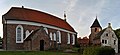
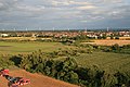
- Nomination The roofs of Bruges (Belgium) -- MJJR 21:08, 27 June 2010 (UTC)
- Promotion nice view, did you try to expose the lighter parts a bit darker? --Mbdortmund 22:11, 27 June 2010 (UTC)
 Done -- MJJR 08:33, 28 June 2010 (UTC)
nice --Mbdortmund 10:34, 28 June 2010 (UTC)
-

-
-

- Nomination Graiguecullen Bridge House at the River Barrow in Carlow, Ireland. --AFBorchert 17:39, 27 June 2010 (UTC)
- Promotion good --Mbdortmund 18:29, 27 June 2010 (UTC)
-

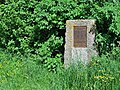
- Nomination Stone in an old cemetery in Łeba. Yarl 17:36, 27 June 2010 (UTC)
- Promotion interesting, sharp details --Mbdortmund 18:31, 27 June 2010 (UTC)
-

- Nomination Barn Ow, Skull --Archaeodontosaurus 16:19, 27 June 2010 (UTC)
- Promotion QI for me. Darius Baužys 16:55, 27 June 2010 (UTC)
-
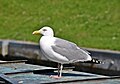
- Nomination Herring Gull in Greetsiel --Carschten 13:36, 27 June 2010 (UTC)
- Promotion Very nice. Felix Koenig 16:35, 27 June 2010 (UTC)
-

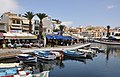
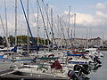
- Nomination Greetsiel harbor --Carschten 13:32, 27 June 2010 (UTC)
- Promotion good --Mbdortmund 18:36, 27 June 2010 (UTC)
-

- Nomination Greetsiel at the harbor --Carschten 13:32, 27 June 2010 (UTC)
- Decline distortion on the left too strong --Mbdortmund 18:38, 27 June 2010 (UTC)
-

-

-

-

- Nomination granite in Brittany, with Xanthoria parietina and other unidentified lichens.--Jebulon 22:07, 26 June 2010 (UTC) Thanks to the anonymous specialist of lichens ;) ! File description improved, and category added.--Jebulon 10:19, 27 June 2010 (UTC)
- Promotion Good. --Cayambe 17:29, 27 June 2010 (UTC)
-
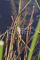
- Nomination Anax imperator --ComputerHotline 09:54, 26 June 2010 (UTC)
- Decline Too tilted. --Quartl 16:49, 27 June 2010 (UTC)
-

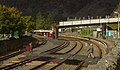
- Nomination Track to Divoká Šárka and Vokovice tram depot, Evropská, Prague — Jagro 23:11, 25 June 2010 (UTC)
- Decline What is the subject ? If it is the tram, it is too far...--Jebulon 21:23, 27 June 2010 (UTC)
 Comment No, the subjects are tram track and whole street, tram is only illustration of track and stop. — Jagro 08:43, 28 June 2010 (UTC)
-

-
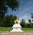
- Nomination Signal Tower of Gatchina Palace. Gatchina, Russia. --Art-top 22:49, 25 June 2010 (UTC)
- Promotion interesting view, could be a bit crisper --Mbdortmund 18:47, 27 June 2010 (UTC)
-

- Nomination Old houses in Bruges, Belgium.--Jebulon 21:48, 25 June 2010 (UTC)
- Promotion QI for me; "un geocode serait un plus" --Archaeodontosaurus 08:51, 26 June 2010 (UTC) I know, but I don't remember where I was precisely when I took this pic... -- Jebulon 23:43, 26 June 2010 (UTC) -- Done Geocode added -- MJJR 15:26, 27 June 2010 (UTC) Dank U well --Jebulon 16:14, 27 June 2010 (UTC)
-

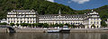
- Nomination Neckarwestheim Nuclear Power Plant and the village Neckarwestheim in the background. Felix Koenig 14:17, 24 June 2010 (UTC)
- Promotion Ok --Carschten 13:41, 27 June 2010 (UTC)
-

-

- Nomination Flag-colored rope at the German Bundestag. Re-nomination after previously undecided. --MichaelBueker 15:22, 20 June 2010 (UTC)
- Decline background should show something of the place or nothing, this way the composition is not convincing --Mbdortmund 16:17, 20 June 2010 (UTC) Einverstanden mit Mbdortmund. --Jebulon 17:31, 27 June 2010 (UTC)
-

-

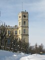
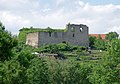
- Nomination Sümeg - Burg Sümeg. --PS-2507 10:47, 20 June 2010 (UTC)
- Decline Comment Slight tilt? Otherwise good. -- Smial 10:59, 20 June 2010 (UTC) Yes, tilt. And spots in the sky. Please see annotations--Jebulon 17:25, 27 June 2010 (UTC)
-
- Nomination: Panorama view from the southwest on the church of Greetsiel, Krummhörn, East Frisia, Germany. --The High Fin Sperm Whale 16:13, 18 June 2010 (UTC)
- Review Auch wenn's Krummhörn heißt, so krumm ist die Kirche wohl doch nicht. --Berthold Werner 08:56, 21 June 2010 (UTC)
hehe, nein, natürlich nicht. Das war auch der Grund warum ich das Bild nicht selber vorschlug. Dadurch, dass ich an einer eher schlechten Position stand und das ein Stitching ist, hat es sich im Zusammensetzen verzerrt. --Carschten 12:34, 21 June 2010 (UTC)
-
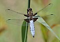
- Nomination Broad-bodied Chaser. --Quartl 20:22, 26 June 2010 (UTC)
- Promotion QI & Useful --Archaeodontosaurus 20:43, 26 June 2010 (UTC)
-

- Nomination Ruddy Darter, male. --Quartl 19:21, 26 June 2010 (UTC)
- Promotion QI --Mbdortmund 09:39, 27 June 2010 (UTC)
-
-

- Nomination Keith Richards of the Rolling Stones in the early days. --WikiLaurent 18:09, 26 June 2010 (UTC)
- Decline From flickr and MUCH too small. -- Smial 18:30, 26 June 2010 (UTC)
-

-
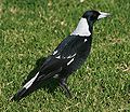
- Nomination Australian Magpie --99of9 14:04, 26 June 2010 (UTC)
- Promotion Good. (Long time nothing seen from you) --Berthold Werner 14:20, 26 June 2010 (UTC) Comment True. Meanwhile I've been learning to use the admin tools and contributing some diagrams, but they're not really complicated enough for QI. Thanks for the review. --99of9 10:05, 27 June 2010 (UTC)
-

- Nomination Aglais urticae --ComputerHotline 09:54, 26 June 2010 (UTC)
- Promotion Ok. --Berthold Werner 14:18, 26 June 2010 (UTC)
-

- Nomination Aglais urticae --ComputerHotline 09:54, 26 June 2010 (UTC)
- Promotion QI & Useful --Archaeodontosaurus 16:34, 26 June 2010 (UTC)
-

- Nomination Apis mellifera --ComputerHotline 09:54, 26 June 2010 (UTC)
- Promotion good --Mbdortmund 14:22, 26 June 2010 (UTC)
-

- Nomination Orthetrum albistylum --ComputerHotline 09:54, 26 June 2010 (UTC)
- Decline Individual images as well as collage below 2 mpx limit. --Quartl 20:54, 26 June 2010 (UTC)
-
- Nomination Orthetrum albistylum --ComputerHotline 09:54, 26 June 2010 (UTC)
- Promotion QI to me. Please, help the nominators with trying to give different names of nominations (same name, same time, same date... Mistakes are possible). A simple number would be sufficient. Thank you.--Jebulon 16:40, 26 June 2010 (UTC)
-

-

- Nomination Composition of walls, roofs and windows on the canal, Bruges, Belgium.--Jebulon 21:54, 25 June 2010 (UTC)
- Withdrawn
 Question can you correct the visible CA? --Alchemist-hp 22:33, 25 June 2010 (UTC) Aïe ! You're right, I didn't saw it before. Sorry no, I don't know how to do. does a software exist ?--Jebulon 16:30, 26 June 2010 (UTC)
-

-

-
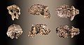
- Nomination Bone harpoon (azilian -12 000 to -9 500 years ago)--Archaeodontosaurus 20:39, 25 June 2010 (UTC)
- Promotion QI, very useful. --Cayambe 08:31, 27 June 2010 (UTC)
-

- Nomination Brandenburg panorama --Leviathan1983 12:55, 25 June 2010 (UTC)
- Promotion Sharp and otherwise also good. --Cayambe 08:36, 27 June 2010 (UTC)
-

- Nomination Limburg, Left side altar ot the town church --Berthold Werner 08:15, 25 June 2010 (UTC)
- Promotion Very nice triptych. Need a very little perspective correction above (not horizontal), IMO--Jebulon 21:59, 25 June 2010 (UTC)
Better now? --Berthold Werner 10:41, 26 June 2010 (UTC) Yes it is. QI now, despite a hard light on the right part--Jebulon 10:40, 27 June 2010 (UTC)
-
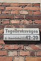
- Nomination: Street signs in Midsommarkransen, in southern Stockholm (Tegelbruksvägen means Brick Factory road!)--Ankara 19:52, 20 June 2010 (UTC)
- Review needed
-

- Nomination: The entrance of the granite-main-building of a museum in bavaria that is dedicated to granite. --High Contrast 19:42, 20 June 2010 (UTC)
- Review The line of the wall above is not straight, and the letters "N" "I" & "T" does not look very vertical (the letter "R" is), if I'm not wrong.--Jebulon 22:57, 20 June 2010 (UTC)
-
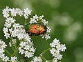
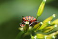
- Nomination: Cetonia aurata --Böhringer 19:01, 20 June 2010 (UTC)
- Review Comment Well captured beetle in its home environment, but there isn't enough sharpness IMO. - Darius Baužys 19:12, 20 June 2010 (UTC)
-

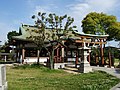
- Nomination: Shrine in Japan --Jnn 12:58, 20 June 2010 (UTC)
- Review distortion needs correction --Mbdortmund 16:18, 20 June 2010 (UTC)
-

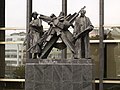
- Nomination Buchenwald concentration camp memorial in Schwerte --Mbdortmund 19:05, 25 June 2010 (UTC)
- Promotion very impressive QI.--Jebulon 22:03, 25 June 2010 (UTC)
-

- Nomination Buchenwald concentration camp memorial in Schwerte --Mbdortmund 19:05, 25 June 2010 (UTC)
- Promotion QI & Useful --Archaeodontosaurus 08:47, 26 June 2010 (UTC)
-

- Nomination Buchenwald concentration camp memorial in Schwerte --Mbdortmund 19:05, 25 June 2010 (UTC)
- Promotion QI & Useful --Archaeodontosaurus 08:47, 26 June 2010 (UTC)
-

- Nomination Team of the Austrian soccer club SKN St. Pölten. --AleXXw 06:26, 25 June 2010 (UTC)
- Promotion genug gut für mich --Jebulon 22:33, 25 June 2010 (UTC)
-

-
-
- Nomination: Opera Stuttgart --AngMoKio 22:42, 11 June 2010 (UTC)
- Review Looks a bit distorted, horizontal lines converse to the right --Mbdortmund 23:22, 11 June 2010 (UTC)
I tried to improve it. --AngMoKio 09:43, 12 June 2010 (UTC) "barrel effect" or distortion ? please look at the two tilted street lamps in front. --Jebulon 21:59, 19 June 2010 (UTC)
Those streetlamps are tilted in reality too. I even checked that again after i tried to fix that pic. At least one of them seems to have been hit by a car. --AngMoKio 07:51, 20 June 2010 (UTC)
-

- Nomination Monument for the Austrian architect Jakob Prandtauer --AleXXw 22:45, 24 June 2010 (UTC)
- Promotion Nice --Jebulon 23:56, 24 June 2010 (UTC)
-
- Nomination Toumaï--Archaeodontosaurus 19:58, 24 June 2010 (UTC)
- Promotion great --Mbdortmund 21:11, 24 June 2010 (UTC)
-

- Nomination Agricultural landscape at Oyambaro in the Ecuadorian Andes. --Cayambe 19:51, 24 June 2010 (UTC)
- Promotion Good. Trace 20:59, 24 June 2010 (UTC)
-
- Nomination Pavilion of the esplanade along the Moselle at Schengen. --Cayambe 19:32, 24 June 2010 (UTC)
- Promotion QI --Archaeodontosaurus 20:13, 24 June 2010 (UTC)
-

-
-

- Nomination Bridge and cathedral in Limburg --Berthold Werner 16:13, 24 June 2010 (UTC)
- Promotion Nice. Trace 20:59, 24 June 2010 (UTC)
-

- Nomination House in Lüneburg, Am Sande, view from the backyard. -- Smial 09:17, 24 June 2010 (UTC)
- Promotion Good --George Chernilevsky 19:05, 24 June 2010 (UTC)
-

-

- Nomination Contre-jour over roofs in Bruges (Groenerei), Belgium --Jebulon 21:46, 23 June 2010 (UTC)
- Decline Good view, but bad lighting, facades in the shadow. Perhaps better in early morning? -- Smial 10:03, 24 June 2010 (UTC). That's the point, it was an intentional "contre-jour"... --Jebulon 23:09, 24 June 2010 (UTC)
-
-

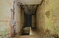
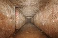
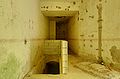
- Nomination Corridor of the North entry of the Fort du salbert --ComputerHotline 10:50, 23 June 2010 (UTC)
- Promotion Good quality --George Chernilevsky 19:09, 24 June 2010 (UTC)
-

- Nomination Maud Olofsson, Deputy Prime Minister of Sweden (photo by Janwikifoto). --Ankara 09:47, 22 June 2010 (UTC)
- Promotion Good. -- Smial 13:58, 22 June 2010 (UTC) Question I find funny that a swedish minister wears a danish order in such a national and official (royal) occasion. Any explanation ?--Jebulon 20:54, 23 June 2010 (UTC) The Swedish orders can only be awarded to foreign nationals and members of the royal family (since 1975), so she has no Swedish.--Ankara 22:55, 23 June 2010 (UTC) Comment The crop to the right looks a bit unfavourable to me. DerHexer 22:47, 24 June 2010 (UTC)
-

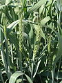
- Nomination Barley field with with poppy flowers near Habitzheim (Germany) --PS-2507 10:52, 21 June 2010 (UTC)
- Promotion Needs a bit better description. 'Grain' is not sufficient. Lycaon 11:05, 21 June 2010 (UTC)
seems to be Barley --Mbdortmund 21:01, 21 June 2010 (UTC)
Yes, Barley field. Very nice colors and composition. Support --George Chernilevsky 18:54, 24 June 2010 (UTC)
-

-

- Nomination: Olivet Baptist Church. --Jovianeye 19:43, 17 June 2010 (UTC)
- Review Trees should be cut. ;-) --Berthold Werner 18:03, 18 June 2010 (UTC)
-
- Nomination: Schengen, Luxembourg: The monument commemorating the signature of the Schengen Agreement at this spot. --Cayambe 18:18, 17 June 2010 (UTC)
- Review Would be good if the left "stone" wasn't obscured by the tree. --Berthold Werner 12:34, 18 June 2010 (UTC)
-

-

-

- Nomination A custom-made Mitsubishi locomotive in the Zhushan Line of Alishan Forest Railway, Taiwan. --WikiLaurent 19:59, 23 June 2010 (UTC)
- Promotion Good. --Cayambe 08:13, 24 June 2010 (UTC)
-
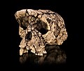
- Nomination Toumaï --Archaeodontosaurus 15:32, 23 June 2010 (UTC)
- Promotion Question -- Why this tight crop? Let the poor thing ... think -- Alvesgaspar 16:22, 23 June 2010 (UTC) Done Bien Vu --Archaeodontosaurus 18:06, 23 June 2010 (UTC)
QI now. Lycaon 18:10, 23 June 2010 (UTC) -- Ouis, maintenant on peut entendre ses petites cellules grises! -- Alvesgaspar 18:14, 23 June 2010 (UTC) --
 Info There is a fine line above the skull in full resolution, should be removed --Llez 18:15, 23 June 2010 (UTC)
Info yes there is a fine line and at the bottom left corner there is dustes who need to be delete --Croucrou 19:21, 23 June 2010 (UTC) Done The line is removed and no longer appear in high resolution. But still in medium resolution. Does anyone has an idea?--Archaeodontosaurus 20:07, 23 June 2010 (UTC) non non, tout va bien maintenant. Merci et bravo.--Jebulon 20:29, 23 June 2010 (UTC)
-

- Nomination Big Brembola village seen from the bell-tower.--PereslavlFoto 13:50, 23 June 2010 (UTC)
- Decline Tilted, oversaturated, distracting foreground -- Alvesgaspar 15:59, 23 June 2010 (UTC)
-
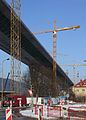
- Nomination Building a bridge - highway D1, Považská Bystrica, Slovakia --Pudelek 12:54, 23 June 2010 (UTC)
- Promotion tilted cw if I'm not wrong (look at the cranes)--Jebulon 20:25, 23 June 2010 (UTC) Comment You are right... I uploaded a new version --Pudelek 21:34, 23 June 2010 (UTC) Much better now, thank you. QI to me. --Jebulon 22:05, 23 June 2010 (UTC)
-

-

- Nomination Midsummer bomfire at Fort de Vézelois. --ComputerHotline 10:50, 23 June 2010 (UTC)
- Decline Individual images only half of size limit. Unusable as a whole anyway. Lycaon 12:45, 23 June 2010 (UTC)
-
- Nomination Midsummer bomfire at Fort de Vézelois. --ComputerHotline 10:50, 23 June 2010 (UTC)
- Decline This is QI not QV. Lycaon 12:45, 23 June 2010 (UTC)
-

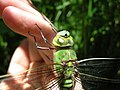
- Nomination Anax imperator on my hand. --ComputerHotline 10:50, 23 June 2010 (UTC)
- Decline Poor lighting, not the best background for this subject -- Alvesgaspar 14:55, 23 June 2010 (UTC)
-
- Nomination Anax imperator head. --ComputerHotline 10:50, 23 June 2010 (UTC)
- Decline Poor lighting, not the best background for this subject -- Alvesgaspar 14:56, 23 June 2010 (UTC)
-
- Nomination Sunset time-lapse. --ComputerHotline 10:50, 23 June 2010 (UTC)
- Decline This is QI not QV. Lycaon 12:46, 23 June 2010 (UTC)
-

- Nomination Orange Daylily. --kallerna 09:35, 23 June 2010 (UTC)
- Decline Poor framing. Landscape aspect ration, with more space infront of the flower, would have been a better choice -- Alvesgaspar 16:03, 23 June 2010 (UTC)
-

- Nomination Timber framed building in Limburg an der Lahn --Berthold Werner 04:52, 23 June 2010 (UTC)
- Promotion Good enough composition and image quality despite the harsh shadows -- Alvesgaspar 16:05, 23 June 2010 (UTC)
-
- Nomination Flowers of Prunus armeniaca --Butko 07:18, 23 June 2010 (UTC)
- Decline Poor composition. Black vertical branch is evil. Background with a lot of details brings "visual noise" (BTW, on most of your nominated flowers images)--Kae 09:50, 24 June 2010 (UTC)
-

-

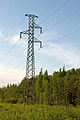
- Nomination Feldberg Transmission Tower.--Quartl 20:17, 21 June 2010 (UTC)
- Decline Too tight crop, lacks context -- Alvesgaspar 15:00, 23 June 2010 (UTC)
-

- Nomination Near Rambrouch, Luxembourg: Crater left by the Halifax-bomber that crashed here in September 1942. Pieces of the plane in front of the cross.--Cayambe 20:02, 21 June 2010 (UTC)
- Decline What is the main object of this image? I do not see it. Here is only flat ground (with unpleasant motion blur) and flat trees. --Kae 12:02, 23 June 2010 (UTC)
THANKS FOR THE REVIEW. InfoThe subject is the place: the crater of the bomber crash in 1942, a humble monument with pieces of the crashed plane to remember one of the numerous tragedies that happened during World War II. Many people come here throughout the year to remember, the members of the family of the British crew included. Three of them died here, their tombs (see here) in the nearby village continue to be flowered throughout the year... Sorry for being so long. And: thanks again for reviewing.--Cayambe 17:43, 23 June 2010 (UTC) Comment Ok, place is famous, but we rate image. I doubt that it is possible to make QI in this place because there is nothing visually outstanding: just a regular forest.--Kae 21:28, 23 June 2010 (UTC)
-

- Nomination Sümeg - View from the castle Sümeg to the city Sümeg. . --PS-2507 18:18, 21 June 2010 (UTC)
- Decline Overall unsharpness, tilted horizon, blotch in the sky, black artifact on top left -- Alvesgaspar 16:27, 23 June 2010 (UTC)
-

- Nomination A policemen, in Quebec City (Canada). --Letartean 15:59, 21 June 2010 (UTC)
- Decline Poor lighting -- Alvesgaspar 15:03, 23 June 2010 (UTC)
-

-

- Nomination Church near Dobronice u Bechyně village in Tábor District, Czech Republic. --Chmee2 10:54, 21 June 2010 (UTC)
- Decline Needs a bit of CA treatment first. All the snow has green borders. Lycaon 11:03, 21 June 2010 (UTC) and the extreme right tree branches have strong blue --Jebulon 20:12, 23 June 2010 (UTC)
-
- Nomination Created by taking a 10-second photograph. --Tucayo 00:55, 21 June 2010 (UTC)
- Decline Below size limit and not categorized. --Berthold Werner 08:23, 21 June 2010 (UTC)
Kallerna added a category, therefore now to CR --Berthold Werner 15:53, 21 June 2010 (UTC)
Still below size limit so ineligible. Lycaon 21:35, 21 June 2010 (UTC) Oppose What's this and why? Note that nominator writes how it is created, but not what's this. If it is a kind or art, then it is not a subject of QI nomination.--Kae 12:16, 23 June 2010 (UTC)<br /< Comment The QI page says these images can show photography techniques, this is a photography technique, involving light and shutter speed. --Tucayo 02:42, 24 June 2010 (UTC) Comment I can take picture of white sheet with perfect exposure and sharp. But it will not be QI because meaning is first of all.--Kae 09:59, 24 June 2010 (UTC)
-

- Nomination Kirrinsanta wind power plant visitor centre. --kallerna 16:18, 18 June 2010 (UTC)
- Decline Poor composition, geometric distortion too obvious -- Alvesgaspar 12:50, 23 June 2010 (UTC)
-

-

-

- Nomination: Czechoslovak Hussite Church in Czech town Semily --Gumruch 05:50, 18 June 2010 (UTC)
- Review needed
-

-

- Nomination: Victory Monument in Chicago. --Jovianeye 20:05, 16 June 2010 (UTC)
- Review the lighting is much better in the other version, here the face of the sculpture on top is totally black --Mbdortmund 20:23, 16 June 2010 (UTC)
I agree the lighting on the face of the top soldier is bad. But this was taken with the sun directly overhead. This has given a more uniform lighting on the remaining structure. --Jovianeye 06:26, 17 June 2010 (UTC)
Mostly pictures with the sun in a low position look better --Mbdortmund 18:11, 17 June 2010 (UTC)
-

- Nomination Bittercress (Barbarea vulgaris). --kallerna 16:03, 15 June 2010 (UTC)
- Decline Distracting background, overall unsharpness -- Alvesgaspar 16:15, 23 June 2010 (UTC)
-

- Nomination underside of Western Redcedar (Thuja plicata) branch, Rogów Arboretum, Poland --Crusier 14:59, 15 June 2010 (UTC)
- Decline Poor framing -- Alvesgaspar 16:17, 23 June 2010 (UTC)
-

-

-
![* Nomination Church of St. Nicholas in Saburovo, Moscow. --S[1] 22:03, 22 June 2010 (UTC) * Promotion Good view, composition, and lighting. Very useful. -- Smial 22:12, 22 June 2010 (UTC)](https://upload.wikimedia.org/wikipedia/commons/thumb/6/64/Nicholas_Church_Moscow_Saburovo.jpg/120px-Nicholas_Church_Moscow_Saburovo.jpg)
-

-
-

- Nomination Canon EOS 5D Mark II camera, with Canon EF 50mm f/1.4 USM lens (fitted with a B+W 010 UV-Haze 58mm filter). --The High Fin Sperm Whale 20:24, 22 June 2010 (UTC)
- Promotion Good, but why with this haze filter? -- Smial 22:19, 22 June 2010 (UTC)
-

- Nomination Panorama on Dartmoor of tors and open space with sheep grazing. --Jolly Janner 18:15, 22 June 2010 (UTC)
- Decline Oversharpened (notice the white haloes), dull composition (yes, comoposition is part of image quality) -- Alvesgaspar 23:09, 22 June 2010 (UTC)
-

- Nomination a Mononychus punctumalbum of the Curculionidae-family on a clossed Iridaceaeblossom side view. The flower is used as habitat for feeding and reproduction. --Leviathan1983 17:35, 22 June 2010 (UTC)
- Promotion QI - Darius Baužys 18:50, 22 June 2010 (UTC)
-

- Nomination Burg Sümeg --PS-2507 16:20, 22 June 2010 (UTC)
- Decline Not sharp enough and can spot some chromatic aberation on the left-side of the hill. --Jolly Janner 18:33, 22 June 2010 (UTC)
-
- Nomination Schengen: Monument commemorating the Schengen Agreement of 1985. Info a similar image is failing (see below) because part of the monument is hidden thereon. Here is a new attempt showing the entire monument. --Cayambe 14:29, 22 June 2010 (UTC)
- Promotion This is good. --Berthold Werner 18:36, 22 June 2010 (UTC) Agree. Sorry for the symbol of the bridge...;)--Jebulon 21:12, 22 June 2010 (UTC)
- Nomination Schengen: Monument commemorating the Schengen Agreement of 1985.
-

- Nomination Cornflower (Centaurea cyanus). --kallerna 08:41, 22 June 2010 (UTC)
- Promotion Good detail just below flower. Daniel Case 16:21, 22 June 2010 (UTC)
-

-

- Nomination Common Dandelion (Taraxacum officinale). --kallerna 16:18, 18 June 2010 (UTC)
- Decline Unsharp, too tight crop -- Alvesgaspar 23:13, 22 June 2010 (UTC)
-

- Nomination Stream Petrovička in Bytča, Slovakia --Pudelek 22:04, 17 June 2010 (UTC)
- Decline Too soft, like after an agressive denoising job -- Alvesgaspar 23:15, 22 June 2010 (UTC)
-

-
- Nomination Common Dandelion (Taraxacum officinale). --kallerna 15:24, 17 June 2010 (UTC)
- Decline Subject out of focus -- Alvesgaspar 23:16, 22 June 2010 (UTC)
-

- Nomination A statue of Joan of Arc in Quebec City(Canada). --Letartean 18:25, 16 June 2010 (UTC)
- Decline really that blue? --Mbdortmund 19:22, 16 June 2010 (UTC) Yes it is. It was taken at falling night but it is a right representation of it's color--Letartean 19:47, 16 June 2010 (UTC) -- Too soft for a Quality Image. I don't like the angle either -- Alvesgaspar 23:20, 22 June 2010 (UTC)
-

- Nomination Leaves of aspen (Populus tremula). --kallerna 12:26, 16 June 2010 (UTC)
- Decline Poor lighting, too shallow DOF -- Alvesgaspar 23:52, 22 June 2010 (UTC)
-

- Nomination: Fort de Roppe : inside the war caserment --ComputerHotline 16:44, 12 June 2010 (UTC)
- Review Comment Man, don't you think it's enough photos of this fort on Commons? Скампецкий 19:51, 12 June 2010 (UTC) Info I don't think so. --ComputerHotline 07:08, 17 June 2010 (UTC)
-
- Nomination Schengen, esplanade. The so-called Schengen Agreement was signed in June 1985 on the M.S. Princesse Marie-Astrid anchored here. --Cayambe 09:28, 22 June 2010 (UTC)
- Promotion very good --George Chernilevsky 10:27, 22 June 2010 (UTC)
-

-

- Nomination A pusher at work on the Seine river, in Paris--Jebulon 22:14, 21 June 2010 (UTC)
- Promotion QI for me --George Chernilevsky 10:25, 22 June 2010 (UTC)
-

- Nomination A pushed barge on the Seine river in Paris, Île Saint-Louis and Pont-Sully in background. A larger crop was impossible, but you may see the whole ship.--Jebulon 22:12, 21 June 2010 (UTC)
- Promotion Good, though the crop is indeed a bit tight, mainly at the right. --Cayambe 10:33, 22 June 2010 (UTC)
-
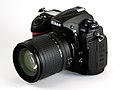
- Nomination A Nikon D300s with Zoom-Nikkor 18-135mm lens. --The High Fin Sperm Whale 19:48, 21 June 2010 (UTC)
- Promotion sharp, well exposed QI IMO --Croucrou 21:59, 21 June 2010 (UTC)
-

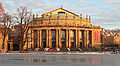
- Nomination The Copenhagen Opera House. /Dcastor 20:57, 21 June 2010 (UTC)
- Promotion nice --Mbdortmund 21:03, 21 June 2010 (UTC)
-

-

- Nomination Ierapetra (Crete, Greece): street garden -- MJJR 20:40, 21 June 2010 (UTC)
- Promotion good --George Chernilevsky 10:29, 22 June 2010 (UTC)
-

- Nomination politician and economist Andrzej Olechowski. --JDavid 18:53, 21 June 2010 (UTC)
- Decline Apparently not the work of a Wikimedian. --Eusebius 20:22, 21 June 2010 (UTC)
-
- Nomination Plaque in Schengen, town-twinning between Schengen and Ischgl. --Cayambe 16:45, 21 June 2010 (UTC)
- Promotion Good --George Chernilevsky 10:31, 22 June 2010 (UTC)
-

-
-
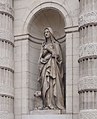
- Nomination A statue of Saint Genevieve saint Patron of Paris, façade of church Saint-Etienne-du-Mont (where is her grave) in Paris.--Jebulon 23:08, 20 June 2010 (UTC)
- Promotion Superbe correction de perspective. QI & Useful --Archaeodontosaurus 05:44, 21 June 2010 (UTC)
Addionally the black spot at the lower border should be removed. --Berthold Werner 06:44, 21 June 2010 (UTC) Done Thank you--Jebulon 21:29, 21 June 2010 (UTC)
-

-

-

-

-

- Nomination Portrait of the German classical philologist Andreas Fritsch. DerHexer 00:50, 20 June 2010 (UTC)
- Decline Hard shadows of flash light spoil the image. try a diffuser or an indirect lighting. Lycaon 16:24, 20 June 2010 (UTC) Comment Thanks for your hint, I'll try to do it better next time. :-) DerHexer 13:24, 21 June 2010 (UTC)
-

-

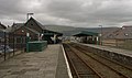
- Nomination: 97303 passes through Talsarnau. Mattbuck 21:49, 15 June 2010 (UTC)
- Review needed
-

- Nomination: Coreus marginatus --ComputerHotline 16:44, 12 June 2010 (UTC)
- Review Decline: It's a FlickR-image. --Körnerbrötchen 09:11, 15 June 2010 (UTC)
It is not a Flickr image. ComputerHotline has this peculiar habit to first upload to Flickr. Lycaon 22:48, 15 June 2010 (UTC)
-

- Nomination Rheinfels castle, Sankt Goar, Germany. --Johannes Robalotoff 22:19, 20 June 2010 (UTC)
- Promotion QI & Useful --Archaeodontosaurus 05:45, 21 June 2010 (UTC)
-

- Nomination A hole made by a cannonball in a wall of the castle of Consuegra, Near Toledo, Spain.--Jebulon 21:33, 20 June 2010 (UTC)
- Promotion QI. --Berthold Werner 06:46, 21 June 2010 (UTC)
-

- Nomination Scan of a 400 years old map of Bohemia. --Gumruch 20:10, 20 June 2010 (UTC)
- Promotion QI & Useful --Archaeodontosaurus 05:47, 21 June 2010 (UTC
-
- Nomination Archaeodontosaurus - Tooth!--Archaeodontosaurus 18:03, 20 June 2010 (UTC)
- Promotion Le voilà, le sauropode à vieilles dents! c'est une dent du fond, ou une dent des couens ? QI to me. --Jebulon 22:51, 20 June 2010 (UTC)
-

-

- Nomination 114, avenue des Champs Elysées, Paris. A plaque commemorating A.Santos-Dumont, brazilian aviation pioneer. Perspective corrected by "The Gimp". --Jebulon 16:58, 20 June 2010 (UTC)
- Withdrawn Does not meet the size requirement (1.86 Mpix) --Jovianeye 22:40, 20 June 2010 (UTC)
-

-

- Nomination Formosan Rock Monkeys in Alishan, Taiwan. --WikiLaurent 13:20, 20 June 2010 (UTC)
- Decline Sorry, motion blur for the left one, and a strange white line through the image. Furthermore, the focus seems to be on the grass, not on the monkeys, which are not sharp enough IMO.--Jebulon 15:12, 20 June 2010 (UTC)
-
- Nomination Pupa of Narrow-bordered Five-spot Burnet. - Darius Baužys 12:10, 20 June 2010 (UTC)
- Promotion QI. Lycaon 12:32, 20 June 2010 (UTC) Excellent photography --Archaeodontosaurus 18:20, 20 June 2010 (UTC)
-

-
-

- Nomination detail of a metallic streetlamp in the Champs Elysées, Paris.--Jebulon 23:05, 19 June 2010 (UTC)
- Promotion Very nice and QI for me. The surface structure and color of the object makes the ISO 800 noise that is visible from 50% resolution on upwards tolerable in my eyes. --Johannes Robalotoff 09:59, 20 June 2010 (UTC) Is this other version better ? --Jebulon 10:09, 20 June 2010 (UTC) With respect to noise and detail, this one is of course much better. (Not surprising as ISO was only 125 here.) But anyway, I mentioned the noise on the other picture only to show that I did not oversee but accept it when I promoted your picture. With the new version you should be on the safe side for every reviewer. --Johannes Robalotoff 12:06, 20 June 2010 (UTC) The noisy one was made 3 hours later in the evening than this one...--Jebulon 17:01, 20 June 2010 (UTC)
-

- Nomination Street sign of a famous avenue.--Jebulon 21:37, 19 June 2010 (UTC)
- Promotion Comment As this is a very regular, nearly graphical geometric object, even the minimal distortion disturbs me. Vertical lines are perfect, but horizontal lines are not. I remember that lens shift correction had to be activated in hugin for your camera to remove this. Did you try it? --Johannes Robalotoff 09:44, 20 June 2010 (UTC) Comment Vertical lines are at least not parallel to the borders of the image. DerHexer 09:59, 20 June 2010 (UTC)Yes, but I'm lost and really don't understand how it works. I've just downloaded the Gimp, and I improved verticality with it. Let's use it for horizontality now ! (no ShiftN because Mac !!) Thanks for comments --Jebulon 10:00, 20 June 2010 (UTC) @ DerHexer: yes, they are vertical. The shadow is not, but the wall is not flat--Jebulon 10:13, 20 June 2010 (UTC) Done Is it better now ? --Jebulon 10:37, 20 June 2010 (UTC) Geometry is very good now. Only you forgot to crop the white space at the bottom that was left after the transformation. Crop it and I will promote. --Johannes Robalotoff 12:17, 20 June 2010 (UTC) Done now.--Jebulon 15:09, 20 June 2010 (UTC) Support Good now. --Johannes Robalotoff 16:58, 20 June 2010 (UTC)
-

-

- Nomination Golfer in Yyteri Golf Links. --kallerna 08:27, 19 June 2010 (UTC)
- Promotion Personnaly, I don't like the color of the gras and the motion blur.--HAF 932 10:52, 19 June 2010 (UTC)
Nice composition, subject is sharp except where moving, lighting works. --MichaelBueker 15:26, 20 June 2010 (UTC)
-

-
- Nomination: Schengen, Luxembourg, part of the monuments celebrating the signature of the Schengen Agreement in 1985 some 100 m from this spot. --Cayambe 10:24, 15 June 2010 (UTC)
- Review needed
-

- Nomination: Čadca, Slovakia - main street --Pudelek 21:28, 14 June 2010 (UTC)
- Review needed
-
- Nomination: Petra, the Djinn Blocks --Berthold Werner 16:41, 14 June 2010 (UTC)
- Review needed
-

-

- Nomination Sümeg - View from the Burg Sümeg to the city Sümeg. . --PS-2507 10:46, 20 June 2010 (UTC)
- Promotion Ok -- Smial 10:59, 20 June 2010 (UTC)
-
- Nomination Bell tower of Piazza San Marco with flying pigeon.--Bartiebert 08:35, 20 June 2010 (UTC)
- Decline This could be a really great composition, if not the bird in foreground were so severely blurred, its wing touched the image border and a lot of empty sky were above the tower. Of course the sky could be cropped, but there is no remedy for the bird. Feel free to send us to discussion if you see it differently. --Johannes Robalotoff 09:31, 20 June 2010 (UTC)
-
- Nomination Alliaria petiolata. --Bartiebert 08:33, 20 June 2010 (UTC)
- Decline 2 megapixels is normally the lower limit --Archaeodontosaurus 09:22, 20 June 2010 (UTC)
-

- Nomination Portugal, coast at Ponta do Pargo (by User:Simisa) --High Contrast 07:39, 20 June 2010 (UTC)
- Promotion Good view, nice "Luftperspektive" (don't know the english expression for that) -- Smial 11:04, 20 June 2010 (UTC)
-

- Nomination IIT Main Building. --Jovianeye 00:32, 20 June 2010 (UTC)
- Promotion Very good in my opinion. Perspective is not corrected completely, but I find this better than potential visual side effects from a stronger correction. --Johannes Robalotoff 09:20, 20 June 2010 (UTC)
-
-

-
- Nomination Location of Katz castle above the river Rhine. --Johannes Robalotoff 21:19, 19 June 2010 (UTC)
- Promotion QI. --Jovianeye 21:30, 19 June 2010 (UTC)
-

-

-

- Nomination Grave of a Czech botanists --Gumruch 19:11, 19 June 2010 (UTC)
- Promotion Good. --Johannes Robalotoff 20:05, 19 June 2010 (UTC)
-

- Nomination Panorama of IIT Armour Lab. --Jovianeye 19:02, 19 June 2010 (UTC)
- Promotion Good. --Johannes Robalotoff 20:07, 19 June 2010 (UTC)
-
- Nomination IIT Machinery Hall (Different version). --Jovianeye 17:45, 19 June 2010 (UTC)
- Promotion Still very good, although sky is slightly overexposed in the lower part. --Johannes Robalotoff 20:19, 19 June 2010 (UTC)
-
- Nomination Spa hotel Bad Ems, Germany. Please note that the floor plan of this building is not symmetric in reality. (Follow e.g. geolocation link on Google Maps.) --Johannes Robalotoff 14:28, 19 June 2010 (UTC)
- Promotion Good.--Jebulon 22:51, 19 June 2010 (UTC)
-

- Nomination New museum of modern arts in Dortmund --Mbdortmund 14:05, 19 June 2010 (UTC)(UTC)
- Promotion Nice and very sharp image. --A.Ceta 14:06, 19 June 2010 (UTC)
-

- Nomination New museum of modern arts in Dortmund --Mbdortmund 12:18, 19 June 2010 (UTC)
- Promotion Saustark! -- Smial 13:05, 19 June 2010 (UTC) for english speaking readers: absolute adequate photo and view of that location, btst
thx! --Mbdortmund 13:16, 19 June 2010 (UTC)
-

- Nomination Transformer of wind power plant. --kallerna 08:27, 19 June 2010 (UTC)
- Promotion Comment slightly tilted? -- Smial 09:11, 19 June 2010 (UTC) Comment Shouldn't be, straightened with photoshop. --kallerna 11:45, 19 June 2010 (UTC)* Support QI & Useful --Archaeodontosaurus 13:40, 19 June 2010 (UTC)
-

-

- Nomination Czech photographer --Gumruch 05:50, 18 June 2010 (UTC)
- Promotion Good. --Johannes Robalotoff 14:57, 19 June 2010 (UTC)
-

- Nomination Czech composer & Minister of Culture --Gumruch 05:50, 18 June 2010 (UTC)
- Promotion Very good. --Johannes Robalotoff 14:54, 19 June 2010 (UTC)
-
- Nomination "Viglaska", a sample of a natural slovakian variety of wheat, in may in Jardin des Plantes de Paris--Jebulon 22:56, 17 June 2010 (UTC)
- Promotion QI & Useful --Archaeodontosaurus 06:20, 20 June 2010 (UTC)
-
- Nomination Statue New Age in Prague --Gumruch 19:32, 16 June 2010 (UTC)
- Promotion tilt/distortion must be corrected --Mbdortmund 20:26, 16 June 2010 (UTC) Info Updated–tried to fix. --Gumruch 19:11, 19 June 2010 (UTC) not so bad, despite of the horrible background, not your fault. I think it's a QI.--Jebulon 22:30, 19 June 2010 (UTC)
-

- Nomination Newest EMU ČD Class 471. — Jagro 22:51, 15 June 2010 (UTC)
- Promotion Good. --Johannes Robalotoff 15:02, 19 June 2010 (UTC)
-
-

- Nomination: Business center «East Gate» (Moscow) --Lodo27 06:40, 14 June 2010 (UTC)
- Review needed
-

- Nomination: Building of a former mill, Southern Germany --Harke 15:54, 13 June 2010 (UTC)
- Review Comment Hier scheint mir der Blickwinkel etwas ungünstig. --Berthold Werner 18:02, 13 June 2010 (UTC)
-
- Nomination: Galactite elegans with insect --Cesco77 14:48, 13 June 2010 (UTC)
- Review needed
-

- Nomination: Surfer on a little tube in Sardinia, Italy --Cesco77 13:39, 13 June 2010 (UTC)
- Review A bit more contrast and a little noise reduction would imo ameliorate the photo --Mbdortmund 15:01, 13 June 2010 (UTC); Done Doneised and contrasted --Cesco77
-

- Nomination Part of the UNESCO World Heritage Site “Maulbronn Abbey”, Germany. From left to right: domestic administration, servants quarters, monastery administration (The picture is annotated). --Llez 10:59, 13 June 2010 (UTC)).
- Decline Nice subject. But there are technical problems: Aggressive noise reduction has already wiped out fine structures. Nevertheless there is still noise visible in darker parts, especially color noise. There are sharpening halos on the rooftops. The houses lean slightly backward. --Johannes Robalotoff 12:51, 19 June 2010 (UTC)
-

- Nomination A plaque at the townhall of Mockmühl, Germany --Berthold Werner 09:48, 12 June 2010 (UTC)
- Promotion Good. Need explanations.--Jebulon 23:16, 17 June 2010 (UTC)
Some infos in german added. --Berthold Werner 15:35, 18 June 2010 (UTC) Danke sehr.--Jebulon 22:01, 19 June 2010 (UTC)
-

- Nomination Church in the neighbourhood of Palekastro (Crete, Greece) -- MJJR 21:40, 11 June 2010 (UTC)
- Promotion The little tower with the bell seems not to be straight, is that real? --Mbdortmund 23:42, 11 June 2010 (UTC) -- Comment The bell tower seems a little bit lopsided indeed, but it's more an impression than reality. The picture is not distorted or tilted. -- MJJR 19:49, 12 June 2010 (UTC) No tilt, I think. To me, it's a QI. --Jebulon 21:57, 19 June 2010 (UTC)
-

- Nomination "Petra" in Jordan. --High Contrast 09:58, 19 June 2010 (UTC)
- Decline Disturbingly visible compression artefacts, even if i like the composition. --Niabot 11:03, 19 June 2010 (UTC)
-

-
-

- Nomination Stained glass in Notre-Dame-de-la-Salette's church, in Paris. --Peter17 11:05, 19 June 2010 (UTC)
- Promotion good quality --Mbdortmund 11:14, 19 June 2010 (UTC)
-

- Nomination Water castle Haus zum Haus in winter -- H005 22:55, 18 June 2010 (UTC)
- Promotion OK, although slightly overexposed. --Johannes Robalotoff 10:44, 19 June 2010 (UTC)
-
- Nomination Memorial tablet in Germany. --High Contrast 22:47, 18 June 2010 (UTC)
- Promotion Good -- Smial 23:44, 18 June 2010 (UTC)
-
-
-

- Nomination Viola Cooperative Creamery, Minnesota - Jonathunder 16:42, 18 June 2010 (UTC)
- Promotion Good -- Smial 23:44, 18 June 2010 (UTC)
-

-

- Nomination Palmyra (Syria) in December 2009. --High Contrast 14:26, 18 June 2010 (UTC)
- Withdrawn Info 2 dead Pixels (i put mark on it)--Croucrou 19:44, 18 June 2010 (UTC)
Will be fixed. --High Contrast 19:51, 18 June 2010 (UTC)
-

- Nomination View on the left side of the river Vils in Vilshofen an der Donau. --High Contrast 12:43, 18 June 2010 (UTC)
- Promotion Good. --Cayambe 09:28, 19 June 2010 (UTC)
-

- Nomination Kurie des Stifts St. Paulin, build 1779–82 --Berthold Werner 08:50, 18 June 2010 (UTC)
- Promotion Good. --Johannes Robalotoff 10:32, 19 June 2010 (UTC)
-

- Nomination ČD Class 814 near Praha-Žvahov — Jagro 19:18, 17 June 2010 (UTC)
- Promotion good --George Chernilevsky 21:37, 18 June 2010 (UTC)
-

-

- Nomination: The surface of Isojärvi during sunset. --kallerna 09:59, 13 June 2010 (UTC)
- Review needed
-

- Nomination: Lampinkoski rapid. --kallerna 09:59, 13 June 2010 (UTC)
- Review needed
-

- Nomination: Fountain and planetarium in Millennium Square, Bristol. Mattbuck 02:34, 13 June 2010 (UTC)
- Review Dark exposure looks artificial --Mbdortmund 10:43, 13 June 2010 (UTC)
-

- Nomination: Fort de Roppe : near the main entrance. --ComputerHotline 16:44, 12 June 2010 (UTC)
- Review needed
-

- Nomination Transept sud cathédrale de Sens. --rabbitslim 09:38, 6 June 2010(UTC)
- Decline perspective distorsion, unfortunate shadow at the bottom --Jebulon 14:02, 14 June 2010 (UTC)
-

- Nomination A Lockheed Martin F-22A Raptor fighter streaks by the ramp at the 2008 Joint Services Open House (JSOH) airshow at Andrews AFB. --The High Fin Sperm Whale 20:44, 17 June 2010 (UTC)
- Decline Fabulous, but Flickr rule applies! --Jovianeye 22:50, 17 June 2010 (UTC)
-
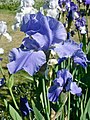
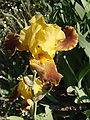
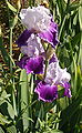
- Nomination Iris cultivar, "pacific panorama", Sexton 1960, Paris, Jardin des iris au Jardin des Plantes.--Jebulon 22:36, 17 June 2010 (UTC)
- Promotion QI --The High Fin Sperm Whale 20:45, 17 June 2010 (UTC)
-
-
- Nomination Ierapetra (Crete, Greece): old Venetian fort -- MJJR 21:37, 17 June 2010 (UTC)
- Promotion Interresting view. Good quality. --Berthold Werner 08:58, 18 June 2010 (UTC)
-

-

-

-

- Nomination Hartzell Memorial United Methodist Church. --Jovianeye 06:15, 17 June 2010 (UTC)
- Promotion There is a small spot in the sky. (look at annotation) --Berthold Werner 12:16, 17 June 2010 (UTC)
I really dont know what that was, but I have fixed it. --Jovianeye 14:29, 17 June 2010 (UTC)
Ok for me. (Yes, the street lamp is a bit disturbing, but it's there and it's part of this place.) --Berthold Werner 15:41, 17 June 2010 (UTC)
-

-
-

- Nomination Germany, Beilstein at the river Mosel --Berthold Werner 08:20, 16 June 2010 (UTC)
- Promotion QI.--Jebulon 23:42, 17 June 2010 (UTC)
-

-

-

- Nomination Coast Douglas-fir (Pseudotsuga menziesii subsp. menziesii) bark in Rogów Arboretum, Poland --Crusier 16:32, 14 June 2010 (UTC)
- Promotion QI to me.--Jebulon 23:24, 17 June 2010 (UTC)
-

- Nomination My picture of Governor of the Czech National Bank --Gumruch 18:23, 14 June 2010 (UTC)
- Promotion Sharp and otherwise also good. --Cayambe 19:44, 17 June 2010 (UTC)
-
- Nomination Fort de Roppe : inside the war caserment --ComputerHotline 16:44, 12 June 2010 (UTC)
- Promotion Good. --Cayambe 19:46, 17 June 2010 (UTC)
-
- Nomination: underside of Ulmus laevis leaf; Rogów Arboretum, Poland --Crusier 19:30, 11 June 2010 (UTC)
- Review needed
-
- Nomination Salix alba in Marki, Poland --Crusier 14:11, 11 June 2010 (UTC)
- Decline Considerable CA. --Jovianeye 23:34, 17 June 2010 (UTC)
-

-

- Nomination: SouthEastern 395017 at London St Pancras. Mattbuck 22:50, 10 June 2010 (UTC)
- Review See image annotation. --Jovianeye 00:51, 11 June 2010 (UTC)
I honestly don't know if the roof is curved or not - I wouldn't put it past them to do something like that, but you may be correct in that it might be distortion. Mattbuck 01:02, 11 June 2010 (UTC)
I have the impression that the roof is indeed curved, seeing how the support beams are oriented. Rama 16:43, 11 June 2010 (UTC)
-

-

- Nomination Trier, Simeonstrasse 15, building from thr 19th century. --Berthold Werner 08:05, 10 June 2010 (UTC)
- Promotion good architectural sample, nice image.--Jebulon 23:12, 17 June 2010 (UTC)
-

-
-

-

-

- Nomination New museum of modern arts in Dortmund --Mbdortmund 19:29, 16 June 2010 (UTC)
- Promotion OK --George Chernilevsky 07:49, 17 June 2010 (UTC)
-

- Nomination Entrance of the new museum of modern arts in Dortmund --Mbdortmund 19:29, 16 June 2010 (UTC)
- Promotion Sehr gut --George Chernilevsky 07:48, 17 June 2010 (UTC)
-

- Nomination Street at the new museum of modern arts in Dortmund --Mbdortmund 19:29, 16 June 2010 (UTC)
- Promotion Gut --George Chernilevsky 07:46, 17 June 2010 (UTC)
-

- Nomination A Martello tower in Quebec City(Canada). --Letartean 18:34, 16 June 2010 (UTC)
- Decline blown out sky --Mbdortmund 19:23, 16 June 2010 (UTC)
-

- Nomination Residential building from 1912 in Stockholm.--Ankara 14:50, 16 June 2010 (UTC)
- Promotion Ok. --Berthold Werner 15:42, 16 June 2010 (UTC)
-
- Nomination Residential buildings from the 1920s in Stockholm.--Ankara 14:45, 16 June 2010 (UTC)
- Promotion Ok. --Berthold Werner 15:42, 16 June 2010 (UTC)
-

-

-

- Nomination A hippo's skull. --The High Fin Sperm Whale 18:42, 14 June 2010 (UTC)
- Promotion not perfect but imo QI --Mbdortmund 19:28, 16 June 2010 (UTC)
-

- Nomination: from above, an iris "iron strip" cultivar in the Jardin des iris, in the Jardin des Plantes of Paris--Jebulon 23:30, 10 June 2010 (UTC)
- Review needed
-

- Nomination: A class 117 DMU sits under covers at Minehead station. Mattbuck 22:50, 10 June 2010 (UTC)
- Review needed
-

- Nomination Bazaly Floodlights by User:Sveter. --Jovianeye 17:20, 7 June 2010 (UTC)
- Withdrawn Comment - it could do with being lightened a bit I feel. Mattbuck 14:34, 8 June 2010 (UTC)
And oversaturated --Mbdortmund 10:22, 12 June 2010 (UTC)
Withdraw nomination --Jovianeye 13:53, 16 June 2010 (UTC)
-

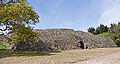
- Nomination Entrance of the Gavrinis cairn (Brittany, France). --Myrabella 07:42, 16 June 2010 (UTC)
- Promotion QI & Useful --Archaeodontosaurus 10:38, 16 June 2010 (UTC)
-

- Nomination Abyssinian Ground-hornbill. --Quartl 07:15, 16 June 2010 (UTC)
- Promotion QI & Useful --Archaeodontosaurus 10:40, 16 June 2010 (UTC)
-

-

-

-

-
-

-

- Nomination A view of the end of a woven lanyard. Ks0stm 20:09, 15 June 2010 (UTC)
- Decline Out of focus --Archaeodontosaurus 10:43, 16 June 2010 (UTC)
-

-

-

-

- Nomination Pensford Viaduct near Bristol. Mattbuck 14:55, 15 June 2010 (UTC)
- Decline Oversharpening yielded strong bright haloes. Lycaon 19:12, 15 June 2010 (UTC)
-

-

- Nomination handkerchief --Körnerbrötchen 13:07, 15 June 2010 (UTC)
- Promotion Good quality and useful. --Cayambe 16:52, 15 June 2010 (UTC)
-

- Nomination Seeds of the Balloonvine, "Cardiospermum halicacabum". Cardiospermum means "Seed with heart" --Llez 12:16, 15 June 2010 (UTC)
- Decline Not big enough! --Körnerbrötchen 13:14, 15 June 2010 (UTC) Comment Sorry, I uploaded the wrong version of the picture, please rewiew again --Llez 14:12, 15 June 2010 (UTC) Oppose Sorry, full of jpg-artefacts. --kallerna 14:16, 15 June 2010 (UTC)
-

-

-

- Nomination detail of a mascaron showing a lion's head, on a end of XIXth century building in Paris.--Jebulon 23:54, 14 June 2010 (UTC)
- Decline Comment Missing quite a bit of details. You are in need of a new camera ;-). Lycaon 13:34, 15 June 2010 (UTC)
Sorry, not good enough. --kallerna 14:00, 15 June 2010 (UTC) @Lycaon: to be more precise : I'm in need of MONEY to buy a new camera. Let's have a Jebulonthon ;)--Jebulon 09:13, 16 June 2010 (UTC)
-

-
-

-

- Nomination: Čadca - 1848 monument --Pudelek 10:23, 10 June 2010 (UTC)
- Review needed
-

- Nomination: Rosa en 'Duet' --Captain-tucker 04:09, 10 June 2010 (UTC)
- Review needed
-
- Nomination: Barmouth railway station. Mattbuck 01:10, 10 June 2010 (UTC)
- Review needed
-

- Nomination: Speedwayriders Jari Mäkinen, Niko Siltaniemi and Aarni Heikkilä. --kallerna 19:44, 9 June 2010 (UTC)
- Review needed
-

- Nomination: Speedwayrider Aarni Heikkilä. --kallerna 19:44, 9 June 2010 (UTC)
- Review needed
-

-
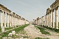
- Nomination Cardo maxima of Apamea, Syria --Bgag 21:14, 2 June 2010 (UTC)
- Decline Looks like this picture was negatively impacted by excessive denoising. EXIF is missing, so it is hard to tell. Please upload a less processed version. --Dschwen 18:21, 4 June 2010 (UTC) Comment I tend to agree with Dschwen, although I know your camera can produce quite a lot of noise. However, I must say it is a very nice picture, good light, good colours, good composition, reasonable absence of tourists :) --Eusebius 11:12, 11 June 2010 (UTC)
per other reviewers. Lycaon 22:52, 15 June 2010 (UTC)
-

- Nomination 080906-N-1082Z-245 ATLANTIC OCEAN The amphibious transport dock ship USS San Antonio (LPD 17) transits the Atlantic Ocean. San Antonio is deployed as part of the Iwo Jima Expeditionary Strike Group supporting maritime security operations in the U.S. 5th and 6th Fleet areas of responsibility. --The High Fin Sperm Whale 04:21, 15 June 2010 (UTC)
- Decline QI for me! --Jovianeye 04:26, 15 June 2010 (UTC)
ONly photographs byy Wikipedians can be promoted here --Mbdortmund 04:43, 15 June 2010 (UTC)
Sorry! Forgot that. --Jovianeye 04:51, 15 June 2010 (UTC)
-

- Nomination Preserved North American P-51D-20 (472216/HO-M, G-BIXL, Miss Helen) performing aerobatics at Kemble Airport Open Day, Gloucestershire, England, on 9th September 2007. Built in 1944. --The High Fin Sperm Whale 03:45, 15 June 2010 (UTC)
- Decline Considerable CA along tail of the aircraft. --Jovianeye 04:02, 15 June 2010 (UTC)
-

- Nomination a metal bench (new model) in the Jardin des Plantes de Paris. You may sponsor it !!--Jebulon 23:40, 14 June 2010 (UTC)
- Decline Bad crop --Körnerbrötchen 09:05, 15 June 2010 (UTC)
-

-

-

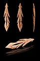
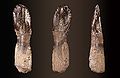
- Nomination A tooth drilled for a necklace Magdalenian (between 17,000 and 10,000 years ago)--Archaeodontosaurus 19:26, 14 June 2010 (UTC)
- Promotion QI --The High Fin Sperm Whale 18:43, 14 June 2010 (UTC)
-

- Nomination Audi A8 D4. --Jovianeye 16:45, 14 June 2010 (UTC)
- Promotion An ok from an audi driver ;-) --Berthold Werner 19:10, 14 June 2010 (UTC)
-

-

- Nomination Phrynohyas resinifictrix in Warsaw Zoo --Crusier 15:44, 14 June 2010 (UTC)
- Promotion QI and Useful --Archaeodontosaurus 19:28, 14 June 2010 (UTC)
-

-

-

-

- Nomination Hans-Schmitz-House in Rheinbach, Germany. Körnerbrötchen 12:05, 14 June 2010 (UTC)
- Promotion Very nice. Mattbuck 16:24, 14 June 2010 (UTC)
-
-
- Nomination 2010 Midsummer bonfire in Bavilliers --ComputerHotline 13:19, 13 June 2010 (UTC)
- Decline It's Quality Image, not video. --Körnerbrötchen 13:48, 14 June 2010 (UTC)
-

- Nomination Trier, Katharinenufer 6 --Berthold Werner 11:28, 13 June 2010 (UTC)
- Promotion Good. --Cayambe 18:11, 14 June 2010 (UTC)
-

- Nomination Trier, Katharinenufer 7 --Berthold Werner 11:28, 13 June 2010 (UTC)
- Promotion Minor CA is noticeable at full size. Please see annotations. --Jovianeye 05:30, 14 June 2010 (UTC)
Better? --Berthold Werner 09:05, 14 June 2010 (UTC)
I believe it is much better. --Jovianeye 14:09, 14 June 2010 (UTC)
-

- Nomination Trier, Katharinenufer 10 --Berthold Werner 11:28, 13 June 2010 (UTC)
- Promotion Good. --Cayambe 13:58, 14 June 2010 (UTC)
-

-

- Nomination Landscape near Palekastro, Crete -- MJJR 21:40, 11 June 2010 (UTC)
- Promotion If you look at the water and the clouds on the left side, the picture looks distorted --Mbdortmund 23:35, 11 June 2010 (UTC) -- Done Justified remark, thanks! Actually the picture was not distorted, but more than two degrees tilted to the right. I uploaded a new version. -- MJJR 19:49, 12 June 2010 (UTC)
looks better now --Mbdortmund 22:27, 14 June 2010 (UTC)
-

- Nomination SouthEastern 395017 at London St Pancras (detail). Mattbuck 22:50, 10 June 2010 (UTC)
- Decline DOF too short. --Körnerbrötchen 09:17, 15 June 2010 (UTC)
-

- Nomination Speedwayrider Timo Lahti. --kallerna 14:05, 10 June 2010 (UTC)
- Promotion Imo QI --Mbdortmund 04:46, 15 June 2010 (UTC)
-

- Nomination Disc golf in Yyteri. --kallerna 14:05, 10 June 2010 (UTC)
- Decline Unfortunate lighting, distorted --Mbdortmund 04:46, 15 June 2010 (UTC)
-

- Nomination: Trier, market cross --Berthold Werner 07:52, 9 June 2010 (UTC)
- Review needed
-

- Nomination: Church in Łubno, Poland. Przykuta 22:48, 8 June 2010 (UTC)
- Review Perspective correction need. And CA at right -- George Chernilevsky 23:17, 8 June 2010 (UTC)
-

- Nomination: 158836 rounds the bend at Llandanwg station. Mattbuck 21:39, 8 June 2010 (UTC)
- Review needed
-
-

- Nomination Juha Hautamäki in Speedway Extraliiga -competition. --kallerna 14:18, 8 June 2010 (UTC)
- Promotion It's a little bottom-heavy - could do with a crop I think. Mattbuck 21:28, 8 June 2010 (UTC) Info I made a new crop. --kallerna 09:31, 13 June 2010 (UTC)
OK now --Mbdortmund 04:48, 15 June 2010 (UTC)
-

- Nomination Pagoda House, Nahmani St. Tel-Aviv, Israel. --Rastaman3000 16:47, 6 June 2010 (UTC)
- Decline Strong distortion IMO--Jebulon 17:27, 6 June 2010 (UTC) Because nor comment neither answer 8 days after review --Jebulon 13:55, 14 June 2010 (UTC)
-

- Nomination Luxembourg City: Plaque commemorating the very last piano recital given by Franz Liszt, 12 days before his death on July 31 1886. --Cayambe 09:05, 14 June 2010 (UTC)
- Promotion QI --George Chernilevsky 09:49, 14 June 2010 (UTC)
-

- Nomination Altar in Savona Cathedral --Wknight94 03:55, 14 June 2010 (UTC)
- Decline Too overexposed areas and absence of perspective correction --Archaeodontosaurus 08:08, 14 June 2010 (UTC)
-

- Nomination Four funny boys wearing Officer's kepis of different ranks of the Gendarmerie Nationale of France. Very informative ! --Jebulon 00:01, 14 June 2010 (UTC)
- Promotion Ah, Jebulon, Jebulon, who cares about image being informative on QI nominations :) I love the image, and the quality is very good.--Mbz1 00:09, 14 June 2010 (UTC) I do ! It's not in oppose with the rules !--Jebulon 08:14, 14 June 2010 (UTC)
-
-

-
-

- Nomination w:Green turtle in w:Kona--Mbz1 17:56, 13 June 2010 (UTC)
- Promotion Comment - I love the picture, but not entirely sure it's sharp. Weak support. Mattbuck 00:18, 14 June 2010 (UTC)
--Mbz1 00:42, 14 June 2010 (UTC)
You're withdrawing your nomination of an image which I said was promotable? Mattbuck 03:14, 14 June 2010 (UTC)
I am sorry, I was really upset when I did it. I withdrawn my withdraw.--Mbz1 03:27, 14 June 2010 (UTC)
-

-

- Nomination Frauenkirche, Unterriexingen, Southern Germany --Harke 15:58, 13 June 2010 (UTC)
- Promotion Ok. --Berthold Werner 18:02, 13 June 2010 (UTC)
-

- Nomination Timber framing in Korntal, Baden-Württemberg --Harke 15:56, 13 June 2010 (UTC)
- Promotion Ok. --Berthold Werner 18:02, 13 June 2010 (UTC)
-

-

- Nomination 2010 Midsummer bonfire in Bavilliers --ComputerHotline 13:19, 13 June 2010 (UTC)
- Decline Separate images of collage below minimum requirements. Lycaon 14:11, 13 June 2010 (UTC)
-

- Nomination Trier, Katharinenufer 4 --Berthold Werner 11:28, 13 June 2010 (UTC)
- Promotion QI. Lovely weather indeed! --Jovianeye 05:30, 14 June 2010 (UTC)
-

- Nomination Trier, Katharinenufer 5 --Berthold Werner 11:28, 13 June 2010 (UTC)
- Promotion QI. --Jovianeye 05:30, 14 June 2010 (UTC)
-

- Nomination Trier, Katharinenufer 8 --Berthold Werner 11:28, 13 June 2010 (UTC)
- Promotion QI. --Jovianeye 05:30, 14 June 2010 (UTC)
-

- Nomination Trier, Katharinenufer 9 --Berthold Werner 11:28, 13 June 2010 (UTC)
- Promotion QI. Number plate of car is visible. Please blur it! --Jovianeye 05:30, 14 June 2010 (UTC)
-

- Nomination Rosa en 'Gene Boerner' --Captain-tucker 06:59, 13 June 2010 (UTC)
- Decline Awkward crop for this large DOF and not too sharp (details on petals are completely missing). Lycaon 14:05, 13 June 2010 (UTC)
-

- Nomination Mr. Jean-Claude TRICHET, current President of the European Central Bank, Paris, 12th june 2010.
- Promotion Good. Could you please add the place (Paris, I guess :-) where the picture was taken? --Cayambe 09:15, 13 June 2010 (UTC)
Name of the nominator would be nice, too. --Mbdortmund 10:29, 13 June 2010 (UTC) sorry for forgot to sign my nomination. Well the pic was taken in Paris yesterday, but for security reasons I don't geocode, sorry.--Jebulon 15:17, 13 June 2010 (UTC)
-

- Nomination The minaret of the Great Mosque of Paris, under a natural stormy evening light.--Jebulon 22:31, 11 June 2010 (UTC)
- Promotion Atmosphere is great, details could be even better with a smaller aperture --Mbdortmund 23:20, 11 June 2010 (UTC)Thanks for review--Jebulon 15:23, 13 June 2010 (UTC)
-

-

- Nomination Exuvia of an Emperor dragonfly Yerpo 20:30, 9 June 2010 (UTC)
- Decline Oppose I think the DOF is too shallow. --The High Fin Sperm Whale 20:59, 10 June 2010 (UTC) not signed. Lycaon 05:57, 10 June 2010 (UTC)
-

- Nomination: Mirande Town Hall, Gers, France -- Florent Pécassou 08:58, 7 June 2010 (UTC)
- Review * Comment Léger Tilt et bruit dans le ciel --Archaeodontosaurus 20:23, 7 June 2010 (UTC)
-

- Nomination Assumption Cathedral in Pühtitsa nunnery --Скампецкий 22:14, 12 June 2010 (UTC)
- Promotion Very good. --Cayambe 09:12, 13 June 2010 (UTC)
-

-
- Nomination Graphosoma lineatum --ComputerHotline 16:44, 12 June 2010 (UTC)
- Decline Here the composition is imo not so good, althoug the idea of a portrait is good --Mbdortmund 10:31, 13 June 2010 (UTC)
-
- Nomination Fort de Roppe : underground --ComputerHotline 16:44, 12 June 2010 (UTC)
- Promotion Very nice. Mattbuck 02:35, 13 June 2010 (UTC)
-

- Nomination Old church in Volovăţ Cezarika1 16:10, 12 June 2010 (UTC)
- WARNING: third template parameter added – please remove.
-

-
-

- Nomination New Museum of modern arts in Dortmund --Mbdortmund 15:50, 12 June 2010 (UTC)
- Promotion looks good, too --Carschten 15:56, 12 June 2010 (UTC)
-

-
- Nomination Interior of Savona Cathedral --Wknight94 14:52, 12 June 2010 (UTC)
- Decline Interesting, but a bit noisy, strong CA and distortions, sorry --Carschten 16:43, 12 June 2010 (UTC)
-

- Nomination Rose window (Basilica dei XII Apostoli, Lodi Vecchio, Italy) -- Etienne 13:39, 12 June 2010 (UTC)
- Decline barrel distortion should be corrected --Mbdortmund 14:48, 12 June 2010 (UTC) and the crop is not so good to me.--Jebulon 21:39, 12 June 2010 (UTC)
I agree - crop is too tight. Mattbuck 02:35, 13 June 2010 (UTC)
-

- Nomination Staircase to the church galllery, Germany --Harke 13:30, 12 June 2010 (UTC)
- Promotion Good --Berthold Werner 13:59, 12 June 2010 (UTC)
-

- Nomination Konstanz church, Ditzingen, Southern Germany --Harke 13:28, 12 June 2010 (UTC
- Promotion Good --Berthold Werner 13:59, 12 June 2010 (UTC))
-

- Nomination Old vicarage house, Germany --Harke 13:26, 12 June 2010 (UTC)
- Promotion Good --Berthold Werner 13:59, 12 June 2010 (UTC)
-

- Nomination Houses near new Museum in Dortmund --Mbdortmund 11:20, 12 June 2010 (UTC)
- Promotion Good. --Cayambe 14:25, 12 June 2010 (UTC)
-

- Nomination Looking out to sea from Harlech. Mattbuck 10:40, 12 June 2010 (UTC)
- Promotion Didn't we have this one already? --Mbdortmund 10:45, 12 June 2010 (UTC)
Nice view, but what I don't like is the noise. Weak promotion from me. --Carschten 16:35, 12 June 2010 (UTC)
-

- Nomination CoA of Paris on a wall in a street, 1904. Perspective corrected by Archaeodontosaurus --Jebulon 10:27, 12 June 2010 (UTC)
- Promotion QI, of course. Скампецкий 12:57, 12 June 2010 (UTC)
-

- Nomination Dolphin Frescoe in the Queen’s Megaron, Palace of Knossos, Crete, Greece --Llez 20:53, 11 June 2010 (UTC)
- Promotion Very nice. Would be very more useful with explanations, dates etc...--Jebulon 21:19, 11 June 2010 (UTC)
Comment - This Dolphin frescoe at Knossos is a replica of a minoan frescoe. The original was found fragmentary in Knossos, restored by the Artist Piet de Jong between 1922 and 1930, and is now in the Heraklion Archaeological Museum. --Llez 18:42, 12 June 2010 (UTC)
-

- Nomination Čadca, Slovakia - museum --Pudelek 20:32, 11 June 2010 (UTC)
- Decline Distortion too strong, unfortunate lighting --Mbdortmund 14:51, 12 June 2010 (UTC)
-
- Nomination Salix alba foliage; Marki, Poland --Crusier 14:11, 11 June 2010 (UTC)
- Decline Details not sharp --Mbdortmund 14:53, 12 June 2010 (UTC)
-

- Nomination: Picea koyamae young shoot; Rogów Arboretum, Poland --Crusier 05:24, 7 June 2010 (UTC)
- Review needed
-

- Nomination: Pseudotsuga menziesii seedling in Rogów Arboretum, Poland --Crusier 05:08, 7 June 2010 (UTC)
- Review needed
-

-
-

- Nomination: Magnolia officinalis in Rogów Arboretum, Poland --Crusier 15:16, 6 June 2010 (UTC)
- Review needed
-

- Nomination: Thousands gather outside the California State Capital 2 days after the election. --Amadscientist 05:18, 6 June 2010 (UTC)
- Review Comment Looks tilted to me. --Jovianeye 05:26, 6 June 2010 (UTC) Comment Yes. Thank you. Corrected.--Amadscientist 00:49, 7 June 2010 (UTC)
-

-

- Nomination New Museum of modern arts in Dortmund --Mbdortmund 11:20, 12 June 2010 (UTC)
- Promotion Seems to be quite fine. ABF 11:22, 12 June 2010 (UTC)
-
-

- Nomination Margerite, a flower. --Alchemist-hp 09:25, 12 June 2010 (UTC)
- Promotion very good QI to me.--Jebulon 10:29, 12 June 2010 (UTC)
-

- Nomination Museum in Dortmund --Mbdortmund 23:21, 11 June 2010 (UTC)
- Promotion QI with funny details :) --AngMoKio 23:23, 11 June 2010 (UTC)
-

- Nomination Quercus coccinea bark; Rogów Arboretum, Poland --Crusier 19:45, 11 June 2010 (UTC)
- Promotion QI to me.--Jebulon 21:17, 11 June 2010 (UTC)
-

- Nomination A boat passes under a footbridge over the Feeder Canal in Bristol. Mattbuck 15:05, 11 June 2010 (UTC)
- Promotion Something wrong here... Oh yes, it is not a train ! lol. Seriously : Nice pic, good light, a good use of the shadow IMO. QI to me.-Jebulon 11 june 2010
I do take photos of things that aren't trains occasionally - ie stations when I'm waiting to take photos of a train. Mattbuck 21:28, 11 June 2010 (UTC) Sorry bad joke... I was a bit provocative as usual... --Jebulon 10:35, 12 June 2010 (UTC)
-
-

-
- Nomination Trier, Simeonstraße 17, build 1819 --Berthold Werner 09:02, 11 June 2010 (UTC)
- Promotion Good. --Cayambe 14:23, 11 June 2010 (UTC)
-
- Nomination Machinery Hall at Illinois Institute of Tech. --Jovianeye 05:06, 11 June 2010 (UTC)
- Promotion Comment ccw tilted by 0.128° --Berthold Werner 09:06, 11 June 2010 (UTC) Done Tilt fixed. --Jovianeye 13:38, 11 June 2010 (UTC)>
Ah, sorry. It is clockwise tilted. Sorry, my error. --Berthold Werner 17:03, 11 June 2010 (UTC)
Rotated 1st version CCW by 0.13. Hope it is ok now! :-) --Jovianeye 17:35, 11 June 2010 (UTC) Support Jepp, it's okay now ;-) --Carschten 19:10, 11 June 2010 (UTC)
-

-

-

-

- Nomination: Pinus palustris folaige in Rogów Arboretum --Crusier 11:14, 6 June 2010 (UTC)
- Review needed
-

- Nomination: Anarchist demonstration in Paris --Romanceor 22:22, 5 June 2010 (UTC)
- Review Your pictures show ideas and interesting scenes, please invest a little noise reduction --Mbdortmund 22:54, 5 June 2010 (UTC) Agree with the slogan ("Free the policemen", for non french speaking), and agree with Mbdortmund very much too.--Jebulon 23:00, 5 June 2010 (UTC)
-
-
-

- Nomination: St Georg church, Schwieberdingen, Southern Germany --Harke 17:40, 5 June 2010 (UTC)
- Review needed
-
- Nomination: Through the masts, the lighting rear range light in La Rochelle, France--Jebulon 13:15, 5 June 2010 (UTC)
- Review needed
-

- Nomination: Limestone quarry owned by Nordkalk at Pargas Väståboland, Finland. --Makele-90 08:15, 5 June 2010 (UTC)
- Review Question Is this the same quarry than “Pargas (Parainen), Turku-Pori, Länsi-Suomen Lääni”? --Archaeodontosaurus 15:17, 5 June 2010 (UTC)
-
- Nomination: Inside the Fort de Roppe. --ComputerHotline 08:26, 29 May 2010 (UTC)
- Review CommentThis view, with the corridor and the stairs going down, strongly called for off centre composition I think. --Eusebius 22:12, 5 June 2010 (UTC)
-

-

-

-

-

-

-

- Nomination Folly Bridge view, by User:Diliff. Maedin 18:28, 10 June 2010 (UTC)
- Promotion QI. Lycaon 21:25, 10 June 2010 (UTC)
-

- Nomination Clarendon Building, Oxford, by User:Diliff. Maedin 18:28, 10 June 2010 (UTC)
- Decline Needs a restitch. Lycaon 21:25, 10 June 2010 (UTC)
-

- Nomination "Schiller Rock" near Dahn, Germany --Llez 14:19, 10 June 2010 (UTC)
- Promotion Gut --George Chernilevsky 14:36, 10 June 2010 (UTC)
-
- Nomination Čadca (Tschadsa, Csaca), Slovakia - city center --Pudelek 10:23, 10 June 2010 (UTC)
- Promotion Good --George Chernilevsky 14:43, 10 June 2010 (UTC)
-

- Nomination Polish EN57-2018 electric multiple unit in Gliwice Central Station --Pudelek 10:23, 10 June 2010 (UTC)
- Promotion good --George Chernilevsky 14:25, 10 June 2010 (UTC)
-

- Nomination General Library Tokyo University by Wiiii-- Elekhh 05:25, 10 June 2010 (UTC)
- Decline CommentThe blue channel is clipped in the sky. --Berthold Werner 08:47, 10 June 2010 (UTC)
Strong CA in top right corner. --Jovianeye 04:08, 11 June 2010 (UTC)
-
-

- Nomination Cirrus clouds over Langley, BC. --The High Fin Sperm Whale 18:39, 9 June 2010 (UTC)
- Decline Sorry, how do you name the red point, near the sun ?--Jebulon 00:04, 10 June 2010 (UTC)
I don't think it has a name. --The High Fin Sperm Whale 22:43, 9 June 2010 (UTC)
Sorry, but while the attempt at natural framing is good, the trees are distractingly dark. Juliancolton 21:31, 10 June 2010 (UTC)
-

-
- Nomination Chapel in Frymburk village Körnerbrötchen 12:12, 9 June 2010 (UTC)
- Promotion Beautiful. Juliancolton 21:32, 10 June 2010 (UTC)
-

-

-
-

-

-

- Nomination: Teemu Lahti riding in Speedway Extraliiga -competition. --kallerna 06:31, 5 June 2010 (UTC)
- Review needed
-

- Nomination: Joni Keskinen, Marko Suojanen and Jiri Nieminen in Speedway Extraliiga -competition. --kallerna 06:31, 5 June 2010 (UTC)
- Review needed
-

- Nomination: A Aglais urticae feeding on a Mentha × gracilis 'Subspicata' flower. C T Johansson 17:25, 4 June 2010 (UTC) 16:38, 4 June 2010 (UTC)
- Review Comment - nice, but I find the background a bit disturbing. Mattbuck 02:29, 5 June 2010 (UTC)
-

-
-

-
- Nomination A Lamborghini Gallardo Superleggera in Scotland.--Pineapple fez 08:15, 10 June 2010 (UTC)
- Decline Far below minimum size. --Berthold Werner 08:46, 10 June 2010 (UTC)
-

- Nomination Agricultural landscape in the Ecuadorean Andes. --Cayambe 07:16, 10 June 2010 (UTC)
- Promotion Good --George Chernilevsky 10:05, 10 June 2010 (UTC)
-

-

-

-

- Nomination A Zeppelin NT in Friedrichshafen --AngMoKio 20:33, 9 June 2010 (UTC)
- Promotion Looks good to me. --The High Fin Sperm Whale 18:40, 9 June 2010 (UTC)
-

-
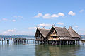
- Nomination Stilt houses in Unteruhldingen --AngMoKio 20:33, 9 June 2010 (UTC)
- Promotion Nice --George Chernilevsky 21:19, 9 June 2010 (UTC)
-

- Nomination Toplou monastery, Crete (Greece): garden gate -- MJJR 19:56, 9 June 2010 (UTC)
- Promotion Good. --Berthold Werner 11:56, 10 June 2010 (UTC)
-

-

- Nomination Toplou monastery, Crete (Greece): inner court -- MJJR 19:56, 9 June 2010 (UTC)
- Promotion Good. --Berthold Werner 11:56, 10 June 2010 (UTC)
-

- Nomination Rathaus Lüneburg, Germany --Kolossos 19:48, 9 June 2010 (UTC)
- Promotion QI With Gigapan--Archaeodontosaurus 20:15, 9 June 2010 (UTC)
-

- Nomination IHK Lüneburg, Germany --Kolossos 19:48, 9 June 2010 (UTC)
- Promotion QI With Gigapan --Archaeodontosaurus 20:22, 9 June 2010 (UTC)
-

- Nomination Fire Lily Lilium bulbiferum, cultivar. --George Chernilevsky 18:54, 9 June 2010 (UTC)
- Promotion QI to me, I like the capture of colors very much. As for my own flowers (see above !), I wish the sample coulb be alone and isolated...--Jebulon 10:19, 10 June 2010 (UTC)
-

- Nomination Cuenca, Ecuador: Sale of flowers in Plaza de las Flores in the centre of the city. --Cayambe 18:21, 9 June 2010 (UTC)
- Promotion Good --George Chernilevsky 19:03, 9 June 2010 (UTC)
-

-

-
- Nomination 158820 and 158839 cross at Severn tunnel Junction. Mattbuck 12:30, 9 June 2010 (UTC)
- Promotion Good. --Berthold Werner 13:45, 9 June 2010 (UTC)
-

- Nomination Lifeguard tower, Miami Beach --Ianare 10:09, 9 June 2010 (UTC)
- Promotion Good. --Berthold Werner 13:54, 9 June 2010 (UTC)
-

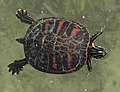
- Nomination Trachemys scripta swimming --Cesco77 09:18, 9 June 2010 (UTC)
- Decline Sorry, but crop is too tight and the colors are a bit dull. Juliancolton 14:34, 9 June 2010 (UTC)
-

- Nomination some bouquinistes on the Seine river embankments, Paris.--Jebulon 23:20, 8 June 2010 (UTC).
- Promotion With acceptable CA (violet and green fringes) mainly at the left bottom. --Cayambe 09:55, 9 June 2010 (UTC) Thanks for review, promotion and comment. I see a (not so) little CA near the trees, but not at the left bottom. Would you show please ?--Jebulon 10:24, 10 June 2010 (UTC)
-
-
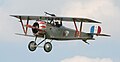
- Nomination Photo of a Nieuport 17, a French WWI biplane. Taken at the English Heritage 'Festival of History '07'. --The High Fin Sperm Whale 02:09, 9 June 2010 (UTC)
- Promotion very good --Ianare 04:39, 9 June 2010 (UTC)
-

- Nomination The trap of a Venus fly trap, showing trigger hairs. --The High Fin Sperm Whale 01:45, 9 June 2010 (UTC)
- Decline Low DOF for the size. --Ianare 04:39, 9 June 2010 (UTC)
-

- Nomination Darlingtonia californica. --The High Fin Sperm Whale 01:41, 9 June 2010 (UTC)
- Decline Some parts are overexposed, the crop looks bad to me (for example, I would like to see the whole plant), the background is disturbing, and seems to be a little noisy. Sorry.--Jebulon 10:08, 9 June 2010 (UTC)
-

- Nomination the bow of an old wooden shipwreck on a beach, low tide, in Brittany, France. --Jebulon 23:22, 8 June 2010 (UTC)
- Promotion Good --George Chernilevsky 05:21, 9 June 2010 (UTC)
-
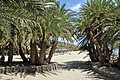
- Nomination The palm beach of Vai (Crete, Greece) -- MJJR 21:16, 8 June 2010 (UTC)
- Promotion good --George Chernilevsky 23:14, 8 June 2010 (UTC)
-
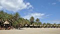
- Nomination The palm beach of Vai (Crete, Greece) -- MJJR 21:16, 8 June 2010 (UTC)
- Promotion Good --George Chernilevsky 23:15, 8 June 2010 (UTC)
-

- Nomination Airship D-LDFR --Carschten 19:51, 8 June 2010 (UTC)
- Promotion Gut --George Chernilevsky 20:09, 8 June 2010 (UTC)
-
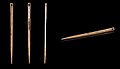
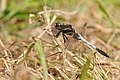
- Nomination Bone flat sewing needle – Upper Paleolithic (40,000 and 10,000 years ago) -- Archaeodontosaurus 19:25, 8 June 2010 (UTC)
- Promotion Very good --George Chernilevsky 19:36, 8 June 2010 (UTC)
-

- Nomination Rosa 'Capistrano' --Captain-tucker 19:15, 8 June 2010 (UTC)
- Promotion good --Ianare 09:05, 9 June 2010 (UTC)
-

- Nomination The river Chiers at Charency-Vezin, region of Lorraine, France. --Cayambe 19:13, 8 June 2010 (UTC)
- Promotion Good --George Chernilevsky 20:08, 8 June 2010 (UTC)
-

- Nomination Ludwigsburg Palace in Southern Germany --Pilettes 15:21, 8 June 2010 (UTC)
- Decline Nice colours, but too unsharp for QI, sorry --Carschten 19:51, 8 June 2010 (UTC)
-

-
- Nomination Hägerstensåsen --Ankara 14:45, 8 June 2010 (UTC)
- Promotion Good -George Chernilevsky 19:38, 8 June 2010 (UTC)
-

- Nomination Hägerstensåsen --Ankara 14:45, 8 June 2010 (UTC)
- Promotion good --George Chernilevsky 19:39, 8 June 2010 (UTC)
-

- Nomination a Click beetle Agrypnus murinus from above --Leviathan1983 14:28, 8 June 2010 (UTC)
- Decline Sorry, but the lower portion of the insect is out of focus. --Jovianeye 16:38, 8 June 2010 (UTC)
-

-

-

-

-

-

- Nomination Animated explosion of a w:rhombic dodecahedron --Lipedia 12:48, 8 June 2010 (UTC)
- Promotion I really liked this animation. But I must ask what guidelines must I use? Do the existing guidelines for photos also apply. (This animation is quite small) --Jovianeye 15:19, 8 June 2010 (UTC) * Support gif animations do not have the size requirement. Good animation --Ianare 04:51, 9 June 2010 (UTC)
-

- Nomination Dotted Stem Bolete Boletus erythropus --George Chernilevsky 12:12, 8 June 2010 (UTC)
- Promotion Aha, you cut it and turned it upside down :-) Good. --Cayambe 15:53, 8 June 2010 (UTC)
-

- Nomination Tinder fungus Fomes fomentarius on the living birch (Betula) --George Chernilevsky 12:12, 8 June 2010 (UTC)
- Promotion Good. --Cayambe 13:46, 8 June 2010 (UTC)
-

- Nomination Tinder fungus Fomes fomentarius on the dead birch (Betula) --George Chernilevsky 12:12, 8 June 2010 (UTC)
- Promotion Also good. --Cayambe 13:48, 8 June 2010 (UTC)
-

- Nomination The Blusher Amanita rubescens, young mushroom --George Chernilevsky 12:12, 8 June 2010 (UTC)
- Promotion QI and Useful -- Archaeodontosaurus 19:27, 8 June 2010 (UTC)
-

- Nomination Elbe in Dresden. --KlausFoehl 11:09, 8 June 2010 (UTC)
- Promotion Nice. Mattbuck 21:29, 8 June 2010 (UTC)
-

- Nomination Campanula patula from Białowieża former palace park.--Von.grzanka 08:40, 8 June 2010 (UTC)
- Promotion Very nice. --Cayambe 13:50, 8 June 2010 (UTC)
-

-

- Nomination 60163 Tornado steams towards the Chepstow Tunnel. Mattbuck 22:40, 7 June 2010 (UTC)
- Promotion The very little view of the tunnel (edge right above) is too small or too large. Its disturbing IMO. If cropped, I'll change my vote, because I like this image--Jebulon 22:58, 8 June 2010 (UTC)
Bridge corner duly cropped. Mattbuck 23:06, 8 June 2010 (UTC)OK Qi now in my opinion.--Jebulon 09:50, 9 June 2010 (UTC)
-

-

-

-

- Nomination Guttation on a Equisetum fluviatile in Belgium natural reserve "Marie Mouchon" by User:Lviatour. --The High Fin Sperm Whale 20:54, 6 June 2010 (UTC)
- Promotion It would be ridiculous to decline this nomination, but I'm not sure this picture really needs a QI promotion...--Jebulon 23:08, 6 June 2010 (UTC)
No, it would not be ridiculous, as the image only barely meets the size requirement. And also it is not about the image needing a promotion, it is about our QI collection needing the promotion. --Dschwen 13:14, 8 June 2010 (UTC)
-
-

- Nomination Trier, so-called Old Forge --Berthold Werner 08:30, 6 June 2010 (UTC)
- Promotion Sehr gut für mich ! Like the shadow over the façade --Jebulon 22:46, 8 June 2010 (UTC)
-

-

-

- Nomination OK, stitching this one almost killed my computer. --Eusebius 14:23, 5 June 2010 (UTC)
- Promotion Nice pano, good sharpness. --Alchemist-hp 12:09, 6 June 2010 (UTC) Comment On the left side comes a guy out of it and is getting photographed by his twin (same clothes, backback...) or is it maybe just a ghost?!
 Please remove one of them. Otherwise, great work! --Leviathan1983 16:19, 8 June 2010 (UTC)
Aargh! Photoshop file is 2GB large, so it will take some time before I can do it. But thanks for pointing that! --Eusebius 22:07, 8 June 2010 (UTC)
-

- Nomination 378005 sits at Willesden Junction with a service to Richmond. Mattbuck 02:27, 5 June 2010 (UTC)
- Promotion Ok. --Berthold Werner 11:20, 9 June 2010 (UTC)
-

- Nomination: Unusual cave formation in a Minnesota State Park - Jonathunder 19:54, 2 June 2010 (UTC)
- Review needed
-

- Nomination: Trainspotters at Newport railway station. Mattbuck 15:16, 2 June 2010 (UTC)
- Review needed
-

- Nomination: 175005 departs Newport with a Marches Line service. Mattbuck 15:16, 2 June 2010 (UTC)
- Review needed
-

-

- Nomination Church tower of the Schweiklberg Abbey in Bavaria, Germany. --High Contrast 10:06, 1 June 2010 (UTC)
- Decline Interesting structure, but pixalation and poor lighting --Ianare 09:08, 9 June 2010 (UTC)
-

- Nomination Small hydroelectric power plant in Bavaria. --High Contrast 10:06, 1 June 2010 (UTC)
- Decline The strong glare from the wall is bothersome! I'm sure it can be fixed in Photoshop. --Jovianeye 02:14, 5 June 2010 (UTC) * Oppose pixelated, looks oversharpened also. --Ianare 09:11, 9 June 2010 (UTC)
-
-

- Nomination the "Louis XV period" summit (1746) of the Grosse Horloge tower in La Rochelle, France.--Jebulon 00:06, 29 May 2010 (UTC) New version uploaded --Jebulon 23:14, 4 June 2010 (UTC)
- Decline Chromatic aberration near the bottom. ZooFari 18:24, 6 June 2010 (UTC). Comment Yes, after some hours reviewing, I've founded it. But I've seen here promoted pictures with more... Respectfully, May be a bit nitpicking ? hmm ? --Jebulon 17:46, 8 June 2010 (UTC) CA is among the most fixable flaws. Since we're getting many statue and tower images, I think the bar needs to be risen, starting with CA. A small amount isn't a big deal but this one has larger fringing. ZooFari 19:50, 8 June 2010 (UTC)
-

- Nomination Torists entering Kerak castle --Berthold Werner 07:56, 28 May 2010 (UTC)
- Withdrawn Not bad IMO, but the problems are... the tourists --Jebulon 15:21, 3 June 2010 (UTC)
:-) The tourists are the subject not the problem. ;-) --Berthold Werner 09:42, 4 June 2010 (UTC) nice attempt...Sometimes, your faith can be as bad as mine !! (lol)--Jebulon 22:53, 4 June 2010 (UTC)
HEY, take a look at the nomination. ;-) --Berthold Werner 07:40, 7 June 2010 (UTC) Comment Correction: Your bad faith is now much better than mine ! By the way, I don't understand your annotation... I put another one, much more according to the nomination. --Jebulon 17:50, 8 June 2010 (UTC)
Enough from that... --Berthold Werner 19:52, 8 June 2010 (UTC)
-

- Nomination View of the Quiberon Bay from Carnac (Brittany, France). --Myrabella 09:50, 8 June 2010 (UTC)
- Promotion good --George Chernilevsky 11:31, 8 June 2010 (UTC)
-

- Nomination Agfa Slide frames for 6x6 Slides --Berthold Werner 08:13, 8 June 2010 (UTC)
- Promotion Quick promotion for a good image. --Cayambe 08:15, 8 June 2010 (UTC)
-

- Nomination Misumena vatia with caught fly. --Von.grzanka 20:58, 7 June 2010 (UTC)
- Promotion Nice one!-Letartean 21:26, 7 June 2010 (UTC)
-

- Nomination Alpa camera, on display at Vevey camera museum -- Rama 20:31, 7 June 2010 (UTC)
- Decline There are stains looking like dust-spots --Mbdortmund 22:29, 7 June 2010 (UTC)
Unsharp. --Berthold Werner 08:18, 8 June 2010 (UTC)
-

- Nomination Alpa camera, on display at Vevey camera museum -- Rama 20:31, 7 June 2010 (UTC)
- Decline There are stains looking like dust-spots in the lower parts --Mbdortmund 22:29, 7 June 2010 (UTC)
Unsharp. --Berthold Werner 08:18, 8 June 2010 (UTC)
-

-

- Nomination Meteorite Chondrite H5 --Archaeodontosaurus 20:19, 7 June 2010 (UTC)
- Promotion Good and very useful. --Cayambe 07:02, 8 June 2010 (UTC)
-

-
-

-

-

- Nomination Tombs of the Halifax bomber crew that died in the crash of their aircraft in 1942 at Rambrouch. --Cayambe 14:33, 7 June 2010 (UTC)
- Promotion QI. --Jovianeye 23:13, 7 June 2010 (UTC)
-
- Nomination Jordan, the desert near Petra --Berthold Werner 09:26, 7 June 2010 (UTC)
- Promotion Already an FP! --Jovianeye 23:07, 7 June 2010 (UTC)
-
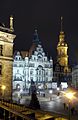
-

-
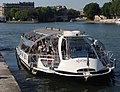
- Nomination A "Batobus" (parisian water bus) leaving embankment on the Seine. Background: Ile Saint-Louis & Pont de Sully. --Jebulon 23:04, 6 June 2010 (UTC)
- Promotion Ok. --Berthold Werner 17:25, 7 June 2010 (UTC)
-

-

- Nomination Pinus palustris in Rogów Arboretum --Crusier 12:59, 6 June 2010 (UTC)
- Promotion QI to me, with acceptrable CA (violet fringes) mainly at the top left. --Cayambe 07:07, 8 June 2010 (UTC)
-

-

- Nomination Border signs of Germany and of the Free State of Bavaria at the German-Austrian border. --High Contrast 20:27, 5 June 2010 (UTC)
- Withdrawn Comment - I think there's a little overexposure going on here. Mattbuck 20:51, 5 June 2010 (UTC)
Thanks for your precise annotation. --High Contrast 16:24, 7 June 2010 (UTC) Have added this pic in two other categories.--Jebulon 17:00, 7 June 2010 (UTC)
-

- Nomination Railway building, Southern Germany --Harke 17:50, 5 June 2010 (UTC)
- Promotion Gut --George Chernilevsky 11:34, 8 June 2010 (UTC)
-

- Nomination "La Tarta" - a colourful geological formation at Tenerife --Llez 04:11, 5 June 2010 (UTC)
- Promotion Comment The colours look kind odd IMO. --kallerna 06:34, 5 June 2010 (UTC) CommentThe "odd colours" are the reason, why this formation is well renowned in Tenerife Llez 15:45, 6 June 2010 (UTC)
The effect in the sky is described here: http://vicanek.de/plugins/huerestorer.htm --Berthold Werner 08:04, 5 June 2010 (UTC) Done sky reworked Llez 16:01, 5 June 2010 (UTC)
Good IMHO --Berthold Werner 15:26, 7 June 2010 (UTC)
-

-
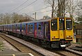
- Nomination 313046 leads 313030 into Enfield Chase station. Mattbuck 01:54, 3 June 2010 (UTC)
- Decline Quality is not bad, but the strong halos around the electrical wires bother me, and there is not much resolution to make up for this. --Dschwen 16:56, 4 June 2010 (UTC)
+ actually quite noisy, dull sky. --kallerna 19:48, 7 June 2010 (UTC)
-

-
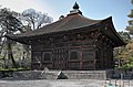
- Nomination Temple in Japan --Jnn 14:51, 2 June 2010 (UTC)
- Promotion A legend in English would be welcome. --Archaeodontosaurus 17:01, 3 June 2010 (UTC) Support QI for me --Archaeodontosaurus 17:08, 7 June 2010 (UTC)
-

- Nomination Geotrupes stercorarius --ComputerHotline 17:52, 1 June 2010 (UTC)
- Decline Specular highlights spoil the picture. Lycaon 05:51, 8 June 2010 (UTC)
-

-

-
-
-

-

- Nomination Tallinn Botanic Garden Скампецкий 18:17, 6 June 2010 (UTC)
- Promotion Well composed and otherwise also good. --Cayambe 07:30, 7 June 2010 (UTC)
-
![* Nomination underside of Magnolia x soulangeana leaf in Rogów Arboretum, Poland --Crusier 15:46, 6 June 2010 (UTC) QuestionCan someone tell me why the thumbnail is not available? File --Crusier 15:46, 6 June 2010 (UTC) * Promotion All looks good, the thumbnail too. --Jebulon 17:26, 6 June 2010 (UTC) Comment I see it: [1] --Crusier 18:29, 6 June 2010 (UTC)](https://upload.wikimedia.org/wikipedia/commons/thumb/a/ad/Magnolia_x_soulangeana_Rog%C3%B3w.JPG/80px-Magnolia_x_soulangeana_Rog%C3%B3w.JPG)
- Nomination underside of Magnolia x soulangeana leaf in Rogów Arboretum, Poland --Crusier 15:46, 6 June 2010 (UTC) QuestionCan someone tell me why the thumbnail is not available? File --Crusier 15:46, 6 June 2010 (UTC)
- Promotion All looks good, the thumbnail too. --Jebulon 17:26, 6 June 2010 (UTC) Comment I see it: [1] --Crusier 18:29, 6 June 2010 (UTC)
- Nomination underside of Magnolia x soulangeana leaf in Rogów Arboretum, Poland --Crusier 15:46, 6 June 2010 (UTC)
-
-

-

-

- Nomination St Peter's Cave Church near Antakya --Memorino 15:10, 6 June 2010 (UTC)
- Promotion Not perfect, but QI imo. Felix Koenig 15:15, 6 June 2010 (UTC) Some technical problems, but best image of the object. -- THWZ 15:27, 6 June 2010 (UTC)
-

- Nomination National museum on Wenceslas Square in Prague --Herzi Pinki 11:23, 6 June 2010 (UTC)
- Promotion QI to me. --Jebulon 17:21, 6 June 2010 (UTC)
-

- Nomination EN57-997rb on Koluszki railway station in Poland --Crusier 09:39, 6 June 2010 (UTC)
- Decline CA around the overhead electric cables. --Jovianeye 16:30, 6 June 2010 (UTC)
-

- Nomination A Roadside Hawk (Buteo magnirostris) perched in a tree in Goiás, Brazil. --The High Fin Sperm Whale 03:14, 6 June 2010 (UTC)
- Decline Beautiful! FP perhaps? --Jovianeye 05:22, 6 June 2010 (UTC)
Info The "original" image (other image) is already a FP image! --Alchemist-hp 11:25, 6 June 2010 (UTC)
Oppose "Pictures from ... Flickr are ineligible" (please see the criteria). Wsiegmund 16:03, 6 June 2010 (UTC)
Why discuss? Im declining it! The flickr rule slipped out of my head. --Jovianeye 16:22, 6 June 2010 (UTC)
-

- Nomination Fragaria vesca flowers in Sweden C T Johansson 15:24, 4 June 2010 (UTC)
- Promotion While the flower is a bit overexposed (40,000 pixels with a value of 255 in the green channel, it retains good detail. I would prefer the flower above and left of center so that leaf in the lower right is not cut off, but I think this image satisfies the criteria.Wsiegmund 17:46, 6 June 2010 (UTC)
-

- Nomination Detail of Grace Cathedral Ghiberti doors, San Francisco --Bgag 22:45, 1 June 2010 (UTC) "effet coussin", perspective distortion ? ----Jebulon 23:34, 1 June 2010 (UTC) Comment You're probably right. I cannot do better with this picture. --Bgag 21:08, 2 June 2010 (UTC)
I tried to correct it. --Mbdortmund 10:29, 6 June 2010 (UTC) - Promotion Sound the trumpets, and fail the walls of Jericho ! QI now !! Hallelujah !!--Jebulon 16:48, 6 June 2010 (UTC) Comment Thanks McDortmund --Bgag 23:25, 6 June 2010 (UTC)
- Nomination Detail of Grace Cathedral Ghiberti doors, San Francisco --Bgag 22:45, 1 June 2010 (UTC) "effet coussin", perspective distortion ? ----Jebulon 23:34, 1 June 2010 (UTC)
-

- Nomination An old ruined sheep pen (?) near Rhyd Ddu in Wales. Mattbuck 00:51, 1 June 2010 (UTC)
- Promotion Nice pic, (with another nice welsh name !)--Jebulon 16:54, 6 June 2010 (UTC)
I must admit I'm unsure quite how to pronounce it - I think it's "rhith thee" or something. Mattbuck 17:02, 6 June 2010 (UTC)
-

-

- Nomination Chennai MRTS station --Kprateek88 11:12, 30 May 2010 (UTC)
- Decline The perspective is fabulous on the thumbnail, but at full resolution I see some noise, and feel it's not enough contrasted (lack of details IMO)--Jebulon 16:35, 6 June 2010 (UTC)
-

- Nomination The Grosse Horloge tower (XVth century for the base-XVIIIth century for the summit), a public clock tower used as a gate between the harbour and the city, from below, south side. Historic monument of France since 1978--Jebulon 00:00, 29 May 2010 (UTC) new version uploaded --Jebulon 23:14, 4 June 2010 (UTC)
- Decline Adjustments blowned the sky severely. ZooFari 18:24, 6 June 2010 (UTC)
-
- Nomination Crucuno dolmen, in Plouharnel (Brittany, France). --Myrabella 08:19, 6 June 2010 (UTC)
- Promotion Very good. --Berthold Werner 08:54, 6 June 2010 (UTC)
-

- Nomination A bouquiniste in Paris. Every book is protected by a plastic cover.--Jebulon 22:48, 5 June 2010 (UTC)
- Promotion good --Mbdortmund 22:56, 5 June 2010 (UTC)
-

- Nomination Mamiya C330. --Eusebius 21:36, 5 June 2010 (UTC)
- Promotion good --Mbdortmund 22:59, 5 June 2010 (UTC)
-

- Nomination Close up of a Leucanthemum vulgare. C T Johansson 19:55, 5 June 2010 (UTC)
- Promotion Very pretty. Mattbuck 20:51, 5 June 2010 (UTC)
-

-

- Nomination silver hand-embroidered ceremony epaulettes of the former rank of Commissaire principal (something like Chief superintendent) in the French police. This rank does not exist more since 2005. Buttons are in silver.--Jebulon 15:10, 5 June 2010 (UTC)
- Promotion There are fiew overexposed spots, and a bit of CA, but QI to me.--Mbz1 17:26, 5 June 2010 (UTC)
-

- Nomination Walheim power plant, Germany. Felix Koenig 14:44, 5 June 2010 (UTC)
- Promotion For me a good QI image! --Alchemist-hp 20:11, 5 June 2010 (UTC)
-

- Nomination an historic Platanus orientalis, the Buffon's plane tree planted here in 1785 --Jebulon 14:06, 5 June 2010 (UTC)
- Decline I like the composition, but the clouds are overexposed ("burned highlights in large areas").Wsiegmund 20:06, 5 June 2010 (UTC)
-

-

-

- Nomination Scorpaena scrofa the Largescaled Scorpionfish --Llez 10:33, 5 June 2010 (UTC)
- Promotion Comment should correct the center of the eye to be black.--Archaeodontosaurus 13:08, 5 June 2010 (UTC) Done Llez 13:55, 5 June 2010 (UTC) Support QI and useful --Archaeodontosaurus 15:05, 5 June 2010 (UTC)
-

- Nomination Trier, so-called Jerusalem Tower --Berthold Werner 07:58, 5 June 2010 (UTC)
- Promotion Good. --Cayambe 15:56, 5 June 2010 (UTC)
-

-

-

- Nomination Guy-Victor Duperré, Amiral de France, 1775-1846, statue by Ebert (1868) in La Rochelle, where he was born.--Jebulon 23:45, 4 June 2010 (UTC)
- Promotion Chromatic color aberration can be easily desaturated. ZooFari 23:51, 4 June 2010 (UTC) You now what ? There are many older pics to be reviewed here...(and the guillotine is a french invention...)--Jebulon 23:54, 4 June 2010 (UTC) Excuse me? ZooFari 00:04, 5 June 2010 (UTC)No problem, don't worry. Where is the CA, please ?--Jebulon 10:24, 5 June 2010 (UTC)Sous l’aisselle gauche :frange violone et sous le bâton d’amiral frange cyan. Une dessaturation ponctuelle peut les enlever.--Archaeodontosaurus 13:14, 5 June 2010 (UTC) A new version uploaded now, due to Archaeodontosaurus (aka dD) kindness--Jebulon 21:05, 5 June 2010 (UTC) Much better. ZooFari 21:33, 5 June 2010 (UTC)
-

-
- Nomination A trolleybus in Vitebsk, Belarus. --Wizardist 21:50, 2 June 2010 (UTC)
- Promotion Ok. --Berthold Werner 13:52, 5 June 2010 (UTC)
-

- Nomination Church of the Annunciation (Brazhnikovo) --Lodo27 09:28, 2 June 2010 (UTC)
- Promotion Good. Why not promoted earlier? --Cayambe 09:29, 5 June 2010 (UTC)
I took a look but tought it's overexposed. --Berthold Werner 13:52, 5 June 2010 (UTC)
-
- Nomination: The north side of the beach of Pwllheli Bay (afraid I don't know the real name of the beach). Mattbuck 23:05, 30 May 2010 (UTC)
- Review needed
-

- Nomination: Abererch railway station in Wales. Mattbuck 23:00, 30 May 2010 (UTC)
- Review Comment Looks tilted, not convinced about composition --Mbdortmund 23:08, 30 May 2010 (UTC)
I think it's more that everything in the picture is tilted at differing angles. Mattbuck 23:47, 30 May 2010 (UTC)
-

- Nomination: Abererch railway station in Wales. Mattbuck 23:00, 30 May 2010 (UTC)
- Review needed
-
-

- Nomination: Church of the Immaculate Conception of St. Mary in Marki, Poland. --Crusier 15:14, 30 May 2010 (UTC)~
- Review CommentStrong distortion and tilted --Mbdortmund 15:52, 30 May 2010 (UTC)
-
- Nomination: Black, Red and Gold barrier cord at German Bundestag in Berlin. --MichaelBueker 15:04, 30 May 2010 (UTC)
- Review Detailmangel durch Reflexionen, leicht überbelichtet, besser wäre eine längere Belichtungszeit und kleinere Blende gewesen. --Mbdortmund 15:55, 30 May 2010 (UTC)
-
- Nomination: The sea, visible over the roofs of Harlech. Mattbuck 02:32, 30 May 2010 (UTC)
- Review needed
-

-

-

- Nomination the Tour de la Lanterne (XVth century) in front of the sea, with part of ancient ramparts in La Rochelle, France. Historic monument of France since 1879.--Jebulon 22:40, 28 May 2010 (UTC) New version uploaded --Jebulon 23:14, 4 June 2010 (UTC)
- Promotion Good enough for me. --Eusebius 22:09, 5 June 2010 (UTC)
-
- Nomination McDonnell Douglas F/A-18F Super Hornet --The High Fin Sperm Whale 01:45, 5 June 2010 (UTC)
- Promotion QI for me! --Jovianeye 04:07, 5 June 2010 (UTC)
-

-

-

-

- Nomination A Nymphaea × daubenyana in a glass house. C T Johansson 18:25, 4 June 2010 (UTC)
- Promotion Looks good to me. --The High Fin Sperm Whale 23:02, 4 June 2010 (UTC)
-

-

-

- Nomination Taraxacum officinale --Mr.checker 16:38, 4 June 2010 (UTC)
- Promotion Nice. Mattbuck 02:29, 5 June 2010 (UTC)
-

- Nomination Trier, Domfreihof 1: Palais Walderdorff --Berthold Werner 09:46, 4 June 2010 (UTC)
- Promotion Nice shot with much details --A.Ceta 14:00, 4 June 2010 (UTC)
-

- Nomination Central square of Aldersbach with maypole in Bavaria, Germany. --High Contrast 09:41, 4 June 2010 (UTC)
- Promotion Nice picture of it. Good colours --A.Ceta 14:05, 4 June 2010 (UTC)
-

-

- Nomination The valley of the danube at the German-Austrian border region. --High Contrast 07:32, 4 June 2010 (UTC)
- Promotion Nice picture of the danube. Good colors --A.Ceta 14:08, 4 June 2010 (UTC)
-

-

- Nomination Panoramic View of Santiago surrounded by the Andes and the Chilean Coast Range. -- Elemaki 00:49, 4 June 2010 (UTC)
- Promotion Possibly dust spot top centre, but could just be a cloud. Lovely view. Mattbuck 13:24, 4 June 2010 (UTC) comment: That "dust" you see is the smog over Santiago. Elemaki 13:53, 4 June 2010 (UTC)
-

-

-

-

- Nomination New shoots of a Nordmann Fir (Abies nordmanniana). --High Contrast 09:08, 3 June 2010 (UTC)
- Decline Blown sky. Lycaon 11:39, 4 June 2010 (UTC)
Comment The sky is not visible on this image. This white background comes from the white floor (that consisted of some kind of particular limestone). --High Contrast 15:06, 4 June 2010 (UTC)
Acknowledged, but still blown. Lycaon 16:00, 4 June 2010 (UTC)
-

-

- Nomination 37324 departs Toddington for Cheltenham. Mattbuck 01:54, 3 June 2010 (UTC)
- Promotion Minor noise, minor CA, but overall quality is acceptable. --Dschwen 16:56, 4 June 2010 (UTC) Comment I think cropping out the lady from the left will add more value to the composition. --Jovianeye 02:22, 5 June 2010 (UTC)
-

-

- Nomination a point of view under the "iron-lace" roof of the gloriette of the Jardin des Plantes in Paris.--Jebulon 23:36, 2 June 2010 (UTC)
- Decline Fringing, too dark to see details, not good composition. ZooFari 16:09, 3 June 2010 (UTC) Disagree. Maybe fringing (a little), but not too dark (no details to see, just a contrast). The compo is a choice. Maybe you dislike, but it's not "no good".--Jebulon 10:33, 5 June 2010 (UTC)
-
-
-

-
-

-

-

-

-

-

-

- Nomination Kodak Ektra --Rama 10:18, 31 May 2010 (UTC)
- Promotion QI to me.--Jovianeye 02:02, 5 June 2010 (UTC)
-

-

- Nomination Picea omorika young shoots --Crusier 14:29, 30 May 2010 (UTC)
- Promotion Not convinced by the composition, but good details --Ianare 12:49, 4 June 2010 (UTC)
-

-

- Nomination Timo Lahti in Speedway Extraliiga -competition. --kallerna 08:05, 4 June 2010 (UTC)
- Promotion The image is good but almost the same ones are in the list in the following. But I am supoorting them
-

- Nomination Joni Kitala in Speedway Extraliiga -competition. --kallerna 08:05, 4 June 2010 (UTC)
- Promotion The image is good but almost the same ones are in the list in the following. But I am supoorting them
-

-
-
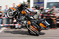
-

-
-

-

- Nomination Curculio nucum side view --mathias K 16:31, 3 June 2010 (UTC)
- Promotion Good enough. ZooFari 17:30, 3 June 2010 (UTC)
-

- Nomination Curculio nucum front view --mathias K 16:31, 3 June 2010 (UTC)
- Decline Too shallow depth of field and out of focus snout is distracting. ZooFari 17:30, 3 June 2010 (UTC)
-

- Nomination Curculio nucum from above --mathias K 16:31, 3 June 2010 (UTC)
- Promotion QI and Useful --Archaeodontosaurus 07:20, 4 June 2010 (UTC)
-

- Nomination Trier, Palais Walderdorff, courtyard --Berthold Werner 15:21, 3 June 2010 (UTC)
- Decline Poor choice of angle, not sharp enough IMO. ZooFari 16:05, 3 June 2010 (UTC)
-

- Nomination Dhërmi beach, Albania - lovely composition--Herzi Pinki 11:37, 3 June 2010 (UTC)
- Decline ... but the sky looks very noisy, and the foreground unsharp. Sorry.--Jebulon 15:55, 3 June 2010 (UTC)
-

-

- Nomination Kilchurn castle, Scotland. --Eusebius 09:47, 3 June 2010 (UTC)
- Decline it's me or this picture has been already nominated ? The Castle is really underexpose due to the sun in background --Croucrou 22:23, 3 June 2010 (UTC) Comment It's been nominated and unassessed. --Eusebius 08:24, 4 June 2010 (UTC)
-

-

- Nomination Pereslavl, Krasny lane, house 2-zh --PereslavlFoto 22:26, 2 June 2010 (UTC)
- Promotion Good enough. ZooFari 16:11, 3 June 2010 (UTC)
-

-

-
-

-

-

- Nomination: Pori football venue. --kallerna 14:47, 28 May 2010 (UTC)
- Review needed
-

- Nomination: Marian and Holy Trinity column at Baden bei Wien. Felix Koenig 13:20, 28 May 2010 (UTC)
- Review CommentNot enough details on the sculpture itsel, not only because of the net --Mbdortmund 22:41, 28 May 2010 (UTC)
-

-

-

- Nomination The catholic church St. Kilian in Mädelhofen. --Carport 16:28, 27 May 2010 (UTC)
- Decline Eigentlich gut, würde aber mit Korrektur der Perspektive noch besser. (Z.B.: mit shiftn) und die Koordinaten könnten noch angegeben werden. --Berthold Werner 16:37, 27 May 2010 (UTC) Info Besser? --Carport 10:42, 28 May 2010 (UTC)
Ich hatte es mir so File:Mädelhofen – St. Kilian (4)-2.jpg vorgestellt. --Berthold Werner 12:30, 28 May 2010 (UTC)
Corrected version by Berthold Werner has been promoted. --Ianare 05:16, 4 June 2010 (UTC)
-
-

-

- Nomination Luolalanjärvi is a lake in Naantali, Finland. In the picture is a bird watching tower located at lake W-corner. --Makele-90 14:35, 25 May 2010 (UTC)
- Decline Comment Pretty sure this is tilted, and thus needs rotation. Adam Cuerden 07:13, 3 June 2010 (UTC) * Oppose per AC, also significant
 chromatic aberration on trees. --Ianare 05:10, 4 June 2010 (UTC)
-

- Nomination Lacerta agilis Zauneidechse --Böhringer 19:37, 9 May 2010 (UTC)
- Promotion cute --Ianare 15:15, 11 May 2010 (UTC). This very nice pic has been nominated here the 9th, and promoted the 11th. Why still in these pages ? a bad example...--Jebulon 09:00, 27 May 2010 (UTC)
Are you shure? The history of the file shows an upload of May 9. and no changes. --Mbdortmund 11:40, 29 May 2010 (UTC)
-

-

- Nomination Pasi Pulliainen and Teemu Lahti in Speedway Extraliiga -competition. --kallerna 17:07, 2 June 2010 (UTC)
- Promotion It's a QI, but the composition is "slow" in a high speed competition C T Johansson 21:20, 2 June 2010 (UTC)
-

- Nomination Greenhouse owned by Taimi Tapio company. --kallerna 17:07, 2 June 2010 (UTC)
- Decline Can't find any sharpness in that picture. C T Johansson 21:03, 2 June 2010 (UTC)
-

- Nomination A Uncarina roeoesliana in my private collection. C T Johansson 15:21, 2 June 2010 (UTC)
- Decline Sorry, overexposed yellow, bit noisy, dull background. --kallerna 16:02, 2 June 2010 (UTC)
-

-

- Nomination Frauenkirche in Dresden by night --Pudelek 12:39, 2 June 2010 (UTC)
- Decline Too dark and disturbing fence in the foreground --Berthold Werner 13:03, 2 June 2010 (UTC)
-
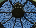
- Nomination From below, a view of the metallic structure of the roof of a "gloriette" in the Jardin des Plantes of Paris. One of the most ancien full metallic buildings in the world (1788). --Jebulon 00:05, 2 June 2010 (UTC) upload of a less contrasted version--Jebulon 23:40, 2 June 2010 (UTC)
- Promotion with corrected contrast for me this is QI; I like the special view; a smaller aperture and spot rating for exposure would be helpful to get even a better photo of this object--J. Lunau 11:59, 3 June 2010 (UTC)
-

-

-

-

- Nomination A member the special counter terrorist unit in the Netherlands. Abigor 17:21, 31 May 2010 (UTC)
- Decline Unsharp and frame --Berthold Werner 17:29, 31 May 2010 (UTC) Comment Image is insuffiently categorized. --High Contrast 18:41, 2 June 2010 (UTC)
-

- Nomination: Prunus serrulata blossom.--Andrei Stroe 07:54, 28 May 2010 (UTC)
- Review needed
-
- Nomination: Speedwayrider Timo Lahti (team Haukat, Lahti) riding in Speedway Extraliiga -competition. --kallerna 15:30, 27 May 2010 (UTC)
- Review needed
-

- Nomination General de Gaulle's call to all Frenchmen, 3 august 1940. Enamelled plaque in La Rochelle, France.--Jebulon 22:46, 19 May 2010 (UTC) Comment How did you made this: you went back in time, after you laminated it? --Elekhh 00:52, 20 May 2010 (UTC) Sorry I don't understand.--Jebulon 23:09, 20 May 2010 (UTC) Sorry, bad joke. I mean that the date in the image description should be the date you took the photo, and the description should indicate location. --Elekhh 23:47, 20 May 2010 (UTC) Your joke is maybe bad, but my english is surely poor (laminated ?) ! Understood now. Photo: see metadata. Description : location added, with a geocode (for free). Vive la France. Promote ? --Jebulon 00:01, 21 May 2010 (UTC)
Yes, I should be more explicit: The image shows a poster on a street wall, photographed recently. I would like to know the street and city name from the image description, and the date the photo was taken in the relevant field. I know is geocoded, and date is in metadata, but the viewer should be able to get such basic information without detective work.--Elekhh 22:11, 24 May 2010 (UTC) Detective work ? Let's not exaggerate...--Broc 21:47, 26 May 2010 (UTC) - Decline In the end, just too dark: Needs levels adjustment. Better to come back with an edited version. Adam Cuerden 07:10, 3 June 2010 (UTC)
- Nomination General de Gaulle's call to all Frenchmen, 3 august 1940. Enamelled plaque in La Rochelle, France.--Jebulon 22:46, 19 May 2010 (UTC)
-

- Nomination Assisi, San Francesco --Berthold Werner 07:47, 2 June 2010 (UTC)
- Promotion QI and usefull.--Jebulon 08:42, 2 June 2010 (UTC)
-
- Nomination Moving of a diptera sp. --ComputerHotline 17:52, 1 June 2010 (UTC)
- Decline No sufficient ID. Lycaon 18:37, 1 June 2010 (UTC)
-
- Nomination Diptera sp. --ComputerHotline 17:52, 1 June 2010 (UTC)
- Decline No sufficient ID. Lycaon 18:37, 1 June 2010 (UTC)
-

- Nomination Diptère dans une fleur de renoncule (Ranunculus sp.). --ComputerHotline 17:52, 1 June 2010 (UTC)
- Decline No sufficient ID. Lycaon 18:37, 1 June 2010 (UTC)
-

- Nomination Syrphidae sp. --ComputerHotline 17:52, 1 June 2010 (UTC)
- Decline No sufficient ID. Lycaon 18:37, 1 June 2010 (UTC)
-

- Nomination Syrphidae sp. --ComputerHotline 17:52, 1 June 2010 (UTC)
- Decline No sufficient ID. Lycaon 18:37, 1 June 2010 (UTC)
-

- Nomination Geotrupes stercorarius --ComputerHotline 17:52, 1 June 2010 (UTC)
- Decline Poor composition. ZooFari 20:16, 1 June 2010 (UTC)
-

- Nomination Geotrupes stercorarius --ComputerHotline 17:52, 1 June 2010 (UTC)
- Decline Poor composition. ZooFari 20:16, 1 June 2010 (UTC)
-

- Nomination Geotrupes stercorarius --ComputerHotline 17:52, 1 June 2010 (UTC)
- Decline Distracting moss, chromatic aberration in the bright areas can easily be desaturated. ZooFari 20:25, 1 June 2010 (UTC)
-

- Nomination Moving of a diptera sp. --ComputerHotline 17:52, 1 June 2010 (UTC)
- Decline No sufficient ID. Lycaon 18:37, 1 June 2010 (UTC)
-

- Nomination Geotrupes stercorarius --ComputerHotline 17:52, 1 June 2010 (UTC)
- Decline Bad depth of field, background and out of focus foreground object are distracting. ZooFari 20:25, 1 June 2010 (UTC)
-

- Nomination Doronicum cordifolium and The Beetles --C T Johansson 16:39, 1 June 2010 (UTC)
- Promotion Good. Lycaon 18:42, 1 June 2010 (UTC)
-

- Nomination A Doronicum cordifolium that capture the sun --C T Johansson 16:26, 1 June 2010 (UTC)
- Promotion Interesting and QI. Lycaon 18:42, 1 June 2010 (UTC)
-

-
-
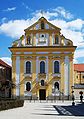
- Nomination The Capuchin Baroque church of St. Magdalena in Altötting in April 2010. --High Contrast 10:06, 1 June 2010 (UTC)
- Promotion Good. --Cayambe 19:25, 1 June 2010 (UTC)
-

- Nomination Cuenca, Ecuador: Inside the Court of Justice building. --Cayambe 08:39, 1 June 2010 (UTC)
- Promotion QI for me --Archaeodontosaurus 19:11, 1 June 2010 (UTC)
-

- Nomination An example of dry stone walling on Dartmoor, Devon. This method is used throughout Dartmoor. --Herbythyme 08:37, 1 June 2010 (UTC)
- Promotion The sky looks overexposed. Qiqritiq 09:55, 1 June 2010 (UTC)
I'll look for a review on that - re-uploaded and not clipped --Herbythyme 12:35, 1 June 2010 (UTC)
It looks good now. Qiqritiq 05:58, 2 June 2010 (UTC)
-
- Nomination Morfa Lodge in Porthmadog at night. Mattbuck 00:51, 1 June 2010 (UTC)
- Decline So much after dark that hardly anything is visible any more apart from the lit windows. High Contrast 10:06, 1 June 2010 (UTC)
* Comment - that was sort of the point. Mattbuck 11:29, 1 June 2010 (UTC)
The criticism was predictable, and the answer too... Maybe a crop, with a framing just around the main window ? --Jebulon 23:49, 1 June 2010 (UTC)
That will probably make it fail the 2MP requirement, but could be done. Mattbuck 00:24, 2 June 2010 (UTC)
-

-

- Nomination A man walks on the beach at Aberdesach. Mattbuck 03:07, 31 May 2010 (UTC)
- Decline Noticeably blurry and grainy, even at thumbnail. Juliancolton 14:04, 1 June 2010 (UTC)
-
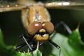
- Nomination Epitheca bimaculata (head) --ComputerHotline 08:26, 29 May 2010 (UTC)
- Promotion OK. Lycaon 21:10, 1 June 2010 (UTC)
-

- Nomination View from Yağdonduran Pass, Sivas, Turkey. --Von.grzanka 19:52, 28 May 2010 (UTC)
- Promotion great view and well done stitching --J. Lunau 10:35, 2 June 2010 (UTC)
-

-
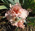
- Nomination: an Iris cultivar Beverly Sills, Hager 1979, from above, Jardin des Iris, Jardin des Plantes, Paris.--Jebulon 22:29, 26 May 2010 (UTC)
- Review needed
-

- Nomination: Foggy winter-day at Eibsee, Bavaria, Germany --Llez 17:31, 26 May 2010 (UTC)
- Review needed
-
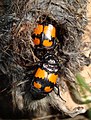
- Nomination Nicrophorus vespilloides (common sexton beetles) feeding on dead rodent. -- V-wolf 16:35, 26 May 2010 (UTC)
- Promotion The composition (too wide or too tight crop) detracts from the real topic: the beetles. --Qiqritiq 08:17, 31 May 2010 (UTC) CommentI have now cropped the image. Would it look better tilted 90° CCW? --V-wolf 16:25, 31 May 2010 (UTC)
Let's see what others think now. Lycaon 21:07, 1 June 2010 (UTC)
Much better. Qiqritiq 06:01, 2 June 2010 (UTC)
-

- Nomination: Sanatorium orphanage at Kuhmar. --PereslavlFoto 14:27, 26 May 2010 (UTC)
- Review needed
-

-
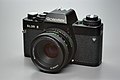
- Nomination Rolleiflex SL 35 E --Berthold Werner 06:26, 1 June 2010 (UTC)
- Promotion QI for me --Archaeodontosaurus 08:30, 1 June 2010 (UTC)
-

- Nomination K-Museum, at Ariake, Tokyo, Japan, by User:Wiiii. --Elekhh 03:48, 1 June 2010 (UTC)
- Promotion Ok --Berthold Werner 07:00, 1 June 2010 (UTC)
-

-

-

- Nomination Reflections in the waters of the Aberglaslyn pass. Mattbuck 00:51, 1 June 2010 (UTC)
- Decline Too much parts out of focus (unsharp), a strange and disturbing "red" thing, right. Sorry.--Jebulon 09:40, 1 June 2010 (UTC)
I think it's a leaf, and I have to say I hadn't noticed it before. Oh well. Mattbuck 11:29, 1 June 2010 (UTC)
-

-

- Nomination Former water castle in Bavaria, Germany. --High Contrast 21:34, 31 May 2010 (UTC)
- Promotion Sehr gut, QI. --Elekhh 03:51, 1 June 2010 (UTC)
-

- Nomination Bald Eagle --The High Fin Sperm Whale 18:31, 31 May 2010 (UTC)
- Decline Commentsorry, but the fence is disturbing --Mbdortmund 22:28, 31 May 2010 (UTC) Oppose - per Mbdortmund. Shame, becaus eotherwise it is a really good photo. Mattbuck 23:53, 31 May 2010 (UTC)
-
-
-
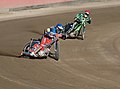
-
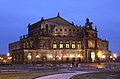
-

- Nomination The catholic church St. Kilian in Mädelhofen. Photograph by Carport, perspective corrected by Berthold Werner --Berthold Werner 13:09, 31 May 2010 (UTC)
- Promotion Good. --Jovianeye 17:43, 31 May 2010 (UTC)
-

-

-

- Nomination Ville d'Ulm de nuit, jeux de lumieres --Bobleponge31 11:38, 31 May 2010 (UTC)
- Decline Sorry but HDR to avoid overexposed parts and perspective correction are state of the art for subjects like this one at QIC. --Berthold Werner 15:58, 31 May 2010 (UTC) 15:56, 31 May 2010 (UTC)
-

-

- Nomination Tooth of Homo habilis --Archaeodontosaurus 09:23, 31 May 2010 (UTC)
- Promotion Good and very useful. --Cayambe 18:02, 31 May 2010 (UTC)
-

- Nomination Lamborghini Reventon in IAA 2009 -- Bobleponge31 09:12, 31 May 2010 (UTC)
- Promotion Comment - could probably do with the yellow car being photoshopped out and a small crop on the right. Mattbuck 12:11, 31 May 2010 (UTC) Comment - Modification done, is it better now ? Still some yellow reflection but that's harder work... --Bobleponge31 14:34, 31 May 2010 (UTC)
Yeah, that would be tricky to remove. Promotion anyway. Mattbuck 20:48, 31 May 2010 (UTC)
-

-
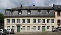
- Nomination Trier, Gilbertstrasse 82 build in 1793 --Berthold Werner 10:41, 31 May 2010 (UTC)
- Promotion Very good... if there wern't those disturbing cars. With acceptable Ca (violet and green fringes mainly at the left). --Cayambe 18:05, 31 May 2010 (UTC)
-
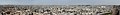
-

-

- Nomination A jetski on its trailer in La Rochelle, France--Jebulon 22:27, 30 May 2010 (UTC)
- Decline I think the picture is cropped too heavily on the right hand side. If it were a bit wider it would be great. (Also, possible slight tilt? Unsure.) Mattbuck 03:13, 31 May 2010 (UTC)
I respectfully disagree. A larger crop (impossible because of the car !) would not add to the encyclopedic value of this pic, which shows enough, at this angle, the whole engine.--Jebulon 15:00, 31 May 2010 (UTC)
This is quality image, not valued image. We're not especially concerned about the value of the image to commons, merely that the picture itself be of a high standard. Mattbuck 20:46, 31 May 2010 (UTC)
-

- Nomination Ruhr in the evening. --Garver
- Decline Himmel links überbelichtet --Mbdortmund 15:55, 30 May 2010 (UTC) Comment Very pretty, but possibly the sky is a bit washed out? Mattbuck 03:13, 31 May 2010 (UTC)
Too much of the image is blown. --Qiqritiq 10:07, 1 June 2010 (UTC)
-

-

- Nomination Dendrobium farmeri, orchid house in Łańcut, Poland --Kroton 10:32, 30 May 2010 (UTC)
- Decline The background is in need of some noise reduction. Qiqritiq 10:03, 1 June 2010 (UTC)
-

- Nomination A light in a very expensive pottery/art gallery in Wales. Mattbuck 02:26, 30 May 2010 (UTC)
- Promotion Comment Nothing to see of the expensive pottery --Mbdortmund 13:59, 30 May 2010 (UTC) Support Nice and sharp. Good! --MichaelBueker 09:27, 31 May 2010 (UTC) Comment - the pottery wasn't worth photographing. Mattbuck 12:05, 31 May 2010 (UTC)
-

- Nomination The two steeple of the "Stadtkirche", the City Church of Wittenberg (seen from the market square). --High Contrast 18:49, 29 May 2010 (UTC)
- Decline Noise in the sky and whitish halos around the tower. --Qiqritiq 10:11, 1 June 2010 (UTC)
-
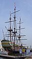
- Nomination The Amsterdam --Carschten 14:27, 29 May 2010 (UTC)
- Promotion Good picture of the stern and the rigging. QI to me, despite the signs blocking the bow, and minor blurriness in the uppermost bits. By the way, it's a replica of the Amsterdam, not the original ship. --Avenue 21:37, 31 May 2010 (UTC)
-

- Nomination: Monumental building from the 16th century in Zaltbommel, the Netherlands --NormanB 22:09, 25 May 2010 (UTC)
- Review needed
-

- Nomination House in Wuppertal --Mbdortmund 19:55, 24 May 2010 (UTC)
- Decline Excessive noise, otherwise good. Not sure what you're doing lately but it's not working very well - normally your images are not noisy :-( --Ianare 03:23, 1 June 2010 (UTC)
-

- Nomination Night of Museums 2010. Village Veskovo. Botik manor. --PereslavlFoto 19:42, 24 May 2010 (UTC)
- Promotion Interesting image, good composition --Ianare 03:23, 1 June 2010 (UTC)
-

-

-

- Nomination Schwebebahn- haltepunkt in Wuppertal- Sonnborn Stadion/Zoo --Mbdortmund 18:05, 23 May 2010 (UTC)
- Decline Comment Besser wärs, man könnte die Schwebebahn schweben sehen. --Berthold Werner 11:42, 24 May 2010 (UTC) * Oppose camera shake ? whole image is a little blurry. --Ianare 03:17, 1 June 2010 (UTC)
-

-

-

-

- Nomination Competitor in Yyteri SM Motocross 2010 -competition in Yyteri. --kallerna 14:29, 30 May 2010 (UTC)
- Decline The driver is good but strong tilt and washed out sky --Mbdortmund 16:22, 30 May 2010 (UTC)
-

-

- Nomination Moon on the sea --Kprateek88 11:05, 30 May 2010 (UTC)
- Decline very noisy, nothing special, to cloudy and to dark. --Alchemist-hp 14:19, 30 May 2010 (UTC)
-

- Nomination Trier, Hauptwache, coat of arms --Berthold Werner 08:46, 30 May 2010 (UTC)
- Promotion good --Mbdortmund 14:01, 30 May 2010 (UTC)
-

- Nomination Panorama of Keating Sports Center. --Jovianeye 03:34, 30 May 2010 (UTC)
- Decline Front of the building noisy --Mbdortmund 14:03, 30 May 2010 (UTC)
-

- Nomination Westminster Palace, London. /Dcastor 02:42, 30 May 2010 (UTC)
- Decline A very interesting view but unfortunatly too noisy. (Can't understand why the camera produced this noise at ISO 200
 ) --Berthold Werner 09:22, 30 May 2010 (UTC)
Kann an Unterbelichtung liegen --Mbdortmund 23:06, 30 May 2010 (UTC)
-

- Nomination DTM Audi panning shot --AngMoKio 17:27, 29 May 2010 (UTC)
- Promotion As with File:DTM_Audi_A4_Jarvis09_amk.jpg, rear is a bit blurred but otherwise very good. Mattbuck 03:21, 31 May 2010 (UTC)
-

- Nomination Former coalmine "Gneisenau" in Dortmund, winding tower --Mbdortmund 10:45, 29 May 2010 (UTC)
- Promotion Also good. --Cayambe 13:55, 30 May 2010 (UTC)
-
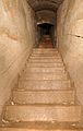
- Nomination Inside the Fort de Roppe. --ComputerHotline 08:26, 29 May 2010 (UTC)
- Promotion Good. --Cayambe 13:57, 30 May 2010 (UTC)
-

- Nomination Semaphore signals at Caersws. Mattbuck 02:15, 29 May 2010 (UTC)
- Promotion I like this one, too --Mbdortmund 15:58, 30 May 2010 (UTC)
-

- Nomination Greim, a 2474 m mountain in the Wölzer Tauern --Herzi Pinki 19:56, 28 May 2010 (UTC)
- Promotion Beautiful. Mattbuck 03:24, 31 May 2010 (UTC)
-

-

-

- Nomination Rüstkammer, Dresden - burgonet --Pudelek 21:14, 27 May 2010 (UTC)
- Decline I like very much, but... See annotations please.--Jebulon 00:00, 28 May 2010 (UTC)
Simply too dark, sorry --Mbdortmund 19:06, 30 May 2010 (UTC)
-

- Nomination Church in Dortmund --Mbdortmund 19:29, 27 May 2010 (UTC)
- Promotion The vertical perspective needs some correction. --Jovianeye 22:05, 27 May 2010 (UTC)
I don't like to put all vertical lines straight in such pictures, I think that looks overcorrected --Mbdortmund 16:15, 29 May 2010 (UTC) Support Very little error correction, up the left wall of the tower. Do not become obsessed. QI for me --Archaeodontosaurus 14:41, 30 May 2010 (UTC)
-
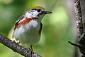
- Nomination Chestnut-sided Warbler, female, Réserve naturelle des Marais-du-Nord, Quebec, Canada. Körnerbrötchen 19:12, 26 May 2010 (UTC) Comment The other one was a male. --Cephas 19:15, 26 May 2010 (UTC)
- Promotion Good --Mbdortmund 23:12, 30 May 2010 (UTC)
- Nomination Chestnut-sided Warbler, female, Réserve naturelle des Marais-du-Nord, Quebec, Canada. Körnerbrötchen 19:12, 26 May 2010 (UTC)
-

-

- Nomination East Jerusalem on a cold rainy evening. --Wknight94 12:15, 26 May 2010 (UTC)
- Decline Too much chromatic aberration. --Qiqritiq 08:15, 31 May 2010 (UTC)
-

- Nomination: Sand and a pond in Yyteri. --kallerna 10:24, 25 May 2010 (UTC)
- Review needed
-

-

- Nomination Grid girls at DTM race --AngMoKio 15:03, 22 May 2010 (UTC)
- Decline Comment crop not so good and wrong side... --Mbdortmund 14:20, 30 May 2010 (UTC)
Decline - if the top right girl (the headless one) weren't there I'd probably go for this, but having said headless girl rather spoils it. Mattbuck 01:16, 31 May 2010 (UTC)
-

- Nomination A ceramic cat on a roof in La Rochelle, France.--Jebulon 22:38, 21 May 2010 (UTC)
- Decline Comment Some CA, some noise. --Eusebius 20:02, 29 May 2010 (UTC)
partially tilted/distorted cw --Mbdortmund 14:07, 30 May 2010 (UTC)
-

- Nomination A person making crossword puzzles. --kallerna 05:52, 20 May 2010 (UTC)
- Decline something disturbing in the corner right above...--Jebulon 00:04, 21 May 2010 (UTC)
Comment ? kallerna 15:06, 23 May 2010 (UTC)
Maybe it's the shirt but in full solution it really looks a bit strange --Mbdortmund 11:46, 29 May 2010 (UTC)
It's the shirt...and don't consentrate to breast, consentrate to crosswors! ;) --Kallerna 14:26, 29 May 2010 (UTC) Choice between international language and finnish language.... But breast and crosswords are both unfortunately cropped...--Jebulon 23:07, 29 May 2010 (UTC)
Decline - if it were crossword and disembodied arms, or crossword and whole body I would go for it, but the halfway house doesn't work for me. Mattbuck 01:20, 31 May 2010 (UTC)
-

- Nomination Former browery "Union" Dortmund --Mbdortmund 01:42, 30 May 2010 (UTC)
- Promotion QI for me --Archaeodontosaurus 07:43, 30 May 2010 (UTC)
-
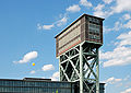
- Nomination Winding tower of a former coalmine in Dortmund --Mbdortmund 00:32, 30 May 2010 (UTC)
- Promotion Good --George Chernilevsky 07:06, 30 May 2010 (UTC)
-

- Nomination Niobium. --Alchemist-hp 00:19, 30 May 2010 (UTC)
- Promotion Good and useful --Mbdortmund 00:35, 30 May 2010 (UTC)
-

- Nomination Tantalum. --Alchemist-hp 00:19, 30 May 2010 (UTC)
- Promotion Good and useful --Mbdortmund 00:35, 30 May 2010 (UTC)
-

- Nomination Conversion of an old brewery to a museum --Mbdortmund 00:21, 30 May 2010 (UTC)
- Promotion Good quality --George Chernilevsky 11:50, 30 May 2010 (UTC)
-

- Nomination Conversion of an old brewery to a museum, view from inside --Mbdortmund 00:21, 30 May 2010 (UTC)
- Promotion good composition --George Chernilevsky 11:51, 30 May 2010 (UTC)
-

- Nomination Leopard mosaic. --Eusebius 21:09, 29 May 2010 (UTC)
- Promotion Very good --George Chernilevsky 21:54, 29 May 2010 (UTC)
-

-

- Nomination Bracket fungi Dryad's saddle Polyporus squamosus --George Chernilevsky 18:45, 29 May 2010 (UTC)
- Promotion Very good. --Cayambe 21:52, 29 May 2010 (UTC)
-
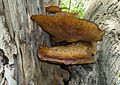
- Nomination Bracket fungi Polyporus squamosus. Same fungi one week later --George Chernilevsky 18:45, 29 May 2010 (UTC)
- Promotion Also good. --Cayambe 21:52, 29 May 2010 (UTC)
-

- Nomination Bracket fungi Polyporus squamosus. Same fungi one week later --George Chernilevsky 18:45, 29 May 2010 (UTC)
- Promotion Very good.--Mbz1 21:06, 29 May 2010 (UTC)
-

-

-
-

-

- Nomination Hofkirche in Dresden by night --Pudelek 12:56, 29 May 2010 (UTC)
- Promotion good --George Chernilevsky 19:05, 29 May 2010 (UTC)
-

- Nomination Former coalmine "Gneisenau" in Dortmund, winding tower --Mbdortmund 10:45, 29 May 2010 (UTC)
- Promotion well done --AngMoKio 15:21, 29 May 2010 (UTC)
-

- Nomination Ixodida sp. --ComputerHotline 08:26, 29 May 2010 (UTC)
- Decline Noisy and head unfocussed. Nice find though. Lycaon 11:26, 30 May 2010 (UTC)
-

- Nomination Ixodida sp. --ComputerHotline 08:26, 29 May 2010 (UTC)
- Decline Undersized, poor flash reflections, not sharp, noisy. Lycaon 11:26, 30 May 2010 (UTC)
-
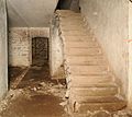
- Nomination Inside the Fort de Roppe. --ComputerHotline 08:26, 29 May 2010 (UTC)
- Promotion OK --George Chernilevsky 19:08, 29 May 2010 (UTC)
-

- Nomination Inside the Fort de Roppe. --ComputerHotline 08:26, 29 May 2010 (UTC)
- Promotion good --George Chernilevsky 19:10, 29 May 2010 (UTC)
-

- Nomination Libellula quadrimaculata --ComputerHotline 08:26, 29 May 2010 (UTC)
- Promotion good --George Chernilevsky 19:03, 29 May 2010 (UTC)
-

- Nomination Libellula quadrimaculata --ComputerHotline 08:26, 29 May 2010 (UTC)
- Promotion good --Mbdortmund 12:34, 29 May 2010 (UTC)
-
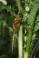
- Nomination Epitheca bimaculata --ComputerHotline 08:26, 29 May 2010 (UTC)
- Promotion good --Mbdortmund 12:35, 29 May 2010 (UTC)
-
![* Nomination 1880 lithograph illustrating Psalm 23. Hope this is alright: The guidelines say "Photographical reproductions [...] made by Wikimedians, are eligible", and I own the 1880 book. Adam Cuerden 02:38, 29 May 2010 (UTC) * Promotion Good quality scan, and the original seems to be in good condition. I don't think ownership of the physical book really matters. --Avenue 04:17, 30 May 2010 (UTC) Well, I meant I also did the scanning, preparation, and so on.Adam Cuerden 08:41, 30 May 2010 (UTC)](https://upload.wikimedia.org/wikipedia/commons/thumb/8/8b/The_Sunday_at_Home_1880_-_Psalm_23.jpg/87px-The_Sunday_at_Home_1880_-_Psalm_23.jpg)
- Nomination 1880 lithograph illustrating Psalm 23. Hope this is alright: The guidelines say "Photographical reproductions [...] made by Wikimedians, are eligible", and I own the 1880 book. Adam Cuerden 02:38, 29 May 2010 (UTC)
- Promotion Good quality scan, and the original seems to be in good condition. I don't think ownership of the physical book really matters. --Avenue 04:17, 30 May 2010 (UTC)
Well, I meant I also did the scanning, preparation, and so on.Adam Cuerden 08:41, 30 May 2010 (UTC)
-

- Nomination 158823 departs Barmouth for Birmingham International. Mattbuck 02:15, 29 May 2010 (UTC)
- Promotion good --Mbdortmund 17:03, 29 May 2010 (UTC)
-

- Nomination Llandanwg railway station. Mattbuck 02:15, 29 May 2010 (UTC)
- Promotion Very good photo --George Chernilevsky 09:14, 30 May 2010 (UTC)
-

- Nomination Pattern of rust on the rail--Mbz1 22:30, 28 May 2010 (UTC)
- Promotion Comment I like the picture, but what is it? What 'rail'? --NormanB 01:34, 29 May 2010 (UTC)
Well,a rail as it described here "a bar extending from one post or support to another and serving as a guard or barrier". The image was taken in Hawaiian Volcano National Park, just above a rather deep crater. So there were those rails around it that somebody would not fall into the crater.--Mbz1 02:35, 29 May 2010 (UTC)
Nice, QI to me. I've reworded/expanded the description on the image page; hope this is okay. --Avenue 03:04, 30 May 2010 (UTC)
-

- Nomination Suckling calves in the Nationalpark Hohe Tauern --Herzi Pinki 19:56, 28 May 2010 (UTC)
- Decline Sorry. Especially the left side has serious quality issues - unsharp and heavy CAs. Also the background looks strange. Did you us a high iso? (why does Nikon not show the iso in the exif...i will never understand this) --AngMoKio 15:28, 29 May 2010 (UTC)) Comment Sorry for nominating, you are right. ISO 450 and 1/500 s was a bad choice. Nikons PictureProject knows the iso. --Herzi Pinki 16:58, 29 May 2010 (UTC) Hey, no need to say sorry. By nominating here you get a feedback which helps you to improve. --AngMoKio 17:07, 29 May 2010 (UTC)
-
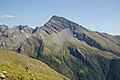
- Nomination Maresenspitze, a 2916 m mountain in the Ankogelgruppe, Carinthia. --Herzi Pinki 19:56, 28 May 2010 (UTC)
- Promotion Good. --Cayambe 22:08, 29 May 2010 (UTC)
-

- Nomination Balloon at a former coalmine in Dortmund --Mbdortmund 18:56, 28 May 2010 (UTC)
- Promotion good --George Chernilevsky 18:50, 29 May 2010 (UTC)
-

- Nomination Balloon at a former coalmine in Dortmund --Mbdortmund 18:56, 28 May 2010 (UTC)
- Promotion Very sharp and otherwise also good. --Cayambe 22:01, 29 May 2010 (UTC)
-

- Nomination DMU entering Frankfurt Main Station. --KlausFoehl 16:12, 28 May 2010 (UTC)
- Promotion good --AngMoKio 17:11, 29 May 2010 (UTC)
-

-

- Nomination female Coenagrion hastulatum --Loz 14:54, 28 May 2010 (UTC)
- Promotion Very good --George Chernilevsky 19:27, 29 May 2010 (UTC)
-
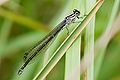
- Nomination female Coenagrion puella --Loz 14:54, 28 May 2010 (UTC)
- Promotion Good --George Chernilevsky 09:18, 30 May 2010 (UTC)
-

-

-

-

-

- Nomination Fire brigade station in Hinterstoder, Upper Austria --Herzi Pinki 22:59, 21 May 2010 (UTC)
- Promotion Good but perspective distortion IMO.--Ankara 10:13, 23 May 2010 (UTC) Comment I have corrected the perspective. --Herzi Pinki 21:34, 27 May 2010 (UTC) Support Good now --George Chernilevsky 19:15, 29 May 2010 (UTC)


.jpg)


.jpg)


.jpg)
.jpg)
.jpg)
.jpg)


.jpg)
.jpg)


.JPG)


![* Nomination Church of St. Nicholas in Saburovo, Moscow. --S[1] 22:03, 22 June 2010 (UTC) * Promotion Good view, composition, and lighting. Very useful. -- Smial 22:12, 22 June 2010 (UTC)](/wiki/File:Nicholas_Church_Moscow_Saburovo.jpg)


.jpg)


.jpg)


_02.jpg)

.jpg)


.JPG)


_in_Amritsar,_India.jpg)


.jpg)


_-_mosaic_in_the_catholic_church.JPG)


.jpg)


.JPG)


_deploy.jpg)


.jpg)


.jpg)


.JPG)


.jpg)
.jpg)


_Emporentreppe.jpg)
_Emprorentreppen.jpg)


.jpg)


.JPG)


.JPG)


.jpg)


.jpg)


.jpg)


![* Nomination underside of Magnolia x soulangeana leaf in Rogów Arboretum, Poland --Crusier 15:46, 6 June 2010 (UTC) QuestionCan someone tell me why the thumbnail is not available? File --Crusier 15:46, 6 June 2010 (UTC) * Promotion All looks good, the thumbnail too. --Jebulon 17:26, 6 June 2010 (UTC) Comment I see it: [1] --Crusier 18:29, 6 June 2010 (UTC)](/wiki/File:Magnolia_x_soulangeana_Rog%C3%B3w.JPG)

.jpg)


.jpg)
.JPG)


.jpg)


.JPG)


.jpg)


.jpg)
.jpg)
.jpg)
.jpg)
.jpg)
.jpg)
.jpg)
.jpg)


.jpg)


-2.jpg)
.jpg)


.jpg)


.jpg)

.jpg)
.jpg)
.jpg)
.jpg)
.jpg)
.jpg)
.jpg)
![* Nomination 1880 lithograph illustrating Psalm 23. Hope this is alright: The guidelines say "Photographical reproductions [...] made by Wikimedians, are eligible", and I own the 1880 book. Adam Cuerden 02:38, 29 May 2010 (UTC) * Promotion Good quality scan, and the original seems to be in good condition. I don't think ownership of the physical book really matters. --Avenue 04:17, 30 May 2010 (UTC) Well, I meant I also did the scanning, preparation, and so on.Adam Cuerden 08:41, 30 May 2010 (UTC)](/wiki/File:The_Sunday_at_Home_1880_-_Psalm_23.jpg)


.jpg)
.jpg)


![[1]](http://img265.imageshack.us/img265/7899/screenyk.png)
.jpg)
.jpg)
.jpg)
.jpg)
.jpg)
.jpg)
.JPG)
.jpg)
.jpg)
.jpg)
_Fond.jpg)
.jpg)
_Fond.jpg)
Consensual review[edit]
File:Rüstkammer, Dresden - burgonet 1.jpg[edit]

- Nomination Rüstkammer, Dresden - Burgonet. Produced in Augsburg, 1594-1599 --Pudelek 12:22, 24 May 2010 (UTC)
- Decline OpposeToo dark IMO, can't see the details in the lower part --Broc 18:57, 27 May 2010 (UTC) Comment I see details in the lower part - so, I move to discuss --Pudelek 21:23, 27 May 2010 (UTC) OpposeThe atmosphere is nice but it is really too dark --Mbdortmund 11:26, 29 May 2010 (UTC)
File:Dome of the Clocks, Umayyad Mosque.jpg[edit]

- Nomination: Dome of the Clocks, Umayyad Mosque, Damascus --Bgag 00:30, 23 May 2010 (UTC) The first of the three spheres (or globes) (right) has a hard perspective problem: it's not spheric !. Same (less)issue with the second (central, which is a little oval too)Only the third (left) is 'round' enough, IMO. Not enough to decline, but maybe others opinions could be interesting.--Jebulon 16:02, 26 May 2010 (UTC)
- Review
- Comment I don't see a perspective problem, but I do see a notable CCW tilt. --MichaelBueker 15:35, 30 May 2010 (UTC)
File:Juniper Springs, FL 2.jpg[edit]

- Nomination Juniper Springs 2 --Ianare 02:07, 22 May 2010 (UTC)
- Decline
- Oppose Unfortunate composition. It takes some time until you understand what you actually see. --AngMoKio 10:24, 24 May 2010 (UTC)
- Yes, it does. But that's how it is in real life as well ... this is why I annotated the image. --Ianare 18:05, 24 May 2010 (UTC)
- Oppose I discern following problems: CA, WB, noise and focus. Lycaon 08:29, 28 May 2010 (UTC)
- Realize that all of this image is under a very blue water and a very bright sun. That the bottom is visible is testament to the clarity of the water, but some distortion is to be expected. Look at the fish to see WB, CA is from water, focus is on the source (annotated) and pretty good imo considering it's about 2 meters deep. --Ianare 19:40, 28 May 2010 (UTC)
File:Juniper Springs, FL 1.jpg[edit]

- Nomination Juniper Springs 1 --Ianare 02:07, 22 May 2010 (UTC)
- Promotion
- Oppose Unfortunate composition. It takes some time until you understand what you actually see. --AngMoKio 10:24, 24 May 2010 (UTC)
- Yes, it does. But that's how it is in real life as well ... this is why I annotated the image. This one I didn't even realize there was a spring until I looked at it on the computer ! At the time, I just though the turtle's shadow was cool. --Ianare 18:04, 24 May 2010 (UTC)
- Support No problem with the compo to me. It's a nice and rare picture (particularly sharp, through the water) of an interesting natural phenomenon, well depicted. The turtle and its shadow are lovely. --Jebulon (talk) 14:30, 26 May 2010 (UTC)
- SupportDifficult subject but the result is good. --Archaeodontosaurus 17:29, 26 May 2010 (UTC
- Oppose WB and CA. Lycaon 08:27, 28 May 2010 (UTC)
- I'm not convinced that it's CA. The blue fringe is below the shadows in every quadrant of the image, so it doesn't radiate out from the centre like typical tranverse CA. It also seems to mainly appear on the floor of the pool; I can see a few shallow dark objects with little or no fringing, despite nearby shadows being strongly fringed (e.g. the dark stump projecting up into the sand patch upper right, and the branches above white sand on the lower left edge). So I suspect the fringing is real, i.e. due to the optical properties of the pool, not the lens. --Avenue 09:32, 28 May 2010 (UTC)
- Per Avenue, realize that all of the image is under a very blue water and a very bright sun. That the bottom is visible is testament to the clarity of the water, but some distortion is to be expected. This one is deeper than the other, about 2.5 - 3 meters deep. --Ianare 19:34, 28 May 2010 (UTC)
- Support Per Jebulon. --MichaelBueker 15:37, 30 May 2010 (UTC)
- Support per Jebulon and Archaeodontosaurus. --Avenue 11:49, 1 June 2010 (UTC)
File:Trepanated skull, Bronze Age.JPG[edit]

- Nomination A trepanated skull from Bronze Age, exhibited in the Jordan Archaeological Museum. --High Contrast 22:36, 30 May 2010 (UTC)
- Decline
- Support I'm very skeptical about this skull, not on your photo that is good. She can see there a lot of restoration in plaster but it has been crudely painted with the brush hairs stuck. I think that the basic skull is true. Or it's a copy and must be reported or it is poorly restored ... and we can not do anything. --Archaeodontosaurus 06:53, 31 May 2010 (UTC)
- Oppose Sorry, I send it to CR because of the crop... --Eusebius 07:59, 31 May 2010 (UTC)
- Oppose agree with Eusebius.--Jebulon 14:44, 31 May 2010 (UTC)
- Oppose - as was said, it's a bad crop. Mattbuck 23:54, 31 May 2010 (UTC)
File:Lamborghini_Super_Trofeo_22_2010_amk.JPG[edit]

- Nomination Panning shot Lamborghini --AngMoKio 15:03, 22 May 2010 (UTC)
- Promotion Pic hard to take, I imagine. Good enough IMO. Sharper than your Formel3...--Jebulon 15:49, 26 May 2010 (UTC) Oppose Good, but too tight crop. --kallerna 14:32, 28 May 2010 (UTC)
agree quite tight but nothing is cut off thus documenting the car and panning adequate. --AngMoKio 14:12, 29 May 2010 (UTC) - Support I too have felt that the cropping is tight but given the difficulty of the shot I am willing to make an exception! --Jovianeye 14:21, 29 May 2010 (UTC)
- Support --Mbdortmund 17:06, 29 May 2010 (UTC)
- Support --Böhringer 20:17, 31 May 2010 (UTC)
- Weak Oppose -- Nice shot, but the extremely tight crop is visually too painful IMO. --Elekhh 00:51, 1 June 2010 (UTC)
- Support - it doesn't look too good in thumbnail, but larger size looks good. Could always use CS5's voodoo to add a bit to the left hand side. Mattbuck 00:57, 1 June 2010 (UTC)
File:Mănăstirea Frumoasa3.jpg[edit]

- Nomination Frumoasa Monastery, Iaşi - view from the west (the bell tower and the walls) --Cezarika1 04:39, 20 May 2010 (UTC)
- Promotion It needs perspective correction. —Jagro 12:33, 22 May 2010 (UTC)
+ noisy, colours washed out. --kallerna 15:37, 27 May 2010 (UTC)
imo acceptable with a little correction --Mbdortmund 11:45, 29 May 2010 (UTC)
![]() Info I corrected perspective distortions and improved the colors.--Andrei Stroe 12:58, 30 May 2010 (UTC)
Info I corrected perspective distortions and improved the colors.--Andrei Stroe 12:58, 30 May 2010 (UTC)
![]() Support imo OK now --Mbdortmund 14:09, 30 May 2010 (UTC)
Support imo OK now --Mbdortmund 14:09, 30 May 2010 (UTC)
![]() Support --Cayambe 10:07, 1 June 2010 (UTC)
Support --Cayambe 10:07, 1 June 2010 (UTC)
File:Enallagma cyathigerum.jpg[edit]

- Nomination Agrion porte-coupe. --ComputerHotline 19:56, 26 May 2010 (UTC)
- Promotion
- Supportgood --The High Fin Sperm Whale 16:47, 26 May 2010 (UTC)
- OpposeBoth head (eye) and tail are OOF. Lycaon 20:51, 27 May 2010 (UTC)
- Oppose see Lycaon --Mbdortmund 11:43, 29 May 2010 (UTC)
- Support The eyes wasn't out of focus. If you look below the eyes you saw the head was in the focus and if you look in front of the eye you saw for example the legs who are in the focus. the Blur of the eyes is due to the texture of the eye. I met the same type of problem when i take picture of Agrion --Croucrou 12:35, 31 May 2010 (UTC)
- Support OK imo --Ianare 08:14, 1 June 2010 (UTC)
File:SchachtZeichen, Diergardt 2, I.jpg[edit]

- Nomination: SchachtZeichen at Zeche Diergardt --Carschten 15:44, 25 May 2010 (UTC)
- Review Comment little bit overcorrected buildings and lanterns on the right side --Tasto 16:33, 25 May 2010 (UTC)
I don't see overcorrected parts --Carschten 22:34, 26 May 2010 (UTC)
![]() Comment The building and the lanterns are tilted cw. --Mbdortmund 00:11, 30 May 2010 (UTC)
Comment The building and the lanterns are tilted cw. --Mbdortmund 00:11, 30 May 2010 (UTC)
File:Rombergpark-100516-13077-Oldenburg.jpg[edit]

- Nomination Rhododendron hybrid in Dortmund --Mbdortmund 19:17, 17 May 2010 (UTC)
- Promotion
- Supporta little noisy but within limits imo --Ianare 17:34, 25 May 2010 (UTC)
- OpposeExcessive noise and a tad underexposed. Lycaon 21:05, 27 May 2010 (UTC)
- CommentI tried to get it a bit better. I took the picture "inside" the bush against the light because I thought the lighting looks interesting and shows blossom and the leaves. --Mbdortmund 11:36, 29 May 2010 (UTC)
 Neutral It is better but I'm not yet convinced. Lycaon 21:05, 1 June 2010 (UTC)
File:MonedaSantiagoChile.jpg[edit]

- Nomination La Moneda Palace, Santiago (Chile)-- Elemaki 00:23, 27 May 2010 (UTC)
- Decline The compo is not so good IMO (not perfectly centered), and there is something strange with the blue(s) of the sky, but I like this picture. I think a CR would be interesting.--Jebulon 08:47, 27 May 2010 (UTC)
- Oppose - I think it is more or less central, but the way the shadow falls draws the eye away from the centre, which is just as bad. Mattbuck 00:56, 1 June 2010 (UTC)
File:Cytise Laburnum × watereri.jpg[edit]

- Nomination Leaves, flowers and buds of Laburnum anagyroides in La Rochelle, France--Jebulon 23:18, 24 May 2010 (UTC)
- Decline
- Support OK --Mbdortmund 00:00, 25 May 2010 (UTC)
- Oppose For me the flower is out of the focus. need to be discuss --Croucrou 16:40, 25 May 2010 (UTC)
- Oppose Per Croucrou. --Eusebius 19:57, 29 May 2010 (UTC)
- Comment I'm sorry but...hmm...Well... You're right.--Jebulon 16:43, 30 May 2010 (UTC)
- Oppose - a bit out of focus. Mattbuck 00:54, 1 June 2010 (UTC)
File:St.PankrazenInStambach-retouched.jpg[edit]

- Nomination I have uploaded a retouched version with the structures removed. Is this a better one? --Herzi Pinki 20:04, 26 May 2010 (UTC)
- Promotion
- Support This version is better and IMO it's really enough to be QI. Jebulon could you put notes on the picture to help us to see where you see the process and where is the other structures. Please Herzi Pinki, don't post the same picture two time in the same page (I talk about the picture "St.PankrazenInStambach-retouched.jpg" you post in the discuss place and in the nomination place)--Croucrou 11:41, 27 May 2010 (UTC)
- Comment There is some remaining structure, a pole and a white spot that could be a pile of sand or similar, but I do not feel this is disturbing so I did not retouch it away. Thanks for support, I'm just beginning to get feedback on my images and some comments sound a bit harsh. I really wanted to give up on this one until I saw your comment. --Herzi Pinki 21:38, 27 May 2010 (UTC)
- Comment, Hi Lycaon, can you give me a hint, where you found the dust? The three annotations have been fixed before your comment, and now there was a bird in the upper left corner which I also have removed. --Herzi Pinki (talk) 15:45, 30 May 2010 (UTC)
- Comment Hello Herzi Pinki. Much better now without the "structures", IMO ! Well, Lycaon is right, At high resolution, I can see two or three little dust spots too. I'll try to put them in a yellow square. If removed, I'll promote.--Jebulon 16:35, 30 May 2010 (UTC)
- Comment Hello Jebulon, I tried, but it was beyond my eyes' capabilities. I have uploaded a new version, where I worked on the areas you marked, but I have to give up here. --Herzi Pinki 19:28, 30 May 2010 (UTC)
- Support Ok, I removed the marks of dustspots. That's not a real problem.--Jebulon 00:19, 2 June 2010 (UTC)
- Support A bit too much sky but all in all a good image that deserves the QI status. --High Contrast 19:58, 2 June 2010 (UTC)
- Support and change from discussion to promotion. -mattbuck (Talk) 20:13, 2 June 2010 (UTC)
File:Turdus fuscater male Paute Ecuador.jpg[edit]

- Nomination Great Thrush (Turdus fuscater) feeding on Aguacate blossoms in southern Ecuador. --Cayambe 16:28, 28 May 2010 (UTC)
- Decline Support Good. Trace 16:37, 28 May 2010 (UTC)
- I hope it isn't my monitor, but I see every pixel in this picture. --Carschten 17:03, 28 May 2010 (UTC)
- Oppose It looks strange. --Berthold Werner 18:14, 28 May 2010 (UTC)
- then now Oppose --Carschten 14:23, 29 May 2010 (UTC)
- Same as Carschten. Oppose Sizing the picture down a little–and giving the colors more contrast–should make it fine though. --MichaelBueker 15:12, 30 May 2010 (UTC)
- Support Sorry, I hope it's not my monitor, but I do not see real problems...--Jebulon 16:48, 30 May 2010 (UTC)
- ??? Have you taken a close look on the eye of the bird ? --Berthold Werner 18:11, 30 May 2010 (UTC)
- Oppose The picture seems to be upscaled by software like from a camera with digital zoom. (Though I thought DSLRs do not have a digital zoom??) One has to downsize by 50% in order to make the pixel effect vanish. If you then crop much of the empty background around the main subject, the picture resolution easily falls below QI minimum of 2MP. That's why I oppose. Otherwise the downscaled picture isn't bad. --Johannes Robalotoff 20:29, 30 May 2010 (UTC)
- Support The bird seems to me perfectly normal for this species. There are a few missing but we are not in FPC but IQ. This photo has a real value is a shame to denigrate that. --Archaeodontosaurus 07:06, 31 May 2010 (UTC)
- It may be nominated as VI --Berthold Werner 08:09, 31 May 2010 (UTC)
- Info The image was not upscaled intentionally. The original picture was cropped with the crop tool in Photoshop, the option "Front Image" being activated, in order to preserve the 3/2 length/width ratio. This makes that the initial file dimensions (number of pixels) are preserved: the cropped image is therefore upscaled. (When cropped with the option "Front Image cleared", the image is not upscaled) by PS.
- Question Does anybody know ho to crop with the option "front" image" on, but without upscaling the image? --Cayambe (talk) 07:41, 31 May 2010 (UTC)
- No PS experts here? Strange! --Berthold Werner 08:30, 1 June 2010 (UTC)
- In my case I use CaptureNX, Gimp, digikam and i haven't got PS that's why i don't understand your question. --Croucrou 11:08, 2 June 2010 (UTC)
- No PS experts here? Strange! --Berthold Werner 08:30, 1 June 2010 (UTC)
- Oppose too pixelised --Croucrou 12:26, 31 May 2010 (UTC)
- Oppose too pixelised --High Contrast 16:37, 1 June 2010 (UTC)
- Oppose per pixel texture. ZooFari 20:44, 1 June 2010 (UTC)
File:Paeonia lactiflora.jpg[edit]

- Nomination Paeonia lactiflora.--Andrei Stroe 07:34, 28 May 2010 (UTC)
- Decline Oversaturated. --kallerna 14:45, 28 May 2010 (UTC)
I reduced the saturation.--Andrei Stroe 16:40, 28 May 2010 (UTC)
![]() Comment Details not really sharp --Mbdortmund 01:12, 30 May 2010 (UTC)
Comment Details not really sharp --Mbdortmund 01:12, 30 May 2010 (UTC)
![]() Question don't need a support vote to be here in CR ?--Jebulon 23:55, 2 June 2010 (UTC)
Question don't need a support vote to be here in CR ?--Jebulon 23:55, 2 June 2010 (UTC)
- Oppose sorry, but even with lower sat. colors looking unnatural to me and I agree Mbdortmunds comment. Maybe try another shot without camera settings "Saturation: High saturation / Sharpness: Hard" --J. Lunau 18:59, 3 June 2010 (UTC)
File:Alamo Square, San Francisco.jpg[edit]

- Nomination Painted Ladies, Alamo Square, San Francisco --Bgag 22:45, 1 June 2010 (UTC)
- Promotion
- Support QI to me.--Jebulon 23:36, 1 June 2010 (UTC)
- Oppose For me it's a bit tilted and it need to be correct before promotion. I talk about the background, all building of the city is tilted --Croucrou 11:20, 2 June 2010 (UTC)
- Done Tilt corrected. --Bgag 16:56, 2 June 2010 (UTC)
- Info thanks to correct the tilt, but now you add compression artefact line in the sky --Croucrou 22:14, 3 June 2010 (UTC)
- Support QI to me now. --Cayambe 18:13, 2 June 2010 (UTC)
- Support Isnt this place where "Full house" episode was filmed, it was in starting cadre also ? --PetarM 20:48, 3 June 2010 (UTC)
File:Hemiptera sp (1).jpg[edit]
.jpg)
- Nomination Eurydema ornata --ComputerHotline 17:52, 1 June 2010 (UTC)
- Decline
- Info ID founded. --ComputerHotline 11:01, 2 June 2010 (UTC)
- Question is the nominator allowed to put his own nomination in CR without a support vote ? CR is not a Court of Appeal, IMO.--Jebulon 16:34, 2 June 2010 (UTC)
- Yes it is allowed. It is like asking a second opinion. Lycaon 18:18, 2 June 2010 (UTC)
- Oppose Not very sharp. Specular highlights of flash disturb. Lycaon 18:21, 2 June 2010 (UTC)
- Support QI for me. Best picture for this species I suggest going as an image value --Archaeodontosaurus 18:37, 2 June 2010 (UTC)
- Oppose per Lycaon. ZooFari 16:01, 3 June 2010 (UTC)
- Oppose OOF. --kallerna 16:52, 3 June 2010 (UTC)
File:Hemiptera sp.jpg[edit]

- Nomination Eurydema ornata --ComputerHotline 17:52, 1 June 2010 (UTC)
- Decline
- Info ID founded. --ComputerHotline 11:01, 2 June 2010 (UTC)
- Questionis the nominator allowed to put his own nomination in CR without a support vote ? CR is not a Court of Appeal, IMO.--Jebulon 16:33, 2 June 2010 (UTC)
- See above. Lycaon 18:23, 2 June 2010 (UTC)
- Oppose Mostly OOF. Specular highlights of flash disturb. Lycaon 18:23, 2 June 2010 (UTC)
- Oppose unsharp. ZooFari 16:03, 3 June 2010 (UTC)
File:Trawlerstade.jpg[edit]

- Nomination a trawler in La Rochelle, France, supporting the local Rugby Union team (colours, coat of arms).--Jebulon 14:12, 29 May 2010 (UTC)
- Promotion
- Support Good. --Cayambe 07:44, 31 May 2010 (UTC)
Oppose I find it a bit too blurry and unsharp. In addition, the ship itself is not completely pictured - the mast is cropped. --High Contrast 15:51, 31 May 2010 (UTC) - Support for me this photo is enough sharp --Pudelek 13:57, 1 June 2010 (UTC)
File:Vallée_des_Contamines-Montjoie.jpg[edit]

- Nomination Panoramic of the Contamines-Montjoie valley, France.--Trace 21:06, 28 May 2010 (UTC)
- Decline Oppose Lovely composition, and well annotated, but spoilt IMO by the camera's inability to handle the bright sky (particularly over Mt Joly on the right, but with some posterisation extending even halfway across the image). Sorry. --Avenue 03:14, 30 May 2010 (UTC) Support yeah, of course, the brightness on the right is bad, but apart from that the qualiaty and composition are imo very good. --
Carschten 15:13, 31 May 2010 (UTC))
- Oppose per Avenue. Sorry.--Jebulon 23:57, 2 June 2010 (UTC)
File:Snowflake moray, Echidna nebulosa in Kona May 2010.jpg[edit]

- Nomination Snowflake moray, Echidna nebulosa in Kona--Mbz1 02:28, 29 May 2010 (UTC)
- Promotion Comment Good quality for an underwater shot, but maybe not the best composition - while hiding in the rocks is a typical behaviour, a slightly lower viewing angle might have looked better. Still, it's a difficult image to get at all... Adam Cuerden 03:31, 29 May 2010 (UTC)
I almost put my hand to his face and BTW his teeth that are clearly seen on the image. If I have put the camera lower, he could have bitten me.--Mbz1 13:32, 29 May 2010 (UTC) - Support Nice shot of difficult subject. --Avenue 21:40, 31 May 2010 (UTC)
- Support prolly not FP but meets QI standards --Ianare 08:17, 1 June 2010 (UTC)
- Support Good. --High Contrast 20:24, 2 June 2010 (UTC)
- Oppose Very poor quality for an easy shot. Moray eels rarely venture from their hideouts and are rather docile as they are often fed by divers. No mitigation really. Lycaon 09:41, 3 June 2010 (UTC)
- It is actually a very good quality for a very difficult shot.--Mbz1 13:51, 3 June 2010 (UTC)
- Support --Tomascastelazo 01:36, 4 June 2010 (UTC)
File:Zaltbommel - Gasthuisstraat 24 2250.jpg[edit]

- Nomination Dutch national monument from the 16th century. --NormanB 22:25, 3 June 2010 (UTC)
- Decline * Support Nice Picture of good quality to me, but I like to see, what others think about the blur on top of the roof --J. Lunau 09:54, 4 June 2010 (UTC)
- Oppose A bit too unsharp, I would say. --A.Ceta 13:46, 4 June 2010 (UTC)
- Oppose looks distorded (tilted) from front to back. The whole façade doesn't look "flat" or vertical, due to the series of photographs IMO--Jebulon 22:27, 4 June 2010 (UTC)
- Oppose see Jebulon --Mbdortmund 08:54, 5 June 2010 (UTC)
File:Mosquée Al-Adiliyah.jpg[edit]

- Nomination Al-Adiliyah mosque, Aleppo. --Eusebius 09:47, 3 June 2010 (UTC)
- Promotion
- Support All is good IMO.--Jebulon 15:51, 3 June 2010 (UTC)
- Oppose Slight CCW tilt. Lycaon 11:39, 4 June 2010 (UTC)
- Not easy, the minaret is not straight (there is an angle around balcony level). Does the original version look tilted to you (this one is an update)? --Eusebius 12:21, 4 June 2010 (UTC)
- I'll check. Lycaon 12:29, 4 June 2010 (UTC)
- Support Quality to me - good quality compared to some here --Herbythyme 18:47, 4 June 2010 (UTC)
File:Phalacrocorax brasilianus (Costa Rica).jpg[edit]
.jpg)
- Nomination Phalacrocorax brasilianus in Costa Rica. Lycaon 00:01, 3 June 2010 (UTC)
- Decline
- SupportWish the head was more in focus but QI to me, it is a beautiful shot --Letartean 04:28, 3 June 2010 (UTC)
- Oppose I agree however the head is not in focus which for QI should be important --Herbythyme 14:04, 3 June 2010 (UTC)
- Support QI to me without doubt, even with the little focus problem. J. Lunau (talk)
- I would suggest that correct focus was a bare minimum for a "quality image"? --Herbythyme 14:18, 3 June 2010 (UTC)
- I agree, focus is a bare minimum. But you have to consider how much focus is possible and if maybe the blur gives an idea of movement. This shoot was taken with focal length 500 mm, 1/320 sec, so I guess, blur comes from birds movement. IMHO in this case blur is acceptable, because very hard to avoid. Maybe it still can be reduced a bit more, even it is already a sharpened version of the photo --J. Lunau 17:06, 3 June 2010 (UTC)
- I would suggest that correct focus was a bare minimum for a "quality image"? --Herbythyme 14:18, 3 June 2010 (UTC)
- Oppose per Herby. This is a very common, and easy to approach, and to take picture of bird. We have much better shots on Commons File:Phalacrocorax brasilianus back.jpg. I see no reason to promote an image only because of 500 mm, 1/320 sec settings were used.--Mbz1 17:22, 3 June 2010 (UTC)
- Oppose the Head is really too blurry --Croucrou 11:08, 4 June 2010 (UTC)
- Support I am supporting this picutre with quality image status --A.Ceta 13:51, 4 June 2010 (UTC)
- Oppose sorry the blurriness is too noticeable to ignore. If these guys are anything like ahinga, they don't move excessively when drying their wings. --Ianare 17:02, 4 June 2010 (UTC)
File:Epitheca bimaculata (1).jpg[edit]
.jpg)
- Nomination Epitheca bimaculata --ComputerHotline 08:26, 29 May 2010 (UTC)
- Promotion
- Support good --Mbdortmund 20:48, 30 May 2010 (UTC)
- Oppose Wrong DOF. Lycaon 21:10, 1 June 2010 (UTC)
- Support high quality IMHO with good sharpness on the insect and nice blur in backround --J. Lunau 10:01, 4 June 2010 (UTC)
File:Green turtle swimming in Kona May 2010.jpg[edit]

- Nomination Green turtle swimming in Kona --Mbz1 18:29, 31 May 2010 (UTC)
- Promotion The turtle needs space in front of the head. The head is out of focus. --Qiqritiq 20:28, 31 May 2010 (UTC)
- Oppose - not entirely sure why we're discussing this - Qiqritiq's comment appeared to be an oppose to me. I oppose per Qiqritiq's reasoning. Cool turtle though. Mattbuck 12:08, 1 June 2010 (UTC)
- Support The head and flippers are in focus, the framing is good (though there might be slightly more space in front of the animal). Therefore QI to me. --Cayambe 18:33, 2 June 2010 (UTC)
- Support --Archaeodontosaurus 18:38, 2 June 2010 (UTC)
- Support Not bad, considering underwatter photo.--PetarM 20:50, 3 June 2010 (UTC)
File:Underwater portrait of green turtle.jpg[edit]

- Nomination Underwater portrait of green turtle--Mbz1 21:06, 29 May 2010 (UTC)
- Promotion * Support very good --George Chernilevsky 21:12, 29 May 2010 (UTC)
- OpposeThe head is not exactly in focus and the flashlight illuminates the wrong part (neck). --Qiqritiq 10:09, 1 June 2010 (UTC)
- Support The head appears sharp enough to me. --Cayambe 18:38, 2 June 2010 (UTC)
- Support --Archaeodontosaurus 18:40, 2 June 2010 (UTC)
- Support QI, but croping the sliver of the flipper visible on the right edge would help. --Ianare 04:49, 4 June 2010 (UTC)
File:IIT Tower.jpg[edit]

- Nomination IIT Tower. (I have applied vertical perspective correction, feedback needed) --Jovianeye 15:58, 29 May 2010 (UTC)
- Promotion Comment Please have a look at the annotation on the photo --Mbdortmund 00:40, 30 May 2010 (UTC) Comment I have applied much stronger correction. Hope it is not over-processed now! --Jovianeye 02:18, 30 May 2010 (UTC)
sorry, it is, you see the barrel distortion even in the thumb --Mbdortmund 15:57, 30 May 2010 (UTC)
I have tried my best! --Jovianeye 01:46, 31 May 2010 (UTC) Support The correction is acceptable now but there are still some problems: You took the picture with an aperture of 4 and 1/800 second, so the camera delivers a picture which looks a bit unsharp. f8 or smaller would have been better, test your camera. Week support. --Mbdortmund 19:01, 31 May 2010 (UTC)
Oppose Composition is not so good with base of the building missing, while tree tops and other objects petrude in the image. --Elekhh 01:00, 1 June 2010 (UTC) Comment This intersection is quite busy with traffic that is why it will not be possible to cover the base of the building! --Jovianeye 02:36, 1 June 2010 (UTC)
- Comment Check the street view on Google Maps using the geocode in the image description to see if its really busy! --Jovianeye 22:45, 1 June 2010 (UTC)
- Question Is it not a "barrel effect" on the right angle ? The left one and the central one looks good and not distorded, but I'm not sure for the right one... The line looks "curved" IMO.--Jebulon 00:10, 4 June 2010 (UTC)
- Comment I have corrected it a bit more to remove the barrel distortion. --Jovianeye 16:41, 4 June 2010 (UTC)
- Support now. I'm happy you understood what I meant, I was not sure of my english explanation...--Jebulon 22:32, 4 June 2010 (UTC)
File:Green turtle at Black Sand Beach.jpg[edit]

- Nomination Green turtle at Black Sand Beach--Mbz1 00:09, 28 May 2010 (UTC)
- Promotion
- May I please ask you to add the notes for the errors? Maybe they could be fixed. Thanks.--Mbz1 12:59, 28 May 2010 (UTC)
- I've marked the two worst. (The rest are much less obtrusive). Good luck! --Avenue 13:43, 28 May 2010 (UTC)
- I fixed some errors.--Mbz1 13:27, 29 May 2010 (UTC)
- The wave on the right side is much better, thanks. The one left of the turtle is improved, but I'm not sure if it's quite right, as it now seems to show echoes running left to right. There is now also a smudged seam running up through the rocks (see my new notes), and I preferred having more space below the turtle in the original version. Sorry. --Avenue 03:34, 30 May 2010 (UTC)
- I just noticed the new version. Now the image is free of significant stitching problems, and the composition is similar to the original version, so I'm happy to Support it. I admire your persistence! --Avenue 02:52, 3 June 2010 (UTC)
- I just noticed the new version. Now the image is free of significant stitching problems, and the composition is similar to the original version, so I'm happy to
- The wave on the right side is much better, thanks. The one left of the turtle is improved, but I'm not sure if it's quite right, as it now seems to show echoes running left to right. There is now also a smudged seam running up through the rocks (see my new notes), and I preferred having more space below the turtle in the original version. Sorry. --Avenue 03:34, 30 May 2010 (UTC)
- I fixed some errors.--Mbz1 13:27, 29 May 2010 (UTC)
- I've marked the two worst. (The rest are much less obtrusive). Good luck! --Avenue 13:43, 28 May 2010 (UTC)
- Comment There's a strong tilt. --MichaelBueker 15:32, 30 May 2010 (UTC)
- Support I find it good: all in all clearly above-average. --High Contrast 08:00, 2 June 2010 (UTC)
- Oppose there is still a significant focus problem on the right side, it looks fixable, at the very least clonable. I also have a strange sensation of tilting. Finally the turtle seems a little overexposed. All in all it is very close to being QI, if the stitch error and tilt were fixed I would change my vote. --Ianare 17:12, 4 June 2010 (UTC)
File:Minh Quang Tran img 0855-square.jpg[edit]

- Nomination Minh Quang Tran --Rama 10:18, 31 May 2010 (UTC)
- Promotion
- Support Good. --Cayambe 17:58, 31 May 2010 (UTC)
- Oppose Sorry, the crop is not so good above...--Jebulon 23:53, 1 June 2010 (UTC)
- Oppose Per Jebulon. Lycaon 18:23, 2 June 2010 (UTC)
* Vote added by an IP address! --Jovianeye 22:07, 2 June 2010 (UTC)
![]() Support QI IMO --null 21:58, 2 June 2010 (UTC)
Support QI IMO --null 21:58, 2 June 2010 (UTC)
- Support QI IMO (sorry i don't saw i wasn't connect) --Croucrou 22:17, 3 June 2010 (UTC)
- Support For me the photo meets QI criteria and I like the crop for portrait as I like depth of field --J. Lunau 18:38, 3 June 2010 (UTC)
- Support For me by a portrait most important is the facial expression, and this one is good, and also otherwise good quality. --Elekhh 01:05, 4 June 2010 (UTC)
- Oppose - sorry. Though it's O.K. otherwise, I have to oppose a portrait with the top of the head cropped off. Jonathunder (talk) 22:52, 4 June 2010 (UTC)
- Support OK --Mbdortmund 08:57, 5 June 2010 (UTC)
- Support The composition works well IMO, including the crop. I don't see why the top of his head is so vital. It's not like he has horns. --Avenue 13:19, 5 June 2010 (UTC)
- Comment That's the point. How to know if he really has horns or not ? --Jebulon 21:40, 5 June 2010 (UTC)
- Oppose I find the crop acceptable, even though I would have cropped a bit more. Cropping the top of the head is very classical in portrait photography (and I also like the expression, BTW). Main issue for me is that the eyes are not sharp. I think (but it is only a thought since I'm not in a position to lecture you) an ideal shot would have been at around f/4 instead, with an additional flash and a shorter aperture time. 1/30 at 100mm, that's not reasonable Rama, even if you like this lens :-) --Eusebius 22:01, 5 June 2010 (UTC)
- Comment Eusebius is right about the blur at eyes (and I should always look to full size pics on my screen before nominating). But over all for me it is still QI compared to others, useful for Wikipedia too --J. Lunau 11:10, 6 June 2010 (UTC)
File:Cairina Moschata Portrait.JPG[edit]

- Nomination Portrait of Cairina Moschata --Cesco77 12:04, 5 June 2010 (UTC)
- Promotion
- Support Very good. --Cayambe 16:00, 5 June 2010 (UTC)
- Comment Uploaded new version with different composition, is it better now? --Cesco77 08:36, 7 June 2010 (UTC)
- Support yes, last version is better --Ianare 04:44, 9 June 2010 (UTC)
- Comment The first version was better, and the blown feathers weren't a big deal IMO considering other good aspects such as the sharpness. ZooFari 05:15, 8 June 2010 (UTC)
- Done Replaced old version --Cesco77 07:59, 8 June 2010 (UTC)
- Support I've made the blown feathers less notable. ZooFari 13:50, 8 June 2010 (UTC)
- Thanks!! --Cesco77 13:55, 8 June 2010 (UTC)
![]() Support Good! --Jovianeye 16:29, 8 June 2010 (UTC)
Support Good! --Jovianeye 16:29, 8 June 2010 (UTC)
File:Fountain Of The Great Lakes.jpg[edit]

- Nomination Fountain Of The Great Lakes. --Jovianeye 03:16, 5 June 2010 (UTC)
- Promotion Nice, but the pic is not centered, and the neck and the shoulder of the first (highest) lady (Lake Superior ?) are overexposed. Not enough to decline, but enough to discuss, IMO.--Jebulon 22:02, 5 June 2010 (UTC)
I have fixed the exposure around the neck of the highest lady. --Jovianeye 00:53, 6 June 2010 (UTC) - and what's your opinion about the centering ? Don't you thing that a little crop left would be better ?--Jebulon 16:27, 6 June 2010 (UTC)
Cropping ![]() Done --Jovianeye 16:55, 6 June 2010 (UTC)
Done --Jovianeye 16:55, 6 June 2010 (UTC)
- Support I think it's much better now, thank you for persistence and supporting my whims (!) Another one ? If you got some time, may be could you show us whith annotations on the pic the different Lakes, and all the symbols... ---Jebulon 09:43, 7 June 2010 (UTC)
File annotations ![]() Done --Jovianeye 12:26, 7 June 2010 (UTC)
Done --Jovianeye 12:26, 7 June 2010 (UTC)
File:Pinwalli.jpg[edit]

- Nomination Pinus wallichiana, planted in the Jardin des Plantes de Paris in 1844.--Jebulon 23:15, 3 June 2010 (UTC)
- Decline
- Support QI and useful --Archaeodontosaurus 07:07, 4 June 2010 (UTC)
- Oppose Too noisy. Lycaon 11:34, 4 June 2010 (UTC)
- I don't see noise...--Jebulon 22:50, 4 June 2010 (UTC)
- Support I support it because of the details --A.Ceta 13:44, 4 June 2010 (UTC)
- Oppose Fairly noisy, and composition a bit too random. --Avenue 13:46, 5 June 2010 (UTC)
- Oppose Per Avenue. --Eusebius 10:40, 7 June 2010 (UTC)
File:Biofuel?.jpg[edit]

- Nomination Biofuel? --kallerna 17:07, 2 June 2010 (UTC)
- Promotion Can't see the picture at all --C T Johansson 19:10, 2 June 2010 (UTC)
Please reupload. It's a funny picture but it doesn't render currently. Lycaon 07:15, 3 June 2010 (UTC)
What's wrong? It works perfectly on my computer, but there's problems here. The full size version works ok thou. --kallerna 16:34, 3 June 2010 (UTC)
For other reviewers : please click ! It would be a shame to miss this picture !! Very nice and funny !! An interesting view of the 21st century maybe--Jebulon 22:50, 3 June 2010 (UTC)
Wish I could see it, but can't at all. Jonathunder 02:29, 4 June 2010 (UTC) Comment I also can not see the photo; please upload again with new filename, do not use any special characters in the filename (like ?), please use only ASCII, maybe this solves the problem --J. Lunau 08:06, 4 June 2010 (UTC) The image is not shown. Is it perhaps a Browser problem of my PC? --A.Ceta 13:47, 4 June 2010 (UTC) Info Works perfectly now. --kallerna 06:49, 5 June 2010 (UTC) - Support Quality of the shoot is good for me + clever title "Biofuel" - but I would prefere version 2. in landscape format --J. Lunau 17:07, 5 June 2010 (UTC)
- Support --Cayambe 19:21, 5 June 2010 (UTC)
- Support But I agree with J.Lunau about version 2.--Jebulon 21:45, 5 June 2010 (UTC)
- Oppose Because of the framing, not adapted to the subject. The horizontal one is better indeed (but a slight sharpening could be of help though, and I think focus is a bit ahead of the subject). --Eusebius 10:29, 7 June 2010 (UTC)
- Oppose sorry, but I like the framing of version 2. --Jovianeye 11:56, 7 June 2010 (UTC)
File:Speedway Extraliiga 22. 5. 2010 - Markku Autio kaatuu erässä 1.jpg[edit]

- Nomination Accident in Speedway Extraliiga -competition. --kallerna 15:14, 1 June 2010 (UTC)
- Decline Oppose The "accident" is not the main subject of the image and it's out of depth. ZooFari 20:29, 1 June 2010 (UTC)
I would like to see another opinion, because the photo is quite rare and it's interesting that the other rider actually noticed the accident. --kallerna 15:17, 2 June 2010 (UTC) - Support after the hint from Kallerna I to me it is QI - maybe it could be bit better with different crop. --J. Lunau 10:20, 4 June 2010 (UTC)
- Oppose the description is not what you can see in the image. The accident, as said, is in the background, and it's not the main subject of the picture. So, IMHO it is not a quality image. --Broc 19:22, 5 June 2010 (UTC)
- Comment The description can always be modified, but the discussion is about the photo, not about the description. --kallerna 15:39, 6 June 2010 (UTC)
- If the accident is the subject, it's out of focus. If it is the guy in the foreground, he's not facing forward. ZooFari 18:20, 6 June 2010 (UTC)
- Neutral I like this picture. The subject is not the accident, it's Lehtinen's reaction, and the fact that he's watching behind him is part of it. Probably a much stronger image could have been taken from the other side, but technically this one is good. I will support if some space is cropped out from the left of the picture. Something like 2640px in width would seem ok to me. --Eusebius 10:17, 7 June 2010 (UTC)
File:Hillside Terrace D 2010.jpg[edit]

- Nomination Hillside Terrace D in Shibuya-ku Tokyo Japan, by User:Wiiii. --Elekhh 03:48, 1 June 2010 (UTC)
- Withdrawn
![]() Oppose The angles of this building are not vertical.--Jebulon 17:55, 8 June 2010 (UTC)
Oppose The angles of this building are not vertical.--Jebulon 17:55, 8 June 2010 (UTC)
- Comment Maybe is an optical illusion but the edges are vertical - I checked. --Elekhh 00:19, 10 June 2010 (UTC)
- Comment The correction of prespective is false, the vertical center and right are not vertical and they are divergent arrested the roof between the two is warped.--Archaeodontosaurus 06:39, 10 June 2010 (UTC)
![]() Comment Oh, I see a tiny tilt of the right edge. Good spotting, and keep up the high standards! --Elekhh 21:26, 10 June 2010 (UTC)
Comment Oh, I see a tiny tilt of the right edge. Good spotting, and keep up the high standards! --Elekhh 21:26, 10 June 2010 (UTC)
![]() I withdraw my nomination --Elekhh 21:26, 10 June 2010 (UTC)
I withdraw my nomination --Elekhh 21:26, 10 June 2010 (UTC)
File:Alpa IMG 0849.jpg[edit]

- Nomination Alpa camera, on display at Vevey camera museum -- Rama 20:31, 7 June 2010 (UTC)
- Decline
- Support OK --Mbdortmund 22:29, 7 June 2010 (UTC)
- Oppose Unsharp and in motion blur. Also tight crop. ZooFari 23:13, 7 June 2010 (UTC) OpposeUnsharp. --Berthold Werner 08:18, 8 June 2010 (UTC)
- Oppose I'm not very interested by the subject, but I think I've seen here much better as camera's photographs. Agree with other opponents--Jebulon 17:39, 8 June 2010 (UTC)
File:Table de terrasse parisienne.jpg[edit]

- Nomination Terrasse parisienne --Romanceor 22:22, 5 June 2010 (UTC)
- Decline
- Support Very nice --Jebulon 22:57, 5 June 2010 (UTC)
- Oppose Very noisy and posterized. --kallerna 16:34, 6 June 2010 (UTC)
- Oppose per Kallerna --Ianare 04:57, 9 June 2010 (UTC)
File:Berndorf Margaretenkirche-adjusted2.jpg[edit]

- Nomination Margaretenkirche by Ludwig Baumann in Berndorf, Lower Austria --Herzi Pinki 23:50, 31 May 2010 (UTC)
- Promotion
- Comment And again a typical use case for shiftn ;-) --Berthold Werner 06:19, 1 June 2010 (UTC)
- Support QI for me, shiftn seems to be a good tool --J. Lunau 18:17, 3 June 2010 (UTC)
- Yes, and I think shiftn (for example) should be used to correct perspective. Let's hear what others say. --Berthold Werner 07:56, 4 June 2010 (UTC)
- Commentmore opinions are always helpful, even I think, this photo is already adjusted as the filename says - the unadjusted version also can be found on / Commons --J. Lunau 09:35, 4 June 2010 (UTC)
- Support Back to promotion. --Berthold Werner 10:25, 4 June 2010 (UTC)
- Comment was already corrected with shiftN, but i did not like the perspective with parallel edges, so I reduced the effect of shiftN a bit. --Herzi Pinki 14:42, 4 June 2010 (UTC)
- Comment Wenn es es so beabsichtigt ist, dann ist es ok. --Berthold Werner 15:55, 4 June 2010 (UTC)
- Comment This one needs to be sent to CR I think. Quality is good, and I can accept the perspective choice, but could you do something about the barrel distortion, especially on the right tower? Also, the branches in the top left corner should be easy to crop out and it would greatly improve the picture. --Eusebius 10:55, 7 June 2010 (UTC)
- Comment can you please help me with the abbreviation CR? regards --Herzi Pinki 19:25, 7 June 2010 (UTC)
- "Consensual Review" --Jovianeye 19:34, 7 June 2010 (UTC)
- We are already here, arn't we? So what shall happen now? --Herzi Pinki 20:09, 7 June 2010 (UTC)
- "Consensual Review" --Jovianeye 19:34, 7 June 2010 (UTC)
- Comment I have uploaded a new version tried to meet Eusebius' comments.
- Thanks, it's better I think. --Eusebius 04:58, 8 June 2010 (UTC)
- Support --Cayambe 13:40, 8 June 2010 (UTC)
- Comment I'm not sure how to proceed, but I shifted focus to the second image. --Herzi Pinki 21:32, 10 June 2010 (UTC)
File:Cuenca Ecuador Catedral Nueva 02.jpg[edit]

- Nomination Cuenca, Ecuador: Main altar of the so-called New Cathedral. --Cayambe 21:27, 5 June 2010 (UTC)
- Promotion
- Comment crops on the two sides would help, IMO, because of the (high)lights...--Jebulon 22:20, 5 June 2010 (UTC)
- Comment Geometry should be corrected (perspective distortion not even), highlights should be cropped out. I'm not 100% sure I would support the result. --Eusebius 10:51, 7 June 2010 (UTC)
- Info I have replaced the file with a cropped and distortion corrected version. --Cayambe 11:07, 7 June 2010 (UTC)
- Support Some slight perspective distortion, but this is not disturbing. Image with encyclopedic value. Technical quality is not exceptional, but acceptable for QI though. -- MJJR 21:03, 7 June 2010 (UTC)
- Support QI now --Archaeodontosaurus 06:33, 8 June 2010 (UTC)
- Support agree with other supporters. But IMO, the crop is not strong enough, on the sides and below (the subject is the baroque altar, not the choir)--Jebulon 17:26, 8 June 2010 (UTC)
File:Emys orbicularis portrait.JPG[edit]

- Nomination Portrait of Emys Orbicularis. --Cesco77 13:26, 5 June 2010 (UTC)
- Decline
- Support Good.--Mbz1 15:32, 5 June 2010 (UTC)
- Comment I am willing to support if the exposure in the overexposed parts is reduced. --Jovianeye 19:47, 6 June 2010 (UTC)
- Comment I've upload different version --Cesco77 08:19, 7 June 2010 (UTC)
- Neutral Definitely better, but the cropped claw still bothers me. --Eusebius 10:48, 7 June 2010 (UTC)
- Oppose -- Poor crop. -- Alvesgaspar 07:59, 8 June 2010 (UTC)
- Oppose per Alvesgaspar --Ianare 04:42, 9 June 2010 (UTC)
File:Michlbauer Hütte, Schneealpe2.jpg[edit]

- Nomination Michlbauer Hütte, Schneealpe, Styria --Herzi Pinki 07:07, 5 June 2010 (UTC)
- Promotion Nice photograph; sufficient for QI. --High Contrast 12:30, 5 June 2010 (UTC) Info yes it's nice but there is dust, need to be delete before promotion (I put some notes on the picture to help localisation) --Croucrou 08:45, 6 June 2010 (UTC)
- Comment uploaded a new version, more fog, less dust. --Herzi Pinki 13:04, 6 June 2010 (UTC)
- Now i can Support it --Croucrou 17:57, 6 June 2010 (UTC)
- Now i can
- Support. Gut für mich, aber ich verstehe nicht was "Michlbauer Hütte" bedeutet...--Jebulon 16:31, 6 June 2010 (UTC)
- Comment it is just the name of the hut (de: Hütte), so I did not translate it. Added more descr. --Herzi Pinki 23:09, 6 June 2010 (UTC)
- Support QI Image for me: zeigt sehr schön die Stimmung eines nebligen Septembertages / shows nicely the mood of a foggy September day --J. Lunau 08:02, 7 June 2010 (UTC)
- Comment bin mir nicht sicher, was die Belichtung angeht: das helle Gras im Vordergrund könnte überbelichtet sein? / not sure about the exposure: fair gas in foreground could be over exposed? --J. Lunau 08:02, 7 June 2010 (UTC)
- Comment könntest Recht haben, zuviel Tonwertkorrektur, habe eine weniger knallige Version hochgeladen / too much color correction, I have uploaded a more decent version. I would prefer the later. --Herzi Pinki 22:39, 7 June 2010 (UTC)
- Comment ich finde auch die neu Version besser / I also think the new verson is better --J. Lunau 09:00, 8 June 2010 (UTC)
- Comment I'm not sure how to proceed, but I shifted focus to the second image. --Herzi Pinki 21:32, 10 June 2010 (UTC)Running total: 3 support (excluding the nominator), 0 oppose → Promote? --Jovianeye 13:51, 10 June 2010 (UTC)
File:Hitler pincushion IMG 1103.jpg[edit]

- Nomination Hitler pincushion, USA, circa 1941. -- Rama 04:50, 10 June 2010 (UTC)
- Decline
- Oppose
WrongUnfortunate lighting (backlit). Lycaon 05:53, 10 June 2010 (UTC) - Support Maybe "different" light, but not so wrong to me. Rare and interesting object, and QI to me.--Jebulon 10:05, 10 June 2010 (UTC)
- Oppose in favor of newer version --Ianare 20:37, 10 June 2010 (UTC)
File:Ice crystals on a window.jpg[edit]

- Nomination Ice crystals on a window of airplane that was flying somewhere between 30,000 and 39,000 feet. They were very, very small, the biggest ones were 4-5 millimeters long. One could see interesting shapes. I see birds, crab, scorpion, dragonfly and dancing.--Mbz1 17:49, 5 June 2010 (UTC)
- Decline
- Support Nice. Mattbuck 20:51, 5 June 2010 (UTC)
- Oppose No details, easy to reshoot. --kallerna 19:45, 7 June 2010 (UTC)
- Oppose per Kallerna. Lycaon 20:02, 7 June 2010 (UTC)
I wonder how one could say it is easy to reshot, if one does not even know where the image was taken. The image was taken in a plane, and the crystals were on a plane's window, so they are very special, and the quality of the image is as good as it gets.--Mbz1 22:41, 7 June 2010 (UTC)
- Comment Are planes really so special that no one can't reshoot this one? --kallerna 14:15, 8 June 2010 (UTC)
- Well, I meant that the shape of the crystals created on the plane's windows are special because of the wind and the elevation, and I meant they are not really easy to reshot for me because I am not planning to be on a plane any time soon, but even when I do, I doubt that the better job could be done, at least with the camera used. The crystals were really tiny.--Mbz1 14:27, 8 June 2010 (UTC)
- Support I read the oppose votes and the discussion above. QI to me.--Jebulon 17:35, 8 June 2010 (UTC)
- Support I think it's OK. ZooFari 17:38, 8 June 2010 (UTC)
- Oppose -- Should this picture be used as an example of a 'good quality' image? That is the question I always put to myself when assessing QI candidates (this criterium was once part of the guidelines, btw). I don't think so. Being 'special' or 'not common' are not proper evaluation criteria here. Quality is. -- Alvesgaspar 23:08, 8 June 2010 (UTC)
- Oppose Not QI for me --Archaeodontosaurus 10:45, 9 June 2010 (UTC)
File:Green turtle in Kona 2008.jpg[edit]

- Nomination Green turtle in Kona--Mbz1 03:57, 4 June 2010 (UTC)
- Promotion Support good composition --Ianare 05:22, 4 June 2010 (UTC)
- Support Very good picture! I hope your camera is not disfunct after this shot --A.Ceta 14:10, 4 June 2010 (UTC)
Why should have my camera disfuncioned after this shot?--Mbz1 16:12, 4 June 2010 (UTC)
![]() Support Because of the attack of the angry looking turtle, I presume !! Very nice shot indeed.--Jebulon 10:28, 5 June 2010 (UTC)
Support Because of the attack of the angry looking turtle, I presume !! Very nice shot indeed.--Jebulon 10:28, 5 June 2010 (UTC)
Thank you, Jebulon. I have to admit that once I did get scared of a turtle. I was sitting at a rock wearing my flippers. I had my mask and snorkel in one hand, in the other I had my camera and one flipper. Suddenly a turtle swam right to me. I should have gave her a way, but with slippery rocks all around, the surf, busy hands and one flipper on I could not move. I was afraid that the turtle could pinch me, I really was, I saw them doing this to each other. So I gently pushed her away. I am still sorry I did it. I even apologized to her, but I should not have touched the turtle even after she touched me first.--Mbz1 04:47, 6 June 2010 (UTC)
- Oppose Head not sharp, insufficient DOF. Lycaon 20:05, 7 June 2010 (UTC)
- Support Looks good to me, sharp enough, and DOF is not a notable factor here. ZooFari 13:38, 8 June 2010 (UTC)
- Oppose --
Clumsy cloning job near the bottom right corner, with too obvious identical patterns.Head not entirely on focus. -- Alvesgaspar 23:18, 8 June 2010 (UTC) - InfoNo cloning work was done in the right hand corner. --Mbz1 23:22, 8 June 2010 (UTC)
- Info - Please check the note in the image -- Alvesgaspar 23:54, 8 June 2010 (UTC)
- Yes, sorry, fixed.--Mbz1 00:18, 9 June 2010 (UTC)
- Support Good enough! --Jovianeye 23:30, 8 June 2010 (UTC)
- Comment check note. I liked the previous version better despite Alvesgaspar's pinpointed issue. ZooFari 00:20, 9 June 2010 (UTC)
- Well, it is a sea bottom. There could be many different formations there. If you did not know it was clonned would you have noticed it? Maybe I will fix it some more, maybe I will not. BTW thanks for fixing the image. I just now noticed you did. I placed retouched image template, so there was never a cover up about cloning, and of course it is not important at all, the turtle is, but anyway...--Mbz1 00:48, 9 June 2010 (UTC)
- Fixed again, any better, ZooFari?--Mbz1 01:01, 9 June 2010 (UTC)
- Support Very good now --George Chernilevsky 09:10, 9 June 2010 (UTC)
File:Zygaena lonicerae caterpillar.jpg[edit]

- Nomination Young caterpillar of Narrow-bordered Five-spot Burnet. - Darius Baužys 07:39, 5 June 2010 (UTC)
- Decline
- Oppose Nice composition but technical problems. --kallerna 19:43, 7 June 2010 (UTC)
- Support. Problems acceptable for work not done in the studio. QI and useful --Archaeodontosaurus 06:45, 10 June 2010 (UTC)
- Oppose Not QI. Too much noise. Lycaon 14:38, 10 June 2010 (UTC)
- Support I can not see big noise and the lag of DOF is acceptable to me because of the rare motive. Amazing QI to me -- J. Lunau 11:28, 13 June 2010 (UTC)
File:Daubentombe.jpg[edit]

- Nomination In the Jardin des Plantes, the grave of Daubenton, famous french naturalist, first Director of the Museum d'Histoire Naturelle de Paris. Wanted he to be a pure XVIIIth century man ? He died on december 1799, the 31st...
- Decline
- Oppose - You can barely see the tomb with all the trees. Mattbuck 23:51, 31 May 2010 (UTC)
- Sorry, that was exactly the reason why he wanted to be burried here, not in a cemetery, but under old trees in a public garden...--Jebulon 09:06, 1 June 2010 (UTC)
- That's not really the point. While it may have been his intention, I still feel the trees get in the way and ruin the composition. -mattbuck (Talk) 12:12, 1 June 2010 (UTC)
- Yes, that's exactly the point. Remember it's a XVIIIth "à l'anglaise" composition, a modest and lonesome grave, not a military cemetery... But I'm afraid I will not convince you...--Jebulon 08:31, 2 June 2010 (UTC)
- Sorry, that was exactly the reason why he wanted to be burried here, not in a cemetery, but under old trees in a public garden...--Jebulon 09:06, 1 June 2010 (UTC)
- Support QI and Useful --Archaeodontosaurus 09:46, 1 June 2010 (UTC)
- Neutral If I'd look at only the quality of the image (DOF, sharpness, exposition, framing, etc) I'd have to say it is very good. On the other hand, I can't say I get a good look at the subject (the tomb). I get your explanation but I would like to be able to read the top engraving. Maybe you could go back and take it from somewhere else? Perhaps, from the left side where there is less trees. I can't decide what to vote on this one...--Letartean 15:04, 1 June 2010 (UTC)
- Hello Letartean. You may read (or distinguish) the top engraving. On the broken column is written "DAUBENTON", and just under,"1716-1799", and nothing else...--Jebulon 08:31, 2 June 2010 (UTC)
- Thanks for the enlightment but still I can't say this pic does the job for me. The more I look at it, the less I feel it's right. I can't put a finger on what I'm feeling, but this one is not QI for me. I won't vote because I can't say what's the problem. You take good and interesting pictures in general and I hope you will continue to do so (loved the pic you showed me on my dicussion page).--Letartean 04:38, 3 June 2010 (UTC)
- No worries my friend ! Quand tu viendras à Paris, je t'emmenerai là et tu verras les lieux, tu comprendras peut-être mieux. Mais si là, tu ne la sens pas, alors ne vote pas, tu as raison ! Et puis c'est juste à côté de chez moi, alors, si elle ne "passe" pas la sélection cette fois-ci, je peux en prendre des meilleures sûrement, des photos de cet endroit !--Jebulon 15:01, 3 June 2010 (UTC)
- Oppose poor composition. L'inscription sur la base n'est pas très lisible (je ne crois pas que le directeur sera gêné si tu la nettoies un peu), aussi j'aimerais une vue d'un autre angle - on dirait que la branche n'est pas très proche de la colonne, et si c'est le cas, les inscriptions seraient plus visibles. S'il n'y a vraiment pas moyen d'avoir une meilleure vue, la composition pourrait alors accentuer le décor naturel, par exemple en montrant une partie plus importante de l'arbre. --Ianare 05:00, 4 June 2010 (UTC)
- Comment Pour l'inscription sur la base, je l'ai déjà un peu nettoyée de ses feuilles, mais je ne veux pas la dégager plus, la plaque est un peu enterrée, je trouve que c'est son charme et je ne veux pas trop "préparer". Un autre photographe a pris la plaque l'année dernière, have a look here. Pour le reste, c'est plus compliqué : il n'y a aucun recul, il faut être sur place pour se rendre compte... Tant pis, j'y retournerai...Merci de vos commentaires en tous cas.--Jebulon 09:14, 4 June 2010 (UTC)
- Support QI and Useful to me for wikipedia, especially when I consider the photographers explanation (it's a pity that I can read French words only with Mr. Googles help) --J. Lunau 11:14, 6 June 2010 (UTC)
- Oppose per Ianare. Center of composition is not on the subject. --Elekhh 14:39, 7 June 2010 (UTC)
- Question I'm sorry Elekhh, but I don't really understand what you mean.--Jebulon 17:19, 8 June 2010 (UTC)
- When one looks to the picture the first part the eye is attracted to is the strongly lit and saturated vegetation and the dark linear shadows of the fence on the bottom part. Yet this is not the subject of the image. The subject is only discovered after a lenghty search... A different vantage point, framing or light conditions might have provided a much better opportunity for a composition which is centered on the subject. --Elekhh 00:28, 10 June 2010 (UTC)
- Ah OK, I understand what you mean now, thanks for explanations. I think you are right, at the end. Other french comments say the same thing, approximately. I'll try to take another one of this place, It's easy to have a bad weather, but hard to have another point of view. What you see in foreground is a large vegetal fence, I need a stool or a stepladder ! Thanks for review.--Jebulon 10:37, 10 June 2010 (UTC)
File:WAZ-Luftschiff D-LDFR 4.jpg[edit]

- Nomination Airship D-LDFR --Carschten 19:51, 8 June 2010 (UTC)
- Promotion
- Support Sehr gut --George Chernilevsky 20:09, 8 June 2010 (UTC)
- Oppose Main subject too small, we don't need 5 QI's from same subject. --kallerna 19:38, 9 June 2010 (UTC)
- sorry, just teasing you a bit ;-) --Ianare 20:25, 10 June 2010 (UTC)
- where stands that we may have just one QI of one subject? These a diffrent photos, from diffrent positions on the ground, and not five illustriations of one serie made in 2 seconds --Carschten 15:04, 10 June 2010 (UTC)
- Support good composition --Mbdortmund 04:28, 10 June 2010 (UTC)
- Support --Ianare 20:25, 10 June 2010 (UTC)
- Oppose Good quality, but lack of composition. The vehicle is closer to the right side of the picture, whereas it is the direction of its movement. It looks odd. Again, a crop would help. --Eusebius 11:07, 11 June 2010 (UTC)
File:WAZ-Luftschiff D-LDFR 3.jpg[edit]

- Nomination Airship D-LDFR. Higher you cann see an airplane. --Carschten 19:51, 8 June 2010 (UTC)
- Decline * OpposeNot a good comparison, subjects not at same distance from viewpoint --Ianare 08:57, 9 June 2010 (UTC)
- Comment This is your reason for opposing on QIC?? This isn't VIC! So please argue better; I made status "Discuss" --Carschten 17:56, 9 June 2010 (UTC)
- Subjects are also too small to see well. --Ianare 20:29, 10 June 2010 (UTC)
- Oppose - the image is composed to include both, but that just makes the subjects insignificant. This is a photo of a not-very interesting cloud which happens to have some flying machines cluttering it up. Mattbuck 18:10, 9 June 2010 (UTC)
- Okay, thanks for that explaining --Carschten 19:33, 9 June 2010 (UTC)
- Support Imo only wrong description, you will never get those objects in equal distance. Interesting composition, noise against the sky accceptable. --Mbdortmund 04:26, 10 June 2010 (UTC)
- I've changed the description --Carschten 15:01, 10 June 2010 (UTC)
- Oppose --kallerna 14:23, 11 June 2010 (UTC)
File:WAZ-Luftschiff D-LDFR 2.jpg[edit]

- Nomination Airship D-LDFR --Carschten 19:51, 8 June 2010 (UTC)
- Promotion
- Support Gut --George Chernilevsky 20:10, 8 June 2010 (UTC)
- Oppose Main subject too small, we don't need 5 QI's from same subject. --kallerna 19:38, 9 June 2010 (UTC)
- Comment QI is not about numbers but about quality. We can have 100 images of the same topic if we so decide. Lycaon 14:42, 10 June 2010 (UTC)
- I agree with Lycaon. These a diffrent photos, from diffrent positions on the ground, and not five illustriations of one serie made in 2 seconds --Carschten 14:55, 10 June 2010 (UTC)
- Support --Ianare 20:26, 10 June 2010 (UTC)
- Support-- QI to me. Agree with Lycaon. We can even have QI of the 101 Dalmatians, or of bikes in Finland, if we so decide !! --Jebulon 22:34, 10 June 2010 (UTC)
- Oppose Main subject too small, quality not bad. A crop would help. I would try to put the aerostat near the lower left part of the picture. Also, it looks a bit dark. --Eusebius 11:05, 11 June 2010 (UTC)
File:WAZ-Luftschiff D-LDFR 1.jpg[edit]

- Nomination Airship D-LDFR --Carschten 19:51, 8 June 2010 (UTC)
- Decline
- Comment - could you paint out the rightmost bit of greenery? It draws the eye away unnecessarily. Mattbuck 21:26, 8 June 2010 (UTC)
- Oppose per Mattbuck --Ianare 08:58, 9 June 2010 (UTC)
- Support me I
lakelike the composition --Croucrou 20:13, 9 June 2010 (UTC) - Comment That's what I want to answering. The greenery is part of my composition. I don't want to delete it out of the image. If you don't like it I've to live with it. I think it's a alternation and I don't think that it's distractive --Carschten 19:33, 9 June 2010 (UTC)
- Oppose Main subject too small, we don't need 5 QI's from same subject. --kallerna 19:38, 9 June 2010 (UTC)
- I don't want ALL the greenery gone, just the bit that sticks out. I like the border effect, but the sticky-out bit takes focus away from the subject. Mattbuck 20:03, 9 June 2010 (UTC)
- Support, but weak, because I agree with Mattbuck--Jebulon 22:25, 10 June 2010 (UTC)
- Oppose Vordergrund doch eher ungeeignet. --Mbdortmund 23:02, 10 June 2010 (UTC)
File:Trientalis borealis 1177.JPG[edit]

- Nomination Trientalis borealis subsp. latifolia (Broadleaf Starflower) --Wsiegmund 15:42, 5 June 2010 (UTC)
- Promotion
- Support very nice shoot, to me QI - maybe it could be sharpened a bit to compensate the slightly to small DOF (the far away petals are bit out of focus, I think} --J. Lunau 07:49, 9 June 2010 (UTC)
- Done. DOF is difficult in macrophotography. Diffraction degrades images at f-stops slower than f/11 for my lens.Wsiegmund 17:43, 9 June 2010 (UTC)
- Comment Needs noise reduction. --kallerna 20:02, 9 June 2010 (UTC)
- Done Lycaon 14:40, 10 June 2010 (UTC)
- Comment in my opinion, now it is perfect, looks great to me after the small adjustments --J. Lunau 13:25, 10 June 2010 (UTC)
- Support--Jebulon 22:21, 10 June 2010 (UTC)
- Support very nice composition --Croucrou 11:29, 11 June 2010 (UTC)
File:Metra Locomotives F40PH-2 & MP36PH-3S.jpg[edit]

- Nomination Metra Locomotives F40PH-2 & MP36PH-3S --Jovianeye 19:57, 8 June 2010 (UTC)
- Promotion
- Oppose I think the crop with the right hand loco going outside the confines of the image is a bit off-putting. Really a strange picture though, it looks like some sort of toy the way the grass and wall have such clean lines. Mattbuck 21:25, 8 June 2010 (UTC)
- Ive uploaded a slightly diff crop. 2nd loco is now in frame. --Jovianeye 21:57, 8 June 2010 (UTC)
I contributed a version with reduced distortion --Mbdortmund 16:42, 9 June 2010 (UTC) - Support An eye-catching composition, it may add interest to an article. It satisfies the criteria, I think. Wsiegmund 18:32, 9 June 2010 (UTC)
- Support QI to me.--Jebulon 21:28, 11 June 2010 (UTC)
File:Cuenca Ecuador Catedral Nueva 03.jpg[edit]

- Nomination Lateral choir of the so-called New Cathedral in Cuenca, Ecuador. --Cayambe 13:53, 8 June 2010 (UTC)
- Promotion
- Support Good result --George Chernilevsky 17:54, 8 June 2010 (UTC)
- Comment Uploaded a new version with a denoised upper part. --Cayambe 17:10, 10 June 2010 (UTC)
- Support good enough for QI IMO now. (thanks for correcting tilt !) --Jebulon 21:25, 11 June 2010 (UTC)
File:Green turtle is using the sand to cool off edit 2.jpg[edit]

- Nomination Green turtle is using the sand to cool off--Mbz1 15:32, 5 June 2010 (UTC)
- Promotion Why not a crop left ? More sand does not add, IMO...Maybe a centered compo could be better, thoughts ? --Jebulon 17:10, 6 June 2010 (UTC)
- Oppose Poor crop, ovesharpened. Lycaon 20:03, 7 June 2010 (UTC)
*Jebulon, the crop you have suggested was made. Do you like it any better? I believe this to be a more or less rare image. At least it was the very first time I saw the behavior.--Mbz1 15:50, 8 June 2010 (UTC) - Support. But maybe the crop is a bit too strong ? I like the moving flipper you show. I'm not a naturalist, but it looks interesting to me.--Jebulon 17:31, 8 June 2010 (UTC)
- Support Well captured --Cesco77 19:43, 8 June 2010 (UTC)
- Yes, it was an interesting behavior that I saw the very first time. The turtles probably are doing the same, when they dig the sand for their eggs.--Mbz1 18:48, 8 June 2010 (UTC)
- Question -- Which picture is being evalueated? -- Alvesgaspar 23:12, 8 June 2010 (UTC)
- I have the same images with the head seen, but only this position could show the digging, and how far the flipper goes for such an activity, and it was an idea. --Mbz1 12:22, 9 June 2010 (UTC)
- I would be interested in taking a look, if you get the chance ... --Ianare 12:33, 9 June 2010 (UTC)
- I could upload one of those images, there's not a problem, but a turtle just looks like it is laying there with the sand on her back, no action. Well, maybe it is better one time to see than 10 to hear. Okay I will upload an image, but only to see not as another QI candidate.--Mbz1 13:23, 9 June 2010 (UTC)
- Okay here it is File:Green turtle at Black sand beach in Kona.jpg (and I have few more like this). The right flipper is not sharp, so maybe there is some sense of movement, but nothing as the action (well, turtle's action :)) as in the nominated image.--Mbz1 13:43, 9 June 2010 (UTC)
- The first one (cropped, but I insist: the crop is a bit too hard, now...) is very much better, interesting and useful IMO. --Jebulon 14:18, 9 June 2010 (UTC)
- I could upload one of those images, there's not a problem, but a turtle just looks like it is laying there with the sand on her back, no action. Well, maybe it is better one time to see than 10 to hear. Okay I will upload an image, but only to see not as another QI candidate.--Mbz1 13:23, 9 June 2010 (UTC)
- I would be interested in taking a look, if you get the chance ... --Ianare 12:33, 9 June 2010 (UTC)
- Neutral I understand your dilemma better now, so won't oppose. Still, shutter speed could've been lowered to better show the movement. --ianaré (talk) 21:37, 9 June 2010 (UTC)
- Question -- Which picture is being evaluated? -- Alvesgaspar 08:42, 10 June 2010 (UTC)
- Question are you sure the turtle wants to cool off? Black sand tends to be very hot. --AngMoKio 20:33, 10 June 2010 (UTC)
- Comment To cool off, when one have only the use of black sand, one may chose damp black sand more than dry black sand... (but that's only my opinion, and i'd do that if I ware a turtle)--Jebulon 22:00, 10 June 2010 (UTC)
- Info Please leave only one picture when closing the discussion, because the bot is not a mind reader and in case of promotion it will promote the first one, regardless of the debate (which it cannot understand). --Eusebius 10:52, 11 June 2010 (UTC)
File:Columbian ground squirrel.jpg[edit]

- Nomination Marmota flaviventris. --The High Fin Sperm Whale 02:03, 5 June 2010 (UTC)
- Decline
- SupportI wish it were just a bit sharper, but for fast moving animal it is still QI.--Mbz1 05:36, 5 June 2010 (UTC)
- Oppose Head OOF, quite badly posterized. --kallerna 06:33, 5 June 2010 (UTC)
![]() Support QI to me. Maybe need a crop, grass doesn't really add IMO.--Jebulon 21:49, 5 June 2010 (UTC)
Support QI to me. Maybe need a crop, grass doesn't really add IMO.--Jebulon 21:49, 5 June 2010 (UTC)
- Done Fixed. --The High Fin Sperm Whale 00:20, 6 June 2010 (UTC)
- Support QI for me. --Jovianeye 19:40, 6 June 2010 (UTC)
- Oppose Didn't check posterization, but the head is definitely not sharp enough (probably a bit out of focus). Mila: I might be mistaken but the animal seems pretty static in this picture. --Eusebius 10:44, 7 June 2010 (UTC)
- It is. These ones were regularly fed by the people there, so you could walk right up to them. This one was sitting about four feet away from me. --The High Fin Sperm Whale 18:47, 7 June 2010 (UTC)
- Oppose the Head is Unsharp --Croucrou 10:28, 8 June 2010 (UTC)
- Oppose Wrong focus plane. Lycaon 18:09, 10 June 2010 (UTC)
File:Queens_tower_dusk.jpg[edit]

- Nomination: Imperial College - Queens Tower near dusk, with a spectacular purple-ish blue sky -tHo_M@s 20:32, 3 June 2010 (UTC)
- Review * Support Nice. ZooFari 21:07, 3 June 2010 (UTC)
- Oppose Too much noise for me, sorry (but the picture is nice). --Eusebius 21:43, 3 June 2010 (UTC)
- Oppose per Eusebius. Sorry --Jebulon 22:48, 4 June 2010 (UTC)
- Comment I might not be in the right position to say this since I am the one who nominated it, but if that's too much noise, I guess this is not any better but still got through the assessing progress. File:Kimya_Dawson_HOH_Fest_2010.JPG --tHo_M@s 04:32, 5 June 2010 (UTC)
- Comment Can't vote for your own image here so changed it to a comment. Thanks --Herby talk thyme 11:24, 5 June 2010 (UTC)
- Thomas: I don't feel bound by other people's reviews on other images (which I didn't review myself), so I feel totally free to oppose here (just a remark, nothing aggressive intended, I totally understand your feeling - again, I like the picture and this tower). --Eusebius 10:38, 7 June 2010 (UTC)
![]() Support Agree with the comment. Absolut_k 16:51, 6 June 2010 (UTC)
Support Agree with the comment. Absolut_k 16:51, 6 June 2010 (UTC)
voting was closed Lycaon 09:40, 14 June 2010 (UTC)
- Oppose Too much noise. The last vote seems to me suspicious --Archaeodontosaurus 09:19, 14 June 2010 (UTC)
File:Presslufthammer - Granitzentrum Hauzenberg.jpg[edit]

- Nomination: Pneumatic jackhammer used to break granite. --High Contrast 21:33, 1 June 2010 (UTC)
- Review
- SupportNice and informative. Is it an historic object ? --Jebulon 23:35, 1 June 2010 (UTC)
- Info Yes, it is from the beginning of the 20th century. I have added the description. --High Contrast 08:58, 2 June 2010 (UTC)
- Oppose Overprocessed yielding strong haloes. Lycaon 11:43, 4 June 2010 (UTC)
- Support I support this picture with a quality status. I like its strong colors. --A.Ceta 13:49, 4 June 2010 (UTC)
- Oppose Postprocessing (sharpening?) seem to have caused local but significant overexposure (or maybe it was there already). Sharpness of the subject itself is borderline IMO, but I wouldn't oppose for that, instead for the obvious postprocessing. --Eusebius 10:25, 7 June 2010 (UTC)
- Comment Yes, maybe overprocessed, but attractive. I supported it because this processing.--Jebulon 17:21, 8 June 2010 (UTC)
- Neutral In general I like the photo but to me it also looks overprocessed (over sharpened and to high saturation) --J. Lunau 16:46, 9 June 2010 (UTC)
- Comment I would like to see the non processed original to decide Oppose / Support --J. Lunau 16:46, 9 June 2010 (UTC)
File:Eckersdorf-Schloss Fantaisie.JPG[edit]

- Nomination: palace Fantaisie taken in Eckersdorf/Bavaria/Germany --J. Lunau 15:28, 1 June 2010 (UTC)
- Review The building is tilted counter clockwise, but that could be corrected. However the picture is also too dark IMO. --NormanB 11:52, 2 June 2010 (UTC)
- Done Tilt and exposure corrected , details see discussion. --J. Lunau (talk) 17:17, 3 June 2010 (UTC)
- Comment - shoot was taken late afternoon so building had lot of shadow, but I tried to correct a bit: 0.6 degree right turn, new crop because of turn, slightly lighter in dark and mid tones, slightly sharpened. --J. Lunau 15:51, 2 June 2010 (UTC)
* Questionis the nominator allowed to put his own nomination in CR without a support vote ? CR is not a Court of Appeal, IMO.--Jebulon 16:39, 2 June 2010 (UTC)
- As far as I know the nominator is welcome to put it to "review" - I certainly have. --Herbythyme 14:06, 3 June 2010 (UTC)
* For me, the light is good now.--Jebulon 22:44, 4 June 2010 (UTC)
![]() Oppose sorry. I see a perspective distorsion left, and the image is not well centered. That's not very good for the compo, especially in foreground IMO (the circle of the foutains, and the grass at the edges below).
Oppose sorry. I see a perspective distorsion left, and the image is not well centered. That's not very good for the compo, especially in foreground IMO (the circle of the foutains, and the grass at the edges below).
- Done distortion corrected with ShiftN (learned about this tool in Commons!), new crop to center building better --J. Lunau 11:21, 5 June 2010 (UTC)
- Support now, and remove my first oppose. I wish ShiftN ware usable for Mac... Well, I really like the (evening ?) light. Ok, it gives some noise (could justify an oppose), but it gives good effects too (shadows of the slates of the roof...). Good luck for this pic !--Jebulon 13:24, 5 June 2010 (UTC)
- Support nice light effects, Magritte style. --Herzi Pinki 11:33, 6 June 2010 (UTC)
- Oppose Main subject in the shadow (and therefore underexposed) and very noisy. --Eusebius 10:11, 7 June 2010 (UTC)
- Comment Please consider, the building is made out of Sandstone, which looks grainy --J. Lunau 13:10, 10 June 2010 (UTC)
- Done I did noise reduction with GIMP NL-Filter, but not too much effect. But I personally do not think, that this photo is too noisy. --J. Lunau 13:10, 10 June 2010 (UTC)
- Oppose per Eusebius --Pudelek 20:16, 11 June 2010 (UTC)
- Comment how can you judge "per Eusebius" when you do not look on the same photo as he did (after Eusebius and Jovianeye review I did noise reduction)? Please see also my comments: building is made out of grainy sandstone and it is the north side of building where you always have shadows. --J. Lunau 11:03, 12 June 2010 (UTC)
- ok but this is still my opinion "Main subject in the shadow (and therefore underexposed)"- Pudelek 14:03, 12 June 2010 (UTC)
- Question I am new here, so I do not know: is anybody allowed to edit the last line with "Running total:"? here I count at the moment 2 support (excluding the nominator), 2 oppose - maybe I am wrong? --J. Lunau (talk) 12:11, 12 June 2010 (UTC)
- Comment Anyone is allowed to update the last line! I have updated it. --Jovianeye 19:49, 12 June 2010 (UTC)
File:Hitler pincushion IMG 1332b.jpg[edit]

- Nomination Hitler pincushion, USA, 1941. Note: this is a second photograph taken with hopefully improved lightening after the failure of File:Hitler pincushion IMG 1103.jpg, which I nominated yesterday; appologies for any inconvenience caused by this reiteration. -- Rama 18:55, 10 June 2010 (UTC)
- Promotion Much better, but now framing is a little tight on the head ... --Ianare 20:36, 10 June 2010 (UTC
- Support Thumbs up for me now Lycaon 21:27, 10 June 2010 (UTC)
- Would the crop of File:Hitler pincushion IMG 1332b.jpg be an improvement? Rama 22:06, 10 June 2010 (UTC)
- Oppose I'm sorry I prefer the first one. I dislike here the background (not the shadow) I feel noisy, and the choice of light, which was more interesting to me on the first version. Sorry... --Jebulon 23:07, 10 June 2010 (UTC)
- Support --Ianare 01:54, 12 June 2010 (UTC)
- Support Lighting is suboptimal (the head should be lit), but good enough for QI imo. --Cayambe 13:52, 12 June 2010 (UTC)
File:Catholic pilgrim, Eastern Time in Rome.JPG[edit]

- Nomination Catholic pilgrim during Eastern Times in Rome. --High Contrast 23:59, 12 June 2010 (UTC)
- Decline Support It's a QI, but the crop of the "bourdon" (pilgrim's stick) is a pity ! If not so cropped, one could see the whole copy of pope John Paul's crucifix, and the whole symbol of St James pilgrims (shell). St James of Compostella and Rome are two of the three major pilgrimages of the catholic christianity. The third one is Jerusalem. D'you think he's calling for an hotel reservation near the Mount of Olives ? --Jebulon 01:01, 13 June 2010 (UTC) Oppose Sorry I think this is not sharp enough, has several overexposed areas and I miss the personality rights warning. --AngMoKio 09:12, 13 June 2010 (UTC)
no personality rights warning because this person is not identifiable. --High Contrast 11:52, 13 June 2010 (UTC)
![]() Oppose I agree with AngMoKio, the left side of the image has over-exposed parts! --JovianEye (talk) 20:04, 13 June 2010 (UTC)
Oppose I agree with AngMoKio, the left side of the image has over-exposed parts! --JovianEye (talk) 20:04, 13 June 2010 (UTC)
File:Iris "Marcel Turbat".jpg[edit]

- Nomination Iris cultivar "Marcel Turbat" in the Jardin des Iris au Jardin des Plantes de Paris.--Jebulon 22:16, 6 June 2010 (UTC)
- Decline
- QI and useful — Preceding unsigned comment added by [[User:|]] ([[User talk:|talk]] • contribs)
- Oppose 38% of pixels are oversaturated. Lycaon 16:30, 8 June 2010 (UTC)
- Support 38%... certainly true... but still QI to me. --Cayambe 13:39, 9 June 2010 (UTC)
June 2010 (UTC)
- Oppose for me there is à With Balance problem --Croucrou 11:00, 10 June 2010 (UTC)
- Question what kind of „level adjustments“ is done on the shoot? To mee it looks very oversaturated and with yellow tint. I would support it with more natural color. --J. Lunau 20:50, 13
- Commentsorry I lost (deleted ?) the original file... --Jebulon 08:54, 16 June 2010 (UTC)
File:Mandarinente Dresden Zoo.JPG[edit]

- Nomination Mandarin Duck in zoo. --Dellex 08:24, 5 June 2010 (UTC)
- Decline Comment Cute duck, but I do not like the central composition. And the rail does not contribute to the charm. - Darius Baužys 11:05, 5 June 2010 (UTC)
Maybe a crop would help ? A correct ID too; IMO...--Jebulon 22:05, 5 June 2010 (UTC) - Oppose I think, with another crop I would support the cute motive --J. Lunau 11:15, 13 June 2010 (UTC)
File:Tolumnia cultivar (Kayster x Barbie).jpg[edit]
.jpg)
- Nomination Tolumnia cultivar --Ianare 08:31, 9 June 2010 (UTC)
- Decline
- Oppose oversaturated, and background distracting IMO.--Jebulon 21:37, 11 June 2010 (UTC)
- Comment Image was not processed, not oversaturated, it is the real color of this flower ! --Ianare 17:51, 12 June 2010 (UTC)
- Oppose Colours are fine (beautiful even) but DOF is not large enough IMO. Lycaon 19:41, 13 June 2010 (UTC)
File:37218 at Bristol Temple Meads.jpg[edit]

- Nomination DRS 37218 sits idle at Bristol Temple Meads. Mattbuck 17:16, 6 June 2010 (UTC)
- Promotion
- Support - QI. Wish the weather were in your favour! --Jovianeye 04:25, 7 June 2010 (UTC)
- It's ok, the weather was in my favour yesterday - got a BBQ in before a rainstorm. Mattbuck 11:38, 7 June 2010 (UTC)
- Oppose IMHO too dark. --Berthold Werner 11:16, 9 June 2010 (UTC)
- I have uploaded a lighter version. Mattbuck 12:28, 9 June 2010 (UTC)
- Oppose Subject not well lit. --Eusebius 10:59, 11 June 2010 (UTC)
- Support I have upload un other version with Dlighting and noise réduction. --Croucrou 14:22, 12 June 2010 (UTC)
- Support --Mbdortmund 22:32, 14 June 2010 (UTC)
File:Fou à Ouagadougou.jpg[edit]

- Nomination Mad man in Ouagadougou --Romanceor 22:22, 5 June 2010 (UTC)
- Decline Support QI to me. --Jebulon 22:57, 5 June 2010 (UTC) Support just tried to promote... --Mbdortmund 22:58, 5 June 2010 (UTC) Sorry Mbdortmund, but maybe try to nominate this as a FP ? Could run IMO...--Jebulon 23:05, 5 June 2010 (UTC)
I think they will refuse it because of technical issues... --Mbdortmund 11:51, 6 June 2010 (UTC) Maybe, but never forget the "wow effect"--Jebulon 17:29, 6 June 2010 (UTC)
Why would they refuse it for technical issues? If something quality shouldn't be a problem, it will be promoted here... Awnser on my talk page so this won't get too long.--Letartean 18:25, 6 June 2010 (UTC) OpposeSharpness issues all over (not just the head). Lycaon 20:00, 7 June 2010 (UTC) - Support The image could be downsampled, and still meet the size requirements. Good image. --Mbz1 14:00, 9 June 2010 (UTC)
- Oppose - But this picture is out of focus!! -- Alvesgaspar 22:37, 9 June 2010 (UTC)
- Oppose Per Alvesgaspar. --Eusebius 10:57, 11 June 2010 (UTC)
- Oppose - unsharp. Also, the caption and image name, are they kind to the subject? Jonathunder 14:59, 11 June 2010 (UTC)
- The guy is obviously nuts. Why else would he be using a 'standard' measuring stick ? --Ianare 19:44, 12 June 2010 (UTC)
- Oppose because of sharpness, plus I'd never support an image where the person on it is called a "fou". -- H005 20:47, 13 June 2010 (UTC)
- Oppose oof --Carschten 16:47, 15 June 2010 (UTC)
File:Graphosoma lineatum (3).jpg[edit]
.jpg)
- Nomination Graphosoma lineatum --ComputerHotline 16:44, 12 June 2010 (UTC)
- Decline
- Support QI and Useful --Archaeodontosaurus 16:59, 12 June 2010 (UTC)
- Oppose Flash reflections disturb, DOF is insufficient. Lycaon 13:59, 13 June 2010 (UTC)
- Oppose -- Poor framing and composition, which are important elements in image quality. -- Alvesgaspar 12:48, 15 June 2010 (UTC)
File:Robinia pseudoacacia Marki.JPG[edit]

- Nomination: Robinia pseudoacacia and Betula pendula in Marki, Poland --Crusier 14:04, 4 June 2010 (UTC)
- Review
![]() Support Good. Very informative. --Cayambe 08:13, 12 June 2010 (UTC)
Support Good. Very informative. --Cayambe 08:13, 12 June 2010 (UTC)
![]() Oppose Heavy CA, lack of crispness. Lycaon 19:38, 13 June 2010 (UTC)
Oppose Heavy CA, lack of crispness. Lycaon 19:38, 13 June 2010 (UTC)
File:Nothosaurus mirabilis 01.jpg[edit]

- Nomination: Model of the Middle Triassic Nothosaurus mirabilis --Llez 19:31, 1 June 2010 (UTC)
- Review Neutral The photographic work is good, the replenishment for the flanks, tail and legs are questionable. --Archaeodontosaurus 13:29, 5 June 2010 (UTC)
Why has the object been extracted from the background? Was it that distracting? If it has been extracted, why is it still in this strange orientation on the background? I suggest a rotation to a more horizontal position to create a better composition. All retouchings should be clearly named on the description page. -- Xorx 10:50, 11 June 2010 (UTC)
CommentThe photo was taken in a museum with a lot of different exposed things in the background. It would have been too distracting. And why more horizontal, when the model is presented in this way? Llez 20:58, 11 June 2010 (UTC)
Nothosaurus is a marine carnivorous animal, thats the reason, I chose this background --Llez 11:56, 13 June 2010 (UTC)
![]() Comment Is this even legal to take this picture? Freedom of panorama may not apply. --Niabot 22:13, 14 June 2010 (UTC)
)
Comment Is this even legal to take this picture? Freedom of panorama may not apply. --Niabot 22:13, 14 June 2010 (UTC)
)
![]() Comment Concerning the "freedom of panorama". I contacted the Museum. All models are made by the staff of the Museum and it will be very probably no problem to publish the pictures at Commons, as I did. I will get the definite answer per mail within the next days. --Llez 07:16, 18 June 2010 (UTC)
Comment Concerning the "freedom of panorama". I contacted the Museum. All models are made by the staff of the Museum and it will be very probably no problem to publish the pictures at Commons, as I did. I will get the definite answer per mail within the next days. --Llez 07:16, 18 June 2010 (UTC)
File:Bouquet de roses roses.jpg[edit]

- Nomination From above, a rose bunch of Rosa sp. cultivars, for the Ladies here on "Commons".--Jebulon 23:57, 10 June 2010 (UTC)
- Promotion Very nice but needs some ID. Lycaon 05:17, 11 June 2010 (UTC)
- Done but I don't know if it is enough: Rosa sp. cultivars ? The subject is not really a scientific view of a vegetal specimen, and I have no more precise ID available...--Jebulon 16:29, 11 June 2010 (UTC)
- It's enough, but it still needs some taxo category. Lycaon 19:42, 13 June 2010 (UTC)
- I'm sorry to disagree. The subject is not "Roses" or Rosa, but the bunch, or bouquet, as seen is the categorization I've chosen. If you have a photograph of a landscape, you need the ID of grass or trees ? --Jebulon 08:22, 14 June 2010 (UTC)
- Still the only thing that is visible is Rosa so it really needs that extra category. Pictures should be categorised so that they can be easily found and that includes both the bunch and the species here. Lycaon 09:46, 14 June 2010 (UTC)
- ID provided. Roses are cultivars the specific origin of which is difficult to assess. --Cayambe 19:23, 11 June 2010 (UTC)
- Support --Cayambe 13:55, 14 June 2010 (UTC)
File:Kalanchoe daigremontiana flowers.jpg[edit]

- Nomination Kalanchoe daigremontiana flowers --Ianare 11:42, 9 June 2010 (UTC)
- Promotion
- Support Nice --George Chernilevsky 13:22, 9 June 2010 (UTC)
- Oppose Shows quit strong haloes. Please reprocess. Lycaon 21:29, 10 June 2010 (UTC)
- No processing was done on this image. Not sure if I see any halos. --Ianare 17:03, 12 June 2010 (UTC)
- Then maybe needs processing? I see white lines hugging the dark/light borders even in thumbnail. Lycaon 19:46, 13 June 2010 (UTC)
- Support QI and Useful --Archaeodontosaurus 08:23, 14 June 2010 (UTC)
- Support very good work --Carschten 16:59, 15 June 2010 (UTC)
- Support--Jebulon 23:03, 17 June 2010 (UTC)
File:Mausgrauer Schnellkäfer 02 (MK).jpg[edit]
.jpg)
- Nomination a Click beetle Agrypnus murinus sideview --Leviathan1983 14:28, 8 June 2010 (UTC)
- Promotion
- Support This is better --Cesco77 19:41, 8 June 2010 (UTC)
- Oppose Insufficient DOF. Lycaon 06:02, 10 June 2010 (UTC)
- Neutral About 75% of the bug is in focus. --Jovianeye 06:24, 14 June 2010 (UTC)
- I've seen pictures turned down that were 95% in focus... (at the other hand some promote images that are 100% OOF). Lycaon 18:14, 14 June 2010 (UTC)
- Support nice work IMO --Carschten 16:54, 15 June 2010 (UTC)
File:Stachys byzantina qtl1.jpg[edit]

- Nomination Lamb's Ear flower. --Quartl 14:06, 14 June 2010 (UTC)
- Withdrawn
- Comment looks unsharp to me. Not sure. Let's discuss.--Jebulon 23:22, 17 June 2010 (UTC)
- Oppose Not completly unsharp, but DOF ist too small --Berthold Werner 17:24, 18 June 2010 (UTC)
- Comment I agree, the dof is probably too shallow for QI. The plant is due to its wooliness quite hard to picture. Nomination withdrawn. --Quartl (talk) 18:49, 18 June 2010 (UTC)
File:Sicklasluss2010b.jpg[edit]

- Nomination M/s Ran in Sickla sluss.--Ankara 12:04, 14 June 2010 (UTC)
- Decline
- Support - QI to me. --Cayambe 18:06, 14 June 2010 (UTC)
- Oppose - I don't really like the crop here, I think it's a bit tight. Mattbuck 18:35, 14 June 2010 (UTC)
- Comment I do understand Matt but i had no choice here. Here is the camera location File:Sicklasluss2010f.jpg. In order to capture the whole boat, I had to make a tight photo. There is not much space there.--Ankara 19:16, 14 June 2010 (UTC)
- Oppose Considerable CA in two places. See image annotations. --Jovianeye 23:03, 16 June 2010 (UTC)
File:Marbled Blenny Entomacrodus marmoratus.jpg[edit]

- Nomination Marbled Blenny, Entomacrodus marmoratus in w:Kona--Mbz1 17:43, 13 June 2010 (UTC)
- Decline
- Oppose Fish not in focus. Lycaon 19:30, 13 June 2010 (UTC)
- Oppose Unfortunately, the fish itself is not very detailed or sharp. It is a nice illustration, however. Juliancolton 01:51, 14 June 2010 (UTC)
- Oppose fish is not sharp. Mattbuck 00:17, 14 June 2010 (UTC)
- Well the image has strong mitigating circumstances. The image is of a very fast moving fish. He does not even swim, as all fishes do, he runs across the corals, and hides in the cracks or burrows. The resolution of the image is also way above required one. --Mbz1 04:15, 14 June 2010 (UTC)
- Support Very good underwater shot. This fish has very good camouflage and sharp enough IMO. --George Chernilevsky 06:39, 15 June 2010 (UTC)
File:Laituri Isojärvellä.jpg[edit]

- Nomination Pier in Isojärvi. --kallerna 09:59, 13 June 2010 (UTC)
- Decline
![]() OpposeDOF too short --Mbdortmund 10:42, 13 June 2010 (UTC)
OpposeDOF too short --Mbdortmund 10:42, 13 June 2010 (UTC)
![]() Comment I would want to see another opinion, IMO shallow DOF makes the image better and I love the lightning... --kallerna 19:26, 13 June 2010 (UTC)
Comment I would want to see another opinion, IMO shallow DOF makes the image better and I love the lightning... --kallerna 19:26, 13 June 2010 (UTC)
![]() Oppose Then the DOF should be shorter than this. Körnerbrötchen 09:19, 15 June 2010 (UTC)
Oppose Then the DOF should be shorter than this. Körnerbrötchen 09:19, 15 June 2010 (UTC)
File:Cuenca Ecuador Cat Vieja Pieta.jpg[edit]

- Nomination Pietà in the Old Cathedral at Cuenca, Ecuador. --Cayambe 09:54, 10 June 2010 (UTC)
- Decline
- Support Good --George Chernilevsky 14:38, 10 June 2010 (UTC)
- Oppose Need a discussion, because of the fence. --Jebulon 21:40, 11 June 2010 (UTC)
- Comment Careful ! You put this under 'Category:Cuenca', however, this is for the city in Spain. I've changed this photo to 'Category:Cuenca,_Ecuador'.
- Comment Well done! --Cayambe 09:53, 13 June 2010 (UTC)
![]() Support IMO, the fence is beyond the photographer's control! --Jovianeye 06:21, 14 June 2010 (UTC)
Support IMO, the fence is beyond the photographer's control! --Jovianeye 06:21, 14 June 2010 (UTC)
- Oppose But it still spoils te picture. Lycaon 22:55, 15 June 2010 (UTC)
- Oppose Agree to Lycaon and Jebulon --Berthold Werner 12:44, 16 June 2010 (UTC)
File:Giant's Causeway (14).JPG[edit]
.JPG)
- Nomination Giant's Causeway, Northern Ireland --Reaperman 22:08, 2 June 2010 (UTC)
- Promotion
- Comment very nice, but tilted cw, IMO.--Jebulon 00:07, 3 June 2010 (UTC)
- Support The tilt has been fixed. QI now IMO despite some noise in the sky. Nice light. --Avenue 07:23, 8 June 2010 (UTC)
- Oppose Tilt may be fixed but the horizon is still seriously warped. Nice colours though. Lycaon 15:48, 8 June 2010 (UTC)
- Support QI imo --Carschten 16:50, 15 June 2010 (UTC)
- Support I wish to see it in reality.--Mbz1 00:26, 17 June 2010 (UTC)
- Support QI. --The High Fin Sperm Whale 16:14, 18 June 2010 (UTC)
File:Green turtles at an old lava flow and Hawaiian temple at background.jpg[edit]

- Nomination Green turtles at an old lava flow and Hawaiian temple at background--Mbz1 00:24, 17 June 2010 (UTC)
- Withdrawn Very good --George Chernilevsky 07:44, 17 June 2010 (UTC)
Oppose There is many switch problem i put mark on it if you want to correct --Croucrou 19:46, 18 June 2010 (UTC)
You are right, thanks for adding the notes. I have no time to deal with it now, that's why I withdraw my nomination--Mbz1 21:56, 18 June 2010 (UTC)
File:Čadca - COOP market.jpg[edit]

- Nomination Čadca, Slovakia - COOP market --Pudelek 21:28, 14 June 2010 (UTC).
- Oppose Good color but no wow. -- Daniel Case 18:15, 15 June 2010 (UTC)
- Comment Wow is something for FP, here we assess technical prowess. Lycaon 19:14, 15 June 2010 (UTC)
- Decline
- Comment I should have said that I don't like the composition, then. Daniel Case 03:45, 18 June 2010 (UTC)
- I'd like to Support this image. Sharp and otherwise also ok imo. Perhaps a bit oversaturated. --Cayambe 19:51, 15 June 2010 (UTC)
- Oppose -- Poor framing -- Alvesgaspar 17:00, 17 June 2010 (UTC)
File:Toyota FT-CH.jpg[edit]

- Nomination Toyota FT-CH. --Jovianeye 17:42, 14 June 2010 (UTC)
- Decline
- Support Good. --Cayambe 17:24, 15 June 2010 (UTC)
- Oppose Too tightly cropped. Lycaon 22:45, 15 June 2010 (UTC)
- Support - Horrible car, but nice photo. Mattbuck 12:48, 16 June 2010 (UTC)
- Oppose -- Let the poor thing breathe -- Alvesgaspar 07:38, 17 June 2010 (UTC)
- Oppose --kallerna 08:37, 17 June 2010 (UTC)
- As I understand it there should be a reason here? I suggest the "opp" is discounted otherwise --Herbythyme 16:27, 19 June 2010 (UTC)
File:Pinus wallichiana 1844.jdp.JPG[edit]

- Nomination Pinus wallichiana (himalayan) planted in the Jardin des Plantes in 1844. A look of the tree in spring is available too.--Jebulon 23:39, 13 June 2010 (UTC)
- Decline
- Support -- Really like this image.--Mbz1 23:45, 13 June 2010 (UTC)
- Oppose Very (very) noisy. Lycaon 20:03, 14 June 2010 (UTC)
- Oppose -- Yeah, ISO 400 seems too much for this small sensor. -- Alvesgaspar 12:37, 15 June 2010 (UTC)
- Comment OK (OK). Thanks for comments.--Jebulon 09:22, 17 June 2010 (UTC)
File:Lueneburg-Rathsapotheke.jpg[edit]

- Nomination Rathsapotheke Lüneburg, Germany --Kolossos 19:48, 9 June 2010 (UTC)
- Promotion
- Question please see annotation , sorry if I'm wrong.--Jebulon 22:55, 10 June 2010 (UTC)
- Comment No it is right so. See File:2010-06-04-lueneburg-by-RalfR-20.jpg --Kolossos 11:26, 11 June 2010 (UTC)
- Support Danke für Antwort. Not perfect (shadows, centering), but QI to me --Jebulon 08:39, 14 June 2010 (UTC)
- where ?--Jebulon 22:54, 14 June 2010 (UTC)
- Support The smelly banner (olfactus) indeed still has a severe stitching fault, but it was done by the builder, not by the photographer! Lycaon 16:10, 17 June 2010 (UTC)
File:Coreus marginatus (1).jpg[edit]
.jpg)
- Nomination Coreus marginatus --ComputerHotline 16:44, 12 June 2010 (UTC)
- Promotion
![]() Support QI and Useful --Archaeodontosaurus 16:59, 12 June 2010 (UTC)
Support QI and Useful --Archaeodontosaurus 16:59, 12 June 2010 (UTC)
![]() Oppose Flash reflections spoil the image. Lycaon 13:57, 13 June 2010 (UTC)
Oppose Flash reflections spoil the image. Lycaon 13:57, 13 June 2010 (UTC)
![]() Support QI for me - Darius Baužys 05:43, 16 June 2010 (UTC)
Support QI for me - Darius Baužys 05:43, 16 June 2010 (UTC)
![]() Support idem.--Jebulon 23:05, 17 June 2010 (UTC)
Support idem.--Jebulon 23:05, 17 June 2010 (UTC)
File:Graphosoma lineatum (2).jpg[edit]
.jpg)
- Nomination: Graphosoma lineatum --ComputerHotline 16:44, 12 June 2010 (UTC)
- Review
![]() Support nice --Mbdortmund 20:47, 12 June 2010 (UTC)
Support nice --Mbdortmund 20:47, 12 June 2010 (UTC)
![]() Oppose Not the best animals to use direct flash light on. Lycaon 13:59, 13 June 2010 (UTC)
Oppose Not the best animals to use direct flash light on. Lycaon 13:59, 13 June 2010 (UTC)
File:Class 395 Javelin STP 004.jpg[edit]

- Nomination: SouthEastern 395017 at London St Pancras. Mattbuck 22:50, 10 June 2010 (UTC)
- Review SupportVery good. --Cayambe 09:13, 11 June 2010 (UTC)
Oppose I'm sorry not so good. It looks a bit tilted (look at the crane, and the running-man sign, left)--Jebulon 21:04, 11 June 2010 (UTC)
I oriented it with respect to the vertical line on that metal wall near the left - I think tilt is perspective. Mattbuck 21:33, 11 June 2010 (UTC)
File:Ferris wheel in Dresden.jpg[edit]

- Nomination Ferris wheel in Dresden --Pudelek 09:23, 7 June 2010 (UTC)
- Decline
- Oppose Not a QI, because of the compo IMO. Sorry.--Jebulon 22:43, 10 June 2010 (UTC)
- Comment but what is wrong wiht composition --Pudelek 19:03, 11 June 2010 (UTC)
The angle of view you chose, and the too hard two red spots, IMO --Jebulon 21:35, 11 June 2010 (UTC)
- Support Good photo IMO --George Chernilevsky 06:42, 15 June 2010 (UTC)
- Support I agree with George --Carschten 16:45, 15 June 2010 (UTC)
- Oppose Blown lights. Could do with some careful HDR. Lycaon 22:57, 15 June 2010 (UTC)
- Oppose as per Jebulon -- H005 21:48, 16 June 2010 (UTC)
- Oppose Per Jebulon --Croucrou 11:06, 18 June 2010 (UTC)
File:Newport railway station MMB 09 175011.jpg[edit]

- Nomination 175011 stands at Newport station. Mattbuck 15:16, 2 June 2010 (UTC)
- Promotion Technically good, but isnt the subject too small! File:175011 Newport B.jpg is much better composed. --Jovianeye 16:42, 8 June 2010 (UTC)
The picture wasn't meant to just be of the train, but also give it a bit of context. It can be renamed if you want, I just tend to go with the number at the start if there's a train in the picture - it's easier for sorting that way. Mattbuck 18:59, 8 June 2010 (UTC)
- Comment : Nice image - Reasonable light level - If subject is Newport station it's reasonable , but description should perhaps mention this a view towards the London end of the station. Which platforms does this image show? Sfan00 IMG 17:20, 15 June 2010 (UTC)
- That's platforms 1 (right) and 2 (left). Mattbuck 17:59, 15 June 2010 (UTC)
- Support Good photo --George Chernilevsky 07:51, 17 June 2010 (UTC)
- Support Good view of the station --Bgag 15:24, 18 June 2010 (UTC)
- Support --The High Fin Sperm Whale 16:14, 18 June 2010 (UTC)
File:Kysuca river in Čadca (winter).jpg[edit]
.jpg)
- Nomination Kysuca river in winter - Čadca, Slovakia --Pudelek 20:32, 11 June 2010 (UTC)
- Decline
- Oppose the light is very bad IMO, sorry.--Jebulon 21:54, 19 June 2010 (UTC)
- Question but why? --Pudelek 23:14, 19 June 2010 (UTC)
File:Trier Palmatiusstrasse 5.jpg[edit]

- Nomination Trier, Building from 1770 --Berthold Werner 09:24, 17 June 2010 (UTC)
- Promotion 1170 ? Sure ? Not the style of the Mittelalter ...--Jebulon 10:14, 17 June 2010 (UTC)
- I wanted to test you ;-) --Berthold Werner 12:06, 17 June 2010 (UTC)
- Oppose Bad light condition and partialy unsharp --Niabot 12:10, 17 June 2010 (UTC)
- Support imo good enough for QI status --Carschten 19:08, 17 June 2010 (UTC)
- Support Test successful. I support.--Jebulon 17:06, 18 June 2010 (UTC)
- Support Good. -- Smial 16:18, 19 June 2010 (UTC)
File:Vierfleck5.jpg[edit]

- Nomination Male four-spotted chaser. --Quartl 07:15, 16 June 2010 (UTC)
- Promotion
- Support good --Mbdortmund 22:47, 16 June 2010 (UTC)
- Comment not bad for a compact camera, good enough for QI? --Berthold Werner 13:27, 17 June 2010 (UTC)
- Oppose -- Nope... Alvesgaspar 16:57, 17 June 2010 (UTC)
- Support--Yep...--Jebulon 23:08, 17 June 2010 (UTC)
- Support QI & Useful --Archaeodontosaurus 05:39, 18 June 2010 (UTC)
- Support Beautiful. --High Contrast 13:19, 18 June 2010 (UTC)
- Support --ZooFari 23:10, 18 June 2010 (UTC)
File:Grey Towers National Historic Site.jpg[edit]

- Nomination Grey Towers, home of founder of U.S. Forest Service. --Daniel Case 18:10, 15 June 2010 (UTC)
- Decline
- Oppose Tilted, oversaturated and blurry (smeared details). Lycaon 19:10, 15 June 2010 (UTC)
- Support I can't see any tilt or oversaturation, as for the blurriness: there are some artefacts probably due to poor noise reduction algorithms, but I still find it acceptable. -- H005 21:34, 16 June 2010 (UTC)
- Oppose imho overstaturated --Berthold Werner 13:23, 17 June 2010 (UTC)
- Support Good photogrpah with nice colours. --A.Ceta 09:09, 18 June 2010 (UTC)
- Oppose Not particularly sharp and perspective correction needed for me (probably a touch oversat). --Herbythyme 15:58, 18 June 2010 (UTC)
- Oppose Noise reduction artifacts (smeared details as mentioned by Lycaon), visible noise left, oversaturated, perspective distortion. --Johannes Robalotoff 15:25, 19 June 2010 (UTC)
File:Feu1.jpg[edit]
![]()
- Nomination 2010 Midsummer bonfire in Bavilliers --ComputerHotline 13:19, 13 June 2010 (UTC)
- Promotion * Oppose Separate images of collage below minimum requirements. Lycaon 14:11, 13 June 2010 (UTC)
* Comment Would become too big, if the single pictures had more pixels --Mbdortmund 14:59, 13 June 2010 (UTC)
* Support Very interesting and good montage, so I support, but I would prefer a higher resolution, too --Carschten 15:21, 13 June 2010 (UTC)
Faulty reasoning. Images should have been nominated separately then and combined on site. This is an easy way to force tens of images of low res in at one go. Cheating in my book. Lycaon 19:33, 13 June 2010 (UTC) - Support "Cheating"? This is not a competition, and I don't expect 22 images for QIC. If the effort to put these images into sequence is made, even if it's a method to make images look more good, then I think it's QI. I like how the aperture was used to show the direction of the fire in each image as they proceed to the next sequence. Well done IMO. ZooFari 16:39, 14 June 2010 (UTC)
- Support - I agree with ZooFari. If the images were any larger the collage would be tedious to view. There are some issues but overall I think it's good enough for QI. Juliancolton 16:58, 14 June 2010 (UTC)
- Oppose -- I don't see the point in nominating 22 small images when 5 or 6, or even less, larger images would make a much better depcition. This long stripe is difficult to see and doesn't show much detail. -- Alvesgaspar 12:45, 15 June 2010 (UTC)
- Oppose Per Alvesgaspar, too many frames. --kallerna 16:05, 15 June 2010 (UTC)
- Support Very interesting and very useful. --Mbz1 01:04, 16 June 2010 (UTC)
- Question -- Useful how? -- Alvesgaspar 11:53, 18 June 2010 (UTC)
File:Apophyllite-Kinoite (1) Fond.jpg[edit]
_Fond.jpg)
- Nomination Kinoite --Archaeodontosaurus 18:06, 19 June 2010 (UTC)(UTC)
- Withdrawn Que dire ? Moi, j'admire ! Non seulement c'est intéressant, mais en plus c'est beau ! QI to me. I like the background too.--Jebulon 21:40, 19 June 2010 (UTC)
I don't think it is sharp enough for a studio shoot. Please try again. Lycaon 07:04, 22 June 2010 (UTC)
_Fond.jpg)
- why withdrawn? It's good! -- Smial 13:39, 22 June 2010 (UTC)
![]() I withdraw my nomination Interesting challenge : I tried ! --Archaeodontosaurus 12:37, 22 June 2010 (UTC)
I withdraw my nomination Interesting challenge : I tried ! --Archaeodontosaurus 12:37, 22 June 2010 (UTC)
_Fond.jpg)
File:Seine saint louis sully.jpg[edit]

- Nomination View of the eastern part of the Île Saint-Louis, on the Seine river in Paris. Pont Sully in background.--Jebulon 22:45, 17 June 2010 (UTC)
- Promotion Oppose Looks noisy and a bit unsharp to me. --The High Fin Sperm Whale 20:47, 17 June 2010 (UTC)
- Sorry your review is not correct technically...It's not a FPC...--Jebulon 22:58, 17 June 2010 (UTC)
- Support IMHO noise and sharpness goord enough for QI, exposure is also ok, not tilted, no visible ca. --Berthold Werner 09:04, 18 June 2010 (UTC)
- Support QI, lighting, composition, technically ok. -- Smial 16:20, 19 June 2010 (UTC)
- Oppose -- Noisy, visible jpeg artifacts. -- Alvesgaspar 23:24, 22 June 2010 (UTC)
File:Vanellus miles novaehollandiae Sydney.jpg[edit]

- Nomination Masked lapwing in a Sydney park. --99of9 13:26, 19 June 2010 (UTC)
- Decline
- Support Very good! Outstanding quality! --A.Ceta 14:07, 19 June 2010 (UTC)
- Oppose I find the crop on left a little tight and the right side needs to be cropped. --Jovianeye 21:26, 19 June 2010 (UTC)
- Support Could benefit from careful, slight sharpening, but ok as is. -- Smial 12:45, 20 June 2010 (UTC)
- Oppose Not sharp enough. Lycaon 17:16, 20 June 2010 (UTC)
- Oppose interesting composition, but I agree with Lycaon and Jovianeye, with the crop on the left. --Carschten 12:47, 21 June 2010 (UTC)
File:Juglans_regia_010.JPG[edit]

- Nomination Seed of the Walnut Juglans regia --Llez 11:51, 19 June 2010 (UTC)
- Decline
- Comment I would propose to crop the picture but perhaps it will get too small then --Mbdortmund 12:19, 19 June 2010 (UTC)
- Done Cropped --Llez 12:40, 19 June 2010 (UTC)
- Support imo QI --Mbdortmund 13:16, 19 June 2010 (UTC)
- Oppose BG is light blue (WB?) and details are not so good (artefacts of camera). Also for a still image DOF should be larger (stacking is a good option here). Lycaon 14:43, 19 June 2010 (UTC)
- Support maybe the background was not neutral white, the seed looks natural to me -- Smial 12:41, 20 June 2010 (UTC)
- Oppose CA at the shadow and the seed at bottom, DOF a bit low and I think for a studio shot the pic could be bigger --Carschten 16:50, 20 June 2010 (UTC)
- Oppose -- As above, by other opposers. -- Alvesgaspar 20:32, 20 June 2010 (UTC)
File:Melanchthonhaus Wittenberg - Gedenktafel an Philipp Melanchthon.JPG[edit]

- Nomination Memorial tablet for Philipp Melanchthon in Germany. --High Contrast 09:58, 19 June 2010 (UTC)
- Decline
- Support Good quality photo! Nice writing --A.Ceta 14:08, 19 June 2010 (UTC)
- Comment Won't actually oppose at the moment, but framing, perspective and sharpness should be discussed at least IMHO. --Johannes Robalotoff 14:42, 19 June 2010 (UTC)
- Oppose blurry in my opinion --Carschten 16:57, 20 June 2010 (UTC)
- Oppose Wrong perspective --Archaeodontosaurus 05:50, 21 June 2010 (UTC)
- Oppose Verwackelt? Sowas besser mit langer Brennweite aus möglichst großer Entfernung knipsen. -- Smial 09:04, 24 June 2010 (UTC)
File:Kelheim Panorama - 2009.jpg[edit]
![]()
- Nomination Panoramic of Kelheim. --High Contrast 09:58, 19 June 2010 (UTC)
- Decline
- Support Image shows nicely details in good sharpness. --A.Ceta 14:10, 19 June 2010 (UTC)
- Oppose Houses are overexposed with loss of detail. --Johannes Robalotoff 14:49, 19 June 2010 (UTC)
- Oppose CA, unsharp, blurry, noisy, but nice view and good for encyclopedically using. --Carschten 17:04, 20 June 2010 (UTC)
File:Gargoyle at the tower of St. Nicholas Church.jpg[edit]

- Nomination Gargoyle at the tower of St. Nicholas Church, Lüneburg, Germany. —DerHexer 10:38, 19 June 2010 (UTC)
- Decline
- Support Also a good composition, in any case an quality image. --Niabot 11:01, 19 June 2010 (UTC)
- Comment tilt and slight distortion need correction --Mbdortmund 11:05, 19 June 2010 (UTC)
- tilt changed, distortion in which way? DerHexer 11:27, 19 June 2010 (UTC)
- Perhaps the vertical lines of the wall should be (nearly) parallel, but I don't know the building, if you kept the *.NEF, you could try to light up the shadows --Mbdortmund 11:57, 19 June 2010 (UTC)
- The walls were not parallel in real life; the shadows can be lightened (still having the NEF) but the perspective not really changed: The image was taken at a small jut at the top of the church were tripods, ladders [which of course would not be allowed] aut idem could not easily be used (cf. this and that). Jumping high seems not useful to me (and of course dangerous at the top of a church), climbing the balustrade neither. Kind regards, DerHexer 13:28, 19 June 2010 (UTC)
_108.jpg)
_109.jpg)
- Oppose Sorry, IMO bad perspective. --kallerna 11:46, 19 June 2010 (UTC)
- Oppose I was to support, because I like the idea, the point of view and the general composition, but I have finally to oppose because of the unfortunate crop of the wing of the gargoyle. Sorry.--Jebulon 21:52, 19 June 2010 (UTC)
- Support
, if shadows could be slightly enhancend.Good now. This is not FP. -- Smial 23:56, 19 June 2010 (UTC)
- I thought that I've done so after having reverted a (apparently just at the first time) mistaken upload. Done by now. Kind regards, DerHexer 00:42, 20 June 2010 (UTC)
- Support Seems to be OK now --Mbdortmund 01:02, 20 June 2010 (UTC)
- Oppose IMO bad perspective --Archaeodontosaurus 06:23, 20 June 2010 (UTC)
- So just gargoyles taken from the top can be considered as good? The bottom of gargoyles (which here is quite interesting imho) is unimportant? That the perspective could not be changed was written above. Kind regards, DerHexer 09:31, 20 June 2010 (UTC)
- Oppose -- As above plus poor lighting -- Alvesgaspar 19:31, 21 June 2010 (UTC)
- Support really difficult to shoot but the realult is here with a good quality QI IMO --Croucrou 22:24, 21 June 2010 (UTC)
- Oppose Per Alvesgaspar. Lycaon 06:54, 22 June 2010 (UTC)
File:Kukkiva puska Reposaaren maantien vieressä 2.jpg[edit]

- Nomination Blooming Prunus padus in Reposaari, Finland. --kallerna 12:26, 16 June 2010 (UTC)
- Decline
- Support Nothing to oppose --Niabot 12:16, 17 June 2010 (UTC)
- Oppose Im afraid too much out of focus, and the shadow is disturbing. Need a discussion IMO. --Jebulon 23:40, 17 June 2010 (UTC)
- Oppose -- Out of focus -- Alvesgaspar 19:39, 21 June 2010 (UTC)
File:Grasglucke Raupe.jpg[edit]

- Nomination Caterpillar of a drinker butterfly. --Quartl 07:15, 16 June 2010 (UTC)
- Decline Drinker :-). Support Good. --Cayambe 19:37, 17 June 2010 (UTC)
Oppose In-camera processing removed too many details. Lycaon 22:31, 17 June 2010 (UTC) Oppose Per Lycaon. --JRff (talk) 10:54, 19 June 2010 (UTC) - Support there are several flaws but it is not studio work, and especially this image is useful.--Archaeodontosaurus 06:28, 20 June 2010 (UTC)
- Agree about the usefulness of the image but this is QI and technical levels have to be minimally met to pass here. There are no mitigating circumstances in QI (that's for FP, where wow is more important of VI where value is paramount). Lycaon 11:07, 20 June 2010 (UTC)
- Oppose -- Artifacts all over the critter -- Alvesgaspar 19:34, 21 June 2010 (UTC)
File:Fossil fish.JPG[edit]

- Nomination A Ray-finned fish (Actinopterygii) fossil. --The High Fin Sperm Whale 03:24, 22 June 2010 (UTC)
- Decline
- Oppose Not nearly enough identified (though generic level is not expected for a fossil). Lycaon 07:11, 22 June 2010 (UTC)
- Oppose I fully agree --Archaeodontosaurus 07:14, 22 June 2010 (UTC)
- Comment Please read the criteria for promoting. I don't believe that good identification is listed.--The High Fin Sperm Whale 16:43, 22 June 2010 (UTC)
- Support The image is very good. I'm not sure about need of identification in this case. However, I'm sure an help would be appreciated for a correct ID...--Jebulon 21:03, 22 June 2010 (UTC)
- Comment I took it to the science reference desk, and they said it could possibly be Knightia. --The High Fin Sperm Whale 23:05, 22 June 2010 (UTC)
- Reply That's unlikely to be verifiable as even the stratum/age of the fossil is not given in the description. Lycaon 23:14, 22 June 2010 (UTC)
File:Bytča - synagogue.jpg[edit]

- Nomination Synagogue in Bytča, Slovakia --Pudelek 09:45, 21 June 2010 (UTC)
- Decline
- Support Good. --Cayambe 13:29, 21 June 2010 (UTC)
- Oppose IMO it's cropped too much from the top --JDavid 19:13, 21 June 2010 (UTC)
- Support maybe not perfect composition, but nothing is cut off, acceptable quality. -- Smial 13:37, 22 June 2010 (UTC)
- Oppose Too tightly cropped. Lycaon 13:47, 22 June 2010 (UTC)
- Oppose too tight crop, some blurry parts --Carschten 16:08, 22 June 2010 (UTC)
File:River Inn near Schärding.jpg[edit]

- Nomination The river Inn near Schärding, Austria in spring. --High Contrast 19:42, 20 June 2010 (UTC)
- Decline
- Support QI to me, with acceptable noise in sky.--Jebulon 22:59, 20 June 2010 (UTC)
- Oppose Sorry, very unsharp. I'm not happy with the composition either. --kallerna 14:12, 21 June 2010 (UTC)
- Oppose Oversharpened yet still very unsharp. Lycaon 12:47, 22 June 2010 (UTC)
File:Glass car silos, Wolfsburg.jpg[edit]

- Nomination The two 60 meter/200 ft tall glass silos in the Autostadt in Wolfsburg. --High Contrast 19:42, 20 June 2010 (UTC)
- Decline
- Support Nice, but without shadow in the right-bottom corner could be better — Jagro 20:37, 20 June 2010 (UTC))
- Oppose This picture has been already nominate and you withdraw it to correct the too big correction of the perspective. I don't saw any correction. The tower is always larger at the top than at the bottom --Croucrou 21:44, 21 June 2010 (UTC)
- Oppose perspective distortion, quality isn't very good in my opinion (noisy, unsharp, CA, not very crispy) --Carschten 16:15, 22 June 2010 (UTC)
File:2008 Smart Fortwo Coupe BRABUS 01.JPG[edit]

- Nomination 2008 Smart FoeTwo BRABUS. Pineapple fez 01:15, 20 June 2010 (UTC)
- Decline
- Oppose Too tight crop. Lycaon 16:24, 20 June 2010 (UTC)
- Support The cropping seems fine to me. --Jovianeye 17:09, 20 June 2010 (UTC)
- Oppose Noisy and distortions --Carschten 12:36, 21 June 2010 (UTC)
- Oppose -- Let the poor thing breathe. -- Alvesgaspar 23:21, 22 June 2010 (UTC)
File:Mutschen and Kreuzberge, St. Gallen.jpg[edit]

- Nomination Mountains of Alpstein, Canton St. Gallen, Switzerland.--Herzi Pinki 23:11, 19 June 2010 (UTC)
- Decline
- Support Nice one. —Jagro 20:37, 20 June 2010 (UTC)
- Oppose Oversaturated and 'plastic' mountains. Lycaon 08:17, 21 June 2010 (UTC)
- Support imo okay --Carschten 12:44, 21 June 2010 (UTC)
- Oppose Oversaturated but easy fix --Archaeodontosaurus 20:56, 21 June 2010 (UTC)
- Oppose Overprocessed IMO. Looks "kitsch", sorry.--Jebulon 20:25, 22 June 2010 (UTC)
File:Lueneburg St Johannis IMGP9335 wp.jpg[edit]

- Nomination St. Johannis Church, Lüneburg, Germany. -- Smial 23:37, 18 June 2010 (UTC)
- Promotion
- Oppose Colors unnatural, seems oversharpened. --Daniel Case 15:02, 19 June 2010 (UTC)
- Comment Made no additional post processing except perspective correction. -- Smial 16:57, 19 June 2010 (UTC)
- I disagree with Daniel Case and I support this picture. But IMO, a little crop above (leaves), and a big crop below (unfortunate shadow) would help. Let's discuss ? --Jebulon 22:38, 19 June 2010 (UTC)
- Do you mean the leaves at the top? The ones on the left can hardly be removed without faking the whole image. Kind regards, DerHexer 13:10, 20 June 2010 (UTC)
- Support. Yes, the little leaves above can be removed by a crop, I'm sure. (DerHexer, I remove your comment below, because of my explicit support now). --Jebulon 10:25, 21 June 2010 (UTC)
- Comment I put a note on the picture for the leaves who need to be delete IMO --Croucrou 22:16, 21 June 2010 (UTC)
- Support Imo difficult to get it better because of the trees surrounding the church. --Mbdortmund 13:24, 22 June 2010 (UTC)
- Comment Thank you Smial--Jebulon 20:23, 22 June 2010 (UTC)
File:Procyon lotor qtl6.jpg[edit]

- Nomination: Portrait of a raccoon – the shallow dof is intentional here. --Quartl 07:15, 16 June 2010 (UTC)
- Review
- Support Good. --Cayambe 09:32, 19 June 2010 (UTC)
- Oppose Blown highlights, washed out colours, noise and short DOF. Sorry but mostly in-camera problems. Lycaon 11:25, 20 June 2010 (UTC)
- Support good enough imho --Carschten 17:07, 20 June 2010 (UTC)
- Oppose -- As above plus the crop -- Alvesgaspar 19:29, 21 June 2010 (UTC)
- Support Good view, acceptable quality. Why washed out? If it's grey, then it's grey. -- Smial 13:42, 22 June 2010 (UTC)
- Oppose Unsharp. ZooFari 16:34, 22 June 2010 (UTC)
File:Zygaena_filipendulae_Liatris_spicata.jpg[edit]

- Nomination Butterfly on a flower --Gumruch 19:32, 16 June 2010 (UTC)
- Decline
- Support - Nice and good. --Cayambe 19:42, 17 June 2010 (UTC)
- Oppose Unfortunate composition, lack of details on the Liatris. Flash light disturbs and background is too prominent. Lycaon 22:31, 17 June 2010 (UTC)
- Oppose -- Poor quality and lack of detail in the moth -- Alvesgaspar 19:33, 21 June 2010 (UTC)
- Oppose, composition too cluttered. Daniel Case 16:29, 22 June 2010 (UTC)
File:Futanari.png[edit]
File:Futanari.png (Please click in the image name to open it)
- Nomination Illustration for Futanari --Niabot 20:48, 14 June 2010 (UTC)
- Decline
- Support -- Not my taste but well executed. Lycaon 22:45, 15 June 2010 (UTC)
- Can we really promote this kind of image without discussion? I don't think so. --Myrabella 22:25, 17 June 2010 (UTC)
- There is a deletion request (pornography), but the discussion is in german... I think that if this kind of image may stay in "Commons", then it can be a FP, VI or QI candidate... But the question is: may it stay ? To me the answer is "no". But here is not the place for this debate IMO... --Jebulon 23:31, 17 June 2010 (UTC)
- Oppose Pornographic Image --Archaeodontosaurus 05:45, 18 June 2010 (UTC)
- Comment Per COM:SEX this is no reason against the image. --Niabot 16:28, 18 June 2010 (UTC)
- Oppose -- My opinion is that images with pornography or explicit sex should not be allowed in any of the foruns - FPC, QIC and VIC -, which have a strong educational component for the young users. Please refer to FPC talk page. -- Alvesgaspar 17:16, 18 June 2010 (UTC)
- Support --kallerna 17:23, 18 June 2010 (UTC)
- Oppose Not my definition of a quality image. --Herbythyme 17:25, 18 June 2010 (UTC)
- Support good work and useful --Carschten 17:29, 20 June 2010 (UTC)
- Oppose plain decoration, personal interpretation, so no educational value, so cannot be QI -- Smial 18:10, 20 June 2010 (UTC)
- Oppose as per smial --EvaK 20:10, 22 June 2010 (UTC)
File:Ellen Jokikunnas.jpg[edit]

- Nomination Ellen Jokikunnas, Finnish model and television presenter, Helsinki, April 2009. By Tsemii. --kallerna 16:24, 15 June 2010 (UTC)
- Promotion
- Oppose Hair cut off --Carschten 16:43, 15 June 2010 (UTC)
- Support Hair imo no problem in this case --Mbdortmund 19:26, 16 June 2010 (UTC)
- Oppose -- Not a good framing or background. -- Alvesgaspar 16:58, 17 June 2010 (UTC)
- Support--Jebulon 23:00, 17 June 2010 (UTC)
- Support Good portrait IMO. ZooFari 16:32, 22 June 2010 (UTC)
File:Pamela Tola.jpg[edit]

- Nomination: Pamela Tola, Finnish actress, Helsinki, February 2010. By Tsemii. --kallerna 16:24, 15 June 2010 (UTC)
- Review
- Support Nice --Carschten 16:43, 15 June 2010 (UTC)
- Oppose background disturbes imo --Mbdortmund 19:26, 16 June 2010 (UTC)
- Oppose as mbdortmund --Berthold Werner 15:11, 17 June 2010 (UTC)
- Support very nice --Pudelek 22:06, 17 June 2010 (UTC)
- Support--Jebulon 23:01, 17 June 2010 (UTC)
- Support - I like the halo effect. Mattbuck 15:29, 18 June 2010 (UTC)
- Oppose Nice image but not QI for me. --Herbythyme 16:01, 18 June 2010 (UTC)
- Support for me all is perfect: technical work, best moment, light situation, depth of field; opposing to some others I also like this playing with the background --Stepro 23:23, 18 June 2010 (UTC)
- Oppose Halo effect in the BG spoils the picture. Lycaon 11:10, 20 June 2010 (UTC)
- Oppose as for Lycaon and mbdortmund. -- Smial 17:50, 20 June 2010 (UTC)
- Support Sharp and good, the halo does'nt really disturb me. --Cayambe 18:55, 20 June 2010 (UTC)
- Support, halo makes it special. Daniel Case 19:41, 21 June 2010 (UTC)
- 'Special' is for FP, here we assess technical prowess, where this image fails. Lycaon 21:42, 21 June 2010 (UTC)
- And we can't say that the image looks good? Daniel Case 16:12, 22 June 2010 (UTC)
- Oppose The lady should be brighter than the background. That would make it special. ZooFari 16:31, 22 June 2010 (UTC)
- Oppose Bad background (too light in comparison with woman). Effects of shining is inappropriate for portrait.--Kae 12:30, 23 June 2010 (UTC)
- Oppose -- I'm with ZooFari, the face should be brighter than it is. I also find the shining effect kitschy. -- Alvesgaspar 12:47, 23 June 2010 (UTC)
- Support per Strepo --AleXXw 08:01, 25 June 2010 (UTC)
File:Nikon D700 Body.jpg[edit]

- Nomination Nikon D700, body front view --The High Fin Sperm Whale 19:48, 21 June 2010 (UTC)
- Decline
- Support sharp, well exposed QI IMO --Croucrou 21:59, 21 June 2010 (UTC)
- Oppose The bajonet looks not really sharp but noisy. --Berthold Werner 06:36, 22 June 2010 (UTC)<
- Oppose As Berthold. Lycaon 07:09, 22 June 2010 (UTC)
- Support OK, it would be nice to buy another full-format to take this picture but imo this photograph is good enough if we don't want to exclude cheaper cameras. Little noise imo acceptable. --Mbdortmund 13:21, 22 June 2010 (UTC)
- Support Very good view and lighting, highly informative, small issues with noise and some blown lights at the bayonet, but this does not spoil the image and does not hinder QI status. -- Smial 13:35, 22 June 2010 (UTC)
- Oppose noisy, chromatic aberrations – highly informative and good encyclopedical using are rather issues for COM:VI --Carschten 16:05, 22 June 2010 (UTC)
- CA? Is this pixel peeper contest? -- Smial 22:29, 22 June 2010 (UTC)
- Oppose I agree that it is noisy and it is disturbing, but I can't see any CA in this picture. I think the seting for the picture is good but another try would probably give an acceptable result. --Letartean 18:33, 22 June 2010 (UTC)
- Support I can't see any CA, the bajonet looks as sharp to me as one can get it, and noise is fairly within acceptable range. Clearly QI to me. -- H005 22:18, 22 June 2010 (UTC)
- Oppose I would not call it a "quality image": noisy; oversharped; unpleasant contrast between white background and very dark object; details in dark are completely lost.--Kae 22:21, 22 June 2010 (UTC)
- Oppose -- Noise and artifacts -- Alvesgaspar 22:33, 22 June 2010 (UTC)
- Oppose --kallerna 09:31, 23 June 2010 (UTC)
- Oppose - CA is minimal and not a concern for me, however I agree that the subject is grainy/noisy. Juliancolton 02:44, 24 June 2010 (UTC)
File:Eastern Water Dragon Portrait.JPG[edit]

- Nomination Portrait of an eastern water dragon. --Quartl 07:15, 16 June 2010 (UTC)
- Decline
- Support Good. --Cayambe 19:35, 17 June 2010 (UTC)
- Oppose Washed out colours, lack of details and largely OOF. Lycaon 22:25, 17 June 2010 (UTC)
- Comment At full resolution, there are noise reduction artifacts visible on the animal and the background is still somewhat noisy. These problems become only tolerable IMHO if the image is scaled down by 50%. If you would do this, the picture would be still above QI minimum of 2MP. --Johannes Robalotoff 12:12, 19 June 2010 (UTC)
- Info Scaled the image down by 50%, the original can be still found in the image history. --Quartl 18:46, 19 June 2010 (UTC)
- Scaling down to 'improve' an image is not done. It only removes (printable) information. How can you add details by throwing away 75% of your image? Lycaon 18:50, 19 June 2010 (UTC)
- Ouf course, downscaling does not add details, but in this case the lost information is only noise and the noisy original is still there. --Quartl 19:28, 19 June 2010 (UTC)
- Exactly. Downscaling just prevents anyone from using the picture at inappropriate resolution, where he/she would only get more artifacts, not more detail. It is still a good 2 MP picture, although it was not a good 8 MP picture because of noise reduction artifacts. Support I will support now, although there is some overexposure from hard light so that I can hardly believe that the flash did not fire (as Exif states). As for the colours: How can we know that the subject was more colourful? As there was aggressive luminance noise reduction visible at full resolution one could guess that there was also strong color noise reduction that indeed washes out colors. But if I look at other commons pictures of the dragon, I see that it varies in color and some individuals seem to be rather pale in reality. So I personally see no reason to oppose. --Johannes Robalotoff 19:55, 19 June 2010 (UTC)
- I didn't use flash, that's the Queensland sun. Also, all the processing was (unfortunately) done by the camera. I added in the description page a link to a different view of the same animal where you can see that it was truly colored so (it was an aged specimen living in the botanical gardens). --Quartl 20:40, 19 June 2010 (UTC)
- Scaling down to 'improve' an image is not done. It only removes (printable) information. How can you add details by throwing away 75% of your image? Lycaon 18:50, 19 June 2010 (UTC)
- Oppose -- Poor composition and background, subject unsharp. -- Alvesgaspar 19:37, 21 June 2010 (UTC)
- Oppose Colours, sharpness and composition ok, but very disturbing background. -- Smial 17:02, 23 June 2010 (UTC)
File:Platycnemis pennipes (6).jpg[edit]
.jpg)
- Nomination Platycnemis pennipes --ComputerHotline 10:50, 23 June 2010 (UTC)
- Promotion
- Support Perfect. --Kae 11:26, 23 June 2010 (UTC)
- Oppose I wouldn't say so: DOF is too low, rendering large parts of the damselfly OOF. Lycaon 16:49, 24 June 2010 (UTC)
- Support distracting background, but nice resolution and sharpness is okay. Nice work. --Carschten 17:16, 24 June 2010 (UTC)
- Support Good, IMO. --Jovianeye 21:16, 24 June 2010 (UTC)
- Support I don't find the background is distracting...--Jebulon 22:23, 25 June 2010 (UTC)
File:Plants in Donetsk 20.JPG[edit]

- Nomination Flowers of Prunus armeniaca --Butko 07:18, 23 June 2010 (UTC)
- Decline
- Support QI to me--Jebulon 20:20, 23 June 2010 (UTC)
- Oppose Not to me, cut off flower ruins the composition -- Alvesgaspar 22:52, 23 June 2010 (UTC)
- Oppose I agree with Alvesgaspar --Kae 15:52, 24 June 2010 (UTC)
File:Limburg BW 14.jpg[edit]

- Nomination Timber framed buildings in Limburg an der Lahn --Berthold Werner 06:32, 22 June 2010 (UTC)
- Withdrawn
- Oppose Blown clouds, CA. --Daniel Case 16:24, 22 June 2010 (UTC)
- Comment Maybe, but not enough to decline IMO. Needs a discussion.--Jebulon 22:12, 23 June 2010 (UTC)
- Oppose chromatic aberrations and I don't like the composition --Carschten 14:12, 24 June 2010 (UTC)
- Oppose - CA is quite severe. Juliancolton 14:10, 25 June 2010 (UTC)
- Oppose Clouds were not a problem to me, and I didn't see the CA first (house's edge in foreground), but now I agree with Juliancolton, sorry--Jebulon 22:18, 25 June 2010 (UTC)
- I withdraw my nomination
File:Apophyllite-Kinoite (0) Fond.jpg[edit]
_Fond.jpg)
- Nomination Kinoite New version --Archaeodontosaurus 19:37, 22 June 2010 (UTC)
- Promotion
- Support QI --The High Fin Sperm Whale 19:43, 22 June 2010 (UTC)
- Support yes, QI, as the first one.
Despite some strange "lines" in the background.--Jebulon 21:16, 22 June 2010 (UTC) - Oppose Sorry, I'm not easily satisfied ;-). The background (strange lines) is posterized and the masking is not perfect (light border left bottom). Lycaon 08:01, 23 June 2010 (UTC)
- Done --Archaeodontosaurus 11:37, 23 June 2010 (UTC)
- Support Ready to support now. Good work. :-); Lycaon 12:14, 23 June 2010 (UTC)
- Support nice --Carschten 14:16, 24 June 2010 (UTC)
- Comment As Lycaon.--Jebulon 23:27, 24 June 2010 (UTC)
File:Royal_Wedding_Stockholm_2010-Slottsbacken-05.jpg[edit]

- Nomination Wedding of Victoria, Crown Princess of Sweden, and Daniel Westling; Cortège at Slottsbacken (photo by Prolineserver). --Ankara 09:47, 22 June 2010 (UTC)
- Promotion
- Support Good -- Smial 13:58, 22 June 2010 (UTC)
- Oppose Good but can you rework from an untilted version? I can do NR if necessary. Lycaon 14:24, 22 June 2010 (UTC)
- Question It is not my photo, but are you sure the photo is tilted?--Ankara (talk) 16:42, 23 June 2010 (UTC)
- Comment Has been addressed since. Lycaon 18:02, 23 June 2010 (UTC)
- Support really good! --Carschten 14:18, 24 June 2010 (UTC)
File:Martens Gold 2.jpg[edit]

- Nomination Martens Gold III -beer can. --kallerna 08:41, 22 June 2010 (UTC)
- Decline
- Support -- QI. Better if not empty...--Jebulon 21:18, 22 June 2010 (UTC)
- Oppose Bad background: detalization of background attracts attention more than object, not enough tone contrast between background and object (object melts into the background)--Kae 23:00, 22 June 2010 (UTC)
- Oppose -- Sorry but I can't even see the point of nominating this image. Quality is mediocre, at the best, and the photo looks like a casual snapshot with little (if any) educational value. Damping images in QIC without no apparent criterium only helps to spam the place and deviate the attention from the good ones. -- Alvesgaspar 12:33, 23 June 2010 (UTC)
- Comment I see that you are fan of my photos. IMO the comment is quite harsh, as the photo fits the criteria. No value - could be used in any wikiarticles about beer (belgian beer, Martens gold...) I quess that the good ones are made by you? --kallerna 14:22, 23 June 2010 (UTC)
- As always, I addressed the photo, not the photographer. For an easy and controlled shot like this, I see no reason for making it outside (with a distracting background), using a flash and a high ISO setting. The result is very far from what a QI of the subject should be. In my opinion, a careful choice is to be made before nominating pictures here, as QI are (or should be) examples of good quality for the various subjects.-- Alvesgaspar 14:48, 23 June 2010 (UTC)
- Comment People have supported it, so what is wrong with nominating this one? And you can decline the photos, if you want. 2/3 of my candidates here get the status. --kallerna 17:29, 24 June 2010 (UTC)
- As always, I addressed the photo, not the photographer. For an easy and controlled shot like this, I see no reason for making it outside (with a distracting background), using a flash and a high ISO setting. The result is very far from what a QI of the subject should be. In my opinion, a careful choice is to be made before nominating pictures here, as QI are (or should be) examples of good quality for the various subjects.-- Alvesgaspar 14:48, 23 June 2010 (UTC)
- Oppose looks like a snapshot: poor composition, noisy --Carschten 14:21, 24 June 2010 (UTC)
- Comment What is wrong with the composition? --kallerna 17:30, 24 June 2010 (UTC)
- distracting back- and foreground, looks like a snapshot, the beer can bottle doesn't make scence in this ambit. --Carschten 20:00, 24 June 2010 (UTC)
File:Airbus_A380_bmn2.JPG[edit]

- Nomination Airbus A380 starting at Stuttgart Airport --Maxe.wiki 13:34, 21 June 2010 (UTC)
- Decline
- OpposeLa balance des blancs ne me convainc pas, le blanch tire sur le bleu, et la luminosité me semble tro faible.--HAF 932 15:46, 21 June 2010 (UTC)
- Comment(Translation of preceeding message:"White balance isn't quite convincing, whites are too blueish and lighting is too low.")--Letartean 18:25, 22 June 2010 (UTC)
- Support I can't speak French so I don't now what HAF 932 said, but imo the picture is good and good enough for QI --Carschten 15:58, 22 June 2010 (UTC)
- Support QI --The High Fin Sperm Whale 20:22, 22 June 2010 (UTC) Supportgood picture Jule N. 12:30, 23 June 2010 (UTC)
- Oppose -- Too dark, too soft, white balance off, blotches in the sky. No reasons given for the three above supports.-- Alvesgaspar 12:38, 23 June 2010 (UTC)
- Oppose Comme HAF 932. Lycaon 16:51, 24 June 2010 (UTC)
- OpposeToo dark --Archaeodontosaurus 17:15, 24 June 2010 (UTC)
- Oppose 2 dustspots in the sky. One good visible. --Berthold Werner 12:28, 25 June 2010 (UTC)
File:Airbus_A380_bmn2_arr.JPG[edit]

- Nomination another alternative. Maxe.wiki 19:25, 24 June 2010 (UTC)
- Decline
- Support Wow, very good. It's better than the others! Jule N. 19:48, 24 June 2010 (UTC)
- Comment Hm. I think in my version is too much grey, but in this version is too much blue imo... --Carschten 20:02, 24 June 2010 (UTC)
- Oppose now large parts are overexposed --AngMoKio 20:04, 24 June 2010 (UTC)
- Oppose Usable, but unsalvageable as a QI. Lycaon 20:06, 24 June 2010 (UTC)
File:Scandium_sublimed_dendritic_and_1cm3_cube.jpg[edit]

- Nomination Scandium. --Alchemist-hp 01:27, 20 June 2010 (UTC)
- Promotion
- Support Perfect as usual --Archaeodontosaurus 06:03, 20 June 2010 (UTC)
- Support Excellent mise au point avec un harmonie des tons admirable.--HAF 932 15:44, 21 June 2010 (UTC)
- Support Excelent. No need to correct perspective, but probably, image should be a bit rotated to make tilt of left and right vertical lines same.--Kae 14:48, 23 June 2010 (UTC)
- sorry if I insist: no need to rotate the cube or the photo: right edge is vertical, central and left are not. Furthermore, I think that the compo could be better if the cube ware not so near of the left sample...--Jebulon 20:42, 23 June 2010 (UTC)
- I'd like to upload a new image version with a perspective distortion correction (but it isn't a building!) only for the 1cm3 cube and more sharpnes for the Scandium pieces. After this upload it will be a FP candidate :-) --Alchemist-hp 21:55, 23 June 2010 (UTC)
- sorry if I insist: no need to rotate the cube or the photo: right edge is vertical, central and left are not. Furthermore, I think that the compo could be better if the cube ware not so near of the left sample...--Jebulon 20:42, 23 June 2010 (UTC)
- Support --Carschten 14:30, 24 June 2010 (UTC)
- Support now. Thank you, Alchemist. Sorry to be so finicky. But I think I was not completely wrong this time... Anyway, this "scandium" is very nice. As said in French : "Ce n'était qu'un détail, mais le Diable se niche dans les détails..."--Jebulon 23:21, 24 June 2010 (UTC)
File:Mahonia_aquifolium_004.JPG[edit]

- Nomination Berries of the Oregon-grape Mahonia aquifolium --Llez 18:44, 16 June 2010 (UTC)
- Decline
- Support Good, strong colors.--Daniel Case 04:33, 21 June 2010 (UTC)
- Oppose Oversaturated (170,000 px = 7.2%). Lycaon 06:59, 22 June 2010 (UTC))
- Sometimes objects are that colorful in real life. Should we avoid taking pictures of brightly colored objects if we wish to meet your standards for quality images? Daniel Case 16:15, 22 June 2010 (UTC)
- What is the source of the 170,000 px number? I looked at the image histogram and saw no channels with 255 but did find 169,000 with a value of 2 in the blue channel. Those pixels are in the shadows, not in the berries. I am familiar with this species in its natural environment and I don't think that the color of the berries is typical of the species, e.g., File:Mahonia_aquifolium_2771.JPG. Also, the whitish bloom on the berries that is characteristic of the species is not well-depicted.[2] Wsiegmund 15:58, 23 June 2010 (UTC)
- Info This are the original colours. No changes and manipulations in colours have been made, see also my other picures of this plant --Llez 11:18, 22 June 2010 (UTC)
- One doesn't have to manipulate/edit to get oversaturated results. Sometimes the camera just doesn't do its job perfectly. Lycaon 12:50, 22 June 2010 (UTC)
- But in this case I was glad that the camera did it's job perfectly and showed this intensive colours as they were visible by eye --Llez 13:17, 22 June 2010 (UTC)
- Support good IMO. Looks reasonably real-near to me.--Jebulon 20:35, 22 June 2010 (UTC)
- Oppose -- Unbalanced composition, with a cut leaf below; oversaturated. -- Alvesgaspar 12:40, 23 June 2010 (UTC)
- Oppose - Colors appear disturbingly unnatural to me. Compare with this similar image, where the berries are much more detailed and natural-looking. Juliancolton 02:47, 24 June 2010 (UTC)
- Oppose Oversaturated --Archaeodontosaurus 17:17, 24 June 2010 (UTC)
File:Palmyre - tronçon de colonne dans le temple de Bel.jpg[edit]

- Nomination Column in Palmyra. --Eusebius 21:50, 21 June 2010 (UTC)
- Withdrawn
- Maybe a perspective correction could help. The extreme right and the extreme left columns look tilted, if I'm not wrong.--Jebulon 22:18, 21 June 2010 (UTC)
- Perspective correction would distort the foreground (which is the subject) just to have the background (which is not) straight. --Eusebius 05:46, 22 June 2010 (UTC)
- I'm sorry I'm not convinced by this explanation...If a problem exists between the fore- and the background, then maybe the compo is not good...--Jebulon 20:58, 22 June 2010 (UTC)
- In any picture with a background and a foreground, both have different perspective distorsions... but you have the right to find the composition problematic of course (or to propose a corrected version). --Eusebius 22:02, 22 June 2010 (UTC)
- I'm sorry I'm not convinced by this explanation...If a problem exists between the fore- and the background, then maybe the compo is not good...--Jebulon 20:58, 22 June 2010 (UTC)
- Perspective correction would distort the foreground (which is the subject) just to have the background (which is not) straight. --Eusebius 05:46, 22 June 2010 (UTC)
- Oppose Sorry but I don't think these were the best lighting conditions for the subject. -- Alvesgaspar 16:25, 23 June 2010 (UTC)
- Maybe other review could be interesting. I dislike the tilt, but I like the light...--Jebulon 23:37, 24 June 2010 (UTC)
- Oppose Poor composition. Foreground object looks like obstacle which prevents me from looking at background. --Kae 21:28, 25 June 2010 (UTC)
- Done Support Nice composition, and interresting light --Archaeodontosaurus 09:14, 26 June 2010 (UTC)
- Support now. On se sera mis à plusieurs pour la "sauver", celle-là !! It's a QI, I think.--Jebulon 16:10, 26 June 2010 (UTC)
- I admit it's better as it is now. Conclusion: don't blindly rely on Photoshop's new lens correction feature. --Eusebius 15:40, 27 June 2010 (UTC)
- Oppose Lighting is a bit awkward (WB problems?) and for me the BG is still too much in focus. Also top crop is tight and some CA issues. Lycaon 21:19, 27 June 2010 (UTC)
![]() I withdraw my nomination I am not satisfied with the edit, which introduces strange issues at the top of the column. However, I would find it a bit picky to oppose on the basis of CAs, and I have absolutely no problem with the WB. Weather was stormy, with sand in the air, and the chosen colours are IMO very close to the actual ones. --Eusebius 13:04, 28 June 2010 (UTC)
I withdraw my nomination I am not satisfied with the edit, which introduces strange issues at the top of the column. However, I would find it a bit picky to oppose on the basis of CAs, and I have absolutely no problem with the WB. Weather was stormy, with sand in the air, and the chosen colours are IMO very close to the actual ones. --Eusebius 13:04, 28 June 2010 (UTC)
- The clearly visible CA on the leftmost column should've been easily fixable though... Lycaon 20:35, 28 June 2010 (UTC)
- OK I see it now. It is below my own personal threshold of CA disturbance. --Eusebius 21:12, 28 June 2010 (UTC)
File:23 Schöpfwerk Greetsiel.jpg[edit]

- Nomination Schöpfwerk Greetsiel --Carschten 13:32, 27 June 2010 (UTC)
- Promotion
- Comment
CW tilt. Lycaon 09:37, 28 June 2010 (UTC)issue addressed. Lycaon 20:25, 28 June 2010 (UTC)
- sorry, I didn't see that --Mbdortmund 10:36, 28 June 2010 (UTC)
- Info smial uploaded a new version --Carschten 14:10, 28 June 2010 (UTC)
- Support QI to me. --Cayambe 14:30, 28 June 2010 (UTC)
- Support OK. Yarl 09:56, 29 June 2010 (UTC)