Commons:Quality images candidates/Archives July 2010
-

- Nomination Funambulus pennantii, Squirrel, India. Yann
- Decline Blurred at poor illumination, sorry -- George Chernilevsky 05:10, 29 July 2010 (UTC)
-

-

-

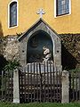
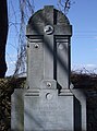
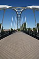
- Nomination Wayside cross in Cee, Galicia (Spain)--Lmbuga 00:23, 29 July 2010 (UTC)
- Promotion Good --The High Fin Sperm Whale 00:58, 29 July 2010 (UTC)
-
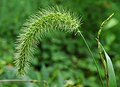
- Nomination Setaria viridis by User:Kropsoq. --Stickpen 21:33, 28 July 2010 (UTC)
- Promotion good details, nice composition --Mbdortmund 22:18, 28 July 2010 (UTC)
-
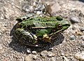
- Nomination Marsh frog. --Quartl 20:18, 28 July 2010 (UTC)
- Promotion nice --Mbdortmund 22:21, 28 July 2010 (UTC)
-

- Nomination Ruddy darter. --Quartl 20:18, 28 July 2010 (UTC)
- Promotion Good --The High Fin Sperm Whale 01:00, 29 July 2010 (UTC)
-

- Nomination Sand lizard. --Quartl 20:18, 28 July 2010 (UTC)
- Promotion good --Mbdortmund 22:23, 28 July 2010 (UTC)
-

- Nomination Nassau castle, Germany. --Johannes Robalotoff 20:14, 28 July 2010 (UTC)
- Promotion Good --The High Fin Sperm Whale 01:03, 29 July 2010 (UTC)
-

- Nomination Mousqueton modèle 1777 modifié An IX. Image assembled from 5 individual photographs. -- Rama 19:19, 28 July 2010 (UTC)
- Promotion Good --The High Fin Sperm Whale 01:03, 29 July 2010 (UTC)
-

- Nomination Man with a moustache, Chambal, India. Yann 19:11, 28 July 2010 (UTC)
- Promotion exposure imo a bit dark --Mbdortmund 22:25, 28 July 2010 (UTC) Better now? Yann 03:12, 29 July 2010 (UTC)
Very good now --George Chernilevsky 05:12, 29 July 2010 (UTC)
-

- Nomination Berger blanc suisse --Körnerbrötchen 19:09, 28 July 2010 (UTC)
- Decline strange lines around the ears, did you change the background? blue oversaturated --Mbdortmund 22:27, 28 July 2010 (UTC)
Issues with quality at the ear surroundings, and too narrow DOF, the whole face should be sharp. Pitke 10:16, 29 July 2010 (UTC)
-

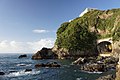
- Nomination Imagoura in Kasumi Coast --663highland 15:42, 28 July 2010 (UTC)
- Promotion Nice place good image. --Cayambe 18:35, 28 July 2010 (UTC)
-
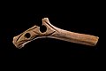
- Nomination Pierced rod Magdalenian --Archaeodontosaurus 14:09, 28 July 2010 (UTC)
- Promotion Very good... and useful. --Cayambe 16:21, 28 July 2010 (UTC)
-

-

-

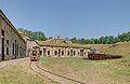
- Nomination Fort de Mutzig --ComputerHotline 10:42, 27 July 2010 (UTC)
- Promotion Good. --Cayambe 16:27, 28 July 2010 (UTC)
-

- Nomination Fort de Mutzig --ComputerHotline 10:42, 27 July 2010 (UTC)
- Promotion Also good. --Cayambe 16:27, 28 July 2010 (UTC)
-
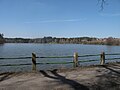
- Nomination Vyžlovský pond by spring, Czech Republic. --Juan de Vojníkov 08:33, 27 July 2010 (UTC)
- Decline Unclear what it depicts. The railing is in focus, but too far away.
-

-

- Nomination Imagoura of Kasumi Coast in Kami, Hyogo prefecture, Japan, photo by 663highland. -- Smial 13:57, 26 July 2010 (UTC)
- Promotion Good. Pitke 11:22, 29 July 2010 (UTC)
-

- Nomination Children eating kheer and puri, Chambal, India. Yann 23:46, 25 July 2010 (UTC)
- Decline The DOF is not sufficient to catch the back children sharply, and since they are the ones looking toward the camera, that is an important disadvantage. Thankyou for a very interesting image though, I learnt something from it. --99of9 02:36, 29 July 2010 (UTC)
-

-
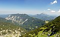
- Nomination Obersee, Scheiblingstein and Ötscher from Dürrenstein (1878m), Lower Austria. Herzi Pinki 00:25, 24 July 2010 (UTC)
- Promotion QI & Didactic --Archaeodontosaurus 13:12, 28 July 2010 (UTC)
-

-

-
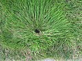
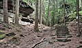
- Nomination: Grass lines around water sprinkler. --Juan de Vojníkov 11:10, 23 July 2010 (UTC)
- Review needed
-

-

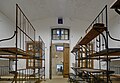
- Nomination: Nursery inside the Fort d'Uxegney. --ComputerHotline 14:12, 21 July 2010 (UTC)
- Review The what ? :D -- Rama 19:26, 22 July 2010 (UTC)
-
-

- Nomination Two Saddle Wrasse are feeding on sea urchin--Mbz1 03:14, 28 July 2010 (UTC)
- Promotion Good -- George Chernilevsky 06:29, 28 July 2010 (UTC)
-
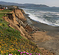
- Nomination Erosion in Pacifica--Mbz1 00:35, 28 July 2010 (UTC)
- Promotion very good -- George Chernilevsky 06:28, 28 July 2010 (UTC)
-
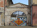
- Nomination Javorník (Jauernig), Czech Silesia - psychedelic gate --Pudelek 23:57, 27 July 2010 (UTC)
- Promotion QI -- George Chernilevsky 06:31, 28 July 2010 (UTC)
-

- Nomination Imperial topaz --Archaeodontosaurus 20:03, 27 July 2010 (UTC)
- Promotion nice --Mbdortmund 20:25, 27 July 2010 (UTC)
-

- Nomination Canal lock --Pline 19:18, 27 July 2010 (UTC)
- Promotion QI for me --Archaeodontosaurus 19:51, 27 July 2010 (UTC)
-
- Nomination Fort de Mutzig --ComputerHotline 10:42, 27 July 2010 (UTC)
- Promotion Very good. The lens flare is a minor distraction. --Pitke 14:04, 27 July 2010 (UTC)
-

- Nomination San Martiño de Fontecada, Santa Comba, Galicia (Spain)--Lmbuga 01:17, 28 July 2010 (UTC)
- Promotion Ok. (Nominated by Lmbuga?) --Berthold Werner 08:11, 27 July 2010 (UTC)
Yes, thanks--Lmbuga 01:15, 28 July 2010 (UTC)
-

-

- Nomination Young Western European hedgehog (Erinaceus europaeus) --V-wolf 18:25, 26 July 2010 (UTC)
 Comment Good. IMO it would be better if you crop the top of the picture.--Ankara 22:00, 26 July 2010 (UTC) Comment Image cropped. --V-wolf 17:13, 27 July 2010 (UTC) Comment QI for me.--Ankara 20:19, 27 July 2010 (UTC)
 - Promotion
- Nomination Young Western European hedgehog (Erinaceus europaeus) --V-wolf 18:25, 26 July 2010 (UTC)
-

- Nomination Bokido of Hotel Urashima in Nachikatsuura --663highland 11:01, 25 July 2010 (UTC)
- Promotion I'd have gone with a better focus on the foreground waves, but it's nice. Mattbuck 21:24, 27 July 2010 (UTC)
-
- Nomination Bokido of Hotel Urashima in Nachikatsuura --663highland 10:58, 25 July 2010 (UTC)
- Promotion Very pretty. Mattbuck 21:24, 27 July 2010 (UTC)
-

- Nomination: Sabre of a French infantry officer, circa 1800-1815. -- Rama 06:30, 22 July 2010 (UTC)
- Review needed
-

- Nomination: Ushimado Port in Setouchi --663highland 21:35, 21 July 2010 (UTC)
- Review needed
-
- Nomination: Inside the main entry of the Fort d'Uxegney. --ComputerHotline 14:12, 21 July 2010 (UTC)
- Review needed
-

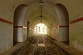
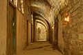
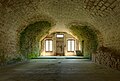
- Nomination: Inside the Fort d'Uxegney. --ComputerHotline 14:12, 21 July 2010 (UTC)
- Review needed
-

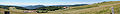
- Nomination: Panorama seen from the Fort d'Uxegney. --ComputerHotline 14:12, 21 July 2010 (UTC)
- Review needed
-
- Nomination: Panoramic seen from the Ballon d'Alsace, in France. --ComputerHotline 14:05, 21 July 2010 (UTC)
- Review needed
-
- Nomination: Inside the Fort de Bois l'Abbé. --ComputerHotline 14:05, 21 July 2010 (UTC)
- Review needed
-
- Nomination: Inside the Fort de Bois l'Abbé. --ComputerHotline 14:05, 21 July 2010 (UTC)
- Review needed
-

- Nomination: Inside the Fort de Bois l'Abbé. --ComputerHotline 14:05, 21 July 2010 (UTC)
- Review needed
-

- Nomination: Inside the Fort de Bois l'Abbé. --ComputerHotline 14:05, 21 July 2010 (UTC)
- Review needed
-

- Nomination: Inside the Fort de Bois l'Abbé : baking --ComputerHotline 14:05, 21 July 2010 (UTC)
- Review needed
-

- Nomination Kuroiwa Falls --663highland 15:06, 20 July 2010 (UTC)
- Decline Blurred, has chromatic aberration. Pitke 12:58, 27 July 2010 (UTC)
-

- Nomination Nembrotha lineolata mating (underwater photography). by User:Nhobgood --99of9 06:09, 27 July 2010 (UTC)
- Promotion Very good -- George Chernilevsky 08:38, 27 July 2010 (UTC)
-

- Nomination Cirsium vulgare --Alchemist-hp 22:43, 26 July 2010 (UTC)
- Promotion Very good --Haneburger 08:03, 27 July 2010 (UTC)
-

- Nomination Tatra KT8D5R.N2P at Jiráskovo náměstí — Jagro 22:24, 26 July 2010 (UTC)
- Promotion Good -- George Chernilevsky 08:34, 27 July 2010 (UTC)
-

- Nomination Tatra T3R.P with Dancing house — Jagro 22:24, 26 July 2010 (UTC)
- Promotion Good -- George Chernilevsky 08:36, 27 July 2010 (UTC)
-

- Nomination cross in Münster --Mbdortmund 21:39, 26 July 2010 (UTC)
- Decline Noise, blurry--Lmbuga 22:17, 26 July 2010 (UTC)
-

- Nomination Prinzipalmarkt Münster --Mbdortmund 21:39, 26 July 2010 (UTC)
- Promotion Comment I like the composition. The left part is absolutely straight, but the right houses leaning a little bit. Is it possible to fix? Otherwise QI.--Ankara 22:13, 26 July 2010 (UTC) Comment corrected --Mbdortmund 22:32, 26 July 2010 (UTC) Thanks, good now.--Ankara 22:34, 26 July 2010 (UTC)
-

- Nomination Human-size Moominhouse in Moomin World theme park, Naantali, Finland. --kallerna 20:41, 26 July 2010 (UTC)
- Promotion Excellent--Lmbuga 21:25, 26 July 2010 (UTC)
Composition would be better without cropped people. Is it clockwise tilted? --Berthold Werner 06:55, 27 July 2010 (UTC)
-

- Nomination Gypsum from Caresse --Archaeodontosaurus 19:29, 26 July 2010 (UTC)
- Promotion Nice. Mattbuck 19:33, 26 July 2010 (UTC)
-

- Nomination Staudammkrone Lünersee --Böhringer 19:25, 26 July 2010 (UTC)
- Promotion nice shot --Mbdortmund 21:45, 26 July 2010 (UTC)
-

- Nomination Young Western European hedgehog (Erinaceus europaeus) --V-wolf 18:25, 26 July 2010 (UTC)
- Promotion good illustration for the danger of traffic --Mbdortmund 21:38, 26 July 2010 (UTC)
-

- Nomination Relief on Lamertikirche Münster -- Mbdortmund 18:17, 26 July 2010 (UTC)
- Promotion QI--Lmbuga 21:22, 26 July 2010 (UTC)
-

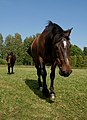
- Nomination Grey Arabian horse playing in his corral.
- Decline Fails to meet the 2MP requirement. Mattbuck 19:33, 26 July 2010 (UTC)
-

- Nomination Remington Model 1858 -- Rama 09:58, 26 July 2010 (UTC)
- Promotion Very good. -- Felix Koenig 15:14, 26 July 2010 (UTC)
-

- Nomination Kitzingen, Bavaria. Synagogue --Berthold Werner 08:05, 26 July 2010 (UTC)
- Promotion QI for me --Archaeodontosaurus 19:33, 26 July 2010 (UTC)
-

- Nomination Forest Reserve Saueruecht in Luxembourg. --Cayambe 07:53, 26 July 2010 (UTC)
- Promotion QI for me --Archaeodontosaurus 12:04, 26 July 2010 (UTC)
-

- Nomination A Bentley Continental GTC. --Pineapple fez 07:34, 26 July 2010 (UTC)
- Promotion The mountain's not quite sharp, but I like the composition. Mattbuck 19:35, 26 July 2010 (UTC)
-
-

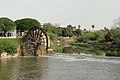
- Nomination Noria in Hama, Syria --Bgag 00:23, 26 July 2010 (UTC)
- Decline washed out sky --Mbdortmund 18:20, 26 July 2010 (UTC)
-

-

- Nomination Chocolate-covered bacon on a stick. -- Jonathunder 16:04, 25 July 2010 (UTC)
- Promotion Good. --Cayambe 15:04, 26 July 2010 (UTC)
-
- Nomination at Okami park in Kasumi Coast --663highland 10:58, 25 July 2010 (UTC)
- Promotion OK --Mbdortmund 18:24, 26 July 2010 (UTC)
-

- Nomination 166220 arrives at Oxford with a service to London Paddington. Mattbuck 00:08, 24 July 2010 (UTC)
- Promotion OK, noise imo acceptable, ISO 100 would perhaps been better --Mbdortmund 18:28, 26 July 2010 (UTC)
-
-
- Nomination Half-timbered houses in Alsfeld. --KlausFoehl 11:25, 23 July 2010 (UTC)
- Promotion Good. -- Smial 15:18, 26 July 2010 (UTC)
-
- Nomination Winter landscape near Kačina chateau. --Juan de Vojníkov 11:10, 23 July 2010 (UTC)
- Decline Noisy, dull light, underexposed. --kallerna 15:19, 26 July 2010 (UTC)
-

- Nomination Nakajima Park in Sapporo --663highland 21:35, 21 July 2010 (UTC)
- Decline Inadequate DOF (mostly blurred), has chromatic aberration. -- Pitke 17:58, 26 July 2010 (UTC)
-

-

- Nomination Pitch Pine (Pinus rigida) foliage in Poland --Crusier 16:44, 21 July 2010 (UTC)
- Decline Multiple problems, most severe is lack of contrast between the subject and the background. -- Pitke 17:58, 26 July 2010 (UTC)
-

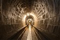
- Nomination Inside the Fort de Bois l'Abbé : inside the double caponnier. --ComputerHotline 14:05, 21 July 2010 (UTC)
- Promotion QI IMHO. —Jagro 22:58, 26 July 2010 (UTC)
-

- Nomination 390007 departs Coventry station. Mattbuck 01:00, 21 July 2010 (UTC)
- Decline Too narrow DOF; most of the picture is blurred. Good composition though. ~~~~
-

- Nomination: Parc ornithologique du Teich (entrance)--Pline 16:20, 20 July 2010 (UTC)
- Review needed
-

- Nomination Sculpture in the Monastery of San Martiño Pinario, Santiago de Compostela, Galicia--Lmbuga 14:10, 20 July 2010 (UTC)
- Promotion An identification of this bishop (?) or abbott (?) would be interesting. The picture is a little bit tilted CW, and needs a perspective correction, especially left IMO. Could be promoted if technical requests done. --Jebulon 16:42, 22 July 2010 (UTC)
OK. New image. I don't know if it's better. Perhaps the image represents Saint Peter, but I am not sure--Lmbuga 20:38, 22 July 2010 (UTC)
imo OK --Mbdortmund 11:46, 27 July 2010 (UTC)
-

- Nomination Hédé Castle. --Coyau 12:12, 20 July 2010 (UTC)
- Decline Composition is good but some parts show a lack of details / are blurry --Mbdortmund 11:43, 27 July 2010 (UTC)
-
- Nomination Plan and relation of the Battle of Bremgarten, 26 May 1712. -- Rama 12:53, 19 July 2010 (UTC)
- Promotion good quality --Mbdortmund 19:23, 26 July 2010 (UTC)
-
-

-

-

- Nomination Miguel Carbajal at the presentation of short “Dairas”, A Estrada, Galicia (Spain)--Iesmgb2 15:19, 17 July 2010 (UTC)
- Decline Is this made by a wikipedian ? --Mbdortmund 21:31, 20 July 2010 (UTC)
Own work--Iesmgb2 21:48, 26 July 2010 (UTC)
Unfortunate lighting casts a strong shadow on his eyes. Otherwise good, and certainly valuable. --99of9 07:50, 27 July 2010 (UTC)
-

- Nomination Raappana performing at Bar Kino, Pori, Finland (see the happy face of reggae artist ! ;)). --kallerna 13:36, 17 July 2010 (UTC)
Artificial happiness maybe ? --Jebulon 17:04, 17 July 2010 (UTC) Comment Not 100% sure, but could be. ;) --kallerna 13:35, 18 July 2010 (UTC)
I am really not a big fan of images where singers have a microphone hiding most of their face. It's quite clear that it is the thing to avoid. Rama 22:59, 20 July 2010 (UTC) - Decline Agree with Rama, the hand is distracting. Pitke 17:52, 26 July 2010 (UTC)
- Nomination Raappana performing at Bar Kino, Pori, Finland (see the happy face of reggae artist ! ;)). --kallerna 13:36, 17 July 2010 (UTC)
-

- Nomination VSCM (vedette côtière de surveillance maritime, "Coastal boat for sea surveillance") Huveaune (P619), of the Gendarmerie maritime -- Rama 23:42, 16 July 2010 (UTC)
- Promotion good picture but should be cropped on the left and butttom --Mbdortmund 12:39, 22 July 2010 (UTC) Comment Agree with Mbdortmund. --Cayambe 15:08, 22 July 2010 (UTC) Comment Good idea, thank you. -- Rama 21:18, 22 July 2010 (UTC) OK --Mbdortmund 22:39, 26 July 2010 (UTC)
-

- Nomination Noria in Hama, Syria --Bgag 00:23, 26 July 2010 (UTC)
- Promotion QI & Useful --Archaeodontosaurus 07:05, 26 July 2010 (UTC)
-

-

-

- Nomination Gallus gallus domesticus --Böhringer 21:43, 25 July 2010 (UTC)
- Promotion good --Mbdortmund 21:48, 25 July 2010 (UTC)
-

- Nomination Tettigonia viridissima (Locust / Grünes Heupferd) --Joadl 20:31, 25 July 2010 (UTC)
- Decline mask not good enough --Mbdortmund 21:51, 25 July 2010 (UTC)
-

- Nomination Skeleton of Pliohippus --Llez 17:37, 25 July 2010 (UTC)
- Promotion good --Mbdortmund 21:54, 25 July 2010 (UTC)
-

- Nomination Aromia moschata --Alchemist-hp 16:36, 25 July 2010 (UTC)
- Promotion Good quality shot of a beetle that is notoriously difficult to capture well. --Quartl 17:53, 25 July 2010 (UTC)
-

- Nomination Caterpillar of the Old World Swallowtail --Archaeodontosaurus 07:58, 25 July 2010 (UTC)
- Promotion QI--Lmbuga 14:01, 25 July 2010 (UTC)
-

- Nomination Special bus line 725, Prague — Jagro 00:51, 25 July 2010 (UTC)
- Promotion Good -- George Chernilevsky 12:42, 25 July 2010 (UTC)
-
- Nomination Plasser & Theurer 08-275 ZW at tram track reconstruction — Jagro 00:51, 25 July 2010 (UTC)
- Promotion Good -- George Chernilevsky 12:42, 25 July 2010 (UTC)
Wait a cotton-picking minute, I thought I was the only person allowed to nominate trains :p Mattbuck 01:22, 26 July 2010 (UTC)
-

-

- Nomination View of downtown Miami, Florida. Dori 19:43, 24 July 2010 (UTC)
- Promotion good --Mbdortmund 23:05, 25 July 2010 (UTC)
-
- Nomination Iphofen, Bavaria, timber framend building. --Berthold Werner 08:00, 23 July 2010 (UTC)
- Promotion Qi for me --Archaeodontosaurus 12:55, 25 July 2010 (UTC)
-

- Nomination: Castle Jánský Vrch (Johannesberg) --Pudelek 10:53, 20 July 2010 (UTC)
- Review needed
-
- Nomination: Iphofen, Bavaria. Mittagsturm (Noon tower) --Berthold Werner 08:00, 20 July 2010 (UTC)
- Review needed
-

-

- Nomination: Old battery from Vaud, painting by Charles Humber -- Rama 12:53, 19 July 2010 (UTC)
- Review needed
-

- Nomination Beech growth rings on the logged wood. --Juan de Vojníkov 06:53, 25 July 2010 (UTC)
- Promotion Good composition and perspective --Haneburger 07:50, 25 July 2010 (UTC)
-

- Nomination Mimas from Cassini. --The High Fin Sperm Whale 22:03, 24 July 2010 (UTC)
- Decline Not the work of a wikimedian. --Eusebius 22:17, 24 July 2010 (UTC)
-

- Nomination Marktbreit, Bavaria. "Malerwinkel" --Berthold Werner 15:05, 24 July 2010 (UTC)
- Promotion Gut -- George Chernilevsky 16:36, 24 July 2010 (UTC)
-

- Nomination Church St-Julien in Tours. Sorry for the tight crop, that's the best I could do with the perspective correction and the bright red car parked in front of the church. --Eusebius 13:53, 24 July 2010 (UTC)
- Promotion Some will say it's a example of two dimensional building ;-) for m it's ok. --Berthold Werner 15:07, 24 July 2010 (UTC)
-

- Nomination Myriapoda in glass of Mexico. --Cody escadron delta 13:35, 24 July 2010 (UTC)
- Decline Very poor quality. --The High Fin Sperm Whale 17:20, 24 July 2010 (UTC)
-

- Nomination Mountain rescue hut (ÖBRD) near Dürrenstein in Lower Austria. Herzi Pinki 23:35, 23 July 2010 (UTC)
- Promotion Nice and for me a QI --Haneburger 12:39, 24 July 2010 (UTC)
-

- Nomination Ybbstaler Hütte, an alpine hut in Lower Austria. Herzi Pinki 22:54, 23 July 2010 (UTC)
- Promotion Pretty and very useable --Haneburger 12:34, 24 July 2010 (UTC)
-

- Nomination An erotic-painted old wine barrel in Château de Pommard, Burgundy, France--Jebulon 22:42, 22 July 2010 (UTC)
- Promotion
 Support Good and interesting. Yann 19:12, 23 July 2010 (UTC)
Strong barrel distortion! ;-) --Berthold Werner 15:11, 24 July 2010 (UTC)
-

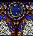
- Nomination Stained glass window in Goleen, depicting Our Lady of Lourdes. --AFBorchert 20:15, 22 July 2010 (UTC)
- Promotion Good --Haneburger 12:45, 24 July 2010 (UTC)
-

- Nomination The Witch from Moomins in Muumimaailma, Naantali. --kallerna 16:49, 22 July 2010 (UTC)
- Promotion A nice shot :) I still wonder, why none has promoted it. Maybe it is reasonable to add {{Personality rights}}?--Gaeser 03:38, 25 July 2010 (UTC)
-

-

- Nomination: Crucifix on stone wall. --Ianare 08:59, 19 July 2010 (UTC)
- Review needed
-

- Nomination: Opera House in Helsinki, by User:Inisheer -- Rama 08:28, 19 July 2010 (UTC)
- Review nice composition but the upper right side (unsharp, washed out sky, noise, some CA) spoils it imo. --Mbdortmund 08:43, 19 July 2010 (UTC)
-

- Nomination Yellow-bellied Flycatcher --Cephas 23:17, 23 July 2010 (UTC)
- Promotion Support QI & Useful --Archaeodontosaurus 10:03, 24 July 2010 (UTC)
-
- Nomination Empis sp., Soigrexa, Bastavales, Brión, Galicia (Spain). Bellis perennis--Lmbuga 17:06, 23 July 2010 (UTC)
- Decline Looks blurry in parts and oversharpened. --The High Fin Sperm Whale 19:36, 23 July 2010 (UTC)
-

- Nomination Fass-90 assault rifle -- Rama 14:25, 23 July 2010 (UTC)
- Promotion Good. --The High Fin Sperm Whale 19:35, 23 July 2010 (UTC)
-

- Nomination Clock tower and slate roof of Hôtel-Dieu de Beaune, France--Jebulon 22:11, 22 July 2010 (UTC)
- Decline Noise in the sky, not too sharp. -- Felix Koenig 14:44, 23 July 2010 (UTC)
-
- Nomination Nominating this image. There was quite different file under same name nominated here, but I think that this one is good enough. --Gaeser 18:26, 22 July 2010 (UTC)
- Promotion Good --The High Fin Sperm Whale 20:12, 22 July 2010 (UTC)
Is the house of the left very distorted?--Lmbuga 22:05, 22 July 2010 (UTC)
No, it really lies so. We were even worried, that early or late it would fall on the temple...And when I looked at the photo now, I found even a Turk inhabit, whom I haven't noticed before:)--Gaeser 04:57, 23 July 2010 (UTC)
Sorry. It's a good picture--Lmbuga 09:43, 23 July 2010 (UTC)
good picture. Geagea 16:25, 23 July 2010 (UTC) -

- Nomination François Victor de Breteuil, Minister of king Louis XV of France.--Jebulon 21:13, 21 July 2010 (UTC)
- Promotion Comment Un peu sombre mais facile à corriger --Archaeodontosaurus 05:55, 22 July 2010 (UTC)
 Done --Jebulon 20:32, 22 July 2010 (UTC) Comment - Ce Capitaine mérite enore un peu plus de lumière --Archaeodontosaurus 06:02, 23 July 2010 (UTC) Done --Archaeodontosaurus 12:59, 23 July 2010 (UTC). Good now. --Cayambe 11:36, 24 July 2010 (UTC)
-

- Nomination Monastery of San Martiño Pinario, Santiago de Compostela, Galicia--Lmbuga 14:12, 20 July 2010 (UTC)
- Promotion Good quality and nice composition, I like it. -- Felix Koenig 14:40, 23 July 2010 (UTC)
-

- Nomination: Growing of pears in the orchard of the Jardin du Luxembourg. --Jebulon 17:01, 17 July 2010 (UTC)
- Review needed
-

- Nomination: The guard leans out of the window as 170107 departs Tamworth. Mattbuck 15:59, 17 July 2010 (UTC)
- Review needed
-

- Nomination: 221142 speeds north through Tamworth on the West Coast Main Line. Mattbuck 15:59, 17 July 2010 (UTC)
- Review needed
-

-

- Nomination: A passenger in Paris metropolitan --Romanceor 15:40, 17 July 2010 (UTC)
- Review needed
-

-

-

- Nomination: Jamison Valley from Wentworth Falls, Valley of the Waters walking track (by User:Adam.J.W.C.). --High Contrast 06:34, 17 July 2010 (UTC)
- Review Comment - could use some cropping at the bottom to remove the shadow, and also some sharpening. Mattbuck 16:03, 17 July 2010 (UTC)
-

- Nomination Cirrocumulus clouds, Thousand Oaks, California. --King of Hearts 17:43, 16 July 2010 (UTC)
- Promotion Good. --Cayambe 11:41, 24 July 2010 (UTC)
-

- Nomination: Former Hokkaido Prefectural Office Building.--663highland 14:50, 16 July 2010 (UTC)
- Review Perspective: Houses lean far too strong for QI. Can you try to correct this? Some CA is visible at full resolution, but still OK for me. Otherwise good. --Johannes Robalotoff 19:14, 17 July 2010 (UTC)
-

- Nomination River floating dry dock on the Seine near Paris. --Pline 08:53, 23 July 2010 (UTC)
- Promotion QI & Useful --Archaeodontosaurus 11:56, 23 July 2010 (UTC)
-
- Nomination Ordoeste, A Baña, Galicia (Spain)--Lmbuga 21:50, 22 July 2010 (UTC)
- Promotion The tree is distracting, but another perspective is not possible--Lmbuga 21:57, 22 July 2010 (UTC) Good for me, with the tree too ! --Jebulon 22:12, 22 July 2010 (UTC)
-

- Nomination roofs of the Hôtel-Dieu de Beaune.--Jebulon 21:39, 22 July 2010 (UTC)
- Promotion Good made and interesting picture --Haneburger 06:19, 23 July 2010 (UTC)
-
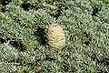
- Nomination Cedrus libani
fruitcone.--Jebulon 20:54, 22 July 2010 (UTC) - Promotion very good -- George Chernilevsky 06:07, 23 July 2010 (UTC)
- Nomination Cedrus libani
-

- Nomination Panorama from Muumimaailma to Naantali. --kallerna 16:49, 22 July 2010 (UTC)
 Info Geolocate it. --ComputerHotline 18:18, 22 July 2010 (UTC)
 - Promotion I like it, a wonderful panorama, no stitch visable.--Gaeser 07:14, 23 July 2010 (UTC)
- Nomination Panorama from Muumimaailma to Naantali. --kallerna 16:49, 22 July 2010 (UTC)
-
- Nomination Hiking path in Luxembourg's Little Switzerland. --Cayambe 08:12, 22 July 2010 (UTC)
- Promotion Nice place, Good picture QI for me --Archaeodontosaurus 14:35, 22 July 2010 (UTC)
-

- Nomination Volucella pellucens. --ComputerHotline 08:06, 22 July 2010 (UTC)
- Promotion Excellent, despite the flash--Lmbuga 19:45, 22 July 2010 (UTC)
-

-

- Nomination Nothing by hope, nothing by fear. CoA of Breteuil family, Château de Breteuil, France--Jebulon 23:11, 21 July 2010 (UTC)
- Promotion Comment un peu sombre peut être corrigé --Archaeodontosaurus 06:02, 22 July 2010 (UTC) Done --Jebulon 20:36, 22 July 2010 (UTC) Support Good now --Archaeodontosaurus 05:48, 23 July 2010 (UTC)
-

-

- Nomination Inside the Fort d'Uxegney. --ComputerHotline 14:12, 21 July 2010 (UTC)
- Promotion good --Mbdortmund 12:17, 22 July 2010 (UTC)
-
- Nomination Bedroom inside the Fort d'Uxegney. --ComputerHotline 14:12, 21 July 2010 (UTC)
- Promotion good --Mbdortmund 12:18, 22 July 2010 (UTC)
-

- Nomination Inside the Fort de Bois l'Abbé. --ComputerHotline 14:05, 21 July 2010 (UTC)
- Promotion good --Mbdortmund 12:20, 22 July 2010 (UTC)
-

- Nomination Inside the Fort de Bois l'Abbé. --ComputerHotline 14:05, 21 July 2010 (UTC)
- Promotion good --Mbdortmund 12:24, 22 July 2010 (UTC)
-
- Nomination Inside the Fort de Bois l'Abbé : bedroom --ComputerHotline 14:05, 21 July 2010 (UTC)
- Promotion good --Mbdortmund 12:26, 22 July 2010 (UTC)
-

- Nomination 350117 arrives at Tamworth. Mattbuck 10:13, 19 July 2010 (UTC)
- Promotion good --Mbdortmund 12:29, 22 July 2010 (UTC)
-
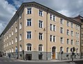
- Nomination: Residential building in Stockholm from 1890 designed by architect Ernst Stenhammar--Ankara 09:44, 17 July 2010 (UTC)
- Review needed
-

- Nomination: VSCM (vedette côtière de surveillance maritime, "Coastal boat for sea surveillance") Huveaune (P619), of the Gendarmerie maritime -- Rama 23:42, 16 July 2010 (UTC)
- Review needed
-

- Nomination: The Monge in Brest harbour -- Rama 23:36, 16 July 2010 (UTC)
- Review needed
-

- Nomination: The Monge in Brest harbour -- Rama 23:36, 16 July 2010 (UTC)
- Review needed
-

-

- Nomination: Smith & Wesson Model 39. Photographed at Morges military museum behind a reflective display glass. -- Rama 19:33, 16 July 2010 (UTC)
- Review needed
-

- Nomination: An EWS chemical train passes through Nottingham station. Mattbuck 18:29, 16 July 2010 (UTC)
- Review needed
-
- Nomination: Church in Samarovo village, dome from inside.-- PereslavlFoto 14:25, 16 July 2010 (UTC)
- Review I like the structure, but I think it could be better if straight. Wouldn't you try a (not so) little rotation ? Your choice doesn't add, IMO--Jebulon 22:28, 16 July 2010 (UTC)
-

-

-

- Nomination Constriction of a school in Pucallpa --Diego Sanguinetti 16:59, 16 July 2010 (UTC)
- Decline I like the scene, but sky is overexposed, roof scaffold is blur, sorry --J. Lunau 22:33, 21 July 2010 (UTC) Done--Diego Sanguinetti 01:36, 23 July 2010 (UTC)
-

-

- Nomination Pinus pumila in Alpinarium in Rogów Arboretum, Poland --Crusier 20:07, 15 July 2010 (UTC)
- Promotion Nothing to complain about, QI to me. --Cayambe 14:54, 22 July 2010 (UTC)
-

-

-

-

- Nomination Saint Michaël, close up of the altarpiece of the Last Judgement by Rogier van der Weyden in Beaune, France --Jebulon 15:22, 14 July 2010 (UTC)
- Promotion concerning the conditions OK --Mbdortmund 12:32, 22 July 2010 (UTC)
-

- Nomination: Iphofen, Bavaria, timberframend building --Berthold Werner 08:19, 11 July 2010 (UTC)
- Review Better without the trash bin, even it's "bio"...--Jebulon 23:13, 16 July 2010 (UTC)
-

- Nomination Episyrphus balteatus. --ComputerHotline 08:06, 22 July 2010 (UTC)
- Promotion QI & Useful --Archaeodontosaurus 11:47, 22 July 2010 (UTC)
-

- Nomination Horse abreuvoir, Château de Breteuil, France--Jebulon 23:11, 21 July 2010 (UTC)
- Promotion Good. Interesting object -- George Chernilevsky 03:36, 22 July 2010 (UTC)
-

- Nomination Punica granatum --Llez 15:54, 21 July 2010 (UTC)
- Promotion Very good -- George Chernilevsky 18:38, 21 July 2010 (UTC)
-

- Nomination Iphofen, Bavaria, townhall --Berthold Werner 15:51, 21 July 2010 (UTC)
- Promotion Good. --Cayambe 10:30, 22 July 2010 (UTC)
-

- Nomination The Mandarin Dragonet Synchiropus splendidus --Llez 14:36, 21 July 2010 (UTC)
- Promotion Good --The High Fin Sperm Whale 14:56, 21 July 2010 (UTC)
-

- Nomination Fireworks in Belfort, July 2010 --ComputerHotline 14:16, 21 July 2010 (UTC)
- Decline Per my earlier comment. --The High Fin Sperm Whale 16:58, 21 July 2010 (UTC)
-

- Nomination Fireworks in Belfort, July 2010 --ComputerHotline 14:16, 21 July 2010 (UTC)
- Decline Per my earlier comment. --The High Fin Sperm Whale 16:58, 21 July 2010 (UTC)
-

- Nomination Fireworks in Belfort, July 2010 --ComputerHotline 14:16, 21 July 2010 (UTC)
- Decline Either that building is falling over, or this is extremely tilted. --The High Fin Sperm Whale 16:58, 21 July 2010 (UTC)
-

- Nomination Fireworks in Belfort, July 2010 --ComputerHotline 14:16, 21 July 2010 (UTC)
- Decline Poor crop and composition. --The High Fin Sperm Whale 16:59, 21 July 2010 (UTC)
-

- Nomination Fireworks in Belfort, July 2010 --ComputerHotline 14:16, 21 July 2010 (UTC)
- Decline Tilted --The High Fin Sperm Whale 16:59, 21 July 2010 (UTC)
-

- Nomination Main entry of the Fort d'Uxegney. --ComputerHotline 14:12, 21 July 2010 (UTC)
- Decline Good, but the flag is blurred. --The High Fin Sperm Whale 17:01, 21 July 2010 (UTC)
-

- Nomination Kitchen inside the Fort d'Uxegney. --ComputerHotline 14:12, 21 July 2010 (UTC)
- Promotion QI now --Archaeodontosaurus 06:04, 22 July 2010 (UTC)
-

- Nomination Ioji in Tomonoura --663highland 13:44, 21 July 2010 (UTC)
- Promotion Good... please add geocode. --Cayambe 10:33, 22 July 2010 (UTC)
-

- Nomination Jonangu Garden in Kyoto --663highland 13:44, 21 July 2010 (UTC)
- Promotion QI for me --Archaeodontosaurus 05:52, 22 July 2010 (UTC)
-

-
-

- Nomination Branch of a purple leaf plum (Prunus cerasifera) with flowers, buds and leaves -- Alvesgaspar 18:15, 20 July 2010 (UTC)
- Promotion Good --Llez 21:46, 21 July 2010 (UTC)
-

- Nomination House in Arcachon--Pline 16:22, 20 July 2010 (UTC)
- Promotion Need a perspective correction.--Jebulon 09:54, 21 July 2010 (UTC) Done--Pline 12:46, 21 July 2010 (UTC)
Ok. --Berthold Werner 15:54, 21 July 2010 (UTC)
-

- Nomination Iwatsuhime shrine --663highland 15:06, 20 July 2010 (UTC)
- Promotion Nice picture, good composition. --Gaeser 14:08, 21 July 2010 (UTC)
-

-
-

-

-

-

- Nomination Shaha river at night.-- PereslavlFoto 14:25, 16 July 2010 (UTC)
- Promotion see annotation please--Jebulon 22:31, 16 July 2010 (UTC)
even without knowing more about the red dot and even with the nois, it is QI to me, because I think you can't do it better --J. Lunau 19:40, 21 July 2010 (UTC)
-

- Nomination Detail of a Hortensia inflorescence -- Alvesgaspar 12:01, 16 July 2010 (UTC)
- Promotion good. --Samovary 17:01, 21 July 2010 (UTC)
-

- Nomination Detail of a Hortensia inflorescence -- Alvesgaspar 12:01, 16 July 2010 (UTC)
- Promotion good. --Samovary 17:01, 21 July 2010 (UTC)
-

- Nomination: Vlčice (Wildschütz) - cemetery --Pudelek 10:27, 16 July 2010 (UTC)
- Review needed
-

- Nomination: The clock tower at Nottingham station. Mattbuck 19:56, 15 July 2010 (UTC)
- Review needed
-

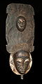
- Nomination: "Caméléon" mask. --Romanceor 19:03, 15 July 2010 (UTC)
- Review Comment Top part look a bit blurred -- George Chernilevsky 05:40, 16 July 2010 (UTC)
-

- Nomination Cryptomeria japonica D.Don., Jardin du Luxembourg, Paris.--Jebulon 11:05, 14 July 2010 (UTC)
- Promotion good shoot, QI in my opinion --J. Lunau 18:42, 21 July 2010 (UTC)
-

-

- Nomination Garden vase in Versailles. --Eusebius 09:44, 21 July 2010 (UTC)
- Promotion Nice contrast between the round vase and the diagonal line of the castle --Haneburger 11:00, 21 July 2010 (UTC)
-

-

- Nomination Southern view of Château de Breteuil, France. Sorry forgot to sign.--Jebulon 08:43, 21 July 2010 (UTC)
- Promotion Good -- George Chernilevsky 09:34, 21 July 2010 (UTC)
-

- Nomination Ornamental pool, Château de Breteuil, France. By Jebulon
- Promotion Nominated by Jebulon? Ok for me. --Berthold Werner 06:20, 21 July 2010 (UTC). Yes. Sorry.--Jebulon 08:44, 21 July 2010 (UTC)
-
-
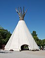
- Nomination Big tipi in Dortmund --Mbdortmund 19:37, 20 July 2010 (UTC)
- Promotion Very sharp and otherwise also good. --Cayambe 06:33, 21 July 2010 (UTC)
-
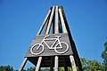
- Nomination symbol of a bycicle rack in Germany --Mbdortmund 19:37, 20 July 2010 (UTC)
- Promotion Gut --George Chernilevsky 09:34, 21 July 2010 (UTC)
-

-

- Nomination Ecuador, env. of Quito: (restored) pyramid erected by the French geodesic expedition in 1736. --Cayambe 18:58, 20 July 2010 (UTC)
- Promotion QI. Gut -- George Chernilevsky 09:36, 21 July 2010 (UTC)
-
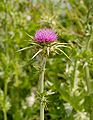
- Nomination Flower of a Milk Thistle -- Alvesgaspar 18:17, 20 July 2010 (UTC)
- Promotion Good for QI--Lmbuga 19:00, 20 July 2010 (UTC)
-

- Nomination Eye with central heterochromia --Adam Cuerden 17:01, 20 July 2010 (UTC)
- Promotion good and useful --Ianare 17:51, 20 July 2010 (UTC)
-

-

-

-

- Nomination Shurakuen in Tsuyama --663highland 15:06, 20 July 2010 (UTC)
- Promotion Good. --Berthold Werner 06:17, 21 July 2010 (UTC)
-

- Nomination Branta canadensis by Mbdortmund 23:02, 19 July 2010 (UTC)
- Promotion Gut -- George Chernilevsky 09:39, 21 July 2010 (UTC)
-

- Nomination Branta canadensis by Mbdortmund 23:02, 19 July 2010 (UTC)
- Promotion Good. --Cayambe 13:37, 20 July 2010 (UTC)
-
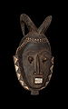
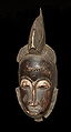
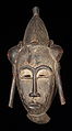
- Nomination African mask --Romanceor 14:38, 19 July 2010 (UTC)
- Promotion Good -- George Chernilevsky 10:36, 21 July 2010 (UTC)
-

- Nomination Victoria and Albert Museum in London. /Dcastor 15:13, 18 July 2010 (UTC)
- Decline Need a perspective correction IMO.--Jebulon 23:25, 18 July 2010 (UTC)
Yes, leans a bit to the right and horizontal lines not straight. Else good exposure --Mbdortmund 09:14, 19 July 2010 (UTC)
Problems told by my precessors nad In my view too much trees in front of the building --A.Ceta 08:26, 21 July 2010 (UTC)
-

- Nomination Tower of the New Town Hall in Munich. --High Contrast 13:20, 18 July 2010 (UTC)
- Promotion Nice detail shot --A.Ceta 08:27, 21 July 2010 (UTC)
-

- Nomination Sankt Johannes Nepomuk Kirche in Leopoldsreut, Germany. --High Contrast 13:20, 18 July 2010 (UTC)
- Promotion QI for me. --A.Ceta 08:27, 21 July 2010 (UTC)
-

- Nomination Seisen-ryo --663highland 12:10, 18 July 2010 (UTC)
- Decline Lack of sharpness (trees) and overexposed. Other parts are too dark A.Ceta 08:29, 21 July 2010 (UTC)
-

-

-

-

-
- Nomination A part of the collection of awarded wines of Burgundy by the Confrérie des Chevaliers du Tastevin, in a cellar of the castle of Clos de Vougeot in Burgundy, France.--Jebulon 22:16, 16 July 2010 (UTC)
- Decline
 Oppose Le vin est certainement très bon, mais la photo serait meilleure à l'horizontale, et plus rapprochée pour pouvoir lire les étiquettes. Yann 01:23, 20 July 2010 (UTC)Pas moyen d'aller plus loin que la grille ! Mais on peut quand même deviner certaines étiquettes... I put my camera through closed the fence...--Jebulon 15:29, 20 July 2010 (UTC)
-
- Nomination Agios Titus Basilika at Gortys, Crete -- MJJR 21:19, 16 July 2010 (UTC)
- Promotion Might benefit from a little bit of perspective correction. Rama 01:22, 17 July 2010 (UTC) Done Perspective corrected -- MJJR 15:21, 17 July 2010 (UTC)
I think it's good now --Ayacop 15:04, 20 July 2010 (UTC)
-

- Nomination: worldwide frist radio clock wrist watch, JUNGHANS MEGA (analog model) --J. Lunau 16:23, 14 July 2010 (UTC)
- Review * Comment At the first photograph the light was much better. (und warum zeigt die Uhr eine falsche Jahreszahl an?) --Berthold Werner 17:55, 14 July 2010 (UTC) Comment the older shoot I did with soft artificial light (LED+ fluorescent lamp), giving a kind of artificial look. Second shoot was taken under natural sun light with 50mm lens Comment das LCD zeig keine Jahreszahl an, die letzten beiden Ziffern sind Sekunden --J. Lunau 18:28, 14 July 2010 (UTC)
-

- Nomination Greater Butterfly Orchid (Platanthera chlorantha) --LC-de 09:15, 12 July 2010 (UTC)
- Promotion as previous. Lycaon 13:02, 12 July 2010 (UTC)
Straightened. --King of Hearts 17:22, 12 July 2010 (UTC)
OK now. Lycaon 12:57, 20 July 2010 (UTC)
-

- Nomination Javorník (Jauernig) - Holy Trynity Church, coat of arms of Ludwig von Pfalz-Neuburg --Pudelek 10:53, 20 July 2010 (UTC)
- Promotion Good -- George Chernilevsky 11:50, 20 July 2010 (UTC)
-
- Nomination The view of Khandzta churhch --Gaeser 07:19, 20 July 2010 (UTC)
- Decline strong distortion, look at the upper left; why 800 ISO? --Mbdortmund 09:36, 20 July 2010 (UTC)
-

- Nomination Flint Biface Lower Paleolithic -- Archaeodontosaurus 06:03, 20 July 2010 (UTC)
- Promotion Excellent.. and very useful. --Cayambe 07:52, 20 July 2010 (UTC)
-

- Nomination British Airways Boeing 747-400 (G-BNLE) takes off from London Heathrow Airport, England. The undercarriages are retracting. --The High Fin Sperm Whale 23:55, 19 July 2010 (UTC)
- Promotion I prefer Airbus, but good pic nevertheless.--Jebulon 00:01, 20 July 2010 (UTC)
-

- Nomination A fountain in The parc of Château de Breteuil, France--Jebulon 23:43, 19 July 2010 (UTC)
- Decline statue partially overexposured, parts without details --Mbdortmund 09:38, 20 July 2010 (UTC)
-

-

- Nomination Opera House 2007, Sydney. --Alchemist-hp 21:51, 19 July 2010 (UTC)
- Promotion QI & Useful --Archaeodontosaurus 06:07, 20 July 2010 (UTC)
-
- Nomination Lung Oyster (Pleurotus pulmonarius) --LC-de 21:14, 19 July 2010 (UTC)
- Promotion Good. --The High Fin Sperm Whale 03:36, 20 July 2010 (UTC)
-

-

-

-

-
-
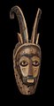
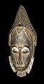
- Nomination African mask --Romanceor 14:38, 19 July 2010 (UTC)
- Promotion Good --The High Fin Sperm Whale 14:00, 19 July 2010 (UTC)
-

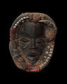
- Nomination Bambara mask --Romanceor 14:38, 19 July 2010 (UTC)
- Promotion good --Mbdortmund 09:28, 20 July 2010 (UTC)
-

- Nomination Market place and townhall in Iphofen, Bavaria --Berthold Werner 12:36, 19 July 2010 (UTC)
- Decline Strong distortion --Niabot 09:37, 20 July 2010 (UTC)
-

- Nomination Kiyosato Picnic Bus --663highland 16:30, 18 July 2010 (UTC)
- Promotion good quality --Niabot 09:37, 20 July 2010 (UTC)
-

- Nomination Kobe Union Church --663highland 16:30, 18 July 2010 (UTC)
- Promotion Good enough --Niabot 09:44, 20 July 2010 (UTC)
-

- Nomination Kiyosato, Hokuto --663highland 16:30, 18 July 2010 (UTC)
- Promotion Good picture --Niabot 09:44, 20 July 2010 (UTC)
-
- Nomination Sunset at Lauttasaari, in Finland, by User:Ludo29 -- Rama 08:28, 19 July 2010 (UTC)
- Decline Too noisy IMO. --kallerna 15:02, 19 July 2010 (UTC)
-

- Nomination Wood exploitation in Finland, by User:Inisheer -- Rama 08:23, 19 July 2010 (UTC)
- Decline Good, but too much lens distortion IMO. --kallerna 15:04, 19 July 2010 (UTC)
-

-

- Nomination Hyogo prefectural Kabutoyama Forest Park --663highland 12:10, 18 July 2010 (UTC)
- Promotion could be better without the tourists left, IMO. Crop ?--Jebulon 23:23, 18 July 2010 (UTC) For me, English is not a mother tongue. I'm sorry, what meaning is "Crop" and "IMO"?--663highland 23:35, 18 July 2010 (UTC) Good enough for me. Tourists should be part of the image if it is an tourist attraction. --Niabot 16:20, 19 July 2010 (UTC) PS: Crop=Cropping and IMO=in my oppinion
-

- Nomination Harburg, Bavaria --Berthold Werner 11:35, 18 July 2010 (UTC)
- Promotion Good. --Cayambe 17:07, 19 July 2010 (UTC)
-

-

- Nomination: Aesculus pavia, Jardin du Luxembourg, Paris.--Jebulon 11:15, 14 July 2010 (UTC)
- Review needed
-

- Nomination: Church of San Martiño de Noia, Galicia (Spain)--Lmbuga 20:09, 12 July 2010 (UTC)
- Review You could describe the picture and add geolocalization. --Coyau 11:52, 14 July 2010 (UTC)
-

- Nomination: Paris skyline during sunset, with La Défense in the back. --King of Hearts 00:46, 10 July 2010 (UTC)
- Review Note: looks better viewed at preview size (800px). --King of Hearts 00:48, 10 July 2010 (UTC)
Underexposed. --The High Fin Sperm Whale 03:19, 11 July 2010 (UTC)
It's for artistic effect; I purposely darkened the buildings to bring attention to the sky. Consider it in the same lines as Commons:Quality images/Subject/Sunsets; no one is complaining that these are underexposed. --King of Hearts 05:51, 10 July 2010 (UTC)
Then maybe the building in front should be croped to bring attention to the sunset. Either it is part of the picture and visible or it is off the picture to put the focus on the sunset. --Letartean 14:37, 13 July 2010 (UTC)
I cropped it. Is it enough? --King of Hearts 05:31, 14 July 2010 (UTC)
-
- Nomination The river Sure (Sauer) upstreams of Echternach, where it forms the border between Germany and Luxembourg. --Cayambe 07:44, 19 July 2010 (UTC)
- Promotion QI & Useful --Archaeodontosaurus 09:07, 19 July 2010 (UTC)
-

- Nomination The central relief of the vault of the main arch of the Arc de Triomphe du Carrousel in Paris.--Jebulon 00:39, 19 July 2010 (UTC)
- Promotion QI and useful -- Archaeodontosaurus 05:50, 19 July 2010 (UTC)
-

- Nomination Hydrogen --Alchemist-hp 21:47, 18 July 2010 (UTC)
- Decline Noisy, as are the others. Sorry, Alchemist-hp, but you have uploaded far batter pictures than this. --The High Fin Sperm Whale 22:18, 18 July 2010 (UTC)
-

- Nomination Deuterium --Alchemist-hp 21:47, 18 July 2010 (UTC)
- Decline Noisy. --The High Fin Sperm Whale 22:18, 18 July 2010 (UTC)
-

- Nomination Nitrogen --Alchemist-hp 21:47, 18 July 2010 (UTC)
- Decline Noise looks realy bad to me, even some points/areas with wrong colors. (Bei Rückfragen einfach bei mir melden) --Niabot 22:53, 18 July 2010 (UTC)
-

- Nomination Oxygen --Alchemist-hp 21:47, 18 July 2010 (UTC)
- Decline Noisy. --The High Fin Sperm Whale 22:18, 18 July 2010 (UTC)
-

- Nomination Mercury --Alchemist-hp 21:47, 18 July 2010 (UTC)
- Decline Noisy. --The High Fin Sperm Whale 22:18, 18 July 2010 (UTC)
-

- Nomination Statue of Louis XIV in Versailles. --Eusebius 18:05, 18 July 2010 (UTC)
- Promotion nice --Mbdortmund 19:20, 18 July 2010 (UTC)
-

- Nomination Standardbred horse. --kallerna 15:37, 18 July 2010 (UTC)
- Promotion Good. --Johannes Robalotoff 17:43, 18 July 2010 (UTC)
-

- Nomination Hasu-ike in Shiga highlans --663highland 12:10, 18 July 2010 (UTC)
- Promotion Very nice composition. There are tiny overexposed spots on the lake, but I don't think that anything got lost by it (neither color nor detail). Geo location would be nice (though not required for QI). --Johannes Robalotoff 17:38, 18 July 2010 (UTC)
-

- Nomination Mating couple of Lepturobosca virens on a peony. --Estormiz 11:19, 18 July 2010 (UTC)
- Promotion QI --The High Fin Sperm Whale 22:26, 18 July 2010 (UTC)
-

- Nomination Ushuaia --Ankara 09:20, 18 July 2010 (UTC)
- Decline Overexposed and composition not so good. WikiLaurent 11:53, 19 July 2010 (UTC)
-

- Nomination Pinus armandii foliage in Rogów Arboretum, Poland. --Crusier 17:33, 17 July 2010 (UTC)
- Promotion A little underexposed. --King of Hearts 02:59, 18 July 2010 (UTC) Comment Now good? --Crusier 04:24, 18 July 2010 (UTC)
Better. --King of Hearts 19:36, 18 July 2010 (UTC)
-

-

-

- Nomination A Husqvarna lawn mower. --kallerna 13:36, 17 July 2010 (UTC)
- Promotion Very sexy. Could the shadow be removed (annotation) ? Otherwise good.--Jebulon 21:39, 17 July 2010 (UTC)
I'll try something. --kallerna 13:35, 18 July 2010 (UTC) Better now IMO, thank you.--Jebulon 23:20, 18 July 2010 (UTC)
-

- Nomination The Sydney Opera House (by User:Adam.J.W.C.). --High Contrast 06:34, 17 July 2010 (UTC)
- Decline Blurs in the sky --Haneburger 10:18, 17 July 2010 (UTC) Fixed the sky issue --Niabot 23:16, 18 July 2010 (UTC) Part of the top right (annotation) is missing --Niabot 11:17, 19 July 2010 (UTC)
-

- Nomination World War II Memorial in Luxembourg City. --Cayambe 20:00, 14 July 2010 (UTC)
- Promotion Comment see annotation. --Berthold Werner 17:23, 18 July 2010 (UTC) Info Yes, I removed a very distant crane and some foliage there... and you spotted it :-). Do you think it spoils the image? --Cayambe 19:55, 18 July 2010 (UTC)
Only a bit. --Berthold Werner 20:15, 18 July 2010 (UTC)
-

- Nomination the central part of the rood screen of church Saint Etienne du Mont in Paris. Please notice that the church is not straight in reality, not the pic.--Jebulon 22:28, 13 July 2010 (UTC)
- Decline I like it overall, but the sunlight causes some annoying overexposure and detracts from the composition. Mattbuck 10:26, 19 July 2010 (UTC)
-

- Nomination Lestes sponsa --ComputerHotline 17:12, 13 July 2010 (UTC)
- Decline I'm not wild about the composition, and it's a bit noisy. Mattbuck 10:26, 19 July 2010 (UTC)
-
- Nomination Lestes sponsa --ComputerHotline 17:12, 13 July 2010 (UTC)
- Decline Why the (near) duplication? If it was a stereo image then it would be ok, not now. Lycaon 07:07, 19 July 2010 (UTC)
-
- Nomination Rio Grand Gorge Bridge near Taos, New Mexico. --Dschwen 17:06, 13 July 2010 (UTC)
- Promotion The CA is not a real issue. I'm not a specialist of bridges, but I'm afraid the vertical pillars are not ... vertical (perspective distortion ?) --Jebulon 21:07, 17 July 2010 (UTC)
Well I like it anyway. The Rio Grande doesn;t look as grande as I was given to believe though. Mattbuck 10:26, 19 July 2010 (UTC)
-

-

-

- Nomination Škoda 14T in Radlice, Prague — Jagro 01:25, 13 July 2010 (UTC)
- Decline I'm not wild about the composition of this, and even though it appears to be upright by the buildings, it feels a bit wonky to me. I have to say though, they use hot women to advertise glasses in the Czech Republic. Mattbuck 10:26, 19 July 2010 (UTC)
-

- Nomination: Church of Santa María of Conxo, Santiago de Compostela--Lmbuga 20:14, 12 July 2010 (UTC)--Lmbuga 20:14, 12 July 2010 (UTC)
- Review needed
-

- Nomination: Dart’s Defender (Rosa x rugotida). --kallerna 13:14, 12 July 2010 (UTC)
- Review needed
-
- Nomination: Burning-bush (Dictamnus albus). --kallerna 13:14, 12 July 2010 (UTC)
- Review needed
-

- Nomination Sainte-Madeleine d'Albi, Tarn, France --Florent Pécassou 19:14, 9 July 2010 (UTC)
- Promotion Aberration chromatique dans le ciel le magenta ne devrait pas s'y trouver dans cette quantité. --Archaeodontosaurus 14:21, 10 July 2010 (UTC) Où ça ?--Jebulon 20:58, 17 July 2010 (UTC)* Comment New version with corrections, but I can not vote now --Archaeodontosaurus 07:23, 18 July 2010 (UTC) good enough for QI now, IMO--Jebulon 23:14, 18 July 2010 (UTC)
-

- Nomination Nootka Cypress 'Pendula' (Callitropsis nootkatensis 'Pendula') in PAN Botanical Garden in Warsaw, Poland. --Crusier 07:58, 18 July 2010 (UTC)
- Promotion good, QI--Jebulon 10:07, 18 July 2010 (UTC)
-

- Nomination Monument to Scheurer-Kestner by Dalou in the Jardin du Luxembourg in Paris--Jebulon 22:44, 17 July 2010 (UTC)
- Promotion QI -- George Chernilevsky 08:26, 18 July 2010 (UTC)
-

- Nomination SIG Pro -- Rama 22:12, 17 July 2010 (UTC)
- Promotion QI. Interesting pistol with some polymer detail in construction -- George Chernilevsky 08:25, 18 July 2010 (UTC)
-

- Nomination Columns in Palmyra, Syria. --High Contrast 20:11, 17 July 2010 (UTC)
- Withdrawn Good. A very unusual view. --Berthold Werner 20:30, 17 July 2010 (UTC) I like the idea, but the sky is very noisy IMO. What is the opinions of others ?--Jebulon 20:32, 17 July 2010 (UTC) -- I agree with Jebulon and also don't like the framing. -- Alvesgaspar 20:40, 17 July 2010 (UTC) -- Unnecessary or inappropriate manipulation of the colors: saturated--Lmbuga 00:34, 18 July 2010 (UTC)
-

- Nomination Pinus contorta subsp. latifolia foliage in Rogów Arboretum, Poland. --Crusier 20:00, 17 July 2010 (UTC)
- Promotion Good. --King of Hearts 02:58, 18 July 2010 (UTC)
-

-

- Nomination It's not New York, it's Paris ! (bis). Below, you can see a pretty good copy of the Lady of New-York... But here, you can see the real first ORIGINAL one
 ! Made by Bartholdi, and used as a model for the new-yorker statue. --Jebulon 17:39, 17 July 2010 (UTC)
 - Decline I find it too dark: the statue does not stand out from the background, unfortunately. --High Contrast 21:47, 17 July 2010 (UTC) Yes you are right. I was not to nominate this one, but it was a joke with Llez work...Sorry ! --Jebulon 21:52, 17 July 2010 (UTC)
- Nomination It's not New York, it's Paris ! (bis). Below, you can see a pretty good copy of the Lady of New-York... But here, you can see the real first ORIGINAL one
-

- Nomination The Palais du Luxembourg in Paris, where seats the french Senate, view from Jardin du Luxembourg.--Jebulon 16:20, 17 July 2010 (UTC)
- Promotion QI & Useful... --Archaeodontosaurus 18:33, 17 July 2010 (UTC)
-
-
-

-

- Nomination Aichwaldsee, Carinthia again. --Herzi Pinki 13:02, 17 July 2010 (UTC)
- Promotion * Comment 3 spots in the sky that can be corrected --Archaeodontosaurus 15:28, 17 July 2010 (UTC) Comment uploaded a new, cleaned version. --Herzi Pinki 21:04, 17 July 2010 (UTC) I'm sorry, is the green really so ... green ?--Jebulon 21:34, 17 July 2010 (UTC) Comment no need to be sorry Jebulon. I was using a polarizer for this image and the meadow in the left front was rather wet (you could not step on), so it is already part of the lake. I compared it with other images taken with the same parameters, all look the same. So I did not do much post processing. Do you feel it is underexposed or too dark? The histogram still has some space left in the lights. --Herzi Pinki 22:50, 17 July 2010 (UTC) * Support Good correction QI for me --Archaeodontosaurus 07:05, 18 July 2010 (UTC)
-
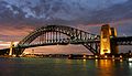
- Nomination The Sydney Harbour Bridge at night. (by User:Adam.J.W.C.). --High Contrast 06:34, 17 July 2010 (UTC)
- Promotion Not currently at required resolution. --99of9 06:51, 17 July 2010 (UTC) Support Nice image. For a QI absolutely okey. Alofok 10:56, 17 July 2010 (UTC) Sorry Alofok you are wrong. Even this pic is nice, or technically sufficient, it does not meet the size requirements. It CANNOT be a QI. Please read the guideline for QIC.--Jebulon 20:07, 17 July 2010 (UTC)
Wrong Jebulon. The size requirements are not that strictly as you are telling. It is legitim to promote below 2MP-images as well. --High Contrast 22:21, 17 July 2010 (UTC)
Inadequate size (1,377 × 768 pixels)--Lmbuga 00:06, 18 July 2010 (UTC)
Since the only objection was size, I'm going to promote the new version. Well done. --King of Hearts 02:53, 18 July 2010 (UTC). Anyway, this pic is good and a quality image. But was not absolutely okey, as said above.--Jebulon 10:00, 18 July 2010 (UTC)
-

-
- Nomination Perspective of the Jardins de l'Observatoire, from the Jardin du Luxembourg in Paris.--Jebulon 17:10, 14 July 2010 (UTC) New version uploaded, without the flying bird.--Jebulon 21:23, 16 July 2010 (UTC)
- Promotion Good now --George Chernilevsky 14:55, 17 July 2010 (UTC)
-

- Nomination The vineyard of "Château de Pommard" in Burgundy, view from the terrace of the castle.--Jebulon 16:00, 14 July 2010 (UTC) New version uploaded, re-cropped, tilt correction.--Jebulon 21:33, 16 July 2010 (UTC)
- Promotion Good now -- George Chernilevsky 14:58, 17 July 2010 (UTC)
-

- Nomination Iphofen, Bavaria, Zehntkeller --Berthold Werner 13:00, 13 July 2010 (UTC)
- Promotion Good to me. Now you have to identify the coats of arms !--Jebulon 23:18, 16 July 2010 (UTC)
Christoph Franz von Hutten (1724-1729) --Berthold Werner 17:12, 17 July 2010 (UTC) Champion !--Jebulon 21:02, 17 July 2010 (UTC) Hum. He died 5 years old ?--Jebulon 21:04, 17 July 2010 (UTC)
:-)) he was "Fürstbischof von Würzburg" from 1724-1729 and lived from 1673-1729 --Berthold Werner 09:30, 18 July 2010 (UTC)
-

- Nomination The beach of Guincho, west coast of Portugal, at the end of the day. -- Alvesgaspar 18:42, 12 July 2010 (UTC)
- Promotion The horizon looks a bit tilted cw. --Jebulon 23:52, 12 July 2010 (UTC) -- Done -- Agree, it is fixed now. -- Alvesgaspar 09:51, 13 July 2010 (UTC) It's a QI, with a very nice winter-evening light--Jebulon 21:13, 17 July 2010 (UTC)
-

-
- Nomination: Žulová (Friedberg) - view from market square --Pudelek 10:40, 12 July 2010 (UTC)
- Review needed
-

- Nomination: Kvinnohuset (Women's House), a collective house from 1946. --Ankara 13:36, 11 July 2010 (UTC)
- Review Comment Left upper parts unsharp? There is also something wrong with distortions. Very poor file description. -- Smial 18:17, 11 July 2010 (UTC) Description was easy to fix. I'm not sure how I can fix disortions here.-Ankara 18:39, 11 July 2010 (UTC)
-

- Nomination Snapping Turtle Skull - --Archaeodontosaurus 07:01, 17 July 2010 (UTC)
- Promotion Bien évidemment. Rama 09:27, 17 July 2010 (UTC)
-

- Nomination Dover Heights from Watsons Bay in Australia (by User:Adam.J.W.C.). --High Contrast 06:34, 17 July 2010 (UTC)
- Promotion Very impressive perspective --Haneburger 09:22, 17 July 2010 (UTC)
-

- Nomination Center point tower in Market st Sydney (by User:Adam.J.W.C.). --High Contrast 06:34, 17 July 2010 (UTC)
- Promotion Good illustration of the tower. Ankara 11:06, 17 July 2010 (UTC)
-

- Nomination Grand Fir (Abies grandis) cross section, Rogów Arboretum, Poland. --Crusier 05:10, 17 July 2010 (UTC)~
- Promotion Good --The High Fin Sperm Whale 03:26, 17 July 2010 (UTC)
-

- Nomination FN Model 1910. Photographed at Morges military museum behind a reflective display glass. -- Rama 00:50, 17 July 2010 (UTC)
- Promotion Good --The High Fin Sperm Whale 03:29, 17 July 2010 (UTC)
-

- Nomination Haize Hegoa type patrol boat Lissero (DF47), of the French customs services, photographed in the old harbour of Marseille. -- Rama 23:42, 16 July 2010 (UTC)
- Decline Looks underexposed, and has a lot more purple fringing than I'd like. --The High Fin Sperm Whale 03:27, 17 July 2010 (UTC)
-

-

- Nomination Sheep of Syria --Bgag 22:00, 16 July 2010 (UTC)
- Promotion sharp --Mbdortmund 22:05, 16 July 2010 (UTC)
-

-

-
- Nomination 1872 Swiss revolver, model 1878. Photographed at Morges military museum behind a reflective display glass. -- Rama 19:00, 16 July 2010 (UTC)
- Promotion QI for me --Archaeodontosaurus 19:07, 16 July 2010 (UTC)
-

-

- Nomination Rio Grande Gorge near Taos, NM. --Dschwen 16:34, 16 July 2010 (UTC)
- Promotion Very good quality despite the atmospheric conditions were probably not the best for this subject. Colors look a bit washed out but I suppose it is how it looked like. -- Alvesgaspar 18:28, 16 July 2010 (UTC)
-

- Nomination SIG P210, 1st series. Taken at Morges museum behind a reflective display glass. -- Rama 15:42, 16 July 2010 (UTC)
- Promotion Good --The High Fin Sperm Whale 15:13, 16 July 2010 (UTC)
-

- Nomination St. Joseph Cathedral in Sioux Falls, South Dakota.--Sdgjake 15:22, 16 July 2010 (UTC)
- Promotion Very nice. -- Felix Koenig 18:33, 16 July 2010 (UTC)
Could you rename it to a more descriptive filename? You can change the "Nomination" back to "Promotion" yourself once you do that. --King of Hearts 18:41, 16 July 2010 (UTC) Some very little stitching errors visible at very high resolution (white lines in the blue sky) But it is very nice (except the name of the file), and I'm absolutely unable to do something as good as this ! --Jebulon 22:43, 16 July 2010 (UTC) Done Renamed, and universal replace requested. --Myrabella 10:34, 17 July 2010 (UTC)
-

- Nomination Lake Shikotsu.--663highland 14:50, 16 July 2010 (UTC)
- Promotion QI to me.--Jebulon 22:33, 16 July 2010 (UTC)
-

- Nomination Nakajima Park in Sapporo.--663highland 14:50, 16 July 2010 (UTC)
- Promotion QI, with some acceptable CA--Jebulon 22:25, 16 July 2010 (UTC)
-
 }}
}}- Nomination The old synagogue in Essen -- Garver 13:39, 16 July 2010 (UTC)
- Decline imho not sharp enough and the cloud is too noisy. --Berthold Werner 10:54, 17 July 2010 (UTC)
-
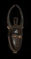
- Nomination African dog mask --Romanceor 12:25, 16 July 2010 (UTC)
- Promotion QI & Useful --Archaeodontosaurus 12:44, 16 July 2010 (UTC)
-

-

- Nomination European hornet (Vespa crabro Linnaeus, 1758) --Archaeodontosaurus 08:59, 16 July 2010 (UTC)
- Promotion Comment Very nice, QI, but should be cropped a bit IMO --Llez 05:26, 17 July 2010 (UTC)
Done --Archaeodontosaurus 06:48, 17 July 2010 (UTC)
Very good --Llez 06:53, 17 July 2010 (UTC)
-

-

- Nomination Bridge Pucallpa Natural Park --Diego Sanguinetti 17:07, 16 July 2010 (UTC)
- Decline Severely overexposed -- Alvesgaspar 20:25, 16 July 2010 (UTC)
-

- Nomination Hagia Sophia at night, Istanbul, Turkey -- Kirua 21:35, 15 July 2010 (UTC)
- Promotion a bit more details on the Building and it would be perfect --Mbdortmund 20:43, 16 July 2010 (UTC)
-

- Nomination Lestes sponsa --ComputerHotline 17:12, 13 July 2010 (UTC)
- Promotion Good. The category:Macro Photography should be removed (overcategorisation). --Cayambe 08:03, 17 July 2010 (UTC)
-

-
-

- Nomination Iphofen, Bavaria , Ludwigstraße 15 --Berthold Werner 07:47, 12 July 2010 (UTC)
- Promotion Nice trash bin...--Jebulon 23:15, 16 July 2010 (UTC)
Good image. Above average. --High Contrast 08:04, 17 July 2010 (UTC)
-
- Nomination: Bedroom in the fort d'Uxegney. --ComputerHotline 07:43, 11 July 2010 (UTC)
- Review Comment Température des blancs qui peut être corrigée --Archaeodontosaurus 08:24, 11 July 2010 (UTC)
-

- Nomination Kitchen in the fort d'Uxegney. --ComputerHotline 07:43, 11 July 2010 (UTC)
- Decline Comment Absence de texte explicatif --Archaeodontosaurus 08:25, 11 July 2010 (UTC) Ghosts of tourists, bad light above. Sorry.--Jebulon 23:08, 16 July 2010 (UTC)
-

- Nomination Colexiata de Santa María de Sar, Santiago de Compostela, Galicia (Spain)--Lmbuga 19:14, 10 July 2010 (UTC)
- Decline Strong
 chromatic aberration on the tree in the corner left above. The "flatness" of the white hortensias left looks unnatural. Maybe could you crop at the fork of the tree ? --Jebulon 23:05, 16 July 2010 (UTC)
-

- Nomination Polistes dominula drinking --Pjt56 18:33, 10 July 2010 (UTC)
- Decline Pretty noisy at full resolution, especially the background.
-
-
-

-

-
- Nomination Lefaucheux M1858 revolver, a groundbreaking revolver design. Photographed in a museum behind a reflective display glass. -- Rama 06:54, 16 July 2010 (UTC)
- Promotion QI & Useful... -- Archaeodontosaurus 07:09, 16 July 2010 (UTC)
Support too. Very good -- George Chernilevsky 07:17, 16 July 2010 (UTC)
-

- Nomination Aichwaldsee with Ferlacher Spitze and Mittagskogel, Carinthia, Austria -- Herzi Pinki 21:30, 15 July 2010 (UTC)
- Promotion Good composition --Haneburger 04:49, 16 July 2010 (UTC)
-
- Nomination The Arentshuis Museum in Bruges, Belgium -- MJJR 21:03, 15 July 2010 (UTC)
- Promotion Good. (the gate at the right may also be interesting) --Berthold Werner 06:09, 16 July 2010 (UTC)
-

- Nomination Einsiedeln Abbey. hofec 21:55, 15 July 2010 (UTC)
- Decline Oppose The perspective can be corrected --Archaeodontosaurus 07:06, 16 July 2010 (UTC)
-

- Nomination Baulé "zébus" mask. --Romanceor 19:03, 15 July 2010 (UTC)
- Promotion Good -- George Chernilevsky 05:55, 16 July 2010 (UTC)
-

- Nomination African bird mask. --Romanceor 19:03, 15 July 2010 (UTC)
- Promotion Good -- George Chernilevsky 05:50, 16 July 2010 (UTC)
-
- Nomination Baule mask. --Romanceor 19:03, 15 July 2010 (UTC)
- Promotion Good -- George Chernilevsky 05:45, 16 July 2010 (UTC)
-

- Nomination Bird mask. --Romanceor 19:03, 15 July 2010 (UTC)
- Promotion QI -- George Chernilevsky 05:44, 16 July 2010 (UTC)
-

- Nomination Night bird or sun mask. --Romanceor 19:03, 15 July 2010 (UTC)
- Promotion Good -- George Chernilevsky 05:42, 16 July 2010 (UTC)
-

- Nomination "Bouc" mask. --Romanceor 19:03, 15 July 2010 (UTC)
- Promotion Good -- George Chernilevsky 05:40, 16 July 2010 (UTC)
-
- Nomination Two faces African mask. --Romanceor 19:03, 15 July 2010 (UTC)
- Promotion Good -- George Chernilevsky 05:36, 16 July 2010 (UTC)
-
- Nomination Baule mask. --Romanceor 19:03, 15 July 2010 (UTC)
- Promotion QI -- George Chernilevsky 05:29, 16 July 2010 (UTC)
-
- Nomination "Antilope" mask. --Romanceor 19:03, 15 July 2010 (UTC)
- Promotion QI -- George Chernilevsky 05:29, 16 July 2010 (UTC)
-

- Nomination Iphofen, Bavaria: market place --Berthold Werner 13:16, 15 July 2010 (UTC)
- Promotion Sehr gut -- George Chernilevsky 05:21, 16 July 2010 (UTC)
-

- Nomination Villagers, Bathpura, district Gwalior, India. Yann 12:34, 15 July 2010 (UTC)
- Promotion Good. --Berthold Werner 13:18, 15 July 2010 (UTC)
-
- Nomination Fuji Television Headquarters Tokyo by User:Wiiii --Elekhh 09:20, 15 July 2010 (UTC)
- Promotion Good -- George Chernilevsky 05:24, 16 July 2010 (UTC)
-

-
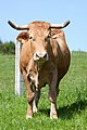
- Nomination Rubia of Galicia, Oroso, Galicia (Spain)--Lmbuga 20:39, 12 July 2010 (UTC)
- Decline The cow is very nice, but the concrete post and the fence in background are very disturbing to me. Sorry.--Jebulon 23:44, 12 July 2010 (UTC)
That's rather FP reasoning you apply there Jebulon. This is a mostly technical venue. Lycaon 10:32, 13 July 2010 (UTC) Info Agree with Jebulon here. --Cayambe 15:43, 13 July 2010 (UTC)@Lycaon: please continue to decline photos, but not comments of reviewers. I know what I say. I try to explain precisely my opinion, and I mean that it's better (and more useful for the photographer, maybe) than a harsh Bad composition. It's a question of respect for the nominator, especially when he is less experimented here than undiscourageable old moustaches.--Jebulon 09:12, 15 July 2010 (UTC)
Sorry Jebulon, but, after the other commentaries, I must say that I agree with you: the background is disturbing--Lmbuga 20:12, 15 July 2010 (UTC)
-

- Nomination: Speedwayriders Marko Suojanen and Aarni Heikkilä. --kallerna 07:29, 10 July 2010 (UTC)
- Review needed
-

- Nomination: Fort St. Angelo, Malta. -- Felix Koenig 11:20, 9 July 2010 (UTC)
- Review Are you sure your camera and lens are ok? The left part ist extremly blurred. I think the NIKON D60 should be better. Wich lens do you use? --Berthold Werner 12:32, 9 July 2010 (UTC)
-

- Nomination: Josef Mysliveček bust in Prague Jedudedek 09:23, 9 July 2010 (UTC)
- Review Proposal: crop it a little bit on the upper border and add a little bit sharpnes/contrast and turn it a bit CW --Mbdortmund 15:21, 9 July 2010 (UTC)
-

-

- Nomination A picnic during the early XVIth century in Burgundy. Tapestry (close-up) probably from Tournai, Hospices de Beaune, France.--Jebulon 22:31, 14 July 2010 (UTC)
- Promotion Good -- George Chernilevsky 05:16, 15 July 2010 (UTC)
-

- Nomination Lentas (Southern Crete, Greece): marina -- MJJR 21:25, 14 July 2010 (UTC)
- Promotion Good -- George Chernilevsky 05:17, 15 July 2010 (UTC)
-

-

- Nomination The cretaceaous ammonites Hoploscaphites and Discoscaphites --Llez 16:09, 14 July 2010 (UTC)
- Promotion QI & Useful --Archaeodontosaurus 17:33, 14 July 2010 (UTC)
-

- Nomination Flower of Galactites tomentosa. Lisboa, Portugal. -- Alvesgaspar 15:44, 14 July 2010 (UTC)
- Promotion Wonderful, very nice.--Jebulon 15:49, 14 July 2010 (UTC)
-
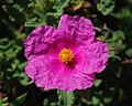
- Nomination Flower of a Cistus creticus. Porto Covo, Portugal. -- Alvesgaspar 15:39, 14 July 2010 (UTC)
- Promotion Ok. --Berthold Werner 17:57, 14 July 2010 (UTC)
-

-
-

-

-

-

-
- Nomination Phoenix canariensis, Jardin du Luxembourg, Paris--Jebulon 10:20, 14 July 2010 (UTC)
- Promotion Good. --Berthold Werner 13:40, 14 July 2010 (UTC)
-
-

-

- Nomination Tataragi Dam --663highland 14:54, 13 July 2010 (UTC)
- Promotion QI. --Elekhh 01:04, 15 July 2010 (UTC)
-

- Nomination SIG P220, original production. -- Rama 10:26, 13 July 2010 (UTC)
- Promotion Close but no cigar. Masking is insufficient (jagged edges) and guns should be cleaned first (lint). Lycaon 10:30, 13 July 2010 (UTC)
Uploaded new version with softened edges and cleaned dust, hope it's animprovement. Thank you for the hints in any case. -- Rama 12:39, 13 July 2010 (UTC)
Somewhat improved. Lycaon 07:00, 14 July 2010 (UTC) Support Good -- George Chernilevsky 05:14, 15 July 2010 (UTC)
-

- Nomination SIG P210, 2nd series. -- Rama 09:08, 13 July 2010 (UTC)
- Promotion Close but no cigar. Masking is insufficient (jagged edges) and guns should be cleaned first (lint). Lycaon 10:30, 13 July 2010 (UTC)
Uploaded new version with softened edges and cleaned dust, hope it's animprovement. Thank you for the hints in any case. -- Rama 15:33, 13 July 2010 (UTC)
Somewhat improved. Lycaon 07:00, 14 July 2010 (UTC) Support Good -- George Chernilevsky 05:12, 15 July 2010 (UTC)
-

-

- Nomination: Dragon in castle Mitrov Jedudedek 09:23, 9 July 2010 (UTC)
- Review needed
-

- Nomination: First Great Western 43193 heads an intercity service into Reading station, on its way to Paddington. Mattbuck 22:52, 8 July 2010 (UTC)
- Review needed
-

- Nomination: First Great Western 165116 departs Reading headed west. Mattbuck 22:26, 8 July 2010 (UTC)
- Review needed
-

- Nomination: a vintage (25 old at least) 2cv Citroën in Paris.--Jebulon 21:58, 8 July 2010 (UTC)
- Review needed
-

- Nomination: Outside broadcasting vans in Paris --Jebulon 21:03, 8 July 2010 (UTC)
- Review needed
-

- Nomination View from the promontory of Sagres, south of Portugal. -- Alvesgaspar 16:29, 8 July 2010 (UTC)
- Withdrawn Comment There is a small error in the upper left corner. --Berthold Werner 17:29, 8 July 2010 (UTC) -- Info -- Fixed -- Alvesgaspar 19:40, 8 July 2010 (UTC)
Tilt CCW and bit blurred (Zoom?). Just avergade quality -- George Chernilevsky 11:47, 9 July 2010 (UTC) Agree with George. I'll oppose if not fixed--Jebulon 16:29, 12 July 2010 (UTC) Oppose not fixed -- George Chernilevsky 05:57, 13 July 2010 (UTC) -- Not fixable, both the geometric distortion (not tilt) and the blur due to atmopsheric haze. Withdrawn. -- Alvesgaspar 15:27, 14 July 2010 (UTC)
-

-

- Nomination View of St Paul's Cathedral and Thames by night (second version) --WikiLaurent 11:46, 14 July 2010 (UTC)
- Decline Perspective distorted, noisy, oversaturated and not sharp. Need I say more ;-)? Lycaon 11:58, 14 July 2010 (UTC)
-

- Nomination Awl made from abraded bone (Neolithic) --Archaeodontosaurus 11:35, 14 July 2010 (UTC)(UTC)
- Promotion Good as usual (a tiny bit sharper would be a bonus). Lycaon 12:00, 14 July 2010 (UTC)
-

-

-

- Nomination a stained glass window representing the CoA of the Confrérie du Tastevin in the castle of Clos de Vougeot in Burgundy. --Jebulon 23:40, 13 July 2010 (UTC)
- Promotion Good -- George Chernilevsky 11:16, 14 July 2010 (UTC)
-

-

-
- Nomination Corbel gallery, church Saint Etienne du Mont in Paris.--Jebulon 22:18, 13 July 2010 (UTC)
- Promotion QI fro me -- Archaeodontosaurus 08:14, 14 July 2010 (UTC)
-

- Nomination Mountains in Chile --Pineapple fez 21:56, 13 July 2010 (UTC)
- Decline Oversaturation. -- Smial 23:44, 13 July 2010 (UTC)
-

- Nomination Bruges (Belgium): the Gruuthuse Museum -- MJJR 21:19, 13 July 2010 (UTC)
- Promotion QI for me -- Archaeodontosaurus 08:17, 14 July 2010 (UTC)
-
-

- Nomination Orthetrum albistylum. --ComputerHotline 17:12, 13 July 2010 (UTC)
- Promotion Good --The High Fin Sperm Whale 15:56, 13 July 2010 (UTC)
-

-

- Nomination Golden-mantled Ground Squirrel in Rocky Mountain national Park. --Dschwen 17:06, 13 July 2010 (UTC)
- Promotion Comment The scientific name would be welcome -- Archaeodontosaurus 17:55, 13 July 2010 (UTC). Done (was actually misidentifed). --Dschwen 18:29, 13 July 2010 (UTC) Probably juvenile form of Spermophilus lateralis, I think. QI and Useful -- Archaeodontosaurus 20:18, 13 July 2010 (UTC)
-

- Nomination The bronze statues of Jean Francisque Coignet on Ikuno Ginzan Silver Mine --663highland 14:54, 13 July 2010 (UTC)
- Promotion QI & Useful -- Archaeodontosaurus 17:53, 13 July 2010 (UTC)
-

-
- Nomination Entrance of the 'Arentshuis' museum in Bruges (Belgium) -- MJJR 19:51, 12 July 2010 (UTC)
- Promotion Need a crop on the left side IMO, because of the notice board. --Jebulon 23:48, 12 July 2010 (UTC) Done -- MJJR 07:51, 13 July 2010 (UTC)Good now, thank you. Did you agree with my wish ? --Jebulon 08:34, 13 July 2010 (UTC)
Yes, the notice board was a little bit disturbing indeed. -- MJJR 18:55, 13 July 2010 (UTC)
-

- Nomination: Banyan, India. Yann 08:35, 8 July 2010 (UTC)
- Review needed
-

- Nomination: Near this pillar rests the body of Blaise Pascal..., Church Saint Etienne du Mont, Paris--Jebulon 23:01, 7 July 2010 (UTC)
- Review needed
-

- Nomination: detail of a sculpture of a lions head on a façade in Paris.--Jebulon 21:39, 7 July 2010 (UTC)
- Review needed
-

- Nomination: a french balcony with heads of lions, ca. 1900, Paris.--Jebulon 21:31, 7 July 2010 (UTC)
- Review needed
-

- Nomination: Žulová (Friedberg) - St. Joseph church --Pudelek 13:45, 7 July 2010 (UTC)
- Review needed
-

- Nomination Enjoying in hot tub (also known as spa, furo, bath barrel, hotspring). --kallerna 18:39, 6 July 2010 (UTC)
- Decline Good idea, but it's softish (maybe the shutter speed was insufficient) and it lacks depth of field. Maybe a bit on the light side too, could be uderexposed by one or two thirds of a stop. Rama 11:14, 14 July 2010 (UTC)
-

- Nomination Trier, Palmatiuststraße 6, build in 1757 --Berthold Werner 08:54, 6 July 2010 (UTC) blue channel oversaturated --Mbdortmund 21:42, 6 July 2010 (UTC)
Better now? --Berthold Werner 09:40, 8 July 2010 (UTC) - Promotion QI for me in spite of minor CA on the left. (Look at the leftmost windows. Did you try any free CA correction software?) --Johannes Robalotoff 18:09, 12 July 2010 (UTC)
CA now removed with FixFoto --Berthold Werner 16:35, 13 July 2010 (UTC)
- Nomination Trier, Palmatiuststraße 6, build in 1757 --Berthold Werner 08:54, 6 July 2010 (UTC) blue channel oversaturated --Mbdortmund 21:42, 6 July 2010 (UTC)
-

- Nomination Cornflowers (Centaurea cyanus). --kallerna 08:22, 5 July 2010 (UTC)
- Decline Comment Somewhat overexposed IMO, not geocoded --Llez 08:04, 10 July 2010 (UTC) Comment I'd also say it's a little bit too bright --Dein Freund der Baum 23:48, 13 July 2010 (UTC) It is overexposed (as others said above). --A.Ceta 06:01, 14 July 2010 (UTC)
-
- Nomination Pormestarinsilta bridge in Pori. --kallerna 22:01, 4 July 2010 (UTC)
- Promotion I was to support with enthusiasm, but... See the annotation, please.--Jebulon 23:17, 4 July 2010 (UTC) Support No need for perfect symetry here IMO. You know the Mona Lisa would be ugly if perfectly symetric... --Elekhh 23:24, 4 July 2010 (UTC)The purpose of this pic is to play with symmetry. It was not the goal of Leonardo (in the case of Mona). Comparaison n'est pas raison. (please, support with the QI mode, not with the FP one...) --Jebulon 08:37, 5 July 2010 (UTC) By the way... Mona Lisa IS ugly, (IMHO)--Jebulon 22:25, 5 July 2010 (UTC) I support it woo. Becuase such images of bridges give a special impression of the strucutre and in addition, this photo is technically fine. --A.Ceta 06:00, 14 July 2010 (UTC)
-

- Nomination Plain walk, Notre-Dame cemetery Luxemb. City. --Cayambe 06:42, 13 July 2010 (UTC)
- Promotion Good --George Chernilevsky 06:59, 13 July 2010 (UTC)
-

- Nomination Rooster and hen copulating.--Andrei Stroe 06:03, 13 July 2010 (UTC)
- Decline Overexposure (whites), unsharpness...and explicit sexual content !!;). Sorry.--Jebulon 08:38, 13 July 2010 (UTC)
-

- Nomination Tatra T3R.PLF, Na Knížecí, Prague — Jagro 01:25, 13 July 2010 (UTC)
- Promotion Good -- George Chernilevsky 05:44, 13 July 2010 (UTC)
-

- Nomination Krak des Chevaliers, Syria --Bgag 01:15, 13 July 2010 (UTC)
- Promotion Good -- George Chernilevsky 06:00, 13 July 2010 (UTC)
-

- Nomination Krak des Chevaliers, Syria --Bgag 00:51, 13 July 2010 (UTC)
- Promotion QI -- George Chernilevsky 05:59, 13 July 2010 (UTC)
-

- Nomination Hoverfly in flight. Below size requirements but there are mitigating factors imo. -- Alvesgaspar 22:19, 12 July 2010 (UTC)
- Decline Ever so sorry but no mitigation in QI ;-). Lycaon 05:04, 13 July 2010 (UTC)
-

- Nomination A female Marmelade Fly -- Alvesgaspar 20:59, 12 July 2010 (UTC)
- Promotion Good --The High Fin Sperm Whale 19:20, 12 July 2010 (UTC)
-
- Nomination A crab spider capturing a fly -- Alvesgaspar 20:55, 12 July 2010 (UTC)
- Promotion Good --The High Fin Sperm Whale 19:20, 12 July 2010 (UTC)
-

- Nomination Rubia of Galicia, Galicia (Spain)--Lmbuga 20:18, 12 July 2010 (UTC)
- Decline Not a good crop: to tight to see the animal, not tight enough for a close-up. Lycaon 20:39, 12 July 2010 (UTC)
In agreement, but after this I think that crop is impossible (5,616 × 3,744 pixels)--Lmbuga 20:56, 12 July 2010 (UTC)
-
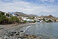
- Nomination The village and the beach of Lentas in Crete - MJJR 19:51, 12 July 2010 (UTC)
- Promotion Very good -- George Chernilevsky 05:41, 13 July 2010 (UTC)
-

-

- Nomination The main square of Porto Covo, northern corner. West coast of Portugal. -- Alvesgaspar 18:46, 12 July 2010 (UTC)
- Promotion Good. --Cayambe 06:15, 13 July 2010 (UTC)
-

-

- Nomination Inflorescence of the Narrowleaf Plantain Plantago lanceolata --Llez 16:29, 12 July 2010 (UTC)
- Decline Oversharpened, noisy artefacts and few details. Compare to this four year old image! Lycaon 17:55, 12 July 2010 (UTC)
-

- Nomination Nemophila --663highland 16:09, 12 July 2010 (UTC)
- Decline Not even the main two flowers are properly in focus. Also specific id is missing. Lycaon 17:52, 12 July 2010 (UTC)
-
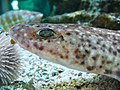
-

-

- Nomination Greater Butterfly Orchid (Platanthera chlorantha) --LC-de 09:15, 12 July 2010 (UTC)
- Promotion I'm aware plants do not always grow straight, but it would be easy to straighten this one and the close-up. will support when done. Lycaon 13:02, 12 July 2010 (UTC)
Straightened. --King of Hearts 17:22, 12 July 2010 (UTC)
Better. Lycaon 17:59, 12 July 2010 (UTC)
-

-

- Nomination Panoramic photograph of the city bavarian Kempten. --High Contrast 19:24, 11 July 2010 (UTC)
- Decline Left end of the picture seems very out of place, both with the coloration of the sky and abrupt transition to woods. I would support the image that part of the image was cropped out. --DaNASCAT 17:48, 12 July 2010 (UTC)
-

- Nomination Dragon statue on Longshan Template, Taipei. --WikiLaurent 18:39, 10 July 2010 (UTC)
- Decline Noisy and strong haloes (e.g. on dragon's whiskers). Lycaon 10:39, 13 July 2010 (UTC)
-

-

- Nomination Tojinbo -663highland 13:02, 10 July 2010 (UTC)
- Decline Warped horizon, could also use a bit of sharpening. Lycaon 18:06, 12 July 2010 (UTC)
-

- Nomination Kintsvisi Monastery, Georgia. BruTe 11:03, 10 July 2010 (UTC)
- Decline Comment Strong perspective effect (walls lean inward), sky overexposed at the right, although not looking too unnatural, building comparatively dark, unfortunate crop at the right. Yet if I imagine the distortion were corrected, I like the composition too much to decline at once. Nice picture, but probably not QI. Other opinions? --Johannes Robalotoff 15:08, 10 July 2010 (UTC) Comment No other opinions and no problems. :) Thanks. BruTe 17:22, 10 July 2010 (UTC)
Unfortunate lighting conditions. Lycaon 13:12, 12 July 2010 (UTC)
-

-

- Nomination The Basilica Cistern in Istanbul. --Kirua 23:50, 7 July 2010 (UTC)
- Promotion QI to me.--Jebulon 09:26, 13 July 2010 (UTC)
-

- Nomination Church facade of Fontevraud Abbey. --Coyau 12:43, 7 July 2010 (UTC)
- Promotion Comment le clochet de gauche semble penché: l'est-il dans la réalité? --Archaeodontosaurus 10:24, 12 July 2010 (UTC)
Dur à dire. ici ça n'a pas l'air très droit, là ça penche aussi un peu. --Coyau 06:08, 13 July 2010 (UTC)
QI for me --Archaeodontosaurus 07:41, 13 July 2010 (UTC)
-

-

- Nomination: stained glass lights on a floor.--Jebulon 23:09, 6 July 2010 (UTC)
- Review needed
-

- Nomination: Oldtown of Zadar, Croatia. --AleXXw 21:27, 6 July 2010 (UTC)
- Review Comment The image has a lot of dust spots which are clearly visible in the sky and water! --Jovianeye 23:39, 6 July 2010 (UTC) Sorry, I've uploaded the wrong file fist, should be better now. --AleXXw 01:01, 7 July 2010 (UTC)
-
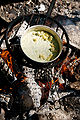
-

- Nomination: Ethiopian singer Alemayehu Eshete. --ComputerHotline 14:47, 6 July 2010 (UTC)
- Review needed
-

-

- Nomination Art Nouveau side door in Semily --Gumruch 10:04, 4 July 2010 (UTC)
- Decline perspective needs correction --Mbdortmund 12:02, 4 July 2010 (UTC) tilt too. --Jebulon 21:08, 4 July 2010 (UTC)Nor answer neither improvement 8 days after review. --Jebulon 16:20, 12 July 2010 (UTC)
-

- Nomination Ruins of Kronoberg Castle, Sweden --LC-de 23:55, 11 July 2010 (UTC)
- Promotion Ok. --Berthold Werner 10:45, 12 July 2010 (UTC)
-

- Nomination Small Pinkertail (Onychogomphus forcipatus) --LC-de 18:42, 11 July 2010 (UTC)
- Promotion QI for me. Darius Baužys 19:06, 11 July 2010 (UTC)
-

- Nomination Raccoon Dog --663highland 15:01, 11 July 2010 (UTC)
- Decline The left one has strong motion blur. -- Smial 18:17, 11 July 2010 (UTC)
-

- Nomination Kyu-Daijoin Garden in Nara --663highland 15:01, 11 July 2010 (UTC)
- Promotion Nice WikiLaurent 16:30, 11 July 2010 (UTC)
-

- Nomination A night market in Tainan, Taiwan --WikiLaurent 10:13, 11 July 2010 (UTC)
- Decline Noisy, overexposed, not really sharp. -- Smial 18:17, 11 July 2010 (UTC)
-

- Nomination Entry of the fort d'Uxegney. --ComputerHotline 07:43, 11 July 2010 (UTC)
- Decline Composition could be better. Actually, we can't see much of the entrance. WikiLaurent 16:31, 11 July 2010 (UTC)
-

- Nomination Enchoen Garden --663highland 02:07, 11 July 2010 (UTC)
- Promotion Slight unsharpeness in far corners, but otherwise good. QI for me -- Smial 18:28, 11 July 2010 (UTC)
-
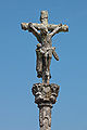
-
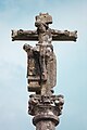
- Nomination San Salvador de Bastavales, Brión, Galicia--Lmbuga 18:53, 10 July 2010 (UTC)
- Decline Oppose visible CA, partially out of focus, blurred (camera not steady) --Niabot 09:46, 12 July 2010 (UTC)
-

-

-
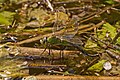
- Nomination Southern migrant hawker during oviposition --Pjt56 18:33, 10 July 2010 (UTC)
- Promotion Good --The High Fin Sperm Whale 18:34, 11 July 2010 (UTC)
-

- Nomination Mannheim Nord power plant. -- Felix Koenig 17:41, 9 July 2010 (UTC)
- Promotion Good picture --Ong-Bak 17:38, 11 July 2010 (UTC)
-
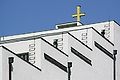
-

- Nomination Main entry of the fort d'Uxegney. --ComputerHotline 07:43, 11 July 2010 (UTC)
- Promotion Qi & Useful --Archaeodontosaurus 08:22, 11 July 2010 (UTC)
-

- Nomination Enchoen Garden --663highland 02:07, 11 July 2010 (UTC)
- Decline I like the composition, but there is quite a lot of CA on the left side, and the lions are overexposed. --King of Hearts 04:32, 11 July 2010 (UTC)
-
- Nomination Sprinter Erik Zabel during the Tour de France 2007 in London. --WikiLaurent 18:41, 10 July 2010 (UTC)
- Decline Noisy, bad lighting. --King of Hearts 04:50, 11 July 2010 (UTC)
-

- Nomination Plumboan Aragonite --Archaeodontosaurus 15:39, 10 July 2010 (UTC)
- Promotion Good and useful --Llez 07:47, 11 July 2010 (UTC)
-

- Nomination Iphofen, Bavaria, timberframend building. --Berthold Werner 10:42, 10 July 2010 (UTC)
- Promotion There are some edges with CA at the far left and a purple color effect from CA at the far right. Also the rooftops begin to exhibit (still very week) sharpening halos. Yet both effects are very minor here, so that they do not hinder QI promotion IMHO. --Johannes Robalotoff 14:46, 10 July 2010 (UTC) Comment I made some fixes in Photoshop; see my upload comment. --King of Hearts 04:48, 11 July 2010 (UTC)
-

- Nomination Fort St. Angelo, Malta. -- Felix Koenig 18:11, 9 July 2010 (UTC)
- Decline Lacking details. Lycaon 09:03, 11 July 2010 (UTC)
-

- Nomination: Taavisilta bridge. --kallerna 08:22, 5 July 2010 (UTC)
- Review needed
-

- Nomination: Taavisilta bridge in Pori. --kallerna 22:01, 4 July 2010 (UTC)
- Review needed
-

- Nomination A panorama of some Swedish fell. "Finalist" of New pictures of the month for June at Svwp. --Scouten 14:59, 2 July 2010 (UTC)
- Promotion Beautiful scenery though I would have liked to see more of the lake on the left and less of the road on the right side. WikiLaurent 16:33, 10 July 2010 (UTC)
-

- Nomination Karpathos harbor. "Finalist" of New pictures of the month for June at Svwp. --Scouten 14:59, 2 July 2010 (UTC)
- Decline Comment Removed lensflare. --Scouten 14:35, 5 July 2010 (UTC)
No well defined subject and not very sharp. WikiLaurent 16:32, 10 July 2010 (UTC)
-

- Nomination A green Ford Thunderbird--Pineapple fez 05:43, 10 July 2010 (UTC)
- Decline Sorry, there are too much overexposed parts and sharpness is not fair. --Berthold Werner 10:56, 10 July 2010 (UTC)
-

- Nomination Medieval tower at Idstein, Germany. --Johannes Robalotoff 18:20, 9 July 2010 (UTC)
- Promotion Good --Pineapple fez 05:43, 10 July 2010 (UTC)
-

- Nomination The fossil frog Latonia seyfriedi (Miocene) --Llez 13:04, 9 July 2010 (UTC)
- Promotion QI & Useful --Archaeodontosaurus 13:50, 9 July 2010 (UTC)
-

-

-

- Nomination Saint-Pierre-Saint-Paul church in Rueil-Malmaison (France) --Myrabella 08:01, 9 July 2010 (UTC)
- Promotion Ok. --Berthold Werner 12:45, 9 July 2010 (UTC)
-
- Nomination Iphofen, Bavaria. Zehnhof --Berthold Werner 07:58, 9 July 2010 (UTC)
- Promotion Nice. MJJR 21:17, 9 July 2010 (UTC)
-

- Nomination Cock Jedudedek 09:23, 9 July 2010 (UTC)
- Promotion OK --Mbdortmund 15:22, 9 July 2010 (UTC)
-

- Nomination Building ornament in Prague Jedudedek 09:23, 9 July 2010 (UTC)
- Promotion QI IMHO. --Johannes Robalotoff 18:27, 9 July 2010 (UTC)
-

- Nomination CrossCountry 220013 sits at Reading station, ready to depart with a service to Edinburgh. Mattbuck 22:26, 8 July 2010 (UTC)
- Decline Too little of the subject is shown. --King of Hearts 02:39, 10 July 2010 (UTC)
-
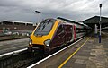
- Nomination CrossCountry 220013 sits at Reading station, ready to depart with a service to Edinburgh. Mattbuck 22:26, 8 July 2010 (UTC)
- Promotion Nice composition, use of line. --King of Hearts 02:39, 10 July 2010 (UTC)
-

- Nomination Neolithic Poignard --Archaeodontosaurus 20:07, 8 July 2010 (UTC)
- Promotion Comment Is this background gradient needed? I know it is an optical illusion, but makes them look curved. Plain background would be desirable. --Niabot 08:39, 9 July 2010 (UTC) Is a matter of taste, but I also take care to put a version without background. --Archaeodontosaurus 16:02, 9 July 2010 (UTC)
Support Very good quality IMO --George Chernilevsky 11:43, 9 July 2010 (UTC)
-
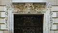
-

- Nomination Dortmunder Volksbank --Mbdortmund 21:32, 7 July 2010 (UTC)
- Decline Sorry, but there's a substantial amount of noise, particularly in the lower right hand corner and on the windows, and there's some CW tilt if you look at the top gridline in Photoshop. But the main issue is noise; ISO 500 shouldn't be used in sunlight. --King of Hearts 02:48, 10 July 2010 (UTC)
-

- Nomination: Close-up of shelled hemp seeds --Gumruch 10:04, 4 July 2010 (UTC)
- Review needed
-

- Nomination: Practising to A-driving license in Pori Delta Arena. --kallerna 20:47, 3 July 2010 (UTC)
- Review needed
-

- Nomination Marked town sign of Visquard --Carschten 19:17, 3 July 2010 (UTC)
- Decline Unlike the previous image (35 FAM-WM 2010), the lighting is poor here. The sign is in shade, while the sky on the left is blown out. --King of Hearts 17:50, 9 July 2010 (UTC)
-

- Nomination: A sailboat in Blekinge, Sweden. "Finalist" of New pictures of the month for June at Svwp. --Scouten 14:59, 2 July 2010 (UTC)
- Review Comment I really love the compostion, but the boat is overexposed, the image is noisy and there are lots of dust spots (I marked some (!)) --Carschten 13:02, 3 July 2010 (UTC)
-
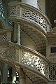
- Nomination The right spiral stairs (XVIth-XIXth) of the rood screen of church Saint Etienne du Mont in Paris.--Jebulon 22:56, 8 July 2010 (UTC)
- Promotion QI and Useful --Archaeodontosaurus 06:09, 9 July 2010 (UTC)
-
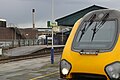
- Nomination CrossCountry 220013 sits at Reading station, ready to depart with a service to Edinburgh. Mattbuck 22:26, 8 July 2010 (UTC)
- Decline Crop imo too tight --Mbdortmund 23:36, 8 July 2010 (UTC)
-

- Nomination Top of the Minaret of the Grand Mosque of Paris.--Jebulon 22:19, 8 July 2010 (UTC)
- Promotion little noise against the sky imo acceptable --Mbdortmund 23:34, 8 July 2010 (UTC)
-

- Nomination Piles of wasted soil of different compositions used for levelling the terrain. -- Alvesgaspar 16:29, 8 July 2010 (UTC)
- Promotion Ok. But I think the piece of garbage should be removed. (best in relity ;-) --Berthold Werner 17:33, 8 July 2010 (UTC) -- Info -- Trash collected -- Alvesgaspar 19:40, 8 July 2010 (UTC)
-

-
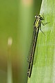
- Nomination Ischnura elegans f. infuscans --Loz 12:20, 8 July 2010 (UTC)
- Promotion Very good -- George Chernilevsky 13:57, 8 July 2010 (UTC)
-

- Nomination Ischnura elegans f. typica --Loz 12:20, 8 July 2010 (UTC)
- Promotion Good -- George Chernilevsky 13:58, 8 July 2010 (UTC)
-

- Nomination Enallagma cyathigerum, male. The photo is part of a sequence that shows the consumption of a cicada --Loz 12:20, 8 July 2010 (UTC)
- Promotion Good -- George Chernilevsky 13:57, 8 July 2010 (UTC)
-
- Nomination Enallagma cyathigerum, male. The photo is part of a sequence that shows the consumption of a cicada --Loz 12:20, 8 July 2010 (UTC)
- Promotion Perfect --George Chernilevsky 13:56, 8 July 2010 (UTC)
-

- Nomination Electronika MK-71 (old calculator, made in USSR) --Kae 11:20, 8 July 2010 (UTC)
- Promotion Good quality. WikiLaurent 20:39, 8 July 2010 (UTC)
-
- Nomination BMW E90 near Fatijärvi. --kallerna 17:53, 7 July 2010 (UTC)
- Promotion Good --The High Fin Sperm Whale 16:02, 8 July 2010 (UTC)
-

- Nomination Panorama view from Raumansilta bridge in Pori. --kallerna 17:53, 7 July 2010 (UTC)
- Promotion Good --The High Fin Sperm Whale 16:02, 8 July 2010 (UTC)
-
- Nomination Collared Lizard at Black Canyon of the Gunnison National Park. --Dschwen 16:44, 7 July 2010 (UTC)
- Promotion Good --The High Fin Sperm Whale 16:02, 8 July 2010 (UTC)
-

- Nomination Collared Lizard at Black Canyon of the Gunnison National Park. --Dschwen 16:44, 7 July 2010 (UTC)
- Promotion Good --The High Fin Sperm Whale 16:02, 8 July 2010 (UTC)
-

- Nomination Ishibutai Kofun in Asuka, Nara Prefecture, Japan. --663highland 14:54, 7 July 2010 (UTC)
- Promotion Some disturbing smoke in background but imho ok for QI. --Berthold Werner 17:08, 8 July 2010 (UTC)
-
-

- Nomination Small Tortoiseshell - top view. --Quartl 18:22, 1 July 2010 (UTC)
- Promotion Good picture. WikiLaurent 20:36, 8 July 2010 (UTC)
-

- Nomination: Cardiff Bay panorama. --WikiLaurent 12:00, 1 July 2010 (UTC)
- Review needed
-
- Nomination Confluence of the Traisen River into the Danube in Lower Austria. --AleXXw 23:05, 7 July 2010 (UTC)
- Promotion Comment Dirty lens, some spots on the sky. Correction need -- George Chernilevsky 07:57, 8 July 2010 (UTC)
Should be better now. --AleXXw 08:43, 8 July 2010 (UTC)
Good now, Support -- George Chernilevsky 10:33, 8 July 2010 (UTC)
-

-
- Nomination Lázně Jeseník (Bad Gräfenberg) - villa Adelheid --Pudelek 13:45, 7 July 2010 (UTC)
- Promotion QI -- George Chernilevsky 07:49, 8 July 2010 (UTC)
-
- Nomination Dormition Cathedral in Omsk, Russia. --PetarM 13:22, 7 July 2010 (UTC)
- Promotion Well done! -- George Chernilevsky 07:50, 8 July 2010 (UTC)
-
- Nomination Iphofen, Bavaria. Mainbernheimer Tor --Berthold Werner 12:14, 7 July 2010 (UTC)
- Promotion good --Carschten 12:44, 7 July 2010 (UTC)
-
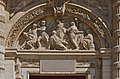
-

- Nomination Świętokrzyski Bridge in Warsaw, Poland --Crusier 18:55, 5 July 2010 (UTC)
- Promotion QI, nice composition to me, even I like version 2 more --J. Lunau 14:48, 7 July 2010 (UTC)
-

- Nomination The village of Ano Viannos on Crete -- MJJR 21:23, 4 July 2010 (UTC)
- Promotion Good, but it would be better to reduce sharpness level in your camera because there are visible sharpness artifacts on the picture (dark contours around light objects and vice versa). --Kae 08:25, 8 July 2010 (UTC)
-

- Nomination: Briggs Factory chimney in Marki, Poland --Crusier 19:55, 1 July 2010 (UTC)
- Review needed
-

- Nomination: Church in Oberstenfeld, Germany. Felix Koenig 19:24, 27 June 2010 (UTC)
- Review Slight distorsion left, IMO--Jebulon 21:36, 27 June 2010 (UTC)
I don't think so; I think the slanted line you're seeing is a result of the viewing (ground) angle and thus the building itself, i.e. that line is not in the middle. FWIW I measured in Photoshop, and Line 1 (see tags on file description) is tilted 1.5° CCW and Line 2 is tilted 0.5° CW. So as a whole there's no tilt. --King of Hearts 01:02, 2 July 2010 (UTC)
-

- Nomination Spring day in the park of Bois-Préau castle (Rueil-Malmaison, France) --Myrabella 06:41, 7 July 2010 (UTC)
- Promotion Very good --George Chernilevsky 11:22, 7 July 2010 (UTC)
-

-

- Nomination Underside of a wild carrot flower (Daucus carota). --Quartl 04:19, 7 July 2010 (UTC)
- Promotion Nice view. Darius Baužys 05:19, 7 July 2010 (UTC)
-

-

- Nomination Kniphofia uvaria in an croatian garden. --AleXXw 22:01, 6 July 2010 (UTC)
- Promotion Very good --Jebulon 23:10, 6 July 2010 (UTC)
-
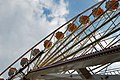
- Nomination Ferris wheel in Dortmund --Mbdortmund 21:23, 6 July 2010 (UTC)
- Promotion Interesting compo of a ferris wheel in which name is the word "parisienne"...--Jebulon 23:13, 6 July 2010 (UTC)
-

- Nomination Kloster Karthaus in Konz by Klein R., nominated by --Berthold Werner 11:14, 6 July 2010 (UTC)
- Promotion Gut. --Cayambe 14:46, 6 July 2010 (UTC)
-

- Nomination Świętokrzyski Bridge in Warsaw, Poland --Crusier 06:15, 6 July 2010 (UTC)
- Promotion Good picture. Trace 11:08, 7 July 2010 (UTC)
-

-

-

- Nomination Oka-dera temple in Asuka, Nara Prefecture, Japan. --The High Fin Sperm Whale 02:41, 6 July 2010 (UTC)
- Decline Strong CA. Lycaon 06:37, 6 July 2010 (UTC)
I'm not seeing the CA, but I do see highlight blowout and moderate noise in dark areas. --King of Hearts 05:45, 7 July 2010 (UTC)
-

- Nomination Panorama of north Härjedalen . --Ankara 09:28, 5 July 2010 (UTC)
- Promotion Nice panorama. Trace 11:10, 7 July 2010 (UTC)
-

- Nomination high res Panorama of Brandenburg July 2010 --Leviathan1983 07:53, 5 July 2010 (UTC)
- Promotion Great panorama. Trace 11:10, 7 July 2010 (UTC)
-

- Nomination Former oil power plant in Germany. --High Contrast 20:58, 4 July 2010 (UTC)
- Decline Severe highlight blowout, especially of the blue channel, sorry. --King of Hearts 05:31, 7 July 2010 (UTC)
-

- Nomination Lightnings in Belfort, France. --ComputerHotline 09:51, 4 July 2010 (UTC)
- Promotion Noise is pretty obvious, but a cool night pic, I'm not complaining. --King of Hearts 05:48, 7 July 2010 (UTC)
-

-

- Nomination Detail of a touristic bridge in Luxembourg Mullerthal. --Cayambe 13:44, 2 July 2010 (UTC)
- Decline Unfortunately, object is not visually separated from background: image looks like a single mess of small details. Probably, another light, composition or depth of field would help. --Kae 10:01, 7 July 2010 (UTC)
-

- Nomination Kirjurinluoto kivipuutarha (stone garden). --kallerna 17:04, 1 July 2010 (UTC)
- Promotion Comment Horizon seems to be tilted (clockwise rotation is needed?) --Kae 13:08, 2 July 2010 (UTC) Info Fixed. --kallerna 22:06, 4 July 2010 (UTC) Support There are some visible distortions (due to short focal length), but I think it is good enough for QI. --Kae 18:05, 6 July 2010 (UTC)
-

-

- Nomination: Castle in Nowęcin. Yarl 15:11, 29 June 2010 (UTC)
- Review perspective and colours need adjustment --Mbdortmund 10:29, 1 July 2010 (UTC)
-

- Nomination Small roadside Equator monument in Ecuador. --Cayambe 14:57, 27 June 2010 (UTC)
- Promotion
to me it looks, geotagging is incorrect, otherwiseQI with lot informations. --J. Lunau 10:54, 7 July 2010 (UTC) Info Geotag corrected, from E to W :-). Thanks for the review.--Cayambe 07:08, 6 July 2010 (UTC)
-
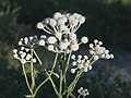
-

- Nomination Volkswagen T3 van. --Pineapple fez 06:52, 6 July 2010 (UTC)
- Decline Far below size requirement --Berthold Werner 07:50, 6 July 2010 (UTC)
-

- Nomination Petr Čech — Jagro 23:44, 5 July 2010 (UTC)
- Promotion For a really good portrait the person should look more to the camera, but QI though. -- Smial 23:51, 5 July 2010 (UTC) Comment I know, but suddenly there was problem with another photographs and my accreditation… — Jagro 23:56, 5 July 2010 (UTC)
-

-

- Nomination Lilium candidum L.--Jebulon 22:21, 5 July 2010 (UTC)
- Promotion Good --The High Fin Sperm Whale 02:40, 6 July 2010 (UTC)
-

-

- Nomination Bavarian village square with Maypole and church in the background. --High Contrast 18:23, 5 July 2010 (UTC)
- Decline Needs perspective correction, not really sharp, some sharpening artefacts though, perhaps some over saturation. -- Smial 23:20, 5 July 2010 (UTC)
-
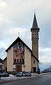
- Nomination Church at Bedollo-Brusago, Trentino. Felix Koenig 17:48, 5 July 2010 (UTC)
- Decline awkward lighting -- Smial 23:15, 5 July 2010 (UTC)
-
![* Nomination Sunrise at the Königspitze seen from the Hintergrat of the Ortler (Northern Italy) --Haneburger * Promotion great arrangement of areas, very light, yet very distinct distribution of colours, fantastic.--Rupert Pupkin 19:36, 5 July 2010 (UTC)]] 17:43, 5 July 2010 (UTC)](https://upload.wikimedia.org/wikipedia/commons/thumb/9/92/K%C3%B6nigspitze_Sunrise.jpg/120px-K%C3%B6nigspitze_Sunrise.jpg)
- Nomination Sunrise at the Königspitze seen from the Hintergrat of the Ortler (Northern Italy) --Haneburger
- Promotion great arrangement of areas, very light, yet very distinct distribution of colours, fantastic.--Rupert Pupkin 19:36, 5 July 2010 (UTC)]] 17:43, 5 July 2010 (UTC)
-

- Nomination Detail of a stained glass window in St. Brendan, Bantry in Ireland, depicting Isaiah 40:11: He gathers the lambs in his arms. --AFBorchert 16:02, 5 July 2010 (UTC)
- Promotion Very good. Lycaon 16:08, 5 July 2010 (UTC)
-

-

-

- Nomination Lázně Jeseník (Bad Gräfenberg) - entrance to hotel Priessnitz --Pudelek 13:08, 5 July 2010 (UTC)
- Promotion QI -- George Chernilevsky 20:39, 5 July 2010 (UTC)
-

- Nomination Lüneburg, street "Auf dem Meere" with St. Michaelis in the background. -- Smial 12:38, 5 July 2010 (UTC)
- Promotion Nice shot. --AFBorchert 16:14, 5 July 2010 (UTC)
-

-

- Nomination And now a really tilted timberframend building: Rödelseer Tor in Iphofen, Bavaria --Berthold Werner 07:40, 5 July 2010 (UTC)
- Promotion - Indeed surprising - QI --Archaeodontosaurus 16:29, 5 July 2010 (UTC)
-
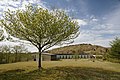
- Nomination Mineyama highlands --663highland 11:30, 5 July 2010 (UTC)
- Promotion nice --Carschten 15:14, 5 July 2010 (UTC)
-

- Nomination Restored elements of a stained glass window of the 17th century representing the Crucifixion of Jesus, Church Saint-Etienne du Mont, Paris.--Jebulon 23:06, 4 July 2010 (UTC)
- Promotion Very good.
--null 09:07, 5 July 2010 (UTC)Unregistered users can not promote images. G0rn 09:42, 5 July 2010 (UTC)) Sorry, null signature corrected now. --Cayambe 14:35, 5 July 2010 (UTC)
-
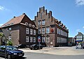
- Nomination Subsidiary of the German thrift in Emden --Carschten 19:17, 3 July 2010 (UTC)
- Decline Comment The traffic sign on the left is very disturbing. --Berthold Werner 09:38, 4 July 2010 (UTC) Comment Could be cropped out, but then the pic doesn't show the reality --Carschten 10:00, 4 July 2010 (UTC)
Therefore as comment, not as decline. May someone make the decision. --Berthold Werner 14:17, 4 July 2010 (UTC) Oppose Bad composition. -- Smial 12:45, 5 July 2010 (UTC)
-

- Nomination Torre Picasso (left), Torre Europa (right). Emblematic buildings along Paseo de la Castellana. Madrid, Spain. --Xauxa 10:47, 2 July 2010 (UTC)
- Promotion what is the "thing" in the corner right above ? Furthermore, a slight persp. dist. for the right tower (please see annotations). Would support if corrected.--Jebulon 22:41, 3 July 2010 (UTC) New version uploaded.--Xauxa 22:17, 4 July 2010 (UTC)OK, Support.--Jebulon 19:53, 5 July 2010 (UTC)
-

- Nomination Horská chata Kozinec (Mountain hostel Kozinec) - Moravian-Silesian Beskids, Czech Republic --Pudelek 16:50, 28 June 2010 (UTC)
- Decline Oppose Sujet penché, ciel et terre bruité.--HAF 932 09:50, 4 July 2010 (UTC). Translation: subject tilted, sky and ground noisy. @HAF 932, Votre vote n'est pas valide. Vous devez remplacer "Nomination" par "Decline" et supprimer votre "contre". Merci.--Jebulon 20:28, 4 July 2010 (UTC)
-

-

-
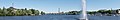
- Nomination Panorama from Kirjurinluoto to Pori. --kallerna 22:01, 4 July 2010 (UTC)
- Promotion Well done. ~~~~
-
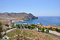
- Nomination Loutra Bay and Lentas Marina (Crete, Greece) -- MJJR 21:23, 4 July 2010 (UTC)
- Promotion Good -- George Chernilevsky 09:07, 5 July 2010 (UTC)
-

- Nomination The village of Amiras on Crete -- MJJR 21:23, 4 July 2010 (UTC)
- Promotion Nice --George Chernilevsky 09:05, 5 July 2010 (UTC)
-
- Nomination a nymphaea cultivar.--Jebulon 20:55, 4 July 2010 (UTC)
- Promotion Good -- George Chernilevsky 09:03, 5 July 2010 (UTC)
-

- Nomination a sunflower.--Jebulon 20:39, 4 July 2010 (UTC)
- Promotion QI -- George Chernilevsky 09:02, 5 July 2010 (UTC)
-
-

- Nomination Bas-relief with symbols of sciences, former "Ecole Polytechnique", Paris. --Jebulon 17:51, 4 July 2010 (UTC)
- Promotion Good -- George Chernilevsky 18:31, 4 July 2010 (UTC)
-

- Nomination Test of sand urchin Clypeaster reticulatus (both sides) --B.navez 14:54, 4 July 2010 (UTC)
- Promotion Good quality and useful -- George Chernilevsky 18:32, 4 July 2010 (UTC)
-

- Nomination Crystallization of aragonite -- Archaeodontosaurus 14:21, 4 July 2010 (UTC)
- Promotion Good -- George Chernilevsky 18:33, 4 July 2010 (UTC)
-

- Nomination Saint-Goustan port in Auray (Brittany) --Myrabella 09:48, 4 July 2010 (UTC)
- Promotion QI for me -- Archaeodontosaurus 13:33, 4 July 2010 (UTC)
-

- Nomination Church of Castell, Bavaria --Berthold Werner 09:31, 4 July 2010 (UTC)
- Promotion Good, given the difficult, tight surroundings of the building. --Cayambe 14:04, 4 July 2010 (UTC)
-

- Nomination Amiras (Crete, Greece): World War II Memorial -- MJJR 21:08, 3 July 2010 (UTC)
- Promotion Good -- George Chernilevsky 09:11, 5 July 2010 (UTC)
-
- Nomination St. John the Baptist Church of Ottmaring in Bavaria, Germany. --High Contrast 10:27, 3 July 2010 (UTC)
- Promotion Die zwei Pfosten im Vordergrund noch retuschieren. Ansonsten gut. --Berthold Werner 13:06, 3 July 2010 (UTC) Done --High Contrast 20:52, 4 July 2010 (UTC)
-

- Nomination Marbach III power plant, panoramic image. Felix Koenig 15:55, 2 July 2010 (UTC)
- Promotion Good enough, though sharpness is borderline. --Cayambe 14:08, 4 July 2010 (UTC)
-

-

-
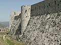
-
- Nomination View of Lannion and the church of Brélévénez in France. --WikiLaurent 12:02, 1 July 2010 (UTC)
- Promotion OK to me. --Cayambe 14:16, 4 July 2010 (UTC)
-

- Nomination: Eschscholzia californica --Butko 10:40, 29 June 2010 (UTC)
- Review needed
-

- Nomination: Eschscholzia californica --Butko 10:40, 29 June 2010 (UTC)
- Review needed
-

- Nomination: Portulaca grandiflora --Butko 10:40, 29 June 2010 (UTC)
- Review needed
-
- Nomination Breakwater in Biarritz. --Eusebius 18:06, 28 June 2010 (UTC)
- Decline strange blur at right (please see annotations). Maybe a crop would help ?--Jebulon 15:48, 29 June 2010 (UTC)
Yes, the distant parts are out of focus, so the details of the vegetation and the noise from the sensor make a strange effect. I don't want to crop the picture. --Eusebius 17:25, 29 June 2010 (UTC). Sorry.--Jebulon 20:24, 4 July 2010 (UTC)
-

- Nomination: Horská chata Kozinec (Mountain hostel Kozinec) - Moravian-Silesian Beskids, Czech Republic --Pudelek 16:50, 28 June 2010 (UTC)
- Review needed
-

-

-

- Nomination Town hall in Worms. -- Felix Koenig 09:54, 4 July 2010 (UTC)
- Promotion nice quality --Carschten 10:25, 4 July 2010 (UTC)
-

- Nomination Lightnings in Belfort, France. --ComputerHotline 09:51, 4 July 2010 (UTC)
- Promotion interesting --Mbdortmund 12:01, 4 July 2010 (UTC)
-

- Nomination Salticidae sp. --ComputerHotline 09:51, 4 July 2010 (UTC)
- Decline Not sufficiently identified. Lycaon 10:25, 4 July 2010 (UTC)
-

- Nomination Old Showers in Fort du Salbert. --ComputerHotline 09:51, 4 July 2010 (UTC)
- Promotion good --Carschten 10:25, 4 July 2010 (UTC)
-

- Nomination Bedroom in th Fort du Salbert --ComputerHotline 09:51, 4 July 2010 (UTC)
- Promotion good quality --Mbdortmund 12:01, 4 July 2010 (UTC)
-

- Nomination Calopteryx splendens --ComputerHotline 09:51, 4 July 2010 (UTC)
- Promotion nice --Carschten 10:25, 4 July 2010 (UTC)
-

- Nomination Calopteryx splendens --ComputerHotline 09:51, 4 July 2010 (UTC)
- Decline Nice quality, but under 2MP --Carschten 10:25, 4 July 2010 (UTC)
-

- Nomination Yttrium --Alchemist-hp 22:38, 3 July 2010 (UTC)
- Promotion Good. --Makele-90 22:52, 3 July 2010 (UTC)
-

-
-

-

- Nomination Museum steam locomotive 043 903-4 in Emden --Carschten 19:17, 3 July 2010 (UTC)
- Promotion Very good! (Allthough the blue channel is cropped. I think this is from the mainly black subject.) --Berthold Werner 09:38, 4 July 2010 (UTC)
-

-
- Nomination Church in St. Julian's, Malta. -- Felix Koenig 16:30, 3 July 2010 (UTC)
- Promotion QI & Useful --Archaeodontosaurus 08:44, 4 July 2010 (UTC)
-
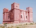
- Nomination St. Agatha's Tower/Red Tower, Malta. -- Felix Koenig 16:30, 3 July 2010 (UTC)
- Promotion Good. --Makele-90 22:52, 3 July 2010 (UTC)
-

- Nomination Kitzingen, chapel of the cross --Berthold Werner 14:07, 3 July 2010 (UTC)
- Promotion Good! NB: the name of the architect is of course Balthasar (with r) Neumann. -- MJJR 19:29, 3 July 2010 (UTC)
-
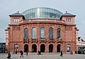
- Nomination Staatstheater Mainz -- Felix Koenig 13:52, 3 July 2010 (UTC)
- Promotion QI & Useful --Archaeodontosaurus 08:48, 4 July 2010 (UTC)
-
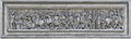
- Nomination Sculpture on the West side of "Arc de Triomphe de l'Étoile" (with graphic work) -- Siren-Com 12:22, 3 July 2010 (UTC)
- Decline Supportgood --Carschten 12:44, 3 July 2010 (UTC) Oppose Strong stitching errors, I'm sorry. Please see annotations.--Jebulon 13:46, 3 July 2010 (UTC)
Yeah, you're right... changend my vote to Decline --Carschten 18:50, 3 July 2010 (UTC)
-

- Nomination Pano-wide image of Roseau Dominica. --Pineapple fez 05:59, 3 July 2010 (UTC)
- Decline Not sharp and fish eye perspective does not flatter this town. Lycaon 14:29, 3 July 2010 (UTC)
-

-

-

-

-

-

-

-

-

- Nomination Malus cultivars --Butko 15:07, 29 June 2010 (UTC). QI IMO.
- Promotion --Jebulon 22:08, 3 July 2010 (UTC)
-
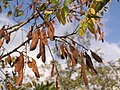
- Nomination Robinia pseudoacacia fruits --Butko 15:07, 29 June 2010 (UTC).
- Promotion QI to me.--Jebulon 22:05, 3 July 2010 (UTC)
-

-

- Nomination: Face looking to Champs-Elysées of the pedestal of the Louxor obelisk of the Place de la Concorde in Paris. The inscription commemorates the erection of
the king Louis-Philippethe monument in 1836.--Jebulon 21:10, 27 June 2010 (UTC) - Review needed
- Nomination: Face looking to Champs-Elysées of the pedestal of the Louxor obelisk of the Place de la Concorde in Paris. The inscription commemorates the erection of
-

- Nomination: A window of the Great Mosque of Paris. undecided in March 2010, now perspective is corrected. --Jebulon 17:17, 27 June 2010 (UTC)
- Review needed
-
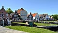
- Nomination: Greetsiel at the harbor --Carschten 13:32, 27 June 2010 (UTC)
- Review dont like composition and crop --Mbdortmund 18:37, 27 June 2010 (UTC)
-

- Nomination: Apis mellifera with a problem --ComputerHotline 09:54, 26 June 2010 (UTC)
- Review Needs description of problem. --Quartl 07:19, 28 June 2010 (UTC)
-

- Nomination: Anax imperator --ComputerHotline 09:54, 26 June 2010 (UTC)
- Review Comment Definitely a difficult shot, I might support a substantially cropped version. --Quartl 16:49, 27 June 2010 (UTC)
-

- Nomination: Graphosoma lineatum --ComputerHotline 09:54, 26 June 2010 (UTC)
- Review Good focus on head and pronotum of the shield bug in front, but poor overall composition. A crop might get support. --Quartl 05:43, 28 June 2010 (UTC)
-

- Nomination: Dolycoris baccarum --ComputerHotline 09:54, 26 June 2010 (UTC)
- Review Abdomen out of focus or motion blurred, but otherwise quite good. --Quartl 07:08, 28 June 2010 (UTC)
-

- Nomination: Wind turbine in Kirrinsanta. --kallerna 14:01, 14 June 2010 (UTC)
- Review Possibly a bit wonky? Mattbuck 16:24, 14 June 2010 (UTC) Comment Dunno, I straightened it with photoshop. --kallerna 13:55, 15 June 2010 (UTC)
upper part distorted cw --Mbdortmund 19:45, 20 June 2010 (UTC) Comment Could you fix it? --kallerna 14:05, 21 June 2010 (UTC)
If you sent me the RAW, I can try to correct it. --Mbdortmund 20:20, 27 June 2010 (UTC)
-

- Nomination Seat Leon Panning Shot --AngMoKio 21:30, 2 July 2010 (UTC)
- Promotion Perfect -- George Chernilevsky 08:10, 3 July 2010 (UTC)
-

- Nomination Seat Leon Panning Shot --AngMoKio 21:30, 2 July 2010 (UTC)
- Promotion Perfect -- George Chernilevsky 08:14, 3 July 2010 (UTC)
-

- Nomination Seat Leon Panning Shot --AngMoKio 21:30, 2 July 2010 (UTC)
- Promotion Perfect -- George Chernilevsky 08:14, 3 July 2010 (UTC)
-

-

- Nomination Takeno Beach in Takeno-cho, Toyooka, Hyogo Prefecture, Japan. --The High Fin Sperm Whale 15:15, 2 July 2010 (UTC)
- Promotion Lovely view. That's where I want to be right now :) WikiLaurent 18:52, 2 July 2010 (UTC)
-

-

-

- Nomination Grass bug (Calocoris affinis) on Field Scabious (Knautia arvensis). - Darius Baužys 14:49, 2 July 2010 (UTC)
- Promotion nice --Mbdortmund 15:20, 2 July 2010 (UTC) Support - No nice : splendid! --Archaeodontosaurus 16:06, 2 July 2010 (UTC)
Have to add support: beautiful colours! Lycaon 10:53, 3 July 2010 (UTC)
-

- Nomination Mikulovice (Niklasdorf) - bridge over Bělá (Biela) river --Pudelek 13:50, 2 July 2010 (UTC)
- Promotion Good --George Chernilevsky 08:29, 3 July 2010 (UTC)
-

- Nomination Train station of Moers --Carschten 11:33, 2 July 2010 (UTC)
- Promotion QI -- George Chernilevsky 08:31, 3 July 2010 (UTC)
-

- Nomination Cemetery chapel of an abbey in Germany. --High Contrast 10:28, 2 July 2010 (UTC)
- Promotion Very good. --Cayambe 14:21, 2 July 2010 (UTC)
-

- Nomination One of various grotesque figures in blind arcade, Linköping Cathedral, Sweden. --Xauxa 10:47, 2 July 2010 (UTC)
- Promotion nice composition --Mbdortmund 15:23, 2 July 2010 (UTC)
-

-

-
- Nomination Stained glas window, Christ church in Korntal, Southern Germany --Harke 15:45, 1 July 2010 (UTC)
- Withdrawn Gibt's da keine urheberrechtlichen Probleme, die Fenster sehen nicht alt aus. --Mbdortmund 19:04, 1 July 2010 (UTC) Danke für den Hinweis. Ich habe nicht daran gedacht. Ich habe hier nachgefragt.--Felix Koenig 16:34, 2 July 2010 (UTC)
-

- Nomination Stained glas window, Christ church in Korntal, Southern Germany --Harke 15:44, 1 July 2010 (UTC)
- Withdrawn
-

- Nomination Stained glas window, Christ church in Korntal, Southern Germany --Harke 15:43, 1 July 2010 (UTC)
- Withdrawn
-

- Nomination Stained glas window, Christ church in Korntal, Southern Germany --Harke 15:42, 1 July 2010 (UTC)
- Withdrawn
-

- Nomination Stained glas window, Christ church in Korntal, Southern Germany --Harke 15:41, 1 July 2010 (UTC)
- Withdrawn
-
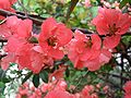
- Nomination Flowers of Chaenomeles japonica --Jos. 14:23, 1 July 2010 (UTC)
- Decline Poor composition, distracting background --Kae 13:08, 2 July 2010 (UTC)
-

- Nomination Pinus banksiana cone, Poland --Crusier 13:34, 1 July 2010 (UTC)
- Promotion QI for me Darius Baužys 14:52, 2 July 2010 (UTC)
-

- Nomination Malus cultivars --Butko 15:07, 29 June 2010 (UTC)
- Decline Foreground melts into background. --Kae 13:26, 2 July 2010 (UTC)
-

- Nomination Pilsumer Leuchtturm --Carschten 13:32, 27 June 2010 (UTC)
- Withdrawn Landscape looks tilted ccw--Jebulon 21:39, 27 June 2010 (UTC)
tilted --Pudelek 18:25, 30 June 2010 (UTC)
I'm going to correct it --Carschten 11:58, 3 July 2010 (UTC)
-

- Nomination: View of the main entry of the spanish infantry officers academy in Toledo, Spain.--Jebulon 23:23, 26 June 2010 (UTC)
- Review slightly tilted cw, top of the tower distorted to the right --Mbdortmund 09:36, 27 June 2010 (UTC) Thank you. Done Tilt corrected, the top of the tower is so in real. Better now ?--Jebulon 10:09, 27 June 2010 (UTC)
-
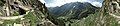
- Nomination: Silvretta Hochalpenstraße 360° Panorama --Böhringer 21:55, 26 June 2010 (UTC)
- Review needed
-

- Nomination: Probably a ran aground red comet, beach of Penthièvre, Morbihan, France --Jebulon 19:24, 26 June 2010 (UTC)
- Review needed
-

- Nomination: Ruddy Darter, female. --Quartl 19:21, 26 June 2010 (UTC)
- Review needed
-

-

- Nomination: Looking north from Talsarnau railway station. Mattbuck 21:49, 15 June 2010 (UTC)
- Review Comment Too dark: no pixels at the far right side of the histogram. Level adjustment can improve image quality. -- MJJR 14:48, 17 June 2010 (UTC) Comment Please do not apply level adjustment, because there are pixels on the far right side, even some isolated overexposed ones. If you want to make the picture look more friendly, apply a curve correction instead. With simple level adjustment, there will be overexposed spots. --Johannes Robalotoff 15:11, 19 June 2010 (UTC)
I apply level adjustment to all my images, so it's probably there just aren't many high brightness pixels, but there are some. Mattbuck 17:20, 20 June 2010 (UTC)
The picture is imo OK concerning the exposure but the telegraph pole on the right side looks distorted --Mbdortmund 14:19, 26 June 2010 (UTC)
-

- Nomination Limburg cathedral and St. Nepomuk --Berthold Werner 08:08, 2 July 2010 (UTC)
- Promotion nice view and shoot meets QI for me --J. Lunau 09:48, 2 July 2010 (UTC)
-

- Nomination Consolatrix afflictorum, Luxembourg cathedral. --Cayambe 07:04, 2 July 2010 (UTC)
- Promotion Good -- George Chernilevsky 07:16, 2 July 2010 (UTC)
-

-

- Nomination Aragonite, Spain -- Archaeodontosaurus 20:47, 1 July 2010 (UTC)
- Promotion Very good and useful --Jebulon 23:57, 1 July 2010 (UTC)
-

- Nomination Aqueduct of Krak des Chevaliers, Syria --Bgag 20:00, 1 July 2010 (UTC)
- Promotion QI & Useful -- Archaeodontosaurus 20:51, 1 July 2010 (UTC)
-
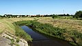
- Nomination Długa river in Marki, Poland --Crusier 19:36, 1 July 2010 (UTC)
- Promotion Good -- George Chernilevsky 07:15, 2 July 2010 (UTC)
-

- Nomination Persicaria amphibia in Poland --Crusier 19:03, 1 July 2010 (UTC)
- Promotion QI & Useful --Archaeodontosaurus 20:49, 1 July 2010 (UTC)
-

- Nomination Small Tortoiseshell - side view. --Quartl 18:22, 1 July 2010 (UTC)
- Promotion Great picture. WikiLaurent 11:44, 2 July 2010 (UTC)
-

- Nomination Persicaria amphibia and horse in Poland -Crusier 17:55, 1 July 2010 (UTC)
- Decline Sorry, very unsharp, odd composition. --kallerna 18:09, 1 July 2010 (UTC)
-

-

-
- Nomination Salbert hill fortifications. Old NATO station. --ComputerHotline 16:02, 1 July 2010 (UTC)
- Decline Quite noisy. --kallerna 17:06, 1 July 2010 (UTC)
-
-

-

- Nomination Trier, Sichelstrasse 8 --Berthold Werner 12:44, 1 July 2010 (UTC)
- Promotion good --Mbdortmund 13:49, 1 July 2010 (UTC)
-

- Nomination Canon 75-300. --Eusebius 18:03, 30 June 2010 (UTC)
- Promotion Composition is a bit boring but technically ok. --Berthold Werner 18:31, 30 June 2010 (UTC)
Couldn't make it smile... --Eusebius 18:43, 30 June 2010 (UTC)
:-)) --Berthold Werner 12:22, 1 July 2010 (UTC)
-

- Nomination Big Brembola village seen from the bell-tower. (Important changes applied.)--PereslavlFoto 15:41, 30 June 2010 (UTC)
- Promotion Good picture. WikiLaurent 10:22, 2 July 2010 (UTC)
-

- Nomination Mikulovice (Niklasdorf) - river Bělá --Pudelek 09:14, 30 June 2010 (UTC)
- Promotion OK, pretty good. --King of Hearts 04:28, 2 July 2010 (UTC)
-

-

- Nomination KZ Buchenwald, memorial in Schwerte --Mbdortmund 22:57, 26 June 2010 (UTC).
 Question Why not rotate it 90° to the left? Would be better imo. --Cayambe 13:41, 29 June 2010 (UTC)
the sculptures are lying on the ground under rails because the prisoners had to repair railway locomotives there in World War II. --Mbdortmund 18:43, 29 June 2010 (UTC). - Promotion Ok, I accept the explanation. QI to me. --Cayambe 15:27, 30 June 2010 (UTC) Well, photograph could show the rails horizontal too...--Jebulon 23:48, 1 July 2010 (UTC)
- Nomination KZ Buchenwald, memorial in Schwerte --Mbdortmund 22:57, 26 June 2010 (UTC).
-

-

- Nomination: Apis mellifera --ComputerHotline 09:54, 26 June 2010 (UTC)
- Review needed
-

- Nomination: Limburg, Gasthaus "Zum Goldenen Hirsch" (Golden Deer Inn) --Berthold Werner 10:45, 26 June 2010 (UTC)
- Review needed
-
- Nomination A window of the Pilsumer Leuchtturm --Carschten 21:16, 25 June 2010 (UTC)
- Promotion Problems in the description of the file.--Jebulon 21:18, 27 June 2010 (UTC) Info corrected --Carschten 14:55, 29 June 2010 (UTC) Hard to distinguish or promote such a pic, but it's a QI, IMO.--Jebulon 23:42, 1 July 2010 (UTC)
-

- Nomination Thomas Vollnhofer, Austrian soccer player. --AleXXw 06:26, 25 June 2010 (UTC)
- Promotion Underexposed. --King of Hearts 01:46, 30 June 2010 (UTC) Much better after Kae's work.--Jebulon 23:40, 1 July 2010 (UTC)
OK, good enough for me. --King of Hearts 00:31, 2 July 2010 (UTC)
-

- Nomination Old tires. --kallerna 18:28, 20 June 2010 (UTC)
- Promotion Bonne mis au point centrale, noir respecté.--HAF 932 15:43, 21 June 2010 (UTC)What is this red thing ?--Jebulon 20:04, 23 June 2010 (UTC) Comment Looks like a needle. --kallerna 06:40, 25 June 2010 (UTC). Well. QI.--Jebulon 23:36, 1 July 2010 (UTC)
-

- Nomination St. Goustan, a Breton saint. --Myrabella 07:56, 1 July 2010 (UTC)
- Withdrawn
-

- Nomination Krak des Chevaliers, Syria --Bgag 01:21, 1 July 2010 (UTC)
- Promotion Ok. --Berthold Werner 06:55, 1 July 2010 (UTC)
-
- Nomination Oasis of Varesse (Adrar, Mauritania) --Pineapple fez 06:53, 1 July 2010 (UTC)
- Promotion Good picture. WikiLaurent 11:56, 1 July 2010 (UTC)
-
- Nomination Mosaic of a duck. --Eusebius 21:00, 30 June 2010 (UTC)
- Promotion QI & Useful --Archaeodontosaurus 05:50, 1 July 2010 (UTC)
-

- Nomination Arab stone design. --Eusebius 18:43, 30 June 2010 (UTC)
- Promotion QI & Useful --Archaeodontosaurus 05:48, 1 July 2010 (UTC)
-

-

-

-

- Nomination Flower of Ornithogalum umbellatum --Llez 04:02, 30 June 2010 (UTC)
- Promotion Good DOF control. --King of Hearts 23:44, 30 June 2010 (UTC)
-

- Nomination Sculpture at Buchenwald-Mahnmal in Schwerte, photo by Mbdortmund --Smial 00:30, 30 June 2010 (UTC)
- Promotion Great picture of a frightening sculpture. WikiLaurent 17:30, 30 June 2010 (UTC)
-

- Nomination Helsinki panorama view from Olympiastadion tower --DIMMIS 11:29, 30 June 2010 (UTC)
- Decline Lacks sharpness and a bit overexposed (sea and the light reflection on some buildings). WikiLaurent 14:21, 30 June 2010 (UTC)
-

-

- Nomination Taiwanese cuisine at a wedding. --WikiLaurent 21:04, 29 June 2010 (UTC)
- Decline strong CA e.g. on the classes, crop not so good --Mbdortmund 10:30, 1 July 2010 (UTC)
-

- Nomination Pacific Ocean (Aug. 17, 2005) – An F/A-18C Hornet, assigned to the "Golden Dragons" of Strike Fighter Squadron One Nine Two (VFA-192), launches from the flight deck of the conventionally powered aircraft carrier USS Kitty Hawk (CV 63). --The High Fin Sperm Whale 16:41, 30 June 2010 (UTC)
- Decline Not a work of a wikipedian --Mbdortmund 20:32, 29 June 2010 (UTC)
-

- Nomination Transmitter on Hesselberg in Franconia, Germany --Harke 18:32, 29 June 2010 (UTC)
- Promotion QI --The High Fin Sperm Whale 16:43, 30 June 2010 (UTC)
-
- Nomination Transmitter on Hesselberg in Franconia, Germany --Harke 18:30, 29 June 2010 (UTC)
- Promotion QI --The High Fin Sperm Whale 16:43, 30 June 2010 (UTC)
-

- Nomination Rathausplatz in Hirschlanden, Southern Germany --Harke 18:19, 29 June 2010 (UTC)
- Decline composition imo not so good --Mbdortmund 13:27, 30 June 2010 (UTC)
-

- Nomination Former water mill, Southern Germany --Harke 18:17, 29 June 2010 (UTC)
- Decline I think the view doesn't show enough of the mill. WikiLaurent 18:52, 30 June 2010 (UTC)
-

- Nomination Scooters in Tainan, Taiwan. --WikiLaurent 16:38, 29 June 2010 (UTC)
- Decline Looks overexposed to me. --The High Fin Sperm Whale 17:00, 30 June 2010 (UTC)
-

-

- Nomination Leaf beetle Clytra laeviuscula . --Quartl 17:57, 27 June 2010 (UTC)
- Promotion
Guidelines ask to upload the largest version. this is 12.3Mpx→2.2Mpx! Lycaon 18:07, 27 June 2010 (UTC)Thanks for the info. Lycaon 20:23, 27 June 2010 (UTC) Comment I don't needlessly downscale my images, this is a crop. I put the uncropped version in the file history, it is just green all round. This bug is only 10 mm long and the image was taken with a 105 mm lens. --Quartl 18:25, 27 June 2010 (UTC)
OK. Lycaon 10:39, 1 July 2010 (UTC)
-

- Nomination: Reconstruction near tram loop Červený vrch with Tatra T3SUCS, Prague — Jagro 22:35, 24 June 2010 (UTC)
- Review needed
-

- Nomination: Orange Daylily. --Kallerna 17:35, 24 June 2010 (UTC)
- Review needed
-

- Nomination: Limburg cathedral --Berthold Werner 06:54, 21 June 2010 (UTC)
- Review Strange perspective, strange roofs...--Jebulon 20:09, 23 June 2010 (UTC)
You can not stand correct (orthogonal?) in front and also you stand somewhat deeper than the cathedral. The result is a strange perspective. --Berthold Werner 16:19, 24 June 2010 (UTC)
-

- Nomination: Cornflowers (Centaurea cyanus). --kallerna 18:28, 20 June 2010 (UTC)
- Review Comment - This could have been a very good picture with a better exposure choice, giving a more favourable DOF. But first it is necessary to give up the automatic mode. -- Alvesgaspar 16:13, 23 June 2010 (UTC) Comment Automatic mode ... :D What do you think about the other version? --kallerna 17:32, 24 June 2010 (UTC)
-

- Nomination Pearl necklace bronzeBronze age (-1800 à -1500 years ago) -- Archaeodontosaurus 06:05, 30 June 2010 (UTC)
- Promotion Ok. --Berthold Werner 10:30, 30 June 2010 (UTC)
-

- Nomination Protestant Educational Centre on Hesselberg in Franconia, Germany --Harke 18:28, 29 June 2010 (UTC)
- Promotion good quality --Mbdortmund 20:53, 29 June 2010 (UTC)
-

-

- Nomination Small, fingernail-sized insect perched on a twig --Cytherium 14:16, 29 June 2010 (EST)
- Decline Comment Category unavailable --Archaeodontosaurus 18:49, 29 June 2010 (UTC)
Not categorized, nor identified. Lycaon 21:46, 29 June 2010 (UTC)
-

- Nomination Cathedral of Christ the Saviour over Moscow River by Voytek S. --Berthold Werner 11:13, 29 June 2010 (UTC)
- Promotion Side crops unperfect but QI and very useful.--Elekhh 13:41, 29 June 2010 (UTC)
-

-
- Nomination Bridgetower in Limburg --Berthold Werner 11:03, 28 June 2010 (UTC)
- Promotion Good. --Cayambe 13:35, 29 June 2010 (UTC)
-

- Nomination Blue Trabant 601 in Eger, Hungary --WikiLaurent 09:30, 28 June 2010 (UTC)
- Promotion Sharp and otherwise also good. --Cayambe 13:37, 29 June 2010 (UTC)
-

- Nomination Optical sight reticle pattern, G36. --Svgalbertian 07:11, 28 June 2010 (UTC).
- Promotion Very useful and QI to me. --Cayambe 13:39, 29 June 2010 (UTC)
-
-

- Nomination KZ Buchenwald, memorial in Schwerte --Mbdortmund 22:57, 26 June 2010 (UTC)
- Promotion High quality photo --George Chernilevsky 10:04, 30 June 2010 (UTC)
-
- Nomination KZ Buchenwald, memorial in Schwerte --Mbdortmund 22:57, 26 June 2010 (UTC)
- Decline Noisy, a bit blurry --Carschten 16:52, 29 June 2010 (UTC)
-

-

- Nomination Boat house in the evening. Veskovo village, Botik estate.--PereslavlFoto 13:14, 25 June 2010 (UTC)
- Promotion Overall well-composed. Exposure is IMO a good compromise between the shadows in the trees and the highlights in the sky. --King of Hearts 01:46, 30 June 2010 (UTC)
-

-

- Nomination Flowers of Prunus armeniaca --Butko 07:47, 24 June 2010 (UTC)
- Decline Unfortunately, the top bunch of flowers (indicated) seems arbitrarily cropped. --King of Hearts 01:40, 30 June 2010 (UTC)
-
- Nomination: Oval forum of Jerash, Jordan --Bgag 03:32, 24 June 2010 (UTC)
- Review needed
-

- Nomination: Model of the Monastery of Our Lady, Ny Varberg, Sweden. --Wolfgangus Mozart 17:57, 23 June 2010 (UTC)
- Review needed
-

- Nomination Speedwayrider Timo Lahti. --kallerna 09:35, 23 June 2010 (UTC)
- Decline The rider's suit is overexposed, leading to loss of detail in some highlight areas. --King of Hearts 01:37, 30 June 2010 (UTC)
-

- Nomination Flowers of Prunus armeniaca --Butko 07:18, 23 June 2010 (UTC)
- Promotion Nice picture. WikiLaurent 16:40, 29 June 2010 (UTC)
-
- Nomination A Black-tailed Deer (Odocoileus hemionus columbianus) fawn. --The High Fin Sperm Whale 17:36, 21 June 2010 (UTC)
- Decline Please expand the file description: wild or zoo animal, where? and please geotag. Will promote when done. --Cayambe 21:46, 28 June 2010 (UTC)
Very tight crop. Lycaon 21:48, 29 June 2010 (UTC)
-

-
- Nomination: Remembrance of Ernest Hemingway, quartier Latin, Paris--Jebulon 23:36, 14 June 2010 (UTC)
- Review do you like File:Hemingway à Paris2.jpg? --Mbdortmund 11:25, 19 June 2010 (UTC) Answer on your talk page.--Jebulon 19:59, 23 June 2010 (UTC)
-

- Nomination: Trier, Katharinenufer 3 --Berthold Werner 11:28, 13 June 2010 (UTC)
- Review the sign... Please See annotation--Jebulon 23:20, 17 June 2010 (UTC) Comment Yes, the sign... In every town of the world is an administration to put signs in front of interesting objects ;-) Some towns may have a task force for that. I tried to minimize the impact of the sign, to cut it off is forbidden. ;-) --Berthold Werner 06:13, 21 June 2010 (UTC) Sorry, what is forbidden is to be catched by police...--Jebulon 19:57, 23 June 2010 (UTC)
-

-

-

- Nomination Chapel in Kehlen. --Cayambe 21:33, 28 June 2010 (UTC)
- Promotion , showing also the immediate surroundings. --Cayambe 16:38, 28 June 2010 (UTC)
Comment Could be tighter cropped on the right side --Berthold Werner 16:45, 28 June 2010 (UTC).
Done Uploaded new version with a tighter crop. --Cayambe 21:36, 28 June 2010 (UTC)
Ok now IMHO. Mëlleschkapell bedeutet Milchkapelle? --Berthold Werner 06:10, 29 June 2010 (UTC). Nein, Kapelle des Müllers. Milch ist Mëllech. :-). --Cayambe 07:26, 29 June 2010 (UTC)
-

- Nomination Epitoke Alitta succinea. Lycaon 12:25, 28 June 2010 (UTC)
- Promotion QI & Useful --Archaeodontosaurus 14:05, 28 June 2010 (UTC)
-

- Nomination Visquard --Carschten 21:16, 25 June 2010 (UTC)
- Decline oversaturated --Mbdortmund 16:08, 28 June 2010 (UTC)
-

- Nomination Shwezigon, Bagan, Myanmar --DIMMIS 08:43, 25 June 2010 (UTC)
- Promotion Comment Two annotations added. Additionally imho the perspective should be corrected and the sky denoised. --Berthold Werner 09:01, 25 June 2010 (UTC)
Denoised sky, corrected perspective. Bird and and other elements deleted (new file version loaded). Is it OK now? --DIMMIS 03:30, 29 June 2010 (UTC)
OK for me. --Berthold Werner 07:48, 29 June 2010 (UTC)
-
- Nomination Stuntman about to jump off Southwark Bridge (London) during the shooting of National Treasure 2. --WikiLaurent 19:56, 24 June 2010 (UTC)
- Decline it's tilted --Pudelek 08:01, 29 June 2010 (UTC)
-


_-_shrine.JPG)


_-_psychedelic_gate.JPG)


_2.jpg)


.jpg)


.jpg)


.JPG)


.jpg)


_mg_8706.jpg)
_mg_8743.jpg)


_-_radnice.JPG)


_-_Holy_Trinity_Church,_interior.JPG)


_-_cemetery.jpg)


_-_CoA_of_Ludwig_von_Pfalz-Neuburg.JPG)


.jpg)
.jpg)


_-_view_from_market_square.JPG)


_-_old_gravestone_2_(german-czech).jpg)


_-_old_gravestone.jpg)


.jpg)
.JPG)
.jpg)
.jpg)


_-_villa_Adelheid.JPG)


_flowers.jpg)


.jpg)


![* Nomination Sunrise at the Königspitze seen from the Hintergrat of the Ortler (Northern Italy) --Haneburger * Promotion great arrangement of areas, very light, yet very distinct distribution of colours, fantastic.--Rupert Pupkin 19:36, 5 July 2010 (UTC)]] 17:43, 5 July 2010 (UTC)](/wiki/File:K%C3%B6nigspitze_Sunrise.jpg)


,_hotel_Priessnitz.jpg)


.JPG)

.jpg)
.jpg)
.jpg)


_-_bridge_over_Biela.JPG)


_-_footbridge.JPG)


.jpg)


.jpg)
.jpg)
.jpg)
.jpg)


_-_bridge_over_B%C4%9Bl%C3%A1_river.jpg)

.jpg)


.jpg)


_-_B%C4%9Bl%C3%A1.jpg)


.jpg)


.jpg)


.jpg)


.jpg)


.jpg)


.jpg)


Consensual review[edit]
File:Versailles Hôtel de Ville June 2010.jpg[edit]

- Nomination
The hôtel de ville of Versailles --King of Hearts 01:14, 30 June 2010 (UTC)
- Decline poor lighting --Pudelek 18:19, 30 June 2010 (UTC)
- Lightened. How is it now? --King of Hearts 23:40, 30 June 2010 (UTC)
- perspective needs correction --Mbdortmund 10:22, 1 July 2010 (UTC)
- I can do that, but is it necessary? I think in three-quarters view, it looks better shot from the ground. --King of Hearts 19:45, 1 July 2010 (UTC)
- Oppose very strong CA, sorry--Jebulon 23:33, 1 July 2010 (UTC)
- Withdrawn --King of Hearts (talk) 00:36, 2 July 2010 (UTC)
File:Christian Walter SKN St. Pölten quer.JPG[edit]

- Nomination Christian Walter, official at Austrian Soccer Club SKN St. Pölten. --AleXXw 21:13, 23 June 2010 (UTC)
- Decline Could be promoted, but it needs crops rechts und links, IMO. The link with the name does not work...--Jebulon 22:04, 23 June 2010 (UTC)
- Oppose Rather underexposed. Lycaon 18:27, 27 June 2010 (UTC)
- Comment Yes, maybe bit lighter? Yarl ✉ 10:00, 29 June 2010 (UTC)
File:Panorama Mochnaczki Niżnej 2010.jpg[edit]
![]()
- Nomination Panorama somewhere in Poland --Sfu 15:05, 26 June 2010 (UTC)
- Promotion
- Support Good quality and gives a good view of the area. WikiLaurent 18:15, 26 June 2010 (UTC)
- If "somewhere in France" is not meaningful enough, I don't understand why "somewhere in Poland" is a sufficient title for nomination.----Jebulon 19:31, 26 June 2010 (UTC)
- I don't rate the description here, I rate the file description and the one of the Poland file is much more detailed than the one of the French ones. WikiLaurent 19:52, 26 June 2010 (UTC)
- Sorry, you used the word "title", and not "description file". Furthermore, if I'm not wrong, you don't have to remove back yourself my "discuss" into a "promote", please.--Jebulon 21:53, 26 June 2010 (UTC)
- Ok my mistake then, I should have written "description" and not "title". I still think that this image should be promoted for the reason given above. Is there any reason why you think it shouldn't? WikiLaurent 10:04, 27 June 2010 (UTC)
- Sorry, you used the word "title", and not "description file". Furthermore, if I'm not wrong, you don't have to remove back yourself my "discuss" into a "promote", please.--Jebulon 21:53, 26 June 2010 (UTC)
- I don't rate the description here, I rate the file description and the one of the Poland file is much more detailed than the one of the French ones. WikiLaurent 19:52, 26 June 2010 (UTC)
- Support @ WikiLaurent: technically, no. --Jebulon 13:50, 28 June 2010 (UTC)
- Support Very nice, desc. in filepage. Yarl ✉ 10:06, 29 June 2010 (UTC)
File:Panoramic-landscape.jpg[edit]
![]()
- Nomination Landscape somewhere in France --ComputerHotline 09:54, 26 June 2010 (UTC)
- Decline Sorry but quality images must have a title more meaningful than "somewhere in France". WikiLaurent 18:13, 26 June 2010 (UTC) Where stays this rule, you apply for France and not for Poland ?...--Jebulon 19:28, 26 June 2010 (UTC) Well since you're checking my contributions, perhaps you should also check the description of the Polish file. WikiLaurent 19:49, 26 June 2010 (UTC) Sorry, "title" is not "description of the Polish file". The "title" of this pano is exactly the same (except the country) than the polish one, "somewhere in France" is no more, no less than "somewhere in Poland", and you know that --Jebulon 21:57, 26 June 2010 (UTC)
- Oppose Partly for the lack of a useful description, and partly because the picture doesn't have any specific subject or an interesting composition. WikiLaurent 21:07, 29 June 2010 (UTC)
File:Panoramic-landscape1.jpg[edit]
![]()
- Nomination Landscape somewhere in France --ComputerHotline 09:54, 26 June 2010 (UTC)
- Decline Sorry but quality images must have a title more meaningful than "somewhere in France". WikiLaurent 18:13, 26 June 2010 (UTC) Where stays this rule, you apply for France and not for Poland ?...--Jebulon 19:28, 26 June 2010 (UTC) Ditto. WikiLaurent 19:49, 26 June 2010 (UTC) Ditto.--Jebulon 21:58, 26 June 2010 (UTC)
- Oppose Partly for the lack of a useful description, and partly because the picture doesn't have any specific subject or an interesting composition. WikiLaurent 21:08, 29 June 2010 (UTC)
File:Bytča ambulance - VW Transporter.JPG[edit]
![]()
- Nomination Ambulance (Volkswagen Transporter T4) in Bytča, Slovakia --Pudelek 09:45, 21 June 2010 (UTC)
- Decline
- Support Not ideal illumination, but IMO good result --George Chernilevsky 18:49, 24 June 2010 (UTC)
- Oppose Poor composition: vehicles need free space in front of it, else it looks "clutched". Light is poor too. Weak visual contrast between car and background. --Kae 21:09, 25 June 2010 (UTC)
- Oppose per Kae. --Elekhh 14:24, 29 June 2010 (UTC)
File:Krak des Chevaliers 04.jpg[edit]

- Nomination Detail of a wall of Krak des Chevaliers, Syria --Bgag 04:29, 25 June 2010 (UTC)
- Promotion
- Support Ok. --Berthold Werner 08:19, 25 June 2010 (UTC)
- Oppose Problems with details/sharpness. Probably poor light conditions for your camera as your Wadi Rum pics are fine. Lycaon 09:47, 25 June 2010 (UTC)
- I've seen that too on several of bgag's photographs, but I think this is one of the better ones. --Berthold Werner 12:07, 25 June 2010 (UTC)
- Comment The image is overcategorized (cat:stone walls, defensive walls). Please, remove these cats or categorise the file deeper into those cats. Will support when done. --Cayambe 17:19, 26 June 2010 (UTC)
- Support after overcat reduction :-) --Cayambe 14:32, 28 June 2010 (UTC)
File:Alpinia purpurata.jpg[edit]

- Nomination Red Ginger photographed in Hannover, Lower Saxony, Germany. DerHexer 22:31, 23 June 2010 (UTC)
- Promotion
- The cut-off leaf at the upper left should be cloned away imo. --Cayambe 16:23, 24 June 2010 (UTC)
- Comment Done. DerHexer 17:34, 24 June 2010 (UTC)
- Support QI to me now. --Cayambe 18:56, 24 June 2010 (UTC)
- Comment
Far too noisy, even after 10 versions (!). Lycaon 20:16, 24 June 2010 (UTC)Did some NR on it myself. Please check. Lycaon 09:22, 25 June 2010 (UTC)- Comment For me it's in general (scene, details, colours etc.) good although it's still a bit too noisy, true. People here and there complained what still should be improved which is why I uploaded so many versions. It's hard to make them all happy. If you want it to be less noisy, I can try it … DerHexer 22:34, 24 June 2010 (UTC)
- Comment the last NR by Lycaon was imo too hard. With A bit lower NR I would support. --Carschten 13:48, 25 June 2010 (UTC)
- So you want more noise ??? Lycaon 13:57, 25 June 2010 (UTC)
- Support QI --The High Fin Sperm Whale 21:16, 27 June 2010 (UTC)
File:Bruges Rozenhoedkaai 2009.jpg[edit]

- Nomination Canal in Bruges, Belgium, view from Rozenhoedkaai.--Jebulon 21:57, 21 June 2010 (UTC)
- Decline
- Oppose Severely tilted, the 'Halletoren' looks like the tower of Pisa ;-). (Compare with this) Lycaon 07:14, 22 June 2010 (UTC)
- Yes you are right, I was mistaken. It's Pisa, not Bruges, sorry. ;)--Jebulon 09:53, 22 June 2010 (UTC)
- Done Tilt corrected, better now ?--Jebulon 20:19, 22 June 2010 (UTC)
- The original problem was mainly tilt. That is better now, but not yet perfect. There are, IMO, a few other issues as sharpness and CA. Lycaon (talk) 06:44, 25 June 2010 (UTC)
- Thanks for CR, Lycaon ;)--Jebulon 22:14, 25 June 2010 (UTC)
- Support with all the corrections now it meets QI for me --J. Lunau 11:09, 2 July 2010 (UTC)
File:Feuilles de pistachier.jpg[edit]

- Nomination Pistachio leaves. --Eusebius 19:41, 21 June 2010 (UTC)
- Promotion
- Oppose Almost there, but exposure choice is poor. With a larger DOF the leaves in the foregound would be focused -- Alvesgaspar 15:02, 23 June 2010 (UTC)
- CommentNot sure it's so bad... Needs a CR, IMO.--Jebulon 23:35, 24 June 2010 (UTC)
- Support OK for me. Lycaon 21:20, 27 June 2010 (UTC)
- Support OK.--Jebulon 13:40, 28 June 2010 (UTC)
File:Kutiny (11).JPG[edit]
.JPG)
- Nomination Natural monument Kutiny in Tábor District, Czech Republic. --Chmee2 22:34, 18 June 2010 (UTC)
- Promotion
- Support Good -- Smial 23:44, 18 June 2010 (UTC)
- Oppose WB problems and slightly oversaturated. Lycaon 10:33, 19 June 2010 (UTC)
- (slight ec) where are you seeing wb problems (& indeed over saturation)? --Herbythyme 16:25, 19 June 2010 (UTC)
- What white balance and oversaturation problems? Can't see anything of this. Perhaps slightly overexposed, but this is not disturbing. -- Smial 16:23, 19 June 2010 (UTC)
- Support Do not see problems here. QI to me. Agree with Herby and Smial --Jebulon 21:48, 19 June 2010 (UTC)
- Histogram does not lie and objectively sees oversaturation in blue channel hence WB problem. Lycaon 22:00, 19 June 2010 (UTC)
- Don't rely on histograms with images that have only one or few dominant colours, in this case white and blue. Please look at the histograms of these featured picture candidates, all three would have white balance problems, if you look only at the histogram: File:Citrus paradisi (Grapefruit, pink) white bg.jpg File:Another brick on the wall.jpg File:Jellyfish aqurium.jpg. Our candidate here has slight blueish whites, which is not astonishing if you see the nearly complete blue sky which is reflected by the snow. Please have also a look at File:Kutiny (11) rgb FFFFFF.jpg, where I have marked all parts, that have rgb FFFFFF - these areas are very small and not disturbing. -- Smial 00:07, 20 June 2010 (UTC)
- Personally I agree with Smial - this is not uncommon in such landscape photography. --Herbythyme 08:39, 20 June 2010 (UTC)
- Reviewing it in more detail in image software. I do not see the histogram tells the story Lycaon does and I agree with the detail of Smial argument. There is a small amount of clipping which could easily be resolved. --Herbythyme 08:42, 20 June 2010 (UTC)
- Don't rely on histograms with images that have only one or few dominant colours, in this case white and blue. Please look at the histograms of these featured picture candidates, all three would have white balance problems, if you look only at the histogram: File:Citrus paradisi (Grapefruit, pink) white bg.jpg File:Another brick on the wall.jpg File:Jellyfish aqurium.jpg. Our candidate here has slight blueish whites, which is not astonishing if you see the nearly complete blue sky which is reflected by the snow. Please have also a look at File:Kutiny (11) rgb FFFFFF.jpg, where I have marked all parts, that have rgb FFFFFF - these areas are very small and not disturbing. -- Smial 00:07, 20 June 2010 (UTC)
- Comment -- Am I the only noticing the OOF trees? -- Alvesgaspar 19:42, 21 June 2010 (UTC)
- There are more problems (such as CA on those blurry trees). Lycaon 21:39, 21 June 2010 (UTC)
- Oppose -- Yes, there are -- Alvesgaspar 22:07, 21 June 2010 (UTC)
- Support - CA is the only issue I see, and it isn't unusually or distractingly obtrusive. I'm not a photography expert, but WB/oversaturation issues are overblown in my opinion. Juliancolton 02:51, 24 June 2010 (UTC)
File:EngagementRing.JPG[edit]

- Nomination Engagement Ring --Cytherium 14:18, 29 June 2010 (EST)
- Decline Oppose Diamond is out of focus --Archaeodontosaurus 18:45, 29 June 2010 (UTC)
- Oppose idea is good, but composition could be better (background, focus) --Mbdortmund 19:53, 30 June 2010 (UTC)
- Oppose The main issue is the composition; it's a little hard to tell that the foreground object is supposed to be a hand, and the black object in the background is a little odd. --King of Hearts 23:58, 30 June 2010 (UTC)
File:Staatstheater Mainz 2010-2.jpg[edit]

- Nomination Staatstheater Mainz, Germany Felix Koenig 18:27, 28 June 2010 (UTC)
- Withdrawn ^ perspective correction needed --Archaeodontosaurus 05:50, 29 June 2010 (UTC)
- Support Now that it's fixed. --King of Hearts 01:27, 30 June 2010 (UTC)
- Oppose still distorted --Mbdortmund 12:34, 30 June 2010 (UTC)
- Oppose still distorted --Archaeodontosaurus 07:03, 1 July 2010 (UTC)
File:07 Schaf am Krummhörner Deich 3.jpg[edit]

- Nomination Sheep Ovis aries --Carschten 13:32, 27 June 2010 (UTC)
- Promotion
- Support Good. --Cayambe 18:03, 27 June 2010 (UTC)
- Oppose Too low DOF. All of the sheep should have been in focus. Lycaon 21:30, 27 June 2010 (UTC)
- Support The sheep's neck doesn't appear too out-of-focus to me. --King of Hearts 00:01, 1 July 2010 (UTC)
File:Clypeaster reticulatus test upperside.JPG[edit]

- Nomination test of the sand urchin Clypeaster reticulatus (upperside) --B.navez 05:07, 27 June 2010 (UTC))
- Decline
- Oppose The background is bad. With F10 we would have all the edges. Too bad we do not both sides. Size may be indicated. There is no geocoding --Archaeodontosaurus 13:28, 27 June 2010 (UTC)
- Oppose per Archaeodontosaurus --Carschten 14:17, 28 June 2010 (UTC)
- Oppose DOF too low. With a focal length of 50 mm and a 1/125 shutter speed, it would have been easy to reduce the aperture. --King of Hearts 00:04, 1 July 2010 (UTC)
File:Kite surf voiles 2.jpg[edit]

- Nomination Kitesurfing in Morbihan, Brittany (Bretagne) France --Jebulon 21:49, 26 June 2010 (UTC)
- Decline
- Support QI --Archaeodontosaurus 13:33, 27 June 2010 (UTC)
- Oppose This image must be called "Sky, fence and road" because only 0.2% of image space illustrate kitesurfing. --Kae 04:07, 28 June 2010 (UTC)
- Maybe, but these 0.2% make sense, IMO...--Jebulon 14:20, 28 June 2010 (UTC)
- Comment the right part looks blurry imo, doesn't it? --Carschten 14:26, 28 June 2010 (UTC)
- Oppose per Kae --Pudelek 08:04, 29 June 2010 (UTC)
- Oppose Its category, Category:Kitesurfing in France, contains better examples that feature the kite more prominently. --King of Hearts 00:07, 1 July 2010 (UTC)
- Comment I'm sorry, but I disagree with the opponents about the title or the category. IMO, opposing for these reasons is wrong. Nothing here is against the QI rules. @Carschten: yes, a bit, you are right. THIS is a good reason for an opposing vote, but you didn't, thxs...--Jebulon 23:19, 1 July 2010 (UTC)
- Comment My vote is not against name, but against content of image. First of all, image must illustrate something. What does this image illustrate? Almost nothing (most important objects are sky, dark fence, road and blurry bushes). I see no meaning. Just a casual picture. --Kae 14:22, 2 July 2010 (UTC)
File:Libellula quadrimaculata (3).jpg[edit]
.jpg)
- Nomination Libellula quadrimaculata --ComputerHotline 09:54, 26 June 2010 (UTC)
- Decline
- Support QI & Useful --Archaeodontosaurus 13:43, 26 June 2010 (UTC)
- Oppose Head should always be in focus (I've been told). Lycaon 21:32, 27 June 2010 (UTC)
- Oppose insufficient DOF; needs a crop, too. --Quartl 14:34, 30 June 2010 (UTC)
File:Sparrow spinning his head.JPG[edit]

- Nomination: A sparrow spinning his head so fast that a 1/320 shutter speed couldn't freeze it. Collard 20:15, 21 June 2010 (UTC)
- Review
- Support Nice work --Croucrou 22:02, 21 June 2010 (UTC)
- Oppose Noisy, quite small, nothing in focus...nice idea but not QI. --kallerna 09:27, 23 June 2010 (UTC)
- Comment
1/320 ? I can't believe. I see some symptoms of fake (motion blur in photoshop)--Kae 14:29, 23 June 2010 (UTC)- Comment You don't have to believe me if you don't want to; check the EXIF (of course you could say I manipulated that too, but I didn't). The motion blur is not Photoshopped. Lewis Collard! (lol, internet) 19:15, 24 June 2010 (UTC)
- Comment same opinon of Kae I can't believe --Archaeodontosaurus 13:48, 27 June 2010 (UTC)
- Comment This is QI, value is not a consideration here. Even if it was, I think that the fact that many of you don't even believe this image is real shows that it has the ability to educate you! --99of9 09:54, 28 June 2010 (UTC)
- A certain value is also necessary for QI, see Commons:Quality images candidates/Intro#Value. --Quartl (talk) 10:00, 28 June 2010 (UTC)
- Sure, but this image meets that minimal standard by a long way. How else would you depict head spinning in a single image? --99of9 02:07, 29 June 2010 (UTC)
- Vote withdrawn, I'll leave that case for others to decide. AFAIK, head spinning is not a particular trait of sparrows, but the image may be valuable for illustrating motion blur. --Quartl 11:52, 29 June 2010 (UTC)
- Comment Okay. I don't mind anyone that says that a image I submitted is noisy, or unsharp, or that it was too small, or that it generally sucks. Tell me that shot sucks and I'm fine with it and I'll lose precisely twenty seconds of sleep over it. I am cool with that. But to be accused of patent dishonesty by two people: well, no fucking way. If you call me a liar, you'd better actually go out and photograph some birds before you have the right to do that. You'd better have blown off thousands of pictures of sparrows at 8 frames a second to get one shot you like before you have the right to say that I'm lying and that I just did a bit of swirling in Photoshop. At the very goddamn least, I'm going to call you out and ask you what those "symptoms of fake (motion blur in photoshop) were, otherwise I'm going to say that you're full of shit. Call it crap if you like. Fine. But I am not going to be called a liar. Collard 01:30, 29 June 2010 (UTC)
- Comment You have my sympathy. I think that their suspicion shows what a valuable image this is, because it depicts a true phenomenon that they simply cannot believe is true. Hence your opportunity to educate them - thankyou for sharing your image (it sounds like it was the result of much hard work!). Unfortunately I cannot support for QI, because it does not meet the technical standards, but I do think that some of the comments you got were in error (as well as failing to assume good faith!). --99of9 02:07, 29 June 2010 (UTC)
- Comment Ok, I withdraw my suspictions. It was just an IMHO. Really difficult to believe. Excuse me [1]--Kae 10:53, 29 June 2010 (UTC)
- Support Info taken to the "French Society of Ornithology", is technically possible. --Archaeodontosaurus 05:59, 29 June 2010 (UTC)
- Also the shadow looks consistent. Lycaon 06:02, 29 June 2010 (UTC)
- Oppose Funny picture but it doesn't have much informative value. WikiLaurent 17:24, 29 June 2010 (UTC)
- oh, I see: without knowing, I was to late. sorry (guess, that's why Lycaon scratched my support)
- Yep indeed, sorry about that. Quote from rules: "In case of draw, or if no additional opinions are given other than the first reviewer's, the image will stay in Consensual Review for a maximum period of 8 days, counted from its entry.". Lycaon 10:29, 3 July 2010 (UTC)
File:Limburg BW 15.jpg[edit]

- Nomination Timberframed building in Limburg --Berthold Werner 09:02, 30 June 2010 (UTC)
- Promotion Oppose It looks a bit tilted to me, having an awkward curvature towards the right. --King of Hearts 04:28, 2 July 2010 (UTC)
A lot of the timber framend buildings in Limburg are tilted. --Berthold Werner 11:16, 2 July 2010 (UTC) - Support I can confirm, what Berthold Werner says: this kind of buildings are never straight and plain, so for me it is QI --J. Lunau 18:23, 2 July 2010 (UTC)
- Hmm, interesting ... I guess I'll Support then. --King of Hearts 05:28, 3 July 2010 (UTC)
File:Osetnik - Stilo Lighthouse 01.jpg[edit]

- Nomination Stilo Lighthouse. Yarl 15:11, 29 June 2010 (UTC)
- Decline Oppose unnatural colours --Mbdortmund 13:28, 30 June 2010 (UTC)
I've uploaded other photo from the same position. Just red paint is faded. Yarl 15:45, 30 June 2010 (UTC)
The colors aren't a big deal IMO, especially since any more exposure (perhaps making the sky less blue and more "real") will completely blow out the white on the lighthouse. But vertical perspective needs to be fixed. --King of Hearts 16:21, 30 June 2010 (UTC)
it is possible to reduce the saturation of the dark blue sky without making any change to the white parts --Mbdortmund 19:52, 30 June 2010 (UTC) - Oppose Additionally there is some strong CA. Lycaon 18:55, 1 July 2010 (UTC)
File:Kehlen Luxembourg rue d Olm 01.jpg[edit]

- Nomination Street in Kehlen, Luxembourg. --Cayambe 06:57, 29 June 2010 (UTC)
- Promotion
- Support ok --Pudelek 07:57, 29 June 2010 (UTC)
- Oppose overexposed imo --Carschten 18:12, 30 June 2010 (UTC)
- Support QI for me -- George Chernilevsky 07:37, 2 July 2010 (UTC)
File:Plants in Donetsk 15.JPG[edit]

- Nomination Flowers of Prunus armeniaca --Butko 07:47, 24 June 2010 (UTC)
- Promotion
- Support Beautiful. --King of Hearts 01:40, 30 June 2010 (UTC)
- Oppose Poor composition: bottom-right area is empty, top is cramped. --Kae 09:34, 1 July 2010 (UTC)
- Support good IMO -- George Chernilevsky 07:32, 2 July 2010 (UTC)
File:Tenterfield PO 2010.jpg[edit]

- Nomination Post office building at Tenterfield, NSW --WikiWookie 08:08, 28 June 2010 (UTC)
- Promotion
- Comment New version with tilt & shift correction uploaded -- Smial 00:38, 30 June 2010 (UTC)
With the fix I'm inclined to Support. --King of Hearts 04:23, 30 June 2010 (UTC)
![]() Support now good --Mbdortmund 12:33, 30 June 2010 (UTC)
Support now good --Mbdortmund 12:33, 30 June 2010 (UTC)
![]() Support Good --Kae 14:09, 2 July 2010 (UTC)
Support Good --Kae 14:09, 2 July 2010 (UTC)
- Comment maybe more explanations in the file description would help (without geocode it's impossible to know that Tenterfield is a pretty city in Australia, I'm not sure that everybody knows that "NSW" means "New South Wales", and very far from Llanelli, Swansea or Cardiff...)--Jebulon 21:32, 3 July 2010 (UTC)
File:Curculionidae 03 (MK).jpg[edit]
.jpg)
- Nomination Mononychus punctumalbum on Iridaceaeblossom from above. The white point seen on the bug is the distinctive mark of this weevil. --Leviathan1983 17:35, 22 June 2010 (UTC)
- Decline
- Oppose Too strong chromatic aberrations on the weevil. --Quartl 18:14, 27 June 2010 (UTC)
- Sorry, but there is no CA. Maybe a very little halo on the right side cause of the lighting from the side, but no CA imo. --Leviathan1983 12:57, 28 June 2010 (UTC)
- I marked some areas, where the weevil has a distinctly greenish tint, which it shouldn't have. --Quartl 20:06, 28 June 2010 (UTC)
- Yes, this is the halo i've mentioned. But I dont think this is a fault of the pic. If you look at the pics in the German article I think you can see that the greenish colour could also come from the hairs of the weevil and the end of DOF. --Leviathan1983 13:08, 29 June 2010 (UTC)
- The hair of this weevil isn't greenish, normally. --Quartl 14:41, 30 June 2010 (UTC)
- Yes, this is the halo i've mentioned. But I dont think this is a fault of the pic. If you look at the pics in the German article I think you can see that the greenish colour could also come from the hairs of the weevil and the end of DOF. --Leviathan1983 13:08, 29 June 2010 (UTC)
- I marked some areas, where the weevil has a distinctly greenish tint, which it shouldn't have. --Quartl 20:06, 28 June 2010 (UTC)
- Sorry, but there is no CA. Maybe a very little halo on the right side cause of the lighting from the side, but no CA imo. --Leviathan1983 12:57, 28 June 2010 (UTC)
File:Warszawa bazylika św. Krzyża 2010.jpg[edit]

- Nomination Holy Cross Church, Warsaw --Sfu 15:05, 26 June 2010 (UTC)
- Promotion Oversaturated --Archaeodontosaurus 16:32, 26 June 2010 (UTC)
- I did nothing about the original colors from camera but the white balance. --Sfu 08:52, 27 June 2010 (UTC)
- perhaps you could try to set it a bit lighter and reduce the saturation, the blue looks really like diving under water --Mbdortmund 18:49, 27 June 2010 (UTC)
- Support Nice. I especially like the effect of the curved lines in the foreground leading up to the subject. A bit of noise in the sky, but no big deal. --King of Hearts 00:48, 2 July 2010 (UTC)
- Oppose Blue is Oversaturated --Archaeodontosaurus 10:30, 2 July 2010 (UTC)
- Support good enough --Pudelek 12:58, 2 July 2010 (UTC)
File:Canada Goose -Branta canadensis.JPG[edit]

- Nomination A Canada Goose (Branta canadensis) on the beach at Cultus Lake. --The High Fin Sperm Whale 23:46, 24 June 2010 (UTC)
- Promotion
- Comment The crop is rather tight. Lycaon 05:25, 24 June 2010 (UTC)
- Support QI & Useful --Archaeodontosaurus 06:12, 24 June 2010 (UTC)
- Oppose Needs CR per my previous comment. Lycaon 06:15, 24 June 2010 (UTC)
- Comment What does "CR" mean? -- Smial 12:55, 24 June 2010 (UTC)
- "Crop reduction" perhaps? In which case I would agree. Juliancolton 12:59, 24 June 2010 (UTC)
- :-)) CR stands here for 'Consensual Review', 'Crop Reduction' would be an appropriate alternative. Lycaon 14:13, 24 June 2010 (UTC)
- Support crop is imo good, head a bit blurry, but the result is okay. --Carschten 12:57, 24 June 2010 (UTC)
- Oppose Tight crop, bad perspective. --kallerna 21:18, 26 June 2010 (UTC)
- Support (Weak) Nothing feature-worthy here, but a decent pic with acceptable sharpness and a crop that's a bit tight but good enough. QI. --King of Hearts 04:39, 2 July 2010 (UTC)
File:Nelumbo_nucifera_002.JPG[edit]

- Nomination Flower of Sacred Lotus, Nelumbo nucifera, Nelumbonaceae --Llez 16:55, 23 June 2010 (UTC)
- Promotion
- Oppose Beautiful but oversharpened. The edges are getting jagged. Lycaon 18:12, 23 June 2010 (UTC) --
- InfoSharpness reduced --Llez 19:48, 23 June 2010 (UTC)
- I think the problem originates with the source image. The in-camera soft renders the strong contrast (petals/background) already jagged before any post-processing. Not much you can do I'm afraid. Nevertheless a pretty and usable image. Lycaon 20:21, 24 June 2010 (UTC)
- Support imo acceptable now --Mbdortmund 14:15, 26 June 2010 (UTC)
- Support QI --The High Fin Sperm Whale
16:35, 30 June 2010 (UTC)Fake date will confuse closer. Lycaon 06:01, 30 June 2010 (UTC)
- lycaon, the editor voted for the image at 18:36, 29 June 2010. Check the editor's contributions before removing a vote. --Mbz1 00:33, 30 June 2010 (UTC)
- Support I don't find it too sharp. Beautiful flower. --King of Hearts 04:42, 2 July 2010 (UTC)
File:Lupiini 2.jpg[edit]

- Nomination Large-leaved Lupines (Lupinus polyphyllus). --kallerna 09:35, 23 June 2010 (UTC)
- Decline
- Oppose Most of main objects (blue) not in focus--Kae 10:46, 23 June 2010 (UTC)
- Comment Why should they be? --kallerna 14:10, 23 June 2010 (UTC)
- Comment I thought that most significant objects of image should be in focus. Just an opinion :) --Kae 15:31, 23 June 2010 (UTC)
- Support - High-quality illustration of this plant. The first three flower stalks are sufficiently in-focus, in my opinion. –Juliancolton | Talk 14:09, 25 June 2010 (UTC)
- Support agree with Juliancolton.--Jebulon 22:21, 25 June 2010 (UTC)
- Oppose Only the front leaves are actual in focus, but none of the flower spikes. Lycaon 21:23, 27 June 2010 (UTC)
- Oppose (Weak) As the above have said, the leaves are in perfect focus. As for the flower, the left one is the only one that's completely in reasonable focus; I would have preferred the middle, most prominent one to be in focus. (I know it's impossible to get the entire thing in focus and not have the background be distracting.) --King of Hearts 00:42, 2 July 2010 (UTC)
File:16 Ostfriesische Landschaft.jpg[edit]

- Nomination Landscape in Krummhörn --Carschten 13:32, 27 June 2010 (UTC)
- Promotion
- Info I uploaded a new version --Carschten 17:42, 28 June 2010 (UTC)
- Support I find it good! --High Contrast 10:31, 3 July 2010 (UTC)
Sorry voting was closed. Lycaon 10:40, 3 July 2010 (UTC)
How did you calculate that? 8 days from 27 June is 5 July. The 48h from last vote rule is a minimum not a maximum. It would be also in the interest of the project to allow enough time for discussion particularly when there is no clear consensus or when an image has been updated during the review process. --Elekhh 10:46, 3 July 2010 (UTC)per After a minimum period of 48 hours since the last entry, the decision - Promoted or Not promoted - will be registered at the end of the text and then executed, according to the Guidelines. More than two days not e votes means it 'can' be closed. Here it was 4 days without any comment. And once closed you can't reopen, sorry. You can however renominate. Lycaon 11:35, 3 July 2010 (UTC)Premature. Lycaon 07:35, 4 July 2010 (UTC)
- Support better now.Remove my oppose.--Jebulon 09:07, 4 July 2010 (UTC)
File:View of St Paul's Cathedral and Thames by night.jpg[edit]

- Nomination View of St Paul's Cathedral over the Thames by night WikiLaurent 11:34, 2 July 2010 (UTC)
- Decline
- Oppose tilted --Pudelek 12:56, 2 July 2010 (UTC)
- Comment Sorry but I've just checked and it's not tilted. WikiLaurent 13:23, 2 July 2010 (UTC)
- Support I don't think so either. --King of Hearts 05:24, 3 July 2010 (UTC)
- Oppose Sorry I see slight distortions both sides (could be corrected), and the moving persons make the foreground distractive to me (make me oppose)--Jebulon 21:48, 3 July 2010 (UTC)
File:Lenina Street in Omsk.jpg[edit]

- Nomination Lenina Street in Omsk --G0rn 14:37, 30 June 2010 (UTC)
- Promotion
- I don't see any blur. Yes, it's not perfectly sharp, but you can't expect crystal-clear sharpness from a compact camera; nonetheless we've promoted many such images. --King of Hearts 23:48, 30 June 2010 (UTC)
- Personally, I think the picture composition is quite ordinary, that's why I would at least have expected the picture to be sharp. WikiLaurent 11:53, 1 July 2010 (UTC)
- I don't see any blur. Yes, it's not perfectly sharp, but you can't expect crystal-clear sharpness from a compact camera; nonetheless we've promoted many such images. --King of Hearts 23:48, 30 June 2010 (UTC)
- I agree with the point "not perfectly sharp" and would support, if it is sharpend per postprocessing —Preceding unsigned comment added by J. Lunau (talk • contribs) 18:05, 2 July 2010 (UTC)
- I've tried to improve the sharpness, please check it now. G0rn 07:00, 3 July 2010 (UTC)
- Support thanks for sharpening, now for me it is a useful QI (see Osmk in German Wikipedia) --J. Lunau 09:23, 3 July 2010 (UTC)
- Support Changed my vote. The picture looks good now, thanks for sharpening it. WikiLaurent 18:56, 3 July 2010 (UTC)
File:Limburger Dom BW 4.jpg[edit]

- Nomination Limburg cathedral --Berthold Werner 10:57, 29 June 2010 (UTC)
- Promotion
- Support QI for me --Archaeodontosaurus 10:26, 1 July 2010 (UTC)
- seems that the tower is tilted: look here:
 and here: Category:Exterior of Limburg Cathedral --Berthold Werner 17:35, 1 July 2010 (UTC)
- Support thx for the explanation --Mbdortmund (talk) 19:08, 1 July 2010 (UTC)
- seems that the tower is tilted: look here:
- Support QI --The High Fin Sperm Whale 21:58, 3 July 2010 (UTC)
File:Diptera sp (6).JPG[edit]
![]()
- Nomination Diptera sp. is making a water droplet. --ComputerHotline 09:51, 4 July 2010 (UTC)
- Decline
- Oppose Not identified. Lycaon 10:25, 4 July 2010 (UTC)
- Support Looks good to me. What do you mean by "not identified"? WikiLaurent 21:08, 4 July 2010 (UTC)
- Oppose Please read the guidelines before voting. --kallerna 22:03, 4 July 2010 (UTC)
- Comment Although the fly is not fully in focus, I think this is fine because the subject IMO is the mouth making the water bubble (which is in focus), not the whole fly. I'm fine with not seeing the rest of the body. WikiLaurent 17:58, 5 July 2010 (UTC)
- The species is not known (not identified), which is in the guidelines (Image page requirements 2.2.). Lycaon 19:54, 5 July 2010 (UTC)
File:St Paul's Islands 2009.jpg[edit]

- Nomination St. Paul's Islands, Malta. -- Felix Koenig 19:00, 3 July 2010 (UTC)
- Decline
- Comment Horizon is slightly tilted cw.--Jebulon 23:12, 3 July 2010 (UTC)
- Oppose Lack of details
and CW tilt. Lycaon 08:44, 4 July 2010 (UTC) - Info tilt corrected --Carschten 19:03, 4 July 2010 (UTC)
File:Biarritz - Sainte Eugénie HDR.jpg[edit]

- Nomination Church Sainte-Eugénie in Biarritz. --Eusebius 20:02, 2 July 2010 (UTC)
- Promotion
- Oppose Tilt --King of Hearts 05:13, 3 July 2010 (UTC)
- Would you please be more specific? --Eusebius 11:51, 3 July 2010 (UTC)
- Support QI for me --Archaeodontosaurus 12:48, 3 July 2010 (UTC)
- Oppose Les perspectives sont aberrantes, et la qualité à 100% ne me convainc pas.--HAF 932 09:44, 4 July 2010 (UTC)
- Support No tilt, and good perspectives IMO. Even I'm not a "fan", technically it meets criteria for QI.--Jebulon 20:16, 4 July 2010 (UTC)
- Just to be clear, I'm not a huge fan of the composition myself and I totally understand oppositions criticizing the "basic" low-angle shot. I did it because the organization of the place (urban furniture) made it difficult to make a clean orthographic shot of the facade (this is an explanation, not a request to take "mitigating circumstances" into account). --Eusebius 21:00, 4 July 2010 (UTC)
- Support Nice composition, sharp, QI IMO --Croucrou 11:10, 5 July 2010 (UTC)
- Comment Could use a bit of perspective correction IMO. The left top angle of the image and the one of the tower should be congruent and the lines parallel. Otherwise refreshing view. Lycaon 07:01, 6 July 2010 (UTC)
File:Arrival of the 2008 Olympic Torch in London.jpg[edit]

- Nomination Arrival of the 2008 Olympic Torch in London WikiLaurent 11:33, 2 July 2010 (UTC)
- Decline
- Oppose It's tilted and unsharp --Pudelek 12:56, 2 July 2010 (UTC)
- Comment Ok I have made it straight. WikiLaurent 13:33, 2 July 2010 (UTC)
- Oppose per Pudelek: unsharp and I think still tilted. Don't need a discussion imo --Carschten 19:58, 2 July 2010 (UTC)
- I agree that the picture is not perfectly sharp but on the other hand couldn't this picture be considered for its "historical" value (since it's the only one on Wikimedia which shows the controversial arrival of the torch in London in 2008)? To be honest, it was a very difficult picture to take considering the madness around the O2 Arena at that time. WikiLaurent 06:23, 4 July 2010 (UTC)
- Oppose Only the rank of spectators (and helm of the bobby) in foreground are sharp. And I'm not sure it could be a good candidate for VI...--Jebulon 20:18, 4 July 2010 (UTC)
File:Kolaudace Nádražní, měřák na Andělu.jpg[edit]

- Nomination Approbation of tram track in Nádražní with gauge tram — Jagro 22:48, 2 July 2010 (UTC)
- Decline
- Support Good quality -- George Chernilevsky 08:19, 3 July 2010 (UTC)
- Oppose I am not so sure about the composition: the subject (tram tracks) are not visible at all. --Elekhh 10:40, 3 July 2010 (UTC)
- Oppose per Elekhh: from another viewpoint the picture would be better --Carschten 17:24, 4 July 2010 (UTC)
- Oppose What is the subject? -- Smial 14:31, 5 July 2010 (UTC)
File:Black iPod Nano 4G.jpg[edit]

- Nomination Black iPod nano 4g, white background --Jackzor 21:26, 1 July 2010 (UTC)
- Decline
- Oppose The glass needs to be cleaned, because the fingerprints are very useful... for police files...--Jebulon 23:59, 1 July 2010 (UTC)
- Support the fingerprints are no promblem to me. Good work: QI! --Carschten 11:34, 2 July 2010 (UTC)
- Oppose A clean screen would make the picture so much better. WikiLaurent 11:37, 2 July 2010 (UTC)
- Support can not see anything wrong, Quality Image to me, even I also do not like the fingerprints --J. Lunau 18:45, 2 July 2010 (UTC)
- Oppose - it is very easy to do it again after cleaning --Archaeodontosaurus 12:54, 3 July 2010 (UTC)
- Oppose Agree with Archaeodontosaurus. Lycaon 12:58, 3 July 2010 (UTC)
![]() Info hey, I've tried to clean it up and I have newer version of the photo, but I didn't overwrite older one at Commons. Can you check it and, if needed, correct your votes? http://filebeam.com/e826ba1fd005c3a3419deb57da05c219.jpg If you say it's better, I'll replace it. Jackzor (talk) 14:23, 5 July 2010 (UTC)
Info hey, I've tried to clean it up and I have newer version of the photo, but I didn't overwrite older one at Commons. Can you check it and, if needed, correct your votes? http://filebeam.com/e826ba1fd005c3a3419deb57da05c219.jpg If you say it's better, I'll replace it. Jackzor (talk) 14:23, 5 July 2010 (UTC)
- Comment I don't see any fingerprint on the new version, which is much better for this reason IMO.--Jebulon 14:40, 5 July 2010 (UTC)
- CommentCORRECTION: still a print in the corner left above of the new version----Jebulon 19:46, 5 July 2010 (UTC)
- QI for me too. Lycaon 15:47, 5 July 2010 (UTC)
![]() Info Okay, let's find some more fingerprints! http://filebeam.com/7beb6da3d8c99b60f9fb4f88e3dfbe43.jpg Jackzor 21:11, 5 July 2010 (UTC)
Info Okay, let's find some more fingerprints! http://filebeam.com/7beb6da3d8c99b60f9fb4f88e3dfbe43.jpg Jackzor 21:11, 5 July 2010 (UTC)
File:24 Schöpfwerk Greetsiel.jpg[edit]

- Nomination Schöpfwerk Greetsiel --Carschten 13:32, 27 June 2010 (UTC)
- Promotion
- Support Good. --Cayambe 18:07, 27 June 2010 (UTC)
- Oppose Oversaturated. Grass almost looks fluo. Lycaon 19:17, 28 June 2010 (UTC)
- I don't changed the saturation... I juest changed the colours because the solar altitude was bad. But I don't saturated at my computer. --Carschten 15:02, 29 June 2010 (UTC)
- Comment Desaturated the grass. --King of Hearts (talk) 05:40, 5 July 2010 (UTC)
- Support good now --Archaeodontosaurus 08:57, 5 July 2010 (UTC)
File:Perisoreus canadensis GJ.jpg[edit]

- Nomination Gray Jay --Cephas 23:14, 5 July 2010 (UTC)
- Promotion
- Support Good --The High Fin Sperm Whale 02:40, 6 July 2010 (UTC)
- Needs some noise reduction. Lycaon 06:01, 6 July 2010 (UTC)
- Done --Cephas 10:04, 6 July 2010 (UTC)
- Support Indeed :-). Lycaon 12:49, 6 July 2010 (UTC)
- Support cute to say it scientiffically --Mbdortmund 21:58, 6 July 2010 (UTC)
- Support Nice photograph --A.Ceta 09:36, 8 July 2010 (UTC)
- Support OK. Yarl 11:56, 9 July 2010 (UTC)
File:Dactylorhiza sphagnicola Belgien 02.jpg[edit]

- Nomination Dactylorhiza sphagnicola by user:Orchi, nominated by --Lycaon 12:31, 6 July 2010 (UTC)
- Decline
- Support good --Mbdortmund 21:27, 6 July 2010 (UTC)
- Oppose It's very nice at thumbnail, but at full size JPEG artefacts are present. The file is size is only 202KB! --Jovianeye 23:46, 6 July 2010 (UTC)
- Oppose the size is correct but the focus is wrong --Archaeodontosaurus 05:44, 7 July 2010 (UTC)
File:Památník Horákové - busta Knobloch.jpg[edit]

- Nomination Bust of executed Czech politician Milada Horáková --Gumruch 10:04, 4 July 2010 (UTC)
- Decline
- Support good IMO--Jebulon 21:13, 4 July 2010 (UTC)
- Info Now in French WP.--Jebulon 21:20, 4 July 2010 (UTC)
- Oppose Almost blown background reduces visibility of the statue. Lycaon 06:42, 6 July 2010 (UTC)
- Oppose Agree. Tone of background and object differ too much. --Kae 18:18, 6 July 2010 (UTC)
File:Kaiseradler_Aquila_heliaca_6_amk.jpg[edit]

- Nomination Aquila heliaca --AngMoKio 20:38, 2 July 2010 (UTC)
- Promotion
- Support QI for me. --Makele-90 01:36, 3 July 2010 (UTC)
- Oppose Too short DOF. Basically only the eye is in focus (which is good but takes up too small a portion of the image). Lycaon 10:44, 3 July 2010 (UTC)
- Oppose Focus is fine, I don't like the crop, and the neck feathers seem badly posterized. --The High Fin Sperm Whale 22:01, 3 July 2010 (UTC)
- Support the crop is bad, but otherwise very good --Carschten 17:30, 4 July 2010 (UTC)
- Support the eyes is very sharp dans the rest of the head is enough sharp for me --Croucrou 11:18, 5 July 2010 (UTC)
- Support Lacks some DOF, otherwise superb. -- Smial 14:28, 5 July 2010 (UTC)
- Comment This is very funny. The three last supporter have reservations (bad crop, enough sharp, lacks DOF) but still promote. If a technical issue is not good, then decline, not promote!! This is not FP where mitigation plays. Lycaon 06:50, 6 July 2010 (UTC)
- QI does not require all criteria to be fulfilled perfectly. In that case we should delete about 95% of the awards. You can find minor problems in nearly every image uploaded here. If I write "lacks some" this is meant as: "Could have been slightly better, but is QI though." -- Smial 15:25, 7 July 2010 (UTC)
File:08 Schaf am Krummhörner Deich 4.jpg[edit]

- Nomination Sheep Ovis aries --Carschten 13:32, 27 June 2010 (UTC).
- Promotion
- Comment There are two dust spots at the left and one at the right in the sky. Otherwise good. --Cayambe 18:03, 27 June 2010 (UTC)
- Could you mark me them, please? --Carschten 19:02, 28 June 2010 (UTC)
- Oppose Sorry, the spot left is still here, and the "removing work" in the blue sky is very visible (even on thumbnail)...--Jebulon 21:43, 3 July 2010 (UTC)
- I can't see both... :-/ --Carschten 17:35, 4 July 2010 (UTC)
- Oppose Looks unreal, maybe overcontrast or something. --kallerna 22:10, 4 July 2010 (UTC)
- Nothing at the colours was changed... I can't help it. The interesting weather situation (blue sky, just sunhine) made the colours like this. It was real... --Carschten 13:04, 5 July 2010 (UTC)
- Support I do not see any dust spots. There is some CA on the tops of the grasses, but not severe. It does looks oversaturated at thumbnail size but perfectly fine at preview or full size. --King of Hearts 05:37, 7 July 2010 (UTC)
- Support Good. --PetarM 13:26, 7 July 2010 (UTC)
File:Sarbsk - Stone 01.jpg[edit]

- Nomination Gravestone in Sarbsk. Yarl 15:11, 29 June 2010 (UTC)
- Promotion
- Could be interesting to know in the file page that Sarbsk is in Poland even if this gravestone is in German...--Jebulon 22:17, 3 July 2010 (UTC)
- Done, that's why geocoding is so useful. Yarl 08:15, 6 July 2010 (UTC)
- Support Looks good to me. WikiLaurent 23:28, 8 July 2010 (UTC)
- Support good --Carschten 11:12, 10 July 2010 (UTC)
File:Mullerthal Cascade Bridge 01.jpg[edit]

- Nomination Touristic bridge in Mullerthal, Luxembourg. --Cayambe 19:10, 5 July 2010 (UTC)
- Promotion
- Support QI --George Chernilevsky 20:37, 5 July 2010 (UTC)
- Question Strange light. Did you lift the shadows? Lycaon 06:40, 6 July 2010 (UTC)
- Info I brightened the entire image, no shadow was selectively treated. Light conditions in the forest, in general, are difficult subjects for digital cameras. --Cayambe 13:06, 6 July 2010 (UTC)
- Support good --Carschten 11:07, 10 July 2010 (UTC)
File:Black-tailed Deer.jpg[edit]

- Nomination This is the second nom, since I have fixed the problems mentioned in the first one. --The High Fin Sperm Whale 15:30, 5 July 2010 (UTC).
- Promotion
- Oppose (Ultra)tight crop. Lycaon 18:34, 5 July 2010 (UTC).
- Support IMO the tight crop espresses well the compact and tight resting position of the animal. --Cayambe 08:27, 6 July 2010 (UTC)
- Support all of the animal is on the picture. Quality is okay. --Carschten 11:04, 10 July 2010 (UTC)
File:Demurova 8568.jpg[edit]


- Nomination Russian translator Nina Demurova (translated Carroll's and Chesterton's works). --PereslavlFoto 14:22, 2 July 2010 (UTC)
- Decline
![]() CommentDid you try to soften the disturbing background? --Mbdortmund 15:37, 2 July 2010 (UTC)
CommentDid you try to soften the disturbing background? --Mbdortmund 15:37, 2 July 2010 (UTC)
- Comment Only aperture effect.--PereslavlFoto 16:48, 2 July 2010 (UTC)
![]() SupportVery good to me.--Jebulon 22:56, 3 July 2010 (UTC)
SupportVery good to me.--Jebulon 22:56, 3 July 2010 (UTC)
![]() Oppose disturbing background --Mbdortmund 12:05, 4 July 2010 (UTC)
Oppose disturbing background --Mbdortmund 12:05, 4 July 2010 (UTC)
- CommentYou think about composition, but technically it may be QI?--PereslavlFoto (talk) 15:56, 5 July 2010 (UTC)
- Comment Composition is one of the QI-criteria --Mbdortmund 22:00, 6 July 2010 (UTC)
- I thougt of something like my example with a better mask. --Mbdortmund 10:12, 7 July 2010 (UTC)
- It is not true. To my taste, it is an artifical damage of the scene, removal of the interior facts. In this blurred version we cannot see the entourage for the scene.--PereslavlFoto 16:02, 7 July 2010 (UTC)
- It is not true. To my taste, it is an artifical damage of the scene, removal of the interior facts. In this blurred version we cannot see the entourage for the scene.--PereslavlFoto 16:02, 7 July 2010 (UTC)
- I thougt of something like my example with a better mask. --Mbdortmund 10:12, 7 July 2010 (UTC)
![]() Oppose There are a lot of problems. Disturbing background with strong tilt. Low quality of small details (due to too strong jpeg compression or noise reduction?). Poor white balance (it is "auto" - not a good idea; why did not you calibrate white balance by white pattern?). Short focal length (portrait looks better if focal length is long). Portrait was taken from too high position; it would be better to place camera on same level as eyes of model (because we see other people from this position). --Kae (talk) 19:07, 7 July 2010 (UTC)
Oppose There are a lot of problems. Disturbing background with strong tilt. Low quality of small details (due to too strong jpeg compression or noise reduction?). Poor white balance (it is "auto" - not a good idea; why did not you calibrate white balance by white pattern?). Short focal length (portrait looks better if focal length is long). Portrait was taken from too high position; it would be better to place camera on same level as eyes of model (because we see other people from this position). --Kae (talk) 19:07, 7 July 2010 (UTC)
- Could you please show the sample of that "low quality details" for I could learn? WB is "auto" in EXIF data taken from RAW file, so you have to deny that value. WB was uneasy, because the light sources were daylight from the window and incandescent lamp, so white pattern would show two different colours. Alas, all the other comments are true.--PereslavlFoto 13:31, 8 July 2010 (UTC)
File:Alppiasteri 3.jpg[edit]

- Nomination Alpine aster (Aster alpinus). --kallerna 17:53, 7 July 2010 (UTC)
- Decline
- Maybe someone has a different opinion, but the flowers behind the main one are too blurry if you want them all in focus and too sharp if you want them as a background. --The High Fin Sperm Whale 16:02, 8 July 2010 (UTC)
- Comment Thanks for reviewing!
 I still would love to see another opinion, or opinions of the other versions. --kallerna 20:59, 8 July 2010 (UTC)
- Oppose The shadow on the flower in the lower right is distracting as are other harsh shadows; fill flash would have been helpful, I think. Also, I agree somewhat with The High Fin Sperm Whale in that the subject is ambiguous, but I would have said that the field of view is too wide or too narrow. I think that the composition of File:Alppiasteri_2.jpg addresses the latter problem, but it is somewhat overexposed with 7,000 pixels at 255 in the red channel (the flower disk). Wsiegmund 17:44, 10 July 2010 (UTC)
File:Spheniscus humboldti, ZOO Praha 817.jpg[edit]

- Nomination Spheniscus humboldti Jedudedek 09:23, 9 July 2010 (UTC)
- Decline
- Oppose Looks soft and appears to have motion blur. --The High Fin Sperm Whale 20:09, 10 July 2010 (UTC)
- Support I don't see motion blur; any perceived softness can be easily fixed by sharpening. Though a little sharpening would be nice IMO, it isn't necessary to make it QI. --King of Hearts 02:37, 10 July 2010 (UTC)
- Support At f/5.6, the depth of field is shallow and only the bill and area around the eye are in focus. While I may have preferred a slower f/stop, e.g., f/11, I trust the photographer's judgment. Wsiegmund 17:15, 10 July 2010 (UTC)
- Oppose imo not sharp enough --Carschten 17:30, 10 July 2010 (UTC)
- Oppose too many areas out of focus --Archaeodontosaurus 08:31, 11 July 2010 (UTC)
File:Ophrys tenthredinifera Mallorca 2010 010.jpg[edit]

- Nomination Ophrys tenthredinifera by user:Orchi, nominated by --Lycaon 12:34, 6 July 2010 (UTC)
- Decline
- Oppose - the second flower is out of focus --Archaeodontosaurus 05:46, 7 July 2010 (UTC)
- Oppose - Yes, but it is part of the composition, like here for example. My opposing reason : the extremities of "violet petals" are not sharp enough IMO(bad DOF ?)--Jebulon 09:07, 8 July 2010 (UTC)
- Support Yes the "violet petals" is not realy sharp but the composition is beautiful and the middle of the flower is really sharp. QI IMO --Croucrou 22:18, 8 July 2010 (UTC)
- Support per Croucrou --Carschten 11:08, 10 July 2010 (UTC)
- Oppose Unfortunately I see another problem not addressed so far: Loss of detail due to overexposure on the main subject. --Johannes Robalotoff 15:56, 10 July 2010 (UTC)
- Oppose 0.3% of the pixels are saturated in the red channel. Unfortunately, almost 5000 are on the upper margins of the flower lip of the subject. Wsiegmund 17:58, 11 July 2010 (UTC)
File:Alnus glutinosa Ząbki.JPG[edit]

- Nomination Alnus glutinosa in Ząbki, Poland --Crusier 18:54, 27 June 2010 (UTC)
- Promotion
- Comment slight overexposure of the background, IMO--Jebulon 21:29, 27 June 2010 (UTC)
*
![]() Oppose for me the leafs of the tree is too unsharp --Croucrou 11:06, 5 July 2010 (UTC)
Oppose for me the leafs of the tree is too unsharp --Croucrou 11:06, 5 July 2010 (UTC)
- Comment Only in upper part, and only at high magnification. It's fault distort correction (look at the earlier version) --Crusier 12:12, 5 July 2010 (UTC)
- Comment during the perspective distortion correction the upper part of the image was upscaled, so the leaves are now unsharp. Now I would downscale a bit. Then I would support --Carschten 10:59, 10 July 2010 (UTC)
File:Golfer in Yyteri Golf Links 3.jpg[edit]

- Nomination: Golfer in Yyteri Golf Links. --kallerna 14:09, 21 June 2010 (UTC)
- Review
- Comment A tiny bit of color noise in the golfer's pants. Could you reduce that? --King of Hearts 01:34, 30 June 2010 (UTC)
- Info Reduced. --kallerna 13:54, 1 July 2010 (UTC)
- Oppose The trees shadow is unfortunate and ruins the compo IMO. I would prefer to see the whole shadow of the golf club.--Jebulon 23:39, 1 July 2010 (UTC)
- Comment hmm, let's send it off and see what the others say. --King of Hearts 00:50, 2 July 2010 (UTC)
- Support - a small bit of blur at the clubhead, but I'm inclined towards promotion. Mattbuck 15:44, 9 July 2010 (UTC)
File:Hadako-tan.png[edit]
| Click for image: Hidden because it is sexually explicit |
|---|
|
|

.jpg)
.JPG)
.jpg)
.jpg)
.JPG)
.jpg)
_-_Mikulovice.jpg)
_-_old_gravestone1.jpg)
.jpg)
_white_bg.jpg)
_rgb_FFFFFF.jpg)
![[1]](http://www.kolobok.us/smiles/icq/sorry.gif)
- Nomination: Hentai image --EinJung 20:05, 30 June 2010 (UTC)
- Review
See description page: "Not yet finished." --Berthold Werner 06:27, 1 July 2010 (UTC)-- Berthold Werner 10:43, 1 July 2010 (UTC)
My own mistake. Its finished and used in many projects. --Niabot 08:21, 1 July 2010 (UTC)
difficult - I'm not shure if we got criteria to judge paintings of Wikipedians --Mbdortmund 10:25, 1 July 2010 (UTC)
- Did QI had such rules in the past? [2] [3] (search for "anime" to find it, especially the first one is funny) ;-) --Niabot 18:25, 1 July 2010 (UTC)
- These two pictures are both QI, FP, VI and finalists for FP of the year. So even without criteria it looks like it was quite easy to assess them :) WikiLaurent 18:56, 1 July 2010 (UTC)
- The quality of Niabots pictures is not the problem, but we had long discussions about the question, if they are only illustrations of an existing style or own artwork. Niabots pictures could be imo compared with the try to write a poem to illustrate an article of modern literature where we don't have free original material. I think we can judge the technical quality of photos, diagrams and graphics but not original artwork. --Mbdortmund 10:00, 7 July 2010 (UTC)
- These two pictures are both QI, FP, VI and finalists for FP of the year. So even without criteria it looks like it was quite easy to assess them :) WikiLaurent 18:56, 1 July 2010 (UTC)
- Comment The bed perspective doesn't look right to me. WikiLaurent 12:03, 1 July 2010 (UTC)
- Comment Are you getting irritated by the windows? Balcony and Room have exactly the same perspective. But it is an isometric perspective. --Niabot 06:36, 2 July 2010 (UTC)
- No, the inconsistency is between the left edge of the balcony and the bottom left corner of the room. --Elekhh 10:57, 3 July 2010 (UTC)
- Support imo good --Carschten 15:36, 8 July 2010 (UTC)
- Oppose -- Depiction of explicit sexual activity. If someone contests the legitimacy of this reason for opposing, please start a discussion on this. -- Alvesgaspar 21:35, 8 July 2010 (UTC)
![[4]](http://www.pic-upload.de/view-6221724/blub.jpg.html)
- Refer back to discussion at Commons talk:Featured picture candidates where censoring the page was generally considered reasonable, whilst blocking explicit images from being discussed.--Nilfanion (talk) 23:05, 8 July 2010 (UTC)
- Comment How does this vote comply to any of the rules? Do we vote for oppose just if we don't like trees, cats, war scenes, historical documents or an person? How can Mbdortmund now be concerned that this image is artwork, but voting with support on File:Anime Girl.svg, without having a problem? Comes it all down to fact, that this image is pornographic, that it needs to be censored and automatically marked bad? Is it illegal? Does it not fall inside commons scope? Just some questions that don't fit in my hopefully sane mind, that is telling me that something is wrong on commons. --Niabot 23:48, 8 July 2010 (UTC)
- Let it be known that I contest the legitimacy of an oppose (or promotion) based purely on the content of the image. See Commons talk:Quality images candidates#Pornography is now a reason to oppose a picture? Mattbuck 15:43, 9 July 2010 (UTC)
Everything after these lines was more than the maximum eight days in Consensual Review. Lycaon (talk) 08:47, 14 July 2010 (UTC)
- Oppose -- Per Alvesgaspar --Archaeodontosaurus 06:14, 9 July 2010 (UTC)
- Support good illustration of the subject. --Don-kun 07:45, 9 July 2010 (UTC)
- Welcome to QIC! I suppose it is a coincidence coming precisely to this nomination! -- Alvesgaspar 09:17, 9 July 2010 (UTC)
- Oppose There really should be perspective effects in this image, the balcony looks unnatural as a result. Also those headphones are a distracting element (the clothing/shoes aren't an issue). the fake DOF looks odd too (the shoes don't look out of focus but rather like they are obscured by mist).--Nilfanion 09:15, 9 July 2010 (UTC)
- Oppose Per Nilfanion --Herbythyme 10:05, 9 July 2010 (UTC)
- Support --kallerna 14:47, 9 July 2010 (UTC)
- Support - very good. And I think it's a bad joke to hide the picture because of "sexual content". Felix Koenig 15:18, 9 July 2010 (UTC)
- Comment @ Niabot: Why is it so difficult to you to accept critical statements? I didn't even vote. I'm not convinced that it is right to illustrate more articles with paintings of a wikipedian, not because of quality problems but because it exceeds the border of documentation. Sorry. --Mbdortmund 15:33, 9 July 2010 (UTC)
- Nothing against you. But 1 or 2 years ago you hadn't a problem with this pictures. You voted for support, without any concern i would know of. But this time you claimed, that you are against original artwork. I asked you what happend in this time, that you changed your mind about 90 degrees? --Niabot 15:43, 9 July 2010 (UTC)
- Support - sexually explicit is no reason to oppose. See general disclaimer. Mattbuck 15:38, 9 July 2010 (UTC)
- Well, if my oppose may be considered not legitimate, because I'm opposing the theme and not the picture, your support does not address the image either and seems to serve only to make a point. :)) -- Alvesgaspar 17:29, 9 July 2010 (UTC)
- Comment -- As Mbdortmund, I also don't think original artwork (if this is artwork indeed) should be assessed here. I'm not aware of Commons' policy but this situation appears similar to Wikipedia's original research limitation. -- Alvesgaspar 16:53, 9 July 2010 (UTC)
- Says who or which guideline? Ironically this image is used in many hentai articles and i didn't even add it to one article. Can't be so original. ^^ --Niabot 17:27, 9 July 2010 (UTC)
- Original research is about creating information that is not attributable to a reliable source. If you go by WP policy, there are restrictions on original imagery too. However typically apply to technical works (for example creating maps with made up boundaries to further a POV) - to quote "Original images created by a Wikipedian are not considered original research, so long as they do not illustrate or introduce unpublished ideas or arguments, the core reason behind the NOR policy.". Given our wider scope, even that restriction may not really be relevant on Commons. As for this image it appears to be a typical example of the genre - is there any aspect of the image that introduces a new concept beyond what is normally in hentai, that would mislead the reader into what hentai actually was? In fact from that POV, I'd applaud Niabot from choosing to illustrate it in a manner that does actually limit the explicit nature (the genitialia are concealed).
- Bear in mind that ultimately all photographs are original artworks, the photographer has chosen the composition, settings on camera to produce desired effect (unless it is a slavish copy of the subject or a previous work). If we are to ban original artwork we might as well close QI completely.--Nilfanion (talk) 21:49, 9 July 2010 (UTC)
- OK, I'm convinced: it seems clear that the concept of 'original research' does not apply. However the issue raised by Mbdortmund on evaluating artwork is still valid as QIC is not supposed to do such thing. -- Alvesgaspar 22:02, 9 July 2010 (UTC)
- Oppose Per Nilfanion --Myrabella (talk) 06:58, 10 July 2010 (UTC)
- Support very good work --by Màñü飆¹5 talk 10:00, 10 July 2010 (UTC)
- Oppose The perspective is too strange, and the guy's body proportions don't look quite right. WikiLaurent 16:05, 10 July 2010 (UTC)
- Oppose The man(?)s legs look like they have a different skin tone to his body (legs have a lot of extra red and purple). The cats tail has a strange section that is much darker than the rest of the cat (apparently due to a glass reflection, but along with many of the reflections in this image, it doesn't look like a typical reflection to me, and anyway if on a photo might be adjudicated as poor lighting due to odd reflections).
Also it doesn't look much like a real cat, but perhaps that is part of the style (though not mentioned on the description or in the Wiki article). Many elements of the scene are cut by the edge of the image (chin, ear, clothes, headphone), which in a photograph would probably cause me to critique this image as poorly composed.The woman(?)s eyelashes are on top of her hair, perhaps this is part of the style (please comment??), but her hair edges are then on top of the eyelashes, which must be plain and simple poor quality.Ditto for the hair going under the eye, not mentioned in en wiki's w:Anime#Eye_styles. 99of9 05:13, 11 July 2010 (UTC)
- Its an drawing in comic style, never expect to see pure realism.
- So you can't expect an realistic cat (Official Artworks from: [5] (Aoi Nishimata), [6] (Sakon Kuroneko), [7] (Yasu)).
- Ok, I've struck that objection. 99of9 11:11, 11 July 2010 (UTC)
- What you guys never understood: Cropping isn't bad at all, since its part of the composition in art. Only illustration/fotos of one distinct primitive subject should not crop the object. (fotos: File:Russian honor guard at Tomb of the Unknown Soldier, Alexander Garden welcomes Michael G. Mullen 2009-06-26 2.jpg, File:Casing.jpg, File:Musca domestica Portrait.jpg; graphics: [8], [9], [10], ...)
- I'm sorry, but this composition is no where near comparable with those. Close crops are indeed sometimes useful, but IMO not when they slice through important parts of important objects. --99of9 11:11, 11 July 2010 (UTC)
- Eyebrows are usually on top of the hair, eyelashes/eyes also. Someone should inform himself before talking nonsense and making himself a clown. Just look at the previous examples. Not enough, there thousands more: [11], [12], [13], [14],... In short: You will find hair behind eyes, partially on top of it and on top of it. All variants are "legal" and commonly used. Even glasses can be shown behind the eyes.
- I've struck the bit where I questioned the eyebrows, but now there is still the problem that the edges of the hair are over the eyebrow (on one of the eyebrows). This is probably easy to fix. --99of9 11:11, 11 July 2010 (UTC)
- All shows me, that the voter had/has low knowledge regarding to anime or manga, but is still confident enough to vote. A shame if you ask me. Maybe he should regard to Dieter Nuhrs popular sentence: "Wenn man keine Ahnung hat: Einfach mal Fresse halten,". --Niabot 09:51, 11 July 2010 (UTC)
- I agree I'm not an expert. If you limit yourself to those who know anime or manga well, you are unlikely to get much discussion. Many of the aspects I did not know about were clearly marked as questions. My lack of expertise doesn't mean I am unable to see deficiencies. This is after all a discussion. I've struck the bits you've convinced me on, but there are still quite a few issues remaining. --99of9 11:11, 11 July 2010 (UTC)
- I din't state that no other user should be invited, but he should expect to be wrong in some aspects, if he has little knowledge. In that case he should look up some references, which easy with images for anime or manga, since there thousands of pictures available to look at. Anyway, i fixed the hair issue. I corrected the cat a little, even it might be wrong physically. I also corrected the colors of the male leg region and the bottom of the picture. Any crop before the start of the head looks odd to me, but the head shouldn't be included. The headphones are placed intentionally, since a removal would leave a large empty space, which would imbalance the image. (Cutting an cable is an issue, if it isn't the main motive?) As i stated above in art you are free to choose any kind of perspective, even impossible ones. --Niabot (talk) 12:09, 11 July 2010 (UTC)
- It sure seemed like you were asking me not to vote [15]. Anyway, I'm glad you've accepted some of my suggestions. The cat is fixed. The legs are better, but I think still darker than they should be relative to the rest of the body. The hair edges still seem to be in front of the eyebrows - I can't see the fix? I understand the headphone and clothes are just a creative difference, but the face sliver still seems problematic since it's part of an important object. --99of9 12:12, 12 July 2010 (UTC)
- Its like with the eyes. Outlines can be in front. Some artists don't draw the eyebrows on top, instead they draw only the outlines above, and vice versa. The rule behind this is simple: There is no rule how to do it, it varies from artist to artist, or even image to image. (I fixed the hair bangs, that didn't reached the eyelines).
- The legs are darker, because you have light from top-right side, naturaly you have an shadow-occlusion (like ambient occlusion, [16]) in this area. So the legs should be darker. That would not be the case if i used the more simple flat-shading ([17]).
- The cropped face: "You can try to create an different crop, if you found any solution call me." I tried many things, but there will never be an better solution. Since it is intentional cropped. (warning, may be explicit: [18], [19], [20], ...)
- If you misunderstood me, it might be my faulty wording. My english isn't that good. ;-) --Niabot 13:02, 12 July 2010 (UTC)
- Its an drawing in comic style, never expect to see pure realism.
- Support per Felix Koenig. Memorino 15:53, 11 July 2010 (UTC)
- Welcome to QIC! I suppose it is a coincidence coming precisely to this nomination! -- Alvesgaspar 18:01, 11 July 2010 (UTC)
- You should stop blaming everyone for voting with support, even if users have more then 200 image uploads. --Niabot 18:34, 11 July 2010 (UTC)
- When two German editors who never participated in QIC come here for the first time and support this particular picture, and only this one, what can we do but laugh? Please don't insult our inteligence! -- Alvesgaspar 20:37, 11 July 2010 (UTC)
- I would never insult your intelligence, never, not in this life. But wait, there was some guy that stated: „{{oppose}}} Depiction of explicit sexual activity.“ Maybe i don't need to insult him. --Niabot 21:05, 11 July 2010 (UTC)
- When two German editors who never participated in QIC come here for the first time and support this particular picture, and only this one, what can we do but laugh? Please don't insult our inteligence! -- Alvesgaspar 20:37, 11 July 2010 (UTC)
- You should stop blaming everyone for voting with support, even if users have more then 200 image uploads. --Niabot 18:34, 11 July 2010 (UTC)
- Welcome to QIC! I suppose it is a coincidence coming precisely to this nomination! -- Alvesgaspar 18:01, 11 July 2010 (UTC)
- Oppose Original artwork. As we cannot have free images of modern art e.g. from Warhol, Mondrian, Lichtenstein etc., or Disney-Comics, would it be appropriate to produce similar works of our own to represent styles like that? -- Smial 14:45, 12 July 2010 (UTC)
- Its more about the subject of the genre than the style. And the subject is clearly defined. --Don-kun 14:49, 12 July 2010 (UTC)
- Hentai is a genre and not an art style. Also the style of Anime and Manga isn't ruled by one single artist. It has many common features, but also thousands of different artists with their own style. This is definitely not comparable to your examples. --Niabot 15:31, 12 July 2010 (UTC)
- You're on a mission, are you? It is completely irrelevant if you call it art style or genre or else. This image (and also the other ones) establishes your POV, and therefore cannot be QI. -- Smial 17:38, 12 July 2010 (UTC)
- Service for other contributors and reviewers: It seems to be risky, to do any statements about this image resp. topic, as the discussion is spread immediately. Smial 17:43, 12 July 2010 (UTC)
- Isn't that not also your POV? Since your statement is simply wrong in any regards. --Niabot 17:49, 12 July 2010 (UTC)
- Service for other contributors and reviewers: It seems to be risky, to do any statements about this image resp. topic, as the discussion is spread immediately. Smial 17:43, 12 July 2010 (UTC)
- You're on a mission, are you? It is completely irrelevant if you call it art style or genre or else. This image (and also the other ones) establishes your POV, and therefore cannot be QI. -- Smial 17:38, 12 July 2010 (UTC)
- Support Why not? Alofok 19:23, 12 July 2010 (UTC)
- Comment Dein Stil, jeden, der gegen Deine Auffassung stimmt, auf dessen Disk zuzutexten und hier in ein schräges Licht zu setzen, lieber Niabot, ist absolut daneben. Meine Meinung: Dies ist kein Forum zur Beurteilung künstlerischer Leistungen von Wikipedianern. Akzeptiere das oder lass es. Für mich EOD. --Mbdortmund 05:04, 14 July 2010 (UTC)
File:Shop signs in Section 1, Beimen Road, East District, Tainan City 20070503.jpg[edit]

- Nomination Neon signs in Tainan, Taiwan --WikiLaurent 10:13, 11 July 2010 (UTC)
- Decline Bad composition: very disturbing traffic sign in the foreground. -- Smial 18:17, 11 July 2010 (UTC)
New version fixed the problem. --King of Hearts 16:55, 12 July 2010 (UTC
Noisy and disturbing ghost cars. Lycaon 10:37, 13 July 2010 (UTC))
File:Spirit of America Staten Island Ferry 20100621.JPG[edit]

- Nomination Spirit of America, one of Staten Island Ferries. --Estormiz 15:15, 9 July 2010 (UTC)
- Decline
- Oppose I think it is a very highly quality picture, but a little too much distraction in the background for I think a truly QI. But I am 50/50 on this one. --daNASCAT 18:36, 9 July 2010 (UTC)
- Support This is New York! The background is an essential part of the picture. QI for me. -- MJJR 21:17, 9 July 2010 (UTC)
- Oppose distracting background, and the colours are dull. -- Rama 08:51, 12 July 2010 (UTC)
- Oppose I like the background per MJJR, but the strong CA and the slight CW tilt prevent promotion. Lycaon 13:20, 12 July 2010 (UTC)
- Oppose Good composition, but strong CA, also noisy, and some distortion. -- Smial 13:56, 12 July 2010 (UTC)
File:Ananda Temple.jpg[edit]

- Nomination Ananda Temple, Bagan, Myanmar --DIMMIS 06:17, 7 July 2010 (UTC)
- Decline
- Oppose oversaturated --Carschten 12:44, 7 July 2010 (UTC)
- Info Desaturated. --King of Hearts 02:57, 10 July 2010 (UTC)
- Support good now, I think --J. Lunau 17:09, 12 July 2010 (UTC)
- Oppose Strong perspective distortion especially left--Jebulon 08:47, 13 July 2010 (UTC)
File:Iphofen BW 3.jpg[edit]

- Nomination Iphofen, Bavaria, road junction Pfarrgasse - Ägidiengasse --Berthold Werner 09:21, 8 July 2010 (UTC)
- Promotion
- Support Good. --Cayambe 20:23, 8 July 2010 (UTC)
- Oppose Bad light IMO --Kirua 08:34, 9 July 2010 (UTC)
- Question Are you sure? I found 3 Pixel with colour FFFFFF. --Berthold Werner 07:54, 10 July 2010 (UTC)
- Comment FFFFFF is plain white, and if it were that, I would have written it. It is mainly the red RGB channel that is overexposed. The blue channel is OK, and the green channel has only a small overexposed spot. All together it makes the effect that I described with "bleaching color". However, you need not decompose the channels to see the effect. Technical analysis is only for finding the reason. Just look at the picture and see how the color of the wall deviates from its actual color in the region at question, because the camera could not get the correct red value any more. --JRff (talk) 13:51, 10 July 2010 (UTC)
- Yes, there are some pixels where the red channel is cropped (but not so much ;-) --Berthold Werner 17:44, 10 July 2010 (UTC)
- Comment Issue repaired. Please review. -- Smial 14:21, 12 July 2010 (UTC)
- Thank you, sometimes someone need some help. --Berthold Werner 12:49, 13 July 2010 (UTC)
- Support Better now. And it wasn't really bad before ;-) --Johannes Robalotoff 17:52, 12 July 2010 (UTC)
File:33 Alte Mühle Uttum.jpg[edit]

- Nomination Alte Mühle Uttum --Carschten 19:17, 3 July 2010 (UTC)
- Promotion
- Info I uploaded a new version --Carschten 20:24, 7 July 2010 (UTC)
- Support more than good enough --Niabot 17:25, 10 July 2010 (UTC)
- Support Much better now. -- Smial 14:26, 12 July 2010 (UTC)
File:Dog. Galiza.jpg[edit]

- Nomination Dog. Galicia, Spain--Lmbuga 19:00, 10 July 2010 (UTC)
- Promotion
- Oppose Poor lighting. --The High Fin Sperm Whale 18:32, 11 July 2010 (UTC)
- Support Lightning OK, background reminiscent of the dog's skin. Good candid. Rama 08:45, 12 July 2010 (UTC)
- Oppose dog is not identified --kaʁstn Disk/Cat 13:07, 12 July 2010 (UTC)
File:Fagus sylvatica Purpurea Tricolor.JPG[edit]

- Nomination Fagus sylvatica 'Purpurea Tricolor' in Rogów Arboretum, Poland --Crusier 14:45, 10 July 2010 (UTC)
- Decline
- Support QI & Useful --Archaeodontosaurus 08:13, 11 July 2010 (UTC)
- Oppose Two problems: chromatic aberrations and nothing is visually separated enough to be a main object (I see just a plain forest). --Kae 06:35, 12 July 2010 (UTC)
- Oppose overexposed (imo), too hard chromatic aberration --Carschten 13:10, 12 July 2010 (UTC)
- Oppose Per Kae and Carschten. --The High Fin Sperm Whale 17:12, 12 July 2010 (UTC)
- Comment Please mark where you now see CA --Crusier 07:07, 13 July 2010 (UTC)
- better. But also the right tree is full of CA. I marked two exemplars --Carschten 14:03, 13 July 2010 (UTC)
- Oppose CA, lack of details, overexxposured --Mbdortmund 04:56, 14 July 2010 (UTC)
File:Fitz Roy group - Laguna Capri - 01.JPG[edit]

- Nomination The Fitz Roy Group in Patagonia seen from the Laguna Capri --Haneburger 03:18, 12 July 2010 (UTC)
- Promotion A little too dark in the foreground? Otherwise excellent. --DaNASCAT 17:40, 12 July 2010 (UTC)
- Comment I also thought about this. But if the water would be brighter, the snow in the background would become overexposed (otherwise you have to make an HDR image)--Haneburger 04:49, 14 July 2010 (UTC)
- Support The contrast is interesting, do not touch anything QI for me --Archaeodontosaurus 08:23, 14 July 2010 (UTC)
- Support per Archeo. Happy to support a picture from South America (rare).--Jebulon 10:47, 14 July 2010 (UTC)
- Support It is a good image and difficult to do--Lmbuga 20:34, 15 July 2010 (UTC)
File:Smyčka Špejchar, Tatra T3M na výstupní pozici.jpg[edit]

- Nomination Tatra T3M in Špejchar tram loop — Jagro 01:13, 12 July 2010 (UTC)
- Oppose Good image, but background way too busy to make it a QI. --DaNASCAT 17:43, 12 July 2010 (UTC)
- Promotion
- Support The background shows the real environment... and this is not FPC. Should be discussed imo --Cayambe 09:48, 13 July 2010 (UTC)
- Comment The background shows construction of the Blanka tunnel – the reason, why is the tram terminate in this loop, so I think, that it is also important. —Jagro 10:56, 13 July 2010 (UTC)
- Support QI to me--Jebulon 10:44, 14 July 2010 (UTC)
- Support nice picture. Alofok 08:58, 15 July 2010 (UTC)
File:San Marco cathedral in Venice.JPG[edit]

- Nomination Detail of San Marco cathedral in Venice. --PetarM 16:17, 10 July 2010 (UTC)
- Decline
- Oppose Many areas overexposed Archaeodontosaurus
- Comment Interesting nobody mention that when nominated and passed as Feautered photo. Could You show me that "many overexposed areas"?--PetarM 15:17, 11 July 2010 (UTC)
- Comment See annotations: Areas Measured --Archaeodontosaurus 17:59, 11 July 2010 (UTC)
- Comment Really, in what units are they measured in what software ? Canon Software didn't show any overexsposing. --PetarM 19:42, 11 July 2010 (UTC)
- Comment Adobe Photoshop CS5 --Archaeodontosaurus 06:07, 12 July 2010 (UTC)
- Oppose 1.8% (over 136 k
Mpx) overexposed and not crisp neither. Lycaon 13:24, 12 July 2010 (UTC)
- 136 Mpx? I found 237 Pixels with colour FFFFFF wich are 0,0032%. Why do we get this differences? --Berthold Werner 14:11, 14 July 2010 (UTC)
- Oops kpx of course, but still a substantial amount. I was not looking for FFFFFF only but for overexposure in all separate channels. Lycaon 15:31, 15 July 2010 (UTC)
- 136 Mpx? I found 237 Pixels with colour FFFFFF wich are 0,0032%. Why do we get this differences? --Berthold Werner 14:11, 14 July 2010 (UTC)
- Oppose Strong noise reduction combined with strong sharpening produced a very unbalanced result with many artefacts. The overexposed parts are existing, but are relatively small and could be tolerated, as they do not ruin colours. -- Smial 14:03, 12 July 2010 (UTC)
- Info Noise reduction was very mild, thats why some noise is still seen. Sharpening is completely absent. Lyacon, ;) --PetarM 23:35, 12 July 2010 (UTC)
- Info I would also ask other people not to follow behaviour of user Archaeodontosaurus. Its clearly obvios he couldnt accept my opposing at his Featured nominee. Some his friends followed. Some even not knowing what are they talking about. --PetarM 23:38, 12 July 2010 (UTC)
- Comment I am interested in this picture because I live part of the year in Venice, not on its author. Among my "friends" supposed Lycaon often vote against me and me against him, but always honestly and constructively and we are moving through here. If this image was taken in RAW it is improvable. --Archaeodontosaurus 08:14, 13 July 2010 (UTC)
- Oppose Agree to smial. --Berthold Werner 14:11, 14 July 2010 (UTC)
- Oppose per smial --Carschten 10:13, 15 July 2010 (UTC)
File:Sasino - House 01.jpg[edit]

- Nomination House in Sasino. Yarl 15:11, 29 June 2010 (UTC)
- Promotion
- Oppose The subject is hidden behind too many things (grid, trees, bushes, etc.) WikiLaurent 21:26, 7 July 2010 (UTC)
- Comment Not as if the photographer could do anything about that... --King of Hearts 17:47, 9 July 2010 (UTC)
- It seems to be a pretty common house though (unless I'm missing something) so there should be other houses where a better composition would be possible. WikiLaurent 20:23, 12 July 2010 (UTC)
- Comment QI is about the technical quality of the photo. Whether the subject is hidden or not is irrelevant here, as long as the hiding factors are photographed properly. Lycaon 08:16, 13 July 2010 (UTC)
- Comment Here where also photographs declined because of "hidden by trees", "distracting somewhat" or "poor composition". IMHO it's part of the technical quality, that the subject is not to much hidden. In this case it may be right to say the hidding elements are part of the subject. Therefore no vote by me. --Berthold Werner 06:44, 16 July 2010 (UTC)
- Support of course the composition could be better, but the quality is very good --Carschten 14:00, 13 July 2010 (UTC)
- I'm new to QIC and I have to say I'm quite confused with QI's criteria. I have seen many pictures being rejected for having "distracting" elements (see for instance this recent one). In this particular case, the quality itself is ok but the house, the subject of the picture, is nearly half hidden by bushes and a grid. I would definitely call that distracting, or am I missing something? WikiLaurent 23:22, 13 July 2010 (UTC)
- You are not the only one that gets confused ;-). QIC regularly attracts new contributors who have not yet familiarized themselves with the purpose and guidelines (and rules!) of QI. This is both the case for nominators and assessors. Lycaon 08:56, 14 July 2010 (UTC)
- I'm new to QIC and I have to say I'm quite confused with QI's criteria. I have seen many pictures being rejected for having "distracting" elements (see for instance this recent one). In this particular case, the quality itself is ok but the house, the subject of the picture, is nearly half hidden by bushes and a grid. I would definitely call that distracting, or am I missing something? WikiLaurent 23:22, 13 July 2010 (UTC)
- Support Technical quality is certainly good enough for QI. The subject is pretty common indeed, but those subjects can be beautiful too, and the whole composition is well done. The rather ordinary "hiding" or "distracting" factors (the trees and bushes, the very ordinary but typical gate) are a surplus value here IMO, and make it a pleasant composition. -- MJJR 15:05, 15 July 2010 (UTC)
File:Libellule-14-30-32.JPG[edit]

- Nomination Sympetrum sanguineum --ComputerHotline 17:12, 13 July 2010 (UTC)
- Decline
- Support I find the OOF plant a bit distracting, besides that, good. --The High Fin Sperm Whale 15:56, 13 July 2010 (UTC)
- Oppose Too little detail sharpness and DOF for the just-above-limit size. Lycaon 07:32, 14 July 2010 (UTC)
- Oppose distracting background, head unsharp --Carschten 13:33, 16 July 2010 (UTC)
File:Windmill charlevoix.jpg[edit]

- Nomination A windmill at l'Isle-aux-Coudres (Canada).--Letartean 01:58, 13 July 2010 (UTC)
- Decline
- Support Some CA, but otherwise nice image. --Dschwen 00:21, 14 July 2010 (UTC)
- Oppose Too strong CA for me, and the clouds are... pink? Lycaon 09:36, 14 July 2010 (UTC)
- Oppose pink clouds at 2 o'clock pm can't be real. And strong CA. This picture isn't QI to me, sorry. --Carschten 13:31, 16 July 2010 (UTC)
File:Pelican and pygmy cormorant in danube delta.jpg[edit]

- Nomination Dalmatian Pelican and Great Cormorant in danube delta. --Cody escadron delta 15:10, 6 July 2010 (UTC)
- Decline
- Support Good, but why such a small file size? Please, add geotag. --Cayambe 18:51, 13 July 2010 (UTC)
- Oppose Quite noisy and not enough detail for the just-over-the-limit size. Lycaon 09:50, 14 July 2010 (UTC)
- Oppose composition is good, but per Lycaon: noisy and no detail --Carschten 13:21, 16 July 2010 (UTC)
File:Pfarrkirche St. Stephanus in Pleinting.jpg[edit]

- Nomination St. Stephen's Church of Pleinting in Bavaria, Germany. --High Contrast 10:27, 3 July 2010 (UTC)
- Decline
- Comment Good lighting and composition, acceptable sharpness, but is there some barrel distortion? -- Smial 23:26, 5 July 2010 (UTC)
- I measured the vertical lines at the edges and they were all straight; trying to make the top of the building straight would throw the entire photo into severe pincushion distortion, which makes me think the building is just curved like that. --King of Hearts 05:58, 7 July 2010 (UTC)
- I think in fqavour with User:King of Hearts and following I pro it. --A.Ceta 05:59, 14 July 2010 (UTC)
- Oppose Too noisy sky and heavy CA left. Lycaon 06:22, 14 July 2010 (UTC)
- Oppose looks imo flat, also very tight crop at the bottom and at the right --Carschten 13:17, 16 July 2010 (UTC)
File:Oasis de Tergit (08).jpg[edit]
.jpg)
- Nomination: Tikitt in Tergit (Adrar, Mauritania) --Pineapple fez 06:53, 1 July 2010 (UTC)
- Review
- Comment I'm willing to promote once the distracting structure at the right bottom will have been cropped away. --Cayambe 14:20, 4 July 2010 (UTC)
- Comment same opinion for the left one...--Jebulon 08:44, 5 July 2010 (UTC)
- Comment Fixed. --King of Hearts 05:52, 14 July 2010 (UTC)
- Oppose Poor clone job: a monocot with a dicot stem??? Lycaon 09:30, 14 July 2010 (UTC)
- Support Brilliant. Alofok 18:45, 16 July 2010 (UTC)
- Support - very nice. Felix Koenig 18:41, 16 July 2010 (UTC)
- 'Very nice' is not an argument on CR. How can anyone support a monocot with a dicot stem? Lycaon 00:30, 17 July 2010 (UTC)
- Comment I remove my opposition because of the work (well) done. But I don't support because of the silent of the nominator.--Jebulon 22:54, 16 July 2010 (UTC)
- Reverted the impossible clone job. Lycaon 00:30, 17 July 2010 (UTC)
- Oppose OK I remove my removal and have to oppose back because nothing is changed.--Jebulon 09:45, 18 July 2010 (UTC)
File:Mugel2.jpg[edit]

- Nomination Calanque du Mugel, La Ciotat, France --Ianare 22:48, 10 July 2010 (UTC)
- Promotion
- Support QI --Archaeodontosaurus 08:27, 11 July 2010 (UTC)
- Oppose Horizon warped. Lycaon 18:03, 12 July 2010 (UTC)
- Support Looks fine to me. --The High Fin Sperm Whale 15:16, 16 July 2010 (UTC)
- Support Nice photo. Alofok 18:48, 16 July 2010 (UTC)
- Support - very good. -- Felix Koenig 18:53, 16 July 2010 (UTC)
File:Reporters télévision.jpg[edit]

- Nomination a team of TV at work in Paris --Jebulon 20:39, 8 July 2010 (UTC)
- Decline
- Support Good picture. WikiLaurent 23:08, 10 July 2010 (UTC)
- Oppose Distracting background and lots of distracting elements. -- Rama 08:54, 12 July 2010 (UTC)
- Oppose no quality photo --A.Ceta 06:02, 14 July 2010 (UTC)
- could you please elaborate? Lycaon 09:02, 14 July 2010 (UTC)
 Neutral The composition is fine for what it is supposed to illustrate. You don't expect to detach a TV team from its background, do you? Sharpness is insufficient for QI though. Lycaon 09:02, 14 July 2010 (UTC)
- Well you could imagine taking them with a wall as the background, or on a sky background, for instance. Rama 09:32, 14 July 2010 (UTC)
- Yes, but they would have to comply, wouldn't they ;-)). Lycaon 09:34, 14 July 2010 (UTC)
- Comment Why this background ? Are journalists always stupid ? Maybe it happens something in the building ? Maybe it's more or less the subject of the report ? Maybe it's useful for the spectators ? It's life in real, not a still life. Furthermore, I think the sharpness is not so bad.--Jebulon 10:32, 14 July 2010 (UTC)
- Well you could imagine taking them with a wall as the background, or on a sky background, for instance. Rama 09:32, 14 July 2010 (UTC)
On the basis of the rules stating than images are only here for 8 days, this should have been closed here and additional votes not counted. Count amended --Herbythyme 12:49, 18 July 2010 (UTC)
- Support The background is fine in this case. It shows the working environment. Yann 04:05, 17 July 2010 (UTC)
- Support Yes - good to me I think --Herbythyme 09:29, 18 July 2010 (UTC)
File:Gatchina. Statue Vigilance about Gatchina Palace-2.jpg[edit]

- Nomination Statue «Bditelnost'» («Vigilance») near Gathina Palace in Gatchina --Art-top 19:24, 1 July 2010 (UTC)
- Decline
- Comment Not bad, but need a crop all around the statue, IMO.--Jebulon 23:54, 1 July 2010 (UTC)
- Oppose Composition is good but strong CA on the white borders --Mbdortmund 11:53, 7 July 2010 (UTC)
- Comment And if so? sfbe --Art-top 05:17, 9 July 2010 (UTC)
On the basis of the rules stating than images are only here for 8 days, this should have been closed here and additional votes not counted. Count amended --Herbythyme 12:48, 18 July 2010 (UTC)
- I'd Support this new version. -- Smial 14:04, 12 July 2010 (UTC)
- Comment Remove CA residues, fixed minor bugs. --Art-top 22:48, 14 July 2010 (UTC)
- Support very good! --Carschten 13:10, 16 July 2010 (UTC)
File:Bělá Jesenická (Biela) - Mikulovice.jpg[edit]
_-_Mikulovice.jpg)
- Nomination River Bělá Jesenická (German: Biela) in Mikulovice, Czech Silesia --Pudelek 09:14, 30 June 2010 (UTC)
- Decline
- Oppose slightly over saturated (colors), composition disturbed by cable --J. Lunau 14:26, 7 July 2010 (UTC)
On the basis of the rules stating than images are only here for 8 days, this should have been closed here and additional votes not counted. Count amended --Herbythyme 12:47, 18 July 2010 (UTC)
- 8 days from nomination or from start of consensual review ? If the 8 days are counted from nomination, and 8 days have passed between nomination and the trasfer to consensual review, than no time for consensual review is left --Elekhh 23:51, 18 July 2010 (UTC)
- If it takes that long to reach consensual review, then there is a problem with the image anyway. Lycaon 06:59, 19 July 2010 (UTC)
- Definitely not oversaturated; if anything, under a little bit. --King of Hearts 04:57, 10 July 2010 (UTC)
- Comment I also think, exposure is OK, I do not like the shoot because of the over saturated colors --J. Lunau 16:59, 11 July 2010 (UTC)
- Support The cable is there, and not that disturbing imo. Perhaps slightly oversatured, but still QI to me. --Cayambe 07:46, 13 July 2010 (UTC)
- Support QI for me --Archaeodontosaurus 17:01, 13 July 2010 (UTC)
- Oppose slightly over saturated (colors)--Lmbuga 20:28, 15 July 2010 (UTC)
- Support Looks like my home village. Alofok 18:49, 16 July 2010 (UTC)
- Oppose I'm afraid I find the cable very distracting --Herbythyme 09:27, 18 July 2010 (UTC)
File:Croisée d'ogives Saint etienne du mont.jpg[edit]

- Nomination: Architectural elements (vault and bosse, XVIth century) in church Saint Etienne du Mont in Paris--Jebulon 22:47, 6 July 2010 (UTC)
- Review Support Good. Trace 11:08, 7 July 2010 (UTC)
Oppose Interesting picture but for me it's too noisy --Croucrou 22:07, 8 July 2010 (UTC) Well, there is no really "noise", but I understand what you mean. The stones here are really so "grainy", and no "pure white" or "flat". That's what I wanted to show... Let's see in CR...--Jebulon 09:05, 9 July 2010 (UTC)
![]() Oppose Like Croucrou I see a strange pattern that can only originate from noise, although (in camera) software noise reduction seems to have transformed the familiar noise pattern into something more unusual. The reason why I say it is noise without having been in this church myself is the following: The patterns do not follow the form of the stone structures, but they seem to lie above. They are strongest in the dark parts of the picture and almost invisible in the bright parts. This is exactly the behaviour of noise, and it speaks against the assumption that the speckles are on the stones in reality. --Johannes Robalotoff 15:48, 10 July 2010 (UTC)
Oppose Like Croucrou I see a strange pattern that can only originate from noise, although (in camera) software noise reduction seems to have transformed the familiar noise pattern into something more unusual. The reason why I say it is noise without having been in this church myself is the following: The patterns do not follow the form of the stone structures, but they seem to lie above. They are strongest in the dark parts of the picture and almost invisible in the bright parts. This is exactly the behaviour of noise, and it speaks against the assumption that the speckles are on the stones in reality. --Johannes Robalotoff 15:48, 10 July 2010 (UTC)
- Support even I see the noise too, it is QI for me: you can see clearly the stones and the structure of the vault
and I can not find any better photo of this issue on commons. But maybe Jebulon can visit place again to do another shoot with less then 1250 ISO? --J. Lunau 16:54, 12 July 2010 (UTC)- Comment Please note that "cannot find any better photo of this issue" is a criterion for VI (valued image), but no argument for QI. --Johannes Robalotoff 17:40, 12 July 2010 (UTC)
- Comment Thanks everybody for reviewing ! All comments (pro or contra) are precious for me because I'm trying my new camera... @J.Lunau : yes, I can ! I'll do so soon. First I will propose you a less processed version of this pic in a few days.--Jebulon 00:07, 13 July 2010 (UTC)
- Comment Thanks for the hint, Johannes Robalotoff. It was only meant as an additional explanation not as an argument. I still think it is already QI and it seems, Jebulon will present even a improved version. --J. Lunau 08:29, 14 July 2010 (UTC)
- improved? not sure... other, sure !--Jebulon 10:24, 14 July 2010 (UTC)
On the basis of the rules stating than images are only here for 8 days, this should have been closed here and additional votes not counted. Count amended --Herbythyme 12:45, 18 July 2010 (UTC)
- Support for a QI is it ok! Alofok 10:29, 17 July 2010 (UTC)
- Oppose Nice image but I have to agree with Johannes Robalotoff I'm afraid. --Herbythyme 09:25, 18 July 2010 (UTC)
File:Statue of Liberty 2009 2.jpg[edit]

- Nomination Picture of Statue of Liberty. I think it very much deserves quality images status, if not featured.--TEK 20:10, 13 July 2010 (UTC)
- Decline
- Personaly, I don't like the crop on this one, the torsoe seems overexposed and self-promotion is a bit disturbing. Let people decide if it is or not a QI or FP. --Letartean 03:11, 14 July 2010 (UTC)
- imo a bit tilted to the right, else OK; strange self-promotion ... --Mbdortmund 10:35, 16 July 2010 (UTC)
- Oppose Torso is overexposed; >10% of pixels have a value of 255 in the green channel.Wsiegmund 12:53, 16 July 2010 (UTC)
File:Flower April 2010-4.jpg[edit]

- Nomination Flower of a Hottentot Fig. Porto Covo, Portugal. -- Alvesgaspar 15:33, 14 July 2010 (UTC)
- Promotion
- Oppose Disturbing white flowers (?) in background. Unsharpness of the front part of the subject (petals). A strange violet thing in the corner right below. Sorry.--Jebulon 15:48, 14 July 2010 (UTC)
- This one failed as FP bit this is not FP! May I have another opinion? -- Alvesgaspar 15:52, 14 July 2010 (UTC)
- Support Meets the criteria, in my opinion. I'm impressed that despite the intense colors, none of the channels are significantly overexposed (Only 5000 have a value of 255 in the red channel). At f/16, there is good DOF albeit with a little loss of resolution, a good compromise, in my view. Wsiegmund 05:05, 16 July 2010 (UTC)
- Support for me QI. --Alchemist-hp 08:48, 16 July 2010 (UTC)
- Support very good --Carschten 13:35, 16 July 2010 (UTC)
File:Pilier droit jubé St etienne du Mont.jpg[edit]

- Nomination The right pillar of the rood screen of the church Saint Etienne-du-Mont in Paris.--Jebulon 21:56, 13 July 2010 (UTC)
- Promotion
- I like the composition but to me it looks to noisy for QI - sorry. I suggest not to use that high ISO setting, if you try to do a QI --J. Lunau 18:00, 14 July 2010 (UTC)
- Upload of a new version a bit denoised. Thoughts ? --Jebulon 21:38, 14 July 2010 (UTC)
- Support Good now -- Archaeodontosaurus 08:28, 15 July 2010 (UTC)
- Support I think Jebulon did a good job and now it is QI --J. Lunau 12:45, 15 July 2010 (UTC)
- Comment why is the bottom not visible, was there a trash bin? --Elekhh 23:59, 16 July 2010 (UTC)
- LOL ! Please have a look at your talk page !--Jebulon 20:54, 17 July 2010 (UTC)
File:Fontevraud, chapiteau de la salle capitulaire.jpg[edit]

- Nomination A capital in the chapter house of Fontevraud abbey. --Coyau 14:32, 7 July 2010 (UTC)
- Promotion
*{{opp}}Tilted. --Lmbuga 20:09, 12 July 2010 (UTC)
- Question In which direction? Imo, vertical is straight, horizontal lines are not symmetrical. Can you be more specific? --Coyau 06:17, 13 July 2010 (UTC)
- CCW, Sens inverse des aiguilles d'une montre. La crosse d'abbé derrière le blason n'est pas verticale, l'angle de droite du chapiteau est plus haut que l'autre, l'anneau à la base du chapiteau remonte aussi un peu à droite. Can easyly be corrected. I'll put it in CR if done. --Jebulon 09:21, 13 July 2010 (UTC)
- Done --Coyau 14:36, 13 July 2010 (UTC).
- CCW, Sens inverse des aiguilles d'une montre. La crosse d'abbé derrière le blason n'est pas verticale, l'angle de droite du chapiteau est plus haut que l'autre, l'anneau à la base du chapiteau remonte aussi un peu à droite. Can easyly be corrected. I'll put it in CR if done. --Jebulon 09:21, 13 July 2010 (UTC)
- Support Good now, thank you.--Jebulon 09:45, 14 July 2010 (UTC)
- Support --Cayambe 08:18, 15 July 2010 (UTC)
- Support (Poor english) I can't understand. I'm Lmbuga, but I can't write "tilted" because I don't know what means. I change the password. Please, view history of the page: I don't write "titled". Who write "titled"? I think that User:The High Fin Sperm Whale write "titled" but I don't know --Lmbuga 21:01, 15 July 2010 (UTC)
- According to the edit history, it was The High Fin Sperm Whale who wrote "titled" and you placed your signiture behind it... I guess just a simple error. --Elekhh 03:26, 17 July 2010 (UTC)
- That can happen when the script doesn't convert the four tildes into username and time; it will change to the next users name who saves the page with his edit. That is absolutely no hint for manipulations or password problems. --Mbdortmund 10:04, 17 July 2010 (UTC)
- According to the edit history, it was The High Fin Sperm Whale who wrote "titled" and you placed your signiture behind it... I guess just a simple error. --Elekhh 03:26, 17 July 2010 (UTC)
File:Epson R-D1s IMG 2942.jpg[edit]

- Nomination Epson R-D1 camera -- Rama 23:59, 11 July 2010 (UTC)
- Decline Very dark: a clear background trimming can be? --Archaeodontosaurus 06:05, 12 July 2010 (UTC)
- Oppose Bad light, partly in red. --Berthold Werner 07:43, 12 July 2010 (UTC)
- Supportwith the backround changed from black to red it looks more authentic, let us see, what others think --J. Lunau 13:44, 12 July 2010 (UTC)
- Support Good result --Archaeodontosaurus 16:56, 13 July 2010 (UTC)
- Oppose red spots, CA --Mbdortmund 04:52, 14 July 2010 (UTC)
- Support I like it. Alofok 18:46, 16 July 2010 (UTC)
- Oppose Bad light, inconsistent with background. Very distracting image editing traces, especially at the camera view finder. --Johannes Robalotoff 18:41, 17 July 2010 (UTC)
- Oppose per Johannes Robalotoff --Herbythyme 09:31, 18 July 2010 (UTC)
File:Leica S2 IMG 2916.jpg[edit]

- Nomination Leica S2 camera -- Rama 21:56, 11 July 2010 (UTC)
- Decline
- Comment Very dark: a clear background trimming can be? -- Archaeodontosaurus 06:05, 12 July 2010 (UTC)
- Oppose Much too dark, for a studio shot not sharp enough and imho bad composition --Berthold Werner 07:45, 12 July 2010 (UTC)
- It's not a studio shot. I have had no choice in the lightening, and very little choice for the point of view. -- Rama 07:52, 12 July 2010 (UTC)
- cette image est sauvable il faut l'éclaicir et refaire le fond; elle a déjà été détourée... -- Archaeodontosaurus 09:14, 12 July 2010 (UTC)
- @Rama: May be you made the best of it, but it's not good enough. Sometimes you can't make a QI and have to wait for another chance. --Berthold Werner 10:48, 12 July 2010 (UTC)
- @Archaeodontosaurus: elle n'est pas sauvable s'il y a des problèmes rédhibitoires de composition et de netteté. En ce qui concerne les couleurs, je la vois vraiment comme ça ; c'est peut-être parce que je suis daltonien que je n'ai pas vu les reflets rouges de l'autre photo et que je vois mieux les contrastes de celle-ci que vous ; j'ai essayé d'éclaircir le fond et le premier plan, et ça me plait toujours moins que cette version ci. Je préfère être honnête et proposer des photographies dont je suis content.
@Berthold Werner: I have no problem with my photographs getting rejected. I do have a problem with photographs getting rejected because they approach the quality of studio shots and consequently get judged by far more stringent criterias ; it's like the better your photograph, the lower your chances of getting promoted are. Compare that with many photographs below on the way to promotion though they are casual shots of trivial subjects, in easy conditions and with little encyclopedic interest. That's a systemic issue, not something I bring up because one of my images is not promoted. -- Rama 11:08, 12 July 2010 (UTC)
- If you think I act unjustly you may change the status to Discuss to get more votes. --Berthold Werner 12:33, 12 July 2010 (UTC)
- @Berthold Werner: I do not think that. I think that you have reviewed this image in strict adherence to the quality guidelines, and with much competence. I have absolutely no quarel on this respect (I'm not entirely agreed on the darkness and the composition but that's a matter of opinion, I do agree on the softness on the image). My point is that the guidelines lead to paradoxal results. -- Rama 16:30, 12 July 2010 (UTC)
- ;-) Sometimes I also think so, when photographs of for example an ordinary street junction are promoted. But here we don't take account for difficult circumstances, but only for the final result. --Berthold Werner 13:51, 14 July 2010 (UTC)
- Maybe the optimum would be three quarters of QI and a quarter of VP. But that sort of thoughs and fitfy pence will buy me a coffee. Rama 20:51, 15 July 2010 (UTC)
- @Archaeodontosaurus: elle n'est pas sauvable s'il y a des problèmes rédhibitoires de composition et de netteté. En ce qui concerne les couleurs, je la vois vraiment comme ça ; c'est peut-être parce que je suis daltonien que je n'ai pas vu les reflets rouges de l'autre photo et que je vois mieux les contrastes de celle-ci que vous ; j'ai essayé d'éclaircir le fond et le premier plan, et ça me plait toujours moins que cette version ci. Je préfère être honnête et proposer des photographies dont je suis content.
- Support it is low key but when I set my display accoring to Commons Your Monitor it looks fine to me - let us see, what others say --J. Lunau 13:53, 12 July 2010 (UTC)
- Support A fine image. --King of Hearts 16:57, 12 July 2010 (UTC)
- Oppose inapplicable background, very confusing and distracting at thumb. Also noisy and sharpness by a motive like this could be better. --Carschten 14:13, 13 July 2010 (UTC)
- Support.--Jebulon 10:36, 14 July 2010 (UTC)
- Oppose Too dark on dark. Lycaon 12:18, 16 July 2010 (UTC)
- Oppose Too dark, sorry! --The High Fin Sperm Whale 15:15, 16 July 2010 (UTC)
- Support Interessting. Alofok 18:47, 16 July 2010 (UTC)
- Oppose Black subject in front of black background and bad light. (Camera too dark, white letters strongly overexposed.) --Johannes Robalotoff 18:32, 17 July 2010 (UTC)
- Oppose Per a number of the above & Johannes Robalotoff puts it well. --Herbythyme 09:30, 18 July 2010 (UTC)
File:Canada-Goose-Szmurlo.jpg[edit]

- Nomination Branta canadensis by User:Cszmurlo --Mbdortmund 23:02, 19 July 2010 (UTC)
- Decline
- Oppose Too soft. --The High Fin Sperm Whale 23:55, 19 July 2010 (UTC)
- If you look at the usage many people think that this is the best picture of branta canadensis and we have a lot of it, so I ask for other opinions --Mbdortmund 09:25, 20 July 2010 (UTC)
- Support I think it is OK: good composition and exposure, moving subject. Yann 12:31, 20 July 2010 (UTC)
- Not eligible: too small. Lycaon 12:48, 20 July 2010 (UTC)
File:Fort-13-32-00.jpg[edit]

- Nomination: Train in front of the fort d'Uxegney. --ComputerHotline 07:43, 11 July 2010 (UTC)
- Review
- Support --Niabot 09:42, 12 July 2010 (UTC)
- Oppose strong white halo on carriage even visible in thumb. Lycaon 13:10, 12 July 2010 (UTC)
- Support can't see a halo. Good quality --Carschten 10:08, 15 July 2010 (UTC)
- Check again, even the red of the roof is spilling into the sky :-o. Lycaon 15:40, 15 July 2010 (UTC)
- Support - searching every halo doesn't really help. -- Felix Koenig 18:43, 16 July 2010 (UTC)
- Comment This is QI, which means you should adhere to some minimal rules. 'I like the picture' is an invalid argument in QI CR, unlike in FP. Lycaon 00:36, 17 July 2010 (UTC)
- Support very fine. Alofok 18:47, 16 July 2010 (UTC)
- Comment on my monitor it also looks a bit funny. Was the tone curve manipulated in any way? --Elekhh 03:31, 17 July 2010 (UTC)
- Oppose Correction light / dark too visible --Archaeodontosaurus 05:59, 19 July 2010 (UTC)
- Oppose Per Archaeodontosaurus --Herbythyme 14:07, 19 July 2010 (UTC)
- Oppose Per Lycaon. --kallerna 14:58, 19 July 2010 (UTC)
Late votes:
- Support --Pudelek 10:56, 20 July 2010 (UTC)
- Oppose per Archaeodontosaurus --LC-de 21:50, 20 July 2010 (UTC)
File:Ikuno Ginzan Silver Mine Asago Hyogo26n4272.jpg[edit]

- Nomination Mine Museum of Ikuno Ginzan Silver Mine --663highland 14:54, 13 July 2010 (UTC)
- Decline Comment Again the problem with perspective (leaning house walls). Can you correct it? --Johannes Robalotoff 17:53, 18 July 2010 (UTC) Support Overexposure within acceptable bounds, the colours look a little vivid but I'm inclined to promote. Mattbuck 10:26, 19 July 2010 (UTC)
Oppose The perspective effect is too strong for promotion IMHO. This should be corrected first. --Johannes Robalotoff 17:11, 19 July 2010 (UTC)
Oppose The perspective effect is too strong--Lmbuga 16:26, 20 July 2010 (UTC)
File:Kuppel-st.lorenz-kempten-4-2.jpg[edit]

- Nomination The ceiling of the dome of the Basilica of St. Lorenz in Kempten. Alofok 07:28, 19 July 2010 (UTC)
- Decline
- Oppose Poor details. If you trace the versions of this image it seems to have been upscaled and downscaled, loosing information in every step of the process. Lycaon 07:40, 19 July 2010 (UTC)
- Too severe comment above IMO. I think the reworked version (by Alchemist-hp) is fine enough for QI. Need a consensual review.--Jebulon 10:10, 19 July 2010 (UTC)
- imo the lack of details in the center is caused by the short DOF (f 4,5) --Mbdortmund 10:32, 19 July 2010 (UTC)
- Support - good quality and perspective well corrected. -- Felix Koenig 12:44, 19 July 2010 (UTC)
- Oppose -- Out of focus. Also there is a disturbing geometric distortion. -- Alvesgaspar 12:55, 20 July 2010 (UTC)
File:Hevoset kesälaitumella 13.jpg[edit]

- Nomination Standardbred horse eating grass. --kallerna 15:37, 18 July 2010 (UTC)
- Decline
- Support Also good. I have no problem with the car in the background. It is there, but it is not too distracting. --Johannes Robalotoff 17:46, 18 July 2010 (UTC)
- Oppose Not convinced about the composition --Mbdortmund 19:20, 18 July 2010 (UTC)
- Oppose Composition: car and crop at top -- George Chernilevsky 11:42, 20 July 2010 (UTC)
- Oppose Per George --Herbythyme 12:21, 20 July 2010 (UTC)
File:Henri Guisan FN Browning model 1906 IMG 3267.jpg[edit]

- Nomination FN modèle 1906 pistol, serial number 904166; this particular pistol was the private weapon of Swiss general Henri Guisan. -- Rama 00:04, 18 July 2010 (UTC)
- Decline Sorry, but in the low part of the pistol the cut can be seen--Lmbuga 00:43, 18 July 2010 (UTC)
Oops, sorry. Any better now? Thank you! Rama 01:23, 18 July 2010 (UTC)
I think that it is better--Lmbuga 02:00, 18 July 2010 (UTC) - Oppose I don't like the cut. In addition, there are defects in the superior left part--Lmbuga 21:21, 19 July 2010 (UTC)
- Support Good. C'est plutôt un Herstal qu'un Browning, mais c'est une licence browning, oui. Devait pas faire grand mal...--Jebulon 23:55, 19 July 2010 (UTC)
- Info Agreed with Lmbuga on the tight crop, I've uploaded a wider version. -- Rama 08:19, 20 July 2010 (UTC)
- Oppose Cutout is really disturbing --Niabot 07:55, 21 July 2010 (UTC)
File:Iphofen BW 15.jpg[edit]

- Nomination Iphofen, Bavaria. Owltower and a part of the city wall. --Berthold Werner 10:52, 17 July 2010 (UTC)
- Promotion
- Support QI to me.--Jebulon 20:11, 17 July 2010 (UTC)
Afolok set it at 10:56 to "Promotion" and at 19:14 to "Decline". I'm wondering why. --Berthold Werner 20:25, 17 July 2010 (UTC) - Support We are talking about quality here. So simply "don't like" should not be an argument, as long as you do not say why you don't like the picture. I do not see anything that speaks against QI. --Johannes Robalotoff 15:25, 18 July 2010 (UTC)
- Support QI to me. --The High Fin Sperm Whale 22:19, 18 July 2010 (UTC)
- Support Musste lange nachdenken. Fürs QI reichts. Alofok 13:48, 19 July 2010 (UTC)
File:Manly sydney harbour.jpg[edit]

- Nomination Waterside in Manly, New South Wales (by User:Adam.J.W.C.). --High Contrast 06:34, 17 July 2010 (UTC)
- Decline
- Support Slight overexposure on the boats, but overall very good. Did you happen to take a close-up of the ripples by the way? They look lovely from this shot. Mattbuck 16:03, 17 July 2010 (UTC)
- Oppose I'm sorry, I think the shadow in foreground (road sign?) is very unfortunate and ruins the composition...--Jebulon 21:31, 17 July 2010 (UTC)
- Oppose I'm sorry, the shadow in foreground is very unfortunate and ruins the composition--Lmbuga 19:19, 20 July 2010 (UTC)
File:Woman spinning, Jaura, M.P., India.jpg[edit]

- Nomination Woman spinning, Jaura, M.P., India. Yann 04:58, 17 July 2010 (UTC)
- Promotion
- Oppose Nice composition, but noisy and unsharp. --The High Fin Sperm Whale 03:29, 17 July 2010 (UTC)
- Support I Think this image is good enough for QI. Need a discussion IMO. --Jebulon 20:04, 17 July 2010 (UTC)
- Support Good enough for QI to me. --Cayambe 10:34, 19 July 2010 (UTC)
- Support Ok for me --Herbythyme 12:20, 20 July 2010 (UTC)
- Support Ok for me. I like it--Lmbuga 18:47, 20 July 2010 (UTC)
File:Kraftwerk Marbach III 2010.JPG[edit]

- Nomination Marbach III power plant, Germany. -- Felix Koenig 16:36, 16 July 2010 (UTC)
- Promotion
- Oppose Very blurry, not QI. Lycaon 00:43, 17 July 2010 (UTC)
- Support Good illustrated powerplant. Alofok 11:01, 17 July 2010 (UTC)
- Support Resolution high enough. Images should be compared on same size to rate sharpness --Niabot 13:18, 19 July 2010 (UTC)
- Support Nice photographed! --Timk70 13:26, 19 July 2010 (UTC)
- Oppose blurry image; lack of details. --A.Ceta 08:38, 21 July 2010 (UTC)
File:Valletta pano.JPG[edit]
![]()
- Nomination Panorama of Valletta, capital of Malta. -- Felix Koenig 16:03, 14 July 2010 (UTC)
- Decline
- Support Not really a QI, but I think it's a excellent picture. Alofok 10:05, 15 July 2010 (UTC)
- Oppose As Alofok's first part [sic] and also seriously warped. Lycaon 15:35, 15 July 2010 (UTC)
- Oppose Great image but it is distorted --Herbythyme 14:11, 19 July 2010 (UTC)
File:2010-03-02 15 25 27 Portugal-Caniçal.jpg[edit]

- Nomination Ponta de São Lourenço on Madeira --Simisa 12:55, 14 July 2010 (UTC)
- Promotion
- Oppose Admittedly not easy to see, but the horizon is seriously curved. Lycaon 13:16, 14 July 2010 (UTC)
- Support Fog may cause different view distance. --Niabot 12:58, 15 July 2010 (UTC)
- Support nice picture. Alofok 13:15, 16 July 2010 (UTC)
- No. Lycaon 12:16, 16 July 2010 (UTC)
- I agree with Niabot; variations in transparency and the elevated POV may cause the apparent curvature in the "horizon". The true horizon is partially obscured, I think. However, the image is a bit overexposed with loss of detail in the white foam on the water near the cliffs. It is a good picture otherwise, so no opinion. Wsiegmund 13:12, 16 July 2010 (UTC)
- Support The image as a whole is properly exposed, and the blown-out water is not distracting. The curvature appears to be natural. --King of Hearts 16:23, 16 July 2010 (UTC)
- Curvature is not natural (compare to the small bit visible right). There should be no discernible curvature from that height. Lycaon 00:27, 17 July 2010 (UTC)
- Support - very nice picture. -- Felix Koenig 18:40, 16 July 2010 (UTC)
- This is CR. 'Very nice' is not an argument here. Lycaon 00:27, 17 July 2010 (UTC)
- As long "sexual content" is an argument here, you should not claim that "very nice" is no argument. --Niabot 19:40, 17 July 2010 (UTC)
- I think he's right. "Very nice" isn't an argument here. But it's my vote, and as long users are allowed to vote, I'll vote how I think. -- Felix Koenig 10:56, 18 July 2010 (UTC)
- Support Technically excellent. The curved does not bother me - quite the contrary. --High Contrast 22:26, 17 July 2010 (UTC)
- Oppose I'm not sure how technically excellent it can be if this is a curve - the curve is a result of lens distortion and should be fixed. --Herbythyme 14:10, 19 July 2010 (UTC)
- Support WOW ! Very good photograph!!! If this is no quality image. What then? --A.Ceta 08:40, 21 July 2010 (UTC)
File:Statue of Liberty 2009 1.jpg[edit]

- Nomination Picture of Statue of Liberty. I think it very much deserves quality images status, if not featured.--TEK 20:10, 13 July 2010 (UTC)
- Decline
- Oppose Composition. -- Rama 11:08, 14 July 2010 (UTC)
- ??? imo a bit tilted to the right, else OK --Mbdortmund 10:35, 16 July 2010 (UTC)
- Oppose Composition. Rule of Thirds--Lmbuga 16:57, 20 July 2010 (UTC)
File:Grasshopper November 2008-3.jpg[edit]

- Nomination: Egyptian grasshopper -- Alvesgaspar 23:10, 12 July 2010 (UTC)
- Review
- Support Good. File descr.: The name of the locality, additionally to the geotag, would be useful. --Cayambe 07:41, 13 July 2010 (UTC)
- Oppose tight crop especially left. Would be enough for a taxobox, but not for QI IMO. Let's other decide.--Jebulon 08:30, 13 July 2010 (UTC)
- Support QI & Useful --Archaeodontosaurus 16:13, 13 July 2010 (UTC)
- Oppose Poor flash light. --The High Fin Sperm Whale 15:52, 13 July 2010 (UTC)
- Support QI, despite that the flash could be better--Lmbuga 20:50, 15 July 2010 (UTC)
- Oppose Per Fin Whale --Herbythyme 09:33, 18 July 2010 (UTC)
- Info - i think this last opinion is beyond the time limit (48h) -- Alvesgaspar 10:01, 18 July 2010 (UTC)
- Note - consensual review does not have a 48 hours time limit on - see here --Herbythyme 11:54, 18 July 2010 (UTC)
- Yep, it has. Read again, please. -- Alvesgaspar 13:24, 18 July 2010 (UTC)
- No - minimum period of 48 hours otherwise the image will stay in Consensual Review for a maximum period of 8 days, counted from its entry. --Herbythyme 13:29, 18 July 2010 (UTC)
- Please read again and check my comment in the talk page. The 8 days' period only makes sense in case of draw. -- Alvesgaspar 14:08, 18 July 2010 (UTC)
- We certainly do not agree on the interpretation of the wording. Had this been closed by someone I agree my vote would have been over the 48 hours. It had not. However feel free to strike it - it matters not to me. --Herbythyme 14:12, 18 July 2010 (UTC)
- Agree with Herby. 48 hours is a minimum, after that decline/promotion is up to the discretion of closer. Eight days stay is always limitative. Lycaon 18:31, 18 July 2010 (UTC)
- If I remember well, the first CR rules were written by me and this concept of loose evaluation period was not there (as a matter of fact, it is absent from all picture forums in Commons). Did the philosophy on this chage in the meantime? I'm not aware of such discussion. -- Alvesgaspar 12:06, 19 July 2010 (UTC)
- Agree with Herby. 48 hours is a minimum, after that decline/promotion is up to the discretion of closer. Eight days stay is always limitative. Lycaon 18:31, 18 July 2010 (UTC)
- We certainly do not agree on the interpretation of the wording. Had this been closed by someone I agree my vote would have been over the 48 hours. It had not. However feel free to strike it - it matters not to me. --Herbythyme 14:12, 18 July 2010 (UTC)
- Please read again and check my comment in the talk page. The 8 days' period only makes sense in case of draw. -- Alvesgaspar 14:08, 18 July 2010 (UTC)
- No - minimum period of 48 hours otherwise the image will stay in Consensual Review for a maximum period of 8 days, counted from its entry. --Herbythyme 13:29, 18 July 2010 (UTC)
- Yep, it has. Read again, please. -- Alvesgaspar 13:24, 18 July 2010 (UTC)
- Note - consensual review does not have a 48 hours time limit on - see here --Herbythyme 11:54, 18 July 2010 (UTC)
File:Pantheon Luxembourg 2.jpg[edit]

- Nomination The dome of the Panthéon of Paris, view from Jardin du Luxembourg.--Jebulon 21:46, 16 July 2010 (UTC)
- Promotion
- Support QI to me. Rama 01:28, 17 July 2010 (UTC)
- Oppose I find it somewhat overexposed. Detail is barely visible on the dome and the steps below. --King of Hearts 19:39, 18 July 2010 (UTC)
- One may count every step, and see all details of the dome, even at high resolution ! White is white, and clear is clear !--Jebulon 23:18, 18 July 2010 (UTC)
- Support QI to me too -- George Chernilevsky 11:40, 20 July 2010 (UTC)
- Oppose The detail is little & Horizons are almost never placed in the middle--Lmbuga 16:37, 20 July 2010 (UTC)
- Support Not overexposed and sharp enough for QI. --Berthold Werner 17:23, 21 July 2010 (UTC)
File:Vlčice (Wildschütz) - old gravestone1.jpg[edit]
_-_old_gravestone1.jpg)
- Nomination Vlčice (Wildschütz) - old gravestone --Pudelek 19:11, 13 July 2010 (UTC)
- Promotion A bit blurry - could do with some sharpening. Mattbuck 10:26, 19 July 2010 (UTC) Comment In my opinion this image is enough sharp --Pudelek 10:43, 19 July 2010 (UTC)
- Oppose Too dark. --King of Hearts 19:24, 19 July 2010 (UTC)
- Support Sharp enough and not too dark to me.--Jebulon 08:47, 21 July 2010 (UTC)
- Support Agree to Jebulon --Berthold Werner 17:30, 21 July 2010 (UTC)
File:Muenster-100720-15837-Zoo.jpg[edit]

- Nomination Elephas maximus, portrait --Mbdortmund 12:15, 22 July 2010 (UTC)
- Decline Bad crop. --The High Fin Sperm Whale 20:12, 22 July 2010 (UTC) Crop not so bad for a portrait. But left part is unsharp. Let's see in CR.--Jebulon 22:22, 22 July 2010 (UTC) Oppose Don't like the crop and lens distortition (?). --kallerna 06:48, 23 July 2010 (UTC)
- Oppose Per my earlier comment. --The High Fin Sperm Whale 19:34, 23 July 2010 (UTC)
File:Flower April 2010-6.jpg[edit]

- Nomination Flower of Coleostephus myconis, Lisbon, Portugal -- Alvesgaspar 18:10, 20 July 2010 (UTC)
- Decline Not sharp throughout the entire 'flower', but ok to me. --Cayambe 06:58, 21 July 2010 (UTC)
This image was discussed and declined in May 2010. The file is already linked to an archive.--Jovianeye 14:08, 22 July 2010 (UTC)
File:Motocross in Yyteri 2010 - 10.jpg[edit]

- Nomination Competitor in Yyteri SM Motocross 2010 -competition in Yyteri. --kallerna 13:14, 12 July 2010 (UTC)
- Decline
- Photographed at the right moment; very good. -- Felix Koenig 15:45, 19 July 2010 (UTC)
- Blurry. --Samovary 16:59, 21 July 2010 (UTC)
- Oppose Too blurry for QI. --The High Fin Sperm Whale 20:09, 22 July 2010 (UTC)
File:2010-07-18- San Martiño Pinario-Santiago Compostela-Galicia (Spain).jpg[edit]
.jpg)
- Nomination Monastery of San Martiño Pinario, Santiago de Compostela, Galicia--Lmbuga 14:12, 20 July 2010 (UTC)
- Decline Comment
Distortion?--Lmbuga 15:53, 20 July 2010 (UTC) - Oppose Sharpness in the middle is very good, but in the corners heavy distortion and lack of sharpness --Berthold Werner 17:25, 21 July 2010 (UTC)
- Oppose Per Berthold. --The High Fin Sperm Whale 17:03, 21 July 2010 (UTC)
- Comment Agreeded with Berthold Werner. I think that the canon EF 17-40mm 1:4 L USM is a bad objective. I am not able to make a good image--Lmbuga (talk) 19:31, 22 July 2010 (UTC)
File:Bernache.jpg[edit]

- Nomination Canada Goose at Helsinki, by User:Ludo29. -- Rama 08:21, 19 July 2010 (UTC)
- Promotion
- Support --Cayambe 09:18, 19 July 2010 (UTC) Comment That is not a Canada Goose, that is a Barnacle Goose. -Stickpen 19:34, 19 July 2010 (UTC)
Biological categorization must be corrected --Mbdortmund 09:30, 20 July 2010 (UTC) - Comment I believe that the species is correct now, is it not? Rama 00:52, 24 July 2010 (UTC)
File:Bastavales, Brión, Galiza. Ovos e escaravello 01.jpg[edit]

- Nomination Opened eggs of Palomena prasina and neoborn stink bug in Bastavales, Brión, Galicia (Spain) (You can see this to verify the size of eggs)--Lmbuga 23:16, 17 July 2010 (UTC)
- Promotion Contrast is a little low, but I guess that is it's natural habitat ... --King of Hearts 02:57, 18 July 2010 (UTC) Oppose Blurry and at some areas unsharp. --High Contrast 06:35, 18 July 2010 (UTC)
- Support Not bad for something underwater, the main subject is in focus. --The High Fin Sperm Whale 03:38, 20 July 2010 (UTC)
- Support Sufficient quality to QI --Archaeodontosaurus 05:54, 19 July 2010 (UTC)
- Oppose Too unsharp for QI, but very interesting nevertheless. Lycaon 07:01, 19 July 2010 (UTC)
- Support Good enough for QI imo --Cayambe 10:31, 19 July 2010 (UTC)
- Oppose I do think it is a great image but the sharpness is not there. --Herbythyme 14:15, 19 July 2010 (UTC)
- Comment -- The file name is misleading and should be corrected. "Escaravello" means 'beatle' (Coleoptera) and this is not a beetle but a 'bug '(Hemiptera) -- Alvesgaspar 14:53, 19 July 2010 (UTC)
- Support - Darius Baužys 05:44, 23 July 2010 (UTC)
File:Weberei-spinnerei-kempten2.jpg[edit]

- Nomination Old weaving- and spinningfabrics at the Iller River, Kempten --Alofok 08:47, 15 July 2010 (UTC)
- Decline
- Support Good picture --Timk70 11:29, 15 July 2010 (UTC)
- Oppose IMHO too much of the subject is obscured by trees. --Berthold Werner 13:48, 15 July 2010 (UTC)
![]() That was my itention, that you can't see it behind the tree, but on the water. Alofok 13:13, 16 July 2010 (UTC)
That was my itention, that you can't see it behind the tree, but on the water. Alofok 13:13, 16 July 2010 (UTC)
- That intention would be more obvious if you would crop from the top. As it stands only you will know --Elekhh 23:55, 16 July 2010 (UTC)
- Support Aesthetically pleasing composition. --King of Hearts 16:21, 16 July 2010 (UTC)
- Oppose Per Berthold Werner and not convinced by the explanation. --Johannes Robalotoff 18:58, 17 July 2010 (UTC)
- Support good quality and nice composition. -- Felix Koenig 11:00, 18 July 2010 (UTC)
- Support beautiful picture and good quality. -- JCIV 13:00, 18 July 2010 (UTC)
- Oppose The trees bother me too and it looks like it could have been oversharpened - some fringing I think. --Herbythyme 14:12, 19 July 2010 (UTC)
- Oppose per others. Samovary 16:56, 21 July 2010 (UTC)
- Samovary, can you please give arguments? This is a discussion where arguments are getting interchanged. "per others" is no argument. --A.Ceta 07:20, 22 July 2010 (UTC)
- Oppose per Berthold Werner & Herbythyme--Lmbuga 19:36, 22 July 2010 (UTC)
File:Parisian dog walker.jpg[edit]

- Nomination Parisian dog walker --Romanceor 15:40, 17 July 2010 (UTC)
- Decline Support Good. Yann 00:45, 20 July 2010 (UTC), noisy. --Samovary 17:05, 21 July 2010 (UTC)
- Oppose Interesting, but quality problems and crop is too tight on bottom. --kallerna 17:10, 22 July 2010 (UTC)
- Oppose quality issues (noise/denoising?). Also, I don't understand the point of the composition: the picture shows a dog walker, seen from back, while watching most of the dog? --Eusebius 08:47, 26 July 2010 (UTC)
Didn't we already have this picture? --Mbdortmund 00:13, 28 July 2010 (UTC)
- Yes, and it was declined. I think it shouldn't have been renominated, but apparently there's no rule against that for QI. --Eusebius 10:54, 28 July 2010 (UTC)
File:José-Maria de Heredia Luxembourg.jpg[edit]

- Nomination: Monument to the french-cuban poet José-Maria de Heredia (1842-1905), Jardin du Luxembourg, Paris--Jebulon 16:44, 14 July 2010 (UTC)
- Review Bad lights --A.Ceta 08:47, 21 July 2010 (UTC) Question do we see shadows of trees or is it just blurry stone? --J. Lunau 19:33, 21 July 2010 (UTC)
- Both. But the monument is under the trees. What is clear is light of the sun.--Jebulon 15:49, 22 July 2010 (UTC)
- By Jebulons explanations I think, it is hard to do a better shoot of this object, let us see, what others think --J. Lunau 21:20, 22 July 2010 (UTC)
File:Pedra de San Francisco - Fragas, Campo Lameiro.jpg[edit]

- Nomination Petroglyph of Pedra de San Francisco - Fragas - Campo Lameiro - Galicia - Spain (3000 b.C - 2000 b.C) --Lansbricae 11:18, 20 July 2010 (UTC)
- Decline overexposed in some parts, too dark in others --Ianare 17:51, 20 July 2010 (UTC) Comment
Does anyone know anything about the photograph of petroglyphs? The stone is wet. The photograph was taken in contre-jour with the afternoon sun. This to can see the rock art present in this granite stone, at least 5,000 years old, and very, extremely worn. Otherwise, without seeking the overexposure of light reflection on the wet stone and the contrast of the shadow of the rows would not be possible to visualize the zoomorphic, cups and rings and other reasons. --Lansbricae 10:21, 21 July 2010 (UTC) - I understand both comments here. IMO, some shadows of vegetals are disturbing a little. However, maybe a perspective correction could help, to show the engravings as "flat" as possible, like if you were "above" the stone (not sure i'm clear, sorry).--Jebulon 15:44, 22 July 2010 (UTC)
- Oppose per Ianare, also not sharp enough imo, probably oversharpened. --Cayambe 09:11, 25 July 2010 (UTC)
File:Pistolet période révolutionnaire Ateliers Nationaux IMG 3200.jpg[edit]

- Nomination French cavalry pistol, model An XIII, France, circa 1804-1815. Made by M.(anufacture) Imp.(éria)le de Saint-Etienne. -- Rama 23:22, 19 July 2010 (UTC)
- Promotion 1806-1807. Donc c'est "Empire". Magnifique. Photo très réussie.--Jebulon 23:46, 19 July 2010 (UTC)
Merci ! Je me suis pris les pieds dans le tapis avec les notices. Pour ma peine, j'ai fait Pistolet modèle An XIII -- Rama 01:08, 20 July 2010 (UTC) Oppose The more i look at this fake shadows, the more i dislike them. BTW: Your table is light green with bright spots, visible at the forgotten cutout at the top. --Niabot 17:32, 21 July 2010 (UTC)
What table? It's not "my table", it is the background of a museum display. I do not own Empire-era weaponry. I took these images in a museum, behind reflexive glass, and I had no control whatsoever on the lighting. Rama 06:53, 22 July 2010 (UTC) - Support --Archaeodontosaurus 07:07, 26 July 2010 (UTC)
File:Pistolet officier Fillon IMG 3201.jpg[edit]

- Nomination French officer flintlock pistol, 1st Empire, France, circa 1805-1810. Made by Fillon, gunsmith in Paris. -- Rama 22:46, 19 July 2010 (UTC)
- Promotion Absolutely nice. Would like to see more of the imperial eagle...--Jebulon 23:52, 19 July 2010 (UTC)
I'll try to if I get back there. You also noticed that they made a really nice finish for officers... -- Rama 01:09, 20 July 2010 (UTC)
Cotouterrors, green flection and artifical shadow (why? no one needs it). --Niabot 17:38, 21 July 2010 (UTC)
![]() Support If possible. May I confirm my first vote ?--Jebulon 15:19, 22 July 2010 (UTC)
Support If possible. May I confirm my first vote ?--Jebulon 15:19, 22 July 2010 (UTC)
![]() Support - good quality, nice background. -- Felix Koenig 14:35, 23 July 2010 (UTC)
Support - good quality, nice background. -- Felix Koenig 14:35, 23 July 2010 (UTC)
![]() Support after removal of the shadows. --Cayambe 09:02, 25 July 2010 (UTC)
Support after removal of the shadows. --Cayambe 09:02, 25 July 2010 (UTC)
- Oppose Background removal not so good: cut too "sharp", and several angles in the curves. --Eusebius 08:50, 26 July 2010 (UTC)
File:Landwirtschaft um Aunkirchen.JPG[edit]

- Nomination Agricultural fields in Bavaria. --High Contrast 21:07, 18 July 2010 (UTC)
- Decline
- Although it seems quite normal this picture it's in technical terms good -- A.Ceta 08:23, 21 July 2010 (UTC),
- overexposed sky. Samovary 17:06, 21 July 2010 (UTC)
- Oppose overexposed (look at the clipping) but fixable. --Herbythyme 08:15, 26 July 2010 (UTC)
File:Laxe das Rodas - Grupo XXIX do Outeiro do Lombo da Costa - San Xurxo de Sacos - Cotobade.jpg[edit]

- Nomination Petroglyph Laxe das Rodas (3000 b.C. - 2000 b.C.) - Cotobade. --Lansbricae 08:36, 13 July 2010 (UTC)
- Promotion It is unsharp, isn't it ?--Jebulon 23:17, 16 July 2010 (UTC)
What? --Lansbricae 16:03, 18 July 2010 (UTC) - Support for me it is QI, but I like to hear others, cause it is really hard to judge the sharpness --J. Lunau 18:29, 21 July 2010 (UTC)
- Support appears ok to me. --Cayambe 09:07, 25 July 2010 (UTC)
- Support Borderline but I agree with the others --Herbythyme 08:12, 26 July 2010 (UTC)
File:Maison des Arts de Malakoff, détail 03.jpg[edit]

- Nomination: Pediment in Malakoff. --Coyau 12:25, 20 July 2010 (UTC)
- Review The subject should not be cropped, unless it is only a specific part of the subject that is of interest--Lmbuga 13:32, 20 July 2010 (UTC) Comment Pediment is not croped. --Coyau 13:47, 20 July 2010 (UTC) Comment I'm not agree. The interesting thing is the assembly--Lmbuga 15:45, 20 July 2010 (UTC)
File:Revolver_modèle_1882_IMG_3070.jpg[edit]

- Nomination Details of the mechanism of a Schmidt M1882 -- Rama 23:36, 13 July 2010 (UTC)
- Decline Question Did you use a tripod? Lycaon 07:03, 14 July 2010 (UTC)
Yes. Rama 07:55, 14 July 2010 (UTC) Good and sharp, but not enough contrast with the background, IMO--Jebulon 16:57, 14 July 2010 (UTC)
I like this, it's ery good, but as Jebulon states it's not distinguished from the background very well. Mattbuck 10:26, 19 July 2010 (UTC)
![]() Question How about like this, with a darkened backgorund?
Question How about like this, with a darkened backgorund?
Thank you for the comments, in any case, much appreciated. Rama 08:11, 20 July 2010 (UTC)
![]() Comment Better, but I don't really understand the composition.--Jebulon 08:51, 21 July 2010 (UTC)
Comment Better, but I don't really understand the composition.--Jebulon 08:51, 21 July 2010 (UTC)
![]() Comment the idea is to illustrated the hammer, cylinder, cartridge chambers, etc. -- Rama 15:46, 22 July 2010 (UTC)
Comment the idea is to illustrated the hammer, cylinder, cartridge chambers, etc. -- Rama 15:46, 22 July 2010 (UTC)
![]() Comment Oui ça j'ai compris, mais je trouve la composition bizarre (angle de vue ?) La couleur du fond me gêne vraiment, ce n'est pas assez "tranché" malgré l'amélioration.--Jebulon 09:52, 23 July 2010 (UTC)
Comment Oui ça j'ai compris, mais je trouve la composition bizarre (angle de vue ?) La couleur du fond me gêne vraiment, ce n'est pas assez "tranché" malgré l'amélioration.--Jebulon 09:52, 23 July 2010 (UTC)
- Oppose The limit between the subject and the background is really not nice, and I find the picture too dark. I think it should be against a light background, not a dark one. Also, unsharp. --Eusebius 08:42, 26 July 2010 (UTC)
File:Saikazaki Wakaura01bs4272.jpg[edit]

- Nomination Saikazaki in Wakanoura --663highland 14:55, 15 July 2010 (UTC)
- Promotion
- Support QI. Nice place -- George Chernilevsky 05:26, 16 July 2010 (UTC)<
- Oppose Convex horizon distortion. Lycaon 12:14, 16 July 2010 (UTC)
- Support Nice. Alofok 13:50, 19 July 2010 (UTC)
- Curved horizons are not 'nice' they reflect a lens problem and should be fixed, so no QI. Lycaon 15:04, 20 July 2010 (UTC)
- Oppose Nice place is right, but the distortion should be fixed. --Berthold Werner 06:14, 21 July 2010 (UTC)
- Support - although the horizon is distorted: QI for me. -- Felix Koenig 13:57, 21 July 2010 (UTC)
- Oppose Horizon distortion--Lmbuga 15:48, 23 July 2010 (UTC)
- Support Curved horizon does not ruin the image, imo. Petritap 06:52, 26 July 2010 (UTC)
File:Flower April 2010-6.jpg[edit]
- Nomination Flower of Coleostephus myconis, Lisbon, Portugal -- Alvesgaspar 18:10, 20 July 2010 (UTC)
- Decline
- Support Not sharp throughout the entire 'flower', but ok to me. --Cayambe 06:58, 21 July 2010 (UTC)
- Oppose This image was discussed and declined in May 2010. The file is already linked to an archive.--Jovianeye 14:08, 22 July 2010 (UTC)
- Comment -- Nothing in the rules forbids re-nominations -- Alvesgaspar 16:19, 26 July 2010 (UTC)
- Comment Maybe not, but in the past it was considered as "fair play" not to resubmit declined images unless they have been updated. Otherwise nominators can try re-submitting any declined image until once gets lucky and slicks through. Also, if renominating declined images would be allowed, than for consistency promoted images would also have to be allowed to be renominated (i.e. for delist). However when I brought into discussion a delist process, it was vehemently opposed. --Elekhh 03:39, 27 July 2010 (UTC)
- Not by me! I always defended that, unlike FPs, QIs should be delisted. In this particular case, I love the picture and can't understand why this love is not shared by everybody ;-) -- Alvesgaspar 11:34, 27 July 2010 (UTC)
- Oppose blurred, low DOF --George Chernilevsky 19:12, 26 July 2010 (UTC)
- Oppose low DOF -- Smial 19:42, 26 July 2010 (UTC)
- Oppose Blurred center of focus. -- Pitke (talk) 13:48, 27 July 2010 (UTC)
File:Uniluodon omakotitaloja.jpg[edit]

- Nomination Uniluoto from Topinranta. --kallerna 21:21, 21 July 2010 (UTC)
- Promotion The text of the nomination does not discribe the subject very well...--Jebulon 16:54, 22 July 2010 (UTC) Comment Oops... --Kallerna 13:11, 23 July 2010 (UTC)
![]() Support QI to me. --Cayambe 16:52, 26 July 2010 (UTC)
Support QI to me. --Cayambe 16:52, 26 July 2010 (UTC)
File:Lonne kirke, south face.jpg[edit]

- Nomination Lønne kirke near Nymindegab, Denmark. --Saethwr 20:43, 14 July 2010 (UTC)
- Promotion White walls slightly overexposured, else good; could you try a little darker exposure? --Mbdortmund 21:04, 14 July 2010 (UTC)
- The walls don’t seem overexposed to me at all. Brick pattern is clearly visible and no detail is lost. Histogram looks fine too. --Saethwr 13:37, 15 July 2010 (UTC).
- Seems ok to me. Is worth to go to consensual review. --Cayambe 14:56, 22 July 2010 (UTC)
- Support - good quality and nice view. -- Felix Koenig 14:36, 23 July 2010 (UTC)
- Support per comment above. --Cayambe 08:34, 25 July 2010 (UTC)
- Oppose The Tower tilt to right. Fingalo 16:44, 26 July 2010 (UTC)
- The tower tilts barely 0.3 degrees (!) to the right. You can’t even see that without measuring and I don’t think it’s worth adjusting it. --Saethwr 18:34, 27 July 2010 (UTC)
File:Riddargatan 29-31.jpg[edit]

- Nomination Residential building from 1904 in Stockholm--Ankara 17:25, 20 July 2010 (UTC)
- Decline
- Oppose Too close crop at bottom. Pitke 19:05, 28 July 2010 (UTC)
File:Utö kyrka.jpg[edit]

- Nomination Utö kyrka (Utö Church).--Ankara 18:00, 16 July 2010 (UTC)
- Promotion Comment Have you reduced contrast? --kallerna 07:31, 24 July 2010 (UTC) No I havnt. Do you think the contrast should be increased or decreased?--Ankara 07:42, 24 July 2010 (UTC)
- Support sent to consensual review because of Kallerna's comment. --Cayambe 17:00, 26 July 2010 (UTC)
- Comment Could use a bit of sharpening too. Pitke 13:49, 27 July 2010 (UTC)
- Comment Contrast and sharpening done.--Ankara 15:29, 28 July 2010 (UTC)
File:Bridge on Chambel river, Rajasthan, India.jpg[edit]

- Nomination Bridge on Chambel river, M.P., India. Yann 21:40, 25 July 2010 (UTC)
- Promotion blown out sky --Mbdortmund 21:49, 25 July 2010 (UTC)
- Is it better now? Yann 23:18, 25 July 2010 (UTC)
- Improved contrast, added geocoding and information, corrected location. Yann 19:28, 26 July 2010 (UTC)
![]() Support QI now & useful --Archaeodontosaurus 10:30, 27 July 2010 (UTC)
Support QI now & useful --Archaeodontosaurus 10:30, 27 July 2010 (UTC)
better now, could you try to put on a little more contrast? --Mbdortmund 00:11, 28 July 2010 (UTC)
File:Furrer submachine gun IMG 3080.jpg[edit]

- Nomination Furrer submachine gun, used by Switzerland during the Second World War. -- Rama 20:48, 15 July 2010 (UTC)
- Promotion
- Comment Borders at the left look not naturally. Too much sharp steps after correction. -- George Chernilevsky 05:58, 16 July 2010 (UTC)
- Info Corrected (hopefully), thank you for the hint (note: I mistakenly uploaded the source file, the thumbnail in the gallery might show something evidently not QI; please see the actual image). Rama 06:55, 16 July 2010 (UTC)
- Support Good for me --The High Fin Sperm Whale 17:05, 21 July 2010 (UTC)
- Support For me too. Bad joke : I didn't know that Switzerland used weapons during WW2... --Jebulon 15:15, 22 July 2010 (UTC)
File:Danjogaran Koyasan16n4272.jpg[edit]

- Nomination Danjogaran in Koyasan --663highland 14:55, 15 July 2010 (UTC)
- Decline
- Support Good. Perspective is OK for this point of look -- George Chernilevsky 07:16, 16 July 2010 (UTC)
- Oppose Concave distortion. What lens are you using? The kit-lens? Lycaon 12:14, 16 July 2010 (UTC)
- Comment The lens that I used is ”Sony SAL1680Z (Carl Zeiss)”--663highland 15:11, 16 July 2010 (UTC)
- Oppose - I would accept the lens distortion of this small focal length but not the noise in the darker areas. -- Alvesgaspar 12:58, 20 July 2010 (UTC)
- Support Good quality. Alofok 13:07, 22 July 2010 (UTC)
- Support - good quality and very nice symmetry. Felix Koenig 15:47, 22 July 2010 (UTC)
- Oppose - Distortion and noise in corners--Lmbuga 15:55, 23 July 2010 (UTC)
- Oppose Noise is not an issue with this image, but CA and distortion is. -- Smial 15:29, 26 July 2010 (UTC)
- Oppose Human figures distorted. Fix and renominate. Pitke 13:57, 27 July 2010 (UTC)