Commons:Quality images candidates/Archives November 2007
-

-
-

-

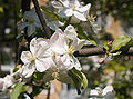
- Nomination Himba girl (by Yves Picq) --TwoWings * to talk or not to talk... 10:06, 26 November 2007 (UTC)
- Promotion Great picture. --JDrewes 14:36, 27 November 2007 (UTC)
-

- Nomination BricksHariadhi 08:16, 26 November 2007 (UTC)
 CommentI almost supported this because it is a great camera and expensive software, yet the quality is not good. However, support like that is not good quality either. -- carol 11:24, 27 November 2007 (UTC)
 - Decline The bricks are not very sharp (for a studio picture), some small debris is hardly recognizable, there is too much white space to the right and maybe also to the left (composition) --JDrewes 14:36, 27 November 2007 (UTC)
- Nomination BricksHariadhi 08:16, 26 November 2007 (UTC)
-

-
-

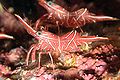
- Nomination Headshield slug Chelidonura varians. --Jnpet 08:41, 27 November 2007 (UTC)
- Decline Don't like the composition, don't like the glare. Ben Aveling 09:29, 27 November 2007 (UTC)
-

-

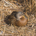
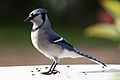
- Nomination Emu, some overexposure on bald parts but considering the rest of the bird is black...Benjamint 08:07, 27 November 2007 (UTC)
- Promotion Sharpness is OK. DOF allows the subject to be detached from the background. An alternative cropped version might be useful though. --TwoWings * to talk or not to talk... 08:21, 27 November 2007 (UTC)
-

- Nomination Cunninghams skink Benjamint 07:52, 27 November 2007 (UTC)
- Promotion Very nice. Ben Aveling 09:33, 27 November 2007 (UTC)
-

- Nomination Red-capped plover Benjamint 07:29, 27 November 2007 (UTC)
- Promotion Nice. Ben Aveling 09:33, 27 November 2007 (UTC)
-
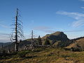
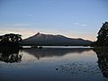
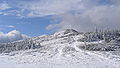
- Nomination Mt. Hotaka (3190m), Japan. Created by 663highland --Laitche 17:23, 26 November 2007 (UTC)
- Decline Comment Some chromatic aberration visible on the left, but a nice photo. Second opinion please. -- Klaus with K 17:37, 26 November 2007 (UTC)
I fixed the chromatic aberration on the left side and uploaded the new version. --Laitche 18:21, 26 November 2007 (UTC)
But some chromatic aberration still remain (red and green). --Laitche 20:27, 26 November 2007 (UTC)> I withdraw my nomination Thanks. --Laitche 11:10, 27 November 2007 (UTC)
-

-

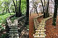
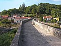
- Nomination: Left-side stairway of the Oratoire Saint-Joseph. --Acarpentier 21:41, 20 November 2007 (UTC)
- Review needed
-
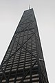
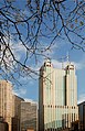
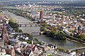
- Nomination The skyscraper of the Jonh Hancock Centre shot from below, Chicago. -- Alvesgaspar 01:02, 17 November 2007 (UTC)
- Promotion Very nice picture. The perspective distortion is not distracting but adds to the images artistry. -- Ram-Man 14:55, 24 November 2007 (UTC) Comment I find it distracting, but not necessarily in a bad way. As you say, it adds to the artistry. Regards, Ben Aveling 09:37, 27 November 2007 (UTC)
-
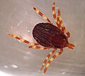
- Nomination Hyalomma marginatum --Adam Cuerden 11:37, 26 November 2007 (UTC)
- Decline too small Lycaon 12:04, 26 November 2007 (UTC)
-

- Nomination View from Engelberg to Hahnen, Switzerland --Simonizer 19:27, 25 November 2007 (UTC)
- Promotion Very much postcard type but nonetheless with beautiful composition and colouring. I would correct the slight geometric distortion - Alvesgaspar 00:14, 26 November 2007 (UTC)
-

- Nomination Dark Small-branded Swift (skipper) --Laitche 16:00, 25 November 2007 (UTC)
- Promotion Details and colors. Acarpentier 18:18, 25 November 2007 (UTC)
-
-

-

-

-

- Nomination Detail of a Small White butterfly (Pieris rapae) collecting nectar from a flower - Alvesgaspar 21:53, 24 November 2007 (UTC)
- Promotion Nice colors, well composed, good details. --LucaG 22:11, 25 November 2007 (UTC)
-

- Nomination Flower with butterfly in IGNOU, New Delhi, INDIA--Rajeevmass 05:44, 25 November 2007 (UTC)
- Decline Unsharp and noisy, this is a difficult subject for such a simple camera! - Alvesgaspar 08:51, 26 November 2007 (UTC)
-

- Nomination Desmarais buiding at the University of Ottawa--Padraic 22:09, 23 November 2007 (UTC)
- Decline Why the tight crop on top? - Alvesgaspar 00:27, 26 November 2007 (UTC)
-

-

- Nomination Cropped. Is this what you mean Calibas? Yes, saw the assassin bug. Funny how it is the same color. ;-) Sorry, I don't know what the protocol for adding addition versions at this phase of the process is. -- Joi 08:08, 22 November 2007 (UTC)
- Promotion Nice patterns. Calibas 21:11, 25 November 2007 (UTC)
-
-

-

- Nomination High resolution shot of a female drone-fly (Eristalis tenax) while collecting nectar - Alvesgaspar 21:46, 24 November 2007 (UTC)
- Promotion Incredible resolution. Acarpentier 00:55, 25 November 2007 (UTC)
-
-

-

- Nomination Hotel de ville de montreal from n-w view. --Acarpentier 18:17, 22 November 2007 (UTC)
- Promotion Lovely composition (and hotel!). Good sharpness too. — RedCoat 16:33, 24 November 2007 (UTC)
-

-
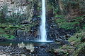
- Nomination The so called Lone Fall, made in Blyde River Canyon area, South Africa. --S.λukαs 19:37, 20 November 2007 (UTC)
- Decline Oversaturated and full of artifacts, looks almost like a painting. The white balance also seems off. - Alvesgaspar 00:04, 25 November 2007 (UTC)
-

-
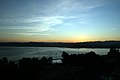
- Nomination: September 1 sunrise over Koper with end-of-season air trafic--Szilas 09:38, 19 November 2007 (UTC)
- Review needed
-
-
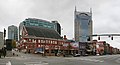
- Nomination A skyscraper in Chicago, in N. Michigan Avenue -- Alvesgaspar 10:58, 17 November 2007 (UTC)
- Promotion Composition, DOF excellent--Szilas 13:37, 24 November 2007 (UTC)
-

- Nomination A w:en:Whale shark in an aquarium --Pumpmeup 05:58, 23 November 2007 (UTC)
- Decline There are strong compression artifacts around the fins and the small fish close to the shark's mouth. The original IMG 1023.JPG doesn't have those, maybe you should save the crop in higher quality? --JDrewes 16:44, 23 November 2007 (UTC)
-

-
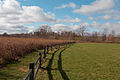
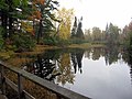
- Nomination A view of Meadow Brook Park in Urbana. Dori - Talk 22:13, 22 November 2007 (UTC)
- Promotion I think this is a very nice image, but are you sure it isn't tilted just a little bit cw? --JDrewes 16:51, 23 November 2007 (UTC) Thanks for the review. I don't know if there is a tilt but if there is it's very slight. The ground itself slopes up a bit. Dori - Talk 23:28, 23 November 2007 (UTC)
-

-
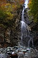
- Nomination Mizuhi Falls, Tanzawa, Kanagawa, Japan. Created by Σ64 --Laitche 17:57, 20 November 2007 (UTC)
- Decline Comment The author is a high-school student :) Laitche 18:17, 20 November 2007 (UTC) I withdraw my nomination --Laitche 20:12, 20 November 2007 (UTC)
Just to keep it simple for the bot. -- carol 12:13, 23 November 2007 (UTC)
-

-

-

- Nomination: Piece of cake "Palermo" #!George Shuklin 11:08, 18 November 2007 (UTC)
- Review needed
-
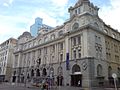
- Nomination: The en:Britomart Transport Centre in Auckland. --Ingolfson 07:25, 18 November 2007 (UTC)
- Review needed
-

- Nomination: An apartment building with a very aesthetic corner. --Ingolfson 07:25, 18 November 2007 (UTC)
- Review needed
-

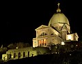
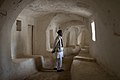
- Nomination: Elevator Room of the Oratoire St-Joseph. -- Acarpentier 05:25, 18 November 2007 (UTC)
- Review needed
-

- Nomination w:Common Mare's Tail (Hippuris vulgaris), Upernavik, Greenland. -- Slaunger 14:28, 22 November 2007 (UTC)
- Decline Overexposed --Lestat 15:08, 22 November 2007 (UTC)
-
-

-

- Nomination Oratoire Saint-Joseph Close up. --Acarpentier 01:44, 20 November 2007 (UTC)
- Promotion Good WB and sharpness. QI. --Lestat 15:10, 22 November 2007 (UTC)
-
- Nomination Oratoire Saint-Joseph du Mont-Royal -- Acarpentier 12:31, 18 November 2007 (UTC)
- Promotion A QI, simple as that --Thermos 18:08, 22 November 2007 (UTC)
-

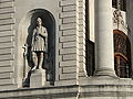
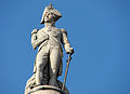
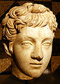
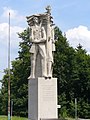
- Nomination: Sculpture of Septimius Severus in Cologne--Szilas 07:22, 17 November 2007 (UTC)
- Review needed
-
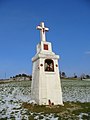
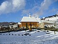
- Nomination: Shrine in Beskid Sądecki, Poland. -- Pudelek 15:16, 16 November 2007 (UTC)
- Review needed
-

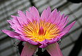
- Nomination probably Trametes versicolor. -- Joi 05:23, 22 November 2007 (UTC)
- Promotion I think another crop might improve the composition but otherwise well done. Did you spot the assassin bug? Calibas 05:54, 22 November 2007 (UTC)
-

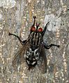
- Nomination Green bottle fly (Lucilia sericata). --Calibas 03:27, 22 November 2007 (UTC)
- Promotion Good light and detail, sharp. -- Alvesgaspar 12:00, 22 November 2007 (UTC)
-

-
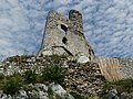
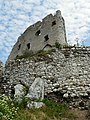
- Nomination: Mirów Castle, Poland. --Piotr Konieczny aka Prokonsul Piotrus Talk 17:42, 15 November 2007 (UTC)
- Review needed
-
- Nomination: Transparent single gramophone record by Tomasz Sienicki nominated by carol 07:16, 14 November 2007 (UTC)
- Review Is it legal to have the logo in there? In any case I don't see what it adds so I would take it out just to be safe. Dori - Talk 01:04, 16 November 2007 (UTC) Comment To be honest, I was looking for an image of a scratched record when I should have been looking at the date. -- carol 01:13, 16 November 2007 (UTC)
-

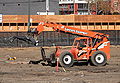
- Nomination Construction work at night in downtown Chicago. --Dschwen 15:25, 12 November 2007 (UTC)
- Decline Borderline decline. In many ways this is a good quality image; nice resolution and sharpness for instance. I also like the motion blur of the construction workers, it adds dynamic to the photo. My main objection is the composition, which I find too cluttered. Feel free to take it to CR for a second opion. -- Slaunger 21:05, 20 November 2007 (UTC), Well, the construction guys just clutterd up the street, what can I do about it? ;-) --Dschwen 16:46, 21 November 2007 (UTC)
It is actually not the construction guys I was thinking about, but the other elements;-) -- Slaunger 06:33, 22 November 2007 (UTC)
-
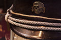
- Nomination New attempts at taking a proper proxiphotograph of a SS cap. -- Rama 22:07, 20 November 2007 (UTC)
- Decline POV and DOF seem well chosen, but extreme color noise, even for 30s exposure. Many hot pixels, doesn't the 5D have dark frame subtraction? --JDrewes 09:38, 21 November 2007 (UTC) Comment Darn, I need to develop this again. Rama 09:50, 21 November 2007 (UTC)
-
-

- Nomination Detail of the Raffaelli's mosaic, life-sized copy of the Da Vinci's Last Supper ordered by Napoleon, Vienna. Perspective corrected. --Alberto Fernandez Fernandez 12:43, 20 November 2007 (UTC)
- Promotion Great colors, perspective Acarpentier 13:17, 20 November 2007 (UTC)
-

-
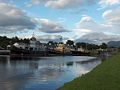
- Nomination Caledonian Canal in Corpach (Scotland) --TwoWings * to talk or not to talk... 23:36, 18 November 2007 (UTC)
- Decline Good composition but too much noise for QI. Sorry. --LucaG 13:22, 20 November 2007 (UTC)
-

- Nomination: A panoramic view of Montreal S-W Downtown. --Acarpentier 02:41, 14 November 2007 (UTC)
- Review
Photographer interview How come you brought this one here and not to FP? -- carol 07:00, 14 November 2007 (UTC). - I'm not sure it's good as that, and I can do better... Acarpentier 13:35, 14 November 2007 (UTC)
-

-

- Nomination Autumn leaves fallen on a driveway in Maryland.--Mark (Mschel) 18:48, 19 November 2007 (UTC)
- Decline DOF way too shallow for my tastes. Calibas 02:11, 20 November 2007 (UTC)
-
-

-

- Nomination Male mallard duck. --Acarpentier 01:27, 19 November 2007 (UTC)
- Promotion Very good details and colors. It's a pity the crop of the reflection. --LucaG 22:54, 19 November 2007 (UTC)
-

- Nomination Rusty car in Oradour-sur-Glane. --TwoWings * to talk or not to talk... 11:32, 18 November 2007 (UTC)
- Promotion Beautiful, sad image. Good composition. Average noise level, not disturbing on this particular image. --LucaG 22:47, 19 November 2007 (UTC)
-

-

- Nomination: Eggs again! Since this one has been accepted, I try that one too even if I don't find it as good as the other! --TwoWings * Wanna talk? ;-) 15:56, 13 November 2007 (UTC)
- Review needed
-

- Nomination Maize, Oroso, Galicia. --Lmbuga gl, pt, es: contacta comigo 22:34, 18 November 2007 (UTC)
- Promotion Good quality. Lycaon 23:31, 18 November 2007 (UTC)
-

- Nomination Another version of the one below. Not so nice composition but detail is still good and focus on nose is better - Alvesgaspar 20:51, 18 November 2007 (UTC)
- Promotion Indeed the composition isn't as good as the other one but it's an acceptable detail IMO. --TwoWings * to talk or not to talk... 08:52, 19 November 2007 (UTC)
-

- Nomination Tombeau du frere Andree. --Acarpentier 18:05, 18 November 2007 (UTC)
- Promotion Superb lighting, FP too in my opinion, if you did denoise, I think you went overboard a bit. Dori - Talk 18:59, 18 November 2007 (UTC)
 Question What is the origin of the light blue line around the head? -- Slaunger 19:05, 18 November 2007 (UTC) - Hey, thanks I'll try to FPC. ;) For the lighting I'm not sure but guess there is a incandescent blue light. Acarpentier 20:41, 18 November 2007 (UTC)
-

- Nomination Detail of the head of a she-cat (Felis silvestris catus) showing the eyes and nose. -- Alvesgaspar 16:47, 18 November 2007 (UTC)
- Promotion Really detailed. Some blue fringes on fur (center-top) not disturbing. --LucaG 17:22, 18 November 2007 (UTC)
-

- Nomination Altar to Zeus in the Pergamonmuseum. --Lestat 13:16, 18 November 2007 (UTC)
- Decline Loss of detail and strong distortions at the sides. Look at the people to the right, they look bent/compressed, and the textures of everything look too smooth (from noise removal?). Maybe try with a lens with less distortion, or correct individual images before stitching? --JDrewes 17:09, 18 November 2007 (UTC)
-

-

- Nomination A Yellow-legged Gull in Gibraltar -- RedCoat 11:29, 18 November 2007 (UTC)
- Decline First the good thing: I like the composition and the pose of the bird. The bad things: the technical quality is pretty bad. There is something very strange going on in the boundary between the bird and the background. Like a multicoloured line dominated by red. It is very distracting to look at even in preview size. I do not know whether this is due to chromatic abberation of the lens or some other effect. Also, the colours look posterized and the background has too much noise and a lot of colour fringes. -- Slaunger 13:22, 18 November 2007 (UTC)
It is chromatic abberation, I think. I used the H2 and the red-green CA was quite pronounced. By the way, I note that you are using Photoshop Elements, with which it is fairly easy to get rid of the chroma noise and CA. I'll leave a note on your talk. Thegreenj 23:02, 18 November 2007 (UTC)
-

-

-

- Nomination A view of Michigan avenue from the top of the John Hancock Tower, Chicago -- Alvesgaspar 23:34, 16 November 2007 (UTC)
- Promotion Good composition. Dori - Talk 19:08, 18 November 2007 (UTC)
-
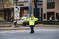
- Nomination A traffic controller at Michigan Avenue in rush hour, Chicago. -- Alvesgaspar 23:34, 16 November 2007 (UTC)
- Decline Unfortunate timing, the car is right behind the main subject and it's distracting due to blur. Dori - Talk 19:07, 18 November 2007 (UTC)
-

- Nomination Detail of the building at 77 West Drive Drive, Chicago, by architect Ricardo Bofill, 1990-92. Check "other versions" to see the whole building -- Alvesgaspar 00:54, 16 November 2007 (UTC)
- Decline
You are away from the commons starting Wednesday some time ago.... -- carol 01:24, 16 November 2007 (UTC)Nonsense. Lycaon 09:50, 16 November 2007 (UTC) --I like the pattern, but I don't think the sharpness is at the detail needed, it seems blurry too, probably not enough light. Dori - Talk 19:03, 18 November 2007 (UTC)
Exactly! It looks like a reproduction of a Frank Llloyd Wright window I saw on a shower curtain in a magazine. -- carol 11:45, 19 November 2007 (UTC)
-
-
- Nomination: Wooden cerkiew (orthodox church) in Wierchomla Wielka, Poland. --Pudelek 10:36, 13 November 2007 (UTC)
- Review needed
-
- Nomination Montreal view from the Oratoire St-Joseph. -- Acarpentier 05:11, 18 November 2007 (UTC)
- Promotion Excellent. Calibas 05:48, 18 November 2007 (UTC)
-

-

-

- Nomination An Indonesian traditional topeng monyet show (A dance performed by dressed Macaca fascicularis) to gather coins from the audience, especially children. Taken from Taman Mini Indonesia Indah.Hariadhi 12:00, 17 November 2007 (UTC)
- Decline Bad crop and unfortunate POV. Lycaon 17:24, 17 November 2007 (UTC)
-

-

- Nomination Romanic monastic church (Cambre, A coruña, Galicia, Spain --Lansbricae (Ti dirás) 12:52, 12 November 2007 (UTC)
- Promotion Nice job editing this. Calibas 05:50, 18 November 2007 (UTC)
-

- Nomination: Lower Mokelumne River. --Calibas 04:40, 12 November 2007 (UTC)
- Review needed
-

- Nomination Marabou Stork (Leptoptilos crumeniferus) at the Toronto Zoo --Relic38 02:01, 11 November 2007 (UTC)
- Decline I think it is a good pose of the bird and the composition is good. Unfortunately the background is cluttered and the stork is not sharp enough for a zoo shot IMO. The lightning is also quite uninteresting, it is challenging on what I guess was an overcast day. -- Slaunger 21:12, 16 November 2007 (UTC)
You are correct; in fact there was a light rain. -- Relic38 01:26, 18 November 2007 (UTC)
-

- Nomination Green Swallowtail (Papilio blumei) butterfly, at the Toronto Zoo. -- Relic38 02:24, 10 November 2007 (UTC)
- Promotion Could use a higher DOF but good colors and detail. Calibas 23:33, 15 November 2007 (UTC)
Comment Agreed, and I since learned that the Auto modes do not usually produce the best exposure combinations :) -- Relic38 00:42, 16 November 2007 (UTC)
Comment Neutral, good colours and details, right angle but why is the swallowtail touching the lower border. The right swallowtail is even missing. From a butterfly in a zoo I expect an undamaged one. --Hsuepfle 19:41, 16 November 2007 (UTC)
I didn't notice how damaged the specimen was until I got home and examined the image. If the left tail was intact I would have cropped it (fixable from the original, and I probably will do that some day). A good portion of the left wing is missing as well. -- Relic38 01:32, 18 November 2007 (UTC)
-

- Nomination Tsarouhi clogs and kaltsodetes garters --Thermos 08:11, 17 November 2007 (UTC)
- Promotion Composition, sharpness and DOF seem good enough. --TwoWings * to talk or not to talk... 08:19, 17 November 2007 (UTC)
-

- Nomination One-point perspective. --Laitche 20:25, 16 November 2007 (UTC)
- Promotion Good composition and high quality. MathKnight
 21:07, 16 November 2007 (UTC)
-

- Nomination A collague of 4 pictures of the Gothic Cologne cathedral. Credit inside picture description page. MathKnight 18:32, 16 November 2007 (UTC)
- Decline Every picture has to be judged by itself and is as such of abominable quality. GIF is not the correct format for photographs. Lycaon 23:13, 16 November 2007 (UTC)
- Nomination A collague of 4 pictures of the Gothic Cologne cathedral. Credit inside picture description page. MathKnight
-

-

- Nomination S.Teresa Stained glass in Katowice --Lestat 09:07, 16 November 2007 (UTC)
- Decline Too faint. Too white. MathKnight 21:07, 16 November 2007 (UTC)
-
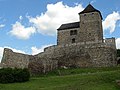
- Nomination Będzin Castle, Poland. --Piotr Konieczny aka Prokonsul Piotrus Talk 17:42, 15 November 2007 (UTC)
- Decline Tilted and not sharp enough. --TwoWings * to talk or not to talk... 08:16, 17 November 2007 (UTC)
-

- Nomination Mirów Castle, Poland. --Piotr Konieczny aka Prokonsul Piotrus Talk 17:42, 15 November 2007 (UTC)
- Decline Composition not quite OK. Not sharp enough. --TwoWings * to talk or not to talk... 08:14, 17 November 2007 (UTC)
-
- Nomination Mirów Castle, Poland. --Piotr Konieczny aka Prokonsul Piotrus Talk 17:42, 15 November 2007 (UTC)
- Decline Not sharp enough. --TwoWings * to talk or not to talk... 08:14, 17 November 2007 (UTC)
-
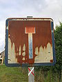
- Nomination Rusty road sign. --TwoWings * to talk or not to talk... 07:37, 15 November 2007 (UTC)
- Decline The crop is too tight and I don't think you're hitting the subject dead on (rather at an angle, don't know if it's possible), and it's a bit low on value. Dori - Talk 01:09, 16 November 2007 (UTC)
I don't understand your review! Could you rephrase it please? --TwoWings * to talk or not to talk... 08:11, 17 November 2007 (UTC)
-

- Nomination The Skyline of San Diego, at night. This picture can be overlayed (pixel-precise) with the following San Diego Skyline Day JD111107.jpg --JDrewes 00:52, 15 November 2007 (UTC)
- Promotion Well executed. Cacophony 03:28, 15 November 2007 (UTC)}
Nice balanced colors rare in night shots / amazing details (see planes on the left). --Meduz 14:08, 16 November 2007 (UTC)
-

-

- Nomination Near Druesberg, Switzerland. --MRB 20:05, 12 November 2007 (UTC)
- Decline The almost 8 sec exposure has given you a lot of DOF and the overall sharpness on all objects is reasonable. However, it seems like the focal plane is too much on the rocks right in front of the camera leading to non-optimal sharpness on, e.g., the small mountain top, which is more interesting. For me this is distracting, as it becomes unclear what the primary subject is. All in all, it is a borderline decline from me. Feel free to take it to CR for a second opinion. Finally, I suggest you add geodata to the photo including a heading. It adds value. -- Slaunger 21:28, 16 November 2007 (UTC)
-

- Nomination Pachystachys lutea from Universitas Indonesia campus . Hariadhi 12:21, 11 November 2007 (UTC)
- Promotion Hmm... I have looked at this one several times. It has many good qualities. The composition is very nice, the lightning and the colours are delicate and it is by far the best illustration of the species on commons. The sharpness is however not so good due to the very three-dimensional character of the flower, which leads to DOF problems. I cannot see how this can be solved though so I choose to mitigate that issue and promote it. -- Slaunger 19:56, 16 November 2007 (UTC)
-

- Nomination Royal Barge Anantanagaraj of Thailand. Dress rehearsal for Royal Barge Procession for Royal Kathin Ceremony at Wat Arun on the special occasion of King Bhumibol's 80th birthday. --Lerdsuwa 10:56, 11 November 2007 (UTC)
- Decline I get the feeling that it's tilted clockwise (from the water line), but maybe it's just perspective. Dori - Talk 00:55, 16 November 2007 (UTC) The top of white building on the left and the roof of houses in the center and right is tilted other way. I'd say it's perspective. I've looked at this before and decided not to rotate the photo. --Lerdsuwa 15:12, 16 November 2007 (UTC)
It is a valuable photo and an impressive scene, and I am OK with the perspective, but I cannot overlook, that it is cleary oversaturated in the red channel. As a consequence, the red dressed people in the scene are blown, sorry :-( -- Slaunger 21:06, 16 November 2007 (UTC)
-
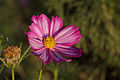
- Nomination A cosmos bipinnatus flower. Dori - Talk 19:31, 10 November 2007 (UTC)
- Decline I really like the composition, the colours and the moody, delicate light. Nice that it is not just a birds eye perspective. Under such circumstances I can accept if not all of the petals are sharp due to the natural limitations of DOF in macro photography. However, in this case it seems like the focal plane is at the end of the front-most petals, leading to an unsharp centre and clearly blurred petals in the back. Had the focus been on the centre, I would have promoted it. -- Slaunger 20:36, 15 November 2007 (UTC) --Yeah, the DOF is pretty bad, the light and the pollen is why I nominated it. I kept telling myself that day to stop down a few stops and I kept forgetting between shots. this is another example. Dori - Talk 23:31, 15 November 2007 (UTC)
That last photo is very nice too. Unfortunately, it has a similar DOF problem, a pity :-( -- Slaunger 21:16, 16 November 2007 (UTC)
-
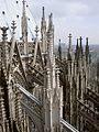
- Nomination: Flying buttresses and pinnacles in Cologne Cathedral (Gothic architecture), by User:Mkill. MathKnight 11:11, 10 November 2007 (UTC)
- Review Comment Please correct perspective distortion. Description of the image is not correct: please add author's name ("uploader" isn't an author's name!). -- MJJR 22:27, 10 November 2007 (UTC)
- Nomination: Flying buttresses and pinnacles in Cologne Cathedral (Gothic architecture), by User:Mkill. MathKnight
-

-

-

-
-

- Nomination Struthio camelus, Teo, Galicia, Spain. Image of User:Grela --Lmbuga gl, pt, es: contacta comigo 19:50, 15 November 2007 (UTC)
- Decline Focus is on the fence. Calibas 02:45, 16 November 2007 (UTC)
-
- Nomination Tower in Będzin Castle, Poland. --Piotr Konieczny aka Prokonsul Piotrus Talk 17:42, 15 November 2007 (UTC)
- Decline When there is a Comedy Image candidate page, I will support this. -- carol 22:25, 15 November 2007 (UTC)
-

- Nomination Tower in Będzin Castle, Poland. --Piotr Konieczny aka Prokonsul Piotrus Talk 17:42, 15 November 2007 (UTC)
- Decline overexposed Pudelek 17:57, 15 November 2007 (UTC)
-

- Nomination Mirów Castle, Poland. --Piotr Konieczny aka Prokonsul Piotrus Talk 17:42, 15 November 2007 (UTC)
- Decline Perspective --Lestat 08:47, 16 November 2007 (UTC)
-

- Nomination Well, this is a glass of latte macchiato, with some coffee beans. (Somehow my signature does not work properly on this page.) -- א. 11:22, 15 November 2007 (UTC)
- Promotion Nicely illustrates a macchiato. The tilt would be perfect for an ad campaign, but I don't think it fits in an encyclopedia article, still well done though. Calibas 02:41, 16 November 2007 (UTC)
-

- Nomination Nude. I know it might not be big enough but I thought we could have some exceptions... (NB: I also have to admit I'm not 100% sure the author is a Wikipedian!) --TwoWings * to talk or not to talk... 07:37, 15 November 2007 (UTC)
- Decline Too small --Lestat 12:03, 15 November 2007 (UTC)
That’s Just the Right Size to me ;) --LucaG 23:12, 15 November 2007 (UTC)
-

- Nomination Detail of the foot of a penitent as he drags chains during a Good Friday procession in Malta --Inkwina 23:41, 14 November 2007 (UTC)
- Decline Too much color noise, soft, sorry. --LucaG 22:04, 15 November 2007 (UTC)
-

-

- Nomination American Hover Fly (Eupeodes americanus). --Calibas 06:55, 14 November 2007 (UTC)
- Promotion Crisp and clear -- Alvesgaspar 01:00, 16 November 2007 (UTC)
-

- Nomination The Gherkin from below (London) --TwoWings * Wanna talk? ;-) 08:57, 13 November 2007 (UTC)
- Decline I prefer calling it The Towering Innuendo : ). Calibas 01:45, 14 November 2007 (UTC) Tilted --Lestat 21:44, 14 November 2007 (UTC) Sorry but I can't see why tilted is a problem on such a shot! --TwoWings * to talk or not to talk... 17:36, 15 November 2007 (UTC)
-

-
-

- Nomination Make-up. --TwoWings (jraf) * Wanna talk? ;-) 12:51, 11 November 2007 (UTC)
- Decline Interesting and unusual subject, but too small to mitigate IMO. -- Slaunger 20:38, 15 November 2007 (UTC)
-
-

-

-

-

-
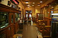
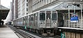
- Nomination Quincy station entrance lobby, Chicago 'L'. Looks like a cozy living room. --Dschwen 17:28, 14 November 2007 (UTC)
- Promotion Tilted, little unsharp --Lestat 20:47, 14 November 2007 (UTC), I replaced it with a slightly rotated and downsampled version. Sharpness is not a problem, DOF would be, but thats unavoidable with such a wide-angle view at these lighting conditions. Please also note that the station in itself is crooked, check the tiles above the door frame! --Dschwen 21:53, 14 November 2007 (UTC) I think that now it can be QI. --Lestat 12:06, 15 November 2007 (UTC)
-

- Nomination View of Petersberg. ← Körnerbrötchen <✉> 16:34, 14 November 2007 (UTC)
- Promotion Though a bit small for my liking, it is sharp, has good colours and ~is quite noise-free. Good job. Lycaon 20:46, 14 November 2007 (UTC)
-

-
- Nomination American Hover Fly (Eupeodes americanus). --Calibas 06:55, 14 November 2007 (UTC)
- Promotion Excelent details, colors. Acarpentier 13:37, 14 November 2007 (UTC)
-
-

- Nomination American cockroach eating from a plate --Muhammad Mahdi Karim 08:00, 13 November 2007 (UTC)
- Decline Tilted, crop --Lestat 20:50, 14 November 2007 (UTC)
-

-

- Nomination Northern Mockingbird (Mimus polyglottos). --Calibas 04:07, 12 November 2007 (UTC)
- Promotion Soft at full size. Maybe 1/80s at 300mm x 1.6 ? --LucaG 21:15, 12 November 2007 (UTC) --I think the focus is OK, but it seems to have a bluish tint so perhaps the color balance should be adjusted a bit. Dori - Talk 20:54, 14 November 2007 (UTC)
 Done Calibas 01:32, 15 November 2007 (UTC) --I think it's good enough, but did you touch up the image? Looking at the back of the bird and the beak. Dori - Talk 02:48, 15 November 2007 (UTC)
-

- Nomination Sortebrødre Church is a 12th century church in Viborg, Denmark. Stitch of three photos. -- Slaunger 00:55, 11 November 2007 (UTC)
- Promotion Comment Weird effect on the tower. Everything is sharp (even in the distance) but the tower roof which is noisy and blurred. Lycaon 23:22, 11 November 2007 (UTC) Comment I am placed closer to the church that what appears in the projection (pano of three portraits), thus leading to DOF problems on the apex, which is also close to the image boundary, where lens performance is bad. This is a back-up pano. I did another based on 3x3 from another position, which had a better sharpness on the tower, but there I have parallax problems with a tree in front :-(. I still think the back-up is good though. -- Slaunger 07:12, 12 November 2007 (UTC) I think it is good enough. --Thermos 14:48, 14 November 2007 (UTC)
-
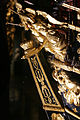
- Nomination Rudder of La Réale (Model of the Naval Museum of Paris) --Rama 09:30, 9 November 2007 (UTC)
- Decline Overexposed areas on the golden areas. Regarding the composition I am confused; what is the subject? Apparently not the rudder as it is cropped. Is it then the trumpet figures? If yes they are too suppressed by other elements in the area and too small IMO. -- Slaunger 20:23, 14 November 2007 (UTC)
-

- Nomination An early morning photo of mount Kozjak, Split and its railway station --Orlovic (talk) 01:17, 9 November 2007 (UTC)
- Decline The strong contrast between the sunlit background and the railway area in shadow is unfortunate as it brings more attention to the bg than to the subject, which I guess must the the train and the passengers. The latter are dark and not well resolved. -- Slaunger 20:17, 14 November 2007 (UTC)
-

- Nomination Monument in Łaziska Górne (Upper Silesia) -- Pudelek 16:44, 8 November 2007 (UTC)
- Decline OK sharpness and lightning, but I find the composition messy due to distracting elements - most prominently the wire and the road sign. I would consider creating another version, where the hanging wire is cloned out. That should be easy to do. For the vast majority of users the Polish(?) description in the image page is not of much use. You could add value by adding geodata (including a heading). A Commons icon on Google maps says more than many words... -- Slaunger 19:10, 14 November 2007 (UTC)
-

- Nomination Altar in Holy Trinity Church. -- 22:11, 6 November 2007 (UTC)
- Decline I think the lightning is not so good. Some of the golden parts seems over-exposed and other areas are quite dark giving a somewhat dull impression. It is a little unsharp too IMO. -- Slaunger 18:55, 14 November 2007 (UTC)
-

-

- Nomination Chrysanthemum in fall, by Snežana Trifunović. Nom by Nikola 20:24, 13 November 2007 (UTC)
- Decline Not sharp, and the background is totally over-edited (what happened there??). Sorry. --JDrewes 22:33, 13 November 2007 (UTC)
-

- Nomination Indian Rhinoceros (Rhinoceros unicornis), at the Buffalo Zoo --Davepape 16:39, 13 November 2007 (UTC)
- Promotion Sharpness, angle and composition OK. --TwoWings * to talk or not to talk... 16:54, 13 November 2007 (UTC)
-
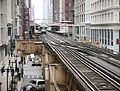
- Nomination Elevated tracks in downtown Chicago. --Dschwen 00:46, 13 November 2007 (UTC)
- Promotion A better DOF could have improved the picture but sharpness and composition make it a QI to me. --TwoWings * to talk or not to talk... 16:56, 13 November 2007 (UTC)
-

-

- Nomination Birds on misty Druesberg, Switzerland. --MRB 20:05, 12 November 2007 (UTC)
- Promotion Sharpness OK even if not that big. Composition great. --TwoWings * Wanna talk? ;-) 11:00, 13 November 2007 (UTC)
Birds are to prominent not to be identified. Sharpness is IMO also insufficient. Lycaon 21:42, 13 November 2007 (UTC)
The birds are Alpine Choughs (Pyrrhocorax graculus). --MRB 07:24, 14 November 2007 (UTC)
Indeed they are ;). Lycaon 08:17, 14 November 2007 (UTC)
-

-

-

- Nomination Romanic church (Leiro, Galicia, Spain --Lansbricae (Ti dirás) 12:44, 12 November 2007 (UTC)
- Decline Tower cropped at the top, also other issues like barrel distortion (lense feature) and chromatic aberration. -- Klaus with K 14:38, 13 November 2007 (UTC)
-

- Nomination Carcinus maenas Shore crab. Lycaon 22:23, 11 November 2007 (UTC)
- Promotion Sharp, very good lighting HighQI. What about size? --LucaG 22:34, 11 November 2007 (UTC)
Carapace width just over 6cm. I added to description. Lycaon 23:10, 11 November 2007 (UTC)
Look at the angry face on his back :) --Orlovic (talk) 22:53, 13 November 2007 (UTC)
-
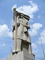
- Nomination Sculpture of Commodus, Roman emperor--Szilas 17:57, 11 November 2007 (UTC)
- Promotion Acceptable detail. --Beyond silence 17:50, 13 November 2007 (UTC)
-

- Nomination Romanian flag --TwoWings (jraf) * Wanna talk? ;-) 02:15, 11 November 2007 (UTC)
- Decline Bad composition, sky overexposed --Orlovic (talk) 22:52, 13 November 2007 (UTC)
-
-

- Nomination Freight steam locomotive LV18-002. Other views: Грузовой паровоз ЛВ18-002 (note: there is no "no sky", this is just cloudy autumn) #!George Shuklin 09:11, 6 November 2007 (UTC)
- Promotion Acceptable detail, high resolution. --Beyond silence 17:52, 13 November 2007 (UTC)
-

- Nomination Cruise, Ponte Maceira, Portor, Negreira. Galicia.--Lmbuga gl, pt, es: contacta comigo 21:33, 5 November 2007 (UTC)
- Promotion Acceptable detail. --Beyond silence 17:51, 13 November 2007 (UTC)
-
-

-
-

- Nomination Erizo (Erinaceus europaeus)(Maceda, Ourense, Galicia, Spain) --Lansbricae (Ti dirás) 13:15, 12 November 2007 (UTC)
- Decline Not that sharp... --TwoWings * Wanna talk? ;-) 11:02, 13 November 2007 (UTC)
-

-

- Nomination If that is all the shade there is... Young Himba girls in Namibia. Lycaon 09:20, 12 November 2007 (UTC)
- Promotion Obvious QI to me... --TwoWings * Wanna talk? ;-) 11:04, 13 November 2007 (UTC)
-

- Nomination A rare Hartmann's mountain zebra (Equus zebra hartmannae) in its natural habitat in Namibia. Lycaon 00:36, 12 November 2007 (UTC)
- Promotion There are some dust spots (upper right) that should be cleaned up. Dori - Talk 03:32, 12 November 2007 (UTC) Done Lycaon 08:13, 12 November 2007 (UTC) Promotion because of rarity and good enough quality --Thermos 16:25, 12 November 2007 (UTC)
-
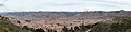
- Nomination Panoramic image of Cuzco, Peru. --Cacophony 21:47, 11 November 2007 (UTC)
- Promotion Remarkably sharp and well stitched pano. Lycaon 21:59, 11 November 2007 (UTC)
Excellent. Please geotag if possible. Alberto Fernandez Fernandez 08:49, 12 November 2007 (UTC)
I tried to figure out the coordinates but I can't find a website for Peru. Cacophony 21:25, 12 November 2007 (UTC)
I geotagged it roughly using the 3D rendering of Google Earth and the orientation of your picture (w:Wikipedia:Obtaining geographic coordinates). I located your picture around Saqsaywaman. Hope this helps. Alberto Fernandez Fernandez 23:22, 12 November 2007 (UTC)
-

-
- Nomination Dasylirion wheeleri, taken august 07 . --NobbiP talk 14:47, 4 November 2007 (UTC) Comment This one is sharp, but the lighting makes it neutral for me. - Relic38 12:39, 10 November 2007 (UTC)
- Promotion As I understand, this is a desert plant and for such a photo I find it acceptable that the lightning is harsh as it underlines the harsh environment. I added the Plants of Arizona cat. You may have other photos, which belong in that cat as well...-- Slaunger 22:00, 12 November 2007 (UTC)
- Nomination Dasylirion wheeleri, taken august 07 . --NobbiP talk 14:47, 4 November 2007 (UTC)
-

-

-

-

-
-

-

-
-

- Nomination Narrow leaf bur-reed, Sparganium angustifolium near Arcalis in Andorra.Lycaon 14:07, 11 November 2007 (UTC)
- Promotion Composition is perfect for the subject, colors, sharp Acarpentier 16:06, 11 November 2007 (UTC)
-

-

- Nomination Hands with camera --TwoWings (jraf) * Wanna talk? ;-) 13:00, 11 November 2007 (UTC)
- Decline Too noisy, blown highlight. Lycaon 13:15, 11 November 2007 (UTC)
-
-

-

- Nomination Australian Pelican. Ben Aveling 04:51, 11 November 2007 (UTC)
- Decline Too much noise. Lycaon 23:14, 11 November 2007 (UTC)
-

- Nomination Female Mallard Duck Rest. --Acarpentier 02:30, 11 November 2007 (UTC)
- Promotion Super quality. Nice lightning, excellent sharpness and composition. Could you add some description of the location? For instance geocode it. -- Slaunger 22:11, 11 November 2007 (UTC) - Sure, I'll do it. ;) Alain Carpentier 22:46, 11 November 2007 (UTC)
-

- Nomination: Mountain pass Brona in Żywiec Beskids, Poland --Pudelek 11:15, 6 November 2007 (UTC)
- Review needed
-

- Nomination Olympic Stadium of Montreal from back-left at night. --Acarpentier 13:36, 10 November 2007 (UTC)
- Promotion Obviously a quality image, excellent work. Calibas 22:28, 10 November 2007 (UTC)
-

- Nomination Panoramic view in Sibiu (Romania) --TwoWings (jraf) * Wanna talk? ;-) 13:23, 10 November 2007 (UTC)
- Decline Noise problems, focus issues, perspective and publicity for Heineken (no, that last one I'm kidding). Lycaon 13:48, 10 November 2007 (UTC)
*You forgot the publicity for BMW ;-) --TwoWings (jraf) * Wanna talk? ;-) 13:53, 10 November 2007 (UTC) Comment Look at the top left corner. Calibas 22:25, 10 November 2007 (UTC) Sh!t I've not seen it! Sorry! --TwoWings (jraf) * Wanna talk? ;-) 23:47, 10 November 2007 (UTC)
-

- Nomination Oxya yezoensis (Acrididae) --Laitche 12:27, 10 November 2007 (UTC)
- Promotion I don't like the flash light, an there is a little bit of noise in the darker parts. Still with this good size, a QI for me, as the focus and DOF are spot on. Lycaon 13:09, 10 November 2007 (UTC) Comment This picture was taken in sunset :) --Laitche 15:41, 10 November 2007 (UTC)
-

- Nomination Olympic Stadium of Montreal from back at night. --Acarpentier 21:40, 9 November 2007 (UTC)
- Promotion Surreal colours, I you don't nominate for FPC, I will. Benh 08:39, 10 November 2007 (UTC) - Thanks. ;) Acarpentier 13:02, 10 November 2007 (UTC)
-

-

- Nomination Painted eggs from Bukovina --TwoWings (jraf) * Wanna talk? ;-) 16:14, 9 November 2007 (UTC)
- Promotion Borderline DOF, rest is fine. Lycaon 14:03, 10 November 2007 (UTC)
-
- Nomination Monument in Łaziska Górne (Upper Silesia) -- Pudelek 16:44, 8 November 2007 (UTC)
- Decline Composition includes too many disturbing details in the background --TwoWings (jraf) * Wanna talk? ;-) 15:51, 10 November 2007 (UTC)
-

- Nomination Small and beautiful buterfly of unknown species (help needed!). Abou 25mm between wing tips. -- Alvesgaspar 13:24, 5 November 2007 (UTC)
- Promotion Good sharpness and DOF, the flower may be a bit bright which distracts from the main subject. Do you think this would be better with a 90 degree CW rotation? - Relic38 12:45, 10 November 2007 (UTC)
-

- Nomination Juvenile mute swan in flight --Thermos 06:31, 5 November 2007 (UTC)
- Decline I would crop on the duck. I suspect the resolution is to low for QI (If i'm not mistaken it should be 2000x3000 px (2MB , 6 Mpx). MathKnight 16:12, 5 November 2007 (UTC)
Comment Size guideline is 2Mpx, not based on file disk size. This image could be cropped a bit more on the top and right. Keep in mind that images at the 2Mpx limit should be very sharp to be considered for QI. This one's close, but the subject may be a bit small unfortunately. - Relic38 03:48, 6 November 2007 (UTC) Comment I think the size is fine and I would give it QI except for the halo around the bird, background editing? --Tony Wills 22:15, 9 November 2007 (UTC)
Size is ok, composition is nice, halos spoil it. Lycaon 22:17, 9 November 2007 (UTC) Halos are probaply due to PP (no background edit, however), don't know why though. I will see if I have better shots of this bird. No need for CR --Thermos 12:37, 10 November 2007 (UTC)
-

- Nomination: The dome of the basilique Notre Dame at Boulogne-sur-Mer, France. -- MJJR 21:54, 4 November 2007 (UTC)
- Review needed
-

-

- Nomination Fireweed of a sort, covers whole hillsides in purple. --Tony Wills 10:20, 4 November 2007 (UTC)
- Promotion Good colour, moderately sharp though. - Relic38 12:39, 10 November 2007 (UTC)
-

- Nomination Larus argentatus Juvenile Close Up Eating. --Acarpentier 21:36, 3 November 2007 (UTC)
- Decline (moved non-review to talk page --Tony Wills 10:28, 4 November 2007 (UTC)) --Framing is too tight and the DOF is too shallow resulting in only part of the subject being in the image, and only part of that being in focus. Dori - Talk 19:46, 10 November 2007 (UTC)
-

- Nomination Deptford Pink (Dianthus armeria). A tighter crop is needed. --Siddharth Patil 23:25, 9 November 2007 (UTC)
- Decline Rather noisy. Lycaon 23:45, 9 November 2007 (UTC)
-

- Nomination Eastern Chipmunk (Tamias striatus), Ontario, Canada -- Relic38 21:45, 9 November 2007 (UTC)
- Decline Attractive image, and focus on head, but back lighting and low depth of field mean not much other detail is clear --Tony Wills 23:38, 9 November 2007 (UTC)
-

-
- Nomination Seeking shadow on bright Bodnath temple in Kathmandu, Nepal --LucaG 20:36, 9 November 2007 (UTC)
- Promotion I wanted to nominate this one for FP 2 days ago, but Sanchezn wasn't so sure I should :) I also often wonder if the people who are portraited know their pictures are diffused, and if they have given their consent. Benh 08:39, 10 November 2007 (UTC)
I smiled and asked by gestures, then I showed them the picture and they smiled. That is the consent I had. --LucaG 09:04, 10 November 2007 (UTC)
-

-
- Nomination Portor, municipality of Negreira. Galicia--Lmbuga gl, pt, es: contacta comigo 21:55, 8 November 2007 (UTC)
- Promotion Not much for composition, but technically a QI. Lycaon 23:41, 9 November 2007 (UTC)
-

- Nomination Tambre river, to the left it's Portor, municipality of Negreira, to the right it's Ponte Maceira, municipality of Ames. Galicia--Lmbuga gl, pt, es: contacta comigo 19:59, 8 November 2007 (UTC)
- Promotion Very nice composition, sharp. - Relic38 23:06, 9 November 2007 (UTC)
-

- Nomination Castle at Mirów, Poland.--Piotr Konieczny aka Prokonsul Piotrus Talk 23:42, 1 November 2007 (UTC)
- Decline Too soft focus, with (already) sharpening (?) halos. Lycaon 21:11, 9 November 2007 (UTC)
-
- Nomination Polietes lardaria of familiy muscidae --Richard Bartz 18:49, 1 November 2007 (UTC)
- Decline Maybe artistic (does not do much for me ;-), but a photo with 90% as blurred background and foreground does not make QI for me :-) --Tony Wills 22:25, 9 November 2007 (UTC)
-

- Nomination Closeup of a white clover (Trifolium repens) --Siddharth Patil 02:45, 9 November 2007 (UTC)
- Decline Not really sharp enough (see i.e. this). Lycaon 08:14, 9 November 2007 (UTC)
-

- Nomination Gypaetus barbatus in Tel Aviz Zoological Garden. MathKnight 21:46, 8 November 2007 (UTC)
- Decline Nice subject but the image has too much noise and jpeg artifacts. High ISO? --LucaG 23:37, 8 November 2007 (UTC)
- Nomination Gypaetus barbatus in Tel Aviz Zoological Garden. MathKnight
-

-

- Nomination Chrysanthemum at Osaka Japan --Laitche 16:17, 8 November 2007 (UTC)
- Promotion Good colours, good DOF, nice Japanese culture. Lycaon 16:43, 8 November 2007 (UTC)
-

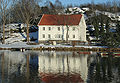
- Nomination Small Mill in Gdańsk (Poland). --Lestat 14:27, 8 November 2007 (UTC)
- Promotion Great color, lighting maybe a bit to much but ok for me. Acarpentier 16:09, 8 November 2007 (UTC)
-
-
- Nomination Penstemon fruticosus var. fruticosus by Walter Siegmund
nom by Lycaon 08:40, 8 November 2007 (UTC) - Promotion Very nice colors and composition. I'd like a bit more DOF. --LucaG 23:45, 8 November 2007 (UTC)
- Nomination Penstemon fruticosus var. fruticosus by Walter Siegmund
-

- Nomination Steeple of the Überwasserkirche, Münster, Germany --XN 10:55, 7 November 2007 (UTC)
- Decline Sorry but color noise is really too much (look at stair-steps) --LucaG 22:46, 8 November 2007 (UTC)
-
- Nomination Blue Jay (Cyanocitta cristata), Ontario, Canada - Relic38 23:04, 7 November 2007 (UTC)
- Promotion very nice photo Pudelek 22:52, 8 November 2007 (UTC)
* Nice picture but it's overexposed. I think you can correct it if you shot in RAW. --LucaG 23:01, 8 November 2007 (UTC)
* Info Unfortunately no RAW was taken. I've since learned that more can be done with RAW files so I've switched - Relic38 00:00, 9 November 2007 (UTC)
-

-

- Nomination S. Angel church in perugia --Aracuanotalk 13:05, 5 November 2007 (UTC)
- Promotion Ciao Giacomo, la foto è di qualità ma la composizione al centro la rende meno gradevole. Ti suggerirei un ritaglio che elimini il troppo cielo e porti la chiesa sulla divisione orizzontale tra primo e secondo terzo.
Back to English: Nice image, good sharpness and DOF but poor composition. I'd support a cropped version with less sky. --LucaG 21:53, 6 November 2007 (UTC)Thanks for your suggestion, I will do it as soon as I can. (rispondo direttamente in inglese così non c'è bisogno di tradurre...)--Aracuanotalk 09:37, 7 November 2007 (UTC)
Done, did you mean something like this?--Aracuanotalk 15:02, 7 November 2007 (UTC)
* Yes, better and enough. To my taste is better to cut a sky with no clouds. --LucaG 23:16, 8 November 2007 (UTC)
-

- Nomination Male mallard duck. --Acarpentier 22:37, 2 November 2007 (UTC)
- Promotion Good sharpness and composition, not much dust at all :) Dori - Talk 22:29, 8 November 2007 (UTC)
-

- Nomination: The medieval belfry of Boulogne-sur-Mer, France. -- MJJR 17:30, 2 November 2007 (UTC)
- Review needed
-
- Nomination: Mikołów church towers by night --Lestat 14:05, 2 November 2007 (UTC)
- Review needed
-
- Nomination: Solar clock in Otmuchów. --Lestat 14:05, 2 November 2007 (UTC)
- Review needed
-

-
- Nomination The Koppler accelerator in Weizmann Institute of Science, Israel. MathKnight 09:48, 2 November 2007 (UTC)
- Decline The main subject is severely obstructed by trees. Dori - Talk 22:29, 8 November 2007 (UTC)
- Nomination The Koppler accelerator in Weizmann Institute of Science, Israel. MathKnight
-

- Nomination Castle at Mirów, Poland.--Piotr Konieczny aka Prokonsul Piotrus Talk 23:42, 1 November 2007 (UTC)
- Decline Composition not that good, not enough of the castle, frog perspective. Dori - Talk 22:24, 8 November 2007 (UTC)
-

-

- Nomination This is a very fascinating plant/fungi mix. Xanthoria parietina is a foliose, or leafy, lichen. --Richard Bartz 18:08, 1 November 2007 (UTC)
- Decline Lighting not good enough. Dori - Talk 22:21, 8 November 2007 (UTC)
-
- Nomination This is a very fascinating plant/fungi mix. Xanthoria parietina is a foliose, or leafy, lichen. --Richard Bartz 18:08, 1 November 2007 (UTC)
- Decline Lighting not good enough. Dori - Talk 22:21, 8 November 2007 (UTC)
-

- Nomination The cluster flies are the genus Pollenia in the blowfly family Calliphoridae. As shown Pollenia rudis --Richard Bartz 14:50, 1 November 2007 (UTC)
- Promotion Borderline case but still scraping through. DOF is just sufficient. Lycaon 12:06, 9 November 2007 (UTC)
-

-
-

- Nomination Great Blue Heron (Ardea herodias) Side View. --Acarpentier 12:54, 7 November 2007 (UTC)
- Promotion Gefällt mir gut, trotz der schwieriegen "Grau in Grau" Farbsituation --Amrum 13:56, 7 November 2007 (UTC)
-

-

- Nomination Although it is too small, Oxalis corymbosa. MathKnight 12:07, 6 November 2007 (UTC)
- Decline Composition (small subject, busy BG) and some noise in the darkareas. - Relic38 23:50, 7 November 2007 (UTC)
- Nomination Although it is too small, Oxalis corymbosa. MathKnight
-

- Nomination Small White butterfly (Pieris rapae). I believe that this one (taken today) is better. A larger size and cleaner composition. - Alvesgaspar 11:52, 6 November 2007 (UTC)
- Promotion Agreed, this is a nice on. might be a bit soft on parts of the wings, but it is a very nice shot. - Relic38 00:12, 8 November 2007 (UTC)
-
- Nomination Polietes lardaria of familiy muscidae --Richard Bartz 18:49, 1 November 2007 (UTC)
- Decline Perspective is unfortunate as I would prefer a better view of the head, a small part of the insect is in focus (strange for aperture of f/20), and it's on the small side (~1.6Mpx) - Relic38 00:19, 8 November 2007 (UTC)
-

- Nomination: Polietes lardaria of familiy muscidae --Richard Bartz 18:49, 1 November 2007 (UTC)
- Review There is a diagonal editing scar in the L RHS, I don't mean to start another argument, it's just obvious.Benjamint 11:32, 2 November 2007 (UTC)
-

-

- Nomination i have been out of buisness for a while still i thought this one may have some chance for a seal,LadyofHats 16:29, 6 November 2007 (UTC).
- Promotion Nice work. Calibas 01:55, 7 November 2007 (UTC)
-

- Nomination Portrait of a Muscovy Duck (Cairina moschata). Taken in Estrela Garden, Lisboa, Portugal. - Alvesgaspar 11:55, 6 November 2007 (UTC)
- Promotion Lower part is very bright, but in general: excellent quality and amazing detail & sharpness. -- MJJR 22:09, 6 November 2007 (UTC)
-

-

- Nomination Rabbit hunter --86.66.173.221 20:31, 6 November 2007 (UTC)
- Decline Heavy noise and too small. Calibas 01:52, 7 November 2007 (UTC)
-

- Nomination Weizmann Institute of Science, Israel. MathKnight 11:43, 5 November 2007 (UTC)
- Decline I really regret, but this isn't a QI for me: tilted building, harsh light, rather uninteresting composition... -- MJJR 21:14, 6 November 2007 (UTC)
- Nomination Weizmann Institute of Science, Israel. MathKnight
-

- Nomination The lighthouse at Cape Agulhas, South Africa. ----Amrum 14:30, 2 November 2007 (UTC)
- Promotion Nice light and composition, but I regret that the lighthouse itself is tilted: please rotate the image till the main subject is vertical! Nevertheless, I believe this is already QI worthy. -- MJJR 21:27, 6 November 2007 (UTC)
-

-

- Nomination Small White butterfly (Pieris rapae) collecting nectar from a Lantana camara flower -- Alvesgaspar 13:24, 5 November 2007 (UTC)
- Promotion Nice one Joaquim. Very good sharpness, light and DOF. Lycaon 14:07, 5 November 2007 (UTC)
Indeed, very good shot, amazing how you caught it still and still sharp. MathKnight 16:12, 5 November 2007 (UTC) -- Thank you both. And still, I wouldn't give a dime for this picture and hesitated before nominating it... The problem (for me) is the head, which could be sharper and more detailed -- Alvesgaspar 16:41, 5 November 2007 (UTC)
-

- Nomination Weizmann Institute of Science - the Physics faculty, Israel. MathKnight 11:43, 5 November 2007 (UTC)
- Decline perspective Pudelek 13:12, 5 November 2007 (UTC)
- Nomination Weizmann Institute of Science - the Physics faculty, Israel. MathKnight
-

- Nomination The main square at Vila Real de Santo António, Portugal. -- MJJR 21:54, 4 November 2007 (UTC)
- Promotion Good composition and correct perspective but a little too soft. Why 1/1250s and f/4 ? --LucaG 22:30, 4 November 2007 (UTC) Camera was in "automatic" mode... -- MJJR 09:54, 5 November 2007 (UTC) Your ability deserves a DSLR camera. --LucaG 23:24, 5 November 2007 (UTC)
-

- Nomination Male mallard --Thermos 11:11, 3 November 2007 (UTC)--
- Promotion a bit dark, but the sharpness and details of the head certainly warrant a QI seal. Lycaon 14:10, 5 November 2007 (UTC) Comment I thought it could be brighter too so I tweaked it to see if it could be improved. See here:
 . - Relic38 23:20, 5 November 2007 (UTC)
-

- Nomination Castle at Mirów, Poland.--Piotr Konieczny aka Prokonsul Piotrus Talk 23:42, 1 November 2007 (UTC)
- Decline Unsharp and the yellow bucket-chain spoils the composition. Lycaon 14:13, 5 November 2007 (UTC)
-

- Nomination The cluster flies are the genus Pollenia in the blowfly family Calliphoridae. As shown Pollenia rudis --Richard Bartz 14:50, 1 November 2007 (UTC)
- Promotion Nice detail. the DOF seems a little shallow, but that is the macro limitation and the prize for having a composition which is slightly head-on. And nice to see insects, which are not on a flower ;-). --Slaunger 21:16, 5 November 2007 (UTC)
-

- Nomination: Entrance of the castle at Boulogne-sur-Mer, France. MJJR 21:11, 30 October 2007 (UTC)
- Review needed
-

-
-

-

- Nomination Whole façade of Notre-Dame Cathedral, Paris by sanchezn -- Benh 21:31, 4 November 2007 (UTC)
- Promotion Stunning details, ghosts are not a problem, but why the sky is brown? --LucaG 22:22, 4 November 2007 (UTC)
The sky was red probably because of light pollution. With long exposition, it's brown on the picture. It's not due to HDR: I have the same color on the original picture. Sanchezn 22:32, 4 November 2007 (UTC)Excellent detail, nicely controlled HDR effect. --Thermos 05:25, 5 November 2007 (UTC)
Great picrture and details of this Gothic architecture masterpiece. I support. MathKnight 11:54, 5 November 2007 (UTC)
-

-
- Nomination Saulnier Mill, Noisiel, France -- Benh 21:31, 4 November 2007 (UTC)
- Promotion Very good colours. Be careful not to oversharpen. Lycaon 22:13, 4 November 2007 (UTC)
Yes when downsampling my pictures, I oversharpen them slightly before to keep more details. Maybe it was a little too much on that one. I'll try with another setting later (now I have to sleep :)). Benh 22:35, 4 November 2007 (UTC)
-

-

-

- Nomination Female Mallard Duck Resting Acarpentier 18:45, 4 November 2007 (UTC)
- Promotion I like your wildlife shots. Very sharp ! Benh 21:31, 4 November 2007 (UTC) - Thanks, Acarpentier 03:45, 5 November 2007 (UTC)
-

-

-
- Nomination photo by Karl Ragnar Gjertsen, nom by Lycaon 12:14, 4 November 2007 (UTC)
- Promotion Good lighting and colors, only a bit noisy. Very nice reflections. The image page needs more information for not Swedish people. --LucaG 18:41, 4 November 2007 (UTC)
It is in Norway ;). I added a link. Lycaon 19:01, 4 November 2007 (UTC)
-
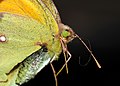
- Nomination Detail of a Clouded Yellow butterfly (Colias croceus), showing the head and wing scales - Alvesgaspar 11:43, 4 November 2007 (UTC)
- Promotion Scary subject (the one by Lycaon seems more friendly) colorful and sharp. I'd like more DOF. --LucaG 22:56, 4 November 2007 (UTC)
-

-

- Nomination Time-out from feeding the
duckspigeons to test the duck pond security --Tony Wills 03:06, 4 November 2007 (UTC) - Decline Nice composition and theme. I like the motion blur in the pigeons but not in the child's hand. Also, the quality of the image is poor, with some noise and colour fringing - Alvesgaspar 23:10, 4 November 2007 (UTC)
- Nomination Time-out from feeding the
-

-
- Nomination Mount Mała Babia Góra - view from Brona mountain pass (Żywiec Beskids, Poland) --Pudelek 14:55, 3 November 2007 (UTC)
- Decline Poor contrast and sharpness, noise in the sky. Why this exposure solution, camera in "automatic" mode? -- Alvesgaspar 23:16, 4 November 2007 (UTC)
-

- Nomination Synagogue in autumn light--Szilas 14:08, 3 November 2007 (UTC)
- Decline Confusing composition with too many elements, overexposed parts, noise, unsharpness, purple fringing - Alvesgaspar 23:23, 4 November 2007 (UTC)
-

-

- Nomination Polietes lardaria of familiy muscidae --Richard Bartz 18:49, 1 November 2007 (UTC)
- Promotion Wonderful detail. Calibas 07:19, 5 November 2007 (UTC)
-

- Nomination This is a very fascinating plant/fungi mix. Xanthoria parietina is a foliose, or leafy, lichen. --Richard Bartz 18:08, 1 November 2007 (UTC)
- Decline Poor lighting. Calibas 07:22, 5 November 2007 (UTC)
-

- Nomination White-headed Capuchin, picture taken in Cahuita national park, Costa Rica--Chmehl 14:58, 1 November 2007 (UTC)
- Decline The ape expression is really amazing but the overexposed bottom-right corner is too much for me. Maybe a retouched version with something like a rock in the corner... --LucaG 21:57, 4 November 2007 (UTC)
-
-

-

- Nomination Bush Stone-curlew Benjamint 10:24, 29 October 2007 (UTC)
- Decline Are you sure about the accuracy of the exposure data in the exif file? F/3.7 and 1/800 seems unreal for this subject - Alvesgaspar 12:52, 31 October 2007 (UTC) Yeah, I was only a few feet away using a flash, and it was taken in shutter priority
Lighting unfortunate. Lycaon 22:19, 4 November 2007 (UTC)
-

- Nomination Resources of Wisconsin, by Edwin Blashfield. --JeremyA 18:22, 3 November 2007 (UTC)
- Promotion Excellent quality! How did you manage to get such a perfect framing? - Alvesgaspar 19:39, 3 November 2007 (UTC) Comment Thanks--The framing is thanks to photoshop: it's square crop from a 3X2 aspect ratio original. --JeremyA 20:47, 3 November 2007 (UTC)
-

- Nomination Rishon LeZion's Founders' Square with The Great Synagogue and the Alarm Bell. MathKnight 16:49, 3 November 2007 (UTC)
- Decline The shadow on the building and the composition in general aren't working for me. Calibas 02:45, 4 November 2007 (UTC)
- Nomination Rishon LeZion's Founders' Square with The Great Synagogue and the Alarm Bell. MathKnight
-

- Nomination Garrulus in Israel. MathKnight 13:31, 3 November 2007 (UTC)
- Decline
Soft focus on subject, the thing behind the beak looks like it is been in one of those movies which need to be viewed wearing those red and blue cardboard glasses to enjoy. -- carol 01:40, 4 November 2007 (UTC)
- Nomination Garrulus in Israel. MathKnight
-

- Nomination Sugarcubes isolated on black. --Pallbo 11:14, 3 November 2007 (UTC) Info Metadata were lost during edit in PhotoShop. For everyone interested the camera used was a Nikon D40, shutter speed 1/25 sec, aperture f/13, focal length 55 mm and ISO 200. --Pallbo 22:27, 3 November 2007 (UTC)
- Decline
Grainy, dark and weighty (should have been grayscale) -- carol 23:52, 3 November 2007 (UTC)
- Nomination Sugarcubes isolated on black. --Pallbo 11:14, 3 November 2007 (UTC)
-

- Nomination A female hoverfly collecting nectar (Eristalinus taeniops) - Alvesgaspar 23:50, 2 November 2007 (UTC)
- Promotion Good detail, colour, and DOF. - Relic38 02:54, 4 November 2007 (UTC)
-

- Nomination Larus argentatus juvenile. --Acarpentier 22:34, 2 November 2007 (UTC)
- Promotion Sharp, good exposure with only a few overexposed pixels. Interesting that there is a spider climbing on the subject. I would have cropped out at the bottom a bit more to get the head into the reflection to add to the composition.- Relic38 02:54, 4 November 2007 (UTC)
-

- Nomination Entrance of Rochefort Trappist Brewery, Wallonia, Belgium. --LucaG 21:03, 2 November 2007 (UTC)
- Promotion Nice to see you back. Excellent composition and colours, I like the outside images deformed by the glass. The only thing I don't like is the flash reflexion off the wall (it coould be correctted though -- Alvesgaspar 22:51, 2 November 2007 (UTC). Done --LucaG 17:47, 3 November 2007 (UTC)
-
-

- Nomination The head of a female drone-fly (Eristalis tenax). This is a much harder shot that the gorgeous Eristalinus because this eye is black, hairy and has a finer structure - Alvesgaspar 16:29, 30 October 2007 (UTC)
- Promotion Nice detail and colors. Calibas 02:46, 4 November 2007 (UTC)
-

- Nomination: Katowice - Stawowa street. --Lestat 15:39, 26 October 2007 (UTC)
- Review I like the picture, despite a bit of trouble with a dark spot at the lower left corner. Interesting colors, too. But it does have a counter-clockwise slant that may probably be corrected with Hugin of ShiftN, perhaps GIMP. I suggest that you try one of them. Luis Dantas 01:51, 29 October 2007 (UTC)
-

- Nomination Pyramids of Güímar. Tenerife, Spain. --Piotr Konieczny aka Prokonsul Piotrus Talk 14:48, 25 October 2007 (UTC) Comment I think this image is subject to geocoding--Saproj 16:20, 31 October 2007 (UTC)
- Decline Unfortunate composition with unclear subject. There is hardly any "pyramidical" shape visible. --LC-de 23:24, 3 November 2007 (UTC)
- Nomination Pyramids of Güímar. Tenerife, Spain. --Piotr Konieczny aka Prokonsul Piotrus Talk 14:48, 25 October 2007 (UTC)
-

-

- Nomination The abbey church of the Trappists Fathers of Rochefort, Abbey of Our Lady of Saint-Remy, Wallonia, Belgium. --LucaG 21:03, 2 November 2007 (UTC)
- Promotion Very good composition and smart use of the wide-angle lens. It's a pitty that the background is on the soft side, but maybe that was inevitable -- Alvesgaspar 22:51, 2 November 2007 (UTC)
-
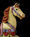
- Nomination Head of a carousel horse, background removed to show it as a sculpture. Vassil 13:16, 2 November 2007 (UTC)
- Promotion Good enough, though I would prefer to see the whole horse -- Alvesgaspar 13:52, 2 November 2007 (UTC)
-
- Nomination The city ramparts of Montreuil-sur-Mer, France. -- MJJR 21:35, 1 November 2007 (UTC)
- Decline Very good composition, quite poor image quality. The background is blurred and lacks detail. Again, why 1/640 and f/4 ? -- Alvesgaspar 14:02, 2 November 2007 (UTC)
-

- Nomination The western jetty of the port of Blankenberge, Belgium. -- MJJR 21:35, 1 November 2007 (UTC)
- Decline A very good composition, which could be used in the "Perspective" section of the QI colection. But part of the lighthouse is burned white and the foreground is blurry. Again, why this exposure choice? -- Alvesgaspar 13:59, 2 November 2007 (UTC) Comment Well, actually the reason is very simple and not very honourful: I trusted too much the "automatic" switch of my camera... ;-) -- MJJR 17:25, 2 November 2007 (UTC)
-

- Nomination Polietes lardaria of familiy muscidae --Richard Bartz 18:49, 1 November 2007 (UTC) Comment It looks like there are 3hree focal planes in this shot. Just curious; is this a Photoshop of multiple shots at different focal points? - Relic38 00:03, 2 November 2007 (UTC) Yes it is --Richard Bartz 00:19, 2 November 2007 (UTC)
- Decline ...and the result looks very strange with the alternating sharp and unsharp areas even in the main object. --LC-de 21:18, 2 November 2007 (UTC)
- Nomination Polietes lardaria of familiy muscidae --Richard Bartz 18:49, 1 November 2007 (UTC)
-

- Nomination This is a very fascinating plant/fungi mix. Xanthoria parietina is a foliose, or leafy, lichen. --Richard Bartz 18:08, 1 November 2007 (UTC)
- Promotion To me, it looks good enough. Not the usual sharpness from yours, but great colours and enough details. Benh 19:32, 2 November 2007 (UTC)
-

- Nomination Batofar is a discotheque in Paris --Richard Bartz 22:15, 29 October 2007 (UTC)
- Promotion Comment That's in France... not an ancient ship... at night with colorful lighting... copyright? Tiresome issue... --JDrewes 12:06, 30 October 2007 (UTC) I think its ok if i understood Benh's last explanation of this tiresome issue. The boat looks really surreal ;) --Richard Bartz 16:33, 30 October 2007 (UTC) Isn't the surreal look exactly the problem? It is artful lighting, and privately done, and thus copyrighted? --JDrewes 18:38, 31 October 2007 (UTC) We don't need to become paranoiac about the French copyright laws: this is just an excellent night view! -- MJJR 19:52, 31 October 2007 (UTC) Comment I disagree, we need being careful :) unfortunately... I don't know how old that boat is, but to me, its shape isn't of very high artistic value, so I don't think there is some kind of copvio here. Benh 19:35, 2 November 2007 (UTC)
-
- Nomination A male flesh-fly of the Sarcophagidae family. Before I started photographing them I used to find these creatures disgusting. Not any more. - Alvesgaspar 23:57, 27 October 2007 (UTC)
- Promotion Not really an attractive creature, but a good image (technical quality and encyclopedic relevance). -- MJJR 22:06, 1 November 2007 (UTC)
Comment You're always catching unique subjects. This one is missing a front-right 'foot'. - Relic38 22:15, 2 November 2007 (UTC)
-

- Nomination Larus
ridibundusargentatus (Juvenille). --Acarpentier 01:29, 27 October 2007 (UTC) - Promotion I think the ID is wrong, to me it looks like a young Larus argentatus. According to Sibley's Larus ridibundus are only found on the far eastern coast of Canada with rare vagrants inland. Please be careful with your identification, just saying it's a juvenile Larus species is better than wrong information. Calibas 04:07, 27 October 2007 (UTC) - Yes, sorry for that I'm not very good on that. Is there a place here to help find id? Acarpentier 12:53, 27 October 2007 (UTC) Category:Unidentified birds, there's even Category:Unidentified gulls since ID of many juvenile gulls requires an expert. Calibas 04:26, 28 October 2007 (UTC) - Thanks, I'll use that. ;) Acarpentier 18:41, 28 October 2007 (UTC)
It must have been really low light (F/5, 1/80s). Focus in places is a bit soft as a result, and it is a bit dark, but overall it's a QI for me. - Relic38 22:15, 2 November 2007 (UTC)
- Nomination Larus
-

- Nomination Mergus merganser female frontal --Richard Bartz 19:59, 26 October 2007 (UTC)
- Promotion If only it had been a couple of stops down it would have been pretty good (why f/5.6?). I think it's missing focus on the head. Dori - Talk 21:21, 26 October 2007 (UTC)
I'd agree that this image could have used a higher F/stop, but the bill, eye, and breast is in focus, so I think this is a QI. - Relic38 22:18, 2 November 2007 (UTC)
-

- Nomination The dunes and the beach at De Haan, Belgium. -- MJJR 21:35, 1 November 2007 (UTC)
- Promotion I'm going to promote this one because I like the composition and the atmosphere. But the quality could be better. Why this particular exposure solution? A better sharpness could be obtained with a higer f-number - Alvesgaspar 08:55, 2 November 2007 (UTC)
-
- Nomination Polietes lardaria of familiy muscidae --Richard Bartz 18:49, 1 November 2007 (UTC)
- Promotion Good detail. Calibas 01:42, 2 November 2007 (UTC)
-

- Nomination Angel on Lyczakowski necropolis in Lviv. --Lestat 14:25, 1 November 2007 (UTC)
- Decline Looks (I haven't checked accurately) slightly overexposed to me and since other technical points weren't oustandingly good, I decline.
-
- Nomination Forklift moving a container with explosives in Upernavik, Greenland. -- Slaunger 14:23, 1 November 2007 (UTC)
- Decline Comment In short, this great image is not a good photograph -- the focus is on the non-explosive cargo containers and not on the explosive one. -- carol 14:45, 1 November 2007 (UTC)
Yeah, you are right. I just like the composition and colours, but the technical quality is probably not good enough for QI, please decline it. -- Slaunger 14:53, 1 November 2007 (UTC) CommentIt feels worse than being declined to me.
-

- Nomination Above the roofs of Bruges (Belgium). -- MJJR 19:43, 31 October 2007 (UTC)
- Promotion This is a fantastic point of view and I like the haze very much. But the image is so noisy, what shall I do (mon coeur balance...)? - Alvesgaspar 22:21, 31 October 2007 (UTC) I like the rather jumbled composition, some noise but not enough for me to decline. Calibas 00:54, 1 November 2007 (UTC) Comment The original image was even more hazy and rather grey, so I had to increase contrast and saturation, which unfortunately caused also the noise... Anyhow: thanks for your comments and for promoting! BTW the image was taken from the roof of the cathedral. -- MJJR 17:06, 1 November 2007 (UTC)
-

- Nomination "Abstract" composition of the Walls of the Duomo in Florence --Thermos 15:54, 31 October 2007 (UTC)
- Decline There is really bad pixelation in the sky, please don't save JPEG in such low quality as it ruins the shots. Dori - Talk 04:10, 2 November 2007 (UTC)Thanks for heads up. PP error on my part. --Thermos 05:41, 2 November 2007 (UTC)
-
- Nomination Magpie Goose Benjamint 11:44, 31 October 2007 (UTC)
- Promotion The beak is overexposed, something you can easily correct - Alvesgaspar 12:58, 31 October 2007 (UTC)Thanks, I will, Benjamint Done 09:03, 1 November 2007 (UTC) -- Some noise and unsharpness but good enough for QI, considering the large size. I wonder why you don't use smaller F numbers for this kind of subject - Alvesgaspar 20:41, 1 November 2007 (UTC)
-

- Nomination Kotnov Castle, Tábor by Ben Skála, nom by Lycaon 08:49, 29 October 2007 (UTC)
- Decline The composition is not very good (tree is in the way) and there is uneven lighting. I don't know if this was stitched or if the tower really looks like that, in the former case that would also be a concern. Dori - Talk 04:04, 2 November 2007 (UTC)
-

- Nomination Western Fence Lizard (Sceloporus occidentalis). Calibas 19:44, 24 October 2007 (UTC)
- Decline DOF seems a bit off. Luis Dantas 23:36, 28 October 2007 (UTC) --Sorry, besides the focus there is the distracting grass blades. Dori - Talk 03:59, 2 November 2007 (UTC)
-
-

- Nomination Chrysanthemum coronarium (Chartzit Atura) with two varieties, Israel. MathKnight 17:23, 31 October 2007 (UTC)
- Decline It is nice to see the two different colorings of the flower, but the image is not sharp enough, noisy and shows strong artifacts (compression?). --JDrewes 18:52, 31 October 2007 (UTC)
- Nomination Chrysanthemum coronarium (Chartzit Atura) with two varieties, Israel. MathKnight
-
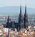
- Nomination Notre-Dame de l'Assomption de Clermont-Ferrand, a Gothic cathedral in France. Taken by User:Fabien1309. MathKnight 17:23, 31 October 2007 (UTC)
- Decline Very low resolution, Very high noise and lots of artifacts (inluding jpeg, sharpening and denoising). Sorry. --JDrewes 18:45, 31 October 2007 (UTC)
- Nomination Notre-Dame de l'Assomption de Clermont-Ferrand, a Gothic cathedral in France. Taken by User:Fabien1309. MathKnight
-
-

- Nomination Yellow Archangel (Lamium argentatum) --LC-de 22:58, 30 October 2007 (UTC)
- Decline Not sharp enough probably due to motion blur (or camera quality?). Also, the background is a bit distracting, I would prefer a lower DOF - Alvesgaspar 12:23, 31 October 2007 (UTC)
-

- Nomination Detail of the inner court of the castle at Boulogne-sur-Mer, France. MJJR 21:11, 30 October 2007 (UTC)
- Decline Bad time of day for this shot, producing harsh lighting and shadows. Also, there is purple fringing around some objects. Finally, this is not IMO the best framing for a building, I would like to see the ground level too. - Alvesgaspar 12:23, 31 October 2007 (UTC)
-

-

- Nomination Větrný mlýn v Jednově, Olomouc Region by Ben Skála, nom by Lycaon 08:54, 29 October 2007 (UTC)
- Decline Extremely noisy, specially (but not only) in the darker areas - Alvesgaspar 12:33, 31 October 2007 (UTC)
-

- Nomination Pseudotsuga menziesii by WSiegmund, nom by Lycaon 08:29, 29 October 2007 (UTC)
- Promotion Good enough for a QI, though I would prefer a softer lighting - Alvesgaspar 12:44, 31 October 2007 (UTC)
-
- Nomination Spice. Bay Laurel (Laurus nobilis) --Butko 07:09, 29 October 2007 (UTC)
- Decline For an easy subject as this one, I expect a much better composition. It would be nice to show, at least, a whole laurel leaf (on the right side?) - Alvesgaspar 12:42, 31 October 2007 (UTC)
-

- Nomination Anomena Coronaria (Kalanit) MathKnight 17:33, 30 October 2007 (UTC)
- Decline Nice colurs, but the flower itself is very overexposed in the red channel, which makes it impossible to see details in the petals. Also the focal plane seems to be on the green BG instead of the flower. If the subject is the flower it should cover a larger fraction of the photo. The centered composition is not so interesting. Try to combine the flower with another element and place the subjects off-center (rule of thirds). -- Slaunger 21:49, 30 October 2007 (UTC)
- Nomination Anomena Coronaria (Kalanit) MathKnight
-

- Nomination Gloves of St. Jadwiga, Polish queen. See image for full description of the legend. --Piotr Konieczny aka Prokonsul Piotrus Talk 20:13, 29 October 2007 (UTC)
- Decline Reflictions on the glass. --Lestat 21:58, 29 October 2007 (UTC)
Also lots of (motion?)blur everywhere but in the image center. --JDrewes 12:16, 30 October 2007 (UTC)
-

-
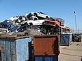
- Nomination Scrap yard by Goodshoped35110s, nom by Lycaon 08:43, 29 October 2007 (UTC)
- Decline
poor composition Pudelek 13:08, 30 October 2007 (UTC)
-

-

- Nomination Castle in Będzin, Poland. --Piotr Konieczny aka Prokonsul Piotrus Talk 20:13, 29 October 2007 (UTC)
- Decline Sorry but the quality is not good enough, the image is unsharp and full of artifacts (see the grass), which are probably the result of jpeg compression. We should always use the best available size and quality our cameras can offer - Alvesgaspar 21:14, 29 October 2007 (UTC)
-

- Nomination Dolphins (Delphinidae) at Loro Parque Dolphinarium. Alternate versions: 1) bigger, 2) original. --Piotr Konieczny aka Prokonsul Piotrus Talk 20:13, 29 October 2007 (UTC)
- Decline Too small, please see the guidelines - Alvesgaspar 21:16, 29 October 2007 (UTC)
-

- Nomination Self-nominating. bdesham 16:30, 29 October 2007 (UTC)
- Decline Noisy and unsharp. Purple fringing around the buildings. I'm afraid that this kind of camera is not good enough for this subject, which we expect to be rasor sharp and clean. Alvesgaspar 21:22, 29 October 2007 (UTC)
-

- Nomination HiRes Glory of St Anna (Daniel Gran) (Annakirche, Vienna) - Stiching of 10 pictures + downsampling. Alberto Fernandez Fernandez 15:31, 29 October 2007 (UTC)
- Promotion Incredibly detailed. If it wasn't for the gilded frames at the bottom, one would tend to think it is not sharp, but apparently you see the brush strokes!. Lycaon 16:52, 29 October 2007 (UTC)
-
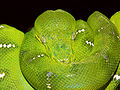
- Nomination Emerald tree boa Benjamint 10:41, 29 October 2007 (UTC)
- Promotion Nice composition and colours. A pity that the DOF is so shallow - Alvesgaspar 21:29, 29 October 2007 (UTC)
-

-

- Nomination The Kemerovo Drama Theatre (Kemerovo, Russia).--Saproj 21:18, 27 October 2007 (UTC)
Comment Nice shot. I was about to promote this when I realized the building was the subject, not the fountain. There's noise in the darker parts of the building and I would have cropped out a bit further as it is really close to the edges. Because of the fountain, I don't have it in me to decline. - Relic38 04:14, 28 October 2007 (UTC) CommentThank you for your review. I've uploaded a new version of the image with less noise and cropping.--Saproj 21:30, 29 October 2007 (UTC) - Promotion Much better. - Relic38 10:49, 30 October 2007 (UTC)
- Nomination The Kemerovo Drama Theatre (Kemerovo, Russia).--Saproj 21:18, 27 October 2007 (UTC)
-
- Nomination An icon on the surrounding walls of the chapel. Dori - Talk 03:13, 26 October 2007 (UTC)
- Promotion Nice picture - sharp, clear, to the point. Luis Dantas 01:12, 30 October 2007 (UTC)
-

- Nomination Coal power plant at Dortmund, Germany Arnoldius 21:41, 22 October 2007 (UTC)
- Decline IT's artefacty and the right edge is uneasy. Also please geotag this. –Dilaudid 08:31, 23 October 2007 (UTC)
 Support Not a bad detail.--Beyond silence 09:57, 23 October 2007 (UTC)
-

- Nomination Rishon LeZion, Israel - The Lake´s Park with Chrysanthemum coronarium´s yellow carpet. MathKnight 15:47, 21 October 2007 (UTC)
- Decline Nice picture, but the roller coaster behind the tree at the left is disturbing. -- MJJR 20:28, 24 October 2007 (UTC)


.JPG)


-Relic38.jpg)


_(0321)_-_Relic38.jpg)
_-_Relic38.jpg)


.JPG)


-Relic38.jpg)


.JPG)


_(1).jpg)


.JPG)


.jpg)


_(1577)_-_Relic38.jpg)


a.JPG)


_(1547)_-_Relic38.jpg)


.JPG)


_(1444)_Relic38.jpg)

.JPG)


-Relic38.jpg)


.JPG)


.JPG)
.jpg)
Consensual Review[edit]
Dog sled road sign ilulissat 2007-08-23 retouched.jpg[edit]

- Nomination Dogsled roadsign in Ilulissat, Greenland. -- Slaunger 20:59, 20 November 2007 (UTC)Exchanged with a retouched version. -- Slaunger 15:03, 22 November 2007 (UTC)
- Discussion
 Oppose Might be better as an SVG. -- carol 12:09, 23 November 2007 (UTC)
- Comment Having it as an SVG is valuable, as is the real world battered sign in a Greenlandic town and environment. As I don't think there are that many signs of this type available world-wide you may need this one to do the SVG... -- Slaunger 22:23, 24 November 2007 (UTC)
- It can be discussed if you like -- the background, the community in which such a sign exists in is interesting and not part of this photograph which is the reason I suggested SVG. -- carol 06:19, 25 November 2007 (UTC
- Acknowledged and I accept the decline as is for reason mentioned. I just wanted to point out the value of the photo as it is a rare road sign. -- Slaunger 20:35, 25 November 2007 (UTC)
- It can be discussed if you like -- the background, the community in which such a sign exists in is interesting and not part of this photograph which is the reason I suggested SVG. -- carol 06:19, 25 November 2007 (UTC
- Support While SVG may be useful I do also see a value in this road sign, and a photo ok for QI. -- Klaus with K 17:32, 26 November 2007 (UTC)
- I'm comfortable with the subject matter - we don't disqualify anything from QI just because another version of the image does or could exist. But I think it is cropped a little tightly at the top. And I wonder if it was shot straight on, or from underneath. Underneath, I suspect. Straight on would have been better for this subject. Oppose but try again if you can. Regards, Ben Aveling 09:47, 27 November 2007 (UTC)
- Info You are right that it was not shot dead on as would have been optimal. I do not remember the detailed circumstances, but something hindered taking it dead on. However, the biggest distraction is perhaps the tilted background which is due to the fact that the road sign itself was tilted. I have chosen to rotate the photo CCW to align the sign thus sacrificing a horizontal BG. I basically agree with you also that the crop at the top is too tight. It is partially a side effect of cropping after rotating. I will not have a chance to retake the photo soon though....the subject is 3300 km (and $) away. -- Slaunger 11:02, 27 November 2007 (UTC)
- Support Why would road sign need to be SVG to have an informative value? Why wouldn't it be interesting to have it in its original background? --TwoWings * to talk or not to talk... 16:52, 27 November 2007 (UTC)
- Oppose Although I fully agree with TwoWings, I only decline because of the too tight crop. Maybe you can clone a few hundreds of blue pixels on top? Lycaon 23:40, 27 November 2007 (UTC)
- I have to agree with the too tight crop... --TwoWings * to talk or not to talk... 18:36, 28 November 2007 (UTC)
- Oppose Due to composition, the crop is too tight but I don't think it can be remedied by cloning. Dori - Talk 23:47, 27 November 2007 (UTC)
![]() Well, I basically agree with the opposers, so there is not really a point in keeping it here. Thank you for the time you have spend reviewing it. At least you have now seen an unusual road sign. -- Slaunger 20:26, 28 November 2007 (UTC)
Result: Withdrawn --Tony Wills 20:19, 29 November 2007 (UTC)
Well, I basically agree with the opposers, so there is not really a point in keeping it here. Thank you for the time you have spend reviewing it. At least you have now seen an unusual road sign. -- Slaunger 20:26, 28 November 2007 (UTC)
Result: Withdrawn --Tony Wills 20:19, 29 November 2007 (UTC)
- Comment I made all of those opposes in that one sweep that one day, I am being sorry about this as time marches on since that day. Before this image leaves the QI candidate page, something nice should be said about the editing of the image. No blue swirls and not too much information was removed. It was also originally opposed by someone in such a mood to oppose the thumbnail without looking at the image. I really thought that the top of the sign was cut off. -- in opposition to the opposer, carol 03:41, 1 December 2007 (UTC)
TentAlignmentFun.jpg[edit]

- Nomination Camping event by Dansplat . -- carol 05:10, 21 November 2007 (UTC)
- Decline
- Oppose Smaller-than-2MPix with no mitigating reasons, partially overexposed --JDrewes 18:30, 21 November 2007 (UTC)
- I think the over exposure you are speaking of is from sunlight. The photograph captures areas of shade and sunlight and seems to do so in a fairly balanced way, given the conditions. The size suggestion is a suggestion. -- carol 05:58, 24 November 2007 (UTC)
- Comment As nominator can I request a discussion? -- carol 23:53, 21 November 2007 (UTC)
- Comment Yes, typically it is the nominator that moves it to CR. Dori - Talk 23:13, 23 November 2007 (UTC)
- Support Nice composition and quality. I disagree with JDrewes for the overexposed argument. When a big part of a picture is oversexposed there's clearly a problem of quality but when it concerns little parts of it, it can be eligible. When a professional cameraman uses the "zebra tool", his purpose is not to have 0% of overexposition but not to reach a "over-overexposition"! IMO it's too strict to decline for a small overexposition. --TwoWings * to talk or not to talk... 16:30, 24 November 2007 (UTC)
- Oppose size Lycaon 12:09, 26 November 2007 (UTC)
- Oppose, based on size. This kind of shot could have easily been taken at a higher resolution.-- Relic38 12:55, 26 November 2007 (UTC)
- It looks as if it was cropped from a 1600x1200 image. There are cameras that take good photographs but at only that size, in case you did not know that. -- carol 04:14, 27 November 2007 (UTC)
Result: 1 support (excluding the nominator), 3 oppose -> not promoted to QI --Tony Wills 20:46, 29 November 2007 (UTC)
Male mallard duck 2.jpg[edit]

- Nomination Male mallard duck (Anas platyrhynchos). -- Acarpentier 04:03, 21 November 2007 (UTC)
- Promotion
- Info I'm not sure about the value of the centered or not critism, and it's not that I dont take them but it seem a non-sense argument because some like it centered, some will reject it cause it is... I only want to make realise to some people that comments like that are going no where and that we cannot learn or improve from them. Cordially, Acarpentier 15:23, 23 November 2007 (UTC)
- Support Centered, not centered, either way I think this one is good. Dori - Talk 23:46, 23 November 2007 (UTC)
- Support Clear QI to me. A good picture doesn't have to be centered. A 2/3 - 1/3 composition can be good too. --TwoWings * to talk or not to talk... 16:32, 24 November 2007 (UTC)
Result: 2 support (excluding the nominator), 0 oppose -> promoted to QI --Tony Wills 20:44, 29 November 2007 (UTC)
VillaFoscari 2007 07 10 04.jpg[edit]

- Nomination Villa Foscari, a villa near Venice by Andrea Palladio. --Kjetil r 11:10, 22 November 2007 (UTC)
- Decline
- SupportGood perspective, a bit soft on details but still QI for me. ;) Acarpentier 00:09, 23 November 2007 (UTC)
- Oppose Sorry but there is lot of halos around objects. Looks like it's been oversharpened. Dori - Talk 00:29, 23 November 2007 (UTC)
- Oppose Oversharpened by camera or postprocessing. -- Klaus with K 18:23, 26 November 2007 (UTC)
Result: 1 support (excluding the nominator), 2 oppose -> not promoted to QI --Tony Wills 20:42, 29 November 2007 (UTC)
The Gherkin from below.JPG[edit]

- Nomination The Gherkin from below (London) --TwoWings * Wanna talk? ;-) 08:57, 13 November 2007 (UTC)
NB: I moved it here since I didn't have any reply to my question before the bot deleted it from the nominations... - Decline
- I prefer calling it The Towering Innuendo : ). Calibas 01:45, 14 November 2007 (UTC)
- Oppose Tilted --Lestat 21:44, 14 November 2007 (UTC)
- Sorry but I can't see why "tilted" is a problem on such a shot! (is it that tilted actually?) --TwoWings * to talk or not to talk... 17:36, 15 November 2007 (UTC)
- Oppose poor composition Pudelek 22:57, 18 November 2007 (UTC)
- Oppose I have a point and shoot camera (read: not a great lens). I take photographs like this because they are comical and because of the limitations of my equipment. TwoWings: would you like to trade camera so that I can take good photographs and you can get as many of these beautiful images as you would like naturally? -- carol 02:30, 19 November 2007 (UTC)
- Do you mind rephrasing because I'm not sure to understand what you want to tell me?... Are you mocking me? Here's what I understant: "I have a crap camera but I take good pictures and you're the contrary"! --TwoWings * to talk or not to talk... 15:08, 19 November 2007 (UTC)
- Nope. I have a little camera with a built in all-purpose lens. To get a good photograph of a tower, I would have to be such a distance away from the subject that after cropping, the image itself would be small. I am suggesting that you have a camera with different sizes of lens or the ability to use different lens or perhaps one better all purpose lens and you are making it work as if it is as limited as mine. If laughing is 'mocking' then I am mocking at your image. -- carol 20:41, 20 November 2007 (UTC)
- OK I understand... except that I can assure you that my camera is not that good! This was the best wide-angle lens of my zoom! But anyway I didn't want to have a full shot since my double purpose was to give the real feeling one can get when he's at the bottom with a low angle shot plus to show the details (but I guess I should have zoomed more for the second purpose!) --TwoWings * to talk or not to talk... 12:49, 21 November 2007 (UTC)
- Nope. I have a little camera with a built in all-purpose lens. To get a good photograph of a tower, I would have to be such a distance away from the subject that after cropping, the image itself would be small. I am suggesting that you have a camera with different sizes of lens or the ability to use different lens or perhaps one better all purpose lens and you are making it work as if it is as limited as mine. If laughing is 'mocking' then I am mocking at your image. -- carol 20:41, 20 November 2007 (UTC)
- Comment Google maps can lower the quality of this image even further if they have its location in their collection yet. -- carol 11:39, 21 November 2007 (UTC)
- Support--Beyond silence 18:34, 27 November 2007 (UTC)
Result: 1 support (excluding the nominator), 3 oppose -> not promoted to QI --Tony Wills 20:41, 29 November 2007 (UTC)
Montreal s-w downtown[edit]

- Nomination A panoramic view (6x2) of Montreal S-W Downtown. --Acarpentier 01:57, 7 November 2007 (UTC)
- Promotion
- Support Beautiful, thank you. -- carol 17:10, 7 November 2007 (UTC)
- Oppose Sorry I find it too dark, little detail is left of the cityscape. Lycaon 23:36, 9 November 2007 (UTC)
 Neutral beautiful but maybe too dark... but on the other hand, why should darkness be a problem for a night picture?! --TwoWings (jraf) * Wanna talk? ;-) 13:20, 10 November 2007 (UTC)
- Support detail, night photo --Beyond silence 20:33, 10 November 2007 (UTC)
- Oppose Nighttime photos should be dark, but when over a third of the image is blown black... Thegreenj 02:09, 11 November 2007 (UTC)
- Neutral Agree with TwoWings.-- Slaunger 21:47, 12 November 2007 (UTC)
- Support --Rollopack 07:07, 18 November 2007 (UTC)
- Support -Lestat 12:36, 18 November 2007 (UTC)
Result: 4 support (excluding the nominator), 2 oppose, 2 neutral -> promoted to QI --Tony Wills 20:45, 20 November 2007 (UTC)
Equus burchelli[edit]


- Nomination Group of Damara Zebras (Equus quagga burchellii) at the waterhole of Okaukuejo, Etosha, Namibia. -- Lycaon 21:11, 29 October 2007 (UTC)
- Promotion
- Oppose Nice composition but poor lighting, with too strong contrasts. The heads of the zebras are in the shadow, affecting the detail - Alvesgaspar 12:28, 31 October 2007 (UTC)
- Comment I beg to differ. Maybe every harsh lighted picture needs a backing story? This waterhole is accessible only from one side. Zebras come drinking during the brighter parts of the day, when not stalked by lions. And of course they are wild, so they are not posing, even if asked nicely ;-)). Lycaon 07:36, 2 November 2007 (UTC)
- Oh, I forgot to mention that it is 7881.52 km from where I live to Okaukuejo :)). Lycaon 20:47, 2 November 2007 (UTC)
- Neutral Torn on this one, take a look at this image for example File:Equus quagga chapmani drinking.jpg or this one File:Zebras_Serengeti.JPG so it's possible to get them on better light. Also Hans seeing as how you blast other users, I would expect you to add a category about the species :) Dori - Talk 00:02, 3 November 2007 (UTC)
-
- No :-) (Oh, no, not *that* argument again! ;-) --Tony Wills 01:14, 4 November 2007 (UTC)
- Why not? Lycaon 01:45, 4 November 2007 (UTC)
- Well the guidelines say it should be correctly 'categorized' which implies adding categories ... (or do you want the whole gallery vs category argument too? ;-) --Tony Wills 10:19, 6 November 2007 (UTC)
- Actually, I think the guideline should be elaborated a little on this point. I'd say it should be properly categorized and/or added to a relevant specific gallery/galleries. This would embrace both the category and the gallery followers as both practises are accepted. For plants for instance, the convention used mostly there is to add the image to a species gallery, other places the predominant convention is to use a specific category. I usually just adopt to commons practise for related subjects without enforcing my own view on this. -- Slaunger 10:44, 6 November 2007 (UTC)
- Well the guidelines say it should be correctly 'categorized' which implies adding categories ... (or do you want the whole gallery vs category argument too? ;-) --Tony Wills 10:19, 6 November 2007 (UTC)
- Why not? Lycaon 01:45, 4 November 2007 (UTC)
- No :-) (Oh, no, not *that* argument again! ;-) --Tony Wills 01:14, 4 November 2007 (UTC)
- Neutral I think the lighting could be better, but I understand the difficulty of the subject. I would support a crop of ~230 pixels off the top, giving a more widescreen feel that emphasizes the subjects. - Relic38 00:53, 3 November 2007 (UTC)
- Done voldaan aan de verzuchtingen ;-). Lycaon 01:17, 4 November 2007 (UTC)
- Comment I was ready to support based on the crop, but I don't much like the loss of contrast in the new version. I would have preferred the lighting to stay the same as in the original. I hope I'm not complaining too much ;) - Relic38 02:17, 4 November 2007 (UTC)
- No you are not, but I'm getting lost... Lycaon 09:52, 4 November 2007 (UTC)
- Done
- Support I like the first version and also the unmentioned danger that the photographer was in makes up for the noisy water, in my humble opinion. Nambia is quite away, I think. -- carol 18:33, 4 November 2007 (UTC)
- Question Lycaon, did you take this photograph or fund it or both? -- carol 18:33, 4 November 2007 (UTC)
- I only post self taken photographs (apart from the odd retouch) and Namibia is quite safe, thank you. Lycaon 19:09, 4 November 2007 (UTC)
- I asked because when I took photographs for a professional photographer, they were hers. About Namibia... (thanks for the hint!) -- carol 20:58, 4 November 2007 (UTC)
- Support There may be better photos of zebras but I find this one is sufficiently good for QI. -- Slaunger 20:59, 5 November 2007 (UTC)
- Comment Tony Wills asked we to clarify which version I preferred here after the vote closed: I prefer the edited version. -- Slaunger 20:26, 20 November 2007 (UTC)
- Support for the edit, if that is possible without it being moved to its own review section? - Relic38 00:28, 8 November 2007 (UTC)
- Neutral (but more Support than Oppose...) I don't really like the background. --TwoWings (jraf) * Wanna talk? ;-) 21:47, 9 November 2007 (UTC)
Result: 2 support (excluding the nominator), 1 oppose -> Promoted to QI -- Lycaon 22:03, 11 November 2007 (UTC)
Cygnus olor juvenile flight2.jpg[edit]

- Nomination Juvenile mute swan in flight over wetlands --Thermos 14:02, 11 November 2007 (UTC)
- Promotion
- Support Great action shot. Acarpentier 16:04, 11 November 2007 (UTC)
- Oppose Image should be cropped, bird is not in center. --Hsuepfle 21:08, 13 November 2007 (UTC)
- You're kidding, eh? --XN 19:33, 14 November 2007 (UTC)
- Comment I think the composition is just fine as it is. I would not like to see it with a centered crop. Overall a great shot. The lightning on the head is a little unfortunate. I would perhaps consider to selectively blur the background a little to emphasize the subject even more and remove some of the noise at the same time. It is at a near-distracting level - at least on-screen. -- Slaunger 19:58, 14 November 2007 (UTC)


- Comment so see this ad hoc editing underlining your comment. I think, it's more an issue of background, but this is more likely a problem of natural camouflage. --XN 21:22, 14 November 2007 (UTC)
- I had a more subtle and delicate blurring in mind (a 2 pixel blur radius or so). This one is too much for my taste, there are clear artifacts of the blurring process around the flying bird. -- Slaunger 21:36, 14 November 2007 (UTC)
- Support For me it is a QI. It is not an easy shot, which mitigates the noise. Lycaon 20:50, 14 November 2007 (UTC)
- Support The edit has a halo effect around the subject which ruins it for me. I don't have a problem with the noise in the original, and I know how hard it is to catch these types of action shots. --Relic38 00:31, 15 November 2007 (UTC)
- Comment I add another edit with noise reduction (.75 gaussian blur on background only). Lycaon 11:51, 15 November 2007 (UTC)
- Support version with slightly blurred bg or the original. Yes, it was something like this I had in mind. Close to the original, but slightly improved BG without ruining the subject. -- Slaunger 20:21, 15 November 2007 (UTC)
- Support original. Dori - Talk 14:38, 15 November 2007 (UTC)
- Support the original. Even if there's some little noise on the blurry background. --TwoWings * to talk or not to talk... 17:39, 15 November 2007 (UTC)
Result: 6 support (excluding the nominator), 1 oppose -> Promoted to QI -- Lycaon 09:11, 18 November 2007 (UTC)
Passer domesticus img 2344[edit]

- Nomination A female house sparrow. Dori - Talk 19:35, 10 November 2007 (UTC)
- Decline
- OpposeCrop, DOF and also a bit the pinkish (?!?) background. Lycaon 14:16, 11 November 2007 (UTC)
- Question What's wrong with the crop? Dori - Talk 15:12, 11 November 2007 (UTC)
- Still not convinced. The sparrow's head is unsharp and concerning the crop, I would've preferred some more foreground. Lycaon 23:24, 11 November 2007 (UTC)
- OK, regarding foreground, it's a matter of personal preference on my part. I don't like to have too much unfocussed foreground showing (background is fine). Dori - Talk 01:10, 12 November 2007 (UTC)
- A 'wildlife rule' says that you should show as much foreground, when an animal's legs are hidden in it, as if you would see the legs without obstruction. Here it is a bit on the limit, as if you would have cut the poor bird's toenails ;-). Lycaon 01:18, 12 November 2007 (UTC)
- Comment Not thaat sharp/somewhat shallow DOF. Suggestion: How about adding some location info? It looks as though the bird is on a moved lawn (cut grass). Is that correct? -- Slaunger 21:52, 12 November 2007 (UTC)
- Oppose Beautiful in tiny version but the full shot shows it's unfortunately not sharp on the head. --TwoWings * Wanna talk? ;-) 09:01, 13 November 2007 (UTC)
Result: 0 support (excluding the nominator), 2 oppose -> Not promoted to QI -- Lycaon 09:11, 18 November 2007 (UTC)
Pontiac Pathfinder 1953 Hood Ornaments[edit]

- Nomination Pontiac Pathfinder 1953 Hood Ornaments. --Acarpentier 04:15, 8 November 2007 (UTC)
- Decline
- Oppose Is it already declined here? #!George Shuklin 07:32, 8 November 2007 (UTC)
- Well spotted. Lycaon 08:19, 8 November 2007 (UTC)
- Yeah, just wanted a second opinion, is it allowed? Acarpentier 14:33, 8 November 2007 (UTC)
- Try consensual review. Lycaon 14:40, 8 November 2007 (UTC)
- Oppose composition not good enough, can't see much of the hood. Dori - Talk 22:14, 8 November 2007 (UTC)
- Oppose I don't like the composition at all! --TwoWings (jraf) * Wanna talk? ;-) 13:18, 10 November 2007 (UTC)
Running total: 0 support (excluding the nominator), 3 oppose -> Not promoted to QI. --Slaunger 21:34, 12 November 2007 (UTC)
Avondale stables[edit]

- Nomination Avondale stables built 1890 Gnangarra 15:56, 7 November 2007 (UTC)
- Decline
- Oppose Levels need adjustment, lighting on roof is harsh, it's a bit unsharp, and should be Geocoded. - Relic38 23:30, 7 November 2007 (UTC)
- according to Commons:Image guidelines Commons:Geocoding isnt a requirement its not even mentioned there is a current dicussion on the talk page. As yet there isnt resolution as to the issues. Gnangarra 05:01, 8 November 2007 (UTC)
- Oppose Here mainly for exposure. Geocoding not (yet) being a requirement, doesn't mean assessors can't use it to decline an image. I wouldn't decline just on that but it is factor in my total assessment anyway. Lycaon 08:24, 8 November 2007 (UTC)
- probably should be on the talk but it can move there if it continues in any length, Why have a criteria/guideline if images can be decline for reasons that arent part of the criteria. Gnangarra 13:08, 8 November 2007 (UTC)
- I declined on the technical flaws, the geocoding is simply a request. Sorry for the confusion. - Relic38 00:03, 9 November 2007 (UTC)
Result: 0 support (excluding the nominator), 2 oppose -> Not promoted to QI -- Lycaon 22:01, 11 November 2007 (UTC)
Mirów Castle - 24[edit]

- Nomination Castle at Mirów, Poland.--Piotr Konieczny aka Prokonsul Piotrus Talk 23:42, 1 November 2007 (UTC)
- Decline
- Support I like the composition, a bit blurry close up but at this high a resolution I'm not gonna fault it. Calibas 07:25, 5 November 2007 (UTC)
- Oppose Unsharp. --Lestat 16:28, 5 November 2007 (UTC)
- Neutral Not thaaat sharp, but the DOF is good. Composition OK, a pity with the visually unattractive yellow tube. I recommend adding geodata including heading and there are some strange braces in the image description. Please fix. -- Slaunger 20:17, 5 November 2007 (UTC)
- Oppose Beautiful but not sharp enough to me. --TwoWings (jraf) * Wanna talk? ;-) 21:44, 9 November 2007 (UTC)
- Oppose Beautiful but not sharp enough --Beyond silence 20:30, 10 November 2007 (UTC)
Result: 1 support (excluding the nominator), 3 oppose -> Not promoted to QI -- Lycaon 21:58, 12 November 2007 (UTC)
Lantana buds[edit]

- Nomination The buds of a Lantana camara inflorescence. Taken in a garden near my house, Lisbon, Portugal - Alvesgaspar 18:04, 29 October 2007 (UTC)
- Promotion
- Oppose I don't know if the focus is off or if it's the DOF, but in my opinion that precludes it from QI. Dori - Talk 04:06, 2 November 2007 (UTC)
- The subject is on focus and the DOF close to the best possible under these conditions. The slight blur is probably the result of diffraction due to the large f-number and the fine details on the hairs, not visible with a naked eye -- Alvesgaspar 08:02, 2 November 2007 (UTC)
- Support I think the sharpness and DOF are just acceptable. The center of the flower seems to have small overexposed areas, but not enough for me to decline. -- Slaunger 21:04, 5 November 2007 (UTC)
- Support Sharpness and DOF look good to me. - Relic38 00:32, 8 November 2007 (UTC)
- Support Focus seems good. Composition great. --TwoWings (jraf) * Wanna talk? ;-) 21:48, 9 November 2007 (UTC)
- Support Good focus. But pinky thing behind the focus attracts my eyes.Hariadhi 12:56, 11 November 2007 (UTC)
- SupportAlthough I share Dori's concerns, Alvesgaspar's explanation seems logical, and the identified problems therefore not avoidable. I like the colours a lot, and the composition, while not very exciting, gives a very clear view of the flower. --Florian Prischl 16:15, 14 November 2007 (UTC)
Result: 5 support (excluding the nominator), 1 oppose -> Promoted to QI -- Lycaon 09:08, 18 November 2007 (UTC)
Silvereye hen[edit]

- Nomination Silvereye hen Benjamint 12:09, 29 October 2007 (UTC)
- Discussion :
- Oppose Nest photography. Lycaon 13:11, 29 October 2007 (UTC)
- Please cite a valid reason for opposing. Nest photography is not illeagal in Australia and I was a reasonable distance away from the nest. Benjamint 03:57, 30 October 2007 (UTC)
- I could see automatically opposing this if it were a top-down 30mm focal length picture of a next with eggs. But, judging by this picture, Benjamint isn't doing anything harmful. Calibas 23:45, 30 October 2007 (UTC)
- The picture was taken from "a few feet away with flash". The exif is identical to this image from which I quoted the author - comment diff. Lycaon 10:17, 1 November 2007 (UTC)
- That's irrevelant, the stone curlew was a tame bird sitting on the ground so I did get closer, The silvereye however was on a nest so I stayed well back, I basically did a hundred percent crop to this Benjamint 03:31, 2 November 2007 (UTC)
- If this is irrelevant, then why are both exifs almost identical? Lycaon 12:47, 2 November 2007 (UTC)
- Because with the camera on the same settings, the imaes being at the same res and me having picked the same exposure in shutter priority the only things I would expect to be different are a)date and b)F-number and any image taken on my camera with the same focal length and the flash on is going to be around the 3.6 - 3.7 - 4.5 mark, so thats what, a one in three chance of identicle EXIF? Honestly, you're really scraping the bottom of the barrel for reasons to annoy me.
- Support Looks QI to me --Tony Wills 00:57, 4 November 2007 (UTC)
Running total: 1 support (excluding the nominator), 1 oppose -> more votes? --Tony Wills 00:57, 4 November 2007 (UTC)
Blue faced honeyeater[edit]

- Nomination Blue faced Honeyeater feedingBenjamint 11:44, 31 October 2007 (UTC)
- Promotion
- Comment Nice picture but the colors are bleeding in the background and there's tons of noise even though it's 100 ISO. I used to have the previous model of your camera and had similar problems, an upgrade to a Canon DSLR made a world of difference. Sucks paying $500 for a camera that gives you lower quality images than a $200 camera. Calibas 00:54, 1 November 2007 (UTC)
- Comment Not only that but about 2 months after I got this the FZ50 came out; twice as good, same price :(. I'll see if I can fix it.Benjamint Done 09:03, 1 November 2007 (UTC)
- Support Nice job cleaning it up. Calibas 23:56, 1 November 2007 (UTC)
- Support I think this is good enough for QI. Dori - Talk 21:48, 2 November 2007 (UTC)
- It probably is, but I would love to hear some explanation on those issues ;). Lycaon 22:06, 2 November 2007 (UTC)
- Worm: It was wriggling like mad trying to escape causing what what we call motion blur, and you can see a slight ghosting on the top edge of the worm to confirm this. Overexposure is produced when too much light reaches the digital image sensor. A good example of this:
 . Benjamint 09:39, 3 November 2007 (UTC)
- Well if the image is (partially) overexposed by too much light reaching the digital image sensor, then it can't be a QI per guidelines. Or am I missing something? Lycaon 00:48, 4 November 2007 (UTC)
- Since when is an image automatically declined if it's partially overexposed? I can't find that rule anywhere. If the white was properly exposed, most of the picture would be underexposed, so in my opinion Benjamint set proper exposure. Calibas 02:41, 4 November 2007 (UTC)
- Worm: It was wriggling like mad trying to escape causing what what we call motion blur, and you can see a slight ghosting on the top edge of the worm to confirm this. Overexposure is produced when too much light reaches the digital image sensor. A good example of this:
- Support The overexposed parts are white so it's reasonable to me. The DOF is Not too bad but could be better. - Relic38 18:38, 3 November 2007 (UTC)
- Support QI for me. Acarpentier 21:08, 3 November 2007 (UTC)
- Oppose Although the resolution is borderline, the photo itself is good enough for QI for me; but there is more to QI that that such as the image page:
- The image page is over-categorized. Quote: The general rule is always place an image in the most specific categories, and not in the levels above those. You have placed your image in three categories, where two of them are levels above.
- Missing date field. (Yeah, I know it is in the EXIF, but when it is in the date field it gives better possibilities for searching for photos on date)
- There does not exist a category or a species gallery for the bird - the links are dead. I would say it is good practise to create such a category or species gallery such that other users can find the photo again. Yes I know this is tedious and takes time. If you are unsure concerning how to do this, I suggest contacting one of these users, alternatively look at the history of related pages to get an indication of who can help you. I have used that several times with success.
- Side-issue, which is not related to me declining: In my opinion it brings value to the image page to add geodata to the image page for a plant or an animal. For instance, all geocoded Commons photos can be activated as a layer in Google Earth. They popup up as a small icon you can click on to access the photo. I find it very useful. The exception is endangered species or species, which are rare on the given location. For such photos bio hunters should not be given too much guidance. -- Slaunger 20:54, 5 November 2007 (UTC)
- Ok, I'll find out how to create categories. I don't know how to geocode either though...? Benjamint 09:46, 6 November 2007 (UTC)
- If you follow the links embedded in my comments, you will see how. If you have further questions regarding it do not hesitate to contact me on my talk page.-- Slaunger 10:30, 6 November 2007 (UTC)
Result: 4 support (excluding the nominator), 1 oppose -> promoted to QI -- Lycaon 07:40, 9 November 2007 (UTC)
Components of TIROS Spac0056-repair[edit]

- Nomination A reconstruction of a 1960 era information card about a weather satellite that was launched around that time. --carol 08:20, 31 October 2007 (UTC)
- Promotion
- Oppose Quality of the old photo is not good enough: it is dark and shows little detail - Alvesgaspar 12:48, 31 October 2007 (UTC)
- What is your problem? -- carol 12:57, 31 October 2007 (UTC)
- Support Strictly speaking Alves is perhaps correct in opposing. On the other hand I think this demonstrates what image restoration can do when you are really skilled at doing it. Considering the absolute lousy quality of the original on which the restored image is based I think it represents work done on a very high level and this should be acknowledged somehow. I am in doubt whether QI is the right place for that, but at least I think it should be discussed. -- Slaunger 14:02, 31 October 2007 (UTC)

- The original print of this would have failed Alvegaspars taste in photography, it is an image done the way they did them then. He does not like the style nor the limitations of the circumstance. It is the best example of an encyclopedic image (informative and factual) from that time. So many of my text books looked like that and the quality of the photographs were perhaps not so perfect. It is what it was. -- carol 14:25, 31 October 2007 (UTC)
- Comment - This place is about images, photographs and otherwise, not about Alvesgaspar's taste or his preferences on style. I evaluate all pictures in conscience in the light of my interpretation of the guidelines and of my little knowledge on Photography. It is just not true that all (or the generality of) old pictures have poor quality. We have plenty of contrary examples, both in Commons:FP and WP:FP. -- Alvesgaspar 16:10, 31 October 2007 (UTC)
- Support Good work Dori - Talk 16:18, 31 October 2007 (UTC)
- Oppose Poor job. Most of the details are lost. Lycaon 16:38, 31 October 2007 (UTC)
- "Most details are lost" could you elaborate a little on that? I find it is the other way around when comparing to the non-restored original, but as I have realized previously my observational skills are seldomly as top-tuned as yours... -- Slaunger 09:59, 1 November 2007 (UTC)
- Question Carol, I am curious to hear what kind of effort you have put into the restoration of this image and what kind of techniques you have used to get there. I have the impression by comparing the original with the restored photo, that it is a very tedious and non-trivial process?
- The little photograph, the labels and the title were lifted from the background and I randomly chose a color of red that reminded me of the colors from back then. If the original background was a different color, it should be interesting to see how that dye responds to acid to change it in such a way. The photograph was returned to grayscale via decomposition into RGB components and I picked what I thought was the best one of the three. The whites of the labels were made white again and the fonts that were there are the ones that had to be used because there is not a font that I have rightful access to to replace them with properly. The lines from the labels were redrawn using stroked paths and they seemed to not be entirely perfect in the original image so neither were these. All this work was done using GIMP, I get mine from the developers versioning system making it difficult for me to tell you which version. I will happily provide the xcf. I don't think that I am the best person to do this work; I do think that I was the first one to look at it, know what it should look like and have the time, love and knowlege to do the work.
- Everyone has access to the original image and the tools I used, greatly because of the license that this commons project and that software project try to share. An expensive artist with those expensive tools perhaps could do a much better job of restoration; I love this image and would enjoy seeing that just as much as I enjoyed my attempt. This is a part of the history of my country and species that I am very proud of. It is about the image and not me! -- carol 14:32, 1 November 2007 (UTC)
- Weak Support : I second Slaunger's requests. To my (admitedly untrained) eye Carol seems to have made fine digital restoration work indeed. Of course, many fine pieces of work do not qualify as QI for some reason or another. Luis Dantas 11:40, 1 November 2007 (UTC)
- Comment The original jpeg had stroked paths that were equal in size from label to component.
- eek! that should be fixed now. -- carol 16:11, 1 November 2007 (UTC)
- Support --Canislupusarctos 03:39, 2 November 2007 (UTC)
Result: 3.5 support (excluding the nominator), 2 oppose -> promoted to QI --Tony Wills 08:29, 5 November 2007 (UTC)
Butterfly on flower[edit]

- Nomination A butterfly of the Lycaenidae family (Cacyreus marshalli) on a Hebe x franciscana flower. Taken in Lisboa, Portugal. - Alvesgaspar 22:17, 29 October 2007 (UTC)
- Decline
- Oppose Sorry, the focus is off on this one as well, additionally not the best composition on the butterfly. Dori - Talk 04:07, 2 November 2007 (UTC)
- Oppose Regarding the main subject: flower and butterfly, its unbalanced in some aspects F, Comp, Dof --Richard Bartz 18:40, 2 November 2007 (UTC)
Result: 0 support (excluding the nominator), 2 oppose -> not promoted to QI --Tony Wills 08:30, 5 November 2007 (UTC)
Yellow fungus[edit]

- Nomination Yellow stagshorn fungus (Calocera viscosa) --LC-de 23:30, 30 October 2007 (UTC)
- Decline
- Support Sublime. Calibas 02:26, 31 October 2007 (UTC)
- Oppose - Yes, the composition and colours are nice but the main subject is out of focus - Alvesgaspar 12:56, 31 October 2007 (UTC)
- Support The ones in the front are in focus -- if all the little fungi had been in focus, it would qualify as FP. As it is, the ones in front represent the fungus just fine. Unless there are many such images in the QI collection right now? Subject is out of focus should it be removed? -- carol 14:38, 31 October 2007 (UTC)
- Oppose Ack Alvesgaspar. BTW, FP and QI should not be confused. Lycaon 16:40, 31 October 2007 (UTC)
- If it had the focus that is being asked for here, it should do well in a Featured Picture assessment? Where is the confusion except me about where the confusion is? -- carol 15:41, 1 November 2007 (UTC)
- Oppose Fungis are
slight Oofblurry, maybe caused by camera/sensor-shake --Richard Bartz 18:15, 1 November 2007 (UTC)
Running total: 2 support (excluding the nominator), 3 oppose -> not promoted to QI --Tony Wills 01:03, 4 November 2007 (UTC)
The windows of the main library at UIUC[edit]


- Nomination The windows of the main library at UIUC, one of the largest libraries in the US. Dori - Talk 02:50, 26 October 2007 (UTC)
- Decline
- Oppose I believe you that it is one of the largest libraries, but because of the framing, I have to believe you. -- carol 06:02, 28 October 2007 (UTC)
- Question I like the composition. Can it be straightened? Lycaon 23:06, 28 October 2007 (UTC)
- Support But you should rename to a more descriptive name. Lycaon 13:17, 29 October 2007 (UTC)
- Oppose The (perspective?) distortion leading to non-parallel lines at the left and right image boundaries distract me. (Are you sure this cannot be fixed?) I also find the tubes distracting in the composition. -- Slaunger 21:21, 29 October 2007 (UTC)
- I don't know if it can or cannot, I just know that I {can't/don't know how to} do it. If someone thinks it's worth it and wants to take a crack at it, I can upload the original image. Dori - Talk 00:28, 30 October 2007 (UTC)
- Google for a program named "ShiftN". It worked fine for me. Luis Dantas 01:08, 30 October 2007 (UTC)
- Thanks for the suggestion but I don't use Windows. I tried fumbling my way in Gimp but it's too big a pain and windows end up crooked in a non-uniform way (as opposed to this which has come out crooked in some uniform way :). I hear Gimp 2.4 has improved in this function, but I don't have it yet. Dori - Talk 01:55, 30 October 2007 (UTC)
- Did the original ever get uploaded? -- carol 13:57, 30 October 2007 (UTC)
- Google for a program named "ShiftN". It worked fine for me. Luis Dantas 01:08, 30 October 2007 (UTC)
- I don't know if it can or cannot, I just know that I {can't/don't know how to} do it. If someone thinks it's worth it and wants to take a crack at it, I can upload the original image. Dori - Talk 00:28, 30 October 2007 (UTC)
- Far from me to disencourage a non-Windows user :) - so, have you tried Hugin? ([1]) Luis Dantas 02:28, 30 October 2007 (UTC)
- Comment I gave it a try with ShiftN. Lycaon 05:41, 30 October 2007 (UTC)
- Comment That fixed the vertical alignment but it is still horizontally distorted (the original also had this kind of distortion, I just did not notice that previously). -- Slaunger 21:54, 30 October 2007 (UTC)
- Comment heh -- carol 13:57, 30 October 2007 (UTC)
- Here is the thing. I can fix this photograph to have the proper perspective and to also be straight -- blah, blah, blah ...encyclopedic images... blah, blah blah. -- carol 15:48, 30 October 2007 (UTC)
- Do show us your tricks. -- Slaunger 21:55, 30 October 2007 (UTC)
- I think that the real image manipulation trick here would be to justify this image for its encyclopedic value and I don't think that any application available on any operating system (or even the old tools where you worked with the negative and film developing equipment) can do this. I certainly haven't seen the old hands here attempt it. -- carol 02:26, 31 October 2007 (UTC)
- Hey, I didn't claim there was much encyclopedic value to it (although it could be used to show perspective distortions and they are corrected through software :). Here's the original (in PNG so it wouldn't lossy compress twice). Dori - Talk 02:39, 31 October 2007 (UTC)
- Was not the claim made when it was nominated here though? I was considering this, what if that was actually a photograph of the VA Hospital in Ann Arbor (before it was rebricked). I would have a difficult time remembering what it looked like before to verify that. Perhaps if there were a sign in the lower left corner or something. -- carol 02:51, 31 October 2007 (UTC)
- Hey, I didn't claim there was much encyclopedic value to it (although it could be used to show perspective distortions and they are corrected through software :). Here's the original (in PNG so it wouldn't lossy compress twice). Dori - Talk 02:39, 31 October 2007 (UTC)
- I think that the real image manipulation trick here would be to justify this image for its encyclopedic value and I don't think that any application available on any operating system (or even the old tools where you worked with the negative and film developing equipment) can do this. I certainly haven't seen the old hands here attempt it. -- carol 02:26, 31 October 2007 (UTC)
- Do show us your tricks. -- Slaunger 21:55, 30 October 2007 (UTC)
- Here is the thing. I can fix this photograph to have the proper perspective and to also be straight -- blah, blah, blah ...encyclopedic images... blah, blah blah. -- carol 15:48, 30 October 2007 (UTC)
Result: 1 support (excluding the nominator), 2 oppose -> not promoted to QI --Tony Wills 00:45, 4 November 2007 (UTC)
Flower[edit]

- Nomination Flower of Hebe sp. (Plantaginaceae), a shrub native to New Zeland - Alvesgaspar 08:12, 23 October 2007 (UTC)
- Promotion
- Support Likely Hebe x franciscana 'Blue Gem'. Lycaon 09:58, 23 October 2007 (UTC
- Oppose Don't really better than my declined photo (File:Centaurea sadleriana-1.JPG)--Beyond silence 10:06, 23 October 2007 (UTC)
- I find this too vague to be a valid oppose; specifically, what is it that makes this picture equal/worse to your photo? Yours was declined for sharpness/focus problems, oversharpening, and overexposure. Of those reasons, this picture suffers only from overexposure, and to a much lesser degree than yours. Would you mind elaborating? Thegreenj 23:43, 23 October 2007 (UTC)
- Support Nice colors and composition, good DOF, no noise or artifacts... I don't see why this should not be a QI. -- MJJR 20:45, 24 October 2007 (UTC)
October 2007 (UTC)
- Support Can't fault it. –Dilaudid 21:18, 27 October 2007 (UTC)
- Support Would say much better than b_silence's because its not overexposed and very beautiful --Richard Bartz 11:25, 28 October 2007 (UTC)
- Support QI, no doubt. -- Slaunger 21:28, 29 October 2007 (UTC)
- Support --Lestat 22:03, 29 October 2007 (UTC)
- Comment - According to the rules, the voting should have been closed on the 26th October, 48 hours after MJJR's vote (the same with the other cases) - ;-) --Alvesgaspar 14:58, 30 October 2007 (UTC)
- Comment IMO, the rules say closing at earliest 48hrs after the last comment/vote. But I agree this is not clear (I quote: "If there are no objections in period of 2 days (exactly: 48 hours) from review, the image becomes promoted or fails"). Lycaon 15:12, 30 October 2007 (UTC)
- Comment - IMO, the most sensitive thing to do is not to allow any more votes 48 hours after the consensus for promotion/rejection has been reached. That is also the general procedure in COM:FPC. Otherwise, there is always a margin for an arbitrary decision of the closer influencing the final result - Alvesgaspar 16:22, 30 October 2007 (UTC)
Result: 6 support (excluding the nominator), 1 oppose -> Promoted to QI -- Lycaon 10:03, 1 November 2007 (UTC)
Marseille Palais Longchamp Zentralsektion[edit]

- Nomination The center section of the Palais Longchamp in Marseille, frontal view--JDrewes 12:30, 21 October 2007 (UTC)]]
- Promotion
- Comment Nice picture, but the tourist on the right definitely spoils the composition. Other opinions? -- MJJR 20:43, 21 October 2007 (UTC)
- Support The tourist is distracting but an otherwise nice image. Calibas 23:56, 26 October 2007 (UTC)
- Support It's reasonably sharp and not too noisy and the tourist is "unfortunate". Lycaon 10:11, 29 October 2007 (UTC)
Result: 2 support (excluding the nominator), 0 oppose -> Promoted to QI -- Lycaon 10:02, 1 November 2007 (UTC))
Sao Camilo[edit]

- Nomination Igreja São Camilo, em Brasília. -- Luis Dantas 08:30, 19 October 2007 (UTC)
- Promotion
- Comment Please correct the perspective distortion of the vertical lines by using ShiftN or another editing tool. -- MJJR 21:08, 20 October 2007 (UTC)
- Thanks for the advice. How is it now? Luis Dantas 02:48, 22 October 2007 (UTC)
- Support Detail.--Beyond silence 20:15, 22 October 2007 (UTC)
- Oppose There is still a clear CW tilt. Lycaon 20:55, 22 October 2007 (UTC)
- Wouldn't it be a CCW (Counter-clockwise) tilt? Anyway, I dabbled a bit more with ShiftN, see if you like the results better. And thanks for the opportunity of learning about such tools! :) Luis Dantas 23:22, 22 October 2007 (UTC)
- Support now. -- MJJR 20:49, 24 October 2007 (UTC)
- I took the liberty of entering the new running total myself, hopefully that is not a breach of etiquette. It's been four days already since the last entry. I was expecting some further input from Lycaon, but perhaps it's time to move on already? Luis Dantas 23:08, 28 October 2007 (UTC)
- Promotion/decline will (often) take place 48hrs after the last comment was made. My lack of comments indicated agreement with the lack of further opposition. Lycaon 10:04, 29 October 2007 (UTC)
Result: 2 support (excluding the nominator), 1 oppose -> Promoted to QI -- Alvesgaspar 13:34, 30 October 2007 (UTC)
Robert Kennedy Jr.[edit]

- Nomination Robert F. Kennedy, Jr. --Dschwen 04:10, 16 October 2007 (UTC)
- Promotion
- Oppose Unsharp, noisy and weird asymmetry of the eyes. --Nattfodd 15:41, 19 October 2007 (UTC)
- Comment Sorry, but unsharp and noisy? You can count pores and beard stubbles and it's a 13MP image for crying out loud. --Dschwen 17:35, 19 October 2007 (UTC
- Support Resoltion so really huge, so sharpness is good. --Beyond silence 23:14, 22 October 2007 (UTC)
- Support I agree with Beyond silence (doesn't often happen:)). Lycaon 11:38, 23 October 2007 (UTC)
- Support I cannot see any sharpness issues. As for the asymmetry: this isn't a beauty contest. --rimshottalk 11:45, 23 October 2007 (UTC)
- Support It is not perfectly sharp, but sharp enough if you don't care for the haircut. There seems to be a hotpixel just under his nose? --JDrewes 09:35, 27 October 2007 (UTC)
- SupportAs per JDrewes. And yes, there is such a hotpixel, definitely. Barely visible at 30% zoom and not at all at 20%, but quite visible at 100%. Luis Dantas 23:32, 28 October 2007 (UTC)
Result: 5 support (excluding the nominator), 1 oppose -> Promoted to QI --Tony Wills 00:17, 4 November 2007 (UTC)
Masked owl[edit]

- Nomination Masked owl--Benjamint 13:19, 14 October 2007 (UTC)
- Promotion
- Support Sharp, OK composition (complete bird might be more useful for Wiki), some overexposure around the face though. - (Relic38 02:11, 15 October 2007 (UTC))
- Oppose There are some small potatoes which i adressed in the 2nd picture above which should be fixed first --Richard Bartz 15:48, 16 October 2007 (UTC)
- Oppose Mainly on the noise areas, resulting from blurring the background but not masking close enough to the bird. Lycaon 16:41, 16 October 2007 (UTC)
- Support Even with the aforementioned problems I still think this is a QI, though I wont complain if they're fixed. Calibas 17:10, 16 October 2007 (UTC)
- Support I agree. I think this is hoing very far here (is this because of Benjamint's review on Richard's picture here ?) -- Benh 19:53, 16 October 2007 (UTC)
- Support I agree Richard Bartz' criticisms are going too far, especially for QI. I could barely see the so-called flaws even in the retouched version. --Nattfodd 22:32, 16 October 2007 (UTC)
- Support It's not only QI, it's near FP. --Beyond silence 08:29, 17 October 2007 (UTC)
- Support Should be a Qi at least --Thermos 16:31, 17 October 2007 (UTC)
- Support At this fairly low resolution we should expect much, and although I can see the points raised by Richard and Lycaon when I really look for it, I do not think it spoils an overall expression of witnessing a QI. -- Slaunger 18:04, 18 October 2007 (UTC)
- Question Fairly low resolution indeed. Any reason for that, with an 8.3 Mpx (3,264 × 2,448) camera, or do you follow FIR's philosophy: the smallest allowable size is more than good enough for wikicommons...? Could you please answer the question? Lycaon 19:48, 26 October 2007 (UTC)
- Yes, FIR's Philosophy, although you don't seem to have a clear grasp on what it is:[2]Benjamint 13:41, 27 October 2007 (UTC)
- After having read the mentioned conversation, I'm even more convinced of my statements. I'm however not opposing because of size in this case, as in full size the faults of this image (which are, admittedly, borderline) would be worse. You can hold on to your philosophy, no problems, but, as Ram-man also said, FP and QI are not rights. So you can't claim it for images for which larger (and especially better) version do exist. You can still request the status from voters though (and be turned down because of size at times). Thanks for answering my question, I'll hold the filibustering now, so that your image can be promoted. Lycaon 09:56, 29 October 2007 (UTC)
- Support A fine shot, the problems are minor. –Dilaudid 23:42, 29 October 2007 (UTC)
Result: 8 support (excluding the nominator), 2 oppose -> Promoted to QI -- Lycaon 09:56, 1 November 2007 (UTC)
Sunset in Autumn[edit]

- Nomination Sunset in Autumn Laitche 07:25, 30 October 2007 (UTC)
- Discussion
- Comment I want discussion to this image :) --Laitche 07:25, 30 October 2007 (UTC)
- Oppose Sorry but you can do much better than this. Though the lighting of those plunes is nice, the composition is not interesting. The blown part doesn't help either. - Alvesgaspar 21:26, 29 October 2007 (UTC)
- I think this composition is very nice at the sence of Japanese. And I feel that the colour as gold. --Laitche 07:47, 30 October 2007 (UTC)
- Comment I want opinions (^^)/ Laitche 04:59, 31 October 2007 (UTC)
- Comment It is beautiful, but it doesn't say much other than autumn is beautiful. -- carol 14:39, 31 October 2007 (UTC)
- Comment From an artistic point of view, this image is superb: colors, composition, atmosphere... (I like it very much!). From a technical point of view, there are some problems: most of the objects are out of focus, the lower left part is overexposed and even burnt white. For a QI the technical aspects are decisive... -- MJJR 21:54, 1 November 2007 (UTC)
- Oppose Sorry, no Qi for me, Its not balanced in many aspects Oof, CA, B, N, Comp --Richard Bartz 00:12, 2 November 2007 (UTC)
- What do you mean CA, B, N ? B means a balance? N means a noise? --Laitche 06:16, 2 November 2007 (UTC)
- OoF - Out of focus , CA - Chromatic Aberations, B - Blur and N - Noise ... and a overexposure casted by rhe sun. This would probably work great if taken as a HDR image--Richard Bartz 18:51, 2 November 2007 (UTC)
- Thank you a lot Richard. --Laitche 06:27, 3 November 2007 (UTC)
![]() I withdraw my nomination Thank you so much everyone. --Laitche 06:27, 3 November 2007 (UTC)
I withdraw my nomination Thank you so much everyone. --Laitche 06:27, 3 November 2007 (UTC)
Młada Hora[edit]
![]()
- Nomination Mlada Hora. --Lestat 20:20, 20 October 2007 (UTC)
- Decline
- Oppose This is in fact a nicer composition than your other one, but unfortunately the sky and the tree at the left side are burnt white. -- MJJR 20:38, 24 October 2007 (UTC)
- Maybe another opinion? --Lestat 15:25, 26 October 2007 (UTC)
- Support Good panorama. English description can you write?--Beyond silence 18:23, 26 October 2007 (UTC)
- Neutral sky is overexposed, but composition is ok --Pudelek 19:14, 27 October 2007 (UTC)
- Oppose The overexposure and the CA on the trees are/should not acceptable for QI, otherwise nice composition. Why not crop a part of the left side ? --Richard Bartz 11:34, 28 October 2007 (UTC)
- Oppose I agree with MJJR and Richard's suggestion. That tree to the left is really an eyesore with the very blown sky behind. -- Slaunger 21:24, 29 October 2007 (UTC)
Result: 1 support (excluding the nominator), 3 oppose -> Not promoted to QI -- Lycaon 10:05, 1 November 2007 (UTC)
Hill fort[edit]

- Nomination Rijeka--Beyond silence 20:10, 22 October 2007 (UTC)
- Decline
- Support Sharp, color, nice POV Acarpentier 01:28, 23 October 2007 (UTC)
- Oppose - No clear subject, random shot. - Alvesgaspar 19:40, 23 October 2007 (UTC)
- Oppose agree with Alvesgaspar. Lycaon 22:16, 23 October 2007 (UTC)
- Oppose I dont like the composition because its twisted and the flag is cutted, furthermore subject is not apparent for me --Richard Bartz 11:31, 28 October 2007 (UTC)
- Oppose Agree with Alves and Richard. -- Slaunger 21:26, 29 October 2007 (UTC)
- Oppose --Lestat 22:04, 29 October 2007 (UTC)
Result: 1 support (excluding the nominator), 5 oppose -> Not promoted to QI -- Lycaon 10:04, 1 November 2007 (UTC)
Wasp and fly[edit]

- Nomination A female digger-wasp of the Sphecidae family (Bembix occulata) feeding on the fluids of a fly after having paralysed it with the sting. - Alvesgaspar 23:29, 13 October 2007 (UTC)
- Decline Comment Why the large aperture? ISO 400 and f/11 would have given a better result, IMO. Thegreenj 00:51, 15 October 2007 (UTC) - Because there was no time to do otherwise! I just pointed and shot two or three times before the wasp flew away - Alvesgaspar 07:35, 15 October 2007 (UTC)
- Weak Oppose Hmmm... this is about to become an unassesed image, so I'll go ahead and review it despite my weak feelings. It really is close to the boundary for me. It's a great shot just for getting the moment, but it's not all that sharp for the size and the DOF problem just knocks it a little past what I'd expect. CR if you disagree; this is close. Thegreenj 21:45, 22 October 2007 (UTC)
- Comment - I don't really disagree but would like to get other opinions. This is such a difficult shot to make ! - Alvesgaspar 06:59, 23 October 2007 (UTC)
- I think it is a fantastic shot, but as has been said before difficulty of the shot doesn't count for much when considering quality - would probably count in FP, but then someone had already done a similar shot, so no longer exceptional :-) --Tony Wills 02:31, 28 October 2007 (UTC)
- Weak Support I realy like the composition as I would not expect anyone to be able to get this shot any time soon (if ever). Since DOF is the only key problem here (could have had a shot at FP otherwise), I give it weak support. Usually I totally miss these kinds of shots when they appear, so I congratulate you on catching it. - Relic38 23:58, 23 October 2007 (UTC)
- Weak Oppose Sorry, have to agree with Thegreenj. It is a bordeline case but the DOF just doesn't cut it for me. Lycaon 07:12, 24 October 2007 (UTC)
- Somebody said weak or strong vote not used in Commons, only in English Wikipedia. Can I use these? --Beyond silence 21:47, 25 October 2007 (UTC)
- Info People can use what they like, so long as their intention is clear. I've assumed "weak" counts as a half vote (0.5), people could also use "strong" but that will only be counted as one vote (1.0). I generally don't close a discussion unless there is a clear majority of at least 1.0 for promote/decline as it seems unreasonable for a fraction of a vote to determine the outcome. --Tony Wills 02:26, 28 October 2007 (UTC)
- I think weak or strong should be just for informing the nominator, it should still count as a full support or oppose vote, otherwise people should be neutral (or not say anything). It either crosses your personal threshold or it doesn't, it's not that hard. Dori - Talk 03:22, 28 October 2007 (UTC)
- Hmmm... I don't know that every image is really a yes or no (or neutral). My threshold is more of a gradient - while I am opposed to it, I wouldn't want my opinion to have an overly strong effect on the outcome should the community disagree. Thegreenj 21:30, 29 October 2007 (UTC)
- I think weak or strong should be just for informing the nominator, it should still count as a full support or oppose vote, otherwise people should be neutral (or not say anything). It either crosses your personal threshold or it doesn't, it's not that hard. Dori - Talk 03:22, 28 October 2007 (UTC)
- Somebody said weak or strong vote not used in Commons, only in English Wikipedia. Can I use these? --Beyond silence 21:47, 25 October 2007 (UTC)
- Oppose As important this picture will be, i think its not balanced in many kinds of aspects, sorry. A QI should be like this --Richard Bartz 11:10, 28 October 2007 (UTC)
Result: 0.5 support (excluding the nominator), 2 oppose -> not promoted to QI --Tony Wills 22:24, 3 November 2007 (UTC)
Dzomba and Sara in Rostock[edit]

- Nomination Two elephants eating. Does their beauty make up for the overexposed tusks? - rimshot 15:54, 17 October 2007 (UTC)
- Decline
- Support Detail.--Beyond silence 20:13, 22 October 2007 (UTC)
- Oppose Don't agree. In a controlled environment (zoo), you should be able to get better lighting. Lycaon 21:04, 22 October 2007 (UTC)
- Lighting is good, or you talk about overexpose?--Beyond silence 23:12, 22 October 2007 (UTC)
- Support Subject of this photograph are the two elephants. So it does not really matter if their tusks overexposed. Hariadhi 13:27, 25 October 2007 (UTC)
- Qué??? Overexposure of an integral part of the topic of an image always matters IMO. 10:00, 29 October 2007 (UTC)Lycaon
- Oppose agree with Lycaon. In ZOO we have a lot of time to do very good photo. Moreover I don't like this crop. --Lestat 22:02, 29 October 2007 (UTC)
Result (after +8 days in CR): 2 support (excluding the nominator), 2 oppose -> Not promoted to QI -- Lycaon 10:01, 1 November 2007 (UTC)
Marseille Palais Longchamp At Night[edit]

- Nomination The Palais Longchamp, Marseille, France. --JDrewes 12:47, 18 October 2007 (UTC)
- Decline
- Oppose Looks unnatural because of lighting and distortion. Lycaon 18:40, 18 October 2007 (UTC)
- Support ? I agree with Lycaon about the "unnatural" look, but for me this is not a reason to decline, as the picture has a special atmosphere and the general quality is more than OK. -- MJJR 20:37, 20 October 2007 (UTC)
- Comment My main problem with this photo is the harsh light on the big plant on the left and other tendencies towards overexposure. It seems overexposed, but I cannot really make up my mind concerning my vote on this. -- Slaunger 19:56, 21 October 2007 (UTC)
- Oppose I've decided (better late than never)! -- Slaunger 21:33, 29 October 2007 (UTC)
Result: 1 support (excluding the nominator), 2 oppose -> Not promoted to QI -- Lycaon 09:58, 1 November 2007 (UTC)
Monument_Valley_Sunset_Thunderstorm[edit]

- Nomination Monument Valley at sunset, just before a thunderstorm --Flicka 19:37, 18 October 2007 (UTC)
- Decline
- OpposeI like colours and composition, but it is not sharp and has halos. Lycaon 20:31, 18 October 2007 (UTC)
- Support I think it has acceptable detail for QI. --Beyond silence 13:26, 19 October 2007 (UTC)
- Oppose Looks great at smaller resolutions but when shown at full resolution it is simply not sharp enough - and with sharpening halos too, very obvious ones. It seems that it was out of focus to begin with? Morven 09:22, 22 October 2007 (UTC)
- Support acceptable detail for QI --Pudelek 23:35, 22 October 2007 (UTC)
- Oppose Nice light and composition, but problems with sharpness and halos as mentioned earlier. -- Slaunger 21:38, 29 October 2007 (UTC)
- Support The whole makes up for the lacks which I find minor. –Dilaudid 23:37, 29 October 2007 (UTC)
- with due respect, that's an FP argument, not a QI argument. Lycaon 14:38, 30 October 2007 (UTC)
Result (after 8 days in CR): 3 support (excluding the nominator), 3 oppose -> Not promoted to QI -- Lycaon 10:00, 1 November 2007 (UTC)
357 rue de la Commune Ouest - Montreal[edit]

- Nomination 357 de la Commune Ouest, Montreal. --Acarpentier 04:52, 9 November 2007 (UTC)
- Promotion
- Support An obvious QI. --Thermos 05:50, 9 November 2007 (UTC)
- Comment I agree that this is a great image, however there is a pretty big error at the top of the building which looks like camera shake or stitching artifacts. Around the top two windows there is some ghosting. - Relic38 11:52, 9 November 2007 (UTC)
- Oppose Stitching error needs fixing. Lycaon 12:02, 9 November 2007 (UTC)
- Thanks for reporting that, I guess it's a postproduction error cause I waz realy stable... I'll fix this soon. ;) Acarpentier 12:39, 9 November 2007 (UTC)
- Info Ok, it's fixed now. ;) Acarpentier 17:58, 9 November 2007 (UTC)
- I can only see the fix in the thumbnail, not yet in the full version (cache problem), so I'll tell you tomorrow... ;-) Lycaon 20:04, 9 November 2007 (UTC)
- Hey, got the problem too. Is it general? I'll try re-upload... Acarpentier 20:26, 9 November 2007 (UTC)
- Might be temporal (catch up of servers). Just waiting half a day often solves the problem. Lycaon 20:33, 9 November 2007 (UTC)
- Hey, got the problem too. Is it general? I'll try re-upload... Acarpentier 20:26, 9 November 2007 (UTC)
- I can only see the fix in the thumbnail, not yet in the full version (cache problem), so I'll tell you tomorrow... ;-) Lycaon 20:04, 9 November 2007 (UTC)
- Support How couldn't it be QI? --TwoWings (jraf) * Wanna talk? ;-) 21:42, 9 November 2007 (UTC)
- Oppose It's probably a nice work, but perspective isn't natural at all and I think they don't give a good idea of the real proportions of the building. I still see the stitching errors to. Benh 08:46, 10 November 2007 (UTC)
- Yeah, it's a tuff job. I think I'll have to re-do it from the beginning. Acarpentier 13:48, 10 November 2007 (UTC)
- Support detail --Beyond silence 20:33, 10 November 2007 (UTC)
- Support The errors I noticed are fixed. --Relic38 14:32, 12 November 2007 (UTC)
- Done Done, thanks for reporting ;) Acarpentier 05:14, 13 November 2007 (UTC)
- Support - as promised. Good enough for QI IMO. I can accept the projection. -- Slaunger 20:26, 15 November 2007 (UTC)
- Oppose I still see the stitching error mentioned by Slaunger, plus the perspective is really weird (like the building is wearing a belt around the middle. Plus, it would help to have a single image shot of the building (possibly in daylight) as it's really difficult to tell what's a flaw in the building and what's a flaw in the stitch. Dori - Talk 07:36, 13 November 2007 (UTC)
- Oppose with the current perspective. It is very confusing, and I too would like to see a single image photograph of the building. The photo suffers from what we call "Stürzende Linien" in German ("collapsing lines", the building seems to fall out the front or the back of the image plane). In this case, it looks as if it would collapse onto the photographer any second. I cannot find any stitching errors that were not already mentioned, but I am very bad at that, so don't trust me on that. Also the lighting seems a little unnatural, especially on the walls of the first and second floor, because they are not directly artificially lighted and thus seems unusually bright. However, this is most likely not the fault of the photographer. All in all, the perspective makes me oppose this one. --Florian Prischl 16:24, 14 November 2007 (UTC)
- InfoI'll have to redo it anyway, but the reason why people are confused is because this building is built in a corner and is not plane. But let it opposed, I'll follow your advices and will have a single sample next time. ;) Acarpentier 17:34, 14 November 2007 (UTC)
Result: 5 support (excluding the nominator), 4 oppose -> Promoted to QI -- Lycaon 09:11, 18 November 2007 (UTC)