Commons:Quality images candidates/Archives July 2011
Jump to navigation
Jump to search

-
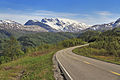
- Nomination E6 road, Kviturfjellet and part of Veikdalsisen, Nordland, Norway, in 2011 June --Ximonic 10:37, 29 July 2011 (UTC)
- Promotion Good quality. --Taxiarchos228 11:00, 29 July 2011 (UTC)
-

- Nomination Kviturfjellet and part of Veikdalsisen, Nordland, Norway, in evening in 2011 June --Ximonic 10:37, 29 July 2011 (UTC)
- Promotion Good quality. --Taxiarchos228 11:00, 29 July 2011 (UTC)
-

- Nomination Miño river in A Arnoia, Galicia (Spain)--Lmbuga 08:46, 29 July 2011 (UTC)
- Promotion Good quality. --Taxiarchos228 08:54, 29 July 2011 (UTC)
-
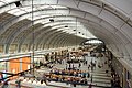
- Nomination Stockholm Central station --Ankara 07:43, 29 July 2011 (UTC)
- Promotion Good quality. --Taxiarchos228 07:56, 29 July 2011 (UTC)
-
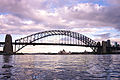
- Nomination Sydney Harbour Bridge and Opera House --Gnangarra 07:26, 29 July 2011 (UTC)
- Decline strong CA, lacking sharpness --Taxiarchos228 07:36, 29 July 2011 (UTC)
-
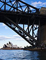
- Nomination Opera house and bridge --Gnangarra 07:26, 29 July 2011 (UTC)
- Decline bridge is to dark, bad exposure --Taxiarchos228 07:36, 29 July 2011 (UTC)
-

- Nomination Sydney Opera House --Gnangarra 07:26, 29 July 2011 (UTC)
- Decline bad lightning, bad contrast --Taxiarchos228 07:36, 29 July 2011 (UTC)
-

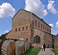
- Nomination Germany, Bamberg, church St. Gangolf --Berthold Werner 06:39, 29 July 2011 (UTC)
- Promotion Good quality. --Taxiarchos228 07:36, 29 July 2011 (UTC)
-

- Nomination Hechingen: Minster Saint Luzen, pipe organ --Taxiarchos228 06:16, 29 July 2011 (UTC)
- Promotion Good quality. --Berthold Werner 06:41, 29 July 2011 (UTC)
-

- Nomination Hechingen: Collegiate Church, window in oratory --Taxiarchos228 06:16, 29 July 2011 (UTC)
- Promotion Good quality. --Berthold Werner 06:41, 29 July 2011 (UTC)
-

- Nomination St George church in Balchik. --MrPanyGoff 06:01, 29 July 2011 (UTC)
- Promotion Good quality. --Taxiarchos228 08:55, 29 July 2011 (UTC)
-

- Nomination Yet another Neuschwanstein Castle picture, in 2011 May. --Ximonic 20:47, 28 July 2011 (UTC)
- Promotion QI --Butterfly austral 00:16, 29 July 2011 (UTC)
-

- Nomination Church of Santo Antón, Ribadavia, Galicia (Spain)--Lmbuga 18:38, 28 July 2011 (UTC)
- Promotion Good quality. --Taxiarchos228 10:05, 29 July 2011 (UTC)
-

- Nomination Ogival arches inside Saint-Étienne-du-Mont church, Paris. --NonOmnisMoriar 18:14, 28 July 2011 (UTC)
- Promotion Good --Butterfly austral 00:16, 29 July 2011 (UTC)
-

- Nomination St George church in Balchik. --MrPanyGoff 17:10, 28 July 2011 (UTC)
- Promotion QI for me--Lmbuga 18:54, 28 July 2011 (UTC)
-

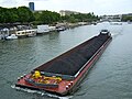
- Nomination Port of Douarnenez, Finistère, France.--LPLT 17:17, 28 July 2011 (UTC)
- Decline Sorry, Jpg artifacts, unsharp,
 chromatic aberrations and few details--Lmbuga 18:50, 28 July 2011 (UTC)
-
-

-

- Nomination Hasel: Protestant Church, bell tower --Taxiarchos228 14:08, 28 July 2011 (UTC)
- Promotion Good--Lmbuga 18:44, 28 July 2011 (UTC)
-

-

-

-

-

- Nomination Bosa, in Sardinia (Italy). --Gzzz 21:27, 27 July 2011 (UTC)
- Promotion Good --Butterfly austral 23:22, 28 July 2011 (UTC)
-

- Nomination Interior view of the New Mosque in Istanbul -- H005 22:36, 23 July 2011 (UTC)
- Promotion Good--Butterfly austral 00:04, 29 July 2011 (UTC)
-

- Nomination Sinkhole in the Causse de Sauveterre, Lozère, France. --Myrabella 19:55, 23 July 2011 (UTC)
- Promotion Rare--Butterfly austral 00:07, 29 July 2011 (UTC)
-
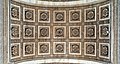
- Nomination Arc du Triomphe, Paris. Detail of the ceiling. -- Alvesgaspar 13:37, 23 July 2011 (UTC)
- Promotion Good, I like --Butterfly austral 23:59, 28 July 2011 (UTC)
-

- Nomination The north-west tower, Nikita monastery, Pereslavl. Warm colours. --PereslavlFoto 15:00, 22 July 2011 (UTC)
- Promotion --Lmbuga 07:16, 29 July 2011 (UTC)
-

-

-

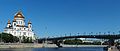
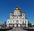
- Nomination Cathedral of Christ the Saviour, Moscow, view from northeast -- Alvesgaspar 16:26, 21 July 2011 (UTC)
- Promotion QI for me--Lmbuga 07:01, 29 July 2011 (UTC)
-

-

-
-
-

- Nomination Gooseberries, by user:neurovelho.--V-wolf 21:45, 27 July 2011 (UTC)
- Promotion Good quality. --Raghith 05:18, 28 July 2011 (UTC)
-

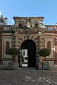
- Nomination Biriciana gate --Vitold Muratov 23:45, 27 July 2011 (UTC)
- Promotion Good quality. --Raghith 05:18, 28 July 2011 (UTC)
-
-

-

- Nomination Common Cockchafer --Archaeodontosaurus 19:37, 27 July 2011 (UTC)
- Promotion High resolution and quality. --Quartl 21:01, 27 July 2011 (UTC)
-
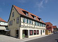
- Nomination Germany, Dettelbach, Am Bach 7, "Old forge" inn --Berthold Werner 18:28, 27 July 2011 (UTC)
- Promotion Good quality. --Sfu 06:16, 28 July 2011 (UTC)
-

- Nomination Shuri Castle in Naha, Okinawa --663highland 13:46, 27 July 2011 (UTC)
- Promotion Good quality. --Sfu 05:59, 28 July 2011 (UTC)
-

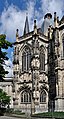
- Nomination Aachen Cathedral seen from north --Carschten 13:14, 27 July 2011 (UTC)
- Promotion
 Support QI for me --Archaeodontosaurus 19:40, 27 July 2011 (UTC)
-

- Nomination Detail of Berlin Wall --Llez 12:12, 27 July 2011 (UTC)
- Promotion Good quality. --Taxiarchos228 14:15, 27 July 2011 (UTC)
-

- Nomination Innerfjorden (Øksfjorden) at Hinnøya, Nordland, Norway, in 2010 September --Ximonic 12:09, 27 July 2011 (UTC)
- Promotion Good quality. --Taxiarchos228 14:15, 27 July 2011 (UTC)
-

-

-

- Nomination Niedereggenen: Protestant Church, sign of Späth-Orgelbau (pipe organ factory) --Taxiarchos228 07:59, 27 July 2011 (UTC)
- Decline Below minimum size requirement --Carschten 12:05, 27 July 2011 (UTC)
-

- Nomination Obereggenen: Protestant Church --Taxiarchos228 07:59, 27 July 2011 (UTC)
- Promotion very nice composition --Carschten 12:05, 27 July 2011 (UTC)
-

-

-

- Nomination Bird of Paradise. Jardin des Plantes, Paris. -- Alvesgaspar 20:52, 24 July 2011 (UTC)
- Promotion Support QI & Useful --Archaeodontosaurus 20:03, 27 July 2011 (UTC)
-

-
-

-

-

- Nomination Larus delawarensis (Ring-billed Gull) --Wsiegmund 17:23, 22 July 2011 (UTC)
- Decline Sorry but I think the focus is a bit off. The most sharp area seems to be at the small rocks below their feet. The exposure is good however. --Ximonic 13:17, 27 July 2011 (UTC)
-

- Nomination: France, Menton, 19, rue Saint-Michel --Berthold Werner 11:37, 22 July 2011 (UTC)
- Review needed
-

- Nomination Storm clouds to Gatchina --Vitold Muratov 12:50, 22 July 2011 (UTC)
- Decline
 Oppose The right side is too modified --Archaeodontosaurus 19:58, 27 July 2011 (UTC)
-

- Nomination: One of the Frecce Tricolori. Photo taken by myself. --Airwolf 10:02, 22 July 2011 (UTC)
- Review needed
-

- Nomination: Bettingen: St. Chrischona Television Tower --Taxiarchos228 07:56, 22 July 2011 (UTC)
- Review needed
-

- Nomination: Bettingen: St. Chrischona Television Tower: concrete surface of pillar no. 2 (southwest) --Taxiarchos228 07:56, 22 July 2011 (UTC)
- Review needed
-
- Nomination: Dornach, Switzland: Goetheanum from west --Taxiarchos228 07:56, 22 July 2011 (UTC)
- Review needed
-

- Nomination: Bus on route 54 in Bristol. -- Geof Sheppard 07:20, 22 July 2011 (UTC)
- Review needed
-

- Nomination: Havis Amanda statue in Helsinki, Finland gets her student cap on "vappu" eve (30th of April). --kallerna 06:24, 22 July 2011 (UTC)
- Review needed
-
-

- Nomination: Confetti in the air during "vappu" eve (30th of April) near Havis Amanda -statue in Helsinki. --kallerna 06:24, 22 July 2011 (UTC)
- Review needed
-

- Nomination: Havis Amanda statue in Helsinki, Finland gets her student cap on "vappu" eve (30th of April). --kallerna 06:24, 22 July 2011 (UTC)
- Review needed
-

- Nomination: Wall at the rear end of the parish church of St. Peter and Paul in Weigelsdorf, municipality of Ebreichsdorf --Herzi Pinki 23:27, 21 July 2011 (UTC)
- Review needed
-

-

-

- Nomination: Anna Calvi at the Eurockéennes de Belfort 2011 -- Rama 15:04, 21 July 2011 (UTC)
- Review needed
-

-
-

- Nomination Cardinal (Argynnis pandora), male. --Le.Loup.Gris 12:42, 20 July 2011 (UTC)
- Promotion
 Comment Tight crop at top and right. --Quartl 08:48, 24 July 2011 (UTC) Thanks for the recrop. --Quartl 07:01, 28 July 2011 (UTC)
-

- Nomination Flower of Artichoke. Jardin des Plantes, Paris. -- Alvesgaspar 10:08, 20 July 2011 (UTC)
- Promotion Good picture. --Gzzz 19:38, 27 July 2011 (UTC) Comment The right orthograph in latin is Cynara scolymus and not scolimus --Gzzz 19:40, 27 July 2011 (UTC)
-

- Nomination Somewhere on the presque-isle of Giens, Hyères, France. --ComputerHotline 22:31, 19 July 2011 (UTC)
- Decline Something looks strange in the middle vertical of the sky. Some parts seems to be overexposed. Isn't it a perspective distortion ?--Jebulon 23:05, 19 July 2011 (UTC) It's an HDR image. The perspective distortion is corrected. It's the real scene. --ComputerHotline 23:32, 19 July 2011 (UTC)Thanks for explanation. Let's wait for other opinions.--Alvesgaspar 08:36, 20 July 2011 (UTC) OpposeI think the perspective is wrong --Archaeodontosaurus 19:50, 27 July 2011 (UTC)
-

-

- Nomination Hot spring at the Elisa Fountain in Aachen --Carschten 11:18, 27 July 2011 (UTC)
- Promotion Good quality. --Taxiarchos228 11:43, 27 July 2011 (UTC)
-

- Nomination Elisa Fountain in Aachen --Carschten 11:18, 27 July 2011 (UTC)
- Promotion Good quality, but I would retouch the leafs out. --Taxiarchos228 11:43, 27 July 2011 (UTC)
-

- Nomination Embraer ERJ-170 --Airwolf 11:09, 27 July 2011 (UTC)
- Decline nice view, but bad contrast (white plane vs. white sky), lacking sharpness --Taxiarchos228 11:43, 27 July 2011 (UTC)
-
- Nomination Kinjocho ishidatami-michi street in Naha, Okinawa --663highland 10:55, 27 July 2011 (UTC)
- Promotion Good quality. --Taxiarchos228 11:04, 27 July 2011 (UTC)
-
- Nomination Shikinaen Garden in Naha, Okinawa --663highland 10:55, 27 July 2011 (UTC)
- Promotion bit overexposed (roof), but ok for this picture --Taxiarchos228 11:04, 27 July 2011 (UTC)
-

- Nomination Medieval fortifications of Provins, France --Pline 07:42, 27 July 2011 (UTC)
- Promotion Good quality, but a panorama of both pictures would be better in this case --Taxiarchos228 11:04, 27 July 2011 (UTC)
-

- Nomination Medieval fortifications of Provins, France --Pline 07:41, 27 July 2011 (UTC)
- Promotion Good quality, but a panorama of both pictures would be better in this case --Taxiarchos228 11:04, 27 July 2011 (UTC)
-
- Nomination Germany, Dettelbach, Am Bach 1a --Berthold Werner 06:39, 27 July 2011 (UTC)
- Promotion Good quality. --Taxiarchos228 06:41, 27 July 2011 (UTC)
-

- Nomination Old house in the town of Kavarna. --MrPanyGoff 06:37, 27 July 2011 (UTC)
- Promotion Good quality. --Taxiarchos228 06:41, 27 July 2011 (UTC)
-

- Nomination Kolomenskoe Museum, Moscow: View on Moskva River. A.Savin 06:19, 27 July 2011 (UTC)
- Promotion Good quality. --Taxiarchos228 06:41, 27 July 2011 (UTC)
-

- Nomination Kolomenskoe Museum, Moscow: Front Gates. A.Savin 06:19, 27 July 2011 (UTC)
- Promotion Good quality. --Taxiarchos228 06:41, 27 July 2011 (UTC)
-

- Nomination Valery Polkhovsky, a Russian biathlon coach. A.Savin 06:19, 27 July 2011 (UTC)
- Promotion Good quality. --Taxiarchos228 06:41, 27 July 2011 (UTC)
-

-

-

-

- Nomination Church Croix-en-Brie, Ile de France. --Pline 19:21, 26 July 2011 (UTC)
- Decline Too tight cropped at upperside and looks noisy. --Berthold Werner 20:19, 26 July 2011 (UTC)
-

- Nomination Spines of Gleditsia triacanthos. --ComputerHotline 19:06, 26 July 2011 (UTC)
- Promotion Good -- George Chernilevsky 19:32, 26 July 2011 (UTC)
-
- Nomination Flower of Phaseolus vulgaris. --ComputerHotline 19:06, 26 July 2011 (UTC)
- Promotion Good quality. --Raghith 05:44, 27 July 2011 (UTC)
-

- Nomination Stortinden (866 m) in Flakstad, Nordland, Norway, in 2010 September --Ximonic 19:02, 26 July 2011 (UTC)
- Promotion Nice colors, high quality -- George Chernilevsky 19:25, 26 July 2011 (UTC)
-

- Nomination Oenanthe sarmentosa (Water-parsley) --Wsiegmund 18:36, 26 July 2011 (UTC)
- Promotion Good -- George Chernilevsky 19:26, 26 July 2011 (UTC)
-

- Nomination Church tower of St. Foillan, Aachen --Carschten 16:02, 26 July 2011 (UTC)
- Promotion Gut -- George Chernilevsky 19:31, 26 July 2011 (UTC)
-
- Nomination Aachen Cathedral: part of the south facade --Carschten 16:02, 26 July 2011 (UTC)
- Promotion Gut -- George Chernilevsky 19:31, 26 July 2011 (UTC)
-
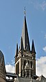
- Nomination West Tower of Aachen Cathedral --Carschten 16:02, 26 July 2011 (UTC)
- Promotion Sehr gut -- George Chernilevsky 19:27, 26 July 2011 (UTC)
-
-

- Nomination St Michael the Archangel church in Balgarevo village. --MrPanyGoff 12:21, 26 July 2011 (UTC)
- Promotion Good quality. --Taxiarchos228 13:54, 26 July 2011 (UTC)
-
- Nomination Cathedral of Christ the Saviour, Moscow. View across the Moscow River. -- Alvesgaspar 11:56, 26 July 2011 (UTC)
- Promotion Good quality. --Taxiarchos228 13:31, 26 July 2011 (UTC)
-

- Nomination Rail car 010 - station Černý Kříž (Schwarzes Kreutz) --Pudelek 08:12, 26 July 2011 (UTC)
- Promotion Good quality. --Taxiarchos228 13:53, 26 July 2011 (UTC)
-

- Nomination Grasse, Place du 24 Août --Berthold Werner 18:07, 25 July 2011 (UTC)
- Promotion Good quality. --Sfu 12:57, 26 July 2011 (UTC)
-

- Nomination Embraer ERJ-170. --Airwolf 08:55, 25 July 2011 (UTC)
- Promotion Good quality. --Taxiarchos228 13:41, 26 July 2011 (UTC)
-

- Nomination Building construction at the Granusturm in Aachen --Carschten 08:51, 25 July 2011 (UTC)
- Promotion Good quality. --Taxiarchos228 13:41, 26 July 2011 (UTC)
-

- Nomination St Paraskeva Petka church belfry in Troyan. --MrPanyGoff 06:05, 25 July 2011 (UTC)
- Decline unsharp --Carschten 09:24, 25 July 2011 (UTC)
Sharpened file is uploaded.--MrPanyGoff 09:39, 25 July 2011 (UTC)
Isn't the new file OK?--MrPanyGoff 09:39, 26 July 2011 (UTC) Comment seems not really better to me... --Carschten 09:43, 26 July 2011 (UTC) Comment You say that the main object in the new file is not sharp enough?!?! Can you show me sharper one of all the nominated photos at the moment because I don't see one ;):)) --MrPanyGoff 11:25, 27 July 2011 (UTC)
-

- Nomination The parish church St. Peter and Paul in Weigelsdorf, municipality of Ebreichsdorf. --Herzi Pinki 23:27, 21 July 2011 (UTC)
- Decline most of the image is underexposed --Carschten 09:57, 27 July 2011 (UTC)
-

-

-

- Nomination Currituck lighthouse in the Outer Banks, NC --Warfieldian 16:32, 21 July 2011 (UTC)
- Promotion next time F8, ISO 100 and 1/250s, but QI and good though --Carschten 09:57, 27 July 2011 (UTC)
-

- Nomination Roger Chapman at the RatingenFestival 2011 -- H005 16:09, 21 July 2011 (UTC)
- Promotion some motion blur, but I like it --Carschten 09:57, 27 July 2011 (UTC)
-

-

-

- Nomination Danilov monastery in Pereslavl, cell building. --PereslavlFoto 13:24, 21 July 2011 (UTC)
- Decline not really crisp to me (bad details) --Carschten 09:57, 27 July 2011 (UTC)
Could you please underline some point that distracted you so I could avoid it in future? Thanks. PereslavlFoto 11:53, 27 July 2011 (UTC)
-

- Nomination Niedereggenen: Protestant Church, war memorial --Taxiarchos228 07:50, 21 July 2011 (UTC)
- Promotion nice --Carschten 09:57, 27 July 2011 (UTC)
-

- Nomination: Niedereggenen: Protestant Church, epitaph --Taxiarchos228 07:50, 21 July 2011 (UTC)
- Review needed
-

- Nomination: Obereggenen: Protestant Church, interior --Taxiarchos228 07:50, 21 July 2011 (UTC)
- Review needed
-

- Nomination Liel: Saint Vinzenz Church, bell tower --Taxiarchos228 07:50, 21 July 2011 (UTC)
- Promotion Good quality. --Carschten 09:57, 27 July 2011 (UTC)
-

- Nomination Obereggenen: Protestant Church, epitaph --Taxiarchos228 07:50, 21 July 2011 (UTC)
- Promotion Good quality. --Carschten 09:57, 27 July 2011 (UTC)
-

- Nomination: A common flower over an uncommon background -- Alvesgaspar 23:24, 20 July 2011 (UTC)
- Review Comment This is Alcea rosea. --Le.Loup.Gris 00:43, 21 July 2011 (UTC) -- Thank you, Loup, the name was changed. Alvesgaspar 07:29, 21 July 2011 (UTC)
-

- Nomination: Almanarre beach, Hyères, France. --ComputerHotline 17:15, 20 July 2011 (UTC)
- Review needed
-

- Nomination Balgarevo village hall. --MrPanyGoff 06:59, 26 July 2011 (UTC)
- Promotion Good quality. --Taxiarchos228 07:23, 26 July 2011 (UTC)
-

-
- Nomination Jura mountains in Mümliswil-Ramiswil, canton of Solothurn, Switzerland --Gestumblindi 00:05, 26 July 2011 (UTC)
- Promotion contrast could be better, but good for QI --Taxiarchos228 07:23, 26 July 2011 (UTC)
-

- Nomination Hyogo Prefectural Museum of Art --663highland 22:37, 25 July 2011 (UTC)
- Decline Very visible compression artifacts/noise on the lift door. --Sfu 11:46, 26 July 2011 (UTC)
-

- Nomination Paris, view from the topo of the Magasins Lafayette, to south. -- Alvesgaspar 22:33, 25 July 2011 (UTC)
- Promotion Great informative panorama. I would prefer more view in the bottom and more sharpness but anyway, it meets the criteria for QI, imo.--MrPanyGoff 09:55, 26 July 2011 (UTC)
-

- Nomination Paris Opera House (Opéra Garnier), view from north. -- Alvesgaspar 22:21, 25 July 2011 (UTC)
- Promotion Valuable view. Could be sharper but anyway I think good enough for QI.--MrPanyGoff 09:48, 26 July 2011 (UTC)
-

- Nomination Metz train station, France -- MJJR 21:12, 25 July 2011 (UTC)
- Promotion Could be sharper but I think good enough for QI.--MrPanyGoff 09:44, 26 July 2011 (UTC)
-

-

- Nomination Boats near Paradise Island, Hurghada. --kallerna 17:07, 25 July 2011 (UTC)
- Withdrawn I withdraw it for you, because it's already a QI :-) --Carschten 17:33, 25 July 2011 (UTC)
-

-

-

-

-

- Nomination The female tennis player Arantxa Parra Santonja after a match in Moers in an interview --Carschten 14:33, 25 July 2011 (UTC)
- Promotion Good quality. --Taxiarchos228 06:13, 26 July 2011 (UTC)
-

- Nomination Grasse, Rue Mirabeau --Berthold Werner 11:00, 25 July 2011 (UTC)
- Promotion CommentStrong CA visible on the chimney. --Sfu 11:54, 25 July 2011 (UTC) Support Good quality. --Raghith 14:48, 25 July 2011 (UTC)
Good, but I also think the CA need a correction. --Carschten 15:20, 25 July 2011 (UTC)
New version uploaded. --Berthold Werner 16:24, 25 July 2011 (UTC)
much better now. Changed back to promoted. --Carschten 16:54, 25 July 2011 (UTC)
-

- Nomination Flowers of Marsh Woundwort (Stachys palustris). --Bff 10:01, 22 July 2011 (UTC)
- Promotion Good exposure illumination and background; crop is a bit tight on the left and top, the tilt may not be typical, left flower and tip of center flower lip are not in focus (more depth of field would be nice), but still QI, I think. --Wsiegmund 10:22, 26 July 2011 (UTC)
-

-

- Nomination Etang des Pesquiers, Hyères, France. --ComputerHotline 17:15, 20 July 2011 (UTC)
- Promotion very nice --Carschten 13:04, 25 July 2011 (UTC)
-

- Nomination Panorama seen from the presqu'isle of Giens, Hyères, France. --ComputerHotline 17:15, 20 July 2011 (UTC)
- Decline unsharp --Carschten 13:04, 25 July 2011 (UTC)
-

- Nomination Main Pod of TV-Tower Nuremberg (Fernmeldeturm Nürnberg), new version --Taxiarchos228 13:03, 20 July 2011 (UTC)
- Promotion Good quality. --Jovianeye 12:07, 25 July 2011 (UTC)
-
- Nomination Amethyst Sea Holly. Jardin des Plantes, Paris. -- Alvesgaspar 10:08, 20 July 2011 (UTC)
- Promotion Good quality. --Carschten 13:04, 25 July 2011 (UTC)
-

- Nomination Obereggenen: Protestant Church, interior --Taxiarchos228 06:35, 20 July 2011 (UTC)
- Promotion sehr schöne Komposition --Carschten 13:04, 25 July 2011 (UTC)
-

- Nomination Niedereggenen: Protestant Church, bell tower --Taxiarchos228 06:35, 20 July 2011 (UTC)
- Promotion Good quality. --Carschten 13:04, 25 July 2011 (UTC)
-

- Nomination Obereggenen: Protestant Church, main portal --Taxiarchos228 06:35, 20 July 2011 (UTC)
- Promotion not the best lighting conditions, but good quality --Carschten 13:04, 25 July 2011 (UTC)
-

- Nomination: Bad Bellingen: Saint Leodegar Church, statue of the Virgin Mary --Taxiarchos228 06:35, 20 July 2011 (UTC)
- Review needed
-
- Nomination: Clouds timelapse over Belfort, France. --ComputerHotline 18:28, 19 July 2011 (UTC)
- Review needed
-

- Nomination: July 14th fireworks at the Hyères port. --ComputerHotline 18:28, 19 July 2011 (UTC)
- Review needed
-

- Nomination July 14th fireworks at the Hyères port. --ComputerHotline 18:28, 19 July 2011 (UTC)
- Decline Unsharp, ambiguous composition. --Elekhh 12:11, 25 July 2011 (UTC)
-

- Nomination: The 519th Groupe de transit maritime during the ceremonies of the 14th of July in Toulon. -- Rama 15:57, 19 July 2011 (UTC)
- Review needed
-

- Nomination: The grave of doctor Nikolay Alexeevich Gubin. Church cemetary in Alexino village. --PereslavlFoto 14:30, 19 July 2011 (UTC)
- Review needed
-

- Nomination: The grave of doctor Nikolay Alexeevich Gubin. Church cemetary in Alexino village. --PereslavlFoto 14:30, 19 July 2011 (UTC)
- Review needed
-

- Nomination: Votive candles in Schweiklberg monastery. --High Contrast 13:48, 18 July 2011 (UTC)
- Review Comment I don't like the vignetting. To me, it's blurry--Lmbuga 20:26, 18 July 2011 (UTC)
The vignetting is wanted - intended to emphasize the painting in the center of the image. --High Contrast 17:38, 19 July 2011 (UTC)
-

- Nomination Annastraße 1 in Aachen --Carschten 09:58, 25 July 2011 (UTC)
- Promotion Good quality. --Berthold Werner 11:00, 25 July 2011 (UTC)
-

- Nomination CH-47 and the crew. --Airwolf 08:55, 25 July 2011 (UTC)
- Promotion Comment nice, but lots of overexposed parts. Can you darken them a bit? --Carschten 09:26, 25 July 2011 (UTC)
How about now? --Airwolf 09:40, 25 July 2011 (UTC) Support good enough now :) --Carschten 09:58, 25 July 2011 (UTC)
-

- Nomination Mulhouse: Railway station (facade of the main entrance) --Taxiarchos228 08:42, 25 July 2011 (UTC)
- Promotion Good quality. --Berthold Werner 09:13, 25 July 2011 (UTC)
-

- Nomination Mulhouse: Transmitter mast --Taxiarchos228 08:42, 25 July 2011 (UTC)
- Promotion Perspective distortions, but not disturbing. Good quality. --Carschten 09:24, 25 July 2011 (UTC)
-

- Nomination Niedereggenen: Protestant Church, main portal --Taxiarchos228 08:42, 25 July 2011 (UTC)
- Promotion Good quality. --Sfu 09:16, 25 July 2011 (UTC)
-

- Nomination Obereggenen: Protestant Church, interior --Taxiarchos228 08:42, 25 July 2011 (UTC)
- Promotion Good quality. --Carschten 09:24, 25 July 2011 (UTC)
-

-

-

- Nomination A pencil sharpener. --Raghith 08:22, 25 July 2011 (UTC)
- Decline DOF is too short --Berthold Werner 09:12, 25 July 2011 (UTC)
-

- Nomination Security researcher Alexander Sotirov at the 25th Chaos Communication Congress --Raghith 08:22, 25 July 2011 (UTC)
- Decline noisy, tight crop --Carschten 09:24, 25 July 2011 (UTC)
-
-

-

- Nomination Bud of Indian Lotus. Jardin des Plantes, Paris. -- Alvesgaspar 22:19, 24 July 2011 (UTC)
- Promotion Good quality. --Raghith 08:26, 25 July 2011 (UTC)
-

-

-

- Nomination Passenger ship Santa Monika on the Rhine-Herne-Canal --Carschten 17:14, 24 July 2011 (UTC)
- Promotion Nice colors -- George Chernilevsky 18:28, 24 July 2011 (UTC)
-

- Nomination Werhahnmühle in Duisburg Inner Harbour --Carschten 17:14, 24 July 2011 (UTC)
- Promotion a bit noisy (can be fixed easily), but good quality for QI --Taxiarchos228 09:29, 25 July 2011 (UTC)
-

- Nomination Krinnenspitze, morning atmosphere --Carschten 17:14, 24 July 2011 (UTC)
- Promotion Gut -- George Chernilevsky 18:30, 24 July 2011 (UTC)
-

-

- Nomination Grasse, Place aux Herbes --Berthold Werner 12:54, 24 July 2011 (UTC)
- Promotion really nice street scene --Don-kun 16:07, 24 July 2011 (UTC)
-

- Nomination Tugboat. --Airwolf 12:27, 24 July 2011 (UTC)
- Promotion Very good -- George Chernilevsky 18:33, 24 July 2011 (UTC)
-

-

-

- Nomination at Shuri Castle in Naha, Okinawa --663highland 11:46, 24 July 2011 (UTC)
- Promotion Good --Pudelek 20:44, 24 July 2011 (UTC)
-

- Nomination Niedereggenen: Protestant Church, interior --Taxiarchos228 09:42, 24 July 2011 (UTC)
- Promotion Really good. --Don-kun 16:22, 24 July 2011 (UTC)
-

- Nomination Niedereggenen: Protestant Church, claviature of pipe organ --Taxiarchos228 09:42, 24 July 2011 (UTC)
- Promotion Great. I nearly can touch the keys and hear the music ;) --Don-kun 16:22, 24 July 2011 (UTC)
-

- Nomination Liel: Saint Vinzenz Church, interior --Taxiarchos228 09:42, 24 July 2011 (UTC)
- Promotion Good quality. --Don-kun 16:22, 24 July 2011 (UTC)
-

- Nomination Liel: Saint Vinzenz Church, statue --Taxiarchos228 09:42, 24 July 2011 (UTC)
- Promotion Good quality. --Don-kun 16:22, 24 July 2011 (UTC)
-
- Nomination Red Square, Moscow. View from northwest -- Alvesgaspar 09:35, 24 July 2011 (UTC)
- Promotion Good composition and maybe the best weather for taking the photo. --Don-kun 16:22, 24 July 2011 (UTC)
-

-

- Nomination Varna Cathedral. --MrPanyGoff 07:53, 24 July 2011 (UTC)
- Promotion Good quality. --Berthold Werner 12:58, 24 July 2011 (UTC)
-

- Nomination Meteor Crater, also known as the Barringer Crater --PL Przemek 06:54, 24 July 2011 (UTC).
- Decline Copyright status: the original licence is "Creative Commons Attribution-NonCommercial-NoDerivs 3.0 License" which is, I believe, not compatible with Wikipedia (although the link is to the CC-BY license which is confusing to me). <BR\>Autor: not by a Wikipedian.<BR\>Quality: the stitching is not well-made: the horizon is wavy and the seams are very visible. --D4m1en 10:15, 25 July 2011 (UTC)
-

- Nomination Castelsardo (Sardinia, Italy). --Gzzz 22:36, 23 July 2011 (UTC)
- Promotion Nice colors; good detail --Daniel Case 05:45, 25 July 2011 (UTC)
-

-

-

- Nomination Burnt Ford Fiesta Mk6 in Bosa (Sardinia, Italy). --Gzzz 21:28, 23 July 2011 (UTC)
- Promotion
 Question Do you know why it has been burned? -- H005 22:48, 23 July 2011 (UTC) -- No, I don't, it was parked there... -Gzzz 06:00, 24 July 2011 (UTC) Support OK then, quality is good! --H005 21:17, 24 July 2011 (UTC)
-

-

-

- Nomination Calocera viscosa --Holleday 18:36, 23 July 2011 (UTC)
- Promotion SupportGood quality. --Gzzz 21:58, 23 July 2011 (UTC) Support Can not eat, I tried and I really regret --Archaeodontosaurus 05:14, 24 July 2011 (UTC)* Comment You have right. I tried it too but the taste was terrible :-)--Holleday 12:24, 24 July 2011 (UTC)
-
-
-

-

- Nomination The Royal Jordanian Falcons. Photo taken by myself. --Airwolf 09:37, 22 July 2011 (UTC)
- Promotion Good -- George Chernilevsky 18:11, 24 July 2011 (UTC)
-
- Nomination Church of Saint-Pierre-aux-Nonnains in Metz, France -- MJJR 21:22, 21 July 2011 (UTC)
- Promotion Good -- George Chernilevsky 17:57, 24 July 2011 (UTC)
-

- Nomination The Avenue Foch in Metz, France -- MJJR 21:22, 21 July 2011 (UTC)
- Promotion Good -- George Chernilevsky 17:57, 24 July 2011 (UTC)
-

- Nomination Water tower near the train station of Metz, France -- MJJR 21:22, 21 July 2011 (UTC)
- Promotion Very good -- George Chernilevsky 18:09, 24 July 2011 (UTC)
-

- Nomination Water tower (detail) near the train station of Metz, France -- MJJR 21:22, 21 July 2011 (UTC)
- Promotion Very good -- George Chernilevsky 18:09, 24 July 2011 (UTC)
-

- Nomination Detail of the forefront of the train station in Metz, France -- MJJR 21:22, 21 July 2011 (UTC)
- Promotion Good -- George Chernilevsky 18:09, 24 July 2011 (UTC)
-

- Nomination Aix-en-Provence, Pavillon Vendôme. I guess the main issue is the fountain in the foreground... --Eusebius 20:44, 21 July 2011 (UTC)
- Promotion Yes. --Berthold Werner 16:09, 22 July 2011 (UTC)
Good quality. --Ianare 00:07, 25 July 2011 (UTC)
-

-

- Nomination The north-west tower, Nikita monastery, Pereslavl. --PereslavlFoto 14:33, 20 July 2011 (UTC)
- Promotion Хорошее фото. Вариант с тёплой гаммой цветов мне тоже нравится. -- George Chernilevsky 18:03, 24 July 2011 (UTC)
-

- Nomination Avro Lancaster. --Airwolf 19:38, 19 July 2011 (UTC)
- Promotion Good quality. --Ianare 00:02, 25 July 2011 (UTC)
-
- Nomination: Gate of the Hôtel Montescot, Chartres. --Coyau 02:42, 19 July 2011 (UTC)
- Review needed
-

- Nomination Caudal fin of a southern right whale --Dr.Haus 20:43, 18 July 2011 (UTC)
- Decline Comment Good and useful shot, but it needs some processing (tilt removal, better contrast/clarity) -- H005 13:57, 23 July 2011 (UTC)
A better version is now uploaded--Dr.Haus 16:29, 24 July 2011 (UTC) Oppose Good quality, but tilted, overexposed, blown out sky --Carschten 09:19, 24 July 2011 (UTC)
-
- Nomination Cathedral of Christ the Saviour, view from across River Moscow -- Alvesgaspar 22:58, 23 July 2011 (UTC)
- Promotion Support Good composition --Archaeodontosaurus 05:06, 24 July 2011 (UTC)
-
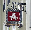
- Nomination A sign of the Fischer-Zunft (founded 1010) in Würzburg -- H005 22:10, 23 July 2011 (UTC)
- Promotion Good quality. --Taxiarchos228 09:26, 24 July 2011 (UTC)
-

-

- Nomination Boletus chrysenteron --Holleday 18:37, 23 July 2011 (UTC)
- Promotion Support QI & Useful The head that eats --Archaeodontosaurus 05:11, 24 July 2011 (UTC)
-

-

-

-

-

- Nomination Olios argelasius--Archaeodontosaurus 13:42, 23 July 2011 (UTC)
- Promotion Good quality. --H005 17:36, 23 July 2011 (UTC)
-

-

-

-

- Nomination King Frederick William IV of Prussia in front of Old National Gallery, Berlin --Llez 09:59, 23 July 2011 (UTC)
- Promotion Good quality. --Taxiarchos228 19:53, 23 July 2011 (UTC)
-

-
- Nomination Shell of an Indonesian land snail, Cyclophorus perdix --Llez 06:19, 23 July 2011 (UTC)
- Promotion Support & useful --Archaeodontosaurus 13:43, 23 July 2011 (UTC)
-

-

-

- Nomination Some mold. --ComputerHotline 17:26, 22 July 2011 (UTC)
- Decline Needs id. --Quartl 08:53, 24 July 2011 (UTC)
-

- Nomination Corneille,Pierre --Vitold Muratov 14:55, 22 July 2011 (UTC)
- Decline Oppose overprocessing and posterization --Archaeodontosaurus 13:56, 23 July 2011 (UTC)
-

- Nomination Portrait of Yellow-headed Amazon Parrot --Jovianeye 11:47, 22 July 2011 (UTC)
- Promotion Nice -- George Chernilevsky 19:58, 23 July 2011 (UTC)
-

- Nomination Doug Scarratt, Saxon. --MrPanyGoff 11:42, 22 July 2011 (UTC)
- Promotion Good quality. --Jovianeye 12:21, 23 July 2011 (UTC)
-

-

- Nomination Dormition of the Theotokos Church in Kavarna. --MrPanyGoff 06:55, 22 July 2011 (UTC)
- Promotion Support QI for me. What are the iron box on both sides of the facade? --Archaeodontosaurus 05:19, 24 July 2011 (UTC)
The boxes are for candles. Sometimes when the churches are small and old the places for candles are arranged outside so that not to fill with smoke the interior.--MrPanyGoff 07:36, 24 July 2011 (UTC)
-

-

- Nomination barrage at river Wiese near Lörrach-Brombach --Taxiarchos228 07:50, 21 July 2011 (UTC)
- Promotion Good quality. --Jovianeye 12:33, 23 July 2011 (UTC)
-

-

- Nomination "Le Concert Champêtre", by Corot, Musée Condé, Chantilly, France.--Jebulon 22:17, 20 July 2011 (UTC)
- Promotion Support QI & Useful --Archaeodontosaurus 05:20, 24 July 2011 (UTC)
-

- Nomination Arts centre l'Arsenal in Metz, France -- MJJR 20:50, 20 July 2011 (UTC)
- Promotion I think it meets the criteria.--MrPanyGoff 13:52, 23 July 2011 (UTC)
-
-

- Nomination Roger Chapman -- H005 17:23, 20 July 2011 (UTC)
- Promotion Very good. --Jovianeye 12:37, 23 July 2011 (UTC)
-

- Nomination Hyères Plage, France. --ComputerHotline 17:15, 20 July 2011 (UTC)
- Promotion Good quality. --H005 13:55, 23 July 2011 (UTC)
-

- Nomination Echinops ritro. Jardin des Plantes, Paris. -- Alvesgaspar 10:08, 20 July 2011 (UTC)
- Promotion Support QI & Useful --Archaeodontosaurus 13:59, 23 July 2011 (UTC)
-

- Nomination Echium vulgare (Viper's Bugloss or Blueweed) flowers. --Le.Loup.Gris 23:00, 19 July 2011 (UTC)
- Decline Comment Poor dof to me f3,2--Lmbuga 23:47, 19 July 2011 (UTC)
Too short dof. --Quartl 08:40, 24 July 2011 (UTC)
-
- Nomination Tour Fondue, Hyères, France. --ComputerHotline 22:31, 19 July 2011 (UTC)
- Promotion Good quality - Gzzz 09:10, 24 July 2011 (UTC)
-

- Nomination A bunker in Hyères, France. --ComputerHotline 22:31, 19 July 2011 (UTC)
- Promotion Good quality. --Carschten 09:37, 24 July 2011 (UTC)
-

-

- Nomination Ephedra distachya with berries (very bright colored berries "glow" in back light). --Le.Loup.Gris 22:21, 19 July 2011 (UTC)
- Decline Short dof, lacks contrast, sharpness. --Quartl 08:46, 24 July 2011 (UTC)
-
- Nomination
- WARNING: third template parameter added – please remove.
-

- Nomination A 1-litre bottle of Hendrick's Gin with a Hendrick's Gin tea cup -- H005 21:42, 19 July 2011 (UTC)
- Promotion Good quality. --Carschten 09:37, 24 July 2011 (UTC)
-

-

-

- Nomination Electric locomotive Škoda ChS4-080 -- George Chernilevsky 20:34, 19 July 2011 (UTC)
- Promotion Good quality. --Carschten 09:37, 24 July 2011 (UTC)
-

- Nomination Frecce Tricolori. --Airwolf 19:38, 19 July 2011 (UTC)
- Promotion lots of overexposed areas, but very good quality and it's very nice --Carschten 09:37, 24 July 2011 (UTC)
-

- Nomination Photo of the w:National Flag Memorial, Rosario, Argentina. --Kved 19:19, 19 July 2011 (UTC)
- Decline good quality, but underexposed sky and poor crop at left --Carschten 09:37, 24 July 2011 (UTC)
-

- Nomination Tour Fondue port, Hyères, France. --ComputerHotline 18:28, 19 July 2011 (UTC)
- Decline unsharp --Carschten 09:37, 24 July 2011 (UTC)
-

- Nomination July 14th fireworks at the Hyères port. --ComputerHotline 18:28, 19 July 2011 (UTC)
- Decline overexposed, unsharp, perspective distortions, reflections --Carschten 09:37, 24 July 2011 (UTC)
-

- Nomination July 14th fireworks at the Hyères port. --ComputerHotline 18:28, 19 July 2011 (UTC)
- Decline overexposed, unsharp, perspective distortions, reflections --Carschten 09:37, 24 July 2011 (UTC)
-

- Nomination The Hyères coastline, in night. --ComputerHotline 18:28, 19 July 2011 (UTC)
- Decline overexposed, perspective distortions --Carschten 09:37, 24 July 2011 (UTC)
-
-

-

-

- Nomination Bamberg, Luitpoldstraße 13/15/17 --Berthold Werner 08:01, 19 July 2011 (UTC)
- Promotion
seems a bit underexposed to me, butgood quality --Carschten 09:37, 24 July 2011 (UTC)
-

- Nomination Liel: Saint Vinzenz Church, interior --Taxiarchos228 06:20, 19 July 2011 (UTC)
- Promotion Good quality. --Carschten 09:37, 24 July 2011 (UTC)
-

- Nomination Obereggenen: Protestant Church, pulpit --Taxiarchos228 06:20, 19 July 2011 (UTC)
- Promotion Good quality. --Carschten 09:37, 24 July 2011 (UTC)
-

-
- Nomination hairpin turns on the road between Kallikratis and Kapsodasos --Hoangquan hientrang 02:28, 19 July 2011 (UTC)
- Decline Blurred left side (see note), doubled image on the left bottom (distortion correction, see note), and still too distorted in my opinion - Gzzz 09:08, 24 July 2011 (UTC)
-

- Nomination Cuirassiers 1805, by Meissonier. Musée Condé, Chantilly, France.--Jebulon 22:03, 18 July 2011 (UTC)
- Promotion
 InfoNew version uploaded, with more light and contrast.--Jebulon 21:50, 19 July 2011 (UTC) Support Very good. --H005 13:59, 23 July 2011 (UTC)
-

-
- Nomination Tower of the town hall of Wolin, Poland. -- Felix Koenig 13:51, 18 July 2011 (UTC)
- Decline very blurry at bottom with nearly no details, sorry --Carschten 09:19, 24 July 2011 (UTC)
-

- Nomination Schliengen: Saint Leodegar Church, bell tower --Taxiarchos228 09:15, 18 July 2011 (UTC)
- Promotion Good quality. --Carschten 09:19, 24 July 2011 (UTC)
-

- Nomination Groningen.University --Vitold Muratov 23:44, 17 July 2011 (UTC)
- Decline distortions, lots of overexposed areas, tight crop --Carschten 09:13, 24 July 2011 (UTC)
-

-

- Nomination: The Siroco in Toulon harbour. Aft view. -- Rama 21:28, 17 July 2011 (UTC)
- Review needed
-

- Nomination Ettal Abbey, organ --Taxiarchos228 20:30, 17 July 2011 (UTC)
- Decline cutted of at top, blown out window(s) --Carschten 09:13, 24 July 2011 (UTC)
-

- Nomination: Ettal Abbey: old bell tower between new bell tower and dome --Taxiarchos228 20:30, 17 July 2011 (UTC)
- Review needed
-

- Nomination Hasel: Protestant Church (baptistery) --Taxiarchos228 20:30, 17 July 2011 (UTC)
- Promotion Good -Gzzz 09:00, 24 July 2011 (UTC)
-

- Nomination TV-Tower Nuremberg (Fernmeldeturm Nürnberg) --Taxiarchos228 20:25, 17 July 2011 (UTC)
- Decline Bad contrast of the main subject, probably too far away... - Gzzz 08:59, 24 July 2011 (UTC)
-

-

-
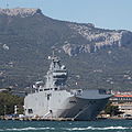
- Nomination The BPC Dixmude (L9015) on the 14th of July 2011, one day after she arrived in Toulon from Saint-Nazaire for fitting out. -- Rama 10:16, 17 July 2011 (UTC)
- Promotion Good --Gzzz 08:55, 24 July 2011 (UTC)
-

- Nomination Tamaudun in Naha, Okinawa --663highland 23:25, 16 July 2011 (UTC)
- Decline CA, shadows. --H005 17:33, 23 July 2011 (UTC)
-

- Nomination Tamaudun in Naha, Okinawa --663highland 23:25, 16 July 2011 (UTC)
- Decline CA, sharpness. --H005 17:33, 23 July 2011 (UTC)
-
-

-

- Nomination Fragment of a façade of the Château de Chantilly, France.--Jebulon 20:41, 16 July 2011 (UTC)
- Promotion Info New version uploaded, not visible at thumbnail. Balance of colors adjusted.--Jebulon 17:51, 17 July 2011 (UTC)
Support Albeit a bit unsharp. --H005 22:57, 23 July 2011 (UTC)
-

-

- Nomination Teatralnaya subway station, Moscow. A.Savin 18:23, 16 July 2011 (UTC)
- Promotion Needs small perspective and distortion correction. --Jovianeye 11:14, 22 July 2011 (UTC) I see no distortion except the small tilt on the very right edge. - A.Savin 15:06, 22 July 2011 (UTC)
See image annotation. --Jovianeye 22:53, 23 July 2011 (UTC)
Done - A.Savin 09:21, 24 July 2011 (UTC)
Better now. --Jovianeye 11:31, 24 July 2011 (UTC)
-
-

- Nomination Neue Burg, Hofburg, Wien. -- Kadellar 16:35, 16 July 2011 (UTC)
- WARNING: third template parameter added – please remove.
-

- Nomination Detail of the bow of the floating palace Independence of the Seas, moored in Toulon harbour. -- Rama 13:31, 16 July 2011 (UTC)
- Decline please see annotations, sorry...--Jebulon 15:43, 16 July 2011 (UTC)
I've tried to improve things a bit. Thank you! -- Rama 15:20, 21 July 2011 (UTC) Oppose Too many chromatic aberration around the white parts -- Gzzz 08:50, 24 July 2011 (UTC)
-

- Nomination Beaulieu-sur-Mer, Villa Kerylos seen from Cap Ferrat --Berthold Werner 10:11, 16 July 2011 (UTC)
- Promotion Good quality. --Jovianeye 22:59, 23 July 2011 (UTC)
-

-

- Nomination Windmill from Trzęsówka, Kolbuszowa Air Museum --Przykuta 08:31, 16 July 2011 (UTC)
- Decline There is a specific Category:Windmills in Poland by voivodeship, could be interesting and useful.--Jebulon 15:52, 16 July 2011 (UTC)
 Neutral because of blur and slight CA. -- H005 17:33, 23 July 2011 (UTC) Oppose I agree with H005: blurred... --Gzzz 08:07, 24 July 2011 (UTC)
-

-
- Nomination Deutsche Band Headquarters in Frankfurt, Germany. -- Der Wolf im Wald 01:47, 16 July 2011 (UTC)
- Promotion Good quality. --H005 14:01, 23 July 2011 (UTC)
-
- Nomination Hole with mold. --ComputerHotline 17:26, 22 July 2011 (UTC)
- Decline Insufficient quality. depth of field so shallow portions are out of focus at top --Warfieldian 20:27, 22 July 2011 (UTC)
-
-

- Nomination Monaco, Building at the Avenue Saint-Martin --Berthold Werner 16:07, 22 July 2011 (UTC)
- Promotion Support QI for me --Archaeodontosaurus 08:07, 23 July 2011 (UTC)
-

- Nomination Margerie Glacier in Alaska (by Skellam) -- Warfieldian 06:28, 22 July 2011 (UTC)
- Decline The picture is very tilted anticlockwise. --Ximonic 13:13, 22 July 2011 (UTC)
-

- Nomination The plague column in Ebreichsdorf --Herzi Pinki 23:27, 21 July 2011 (UTC)
- Promotion Not extremely sharp (but one can read the markings on the column all right), and a bit noisy sky, but very good light and colours. QI for me. --Coyau 08:51, 23 July 2011 (UTC)
-

- Nomination The mortuary (former burial vault) in Ebreichsdorf --Herzi Pinki 23:27, 21 July 2011 (UTC)
- Promotion Good lightning and colours. QI for me. --Coyau 08:51, 23 July 2011 (UTC)
-
- Nomination The Kazan Cathedral at the Red Square, Moscow. -- Alvesgaspar 22:46, 21 July 2011 (UTC)
- Promotion Tight crop but I think it meets the criteria.--MrPanyGoff 09:51, 23 July 2011 (UTC)
-

- Nomination Photo of tool for woodworking --Warfieldian 16:23, 21 July 2011 (UTC)
- Decline Good effort, but insufficient DOF, not properly cut out, reference for size (scale) missing. --H005 22:29, 22 July 2011 (UTC)
-

- Nomination Roger Chapman at the RatingenFestival 2011 -- H005 16:09, 21 July 2011 (UTC)
- Promotion I think it meets the criteria.--MrPanyGoff 15:51, 22 July 2011 (UTC)
-

- Nomination Inside the Giens church, Hyères, France. --ComputerHotline 18:28, 19 July 2011 (UTC)
- Promotion Good quality --Ximonic 13:29, 22 July 2011 (UTC)
-

- Nomination Ochna serrulata --Hội Phượng Hoàng 12:31, 19 July 2011 (UTC)
- Decline Interesting picture, but doesn't meet the lighting and composition criteria for QI, in my opinion. Only the center is well-illuminated. The centered composition detracts from the quality (please see "rule of thirds"). A longer focal length would provide more uniform illumination from the camera flash and reduce distortion. Depth of field is fine, I think. --Wsiegmund 17:37, 22 July 2011 (UTC)
-

- Nomination Nymphaea alba --Hội Phượng Hoàng 12:30, 19 July 2011 (UTC)
- Promotion
Below minimum size requirement.Dark areas are a bit noisy, but criteria satisfied, in my opinion. --Wsiegmund 17:37, 22 July 2011 (UTC)
-

- Nomination The last Prince of Condé, 1830, by Delaval. Musée Condé, Chantilly, France.--Jebulon 23:30, 18 July 2011 (UTC) InfoNew version uploaded, increasing light and contrast.--Jebulon 21:41, 19 July 2011 (UTC)
- Promotion Support QI and Useful --Archaeodontosaurus 08:16, 23 July 2011 (UTC)
- Nomination The last Prince of Condé, 1830, by Delaval. Musée Condé, Chantilly, France.--Jebulon 23:30, 18 July 2011 (UTC)
-

- Nomination: Ancistroceras undulatum, Arenigian, Early Ordovician; Museum für Naturkunde Berlin --Hoangquan hientrang 05:43, 17 July 2011 (UTC)
- Review needed
-

-

-

- Nomination Giotto's Bell tower, Florence, Italy. (other version. Not the previously declined one)--Jebulon 22:05, 15 July 2011 (UTC)
- Decline the top of the tower is unsharp, the upper sky is noisy/pixelated (all from the distortion correction?). Also, the blurred faces of the tourists are ugly --Carschten 18:55, 22 July 2011 (UTC)
I have to agree with Carsten, plus I see too much CA at the top. Good light, good effort, good at thumbnail size, but in the end not quite up to standards. -- H005 21:42, 22 July 2011 (UTC)
-

- Nomination BPC Dixmude (L9015) on the 14th of July 2011, one day after she arrived in Toulon from Saint-Nazaire for fitting out. Starboard view as seen from the far side of Toulon harbour. -- Rama 19:50, 15 July 2011 (UTC)
- Decline I know you couldn't help it, but I find the background very distracting. --H005 21:42, 22 July 2011 (UTC)
-

- Nomination Annecy Lake, moonlight. --Vomirencostard 14:46, 15 July 2011 (UTC)
- Decline bad quality (unsharp, noisy) --Carschten 18:55, 22 July 2011 (UTC)
-
- Nomination Annecy Lake, moonlight. --Vomirencostard 14:46, 15 July 2011 (UTC)
- Decline bad quality (unsharp, noisy) --Carschten 18:55, 22 July 2011 (UTC)
-

- Nomination Hasel: Protestant Church --Taxiarchos228 07:14, 15 July 2011 (UTC)
- Promotion Comment Good, but the right vertical line of the church is tilted--Lmbuga 23:12, 15 July 2011 (UTC) Support It's good as it is, it must not be 100 % vertical. --H005 21:42, 22 July 2011 (UTC)
-

- Nomination Schliengen: Saint Leodegar Church, gallery and organ --Taxiarchos228 07:14, 15 July 2011 (UTC)
- Promotion without blemish IMO --Carschten 18:55, 22 July 2011 (UTC)
-

-

-

- Nomination El Prat de Llobregat beach. -- -Pedroserafin 17:43, 14 July 2011 (UTC)
- Decline chromatic aberrations, poor quality --Carschten 18:39, 22 July 2011 (UTC)
-

- Nomination Leer.Waage.2. --Vitold Muratov 17:46, 14 July 2011 (UTC)
- Decline JPG artifacts --Carschten 18:39, 22 July 2011 (UTC)
-

- Nomination Leer.Waage --Vitold Muratov 17:38, 14 July 2011 (UTC)
- Decline perspective distortion, JPG artifacts --Carschten 18:39, 22 July 2011 (UTC)
-

- Nomination Clogs. (Shoe). --Vitold Muratov 17:20, 14 July 2011 (UTC)
- Decline below minimum size requirement --Carschten 18:39, 22 July 2011 (UTC)
-

- Nomination Franken in Winter --Vitold Muratov 16:10, 14 July 2011 (UTC)
- Promotion Good. Geolocation would be helpful. --Jonathunder 17:24, 22 July 2011 -- From some hills of Bamberg. BRD--Vitold Muratov 08:40, 23 July 2011 (UTC)
-
- Nomination Old commercial building, Postville, Iowa--Jonathunder 13:29, 14 July 2011 (UTC)
- Promotion Good quality. --Carschten 18:39, 22 July 2011 (UTC)
-

- Nomination The town hall in Ebreichsdorf --Herzi Pinki 23:27, 21 July 2011 (UTC)
- Promotion I think good enough for QI.--MrPanyGoff 10:53, 22 July 2011 (UTC)
-

- Nomination Třebíč - house with clock --Pudelek 20:37, 21 July 2011 (UTC)
- Promotion Good quality. --Warfieldian 21:20, 21 July 2011 (UTC)
-
- Nomination Cathedral of Christ the Saviour, Moscow, view from southeast -- Alvesgaspar 16:26, 21 July 2011 (UTC)
- Promotion Good quality. --Berthold Werner 18:18, 21 July 2011 (UTC)
-

- Nomination The tower of monastery church in Klosterreichenbach, Black Forest. -- Felix Koenig 14:39, 21 July 2011 (UTC)
- Promotion Good quality. --Taxiarchos228 14:44, 21 July 2011 (UTC)
-
- Nomination France, Menton, Montée du Souvenir --Berthold Werner 12:48, 21 July 2011 (UTC)
- Promotion Good quality. --Taxiarchos228 13:32, 21 July 2011 (UTC)
-

- Nomination Niedereggenen: Protestant Church, interior --Taxiarchos228 06:20, 19 July 2011 (UTC)
- Promotion I think it meets the criteria.--MrPanyGoff 10:37, 22 July 2011 (UTC)
-

-

-

- Nomination House from Markowa, Kolbuszowa Air Museum --Przykuta 08:31, 16 July 2011 (UTC)
- Promotion Good quality. Nice color and framing. --Warfieldian 19:00, 21 July 2011 (UTC)
-

- Nomination Zagroda (croft) from Markowa, Kolbuszowa Air Museum --Przykuta 08:31, 16 July 2011 (UTC)
- Decline Insufficient quality. front of building is dark and obscured by poor light. --Warfieldian 19:02, 21 July 2011 (UTC)
-

- Nomination Memory plate for war victims --Harke 08:34, 21 July 2011 (UTC)
- Promotion Good quality. --Taxiarchos228 08:38, 21 July 2011 (UTC)
-
- Nomination Sundial --Harke 08:33, 21 July 2011 (UTC)
- Promotion Good quality. --Taxiarchos228 08:38, 21 July 2011 (UTC)
-

- Nomination Church tower, Gerlingen --Harke 08:31, 21 July 2011 (UTC)
- Promotion Good quality. --Taxiarchos228 08:38, 21 July 2011 (UTC)
-

- Nomination A Cretaceous heteromorph ammonite, Bostrychoceras polyplocum --Llez 07:43, 21 July 2011 (UTC)
- Promotion Good quality. --Taxiarchos228 08:38, 21 July 2011 (UTC)
-

- Nomination Flower of a Common Gaillardia. Jardin des Plantes, Paris -- Alvesgaspar 23:24, 20 July 2011 (UTC)
- Promotion I hate bugs, but besides that it's an extraordinarily pleasing photo. Airwolf 23:32, 20 July 2011 (UTC)
-

- Nomination The Chapelle des Templiers in Metz, France -- MJJR 20:50, 20 July 2011 (UTC)
- Promotion Good quality. --Taxiarchos228 08:40, 21 July 2011 (UTC)
-

- Nomination Post Tower in Bonn -- H005 17:23, 20 July 2011 (UTC)
- Promotion Good quality. --Taxiarchos228 08:40, 21 July 2011 (UTC)
-

- Nomination Louise Marguerite de Lorraine, ca 1600, anon., Musée Condé, Chantilly, France.--Jebulon 23:43, 19 July 2011 (UTC)
- Promotion Good quality. Perhaps too tight at bottom (I'm not sure): the words "Ecole francaise" must be to me complete--Lmbuga 00:48, 20 July 2011 (UTC)
—Good quality, although her skin and pearl necklace are bluish; the readability of «École française» is irrelevant. --Thorvaldsson 07:49, 20 July 2011 (UTC)Thank you. I'm sorry it "is" bluish like this in real, if I remeber well. "Ecole française" is only a very small part of the description panel (3 or 4 lines...). My crop was only for the painting, and the words painted on it. If I want to remove the words "Ecole française, I have to remove the painted inscription, like here. Not my choice...--Jebulon 08:35, 20 July 2011 (UTC)
—The colours of a painting vary according to the quality of the light, which falls upon the painting. --Thorvaldsson 16:20, 20 July 2011 (UTC)
-

-

- Nomination Bettingen: St. Chrischona Television Tower (general view) --Taxiarchos228 20:21, 17 July 2011 (UTC)
- Promotion Good quality. --Jovianeye 11:37, 21 July 2011 (UTC)
-
- Nomination The Tamaoton no Hinomon --663highland 11:06, 17 July 2011 (UTC)
- Promotion Good quality. --Jovianeye 11:37, 21 July 2011 (UTC)
-

- Nomination Médecin Chef des Services (Chief physician of the Services, equivalent to a brigade general) Dominique Esquivié, at the 14th of July 2011 ceremonies in Toulon. -- Rama 21:17, 15 July 2011 (UTC)
- Promotion Comment Can you change the white balance? I am finding it quite bluish. --Jovianeye 03:14, 17 July 2011 (UTC)
Colourblind me... thanks, fixed! Rama 10:36, 20 July 2011 (UTC)
Much better now. --Jovianeye 11:28, 21 July 2011 (UTC)
-
-

-

- Nomination The Château d'Enghien, in the parc of the Château de Chantilly, France.--Jebulon 21:36, 12 July 2011 (UTC) InfoNew vesrion uploaded, not visible here, please skip the thumbnail.--Jebulon 09:31, 18 July 2011 (UTC)
- Promotion Good quality. --H005 17:37, 20 July 2011 (UTC)
- Nomination The Château d'Enghien, in the parc of the Château de Chantilly, France.--Jebulon 21:36, 12 July 2011 (UTC)
-

- Nomination Pereslavl, Chkalovsky district, branch of «Sberbank Rossii». PereslavlFoto 20:13, 12 July 2011 (UTC)
- Decline Unsharp, blown lights. --H005 17:37, 20 July 2011 (UTC)
-

- Nomination Pereslavl museum, refectory and the church of All Saints. Retouched and cropped re: previous discussion. PereslavlFoto 19:52, 12 July 2011 (UTC)
- Promotion Acceptable, despite some flaws. --H005 17:37, 20 July 2011 (UTC)
-

- Nomination Nicholas Merrill at the 27th Chaos Communication Congress, by AlexanderKlink. -- Rama 17:44, 12 July 2011 (UTC)
- Decline Very tight crop --H005 17:37, 20 July 2011 (UTC)
-

- Nomination Harald Welte at the 27th Chaos Communication Congress, by AlexanderKlink. -- Rama 17:44, 12 July 2011 (UTC)
- Promotion Good, although the left part has too much shadows. --H005 17:37, 20 July 2011 (UTC)
-

- Nomination Peter Welchering at the 27th Chaos Communication Congress, by AlexanderKlink. -- Rama 17:44, 12 July 2011 (UTC)
- Promotion Too much shadows again, but nonetheless good, excellent sharpness. --H005 17:37, 20 July 2011 (UTC)
-

-

-

-

- Nomination Cyril "Pépito" Renou playing with Les Hurlements d'Léo at the Eurockéennes de Belfort 2011 -- Rama 14:23, 12 July 2011 (UTC)
- Promotion Comment Wrong description again (This is a person, not a band.) Please fix. -- H005 20:50, 20 July 2011 (UTC)
The name of the individual musician was already in the file description. -- Rama 07:42, 21 July 2011 (UTC)
OK, sorry, I didn't notice! -- H005 11:44, 21 July 2011 (UTC)
-

- Nomination A supporting musician playing with AaRON at the Eurockéennes de Belfort 2011. -- Rama 14:20, 12 July 2011 (UTC)
- Promotion Comment Wrong description again (This is a person, not a duet.) Please fix. -- H005 20:50, 20 July 2011 (UTC)
There you go. Rama 07:39, 21 July 2011 (UTC)
OK, thanks! --H005 11:44, 21 July 2011 (UTC)
-

- Nomination The bassist of Mars Red Sky at the Eurockéennes de Belfort 2011. -- Rama 14:18, 12 July 2011 (UTC)
- Promotion Comment Wrong description again (This is a person, not a band.) Please fix. -- H005 20:50, 20 July 2011 (UTC)
There you go. Rama 07:39, 21 July 2011 (UTC)
OK, thanks! --H005 11:44, 21 July 2011 (UTC)
-
![* Nomination Cheers at the Eurockéennes de Belfort 2011 -- Rama 12:24, 11 July 2011 (UTC) * Promotion Question Who or what is "Cheers" here? Not this person, I guess? -- H005 20:50, 12 July 2011 (UTC) [1] -- Rama 21:08, 13 July 2011 (UTC) That doesn't help much, sorry. A proper description is required for an image to become QI - currently it's insufficient. -- H005 21:19, 15 July 2011 (UTC) Any better now? Rama 10:36, 20 July 2011 (UTC) I've added some more info. --H005 11:40, 21 July 2011 (UTC)](https://upload.wikimedia.org/wikipedia/commons/thumb/d/dc/Cheers_IMG_5697.jpg/80px-Cheers_IMG_5697.jpg)
- Nomination Cheers at the Eurockéennes de Belfort 2011 -- Rama 12:24, 11 July 2011 (UTC)
- Promotion Question Who or what is "Cheers" here? Not this person, I guess? -- H005 20:50, 12 July 2011 (UTC)
[1] -- Rama 21:08, 13 July 2011 (UTC)
That doesn't help much, sorry. A proper description is required for an image to become QI - currently it's insufficient. -- H005 21:19, 15 July 2011 (UTC)
Any better now? Rama 10:36, 20 July 2011 (UTC)
I've added some more info. --H005 11:40, 21 July 2011 (UTC)
-

- Nomination Morpheus after Poussin, Versailles. --Coyau 14:30, 9 July 2011 (UTC)
- Promotion Comment I think the white balance needs a adjustment, seems to yellow-greenish to me. --Carschten 15:33, 13 July 2011 (UTC)
It is. --Coyau 20:25, 17 July 2011 (UTC)
To me it looks like a reflection of the green surrounding. --H005 20:51, 20 July 2011 (UTC)
-
- Nomination Homme-requin, ancient kingdom of Dahomey. --Myrabella 07:01, 20 July 2011 (UTC)
- Promotion Good quality and very nice! --Taxiarchos228 07:07, 20 July 2011 (UTC)
-

- Nomination Thermocouple-Thermoelement --Harke 06:54, 20 July 2011 (UTC)
- Promotion Good quality. --Taxiarchos228 07:07, 20 July 2011 (UTC)
-

- Nomination Thermocouple-Thermometer --Harke 06:50, 20 July 2011 (UTC)
- Promotion Good quality. --Taxiarchos228 07:07, 20 July 2011 (UTC)
-

- Nomination Thermocouple-Thermometer --Harke 06:47, 20 July 2011 (UTC)
- Promotion Good quality. --Taxiarchos228 06:48, 20 July 2011 (UTC)
-

- Nomination Johannes-Rebmann house in Gerlingen --Harke 06:45, 20 July 2011 (UTC)
- Promotion Good quality. --Taxiarchos228 06:48, 20 July 2011 (UTC)
-

- Nomination Old farm house in Gerlingen --Harke 06:44, 20 July 2011 (UTC)
- Promotion Good quality. --Taxiarchos228 06:48, 20 July 2011 (UTC)
-

- Nomination Rössle-Brunnen in Gerlingen --Harke 06:42, 20 July 2011 (UTC)
- Promotion Good quality. --Taxiarchos228 06:48, 20 July 2011 (UTC)
-

- Nomination Niedereggenen: Protestant Church, choir ceiling --Taxiarchos228 06:35, 20 July 2011 (UTC)
- Promotion Very nice !--Jebulon 08:19, 20 July 2011 (UTC)
-

- Nomination Niedereggenen: Protestant Church, organ --Taxiarchos228 06:35, 20 July 2011 (UTC)
- Promotion Good--Jebulon 08:20, 20 July 2011 (UTC)
-

- Nomination Niedereggenen: Protestant Church, gable cross (1429) --Taxiarchos228 06:35, 20 July 2011 (UTC)
- Promotion Good--Jebulon 08:22, 20 July 2011 (UTC)
-

- Nomination Shell of a Sunburst Carrier Shell, Stellaria solaris --Llez 05:13, 20 July 2011 (UTC)
- Promotion Good quality. --Taxiarchos228 07:08, 20 July 2011 (UTC)
-
- Nomination Saint Domingos of Ribadavia, Galicia (Spain)--Lmbuga 00:42, 20 July 2011 (UTC)
- Promotion Good quality. --Taxiarchos228 08:17, 20 July 2011 (UTC)
-

- Nomination Angels dancing, 1436, by Giovanni di Paolo, Musée Condé, Chantilly, France.--Jebulon 22:39, 19 July 2011 (UTC)
- Promotion For me, the image can be very good, but the frame of the painting is not perfect. In spite of this, QI for me--Lmbuga 00:22, 20 July 2011 (UTC)Thank you. Nor the frame, neither the panel are perfect and symmetrical in real. I give a very small part of the frame on my pictures photos, only to be sure one can see the whole painting (as suggested here by another reviewer).--Jebulon 08:28, 20 July 2011 (UTC)
—Good quality. Keep the frame: allows to see that it is not a full view of the painting. --Thorvaldsson 10:27, 20 July 2011 (UTC)
-

- Nomination Coat of arms, Ribadavia--Lmbuga 22:24, 19 July 2011 (UTC)
- Promotion Good. An ID should be helpful... It is a mandatory for living species or minerals, it should be a mandatory too for CoA, in my opinion, as they all are identifiable. Why not ?--Jebulon 22:54, 19 July 2011 (UTC)
I think that I understand your words. It is impossible for me to identify the coat. I only can place it in this category, but it's not the same necessarily. Sorry--Lmbuga 23:24, 19 July 2011 (UTC)
If other users think that the image cannot be QI, I will not object anything (I will not put objections)--Lmbuga 23:32, 19 July 2011 (UTC) Oh surely no ! It is a very good picture IMO, and an obvious QI to me. My comment was just a thought, an idea ! --Jebulon 23:53, 19 July 2011 (UTC)
Ok, thanks. I also have had that idea, some times--Lmbuga 00:14, 20 July 2011 (UTC)
-

-
- Nomination The Tour Eiffel, view from the Trocadero -- Alvesgaspar 22:01, 19 July 2011 (UTC)
- Promotion Good quality. Just the metadata could be better (inaccurate file name, no geocode, I had to correct a typo.) --H005 22:06, 19 July 2011 (UTC) "Tour EifFel", with 2 "ff". Geocode added (that's because I know the place
 )--Jebulon 22:52, 19 July 2011 (UTC)
good picture, but please remove first the "ghost-bus" --Taxiarchos228 06:12, 20 July 2011 (UTC)} -- Done -- Thank you, Jebulon and Tachiarchos! Alvesgaspar 08:35, 20 July 2011 (UTC)
-

- Nomination A 1-litre bottle of Hendrick's Gin -- H005 21:42, 19 July 2011 (UTC)
- Promotion The upper label is maybe a bit overexposed, but good QI, I think (if no copyright violation.--Jebulon 21:53, 19 July 2011 (UTC)
-

-
-

- Nomination Flowers of Coreopsis grandiflora. Jardin des Plantes, Paris. -- Alvesgaspar 20:38, 19 July 2011 (UTC)
- Promotion Good. Suitable category added.--Jebulon 22:59, 19 July 2011 (UTC)
-

- Nomination Electric locomotive Škoda ChS4-080 -- George Chernilevsky 20:34, 19 July 2011 (UTC)
- Promotion QI for me--Lmbuga 22:33, 19 July 2011 (UTC)
-

- Nomination Electric locomotive Škoda ChS8-016 -- George Chernilevsky 20:34, 19 July 2011 (UTC)
- Promotion Good!--Jebulon 21:54, 19 July 2011 (UTC)
-
- Nomination Electric locomotive Škoda ChS8-016 -- George Chernilevsky 20:34, 19 July 2011 (UTC)
- Promotion Good! -- MJJR 21:02, 19 July 2011 (UTC)
-

- Nomination Electric locomotive Škoda ChS8-030 -- George Chernilevsky 20:34, 19 July 2011 (UTC)
- Promotion QI for me--Lmbuga 22:35, 19 July 2011 (UTC)
-

- Nomination Electric locomotive Škoda ChS8-030 -- George Chernilevsky 20:34, 19 July 2011 (UTC)
- Promotion Good! -- MJJR 21:02, 19 July 2011 (UTC)
-

- Nomination Frecce Tricolori. --Airwolf 19:38, 19 July 2011 (UTC)
- Promotion Nice. Perhaps can be more sharp, but QI for me--Lmbuga 22:51, 19 July 2011 (UTC)
-

- Nomination Giens church altar, Hyères, France. --ComputerHotline 18:28, 19 July 2011 (UTC)
- Promotion Good. Suitable category added.--Jebulon 21:59, 19 July 2011 (UTC)
-

- Nomination July 14th fireworks at the Hyères port. --ComputerHotline 18:28, 19 July 2011 (UTC)
- Decline Fireworks are over-exposed and lens flare --Jovianeye 01:41, 20 July 2011 (UTC)
-
- Nomination Germany, Koblenz, church St. Kastor --Berthold Werner 16:50, 19 July 2011 (UTC)
- Promotion I even like the two umbrellas. The variety of churches in Germany is refreshing. -- Saffron Blaze 18:14, 19 July 2011 (UTC)
-

-

- Nomination Regimental flag of the 141th Infantry regiment. -- Rama 15:09, 19 July 2011 (UTC)
- Decline Because of the background...--Jebulon 22:00, 19 July 2011 (UTC)
You're right, these backgrounds ruin everything. Look at this one! Ouin! -- Rama Maybe could you try a cloning out or something ? The lady in foreground is a real beauty IMO !--Jebulon 23:57, 19 July 2011 (UTC)
-
- Nomination Church dome in Nagorye village. --PereslavlFoto 13:24, 19 July 2011 (UTC)
- Promotion Good --Jebulon 22:01, 19 July 2011 (UTC)
-

- Nomination Motörhead at the Eurockéennes de Belfort 2011. -- Rama 12:35, 19 July 2011 (UTC)
- Promotion Good quality. --Taxiarchos228 12:48, 19 July 2011 (UTC)
-

- Nomination Raphael Saadiq at the Eurockéennes de Belfort 2011. -- Rama 12:35, 19 July 2011 (UTC)
- Promotion Good quality too --Taxiarchos228 12:50, 19 July 2011 (UTC)
-
- Nomination Flower of Kalanchoe blossfeldiana --Hội Phượng Hoàng 06:32, 19 July 2011 (UTC)
- Decline Oppose too many blurred areas and some part overexposed --Archaeodontosaurus 12:09, 19 July 2011 (UTC)
-

- Nomination Flower of Cosmos sulphureus --Hội Phượng Hoàng 06:32, 19 July 2011 (UTC)
- Decline Oppose too many blurred areas and overprocessed --Archaeodontosaurus 12:08, 19 July 2011 (UTC)
-

- Nomination Liel: Saint Vinzenz Church, fresco --Taxiarchos228 06:20, 19 July 2011 (UTC)
- Promotion Question What is the black border on top? --Berthold Werner 10:46, 19 July 2011 (UTC)
part of the gallery --Taxiarchos228 10:49, 19 July 2011 (UTC)
Ok. --Berthold Werner 12:15, 19 July 2011 (UTC)
-

- Nomination Niedereggenen: Protestant Church, pipe organ --Taxiarchos228 06:20, 19 July 2011 (UTC)
- Promotion QI for me: can be more sharp, but it's a interior. Difficult and commendable image--Rama 23:12, 19 July 2011 (UTC)
-
- Nomination Flower of Averrhoa carambola. --Hội Phượng Hoàng 05:57, 19 July 2011 (UTC)
- Decline Oppose too many blurred areas and overprocessed --Archaeodontosaurus 12:07, 19 July 2011 (UTC)
-

- Nomination The Holy Family, 1640, by Il Sassoferrato. Musée Condé, Chantilly, France.--Jebulon 22:43, 18 July 2011 (UTC)
- Promotion Question I'm wondering if there is too much blue? --Berthold Werner 11:18, 19 July 2011 (UTC)Maybe, but I don't think so. Please notice that paintings are in a room under a glass ceiling, with natural light.--Jebulon 17:19, 19 July 2011 (UTC)New version uploaded, less "blue" maybe.--Jebulon 21:45, 19 July 2011 (UTC)
imho better. --Berthold Werner 06:07, 20 July 2011 (UTC)
-

- Nomination A nice peach --Dtarazona 23:35, 17 July 2011 (UTC)
- Promotion A nice photo --Jonathunder 14:30, 19 July 2011 (UTC)
-

- Nomination: A part of cemetery in Komańcza, Poland --Przykuta 11:43, 14 July 2011 (UTC)
- Review needed
-

- Nomination: The Osławica River, Cisna-Wetlina Landscape Park --Przykuta 11:43, 14 July 2011 (UTC)
- Review needed
-

- Nomination: Rebuilded orthodox church in Komańcza, Poland --Przykuta 11:43, 14 July 2011 (UTC)
- Review needed
-

- Nomination: The Solinka River, Cisna-Wetlina Landscape Park --Przykuta 11:43, 14 July 2011 (UTC)
- Review needed
-

- Nomination: A part of old cemetary in Łupków, Poland --Przykuta 11:43, 14 July 2011 (UTC)
- Review needed
-

- Nomination: Altenburg Panorama 2. --Vitold Muratov 10:05, 14 July 2011 (UTC)
- Review needed
-

- Nomination: Schliengen: Saint Leodegar Church, fresco of Leodegar near quire arch, Christogram IHS below --Taxiarchos228 07:01, 14 July 2011 (UTC)
- Review needed
-

- Nomination: Kreisbach Castle in Lower Austria --AleXXw 22:49, 13 July 2011 (UTC)
- Review needed
-

-

-

-

- Nomination: Drums are for parade at the Eurockénnes de Belfort 2011. -- Rama 19:46, 13 July 2011 (UTC)
- Review needed
-
- Nomination: Oberhausen Castle during the blue hour --Carschten 19:28, 13 July 2011 (UTC)
- Review Comment Imo Slightly tilted CW --Mbdortmund 05:15, 14 July 2011 (UTC)
-

- Nomination: An Upper Cretaceous Ammonite, Acanthoceras cenomanense --Llez 18:43, 13 July 2011 (UTC)
- Review needed
-

- Nomination: The ground school of Stattersdorf (St. Pölten), a historcal monument. --AleXXw 14:00, 13 July 2011 (UTC)
- Review needed
-

- Nomination Timber framing in Gerlingen --Harke 06:42, 19 July 2011 (UTC)
- Promotion Good quality. --Taxiarchos228 06:43, 19 July 2011 (UTC)
-

- Nomination Timber framing in Gerlingen --Harke 06:40, 19 July 2011 (UTC)
- Promotion Good quality. --Taxiarchos228 06:43, 19 July 2011 (UTC)
-

- Nomination Old town hall Gerlingen --Harke 06:39, 19 July 2011 (UTC)
- Promotion Good quality. --Taxiarchos228 06:43, 19 July 2011 (UTC)
-

- Nomination Liel: Saint Vinzenz Church --Taxiarchos228 06:20, 19 July 2011 (UTC)
- Promotion Good quality. --Berthold Werner 10:46, 19 July 2011 (UTC)
-

- Nomination Mauchen: Saint Nicolaus Chapel --Taxiarchos228 06:20, 19 July 2011 (UTC)
- Promotion Good quality. --Berthold Werner 10:46, 19 July 2011 (UTC)
-

- Nomination Obereggenen: Protestant Church, bell tower --Taxiarchos228 06:20, 19 July 2011 (UTC)
- Promotion Good quality. --Berthold Werner 10:46, 19 July 2011 (UTC)
-

- Nomination Obereggenen: Protestant Church --Taxiarchos228 06:20, 19 July 2011 (UTC)
- Promotion Good quality. --Berthold Werner 10:46, 19 July 2011 (UTC)
-

- Nomination Bamberg, Obere Königsstraße 5 (Upper Kingsroad 5) --Berthold Werner 14:50, 18 July 2011 (UTC)
- Promotion Good quality--Lmbuga 20:16, 18 July 2011 (UTC)
-

-

- Nomination Catholic church, Gerlingen --Harke 13:34, 18 July 2011 (UTC)
- Promotion Good quality. --Taxiarchos228 13:46, 18 July 2011 (UTC)
-

- Nomination Former fire station, Gerlingen --Harke 13:33, 18 July 2011 (UTC)
- Promotion Good quality. --Taxiarchos228 13:46, 18 July 2011 (UTC)
-
- Nomination City Hall Gerlingen --Harke 13:31, 18 July 2011 (UTC)
- Promotion Good quality. --Taxiarchos228 13:46, 18 July 2011 (UTC)
-

- Nomination Schliengen: Saint Leodegar Church, nave --Taxiarchos228 09:15, 18 July 2011 (UTC)
- Promotion Good quality--Lmbuga 20:33, 18 July 2011 (UTC)
-

- Nomination Schliengen: Saint Leodegar Church, organ --Taxiarchos228 09:15, 18 July 2011 (UTC)
- Promotion QI for me--Lmbuga 20:36, 18 July 2011 (UTC)
-

- Nomination Shureimon of Shuri Castle in Naha, Okinawa --663highland 01:31, 17 July 2011 (UTC)
- Promotion Good quality. --Berthold Werner 17:43, 18 July 2011 (UTC)
-
- Nomination Shureimon of Shuri Castle in Naha, Okinawa --663highland 02:04, 17 July 2011 (UTC)
- Promotion Good quality. --Berthold Werner 17:43, 18 July 2011 (UTC)
-

- Nomination Global view of Château de Chantilly, France, from south.--Jebulon 22:24, 16 July 2011 (UTC)
- Promotion Sicher! --Berthold Werner 15:41, 17 July 2011 (UTC) Danke. Aber zuviel Gelb und nicht genug Blau IMO. Info New version uploaded, unfortunately not visible at thumbnail.--Jebulon 17:45, 17 July 2011 (UTC)
imho the first versin was better --Berthold Werner 14:41, 18 July 2011 (UTC)
-
- Nomination Würzburg. Main und Marienberg --Vitold Muratov 23:17, 16 July 2011 (UTC)
- WARNING: third template parameter added – please remove.
-

- Nomination Church of Saint Jacques of Ribadavia--Lmbuga 19:54, 16 July 2011 (UTC)
- Promotion Good quality. The door is quite lovely at full res. --Saffron Blaze 20:47, 18 July 2011 (UTC)
-

- Nomination: Festung Krakau (Fortress Kraków) - ruins of Fort 53 Bodzów --Pudelek 11:02, 13 July 2011 (UTC)
- Review needed
-

- Nomination: Wawel, Fortress Kraków --Pudelek 11:02, 13 July 2011 (UTC)
- Review needed
-

- Nomination: Ships on the Vistula river, Kraków --Pudelek 11:02, 13 July 2011 (UTC)
- Review needed
-

- Nomination: Bursa clock tower. --Eusebius 07:57, 13 July 2011 (UTC)
- Review needed
-
- Nomination: Roger Chapman at the RatingenFestival 2011 -- H005 21:57, 12 July 2011 (UTC)
- Review needed
-
- Nomination: Roger Chapman at the RatingenFestival 2011 -- H005 21:57, 12 July 2011 (UTC)
- Review needed
-

- Nomination Church of San Xoán of Ribadavia (s.XII) --Lmbuga 15:05, 12 July 2011 (UTC)
- Promotion Support QI for me --Archaeodontosaurus 16:31, 18 July 2011 (UTC)
-

- Nomination Lake Mohonk seen from one hiking trail. --Fred Hsu 02:11, 11 July 2011 (UTC)
- Decline Needs perspective correction. Buildings are leaning. Wetenschatje 08:14, 19 July 2011 (UTC)
-

- Nomination Eddy Louiss at Paris Jazz Festival 2011. --Myrabella 07:58, 10 July 2011 (UTC)
- Decline Comment It's rather unfortunately that we have two guys behind the subject... Fred Hsu 01:47, 11 July 2011 (UTC)
The fact is that he is playing with a big band of more than forty musicians on a stage of medium size...--Myrabella 06:49, 11 July 2011 (UTC) Oppose ...still, he shouldn't have two and a half heads. Agree with Fred, unfortunate composition.--Elekhh 21:28, 18 July 2011 (UTC)
-

- Nomination: Sarriac-Bigorre Bridge -- Florent Pécassou 18:01, 5 July 2011 (UTC)
- WARNING: third template parameter added – please remove.
-
- Nomination Germany, Dettelbach, townhall --Berthold Werner 08:46, 18 July 2011 (UTC)
- Promotion Good quality. --Taxiarchos228 09:15, 18 July 2011 (UTC)
-
- Nomination Palace Sagredo (Ca' Sagredo) Venice--Archaeodontosaurus 05:54, 18 July 2011 (UTC)
- Promotion Good quality. --Berthold Werner 08:46, 18 July 2011 (UTC)
-

- Nomination AF-S DX Nikkor 18-105mm --Jovianeye 02:09, 18 July 2011 (UTC) (uploaded a new version please skip thumbnail)
- Promotion Good quality. --Mbdortmund 03:13, 18 July 2011 (UTC)
-
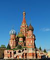
- Nomination Saint Basil's Cathedral, Moscow. -- Alvesgaspar 21:54, 17 July 2011 (UTC)
- Promotion Good quality. --Saffron Blaze 23:56, 17 July 2011 (UTC)
-

- Nomination Ettal Abbey, pulpit --Taxiarchos228 20:30, 17 July 2011 (UTC)
- Promotion Good quality. --Saffron Blaze 23:56, 17 July 2011 (UTC)
-

-

-

- Nomination State Historical Museum, Moscow -- Alvesgaspar 14:18, 17 July 2011 (UTC)
- Promotion Support QI & Useful --Archaeodontosaurus 15:04, 17 July 2011 (UTC)
-

- Nomination The Dormition Cathedral, Kremlin, Moscow. Northern door -- Alvesgaspar 14:16, 17 July 2011 (UTC)
- Promotion FP ? Welcome back !--Jebulon 14:30, 17 July 2011 (UTC)
-

- Nomination Marbled White with a damaged wing. --Quartl 10:08, 17 July 2011 (UTC)
- Promotion Support QI & Useful --Archaeodontosaurus 15:02, 17 July 2011 (UTC)
-
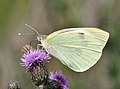
- Nomination Large White on Creeping Thistle. --Quartl 09:52, 17 July 2011 (UTC)
- Promotion Support QI & Useful --Archaeodontosaurus 15:01, 17 July 2011 (UTC)
-

- Nomination Cap Ferrat, Villa Ephrussi de Rothschild --Berthold Werner 08:32, 17 July 2011 (UTC)
- Promotion Would it really be that difficult to compose these so that there was symmetry? Such as this: http://www.saintjeancapferrat.fr/forum/images/stories/ephrussi_de_rothschild/ephrussi_br_01.jpg
Yes, there is always water on the axis as you can see here and here. Also at the stones in the water you found none in the middle. For that official picture the photographer perhaps used a ladder but I get none with me at holidays ;-). --Berthold Werner 15:32, 17 July 2011 (UTC)
I supppose taking your shoes off and walking in the fountain would not be appreciated :) Saffron Blaze 15:56, 17 July 2011 (UTC)
Perhaps next time (in a few years) --Berthold Werner 17:21, 17 July 2011 (UTC)
Good quality given the limitations. --Saffron Blaze 19:33, 17 July 2011 (UTC)
-

- Nomination Plaque, Frei Jacinto de la Ribera (1694-1745)--Lmbuga 00:00, 17 July 2011 (UTC)
- Promotion Very good quality. --Berthold Werner 11:03, 18 July 2011 (UTC)
-

- Nomination Clock. Town hall of Ribadavia--Lmbuga 23:09, 16 July 2011 (UTC)
- Promotion Good quality. --Mbdortmund 17:43, 17 July 2011 (UTC)
-
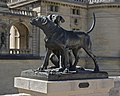
- Nomination Statues of two dogs, Château de Chantilly, France.--Jebulon 22:07, 16 July 2011 (UTC)
- Promotion Info New version uploaded, balance of colors adjusted (less yellow). Not visible at thumbnail due to the current problem.--Jebulon 17:48, 17 July 2011 (UTC) Support QI now --Archaeodontosaurus 20:16, 17 July 2011 (UTC)
-

- Nomination A bronze prophet, detail of the main portal of the Cathedral of Florence, Italy.--Jebulon 22:28, 14 July 2011 (UTC)
- Promotion Its look like some prophet from Al Saud family...in the middle of Pope back yard. Who was it ? --PetarM 22:11, 16 July 2011 (UTC)I don't know, sorry... But As I know, Abraham is a prophet/patriarch in three major monotheist religions, so everything is possible --Jebulon 16:13, 17 July 2011 (UTC)
-

- Nomination Flowering Helenium. --Bff 13:28, 14 July 2011 (UTC)
- Decline Oppose Bad flash light. It would take two light sources.--Archaeodontosaurus 06:02, 18 July 2011 (UTC)
-

- Nomination Square in Ribadavia, Galicia--Lmbuga 13:59, 12 July 2011 (UTC)
- Promotion Support QI for me --Archaeodontosaurus 06:04, 18 July 2011 (UTC)
-

-

- Nomination: Church of the Resurrection in Slavkov u Brna (Austerlitz). --Bazi 09:41, 12 July 2011 (UTC)
- Review needed
-

-

- Nomination: Southern Hawker. --Quartl 08:47, 12 July 2011 (UTC)
- Review needed
-
- Nomination: Black-tailed Skimmer. --Quartl 08:47, 12 July 2011 (UTC)
- Review needed
-

- Nomination: Black-tailed Skimmer. --Quartl 08:47, 12 July 2011 (UTC)
- Review needed
-
- Nomination: Black-tailed Skimmer, male with damaged wings. --Quartl 08:47, 12 July 2011 (UTC)
- Review needed
-

- Nomination: Schliengen: Saint Leodegar Church, view from forecourt --Taxiarchos228 06:42, 12 July 2011 (UTC)
- Review needed
-

- Nomination: Schliengen: Saint Leodegar Church, main portal --Taxiarchos228 06:42, 12 July 2011 (UTC)
- Review needed
-

- Nomination: Schliengen: Saint Leodegar Church, epitaph --Taxiarchos228 06:42, 12 July 2011 (UTC)
- Review needed
-

- Nomination: People on the top of Piedra del Peñol --Dtarazona 23:42, 11 July 2011 (UTC)
- Review needed
-

- Nomination Falconry in Algeria, 1865, by Eugène Fromentin. Château de Chantilly.--Jebulon 23:17, 11 July 2011 (UTC)
- Promotion Good quality. --Saffron Blaze 16:02, 17 July 2011 (UTC)
-
- Nomination: Roger Chapman -- H005 22:02, 11 July 2011 (UTC)
- Review needed
-

- Nomination: Napoli. Castello Nuovo --Vitold Muratov 23:55, 11 July 2011 (UTC)
- Review needed
-
- Nomination: Post Tower in Bonn -- H005 21:39, 11 July 2011 (UTC)
- Review needed
-

- Nomination: River Ems in Leer --Vitold Muratov 23:35, 11 July 2011 (UTC)
- Review needed
-
- Nomination: Female Synhalonia foraging on Phlomis --Gidip 18:56, 11 July 2011 (UTC)
- Review needed
-
- Nomination: Female Synhalonia foraging on Phlomis --Gidip 17:47, 11 July 2011 (UTC)
- Review needed
-

- Nomination: Amagasaki Cultural Center (Archaic Hall) in Amagasaki --663highland 15:03, 11 July 2011 (UTC)
- Review needed
-

- Nomination The CoA of the House of Orléans. Wooden door, Château de Chantilly, France.--Jebulon 18:10, 10 July 2011 (UTC)
- Promotion Less reflections would be better, but still good enough for QI. --H005 20:23, 16 July 2011 (UTC)Thanks. I agree. That was my question, hidden behind this nomination...--Jebulon 16:15, 17 July 2011 (UTC)
-

- Nomination Clock tower in Bursa. --Eusebius 06:37, 6 July 2011 (UTC)
- Decline fault on the top, see notice, clock could be a bit darker --Mbdortmund 22:00, 9 July 2011 (UTC)
What do you mean by fault? Perspective is modified by, well, perspective correction. --Eusebius 07:06, 12 July 2011 (UTC) Oppose I have to agree with MBDortmund, the tip looks very strange, unsharp and distorted. -- H005 20:12, 16 July 2011 (UTC) Comment The lack of sharpness is unavoidable, since perspective correction induces upsampling at the top (or downsampling at the bottom). The distortion might be corrected, I'll resubmit if I manage to do something about it. Thanks for the comments. --Eusebius 11:04, 18 July 2011 (UTC)
-

- Nomination Perseus and Medusa, by Benvenuto Cellini, Florence, Italy.--Jebulon 17:35, 2 July 2011 (UTC)
- Promotion Neutral because of sharpness and CA. Can you edit away the distracting stone arch? -- H005 11:15, 9 July 2011 (UTC) As for the unsharpness and the CA, I think it is very minor and acceptable. As for the stone arch, it is a deliberate part of my composition (if not, I would have crop something more central, it is possible). Thanks for review.--Jebulon 15:41, 9 July 2011 (UTC)
QI for me--Lmbuga 06:42, 18 July 2011 (UTC)
-

- Nomination The naval battle of the Glorious First of June 1794, as seen from the french point of view...Bronze haut-relief, Monument to the Republic, Paris.--Jebulon 21:24, 16 July 2011 (UTC)
- Promotion QI for me--Lmbuga 00:08, 17 July 2011 (UTC)
-

-
-

-

-

-

-

- Nomination A colonel salutes officials at the ceremonies of the 14th of July 2011 in Toulon. -- Rama 17:19, 16 July 2011 (UTC)
- Promotion It is a "lieutenant-colonel" !! But good. I've corrected the File desc. page.--Jebulon 20:44, 16 July 2011 (UTC)
Darn, yes. And from a mounted unit, at that. -- Rama 21:00, 16 July 2011 (UTC) Trois blancs, deux jaunes. A nos chevaux ! A nos femmes ! etc etc...--Jebulon 22:10, 16 July 2011 (UTC)
-

-

-

- Nomination Watermill from Żołynia Doolna, Kolbuszowa Air Museum --Przykuta 08:31, 16 July 2011 (UTC)
- Promotion Good for QI. Please notice there is a Category:Watermills in Poland by voivodeship.--Jebulon 16:16, 16 July 2011 (UTC)
-

- Nomination Shell of a Turtle Cowry, Chelycypraea testudinaria --Llez 06:19, 16 July 2011 (UTC)
- Promotion Support Very good work --Archaeodontosaurus 12:42, 16 July 2011 (UTC)
-

- Nomination "God the Father", by Bandinelli, Florence, Italy.--Jebulon 22:24, 15 July 2011 (UTC)
- Promotion Support QI & Useful --Archaeodontosaurus 12:26, 16 July 2011 (UTC)
-

- Nomination Ducks, Vielle-Adour, France --France64160 20:24, 15 July 2011 (UTC)
- Decline Lacks sharpness. --Quartl 20:34, 16 July 2011 (UTC)
-

- Nomination Deilephila elpenor --Przykuta 12:51, 15 July 2011 (UTC)
- Decline Oppose Are strongly advised to make a caption in English. It is good to specify the size. The image is too dark. --Archaeodontosaurus 12:41, 16 July 2011 (UTC)
-

-

- Nomination Inflorescences of Saussurea salsa. --Le.Loup.Gris 10:15, 14 July 2011 (UTC)
- Promotion Exposure, DOF, noise, and lighting satisfy criteria in my opinion. Useful. --Wsiegmund 20:12, 16 July 2011 (UTC)
-

- Nomination Inflorescence of Southern Сatalpa (Catalpa bignonioides). --Le.Loup.Gris 10:15, 14 July 2011 (UTC)
- Promotion Exposure, DOF, noise, and lighting satisfy criteria in my opinion. Useful. --Wsiegmund 20:12, 16 July 2011 (UTC)
-

-

-

- Nomination: Stefan Bratkowski epitaph in Krakow --Pudelek 12:00, 11 July 2011 (UTC)
- Review needed
-

- Nomination: Plaque in Krakow --Pudelek 12:00, 11 July 2011 (UTC)
- Review needed
-

- Nomination: Wyhlen: Saint Georg Church, nave and main portal --Taxiarchos228 07:05, 11 July 2011 (UTC)
- Review needed
-

- Nomination: Hasel: Protestant Church (interior) --Taxiarchos228 07:05, 11 July 2011 (UTC)
- Review needed
-
- Nomination: Hasel: Protestant Church (bell tower) --Taxiarchos228 07:05, 11 July 2011 (UTC)
- Review needed
-

- Nomination: Xylocopa olivieri, copulation. --Gidip 04:37, 11 July 2011 (UTC)
- Review Comment Good subject but too dark --Archaeodontosaurus 05:50, 11 July 2011 (UTC)
-
- Nomination: Glacial cliff surrounding Lake Mohonk --Fred Hsu 02:24, 11 July 2011 (UTC)
- Review needed
-

-

-

- Nomination St. Sebastianus church, Friesenhagen --Schizoschaf 15:42, 10 July 2011 (UTC)
- Decline You need to rotate the image a bit to the left. Look at the vertical lines of the windows. Also perhaps lighten the image a bit? it' got potential. Fred Hsu 18:14, 10 July 2011 (UTC) Oppose As per Fred Hsu. --H005 20:23, 16 July 2011 (UTC)
-

- Nomination Fruit of Warty euonymus (Euonymus verrucosus). --Bff 14:15, 10 July 2011 (UTC)
- Decline Sharpness / DOF, object doesn't stand out enough from the background. --H005 20:23, 16 July 2011 (UTC)
-

- Nomination Astragalus dasyanthus in natural habitat. --Le.Loup.Gris 20:22, 8 July 2011 (UTC)
- Promotion QI, if ID is good.--Jebulon 09:03, 16 July 2011 (UTC) Please check out photos at www.plantarium.ru. This site is run by professional botanists. --Le.Loup.Gris 19:04, 16 July 2011 (UTC) OK. Thanks for the link. --Jebulon 09:06, 17 July 2011 (UTC)
-

-
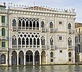
- Nomination Ca' d'Oro in Venice--Archaeodontosaurus 09:47, 16 July 2011 (UTC)
- Promotion Good quality. --Berthold Werner 10:13, 16 July 2011 (UTC)
-

- Nomination A Arnoia. Río Miño. Galicia--Lmbuga 23:02, 15 July 2011 (UTC)
- Promotion Good quality. --Mbdortmund 02:29, 16 July 2011 (UTC)
-

- Nomination Seagulls in the Miño river, Galicia--Lmbuga 22:44, 15 July 2011 (UTC)
- Decline reflections on the water posterisized --Mbdortmund 02:29, 16 July 2011 (UTC)
-

- Nomination Boat in the river Miño, A Arnoia--Lmbuga 22:10, 15 July 2011 (UTC)
- Promotion Good quality. --Mbdortmund 02:31, 16 July 2011 (UTC)
-

-

-

-

- Nomination Religious monument, Vielle-Adour, France --France64160 20:24, 15 July 2011 (UTC)
- Decline Disturbing background, tight crop above.--Jebulon 10:03, 16 July 2011 (UTC)
-

- Nomination Duck, Vielle-Adour, France --France64160 20:24, 15 July 2011 (UTC)
- Decline Sorry, blurry, poor quality--Lmbuga 22:22, 15 July 2011 (UTC)
-

- Nomination Beautiful peruvian lemons --Dtarazona 19:22, 15 July 2011 (UTC)
- Decline crop, not crisp enough, strange reflections in the background --Mbdortmund 02:26, 16 July 2011 (UTC)
-

- Nomination A bus in Lima from inside --Dtarazona 19:22, 15 July 2011 (UTC)
- Decline very noisy, strong CA --Mbdortmund 02:27, 16 July 2011 (UTC)
-

- Nomination Church of St. Mark the Evangelist in Mielec --Kroton 18:59, 15 July 2011 (UTC)
- Promotion nice --Taxiarchos228 19:09, 15 July 2011 (UTC)
-

- Nomination The head of the Pereslavl district Alexander Rychkov participates a village holiday. --PereslavlFoto 15:21, 15 July 2011 (UTC)
- Promotion Maybe could you consider a crop at right (too much useless space IMO), but good portrait for QI.--Jebulon 10:06, 16 July 2011 (UTC)
-

- Nomination BPC Dixmude (L9015) on the 14th of July 2011, one day after she arrived in Toulon from Saint-Nazaire for fitting out. -- Rama 15:12, 15 July 2011 (UTC)
- WARNING: third template parameter added – please remove.
-

- Nomination The Krasiczyn Palace: Papal Tower --Przykuta 12:51, 15 July 2011 (UTC)
- Decline too dark and noisy --Taxiarchos228 13:15, 15 July 2011 (UTC)
-

- Nomination The Krasiczyn Palace: Divine Tower --Przykuta 12:51, 15 July 2011 (UTC)
- Decline too dark --Taxiarchos228 13:15, 15 July 2011 (UTC)
-

- Nomination A head of Miniature Schnauzer --Przykuta 12:51, 15 July 2011 (UTC)
- Promotion Good quality. --Taxiarchos228 13:16, 15 July 2011 (UTC)
-
- Nomination Tour des Pénitents in Mende, France. --Myrabella 12:22, 15 July 2011 (UTC)
- Promotion Good quality and nice --Taxiarchos228 13:15, 15 July 2011 (UTC)
-

- Nomination Villa Ephrussi de Rothschild --Berthold Werner 08:26, 15 July 2011 (UTC)
- Promotion Good quality. --Taxiarchos228 13:16, 15 July 2011 (UTC)
-

- Nomination Dossenbach: Protestant Church --Taxiarchos228 07:14, 15 July 2011 (UTC)
- Promotion Good quality. --Mbdortmund 02:33, 16 July 2011 (UTC)
-

- Nomination Hasel: Protestant Church --Taxiarchos228 07:14, 15 July 2011 (UTC)
- Promotion Good --Jebulon 10:02, 16 July 2011 (UTC)
-
-
- Nomination Grenzach-Wyhlen: Saint Georg Church, tabernacle --Taxiarchos228 07:35, 11 July 2011 (UTC)
- Promotion Good. Suited category added--Jebulon 09:57, 16 July 2011 (UTC)
-

- Nomination Bettingen: St. Chrischona Television Tower (tripod construction and tower basement) --Taxiarchos228 07:05, 11 July 2011 (UTC)
- Promotion Good.--Jebulon 09:58, 16 July 2011 (UTC)
-

-

- Nomination Rabboni by Gutzon Borglum, 1909, Wasington, DC--Missvain 14:12, 9 July 2011 (UTC)
- WARNING: third template parameter added – please remove.
-
- Nomination Australian Plague Locusts by User:99of9 --Hoangquan hientrang 12:33, 9 July 2011 (UTC)
- Decline Not sharp enough, out of focus IMO. Background noisy --Jebulon 09:30, 16 July 2011 (UTC)
-

-

-

-
- Nomination M.V. Northern Osprey in the harbour of Halifax --Taxiarchos228 10:53, 8 July 2011 (UTC)
- Promotion Prow (bow ?) a bit dark, but QI to me.--Jebulon 08:27, 16 July 2011 (UTC)
-

- Nomination Lörrach: Holy Family Church --Taxiarchos228 10:53, 8 July 2011 (UTC)
- Promotion Comment Perhaps a more symmetric crop? Would also remove the car. --Ikar.us 11:13, 8 July 2011 (UTC) The crop and composition work to me. The car is not too much disturbing. Light is good and I assume it was hard to take (the glass windows)--Jebulon 08:34, 16 July 2011 (UTC)
-

- Nomination Weil am Rhein: Peter and Paul Church (interior) --Taxiarchos228 10:53, 8 July 2011 (UTC)
- Decline Noisy, strange aberrations of perspective due to correction (top of the pillar at right, for instance), blown up parts.--Jebulon 08:31, 16 July 2011 (UTC)
-

- Nomination Art nouveau town hall of Ebingen, Germany --Ikar.us 10:32, 8 July 2011 (UTC)
- Decline Comment Strong (to me) chromatic aberrations: Top of the tower, arcs of the left, clock. Perhaps little perspective distortion. --Lmbuga 19:39, 8 July 2011 (UTC)+ noise. --Jebulon 08:36, 16 July 2011 (UTC)
-
-

- Nomination France, Saint-Paul-de-Vence --Berthold Werner 06:47, 8 July 2011 (UTC)
- Promotion Good --Jebulon 08:41, 16 July 2011 (UTC)
-
- Nomination Schwörstadt: Catholic Church, organ --Taxiarchos228 07:14, 15 July 2011 (UTC)
- Promotion A bit soft, probably due to denoising, but good.--Jebulon 08:46, 15 July 2011 (UTC)
-

- Nomination A piece of chicharron --Dtarazona 05:20, 15 July 2011 (UTC)
- Decline DOF too short and compositin is not convincing too me --Berthold Werner 06:54, 15 July 2011 (UTC)
-

- Nomination Cleaning the church for Inti Raymi fest --Dtarazona 05:20, 15 July 2011 (UTC)
- Promotion Good quality. --Berthold Werner 07:46, 15 July 2011 (UTC)
-

- Nomination Miño river near the mouth of the Arnoia river. A Arnoia--Lmbuga 00:45, 15 July 2011 (UTC)
- Promotion Good quality. --Berthold Werner 06:54, 15 July 2011 (UTC)
-

- Nomination Arnoia river ending at the Miño river--Lmbuga 00:45, 15 July 2011 (UTC)
- Promotion Good quality. --Berthold Werner 06:54, 15 July 2011 (UTC)
-

-

- Nomination A very rare virtue... Detail of the southern bronze doors of the Florence Baptistery, Italy.--Jebulon 22:48, 14 July 2011 (UTC)
- Promotion QI for me--Lmbuga 00:51, 15 July 2011 (UTC)
-

- Nomination Detail of a sculpted lion, Florence, Italy.--Jebulon 22:02, 14 July 2011 (UTC)
- Promotion Good quality. --Taxiarchos228 06:46, 15 July 2011 (UTC)
-

- Nomination The Temple Neuf in Metz (France), seen from the Quai Paul Vautrin -- MJJR 21:00, 14 July 2011 (UTC)
- Promotion Good quality. --Taxiarchos228 06:46, 15 July 2011 (UTC)
-

- Nomination The Temple Neuf in Metz (France), seen from the Place de la Comédie -- MJJR 21:00, 14 July 2011 (UTC)
- Promotion Good quality. --Taxiarchos228 06:46, 15 July 2011 (UTC)
-

- Nomination The train station of Maizières-lès-Metz (France) -- MJJR 21:00, 14 July 2011 (UTC)
- Promotion Good quality. --Taxiarchos228 06:46, 15 July 2011 (UTC)
-

-

-

- Nomination Morpho menelaus --Archaeodontosaurus 14:48, 14 July 2011 (UTC)
- Promotion QI for me--Lmbuga 00:57, 15 July 2011 (UTC)
-

-

- Nomination A fossil shell of the marine gastropod Oliva sayana--Llez 11:01, 14 July 2011 (UTC)
- Promotion Support QI & Useful --Archaeodontosaurus 14:55, 14 July 2011 (UTC)
-
- Nomination View from the garden of the Villa Ephrussi de Rothschild towards Villefranche sur mer --Berthold Werner 08:33, 14 July 2011 (UTC)
- Promotion Support QI for me --Archaeodontosaurus 17:01, 14 July 2011 (UTC)
-
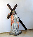
- Nomination Schliengen: Saint Leodegar Church, life-size statue of Jesus luging cross --Taxiarchos228 07:01, 14 July 2011 (UTC)
- Promotion QI for me--Lmbuga 20:15, 14 July 2011 (UTC)
-

- Nomination Schliengen: Saint Leodegar Church, side view into nave --Taxiarchos228 07:01, 14 July 2011 (UTC)
- Promotion Support QI for me --Archaeodontosaurus 14:51, 14 July 2011 (UTC)
-

- Nomination The Portail de la Vierge, Saint-Etienne cathedral, Metz, France -- MJJR 21:14, 13 July 2011 (UTC)
- Promotion Comment Good level of detail, acceptable noise level in the shade. I'd suggest a little tighter crop on the bottom (to get rid of the man with the hat)--Ankara 21:24, 13 July 2011 (UTC)
Very good quality, perhaps the composition can be improvable--Lmbuga 00:46, 14 July 2011 (UTC) Done Cropped. Thanks for your suggestions. -- MJJR 13:31, 14 July 2011 (UTC)
-
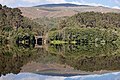
- Nomination River Miño in A Arnoia--Lmbuga 20:49, 13 July 2011 (UTC)
- Promotion Support QI for me --Archaeodontosaurus 14:57, 14 July 2011 (UTC)
-

- Nomination Sculpture Die Trauernde in Oberhausen --Carschten 20:06, 13 July 2011 (UTC)
- Promotion Support QI for me --Archaeodontosaurus 15:01, 14 July 2011 (UTC)
-

- Nomination Ludwigsforum at Duisburg Inner Harbour --Carschten 19:28, 13 July 2011 (UTC)
- Promotion Good quality. --Taxiarchos228 06:47, 15 July 2011 (UTC)
-

- Nomination Paris: Champ-de-Mars --Taxiarchos228 07:05, 11 July 2011 (UTC)
- Decline Seems tilted (horizon), and strong perspective distorsion both sides, especially at left (Panthéon, Jussieu tower, Invalides...).--Jebulon 23:29, 14 July 2011 (UTC)
-

- Nomination Same fishing gazebo on Lake Mohonk from another angle and with different lighting. --Fred Hsu 04:14, 10 July 2011 (UTC)
- Decline chromatic aberrations, bad composition (too much and disturbing space at top, too tight at bottom and at right) --Carschten 15:26, 13 July 2011 (UTC)
I am too tired and busy to rework this image right now. It's not clear there is anything I can do with CA any way. Oh well. Fred Hsu 04:08, 15 July 2011 (UTC)
-
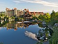
- Nomination Front view of Mohonk Mountain House (pic3). Not as panoramic as pic1 and pic2, but includes fishing gazebo. --Fred Hsu 03:32, 10 July 2011 (UTC)
- Decline a lot of overexposed parts, perspective distortions --Carschten 15:26, 13 July 2011 (UTC)
I do not agree on over-exposure - check other QI'ed images here for comparison. Distortion I can fix with DxO, then rerun my editing workflow. I'll give it a try again next time. Fred Hsu 04:08, 15 July 2011 (UTC)
-

-

- Nomination Rabastens-De-Bigorre Market Hall -- Florent Pécassou 17:03, 5 July 2011 (UTC)
- Decline Comment perspective distortions --Carschten 13:20, 9 July 2011 (UTC) Oppose Tilted.--H005 21:01, 12 July 2011 (UTC)
-

- Nomination Rabastens-de-Bigorre central fountain -- Florent Pécassou 17:03, 5 July 2011 (UTC)
- Decline Oppose Chromatic aberrations need to be removed. -- H005 21:01, 12 July 2011 (UTC)
-

-

-

- Nomination The Moselle River in Metz, France -- MJJR 21:14, 13 July 2011 (UTC)
- Promotion Good details, nice view --Mbdortmund 05:10, 14 July 2011 (UTC)
-

-

- Nomination River Miño in A Arnoia--Lmbuga 20:49, 13 July 2011 (UTC)
- Promotion Good quality. --Mbdortmund 05:12, 14 July 2011 (UTC)
-

-

- Nomination Keziah Jones at the Eurockénnes de Belfort 2011. -- Rama 19:46, 13 July 2011 (UTC)
- Promotion Good quality. --Mbdortmund 05:13, 14 July 2011 (UTC)
-

-

- Nomination View from the garden of the Villa Ephrussi de Rothschild towards Villfranche sur mer --Berthold Werner 09:21, 13 July 2011 (UTC)
- Promotion Good quality. --Mbdortmund 05:16, 14 July 2011 (UTC)
-

- Nomination Galerie des Glaces (Hall of Mirrors), Palace of Versailles. --Myrabella 08:15, 13 July 2011 (UTC)
- Promotion Support QI for me --Archaeodontosaurus 16:45, 13 July 2011 (UTC)
-

-

- Nomination Château de Chantilly, France.--Jebulon 21:51, 12 July 2011 (UTC)
- Decline aslope (correctable), but very noisy and with strong artefacts (I guess it's not correctable) --Taxiarchos228 08:25, 13 July 2011 (UTC)Sorry, I don't understand the word "aslope"...--Jebulon 08:58, 13 July 2011 (UTC)
in French: "oblique" --Taxiarchos228 08:59, 13 July 2011 (UTC)Something like "tilted" ?--Jebulon 14:46, 13 July 2011 (UTC)
-

- Nomination Coat of arms in Ribadavia, Galicia--Lmbuga 12:34, 12 July 2011 (UTC)
- Promotion Support QI for me --Archaeodontosaurus 16:49, 13 July 2011 (UTC)
-

-

- Nomination Tugboat --Vitold Muratov 23:58, 10 July 2011 (UTC)
- Decline contrastless --Carschten 15:26, 13 July 2011 (UTC)
-

- Nomination Gèze Coat -- Florent Pécassou 18:59, 10 July 2011 (UTC)
- Decline unsharp --Carschten 15:26, 13 July 2011 (UTC)
-

-

- Nomination Park of the CHâteau de Chantilly, by Le Nôtre. Due to the thumbnail generation problem, please open it at full size, the slight tilt has been corrected by rotation, Thx.--Jebulon 17:16, 10 July 2011 (UTC)
- Decline low sharpness, blurry at left, harsh light (no details on lots of statues), CA - sorry! Very nice view+comp though... --Carschten 15:26, 13 July 2011 (UTC)
-

- Nomination Castelnau-Magnoac older school --Florent Pécassou 16:08, 10 July 2011 (UTC)
- Decline good quality, but perspective distortion --Carschten 15:26, 13 July 2011 (UTC)
-

-

- Nomination Slade at Sofia Rocks 2011. --MrPanyGoff 14:08, 10 July 2011 (UTC)
- Decline disturbing foreground --Carschten 15:26, 13 July 2011 (UTC)
-

- Nomination Mal McNulty with Slade. --MrPanyGoff 12:15, 10 July 2011 (UTC)
- Promotion good (but too bad that all the most images are so small) --Carschten 15:26, 13 July 2011 (UTC)
-

-

-

-

- Nomination CoA of Anne de Montmorency, Chantilly, France.--Jebulon 14:10, 9 July 2011 (UTC)
- Promotion nice --Carschten 15:33, 13 July 2011 (UTC)
-

-

- Nomination Magnoac lake --Florent Pécassou 19:15, 8 July 2011 (UTC)
- Decline pixelated (artifacts) --Carschten 16:11, 13 July 2011 (UTC)
-

- Nomination Bérenx war memorial, France --France64160 13:21, 8 July 2011 (UTC)
- Promotion ok --Carschten 16:11, 13 July 2011 (UTC)
-

- Nomination Labastide-Cézéracq church, France --France64160 13:21, 8 July 2011 (UTC)
- Decline poor quality, perspective distortion --Carschten 16:11, 13 July 2011 (UTC)
-

-

-

-

- Nomination M.V. Northern Osprey in the harbour of Halifax (rearview) --Taxiarchos228 10:53, 8 July 2011 (UTC)
- Decline blown white, could be sharper --Carschten 16:11, 13 July 2011 (UTC)
-

- Nomination Miélan Playground--Florent Pécassou 09:37, 8 July 2011 (UTC)
- Decline blown out/overexposed sky --Carschten 16:11, 13 July 2011 (UTC)
-

- Nomination: Berliner wall crossed on the bicycle (street sign 2011)--DeeMusil 05:02, 8 July 2011 (UTC)
- Review needed
-

- Nomination: John Garcia at the Eurockéennes de Belfort 2011. -- Rama 21:02, 7 July 2011 (UTC)
- Review needed
-

- Nomination: Stars constellations. --ComputerHotline 15:39, 7 July 2011 (UTC)
- Review needed
-

- Nomination: Rescue car in Ramzova, Czech Republic --Pudelek 13:44, 7 July 2011 (UTC)
- Review needed
-

- Nomination: Czechoslovak truck Praga V3S in Ramzova, Czech Republic --Pudelek 13:44, 7 July 2011 (UTC)
- Review needed
-

- Nomination: La Renommée du Roi by Domenico Guidi, Versailles. --Coyau 12:41, 7 July 2011 (UTC)
- Review needed
-

- Nomination: La Renommée du Roi by Domenico Guidi, Versailles. --Coyau 12:41, 7 July 2011 (UTC)
- Review needed
-

- Nomination: La Renommée du Roi by Domenico Guidi, Versailles. --Coyau 12:41, 7 July 2011 (UTC)
- Review needed
-

- Nomination: La Renommée du Roi by Domenico Guidi, Versailles. --Coyau 12:41, 7 July 2011 (UTC)
- Review needed
-

- Nomination: Feet of Faustina Minor, by Nicolas Frémery, Versailles. --Coyau 12:16, 7 July 2011 (UTC)
- Review needed
-

- Nomination: Medieval parish church in Lorrha, County Tipperary, Ireland. --AFBorchert 08:18, 7 July 2011 (UTC)
- Review The trees at left are a bit too dark IMO.--Jebulon 09:57, 7 July 2011 (UTC). Thanks for your comment: The trees are dark but not blackened, please be also refered to COM:I#Your monitor. --AFBorchert 11:34, 7 July 2011 (UTC)
Comment Nice, but, needs perspective correction: the verical lines aren't stright. To me, dark trees--Lmbuga 11:51, 7 July 2011 (UTC)@AFBorchert: My monitor is fine with the three circles, thank you. I really find the trees a bit dark (not blackened). Matter of taste ?--Jebulon 15:22, 7 July 2011 (UTC)
-

- Nomination Flower Crab Spider on Common Yarrow. --Quartl 05:35, 13 July 2011 (UTC)
- Promotion Support QI & Useful --Archaeodontosaurus 05:50, 13 July 2011 (UTC)
-

- Nomination Anosin Monastery near Moscow: Gate church. A.Savin 19:11, 12 July 2011 (UTC)
- Promotion Good quality. --Saffron Blaze 19:33, 12 July 2011 (UTC)
-

- Nomination Anosin Monastery near Moscow: Nun cells. A.Savin 19:11, 12 July 2011 (UTC)
- Promotion If there is room the right would add to an already good image. --Saffron Blaze 19:33, 12 July 2011 (UTC)
-

- Nomination Anosin Monastery near Moscow: The cathedral. A.Savin 19:11, 12 July 2011 (UTC)
- Promotion Good quality. --Saffron Blaze 19:33, 12 July 2011 (UTC)
-

- Nomination Mitch Altman at the 27th Chaos Communication Congress, by AlexanderKlink. -- Rama 17:44, 12 July 2011 (UTC)
- Decline Too much shadow on the left side. --H005 20:54, 12 July 2011 (UTC)
-

- Nomination Dan Bernstein at the 27th Chaos Communication Congress, by AlexanderKlink. -- Rama 17:44, 12 July 2011 (UTC)
- Promotion Good. --H005 20:54, 12 July 2011 (UTC)
-

- Nomination Meredith L. Patterson at the 27th Chaos Communication Congress, by AlexanderKlink. -- Rama 17:44, 12 July 2011 (UTC)
- Promotion Very good --H005 20:54, 12 July 2011 (UTC)
-

- Nomination Len Sassaman at the 27th Chaos Communication Congress, by AlexanderKlink. -- Rama 17:44, 12 July 2011 (UTC)
- Promotion Good (altough DOF could have been better). --H005 20:54, 12 July 2011 (UTC)
-

- Nomination Mountain biking in Alps. --PetarM 16:14, 12 July 2011 (UTC)
- Promotion Good quality. --Saffron Blaze 17:08, 12 July 2011 (UTC)
-

- Nomination Portal of the church of San Xoán of Ribadavia (s.XII) --Lmbuga 15:05, 12 July 2011 (UTC)
- Promotion Good quality. --Mbdortmund 17:19, 12 July 2011 (UTC)
-

- Nomination Window of the church of San Xoán of Ribadavia (s.XII) --Lmbuga 15:05, 12 July 2011 (UTC)
- Promotion Good quality. --Mbdortmund 17:20, 12 July 2011 (UTC)
-

- Nomination Bell tower of the church of San Xoán of Ribadavia (s.XII) --Lmbuga 15:05, 12 July 2011 (UTC)
- Promotion High quality photo -- George Chernilevsky 19:14, 12 July 2011 (UTC)
-

- Nomination Chapitel of the church of San Xoán of Ribadavia (s.XII) --Lmbuga 15:05, 12 July 2011 (UTC)
- Promotion Good -- George Chernilevsky 19:22, 12 July 2011 (UTC)
-

- Nomination Chapitel of the church of San Xoán of Ribadavia (s.XII) --Lmbuga 15:05, 12 July 2011 (UTC)
- Promotion Good -- George Chernilevsky 19:22, 12 July 2011 (UTC)
-

- Nomination Amagasaki City Library in Amagasaki --663highland 13:44, 12 July 2011 (UTC)
- Promotion QI to me, but a little CA on the lateral borders of the right window--Lmbuga 14:02, 12 July 2011 (UTC)
-
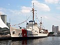
-
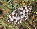
-

- Nomination Black-tailed Skimmer. --Quartl 08:47, 12 July 2011 (UTC)
- Promotion Good quality. --Mbdortmund 17:22, 12 July 2011 (UTC)
-

- Nomination Schliengen: Saint Leodegar Church, general view from southwest --Taxiarchos228 06:42, 12 July 2011 (UTC)
- Promotion Comment Der Kondensstreifen ist irritierend, so als ginge er durch den Turm. --Berthold Werner 09:36, 12 July 2011 (UTC)
kann den gerne bei Gelegenheit entfernen, verfälscht die Tatsachen vor Ort ja nicht :) --Taxiarchos228 09:44, 12 July 2011 (UTC)
contrails retouched now --Taxiarchos228 14:07, 12 July 2011 (UTC)
Ok now --Berthold Werner 15:43, 12 July 2011 (UTC)
-

- Nomination Façade of the chapel of the Château de Chantilly, France.--Jebulon 23:54, 11 July 2011 (UTC)
- Decline The image is oversharpened which yields haloes especially visible on the pinnacle. I assume the latter is leaning in real life too? W.S. Wetenschatje 06:40, 13 July 2011 (UTC)~
-

-

- Nomination: Lunar Double-stripe (Minucia lunaris) foraging. --Le.Loup.Gris 09:43, 7 July 2011 (UTC)
- Review needed
-

- Nomination: Saint-Paul-de-Vence, Le Vieux Moulin --Berthold Werner 08:29, 7 July 2011 (UTC)
- Review needed
-

- Nomination Tiken Jah Fakoly at the Eurockéennes de Belfort 2011. -- Rama 10:09, 6 July 2011 (UTC)
- Decline Oppose Ok composition. But it seems to be a focus problem here, the forehead is not in focus.--Ankara 09:42, 12 July 2011 (UTC)
Composition and light is great! But I agree about the sharpness. -- H005 21:12, 12 July 2011 (UTC)
-

-
-

-

- Nomination Saint Paul's Gate, part of the medieval fortifications at Rhodes, Greece.--Jebulon 21:19, 4 July 2011 (UTC)
- Promotion Comment can you remove the leaves (see annotation)? --Carschten 12:55, 9 July 2011 (UTC) Thanks for review. Done, but not visible at thumbnail...--Jebulon 21:02, 11 July 2011 (UTC) good--Ankara 12:41, 12 July 2011 (UTC)
-

-

- Nomination France, Cap Ferrat, Villa Ephrussi de Rothschild --Berthold Werner 09:36, 12 July 2011 (UTC)
- Promotion Good quality--Lmbuga 10:09, 12 July 2011 (UTC)
-

-

-

- Nomination Marmelade Fly. --Quartl 08:47, 12 July 2011 (UTC)
- Promotion Very good quality. --Berthold Werner 09:48, 12 July 2011 (UTC)
-

-

-

- Nomination Bursa, Turkey. --Eusebius 07:00, 12 July 2011 (UTC)
- Promotion not perfect but good --Taxiarchos228 07:05, 12 July 2011 (UTC)
-

- Nomination Schliengen: Saint Leodegar Church, pulpit --Taxiarchos228 06:42, 12 July 2011 (UTC)
- Promotion Good quality, very good considering that it's a interior--Lmbuga 10:19, 12 July 2011 (UTC)
-
- Nomination Schliengen: Saint Leodegar Church, main fresco --Taxiarchos228 06:42, 12 July 2011 (UTC)
- Promotion Good quality. To me the corners at left are a bit dark; or perhaps the corners at right are a bit clear--Lmbuga 10:26, 12 July 2011 (UTC)
-
- Nomination Schliengen: Saint Leodegar Church, holy water font --Taxiarchos228 06:42, 12 July 2011 (UTC)
- Promotion Very nice ! --Jebulon 08:45, 12 July 2011 (UTC)
-

- Nomination Former hospital, Auch, Gers, France -- Florent Pécassou 23:30, 11 July 2011 (UTC)
- Decline aslope, noisy, bad exposure, ugly shadow --Taxiarchos228 06:33, 12 July 2011 (UTC)
-

- Nomination Odet de Coligny, by (attributed to) François Clouet. Château de Chantilly.
Please open the file, the version shown in thumbnail is not the good one...--Jebulon 22:40, 11 July 2011 (UTC) - Promotion Support QI for me --Archaeodontosaurus 05:56, 12 July 2011 (UTC)
- Nomination Odet de Coligny, by (attributed to) François Clouet. Château de Chantilly.
-

- Nomination Horse stables, musée vivant du cheval, Chantilly.--Jebulon 22:21, 11 July 2011 (UTC)
- Promotion Good quality. --Taxiarchos228 06:10, 12 July 2011 (UTC)
-

- Nomination The CoA of the Princes of Condé.--Jebulon 22:04, 11 July 2011 (UTC)
- Promotion Good quality. --Taxiarchos228 06:10, 12 July 2011 (UTC)
-

- Nomination Castle of Ribadavia--Lmbuga 19:59, 11 July 2011 (UTC)
- Promotion Good quality. --Taxiarchos228 06:10, 12 July 2011 (UTC)
-

- Nomination Castle of Ribadavia (detail)--Lmbuga 19:59, 11 July 2011 (UTC)
- Promotion Good quality. --Taxiarchos228 06:11, 12 July 2011 (UTC)
-
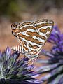
- Nomination Apharitis acamas --Gidip 15:54, 11 July 2011 (UTC)
- Promotion Good quality. --Mbdortmund 17:39, 11 July 2011 (UTC)
-

- Nomination Cube annex of the Museum Küppersmühle, Duisburg Inner Harbour --Carschten 14:14, 11 July 2011 (UTC)
- Promotion Good quality. --Mbdortmund 17:41, 11 July 2011 (UTC)
-

- Nomination France, Cap Ferrat, view from the Villa Ephrussi de Rothschild towards the garden. --Berthold Werner 13:35, 11 July 2011 (UTC)
- Promotion Good quality. --Mbdortmund 17:41, 11 July 2011 (UTC)
-

- Nomination Duisburg Synagogue --Carschten 12:35, 11 July 2011 (UTC)
- Promotion Good quality. --Mbdortmund 17:42, 11 July 2011 (UTC)
-

-

- Nomination USS Torsk (SS-423) --Jovianeye 12:07, 11 July 2011 (UTC)
- Promotion Good quality. --Mbdortmund 17:44, 11 July 2011 (UTC)
-

- Nomination Lokomotive ČSD Class E 669.2 --Pudelek 12:00, 11 July 2011 (UTC)
- Promotion Good quality. --Mbdortmund 17:44, 11 July 2011 (UTC)
-

- Nomination Cigaritis cilissa. --Gidip 09:57, 11 July 2011 (UTC)
- Promotion Good quality. --Mbdortmund 17:45, 11 July 2011 (UTC)
-

- Nomination Cigaritis cilissa foraging on Eryngium. --Gidip 09:57, 11 July 2011 (UTC)
- Promotion Good quality. --Mbdortmund 17:45, 11 July 2011 (UTC)
-

- Nomination Petar Gyuzelev at Flower for Gosho Fest. --MrPanyGoff 06:43, 11 July 2011 (UTC)
- Promotion Support good.--Ankara 10:00, 12 July 2011 (UTC)
-

- Nomination Town hall of Ribadavia, Galicia (Spain)--Lmbuga 22:11, 10 July 2011 (UTC)
- Promotion Support Geocoding would replace the image in the geographical context and come and see ... --Archaeodontosaurus 05:53, 11 July 2011 (UTC)
Added. Thanks--Lmbuga 12:33, 11 July 2011 (UTC)
-

- Nomination Melanargia russiae, male. --Le.Loup.Gris 21:32, 10 July 2011 (UTC)
- Promotion Good--Lmbuga 22:12, 10 July 2011 (UTC) I would prefer a less tight crop at the top, and maybe also on the right. Gidip 16:51, 11 July 2011 (UTC) I’ve downloaded a new version here. --Le.Loup.Gris 20:03, 11 July 2011 (UTC)
-

-

- Nomination Ceiling of the chapel of the Château de Chantilly, France--Jebulon 21:57, 8 July 2011 (UTC)
- Promotion could be better quality, but good enough for QI, very nice ceiling --Taxiarchos228 06:35, 12 July 2011 (UTC)
-

- Nomination Magnoac lake --Florent Pécassou 19:00, 8 July 2011 (UTC)
- Decline Badly tilted, unsharp. Yerpo 05:54, 11 July 2011 (UTC) OpposeLack of quality seen in full size.--Ankara 10:09, 12 July 2011 (UTC)
-

- Nomination Protestant Church, bell tower --Taxiarchos228 10:53, 8 July 2011 (UTC)
- Promotion Support Good. --Ankara 10:06, 12 July 2011 (UTC)
-

- Nomination Dutch trailing suction hopper dredger DC Vlaanderen 3000 moored in Zeebrugge, Belgium -- MJJR 20:48, 7 July 2011 (UTC)
- Promotion Good quality. --Taxiarchos228 14:21, 11 July 2011 (UTC)
-

- Nomination Ludwig Canal --Vitold Muratov 22:10, 6 July 2011 (UTC)
- Decline OpposeI really regret this but the quality is not sufficient. The composition is excellent, but the picture does not look good viewed at full size.-Ankara 10:33, 12 July 2011 (UTC)
-
- Nomination Crane.Shipyard --Vitold Muratov 18:54, 6 July 2011 (UTC)
- Decline Oppose Lack of sharpness.--Ankara 09:48, 12 July 2011 (UTC)
-

- Nomination Tomb of saint fool Misha-Samuel. Trinity suburb, Pereslavl region. PereslavlFoto 13:56, 6 July 2011 (UTC)
- Promotion Support Ok.--Ankara 09:42, 12 July 2011 (UTC)
-

-

- Nomination: Hasel: Protestant Church (bell tower) --Taxiarchos228 07:27, 5 July 2011 (UTC)
- Review Comment The image can be QI, but, to me, tilted--Lmbuga 23:33, 5 July 2011 (UTC)
-

- Nomination Chata Jiřího mountain hut on the Šerak --Pudelek 22:10, 3 July 2011 (UTC)
- Promotion Comment I love this picture, but it's got too aggressive denoising and sharpening. Don't you think the ground, dirty and gravel look very odd? The far buildings are also very weird by they are just tiny specks we can ignore them. Fred Hsu 01:01, 11 July 2011 (UTC) Comment I know, that isn't perfect, but I think that quality is sufficient --Pudelek 09:16, 11 July 2011 (UTC)
Acceptable IMHO. --H005 22:12, 11 July 2011 (UTC)
-

-

- Nomination Cloister of Saint-Sever-de-Rustan abbey --Florent Pécassou 22:50, 1 July 2011 (UTC)
- Decline New version, with less chromatic aberrations (see left side of the building), perspective correction and light. If you want, you can delete the version--Lmbuga 00:08, 2 July 2011 (UTC) Comment IMHO the previous version was better. The new one has issues with the colours and strange artefacts (You can see this best in the grass). -- H005 10:50, 9 July 2011 (UTC)
You're right. Sorry. I revert the version--Lmbuga 20:39, 9 July 2011 (UTC)
Tilt, CA. I believe both can be fixed easily, but for the lack of reaction I have to oppose. --H005 22:07, 11 July 2011 (UTC)
-

- Nomination La Terre (1681) by Benoît Massou, Palace of Versailles. --Myrabella 06:25, 11 July 2011 (UTC)
- Promotion Good quality. --Taxiarchos228 07:36, 11 July 2011 (UTC)
-

- Nomination Palazzo Dolfin-Manin Venice --Archaeodontosaurus 05:48, 11 July 2011 (UTC)
- Promotion Good quality. --Taxiarchos228 07:05, 11 July 2011 (UTC)
-

- Nomination Flowering plant of Jacob's Ladder (Polemonium caeruleum). --Bff 21:20, 10 July 2011 (UTC)
- Promotion Sharp and nice--Lmbuga 22:17, 10 July 2011 (UTC)
-

- Nomination Памятник Жаку Картье --Vitold Muratov 23:07, 10 July 2011 (UTC)
- Decline Comment it is the statue of the explorer Jacques Cartier by Georges Bareau, in Saint-Malo, Brittany, France. --Jebulon 21:12, 10 July 2011 (UTC)
Low contrast and chromatic aberrations--Lmbuga 00:29, 11 July 2011 (UTC)
-

- Nomination The prince (Agaricus augustus) -- George Chernilevsky 20:47, 10 July 2011 (UTC)
- Promotion Good quality --Lmbuga 22:15, 10 July 2011 (UTC)
-

- Nomination Christophe Mali, of Tryo, at the Eurockéennes de Belfort 2011 -- Rama 18:40, 10 July 2011 (UTC)
- Decline noisy, lacking sharpness, partial overexposured --Taxiarchos228 07:06, 11 July 2011 (UTC)
-

- Nomination Portal sec XIII-XIV. Church of San Domingos, Ribadavia--Lmbuga 17:29, 10 July 2011 (UTC)
- Promotion I think you need to rotate this image just one tiny bit to the right. I've downloaded your image and tried that. I went by gut feeling not by grid lines. Fred Hsu 18:17, 10 July 2011 (UTC)
Thanks. New version--Lmbuga 22:57, 10 July 2011 (UTC)
Cool --Fred Hsu 00:12, 11 July 2011 (UTC)
-

- Nomination The ISS as seen by the crew of STS-134. (by Xshadow) --Snake311 16:42, 10 July 2011 (UTC)
- Decline picture was not made by a wikipedian --Taxiarchos228 17:12, 10 July 2011 (UTC)
-

- Nomination Castelnau-Magnoac coleegiate church --Florent Pécassou 16:08, 10 July 2011 (UTC)
- WARNING: third template parameter added – please remove.
-

- Nomination Louis XIV of France. photo by Paris 16 --Fred Hsu 15:29, 10 July 2011 (UTC)
- Decline Sorry no. Not made by a wikimedian. The uploader is not the author.--Jebulon 16:16, 10 July 2011 (UTC)
Note this image was replaced by Paris 16's second update. Perhaps old credits need to be changed? Fred Hsu 18:29, 10 July 2011 (UTC)
-

- Nomination Columba livia in Kharkov City. --Vizu 15:23, 10 July 2011 (UTC)
- Decline Composition is not ideal - see bird's decapitated friend --Fred Hsu 15:25, 10 July 2011 (UTC) *Is not the val. image) --Vizu 15:29, 10 July 2011 (UTC)
Noted, but guidlines: "The arrangement of the elements within the image should support depiction of the subject, not distract from it." Fred Hsu 15:33, 10 July 2011 (UTC)
-

- Nomination Bad Bellingen-Bamlach: Saint Peter and Paul --Taxiarchos228 13:52, 10 July 2011 (UTC)
- Promotion I really like this one, but the few over-exposed parts do distract... --Fred Hsu 14:33, 10 July 2011 (UTC)
-

- Nomination Bad Bellingen-Bamlach: Saint Peter and Paul (choir) --Taxiarchos228 13:52, 10 July 2011 (UTC)
- Promotion Good quality. --Fred Hsu 14:08, 10 July 2011 (UTC)
-
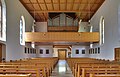
- Nomination Bad Bellingen-Bamlach: Saint Peter and Paul, interior rear view to organ --Taxiarchos228 13:52, 10 July 2011 (UTC)
- Promotion Good quality. --Fred Hsu 14:06, 10 July 2011 (UTC)
-

- Nomination Wehr: Protestant Church --Taxiarchos228 13:52, 10 July 2011 (UTC)
- Decline Composition - subject obscured by trees --Fred Hsu 01:50, 11 July 2011 (UTC)
-

-

- Nomination Detail of a metallic banister, interior of the Château de Chantilly, France.--Jebulon 17:03, 9 July 2011 (UTC)
- Promotion Nice image, but don't you think the man in the background is distracting?not so much IMO. Do you have a different version of this?Yes I do, but with flashy red shirts distracting people. Also find an WP article to house this image? Please feel free to do so, you may find help when looking at the categories .Fred Hsu 17:11, 9 July 2011 (UTC) Welcome back !--Jebulon 18:50, 9 July 2011 (UTC)
Good quality. --Mbdortmund 20:10, 10 July 2011 (UTC)
-

- Nomination André Le Nôtre, by Tony Noël, park of the Château de Chantilly, France.--Jebulon 15:25, 9 July 2011 (UTC)
- Promotion Comment imho the sky should be denoised and the contrail removed --Berthold Werner 13:09, 10 July 2011 (UTC)
Good now. --Berthold Werner 06:41, 11 July 2011 (UTC)
-
- Nomination Château d'Enghien, in the park of the Château de Chantilly, France. --Jebulon 14:48, 9 July 2011 (UTC)
- Decline lacking sharpness, especially at the side of the palace --Taxiarchos228 07:16, 11 July 2011 (UTC)
-
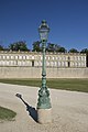
- Nomination A lamp in the park of the Château de Chantilly, France.--Jebulon 14:25, 9 July 2011 (UTC)
- Promotion Good quality. --Taxiarchos228 07:16, 11 July 2011 (UTC)
-

- Nomination France, Menton, Bastion --Berthold Werner 13:21, 9 July 2011 (UTC)
- Promotion Good quality. --Taxiarchos228 07:12, 11 July 2011 (UTC)
-

-

- Nomination Magnoac lake --Florent Pécassou 19:00, 8 July 2011 (UTC)
- Decline Badly tilted, unsharp. Yerpo 05:54, 11 July 2011 (UTC)
-

-

- Nomination Egyptian blogger and human right activist Wael Khalil. -- The Egyptian Liberal 07:20, 5 July 2011 (UTC)
- Decline Composition is not optimal, you should crop out the rightmost part. -- Rama 13:29, 5 July 2011 (UTC) Comment Done -- The Egyptian Liberal 05:13, 6 July 2011 (UTC) Oppose still not by a Commons user! --Carschten 13:21, 9 July 2011 (UTC) Comment The image in question is a derivative work from another image so does that count as an image by a commons user? -- The Egyptian Liberal 21:09, 10 July 2011 (UTC)
No, unfortunately not, derivative work is just derivative work. Especially in this case, when no drastic changes were introduced (if you made a mosaic of a series of photos, for example, that would be a different story). Airwolf 23:54, 10 July 2011 (UTC)
-

- Nomination Vasko The Patch at "Flower for Gosho Fest" 2011. --MrPanyGoff 10:53, 4 July 2011 (UTC)
- Promotion Comment please fix the crop, see annotation --Carschten 12:55, 9 July 2011 (UTC) Done.--MrPanyGoff 10:42, 11 July 2011 (UTC) Support Good quality. --Carschten 12:01, 11 July 2011 (UTC)
-

-

- Nomination Wyhlen: Saint Georg Church (bell tower) --Taxiarchos228 12:14, 3 July 2011 (UTC)
- Decline I know it's white, but even white surfaces have texture. This is completely washed out by direct sunlight. --Fred Hsu 00:57, 11 July 2011 (UTC)
-
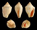
-

-
-
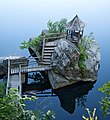
- Nomination Fishing gazebo on Lake Mohonk --Fred Hsu 01:11, 10 July 2011 (UTC)
- Promotion nice composition --Mbdortmund 03:09, 10 July 2011 (UTC)
-

- Nomination Main structures at Mohonk Mountain House --Fred Hsu 23:49, 9 July 2011 (UTC)
- Promotion Good quality. --Saffron Blaze 00:48, 10 July 2011 (UTC)
-

- Nomination Floating dock against reflection of cliff at Mohonk Mountain House --Fred Hsu 23:15, 9 July 2011 (UTC)
- Promotion Good quality. --Saffron Blaze 00:48, 10 July 2011 (UTC)
-

-

- Nomination A sphynx, copy of N.Coustou, by Watrinelle, Château de Chantilly in background--Jebulon 22:34, 9 July 2011 (UTC)
- Promotion Support QI f& Useful --Archaeodontosaurus 08:47, 10 July 2011 (UTC)
-

- Nomination Louis Philippe d'Orléans (1747-1793) by sir Joshua Reynolds, Château de Chantilly, France.--Jebulon 21:44, 9 July 2011 (UTC)
- Promotion How on earth did you take this great picture? You should replace the title image of that article with yours. --Fred Hsu 22:18, 9 July 2011 (UTC)
-

- Nomination Mr.le Prince de Condé by Deseine. 1814. Château de Chantilly, France.--Jebulon 19:50, 9 July 2011 (UTC)
- Promotion Nice balance of light and shadow for this type of material, IMHO --Fred Hsu 20:01, 9 July 2011 (UTC)
-

- Nomination Jacques Bénigne Bossuet by Guillaume, Château de Chantilly, France.--Jebulon 18:44, 9 July 2011 (UTC)
- Promotion QI to me --Fred Hsu 20:56, 9 July 2011 (UTC)
-

- Nomination A christian motto with royalist symbols, ceiling of the chapel of the Château de Chantilly, France.--Jebulon 17:27, 9 July 2011 (UTC)
- WARNING: third template parameter added – please remove.
-

- Nomination Detail of a garden vase, Château de Chantilly, France.--Jebulon 16:20, 9 July 2011 (UTC)
- Promotion This reminds me of my own image of two vases from 2009. Do we really gain much by tagging them QI? Fred Hsu 21:06, 9 July 2011 (UTC) Wrong question IMO. The right question here is : is it, or is it not, a quality image according to the QI guidelines ? --Jebulon 21:47, 9 July 2011 (UTC)
Of course. I agree. Note it was only a 'comment'. Fred Hsu 22:20, 9 July 2011 (UTC)
Good quality. --Mbdortmund 03:11, 10 July 2011 (UTC)
-

-

- Nomination Titanacris Albipes --Archaeodontosaurus 15:24, 9 July 2011 (UTC)
- Promotion QI. --Quartl 16:48, 9 July 2011 (UTC)
-

-

-

- Nomination Plenarsaal des Hamburger Rathaus. --Hoangquan hientrang 12:28, 9 July 2011 (UTC)
- Promotion Yes, the windows are slightly overexposed but the attention is still on the magnificent room. --Saffron Blaze 17:59, 9 July 2011 (UTC)
-
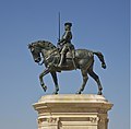
- Nomination Anne de Montmorency, Château de Chantilly, France. --Jebulon 12:10, 9 July 2011 (UTC)
- Promotion quality not perfect, but clear QI though --Carschten 12:26, 9 July 2011 (UTC) Perfection does not exist in this world, ;) thanks anyway --Jebulon 14:10, 9 July 2011 (UTC)
-

- Nomination Aachen: Hof --Carschten 10:15, 9 July 2011 (UTC)
- Promotion Support QI for me --Archaeodontosaurus 15:26, 9 July 2011 (UTC)
-

- Nomination France, old bridge in Tourettes-sur-Loup --Berthold Werner 09:32, 9 July 2011 (UTC)
- Withdrawn Comment nice composition, but clearly overexposed. Also CA and a disturbing lamp pole which should be cropped out (see notes). --Carschten 12:26, 9 July 2011 (UTC)
Danke für die ausführliche Untersuchung. --Berthold Werner 13:14, 9 July 2011 (UTC)
-

-

-

- Nomination Castle of Ribadavia, Galicia (Spain)--Lmbuga 20:48, 8 July 2011 (UTC)
- Withdrawn Comment This image is worse than the other and it's unnecesary that the image can be QI.--Lmbuga 03:49, 10 July 2011 (UTC)
-

- Nomination Castle of Ribadavia, Galicia (Spain)--Lmbuga 20:46, 8 July 2011 (UTC)
- Promotion Good quality. --Mbdortmund 03:17, 10 July 2011 (UTC)
Comment Thanks, I think that this image is better than the other--Lmbuga 03:53, 10 July 2011 (UTC)
-
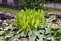
- Nomination 3 AT-3s. --Pontederia cordata surrounded by Nymphaea alba, A Arnoia, Galicia--Lmbuga 11:32, 8 July 2011 (UTC)
- Promotion Background a bit noisy, but the flower is really good --Mbdortmund 03:15, 10 July 2011 (UTC)
-

- Nomination Watching the Inchworm (Geometridae sp.)--DeeMusil 04:12, 8 July 2011 (UTC)
- Promotion
very fair! --Archaeodontosaurus 10:16, 8 July 2011 (UTC)
I love this composition. Fred Hsu 00:48, 10 July 2011 (UTC)
-

- Nomination Dauphine Marie-Antoinette as Hebe, by Drouais. 1773. Musée Condé, Château de Chantilly.--Jebulon 23:46, 7 July 2011 (UTC)
- Promotion Comment colour issue: too blue --Thorvaldsson 09:56, 8 July 2011 (UTC) Agree. Thanks for review. Done Better now ? --Jebulon 22:04, 8 July 2011 (UTC)
QI to me--Lmbuga 20:28, 9 July 2011 (UTC)
-

-

- Nomination The first Romanows mortal place --Vitold Muratov 22:00, 7 July 2011 (UTC)
- Decline Does not meet size requirement --Fred Hsu 22:25, 9 July 2011 (UTC)
-
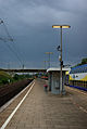
- Nomination platform of Maschen railway station --Schizoschaf 19:20, 7 July 2011 (UTC)
- Promotion interesting atmosphere --Mbdortmund 21:55, 9 July 2011 (UTC)
-

- Nomination Richard Bellia. -- Rama 17:03, 7 July 2011 (UTC)
- Promotion classic portrait, I like it --Mbdortmund 21:56, 9 July 2011 (UTC)
-

-

-

- Nomination Moriarty on stage at the Eurockéennes de Belfort. -- Rama 07:56, 7 July 2011 (UTC)
- Promotion Good quality. --Mbdortmund 21:53, 9 July 2011 (UTC)
-

- Nomination Isolation hospital in Pereslavl, building #4. PereslavlFoto 13:56, 6 July 2011 (UTC)
- Decline too much noise reduction and post-reduction sharpening? --Fred Hsu 19:01, 9 July 2011 (UTC)
-

-

-

-
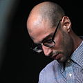
-

-

-

- Nomination Saint-Paul-de-Vence, Place Général de Gaulle --Berthold Werner 08:03, 5 July 2011 (UTC)
- Promotion schön --Carschten 13:20, 9 July 2011 (UTC)
-

- Nomination Bad Bellingen-Bamlach: Saint Peter and Paul (staircase and vaulted ceiling in the bell tower) --Taxiarchos228 07:27, 5 July 2011 (UTC)
- Decline blurry --Carschten 13:20, 9 July 2011 (UTC)
-

- Nomination CoA of the Gramont family, painted ceiling in the Château de Chantilly, France.--Jebulon 22:46, 4 July 2011 (UTC)
- Promotion interesting light --Carschten 12:55, 9 July 2011 (UTC)
-

-
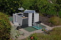
-

-

- Nomination Barry Market Hall (Miélan, Gers, France) -- Florent Pécassou 16:38, 4 July 2011 (UTC)
- Decline tight crop, very dark shadows --Carschten 12:55, 9 July 2011 (UTC)
-

- Nomination Wies: Protestant Church, bell tower (new version) --Taxiarchos228 12:41, 4 July 2011 (UTC)
- Promotion Good quality. --Carschten 12:55, 9 July 2011 (UTC)
-

- Nomination Sightseeing boats waiting for passengers from Jewel of the Seas --Ankara 10:38, 4 July 2011 (UTC)
- Promotion Comment please see annotations. The WB seems a bit too cyan, too. --Carschten 12:55, 9 July 2011 (UTC) Done.--Ankara 13:10, 9 July 2011 (UTC) Support good now (maybe a bit extreme WB correction though) --Carschten 13:36, 9 July 2011 (UTC)
-

-

- Nomination Bad Bellingen: Saint Leodegar Church: bat-voix --Taxiarchos228 08:06, 4 July 2011 (UTC)
- Promotion Good quality. --Carschten 12:55, 9 July 2011 (UTC)
-

- Nomination Bamberg. Schloss Altenburg 3 --Vitold Muratov 21:20, 3 July 2011 (UTC))
- Decline heavy CA; very, very poor quality --Carschten 13:07, 9 July 2011 (UTC)
-
- Nomination Bettingen: St. Chrischona Television Tower --Taxiarchos228 16:54, 3 July 2011 (UTC)
- Promotion Good quality. --Carschten 13:07, 9 July 2011 (UTC)
-
- Nomination Bettingen: St. Chrischona Television Tower (main pod and plattforms) --Taxiarchos228 16:47, 3 July 2011 (UTC)
- Promotion superb quality --Carschten 13:07, 9 July 2011 (UTC)
-

- Nomination Wolfenbuttel.Schloss 1 --Vitold Muratov 18:13, 3 July 2011 (UTC)
- Decline Comment The pincushion distortion should be corrected IMO...--Jebulon 23:00, 3 July 2011 (UTC)
And now?... --Vitold Muratov 17:10, 5 July 2011 (UTC) Oppose below 2 MP --Carschten 13:07, 9 July 2011 (UTC)
-

-

-

-

- Nomination Mosaic ceiling of the Baptistery of Florence, Italy. Fragment.--Jebulon 20:51, 2 July 2011 (UTC)
- Promotion although a more centered version would have been better. Maybe rotating it by 180 degrees would make it look more natural. --H005 11:15, 9 July 2011 (UTC) Agree about the centered version, I did my best given the circumstances. I tried a rotation by 180°, it is ver bad for the Christ...Thanks for review.--Jebulon 15:43, 9 July 2011 (UTC)
-
- Nomination A shot of the 17th century ship Vasa. Only staff is allowed where it was taken from, so there are probably no other freely licensed overhead images of the ship. Peter Isotalo 15:42, 29 June 2011 (UTC)
- Decline Neutral Very valuable indeed, but the photographic quality is just so-so. Too much noise, and I'd prefer a more centered view of the ship. I'm sure this can be improved. -- H005 10:51, 3 July 2011 (UTC)
I hate to be the guy saying this, but it's not QI, even though this angle of view is valuable. --Fred Hsu 20:29, 9 July 2011 (UTC)
-
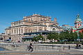
-

-

- Nomination Bronze ornament on a piece of furniture, showing the CoA of a Prince of Condé. Château de Chantilly, France.--Jebulon 00:13, 9 July 2011 (UTC)
- Promotion Very good--Lmbuga 09:32, 9 July 2011 (UTC)
-

-

-

-

-

-

-

- Nomination Shell of a Spotted Auger, Oxymeris maculata --Llez 13:29, 8 July 2011 (UTC)
- Promotion Support QI & Useful --Archaeodontosaurus 16:17, 8 July 2011 (UTC)
-

- Nomination Castetpugon church clock, France --France64160 13:21, 8 July 2011 (UTC)
- Decline Perspective distortion. I think that the image is too tight t top to be improbable--Lmbuga 19:53, 8 July 2011 (UTC)
-

- Nomination Ship and dok --Vitold Muratov 15:00, 8 July 2011 (UTC)
- Decline Cluttered, unsharp, parts of sky overexposed. Yerpo 20:27, 8 July 2011 (UTC)
-

- Nomination Monaco, cathedral Notre-Dame-Immaculée --Berthold Werner 13:38, 8 July 2011 (UTC)
- Promotion Good! -- MJJR 14:51, 8 July 2011 (UTC)
-

- Nomination A steam train by the Somerset coast. Geof Sheppard 07:26, 8 July 2011 (UTC)
- Promotion Comment Suggest you fix the horizon so it is level. This is a very nice picture. Saffron Blaze 14:20, 8 July 2011 (UTC)
I don't see a horizon tilt worth mentioning. For the rest I agree with Saffron Blaze: a very nice picture. -- MJJR 14:59, 8 July 2011 (UTC)
-

- Nomination Molière by Pierre Mignard.Ca 1658. Musée Condé, Château de Chantilly.--Jebulon 22:31, 7 July 2011 (UTC)
- Promotion Comment bit dark. --Archaeodontosaurus 05:40, 8 July 2011 (UTC)Agree. Not so dark at high size, but I'll try to improve. I like the eyes and the slight smile very much --Jebulon 08:12, 8 July 2011 (UTC) DoneBetter now ?--Jebulon 21:59, 8 July 2011 (UTC)
Support Good now --Archaeodontosaurus 09:07, 9 July 2011 (UTC)
-

- Nomination Portrait of Bonaparte, first Consul, by Gérard. 1803. Musée Condé, Château de Chantilly.--Jebulon 21:28, 7 July 2011 (UTC)
- Promotion Good quality. I like to have just a bit of frame, so I know the picture is complete (but it's me). --Coyau 13:46, 8 July 2011 (UTC) Je l'ai si tu veux. Tu crois que c'est mieux ? Je ne sais jamais ce qu'il faut faire avec les cadres...--Jebulon 22:00, 8 July 2011 (UTC)
-

-

- Nomination Rosemary Standley, of Moriarty, on interview at the Eurockéennes de Belfort 2011. -- Rama 22:03, 6 July 2011 (UTC)
- Promotion Good quality. --Mbdortmund 16:38, 8 July 2011 (UTC)
-

- Nomination Proserpina, by Chapu. Park of the Château de Chantilly, France.--Jebulon 23:47, 5 July 2011 (UTC)
- Promotion There is a technical (cache?) issue, it is not the version I wish to nominate, sorry...--Jebulon 09:45, 8 July 2011 (UTC)
Good version in 100% --Archaeodontosaurus 10:28, 9 July 2011 (UTC)
-

- Nomination ORP Wodnik. --Airwolf 09:09, 4 July 2011 (UTC)
- Decline chromatic aberrations: See, for example, the anchor. Blurry, not sharp enough to me. But nice--Lmbuga 20:05, 8 July 2011 (UTC)
-

- Nomination East side of the of Neue Pinakothek, Munich. --High Contrast 21:59, 2 July 2011 (UTC)
- Promotion Support Bit unsharp, but otherwise very good. --H005 11:15, 9 July 2011 (UTC)
-

-

- Nomination Krishna and Radha, National Museum, New Delhi. Yann 18:35, 2 July 2011 (UTC)
- Promotion Unfortunate cropping, a little bit of the right side disappeared.--Ankara 18:44, 2 July 2011 (UTC) Better now? Yann 19:04, 2 July 2011 (UTC) The crop is fine now. I'm not sure about the quality. Other opinions?--Ankara 19:33, 2 July 2011 (UTC) Support I think it's acceptable. Sharpness is insufficient, but on the other hand the light is very good, this is not easily accomplished with art reproductions. --H005 11:15, 9 July 2011 (UTC)
-

- Nomination Leonardo...by himself ? Florence, Italy.--Jebulon 16:12, 2 July 2011 (UTC)
- Promotion Slight cw tilt?--Ankara 19:45, 2 July 2011 (UTC) Not sure, but I don't think so: I put a grid, and the window is vertical straight behind the head of the "statue"...--Jebulon 20:55, 2 July 2011 (UTC) You're probably right. Good otherwise. --Ankara 09:52, 9 July 2011 (UTC)
-

-

-

- Nomination Germany, Koblenz, building Firmungsstr. 27 --Berthold Werner 11:53, 2 July 2011 (UTC)
- Promotion Good quality. --H005 11:15, 9 July 2011 (UTC)
-

-

- Nomination Bours Lake --Florent Pécassou 22:50, 1 July 2011 (UTC)
- Decline Oppose Tilted ccw, colour noise, some areas too dark. --H005 10:56, 9 July 2011 (UTC)
-
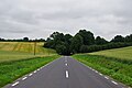
- Nomination Road nr 538 in Poland. Kudak 18:10, 1 July 2011 (UTC)
- Decline Is this road really cambered like that? Or does it need a tilt adjust? Regardless, this is a bit soft throughout. Saffron Blaze 21:28, 1 July 2011 (UTC) Oppose Tilt (compare the poles), CA, sharpness. --H005 10:56, 9 July 2011 (UTC)
-
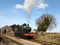
- Nomination Steam locomotive shunting at Dunster -- Geof Sheppard 07:18, 1 July 2011 (UTC)
- Decline This is a bit soft and an odd glare off the bell. Saffron Blaze 17:50, 1 July 2011 (UTC) Oppose As per Saffron Blaze, also noticeable CA. --H005 10:58, 9 July 2011 (UTC)
-
- Nomination Leeboard --Vitold Muratov 22:45, 30 June 2011 (UTC)
- Decline Comment Oversharpened or over-denoised as several of your other images - please, do not do this to all your images, it does not make them better! Can you upload a less processed version? -- H005 10:33, 9 July 2011 (UTC)
I agree. --Fred Hsu 20:42, 9 July 2011-- Yes ,I can. Just a minute. --Vitold Muratov 23:15 10 July 2011 (UTC)
-
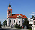
- Nomination Church in Prószków (Proskau), Upper Silesia --Pudelek 19:52, 30 June 2011 (UTC)
- Promotion Comment The right lines aren't stright. There are little green and violet chromatic aberrations (I can work it if you want)--Lmbuga 23:00, 30 June 2011 (UTC)
New version with less chromatic aberrations and with correction of perspective. You can revert the version if you want--Lmbuga 23:11, 30 June 2011 (UTC)
New version is OK, but in my opinion perspective was good --Pudelek 09:51, 1 July 2011 (UTC) Support Small issue with sharpness at the tower top, but overall good quality. --H005 10:33, 9 July 2011 (UTC)
-
-

- Nomination Mermaid statue, Kiryat Yam beach, Israel. --Tomer T 17:43, 30 June 2011 (UTC)
- Decline The bicycle wheel is one thing but the fishing rod coming out of her butt is rather disconcerting. Saffron Blaze 18:52, 30 June 2011 (UTC) Oppose As per Saffron Blaze, plus sharpening halos. --H005 10:33, 9 July 2011 (UTC)
-

- Nomination Lis-1 jet engine. This engine was used in the Polish version of the MiG-15 fighter. --Airwolf 13:36, 30 June 2011 (UTC)
- Decline Few minor issues (background, crop, viewing angle, CA, too dark at the bottom (flash wuld have helped), blown sky, ...), none of them serious, but overall too many to approve QI status. --H005 10:37, 9 July 2011 (UTC)
-

-

- Nomination Inre delning. Artist: Gert Marcus --Ankara 08:44, 27 June 2011 (UTC)
- Promotion Comment The isolation is great except that pole is a distraction. I'd also edit out the people in the background as their bright clothing is also a distraction. Saffron Blaze 20:00, 28 June 2011 (UTC) Thanks for your feedback. Unfortunately, I dont know how to remove the pole and the people.--Ankara 20:56, 30 June 2011 (UTC) Support I do not see as much of an issue with the pole, and none at all with the people. Sharpness at the lower end of the stone is more a problem, but overall it's still acceptable. -- H005 10:25, 9 July 2011 (UTC) --H005 10:25, 9 July 2011 (UTC)
-

- Nomination Kandern-Wollbach: Protestant Church (fresco) --Taxiarchos228 14:41, 24 June 2011 (UTC)
- Decline Should be reworked a bit: The light is not uniform, dark above and clear below, it can be improved. It needs a little perspective correction: the frame at the lower edge of the fresco is not straight, and St Paul's quote is really tilted. Please try to improve the categorization, as it is an interesting piece of art. Above all, the crop is too tight --Jebulon 14:01, 29 June 2011 (UTC)
this fresco is between to windows, there the light is not uniform and the crop is tight. there is no possibility to improve here s.th. perspective correction I have already made here like I do to all uploaded images. --Taxiarchos228 12:33, 1 July 2011 (UTC) Oppose I understand the difficult conditions, but strong colour noise, line at the top not parallel make me oppose. -- H005 10:20, 9 July 2011 (UTC)
-

- Nomination Kandern-Feuerbach: Protestant Church, altar --Taxiarchos228 14:41, 24 June 2011 (UTC)
- Decline Barrel distortion. --Coyau 14:29, 1 July 2011 (UTC) Oppose As per Coyau, slight clockwise tilt. -- H005 10:20, 9 July 2011 (UTC) --H005 10:20, 9 July 2011 (UTC)
-

- Nomination Cathedral of Monaco --NielsMickers 08:23, 8 July 2011 (UTC)
- Decline Oppose Aberration of perspective can not be corrected --Archaeodontosaurus 10:18, 8 July 2011 (UTC)
-
- Nomination Nymph by Suchetet after Coysevox, Versailles. --Coyau 04:48, 8 July 2011 (UTC)
- Promotion Good photograph of a difficult object --Berthold Werner 06:47, 8 July 2011 (UTC)
-

- Nomination Street in Ribadavia, Galicia (Spain)--Lmbuga 23:29, 7 July 2011 (UTC)
- Promotion Nice, even if the weather was not perfect...--Jebulon 23:51, 7 July 2011 (UTC)
-

- Nomination Street in Ribadavia, Galicia (Spain)--Lmbuga 23:27, 7 July 2011 (UTC)
- Promotion Good composition. QI for me.--Jebulon 23:52, 7 July 2011 (UTC)
-

-

-

- Nomination Dutch trailing suction hopper dredger DC Vlaanderen 3000 -- MJJR 20:48, 7 July 2011 (UTC)
- Promotion Nice angle; good detail --Daniel Case 04:46, 8 July 2011 (UTC)
-
- Nomination Vineyards. Ribeiro wine. Miño river, A Arnoia, Galicia (Spain)--Lmbuga 17:44, 7 July 2011 (UTC)
- Promotion Support QI for me --Archaeodontosaurus 05:42, 8 July 2011 (UTC)
-

- Nomination The Church of St. Michael and All Angels, Stanton: est circa 1200 AD. --Saffron Blaze 17:41, 7 July 2011 (UTC)
- Promotion Good quality. Very good dof--Lmbuga 17:47, 7 July 2011 (UTC)
-

-

-

- Nomination Faustina Minor, by Nicolas Frémery, Versailles. --Coyau 12:38, 7 July 2011 (UTC)
- Promotion Comment chromatic aberrations and, to me, too tight at top--Lmbuga 18:09, 7 July 2011 (UTC)
Right. I've corrected CA and given as much space as possible at top. --Coyau 00:20, 8 July 2011 (UTC)
Good enough imho. --Berthold Werner 07:00, 8 July 2011 (UTC)
-

-

- Nomination Nymphaea alba, A Arnoia, Galicia--Lmbuga 11:44, 7 July 2011 (UTC)
- Promotion Support QI & useful --Archaeodontosaurus 14:55, 7 July 2011 (UTC)
-

- Nomination Lunar Double-stripe (Minucia lunaris) perching. --Le.Loup.Gris 09:43, 7 July 2011 (UTC)
- Promotion Support Some minor artifacts, but very didactic --Archaeodontosaurus 15:05, 7 July 2011 (UTC)
-
- Nomination Stag beetle (Lucanus cervus), female. --Le.Loup.Gris 09:43, 7 July 2011 (UTC)
- Decline Comment Sorry, to me, poor DOF for a big insect (f/3.2), but I'm not sure if it can be QI--Lmbuga 10:41, 7 July 2011 (UTC)
Oppose The legs are out of focus Archaeodontosaurus 15:05, 7 July 2011 (UTC)
-

-

-

- Nomination Bettingen: St. Chrischona Television Tower, mainpod and antenna --Taxiarchos228 13:12, 6 July 2011 (UTC)
- Promotion Good--Jebulon 15:34, 7 July 2011 (UTC)
-

- Nomination Flims: observation tower "Il spir" --Taxiarchos228 13:12, 6 July 2011 (UTC)
- Promotion Good--Jebulon 15:34, 7 July 2011 (UTC)
-

- Nomination Bad Bellingen: Saint Leodegar Church, interior --Taxiarchos228 13:12, 6 July 2011 (UTC)
- Decline Too many blurry areas. Important stretching issue at right. Disturbing element at right above edge. A well centered composition should have been better in this case IMO.--Jebulon 15:34, 7 July 2011 (UTC)
-

- Nomination Bad Bellingen-Bamlach: counterfort of Saint Peter and Paul --Taxiarchos228 13:12, 6 July 2011 (UTC)
- Promotion Good. More useful with another category (added)--Jebulon 09:47, 8 July 2011 (UTC)
-
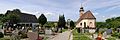
- Nomination Bad Bellingen: Saint Leodegar Church with cementary and chapel --Taxiarchos228 13:12, 6 July 2011 (UTC)
- Promotion Good--Lmbuga 20:41, 7 July 2011 (UTC)
-

- Nomination Infoboard at Confederation Bridge --Taxiarchos228 19:06, 5 July 2011 (UTC)
- Decline Noisy shadows, CA (especially to the right side, not sharp enough.--PereslavlFoto 16:07, 7 July 2011 (UTC)
-
- Nomination Church and hotel of Rabastens-De-Bigorre -- Florent Pécassou 17:03, 5 July 2011 (UTC)
- Promotion Comment Le nom de Rabastens-De-Bigorre doit apparaître dans la légende et mieux dans le titre de la photo --Archaeodontosaurus 14:10, 6 July 2011 (UTC) J'ai précisé la légende et demandé que le fichier soit renommé... Florent Pécassou 10:58, 7 July 2011 (UTC)
QI now --Archaeodontosaurus 05:51, 8 July 2011 (UTC)
-
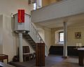
- Nomination Hasel: Protestant Church (pulpit) --Taxiarchos228 07:27, 5 July 2011 (UTC)
- Promotion Well done available light photo.--PereslavlFoto 16:09, 7 July 2011 (UTC)
-

-

- Nomination: Jeseníky - view from Obří skály --Pudelek 11:52, 2 July 2011 (UTC)
- Review needed
-

- Nomination: Entrance to Yungang Grottoes, Datong, China --Sfu 11:02, 2 July 2011 (UTC)
- Review needed
-

- Nomination: Iscription on Qutb Minar, Delhi, India. --Sfu 11:02, 2 July 2011 (UTC)
- Review needed
-

- Nomination: Deoksugung palace complex, Seoul. --Sfu 11:02, 2 July 2011 (UTC)
- Review needed
-

- Nomination: Last turkey pic to be nominated from me this round. I have no spare space upwards, but it's not much to see there anyway.--V-wolf 06:47, 2 July 2011 (UTC)
- Review needed
-

- Nomination: Statue of John of Nepomuk in Krumau am Kamp, Lower Austria --Herzi Pinki 06:27, 2 July 2011 (UTC)
- Review needed
-

- Nomination: Drilling Rig. --Airwolf 00:02, 2 July 2011 (UTC)
- Review needed
-
- Nomination: Su-22. --Airwolf 00:02, 2 July 2011 (UTC)
- Review needed
-

-

-

- Nomination Torres del Paines, Chile. by Martin St-Amant. --Elekhh 08:19, 7 July 2011 (UTC)
- Promotion Good quality, but to me a bit of chromatic aberrations in the left hill of the mountain.--Lmbuga 12:01, 7 July 2011 (UTC)
-

- Nomination Torres del Paines panorama, Chile. by Martin St-Amant. --Elekhh 08:19, 7 July 2011 (UTC)
- Promotion Good quality. --Taxiarchos228 08:29, 7 July 2011 (UTC)
-

-

-

- Nomination Rosemary Standley, of Moriarty, on interview at the Eurockéennes de Belfort 2011. -- Rama 22:03, 6 July 2011 (UTC)
- Promotion Support QI for me --Archaeodontosaurus 05:39, 7 July 2011 (UTC)
-

- Nomination Toronto: Aerial view of main pod and antenna of the CN Tower from helicopter (new version) --Taxiarchos228 20:52, 6 July 2011 (UTC)
- Promotion Good quality. Bright background does not detract from detail offered. --Saffron Blaze 20:57, 6 July 2011 (UTC)
-

- Nomination St Michael and St Martin's Church, Eastleach Martin -- Saffron Blaze 20:28, 6 July 2011 (UTC)
- Promotion Support QI for me --Archaeodontosaurus 10:00, 7 July 2011 (UTC)
-

- Nomination Rosemary Standley, of Moriarty, on stage at the Eurockéennes de Belfort 2011. -- Rama 19:40, 6 July 2011 (UTC)
- Promotion I would love to see this witha greater DoF but it is still an excellent capture of her. --Saffron Blaze 21:02, 6 July 2011 (UTC)
-
- Nomination Ferry 1 --Vitold Muratov 20:40, 6 July 2011 (UTC)
- Decline No change since last nomination. If these files are the output of your camera, I'm afraid you have to ditch it. --Ikar.us 20:21, 6 July 2011 (UTC)
-

- Nomination Versailles Bassin de Latone KlausFoehl 15:44, 6 July 2011 (UTC)
- Decline Oppose CA very strong and aberration of perspective, in the extremities. A new frame is possible. --Archaeodontosaurus 09:48, 7 July 2011 (UTC)
-

- Nomination Innsbruck Seegrube hotel and station KlausFoehl 15:44, 6 July 2011 (UTC)
- Promotion Nice shot. --High Contrast 18:34, 6 July 2011 (UTC)
-

- Nomination Phlegmatic (1675) by Lespagnandelle, Palace of Bersailles. --Myrabella 15:19, 6 July 2011 (UTC)
- Promotion QI and good caption --Archaeodontosaurus 05:38, 7 July 2011 (UTC)
-

- Nomination Titanacris Albipes --Archaeodontosaurus 13:54, 6 July 2011 (UTC)
- Promotion Good quality. Very detailed. --Saffron Blaze 21:15, 6 July 2011 (UTC)
-

- Nomination Shell of a Miocene gastropod, Conus saucatsensis --Llez 11:25, 6 July 2011 (UTC)
- Promotion Good quality. --Taxiarchos228 13:12, 6 July 2011 (UTC)
-

- Nomination Cable car Ramzová - Šerák --Pudelek 10:09, 6 July 2011 (UTC)
- Promotion Good quality. --Taxiarchos228 13:12, 6 July 2011 (UTC)
-

- Nomination Les Hurlements d'Léo at the Eurockéennes de Belfort 2011. -- Rama 10:09, 6 July 2011 (UTC)
- Promotion Good quality. --Taxiarchos228 13:12, 6 July 2011 (UTC)
-

- Nomination Iphiclides podalirius, reframed because a capricious flight, catched without specific lenses -- Dvillafruela 02:39, 6 July 2011 (UTC)
- Decline * Oppose Out of focus - damage, the caption was good --Archaeodontosaurus 13:58, 6 July 2011 (UTC)
-

- Nomination Statue of Louis II de Bourbon-Condé, Château de Chantilly, France.--Jebulon 22:23, 5 July 2011 (UTC) Comment Strange halo at top of the statue. The sky is a bit noisy--Lmbuga 23:17, 5 July 2011 (UTC) Agree. Do not understand why. Any idea ? Misuse of polarization filter ? I'll try to upload a new version soon. Thank you for review.--Jebulon 23:47, 5 July 2011 (UTC) Done Better now ?--Jebulon 08:31, 6 July 2011 (UTC)
Much better--Lmbuga 10:25, 7 July 2011 (UTC) - Promotion Good to me--Lmbuga 10:23, 7 July 2011 (UTC)
- Nomination Statue of Louis II de Bourbon-Condé, Château de Chantilly, France.--Jebulon 22:23, 5 July 2011 (UTC)
-

-

- Nomination Wehr: Saint Martin Church (epitaph) --Taxiarchos228 07:27, 5 July 2011 (UTC)
- Promotion Good quality. --Yann 08:38, 7 July 2011 (UTC)
-
- Nomination Aubisque Mountain Pass, free horse --France64160 14:35, 4 July 2011 (UTC)
- Decline Sorry but the composition does not work at all. --Elekhh 07:28, 7 July 2011 (UTC)
-

- Nomination Loch Shiel and the memorial to the Jacobites, Scotland --Kirua 20:17, 29 June 2011 (UTC)
- Promotion Good quality... suggest VI -- Saffron Blaze 21:12, 6 July 2011 (UTC)
-

- Nomination A small building in Saint-Paul-de-Vence --Berthold Werner 08:07, 6 July 2011 (UTC)
- Promotion Nice.--Jebulon 08:40, 6 July 2011 (UTC)
-
- Nomination Anna Calvi at the Eurockéennes de Belfort 2011. -- Rama 07:24, 6 July 2011 (UTC)
- Decline too dark and the view from the bottom is not really good --Taxiarchos228 07:27, 6 July 2011 (UTC)
-

-

-

- Nomination Sarriac-Bigorre War Memorial -- Florent Pécassou 17:24, 5 July 2011 (UTC)
- Decline Subject is poorly illuminated and noisy, parts of the sky is overexposed; fill-flash may be helpful. --Wsiegmund 20:14, 5 July 2011 (UTC)
-

- Nomination Bad Bellingen: Saint Leodegar Church (bell tower) --Taxiarchos228 07:27, 5 July 2011 (UTC)
- Promotion Good quality--Lmbuga 23:02, 5 July 2011 (UTC)
-

- Nomination Ceiling of the portal arch above the main entrance of the cathedral of Berlin --Llez 14:31, 5 July 2011 (UTC)
- Promotion Support QI for me --Archaeodontosaurus 16:56, 5 July 2011 (UTC)
-

- Nomination Singer Medi at the Eurockéennes de Belfort 2011. -- Rama 13:27, 5 July 2011 (UTC)
- Promotion Good quality. --The Egyptian Liberal 15:21, 5 July 2011 (UTC)
-

- Nomination Hasel: Protestant Church --Taxiarchos228 07:27, 5 July 2011 (UTC)
- Promotion Good quality to me--Lmbuga 23:05, 5 July 2011 (UTC)
-

- Nomination Saints Apostles Cathedral in Vratsa. --MrPanyGoff 05:26, 5 July 2011 (UTC)
- Promotion Good. --Ikar.us 21:54, 5 July 2011 (UTC)
-

- Nomination Bad Mergentheim. Markt --Vitold Muratov 23:55, 3 July 2011 (UTC))
- Decline Overexposition (see the clock, for instance), noise...--Jebulon 22:57, 3 July 2011 (UTC)--СделаноVitold Muratov 23:55, 3 July 2011 (UTC) Worse than before. Apply noise reduction to the sky, not the pavement. --Ikar.us 22:03, 5 July 2011 (UTC)
-

- Nomination Saint-Sauveur, Dinan. --Eusebius 16:54, 2 July 2011 (UTC)
- Promotion Yes, it's a HDR, bit the image is definitely too gray/it's contrastless/the WB has to be fixed. --Carschten 17:18, 2 July 2011 (UTC)
* Comment The picture is great enough to invest a little more work. Imo the perspektive is not corrected perfectly, there are rests of tilt cw on the left parts and perhaps a slight correction on the right would be nice, too. I don't think it's too grey. --Mbdortmund 01:41, 3 July 2011 (UTC)
Thanks for the remarks. Picture updated: slight perspective correction, slightly lightened/contrasted. --Eusebius 07:21, 3 July 2011 (UTC)
Better now, I really like it. --Mbdortmund 06:03, 6 July 2011 (UTC)
-

- Nomination: HAT Kobe in Kobe --663highland 11:53, 30 June 2011 (UTC)
- Review needed
-

- Nomination: The Museum Road in Kobe --663highland 11:53, 30 June 2011 (UTC)
- Review needed
-

- Nomination: Inflorescence of Marsh Woundwort (Stachys palustris). --Bff 11:26, 30 June 2011 (UTC)
- Review needed
-
- Nomination: Hasel: Protestant Church (baptistery) --Taxiarchos228 10:04, 30 June 2011 (UTC)
- Review needed
-

- Nomination: Hasel: Protestant Church, cemetery portal in the form of a memorial --Taxiarchos228 10:04, 30 June 2011 (UTC)
- Review needed
-
- Nomination: Lörrach: Saint Peter Church --Taxiarchos228 10:04, 30 June 2011 (UTC)
- Review needed
-
- Nomination: Ettal Abbey: old bell tower between new bell tower and dome --Taxiarchos228 10:04, 30 June 2011 (UTC)
- Review needed
-
- Nomination: Ettal Abbey (organ) --Taxiarchos228 10:04, 30 June 2011 (UTC)
- Review needed
-

- Nomination: The wayside cross in the village Ramsau, municipality of Pölla, Waldviertel --Herzi Pinki 23:14, 29 June 2011 (UTC)
- Review needed
-
- Nomination: Norahällen rock carving. Runic inscription U130 (by einarspetz) --LittleGun 21:32, 29 June 2011 (UTC)
- Review needed
-

- Nomination: Morastugan, interior (by Prolineserver) --LittleGun 21:32, 29 June 2011 (UTC)
- Review needed
-

- Nomination: Morastugan, interior. Detail showing Napoleon (by Prolineserver) --LittleGun 21:32, 29 June 2011 (UTC)
- Review needed
-

- Nomination: Morastugan, interior. Detail showing Josephine (by Prolineserver) --LittleGun 21:32, 29 June 2011 (UTC)
- Review needed
-
-

- Nomination: Minor locality Nysättra, Sweden --LittleGun 21:32, 29 June 2011 (UTC)
- Review needed
-

- Nomination: The Scots Hotel – A boutique hotel, situated in an old historical compound on the shore of the Sea of Galilee. Tomer T 20:41, 29 June 2011 (UTC)
- Review needed
-

- Nomination: Germany, Koblenz, gate of the "Deutschordenskommende" --Berthold Werner 17:09, 29 June 2011 (UTC)
- Review needed
-

- Nomination: Entrance and information center of Greifswald Nuclear Power Plant, Mecklenburg-Vorpommern. -- Felix Koenig 16:34, 29 June 2011 (UTC)
- Review needed
-

- Nomination: Vishnu holding lotus flowers, National Museum, New Delhi. Yann 13:11, 29 June 2011 (UTC)
- Review needed
-

- Nomination Bassillon-Vauzé war monument, France--France64160 12:07, 28 June 2011 (UTC)
- Promotion Good quality, but I would crop the left and right sides. Yann 14:33, 2 July 2011 (UTC)
Good quality now. --Yann 13:20, 5 July 2011 (UTC)
-

- Nomination: Street light on the Collège de l'Esquile, Toulouse, France. Léna 12:12, 28 June 2011 (UTC)
- Review Comment Un peu flou... --Archaeodontosaurus 19:38, 29 June 2011 (UTC)
-

- Nomination Jewel of the Seas in Stockholm June 2011 --Ankara 09:39, 27 June 2011 (UTC)
underexposed, but this can be fixed --Taxiarchos228 11:28, 27 June 2011 (UTC) - Promotion New version here also, but I'm not sure about the result. --Ankara 12:37, 27 June 2011 (UTC) I would be very grateful for comments on the new versions, are they better and/or there is more to improve?--Ankara 20:56, 30 June 2011 (UTC) Why withdraw? This one is good IMO. --Ikar.us 00:28, 3 July 2011 (UTC) I was worry about the colours, maybe i was wrong.--Ankara 06:55, 3 July 2011 (UTC) Support --Ikar.us 21:17, 5 July 2011 (UTC)
- Nomination Jewel of the Seas in Stockholm June 2011 --Ankara 09:39, 27 June 2011 (UTC)
-

- Nomination Château de Chantilly, view from south.--Jebulon 23:07, 4 July 2011 (UTC)
- Promotion Good quality. --Berthold Werner 06:23, 5 July 2011 (UTC)
-

-

- Nomination ANTONY GORMLEY Kriegeralpe --Böhringer 21:39, 4 July 2011 (UTC)
- Promotion Comment To me, Too much insistence with this reason: Category: Horizon Field, Kriegeralpe, but QI--Lmbuga 22:04, 4 July 2011 (UTC)
-

- Nomination Medieval fortifications at Rhodes, Greece.--Jebulon 21:36, 4 July 2011 (UTC)
- Promotion Good quality. --Berthold Werner 06:25, 5 July 2011 (UTC)
-
- Nomination Schwarzspanner, Odezia atrata --Böhringer 21:28, 4 July 2011 (UTC)
- Decline Subexposed: File:Schwarzspanner, Odezia atrata 02.JPG--Lmbuga 21:38, 4 July 2011 (UTC) Info das sind aber komplett unterschiedliche Bilder ?!? --Böhringer 21:41, 4 July 2011 (UTC)
Thanks, but I can't understand --Lmbuga 21:48, 4 July 2011 (UTC)
Ok. Different pictures (with translators I can understand other languages) but this image is not to me QI and the other image is to me QI--Lmbuga 22:17, 4 July 2011 (UTC)
-

- Nomination Kriegeralpe (AT) Mohnenfluh --Böhringer 21:01, 4 July 2011 (UTC)
- Promotion Good quality. --Taxiarchos228 21:02, 4 July 2011 (UTC)
-

- Nomination Train station of Bruges, Belgium -- MJJR 20:54, 4 July 2011 (UTC)
- Promotion Good quality. --Taxiarchos228 21:02, 4 July 2011 (UTC)
-

- Nomination The Poertoren (Gunpowder Tower) in Bruges, Belgium -- MJJR 20:54, 4 July 2011 (UTC)
- Promotion Good quality. --Taxiarchos228 21:02, 4 July 2011 (UTC)
-

- Nomination Façade of the Santa Maria del Fiore Florence cathedral.--Jebulon 16:42, 4 July 2011 (UTC)
- Promotion Good quality. --Taxiarchos228 07:58, 5 July 2011 (UTC)
-

- Nomination Aubisque Mountain Pass, free horses --France64160 14:35, 4 July 2011 (UTC)
- Decline Oppose The black spots in the sky does not seem to be birds. Post image processing induces a lot of artifacts. poor contrast (the cloud is overexposed). It is strongly recommended to name the breed of horses. --Archaeodontosaurus 07:45, 5 July 2011 (UTC)
-

- Nomination Bettingen: St. Chrischona Television Tower: antenna, 98 m high --Taxiarchos228 08:06, 4 July 2011 (UTC)
- Promotion Well done. The entire structure is sharp.--Ankara 18:10, 4 July 2011 (UTC)
-

- Nomination Statue of Saint Reparata, Cathedral of Florence, Italy.--Jebulon 19:20, 2 July 2011 (UTC)
- Promotion Very good. --Cayambe 20:50, 4 July 2011 (UTC)
-

-

- Nomination Miélan Tax Office, Gers, France -- Florent Pécassou 19:05, 30 June 2011 (UTC)
- Decline bad perspective --Pudelek 11:38, 5 July 2011 (UTC)
-

- Nomination Dargagnon Street, Miélan, France --Florent Pécassou 18:39, 30 June 2011 (UTC)
- Decline tilted, perspective --Pudelek 11:38, 5 July 2011 (UTC)
-

- Nomination Germany, Koblenz, gate of the "Deutschordenskommende" --Berthold Werner 14:27, 30 June 2011 (UTC)
- Promotion Good quality. --Pudelek 11:38, 5 July 2011 (UTC)
-

-

- Nomination: A date palm at the dunes in the west part of Boa Vista island in 2010 December. --Tomer T 11:29, 29 June 2011 (UTC)
- Review needed
-
- Nomination: Rama and the monkey army, National Museum, New Delhi. Yann 10:47, 29 June 2011 (UTC)
- Review needed
-

- Nomination: King and his army, National Museum, New Delhi. Yann 10:47, 29 June 2011 (UTC)
- Review needed
-
- Nomination: Swedish flags in the village Husby at the national day of Sweden.--V-wolf 10:37, 29 June 2011 (UTC)
- Review needed
-

- Nomination: Tower of Hedemora Church, Sweden.--V-wolf 10:18, 29 June 2011 (UTC)
- Review needed
-

- Nomination: Rheinfelden: Church of Christ --Taxiarchos228 09:23, 29 June 2011 (UTC)
- Review needed
-

- Nomination: Former factory Christian Dierig AG in Bielawa (Langenbielau) -Pudelek 09:16, 29 June 2011 (UTC)
- Review needed
-

- Nomination: MS Saxare. --Ankara 08:34, 29 June 2011 (UTC)
- Review needed
-

- Nomination: Mi-2 Medicopter (BTW: note the dirty tail :) ). Airwolf 07:18, 29 June 2011 (UTC)
without cropped rotor this picture would be better --Taxiarchos228 09:27, 29 June 2011 (UTC)
But then the fuselage would be much smaller in relation to the entire picture. Airwolf 09:40, 29 June 2011 (UTC) - Review needed
- Nomination: Mi-2 Medicopter (BTW: note the dirty tail :) ). Airwolf 07:18, 29 June 2011 (UTC)
-
- Nomination: Vintage RWD-5. Airwolf 07:18, 29 June 2011 (UTC)
- Review needed
-

-

-

- Nomination: Sourdough roll --Jonathunder 12:23, 28 June 2011 (UTC)
- Review How about a different crop? The detail is there to make this QI just not certain about the compositional choice. If you prefer this layout I will willingly promote. Saffron Blaze 12:36, 28 June 2011 (UTC)
-

- Nomination: Eslourenties-Daban town hall, France--France64160 12:07, 28 June 2011 (UTC)
- Review needed
-
- Nomination: Bassillon-Vauzé church, France --France64160 12:07, 28 June 2011 (UTC)
- Review needed
-

- Nomination: Castle Neuschwanstein from North --Taxiarchos228 06:41, 27 June 2011 (UTC)
- Review A bit blue, isn't it ?--Jebulon 14:22, 27 June 2011 (UTC)
IMO it is not~, color correction was done here --Taxiarchos228 11:41, 29 June 2011 (UTC)
-

- Nomination Istein: Saint Michaels Church --Taxiarchos228 11:19, 26 June 2011 (UTC)
- Promotion I like the colors and the composition, but I would make a light crop at the bottom to remove part of this ugly metal enclosure. Yann 13:08, 2 July 2011 (UTC)
you`re right, image is croped now --Taxiarchos228 10:47, 2 July 2011 (UTC) Support Very good now. --Yann 15:37, 3 July 2011 (UTC)
-

- Nomination Saint-Paul-de-Vence, La grande Fontaine --Berthold Werner 08:20, 4 July 2011 (UTC)
- Decline Many disturbing elements on the right edge (shadow, fragment roof, man...) are ruining the composition IMO. Probable perspective distorsion. Sorry. --Jebulon 10:00, 4 July 2011 (UTC)
-

-

- Nomination Bad Bellingen-Hertingen: Protestant Church --Taxiarchos228 08:06, 4 July 2011 (UTC)
- Promotion I like the perspective. Technical good quality. The right backmost corner of the tower seems to be tilted to the left and the front left corner of the main building seems to be tilted to the right. So for me the perspective seems to be minimal distorted: For me this gives a natural look and is not disturbing. --Elektroschreiber 10:13, 4 July 2011 (UTC)
-

- Nomination Bad Bellingen: Saint Leodegar Church (from southeast) --Taxiarchos228 08:06, 4 July 2011 (UTC)
- Promotion Lovely composition. --Saffron Blaze 09:06, 4 July 2011 (UTC)
-
- Nomination Bad Bellingen-Bamlach: Saint Peter and Paul (attention: high resolution) --Taxiarchos228 08:06, 4 July 2011 (UTC)
- Promotion Good quality. --Saffron Blaze 09:06, 4 July 2011 (UTC)
-

- Nomination Bad Bellingen-Bamlach: Saint Peter and Paul (choir) --Taxiarchos228 08:06, 4 July 2011 (UTC)
- Promotion I suspect that wire behind the cross on top is there for a reason but it sure is distracting. Saffron Blaze 09:09, 4 July 2011 (UTC)
the wire on top of the cross is a lightning rod, it is not nice but I am against retouching it, I would like to show encyclopedic relevant images and there have to be no fakes --Taxiarchos228 09:23, 4 July 2011 (UTC)
Comment Good point. Promoted. -- Saffron Blaze 11:07, 4 July 2011 (UTC)
-

- Nomination Château de Chantilly, France.--Jebulon 22:53, 3 July 2011 (UTC)
- Promotion Good quality. --Taxiarchos228 07:15, 4 July 2011 (UTC)
-

- Nomination High Voltage Cables in the Netherlands. Abigor 19:20, 3 July 2011 (UTC)
- Decline The composition does not fit to the subject for me. Why this falling electrical tower? --Elektroschreiber 07:45, 4 July 2011 (UTC)
-

- Nomination Tarbes Town Hall, Hautes-Pyrénées, France --Florent Pécassou 18:02, 3 July 2011 (UTC))
- Promotion Good.--Jebulon 22:54, 3 July 2011 (UTC)
-

- Nomination Morpho didius --Archaeodontosaurus 13:17, 3 July 2011 (UTC)
- Promotion Good quality. --Saffron Blaze 14:23, 3 July 2011 (UTC)
-

- Nomination Ivan Bunins grave --Vitold Muratov 14:35, 3 July 2011 (UTC)
- Promotion Good quality. --Saffron Blaze 14:28, 3 July 2011 (UTC)
-

- Nomination Valdi Totev at "Flower for Gosho" Fest. --MrPanyGoff 12:27, 3 July 2011 (UTC)
- Promotion Good quality. --Saffron Blaze 14:28, 3 July 2011 (UTC)
-

- Nomination Spilosoma canescens caterpillar in Sydney. --99of9 12:21, 3 July 2011 (UTC)
- Promotion Support QI and Useful --Archaeodontosaurus 13:39, 3 July 2011 (UTC)
-
- Nomination Germany, Koblenz, building Firmungsstr. 2 --Berthold Werner 12:16, 3 July 2011 (UTC)
- Promotion Good quality. --Saffron Blaze 14:24, 3 July 2011 (UTC)
-

- Nomination Lörrach: Holy Family Church --Taxiarchos228 12:14, 3 July 2011 (UTC)
- Promotion Good quality. --Saffron Blaze 14:27, 3 July 2011 (UTC)
-

- Nomination Lörrach: Holy Family Church (bell tower) --Taxiarchos228 12:14, 3 July 2011 (UTC)
- Promotion Good quality. --Saffron Blaze 14:27, 3 July 2011 (UTC)
-

- Nomination Lörrach: Church of Rötteln, south facade with epitaphs --Taxiarchos228 12:14, 3 July 2011 (UTC)
- Decline InfoThis is promotable as it stands but I would offer that with a bit of contrast the inscriptions would stand out better at full res. Saffron Blaze 14:27, 3 July 2011 (UTC) OpposeBad crop. I don't like the cropped windows. --Elektroschreiber 08:06, 4 July 2011 (UTC)
-

- Nomination Fernsehturm at Berlin, Germany --Llez 06:40, 3 July 2011 (UTC)
- Promotion Very good composition and good technical quality. --Elektroschreiber 07:45, 4 July 2011 (UTC)
-

- Nomination Suillus granulatus --Holleday 19:27, 1 July 2011 (UTC)
- Promotion There are some blown highlights on the mushroom on the right that need to be edited out. Saffron Blaze 21:23, 1 July 2011 (UTC)Hello, I removed the lights.greetings--Holleday 16:08, 2 July 2011 (UTC) CommentGood quality now. --Saffron Blaze 23:18, 3 July 2011 (UTC)
-

- Nomination "L'Eau" (the Water), by Pierre Ier Le Gros, Versailles.--Jebulon 22:20, 29 June 2011 (UTC)
- Promotion Support QI for me --Archaeodontosaurus 13:34, 3 July 2011 (UTC)
-
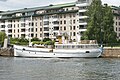
- Nomination: M/S Draga.--Ankara 23:25, 27 June 2011 (UTC)
- Review needed
-

-

- Nomination: Spielhofer Kreuz (929m) marks the highest point on the road from Miesenbach to Strallegg --Herzi Pinki 21:09, 27 June 2011 (UTC)
- Review needed
-

- Nomination: Grandes serres in the Parc de la Tête d'Or, Lyon (France). --TwoWings 17:13, 27 June 2011 (UTC)
- Review The picture seems hazy... contrast issue? Saffron Blaze 21:01, 27 June 2011 (UTC)
-

-
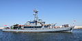
-

-
- Nomination Portable throne of the Habsburg Emperors of the Holy Roman Empire, used for coronation ceremonies in the Francfort cathedral.--Jebulon 23:45, 2 July 2011 (UTC)
- Promotion Good quality. --Mbdortmund 01:46, 3 July 2011 (UTC)
-
- Nomination Summit cross of a mountain in Austria. --High Contrast 23:26, 2 July 2011 (UTC)
- Promotion Good quality. --Mbdortmund 01:47, 3 July 2011 (UTC)
-

-

-

-

- Nomination Statue of (not by!) Benvenuto Cellini, Florence, Italy.--Jebulon 17:37, 2 July 2011 (UTC)
- Promotion Ok. --Ankara 18:12, 2 July 2011 (UTC)
-

-

-

-
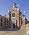
- Nomination Church Madonna dell'Orto in Venice --Archaeodontosaurus 08:26, 2 July 2011 (UTC)
- Promotion Good quality. --Taxiarchos228 11:01, 2 July 2011 (UTC) Sera meilleure si tu coupes la tige au premier plan...--Jebulon 14:30, 2 July 2011 (UTC)
j'étais sûr que tu me le demanderai. C'est fait. --Archaeodontosaurus 15:44, 2 July 2011 (UTC) Il y a un pb de cache, mais j'ai trouvé la correction. Merci, c'est mieux, non ?--Jebulon 16:28, 2 July 2011 (UTC)
-
- Nomination Dry-stone walls made of golden yellow sandstone surround many of the cottages and farms within the --Saffron Blaze 21:47, 1 July 2011 (UTC)
- Promotion Comment Seems oversaturated colors--Lmbuga 00:17, 2 July 2011 (UTC)
Comment Checked the RAW file, not much different. A bit of colour contrast increase but I rarely add saturation. Saffron Blaze 08:03, 2 July 2011 (UTC)
Good quality. --Yann 12:55, 2 July 2011 (UTC)
-

-

-

-

-

- Nomination Rheinfelden: Petrus Church --Taxiarchos228 12:42, 28 June 2011 (UTC)
- Promotion Good quality. --Yann 14:38, 2 July 2011 (UTC)
-

- Nomination Saubole church, France --France64160 12:07, 28 June 2011 (UTC)
- Decline Needs perspective correction. --Yann 13:16, 2 July 2011 (UTC)
-
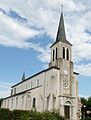
- Nomination Beuste church, France --France64160 12:07, 28 June 2011 (UTC) Comment
- Decline To me, the part inferior of the image is blurry. Needs perspective correction--Lmbuga 01:16, 29 June 2011 (UTC)
Needs perspective correction. --Yann 13:16, 2 July 2011 (UTC)
- Nomination Beuste church, France --France64160 12:07, 28 June 2011 (UTC)
-

- Nomination Corbère-Abères church, France --France64160 12:07, 28 June 2011 (UTC)
- Decline I am sorry but too low quality for QI. No details of the building, lack of sharpness etc. The light and the distance was probably too difficult for your camera.--Ankara 18:21, 2 July 2011 (UTC)
-

-

- Nomination: Corvette ORP Kaszub. Photo taken by me. Airwolf 08:13, 27 June 2011 (UTC)
- Review needed
-

- Nomination: Münster: tower base of TV Tower Münster --Taxiarchos228 06:41, 27 June 2011 (UTC)
- Review needed
-

- Nomination Dossenbach: Protestant Church --Taxiarchos228 06:41, 27 June 2011 (UTC)
- Promotion Good quality. --Yann 13:13, 2 July 2011 (UTC)
-

- Nomination: Mangaka Nobuyuki Fukumoto, taken in Lahti, Finland, June 2010 (by Tulitomaatti) --Soppakanuuna 23:34, 26 June 2011 (UTC)
- Review needed
-

- Nomination: Sju søstre, Nordland, Norway, in 2011 June --Ximonic 21:51, 26 June 2011 (UTC)
- Review needed
-

-

- Nomination: Børvasstindan, Nordland, Norway, in 2011 June --Ximonic 21:51, 26 June 2011 (UTC)
- Review needed
-
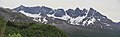
- Nomination: Småtindan, Nordland, Norway, in 2011 June --Ximonic 21:51, 26 June 2011 (UTC)
- Review needed
-
- Nomination: Glomfjorden, Nordland, Norway, in 2011 June --Ximonic 21:51, 26 June 2011 (UTC)
- Review needed
-

- Nomination: Tatra tram in Prague. --High Contrast 21:49, 26 June 2011 (UTC)
- Review needed
-
-
- Nomination Timelapse of clouds over Petit-Croix (France). --ComputerHotline 16:15, 26 June 2011 (UTC)
- Decline Too small. --Yann 14:16, 2 July 2011 (UTC)
-

-

- Nomination: Kawadoko in Kibune, Kyoto --663highland 12:15, 26 June 2011 (UTC)
- Review needed
-

- Nomination Detail from Toldboden, Aarhus, Denmark. --Villy Fink Isaksen 19:06, 25 June 2011 (UTC)
- Decline Needs perspective correction on the right side. --Yann 14:44, 2 July 2011 (UTC)
-
- Nomination Detail from Toldboden, Aarhus, Denmark. --Villy Fink Isaksen 19:06, 25 June 2011 (UTC)
- Decline Lower part overexposed, can be cropped. --Yann 14:44, 2 July 2011 (UTC)
-

-

- Nomination Kumano River at Shingu, Wakayama --663highland 14:39, 25 June 2011 (UTC)
- Promotion Good quality. --Yann 14:49, 2 July 2011 (UTC)
-

-

- Nomination Tegernau: Catholic Church --Taxiarchos228 14:41, 24 June 2011 (UTC)
- Promotion ok. --Ankara 08:39, 3 July 2011 (UTC)
-

- Nomination On the cemetery of Oberwaltersdorf --Herzi Pinki 13:06, 23 June 2011 (UTC)
- Promotion Comment Very nice image. Interesting and beautiful subject, nice evening light and colors. But a slight barrel distortion: can this be fixed? -- MJJR 20:55, 30 June 2011 (UTC) Comment thanks for the hint, as always 4 eyes ...; I uploaded a version with distortion removed (hope so). --Herzi Pinki 06:25, 2 July 2011 (UTC)
Good quality. --Yann 12:58, 2 July 2011 (UTC)
-

- Nomination Statue of Saint Zenobius, first bishop of Florence, main portal of the cathedral.--Jebulon 10:54, 2 July 2011 (UTC)
- Promotion Good quality. --Taxiarchos228 11:01, 2 July 2011 (UTC)
-

-

- Nomination Adoration of the magi, detail of bronze gates of Florence Baptistery, by Ghiberti, 1401.--Jebulon 00:29, 2 July 2011 (UTC)
- Promotion nice and useful --Mbdortmund 02:47, 2 July 2011 (UTC)
-

-

-

- Nomination A pedestrian bridge over the River Windrush in Bourton-on-the-Water. --Saffron Blaze 21:47, 1 July 2011 (UTC)
- Promotion Good quality--Lmbuga 00:14, 2 July 2011 (UTC)
-

- Nomination Another turkey.--V-wolf 18:46, 1 July 2011 (UTC)
- Withdrawn I think the camera missed the focus point as it is on the neck area not the head/eye. Best turkey composition yet though. Saffron Blaze 21:21, 1 July 2011 (UTC). Thank you for reviewing! I withdraw this pic. V-wolf 06:28, 2 July 2011 (UTC)
-

- Nomination Fossil tree near Twyfelfontein. W.S. 17:23, 1 July 2011 (UTC)
- Promotion Good quality. --Saffron Blaze 17:46, 1 July 2011 (UTC)
-

- Nomination Lader.--LutzBruno 16:09, 1 July 2011 (UTC)
- Promotion Good Quality.Saffron Blaze 17:50, 1 July 2011 (UTC)
-
- Nomination St. George church in Mezdra. --MrPanyGoff 16:00, 1 July 2011 (UTC)
- Promotion Good quality. --Saffron Blaze 17:46, 1 July 2011 (UTC)
-

- Nomination A turkey among its peers.--V-wolf 15:57, 1 July 2011 (UTC)
- Promotion Good quality. --Saffron Blaze 17:48, 1 July 2011 (UTC)
-

- Nomination Lasioglossum pseudosphecodimorphum, female --Gidip 14:59, 1 July 2011 (UTC)
- Promotion Good quality. --Saffron Blaze 15:31, 1 July 2011 (UTC)
-

- Nomination North wall of Ani, Turkey --Hoangquan hientrang 10:44, 1 July 2011 (UTC)
- Promotion Good quality. --Saffron Blaze 17:49, 1 July 2011 (UTC)
-

- Nomination L'Hiver, by Girardon. Château de Versailles.--Jebulon 09:24, 1 July 2011 (UTC)
- Promotion Good quality. --Saffron Blaze 15:30, 1 July 2011 (UTC)
-

- Nomination Weil am Rhein: Saint Georg Church, memorial --Taxiarchos228 08:48, 1 July 2011 (UTC)
- Promotion Good quality. --Saffron Blaze 15:30, 1 July 2011 (UTC)
-

- Nomination Ötlingen: Gallus Church (interior) --Taxiarchos228 08:48, 1 July 2011 (UTC)
- Promotion Good quality albeit a bit noisy. --Saffron Blaze 15:30, 1 July 2011 (UTC)
-

- Nomination Mappach: Protestant Church (fresco) --Taxiarchos228 08:48, 1 July 2011 (UTC)
- Promotion Good quality. --Saffron Blaze 15:30, 1 July 2011 (UTC)
-
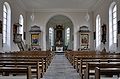
- Nomination Church of Saint Fridolin: interior --Taxiarchos228 08:48, 1 July 2011 (UTC)
- Promotion Good quality. --Saffron Blaze 17:46, 1 July 2011 (UTC)
-

- Nomination Germany, Koblenz, "Deutschordenskommende" --Berthold Werner 06:25, 1 July 2011 (UTC)
- Promotion Needs a tilt adjust. Saffron Blaze 17:50, 1 July 2011 (UTC)
Good quality, not tilted to me--Lmbuga 00:23, 2 July 2011 (UTC)
-

-

-

-

- Nomination Former farmhouse in Simpelveld, NL. --Wammes Waggel 16:28, 30 June 2011 (UTC)
- Decline Crop too tight. --H005 20:25, 1 July 2011 (UTC)
-

- Nomination Dockside cranes near Świnoujście, Poland. Picture taken from Świnoujście Lighthouse. -- Felix Koenig 14:24, 30 June 2011 (UTC)
- Promotion Good quality. --H005 20:23, 1 July 2011 (UTC)
-

-

-

- Nomination Hasel: Protestant Church (organ) --Taxiarchos228 09:23, 29 June 2011 (UTC)
- Promotion Good quality. --Cayambe 14:10, 1 July 2011 (UTC)
-

- Nomination Hasel: Protestant Church (open bible at altar) --Taxiarchos228 09:23, 29 June 2011 (UTC)
- Promotion Good quality. --Cayambe 14:10, 1 July 2011 (UTC)
-

- Nomination The sundial at the parish church in Stubenberg, Styria --Herzi Pinki 21:09, 27 June 2011 (UTC)
- Promotion Very good. --Yann 12:10, 1 July 2011 (UTC)
-

-

- Nomination The Siemens headquater in Munich. --High Contrast 21:49, 26 June 2011 (UTC)
- Decline Sky overexposed. --Yann 12:18, 1 July 2011 (UTC)
-
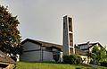
- Nomination: Huttingen: Saint Nicolaus Church --Taxiarchos228 11:19, 26 June 2011 (UTC)
- Review needed
-
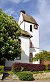
- Nomination: Mappach: Protestant Church (bell tower) --Taxiarchos228 11:19, 26 June 2011 (UTC)
- Review needed
-

- Nomination: Mappach: Protestant Church --Taxiarchos228 11:19, 26 June 2011 (UTC)
- Review needed
-

- Nomination: Callisto by Flamen, Versailles. --Coyau 22:10, 25 June 2011 (UTC)
- Review needed
-

- Nomination: A residence in Eindhoven, the Netherlands, with legal status Rijksmonument. --Wammes Waggel 15:37, 25 June 2011 (UTC)
- Review needed
-

- Nomination: Hyogo Prefectural Museum of Art in Kobe --663highland 14:39, 25 June 2011 (UTC)
- Review needed
-
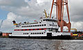
-

- Nomination: Fragment of bas-reliefs. Museum of Fine Arts of Lyon. -- Rama 12:24, 25 June 2011 (UTC)
- Review needed
-

- Nomination Wintersweiler: Protestant Church (altar) --Taxiarchos228 14:41, 24 June 2011 (UTC)
- Promotion Good quality. --Coyau 14:32, 1 July 2011 (UTC)
-

- Nomination Wintersweiler: Protestant Church (interior, view back) --Taxiarchos228 14:41, 24 June 2011 (UTC)
- Promotion Good quality. --Coyau 14:32, 1 July 2011 (UTC)
-

- Nomination Wiener Neustädter Kanal, from L4038, Schönau --Herzi Pinki 13:06, 23 June 2011 (UTC)
- Promotion Good quality. --Coyau 14:33, 1 July 2011 (UTC)
-

- Nomination Renault Clio Cup on the Nürburgring --Carschten 13:06, 20 June 2011 (UTC)
- Promotion I have added a crop suggestion as an annotation. --Jovianeye 00:56, 27 June 2011 (UTC) Done like this? --Carschten 21:36, 1 July 2011 (UTC)
Yes! the guy in the orange shirt was distracting. --Jovianeye 02:31, 2 July 2011 (UTC)
-

- Nomination The western Karwendel in Bavaria. --High Contrast 12:14, 19 June 2011 (UTC)
- Promotion Will support if you can crop out the blue patch from the lower right corner. --Jovianeye 00:37, 27 June 2011 (UTC)
Done --High Contrast 15:07, 1 July 2011 (UTC)
Good now. --Jovianeye 02:26, 2 July 2011 (UTC)
-

- Nomination ORP Grom. Photo taken by me. --Airwolf 08:51, 1 July 2011 (UTC)
- Promotion Good quality. --Taxiarchos228 09:01, 1 July 2011 (UTC)
-

- Nomination The Bonde palace. Today home of the Supreme Court of Sweden. --Ankara 08:28, 1 July 2011 (UTC)
- Promotion Good quality. --Taxiarchos228 09:01, 1 July 2011 (UTC)
-
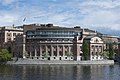
-

-

-

-

- Nomination Gravestone at the Netherlands American Cemetery in Margraten, NL. --Wammes Waggel 16:24, 30 June 2011 (UTC)
- Promotion Good quality. --Tomer T 17:43, 30 June 2011 (UTC)
-

- Nomination Ischnura elegans f. typica, female --Loz 16:17, 30 June 2011 (UTC)
- Promotion Good quality. --Tomer T 17:45, 30 June 2011 (UTC)
-

- Nomination Ischnura elegans, juvenile male --Loz 16:17, 30 June 2011 (UTC)
- Promotion Very good--Holleday 18:22, 30 June 2011 (UTC)
-

- Nomination Ischnura elegans f. violacea, teneral female --Loz 16:17, 30 June 2011 (UTC)
- Promotion Very good--Holleday 18:23, 30 June 2011 (UTC)
-

-

- Nomination Head of a domesticated turkey.--V-wolf 15:19, 30 June 2011 (UTC)
- Decline Overexposed lower half. - A.Savin 15:39, 30 June 2011 (UTC) Comment The body is not intended to be in focus. Would a tighter crop be better? --V-wolf 19:11, 30 June 2011 (UTC) The crop is very tight already; the image has anyway a sharp contrast between the main subject and the background which does not make me think that this one could be a QI; if you disagree, feel free to put this box in the discussion section. - A.Savin 20:10, 30 June 2011 (UTC)
-

-

- Nomination People at the beach. Porto Covo, Portugal. -- Alvesgaspar 23:12, 28 June 2011 (UTC)
- Promotion QI to me--Lmbuga 00:51, 1 July 2011 (UTC)
-

- Nomination Yellow-legged gull guarding the eggs. Porto Covo, Portugal. -- Alvesgaspar 22:55, 28 June 2011 (UTC)
- Promotion Comment QI to me, but I'm not sure--Lmbuga 02:17, 1 July 2011 (UTC)
-

- Nomination Jewel of the Seas in Stockholm June 2011 --Ankara 09:39, 27 June 2011 (UTC)
- Withdrawn
-

- Nomination Jewel of the Seas in Stockholm June 2011b --Ankara 09:39, 27 June 2011 (UTC)
underexposed, but this can be fixed --Taxiarchos228 11:28, 27 June 2011 (UTC) - Withdrawn Thanks, you're right. New version uploaded. Better?--Ankara 12:10, 27 June 2011 (UTC) I would be very grateful for comments on the new versions, are they better and/or there is more to improve?--Ankara 20:56, 30 June 2011 (UTC) Comment On this one, coulour has changed badly. --Ikar.us 23:03, 30 June 2011 (UTC)
- Nomination Jewel of the Seas in Stockholm June 2011b --Ankara 09:39, 27 June 2011 (UTC)
-

- Nomination Annunciation, attribueted to Jacopo di Cione, ca 1371, basilica San Marco, Florence, Italy.--Jebulon 13:36, 25 June 2011 (UTC)
- Promotion Very good. --Yann 11:36, 1 July 2011 (UTC)
-

- Nomination: Stele dedicated to Osiris and the gods of Abydos by the king's flag-bearer Aakheperu-men-su-iam and his family. New Empire, reign of Amenophis II (ca 1450-1425 BCE). Polychrome limestone -- Rama 11:03, 25 June 2011 (UTC)
- Review needed
-

- Nomination: Germany, Göllheim, timber framend building and city gate --Berthold Werner 10:40, 25 June 2011 (UTC)
- Review needed
-
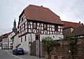
- Nomination: Germany, Göllheim, hauptstr. 59, timber framend building --Berthold Werner 08:08, 24 June 2011 (UTC)
New version with less chromatic aberrations (See chimney at left side). If you want, you (or I) can delete the new version--Lmbuga 12:15, 24 June 2011 (UTC)
Thank you. --Berthold Werner 13:56, 24 June 2011 (UTC) - Review needed
- Nomination: Germany, Göllheim, hauptstr. 59, timber framend building --Berthold Werner 08:08, 24 June 2011 (UTC)
-

- Nomination McDonald's logo, Warsaw, Poland. --Crusier 20:54, 23 June 2011 (UTC)
- Decline Bad compo: a portrait view should have been better for a vertical object, IMO. I don't decline because the rest of the pic is technically good. And I love BigMac.--Jebulon 14:08, 24 June 2011 (UTC)
* Comment I doubt this can be classified as freedom of panorama and is probably therefore unfortunately not free to use. V-wolf 11:11, 26 June 2011 (UTC)
* Comment Per COM:FOP#Poland and COM:L#Simple design, this should be OK. Grand-Duc 22:49, 26 June 2011 (UTC).
Tilted and needs crop on the sides. --Yann 11:25, 1 July 2011 (UTC)
-

-

-

-
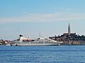
- Nomination: Seabourn Spirit in front of Rovinj old part--Orlovic 16:40, 12 June 2011 (UTC)
- Review I'm seeing some red-cyan chromatic aberrations at some edges. --Ximonic 20:05, 16 June 2011 (UTC)
Comment New version with less chromatic aberrations (see tower). If you want, you can delete the new version--Lmbuga 12:54, 24 June 2011 (UTC)
Comment Is there a bit of a tilt, or is that an optical illusion? I'd favour a landscape 2x3 format for this; as it is, I have the impression you have lots of empty sky. -- Rama 06:58, 25 June 2011 (UTC)
-

- Nomination Bassin de Latone, Verailles. --Coyau 10:56, 30 June 2011 (UTC)
- Promotion Good quality. --Taxiarchos228 10:59, 30 June 2011 (UTC)
-

- Nomination Flower Tagetes in Poland --Kudak 10:32, 30 June 2011 (UTC)
- Decline noisy and bad focus --Taxiarchos228 10:59, 30 June 2011 (UTC)
-

- Nomination Etropole Monastery entrance. --MrPanyGoff 08:49, 30 June 2011 (UTC)
- Promotion Good quality. --Taxiarchos228 10:06, 30 June 2011 (UTC)
-
- Nomination 360° Mohnenfluh Panorama --Böhringer 21:56, 29 June 2011 (UTC)
- Promotion very good image --Taxiarchos228 07:24, 30 June 2011 (UTC)
-

- Nomination Morpho menelaus - Ventral side --Archaeodontosaurus 19:24, 29 June 2011 (UTC)
- Promotion Good quality. --Saffron Blaze 20:10, 29 June 2011 (UTC)
-

-
-

- Nomination Amata phegea (couple) --Holleday 17:40, 29 June 2011 (UTC)
- Promotion Support Background bit noisy but QI & Useful --Archaeodontosaurus 19:26, 29 June 2011 (UTC)
-

-

-

-
- Nomination Bombina variegata --Holleday 17:31, 29 June 2011 (UTC)
- Withdrawn Good quality. --Raghith 17:35, 29 June 2011 (UTC)
Unfortunate flash light. W.S. 22:16, 29 June 2011 (UTC)
-

-

- Nomination The Church of St John the Baptise, Harescombe, England. - Saffron Blaze 15:10, 29 June 2011 (UTC)
- Promotion Comment Very sharp and nice composition but there are some dustspots in the sky. --Berthold Werner 17:37, 29 June 2011 (UTC)
Done Thanks for picking those up. Fixed now. Saffron Blaze 18:41, 29 June 2011 (UTC) Comment May be there is one very small (really very) left (see annotation)? I'm not sure, but nevertheless now QI imho. --Berthold Werner 19:55, 29 June 2011 (UTC) Comment Yes, found it. Thanks again. Time to clean the sensor. Saffron Blaze 20:06, 29 June 2011 (UTC)
-

- Nomination en:Nikolay Vinnichenko, a russian lawyer and politician. - A.Savin 14:51, 29 June 2011 (UTC)
- Promotion Good quality. --Raghith 17:32, 29 June 2011 (UTC)
-

-
- Nomination Danviksbron --Ankara 12:21, 29 June 2011 (UTC)
- Promotion Minor (fat?) spot in the sky above the bridge's head, othervise very nice imho.--V-wolf 12:36, 29 June 2011 (UTC) Thank you. I removed the spot.--Ankara 12:52, 29 June 2011 (UTC) "Green" now, what I can see. --V-wolf 13:53, 29 June 2011 (UTC)
-

- Nomination Episyrphus balteatus -- Pro2 10:22, 29 June 2011 (UTC)
- Decline Not an Episyrphus balteatus, probably an Eupeodes corollae -- Alvesgaspar 11:10, 29 June 2011 (UTC)
I've corrected this, guess you're right about the species. -- Pro2 16:02, 29 June 2011 (UTC)
Wrong white balance and also this syrphid can not be exactly identified from a dorsal view only. Jebulon 22:20, 29 June 2011 (UTC)
-

- Nomination Hasel: Protestant Church (interior) --Taxiarchos228 09:23, 29 June 2011 (UTC)
- Promotion I think it meets the criteria.--MrPanyGoff 11:34, 30 June 2011 (UTC)
-
-

- Nomination A travel luggage belonging to the queen Marie-Antoinette. End of 18th c. Versailles.--Jebulon 23:33, 28 June 2011 (UTC)
- Promotion Support QI & Useful, good caption --Archaeodontosaurus 19:30, 29 June 2011 (UTC)
-

-

-
- Nomination Buildings in Corcubion, Galicia (Spain)--Lmbuga 21:03, 28 June 2011 (UTC)
- Promotion Support QI for me --Archaeodontosaurus 19:32, 29 June 2011 (UTC)
-

- Nomination Luc-Armau war memorial, France --France64160 12:07, 28 June 2011 (UTC)
- Decline Overexposured parts, top of subject obscured. --Elekhh 23:24, 29 June 2011 (UTC)
-

- Nomination Zodiac Inflatable Boat. --MrPanyGoff 09:57, 28 June 2011 (UTC)
- Promotion Support QI to me --Archaeodontosaurus 19:36, 29 June 2011 (UTC)
-

- Nomination Eames plastic chair. -- Rama 19:53, 27 June 2011 (UTC)
- Decline Edges in some areas eaten away --Saffron Blaze 20:59, 27 June 2011 (UTC)
Improved a bit. Quality was unacceptable, sorry for the quality control failure. Thank you to Saffron and Jebulon for comments. -- Rama 16:02, 29 June 2011 (UTC)
-

-

-

- Nomination Music school Henri Duprac, Tarbes, France --Florent Pécassou 08:26, 26 June 2011 (UTC)
- Promotion Need perspective correction (and what about the panorama freedom here? France has no freedom of panorama, and the building looks new.).--Ankara 23:23, 26 June 2011 (UTC) It is a Former abbey. Florent Pécassou 17:23, 29 June 2011 (UTC)
Comment QI now. Saffron Blaze 09:29, 30 June 2011 (UTC)
-

-
-

- Nomination: Ujigami-jinja in Uji, Kyoto --663highland 11:40, 24 June 2011 (UTC)
- Review needed
-

- Nomination: Alfa Romeo MiTo, front view --Maksa 05:08, 24 June 2011 (UTC)
- Review needed
-

- Nomination: Construction of metro, Prague — Jagro 22:46, 23 June 2011 (UTC)
- Review needed
-
-

- Nomination: Bosquet des Rocailles, Versailles. --Coyau 14:02, 23 June 2011 (UTC)
- Review needed
-
- Nomination: The church St. Ägydius and cemetery around in Schwarzensee, Weissenbach an der Triesting --Herzi Pinki 13:06, 23 June 2011 (UTC)
- Review needed
-

- Nomination: Tuchfabrik Pottenstein --Herzi Pinki 13:06, 23 June 2011 (UTC)
- Review needed
-

- Nomination: The family mausoleum of Pacher of Theinburg, a local industrial dynasty in Schönau an der Triesting --Herzi Pinki 13:06, 23 June 2011 (UTC)
- Review needed
-

- Nomination: Spinning mill in Günselsdorf, Lower Austria --Herzi Pinki 13:06, 23 June 2011 (UTC)
- Review Comment Mich stört der Ast der etwas unmotiviert ins Bild ragt. --Berthold Werner 16:54, 23 June 2011 (UTC)
-

- Nomination: Stoertebeker in Marienhafe --Vitold Muratov 13:25, 23 June 2011 (UTC)
- Review needed
-
- Nomination Yellow Dogrose-Flowers with Raindrops. --Abderitestatos 11:05, 23 June 2011 (UTC)
- Promotion Good quality. --Cayambe 07:45, 30 June 2011 (UTC)
-

- Nomination Former factory Christian Dierig AG in Bielawa (Langenbielau) -Pudelek 09:16, 29 June 2011 (UTC)
- Promotion Good quality. --Taxiarchos228 09:23, 29 June 2011 (UTC)
-

- Nomination St. George Church in Varshets. --MrPanyGoff 09:01, 29 June 2011 (UTC)
- Promotion Good quality. --Taxiarchos228 09:23, 29 June 2011 (UTC)
-

- Nomination AT-3. Airwolf 07:18, 29 June 2011 (UTC)
- Promotion Good quality. --Taxiarchos228 09:27, 29 June 2011 (UTC)
-

- Nomination Two cranes (left in place as a historic landmark) of the Stadthafen (city port) of Rostock. --Grand-Duc 04:11, 29 June 2011 (UTC)
- Promotion Good quality. --Taxiarchos228 06:22, 29 June 2011 (UTC)
-

- Nomination Yellow-legged gull guarding the eggs. Porto Covo, Portugal. -- Alvesgaspar 22:55, 28 June 2011 (UTC)
- Promotion Not "pin-sharp" but good. I like the composition.--Jebulon 23:35, 28 June 2011 (UTC)
-

- Nomination Zodiac Inflatable Boat with Yamaha marine engine. --MrPanyGoff 22:49, 28 June 2011 (UTC)
- Promotion Good quality--Lmbuga 00:34, 29 June 2011 (UTC)
-

-

-
-

- Nomination VW Käfer (Volkswagen Beetle/Type 1) at the lake Toeppersee in Duisburg --Carschten 16:19, 28 June 2011 (UTC)
- Promotion Good quality. --Saffron Blaze 16:21, 28 June 2011 (UTC)
-

-

- Nomination Part of the Italian Garden, Berlin-Marzahn --Llez 15:29, 28 June 2011 (UTC)
- Promotion Good quality. --Saffron Blaze 16:21, 28 June 2011 (UTC)
-

- Nomination Canal Parallelkanal in the sports park of Duisburg --Carschten 15:02, 28 June 2011 (UTC)
- Promotion Nice composition. Draws you in. --Saffron Blaze 16:21, 28 June 2011 (UTC) I was just going to promote it and say the same. Very nice composition!--Ankara 16:25, 28 June 2011 (UTC)
-

- Nomination ORP Wdzydze. --Airwolf 14:04, 28 June 2011 (UTC)
- Promotion Good quality. --Mbdortmund 14:39, 28 June 2011 (UTC)
-

- Nomination Lörrach: Germanus Church (main portal) --Taxiarchos228 12:42, 28 June 2011 (UTC)
- Promotion Good quality. --Carschten 15:02, 28 June 2011 (UTC)
-

- Nomination Grenzach: Saint Michels Church (interior) --Taxiarchos228 12:42, 28 June 2011 (UTC)
- Promotion Good quality. Might want to crop the left a bit to even it out with the right... symmetry. --Saffron Blaze 16:23, 28 June 2011 (UTC)
-

- Nomination Grenzach-Wyhlen: memorial --Taxiarchos228 12:42, 28 June 2011 (UTC)
- Promotion Good quality, albeit the cars disturb a bit - A.Savin 19:23, 28 June 2011 (UTC)
-

- Nomination Rheinfelden: Gallus Church --Taxiarchos228 12:42, 28 June 2011 (UTC)
- Promotion Good quality. --Carschten 15:02, 28 June 2011 (UTC)
-

- Nomination Peyrelongue-Abos housse, France --France64160 12:07, 28 June 2011 (UTC)
- Promotion Good quality. --Saffron Blaze 12:33, 28 June 2011 (UTC)
-

-
- Nomination "L'Europe", by Pierre Mazeline (1632-1708). Original. Galerie de Marbre, Château de Versailles.--Jebulon 23:03, 27 June 2011 (UTC)
- Promotion Good quality. There is a thing, though, with light in the galerie basse really blue at the feet and yellow above the thigh. --Coyau 01:01, 28 June 2011 (UTC) Done--Jebulon 10:19, 29 June 2011 (UTC)
-

- Nomination Dossenbach: Protestant Church, construction table ("Build with God") --Taxiarchos228 06:41, 27 June 2011 (UTC)
- Promotion Good quality. --Cayambe 08:14, 27 June 2011 (UTC) Comment I concur with the overall assessment, but the composition could be improved with a more left/right balanced crop. Saffron Blaze 11:52, 28 June 2011 (UTC)
you are right, I have improved it --Taxiarchos228 18:41, 28 June 2011 (UTC)
-

- Nomination Silver Medal for merits for the state of Lower Austria --AleXXw 17:24, 23 June 2011 (UTC)
- Decline At full resolution the lower half of the image is rather soft or out of focus even. In fact only the ribbon is in focus. At f5.6 this is odd. --Saffron Blaze 16:44, 28 June 2011 (UTC)
-

- Nomination Duisburg Inner Harbour at evening --Carschten 10:06, 23 June 2011 (UTC)
- Promotion As an evening shot this is well executed. --Saffron Blaze 16:39, 28 June 2011 (UTC)
-
- Nomination: Crashed BMW M3 at the Nürburgring --Carschten 10:06, 23 June 2011 (UTC)
- Review needed
-

- Nomination Audi R8 LMS, the winner car of that day, on the Nürburgring --Carschten 10:06, 23 June 2011 (UTC)
- Promotion Good quality. --Saffron Blaze 16:39, 28 June 2011 (UTC)
-

- Nomination: Le Soir, by Desjardins, Versailles (photo by Trizek). --Coyau 01:10, 23 June 2011 (UTC)
- Review Too overexposed area, (do you have the RAW file?)--Archaeodontosaurus 09:20, 23 June 2011 (UTC)
No RAW file :/ ; Exposition reviewed --Trizek 09:55, 23 June 2011 (UTC)
-

- Nomination: Rašínovo nábřeží, Prague — Jagro 23:19, 22 June 2011 (UTC)
- Review needed
-

- Nomination: A fully opened and a half opened flower of Bellis perennis. --Grand-Duc 21:59, 22 June 2011 (UTC)
- Review needed
-

- Nomination: A side view of a swimming black-headed gull. --Grand-Duc 21:59, 22 June 2011 (UTC)
- Review needed
-

- Nomination: Tunnel of metro, Prague — Jagro 17:15, 22 June 2011 (UTC)
- Review needed
-

- Nomination: Construction of metro in Prague — Jagro 17:15, 22 June 2011 (UTC)
- Review needed
-

-
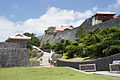
- Nomination: Shuri Castle, Okinawa --663highland 14:14, 22 June 2011 (UTC)
- Review needed
-

- Nomination Tourists in Varanasi, India --Sfu 19:35, 20 June 2011 (UTC) Neutral Coulours in background are very "pale". Is it due to air pollution? This emphasizes the coulourful boat in an interesting way. But crop on top is too narrow. --Ikar.us 23:17, 24 June 2011 (UTC)
it`s rather fog. But could be smoke as well. Sfu 19:10, 26 June 2011 (UTC) - Promotion Very impressive and good enough for me. --Ikar.us 11:40, 29 June 2011 (UTC)
- Nomination Tourists in Varanasi, India --Sfu 19:35, 20 June 2011 (UTC)
-

- Nomination Windows in a red brick wall--Jonathunder 00:53, 18 June 2011 (UTC)
- Decline I'm unsure about the tilt. -- Rama 08:15, 21 June 2011 (UTC) OpposeDistorsion IMO.--Jebulon 10:03, 29 June 2011 (UTC)
-

- Nomination Hoover Tower. --King of Hearts 12:03, 7 June 2011 (UTC)
- Decline Comment There is a highly un natural, flash light/reflection from the sun on the top left of the tower. highly distracting --Good twins 22:28, 9 June 2011 (UTC)
It is easy to make a shot without the sunstar. The inclusion was intentional. --King of Hearts 06:31, 11 June 2011 (UTC) Oppose The light reflection is not problem for me, however I don't like the lightning: there is too bright (disturbing) grass on the front while the main object (building) is gray. Maybe try to crop and change levels of the grass. --Daniel Baránek 10:33, 17 June 2011 (UTC)


_%26_Mont_Blanc,_2010_July.jpg)


.jpg)


,_Hinn%C3%B8ya,_2010_September.jpg)
.jpg)


.jpg)


.jpg)


.jpg)


_(3).JPG)


.jpg)


.jpg)


_in_Baltimore.jpg)


.jpg)


.jpg)


_en_Ribadavia_-_Galiza.jpg)


![* Nomination Cheers at the Eurockéennes de Belfort 2011 -- Rama 12:24, 11 July 2011 (UTC) * Promotion Question Who or what is "Cheers" here? Not this person, I guess? -- H005 20:50, 12 July 2011 (UTC) [1] -- Rama 21:08, 13 July 2011 (UTC) That doesn't help much, sorry. A proper description is required for an image to become QI - currently it's insufficient. -- H005 21:19, 15 July 2011 (UTC) Any better now? Rama 10:36, 20 July 2011 (UTC) I've added some more info. --H005 11:40, 21 July 2011 (UTC)](/wiki/File:Cheers_IMG_5697.jpg)


.jpg)
.jpg)
.jpg)


.jpg)


.jpg)


_krzy%C5%BCe_w_drzewach_31.08.2010_p.jpg)


.jpg)
.jpg)


._Ribadavia-_Galiza.jpg)


_en_Ribadavia_-_Galiza-3.jpg)


.jpg)


-5.jpg)
-2.jpg)
.jpg)


.jpg)


.JPG)


.jpg)


.jpg)
.jpg)


_en_Ribadavia_-_Galiza-2.jpg)
_en_Ribadavia_-_Galiza-4.jpg)
_en_Ribadavia_-_Galiza-5.jpg)
_en_Ribadavia_-_Galiza-7.jpg)
_en_Ribadavia_-_Galiza-6.jpg)

_in_Baltimore.jpg)


.jpg)


_in_Baltimore.jpg)


.jpg)


._Ribadavia_-_Portal.jpg)

.jpg)


.jpg)

.jpg)


.jpg)


.jpg)


.JPG)


.jpg)


,_Train_Station.jpg)


.jpg)


.jpg)


.jpg)


.jpg)


-mai2011.jpg)


.JPG)


.jpg)


_2.JPG)


.jpg)
.jpg)
.jpg)


.JPG)
.JPG)


.JPG)
_2.jpg)


,_2011-06_CN-03.jpg)
,_2011-06_CN-02.jpg)


_2.jpg)
,_2011-06_CN-01.jpg)
.jpg)
_on_the_table.jpg)
_on_a_leaf_-_20110605.jpg)
.jpg)
.jpg)
Consensual review[edit]
File:Duisburg, Loveparade-Mahnmal, 2011-06 CN-04.jpg[edit]

- Nomination Love Parade monument (detail) --Carschten 17:27, 27 June 2011 (UTC)
- Decline
 Weak oppose White candle is blown with CA as well. --Saffron Blaze 20:59, 27 June 2011 (UTC)
candle not blown out, it's white. CA are not disturbing and very small --Carschten 15:06, 28 June 2011 (UTC)
Comment Photoshop shows 251,255,255 in the central area of the candle but the majority of the candle is less than blown as you point out. Just seems to glow to me and I am not talking about the flame. Saffron Blaze 16:58, 28 June 2011 (UTC)
Running total: 0 support (excluding the nominator), 1 oppose → Decline? --W.S. 07:20, 1 July 2011 (UTC)
File:San Felice Chiesa exterieur.jpg[edit]

- Nomination San Felice Church in Venice --Archaeodontosaurus 16:54, 25 June 2011 (UTC)
- Promotion
- Support Maybe crop a bit tight above, but very good.--Jebulon 17:06, 25 June 2011 (UTC)
- Oppose much too tight crop at top, bad quality/detail (compared e.g. at the man at the right) --Carschten 17:54, 25 June 2011 (UTC)
- Support At 24Mpixel I don't expect pixel sharpness. Still surprising detail on the man. --Ikar.us 12:25, 26 June 2011 (UTC)
- Support The people are inconequential, as the building is the main subject and it shows good detail. If a wider crop on top is available I recommend it be done, but if not this still meets QI. Saffron Blaze 16:29, 28 June 2011 (UTC)
Running total: 3 support (excluding the nominator), 1 oppose → Promote? --Ikar.us 12:25, 26 June 2011 (UTC)
File:Nagorie 4474.jpg[edit]
- Nomination Church dome in Nagorye village. PereslavlFoto 18:01, 21 June 2011 (UTC)
- Decline Info It was nominated and declined twice. --Kae 20:15, 22 June 2011 (UTC)
I underscore: declined without reasons. So I have to nominate it again.--PereslavlFoto 22:03, 23 June 2011 (UTC) - Support Plausible coulours, good contrast where structures are present. No noise. --Ikar.us 21:27, 24 June 2011 (UTC)
- Oppose Overexposed, especially on the sky but also a bit on the building. - A.Savin 09:14, 25 June 2011 (UTC)
- Спасибо за конкретное указание, попробую чинить небо. А где на здании? Ближний край купола, наверное?--PereslavlFoto 11:48, 27 June 2011 (UTC)
- Oppose overexposured sky, tilted cw --Mbdortmund 11:26, 26 June 2011 (UTC)
- Seems you are right about exposition, I will check if anything can be done. And where do you see the tilt? Thanks.--PereslavlFoto 11:48, 27 June 2011 (UTC)
- Hi Pereslav, I marked three lines, where you can imo see the tilt --Mbdortmund 00:41, 28 June 2011 (UTC)
- Thanks, I see now. AFAIR, a church dome must be straight vertical, and other lines could be tilted. The base of this dome is partly on the ground and partly on the sidewalk, and should I keep the buildings vertical, the dome apeears to be tilted.--PereslavlFoto 13:19, 28 June 2011 (UTC)
- Hi Pereslav, I marked three lines, where you can imo see the tilt --Mbdortmund 00:41, 28 June 2011 (UTC)
- Seems you are right about exposition, I will check if anything can be done. And where do you see the tilt? Thanks.--PereslavlFoto 11:48, 27 June 2011 (UTC)
Running total: 1 support (excluding the nominator), 2 oppose → Decline? --Elekhh 03:41, 1 July 2011 (UTC)
File:St._Nicolai_Lüneburg_-_Chorseite.jpg[edit]

- Nomination: Lüneburg: Saint Nicolai church (choir side) --Taxiarchos228 09:33, 22 June 2011 (UTC)
- Review
- Oppose very noisy --Carschten 16:04, 22 June 2011 (UTC)
- now denoised, good now for QI? --Taxiarchos228 16:53, 22 June 2011 (UTC)
- much better, but I'm not sure if it's good enough for QI. There's also a halo because of the backlight. I think it's the best to hear some other opinions here in CR. --Carschten 09:40, 24 June 2011 (UTC)
- Support Much better. To me QI: the halo is not too strong--Lmbuga 13:30, 24 June 2011 (UTC)
- Support I think it's good too. The composition looks good to me, and I suppose it was not easy.--Jebulon 23:07, 25 June 2011 (UTC)
- Oppose Halo is even visible in thumb. W.S. 08:09, 28 June 2011 (UTC)
- Oppose Halo is only in thumb. But the crown thing on the tower tip is unsharp. --Ikar.us 14:15, 29 June 2011 (UTC)
- Support Good enough IMHO. -- H005 22:29, 30 June 2011 (UTC)
Running total: 3 support (excluding the nominator), 3 oppose → More votes? --W.S. 08:09, 28 June 2011 (UTC)
File:Meersalat-Ulva-lactuca.jpg[edit]

- Nomination Ulva lactuca --Holleday 17:30, 29 June 2011 (UTC)
- Withdrawn
- Support Good quality. --Raghith 17:35, 29 June 2011 (UTC)
- Oppose Insufficient DOF, Poor light (underexposed). W.S. 22:16, 29 June 2011 (UTC)
 I withdraw my nomination--Holleday 16:27, 2 July 2011 (UTC)
Running total: 1 support (excluding the nominator), 1 oppose → More votes? Ikar.us 21:14, 1 July 2011 (UTC)
File:Coenagrion puella qtl4.jpg[edit]

- Nomination Azure Damselfly, androchrome female. --Quartl 20:45, 25 June 2011 (UTC)
- Promotion
- OpposeI like it, but the background is noisy, and there are blown areas. Not bad enough to decline, so let's discuss this one. --The High Fin Sperm Whale 20:16, 25 June 2011 (UTC)
- I adjusted brightness and contrast to reduce the blown areas on the damselfly; the background also appears less noisy now. --Quartl 21:37, 25 June 2011 (UTC)
- Support--Lmbuga 21:22, 26 June 2011 (UTC)
- Support good now --Archaeodontosaurus (talk) 10:11, 28 June 2011 (UTC)
- Support Very good --Holleday 17:46, 29 June 2011 (UTC)
Running total: 3 support (excluding the nominator), 1 oppose → Promote? --Elekhh 23:09, 2 July 2011 (UTC)
File:Wies_-_Evangelische_Kirche_Wies3.jpg[edit]

- Nomination Wies: Protestant Church, bell tower --Taxiarchos228 08:48, 1 July 2011 (UTC)
- Decline
- Oppose Rather noisy sky. W.S. 09:33, 1 July 2011 (UTC)
- denoised --Taxiarchos228 16:53, 1 July 2011 (UTC)
- Comment Might be a caching issue but the two images are still identical at this time. Saffron Blaze 21:19, 1 July 2011 (UTC)
- Commentit is not, look at the file history or purge your cache --Taxiarchos228 15:16, 2 July 2011 (UTC)
- Comment I did that but they were and are still the same. Like I said... a server side caching issue. I'll take your word it was edited. Saffron Blaze 22:22, 2 July 2011 (UTC)
- try this link --Taxiarchos228 10:00, 7 July 2011 (UTC)
Running total: 0 support (excluding the nominator), 1 oppose → Decline? --W.S. 05:46, 4 July 2011 (UTC)~
File:Lissewege_Toren_R01.jpg[edit]

- Nomination The 13th century bell tower of Our Lady's church in Lissewege, Belgium -- MJJR 21:00, 22 June 2011 (UTC)
- Decline
- Support Good quality. --Coyau 10:59, 1 July 2011 (UTC)
- Oppose IMO it needs perspective correction. --Yann 11:20, 1 July 2011 (UTC)
- Oppose Perhaps QI, I don't know, but the vertical lines aren't stright. Needs correction of perspective (if you want, I can do it)--Lmbuga 00:38, 2 July 2011 (UTC)
Running total: 1 support (excluding the nominator), 2 oppose → Decline? W.S. 05:42, 4 July 2011 (UTC)
File:Malwa POL.jpg[edit]

- Nomination Flowers Alcea in Poland -- Kudak 20:47, 29 June 2011 (UTC)
- Decline
- SupportGood quality. Interesting lighting. -- Saffron Blaze 21:08, 29 June 2011 (UTC)
- Oppose Poor lighting and image quality -- Alvesgaspar 22:06, 29 June 2011 (UTC)
- Oppose As Alvesgaspar --Lmbuga 12:58, 30 June 2011 (UTC)
Running total: 1 support (excluding the nominator), 2 oppose → Decline? Ikar.us 21:14, 1 July 2011 (UTC)
File:DOD metro Vypich, vozidlo Báňské záchranné služby.jpg[edit]

- Nomination Ambulance of mining emergency — Jagro 17:15, 22 June 2011 (UTC)
- Promotion
- Support Good quality -- George Chernilevsky 08:14, 28 June 2011 (UTC)
- Oppose Composition: If the car is the subject than the background is distracting and the file description insufficient. If the construction site behind the car is the subject than it's obscured.--Elekhh 08:40, 29 June 2011 (UTC)
- Support Disagree. The car is red and cannot be confused with the background. And it is in situ, I find the compo very realistic.--Jebulon 13:51, 29 June 2011 (UTC)
- Support per Jebulon. --Ikar.us 14:17, 29 June 2011 (UTC)
- Support per Jebulon. -- Saffron Blaze 20:25, 29 June 2011 (UTC)
- Comment Compare file description "Open doors day in Vypich metro construction site of new section V.A metro, Prague 6" vs QI criteria "Quality images must be categorized, have a meaningful title and description." --Elekhh 23:15, 29 June 2011 (UTC)
Running total: 4 support (excluding the nominator), 1 oppose → Promote? --Ikar.us 14:17, 29 June 2011 (UTC)
File:Duisburg, Loveparade-Mahnmal, 2011-06 CN-01.jpg[edit]

- Nomination LoveParade monument (inducted today!) --Carschten 20:33, 26 June 2011 (UTC)
- Decline
- Support Good quality. --Taxiarchos228 20:58, 26 June 2011 (UTC)
- Oppose I disagree, as there are overexposed areas, the plane of focus seems to be behind the main subject and there are odd artefacts in the shadow areas of the sculpture. --Saffron Blaze 21:47, 27 June 2011 (UTC)
- Oppose The plane of focus looks wrong to me too.--Jebulon 09:57, 29 June 2011 (UTC)
Running total: 1 support (excluding the nominator), 2 oppose → Decline? --Jebulon 09:57, 29 June 2011 (UTC)
File:Tegelhällan sunset.jpg[edit]

- Nomination Lighthouse Tegelhällan by Stavsnäs in Stockholm archipelago. -- Esquilo 19:12, 24 June 2011 (UTC)
- Decline
- OpposeToo darkish part between the water and the sky; nice motive but due to much too high contrast rather something for exposure blending or HDR. - A.Savin 10:01, 25 June 2011 (UTC)
- Support I doubt HDR would improve this image. I think it is fine. --King of Hearts 19:44, 25 June 2011 (UTC)
- Comment Got only one shot, so HDR or exposure blending is out of the question. I played a little with the levels, but adjusting them to much would make the dark areas noisy. Esquilo 19:54, 25 June 2011 (UTC)
- Oppose Too dark. Yann 15:10, 2 July 2011 (UTC)
Running total: 1 support (excluding the nominator), 2 oppose → Decline? Yann 15:10, 2 July 2011 (UTC)
File:Kruchinin-2011-2.jpg[edit]

- Nomination: Igor Alexandrovich Kruchinin.--PereslavlFoto 16:46, 24 June 2011 (UTC)
- Review
- Support To be perfect, focus could be more on the eye instead of the ear. But still very good. --Ikar.us 22:03, 24 June 2011 (UTC)
- Oppose unfortunate composition and badly overexposed below + on the left. - A.Savin 09:07, 25 June 2011 (UTC)
- Comment Didn't we have this debate before for this photo or one almsot identical? Saffron Blaze 16:31, 28 June 2011 (UTC)
- There was a photo of this person, already discussed, retouched on the results of discussion, QI now. This is another image. Looks like it is not so perfect.--PereslavlFoto 13:47, 29 June 2011 (UTC)
Running total: 1 support (excluding the nominator), 1 oppose → More votes? --Mbdortmund 04:55, 26 June 2011 (UTC)
File:M-danilov-sobor-5423.jpg[edit]

- Nomination Danilov monastery in Pereslavl, belltower and Trinity cathedral.--PereslavlFoto 14:49, 24 June 2011 (UTC)
- Decline
- Support Good available light photo. --Ikar.us 22:06, 24 June 2011 (UTC)
- Oppose Too tight at top. The left vertical lines aren't straight--Lmbuga 22:19, 24 June 2011 (UTC)
- Oppose as per Lmbuga. Yann 15:11, 2 July 2011 (UTC)
- Oppose per Lmbuga --Carschten 15:02, 3 July 2011 (UTC)
Running total: 1 support (excluding the nominator), 3 oppose → Decline? --Carschten 15:02, 3 July 2011 (UTC)
File:Grenzach_-_St._Leodegar2.jpg[edit]

- Nomination Grenzach-Wyhlen: Saint Leodegar Church, main portal and memorial --Taxiarchos228 12:42, 28 June 2011 (UTC)
- Decline
- Oppose Bad crop: too much or too little. --Yann 14:36, 2 July 2011 (UTC)
- picture is showing main portal and memorial and nothing else. please reason why this should be a bad crop. --Taxiarchos228 09:58, 7 July 2011 (UTC)
- Support --Carschten 14:39, 3 July 2011 (UTC)
- Oppose Agree the crop is poor. Just because the picture contains two elements the nominator wanted to display doesn't mean it was composed well. Would work better as separate pictures of the memorial and the front face of the building, and a different time of day would improve the lighting on both. Colin 15:23, 3 July 2011 (UTC)
Running total: 1 support (excluding the nominator), 2 oppose → Decline? --Carschten 14:39, 3 July 2011 (UTC)
File:Fischingen_-_Evangelische_Kirche1.jpg[edit]

- Nomination Fischingen: Protestant Church --Taxiarchos228 11:19, 26 June 2011 (UTC)
- Decline
- Oppose Needs perspective correction. --Yann 14:16, 2 July 2011 (UTC)
- I have already corrected the perspective, IMO it is okay --Taxiarchos228 10:48, 7 July 2011 (UTC)
- Oppose heavy perspective distortions, noise (especially in the shadows) --Carschten 14:37, 3 July 2011 (UTC)
Running total: 0 support (excluding the nominator), 2 oppose → Decline? --Carschten 14:37, 3 July 2011 (UTC)
File:Käferstammtisch Rhein-Ruhr (Duisburg), 2011-06 CN-01.jpg[edit]
,_2011-06_CN-01.jpg)
- Nomination VW Käfer (Volkswagen Beetle/Type 1) at the lake Toeppersee in Duisburg --Carschten 16:19, 28 June 2011 (UTC)
- Decline
- Comment I think the composititon is a bit messy and the person leaning towards the car has a chopped head. Nice glow on the car though. More thoughts? V-wolf 06:35, 2 July 2011 (UTC)
- Oppose as per V-wolf. Yann 14:54, 2 July 2011 (UTC)
Running total: 0 support (excluding the nominator), 1 oppose → Decline? --Taxiarchos228 14:52, 3 July 2011 (UTC)
File:Borlachschacht.jpg[edit]

- Nomination Historical Building in Bad Kösen. --Genealogist 10:50, 14 June 2011 (UTC)
- Decline
- Comment Underexposed and tight crop above. The rest is correctible : distorsion (see the streetlamp) and disturbing leaves at the left edge.--Jebulon 14:12, 21 June 2011 (UTC)
- Oppose The lines of the right side aren't stright--Lmbuga 22:12, 24 June 2011 (UTC)
- Oppose Per all above, and no answer--Jebulon 10:01, 29 June 2011 (UTC)
- Comment Thnaks for your hints. Next time better ... --Genealogist 16:43, 29 June 2011 (UTC)
- This one could be improved !--Jebulon 23:57, 29 June 2011 (UTC)
- Info I tried to make some corrections. --Yann 17:43, 1 July 2011 (UTC)
- Support sky at the left now overexposed, but its's very nice and good enough for QI imo --Carschten 16:06, 3 July 2011 (UTC)
Running total: 1 support (excluding the nominator), 2 oppose → Decline? --Carschten 16:10, 3 July 2011 (UTC)
File:Ettal_-_Klosterkirche_Ettal6.jpg[edit]

- Nomination Ettal Abbey: interior of the cupola at choir --Taxiarchos228 10:04, 30 June 2011 (UTC)
- Decline
- Oppose Framing looks random, and unappealing. --Elekhh 03:31, 1 July 2011 (UTC)
- framing is not random but given by the construction itself, picture shows the entire cupola. --Taxiarchos228 06:20, 1 July 2011 (UTC)
- Oppose As Elekhh and poor lighting--Lmbuga 00:41, 2 July 2011 (UTC)
- Oppose agree with Lmbuga --Carschten 16:04, 3 July 2011 (UTC)
Running total: 0 support (excluding the nominator), 3 oppose → Decline? --Carschten 16:04, 3 July 2011 (UTC)
File:Cat Poland.jpg[edit]

- Nomination Cat Felis catus in Poland -- Kudak 20:32, 29 June 2011 (UTC)
- Decline
- Support Good quality. --Taxiarchos228 20:34, 29 June 2011 (UTC)
- Oppose I disagree, the background is distracting. Alvesgaspar 22:05, 29 June 2011 (UTC)
- Support I think a tighter crop would eliminate any distraction; however, as it stands this is still an excellent capture... sharp, nice isolation. Certainly QI. Saffron Blaze 00:03, 30 June 2011 (UTC)
- Support Contrast of head against background is very good. But it should have more specific CATegories. --Ikar.us 21:17, 1 July 2011 (UTC)
- Oppose As Alvesgaspar--Lmbuga 00:45, 2 July 2011 (UTC)
- Oppose per Alvesgaspar + strange colours of the background --Mbdortmund 02:52, 2 July 2011 (UTC)
- Support OK for me. Yann 14:59, 2 July 2011 (UTC)
- Oppose per Alvesgaspar --Archaeodontosaurus 16:00, 2 July 2011 (UTC)
- Oppose residues of color noise, the pad on the ground is disturbing. --Carschten 14:59, 3 July 2011 (UTC)
Running total: 4 support (excluding the nominator), 5 oppose → Decline? --Carschten 14:59, 3 July 2011 (UTC)
File:Duisburg, Loveparade-Mahnmal, 2011-06 CN-02.jpg[edit]

- Nomination: Love Parade monument --Carschten 17:27, 27 June 2011 (UTC)
- Review
- Blown or overexposed background elements --Saffron Blaze 20:59, 27 June 2011 (UTC)
- Comment Issue appears to have been corrected enough for QI. Saffron Blaze 20:20, 29 June 2011 (UTC)
Running total: 0 support (excluding the nominator), 0 oppose → More votes? Ikar.us 21:14, 1 July 2011 (UTC)
File:Malsburg-Kaltenbach_-_Evangelische_Kirche8.jpg[edit]

- Nomination: Kaltenbach: Protestant Church from North --Taxiarchos228 11:52, 23 June 2011 (UTC)
- Review
- Oppose building is underexposed --Carschten 12:01, 23 June 2011 (UTC)
- it is not --Taxiarchos228 12:11, 23 June 2011 (UTC)
- Oppose clearly underexposed to me--Lmbuga 22:51, 30 June 2011 (UTC)
- please appoint accurately where this picture should be underexposed, wonder how this File:Malsburg-Kaltenbach - Evangelische Kirche7.jpg picture could get QI if you are right. --Taxiarchos228 06:25, 1 July 2011 (UTC)
- Ok, thanks--Lmbuga 21:30, 4 July 2011 (UTC)
- Support Well exposed. (Given that reviewers usually request exposure of sky, everything else must be rather dark.) --Ikar.us 21:23, 1 July 2011 (UTC)
- Support Ok for me. Yann 15:03, 2 July 2011 (UTC)
- Oppose Agree, underexposed building and not terribly sharp. This is no better than #9 of this church and significantly worse than #7. --Colin 15:41, 3 July 2011 (UTC)
- Support QI for me --Archaeodontosaurus 16:49, 3 July 2011 (UTC)
Running total: 3 support (excluding the nominator), 3 oppose → More votes? --Carschten 15:59, 3 July 2011 (UTC)
File:Heliconius sara butterfly.jpg[edit]

- Nomination Heliconius sara -- Pro2 17:38, 24 June 2011 (UTC)
- Decline
- Comment the image is 1,800 × 1,197 pixels and the buterfly a little part of the image. With this size the detail is little. I don't like the cropp at upper side--Lmbuga 21:38, 24 June 2011 (UTC)
- Another opinion would be nice -- Pro2 10:22, 29 June 2011 (UTC)
- Support Seems to have sufficient detail to meet QI if I have the 2 mpix concept correct. Lovely composition and lighting as well. Saffron Blaze 14:53, 29 June 2011 (UTC)
- Neutral Only good image of the ventral side for this species. To be promoted by VI. For QI i don't know --Archaeodontosaurus 19:45, 29 June 2011 (UTC)
- Oppose Poor crop to me. Too tight at top (and see my comment)--Lmbuga 00:32, 2 July 2011 (UTC)
- Oppose -- Nice butterfly but poor framing. -- Alvesgaspar 20:10, 2 July 2011 (UTC)
Running total: 1 support (excluding the nominator), 2 oppose → Decline? --Carschten 15:58, 3 July 2011 (UTC)
File:Tegelhällan sunset.jpg[edit]
- Nomination Lighthouse Tegelhällan by Stavsnäs in Stockholm archipelago. -- Esquilo 19:12, 24 June 2011 (UTC)
- Decline
- OpposeToo darkish part between the water and the sky; nice motive but due to much too high contrast rather something for exposure blending or HDR. - A.Savin 10:01, 25 June 2011 (UTC)
- Support I doubt HDR would improve this image. I think it is fine. --King of Hearts 19:44, 25 June 2011 (UTC)
- Comment Got only one shot, so HDR or exposure blending is out of the question. I played a little with the levels, but adjusting them to much would make the dark areas noisy. Esquilo 19:54, 25 June 2011 (UTC)
- Oppose Too dark. Yann 15:10, 2 July 2011 (UTC)
Running total: 1 support (excluding the nominator), 2 oppose → Decline? Yann 15:10, 2 July 2011 (UTC)
File:ANTONY GORMLEY Kriegeralpe Panorama.jpg[edit]

- Nomination ANTONY GORMLEY Kriegeralpe Panorama --Böhringer 20:56, 30 June 2011 (UTC)
- Decline
- Comment Sorry, tilted? In File:ANTONY GORMLEY Widderstein 09.JPG the sculpture is straight--Lmbuga 22:34, 30 June 2011 (UTC)
- Support Good quality. --Taxiarchos228 06:20, 1 July 2011 (UTC)
- Oppose Clearly tilted (File:ANTONY GORMLEY Widderstein 09.JPG and others in the category: Category:Horizon Field, Großer Widderstein)--Lmbuga 00:49, 2 July 2011 (UTC)
- Oppose As Lmbuga. W.S. 12:19, 3 July 2011 (UTC)
- Oppose per Lmbuga --Carschten 14:46, 3 July 2011 (UTC)
- Oppose The water shows tilt. --Ikar.us 21:45, 4 July 2011 (UTC)
- Info der Rest ist offensichtlich nichts wert? Es könnte ja einer von euch das Bild drehen und neu hochladen anstatt nur abzuwinken. Ich werde es zur gegebenen Zeit selbst drehen. Danke euch --Böhringer 08:06, 5 July 2011 (UTC)
Running total: 1 support (excluding the nominator), 4 oppose → Decline? --Elekhh 02:59, 8 July 2011 (UTC)
File:Frozen joy.jpg[edit]

- Nomination Frozen joy – W.S. 19:56, 30 June 2011 (UTC)
- Decline
- Support QI. Adequately handled motion--Lmbuga 23:35, 30 June 2011 (UTC)
- Oppose Sorry to disagree. The raw shot is very good, but it has been ruined in postprocessing from all I can tell. Something has been done to the s-curve that makes the bright areas too bright and the dark areas too dark. -- H005 20:37, 1 July 2011 (UTC)
- ??? there was no raw shot. W.S. 12:10, 3 July 2011 (UTC)
- Of course there was. There is no digital image on this world that didn't com from raw data from the sensor - whether the raw is saved and whether postprocessing was done in the camera or outside doesn't matter. -- H005 20:28, 5 July 2011 (UTC)
- You are funny. There was no RAW saved. Wetenschatje 20:53, 5 July 2011 (UTC)
- No, I am serious. It doesn't matter whether it was saved, I just see that this jpg is the result of something more than just simple JPG transfer of the raw data, and that this "something more" is something that, IMHO, ruined the image, sorry. -- H005 11:40, 6 July 2011 (UTC)
- You are funny. There was no RAW saved. Wetenschatje 20:53, 5 July 2011 (UTC)
- Support I do not understand the remark of H005 ; for me in the dynamic conditions in which the photograph was taken, it's QI. --Archaeodontosaurus 13:28, 3 July 2011 (UTC)
- Oppose bad light (lots of overexposed parts), poor white balance, poor composition (tight crop, very disturbing foreground), motion blur (too long exposure). Clear not QI to me --Carschten 14:51, 3 July 2011 (UTC)
- Oppose motion blur is appropriate to this image but the foreground is disturbing --Taxiarchos228 06:14, 5 July 2011 (UTC)
- Support Well dealt with subject. It's hard to take photos like this without disturbing elements. --Ikar.us 22:18, 5 July 2011 (UTC)
- Oppose The rest is good, or has mitigating circumstances, but there are lots overexposed areas IMO (leg, hands, empty yellow seat.)--Jebulon 23:53, 5 July 2011 (UTC)
Running total: 3 support (excluding the nominator), 4 oppose → Decline? --Elekhh 03:00, 8 July 2011 (UTC)
File:Trôo - collégiale Saint-Martin.jpg[edit]

- Nomination Saint-Martin church in Trôo. --Eusebius 06:44, 3 July 2011 (UTC)
- Decline
- Oppose Perspective distortion. Sorry, to me, it's not possible the perspective correction--Lmbuga 17:33, 4 July 2011 (UTC)
- I thought it would be obvious that the strong perspective induced by the low-angle point of view was a deliberate choice here, not a mistake. I request other opinions. --Eusebius 15:42, 5 July 2011 (UTC)
- Comment I think you will find a real disconnect between what may be considered a QI as per the image guidelines and what is expected of QI here. I find there is an over emphasis on a certain subset of technical achievents (I even have been guilty of this) and very little emphasis on value or artistic merit. I think your image is striking but I also know that it will never pass for a QI here because of the perspective issue.Saffron Blaze 09:21, 6 July 2011 (UTC)
- Oppose Distortion does not matter, because it is not a mistake but a special effect. Let us check the QI guidelines, and we read a supprise: Perspective distortion should either have a purpose. They do! — Yet I see CA to the left on the roof, noisy sky, and the whole image seems tilted — check the topmost cross. On the other hand, the lighting conditions are about perfect. The whole image is about emotions raised by the church. Will support after clearing those issues.--PereslavlFoto (talk) 19:02, 6 July 2011 (UTC) But people are right, crop is too tight, so I oppose.--PereslavlFoto 12:59, 7 July 2011 (UTC)
- Comment I am more disturbed by the very tight framing and bottom crop of the building than the perspective effect. --Elekhh 07:11, 7 July 2011 (UTC)
- Oppose No problem with perspective here, I understand the purpose. The tilt can be corrected. But I have to oppose because of the tight framing and the bottom crop.--Jebulon 09:42, 7 July 2011 (UTC)
Running total: 0 support (excluding the nominator), 3 oppose → Decline? George Chernilevsky 11:58, 9 July 2011 (UTC)
File:Kandern_-_Katholische_Kirche2.jpg[edit]

- Nomination Kandern-Wollbach: Catholic Church (bell tower) --Taxiarchos228 14:41, 24 June 2011 (UTC)
- Promotion
- Support Good quality. --Yann 13:01, 2 July 2011 (UTC)
- Support The tree is disturbing and, to me, not the best moment to the photo (too dark); but perhaps QI--Lmbuga 17:24, 4 July 2011 (UTC)
- Support Sharp, clear, vivid, well descripted. This is a QI, because QI is about technological result, not about artistic valuation. The tree is a fact, so how could it be avoided?--PereslavlFoto 18:49, 6 July 2011 (UTC)
- Comment It could be avoided by moving a few feet to the left. That said I find the presence of the branch inconsequential. Saffron Blaze 20:23, 6 July 2011 (UTC)
- Oppose I also find the tree very distracting and disturbing. -- H005 10:06, 9 July 2011 (UTC)
Running total: 3 support (excluding the nominator), 1 oppose → Promote? H005 10:06, 9 July 2011 (UTC)
File:Wollbach_-_Kirche5.jpg[edit]

- Nomination Kandern-Wollbach: Protestant Church (baptistery) --Taxiarchos228 14:41, 24 June 2011 (UTC)
- Decline
- Support Good quality. --Coyau 14:32, 1 July 2011 (UTC)
- Oppose Unfortunate light. E.g. the reflection making the painting rather unrecognisable. W.S. 05:53, 4 July 2011 (UTC)
- Comment the painting is obviously not the main object of this picture (would it be so I would make for sure not a shot from this angle); main object is the recess with the baptistery and thatfore the reflection is not significant --Taxiarchos228 12:10, 4 July 2011 (UTC)
- Oppose Unfortunate light (as W.S.) and tilted or with perspective distortion--Lmbuga 23:25, 5 July 2011 (UTC)
Running total: 1 support (excluding the nominator), 2 oppose → Decline? George Chernilevsky 09:53, 9 July 2011 (UTC)
File:Karte_Confederation_Bridge.png[edit]

- Nomination Map showing position of Confederation Bridge in easten Canada --Taxiarchos228 20:44, 5 July 2011 (UTC)
- Decline
- Oppose Mix of English and Deutsch. Unfortunate format for a map (should be vector). W.S. 21:05, 5 July 2011 (UTC)
- Comment the map is not a mix but in german, only proper names that have no german translation are in english, this is custom mapping --Taxiarchos228 06:30, 6 July 2011 (UTC)
- USA heißt 'Die Vereinigten Staaten' auf Deutsch, AFAIK, to name but one label. W.S. 11:03, 6 July 2011 (UTC)
- as I said the map is a german map and in german it is usual to abbreviate USA same as in english, you'll find this also in every german dictionary like DUDEN, so what's the point? --Taxiarchos228 13:29, 6 July 2011 (UTC)
- For instance to be consistent with Wikipedia it would be good to follow de:Vereinigte Staaten. Of course if it would be SVG it would be easier to change. Siehe auch de:Neufundland. --Elekhh 07:05, 7 July 2011 (UTC)
- And there you can see that Vereinigte Staaten is also abbreviated USA. For writing Vereinigte Staaten the space was lacking. SVG would be easier to chance, but PNG is not difficult too. No point against the quality of this map. --Taxiarchos228 07:31, 7 July 2011 (UTC)
- Point :) Amazingly as a by-benefit is also shorter in German and might fit better within the outline... --ELEKHHT 07:46, 7 July 2011 (UTC)
- This I'll fix. --Taxiarchos228 07:50, 7 July 2011 (UTC)
- And what about Strom (correct) but not Bucht (Bay) or Insel (Island)? W.S. 13:15, 7 July 2011 (UTC)
- Proper names like Prince Edward Island are not to translate. Prinz-Edward-Insel is translatable but this sounds moreover very overblown in german and you'll never find a german map or atlas with this nomenclature. And in this special case we would create danger of confusion with the de:Prinz-Edward-Inseln which are in the indian ocean. --Taxiarchos228 13:35, 7 July 2011 (UTC)
- And what about Strom (correct) but not Bucht (Bay) or Insel (Island)? W.S. 13:15, 7 July 2011 (UTC)
- This I'll fix. --Taxiarchos228 07:50, 7 July 2011 (UTC)
- Point :) Amazingly as a by-benefit is also shorter in German and might fit better within the outline... --ELEKHHT 07:46, 7 July 2011 (UTC)
- And there you can see that Vereinigte Staaten is also abbreviated USA. For writing Vereinigte Staaten the space was lacking. SVG would be easier to chance, but PNG is not difficult too. No point against the quality of this map. --Taxiarchos228 07:31, 7 July 2011 (UTC)
- For instance to be consistent with Wikipedia it would be good to follow de:Vereinigte Staaten. Of course if it would be SVG it would be easier to change. Siehe auch de:Neufundland. --Elekhh 07:05, 7 July 2011 (UTC)
- as I said the map is a german map and in german it is usual to abbreviate USA same as in english, you'll find this also in every german dictionary like DUDEN, so what's the point? --Taxiarchos228 13:29, 6 July 2011 (UTC)
- USA heißt 'Die Vereinigten Staaten' auf Deutsch, AFAIK, to name but one label. W.S. 11:03, 6 July 2011 (UTC)
- Question The red line symbolizing the bridge looks strange to me, because it has not the same width everywhere. is it normal ? --Jebulon 09:37, 7 July 2011 (UTC)
Running total: 0 support (excluding the nominator), 1 oppose → Decline? --Elekhh 01:11, 10 July 2011 (UTC)
File:Nizhnie Kotly Railplatform 2011.jpg[edit]

- Nomination Train stop Nizhnie Kotly, Moscow. - A.Savin 14:51, 29 June 2011 (UTC)
- Promotion
- Support Good quality. --Raghith 17:32, 29 June 2011 (UTC)
- Support OK for me. Yann 14:56, 2 July 2011 (UTC)
![]() Info I have scaled down the saturation, albeit there were actually no saturation corrections on the original version. - A.Savin 18:30, 2 July 2011 (UTC)
Info I have scaled down the saturation, albeit there were actually no saturation corrections on the original version. - A.Savin 18:30, 2 July 2011 (UTC)
- Support Good now --Archaeodontosaurus 10:21, 4 July 2011 (UTC)
- OK. But why did the file grow so much? --Ikar.us 22:43, 4 July 2011 (UTC)
- Support definitly a quality image. --Niabot 14:35, 7 July 2011 (UTC)
Running total: 4 support (excluding the nominator), 0 oppose → Promote? --Elekhh 01:08, 10 July 2011 (UTC)
File:HamatGader 0005a.jpg[edit]

- Nomination Nile Crocodile at Hamat Gader, Israel. --MathKnight 15:44, 2 July 2011 (UTC)
- Decline
- SupportGood photo, nice composition. --Ankara 18:13, 2 July 2011 (UTC)
- Oppose Lack of details merges the heads into the bodies. Also unfortunate crop. W.S. 18:54, 3 July 2011 (UTC)
I took this shot through a cage's bars so I couldn't have a wide shot of three long crocs. MathKnight 15:06, 5 July 2011 (UTC)
- I appreciate that but the lack of detail is my main bone of contention. Wetenschatje 21:00, 5 July 2011 (UTC)
- Oppose Per Wetenschatje --Archaeodontosaurus 06:01, 8 July 2011 (UTC)
Running total: 1 support (excluding the nominator), 2 oppose → Decline? --Elekhh 22:59, 10 July 2011 (UTC)
File:Elbdeich_over.jpg[edit]

- Nomination Elbe-dike in Over --Schizoschaf 19:20, 7 July 2011 (UTC)
- Decline
- Oppose moving Trees in the top, shade in the middle --DeeMusil 04:18, 8 July 2011 (UTC)
- Support I like this effect. And the composition with dustbin. --Ikar.us 10:37, 8 July 2011 (UTC)
- Oppose Doesn't work for me either, sorry. Landscape mode would have been more appropriate. -- H005 08:47, 9 July 2011 (UTC)
- Oppose in this case, it's more disturbing than a good effect IMO --Carschten 13:54, 9 July 2011 (UTC)
- Comment I agree. Maybe i'll try again with a crop, as i still like the light and the scenery. The trees by the way are not in motion, but out of focus, because they were very close to the lens. --Schizoschaf 16:11, 9 July 2011 (UTC)
- Oppose Sky looks too washed out and it is a prominent part of the image... Fred Hsu 17:34, 9 July 2011 (UTC)
Running total: 1 support (excluding the nominator), 4 oppose → Decline? --Elekhh 06:23, 12 July 2011 (UTC)
File:War_monument.jpg[edit]

- Nomination War monument.. --Vitold Muratov 12:35, 20 June 2011 (UTC)
- Decline
- Is this taken straight from the camera? There seems to be oversharpening involved. --Jovianeye 00:51, 27 June 2011 (UTC)
- You are quite right. Thats PS.--Vitold Muratov 22:50, 30 June 2011 (UTC)
- Diskuss--Vitold Muratov 14:50, 3 July 2011 (UTC)
- Comment Not geocoded. Lacks detailed description. Нет геокода, недостаточно полное и ясное описание.--PereslavlFoto 18:51, 6 July 2011 (UTC)
- CommentPlaced:at the belltower wall. Town Norden in Ost Friesland.--Vitold Muratov 22:35, 6 July 2011 (UTC)
- Belltower? Of a church?
- If your images are victims to postprocessing, then you can keep your camera
 , but perhaps you should upload the original files. --Ikar.us 21:05, 6 July 2011 (UTC)
- Oppose Sharpness problems, post-processing probably too strong. I like the subject.--Jebulon 09:53, 7 July 2011 (UTC)
- Original is reloaded. Can I do fishing my camera out of ditch?--Vitold Muratov 21:10, 7 July 2011 (UTC)
- View without box----Vitold Muratov 11:45, 8 July 2011 (UTC)
- Oppose The current version still suffers from bad postprocessing. All versions are very unsharp at the top left area. No proper description of the exact place, no geocode. -- H005 09:20, 9 July 2011 (UTC)
- Oppose Agree with the two oppositions. I do not see requested info added either. The green box in the lower-left-hand corner was photoshopped out. I am not sure if this is acceptable. Even if it, shouldn't the image description page say that? Fred Hsu 18:51, 9 July 2011 (UTC)
Running total: 0 support (excluding the nominator), 3 oppose → Decline? George Chernilevsky 11:01, 12 July 2011 (UTC)
File:Lörrach_-_Heilige_Familie6.jpg[edit]

- Nomination Lörrach: Holy Family Church (foundation plate) --Taxiarchos228 12:14, 3 July 2011 (UTC)
- Promotion Good quality. --Saffron Blaze 14:27, 3 July 2011 (UTC) Question Are the superior side and the left side tilted in the reality. In the image are tilted--Lmbuga 17:50, 4 July 2011 (UTC>
{{o}} Perspective distortion (see question)--Lmbuga 23:16, 4 July 2011 (UTC) - I tried to correct it, but the server still shows the old thumbnail... --Mbdortmund 16:16, 7 July 2011 (UTC)
- It is now perfectly straight, both horizontally and vertically, but the crop is very unbalanced left/right. Saffron Blaze 21:18, 7 July 2011 (UTC)
- Support I do not find it unbalanced. -- H005 09:22, 9 July 2011 (UTC)
- Shows the old thumbs on my computer in different browsers, purge didn't help, don't know why. Please look at full solution. --Mbdortmund 09:46, 9 July 2011 (UTC)
- Same problems for me.--Jebulon 15:32, 9 July 2011 (UTC)
- Support Thumbnail images are outdated. The actual image has been corrected. Compare that to the original. Fred Hsu 19:21, 9 July 2011 (UTC)
- Support The new version of the image it's good--Lmbuga 20:43, 9 July 2011 (UTC)
- Comment Saibo informed me about problems with the server cache: http://commons.wikimedia.org/wiki/Commons:Village_pump#Uploaded_a_new_version_of_an_image.2C_but_it_isn.27t_updating --Mbdortmund 22:29, 9 July 2011 (UTC)
Running total: 3 support (excluding the nominator), 0 oppose → Promote? George Chernilevsky 11:02, 12 July 2011 (UTC)
File:Swedbank_Arena_Juni_2011.jpg[edit]

- Nomination Swedbank Arena under construction in Juni 2011. --Ankara 20:47, 26 June 2011 (UTC)
- Decline Seems underexposed. --Yann 14:11, 2 July 2011 (UTC) Yes. New version uploaded.--Ankara 17:10, 3 July 2011 (UTC)
I am not very found of the composition because of the big pole in the foreground, but the exposure is OK now. Let's discuss it. --Yann 17:51, 4 July 2011 (UTC) I understand your point. It is a difficult building to photograph for several reasons: a) it is surrounded by construction sites / railways / highways; b) the building is huge (built 50-60000 viewers), c) there is no good vantage points. To take the picture I get up on a viaduct, where I had the choice between the pole and more trees. Since Wikipedia needed a picture of the stadium under construction, I could not wait for the winter (when the trees would be less of a problem). What do you think about a tighter crop (bottom, left side)? Regards--Ankara 10:42, 6 July 2011 (UTC). - Comment I'd cut off the lower 25% of the image, they are just distracting from the main object. -- H005 09:26, 9 July 2011 (UTC)
- Comment New version uploaded.--Ankara 09:35, 9 July 2011 (UTC)
- Comment That's better! Do you have some more material on the right? The crop is rather tight there. -- H005 10:03, 9 July 2011 (UTC)
- Done--Ankara 10:14, 9 July 2011 (UTC)
- Support Not ideal yet, but ok. -- H005 11:43, 9 July 2011 (UTC)
- Oppose Image upload history shows how the image was greatly improved. But I still do not think the composition warrants the QI tag. Not all images need to be QI before they can be used on Wikipedia... I understand the difficulty of taking a good shot. Same problem can be said of many pictures I've taken myself. So I do, I do understand... :( Fred Hsu 19:27, 9 July 2011 (UTC)
Running total: 1 support (excluding the nominator), 2 oppose → Decline? George Chernilevsky 10:59, 12 July 2011 (UTC)
File:Rolls_-Royce.jpg[edit]

- Nomination Rolls-Royce Silver Spirit--Vitold Muratov 19:06, 3 July 2011 (UTC)
- Decline
- Support Good quality. --Taxiarchos228 17:10, 3 July 2011 (UTC)
- Oppose In my opinion Rolls Royce is not a very meaningful description. The model should be named - like the taxa naming for organisms. It is a nice picture but I find the light reflections to distracting. --Elektroschreiber 07:53, 4 July 2011 (UTC)
- DoneI have added the type --Taxiarchos228 07:58, 4 July 2011 (UTC)
- Neutral Reflections often can't be avoided, what concerns me more is that there is a lot of CA all over the image. Rather subtle, but almost everywere. And I miss more information. Where was it shot (which city, or at least which country)? Where is the car from? (Licence plate is Saudi-Arabian, isn't it?) -- H005 11:54, 6 July 2011 (UTC)
- Support Is this the only image of this type? Reflections are valuable information, because they are in German. :-/ --Ikar.us 12:28, 6 July 2011 (UTC)
- This car was shot in Nuremberg in the Wodan street due to its number lable.
- Info I reverted the file. The new version was much too small for QI.
- InfoThanks. That day the Sky was clear. There is no CA. That is reflection of blue.--Vitold Muratov 22:40, 6 July 2011 (UTC)
- Oppose The background/angle is not well chosen. Particularly that metal box with gratifies is just messing up the composition. --Elekhh 07:15, 7 July 2011 (UTC)
- Oppose Per Elekhh. Maybe the license plate could be blurred ?--Jebulon 09:48, 7 July 2011 (UTC)
- Please leave the license plate as it is! -- H005 19:34, 8 July 2011 (UTC)
- New appearance the same object--Vitold Muratov 10:35 8 July 2011 (UTC)
- Comment The position/angle is much better now, and the geocode is helpful. But this photo suffers from the same problem as your statue from Norden: Strange posterisation from either denoising or sharpening. Also, it still has a lot of CA (no, this is NOT a reflection of blue). Question: Is it really from 2008? The EXIF data say 21st June 2009. -- H005 10:11, 9 July 2011 (UTC)
- Oppose Way too much noise reduction and post-reduction sharpening. Fred Hsu 19:35, 9 July 2011 (UTC)
Running total: 2 support (excluding the nominator), 4 oppose → Decline? ----Elekhh 06:21, 12 July 2011 (UTC)
File:Dallmayr Fassade.jpg[edit]

- Nomination Dallmayr in Munich, Germany -- Der Wolf im Wald 19:52, 29 June 2011 (UTC)
- Decline
- OpposeBad composition with the cut arches.
(And very bright.)--Ikar.us 20:56, 30 June 2011 (UTC) - Support I disagree, I like the crop, would probably make it even tighter on the right and cut off the other building. And it's not too bright at all. -- H005 10:36, 3 July 2011 (UTC)
- Oppose Some parts overexposed and oversaturated --Archaeodontosaurus 13:31, 3 July 2011 (UTC)
- Oppose CA, overexposed --Carschten 14:35, 3 July 2011 (UTC)
- Oppose CA, overexposed, as others: Carschten, Archaeodontosaurus--Lmbuga 21:21, 4 July 2011 (UTC)
- Comment I really don't understand it. I agree about the CA, but what makes all of you believe it's overexposed? The facade is painted in bright colours, so of course the image needs to reflect that. The histogram does not show any blown out areas. -- H005 20:25, 5 July 2011 (UTC)
- Comment I prefer my view that the histograms. if you take a piece of wall painted white or yellow shades, the histogram does not change and here it is not "natural". There is always a well-made image, the histogram changes, even in areas of color that seem consistent. --Archaeodontosaurus 14:38, 6 July 2011 (UTC)
- Comment Please, download the file and slightly reduce its brightness. Is it really your taste that that image does look more natural then? I have a completely different taste then, to me it doesn't look natural at all anymore, rather like shot through a pair of sunglasses. An image full of snow has to be white, not grey. And an image of a white wall too. The exposure is perfect here! But well, different people, different taste. -- H005 15:06, 6 July 2011 (UTC)
- Comment This is a local religion. People here do not like the bright sunny weather and avoid bright images filled with sunshine. They think white places are to be photoed gray. You may have no blown areas on the histogram, but they say «too light». White places are to be white? This is not a mainstream tradition here. No way for us. In the meantime you may reduce gamma value :-).--PereslavlFoto 18:41, 6 July 2011 (UTC)
- Of course, an overexposed image wouldn't improve if it's just globally darkened. Details that are lost can't be restored by magic. But here I can even recognize shadows of the bird net on the white walls. Exposure is very well done IMO. --Ikar.us 10:28, 8 July 2011 (UTC)
Running total: 1 support (excluding the nominator), 4 oppose → Decline? George Chernilevsky 10:58, 12 July 2011 (UTC)
File:Campanile Giotto Florence.jpg[edit]

- Nomination Giotto's bell tower, Florence, Italy. West side, evening light. --Jebulon 17:04, 25 June 2011 (UTC)
- Decline
- Comment Good quality, but the people are disturbing. Yann 14:45, 2 July 2011 (UTC)
- Comment I do not think people are a big problem here, and it is virtually impossible to avoid in major tourist sites.--Ankara 18:26, 2 July 2011 (UTC)
- Oppose I like the colours and clarity, but there are several issues with the image (distortion (see top), noise, in the upper parts CA and lack of sharpness. -- H005 14:01, 8 July 2011 (UTC)
- Oppose bad quality: per H005 --Carschten 13:51, 9 July 2011 (UTC)
- Comment No, there is no distortion, but a normal perspective, it is not a "front" picture, see the left side.--Jebulon 15:29, 9 July 2011 (UTC)
- Comment The building does look *leaning*, due to the top edge of the building mostly :( By the way, I recognize names of most people here since my last apperance on this page. Do you people hang around forever here? Hi, again :) Fred Hsu 17:28, 9 July 2011 (UTC)
Running total: 0 support (excluding the nominator), 2 oppose → Decline? George Chernilevsky 19:06, 12 July 2011 (UTC)
File:Hentai - yuuree-redraw-no-halo.jpg[edit]

- Nomination Version without halo --Niabot 11:55, 7 July 2011 (UTC)
- Decline
Oppose If pornography is entitled to be treated in an encyclopedia, not a reason to promote it. --Archaeodontosaurus 12:12, 7 July 2011 (UTC) Comment "Hail to prudery". This project is about image quality not about content. You also haven't given a valid reason to not promote it. --Niabot 12:18, 7 July 2011 (UTC)
Comment Actually QI status implies the image also has value as well as technical merit as per the guidelines. Regardless, I am not a prude, yet I found the presence of such imagery a bit off putting. Saffron Blaze 12:24, 7 July 2011 (UTC) Comment The original version of this image is from yūrē, an japanese artist. It's widely used to as an illustration for hentai and was the result of an long dicussion (see talkpage). --Niabot 12:32, 7 July 2011 (UTC): Question Why did the previous discussion about the original nomination of this picture disappear ?--Jebulon 13:45, 7 July 2011 (UTC)
Info Moved to Consensual review by QIbot. --Coyau 13:50, 7 July 2011 (UTC)
OK sorry.--Jebulon 15:10, 7 July 2011 (UTC)
Support Well, as far as quality is concerned, it's pretty well done. Whether we need to have these on Commons is a different matter. -- H005 08:49, 9 July 2011 (UTC)
- Comment As I say pornography is entitled to be treated with tact and moderation. If we magnify such an image, we may draw upon us the reproach of religious groups or fundamentalist prudes who attack with substantial resources, our project. This is the project that I defend. Please take a step back and think about that. --Archaeodontosaurus (talk) 09:26, 9 July 2011 (UTC)
- Comment Then we should discuss about the QI promotion rules. As per today, the obnoxiousness of an image is no criterion. Otherwise the next comes over and denies car images because they glorify air pollution, thus support global warming, or modern art pictures because they consider them Entartete Kunst. Currently this is solely about image quality. -- H005 11:28, 9 July 2011 (UTC)
- Oppose I agree with Archaeodontosaurus -- George Chernilevsky 10:02, 9 July 2011 (UTC)
- Oppose Quality is definitely decreased by composition of the content.--DeeMusil 14:00, 9 July 2011 (UTC)
- Are you able to explain what you mean with this argument? What composition you are talking about. Why is the quality decreased? Compared to what? --Niabot 17:05, 9 July 2011 (UTC)
- Oppose I agree with Archaeodontosaurus. - Jamain 16:21, 9 July 2011 (UTC)
- Comment I hope that you are not already part of such an extremist group yourself. If i go just by pure arguments, it would be like that, or not? Up till now, i saw only one reason to oppose: "Hey it contains porn, lets burn it!" Is this the way to go? I can only hope that this isn't true. --Niabot 17:02, 9 July 2011 (UTC)
- You are going a bit too far... Who spoke about burning ? here it is question of QI or not QI. --Jebulon 21:51, 9 July 2011 (UTC)
- Comment I don't understand why this is even submitted to QI. I thought we accept work by Wikimedians only? I understand this was *redrawn*, and I've got to admit Niabot is an extremely good illustrator. But this is a replica of the original image by a non-Wikimedian. I must be missing something... Fred Hsu 17:59, 9 July 2011 (UTC)
- Ah, I think I just answered my own question. This one is a 'non-halo' version of a 'redraw' in higher-resolution of the original artwork. Sigh. I don't know how to vote. Fred Hsu 18:10, 9 July 2011 (UTC)
- We also vote on other (historic) images that were scanned/photographed by Wikimedians, but not created by them. For example: [2] or [3]. If we would apply this rule also to this images, it would be quite contradictory. Maybe a misunderstanding or wrong wording inside the rules? We even have a "category" for such images: Commons:Quality images/Subject/Works of art --Niabot 18:16, 9 July 2011 (UTC)
- Ah, I think I just answered my own question. This one is a 'non-halo' version of a 'redraw' in higher-resolution of the original artwork. Sigh. I don't know how to vote. Fred Hsu 18:10, 9 July 2011 (UTC)
- Support good quality picture --Taxiarchos228 09:50, 10 July 2011 (UTC)
- Oppose Lolwut? Pr0n on Commons?!!? And I thought Jimbo Wales got the rap before when "underage porn" was discovered in Commons. Btw, why does the guy on the bottom have no eyes? That's a little creepy. —stay (sic)! 16:54, 10 July 2011 (UTC)
- Support because it is a quality image. the qic should judge if a image is good or not. this site is not for idiotic comments like this above. Alofok 10:16, 13 July 2011 (UTC)
![[2]](https://commons.wikimedia.org/wiki/File:Moli%C3%A8re_Mignard_Chantilly.jpg)
![[3]](https://commons.wikimedia.org/wiki/File:Marie_Antoinette_dauphine_H%C3%A9b%C3%A9_Drouais_Chantilly.jpg)
Running total: 3 support (excluding the nominator), 5 oppose → Decline? Alofok 10:16, 13 July 2011 (UTC)
File:Hammarby_sjöstad_from_Danviksbron.jpg[edit]

- Nomination Hammarby sjöstad from Danviksbron --Ankara 07:32, 5 July 2011 (UTC)
- Promotion
- Supportvery nice --Carschten 13:37, 5 July 2011 (UTC)
- Opposeto dark for me --Taxiarchos228 06:32, 6 July 2011 (UTC) The camera's time is incorrect, the picture was taken one hour later (0:30 am). As far as I can see is the light correct here.--Ankara 20:37, 6 July 2011 (UTC)
- Supportfine for me. More light would mean the sphere in the middle will be flashed. Night pictures are usually dark. :c) Camera time-shift (England to Denmark / or similar) is not an error.signature missing. Please add, then remove this comment! -- H005 16:07, 9 July 2011 (UTC)That was me --DeeMusil 05:08, 11 July 2011 (UTC)
- Comment I think this image has potential. How does the original file look? Can't you shift curves to try to give more life to surrounding buildings, etc. without kiling that sphere in the middle? Fred Hsu 18:43, 9 July 2011 (UTC)
- Comment Thanks for the comments. The original file was darker (slightly under-exposed). I have tried, but I is not very good at editing pictures. If someone wants to give it a try, I will be happy to send the RAW-file.--Ankara 19:36, 9 July 2011 (UTC)
- Info I have uploaded a reprocessed version, based on the RAW that Ankara sent me.
(It doesn't seem appear yet because of the current Wikimedia caching bug - please be patient.)-- H005 23:44, 9 July 2011 (UTC)- Thank you very much for your help!--Ankara 09:26, 10 July 2011 (UTC)
- Support I like the new version. Here is the original, compared to the new version. Nice noise reduction. Fred Hsu 00:57, 10 July 2011 (UTC)
Running total: 3 support (excluding the nominator), 1 oppose → Promote? George Chernilevsky 19:03, 12 July 2011 (UTC)
File:Aquila nipalensis - 20100905.jpg[edit]

- Nomination Steppe Eagle. --H005 22:04, 30 June 2011 (UTC)
- Promotion
- Support QI to me--Lmbuga 00:20, 1 July 2011 (UTC)
- Oppose Rather unfortunate background and cropped tail. W.S. 11:32, 3 July 2011 (UTC)
- Support background no problem in full resolution because of a nice bokeh, cropping at bottom ok. Good enough for QI imo. --Carschten 14:43, 3 July 2011 (UTC)
- Oppose Bad crop lacks the tail.--Archaeodontosaurus 16:47, 3 July 2011 (UTC)
- Support Well described, sharp, denoised, interesting, geocoded, -- so I support. Still I think f/9 is too much for the subject.--PereslavlFoto 18:45, 6 July 2011 (UTC)
Running total: 3 support (excluding the nominator), 2 oppose → Promote? George Chernilevsky 19:02, 12 July 2011 (UTC)
File:Lissewege_Toren_R01.jpg[edit]
- Nomination The 13th century bell tower of Our Lady's church in Lissewege, Belgium -- MJJR 21:00, 22 June 2011 (UTC)
- Promotion
- Support Good quality. --Coyau 10:59, 1 July 2011 (UTC)
- Support QI now to me, Thanks--Lmbuga 21:26, 4 July 2011 (UTC)
- Neutral Correcting the perspective can be a good thing, but if the difference is too great you should not make it 100% vertical. Straigth lines with far away fixpoint in the sky would be the right solution. --Niabot 14:34, 7 July 2011 (UTC)
8 days passed
- Support I have revised by vote from 'comment' to 'support'. Fred Hsu 14:00, 10 July 2011 (UTC)
- Support I have reset it to the original version, as a majority here seems to prefer it, this one is QI to me. @Lmbuga, please consider revising your vote, as you seemed to prefer Yann's edit. -- H005 09:24, 10 July 2011 (UTC)
- Support now. --Ikar.us 22:36, 10 July 2011 (UTC)
- Support —stay (sic)! 05:48, 11 July 2011 (UTC)
Running total: 2 support (excluding the nominator), 0 oppose → Promote? W.S. 20:32, 12 July 2011 (UTC)
File:Hasel_-_Evangelische_Kirche2.jpg[edit]

- Nomination: Hasel: Protestant Church --Taxiarchos228 09:23, 29 June 2011 (UTC)
- Review
- Oppose Not sharp on top. W.S. 14:56, 29 June 2011 (UTC)
- IMO sharp enough for QI --Taxiarchos228 17:39, 29 June 2011 (UTC)
- Support --Carschten 15:00, 3 July 2011 (UTC)
- Oppose Sharpness on the top can be improved. PereslavlFoto 18:25, 6 July 2011 (UTC)
- Support Overall good. A little bit deeper DOF could not hurt. --Niabot 14:30, 7 July 2011 (UTC)
8 days passed
- Support -- H005 13:23, 9 July 2011 (UTC)
Running total: 2 support (excluding the nominator), 2 oppose → More votes? W.S. 19:00, 12 July 2011 (UTC)
File:Gnadenfrei - house.jpg[edit]

- Nomination: Piława Górna (Gnadenfrei) - house near palace --Pudelek 10:55, 27 June 2011 (UTC)
- Review
- Support I think it meets the criteria.--MrPanyGoff 09:15, 28 June 2011 (UTC)
- Oppose I think it needs some sharpening. In fact I am not certain sharpening was done in the first place, as such should be an easy improvement. --Saffron Blaze 11:49, 28 June 2011 (UTC)
- Comment Artificial sharpening is cosmetics, not improvement. But structures are sharp enough, I think. I wonder why there are large areas without structures. Noise reduction? --Ikar.us 14:22, 29 June 2011 (UTC)
- Comment That might be true with film but most if not all digital images will require some sharpening to increase acutance. It is the nature of the sensors used. Saffron Blaze 15:01, 29 June 2011 (UTC)
- Support Ok for me. Yann 15:06, 2 July 2011 (UTC)
- Oppose too soft (per Saffron Blaze) --Carschten 15:53, 3 July 2011 (UTC)
8 days passed
- Oppose As per Saffron/Carschten -- H005 19:32, 8 July 2011 (UTC)
- Oppose Same as above. Also needs geocode. And what is the value of this image? Fred Hsu 20:23, 9 July 2011 (UTC)
- this is QI, not VI... --Pudelek 01:37, 10 July 2011 (UTC)
- Of course, and I agree. I am objecting based on QI evaluation, not based on VI. My comment on 'value' is just that, a comment. Having said above, let me quote one of many QI quidelines: "Value - Our main goal is to encourage quality images being contributed to Wikicommons, valuable for Wikimedia and other projects." QI images do not exist for personal vanity. They should be uploaded and nominated with 'valuable' uses in mind, IMHO. Fred Hsu 01:59, 10 July 2011 (UTC)
- This Gród image of yours, for instance, is appropriately tagged as QI. Not only is it of high quality, but it also serves as a valuable illustration for the Wikipedia articles you have chosen as hosts for this image :) Fred Hsu 02:14, 10 July 2011 (UTC)
- this is QI, not VI... --Pudelek 01:37, 10 July 2011 (UTC)
Running total: 2 support (excluding the nominator), 2 oppose → More votes? W.S. 18:59, 12 July 2011 (UTC)
File:Duisburg, Loveparade-Mahnmal, 2011-06 CN-04.jpg[edit]
- Nomination: Love Parade monument (detail) --Carschten 17:27, 27 June 2011 (UTC)
- Review
- Neutral White candle is blown with CA as well. --Saffron Blaze 20:59, 27 June 2011 (UTC)
- candle not blown out, it's white. CA are not disturbing and very small --Carschten 15:06, 28 June 2011 (UTC)
- Comment Photoshop shows 251,255,255 in the central area of the candle but the majority of the candle is less than blown as you point out. Just seems to glow to me and I am not talking about the flame. Saffron Blaze 16:58, 28 June 2011 (UTC)
- But nonetheless I think the whole image is good enough. The small problem on the small candle isn't crucial. --Carschten 12:18, 4 July 2011 (UTC)
- I have changed my opinion based on the merit of your argument. The issue does not ruin the overall picture and this one doesn't have the additional problems of the other two similar pictures. As such, I won't oppose promotion. Notwithstanding, as per our talk, can't you just go down and take a better picture? Saffron Blaze 15:19, 4 July 2011 (UTC)
8 days passed
- Support Extremly minor issue. --Niabot 14:27, 7 July 2011 (UTC)
- Indeed, it was this discussion that stopped me from looking for some measure of perfection in the images submitted for QI. Now I look at images like I did when I first got here... good quality images with value... nothing more. Saffron Blaze 21:22, 7 July 2011 (UTC)
- Oppose Bad angle/framing. I can't understand what it is or where it is. --Elekhh 03:02, 8 July 2011 (UTC)
- Oppose Poor composition. This detail shot shows nothing that you can't also clearly see on an image showing the entire monument, and you need to see the entire monument IMHO to understand it. So what's the purpose of this shot? Doesn't work for me, sorry. -- H005 16:15, 9 July 2011 (UTC)
- I was wondering about this composition until I looked at the other images in the same category. Other angles for this artwork apparently do not work. There are distracting objects in the background. I think a shot of the entire artwork makes more sense... Fred Hsu 17:23, 9 July 2011 (UTC)
- I know the place, and believe it can be shot w/o any distracting objects in the background. Maybe I'll go there in the next few weeks and take a few shots myself. -- H005 21:51, 9 July 2011 (UTC)
Running total: 0 support (excluding the nominator), 0 oppose → More votes? --Ikar.us 11:21, 9 July 2011 (UTC)
File:Moskva River locks near Karamyshev Embankment.jpg[edit]

- Nomination Locks Nr.9 in Moscow. A.Savin 14:10, 10 July 2011 (UTC)
- Withdrawn
- Comment Over-saturated after light/shadow dynamic range adjustments --Fred Hsu 14:16, 10 July 2011 (UTC)
- Comment imo OK as HDR --Mbdortmund 20:06, 10 July 2011 (UTC)
- Comment This does not look like a HDR to me; HDR would have normal-looking building colors. I would have upvoted a true HDR. Fred Hsu 00:19, 11 July 2011 (UTC)
- Comment The image is no HDR. - A.Savin 07:08, 11 July 2011 (UTC)
- Oppose ... for now. Fred Hsu 04:03, 12 July 2011 (UTC)
- Oppose Lots of CA, washed out colours and missing details. W.S. 06:49, 13 July 2011 (UTC)
File:Ferry Blue star 1 Rhodes.jpg[edit]

- Nomination Ferry Blue Star 1, Harbour of Rhodes, Greece.--Jebulon 22:19, 12 July 2011 (UTC)
- Promotion
- Support Good--Lmbuga 01:00, 13 July 2011 (UTC)
- Oppose Could be sharper. W.S. 06:29, 13 July 2011 (UTC)
- Support Sharpness is certainly O.K. for me; otherwise also a good picture. -- MJJR 21:11, 14 July 2011 (UTC)
Running total: 2 support (excluding the nominator), 1 oppose → Promote? --Quartl 05:25, 17 July 2011 (UTC)
File:Satyrium myrtale 2.jpg[edit]

- Nomination Satyrium myrtale --Gidip 15:54, 11 July 2011 (UTC)
- Decline
- Support Good quality. --Mbdortmund 17:39, 11 July 2011 (UTC)
- Oppose Out of focus --Archaeodontosaurus 05:53, 12 July 2011 (UTC)
- Oppose Out of focus--Lmbuga 01:31, 13 July 2011 (UTC)
Running total: 1 support (excluding the nominator), 2 oppose → Decline? --Quartl 21:10, 16 July 2011 (UTC)
File:Aachen, Elisengarten, 2011-07 CN-01.jpg[edit]

- Nomination Aachen: Elisengarten --Carschten 10:15, 9 July 2011 (UTC)
- Decline
- Oppose The shadow in the right corner below is really disturbing --Jebulon 17:03, 9 July 2011 (UTC)
- Comment Maybe it seems disturbing, but the garden is named after very famous fountains, which are lodged in a building; and the shadow in the right corner is from this building. So I think this shadow is a sensible and if you know this information it's a good part in the composition (I annotated it) --Carschten 14:46, 12 July 2011 (UTC)
- Support For me, the shadow rescues the big empty space, which would be disturbing without it. --Ikar.us 11:37, 12 July 2011 (UTC)
- Was about to request identification of 2nd church, but I see it's already done. --Ikar.us 15:01, 12 July 2011 (UTC)
- Oppose To me, the image can be cropped: The shadow is disturbing and there are not important data in the zone that can be cropped--Lmbuga 01:28, 13 July 2011 (UTC)
Running total: 1 support (excluding the nominator), 2 oppose → Decline? --Quartl 21:09, 16 July 2011 (UTC)
File:Episyrphus balteatus female-2007 002-2.jpg[edit]

- Nomination Episyrphus balteatus female -- Pro2 12:25, 8 July 2011 (UTC)
- Decline
- Okay, the blown lights on the stamen are indeed disturbing. --Quartl 08:39, 13 July 2011 (UTC)
- Oppose Overprocessed, (especially blown highlights). W.S. 12:41, 14 July 2011 (UTC)
Running total: 0 support (excluding the nominator), 1 oppose → Decline? --Quartl 08:39, 13 July 2011 (UTC)
File:Louis XIV Rigaud Condé Chantilly.jpg[edit]

- Nomination Louis XIV, by Rigaud, modello for the famous Louvre and Versailles paintings.Château de Chantilly.--Jebulon 15:09, 10 July 2011 (UTC)
- Promotion
- Unlike the other painting of yours I promoted, for this one you have a competitor. I think you probably want to fix the blue cast and reflection of room light (lower-right) --Fred Hsu 15:19, 10 July 2011 (UTC)
- I nominated the other image. Please don't be upset. Fred Hsu 15:29, 10 July 2011 (UTC)
- Mind that it is not the same painting. This one is the "draft" for the other one. It is entirely possible that they would feature differences in colour. -- Rama 16:09, 10 July 2011 (UTC)
- Yes. All is different (size, colors, design, please check the file description page.) This one is the "modello" for all the following pictures of the same subject, including the two famous (Louvre and Versailles) Here is not VI...--Jebulon 16:10, 10 July 2011 (UTC)
- Mind that it is not the same painting. This one is the "draft" for the other one. It is entirely possible that they would feature differences in colour. -- Rama 16:09, 10 July 2011 (UTC)
- I nominated the other image. Please don't be upset. Fred Hsu 15:29, 10 July 2011 (UTC)
- Comment lower half: colour issue: too light and blue --Thorvaldsson 17:57, 10 July 2011 (UTC)
- Comment I stand corrected. Let's make this to new discussion section, and have the color issue fixed. (by Fred Hsu)
- Comment I've tried something, but not visible in thumbnail for now...--Jebulon 22:34, 11 July 2011 (UTC)
- Support I like the new version. Fred Hsu 03:51, 12 July 2011 (UTC)
- Comment colour issue: too blue. —The coronation mantle is lined with yellowish white ermine; the silver tissue doublet and trunk hose of a white colour. --Thorvaldsson (talk) 16:06, 13 July 2011 (UTC)
Running total: 1 support (excluding the nominator), 0 oppose → Promote? --Quartl 21:04, 16 July 2011 (UTC)
File:Villa_Ephrussi_de_Rothschild_BW_2011-06-10_10-43-29.JPG[edit]

- Nomination France, Cap Ferrat, view from the Villa Ephrussi de Rothschild towards the garden. --Berthold Werner 09:49, 10 July 2011 (UTC)
- Promotion
- Oppose Composition does not work for me. Also need geocode? --Fred Hsu 15:49, 10 July 2011 (UTC)
- Comment Location added. --Berthold Werner 11:20, 11 July 2011 (UTC)
- Support very nice composition to me --Carschten 14:54, 12 July 2011 (UTC)
- Support --Archaeodontosaurus 05:54, 13 July 2011 (UTC)
- Support Position of the sun could be better, but nice composition and good image quality -- MJJR 21:14, 16 July 2011 (UTC)
Running total: 3 support (excluding the nominator), 1 oppose → Promote? --Quartl (talk) 04:21, 17 July 2011 (UTC)
File:Keila juga (suvi 2011).jpg[edit]
.jpg)
- Nomination The Falls of Keila. --Vamps 20:27, 3 July 2011 (UTC)
- Decline
- Comment not straight --Carschten 13:07, 9 July 2011 (UTC)
It isn't a building. - Support For me QI --Alchemist-hp 22:11, 10 July 2011 (UTC)
- Oppose It's not a building, but still distracting for no good reason; people expect water to follow gravity (plus momentum). Also this is EOS 400D - why such a small image? Fred Hsu 00:26, 11 July 2011 (UTC)
- Oppose overexposed right side --Archaeodontosaurus 06:03, 12 July 2011 (UTC)
- Oppose Listing starboard side. W.S. 12:56, 12 July 2011 (UTC)
Running total: 1 support (excluding the nominator), 3 oppose → Decline? --Quartl 21:02, 16 July 2011 (UTC)
File:Inchworm (Geometridae sp.) on the table.jpg[edit]
_on_the_table.jpg)
- Nomination Inchworm (Geometridae sp.) on the table--DeeMusil 04:12, 8 July 2011 (UTC)
- Decline
- Oppose Bad lighting, bad backgroud --Archaeodontosaurus 05:49, 8 July 2011 (UTC)
- Support I disagree, the lighting provides emphasis on the iconic mode of locomotion of the inchworm. My only disappointment with this picture is that part of the shadow is not there.--Saffron Blaze 00:34, 10 July 2011 (UTC)
- Oppose I love the composition and lighting. But the contrast is too harsh. Unlike the 'Hammarby' night image, I think I can salvage this one. Send me the raw file. Fred Hsu 00:51, 10 July 2011 (UTC)
- no RAW available, see camera details.--DeeMusil 05:13, 11 July 2011 (UTC)
Running total: 1 support (excluding the nominator), 2 oppose → Decline? --Quartl 21:00, 16 July 2011 (UTC)
File:Inchworm (Geometridae sp.) on a leaf - 20110605.jpg[edit]
_on_a_leaf_-_20110605.jpg)
- Nomination Inchworm (Geometridae sp.) on a leaf--DeeMusil 04:12, 8 July 2011 (UTC)
- Decline
- Oppose Bad background --Archaeodontosaurus 05:47, 8 July 2011 (UTC)
- Support I disagree, as per the other photo this nicely displays the scale of the insect without using rulers. --Saffron Blaze 00:34, 10 July 2011 (UTC)
- Oppose per Archaeodontosaurus. The leaf already provides scale. The hand with the ring is distracting, and the grass is "not important". --Elekhh 23:03, 10 July 2011 (UTC)
- Comment I don't understand this standard which many of you apply to images. It is as if you expect every image to be a scientific study where all background elements have been erased away. Of course the grass is not important; how is that relevant? Every real picture has elements that are unimportant. So long as they aren't a distraction it shouldn't matter. Moreover, unlike the leaf, which could be any size, most human hands are fairly similar so indeed the hand and ring do offer scale. Perhaps not the scale that you would like to see in a study of a bug, but for me images like this are far more useful and illustrative to regular people than any of the studio shots done with elaborate macro set-ups that appeal to entymologists. Saffron Blaze 16:28, 11 July 2011 (UTC)
- Comment It is difficult to mix photography studio, the photographs "in vivo" in entomology. Each have their place and to succeed, each like the others, it takes work and patience. The photograph here does not belong to both categories of work. The negative vote in the case of this photograph, must show itself can be improved ... we all started one day.--Archaeodontosaurus 07:25, 12 July 2011 (UTC)
- Comment Sorry, but I don't understand the point you were trying to make. If you are suggesting this isn't even good live work then I suppose we fundamentally disagree. Saffron Blaze 15:01, 12 July 2011 (UTC)
- Comment Our disagreements will not divide us, they enrich us.--Archaeodontosaurus 15:13, 14 July 2011 (UTC)
Running total: 1 support (excluding the nominator), 2 oppose → Decline? --Quartl 20:59, 16 July 2011 (UTC)
File:Inchworm eating a leaf.jpg[edit]

- Nomination Inchworm (Geometridae sp.) eating a leaf--DeeMusil 04:12, 8 July 2011 (UTC)
- Decline
- Oppose Bad crop --Archaeodontosaurus 05:45, 8 July 2011 (UTC)
- There is no crop at all, "eating" is perfectly in the middle and that is the point of the photography. Rest of the inchworm is not important.. --DeeMusil 13:27, 9 July 2011 (UTC)
- Comment Dee, I think your other three pictures are certainly QI as they nicely display all the qualities of what an inchworm is. I can see they are not meant to be scientific studies. Not all pictures of an insect need be of that genre. However in this case the composition is an unecessary distraction from the point of the picture. Saffron Blaze 18:31, 9 July 2011 (UTC)
- Comment If "eating" is the main subject, then there is to much empty space all around, and it needs a crop IMO, and you know that: Rest is not important, as you say yourself. Nice picture otherwise.--Jebulon (talk) 20:29, 10 July 2011 (UTC)
- Comment If the image was centered on the head to show chewing I would be very pleased to support this picture. --Archaeodontosaurus 07:51, 12 July 2011 (UTC)
- Oppose Unidentified indeed. And unexpectedly noisy (at ISO 200) to boot. W.S. 13:10, 12 July 2011 (UTC)
Running total: 0 support (excluding the nominator), 2 oppose → Decline? --Quartl 20:57, 16 July 2011 (UTC)
File:Bettingen_-_Fernsehturm_St._Chrischona7.jpg[edit]

- Nomination Bettingen: St. Chrischona Television Tower: basement and tripod construction --Taxiarchos228 08:06, 4 July 2011 (UTC)
- Decline
- Support Nice image. No technical issues that i could see. --Niabot 15:16, 7 July 2011 (UTC)
- Oppose Subject in shadow. Light on the background. --Elekhh 01:14, 10 July 2011 (UTC)
- this part of the tower is because of surrounding trees never out of shadow! in spite of shadow the structure is visible well. --Taxiarchos228 09:48, 10 July 2011 (UTC)
- Oppose Per Elekhh, sorry. Pic can be taken another day, without sun.--Jebulon 20:21, 10 July 2011 (UTC)
- Sure, without sun you´ll get more shadow and a darker pic, a rather absurd proposal --Taxiarchos228 20:25, 10 July 2011 (UTC)
Running total: 1 support (excluding the nominator), 2 oppose → Decline? --Quartl 20:56, 16 July 2011 (UTC)
File:Proskau - Friedhof.JPG[edit]

- Nomination Prószków (Proskau) - old cemetery --Pudelek 22:10, 3 July 2011 (UTC)
- Promotion
- Oppose very soft (hard to see details), CA --Carschten 13:07, 9 July 2011 (UTC)
- for me isn't soft --Pudelek 15:14, 9 July 2011 (UTC)
- it's difficult to read what is written on the grave stone because the image is not sharp enough. The CA are also well visible. --Carschten 19:22, 10 July 2011 (UTC)
- on the grave stone inscription is not visible, because is old and not renoved (half of XIX century)... --Pudelek 23:18, 10 July 2011 (UTC)
- Support good imho --Berthold Werner 14:56, 10 July 2011 (UTC)
- Support idem. --Jebulon 20:16, 10 July 2011 (UTC)
- Oppose Light is too frontal. --Ikar.us 15:17, 12 July 2011 (UTC)
- Support A little bit too contrasted, but good composition and colors; sharpness is good enough IMO. -- MJJR 21:16, 14 July 2011 (UTC)
Running total: 3 support (excluding the nominator), 2 oppose → Promote? --Quartl 20:55, 16 July 2011 (UTC)
File:Cotswolds_Panorama_Fields.jpg[edit]

- Nomination Rolling hills of the Cotswolds near Coberley. --Saffron Blaze 21:47, 1 July 2011 (UTC)
- Withdrawn
- Support Blown clouds and sharpness not the greatest, but overall a very nice image. --H005 10:56, 9 July 2011 (UTC)
- Oppose I feel that it's got too much light/shadow and color manipulations. Also too much sharpening. --Fred Hsu 20:50, 9 July 2011 (UTC)
Comment I am not overly pleased with this one either now. The red pops right off the screen yet I don't remember doing much in the way of manipulations. There would have been no reason for light/shadow work and the bright colours wouldn't need much work either. Nevertheless, I will go back to the original and see what can be done, especially regarding the sharpness. Saffron Blaze 23:30, 9 July 2011 (UTC)
Comment My view was based on my own experience postprocessing, and I could be wrong.Fred Hsu 23:42, 9 July 2011 (UTC)
Comment This image linked below is from a slightly wider perspective, as the RAW file looked slightly sharper. It was taken just seconds apart from the other. To make it identical to the other in appareance all I did was Auto Levels and Unsharp Mask as I suspected. To get the following result File:Flax-poppy-cotswolds.jpg I used Auto levels, adjusted the saturation a bit and took away a bit of the red then used PS's Noise Reduction for sharpening (sounds odd but it works). I think the result might be more natural looking and a bit sharper. Saffron Blaze 00:17, 10 July 2011 (UTC)
Comment I don't have ps; I am a lazy Apple Apperture user, so I can't say I know exactly how ps noise reduction works. But most noise reduction tools (including Noise Ninja which I use sparingly) pre-set sharpening as the last stage. I always need to dial down preset sharpening values as they always over-sharpen. Fred Hsu 01:04, 10 July 2011 (UTC)
Comment Noted, but would you still oppose the second file? Saffron Blaze 14:08, 10 July 2011 (UTC) Comment I have the same issue with the second one in terms of post-desnoise sharpening. I have the same camera as you. Do you mind sending me the raw file? Let me take a look and see if I can't articulate my issues with it better after I play with it in Aperture. You used a very aggressive exposure time ;) Fred Hsu 15:03, 10 July 2011 (UTC) Comment Sure, where would you like it sent? Saffron Blaze 20:31, 10 July 2011 (UTC) Comment I've never sent mail to another Wikimedian. But I always thought you could go to my User page, and click on the 'E-mail this user' link? If it won't let you attach file, just send an email to me first, and I'll reply. Fred Hsu 00:32, 11 July 2011 (UTC) - Comment Except you don't have email enabled. Saffron Blaze 08:49, 11 July 2011 (UTC)
- Comment Ah? Let me check. I did sent you an email via the same mechanism, did you receive it? Fred Hsu 03:59, 12 July 2011 (UTC)
- Comment I am really sorry. You were right. I wonder why no one has sent me files even after I asked for them in other reviews. Sigh. Just turned it on. Also, did you not receive the mail I sent you last night? Fred Hsu 04:02, 12 July 2011 (UTC)
- Got it. I believe you will find the same file in both inboxes :) Saffron Blaze 17:10, 12 July 2011 (UTC)
- Got raw file. Yeah, it was just a very bright day. It's a bit hard. Sending you my best attempt now... Fred Hsu 04:51, 13 July 2011 (UTC)
- Comment I exchanged mails and images with author. Here is a version of Saffron Blaze' image I edited to my liking. I haven't applied any sharpening as I do not subscribe to the belief of sharpening before scaling. And at Wikimedia and on Wikipedia we always rescale images before showing them to users. In any case, I focused on light, shadows and balance of colors. Here it is, the edited version. Fred Hsu 03:59, 15 July 2011 (UTC)
- Comment As I said in our email exchange your version is very nice at screen resolution. I particularly like how the red poppies don't jump out of the picture as they did with my version. However, given the standard set here, it would not likely meet QI because of the overall softness at full-res. I now have about 5 version sitting on my hard drive and I am not sure which one is the best. As such I will just withdraw this nomination until I get around to making a decision. Saffron Blaze 18:04, 15 July 2011 (UTC)
- I withdraw my nomination Saffron Blaze (talk) 18:21, 16 July 2011 (UTC)
File:Lufthansa D-ACPH.JPG[edit]

- Nomination The setting sun casts strong shadows on the airframe of this Lufthansa CRJ. --Airwolf 13:36, 30 June 2011 (UTC)
- Promotion
- Support Good quality. --H005 10:37, 9 July 2011 (UTC)
- Oppose poor light --Carschten 12:32, 9 July 2011 (UTC)
- Support Actually, I rather like this special lighting condition.Fred Hsu 20:33, 9 July 2011 (UTC)
- Comment If I may add something in defence of this photo, its theme is to show how the sun lights up the wings and fuselage when its plain is below the plain of the aircraft, thus casting light from below (seemingly, because it is never really below in the literal sense of the word). Airwolf 12:10, 10 July 2011 (UTC)
- Support Like it too. --Ikar.us 16:13, 12 July 2011 (UTC)
Running total: 3 support (excluding the nominator), 1 oppose → Promote? --Quartl 20:51, 16 July 2011 (UTC)
File:San Girolamo (Venezia).jpg[edit]
.jpg)
- Nomination Church of San Girolamo (Venice)--Archaeodontosaurus 15:57, 6 July 2011 (UTC)
- Promotion
- Commons is not meant to promote religion. --Niabot 12:21, 7 July 2011 (UTC)
- Comment You are missing the point. QI is there to promote technical adequate images, not to be a moral or a religious forum. W.S. Wetenschatje 20:36, 5 July 2011 (UTC)~
- Support This is a good image of a historical monument and a landmark in the city of Venice. -- MJJR 16:24, 7 July 2011 (UTC)
- Support As per MJRR. The religion snipe is unwarranted. Saffron Blaze 21:42, 8 July 2011 (UTC)
- Question I'm just curios why a porn snipe is wanted, even so we have this this or this, as stated by Rama? --Niabot 03:30, 9 July 2011 (UTC)
- Here is history, for your drawing, you have to wait a bit. --Archaeodontosaurus 09:14, 9 July 2011 (UTC)
- History doesn't matter for actual topics. Hentai of this kind exists since the 90's and it plays a major role in many Japanese culture related topics. If only history would count, then we should not be able to support modern architecture, images of bands that were founded after 1980 or many other things. I can't consider this a valid argumentation at this point. --Niabot 17:18, 9 July 2011 (UTC)
- The quality of your work is not in question is an art that you proficiently. It is not from me, or prudery, or a religious commitment. I am fighting, both in my daily life. The paradox was that while we defend the values of the two freedoms. Wikimedia is an extraordinary project which we are all very attached. You know that this project is based on a U.S. base. You know there in this country powerful pressure groups can affect the project. That exists in your drawing COMMONS, no problem. There have many or as we magnify a label, is a problem. Our area of expression in WIKIMEDIA seems to me enough for us to move on. Wanting to claim more, can put everything at risk. If we are to continue we need to fight for the quality of our work but also that of our relations. --Archaeodontosaurus 09:17, 10 July 2011 (UTC)
- We should not bow before possible pressure. The Wikimedia projects are meant to be free and not censored. If we censor ourself we will never reach this goals to begin with. If they care, then let them care. If they don't care, then nothing happens. If we censor ourself, they don't even need to care, since we already have given up to them. Is this the way to achieve liberty or freedom? Ask some Egyptian or Tunis people what they think. The worst kind of self censorship in history is the "Entartete Kunst" or "Bücherverbrennung". Now you might say that we don't delete it. But we treat it different, hide it, what is basically the same. Everyone should know that nothing good comes out of that. --Niabot 13:40, 10 July 2011 (UTC)
- What you say is true. And once again we are pursuing the same ideal. But you want to go quickly and it is not wise. You have every right to this type of image COMMONS. But this right should not be ostentatious. We have so many important things to do, so do not take risk. --Archaeodontosaurus 17:23, 10 July 2011 (UTC)
- That is the point i have to disagree with. I don't believe that we are taking any risk in this case. Compared to many other hentai illustrations it is mild. What should we use as a replacement? We can't use an image without "explicit content", since then it would not meet the criteria for hentai. --Niabot 07:15, 12 July 2011 (UTC)
- What you say is true. And once again we are pursuing the same ideal. But you want to go quickly and it is not wise. You have every right to this type of image COMMONS. But this right should not be ostentatious. We have so many important things to do, so do not take risk. --Archaeodontosaurus 17:23, 10 July 2011 (UTC)
- We should not bow before possible pressure. The Wikimedia projects are meant to be free and not censored. If we censor ourself we will never reach this goals to begin with. If they care, then let them care. If they don't care, then nothing happens. If we censor ourself, they don't even need to care, since we already have given up to them. Is this the way to achieve liberty or freedom? Ask some Egyptian or Tunis people what they think. The worst kind of self censorship in history is the "Entartete Kunst" or "Bücherverbrennung". Now you might say that we don't delete it. But we treat it different, hide it, what is basically the same. Everyone should know that nothing good comes out of that. --Niabot 13:40, 10 July 2011 (UTC)
- The quality of your work is not in question is an art that you proficiently. It is not from me, or prudery, or a religious commitment. I am fighting, both in my daily life. The paradox was that while we defend the values of the two freedoms. Wikimedia is an extraordinary project which we are all very attached. You know that this project is based on a U.S. base. You know there in this country powerful pressure groups can affect the project. That exists in your drawing COMMONS, no problem. There have many or as we magnify a label, is a problem. Our area of expression in WIKIMEDIA seems to me enough for us to move on. Wanting to claim more, can put everything at risk. If we are to continue we need to fight for the quality of our work but also that of our relations. --Archaeodontosaurus 09:17, 10 July 2011 (UTC)
- History doesn't matter for actual topics. Hentai of this kind exists since the 90's and it plays a major role in many Japanese culture related topics. If only history would count, then we should not be able to support modern architecture, images of bands that were founded after 1980 or many other things. I can't consider this a valid argumentation at this point. --Niabot 17:18, 9 July 2011 (UTC)
- Support The picture in question is worthy as encyclopedic value. Also as MJJR stated, it is a historical and cultural landmark from Venice, Italy. This image does not in any means, promotes a religion. —stay (sic)! 05:42, 11 July 2011 (UTC)
- Support Is this picture technicaly good enough to deserve the QI status ? My answer is "Yes".--Jebulon 10:03, 15 July 2011 (UTC)
Running total: 4 support (excluding the nominator), 0 oppose → Promote? --Quartl 20:50, 16 July 2011 (UTC)
File:Maxbruecke_Nuernberg_110605_blue_hour.jpg[edit]

- Nomination Maxbrücke (bridge) over the river Pegnitz in Nuremberg, Germany. --R-bitzer 00:33, 4 July 2011 (UTC)
- Decline
- OpposeTo dark for my taste. The image isn't very big and a bit blurry. Same shot a little bit earlier would give a much better result. --Niabot 15:16, 7 July 2011 (UTC)
- Support I disagree, there is no blur on the picture, picture is sharp, almost 4MP, night pictures usually are darker - and this is correct, no taste applicable here, in opposite, good composition --DeeMusil 04:29, 8 July 2011 (UTC)
- Oppose I have to agree to Niabot, although I think it should have been made later, not earlier, because currently the sky is to bright in contrast to the main object. -- H005 13:20, 9 July 2011 (UTC)
- Oppose Too many areas with no info (too dark). Image may look sharp because of sharpening after noise reduction. I am not convinced. Fred Hsu 18:41, 9 July 2011 (UTC)
- Comment Image has natural sharpness, addition noise reduction is not necessary with ISO 200, no digital sharpening. --R-bitzer 00:03, 11 July 2011 (UTC)
- Comment why is the image so small? Fred Hsu 00:36, 11 July 2011 (UTC)
- Comment OK, uploaded a new version of the image with almost 12MP. The new version has apect ratio (1.8) and +0.3EW correction to consider the inputs. Please note that Wikimedia thumbnail and preview is not updated immediately. --R-bitzer 00:47, 12 July 2011 (UTC)
- Oppose CW Tilted and not sharp. W.S. 13:30, 12 July 2011 (UTC)
Running total: 1 support (excluding the nominator), 4 oppose → Decline? --Quartl 20:49, 16 July 2011 (UTC)
File:C-misha-samuil-grave-6590.jpg[edit]

- Nomination Tomb of saint fool Misha-Samuel. Trinity suburb, Pereslavl region. PereslavlFoto 13:56, 6 July 2011 (UTC)
- Promotion
- Comment What is that plastic bag doing there? --Fred Hsu 18:59, 9 July 2011 (UTC)
- Comment A plastic bag is a sacrifice, people bring some usable food to gift it in the name of Misha. I will add this to the description.--PereslavlFoto 11:58, 11 July 2011 (UTC)
- From the description I understand the purpose of this tradition. (I'd heard about bringing food to graves from Asian religions, where it's meant for the dead and eaten by rats...) Support --Ikar.us 22:27, 13 July 2011 (UTC)
- From the description I understand the purpose of this tradition. (I'd heard about bringing food to graves from Asian religions, where it's meant for the dead and eaten by rats...)
- Support --Archaeodontosaurus 14:56, 15 July 2011 (UTC)
Running total: 2 support (excluding the nominator), 0 oppose → Promote? --Quartl 07:08, 18 July 2011 (UTC)
File:Hôtel Brauhauban (Tarbes, France).jpg[edit]
.jpg)
- Nomination Hôtel Brauhauban --Florent Pécassou 22:50, 1 July 2011 (UTC)
- Decline
- Comment Need perspective correction, correction of chromatic aberrations; to me, perhaps, the dark zones are too dark--Lmbuga 23:48, 1 July 2011 (UTC)
- Comment I do not think perspective needs to be corrected, it's fine as it is. But there's a lot of CA and some colour noise that should be fixed. -- H005 10:50, 9 July 2011 (UTC)
- (to H005) The superior lateral lines of the building aren't straight, I think that "straight" it's better than "tilted" (sorry, poor english)--Lmbuga 20:33, 9 July 2011 (UTC)
- You mean the "vertical" lines? If they were 100 % vertical on the image, it would look rather unnatural. -- H005 21:34, 9 July 2011 (UTC)
Perhaps it's my english. Here it's a detail with the lines tilted: File:Detail of File-Hôtel Brauhauban (Tarbes, France).jpg. I remember you than this is only a comment--Lmbuga 04:11, 10 July 2011 (UTC) - OK, it is debatable whether the current gradient is too much, but they must not be 100% vertical. Maybe a bit less would be better, but for me it's ok. -- H005 16:22, 10 July 2011 (UTC)
- Support, perspective is good for me. --Ikar.us 22:19, 13 July 2011 (UTC)
.jpg)
- Neutral, sorry, with this distortion many images have been misestimated or declined. I can't understand. I would be thankful for some explanation personally--Lmbuga 00:54, 14 July 2011 (UTC)
- Transforming an image to a differnet perspective works only if the motif is flat. If it has depth structures, every single element is still seen in the old perspective. I.e. on a house, if the photo is taken from ground, every window frame, ledge, the eaves etc. are still seen from their bottom side. If the image is transformed to a retangular shape, there's a mismatch of global and local perspective. This is obvious on examination and looks wrong to many viewers. Thus a residual trapezoid shape must be left (according to those reviewers' opinion). --Ikar.us 17:24, 14 July 2011 (UTC)
- Oppose I agree that some subtle perspective correction could improve the image, but it's not a big issue. I rather oppose for the reasons stated above. -- H005 20:45, 14 July 2011 (UTC)
- Oppose Aberration of perspective and dark areas too dark. --Archaeodontosaurus 14:54, 15 July 2011 (UTC)
Running total: 1 support (excluding the nominator), 2 oppose → Decline? --Quartl 07:07, 18 July 2011 (UTC)
File:HA-LWH 8 lipca 3.JPG[edit]

- Nomination: Airbus A320-232. --Airwolf 12:21, 10 July 2011 (UTC)
- Review
- Comment I really like this image, but am annoyed by the reflection. Can you send me the raw file so I can check whether it may be reduced? Fred Hsu 14:56, 10 July 2011 (UTC)
- Comment Which reflection? Where? Airwolf 15:05, 10 July 2011 (UTC)
- Comment reflection of the sky by the word 'wizzair.com'. Fred Hsu 15:11, 10 July 2011 (UTC)
- Comment I should add that I am willing to promote this image if you can prove to me that it is impossible to remove the glare - I think it is possible. Fred Hsu 00:42, 11 July 2011 (UTC)
- Comment Ah!!! I've just realized that I did not have email enabled. If you tried unsuccessfully, please send it to me again. Fred Hsu 04:09, 12 July 2011 (UTC)
- Comment I can't see any problematic reflections / glare, but I believe sharpness and clarity could be improved. -- H005 20:26, 16 July 2011 (UTC)
- Comment I don't have problem with sharpness. I am just saying that I believe this image could use a bit of tweaking to make the fuselage look better. But I don't know if it is possible until I see the raw file. Compare to this severely darkened version of this image (for demonstration purposes - obviously I am not saying the image should appear this dark). Fred Hsu 15:05, 17 July 2011 (UTC)
Running total: 0 support (excluding the nominator), 0 oppose → More votes? --Quartl 07:10, 18 July 2011 (UTC)
File:Mohonk Mountain House 2011 Main Buildings around Lake 2 FRD 3107.jpg[edit]

- Nomination Front view of Mohonk Mountain House from hiking trail (pic1). --Fred Hsu 02:51, 10 July 2011 (UTC)
- Decline
- Oppose low sharpness (not crisp enough) --Carschten 15:26, 13 July 2011 (UTC)
- CommentI don't subscribe to premature sharpening before scaling to target viewing size. Here is this picture default-processed by Noise Ninja. Does the sharpened one look better? Only to an QI reviewer. Sharpening should be done as last step in the rendering workflow, IMHO, not when I upload full-res to Wikimedia. But I won't contest your decision. Fred Hsu 04:17, 15 July 2011 (UTC)
- Neutral With this argument you should rather upload RAW files only ... Your processed image is QI to me, this one I'm not sure. -- H005 20:31, 16 July 2011 (UTC)
- Comment That 'processed' image is default-processed by Noise Ninja - I find it has better sharpening process. It will be even better if I pay a little bit more attention to denoise fine-tuning (or just turn it off), and the sharpening parameters. My point is that sharpening is a no-brainer step that anybody can apply to a good image, AFTER target resolution is achieved by scaling. Premature sharpening is useless and often bad for re-targeting which is 100% of Wikimedia uses right now. I don't understand the fascination of this community with extremely sharpened images often to the detriment of image quality. Many QI'ed images here have lost image details due to aggressive denoising and then have harsh looks because of aggressive after-denoise sharpening. I think it is sad. And this is not the first time I've seen this. In my past sporadic involvements here, I've observed the same. Fred Hsu (talk) 14:56, 17 July 2011 (UTC)
- Comment That said, perhaps I'll apply very light amount of sharpening to this image, and a few others.... Thanks for commenting :) Fred Hsu 14:54, 17 July 2011 (UTC)
Running total: 0 support (excluding the nominator), 1 oppose → Decline? --Quartl 07:09, 18 July 2011 (UTC)
File:Große Ochsenauge, Maniola jurtina, mating.JPG[edit]

- Nomination Maniola jurtina, mating --Böhringer 21:13, 12 July 2011 (UTC)
- Promotion
- Oppose Insufficient DOF. When capturing a pair, both should be in focus. Also quite noisy. W.S. 06:29, 13 July 2011 (UTC)
- Support I agree, but since the copulation itself is nicely pictured and the head of the second butterfly is only slightly oof, I would give this one a go. The noise is tolerable, imho. --Quartl 08:34, 13 July 2011 (UTC)
- Support Sorry, I like it--Lmbuga 01:08, 14 July 2011 (UTC)
- Support--Jebulon 08:21, 16 July 2011 (UTC)
Running total: 3 support (excluding the nominator), 1 oppose → Promote? --Jebulon 08:21, 16 July 2011 (UTC)
File:D-gorki-dom-4942.jpg[edit]

- Nomination: Wooden house in Gorki Pereslavskie village --PereslavlFoto 13:59, 8 July 2011 (UTC)
- Review
- Comment I like this one, some underexposing would make it IQ for me.--PetarM 22:45, 8 July 2011 (UTC)...
- Comment I did some, better now. Its not so sharp but at least at full resolution (could be downsized and sharpened in ER). --PetarM 22:56, 8 July 2011 (UTC)...Reverted due to autor. --PetarM 18:51, 9 July 2011 (UTC)
- Comment A bit darker now.--PereslavlFoto 19:50, 12 July 2011 (UTC)
Running total: 0 support (excluding the nominator), 0 oppose → More votes? --Mbdortmund 05:21, 14 July 2011 (UTC)
File:Chata Jiřího na Šeraku.jpg[edit]

- Nomination Mountain hut Chata Jiřího na Šeraku --Pudelek 10:09, 6 July 2011 (UTC)
- Decline
- Oppose Unsharpness & dark shadows are just too prominent here. --H005 21:12, 12 July 2011 (UTC)
- Comment It seems difficult that the presenter can vote --Archaeodontosaurus (talk) 15:18, 17 July 2011 (UTC)
Running total: 0 support (excluding the nominator), 1 oppose → Decline? --Quartl 21:12, 16 July 2011 (UTC)
File:Hentai - yuuree-redraw.jpg[edit]

- Nomination Redrawing of a low res illustration by yuuree for hentai --Niabot 03:36, 7 July 2011 (UTC)
- Promotion
- Support Good quality. --Taxiarchos228 06:18, 7 July 2011 (UTC).
- Strange halo almost all around the charachters. I need explanations why, please. Issue on a detail at high resolution (see annotation please). And let's go for a nice useless and endless debate, as usual.--Jebulon 09:31, 7 July 2011 (UTC)
- @Jebulon: Could you explain what you marked as an error? As i uploaded the image i noted an error inside this region as well, but Commons currently shows the first upload (cache problem). The halo is typical in such situations. It illustrates backlight. This effect could also be achived by shading the sides different, but this is not intended in such 2D drawings, thats why a halo is used instead. PS: But if you are happy with a version without halo, this would be no problem at all.--Niabot 11:25, 7 July 2011 (UTC)
- @Niabot: not in thumbnail, but at high resolution, there is an issue with the designed line between the heel of the lady and the penis of the lord. Maybe a cache problem indeed.--Jebulon 15:08, 7 July 2011 (UTC)
- @Jebulon: Could you explain what you marked as an error? As i uploaded the image i noted an error inside this region as well, but Commons currently shows the first upload (cache problem). The halo is typical in such situations. It illustrates backlight. This effect could also be achived by shading the sides different, but this is not intended in such 2D drawings, thats why a halo is used instead. PS: But if you are happy with a version without halo, this would be no problem at all.--Niabot 11:25, 7 July 2011 (UTC)
- Oppose If pornography is entitled to be treated in an encyclopedia, not a reason to promote it. --Archaeodontosaurus 05:57, 8 July 2011 (UTC)
- Ooops, File:Roman plate fragment-IMG 4714.jpg File:Lamp fragment IMG 4549.JPG. My bad! :) Rama 07:49, 8 July 2011 (UTC)
- No problem here is history. As I say pornography is entitled to be treated with tact and moderation. If we magnify such an image, we may draw upon us the reproach of religious groups or fundamentalist prudes who attack with substantial resources, our project. This is the project that I defend. Please take a step back and think about that. --Archaeodontosaurus 09:25, 9 July 2011 (UTC)
- I agree that the points you make are to be considered. There are of course other points that go in the other direction: surrendering to fundamentalists that we anticipate before they even manifest themselves, contemporary Japanese culture being worthy of study, etc. Overall the balance between these points is difficult to make, so I rather focus on purely technical arguments. Rama 09:44, 9 July 2011 (UTC)
- I might want to argue that this image, or anything similar to it, does not represent contemporary Japanese culture, nor is it worth of study. There is much more to Japanese art and culture than drawings of anime or manga porn. Not only will these type of images bring waves of protests and bad publicity from religious and fundamentalist groups, it will degrade Wikimedia Commons as a reliable, free, and educational source of images and media. Commons' images should be worth of educational value, not something that pedophiles would "fap" to. —stay (sic)! 05:08, 11 July 2011 (UTC)
- Also I might want to add that this type of image may breach certain decency laws in several countries. In the United States for example, images that explicitly show genitalia uncensored, and meant for erotic purposes, is automatically considered "pornographic" of nature, and minors wouldn't be allowed to view such material. Because not all of Commons' users and anonymous visitors are legally adults, this image should have no right to be kept in Commons, let alone even promoted to quality image or featured picture status. Call me a conservative prude or whatever, but I feel that this is inappropriate to be considered educational material. —stay (sic)! 05:29, 11 July 2011 (UTC)
- I might want to argue that this image, or anything similar to it, does not represent contemporary Japanese culture, nor is it worth of study. There is much more to Japanese art and culture than drawings of anime or manga porn. Not only will these type of images bring waves of protests and bad publicity from religious and fundamentalist groups, it will degrade Wikimedia Commons as a reliable, free, and educational source of images and media. Commons' images should be worth of educational value, not something that pedophiles would "fap" to. —stay (sic)! 05:08, 11 July 2011 (UTC)
- I agree that the points you make are to be considered. There are of course other points that go in the other direction: surrendering to fundamentalists that we anticipate before they even manifest themselves, contemporary Japanese culture being worthy of study, etc. Overall the balance between these points is difficult to make, so I rather focus on purely technical arguments. Rama 09:44, 9 July 2011 (UTC)
- No problem here is history. As I say pornography is entitled to be treated with tact and moderation. If we magnify such an image, we may draw upon us the reproach of religious groups or fundamentalist prudes who attack with substantial resources, our project. This is the project that I defend. Please take a step back and think about that. --Archaeodontosaurus 09:25, 9 July 2011 (UTC)
- Ooops, File:Roman plate fragment-IMG 4714.jpg File:Lamp fragment IMG 4549.JPG. My bad! :) Rama 07:49, 8 July 2011 (UTC)
- You really should start to inform yourself. A first step would be to read the paper linked below. Additionally i would recommend to read:
Otaku engagements: Lawrence Eng: Subcultural appropriation of science and technology, Rensselaer Polytechnic Institute, 2006, ISBN 9780542865497
Toni Johnson-Woods: Manga: an anthology of global and cultural perspectives, Continuum International Publishing Group, 2009, ISBN 9780826429384
Frederik L. Schodt: Dreamland Japan: writings on modern manga, Stone Bridge Press, 2007, ISBN 9781880656235
Maybe also some other titles. I guess then you can answer the question yourself if this is "inappropiate to be considered educational material". Have a good reading. --Niabot 08:18, 11 July 2011 (UTC)
- You really should start to inform yourself. A first step would be to read the paper linked below. Additionally i would recommend to read:
- Oppose I agree with Archaeodontosaurus. - Jamain 08:06, 8 July 2011 (UTC)
- Neutral Support I entirely disagree! Feel free to abstain from voting if you do not want to promote something for reasons of personal morale, but if you oppose, please refer to a violation of the image guidelines. This is about image quality, not your weltanschauung.
(But I agree that the line error as pointed out by Jebulon needs to be fixed.)-- H005 09:10, 9 July 2011 (UTC) - Support Very good drawing to me. -- Rama 09:36, 9 July 2011 (UTC)
- Oppose I agree with Archaeodontosaurus too. -- George Chernilevsky 10:01, 9 July 2011 (UTC)
- Oppose Quality is greatly decreased by composition of the content--DeeMusil 14:02, 9 July 2011 (UTC)
- What do you mean with "composition of the content"? --Niabot 17:22, 9 July 2011 (UTC)
- Support I think niabot is a great artist. He has made sone very good illustrations and drawings with blender, inkscape and gimp including this one. Dunning–Kruger effect?! --Paddy 12:50, 10 July 2011 (UTC)
- Oppose as per Archaeodontosaurus. Yann 14:36, 10 July 2011 (UTC)
- Oppose Lolwut? Pr0n on Commons?!!? And I thought Jimbo Wales got the rap before when "underage porn" was discovered in Commons. Btw, why does the guy on the bottom have no eyes? That's a little creepy. —stay (sic)! 16:59, 10 July 2011 (UTC)
- No Eyes? Read this paper and you will know why: Oren Ronen: Otaku Immersion – The Depiction of the Protagonist in Visual Novels. Universität Tel Aviv, March 29. 2008 --Niabot 07:57, 11 July 2011 (UTC)
- Support -Pudelek 23:20, 10 July 2011 (UTC)
- Oppose as per Archaeodontosaurus. --Alchemist-hp 23:29, 10 July 2011 (UTC)
- Support good illustration for its subject. --Don-kun 19:10, 11 July 2011 (UTC)
- Support I don't have to like the image (and I don't) to appreciate its technical prowess. This is NOT a forum to vent moral (or other non-image related) issues. W.S. 13:27, 12 July 2011 (UTC)
- Comment The problem with that line of reasoning is that it implies no line at all. Certainly you would impose a moral standard by not allowing child porn. Saffron Blaze 15:04, 12 July 2011 (UTC)
- Comment You are confusing issues. You are talking illegal stuff that will never be an issue on commons as it will be deleted on sight. Don't mix moral standards with prudishness please. QI is about good quality images, not about the subject. If images are not deleted they can be QI if they fulfil technical requirements, period. W.S. 20:21, 5 July 2011 (UTC)
- Comment I am not confusing anything. Images like this would be illegal in some places; however, I wasn't drawing upon the legality of either type of image to make my point. Moreover, moral standards are not always enshrined in law. Regardless, there are many more examples I could use to make the same point using other forms of "art" with the same legal standing as this yet most people would object to it. By making this image QI you are not just saying something about its quality you are in many ways sanctioning it as legitimate and valuable. Saffron Blaze 23:53, 13 July 2011 (UTC)
- Comment It isn't about moral standards, it's rather about ethics, (il)legality, and the difference between what this project is about and what isn't. However this isn't the exact place to discuss it, so somewhere else may be better. —stay (sic)! 07:13, 13 July 2011 (UTC)
- Support A good redraw for me. --Pmt7ar (talk) 15:57, 12 July 2011 (UTC)
- Support because it is a quality image. the qic should judge if a image is good or not. this site is not for idiotic comments like this above. Alofok 10:17, 13 July 2011 (UTC)
- Comment QI to me, but can be this image image of the day if it's QI?--Lmbuga 01:18, 14 July 2011 (UTC)
- Usually only featured images are displayed as POTD. --Niabot 08:10, 14 July 2011 (UTC)
- Usualy only featured images? Usualy? --Lmbuga 23:43, 15 July 2011 (UTC)
- Usually only featured images are displayed as POTD. --Niabot 08:10, 14 July 2011 (UTC)
- Support good quality --Ralf Roletschek 11:14, 16 July 2011 (UTC)
- Comment I'm sorry the issue I noticed is still here. Something looks unfinished in the design.--Jebulon 16:34, 16 July 2011 (UTC)
Running total: 10 support (excluding the nominator), 7 oppose → Promote? --Quartl (talk) 19:48, 16 July 2011 (UTC)
File:Malachitfalter, Siproeta stelenes.JPG[edit]

- Nomination Malachitfalter, Siproeta stelenes --Böhringer 19:45, 16 July 2011 (UTC)
- Decline
- Oppose Weird angle, noisy, overprocessed (haloes). W.S. 22:30, 16 July 2011 (UTC)
Running total: 0 support (excluding the nominator), 1 oppose → Decline? --Quartl 07:12, 18 July 2011 (UTC)
File:Thersites_yulei_01.JPG[edit]

- Nomination Shell of an Australian land snail, Thersites yulei --Llez 10:51, 12 July 2011 (UTC)
- Promotion
- Support Good--Lmbuga 12:40, 12 July 2011 (UTC)
- Oppose Masking is to abrupt (sharp) on this one for me. did you start of on a black BG? W.S. 06:29, 13 July 2011 (UTC)
- Comment The background was black velvet for it has no reflections --Llez 15:34, 16 July 2011 (UTC)
- Support I agree withW.S. should be a transition 2px that, overall, is perfect. But we are not in FP. This type of work is long, it really deserves the lable QI. --Archaeodontosaurus 15:13, 17 July 2011 (UTC)
Running total: 2 support (excluding the nominator), 1 oppose → Promote? --Mbdortmund 05:23, 14 July 2011 (UTC)
File:Queen of the Stone Edge-Dean Fertita-IMG 6596.jpg[edit]

- Nomination Dean Fertina with Queens of the Stone Age at the Eurockéennes de Belfort 2011. -- Rama 07:20, 10 July 2011 (UTC)
- Promotion
- Support I quite like this picture. --Fred Hsu 01:42, 11 July 2011 (UTC)
- Oppose Hmmm, I don't. To me it seems as if the image was first desaturated, then coloured green. -- H005 13:43, 12 July 2011 (UTC)
- Info No, no cheating there. What is see is the result of smoke, for saturation, and a strong green lightening. Now, I totally understand that you could like that or not... during a concert, you photograph what you manage to get. -- Rama 17:19, 12 July 2011 (UTC)
- Hmmm, if you say so ... but it still looks this way - it's so monochromatic, just black and all the same green, not the slightest variation in color. -- H005 22:41, 12 July 2011 (UTC)
- Support I am fortunate to know the photographer and I know honest. It is clear that the singer wearing shutter noise and that's very educational! --Archaeodontosaurus 06:13, 18 July 2011 (UTC)
Running total: 2 support (excluding the nominator), 1 oppose → Promote? H005 13:43, 12 July 2011 (UTC)
File:Bamberg._Schloss_Altenburg_.jpg[edit]

- Nomination Bamberg. Schloss Altenburg --Vitold Muratov 20:30, 3 July 2011 (UTC))
- Decline
- Comment good, but why black-white-grey? --Carschten 13:07, 9 July 2011 (UTC)
- Support interesting --Pudelek 09:17, 11 July 2011 (UTC)
- OpposeThe whole image is overexposed --Archaeodontosaurus 15:21, 17 July 2011 (UTC)
- Comment I have a comment from a different angle. I am surprise no one has mentioned that the image is over-noise-reduced and over-sharpened. The bricks have no details in them when surely the original raw image does. Every line and tree branch has knife edge-sharp boundaries. Same problem plagues many actually QI'ed images here. Fred Hsu 17:58, 17 July 2011 (UTC)
- But I am surprised: what another kind of sky ought to be in the dim winter day ?--Vitld Muratov 23:58, 17 July 2011 (UTC)
Running total: 1 support (excluding the nominator), 2 oppose → Decline? --W.S. 07:43, 20 July 2011 (UTC)
File:Euonymus verrucosus20100627 231.jpg[edit]

- Nomination Branch of Warty euonymus (Euonymus verrucosus). --Bff 13:21, 10 July 2011 (UTC)
- Decline
- I like the extremely underexposed background due to short shutter time (and its overall effect), but I am not happy about the uneven reflection of the flash... Fred Hsu 14:46, 10 July 2011 (UTC)
- Support Good quality. --H005 20:23, 16 July 2011 (UTC)
- Oppose imho too dark and bad lighting by flash --Berthold Werner 11:08, 18 July 2011 (UTC)
- Oppose Should be two flashes better distributed --Archaeodontosaurus 16:27, 18 July 2011 (UTC)
- Oppose bad lighting. --Elekhh 21:23, 18 July 2011 (UTC)
Running total: 1 support (excluding the nominator), 3 oppose → Decline? --Elekhh 07:08, 21 July 2011 (UTC)
File:Jewel_of_the_Seas_in_Stockholm_June_2011.jpg[edit]

- Nomination Jewel of the seas withdrawn before. new version with the correct WB and cropped. --Ankara 22:00, 12 July 2011 (UTC)
- Decline
- Support Good. Same family as this one ?--Jebulon 22:22, 12 July 2011 (UTC)
- Thanks. Yes, en:Radiance class cruise ship.--Ankara 22:27, 12 July 2011 (UTC)
- Oppose Not crisp, tight crop. W.S. 06:29, 13 July 2011 (UTC)
- Oppose Side crops really hurt. Otherwise I like the scale elements. Elekhh 21:18, 18 July 2011 (UTC)
Running total: 1 support (excluding the nominator), 2 oppose → Decline? --Mbdortmund 05:23, 14 July 2011 (UTC)
File:Lanová dráha Ramzová - Šerák - I.jpg[edit]

- Nomination: Cable car Ramzová - Šerák --Pudelek 10:09, 6 July 2011 (UTC)
- Review Support--Ankara 09:42, 12 July 2011 (UTC) Oppose Sharpness, CA --H005 21:12, 12 July 2011 (UTC)
Running total: 1 support (excluding the nominator), 1 oppose → More votes? --Mbdortmund 05:21, 14 July 2011 (UTC)
File:Птенец белой трясогузки.jpg[edit]

- Nomination Fledgling white wagtail. --Brizhnichenko 17:57, 20 July 2011 (UTC)
- Decline
- Oppose too harsh light --Citron 11:26, 21 July 2011 (UTC)
- Comment Cannot say about light, but the background is too noisy.--PereslavlFoto 14:00, 21 July 2011 (UTC)
Running total: 0 support (excluding the nominator), 1 oppose → Decline? --Quartl 08:38, 24 July 2011 (UTC)
File:Shadows of trees on the Ouse Relief Channel at last light.jpg[edit]

- Nomination Trees by the River Great Ouse relief channel, shot on Fuji Velvia 50. --Collard 18:35, 17 July 2011 (UTC)
- Decline
- Oppose Poor crop + too extreme contrast. - A.Savin 03:51, 19 July 2011 (UTC)
- Support This is film not digital. The saturation levels are what the film offers. --Jovianeye 01:47, 20 July 2011 (UTC)
- Oppose I'm rather concerned about the very strong vignette. -- H005 20:37, 21 July 2011 (UTC)
Running total: 1 support (excluding the nominator), 2 oppose → Decline? --Quartl 08:37, 24 July 2011 (UTC)
File:Fernmeldeturm_Muenster_-_Turmfuß.jpg[edit]

- Nomination Münster: tower base of TV Tower Münster --Taxiarchos228 13:52, 10 July 2011 (UTC)
- Promotion
- Support Good quality. --Carschten 15:26, 13 July 2011 (UTC)
- fixed now --Taxiarchos228 09:14, 20 July 2011 (UTC)
- Support Better now, although it could still need some more. -- H005 17:47, 20 July 2011 (UTC)
Running total: 2 support (excluding the nominator), 0 oppose → Promote? --Quartl 08:36, 24 July 2011 (UTC)
File:Wiener Staatsoper - 01.jpg[edit]

- Nomination Wiener Staatsoper. --Kadellar 15:17, 13 July 2011 (UTC)
- Decline
- Support Good quality. You could get an even better result with a smaller aperture --Mbdortmund 17:56, 13 July 2011 (UTC)
- Oppose Sky blown up at right above corner, IMO. I need other opinions. Good VI otherwise. --Jebulon 19:39, 13 July 2011 (UTC)
- Comment Location added. It was clouded, so it was a bit dark. To get to see the Oper, which is the main subject, I thought it was better to lose (and blow up) a small part of the sky. Kadellar 10:41, 16 July 2011 (UTC)
- Oppose Usually it should be possible to add light to the opera without blowing up the sky, at least if you have the raw file. You may mail it to me if you want and I'll give it a try. -- H005 18:35, 20 July 2011 (UTC)
- Support I don't find the blown out sky disturbing. I want to see the details of the opera and not of the sky. --Elektroschreiber 09:21, 21 July 2011 (UTC)
- Oppose lacking sharpness, CA at building --Taxiarchos228 09:28, 21 July 2011 (UTC)
Running total: 2 support (excluding the nominator), 3 oppose → Decline? --Quartl 08:35, 24 July 2011 (UTC)
File:Taillat-IMG 8422.jpg[edit]

- Nomination The tugboat Taillat in Toulon harbour. -- Rama 21:54, 17 July 2011 (UTC)
- Decline
- Comment Good quality, but very distracting background... -Gzzz 09:03, 24 July 2011 (UTC)
- Oppose as per Gzzz. -- H005 12:47, 24 July 2011 (UTC)
Running total: 0 support (excluding the nominator), 1 oppose → Decline? H005 12:47, 24 July 2011 (UTC)
File:Dixmude-IMG 8438.jpg[edit]

- Nomination The BPC Dixmude (L9015) on the 14th of July 2011, one day after she arrived in Toulon from Saint-Nazaire for fitting out. -- Rama 10:16, 17 July 2011 (UTC)
- Decline
- Oppose I see it unsharp, mainly on the top... --Gzzz 08:53, 24 July 2011 (UTC)
- Comment IMHO sharpness is acceptable, but the right crop is very tight ... otherwise good. -- H005 12:46, 24 July 2011 (UTC)
Running total: 0 support (excluding the nominator), 1 oppose → Decline? --Quartl 08:19, 25 July 2011 (UTC)
File:PL - Mielec - soviet military cemetery - Kroton 001.jpg[edit]

- Nomination: Soviet military cemetery in Mielec --Kroton 18:16, 16 July 2011 (UTC)
- Review
- Comment The image is tilted anti-clockwise. Use the steps for correcting the tilt. The contrast also needs some improvement. --Jovianeye 22:53, 23 July 2011 (UTC)
Running total: 0 support (excluding the nominator), 0 oppose → More votes? --Quartl 08:18, 25 July 2011 (UTC)
File:Simplonpass panorama, 2010 07 21.jpg[edit]

- Nomination Simplonpass, Valais, Switzerland, in 2010 July --Ximonic 13:09, 22 July 2011 (UTC)
- Decline
- Support Good quality. --Taxiarchos228 14:14, 22 July 2011 (UTC)
- Oppose I disagree. Color is washed out, a lot of barrel distortion. --Warfieldian 20:20, 22 July 2011 (UTC)
- Oppose Yes, too much distortion. --Gzzz 06:27, 24 July 2011 (UTC)
Running total: 1 support (excluding the nominator), 2 oppose → Decline? --Gzzz 06:27, 24 July 2011 (UTC)
File:Heliopsis July 2011-3.jpg[edit]

- Nomination Flowers of Coreopsis grandiflora. Jardin des Plantes, Paris. -- Alvesgaspar 20:38, 19 July 2011 (UTC)
- Promotion
- Comment Suitable category added.--Jebulon 22:59, 19 July 2011 (UTC)
- Done -- Just a cloning error -- Alvesgaspar 19:08, 22 July 2011 (UTC)
- Support after fixes. --Wsiegmund 18:15, 23 July 2011 (UTC)
Running total: 1 support (excluding the nominator), 0 oppose → Promote? --Wsiegmund 18:15, 23 July 2011 (UTC)
File:Poole D600 capsize drill.jpg[edit]

- Nomination Capsize drill at the Lifeboat College -- Geof Sheppard 07:21, 15 July 2011 (UTC)
- Decline
- Support a bit unsharp and some motion blur, but QI imo --Carschten 18:55, 22 July 2011 (UTC)
- Oppose Not enough detail, the main subject is blurry and image size not sufficient compared to the size of the subject. -- H005 21:42, 22 July 2011 (UTC)
- Oppose Per H005 --Archaeodontosaurus (talk) 05:30, 24 July 2011 (UTC)
Running total: 1 support (excluding the nominator), 2 oppose → Decline? --Quartl 12:33, 23 July 2011 (UTC)
File:Erodium July 2011-1.jpg[edit]

- Nomination Erodium chrysanthum. Jardin des Plantes, Paris. -- Alvesgaspar 10:08, 20 July 2011 (UTC)
- Decline
- Oppose Wrong ID. This is Campanulaceae sp. --Gidip 11:43, 20 July 2011 (UTC)
- I very much doubt, as this plant is fully identified at the Jardin des Plantes - Alvesgaspar 11:06, 20 July 2011 (UTC)
- No doubt, I promise you. --Gidip 12:14, 20 July 2011 (UTC)
- I think you are right, considering the fact that petals are not separate. That means the wrong ID was assigned in the Jardin des Plantes! Any idea of the species (maybe Campanula sp.?) -- Alvesgaspar 16:57, 20 July 2011 (UTC)
- No idea, sorry. There are too many possibilities... -- Gidip 18:21, 20 July 2011 (UTC)
- I seem to recognize Campanula latifolia (there labeling errors in all the museums) --Archaeodontosaurus 08:28, 23 July 2011 (UTC)
- Maybe so, but without examining the leaves we can't be sure. There are too many similar species :(. Anyway, I will change the file name to 'Campanula'. -- Alvesgaspar 10:02, 23 July 2011 (UTC)
- I seem to recognize Campanula latifolia (there labeling errors in all the museums) --Archaeodontosaurus 08:28, 23 July 2011 (UTC)
- No idea, sorry. There are too many possibilities... -- Gidip 18:21, 20 July 2011 (UTC)
- I think you are right, considering the fact that petals are not separate. That means the wrong ID was assigned in the Jardin des Plantes! Any idea of the species (maybe Campanula sp.?) -- Alvesgaspar 16:57, 20 July 2011 (UTC)
- No doubt, I promise you. --Gidip 12:14, 20 July 2011 (UTC)
- I very much doubt, as this plant is fully identified at the Jardin des Plantes - Alvesgaspar 11:06, 20 July 2011 (UTC)
- l need someone who lives next door, should go check ... :) --Archaeodontosaurus 13:54, 23 July 2011 (UTC)
- C'est une idée excellente! Mais je ne me souviens plus ou la plante était dnas le jardin (peut-être à la partie des herbes?). Est-ce que tu as des amis lá-bas?... -- Alvesgaspar 16:54, 23 July 2011 (UTC)
Running total: 0 support (excluding the nominator), 1 oppose → Decline? --Quartl 12:38, 23 July 2011 (UTC)
File:Pracht Passionsfalter, Philaethria dido 1.JPG[edit]

- Nomination Pracht Passionsfalter, Philaethria dido --Böhringer 19:36, 16 July 2011 (UTC)
- Promotion
- Support Nice and good--Lmbuga 19:51, 16 July 2011 (UTC)
- Oppose Insufficient DOF, top is blurry. W.S. 22:30, 16 July 2011 (UTC)
- Support I think it's good enough, considering how difficult a wider DOF is at this size. -- H005 22:30, 17 July 2011 (UTC)
- Support -- This is a gorgeous picture, likely to succeed in FPC. Quality is more than good enough, imo. -- Alvesgaspar 13:25, 18 July 2011 (UTC)
- Support We can't start expecting people to focus stack live bugs. Moreover, all bugs suceed at FPC:P Beautiful shot nonetheless. Saffron Blaze 13:45, 18 July 2011 (UTC)
- Comment A butterfly is basically flat on the side. So the DOF failure is a composition fault. Blurry legs are acceptable. You want QI, then vote for QI. There is no delisting procedure here. Some of the other stuff that passes QI is <...>. This particular image only fails by a whisker, but still does. W.S. 20:56, 18 July 2011 (UTC)
- Support Pretty good picture, QI to me. --DKrieger 15:29, 19 July 2011 (UTC)
- Comment The F number is too low - only 4.5 - no wonder DOF is shallow. --Gidip 20:37, 20 July 2011 (UTC)
- If you choose a greater aperture value you'll probably have even less sharpness because of movement - it's sitting on a leaf after all! -- H005 10:45, 23 July 2011 (UTC)
- That's totally wrong, look at other QI of butterflies and check their F numbers. Butterflies don't move every 100th of a second. Gidip 12:57, 24 July 2011 (UTC)
- If you choose a greater aperture value you'll probably have even less sharpness because of movement - it's sitting on a leaf after all! -- H005 10:45, 23 July 2011 (UTC)
Running total: 4 support (excluding the nominator), 1 oppose → Promote? Saffron Blaze 13:47, 18 July 2011 (UTC)
File:Mi-14PŁ and seagulls.JPG[edit]

- Nomination A Mi-14PŁ and seagulls. --Airwolf 08:17, 3 July 2011 (UTC)
- Decline
- Support Mhm... I'm not sure why this one sat here for such long time. I am impressed by composition and quality. I think we can overlook slight imperfections in CA, etc. --Fred Hsu 00:52, 11 July 2011 (UTC)
- Oppose Moving parts can be blurred but at least he rest should be sharp and detailed (e.g.). W.S. 12:36, 14 July 2011 (UTC)
- Oppose I have to agree with W.S. To be honest, I'm neither impressed by composition nor quality - the helicopter is ok but the seagulls aren't. I think it could become a QI if the seagulls are removed and cropped around the helicopter -- H005 14:55, 23 July 2011 (UTC)
Running total: 1 support (excluding the nominator), 2 oppose → Decline? H005 14:55, 23 July 2011 (UTC)
File:Kolbuszowa Dasychira pudibunda 03.09.10 pl.jpg[edit]

- Nomination Calliteara pudibunda --Przykuta 12:51, 15 July 2011 (UTC)
- Promotion
- Oppose It is strongly recommended to make a caption in English. It is imperative not to give a specimen under a name synonymous. Here the name is Calliteara pudibunda. It needs to be fixed in legend and in the title.--Archaeodontosaurus 12:38, 16 July 2011 (UTC)
- Support All languages should be treated equally here, Polski is just as good as English. The photo is good and well-categorized under its Latin name. --H005 21:42, 22 July 2011 (UTC)
- Support -- Raghith 14:53, 25 July 2011 (UTC)
Running total: 2 support (excluding the nominator), 1 oppose → Promote? --Quartl 07:03, 28 July 2011 (UTC)
File:Viljo koirarannalla 17 edit.JPG[edit]

- Nomination Nova Scotia Duck-Tolling Retriever running in water. --kallerna 17:07, 25 July 2011 (UTC)
- Decline
- Comment would be also a good candidate for User:Carschten/QI-retouched IMO.... --Carschten 17:33, 25 July 2011 (UTC)
- Support A quality image IMO. --Ximonic 19:46, 26 July 2011 (UTC)
- Oppose just a retouched version auf a QI. Not any crop of a QI should get also QI status. --Carschten 09:25, 27 July 2011 (UTC)
- Oppose per Carschten. Use
 in the description when linking to the original if you wish. --Elekhh 12:57, 27 July 2011 (UTC)
Running total: 1 support (excluding the nominator), 2 oppose → Decline? --Quartl 07:07, 28 July 2011 (UTC)
File:Niedereggenen_-_Evangelische_Kirche11.jpg[edit]

- Nomination Niedereggenen: Protestant Church, foyer in bell tower --Taxiarchos228 06:35, 20 July 2011 (UTC)
- Decline
- Oppose bad composition (poor crop) --Carschten 13:04, 25 July 2011 (UTC)
- propose a better crop in that small room --Taxiarchos228 13:34, 25 July 2011 (UTC)
- I can only evaluate what I can see, sorry. But ok, if you want to discuss it, feel free! --Carschten 09:40, 27 July 2011 (UTC)
- picture gives a good impression of the room and this should be the purpose. --Taxiarchos228 09:48, 27 July 2011 (UTC)
Running total: 0 support (excluding the nominator), 1 oppose → Decline? --Quartl 10:52, 29 July 2011 (UTC)
File:Villiers de l'Isle-Adam CoA Rhodes.jpg[edit]

- Nomination The CoA of Philippe de Villiers de l'Isle Adam, 44th Grand Master of the Knights of Rhodes.--Jebulon 23:03, 12 July 2011 (UTC)
- Decline
- Neutral Technical quality is good, but why is the main object so small? 85% to 90% of the space is spent on the surrounding stones - doesn't quite fit my preference. -- H005 17:37, 20 July 2011 (UTC)
- Oppose crop is nice, but the CoA seems not really crisp and sharp IMO --Carschten 09:35, 27 July 2011 (UTC)
Running total: 0 support (excluding the nominator), 1 oppose → Decline? --Quartl 10:51, 29 July 2011 (UTC)
File:Post Tower X-Mas yellow-red.jpg[edit]

- Nomination The Post Tower in Bonn at night with Christmas illumination. -- H005 11:31, 16 July 2011 (UTC)
- Promotion
- Support Very good job, but be patient to see ...--Archaeodontosaurus 05:27, 24 July 2011 (UTC)
- Oppose Good stitching job indeed. But at full size it is not sharp and slightly noisy too. I would suggest down-sampling this image. --Jovianeye 12:16, 25 July 2011 (UTC)
- Question Where do you see unsharpness? Maybe you can make an annotation. In my opinion it is rather sharp. Don't forget that it is a night shot. I'm not actually excited about the idea of downsampling, because you'd lose much of the detail. -- H005 12:46, 26 July 2011 (UTC)
- Comment Yes, I'm fully aware that this is a night shot. I have added an image annotation, but I find the image as a whole slightly unsharp for QI. Because of the lack of metadata I dont know what ISO and other settings were used. Since the Nikon D5000 uses the same sensor as the D90, I know that lower noise levels are possible. --Jovianeye 12:26, 27 July 2011 (UTC)
- I've checked it, all shots were made at ISO 200. -- H005 21:31, 29 July 2011 (UTC)
- Support How could downsampling possibly improve the quality? If you need to use it at a smaller size, just use output downsampling. -- King of Hearts 06:52, 28 July 2011 (UTC)
Running total: 2 support (excluding the nominator), 1 oppose → Promote? --Quartl 20:02, 30 July 2011 (UTC)
File:Paris July 2011-2.jpg[edit]

- Nomination Artist at the Place du Tertre, Paris. -- Alvesgaspar 09:53, 24 July 2011 (UTC)
- Promotion
- Oppose doubtful copyright status, so can't be promoted --Don-kun 16:22, 24 July 2011 (UTC)
- Comment A little more attention required. That issue was resolved. -- Alvesgaspar 16:40, 24 July 2011 (UTC)
- Support -- Raghith 14:56, 25 July 2011 (UTC)
- Oppose very poor composition --Carschten 15:26, 25 July 2011 (UTC)
- Question -- Could you please elaborate how this very poor composition could be improved? -- Alvesgaspar 16:40, 25 July 2011 (UTC)
- Of course I can. The composition is too tight and busy. There are many disturbing elements (guy in background, all the umbrellas), I don't like the crop (much space at top, but at right it seems the hood is cutted off). At last (more an FP and not QI issue), the perspective is bad to me, because the draw equipment as well as the reference of the portrait is missing or not really good visible. --Carschten 20:40, 25 July 2011 (UTC)
- Support It is as it is: He's standing in a crowded street on a rainy day, a fact that is worth being documented. I like it, and technical quality is good. -- H005 07:12, 27 July 2011 (UTC)
- Support good quality + good composition = QI, here is not FPC --Taxiarchos228 06:28, 28 July 2011 (UTC)
- Support good quality and composition to me--Miguel Bugallo 21:12, 30 July 2011 (UTC)
Running total: 4 support (excluding the nominator), 2 oppose → Promote? --Quartl 20:01, 30 July 2011 (UTC)