Decline The image is blurred and suffers from artifacts (in the grass) and chromatic aberration (purple fringing between the castle and sky). The choice "shutter speed/aperture" is not the best too. But the poor quality of the picture is probably due to the camera itself. You should always use the largest available file size in your camera so that compression artifacts are minimal - Alvesgaspar 23:58, 28 December 2007 (UTC)
Nomination Fireworks at Epcot in Walt Disney World. --bdesham 23:54, 22 December 2007 (UTC)
DeclineComment maybe a crop on the right to remove the tower other than that I'd promote Gnangarra 15:22, 26 December 2007 (UTC) Donebdesham 16:24, 26 December 2007 (UTC) The traces of blue fireworks are waved, because of no tripod was used (the street light is blured). The traces should be more "straight" if tripod was used. Sfu 20:54, 27 December 2007 (UTC) Comment Well, I did use a tripod… bdesham 00:45, 28 December 2007 (UTC) The street light doesn`t look so. Maybe tripod was shaking? Sfu 14:53, 28 December 2007 (UTC)
Nomination Painting Thangka in Lhasa, Tibet. --LucaG 21:27, 22 December 2007 (UTC)
Promotion Cropping out the brown section at the right might make the composition a little more pleasing IMO. --bdesham 00:08, 23 December 2007 (UTC) * IMHO no need for a crop the composition looks balanced, the soft focus on the painter would become to dominant if cropped Gnangarra 15:29, 26 December 2007 (UTC) Comment IMHO image suffers due to big noise. Part of boy`s face and especially ear are out of focus. Sfu 21:33, 27 December 2007 (UTC) I purposely focused where painter eyes were focusing. --LucaG 22:39, 27 December 2007 (UTC) Noise is big anyway. Sfu 14:53, 28 December 2007 (UTC)
Decline Bad perspective --Lestat 23:45, 27 December 2007 (UTC)
Nomination Lost Californian quail chick hiding in grass --Tony Wills 09:03, 25 December 2007 (UTC)
Decline definitely lost in the grass, way too lost. I think that File:Quail chick 02.jpg is the QI photo. Gnangarra 14:55, 26 December 2007 (UTC). The image was to show how well they hide when hunkered down with eyes closed and keeping still, admittedly a less close shot would show this better, but then it would be harder to see the chick :-) --Tony Wills 22:04, 27 December 2007 (UTC)
Nomination A nice panorama of Greenwich Park by Pixel8. Maybe a bit oversaturated but the detail and sharpness are quite good. Nominated by Alvesgaspar 23:02, 26 December 2007 (UTC)
Promotion Agreed: some of the reds bleed out, but I only see it on the cranes left of Citigroup, the Citigroup and HSBC tower signing, and the various street lamps... but finding those is like finding Waldo. It's certainly a very crisp picture. --Bossi (talk • gallery • contrib) 02:00, 27 December 2007 (UTC)
Nomination Image of a Devon Rex cat. - Freestyle nl 14:07, 26 December 2007 (UTC)
Decline The shadow across the eye is just too dominant and it detracts significantly from the image. Gnangarra 14:46, 26 December 2007 (UTC)
Nomination Back to syrphid beauties. This one is a female Chrysotoxum intermedium and got out to feed when the sun appeared in a cold winter morning - Alvesgaspar 13:42, 26 December 2007 (UTC)
Promotion Nice detail, good clarity, room for a minor crop across the top of the image but its nothing to prevent promotion Gnangarra 14:52, 26 December 2007 (UTC)
Nomination Bronze image of Christ the Saviour by Alessandro Algardi (1598–1654), in St John’s Co-Cathedral, Malta. --Kuxu76 03:13, 26 December 2007 (UTC)
Decline The background artifacts add to the image unfortunately its the over exposure of the forehead with loss of detail on the hair line thats is the problem Gnangarra 14:50, 26 December 2007 (UTC)
Nomination Banksia "cones" uploaded by User:Hesperian nom by Gnangarra 01:52, 26 December 2007 (UTC)
Decline Dirty, unsharp 'cones', unfortunate choice of background. Lycaon 09:04, 27 December 2007 (UTC)
Nomination Ox-eye daisy --Tony Wills 08:57, 25 December 2007 (UTC)
Promotion exposure is right on the limit any more and the petals at 10-11 oclock would have lost detail. Gnangarra 14:59, 26 December 2007 (UTC)
Promotion beautiful composition, exposure is perfect event the shadow of the fly is clear well done. FP maybe? Gnangarra 14:59, 26 December 2007 (UTC)
Nomination Church of St. Mary the Painful in Rybnik. --Lestat 15:20, 24 December 2007 (UTC)
Promotion Good composition, all potential distractions people signs etc have been diminished by the composition. A good example of how to aviod such issues. Gnangarra 15:03, 26 December 2007 (UTC)
Nomination Góry Izerskie Mountains (Isergebirge). View from Stog Izerski (Heufuder) - Pudelek 18:10, 23 December 2007 (UTC)
Decline A 50/50 split on the composition doesnt work well with this image. Gnangarra 15:09, 26 December 2007 (UTC)
Nomination Góry Izerskie Mountains (Isergebirge). View from Stog Izerski (Heufuder) - Pudelek 18:05, 23 December 2007 (UTC)
Promotion Good composition with high horizon line the clear sky doesnt detract from the composition. Gnangarra 15:11, 26 December 2007 (UTC)
Nomination Góry Izerskie Mountains (Isergebirge). View from Stog Izerski (Heufuder) --Pudelek 18:02, 23 December 2007 (UTC)
Promotion Composition has a bit of wow factor. Gnangarra 15:13, 26 December 2007 (UTC)
Nomination Shoulder of motorcycling racing suit after crash--Thermos 12:31, 23 December 2007 (UTC))
Promotion nice detail, clear image. One question description doesnt say what injuries(if any) the rider sustained. Gnangarra 15:15, 26 December 2007 (UTC) Thanks for the promotion and heads up. I thought I mentioned consequenses, i.e. bruises/none, but that was just in the Motorcycle safety clothing article. However, made correction. --Thermos 17:40, 26 December 2007 (UTC)
Nomination Monkeys in Japan. --Leyo 02:19, 23 December 2007 (UTC)
Promotion some very minor over exposure on the right leg, not enough to decline Gnangarra 15:20, 26 December 2007 (UTC)
Nomination Young Buddhist Monk in Shalu Monastery near Shigatse, Tibet. --LucaG 21:27, 22 December 2007 (UTC)
Promotion fine composition nice expression from the person Gnangarra 15:25, 26 December 2007 (UTC)
Nomination El Gouna (Egypt): part of the Steigenberger Hotel, created by the American architect Michael Graves -- MJJR 21:24, 22 December 2007 (UTC)
Promotion first impression wow strong colours, detailed look good clean lines maybe a small crop on right hand edge Gnangarra 15:31, 26 December 2007 (UTC)
Decline I see a stitch line in the sky about 3/8 of the way across from the left(under the file history link) on the image page. Gnangarra 15:37, 26 December 2007 (UTC)
Nomination The Big Ben, view from across the Thames (single shot version)- Alvesgaspar 21:07, 22 December 2007 (UTC)
Promotion clean clear image Gnangarra 15:45, 26 December 2007 (UTC)
Nomination The Big Ben, view from across the Thames (panorama version)- Alvesgaspar 01:39, 22 December 2007 (UTC)
PromotionCommentI like the other version's crop much better: and would support it if nominated. - Till 13:07, 22 December 2007 (UTC) This really gives a great perspective to the scale of the building, no stitching issue that i could find Gnangarra 15:45, 26 December 2007 (UTC)
Nomination The Palace of Westminster, view from across the Thames - Alvesgaspar 01:32, 22 December 2007 (UTC)
Promotion Another fine panorama that gives scale to the building, no stitching issues Gnangarra 15:45, 26 December 2007 (UTC)
Nomination Dar es Salaam Panorama --Muhammad Mahdi Karim 15:02, 17 December 2007 (UTC)Comment Although the composition is a little bit untidy, I like this picture. It renders correctly the atmosphere of the town, I guess. Sharpness is problematical on the left edge. -- MJJR 17:19, 22 December 2007 (UTC)
Promotion composition gives a feel to the area. Gnangarra 15:52, 26 December 2007 (UTC)
Nomination The front of farm - house building from Stary Las (Altewalde), 1798. Opole Village Museum--Pudelek 01:03, 17 December 2007 (UTC)
DeclineComment I corrected the white balance. --Ikiwaner 18:47, 23 December 2007 (UTC)Comment thanks -Pudelek 15:43, 24 December 2007 (UTC) Decline due to the edge of the snow having artifacts/purpling Gnangarra 15:51, 26 December 2007 (UTC)
Nomination Anatomy of Actiniaria. Lycaon 22:40, 11 December 2007 (UTC) "1" slightly croped. I think you should to add a small padding...#!George Shuklin 23:55, 11 December 2007 (UTC)
DeclineNeutral It looks like flattened. Some shadows would be nice to enhance 3-D.Masur 09:23, 20 December 2007 (UTC) agree its flat and needs some shadows Gnangarra 15:49, 26 December 2007 (UTC)
Nomination Winter scene in Ostend, Belgium --Pixar 10:21, 24 December 2007 (UTC)
Promotion good detail, strong composition, clear sharp image Gnangarra 06:29, 26 December 2007 (UTC)
Nomination Early morning in the Andes Mountains by the Lake Argentino in the Province of Santa Cruz, Southern Patagonia, Argentina.--Carlos Ponte 18:31, 23 December 2007 (UTC))
Promotion Nice lighting and exposure, details are good enough. QI for me. --LucaG 20:35, 25 December 2007 (UTC)
Nomination Festung Hohensalzburg over the Alstadt, Salzburg, Austria --Bossi (talk • gallery • contrib) 07:34, 23 December 2007 (UTC)
Decline Nice image, good lighting but noisy. Perspective distortion is really disturbing on right side. Sorry. --LucaG 20:39, 25 December 2007 (UTC)
Nomination Bubble gum --Tony Wills 19:54, 18 December 2007 (UTC)
Decline Its not as good as images 3 & 4 are, particularly focus is just behind and the bubble blends into the background. Gnangarra 06:34, 26 December 2007 (UTC). You are probably right. This view has interesting features - the sun reflection is right above the condensation spot, and there is a 'pucker' in the front where the bubble is deformed --Tony Wills 11:22, 26 December 2007 (UTC)
Nomination Girl floating on a deep blue sea in Brentwood Bay, British Columbia, Canada.--Rob Hughes 23:50, 23 December 2007 (UTC))
Decline Too underexposed to show the primary subject- Peripitus 00:40, 25 December 2007 (UTC)
Nomination Festung Hohensalzburg over the Alstadt, Salzburg, Austria --Bossi (talk • gallery • contrib) 07:34, 23 December 2007 (UTC)
Decline Unsharp, too dark. --Lestat 15:23, 24 December 2007 (UTC)
Nomination Bubble gum --Tony Wills 19:54, 18 December 2007 (UTC)
Promotion I think other two are good too. But don't need three for QI, I think :) --Laitche 19:10, 23 December 2007 (UTC). Thank you :-). But note this is not FP, we can quite happily have multiple versions all QI, preferably every image on Commons should be up to QI standard :-) --Tony Wills 10:35, 24 December 2007 (UTC) Japanese have "the virtue of modesty" then I thought so but if not, someone will promote other versions :) --Laitche 14:13, 24 December 2007 (UTC)
Nomination Bubble gum --Tony Wills 19:54, 18 December 2007 (UTC)
Promotion Gorgeous. No quibbles (aside from the fact this is indeed tree sap). Doodledoo 16:16, 24 December 2007 (UTC). Interesting that humans started with chewing on lumps of tree gum (sap/resin whatever you want to call it), and 'invented' 'bubble gum' ... when nature had it covered already :-) --Tony Wills 04:44, 25 December 2007 (UTC)
Nomination Lagoon on Hauru Beach in Moorea island, French Polynesia.--Vilallonga 08:32, 24 December 2007 (UTC)
Decline A very nice mood! For some strange reason (lens distortion) the ocean is bend concave, just the opposite what it should do! Then I don't like the leafs on the right and the left. Last but not least it lacks contrast. Those things could be corrected by image editing. --Ikiwaner 10:02, 24 December 2007 (UTC)
Decline Not sharp, crooked frame. Sfu 08:52, 22 December 2007 (UTC)Comment go again with tripod and f/8. This is a nice composition! --Ikiwaner 23:44, 22 December 2007 (UTC)
Nomination A gull nibbling on some bread crumbs at the Reflecting Pool steps, near the U.S. Capitol building in Washington D.C. -- Swatjester 00:38, 21 December 2007 (UTC)
Decline Too small. Lycaon 19:34, 22 December 2007 (UTC)
Nomination A gull perched on the Reflecting Pool of the U.S. Capitol building in Washington D.C. -- Swatjester 00:36, 21 December 2007 (UTC)
Decline Too small. Lycaon 19:34, 22 December 2007 (UTC)
Nomination A quote from Marbury v. Madison is inscribed on the walls of the US Supreme Court Building, in the shadow of a statue of Chief Justice John Marshall, their author, and the father of american jurisprudence. -- Swatjester 00:33, 21 December 2007 (UTC)
Decline Too small. Lycaon 19:34, 22 December 2007 (UTC)
Nomination Teacup Yorkie sniffing a cigarette at Florida State University -- Swatjester 00:32, 21 December 2007 (UTC)
Decline Too small. Lycaon 19:34, 22 December 2007 (UTC)
Nomination Petrified ammonite shell phographed in museum. --Masur 08:47, 20 December 2007 (UTC)
Promotion Good quality for a museum shot. Lycaon 19:36, 22 December 2007 (UTC)
Nomination Seal of medieval Lausanne -- Rama 12:43, 20 December 2007 (UTC)
Promotion I would crop to square but QI though. --LucaG 14:24, 22 December 2007 (UTC)
Nomination Tree growing in a hallway of the cellblock building. Saint Joseph's Island, French Guiana. Made by User:Arria Belli -- Rama 21:28, 20 December 2007 (UTC)
Decline Full of artefacts. Lycaon 20:06, 22 December 2007 (UTC)
Nomination Onion on a bed of lettuce from a chicken sandwich -- Swatjester 21:42, 20 December 2007 (UTC)
Decline Too small. Lycaon 19:36, 22 December 2007 (UTC)
Nomination Fernando Ribeiro from Moonspell during concert --Przykuta 22:18, 19 December 2007 (UTC)
Decline interesting lighting but overexposed cheeks and noise in the background --Ikiwaner 23:41, 22 December 2007 (UTC)
Nomination A train in Rijeka, Croatia --Orlovic(talk) 20:34, 17 December 2007 (UTC)
Promotion Good, very 'conventional' train picture. DOF could be better. Acceptable for Qi though. -- MJJR 16:52, 22 December 2007 (UTC)
Nomination Paternoster Square in London. -- bdesham 17:38, 17 December 2007 (UTC) Comment The column in the centre should be vertical at least. BTW did you try to correct the perspective lines of the buildings (e.g. by using ShiftN)? -- MJJR 17:08, 22 December 2007 (UTC) Comment Straightened. --bdesham 19:41, 22 December 2007 (UTC)
Promotion interesting point of view and composition. Don't try to correct the perspective! --Ikiwaner 23:39, 22 December 2007 (UTC)
Decline blown out sky and not very sharp lens. --Ikiwaner 23:37, 22 December 2007 (UTC)
Nomination Detail fresco Karlskirche Vienna by Rottmayr. -Alberto Fernandez Fernandez 17:54, 14 December 2007 (UTC)
Promotion nice (color,crop+sharpness)--Kolossos 22:06, 22 December 2007 (UTC)
Nomination A building at SUNY Geneseo. --bdesham 20:15, 21 December 2007 (UTC)
Decline Perspective --Lestat 23:15, 21 December 2007 (UTC)
Nomination Sabre of an officer of the militia of Lausanne -- Rama 12:43, 20 December 2007 (UTC) I just corrected a number of hot pixels and similar defects. Rama 22:06, 20 December 2007 (UTC)
Promotion Good detali photo. QI --Lestat 23:13, 21 December 2007 (UTC)
Nomination Perpendicular Gothic architecture, Palace of Westminster. RedCoat 21:59, 13 December 2007 (UTC)
Decline Crop. - Till 19:38, 21 December 2007 (UTC)
Nomination A train in Rijeka, Croatia --Orlovic(talk) 20:34, 17 December 2007 (UTC)
Decline Cluttered, boring composition. Also the focal point ends up being the orange sign. Swatjester 00:46, 21 December 2007 (UTC)
Nomination Niedenmatten, between Mürren & Gimmelwald, CH --Bossi (talk • gallery • contrib) 20:22, 15 December 2007 (UTC)
Promotion Beautiful composition, I love the angle of the left side slope. Swatjester 00:47, 21 December 2007 (UTC)
Nomination I don't know if this is fanart, but it's really well done and can be used to illustrate anime. And it's SVG. By Niabot, nom. by Rocket000 19:39, 19 December 2007 (UTC)
Promotion Looks good to me. --Laitche 04:55, 20 December 2007 (UTC)
Nomination Rhein Valley. Apart from a bit of solar reflection, I like the light over the valley mist. --Bossi (talk • gallery • contrib) 06:41, 18 December 2007 (UTC)
Promotion The rays of light through the mist looks fine. Also the glow water and electricity masts attract my attention. --AKA MBG 10:14, 20 December 2007 (UTC)
Nomination: Double-crested cormorant group. --Calibas 03:04, 14 December 2007 (UTC)
Review needed
Nomination: Aletschgletscher viewed from Eggishorn, Fiescheralp, CH --Bossi (talk • gallery • contrib) 01:40, 14 December 2007 (UTC)
Decline Overexposed sky and dark ruins --Orlovic(talk) 20:45, 17 December 2007 (UTC) That was the purpose, in order to detach the buildings and create a dark mood that is appropriate to the place and its history. But I can understand you don't like it... --TwoWings 09:36, 18 December 2007 (UTC) Read the guidelines and according to them the image is not QI, anyway put the photo to the discussion at bottom of this page --Orlovic(talk) 13:14, 19 December 2007 (UTC)
Nomination Two windmills in Opole Village Museum. -- Pudelek 01:09, 17 December 2007 (UTC)
Promotion Good enough. Sharp and nice use of colours. RedCoat 17:56, 17 December 2007 (UTC)
Nomination Brown egg. #!George Shuklin 16:03, 15 December 2007 (UTC)
Decline Unappealing lighting and POV. RedCoat 17:42, 17 December 2007 (UTC) POV is a "point of view"? #!George Shuklin 01:02, 18 December 2007 (UTC)
Nomination Cygnus olor in a park in Brussels--Szilas 14:46, 15 December 2007 (UTC))
Decline Noisy and unfortunate lighting, shadows are in the wrong place. RedCoat 17:46, 17 December 2007 (UTC)
Nomination The Eiffel Tower and trees in the Champ-de-Mars. --bdesham 00:36, 14 December 2007 (UTC)
Decline Unappealing composition, washed out sky, and half of the The Eiffel Tower is missing. RedCoat 17:51, 17 December 2007 (UTC)
Nomination Lazy barnstar -LadyofHats 21:33, 13 December 2007 (UTC)
Promotion Cannot... resist... the kawaii... But seriously, it's a nice, funny and clear image. Arria Belli | parlami 18:42, 17 December 2007 (UTC)
Nomination West Mitten, Monument Valley Navajo Tribal Park. --LucaG 10:47, 16 December 2007 (UTC)
Promotion Fantastic details, composition. Luckily without kitchy Indians :-)--Szilas 16:54, 16 December 2007 (UTC)
Nomination Delicate Arch, Arches National Park. The hiker under the arch gives an idea of dimensions. --LucaG 10:47, 16 December 2007 (UTC)
Promotion very, very nice Pudelek 18:36, 16 December 2007 (UTC)
Nomination "Somewhere in Utah" - Northbound view from I-70 near Green River Town. --LucaG 10:47, 16 December 2007 (UTC)
Promotion Details, colors. Would be nice if you'd geo-locate your images too. Acarpentier 14:47, 16 December 2007 (UTC) Done Thank you. --LucaG 15:14, 16 December 2007 (UTC)
Nomination View from John Hancock Center in Chicago. --Dschwen 03:09, 15 December 2007 (UTC) Before this drops off the page: this is an 18MP image, downsampled from 150MP (it's sharp) --Dschwen 16:35, 16 December 2007 (UTC)
Promotion Pity about the weather and atmospheric conditions--come back in April for a clearer view!. However, I think that the resolution and quality of this panorama make it a QI—JeremyA 17:21, 16 December 2007 (UTC)
Nomination: Pottery shop at El Gouna, Egypt -- MJJR 21:18, 10 December 2007 (UTC)
Review needed
Nomination Jade semitransparent small cup. -- Laitche 18:33, 15 December 2007 (UTC)
DeclineI withdraw my nomination I nominated other version. -- Laitche 07:09, 16 December 2007 (UTC)
Nomination Boundary stone on the Albrun mountain pass (Switzerland - Italy) --Dschwen 03:22, 15 December 2007 (UTC)
Promotion Nice shot. Any idea what "4" stands for? Alberto Fernandez Fernandez 19:17, 15 December 2007 (UTC)
Decline Nomination retired: author not Wikimedian. Arria Belli | parlami 14:40, 15 December 2007 (UTC)
Nomination: Wooden house in Żelechów, Poland --Sfu 10:58, 10 December 2007 (UTC)
Review needed
Nomination: Brunch church in Żelechów, Poland --Sfu 10:58, 10 December 2007 (UTC)
Review needed
Nomination: A SVG diagram of a peach (drupe) by User:LadyofHats, nom. by Rocket000 04:58, 9 December 2007 (UTC) Note: IMHO letters too tight to lines (ajust position?) #!George Shuklin 02:37, 10 December 2007 (UTC)
Review needed
Nomination A Commons Hawkweed flower opening to the morning sun rays - Alvesgaspar 21:50, 14 December 2007 (UTC)
Promotion Sufficiently good technical quality. --Aqwis 00:07, 15 December 2007 (UTC)
Nomination Face of Common skimmer -- Laitche 16:47, 14 December 2007 (UTC)
DeclineComment I see very strong Moiree in the eye of the skimmer. I can't imagine they have rectangular facets there... but someone with insect-macro knowledge should decline or promote this, as appropriate... --JDrewes 20:46, 14 December 2007 (UTC) - Those are sharpening or compression artifacts, I'm afraid. The image is too noisy to be QI- Alvesgaspar 21:53, 14 December 2007 (UTC)
Nomination The Reichstag building in Berlin, seat of the German parliament. --Dschwen 02:45, 14 December 2007 (UTC)
Promotion Excellent details, I couldn't find any visible stitching. --JDrewes 15:07, 14 December 2007 (UTC)
Nomination The hills near Patatua, Northland, New Zealand. Arria Belli | parlami 01:47, 14 December 2007 (UTC)
Decline Not elegible because the author is not a Wikipedian - Alvesgaspar 21:56, 14 December 2007 (UTC)
Nomination Self-nom of a building at Alfred University. --★ 00:36, 14 December 2007 (UTC)
Promotion Overall a very nice image. --JDrewes 15:19, 14 December 2007 (UTC)
Nomination Illini Union and Main Quad of the University of Illinois at Urbana Champaign. --Dschwen 23:33, 13 December 2007 (UTC)
Promotion Very good overall quality and composition. We can even see, by the leaves, that the trees at right are oaks and beeches. How can we join the "Campus Anti-War Network"?... - Alvesgaspar 16:29, 14 December 2007 (UTC)
Nomination respiratory system.. yeah i finally did it :P-LadyofHats 21:33, 13 December 2007 (UTC)
Promotion Great work, might succeed as a FP. Calibas 00:55, 15 December 2007 (UTC)
Nomination Construction in Gibraltar. RedCoat 19:20, 13 December 2007 (UTC)
Promotion I like the composition and atmosphere, which mitigate (IMO) the blown parts and noise - Alvesgaspar 22:00, 13 December 2007 (UTC)
Nomination Chemin de Halage bouziès --Croucrou 12:50, 13 December 2007 (UTC)
Decline Nice comosition but noisy (sky), underexposed area is too large (and it is a visual center of image) #!80.249.182.254 15:35, 13 December 2007 (UTC)
Nomination Flat in Budapest, Hungary--Bossi (talk • gallery • contrib) 06:00, 13 December 2007 (UTC)
Decline It is a pity to decline this nomination but the noise is really too much - Alvesgaspar 13:46, 13 December 2007 (UTC)
Decline Really nice panorama, good sharpness, but colors rather oversaturated and very noisy sky at full resolution. -- MJJR 20:04, 13 December 2007 (UTC)
Nomination The peasant's granary from Ligota Górna (Ober Ellguth), XVIIIth/XIX th cent. --Pudelek 20:26, 12 December 2007 (UTC)
Promotion Good enough for QI. -- MJJR 20:09, 13 December 2007 (UTC)
Nomination The water-mill from Siołkowice Stare (Alt Schalkowitz), from the end of XVIII th cent., rebuilt in 1832. Opole Village Museum -- Pudelek 20:26, 12 December 2007 (UTC)
Decline Large amounts of JPEG compression artefacts not present in your two other pictures. --Aqwis 00:13, 15 December 2007 (UTC)
Nomination: Sculpture of Lucius Verus Roman emperor in Cologne--Szilas 06:01, 9 December 2007 (UTC)
Review needed
Nomination: Faro (Portugal): Largo da Sé and Bishop's Palace -- MJJR 15:06, 8 December 2007 (UTC)
Review needed
Nomination The Prudential Center and the Reflecting Pool. Boston, Massachusetts, USA. --LucaG 21:14, 5 December 2007 (UTC) Comment Beautyful composition, good sharpness... but what happened with the sky?! -- MJJR 21:33, 5 December 2007 (UTC) It's 5.45pm, the sun is low behind the church. Here I only corrected the perspective. The image at left was shot 10 minutes before with color temperature on "cloudy" to warm up colors. Then I recovered the highlights with PS Lightroom.--LucaG 23:02, 5 December 2007 (UTC) Comment The lowest parts of the sky have strange halos, I think that's what MJJR is talking about. Calibas 20:08, 9 December 2007 (UTC) Done OK, I fixed it. What do you think about it? --LucaG 00:06, 10 December 2007 (UTC)
Promotion The sky is much better now! -- MJJR 19:54, 13 December 2007 (UTC)
Nomination Residencial Varandas a postcard from Lisboa. By Lucag, nom. by Rocket000 03:05, 13 December 2007 (UTC)
Promotion Nice composition and subject - Alvesgaspar 08:46, 13 December 2007 (UTC)
Nomination Fruit on the Gray Mangrove (Avicennia marina var resinifera) in Adelaide, South Australia --Peripitus 11:30, 12 December 2007 (UTC)
Promotion Good illustration of the species. Lycaon 16:07, 12 December 2007 (UTC)
Nomination Broom flower --Tony Wills 20:35, 11 December 2007 (UTC)
Promotion Beautiful! QI. --LucaG 21:47, 12 December 2007 (UTC)
Nomination Swallow chick Benjamint 10:01, 11 December 2007 (UTC)
Decline Beautiful picture but oversharpened, blue fringe on beak. I'm sure you can fix it Ben. --LucaG 20:06, 12 December 2007 (UTC)
Nomination Grey fantail Benjamint 09:39, 11 December 2007 (UTC)
Promotion A bit oversharpened but QI for me. --LucaG 20:08, 12 December 2007 (UTC)
Nomination A SVG diagram of a avocado seed by User:LadyofHats, nom. by Rocket000 04:58, 9 December 2007 (UTC)
Decline I find the close together and bent label lines annoying and hard to follow at a glance, and the 'Embryo' collective label awkward. Not quite up to LoH's usual standard :-) --Tony Wills 22:30, 12 December 2007 (UTC)
Nomination A Barbary Macaque (Macaca sylvanus) in Gibraltar. RedCoat 17:34, 11 December 2007 (UTC)
Promotion Excellent sharpness. --JDrewes 22:15, 11 December 2007 (UTC)
Nomination Depth of field (by Ligar) --TwoWings 13:17, 11 December 2007 (UTC)
Decline Excellent idea and nice photo, but unfortunately too low resolution. -- Slaunger 15:39, 11 December 2007 (UTC)
Nomination A Goeldi's monkey (Callimico goeldii) eating an unidentified butterfly. --Nattfodd 22:47, 9 December 2007 (UTC)
Decline A rare photo, a nice composition, but heavy noise on background at full size, chromatic abberations, some strange blue color on monkey's hand... #!George Shuklin 22:02, 11 December 2007 (UTC)
Nomination Indian wild strawberry. This shot is basically a macro since the fruit is about a centimeter long, please keep this in mind. Benjamint 08:28, 9 December 2007 (UTC)
Decline There is visible noise (see the leaf in the foreground), not enought detail and the lighting is too harsh. The size is below the reference in the guidelines (is 1600x1200 an Australian trademark?...) - Alvesgaspar 08:53, 12 December 2007 (UTC)
Nomination Imbergstiege, Salzburg, Austria. Personally I like the texture on the walls; but I'll leave it to rest of you to decide if its blur is too much (this was the best of about 10 shots) --Bossi (talk • gallery • contrib) 04:31, 11 December 2007 (UTC)
Decline I guess it's a nice arty shot, but I think it's too noisy for a QI. Not an easy shot. Ben Aveling 11:45, 11 December 2007 (UTC)
Nomination Fiescheralp, CH. Just let me know if this might benefit from some cropping (or if cropping is the least of its concerns :) --Bossi (talk • gallery • contrib) 04:31, 11 December 2007 (UTC)
Decline Yes, needs a crop - not least, there is some purple fringing visible, mainly at the top, and it puts an odd perspective on the whole thing. Regards, Ben Aveling 11:45, 11 December 2007 (UTC)
Nomination Vintage ampere meter. Adamantios 18:42, 10 December 2007 (UTC)
Promotion Clean image, DOF ok, colors ok. (May be you should rotate it slightly?) #!George Shuklin
Nomination Denver, CO, USA Capitol building.Hustvedt 04:44, 10 December 2007 (UTC)
Promotion Nicely composed and attractive colours, sky, etc. Slightly on the blurry side and some minor distortion on the sides. Otherwise a great shot. RedCoat 18:41, 10 December 2007 (UTC)
Nomination Kori Bustard (Ardeotis kori) in Etosha, Namibia. Lycaon 00:13, 10 December 2007 (UTC)
Promotion You deserve a better camera. Calibas 04:04, 11 December 2007 (UTC)
Nomination Baobab (Adansonia digitata) in Kunene, Namibia. Lycaon 00:13, 10 December 2007 (UTC)
Promotion Nice and detailed picture but the tree is upside down :) --LucaG 20:09, 10 December 2007 (UTC)
Nomination Argyle 'L' station in Chicago. --JeremyA 23:38, 9 December 2007 (UTC)
Promotion -- Renders very well the rather depressing atmosphere of many urban districts; technical quality O.K. -- MJJR 20:30, 10 December 2007 (UTC)
Nomination High resolution picture of a honeybee on the ground. It was very still, maybe because of the cold in the evening - Alvesgaspar 21:46, 9 December 2007 (UTC)
Promotion Focus is a little bit too much on the foreground, but nevertheless an amazing picture and thus QI. -- MJJR 21:42, 10 December 2007 (UTC)
Nomination Carmelites church at Faro, Portugal ...and yes: the composition is intentionally symmetrical! -- MJJR 21:20, 9 December 2007 (UTC)
Promotion very nice! Pudelek 21:30, 10 December 2007 (UTC)
Nomination Surfing in the wake of the Obere Schleuse, Thun, CH --Bossi (talk • gallery • contrib) 07:20, 9 December 2007 (UTC)
Promotion I like the composition and action too bad most of the image is underexposed. Calibas 04:06, 11 December 2007 (UTC)
Nomination Wrecked boat at El Gouna, Egypt -- MJJR 21:20, 9 December 2007 (UTC)
Promotion Nicely composed. Good enough for QI. --LucaG 23:23, 9 December 2007 (UTC)
Nomination Chestnut-breasted bird. Benjamint 09:11, 9 December 2007 (UTC)
Promotion Very good sharpness, colors and DOF. --LucaG 23:30, 9 December 2007 (UTC)
Nomination A yellow flower of a Field Marigold (Calendula arvensis), showing the details of the florets at the centre -- Alvesgaspar 00:09, 9 December 2007 (UTC)
Promotion Looks good to me. Nicely composed and good DOF, even though I'm no expert in macro photography. RedCoat 15:43, 9 December 2007 (UTC)
Nomination: A view of the Statue of Liberty from a ferry approaching Liberty Island. O) 03:40, 04 December 2007 (GMT)
Review needed
Nomination: A HŽ railcar --Orlovic(talk) 19:00, 3 December 2007 (UTC)
Review needed
Nomination: Barges parked at Wat Rachathiwat pier. --Lerdsuwa 17:34, 3 December 2007 (UTC)
Review needed
Nomination: Faculty of Social Sciences - University of Silesia. --Lestat 16:08, 3 December 2007 (UTC)
Review needed
Nomination: Relief in the Pergamonmuseum, Berlin. --Lestat 16:09, 3 December 2007 (UTC)
Nomination: St Remy la Varenne Church. Smallish but pretty. By Manfred Heyde, nom by Lycaon 14:15, 3 December 2007 (UTC)
Review Nice picture, but a triangle of black pixels in the lower left corner; perhaps some noise in the dark leaves at the left side ? -- MJJR 21:04, 3 December 2007 (UTC)
Nomination A Marmelade Fly (Episyrphus balteatus) collecting nectar - Alvesgaspar 16:41, 1 December 2007 (UTC)
Promotion Good colors/detail. Calibas 20:02, 9 December 2007 (UTC)
Nomination El Gouna (Egypt): detail of a building at Tamr Henna Square in the evening light -- MJJR 15:06, 8 December 2007 (UTC)
Promotion Good composition, QI for me. --LucaG 20:57, 8 December 2007 (UTC)
Nomination Girl in midnight sun in Upernavik, Greenland. Taken at 11:35 pm on June 9, 2007. Nominated close to midnight ;-) -- Slaunger 00:15, 8 December 2007 (UTC)
Promotion Composition a little off-kilter but lovely. Arria Belli | parlami 13:44, 8 December 2007 (UTC)
Nomination Main Street in Gibraltar. -- RedCoat 21:38, 7 December 2007 (UTC)
Decline Artifacts in the shadows (see the people in the lower right corner), Part of the Building overexposed --JDrewes 00:14, 8 December 2007 (UTC)
Nomination The minaret of the mosque at El Gouna, Red Sea, Egypt -- MJJR 19:56, 7 December 2007 (UTC)
Decline Some JPEG artifacts and a little blurry at the top. - Rocket000 05:31, 9 December 2007 (UTC)
Nomination Bell-tower of Faro cathedral, Portugal (new edit) -- MJJR 19:39, 7 December 2007 (UTC)
Promotion Nice Picture. --JDrewes 00:14, 8 December 2007 (UTC)
Nomination Sunset of Osaka, Japan in Autumn. -- This user loves Krittaya. 11:55, 7 December 2007 (UTC)
Decline This picture was very recently nominated to QIC and failed (the nomination was withdrawn after some negative reviews). Please refer to my review then - Alvesgaspar 00:33, 8 December 2007 (UTC)
Nomination Rainbow bridge and Tokyo skyline --Tackbert 11:51, 7 December 2007 (UTC)
Nomination A norwegian farm --Tackbert 11:51, 7 December 2007 (UTC)
Decline Too small. - Rocket000 05:31, 9 December 2007 (UTC)
Nomination Sight across innerdalen --Tackbert 11:51, 7 December 2007 (UTC)
Decline Overall low quality (most apparent in the lake area) - Rocket000 05:31, 9 December 2007 (UTC)
Nomination Panorama view of Røros --Tackbert 11:44, 7 December 2007 (UTC)
Promotion Beautiful composition and light mitigating the soft sharpness - Alvesgaspar 12:50, 8 December 2007 (UTC)
Nomination The Church of the world heritage town Røros on a sunny winterday --Tackbert 11:40, 7 December 2007 (UTC)
Promotion Nicely composed. Looks good enough IMO. -- RedCoat 15:36, 7 December 2007 (UTC)
Nomination A very small aphid (less than 2mm body length) of the Aphididae family feeding inside a Common Hawkweed flower. Notice the two cornicles at the hind end of the abdomen that exude waxy secretions - Alvesgaspar 00:02, 7 December 2007 (UTC)
Promotion Interesting. QI for me because the critter is so small. Hard to make it much better than that. Do add your information about size, waxy secretions, etc. to the image page. -- Slaunger 22:47, 7 December 2007 (UTC) - Done -- Alvesgaspar 22:51, 7 December 2007 (UTC)
Nomination 'Mature' tree fuchsia flower --Tony Wills 04:18, 6 December 2007 (UTC)
Decline Colour cast. Is the BG really that blueish? Lycaon 09:19, 6 December 2007 (UTC). Well, no, I can't detect a blue colour cast. There are blue elements in the lower background area (some are small blue flowers), and some leaves seem to have a bluish reflection, maybe of other flowers or perhaps my backpack. --Tony Wills 03:16, 7 December 2007 (UTC)
Nomination New tree fuchsia flower --Tony Wills 04:18, 6 December 2007 (UTC)
Decline Crop too tight, harsh lighting (with blown areas) and noisy background - Alvesgaspar 00:37, 8 December 2007 (UTC)
Nomination El Gouna (Red Sea, Egypt): the Mosque. -- MJJR 21:53, 5 December 2007 (UTC)
Decline Promising subject but the composition is too symetrical and the image is noisy and unsharp - Alvesgaspar 21:50, 8 December 2007 (UTC)
Nomination Dissection of Asterias rubens. Lycaon 16:39, 5 December 2007 (UTC)
Promotion Great work, clear QI for me. --LucaG 20:20, 6 December 2007 (UTC)
Promotion Good enough for QI. -- MJJR 21:58, 6 December 2007 (UTC)
Nomination Sow thistle seed head --Tony Wills 11:20, 5 December 2007 (UTC)
Promotion Beautyful! -- MJJR 21:58, 6 December 2007 (UTC)
Nomination This house is a soy sauce factory. The name is Kamebishi-ya which was established in 1753. And this house is a Cultural heritage(Relic) of Japan. nom by Laitche 20:48, 4 December 2007 (UTC)--Laitche 07:31, 5 December 2007 (UTC)
DeclineI withdraw my nomination Thanks --Laitche 13:57, 6 December 2007 (UTC)
Nomination A simple and clear cigarette diagram. --Sémhur 20:59, 3 December 2007 (UTC)
Promotion Clear and clean diagram. I would prefer a white background though as the picture is also intended to be seen on screen - Alvesgaspar 21:52, 8 December 2007 (UTC) Info It exists with a grey background, too Sémhur 11:35, 9 December 2007 (UTC) Transparency is better so the background color can then be determined by whoever is styling the rest of the screen area. SVG on a web page will use the preset background-color?
Nomination: Yachts at Abu Tig Marina, El Gouna, Egypt -- MJJR 21:31, 2 December 2007 (UTC)
Review needed
Nomination: El Gouna, Egypt: Sheraton Hotel -- MJJR 21:31, 2 December 2007 (UTC)
Review needed
Nomination: Opole Village Museum - the cottage from Wichrów (Wichrau) -- Pudelek 00:01, 2 December 2007 (UTC)
Review needed
Nomination Opole Village Museum - the smithy from Ziemiełowice (Simmelwitz) -- Pudelek 23:39, 1 December 2007 (UTC)
Promotion Sufficient quality for QI. -- MJJR 20:53, 8 December 2007 (UTC)
Decline Fine subject, good sharpness, nice light and colors, but untidy and disturbing background. Please try again! -- MJJR 21:03, 8 December 2007 (UTC)
Decline Subject and sharpness O.K., but bad and partly overexposed background. Sorry... -- MJJR 21:03, 8 December 2007 (UTC)
NominationCalceolaria uniflora, Torres del Paine National Park, Chile. Created by Aonikenk 12:02, 1 December 2007 (UTC)
Decline 367 KB is by far too low for QI! -- MJJR 21:03, 8 December 2007 (UTC)
Nomination A female butterfly of the Lycaenidae family (Satyrium titus). Notice the dramatic difference between the upper and lower sides - Alvesgaspar 17:11, 29 November 2007 (UTC) Done Location and species inserted Alvesgaspar 09:36, 30 November 2007 (UTC), The detail looks a bit washed out on this one as well. --Dschwen 16:21, 4 December 2007 (UTC)
DeclineYou are right, I withdraw my nomination - Alvesgaspar 01:21, 8 December 2007 (UTC)
Nomination Linnet young in nest --Yerpo 08:57, 6 December 2007 (UTC)
Decline Nest photography. Lycaon 09:17, 6 December 2007 (UTC) Comment Ugh, I didn't think of that, shame on me. I withdraw the nomination. --Yerpo 09:50, 6 December 2007 (UTC)
Nomination Toronto Transit Commission Token by User:Saforrest --carol 05:26, 6 December 2007 (UTC)
Decline DOF should be perfect for such a studio pic. Try face on. Lycaon 09:18, 6 December 2007 (UTC)
Nomination Red clover --Tony Wills 04:18, 6 December 2007 (UTC)
Promotion Good picture. fulfills requirements. Lycaon 09:18, 6 December 2007 (UTC)
Nomination Christian Science Church and the Reflecting Pool in the Back Bay neighborhood of Boston, Massachusetts, USA. --LucaG 21:14, 5 December 2007 (UTC)
Decline Excellent composition but not sharp enough and too obvious colour aberration, in the form of red and purple fringing - Alvesgaspar 08:28, 6 December 2007 (UTC)
Nomination The Prudential Center by night viewed from the Christian Science Plaza in Boston, Massachusetts. --LucaG 21:14, 5 December 2007 (UTC)
Promotion Nice night view, QI for me. -- MJJR 21:33, 5 December 2007 (UTC)
Nomination Old street in Faro, Portugal -- MJJR 20:30, 3 December 2007 (UTC)
Promotion very nice and climatic photo - Pudelek 22:51, 5 December 2007 (UTC)
Nomination A HŽ railcar --Orlovic(talk) 19:00, 3 December 2007 (UTC)
Promotion I like this composition Morven 20:24, 5 December 2007 (UTC)
Nomination River Styx emerges in Mammoth Cave NP, Kentucky. --Dschwen 17:25, 28 November 2007 (UTC)
Promotion A little bit pale, but otherwise good quality. -- MJJR 21:23, 5 December 2007 (UTC)
Nomination: A male blow-fly (Calliphora vicina), detail of the head - Alvesgaspar 15:39, 26 November 2007 (UTC) Comment Is it just me or can anyone else see the strange noise in the fly's shadow? -- Relic38 08:41, 28 November 2007 (UTC) - Done You are quite right, it is fixed now - Alvesgaspar 09:27, 28 November 2007 (UTC) Comment I still se the noise in the latest version, but if I load the original it looks fine. I've cleared cache and reloaded with the same result. Confused. -- Relic38 23:19, 29 November 2007 (UTC)
Review needed
Nomination The bell-tower of Faro Cathedral, Portugal -- MJJR 20:30, 3 December 2007 (UTC).
Decline Do you have a less compressed version. This file shows prominent banding and JPG artifacts in the sky. Apart from that it's a great shot and I'll happily promote a revised version. --Dschwen 16:25, 4 December 2007 (UTC) - You are right: the JPG artifact are really there in the sky, although this image is not compressed at all. The only thing I did was correcting the verticals, using ShiftN. I don't have an explanation for that strange phenomenon... -- MJJR 22:08, 4 December 2007 (UTC) - Try increase your jpeg quality setting or experiment with other software to see if it helps. -- Lerdsuwa 11:31, 5 December 2007 (UTC)
Nomination A femae butterfly of the Lycaenidae family (Satyrium titus). Notice the dramatic difference between the upper and lower sides - Alvesgaspar 17:11, 29 November 2007 (UTC)
Decline I'm usually not very picky about including a location but I think it should be a requirement for species without a solid ID, please include. Calibas 01:19, 30 November 2007 (UTC) Done Location and species insertedAlvesgaspar 09:36, 30 November 2007 (UTC), DOF seems just a bit too low. Fine detail looks washed out as well. --Dschwen 16:21, 4 December 2007 (UTC)
Nomination Garden strawberry Benjamint 10:51, 4 December 2007 (UTC)
Promotion This one is good!! Lycaon 11:03, 4 December 2007 (UTC) Thanks Benjamint
Nomination Eugene Marioton - Bust of Napoleon. --Lestat 16:13, 3 December 2007 (UTC)
Decline I see noise on his dress and a bit blurry face. --Orlovic(talk) 19:04, 3 December 2007 (UTC)
Nomination Castle Brézé. By Manfred Heyde, nom by Lycaon 15:49, 3 December 2007 (UTC)
Promotion Nice light! This picture proves that a centered view of a (almost) symmetrical object can be excellent though! -- MJJR 20:44, 3 December 2007 (UTC)
Nomination The Driftweg in Vosseslag at the Belgian coast. Dunes left, polders right. Lycaon 13:17, 3 December 2007 (UTC)
Promotion Definitely QI. --JDrewes 15:43, 3 December 2007 (UTC) - I agree with JDrewes! -- MJJR 20:51, 3 December 2007 (UTC)
Nomination Matterhorn from Zermatt, Switzerland --Bossi (talk • gallery • contrib) 02:13, 3 December 2007 (UTC)
Decline Noisy, probably from too much sharpening, and yet still not very sharp. Sorry. --JDrewes 15:34, 3 December 2007 (UTC)
Nomination The Obelisk of Schloss Schönbrunn, Wien, Austria --Bossi (talk • gallery • contrib) 02:13, 3 December 2007 (UTC)
Decline The subject is highly underexposed; lots of glare; bad perspective (too close); there seems to be some shake or blur. --Florian Prischl 14:05, 3 December 2007 (UTC)
Nomination The gorgeous coppery colouring of a male bottle-fly (Lucilia caesar) - Alvesgaspar 23:31, 2 December 2007 (UTC)
Promotion Beautiful colors, clear QI for me. --LucaG 21:41, 3 December 2007 (UTC)
Nomination Praça Luís de Camões, Lisbon, Portugal. --LucaG 22:27, 28 November 2007 (UTC)
Promotion Good enough. Nicely composed. RedCoat 16:07, 3 December 2007 (UTC)
Nomination Cherry, Prunus avium. Benjamint 07:01, 3 December 2007 (UTC)
Nomination Hallstatt on the Hallstätter See, Salzkammergut, Austria --Bossi (talk • gallery • contrib) 02:13, 3 December 2007 (UTC)
Promotion I'm promoting this one for the interesting composition and despite some lack of quality: blurriness and colour fringing. Let's see if it stands. Y've got to buy yourself a new camera! - Alvesgaspar 08:43, 3 December 2007 (UTC)
Nomination The El Gouna satellite campus of the American University in Cairo, Egypt -- MJJR 20:42, 2 December 2007 (UTC)
Promotion Good composition. Calibas 02:03, 3 December 2007 (UTC)
Nomination Kronstad Hovedgård, a manor house in the city of Bergen, Norway. --Aqwis 17:05, 2 December 2007 (UTC)
Promotion Not the best possible lighting, but technically good for QI. Lycaon 06:53, 3 December 2007 (UTC)
Nomination The Matterhorn viewed from the eastern hills of Zermatt, Switzerland --Bossi (talk • gallery • contrib) 01:12, 2 December 2007 (UTC)
Decline The composition looks nice but not the quality. The image is very noise, there is little detail and an extense part is blown white. A better exposure choice (higher f number/lower speed) would have given better results - Alvesgaspar 18:39, 2 December 2007 (UTC) Edited sky --Bossi (talk • gallery • contrib) 02:05, 3 December 2007 (UTC) - Sorry, but the composite sky is too obvious. You shoul add the "retouched" template to the image file - Alvesgaspar 08:48, 3 December 2007 (UTC)
Nomination A chandelier at St Peter's Stiftskeller, Salzburg, Austria --Bossi (talk • gallery • contrib) 01:12, 2 December 2007 (UTC)
Decline The subject is out of focus and the image is extremely noisy - Alvesgaspar 18:40, 2 December 2007 (UTC)
Nomination Old Norwegian railway ticket for a trip between Trondheim and the town of Hell. Arria Belli | parlami 21:05, 30 November 2007 (UTC)
Decline Needs better DOF and vignetting disturbs. Lycaon 21:20, 30 November 2007 (UTC)
Nomination Tübingen Neckarfront -- Klaus with K 17:18, 26 November 2007 (UTC)
Decline Nice place but some noise and too much of the dark trees part on the left IMO. --TwoWings * to talk or not to talk... 07:53, 3 December 2007 (UTC)
Nomination Winter theme - Ice on the rocks. --Acarpentier 01:21, 25 November 2007 (UTC)
Decline Very nice aesthetic but a better DOF would be better for an informative purpose. --TwoWings * to talk or not to talk... 07:56, 3 December 2007 (UTC)
Nomination View of Salzburg, Austria, from the Gaisberg --Bossi (talk • gallery • contrib) 01:12, 2 December 2007 (UTC)
Decline A good panorama, but very strong fringing, very high levels of noise and too blue white balance. --Florian Prischl 02:23, 2 December 2007 (UTC)
Nomination A Common Hawkweed flower (Hieracium lachenalii) - Alvesgaspar 21:44, 1 December 2007 (UTC)
PromotionQuestion This is a bit confusing as Yellow Hawkweed is now Hieracium caespitosum (formerly H. pratense), while H. vulgatum is now H. lachenalii (and has as English name Common Hawkweed). So which is which? Lycaon 00:59, 2 December 2007 (UTC) - Well...I don't know since most of the Hawkweed flowers are yellow and the genus Hieracium is one of the most complex in the Astereceae family. The flower and leaves agree with the actual name H. lachenalii. As for the common name it varies with the source - Alvesgaspar 01:15, 2 December 2007 (UTC) Quit good, just a little bit of noise. You should rename it Common Hawkweed IMO though. Lycaon 11:56, 2 December 2007 (UTC)
Nomination View from Mt. Feathertop. Benjamint 11:34, 1 December 2007 (UTC)
Promotion Considering the challenge, I think DOF is good enough (eyes/head focused) --TwoWings * to talk or not to talk... 16:59, 1 December 2007 (UTC)
NominationMyathropa florea by Anevrisme, nom by Lycaon 23:57, 30 November 2007 (UTC)
Promotion Good enough though I would like the bk noise to be reduced -- Alvesgaspar 00:46, 2 December 2007 (UTC)
Nomination Dutch Medallion commemorating the blockade of Gibraltar, 1783 and the loss of the HMS Royal George, 1782. — RedCoat 20:31, 30 November 2007 (UTC)
Nomination Vanessa atalanta, id by Gyllenhali. Adamantios 11:03, 30 November 2007 (UTC)
Decline Poor angle and quality. This beautiful Vice-admiral deserves a more detailed and sharp portrait - Alvesgaspar 00:49, 2 December 2007 (UTC)
Nomination: Cracked painting of Jesus (Romania) --TwoWings * to talk or not to talk... 12:03, 26 November 2007 (UTC) There was a decline without review nor signature)
Review needed
Nomination: A modern and beautiful glass skyscraper in Chicago: the Medical Association's headquarters building, at 515 North State Street - Alvesgaspar 00:10, 26 November 2007 (UTC)
Review needed
Nomination: A view off the coast of Vlora, Albania. Dori - Talk 00:07, 26 November 2007 (UTC)
Nomination: "Baśka" ("Ślizgowiec") building in Katowice (Poland). --Lestat 12:58, 25 November 2007 (UTC)
Review needed
Nomination Angel on the cementery in Ochodze (Ochotz) in Upper Silesia -- Pudelek 13:26, 24 November 2007 (UTC)
Promotion Good colours and DOF, although it looks just slightly unsharp overall. I think the crop should have included more of the base of the statue and less sky, but it is OK. --Florian Prischl 00:46, 2 December 2007 (UTC)
Nomination: Jacek Wan --Lestat 12:49, 18 November 2007 (UTC)
Review The shirt is mildly overexposed which is a bit distracting, if you have the RAW I'd pull back a bit on the exposure. Dori - Talk 23:28, 25 November 2007 (UTC)
Nomination Argentine Horned Frog (Ceratophrys ornata) Max 00:42, 1 December 2007 (UTC)
WARNING: third template parameter added – please remove.
Nomination Portrait of a social wasp (Vespula germanica) - Alvesgaspar 00:01, 1 December 2007 (UTC)
Decline Not enough detail for something right on the cusp of the size requirement. Calibas 01:06, 1 December 2007 (UTC)
Nomination Panamanian golden frog (Atelopus zeteki) --dave pape 19:11, 30 November 2007 (UTC)
Nomination A beautiful hoverfly (Episyrphus balteatus) collecting nectar from a Yellow Hawkweed flower (Hieracium vulgatum). Taken in Lisboa, Portugal - Alvesgaspar 13:13, 30 November 2007 (UTC)
Promotion Very nice: colors, sharpness, well balanced composition (flower out of center to the right, hoverfly out of center to the left). -- MJJR 22:21, 30 November 2007 (UTC)
Nomination Giant tree frog, shame about the peripheral frogs I know but it shows the main one well. Benjamint 12:37, 30 November 2007 (UTC)
Decline It would be better with out the other frogs leg in the photo, it takes to much focus off the main subject. I would say not it douse not make Quality image guidelines: "Foreground and background objects should not be distracting."Max 00:56, 1 December 2007 (UTC)
Nomination Ceiling fresco by Daniel Gran - Annakirche (Vienna). Full-view not possible. Post-processing: perspective correction --Alberto Fernandez Fernandez 10:53, 29 November 2007 (UTC)
Promotion Your fresco images are getting better and better... Calibas 00:59, 1 December 2007 (UTC) ...and they were already good. Lycaon 01:31, 1 December 2007 (UTC)
Decline Noisy (the sign to the right, dark red), not very sharp, unfortunate motion blur on truck. sorry. PS: Why doesn't the thumbnail show? --JDrewes 15:54, 30 November 2007 (UTC)
Promotion Overall good quality, I just wish I could see more bridge and less trees - Why did you put the monument to the right of the image? And I can't read the sign. --JDrewes 15:54, 30 November 2007 (UTC) You have to consider that it was taken from a moving train and I'm not sure one's allowed to stop there by car. As for the bridge, it's further, you can't see both monument and bridge on the same picture apart from a helicopter! See geodata. --TwoWings * to talk or not to talk... 17:18, 30 November 2007 (UTC)
Nomination A park in Brussels - autumn colours--Szilas 08:43, 28 November 2007 (UTC)
Decline Nice composition and colours but poor quality: image is blurred and lacks detail. There is also a quite visible cw tilt - Alvesgaspar 18:15, 30 November 2007 (UTC)
Nomination A sunset on the island of Vlieland, the Netherlands, looking out to the North Sea --Booksworm 17:55, 27 November 2007 (UTC)
Decline Might have a chance if noise in sky is minimized and human figure in the foreground is cloned off - Alvesgaspar 18:17, 30 November 2007 (UTC)
Nomination 1929 Frago truck Gnangarra 06:56, 26 November 2007 (UTC)
Decline Extremely noisy and front wheel is cropped - Alvesgaspar 18:20, 30 November 2007 (UTC)
Nomination: a herbary photo with great details and high resolution of a rare plant. maybe not beautiful but quite useful for a encyclopedia. Fabelfroh 11:46, 25 November 2007 (UTC)
Review needed
Nomination Vegetable market in Herakleion. Lycaon 22:12, 29 November 2007 (UTC)
Promotion Not focused everywhere but acceptable to me. --TwoWings * to talk or not to talk... 22:18, 29 November 2007 (UTC) -- Excellent composition and colours, Hans - Alvesgaspar 10:37, 30 November 2007 (UTC)
Nomination Algal bloom, a type of algae. Not a very high quality picture, but I post-processed it and I think it's really correct and visually nice. -- Sting 14:45, 29 November 2007 (UTC)
Decline Not a very high quality picture. Lycaon 21:34, 29 November 2007 (UTC)
Nomination Vindula Arsinoe, my first ever macro, so I'll be very interested in any feedback. Benjamint 09:00, 29 November 2007 (UTC)
Promotion Superb ! Excellent lightning and colours ! The burned leaves in the background matter few. Sting 18:58, 29 November 2007 (UTC)
Nomination Latter-day Saints temple in Oakland, California. --Calibas 04:43, 29 November 2007 (UTC)
Promotion Would've been an FP candidate with a slightly higher technical quality. --Aqwis 09:26, 30 November 2007 (UTC)
Nomination Cheesy goodness, the reason for the vast amount of space is that small object on the lower right corner which I think is Mars. Dori - Talk 03:37, 29 November 2007 (UTC)
Nomination View from the historic elevator de Santa Justa toward praça don Pedro, Lisbon, Portugal. --LucaG 22:27, 28 November 2007 (UTC)
Promotion Composition seems a little manic but otherwise very well done. Calibas 01:12, 30 November 2007 (UTC)
Nomination Padrão dos Descobrimentos, Lisbon, Portugal. --LucaG 22:27, 28 November 2007 (UTC)
Promotion Evidently a QI. Lovely colours, contrast, composition etc. RedCoat 16:03, 29 November 2007 (UTC)
NominationPieris rapae ( Small White ). --Laitche 18:04, 28 November 2007 (UTC)
Promotion Excellent use of DOF, very good details, nice colors. --LucaG 21:22, 28 November 2007 (UTC) - Excellent detail and focus, much better than mine :)) -- Alvesgaspar 23:45, 29 November 2007 (UTC)
Nomination California Sea Lion. --Calibas 07:14, 25 November 2007 (UTC)
Promotion Good Composition, sharpness, only complaint would be the subtle lighting/colours. -- Relic38 23:23, 29 November 2007 (UTC)
Nomination A female blow-fly (Calliphora vicina) taking a sunbath after raining - Alvesgaspar 11:58, 22 November 2007 (UTC)
Nomination Panoramic view from the top of the Rock of Gibraltar. --RedCoat 13:35, 18 November 2007 (UTC)
Promotion Is this a stitch or taken from a dirty window? There seem to be some lines and/or gradients that look weird (to the left of the peak). Dori - Talk 23:28, 25 November 2007 (UTC) Comment: It's a stich. A couple of images I think, I can't remember exactly. — RedCoat 15:10, 26 November 2007 (UTC) The stitch is rather hard to see and otherwise this is an excellent picture, promoted. Calibas 06:20, 30 November 2007 (UTC)
Nomination Panoramic view of Chattanooga, Tennessee. --Dschwen 15:52, 28 November 2007 (UTC) (a 40MP version is available in the image history)
Promotion An obvious QI --Thermos 15:58, 28 November 2007 (UTC)
Nomination Small photo of a bird.--72.204.45.94 12:54, 28 November 2007 (UTC)
Decline It is not high enough resolution, it is probably not your photograph it wasn't that funny, 'etc'. -- carol 13:47, 28 November 2007 (UTC) Just to clarify, there are no extra points for nominating your own photograph or vice versa, nor is humor required either in the photograph or the response. But yes, resolution is a problem. PS. Was it a wild bird? If so, GPS information is a good thing to add. Regards, Ben Aveling 20:25, 28 November 2007 (UTC) The photographer name should be mentioned in the nomination, to be consistent with other disqualifying situations here. -- carol 02:30, 29 November 2007 (UTC)
Nomination Jackson's Chameleon Benjamint 12:33, 28 November 2007 (UTC)
Promotion Must've been difficult shooting circumstances to yield a minimum sized pictures with still some visible noise. Just scrapes through for QI, mainly for colours and composition. Lycaon 14:00, 28 November 2007 (UTC)
Nomination View from Corktown Bridge of downtown Ottawa--Padraic 19:37, 27 November 2007 (UTC)
Promotion Very well composed shot. The quality is perhaps an iota below average, but nevertheless good enough for QI. — RedCoat 15:52, 28 November 2007 (UTC)
Nomination Sleeping snow leopard (Uncia uncia) --dave pape 18:10, 27 November 2007 (UTC)
Decline Nice picture but too noisy. ISO400, 1/200s is not a good choice on RebelXT with a still subject. Focus is on bottom not on snout. Sorry --LucaG 21:57, 28 November 2007 (UTC)
Nomination Demo of Native American method of making maple sugar --dave pape 18:10, 27 November 2007 (UTC)
Decline As much as I love maple syrup, part of the main subject is cut-off and obstructed by a branch. The lighting is somewhat awkward in any case. — RedCoat 16:05, 28 November 2007 (UTC)
Nomination Ceiling fresco - Glory of Virgin Mary represented under the christogram IHS (Annakirche, Vienna) --Alberto Fernandez Fernandez 11:11, 27 November 2007 (UTC)
Promotion Good work and also high value. --LucaG 21:38, 28 November 2007 (UTC)
Nomination A male blow-fly (Calliphora vicina) - Alvesgaspar 15:39, 26 November 2007 (UTC)
Promotion Ugly subject but good quality. --LucaG 22:54, 28 November 2007 (UTC)
Nomination Ryman Auditorium, the mother church of country music, Nashville, Tennessee. --Dschwen 18:31, 27 November 2007 (UTC)
Promotion High resolution and detailed, correct perspective. --LucaG 22:54, 28 November 2007 (UTC)
Nomination The Golden Lamb Inn and Restaurant in Lebanon, Ohio. Photograph taken by User:Zinzius in 2007 to show changes since 1936. Many things are golden. -- carol 22:50, 23 November 2007 (UTC)
Decline I don't like the composition. IMO a lower angle would have been better for 2 details: the tree wouldn't have been cropped and the traffic light would totally appear on a sky background rather than being connected in the building background. --TwoWings * to talk or not to talk... 16:35, 24 November 2007 (UTC) The crop was to match this image from 1936. I find images that I would have liked to have taken or even thought of taking. -- carol 04:31, 27 November 2007 (UTC) I understand but sorry I keep my review. What's more it seems that the 1936 picture had a lower angle... --TwoWings * to talk or not to talk... 18:30, 28 November 2007 (UTC)
Nomination: Another view of Meadow Brook Park, fence more prominent. Dori - Talk 22:13, 22 November 2007 (UTC)
Review needed
Nomination: Tree branches in the fall. Dori - Talk 22:13, 22 November 2007 (UTC)
Review needed
Nomination:Morpho achilles butterfly in Kourou, as seen face-first. Arria Belli | parlami 19:05, 22 November 2007 (UTC)
NominationOvis aries after the dissolution of fog. Shot in Sennwald (Switzerland)--Böhringer 08:14, 21 December 2007 (UTC)
Decline
Oppose Nice composition and colours, bur remarkable lack of detail. Lycaon 19:58, 22 December 2007 (UTC)
Support The lack of detail was mainly a lack of contrast. I corrected this and the colours and vote for being QI now. --Ikiwaner 09:54, 24 December 2007 (UTC)
Oppose Not true. At full res, the photo is hardly viewable. Bad print scan? Doodledoo 16:19, 24 December 2007 (UTC)
Oppose bad quality in full res. --Lestat 22:17, 24 December 2007 (UTC)
Oppose per Lycaon and Lestat -- Laitche 16:11, 27 December 2007 (UTC)
Nomination Passenger ship at sunset in winter --Ikiwaner 00:19, 22 December 2007 (UTC)
Promotion
Support I like this one but there is a lot of noise. Can you try to fix it? --LucaG 14:30, 22 December 2007 (UTC)
Oppose Too much noise, I'm afraid. Lycaon 19:56, 22 December 2007 (UTC)
Comment I converted it with less grain. However I personally prefer the first version which will perform better on paper. Don't zoom into pictures more than about 50% to see how it might look on a poster. --Ikiwaner 00:51, 23 December 2007 (UTC)
It doesn't matter how it looks on a poster, unfortunately. However, this version is fine so I'll Support. Doodledoo 16:21, 24 December 2007 (UTC)
Support very good composition and perfect exposure, needs black canvas for best performance. Rather much colour noise. --Ikiwaner 23:37, 22 December 2007 (UTC)
Oppose You are kidding, aren't you? Far too dark and noisy for QI. Lycaon 00:00, 23 December 2007 (UTC)
Oppose per Lycaon. (Jeez.) Doodledoo 16:22, 24 December 2007 (UTC)
Oppose ac Lycaon --Lestat 22:17, 24 December 2007 (UTC)
Nomination A view of the Greenwich Park, from near the Royal Observatory to northeast. - Alvesgaspar 19:38, 21 December 2007 (UTC)
Promotion
Oppose A little bit boring composition. --Kolossos 22:16, 22 December 2007 (UTC)
A QI can be boring if well presented, its frequently more difficult to present the boring well. Gnangarra 00:58, 23 December 2007 (UTC)
Support good lines, presents the subject well lack of leaves permits the hill to be seen, the single person adds scale(though he could have been wearing a red shirt:)) Gnangarra 00:58, 23 December 2007 (UTC)
Support Boring? Yes, perhaps. But winter days in NW Europe are boring. And this picture renders very well that winterly atmosphere. Composition and technical quality are O.K. -- MJJR 15:27, 27 December 2007 (UTC)
Nomination Matterhorn, Zermatt, CH (figured I'd try another photo) --Bossi (talk • gallery • contrib) 06:41, 18 December 2007 (UTC)
Promotion
Support The composition is interesting. This viewpoint shows the unusual form of the mountain, it looks like the monument. --AKA MBG 10:14, 20 December 2007 (UTC)
Support Nice, high resolution. --Beyond silence 19:28, 23 December 2007 (UTC)
Oppose blown highlights, noise in dark parts. Estrilda 15:19, 20 December 2007 (UTC)
Nomination Too old to still need camouflage? --Tony Wills 10:48, 13 December 2007 (UTC)
Promotion
Support Clear, composion ok, colors ok, DOF ok, focus is shifted, but acceptible. #!80.249.182.254 15:38, 13 December 2007 (UTC)
Oppose Soft focus, not complete background separation, depth of field not too good. Estrilda 12:05, 16 December 2007 (UTC)
Comment I thought the depth of field did a good job of seperating out the background in an image that questions why the juvenile birds retain such good camouflage - these birds are very hard to spot if they are standing still on the beach, but do they really need this camouflage at this age? --Tony Wills 19:25, 16 December 2007 (UTC)
Support Yes, focus is a little soft, but I agree with Tony that there are good reasons for not having a good background separation to illustrate the camoflage aspect. Good enough for QI IMO. As an aside I suggest you add geodata to the photo. Adds value to the image page. -- Slaunger 22:26, 20 December 2007 (UTC)
Resut: 3 support (excluding the nominator), 1 oppose -> promoted to QI -- Lycaon 20:24, 29 December 2007 (UTC)
Could someone other than me declare a result on this --Tony Wills 11:38, 29 December 2007 (UTC) (you are perfectly welcome to do it yourself. Rules are rules. Lycaon 20:21, 29 December 2007 (UTC))
Nomination High resolution shot of a male drone-fly (Eristalis tenax). Notice the hairy eyes - Alvesgaspar 12:51, 11 December 2007 (UTC)
Promotion
Oppose Too soft focus. Typically the hairs on the eyes are arranged in bands on this species, which is not discernible here. Lycaon 22:43, 11 December 2007 (UTC)
Not here or in any other Commons picture of the species that I know. I think you are asking too much of a QI candidate and of a photo depicting the whole insect. The main reasons for those bands being not visible are lack of resolution and less-than-optimal lighting, not focus. Even this picture and and this and and this, where the sharpness of the eyes is a little better do not show the hair banding.
Nomination Brush Bronzewing Benjamint 09:11, 11 December 2007 (UTC)
Promotion
Question How much sharpening has this had? Ben Aveling 11:45, 11 December 2007 (UTC)
Only a bicubic downsample Benjamint 02:35, 17 December 2007 (UTC)
Neutral Tricky. It's really sharp and clear. The crop is a bit close on the right, but I can live with it. What I find odd, is the way the head looks in front of the background. It doesn't really look like the bird is where I know it is, that is, surrounded by the tree fern. I'm not sure why, maybe an artefact of the flash used, but it almost looks like it's been cut and paste in front of a different backgrounds somehow... Perhaps it's because there is some in-focus fern on the left, and it's not clear if it's in front or behind the bird. Maybe a tighter crop would help? I'm going to leave this one for someone else to decide on, sorry. . Ben Aveling 20:56, 18 December 2007 (UTC)
Support Harsh flash lighting but sharp and clear. Yes, QI for me. --LucaG 14:04, 22 December 2007 (UTC)
Oppose Flash light, crop (tail!) and discernible traces of oversharpening spoil the image. Lycaon 19:50, 22 December 2007 (UTC)
Support I've seen harsher flash light pictures. This is in fact quite well done. I see no oversharpening and the image is illustrative. --Ikiwaner 00:56, 23 December 2007 (UTC)
Weak Oppose Mainly to get more opinion before promoting. I too have issue with the DOF. Rocket000 07:03, 10 December 2007 (UTC)
You have to take ino account that it's a macro though, this shot has better DOF and sharpness than many macro FPsBenjamint 09:56, 10 December 2007 (UTC)
I know. I can overlook the antenna but the whole right side kinda bothers me. Another vote one way or another would be nice, but if not, go head and promote. Rocket000 12:11, 10 December 2007 (UTC)
Weak Oppose. DOF, a bit too shiney, borderline size, and what is that blue circle? Ben Aveling 13:42, 10 December 2007 (UTC)
Oppose DOF issue --Lerdsuwa 08:59, 11 December 2007 (UTC)
As I've said, the DOF is better than many FPs and it is within the size limits. Too shiney: Thats just ridiculous; beetles are shiney and glittery, please come up with a decent reason for opposing. Benjamint 09:17, 11 December 2007 (UTC)
I dislike your suggestion that I'm looking for reasons to oppose. Yes beetles can be shiny, but leaves should not be shiny, nor should, IMHO, this beetle be quite as shiny as it is. Front flash, I'm guessing. I don't mind the back of the bug going out of focus, but the front antenna being out of focus detracts from the image. Lastly, I don't like the composition - a tighter crop on all sides but especially above would be better. As an aside, if you know of an FP that shouldn't be an FP, you should nominate it for delisting. I know macro shots are hard, and this isn't a bad shot. I just don't think it's good enough for QI. Regards, Ben Aveling 12:49, 18 December 2007 (UTC)
Support Good quality for QI. Lycaon 09:37, 11 December 2007 (UTC)
Support. There is a slight focus issue, but it's understandable, and still a quite good photo. And I like the shiny. Superm401 16:40, 11 December 2007 (UTC)
Support Agreed that the DOF is a tad off, but I think it's otherwise a good photo. Shine on, you crazy beetle. --Bossi (talk • gallery • contrib) 02:38, 19 December 2007 (UTC)
Support Beautiful although resolution it at the lower pain limit. -- Slaunger 22:43, 20 December 2007 (UTC)
Nomination Apricot on white bg, I read somewhere recently that we need more of this type of shot so I thought I'd try it out. Benjamint 10:36, 2 December 2007 (UTC)
Promotion
Oppose It is quite good, please try again. I decline because of the POV. This fruit should show some typical cleavage ;-). Lycaon 11:48, 2 December 2007 (UTC)
I've run out of apricots (without bruises imperfections etc.) for now but I'll continue in this vien for a while, see cherry image above. Benjamint 09:31, 3 December 2007 (UTC)
Oppose - Agree with Lycaon on the POV issue. Also, I believe it is possible to have a better DOF and lighting, the fruit appears quite flat and lacking detail - Alvesgaspar 08:34, 6 December 2007 (UTC)
Nomination Klein Matterhorn, CH. The small dots upon the mountainside are mountaineers --Bossi (talk • gallery • contrib) 01:40, 14 December 2007 (UTC)
Decline At full resolution, a little noisy. But with so much else to like, it's a great shot. Ben Aveling 12:25, 18 December 2007 (UTC) PS. I understand the temptation to put the Image number into the name, but probably better to have called it Klein Matterhorn 4069.
Oppose very much chroma noise. Estrilda 12:50, 19 December 2007 (UTC)
Oppose, underexposed too. --Aqwis 16:45, 20 December 2007 (UTC)
Oppose per Estrilda. I like the series of geocoded photos though, look great on Google Maps. I can almost follow your trail and the directions you looked in ;-) -- Slaunger 22:16, 20 December 2007 (UTC)
Comment One of the places with the most important navigation traffic in the world, and one of the most dangerous. Marvelous colous, taken in one of the rare times with calm waters, this place is highly regulated due to the importance of its traffic for Europe, and is known for the many boats and carriers in difficulty during the numerous tempests and powerful currents that bring boats to the rocks. The construction of the lighthouse itself is an exploit, because these waters are so dangerous, the lighthouse is nearly unaccessible except in few moments like this one; unlike other Breton lighthouses in the area (known as the "infernos") this one has never been inhabited, it is automated and now fueled by a submarine electric cable from Ouessant and the continent. Verdy p 23:56, 18 December 2007 (UTC)
Oppose - Pretty photo, but there is some significant noise and it is not particularly sharp. If you have other photos or further opportunity to take more, it may do better in landscape format: you may be able to zoom in on the subject (the lighthouse) while still maintaining the sky and rocks. Don't be too disheartened if this doesn't make it -- I've already had a couple dozen of mine declined :) --Bossi (talk • gallery • contrib) 00:41, 19 December 2007 (UTC)
Is the landscape format mandatory? The purpose of this image is to show the lighthouse in its environment, so the sea and the sky are noth necessary. It is very descriptive of the area and needed to understand why the lighthouse was built there. I've been in the place (but I did not take this shot) and it's marvelous to see. But you cannot go there easily, only during summer time with calm waters, and even in this case, the navigation is dangerous. The same is true for the lighthouses near Ile de Sein in the south of the mer d'Iroise. Note that lighthouses are typically always photographed in portrait, not landscape, because this would contradict the subject of composition. Verdy p 01:07, 19 December 2007 (UTC)
Nope, not mandatory: but it may enable you to enlarge the subject while maintaining the view of the sky and rocks. The subject of the current image appears too insignificant considering the power of the waves upon the rocks. That's just artistic opinion, however -- my understanding of quality images is that ratings are based on technical merits. From a technical perspective, it appears rather blurred and there's a significant amount of noise (my camera has the same problem with lower-light photos at a higher shutter speed). --Bossi (talk • gallery • contrib) 01:13, 19 December 2007 (UTC)
Oppose Artistic, but the lighthouse should be the subject of the focus, not the foreground. And it isn't quite straight. Regards, Ben Aveling 12:18, 20 December 2007 (UTC)
"It's not straight" you said. It is NOT supposed to be so! The lighthouses themselves are straight, but NOT the sea level ! There are several meters (about 3) of differences of levels in this area, and this is the main cause of the powerful and dangerous currents (the colder waters coming from the English channel are coming above the warmer waters of the Atlantic Ocean and turning around the Mer d'Iroise, and they are melting there... If you've been in boat there to see the phenomenom, you can see the effect of this, with a unstable wave constantly coming back and forth, as if the Atlantic was a sliding beach, on which the Channel tries to pass over. Naturally, the mean level of waters is NOT flat! This produces along a line going from the Northern side of Ouessant to the Western side of Sein in Audierne Bay (boats cannot go directly to Sein from Audierne, and must turn and come to it from the south-western side, where the effect of this wave is lowered; no marge boat can pass in this area, only small fisher boats and navettes for the tourists, because this requires high experience of navigation and agility, that larger boats can't do effectively; that's why the navigation area for supertankers and carriers is going several miles away westward from Ouesssant and Sein: they must not approach this coastal area). Verdy p 00:52, 21 December 2007 (UTC)
Oppose I like the light, the clearly windy conditions, but as mentioned previously the subject (the lighthouse) is not well focused. -- Slaunger 22:21, 20 December 2007 (UTC)
Comment Yes a fantastic mood shot, I think the smallness of the lighthouse within the overall picture, emphasises the isolation. I think the portrait format is right for it, and a close-up showing detail of the lighthouse is an idea for a separate photo, this one indeed shows the lighthouse's environment well.
Having the horizon in the centre of the image is a bit odd. If you crop it so that the horizon is a third of the way up (ie only show the white foamy sea), or halfway down (ie crop off the top half of the sky) you get a more 'pleasing' image. But having said that, you then loose some of the mood of the image (the first brings the lighthouse closer - reducing the isolation, the second removes that dramatic sky).
Technically the low light levels mean the sea does show a lot of 'noise' and there is also noticeable chromatic aberration (green and purple fringing) down the sides of the lighthouse and other tower.
Your blurring of the noise from the original has lost a little bit of detail (eg compare the definition of the structure on top of the lighthouse). The tilt correction was good.
So although a great photo I think it falls short of our narrow technical 'Quality Image' definition --Tony Wills 11:21, 21 December 2007 (UTC)
OpposeVery nice picture: subject, composition, format, light, atmosphere... But unfortunately the sharpness is bad. I really regret! -- MJJR 20:45, 22 December 2007 (UTC)
View of Mount Fuji from Tanzawa, Kanagawa, Japan.[edit]
Nomination View of Mount Fuji from Tanzawa, Kanagawa, Japan. --Σ64 08:36, 3 December 2007 (UTC)
Decline
Comment Maybe a bit pale. You should increase contrast or color strenght. --Orlovic(talk) 19:02, 3 December 2007 (UTC)
Comment Not really pale, but hazy and therefore bluish; even a little bit too dark too -- MJJR 20:56, 3 December 2007 (UTC)
Done I increased contrast and brightness.--Σ64 07:32, 7 December 2007 (UTC)
Oppose A little noisy and composition, maybe around 10% upside crop, around 5% underside crop would be better :) -- Laitche 11:40, 8 December 2007 (UTC)
Support Enough good, high resol. --Beyond silence 17:11, 18 December 2007 (UTC)
Oppose I had thought the crop might help out, but I think there's just too much going on in this photo. It might be neat to try this same angle on a cold day (perhaps dawn in late-autumn or early-spring; or dusk in the wintertime) so that you get a low mist within the mountains. That may help clear some of the haze due to the distance, and thus alleviate some of the noise. Lower-level clouds may also help emphasize the height and power of Fuji-san. Additionally, a spring photo may bring out some color from the landscape prior to the mountain. --Bossi (talk • gallery • contrib) 02:46, 19 December 2007 (UTC)
Support Could have used a tiny bit more DOF but good enough for QI. I might be a bit biased since those things are so damned tasty. Calibas 01:18, 30 November 2007 (UTC)
Oppose DOF, vignetting, etc. -- carol 03:21, 1 December 2007 (UTC)
Support A bit blurry on the peels, but overall I like the image (though my appetite may have biased me a bit). It might benefit from a bit of cropping on the sides to center the image (the top is tighter than the other 3 sides), but I'm not sure if that'll tighten up the image too much or not. --Bossi (talk • gallery • contrib) 05:30, 11 December 2007 (UTC).
Oppose Vignetting -- Lycaon 07:23, 11 December 2007 (UTC)
Oppose Vignetting, crop, and blurriness. Rocket000 06:10, 13 December 2007 (UTC)
Oppose Complementary background is distracting. -- carol 17:53, 14 December 2007 (UTC)
Nice arrangement. But may I ask why you thought the image was worth uploading if you are not convinced that it is of sufficient quality? ;-). --Dschwen 18:43, 14 December 2007 (UTC)
I used my little and secondhand camera to replace this image on the english wikipedia page where it has been located for a while now. It sits there until a better quality image can take its place. The first image that I nominated here was of far more 'quality' than this one and it did not get the approval needed to be a 'quality' image. And that is what has happened here for the last few months. If there are indeed ~3000 images uploaded here a day, you worry about this ~1 image? -- carol 21:20, 14 December 2007 (UTC)
Oh, sorry, that sounds like you are a bit disappointed n the process. Well, since the people reviewing the images are only humans, and different people for each image, you cannot expect 100% fairness and exactly equal standards. But most people are very aware of this and just accept it as this process is designed with speed and throughput in mind. You are exactly right, that one image in this case does not matter at all. But it was not the image that was causing me to comment, but your peculiar reaction in the review. --Dschwen 17:39, 15 December 2007 (UTC)
Is there a process that stands out as not a disappointment? I would not like to feed any elite attitude that might have some life here by suggesting that this process is any worse or better than any of the other ones that 'run things' and 'handle large sums of money' all in the name of 'public good'. -- carol 18:10, 15 December 2007 (UTC)
@Carol: "more votes" mean "more votes by other people". Of course you can add a comment with other reasons but you can't vote twice! That's why I've changed your 2nd "oppose" into a "comment". Get it? And sorry to have nominated this picture: I just happened to really like it even if its quality was not perfect! Regards --TwoWings 14:27, 15 December 2007 (UTC)
It is not a comment it is a second opposition. Typically, wrongly cast votes are struck out and a snippy little comment is left about the rules. -- carol 18:10, 15 December 2007 (UTC)
Please don't be sorry that you nominated it. I like it as well and I actually respected that you nominated it. This actually felt like fun to me. For example, I haven't had a reason to use the word complementary in a sentence which was appropriate for the subject in a very very long while. -- carol 18:47, 15 December 2007 (UTC)
Comment If this image is not good enough to replace this image then these lovely Clementine do not belong in these contests at all. What exactly are these contests anyways? An attempt to get the best photographs into a collection or something else? -- carol 22:26, 19 December 2007 (UTC)
Well I guess it's just a way to get recognized for something! Awards are pleasant sometimes! --86.67.47.199 07:13, 20 December 2007 (UTC)
So, this contest is 'fixed' and this entry and votes for it was just a small treat? The overall documentation of these two 'vote for good images' suggests that the goal is to collect the best of the encyclopedic images and not to 'reward' people. Now I am considering the reason that more 'rewards' are given to some than to others -- especially if the goal is not about the best images. Fixed contests and ones that give small treats occasionally are so very not interesting to me and to so many adults I know; very good for kindergarten through 5th grade though. Perhaps some additional thought could be put into that last statement or the documentation should be adjusted about the mentality level of the proceedings here.... -- carol 17:32, 23 December 2007 (UTC)
Support I prefer macros a little higher quality, but it's not bad. Juicy. -Rocket000 03:29, 13 December 2007 (UTC)
Oppose This image is of lower quality than the clementine arrangement in CR. The flash lighting is unappealing. --Dschwen 18:45, 14 December 2007 (UTC)
I can understand this: than the clementine arrangement in CR - could you sai in other words? #!George Shuklin 17:32, 15 December 2007 (UTC)
I believe he's saying it's lower quality than this picture, which is also currently in CR (consensus review). Rocket000 23:04, 15 December 2007 (UTC)
Oppose The shadow is a problem. And the flash makes it a bit hard to see the details of the flesh of the fruit. Ben Aveling 13:09, 18 December 2007 (UTC)
Oppose per other opposers. And the colurs seems too cold for a citrus. -- Slaunger 22:28, 20 December 2007 (UTC)
Nomination Ballot-box from election of Duma of Russia #!George Shuklin 18:31, 2 December 2007 (UTC)
Decline
Oppose Rather boring, is there something special about this box? Calibas 02:04, 3 December 2007 (UTC)
No, this is a just plain ballot-box for illustraing article about ballot boxes. Do you expecting an amazing effect from image of ballot-box? #!George Shuklin 08:55, 3 December 2007 (UTC)
To clarify, I was wondering if there was anything special about this specific box that would outweigh the flat composition. A plain subject doesn't need to make a plain picture. Calibas 20:18, 9 December 2007 (UTC)
Support The image is sharp and high res. Yeah, it's just a ballot box standing on the floor, but flies are even more common and they are instant QI here. I really wish this page would get back focussing more on technical quality than on subject matter. We have FP for the latter! --Dschwen 15:52, 4 December 2007 (UTC)
How is technical quality a focus when the majority of the images are either promoted or declined within little boxen here? -- carol 15:56, 5 December 2007 (UTC)
What is the point of your comment? What does box-size have to do with focus on technical quality? --Dschwen 18:01, 5 December 2007 (UTC)
It was not a point, it was a question about technical quality focus being reduced to what is more often than not a Support or Decline icon and a small text area. This is also about the methods of the web system here, the html area and not about the image of the box that George Shuklin nominated, although interesting that it should unfold here. Voting gets hacked and voting gets hacked and voting has gotten hacked for centuries and centuries. My question was about technical quality focus without much discussion. In bigger systems (bigger than this little election/selection aparatus), people get scared away so the same scary people always end up being in charge of things, which to me is an abuse. Is there a point to making my question into a point? -- carol 03:29, 6 December 2007 (UTC)
Oppose the bottom edges, the floor and large portions of the vertical edge of the box pointing toward the camera are not well focused (DOF), too close crop for my taste, lack of measure makes estimation of object's size difficult (a person or an item of known size would be nice) --JDrewes 18:43, 5 December 2007 (UTC)
Oppose On the grounds of composition (would like some context) and lighting. Dori - Talk 18:48, 5 December 2007 (UTC)
Support Sharp. It's not something you will find lying around in the backyard. --Lerdsuwa 16:50, 7 December 2007 (UTC)
Support(vote too late) --Tony Wills 11:05, 15 December 2007 (UTC) it illustrates a Russian ballot box so it's rather interesting than beautiful. But it's a QI. Lighting on the sticky tape and the ugly ground are just due to "natural" conditions. It's a good documentary illustration. --TwoWings 08:32, 12 December 2007 (UTC)
С. Г. Чириков - Александр Сергеевич Пушкин (акварель).jpg[edit]
Nomination Yet another rare copy of picture with flash. A.S. Pushkin (about 1810). (note: compare to older avaible version on net: [1]) #!George Shuklin 07:20, 4 December 2007 (UTC)
Promotion
Oppose Not a creation by a Commoner; too noisy. User:O
QuestionNoisy? Are you sure? ISO 160, big matrix, flashlight. May be you talking about texture of aquarel of original? #!George Shuklin 22:52, 4 December 2007 (UTC)
That point it moot, since this image does not qualify for QI anyway, since was published (copyrighted) prior to being uploaded here. User:O
I see right to this image copyrighted statue. It's ok, to post photos of statue? In any case, at bottom of page discussion, about image:Ф.Я.Алексеев - Москва. Вид от Лубянки на Владимирские ворота.jpg. Could you clearly say me - right copy of PD-art from museum can be nominated to QI or not? (Note: make copy of painted picture not so easy, as looks). #!George Shuklin 07:47, 5 December 2007 (UTC)
I am author of this PHOTO. Original art was created by other people (like other people create statue, which you nominating to QI) - but this image was created by me. #!George Shuklin 20:43, 6 December 2007 (UTC)
In this context, the original author is the author of the original art. The photo is a derivative work of the art. 哦,是吗?(User:O) 02:47, 07 December 2007 (GMT)
Is the photo of statue a derivative work? #!George Shuklin 09:36, 7 December 2007 (UTC)
For QI, George being the author of the derived work is fine; we are judging the quality of this image, which he created, not the quality of the original. While we are also concerned with copyright, I don't see any copyright issues here. The copyright on the original image is long expired, no? And because the derived work is pretty much an exact copy of the original there aren't any additional copyright issues with it? So, I see no problem there. Which just leaves the quality of the derived work. It just meets the size requirements, I think. But there seems to be a nasty smudge across the nose? Was that present in the original? Regards, Ben Aveling 17:59, 9 December 2007 (UTC)
O, please use simple signatures on this page as your complex one breaks the templates. Thanks, Dori - Talk 16:46, 5 December 2007 (UTC)
Support Same as for the other image, this is good quality, the painting is surely in the public domain by now. Dori - Talk 16:37, 5 December 2007 (UTC)
Support. A creation by a Commoner, and a nice photo. --Kjetil r 05:11, 7 December 2007 (UTC)
See my comments above. 哦,是吗?(User:O) 06:25, 07 December 2007 (GMT)
Support - This a nice photo by a Commoner about an art object. User O is seriously misinformed, see previous history of QI pictures of paintings.--Szilas 08:07, 7 December 2007 (UTC)
Support I'm not gonna oppose something like this simply because there's an ambiguous rule. This should be discussed on the talk page. Calibas 20:24, 9 December 2007 (UTC)
Well, I think it should be up to the photographer. Personally, I disagree with that guideline. Bridgeman Art Library v. Corel Corp. surely applies here. What makes Commoners so special they can claim copyright (by using a CC license), but when we find photographs of art else where we say "too bad, this is PD"? Rocket000 07:15, 10 December 2007 (UTC)
Bridgeman v. Corel only applies in the United States. A free license would allow the photo to be used in the rest of the world. --Kjetil r 09:19, 10 December 2007 (UTC)
Support QI, no doubt--Szilas 17:55, 29 November 2007 (UTC)
Oppose I Declined this photo because: 1. It is unclear what the Photo Main subject is, the van or the roof of some barn Max 01:11, 1 December 2007 (UTC)
Nomination Pollution and wood. --86.66.173.221 18:59, 8 November 2007 (UTC)
Discussion
Oppose Interesting subject, but I find the composition is quite arbitrary and I am not too fond of the strong reflection in the water, although it emphasizes the floating wheel. Why the anonymous nomination, btw? -- Slaunger 19:01, 14 November 2007 (UTC)
Arbitrary?! A composition is ALWAYS arbitrary! As for the reflection, you got it: it emphasizes the wheel. So? Sorry but I don't understand your criteria of opposition... --TwoWings * to talk or not to talk... 08:06, 17 November 2007 (UTC)
I generally accept the decision of any reviewer but in that case I don't feel the review is good enough! (BTW sorry for the anonymous nomination...) --TwoWings * to talk or not to talk... 22:52, 17 November 2007 (UTC)
CR is also for getting a second opinion, so I am fine with that. It may be a language thing, but I am actually a little surprised about your statement saying that A composition is ALWAYS arbitrary!. Of course the individual arrangement of the pieces of wood and other objects is quite arbitrary and not under your control. However you can control how that area of floating wood and objects are oriented and placed in your photo. It was this arrangement I intended to refer to as arbitrary. As for the wheel I understand the effect you want to make with the reflection. It just does not work for me. I hope this brings a better understanding of why I oppose it as a QI. -- Slaunger 12:33, 18 November 2007 (UTC)
Indeed. But any angle you choose will be arbitrary. Except if arbitrary doesn't have the same meaning as in French --TwoWings * to talk or not to talk... 14:21, 18 November 2007 (UTC)
Two users communicating in a language which is not native to any of them sometimes leads to misunderstandings;-) I think this is an example thereof. Unfortunately, I am ignorant of the French meaning of the word arbitrary; other words could be somewhat casual, or somewhat random. -- Slaunger 14:47, 18 November 2007 (UTC)
Then you may try to explain how it could have been better - and especially how it could have been a non-arbitrary picture. That could help me to understand your opinion. I think arbitrary means "personal choice" and IMO any picture is a personal choice... --TwoWings * to talk or not to talk... 14:58, 18 November 2007 (UTC)
OK, we definately put different meanings into that word, thus the confusion. I will try to explain what I mean about the composition. When I see the photo I miss some kind of indication of where all this floating material stops and is heading towards. Is it pressed against some bank due to wind or is it flowing in some direction? As a viewer I miss some other objects that I can relate the debris to. I do not know what the scenary looked like, but maybe by changing the direction of the camera some of these elements could be have been included. -- Slaunger 15:11, 18 November 2007 (UTC)
OK now I see what you mean and I can understand your opinion! Here's my explanation then: I can understand that my composition might not be the best for an encyclopedia/information value and I guess that's what we mainly expect here. I remember I hesitated when I took this picture and I think it was almost impossible to include the dam wall in the shot or the composition wouldn't seem as beautiful as the final choice. But again I suppose the "artistic" choice might not necessarily be the most important criteria for QI on Commons! As for the details, they're written in the description of the picture but I suppose this is not enough because it proves nothing! If you look at this picture you can localize where it has been taken: on the left of the dam wall. --TwoWings * to talk or not to talk... 20:44, 18 November 2007 (UTC)
(Reset indentation). Glad we understand each other now, and thanks for the explanation. I fully understand the context now, but of course it is preferable that the context is self-explanatory from the photo itself. -- Slaunger 21:29, 18 November 2007 (UTC)
I'm glad too and I understand. And your POV made me wish to go back to this place and try to take another picture like that but self-explantory (but of course there might be no wheel anymore!) --TwoWings * to talk or not to talk... 22:48, 18 November 2007 (UTC)
Support Spooge. I have seen spooge before. This is a good image of spooge. It should be inspiring to some. Most of it is organic stuffs anyways. -- carol 09:55, 18 November 2007 (UTC)
Please state a reason for opposing in courtesy of the nominator. -- Slaunger 15:11, 18 November 2007 (UTC)
I don't like and don't understand this image, crop and way to show the subject, but OK, I strike my vote. --Lestat 20:38, 27 November 2007 (UTC)
You have just stated a reason, which is what was asked for. No need to strike out the oppose if you find it ought to be declined. -- Slaunger 23:50, 30 November 2007 (UTC)
Oppose and agree with Slaunger. The composition looks not very thoughtful to me, and the strong reflection is distracting (even though it does emphasize the wheel well). Maybe the use of a polarization filter would have helped. It also looks a little underexposed, but that's just my personal impression. --Florian Prischl 23:42, 1 December 2007 (UTC)
Support Mi piace la composizione e gli colori sono bellissimi. Dori - Talk 01:18, 30 November 2007 (UTC)
Oppose I agree about the pretty colours, but the quality (compression artefacts) is too low for QI. Lycaon 10:28, 30 November 2007 (UTC)
Oppose - Little detail, unnatural colours, artifacts - Alvesgaspar 14:31, 30 November 2007 (UTC)
Comment I think you'll find the colours are fairly true to life :-) --Tony Wills 19:12, 30 November 2007 (UTC)
Support I think it's great and I don't mind the compression artefacts (they're quite discreet to me) --TwoWings * to talk or not to talk... 19:20, 30 November 2007 (UTC)
Oppose due to the very strong JPEG artifacts. Also, the compositon (portrait rather than landscape) is not very satisfying. I know it is tempting to take photos in the more uncommon orientation, but I guess there is a reason the horizontal orientation is called "landscape"... The colours are great and I do believe they are natural. --Florian Prischl 00:20, 2 December 2007 (UTC)
Nomination Police car at Vanderbilt University in Nashville, Tennessee. --Dschwen 18:31, 27 November 2007 (UTC)
Decline
Support --Good enough image - it's a Dodge Charger I think. --JDrewes 20:30, 27 November 2007 (UTC)
Oppose --I don't believe this is a quality photograph : the unfortunate poor daylight makes that the picture is too dark and the general form of the car difficult to see. It's very hard to see the wheels for example even at 100%. Sting 19:25, 29 November 2007 (UTC)
It's a tad dark but I can see the wheels just fine. Perhaps the contrast on your monitor is off? Calibas 06:22, 30 November 2007 (UTC)
Oppose agree with Sting. Lycaon 10:28, 30 November 2007 (UTC)
Oppose - As other opposers - Alvesgaspar 14:33, 30 November 2007 (UTC)
Oppose The colour(brightnes correction of the original image washed it out, so this is actually worse than the original. --Florian Prischl 00:17, 2 December 2007 (UTC)
Nomination Police car at Vanderbilt University in Nashville, Tennessee. Some curve corrections applied.
Decline
Comment Sorry, but it's a black car with black tires, why do you expect some magic contrast here? The picture is perfectly sharp and high res. May I suggest reloading Special:Random/Image a few times to get a perspective on what low and high quality means? --Dschwen 15:20, 30 November 2007 (UTC)
Comment --The photograph is good, but it wasn't the day to take it, that's why I think it isn't a QI : a poor lightning on a black car doesn't help. The same on a sunny day would be much different. Sting 14:21, 1 December 2007 (UTC)
Oppose Due to the uninteresting and unfocused (in terms of concentrating) crop. The angle is also a little awkward to the downward slope of the ground. --Florian Prischl 00:02, 2 December 2007 (UTC)
Oppose If the photographer has the capability, I'd recommend another photo with the vehicle in a more scenic location. My primary issue is that it's a parking lot and there's a second car adding some clutter to the background. As it's a college setting, I'm sure there are several two-lane roads with heavy foliage and some buildings with lovely architecture which may make for a nicer backdrop. --Bossi (talk • gallery • contrib) 02:55, 2 December 2007 (UTC)
I'm happy enough with the subject matter. But I don't think the photo is straight on? Ben Aveling 21:12, 27 November 2007 (UTC)
Maybe not totally. But why does such a picture need to be strictly horizontal anyway?! --TwoWings * to talk or not to talk... 18:35, 28 November 2007 (UTC)
It's not just about being horizontal. Being flat on to subject makes the best use of available DOF and offers the least distractions to the eye. We want the viewer to look at the subject. That means that the best composition is one that doesn't get noticed. For a flat subject that usually means straight on and, yes, strictly horizontal. Regards, Ben Aveling 20:17, 28 November 2007 (UTC)
OK I understand. That's a pity because I liked this shot a lot... --TwoWings * to talk or not to talk... 06:56, 29 November 2007 (UTC)
Oppose For the reasons stated by Ben Aveling. -- Slaunger 21:59, 28 November 2007 (UTC)
the van and its home
Comment I like it; I actually like it a lot and am really glad that it was put here so that I could see it and know it is here, but I think I like the 'bigger picture' better. I saw so many photographs of old architecture from Europe recently that seeing something that is both new and old, comparatively speaking was nice on my eyes. -- carol 02:46, 29 November 2007 (UTC)
OK I've nominated the other shot. But I want to notice the purpose/use is not the same. --TwoWings * to talk or not to talk... 06:56, 29 November 2007 (UTC)
Comment Frankly the van shot is a much better choice for QI. Dori - Talk 03:40, 29 November 2007 (UTC)
Support Not bad. --Beyond silence 09:24, 30 November 2007 (UTC)
Oppose and agree with Ben Aveling. The problems he mentioned are present in this shot. --Florian Prischl 23:56, 1 December 2007 (UTC)
Oppose In addition to a flatter angle, I recommend the photographer try to find an area where the horizontal lines aren't in the center. The space between the panels commands too much attention away from the rust. If the rust reacted to the break, it'd be neat; but it doesn't seem to have any effect. Try and use the lines to break the image into thirds. I do like how the rust is more pronounced in the top half (more of the subject to look at) and runs off in the bottom half (showing its effects), so it may be quite tricky to realign the lines whilst maintaining the rest of the image's quality. --Bossi (talk • gallery • contrib) 03:00, 2 December 2007 (UTC)
I can understand but to me it was also interesting to have those two halves: the bottom one with more paint (and another line cutting that half in two parts!), the other being mainly rust. It was kind of a crescendo for me. Anyway I won't be able to redo it since it was taken during my Summer trip to Romania and even if I go back there the van may not be there anymore! --TwoWings * to talk or not to talk... 06:36, 3 December 2007 (UTC)
Support Some noise, not completely sharp, but underwater shots are hard. I think this is good enough. Ben Aveling 09:29, 27 November 2007 (UTC) Suspending support pending resolution of species. Ben Aveling 11:40, 27 November 2007 (UTC)
Oppose Badly needs colour correction, and id is also faulty (it is A. polymnus). Lycaon 09:44, 27 November 2007 (UTC)
Nope, I even hadn't. Only reacted on the species epitheton polymnas which does not exist (polymnus does however, as I noted...). Lycaon 15:50, 27 November 2007 (UTC)
Had a good look at the id. It is an A. polymnus all right (white tail borders), but that doesn't fix the colour cast. Lycaon 19:24, 27 November 2007 (UTC)
I've fixed the id. I'm prepared to have a go at the colour cast, but I'd like some guidance on what you'd like to see - a bit less blue? Regards, Ben Aveling 21:16, 27 November 2007 (UTC)
I admit it is not easy to get a proper colour balance, live under water, but something like this could be appropriate. Less blue in the BG, more orange on the 'face'. Lycaon 23:38, 27 November 2007 (UTC)
I've had a go. I'm not happy with the blue that is still in the tail, and it seems noisier, overall, I think I've improved it, but I don't think I've quite got it to where it would need to be? Regards, Ben Aveling 11:27, 30 November 2007 (UTC)
Nomination Nike takes the fallen hero to Olympus. --Lestat 14:56, 19 November 2007 (UTC)
Decline
CommentThumbnail looks like a spanking, I want reasons for that or a different angle. --- carol 12:19, 23 November 2007 (UTC)
Methinks that image should be assessed at original size. -- Klaus with K 15:59, 23 November 2007 (UTC)
I was rather emotional late one day when I ran through the candidates and declined quite a few -- the list seemed dormant to me. This image and the image being discussed below were two of my declines that day. It does look better a little larger. -- carol 04:25, 27 November 2007 (UTC)
Oppose I think it falls short - just a little too burnt out, just not quite sharp enough, and the roof line interacts with the plinth in an odd way. Sorry. Ben Aveling 09:41, 27 November 2007 (UTC)
Not necessarily, but better light makes for more detail and a better quality picture. I also don't think the composition is all that great on this one. Just my opinion. Dori - Talk 17:46, 26 November 2007 (UTC)
Support Let's keep the image in the discussion. -- Klaus with K 13:32, 26 November 2007 (UTC)
Neutral - I would support despite the lack of quality (light, detail in the background) if the bench were in the right side of the frame, with some space in front of it - Alvesgaspar 17:51, 26 November 2007 (UTC)
I did that on purpose since I didn't want to be cliched. But QI criteria are not really opened to "creativity" like that, aren't they? --TwoWings * to talk or not to talk... 19:52, 26 November 2007 (UTC)
I like to believe it is, yes! But maybe I'm on the conservative side on this one ;-) -- Alvesgaspar 20:58, 26 November 2007 (UTC)
I would understand that conservatism if someone was sitting in the bench and looking toward the left but there isn't. What's more, it wasn't so beautiful on the left of the bench! --TwoWings * to talk or not to talk... 06:33, 27 November 2007 (UTC)
Support the composition to me is strong, having a worn path in front the bench wouldnt add to the image. Gnangarra 04:09, 27 November 2007 (UTC)
Support This is QI for me. I suggest you add geodata to the photo (preferably including a heading). Adds value... -- Slaunger 20:18, 27 November 2007 (UTC)
Done... even if I have to admit it could be some few meters away from these coordinates! --TwoWings * to talk or not to talk... 18:48, 28 November 2007 (UTC)
BTW why don't we see the heading in the template when it has been given? --TwoWings * to talk or not to talk... 18:50, 28 November 2007 (UTC)
As far as I know the optional location parameters such as the heading are not displayed in the Location templates. However, the important point is that if you now click on the Google maps link and zoom out a level, a Wikimedia icon now pops up pointing along your heading (wait a few seconds such that the search in the database completes)! (Cool, right..). BTW you had an error in your location. You should use W for West. You had used O (a French thing?) (which I first thought you intended to be East, but that location was in sea West of Denmark). -- Slaunger 20:23, 28 November 2007 (UTC)
Ф.Я.Алексеев - Москва. Вид от Лубянки на Владимирские ворота.jpg[edit]
Nomination Moskow, begin XIX cent. (Central Pushkin museum, St. Petersburg) I'm not sure to nominate a painted picture, but I really tried to make a quality copy... #!George Shuklin 22:14, 22 November 2007 (UTC)
Promotion
OpposeNo because one of the rules is "only works made by a Wikimedia user". It's obviously not the case here... --TwoWings * to talk or not to talk... 18:15, 23 November 2007 (UTC)
Support That just means that a wikimedian must have taken the picture. Not that they would have had to have painted it too (otherwise might as well require people to have build all the buildings in all the pictures. Dori - Talk 23:50, 23 November 2007 (UTC)
I'm sorry but there's a BIG difference between a photograph of a painting and one of a building because of the possibilities of angles, POV etc. It would seem a bit strange to me if someone nominated this upload of mine by considering I'm the author of the scan! Apart from the quality of photo/scan, anyone would do the same shot so IMO it's not eligible as a QI. --TwoWings * to talk or not to talk... 16:13, 24 November 2007 (UTC)
Making a good photograph/scan of painting is harder than it looks, I don't think we should exclude them from QI. Calibas 06:49, 25 November 2007 (UTC)
OK I admit it... Does it mean I could nominate the scan I was speaking about? --TwoWings * to talk or not to talk... 18:54, 25 November 2007 (UTC)
Support as Dori. Acarpentier 03:11, 24 November 2007 (UTC)
Support as Dori. One of my images, edited also by Thegreenj, was accepted as QI, several others were refused, but not on the above basis--Szilas 14:25, 25 November 2007 (UTC)
Support The JPEG artifacts seem to be a little strong, but this might just seem so because of the nature of the painting. I do not think that the fact that the actual painting is by a Non-Wikimedian is a problem, as the photograph was made by a Wikimedian. See also Dori's argument... --Florian Prischl 23:50, 1 December 2007 (UTC)
Support Could somebody provide a good translation of the description? --Bossi (talk • gallery • contrib) 03:04, 2 December 2007 (UTC)
That should be done, yes. Unfortunately I don't speak/read Russian. --Florian Prischl 12:57, 2 December 2007 (UTC)
my try: F.Ya.Alekseev - Moscow . View from Lubyanka to Vladimir gate -- Klaus with K 14:02, 2 December 2007 (UTC)
Nomination A female Culiseta longiareolata, one of the larger mosquito species. Notice the long needle-like proboscis used to suck blood from mammals, humans included. -- Alvesgaspar 12:45, 18 November 2007 (UTC)
Promotion
Support She is beautiful, I have to trust you that she is supposed to be blue. -- carol 08:24, 19 November 2007 (UTC)
Oppose I have some problems with sharpness (both over sharpening halos and lack of sharpness elsewhere) and DOF. Lycaon 11:31, 20 November 2007 (UTC)
CommentPerhaps it should just be deleted from the page. -- carol 14:16, 20 November 2007 (UTC)
Support The focal plane is about a millimeter too far away, but it's a wicked looking blue mosquito. Calibas 04:53, 21 November 2007 (UTC)
Support Considering the challenge I think the DOF is OK enough. --TwoWings * to talk or not to talk... 18:05, 21 November 2007 (UTC)
Maybe another opinion? Pudelek 17:12, 15 November 2007 (UTC)
Comment I'm not going to vote. In my cleaning spree I saw so many images of churches. I think there are even more churches in this world than there are villages in Slovenia (but I am just guessing about that). This is a nice church, not ornate (like more effort was spent on the task of living on the piece of earth god put them on than showing god how much they like and are able to suck up to god) and I was going to comment about it being insulated or not heated because the roof is white with snow, but the roof is white because it was made that way, so I won't. I will not vote for the simple fact that I am sick of seeing churches (can you imagine how god must feel about them (if there is one) since I only spent one long weekend looking at some of them) and this image deserves a better eye than that. It is a good photograph, I wonder if it would be more interesting with a corner view, even though the stairs are nice. Can a long comment be considered as an opinion? My opinion is that there are a lot of photographs of churches here, and not all of them are very clear about where they are and stuff.... -- carol 10:34, 27 November 2007 (UTC)
Support Not bad. --Beyond silence 09:20, 30 November 2007 (UTC)
Oppose Because I very much dislike the stone column masking the wall of the church. Also, the angle the photo was taken at creates some "collapsing lines", especially at the right side. I think a better position for the photographer would have been further to the left, maybe standing on a wall or so. --Florian Prischl 22:38, 1 December 2007 (UTC)
Oppose I agree with the stone column's intrusion. I think it could be a really good photo if the photographer took a couple steps to the left -- that'd move the column away from center and between the windows (but don't block the entry room of the church) and it'd also put that that hut between the windows. The only catch is that those bushes at the bottom-left might then get in the way... --Bossi (talk • gallery • contrib) 03:08, 2 December 2007 (UTC)
Oppose Agree with others about moving a bit left for better composition. --Lerdsuwa
Support Acceptable detail. --Beyond silence 17:51, 13 November 2007 (UTC)
Oppose It is a good photo, but it has geometric distortions (tilt and perspective, verticals are not vertical). If this is corrected, I will support. -- Slaunger 20:29, 14 November 2007 (UTC)
Support Not only this detail is of great quality but I am against the "phobia" of perspective and non-strict verticality. Asking such things doesn't always seem illogical to me. For instance, in that case, it might be impossible to have a different perspective apart if you have a scaffolding! --TwoWings * to talk or not to talk... 22:56, 17 November 2007 (UTC)
Often, I don't mind the perspective either, but for such a two-dimensional motive, I think it is in order, and it can be done in a postprocessing step. -- Slaunger 21:27, 18 November 2007 (UTC)
I understand. I guess it's a question of taste since I always prefer "natural pictures" (I mean without postprocessing). --TwoWings * to talk or not to talk... 22:37, 18 November 2007 (UTC)
I agree, it should still look natural. I hope the below still does - what I did with it was pretty mild. I think. Postprocessing's something I'm just starting to dabble with - I know the first rule is that if you can see that it's been post processed, you did it too much. But I don't yet know much about what can be done up to that point, how much is too much, or what the best things to do in that space are. Regards, Ben Aveling 08:45, 19 November 2007 (UTC)
I understand. But what I wanted to say is that it always feels better to me to be honest and show things as they're seen. Postprocessing sometimes seems to be a lie. It makes people think everything is perfect naturally and little by little almost nobody wonders if a publicity has been postprocessed (just an example). I am a bit disappointed sometimes to see that people don't accept close-to-reality images anymore... And I think it starts with that kind of soft postprocessing. --TwoWings * to talk or not to talk... 12:56, 21 November 2007 (UTC)
IMHO, the key issue here is encyclopedic value. The image should explain something, and be as close to the truth as possible. It should primarily convey knowledge/information, not beauty. Of course(!!), if both can be achieved at the same time, then that is preferable. However, to show what kind of icon/statue/figure/whatever exists in that particular location, a neutral, "normalized" perspective is generally the best solution. --JDrewes 18:25, 21 November 2007 (UTC)
Well IMO it's the contrary. An encyclopedia should be the most objective/real possible so it should mainly consider things as they're seen, not as they should be seen. It's a question of integrity and sincerity to me. It makes me think of something else: people generally prefer to see WP articles with shots of landscape with beautiful blue skies whereas a more objective vision of some place should show different sorts of weather. A dark cloudy landscape is almost never be promoted as QI because people consider we don't see much details for instance, as if the atmosphere/weather was not an important item to talk about! Another example of that normalized way of considering images: I recently realized the Category:Nude women and its sub-cat has a strong proportion of White/Caucasian women. There are tons of things like that. Commons (and mainly QI) should have a truer and more sincere approach of life/reality. That implies less postprocessing and diversity. --TwoWings * to talk or not to talk... 16:23, 24 November 2007 (UTC)
Support I am supporting both versions. Pick one of the two (but no point promoting both). --Lerdsuwa 09:23, 4 December 2007 (UTC)


 Comment maybe a crop on the right to remove the tower other than that I'd promote Gnangarra 15:22, 26 December 2007 (UTC)
  Done bdesham 16:24, 26 December 2007 (UTC)
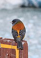

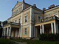

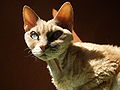
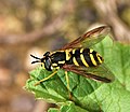


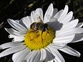


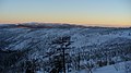
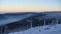


 Neutral It looks like flattened. Some shadows would be nice to enhance 3-D.Masur 09:23, 20 December 2007 (UTC)
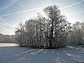


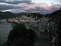


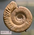

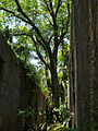


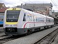


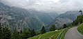


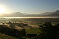


 I withdraw my nominationThanks. --Laitche 21:16, 18 December 2007 (UTC)


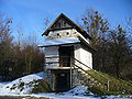

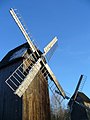


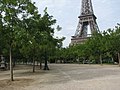


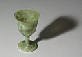


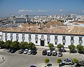


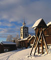
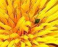


 Info It exists with a grey background, too Sémhur 11:35, 9 December 2007 (UTC)

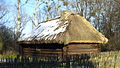
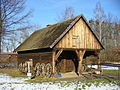


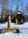


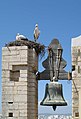


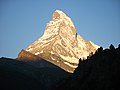


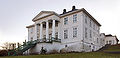


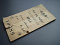


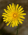
 Question This is a bit confusing as Yellow Hawkweed is now Hieracium caespitosum (formerly H. pratense), while H. vulgatum is now H. lachenalii (and has as English name Common Hawkweed). So which is which? Lycaon 00:59, 2 December 2007 (UTC) - Well...I don't know since most of the Hawkweed flowers are yellow and the genus Hieracium is one of the most complex in the Astereceae family. The flower and leaves agree with the actual name H. lachenalii. As for the common name it varies with the source - Alvesgaspar 01:15, 2 December 2007 (UTC)


 image from 1936. I find images that I would have liked to have taken or even thought of taking. -- carol 04:31, 27 November 2007 (UTC)


-1.jpg)


.JPG)


.JPG)


_cara_a_Ourense_desde_o_Monte_San_Trocado,_(Galicia,_Spain).jpg)


_Luca_Galuzzi_2006.jpg)


.JPG)


.JPG)


.JPG)


.jpg)


1.JPG)


.jpg)


 Support of course! --Pudelek 15:36, 24 December 2007 (UTC)
 Oppose Why of course? It doesn't look sharp at all to me. Lycaon 20:44, 25 December 2007 (UTC)

_at_CGN_harbour_Lausanne-Ouchy_2007-12-16.jpg)


.jpg)


 Regards, Ben Aveling 11:27, 30 November 2007 (UTC)
.JPG)
.jpg)
![[1]](http://feb-web.ru/feb/pushkin/pictures/V20-123.jpg)


.jpg&action=edit&redlink=1)


