Commons:Quality images candidates/Archives January 14 2020
Jump to navigation
Jump to search

-

- Nomination Naubat Khana, Red Fort, Delhi --Jakubhal 21:46, 11 January 2020 (UTC)
- Promotion GQ --Palauenc05 22:22, 11 January 2020 (UTC)
-

-

-

-

-

-

- Nomination Grass and autumn leaves on a slope in Sihlwald --Domob 18:50, 11 January 2020 (UTC)
- Promotion Good quality --Michielverbeek 19:39, 11 January 2020 (UTC)
-
- Nomination View of Cap Blanc-Nez from the beach --Milseburg 17:36, 11 January 2020 (UTC)
- Promotion
 Support Slight tilt, but still ok --Poco a poco 18:34, 11 January 2020 (UTC)
-

- Nomination Small stupas at Ratnagiri (Orissa) --Kritzolina 17:19, 11 January 2020 (UTC)
- Promotion Support Good quality. --Poco a poco 18:34, 11 January 2020 (UTC)
-

- Nomination Ratnagiri, Monastery 1, damaged head of a statue --Kritzolina 17:19, 11 January 2020 (UTC)
- Promotion Support Good quality. --Poco a poco 18:41, 11 January 2020 (UTC)
-

- Nomination Ratnagiri, Monastery 1, head of a statue --Kritzolina 17:19, 11 January 2020 (UTC)
- Promotion Support DoF not optimal, but overall ok --Poco a poco 18:44, 11 January 2020 (UTC)
-

- Nomination Junior researcher Andrei Kartoziia is ready for an amazing walking trip to the Samoylov Island scientific station after geophysical study. We studied permafrost and frozen deposits by means electrical resistivity tomography. By User:Alexey Faguet --Tomer T 15:43, 11 January 2020 (UTC)
- Promotion Good quality especially for a phone photo. --Michielverbeek 16:24, 11 January 2020 (UTC)
-

- Nomination Aerial photograph of Caesarea Maritima. By User:Idomeir --Andrew J.Kurbiko 12:50, 11 January 2020 (UTC)
- Promotion Good quality. --Kritzolina 17:22, 11 January 2020 (UTC)
-

- Nomination Chateau Pelerin. By User:Akiiva --Andrew J.Kurbiko 12:50, 11 January 2020 (UTC)
- Promotion Very nice --Cvmontuy 14:28, 11 January 2020 (UTC)
-

- Nomination Eshkol Park. By User:Erezvanso --Andrew J.Kurbiko 12:50, 11 January 2020 (UTC)
- Promotion Support A bit of noise but still ok --Poco a poco 18:41, 11 January 2020 (UTC)
-

- Nomination Moses Montefiore Windmill at night. By User:Shai knaani --Andrew J.Kurbiko 12:50, 11 January 2020 (UTC)
- Promotion Good quality. --Cvmontuy 14:25, 11 January 2020 (UTC)
-

- Nomination A view from ancient Caesarea to the Hadera power plant. By User:Shai knaani --Andrew J.Kurbiko 12:50, 11 January 2020 (UTC)
- Promotion Support Good quality. --Poco a poco 18:44, 11 January 2020 (UTC)
-

- Nomination Suzdal. Spaso-Yevfimiyev Monastery, fortification. --Dmitry Makeev 12:10, 11 January 2020 (UTC)
- Promotion Support Good quality. --Poco a poco 18:41, 11 January 2020 (UTC)
-

- Nomination Renault Koleos Initiale Paris, IAA 2017 --MB-one 11:46, 11 January 2020 (UTC)
- Promotion Support A bit dark, but ok --Poco a poco 18:41, 11 January 2020 (UTC)
-

- Nomination Pilatus PC12 NG blended winglet at AERO Friedrichshafen 2018 --MB-one 11:46, 11 January 2020 (UTC)
- Promotion Support Good quality. --Poco a poco 18:44, 11 January 2020 (UTC)
-

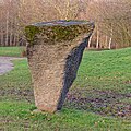
- Nomination Kinetic sculptures made from scrap at Maker Faire Berlin 2018, FEZ Wuhlheide --MB-one 11:46, 11 January 2020 (UTC)
- Promotion Support Ok --Poco a poco 18:41, 11 January 2020 (UTC)
-

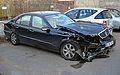
- Nomination Michael Cole at Kia press conference, IAA 2017 --MB-one 11:46, 11 January 2020 (UTC)
- Decline
 Oppose This should have been portrait, person and car cropped --Poco a poco 18:44, 11 January 2020 (UTC)
-
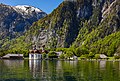
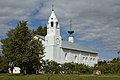
- Nomination St. Bartholomew's Church, Königssee, Germany --Poco a poco 11:07, 11 January 2020 (UTC)
- Promotion Support Good quality. --MB-one 11:54, 11 January 2020 (UTC)
-
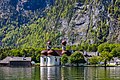
- Nomination St. Bartholomew's Church, Königssee, Germany --Poco a poco 11:07, 11 January 2020 (UTC)
- Promotion Good quality. --Berthold Werner 12:03, 11 January 2020 (UTC)
-

- Nomination View of Shkodra, Albania --Poco a poco 11:07, 11 January 2020 (UTC)
- Promotion Support Good quality. --Andrew J.Kurbiko 15:12, 11 January 2020 (UTC)
-

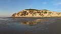
- Nomination Beach of Apollo Bay, Victoria, Australia --XRay 10:50, 11 January 2020 (UTC)
- Promotion Support Good quality. --Poco a poco 18:45, 11 January 2020 (UTC)
-

- Nomination Ara ararauna. By User:Renato Augusto Martins --Tomer T 10:21, 11 January 2020 (UTC)
- Promotion Support Good quality. --XRay 10:51, 11 January 2020 (UTC)
-

- Nomination Hylomantis aspera. By User:Renato Augusto Martins --Tomer T 10:21, 11 January 2020 (UTC)
- Promotion Support Good quality. --Poco a poco 18:45, 11 January 2020 (UTC)
-

- Nomination 100 million Mark "Notgeld" banknote of Trier (1923). --Palauenc05 10:11, 11 January 2020 (UTC)
- Promotion Good quality. --Berthold Werner 12:03, 11 January 2020 (UTC)
-
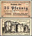
- Nomination 25 Pfennig "Notgeld" banknote of Trier (1920). --Palauenc05 10:11, 11 January 2020 (UTC)
- Promotion Good quality. --Berthold Werner 12:03, 11 January 2020 (UTC)
-

- Nomination 50 Pfennig "Notgeld" banknote of Trier (1920). --Palauenc05 10:11, 11 January 2020 (UTC)
- Promotion Good quality. --Berthold Werner 12:03, 11 January 2020 (UTC)
-

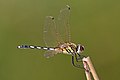
- Nomination Crimson marsh glider (Trithemis aurora) male --Charlesjsharp 09:39, 11 January 2020 (UTC)
- Promotion Good quality. -- Ikan Kekek 09:49, 11 January 2020 (UTC)
-

- Nomination Crimson-tailed marsh hawk (Orthetrum pruinosum) male --Charlesjsharp 09:39, 11 January 2020 (UTC)
- Promotion Good quality. -- Ikan Kekek 09:49, 11 January 2020 (UTC)
-

- Nomination Green marsh hawk (Orthetrum sabina) female --Charlesjsharp 09:39, 11 January 2020 (UTC)
- Promotion Support Good quality. --Poco a poco 18:48, 11 January 2020 (UTC)
-
- Nomination Long-legged marsh glider (Trithemis pallidinervis) male --Charlesjsharp 09:39, 11 January 2020 (UTC)
- Promotion Support Good quality. --Poco a poco 18:48, 11 January 2020 (UTC)
-
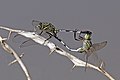
- Nomination Green marsh hawks (Orthetrum sabina) mating --Charlesjsharp 09:39, 11 January 2020 (UTC)
- Promotion Good quality. -- Ikan Kekek 09:51, 11 January 2020 (UTC)
-

- Nomination Suzdal. Pokrovsky Monastery. Wall with a tower. --Dmitry Makeev 09:07, 11 January 2020 (UTC)
- Promotion Support Good quality. --Poco a poco 18:48, 11 January 2020 (UTC)
-
- Nomination Suzdal. Pokrovsky Monastery. --Dmitry Makeev 09:05, 11 January 2020 (UTC)
- Promotion Good quality --Michielverbeek 09:41, 11 January 2020 (UTC)
-

- Nomination European crested tit (Lophophanes cristatus) in the Gran Paradiso National Park in Aosta Valley, Italy. --Jastrow 09:01, 11 January 2020 (UTC)
- Promotion Support Good quality. Would be ever better with colour adjustment. too green. --Charlesjsharp 09:34, 11 January 2020 (UTC)
-

- Nomination HMS Belfast near Tower Bridge. London --Ввласенко 08:33, 11 January 2020 (UTC)
- Promotion Support Good quality. --Poco a poco 18:48, 11 January 2020 (UTC)
-

- Nomination Government Gardens in Rotorua, Bay of Plenty Region, New Zealand. --Tournasol7 07:53, 11 January 2020 (UTC)
- Promotion Support Good quality. --Poco a poco 18:48, 11 January 2020 (UTC)
-

- Nomination Door of the building in Brousse-le-Château, Aveyron, France. --Tournasol7 07:53, 11 January 2020 (UTC)
- Promotion Support Good quality. --XRay 07:59, 11 January 2020 (UTC)
-

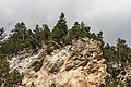
- Nomination Sommet de Bizourtouse in PNR Pyrénées ariégeoises, Ariege, France. --Tournasol7 07:53, 11 January 2020 (UTC)
- Promotion Support Good quality. --Tomer T 10:22, 11 January 2020 (UTC)
-

- Nomination Hotel Elephant at Markt 19 in Weimar, Thuringia, Germany. --Tournasol7 07:53, 11 January 2020 (UTC)
- Promotion Good quality.--Famberhorst 17:45, 11 January 2020 (UTC)
-

- Nomination Castle of Salles-Curan, Aveyron, France. --Tournasol7 07:53, 11 January 2020 (UTC)
- Promotion Good quality.--Famberhorst 17:47, 11 January 2020 (UTC)
-

- Nomination Gloeoporus dichrous on the trunk of a Pollard willow..
--Famberhorst 07:19, 11 January 2020 (UTC) - Promotion Support Good quality. --XRay 07:26, 11 January 2020 (UTC)
- Nomination Gloeoporus dichrous on the trunk of a Pollard willow..
-

- Nomination Enokitake on dead half decayed branch.
--Famberhorst 07:19, 11 January 2020 (UTC) - Promotion Support Good quality. --XRay 07:26, 11 January 2020 (UTC)
- Nomination Enokitake on dead half decayed branch.
-

- Nomination Delleboersterheide, nature reserve of the It Fryske Gea. Oak Quercus In mild winter light.
--Famberhorst 07:19, 11 January 2020 (UTC) - Promotion Support Good quality. --XRay 07:26, 11 January 2020 (UTC)
Yes good quality, not all trees are growing vertical --Michielverbeek 07:28, 11 January 2020 (UTC)
- Nomination Delleboersterheide, nature reserve of the It Fryske Gea. Oak Quercus In mild winter light.
-

- Nomination Last Supper by Johann Zofanny. Photographed at the St. John's Church, Kolkata, India. By User:Gangulybiswarup --Bodhisattwa 07:13, 11 January 2020 (UTC)
- Decline Oppose Insufficient quality. Sorry. Resolution could be better (no problem), unsharp and a little bit noisy. --XRay 07:27, 11 January 2020 (UTC)
-

-

-

- Nomination Flower of a red chrysanthemum with dew drops in a garden in Bamberg in Upper Franconia. Focus stack of 32 frames. --Ermell 06:59, 11 January 2020 (UTC)
- Promotion Support Good quality.--Famberhorst 07:17, 11 January 2020 (UTC)
-

- Nomination Engine compartment of a Dodge Challenger with a 5.7 L Hemi V8 engine at the 5th US-Car meeting in Gut Leimershof near Bamberg --Ermell 06:59, 11 January 2020 (UTC)
- Promotion Support Good quality.--Famberhorst 07:15, 11 January 2020 (UTC)
-

- Nomination Rectory in Kirchaich --Ermell 06:59, 11 January 2020 (UTC)
- Promotion Support Good quality.--Famberhorst 07:13, 11 January 2020 (UTC)
-
- Nomination Mountain tour in the vicinity of mountain village S-charl. View of the mountains around S-charl.
--Agnes Monkelbaan 05:46, 11 January 2020 (UTC) - Promotion Support Good quality -- Johann Jaritz 05:49, 11 January 2020 (UTC)
- Nomination Mountain tour in the vicinity of mountain village S-charl. View of the mountains around S-charl.
-

- Nomination Mountain tour in the vicinity of mountain village S-charl. Schmelzra S-charl Museum.
--Agnes Monkelbaan 05:46, 11 January 2020 (UTC) - Promotion Support Good quality -- Johann Jaritz 05:49, 11 January 2020 (UTC)
- Nomination Mountain tour in the vicinity of mountain village S-charl. Schmelzra S-charl Museum.
-

- Nomination Mountain tour from Val Sinestra via Vnà to Zuort. View on the area of Zuort.
--Agnes Monkelbaan 05:46, 11 January 2020 (UTC) - Promotion Support Good quality -- Johann Jaritz 05:49, 11 January 2020 (UTC)
- Nomination Mountain tour from Val Sinestra via Vnà to Zuort. View on the area of Zuort.
-

- Nomination Residential buildings on Am Hügel #11, #13 and #15 in Winklern, Pörtschach, Carinthia, Austria -- Johann Jaritz 03:37, 11 January 2020 (UTC)
- Promotion Support Good quality. --XRay 06:48, 11 January 2020 (UTC)
-

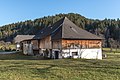
- Nomination Farmstead vulgo Komar on Gaisrückenstrasse #51 in Winklern, Pörtschach, Carinthia, Austria -- Johann Jaritz 03:37, 11 January 2020 (UTC)
- Promotion Support Good quality.--Agnes Monkelbaan 05:38, 11 January 2020 (UTC)
-

- Nomination Farmstead «Brock Hof» (vulgo Brock) on Gaisrückenstrasse #70 and restaurant «Zocklwirt», vulgo Rumasch, Gaisrückenstrasse #77 in Winklern, Pörtschach, Carinthia, Austria -- Johann Jaritz 03:37, 11 January 2020 (UTC)
- Promotion Support Good quality. --XRay 06:48, 11 January 2020 (UTC)
-

- Nomination Farmstead «Brock Hof» (vulgo Brock) on Gaisrückenstrasse #70 in Winklern, Pörtschach, Carinthia, Austria -- Johann Jaritz 03:37, 11 January 2020 (UTC)
- Promotion Support Good quality.--Agnes Monkelbaan 05:36, 11 January 2020 (UTC)
-
- Nomination Stable of the farmstead «Brock Hof» (vulgo Brock) on Gaisrückenstrasse #70 in Winklern, Pörtschach, Carinthia, Austria -- Johann Jaritz 03:37, 11 January 2020 (UTC)
- Promotion Support Good quality.--Agnes Monkelbaan 05:41, 11 January 2020 (UTC)
-
- Nomination Royal Melbourne Yacht Squadron Marina, Melbourne, Victoria, Australia --XRay 01:30, 11 January 2020 (UTC)
- Promotion Quite difficult to estimate the perfect f-value, a bit lower might have been better. However for me the qualtiy is high enough for QI --Michielverbeek 07:40, 11 January 2020 (UTC)
-

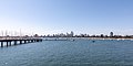
- Nomination Pavilion at St Kilda Pier, Melbourne, Victoria, Australia --XRay 01:30, 11 January 2020 (UTC)
- Promotion Support Good quality.--Agnes Monkelbaan 05:40, 11 January 2020 (UTC)
-

- Nomination Tidal River, Wilsons Promontory National Park, Victoria, Australia --XRay 01:30, 11 January 2020 (UTC)
- Promotion Support Good quality. --Poco a poco 18:48, 11 January 2020 (UTC)
-

- Nomination Sand dune “Big Drift” in Wilsons Promontory National Park, Victoria, Australia --XRay 01:30, 11 January 2020 (UTC)
- Promotion Support Good quality.--Agnes Monkelbaan 05:37, 11 January 2020 (UTC)
-

- Nomination Tribal Museum Bhubaneswar --Kritzolina 22:02, 10 January 2020 (UTC)
- Promotion Support - A little soft. Good enough definition for me, but I wouldn't mind a second opinion. -- Ikan Kekek 01:13, 12 January 2020 (UTC)
-

- Nomination Smashed Unripe (Green) Banana. By User:Jubair1985 --RockyMasum 18:05, 10 January 2020 (UTC)
- Promotion Support - Good quality and adequate categorization. However, since there are clearly other ingredients in the patties other than just unripe banana, it would be good to mention them in the file description. -- Ikan Kekek 01:17, 12 January 2020 (UTC)
-

- Nomination African peguins at Boulders Beach, Cape Town --MB-one 16:32, 10 January 2020 (UTC)
- Decline Oppose blurred --Charlesjsharp 09:36, 11 January 2020 (UTC)
-

- Nomination 360° (but not spherical) panorama of the view from Albis Hochwacht --Domob 16:15, 10 January 2020 (UTC)
- Promotion The edges were not cut correctly. The pano is not reaching QI standard yet. --Milseburg 17:54, 10 January 2020 (UTC)
 Comment I intentionally left all data there, so that e.g. when viewing in Panini as much as possible of the full sphere is there. Is it required / customary to completely crop out all missing parts? Then I'm of course happy to do so. --Domob 18:46, 10 January 2020 (UTC) Comment I can not comprehend that. It's not a spherical panorama anyway. The different width, black edges are very annoying and contain no information. A correct cut would cost some irrelevant sky above and unimportant branches below. So what? --Milseburg 19:43, 10 January 2020 (UTC) Comment By the way: I find the section unfavorabel where you let start and end the panorama: the vertical cut goes right trough the Alps. For that I would choose the area where the view is the most boring: where you can hardly see over the neighboring tree tops. Does something speak against it? Just a suggestion regardless of QIC. --Milseburg 20:12, 10 January 2020 (UTC)
 Done Good points. I've now cropped out the top/bottom, and changed the centre. (The original centre was chosen so that Zurich is in the middle, but it was indeed unfortunate that the cut went right through Lake Zug; especially since the 360° viewer doesn't work.) --Domob 08:48, 11 January 2020 (UTC) Support Well done, interesting and good quality. --Milseburg 16:09, 11 January 2020 (UTC)
-

- Nomination Plowed field outside the village. Tver region. --Dmitry Makeev 00:37, 10 January 2020 (UTC)
- Promotion
IMO a touch of green. And the categorization should be better. --XRay 06:07, 10 January 2020 (UTC) Done Edits made. --Dmitry Makeev 10:51, 10 January 2020 Support Good quality now. Thank you. --XRay 10:52, 11 January 2020 (UTC)
-

- Nomination Jewish people praying at the Western Wall. By User:Ilya Varlamov --Andrew J.Kurbiko 00:10, 7 January 2020 (UTC)
- Decline Is noisy, sorry --Cvmontuy 14:21, 11 January 2020 (UTC)
-
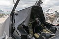
- Nomination Cockpit of an Eurocopter Tiger at ILA 2018 --MB-one 13:24, 6 January 2020 (UTC)
- Promotion
Tilted and disturbing elements at the top --Poco a poco 15:06, 6 January 2020 (UTC) Done --MB-one 21:00, 10 January 2020 (UTC) Support Ok --Poco a poco 14:56, 11 January 2020 (UTC)
-

- Nomination Volkswagen T1 --Berthold Werner 11:30, 6 January 2020 (UTC)
- Promotion Support Good quality. --XRay 10:54, 11 January 2020 (UTC)
-

- Nomination: Joshua Jortner. By User:Arielinson --Andrew J.Kurbiko 00:12, 6 January 2020 (UTC)
- Review needed
-

- Nomination: Interior of the National Art Center, Tokyo. By User:Daderot --Another Believer 22:08, 5 January 2020 (UTC)
- Review needed
-

- Nomination: Texas State Capitol - Austin, Texas, USA. By User:Daderot --Another Believer 22:08, 5 January 2020 (UTC)
- Review needed
-

- Nomination: Equestrian statue of George Washington, Boston Public Garden, Massachusetts, U.S. By User:Daderot --Another Believer 22:08, 5 January 2020 (UTC)
- Review needed
-

- Nomination: Ana Sagar Lake in Ajmer --Jakubhal 21:05, 5 January 2020 (UTC)
- Review needed
-

- Nomination: A folk musician in Jodhpur --Jakubhal 19:44, 5 January 2020 (UTC)
- Review needed
-

- Nomination: Le Vauclin. By User:Lougas972 --Andrew J.Kurbiko 16:19, 5 January 2020 (UTC)
- Review needed
-

- Nomination: Tzippori mosaic. By User:Poliocretes --Andrew J.Kurbiko 16:19, 5 January 2020 (UTC)
- Review needed
-

- Nomination: Les Trois-Îlets. By User:Lougas972 --Andrew J.Kurbiko 16:19, 5 January 2020 (UTC)
- Review needed
-

- Nomination: Phare de Pointe-Plate. By User:Pcarrere --Andrew J.Kurbiko 16:19, 5 January 2020 (UTC)
- Review needed
-

- Nomination: Yellow-spot swift (Polytremis eltola) --Charlesjsharp 15:30, 5 January 2020 (UTC)
- Review needed
-

- Nomination: Great swift (Pelopidas assamensis) --Charlesjsharp 15:30, 5 January 2020 (UTC)
- Review needed
-

- Nomination: Chestnut tree in flower, Berlin --MB-one 12:41, 5 January 2020 (UTC)
- Review needed
-
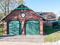
- Nomination: Boat house of the Seenotstation Wustrow --MB-one 12:41, 5 January 2020 (UTC)
- Review needed
-

- Nomination Solidago gigantea, top side of leaf (by User:Stefan.lefnaer) --D-Kuru 11:27, 5 January 2020 (UTC)
- Decline insufficient dof and lack of detail, sorry --Cvmontuy 14:17, 11 January 2020 (UTC)
-

- Nomination solidago gigantea, Inflorescence detail (by User:Stefan.lefnaer) --D-Kuru 11:27, 5 January 2020 (UTC)
- Promotion Support Good quality. --MB-one 11:54, 11 January 2020 (UTC)
-

- Nomination: War room, Reunification Palace, Ho Chi Minh City, Vietnam --Poco a poco 10:45, 5 January 2020 (UTC)
- Review needed
-

- Nomination Recreation room, Reunification Palace, Ho Chi Minh City, Vietnam --Poco a poco 10:45, 5 January 2020 (UTC)
- Decline Oppose Too soft (probably from noise cancelling) --MB-one 11:54, 11 January 2020 (UTC)
-
-

- Nomination: Mating pair of Loxura atymnus Stoll, 1780 - Yamfly (by Souvick Mukherjee) --Atudu 16:24, 4 January 2020 (UTC)
- Review
QI if saturation reduced --Charlesjsharp 12:32, 5 January 2020 (UTC)
-

- Nomination: Open wing position of Male Acraea issoria Hübner, 1818 – Yellow Coster (by Tamaghna Sengupta) --Atudu 15:35, 4 January 2020 (UTC)
- Review
over-saturated --Charlesjsharp 12:32, 5 January 2020 (UTC)
-

- Nomination Straight swift (Parnara sp.) --Charlesjsharp 15:01, 4 January 2020 (UTC)
- Decline Oppose Not sharp enough --MB-one 11:54, 11 January 2020 (UTC)
-

- Nomination Flowering tree (Ceiba speciosa) in the Chinese garden of Serentiy, Malta --Kritzolina 11:22, 4 January 2020 (UTC)
- Promotion Support Good quality. --MB-one 11:54, 11 January 2020 (UTC)
-
-

- Nomination Sigmundstor, Salzburg, Austria --Poco a poco 09:42, 4 January 2020 (UTC)
- Promotion
Support Good quality --Domob 18:52, 11 January 2020 (UTC)
-

- Nomination St. Bartholomew's Church, Königssee, Germany --Poco a poco 09:42, 4 January 2020 (UTC)
- Promotion Support Good quality. --MB-one 11:54, 11 January 2020 (UTC)
-

- Nomination Lamborghini Huracán LP 640-4 Performante Spyder, Geneva International Motor Show 2018 --MB-one 17:28, 3 January 2020 (UTC) Comment The picture is tilted, can we have a proper rotation? --Cvmontuy 19:03, 8 January 2020 (UTC) Done --MB-one 21:05, 10 January 2020 (UTC)
- Promotion Good quality. --Cvmontuy 14:09, 11 January 2020 (UTC)
- Nomination Lamborghini Huracán LP 640-4 Performante Spyder, Geneva International Motor Show 2018 --MB-one 17:28, 3 January 2020 (UTC)
-

- Nomination Dining room in Humberstone and Santa Laura Saltpeter Office, Chile --Poco a poco 08:10, 3 January 2020 (UTC)
- Promotion Support Good quality. --MB-one 11:54, 11 January 2020 (UTC)
-

- Nomination Yellow badge. By User:DRG-fan --Andrew J.Kurbiko 00:00, 3 January 2020 (UTC)
Comment Can you center the star? --D-Kuru 21:58, 4 January 2020 (UTC) Done--Andrew J.Kurbiko 16:50, 5 January 2020 (UTC) - Promotion Good quality. --Cvmontuy 04:15, 12 January 2020 (UTC)
- Nomination Yellow badge. By User:DRG-fan --Andrew J.Kurbiko 00:00, 3 January 2020 (UTC)
-

- Nomination Mittertor, Rosenheim, Germany --Poco a poco 08:50, 31 December 2019 (UTC) Comment It looks like a lot of distortion --Cvmontuy 22:38, 8 January 2020 (UTC)
The building is not straight, look at this: File:Rosenheim, das Stadtmuseum.jpg --Poco a poco 14:58, 11 January 2020 (UTC) - Promotion Good quality. --Cvmontuy 18:35, 11 January 2020 (UTC)
- Nomination Mittertor, Rosenheim, Germany --Poco a poco 08:50, 31 December 2019 (UTC)


.JPG)


.JPG)


_06.jpg)
_10.jpg)
_11.jpg)


.jpg)
.jpg)
.jpg)
.jpg)


,_Beach_--_2019_--_170804_(bw).jpg)


_male_Bardiya.jpg)
_male_Nepal.jpg)
_female_2_Bardiya.jpg)
_male_Rajasthan.jpg)
_mating_Rajasthan.jpg)


_op_de_stam_van_een_knotwilg_08-01-2020_(d.j.b)_01.jpg)
_14.jpg)


_Hemi_V8_Leimershof_-20190907-RM-170308.jpg)

_63.jpg)
_56.jpg)
_24.jpg)


,_View_from_St_Kilda_Pier_--_2019_--_1593.jpg)
,_St_Kilda_Pier,_Pavilion_--_2019_--_1594.jpg)
,_Tidal_River_--_2019_--_184132.jpg)
,_Big_Drift_--_2019_--_1683.jpg)


.jpg)


.jpg)


_290314_05.jpg)


_Godavari.jpg)
_underside_Godavari.jpg)
.jpg)
.jpg)
_sl23.jpg)
_sl25.jpg)


_underside_Lumbini_2.jpg)


.jpg)


Consensual review[edit]
File:Life_on_a_wheel.jpg[edit]

- Nomination Pottery maker doing his work. By User:Arjit Chowdhury --RockyMasum 10:12, 8 January 2020 (UTC)
- Decline
- Oppose head cropped --Charlesjsharp 10:56, 8 January 2020 (UTC)
- Support I disagree. I think the crop of the head and the work on the bottom was made intentionally. Apart from that the composition and the framing looks really pleasing to me. --Granada 11:07, 8 January 2020 (UTC)
- Oppose I think this framing works, given that both the bottom and top crop are tight. I will support when (and only when) the file name is changed into something more meaningful.--Peulle 09:38, 9 January 2020 (UTC)
- Oppose for now per Peulle. -- Ikan Kekek 10:04, 9 January 2020 (UTC)
- OpposeThe file name does not bother me, but the image description should contain a meaningful description of the location. Also: Is this a craftsman working individually? Part of a larger company? --Smial 14:39, 9 January 2020 (UTC)
Total: 1 support (excluding the nominator), 4 oppose →  Declined --Peulle 07:54, 13 January 2020 (UTC)
File:Iglesia_de_San_Luis,_Múnich,_Alemania,_2012-04-30,_DD_03.JPG[edit]

- Nomination: Church of St. Ludwig, Munich, Germany --Poco a poco 08:10, 3 January 2020 (UTC)
- Review
- Support Good quality. --Tournasol7 09:23, 3 January 2020 (UTC)
- Oppose I disagree, perspective seems overdone to me. Please discuss. --Domob 17:48, 3 January 2020 (UTC)
- Support o.k. for me.--Ermell 07:36, 4 January 2020 (UTC)
- Oppose I rarely oppose, but I know this church and care about it - this perspective just looks wrong to me. --Kritzolina 11:32, 4 January 2020 (UTC)
- Comment If you look at the photo from a purely technical point of view of geometric optics, the result is largely correct. Unfortunately, like many others that have been compulsively verticalised, the picture does not correspond to the visual impression on site and is an aesthetic total loss. I am sorry to say that especially with this photo. One could write the same comments on hundreds of other photos on QIC, all of which fell victim to the dogma that verticals in architectural photography must always be shown vertically in the photo, because after all, the architect didn't draw sloping walls. In doing so it is deliberately and stupidly ignored that the architect can freely choose the perspective in his drawings, but the photographer cannot. --Smial 00:05, 5 January 2020 (UTC) Translated with www.DeepL.com/Translator (free version)
- Support Reaches cleraly QI level in my eyes. --Milseburg 14:21, 8 January 2020 (UTC)
- Oppose Sorry, but this perspective makes it too unnatural. The tower on the right is much too high in comparison to the left one. --Palauenc05 12:25, 9 January 2020 (UTC)
Total: 3 support (excluding the nominator), 3 oppose →  Inconclusive result after 8 consensual review days --Peulle 07:54, 13 January 2020 (UTC)