Commons:Graphic Lab/Illustration workshop/Archive/2010/Stale

Arms of Canada (1957)[edit]
Note: This request was moved from the Images to improve or create to the Illustration workshop. Ivan Akira (talk) 01:51, 18 December 2009 (UTC)
-
 SVG Needed
 -
Attempt one: still quite rough
.jpg)
Article(s): Canada
Request: Please vectorize the first image, using the w:File:Coat of arms of Canada.svg as help. Connormah (talk) 00:31, 18 October 2009 (UTC)
Graphist opinion(s):
![]() Request taken by Nesnad - This isn't done. Anyone good at touching up traced SVGs? I did my best to make it look like the original coat of arms, but it needs a lot of touch ups. I just thought I would do something on this since it was stale. Cheers, Nesnad (talk) 18:47, 26 April 2010 (UTC)
Request taken by Nesnad - This isn't done. Anyone good at touching up traced SVGs? I did my best to make it look like the original coat of arms, but it needs a lot of touch ups. I just thought I would do something on this since it was stale. Cheers, Nesnad (talk) 18:47, 26 April 2010 (UTC)
 Comment: Actually I hate to stale a request, but since I have no skill in SVG at all, so what can I do is just abandon this request. I will ask Connormah about this very-old request (year of 2009), does he like your work or not. Ivan Akira (talk) 02:16, 7 August 2010 (UTC)
- It definitely can use work, IMO, but since my SVG skills are nowhere near some others, I can't really do anything. If anyone else could, it'd be greatly appreciated. Connormah (talk | contribs) 16:40, 7 August 2010 (UTC)
- I can try my hand with it when I have time; however, I'm actively seeking work and going to school at the moment, so no guarantees. I'll throw the original and the current svg on my flash drive (which is pretty much the container for my whole life) and work on it when I have time. Morgan Phoenix (talk) 04:26, 15 October 2010 (UTC)
- It definitely can use work, IMO, but since my SVG skills are nowhere near some others, I can't really do anything. If anyone else could, it'd be greatly appreciated. Connormah (talk | contribs) 16:40, 7 August 2010 (UTC)
Coat of arms of South Ossetia & Coat of arms of Transnistria[edit]
Note: This request was moved from the Images to improve or create to the Illustration workshop. Ivan Akira (talk) 02:27, 18 December 2009 (UTC)
-
 Original PNG
 -
 SVG
SVG -
 Original PNG
 -
 SVG
SVGwithout text


Article(s): w:Coat of arms of South Ossetia, w:Coat of arms of Transnistria
Request: Vectorize. Connormah (talk) 04:33, 18 October 2009 (UTC)
Graphist opinion(s):
- Done with Ossetia COA, as you can see I didn't add those grey shadows on hills because on Ossetia official website [1] COA is without and I presume it's official version.
- Half done with Transnistria COA as I don't have Cyrillic fonts. --Justass (talk) 14:36, 22 October 2009 (UTC)
-
- Let us try to un-stale this... I've added the texts with Liberation Sans font. I've converted them as paths to avoid any rendering bug (as MediaWiki is especially bad for rendering texts on paths...). +100 Ko to the final file though. What do you think ? Arnaud Ramey (talk) 14:14, 6 September 2010 (UTC)
-
- Hum, should I consider this as solved so ? I'd like some feedback :) Arnaud Ramey (talk) 13:47, 8 September 2010 (UTC)
The text in the south ossetia emblem which is at the top in jog and png is at bottom in svg. please correct--Antemister (talk) 15:48, 8 September 2010 (UTC) ![]() Done
Done
White House mono[edit]
- stereoscopic views of the White House
- a few other similar ones, e.g. for the Blue Room: Special:Search/Blue Room Dennis
Request: I'm currently categorizing some of the above images and I thought it would be interesting if there was a gallery with one version of each view, possibly cropping a single image from a pair. For the Blue Room, there would be just three images. -- User:Docu at 12:25, 20 December 2009 (UTC)
Graphist opinion(s):
Wiktionary logo candidate[edit]
-
 Original
 -
 Transparent version
Request: I'm not sure if this is the right place for this request, but could someone make an SVG version of this, with the words on the left side of the page changed into unidentifiable generic text? Also, if possible, could someone make some localized versions (i.e. changing the text underneath to say "Wiktionnaire Le dictionnaire libre", "Wiktionary das freie Wörterbuch", etc.)? Yair rand (talk) 23:36, 25 January 2010 (UTC)
- Oh, one more thing. Could someone make a favicon of this, without the underneath text and simplified so that it doesn't look like a blurry mess? --Yair rand (talk) 00:04, 26 January 2010 (UTC)
- Anyone? The logo vote ends in four days and it looks like this logo is the most likely to win, so it would really be best if we had a completed version by then. --Yair rand (talk) 00:15, 28 January 2010 (UTC)
Graphist opinion(s):
There's still the individual language wiktionary voting to be done. No rush. I've started on an SVG, but it's such a terrible "logo". Photographs make terrible logos. People had the opportunity to vote for more stylized designs and decided on this instead, so the challenge will be in simplifying this bland photographic result without it becoming as simplified as the competitors it beat out. ¦ Reisio (talk) 03:41, 30 January 2010 (UTC)
- It would be best if the finished localized versions were done by the time the individual language Wiktionaries start voting, so that they can see what they're voting on. (I'm not sure if that's going to start immediately after the second round is over, but it would still be best for it to be done as soon as possible.) --Yair rand (talk) 23:52, 30 January 2010 (UTC)
- Mmm. ¦ Reisio (talk) 03:23, 31 January 2010 (UTC)
- It would be best if the finished localized versions were done by the time the individual language Wiktionaries start voting, so that they can see what they're voting on. (I'm not sure if that's going to start immediately after the second round is over, but it would still be best for it to be done as soon as possible.) --Yair rand (talk) 23:52, 30 January 2010 (UTC)
Going to call this done:
- http://reisio.com/temp/wiktlogo-comparison.svg (side-by-side, original raster & SVG)
- http://reisio.com/temp/wiktlogo-final_en.svg (English)
- http://reisio.com/temp/wiktlogo-final_text.svg (same as _en, but text instead of paths)
- http://reisio.com/temp/wiktlogo-final_full.svg (more stuff included off-canvas)
- http://reisio.com/temp/wiktlogo-final_favicon.ico (merely resized to 16x16, not tweaked)
Will see if I can rattle off some localized versions in the next couple hours if I can manage it.
¦ Reisio (talk) 11:29, 1 February 2010 (UTC)
- Replied similarly on vote talk page. ¦ Reisio (talk) 12:05, 1 February 2010 (UTC)
- No, I don't think so. In general, favicons are just smaller versions of the logo, but I don't think that a shrunken version of this would be clearly recognizable. Best would be to get as close as possible to the original, but less detailed so that it's still clear. --Yair rand (talk) 23:52, 30 January 2010 (UTC)
- Ok, I think there should be another Wikigraphist who able to work on this... Ivan Akira (talk) 01:50, 31 January 2010 (UTC)
- No, I don't think so. In general, favicons are just smaller versions of the logo, but I don't think that a shrunken version of this would be clearly recognizable. Best would be to get as close as possible to the original, but less detailed so that it's still clear. --Yair rand (talk) 23:52, 30 January 2010 (UTC)
Okay, due to a slight misunderstanding on my part, I had thought that all logos had to be in SVG, whereas it turned out that logos are in PNG (though we will eventually need an SVG version, but that's not that important at the moment). So what we need now is to have a version with the words on the left side page being illegible, (turns out they were copied from another dictionary) and for localized versions to be made available. (See m:Wiktionary/logo/refresh/localization text for a list of the localization texts.) Also, could someone make a favicon of the corner puzzle piece? It hasn't yet been decided which favicon will be used, but it'll be easier to come to a consensus when both are visible. Thanks. --Yair rand (talk) 04:43, 3 February 2010 (UTC)
- Forget the favicon bit, I already did it myself. --Yair rand (talk) 05:51, 4 February 2010 (UTC)
- Anyone? The logo vote ended twelve days ago and we need at least some copyvio-free and localized png versions before we can start local voting... --Yair rand (talk) 01:47, 12 February 2010 (UTC)
- A copy vio logo should not have been included in the voting round. In fact, it shouldn't even exist on commons. -- penubag (talk) 06:51, 3 March 2010 (UTC)
- The copyvio of the text was only discovered near the end of the second round. The fact that the image ordinarily wouldn't even be allowed on commons is all the more reason that this needs to be fixed as soon as possible. --Yair rand (talk) 07:33, 3 March 2010 (UTC)
- I have redrawn in SVG the logo, the blurry effect don't work with mediawiki but you could see the result in PNG there:
- The copyvio of the text was only discovered near the end of the second round. The fact that the image ordinarily wouldn't even be allowed on commons is all the more reason that this needs to be fixed as soon as possible. --Yair rand (talk) 07:33, 3 March 2010 (UTC)
- A copy vio logo should not have been included in the voting round. In fact, it shouldn't even exist on commons. -- penubag (talk) 06:51, 3 March 2010 (UTC)
- Anyone? The logo vote ended twelve days ago and we need at least some copyvio-free and localized png versions before we can start local voting... --Yair rand (talk) 01:47, 12 February 2010 (UTC)
I need text so... Regards, Otourly (talk) 11:53, 19 June 2010 (UTC)
- Would there be any way to make it look similar to the original without the actual text? The original actual text can't be used because of the copyvio problem and because it would make the logo monolingual. Perhaps just shapes similar to text, or giving the impression of there being text, could be used? --Yair rand (talk) 03:58, 23 June 2010 (UTC)
- How about three versions with "text", one for left to right, one for right to left, one for top to bottom (are there any others) with a localised drop-cap large letter (e.g. 'W'), then lines for the text, something like this. To simulate multiple entries on each page, you could put the characters from other languages as the drop cap. Gringer (talk) 14:07, 2 August 2010 (UTC)
- Working process. This weekend I will work with that problem, See ya --The Photographer (talk) 17:30, 12 August 2010 (UTC)
- I have an almost finished version 90 % --The Photographer (talk) 13:19, 11 October 2010 (UTC)
- Working process. This weekend I will work with that problem, See ya --The Photographer (talk) 17:30, 12 August 2010 (UTC)
- How about three versions with "text", one for left to right, one for right to left, one for top to bottom (are there any others) with a localised drop-cap large letter (e.g. 'W'), then lines for the text, something like this. To simulate multiple entries on each page, you could put the characters from other languages as the drop cap. Gringer (talk) 14:07, 2 August 2010 (UTC)
Coat of arms of Trinity College, Dublin[edit]
-
 Coat of arms

Request: There are two parts to this request, I'd appreciate help with one or both parts. 1. Vectorize the above image. 2. Colourise the image, per its blazon: Azure, a Bible closed, clasps to the dexter, between in chief, on a dexter a lion passant, on the sinister a harp, all or, and in base a castle with two towers domed, each surmounted by a banner flotant from the sides, argent, the dexter flag charged with a cross, the sinister with a saltire, gules. (In plain English that means a yellow/gold lion, harp and bible, a silver/white castle [with both its flags having red crosses on a white background], all on a blue shield.) The source image can be found on page 287 of this book at the Internet Archive. Kwekubo (talk) 20:13, 31 January 2010 (UTC)
Graphist opinion(s):
- Not really sure why you're asking this, since you yourself uploaded File:Blazon Trinity College Dublin.svg a year and a half ago... AnonMoos (talk) 12:03, 9 February 2010 (UTC)
- This version of the arms is much closer to the version actually used by the university at present. I made the other file by cobbling together pre-existing elements from other Commons images, but I'm not really sure how to go about vectorizing a bitmap image such as this. --134.226.1.229 08:23, 5 March 2010 (UTC)
Imperial Standards of Iran[edit]
-
 Standard of the Shah
 -
 Standard of the Shabinou
 -
 Standard of the Shahinshah


-
 BTW this is the Shah's standard the first one above is the Crown Prince's
 -
 The Empress' standard


Request: Could someone please make new SVGs of these three Standards? There is already a an SVG of the flag in the canton available here http://commons.wikimedia.org/wiki/File:Iran_flag_with_emblem_1964-1979.svg (though in the standards, it appears it's just the lion and crown, but excludes the surrounding laurels) so that will be easy. I understand it will take some time and effort to redraw the emblems, but I'd be really greatful if anyone can do it Fry1989 (talk) 23:18, 3 February 2010 (UTC)
Graphist opinion(s): Thought about doing these for a long time, but there isn't enough information on the first one the Persian script is blurry and more details is needed for the order. But I'll try again, if you can find more information that would really help. I guess what I'm saying is I'll take it Sodacan (talk) 11:46, 8 February 2010 (UTC)
- Two done, only the Standard of the Crown Prince remains, need more information for example what is in the 4th quarter? (Wikipedia states that it is a tiger cat).
- I'm looking for text on it, however it doesn't look like I will be able to find any. I'll keep trying though Fry1989 (talk) 01:40, 12 February 2010 (UTC)
- Maybe we could ask someone who knows farsi to type it out for us, then I can just svg the text. Plus someone posted all these new stuff for me. Sodacan (talk) 16:41, 13 February 2010 (UTC)
- Have a look at this File:Coat of Arms of Pahlavi dynasty.jpg
- Maybe we could ask someone who knows farsi to type it out for us, then I can just svg the text. Plus someone posted all these new stuff for me. Sodacan (talk) 16:41, 13 February 2010 (UTC)
- I'm looking for text on it, however it doesn't look like I will be able to find any. I'll keep trying though Fry1989 (talk) 01:40, 12 February 2010 (UTC)
Recreate in SVG[edit]
-
 Cap badge of the Royal Gibraltar Regiment.
 -
 Coat of arms of Gibraltar. The centre can be taken from this image.

Request: Hi there. Could someone please recreate the cap badge of the Royal Gibraltar Regiment in SVG. Gibmetal 77talk 18:47, 9 February 2010 (UTC)
Graphist opinion(s): I I'll take that one. it's similar to another i did a while back.--Amadscientist (talk) 04:47, 15 February 2010 (UTC)
- Thanks! --Gibmetal 77talk 07:35, 15 February 2010 (UTC)
Had a tooth removed shortly after i made this post. Give me a bit and i will have it done. Sorry.--Amadscientist (talk) 06:48, 22 February 2010 (UTC)
- No worries, let me know how it's going. --Gibmetal 77talk 23:16, 27 February 2010 (UTC)
Spectre fixes resurrected[edit]
Resurrecting this request marked stale last year, but it still needs improving. Temporarily in the English wikipedia article w:en:laser I have replaced the incorrect File:Spectre.svg with a better but not perfect File:Spectre visible light.svg. Here is a copy paste of the archived request from Commons:Graphic_Lab_School/Images_to_improve/Archive/Resolved 3#Spectre fixes:
-
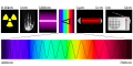 1. Electromagnetic spectrum illustration to be fixed by inserting an infrared band
 -
 2. diagram showing where the infrared band should appear and the correct wavelengths to use
 -
 3. added microwaves, long waves and gamma radiation, also fixed the wavelengths
 -
 4. 84user's adaptation with icons swapped and bolder figures
 -
 5. 84user's attempt at a narrow version, looks Ok in Inkscape and Opera but Commons somehow
shrinksshrank the width; latest upload has fixed this -
 6. Visible light variant made from Spectre.svg and Spectre InfraRed.svg


Article(s): almost everywhere; and see w:en:Electromagnetic spectrum for background needed to understand problem
Request: Please squeeze in an infra-red band icon between the rainbow icon and the microwave icon. Please also correct the wavelengths as shown in File:Spectre Terahertz.svg, or refer to w:en:Electromagnetic spectrum. I can do a stop-gap fix myself by copy and paste from the second image but I doubt the result will be the high quality a featured picture deserves (I had problems with the font, and my quickfix icons do not look good in closeup). -- 84user (talk) 17:22, 1 August 2009 (UTC)
hi, i hope it works. it's my first upload to wikicommons, so please don't hesitate to ask for any changes.Isometrik (talk) 02:31, 5 August 2009 (UTC)
- Wow, that's quite good and more than I expected. I made some trial variants from it and placed them in the gallery above. The first of my adaptations (4) swaps two icons because it seems the red quarter circle with the "C" represents infrared, while the "bar"-like icon is meant to represent microwaves. The second adaptation (5) removed the left-most gamma and right-most radio icon because they duplicate the existing icons. The radiation symbol is meant to represent gamma. The micorwave icon unfortunately is easily confused with an electric bar fire. However, after I uploaded the narrow SVG (width 758 height 443), Commons
displaysdisplayed it as 512 wide by 443 high. Is this a known bug in Inkscape or in Commons? Latest upload has fixed it. It looks Ok when I view the SVG locally in Opera.Can you make a version of mine that matches the original size of 744 × 524?84user (talk) 20:28, 5 August 2009 (UTC) - Update: I've added a variant (6) made by merging elements from Spectre.svg and Spectre InfraRed.svg, and struck through out of date comments. 84user (talk) 21:41, 5 August 2009 (UTC)
- Hello again, when i was doing my corrections, i read the article, so i used c° and the graph of the rising temperature (red quarter circle) to represent microwaves as they can heat things up. and from this graph: File:Electromagnetic-Spectrum.png i added gamma radiation and long waves, which are not the same as x-ray and radio waves. Isometrik (talk) 14:03, 6 August 2009 (UTC)
Graphist opinion(s):
- I think the real problem here is that some of the (used/suggested) icons are confusing. Once we've decided which icons to use, drawing them should be no problem.
- Specifically, the "°C" icon seems to have two conflicting interpretations: I'd immediately associate it with the thermal infrared range, but apparently some people think it should represent microwaves (presumably because of their use in microwave ovens. Similarly, the "red beam thingy" used to represent infrared in some versions (presumably meant to be a stylized infrared emitter and sensor, as in a TV remote control) seems to be a bit hard to figure out; I had to look at it several times before realizing what (I think) it was supposed to be.
- One possibility for the infrared range could be to split it in two, representing near IR with a communications device and mid/far IR with heat, but that probably wouldn't work very well in this kind of diagram (although I could imagine one showing multiple overlapping frequency ranges on multiple lines). And the microwave range is an even bigger mess, with several distinct applications sharing pretty much the same frequencies. (Did you know that Wi-Fi and microwave ovens use the same frequency band?)
- For infrared, I might suggest replacing the current stylized remote control with a picture of an actual remote control, perhaps with some red "wave" arcs being emitted from the end where the LED is. As for microwaves, a picture of a microwave oven would seem like the obvious choice, but I'm not sure if having two boxy appliances (the other being the radio) next to each other in the same diagram really helps. Replacing the radio with a parabolic antenna would be tempting, but probably a bad idea for accuracy: many if not most of the frequencies typically used with such antennas actually fall in the microwave range. Perhaps a transmitter mast would work? —Ilmari Karonen (talk) 14:31, 7 March 2010 (UTC)
Coat of arms of the Congo Free State[edit]
-

-

-
 okay to overwrite the incomplete svg
 -
 shield shape


Request: vector version, please... --Kintetsubuffalo (talk) 03:47, 2 April 2010 (UTC)
- By the way, if you don't like the shield shape in File:Belgian Congo Free State coat of arms.svg, you could start from File:Blason qc cardinal Joseph Charbonneau.svg instead... AnonMoos (talk) 22:15, 19 June 2010 (UTC)
- Better graphics are here. Note that the two graphics we already have are with a common mistake--Antemister (talk) 06:49, 1 September 2010 (UTC)
Graphist opinion(s):
Wikibooks:Java UML diagrams[edit]
Request: Wikibooks:Java Programming has some UML diagrams that are saved as JPG files. They should be converted to vector graphics. User:Mikm seems to have started that process a few years ago but only finished a couple of diagrams. The new diagrams should look the same as his versions (or alternatively his versions should be redrawn to look the same as the other new diagrams). --ZeroOne (talk) 12:57, 10 April 2010 (UTC)
Graphist opinion:
Supranational European Bodies diagram[edit]
-
 Source english version
 -
 Vector
 -
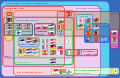


Request: This is extremly well arranged diagram on its theme. As creator create it using Word (!), there is no vector version. It would be nice if some SVG wizard could recrated to easily translable SVG. Jklamo (talk) 10:20, 21 May 2010 (UTC)
- Comment I've moved this request here from the photography workshop page. Also, see Commons:Project Nuvola 2.0+ for SVG flag images. —Ilmari Karonen (talk) 17:58, 21 May 2010 (UTC)
Graphist opinion(s):
![]() Done
There is a vector version, the turkish one. You just have to translate it.--DieBuche (talk) 18:41, 21 May 2010 (UTC)
Done
There is a vector version, the turkish one. You just have to translate it.--DieBuche (talk) 18:41, 21 May 2010 (UTC)
- I'll change the text to actual text, so that you can use {{Translate}}--DieBuche (talk) 18:44, 21 May 2010 (UTC)
- Do u want me to remove the very outer circle the turkish version added? --DieBuche (talk) 13:35, 22 May 2010 (UTC)
- Not sure if it's necessary to remove it, as it's just listing the two countries in Europe not part of any of the organisations. Anyway, translated it. NikNaks93 (talk) 19:24, 22 May 2010 (UTC)
- Comment Belorussian flag is bit scrambled in both versions. Otherwise good work. --Jklamo (talk) 14:41, 24 May 2010 (UTC)
- Hopefully it's a little better on the EN version, now. NikNaks talk - gallery - wikipedia 16:32, 30 May 2010 (UTC)
- Um, circling the whole lot with "continent of Europe" is incorrect. Turkey is in a different continent. So is Cyprus. SpinningSpark 14:23, 26 June 2010 (UTC)
- Turkey is partly in Europe, but, anyway, I've removed the circle and adjusted balloons. However, there is a problem with the flags of Greece (it has some white stripe at the top) and Lithuania (it has too black border), and I'm not able to fix that. If somebody do so, it'd be great. —Volgar (talk) 15:37, 15 September 2010 (UTC)
- Um, circling the whole lot with "continent of Europe" is incorrect. Turkey is in a different continent. So is Cyprus. SpinningSpark 14:23, 26 June 2010 (UTC)
- Hopefully it's a little better on the EN version, now. NikNaks talk - gallery - wikipedia 16:32, 30 May 2010 (UTC)
Warsaw fortification 19th century[edit]
-
 19th century fortification of the bigger Warsaw region (includes the upper one)
.svg)
Request: Could eventually somebody (best: Polish speaker) help to change the first in a similiar beautiful form like the second one ? Wistula (talk) 15:46, 3 June 2010 (UTC)
Graphist opinion(s):
![]() Request taken by leafnode --Leafnode✉ 13:25, 9 June 2010 (UTC)
Request taken by leafnode --Leafnode✉ 13:25, 9 June 2010 (UTC)
Coat of arms of Morocco 3D-effect[edit]
-
 Coat of arms of Morocco (SVG)
 -
3D effect
-
 ex: Coat of arms of Sweden
 -
 ex: 3D effect


.svg)
Request: Can anyone create a 3D version of the coat of arms shown above. Flad (talk) 22:58, 31 March 2010 (UTC)
Graphist opinion(s): What kind of "3D effect" do you mean?--DieBuche (talk) 12:28, 10 June 2010 (UTC)
- Shadows.. --Flad (talk) 23:43, 17 June 2010 (UTC)
- Do you mean an embossed-type effect (where the star appears to cast a shadow on the red background. etc.), or do you mean a general overall pseudo-reflective gradient, such as is mandatory for heraldic images on French Wikipedia? If the latter, then the French Wikipedia "Blasons" project is certain to have some relevant instructions (in French, of course). AnonMoos (talk) 23:16, 19 June 2010 (UTC)
- I think it would be the first, like the exemplar I added above. --Flad (talk) 14:51, 29 June 2010 (UTC)
- Different colour scheme can be found here File:Coat_of_arms_of_Morocco_(illuminated).svg. --Flad (talk) 15:04, 29 June 2010 (UTC)
- Do you mean an embossed-type effect (where the star appears to cast a shadow on the red background. etc.), or do you mean a general overall pseudo-reflective gradient, such as is mandatory for heraldic images on French Wikipedia? If the latter, then the French Wikipedia "Blasons" project is certain to have some relevant instructions (in French, of course). AnonMoos (talk) 23:16, 19 June 2010 (UTC)
Germany regiment arms[edit]

Request: This is concerning an image found on the English Wikipedia only at this moment. De728631 asked for help transforming this image into an SVG file. If anyone could convert the image, I would appreciate the assistance. [tk] XANDERLIPTAK 03:54, 16 June 2010 (UTC)
- First of all, thank you, Xanderliptak, for posting this here. I've now uploaded the file to Commmons under a different name, but it would still be appreciated if someone could transform it into SVG. Regards, De728631 (talk) 18:24, 21 June 2010 (UTC)
Graphist opinion:
Sindhi Wikipedia logo[edit]
Area(s): Sindhi Wikipedia
Request: Make it transparent. 92.8.202.26 12:13, 23 June 2010 (UTC)
Graphist opinion(s): The image is too tiny for proper cropping. If you can tell me what are the letters on the globe and the specific font, i could create a vector for you Finemann (talk) 07:17, 29 June 2010 (UTC)
Muscle contraction illustration[edit]
-
 The translated image currently in use on the article
 -
 The original German image
 -
 A previous attempt at translation/vectorisation


Article: w:Muscle contraction
Request: This was originally a German illustration used (oddly) on the English w:Muscle contraction article. I've provided a (very rough) translation, but this seems like the kind of thing that should be an SVG. There seems to have been a previous attempt at this, but the text is a mess (Fx 3.6.4) and still half German anyway. Anyone able to help? GravityGilly (talk) 15:53, 24 June 2010 (UTC)
Graphist opinion(s):
State Seal and Governor's flag[edit]
-
 State Seal
 -
 Governor's Flag


Request: Okay, since after having requested the flag of the Governor of Hawaii when it was a Territory, I decided to do checkup, just to make sure there weren't any others I had overlooked, and there's one more. This is for Alabama, and luckily, it shouldn't be very hard since I have found SVGs of the needed main component.
THIS was the State Seal of Alabama from 1868 to 1939. Here is an alternate depiction: 11. The main part needed for this seal, the eagle over the shield, can be used from the Seal of the US DoJ.
The historical Governor's Flag folows the same design as the current one, except that it was square, and had the coat of arms at the top replaced by the Eagle and shield motif from the Seal of 1868-1939, as seen here.
Please recreate both in SVG, and upload with "1868-1939" in their titles. Thank you very much :) Fry1989 (talk) 19:50, 24 June 2010 (UTC)
Request taken by NikNaks93
Graphist opinion(s): Well, I'm working on it, but Inkscape is having trouble with the seal. It's got so much going on that it occasionally crashes, but I should be able to work around it. NikNaks talk - gallery - wikipedia 11:08, 25 June 2010 (UTC)
- Interesting, it doesn't crash for me when I try to do things to the seal, but I agree there is a TONNE of stuff going on there. Unfortunately, I'm still working up my skills, so I can't do this myself. I really appreciate you doing it for me :) Fry1989 (talk) 04:37, 27 June 2010 (UTC)
Uruguay National Emblems[edit]
-
 Fix this coat please. OFFICIAL VERSION

-
 Presidential Flag done
.svg)
- Flag of Athletic Club of Peñarol 2:3 Ratio
- Coat of Peñarol
- Coat of Club Nacional de Footbal
- Flag of Uruguayan Football Asociation 2:3 Ratio
- Urugay presidential flag 2:3 ratio
Request: Hi, can somebody make a SVG of theese emblems, thanks in advance. Kineto007 (talk) 02:13, 17 July 2010 (UTC)
- I have made the Presidential Flag. Fry1989 (talk) 23:34, 13 August 2010 (UTC)
Graphist opinion(s):
[edit]
Request: Would someone be willing to make a from-scratch (SVG or PNG) version of the above image? Font similarity is most important, but if similar shading could be applied, that would be nice. The above image is unquestionably a copyright violation, so it has been nominated for deletion. If it gets deleted before this is acted on, this is a cleaner version I created (but also derived from the TV logo). If you're feeling really generous, perhaps you would consider a version with "Navy CIS", as it is known in some places in the world, similar to this image at the German Wikipedia. Thanks for your help! — Huntster (t @ c) 22:13, 18 July 2010 (UTC)
Graphist opinion(s):
- I think the image quite clearly falls under {{PD-textlogo}}, so I removed the speedydelete requests. The image is still open to improvement, of course. —Quibik (talk) 22:07, 19 July 2010 (UTC)
Cleaning up artifacts[edit]
-
 (PNG) Indonesia Raya
 -
 Cleaned up low-res JPG version


Request: This is a lossless conversion of a PDF document containing a rare 1928 magazine that contains the original music of what is now Indonesia's national anthem. I would be grateful if someone could clean this up of the artifacts throughout. I uploaded it as a PNG, but let me know if it's insufficient and I can give you a copy of the original PDF. Ivan Akira had cleaned up the low-res JPG version but thought I should come here for the larger image. Arsonal (talk) 19:44, 6 August 2010 (UTC)
Graphist opinion(s):
Signature transpearancy[edit]
{{Stale|1=--ZooFari 21:56, 1 January 2011 (UTC)
Request: Could someone clean up this signature image? Possibly make the white portions transparent?--GrapedApe (talk) 02:22, 7 August 2010 (UTC)
Graphist opinion(s):
![]() Request taken by Ivan Akira: Please wait awhile okay? Ivan Akira (talk) 02:27, 7 August 2010 (UTC)
Request taken by Ivan Akira: Please wait awhile okay? Ivan Akira (talk) 02:27, 7 August 2010 (UTC)
 Done It's done now. Have a look. Ivan Akira (talk) 02:32, 7 August 2010 (UTC)
Request: Could you make a svg-version of it with better quality? Ischa1 (talk) 06:05, 9 August 2010 (UTC)
Graphist opinion(s): Sure, I'm on it. Connormah (talk | contribs) 01:57, 10 August 2010 (UTC)
Geometric shapes[edit]
Request: Could you make seven separate svg-images of it (maybe colored)? Ischa1 (talk) 17:51, 12 August 2010 (UTC)
Graphist opinion(s): I see a great long list. Which of them did you wanted SVG images of?
Energy flows in the U.S.[edit]
-
 U.S. Energy Flow for 2008

Request: Please make the backgrounds on the left easier to read, fill in the transportation percentages, and change "rejected" and "services" to "lost" and "used" as in http://www.seeingenergy.rs/assets/images/education/001-low-energy/us-energy-flow-trends-2006.jpg Also please add the domestic, import, and export values here.
There are some international charts here. Thank you. 71.198.176.22 16:00, 21 August 2010 (UTC)
- It would be better to also make coal grey instead of black, make petroleum black, and make wind green instead of magenta. 208.54.5.76 22:01, 23 August 2010 (UTC)
- Also, there is a new version for 2009 at https://publicaffairs.llnl.gov/news/news_releases/2010/images/energy-flow-annotated.pdf
- How difficult would a second version with an overlay explaining "Carbon-Neutral Transportation Fuels From off-Peak Wind and CO2" -- http://dotyenergy.com -- be? 71.198.176.22 21:42, 24 August 2010 (UTC)
Graphist opinion(s):
Blason de la famille de Gournay[edit]
-
 same as this
 -
 but without the chain


Request: Remove the chain and rename as suggested. Diligent (talk) 20:17, 25 September 2010 (UTC)
Graphist opinion(s):
- Do you mean upload the new version under the new name or under the old name but rename it afterwards? ZooFari 20:47, 25 September 2010 (UTC)
File:075 Infantry Regiment COA.png[edit]

Request: vectorize... Kintetsubuffalo (talk) 17:45, 2 October 2010 (UTC)
Graphist opinion(s):
==[edit]
Request: vectorize... Kintetsubuffalo (talk) 18:05, 2 October 2010 (UTC)
Graphist opinion(s):
Coat of arms of Burma[edit]
-

-
 this may help with the forward looking chinthe
.jpg)
Request: vectorize black and white lineart svg version? The original coat of arms contained the Burmese text
on the banner, which translates "Union of Burma", as well as three chinthe (the chinthe at the top was replaced by a star). Additionally, the cogwheel was a circle surrounded by Verse 194 of the Buddhavagga in the Dhammapada in Pali:
(samagganam tapo sukho), which translates to "happiness through harmony" or "well-being through unity."--Kintetsubuffalo (talk) 06:44, 14 October 2010 (UTC)
Graphist opinion(s):
Andy Warhol signature[edit]
-
 Done
Done
Request: Would someone be interested in creating a signature image of Andy Warhol? He is a good sample signature. I tried an SVG auto-trace, but it looked pretty bad. GrapedApe (talk) 22:45, 15 October 2010 (UTC)
Graphist opinion(s): I'll take this. Connormah (talk | contribs) 22:05, 13 November 2010 (UTC)
SVG trace of a logo[edit]

.svg)
.svg)
Request: Would someone please trace this image into SVG? GrapedApe (talk) 18:58, 17 October 2010 (UTC)
Graphist opinion(s):
- The PNG is kind of small, and the copyright status perhaps dubious... AnonMoos (talk) 23:22, 17 October 2010 (UTC)
- How is the copyright dubious? Is it not PD-text? It's just text and a circle.--GrapedApe (talk) 00:29, 18 October 2010 (UTC)
- It looks like it's at least partially custom calligraphy, not just a font. AnonMoos (talk) 00:36, 18 October 2010 (UTC)
- I see what you mean, but I disagree. Besides the PD-text, I strongly suspect that it is PD for age. I can't substantiate it yet, except that it is the logo of a really old company that was founded in 1865 and had its heyday 1920-1940. Chances are good that this logo was created a long time ago (PD-1923). Anyways, if you think there's a chance that it's not PD, then please nominate it for deletion. If I'm wrong, I'd like to set up a FUR version at Duncan & Miller Glass Company.--GrapedApe (talk) 05:06, 18 October 2010 (UTC)
- It looks like it's at least partially custom calligraphy, not just a font. AnonMoos (talk) 00:36, 18 October 2010 (UTC)