Ajuda:Escanejar

Escanejar una imatge o un document per a Commons pot ser relativament senzill, si sabeu què feu i, si teniu interès per la història, pot ser una manera excel·lent de compartir el vostre interès per aquest món.
Entre les fonts excel·lents d'obres de domini públic s'inclouen:
- Biblioteques (en particular les grans biblioteques municipals i, encara millor, biblioteques universitàries, on els estudiants i altres usuaris autoritzats solen tenir accés més lliure als llibres més antics del que normalment es concedeix al públic en general)
- Societats històriques
- Llibreries de segona mà
- Mercadillos i botigues benèfiques
Principis generals
Comproveu si el monitor té un ajust adequat, especialment els paràmetres de brillantor i contrast. Massa brillant o amb un contrast massa baix, i les vostres imatges tendiran a un to gris en els monitors millor ajustats. Idealment, hauríeu de poder veure tres cercles en aquesta imatge, que prova la calibració del monitor. Commons:Image_guidelines/ca#El vostre monitor proporciona més consells.
.svg)
Tret que el vostre escàner no sigui capaç d'escanejar-lo, no escanegeu mai a menys de 300 ppp[1] Les mides dels fitxers poden ser grans, però per a gravats, pintures i il·lustracions de qualsevol complexitat, es tracta de la resolució mínima necessària per reproduir-los amb una qualitat raonable.
En general. 400 ppp és una bona resolució. Per a gravats i treballs similars, però, és millor 600 o fins i tot 800 ppp, ja que els mestres gravadors (com William Hogarth i Gustave Doré) sovint han inclòs detalls més petits del que es pot distingir a simple vista. Per a imatges de fins a una mida aproximada d'una postal (aproximadament 8 cm per 10 cm), pot ser convenient de 500 a 800 ppp , ja que permet augmentar-les fins a un cert punt més enllà de la mida original. De la mateixa manera, 600 o 800 ppp és una bona opció quan s'escaneja des d'obres rares: s'agrairà una qualitat addicional. Gairebé sempre són excessius els 1200 ppp, excepte les diapositives o els microfilms. Consulteu el manual del vostre escàner en aquests casos.
Netegeu el vidre abans d'escanejar-lo, sobretot si teniu mascotes. - El cabell, la pols i similars tendeixen a ficar-se sobre el vidre de l'escàner.
Utilitzeu l'opció de previsualització del programari de l'escàner (si està disponible) per col·locar la imatge el més recta possible abans d'escanejar-la. Les imatges també es poden girar després, però això requereix més temps. A més, cada programari d'escàner és diferent. Així doncs, jugueu amb totes les funcions del vostre programari (canvieu al mode “Professional” o “Avançat” si ho permet), fins que no sapigueu utilitzar-les bé.
Assegureu-vos que l'objecte a escanejar quedi completament pla. Si només és un full, poseu-hi llibres pesats. Si esteu escanejant part d'un llibre, premeu fermament la coberta amb la mà mentre escanejeu. Òbviament, això no s'aplica a les obres fràgils.
Si és possible, les opcions de nivells automàtics s'han d'utilitzar amb certa precaució. Compareu la previsualització amb l'original (el millor possible, atès que s'està escanejant l'original) i comproveu si els resultats tenen sentit. Si teniu experiència en l'edició d'imatges o creieu que altres persones experimentades us poden ajudar més tard, desactiveu els nivells automàtics.
No us preocupeu per les obres grans que no encaixin a l'escàner d'una sola peça: als laboratoris de gràfics, com ara: en:WP:GL/IMPROVE, Commons:Graphics village pump i Commons:Graphic Lab, normalment hi ha persones que molt amablement ajuntaran les múltiples exploracions d'una imatge.
Consell: Facilita molt les coses si utilitzeu la vora del vidre de l'escàner per redreçar qualsevol cosa que escanegeu, de manera que totes les imatges parcials es facin amb el mateix angle. Tot i això, si no podeu fer-ho, normalment ells ho poden fer. A més, escanegeu les peces amb una resolució bastant alta (entre 600 i 800 ppp solen ser bona): facilitarà l'ocultació de les unions entre les imatges si se'n pot reduir després una mica la mida.
Assegureu-vos de desactivar els “nivells automàtics” del vostre escàner, per molt bons que siguin els resultats normalment: dos exploracions consecutives amb nivells automàtics apagats seran una bona coincidència entre el to i els colors del paper i, per tant, molt més fàcils d'“ajuntar”. Tenir els nivells activats pot comportar que les captures tinguin diferències de to subtils o fins i tot importants que dificultaran la costura.
Els fitxers a Commons no poden superar els 100 MiB. Això no se sobrepassa tant per PNG com per JPEG amb una resolució de fins a 800 dpi en qualsevol mida que s'adapti fins i tot en escàners més grans. Els TIFF poden ser molt més grans, però, com s'explica a continuació, és preferible no penjar fitxers TIFF.
Reducing bleedthrough


Already with standard paper thickness, but especially with thinner paper, you can often see the printing from the backside or the next page through the paper. This can be greatly reduced by scanning with a blank paper (or two, if necessary) behind the scanned page. If the printing from the backside shows through, you should use black paper for this, if it is only the next page, white is preferable.
The black paper behind the page causes a slightly darker white point that can be compensated for later.
If a scan does show shining-through text and you can't rescan it as described above, it can sometimes be corrected with little loss using image manipulation software. A technique that works quite well for grayscale images is explained at Commons:Pearson Scott Foresman.
Color calibration

Manually changing scan settings can help improve the color accuracy of your scans. For better results, you can buy an IT8 target, which is a sheet of defined colors that is scanned and then analyzed by software (such as the free LPROF) to create a custom color profile for your scanner.
PNG vs. JPEG
Please note. The following advice refers to scanned images. If an image has originated from a digital camera, it will usually be in JPEG format. There is no point in converting an image which is already in JPEG format to PNG unless you intend to do extensive edits to the image and want to be able to save your work as you go along. (Saving as JPEG repeatedly can increase the amount of JPEG artefacts significantly.)
PNG saves images using lossless methods; GIFs and JPEGs (sometimes called .jpg because of a DOS file name limitation) can add artefacts (ugly errors, pretty much) to your picture. In general, GIFs are mainly used for animated images, and JPEGs and PNGs are the main choices for still images. As most scanners are not set up to capture moving images, let's concentrate on PNG and JPEG.
PNG is a safe bet in most cases, but if a PNG is very large (more than 12.5 million pixels, or more than roughly 4000×3000), Wikimedia software can't display the image. A full-colour PNG file can also be quite large, although the increase in maximum upload size to 100 megabytes helps a bit here. Programs like Optipng or PNGcrush can help make your PNG files smaller without any loss of quality.
In any case, it's usually best to scan to a lossless format like PNG, TIFF, or, if necessary, BMP first. A JPEG file has already lost quality, and, with some settings, may have lost a significant amount; switching to PNG will not bring that back. In addition, artefacts accumulate each time you edit and resave JPEG files. By starting with a lossless format, even if you have to go to JPEG in the end due to size issues, avoids unnecessary loss of quality.
Best practice: When possible, upload a PNG file as a lossless archival version, even if it can't be displayed on Wikipedia because of its large size: You can always upload an additional JPEG version, and add links between them in the "other versions" section of the upload template. This way, any future image manipulation can be based on the lossless PNG file, instead of a lossy JPEG.
In better image editing programs, you can trade off quality vs. compression when saving to JPEG format. In general, use the maximum quality 100 – the scale is 1 to 100 with 100 being best quality. In Photoshop, which uses a scale of 0 to 12 instead, use 12.
If the compressed file size exceeds the current limit of 100 megabytes, consider either reducing the quality or, if the material is of historical significance, requesting assistance from the Commons:Graphic Lab. If the quality is reduced, check the image at full resolution before uploading to make sure it still looks okay. This old version of Sadko.jpg appears to be made up of thousands of little squares when viewed at full resolution, which is one of the things that can happen if the quality is set too low. The current version has twice the file size, but avoids the worst of these problems.
If you have the choice, choose to save PNGs with the "smallest file size" or "highest compression": The PNG compression algorithms are entirely lossless, it just takes longer save the more compressed ones. In practice, the much smaller filesize makes it so much more efficient that the time spent dealing with the compression doesn't matter.
PNG vs. TIFF
PNG has much smaller file sizes than most archival TIFF. Scan to PNG if the scanner software has this option, and otherwise consider converting to PNG afterwards.
TIFF is offered as a courtesy to any museums or other archives that want to upload their files. However, TIFF can contain almost any other format — including, in theory, lossily compressed formats like JPEG! Therefore, if you need to use TIFF, make sure you choose a lossless compression, preferably LZW or Zip/Deflate.[2] Baseline TIFF encoders will always produce lossless TIFFs.
Editing your image
Always upload your original scan, preferably as a PNG or PNG/JPEG pair. This way people can clearly see what your manipulations were, and allows other editors to fix things if the edits accidentally damage the image.
Common manipulations include:
- Levels adjustment
- Adjusting colours to match the original.
- Cloning out hairs
- If you have cats, there is a high probability that at least one hair is present on your scanner.
- Attempts at restoration
- Fixing tears and stains.
These are beyond the scope of this help page. Contact an experienced user for help with these.
Black and white, grayscale, or colour scanning?
If your image is in colour, it should of course be scanned in colour. With black-and-white images the decision is a little more complex.
Binary black and white is usually not a good idea — a grayscale or colour scan tends to look a lot better because it shows oblique edges without the jaggedness of binary black-and-white, since it allows anti-aliasing to smooth out pixelation. However, there's something to be said for both the other choices.

When scanning from a reproduction – I could only bring a photocopy of this newspaper to a scanner – it makes little sense to preserve the paper texture. This image is scanned in grayscale, with the contrast adjusted upwards to give a smooth, white background, and to get the main parts of the lines to pure black. This puts the emphasis squarely on the picture, and since the lines that make up this image are fairly thick (for an engraving: the smallest are about as wide as a line from a ballpoint pen, and are all visible to the naked eye if you look closely), such adjustments would not result in any real loss of detail. This way, the image can be printed without trying to reproduce a paper texture which the paper it is printed on will have anyway.

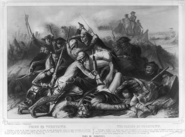
This scan is from an original, and is a different type of engraving – a copperplate engraving instead of a woodcut from a newspaper. In this one, some of the lines are so fine that they are barely visible to the naked eye (at its original size), the ink is slightly tinted from age, and the paper has a nice feel of oldness to it. Some of the detail in the very delicate fine lines might be lost with a lot of post-processing, and the ink and paper add to the interest of the piece, so this one is best kept in colour. However, it is somewhat harder to print this one.
If in doubt, try both ways, and then decide which one you like best. Note, however, that you can go from colour to greyscale, but not the other way around. So if scanning something quite rare, colour is probably best.
Half-toning

Half-toned images are used in most modern printing. They consist of an array of dots at regular intervals, with the size of the dot determining how dark it is. Unfortunately, half-toning can look awful if you zoom in too far and may create disturbing Moiré artefacts. Consider this image:

The original was made by using engraving for the black lines, followed, as I understand it, either by hand-tinting or an additional plate for each colour. However, this version was clearly scanned from a modern book, and at full-view, all its half-toning dots are visible.
If possible, try to use the original sources. Of course, this is not always possible. So if your work is half-toned, but still under a free licence, please do scan it for Commons! At least if scanning resolution was high enough, most half-toning can be fixed with a little manipulation afterwards, and, even if the image ends up, by necessity, at a lowish resolution, it still shows things that would otherwise not be available for Wikimedia projects.
“Remove moiré”, or “descreen” functions of scanner software make a start towards fixing half-toning. But usually the results are not on par with some of the available descreening software. Those functions may be more destructive to the image and may also prevent better descreening software from removing the remaining half-toning artefacts afterwards.
A half-toned image cannot have more detail than the distance of the dots that make it up. So if your work is half-toned, it's best to manipulate it in a image editing program afterwards. To do this, it is desirable to use an oversampled scan (a higher resolution than that required to reproduce the smallest details of the actual image). You may want to use a resolution that makes it possible to distinguish the individual printing dots.
Merging dots with Gaussian blur is straight-forward to do and utilizes functions available in most image-editing software, but it destroys more detail than necessary. Since the printing dots have to actually merge half-way into each other until the raster disappears completely, you end up with only up to half of the original resolution.
You need specialised software to remove dot patterns in the frequency domain, but this way you can retain almost all the detail of the full original resolution.
Software is available from Cornell University and Picture elements to automatically fix black and white halftone images, if scanned at 600 dpi.
Note: The techniques used for halftoning have changed over time. On early half-toned images (circa 1890–1920) these methods will probably not work.
Merging dots with Gaussian blur
Note: This can work very well in some cases, if done carefully and if you do not need more than half of the original resolution. However, it cannot be undone, so please upload an unblurred copy as well. Also, note that this should not be done to lithographs or other such images.

Up: Halftone picture.
Middle: after applying a Gaussian blur with σ = 2.
Below: Dot pattern removed in the frequency domain.
(results seen better at full size)
First (perhaps after carefully correcting the white-balance) use the Gaussian blur filter with a radius just big enough to make the dot raster disappear. Now you might want to maximise the contrast and maybe do another tonal correction and other stuff. Then you can scale down the image by factor of the blur radius. Because there are no smaller details left, this won't hurt much.
You might want to use a resampling technique that retains more sharpness instead of having to sharpen afterwards.
In binary black-and-white half-toned images, however, you may be able to get away with just blurring it a bit, then using the sharpening filter and increasing the contrast. You should probably scale it down a little afterwards, but with practice this can salvage a black and white half-toned image to good effect.
Removing dot patterns in the frequency domain
You need the G'MIC plug-in for GIMP, which includes both a Fourier transform filter and an additional descreen filter that automates the whole process and ensures that you don't miss anything.
(See here for step-by-step instructions on how to manually perform the steps from the automatic descreen filter.)
This works incredibly well if the patterns to remove really are coherent throughout the image. If there are (small) areas where the patterns are absent, the pattern that is removed from the other parts will show up here instead. In this case you may want to load the previous image as a layer underneath the descreened one and merge in the undistorted areas from there, e.g. add an alpha channel to the upper layer and selectively let the lower layer show through using the eraser tool.
Similarly, if the scanning resolution is so high that the printing dots are completely separated, then the pattern removal may work less. You may have to try to feed several resolutions of the image into the frequency transform. Initially scanning the image at even higher resolution may still be helpful to reduce image noise.
You may then want to reduce the resolution to get closer to the original resolution. It may be a little difficult (compared to above blur technique) to find the right reduction factor. You can try to find the minimum blur radius that completely removes the pattern from the original scan, as described above under "Merging dots with Gaussian blur" or use the measuring tool to determine the pixel distance between two adjacent printing dots.
Now reduce by at maximum half of that factor. (Due to the sampling theorem, bitmap graphics require twice as many pixels per dimension than the maximum frequency [number of details] to reproduce.) Before resampling you may want to apply other filters such as a median filter (“despeckle” in GIMP, or the less destructive pixel denoise from G'MIC) to (some parts of) your image.
Engravings are, perhaps, the easiest type of art to work with, and, if you have access to a good library, 19th century illustrated newspapers were common, often had very good quality engravings, used quite a lot of them, and are often fairly-well preserved.
There are two main types of engraving:

The first is to make it out of individual lines, as in this (originally approximately 2" / 5 cm tall) small engraving of Charles Dickens from the Entr'acte, a Victorian theatrical newspaper. This technique is also used for far more complex drawings, for instance:
If you look at this image of William Hogarth's Gin Lane at full size, you will see that all the shading, all the detail comes down to fine lines and crosshatching. The fine lines are actually invisible to the naked eye, instead blending into shading.
This is perhaps the most common form of black and white engraving.
Now consider this engraving:

Technically, this is actually not an engraving, but an etching. An acid-resistant coating was put over the plate, then areas were scratched away to allow acid to get at and texture the plate. The longer the acid is in contact, the rougher the plate's surface gets, and so the more ink it holds. By using several baths, changing what is covered as you go, you can create delicately-shaded works such as this one, with the shading made up of a sea of irregularly-shaped pits.
Etching generally cannot get as much detail as an engraving proper, as a certain amount of randomness comes into play from the acid pitting the surface irregularly. An etching is inherently "noisy", with irregular dimpling of black and white, as it's altering how much "noise" there is in any one area that actually makes up the art.
This distinction matters to scanning: In a scan of an engraving proper, every line should be distinct at full resolution, unless the engraving is extremely large, but in an etching, the artist did not physically choose the exact texture that creates the colours or grayscale, so a slightly lower resolution is fine. If you have a choice, somewhere between 300dpi to 800dpi is a good choice, and always go on the higher side for copperplate engravings – the details in a copperplate engraving can literally be microscopic.
A good scan of engraving, etching or similar should:
- Generally speaking, have a minimum resolution of 300 dpi.
- Show every line that makes it up distinctly, if an engraving. In an etching, it's basically made out of noise/static/irregularly shaped pits, with the location not precisely chosen by the artist. Just scan them at a reasonably high resolution, and make sure all graphical elements are visible.
- If it's a black and white engraving, and you've decided not to show the paper texture, adjust the levels so that the background is smooth, pure white, and the ink (at least where there's plenty of it) is a nice dark black. If you are scanning in colour, still make sure the paper is reasonably light in colour, and black areas do not look washed out, but reasonably black. This will make it look far better when scaled down for viewing on Wikipedia and other projects.
- For colour engravings, see also the advice of the next section.
A note on woodblock engravings
Woodblock engravings, particularly from Victorian periodicals, often contain fine white lines that show the divisions between the woodblocks that were glued together to make the full image. (Example Image:Design for an Aesthetic theatrical poster.png is fairly cleanly divided into four smaller rectangles.)
There are multiple views on whether it is best to edit the image to remove them or to keep them in for authenticity. Graphics labs, such as en:WP:GL/IMPROVE, Commons:Graphics village pump and Commons:Graphic Lab are probably the most useful places to go for restoration work; describing how to do extensive restoration work yourself is probably out of the scope of this tutorial.
Paintings, full-colour illustrations, and similar works
The methods for scanning full-colour illustrations, paintings (however, see below in this case), and similar are not greatly different from engravings, but it's best to adjust the colours afterwards to make it look as much like the original as possible.
- Scan at a minimum of 300dpi.
- Using a graphics editing program, adjust the levels, brightness and contrast, and so on, until the colours are as similar to those in the actual picture as possible. Keep a copy of the untweaked scan, and compare it with the final version to make sure you haven't accidentally messed something up. Also, this was said in the general advice section already, but make sure your monitor is appropriately calibrated, as described in Commons:Directrius sobre les imatges#Your Monitor – otherwise, what looks realistic to you and what looks realistic to everyone else will be different.
A warning about paintings: For paintings done on a canvas (e.g. most oil paintings, acrylics, and so on, in most cases, it's not going to be possible to get the original to a scanner, and, if the painting is old, it might damage it even if you could get it to one. If, however, it is possible, and damage is unlikely—e.g. a painting you've just made yourself, hence in good condition, note the texture of it. A little texture is fine, but if some parts stick out much more than a couple millimetres from the surface, you are probably best photographing it.
In many cases, though, you'll be scanning a painting from a modern reproduction. This can lead to mixed results. In lower-quality reproductions, you'll be dealing with half-toning, as described in the earlier section on it. Use the advice given there to attempt to ameliorate it. However, really good reproductions, as can be found in some high-quality art books may not have half-toning, or have it so fine that it doesn't matter except at the most ridiculously high of resolutions. In these cases, scan it at at least 300dpi then adjust it in a graphics program as described for scanning from an original painting.
As always, Graphics labs such as en:WP:GL/IMPROVE, Commons:Graphics village pump and Commons:Graphic Lab can assist you if you find this difficult. Also, check the copyright status first. Bridgeman Art Library v. Corel Corp. and similar rulings in other countries mean that, in most cases, if the original is in public domain, a copy is as well.
However, note that the United Kingdom has unusually strict copyright laws that may protect a heavily-restored image produced there. If in doubt, Commons:Sobre les llicències attempts to explain the full rules related to copyright, and Commons:Village pump may be able to help you if you are still uncertain.
Cropping
Try and leave a little whitespace around the image when you are scanning it in full. This makes sure you don't accidentally remove useful parts of the image or of its caption, or give the impression you have. Obviously, this may not be possible if the image goes right to the edge of the paper, but putting a piece of blank white paper behind it can help. (Don't worry about this when using black paper behind to prevent bleed-through.) Scan the image in multiple parts, if necessary—as mentioned in #General advice, support is available to stitch an image together from its parts.
When giving a detail from a larger image, try and trim it so that distracting details you do not intend to draw attention to are minimised in visual effect. For example:

This is a detail from a Punch cartoon—this Punch cartoon, in fact—that was being cropped for the English Wikipedia article on Gilbert and Sullivan. As such, The main image of Sullivan, and the tiny W. S. Gilbert were the important parts. Part of someone who is probably F. C. Burnand can be seen in the upper left-hand corner, but the crop avoids showing his face, so it doesn't attract too much attention. This detail is also from the lower-right corner of the original, so it's fairly sharply cropped on the right and bottom to avoid including (most of) the black line that frames the image as a whole, as having a thick black line on only two sides of an image would unbalance it. Serendipitously, the tiny bit of the black line that got left in on the lower edge and the bit of Burnand's moustache in the upper left completes the frame, creating a nice, even rectangle.
Caption
-
 Scan with caption
 -
 Scan without caption. Unfortunately, as this is higher resolution than the other, the value is substantially reduced, as the "good" copy is much lower resolution.
If a picture has a caption written in the same medium, it is better not to crop it, so that the information it may contain (original title, publisher, date, etc.) is immediately verifiable. Note that it is possible to produce a cropped version from the full scan with caption, while the reverse is not.
Always provide it with the captions, then upload any crops as a separate image
See also
* Help:Converting for advice on converting between document formats * Help:Digitising texts and images for Wikisource
Notes
- ↑ Els escàners fan servir ppp (“Punts per polzada”) per mesurar la resolució de l'escaneig proposat. A 300 ppp (2.54 cm per 2.54 cm) de la imatge original es converteix en una àrea de 300 píxels per 300 píxels de l'escaneig.
- ↑ More on the topic: https://photo.stackexchange.com/a/69661/45210
External links
- Scantips
- Halftone scanning
- Scanning tips, tricks, tutorials and techniques – list of links
- SANE FAQ – SANE (Scanner Access Now Easy) – API for Linux scanner software such as XSANE