This is an archive of past discussions. Do not edit the contents of this page. If you wish to start a new discussion or revive an old one, please do so on the current talk page.
I reverted User:Jhs's changes to the image. In Special:Preferences#prefsection-3, you can set image description pages to use 1280x1024px thumbnails. Jhs's 1100x800 version didn't display at full size in that case. The 11000x8000 version will display at full size in any conceivable conditions. (Frankly, it shouldn't matter, since MediaWiki should be willing to scale SVG up, but it doesn't.) dbenbenn | talk17:54, 29 October 2005 (UTC)
The reason I downsized it was that when I put the image somewhere forgetting to use thumb, my computer crashes. It did earlier today. And this version should be more than enough for now – images should never need to be bigger than that version… Jon Harald Søby\nona18:28, 29 October 2005 (UTC)
I'm sorting Category:SVG sovereign state flags alphabetically. Please edit the cat tag to "Category:SVG sovereign state flags|Norway" Fry1989 (talk) 00:42, 18 January 2011 (UTC)
{{Edit request}}
Please add a row |other fields={{igen|U|4|+}} to {{Information}}, this indicates an invalid SVG created with an unidentified tool throwing 4 validation errors. Or revert it to the oldest vintage 2005 version with |other fields={{igen|T|v|+}} indicating a valid SVG created with a text editor, but 28 bytes more than the current commons=crap?.[1]89.204.154.21403:49, 9 July 2016 (UTC)
Oppose There's no need to add another PD tag since the copyright holder/author (Dbenbenn) has already released this file to the public domain. And the "author" you are saying is actually the designer of the flag of Norway, which is unknown, but they don't hold copyright for this flag, it is Dbenbenn (and Jarekt, in the file history), since they created the SVG code of this flag. --★Poké9511:42, 30 September 2016 (UTC)
The red color currently used in this file appears too bright. The colors normally used by flag producers are red Pantone 200 and blue Pantone 281. In web colors, these Pantone colours approximately correspond to #BA122B (186, 18, 43) for intense red and #00205B dark blue (0, 32, 91).
Hello, @Sauer202: . The de facto standard used by Norwegian flag producers is, as you say, PMS 200 for red, and PMS 281 for blue. However according to the sources cited in the article these colors correspond to #BA122B (186, 18, 43) for red and #002469 (0, 36, 105) for blue (notice that your cited blue does not correspond with the source).
As there is no official definition for the colors (neither physical nor digital), I suggest we base our files here on commons on the de facto standard with the hex colors as stated above (#ba122b for red, and #002469 for blue). I hope you can agree with me on this.
On second thought, #ba122b might actually leave the red a bit too dark (it’s called bright red for a reason, I would assume). I personally think the colors in the current svg files are pretty much fine. The obsession to find approximate colors for the de facto pantone values seem counter productive to me. After all, the foreign secretary stated that the end product is what matters. So I say we go for colors that look good in rgb instead of blindly following (almost) arbitrary pantone to rgb conversions.
In my opinion the red in the current file is way to bright. In comparison, any quality flag bought at a reputable Norwegian flag store or used in official settings will both have a darker red and blue. Just take a trip to a reputable flag store and you will see that the red and blue colors are very deep. It is a common error in lower quality flags to make the Norwegian red and blue way too bright, and there seems to be a new mix of colors every time.
It would be wrong to argue what "feels right", which so many have done before us, leading to the chaos today. The foreign secretary is irresolute when she says it is up to the manufacturers to decide. These should be official guidelines, and when there are not, we should follow the professional communityː The national Norwegian flag manufacturers. In many general stores you will see cheap imported flags around the national holiday, and it is so easy to spot the wrong ones.
We agree that Pantone 200 as "Norwegian Red" and Pantone 281 as "Norwegian Blue" are the de facto colors used by reputable flag producers who have been keeping the tradition for years. I trust that it is a better solution to use the hex equivalents #ba122b for red and #002469 for blue instead of the colors in this file right now, which seem to have been chosen arbitrarily. (You are right that I cited the blue hex color wrong above, it should be #002469 as you say). Sauer202 (talk) 08:34, 15 December 2020 (UTC)
@Sauer202: To a degree, yes, I agree that the current red is slightly too bright, but have you taken a look at the flag with #ba122b for red?
Colors converted from PMS 200 and PMS 281 with Encycolorpedia (#ba122b & #002469)
The colors currently used on Commons
To me this red looks way too dark. The red looks barely brighter than the blue and this is crazy considering the fact that the offical Norwegian flag law states the red should be høirød (translated to bright red) and the blue should be mørkeblå (dark blue). Have a look at where we get the converted color codes from (this is the conversion cited in both the Norwegian and English article about the flag). Not only does Encycolorpedia not state any sources for their conversions, they even state that The hexadecimal color code #ba122b is a medium dark shade of pink-red on the page for the red color. This seems unacceptable to me. This conversion is likely just as arbitrary as the current colors, if not more. I don’t think we should base a bright red on a medium dark shade of pink-red. True, this color might look right on physical flags, but I don’t think the conversion is any good as it doesn’t look right in RGB. Looking forward to hear your thoughts on this!
To me the converted PMS 200 and PMS 281 looks way better. The current Commons one is almost orange in comparison. If you stare at the dark one for long and then look at the light one, it looks too light. If you stare at the light one for long and then look at the dark one, it looks too dark. We should not pick an arbitrary color based on what we feel, but what is right (or at least as close to right as we can possibly get).
The official webpage of Pantone LLC has coated variants (200C and 281 C), but not uncoated variants of 200 and 281 listed. Maybe it exists in the Pantone Formula Guide from Pantone, but in that case it has to be bought by someone.
The RALcolor webpage states that:
"This chart is a reference guide only. Pantone colors on computer screens may vary based on the graphics card and monitor used in your system. Do not rely on this as your only method for final color selection. For true accuracy use the Pantone Formula Guide."
Still, the ralcolor.net and encycolorpedia does not look that far from each other?
I tried to compile a list convertions from Pantone to web colors. Feel free to add to the list if you find more referencesː Sauer202 (talk) 15:38, 15 December 2020 (UTC)
@Sauer202: I agree that we should attempt to make the colors right, but here’s the trouble: in this case there is not, and there never has been, anything even resembling right. People who work with graphic arts know well to ignore what they assume is right. Instead they use their eyes, and adjust their work until it looks right, just as you and I do when we say the red in the current flag looks too bright. The reason the Commons red looks orange in comparison is exactly because it’s a comparison: compare the other way around, and the converted red looks hot pink in comparison. To me this isn’t a good enough reason to change the colors. However, this doesn’t mean that I think the colors shouldn’t be changed, just that we should do it for the right reasons.
There are currently no standards for the digital colors used in this flag, so I think it is too early to permanently decide on the RGB values. I am, however, alright with 1. sticking with the current colors, 2. using the converted Pantone colors, or 3. use something in between. If we go with the converted Pantone colors, let’s keep them consistent throughout commons, and I’m happy!
After confering with a flag manufacturer, my understanding is that coated and uncoated should not matter on computer screens, but has more to do with how the print looks on different types of paper. Futhermore, 186 and 289 were also mentioned as good alternatives to 200 and 281. I will confer and think a bit more, but in the meantime my opinion is that all the mentioned colors look better than the compared to the current commons color. I will get back to this and will ping you. Sauer202 (talk) 22:04, 18 December 2020 (UTC)
@Sauer202: Thank you for that! The flag manufacturer is correct in that coated and uncoated is irrelevant on computer screens, but more importantly: Pantone colors (e.g. any color codes starting with PMS) aren‘t used to represent colors on computers. They’ve always been a way to standardize physical reproduction of colors. That’s what – to an extent – makes the whole discussion kind of meaningless. There are no direct correlations between pantone and rgb.
For example: when large companies do branding – say a company like YouTube – they begin with one color system: on screens, YouTube have standardized their red to #ff0000. That’s the strongest red possible in the rgb color space, due to the fact that red is one of the primaries. Sure it’s not going to look the same on all screens, but that’s the nature of the web. Next they decide on a color that makes their marketing material look good when printed. They’ll likely go with both process colors printed with the cmyk primaries, and spot colors in the famous pantone system. But instead of simply going with whatever arbitrary color, pantone has decided #ff0000 is closest to, the designers will purchase swatches, do test prints and choose the color most closely representing their brand (i.e. the color that looks best).
As long as there are no official or de facto rgb values for the Norwegian flag, we should set a good example by coming together and looking at different colors, and deciding on one that looks representative of the physical flags, instead of blindly trusting a few conversion sites to tell us what a good color is.
@VulpesVulpes42: Hi, thanks for looking into this! Unfortunately that page is unsuitable as a source for the colors as we are looking for RGB/hex values, and not Pantone (PMS) or CMYK codes. The latest word from Norwegian officials is in a 2018 letter from the foreign secretary to the parliament. In it, the foreign secretary states that they wish to avoid unnecessary beaurocracy and therefore urges the flag producers to band together and develop a proper standard. Mainly for the colors of the physical flag itself, but hopefully also for digital ones.
@Gutten på Hemsen: I have been thinking about it, and since we are lacking an official guideline for hex colors I think the best thing will be to get as close to the most common de facto physical flag colors (Pantone 200 red and 281 blue) using the official Pantone translation for Pantone 200 and Pantone 281. The C should not matter for hex colors. The linked C-values are the same hex values as on the Pantone color wheel ("pantonevifte") used by Flaggfabrikken, and probably also other major Norwegian flag manufacturers. This concludes to #BA0C2F and #00205B. I think this is the best we can do.
I suggest we shall mention for the time being that Pantone 200 and 281 is used here on Commons as the primary color set, via using hex values from the official Pantone guide. I suggest that 186 and 289 (with their respective #C8102E and #0C2340) also shall be mentioned in the image description as good alternatives to 200 and 281.
Taking a step back and summing up the unofficial alternative hex translations in the tables above, I will say that most of the hex translations above (perhaps except the uncoated versions) are in my opinion way better than the current Commons color. The hex translations indeed do differ sightly inbetween each other, but collectively I think they are more similar to each other than to the current color set on Commons. Therefore I think it will not be very wrong if we stick to the official Pantone translations.
I too hope Norwegian flag producers, who have very trained eyes on the subject (it's their job to match colors), can band together and develop a proper standard in the future. I think this will be a good stepping stone to the process. Sauer202 (talk) 22:46, 16 January 2021 (UTC)
@Gutten på Hemsen: The suggested colors look good to me. I think we should change the most relevant Norwegian flag files on Commons accordingly to keep it consistent. Since you seem more familiar with image processing, do you want to take on the task? I suggest the image descriptions could contain something like "Colors used in this file are Pantone 200 and 281, translated to hex (web color) values using the official Pantone guide." Sauer202 (talk) 00:36, 18 January 2021 (UTC)
@Sauer202: I’ll gladly take up the task. Fortunately Norwegian Wikipedia has an extensive list of Norwegian flags both current and historical. I’ll replace the most relevant files and create new ones wherever it is convenient. Unfortunately the main flag is locked from overwriting so I’ll have to contact and administrator about that. Gutten på Hemsen (talk) 11:09, 18 January 2021 (UTC)
@Sauer202: , @Gutten på Hemsen: Dear Wikimedians, what I am about to write may come off as harsh, but I want to make it clear that while my tone is due to my moderate disappointment over the chosen colour shades, it is not directed at any of you personally. With that said, I feel obliged to object to the choice of Pantone 200 as the shade of red to be used in this file. While I understand that it was chosen as being in accordance with colours commonly used on de facto physical flags, I strongly request that Pantone 186 be used instead. My reasons for this are twofold:
While basing digital files upon de facto colours may be a reasonable alternative, I believe that de jure colours are superior when existing. In this case, while the aforementioned government website may not constitute legislation, I do still believe it to have significant bearing, and lean towards the more official end of the de facto–de jure scale. I think this holds true regardless of what unofficial colours manufacturers may use.
Secondly, I too would claim that 200 is too dark, having viewed the new file on both my computer monitor and my mobile phone screen. Choosing 186 instead would lighten up the shade of red a bit, to a value that I, and possibly others, would find more reasonable.
With these two arguments laid forward, I hope sincerely that this decision may be reevaluated, and further thought over. Yours truly —VulpesVulpes42 (talk) 18:41, 22 January 2021 (UTC)
@VulpesVulpes42: Hello again! I’m glad to see you joining the discussion once more, and it will be my pleasure to work together towards what might be seen as a better alternative. Firstly, the color shades: I’ve reflected on the new colors for the past few days and I’ve come up with a few thoughts on them. Number one: I am very satisfied with the new shade of blue. The Norwegian flag has always had a very dark and beautifully saturated shade of blue. I think the new blue better reflects the shade used on physical flags, and I would be pleased if it could be kept. I understand your primary issues are not with the blue shade, so I’ll swiftly move along to the next point. Number two: I have on most devices also decided that the red is too dark. That is, unless I set my display to full brightness, at which point it starts to look better. I think a brighter shade might be apt.
Now, let me address your two points. It seems to me that your main argument revolves around the subjective impression that the shade of red chosen is too dark. Again, I agree to an extent. I consider this justification enough to select another color; after all, color rendering is an inherently subjective matter. The color that you have suggested (186 C) is, as discussed, mentioned on a government website but not mentioned in law. However, as is written in this Aftenposten article, 200 is, together with 186, commonly used by Norwegian manufacturers when producing flags, so I consider 186 C to be a reasonable alternative to 200 C. I’ll be waiting patiently for Sauer202’s thoughts on the matter. —Gutten på Hemsen (talk) 02:13, 23 January 2021 (UTC)
For reference:
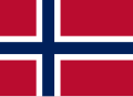
The previous colors
The current colors (200 C for red, 281 C for blue)
The suggested colors (186 C for red, 281 C for blue)
Third time's the charm. Nice work, @Gutten på Hemsen: and @VulpesVulpes42: the contrast between red 186 C and blue 281 C exudes bold harmony on my screens, and the resulting file bears a strong resemblance to most of the good flags of Norway I've seen in the wild. --Iketsi (talk) 03:47, 23 January 2021 (UTC)
@Gutten på Hemsen: , @Iketsi: Thank you so much for your cooperativeness! To Gutten, I want to clarify that I may have expressed myself a bit clumsily. When I spoke of "colours", in the plural, it may have given an impression of me being against both the red and the blue shade. This is not actually the case. I fully support continuing using 281 for the blue, combined with switching the red to 186. If that would be doable, I would have zero complaints, and be 100% satisfied. Once again, thank you all for this highly constructive discussion! —VulpesVulpes42 (talk) 11:49, 23 January 2021 (UTC)
I think we should keep 200/281. There is no official guideline, so there is no de jure color. There are de facto colors with Pantone 200 and 281 being the most referenced colors among Norwegian flag producers.
I mean that it is not for us to decide what "feels" right. There should be an official national standard developed in cooperation with Norwegian flag manufacturers who have long traditions and are experienced in the field. In the mean time, the best we can do is to follow the de facto colors used by reputable Norwegian flag manufacturers.
I think 186 and 281 gives a result that is "OK", but I think 200 and 281 looks best of the three alternatives above. Adding the one from the previous version on Commons as comparison beside these two, however, might make 186/281 look like a "middle alternative"? Comparing just 186/281 and 200/281, and leaving out the old Commons version, I still think 200/281 looks best in my opinion. I might be wrong, and I think that it is not for us to decide what "feels" right.. But in my opinion, of these two, the 200/281 best resembles the physical flag on the wall. Sauer202 (talk) 13:07, 23 January 2021 (UTC)
Another thing that speaks for 200 is that physical Norwegian flags often have a darker red color than Danish flags, and Danish flags use Pantone 186. The difference is small, and seems about as much as the difference between the proposed Norwegian flags above using 186 and 200. I think this speaks again for using 200. Some digital flags on random websites use lighter colors for the Norwegian flag, and the old Commons image might be to blame for this. Sauer202 (talk) 20:41, 24 January 2021 (UTC)
I would like to state, for the record, that I oppose the change that has been made to the red here – it looks way too dark on screen. I am not a colour expert, but I know that there is no proper way to convert Pantone colours into web (hex) colours, so making this change purely based on now-removed recommendations from the Ministry of Foreign Affairs seems overly zealous to me. The colour specification in Pantone is meant for print, while this file is viewed on screens.
The closest I have found to an official source for web colours for the flag is this government page (also mentioned by VulpesVulpes42 above). Their flag file is certainly more similar to the old version that was here. The page mentions the Pantone colours that have been discussed here at length, but they also give the CMYK values: 2, 100, 85, 6 for red and 100, 85, 5, 36 for blue. While I am aware that CMYK also has its limitations when converting to RGB, all the conversion tools I tested give a hex value of #eb0023 for the red. Which is certainly much closer to the colour that was used in the old version of this file than the current one. Jon Harald Søby (talk) 13:59, 25 January 2021 (UTC)
I am still firm that I think 200 is more appropriate both based on the facts that have been discussed at length above as well as physical inspection by comparing the screen to physical flags made by reputable flag manufacturers. Pantone provides official conversions to hex colors, and these are not meant for print, but for web use.
The governmental source you provide cites SNL, which again cites former recommendations by the ministry of foreign affairs (UD) which was heavily criticized by Norwegian flag manufacturers and later redacted. UD later stated that these recommendations were only for internal use. The fact that the Norwegian foreign minister in 2018 refused to specify the colors and urged Norwegian flag producers to take initiative to form a standard makes that governmental page seem like a slip. The Norwegian government has suggested that Norwegian flag manufacturers themselves get together to make a flag standard. Until then, I mean that we should use the de facto colors used by Norwegian flag manufacturers, translated from Pantone to hex using the official Pantone guide. There should be no room for personal taste here. Sauer202 (talk) 14:22, 25 January 2021 (UTC)
The file on the government page does not even match its own descriptionǃ The legend says 186 C, but the color used in the example image does not match 186 C. It looks more like PANTONE Red 032 C. Sauer202 (talk) 17:42, 25 January 2021 (UTC)
@Sauer202: Alright, I shall attempt to deconstruct some of your points. If my writings would appear to take on a confrontational tone, please rest assured that this is not meant to target anyone personally, but would rather be due to my emotional investment in this matter.
"There should be no room for personal taste here."
The notion that any personal preferences I may have would be the basis for my argumentation is one that I entirely repudiate. As a matter of fact, I believe that everyone here is arguing genuinely, based primarily upon facts rather than opinions. In my case, I feel that the shade of red that has now been chosen is factually too dark compared to the Norwegian flags I have seen my entire life, entirely irrespective of what I would consider more aesthetic.
"The governmental source you provide cites SNL, which again cites former recommendations by the ministry of foreign affairs (UD) which was heavily criticized by Norwegian flag manufacturers and later redacted."
That argument would maybe hold water, if not for the fact that it is built on what I believe to be a misconception. You see, there were indeed criticized recommendations that were later withdrawn, however, these recommendations in question never said anything about 186. Instead, these controversial guidelines instead gave the red shade as 032 U (which I think everyone here would agree is way too light)! SNL, which is indeed given as a source on the government web page, does not mention 186 either, only the withdrawn 032. One conclusion results from this: the sources on the government web page are only for the preceding sentences, not the following specifications. Indeed, the link that Wikipedia gives to the former government recommendations has since become a dead link. This leads to another conclusion: While the Norwegian government felt it worthwhile to delete the webpage which stated 032 as the shade of red, it has since released new recommendations, better harmonizing with the opinions held by flag manufacturers. On the topic, since you seem to believe that it would be best to use the same de facto colour shades that manufacturers use, why 200 instead of 186? From the sources that have been given during the course of this discussion, flag manufacturers apparently make use of both. It is my opinion that 186 has more sources supporting it. While some flag producers use 200, 186 is used by others, while 186 is also correct according to additional sources, such as the Norwegian government, the Nordic Council, and the Nordic Flag Society.
To close off, I would also like to bring up that this new file now uses darker colours than in the old Norwegian flag. I had previously thought that the old flag used darker colours compared to the modern flag, not lighter. I may be wrong, but with that said, what opinions do others have on this? —VulpesVulpes42 (talk) 18:45, 26 January 2021 (UTC)
Over the last few days, it seems this discussion has reached a bit of a stalemate. I therefore think it is best to clear our minds and look at the bigger picture.
First of all: the Norwegian flag law of 1898 simply states the colors to be høirødt (bright red), and mørkeblått (dark blue). As long as a Norwegian flag passes this low bar, it is considered correct and is legally bound by the law within Norwegian territories. This law has not been updated in this regard since it was passed.
In the second half of the twentieth century, the Pantone Matching System (PMS) was created, and many flag manufacturers found it to be a beneficial system for consistently applying colors to their flags. In Norway, due to the freedom allowed by the law, different manufacturers came up with their own unique production standards involving the Pantone system. A common factor, however, is that they chose color values that specifically looked good and worked well on their medium of choice, a cloth flag. And with this, a few different standards were established. To the best of our knowledge either PMS 200 and PMS 186 is being used for red, and PMS 281 is being used for blue by multiple Norwegian flag manufacturers. I think most of us can agree that these colors not only look good and harmonious on the flags we’ve seen out in the world, but also correct.
But, now we must come to digital flags on computer screens. Importantly, here on Wikimedia Commons we have what is likely the greatest digital flag collection anywhere in the world. This is the place regular people come to download digital versions of all kinds of different flags to be used on their websites, during their presentions, in their documents, you name it. Our Norwegian flag has been and will be seen by many orders of magnitude more people than will ever visit the websites of a few dedicated flag shops. When Norwegian manufacturers chose their PMS values, they considered the medium of cloth flags, and how they could make the colors look as good as possible on the finished product. That was it: no other mediums were brought into consideration. Why shouldn’t the same hold true for our digital version? Here we have the chance to make our own de facto standard for the digital flag. The version that we’re finalizing now will be the digital Norwegian flag, no doubt about it. We have the knowledge and experience to determine what a good and what a bad digital flag looks like. The flag manufacturers don’t. And quite frankly, they shouldn’t have to (neither should the government, with the laws being what they are). What we need is a digital standard that works for us and our needs. Therefore our subjective opinions are important! A standard is no good if it doesn’t look good.
This is why I’m laying out some basic criteria that I recommend we follow when deciding the colors of the digital version of the Norwegian flag. There are three properties I think we should optimize for (this can probably be applied to most flags on Commons):
the flag complies with legal code (in this case: red must be bright (høirødt), and blue must be dark (mørkeblaat); a simple definition which leaves room for exact color values to be decided when working with the medium for which they are intended)
the flag is recognizable to the many, many people who browse and contribute to the Wikimedia projects (there should be no doubt that what they are looking at is indeed the Norwegian flag)
the flag looks good on most peoples’ screens and is firmly associated with the physical counterpart (contrast between colors should be good and the colors should be very legible despite individual differences in screens and color perception)
I think number one is quite clear: most people agrre on which colors fall under the loosely defined bright red and dark blue. I also think the flag is very recognizable so the issue doesn’t lie with point number two either. However, regarding point three: multiple people have described the current red—200 C—as too dark on their screens (and I personally think the contrast could be better), but everyone in this discussion—@Sauer202: , @VulpesVulpes42: , @Iketsi: , @Jon Harald Søby: , and @Løken: —has stated that the red converted from 186 C is either superior to or a good alternative to 200 C. I therefore suggest that 186 C could be used as a baseline for the red, where tweaks and improvements are welcome. It is important that we should not be afraid to stray from the Pantone colors. They were only decided for physical flags after all.
I apologize if I have seemed rude. I don't mean to be rude and we might talk past each other on some points. This is a complex subject, so please excuse me that it is difficult to keep track.
One question I have is whether "høyrød" necessarily means "bright red"? In my mind "høyrød" sounds more like "very red", "strong red", etc.
I think we agree that for many years a version with too light red has been the main version on Commons (previous Commons flag). I think this might skew the comparison.
The Danish flag is Pantone 186 according to Dansk Standard DS 359 (2005). The Norwegian flag often has a darker red color than the Danish, which in my opinion makes it obvious to choose 200 in preference over 186. For example, take a look at these images:
All the Nordic national flags have both different aspect ratios and colors. (At least this is true for Iceland, Finland, Norway, Sweden, Denmark, other local flags might differ). There should be no need to try to "unify" the colors. Rather, the darker red color in the Norwegian flag shows a mixed heritage of Swedish and Danish colors, but at the same time its own.
It was brought up that a different color was used for the Norwegian flag before. This is claimed in the image description of Flag of Norway (1821–1844).svg. I was not aware that the Norwegian flag has officially had any other colors before. Do anyone have a reference for this? I have been searching, but have not found anything.
The Nordic Coulcil recommends 186 and 287, but does not have any legislative authority, and previously in 2010 recommended the light blue color Pantone 301. It now recommends Pantone 287. The flakiness does not instill confidence. It currently cites Nordisk Flagselskab as the source.
Nordisk Flagselskab is a voluntary organization based in Denmark that recommends PMS 186 amd PMS 287, which has not been recommended by anyone else. Also, their manual is questionable since the image in the manual does not match its stated colors according to the Pantone system. However, they use many pictures on their website[2][3][4] which show the Norwegian flag having a slightly darker red than the Danish flag. Furthermore, Nordisk Flagselskab does not manufacture flags, and therefore does not have to worry about color matching to the same degree that major Norwegian flag producers do.
Recommendations vary, and maybe there should maybe be some room for lenience in a manufacture setting, as there is with all manufactured parts (for example the size of an A4 papersheet). But 200 and 281 together is currently the most cited combination by Norwegian flag producers according to the Norwegian and English Wikipedia articles. The flag manufacturer Langkilde & Søn even refers to Pantone 200 as «Norwegian Red» and Pantone 281 as «Norwegian Blue».
(None explicitly given) - Flaggfabrikken a.s does not state a recommanation on their website, but was the initiator of the critisism of 032 U, and has problematisized 186 and 281 as a definitive standard.[5][6] After confering with Flaggfabrikken, I was recommended to go forward with 200 and 281. They did however mention that they had used for example 186 and 289 on certain prints (a tablecloth) due to the material being printed on, and that this could be a good alternative in some situations. (By the way, no one has recommended 289 blue for general use).
@VulpesVulpes42: "This leads to another conclusion: While the Norwegian government felt it worthwhile to delete the webpage which stated 032 as the shade of red, it has since released new recommendations, better harmonizing with the opinions held by flag manufacturers"
I still find that the mentioned page (published 26. august 2019) is somewhat odd and has many inconsistencies. It recommends 186 together with and 281, and not 287 as Nordisk Flagselskab. The colors shown in the example flag on that page do not match the stated recommendations. It either has a poor citation style or the source do not show what is claimed. I find it weird to cite SNL and UD for colors that are not mentioned there. If the citations are for the proportions, why not cite flaggloven, where § 1 states the proportions?
Not to mention that in an official letter from 2018, foreign minister Ine Eriksen Søreide stated that there would be no official recommendation, and instead recommended that flag manufacturers get together to form an industry standard as a guide similar to what has been done in Denmark. I then find it very odd that a government page suddenly specifies 186 as the right color.
I strongly suggest we stick with a well known set of Pantone colors, and only 200 and 281 have consistently been cited from reputable sources.
@VulpesVulpes42: "On the topic, since you seem to believe that it would be best to use the same de facto colour shades that manufacturers use, why 200 instead of 186? From the sources that have been given during the course of this discussion, flag manufacturers apparently make use of both. It is my opinion that 186 has more sources supporting it."
To my knowledge, no flag manufacturers have stated that 186 as a color.
@Gutten på Hemsen: ː No matter the result, (186 or 200), I strongly suggest we use the official Pantone color matching system to convert to hex colors. After all, that is what color reference systems are for. If we try to make up our own mix we will open up a Pandora's box with thousands of possibilities. They even sell Pantone calibrated screens.[7] The article says "PMS is intended to make a desired color look identical across print and digital displays".
Norwegian flag manufacturers indeed have trained eyes, and produce flags for more surfaces than just textile flags, for example tablecloth, stickers, various clothing, etc. It's their job to make sure the result looks good according to the reference system, so I see no reason to doubt them as the persons who know best about this subject.
200 and 281
186 and 281
My recommendation is still:
200 and 281 is the primary color set. The most cited by professionals and the most consistent recommandation. (In my opinion also corresponds closer to the physical flag, although that is subjective)
I have to somewhat agree with Gutten på Hemsen and the rest, though to be clear I fully support a change from the original, salmon-like red. However, the Pantone 200 manufacturers standard is a standard created specifically for physical materials. You're not wrong that it is possible to translate from Pantone to the RGB color model, but the nature of the color in this new color space will still be different. Physical materials have light shining onto them (and in the case of flags, through them). Digital screens however, straight up display colors as light.
If we step away from the color codes for a second and simply try to experience the flags in images, and then as a digital SVG file, the flags "pop" in real life. In the digital file however, to me the red looks darker and muddier, with much less contrast to the blue cross. I believe this could be because:
1) the RGB color model has a much higher max brightness and saturation than ink (but Pantone should make up for this in their official translation), and
2) Pantone 200 reflects more light than Pantone 281, yet this reflection of light simply doesn't happen on screens, making the color look darker and the entire flag much more flat, as if the flag was in the shade. To make up for this, ideally someone who knows what they're doing would create an adjusted standard specifically for RGB, that matches the experience of the flag to that of a flag flying in daylight.
I do believe you're right in that simply picking a color on the color wheel isn't a good solution - none of us are color matching experts. But there are quite a few sets of eyes here, and I do believe Gutten is right in that actually looking, and making a few subjective calls on what captures the look of the physical flag, is the way to go. And honestly, I believe Pantone 186 is a solid contender, as I think the extra brightness in the digital translation of 186 makes up for the loss of daylight reflecting off of Pantone 200. The government recommending it also makes the choice legitimate, if you believe this small group of people isn't entirely qualified to make a purely subjective call. I think the color compared to a digital Dannebrog shouldn't be prioritized as much as the balance of the flag itself.
I would also like to add that describing "høirødt" as "bright red" is wrong. According to Bokmålsordboka, a recognized dictionary from the University of Bergen, carmine (Norwegian: "karmin") is considered a "høyrødt" dye. Carmine is, as described on Wikipedia, "some deep red colours that are very slightly purplish but are generally slightly closer to red than the colour crimson is." With that in mind we can be pretty comfortable that changing the original color was and is the right step.
@YJonas: Thank you, YJonas. That vas very eloquently put. In all forms of visual design it is important to use one’s eyes. Human vision is full of quirks and inconsistencies. Consider for example type designers: when they make their fonts, of course they define strict guidelines for the height of different letters, but when they compare rectangular glyphs and rounded glyphs they see that despite the rigid system they put in place, they still have to optically correct the rounded letters by making them ever so slightly taller so that their height looks equal to that of the rectangular letters. I see no reason to suggest that these principles should not apply when bringing physical color into the digital world.
YJonas’ point about light in the physical world not translating well to digital screens hits the nail on the head. If we stay «married to the numbers» in the name of staying true to the guidelines set by the flag manufacturers we’re going to lose the qualities that made their colors look great in the first place.
And yes, I do admit to blindly trusting the English translation of «høirødt» that has been used on Wikipedia. It seems much truer to the original document to translate it as deep red.
Btw, I’ve taken a look at the images posted by @Sauer202: and I think I can use the file Nordiske-flag.jpg to illustrate the arguments of @YJonas: , and I, visually.
Nordiske-flag.jpg – one of the images used as an example by Sauer202
Here we can clearly see the Norwegian flag lit up by sunlight. The light is nicely reflected on the flag, the colors look right and balanced, and overall I would consider this a good representation of the Norwegian flag and I think Sauer202 would agree as it is one of the first photos in the gallery they posted.
Now, let’s sample the colors from a part of the flag not in the shade and use the samples to generate a new svg file:
Nordiske-flag.jpg with illustrated color sampling
The Norwegian flag with colors sampled from Nordiske-flag.jpg
To me the newly generated flag looks correct, nicely balanced, and representative of the physical flag. Let’s compare it to our other versions:
Current flag on Commons (converted from Pantone 200 C and 281 C)
The sampled colors
Suggested version (converted from Pantone 186 C and 281 C)
To me the sampled colors look very similar to 186 C. Hopefully this should illustrate more clearly why we prefer 186 C over 200 C. Thanks again!
Very much agree with this. Nicely demonstrated! Though there is no perfect way to replicate physical colors on screens, I think 186 is the closest we're gonna get to a digital version of the flag in an ideal situation, that also has a legitimate source.
If/when we do change, I'd like to suggest making sure the dimensions are back at 1,100 × 800 for consistency (although it doesn't practically matter as much with a vector file).
I'd also make sure the state flag is at 1,350 × 800 and, although you probably don't need it as you've edited some of them before, I'll remind you to also change the .PNG version, and the two illustrations with proportions here and here :)
Lastly, I see that there's a different version of the flag on the Flag of Norway wikipedia page that's from 1821–1844 and has a quote: "slightly different red color". I don't know if the difference in color is historically accurate (I don't think it is), or if it was created simply because someone was thrown off by the weird color of the main .SVG. It might not be worth the effort to change the color of it and other historic versions like this, this and even this, but it's my guess that they are all supposed to be the same colors; "høirødt" and "mørkeblaat". I'm sure there's too many flags to even count on Commons, but these are in total the ones featured on the Norwegian and English wikipedia pages.
Actually, I don't know exactly how the new colors would look on union flags with Sweden. The blue color should be the same on both the Swedish and Norwegian parts of the flags, and the blue should definitely not change as it is featured in multiple files of historic flags of Sweden. The red may or may not look good matched with the saturation and brightness of the exisiting colors of those flags. You might want to entirely disregard my last paragraph there.
@YJonas: Correct me if I am mistaken, but it was my understanding that defining fixed dimensions in SVG files using the width and height attributes was bad practice, since the viewBox attribute can manage scaling. –Iketsi (talk) 04:48, 1 February 2021 (UTC)
@Iketsi: Last night was apparently too late for me, I actually didn't realize it wasn't defined already. That's certainly the better solution! YJonas (talk) 08:19, 1 February 2021 (UTC)
@YJonas: Yes, what Iketsi said matches my understanding as well. By not including the width and height attributes we allow the graphics to dynamically scale to the size of whatever environment they are displayed within. We also save space as we don’t have to store the multiple digits used to determine the final display resolution. Similarly the shapes that make up the flag can remain precisely defined with very few digits. In my version of the flag, I’ve determined a grid of only 22 to 16 units (no decimal places necessary). This allowed the code to be reduced to only 400 bytes while staying human readable and keeping the svg markup valid. The reason the svg resolution and the png preview resolution is listed as 512 to 372 pixels is simply due to a quirk with the svg library used here on Commons. 512 to 372 pixels seems entirely arbitrary, but I have to say, it’s a lot better than a preview resolution of 22 to 16 pixels!
Thanks for the ping, I have more input. :) I don't see why we are in such a hurry to change to 186 when there are still several points I made above in my previous post which remain un-answered.
I'm surpised if it appears that I have not expressed clear enough that I am for 200 and 281, and sticking to the standard Pantone color matching system instead of sampling.
I still hold that 200 and 281 is the most reliable color set based on sources, and don't feel this has been challenged.
Both the sampled-color version and the 186-version look "Danish" to me. The Norwegian flag is its own flag, with separate colors from the Danish and Swedish.
The images of Nordic flags I posted above were merely to show a comparison of Danish and Norwegian flags, which do indeed appear to have different red colors on physical flags. Hence the argument that 200 is more appropriate for the Norwegian flag, since the Danish flag is definitively standardized as Pantone 186. Do no one agree with this argument?
I have previously stated that I do not agree on sampling based on images. Sampling of images can not be used as an accurate representation (but only as a rough comparison) since the images depend on a whole lot of external factors. For example:
The weather conditions when the photo was taken are probably the most important. Sun will give very bright colors, and overcast will give darker. Heavy rain will perhaps give even darker colors. The local environment also matters. Is there snow on the ground? Green grass, or yellow grass? Blue ocean? All of this matters for the reflections of sunlight going towards the flag, impacting the reflected and percepted colors. Even more skew will apear with blue winter light, or a red sunset during summer.
Camera settings, like the white balance, ISO, exposure time and lens number will impact how bright the colors appear.
Image format: For example HD videos are more saturated than SD videos. Some think the HD colorspace is oversaturated, making the green appear "too green", red "too red", blue "too blue", etc. I suppose the same argument can be made for cameras. Cameras from different eras and even today between different manufacturers sample slightly different color spaces (for example iPhone vs Samsung).
Lenses used on the camera also differ (for example by optical coatings), which can for example add a blue or yellow "tint" to the image. For example, Japanse optics in scope sights have a reputation for having a charactheristic slightly blue image.
Direction of camera relative to the sun: The direction the image was shot, for example if the camera is pointed facing towards the sun light (lighter colors in the flag) or if the image was taken facing away from the sun (darker colors in the flag).
The background of the flag: If the flag is in the shadow (darker flag) or out in direct sunlight (lighter flag).
I think the most important factor (if sampling was to be used), is that the sampled photo should have been taken in overcast weather. Photographers prefer to take photos of persons in overcast weather since it results in more natural looking colors, and I think the same would apply for flags.
200 and 281 is the most cited and most reliable color set according to several flag manufacturers, who make our flags. It also fits better with the notion dark blue and deep red.
The Danish based organization Nordisk Flaggselskab seems to think different.
An argument could be perhaps be made that the Pantone color matching system is wrong, but then we should discuss that. Do anyone think the Pantone color matching system is wrong?
I say we should trust the standard. The decided A4 paper size is 210 x 297 mm. It think it would be easier if we could say it with rounder numbers like 210 x 300 mm, but that would go outside the standard. There are several good reasons why the A4 size is 210 x 297 mm. In the same sense, I feel it is wrong to go outside the accepted color standard. This is heresay, but will serve as an exampleː I heard that in the British industry in the 1950s, while there were thread standards, it was common to customize threads specially for each application for an extra good fit. Sounds good, right? Yes, perhaps until you need a new screw, because slight variances add up. British motorcycles from this era are known to leak oil everywhere. Indeed, there is a humoristic saying among their owners that if there is no leak, it means there is a problem.
Sorry if this is a rough answer, but I felt it had to be made quickly, and I think I have some interesting points. Also take a look at this image from the news. Sauer202 (talk) 19:47, 4 February 2021 (UTC)
@Sauer202: I think we've understood you prefer 200, I was more asking if you're lenient to support 186 as an alternative. It's not a rush, there just wasn't a response for a few days, no worries!
What we've said in response to 200, which we understand you support and I see your point about being technically correct, is that we believe the contrast it provides digitally doesn't look right, because digital translations of physical standards don't take into account the light that in the real world makes those colors look the way they do. I'm not saying pantone is "wrong", but when you're designing a physical product on a computer with digital translations of print-friendly colors, those colors don't always look very good on the computer. They're often quite tame. When you print them though, they'll look right, and that's what matters in those cases. Here, we're talking about finding a standard designed for digital use, not one for digial designing of physical products. If you look at a lot of digital flags, the colors aren't even within the limits of print-friendly colorspaces. I don't think that's a good idea, but I acknowledge that physical and digital flags won't often, or even usually, look the best in both cases with the "same color" (translation from one to the other).
I'm absolutely not saying we should sample, I took it as a demonstration of what the color of the flag looks like in comparison to what it "should" look like, judging by the color code used to create it. The difference between 200 and 186 is ultimately not a big one however. The digital 186 is slightly brighter, and contrasts more with the blue. It's a legitimate choice just like 200 because it's an official recommendation, although you can argue that 200 is the de facto. I get your point about the Danish flag, though the government apparently disagrees with you and think the Norwegian and Danish reds are supposed to be the same, which is fair enough because that's what our flag based on, however our manufacturers have set a slightly different shade as standard.
I will completely disagree with your use of unrelated standards like the size of paper as an argument. It's not, sizes are sizes across physical and digital environments. — Preceding unsigned comment added by YJonas (talk • contribs) 10:46, 5 February 2021 (UTC)
Again though, I don't think the difference really matters too much, and I'm ultimately happy with both. The reason I've fronted 186 is I believe it pops more on screen, while 200 looks more muted. I will acknowledge that in your image from China, it does look rather dark, especially in comparison to the Chinese flag, while 186 looks like the flag in brighter daylight from previous images. Photographers prefer overcast weather because clouds provide a softness similar to that of a studio soft box, if that applies to how you want a flag to look or not is a subjective call I suppose.
For the technically most correct color, and one that's the same as what we consider the de facto standard in Wikipedia articles, 200 would be the choice. For a subjective call on what represents the color in real life, and ultimately pops more on screen - well that's a different discussion. I'm more lenient to accepting 200 today than I was yesterday, mainly because I see that's how a lot of other flags on Commons have decided on color, and I want to be careful about breaking any de facto standard on Wikimedia. I will also say that though the difference in how it looks in Firefox, Safari and on my phone is currently messing with my head a little. I think I'd like more people to chime in at this point however, I think we can all be more comfortable on which direction to go if there's more than three people taking the decision. I will ask everyone to consider both the technical color standards, the norm on how we choose colors on Wikipedia, *and* simply how it looks. Thanks! YJonas (talk) 10:22, 5 February 2021 (UTC)
I'll also chime in with a very unlit image of my flagg by Oslo Flaggfabrikk from the 70s or 80s. No idea what the color standard was at this point in time, but it certainly looks brighter than that one from China. Who made those?
I’ll just have to quickly point out that the color values of the digital version don’t really matter, as long as they look good on screen and the shades seem close to those of the physical flag. Say for instance we find out that the digital color code converted from 186 C — on our screens — look more like the physical 200 than the code converted from 200 C. Just food for thought. —Gutten på Hemsen (talk) 13:33, 5 February 2021 (UTC)
@Sauer202: "I apologize if I have seemed rude. I don't mean to be rude and we might talk past each other on some points. This is a complex subject, so please excuse me that it is difficult to keep track."
No, I do not think that you have been rude at all :) Sorry if I expressed myself in such a way as to make it seem as if that was my sentiment. I sort of left this discussion after exhaustion, and I really have nothing left to add, but I still felt like I ought to come back just to clarify that I really do not hold a grudge against anyone here. Of course, I too should admit to maybe talking past some points, and probably having even greater difficulty than you trying to keep track. But I really do think that everyone here has argumented fervently and valiantly.
"To my knowledge, no flag manufacturers have stated that 186 as a color."
I think I made that claim based on what I read in this article mentioned earlier in this discussion.
@YJonas: Thank you for bringing up many valid points. While I have contemplated both sides of this discussion, with many arguments of genuine concern from everyone, my personal conclusion in the end is that I support 186. Should my opinion at all be of any relevance when the time comes to establish consensus, that is where my standpoint is.
Tired autistic ramblings, not furthering the discussion, disregard at will
But as previously stated, I have nothing more to add. I apologize for any caused inconvenience. Maybe this very reply is superfluous and redundant. But before leaving, I simply wanted to ensure that the last response I gave would be civil, and not be cause of any bad mood. If my writing seems somewhat strange right now, it might be because it's currently a bit late in the evening as of me writing this, and I'm currently rather tired. Anyways, I wish you all the best. Good luck sorting all this out.
One point that I would like us to address is how the Norwegian flag'shøirødt relates to the Danish flag'sdannebrogsrød. I have read conflicting information about whether the two flags share the same shade of red – perhaps we should clarify this point first. We know that dannebrogsrød has been defined as Pantone 186 C by Dansk Standard(DS 359:2005), but since I do not have 195 DKK to spare, I did not read the specification, so I do not know if it also provides a standard hex code to use on digital flags or a standardized conversion from Pantone to RGB. As it relates to the flag of Denmark, Pantone 186 C is understood to convert to:
#c8102e according to Pantone's official conversion using the M2 lighting standard,
Why are these conversions so different, and which one is preferable? Determining what the flag of Denmark and Pantone 186 C are actually supposed to look like might help us put into perspective what the flag of Norway should look like, regardless of whether we opt for Pantone 200 C or 186 C. Hopefully, we can find common ground here and see where it takes us. –Iketsi (talk) 05:53, 6 February 2021 (UTC)
Is the Norwegian flag made out of a thicker fabric?
It is unclear what colors were used in these flags, whether høirødt and dannebrogsrød were supposed to differ, and whether they do.
2007 photograph of both flags presumed to predate DS 359:2005. Note the maroonish tint of the likely non-Pantone 186 C flag of Denmark.
N.B. To make image comparisons more useful, we would need to know who manufactured the photographed flags, whether they followed current standards, and whether the color discrepancies (or lack thereof) between høirødt and dannebrogsrød were intentional. I believe that dannebrogsrød was often slightly maroonish before the 2005 standard. On newer flags, it is more likely to be an accurate rendition of Pantone 186 C. –Iketsi (talk) 06:00, 6 February 2021 (UTC)
@Iketsi: I’ve purchased a copy of DS 359:2005 but I would not recommend doing the same; it has some really dehumanizing DRM. The standard, however, only mentions the colors in a single sentence: “Farve: Dannebrogsrød skal svare til PANTONE 186C. Orlogsflag skal svare til PANTONE 194C.”. As you can see, there’s no mention of digital colors. This standard is exclusively used to determine standards regarding the physical flags of Denmark.
My personal conclusion is that sampling is meaningless: We can sample anything. Just sample another picture to get another color. The only thing we can draw from pictures is that there is often a difference between the red color in the Norwegian and the Danish flag. For this reason I suggest we shall leave pictures for now. Pictures can be used to show anything, based on the picture chosen.
"The difference between 200 and 186 is ultimately not a big one however"
200 and 186 are not very far from each other. I think everyone agree that both are much better than the old Commons version. At the same time I am losing sleep over this. I am feeling it is wrong to be creative when it comes to our national symbol on a site with such an impact, even if it is ever so slightly. I have also considered going for 186 as a compromise, but I see that as moving away slightly from what I see as the more technical correct standard. I also hope it would be accepted to go for 200, both since the difference is not too big and I view it as the more technical correct. My motto: 200 is the reference, and thus should be used on Wikimedia.
"Again though, I don't think the difference really matters too much, and I'm ultimately happy with both. The reason I've fronted 186 is I believe it pops more on screen, while 200 looks more muted"
I dont know if my understanding of the word "popping" is the same as everyone else here, but I think I understand what we mean when we talk about the colors "popping". I feel that with the 186, the contrast between the red and blue is too big and makes it look like a Danish flag with a blue cross laid on top, and not an integrated part of the flag. To me the 200 and 281 looks more balanced and harmonic.
"I get your point about the Danish flag, though the government apparently disagrees with you and think the Norwegian and Danish reds are supposed to be the same, which is fair enough because that's what our flag based on, however our manufacturers have set a slightly different shade as standard"
The law only states "høirødt, med et mørkeblaat, og af en hvid Kant indfattet Kors". I do not trust the cited government page above as a reliable source. The government have also previously recommended 032 for red, which was retracted. They also at one point even said that the blue color was the same as the French flag (Pantone Reflex Blue), which was retracted. The mentioned color now on the latest new, short and small page looks like a small note, and has an erronous citing of Nordisk Flaggselskab (which I again hold are not correct in their respective recommendation..). When challenged on the matter in an official letter from 2018, foreign minister Ine Eriksen Søreide stated that there would be no official recommendation and said the government would leave flag color issues up to the flag manufacturers. The only thing we can draw from the mentioned government page is that it is not consistent. While it is true that the Norwegian flag is related to the Danish flag (just like all other Nordic flags), it is debatable to which degree the Norwegian flag is directly based on the Danish flag. There is some common heritage, but I have always viewed the Norwegian flag as its own independent and unique national symbol. The Norwegian red being the same as the Danish red is an assumption, not a fact. It is a fact that the proportions are different.
"I'll also chime in with a very unlit image of my flagg by Oslo Flaggfabrikk from the 70s or 80s" [..] "I will acknowledge that in your image from China, it does look rather dark"
Both the old flag from Oslo Flaggfabrikk (perhaps somewhat light) and the flag in the newsreport from China (perhaps somewhat dark) may be within the manufacture tolerance - some flags will be darker than 200 and some will be lighter than 200. The old flag might have been made that way, but it might also have have faded over time - it may even have darkened (although maybe less likely). Anyway, Oslo flaggfabrikk today specifies Pantone 200 for their new flags. When new flags are manufactured, I suppose inspections are performed on a selection of flags as a quality check by comparing to a Pantone color wheel. It should be possible to take the same color wheel and compare it to the color showed on a calibrated computer screen.
"Is the Norwegian flag made out of a thicker fabric?"
The fabric on the pictured Danish flag may be thinner than the side-by-side Norwegian flag, but it also may be thicker. It is impossible to say without inspecting those exact flags. Also, the weaving may differ as well.
"I will completely disagree with your use of unrelated standards like the size of paper as an argument. It's not, sizes are sizes across physical and digital environments"
I do think the A4 paper comparison is indeed relevant! No ruler on earth is exactly 1 meter, but there are reference systems set up to get as close as possible. If you suddenly move the definition of the meter (the reference system), everything shifts. It is somewhat related to what we are doing if we choose 186 rather than the established 200: We are moving the colors! For practical purposes, a flag close to 186 might be "OK" and within tolerance, and at the same time a flag darker than 200 might also be "OK" and within tolerance. But 200 and 281 is the accepted color set standard amongst flag manufacturers, and that should be the aim (the reference). Therefore it should also be our aim here, standing on standardized frameworks that are already there and doing things as correctly as we can. I think we are doing everyone a disservice if we do not choose the more technically correct color set.
"As it relates to the flag of Denmark, Pantone 186 C is understood to convert to: [...] #c8102e, #e31836, #c60c30 [...] Why are these conversions so different, and which one is preferable"
Pantone is the ones who regulate the Pantone Matching System, so I think we of course should trust the official Pantone conversion since Pantone is used as the reference system.
When it comes to how we should move forward, I hope that we can come to an agreement. If it helps I hope we can give ourselves a little more time to process this.
Feeling, fits, pops.. I see all your arguments, and I have been thinking about them myself. Of course feelings matter, but when feelings differ I think we should base our decision on what is most neutral and technically correct. I therefore suggest using 200, and if the technical Pantone standard should change its translation to hex colors in the future, we should of course change our hex color om Commons accordingly. I feel we should trust our flag manufacturers and the Pantone color matching system.
Suggested action: I suggest using 200 and 281, and translating using the official Pantone guide. If the technical Pantone standard changes its translation to hex colors in the future, the hex colors used on Commons should be changed accordingly.
@Sauer202: I’ve been looking more at the two flags and in the last few days and I don’t know what has happened (browser updates or otherwise) but now 186 C and 200 C look more similar than they did a few weeks ago. Anyways, I’m now okay with both choices. But, friend, are you losing sleep over this issue? Sounds like you may be a bit too involved in this discussion if it affects your health. I hope you’re fine!
jkjk@Sauer202: I commend your dedication to the matter. You laid out convincing arguments, shared the most thorough research, and presented a very compelling case. Kari and Ola would be proud. As this saga nears its end, my main takeaway for future discussions around colors is that the importance of waiting for the dust to settle cannot be overstated. Only a fresh look, untainted by lingering memories of the previous colors, allows us to judge new colors with a semblance of objectivity. A few weeks into this discussion, I have come to the realization that Pantone 200 C no longer strikes me as odd, because my initial assessment was based on a miniature, heavily anti-aliased rendition of the flag on the List of countries by HDI article (where it is sized at 21x15 px). As you can see below with widths of 66, 44, 22, and 21 pixels respectively, scaling the flag smaller than a multiple of its native proportions of 22 by 16 units smears the white fimbriation very noticeably, and changes the perceived shade of red. When the flag is rescaled proportionally at larger sizes, the colors look great. I believe that 200 C and 281 C (represented by Pantone's official hex conversions) are the optimal choices for our purposes in light of what we have uncovered at this time. Should new developments affect the choice of colors in the future, I will be open to reconsideration. In the meantime, I support keeping File:Flag of Norway.svg as-is—per Sauer202's arguments—and correcting the colors of other files depicting the Category:National flag of Norway accordingly. —Iketsi (talk) 07:38, 8 February 2021 (UTC)
As no more arguments have been laid out in the last few days, I suggest we do a poll. Each person can be allowed to vote on both red colors, or just one of them. If this results in a tie, we can have a new vote where each person may only select one color. —Gutten på Hemsen (talk) 22:31, 10 February 2021 (UTC)
@Gutten på Hemsen: With this opportunity to influence, I have taken some time to consider the options carefully and honestly. Having thought about it all, I can honestly not say that me going with option №3 would be entirely right, so my final answer is that I choose option №2. With this said, I still have one last observation that I want to share. While giving both color variants the chance to be evaluated fairly, I decided to look at them both on two different screens, i.e. my computer monitor and the one of my smartphone. And I must say, 200 C looks a good bit duller on the computer monitor, even when having the smartphone's screen at a lower brightness. Maybe 'tis something to keep in mind, or maybe it's just me bringing up meaningless points. Anyway, I'm happy to see what might finally be closure to this discussion that has been going on for far longer than I expected it too. Have a good one, everyone. —VulpesVulpes42 (talk) 16:27, 12 February 2021 (UTC)
Setting aside personal preferences, I have to go with option 1 right now, since Pantone 200 C has been recommended by more reputable sources. —Iketsi (talk) 17:41, 12 February 2021 (UTC)
Thanks for pointing out the issue, JPD. The thumbnail image and image itself hadn't purged/rolled over yet so the error was not apparent. @The Replicator: FYI If you included an explanation in your revert rather than unexplained characters, I would have fixed this immediately. It had appeared like you just disagreed with the red change. ~riley(talk)00:35, 7 May 2021 (UTC)

 Done Thank you. – Kwj2772 (msg) 06:52, 6 March 2011 (UTC)
 –89.15.237.117 11:59, 29 October 2017 (UTC)
 Oppose There's no need to add another PD tag since the copyright holder/author (Dbenbenn) has already released this file to the public domain. And the "author" you are saying is actually the designer of the flag of Norway, which is unknown, but they don't hold copyright for this flag, it is Dbenbenn (and Jarekt, in the file history), since they created the SVG code of this flag. --★ Poké95 11:42, 30 September 2016 (UTC)
 Not done per Poké. By the way I do not consider myself and co-author or co-copyright holder of this file. --Jarekt (talk) 12:42, 30 September 2016 (UTC)
 Colors converted from PMS 200 and PMS 281 with Encycolorpedia (#ba122b & #002469)
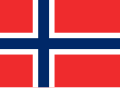 The colors currently used on Commons
.svg)
.svg)
 The current colors (200 C for red, 281 C for blue)
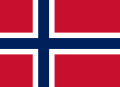 The suggested colors (186 C for red, 281 C for blue)
_current_commons_version.svg)
.svg)


.jpg)

.jpg)

 Nordiske-flag.jpg – one of the images used as an example by Sauer202
 Nordiske-flag.jpg with illustrated color sampling
 The Norwegian flag with colors sampled from Nordiske-flag.jpg
.png)
.svg)

 Is the Norwegian flag made out of a thicker fabric?
 It is unclear what colors were used in these flags, whether høirødt and dannebrogsrød were supposed to differ, and whether they do.
 2007 photograph of both flags presumed to predate DS 359:2005. Note the maroonish tint of the likely non-Pantone 186 C flag of Denmark.


![[1]](http://validator.w3.org/check?uri=https%3A%2F%2Fupload.wikimedia.org%2Fwikipedia%2Fcommons%2Farchive%2Fd%2Fd9%2F20051029143857%21Flag_of_Norway.svg;ss=1)
.svg)
.svg)
![[2]](https://nordicflagsociety.org/wp-content/uploads/2015/06/AdobeStock_111429537.jpeg)
.svg)
.svg)