Commons talk:Project Mapmaking Wiki Standards/Archive01
- Note to mapmakers: for the moment, continue to follow local recommendations, or the English one.
- Advices to recommendations makers.
Do your best, we have to provide convenient to follow tutorials, and good and easy to read maps.
- The first stage "First try and talks" :
 Done, it had been done the last 8 months, it's this [dead] page.
 - The second stage "Set a clear workable proposal for each type of map", it will be lead by the French graphic lab soon by recycling and improving ideas from this page. Non-French map masters are still encouraged to submit recommendation to the French team (see below)
- The 3rd stage will be to ask experts to harmonize and improvement the colors, icones, naming conventions according to the aim to communicate clearly (Avoiding chartjunk) with graphical medium.
- Tutorial :"How to set a map recommendation ?"
You are especialy interested in one kind of maps listed upper, and want to propose one recommendation ? We have tools for you ! Please look at this section and its code as example to what to do. You can copy this code to your own space [user:YourPseudo/Map] on commons or wikipedia as well, and please give a link to user talk:Yug.
Please complete your page's table to propose : a/ a list of "issue <-> colorimetric value" duo ; b/ a naming convention.
If possible, try to also provide 2 SVG images : c/ one example map ; d/ one « palette » (with icons and symbols.).
Your advice and proposals are requested !
Wikimedia maps need professional recommendations, perfectly think, understandable and harmonized : we will set up this.
For an overview of the wiki recommandations
- en:Wikipedia:Manual of Style (diagrams and maps)
- fr:Aide:Cartographie (French map Lab recommendations)
For color choice, look also on :
Please also avoid Chartjunk.
Overview of the needs[edit]
| Recommendation need | Aim | Background, Style & Tools | Current status, Various notes, and current emerging proposal. |
|---|---|---|---|
| Basis | |||
| World projection | Display the world in the most suitable projection for wp use. Ease both the creation and the reading of World maps. |
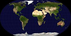
BlankMap-World6.svg (Robinson) ? Adopt the Winkel tripel ? the Mollweide projection ? |
The current BlankMap is in Robinson projection : a/ do we keep it or change for an other one ? (-> Winkel ? Plate carree ?) b/ Do we display Antartic ? |
| Introduction: Upload and Legend advices |
General advices for mapmakers: Font, Naming conventions, License, Legend, Category. Map-relate wiki technologies-introduction (Template {Legende}, others) |
{{Maplegend}}, {{Mapcolor}}, {{Légende cartographique}}, further SVG tools & technologies welcome. |  New global and medium proposal, waiting comments before approval. |
| Color theory: Research for optimized colors |
General advices to set optimized palets : web safe colors, attractives, non-aggressive but clearly distinguishable. | en:Color theory, en:Web colors, web tools to harmonize colors (such this one). | |
| Very last review: | Review by some color blind users, coherence between naming conventions, etc. | ||
| Maps' types | |||
| Basis | |||
| Standard Wikimaps background | World: Display all current Countries on a neutral color World map. | Style: wikimaps. Borders: administrative ones. Labels: no. Projection : ? |
 Note: far and close up views will be allow. Close up will be « position » maps displaying the area and it's 1st level administrative divisions. The Far view will be the « locator » view, puting the country in its continent. |
| Small area: to later display an area on its geographic context (i.e: Wales out of the Britanic Islands ; neutral color map). | |||
| Easy types (all the following maps will have background colors according to previous "Wikimaps background" colors) | |||
| Location maps |
Mainly for geolocation purposes. Just display the subject (most of time a country) in its geographic close context |
Style: wikimaps Projection: equirectangular (conical for higher latitudes). Borders: subject ones + it's sub-divions. Labels: no. |

Use the Position map + georeference template to add the dozen of label. Example: old practice (depreciated) ; new practice using georeference-templates.
The question is here to choice suitable + neutral + serious + soft colors. |
| Simple CIA maps | Display a country or region with the dozen of very importants things to notice | Will be replaced by better ones in time. |
|
| Gradiant maps | Display Wikimaps background + the area need colorated according to their % (rate) or rank. | Style and projection: wikimaps. Borders: subjects ones. Labels and legend: if necessary. Color set: under construction (Yug+LoH) | |
| Locator maps (area) * Country locator * Bio-locator etc. |
Ease the localisation of a subject on its continent and on the earth | Style: basic topo style (4 positive, 3 negative levels). Borders: continental and subject ones. Labels: no. Projection: ? Color set: need 1 recommended color for the subject + some other |

Find suitable colors for vegetal/walking/swimming/flying |
| Expert types | |||
| Geopolitical maps | The common, multi-purpose map in an article page. Display most stratigical informations such railroads, highspeed, harbors, etc. |
Improved French standard style. | 
|
| Exchanges maps | Display roads, train, planes lines, economic exchanges, etc. with numeral values | Put on the geopolitical maps ? or on topographic ones ?. Which color /icone set ? |
|
| Physical maps (relief / topographic) | Display topo-hydro(-human?) datas. | will likely follow the improved French standard style. | 
|
| Historical maps | Display territories, contested area, wars and battles, extensions and move of armies | Which color /icone set ? | |
| Currently cancelled | |||
| Biosphere maps | Display bio datas (forest of *,*,* ; human's created forest ; fields of *,*,* ; human habitat ; ). | Which color /icone set ? | |
| Geologic maps | Canceled (not manageable with current knowledge.) | need advices from a geologist | |
Basis[edit]
Recommended World map projection[edit]
Current proposition(s)[edit]
Discussion[edit]
- Interesting World map projections (candidats)
-
 This is a Robinson projection, it sacrifices ... ; favor... (See more: Robinson projection)
 -
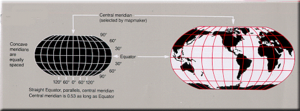 Commnent: This Robinson projection was adopted by National Geographic Magazine in 1988 but abandoned by them in about 1997 for the Winkel Tripel projection. Still use by the World Fact book (see this 2005's SVG)


-
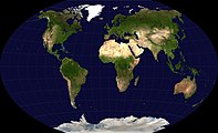 This is a Winkel Tripel projection, it sacrifices ... ; favor... (See more: Winkel Tripel)
 -
Commnent: adopted by National Geographic Magazine from 1998 to today.

-
 This is a Mercator projection, it sacrifices ... ; favor... (See more: en:Mercator projection)
 -


-
 This is a Plate carrée projection (sub-style of Mercador projection), it sacrifices ... ; favor.... (See more: (mercador) Plate carrée projection)

-
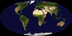 This is a Mollweide projection, it sacrifices : fidelity to angle and shape; favor : accurate depiction of area. (See more: Mollweide projection)

-
 This is a Goode homolosine projection (sub-style of Mollweide projection), it sacrefice same aspect than Mollweide ones. (See more: Goode homolosine projection)

- See also This gallery of projections
It is need to look :
- is the map projection accurate or misleading ;
- is the map projection easy to edit ;
I personally exclude :
- _the misleading mercador projection (easily editable, but misleading : groenland is as bis as Africa !) ;
- _the (also misleading) Robinson projection, itself exclude by National Geographic ;
I prefer :
- _the highly appreciated Winkel-Tripel projection, its Wikipedia article is really clear : the best projection, more occurate, adopted by National Geographic and then by many other.
- _the Plate carree projection : keep realist surfaces + easy to edit (rectangle).
It's my pre-selection, afterwhat: I let the mapmakers make the true choice. Yug 13:50, 5 March 2008 (UTC)
- _the Plate caree projection has the easiest mapping between lat/long and coordinates, being a 1:1 mapping Anonymous ~6 march 2008
Upload and Legend[edit]
Current propositions[edit]
The Legend does it should be removed from the image and appear only on the Commons Image page and in articles ?
Appearing on the map[edit]
The fewer legend possible should appear on the map. Basic English have to be use. Other language should not be use, and translations are not welcome on the map to avoid to have several copies hard to maintain up to date. The Legend translation should be add in the article using {{Legend|#color|comment}}.
- Which kind "Legend Square", which color of the border ? which number of px ?
The Internet connection rate in 2000 map and its legend are the model for the project. As shown in the map, the legend within the Image (in grey #C0C0C0) is keep as small as possible: almost only numbers and the globally understood arrow symbol "⇒".
Full legend and explanation have to be in the article or in the Image page (on commons), using the template {{Legend||}} : {{Legend|#0000FF|Swimming animals habitat}}
Out of the map[edit]
This is a list (still to set up) of recommandation and advices .
- Recommanded Font
m:Fonts, Wikipedia:Manual_of_Style_(diagrams_and_maps)#Fonts, Wikipedia:WikiProject_Indian_maps#Typeface
Upload:
- Naming conventions
- Recommanded licenses
- Templates to use
- {LEGEND|Language} = {| class="maptable"
- {Legend|#color|comment}
- References
Please, try to provide links to your sources ( "Cite your sources{ref}") which confirm your map. This is critical. Just like articles, maps should be thoroughly referenced. MapMaster 05:06, 13 November 2007 (UTC)
Tools to build[edit]
- Template, class, and new technologies ?
A Template:Legend_2.0 is under construction at template:Maplegend, new features expected :
- _display color code : Done ! (when the internaut/mapmaker's curseur fly on the colored square)
- _allow to display alpha-numeric (123, abc, αβ...) : Done !
- _allow to display 12/12px map-icones :

- _allow to display lines :
 (like on such examples (1)),
And maybe:
- _allow to display % scale (See this good idea for gradiants)
- SVG tools ?
Discussion[edit]
Basis[edit]
Wiki official Background[edit]
Current propositions[edit]
| Subject | Colorimetric values |
|---|---|
| Oceans & Boundaries (bg) | #FFFFFF
R:255 V:255 B:255 A:1 |
| Earth (background) | #C0C0C0
R:192 V:192 B:192 A:1 |
| Antartic (different color ??) | #C0C0C0
R:192 V:192 B:192 A:1 |
| Major text(s) (to avoid) | #000000
R:0 V:0 B:0 A:1 |
| Other minor texts (to AVOID) | #787878
R:120 V:120 B:120 A:1 |
| To make locator maps, just add the colors: | |
| color the area need with color of the respective recommandation (see below). | |
Discussion[edit]
- A world map in SVG as starting point
I think we need to set up a SVG World Map being our official background.
- Proposed name: Image:Current_world_standard_background.svg (remplacing )
- Containing: several layers, using the Layer technology, available in SVG files.
- i.e.: Blank map + layer with borders + layer with main rivers. If you need to make a natural map (just world + Rivers), just delete the borders' layer.
Objects should be described by both an id element and a class element so as to make text-editor and inkscape edits equally easy. /Lokal_Profil 00:19, 17 September 2007 (UTC)
- Antartica
I encourage to use the same color for antartic too, anyway : map makers often use a cropped version without Antartica. Yug 14:52, 13 March 2008 (UTC)
- Notes
- We should also make a clean up of the Category:Blank SVG maps of the world, several maps are not need not, but still here, and can cause trouble.
Comment
Easy types[edit]
Bio-Locator maps[edit]
(for animals and plants)
Current propositions[edit]
- Move to fr:Aide:Cartographie
Discussion[edit]
Two ideas :
- Make a biological categorisation, or a phylogenetical categorization will produce too many categories.
- the categories are according to "how and in which element live or move the subject". For two reasons : animals are shaped more by their milieu than by their biological family (ex: fish are chaped like dolphin, and they live in the sames element : water.)
According to this view, categorization such : plants ; walking/land animals ; swiming/water animals ; flying/sky animals ; this seem to be far more convenient.
For some cases such crocodile, we should choice according :
- where they spend most of their time ;
- where they born ; or where they reproduct. (= where they fell in security = where they live the most)
Locator maps and CIA Locator maps[edit]
These are perhaps one of the simplest types of map, but should not be forgotten. Currently these also come in a wide range of colours (both highlighted region and rest of country) and types (including e.g. neighboring countries or not)
Current propositions[edit]

| Subject | Colors |
|---|---|
Lambda Subject (country, etc.):
|
#40A040
R:64 V:160 B:64 A:1 #E08040
R:0 V:128 B:32 A:1 #3030B0
R:0 V:0 B:176 A:1 |
| Naming convention examples (case sensitive) | Explanations |
| Image:WM_Locator_map_Europe_AUT.svg | Image:WM_Locator_map_[ContinentEnglishname]_ISO3166-1ALPHA-3.svg |
| Image:WM_Locator_map_Europe_Alpes.svg Image:WM_Locator_map_Europe_Blue_wolves.svg Image:WM_Locator_map_World_Wolves.svg |
Image:WM_Locator_map_[ContinentEnglishname]_[en.wikipedia.orgArticleName].svg |
Discussion[edit]
-
 Traditional Locator maps
 -
![CIA-Locator map for Austria]]](https://upload.wikimedia.org/wikipedia/commons/thumb/5/5d/LocationAustria.svg/170px-LocationAustria.svg.png) CIA-Locator map for Austria]]
CIA-Locator map for Austria]] -
 CIA-Locator map
 -
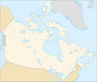 CIA-Locator map for Canada (why USA and Groenland have different colors ?? O.o)

![CIA-Locator map for Austria]]](/wiki/File:LocationAustria.svg)

.svg)
I suggest using maps showing the country only, using some kind of red for highlighting and the 'standard gray' for background. Should perhaps highlight using a slightly mellower red.
- IMO, Some countries really need more than just the country itself, they need the surrounding land. A few examples that come immediately to mind are en:Equatorial Guinea, en:Brunei, and en:Azerbaijan. A couple others would be en:Indonesia and en:Malaysia, since they (and Brunei) share Borneo, and it would be odd to just have the Borneo provinces floating in the middle of nowhere. --Golbez 23:10, 16 September 2007 (UTC)
- These maps should primarily be in SVG and the objects should be tagged (with ISO code?) so that derivative maps can be easily made. /Lokal_Profil 00:24, 17 September 2007 (UTC)
Is there a naming convention for locator maps? /Marmelad 19:03, 19 September 2007 (UTC)
- No. I have my own standards, which have evolved over time; other people have their own. --Golbez 11:25, 20 September 2007 (UTC)
- should we propose some? /Marmelad 12:52, 20 September 2007 (UTC)
- Probably, but keep in mind that we don't have a single standard for locator maps, so there's multiple versions for some countries. --Golbez 19:38, 20 September 2007 (UTC)
- should we propose some? /Marmelad 12:52, 20 September 2007 (UTC)
- For the locator maps I would suggest the standard based on the CIA World Fact Book widely used through the WPs (see example at the right). This way we will have a better harmonization between the maps and will not have to change all the country maps (until we create new ones more precise and complete to replace the CIA ones).
- About the file names, I think the idea of user:Golbez good : some countries change names (ex. Upper Volta which is now Burkina Faso) or are redrawn (ex. Yugoslavia) ; using the en:ISO 3166-1 code specifically for the locator maps could be better. I would complete this description by adding at first place the continent so the classification in the category(ies) would be easier. The ISO code using 3 letters (Alpha-3) may also be easier to understand than the one using the 2 letters (Alpha-2). This would give a file name : Image:Europe_AUT_locator_map.svg for Austria for example. Sting 14:40, 4 October 2007 (UTC)
- Well, I've taken to using "Ph_<something>.<ext>" to name my Philippine maps, so I agree with using the ISO. Well, if we're going to be creating mapping standards, then we ought to adopt the ISO standards, right? :-) --seav 13:06, 14 November 2007 (UTC)
- Until such time as we start to adopt a single set of maps for Wikipedia, I don't see a huge need for a single standard of naming, and let each suite of maps (that is to say, usually all the maps by a single author) have its own naming standard. Having a single standard would mean that, for example, we could only have one image at "MX locator.png" or what not, when we aren't ready for that yet. So I guess the question is, come up with mapping standards and naming standards simultaneously, we can't really have the latter before the former. --Golbez 06:01, 15 November 2007 (UTC)
Existing prevalent style of locator maps in EN Wikipedia[edit]
I'm my experience, there has been no overwhelming standard colors used in the English Wikipedia, though the colors above are used quite often. (I have had a huge influence on the suggested palette above shown in the English Wikipedia Maps WikiProject, so I guess I should put in my two cents). The subprojects that followed, more or less, those colors are:
-
 Locator maps for the states of the United States
 -
 Locator maps for the various subdivisions of the Philippines
 -
 Regions of France
 -
 Provinces of Thailand
 -
 States of India
 -
 Provinces of Argentina
 -
 Divisions of Bangladesh.
This type is to AVOID: coutry are not "out of nothing", borders are artifact jokes made by governement. -> Neighbour countries should also appear. -
 Moldavian subdivisions
 -
 States of Malaysia
 -
 Provinces of Indonesia
 -
 Departments of Colombia
 -
 CIA locator by Styx, summer 2007.


Well, some of these seem to be much closer to the CIA style, and this probably properly belongs to the Locator Maps section below. --Seav 13:02, 14 November 2007 (UTC)
Gradiant maps[edit]
Current propositions[edit]

Internet connection rate in 2000 showing the number of connections/10.000 people/country.
For help on un-categorised maps' standard, see :fr:

- Maps by gradiants
| Subject | Colorimetric values | |||
|---|---|---|---|---|
| Proposed area colors (Positive) : | ||||
|
Sixth area |
#00005B
R:? V:? B:? A:1 #000080
R:? V:? B:? A:1 #0000FF
R:? V:? B:? A:1 #0080FF
R:? V:? B:? A:1 #78C0FF
R:? V:? B:? A:1 #B3D9FF
R:? V:? B:? A:1 | |||
| Wiki "No data/Neutral" area color : | ||||
| No data area | #C0C0C0
R:? V:? B:? A:1 | |||
| Proposed area colors (Negative) : | ||||
|
First area |
#f0e090
R:? V:? B:? A:1 #f0d218
R:? V:? B:? A:1 #f0a518
R:? V:? B:? A:1 #f07818
R:? V:? B:? A:1 #f05018
R:? V:? B:? A:1 #821e18
R:? V:? B:? A:1 | |||
Discussion[edit]
- See also Image:Football world popularity.png
Which colors[edit]
Such maps with uncategorised topic just need gradiant of colors for positive rage (0% to 20% = color 1 ; 20% to 30% = color 2 ; ... ), and some negatives colors (with symetry). I choice blue for positive colors, since it seem neutral, and that Mediawiki software have a blue-grey looking. But blue may look to much childish, and brown and pastel colors may make more profesionnal. Some propositions are welcome.
- I would suggest maybe green instead of blue for positive colours (see example below)
| Proposed area colors (Positive n'2) : | ||
|---|---|---|
| Sixth area | #005B00 | |
| Fifth area | #008000 | |
| Fourth area | #00FF00 | |
| Third area | #00FF80 | |
| Second area | #78FFC0 | |
| First area | #B3FFD9 | |
- This is for a couple of reasons. Firstly, green is more associated with positive (as red is for negative). Secondly, green (somewhere between #005b00 and #008000) is used frequently on Wikipedia already as a locator colour. Thirdly, blue is more closely associated with oceans and water, this is why (at least in my experience), blue is not used that much as a colour for countries and country data on maps. --Canuckguy 00:13, 22 September 2007 (UTC)
 |
 |
- I would like to highly encourage the use of clear and smooth colours each time it's possible, like in the two examples at the right, not only for this topic but for all the maps (geological, geobiological, historical, etc.). These are much less aggressive for the visitor's eyes and permit a better reading of the text it contents. Avoid the use of fully saturated colours like a red #FF0000 or a green #00FF00 which are very aggressive and really unpleasant imo. Sting 15:12, 10 October 2007 (UTC)
- Completely agree!!! MapMaster 19:27, 13 November 2007 (UTC)
- Total support too. Yug 14:51, 5 March 2008 (UTC)
- Completely agree!!! MapMaster 19:27, 13 November 2007 (UTC)
- I would like to highly encourage the use of clear and smooth colours each time it's possible, like in the two examples at the right, not only for this topic but for all the maps (geological, geobiological, historical, etc.). These are much less aggressive for the visitor's eyes and permit a better reading of the text it contents. Avoid the use of fully saturated colours like a red #FF0000 or a green #00FF00 which are very aggressive and really unpleasant imo. Sting 15:12, 10 October 2007 (UTC)
Negative colors[edit]
 |
I'm not too happy with the negative colors: particularly, the fifth and sixth are quite similar. See Image:Africa HIV-AIDS.svg. I first SVG'd it with colors that I thought looked good, then changed it to the proper colors. I uploaded the same map, with the colors I like here. Can we please change the color scheme to portray the colors better?! Reuvenk 21:54, 2 October 2007 (UTC)
- Also, i think the "wrong" colors are "warmer". Reuvenk 21:59, 2 October 2007 (UTC)
- I think you're right (except for the no datas color, I think the grey is OK). The right map is better than the left one for reading informations. historicair 22:57, 2 October 2007 (UTC)
- I uploaded a version with the "wrong" colors, except for no data areas, which are now grey. What do we think? Reuvenk 09:36, 3 October 2007 (UTC)
- The right side map, by "wrong" you means "proposed" colors ? (I personnally prefer the right side map.) Yug (talk) 08:04, 12 October 2007 (UTC)
- Yes, I support the colors on the right side (and below) as well. Much better. MapMaster 04:57, 13 November 2007 (UTC)
- The right side map, by "wrong" you means "proposed" colors ? (I personnally prefer the right side map.) Yug (talk) 08:04, 12 October 2007 (UTC)
- I uploaded a version with the "wrong" colors, except for no data areas, which are now grey. What do we think? Reuvenk 09:36, 3 October 2007 (UTC)
Example of proposed changes:
- To see this proposal, see upper (orange colors)
I hope that the name "negative" and "positive" doesn´t stop us from using the red scale("negative") to show high(positive) mean temperatures and the blue scale("positive") to show low mean temperatures. And the same concern for high altitudes that usually are in orange while depressions are in green/blue. /Johan Jönsson 17:06, 4 January 2008 (UTC)
| Subject | Colorimetric values | |||
|---|---|---|---|---|
| Proposed area colors (Positive n'2) : | ||||
|
Sixth area |
#005B00
R:? V:? B:? A:1 #008000
R:? V:? B:? A:1 #00FF00
R:? V:? B:? A:1 #00FF80
R:? V:? B:? A:1 #78FFC0
R:? V:? B:? A:1 #B3FFD9
R:? V:? B:? A:1 | |||
| Wiki "No data/Neutral" area color : | ||||
| No data area | #C0C0C0
R:? V:? B:? A:1 | |||
| Proposed area colors (Negative2) : | ||||
|
First area |
R:? V:? B:? A:1 R:? V:? B:? A:1 R:? V:? B:? A:1 R:? V:? B:? A:1 R:? V:? B:? A:1 R:? V:? B:? A:1 | |||
Expert types[edit]
Geopolitic maps[edit]
(like those from CIA world fact book)
Current propositions CIA[edit]


(Here: a background + political divisions + names).
For help of a skilled users on geopolitical maps, see :fr:STyx and :en:Planemad.

| Subject | Colorimetric values |
|---|---|
| Subject of the map | #FCF5E3
R:252 V:245 B:227 A:1 |
| Earth | #F4E2BA
R:244 V:226 B:186 A:1 |
| Earth out of the subject | #E0E0E0
R:224 V:224 B:224 A:1 |
| Rivers, Coasts, and associated names | #27AAEA
R:39 V:170 B:234 A:1 |
| Oceans and seas | #DAF0FD
R:218 V:240 B:253 A:1 |
| Subject's Text | #000000
R:0 V:0 B:0 A:1 |
| Borders and text out of subject | #787878
R:120 V:120 B:120 A:1 |
| Naming convention examples (case sensitive) | Explanations |
| Image:WM_CIA_Geopolitic_map_Europe_AUT.svg | Image:WM_Locator_map_[ContinentEnglishname]_[ISO3166-1ALPHA-3].svg |
Discussion[edit]
- Note: this is the CIA style. We can adopt this style to merge it with the "Wikibackground" style that. Then, we will have one style instead of two. The background will be without icons and places' name, the Geopolitical being with icons and places' name.
- Interesting idea ;)
- These lead us to the question : need we 2 levels of "easy maps":
- REALLY easy (current white / grey maps)
- Easy (current light-yellow/light-blue)
- (Followed by CIA maps: white / grey maps / with coutries-oceans-lakes names, etc.)
- Yug 09:13, 6 March 2008 (UTC)
Let's use these instead of drab CIA colors[edit]
Here is the color sheet used on the English Wikipedia. I believe that these colors are brighter and more welcoming than those above.

Additionally, these are the same colors suggested for the historical maps below.
- The advantage of using drab and clear colours for the background is that it eases a lot the labelling. The purpose of the background is to set the context in a neutral way in order to highlight the subject. The more vivid colours you use for the background, the even more vivid ones you will have to use for the points of interest, giving an explosion of colours where nothing is really highlighted at first sight. Why, for example, use two colours for borders ? Use instead for the secondary borders the same colour with a dotted and thinner line.
- The other advantage of the French Graphic Lab proposition using the CIA WFB style is that these CIA maps are widely used through the WPs. If a country page has only one map, it is the CIA one. Using the same style for our new maps will allow us not to surprise the reader in each page he visits with each time a different map visual.Sting 12:14, 13 November 2007 (UTC)
- I understand your point about being consistent with the CIA and French maps. However, I still feel that their colors are drab and boring. I suspect that these colors were originally chosen for print whereas the suggested colors would be best for a screen.
- These colors have certainly been widely used within the English language Wikipedia. MapMaster 19:27, 13 November 2007 (UTC)
- Secondarily, looking at category:Maps in English and [[:category:SV
Topographic maps[edit]
Current propositions[edit]

(Here: a Topographic + Road map).
For help of a skilled user on topographic maps, see :fr:user:Sting and fr:Aide:Cartographie.
The aim of such maps is to show the relief of the area.
- Precise rules for the background
- We should not have background. But we can have 2 cases :
- -Missing information out of one country (i.e. we have topography for India, not for nepal) : nepal should appear in grey, which grey ?
- -We have data about Nepal, but don't want to show this to much because it's a map about topography of India : we can put a soft white layer on Nepal, which will show Nepalese topography colors more light.
- Precise standard color gradiant for layer, arrows, etc.
- ??? which boundaries are commonly use ?
- 0 +100m +200m +500m +1000m +2000m +4000 +6000 +8000 ???
- 0 -100m -200m -500m -1000m -2000m -4000 -6000 -8000 -10000 ???
- Precise standard for icones.
- top point ; bottow point ; altitude line
- Text may be need for notable point i.e Mt Blanc (4807m) or should we use icons with a number ?
- Precise rule to show the legend in wikipedia's articles (internationalization: no words).
- use such {{Legend|#ff0000|+0m to +200m area.}}
- for number-icones, use such : {{Legendn|1|comment.}}
- Precise system for file name
- Filename such : Topography-[Name of the english-wikipedia-article].svg , i.e : Topography-India.svg ; Tophography-Paris.svg
Discussion[edit]
- Point 2, colors
I have really no ideas for the point 2, what is commonly use in books ? Step by 200m ? step by 500m ? steps like 0-50-100-200-500-1000-2000-4000-8000 ? Someone know ? Then, which colors to use ?
- There can't be a standard about the elevations or depths : it will depend on the area shown.
- About the depths, the freely useable Demis maps use the following 26 steps : -200m ; -500m ; -750m ; -1 000m ; -1 250m ; -1 500m ; … ; <-6 000m. They lack the important –50 or –100m which need to be found through other sources. Sting 12:16, 29 May 2007 (UTC)
- Point 4, Legend
It would be great to make an SVG image "Image:Legend of Topographic maps.svg" (STyx: en fait c'est l'idée d'une palette ;] ), with :
- square for all colors need
- limits 0 + 200 ....
able to be past into the topographic map that the graphist is doing.
- The key for the colours of elevations and depths must stay in the map : nothing is more boring than to have to navigate back from the large view of the map to see the key. Also, the colours displayed in a page are quite different from the ones displayed in the map, even using the same hexadecimal code. Sting 12:16, 29 May 2007 (UTC)
Exchanges maps (roads, train, planes lines, economic exchanges, etc.)[edit]
Current propositions[edit]
Discussion[edit]
Historical maps[edit]
Current propositions[edit]

.
For help on Historical maps, see :fr:Fabienkhan (french wikigraphist).
The colours of WikiProject Maps are used on many maps on wikipedia:
| Colour | Colorimetry ( hex / RGB ) | Used for | |
|---|---|---|---|
| Black | #000000
R:0 V:0 B:0 A:1 |
Primary label colour | |
| Brown | #A08070
R:160 V:128 B:112 A:1 |
Political borders. Country, state, and province borders should be brown. | |
| Light brown | #D0C0A0
R:208 V:192 B:160 A:1 |
Secondary political borders. | |
| Light yellow | #FFFFD0
R:255 V:255 B:208 A:1 |
Primary territory of interest, or one of four choices for four-colour maps. | |
| Pink | #FFD0D0
R:255 V:208 B:208 A:1 |
Another colour to be used for four-colour maps. | |
| Orange | #F8A20C
R:248 V:162 B:12 A:1 |
A third colour to be used for four-colour maps. | |
| Green | #3CE67B
R:60 V:230 B:123 A:1 |
A fourth colour to be used for four-colour maps. | |
| Light blue | #CEFEF2
R:206 V:254 B:242 A:1 |
An alternate color to be used for four-colour maps. | |
| Orange | #F7D3AA
R:247 V:211 B:170 A:1 |
Alternative colour for the above Tan (surrounding territories). | |
| Medm blue | #9EC7F3
R:158 V:199 B:243 A:1 |
Bodies of water. Oceans or lakes. | |
| Blue | #1821DE
R:24 V:33 B:222 A:1 |
Water borders, if necessary. For lake or ocean borders that need a colour contrasting with surrounding land, or for rivers. | |
| Red | #B00000
R:176 V:0 B:0 A:1 |
Points of interest. Cities, especially. | |
| Red-orange | #F07568
R:240 V:117 B:104 A:1 |
Alternative colour for the above Red (points of interest). | |
| Medium red | #E0584E
R:224 V:88 B:78 A:1 |
Border colour for areas highlighted in Red-orange | |
| Green | #A0F090
R:160 V:240 B:144 A:1 |
Parks or natural preservation areas |
Discussion[edit]
Currently cancelled[edit]
Geologic maps (for minerals)[edit]
Current propositions[edit]
Discussion[edit]
I think they are too much kind of soil, and then, geological maps should be made according to the situation => no standard colors. But someone may him help ? => fr:user:Jd may be helpfull. Yug (talk) 22:19, 29 May 2007 (UTC)
Global comments[edit]
We have lot of work to do ! I made some propositions, but all this may be change, and have to be improve ! Yug (talk) 18:27, 17 May 2007 (UTC)
- Rules or Guidelines ? => strongly encouraged Guidelines
- I like the idea of mapmaking guidelines, but I would want them to remaine guidelines rather than rules, since nice looking maps are as much an art as a science. But more than that, I've long wondered about wikipedia maps and how well they adhere to the citing the sources and the issue of Original Resource. This may be a tangent to this page, but I'd like to bring it up . Wikipedia has a need for information to be verifiable and referenced, an idea I agree with. When wikipedians make maps they are undoubtedly drawing on various sources, but there doesn't seem to be an obvious and simple way to reference these sources -- or even a guideline to encourage such a thing. Many of the wikipedian-created maps are presented as "fact" without anything reference citations. Is this an issue worth considering? How might it be addressed? Thanks. Pfly 09:14, 21 June 2007 (UTC)
- I agree with you, Pfly, about the importance of referencing the sources used to draw a map. This is valid even for a "simple" map showing for example a country only with its borders : which source was used to draw the water bodies (shores and lakes), the borders, place the cities ? Obviously, it's not the same to use (for the first) the NASA SRTM Water Body Data than draw them from a paper atlas. Same remark for the borders where the source should be reliable and of large scale to be as precise as possible.
- Few days ago I draw a map of the historical Republic of Armenia. As background map, I used the reliable NASA data, but when it came to the populated places locations and the Russian provinces / districts borders, I saw that the reference map was in many parts not accurate. For the cities, it was easy to get an other source, but for the borders… I think the description page should indicate this kind of problem, as well as the references used, for the reader be aware of the level of precision of what he's looking at.
- As general comment about this page, I agree also with you that it will be more a guideline than a rule, simply because as volunteers, people will draw their maps the way they feel it and like it. But even if it can't be rigid, I think it's good to try to get a relative homogeneity among the WPs to reduce the surprises for the reader, favour the inter-wiki exchange possibility and avoid visually awful drawings (flashy colours, low quality drawings, etc.). Sting 13:01, 21 June 2007 (UTC)
- I also agree, this aim to set several "strongly encouraged Guidelines", optimized, and think to be really convenient to use. My medium english don't allowed me to see clearly the difference between "rules" and "guidelines", but it appear that the words need are that here we aim to set up some "strongly encouraged Guidelines". This keep everybody free to find some better solutions according to the needs of the map. --Yug (talk) 22:33, 23 June 2007 (UTC)
- Related to sources, I think it's a good idea to use Template:Information and include detailed source information in the "source" section. That's what I've been doing.
- On another note, somewhat related to this topic, I think there is a need for more tutorials for beginning mapmakers, and especially once you have standards in place, there will be a need for instructing users how to make good maps. Remember, this is a project that anyone can edit, so once we have the standards established, there will still be many who don't know anything about the standards or how to adjust their maps to fit them. The standards need to be such that the average user, with a little effort, can become a good mapmaker. -Teaandcrumpets 14:01, 1 November 2007 (UTC)
- There should be tutorials shortly available (initially in French but with translation in English already planned), but I still have to make some edits on them, for map creation using free Digital Elevation Models. These will allow anybody to create flat, relief or topographic maps. I will make an announcement here when they are on line. Sting 14:29, 1 November 2007 (UTC)
- On another note, somewhat related to this topic, I think there is a need for more tutorials for beginning mapmakers, and especially once you have standards in place, there will be a need for instructing users how to make good maps. Remember, this is a project that anyone can edit, so once we have the standards established, there will still be many who don't know anything about the standards or how to adjust their maps to fit them. The standards need to be such that the average user, with a little effort, can become a good mapmaker. -Teaandcrumpets 14:01, 1 November 2007 (UTC)
Hello[edit]
There is a need for a better coordination between this project and the various mapping WikiProjects on the Wikipedias. Anyway, I'm an amateur mapmaker on the English Wikipedia and I have created various types of maps, two of which have become Featured images on the English Wikipedia. I also initiated the map colors palette used in many maps in en-wiki and the styles of many of the locator maps there were ultimately derived from the locator maps I created. I'd love to help out with standardizing. A sample of my maps are the following:
-
 Locator map (city)
 -
Locator map (province)
-
![Topographic map (country) [featured]](https://upload.wikimedia.org/wikipedia/commons/thumb/6/6f/Ph_physical_map.png/76px-Ph_physical_map.png) Topographic map (country) [featured]
Topographic map (country) [featured] -
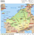 Topographic map (province)
 -
![City map [featured]](https://upload.wikimedia.org/wikipedia/commons/thumb/1/1f/Ph_map_manila.svg/102px-Ph_map_manila.svg.png) City map [featured]
City map [featured] -
 Election map (country)

![Topographic map (country) [featured]](/wiki/File:Ph_physical_map.png)

![City map [featured]](/wiki/File:Ph_map_manila.svg)

I have a comment regarding the topographical maps; raster images should be acceptable. The topographic maps I created used raster DEM data, not vectors, so it's quite improbable that I can create SVG topographic maps with shadows. --Seav 06:42, 24 October 2007 (UTC)
 |
 |
- I think there's no problem to use raster images for topographic maps : I use them myself like in the examples at the right, so we can enlarge our visual aspect of maps without being restricted to full svg. But imo this should only apply to the background while the whole additional data should be in svg format to be easily translated. The late versions of Inkscape permit embedded raster images. Try to modify Image:Ph physical map.png for translation and you will understand what I mean. When I use a full raster background I prefer call that type of map of « relief map » as the elevation colours are blended (like in yours) and it's more difficult to determine an altitude. For a real topographic map in which only the shaded relief is a raster image, I extract each elevation level from the DEM data and vectorize it in Inkscape. It needs more work but it's not very difficult. Sting 13:06, 24 October 2007 (UTC)
- Thanks for the clarification. I wasn't sure that the SVG-to-PNG converter that MediaWiki uses was capable of rendering raster layers. Since you've proven it can be done, I'll make my succeeding relief maps SVG. BTW, I'm going to be using the SRTM3 data for my succeeding maps (the relief maps I made above used GTOP30, hence the great blurring on the provincial map). I don't think that making vectorized contours is that important for Wikipedia especially since the base data is raster, so I'll stick with the blurred rasterized relief in the meantime. If readers want more accurate topographic maps, then they should go to the respective mapping agencies. --Seav 04:56, 25 October 2007 (UTC)
- You will notice with the SRTM raster data that they are really not accurate for the shores (almost unusable alone), that's why they provide also the SRTM Water Body Data (SWBD in short). As this data gives the precise contour of the shores, lakes and large rivers in vector format, I keep it that way (but simplified) and it brings a bit of a better quality at 100% viewing. But I don't use it in vector format every time, sometimes I put it directly on the raster background image for simplification. Sting 15:14, 25 October 2007 (UTC)
- I've actually experimented with SRTM3 before (see my blog post) but I haven't checked the shoreline data. I'm assuming that this (shoreline data) is the one Google used for their Maps and Earth products? If yes, It's not quite accurate in the details. Another problem is that I discovered that there are a few unrecoverable voids in the SRTM3 DEM data that can't be fixed by interpolation (for instance, a ~20km² island has no DEM data); I'll just have to avoid creating maps containing those areas until I get better data. --Seav 04:43, 26 October 2007 (UTC)
- Yes, there are some zones with unrecoverable voids, specially in mountainous areas. For these cases, MicroDEM makes a better work but usually you can see the lack of data comparing it with the surrounding areas. I don't know what kind of data Google uses, but for us and for free, the SWBD one is perfect for most of our maps. Their accuracy is 1 arc second of degree, 31 m at the equator for the whole world which is at my knowledge the best one available for free. It's three times more accurate than the SRTM3 data and equivalent to the SRTM1 one. Of course, their purpose is for topographic maps (or flat ones, CIA WFB style), not for city plans which would need an even higher accuracy. Sting 11:36, 26 October 2007 (UTC)
- A late comment about your second post : about the contour in SVG format or flattened with the raster background. It depends if you create several versions of a map, for ex. a relief map with raster background and a geopolitical (flat) SVG map. In this case, for the relief map, it's not necessary to keep the contours in SVG format as it will be available in the other version. If you intend to create only the relief map, then it's interesting to keep the contours in SVG as anybody can take your map and extract the vectorized contours in order to create another map for other purposes, so they don't have to draw everything again. Sting 14:08, 14 November 2007 (UTC)
- I'f you're mixing raster and svg in the svg image then remember to state that on the image page since it won't be a proper scalable image. Alternatively upload the svg file and a png file and use the png file in articles but refer to the svg file as sourcefile for anyone wanting to create derivatives or make corrections. /Lokal_Profil 20:34, 14 November 2007 (UTC)
- A late comment about your second post : about the contour in SVG format or flattened with the raster background. It depends if you create several versions of a map, for ex. a relief map with raster background and a geopolitical (flat) SVG map. In this case, for the relief map, it's not necessary to keep the contours in SVG format as it will be available in the other version. If you intend to create only the relief map, then it's interesting to keep the contours in SVG as anybody can take your map and extract the vectorized contours in order to create another map for other purposes, so they don't have to draw everything again. Sting 14:08, 14 November 2007 (UTC)
- Yes, there are some zones with unrecoverable voids, specially in mountainous areas. For these cases, MicroDEM makes a better work but usually you can see the lack of data comparing it with the surrounding areas. I don't know what kind of data Google uses, but for us and for free, the SWBD one is perfect for most of our maps. Their accuracy is 1 arc second of degree, 31 m at the equator for the whole world which is at my knowledge the best one available for free. It's three times more accurate than the SRTM3 data and equivalent to the SRTM1 one. Of course, their purpose is for topographic maps (or flat ones, CIA WFB style), not for city plans which would need an even higher accuracy. Sting 11:36, 26 October 2007 (UTC)
- I've actually experimented with SRTM3 before (see my blog post) but I haven't checked the shoreline data. I'm assuming that this (shoreline data) is the one Google used for their Maps and Earth products? If yes, It's not quite accurate in the details. Another problem is that I discovered that there are a few unrecoverable voids in the SRTM3 DEM data that can't be fixed by interpolation (for instance, a ~20km² island has no DEM data); I'll just have to avoid creating maps containing those areas until I get better data. --Seav 04:43, 26 October 2007 (UTC)
- You will notice with the SRTM raster data that they are really not accurate for the shores (almost unusable alone), that's why they provide also the SRTM Water Body Data (SWBD in short). As this data gives the precise contour of the shores, lakes and large rivers in vector format, I keep it that way (but simplified) and it brings a bit of a better quality at 100% viewing. But I don't use it in vector format every time, sometimes I put it directly on the raster background image for simplification. Sting 15:14, 25 October 2007 (UTC)
- Thanks for the clarification. I wasn't sure that the SVG-to-PNG converter that MediaWiki uses was capable of rendering raster layers. Since you've proven it can be done, I'll make my succeeding relief maps SVG. BTW, I'm going to be using the SRTM3 data for my succeeding maps (the relief maps I made above used GTOP30, hence the great blurring on the provincial map). I don't think that making vectorized contours is that important for Wikipedia especially since the base data is raster, so I'll stick with the blurred rasterized relief in the meantime. If readers want more accurate topographic maps, then they should go to the respective mapping agencies. --Seav 04:56, 25 October 2007 (UTC)
Don't forget[edit]
To standardize the font(s) used, I've seen a few user generated maps with highly questionable fonts. 68.39.174.238 15:38, 11 July 2007 (UTC)
Limits of SVG[edit]
Remember that if the data was originally collected on a point per point basis, there is no point in converting it to vector as you will lose precision. You can't ever gain precision by converting to vector, at best you can hope to keep the same. However to keep the same precision you would need to use too many svg handles resulting in an image that is very hard to view in a browser. Already some of the examples above take a second to scroll in Firefox (when viewed in full size). Also don't forget that most users can't view the full size svg file, whereas they can with png. So sometimes it's just best to upload the work version in xcf format for example. Jackaranga 00:43, 17 December 2007 (UTC)
Old introduction[edit]
On this page, we debate of each point, to obtain optimized and strongly encouraged guidelines for mapmaking. This by an expert consensus[1].
- The tools need for each style
Maps should :
- be relatively easy to do following the protocol
- be perfectly clear and understandable, in full size and is small size as well.
- not contain legend
The redaction of this page is also to improve and improve again. In 4 or 6 months, all this have to be perfectly:
- think (optimized)
- clear and understandable
- written
- applicable
Those standards will be use to make all futur wikimedia maps after september(?) 2007.
Those standards will also be use by all the Graphic Labs to convert all the old maps into this new proud and professional wiki-standards, this will be done slowly on 2008 and 2009.
Your experience, and your opinion is really need to set up all this. Please choice a category of map according to your abilities, and then set up the best standard possible, with colors, icones, files naming conventions and all what is need.
Wikimedia maps need a professional work and standard, perfectly think, understandable and harmonized : we will set up this.
Split this project page[edit]
I think we need to split this project because the discussion will certainly become large. Also, I suggest that we concentrate on locator maps first because that's the most prevalent type of map used in (at least) the English Wikipedia and is the easiest to create. Of course, discussion on other types of maps can go on, but it would be best if we finalize the mapmaking standards/recommendations for locator maps. The discussion and learnings from the process can be used to add structure to the discussions on the other types of maps. --seav 14:24, 16 March 2008 (UTC)
- I honestly don't know what to answer to your encouraging request.
- If I understood well, the French graphic lab plan to take this issue in charge "soon", but what is "soon" ?
- so...
- if they plan to do it soon, I trust their abilities, and I don't encourage to divide the page ...
- but...
- If you have motivation and free time to manage the basic maps' recommendation : let go ! Each more step, each idea is helpful : especially the big ones. ;)
- 220.135.4.212 14:45, 20 March 2008 (UTC)
Notes[edit]
- ↑ Opinions of Users who already have huge experience on mapmaking will be followed. Other users can assist them and give them advice.
- ↑ (example : historical maps need to show topography, which explain population locations and strategies)
- ↑ (example : for historical maps, pastel, brown pastel, are more serious than red, pink, and green.)
- ↑ (ex: Image:*-fr.ext for french translation of the map Image:*.ext. This according to the code name of the wiki which will host the file.)
Bold text