Commons:Quality images candidates/Archives July 2007
-
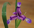
- Nomination Iris graminea flower. -- Ram-Man 04:01, 27 July 2007 (UTC)
- Promotion Yet another one in the series: QI Irises by Ram Man ;-) -- Lycaon 07:53, 27 July 2007 (UTC)
-

- Nomination Iris laevigata flower. -- Ram-Man 01:48, 27 July 2007 (UTC)
- Promotion Yet another one in the series: QI Irises by Ram Man ;-) -- Lycaon 07:53, 27 July 2007 (UTC)
-

- Nomination Yellow Iris (Iris pseudacorus) flower. -- Ram-Man 03:44, 26 July 2007 (UTC)
- Promotion good isolation, clear focus Gnangarra 02:36, 27 July 2007 (UTC)
-

-

-

-

- Nomination Siberian Iris (Iris sibirica). -- Ram-Man 14:51, 25 July 2007 (UTC)
- Promotion Yes. Ben Aveling 15:09, 26 July 2007 (UTC)
-
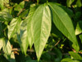
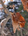
- Nomination Wintersweet (Chimonanthus praecox) leaves. -- Ram-Man 14:35, 25 July 2007 (UTC)
- Promotion Good illustration, light is good, crisp focus. Lycaon 16:26, 26 July 2007 (UTC)
-

- Nomination Egg shaped puffball --Tony Wills 23:18, 24 July 2007 (UTC)
- Promotion Good composition and illumination under difficult lighting conditions. Lycaon 07:17, 25 July 2007 (UTC)
-
-

-

-

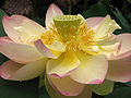
- Nomination Lotus (Nelumbo nucifera) flower. -- Ram-Man 14:52, 23 July 2007 (UTC)
- Promotion again perfect DOF --Ikiwaner 18:41, 24 July 2007 (UTC)
-

- Nomination Japanese Larch (Larix kaempferi). -- Ram-Man 14:52, 23 July 2007 (UTC)
- Promotion This is a pleasure to promote! The two objects are both equally sharp and nothing is sharp by coincidence. Only the composition could be slightly better. --Ikiwaner 18:37, 24 July 2007 (UTC)
-

-

-

-

-

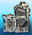
- Nomination Kodak No1 folding camera, view through the bellows. -- Adamantios 18:07, 22 July 2007 (UTC)
- Promotion Good detail and DoF. -- Ram-Man 15:25, 24 July 2007 (UTC)
-
-

-
-
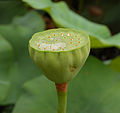
- Nomination Lotus (Nelumbo nucifera) seed head. -- Ram-Man 14:52, 23 July 2007 (UTC)
- Promotion Good sharpness, DOF and colours. --Lestat 19:52, 23 July 2007 (UTC)
-
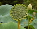
- Nomination Lotus (Nelumbo nucifera) seed head. -- Ram-Man 14:52, 23 July 2007 (UTC)
- Promotion Good sharpness, DOF and colours. --Lestat 19:52, 23 July 2007 (UTC)
-
-

-

- Nomination inside the Church of Gesù in Rome, Italy. Tone-mapped HDR image of 6 pictures. Alessio Damato
- Decline Ghost are tolerable giving the picture a mystic touch, but there are heavy distorsions and aberrations in the corners. There are to much details in this area to ignore this. --LC-de 08:29, 25 July 2007 (UTC)
-
- Nomination Sawtooth Oak (Quercus acutissima) leaves. -- Ram-Man 15:10, 23 July 2007 (UTC)
- Decline Composition: centered leaf and cut leaf in the top right corner. Beautiful biikeh though --Ikiwaner 18:47, 24 July 2007 (UTC)
-

-

-
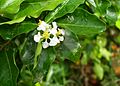
- Nomination Flower of Malpighia glabra. Mateus Hidalgo 14:08, 22 July 2007 (UTC)
- Decline Overexposed flower petals. -- Ram-Man 15:31, 24 July 2007 (UTC)
-

-
-
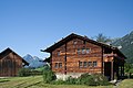
- Nomination Home of Nicholas of Flüe --Ikiwaner 05:10, 23 July 2007 (UTC)
- Promotion One may argue that there is too much sky and too little foreground, and that the barn on the left should not be cropped. But I like the composition though, and according to the technical qualities it's a QI. And besides: it reminds me of a holiday over there in 1966... -- MJJR 09:42, 23 July 2007 (UTC)
-
-

- Nomination Kodak No1 folding camera. -- Adamantios 18:07, 22 July 2007 (UTC)
- Decline Why use a black backround for a dark object? --Kolossos 21:28, 22 July 2007 (UTC)
-
-

- Nomination Are zebras white with black stripes, or black with white strips. Melanistic Equus quagga burchellii in Etosha Namibia. Lycaon 12:52, 22 July 2007 (UTC)
- Promotion The harvest of high quality pictures from Namibia is absolutely great... -- MJJR 20:34, 22 July 2007 (UTC)
I think I'm running out .. ;-( Lycaon 20:46, 22 July 2007 (UTC)
-

- Nomination Church in St Petersburg. George Shuklin 11:42, 22 July 2007 (UTC)
- Promotion The cropping is a little bit too tight, and the balconies on the right hand are rather disturbing (could you choose another point of view?). But technical quality is good and the subject itself is nicely represented. So for me it's a QI yet. -- MJJR 20:55, 22 July 2007 (UTC)
-

-

-

- Nomination Ground agama (Agama aculeata) at the petrified forest, east of Doro !Nawas, Namibia. Lycaon 07:59, 21 July 2007 (UTC)
- Promotion Clear illustration of lizard in habitat. -- Infrogmation 16:18, 22 July 2007 (UTC)
-

-

- Nomination I am aware that this is an image one either likes because of the colors/lighting, or dislikes because of it; I am curious what you think. --Tsui 17:54, 20 July 2007 (UTC)
- Promotion I like it despite the lighting. You are right that the light does some odd things, but as an image, it still works. Not so sure about the next one. The lighting is a little more distracting. I think the image still works, but not as well as this one because the lighting is more severe than in this image. Ben Aveling 20:37, 20 July 2007 (UTC)
-

- Nomination It is not the sharpest, I know. But I like the expression. --Tsui 17:54, 20 July 2007 (UTC)
- Promotion now if she looking directly at the camera it'd be a FP, softness with people isnt necessarily a bad thing, in this case it complimentary to the expression. Gnangarra 13:01, 22 July 2007 (UTC)
-

- Nomination Coenonympha pamphilus --MichaD | Michael Apel 13:10, 20 July 2007 (UTC)
- Promotion Without a doubt. -- Ram-Man 14:21, 20 July 2007 (UTC)
-

- Nomination The elusive Damara Dik-dik in Etosha, Namibia -- Lycaon 11:51, 20 July 2007 (UTC)
- Promotion The foreground is a bit distracting again but quality is top notch --MichaD | Michael Apel 13:25, 20 July 2007 (UTC)
-
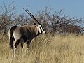
- Nomination An early morning breakfast by a Gemsbok in Etosha, Namibia -- Lycaon 11:51, 20 July 2007 (UTC)
- Promotion Superior quality (sharpness, colors, lighting) and at the same time a very nice composition. In my opinion certainly a valuable FPC. Kortom: zéér knap werk! -- MJJR 20:01, 20 July 2007 (UTC)
-

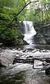
- Nomination Snoqualmie Falls by Jina Lee. -- Ram-Man 11:41, 20 July 2007 (UTC)
- Promotion Good composition with strong colours Gnangarra 13:14, 22 July 2007 (UTC)
 Question Is the water not supposed to be white? Lycaon 07:35, 23 July 2007 (UTC)
Note the normal looking white clouds. This is not a WB issue or those would be wrong too. This is warm evening light. -- Ram-Man 11:41, 23 July 2007 (UTC)
Ok, it was just a question :-) Lycaon 11:47, 23 July 2007 (UTC)
-

- Nomination Erysimum cheiri flowers by Jina Lee. -- Ram-Man 11:38, 20 July 2007 (UTC)
- Promotion Nice DOF clear focus one for the technical section Gnangarra 13:14, 22 July 2007 (UTC)
-

-

-

- Nomination European Peacock (Inachis io) --LC-de 16:27, 19 July 2007 (UTC)
- Promotion The DOF isn't perfect, but I think it's good enough. Ben Aveling 13:10, 20 July 2007 (UTC)
-

- Nomination male Banded Demoiselle (Calopteryx splendens) --LC-de 16:02, 19 July 2007 (UTC)
- Promotion Looks good to me. Ben Aveling 13:10, 20 July 2007 (UTC)
-
- Nomination False Holly (Osmanthus heterophyllus). -- Ram-Man 14:23, 19 July 2007 (UTC)
- Decline Sharp and detailed but I wish a clearer background --Ikiwaner 05:12, 23 July 2007 (UTC)
-
-

-

-

-

-

-

-

- Nomination Rock Ford plantation historical building. -- Ram-Man 14:36, 17 July 2007 (UTC)
- Decline good composition and lighting - please shoot raw and correct the strong colour aberrations! --Ikiwaner 17:34, 19 July 2007 (UTC)
CA is expected in these types of pictures, especially in corners, with almost all lenses, especially at the wide angle. RAW would make no difference. Even at 100%, the CA isn't that bad. -- Ram-Man 18:25, 19 July 2007 (UTC)
CA is just acceptable, but the CW tilt isn't. Lycaon 05:39, 20 July 2007 (UTC)
-

-
- Nomination Catholic church in Worb, Switzerland. -- Selfnom: Jan.Kamenicek 11:58, 19 July 2007 (UTC)
- Decline Tilted, overexposed and fringed. Sorry. Lycaon 12:05, 19 July 2007 (UTC)
-

- Nomination Antirrhinum majus --MichaD | Michael Apel 19:07, 18 July 2007 (UTC)
- Promotion Good composition and sharpness.--Beyond silence 19:44, 18 July 2007 (UTC)
-

- Nomination All Gizah Pyramids in One shot, incredible detail at full resolution --Riclib 17:02, 18 July 2007 (UTC)
- Promotion Great picture! (sharpness and good lighting condition)--Beyond silence 17:14, 18 July 2007 (UTC)
-
- Nomination Yellow Mongoose (Cynictis penicillata) in Etosha, Namibia -- Lycaon 05:52, 18 July 2007 (UTC)
- Promotion High quality, just a bit distracting shadow --MichaD | Michael Apel 19:07, 18 July 2007 (UTC)
-

- Nomination The flower en:Fritillaria imperialis --moralist 21:32, 17 July 2007 (UTC)
- Decline Composition. Either crop more tightly to just focus on the center flowers, or less tightly, and include the others. Ben Aveling 10:06, 19 July 2007 (UTC)
-

- Nomination Adršpašskoteplické skály --09:20, 16 July 2007 (UTC)
- Decline Not quite sharp enough for my taste. Ben Aveling 09:54, 19 July 2007 (UTC) Question What kind of signature is it? --Beyond silence 09:33, 16 July 2007 (UTC) Someone probably signed using ~~~~~ instead of ~~~~. Regards, Ben Aveling 09:54, 19 July 2007 (UTC)
-

- Nomination Jacek Malczewski - Christ and the Samaritian Woman --09:20, 16 July 2007 (UTC)
- Decline The barrel distortion needs correction. And it needs a closer crop, lose the traces of the wall, maybe even lose the frame. Sorry Ben Aveling 09:54, 19 July 2007 (UTC). Question What kind of signature is it? --Beyond silence 09:33, 16 July 2007 (UTC)
-

- Nomination Southern Red Hartebeest (Alcelaphus buselaphus caama) in Etosha, Namibia -- Lycaon 05:52, 18 July 2007 (UTC)
- Promotion The foreground a bit distracting, but I think it can be QI from sharpness and good lighting condition.--Beyond silence 10:55, 18 July 2007 (UTC)
-

- Nomination Panorama over Riga --moralist 21:32, 17 July 2007 (UTC)
- Decline So really wide, but main part is so dark, and the picture don't to sharp. Sorry--Beyond silence 10:28, 18 July 2007 (UTC)
-

- Nomination Boulogne (France): Colonne de la Grande Armée -- MJJR 20:56, 17 July 2007 (UTC)
- Decline Napoleon is out of focus. Sorry. Ben Aveling
-

- Nomination Gargoyle at Château d'Amboise -- Ben Aveling 18:58, 17 July 2007 (UTC)
- Promotion Slightly underexposed, but sharp and balanced composition. -- MJJR 21:01, 17 July 2007 (UTC)
-

- Nomination Master Lock brand padlock -- Thegreenj 17:53, 17 July 2007 (UTC)
- Promotion Great techincal condition.--Beyond silence 18:14, 17 July 2007 (UTC)
-

-
- Nomination Flowering Dogwood flower. -- Ram-Man 15:47, 17 July 2007 (UTC)
- Promotion Good techincal condition, a bit bad composition.--Beyond silence 18:23, 17 July 2007 (UTC)
-

- Nomination Grafted Cherry Tree by Jina Lee. -- Ram-Man 15:04, 17 July 2007 (UTC)
- Decline Subject too dark, and some noise.--Beyond silence 18:29, 17 July 2007 (UTC)
-

- Nomination Frozen peas by Jina Lee. -- Ram-Man 15:04, 17 July 2007 (UTC)
- Promotion Good techincal condition.--Beyond silence 18:25, 17 July 2007 (UTC)
-

- Nomination Broken Sand Dollar by Jina Lee. -- Ram-Man 15:04, 17 July 2007 (UTC)
- Promotion Good techincal condition.--Beyond silence 18:25, 17 July 2007 (UTC)
-
- Nomination Lotus (Nelumbo nucifera). -- Ram-Man 13:43, 17 July 2007 (UTC)
- Promotion Good colours, nice details. Crop is only a minor problem. Lycaon 14:08, 17 July 2007 (UTC)
-

- Nomination Japanese Larch needles (Larix kaempferi). -- Ram-Man 13:27, 17 July 2007 (UTC)
- Promotion Very illustrative. Technically good. Just a pity about the brown tips of some of the leaves... Lycaon 14:02, 17 July 2007 (UTC)
-

- Nomination Japanese Larch (Larix kaempferi). -- Ram-Man 13:27, 17 July 2007 (UTC)
- Promotion Good sharpness and lighting.--Beyond silence 14:34, 17 July 2007 (UTC)
-
-

- Nomination Flowering Dogwood bark closeup (Cornus florida). -- Ram-Man 13:22, 17 July 2007 (UTC)
- Promotion Very good sharpness.--Beyond silence 14:34, 17 July 2007 (UTC)
-

- Nomination False Holly (Osmanthus heterophyllus). -- Ram-Man 13:20, 17 July 2007 (UTC)
- Promotion a bit distracting the part that is out of focus but still i think is enough for QI-LadyofHats 19:17, 17 July 2007 (UTC)
-

- Nomination Erect Silky Leather Flower (Clematis ochroleuca). -- Ram-Man 13:17, 17 July 2007 (UTC)
- Promotion Good sharpness.--Beyond silence 14:34, 17 July 2007 (UTC)
-

- Nomination English Ivy (Hedera helix) growing on a brick wall. -- Ram-Man 13:16, 17 July 2007 (UTC)
- Promotion No qualms. Good quality. (BTW, you can drop the most likely in the description). Lycaon 14:04, 17 July 2007 (UTC)
-

- Nomination Cave of Postojnska Jama (Think on difficult lighting conditions)--Beyond silence 06:28, 17 July 2007 (UTC)
- Decline still with lighting conditions much of the image is burn to black-LadyofHats 19:14, 17 July 2007 (UTC)
-

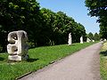
- Nomination Marble Hall in Silesian Seym --Lestat 09:20, 16 July 2007 (UTC)
- Promotion a bit anoying the shine of the lamps but hard to get it diferent-LadyofHats 19:14, 17 July 2007 (UTC)
-

-

- Nomination Chimney in Crespi d'Adda --Luigi Chiesa 22:56, 13 July 2007 (UTC)
- Promotion Quality is good. Reasons to decline are all FP-only reasons. -- Ram-Man 17:37, 17 July 2007 (UTC)
-

- Nomination Hanson's Lily (Lilium hansonii). -- Ram-Man 12:22, 10 July 2007 (UTC)
- Promotion Nice sharp clarity, individual features of the flower are clearly identifiable Gnangarra 04:49, 14 July 2007 (UTC)-- still lighting could improve. -LadyofHats 19:02, 17 July 2007 (UTC)
-

- Nomination The Greifensteine, a formation of granite rocks, near Ehrenfriedersdorf, Germany --LC-de 22:05, 16 July 2007 (UTC)
- Promotion There are overexposed parts, and the tree at forgrnd is a bit distracting, but techicaly enough to QI.--Beyond silence 06:31, 17 July 2007 (UTC)
-

- Nomination Summer generation of Araschnia levana --MichaD | Michael Apel 21:40, 16 July 2007 (UTC)
- Promotion Almost perfect focus, pity about the wing damage. QI worthy. Lycaon 21:52, 16 July 2007 (UTC)
-

- Nomination Blue Wildebeest Connochaetes taurinus north of Namutoni, Etosha, Namibia. -- Lycaon 20:02, 16 July 2007 (UTC)
- Promotion Accaptable technical condition - good lighting on the subject. --Beyond silence 06:33, 17 July 2007 (UTC)
-

- Nomination A rare Ludwig's Bustard Neotis ludwigii near Palmwag, Namibia. -- Lycaon 20:02, 16 July 2007 (UTC)
- Promotion A bit noisy and hard light but definitely good enough
 CommentNeed to be signatured!--Beyond silence 06:15, 17 July 2007 (UTC) Comment Oops, that was me --MichaD | Michael Apel 11:21, 17 July 2007 (UTC)
-
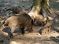
- Nomination Sounder of wild boar (sow, her piglets and a female from her last year offspring) --LC-de 18:48, 16 July 2007 (UTC)
- Promotion I would appreciate some location info. Lycaon 20:02, 16 July 2007 (UTC)
Done --LC-de 21:55, 16 July 2007 (UTC)
Good enough result for difficult (and dark) lighting conditions. (BTW what happened to the exif?) Lycaon 22:28, 16 July 2007 (UTC)
-

- Nomination Barn Swallow (Hirundo rustica) --LC-de 12:45, 15 July 2007 (UTC)
- Promotion Good sharpness and lighting on subject. --Beyond silence 18:20, 16 July 2007 (UTC)
-

-

- Nomination Armenian Cathedral in Lviv. --Lestat 09:20, 16 July 2007 (UTC)
- Promotion Accaptable technical condition - good lighting on the subject.--Beyond silence 09:36, 16 July 2007 (UTC)
-
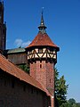
- Nomination Guard tower in castle in Malbork. --Lestat 09:20, 16 July 2007 (UTC)
- Promotion Accaptable technical condition - good lighting on the subject.--Beyond silence 09:36, 16 July 2007 (UTC)
-

- Nomination Greater kudu - Tragelaphus strepsiceros. Lycaon 13:10, 15 July 2007 (UTC)
- Promotion Good technical condition - sharpness and lighting on subject.--Beyond silence 07:58, 16 July 2007 (UTC)
-
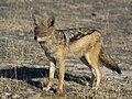
- Nomination Black-backed jackal - Canis mesomelas. Lycaon 13:10, 15 July 2007 (UTC)
- Promotion Good technical condition - sharpness and lighting on subject.--Beyond silence 07:58, 16 July 2007 (UTC)
-

- Nomination A Sundial @ the Carl-Zeiss-Planetarium in Stuttgart --Stefan-Xp 21:16, 14 July 2007 (UTC)
- Promotion Good sharpness and lighting condition on subject.--Beyond silence 03:46, 15 July 2007 (UTC)
-
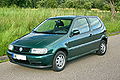
- Nomination A green polo 6N --Stefan-Xp 21:16, 14 July 2007 (UTC)
- Promotion Acceptable technical condition and composition for subject.--Beyond silence 08:06, 15 July 2007 (UTC)
-

- Nomination Petunia Flower --Digon3 talk 13:23, 14 July 2007 (UTC)
- Promotion Good composition and I think technicaly acceptable.--Beyond silence 03:36, 15 July 2007 (UTC)
-
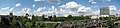
- Nomination Berlin Mitte panorama. --Adamantios 12:57, 14 July 2007 (UTC)
- Promotion Good technical condition, good lighting and sharpness. --Beyond silence 13:57, 14 July 2007 (UTC)
-

- Nomination View of the monastery of Dragomirna in Bucovina, north Romania --Alessio Damato 13:51, 8 July 2007 (UTC)
- Promotion Good image, very nice colours. --Lestat 18:31, 14 July 2007 (UTC)
-

- Nomination A simple throw pillow --Scrumshus 05:22, 8 July 2007 (UTC)
- Promotion i sometimes really have problems to qualify this images. the subject is plain boring the composition is straight foward and the background dont help it at all. please try making your images a bit more dinamic. otherwise is an image noone would want to spend more than a second looking at-LadyofHats 19:47, 14 July 2007 (UTC)
-
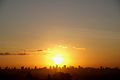
- Nomination Sunset in Recife, Brazil. Christof01 20:44, 15 July 2007 (UTC)
- Decline Sun looks very distracting.--Beyond silence 02:40, 16 July 2007 (UTC)
-

- Nomination Vanda coerulea, a type of orchid. Scrumshus 18:24, 14 July 2007 (UTC)
- Decline Distracting shadow on whol subject.--Beyond silence 03:38, 15 July 2007 (UTC)
-

-
- Nomination Roof tip of Berliner philharmonie. --Adamantios 12:57, 14 July 2007 (UTC)
- Decline Composition is interesting, but I think this small piece of roof don't present high value from the subject. But if we don't think about it, the whole object in shadow, so tehnicaly distracting. --Beyond silence 13:57, 14 July 2007 (UTC)
-

- Nomination A mother mallard with her babies (Anas platyrhynchos) Scrumshus 03:53, 14 July 2007 (UTC)
- Decline So the subject is really dark as distracting, composition a bit weak too. --Beyond silence 14:10, 14 July 2007 (UTC)
-

-

- Nomination A Pigeon in Chicago (Columba livia domestic) Scrumshus 03:53, 14 July 2007 (UTC)
- Decline Dark, poor composition and value. --Beyond silence 04:30, 14 July 2007 (UTC)
-

- Nomination Hans-Gert Pöttering, President of the European Parliament. -- Aleph 19:45, 13 July 2007 (UTC)
- Promotion Enough high quality by lighting and sharpness. --Beyond silence 04:04, 14 July 2007 (UTC)
-

- Nomination Yellow Coneflower with a bee. -- Ram-Man 12:26, 10 July 2007 (UTC)
- Decline becouse many of the flower petals are out of focus there is not a real diference between those infront and those behind. -LadyofHats 16:01, 13 July 2007 (UTC)
-

- Nomination Nihil. --Lestat 19:23, 8 July 2007 (UTC)
- Decline Too dark, hard to see what presents the pic's value. --Beyond silence 16:30, 13 July 2007 (UTC)
-

- Nomination The tower of the orthodox trinity church in Sighisoara, Romania --Alessio Damato 13:51, 8 July 2007 (UTC)
- Promotion There was a bit to much shadow, I improved it, now good for QI.--Beyond silence 16:22, 13 July 2007 (UTC)
-
- Nomination An opening to a bikepath/creek --Scrumshus 05:22, 8 July 2007 (UTC)
- Decline Not enough definition, possibly from too much detail in the landscape but not enough resolution (it's 5MP!) in the camera to capture it. The contrasty light accentuates this. Maybe it was just oversharpened in software. -- Ram-Man 12:36, 13 July 2007 (UTC)
-

- Nomination Church of "Nossa Senhora Auxiliadora", in Cuiabá. --Mateus Hidalgo 03:03, 7 July 2007 (UTC)
- Decline ,uch detail lost in the statue duew overexposure-LadyofHats 09:42, 14 July 2007 (UTC)
-

- Nomination Church of Our Lady of the Rosary and Saint Benedict, in Cuiabá. --Mateus Hidalgo 03:03, 7 July 2007 (UTC)
- Promotion not a fan from tilted compositions but it is a good foto-LadyofHats 09:42, 14 July 2007 (UTC)
-

-

- Nomination a bottle of home-made limoncello, with removed background. Click on the picture to see the original version. Alessio Damato 07:08, 12 July 2007 (UTC)
- Decline overexposed, noisy and too saturated-LadyofHats 17:41, 12 July 2007 (UTC)
-

- Nomination Icy Cactaceae, shot in the Himalayas --Greatestprateek 15:15, 12 July 2007 (UTC)
- Decline Cactaceae are endemic to the Americas (mainly middle/south). Lycaon 17:27, 12 July 2007 (UTC)
-
-

- Nomination Ayamonte (Spain): street in the old town -- MJJR 20:55, 3 July 2007 (UTC)
- Decline The subject just a bit poor, not present a high value. The composition is not help to show that can be interesting in this street, and a bit to dark. --Beyond silence 09:22, 13 July 2007 (UTC)
-

- Nomination animal cell structure -- LadyofHats 10:40, 22 June 2007 (UTC)
- Promotion Very well made diagramm, just the different sizes of the arrow-ends are a little distracting. Other opinions? --Simonizer 14:51, 27 June 2007 (UTC) arrows heads are the same size the variance is due to angle of the lines Gnangarra 13:59, 8 July 2007 (UTC)you know guys you could have told me before that the text overlaped with the arrows.. anyway it is fixed now-LadyofHats 16:00, 12 July 2007 (UTC)
-

-

-
-

-

-
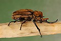
- Nomination Elephant Beetle (Megasoma elephas). -- Ram-Man 12:22, 10 July 2007 (UTC)
- Promotion Great picture, QI --LC-de 13:57, 10 July 2007 (UTC)
-

-

- Nomination An extreme case of mind-boggling regular and wrong-way concurrencies win60 02:25, 10 July 2007 (UTC)
- Decline Interesting picture, but 166 KB is far too small for a QI. -- MJJR 21:03, 10 July 2007 (UTC)
-
- Nomination Antique coin purse --sanjay_ach 00:52, 5 July 2007 (UTC)sanjay_ach
- Promotion Looks great to me. -- Ram-Man 13:55, 10 July 2007 (UTC)
-

-

-
-

-

- Nomination Izrael Poznański's Palace in Łódź (Poland). --Lestat 21:34, 6 July 2007 (UTC)
- Decline Sightly overexposed, but too much for QI. Moreover, use only ASCII characters in filenames, please. Alessio Damato 08:34, 11 July 2007 (UTC)
-

- Nomination Gold Mine in Złoty Stok. --Lestat 21:34, 6 July 2007 (UTC)
- Decline Heavily overexposed. Alessio Damato 08:34, 11 July 2007 (UTC)
-

- Nomination Upper Silesian Ethnographic Park. --Lestat 21:34, 6 July 2007 (UTC)
- Decline The sky is overexposed. I don't like the shadow in the foreground, too Alessio Damato 08:34, 11 July 2007 (UTC)
-

- Nomination Blue flax flower --Skoch3 06:14, 6 July 2007 (UTC)
- Decline The DOF is perfect, but unfortunately it's overexposed... try to re-take it, if you can. Alessio Damato 08:34, 11 July 2007 (UTC)
-

-

-

-

- Nomination Avaceratops reconstruction--LadyofHats 16:08, 4 July 2007 (UTC)
- Promotion Well executed (as usual). Lycaon 10:04, 9 July 2007 (UTC)
-

- Nomination Ayamonte (Spain): Capilla de San Antonio -- MJJR 21:00, 3 July 2007 (UTC)
- Promotion Good artistic composition that make the fore and the background useful. Good sharpness.
-

-

-

- Nomination Church of Our Lady of "Bom Despacho", in Cuiabá. --Mateus Hidalgo 03:03, 7 July 2007 (UTC)
- Decline Tree. --Lestat 19:25, 8 July 2007 (UTC)
-
-

- Nomination Seattle Skyline at dusk.--Cacophony 04:00, 1 July 2007 (UTC)
- Promotion Comment Truly a magnificent shot, but the left-hand-side is suffering from slight slope to the right. Could this be fixed before we promote it? –Dilaudid 08:04, 1 July 2007 (UTC)
 Info I straightened it and reuploaded. Cacophony 21:58, 1 July 2007 (UTC) Neat! –Dilaudid 09:24, 4 July 2007 (UTC)
-

- Nomination Rose chafer (Torynorrhina). --Makro Freak 17:30, 30 June 2007 (UTC)
- Promotion Fantastic. –Dilaudid 08:01, 1 July 2007 (UTC)
-

-

-
- Nomination Wallpepper (Sedum acre) --LC-de 17:45, 5 July 2007 (UTC)
- Decline The blurry foreground elements in the center of the picture hurts an otherwise great picture. -- Ram-Man 13:55, 10 July 2007 (UTC)
-

-

-

-

-
-

-

-

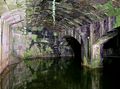
- Nomination Canal in Venice -- MJJR 20:22, 2 July 2007 (UTC)
- Decline underexposed it misses contrast. rather dull composition -LadyofHats 10:04, 9 July 2007 (UTC)
-

- Nomination The lagoon of Venice at sunset -- MJJR 20:22, 2 July 2007 (UTC)
- Decline overexposed-LadyofHats 10:04, 9 July 2007 (UTC)
-

- Nomination A vector CD.--Kulshrax 23:21, 30 June 2007 (UTC)
- Decline
Althgouh simple, it's faultless and very useful. –Dilaudid 08:01, 1 July 2007 (UTC)I'll take that back, since it seems the reflections are embedded as raster, in which case I think the picture shouldn't be promoted. –Dilaudid 20:48, 1 July 2007 (UTC)
-

- Nomination This picture has been hanging for some time in my page, mainly for sentimental reasons. Today I looked at it with a more "technical" eye and I realized that the quality might be good enough for QI. What do you think? - Alvesgaspar 23:11, 29 June 2007 (UTC)
- Decline Bad colours, noisy bckgr, main subject unsharp. I like cats like that one --Orlovic (talk) 12:17, 30 June 2007 (UTC)
-

-

- Nomination Erfurt Cathedral, Germany --Kolossos 10:43, 1 July 2007 (UTC)
- Promotion Is an excellent photo, only concern is that it is borderline on resolution. Given the subject of the photo (many individual faces), higher resolution is desirable. What do others think?--Skoch3 03:27, 7 July 2007 (UTC)
Attention: I uploaded the image now with a higher resolution. Kolossos 11:05, 7 July 2007 (UTC)
*Higher resolution looks great and definitely QI in my opinion. If you have even higher resolution, please upload!--Skoch3 20:37, 7 July 2007 (UTC)
-

- Nomination Springbok (Antidorcas marsupialis) in Etosha, Namibia -- Lycaon 13:56, 6 July 2007 (UTC)
- Promotion Absolutely a QI, razor sharp, although some people may find the background 'disturbing' / Absoluut een QI, letterlijk haar-scherp! De volgens sommigen misschien 'storende achtergrond' doet daar niets van af. Schitterend beeld! -- MJJR 19:12, 6 July 2007 (UTC)
-

-

-
-

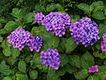
- Nomination Hydrangea macrophylla -- MJJR 20:15, 25 June 2007 (UTC)
- Promotion Quality Image! --Simonizer 14:10, 27 June 2007 (UTC) *You should nominate this at FPC. --Digon3 talk 20:10, 27 June 2007 (UTC) ** The crop is not nice --Makro Freak 17:41, 30 June 2007 (UTC)**I notice that now. You should definitly retake the subject and try for better composition, its a great picture. --Digon3 talk 17:02, 2 July 2007 (UTC) **Retake is not possible, as the flowers in my garden were overblown in the mean time... -- MJJR 19:47, 6 July 2007 (UTC)
-

-
- Nomination Homeless in Ontario --WayneRay 17:54, 4 July 2007 (UTC)WayneRay
- Decline Too blurry. --Florian Prischl 16:36, 5 July 2007 (UTC)
-

-

- Nomination Echeveria glauca --WayneRay 17:48, 4 July 2007 (UTC)WayneRay
- Decline Too dark. --Florian Prischl 16:36, 5 July 2007 (UTC)
-

-

- Nomination Abbey in Wunstorf, Germany. --Dschwen 20:27, 28 June 2007 (UTC)
- Decline Info small dust speck right of rooftop in the sky -- Klaus with K 16:36, 29 June 2007 (UTC) Oversaturated green colours --Simonizer 11:08, 6 July 2007 (UTC)
-

- Nomination Knautia (Knautia macedonica) flower and insect. -- Ram-Man 20:22, 28 June 2007 (UTC)
- Promotion good quality --Simonizer 11:04, 6 July 2007 (UTC)
-

-
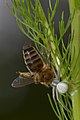
- Nomination Misumena vatia with pray Apis mellifera --MichaD | Michael Apel 07:46, 5 July 2007 (UTC)
- Promotion Could you please wash the pollen off the bee and then retake the photo? Ha ha, j/k, Wow, this photo is incredible, definitely high quality...would love to know how you captured it.--Skoch3 08:01, 5 July 2007 (UTC)
-

-

- Nomination Typewriter detail from 1923 --Kolossos 10:43, 1 July 2007 (UTC)
- Decline Good concept and fine detail, but the angle of the shot doesn't show enough of the typewriter. More reviews needed! Greatestprateek 13:03, 3 July 2007 (UTC)
Info: more opinions can be found on Featured picture candidate --Kolossos
-

- Nomination Santiago church, Tavira (Portugal) -- MJJR 20:51, 27 June 2007 (UTC)
- Decline overexposed-LadyofHats 11:33, 4 July 2007 (UTC)
-

- Nomination Ring-tailed lemur --Chris_huh 11:36, 26 June 2007 (UTC)
- Decline * Question are those the right colors? i have this impression the image has too much green or yellow in it-LadyofHats 14:59, 27 June 2007 (UTC) - It was the original photo, but yeah it does look like its got too much green so i have reduced the green in the photo. Chris_huh 15:10, 27 June 2007 (UTC)* unfortunaly it means now the pictue is overexposed -LadyofHats 11:07, 4 July 2007 (UTC)
-

- Nomination Wrocław, Kępa Mieszczańska (Bürgerwerder) island on the Odra River, 2006 Przykuta 12:04, 21 June 2007 (UTC)
- Decline oops can someone help me i dont find this image..-LadyofHats 09:28, 23 June 2007 (UTC)
*I guess that Przykuta meant this image. Herr Kriss 15:36, 25 June 2007 (UTC)too much information in to few space, too similar colors dificult the reading of the lines, the text is to tight and hard to read (recognise) in some parts-LadyofHats 10:51, 4 July 2007 (UTC)
-
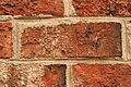
- Nomination It's, well... a brick. Thegreenj 21:05, 2 July 2007 (UTC)
- Promotion Well shot, maybe a bit overexposed. Better than the photo of the wall, mainly because it is larger. --Florian Prischl 07:48, 3 July 2007 (UTC)
-
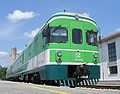
- Nomination Slovenian 711 series train --Orlovic (talk) 20:34, 2 July 2007 (UTC)
- Promotion Not as good as the pictures of the blue train of June 29. You should crop the image a little bit on the right. Please make your pictures heavier: 2MB if possible... But nevertheless, I think it's just good enough for a QI. -- MJJR 20:53, 2 July 2007 (UTC)
Cropped. I don't know how to make them heavier now. --Orlovic (talk) 21:47, 2 July 2007 (UTC)
-
-

-

-

- Nomination Lake Mansarovar and the Tibetan Himalayas --Greatestprateek 15:52, 2 July 2007 (UTC)
- Decline Overexposed and oversaturated. --Digon3 talk 19:01, 2 July 2007 (UTC)
-

-

- Nomination Pair of Yellow Coneflowers (Echinacea paradoxa) without a bee. -- Ram-Man 13:43, 29 June 2007 (UTC)
- Promotion Good DoF, good colors, good composition, nicely blurred background. -- MJJR 20:41, 2 July 2007 (UTC)
-

- Nomination Pair of Yellow Coneflowers (Echinacea paradoxa) with a bee. -- Ram-Man 13:43, 29 June 2007 (UTC)
- Promotion I prefer the one without the bee, but of course it's a good picture too. -- MJJR 20:41, 2 July 2007 (UTC)
-

-

-

-

-
-

- Nomination Juvenile Black Redstart. Wojsyl 19:33, 1 July 2007 (UTC)
- Decline Size is <2MP and it is blurry. --Florian Prischl 21:13, 1 July 2007 (UTC)
-
- Nomination Dresden, A half camera --Kolossos 10:43, 1 July 2007 (UTC)
- Decline Size is <2MP, it is blurry and crudely cut out. --Florian Prischl 21:12, 1 July 2007 (UTC)
-

- Nomination Erfurt Anger, Germany --Kolossos 10:43, 1 July 2007 (UTC)
- Decline No clear subject, convoluted composition. --Florian Prischl 21:21, 1 July 2007 (UTC)
-

- Nomination Eurasian Bullfinch. –Dilaudid 08:08, 1 July 2007 (UTC)
- Decline Size is borderline, heavy artifacts. --Florian Prischl 21:21, 1 July 2007 (UTC)
-

- Nomination Griffon vulture. –Dilaudid 08:17, 1 July 2007 (UTC)
- Decline Size is <2MP. --Florian Prischl 21:21, 1 July 2007 (UTC)
-

- Nomination Mute swan with cygnets. --Eva K. Message 09:48, 1 July 2007 (UTC)
- Decline Out of focus, the angle does not show the swan well. --Florian Prischl 21:21, 1 July 2007 (UTC)
-

- Nomination Houses in Cacela Velha (Portugal) -- MJJR 21:13, 28 June 2007 (UTC)
- Decline I would have supported this picture, for its composition, if it were not for the presence of the cars and the unfortunate time of the day, with these harsh shadows. Please move it to CR if you want other opinions. - Alvesgaspar 22:17, 29 June 2007 (UTC)*I agree with you. Also, it is tilted to the right, which makes the row appear as if it collapses to the right. --Florian Prischl 21:30, 1 July 2007 (UTC)
-

-

- Nomination I had already nominated it, but it was rejected because it needed to be rotated. Now it should be fine. Alessio Damato 18:17, 29 June 2007 (UTC)
- Promotion It is too. The birds are a nice detail. –Dilaudid 07:57, 1 July 2007 (UTC)
-

- Nomination Euchroea- auripimenta- on-passiflora --Makro Freak 16:02, 29 June 2007 (UTC)
- Promotion The head suffers from minor motion blur but otherwise – wow. –Dilaudid 07:57, 1 July 2007 (UTC)
-

- Nomination Oxysternon- conspicillatum --Makro Freak 16:02, 29 June 2007 (UTC)
- Promotion Makro Freak style. –Dilaudid 07:57, 1 July 2007 (UTC)
-

- Nomination The Tour Pons de l'Orme, Montmajour Abbey near Arles, France -- MJJR 20:59, 25 June 2007 (UTC)
- Decline i find it has a lot of empty space on the top, also the birds are a bit anoying ,minimally blury. so i think i would promote a bit croped version. a second opinion?-LadyofHats 14:38, 27 June 2007 (UTC) Composition. Also the tower doesn't seem quite straight. –Dilaudid 08:15, 1 July 2007 (UTC)
-
 }}
}}- Nomination Hydrangea macrophylla -- MJJR 20:15, 25 June 2007 (UTC)
- Promotion Quality Image! --Simonizer 14:10, 27 June 2007 (UTC) *You should nominate this at FPC. --Digon3 talk 20:10, 27 June 2007 (UTC) ** The crop is not nice --Makro Freak 17:41, 30 June 2007 (UTC)
-

-

-

-

- Nomination Hercules tower in A Coruña (Galicia, Spain) -- Alessio Damato 16:11, 27 June 2007 (UTC)
- Decline The building is tilted and needs correction before it can be promoted. -- Ram-Man 13:36, 29 June 2007 (UTC)
-

- Nomination a genus of herbivorous ceratopsian dinosaur from the Cretaceous Period.-- LadyofHats 10:40, 22 June 2007 (UTC)
- Promotion Seems good enough for a QI to me. -- Ram-Man 13:28, 29 June 2007 (UTC)
-

- Nomination a genus of chasmosaurine ceratopsid dinosaur from the Late Cretaceous Period of western North America.-- LadyofHats 10:40, 22 June 2007 (UTC)
- Promotion I see nothing in this image that would cause it to not be a QI. -- Ram-Man 13:28, 29 June 2007 (UTC)
-

- Nomination The old castle of Tavira (Portugal) -- MJJR 20:51, 27 June 2007 (UTC)
- Promotion I like the composition, technical quality good enough for QI -- Klaus with K 18:05, 28 June 2007 (UTC)
-
- Nomination cistern inside the San Anton Castle in A Coruña, Galicia, Spain. Rendered HDR, to be able to show the huge dynamics of the view Alessio Damato 13:45, 26 June 2007 (UTC)
- Decline The exposure bracketed frames have alignment problems (-> ghosting), plus the exposure range could have been wider. --Dschwen 21:24, 28 June 2007 (UTC)
-

- Nomination Romanian countryside in the Suceava region --Alessio Damato 19:21, 25 June 2007 (UTC)
- Decline overexposed.. still impressive-LadyofHats 14:41, 27 June 2007 (UTC); Question just to learn, can I know where I can see it's overexposed? it's bright, but there are no bright white spots (i.e. burnt parts), as I would expect from an overexposed pictures. Thanks Alessio Damato 16:05, 27 June 2007 (UTC) Info get yourself a copy of the free photo-editing programme gimp, several of the colour-modifying commands show you a histogram in the preview - in your case (as often), the blue channel for the sky clips (would have values >255 if it were possible} -- Klaus with K 16:32, 27 June 2007 (UTC)- and in this case is visible without any program, like in the window of the house, the flowers and ever the clouds. it doesnt need to be white to know that an image is overxposed. normally you can recognise it when huge areas end being of one single color.-LadyofHats 10:11, 28 June 2007 (UTC) Thanks Alessio Damato 17:11, 28 June 2007 (UTC)
-

- Nomination A lion-tailed macaque --Chris_huh 11:36, 26 June 2007 (UTC)
- Decline blury-LadyofHats 14:59, 27 June 2007 (UTC)
-

-

- Nomination Camomile Colza and Rainbow --Simonizer 21:49, 25 June 2007 (UTC)
- Promotion nice compotition-LadyofHats 14:38, 27 June 2007 (UTC)
-

- Nomination Montmajour Abbey near Arles, France -- MJJR 20:59, 25 June 2007 (UTC)
- Promotion same as the one before i think this one has a lot of empry space on the top , and would look better croped. but still this one is good enough to be promoted. LadyofHats 14:38, 27 June 2007 (UTC)
-

- Nomination Montmajour Abbey near Arles, France -- MJJR 20:59, 25 June 2007 (UTC)
- Promotion in this case the empty space gives it a bit of character, but still maybe a bit less would be better-LadyofHats 14:38, 27 June 2007 (UTC)
-
- Nomination Papaver hybridum --LC-de 19:19, 25 June 2007 (UTC)
- Decline it is such a nice picture, but that plant on the front (the one out of focus) it is just so distracting i am tempted to decline it. second opinion?-LadyofHats 14:41, 27 June 2007 (UTC)
I feel the same way. I like this picture very much and i even would have nominate it for FP. Its a pitty that there is this blurry plant in the foreground. Thats sadly a reason to decline --Simonizer 11:28, 28 June 2007 (UTC)
-

- Nomination The War Memorial Tower in Wanganui, New Zealand. –Dilaudid 19:12, 25 June 2007 (UTC)
- Decline Comment camera is slightly unsharp+colour fringing at the image edge (see QIC talk page) --Klaus with K 19:33, 25 June 2007 (UTC)- agree, the image is blury and has color aberrations on the top of the tower-LadyofHats 14:53, 27 June 2007 (UTC)
-

- Nomination Fountains Abbey ruins in Yorkshire -- Klaus with K 16:27, 25 June 2007 (UTC)
- Promotion minimal noise and blury in full view. reasonable for QI-LadyofHats 14:53, 27 June 2007 (UTC)
-

- Nomination parts of a mature flower.-- LadyofHats 10:40, 22 June 2007 (UTC)
- Promotion Very illustrative --Simonizer 14:13, 27 June 2007 (UTC)
-

- Nomination Female black redstart (Phoenicurus ochruros) --MichaD | Michael Apel 15:23, 25 June 2007 (UTC)
- Promotion i really like it-LadyofHats 15:13, 26 June 2007 (UTC)


.jpg)


_white_bg.jpg)


.jpg)


.jpg)


.jpg)


.jpg)


.jpg)
.jpg)


_GLX_sedan_(2007-07-07).jpg)

.jpg)


.JPG)


.JPG)
.JPG)


Consensual review[edit]
BlackTunnelweb head.JPG[edit]

.jpg)
- Nomination Black tunnel web spider --Tony Wills 00:57, 22 July 2007 (UTC)
- Promotion
- Comment A bit overexposed, I did a little workshop here. Lycaon 07:44, 24 July 2007 (UTC)
- Comment I see what you mean, the background looks a bit better (I was too busy looking at the eyes to notice! - those 4 orange eyes facing in different directions, plus one set looking upwards and one set looking forwards :-) --Tony Wills 21:43, 24 July 2007 (UTC)
 Support Right version. Great details! Lycaon 07:22, 25 July 2007 (UTC)
Result: 1 support (excluding the nominator), 0 oppose -> Right version promoted to QI -- Lycaon 07:32, 27 July 2007 (UTC)
Himba ladies[edit]

- Nomination Two Himba ladies about 15 km north of Opuwo, Namibia. Lycaon 07:59, 21 July 2007 (UTC)
- Promotion
- Support Good doccumentation of subject -- 16:18, 22 July 2007 (UTC)—the preceding unsigned comment is by Infrogmation (talk • contribs) Seems user used ~~~~~ instead of ~~~~.
 Oppose I've been looking at this one for a few days and the composition just doesn't do it for me. The crop on the right is too close for my comfort, especially given all the empty space on the left. Ben Aveling 05:50, 23 July 2007 (UTC)
- Comment I've cropped out half of a third lady on the right ;-). Lycaon 07:31, 23 July 2007 (UTC)
- I thought it must have been something like that. A pity. Ben Aveling 12:25, 24 July 2007 (UTC)
- Support Not perfect but: It's hard to do people shots outside. This is a good one. --Ikiwaner 19:45, 24 July 2007 (UTC)
- Support sufficient in my opinion --norro 21:52, 24 July 2007 (UTC)
Result: 3 support (excluding the nominator), 1 oppose -> Promoted to QI -- Lycaon 07:31, 27 July 2007 (UTC)
[edit]


cropped image
- Nomination Potentilla hookeriana close-up in evening sun 800 km north of the polar circle. -- Slaunger 03:00, 19 July 2007 (UTC)
- Decline
- CommentIs this overexposed / posterized or is it just me? -- Ram-Man 14:26, 20 July 2007 (UTC)
- I have uploaded the original photo for comparison. The original does not go into saturation in any of its colour channel histograms. The blue channel is under-saturated though in the blurred background. I have done the following postprocessing steps to acheive the nominated photo: 1. Cropped. 2. Increased saturation sligthly (5-10 as far as I remember). 3. Slight tone-curve adjustments to lighten up the dark background a little and finally I've applied an unsharp mask of pixel radius 1.0 and an amount of approx. 50% to emphasize details such as filaments a little. Maybe the latter process has introduced the posterized effect you mention? -- Slaunger 02:51, 21 July 2007 (UTC)
- Oppose For reasons I stated above and the fact that the other supporters withdrew support. -- Ram-Man 14:50, 24 July 2007 (UTC)
Result: 0 support (excluding the nominator), 1 oppose -> not promoted to QI -- Lycaon 15:50, 26 July 2007 (UTC)
original image
- Nomination Potentilla hookeriana in evening sun 800 km north of the polar circle. by Slaunger --Tony Wills 11:48, 23 July 2007 (UTC)
- Promotion
- I have uploaded the original photo for comparison. The original does not go into saturation in any of its colour channel histograms. The blue channel is under-saturated though in the blurred background. I have done the following postprocessing steps to acheive the nominated photo: 1. Cropped. 2. Increased saturation sligthly (5-10 as far as I remember). 3. Slight tone-curve adjustments to lighten up the dark background a little and finally I've applied an unsharp mask of pixel radius 1.0 and an amount of approx. 50% to emphasize details such as filaments a little. Maybe the latter process has introduced the posterized effect you mention? -- Slaunger 02:51, 21 July 2007 (UTC)
- Support After having seen the original, I'ld rather support that one. Lycaon 09:50, 23 July 2007 (UTC)
- Support definately a better presentation of the flower Gnangarra 06:04, 24 July 2007 (UTC)
Result: 2 support (excluding the nominator), 0 oppose -> Promoted to QI -- Lycaon 12:09, 26 July 2007 (UTC)
Amur Tiger Panthera tigris altaica Cub Walking[edit]

- Nomination Amur Tiger (Panthera tigris altaica) cub. -- Ram-Man 13:56, 19 July 2007 (UTC)
- Promotion UNSHARP.--Beyond silence 15:51, 19 July 2007 (UTC)
- Unsharp? You can see the individual hairs. Low contrast maybe, but it's got enough sharpness for a QI. There is movement blur in the feet, but that's fine for effect. -- Ram-Man 18:26, 19 July 2007 (UTC)
- This one needs further discussion I think. --LC-de 05:54, 20 July 2007 (UTC)
- If St. Peter's Church.JPG unsharp by Lycaon, than it is really unsharp... But I don't agree with him.--Beyond silence 06:18, 20 July 2007 (UTC)
- Comment maybe it needed some curves adjustments? (see version 2) Lycaon 12:33, 20 July 2007 (UTC)
- Comment I prefer this new version, so I overwrote the original with it. Yes it is darker, but it needed more contrast. Please reevaluate based on this new image. -- Ram-Man 12:50, 20 July 2007 (UTC)
- Comment That approach makes it difficult to get promoted unless people come back and edit their original votes. We now have one oppose vote on this image instead of one oppose on the original an no opposes on the new version. Much cleaner to simply seperate the versions --Tony Wills 05:52, 22 July 2007 (UTC)
- Support -- only seen touched up version, I like with motion blur in the front foot a necessary distraction. Gnangarra 13:42, 22 July 2007 (UTC)
- Support sufficient for QI -- Lycaon 17:56, 22 July 2007 (UTC)
Result: 2 support (excluding the nominator), 1 oppose -> promoted to QI --Tony Wills 01:28, 25 July 2007 (UTC)
St. Peter's Church.JPG[edit]

- Nomination de:Petrikirche_(Riga) (St. Peters church in Riga) --moralist 21:32, 17 July 2007 (UTC)
- Promotion
- SupportI took some adjustment, now I think it is a good QI (good brightness and shaprness)--Beyond silence 10:45, 18 July 2007 (UTC)
- Oppose It is still tilted, unsharp and shows some fringing. Also if you 'adjust' an image it is better (advisable even) to leave the original and upload the altered version under a new name. Lycaon 13:27, 19 July 2007 (UTC)
- Comment Yes this is not the right way to do it, Beyond silence is now essentially voting on a new version that he himself has submitted. He should have reviewed the original, and then uploaded the new version as a new nomination (eg move the nomination to CR and provide both pictures side by side so others can review). User:Moralist is the only one who should replace the original image, unless they have specifically asked for it to be replaced. In this case I see that User:Moralist agrees with the modification, but this is still not the right process. --Tony Wills 01:30, 20 July 2007 (UTC)
- Support I think this one is ok. There isn't much tilt, it's sharp enough at 2MP, and you can't see the fringing either. -- Ram-Man 11:32, 20 July 2007 (UTC)
Result: 2 support (excluding the nominator), 1 oppose -> promoted to QI --Tony Wills 11:29, 23 July 2007 (UTC)
File:Thraciae-veteris-typvs.jpg[edit]

- Nomination Historical map of Thrace. Comment I'm not sure if this stands due to the license (PD). --Adamantios 12:57, 14 July 2007 (UTC)
- Promotion
- SupportIt's realy old, so I think 70 years expires. Old so has some minor problem, but the resulation is very high, and sharpness is so good too.--Beyond silence 14:02, 14 July 2007 (UTC)
- Oppose QI is for self published ie "uploaded to Commons by the copyright holder", this doesnt this fit within this requiement Gnangarra 02:26, 15 July 2007 (UTC)

- I think you are not right. It not self work, but the copyright has expired, so PD - public domain. It's received in Wikimediacommons. Look like Wrightflyer.jpg!--Beyond silence 03:29, 15 July 2007 (UTC)
- Oppose beyond QI scope (ack Gnangarra) Lycaon 10:42, 15 July 2007 (UTC)
- Support It's a very well done self made reproduction of a large map. I wish more reproductions in this quality! Maybe apply a tad more USM next time --Ikiwaner 17:10, 19 July 2007 (UTC)
- What is USM ? --Tony Wills 01:42, 20 July 2007 (UTC)
- a) a design furniture maker; b) Unsharp masking --Ikiwaner 19:42, 24 July 2007 (UTC)
- What is USM ? --Tony Wills 01:42, 20 July 2007 (UTC)
- Support --Lestat 19:57, 23 July 2007 (UTC)
Result: 3 support (excluding the nominator), 2 oppose -> Promoted to QI -- Lycaon 12:11, 26 July 2007 (UTC)
Banana Flower Petal[edit]

- Nomination Banana Flower Petal. -- Ram-Man 04:22, 19 July 2007 (UTC)
- Decline
- Oppose since the petal is off the flower the background should be more neutral Gnangarra 13:27, 22 July 2007 (UTC)
- While I don't deny your point, I don't think it is sufficient reason to decline: it's not terribly distracting and the quality is high enough for a QI. There is enough color contrast here such that the subject is very clear, even if the background isn't a neutral color. Green grass vs. neutral-colored brown dirt (for example) seems a minor point reserved for a FP nom. -- Ram-Man 14:57, 24 July 2007 (UTC)
Result: 0 support (excluding the nominator), 1 oppose -> Not promoted to QI -- Lycaon 16:13, 26 July 2007 (UTC)
Digital clock's display changing numbers[edit]

- Nomination Digital clock's display changing numbers --Beyond silence 18:19, 17 July 2007 (UTC)
- Decline
- OpposeWhat time is this changing to/from? The left side reads "21", but the "1" digit was not previously a "0" or a "2" because the bottom, side, left segment is not lit. It was either a "9" or a "5", which does not make any sense. This makes the composition confusing. -- Ram-Man 13:36, 19 July 2007 (UTC)
- How do you think decline with this reason? I can not believe this. --Beyond silence 15:48, 19 July 2007 (UTC)
- The value of an image is whether or not it is clear what it is. Looking at this picture, it doesn't make sense to me for the stated reasons, and the image description is not helpful in explaining it. If it doesn't behave like a clock, how is it useful as an example of a clock? If you want, I can discuss the other technical reasons why an oppose might be warranted (such as the "flare" to the right of the rightmost digit). -- Ram-Man 17:29, 19 July 2007 (UTC)
- How do you think decline with this reason? I can not believe this. --Beyond silence 15:48, 19 July 2007 (UTC)
- Oppose Neither can I work out what digits are changing to/from, but another problem is that the camera is on an angle to the clock so that for instance the '0' is smaller than the '2', and the '2' is much more slanted than the '0'. Interesting shot but not a QI. --Tony Wills 03:02, 20 July 2007 (UTC)
 Neutral The left hand number could be a 3 going to a 4, though I would have expected the number after 23 to be 00. The right hand number has to be 59 going to 00, given that the hour is also changing. I'd hazard that the bits that stay on are brighter than the bits that are switching between off and on, which might explain why it looks like it is showing 21:50. As I said at FP, I like the idea behind this image - the time between the time - I just wish it was taken from front on. Regards, Ben Aveling 08:13, 21 July 2007 (UTC)
- If it was 3 -> 4 the middle horizontal bar would be lit (present in 3 and 4 digit), if it was a 5 -> 0 the bottom left side bar would probably be half lit, if it was 9 -> 0 the top horizontal and top left vertical bars would be brightly lit (present in both 9 & 0 digit) and mid horizontal bar partly lit. All very odd :-) --Tony Wills 05:38, 22 July 2007 (UTC)
- Oppose I the perspective distracting, theres a small dot of light on the right edge that appears out of place, the number sequence needs to be established. Gnangarra 13:53, 22 July 2007 (UTC)
Running total: 0 support (excluding the nominator), 3 oppose -> not promoted to QI -- Ram-Man 14:47, 24 July 2007 (UTC)
Purple Hibiscus[edit]
- Nomination Purple Hibiscus --He Who Laughs Last 02:06, 14 July 2007 (UTC)
- Decline
- Support Good composition and I think technicaly acceptable. --Beyond silence 03:33, 15 July 2007 (UTC)
- Oppose Very overexposed, harsh lighting, distracting background, blown headlights Thegreenj 01:50, 18 July 2007 (UTC)
- Its too late its been three days since it was approved. You have to place your objections within 48 hours. Very overexposed is an exaggeration, its only slight and acceptable. —the preceding unsigned comment is by He Who Laughs Last (talk • contribs)
- For what it's worth, if it's still in the list of pictures, I don't care if it's 2 days or 4 days. Objections should be dealt with. I'd rather take an extra day or two and make sure we get it right. Of course if someone wants to promote the picture after exactly 48 hours, they can do so under the rules, but if it sticks around longer, it should still be possible to update the vote. Otherwise QICBot should be changed to do exactly 2 days and not 4. -- Ram-Man 11:38, 18 July 2007 (UTC)
- CommentWell, technically he is right, the rules say it becomes promoted exactly 48 hours after positive review. And we haven't got a procedure stated for de-promoting images from QI. --Tony Wills 12:06, 19 July 2007 (UTC)
- The rules also say that any objections get moved to CR, so this is clearly an objection, albeit after the 48 hours. In any case, I think this is fairly common practice, but is not frequently checked: if an image is still on this page, it is fair game for CR, regardless of whether or not it was promoted or declined. If someone has a problem with this interpretation, they can override me. -- Ram-Man 14:36, 24 July 2007 (UTC)
- Support The exposure is alright here. The overexposure is not distracting on account of the large amount of texture detail surrounding it. -- Ram-Man 11:38, 18 July 2007 (UTC)
- Oppose I think it is overexposed too, but only minor. What bugs me more is the lack of a positive identification. Lycaon 12:22, 18 July 2007 (UTC)
- Oppose As Ram-Man says, the species has to be known. -- Slaunger 01:26, 19 July 2007 (UTC)
- Comment It seems that the main agreed problem is lack of species identification. Would someone like to help identify it? --Tony Wills 12:06, 19 July 2007 (UTC)
- Comment That's a tough one. I tried but failed. E.g. Google gives 470000 image for Hibiscus. It is probably some cultivar, but I didn't find anything with this dark pistil colours. Lycaon 11:43, 20 July 2007 (UTC)
- Comment I'm closing this request as a decline. It should be resubmitted in the future if the species is identified. -- Ram-Man 14:38, 24 July 2007 (UTC)
Running total: 2 support (excluding the nominator), 3 oppose -> not promoted to QI -- Ram-Man 14:36, 24 July 2007 (UTC)
View on Schneeberg[edit]

- Nomination View on Schneeberg --Beyond silence 03:55, 11 July 2007 (UTC)
- Decline
- Supportoversaturated clouds, but i think it is still good enough to promote-LadyofHats 12:45, 13 July 2007 (UTC)
- Oppose I know I am new here and late to oppose... But the picture does not meet quality standards for me: Feets and heads in the bottom of the picture are cut, and the object is really nothing special.-- User:Christof01 22:37, 13 July 2007 (UTC)
- Comment Again, QI is not junior FP, 'special' is not a requirement, we are mainly looking at the technical attributes. --Tony Wills 13:20, 14 July 2007 (UTC)
- I thik there is enough special from composition, where used the people too. --Beyond silence 03:58, 14 July 2007 (UTC)
- Question
Is that a vote of support?--Tony Wills 13:20, 14 July 2007 (UTC) - I am the nomiator, of you include, then yes. --Beyond silence 13:25, 14 July 2007 (UTC)
- You are indeed :-) --Tony Wills 13:34, 14 July 2007 (UTC)
- Support the people provide depth/dimension/scale to the image, maybe slightly top heavy with the amount of sky but not sufficient to oppose at QI Gnangarra 02:39, 15 July 2007 (UTC)
- Oppose don't like the cut man at the bottom. Lycaon 11:05, 15 July 2007 (UTC)
- OpposeI like the composition a lot with the people walking into the image. Those few overexposed pixels are not distracting either. Unacceptable are the cut off feet and the cut head on the lower image border. The image seems to be tilting 1° CW too. --Ikiwaner 17:06, 19 July 2007 (UTC)
- Then Fuck!--Beyond silence 06:20, 20 July 2007 (UTC)
- Who ? --Tony Wills 12:20, 20 July 2007 (UTC)
- Support Main objection seems to be the slight cropping of feet in the foreground which seems to be a minor point. I don't think that is sufficient reason to decline an otherwise good image. --Tony Wills 12:20, 20 July 2007 (UTC)
- Oppose People in the picture is a compositional issue, and is thus an issue for QI as well as FP. Only a single person is needed for scale, not three, and the placement of the person can be chosen to aid the picture. In this case, the people are distracting and decrease its encyclopedic value even ignoring the crop, thus the composition is not enough for a QI. In addition, the grass (and perhaps the trees) show signs of typical detail smudging from cheap point-and-shoot digital camera noise reduction, despite the bright sunlight. -- Ram-Man 14:45, 24 July 2007 (UTC)
Result: 3 support (excluding the nominator), 4 oppose -> Not promoted to QI -- Lycaon 16:11, 26 July 2007 (UTC)
[edit]

- Nomination Vaccinium uliginosum photographed in midnight sun 800 km north of the polar cirle --Slaunger 01:44, 15 July 2007 (UTC)
- Promotion
- SupportGood sharpness and lighting condition on subject.--Beyond silence 03:44, 15 July 2007 (UTC)--
- Oppose i disagree, there is much of the picture out of focus and the composition is not the best-LadyofHats 19:05, 17 July 2007 (UTC)
- It is intentional from my side that much of the picture is out of focus. I wanted to emphazise the sun-lit red-fringed leaves in the middle and the minuscule flowers in the lower right corner. Could you be a little more specific about what could be improved in the composition? I am eager to learn from an expert illustrator, whose opinions I respect very much. -- Slaunger 03:33, 20 July 2007 (UTC)
- Support Sharp, clear, good technical quality, although I liked the untrimmed version better.-He Who Laughs Last 03:05, 20 July 2007 (UTC)
- Interesting remark about the untrimmed version. I have had doubts myself as to which version was the the best and asked for advice in the citiques forum. Here, two users were in favor for the cropped version, and none were for the original uncropped. Personally, I am slightly in favor of the original photo, but being a newbie photographer I took the advise from others and nominated the trimmed version. -- Slaunger 03:33, 20 July 2007 (UTC)
Result: 1 oppose, 2 support -> promoted to QI --Tony Wills 05:21, 22 July 2007 (UTC)
Paperbark Maple Bark[edit]
![]()
- Nomination Paperbark Maple (Acer griseum)
- Promotion
- Oppose The bark is nice, but I can't overlook the burnt out backgorund. Ben Aveling 18:45, 17 July 2007 (UTC)
- The background is snow. If this was a picture of snow, it would make sense to expose for the snow, but this isn't about the snow, it's about the bark, so it was exposed for the bark. Without the snow, sure you'd have a normal background, but then you'd get normal hard contrast like this picture. Diffuse indirect lighting like this is very rare and the whole point of this exposure. Even on a cloudy day you couldn't get this type of illumination. -- Ram-Man 18:55, 17 July 2007 (UTC)
- On another note, this image of the same tree has "properly" exposed snow, but there is no detail in the snow, so it actually looks worse because snow is naturally very bright. -- Ram-Man 19:02, 17 July 2007 (UTC)
- Supporti find it sufficient for QI-LadyofHats 19:00, 17 July 2007 (UTC)
- Support Quality is good --He Who Laughs Last 00:36, 18 July 2007 (UTC)
- Comment The BG may be snow, but the casual observer won't know that! (Bark itself is sharp and properly lit though, so no oppose from me). Lycaon 05:45, 18 July 2007 (UTC)
- Support Very nice and crisp. There is a slight lack of detail at the rim of the trunk, e.g. the small ice-tap is some-what blurred, but that would require a very small aperture to get it all in focus. -- Slaunger 01:37, 19 July 2007 (UTC)
Result: 3 support (excluding the nominator), 1 oppose -> promoted to QI --Tony Wills 05:18, 22 July 2007 (UTC)
Tagetes patula[edit]

- Nomination Tagetes patula --Beyond silence 07:53, 16 July 2007 (UTC)
- Decline
- OpposeOverexposed and noisy. Focus could be better as well --MichaD | Michael Apel 21:51, 16 July 2007 (UTC)
- Oppose ask MichaD. -- Ram-Man 17:38, 17 July 2007 (UTC)
- Oppose bad lighting -LadyofHats 18:58, 17 July 2007 (UTC)
- I agree much thing but that here is bad lighting... ohh where?--Beyond silence 19:02, 17 July 2007 (UTC)
- Well, first the plant is backlit which emphasizes the greens on the back of the leafs but on the other hand makes the top of them overexposed. One solution for this would be to use a bit of fill flash (experiment with different flash settings if your camera offers them). Or you could use a reflector for the same effect (you can build one yourself with some aluminum foil or similar). The problem is further increased as the picture is overexposed as a whole. What happened is probably that your camera compensated for the dark soil as it can't tell the difference between low light and dark subjects (it only measures the reflectivity). So you have to dial in some negative exposure compensation. Hope that helps a bit. --MichaD | Michael Apel 20:08, 18 July 2007 (UTC)
- I agree much thing but that here is bad lighting... ohh where?--Beyond silence 19:02, 17 July 2007 (UTC)
Result: 0 support (excluding the nominator), 3 oppose -> not promoted to QI --Tony Wills 05:16, 22 July 2007 (UTC)
Roman walls in Split[edit]

- Nomination Roman walls in Split --Beyond silence 03:27, 11 July 2007 (UTC)
- Decline
- Fringes (overprocessed), snapshot. Lycaon 10:47, 15 July 2007 (UTC)
- I don't think your reason is correct and supported from any guideline.--Beyond silence 13:08, 15 July 2007 (UTC)
- Oppose poor composition, people are a distractions especially the boy in the centre, also the wire fencing on the right. While it difficult to get locations such as these without people you need to consider the peoples actions at the time of taking the image. Gnangarra 13:51, 15 July 2007 (UTC)
- Oppose The arrangement of the elements within the image should support depiction of the subject, not distract from it. The subject should not be cropped, unless it is only a specific part of the subject that is of interest. Foreground and background objects should not be distracting. You should check that something in front of the subject doesn't hide important elements --Wikimol 00:24, 17 July 2007 (UTC)
- Which important elements hided?--Beyond silence 19:43, 18 July 2007 (UTC)
Result: 0 support (excluding the nominator), 3 oppose -> not promoted to QI --Tony Wills 05:14, 22 July 2007 (UTC)
Church of Our Lady of the Rosary and Saint Benedict[edit]
.jpg)
- Nomination Church of Our Lady of the Rosary and Saint Benedict, in Cuiabá. --Mateus Hidalgo 03:03, 7 July 2007 (UTC)
- Promotion
- Support excellent exposure, great volume in the clouds-LadyofHats 09:45, 14 July 2007 (UTC)
- Oppose It's really underexposed. Other things are good, but at this condition I don't think QI.--Beyond silence 14:22, 14 July 2007 (UTC)
- Support It's sure not underexposed. Lens quality is somewhat on the edge (CA) but it's an illustrative image. --Ikiwaner 23:40, 16 July 2007 (UTC)
Result: 2 support (excluding the nominator), 1 oppose -> promoted to QI --Tony Wills 12:27, 20 July 2007 (UTC)
Banksia menziesii bark[edit]

- Nomination the bark of a Banksia menziesii tree -- Gnangarra 14:25, 14 July 2007 (UTC)
- Decline The main object (the bark) appears to be out of focus - especially at the top, where it is severely blurred.--Slaunger 01:33, 17 July 2007 (UTC)
- This style of photograph is no different to flowers in that good macro photographs always have areas out of focus, the central area is in focus and the points of interest the cracking and the texture particular to this species are both clearly evident and in focus. Gnangarra 03:56, 17 July 2007 (UTC)
- Oppose To my mind even the central area is not sufficiently sharp, and the area which has a reasonable sharpness is too small.--Slaunger 12:01, 17 July 2007 (UTC)
- Oppose There are too much shadow.--Beyond silence 06:38, 17 July 2007 (UTC)
- Oppose It appears that the DoF is too shallow from too large an aperture. Without EXIF information, there is no way to verify this, so I'll just make this assumption. -- Ram-Man 17:41, 17 July 2007 (UTC)
Result: 0 support (excluding the nominator), 3 oppose -> not promoted to QI --Tony Wills 12:37, 20 July 2007 (UTC)
Rocks at top of Schneeberg[edit]

- Nomination Rocks at top of Schneeberg --Beyond silence 03:27, 11 July 2007 (UTC)
- Decline
- Full of compression/processing artefacts (e.g. look at the flowers). Lycaon 10:47, 15 July 2007 (UTC)
- I don't think your reason is correct and supported from any guideline.--Beyond silence 13:08, 15 July 2007 (UTC)
- Agree with Lycaon artifacts especially around the flowers, though cropping to remove the flowers may over come, using my crude piece of paper across the screen approach it'd look fine. Gnangarra 13:47, 15 July 2007 (UTC)
- You think is it distracting?!--Beyond silence 02:44, 16 July 2007 (UTC)
- Sorry, but the image quality is really on the low side. It looks like as if washed by some quite heavy noise reduction, reducing almost all high frequency texture, and than strongly sharpened. --Wikimol 00:33, 17 July 2007 (UTC)
- Oppose ack Wikimol. -- Ram-Man 17:43, 17 July 2007 (UTC)
Result: 0 support (excluding the nominator), 4 oppose -> not promoted to QI --Tony Wills 12:32, 20 July 2007 (UTC)
Capitol Building[edit]

- Nomination The Capitol Building in Washington, DC. Scrumshus 03:53, 14 July 2007 (UTC)
- Decline
- Not sure about this the compsoition is fine, the weather isnt favourable but it has reduced the number of people around the grass areas in front. My concern is the slight horizontal perspective tilt, verticle is fine. Consider this as supporting but I think further discussion is warranted Gnangarra 03:59, 15 July 2007 (UTC)
- The weather is really bad.I am not on strong support.--Beyond silence 04:08, 15 July 2007 (UTC)
- Oppose- bad light, tilted composition. this is a clasic view from the building and therefor it can be done much better-LadyofHats 09:35, 15 July 2007 (UTC)
- Oppose - Fully agree with LadyofHats. Lycaon 11:02, 15 July 2007 (UTC)
Result: 0 support (excluding the nominator), 2 oppose -> not promoted to QI --Tony Wills 12:30, 20 July 2007 (UTC)
File:4.FMC - Ellorien 01.JPG[edit]

- Nomination Ellorien. --Lestat 19:23, 8 July 2007 (UTC)
- Decline
*
![]() Oppose There is not aything about this "band" on Wikipedia, it has not enough value, poor composition. --Beyond silence 16:34, 13 July 2007 (UTC)
Oppose There is not aything about this "band" on Wikipedia, it has not enough value, poor composition. --Beyond silence 16:34, 13 July 2007 (UTC)
- Info-this is no reason to decline the foto.-LadyofHats 10:09, 14 July 2007 (UTC))
- Comment The compositional aspects are of course valid criteria --Tony Wills 13:32, 14 July 2007 (UTC)
- OpposePoor composition and tehnical condition (weak shapness). --Beyond silence 13:39, 14 July 2007 (UTC)
- Support If you notice, this is a stop-action photo (center dancer is in midair), and the sharpness as such is quite good. Not a "postcard" shot by any means but it has a nice little behind-the-scenes story, pretty dancers practicing, surrounded by a rather industrial setup. Composition is a bit weak due mainly to the man working behind the center dancer. Masonbarge 15:27, 14 July 2007 (UTC)
- Oppose composition. Sorry. Ben Aveling 19:04, 15 July 2007 (UTC)
Result: 1 support (excluding the nominator), 2 oppose -> not promoted to QI --Tony Wills 12:25, 20 July 2007 (UTC)
Grapes in a bowl.JPG[edit]

- Nomination A selection of grapes in a glass bowl.--Scrumshus 05:22,8 July 2007 (UTC)
- Decline
Good technical comfort, but less value. Guidelines: "Our main goal is to encourage quality images being contributed to Wikicommons, valuable for Wikimedia projects." --Beyond silence 16:08, 13 July 2007 (UTC)I changed my mind.--Beyond silence 13:21, 14 July 2007 (UTC)
--*we already discused this, a picture from some grapes is valuable for the project commons. as well as other wikipedias. this is no reason to decline the foto-LadyofHats 09:47, 14 July 2007 (UTC)
- Neutral Grapes look OK. Don't like the background. No issues with value. Ben Aveling 19:06, 15 July 2007 (UTC)
- Opposeonce cleared the problem with value. i can say i find the image tilted and with a poor composition-LadyofHats 15:36, 16 July 2007 (UTC)
Result: 0 support (excluding the nominator), 1 oppose -> not promoted to QI --Tony Wills 12:23, 20 July 2007 (UTC)
Cacela Velha Fortress[edit]

- Nomination Old fortress in Cacela Velha (Portugal) -- MJJR 21:13, 28 June 2007 (UTC)
- Decline
- This was the view of the attackers when trying to take the fortress, poor guys! Not really the best point of view to appreciate the building. - Alvesgaspar 22:17, 29 June 2007 (UTC)
- To me photo looks technically good enough for QI, and such view can nicely illustrate the problem that potential attackers were facing. -- Klaus with K 13:32, 30 June 2007 (UTC)
- Oppose- for me the subject is really interesting. but find the image overexposed and minimally blury -LadyofHats 09:48, 9 July 2007 (UTC)
- Support Good enough for a QI
- Oppose Not visible enough of the subject. Not really the good point of view to present the fortress. --Beyond silence 09:34, 13 July 2007 (UTC)
Result: 2 support (excluding the nominator), 3 oppose -> 'not promoted to QI --Tony Wills 12:07, 20 July 2007 (UTC)
Old Man of Storr[edit]

- Nomination Old Man of Storr in the rain. Isle of Skye, Scotland. --Wojsyl 16:23, 2 July 2007 (UTC)
- Promotion
rather overexposed, i am inclined to decline, but would like a second opinion-LadyofHats 10:04, 9 July 2007 (UTC) Decline because of noise cause by underexposure. --Digon3 talk 21:36, 9 July 2007 (UTC) - fog images are always complicated becouse the line between underexposed and overexposed is so thin. this image seems underexposed, but in fullscreen gets a nice contrast and dinamic composition. i am inclined to promote it but want a second opinion-LadyofHats 10:04, 9 July 2007 (UTC) (I hope I've moved this review to the right image! --Tony Wills 12:36, 13 July 2007 (UTC))
- Support So the photo very dark, that makes what is the subject to a big question... The title that Old Man of Storr, which is the rocks, but these isn't visible only with contrast with the background. If this is the subject is, than the picture don't meeting with this guideline: Lighting and focus also contribute to the overall result; the subject should be sharp, uncluttered, and well-exposed. Otherwise the picture take the land to the main theme, shows a good weather condition to make an special landscape (and hard to rockshot), and the darkness with the compositio are good artistic elements with good sharpness--Beyond silence 09:09, 13 July 2007 (UTC)
- Oppose The main object gets lost in the picture. Not enough contrast, but of course difficult with this weather. Could be a perfect picture with a little bit of sunshine on or behind the rock, but like this, it's just a reminder of a nice place. Christof01 22:52, 13 July 2007 (UTC)
- The perfect picture names Featured! Not take perfect standards on quality pictures, read the guidelines! I think there is enough contrast. --Beyond silence 03:55, 14 July 2007 (UTC)
- CommentWell actually Commons:Featured Pictures are not necessarily 'perfect', mitigating circumstances and 'wow' factor may allow a picture that isn't technically perfect to get promoted as a FP. Anyway, should I take your comment as a vote of support? --Tony Wills 13:08, 14 July 2007 (UTC)
- Support It's gorgeous, mysterious, atmospheric; the technique (darkness, some lack of contrast) presents the subject matter skillfully. Masonbarge 15:32, 14 July 2007 (UTC)
Result: 2 support (excluding the nominator), 1 oppose -> promoted to QI --Tony Wills 11:22, 19 July 2007 (UTC)
Brick Wall[edit]

- Nomination Stretcher bond brick wall. -- Thegreenj 21:05, 2 July 2007 (UTC)
- Promotion
- OpposeArtifacts, noise. --Florian Prischl 07:48, 3 July 2007 (UTC)
- Support This is a boring brick wall for sure, but there are no artifacts or noise visible at 2MP. This is more than acceptable for QI, and this is an extreme standard I wouldn't even support for FP. -- Ram-Man 12:16, 3 July 2007 (UTC)
- Oppose- it is overexposed and noisy ( if well the texture helps to aboid this)in my opinion it is in the border to be promoted, still...-LadyofHats 10:46, 4 July 2007 (UTC)
- Support Yes, there is little overexposure, but the structure comes out very clearly. There are no artefacts, neither noise. -- Aleph
- Overexposure? Take a look at the histogram. Nothing is blown, and shortening the exposure, IMO, would make the picture too dark. Thegreenj 04:07, 5 July 2007 (UTC)
- Oppose it's definitely overexposed. Try to re-take it with a slightly shorter exposure, looking at the histogram I think it may work. If it doesn't, then you have chosen a very difficult subject, you'd have to try with HDRI. Alessio Damato 08:41, 11 July 2007 (UTC)
- Ok, if you describe this image "definitely overexposed", can you explain your definition of overexposure? And please, don't refer only on histograms, except you use a special kind wich counts lost details or something like that. The usual histogram can give you only a clue, if the image is over-/underexposed or not. It's only a tool, not the ultimate proof.
- in the histogram, the red channel (and also the value channel, if you make a transform) have a very big peak at 255 and almost no pixels under 50 (I think it's just noise). This means that you are using about 200 pixels to represent the whole dynamic of the image, so there is a waste of 50/200 (25%) of the resources. Since quality images have to be models for others to take pictures, then I disagree with the promotion. If you can find an exposure to "shift" the histogram to fully use the dynamics, then I would vote it because it's a good picture; if you can't find such an exposure, you can create your own with HDR (but yes, I agree that it would be too much for a flat wall...) Alessio Damato 08:59, 13 July 2007 (UTC)
- The reason I didn't look at the histogram was because I didn't notice a real problem. I don't seek one if I can't find evidence of it. The peak you mentioned is not that great and it occurs in the white mortar. Even in those whites, the "clipping" is minor. If anything, clipping results in less of a red cast in the mortar, which is probably a good thing. The red bricks themselves are not overexposed. As for the dynamic range, this picture does not need that 25% because the luminance is flat. In any case, if you want it strong enough, a levels adjustment to pull the data into the full range for increased contrast and a darker image. But do you really want a darker image? -- Ram-Man 12:18, 13 July 2007 (UTC)
- in the histogram, the red channel (and also the value channel, if you make a transform) have a very big peak at 255 and almost no pixels under 50 (I think it's just noise). This means that you are using about 200 pixels to represent the whole dynamic of the image, so there is a waste of 50/200 (25%) of the resources. Since quality images have to be models for others to take pictures, then I disagree with the promotion. If you can find an exposure to "shift" the histogram to fully use the dynamics, then I would vote it because it's a good picture; if you can't find such an exposure, you can create your own with HDR (but yes, I agree that it would be too much for a flat wall...) Alessio Damato 08:59, 13 July 2007 (UTC)
- Taking a HDR-image of an object with this dynamic is what we call in germany "to shoot sparrows with cannons".
- After all, the image is IMHO technically ok. Support --LC-de 11:36, 11 July 2007 (UTC)
- HDR for a brick wall? That's shooting a sparrow with a cannon indeed! And please do check the histogram - it's not overexposed with a median luminosity pixel level of 122. Thegreenj 20:23, 11 July 2007 (UTC)
- Ok, if you describe this image "definitely overexposed", can you explain your definition of overexposure? And please, don't refer only on histograms, except you use a special kind wich counts lost details or something like that. The usual histogram can give you only a clue, if the image is over-/underexposed or not. It's only a tool, not the ultimate proof.
- Support High quality photo. --Beyond silence 15:01, 13 July 2007 (UTC)
- Support Simple, nice and ok. --Christof01 15:01, 13 July 2007 (UTC)
- Support Its a brick well with substantially dark areas with white mortar joins, depth and dimensions is limited to the joints I'd expect a large range due to that alone, the question is does the exposure prevent QI, IMHO it doesnt if I needed a brick wall image this would be one I'd consider Gnangarra 03:06, 15 July 2007 (UTC)
Result: 6 support (excluding the nominator), 3 oppose -> promoted to QI --Tony Wills 11:18, 19 July 2007 (UTC)
File:Ruta_graveolens_LC0061.jpg[edit]

- Nomination Common Rue (Ruta graveolens) --LC-de 19:45, 10 July 2007 (UTC)
- Decline
- the image has the grong exposure. but what makes me decline it. is that it has a rather plain composition, the plants have too much details to be apreciated in screen size and they come to tight in full view. the stone are too bright coming from overexposure, and the foto misses deepnes ( if well this may be the intention of it. i am inclined to Decline it Oppose unsigned review by: User:LadyofHats 19:54, 14 July 2007 --Tony Wills 23:26, 14 July 2007 (UTC)
- sorry about the signature problems, i will have to work on it-LadyofHats 09:32, 15 July 2007 (UTC)
- the stone are too bright coming from overexposure, no, the stones are so bright coming from there consistence of marble. --LC-de 11:55, 15 July 2007 (UTC)
- Oppose But why to discuss? Poor compostion. --Beyond silence 01:13, 15 July 2007 (UTC)
- i sent it to discuss becouse i wasnt conpletly convinced and needed a second opinion-LadyofHats 09:32, 15 July 2007 (UTC)
Result: 0 support (excluding the nominator), 2 oppose -> not promoted to QI --Tony Wills 11:37, 19 July 2007 (UTC)
File:Puchberg am Schneeberg - pool.jpg[edit]

- Nomination Pool of town Puchberg am Schneeberg --Beyond silence 04:11, 14 July 2007 (UTC)
- Decline
- Oppose Nice light in Centre and Background, but disturbing foreground. Christof01 20:16, 13 July 2007 (UTC)
- Support i do like it this way-LadyofHats 09:38, 14 July 2007 (UTC)
- Oppose overexposed sky Lycaon 14:10, 14 July 2007 (UTC)
- Impossible to expose everything good at this time. --Beyond silence 14:25, 14 July 2007 (UTC)
- Oppose I like the composition, the foreground is fine but the sky especially around the purple edging of the trees is its unfortunate down fall. Gnangarra 02:32, 15 July 2007 (UTC)
Result: 1 support (excluding the nominator), 3 oppose -> not promoted to QI --Tony Wills 11:30, 19 July 2007 (UTC)
File:Schneeberg 5427.jpg[edit]

- Nomination Schneeberg mountain --Beyond silence 15:11, 13 July 2007 (UTC)
- Decline
- Oppose No main object or composition on the picture. Christof01 20:16, 13 July 2007 (UTC)
- we just recently promoted a picture of a brick wall, if the subject of the picture could be qualified that would be rejected. unfortunally we do not take in count what apears in the picture, only if it has quality. this foto is rather fogy, but it comes from where was it taken. and has a lousy composition. wich makes me inclined to reject it Oppose.
- Sign the vote if you want it counted. --Tony Wills 13:23, 14 July 2007 (UTC)
- Oops that was me sorry-LadyofHats 09:29, 15 July 2007 (UTC)
- Sign the vote if you want it counted. --Tony Wills 13:23, 14 July 2007 (UTC)
- Oppose needs an object to define some dimension other then that its nice Gnangarra 02:36, 15 July 2007 (UTC)
- There are objects, use full size!--Beyond silence 13:10, 15 July 2007 (UTC)
Result: 0 support (excluding the nominator), 3 oppose -> not promoted to QI --Tony Wills 11:29, 19 July 2007 (UTC)
Cephalanthera rubra[edit]

- Nomination Red Helleborine (Cephalanthera rubra) Sorry, forgot signing. --LC-de 17:12, 9 July 2007 (UTC)
- Decline
- Oppose A bit overexposed and not the sharpest either. -- Ram-Man 11:37, 12 July 2007 (UTC)
- Comment I take this because of the unsharpness, but stating this picture as overexposed is absolut nonsense. Please excuse my harsh words, but I can't take this overexposure-rubbish anymore. --LC-de 14:20, 12 July 2007 (UTC)
- I've moved this to CR, because you feel there is a serious problem with my evaluation and I don't want to harbor bad feelings or let something slide by if I am in the minority. However, I believe this is textbook overexposure. There are blown highlights on the foreground and background flowers, not to mention the luminance of the flowers is near the top 5%, causing both color clipping and blowing out detail. Let's see what others think. -- Ram-Man 15:41, 12 July 2007 (UTC)
- There is no serious problem with your evaluation, there is a problem with this "overexposed"-statements in general. After seeing many good images declined only by the an overexposure statement, where I hardly disagree, I lost my temper. Please excuse me for that.
- I will state my point of view on this general topic in the discussion beneath, but it takes some time to preparate and translate. --LC-de 06:35, 13 July 2007 (UTC)
- I've moved this to CR, because you feel there is a serious problem with my evaluation and I don't want to harbor bad feelings or let something slide by if I am in the minority. However, I believe this is textbook overexposure. There are blown highlights on the foreground and background flowers, not to mention the luminance of the flowers is near the top 5%, causing both color clipping and blowing out detail. Let's see what others think. -- Ram-Man 15:41, 12 July 2007 (UTC)
- Opposestrictly talking the image IS oveexposed, but that is not its main problem the problem is the seond flowers who is out of focus and stands too close of the main flower, together with the background who is full of information it removes clarity from the main object. also the flower is too thin and there is much space arround it, taking importance away from it and giving it to the parts of the foto wich are out of focus.-LadyofHats 09:27, 14 July 2007 (UTC)
![]() Oppose not enough detail and size to ignore/exclude the second flower spike in the background from consideration. Gnangarra 02:43, 15 July 2007 (UTC)
Result: 0 support (excluding the nominator), 3 oppose -> not promoted to QI --Tony Wills 11:27, 19 July 2007 (UTC)
Oppose not enough detail and size to ignore/exclude the second flower spike in the background from consideration. Gnangarra 02:43, 15 July 2007 (UTC)
Result: 0 support (excluding the nominator), 3 oppose -> not promoted to QI --Tony Wills 11:27, 19 July 2007 (UTC)
Tomato (Solanum lycopersicum) flower[edit]

- Nomination Tomato (Solanum lycopersicum) flower -- Thegreenj 16:10, 9 July 2007 (UTC)
- Decline Much of the image is too blurry. A sharp in focus version would be optimal. -Scrumshus 04:47, 10 July 2007 (UTC)
- The flower is about 2 cm long, making it impractical to expand DOF. This particular photograph was taken at f/10. Thegreenj 15:43, 10 July 2007 (UTC)
- Opposemy problem is not with the focus but i find the composition too lousy, too much space at the left and almust none at the right. even if only one flower was on focus would be fine if the composition was acording to this -LadyofHats 15:10, 12 July 2007 (UTC)
- Support So well technical comforts, one of the flower in an exellent sharpness. The composition is acceptable, the only problem the focused flower not in the center. Not FP, but QI! --Beyond silence 08:47, 13 July 2007 (UTC)
- Oppose the strongest flower in the image is the left one thats were the focus needs to be, macro photographs always have large regions out of focus so thats not an issue here. Gnangarra 02:54, 15 July 2007 (UTC)
Result: 1 support (excluding the nominator), 3 oppose -> not promoted to QI --Tony Wills 11:24, 19 July 2007 (UTC)
Plan of Danzig[edit]

- Nomination Plan of Danzig Brösen, 1932 Przykuta 12:04, 21 June 2007 (UTC)
- Discussion
- it is svg -LadyofHats 09:28, 23 June 2007 (UTC)
- Oppose - Being svg is not a certificate of cartographic quality. On the contrary, maps shouldn't normally be in that format since they are conceived to be shown with a certain size and scale. This map is not a good example what a city plan should be, it lacks detailed information. Just note the size of the empty, unclassified areas. Alvesgaspar 16:34, 23 June 2007 (UTC)
- Comment I, too, am confused by the large unmarked areas. However, I do not agree with you, Alvesgaspar in that SVG is not good for maps. As long as there is a proper scale and maybe even an orientation help (both of which are present in this map), SVG is, in my opinion, superior to a raster image for maps. Maps may need to printed out or displayed on vast areas (paper or screen). Besides, I cannot find any advantage a raster image would have over a vector image with a map, diagram or a lot of other non-photographic things. --Florian Prischl 17:06, 23 June 2007 (UTC)
- Info - SVG shouldn't generally be used in cartography because a map has a determined scale, planimetric accuracy and detail associated with it. When we enlarge a map beyond its nominal scale we are implicitly giving a wrong information about its spatial accuracy. Also, the density of the information, as well as the size of the symbols and the letering, will be inadequate to the new size. When we reduce it, we will have a cluttered representation. This problem is solved in the web maps (like Google Maps) by a mechanism we might call "automatic generalization", which consists in adapting the size of the symbols and the information density to the actual scale. In my opinion, every map should have associated with it, not only a graphical scale, but also a numerical scale (for example 1:10000), so that its normal size can be deduced from it. I have been calling the attention of the users for this problem for some time, but the fashionable "Saint Svg" still seems to prevail over reason - Alvesgaspar 17:53, 23 June 2007 (UTC)
- Infoi do not completly agree with you, scale and planimetric remain identic in a svg whatever the size of reproduction it has. and if well is true that reproducing it smaller as its intended size would cause high density of information, this is also true for other formats like png or jpg. yet when scaling a bitmap map you loose detail and information while in a svg doesnt happen. plus in a svg map you do not use proportional scales but instead you use size guidness, ( that little white and black line that says a basic size like 10km, or 1km ) same as you would do in a computer file. since only when done in paper the proportion actually remains the same. another advantage of the svg is the reproduction against size. to be managable a map in internet must be a small size, but to give the same amount of detail in a printed file you need a much bigger map and resolution. vectors are ideal for maps and diagrams becouse they do not loose proportion, do not pixelate and are able to print as big as you need in a small file.-LadyofHats 20:53, 23 June 2007 (UTC)
- Comment I note that it is described as a 'plan' rather than a 'map' and should be evaluated on that basis --Tony Wills 21:58, 23 June 2007 (UTC)
- Info - A "plant" is a map of a small area, with a scale larger than a certain reference value, so that the curvature of the Earth can be ignored and scale can be taken as a constant (1:10 000 is a typical reference value for the scale). - Alvesgaspar 22:49, 23 June 2007 (UTC)
- Comment - A map is not just a beautiful drawing that we can reduce or enlarge at will. All maps always have a nominal scale associated with it, which is closely related to the spatial and thematic accuracy of the information depicted. In paper maps, the length of 0,25mm (which is the typical thickness of a thin line) is normally taken as a reference for planimetric accuracy. In a map with a scale of 1:50 000, this means that the horizontal accuracy of the survey was, at least, 0.25 x 50 000 -> 12 500mm -> 12.5 m. In other words, it is guaranteed that the error in the position of all objects depicted in the map is less than 12,5m. When we enlarge that map by a factor of 10, keeping the line width of 0,25mm, we are implicitly assuming that the horizontal accuracy is 1,25m, which is wrong. And when the nominal scale of the map is not even stated, the map becomes useless for anything other than trivial applications. That is precisely the problem with the svg format. Of course, I’ll not pass a certificate of quality to a map just because it looks beautiful at all sizes - Alvesgaspar 23:24, 23 June 2007 (UTC)
- Oppose confusing and non consistent mix of German and Polish labels. Lycaon 17:34, 12 July 2007 (UTC)
- Support Good showing everything I think, good techical comfort. --Beyond silence 09:51, 13 July 2007 (UTC)
Result: 2 support (excluding the nominator), 2 oppose -> No result after 14 days -> archive --Tony Wills 10:24, 16 July 2007 (UTC)
Pałac Izraela Poznańskiego[edit]

- Nomination Izrael Poznański's Palace in Łódź (Poland). --Lestat 21:34, 6 July 2007 (UTC)
- Promotion
Sightly overexposed, but too much for QI. Moreover, use only ASCII characters in filenames, please. Alessio Damato 08:34, 11 July 2007 (UTC)
- Comment I don't see any overexpsure, whether or not a histogram is utilised. (No vote) Thegreenj 21:40, 12 July 2007 (UTC)
- Support It is not overexposed, I think. Near good techinal comfort, the nice light makes the building well visible and the composition well support the view of the whole structure. --Beyond silence 08:33, 13 July 2007 (UTC)
- Support there is a high exposiure but there is no real information lost-LadyofHats 09:30, 14 July 2007 (UTC)
Result: 2 support (excluding the nominator), 1 oppose -> promoted to QI --Tony Wills 10:13, 16 July 2007 (UTC)
Castle in Będzin[edit]

- Nomination Castle in Będzin. --Lestat 19:23, 8 July 2007 (UTC)
- Promotion
- Oppose Unfocused and over processed. Lycaon 10:49, 11 July 2007 (UTC)
- I don't agree - please for another opinion. --Lestat 12:16, 11 July 2007 (UTC)
- Support While the sky seems fake (too saturated) and it's moderately blurry at full size, when downsampled it is reasonably detailed. Thegreenj 17:27, 11 July 2007 (UTC)
- Support- it is oversaturated and blury but i think it goes between limits-LadyofHats 15:28, 12 July 2007 (UTC)
- Support --Beyond silence 14:25, 13 July 2007 (UTC)
Result: 3 support (excluding the nominator), 1 oppose -> promoted to QI --Tony Wills 09:56, 16 July 2007 (UTC)
Slovenian 711 series train[edit]
.JPG)
- Nomination Slovenian 711 series train --Orlovic (talk) 20:34, 2 July 2007 (UTC)
- Promotion *
fog images are always complicated becouse the line between underexposed and overexposed is so thin. this image seems underexposed, but in fullscreen gets a nice contrast and dinamic composition. i am inclined to promote it but want a second opinion-LadyofHats 10:04, 9 July 2007 (UTC)
- Question What fog? --Tony Wills 23:56, 11 July 2007 (UTC)
sorry mixed images during the edit of the gallery, this coment is thought for the image bellow and the other way arround... sorry `-LadyofHats 15:02, 12 July 2007 (UTC)
- SupportThere is much place in shadow, but good sharpness and composition acceptable presents the train, can be QI. --Beyond silence 09:31, 13 July 2007 (UTC)
Result: 1 support (excluding the nominator), 0 oppose -> promoted to QI --Tony Wills 10:19, 16 July 2007 (UTC)
Burano Canal[edit]

- Nomination The island of Burano (Venice) -- MJJR 20:22, 2 July 2007 (UTC)
- Promotion
- Do you think a tighter crop would help? Distracting pink jacket left, person shadows, awning right foreground. Maybe less sky?--Skoch3 02:50, 8 July 2007 (UTC)
- I think the jacket colour is in keeping with the buildings and a crop would make the image appear squashed, I'd promote Gnangarra 13:53, 8 July 2007 (UTC)
- i do not mind the person shadows or the amount of sky, but Skoch3 is right with the pink jacket. i would promote if that part would be croped-LadyofHats 09:56, 9 July 2007 (UTC)
- Support Good composition, acceptable technical comfort. --Beyond silence 05:24, 14 July 2007 (UTC)
Result: 2 support (excluding the nominator), 1 oppose -> promoted to QI --Tony Wills 09:51, 16 July 2007 (UTC)
Wild Petunia Blue Flower 1[edit]

- Nomination Wild Petunia (Ruellia caroliniensis)--Digon3 talk 17:02, 28 June 2007 (UTC)
- Promotion
- Oppose The other version is better. This one has a distracting, underexposed background. -- Ram-Man 13:47, 1 July 2007 (UTC)
- Comment So all I have to do is brighten the background? --Digon3 talk 16:55, 2 July 2007 (UTC)
I'm not so sure about that. It's a bit noisy. -- Ram-Man 11:59, 3 July 2007 (UTC)- Support i actually think it is ok, and it is not one or the other, both images should be promoted-LadyofHats 11:32, 4 July 2007 (UTC)
- Comment I think the greens suffer from poor color and more importantly bad noise, both caused by underexposure. In the other image, the background consists of mostly out of focus browns. In this image the green leaves appear distracting. The difference between the two images is important content, which is why I supported one and not the other. It has nothing to do with opposing because we should only have one of each type. I found this one bothersome. However, it's close enough that a CR is appropriate. -- Ram-Man 12:11, 5 July 2007 (UTC)
- Oppose Lestat 22:31, 10 July 2007 (UTC)
- Support Good tehnical comforts and composition. With more light can be better. --Beyond silence 09:37, 13 July 2007 (UTC)
- Support Nice, technically ok, but not spectacular. --Christof01 23:04, 13 July 2007 (UTC)
Result: 3 support (excluding the nominator), 2 oppose -> promoted to QI --Tony Wills 09:46, 16 July 2007 (UTC)
Bull Terrier[edit]

- Nomination Bull Terrier --Przykuta 11:46, 4 July 2007 (UTC)
- Decline
- Oppose A very nice picture, but overexposed. -- Ram-Man 13:51, 10 July 2007 (UTC)
- Support Why shouldn't a white dog look like a white dog on the image? The fur has a detailed texture either, so I wouldn't call this overexposed. Beside this special pic I think, the term "overexposed" is used to often and to careless. Judging exposure only by histogram is nonsense. Histograms know nothing about the main object, the background, their color and illumination. If you evaluate, you have to see the pic as a whole: Are there any blown out areas, where details are lost? Are they significant? Are they relevant? These are question you can't answer only with a peek on the histogram. Back to this special case there are such blown out areas at the dogs shoulder, but they don't disturb me, because I wouldn't see there much details in reality. And the pic as a whole doesn't look to bright to me. --LC-de 14:47, 12 July 2007 (UTC)
- You're judgment of my evaluation is flawed. I first evaluate an image subjectively and if I notice something wrong, like bad exposure, I will use a histogram (sometimes, but not always!) to make sure that I didn't make a mistake and that there is no detail that could be pulled out via a simple curves adjustment. I do not look at the histogram and make a blind judgment. Monitors can be calibrated differently resulting in exposures that look better or worse to some people, but the histogram can't lie and serves as confirmation. -- Ram-Man 15:48, 12 July 2007 (UTC)
- Opposenot everyone here needs an histogram to know a image is overexposed, and this image IS overexposed. you are right that one has to analise where is information lost. still i do not think that gives you the right to complain that way. the information loss in this case is the diference between a white collar and whe white hair of the dog.plus all the way down his back-LadyofHats 15:41, 12 July 2007 (UTC)
- Support Very little overexposed, and it only in little location - overall the expose support the well visibility on the dog darker parts (as head). Good sharpness and the composition well present the dog's apparace. --Beyond silence 08:40, 13 July 2007 (UTC)
- Oppose Overexposed indeed. Not a QI. Lycaon 20:40, 13 July 2007 (UTC)
Result: 2 support (excluding the nominator), 3 oppose -> not promoted to QI --Tony Wills 10:15, 16 July 2007 (UTC)
Corner building in Katowice[edit]

- Nomination Building in Katowice. --Lestat 21:34, 6 July 2007 (UTC)
- Decline
- Oppose I disagree: from the technical point of view, I don't like the fact that the whole street is under a dark shadow. In any case, I don't see the point of taking a picture of a building like this, moreover its description is only in Polish so I can't understand the point. Alessio Damato 08:34, 11 July 2007 (UTC)
- InfoPlease evaluate to the QI criteria, there is no language requirement for QI, and the usefulness of any picture is subjective (this is not FP)
- Neutral Very well, I was almost neutral anyway. -- Ram-Man 12:06, 11 July 2007 (UTC)
- Comment I added english description. Shadow on the street isn't very deep, and in this place is inescapable. --Lestat 12:24, 11 July 2007 (UTC)
- Question, am i the only one that thinks the whole back buildings are oversaturated and the image is full of color aberrations?-LadyofHats 15:34, 12 July 2007 (UTC)
- I'm not sure about the saturation, but I can certainly see the colour fringes along white edges (mainly purple), very marked in places. --Tony Wills 12:58, 13 July 2007 (UTC)
- I don't think, that they are oversaturated, but I don't like the harsh lighting and contrast. Here you might consider to use some HDR technics. Color abberations are another problem in this picture. Oppose --LC-de 13:04, 13 July 2007 (UTC)
*
![]() Oppose Just a picture of a boring building. Nothing outstanding. Christof01 23:10, 13 July 2007 (UTC)
Oppose Just a picture of a boring building. Nothing outstanding. Christof01 23:10, 13 July 2007 (UTC)
- Info This is not FP, boring is subjective, boring is fine, it is the quality of the image that counts (not counting that as an oppose) --Tony Wills 12:15, 14 July 2007 (UTC)
Result: 0 support (excluding the nominator), 2 oppose -> not promoted to QI --Tony Wills 10:09, 16 July 2007 (UTC)

- Nomination Map of South America (svg) Przykuta 12:04, 21 June 2007 (UTC)
- Promotion
- Supporti would then support the svg version of the map.-LadyofHats 09:44, 9 July 2007 (UTC)
- Support High resulation and value. --Beyond silence 09:42, 13 July 2007 (UTC)
Result: 2 support (excluding the nominator), 0 oppose (see above)? -> promoted to QI --Tony Wills 09:37, 16 July 2007 (UTC)
Mapa Hipsometryczna Ameryki Południowej[edit]

- Nomination Map of South America (svg) Przykuta 12:04, 21 June 2007 (UTC)
- Decline
- this is a wonderfull work you do with the maps, but trully one can see you use a vector program and therefor you could produce an svg file instead of a png -LadyofHats 09:28, 23 June 2007 (UTC)
- Question So why didn't you evaluate the SVG version? --Tony Wills 11:00, 27 June 2007 (UTC)
- becouse as soon as i saw the svg, the discussion about maps in QI started . so i wanted to wait until there was a conlution on that-LadyofHats 14:43, 27 June 2007 (UTC)
- Neutral - This is a nice hypsometric map (the original png) and I will gladly support its promotion if some minor improvements are made: (i) Modify the hypsometric scale so that the "greens" (0-200m) occupy a larger area. In this case, a linear scale is not the best option; (ii) State the map projection in the map; (iii) State, in the map or image file, what is the maximum scale (or size) it should be printed, according to the author knowledge of its accuracy. I suppose it would be too much to make the "crop" on South America a little less tight. The svg version has less detail than this one.- Alvesgaspar 22:11, 29 June 2007 (UTC)
Result: 0 support (excluding the nominator), 1 oppose -> not promoted to QI --Tony Wills 09:37, 16 July 2007 (UTC)
Frankfurt Deutsche Bank Skyscryper[edit]

- Nomination Deutsche Bank Towers in Frankfurt am Main, Germany Przykuta 12:04, 21 June 2007 (UTC)
- Decline
- i find it noisy, but in full screen looks reasonable..still i would decline it. what do you think? -LadyofHats 09:28, 23 June 2007 (UTC)
- neutral -- if find the perspective of the building a little distorted Gnangarra 01:26, 24 June 2007 (UTC)
- Oppose due to noise and the tilted left tower (the photographer should have probably positioned himself more to the left.) --Florian Prischl 00:54, 2 July 2007 (UTC)
- Oppose Wrong title. What you mean is a skyscraper. -- Aleph
File naming is not a quality image criteria, so I'm not counting this as an oppose.--Tony Wills 09:32, 10 July 2007 (UTC)- It is: 2. Quality images must be categorized, have meaningful title and description. It is not that severe here, but if it was an animal or a plant, one could not find this image on commons or one could even use it in a wrong place. It is easy to change the title so why not do it and come back then? -- Aleph
- Hmmm, I hadn't thought of the file-name as being the 'title' but I suppose you're right. Not so easy to change (have to upload new copy and delete old one, loosing any history attached). I've never though of the filename (title) as being important as it could be in any language (and usually only in one language) whereas the description can include multiple languages and that's where the searching will most likely find it. But a valid point, I'll update the vote count. --Tony Wills 12:18, 13 July 2007 (UTC)
- It is: 2. Quality images must be categorized, have meaningful title and description. It is not that severe here, but if it was an animal or a plant, one could not find this image on commons or one could even use it in a wrong place. It is easy to change the title so why not do it and come back then? -- Aleph
Result: 0 support (excluding the nominator), 2 oppose -> not promoted to QI --Tony Wills 09:32, 16 July 2007 (UTC)
Museum Historii Katowic[edit]

- Nomination Museum of history of Katowice. --Lestat 21:34, 6 July 2007 (UTC)
- Promotion
- Support Properly exposed and sharp. -- Ram-Man 14:07, 10 July 2007 (UTC)
- Oppose I disagree: I don't like the triangular-shaped shadow on the building. Alessio Damato 08:34, 11 July 2007 (UTC)
- In order to get the nice blue background the sun had to be in this particular configuration. Eliminating the shadow would also mean eliminating the pretty sky and replacing it with something washed out, like on a fully cloudy overcast day when the lighting is diffuse. -- Ram-Man 12:06, 11 July 2007 (UTC)
- Supporti do not think the shadow makes much problem-LadyofHats 15:26, 12 July 2007 (UTC)
Result: 2 support (excluding the nominator), 1 oppose -> promoted to QI --Tony Wills 23:09, 14 July 2007 (UTC)
Marble Stone Pit[edit]

- Nomination Marble stone pit on Thasos, Greece --LC-de 19:42, 3 July 2007 (UTC)
- Decline
- Oppose This image is too bright, partially washing out some detail. -- Ram-Man 13:47, 10 July 2007 (UTC)
- What details do you expect? This is marble and especially the marble from Thasos is known for it's clear white. In fact after postprocessing I was surprised, that you can see these slight striped patterns in the marble. In reality they were hardly to see, because there is only little contrast and the marble glares to bright. --LC-de 15:26, 10 July 2007 (UTC)
- Opposei think he doesnt mean the big blocks but the stones that are all over the hill. the "shine" white clearly overexosed. but what anoys me more is the composition, is it really necesary to have so mcuh empty space below the blocks?i would support a better croped version-LadyofHats 15:19, 12 July 2007 (UTC)
Result: 0 support (excluding the nominator), 2 oppose -> not promoted to QI --Tony Wills 23:06, 14 July 2007 (UTC)
Diana State in Lviv[edit]

- Nomination Diana State in Lviv. --Lestat 21:34, 6 July 2007 (UTC)
- Decline The exposure seems off and also color balance is weird (white looks purple)--Skoch3 02:48, 7 July 2007 (UTC)
The purple look of the white is the result of the purple illumination of the statue, and I think this is intended by the city architects. --LC-de 11:46, 7 July 2007 (UTC) Oppose The lighting is acceptable, the focus however is not and neither is the composition with the notice board behind the statue. Lycaon 10:57, 11 July 2007 (UTC) - Oppose agree that the composition is not that good-LadyofHats 15:05, 12 July 2007 (UTC)
Running total: 0 support (excluding the nominator), 2 oppose -> not promoted to QI --Tony Wills 22:45, 14 July 2007 (UTC)
Cistus creticus[edit]

- Nomination Crete rockrose (Cistus creticus). Aditionally the centre flower has a little visitor... --LC-de 13:43, 30 June 2007 (UTC)
- Promotion
- There is too little dynamic range in the central flower, so looks over-exposed. Not sure why. --Skoch3 03:12, 7 July 2007 (UTC)
- I cant add any dynamic or contrast in the flower, if there aren't much. --LC-de 11:39, 7 July 2007 (UTC)
- Supportthe flower is indeed overexposed, but becouse of so few white in the picture and no other color suffers greatly from it i would support it. it also reinforces the impact of the flowers over the background and this helps an otherwise disbalanced composition -LadyofHats 09:54, 9 July 2007 (UTC)
- Support Lestat 22:30, 10 July 2007 (UTC)
Result: 2 support (excluding the nominator), 1 oppose -> promoted to QI --Tony Wills 12:30, 13 July 2007 (UTC)
Monarch Butterfly Danaus plexippus Mating[edit]

- Nomination Monarch Butterfly (Danaus plexippus) mating. -- Ram-Man 17:54, 13 June 2007 (UTC)
- Promotion
- there should be something like a soft decline :P the image is good, what anoys me is that is not really centered and the butterfly in the bottom is croped so that the whole composition "falls down" if you know what i mean-LadyofHats 11:28, 22 June 2007 (UTC)
- I think the relative rarity of the shot is sufficient mitigating circumstance to let minor compositional elements slip by --Tony Wills 10:22, 24 June 2007 (UTC)
- i thought that rarity of the picture was an argument for FP but not for QI... is it so?-LadyofHats 22:56, 24 June 2007 (UTC)
- You're right, but then 'composition' is also rather subjective, you mention 'not centred' and many others complain when images are centred :-). The 'falling down' perhaps conveys the correct impression of their precarious position (how do they fly away together when facing opposite directions? :-) --Tony Wills 13:14, 26 June 2007 (UTC)
- The orientation of the butterflies is correct, so 'falling down' in this case is the accurate representation of reality. -- Ram-Man 19:04, 28 June 2007 (UTC)
- You're right, but then 'composition' is also rather subjective, you mention 'not centred' and many others complain when images are centred :-). The 'falling down' perhaps conveys the correct impression of their precarious position (how do they fly away together when facing opposite directions? :-) --Tony Wills 13:14, 26 June 2007 (UTC)
- Support - Come on, those are typical FP arguments! Nice quality and high illustrative relevance are enough for me. - Alvesgaspar 23:38, 29 June 2007 (UTC)
- Oppose - The bottom butterfly is cropped, and it looks noisy. Otherwise it is a great shot, but especially the crop makes me oppose it. --Florian Prischl 07:59, 3 July 2007 (UTC)
- Support I would promote it! --Simonizer 12:38, 30 June 2007 (UTC)
- Support --Tony Wills 09:59, 10 July 2007 (UTC)
- Support Sharp. --Beyond silence 05:25, 14 July 2007 (UTC)
Result: 3 support (excluding the nominator), 2 oppose -> promoted to QI --Tony Wills 12:21, 13 July 2007 (UTC)
Pink Lily Lilium sp Single Flower[edit]

- Nomination Pink Lily flower. -- Ram-Man 20:24, 28 June 2007 (UTC)
- Promotion
- In my opinion a upright format would be better --Simonizer 11:12, 6 July 2007 (UTC)
- Support- with the angle that the flower has a cropped version or a upright version of it would make the flower be "falling". this way it becomes stable, i do think is not the best composition, but it is balanced and has quality -LadyofHats 09:51, 9 July 2007 (UTC)
- Support I like the color diversity and how the pink really stands out. Nice colors, composition. Scrumshus 22:27, 10 July 2007 (UTC)
Result: 2 support (excluding the nominator), 1 oppose -> promoted to QI --Tony Wills 23:49, 11 July 2007 (UTC)
Space Needle Close[edit]

- Nomination Space Needle - Cacophony 17:31, 2 July 2007 (UTC)
- Promotion
- Oppose Skyline obscures the subject, too little constrast (could have used some post-shot manipulation). --Florian Prischl 07:48, 3 July 2007 (UTC)
- Strongly disagree, a reality check is needed here, neither are we voying FPs here, nor does the skyline obscure anything, nor should we advocate image manipulation as a prerequisite to getting QI status. The quality is way above standard, not promoting a pic like this is just picky and hurts the QI concept! --Dschwen 09:53, 3 July 2007 (UTC)
- Support Agree with Dschwen. -- Ram-Man 12:11, 3 July 2007 (UTC),
- Support very good quality. Not very spectacular composition but not bad enough to decline --Simonizer 12:21, 3 July 2007 (UTC)
- Supportagree the image should be promoted-LadyofHats 10:41, 4 July 2007 (UTC)
- Support Really good for QI, nice ligthing and pretty sharp. -- Aleph
- Support Perhaps some lack of contrast, but very sharp and nice composition. No doubt it's a QI. -- MJJR 19:54, 6 July 2007 (UTC)
Result: 6 support (excluding the nominator), 1 oppose -> promoted to QI --Tony Wills 23:45, 11 July 2007 (UTC)
Steinmeier with Solana[edit]

- Nomination There seems to be need for discussion for this picture, as there were two different opinions (Nominated June 26). -- Aleph 20:35, 30 June 2007 (UTC)
- Promotion
- Info It has been criticized that Mr. Solana was out of focus. I would like to point out that this was knowingly used to emphasize on Mr. Steinmeier who is currently talking. Of course, the image should rather be used to illustrate Mr. Steinmeier than Mr. Solana. -- Aleph
- It is a great shot, I really like the composition. Exposure is good. That Mr. Solana is not in focus is very distracting, though, because he is in the foreground and therefore bigger than Mr. Steinmeier. That Steinmeier is talking is not apparent or obvious from this photo. I'll think about this one... --Florian Prischl 08:08, 3 July 2007 (UTC)
- Support. Very good quality and a rare subject matter for a free photographer. The DOF is not a quality issue here, but a compositional choice. --Dschwen 15:39, 3 July 2007 (UTC)
- Support agree with Dschwen --AngMoKio 16:51, 3 July 2007 (UTC)
- Support Richardfabi 20:07, 3 July 2007 (UTC)
- Oppose i do think that such a big area on the foreground being out of focus is a quality problem-LadyofHats 10:35, 4 July 2007 (UTC)
- Oppose Maybe he call it a compositional choice, for me they are head on head so they both must be in focus. If the composition was different i would agree. --Makro Freak 13:55, 10 July 2007 (UTC)
- Support The title Steinmeier with Solana, the main subject Steinmeier is in high quality. --Beyond silence 09:40, 13 July 2007 (UTC)
Result: 4 support (excluding the nominator), 2 oppose -> promoted to QI --Tony Wills 23:44, 11 July 2007 (UTC)
Joy.svg[edit]

- Nomination Joystick Przykuta 12:04, 21 June 2007 (UTC)
- Promotion
- actually the only change i would sugest is that the red big botton on the front is made darker or has a shadow ( otherwise doesnt seem to be on the back, and maybe a sugestion of a cable since this joysticks are rarely unalambric-LadyofHats 13:29, 22 June 2007 (UTC)
- Oppose not only for the reasons above but also becouse the same image was already promoted-LadyofHats 13:12, 25 June 2007 (UTC)
- Info There is no limit to the number of versions of the same image that can be promoted to QI --Tony Wills 12:49, 26 June 2007 (UTC)
- Info LadyofHats is talking about File:Joyopis.svg. --Florian Prischl 00:18, 2 July 2007 (UTC)
- Support Looks good to me --Tony Wills 13:02, 29 June 2007 (UTC)
- Support It seems strange to promote two versions of the same picture, but why not. It is well done, and I actually like this version better (the best version would be one with only small, discrete labels, and not big numbers). On side note, I think people should use better file names. --Florian Prischl 00:18, 2 July 2007 (UTC)
Result: 2 support (excluding the nominator), 1 oppose -> promoted to QI --Tony Wills 23:36, 11 July 2007 (UTC)
Ciemniak panorama.jpg[edit]

- Nomination Panorama from approach to Ciemniak peak at Czerwone Wierchy (Tatra Mountains) Przykuta 12:04, 21 June 2007 (UTC)
- Decline
- much better than the one before, but still i dont know how much this size thing could be said to afect quality-LadyofHats 10:01, 23 June 2007 (UTC)
- Info overexposed parts in clouds, camera "panorama" modes do not prevent this -- Klaus with K 12:33, 23 June 2007 (UTC)
- Oppose Clouds are overexposed (more than acceptable), dull edges (sharpnes). --Florian Prischl 07:52, 3 July 2007 (UTC)
Result: 0 support (excluding the nominator), 1 oppose -> not promoted to QI --Tony Wills 23:40, 11 July 2007 (UTC)
Panorama Jerozolimy.jpg[edit]

- Nomination Panorama of Jerusalem Przykuta 12:04, 21 June 2007 (UTC)
- Decline
- - i do not know why you like this images in wich seen as a whole there is not much information to get, and seen from closer you must scroll arround to get what it is about. but anyway.. i find the image missing contrast and actually blurry. i would personally decline it but would like a sewcond opinion about it-LadyofHats 09:28, 23 June 2007 (UTC)
- Oppose. It seems a little blurry, and I do not like the crop very much. There is too much sky. --Florian Prischl 00:24, 2 July 2007 (UTC)
Result: 0 support (excluding the nominator), 1 oppose -> not promoted to QI --Tony Wills 23:37, 11 July 2007 (UTC)
Cappel Stadtbahn[edit]

- Nomination Stadtbahn train in Cappel --Klaus with K 15:38, 18 June 2007 (UTC)
- Decline
- the composition falls to the side, still dont know if it is on propouse or just a mistake, i think a croped version would work better but would like a second opinion-LadyofHats 12:38, 22 June 2007 (UTC)
- Info The image is to show both the train and the platform, although non-frills, allowing for a longer consist. -- Klaus with K 14:07, 29 June 2007 (UTC)
- Oppose. The peculiar composition does not add informational value to the picture and only makes the subjects (train and station) smaller. Also, it seems to be a bit noisy. unsigned comment left by User:Florian Prischl 00:11, 2 July 2007
- Oppose Too much free space, too less to the train, the platform doesn't show value. Poor compostion and shrapness. --Beyond silence 09:49, 13 July 2007 (UTC)
Result: 0 support, 2 oppose -> not promoted to QI --Tony Wills 23:59, 11 July 2007 (UTC)
Bos taurus taurus relaxing[edit]

- Nomination Some nice cattles from bavaria, where i come from --Makro Freak 13:41, 21 June 2007 (UTC)
- Promotion
- a bit overexposed but i would promote it, a second opinion?-LadyofHats 10:16, 23 June 2007 (UTC)
- Support -- Quality the composition, unique camera positioning Gnangarra 01:32, 24 June 2007 (UTC)
- I would promote it too --Simonizer 13:37, 24 June 2007 (UTC)
then i think it is desided. lets promote it -LadyofHats 13:14, 25 June 2007 (UTC)
- Support here the cows look as they should on such a sunny day :) ...i like the composition --AngMoKio 20:44, 28 June 2007 (UTC)
- Support as well, so my vote doesn't change anything. Composition is nice, although leaning to the right. Exposure is good. --Florian Prischl 07:55, 3 July 2007 (UTC)
Result: 5 support (excluding the nominator), 0 oppose -> promoted to QI--Tony Wills 09:46, 10 July 2007 (UTC)
Residence of Bonn at night[edit]

- Nomination Residence of Bonn at night --Curnen 10:03, 26 June 2007 (UTC)
- Decline
- OpposeThe picture is tilt and there are to many black areas. Also there is a stain in the upper middle --Simonizer 13:56, 27 June 2007 (UTC)
- Info I've rotated the image 0,8 degrees and tried to remove the stain (although it was a small cloud of smoke) and hope it is now better. But the many black areas...well it seems that they are somehow a very common feature of night images ;-). --Curnen 17:35, 27 June 2007 (UTC)
- Oppose Too much black area and the subject is not centered. Cacophony 06:59, 2 July 2007 (UTC)
- Oppose It would look better centered. Right now it is too heavy at the right side. It is also blurry. --Florian Prischl 08:06, 3 July 2007 (UTC)
- Info Thank you for your criticism. I accept your opionion, that this one isn't a quality image, rather than change it again, because I like the composition including the reflections of the towers in the puddles, although this ment to hazard the consequences of a non-centered image and large black areas, resulting from the lawn inbetween. Thanks for voting. [--Curnen 15:56, 5 July 2007 (UTC)]
Result: 0 support (excluding the nominator), 3 oppose -> not promoted to QI --Tony Wills 10:29, 10 July 2007 (UTC)
Larus canus in Norway[edit]

- Nomination Common gull Røed 14:25, 23 June 2007 (UTC)
- Decline
- Good for QI. --Digon3 talk 16:37, 23 June 2007 (UTC)
- Oppose i disagree, the image is clealy overxposed-LadyofHats 13:40, 25 June 2007 (UTC)}
- Oppose I don't like the composition. The blobs in the background aren't good. Sorry. Ben Aveling 09:16, 26 June 2007 (UTC)
- Oppose as per above. –Dilaudid 08:49, 27 June 2007 (UTC)
- Oppose usually not an editing fan, but blobs are distracting; also feel crop is that little bit too near the feet -- Klaus with K 13:45, 27 June 2007 (UTC)
- Oppose - Too much room at the top, compared with the bottom. The "blobs" (I think they are plants or something like that) are a little distracting, and the picture is overexposed. Besides the mentioned cropping problem, I like how the gull fills the whole picture. --Florian Prischl 08:02, 3 July 2007 (UTC)
Result: 1 support (excluding the nominator), 5 oppose -> not promoted to QI --Tony Wills 10:05, 10 July 2007 (UTC)
Bos taurus taurus looking[edit]

- Nomination Some nice cattles from bavaria, where i come from --Makro Freak 13:41, 21 June 2007 (UTC)
- Decline
- Opposeover exposed sky a second opinion?-LadyofHats 10:16, 23 June 2007 (UTC)
- oppose-- subject lost in the over expose cloud Gnangarra 01:33, 24 June 2007 (UTC)
- Comment i am not even sure if this is the original sky... sth is strange the cows should be brighter --AngMoKio 20:33, 28 June 2007 (UTC)
- Support Haha! Dream on! The cows are covered by a cloud. --Makro Freak 17:33, 30 June 2007 (UTC)
- Opposebecause the left cow does not stand out well against the mountain. --Florian Prischl 07:57, 3 July 2007 (UTC)
Result: 0 support (excluding the nominator), 3 oppose -> not promoted to QI --Tony Wills 09:52, 10 July 2007 (UTC)
Tatra Mountains Panorama[edit]

- Nomination Panoramic photo of Tatra Mountains, view from Kriváň, Slovakia. Przykuta 12:04, 21 June 2007 (UTC)
- Decline
- in my opinion it misses quite a lot of contrast but i would like to have other opinions on this one-LadyofHats 10:01, 23 June 2007 (UTC)
- vignetting effect from individual photos still visible in the sky, stitching again with recent stitch software can correct this -- Klaus with K 12:33, 23 June 2007 (UTC)
- Oppose Vignetting --Benjamint 09:19, 28 June 2007 (UTC)
- Oppose due to vignetting, especially in the left half. --Florian Prischl 07:50, 3 July 2007 (UTC)
Result: 0 support (excluding the nominator), 2 oppose -> not promoted to QI --Tony Wills 09:38, 10 July 2007 (UTC)
Corbel in Katowice[edit]

- Nomination Corbel, Katowice, Poland Przykuta 12:04, 21 June 2007 (UTC)
- Decline
- Oppose minimal jpg aberrations, blurry -LadyofHats 09:28, 23 June 2007 (UTC)}
- Support I don't agree with decline. Aberrations are minimal and image isn't blurry. --Lestat 09:47, 23 June 2007 (UTC)
- Oppose and agree with LadyofHats. The blur/abberrations is especially noticeable around and at the lattice. This is very minor (i.e., on the edge to promotion), but still too noticeable. --Florian Prischl 10:43, 23 June 2007 (UTC)
- Support --WarX 10:56, 25 June 2007 (UTC) I love this image ;)
- Oppose Blurry and not enough detail--Benjamint 09:31, 28 June 2007 (UTC)
Result: 2 support (excluding the nominator), 3 oppose -> not promoted to QI --Tony Wills 09:01, 10 July 2007 (UTC)