Nomination A German prisoner of war at Stalingrad with severe frostbite (?) in his face. Peter Isotalo 14:37, 25 February 2010 (UTC)
Decline Please read guidelines before nomination. All nominated images should be the work of Commons users. --George Chernilevsky 15:23, 25 February 2010 (UTC)
Nomination Ferry Maria Grazia On, Italy --Lucarelli 23:09, 24 February 2010 (UTC)
Promotion Good. --Cayambe 08:42, 26 February 2010 (UTC)
Promotion Good image. --Cayambe 16:53, 25 February 2010 (UTC)
Nomination Panorama view of depressive village Zavodouspenskoe (ru), Russia. --Const st 20:09, 24 February 2010 (UTC)
Promotion Good, with acceptable CA (green fringes, mainly at left). --Cayambe 16:55, 25 February 2010 (UTC)
Nomination Erie Falls in Ricketts Glen State Park, Pennsylvania (USA) -- Ruhrfisch 03:28, 24 February 2010 (UTC)
PromotionComment Please add a geocode. -- Avenue 12:36, 24 February 2010 (UTC) Added, thanks Ruhrfisch 16:31, 24 February 2010 (UTC) Thanks, QI to me. Nice image. -- Avenue 12:34, 25 February 2010 (UTC)
Nomination Parc Güell, View of Barcelona --Marrovi 20:50, 24 February 2010 (UTC)
Promotion Nice place and good image. --Cayambe 16:59, 25 February 2010 (UTC)
Nomination Medal 850th Anniversary of Moscow, avers Lvova 20:49, 23 February 2010 (UTC)
Promotion Minor fluff on background which could be removed but otherwise good. --Iotatau 21:15, 25 February 2010 (UTC)
Nomination Medal 850th Anniversary of Moscow, revers Lvova 20:49, 23 February 2010 (UTC)
Promotion Again minor fluff but otherwise good. --Iotatau 21:15, 25 February 2010 (UTC)
Nomination Medal 30th anniversary of victory in The Great Patriotic War, avers Lvova 20:49, 23 February 2010 (UTC)
Promotion Good. --Cayambe 21:50, 25 February 2010 (UTC)
Nomination Medal 30th anniversary of victory in The Great Patriotic War, revers Lvova 20:49, 23 February 2010 (UTC)
Promotion Also good. --Cayambe 21:52, 25 February 2010 (UTC)
Nomination Medal 20th anniversary of victory in The Great Patriotic War, avers Lvova 20:49, 23 February 2010 (UTC)
Promotion Also good. --Cayambe 21:50, 25 February 2010 (UTC)
Nomination Präsident - first car in Austria-Hungary. Copy in Tatra Museum Kopřivnice --Pudelek 15:38, 23 February 2010 (UTC)
Promotion Good, with acceptable noise in the background. --Cayambe 21:54, 25 February 2010 (UTC)
Nomination: The Jowo in the Ramoche temple (Lhasa, Tibet). --Antoine Taveneaux 13:22, 19 February 2010 (UTC)
Review needed
Nomination: Belfort (France), seen from the Miotte fortifications. --ComputerHotline 12:44, 19 February 2010 (UTC)
Review needed
Nomination Llovizna falls, Venezuela. --Berrucomons 19:25, 12 February 2010 (UTC)
Decline Good resolution and composition, but the tree in the foreground is kind of disturbing and I got the feeling there is a barrel disortion. --UnreifeKirsche 14:44, 20 February 2010 (UTC) I agree. -- Avenue 01:21, 26 February 2010 (UTC)
Nomination A little blue heron perching on a tree. Dori 02:53, 25 February 2010 (UTC)
Nomination A green heron fishing. Dori 00:59, 25 February 2010 (UTC)
Promotion Great action shot! Composition works, although I wonder if a closer portrait-orientation crop might have more impact. QI anyway IMO. --Avenue 02:35, 25 February 2010 (UTC) --Thought about it, posted a crop here. Dori 03:00, 25 February 2010 (UTC)
Nomination Farmhouse near Bolgheri, Italy --Lucarelli 23:05, 24 February 2010 (UTC)
Nomination View of Segovia, Spain --Bgag 17:38, 24 February 2010 (UTC)
Decline too hard unnoised --Carschten 18:50, 24 February 2010 (UTC)
Nomination Church of San Esteban, Segovia, Spain --Bgag 17:38, 24 February 2010 (UTC)
Decline too hard unnoised --Carschten 18:50, 24 February 2010 (UTC)
Nomination To tell the trooth, it's one of my favourite photoes :) --Gaeser 16:49, 24 February 2010 (UTC)
Decline looks not bad, but resolution is too low for QI (minimum 2000px) --Carschten 18:50, 24 February 2010 (UTC)
Nomination A view of Raybarrow pool on northern Dartmoor, Devon, UK. This is one of the larger area of peat bogs on the moors. --Herbythyme 12:11, 24 February 2010 (UTC)
Nomination This shows the South Zeal track on northern northern Dartmoor, Devon, UK. This view is looking south towards Fernworthy forest. This is one of the ancient cross moor tracks used over many years prior to roads. --Herbythyme 12:11, 24 February 2010 (UTC)
Nomination This shows the South Zeal track on northern northern Dartmoor, Devon, UK. This view is looking north towards Cosdon Beacon. This is one of the ancient cross moor tracks used over many years prior to roads. --Herbythyme 12:11, 24 February 2010 (UTC)
Nomination: "Pervenche". --Charles75 10:40, 19 February 2010 (UTC)
Review needed
Nomination Ice Race --Böhringer 20:05, 18 February 2010 (UTC)
Promotion Good enough IMO.--Ankara 16:02, 24 February 2010 (UTC) I agree --George Chernilevsky 06:41, 25 February 2010 (UTC)
Nomination: Papaver nudicaule with bud remains on a flower --Скампецкий 14:59, 18 February 2010 (UTC)
Review needed
Nomination: Lightbeacon in Roomassaare. --WikedKentaur 20:10, 18 February 2010 (UTC)
Review needed
Nomination A Savanna Hawk. --Berrucomons 20:29, 16 February 2010 (UTC)
DeclineComment Lovely image however it is not really sharp enough for me (the tail particularly) --Herbythyme 10:23, 17 February 2010 (UTC) Nice, but I agree. Sorry. -- Avenue 08:49, 25 February 2010 (UTC)
Nomination A tower of the Alcázar of Segovia, Spain --Bgag 18:08, 23 February 2010 (UTC)
Promotion Good. --Cayambe 11:25, 24 February 2010 (UTC)
Nomination Präsident - first car in Austria-Hungary. Copy in Tatra Museum Kopřivnice --Pudelek 15:38, 23 February 2010 (UTC)
Promotion Good. --Cayambe 08:35, 24 February 2010 (UTC)
Nomination The Cape of Roca, view from the Guincho beach, Portugal. -- Alvesgaspar 12:32, 23 February 2010 (UTC)
Nomination Black kite in water. --Leyo 23:42, 22 February 2010 (UTC)
Promotion Good. --Cayambe 14:24, 23 February 2010 (UTC)
Nomination Seattle by night. --Dschwen 19:30, 22 February 2010 (UTC)
Promotion QI to me. --Cayambe 16:18, 23 February 2010 (UTC)
Nomination American Tree Sparrow --Cephas 01:16, 22 February 2010 (UTC)
PromotionComment Strange object on photo (see notes) - Darius Baužys 06:42, 22 February 2010 (UTC) The object has been removed --Cephas 17:50, 22 February 2010 (UTC) Good now Qi for me --Archaeodontosaurus 18:00, 23 February 2010 (UTC)
Nomination House (former archbishops palace) in Hukvaldy, Moravia --Pudelek 14:59, 20 February 2010 (UTC)
PromotionComment I'd correct perspective distortion (see left wall) and remove the cut off roof at the right. --Iotatau 07:53, 21 February 2010 (UTC) Info New version --Pudelek 15:49, 23 February 2010 (UTC) Thanks, good now. --Iotatau 18:31, 23 February 2010 (UTC)
Nomination Coat of arms of Mössingen --UnreifeKirsche 09:59, 20 February 2010 (UTC)
Promotion QI. Excellent details in svg. Very good documentation! -- Xorx 21:13, 23 February 2010 (UTC)
Nomination: Ruins of Genoese stronghold in Theodosia, Ukraine --Скампецкий 01:55, 18 February 2010 (UTC)
Review needed
Nomination: View on Valaam Monastery in Karelia, Russia. --Скампецкий 21:18, 17 February 2010 (UTC)
Review needed
Nomination: Hukvaldy Castle - the fortification of the interior part of the castle --Pudelek 15:13, 17 February 2010 (UTC)
Nomination Gorgoneia on fence of Summer Garden (St. Petersburg) #!George Shuklin 04:26, 23 February 2010 (UTC)
Decline Sorry, overexposed background, chromatic aberration, too tight cropped --Berthold Werner 10:31, 23 February 2010 (UTC)
Nomination Underwater scene created with Blender. --Niabot 18:50, 22 February 2010 (UTC)
Promotion Nice and well done. --Cayambe 11:22, 23 February 2010 (UTC)
Nomination The coat of arms of Saint-Malo. --Eusebius 16:13, 22 February 2010 (UTC)
Promotion Good. -- Smial 16:17, 22 February 2010 (UTC)
Nomination Lamprotornis hildebrandti in Tanzania --Carschten 13:09, 22 February 2010 (UTC)
Decline Derrivative work, sorry. Author is flickr user, NOT a Wikipedian. All nominated images should be the work of Commons users. --George Chernilevsky 14:21, 22 February 2010 (UTC)
Nomination Modern church at the baptism site --Berthold Werner 13:00, 22 February 2010 (UTC)
Promotion I would support a litte bit more sharpness, but however good enough --Carschten 13:09, 22 February 2010 (UTC)
Nomination Inside the Tarawera rift.--Avenue 00:52, 22 February 2010 (UTC)
Promotion Good focus, composition, colors, lighting, crop, geocoded... → QI. --Iotatau 12:06, 22 February 2010 (UTC)
Nomination Babia Góra. Yarl 22:40, 21 February 2010 (UTC)
Promotion Good. --Cayambe 11:25, 23 February 2010 (UTC)
Nomination Babia Góra. Yarl 22:40, 21 February 2010 (UTC)
Decline right side is strong tilted --Pudelek 21:57, 22 February 2010 (UTC)
Nomination Top of Babia Góra. Yarl 22:40, 21 February 2010 (UTC)
Nomination Horse armour in Alcázar of Segovia, Spain --Bgag 15:39, 21 February 2010 (UTC)
PromotionComment The photo would look more dynamic if most of the wall to the horse's left was cropped out, I think. -- Avenue 04:53, 22 February 2010 (UTC) Done --Bgag 22:12, 22 February 2010 (UTC) Much better, thanks. There are some blown highlights, particularly on the breastplate, but IMO they are small enough to pass. -- Avenue 03:21, 23 February 2010 (UTC)
Review Certainly a valuable picture. But there is too much noise (mainly in the sky) for QI imo. --Cayambe 17:35, 9 February 2010 (UTC) New version uploaded. --Ankara 08:55, 10 February 2010 (UTC) Comment Better now as noise is concerned. But there are fringes over the buildings, etc, probably due to overprocessing. Not QI imo, sorry. Light conditions were simply not sufficient to capture a QI shot. --Cayambe 21:21, 16 February 2010 (UTC)
Nomination New town hall, Norden. --Iotatau 07:52, 22 February 2010 (UTC)
Promotion Seattle skyline view from Queen Anne Hill. --Dschwen 16:02, 21 February 2010 (UTC) Good.--Ankara 16:06, 21 February 2010 (UTC)
Nomination Aluminium bar, etched surface. --Alchemist-hp 13:02, 21 February 2010 (UTC)
Promotion Wonderful detail. --Avenue 21:52, 21 February 2010 (UTC)
Nomination Seattle skyline view from Queen Anne Hill. --Dschwen 04:51, 21 February 2010 (UTC)
Promotion a very good pano --Alchemist-hp 08:24, 21 February 2010 (UTC) Comment Some dust spots left in the sky. After correction good FP chances. --Iotatau 21:19, 21 February 2010 (UTC)
Nomination Close-up of wood deck and screw head. --Loadmaster 03:41, 21 February 2010 (UTC)
Decline Good detail, but uncomfortable composition. Too tightly cropped on left, IMO. --Avenue 21:51, 21 February 2010 (UTC)
Nomination Hukvaldy Castle - St. Andrew's Chapel --Pudelek 14:59, 20 February 2010 (UTC)
Promotion QI. Good exposure handling (white wall not blown). --Iotatau 20:15, 21 February 2010 (UTC)
Nomination Modern Kitchen Gnangarra 12:03, 19 February 2010 (UTC)
Promotion QI to me. --Cayambe 15:24, 21 February 2010 (UTC) Comment Normally straight verticals are required for architecture shots. --Iotatau 20:43, 21 February 2010 (UTC)
Nomination Slapshot in a Swiss icehockey game --Leyo 23:12, 18 February 2010 (UTC)
PromotionComment I'm guessing it is tilted unless they play on a sloping pitch :) Good image though --Herbythyme 09:37, 19 February 2010 (UTC) Comment I've corrected tilt&shift. QI now? -- Smial 11:27, 19 February 2010 (UTC) Support There is some noise, but the central player is sharp, the motion blur is very nice and the composition works. --MichaelBueker 16:11, 19 February 2010 (UTC) I am not a fan of the cut-off players at the right but I don't oppose strongly enough for a /Discuss. --Iotatau 20:44, 21 February 2010 (UTC)
Nomination A320 KoralBlue at CDG --Qdou 13:12, 17 February 2010 (UTC)
Decline Tight vertical crops. Do you have an original with more space on left and right? With better balanced crops (also less on top and bottom) your planes would be more attractive. --Iotatau 11:21, 18 February 2010 (UTC). Yes, I have another with a little more space.--Qdou 16:22, 21 February 2010 (UTC) Comment If it's a similar scene of the same plane you can update this image. Alternatively you may submit a new candidate. Thanks. --Iotatau 20:53, 21 February 2010 (UTC) Oppose I agree with Iotatau. Composition (crop) error, sorry --George Chernilevsky 11:07, 22 February 2010 (UTC)
Nomination: Lamps on the tower in Hukvaldy castle --Pudelek 22:02, 15 February 2010 (UTC)
Review needed
Nomination: St. Andrew's chapel - Hukvaldy castle, Czech Republic --Pudelek 22:02, 15 February 2010 (UTC)
ReviewComment I like the image, but unfortunately the red channel is blown. --99of9 06:18, 16 February 2010 (UTC)
Nomination Church in Stężyca, Poland --Sfu 21:37, 11 February 2010 (UTC) Comment Lovely image. Would you be able to correct the perspective, the left hand wall is not vertical? --99of9 06:26, 16 February 2010 (UTC) Done --Sfu 21:56, 19 February 2010 (UTC)
Promotion Very nice. Yarl 14:34, 21 February 2010 (UTC)
Nomination Seattle skyline view from West Seattle. --Dschwen 04:51, 21 February 2010 (UTC)
Promotion a very good pano --Alchemist-hp 08:24, 21 February 2010 (UTC)
Nomination 3d Profile of a star on a 1-Euro coin --Xorx 19:53, 20 February 2010 (UTC)
Promotion Interesting image. Good quality. -- MJJR 20:57, 20 February 2010 (UTC)
Nomination Trails on the "Autoroute A36" (Highway A36), near Belfort, France. --ComputerHotline 12:44, 19 February 2010 (UTC)
Promotion Interesting view --Carschten 18:40, 20 February 2010 (UTC)
Nomination Tower of John II of the Alcázar of Segovia, Spain --Bgag 01:31, 18 February 2010 (UTC)
PromotionComment perspective correction necessary --Berthold Werner 13:57, 18 February 2010 (UTC) Done --Bgag 15:22, 20 February 2010 (UTC) Good. --Berthold Werner 09:36, 21 February 2010 (UTC)
Nomination Splashing water in the sink. Etincelles 23:44, 17 February 2010 (UTC)
Decline Nice shot, but sorry, I don't see the/a sharp point und it's a little bit noisy --Carschten 18:45, 20 February 2010 (UTC)
Nomination A319 Azerbaijan Airlines at CDG --Qdou 13:19, 17 February 2010 (UTC)
Decline Good detail, but the building behind the plane's nose spoils the composition for me. It would also benefit from losing half of the grass. -- Avenue 00:57, 21 February 2010 (UTC)
Nomination River Glems in winter, Southern Germany --Harke 20:27, 16 February 2010 (UTC)
PromotionComment Strong tilt CCW, correction need --George Chernilevsky 06:28, 17 February 2010 (UTC) Sorry, I cannot see it. What elements are tilt? If you mean the horizon: there is in reality a hill right-hand side in the background. --Harke 19:00, 17 February 2010 (UTC) Compare trees and their reflexions in water. It is visible even in thumbnail. --George Chernilevsky 14:32, 18 February 2010 (UTC) Rotated 3.5° cw. It's difficult for me to see, if this is correct. --Harke 20:54, 18 February 2010 (UTC) 6.2° CW IMO need for original --George Chernilevsky 06:05, 19 February 2010 (UTC) Done. Thanks for your detailed review, its really difficult to see. --Harke 17:01, 19 February 2010 (UTC) Es ist das gute Ergebnis. Es hat mir gefallen. --George Chernilevsky 13:19, 20 February 2010 (UTC)
Nomination: Hirschlanden, Southern Germany --Harke 18:48, 14 February 2010 (UTC)
Review needed
Nomination: Panorama of Bogotá, Colombia. Dori 14:27, 14 February 2010 (UTC)
Review needed
Nomination: Hollihaka Marina at a winter night in Oulu, Finland. --Estormiz 13:54, 14 February 2010 (UTC)
Review needed
Nomination: The Vornbach Abbey in Bavaria. --High Contrast 20:16, 13 February 2010 (UTC)
Review The trees hide too much of the building. I know cutting them is forbidden, perhaps an other season ist better. (for example look at this and the "other versions": File:Trier Sankt Paulin BW 10.jpg) --Berthold Werner 18:20, 14 February 2010 (UTC)
Nomination Bigourdan Church (France)--Florent Pécassou 19:30, 13 February 2010 (UTC)
Decline Sorry, but too much overexposed areas (wall, window) and I think there is a kind of disortion, too --UnreifeKirsche 14:51, 20 February 2010 (UTC)
Nomination Taxi cars in Sighişoara --Pudelek 17:26, 13 February 2010 (UTC)
Decline Sorry, IMO composition is to messy. Next time better upright and from a lower POV. --UnreifeKirsche 14:51, 20 February 2010 (UTC)
Nomination 1950s Chevrolet Pickup in the field in Smoke Hole Canion --Jarekt 03:25, 13 February 2010 (UTC)
Decline Sorry, the theme is wonderfuld, but the overexposed roof and cropped tree at the left are disturbing. IMO a shot from a lower position would have been better. --UnreifeKirsche 14:51, 20 February 2010 (UTC)
Nomination: Train station in Mediaş (Mediasch, Medgyes) --Pudelek 00:02, 6 February 2010 (UTC) Comment Crop (left/right) not ideal, can you remove the building corner and the pole?
Review I cropped bulding, but I left the pole - picture would be too tight --Pudelek 13:51, 14 February 2010 (UTC)
NominationLarus argentatus in flight. --Iotatau 08:43, 20 February 2010 (UTC)
Nomination A Czech W-3 Sokół. Photo by myself. --Airwolf 18:16, 19 February 2010 (UTC)
PromotionPictures must have been created by a Wikimedian in order to be eligible for QI status.-Ankara 20:01, 19 February 2010 (UTC) Which word in the phrase Photo by myself is unclear? Airwolf 20:13, 19 February 2010 (UTC) Łukasz Golowanow is User:Airwolf, it is correct nomination. Nice Photo --George Chernilevsky 20:34, 19 February 2010 (UTC) You quote something that is not included in the information. Anyway, I am sorry I missed it but there is no reason to be rude. Why not crop the photo, it's too much gray sky.--Ankara 20:32, 19 February 2010 (UTC)
Nomination River Shaha near Elizarovo village.--PereslavlFoto 14:32, 19 February 2010 (UTC)
Decline Nice model :-) but please do not use the built-in direct flash to produce table top photos, this will in any case result in ugly lighting. Try again with a tripod, no flash, with daylight near a window without direct sunlight. You can find a small comparison of different lighting methods here (work in progress) -- Smial 11:44, 19 February 2010 (UTC) Comment Thanks for review, but unfortunately, I don't have possibility to shoot this cactus again. Скампецкий 00:49, 20 February 2010 (UTC)
Nomination The relief channel of the River Great Ouse by last light, shot on Kodak Ektar 100. Collard 18:13, 18 February 2010 (UTC)
Promotion Nice view, QI for me. -- Smial 18:03, 19 February 2010 (UTC)
Nomination Wadi Rum, Jebel Khazali --Berthold Werner 14:57, 17 February 2010 (UTC)
PromotionComment CA removed --Berthold Werner 15:44, 19 February 2010 (UTC) QI. Impressive rock formations. --Iotatau 19:36, 19 February 2010 (UTC)
Nomination: Sicklasjön (Lake Sickla) in Nacka.--Ankara 17:12, 7 February 2010 (UTC)
ReviewComment I think the left part (trees) is underexposed and the middle (buildings, snow) is a bit to overexposed for QI. Other oppinions? --Leuo 19:28, 13 February 2010 (UTC)
Nomination Wadi Rum, evening at a bedouins camp --Berthold Werner 10:19, 19 February 2010 (UTC)
Promotion QI and attractive. --Iotatau 10:35, 19 February 2010 (UTC)
Nomination "Frisia I" ferry between Norderney and Norden. --Iotatau 08:39, 19 February 2010 (UTC)
Promotion Ok. --Berthold Werner 10:22, 19 February 2010 (UTC)
Nomination Scenery with baobab trees in Tarangire National Park. --Leyo 21:43, 18 February 2010 (UTC)
Promotion Maybe a little bit oversharpened, but good though. Can you add a geocoding? -- MJJR 22:44, 18 February 2010 (UTC) Unfortunately, I cannot be more precise than this. --Leyo 23:00, 18 February 2010 (UTC)
Nomination Russian architect restorer Ivan Borisovich Purishev--PereslavlFoto 11:41, 18 February 2010 (UTC)
Decline Too tight crop, blury, could used more DOF, sorry. --Von.grzanka 12:30, 18 February 2010 (UTC)
Nomination Greetsiel harbor. --Iotatau 09:20, 18 February 2010 (UTC)
PromotionQuestion Are there two dustspots? --Berthold Werner 09:54, 18 February 2010 (UTC) No, seagulls. Shall I remove them? --Iotatau 10:07, 18 February 2010 (UTC) Seagulls are ok. --Berthold Werner 13:53, 18 February 2010 (UTC)
Nomination This shows Longaford Tor (near) and Littaford Tor (further down the ridge) taken looking down the ridge from Higher White Tor on northern Dartmoor in Devon, UK in winter. --Herbythyme 08:43, 18 February 2010 (UTC)
Nomination This shows Littaford Tor on northern Dartmoor in Devon, UK in winter. --Herbythyme 08:43, 18 February 2010 (UTC)
Promotion Good. --Cayambe 14:44, 18 February 2010 (UTC)
Nomination A Ringed Kingfisher --Berrucomons 08:11, 18 February 2010 (UTC))
Promotion Good sharpness on the Kingfisher and good ev --Herbythyme 08:45, 18 February 2010 (UTC) Comment Agree with Herbythyme... but the lens spot between the two poles should be removed :-). --Cayambe 14:40, 18 February 2010 (UTC)
Nomination John the Forerunner church in Kerch, Ukraine --Скампецкий 02:51, 18 February 2010 (UTC)
PromotionComment perspective correction necessary --Berthold Werner 13:57, 18 February 2010 (UTC) Comment Fixed perspective. How does it look now? Скампецкий 17:55, 18 February 2010 (UTC) Better, but there is a barrel distortion that I didn't noticed before (sorry for that) . Take the original photograph and correct first the barrel distortion and then the perspective. --Berthold Werner 18:18, 18 February 2010 (UTC) Comment Hope it's fixed... Скампецкий 20:03, 18 February 2010 (UTC) Ok. --Berthold Werner 07:33, 19 February 2010 (UTC)
Nomination Hukvaldy Castle - Third Gate --Pudelek 15:13, 17 February 2010 (UTC)
Promotion Please add coordinates. If you regularly geocoded I'd promote your images more easily :-) --Iotatau 11:18, 18 February 2010 (UTC) Comment Done :) --Pudelek 11:13, 19 February 2010 (UTC) QI now. Good lighting emphasizing the wall structure. --Iotatau 11:36, 19 February 2010 (UTC)
Nomination Another view of the river Glems --Harke 20:25, 16 February 2010 (UTC)
PromotionComment Tilt CCW, correction need --George Chernilevsky 06:31, 17 February 2010 (UTC) Also here, there is a hill right-hand side on the horizon and the trees are in reality not vertical. What element are tilt i your opinion? --Harke 19:00, 17 February 2010 (UTC) Compare trees and their reflexions in water. It is visible even in thumbnail. --George Chernilevsky 14:32, 18 February 2010 (UTC) Rotated 3° cw to get the central trees and their reflexions vertical. Better now? --Harke 20:48, 18 February 2010 (UTC) Good now --George Chernilevsky 06:06, 19 February 2010 (UTC)
Nomination Ski club house in Schopfloch. --Iotatau 09:20, 18 February 2010 (UTC)
Promotion Ok. --Berthold Werner 09:55, 18 February 2010 (UTC)
Nomination Church of Notre-Dame-du-Mont-Cornadore at St Nectaire. the church is Roman in origin and has been classified as an historic monument since 1840. --Herbythyme 08:43, 18 February 2010 (UTC)
Decline The steeple is cropped. --Berthold Werner 09:48, 18 February 2010 (UTC)
Nomination The European green toad --Скампецкий 01:39, 18 February 2010 (UTC)
Nomination Sculpture by the Swedish artist Olle Krantz (Tempelgården, art museum, Visingsö). Photo by User:Xauxa.--Ankara 23:47, 17 February 2010 (UTC)
PromotionQuestion Is there Freedom of Panorama in Sweden? --Iotatau 10:13, 18 February 2010 (UTC) Yes it is. --Ankara 10:35, 18 February 2010 (UTC) Thanks. Good image so I'll promote it. --Iotatau 11:15, 18 February 2010 (UTC)
Nomination Castle Bärenschlössle in Stuttgart during a snowfall --Harke 22:00, 17 February 2010 (UTC)
Decline The building is hidden by trees, extremely small and hardly visible. Also, I don't see the point of shooting a photo of it during heavy snowfall - neither for aesthetic nor documentary purposes. -- H005 22:10, 17 February 2010 (UTC)
Nomination Castle Bärenschlössle in Stuttgart during a snowfall --Harke 21:59, 17 February 2010 (UTC)
Decline The building is hidden by trees, extremely small and hardly visible. Also, I don't see the point of shooting a photo of it during heavy snowfall - neither for aesthetic nor documentary purposes. -- H005 22:10, 17 February 2010 (UTC)
Nomination Castle Bärenschlössle in Stuttgart during a snowfall --Harke 21:57, 17 February 2010 (UTC)
Promotion QI to me. --Cayambe 08:45, 18 February 2010 (UTC)
NominationClass 365 number 365504 at King's Lynn, shot on Kodak Ektar 100. Collard 21:07, 17 February 2010 (UTC)
Promotion Excellent dynamic range, attractive subject and composition. The first non-digitally recorded image I see here. --Iotatau 21:18, 17 February 2010 (UTC)
Nomination Three young Burrowing Owls --Berrucomons 18:14, 17 February 2010 (UTC)
Promotion Very nice juvenile owls --George Chernilevsky 18:31, 17 February 2010 (UTC)
Nomination Luxemb. City: Courtyard of History Museum, with a Purple Beech, listed as National Monument. Winter view. --Cayambe 14:45, 17 February 2010 (UTC)
Promotion Qi Qi and well documented -- Archaeodontosaurus 18:08, 17 February 2010 (UTC)
Nomination Monastery of Santa Maria del Parral, Segovia, Spain --Bgag 12:51, 17 February 2010 (UTC)
Nomination A380 Emirates, final runway 27R at CDG. --Qdou 12:37, 17 February 2010 (UTC)
Promotion QI to me --Herbythyme 12:55, 17 February 2010 (UTC)
Nomination Lower White Tor on northern Dartmoor in Devon, UK in winter. --Herbythyme 09:20, 17 February 2010 (UTC)
Promotion Very sharp and otherwise also good. --Cayambe 15:16, 17 February 2010 (UTC)
Nomination Higher White Tor on Dartmoor in Devon, UK in winter. --Herbythyme 09:20, 17 February 2010 (UTC)
Promotion Also very good. --Cayambe 21:32, 17 February 2010 (UTC)
Nomination Rough Tor on northern Dartmoor in Devon, UK in winter. --Herbythyme 09:20, 17 February 2010 (UTC)
Promotion Gives a good impression of the landscape. --Cayambe 14:26, 17 February 2010 (UTC)
Nomination View from Alcazar of Segovia, Spain --Bgag 22:35, 16 February 2010 (UTC)
Promotion Very good. --Cayambe 08:24, 17 February 2010 (UTC). Former Null vote corrected now. --Cayambe 14:48, 17 February 2010 (UTC)
Nomination A Cocoi heron. --Berrucomons 19:44, 16 February 2010 (UTC)
Promotion Good. --Cayambe 14:54, 17 February 2010 (UTC)
Nomination Windows in Hukvaldy castle --Pudelek 22:02, 15 February 2010 (UTC)
Promotion Also good. --Cayambe 14:52, 17 February 2010 (UTC)
Nomination Kuressaare Castle --WikedKentaur 17:40, 13 February 2010 (UTC). This is essentially a very good picture.. the building simply needs imo a bit more of contrast. You might try Autocontrast in Photoshop and then fade it (Edit Fade Autocontrast) to get a good result. Please, also remove the disturbing 'spot' at the left of the tower. Geotagging is also on the wishlist. --Cayambe 11:33, 15 February 2010 (UTC) Modified this version and uploaded two new versions of same shot: and File:Kuressaare-linnus, 2010-ver3.jpg --Berrucomons 19:44, 16 February 2010 (UTC) Comment You must make a choice. I suggest to replace the nominated version with vers 2, which I am ready to promote. --Cayambe 21:11, 16 February 2010 (UTC) Updated. --WikedKentaur 20:36, 17 February 2010 (UTC)
Promotion QI now to me. --Cayambe 10:06, 18 February 2010 (UTC)
Nomination: Lanterna of Stockholm Cathedral, Sweden. --Wolfgangus Mozart 18:21, 11 February 2010 (UTC)
Review needed
Nomination Valea lui Mihai (Érmihályfalva), Romania - street--Pudelek 21:23, 10 February 2010 (UTC)
Promotion Good, though a bit dark imo. --Cayambe 10:10, 18 February 2010 (UTC)
Nomination: Heydar Aliyev Palace in Baki, Azerbaijan (by User:VargaA). --High Contrast 22:39, 7 February 2010 (UTC)
ReviewCommentThere is considerable distortion to the left and right edges of the image. However, the building is sharp and the lighting is good. I'd like to hear someone else's opinion, but I'm inclined to promote. --MichaelBueker 00:51, 9 February 2010 (UTC) Comment The image looks nice in general, although the sky and the wall at the right are strongly overexposed. But in the transition zone to the overexposed sky region there is an artificial green colour cast, because the blue channel gets blown earlier than the others. This is probably very hard to remove, but I remember that someone here was able to do this. On the other hand it would be easy to reduce the still visible colour noise on the building by filtering in CIELAB space, much better than by scaling down from 6MP, as it was apparently done according to the EXIF headers. Last but not least, you should at least try to correct perspective with hugin. --Johannes Robalotoff 20:32, 11 February 2010 (UTC)
Nomination Body of an Airbus A380 which taxis after landing. --Iotatau 07:24, 17 February 2010 (UTC)
Promotion Good quality. Giant airplane! --George Chernilevsky 08:01, 17 February 2010 (UTC)
Nomination Bernau railway station. --Iotatau 07:24, 17 February 2010 (UTC)
Promotion Good. --Cayambe 20:56, 16 February 2010 (UTC)
Nomination Agama agama, Ngorongoro --Leyo 18:57, 16 February 2010 (UTC)
Promotion Excellent, well done! --George Chernilevsky 19:17, 16 February 2010 (UTC)
Nomination Agama mwanzae in Serengeti --Leyo 18:57, 16 February 2010 (UTC)
Promotion This lizard overtakes the lion and gets a promotion straight away :-) --Iotatau 18:59, 16 February 2010 (UTC) + by me --Berthold Werner 19:04, 16 February 2010 (UTC)
Nomination A view up the valley floor of the West Dart on Dartmoor, Devon, UK. On the right in the foreground is en:Wistman's Wood with Crow tor to the left in the distance and Rough Tor to the right of it on the skyline. --Herbythyme 17:14, 16 February 2010 (UTC)
Promotion I like the composition here with the valley leading into the background. --Iotatau 18:23, 16 February 2010 (UTC)
Nomination A view of the upper valley of the West Dart on Dartmoor in Devon, UK. The looks towards its source at the base of Cut Hill. The absence of any other real features is typical of the central portions of the north moor. --Herbythyme 17:14, 16 February 2010 (UTC)
Nomination A tour group receiving a safety briefing, seen from the ruins of White Island's abandoned sulphur mine. -- Avenue 14:16, 16 February 2010 (UTC)
Decline Beautiful, but the sharpness is not good (look at the people and the mountains in the background). Sorry.--Ankara 15:46, 16 February 2010 (UTC)
Nomination A panorama looking south west from Higher White Tor on Dartmoor, Devon, UK. The nearer tors are the Beardown Tors with Great Mis Tor in the distance centre. --Herbythyme 11:55, 16 February 2010 (UTC)
Promotion Good. --Cayambe 19:44, 16 February 2010 (UTC)
Nomination A panoramic view up the valley of the West Dart on Dartmoor, Devon,UK. The tors on the left are the Beardown Tors with Crow Tor on the right just off the ridge line --Herbythyme 11:55, 16 February 2010 (UTC)
Promotion Also good. --Cayambe 19:44, 16 February 2010 (UTC)
Nomination Dandelion (Taraxacum officinale): Seed head with down in the afternoon sun --Gerardo Noriega 04:55, 16 February 2010 (UTC)
Decline In focus is not dandelion, but grass before the dandelion. - Darius Baužys 15:33, 16 February 2010 (UTC)
Nomination Paris, place de la Concorde by night. --Cayambe 21:48, 15 February 2010 (UTC)
Decline Sorry, but too much noise --Dein Freund der Baum 18:54, 16 February 2010 (UTC)
Nomination The Tombs of Kings --Berthold Werner 10:18, 15 February 2010 (UTC)
PromotionQuestion Are the columns of the Corinthian Tomb that much inclined (about 2° CCW)? New stichted. Better now? --Berthold Werner 18:58, 16 February 2010 (UTC) Thanks, good now. --Iotatau 19:03, 16 February 2010 (UTC)
Nomination: Ruins of Cordeliers' Church, Toulouse, France --Florent Pécassou 07:12, 11 February 2010 (UTC)
Review needed
Nomination Kangaroo paws. --99of9 02:20, 11 February 2010 (UTC)
Promotion Sharp and otherwise also good for QI imo. --Cayambe 21:14, 16 February 2010 (UTC)
Nomination: Clock Tower in Sighişoara (Segesvár, Schäßburg) --Pudelek 21:23, 10 February 2010 (UTC)
Review needed
Nomination Embassy of Mongolia, Berlin. --Iotatau 08:45, 16 February 2010 (UTC)
Nomination Plaza de la Artillería and Aqueduct of Segovia, Spain --Bgag 21:59, 14 February 2010 (UTC)
Promotion Good. --Cayambe 17:39, 15 February 2010 (UTC)
Nomination Aqueduct of Segovia, Spain --Bgag 21:59, 14 February 2010 (UTC)
Promotion Also good. --Cayambe 17:39, 15 February 2010 (UTC)
Nomination Little blue heron looking for food. Dori 16:03, 14 February 2010 (UTC)
Promotion Nice, but it's not tilted is it? Basar 02:57, 15 February 2010 (UTC) --I think it looks that way due to the bird being about to move forward. Dori 01:23, 16 February 2010 (UTC). -- OK. Basar 01:59, 16 February 2010 (UTC)
Nomination Port crane in Berlin (dismantled in the meantime). --Iotatau 00:05, 14 February 2010 (UTC)
Promotion QI to me --Herbythyme 09:49, 14 February 2010 (UTC) What is so special about this? It's just a crane!--Erikgunby 18:23, 15 February 2010 (UTC) Comment Many much simpler objects have been promoted as quality images before. The QI process isn't about "Wow" subjects but about technically sound photographs or drawings. You may want to read the page on Commons:Quality images. If you find it easy to create quality images I am looking forward to your submissions. --Iotatau 19:18, 15 February 2010 (UTC)
Nomination Limendous Church (France)--Florent Pécassou 19:26, 13 February 2010 (UTC)
Decline The crop is unfortunate - it cuts off some of the building, and includes a very large slab of grass. --99of9 06:13, 16 February 2010 (UTC)
Nomination A red rose with dewdrops --Kango 00:04, 12 February 2010 (UTC)
Promotion Very nice, QI in my view. --MichaelBueker 23:31, 15 February 2010 (UTC)
Nomination A ferry's light mast, backlit by the sun. --Avenue 20:59, 11 February 2010 (UTC)
Promotion OK --99of9 06:29, 16 February 2010 (UTC)
Nomination Adult Great Blue Heron (Ardea herodias) wades along the bank of a creek. --Basar 02:40, 15 February 2010 (UTC)
Promotion Good --Totodu74 10:18, 15 February 2010 (UTC)
Nomination Reception of the Alpine village Dachstein-West, Austria. --Iotatau 00:09, 15 February 2010 (UTC)
Promotion Good. Basar 02:56, 15 February 2010 (UTC)
Nomination "Bayerisches Vogtland" highway interchange near Selbitz. --Iotatau 00:09, 15 February 2010 (UTC)
Promotion good and informative --George Chernilevsky 06:18, 15 February 2010 (UTC)
Nomination Håkonshallen in Bergenhus fortress in Bergen, Norway. --Sveter 16:46, 14 February 2010 (UTC)
Promotion Good! Please add Geocode. --Berthold Werner 18:24, 14 February 2010 (UTC)
Nomination Turkey Vulture portrait. Dori 14:27, 14 February 2010 (UTC)
Promotion Borderline size but otherwise good. --Iotatau 14:38, 14 February 2010 (UTC)
Nomination Turkey Vulture in flight. Dori 14:27, 14 February 2010 (UTC)
Promotion Very nice. -- Avenue 21:34, 14 February 2010 (UTC)
Nomination Windows in Dunstaffnage chapel. --Eusebius 14:27, 14 February 2010 (UTC)
Promotion Nice image --Herbythyme 16:54, 14 February 2010 (UTC)
Nomination One view of the Wishing Fish Clock in the Regent Shopping Arcade, Cheltenham, UK may be the world's tallest mechanical clock. The vertical distance from the duck to the fish is 14 metres. --Herbythyme 09:48, 14 February 2010 (UTC)
Promotion Good and interesting. --Cayambe 17:20, 14 February 2010 (UTC)
Nomination Another view of the Wishing Fish Clock in the Regent Shopping Arcade, Cheltenham, UK may be the world's tallest mechanical clock. The vertical distance from the duck to the fish is 14 metres. --Herbythyme 09:48, 14 February 2010 (UTC)
Promotion Also good. --Cayambe 17:20, 14 February 2010 (UTC)
Nomination Grand-Place, Brussels, in the lights of a winter afternoon, from the balcony of the Le Cygne/De Zwaan/The Swan house, with the Breadhouse in the middle. --Szilas 08:51, 14 February 2010 (UTC)
Decline Nice view with very vivid lighting, but several issues: Tree is disturbing, lacks some sharpness, has visible CA, barrel distortion, and perspective distortion. If someone could correct the technical issues, it could be despite of the tree QI, but this version cannot. -- Smial 21:40, 14 February 2010 (UTC)
Nomination Beach near Split --Jos. 12:55, 13 February 2010 (UTC)
Decline Composition not strong enough, IMO. The breaking wave holds some interest, but does not stand out. A slight barrel effect is visible along the horizon, too, but that is not the main issue. -- Avenue 04:05, 15 February 2010 (UTC)
Nomination: Malsaucy lake, near Belfort - in France. --ComputerHotline 19:10, 8 February 2010 (UTC).
Review needed
Nomination Shipyard crane in Nantes. --Eusebius 09:22, 8 February 2010 (UTC)
Promotion Slightly tilted CW (fix?), would be OK otherwise. --Leuo 12:47, 8 February 2010 (UTC) Comment I remember taking the crane as a reference, because it is the subject (although the structures on the left have more obvious verticals. If we want both vertical, it would beed perspective correction. I think it would be a bit exagerated for this picture. --Eusebius 20:50, 8 February 2010 (UTC) Comment I've looked at the image some time now. Yes, the crane is upright, its just the different lines of the structures behind the boat that produce an illusion of tilt. I promoted the image now. --Leuo 12:07, 14 February 2010 (UTC)
Withdrawn Important subject, useful photo. But there is too much blank, nearly blown sky, and the half gravestone in the right foreground is distracting. Cropping fairly tightly down over the hills and in a bit from the sides (while retaining the clear views down the diagonals) could work. -- Avenue13:38, 14 February 2010 (UTC)[reply] I withdraw my nomination I'll do some retouching and think about the crop, then I will nominate a redone version. --MichaelBueker18:54, 14 February 2010 (UTC)[reply]
Nomination: La Dent de Crolles. --Eusebius 10:18, 6 February 2010 (UTC)
ReviewComment IMO needs some contrast. --kallerna 16:27, 8 February 2010 (UTC)
Promotion Good and valuable. --Iotatau 12:00, 14 February 2010 (UTC)
Nomination Wilhelmplatz ("Wilhelm square") and "Kirche am Stölpchensee" ("Church at the Stoelpchen Lake"), Berlin-Wannsee. --Iotatau 00:05, 14 February 2010 (UTC). There is a large dust spot just at the left over the tower. Otherwise very good. --Cayambe 08:41, 14 February 2010 (UTC) Thanks, new version uploaded. --Iotatau 09:42, 14 February 2010 (UTC) Comment Sorry, but it's still there: between the two left pinnacles of the tower, rather big. I guess you removed the smaller one at right. :-} --Cayambe 10:57, 14 February 2010 (UTC) Is your cache refreshed? Try Shift-reload of the page or specifically download the new version on the image page. --Iotatau 11:03, 14 February 2010 (UTC).
Promotion Ok now, sorry for that. --Cayambe 11:30, 14 February 2010 (UTC)
Nomination Sárospatak, Hungary - WWI memorial --Pudelek 17:26, 13 February 2010 (UTC)
Promotion OK. Acceptable unsharpness in the corners. Please geocode! --Leuo 19:37, 13 February 2010 (UTC)
Nomination Icicle. --kallerna 12:13, 13 February 2010 (UTC)
Promotion Good use of dof --Berthold Werner 13:46, 13 February 2010 (UTC)
Nomination Wave advancing over ripples in the sand. -- Avenue 10:42, 13 February 2010 (UTC)
Decline very good composition but quality is to bad --Simonizer 15:28, 13 February 2010 (UTC)
Nomination Petra, fasades in the outer siq --Berthold Werner 10:20, 13 February 2010 (UTC)
Promotion good QI --George Chernilevsky 10:44, 13 February 2010 (UTC) Comment Some minor dust spots in the sky could be removed. --Iotatau 10:47, 13 February 2010 (UTC) There is allways one more... ;-) --Berthold Werner 13:44, 13 February 2010 (UTC)
Nomination Antonov An-26. --Iotatau 07:36, 13 February 2010 (UTC)
Promotion Good. --Cayambe 12:13, 13 February 2010 (UTC)
Nomination The braided Murchison River. --Avenue 04:45, 12 February 2010 (UTC)
Promotion Good and useful. --Cayambe 08:30, 14 February 2010 (UTC)
Nomination Buddhabrot / Nebulabrot --UnreifeKirsche 13:45, 12 February 2010 (UTC)
Promotion Colour scheme works well. --Avenue 12:03, 13 February 2010 (UTC)
Nomination Piasecki H-21C "83+08". --Iotatau 11:06, 11 February 2010 (UTC)
Promotion Very sharp and clean photo --George Chernilevsky 13:52, 11 February 2010 (UTC) Comment Noisy shadows. --PereslavlFoto 14:54, 11 February 2010 (UTC) Thanks, new version uploaded. --Iotatau 20:03, 13 February 2010 (UTC)
Nomination Clock Tower in Sighişoara (Segesvár, Schäßburg) --Pudelek 21:23, 10 February 2010 (UTC)
Decline The wires running in front of the tower spoil this shot for me. Composition otherwise good, although dropping some of the white building on the right could improve it. -- Avenue 12:15, 13 February 2010 (UTC)
Nomination: Mimeograph of a hand-cranked style with a leaflet sample. --PereslavlFoto 11:27, 8 February 2010 (UTC)
Review needed
Nomination: Exposition of «Ganshin's Manor» museum. --PereslavlFoto 11:27, 8 February 2010 (UTC)
Nomination Winnapaug Pond in Rhode Island, United States. Juliancolton 17:01, 7 February 2010 (UTC)
Decline Sorry, but not QI in my oppinion. In general not too sharp, foreground sharper than main subject (pond), and color fringes on the horizon. Also composition does not aid the subject. --Leuo 19:15, 13 February 2010 (UTC)
Nomination Est from Lord Est performing at Bar Kino, Pori, Finland. --kallerna 16:41, 7 February 2010 (UTC)
Decline Not easy light conditions, but still too much blur, noise and crop don't make it QI for me. --Leuo 19:30, 13 February 2010 (UTC)
Decline Nice image, but DOF is to small for QI. --Leuo 19:33, 13 February 2010 (UTC)
Nomination A stalactite. --ComputerHotline 20:28, 6 February 2010 (UTC)
Decline Too little DOF, bubble somewhat ok but stalactite is unsharp. --Leuo 19:17, 13 February 2010 (UTC)
Nomination Trains in Tampere railway station. --kallerna 18:59, 6 February 2010 (UTC)
Decline Nice image, but a stiching issue on the train in the background does not make it QI for me (left image unsharp, then suddenly gets sharp towards the middle, good to see on windows and the rails in the foreground). --Leuo 19:21, 13 February 2010 (UTC)
Nomination General Carrera Lake, in Chile.--Ankara 09:13, 5 February 2010 (UTC)
DeclineComment Nice landscape, atmosphere and colors are great. But blurred. Noised in dark areas. Tilt CW --George Chernilevsky 11:22, 5 February 2010 (UTC) I uploded a new version but I do not know how big the improvement is.--Ankara 12:04, 6 February 2010 (UTC) Comment Please revert it, the changes were negative. IMO too noisy to QI. --kallerna 12:27, 13 February 2010 (UTC)
Nomination: A little village church on a bright daywindmill in a little village i the north of Zealand in Denmark --Thomas81 21:27, 4 February 2010 (UTC)
Review Nice image, but unhappy too small. 0.75 Mp only, far below 2 Mp technical requirements. --George Chernilevsky 06:25, 5 February 2010 (UTC) Comment Uploaded a bigger version --Thomas81 16:13, 7 February 2010 (UTC) CommentI remove my oppose, but correction need - too much CA on wing at top left --George Chernilevsky 08:37, 8 February 2010 (UTC)
Nomination Danburite Mexico -- Archaeodontosaurus 09:16, 13 February 2010 (UTC)
Decline Sadly the DOF is not really there. The front of the bad is barely sharp and further away the focus is not good, sorry --Herbythyme 09:16, 13 February 2010 (UTC)
NominationYttrium, a rare earth metal. --Alchemist-hp 20:38, 12 February 2010 (UTC)
Promotion QI and Useful -- Archaeodontosaurus 07:50, 13 February 2010 (UTC)
NominationMourera fluviatilis. Ciudad Guayana, Venezuela. --Berrucomons 19:27, 12 February 2010 (UTC)
Promotion QI and Useful -- Archaeodontosaurus 07:51, 13 February 2010 (UTC)
Nomination Cachamay falls, Venezuela. --Berrucomons 19:26, 12 February 2010 (UTC)
Decline There's some dust spots from the lens in the sky, and more contrast would be nice. Once these problems are fixed I see no reason why not to promote. --Ianare 20:21, 12 February 2010 (UTC)
Nomination Rusty boat in the abandoned port of Moynaq (Uzbekistan) --TwoWings 15:06, 12 February 2010 (UTC)
PromotionComment Dust spot at top right, tiny correction need --George Chernilevsky 15:37, 12 February 2010 (UTC) Dustspot removed ;-) --Berthold Werner 10:29, 13 February 2010 (UTC) Good now! --George Chernilevsky 11:00, 13 February 2010 (UTC)
Nomination MiG-25RBS Foxbat-D. Air Force Museum in Vinnitsa. --George Chernilevsky 15:02, 12 February 2010 (UTC)
Promotion QI to me --Herbythyme 15:09, 12 February 2010 (UTC)
Nomination Suchoi Su-22M4. --Iotatau 09:52, 12 February 2010 (UTC)
NominationVictoria amazonica - Bilby 23:49, 11 February 2010 (UTC)
Promotion Very good. -- Smial 00:49, 12 February 2010 (UTC)
Nomination Tyndall-Effekt --Böhringer 23:04, 11 February 2010 (UTC)
Promotion A creative, instructive image; I like it. --Iotatau 11:23, 12 February 2010 (UTC) P.S. A commentator on Friedrich Böhringer's talk page questions whether the image illustrates the Tyndall effect. Additionally there seems to be a lack of consensus what the Tyndall effect actually is (see discussion on the German talk page). This should be noted though I keep up my promotion based on photographic merits. --Iotatau 12:55, 12 February 2010 (UTC)
Nomination Square Guillaume II in Luxembourg City. --Cayambe 21:56, 11 February 2010 (UTC)
Promotion Checks for the technicals and attractive. --Iotatau 23:14, 11 February 2010 (UTC)
Nomination Tower crane in Germany. --High Contrast 21:53, 11 February 2010 (UTC)
Promotion Good. -- Smial 22:58, 11 February 2010 (UTC) Comment I think the composition could still be improved, though, by cropping off half the blue area to the right. -- Avenue 06:35, 12 February 2010 (UTC)
Nomination Marmalade hoverfly (Episyrphus balteatus) on a borage flower (Borago officinalis). --pjt56 21:00, 11 February 2010 (UTC)
Promotion High-quality contribution, thanks. --Iotatau 20:37, 11 February 2010 (UTC)
Nomination 25 Pfennig Coin, German Empire 1912. --Johannes Robalotoff 19:15, 11 February 2010 (UTC)
Promotion Good macro. --Iotatau 19:20, 11 February 2010 (UTC)
Nomination Wadi Rum at Lawrence spring --Berthold Werner 18:53, 11 February 2010 (UTC)
Promotion Slight CA (rock at right) but otherwise QI. That must have been a fantastic trip. --Iotatau 19:09, 11 February 2010 (UTC) Indeed. --Berthold Werner 10:13, 12 February 2010 (UTC)
Nomination Devil's Bridge, Montoulieu, Ariège, France --Florent Pécassou 17:46, 11 February 2010 (UTC)
Decline Good composition, but blown out highlights. -- Smial 00:55, 12 February 2010 (UTC)
Nomination Male Australian King Parrot (Alisterus scapularis). --Avenue 12:31, 11 February 2010 (UTC)
Decline Nice view, but not really sharp. -- Smial 00:52, 12 February 2010 (UTC)
Nomination Folding wing joint of a Fairey Gannet. --Iotatau 11:06, 11 February 2010 (UTC)
Promotion Tight crop, but QI though. -- Smial 13:09, 11 February 2010 (UTC)
Nomination Mil Mi-4A. --Iotatau 11:06, 11 February 2010 (UTC)
Promotion Nice and interesting --George Chernilevsky 12:02, 11 February 2010 (UTC)
Nomination Bell UH-1D. --Iotatau 11:06, 11 February 2010 (UTC)
Promotion High-quality photo, fine --George Chernilevsky 14:28, 11 February 2010 (UTC)
Nomination Tower of Armagnac, Auch, Gers, France --Florent Pécassou 07:19, 11 February 2010 (UTC)
Decline Real good view, but lacks sharpness in lower right corner. Please consider camera repair, as this seems to result from a misaligned lens. -- Smial 13:14, 11 February 2010 (UTC)
Nomination Statue on Plaza de la Paja, Madrid. --Bgag 01:30, 11 February 2010 (UTC)
Promotion Good. -- Smial 13:10, 11 February 2010 (UTC) Comment There is a CW tilt of about 1.0 degree, though, see middle horizontal wall joint, it could be corrected. --Iotatau 13:27, 11 February 2010 (UTC) Done --Bgag 17:53, 11 February 2010 (UTC) Thanks! --Iotatau 18:05, 11 February 2010 (UTC)
Promotion Good. --Cayambe 20:42, 11 February 2010 (UTC)
Nomination Galah takeoff. --99of9 23:03, 10 February 2010 (UTC)
Promotion Good. --Cayambe 19:50, 11 February 2010 (UTC)
Nomination Tautuku Bay, in New Zealand's far south. -- Avenue 22:43, 10 February 2010 (UTC)
Promotion Good. With some acceptable noise in the sea. --Cayambe 19:45, 11 February 2010 (UTC)
Nomination A Mirror dinghy setting off from the beach in South Australia with two girls on board. - Bilby 21:57, 10 February 2010 (UTC). Comment With heavy chromatic aberration (violet fringes) on the necks of the two women. Can this be fixed?--Cayambe 19:47, 11 February 2010 (UTC) * Sorry, not sure how I missed that. Done. - Bilby 21:37, 11 February 2010 (UTC)
Promotion Good now. --Cayambe 22:16, 11 February 2010 (UTC)
Nomination Program Systems intitute, of Russian Academy of Sciences, in Pereslavl. --PereslavlFoto 12:42, 10 February 2010 (UTC)
Decline Distortions could be corrected, but too much detail is lost in noise reduction. You should also write your explanation on the image page, not only here. (The abbreviation IPS RAN can only be understood by insiders.) --Johannes Robalotoff 21:41, 11 February 2010 (UTC)
Nomination The Tekapo-Pukaki hydroelectric canal. -- Avenue 10:33, 10 February 2010 (UTC)
Promotion Good. --Cayambe 16:02, 11 February 2010 (UTC)
NominationLupinus pilosus flower --Adiel lo 05:22, 10 February 2010 (UTC)
Promotion Good colors and depth of field. --MathKnight 16:19, 11 February 2010 (UTC)
Nomination A derelict truck on abandoned industrial premises in Sarajevo. --MichaelBueker 21:37, 9 February 2010 (UTC)
Decline Too much CA and blown sky --George Chernilevsky 10:27, 12 February 2010 (UTC)
Nomination Järla sjö, a new residential area in Nacka.--Ankara 16:02, 7 February 2010 (UTC)
Decline This is the problem with newer point n shoots, the MP is high, but the lens can't handle the detail. I am refusing because the edges are too blurry and there is too much noise in the sky. Good composition though, sorry. --Ianare 20:30, 12 February 2010 (UTC)
Nomination The basement door of an old wooden house in Rantakatu street in Oulu. --Estormiz 10:02, 7 February 2010 (UTC)
Promotion Good in my opinion, in spite of very minor CA on the left side. Some people might also have problems with the reflections on the window, but these reflections are not too disturbing in my eyes. --Johannes Robalotoff 21:26, 11 February 2010 (UTC)
Nomination Braşov - panorama --Pudelek 00:02, 6 February 2010 (UTC)
Promotion Looks good to me. Interesting contrast of old and new buildings. --Iotatau 17:15, 11 February 2010 (UTC)
Nomination: Kinney Octagon Barn in northeast Iowa --Jonathunder 18:24, 5 February 2010 (UTC)
ReviewComment Image appears tilted CCW, white balance also looks to be off. --MichaelBueker 11:39, 6 February 2010 (UTC)
Nomination: Slavich factory in Pereslavl--PereslavlFoto 15:01, 5 February 2010 (UTC)
ReviewComment Tilt CCW наклон против часовой стрелки, нужно устранить --George Chernilevsky 15:12, 5 February 2010 (UTC)
Nomination: Saint-Sever-de-Rustan Abbey and war memorial (Monument Historique), Hautes-Pyrénées, France -- Florent Pécassou 20:49, 4 February 2010 (UTC)]]
ReviewComment A nice image. I think some perspective correction would be good. However the image, sharp in the centre, is less good on the right hand side particularly? Herby 13:50, 5 February 2010 (UTC) -- I'm not sure I can fix it with my limited photoediting skills but I will try. Florent Pécassou 08:07, 6 February 2010 (UTC)
Nomination:Characters in Flight observation balloon ride at Downtown Disney in Orlando. --Loadmaster 15:24, 4 February 2010 (UTC)
ReviewComment There's too much noise in the blue sky for my taste. --MichaelBueker 14:39, 5 February 2010 (UTC)
Nomination: Train station in Mediaş (Mediasch, Medgyes) --Pudelek 00:02, 6 February 2010 (UTC) Comment Crop (left/right) not ideal, can you remove the building corner and the pole?
Review needed
Nomination old city hall in Bonn, Germany -- Der Wolf im Wald 22:41, 27 January 2010 (UTC)
Promotion Auf der linken Seite leicht nach rechts verzerrt. --Mbdortmund 00:38, 30 January 2010 (UTC) Das ist aber ein ganz normaler Verzerrungseffekt, ihn zu beheben würde das Bild unnatürlich wirken lassen. Außerdem finde ich die Auflösung (34,5 MP) so beeindruckend, dass es allein schon deshalb ein Qualitätsbild ist. -- Der Wolf im Wald 14:17, 30 January 2010 (UTC) Question Excellent amount of details, excellent light, but lacks perspective correction: the left side of the house is leaning towards right. Would you be willing to fix that? (Sorry if I duplicated any review comments, but I don't understand a word about the German above. :-)) --MattiPaavola 13:19, 3 February 2010 (UTC) CommentLook at the QI rules, perspective correction is wanted. Size alone is not a reason for promotion. --MichaelBueker 11:49, 6 February 2010 (UTC) CommentPerspective correction done! -- Der Wolf im Wald 18:07, 11 February 2010 (UTC) Thanks, now QI. --Iotatau 18:09, 11 February 2010 (UTC)
Nomination MiG-21UM. --Iotatau 11:06, 11 February 2010 (UTC)
Nomination Hungarian locomotive M41 - station Valea lui Mihai (Érmihályfalva), Romania --Pudelek 21:23, 10 February 2010 (UTC)
Promotion Good locomotive image. --Iotatau 21:39, 10 February 2010 (UTC)
Nomination Odos town hall, Hautes-Pyrénées, France -- Florent Pécassou 19:07, 9 February 2010 (UTC)
Promotion Nice. --High Contrast 20:19, 10 February 2010 (UTC)
Nomination Tautuku Bay, in New Zealand's far south. --Avenue 05:59, 8 February 2010 (UTC).
Decline Too noisy to become QI, imo. Otherwise very good. --Cayambe 08:50, 10 February 2010 (UTC) Thanks, I guess the light was just too dim for my camera to capture that moment (which took my breath away, it was so beautiful!) I have a daytime photo without the valley mist; I'll try that. -- Avenue 21:51, 10 February 2010 (UTC)
Nomination: Crossing tower of Dol cathedral. --Eusebius 08:20, 5 February 2010 (UTC)
Review needed
Nomination: Mercedes-Benz S203 -04 (photographed during snowfall). --kallerna 13:52, 2 February 2010 (UTC)
ReviewComment Composition looks a little awkward with the space on the right. Maybe crop? --MichaelBueker 12:19, 4 February 2010 (UTC) Comment If you think it would be better that way. IMO the composition is quite good now. I can also download the original version, which has more space on the borders. --kallerna 14:47, 4 February 2010 (UTC)
Nomination Sculpture of Cimon (510-450BC), Larnaca, Cyprus. --Leuo 09:51, 10 February 2010 (UTC)
Promotion Good and useful. --Cayambe 11:01, 10 February 2010 (UTC)
Nomination Suspension bridge in Selvatura Park, Monte Verde, Costa Rica. --Leuo 09:00, 10 February 2010 (UTC)
Promotion Lacks a little sharpness, apart from that good. -- Smial 09:39, 10 February 2010 (UTC)
Nomination Little Raven. --99of9 00:49, 10 February 2010 (UTC)
Nomination Frescos on the Casa de la Panadería, Plaza Mayor, Madrid --Bgag 23:21, 9 February 2010 (UTC)
Promotion Very good. -- Smial 00:56, 10 February 2010 (UTC)
Nomination Snow-Trac compact snowcar in Germany. --High Contrast 23:00, 9 February 2010 (UTC)
Promotion Could have had some more room at the left side, but ok. -- Smial 00:56, 10 February 2010 (UTC)
Nomination The United States Coast Guard river buoy tender on the Ohio river at Louisville, Kentucky. JMSchneid 22:42, 9 February 2010 (UTC)
Promotion Ok. -- Smial 00:56, 10 February 2010 (UTC)
NominationLupinus pilosus flower --Adiel lo 17:28, 9 February 2010 (UTC)
Promotion Wonderful colours. --99of9 06:13, 10 February 2010
Nomination Domestic cat --Von.grzanka 16:17, 9 February 2010 (UTC)
Promotion Very nice photo --George Chernilevsky 17:12, 9 February 2010 (UTC)
Nomination Reflection of a stained glass window in Almudena Cathedral, Madrid --Bgag 14:35, 9 February 2010 (UTC)
Decline Very nice view, except of the box, but also very noisy, sorry. -- Smial 15:23, 9 February 2010 (UTC)
Nomination Rocamadour, a French goat's milk cheese --Myrabella 11:14, 9 February 2010 (UTC)
Promotion Good photo :). I expected this nomination --George Chernilevsky 12:37, 9 February 2010 (UTC)
Nomination two Railroad cars of the former Hedjas railway, now parked in Wadi Rum --Berthold Werner 10:24, 9 February 2010 (UTC). Berthold, there are several dust spots in the sky, both at left and right :-) --Cayambe 14:24, 9 February 2010 (UTC) Dustspots removed. --Berthold Werner 14:56, 9 February 2010 (UTC) Comment Sorry, but there is still one large spot over the wagon at left :-). --Cayambe 15:52, 9 February 2010 (UTC) Next try ;-) --Berthold Werner 18:03, 9 February 2010 (UTC)
Promotion QI now :-). --Cayambe 18:39, 9 February 2010 (UTC)
Nomination A Venziana mask from Verona, Italy. --Schlurcher 20:55, 8 February 2010 (UTC)
Decline The two lateral masks are partly cropped, sorry. --Cayambe 14:27, 9 February 2010 (UTC)
Nomination Tower bell of Almudena Cathedral, Madrid --Bgag 17:51, 7 February 2010 (UTC). Could you please clone away the wall that was cut at top left? Otherwise good. --Cayambe 09:32, 8 February 2010 (UTC) Done--Bgag 23:07, 8 February 2010 (UTC).
Promotion Ok now. --Cayambe 16:01, 9 February 2010 (UTC)
Nomination Synagogue in Mediaş (Mediasch, Medgyes) --Pudelek 00:02, 6 February 2010 (UTC)
Promotion QI to me. --Cayambe 19:08, 9 February 2010 (UTC)
Nomination Mediaş (Mediasch, Medgyes) - dome inside the church --Pudelek 00:02, 6 February 2010 (UTC)
Promotion Good to me. --Cayambe 19:06, 9 February 2010 (UTC)
Nomination: Rougemont-le-Château church. --ComputerHotline 14:38, 31 January 2010 (UTC)
ReviewComment Too much perspective distortion for promotion, too beautiful to decline. --Iotatau 23:26, 3 February 2010 (UTC)
Nomination: Heavy traffic on the main square in front of Stantsiya Volgograd 1. --High Contrast 10:08, 29 January 2010 (UTC)
ReviewComment More a "Valued" than a "Quality Image" candidate. --Iotatau 22:50, 3 February 2010 (UTC)
Nomination: Audi A4 B8 -- Der Wolf im Wald 17:05, 28 January 2010 (UTC)
ReviewComment Cut-off heads in the background. The image would benefit from a LiveChocolate processing as in the e-tron image. --Iotatau 19:35, 3 February 2010 (UTC)
Nomination: Jordan baptism site --Berthold Werner 14:13, 28 January 2010 (UTC)
ReviewComment Valuable subject but questionable composition. The trees on the right create an empty space in the sky; visitors show their back or look away from Jordan. --Iotatau 22:48, 3 February 2010 (UTC)
Nomination Project 320 Ob' Class Hospital Ship Yenisey. --George Chernilevsky 07:08, 9 February 2010 (UTC)
Promotion Good quality and valuable contribution. --Iotatau 07:36, 9 February 2010 (UTC)
Nomination Marcasite from chalk -- Archaeodontosaurus 07:04, 9 February 2010 (UTC)
Promotion Slight CA but otherwise good and interesting. --Iotatau 07:33, 9 February 2010 (UTC)
Nomination Breguet Atlantic at Gatow museum. --Iotatau 07:00, 9 February 2010 (UTC)
Promotion good and interesting --George Chernilevsky 07:13, 9 February 2010 (UTC)
Nomination "GATOW" sign at Gatow airport. --Iotatau 07:00, 9 February 2010 (UTC)
Promotion Good. This building similarly alike to old airport in my city (Ukraine, Vinnitsa) --George Chernilevsky 07:18, 9 February 2010 (UTC)
Promotion Well done photo --George Chernilevsky 18:12, 8 February 2010 (UTC)
Nomination young fox --Brackenheim 14:33, 8 February 2010 (UTC)
Decline Nice fox baby, but unhappy too small image. 0.24 Mp only, far below 2 Mp technical requirements. --George Chernilevsky 15:22, 8 February 2010 (UTC)
Decline I'm sorry, but the bird is not in focus, the trunk is. --Leuo 12:48, 8 February 2010 (UTC)
Nomination Portal of Almudena Cathedral, Madrid --Bgag 17:51, 7 February 2010 (UTC)
Promotion Ok. -- Smial 23:42, 8 February 2010 (UTC)
Nomination Lord Est's DJ performing at Bar Kino, Pori, Finland. --kallerna 16:17, 7 February 2010 (UTC)
Decline inappropriate lighting -> bad colours. -- Smial 23:46, 8 February 2010 (UTC)
Nomination Uncle Tan from Lord Est performing at Bar Kino, Pori, Finland. --kallerna 16:17, 7 February 2010 (UTC)
Decline The keyboard is sharp instead of the person. The hat and the lighting allow almost nothing to be recognized of the face. --MichaelBueker 00:51, 9 February 2010 (UTC)
Nomination Something in a water droplet under a stalactite. --ComputerHotline 20:28, 6 February 2010 (UTC)
Decline Too low DOF. --kallerna 16:26, 8 February 2010 (UTC)
Nomination: Mediaş (Mediasch, Medgyes) - Church of Saint Margaret --Pudelek 19:25, 2 February 2010 (UTC)
Review needed
Nomination Village square with monument of the bavarian village "Großarmschlag". --High Contrast 10:10, 8 February 2010 (UTC)
Promotion Sharp and otherwise also good. --Cayambe 19:48, 7 February 2010 (UTC)
Nomination 3 stalactites. --ComputerHotline 20:28, 6 February 2010 (UTC)
Promotion Well done photo! --George Chernilevsky 18:30, 7 February 2010 (UTC)
Nomination Wegkreuz in Meschach --Böhringer 21:54, 4 February 2010 (UTC)
PromotionComment A bit tilted CCW. Cross are tilted, but look at icicles and trees. Minor correction need --George Chernilevsky 06:16, 5 February 2010 (UTC) 0,4° rotated with the longer icicles as reference --Berthold Werner 16:16, 7 February 2010 (UTC) Comment danke fürs drehen :-) SupportBitte :-). Good now --George Chernilevsky 08:48, 8 February 2010 (UTC)
Nomination Lannemezan Church (inscrit Monument Historique), Hautes-Pyrénées, France -- Florent Pécassou 20:54, 4 February 2010 (UTC)
DeclineComment Lack of perspective correction, walls leaning to the right (on the left side of photo) and to the left of the right hand side.Ankara 21:19, 4 February 2010 (UTC) -- I'm not sure I can fix it with my limited photoediting skills but I will try. Florent Pécassou 08:07, 6 February 2010 (UTC) I was trying to fix it. Please rv if u dont like the new version or have a better one.--Ankara 11:19, 6 February 2010 (UTC) Well done. Thanks. :-) Florent Pécassou 14:08, 7 February 2010 (UTC) Too much noise, especially on the fornt side of the curch --Berthold Werner 15:59, 7 February 2010 (UTC)
Nomination: View of the village of Télouet from the Kasbah --Kango 16:13, 1 February 2010 (UTC)
Decline Slightly tilted CW, very unsharp/strong CA in lower right corner. Can you fix that? --Leuo 20:56, 2 February 2010 (UTC) -This nomination wasn't a good idea...Florent Pécassou 15:56, 5 February 2010 (UTC) Comment OK, then I'll decline it (you could also have withdrawn the nomination). --Leuo 07:57, 8 February 2010 (UTC)
Nomination War memorial at Heywood, Victoria, Australia. --Mattinbgn 01:23, 25 January 2010 (UTC)
DeclineComment Some noticeable CA, can you fix that? Also left car and background is distracting, how about cropping to just the memorial? --Leuo 07:47, 29 January 2010 (UTC) Comment Not sure I can fix it with my limited skills but I will try. However, there is a vehicle immediately behind the memorial I cannot crop out. May be best to withdraw. Thanks for the advice. Mattinbgn 05:28, 31 January 2010 (UTC) Comment Nothing else said, so rejected. --Leuo 07:55, 8 February 2010 (UTC)
Nomination Terminus Hotel at Balaklava, South Australia --Mattinbgn 01:11, 25 January 2010 (UTC)
DeclineComment Can you fix the color fringes (visible e.g. at right pole)? --Leuo 07:47, 29 January 2010 (UTC) Comment Not sure my photoediting skills have developed that far yet! I will try and post a better version if I can. Thanks. -- Mattinbgn 05:16, 31 January 2010 (UTC) Comment Nothing else said, so rejected. --Leuo 07:55, 8 February 2010 (UTC)
Nomination A stitched view of Preston seafront in Devon, UK. --Herbythyme 11:00, 7 February 2010 (UTC)
Promotion Great! Beautiful and good quality. However, I would like to see you crop the left side a small bit (I dont like the half-car). --Ankara 11:28, 7 February 2010 (UTC) Agreed :) I think the white house there will have to go too but as it isn't actually "Preston" there it should be fine. Will upload shortly, thanks --Herbythyme 11:34, 7 February 2010 (UTC)
Nomination Entrance section of the German Mining Museum building, Bochum. --Iotatau 10:01, 7 February 2010 (UTC)
Promotion Deserves QI status in my view. --MichaelBueker 01:44, 7 February 2010 (UTC)
Nomination Glandorf windmill, town landmark. --Iotatau 09:43, 6 February 2010 (UTC)
Promotion Nice and sharp subject, good composition and lighting. QI! --MichaelBueker 10:59, 6 February 2010 (UTC)
Nomination Skyline of Odaiba --HBR 10:02, 6 February 2010 (UTC)
Decline Sorry, too small (minimum is 2 MP). --Iotatau 09:14, 6 February 2010 (UTC)
Nomination German sign in Mediaş (Mediasch, Medgyes), Romania --Pudelek 00:02, 6 February 2010 (UTC)
PromotionCommentVery high image quality, but slight CW tilt? --MichaelBueker 08:50, 6 February 2010 (UTC) Rotated CCW, now promoting. --MichaelBueker 11:16, 6 February 2010 (UTC)
Nomination Sculpture on Royal Palace of Madrid, Spain --Bgag 22:29, 5 February 2010 (UTC)
Promotion Nice and symmetric, also sharp. Good! --MichaelBueker 11:39, 6 February 2010 (UTC)
Decline too much crop, bad composition as result, sorry --George Chernilevsky 20:38, 5 February 2010 (UTC)
Nomination Mimeograph of a hand-cranked style--PereslavlFoto 15:07, 5 February 2010 (UTC)
Promotion Perfectly sharp. I like it! Maybe some crop at the right and top could be useful. --MichaelBueker 22:34, 5 February 2010 (UTC)
Nomination European Hedgehog, Erinaceus concolor. Found this in the "Unreviewed" category, really think it deserves QI status. --MichaelBueker 14:37, 5 February 2010 (UTC)
Promotion OK. Juliancolton 17:54, 5 February 2010 (UTC)
Nomination Mountain goat licking salt from handrail. --Avenue 08:27, 5 February 2010 (UTC)
Promotion Composition works, subject is sharp, nice backdrop. QI to me. Could you provide the geocode? --MichaelBueker 09:52, 5 February 2010 (UTC) Approximate geocode added.--Avenue 19:00, 5 February 2010 (UTC)
Nomination Sisters? --Böhringer 21:59, 4 February 2010 (UTC)
Decline Background unappealing and confusing. Juliancolton 17:46, 5 February 2010 (UTC)) Comment the background fog, mist If you do not know, I understand your confusion, otherwise you could not evaluate the foreground.--Böhringer 19:24, 5 February 2010 (UTC)
Nomination Bridge, Saint-Sever-de-Rustan, Hautes-Pyrénées, France -- Florent Pécassou 20:46, 4 February 2010 (UTC)
Promotion Good composition and otherwise also good. --Cayambe 09:57, 5 February 2010 (UTC)- Thanks. Florent Pécassou 16:09, 5 February 2010 (UTC)
Nomination A date seed showing the root coming out --Amada44 09:56, 4 February 2010 (UTC)
Promotion Slight CA but otherwise good and interesting. --Iotatau 20:19, 4 February 2010 (UTC) Support Good work. If possible add the species. --Archaeodontosaurus 09:29, 6 February 2010 (UTC)
Nomination Thredbo ski resort in summer. --99of9 05:14, 4 February 2010 (UTC)
Promotion Nice colors, great resolution, interesting view. --MichaelBueker 12:43, 5 February 2010 (UTC)
Nomination A very light colored chilean flamingo --Ltshears 22:21, 1 February 2010 (UTC)
Promotion Nice and sharp subject, good composition. --MichaelBueker 12:39, 5 February 2010 (UTC)
Nomination Sighişoara (Schäßburg, Segesvár) - old buildings --Pudelek 14:50, 31 January 2010 (UTC)
Promotion Tilted CW and has some CA (e.g. bottom right shadows of cars). Can you fix that? --Leuo 20:43, 2 February 2010 (UTC) CommentI uploaded new version --Pudelek 11:43, 3 February 2010 (UTC) Better now, attractive buildings. --Iotatau 20:09, 3 February 2010 (UTC) Forgot to check: please add geocode. --Iotatau 20:11, 3 February 2010 (UTC) Info geocoded --Pudelek 23:32, 5 February 2010 (UTC) Thanks, now QI for me. --Iotatau 23:42, 5 February 2010 (UTC)
Nomination Capendu Clock Tower and ruins (Monument Historique), Aude, France--Florent Pécassou 00:05, 31 January 2010 (UTC)
Promotion --Archaeodontosaurus 20:09, 3 February 2010 (UTC) Thanks. Florent Pécassou 15:56, 5 February 2010 (UTC)Comment Tempted to move it to "Discuss" because there is too much perspective distortion. --Iotatau 20:21, 3 February 2010 (UTC)
Nomination Church (inscrit Monument Historique), Tarbes, France --Florent Pécassou 14:02, 30 January 2010 (UTC)
Decline Attractive subject but blur, CA, perspective distortion. With the risk of sounding "camera-racist": since you seem to get to many interesting places it might be an idea to get the cheapest DSLR (e.g. Canon 1000D), the cheapest high-quality lens (50/1.8, combined 450 €) and take care of perspective distortion. Then you could collect dozens of QI promotions. --Iotatau 12:36, 5 February 2010 (UTC) Comment Not enough money. I'm student. Furthermore, thanks for your idea. Florent Pécassou 15:56, 5 February 2010 (UTC) Ok. A used DSLR set can be picked up starting around 100 € on a well-known auction site. --Iotatau 16:16, 5 February 2010 (UTC)
Nomination: St. Vincent's Church (Monument Historique), Bagnères-de-Bigorre, Hautes-Pyrénées, France --Florent Pécassou 14:54, 30 January 2010 (UTC)
Review needed
Nomination Sighişoara (Schäßburg, Segesvár) - The Tower of Tailors --Pudelek 12:18, 26 January 2010 (UTC)
PromotionComment nice image - CCW tilt? --Herbythyme 16:35, 26 January 2010 (UTC)Comment New version --Pudelek 15:18, 28 January 2010 (UTC) Better now. Cropped car and board are a pity but hard to avoid; rest is ok. --Iotatau 19:02, 3 February 2010 (UTC) P.S. Please add geocode. --Iotatau 20:13, 3 February 2010 (UTC) Info geocoded --Pudelek 23:30, 5 February 2010 (UTC) Thanks, now QI for me. --Iotatau 23:40, 5 February 2010 (UTC)
Nomination Berlin Villa Garbáty, now seat of Lebanese Embassy. --Iotatau 09:03, 5 February 2010 (UTC)
Nomination View of Siena, Tuscany, Italy. --Myrabella 08:59, 5 February 2010 (UTC)
Promotion Very good. --Cayambe 09:46, 5 February 2010 (UTC)
Nomination A little village church on a bright daywindmill in a little village i the north of Zealand in Denmark --Thomas81 21:27, 4 February 2010 (UTC)
Decline Nice image, but unhappy too small. 0.75 Mp only, far below 2 Mp technical requirements. --George Chernilevsky 06:25, 5 February 2010 (UTC)
Nomination Wadi Rum --Berthold Werner 17:58, 4 February 2010 (UTC)
Promotion Remote and good. --Iotatau 18:15, 4 February 2010 (UTC)
Nomination Rob Bourdon of Linkin Park at The Globe Arena in Stockholm. Photo by User:Believer. --Ankara 15:55, 4 February 2010 (UTC)
Promotion Definitely QI to me. Great lighting, sharp and exciting motive. --MichaelBueker 18:28, 4 February 2010 (UTC)
Nomination Swedish artist Jerry Williams. Photo by User:Jonny Hansson.--Ankara 15:55, 4 February 2010 (UTC)
Decline Low quality: noised, not sharp, tilted, bad crop. It is too far not QI, sorry --George Chernilevsky 19:42, 4 February 2010 (UTC)
Nomination Panorama of Hilter. --Iotatau 11:39, 4 February 2010 (UTC)
Promotion Ohh... Hard to review - too big image. All ok, nice. --George Chernilevsky 19:38, 4 February 2010 (UTC)
Nomination The beach at Budleigh Salterton in Devon, UK looking east from the town. --Herbythyme 09:30, 4 February 2010 (UTC)
Promotion Good. --null 09:42, 5 February 2010 (UTC) First vote is by User:Cayambe, but unsigned. I Support too --George Chernilevsky 11:16, 5 February 2010 (UTC). Comment Thanks George. I had overlooked the null signature, sorry. --Cayambe 11:19, 5 February 2010 (UTC)
Nomination This shows the lower ferries on the River Dart between Dartmouth and Kingswear (the town ahead). The ferries are floating pontoons which are towed by boat across the river. In the summer two ferries run and pass one another mid stream as can be seen here. --Herbythyme 09:30, 4 February 2010 (UTC)
Promotion Interesting and good. --Cayambe 15:27, 4 February 2010 (UTC)
Nomination The seafront at Sidmouth on the south Devon coast, UK. This is during the annual festival week. --Herbythyme 09:30, 4 February 2010 (UTC)
Promotion Good image. --Cayambe 18:21, 4 February 2010 (UTC)
Nomination Tourists at a fountain in Beiteddine, Lebanon - Peripitus 03:07, 4 February 2010 (UTC)
Promotion Good. --Cayambe 14:54, 4 February 2010 (UTC) Comment IMO bit oversaturated. --kallerna 15:19, 4 February 2010 (UTC)
Nomination Seventh-day Adventist Church in Vinnitsa. --George Chernilevsky 21:48, 2 February 2010 (UTC)
Promotion Had to retract promotion, geocode is missing. --MichaelBueker 12:15, 4 February 2010 (UTC) Sorry, I wasn't aware geocoding was optional. Now promoting again—add the geocode when you have the chance! --MichaelBueker 12:59, 4 February 2010 (UTC)
Nomination The church of Presentation of Mary, Theodore monastery, Pereslavl. --PereslavlFoto 12:38, 1 February 2010 (UTC)
PromotionComment Retracted the Promotion because geocode is still missing. --MichaelBueker 12:13, 4 February 2010 (UTC) Comment Geocoding done.--PereslavlFoto 12:41, 4 February 2010 (UTC) Now promoting—I wasn't aware that geocoding was optional. Still, thanks for adding it! --MichaelBueker 13:05, 4 February 2010 (UTC)
Nomination Panoramic view of Pereslavl-Zalessky. --PereslavlFoto 12:38, 1 February 2010 (UTC)
PromotionComment Please add the geocode. (Same for Presentation of Mary church.) --Iotatau 23:11, 3 February 2010 (UTC) Geocode done.--PereslavlFoto 12:41, 4 February 2010 (UTC) Thanks. Slight softness at full resolution but otherwise good and interesting city view. --Iotatau 12:55, 4 February 2010 (UTC)
Nomination The pavilion of Gustav III. in the Hagaparken in Stockholm. (by User:Holger.Ellgaard) --High Contrast 09:12, 1 February 2010 (UTC)
PromotionComment Building is not very sharp (foreground is) and maybe a very slight tilt too? --Herbythyme 12:27, 1 February 2010 (UTC) Tilt is ok, sharpness is sensor-limited but geocode is lacking (so far). --Iotatau 23:15, 3 February 2010 (UTC) I added geocode. I know the area.--Ankara 12:50, 4 February 2010 (UTC) Thanks, now ok. --Iotatau 13:19, 4 February 2010 (UTC)
Nomination Westcombe beach on the South Devon coast looking westwards. --Herbythyme 09:30, 4 February 2010 (UTC)
Promotion Good. --Iotatau 18:53, 3 February 2010 (UTC)
Nomination Aerial view down the Franz Josef Glacier. --Avenue 15:57, 3 February 2010 (UTC)
PromotionComment QI with geocode. --Iotatau 18:53, 3 February 2010 (UTC) Thanks, good idea. I've added it. --Avenue 22:33, 3 February 2010 (UTC) Thanks, impressive subject. --Iotatau 22:39, 3 February 2010 (UTC)
Nomination Sunset view from Berlin Elsenbrücke. --Iotatau 12:38, 3 February 2010 (UTC)
Promotion Very good quality, detail, notes --Herbythyme 13:00, 3 February 2010 (UTC)
Nomination The historic icebreaker S / S Sankt Erik a very cold winter day in Stockholm.. --Ankara 12:18, 3 February 2010 (UTC)
Promotion A bit dark and soft, but overall very nice and aesthetic. QI --George Chernilevsky 15:28, 3 February 2010 (UTC)
Nomination View over the town of Dartmouth in Devon, UK made up from a stitch of images taken from above the town. The river is the River Dart. --Herbythyme 11:40, 3 February 2010 (UTC)
Promotion Crisp and otherwise also good. --Cayambe 14:29, 3 February 2010 Comment It would look even better if the converging verticals (downward) would be fixed. --Iotatau 14:35, 3 February 2010 (UTC)
Nomination A view of Vire Island on the River Dart in Totnes, Devon, UK made up from a stitch of images. --Herbythyme 11:40, 3 February 2010 (UTC)
Promotion Good. --Iotatau 14:30, 3 February 2010 (UTC)
Nomination Barred Owl. --Cephas 00:14, 3 February 2010 (UTC)
Promotion Interesting bird, good picture. --Cayambe 14:27, 3 February 2010 (UTC)
PromotionComment The buildings near the right edge are tilted to the left. Can you fix that? Otherwise a very nice panorama. - Till.niermann 19:49, 2 February 2010 (UTC)CommentThank you! I hope I've fixed it now (i will add the notes to the photo again when finised).--Ankara 20:22, 2 February 2010 (UTC) Now I gladly Support. - Till.niermann 14:54, 3 February 2010 (UTC)
Promotion QI. --Iotatau 18:55, 3 February 2010 (UTC)
Nomination Wallaroo Female --Ltshears 22:16, 1 February 2010 (UTC)
Promotion I think it's deserving. --MichaelBueker 11:41, 4 February 2010 (UTC)
Nomination Eurasian red squirrel eating a nut --Dein Freund der Baum 09:48, 29 January 2010 (UTC)
Promotion Direct flash a bit harsh but otherwise good. --Iotatau 22:57, 3 February 2010 (UTC)
Nomination St Gregory's Roman Catholic church at Heywood, Victoria, Australia --Mattinbgn 22:04, 28 January 2010 (UTC)
PromotionComment Distracting objects - wires at the upper left and image tilt right. Correction and crop need --George Chernilevsky 12:24, 30 January 2010 (UTC) Comment Thanks, new version uploaded -- Mattinbgn 11:01, 28 January 2010 (UTC) Now good. --Iotatau 19:09, 3 February 2010 (UTC)
Nomination: Sighişoara (Schäßburg, Segesvár) - The Furriers Tower --Pudelek 15:41, 28 January 2010 (UTC)
Review needed
Nomination: Turku Cathedral. --kallerna 12:22, 23 January 2010 (UTC)
ReviewComment Perspective correction needed IMO. --MattiPaavola 14:50, 28 January 2010 (UTC) Underexposed too --Herbythyme 16:53, 28 January 2010 (UTC)
Nomination: Turku Cathedral. --kallerna 12:22, 23 January 2010 (UTC)
ReviewComment Perspective correction needed IMO. --MattiPaavola 14:50, 28 January 2010 (UTC) Underexposed too --Herbythyme 16:53, 28 January 2010 (UTC)
Nomination: "Western wall in Jerusalem, the most important jewish religious site." --sheepdog85 03:43, 23 January 2010 (UTC)
ReviewComment Tight crop at bottom and at right. Maybe the exposure could also be slightly lower. --MattiPaavola 14:54, 28 January 2010 (UTC)Done Crop. Whats about this one ? ~~~
Nomination A tourist bus in Syria. --High Contrast 11:44, 3 February 2010 (UTC)
Promotion QI for me - Darius Baužys 07:23, 3 February 2010 (UTC)
Nomination Red Banded Polypore and the brand of a forester --George Chernilevsky 07:30, 2 February 2010 (UTC)
Promotion Good. --Cayambe 15:29, 2 February 2010 (UTC)
Nomination Snow gum. --99of9 04:42, 2 February 2010 (UTC)
Promotion Good. I like the contrast between the green foliage and the white clouds. With some acceptable CA (bluegreen fringes on the tree branches at right. --Cayambe 21:08, 2 February 2010 (UTC)
Nomination Crater lake of White Island, New Zealand's most active volcano. --Avenue 02:45, 2 February 2010 (UTC)
Promotion Technically ok and valuable. --Iotatau 12:46, 2 February 2010 (UTC)
Nomination 360 panorama from the summit of Mount Kosciuszko, the highest peak in Australia. --99of9 02:27, 2 February 2010 (UTC)
Promotion Good, interesting. --Cayambe 15:23, 2 February 2010 (UTC)
Nomination A blow fly (Female Chrysomya albiceps) --NormanB 00:30, 2 February 2010 (UTC)
Promotion I am no expert on the topic however this is qi to me. Clear/good dof --Herbythyme 09:07, 3 February 2010 (UTC)
Nomination Fields in Devon as seen from high ground on Dartmoor--Nilfanion 22:39, 1 February 2010 (UTC)
Promotion A bit foggy but nevertheless good. --Cayambe 15:20, 2 February 2010 (UTC)
Decline The lighting is attractive but the framing is not sufficient for QI. --Iotatau 12:42, 2 February 2010 (UTC)
Nomination Audi e-tron, at the International Motor Show 2009 Info Retouched version of previously nominated and assessed image --LiveChocolate 22:49, 31 January 2010 (UTC)
Nomination Narbonne Public Library, Aude, France (Architects : Olivier Brochet, Emmanuel Lajus & Christine Pueyo) --Florent Pécassou 14:54, 30 January 2010 (UTC)
Decline Resolution too small. --Leuo 20:45, 2 February 2010 (UTC)
Nomination Close up picture of an emu head from Victoria. Slight angle to show the shape. --Bilby 01:06, 29 January 2010 (UTC)
Decline Cute pose, but beak is out of focus and overexposed. --Leuo 20:53, 2 February 2010 (UTC)
NominationKurhaus Baden Baden, Germany -- Der Wolf im Wald 17:05, 28 January 2010 (UTC)
Decline Nice panorama, but sadly overexposed sky. Also some CA on some of the pillars in the middle and right parts of the main building. --Leuo 21:01, 2 February 2010 (UTC)
Nomination: Trier, Church Heiligkreuz (Holy cross) --Berthold Werner 19:31, 27 January 2010 (UTC)
ReviewComment CA at bottom part of photo, try to fix it. Otherwise nice --George Chernilevsky 20:52, 27 January 2010 (UTC)
Nomination A panorama of Don River from the bridge near town Serafimovich in Russia. --Ddd-www 17:50, 27 January 2010 (UTC)
Decline To me this is a bit tilted. It also is not very sharp? --Herbythyme 16:16, 28 January 2010 (UTC) As per Herbythyme, especially at the very left, but also at the left-side river bank. And the water is a bit too no noisy for QI in my oppinion. --Leuo 21:06, 2 February 2010 (UTC)
Nomination Macaca sylvanus --Böhringer 20:55, 26 January 2010 (UTC)
Promotion Technically good and cute to top it. --Iotatau 12:11, 2 February 2010 (UTC)
Nomination The former water tower in the center of Vinnitsa, Ukraine. --George Chernilevsky 07:30, 2 February 2010 (UTC)
Promotion Tolerable converging verticals (others might disagree), good composition, colors, lighting. The subject is as attractive in daylight as at night. --Iotatau 11:21, 2 February 2010 (UTC)
Nomination Buckland Beacon on Dartmoor. The Ten Commandments are inscribed on two of the rocks.--Nilfanion 22:39, 1 February 2010 (UTC)
Promotion Well done image --George Chernilevsky 07:22, 2 February 2010 (UTC)
Nomination Great Staple Tor on western Dartmoor, UK--Nilfanion 22:39, 1 February 2010 (UTC)
Nomination Nagoya Castle Keep Tower, Japan. --Leuo 16:27, 1 February 2010 (UTC)
Promotion Good and useful. --Cayambe 10:58, 2 February 2010 (UTC)
Nomination Subway depot Berlin-Grunewald. --Iotatau 12:04, 1 February 2010 (UTC)
Promotion QI to me and I like it :) --Herbythyme 12:26, 1 February 2010 (UTC)
Nomination Sunset at Bethells Beach, near Auckland, New Zealand. -- Avenue 11:21, 1 February 2010 (UTC)
PromotionComment Lovely image but definitely a CCW tilt. --Herbythyme 11:57, 1 February 2010 (UTC) Good point. I've replaced it with a rotated (and slightly cropped) version. --Avenue 14:49, 1 February 2010 (UTC) Good now thanks. The sea is a touch blurred but the sky is the feature, qi to me --Herbythyme 14:51, 1 February 2010 (UTC)
WithdrawnQuestion Is there camera shake on the extreme right? Is it possible - what were the exposure settings? Also, maybe the exposure could be lowered a little? The composition is nice. --MattiPaavola13:40, 28 January 2010 (UTC)[reply] Comment I doubt it was camera shake. It was taken on a tripod with a fairly wide angle lens. Any errors you see are probably due to the stitching or exposure blending. 3 images on top of each other makes it blur if they're not correctly aligned. I'll have another go at it another time. Thanks for the review. --99of912:05, 1 February 2010 (UTC)[reply]
DeclineComment The tower is just a tiny bit tilted CCW. Can you fix that? --NormanB 23:15, 23 January 2010 (UTC) Comment Fixed, rotated 0.2° clockwise. --Loadmaster 23:19, 28 January 2010 (UTC) An attractive view at small size but considering the not so high resolution there is too much lost detail (waves) and CA (palm trees at bottom right). --Iotatau 12:01, 2 February 2010 (UTC)
Nomination Aerial view on Bavaria in a northward direction with the Danube and the mountains of the Bavarian Forest. (by User:Simisa) --High Contrast 19:33, 17 January 2010 (UTC)
PromotionComment the bottom crop should be improved --Pjt56 20:17, 17 January 2010 (UTC) Of what exactly do you think of? --High Contrast 22:17, 17 January 2010 (UTC) The lower river arm is cropped unfavorably, and the object (guard rail?) in the lower left corner is disturbing --Pjt56 21:41, 18 January 2010 (UTC) object (guard rail?) in the lower left corner? Watch in full resolution. --High Contrast 18:52, 24 January 2010 (UTC) Retouched version now ok, no significant weaknesses. A bit small for today's standards but aerial views are valuable. --Iotatau 11:53, 2 February 2010 (UTC)
Nomination Part of Ehner, a small village in Luxembourg. Info Improved version of a formerly (2009) unassessed image. --Cayambe 20:25, 31 January 2010 (UTC)
Promotion Might be a very slight CCW tilt (?) but a good image. --Herbythyme 11:56, 1 February 2010 (UTC)
Nomination Petra, obelisk tomb --Berthold Werner 18:30, 31 January 2010 (UTC)
PromotionComment May be a slight CCW tilt which is fixable but a lovely image, maybe the best so far :) --Herbythyme 18:55, 31 January 2010 (UTC)
Nomination Sighişoara (Schäßburg, Segesvár) - World War memorial (catholic cemetery) --Pudelek 14:50, 31 January 2010 (UTC)
Nomination Devil's ivy, a common houseplant. ZooFari 06:17, 31 January 2010 (UTC)
Decline Partially overexposed --Berthold Werner 07:44, 1 February 2010 (UTC)
NominationKraken roller coaster ride at Seaworld Orlando. --Loadmaster 20:04, 30 January 2010 (UTC)
Promotion Good. --Cayambe 20:32, 31 January 2010 (UTC)
Nomination Torii and Itsukushima Shrine, Miyajima Island, Japan --Bgag 17:59, 30 January 2010 (UTC)
Promotion Good. --Iotatau 16:48, 31 January 2010 (UTC)
Nomination Presolana, Lombardy, Italian Alps -- Etienne 15:06, 30 January 2010 (UTC). CommentI think that there is at least one dust spot in the sky at right. Are the other 'spots' birds? Otherwise good. --Cayambe 17:56, 31 January 2010 (UTC) Yes, and I think that also the 'dust spot' is a bird (I have compared with other pictures I had shot on the same day). -- Etienne 20:17, 31 January 2010 (UTC)
Promotion Ok. QI then IMO. --Cayambe 09:16, 1 February 2010 (UTC)
Nomination Tower of Matsumoto Castle, Japan. --Leuo 22:52, 29 January 2010 (UTC)
Promotion Good. --Cayambe 18:08, 31 January 2010 (UTC)
Nomination: Alp Rohr --Böhringer 22:32, 25 January 2010 (UTC)
Review needed
Nomination Adult Green Heron (Butorides virescens) --Basar 01:45, 31 January 2010 (UTC))
Promotion very nice and good for FP IMO --George Chernilevsky 09:11, 31 January 2010 (UTC)
Nomination Lake in the Berlin-Marzahn Chinese Garden. --Iotatau 17:53, 30 January 2010 (UTC)
Nomination Rock formation showing the broken strata on the beach at Widemouth Bay near Bude in Cornwall, UK. --Herbythyme 15:29, 30 January 2010 (UTC)
Promotion Water bit noised, but overall good. Interesting place --George Chernilevsky 20:18, 30 January 2010 (UTC)
Nomination A view of the North Cornish coast looking north east from Widemouth Bay near Bude in Cornwall, uk. Rock strata can be clearly seen & in the distance is a transmission monitoring establishment GCHQ Bude. --Herbythyme 15:29, 30 January 2010 (UTC)
Nomination Rauba-Capeù in Nice. --Cayambe 15:10, 30 January 2010 (UTC)
Promotion Very nice and crisp. Would have been slightly better at lower ISO, but noise is OK for me. --Leuo 15:24, 30 January 2010 (UTC)
NominationSpinifex seed head resting on beach. --Avenue 15:02, 30 January 2010 (UTC)
Promotion QI and useful -- Archaeodontosaurus 15:11, 30 January 2010 (UTC)
Nomination Skutterudite and Nickeline, Morocco. -- Archaeodontosaurus 13:06, 30 January 2010 (UTC)
Promotion Good and useful. --Cayambe 15:13, 30 January 2010 (UTC)
Nomination Central hall of the Hotel Negresco in Nice. Thw hall is listed as Historical Momument since 2003. --Cayambe 10:43, 30 January 2010 (UTC)
Promotion QI for me. useful...but onerous. -- Archaeodontosaurus 12:57, 30 January 2010 (UTC)
Nomination Famous sculpture on a pillar in Stephansdom, Vienna, Austria --Leuo 23:37, 29 January 2010 (UTC)
Promotion Good and sueful. --Cayambe 09:04, 31 January 2010 (UTC)
NominationForrabury Church at Boscastle, Cornwall. While there was a church there since Norman times this building was constructed 1687. --Herbythyme 09:30, 29 January 2010 (UTC)
Promotion Good and useful. A better bottom crop imo would have been just below the third stone from the left. --Cayambe 09:07, 31 January 2010 (UTC)
Nomination: Fountain in Fuschl am See, Austria --Dein Freund der Baum 14:03, 24 January 2010 (UTC)
Review needed
Nomination: Church Saint-Michel in Dijon. --Eusebius 08:23, 16 January 2010 (UTC)
ReviewComment Can you check the verticals? There looks to be a slight tilt? --Herbythyme 16:21, 23 January 2010 (UTC) Maybe it needs a slight perspective correction. I'll see to it later. --Eusebius 09:08, 25 January 2010 (UTC)
Nomination State Opera (backside) Vienna, Austria. --Leuo 23:07, 29 January 2010 (UTC)
Promotion Attractive night image though possibly slight loss of sharpness due to aperture smaller than f/8 (diffraction). --Iotatau 00:02, 30 January 2010 (UTC)
Nomination Rime in Helsinki, Finland. --MattiPaavola 20:57, 29 January 2010 (UTC)
PromotionQuestion Nice hoarfrost. Could this be geolocated? Jonathunder 21:11, 29 January 2010 (UTC) Done --MattiPaavola 21:47, 29 January 2010 (UTC) Good quality and very nice --George Chernilevsky 08:58, 30 January 2010 (UTC)
Nomination Rime in Helsinki, Finland. --MattiPaavola 20:57, 29 January 2010 (UTC)
Promotion Well done photo --George Chernilevsky 09:00, 30 January 2010 (UTC)
Nomination Santa Cova Chapel, Montserrat, Spain --Bgag 19:58, 29 January 2010 (UTC)
Promotion Very nice place, excellent work. --Cayambe 09:46, 30 January 2010 (UTC)
Promotion QI, clear and sharp --George Chernilevsky 09:01, 30 January 2010 (UTC)
Nomination Fuschl am See, Austria --Dein Freund der Baum 09:41, 29 January 2010 (UTC)
Promotion Good. --Cayambe 20:51, 29 January 2010 (UTC)
Nomination Ancient simple cross at Forrabury Church, Boscastle, Cornwall. (& it is that tilted!). --Herbythyme 09:30, 29 January 2010 (UTC)
Promotion Sharp and good. --Cayambe 09:47, 30 January 2010 (UTC)
Nomination Frankfurt am Main, Germany -- Der Wolf im Wald 17:05, 28 January 2010 (UTC)
Promotion Sharp and otherwise also good. --Cayambe 16:36, 29 January 2010 (UTC)
Nomination Bleu de Gex, a French cow's-milk blue cheese. --Myrabella 16:24, 28 January 2010 (UTC)
Promotion Tasty --Herbythyme 16:30, 28 January 2010 (UTC) Support Everybody say 'tasty', yeah. Pictured by a photo chief-cooker? --PereslavlFoto 12:30, 29 January 2010 (UTC) Only by an amateur ;-) --Myrabella 08:55, 30 January 2010 (UTC)
Nomination Looking west by Wembury towards Plymouth Sound on the South Devon coast in the UK. The Great Mew Stone rock can be seen. --Herbythyme14:49, 28 January 2010 (UTC)[reply]
DeclineComment Noised and bit tilt left Видны шумы матрицы (зернистость) и есть маленький наклон влево (менее 1 градуса). Попытайтесь исправить в Фотошопе --George Chernilevsky 20:59, 27 January 2010 (UTC) Done Corrected Поправил --Ddd-www 00:50, 28 January 2010 (UTC) Oppose Beautiful image, but mostly unsharp (maybe camera shake or maybe a DOF issue) --MattiPaavola 16:44, 29 January 2010 (UTC)
Nomination Abbey Santa Maria de Montserrat, Spain --Bgag 14:49, 25 January 2010 (UTC)
DeclineComment Too blurred IMO --George Chernilevsky 17:53, 25 January 2010 (UTC) I agree with George --Herbythyme 14:41, 29 January 2010 (UTC)
Nomination: Anemone coronaria. --MathKnight 12:45, 23 January 2010 (UTC)
Review needed
Nomination Frozen branches. --kallerna 15:52, 21 January 2010 (UTC)
Promotion Good quality, although DOF could be a little bit deeper imo --Dein Freund der Baum 23:49, 29 January 2010 (UTC)
Nomination Old Opera in Frankfurt am Main, Germany. -- Der Wolf im Wald 13:24, 19 January 2010 (UTC)
Decline Lovely. How about denoising the sky?--Korall 18:06, 19 January 2010 (UTC) A little perspective correction and desaturation would help, and would it be illegitimate manipulation to remove the scaffold on the left side of the opera building? --Pjt56 20:45, 21 January 2010 (UTC) Given the issues mentioned and no other comments, declined --Herbythyme 16:52, 29 January 2010 (UTC)
Nomination Ice on the Hudson River in New York. Juliancolton 22:36, 17 January 2010 (UTC)
DeclineComment Not sharp at 1:1 --Herbythyme 17:15, 18 January 2010 (UTC) Hmm, any idea how to fix that? Juliancolton 16:42, 22 January 2010 (UTC) You could try sharpening it but the honest answer is that either conditions were not good enough to get a sharp image or focus was a little out maybe. --Herbythyme 12:29, 23 January 2010 (UTC) Nothing else heard so declined --Herbythyme 16:53, 29 January 2010 (UTC)
Nomination Pereslavl bus station with New Year decorations --PereslavlFoto 12:12, 27 January 2010 (UTC)
Decline Oppose White balance looks artificial. Also, I would like to see the pole on the left cropped away or shown fully. There is also quite a lot of ground at the bottom, but the tree is cut at the top. --MattiPaavola 14:02, 28 January 2010 (UTC) Sorry for my misunderstanding, I beg you to explain me something. In the darkness any WB is artificial; there is no natural light at night. The tree doesn't contribute to the image. The ground is a real problem — I just tried to escape tilt. And what is "pole"? Thanks.--PereslavlFoto 12:26, 29 January 2010 (UTC) Comment I tried to adjust the WB myself, but I didn't manage to get a pleasant result. There are many kinds of different light sources, which makes it difficult - the street lamps in the background might even be monochromatic which makes it even harder. With "pole" I meant that big wooden "stick" supporting the electrical wires. :-) I open this image for discussion since it is not at all a bad image - I just personally don't think it is a QI, but others might think differently. --MattiPaavola 18:01, 29 January 2010 (UTC)
Nomination Cathedral of Senlis, France. Stiched from 7 photographs. --Stephanemartin 14:10, 23 January 2010 (UTC)
DeclineComment An interesting image. There do seem some significant perspective problems here, the tower on the left is leaning rather a lot? --Herbythyme 17:11, 26 January 2010 (UTC) Comment Interesting picture for sure. It looks like an HDR picture that has been tone-mapped. If it is, this should be indicated, e.g. using the {{RetouchedPicture}} template, otherwise it can't qualify for QI according to the Commons:Image guidelines. --NormanB 01:13, 27 January 2010 (UTC) Comment Because the image was generated from several wide-angle pictures, there are some difficulties with either horizontal or vertical lines. I chose to keep the strange verticals cause it was more aesthetic. It is not HDR though, just contrast and color corrected with classical tools. Template added. You can see another image here or here, for examples of a non-stitched photo. --Stephanemartin 22:24, 28 January 2010 (UTC) I think the difficulties with perspective would prevent me from making this qi so I Oppose but put it in for discussion, thanks --Herbythyme 14:39, 29 January 2010 (UTC)
Nomination Bench in near shore of Linnakepuisto in Reposaari, Pori, Finland. --kallerna 18:47, 19 January 2010 (UTC)
DeclineComment I find the tilt of the bench rather odd? Is it really like that? --Herbythyme 11:49, 23 January 2010 (UTC) Comment Yes it is, probably because of the surface. --kallerna 16:32, 24 January 2010 (UTC)
As the turbine shaft is tilted I think it likely the images is. Oppose Dull/underexposed too, discuss--Herbythyme 17:36, 28 January 2010 (UTC)
Oppose Floor is sharp, but upper half of image is blurry. --Leuo 07:50, 29 January 2010 (UTC)
Oppose Sorry, but IMO the composition is not good enough for QI. Maybe if you crop the picture so you don't see any leaves sticking out of the pot? Furthermore there is no species indication of the cat. --NormanB01:26, 27 January 2010 (UTC)[reply]
Nomination Ruddy Daggerwing--Korall 18:26, 18 January 2010 (UTC)
Promotion
Support perfect and useful --Archaeodontosaurus 08:26, 19 January 2010 (UTC)
Oppose Hard shadows caused by direct flash. May be good for VI, not for QI, sorry --Pjt56 18:07, 19 January 2010 (UTC)
Comment @Pjt56 First of all you cant decline a promoted image. You have to change to discuss and put the promotion comment as support. Second, as shown in the EXIF data I did not use a flash, the shadows come from the sun. I see you have uploaded macros so I guess you would understand that light conditions have to be very good, otherwise the DOF will be so shallow that almost nothing is in focus. If daylight is not an acceptable light source for insect macros, please tell me how to light them. --Korall 20:30 19 jan 2010
Comment Really sorry that I didn't adhere to rules pertaining to promotion/discussion, sorry again that I didn't look very deeply into the EXIF data. And of course I'm aware of the difficulties of lighting macros and achieving sufficient DOF. Still the shadows and the reflections on the leaf are IMO not up to QI standards. --Pjt56 20:58, 20 January 2010 (UTC)
Thanks for the feedback anyway. It will help me improve as a photographer.--Korall 23:08, 20 January 2010 (UTC)
Comment Without controversy I still find this quality image IQ. The conditions in vivo are very different from work in the studio. It deserves, at least, to be presented in VI-- --Archaeodontosaurus 08:07, 21 January 2010 (UTC)
Pedantic comment Please fill in the mandatory date field in the information template. Yes, I know it is in the EXIF, but adding it to the {{Information}} in yyyy-mm-dd format gives a nice language localized representation, such that the date is written in a manner where month-date, etc. is unlikely to be mixed up and swapped and misuderstood. And yes I could do it myself much faster than writing this, but that is not the point.... Meanwhile I will think about my vote...--Slaunger 21:49, 26 January 2010 (UTC)
Support Quality enough IMO --George Chernilevsky 07:41, 1 February 2010 (UTC)
Oppose Valuable image, but I'm not sure if the quality is there. The composition is good, but the contrast is really low and the fishes are barely visible. --MattiPaavola 09:58, 26 January 2010 (UTC)
Comment That the fish (note the plural) is barely visible is volitional. The image shows fish scarcely below the water surface. That the contrast is too low is not appropriate. --High Contrast 15:46, 26 January 2010 (UTC)
Oppose Composition. Two fish in murky waters could render a nice picture, but here I'm missing something on the water surface acting as a contrast: a leaf, an insect, an interesting reflection. Without that the photo really appears somewhat dull. - Till.niermann 19:42, 2 February 2010 (UTC)
Nomination Chrysalina sp., probably C. herbacea --Pjt56 17:35, 30 January 2010 (UTC)
Promotion
Neutral Unfortunately inclined to decline due to RGB artifacts. ZooFari 18:14, 30 January 2010 (UTC) Comment new version uploaded --Pjt56 22:06, 30 January 2010 (UTC) Looks better, but I'll put this into discussion and see what others think. ZooFari 22:25, 30 January 2010 (UTC)
Support I think it's good. - Till.niermann 19:34, 2 February 2010 (UTC)
Support I like it. --MichaelBueker 14:24, 3 February 2010 (UTC)
Nomination Kallo Lighthouse photographed through windscreen of Mercedes-Benz S203. --kallerna 14:18, 2 February 2010 (UTC)
Decline
Oppose Funny snap but no QI. --Iotatau 13:22, 4 February 2010 (UTC)
Comment Why not? --kallerna 14:47, 4 February 2010 (UTC)
Comment According to the title the main subject is the lighthouse. COM:I states that "every important object on the picture should be sharp". The lighthouse is clearly out of focus, instead some water drops on the windshield are sharp. Additionally the dashboard is distractingly cropped and has moiré. --Iotatau 14:59, 4 February 2010 (UTC)
It wouldn't be much of a photo, if I would have focused it to the lighthouse. :D I agree about the moiré, but it's unavoidable. --kallerna 15:22, 4 February 2010 (UTC)
As so often - it depends. My D200 has a strong anti-alias filter and I never get moiré. The concomitant disadvantage is that the default output is soft and must be sharpened in postprocessing. --Iotatau 15:53, 4 February 2010 (UTC)
Oppose It is an interesting image. However what we have is a portion of the car dashboard nicely sharp. To me this means that the lighthouse which is the intended subject could not have been the subject of the focussing of the image. Had the lighthouse been in focus more it might have been qi (the dash then would be out of focus though and might overwhelm the image). --Herbytalk thyme 13:14, 5 February 2010 (UTC)
Oppose The idea of the image could actually work, but here the dashboard makes up too much of the image. You can see parts of the fan controls that are too distracting. There is also a person walking in front of the house, distracting from the motive. --MichaelBueker 14:20, 5 February 2010 (UTC)
CommentSupplemental: With a little luck, you might be able to crop those elements away. In that case, I'd support the image.
Nomination Mercedes-Benz S203 -04 (photographed during snowfall). --kallerna 13:52, 2 February 2010 (UTC)
Decline
Support Good composition. Image quality is ok. --High Contrast 09:45, 4 February 2010 (UTC)
Oppose At 1:1 the vehicle is not sharp. --Herbythyme 14:56, 4 February 2010 (UTC)
Comment How sharp should it be? The lightning conditions were quite extreme (darkness due the snowfall, time of the day and finnish winter). Compare just for instance to this QI. And it could always also be downsampled. --kallerna 15:28, 4 February 2010 (UTC)
I don't see it as relevant to this image however the one you point to I took a long time ago & I have learnt a lot since. Additionally it is not actually my upload not did I nominate it for QI. To me your image is simply not sharp given the vehicle was static --Herbythyme 16:02, 4 February 2010 (UTC)
I just took one QI, and suddently it was taken by you. I meant that that picture is QI, it's subject is also static but it's quality is much lower. That was my point. --kallerna 16:21, 4 February 2010 (UTC)
The issue to me is that you had the opportunity to take an image of a static (sharp) vehicle in snow. Had you got that it might well have been good. However we have an image of blurred snow (understandable) and un sharp car - not understandable. --Herbytalk thyme 13:10, 5 February 2010 (UTC)
Oppose - Bad composition, IMO - Darius Baužys 08:09 5 February 2010 (UTC)
Support I think the compsition works quite well, with the extra space to the rear end of the car. --MichaelBueker 14:15, 5 February 2010 (UTC)
Oppose - Poor lighting conditions ok. It can be ignored if there is something else in return. To be rude, if you want to take a photo of the car, why did you put the car on a forest road during snowfall and with poor lighting conditions? Or, if you want to take a photo of a forest road, why give the car such a dominant position? It is not a very good photo of the car, nor of the forest road. I can not see how the combination of the car and the snow adds value to the photo.--Ankara 14:40, 5 February 2010 (UTC)
Oppose The reflection of the lamps means there is appreciable clipping --Herbythyme 17:30, 28 January 2010 (UTC)
Oppose In a picture like this symmetry should be perfect – here the photographer was standing too far to the left. - Till.niermann 19:32, 2 February 2010 (UTC)
Comment The building itself isn't perfectly symmetric. --kallerna 14:50, 4 February 2010 (UTC)
Oppose The pole in the center appears tilted. --MichaelBueker 14:11, 5 February 2010 (UTC)
Support Sky is blown, but it is natural look at moment of photo. QI for me --George Chernilevsky 18:32, 7 February 2010 (UTC)
Oppose I'd like to discuss this. For me the blown sky, the slight tilt CW and the framing (cut tower at the lower left) don't make it QI. --Leuo 08:01, 8 February 2010 (UTC)
Neutral With the latest correction I no longer oppose, and also would consider the blown sky as part of the fog - not perfect, but ok. --Leuo 14:27, 8 February 2010 (UTC)
Comment With tilt correction, some cropping and a color touchup, I could support this image. Is anyone up for it? --MichaelBueker 13:04, 8 February 2010 (UTC)
Comment I uploded a new version. Better?--Ankara 13:36, 8 February 2010 (UTC)
Ditto :) I've cleared the clipping that was still extensive and hopefully sorted the tilt out too, + a couple of other tweaks. Revert if not good enough :) Regards --Herbythyme 13:49, 8 February 2010 (UTC)
Support Herbythyme, your version was identical to the original image (uploaded the wrong file?). I reverted to Ankara's version, which I now support. --MichaelBueker 14:09, 8 February 2010 (UTC)
Hum - looking at the thumbs I am not sure I agree but I did not adjust the colour very much, you can tell mine is different as the upper left corner has been adjusted in mine (there was too much brightness there). I've just resaved it again and looked at it. The whole sky on the current version is clipped to me so I would have to oppose this version I think. --Herbythyme 14:21, 8 February 2010 (UTC)
Herbythyme: Maybe you could take the original image, rotate and crop just like this one and do the colors your way? --MichaelBueker 18:26, 8 February 2010 (UTC)
Support I find it good, but weak support. --High Contrast 20:22, 10 February 2010 (UTC)
File:Horse Race Taste El Fresno Mexico 2004.jpg[edit]
Nomination Instead of a normal nomination, I've put this image right in Consensual Review, because it's probably going to be controversial. Kindly allow me to make my point. --MichaelBueker
Decline This image falls short of the 2 MP limit, having only 1.92 MP. However, it was taken in 2004, and the Image guidelines state: "The purpose of quality image status is to recognize that at the moment of creation, a Commoner skillfully achieved a desirable level of quality, a recognition that is not erased by later advances." Clearly, by mid-2004 standards, this image had a high resolution. The reason I'm uploading this image only now, six years later, is that I have only recently taken to publishing my works on Commons. However, as can be seen by my old user account's record on the German Wikipedia, I was very much active there in 2004 already, so with some good faith, I think this qualifies as the work of a Commoner. This is one of my favorite photos, and I recently spent a few hours researching to exactly geocode this image. So, I nomiate this image on the grounds expained here, quoting the Image guidelines again: "Happy nominating, happy judging, and remember… rules can be broken." Thank your for your time :-) --MichaelBueker (talk) 01:28, 7 February 2010 (UTC)
Oppose Not about size, it is about quality as whole. 98% is not sharp, noised and blurred. For panning camera technique photo need far much crop. In my fair opinion it is far not QI IMO, sorry --George Chernilevsky 19:53, 8 February 2010 (UTC)
Oppose Sorry, I would oppose, too. Like George said. 1.9MP is not the problem, the image would need a much tighter crop around the horses, so they are at least 1/3 of the image, otherwise there is simply too much blur, even for 2004 standars. But, current image size doesn't support more cropping. I suggest still cropping it a bit and nominating it as valued image. --Leuo 20:23, 8 February 2010 (UTC)
Comment Yes, I agree with Leuo. And look this photo. Shot taken in 2004 too and it is valued image in scope panning. With best regards --George Chernilevsky 21:05, 8 February 2010 (UTC)
Nomination Est from Lord Est performing at Bar Kino, Pori, Finland. --kallerna 16:41, 7 February 2010 (UTC)
Decline
Support There is some noise, but the image is good considering the lighting conditions. The hand is blurred, which is nice because it indicates a gesture typical for rap musicians. --MichaelBueker 00:51, 9 February 2010 (UTC)
Oppose Too much blurred and noised, not sharp. It is far not QI, sorry --George Chernilevsky 11:56, 11 February 2010 (UTC)
Oppose Good image for the context I guess but per George not qi --Herbythyme 13:00, 12 February 2010 (UTC)
Oppose I still see very big artifacts on the feathers. I'm not sure where you mean that the original is, because the link points at the same file. Perhaps VI? --99of9 (talk) 11:09, 11 February 2010 (UTC)[reply]
I assume that the first of the three versions is the original. I guess that the artifacts are "detail smearing" by the built-in camera noise suppression. If Ankara used base ISO there's nothing that he could have done better with the camera he was using. It really is a principal question to what extent the quality of the employed camera should influence the QI judgement. Ideally it's only about the result but if the required standards have a certain level then many contributors using simple cameras would find it very hard to get any promotions. On the other hand, with used DSLR starting around $100, most of those people could afford a better tool. --Iotatau11:20, 11 February 2010 (UTC)[reply]
Comment After all, I believe the camera presets were set to contrast=highest, sharpening=highest or something like that. This makes it very difficult to repair this quite nice shot. If a camera does not support RAW format, it is always a good idea to use medium settings (colour intensity, contrast, sharpening, noise reduction etc.) - in most cases this results in acceptable quality, and if there are some issues, they can be enhanced later. -- smial (talk) 13:03, 11 February 2010 (UTC)[reply]
I do not have so many options on the camera, I can change ISO from but I did not do as far as I remember. The conditions were perhaps not ideal for a simpler camera. There was strong sun, reflector from the sea, and a dry (on the edge of the desert) and colorless environment. Anyway, thanks for all the comments.--Ankara (talk) 13:23, 11 February 2010 (UTC)[reply]
Comment Now I see the original (with the corrected filename), and I like it better than your processed version! I believe your processing has put in too much contrast and too much sharpening. The camera is not great, but it's not entirely to blame here!--99of9 (talk) 07:06, 12 February 2010 (UTC)[reply]
Comment I had a go at processing it for you (in GIMP). See if you like the result (this is mostly what I learnt from my images being processed by others. I had similar exposure issues to you). --99of9 (talk) 07:20, 12 February 2010 (UTC)[reply]
Oppose Extreme wide angle is not suitable for a realistc illustration, proportions distorted. -- Smial 09:33, 10 February 2010 (UTC)
Comment I would like to see more opinions here. Unwarranted wide-angle representation isn't mentioned anywhere in the image guidelines. The representation is optically correct and I eliminated perspective distortion present in the original. --Iotatau 09:57, 10 February 2010 (UTC)
Support Interesting and good quality photo. And look like natural (human's look, not wide-angle camera). it is QI for me --George Chernilevsky 14:33, 10 February 2010 (UTC)
Comment See Commons:Image guidelines: "Perspective distortion should either have a purpose or be insignificant." -- Smial 12:53, 11 February 2010 (UTC)
Comment The discussion column solely mentions perspective distortion in architecture, i.e. "keystoning" or converging verticals. This is not present here. --Iotatau 13:11, 11 February 2010 (UTC)
Support I agree with the above. --Herbythyme 13:22, 14 February 2010 (UTC)
Oppose Extreme wide angle is not suitable for a realistc illustration, proportions distorted. Slightly over exposed. -- Smial 09:33, 10 February 2010 (UTC)
Comment Check histogram - it is centered, no blown highlights. 21 mm equiv. FL is not that wide and is the only way to eliminate disturbing elements here. Unwarranted wide-angle representation isn't mentioned anywhere in the image guidelines, I encounter this argument for the first time. --Iotatau 09:43, 10 February 2010 (UTC)
Support Nice photo. And look like natural (human's look, not wide-angle camera). it is QI for me --George Chernilevsky 14:32, 10 February 2010 (UTC)
Comment See Commons:Image guidelines: "Perspective distortion should either have a purpose or be insignificant." -- Smial 12:53, 11 February 2010 (UTC)
Comment The discussion column solely mentions perspective distortion in architecture, i.e. "keystoning" or converging verticals. This is not present here. Furthermore, due to the orthogonal look on the subject, I consider the wide-angle distortion you refer to as insignificant in this case. --Iotatau 13:15, 11 February 2010 (UTC)
Support I agree with the above. --Herbythyme 13:23, 14 February 2010 (UTC)
Oppose Extreme wide angle is not suitable for a realistc illustration, proportions distorted. -- Smial 09:33, 10 February 2010 (UTC)
Comment In my view an aesthetic judgement not supported by the quality image guidelines. I'd like to see more opinions. --Iotatau 10:21, 10 February 2010 (UTC)
Support Good quality photo. And look like natural (human's look, not wide-angle camera). it is QI for me --George Chernilevsky 14:31, 10 February 2010 (UTC)
Comment See Commons:Image guidelines: "Perspective distortion should either have a purpose or be insignificant." -- Smial 12:53, 11 February 2010 (UTC)
Comment The discussion column solely mentions perspective distortion in architecture, i.e. "keystoning" or converging verticals. This is not present here. I admit, though, that the wide-angle distortion you mention is most obvious in this image of the three ones you declined. It leads to a bigger front of the plane - which actually has a purpose in this case: it is a reconnaissance variant, the camera openings at the bottom become more prominent. --Iotatau 13:18, 11 February 2010 (UTC)
Support I agree with the above. --Herbythyme 13:23, 14 February 2010 (UTC)
Nomination Lion figure at Nihonbashi, Tokyo/Japan --Leuo 07:21, 22 January 2010 (UTC)
Promotion
Oppose Awkward composition. The main subject (the lion) is quite close to the edge. --Stephanemartin 12:00, 24 January 2010 (UTC)
Support QI to me I think --Herbythyme 14:43, 24 January 2010 (UTC)
Are the letters in the top left related to the lion? --Iotatau 19:41, 3 February 2010 (UTC)
Oppose Odd composition. --kallerna 15:24, 4 February 2010 (UTC)
Support In my view, the composition actually works when you're not just looking at the thumbnail. --MichaelBueker 14:09, 5 February 2010 (UTC)
Support Crop is not ideal, but acceptable. All other is OK --George Chernilevsky 11:26, 8 February 2010 (UTC)
Oppose Bad crop, the point of interest is too low in this photo, interesting bottom cropped out.--PereslavlFoto 16:47, 8 February 2010 (UTC)
Comment Could someone please give the deciding vote to release the poor lion from his yellow prison? Thanks! --Leuo 06:02, 16 February 2010 (UTC)
No answer to my question above but I found it myself in the English Nihonbashi article. I don't speak Japanese but the characters of the bridge name (日本橋) seem to be the same as the ones in the image, so lion and characters are related and justify the composition. On crop: as per George. All in all: Support. --Iotatau 19:48, 16 February 2010 (UTC)
Comment Yes, the sky is somewhat overexposed. However, this photo of the same scenery got promoted regardless—see the archive here (just search the page for my username). I'm not trying to push it for all my photos, but this shot is important, since it also shows the Memorial Center behind the graves. --MichaelBueker16:05, 19 February 2010 (UTC)[reply]
Comment I promoted the the other photo linked above. My reasons were that the composition seemed good, and although the sky was overexposed, it was only a small part of the whole picture. Borderline, but IMO it was good enough. The sky makes up a bigger part of the current picture, and the composition is not nearly as strong, so I would not promote this one. -- Avenue (talk) 13:42, 20 February 2010 (UTC)[reply]
I withdraw my nomination I can see your reasoning, Avenue. It's a pity, but I guess you're right. I hope I'll visit that place again, and take some real quality photos! --MichaelBueker (talk) 16:59, 20 February 2010 (UTC)[reply]
Nomination Unirea Shopping Center in Bucharest, Romania. Andrei Stroe 19:11, 16 February 2010 (UTC)
Promotion
Oppose strong distortion --Pudelek 22:18, 16 February 2010 (UTC) now is OK --Pudelek 00:01, 19 February 2010 (UTC)
Comment New version with perspective correction uploaded, image moved to /Discuss. As an image editor I have to abstain. --Iotatau 08:14, 17 February 2010 (UTC)
Support QI now to me. --Cayambe (talk) 13:11, 17 February 2010 (UTC)
Support Agreed --Herbythyme 13:12, 17 February 2010 (UTC)
Support Nice image, definatley QI. Etincelles 10:48, 18 February 2010 (UTC)
Nomination Laganne Water Tower (Monument Historique), Toulouse, France -- Florent Pécassou 20:35, 8 February 2010 (UTC). Basically good. The tower is CW tilted, and it needs a perspective correction. The crop should be tighter at the bottom (too much green). --Cayambe 14:30, 9 February 2010 (UTC)
Promotion
Support Coming back to this image... I'm ready to change my previous review. The camera being directed upwards (there is no other way to capture this picture), I now think that the perspective distortion is acceptable here. --Cayambe 19:17, 9 February 2010 (UTC)
Oppose imho perspective correction is necessary (and possible) --Berthold Werner 08:46, 11 February 2010 (UTC) --Berthold Werner (talk) 18:57, 20 February 2010 (UTC)
Nomination Trails on the "Autoroute A36" (Highway A36), near Belfort, France. --ComputerHotline 12:44, 19 February 2010 (UTC)
Decline
Oppose tilted --Pudelek 15:28, 19 February 2010 (UTC)
Comment Yes, it's tilted, but it's obviously an extraordinary photo. My understanding of best practise is to leave a comment and allow the nominator to fix it, not decline it straight away. --MichaelBueker 15:36, 19 February 2010 (UTC)
Support Still supporting it. I don't see how the sky is that big a problem. --MichaelBueker 16:48, 20 February 2010 (UTC)
Oppose I disagree. The light from the cars is excellent but the background is not, however excellent, and it destroys the whole. I think the photo would have been much better if it had been taken later in the evening / night.--Ankara 16:17, 19 February 2010 (UTC)
Nomination Adult Ring-billed Gull in non-breeding plumage (Larus delawarensis) --Basar 00:00, 22 February 2010 (UTC)
Decline
Oppose Good detail in beak, but the composition is poor - much of the bird is missing, and there is a lot of blank space above and to the left. The white feathers on its front seem overexposed too. -- Avenue 13:12, 22 February 2010 (UTC)
Comment I don't believe it's overexposed per the histogram. It's intended as a portrait which is why the rest of the bird was purposely left out, and some open space on the left is needed to balance the composition. Nonetheless, I see your point and have adjusted the composition. Other opinions? Basar 07:36, 23 February 2010 (UTC)
Much better composition with that crop, thanks. I didn't realise how much removing the belly would help. Now it looks more like a portrait. You're right about no overexposure - my mistake. Parts still seem harshly bright to me; have you considered muting it a bit? I'm not sure that sharpness on the body is critical for a portrait like this, so I'm withdrawing my opposition. -- Avenue (talk) 01:34, 24 February 2010 (UTC)
Shows no exposure clipping for me but colour channels are looking clipped. Sharpness on the eye and the beak are good but the body is not good. Not qi for me I'm afraid Oppose --Herbythyme 16:59, 23 February 2010 (UTC)
Nomination Exact and detailed vector profile of Russian up-to-date SSBN Borei-class. --Rave 07:13, 12 February 2010 (UTC)
Promotion
Oppose No references are given. --Ianare 20:21, 12 February 2010 (UTC)
Question References to what? This work is self-made by author using alot of sources. --Rave 08:27, 13 February 2010 (UTC)
Comment If you know the sources add the important ones and change the submission status to "/Discuss". The submitter is allowed to challenge a review. --Iotatau 17:47, 13 February 2010 (UTC)
Comment Ok. I asked uploader for sources and i'll change status back if there will no reaction in 2 days. --Rave 17:45, 14 February 2010 (UTC)
Comment Source added. --Rave 19:06, 14 February 2010 (UTC)
Comment Thanks for adding the source. There is no need to change the status yourself now that the SVG is in the "Discuss" section. I hope Ianare has time to come back and check the source. I have no experience with assessing drawings and thus stay Neutral. --Iotatau 19:12, 15 February 2010 (UTC)
Support OK 4 me. --Nevit 12:14, 17 February 2010 (UTC)
Support I think so, too. --UnreifeKirsche (talk) 14:29, 20 February 2010 (UTC)
Support Very good drawing. --High Contrast 10:14, 21 February 2010 (UTC)
Oppose The details look as if they could have been made with paint. IMO should require more detail. Pbroks13 (talk) 21:44, 22 February 2010 (UTC)
Comment I made this draw with Inkscape and I didn't use paint for any purpose. Author.--Mike1979 Russia 10:30, 23 February 2010 (UTC)\
Well of course, as far as I know, paint cant make vector images. What I meant was I think more detail should be added instead of mostly just using black stroke lines. Pbroks13 05:37, 24 February 2010 (UTC)


 Comment Please add a geocode. -- Avenue 12:36, 24 February 2010 (UTC)

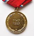


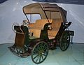


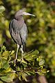

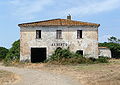


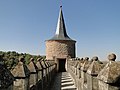


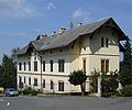
 Info New version --Pudelek 15:49, 23 February 2010 (UTC)


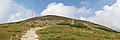
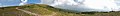


 Done --Bgag 22:12, 22 February 2010 (UTC)

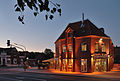

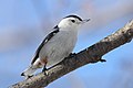


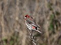


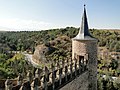


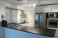

 Support There is some noise, but the central player is sharp, the motion blur is very nice and the composition works. --MichaelBueker 16:11, 19 February 2010 (UTC)
 Oppose I agree with Iotatau. Composition (crop) error, sorry --George Chernilevsky 11:07, 22 February 2010 (UTC)

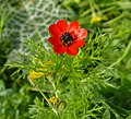


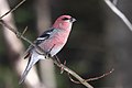


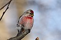


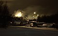


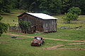

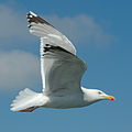


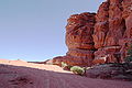


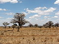


 Question Are there two dustspots? --Berthold Werner 09:54, 18 February 2010 (UTC)

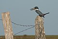


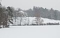


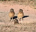


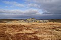
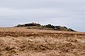


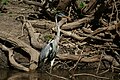


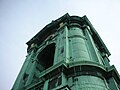


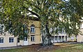


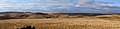


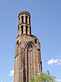

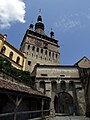


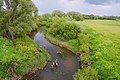


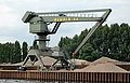


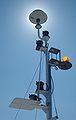


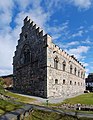


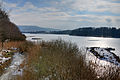

 I withdraw my nomination I'll do some retouching and think about the crop, then I will nominate a redone version. --MichaelBueker 18:54, 14 February 2010 (UTC)


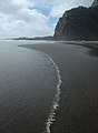


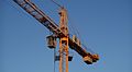


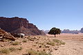


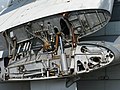
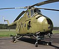

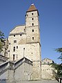
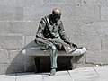


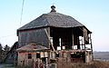

![* Nomination: Saint-Sever-de-Rustan Abbey and war memorial (Monument Historique), Hautes-Pyrénées, France -- Florent Pécassou 20:49, 4 February 2010 (UTC)]] * Review Comment A nice image. I think some perspective correction would be good. However the image, sharp in the centre, is less good on the right hand side particularly? Herby 13:50, 5 February 2010 (UTC) -- I'm not sure I can fix it with my limited photoediting skills but I will try. Florent Pécassou 08:07, 6 February 2010 (UTC)](https://upload.wikimedia.org/wikipedia/commons/thumb/3/36/Abbaye_et_monument_aux_morts_de_Saint-Sever-de-Rustan.JPG/120px-Abbaye_et_monument_aux_morts_de_Saint-Sever-de-Rustan.JPG)


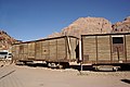


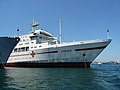

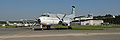


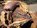


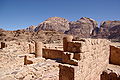
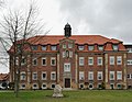

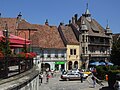


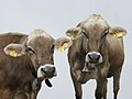
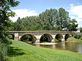

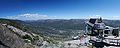


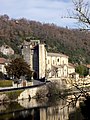
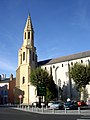
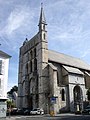
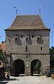


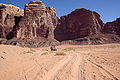


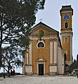


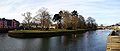


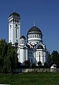


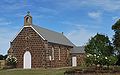


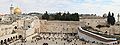


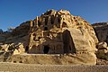


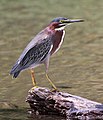
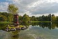


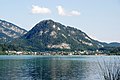

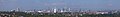

 --Herbythyme 16:30, 28 January 2010 (UTC)


.jpg)
.jpg)


.jpg)


.svg)


.jpg)
.jpg)
.jpg)


.jpg)
.jpg)


.jpg)


_(1).jpg)


.jpg)


_-_train_station.JPG)
_im_Flug_(2007).jpg)
.jpg)


.jpg)


.jpg)


.jpg)


.jpg)

.jpg)


.jpg)
.jpg)
.jpg)


_-_street.JPG)

.jpg)


.jpg)
.JPG)


_-_Clock_Tower_1.jpg)
.jpg)
.jpg)


.jpg)


.jpg)
.jpg)

.jpg)
.jpg)


.jpg)


.jpg)


.jpg)


.jpg)
_-_Clock_Tower.jpg)


.JPG)
.jpg)


.jpg)


.jpg)


.JPG)
_at_the_Cairns_Wildlife_Dome.jpg)
.jpg)
.jpg)
.jpg)


![* Nomination: Saint-Sever-de-Rustan Abbey and war memorial (Monument Historique), Hautes-Pyrénées, France -- Florent Pécassou 20:49, 4 February 2010 (UTC)]] * Review Comment A nice image. I think some perspective correction would be good. However the image, sharp in the centre, is less good on the right hand side particularly? Herby 13:50, 5 February 2010 (UTC) -- I'm not sure I can fix it with my limited photoediting skills but I will try. Florent Pécassou 08:07, 6 February 2010 (UTC)](/wiki/File:Abbaye_et_monument_aux_morts_de_Saint-Sever-de-Rustan.JPG)


.jpg)


.jpg)


.JPG)
.jpg)

.jpg)
.JPG)


.jpg)


.jpg)
_-_tower.JPG)


_Berlin-Sch%C3%B6neberg_(2008).jpg)


.jpg)

.JPG)

.JPG)


.jpg)
.jpg)
.JPG)
.jpg)


.jpg)
_-_old_building1.JPG)
_-_old_building.JPG)
.JPG)
.jpg)

.JPG)

_2.JPG)


.JPG)


_-_old_building_2.jpg)

.JPG)


_-_The_Tower_of_Tailors.JPG)
.jpg)


_-_wall_tower.jpg)
.jpg)


.jpg)

_-_The_Furriers_Tower.JPG)


_-_Church_of_Saint_Margaret_-_main_altar.jpg)

.jpg)


.jpg)


.jpg)

.jpg)


_-_World_War_I_memorial_(cath.).jpg)


.jpg)


.JPG)


.JPG)


_-_part.JPG)
.JPG)
.JPG)
.jpg)
.jpg)
.jpg)
_(2).jpg)


_-_part.JPG)
.JPG)


.JPG)
 Neutral With the latest correction I no longer oppose, and also would consider the blown sky as part of the fog - not perfect, but ok. --Leuo 14:27, 8 February 2010 (UTC)


.jpg)
.jpg)
.jpg)


_(2).jpg)
