Commons:Graphic Lab/Map workshop/Archive/2011
Problem with thumbnails[edit]
-
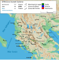 Italo-Grecian war
 -


Request: Please take a look at this file, it has some problem in making previews. Ciaurlec (talk) 16:46, 21 December 2010 (UTC)
- The same happened a second file: it search for an uncorrect location to show the file preview.Ciaurlec (talk) 21:29, 22 December 2010 (UTC)
Graphist opinion(s):
- They had annoying but minor problems of the kind that have been seen many times at Commons:Graphics village pump. They now thumbnail, but the images probably need more work to se4rve their intended purposes... AnonMoos (talk) 01:13, 3 January 2011 (UTC)
Lines appearing in SVG maps after upload[edit]
-
 SVG map of the initial stage of the Battle of Towton
 -
 Later stage of the battle


Request: There are some (3) strange faint lines streaking down the image in the left side that did not show up in Inkscape. I have no idea what are the causes for this and would appreciate any help in eliminating them. Jappalang (talk) 17:14, 3 January 2011 (UTC)
Graphist opinion(s):
![]() Done. Not sure what the problem was but I cropped all the elements hidden from the visible area and that seemed to have fixed it. --ZooFari 03:27, 5 January 2011 (UTC)
Done. Not sure what the problem was but I cropped all the elements hidden from the visible area and that seemed to have fixed it. --ZooFari 03:27, 5 January 2011 (UTC)
Problems with SVG map[edit]

Request: After uploading this map, some wierd blue circles appear, and lot of text is missing. But in Inkscape everything is perfect. -Ivan25 (talk) 10:43, 14 January 2011 (UTC)
Graphist opinion(s): Hi Ivan - I simply saved the file in Illustrator (the blue circles doesn't show up in there either), and it seems the blue circles are no longer present. The fonts were, however, problematic, and I converted it to DejaVu Sans. (Fonts are always problematic with SVG :( ) It doesn't look as nice as your original version, but I think that is as far as I can take it. If you have other suggestions please let me know. Jon C (talk) 16:20, 14 January 2011 (UTC)
Electoral boundaries during the Singapore general elections 2011[edit]

Request: Please help to remove the little black rectangle in the image. Thanks! — Cheers, JackLee –talk– 13:41, 18 April 2011 (UTC)
Graphist opinion(s):
![]() Done. The <flowroot> tag in the XML is not well supported by our thumbnailing algorithms. In this case, since the flow feature was not being used, removing it was trivial. Powers (talk) 16:00, 18 April 2011 (UTC)
Done. The <flowroot> tag in the XML is not well supported by our thumbnailing algorithms. In this case, since the flow feature was not being used, removing it was trivial. Powers (talk) 16:00, 18 April 2011 (UTC)
- That's Double Dutch to me, but thanks very much! — Cheers, JackLee –talk– 18:05, 18 April 2011 (UTC)
Map indicating location of Colombia and Indonesia[edit]
Request: Can anyone create a map indicating the location of Colombia and Indonesia similar to those used for bilateral relations between countries, thank you. Mijotoba 05:42, 30 April 2011 (UTC)
 Done Hope File:Colombia Indonesia Locator.svg is what you were after. --ELEKHHT 00:51, 28 May 2011 (UTC)
Maps of Patagonia[edit]

Request: I think these SVGs might need a bit of work ... ;-). If the files are identical, feel free to nominate one of them for speedy deletion as a duplicate. — Cheers, JackLee –talk– 06:57, 21 May 2011 (UTC)
Graphist opinion(s):
- Done. I tried to keep the author's intent as much as possible when adjusting the text labels. I also deleted the duplicate. Powers (talk) 19:39, 21 May 2011 (UTC)
- Great, thanks! — Cheers, JackLee –talk– 06:21, 22 May 2011 (UTC)
Translation of map[edit]
-
 French
 -
 English
 -
 German


| French | English | German |
|---|---|---|
| Zurich (2x) | Zurich | Zürich |
| Argovie | Aargau | Aargau |
| Lucerne | Lucerne | Luzern |
| Zoug | Zug | Zug |
| Schaffhouse | Schaffhausen | Schaffhausen |
| Saint-Gall | St. Gallen | St. Gallen |
| Thurgovie | Thurgau | Thurgau |
| Lac de Zurich | Lake Zurich | Zürichsee |
| Lac de Hallwil | Lake Hallwil | Hallwilersee |
| Lac de Pfäffikon | Pfäffikersee | Pfäffikersee |
| Lac de Türlen | Türlersee | Türlersee |
| Rhin | Rhine | Rhein |
| Aare | Aar | Aare |
| aéroport de Zurich | Zurich Airport | Flughafen Zürich |
| principales villes | principal towns | wichtige Städte |
| limite de canton | canton's frontiers | Kantonsgrenze |
| canton | canton | Kanton |
| massif montagneux | massif | Gebirgsmassiv |
| sommet | mountain | Berg |
| Projection UTM | UTM grid | UTM-System |
Request: A translation of the above map please -- 188.155.144.13 21:08, 8 June 2011 (UTC)
Graphist opinion(s):
![]() Done Translated from French map with terms in the table. Derfel73 (talk) 14:05, 12 June 2011 (UTC)
Done Translated from French map with terms in the table. Derfel73 (talk) 14:05, 12 June 2011 (UTC)
- "Thurgovie" is "Thurgau" in English (check Wikipedia article). Now added to the table. 188.155.33.184 20:48, 17 June 2011 (UTC)
Thumbnails again[edit]

Request: Do something with them...Thumbnails needs for cleaning; i probably moved text too much on left side on the legend box.Ciaurlec (talk) 22:58, 24 June 2011 (UTC)
Graphist opinion(s): Fixed by LtPowers. --ELEKHHT 23:33, 28 January 2012 (UTC)
Requested edit[edit]
Please assist File:United Nations Members.svg is one of many that needs to be amended to add South Sudan (presently, it should be greyed out, but soon it will be blue--I can do that part, but I can't "draw" the border.) Can someone assist me here? Thanks. Koavf (talk) 13:01, 11 July 2011 (UTC)
- Done Thanks. Koavf (talk) 12:19, 13 July 2011 (UTC)
Map of fertile cresent-sr.svg[edit]
-
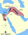 Description of image

Request: Please, remove those boxes, they should be text and/or teach me ho to to that without converting them to path. Bojan Talk 02:42, 10 September 2011 (UTC)
Graphist opinion(s):
- From Help:SVG:
- My text is appearing as little blocks, or isn't showing up at all after uploading to Commons!
if you use "Flowed Text" in Inkscape, it will render as a black rectangle. Flowed text boxes are created when you click and drag to make you text box. To avoid this, just click once to position your cursor and then type your text. To convert a flowed text box to a normal text box, go to the "Text" menu and choose "Convert to Text".
If this still doesn't work, some text features of Inkscape are not supported by MediaWiki's renderer, such as text-on-path. If you are not using flowed text and still have problem, convert the text to paths. Do this by selecting the command Path>Object to Path. This will convert the text to paths. Save as Plain SVG, and reupload your file.
--Robot8A (talk) 06:59, 14 September 2011 (UTC)
Thanks a lot. -- Bojan Talk 11:48, 14 September 2011 (UTC)
Districts affected by 2008 attacks on Christians in southern Karnataka[edit]
-
 Districts affected by 2008 attacks on Christians in southern Karnataka
 -
 Will this do?


Request: Please remove the lines from the map. Thanks! Joyson Noel Holla at me 14:36, 27 October 2011 (UTC)
- And just have a blank white image? --Fred the Oyster (talk) 14:56, 27 October 2011 (UTC)
- Pardon me, English isn't my first language. No, i meant the pointers to Mangalore city; and Dakshina Kannada, Chikkamagaluru, Udupi districts. The names are sufficient. Furthermore, please change the color of the text for districts and to a separate color for Mangalore city. Bring the names a bit closer to the highlighted districts, and in the case of Mangalore, to the city. Also, merge the map of India to it with Karnataka state highlighted. Joyson Noel Holla at me 15:10, 27 October 2011 (UTC)
Graphist opinion(s):![]() Done --Fred the Oyster (talk) 18:20, 7 November 2011 (UTC)
Done --Fred the Oyster (talk) 18:20, 7 November 2011 (UTC)
- Wonderful image, except that there is a typo. Udupi district is incorrectly written as "Udapi district". The font size should be much larger, with district names in block letters. The text for Dakshina Kannada and Udupi districts intrude on the yellow region. Also, Mangalore text is too close. It would look better just a little farther to the left. Joyson Noel Holla at me 20:56, 7 November 2011 (UTC)
- I'll correct the typo, but I shan't be writing the other captions in upper-case as it looks awful and amateurish. As I'm a professional designer I have no intention of putting my 'name' to anything that looks awful and amateurish. And "too close" is a subjective thing. You wanted the usual arrows removed, so you'll have to accept that "too close" also means leaving the reader in no doubt as to where what is. --Fred the Oyster (talk) 00:00, 8 November 2011 (UTC)
- Point of order, it wasn't a typo. "Udapi" is what is written on the original image, I just copied that. I also just noticed what you mean about Mangalore. I was looking at the original which is okay, but I see form the uploaded SVG that it's far too close so I presume that's a render bug. I'll move it further away to see if I can take the bug into account. --Fred the Oyster (talk) 00:09, 8 November 2011 (UTC)
- At least increase the font size! The names are not clear from far. By the way, Udapi's the wrong spelling. It's alternative spelling is Udipi, but the more commonly used one is Udupi. Please refer Udupi district. You have done a good job, but please correct the typo and increase the font size. Joyson Noel Holla at me 11:24, 8 November 2011 (UTC)
- I've already corrected the spelling error. As for the text size, it's meant to be readable (and proportional) at its full nominal size, not at thumbnail size. As such the text is the correct size for this image. For an image of this size to make the text readable in thumbnail form requires the full size image to have a ludicrous font size. That is what I mean about it looking amateurish. If it's a necessity to see the district names you can use the image's caption (and legend tag) on the article page to state the district names, additionally if people are interested then they can click on the thumbnail, that's what it's there for. --Fred the Oyster (talk) 13:08, 8 November 2011 (UTC)
- All right, i guess you have a point. Thanks again. Joyson Noel Holla at me 14:17, 8 November 2011 (UTC)
- I've already corrected the spelling error. As for the text size, it's meant to be readable (and proportional) at its full nominal size, not at thumbnail size. As such the text is the correct size for this image. For an image of this size to make the text readable in thumbnail form requires the full size image to have a ludicrous font size. That is what I mean about it looking amateurish. If it's a necessity to see the district names you can use the image's caption (and legend tag) on the article page to state the district names, additionally if people are interested then they can click on the thumbnail, that's what it's there for. --Fred the Oyster (talk) 13:08, 8 November 2011 (UTC)
- At least increase the font size! The names are not clear from far. By the way, Udapi's the wrong spelling. It's alternative spelling is Udipi, but the more commonly used one is Udupi. Please refer Udupi district. You have done a good job, but please correct the typo and increase the font size. Joyson Noel Holla at me 11:24, 8 November 2011 (UTC)
- Point of order, it wasn't a typo. "Udapi" is what is written on the original image, I just copied that. I also just noticed what you mean about Mangalore. I was looking at the original which is okay, but I see form the uploaded SVG that it's far too close so I presume that's a render bug. I'll move it further away to see if I can take the bug into account. --Fred the Oyster (talk) 00:09, 8 November 2011 (UTC)
- I'll correct the typo, but I shan't be writing the other captions in upper-case as it looks awful and amateurish. As I'm a professional designer I have no intention of putting my 'name' to anything that looks awful and amateurish. And "too close" is a subjective thing. You wanted the usual arrows removed, so you'll have to accept that "too close" also means leaving the reader in no doubt as to where what is. --Fred the Oyster (talk) 00:00, 8 November 2011 (UTC)
[edit]
-
 English
 -
 Spanish


Request: I would like for someone to create a map in the Spanish language.
- Translations: New Mexico -> Nuevo México
WhisperToMe (talk) 01:49, 1 November 2011 (UTC)
- Will this do? --Fred the Oyster (talk) 00:52, 2 November 2011 (UTC)
- Works for me. Thank you so much :) WhisperToMe (talk) 20:48, 5 November 2011 (UTC)
- Will this do? --Fred the Oyster (talk) 00:52, 2 November 2011 (UTC)
Regional Flights from johannesburg.png[edit]
-

-
 Done
Done


Request: There seems to be an awful lot of white space around the graphic. Can it be reduced? Also, is the file a .PNG or an .SVG? — Cheers, JackLee –talk– 11:28, 12 November 2011 (UTC)
Graphist opinion(s): The original file was an svg file incorrectly named as png, so when I tried to uploaded a corrected version the system wouldn't let me. Accordingly I created a new corrected and optimised file as per above. --Fred the Oyster (talk) 12:40, 12 November 2011 (UTC)
- Great, thanks so much. — Cheers, JackLee –talk– 15:16, 12 November 2011 (UTC)
- I've just noticed that the name of "St-Denis de la Réunion" has its n at the end cut off on the right side of the image. Can this be fixed? Thanks. — Cheers, JackLee –talk– 17:03, 16 November 2011 (UTC)
- Cheers for pointing it out, I hadn't noticed it. It isn't cut off on the original. The Wikimedia renderer has a habit of rendering text at a slightly higher point size than it should do and I hadn't taken that into account. I'll try to get it off my laptop (I just came home from shopping only to find one of my dogs had knocked the laptop on the floor then stood on the screen wrecking it, I'm having to use an old iMac at the moment and it's doing my head in!). --Fred the Oyster (talk) 17:53, 16 November 2011 (UTC)
- Oh, dear. Bad, bad dog. — Cheers, JackLee –talk– 19:04, 16 November 2011 (UTC)
- Cheers for pointing it out, I hadn't noticed it. It isn't cut off on the original. The Wikimedia renderer has a habit of rendering text at a slightly higher point size than it should do and I hadn't taken that into account. I'll try to get it off my laptop (I just came home from shopping only to find one of my dogs had knocked the laptop on the floor then stood on the screen wrecking it, I'm having to use an old iMac at the moment and it's doing my head in!). --Fred the Oyster (talk) 17:53, 16 November 2011 (UTC)
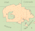
Iowa Map Colors[edit]
-
 4 Congressional districts Done
 -
 50 Iowa Senate districts
 -
 100 Iowa House districts


Request: Can I get the pale colors on this map replaced with more vibrant "map colors"? These are bad enough for folks with good eyesight, I don't even want to speculate on how they are for those with poorer eyesight. I'd rather the outline's thickness be left alone, though perhaps it could be darkened, due to the small size of some of the districts. Thanks! Philosopher Let us reason together. 00:21, 13 November 2011 (UTC)
- Come to think of it, if you can just tell me what colors to use for good "map colors," I can actually change the map myself, as I did with the election result version. I'm afraid I'm useless when it comes to choosing colors or when it comes to understanding how hex codes translate into colors. --Philosopher Let us reason together. 00:28, 13 November 2011 (UTC)
- It's not that the colours aren't vibrant, it's the fact that the original artist has decided to reduce the opacity of the map so that it's semi transparent. Strange choice, but there ya go, that's people for ya! --Fred the Oyster (talk) 00:46, 13 November 2011 (UTC)
- Oops, just spotted that you were the original artist. Heheheheh. --Fred the Oyster (talk) 00:49, 13 November 2011 (UTC)
- I think the colors were generated by a weird tool I used to change the .kml file into a .svg. *sigh* In any case, but is there a standard set of map colors I can use to replace them when I restore the opacity setting? --Philosopher Let us reason together. 00:53, 13 November 2011 (UTC)
- Oops, just spotted that you were the original artist. Heheheheh. --Fred the Oyster (talk) 00:49, 13 November 2011 (UTC)
- It's not that the colours aren't vibrant, it's the fact that the original artist has decided to reduce the opacity of the map so that it's semi transparent. Strange choice, but there ya go, that's people for ya! --Fred the Oyster (talk) 00:46, 13 November 2011 (UTC)
Graphist opinion(s):Sometimes it's easier to do it than explain it :) Meanwhile I'm off to bed, so have a look at the source code of the one I just did and you should be able to see the colours. Incidentally, an easy rule of thumb for figuring out what colours equate to hex values is the remember that the first 2 characters equate to the red value in hexadecimal (where ABCDEF equate to 10-16), the second 2 are the green values and the last two are the blue values, so if the first two characters are higher than the other two pairs then the colour is a shade of red, or has a lot of red in it. Likewise for all the others. Have fun :) --Fred the Oyster (talk) 01:06, 13 November 2011 (UTC)
![]() Done Thanks. --Philosopher Let us reason together. 10:46, 13 November 2011 (UTC)
Done Thanks. --Philosopher Let us reason together. 10:46, 13 November 2011 (UTC)
- I see you just "optimised" the images, reducing their file size by a lot. I was just wondering what that meant? I also noticed that it seems to have broken the House file. It gives the following message when clicking on the image, "This page contains the following errors: error on line 119 at column 125: Namespace prefix kml2svg for originalId on path is not defined Below is a rendering of the page up to the first error.." --Philosopher Let us reason together. 13:42, 13 November 2011 (UTC)
- Sorry about that, I've just sorted it. The problem was caused by leaving in 10 instances of kml2svg tags whilst I was optimising by hand. I did a regex search and replace but forgot that 1-9 and 100 didn't have 2 characters. Duh. I can only insist it was Sunday morning lethargy. By the way, for future use, when you reset the opacity of the fill back to normal you forgot to also do the stroke. Right, now for a spot of lunch and then some proper work. --Fred the Oyster (talk) 13:57, 13 November 2011 (UTC)
- Cool, thanks! --Philosopher Let us reason together. 21:16, 14 November 2011 (UTC)
- Sorry about that, I've just sorted it. The problem was caused by leaving in 10 instances of kml2svg tags whilst I was optimising by hand. I did a regex search and replace but forgot that 1-9 and 100 didn't have 2 characters. Duh. I can only insist it was Sunday morning lethargy. By the way, for future use, when you reset the opacity of the fill back to normal you forgot to also do the stroke. Right, now for a spot of lunch and then some proper work. --Fred the Oyster (talk) 13:57, 13 November 2011 (UTC)
Karnataka map[edit]
-
Districts of Karnataka affected by the 2008 attacks on Christians.
Request: Please rename "Karnataka State" in this image to "Karnataka". It is understood that Karnataka is a state. Also, that's not its official name. Joyson Noel Holla at me 18:31, 8 December 2011 (UTC)
Graphist opinion(s): ![]() Done For future reference though, text changes like that can most times be done by loading the file into a text editor and doing a search and replace. It all depends on whether the text has been converted to outlines. In this case I hadn't outlined any of the text. --Fred the Oyster (talk) 22:32, 8 December 2011 (UTC)
Done For future reference though, text changes like that can most times be done by loading the file into a text editor and doing a search and replace. It all depends on whether the text has been converted to outlines. In this case I hadn't outlined any of the text. --Fred the Oyster (talk) 22:32, 8 December 2011 (UTC)
- Thanks for the info! Good job! Joyson Noel Holla at me 16:19, 9 December 2011 (UTC)
resolve svg rendering errors; extract x-y imagemap coordinates for states/territories[edit]
-
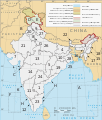 A clickable map of India exhibiting its states and territories.

Request:
- I've just made this after adapting an svg map by Planemad (talk · contribs)/Nichalp (talk · contribs)--see image page for details. I've been getting errors when I test File:Political map of India EN.svg at COM:SVG Check--font errors, etc: "you have a trailing space in one of your attributes"; "appear to have specified a font that does not exist". Switching fonts back and forth has not resolved them.
I've also been trying to extract x-y coordinates for the states and territories for use in en:Template:Indian States Image Map, so that one can click state-shaped polygons rather than just rectangular boxes. I tried using [Inkscape Map], tried exporting the coordinates with an Inkscape extension (couldn't find the ".inx" folder in my directory), etc.
For a given state/UT in the maps this work is derived from, the polygon path corresponds to the real-life border maybe in 50% of the nodes--the other nodes are positioned in a hack-like non-precise manner and depends on these portions being concealed by state/UT objects layered above those portions. Maybe that is the problem--I'm not sure ... Thanks.Saravask (talk) 22:43, 21 December 2011 (UTC)
Graphist opinion(s): As far as the image map coordinates goes, have you tried the inline ImageMapEdit tool, just for such occasions as this? --Fred the Oyster (talk) 02:45, 22 December 2011 (UTC)
- Font: I ran SVG Check on your Verdana version and it rendered without errors. I then tweaked letter spacing, put italics on water bodies, etc, while keeping the font Verdana--SVG Check gave the same errors I was getting before I posted here. I checked all the labels, and Inkscape is showing that they are all still Verdana, so I don't understand why the "[a]llowable types are serif, sans-serif, cursive, fantasy and monospace" and "you have a trailing space in one of your attributes" warnings. I also tried the W3C Markup Validator and got three errors in the XML:
- "Line 2, Column 33: there is no attribute "class""
- "Line 332, Column 10: end tag for "ul" which is not finished"
- "Line 357, Column 10: end tag for "ul" which is not finished"
- So maybe this is an Inkscape issue? I have little clue what's going on ...
- Imagemap: No, I didn't know about or try ImageMapEdit yet--of course I'll use that as a last resort, because I thought there were fully automated ways to get the border coordinates.
I've been trying to find where the Inkscape extensions directory is located in OS X Lion.I tried your error-free Verdana version in InkscapeMap and it again failed to load: "Error in file parsing: java.lang.NumberFormatException: For input string: "1594px"". Again, this suggests that Inkscape is messing up/corrupting the XML data formatting or something.
- Imagemap: No, I didn't know about or try ImageMapEdit yet--of course I'll use that as a last resort, because I thought there were fully automated ways to get the border coordinates.
- I'm wondering if you can again remove the font/formatting errors or know why the errors are being generated. Again, thanks for your help. Saravask (talk) 10:55, 22 December 2011 (UTC)
- Update: I'm able to export lists of x-y coords from Inkscape, so the imagemap coords issue is resolved. I'm still not sure about the font/attribute rendering errors. I've been told by Planemad on en-wiki that Nichalp's svg (on which this is based) is fundamentally flawed. Saravask (talk) 15:23, 22 December 2011 (UTC)
- It's definitely an issue with Inkscape, after all it is basically crap and is only used because it's the only free alternative to Illustrator and CorelDraw. I vaguely remember sorting out the text problems of one of the two base images you used, which again was caused by Inkscape. Have you looked at the file in a text editor (which displays line numbers) to see what the errors actually are based on the list of errors produced by SVG check? I think you'll find that all the errors relate to Inkscape's own tags rather than the official SVG tags. Additionally sometimes you can sort out text related problems by sorting out the way the font type is referred to, eg "'verdana'" should be changed to "verdana", ie removing the sinngle apostrophe pair. When I get a min I'll have a nosey in the code to see if I can see anything semi-obvious. The internals of SVG aren't really my speciality but sometimes what I do know is enough :) . --Fred the Oyster (talk) 20:38, 22 December 2011 (UTC)
- Update: I'm able to export lists of x-y coords from Inkscape, so the imagemap coords issue is resolved. I'm still not sure about the font/attribute rendering errors. I've been told by Planemad on en-wiki that Nichalp's svg (on which this is based) is fundamentally flawed. Saravask (talk) 15:23, 22 December 2011 (UTC)
- Just as a courtesy (so that no one goes through the XML code), I will redo this map, basing it off of File:India disputed areas map.svg instead. I do have Illustrator 5.1, so I'll use it instead of Inkscape--I didn't know that Inkscape messed up the code and made it invalid. Regards. Saravask (talk) 13:24, 24 December 2011 (UTC)
Kagawa prefecture[edit]

Request: sample only above, all maps in series have same error, Mitooy needs to be Mitoyo... Kintetsubuffalo (talk) 17:45, 9 October 2010 (UTC)
Graphist opinion(s): You may want to talk to DanGarb (original uploader). If he does the fix, he can replace the existing version and all changes are automatically propagated. If one of us others do that, there will be an additional task of chasing down the loose ends. Jon C (talk) 06:17, 28 December 2010 (UTC)
![]() Done, I've uploaded it in the existing version, so there's no problem. --Robot8A (talk) 17:41, 1 November 2011 (UTC)
Done, I've uploaded it in the existing version, so there's no problem. --Robot8A (talk) 17:41, 1 November 2011 (UTC)
- Wow, thank you for catching that, and for pinging me!--Kintetsubuffalo (talk) 22:46, 1 November 2011 (UTC)
- And I did the rest of 'em (optimised them too while I was at it)! --Fred the Oyster (talk) 00:14, 2 November 2011 (UTC)
- Thank you Fred!--Kintetsubuffalo (talk) 12:01, 2 November 2011 (UTC)
3 problems[edit]

Request: Half toponyms can not be seen when the image is shown in thumbnail. Caption at the top also breaks out of borders, and black rectangle should be removed. Bojan Talk 06:30, 14 January 2011 (UTC)
Graphist opinion(s):
GreaterManchesterNumbered.png[edit]
-
 SVGification of this image.... 1 with and 1 without the numbers please
 -
 1 without numbers
 -
 2 numbered


Request: SVGification of this image.... 1 with and 1 without the numbers please 86.185.121.180 23:38, 16 October 2011 (UTC)
Graphist opinion(s):
![]() Request taken by -- πϵρήλιο ℗:
Request taken by -- πϵρήλιο ℗:![]() Done Any feedback, good or not? -- πϵρήλιο ℗ 23:32, 28 October 2011 (UTC)
Done Any feedback, good or not? -- πϵρήλιο ℗ 23:32, 28 October 2011 (UTC)
Mid-Atlantic map[edit]
-
 1883 map of the Mid-Atlantic states

Request: There is an odd scanning or stitching artifact running horizontally from just under the "K" in "LAKE ONTARIO" to the righthand edge of the image. This artifact appears to have shifted the underlying graphics to the right a few pixels. Moving it to the left and neutralizing the color would make words like "Oswego" and "Lockport" more readable. It'd be nice if this could be done losslessly. Powers (talk) 00:50, 17 October 2011 (UTC)
- Wouldn't hurt to remove the vertical black line on the right side, either. =) Powers (talk) 00:53, 17 October 2011 (UTC)
- Just trying to make sure this request doesn't get lost. Powers (talk) 01:18, 19 December 2011 (UTC)
Graphist opinion(s):
![]() Done--McZusatz (talk) 23:14, 3 January 2012 (UTC)
Done--McZusatz (talk) 23:14, 3 January 2012 (UTC)
- Thanks, that's much improved! Do you think you could extend the fix westward a bit to catch the "Lockport" text? It looks like that could benefit as well. Powers (talk) 03:39, 5 January 2012 (UTC)
- Ooh, missed that one... --McZusatz (talk) 12:24, 5 January 2012 (UTC)
- Fantastic, thanks so much. Powers (talk) 21:42, 5 January 2012 (UTC)
Remove cities from map[edit]


Request: This map shows an organization's presence in certain cities in the USA, plus "prospects for future growth." It's just pure speculation that the organization will grow to those areas. Would someone please remove the "prospects" from this map?GrapedApe (talk) 13:17, 29 December 2011 (UTC)
Graphist opinion(s):
![]() Done
Done
Soviet Atlas scans need combining[edit]
-
Northern half of European USSR map
-
Southern half of European USSR map
-
Merging done.
Request: I'm working on scanning an old Soviet Atlas. Some of the maps are on fold-out pages and are way too big for any scanner I have access to. I've scanned these in pieces, and I think the final answer is for them to be pieced together. A basic example involves the two images above here: a "northern" and a "southern" half. What's the best way to approach "merging" such images back into single maps? Would someone be able to merge them carefully? Should I be scanning them differently? Is an altogether different approach called for? —Firespeaker (talk) 10:16, 20 June 2011 (UTC)
Graphist opinion:
![]() Request taken by Fred the Oyster
Request taken by Fred the Oyster ![]() Done
Done
- Thanks, looks wonderful! I'd also like the following done:
-
Right part of the World Map
-
Left part of the World Map
-


- and
-
USSR map (NE)
-
USSR map (NW)
-
USSR map (SW)
-
USSR map (SW - alternate scan)
-
USSR map (SW - another alternate scan)
-
USSR map (SE)
- and
-
R.S.F.S.R. map (NW)
-
R.S.F.S.R. map (NE)
-
R.S.F.S.R. map (E)
-
R.S.F.S.R. map (SE)
-
R.S.F.S.R. map (SW)
-
R.S.F.S.R. map (W)
-
R.S.F.S.R. map (WNW)
- —Firespeaker (talk) 20:19, 24 December 2011 (UTC)
- ammended by Firespeaker (talk) 21:58, 18 March 2012 (UTC)
- This section was archived on a request by: Goran tek-en (talk) 18:08, 10 January 2014 (UTC)
Map of Simpang New Town, Singapore[edit]
-
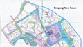 Top portion
 -
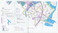 Bottom portion
 -
 Meged image Done


.png)
.jpg)
.jpg)
.jpg)
.jpg)
.jpg)
.jpg)
.jpg)
.jpg)
.jpg)
.jpg)
.jpg)
.jpg)
.jpg)
.jpg)
.jpg)
.jpg)
.jpg)
.jpg)
Request: Can these two maps be combined to make a single map? — Cheers, JackLee –talk– 11:23, 18 July 2011 (UTC)
Graphist opinion(s): The two halves are very imprecisely scanned; fitting them together will require some stretching and squashing I'm afraid. Powers (talk) 23:14, 18 July 2011 (UTC)
- No worries, then. I spotted the map and thought it was odd that it was in two halves. I suppose it was too large for the uploader's scanner. — Cheers, JackLee –talk– 06:59, 19 July 2011 (UTC)
![]() Request taken by Fred the Oyster
Request taken by Fred the Oyster
![]() Done
Done
- Hey, that's great! Thanks. (Is it my imagination that the map looks slightly rotated anticlockwise, maybe about 1 or 2 degrees?) — Cheers, JackLee –talk– 17:27, 24 August 2011 (UTC)
- Yes it is. Something had to be horizontal so I chose the latitude lines for the job :) --Fred the Oyster (talk) 17:36, 24 August 2011 (UTC)
- Ah. Maybe some cropping around the edges would eliminate that issue? Just a suggestion. — Cheers, JackLee –talk– 17:47, 24 August 2011 (UTC)
- I deliberately didn't crop anything simply because it's so unsymmetrical. Instead I chose to fill in the 'missing bits with white, though if you think a crop would improve things I'll certainly have a try. --Fred the Oyster (talk) 19:08, 24 August 2011 (UTC)
- Well, give it a shot and see how it looks (no need to upload it if it doesn't turn out well). Looking at the image again, I see that it might be difficult to crop it without losing illustrated parts of it. — Cheers, JackLee –talk– 19:15, 24 August 2011 (UTC)
- I deliberately didn't crop anything simply because it's so unsymmetrical. Instead I chose to fill in the 'missing bits with white, though if you think a crop would improve things I'll certainly have a try. --Fred the Oyster (talk) 19:08, 24 August 2011 (UTC)
- Ah. Maybe some cropping around the edges would eliminate that issue? Just a suggestion. — Cheers, JackLee –talk– 17:47, 24 August 2011 (UTC)
- Yes it is. Something had to be horizontal so I chose the latitude lines for the job :) --Fred the Oyster (talk) 17:36, 24 August 2011 (UTC)
- This section was archived on a request by: Goran tek-en (talk) 18:06, 10 January 2014 (UTC)