Commons:Graphic Lab/Illustration workshop/Archive/2010

Signatures into SVG[edit]
Note: This request was moved from the Images to improve or create to the Illustration workshop.
Article(s):Kim Pizzingrilli & Albert Belan & James J. Rhoades
Request: Is someone able to retrace these into SVG format? Blargh29 (talk) 06:55, 14 December 2009 (UTC)
Graphist opinion(s):
- I'll get to it right away. Connormah (talk) 23:51, 14 December 2009 (UTC)
- I have done the below and I'll work on a few. --The New Mikemoral ♪♫ 05:42, 19 December 2009 (UTC)

- New trick: If you tag an image with {{Convert to SVG|signature}}, then it is placed into this category Category:Signature images that should use vector graphics. --Blargh29 (talk) 19:41, 21 December 2009 (UTC)
- I'm going to redo the ones done above. Autotraced signatures lose details. Connormah (talk) 21:04, 24 December 2009 (UTC)
NASA TV[edit]
-
 NASA TV logo
 -
 Tracing by Ivan Akira

.png)
Request: Requesting a cleanup of the NASA TV logo, since the current options are either a black background (not optimal for Wiki display) or very jagged borders (where it was converted from black background). If it can be converted to SVG, that's fantastic, but if the current PNG can simply be cleaned up, that would be good also. Thanks! — Huntster (t @ c) 02:44, 20 December 2009 (UTC)
Graphist opinion:
- I think I could take this request. But, does NASA permit us to have a derivation work from that image? I'm just concern even the license tell us that we can. Oh yeah... maybe I will trace the image from that image, if it's permitted. Ivan Akira (talk) 12:54, 2 January 2010 (UTC)
- Images from NASA are in the public domain as it is a U.S. Government entity, with only the main NASA "meatball" (big blue ball with red halo) having any restrictions. So you are free to do anything you wish to this image. Thanks for trying this request :) — Huntster (t @ c) 18:05, 2 January 2010 (UTC)
 Request taken by Ivan Akira: Okay. Btw, the File:NASA TV.png is actually not a PNG image file, but it is JPG image file... So I will recreate the image and export it to proper PNG file and upload over, okay? Ivan Akira (talk) 03:09, 3 January 2010 (UTC)
- Do whatever you need to do. I would recommend, however, taking the original black background and going from there. Might be easier to make the transparent background that way rather than working through the pixelation that came with the conversion to white background. BTW, how could you tell it was a JPG converted to PNG format? (I only did that to avoid evil JPG compression.) — Huntster (t @ c) 05:45, 3 January 2010 (UTC)
- Oooh... when I try to open the latest version of that image, Photoshop and Flash keep telling me that the image format is invalid, therefore it can't be loaded to the editor. So I tried to rename the file to other common image extension such as GIF, BMP, and finally I came to JPG. That's why I can tell that actually that is a JPG file. Ivan Akira (talk) 07:18, 3 January 2010 (UTC)
 Done I'm already upload two version of the logo, first at File:NASA TV.png and File:NASA TV (Tracing).png. Please take a look, and choose which logo is better for you. And I'm terribly sorry if my tracing is not as good as a professional. Ivan Akira (talk) 07:41, 3 January 2010 (UTC)
- Thank you Ivan. While the tracing version does lack the 3D qualities of the original, it makes up for it with the simple crispness of the new version. Very good! Regarding the PNG/JPG issue, that's interesting and indicates that something was changed between version 1 and version 2 that turned it into a PNG wrapped JPG rather than a straight PNG file, which the original one was. Learn something new all the time. — Huntster (t @ c) 10:29, 3 January 2010 (UTC)
- Nice to hear it. And yes, the traced version does lack of 3D quality, even I can tell that after finishing the job, hohoho... And, if you want better quality logo, how about waiting for other Wikigraphist to try on this request (which means re-opening this request)? Ivan Akira (talk) 11:07, 3 January 2010 (UTC)
- Oh, I'm not that concerned about it. I'm just happy for some progress, hehe. Thanks again Ivan! — Huntster (t @ c) 17:33, 3 January 2010 (UTC)
- Ooh, Ok then... Ivan Akira (talk) 23:27, 3 January 2010 (UTC)
- Oh, I'm not that concerned about it. I'm just happy for some progress, hehe. Thanks again Ivan! — Huntster (t @ c) 17:33, 3 January 2010 (UTC)
Coversion to vectors[edit]
-
 A nice, "collective justice" icon
 -
 svg
svg


Request: Would someone with SVG-fu be kind enough to make a vector version of this image? I was fishing desperately for something ArbCom-ish, that wasn't plain scales and this popped up as eminently adequate. Coren (talk) 20:40, 22 December 2009 (UTC)
Graphist opinion(s): My try --Justass (talk) 00:37, 26 December 2009 (UTC)
- Danke schoen. Exactly what the doctor ordered. :-) Coren (talk) 04:58, 30 December 2009 (UTC)
Signature of J. D. Salinger into SVG[edit]
-

-
 new
new
Request: This signature of J. D. Salinger would be great in a vector version. Any takers? Blargh29 (talk) 03:56, 22 January 2010 (UTC)
Graphist opinion(s):
This just seems to have too little information. It's too low res. ¦ Reisio (talk) 01:33, 30 January 2010 (UTC)
- Can try to trace from here or here --Justass (talk) 01:53, 30 January 2010 (UTC)
- Yeah, those seem like better candidates.--Blargh29 (talk) 06:41, 30 January 2010 (UTC)
- Done How does this look? Connormah (talk) 01:32, 10 February 2010 (UTC)
- Looks great!--Blargh29 (talk) 01:46, 10 February 2010 (UTC)
- Yeah, those seem like better candidates.--Blargh29 (talk) 06:41, 30 January 2010 (UTC)
Israeli Air Force Ensign[edit]

Request: The colours are inaccurate according to actual flags I have seen in use, such as 11 and 22. I contacted the creator Reuvenk over a month ago and there have been no replies on either of our pages, so I decided to request it here.
I'd like to suggest for proper colours, that you use for the roundel and stripes the shade of blue used in IAF Roundel, and for the lighter blue of the field, you use the blue from Israeli Army Flag
Fry1989 (talk) 22:04, 2 March 2010 (UTC)
Graphist opinion(s):
- Done Sodacan (talk) 23:24, 2 March 2010 (UTC)
Thanks mate! :D Fry1989 (talk) 02:13, 3 March 2010 (UTC)
Flag Request[edit]

Request: Convert to .svg. I think this flag has no copyright restrictions. Bojan Talk 05:17, 7 March 2010 (UTC)
Graphist opinion(s): Not sure what that filename should be, but it's made. Just let me know where it should be uploaded. --NikNaks93 (talk) 13:43, 7 March 2010 (UTC)
- Thank You very much. I propose name File:Flag of East Sarajevo.svg. -- Bojan Talk 08:35, 8 March 2010 (UTC)
- Done. See the file ;) --NikNaks93 (talk) 19:22, 8 March 2010 (UTC)
Nice work. Thanks again. -- Bojan Talk 04:42, 9 March 2010 (UTC)
![]() Request taken by NikNaks93
Request taken by NikNaks93
![]() Done
Done
Governor's Standards[edit]
-
 California's Governor
 -
 Kansas' Governor


Request: Please recreate in SVG. The Standard for California, the seal needs a bit of work (there is an illistration of the actual flag HERE) but other then that, there shouldn't be a problem. Kansas' Standard simply needs to be made in SVG, no re-drawing should be neccesary.
I will make requests for the other Gubernatorial Standards when these three are complete. Thank you to whomever takes this on. Fry1989 (talk) 23:08, 13 February 2010 (UTC)
Graphist opinion(s): ![]() Request taken by Beao and I've done two. --Beao 10:33, 14 February 2010 (UTC)
Request taken by Beao and I've done two. --Beao 10:33, 14 February 2010 (UTC)
Coat of arms of the People's Republic of Macedonia[edit]
-
 the PNG
 -
 the SVG that already exists

.svg)
Article(s): w:Coat of arms of the Republic of Macedonia
Request: Please vectorize. Connormah (talk) 04:13, 18 October 2009 (UTC)
- there's already a vector version of this CoA linked to the file itself, idk why we'd need two. Fry1989 (talk) 00:40, 3 March 2010 (UTC)
Graphist opinion(s):
Nucleus[edit]


Request: Vectorize. Connormah (talk) 05:25, 20 February 2010 (UTC)
Graphist opinion(s):
![]() Request taken by Andrew c: when you accept the request ;
Request taken by Andrew c: when you accept the request ;
![]() Done: -Andrew c (talk) 17:52, 23 March 2010 (UTC)
Done: -Andrew c (talk) 17:52, 23 March 2010 (UTC)
SVG request[edit]
-
 Rabindranath Tagore's signature
 -
 SVG
SVG
Request: Please clear the ash colored spots in the bottom, as well as vectorized it. Make the background transparent. If you need additional info, let me know. Thank you in advance. Tanvir 09:18, 22 March 2010 (UTC)
Graphist opinion(s):
- Too low res. ¦ Reisio (talk) 16:20, 22 March 2010 (UTC)
- I'll give it a shot. Connormah (talk) 23:16, 22 March 2010 (UTC)
- Done - how does that look? Connormah (talk) 23:32, 22 March 2010 (UTC)
- In short, great! Tanvir 10:46, 23 March 2010 (UTC)
Flags need SVG[edit]
-
 Nevada's Governor
 -
New York's Governor
-
 Texas' Governor


-
 Governor of Nevada.svg
 -
 Governor of New York.svg
 -
 Standard Of Governor Of Texas.svg


Request: Pleasre recreate these in SVG. There is already SVG components, so work should be easy. For all three you can use this flag for the base, and all three, including New York's follow this ratio. As my PNGs are not 100% accurate(I did my best)in the size and placement of the stars, you can check their discription for links to FOTW to be exact.
For Nevada, it's basically a centering of the canton emblem from the state flag SVG The four stars in the corner
For New York, it's just the State Flag, with the addition of four stars, one in each corner, and the shorter ratio.
For Texas, it has the State Seal in the centre of the flag. This is the version I I request you use, and I also ask that you KEEP a small white ring between the much lighter Seal and the darker blue of the flag(as in my PNG version). Fry1989 (talk) 21:48, 11 March 2010 (UTC)
Graphist opinion(s): I'm just beginning to learn my way around Inkscape, but I've done New York. I hope that works. Wine Guy (talk) 00:24, 14 March 2010 (UTC)
- That's great mate, though if someone could just remove the black border from the stars? Texas' will need a professional though. Fry1989 (talk) 00:42, 14 March 2010 (UTC)
- Star borders gone now, I hadn't noticed that earlier. Wine Guy (talk) 01:08, 14 March 2010 (UTC)
- THUMBS UP MATE! :D Fry1989 (talk) 01:10, 14 March 2010 (UTC)
- Star borders gone now, I hadn't noticed that earlier. Wine Guy (talk) 01:08, 14 March 2010 (UTC)
- That's great mate, though if someone could just remove the black border from the stars? Texas' will need a professional though. Fry1989 (talk) 00:42, 14 March 2010 (UTC)
Working on Nevada now, but must take a break. I'll have it done a bit later tonight. Glad the NY one came out well, this is a good learning experience. Wine Guy (talk) 02:51, 14 March 2010 (UTC)
- Nevada took a bit more work than I anticipated. The colors looked odd, so I found the Nevada statute [11] which describes the state flag; the color of the scroll, and the word "Nevada" are supposed to be golden yellow, and the star is silver. I made several other adjustments to the canton as well, although the lettering could probably still use a touch-up from someone who knows what they're doing. Since the state flag used the same persimmony-orange color and a too-dark shade of blue, I fixed that up as well. Wine Guy (talk) 10:55, 14 March 2010 (UTC)
- I'll attempt Texas'. Connormah (talk) 22:52, 14 March 2010 (UTC)
- Done. Connormah (talk) 23:17, 14 March 2010 (UTC)
- Thanks so much guys, this is excellent!!! Fry1989 (talk) 23:48, 14 March 2010 (UTC)
Flags[edit]
-
 Massachusetts' Governor
 -
 Done
Done -
 Done
Done -
 Done
Done


Request: I have three more Governor's Standards to request. These are the last 3 easy ones, there's three others after that, but they'll need more work so I'll request them at a later date.
Massachusetts' is a pennant form of the current State Flag, it'll need transparency and a thin border to distinguish it as a pennant.
Michagan's is the State Flag, but with the background changed from blue to white.
Puerto Rico's is the Commonwealth's Coat of Arms on a white field.
Thanks in advance Fry1989 (talk) 21:12, 19 March 2010 (UTC)
Graphist opinion(s): I'll have this done in a few minutes NikNaks93 (talk) 17:48, 20 March 2010 (UTC)
![]() Request taken by NikNaks93
Request taken by NikNaks93
![]() Done
Done
Thanks so much mate :) Fry1989 (talk) 18:18, 20 March 2010 (UTC)
SVG help please, 2 of 3 objects disappearing in thumbs[edit]
![]()
-
 Igloo logo.svg thumb
Request: This is really starting to bug me, because I'm fairly certain that there is an easy and obvious fix for this; I just haven't figured out what it is. There are 3 objects in the svg: a light blue "hump", a greenish-blue that covers the left and top, and a darker blue front with a linear gradient. The full size image looks fine, but when thumbnailed only the dark blue front appears. I've tried everything I can think of. Any ideas? Thanks. Wine Guy (talk) 06:42, 15 March 2010 (UTC)
Graphist opinion(s): Gave it a go, have no idea what's going on, I think it's wiki commons and not the file that is at fault though, 2/3 of the way there at least! Sodacan (talk) 19:42, 15 March 2010 (UTC)
- 2 out of 3 is definitely better than 1! And I agree, I think the problem is with how the wiki handles svg's made in inkscape. I thought saving as a "plain" svg would help, but apparently not. I just don't know enough about the issue to fix it. Thanks very much for your help. Wine Guy (talk) 21:56, 15 March 2010 (UTC)
- Wine Guy, is the blur necessary? Blurring values are one thing that bugs the Wiki software. ZooFari 22:39, 15 March 2010 (UTC)
- Ah, I didn't realize that could be a problem. The blur is definitely not necessary if it causes problems with rendering. I'll keep that issue in mind in the future; as I mentioned in the flag thread above I'm just beginning to figure out inkscape and how to make svg's work on wiki. The more I learn, it seems that simpler may be better. The help is much appreciated. Wine Guy (talk) 23:40, 15 March 2010 (UTC)
- It looks like removing the blur worked. I never would have figured that out; thanks again to you both. Wine Guy (talk) 23:51, 15 March 2010 (UTC)
- Ah, I didn't realize that could be a problem. The blur is definitely not necessary if it causes problems with rendering. I'll keep that issue in mind in the future; as I mentioned in the flag thread above I'm just beginning to figure out inkscape and how to make svg's work on wiki. The more I learn, it seems that simpler may be better. The help is much appreciated. Wine Guy (talk) 23:40, 15 March 2010 (UTC)
Ladies' smoking area[edit]


Request: Please render these both in pink... Kintetsubuffalo (talk) 03:59, 14 March 2010 (UTC)
Graphist opinion(s): What are these actually for? It's easy enough to do, but pointless if there's no relevant article. NikNaks93 (talk) 16:58, 18 March 2010 (UTC)
- They are signs used here in Japan, I don't yet know why they make the separation, but they will be for the en:Smoking in Japan article. --Kintetsubuffalo (talk) 03:07, 19 March 2010 (UTC)
- Any pink you had in mind? ZooFari 03:29, 19 March 2010 (UTC)
- Hex triplet #FC0FC0
- RGB (r, g, b) (252, 15, 192)
- HSV (h, s, v) (315°, 94%, 99%)
- I didn't know which format you prefer. --Kintetsubuffalo (talk) 18:44, 19 March 2010 (UTC)
- Done see above. ZooFari 23:52, 19 March 2010 (UTC)
- Thank you so much, those are great! A vectorized black version of File:Smoking pictogram.JPG should be attempted someday, but for my purposes I don't need it. --Kintetsubuffalo (talk) 06:29, 21 March 2010 (UTC)
Watermark removal[edit]
-
 Title page of Robert Hues, Tractatvs de Globis Coelesti et Terrestri eorvmqve vsv (1634)

Request: Can the watermark added by the National Library of Portugal be removed? — Cheers, JackLee –talk– 09:31, 23 February 2010 (UTC)
Graphist opinion(s):
![]() Request taken by Nesnad: Not sure if this is a
Request taken by Nesnad: Not sure if this is a ![]() Done or not, because it isn't perfect. But I also recognize that watermarks are against policy (thus I overwrote the original) and tried to defuse the current watermark. I hope this is a good start, it's a lot harder to see now. Cheers! Nesnad (talk) 17:58, 25 February 2010 (UTC)
Done or not, because it isn't perfect. But I also recognize that watermarks are against policy (thus I overwrote the original) and tried to defuse the current watermark. I hope this is a good start, it's a lot harder to see now. Cheers! Nesnad (talk) 17:58, 25 February 2010 (UTC)
- Thanks very much. It's definitely an improvement. Will you be attempting to remove the rest of the watermark? — Cheers, JackLee –talk– 04:30, 26 February 2010 (UTC)
- Did my try --Justass (talk) 01:57, 3 March 2010 (UTC)
- Thanks. Can the grey circle and other grey bits in the bottom right-hand corner be removed, though? — Cheers, JackLee –talk– 04:11, 3 March 2010 (UTC)
- Brilliant, it's been fixed. Thanks very much to all editors who helped. — Cheers, JackLee –talk– 04:42, 19 March 2010 (UTC)
Flags[edit]
-
Pennsylvania (missing banners)
-
 Vector
 -
 Rhode Island
 -
 Vector
 -
 Vector


Request:These are the last of the Governor's flags that should be in SVG (except for 2 others not on here, that I will request at a later date). I have saved these for last as they will take some effort, and I really do appreciate whomever can give their time and talents to this.
Pennsylvania's I have put first, as I figure it may be the easiest. It is the State Flag, but with a white field. Above the Arms is a banner saying "The Governor", and below the arms a banner saying "Commonwealth Of Pennsylvania". The flag appears to also be in the ratio of 1:2, and an image of the flag can be seen HERE. The bottom banner appears to be extremely similar to the one of North Dakotaa's Flag, I hope that can help in creating it.
Rhode Island's follows the design of the 1936 Vice-President's Flag, but with the state's Coat of Arms in the centre, also in it's original resolution.
Tennessee's follows the Secretary of the Army's Flag, but with the same ratio as Rhode Island's. It has the State Military Crest in the center, which is partially stretched, it appears. The part that the Tree "stands" upon, is very similar to the one in this Flag, so I bet it could be editied and used for this.
Again, thank you to those who can take this on. Fry1989 (talk) 01:29, 5 April 2010 (UTC)
Graphist opinion(s): I'll have a go at Tennessee, and if it goes well, Rhode Island. NikNaks93 (talk) 09:54, 5 April 2010 (UTC)
- T done. Moving onto RI. I've noticed that I've given it the dimensions of the Tennessee state flag, not the Rhode Island standard, but I'll come back to that. NikNaks93 (talk) 10:28, 5 April 2010 (UTC)
- Those two are done. I'll work on another if there are no other takers by this afternoon. NikNaks93 (talk) 11:33, 5 April 2010 (UTC)
- Okay, I'll try Pennsylvania's. NikNaks93 (talk) 14:44, 5 April 2010 (UTC)
- Three down. Alabama's will require the most work. A good vector image of the coat of arms is a must, but, as with the arms of Nunavut from earlier on this page, the only copy is on a paysite. Someone more experienced will have to tackle that, as it's a little beyond my capabilities. NikNaks93 (talk) 15:40, 5 April 2010 (UTC)
I understand. If someone on here can tackle Alabama's, I'd really appreciate it. Fry1989 (talk) 20:41, 5 April 2010 (UTC)
Coat of Arms of the National Party[edit]
-
 Original Coat
 -
 Vectorized form
.jpg)
.svg)
Request: Some rays of the star in the top, do not correspond with the original image in jpg. For instance if you magnify the emblem around the star there are rays that seemed to be sticked one each other or seem to be doubled sized. Please I would be grated if you can fix the problem, do not modify the star pattern nor the rest of the image, only work on the rays that present some kind of problem, thaks for now. Kineto007 (talk) 21:47, 13 April 2010 (UTC)
Graphist opinion(s): I reduced the weight of the strokes to 0.5pt, re-did the star shape totally, created new strokes at 2 degree increments then used an 8-pointed star as a clipping mask. I had a little bit of trouble extracting the original (and adding the new) from the single-layered SVG but a few path and fill deletions and additions here and there sorted it. --Fred the Oyster (talk) 13:35, 18 April 2010 (UTC)
![]() Request taken by Fred the Oyster
Request taken by Fred the Oyster![]() Done
Done
SoS[edit]
-
 Zugdidi and Tsaishi eparchy

Request: Can anyone correct the file? I can't guess what's up with it... Gaeser (talk) 11:35, 21 April 2010 (UTC)
Graphist opinion(s):
- Clicking the "this image rendered as PNG" links on File:ZugdidiTsaishiEparchy.svg gives the following error message:
Error creating thumbnail:
librsvg-ERROR **: _rsvg_acquire_xlink_href_resource called for external resource: file:///C:/Users/George/Desktop/i7ii7.jpg base: (null)
- It looks like you had a linked bitmap image in your SVG and you forgot to either embed or remove it. —Ilmari Karonen (talk) 11:56, 21 April 2010 (UTC)
- Oh, thank you a lot :) Yes, there was a linked image. Thank you very much :)--Gaeser (talk) 12:08, 21 April 2010 (UTC)
Color change request[edit]

Request: The colors aren't the actual green and red used in the flag of Bangladesh. The HTML color code of the actual green and red color is #006a4e and #f42a41 respectively. Hope somebody change it to the right. You may look into the actual flag here to know the actual colors. Regards, Tanvir 11:40, 29 March 2010 (UTC)
- Actually no. Newer one is darker, can you make it more bright? There is also a border with the original. Can you see that please. Besides the ratio of the newer one is improper, and please make the nominal size 60 × 60 pixels. Thank you for you try. I hope you will get my point. Tanvir 15:03, 29 March 2010 (UTC)
- Oh sorry. Border is kinda okay I think. Just make it more visible. But the ratio of the circle and square is not, as well as the nominal size. If you have any idea please let me know. Thanks. Tanvir 15:06, 29 March 2010 (UTC)
- The "dark" you refer to is because that's the exact green you wanted. The border is also in the exact green you wanted. The lighter shade of green in the gradient is halfway between the green you wanted and the green of the other flag. The nominal size is set by mediawiki as this is a vector image. The circle is the correct proportion but is distorted by the wave effect. It doesn't appear so in the other image as whoever did it didn't distort the circle relative to the flag wave.Fred the Oyster (talk) 15:33, 29 March 2010 (UTC)
- I get your point. But I think the circle size need to be increased a little more comparatively to the original. Tanvir 17:39, 29 March 2010 (UTC)
- I've enlarged both the centre circle and the nominal image size. Hopefully mediawiki will pick up the latter. It hasn't done for some other illustrations I've done. --Fred the Oyster (talk) 10:51, 30 March 2010 (UTC)
- Now it looks great. Thank you very much Fred. :) Tanvir 10:56, 30 March 2010 (UTC)
- I've enlarged both the centre circle and the nominal image size. Hopefully mediawiki will pick up the latter. It hasn't done for some other illustrations I've done. --Fred the Oyster (talk) 10:51, 30 March 2010 (UTC)
- I get your point. But I think the circle size need to be increased a little more comparatively to the original. Tanvir 17:39, 29 March 2010 (UTC)
- The "dark" you refer to is because that's the exact green you wanted. The border is also in the exact green you wanted. The lighter shade of green in the gradient is halfway between the green you wanted and the green of the other flag. The nominal size is set by mediawiki as this is a vector image. The circle is the correct proportion but is distorted by the wave effect. It doesn't appear so in the other image as whoever did it didn't distort the circle relative to the flag wave.Fred the Oyster (talk) 15:33, 29 March 2010 (UTC)
- Oh sorry. Border is kinda okay I think. Just make it more visible. But the ratio of the circle and square is not, as well as the nominal size. If you have any idea please let me know. Thanks. Tanvir 15:06, 29 March 2010 (UTC)
Graphist opinion(s):
![]() Request taken by Fred the Oyster
Request taken by Fred the Oyster
Low-visibility roundel[edit]
-
 Slovak roundel
 -
 Hungarian roundel
 -
 Image of the roundel on the tailfin
 -
 Slovak low-visibility roundel


Request: Please make an SVG low-visibility version of the Slovak roundel using the same scheme as the Hungarian low-visibility roundel. Fry1989 (talk) 21:31, 25 April 2010 (UTC)
Graphist opinion(s): ![]() Done: SaMi ✉ 12:06, 27 April 2010 (UTC)
Done: SaMi ✉ 12:06, 27 April 2010 (UTC)
Vectorize Signature[edit]
-
 Original signature of uruguayan ex-president Luis Alberto Lacalle.
 -
 Vectorised signature.

Request: Can someone vectorize this image, I would be very please, thanks. Kineto007 (talk) 07:48, 11 April 2010 (UTC)
Graphist opinion(s):
![]() Done --SaMi ✉ 21:24, 11 April 2010 (UTC)
Done --SaMi ✉ 21:24, 11 April 2010 (UTC)
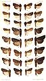
Extraction of moth species[edit]
Note: This request was moved from the Images to improve or create to the Illustration workshop. ZooFari 00:38, 17 December 2009 (UTC)
-
 One I already did
 -
 One that needs to be done


Article(s): Category:Catalogue_Of_The_Noctuidae_In_The_Collection_Of_The_British_Museum
Request: I would like to ask for assistance with the extraction of images from all these plates I uploaded. I am making articles for the species on wikipedia. I was referred to the Lab by another user who thought someone here might be interested in helping out. I did about 30 myself by now, but there are roughly 170 plates with an estimate of 5000 species. I will continue extracting myself, but it is a bit much for me alone, so all help would be appreciated! -- Ruigeroeland (talk) 12:12, 30 September 2009 (UTC)
Graphist opinion:
- Marked as resolved: Requester appears to have completed the request. ZooFari 03:53, 1 May 2010 (UTC)
Hideki Tojo[edit]


Request: svgify... --Kintetsubuffalo (talk) 02:46, 30 April 2010 (UTC)
![]() Done McSush (talk) 02:42, 3 May 2010 (UTC)
Done McSush (talk) 02:42, 3 May 2010 (UTC)
- Thank you so much, that's great! --Kintetsubuffalo (talk) 04:51, 3 May 2010 (UTC)
Image doesn't display[edit]
-
 Great Coat of Arms of Congress Poland

Request: Could anyone please fix the problem with this one? Errors in the code perhaps? Could it be that it is simply too huge? Avalokitesvara (talk) 22:07, 29 April 2010 (UTC)
![]() Done you're right: the filesize was the problem. The rsvglib should create the raster graphic preview, but was overtaxed.
Use the clone function instead to copy every element x times to reduce your filesizes. A "crown" for example needs 900 Kilobytes, but a cloned crown only ~20 Bytes. ;)
greets McSush (talk) 04:53, 3 May 2010 (UTC)
Done you're right: the filesize was the problem. The rsvglib should create the raster graphic preview, but was overtaxed.
Use the clone function instead to copy every element x times to reduce your filesizes. A "crown" for example needs 900 Kilobytes, but a cloned crown only ~20 Bytes. ;)
greets McSush (talk) 04:53, 3 May 2010 (UTC)
a few Roundels[edit]
-
Cuban roundels
-
 First
First -
 Second
 -
 Swedish roundel (fixed)
 -
 Malaysian roundel (PNG)
 -
 New
New


Request: For Cuba, and you please make two seperate SVGs of these roundels. Here are two alternate illustrations for extra help: The one on top was used from 1955-1959, and you can use the Chinese Roundel as a base. The one on the bottom was used from 1959-1962. You can use the Yemeni Roundel as a base.
For Sweden's roundel, I'd just like to ask it's colours be edited to match the National Flag.
Malaysia's, apparently is wrong. I have been looking at photos of Malaysian military aircraft, and the dark blue is supposed to be on the inside, with an outer ring of the light blue, as seen HERE Here is the SVG version of the Malaysian Roundel, although obviously the one as shown in the photo doesn't have that intricacy inside the star. I'd like to suggest using the dark blue from the PNG shown above, but the gold and light blue from the SVG.
Thanks :) Fry1989 (talk) 17:14, 28 April 2010 (UTC)
Graphist opinion(s): Almost done NikNaks93 (talk) 12:16, 3 May 2010 (UTC)
- Ok, if you want anything changed on the second Cuban one, just say the word. NikNaks93 (talk) 12:23, 3 May 2010 (UTC)
Thanks mate, this is excellent :D Fry1989 (talk) 19:49, 3 May 2010 (UTC)
a few Presidential Standards[edit]
-
 Already SVG, needs better Arms
 -
 please use these Arms
 -
 The Seal you'll neeed
 -
 SVG
SVG -
 SVG Arms
 -
 SVG
SVG -
PNG
.svg)


Request: Please recreate these presidential standards in SVG.
I'd also like to request that you replace the arms on the current SVG of Austria's Presidential Standard with the arms provided. Fry1989 (talk) 00:19, 13 April 2010 (UTC)
Graphist opinion(s): I'll tackle these tomorrow morning, my friend :) NikNaks93 (talk) 16:32, 14 April 2010 (UTC)
- Sorry for the delay! Not sure what you want me to do with the last one, as it doesn't really make sense to use a PNG coat of arms on a vector image. NikNaks93 (talk) 11:57, 3 May 2010 (UTC)
- They look excellent, I just wanted the PNG arms of the UAE to be on the flag because flags don't have 3-d on them. Fry1989 (talk) 20:28, 3 May 2010 (UTC)
![]() Request taken by NikNaks93
Request taken by NikNaks93
Vectorisation of Coat of arms of Tbilisi[edit]
Note: This request was moved from the Images to improve or create to the Illustration workshop. Ivan Akira (talk) 02:02, 18 December 2009 (UTC)
-
 The coat of arms of Tbilisi
 -
 the SVG version


Article(s): w:Tbilisi
Request: If you please, create the svg version of the coat of arms of Tbilisi. --Gaeser (talk) 11:46, 20 October 2009 (UTC)
Graphist opinion(s):
![]() Done -- well, at least I think this is done.....? I hope it is good enough? I am willing to add it to the correct page myself if needed.. This isn't perfect but thought I should do my best to help out. Nesnad (talk) 18:27, 26 April 2010 (UTC)
Done -- well, at least I think this is done.....? I hope it is good enough? I am willing to add it to the correct page myself if needed.. This isn't perfect but thought I should do my best to help out. Nesnad (talk) 18:27, 26 April 2010 (UTC)
- I've replaced the traced version against a redrawn. McSush (talk) 17:55, 3 May 2010 (UTC)
Vectorize Manuel Oribe Signature[edit]
-
 Signature of second uruguayan president Manuel Oribe.
 -
 svg version made by McSush

Request: Can someone please vectorize it, I would be pleased, thanks. Here is a link: File:Manuel Oribe Signature.png Kineto007 (talk) 01:01, 12 April 2010 (UTC)
![]() Done McSush (talk) 02:01, 3 May 2010 (UTC)
Done McSush (talk) 02:01, 3 May 2010 (UTC)
Colour corrections[edit]
-
 Angola 1
 -
 Angola 2
 -
 Cuba
Cuba -
 Mauritania
 -
 TRNC
TRNC
.svg)
.svg)


Request:These images need their colours corrected to match the national flags of the countries they represent.
Angola's Flag
Cuba's Flag
Mauritania's Flag
Yugoslavia's Flag(including the gold outline of the red star, please)
TRNC's Flag(for the star and fringe, can you use the gold from the Yugoslav flag please)
Thank you in advance Fry1989 (talk) 04:39, 7 May 2010 (UTC)
Cuba's was done curtesy of user:Zscout370
Graphist opinion(s): Done :) NikNaks93 (talk) 18:46, 10 May 2010 (UTC)
- Thanks:)Fry1989 (talk) 21:19, 10 May 2010 (UTC)
Flags request (swallowtailing)[edit]
-
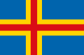 Åland
Åland -
 With tail
 -
 Faroes
 -
 With tail


.svg)
Request: Following the practice used by the Nordic countries, the dependent territories of Åland and the Faroes also have swallowtailed variants of their flag.
According to FOTW, Åland's is used by the yacht clubs of the Islands, using badges in the canton to mark which club, similar to Finland's yachting ensign, the difference being that it is swallowtailed.
For the Faroes, it appears to be only an unofficial variant, however I can confirm it does exist, as seen in this photo and the FOTW article on the Faroes.
Could someone please make SVGs of these swallowtailed variants. Fry1989 (talk) 22:16, 21 May 2010 (UTC)
Graphist opinion(s): I'll do these. Just wondering what the specific badge is for the Aland one. Is it the same as the Finnish, or slightly different? NikNaks93 (talk) 12:27, 22 May 2010 (UTC)
- Well, if you scroll down on the link I gave for the FOTW site, it shows 3 badges, so I'm guessing there is atleast 3 yacht clubs in Aland. I'd suggest though, just for ease, that you just make a gold circle in the canton where the badges would be, similar to how Finland has that black circle with an X where the badge of the club would normally be, unless you're up for making all three badges seperately. Fry1989 (talk) 19:16, 22 May 2010 (UTC)
- I think I'll pass at making the different badges. Maybe if they gain their own articles one day, I'll do it, but it's unnecessary work as it is. Anyway, done with a similarly shaped circle. NikNaks93 (talk) 19:42, 22 May 2010 (UTC)
- They look good, though the ratios appear just a bit off, and the swallowtailing on the flags aren't full split(like this), they should start only on the gold part for Alands like this, and the white parts for Faroes, like this. I think Aland will look better once that'd fixed, whereas the Faroes also needs to be a bit shorter. I'd suggest for the Faroes, that you use Iceland's state flag as a basis for ratio. Fry1989 (talk) 20:34, 22 May 2010 (UTC)
- Now that I've fixed where the tails begin, I think it looks better in proportion, but if it's still not quite there, I'll modify it. NikNaks93 (talk) 09:36, 23 May 2010 (UTC)
- They look good, though the ratios appear just a bit off, and the swallowtailing on the flags aren't full split(like this), they should start only on the gold part for Alands like this, and the white parts for Faroes, like this. I think Aland will look better once that'd fixed, whereas the Faroes also needs to be a bit shorter. I'd suggest for the Faroes, that you use Iceland's state flag as a basis for ratio. Fry1989 (talk) 20:34, 22 May 2010 (UTC)
- Actually they look perfect :), I'd just ask if you could, that you add a border on the tail for the Faroes, like Finland's presidential flag, because of the problem with white-on-transparency. Other then that, you've done really good, thanks so much :) Fry1989 (talk) 19:00, 23 May 2010 (UTC)
- I think I'll pass at making the different badges. Maybe if they gain their own articles one day, I'll do it, but it's unnecessary work as it is. Anyway, done with a similarly shaped circle. NikNaks93 (talk) 19:42, 22 May 2010 (UTC)
Pennsylvania political signatures[edit]
Request: These are some signatures of Pennsylvania politicians. Would someone be able to trace these into SVG?--Blargh29 (talk) 03:02, 10 February 2010 (UTC)
I've removed those, which are already finished. Btw. the other signatures look like blurred. It's difficult to see an accurate line. A better source would be fine. McSush (talk) 01:11, 3 May 2010 (UTC)
- 8 signatures made McSush (talk) 04:43, 22 May 2010 (UTC)
all =![]() Done= now McSushtalk 15:48, 22 May 2010 (UTC)
Done= now McSushtalk 15:48, 22 May 2010 (UTC)
Delta Force[edit]
-

Delta Force Insignia -

svg
.png)
.svg)
Request: Please redraw as SVG. Fallschirmjäger ✉ 22:27, 21 May 2010 (UTC)
i believe it's ![]() Done, or? McSush (talk) 00:58, 22 May 2010 (UTC)
Done, or? McSush (talk) 00:58, 22 May 2010 (UTC)
- Fantastic job, thanks very much! Fallschirmjäger ✉ 12:56, 22 May 2010 (UTC)
16th MP Brigade Insignia[edit]
-

16th MP Brigade Shoulder Sleeve Insignia. -

svg

.svg)
Request: Please redraw as svg, thanks. Fallschirmjäger ✉ 13:16, 22 May 2010 (UTC)
![]() Done :) McSushtalk 14:57, 22 May 2010 (UTC)
Done :) McSushtalk 14:57, 22 May 2010 (UTC)
- Excellent, cheers for the great work ;) Fallschirmjäger ✉ 19:47, 22 May 2010 (UTC)
20th Engineer Brigade[edit]
-

-

svg

.svg)
Request: Please redraw as an svg, cheers. Fallschirmjäger ✉ 07:26, 23 May 2010 (UTC)
Graphist opinion(s):
sure! :) ![]() Done McSushtalk 15:01, 23 May 2010 (UTC)
Done McSushtalk 15:01, 23 May 2010 (UTC)
- Thanks so much again! Fallschirmjäger ✉ 20:16, 23 May 2010 (UTC)
Text image logo[edit]
-
 Red & Black text logo
Request: Is there someone who could give this image a transparent background? --GrapedApe (talk) 01:35, 16 May 2010 (UTC)
Graphist opinion(s):
![]() Done How's that? ZooFari 01:42, 16 May 2010 (UTC)
Done How's that? ZooFari 01:42, 16 May 2010 (UTC)
- Much obliged!--GrapedApe (talk) 06:38, 16 May 2010 (UTC)
Flag and Seal[edit]


Request:
I would like to have an SVG version of these two files. Alabama's Governors' flag, and the State Seal of Ohio, that will be needed for the Governor's Flag of Ohio that I will be requesting later.
Alabama's is the State Flag, but with the State Coat of Arms, and State Military Crest in the upper and lower segments of the Flag. For the Coat of Arms, the following components are available in SVG: French Quarter, Spanish Quarter (lions need to be all red, and castles all gold), British Quarter (can be rotated to vertical), Confederate Quarter, and the United States center emblem (from the center of the Eagle). The rest of it though will need drawing. The banner at the bottom of the arms says "AUDEMUS - JURA NOSTRA - DEFENDERE". The Crest in the bottom segment of the flag is a cotton flower.
Ohio's Seal will take some work I know, I hope someone on here with expert skills can do it up though.
Thanks in advance Fry1989 (talk) 20:39, 6 April 2010 (UTC)
Graphist opinion(s):
- Ohio's Seal: I don't like that we have images from vector-images.com but if the orginal is PD, Commons seems to be accepting people converting the EPS to SVG, you just need to pay $2.45 at http://vector-images.com/image.php?epsid=4137 (see: File:Flag of San Francisco.svg, File:Seal of Texas.svg, File:Coat of Arms of Jordan.svg, File:Coat of Arms of North Korea.svg, File:Coat of Arms of American Samoa.svg, File:Seal of New York City.svg)--Svgalbertian (talk) 23:58, 6 April 2010 (UTC)
- unfortunately, I don't really have the ability to edit or use SVGs on my computer, I'm pretty much limited to the basic PAINT programme, that's why I'm requesting it of someone with better skills. Fry1989 (talk) 00:54, 7 April 2010 (UTC)
- It's more a matter of actually obtaining the EPS file from that site and passing it on to someone who can edit it. Being a student, I'm not really in a position to buy it, but maybe someone else is. If that's the case, I'll be happy to convert it to SVG for Commons. NikNaks93 (talk) 18:37, 8 April 2010 (UTC)
- Please don't waste your money, I can do the Flag (Coat of Arms and crest) and the seal for you — just not soon, maybe in a month's time. Sodacan (talk) 19:03, 8 April 2010 (UTC)
- excellent! thanks man!Fry1989 (talk) 21:02, 9 April 2010 (UTC)
- i know it's not perfect, but i've tried to make the seal. if someone want's to improve it: feel free. McSush (talk) 22:52, 6 May 2010 (UTC)
- Standard finished! Sodacan (talk) 02:56, 25 May 2010 (UTC)
- Thanks so much Sodocan :D If you could just perfect the Ohio seal a bit, then I can request the Governor's flag for Ohio and I'll be finished with the flags of US Governors :D Fry1989 (talk) 19:45, 25 May 2010 (UTC)
- Certainly, as a whole it looks fine to me, except for the colours. Is there any other changes you think I should make? Sodacan (talk) 18:39, 26 May 2010 (UTC)
- I think just the colours need changing, other then that McSush did a really good job :) Thanks so much for your work Fry1989 (talk) 19:43, 26 May 2010 (UTC)
- Done. Sodacan (talk) 20:05, 26 May 2010 (UTC)
- Thanks so much Sodocan :D If you could just perfect the Ohio seal a bit, then I can request the Governor's flag for Ohio and I'll be finished with the flags of US Governors :D Fry1989 (talk) 19:45, 25 May 2010 (UTC)
81st Infantry SSI[edit]
-

US 81st Infantry Badge -

svg


Request: Please redraw this SSI as an SVG, thanks in advance. Fallschirmjäger ✉ 11:19, 24 May 2010 (UTC)
Graphist opinion(s):
- uh, what a strange cat ... Done McSushtalk 15:30, 24 May 2010 (UTC)
- Excellent, thanks so much! One small thing though if it isn't too much to ask, the eye should be a white dot, if that could be changed it would be great. Cheers Fallschirmjäger ✉ 22:57, 24 May 2010 (UTC)
- cats with white eyes - even more ugly :) - it's done McSushtalk 23:26, 24 May 2010 (UTC)
- Perfect, thanks for that! Fallschirmjäger ✉ 10:50, 25 May 2010 (UTC)
- cats with white eyes - even more ugly :) - it's done McSushtalk 23:26, 24 May 2010 (UTC)
- Excellent, thanks so much! One small thing though if it isn't too much to ask, the eye should be a white dot, if that could be changed it would be great. Cheers Fallschirmjäger ✉ 22:57, 24 May 2010 (UTC)
17th Airborne Division[edit]
-

-

svg


Request: Please create an svg of this badge, cheers. Fallschirmjäger ✉ 10:53, 25 May 2010 (UTC)
Graphist opinion(s):
- ok... Done McSushtalk 21:25, 26 May 2010 (UTC)
- Perfect, thanks so much again! Fallschirmjäger ✉ 00:01, 27 May 2010 (UTC)
Governor's Standard[edit]
-
 State Seal
 -
 Vectorised flag

Request: I am very happy to be able to make my last request as part of my project on the standards of United States' state governors.
The last one is for Ohio, and an illustration and description of it can be seen HERE. Fry1989 (talk) 23:06, 26 May 2010 (UTC)
Graphist opinion(s): I'll do this one this afternoon. NikNaks talk - gallery - wikipedia 10:03, 27 May 2010 (UTC)
- Done :) NikNaks talk - gallery - wikipedia 14:17, 27 May 2010 (UTC)
![]() Done
Done
- Brilliant :D Can you just move the four stars further out into the corners, they're a bit to close to the circlet. Fry1989 (talk) 20:42, 27 May 2010 (UTC)
- Better? NikNaks talk - gallery - wikipedia 16:31, 29 May 2010 (UTC)
- Perfect :D thanks Fry1989 (talk) 20:06, 29 May 2010 (UTC)
- Brilliant :D Can you just move the four stars further out into the corners, they're a bit to close to the circlet. Fry1989 (talk) 20:42, 27 May 2010 (UTC)
Roundels and Seals (SVGing)[edit]
-
 Colombian naval roundel
 -
 Vector
 -
 Ecuadorian roundel
 -
 Vector
 -
 Presidential Seal, Macedonia
 -
 Vector
 -
 Presidential Seal of Korea (ROK)
 -
 Vector


Request: Colombia and Ecuador have Naval Aviation roundels. Colombia's is just the Air Force Roundel over an Anchor. Ecuador's is also the Air Force roundel, but has the Eagle and Anchor motif from the Ecuadorian Naval Jack superimposed on it in black.
Macedonia's Presidential Seal just needs transparency added.
El Salvador's Presidential Seal needs to be made into SVG, which shouldn't be too hard, since the Republic's Coat of Arms is already SVG.
The Presidential Seal of the Republic of Korea can be seen HERE and HERE. It uses the Phoenix and Hibiscus motif from the Presidential Standard, though in a darker blue, I'd say the blue from the National Emblem. You can get some of the Korean characters from the national emblem, though the others will probably need translation or something.
Thank you so much to those that can do this for me :) Fry1989 (talk) 00:29, 1 June 2010 (UTC)
Graphist opinion(s): Oooooh! Gimme gimme gimme. NikNaks talk - gallery - wikipedia 09:01, 1 June 2010 (UTC) ![]() Request taken by NikNaks93
Request taken by NikNaks93
- OK, I've done them all. There's a discrepancy between the two images you posted for the Korean seal with font sizes and placements, so I tried to find some kind of middle ground. Hope it's alright! NikNaks talk - gallery - wikipedia 10:54, 1 June 2010 (UTC)
- They're excellent, thanks :D you never disappoint Fry1989 (talk) 17:52, 1 June 2010 (UTC)
- Thanks! :) One thing I remember, looking at them again, is whether the superimposed anchor should be bigger on the one for Ecuador. Is there a reference image for it somewhere? NikNaks talk - gallery - wikipedia 20:09, 1 June 2010 (UTC)
- Unfortunately, I can't find a reference image, though I'm gonna try Airliners.net later on. BTW, I have a discussion on the Villiage Pump, I wanna be able to do some basic corrections of SVGs myself, like just altering the colour. Could you maybe help me with that? my discussion is HERE Fry1989 (talk) 20:30, 1 June 2010 (UTC)
- They're excellent, thanks :D you never disappoint Fry1989 (talk) 17:52, 1 June 2010 (UTC)
Canada Flag-maps[edit]
Note: This request was moved from the Images to improve or create to the Illustration workshop. Ivan Akira (talk) 02:27, 18 December 2009 (UTC)
Original


SVG
-
 British Columbia
 -
 Alberta
 -
 Saskatchewan
 -
 Manitoba
 -
 Ontario
 -
 Quebec
 -
 Newfoundland and Labrador
 -
 New Brunswick
 -
 Prince Edward Island
 -
 Nova Scotia
 -
 Vote stub


Article(s): w:WP:CANADA
Request: Retrace to SVG format. SVG flags are available on the provinces' respective articles. Connormah (talk) 01:06, 20 October 2009 (UTC)
Graphist opinion(s):
- Check with the folk(s) at Commons:Project Flag-map --Svgalbertian (talk) 01:51, 7 November 2009 (UTC)
![]() Request taken by Svgalbertian: I have done a few, but I am not completely happy with them and might tweek them some more. I will do the other provinces later.--Svgalbertian (talk) 18:53, 9 May 2010 (UTC)
Request taken by Svgalbertian: I have done a few, but I am not completely happy with them and might tweek them some more. I will do the other provinces later.--Svgalbertian (talk) 18:53, 9 May 2010 (UTC)
![]() Done: Okay I am more of less happy with them now. --Svgalbertian (talk) 22:07, 9 May 2010 (UTC)
Done: Okay I am more of less happy with them now. --Svgalbertian (talk) 22:07, 9 May 2010 (UTC)
- Looks good. Thanks for your work. Connormah (talk | contribs) 04:32, 29 May 2010 (UTC)
Governor's Flag Hawaii (historical)[edit]
-
 current
 -
 Pre-1959


Apparently there was a standard for the Governor of Hawaii prior to statehood, that was similar, but instead of the name of the state, it had the letters "TH" in the middle, for Territory of Hawaii. I can't find any images, but I would assume the letters were somewhat larger then they are for the full name of the State.
Please make in SVG, and upload as "Flag of the Governor of Hawaii pre-1959" Fry1989 (talk) 01:55, 23 June 2010 (UTC)
Graphist opinion(s): How's that? NikNaks talk - gallery - wikipedia 17:34, 23 June 2010 (UTC)
- Excellent! thanks Fry1989 (talk) 18:30, 23 June 2010 (UTC)
Qatar Air Force Ensign[edit]
-
 SVG flag
 -
 SVG roundel
 -
 Done
Done

Request: Please recreate in SVG the Qatar Air Force Ensign seen HERE using the elements supplied above. Thanks Fry1989 (talk) 21:33, 14 July 2010 (UTC) Fry1989 (talk) 21:33, 14 July 2010 (UTC)
Graphist opinion(s):
![]() Done: Not sure on the proportions, placement, and color, but I did my best. Color for background was taken from the Malay sky blue air force flag. Proportion is the same as the main Qatar flag, so that the mini flag can take up the entire top left quadrant. The roundel is centered on the bottom third, and the right quarter, and the roundel size was simply eyeballed. I'll be glad to make any changes if you know more specific information. Your source image left me wanting ;) -Andrew c (talk) 13:37, 15 July 2010 (UTC)
Done: Not sure on the proportions, placement, and color, but I did my best. Color for background was taken from the Malay sky blue air force flag. Proportion is the same as the main Qatar flag, so that the mini flag can take up the entire top left quadrant. The roundel is centered on the bottom third, and the right quarter, and the roundel size was simply eyeballed. I'll be glad to make any changes if you know more specific information. Your source image left me wanting ;) -Andrew c (talk) 13:37, 15 July 2010 (UTC)
- I know what you mean. I actually came across the pic by accident, and I haven't been able to find any other pics or sources since. Wish I could find more info on it. grr >.> I'll kepp looking though when I can. Thanks for making it though :) Fry1989 (talk) 02:41, 16 July 2010 (UTC)
Hex color identification[edit]
Request: Would someone please identify the hex codes for the blue and red in this logo? Note that it is non-free and stored at Wikipedia, so I have just provided a link: w:File:Achalogo.png. GrapedApe (talk) 04:53, 16 July 2010 (UTC)
Graphist opinion(s):
- Done, answered on editor's talk page (#100069 and #D63136). — Huntster (t @ c) 06:15, 16 July 2010 (UTC)
- Thanks!--GrapedApe (talk) 12:15, 16 July 2010 (UTC)
Font identification[edit]
Request: Would someone please identify what font is used for the "W&J" on the front of the hockey sweaters seen in this image? [12]. I'm in the process of creating a jersey template for the page.--GrapedApe (talk) 13:29, 9 July 2010 (UTC)
Graphist opinion(s):
- Identifont suggests that it might be Yearbook or something like quite similar. Of course, it's also possible that the letters might be hand-drawn rather than from a pre-existing font. —Ilmari Karonen (talk) 17:23, 9 July 2010 (UTC)
- That looks great! Thank you!--GrapedApe (talk) 03:35, 10 July 2010 (UTC)
Retouch Seal[edit]
-
Original
-
SVG
Request: Hi, can you move a little bit the star, is lightly descentered if you look the base it touchs the body of the axe, thanks for now.
If you look carefully to the border of the 1st and 2nd flag of the left side you will notice that they have a straight edge, in comparison with the borders of the 1st and 2nd flags from the right that have a slightly "curved" edge instead of a straight one like it should be, can you fix it please?
The tips of the spears are not sharp enough, like in the original. And there are many more imperfections that should be corrected, like the lines in the axe body for example. Please do not change the color it's correct, and the suns too, thanks in advance. --Kineto007 (talk) 20:37, 22 April 2010 (UTC)
Graphist opinion(s):
- Hi Kineto007 - i've tried a little bit - what do you think about it? McSush (talk) 03:09, 18 May 2010 (UTC)
SVG is done well, but thumbnails are too lossy[edit]
Note: This request was moved from the Images to improve or create to the Illustration workshop. ZooFari 00:44, 17 December 2009 (UTC)
-
 Description of image
 -
 2nd image (If there is one)


Article(s): I would like to use the SVG in w:Laplace transform instead of PNG.
Request: SVG is done well, but Wiki cannot make normal thumbnail from it. Almost all lines disappear in png thumbnail, while SVG itself scales without losses (in Firefox 3.5).Wikiwide (talk) 08:40, 9 December 2009 (UTC)
Graphist opinion(s):
![]() Request taken by Flekstro Now, I've applied all css styles to each elements, since css isn't widely supported as in inkscape, many image viewers as well as probably by the rendering engine of Mediawiki. The thumbnail above seems to be working.--Flekstro (talk) 15:46, 27 May 2010 (UTC)
Request taken by Flekstro Now, I've applied all css styles to each elements, since css isn't widely supported as in inkscape, many image viewers as well as probably by the rendering engine of Mediawiki. The thumbnail above seems to be working.--Flekstro (talk) 15:46, 27 May 2010 (UTC)
- I modified additional aspects, mentioned at File:S-Domain_circuit_equivalency.svg#filehistory to fit it for the Wikipedia article. Finally, I applied the vectorized version in the referred place.--Flekstro (talk) 17:31, 27 May 2010 (UTC)
Hans Jæger and Hans Schreuder[edit]
-
 Book: Socialismens ABC
 -
 Book: Den norske Zulumission
 -
 Hans Schreuder

Request: The first page of both these files are portraits, of, respectively Hans Jæger and Hans Schreuder, currently, we have no PD images of these two individuals for their articles. I am wondering if the eminent volunteers of the graphics lab could extract these images, and manipulate them so that they can be used for illustrations in their articles. V85 (talk) 22:38, 25 March 2010 (UTC)
Graphist opinion(s):
- Regarding the Hans Jæger portrait, the caption says it's based on a painting by Edvard Munch. Munch died in 1944, so the painting (and any derivatives of it) will remain copyrighted until 2015 under Norwegian copyright law (70 years p.m.a.). To be completely safe, someone who knows how to edit such files might want to remove that page from the DjVu file. Also, once the painting does become free, it would presumably be better to use a photo of the original rather than the black-and-white printed version. —Ilmari Karonen (talk) 16:11, 28 March 2010 (UTC)
- I've uploaded the Hans Schreuder portrait here. I used pdfimages to extract it from the original PDF and cleaned up the background in GIMP. —Ilmari Karonen (talk) 18:07, 28 March 2010 (UTC)
- Lovely work for Hans Schreuder, thank you! I will remove the picture of Hans Jæger, and re-upload that file without it, with a notice of it needing to be changed at a later date. V85 (talk) 20:41, 28 March 2010 (UTC)
Debate and Oratory[edit]
-
 Image for first page of "Debate and Oratory" section of 1909 Tyee (yearbook of the University of Washington). Good illustration for its subject.
 -
 My black and white version for you
 -
 Grayscale PNG version by Ilmari Karonen


Request: This was not copied under ideal conditions. The book from which it was taken cannot leave the Seattle Room of the Seattle Public Library, and there are big fluorescent lights above. I snapped a shot as well as I could and did about 10 minutes of cleanup with GIMP, largely to account for distortion.
If anyone can clean this up further it would be appreciated, but no crisis if not. I'd guess that, since it's intended to be pure black-and-white (no grayscale) there are some nice tricks to bring to this, but I don't know them. Jmabel ! talk 00:43, 19 February 2010 (UTC)
Graphist opinion: Well, not sure if this is good enough for you, but I had a little time (while I wait for someone to help me with the request above) to try to do what I figured you were looking for. Does it work? Yes / no? I am a bit sleepy, so I am afraid I hurried this and you won't be satisfied. Please be honest. Hope I could help (anyone is welcome to improve on my humble attempt):
Nesnad (talk) 17:06, 19 February 2010 (UTC)
- Not bad. Unfortunately, also reinforces a few imperfections. But nice to have. - Jmabel ! talk 21:38, 19 February 2010 (UTC)
I did another version, which you can see here. I deliberately left the background of the stippled areas gray, since that's how they came out after inpainting and background subtraction (presumably because, between printing and photographing, some of the stipples became too blurred to resolve). If you really want black and white, a bit of careful unsharp masking followed by a threshold should produce fairly good results, but nothing I could come up with that way looked IMO quite as good as the grayscale version I uploaded. —Ilmari Karonen (talk) 20:30, 7 March 2010 (UTC)
AMDProcessorRoadmap[edit]
-
 AMD Processor Roadmap
Request: I was trying to make a derivate for File:AMDProcessorRoadmap.svg but of AMD processors, but I'm a SVG noob and the final file is not what I intended, so I need someone experienced with SVG files to help me fix this. Bachinchi (talk) 21:30, 4 July 2010 (UTC)
Graphist opinion(s): Do you mean you created this as a derivative of the intel one? And is your problem the text not staying in the box? There's two things you can do, the first one's easy and I know this works. You're probably using Inkscape to edit these? If you select text and press ctr+shift+c, it becomes a graphic instead of plain text so it will always be rendered the same way. The second solution may be better but I'm not sure this will work. Commons doesn't support all fonts, most windows fonts like arial and times new roman are not supported because they are not free. This means that it'll replace those fonts with ones that are free but look different. You should pick a font that IS supported by commons here:m:SVG_fonts Richardprins (talk) 15:52, 11 July 2010 (UTC)
- Thanks, it used DejaVu Sans font, and my win7 didn't have it installed, so they were replaced by ArialMT. It's fixed now. --Bachinchi (talk) 22:36, 15 July 2010 (UTC)
Cleaning up a logo[edit]
-
 Cleanup and remove the "X"
 -
 Vectorized


Request: Would someone be interested in taking this image ([13]) and photoshopping the giant "X" across that logo? It is an old logo for Washington & Jefferson College. It would be great if it could be in SVG format too. Thanks! GrapedApe (talk) 12:09, 10 June 2010 (UTC)
Graphist opinion(s):
- I suggest that you upload the unmodified image to Commons first, so the editor won't have to take care of the licensing and description information when uploading. (please upload it as PNG, if you do) —Quibik (talk) 15:28, 10 June 2010 (UTC)
- Good point. It should be public domain because it is just letters and basic geometric shapes. Done.--GrapedApe (talk) 18:48, 10 June 2010 (UTC)
- Done Thanks! I cleaned it up. —Quibik (talk) 13:08, 11 June 2010 (UTC)
Hex code for a color[edit]
Can someone please tell me if there is a hex code that matches the red in this image? I'd like to use the correct color for some templates on enwiki.--GrapedApe (talk) 05:55, 21 June 2010 (UTC)
- #b11107, hope that helps. ZooFari 05:59, 21 June 2010 (UTC)
- THANKS!--GrapedApe (talk) 17:49, 23 June 2010 (UTC)
Transparency for text logo[edit]
Request: Would someone be able to add transparency to this logo's background?--GrapedApe (talk) 03:59, 30 June 2010 (UTC)
Graphist opinion(s):
![]() Request taken by Ivan Akira: Okay, I'll work on it.
Request taken by Ivan Akira: Okay, I'll work on it.
- Done: It's done, what do you think? Ivan Akira (talk) 09:55, 30 June 2010 (UTC)
- That looks great! Thanks!--GrapedApe (talk) 11:55, 30 June 2010 (UTC)
Vatican City location map ka.svg[edit]

Request: the file doesn't appear, can anyone do something with it?... Gaeser (talk) 15:47, 21 June 2010 (UTC)
Graphist opinion(s): ![]() Done --Svgalbertian (talk) 14:24, 22 June 2010 (UTC)
Done --Svgalbertian (talk) 14:24, 22 June 2010 (UTC)
Integration[edit]
-
 German-language diagram illustrating the economic concepts of vertical and horizontal integration.
 -
 SVG conversion
 -
 English version


Request: If it is not too much work, perhaps an identical English-language version of this file could be created to illustrate the English Wikipedia articles Vertical integration and Horizontal integration, in a similar fashion to their German-language equivalents (Vertikale Integration and Horizontale Integration). An English-language version would be much appreciated, and if making multilingual diagrams is not too much of a hassle, French, Spanish, Dutch, Russian, and Swedish versions could also be made for those respective Wikipedias. However, please don't go out of your way to do this if you think the benefit isn't worth the cost. Thanks! TFCforever (talk) 23:03, 14 June 2010 (UTC)
- Could you provide a word for word translation? This should be real simple to make an equivolent SVG, and from that, anyone can alter the labels with a basic text editor (or inkscape/illustrator). -Andrew c (talk) 14:30, 15 June 2010 (UTC)
- Sorry about the delay, but here's the translation into English...
Autokäufer = Car (automobile) buyers
Garagisten = Garage owners
Autoimporteure = Car (automobile) importers
Autohersteller = Car (automobile) manufacturers
Zulieferer = Suppliers
Rohstoffproduzenten = Commodity (primary) producers
Vertika = Vertical
Horizonta = Horizontal
Vorwarts = Forwards
Ruckwarts = Backwards
Also, I am not skilled enough with a program like Inkscape to insert the English words into the image. I am willing to learn, but I also don't want to waste the time of anyone here at the graphics lab. Thanks so much for all your work!
TFCforever (talk) 14:37, 24 June 2010 (UTC)
Graphist opinion(s):
- DoneI've made an SVG conversion. Anyone is welcome to translate the titles now. They can do it in a text editor. One thing, though, when I click on the image to let firefox render the SVG, the titles fit perfectly in the boxes (they are centered), but the Wikimedia png generator makes the text flow outside of the boxes. Any ideas how to change this? Also, if someone supplies me with translations, I'd be glad to make different language versions if you can't (or don't want) to do it yourself! -Andrew c (talk) 14:03, 24 June 2010 (UTC)
Girl Guides and Girl Scouts[edit]
- w:File:World Association of Girl Guides and Girl Scouts.svg
- w:File:Association des Guides du Togo.png→
- w:File:Girl Guides Association of the Solomon Islands.png→
- w:File:Samoa Girl Guides Association.png→
- w:File:Girl Guides Association of Saint Vincent and the Grenadines.png→
- w:File:Girl Guides Association of Saint Lucia.png→
- w:File:Girl Guides Association of Saint Christopher and Nevis.png→
- w:File:Girl Guides Association of Kiribati.png→
- w:File:Guyana Girl Guides Association.png→
- w:File:Girl Guides Association of Grenada.png→
- w:File:Association Nationale des Guides de Centrafrique.png→
- w:File:Girl Guides Association of Dominica.png→
- w:File:Girl Guides Association of Belize.png→
- w:File:Bahamas Girl Guides Association.png→
- w:File:Malawi Girl Guides Association.png→
- w:File:Sudan Girl Guides Association.png→
- w:File:Association des Guides du Liban.png→
- w:File:Association des Guides du Burkina Faso.png→
- w:File:Girl Guides Association of Namibia.png→
- w:File:Association des Guides du Tchad.png→
- w:File:Comité de Enlace del Guidismo en España.png→
- w:File:Asociación Guías Scouts del Paraguay.png→
- w:File:Asociación de Muchachas Guías de Panamá.png→
- w:File:Girl Guides Association of Jamaica.png→
- w:File:Asociación Nacional de Muchachas Guías de Guatemala.png→
- w:File:Het Arubaanse Padvindsters Gilde.png→remove gold triangles above scroll
- w:File:Anguilla Girl Guides 1968.png→
- w:File:Surinaams Padvindsters Gilde.svg change black to blue-there is enough contrast
- w:File:Vanuatu Girl Guides Association.svg change black to orange-there is enough contrast
- w:File:Girl Guides Association of Tuvalu.svg change black to orange-there is enough contrast
- w:File:WikiProject Scouting trefoil blank.svg change black to orange-there is enough contrast
Request: Would someone be able to vectorize and clean up these emblems? Most countries use standard colors-both blue/orange colors should match w:File:World Association of Girl Guides and Girl Scouts.svg-in RGB format, the blue is (0,82,214) and the orange is (254,143,3), remove all black bordering as unnecessary-there is enough contrast between the colors and black does not appear in the actual emblems. This is cross posted from a stale request at Wikipedia:Graphic Lab/Illustration workshop. Thanks! Kintetsubuffalo (talk) 05:14, 3 May 2010 (UTC)
Graphist opinion(s):
- I don't think there is a need to crosspost, especially when this is non-free content not acceptable for use here at the Commons. -Andrew c (talk) 02:16, 4 May 2010 (UTC)
- Nobody asked for color commentary. Not a crosspost, the other one is archived and it still needs doing.--Kintetsubuffalo (talk) 04:02, 4 May 2010 (UTC)
- Perhaps to put a better point on it, if a request is not fulfilled at any of the local-language Wikipedias, is there any valid reason that request should not be brought here, to receive assistance from a broader array of graphic artists? Such requests can only improve the various Wikipedias. --Kintetsubuffalo (talk) 09:24, 5 May 2010 (UTC)
- Surely the point is that these images cannot be posted on Commons, so as such should not be created here. It's a little strange to crosspost like that, even if the original has been archived. I would also argue that the number of artists on both sites is equal, and there's definitely a significant overlap of artists anyway. It would be more sensible to repost it on en with more specific instructions so it can be completed more easily. Just my two cents. NikNaks (talk) 17:15, 15 May 2010 (UTC)
- Perhaps to put a better point on it, if a request is not fulfilled at any of the local-language Wikipedias, is there any valid reason that request should not be brought here, to receive assistance from a broader array of graphic artists? Such requests can only improve the various Wikipedias. --Kintetsubuffalo (talk) 09:24, 5 May 2010 (UTC)
Scanned image restoration[edit]
-
 Ottoman tughra dating from the reign of Murad III
 -
 Ottoman tughra dating from the reign of Murad III

.png)
Request: Restore (poor-quality scanned) image... Dada (talk) 11:42, 1 April 2010 (UTC)
Graphist opinion(s): Not sure what kind of restoration you'd like to see here... I completely washed out the background. -- deerstop. 21:51, 15 June 2010 (UTC)
New Zealand Revenue 2005-06[edit]
-
 New Zealand Revenue 2005-06

Request: Crop out excessive amount of white border. Alan Liefting (talk) 07:35, 20 July 2010 (UTC)
Graphist opinion(s): Ah, are you wanting to preserve the black line or does it matter? — Huntster (t @ c) 07:43, 20 July 2010 (UTC)
- It think it is best with the black line border . Alan Liefting (talk) 09:00, 20 July 2010 (UTC)
- Done. Excess whitespace removed, black border kept. — Huntster (t @ c) 09:22, 20 July 2010 (UTC)
Presidential Standard[edit]

Request: Can you please just add the letters "R.M." in the upper corner, as in this pic. We don't need the "D.R." in the bottom though, as that is the innitials of the president, and changes with each incumbent. Thanks. Fry1989 (talk) 21:58, 21 August 2010 (UTC)
Graphist opinion(s):
- Done Like so? ZooFari 16:25, 27 August 2010 (UTC)
- Excellent Fry1989 (talk) 16:32, 27 August 2010 (UTC)
Air Force Ensign of Dominican Republic[edit]
-
 File in question

Request: Can someone please fix this file and re-upload as "Air Force Ensign of Dominican Republic". I've tried myself, but keeps coming as black when I transfer it to inkscape. Thanks Fry1989 (talk) 17:29, 14 August 2010 (UTC)
Graphist opinion(s):
- Renamed and
 Fixed. It didn't turn black on my Inkscape but there was a strange object hidden away from the document. Now gone. ZooFari 22:47, 17 August 2010 (UTC)
- It still has part of it "chopped off". It doesn't show up black in my inkscape anymore, but that's gotta be fixed. If there's a way to change the margin around the file, I could do it myself. Fry1989 (talk) 22:53, 17 August 2010 (UTC)
- Ah, better? ZooFari 23:25, 17 August 2010 (UTC)
- Great, thanks :) Fry1989 (talk) 23:39, 17 August 2010 (UTC)
- It still has part of it "chopped off". It doesn't show up black in my inkscape anymore, but that's gotta be fixed. If there's a way to change the margin around the file, I could do it myself. Fry1989 (talk) 22:53, 17 August 2010 (UTC)
A silly, but simple, request[edit]

Request: Would someone please make the background area of this image transparent? GrapedApe (talk) 07:01, 3 August 2010 (UTC)
Graphist opinion(s):
![]() Request taken by Andrew c Should be up in a few. -Andrew c (talk) 14:19, 3 August 2010 (UTC)
Request taken by Andrew c Should be up in a few. -Andrew c (talk) 14:19, 3 August 2010 (UTC)
![]() Done: -Andrew c (talk) 14:24, 3 August 2010 (UTC)
Done: -Andrew c (talk) 14:24, 3 August 2010 (UTC)
- I'm sorry, I must not have been specific enough. Would you be able to make the inerior of the shield white, with the background outside the shield transparent. Again, I'm sorry if this request was not specific enough.--GrapedApe (talk) 21:05, 3 August 2010 (UTC)
- Let me make absolutely certain of your desire: you want just the pure exterior of the graphic transparent, or *everything* outside the wide black shield outline (including the decorative curlies)? — Huntster (t @ c) 21:55, 3 August 2010 (UTC)
- Everything outside the outline of the shield to be transparent. Everything within the outline (including the exterior curlies) to be white. Cheers!--GrapedApe (talk) 22:06, 3 August 2010 (UTC)
- Done. I used a pink-ish background for the transparency mask. It seems that Andrew's version was also made so that just the exterior would be transparent, but the browser renderers must not understand that and simply interpreted all white areas to be transparent. — Huntster (t @ c) 22:25, 3 August 2010 (UTC)
- Everything outside the outline of the shield to be transparent. Everything within the outline (including the exterior curlies) to be white. Cheers!--GrapedApe (talk) 22:06, 3 August 2010 (UTC)
- Let me make absolutely certain of your desire: you want just the pure exterior of the graphic transparent, or *everything* outside the wide black shield outline (including the decorative curlies)? — Huntster (t @ c) 21:55, 3 August 2010 (UTC)
- I'm sorry, I must not have been specific enough. Would you be able to make the inerior of the shield white, with the background outside the shield transparent. Again, I'm sorry if this request was not specific enough.--GrapedApe (talk) 21:05, 3 August 2010 (UTC)
- Sorry, didn't understand the request. I used an alpha-channel technique I learned years ago to make basically the entire image transparent, except for the black. It isn't a browser error, rather a comprehension error (on my part ;) -Andrew c (talk) 01:46, 4 August 2010 (UTC)
- Really? I mean, that's what I figured at first, but when I opened your version in Paint Shop Pro, only the outside white areas were transparent, not the interior...strange. — Huntster (t @ c) 02:44, 4 August 2010 (UTC)
- Either way, it looks awesome now! Thanks fellas.--GrapedApe (talk) 05:45, 4 August 2010 (UTC)
- Really? I mean, that's what I figured at first, but when I opened your version in Paint Shop Pro, only the outside white areas were transparent, not the interior...strange. — Huntster (t @ c) 02:44, 4 August 2010 (UTC)
Invalid code[edit]
-
Invalid SVG
Request: I created this vector image using Inkscape, but something seems to have gone wrong. It seems to be an invalid SVG code, but I do not know how to solve it. Could anyone help me? Best regards; Felipe Menegaz 21:49, 30 June 2010 (UTC)
Graphist opinion(s):
- SVG passes Validator now. Got to be another rsvg bug--DieBuche (talk) 16:25, 1 July 2010 (UTC)
- How can I solve it? Felipe Menegaz 20:05, 1 July 2010 (UTC)
- Felipe Menegaz, I think what DieBuche trying to say is, you don't have to do anything, because your SVG file is perfectly fine. And if some program or parser said that your SVG is invalid, it must be just some kind of bug. Ivan Akira (talk) 01:21, 26 July 2010 (UTC)
- How can I solve it? Felipe Menegaz 20:05, 1 July 2010 (UTC)
Magnet[edit]
-
 Finished SVG version

Request: Could you create a svg-version of this image? Ischa1 (talk) 19:19, 10 August 2010 (UTC)
Graphist opinion(s):
- Done It's done. The hardest thing was uploading: I'm new at this. Mirek2 (talk) 09:32, 14 August 2010 (UTC)
- I saw it! Thank you very very very much! :D:D:D:D Ischa1 (talk) 14:06, 14 August 2010 (UTC)
Grand coat of arms of Kingdom of Naples in times of Joseph Bonaparte[edit]
-
 Grand coat of arms of Kingdom of Naples in times of Joseph Bonaparte

Request: Could anyone please get rid of this black bar near the supporter's neck? Thanks in advance. Avalokitesvara (talk) 13:27, 17 August 2010 (UTC)
Graphist opinion(s): ![]() Done and optimised as well, free of charge :) Jarry1250 (talk) 14:25, 25 August 2010 (UTC)
Done and optimised as well, free of charge :) Jarry1250 (talk) 14:25, 25 August 2010 (UTC)
- Thank you, good sir :) Avalokitesvara (talk) 14:05, 27 August 2010 (UTC)
Presidential Standards[edit]
-
 Kyrgyzstan
 -
 Turkmenistan (without eagle motif)
 -
 Flag of Tunisia
 -
 Vector


Request:
Kyrgyzstan: A discription from FOTW, it's basically the national flag but instead of the Sun & Yurt symbol, it has the National Emblem, which has been altered, so the inscription is "Kyrghyz Respublicasynyn Presidenti". I tried to do some colourization of the emblem myself, but I just couldn't get it how I liked it.
Turkmenistan: An illustration from FOTW, there's a few designs but accourding to the discussion there, this is the most accurate. The text ofcourse is "President of Turkmenistan".
- That last ñ should be the Spanish-style ñ with the tilde, not the hachik ^.--Kintetsubuffalo (talk) 08:26, 27 June 2010 (UTC)
Tunisia: Information from FOTW. One shows the script directly above the disc, but all the photo links show it as the diagonal variant, so I would suggest just making the diagonal one for now.
Thanks Fry1989 (talk) 00:01, 8 June 2010 (UTC)
Graphist opinion(s): Sign me up! I'll start these this evening. NikNaks talk - gallery - wikipedia 10:37, 8 June 2010 (UTC)
- Well, I've done the Tunisian one, and have made a start on the Turkmen one. Only the eagle motif in the middle is missing. Can you check that the transliteration is right? I copied it from the Turkmen Wikipedia entry for "President of Turkmenistan", so it should be alright. I've also transliterated the Kyrgyz one using Google's transliteration tool: Кыргхйз Республикасынын Пресиденти
- I'm not sure I'll be able to match the Kyrghyz emblem's font, as I have not the faintest idea what it is written in. I will try to contact the original author to find out, however. I'll work around it for the time being. NikNaks talk - gallery - wikipedia 18:38, 8 June 2010 (UTC)
- Done the Kyrgyz one now. Just need to do the eagles, but I might not have time to do that for a while, so if anyone else wants to have a go, go right ahead! NikNaks talk - gallery - wikipedia 19:04, 8 June 2010 (UTC)
- Thanks alot my friend :), I hope someone can get the five-headed eagle motif for Turkmenistan.Fry1989 (talk) 19:58, 8 June 2010 (UTC)
Making SVGs to Liechtenstein and the Netherlands' coat of arms[edit]
Note: This request was moved from the Images to improve or create to the Illustration workshop. Ivan Akira (talk) 02:27, 18 December 2009 (UTC)
-
 Coat of arms of Liechtenstein
 -
 Appears to be some gradient problems with the work in thumbnail that I cannot overcome. Could someone take a look at this please?.--Amadscientist (talk) 05:37, 11 September 2009 (UTC)
 -
Coat of arms of the Netherlands
-
 Traced SVG


Article(s): All articles related to Liechtenstein and Netherland on any wiki
Request: Create a SVG version. This are high res. PNG images of the coat of arms of Liechtenstein and the Netherlands, with clear contours and single tone colors. The former country doesn't have an SVG CoA yet and the latter has 2, but very distorted. The lions and everything else should be Or (yellow) not orange. -- Alex:D (talk) 16:01, 2 September 2009 (UTC)
Graphist opinion: I'll do the first one.--Amadscientist (talk) 18:18, 8 September 2009 (UTC) It needs a few tweaks now that I see it up loaded. The white mink at the bottum of the image needs a white background and a few of the shadows have been blurred as a top layer overlapping in a few spots and I need to fix a couple of lines that I didn't noticed don't match the correct thickness, but it's basicaly done.--Amadscientist (talk) 05:37, 11 September 2009 (UTC)
- I've managed to do a traced SVG version of my PNG image, resulting a pretty accurate coat of Arms of the Netherlands. The problem is, the space between the cords' loops and the top crown's arms is white instead of transparent. Can someone fix this problem? --Alex:D (talk) 16:13, 30 September 2009 (UTC)
-
- I'll give a shot and clean the Liechtenstein one. Arnaud Ramey (talk) 11:53, 8 September 2010 (UTC)
-
- Done Here you go ! Solved the gradients problem. Used the symmetry of the curtains to use clones and reduce file size. Various cleaning in addiction. Arnaud Ramey (talk) 13:27, 8 September 2010 (UTC)
Please provide cleaner logo![edit]

Request: Do something with them... 173.48.154.223 14:13, 7 September 2010 (UTC)
- Replaced attempted HTML link above with a copy of the actual logo. — Huntster (t @ c) 17:04, 7 September 2010 (UTC)
Graphist opinion(s): ![]() Done Official vector version of the logo uploaded. --Svgalbertian (talk) 14:42, 10 September 2010 (UTC)
Done Official vector version of the logo uploaded. --Svgalbertian (talk) 14:42, 10 September 2010 (UTC)
- Thanks Svgalbertian. — Huntster (t @ c) 00:21, 11 September 2010 (UTC)
Lieutenant-Governor's standard.[edit]


-
 SVG by Zoofari

Request: Please re-create this flag in SVG format, and upload onto the Commons. It's the only Canadian provincial Lieutanat_Governor's flag that's missing on the Commons. Above are the SVG elements you'll need. The two on the left you can use for the main part of the Shield, while the one on the right gives you the Lion, as well as the Standardized design for LG flags. Please upload as "Flag of the Lieutenant-Governor of New Brunswick.svg" and use the same licensing as the one on the right above. I'd do it myself but I'm still not that good at inkscape. Thank you very much to whoever takes this on. Fry1989 (talk) 21:12, 15 September 2010 (UTC)
Graphist opinion(s):
- Which shape of the shield would you like? ZooFari 22:11, 16 September 2010 (UTC)
- Done, let me know if that works. ZooFari 23:18, 16 September 2010 (UTC)
- You have it really close, thank you. Just needs the white border, third blue wave, and bottom part of the Sea to be white, as in the PNG. If you like, I can ask user:Denelson83 to take a look at those minor details, as he made the other LG flags. Whatever works for you :) Fry1989 (talk) 23:55, 16 September 2010 (UTC)
- Take two: How's that? ZooFari 00:43, 17 September 2010 (UTC)
- You have it really close, thank you. Just needs the white border, third blue wave, and bottom part of the Sea to be white, as in the PNG. If you like, I can ask user:Denelson83 to take a look at those minor details, as he made the other LG flags. Whatever works for you :) Fry1989 (talk) 23:55, 16 September 2010 (UTC)
- It's perfect, thank you so much :D Fry1989 (talk) 01:23, 17 September 2010 (UTC)
- Done, let me know if that works. ZooFari 23:18, 16 September 2010 (UTC)
Coat of arms of Saint Kitts and Nevis[edit]
-
png variant from Estonian Wiki
Request: The white section of the shield, as well as the banner, both need a white background. Currently they're transparent. Please add. Also the banner should read "Country Above Self", not "Unity in Trinity". Fry1989 (talk) 04:23, 18 August 2010 (UTC)
Graphist opinion(s):
- Done with transparency fix. To change the text, however, I would need the font unfortunately. ZooFari 04:31, 18 August 2010 (UTC)
- Thanks alot. Unfortunately I don't know the font. There are other changes to the file I want to make based on the depiction on the Prime Minister's wesbite, which I can do myself, it's just that transparency thing and changing the text that I'm not capable of. Fry1989 (talk) 04:38, 18 August 2010 (UTC)
- This is the old pre-1983 coat-of-arms. Properly, a new image File:Coat of arms of Saint Kitts and Nevis 1983.svg should be created, rather than just changing the wording.--Kintetsubuffalo (talk) 05:45, 18 August 2010 (UTC)
- In that case, this file should be renamed as pre-1983, and re-uploaded as the current coat of arms with the new wording. Fry1989 (talk) 05:50, 18 August 2010 (UTC)
- Ah, I see, you've renamed it. I'll re-upload this file with the changes as seen on the Prime Minister's website, and then request the change for the wording of the banner on the new file. Fry1989 (talk) 05:53, 18 August 2010 (UTC)
- Alright, I have uploaded the current CoA, and this is the file that should be altered to have the text in the banner read "Country Above Self". Fry1989 (talk) 06:19, 18 August 2010 (UTC)
- Note: examples exist with the proper wording at
- http://de.wikipedia.org/wiki/Datei:Coats_of_arms_of_Saint_Kitts_and_Nevis.png (which should be brought to Commons)
- http://et.wikipedia.org/wiki/Pilt:Saint_Kittsi_ja_Nevise_vapp.gif (which should be brought to Commons)
- along with http://de.wikipedia.org/wiki/Datei:St._Kitts_Nevis_Anguilla_coa_1958-67.png, which should be brought to Commons--Kintetsubuffalo (talk) 07:38, 18 August 2010 (UTC)
- Note: examples exist with the proper wording at
- Done Created a new, nicer banner based on the german wiki banner. For the font, I used a sober DejaVu Sans. The white background were supposed to be done according to the talk, but not in the file, so I changed it again. Arnaud Ramey (talk) 10:53, 21 September 2010 (UTC)
- Backgrounds changed to blue again, cf User_talk:Arnaud.ramey#Arms_of_Saint_Kitts_.26_Nevis for more info. Arnaud Ramey (talk) 09:51, 22 September 2010 (UTC)
Coat of Arms of Australia[edit]
Note: This request was moved from the Images to improve or create to the Illustration workshop. Ivan Akira (talk) 02:27, 18 December 2009 (UTC)
-

-
 an attempt to vectorize CoA by QWerk


Article(s): w:Australia
Request: Does anyone want to take a shot at vectorizing this one, this time, properly, using gradients? Thanks. Connormah (talk) 00:49, 23 October 2009 (UTC)
Graphist opinion(s): It wouldn't look better. The animals are very detailed and are not adequate for gradating. --Beao 11:20, 23 October 2009 (UTC)
- I have made an attempt to vectorize this CoA earlier, but never finnished it nor uoploaded it to Commons. Now I uploaded it (File:Coat of arms of Australia.svg) and hopefully someone with higher skills can finnish it and make some improvements to it. --QWerk (talk) 16:15, 5 November 2009 (UTC)
- Several users have worked on it and seems finished now. Marked as resolved. ZooFari 21:17, 23 October 2010 (UTC)
Alberta Portal Logo[edit]
Request: Can someone possibly re-work this portal logo into vector format? I think it's time for a new logo, so feel free to re-work the text, and all, but I'd like to keep the Alberta outline with puzzle pieces and the whole Alberta-blue theme, if possible. Thanks in advance. Connormah (talk) 21:16, 28 March 2010 (UTC)
Graphist opinion(s):![]() Request taken by Svgalbertian
Request taken by Svgalbertian
![]() Done Suggestions welcome. --Svgalbertian (talk) 22:09, 7 September 2010 (UTC)
Done Suggestions welcome. --Svgalbertian (talk) 22:09, 7 September 2010 (UTC)
- Superb, that looks great. Connormah (talk | contribs) 01:06, 18 September 2010 (UTC)
Royal Marines Commando[edit]
-

SVG version

Request: Please redraw as SVG, cheers. Fallschirmjäger ✉ 09:45, 4 June 2010 (UTC)
Graphist opinion(s):
![]() Request taken by Kbentekik
Request taken by Kbentekik
Here my try for a svg version, keep in mind i'm a beginner, so feel free to change. — Preceding unsigned comment added by Kbentekik (talk • contribs) 16 October 2010, 09:47 (UTC)
Scouting uniforms for Scouting infobox[edit]
-
 We don't need all the badges and numbers, just the shirt/pants/hat and a female version
 -
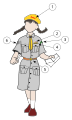 female version
 -
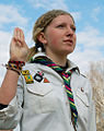 if you need something to do with their hands...
 -

-


Request: please help create a customizable graphic system using Scouting uniforms for Wikipedia:WikiProject Scouting/Article incubator/Template:Infobox WorldScouting uniform to incorporate it or use it as an adjunct to w:Template:Infobox WorldScouting
We need:
- long and short sleeve variants
- shorts and pants variants
- male and female variants
Thank you so much. We really appreciate it. Kintetsubuffalo (talk) 11:43, 24 June 2010 (UTC)
Graphist opinion(s):
![]() Request taken by Arnaud.ramey
Request taken by Arnaud.ramey
OK, here is my first shot : Scout_kit_test, the template is here Template:Scout_kit. I had to separate the different parts of the body, otherwise the white zones overlap. Arnaud Ramey (talk) 13:21, 9 September 2010 (UTC)
- Thank you for taking this, good start!--Kintetsubuffalo (talk) 07:07, 10 September 2010 (UTC)
It is kind of finished for the male version. Overview available on Wikipedia:Template:Scout_kit/sandbox. What do you think ? Arnaud Ramey (talk) 15:36, 10 September 2010 (UTC) The girl version is also done, cf Wikipedia:Template:Girlscout_kit/sandbox. Arnaud Ramey (talk) 17:40, 10 September 2010 (UTC)
- They're beautiful, thank you! The salute arm should be straight up, and if you want to tuck the other hand behind, that would look okay.--Kintetsubuffalo (talk) 19:03, 18 September 2010 (UTC)
- The templates are created, and Kintetsubuffalo and me are in contact for the small corrections. I consider the problem as solved. Arnaud Ramey (talk) 14:00, 24 September 2010 (UTC)
University seal[edit]
Request: This should be an easy one. We need a good clean version of the seal of the Indiana University of Pennsylvania, but the university's graphic standards page only has one with a watermark. So, could someone please grab that image and wpe out the watermark? Could the graphics lab also please change the color from gray to black? Here's the link: [14] Also, this is going to be non-free, so its gotta be uploaded to Wikipedia. Thanks everyone!--GrapedApe (talk) 05:30, 26 September 2010 (UTC)
Graphist opinion(s):
- Done —Quibik (talk) 08:04, 26 September 2010 (UTC)
University seal (x2)[edit]
Request: *Would someone be interested in cleaning up the seal of Saint Joseph's University? There's a watermarked version available at [15] Also, this is going to be non-free, so its gotta be uploaded to Wikipedia. Thanks everyone!--GrapedApe (talk) 19:50, 29 September 2010 (UTC)
- Done.[16].--GrapedApe (talk) 21:31, 15 October 2010 (UTC)
Ecology symbol[edit]
-
 Ecology symbol

Request: Some padding is needed between the image on the edge. Alan Liefting (talk) 06:17, 1 October 2010 (UTC)
Graphist opinion(s):
- Added 2-pixel blank margin on all sides... AnonMoos (talk) 17:16, 8 October 2010 (UTC)
Typo in diagram[edit]
-
 diagram of Celestial Pole

Request: File:Pole01-eng.jpg has a typo 'Acctual South Pole' The file also appears in en.wikipedia Dinoceras (talk) 14:42, 8 October 2010 (UTC)
Graphist opinion(s):
- Done. Actually, diagrams like this should really be redrawn in SVG, but simply removing an extra letter is quick and easy enough. I also took the opportunity to clean up some of the JPEG compression artifacts and resave with less compression. —Ilmari Karonen (talk) 14:05, 11 October 2010 (UTC)
Ambassadorial Flag[edit]
-
 Arms
Arms -
 Flag
Flag


Request: Please replace the current flag's eagle(and ornaments) with the one on the left. The way it is now does not suit well, it's way too complex for a flag. Thanks Fry1989 (talk) 23:27, 31 October 2010 (UTC)
Graphist opinion(s):
- Done how's that? ZooFari 00:02, 1 November 2010 (UTC)
- Perfect, and fast :D thanks alot mate. Fry1989 (talk) 00:07, 1 November 2010 (UTC)
Afghanistan Flag - Mistake[edit]
-
Correct Original image
Request: I uploaded the Vector image above, by taking it from the history of File:Flag of Afghanistan (1992).svg. I did not recognize that the order of the colors is different. Can someone correct that? Antemister (talk) 16:57, 1 November 2010 (UTC)
Graphist opinion(s): I have corrected it :) Fry1989 (talk) 19:01, 1 November 2010 (UTC)
- Done —Quibik (talk) 14:22, 19 December 2010 (UTC)
'crat logo[edit]


Request: Anyone want to take a stab at converting this to SVG? Connormah (talk | contribs) 19:50, 5 June 2010 (UTC)
Graphist opinion(s): ![]() Done — Preceding unsigned comment added by Jkwchui (talk • contribs)
Done — Preceding unsigned comment added by Jkwchui (talk • contribs)
Bad scan improvement[edit]


Request: Hi Guys, thank you very much for the precious work you are doing for the project. I'm used to just admire your masterpieces but this time I had to contact you and to bother you with a silly request. It's may be a hard or impossible task to ask you but I prefer to try. I guess you can manage it easily and, for sure, better than me. I have recovered from a digitalized 1905 Harper's Magazine those two pictures of the illustrator Howard Pyle about La Salle expedition in Texas (1684). Unfortunately , the Google scan is very poor. Mostly, colors: the too quick scanning blended them leaving those red-green spotty shadows. It's a pity because on the net there are only reduced versions of them and mostly from commercial sites, sometimes undownlodable even if in PD. So, those two are the only one free and large size. I have tried to correct something with Photoshop but, as you can see, with meager results. I'm a very disaster in photo retouching so, I wonder, if you experts can do something to them in order to ameliorate their quality. I know that you all are really busy so thank you very much for your time and your attention.Giorgiomonteforti (talk) 15:34, 22 March 2010 (UTC)
Graphist opinion(s):
- It looks like both of those scans have been scaled up by a factor of 4 — you can see the pixels when you zoom in. Curiously, though, the text in the original version of the first image, and the birds on the upper right of the second image that show up as black silhouettes, do not seem to be pixelated. It looks as if Google is actually doing two scanning passes — one high-resolution pass in 1-bit black&white, and a second low-resolution pass in color — and combining the results.
- Anyway, the upshot of all this is that I don't think there's much anyone can do about these images, and even if someone could correct the color Moiré effect, the resulting images would still have only around 725 x 1100 pixels of actual resolution. Sorry. —Ilmari Karonen (talk) 15:01, 28 March 2010 (UTC)
- As for the second image, I've simply tried to recolor some parts. It helped to get red of Moiré (partially), but I couldn't completely restore the original colors and grid is still visible. -- deerstop. 19:48, 9 June 2010 (UTC)
- Done. I scaled down both images by a factor of 4 and removed the moiré patterns (mostly by desaturating certain frequencies). They could still use some general improvements, though, like levels/colors adjustments and in the case of the second image, the right edge should be lightened. —Quibik (talk) 15:56, 19 December 2010 (UTC)
The Glugs of Gosh[edit]
-
 Inside front cover of a book I'm working on at English Wikisource.
 -
 Inside back
.JPG)
.JPG)
Request: Reduce the marks and shading, remove owners signature, remove or reduce the line and shadow down the middle. But mostly, improve contrast. Any assistance or advice gratefully received. Moondyne (talk) 06:32, 15 June 2010 (UTC)
Graphist opinion(s): I've worked for HOURS on it and the result is so bad that is doesn't even deserve uploading. :) I will upload it if noone else makes a better attempt. -- deerstop. 10:12, 23 June 2010 (UTC)
- Here's the best I could come up with so far. And yes, even that took some time. Still, I figure that it might at least serve as a mask for more advanced inpainting-based extraction methods. (Oh, and FFS... I forgot about the PNG scaling limit. Feel free to reupload a JPEG copy if you want.) —Ilmari Karonen (talk) 12:01, 23 June 2010 (UTC)
-
 Graph of trigonometric functions

Request The colors on that file are all a-jumble, and I can't really tell which is which just by a glance at it. Also it distracts our poor readers' eyes. I suggest that the reciprocal functions of the trigonometric functions are similarly colored to the trigonometric functions themselves. (e.g. sine="dark blue", cosecant="light blue"...) Does someone know how to change the colors? TeleComNasSprVen (talk) 02:13, 27 June 2010 (UTC)
Graphist opinion(s):
![]() Done: I've made the colours of the primary and associated reciprocal functions the same, changed all primary functions to be solid lines, changed all reciprocal functions to dotted lines, and re-ordered the reciprocal functions in the key to match their primary function (cosecant is the reciprocal of sine, rather than cosine). You can change colours by changing 'Fill and Stroke' in Inkscape (<CTRL>+<SHIFT>+F). Gringer (talk) 15:13, 2 August 2010 (UTC)
Done: I've made the colours of the primary and associated reciprocal functions the same, changed all primary functions to be solid lines, changed all reciprocal functions to dotted lines, and re-ordered the reciprocal functions in the key to match their primary function (cosecant is the reciprocal of sine, rather than cosine). You can change colours by changing 'Fill and Stroke' in Inkscape (<CTRL>+<SHIFT>+F). Gringer (talk) 15:13, 2 August 2010 (UTC)
- Thanks so much! TeleComNasSprVen (talk) 17:30, 2 August 2010 (UTC)
JPG stitching[edit]
-
 My stitch-job.
 -
 JPEG
JPEG


Request: If this is the wrong forum, I apologize but I didn't see any better location. This image was stitched together by me from a series of 12 jpg files. Is anyone aware of a method for losslessly stitching together multiple jpg files? Or better yet, have a script that would do it for me so I could replace my png with a much smaller jpg? VernoWhitney (talk) 18:29, 27 June 2010 (UTC)
Graphist opinion(s):
- You can only work with 8×8 pixel blocks in lossless mode, which limits your freedom of adjustments severely. So I doubt that this can be done losslessly. How about simply saving the image as a minimally compressed JPEG? Even a 100% quality JPEG would be much smaller than the PNG and with only very marginal compression artifacts. —Quibik (talk) 16:12, 28 June 2010 (UTC)
- I also adjusted the tone of the image, which looked too blue to me. Is it better this way? —Quibik (talk) 16:52, 28 June 2010 (UTC)
- As far as the tint goes, I haven't seen any other version of the picture, so I have no idea what shade it's actually supposed to be. I'll try posting JPGs of this and two other images I have that need stitched together and see how they look. VernoWhitney (talk) 17:03, 28 June 2010 (UTC)
- Taking the other images of paintings in Category:Henri Pierre Picou as a reference, I think my edit was quite correct. —Quibik (talk) 20:05, 28 June 2010 (UTC)
- As far as the tint goes, I haven't seen any other version of the picture, so I have no idea what shade it's actually supposed to be. I'll try posting JPGs of this and two other images I have that need stitched together and see how they look. VernoWhitney (talk) 17:03, 28 June 2010 (UTC)
- It would probably be best not to advise people to save JPEGs with a 100% so-called "quality" factor in the vast majority of cases; such JPEGs are not lossless, and if you go beyond the low nineties, then you generally get a large increase in file size without much corresponding improvement in real image quality... AnonMoos (talk) 16:27, 29 June 2010 (UTC)
- That's true, but my comment was not intended so much as a suggestion for saving JPEGs with ridiculously low compression, but rather against using PNG for photographic images. —Quibik (talk) 17:56, 29 June 2010 (UTC)
- Okay, I took your advice and saved it at 95% quality with some other settings tweaked to get a reasonable size. I also uploaded File:Picou, Henri Pierre - The Judgement of Paris - 19th century.jpg, File:Picou, Henri Pierre - Loss of Innocence - 1885.jpg and File:Picou, Henri Pierre - Innocence Seduced by Love - 1886.jpg in the same fashion. And If they appear to be an acceptable compromise between file size and compression artifacts, then I guess this "request" is done. VernoWhitney (talk) 14:34, 30 June 2010 (UTC)
- Oh, and while most of his pictures are certainly in warmer shades than this one, not all are, for example File:Picou, Henri Pierre - The Hammock - 1884.jpg (either that or it's off-color too) so I'm still unsure about adjusting the tone. VernoWhitney (talk) 14:40, 30 June 2010 (UTC)
- Yeah, when I had a new, fresh look at both of the versions side-by-side, the original looked more natural to me too. So, I agree. --Quibik (talk) 16:18, 30 June 2010 (UTC)
- Oh, and while most of his pictures are certainly in warmer shades than this one, not all are, for example File:Picou, Henri Pierre - The Hammock - 1884.jpg (either that or it's off-color too) so I'm still unsure about adjusting the tone. VernoWhitney (talk) 14:40, 30 June 2010 (UTC)
- Okay, I took your advice and saved it at 95% quality with some other settings tweaked to get a reasonable size. I also uploaded File:Picou, Henri Pierre - The Judgement of Paris - 19th century.jpg, File:Picou, Henri Pierre - Loss of Innocence - 1885.jpg and File:Picou, Henri Pierre - Innocence Seduced by Love - 1886.jpg in the same fashion. And If they appear to be an acceptable compromise between file size and compression artifacts, then I guess this "request" is done. VernoWhitney (talk) 14:34, 30 June 2010 (UTC)
- That's true, but my comment was not intended so much as a suggestion for saving JPEGs with ridiculously low compression, but rather against using PNG for photographic images. —Quibik (talk) 17:56, 29 June 2010 (UTC)
- It would probably be best not to advise people to save JPEGs with a 100% so-called "quality" factor in the vast majority of cases; such JPEGs are not lossless, and if you go beyond the low nineties, then you generally get a large increase in file size without much corresponding improvement in real image quality... AnonMoos (talk) 16:27, 29 June 2010 (UTC)
US state seals[edit]
-
 Seal of Montana
 -
 Vermont PNG
 -
 Vermont SVG - Arnaud
 -
 Vermont B&W SVG - Arnaud
 -
 South Carolina JPG


.svg)

Request: The following heavily used state seals have outdated license and are unsourced, and could be deleted at anytime. Please create free variants of them. New files should follow the established naming convention: File:Seal of Montana.svg, File:Seal of Vermont.svg, File:Seal of South Carolina.svg. Svgalbertian (talk) 04:25, 4 July 2010 (UTC)
Graphist opinion(s):
I've made the seal of Vermont, at File:Vermont_state_seal.svg. I uploaded it with a wrong name, but created a redirection. Move the file if you think it is better. Arnaud Ramey (talk) 12:43, 24 September 2010 (UTC)
- Thank you very much. Excellent work. --Svgalbertian (talk) 14:32, 24 September 2010 (UTC)
I've now made the Montana one. I am not exactly satisfied with the rendering using parallel black strokes, but that was the best I got to be close from the original one. There are also some rendering bugs with Wikimedia (compared with the rendering in Inkscape), I try to get rid of them. I also used a blue sky as in the hi-res version. Arnaud Ramey (talk) 15:49, 25 September 2010 (UTC)
- I tried to fix the upload from Hydrox, but for some reason it will still not render. Your image still has some issues however. In Firefox, the sky disappears. With Wikimedia (librsvg), the image cannot be scaled below 115px or else the entire image disappears except for the sky (e.x. [17]). I am unsure what is causing the Firefox issue, but Mediawiki tends to have issues with blurs.--Svgalbertian (talk) 16:07, 26 September 2010 (UTC)
- A easy and dirty fix is to remove all the blur effects of the image. And may be some gradients also, especially if they contain colors with an opactiy < 100%. I've already encountered this kind of trouble with Wikimedia. I will give a shot tonight ( GMT+1 :) ). Arnaud Ramey (talk) 07:53, 27 September 2010 (UTC)
- Done Problem solved. The problem was in the black stroked patterns. I've redrawn them using regular lines, disposed using the Rows tool of Inkscape. Now it is rendering OK, even the thumbnail version. Tell me if you experience further bugs. Arnaud Ramey (talk) 13:34, 28 September 2010 (UTC)
- Awesome, thanks for you hard work. It sounds like this bug, https://bugzilla.gnome.org/show_bug.cgi?id=538841. I really hope that Wikipedia will help fund fixing the bugs in this libary, see strategy:Proposal:Librsvg development funding.--Svgalbertian (talk) 16:49, 28 September 2010 (UTC)
- Yeah, I think that's the same thing. Hum, the list of things to avoid becomes long : small patterns, blur effect, text objects (that must be converted to paths)... Well, at least we know. Arnaud Ramey (talk) 19:20, 28 September 2010 (UTC)
Fuse[edit]
-
 Illustration from the inside of a fuse.
 -
 The same illustration, but important parts are numered. 1 and 2 are the electrical wires, 3 is a little spring, 4 is the color code on the back (in this case: red for 10 A) and 5 is the sand.
 -
 svg version.


Request: Could you create a svg-version of these images I created? The lines need to be tighter (when you see one of these images in full size, you'll exactly see what I mean). Also: the sand colored piece in both images symbolises sand, so maybe grains (or something like that) can be drawn there. Ischa1 (talk) Ischa1 (talk) 12:00, 25 July 2010 (UTC)
Graphist opinion(s):
![]() Request taken by Kbentekik
Request taken by Kbentekik
Here a copy of the figure to svg.
Mercator and straightened rhumb[edit]
-
 math fig from Inkscape with text

Request: I would be very grateful if anyone can suggest why the above svg file (from Inkscape) doesn't render properly. It is fine before it is uploaded. This must surely be something to do with fonts. Some of the text does render but I'm not sure how to improve the font. (You will also see that I have uploaded many attempts. What is the easiest way of wiping all the previous versions.) Thanks in anticipation. Peter Mercator (talk) 20:06, 30 July 2010 (UTC)
Graphist opinion(s): You need to convert the text to paths in order for it to display well on wikipedia using the current renderer. However, the black blocks are probably because you are using flowed text in Inkscape, and there's not really an SVG standard for that. Inkscape has an 'unflow' option for text that converts flowed text into standard text blocks (but you lose the goodness of flowed text by doing that). Gringer (talk) 15:07, 2 August 2010 (UTC)
- regarding wiping version history, you need to talk to an Administrator for that. There's not usually much reason to remove history — it demonstrates that you're persistent, at least ;) Gringer (talk) 15:09, 2 August 2010 (UTC)
- Many thanks for your comments. A few points in reply. Firstly the text wasn't flowed. Secondly only that on the right was affected by the black rectangle and when the text was moved to the left side it was ok. So, I opened a new inkscape file and copied all the separate elements to the new file and re-assembled them. Success. The inkscape file must have been corrupted in some way! Shall leave you to close this topic. Thanks again. (PS. Could wiki have a previewer for svg files?) Peter Mercator (talk) 10:47, 3 August 2010 (UTC)
- There was definitely flowed text in the file, it just didn't have any content (i.e. a flowed region, but nothing inside it). This can be noticed by looking at to source of the older versions with black boxes and seeing a 'flowRoot' / 'flowRegion' node. Both firefox and wikimedia have different opinions about flowed text than Inkscape (i.e. they both replace flowed regions with black boxes). It is also possible that by moving text to the left you produced a different clip boundary for the picture that excluded the flowed text. Gringer (talk) 01:25, 26 September 2010 (UTC)
- Many thanks for your comments. A few points in reply. Firstly the text wasn't flowed. Secondly only that on the right was affected by the black rectangle and when the text was moved to the left side it was ok. So, I opened a new inkscape file and copied all the separate elements to the new file and re-assembled them. Success. The inkscape file must have been corrupted in some way! Shall leave you to close this topic. Thanks again. (PS. Could wiki have a previewer for svg files?) Peter Mercator (talk) 10:47, 3 August 2010 (UTC)
Étienne de Jouy[edit]
-
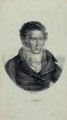 DjVu file
 -
 PNG file
 -
 Another version


Request: The first page of this DjVu file contains a portrait of the author fr:Étienne de Jouy, which could be used to illustrate articles or WS author pages about him, if it were extracted and cleaned up. V85 (talk) 19:37, 30 September 2010 (UTC)
Graphist opinion(s):
![]() DoneI made a PNG out of it, and made it transparent. Richardprins (talk) 15:44, 13 October 2010 (UTC)
DoneI made a PNG out of it, and made it transparent. Richardprins (talk) 15:44, 13 October 2010 (UTC)
- Lovely, thanks! V85 (talk) 23:26, 15 October 2010 (UTC)
- I had a go at it too. BTW, can anyone make out what the signature on the drawing says? It looks something like "Werther Iith" to me, but I've probably got a letter or two wrong there. —Ilmari Karonen (talk) 23:15, 17 October 2010 (UTC)

Request: Please see the discussion about this. I want to somehow do away with the weird thumbnail appearances. :| TelCoNaSpVe :| 04:39, 28 October 2010 (UTC)
Graphist opinion(s):
- There's also a problem with the graph itself looking jagged if you zoom in enough. It looks like the control point coordinates have been rounded off to the nearest pixel. I replotted the graph using my version of gnuplot, which (mostly) fixed that problem, but not the text issue. I think that's either a font problem or a bug in the version of librsvg used on Wikimedia's servers, since rsvg-view displays it just fine on my computer. —Ilmari Karonen (talk) 15:14, 28 October 2010 (UTC)
- I modified the curve in the plot to use a quadratic primitive instead of a bunch of points. ~2000→2 nodes :) —Quibik (talk) 16:15, 28 October 2010 (UTC)
- ...and I did the same and uploaded my version before noticing yours. :) Anyway, I took your version (which was quite a bit more compact) and replaced the curve with mine (which is an actual SVG "Q" type spline, not a "c" spline). I also remove the quotes from around the font name, since apparently librsvg doesn't handle quoted font names right (even though the spec says otherwise). —Ilmari Karonen (talk) 16:37, 28 October 2010 (UTC)
- I modified the curve in the plot to use a quadratic primitive instead of a bunch of points. ~2000→2 nodes :) —Quibik (talk) 16:15, 28 October 2010 (UTC)
Part of SVG image obliterated by black box[edit]
-
 Diagram for addition formula for cosines.

Request: This image renders fine in Inkscape 0.45 but the part with the most detail shows as a black box here, and also when drawn directly in firefox. The obliterated part has an alpha, a beta (done as paths as is the alpha near the top which works) and curved lines to indicate the angles. Any ideas what I am doing wrong/how to fix it? JamesCrook (talk) 21:01, 31 October 2010 (UTC)
Graphist opinion(s):
- Done, there were some <flowRoot> and <flowRegion> tags left in the code, presumably because some of the letter used to be flowed text. Wikimedia's SVG renderer doesn't support those tags, and rendered the <rect> inside them as a black rectangle. I just deleted those tags from the code and reuploaded. BTW, you can use this tool to check your SVG images for such problems before uploading. —Ilmari Karonen (talk) 22:36, 31 October 2010 (UTC)
Fractal stars[edit]


.svg)
.svg)
Request: I would be really grateful if someone was willing to make two versions of the silver star with the check and the cross, just as the two first golden ones. Thanks a lot (and sorry if the English is not great), Opraco (talk) 22:56, 13 November 2010 (UTC)
Graphist opinion(s):
![]() Request taken by Fry1989:
Request taken by Fry1989:
![]() Done: Fry1989 (talk) 21:46, 16 November 2010 (UTC)
Done: Fry1989 (talk) 21:46, 16 November 2010 (UTC)
Canadian wikimedians want identifying mark[edit]
-
 Wikimedian Community logo
 -
 Wikimedia logo
 -
 Flag of Canada
 -
 Maple leaf in use on en.WP Wikiproject Canada
 -
 Logo options

.svg)
Request: Forming a Canada wikimedian group, and would like a logo representing the country and the association with the Wikimedia movement. Some variants which spring to mind would include:
- Wikimedia Community logo, except the transparent globe grid superimposed on a Canadian maple leaf
- The color ring be transformed to the red-white-red tri-color.
- The entire logo be done solely in red monochrome
- Amgine (talk) 20:13, 8 December 2010 (UTC)
- Suggestion of a German: Replace the red circle of the wikimedia logo by the maple leaf--Antemister (talk) 22:12, 8 December 2010 (UTC)
Graphist opinion(s):
![]() Done several options. Have a look and choose what you like. Personally I like the top-right option the most. -- Orionist ★ talk 11:45, 22 December 2010 (UTC)
Done several options. Have a look and choose what you like. Personally I like the top-right option the most. -- Orionist ★ talk 11:45, 22 December 2010 (UTC)
Flag of Moldova[edit]
-
 SVG flag, right colors, wrong proportions of coa
 -
 Construction sheet


Request: According to new law (issued 2010-11-26), the coat of arms of Moldova has different proportions on the state flag of Moldova, as you can see in the construction sheet. I've managed to correct the colors, but not the proportions. What I ask is:
- Correct proportions and placement of the coa. The construction sheet must be interpreted in such way that if the flag has 2000 x 1000 px, the coa width (the length between the external tip of the wings) is 400px, height is 560px, and the central axis that runs trough aurochs' ears is set upwards at 30 px distance of the central axis of the flag (the construction sheet is a mess between proportions and actual dimensions, but the text clearly states what I've said)
- Create a mirrored image of the resulting flag, and upload it as File:Flag of Moldova, reverse.svg. According to article 2.3, the reverse is now the mirrored image of the obverse.
- Create an svg construction sheet, based on the corrected flag, which has all the dimensions given as proportions of the width (w, l = 3/2*w, coa width = 40%*w or 1/5*l, coa height = 56%*w, horizontal offset = 3%*w). --Alex:D (talk) 14:20, 27 December 2010 (UTC)
Graphist opinion(s):
![]() Done: It seems I had some problems with MIME type that are solved now. --Alex:D (talk) 16:18, 27 December 2010 (UTC)
Done: It seems I had some problems with MIME type that are solved now. --Alex:D (talk) 16:18, 27 December 2010 (UTC)
Afghanistans Coat of arms[edit]
I tried to extract the historic afghan CoAs from the flags, but i was not successful with four of the flags because it was not possible to select the arms. I usually do not create vector graphics, can some of the experts here create the four missing CoAs? File:Afghanistan arms 1919-1928.svg File:Afghanistan arms 1931-1973.svg File:Afghanistan arms 1973-1974.svg File:Afghanistan arms 1992-2002.svg
.svg)
.svg)
.svg)
.svg)
.svg)
.svg)
.svg)
![[1]](http://www.goodturnforamerica.org/support/partners/PENN1.jpg)
![[2]](http://www.goodturnforamerica.org/support/partners/PENN2.jpg)
![[3]](http://www.goodturnforamerica.org/support/partners/PENN3.jpg)
![[4]](http://www.goodturnforamerica.org/support/partners/PENN4.jpg)
![[5]](http://www.goodturnforamerica.org/support/partners/PENN5.jpg)
![[6]](http://www.goodturnforamerica.org/support/partners/PENN6.jpg)
![[7]](http://www.goodturnforamerica.org/support/partners/PENN8.jpg)
![[8]](http://www.goodturnforamerica.org/support/partners/PENN9.jpg)
![[9]](http://www.goodturnforamerica.org/support/partners/PENN10.jpg)
![[10]](https://upload.wikimedia.org/wikipedia/sr/archive/6/6c/20090706233125!Zastava_isto%C4%8Dnog_sarajeva.gif)
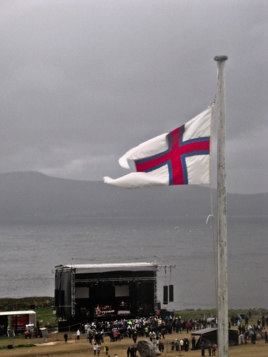
.svg)
.svg)
.svg)
.jpg)
![[12]](http://washjeffhockey.com/teamphoto0910_1.jpg)
![[13]](http://www.washjeff.edu/uploadedImages/External_Relations/For_the_Media/logo_old.gif)
.png)
.svg)
.png)
![[17]](https://upload.wikimedia.org/wikipedia/commons/thumb/0/03/Seal_of_Montana.svg/110px-Seal_of_Montana.svg.png)
The colours of File:Afghanistan arms 1978-1980.svg need to be corrected according to [18]--Antemister (talk) 09:09, 30 August 2010 (UTC)
![[18]](http://www.crwflags.com/fotw/images/a/af%291978.gif)
- Done by several graphists--Antemister (talk) 08:20, 25 March 2011 (UTC)
ć