Support I optimized colors and uploaded the photo under a very decent resolution (near 1:1 crop). Only the outer right part of the winh is slightly out of focus. But all the other important parts are sharp. Fabelfroh11:24, 21 October 2007 (UTC)[reply]
Opposefor now - Needs some improvements to reach FP level. Here are a few suggestions: (i) Crop the map at north, that area is never used; (ii) Insert the legend in the picture so that it is always visible; (iii) Instead of just writting the date, insert a time scale and a marker, which should move from left to right (BTW, times before Christ should have some kind of indication); (iv) The Europe map looks naked, some generalized geographic information would fit well in the representation. This suggestions also apply to the animation below - Alvesgaspar19:59, 21 October 2007 (UTC)[reply]
Comment If the legend is included, it can only be in one language. If the legend is external, it can be done in every language needed. So just add the legend to the description page.. --Jeses11:09, 22 October 2007 (UTC)[reply]
(*ponders strangling Beyond silence and deleting his template*) If it doesn't succeed here because of technical quality and composition, why would it become a QI? --Pumpmeup05:57, 23 October 2007 (UTC)[reply]
Neutral (original) Beautiful! Near mitigating composition. It is not because this picture was shot down that I have to oppose a similar one ;-). Lycaon08:51, 22 October 2007 (UTC)[reply]
Support --IMO the original is the best as the noise has more the aspect of natural film grain, which is not the case for the edited versions where it looks like more digital blur. Grain is acceptable but it depends on the subject of the photograph. In this case (photograph of animals), it's not « top », but the overall visual quality of the picture makes it really good. Sting12:55, 23 October 2007 (UTC)[reply]
Info - I have uploaded a edited version, but I really think the image is beyond repair. It's a shame because the composition is very nice. Alvesgaspar22:54, 21 October 2007 (UTC)[reply]
Comment - First of all, thanks Alvesgaspar, I like your version better... On the other hand, I come from the days where grain is just grain, generally accepted and given "normal" considerations, part of the image. Noise is nothing else but digital grain. Back in the old days, one could choose fine grain film, fine grain processing at the expense of not getting the image. It is no different now... one must choose ISO speed over other considerations in order to get the image. Not because the camera can produce noisless images, due maily to ISO setings, it means that every picture must be grainless. All pictures will show noise at certain magnifications, just like in the old days. And besides, screen displays are so far from print displays that some of these observations about noise are completely irrelevant. Noise, most of the time, is irrelevant. Grain, most of the time, is irrelevant. Some of the greatest pictures ever, were taken with the good old Kodak Tri X film, pushed, pulled, and grainy... What I see here, over and over, is a general misunderstanding of the medium and how the medium is evaluated and appreciated. Form is privileged over content. Alleged technical quality is privileged over true photographic quality. As I have often said, do not miss the lanscape beyond the window... Photography is just a medium... ----Tomascastelazo03:34, 22 October 2007 (UTC)[reply]
Oppose --For the edited version : if the noise of the background is better, the post-processing introduced heavy rainbow artefacts on the birds (head, body, their image in the water). Sting12:37, 22 October 2007 (UTC)[reply]
Oppose Oppose all versions. Very beautiful picture and composition but for my taste I dont see any mitigating reasons here. Low Q @ 3k, its a pity!° --Richard Bartz14:09, 22 October 2007 (UTC)[reply]
No FP detail? Give me a break, you can count the hairs on his fur or on his ears! And what about composition? I have trouble imagining a better composition for describing a vizcacha on wikipedia! --Nattfodd16:29, 22 October 2007 (UTC)[reply]
I quote: "Wikimedia Commons is a freely licensed media file repository (similar to stock photography archives) targeted at other Wikimedia projects." Wikipedia, I think, is an encyclopedic effort. Problem here is that there is sooooo much photography around here that is not appreciated for that value...--Tomascastelazo23:52, 22 October 2007 (UTC)[reply]
Indeed, but they really look like (ugly) rabbits. And Pumpmeup, you really have some wild imagination to find it cute ;) --Nattfodd08:49, 23 October 2007 (UTC)[reply]
Support Qu'il est mignon le mossieur ! (au passage, les critiques sur les parties "impressionnistes" que j'ai faites sur ta photo du bas sont valables ici, pourquoi ces étranges couleurs qui bavent un peu ??) -- Benh17:48, 26 October 2007 (UTC)[reply]
Please try to make sense (and stop redirecting people to QI when you reject FP status for technical reasons. It makes no sense.) --Nattfodd21:21, 22 October 2007 (UTC)[reply]
Neutral I want to support but it really isn't sharp enough, that's a shame. Great composition and colours. Hopefully next time, you'll have a bigger camera :) --Nattfodd21:21, 22 October 2007 (UTC)[reply]
Thanks for your opinion.
Neutral Ack Nattfodd. This world is not really hostile, but just (very) critical. Don't let you discourage. Try and try again, first in the QI section, and you will succeed! -- MJJR21:31, 22 October 2007 (UTC)[reply]
Thanks for your opinion. I understand the critics.
Comment Looks good, but before I vote a few small comments. (1) I would prefer full line labelling. (2) Maybe a bit more space around the two-figure numbers. (3) Why not also sectioning the bolt? It is a bit weird that that is the only part which has a 3D look. For the rest: well done. Lycaon17:42, 22 October 2007 (UTC)[reply]
Full line labelling = les pointillés rouges foncés pour les annotations would probably look better as full lines, but it is not a conditio sine qua non. And I've looked at the request of the French graphics workshop, but there no explanation is given why the bolt has to be in 3D. Oh yes, BTW, you don't have to be sorry that you are French ;-)). Lycaon18:20, 22 October 2007 (UTC)[reply]
Oppose for now. The illustration is so good that definitely deserves a better labelling. The lines should be a little longer and full, like Lycaon suggests. Also, the circles are too small for such big numbers (or the other way around...). Alvesgaspar08:35, 23 October 2007 (UTC)[reply]
Support Nice scheme. La largeur gagnerait à être augmentée, ce qui permettrait d'aérer les numéros. Et rien n'empêche de mettre des numéros au dessus et en dessous de l'image, plutôt que d'avoir tout sur deux côtés. The circles should have the same diameter. Sémhur08:50, 23 October 2007 (UTC)[reply]
Neutral because of the less than optimal labelling. The reason it looks so heavy is the use of circles round the numbers (these would never be allowed in professional patent drawings). Get rid of the circles, use thinner but non-dotted leadlines and this would be perfect. The drawing itself is excellent. --MichaelMaggs06:25, 24 October 2007 (UTC)[reply]
Comment - Agree with MichaelMaggs, the circles are ruining the labelling. Also, as I said above, full lines should be used (but thin lines, not the ones shown in your example) - Alvesgaspar11:26, 24 October 2007 (UTC)[reply]
Support Travail époustouflant qui mérite d'être récompensé! Je ne regrette qu'une seule petite chose: le style graphique contrasté de la mèche par rapport au reste de la grenade Karta2420:44, 29 October 2007 (UTC)[reply]
... je suis aussi de ton avis mais hélàs faire une jolie mèche en svg n'est absolument pas de mon niveau. J'ai donc pris une photo de ficelle, tenté et intérgé. Si tu peut faire mieux j'en serais ravi ! -- Walké21:16, 29 October 2007 (UTC)[reply]
Several reasons, file size and viewing conditions being two of them. Too big and the 100% view gives you no sense of place in the confines of a computer screen. As it is, it's 50% bigger than the recommended height... glad you like it, anyway. --mixpix21:12, 22 October 2007 (UTC)[reply]
That's what stitching and downsampling can do for you if well performed (as it is here). You should give it a try. Lycaon21:25, 22 October 2007 (UTC)[reply]
Support The sharp detail you see in this pic at 100% is incredible. Could you give us some info about it (how many pictures, what lens you used)? --JaGa03:40, 23 October 2007 (UTC)[reply]
Info Of course :) this is a 4x3 mosaic. I used a Canon EF-S 17-55mm at 55mm, f/8.0, 1.6sec and ISO 100. The original picture was much larger, but my target was something which fits into a 5000x5000 square with great sharpness, hence the actual resolution. I oversharpened the larger version (but not so much) and then downsampled it so even the little details remain visible enough. I'll update the description page tonight. Benh09:24, 23 October 2007 (UTC)[reply]
I'd like to accept the compliment, but I can't :) It seems you believe I used the 18-55mm... the 17-55mm is a totally different one, and it is a topnotch lense !! The best or one of the best in this focal range for sure... (see links on my user page for reviews). That said, it's certainly possible to get similar results from the 18-55 -- Benh06:56, 25 October 2007 (UTC)[reply]
Neutral - The detail on the arch is amazing and I'll probably support this picture later. There are some issues though: (i)I also don't like the perspective very much, the monument seems to be leaning to the right; (ii) What about the strict French law on monument pictures? (iii) The picture won't pass with this noisy sky!... Alvesgaspar08:30, 23 October 2007 (UTC)[reply]
For the perspective, I chose to have the vertical lines converging slightly, so it looks natural enough. I could choose another anchor point and another anchor vertical line. What would you suggest, so I can give it a try ? I'll fix the noise in the sky tonight (I used wrong parameters when sharpening this one...). There is no copyright problem, as Semhur mentionned below. Benh09:24, 23 October 2007 (UTC)[reply]
For the perspective, nothing wrong with the converging verticals but I would move the anchor vertical line to the longer edge of the building (or slighly right of it?). Like it is, the edge at right is almost parallel to margin. Alvesgaspar15:11, 23 October 2007 (UTC)[reply]
I Haven't forgotten you :) It's even done actually but I'd like to fix issue raised by Sting, and it's very hard. Benh07:04, 24 October 2007 (UTC)[reply]
Support Detail is excellent. About the french law, it's not a problem here, because the Arc de Triomphe is two hundred years old. Sémhur09:09, 23 October 2007 (UTC)[reply]
Oppose (for now) Good point of view and very good lightning. Excellent idea to make a mosaic which brings the level of details of a medium format camera, but… there are perspective problems and heavy lens distortions in barrel (for sure the use of the EF-S lens, one of the worst of Canon, didn't help). One concrete example : at the right, just left of the Eiffel Tower, the first level of the building is curve and goes to the left and the upper level goes to the right. This picture needs a lot of work in order to correct these issues (that's the problem of making a mosaic of a too close subject) : you will have to correct the distortion of each photograph (see here) and after mounting the mosaic, the general perspective. Alternatively, as Alvesgaspar wrote, it would be also good to soften some parts of the sky which makes blurs. Sting12:27, 23 October 2007 (UTC)[reply]
True. Hard to fix... It may be not only due to distorsion, but also to the fact that overlapping areas between pictures are very small, and then Hugin takes some liberty when warping pictures. I tried a restitch last night, which didn't give expected results, and I'll try another way when I can (hopefully by the end of this week)... Benh07:04, 24 October 2007 (UTC)[reply]
Juste une information concernant l'objectif utilisé... ce n'est pas un EF-S 17-55 de base mais le 17-55 f/2.8 IS USM qui est un excellent objectif (voir les liens vers les tests sur la page de Benh)... Sanchezn09:58, 24 October 2007 (UTC)[reply]
Oups ! Ah oui, ce n'est pas le 18-55 mais le 17-55 qui a été utilisé. Désolé. Mais à priori il a était réglé sur une focale de 17mm au vu des distorsions. Dommage. Sting15:23, 24 October 2007 (UTC)[reply]
Décidément je n'ai pas les yeux en face des trous !! Il serait alors bon d'essayer avec un autre soft parce que celui-ci fait àmha un travail catastrophique qui n'est pas digne de cette image. Sting17:42, 24 October 2007 (UTC)[reply]
ça n'est pas Hugin, Hugin utilise les Pano Tools, comme PT Gui (bien que maintenant, celui-ci a son propre moteur dans certain cas). En fait, comme les images ne se chevauchent que sur une petite zone, Hugin déforme l'image en ne donnant priorité que sur cette zone, et se fiche du reste. Les images du droite sont corrigé en priorité sur leur partie gauche, ça peut donner de mauvaises surprises, comme celle que tu as si bien remarqué. J'ai refait le collage hier, avec nouveau paramétrage, et je suis fiers de te dire que j'ai corrigé le problème (ainsi que les autres mentionnés dessus) ! J'ai demandé à sanchezn mon bêta testeur ;) de faire une dernière passe dessus, puis j'écraserai la présente version. Benh06:56, 25 October 2007 (UTC)[reply]
It would be really a pity if these distortions couldn't be fixed because this photograph has the potential of a very great picture. Sting15:23, 24 October 2007 (UTC)[reply]
P.S. : Btw, the picture is not categorized !
Support now : The perspective is much better as well as the sky, the picture is now categorized (but I cleaned them as cat:Arc de Triomphe is a sub-cat of all the others so they were unnecessary). The barrel distortions in each single image from the mosaic are still well visible so the picture is not as great as it could (should ?) be, but the overall quality (and work it needed) makes me think it's a very good picture which deserves the Quality label. Sting14:08, 26 October 2007 (UTC)[reply]
No copyright problem, I think. The building itself is too old for copyright and although in France claims have been made to copyright in lighting schemes (especially of the Eiffel Tower), this is not a copyright lighting scheme but a series of flood lamps. --MichaelMaggs16:15, 23 October 2007 (UTC)[reply]
Info Yes, no copyright problems for the building itself. As far as I know (I haven't checked the accuracy of what I'm going to say), night lightings aren't copyrighted either, unless they add a very artistic value to the rest. I think the "standard" lighting of Eiffel Tower (as seen on this pic) isn't copyrighted but the sparkling lights are. Benh16:54, 23 October 2007 (UTC)[reply]
Info This FAQ says that publishing night pictures of the Eiffel Tower is copyrighted. Normally, this picture isn't concerned as the eiffel tower is far from being the main subject, is show in half of its part, and because of this case law. Benh17:03, 23 October 2007 (UTC)[reply]
InfoAbout copyright issues (again !). I just gave a call to the people in charge of Arc de Triomphe, and I've been confirmed that this picture is freely diffusable. Arc de Triomphe is in the public domain, lighting isn't copyrighted either (it seems to be very specific to the Eiffel Tower). The only thing that could have prevented such a picture to be diffused is the location from where it was taken. Some people might be interested to know that Pictures taken from the roundabout cannot be diffused (I don't understand why !! The more I dig into copyrights stuffs, the more I get lost...). Benh14:44, 24 October 2007 (UTC)[reply]
InfoAbout copyright issues (again and again !). People has to understand how this stuff works in France in order to a) not upload copyrighted material, b) stop asking each time the same questions about the legal validity of a photograph. The two most famous school cases are a) the Eiffel Tower by night because the lightning is operated by a commercial and private firm earning money from it's pictures (even if the building is public, that's why you can shoot it by day without problem) and b) the Pyramid at The Louvre (day or night) because the building is recent and considered an artistic work copyrighted by it's architect. This, as well as for some other buildings, applies only if the photograph pictures the building as main subject of the image. The striking (and quiet contradictory) example is the Pyramid which is so big that if you want to snap the main courtyard of The Louvre Palace, the Pyramid will occupy a big part of the picture. That's authorized as you can neither move out the Pyramid, nor find another POV for the courtyard without it. That's why this one is legally authorized, but I doubt this other one or that one are and should be deleted imo. For our example above, the Eiffel Tower is really a minimal element of the picture and obviously not the main subject, that's why the copyright on it's lightning can't apply here. About the Arc de Triomphe itself, of course it's an old building so no problem on this side and it's lightning isn't operated by a commercial firm in the contrary of the specific case of the Eiffel Tower. I hope it's clear enough so these questions about freedom of panorama and copyright law in France will not be asked each time a picture appears here. Sting16:25, 24 October 2007 (UTC)[reply]
Nothing really wrong : as well as in other countries, recent artwork or firm / private creations are protected by copyright. What makes people usually think wrong about these two examples is that they are located in public places. Sting14:16, 26 October 2007 (UTC)[reply]
Done I fixed issues raised above : 1. anchor vertical line moved to the left edge of the right arch so the whole thing doesn't lean to the right anymore. 2. restitched in a different way so the rightmost edge doesn't dangle any more. 3. Noise in the sky slightly reduced (but not so much). I overwrote the previous picture as I believe this is an obvious improvement. Thanks to everyone for the detailed reviews which showed the problems ! -- Benh17:11, 25 October 2007 (UTC)[reply]
Oppose Yes, here it comes. The construction of the experiment looks interesting but i have the feeling that the colors/picture looks dull/sad. It's not banging for me, sorry. Have a look at this, which is more expressive (only to point out what i mean) --Richard Bartz14:53, 23 October 2007 (UTC)[reply]
Comment A valiant attempt to protect the flower from the flame, but I think it is all in vain: someone has cut the flower from its stem and it will shortly wither :-( --Tony Wills09:20, 1 November 2007 (UTC)[reply]
Oppose Shadows across the head, prominent out-of-focus sticks in the foreground, not easy to distinguish subject from setting. --JaGa19:12, 23 October 2007 (UTC)[reply]
Comment This was a bad place to take the picture. The pic should've been shot where you can actually see the subject, like in the pic below. --JaGa19:55, 24 October 2007 (UTC)[reply]
Comment I wanted it in it's natural environment, unlike the picture below, and without having to use a flash, unlike the picture below. :) Lycaon21:16, 24 October 2007 (UTC)[reply]
Info The Great Blue Heron, Ardea herodias, is a wading bird in the heron family Ardeidae
Question Ok I think I will merge these and update the image with the original background version since there is no opposition on Fir0002 point of view. If there is a problem, I'll revert theses changes. Acarpentier14:44, 30 October 2007 (UTC)[reply]
Neutral A cropped version of This one would be more interesting by several magnitudes and actually starts to hint at the size and beauty of this bird which while in flight covers (as in blocks from view) a significant area of the sky (compared to other birds). --carol05:33, 24 October 2007 (UTC)[reply]
Also, forgive me if I have encroached upon a voter block here; it is fun how little groups of people always support each other, isn't it?! Doesn't everyone have fun with this? -- carol05:36, 24 October 2007 (UTC)[reply]
Oppose Hopefully everyone above is aware of the selective background desaturation that has been applied to this image? Anyway I personally think it really ruins an otherwise terrific image --Fir0002www06:22, 25 October 2007 (UTC)[reply]
Isn't it obvious? When have you seen a seen where you get vivid yellow beak and eyes and virtually monochrome background? Including autumn colored leave? Including green growth near the river? Check out another one of the shots by Acarpentier, Image:Female Mallard Duck.jpg - anything strike you as odd with that? The only colour is on the bird? But that aside there's some pretty obvious clues, namely the colour halo around the heron's legs. See Image:Le Grand Heron temp.jpg. Honestly I've said it before but I'll say it again - you commons folk need to become a little more careful when examining photos.... --Fir0002www22:27, 25 October 2007 (UTC)[reply]
And I've said it before and I'll say it again - you need to learn how to make a point without being condescending. Most people will just see the negative tone and disregard the point altogether. Not to mention it makes you look kinda silly. --JaGa06:59, 26 October 2007 (UTC)[reply]
An interesting perspective on this - if anything I would expect it would leave a lot of the above voters looking pretty silly that they didn't notice something which is pretty obvious. I think it would do voters well to take notice of this, because I've only decided to comment here in hopes of getting a better version of a pic I really liked; dare I suggest that if I hadn't comment this would never have been noticed? Dare I suggest that numerous images with manipulation which have gone unobserved by voters here? And if people are just letting there egos get in the way of proper voting well that's just another failing of com:fpc IMO. --Fir0002www09:13, 27 October 2007 (UTC)[reply]
I think that you are wrongly presuming that people didnt notice it and that's where you're bit too fast on conclusion... Even on QI process people remarked it, and it pass the test anyways. You should just step down a bit and relax, think twice before acting like that and insult people... ;) Acarpentier14:11, 27 October 2007 (UTC)[reply]
OK if any of the above supporters (prior to my comment) can honestly say that they knew that the image had been selectively desaturated and still supported without comment I'll gladly apologise. But I seriously doubt anyone did.... --Fir0002www22:27, 27 October 2007 (UTC)[reply]
Question Is there some sort of Australian kids vs. Richard Bartz war going on? Well, anyways, I for one don't know what selective background desaturation is or why it's bad. Could you enlighten me? --JaGa07:02, 25 October 2007 (UTC)[reply]
??? It's not even taken by Richard Bartz! Selective background desaturating is where you either use a sponge tool to desaturate or as I suspect was the case in this image, duplicate layers and desaturate the bottom layer to about 70% and then erase through. This is bad because it presents reality in a way which is impossible (leaves and that will never by near monochrome whilst the bird is full colour, and I personally find it very bad aesthetically. --Fir0002www22:27, 25 October 2007 (UTC)[reply]
I prefer using adjustement layer in photoshop than to duplicate a layer. In that way you keep the image layer clean and original. I also found very usefull the photo filter tab to fight against bad lightning, and cost less money than buying real filter. Anyway I found it better like that and think that the background where distracting. Take a look, do you like it better? ;) Acarpentier23:02, 25 October 2007 (UTC)[reply]
InfoSince there is no opposition on Fir0002 point of view about the deasaturation background, I've deceided to replace it with the original background version. So you can replace your support or oppose from this alternate version to the previous one since it's the same now. Thanks, ;) Acarpentier23:37, 25 October 2007 (UTC)[reply]
Support Much better version. Much better - I'd love to see your mallard duck without the desat as well! Possibly a downsample/sharpen should be applied to improve image quality at full res --Fir0002www09:13, 27 October 2007 (UTC)[reply]
Support Agree with Fir0002. I haven't noticed the desaturation applied to the bg (but the colours weren't that shocking to me, not as much as on the picture of the duck) -- Benh16:58, 28 October 2007 (UTC).[reply]
Support This picture shows why the bird is colored they way it is. I thought the original looked strange. Same image as above. Calibas23:29, 30 October 2007 (UTC)[reply]
Oppose sorry I know it is hard work to stitch that. But it really is the typical shot of that church. I know the square in front of that church makes it difficult to get a better view on the church as it is sloping and those stairs are also not helpful.... Maybe one day someone will upload a picture of that church made out of a building opposite to the church. --AngMoKio07:31, 24 October 2007 (UTC)[reply]
I agree and I don't agree:). Yes it it is a typical view bottom up. But what makes it different is that this is the only angle where no lighting poles or fountain are obscuring part of the building (as also taken here). The opposite buildings are quite low an I don't think they are readily accessible (small shops, a few restaurants, if I remember right). I hope someone who lives there, one day obtains a reasonable digital camera, takes a good shot and posts it on Commons (or is this too long a shot...). ;-). I do acknowledge your critics however. Lycaon10:10, 24 October 2007 (UTC)[reply]
Oppose - I was so sure I was going to support this picture! I like the composition, including the stairs and people seated. But then I realized it is too noisy, both the sky and the shadowed parts of the building. I'm pretty sure it can be fixed though. Alvesgaspar11:21, 24 October 2007 (UTC)[reply]
Oppose Unacceptable noise in shadows, lack of detail in white (burned out), too much unnecessary foreground, distracting block, people, artifacts. Otherwise a very nice image. Too bad these flaws interfere with a well composed, well exposed picture and relevant building. Sorry, try Quality images first :o).--Tomascastelazo19:52, 24 October 2007 (UTC)[reply]
Support If this picture will printed out as a photo i guarante you there will be no noise visible. This contraproductive noise discussion will result (like we have already) that everybody will go to 2k. This is a great picture from a great photographer --Richard Bartz22:58, 24 October 2007 (UTC)[reply]
Support I remember I wanted to nominate this one !! arg sorry to have forgotten :) I do support despite the noise (the picture is large enough to mitigate). High quality stitching, and I like the building. Benh17:45, 26 October 2007 (UTC)[reply]
Support A month ago I voted this picture for an QI. I think this picture is good enough to earn a FP stamp also. I quote my text from the QI candidates discussion: "Finally, a decent image of one of Helsinki's finest buildings. Lycaon has done good job stitching the 22 photos together." --Siipikarja20:25, 31 October 2007 (UTC)[reply]
Info Izhevsk , after Dmitry Ustinov, is the capital city of the Udmurt Republic, Russia, located on the Izh River in the Western Urals area. Here i bring you (from very far away) the Svyato Mihailovsky Cathedral as part of my adventures in the western Ural area.
Changed my mind due to the red, fire looking thing next to the lower left steeple. What is that (flash, lens reflection)?? Dori - Talk01:57, 24 October 2007 (UTC)[reply]
Tried it before but it looked to stocky for my taste. There is not much choice to find a spot to take a nice picture without disturbing buildings in the background. If taken from the left side you have the Kalaschnikov museum in the background, taken from the opposite side there is a unfortunate hill I was very happy that there was no parked cars on this time :) Otherwise the white lines on the ground fits with the white decoration lines on the building, just my opinion --Richard Bartz08:01, 24 October 2007 (UTC)[reply]
If you are accustomed to a high image, it appears stocky cut. But stocky itself even for a picture makes no sense, the size suited to its subject/ Si tu es habitué a une image haute, découpée elle paraît trapue. Mais trapue en soi même pour une image n'a pas de sens, les dimensions son adaptée au sujet.Sorry, all my english com from Google translate. walké13:37, 24 October 2007 (UTC)[reply]
Neutral Great picture. I'm going to change to support, if this file with progressive jpeg-encoding is replaced by a normal jpeg version. I think progressive jpeg is rather disturbing the whole thing. --Jeses10:16, 24 October 2007 (UTC)[reply]
Question This picture is really nice, but why is it so small ? I have in mind people complaining about Fir0002's lowres pics, but we aren't that far from a picture fitting in a 1600 square here (and most of your recent submissions seen on FPC fit in a 1800 square)... I can understand that a picture of an insect needs being downsized to produce apparent quality because from my experience, it's harder to shoot macro than shooting landscape. But taking this kind of picture doesn't require that much dexterity I believe (so I suspect the larger version to have sufficient quality for FP), one just need to be at the right place, at the right time, under right conditions. Benh17:41, 26 October 2007 (UTC)[reply]
Size? surely, because its a one-shot taken by hand and to avoid these unpleasant commentaries about noise. Its not a 155 picture collage but it can stand --Richard Bartz18:35, 26 October 2007 (UTC)[reply]
Thanks for replying. I was just finding that this was quite a huge downsizing from a camera which takes 10mpix pics. I personnaly don't find the Canon 400D that noisy at 200 ISO (not enough for being a reason to oppose on FPC). I do the same (I reduce pics to fit them in 2000 square) when using my 18-55, which isn't very sharp, but I think you have some much better lenses (which one here ?). Benh20:54, 26 October 2007 (UTC)[reply]
A cheap and not so sharp Sigma 18-50mm when iam travelling, but i am going to upgrade with this :) ASAP and this in a few weeks :)... The downsampling of my last insect macros was because i bought a Tamron 180mm Macro which has a strange backfocus on my 400d, but works great on a 5d or 1d. Its possible to adjust it but i give my 400d away :) :) :). --Richard Bartz00:53, 27 October 2007 (UTC)[reply]
Thanks again, and sorry to make you justify... I own "this" and strongly encourage you to get it :) But this is an EF-S lense and you said you wanted to give away your 400d ? does the new body you want to upgrade to take EF-S lenses ?? -- Benh08:55, 27 October 2007 (UTC)[reply]
Neutral I really think it could use some cropping on the bottom. The bokeh there is too disturbing (at the top it's not as big an issue. Dori - Talk01:38, 24 October 2007 (UTC)[reply]
Support Impressive!! In my opinion, you don't need to crop the out of focus parts, as they produce a strong impression of depth. -- MJJR19:54, 24 October 2007 (UTC)[reply]
Oppose Nice picture, but like i said about the last caterpillar.. Caterpillars should be on the plant they feed on, not on some random ground, even if they often are on the groud. + the Image has a bit low resolution for such an easy shot... Yzmo14:44, 25 October 2007 (UTC)[reply]
Of course, but its alot easier than for example a bird or a wasp or similar. And i never said the picrure wasnt good... But, it just looks to artificial. Yzmo07:21, 27 October 2007 (UTC)[reply]
Support When are they like this? I might have stepped on one the other day. This is a vote of support because it is a beautiful photograph and sometimes there are things like this on the ground. -- carol05:26, 27 October 2007 (UTC)[reply]
Somewhere around munich, cant remember it was long ago. (June if exif says September) Why you asking for ? You planning to oppose because it has no location temp ?`--Richard Bartz08:43, 28 October 2007 (UTC)[reply]
Discussion about Slaunger gets bored on Insects on flowers pictures is moved to here
Comment I am intrigued by the interference pattern of all the circular small water waves. Is this a wild-life shot? I suggest you add geodata to the photo. The photo is not thaat sharp, and all this water gives a subjective feeling of blurriness leaving the impression of a slightly messy composition. I cannot make up my mind on what to vote on it though. I would like to give an additional comment. I do not like sarcastic comments and personal attacks rearding other reviewers evaluations as above. There seems to an uprising of harsh sarcastic comments like that, which are not in the spirit of the guidelines stating that you should always be polite. I too do not always agree with other reviewers opinions and often shake my head. However, I propose either to ignore reviews you cannot approve of or give a more balanced reply. In the end single wrong evaluations does not normally influence the end result as normally quite a lot of users vote on FPC, which averages out anomalies. The rules state that any Commons user is entitled to vote on and have an opinion on the photos here. It is not stated that you should have qualified as a reviewer somehow. -- Slaunger20:31, 24 October 2007 (UTC)[reply]
Comment Slaunger, It is a wildlife shot, hanging from a manglar, low light conditions. Sharpness? Well, that is an academic point… The picture was taken at 60th of a second, so there is motion blurr, and the subject itself was moving. The skin color and texture do mimic the environment, a good predator camouflage. Distance? 10 feet? Maybe less. But of course, the technical difficulties and the danger inherent in this type of situation in no way match the mortal danger incurred in close up lady bug photography. Next time I will take to the swamp lighting equipment, a make up artist, several crocs in order to take that “Feature Picture” with a 200 megapixel camera. Sarcasm? Yes. But what is sarcasm an answer from?--Tomascastelazo21:11, 24 October 2007 (UTC)[reply]
BTW, the danger incurred is of course irrelevant: or you take the picture or you don't, and BTW you can make a 200 Mpix picture by stitching 40-odd 5Mpx (allow some overlap) snaps. Lycaon21:34, 24 October 2007 (UTC)[reply]
Comment The circular patterns in the water are most probably produced by the croc vocalizing with infrasound underwater. Lycaon21:29, 24 October 2007 (UTC)[reply]
Support Thank you for explaining the special circumstances. That is one of the reasons why I asked without coming to immediate conclusions first. I think the special circumstances overcompenstaes technical issues. Very nice. And no, I still do not approve of the sarcasm, I was just asking a question to learn more. -- Slaunger21:30, 24 October 2007 (UTC)[reply]
Comment Slaunger: Sarcasm not directed at you and thanks for your vote!. Lycaon: Thanks! All: This is true for me: I am my own harshest critic, and when I critique someone else's work, I do it following well established photographing judging criteria. That it the least I owe to someone I critisize. Do I fall short? Probably, and due to my own ignorance. However, by acknowledging my own ignorance and shortcomings, and doing something about it, I lessen the damage bad judging can create.--Tomascastelazo21:48, 24 October 2007 (UTC)[reply]
Oppose Not so much on its technical merits - it is sharp enough and has sufficient light - but the subject is too much hidden in it's environment to generate an outstanding image, a wow factor. I understand that hiding is the predator's intend and yet as a photographer I have to have the patience and yes luck to find it in a situation where it stands out and presents itself in all its beauty (well here beauty is relative) to the viewer. Wwcsig23:10, 24 October 2007 (UTC)[reply]
Oppose due to technical quality, and I hope people are not getting themselves in dangerous situations just to get FPs. Dori - Talk17:22, 25 October 2007 (UTC)[reply]
Support I said elsewhere that I was not going to be participating in these things, but this photograph is awesome! I know that the collection which is the Featured pictures is not necessarily mentioned in the guidelines but if you look at the collection; the photographs that are there and the photographs that are missing and judge photographs like you would how a teeter totter works where it is a total weight not just both sides being perfectly matched. As far as safety goes, the more crocodile photographs there are, the less of a need for them and that much more is understood about photographing them. I can see a day in the future when a photograph of a crocodile is not supported because the Featured pictures collection has 30 of them and 4 dead photographers as well. My support hopefully will move these photographers into a future like that. Thank you for not only giving this photograph to the commons collection but having the balls to show it here where the bug and flower people will try to hurt your feelings. -- carol05:23, 26 October 2007 (UTC)[reply]
Comment This kind of so-called support vote is actually there to debase photographer who do an effort to sit still for hours trying to capture a high quality botanical or entomological picture. Sarcasm has become the rule in FP. It doesn't matter whether you make a picture of a fly in your garden with your 100€ digital camera or whether you are fortunate (as in having lots of money) enough to make that shot with your state-of-the-art camera on the top of the world. A good picture is a good picture. Every good syrphid picture gets my support, every bad Asian tsunami pic my oppose, and vice versa. If the only thing you are here for is to insinuate and spew sarcasm, it would be better if you stayed away. Criticize pictures not people, you can always start FPh (Featured Photographer) if you want to do that. I can very much appreciate critics (in al senses) from people who contribute and show they know what they are talking about but in your case it is as we say in Dutch "De beste stuurlui staan aan wal", Lycaon06:22, 26 October 2007 (UTC)[reply]
Well, sir or madam Lycaon, I love those Macro shots as well. I really do. Lord knows, they do not get the support they deserve around here and I will try to vote favorably for more of them. Thank you for correcting me. -- carol07:18, 26 October 2007 (UTC)[reply]
By the way, do the Commons Photographers use a buddy system when getting photographs like this? I was wondering if there was a gallery of photographers being eaten by their subject yet or plans for one in the future? You know, things just happen and it would be nice to have a camera around when they do happen. -- carol13:11, 26 October 2007 (UTC)[reply]
Oh my, what happened there, Carol? Did a million neurons just zap instantaneously in your brain causing a spasm of arbitrary keyboard commands followed by a violent jerk unwillingly pressing you finger on the mouse button while having the pointer positioned over the Save page button? (This is not meant as sarcasm. This is meant as concern.)-- Slaunger13:47, 26 October 2007 (UTC)[reply]
Nope. And no offense is taken. I was imagining hanging from a tree getting photographs of a crocodile and thought it would be nice to have a photograph of this photographer taking that photograph -- regardless of the outcome. There was that bird photograph and Dori mentioned (or hinted) that the photographer had to be lying on his belly in the wet sand to get it. There is a joke somewhere within all of this about imagining imagery imaging but I can't make it work out correctly. I began all of this with the assumption that the photographer knew the equipment that was being used and was comfortable with it and was mostly safe the whole time.-- carol14:00, 26 October 2007 (UTC)[reply]
Oh, so that's what you meant? I got the impression from your previous comment that you suggesting feeding Commons photographers to wild animals while photographing it. I'm glad we settled that misundertsanding of mine. I think these thoughts about imagining imagery imaging (albeit interesting) are quite off-topic for the evaluation of this FPC though. -- Slaunger14:23, 26 October 2007 (UTC)[reply]
MichaelMaggs – I normally upload images that are mostly unprocessed, except perhaps histogram adjustments and minor color adjustments. The reason I do this is so if the image is used in print (or other media), it can be manipulated with freedom for any application, that is, from unsharp to sharp, from low to high contrast, to the measure required by the final output. Over processing may look a picture look nice on screen, but be usless for other applications. In fact, most of the time reduces the possibilities of the editor.
ALL: Well, I leave you all, and take my sarcasm away with me…. Have fun with the bees and the flowers!!! Love,
Support - It is sharp enough all right, and if it has not enough wow factor, I don't know what has. Sometimes this evaluation process is a real farce. We accept very-very simple maps only because they are self-made, but very old and rare ones are rejected, because they are old...--Szilas18:28, 2 November 2007 (UTC)[reply]
The need for the margins is illustrated in the article on the English wikipedia (here). And though if I had to make such an illustration from scratch, I would have placed the legend differently, I still think it works the way it currently is placed. It is readable at sizes useful for inclusion in articles. Lycaon07:22, 26 October 2007 (UTC)[reply]
Comment It's unclear to me, as a non-specialist, what the significance of the 'low hydraulic-conductivity confining unit' is. How does the water get into and out of it? Does the water travel along it? Is 'low hydraulic-conductivity confining unit' the correct technical English expression? ('unit' sounds very odd). --MichaelMaggs06:46, 26 October 2007 (UTC)[reply]
The concept of an Aquifer is explained on en:. The image is a vectorized version of a drawing by the USGS geologists, whom I trust to know what they are talking about ;-). Not being a geologist myself, I have to rely on specialists for the correct terminology. Lycaon07:22, 26 October 2007 (UTC)[reply]
CRITIQUE First of all, bad time of day to take photograph, harsh light flattens the image. Second, I would have taken it from ground level so it silhouettes against the plain sky, giving us a better shape or contour. Third, I would have chosen a larger aperture in order to have just the plant in focus and foreground and background out of focus in order to concentrate on the subject. Enough environment detail would have been conserved without distracting attention from the subject. Fourth, I would have taken the picture with softer, side light in order to enhance volume and texture. --Tomascastelazo23:10, 24 October 2007 (UTC)[reply]
Point 2 may have been remediated at the time. The lighting conditions however were as they were. We were on our way from Twyfelfontein to Sesfontein over several hundreds of kilometres dirt roads. We only saw P. lealii that once and it happened to be almost lunch time. Are those mitigating circumstances? I would think not. But where these plants grow (20°S, no trees, no clouds), soft light is limited to the 90 minutes after and before sunrise and sunset. And what concerns point three: it was very windy high up those hills, so I needed the speed. Alas!. Lycaon23:32, 24 October 2007 (UTC)[reply]
Indeed, that could have been an option. But don't you think that showing the harsh stony desert environment where these plants grow is an asset here? IMO it enhances the encyclopaedic value of the image (and probably slightly reduces the phototechnical value). Lycaon07:13, 25 October 2007 (UTC)[reply]
Support It is by far the best photo in Commons of this unusual tree depicted in what appears to be a very hostile environment. The light is harsh, yes, but I actually think that adds to emphasizing the harsh environment. Taking the photograph in the morning and evening would have lead to a "nicer" light, but it would not be representative of the scenario I think. -- Slaunger20:17, 29 October 2007 (UTC)[reply]
Support Love it. A wonderful subject with TONS of wow (seriously, I'm drooling) and I think that outweighs the few problems raised above (Can't we all just get along?) Doodle-dooĦ21:12, 1 November 2007 (UTC)[reply]
Support I also think the lighting is flat, and DOF could be shallower but overall quality is good to me, and the subject is unusual (to me also). Benh00:29, 2 November 2007 (UTC)[reply]
Oppose Harsh light, sporadic chromatic aberrations, low wow factor, and the composition is close but not exactly centered (were you in the water?). Dori - Talk21:15, 26 October 2007 (UTC)[reply]
Info I was standing on stones in the riverbed, camera around waist height. Slightly off-center IIRC to hide a road sign on the far side bridge. -- Klaus with K12:43, 1 November 2007 (UTC)[reply]
Oppose Klaus, I am a great fan of your technically excellent panoramas and stitches. Here you have produced another pano with of very high technical quality, but it is not exceptional enough to make it FP for me. -- Slaunger23:03, 27 October 2007 (UTC)[reply]
Oppose A sub-optimal pano from the 'stitch-master' I find it a bit dark and the composition doesn't wow me neither. Lycaon12:34, 28 October 2007 (UTC)[reply]
Info Regarding brightness, the blue channel is already at the limit. As I think that altering the contrast would change the image character, I see no proper way of making the image brighter. -- Klaus with K11:05, 30 October 2007 (UTC)[reply]
I withdraw my nominationInfo I understand too few people are wowed enough to make it FP. Thank you for your constructive comments.-- Klaus with K12:43, 1 November 2007 (UTC)[reply]
Oppose First the good thing: I like the composition and the pose of the bird. The bad things: the technical quality is pretty bad. There is something very strange going on in the boundary between the bird and the background. Like a multicoloured line dominated by red. It is very distracting to look at even in preview size. I do not know whether this is due to chromatic abberation of the lens or some other effect. Also the colours look posterized and the background has too much noise and a lot of colour fringes. -- Slaunger22:54, 27 October 2007 (UTC)[reply]
Whoooops, for want of better word. I've just chopped off a very old tower. *smiles evilly* hmmm, Guy Fawkes Night isn't far away now is it.... -- RedCoat21:35, 28 October 2007 (UTC)[reply]
Neutralfor now - The subject is lovely if a twinge small, but I really don't like what appears to be an applied blur over the rock in the foreground. The line along which it ends intersects with some of the rufous colouring on the rock near the fly and it bothers me. Perhaps a more graduated blue to give the illusion of DOF would be better. Therefore the neutral for now; I'd like to see what the photo looked like before the blur. Gorgeous otherwise, no complaints aside from the blur : ) Doodle-dooĦ20:24, 1 November 2007 (UTC)[reply]
Neutral I think the line ascending from left to right shouldn't go directly through the corners and it is in general a bit too steep. The fly should look in the other direction...not "outside the photo". I give neutral bcs i always appreciate it when people experiment with compositions - i would love to see more such experiments here. --AngMoKio14:46, 2 November 2007 (UTC)[reply]
Oppose, a similar image with the fly at the top instead of at the bottom i would have supported. This i can not support. --Aqwis19:56, 2 November 2007 (UTC)[reply]
Comment I thought a lot about the comments regarding the composition. Not that i have planned/calculated this before but even a golden spiral fits perfectly onto this composition (showing that i dont unlearned my sense of proportion) ... just to show up that this picture is not trivial. It's a matter of opinion if the fly is moving upward or downward, is the journey the reward ? Is it christianity that you have always the feeling something should go upwards, like jesus was going on the Mount of Olives ? Or is it the feeling of the conqueror who want to be the king of the hill. The truth is that i have taken 120 pictures where no flies moved upwards, they all came along from the top of the treestump, dont ask me why and I as a nature-photographer tried to ban this on my sensor with my own style of symbolic speech. --Richard Bartz20:41, 2 November 2007 (UTC)[reply]
Comment I think a roughly 20 degree clockwise rotation and a tighter crop would make this a better picture, something like but without the horrible clone-stamp job. Of course, this may be impossible to do keeping it over 2 million pixels. Calibas23:59, 2 November 2007 (UTC)[reply]
I withdraw my nomination Iam convinced now that this is not the right place to nominate such pictures, thank you very much for your constructive comments --Richard Bartz09:17, 3 November 2007 (UTC)[reply]
hmm...what do u mean by "such pictures"? The picture is no far away from a picture i would support. I would regret not to see more "such pictures" here. --AngMoKio10:26, 4 November 2007 (UTC)[reply]
Info If you ask yourself what caused this orange background, you should click on this.
Neutralfor now for the same reason as above. The added blur is very obvious and displeasing to me.Support However, this photo is PHENOMENAL (I'm sorry, I meant PHENOMENAL) otherwise. Doodle-dooĦ20:36, 1 November 2007 (UTC)[reply]
Support It is indeed a good picture, however, I would crop out the orange section, as it "weights" on top without adding value to the image, it is a distracting element. As for the DOF, it is as it is, inherent to macro photography, no problem there. Congrats. --Tomascastelazo20:41, 1 November 2007 (UTC)[reply]
I see it like BOB ROSS (rest in peace, buddy), a hill in the background with a surreal sky which gives a lot of space (works as a landscape). But if you view at 100% the background disapears :) As i hold it with creative commons this picture can be later cutted, rotated or whatsoever. Here is the raw material where everything is possible --Richard Bartz20:55, 1 November 2007 (UTC)[reply]
Oppose - Nothing special, you have much better than this (for example this one, this one and this one, just to mention some of the first in your gallery). Technically it is a correct picture, though not exceptional. I think it would barely pass the QIC barrier. In aesthetical terms, it is a risky business to nominate this kind of critter, without a flower to soften its ugliness. Yes, that side could be also exploited but only with a better resolution/detail and sharpness -- Alvesgaspar21:20, 1 November 2007 (UTC)[reply]
I find this fly beautiful and probably iam more courageous than you. Regarding my old pictures you listed, I dont like to repeat myself but rather try new scopes for design. This picture has a much better quality than my old ones because they're all crappy flashlight pics. C'est la vie, i'am more large hearted in reviewing macro pictures than you ;-)) --Richard Bartz21:29, 1 November 2007 (UTC)[reply]
Buy a Sigma 150mm which is not that expensive and join the club of true macrofreaks ... if you do macro shots similar to your last great contributions then it would be a hot winter :-) Join the freaks ! --Richard Bartz22:34, 1 November 2007 (UTC)[reply]
I withdraw my nomination Iam convinced now that this is not the right place to nominate such pictures, thank you very much for your constructive comments --Richard Bartz09:17, 3 November 2007 (UTC)[reply]
Comment This one seemed to have a chance to make its way through to FP ! I liked both actually (with a preference for the one above), maybe you shouldn't have withdrawn them so quickly so more people can review it :) Benh10:41, 3 November 2007 (UTC)[reply]
Dear Benh, i take this withdraw with a pinch of salt ;) Its a approach to test possibilities. The tendency is a decreasing admiration for a whole spamflood of insect macros. So i should come along with something outstanding, because my attempt for the return to essence in insect macros failed. Maybe because iam not surrounded with like-minded people, where finally said this list cannot be the place for this, and such great shots should be better contributed here or there for reviewing and promotion. Last sarcastic but precise joke: Why you dont place this Image:EM Spectrum Properties.svg on a flower to soften its ugliness ? CU back in spring 2008, Regards--Richard Bartz12:50, 3 November 2007 (UTC)[reply]
It may not be appropriate, but it may be too :), but if you don't ask/try, you never know. This one was on a good way to being promoted, so the admiration hasn't "decreased" as much as you said. Hadn't you close the nomination, you could have had even more feedbacks, I don't think that would have bothered people here. Benh17:40, 3 November 2007 (UTC)[reply]
Info 360° view from (almost) the summit of the Lascar volcano, the most active volcano of the northern Chilean Andes. This was taken at an altitude of 5500m. It's a downscaled version made from 11 photos.
Comment Special note for Beyond Silence: don't even think of complaining about sharpness or detail.
Comment I do not approve of such comments. Every registered user is entitled to have an opinion. Above all, be polite. You may disagree on opinion of a reviewr, in which case you can start arguing why you do not agree or just ignore it. In the end anomalous opinions are normally averaged out by the opinions of several users. -- Slaunger20:48, 24 October 2007 (UTC)[reply]
This was on a (somewhat) humoristic stance, making reference to the fact that he has repeatedly complained about sharpness or detail on some of my shots that appear perfectly fine, and never bother to add any precision to his initial comment. --Nattfodd21:21, 24 October 2007 (UTC)[reply]
If you suspect that a particular reviewer systematically is opposing your nominations and ignoring questions, I suggest that you first address this on the particular users talk page and try to settle things there. -- Slaunger06:20, 25 October 2007 (UTC)[reply]
Really, Slaunger, you go try having a civilized interaction with beyond silence and reading their comments and see how much hair you pull out :) --Pumpmeup07:47, 26 October 2007 (UTC)[reply]
I do think constructive criticism about observed behaviors are better to discuss on the particular users talk page, than stating sarcastic comments about a user while nominating an FP, see here for an example. -- Slaunger23:30, 27 October 2007 (UTC)[reply]
Yes, the crop could have been better. But don't you think it has mitigating qualities that more than compensate for it? --Nattfodd07:24, 24 October 2007 (UTC)[reply]
Comment I pondered for a long time whether to upload this photo or not. Turns out I shouldn't have. I'm sick and tired of seeing great photos (not only mine) being dragged in the mud because the background looks a bit unsharp at 300%. I get the impression that (almost) no one really cares about the photo, only about technical nitpicking. Never does the value of the image, the difficulty involved in taking it or its beauty enter as factors in your decisions to oppose. This is the last image I nominate for FP (and probably contribute to commons, for that matter). Have fun promoting the 25678th image of a bee on a flower. --Nattfodd11:40, 24 October 2007 (UTC)[reply]
Well said. This is exactly what I've been thinking about too. Usually, someone submits a picture, one of the insiders finds some nitpicking reason to dislike it, and the rest follow. And like you said, nothing trumps the tech details (remember people disliking this war picture because the private who snapped the shot hadn't used a tripod? Sure, it's an amazingly powerful photo taken over 60 years ago during a war, but it just isn't sharp enough. That's plain ridiculous.) What's worse, only the people OUTSIDE the clique are subject to the nitpicking - the insiders receive a much lower level of scrutiny. I'll bet Commons loses a lot of photographic talent to the politics of FP. Nominations/authorship should be anonymous, and votes unseen until the result is decided, to stop this group voting; but that seems impossible, and sometimes people's comments are helpful in evaluating a pic (like pointing out noise or ghosting that I hadn't noticed or something like that). So it does seem very discouraging. I don't blame you for withdrawing; it's hard to put your own work out there and watch it get stomped by people who seem to take pleasure in it. But you should stick around to fight back. LOLed on the bee comment BTW. --JaGa18:38, 24 October 2007 (UTC)[reply]
Thanks for your support. As for fighting back, I wouldn't really know how to do it except than keeping uploading and getting rejected over stupid reasons (and the mere thought of Beyond silence leaving a critic on another photo of mine is making me want to kill kittens...). Honestly, since it's 'only' FP on wikipedia, I just don't see it as worth all the frustration it brings me. On the other hand, if you find some other way to lobby for e.g. anonymous voting (which seems to be a great idea), I'd be glad to help. --Nattfodd20:00, 24 October 2007 (UTC)[reply]
I much much agree with Jaga (and Nattfodd). I remember I felt very dissapointed that this pic of mine got declined for perspective reasons when it was the desired effect... and was thinking that it only has to be an insect on flower to succeed. I was also wondering if the earliest votes didn't have an influence on the following ones. But I also agree with Michael Maggs, I have the feeling the process is good, generaly, the pictures featured are very good. Probably my dissapointment was because I took me lot of work and time to produce the pano. As I seen somewhere (Ram-Man's page ?), this process shouldn't be taken too seriously, there's a lot of subjectivity involved, there isn't any competition or whatever and nothing to win but pride, recognition by other people (at least to me), hearing other opinions, and learning (I learnt a lot from Diliff's panos). Benh17:29, 28 October 2007 (UTC)[reply]
I think it is a bit sad that you do not want to contribute more to commons, because this FP section has nothing to do whether an image is valuable or not. Even if I never get a picture promoted I will not see that as a reason to stop contributing to commons. It's important to remember that a rejected FP is not a rejected commons image in any way. /Daniel7821:35, 4 November 2007 (UTC)[reply]
Don't take this too personally. Loads of us have had what we believe to be unreasonable objections to our FP candidates, but in the end the results seems to work out fairly well. What bothers one person a lot (the upper crop in this case was the very first thing that drew my eye, and to me significantly affects the image's beauty) bothers others not at all. There are already several support votes and, who knows, this picture may well succeed. Please don't stop nominating or, worse, contributing. Your images are always of very high quality and are of great usefulness to Commons. Nobody wins every time, though. (ps I think we may recently have raised the bar for bees). --MichaelMaggs16:12, 24 October 2007 (UTC)[reply]
At this time we don't riding on minor tech. problems! I think if your composition is more concentrate on the vulcan it can be really great. --Beyond silence16:59, 24 October 2007 (UTC)[reply]
Who's citing any technical problems in your picture? It's an aesthetic issue this time. I disagree with the people here all the time, but this is to be expected since art is subjective. You're picture is of what looks to be a volcano summit, people expect to see one of two things, either the view from the summit or a good shot into the volcano. This picture is at least 50% rocks on the ground. Also "the 25678th image of a bee on a flower" (actually a fly) is currently doing worse than your picture and it's from our best macro photographer. Calibas18:10, 24 October 2007 (UTC)[reply]
Support It is a great picture! Unless, of course, all the chairborne commandos around here have a better one... I've been in and out of this forum for a few months and sadly, I believe it has been hijacked by know nothing nitpicks, who of course, pride themselves in believing to be photography critics. A camera does not make a photographer nor language a critic. Nattfodd is a generous photograher that brings into this forum or effort great images from afar, from places most of us will only know from his pictures, and to knock them down with silly pseudo teckie arguments does a disservice to the Wikipeda effort, and to boot, only exhibits ignorance of the worst kind, contrary to the spirit of the Encyclopedia, in its true extension of the word. By knocking this photograh of Nattfodd and at the same time promote, for example the Neon picture to FP what shows is the vastness of stupidity. Sorry to put it that way... and if the shoe fits, wear it.--Tomascastelazo18:35, 24 October 2007 (UTC)[reply]
Support Excellent sharpness (even in the mountains in the background) - I get vertigo on behalf of that guy. --JaGa18:38, 24 October 2007 (UTC)[reply]
Support The crop is very tight indeed, but for a 360° this doesn't bother me really. Breath-taking view and excellent sharpness. -- MJJR19:44, 24 October 2007 (UTC)[reply]
Support That crop is a bit of an eyesore - it is immediately noticed, but I find it is overcompensated by the otherwise exceptional quality of the photo taken at an unusual place at very high altitude. -- Slaunger20:58, 24 October 2007 (UTC)[reply]
Comment We're all here to try an improve Wikipedia (I hope), let's try to treat each other with respect. Disagreement is healthy, but resorting to personal insults is rather immature. We're here to judge the images, not the other users. If you have a problem with another user, tell them on their talk page. If you have a problem with the FP requirements, there's a talk page for that too. Calibas22:10, 24 October 2007 (UTC)[reply]
Question Who is insulting who? Aren't the conditions, whatever they may be, that make Nattfodd and his talent leave this encyclopedic effort the real insult? --Tomascastelazo22:42, 24 October 2007 (UTC)[reply]
To quote you, "I believe it has been hijacked by know nothing nitpicks, who of course, pride themselves in believing to be photography critics" and "By knocking this photograh of Nattfodd and at the same time promote, for example the Neon picture to FP what shows is the vastness of stupidity". Know nothing nitpicks isn't an insult? If you or the other editors here have a problem with the way FPs are chosen there's a forum where we discuss these things, Commons talk:Featured picture candidates. Starting a flame war because individuals have different opinions is nothing but detrimental to the people here and Wikipedia as a whole. Calibas03:54, 25 October 2007 (UTC)[reply]
Oppose Technically outstanding, sharpness, light and stitching seem flawless but the crop is such an essential element of the effect on the viewer that the missing hilltop spoils the otherwise wonderful image. Wwcsig23:14, 24 October 2007 (UTC)[reply]
Without the right part.
Comment. Maybe can you try to cut the right part of the picture to make the crop disappear. Whatever the length may be, it will remain a great picture, won't it? Thierry Caro02:20, 25 October 2007 (UTC)[reply]
Something like the one I've uploaded, or even shorter.
Support the original image as presented - rhs - bulk presence, rhc volcanic gassed entryway surmounted by clouds, lhc presence and scale feature, lhs distance feature showing true scale of the photo and the accomplishment (high-altitude blue with cloud haze under). IFFF this sequence is contemporaneous, a masterful composite work, if separate timed shots, a very impressive montage. Either way a rich and worthy image. Franamax13:55, 25 October 2007 (UTC)[reply]
Support First you gotta get there. The contrastyness is what it looks like, isn't it? I appreciate seeing the panorama without having to go there myself. It was stitched together by someone who had a lot of respect for the situation as well, I think. I found one place where the stitching is not so good, I would volunteer to fix this if none of the other more experienced stitchers are available. I think the bickering about the crop is kind of moot, too bad there is no way to vote on the voters. -- carol05:55, 26 October 2007 (UTC)[reply]
I have done what I can to over-document that little error here.-- carol 07:52, 28 October 2007 (UTC) Also, it is a clone error (I think) and not a stitch error. I think I fixed my error as much as I can while sitting here on this chair critisizing the system. -- carol11:12, 29 October 2007 (UTC)[reply]
Support seriously, anyone who raises points as valid as those under the 3rd comment point and still produces great pictures is a legend --Pumpmeup07:49, 26 October 2007 (UTC)[reply]
Oppose I feel a bit sad to oppose because I believe this is a very good shot. But why is the horizon straight on the left part, and curved on the right part ? Could it be restitched ? Also, crop is really tight but I understand that Alexandre may have not left enough margins on the source pictures when taking them (which is often a problem to me). Great picture otherwise... Benh17:30, 26 October 2007 (UTC)[reply]
So am I. I think it is best if cropped such that the rock/sky boundary just meets in the upper right corner of the image, see this for example (where it is done (a little careless on close inspection) in the upper left corner). -- Slaunger06:26, 25 October 2007 (UTC)[reply]
Comment Maybe, if Natt can do the same crop from the original pictures, he can get more on the bottom (to see more of the smoking hole) and correct the horizon (it's curved) ? Sanchezn16:44, 26 October 2007 (UTC)[reply]
Oppose Loses the view over Argentina, Laguna Leija and the bits of the Atacama desert. Plus less interesting if it's not 360°. --Nattfodd17:56, 27 October 2007 (UTC)[reply]
Support IMO if one gets promoted, it should be this one. The guy's presence has a sense here (on the above picture, I find he spoils the composition) and helps improving the composition. Also, the -what I believe to be a- stitching flaw, inconsistency of the horizon, can't be seen here. -- Benh17:05, 28 October 2007 (UTC)[reply]
Support Maybe not quite such a good composition as the identifiable image, but still a rare and unusual picture. It's well lit and exposed, and works well as a photographic image. --MichaelMaggs06:42, 26 October 2007 (UTC)[reply]
Support --Composition, lightning, sharpness : I think it's really good regarding the quiet difficult condition for shooting. Not a tasty subject but an encyclopaedic picture. Sting03:14, 31 October 2007 (UTC)[reply]
Support FYI: I shot this at Qualcomm Stadium today in San Diego. The child is waiting for permission to return to her neighborhood and does not know whether she still has a home. --Durova07:26, 25 October 2007 (UTC)[reply]
If this were purely on its merits as photography I wouldn't even nominate. This is basically a piece of photojournalism about a major current event, not a posed photograph. Durova16:34, 25 October 2007 (UTC)[reply]
Oppose Sorry, but not enough of a mitigating reason. It's a relatively easy shot and the quality is pretty bad (almost looks upsampled), maybe just outside of the camera's capabilities or different settings could have been used. Dori - Talk17:16, 25 October 2007 (UTC)[reply]
Comment The picture itself just shows a girl in a stadium. I don't see any special meaning in this pic without having background information. By the way, does the girl know that she has found a new home in the world wide web now? --Flicka 17:25, 25 October 2007 (UTC) After having read my comment again, I'd like to apologize for the sarcasm. But I'm still not happy about the picture. --Flicka18:40, 25 October 2007 (UTC)[reply]
Oppose Child too small in comparison with rest of field, and if idea was to have child dwarfed by field size, more of the field should have been shown. -- Avi14:39, 31 October 2007 (UTC)[reply]
Info This image was previously nominated here, but I don't think it got a fair assessment. I cropped it a bit to emphasize the subjects, and changed the file name. It's a bit on the small size, but still within guidelines. The expression of that little girl is impressive, she looks so resigned. Dori - Talk18:02, 25 October 2007 (UTC)[reply]
Oppose - I agree that the previous review wasn't fair, the image got refused for the wrong reasons. I like the theme and the composition and will support the nomination if a decent copy (with no artifacts or significant noise) is uploaded. Alvesgaspar19:12, 25 October 2007 (UTC)[reply]
I already tried noise reduction. It's the grain of the image, so you lose detail (skin becomes too smooth and unreal) even at low levels. Dori - Talk00:31, 26 October 2007 (UTC)[reply]
DORI, thanks for the gesture, I appreciate the spirit of the editing and the name change, and most of all, the critique and the time you took. I can go with no problem on the editing, however, the name change I do take issue with, for it is part of the picture, its meaning, its message. These are not street children, they are farm children, below poor, children of migrant workers who risk their life crossing the border to work the US fields, where they are not wanted, but needed, to put those nice, wholesome vegetables on US plates, displaced from their own fields due to the economic conditions created, in part, by agribusiness… But of course, none of that matters…. Bees and flowers definitely have a deeper, more sublime purpose… and they do!--Tomascastelazo15:17, 26 October 2007 (UTC)[reply]
The first thing we learned at my old graphic school was: "Children, Animals and Erotic" when they're talking about what motif is the best to sell. Here on your nice picture we have children which are normaly most-favored as you can see here, here, here, here and here and .... :) --Richard Bartz19:41, 26 October 2007 (UTC)[reply]
Oppose I agree with MARCIN N: the surrounding figures can have gradients, but the escutcheon itself can definitely not have gradients! BTW, this coat of arms is heraldically speaking rather bad, but that's not the responsability of The Photographer, who did a good job - except the gradients in the escutcheon: if you change them to flat colors, I'll support. -- MJJR18:47, 26 October 2007 (UTC)[reply]
Neutral Very nice indeed. There is just one thing that bothers me: All such diagrams I have seen resp. noticed yet go from lower to higher wavelength (resp. from higher to lower frequency) from left to right. This was irritating at first view. Since this is an SVG it should be easy to edit. No reason to oppose though since I reall like this diagram. --norro15:50, 24 October 2007 (UTC)[reply]
It is not always so. I can add that all such diagrams I remember seeing has used the same convention of starting at the long wavelengths. Si it seems like there is not a fixed convention regarding this. -- Slaunger20:43, 24 October 2007 (UTC)[reply]
Support One comment though. I do not think peak wavelength is the best way of stating the equivalent black-body temperature as it could give the impression that it is the maximum wavelength emitted in the black-body wvae-length spectrum (which it is not). I have not found the perfect formulation, but I guess characteristic or most probable is more correct somehow. -- Slaunger 20:43, 24 October 2007 (UTC). Support moved to edited version. -- Slaunger09:56, 26 October 2007 (UTC)[reply]
Comment - There is a slight improvement to make: instead of "Wavelenght /m" and "Frequency /Hz", it should read "Wavelenght (m)" and "Frequency (H)z". To Slaunger: none of the formulations is good enough because it is not possible to describe energy distribution(over frequency) with a single number. - Alvesgaspar08:19, 25 October 2007 (UTC)[reply]
..unless you indicate descriptions of the distribution such as the mean of, the maximum of or the median of. The problem is it gets too technical for the targeted viewers. My suggestion to use "characteristic" is an attempt to use a more everyday word than the descriptive statistics terms. Peak is a pretty bad coice unless it is something like the wavelength of radiation with peak (or maximum) intensity. But it just gets too involved and long. Hmm...tough one. Did you not intend to write "Frequency (Hz)" by the way? I would say that "Frequency [Hz]" is equally good as it is an often used convention to enclose units in brackets. Actually I think the original notation "Frequency/Hz" is good notation too as it explicitly indicates that what you see is a number divided by its physical unit. But we are getting awfully nitty-gritty here I think. -- Slaunger08:31, 25 October 2007 (UTC)[reply]
I personally quite like "...is the emitted wavelength with peak intensity", but thats still pretty long. "Characteristic" is OK, but I don't particularly like it as it sounds technical but isn't the standard phrase used to describe it. Unless it is and I don't know it, in which case I'm wrong and that's the best option.
As for the units, if you write frequency (Hz), then it could mean that frequency is a function of Hz, or that it's multiplied. By dividing, you get a dimensionless quantity which is actually what is on the diagram (how do you place a Hertz on a piece of paper?) Maybe I could have Frequency / [Hz], as this emphasises division by units, rather than a variable.Inductiveload15:59, 25 October 2007 (UTC)[reply]
Can you elaboare on what you mean? If it is the size of the image shown, it can be of any size as it is in the scalable vector graphics format. You can magnify it as much as you want. Or maybe it is something different you are referring to? -- Slaunger09:54, 25 October 2007 (UTC)[reply]
There is same distance on scale between 10^15 and 10^16 as 10^16 and 10^18. This should be made as proper logarithmic distance (10^18-10^16 should be twice as 10^16-10^15). --WarX12:47, 25 October 2007 (UTC)[reply]
The problem with that is that the cutoffs for accepted frequency ranges (radio, microwave) etc, are NOT logarithmic. Sure I could make it on a log scale, but then all the diagram would be unevenly spaced. This diagram puts them all together and gives each band approximately equal weight. The scale is not supposed to be linear or logarithmic or anything other than in order of increasing frequency, showing the major divisions and their approximate size of wavelength. Inductiveload15:59, 25 October 2007 (UTC)[reply]
Oppose A ripoff is one thing, but a bad ripoff is another. This purports to be scientific - choosing arbitrary scales, Wavelength is measured in meters, thus wavelength / m = dimensionless = means what? Frequency is cycles/second, which is Hertz, divided by Hertz - doesn't that always equal one? Stick to emphasizing that pretty butterfly and the neat way you took the button away from the needle. Give the kudos to the NASA image - what single thing did you contribute? Franamax11:02, 25 October 2007 (UTC)[reply]
I am new here and I apologize if this is what is considered as a feature candidate. I also note that on the temperature bulb it appears that the colour line in the "mercury" don't align with the scale lines. Also, leaving aside the approximate Celsius equivalents which aren't consistent in their rounding, why does Celsius get a degree symbol, whereas the Kelvin does not? Aren't they both degree scales? Maybe that's what Warx means? I'm at three scale-scale-scale's now too! Nice butterfly, way better than the honeybee. Franamax11:19, 25 October 2007 (UTC)[reply]
Concerning units: Take microwaves for instance: Here the wavelength is approximately 10-2 m. If you divide that by m you get 10-2. Which is exactly what it says. This is a perfectly accepted way of notation. Likewise 1012 Hz is the frequency of radiation somewhere between microwave and infrared radiation, and if you divide that by Hz you get the diemnsionless number 1012 exactly as written. There are other notational ways to state the physial dimension as discussed above, but the divide by unit convention used is formally OK. When it comes to Kelvin and Celsius, the degree symbol is not used for Kelvin only for Celsius, so that is formally correct notation too. Finally the rounding. Well is does state an approximate symbol in front of the 10,000,000 K, and quite frankly reducing that number by 273 to get 9,999,727 K does not make much sense considering it is an order of magnitude figure. The scale lines on the thermometer is not supposed to align with the other scale lines. They do not coincide. Hope that clarified some of your concerns. -- Slaunger15:24, 25 October 2007 (UTC)[reply]
Slaunger is correct. This is a perfectly normal and commonplace method of displaying units on a graph. Physicists do it this way all the time. Degree symbols are never used with Kelvin (as it's an absolute scale, the concept of 'degree' is not appropriate). --MichaelMaggs07:14, 26 October 2007 (UTC)[reply]
result: 7 supports, 2 opposes, 1 neutral => waiting for other nomination to be closed Benh 09:56, 4 November 2007 (UTC)
=> not featured (the other one has same count of support but less oppose) -- Cecil01:07, 5 November 2007 (UTC)[reply]
Hi guys! Due to comments over at en, I've put in a continuous colour spectrum for the temperatures that (very approximately) show the colour (but not relative intensity except right down in radio) at that wavelength. Again, it's not supposed to be 100% accurate, as this just isn't possible in this drawing due to the non-linearity of the scale. Also corrected a rounding error in the temp scale. Also changed temperature caption. What do you think? Inductiveload23:56, 25 October 2007 (UTC)[reply]
Support - This one is better. But I still don't sympathize with the "/unit" thing in this particular picture. Yes, it is used in Physics but this is a simple diagram aimed at common people. On the contrary, "(unit)" is clear to everyone. Alvesgaspar08:00, 26 October 2007 (UTC)[reply]
Support - The temperature caption is more concise now, still a bit long, but I can't come up with a better solution. Concerning the units. Having established that your convention for the physical units is formally correct I do suggest changing the notation as Alves suggests as I think the (unit) notation is understood better among the broader audience. Your concern above that such a notation could indicate somehow a function which depends on the unit as an argument is a little far fetched. The (unit) notation is widely accepted as well (although us physicists freaks may have slight preferences for the more concise notation). -- Slaunger10:05, 26 October 2007 (UTC)[reply]
I know it's far fetched, I was just commenting that if you use brackets it has the same notation and is therefore (very slightly) imprescise. I don't think anyone would actually do it. At least I hope not, becuase someone who could realistically make that mistake surely wouldn't know about the concept of a function anyway... xD. Inductiveload10:32, 26 October 2007 (UTC)[reply]
Support - Changed to (units) under all the pressure ;). My physics teacher would turn in his tweed jacket but it seems like a pretty unaminous opinion here and over at en. Not something worth digging any heels in over, is it? Inductiveload10:32, 26 October 2007 (UTC)[reply]
Oppose The white petals are overexposed. I find the composition is good but too ordinary to make it a FP. The current flower-insect bar is somewhat higher than this photo offers, sorry. -- Slaunger22:44, 27 October 2007 (UTC)[reply]
If the petals are over exposured, it's because of the regular sun of noon : picture is not retouched yet. This is regular nature without PhotoShop alteration! Give me hints to make it better, I'll work on it... or feel free to work on it if you have a second! Thanks a lot for your help guys!.. Benoit Rochon05:57, 28 October 2007 (UTC)[reply]
There is nearly nothing you can do when a picture is overexposed. The detail in the pedals is lost forever. You have to be careful when you take the picture. --Simonizer08:32, 28 October 2007 (UTC)[reply]
I agree with Simonizer about this. It would be hard do much about it in Photoshop without "cheating". The fundamental problem is that your camera sensor has clipped off the brightest parts due to a too long exposure time and/or a too large aperture. It is hard to avoid this on white flowers. If you would like more detailed feedback and hints on how to improve your photography, I suggest posting your images at Photography critiques. I have used that several times myself and it has helped me improving on certain aspects of photography, although I still have a lot to learn. -- Slaunger07:08, 29 October 2007 (UTC)[reply]
Question WarX, could you explain to me why you think this photo is exceptionally good and has sufficient wow for you to nominate it to FPC? -- Slaunger22:40, 27 October 2007 (UTC)[reply]
Because I do not use the wow factor (it's very strange unit for physician). I divide images into two categories: images I like, and images I don't like (eventually 3rd - images i don't matter). This one I like very much, maybe cause this guy doesn't look like heavymetalist :P --WarX22:56, 27 October 2007 (UTC)[reply]
Thank you for explaining me that. So, as I understand, you think this photo qualifies for becoming FP because it depicts a heavymetalist who does not look like a heavymetalist? I am sorry if I am a little slow here, I am just trying to understand... -- Slaunger23:08, 27 October 2007 (UTC)[reply]
Comment Not a bad picture but the rocks on the bottom are rather bright and distract from the much more beautiful valley. Perhaps a different crop or darkening the rocks in the front? Calibas03:49, 31 October 2007 (UTC)[reply]
Oppose Very Simonizer-like colours... a bit dark and sad... Good technically. You caught the clouds well, but I think the rocks spoils it a little (maybe too much of them) and I believe a panoramic format would have fit this scenery better. Benh00:22, 2 November 2007 (UTC)[reply]
Oppose Shadows too harsh, wrong time of day. If possible, you should have taken it earlier in the morning or later in the evening when the sun was not that strong. If you have a polarizing or graduated ND filter, you need to use it in such situations. Freedom to share07:18, 31 October 2007 (UTC)[reply]
Question Isn't that a trunk ornament? If it is, I don't know what the real word for that is but a hood ornament has a very different position and placement for its life. -- carol20:29, 4 November 2007 (UTC)[reply]
Support The resolution is low by today's standards, but the image is from pre-digital-camera era, is a valuable historical document, and is photographically very strong. --Rama15:57, 5 November 2007 (UTC)[reply]
Comment, all that needs to be done is to rescan the image with a higher resolution scanner. This photo is from 1995, not 1905, and the original on paper that this picture was scanned from should contain a lot more information than is in this low-resolution scan. --Aqwis19:46, 5 November 2007 (UTC)[reply]
Thank you for nominating this image. Unfortunately, it does not fall within the Guidelines and is unlikely to succeed for the following reason: too small and very noisy
Anyone other than the nominator who disagrees may override this template by changing {{FPX}} to {{FPX contested}} and adding a vote in support. Voting will then continue in the usual way. If not contested within 24 hours, this nomination may be closed.
Support The resolution is low by today's standards, but the image is from pre-digital-camera era, is a valuable historical document, and is photographically very strong. --Rama15:57, 5 November 2007 (UTC)[reply]
Oppose, while this picture has an interesting subject, i can't support it as it is far too small, even if it has some historical value. Also, see my comment to Image:Evstafiev-chechnya-boy-house-burns.jpg above. --Aqwis19:50, 5 November 2007 (UTC)[reply]
Thank you for nominating this image. Unfortunately, it does not fall within the Guidelines and is unlikely to succeed for the following reason: too small.
Anyone other than the nominator who disagrees may override this template by changing {{FPX}} to {{FPX contested}} and adding a vote in support. Voting will then continue in the usual way. If not contested within 24 hours, this nomination may be closed.
Support The resolution is low by today's standards, but the image is from pre-digital-camera era, is a valuable historical document, and is photographically very strong. --Rama15:57, 5 November 2007 (UTC)[reply]
Comment Could you please fill out the information-template (description, date) at the image-page, because right now I can't see the context to the valuable historical document. Just the picture-name tells that this man is in Sarajevo and thus gives a clue to the meaning of the picture. -- Cecil16:09, 5 November 2007 (UTC)[reply]
Oppose, while this picture has an interesting subject, i can't support it as it is far too small, even if it has some historical value. Also, see my comment to the Image:Evstafiev-chechnya-boy-house-burns.jpg above. --Aqwis19:50, 5 November 2007 (UTC)[reply]
Thank you for nominating this image. Unfortunately, it does not fall within the Guidelines and is unlikely to succeed for the following reason: too small.
Anyone other than the nominator who disagrees may override this template by changing {{FPX}} to {{FPX contested}} and adding a vote in support. Voting will then continue in the usual way. If not contested within 24 hours, this nomination may be closed.
Thank you for nominating this image. Unfortunately, it does not fall within the Guidelines and is unlikely to succeed for the following reason: full of artefacts
Anyone other than the nominator who disagrees may override this template by changing {{FPX}} to {{FPX contested}} and adding a vote in support. Voting will then continue in the usual way. If not contested within 24 hours, this nomination may be closed.
Support Given the conditions the noise/blur is unavoidable and a flash would have ruined the colors. The bar for action shots like these is rather low here, this is one of the best I've seen. Calibas18:39, 27 October 2007 (UTC)[reply]
Oppose Very low quality, I don't know why the bar has to be that low for this type of pictures and high for others. Lycaon10:36, 28 October 2007 (UTC)[reply]
I think because of the "moving subject under very low light" conditions. But maybe hardware wasn't optimal here (narrow aperture and I don't believe Nikon D50 is a good performer at high ISO) -- Benh17:49, 28 October 2007 (UTC)[reply]
Comment This is a very good idea, but it is way too fast to understand, even when you know the quicksort algoritm. However, if you slow it down the animation it will take too long I fear. The audience would be bored. Could the same point not be made with half as many bins while still getting the point? I think I would support such a version. It would by the way be very cool to see the same downscaled animation illustrating the more straightforward but way more inefficient Bubblesort alorithm. Just seeing that the animation takes longer time would be a clear illustration of the different efficiencies of those two algorithms. The (as far as I recall) equally efficient Heapsort algorithm could also be interesting to illustrate. -- Slaunger22:33, 27 October 2007 (UTC)[reply]
A computer animation like this is not like so many things that you might only see one time and perhaps never see it again or see it again decades later. I watched it run through its routine a few times before I voted. Consider that the speed of this animation might be perfect as it it because of the nature of the format to replay. -- carol05:45, 28 October 2007 (UTC)[reply]
Support The speed is good: the first watching does not get boring and the animation can be watched again (likely after reading a description of the algorithm) for better understanding. --Ronja18:48, 28 October 2007 (UTC)[reply]
Support Very good.A beautiful picture is worth a thousand words/Un beau dessin vaut mieux qu'un long discours -- Walké20:16, 28 October 2007 (UTC)[reply]
Oppose unnecessarily large and therefore complicated for me to understand. I never really got the idea behind quick sort in programming class and this doesn't help me. Maybe a bit too fast, too. Samulili08:01, 30 October 2007 (UTC)[reply]
Info Detail on the head of a male hoverfly (Eristalinus taeniops), collecting nectar from a hawkweed flower. Note the gorgeous compound eyes. On the top of the head the three red occeli are visible (see also "other versions" for a better depiction of those). Created and nominated by Alvesgaspar17:27, 28 October 2007 (UTC)[reply]
Comment - That was an ugly thing to do (and to say), much uglier than the ugliest of your flies. But don't worry, I'll abstain from reviewing your pictures from now on :(( - Alvesgaspar17:41, 3 November 2007 (UTC)[reply]
InfoA panoramic image of a foggy forest in Pennsylvania. What you might see as noise is in fact often dense fog comprised of small particles. Taken using an EOS 350D with the EF-S 18-55mm f/3.5-5.6 lens at f/7.1 and f/8 and at shutter speeds of 1/100 sec and 1/125 sec. Created from three images using Hugin. Freedom to share22:06, 28 October 2007 (UTC)[reply]
Oppose I know that it was beautiful to be there and i can smell the fresh forrest air. A shot like this would be more nicer in the morning when you see sunrays bursting throught the fog (causes fogshadow, too) which would give the picture more deph and a nicer play of colors. I tried this so many times and i always failed Richard Bartztalk19:44, 29 October 2007 (UTC)[reply]
Oppose Technically a very nice image. The stitching is very good (I cannot figure out where they are, which is a good sign). I agree with Richard though and besides that it does not give a sizeable enough reading on my value-o-meter. I hope you enjoyed being in the forest though. -- Slaunger20:56, 29 October 2007 (UTC)[reply]
Neutral I really like this, but overall it seems overexposed (not any burnt out areas, just very bright). Some geogoding would be nice too. --Digon3talk16:54, 31 October 2007 (UTC)[reply]
Support We need such pictures just for illustrating what are actually temperate forests (without exaggerated scenery like sun rays or other esthetic effects) and this one is a very good one . You might be more accurate : what is the exact location, what are the tree species ? --B.navez04:00, 4 November 2007 (UTC)[reply]
Support I think this is a good composition, the fog adds to the effect, and it has enough technical quality and value for me. - Relic3802:32, 7 November 2007 (UTC)[reply]
Oppose for now. First of all this is a nicely done map. The reason I'm opposing is because I would like to see it improved before supporting. Here are some suggestions: (i) The level of cartographic generalization is too high, meaning that for this scale the detail is not enough. If we look at the map in the 1:1 size, it looks quite empty; (ii) only a few symbols are explained in the legend; (iii) no need to put the units in every number of the elevation/depth scale. Better to have a title like "Elevation/depth(m)"; (iv) rivers have no names; (v) in the image file the nominal scale of the map (corresponding to the 1:1 size); (v) The map projection should be indicated in the map. Sorry to be so hard to please. - Alvesgaspar15:34, 29 October 2007 (UTC)[reply]
Support - After the changes, though I still insist that this is not the normal (or the best) way to present an elevation/depth svale - Alvesgaspar16:47, 30 October 2007 (UTC)[reply]
I added the few creek names I had and completed the key. About the elevation/depths scale, I made the choice to show it this way as it is more international and doesn't need a translation for each language. The map looks empty ? For the continent, yes, as it is a map of Corfu island so I concentrated on it (many times, the maps through the Web don't even represent the continent). Also, the data I was able to get about Albania is very poor. I also added on the description page the approximate scale for an equivalent accuracy compared to the commercial official maps. Sting19:27, 29 October 2007 (UTC)[reply]
Support But Alve has some points (although I'd say that map would get cluttered if you labeled every river) --JaGa18:15, 29 October 2007 (UTC)[reply]
Support -- Amazing work, same comment that previously : If the 3 topographic maps are nominated, we just have to delay their display of 2 weeks each. Yug(talk)13:07, 30 October 2007 (UTC)[reply]
Support As above. I do not have a problem of supporting several outstanding maps. We have other examples of topics (I dare not say which), where many photos have acheived FP status over time. The difference here is that the nominations are clustered. -- Slaunger20:46, 29 October 2007 (UTC)[reply]
Support There is this icky feeling about contributing images -- not knowing cartography; I like to think that the contributor/nominator of such an image would him or herself rely on its accuracy. It is very beautiful. -- carol16:34, 1 November 2007 (UTC)[reply]
Support Sting has hundreds (or at least a great lot!) of very good map in SVG format. All can't be featured or we would have a map of the day every other day. So I will (gladly) support only this one (random pick). Lycaon13:32, 29 October 2007 (UTC)[reply]
Well, I've seen about 3-4 other maps which could deserve a FP status, but I chose to only nominate these three. There aren't that many maps from Sting which have this level, as they seem to take long to produce (see User:Sting). le Korrigan→bla13:59, 29 October 2007 (UTC)[reply]
Info The link you give Lycaon doesn't show the maps I created but the ones where my name is mentioned, because of the re-use of one of my maps or even for other reasons. An example is the map of Easter Island in English below from which I only created the version in French ; at this time there are four other ones translated by other contributors. I made by myself a little bit more than 50 maps in over one and half year ; seems my productivity isn't so big at all. For information, some maps can take up to one week to be created, depending on the complexity of the additional data (like Image:Pyrenees_map_shaded_relief-fr.svg). Sting22:37, 29 October 2007 (UTC)[reply]
Being a prolific quality producer is definitely a good thing. I could only advice you to spread the nominations a bit, lest people get bored or scrutinize on small details of the 'least' of the bunch :). Lycaon23:01, 29 October 2007 (UTC)[reply]
Well, the nominations are not from my fact, I discovered them through a discussion in French speaking Graphic Lab. Btw, I have for principle not to nominate my own pictures, neither vote for them. Sting00:14, 30 October 2007 (UTC)[reply]
Support These are all excellent maps. And like Korrigan says, he couldn't possibly crank them out that quickly. --JaGa18:01, 29 October 2007 (UTC)[reply]
Support I don't know if this is a vote for the vectorized image or the browser that drew it -- that was something! -- carol16:30, 1 November 2007 (UTC)[reply]
Question Very very nice illustration. One pedantic question: The labels you use goes like this: 1, 2, 3, ... 8, 9, 0. That last zero looks a bit ackward. I realize it is because it would ruin the equal sized label circles if you were to use 10 in the end. Could you circumvent the problem by using A, B, C,..., I, J (or some other labeling scheme) instead or would that ruin internationalization or other delicacies about embedded text in the svg file (which I admit I do not know anything about)? -- Slaunger20:36, 29 October 2007 (UTC)[reply]
Oppose - Very nice illustration but not informative or special enough to become FP. For example, what is the meaning of the various colour tones? - Alvesgaspar20:58, 29 October 2007 (UTC)[reply]
I have removed the circles around the numbers, it wasn't a good idea. I added two keys, about the layers which Alvesgaspar speak (there are stratum and layers). If you think this scheme is better like that, I will do the same to the others. About the colours of the strata, there is no real meaning (except in this one), it's just to show that it exists several layers. Sémhur12:57, 30 October 2007 (UTC)[reply]
Support --Tintagel19:45, 6 November 2007 (UTC) Dieses Bild von Jürgen Drews, einem deutschen Sänger, ist einmalig und genial. Es zeigt einen dynamischen Drews trotz seiner 62 Jahre. Seine Leidenschaft für die Musik kommt voll zum Ausdruck. Die Position des Arms und die Bewegungsunschärfe betonen dies nachdrücklich. Durch die schwache Belichtung des Arms drängt sich dieser nicht in den Vordergrund. Bei genauer Betrachtung zeigt der Arm jedoch die unausweichlichen Spuren des Alters. Das macht den besonderen Reiz dieses Bildes aus. Die spannungsgeladene Diskrepanz zwischen Alter und Jugendlichkeit, zwischen Vergänglichkeit und Energie. Das Bild sagt mehr über Drews, als der ganze Artikel. Das ist kein blasses Portrait, sondern ein Bild mit Charakter.[reply]
Thank you for nominating this image. Unfortunately, it does not fall within the Guidelines and is unlikely to succeed for the following reason: too small.
Anyone other than the nominator who disagrees may override this template by changing {{FPX}} to {{FPX contested}} and adding a vote in support. Voting will then continue in the usual way. If not contested within 24 hours, this nomination may be closed.
Keep I heavily oppose delisting FPs just because their size has gone out of our interests. That is as if we would say that that a Ford Model T was crap as a DB9 has a better 0-60. Open your eyes (look up to the skies and see :D ) and see that we cannot delist an image just because the technology is better now. If a higher resolution version is obtainable, you are acting as if the efforts of the original artist are all simply null and void. They are not. He took an FP and just because we have moved on does not mean that his photographic skills are losing quality, does it? What you are basically saying here, Beyond Silence, is that images have a 'best before' date - they do not. Freedom to share22:10, 5 November 2007 (UTC)[reply]
Yeah, isn't it just disgusting how photographers with no talent or post processing abilities get their worthless pics promoted by idiot reviewers who care about nothing but pretty colors? I'm impressed with your ability to tolerate such widespread inferiority. --JaGa17:51, 6 November 2007 (UTC)[reply]
Ha, I knew you wouldn't like not being taken seriously. It's not his opinion I dislike, it's the snide delivery of it. I wonder, why are you not bothered by a sneering comment like his, but when someone calls him on it, you feel a need to defend him? Didn't you learn to respect other people's opinions? ;) --JaGa23:11, 6 November 2007 (UTC)[reply]
Oppose If this were a once in a lifetime opportunity, I would consider. You, however, are presented with this scene every day (probably). Try a few different combinations, try to make this image a bit more special if you see what I mean. Try to eliminate the distracting foreground, take the photo when a toyboat or rubber duck is present as well, make it interesting. Freedom to share17:14, 1 November 2007 (UTC)[reply]
Comment Painting at the ceiling of Atotonilco church, a 18th century church in the state of Guanajuato, Mexico. The ceiling depicts the passion of Christ, with this section showing the betrayal of Judas and the role of the devil. Notice the interpretation of the Roman soldiers. The artists, for lack of reference, utilized the model of the Spanish soldiers, a recourse used in art for lack of visual reference. The real credit goes to the artists that created this painting....
Comment This is a section of a ceiling, and as a section, one is bound to leave something out, as it is the case here. This is a synthesis of a subject. As far as "centering", well, in photograhy one of the first things one does is unlearn to center, for centering is almostnever good photograhic composition (see rule of thirds), for one centers that which calls our attention (eyes, in case of a face, for example) at the expense of either leaving something out or having too much of of something else that is irrelevant to the image. In this particular case I tried to leave in place the elements relevant to the section of the panting without cutting abruptly the other partial elements. The elements, furthermore, face four different directions. The is no single right side up to the image. Please see [1] to se a complete ceiling. --Tomascastelazo19:39, 31 October 2007 (UTC)[reply]
Oppose, I don't see any distorsion (straight edges are straight on the picture), but think the perspective/composition could be better. The large parts of the castle being renovated spoil it to me. Benh00:37, 2 November 2007 (UTC)[reply]
Comment, look at the left/right extremes of the building - you will notice that the lines aren't as vertical as they should be. --Aqwis19:24, 2 November 2007 (UTC)[reply]
Comment They are not vertical, but they are straight, (or am I seeing things ?) So to me there aren't (or few) distorsion. But I agree about the verticals issue here, it's annoying to me. Benh11:06, 3 November 2007 (UTC)[reply]
Neutral Would support except that the buttocks are not in focus (and don't try to tell me that's not the main object, I've got a few photographers who would disagree). Dori - Talk23:55, 2 November 2007 (UTC)[reply]
Comment I agree with ‘che’, what I like very much though is the facial expression of the lady holding the brochures/booklets on the right. I can hear her say, 'what’s the point?, no one cares about these @&#$#%@ brochures!!!'. --calyponte
Oppose Bad crop, I'd have loved to see more of the subject above :). No I think this picture is a bit noisy and blurry. I also think it doesn't show something so special, I see men starring at beautiful womens everywhere (me the first). I remember I went to a show about photography and saw three ladies in bikini, to "test photography in studio conditions" ;) Benh10:55, 3 November 2007 (UTC)[reply]
Comment No, this picture is not abbout the buttocks, and yet it is... This picture is not about people, and yet it is too... This picture is about a moment, it is about technology (people are not REALLY looking at the girl directly) they are looking at the girl through their cameras, and they are not definitely looking at her buttocks... we are! It is definitely not a masterpiece of photographic quality, but about a photographic moment, unposed, fleeting, time standing still. If Henry Cartier Bresson were to post a picture here he would definitely be booted out... :0) --Tomascastelazo16:16, 3 November 2007 (UTC)[reply]
Oppose Way too noisy. Even if it has the artistic "capturing the moment" thing, I don't think that can compensate for the quality. Rocket00001:05, 4 November 2007 (UTC)[reply]
Neutral noisy...yes. But you really spotted a interesting scene (men take pictures, women don't seem to be interested :). Very well composed! --AngMoKio15:30, 4 November 2007 (UTC)[reply]
Comment There are 2 write fault errors. "LEHRE VOR DER STOFFEN" in german should be "LEHRE VON DEN STOFFEN" like it was written correctly on the original manuscript. "ELEMENTARE FORLEHRE" should be "ELEMENTARE VORLEHRE" instead of "ELEMENTARE FORMLEHRE" where the original manuscript pointing on VORLEHRE, as I smell misspelling on the V. Correcting a letter is more preferable than adding one, i think. In case of doubt maybe use the original script and let it as "ELEMENTARE FORLEHRE" --Richard Bartz19:27, 2 November 2007 (UTC)[reply]
Oppose Nice stitching (I haven't taken too much time to find errors, but it looks good). But this picture is too dark to me. I would use longer exposure or, better, take it at dusk. Verticals perspective correction could be better (look at the borders of the picture where they go to the exterior). Why f/22 ??? -- Benh07:42, 8 November 2007 (UTC)[reply]
I wanted the most DOF possible on the building. Do you think it would be better on a larger aperture? I can take it again, this is from my office building... ;) Acarpentier14:19, 8 November 2007 (UTC)[reply]
I can well understand Benh's comment about aperture. Although this is not about the image, perhaps some discussion about aperture is allowed. There are three points. First, to get the DOF from foreground to infinity, you can simply focus to hyperfocal distance and use big f-number, which should enable you to achieve desired result. However, because calculating hyperfocal distance is somewhat laborious, you can use a simple method:
1) focus on a point which is on 1/3 of Z-axis (i.e. depth)
2) use f number 11 or 13 (reason for f-numbers later).
With shorer focal lengths (approximately less than 50 mm) this should get you DOF from foreground to infinity. With telephotos or longer focal lengths (which have shallow DOF due to their nature), this may not work.
Regarding the f-numbers you use, although it is true that bigger f-number will provide you with more DOF, bigger f-numbers or stopping the lens down (too much) is not only beneficial. With every lens there is some kind of "sweet spot", where the IQ is at its best. Quite often, this is somewhere in the middle of available aperture range, which is often around 11-13. However, for specific lens, you should simply see relevant lens tests. However, note that when f-number is increased beyound the "sweet spot", IQ will decrease. Aperture of 11-13 should usually be enough to get maximum DOF, without breaking (too much) through the "sweet spot" of the lens.
In addition, there is a physical phenomen called diffraction, which effects the IQ. Regardless of the lens, but depending on the camera body, size of the sensor, the MP amount of the body and image size, when f-number is incresed too much, IQ will decrese due to diffraction. You can see more detailed explanation behind this link about diffraction limitations. And if we consider cameras with cropped sensors (those with magnification factor of 1.5 or whatever it should be called), the limit is around 11-13. If you were not aware of these things, I hope that this will help you. And in any case, perhaps this (longish) comment is beneficial to some readers. --Thermos16:15, 8 November 2007 (UTC)[reply]
Question Wow, thank you very much, I couldn’t expect a better review than this! That’s great, it will take some time and test for me to understand all of that but do you think with my d80+18-135 nikon lens the sweet spot would be also in the middle of available aperture range? Acarpentier17:32, 8 November 2007 (UTC)[reply]
Comment Just a little clarification:
Usually the sweet spot in most lenses is f8
Hyperfocal distance is that where the lense is focused at whatever aperture and yields sharp image from infinity to a point in front of camera. The hyperfocal distance will increase or decrease depending on aperture. The smaller the aperture, the larger the DOF and viceversa. For example, lets suppose that with a 50 mm lense you do critical focus at 10 meters and with an f8 aperture, anything between 5 meters to infinity will be on focus. By using a different aperture, for example, an f16, the critical fopcus would be done at 7 meters and from 5 meters to infinity everything would be in focus., by opening the lense, you get the opposite effect. The critical point of focusing would be further away and consequently, the area in sharp focus reduced. --Tomascastelazo18:26, 8 November 2007 (UTC)[reply]
Glad if the comments help you. Although I am not familiar with Nikon gear nor your lens, at least according to this review the 18-135 seems to perform remarkably well in wide end with aperture open (i.e. with small f-numbers). In my opinion, this is a very desirable property. However, as you can see from the review, the resolution starts to decrease when the f-number increases. Hence, at least with that lens increasing the f-number wouldn't seem to be beneficial. Contrary to what I wrote above, it appears that the "sweet spot" for this lens is on lower end of f-numbers (i.e. aperture open), not in the middle. Even though this is against "conventional wisdom", what can be learned is that it always pays to find out about pecularities of one's equipment. After all, the lens designer may make unconventional choices. If the DOF/big f-numbers and decreasing IQ bothers you because of your lense's properties, don't worry. With shorter focal lengths (wide angle end) you can achieve a lot of DOF even with apertures around 7-9. --Thermos18:46, 8 November 2007 (UTC)[reply]
Thanks you very much for these tips! All these info sure will help me. I'll withdraw this submission and will go back study on what you've teached me. ;) Acarpentier19:00, 8 November 2007 (UTC)[reply]
Wow I didn't mean (and know) that much. I just knew that this probably wasn't needed to get enough DOF and could alter the quality of the picture. One more thing, I don't know if you chose 30sec exposure deliberately or not (it's a limitation on my camera and if it is on yours, it may explain the darkness of your pano), but if not you can use the bulb mode. Benh19:32, 8 November 2007 (UTC)[reply]
lol, I really want to take it back and better with those settings you propose and retry here after. Well I waz in A mode choosing the f setting and the nikon calculated the exposure time, but it's a good idea to use the bulb mode. Acarpentier19:37, 8 November 2007 (UTC)[reply]
Aaah, then I'm pretty much sure this is the reason of the underexposure. 30 sec is probably a limitation (but if you retry with f/8.0 or f/10.0, you won't probably meet it). You shouldn't use A-mode, because it will recalculate the exposure for each picture, and this may result in inconsistencies between all your photos sources (resulting in a bad stitch) (here you were lucky because your camera couldn't go further, so it was 30 sec each time). Instead, I recommend you to find a spot for "anchor exposure", let the camera calculate the exposure on this spot (half press the button, and look at which exposure your camera has chosen), switch to Manual mode, and use these settings. See you soon here then :) -- Benh19:50, 8 November 2007 (UTC)[reply]
I've made some other test yesterday night and realy improved technicaly, soon will post a new version. Thanks for all these advice ;) Acarpentier18:20, 9 November 2007 (UTC)[reply]
Comment La Catrina – In Mexican folk culture, the Catrina, popularized by Jose Guadalupe Posada, is the skeleton of a high society woman and one of the most popular figures of the Day of the Dead celebrations in Mexico.
Support I like this one. The composition is very good, with good use of DOF, the skeleton to the left is crisp and sharp. Very nice colours and lightning. My eyes are immediately drawn to the photo. Well done. -- Slaunger23:25, 30 October 2007 (UTC)[reply]
Comment I forgot to check your image page. I think you need to clean up on the use of categories, only use the most specific. Like death costums is a subcat of Traditions. This is redundant categorization, and you should only keep the most specific (death customs). I know there is a policy about that somewhere. Art and Culture also seems like overly general categories to use for this photo. Please look into this. -- Slaunger23:33, 30 October 2007 (UTC)[reply]
Supportfor the edited version An excellent photograph, useful and encyclopaedic, representing perfectly it's subject. The composition is very good, the colours are very well chosen and highlight the 2 puppets, their visual aspect is really nice (a tribute to Tim Burton ? – or the contrary, more probably –), the light is very good as well as the contrast and saturation, the noise in the background is like the grain of a classic film, the sharpness is excellent in some areas, but… there's a lack in the DOF : the front part of the skull, of the dress and the flowers are slightly out of focus. I've edited these parts and I think it's better now without loss of quality (noise or artefacts) and uploaded it above the original. There were also dark or bright edge artefacts in some areas, some of them well visible even at 100% (the picture has already been post-processed ?) and I've corrected them too. Of course, if my edit doesn't bring satisfaction, just undo it and revert to the previous version. Alternatively, I would have liked in the description page the info about the approximate size of them, as there's nothing in picture which could give a reference. Congratulations ! Sting02:44, 31 October 2007 (UTC)[reply]
Can you do it again but without sharpening the eye-sockets? There's a lot of noise in there and the jpg artifacts are starting to show. Calibas03:37, 31 October 2007 (UTC)[reply]
Sting - thanks for the contribution. And a few comments.
1. Size - they are about 15 inches high.
Thanks. I added the info in the description page
2. DOF - There were a few considerations. First, the distance between subjects. Second, the distance camera-subject. Third, the scale relationship between subjects and how it was affected by the focal length. In order to obtain the size relationship between subjects, I used maximum zoom on the lens (135 mm on a canon 20d, which translates aprox into a 200 mm lens in 35 mm camera) and then I adjusted camera-subject distance. Subject size, focal length, subject to subject distance and camera to subject distance were all factors. Focused on face and used several apertures until I got the desired out of focus effect on second subject.
Yes, I took a look at the exif info. Excellent sharpness regarding the shutter speed.
3. Shot this in raw format.
4. I do as little post processing as possible, in order to maintain information in file so it can be maniplulated for different applications, print, computer display, etc.
3 and 4 : strange as there were quiet heavy edge artefacts, like if the image has already been heavily sharpened before. May be it could also be the sharpness setting of your camera.
5. Noise does not bother me at all, for it will not show when printed. Noise appears in all images after certain magnifications, just like grain. For me, Canon technology is good enough...
Me neither as I wrote it. Here it looks like very natural grain, not like digital noise.
At the end, it's imo one of the best photograph I've ever seen here displaying a common subject : visual beauty, composition (the heads "looking" at the right of the picture makes feel there's something else out of the field), lightning, detail in the high and low lights, colours, sharpness… even if for the latest it's not perfect for the flowers zone. Yes, I really love this photograph ! Sting13:35, 1 November 2007 (UTC)[reply]
Support Did you not wanted to stay away from FPC? Iam glad you are not. -- Image: Good quality, good lighting, good composition, nice DOF --Simonizer06:39, 31 October 2007 (UTC)[reply]
Support Wo-ow ! Beautiful subject, colours and good technical quality. A bit noisy, but I think it's a tradeoff for the great sharpness, and overall, I like it this way. Benh00:14, 2 November 2007 (UTC)[reply]
Question I am confused, who's the actual author? Nomination says Username but on the image page it says Tomascastelazo. Dori - Talk16:21, 2 November 2007 (UTC)[reply]
Comment According to the Wiki Commons page on Mexican law,
"Literary and artistic works already published may be used, provided that normal commercialization of the work is not affected, without authorization from the copyright holder and without remuneration, invariably citing the source and without altering the work, only in the following cases... VII. Reproduction, communication, and distribution by means of drawings, paintings, photographs, and audiovisual means of works visible from public places."
Assuming this was taken in a public place, it's perfectly legal except that the source needs to be cited. Of course, if you got permission from the owners it's a different story. Please correct this or delete the image, it's a wonderful picture but not worth getting Wikimedia sued. Calibas00:59, 9 November 2007 (UTC)[reply]
Support - Excellent quality and inspiring composition! I'm tempted to clean the noise in the background to make the image perfect (but of course you can do it yourself) :)) -- Alvesgaspar14:47, 31 October 2007 (UTC)[reply]
Oppose Its sharp, yes, but this should be a basic requirement of a picture. The colors/contrast of the whole pic looks 2 sallow for my taste, especially the green tones. The crossing handrail and the head of a 2nd bird in the background are not to my taste because it's 2 artificial and disturbing (the 2nd bird looks like it has a chef's/cook's hat on his head). It would be much nicer if the bird would be more separated. Finally the pose of the bird is slight boring/drowsy. Richard Bartztalk19:43, 31 October 2007 (UTC)[reply]
Oppose, although it is sharp, the composition is sub-par and beak of the other bird does not add to the picture. In addition, it needs a contrast boost. There is also some noise which can be easily removed with the correct software, without losing detail. --Aqwis16:18, 1 November 2007 (UTC)[reply]
Oppose Lighting doesn't thrill me, colours seem washed out, background rather noisy. Otherwise a lovely image though, a beautiful subject. I feel guilty for opposing, but I can't quite get past the technical problems, sorry. Doodle-dooĦ20:44, 1 November 2007 (UTC)[reply]
Oppose Wonderful image of the bird and the light and colors can probably be dealt with in photoshop but the birds surroundings (perch and background) don't make this an outstanding image quite yet. Wwcsig14:49, 3 November 2007 (UTC)[reply]
Question Why yet another SVG image with unnecessary margins? As long as we will not have 15" displays with 1080p resolution every pixel of margin is wasted pixel! --WarX10:57, 1 November 2007 (UTC)[reply]
Comment - If this picture is promoted it makes little sense to have two similar images as FP. I have raised this issue before with no success :-(( -- Alvesgaspar16:46, 1 November 2007 (UTC)[reply]
I would suggest that the other one gets delisted in that case, which I think is also in the sense of the author of both pics. After all this one here is the result of some critics of the first voting. -- Cecil05:21, 2 November 2007 (UTC)[reply]
Neutral You're not really helping the nomination by pointing at the bar :) I would support if it weren't for the foreground blockage. Dori - Talk03:19, 1 November 2007 (UTC)[reply]
Support good composition, high resolution, and quality is good enough. Nearly no noise, good colours and the sharpness is good enough for a non static natural object taken with a focal length of 280mm --Simonizer13:41, 6 November 2007 (UTC)[reply]
Support - I think Alvesgaspar is referring to the sharpness; but at 10Mpx, and with this composition, I can forgive it. I will also point out the harsh light on the rock, but that's minor. - Relic3802:15, 7 November 2007 (UTC)[reply]
Support It could stand some noise reduction in the sky and perhaps some sharpening, but I love the picture so I'm supporting. --JaGa18:18, 1 November 2007 (UTC)[reply]
Oppose Nice colours, and beautiful clear sky at dust. But low sharpness (main reason for my oppose) and unnatural perspective to me (Having the verticals congerging a little would probably makes it more natural). Benh00:42, 2 November 2007 (UTC)[reply]
Neutral The bird is just a bit out of focus and the colours seem a tad washed out, and the centred bird is kind of a boring aspect for compositon. However, I realize that the environment and lighting conditions would be difficult to capture such an image (excellent pose on the bird's behalf), and therefore I vote neutral. Doodle-dooĦ20:20, 1 November 2007 (UTC)[reply]
Support I do agree that the focus may not be dead on, probably due to the large aperture (use of F/5, it looks like you had enough light to go higher?) I'm OK with the composition (the duck did most of the work though). - Relic3802:08, 7 November 2007 (UTC)[reply]
Oppose It's great for showing children how nuclear power plant works, but for me this scheme is drawn on to much simplified understanding of PWR reactor! --WarX17:48, 2 November 2007 (UTC)[reply]
I believe simplified schemes have their uses (as Wikipedia is an educational project), and it shouldn't prevent this picture from being featured. le Korrigan→bla17:57, 2 November 2007 (UTC)[reply]
But I think that it should be stated as very very simplified artistic vision otherwise it's a bit misleading. --WarX18:01, 2 November 2007 (UTC)[reply]
It is not an "artistic vision", it is a diagram. You can also name it General architecture of a pressurized water reactor : this is not just for kids, it is also useful for people like me who don't know much about nuclear reactors. It allows easy comparison between two different systems. Its aim if of course not to represent each and every system involved in this reactor, but to understand the way it works. You can compare it with Image:Personal computer, exploded 4.svg (FP) or Image:Oil well scheme.svg (FP). le Korrigan→bla18:14, 2 November 2007 (UTC)[reply]
Oppose Though this is only a diagram, the pressurizer is usually placed in an highter position, because boiling in the reactor pressure vessel must be avoided. In my opinion, this is an unacceptable flaw. --Juiced lemon02:09, 9 November 2007 (UTC)[reply]
Oppose - Correct drawing but not special enough to reach FP level. The kitschy wind-rose should be replaced by a simple arrow indicating the North - Alvesgaspar21:16, 2 November 2007 (UTC)[reply]
Support I checked accuracy with satellite picture from google maps, and it seems good to me. I ack Alvesgaspar, drawing is trivial, but I don't think common has better than that, and I think this drawing does its job well -- Benh10:47, 3 November 2007 (UTC)[reply]
Support It is accurate, which is the most important thing for a map, and clear, which is the second most important thing. It may look bland, but that is the color of sand and pyramids, and I don't see how could it be improved. Nikola Smolenski13:56, 10 November 2007 (UTC)[reply]
Comment Nikola, I don't know what it is, but it's rare for a map to make Featured picture. It probably has something to do with photographers making the choices. It seems that photos of animals and buildings outweigh all other FPs put together.
In any case, I would suggest that you not try to match the colors of the sands and the structures and instead use standard map-maker colors, such as can be found here. Good luck, and if I find the magic formula, I'll let you know. MapMaster02:09, 13 November 2007 (UTC)[reply]
I guess that's obvious (and the scan/cleanup was properly done), but that doesn't justify colouring it in a drab hue, does it? Lycaon12:57, 4 November 2007 (UTC)[reply]
I colored it for security reasons. These 1st aid techniques are outdated and could be dangerous if they were used, so this old color can help as a warning. historicair15:28, 10 November 2007 (UTC)[reply]
Question, "comparison of some of the longest ships" - does this mean those are the 5 longest ships in the world, or a random selection of some of the longest ships, which is what the description says, reducing the usefulness of the image a lot? --Aqwis19:45, 2 November 2007 (UTC)[reply]
Some ships are actually skipped, if they are the same type as those already depicted. For instance, there are 6 tankers between Knock Nevis and Emma Maersk; there are many container carriers and tankers between Emma Maersk and QM2, and so on. Thus, it shows the biggest ships of each type, if you prefer. It is indeed quite useful in articles (see fr:Liste des plus grands navires and a few more), and a picture representing a dozen tankers would carry less information. le Korrigan→bla19:56, 2 November 2007 (UTC)[reply]
You have convinced me to Support the image, but you should definitely add that important information to the image description. --Aqwis20:15, 2 November 2007 (UTC)[reply]
Oppose - Is it necessary to have a scale for each ship? The best way would probably be to insert the names and lengths inside each diagram. Anyway, I don't think this scheme has enough sophistication for reaching FP level - Alvesgaspar21:12, 2 November 2007 (UTC)[reply]
Comment I like it, but I agree with Alvesgaspar, the bars and lengths should be directly under each ship. I also don't think the scale is needed on the bottom since the exact measurements are given anyway. Calibas00:11, 3 November 2007 (UTC)[reply]
There's quite a few "well-known" ships (a Frenchman would not say the QE2 but the France, Americans may think at their favorite sub and the Russian at the Kutznetzov). At some point you have to make a choice :-) and these ships are really well-known in the maritime world. For the 747 and bus, notfish tried but wasn't happy with the result if I remember well. You may want to try it again ? le Korrigan→bla08:45, 3 November 2007 (UTC)[reply]
Oppose Like Alvesgaspar, I am unsure of why there is a separate graph along the bottom. I am also puzzled by the colours -- I'm unsure why each of these ships is a separate pair of seemingly unrelated colours. For example, 3 of the underwater colours are a shade of bright-ish red while one is a pale dark red and the other is a gray which kinda-sorta matches the above-water colour on another ship. In my opinion they should either be the same set of colours or the colours should mean something. Madman200117:32, 7 November 2007 (UTC)[reply]
Well, it has been updated several times already and I believe it is right at least in France. Can you point out where it is currently outdated ? It seems to match the article fr:TGV. le Korrigan→bla17:59, 2 November 2007 (UTC)[reply]
Info This is a mosaic picture (4x3). It may seem tilted, but I went there again last night and checked that the ground is not horizontal and is lower on the right part. Same for the row of kings on the upper part, the right part is higher than the left. Benh19:17, 2 November 2007 (UTC)[reply]
Support though it's (again, sorry) a night shot, I think it has enough details for encyclopedic purposes. I chose to take it at night because I like the mood from the lighting and it's not as insanely crowded as it is at daytime. -- Benh19:17, 2 November 2007 (UTC)[reply]
Support high quality image of a detailed and interesting subject. I much prefer it to any daytime shot; both because the location would be too crowded at day, but also because i like the effect that taking the photo at night gives. Personally, I'd prefer a straightened version, but we shouldn't try changing reality too much, should we. :) --Aqwis19:32, 2 November 2007 (UTC)[reply]
Oppose I really like the clean background (removing it before you take the picture is really the simplest and most effective way :-), but the way two objects are combined into one picture seems confusing to me. --che00:45, 3 November 2007 (UTC)[reply]
I think, that it's best position to show how does it work ;) I'm sorry I am not able to write English description of this :( --WarX19:09, 4 November 2007 (UTC)[reply]
Oppose Disturbing (blotchy) background. In such pictures backgrounds are of course better totally removed. The composition is also quite unfortunate. If you don't know what it is (and the description is all but helpful here), you won't be able to separate the two objects. Lycaon15:22, 4 November 2007 (UTC)[reply]
Oppose - Looks good in thumb size but the quality of the image is poor. There is noise and posterization in the sky and the buildings are not sharp enough. I would crop the building at left and try to improve the quality, the composition and theme are interesting -- Alvesgaspar22:58, 4 November 2007 (UTC)[reply]
Oppose Composition works well IMO and the rainbow is perfect, but the overall shot looks somewhat noisy and not too sharp in areas. -- RedCoat16:44, 5 November 2007 (UTC)[reply]
Oppose that was a tough one... But beside the rainbow which really is nicely taken, the buildings are rather boring, and since it's technically slightly weak (a bit soft, a bit noisy and tilted in most parts) I oppose. Benh22:18, 7 November 2007 (UTC)[reply]
Question/Comment - Flowers don't have "wow" and yet there are countless featured flowers here. My Question is - How can I improve this picture? Booksworm19:59, 6 November 2007 (UTC)[reply]
Comment Thank-You Lycaon (But I have used the Photography Critiques before, you see). I was just asking Daniel78 if he could elaborate a bit more as opposed to a 6-word sentence. Booksworm20:29, 6 November 2007 (UTC)[reply]
Well there is quite a bit of noise (grain) in the darker parts of the picture, and the artefacts (compression? camera related?) are most visible on the wall of the left low whitish house. Lycaon20:36, 6 November 2007 (UTC)[reply]
Saving in jpg is a lossy method which uses compression to end up with a smaller file size. Repeatedly saving an image in jpg introduces compression artefacts: you loose (lossy compression) part of the original information that was stored in your photograph, every time you hit that save button. I'm not claiming that this is the case here, but it is a common way of introducing artefacts. Lycaon21:12, 6 November 2007 (UTC)[reply]
"No wow", might be unclear wording but what I mean is that even if this image was technically good I do not think the view/composition is special/valuable enough for a FP (that little extra that is not so easy to put in words). About the compression artifacts I mainly noticed it in the bottom part of the image in the water where much detail is lost, but sharpness suffers in the rest of the image too. Many programs have a setting for the jpeg quality when saving an image. By the way I disagree about flowers having "no wow", some have, some do not, just as some rivers have and some do not :) /Daniel7823:04, 6 November 2007 (UTC)[reply]
To add to the JPEG and lossy compression issue, when editing I save often to avoid losing my work (have not crashed in years, but it has become a habit...). If you do this, make sure you use a non-lossy format while editing (ex. .psd, .tif) and not to a .jpg. Each time you save it, the compression artifacts will get worse regardless of the quality settings. - Relic3801:51, 7 November 2007 (UTC)[reply]
CommentWhat I meant by the above comment is that several users had suggested there was a "wow" in flowers. I don't see a wow in flowers - I see beauty Booksworm14:26, 11 November 2007 (UTC)[reply]
Oppose I like this composition, but the quality isn't that good (jpeg artifacts, unsharp, too dark). —the preceding unsigned comment was added byRocket000 (talk • contribs)
Support This is what I hope is a useful map I created in response to a request raised over at the English language Requested maps page. It is clean, crisp, and shows useful information concerning the eruption of Mt Vesuvius in 79 AD. The names are in Latin, to allow the widest use -- at present, it is used in 25 encyclopedias in 43 different articles. There is also an English language version used in 10 articles. What do the assembled masses think? MapMaster04:37, 8 November 2007 (UTC)[reply]
Oppose I'm not really keen on the temperature scale in the right top corner: 20 degrees Kelvin is rather cold isn't it? Just kidding, but it should be corrected to give the map a chance. I'm also not too fond of the 'dark cloud'. Couldn't you have used a more delineated approach? Lycaon07:07, 8 November 2007 (UTC)[reply]
Comment -- A single and possibly very large svg of all of these svg with a gallery of the individual svg included in the information would be, at the very least, much easier to vote favorably for or comment on or decline here. -- carol11:10, 3 November 2007 (UTC)[reply]
I can do this, but what will be the use of this "super-svg"? If it's only to have an easier vote here, I don't think it's interesting. Sémhur12:51, 4 November 2007 (UTC)[reply]
Comment The images are quite similar so if you oppose or support one you probably in general mean the same for all of them, but voting separately on each of them is probably a bit too big of a hassle for many. /Daniel7823:42, 6 November 2007 (UTC)[reply]
Support Clear, straightforward with visual interest. Not sure what a "super svg" would accomplish over the long run. Is it against the rules to submit more than 1 at a time?? (real question, not rhetorical). MrHarman03:55, 9 November 2007 (UTC)[reply]
Support --Very clear and well made scheme, like the other ones. Makes clearly see the difference between the types of eruptions. Sting14:12, 9 November 2007 (UTC)[reply]
I have done this from one of the other, and follow the demand made in the Atelier graphique, the french Graphic Lab. But if you have sources (like photo or scheme) from which I can be inspired, I am interested!
Support --Very clear and well made scheme, like the other ones. Makes clearly see the difference between the types of eruptions. Sting14:11, 9 November 2007 (UTC)[reply]
Support --Very clear and well made scheme, like the other ones. Makes clearly see the difference between the types of eruptions. Sting14:11, 9 November 2007 (UTC)[reply]
Support --Very clear and well made scheme, like the other ones. Makes clearly see the difference between the types of eruptions. Sting14:11, 9 November 2007 (UTC)[reply]
Support --Very clear and well made scheme, like the other ones. Makes clearly see the difference between the types of eruptions. Sting14:10, 9 November 2007 (UTC)[reply]
Support --Very clear and well made scheme, like the other ones. Makes clearly see the difference between the types of eruptions. Sting14:10, 9 November 2007 (UTC)[reply]
Oppose I don't think all these should be featured. Opposing this one because I don't like the numbering from 1 to 0 /Ö 13:35, 3 November 2007 (UTC) The numbers are changed, but I still oppose, since Image:Vulcanian Eruption-numbers.svg is now featured and is almost the same image. /Ö23:39, 12 November 2007 (UTC)[reply]
Now, there are no circles around numbers, the number 0 has disappeared, and two keys were added. It's not the same scheme as below, this is Strombolian eruption, and below it is Vulcanian (they are similar, but not identical). Sémhur13:09, 4 November 2007 (UTC)[reply]
Support --Very clear and well made scheme, like the other ones. Makes clearly see the difference between the types of eruptions. Sting14:10, 9 November 2007 (UTC)[reply]
Oppose I don't think all these should be featured. Opposing this one because I don't like the numbering from 1 to 0 /Ö 13:36, 3 November 2007 (UTC)Neutral now that the numbers are changed. /Ö23:32, 12 November 2007 (UTC)[reply]
Support --Very clear and well made scheme, like the other ones. Makes clearly see the difference between the types of eruptions. Sting14:09, 9 November 2007 (UTC)[reply]
Info Shadow of the Puy-de-Dôme on the clouds (viewed from the Puy-de-Dôme summit). Chaîne des Puys' volcanoes on the left. Created, uploaded and nominated by Fabien130914:42, 3 November 2007 (UTC)[reply]
Info No over- or underexposure, many details, no tourists, the fin works as a guide for the eye and as a frame for the main aspect, Devils Garden. Own picture, so no support from me. MatthiasKabel16:28, 3 November 2007 (UTC)[reply]
Support The one speck of dust I saw was actually grunge on my monitor. There is a blue 'halo' on the left side of the rock on the left side, but other than that it is very beautiful. I really liked the little sign in the lower right corner -- I think that it is not a place to that is easy to get lost in. -- carol22:38, 3 November 2007 (UTC)[reply]
Question There are three (or four) sticks in the right corner, they are all laying in the same direction. Are they snakes and not sticks or what reason are they all angled the same? -- carol22:38, 3 November 2007 (UTC)[reply]
Oh, there where small areas not covered by the original photos, so I used the clone tool. I shall correct these and possible other points. (Waiting for more comments) MatthiasKabel07:57, 4 November 2007 (UTC)[reply]
The simmetry of the two hills -- in the thumbnail, it almost looks as if it is your (the viewer) knees and you are seeing the stark reality, the empty vastness which is to be seen there while cloud watching. People seem to be somewhat harsh about those clone errors there. -- carol23:38, 5 November 2007 (UTC)[reply]
Oppose It seems to be way overcompressed. It looks good, but feels like a mp3 file at 64 kbps. Come on, 5MB for such a large pano image? Some of my essays (with several illustrations) take up more space than that. Freedom to share09:40, 4 November 2007 (UTC)[reply]
Oppose It's full of editing scars: The sky has overexposed bubbles in it, the lower edge has small bits of background showing through the whole way along, the small areas of cloning spreads along about half the lower edge and is clumsily done. Triplicating details in most places, the trunk of the tree in particular. Sorry, might be ok if all this was fixed but not in it's current state. Benjamint11:25, 4 November 2007 (UTC)[reply]
Info Thanks for your comments, because the first verison has to many flaws, I've uploaded a better version, but AFAIK, this improved version is not valid for further discussion. MatthiasKabel16:04, 11 November 2007 (UTC)[reply]
Thank you for nominating this image. Unfortunately, it does not fall within the Guidelines and is unlikely to succeed for the following reason: not of sufficiently good composition.
Anyone other than the nominator who disagrees may override this template by changing {{FPX}} to {{FPX contested}} and adding a vote in support. Voting will then continue in the usual way. If not contested within 24 hours, this nomination may be closed.
Oppose A mallard is, let's say, really common. To make a shot of it an FP we would need to make it really special. Find a female sitting on her eggs, make one wear a Guns N' Roses T-Shirt :) or something like that and I will happily support it. (Don't abuse ducks, though :) ) Freedom to share16:10, 31 October 2007 (UTC)[reply]
Neutral, i'm not sure about this picture. On one hand, it is sharp and has great colours. On the other hand, i dislike the composition - the bird is too centred. The "stuff" in the upper right corner has got to go too, either by cropping the picture or by using the clone tool. --Aqwis16:21, 1 November 2007 (UTC)[reply]
Support The composition doesn't really bother me because of the vibrant colours and lovely subject. I wouldn't mind a cloning-out of the "stuff" either, though. Doodle-dooĦ 20:39, 1 November 2007 (UTC) Supporting below version : ) Doodle-dooĦ15:02, 4 November 2007 (UTC)[reply]
Oppose, unfortunately, there are now ugly smudge marks where the "stuff" (heh) used to be. This can be done better. --Aqwis19:19, 2 November 2007 (UTC)[reply]
Info A female hoverfly - Eristalinus taeniops - detail of the head and thorax. I yelled at the critter to stay still right on the middle of the flower while I was focusing but probably she wasn't listening. This is of course just an exercise of aesthetics with little encyclopaedic relevance. Created and nominated by Alvesgaspar23:38, 2 November 2007 (UTC)[reply]
Neutral Amazing, but the crop seems a little off. Shouldn't be hard to fix, you've got plenty of pixels to work with. Calibas00:02, 3 November 2007 (UTC)[reply]
Comment - That was an ugly thing to do, much uglier than the ugliest of your flies. But don't worry, I'll abstain from reviewing your pictures from now on :(( - Alvesgaspar17:39, 3 November 2007 (UTC)[reply]
A vote with a aberrant course of business, which would be readen by 10 peoples ? It's not the end of the world i assume :-) If you try to explain this to a person who is not familar with Wikipedia, i'am shure he thinks there must be deranged people here, discussing or being busy with ugly flies. Ohmygod! ;) Should be understood as a discernment, for my part :-))--Richard Bartz14:42, 4 November 2007 (UTC)[reply]
Oppose I don't think this crop is much better, it doesn't do much for the composition IMO. It's not as encyclopedic now in any case. -- RedCoat16:51, 5 November 2007 (UTC)[reply]
Comment I wasn't aware that captive (even domesticated?) animals are excluded. Is that a requirement, or simply your preference? - Relic3814:07, 4 November 2007 (UTC)[reply]
It is an 'almost' rule, which means strong mitigation is necessary for a zoo picture to get featured. And though colours and sharpness are well up to FP standards, crop and background are not so good. Lycaon15:12, 4 November 2007 (UTC)[reply]
Comment Understood, no domesticated or (obvious?) zoo shots on FP. Out of curiosity, I checked and there are a few shots in zoos but they are not obvious. Good to know. Instead of pulling this down right away, I'll leave it for a day or two to inform more users. - Relic3821:22, 4 November 2007 (UTC)[reply]
Support After looking at this some more, I have decided that I like the background, and the only thing I don't like is the cropped off neck on the left (which should be easy to clone out). --Digon3talk15:22, 6 November 2007 (UTC)[reply]
The encyclopedic value is one of the factors we look for when judging. Images of the animal outside it's natural environment necessarily have less encyclopedic value. Kind of a silly rule, though I think the main idea is that we don't get flooded with images of sunsets and artsy pictures that don't quite fit into encyclopedia articles. Of course, as Lycaon points out, it's not a solid rule, just a factor we look for when judging. If the image is beautiful encyclopedic value usually gets tossed out the window. Calibas07:10, 5 November 2007 (UTC)[reply]
Support I like the colours and the composition. The purpose is to show sleeping flamingos, so it seems enough encyclopedic to me. Vassil12:04, 5 November 2007 (UTC)[reply]
Comment I think the unwritten "zoo rule" is not necessary. If the image has value, meets the image quality requirements for a Feature Picture, and appeals to the reviewer, the image can be supported. In this case, I could have tried harder to make this an FP (cropping and cloning) that I believe has value for Commons. As for cropping on the left, I didn't want to cut out the juvenile. Wow/stun factor is a per-user preference. On the topic of 'quality' (re: Karelj and Anonymous Dissident), more specific feedback is preferred. If it's sharpness that is referred to, I think it's decently sharp for ~8Mpx. - Relic3801:08, 7 November 2007 (UTC)[reply]
Comment No such rule exists. But people generally have a preference for natural environments. For me, it's a weak preference. For others, it's an absolute preference. In general, difficult to take shots have more wow factor. Regards, Ben Aveling10:28, 11 November 2007 (UTC)[reply]
Info This is the Rochefort Trappist Brewery in Abbey of Our Lady of Saint-Remy, Wallonia, Belgium. Here are brewed three of the most renowned beers of the world. Brewing is the main source of income for the monastery since the 16th century. The brewery was renovated in 1952 and produces high fermentation beer. The Cistercian Order of the Strict Observance is known for their seclusion and the brewery is not accessible to the public. --LucaG23:19, 4 November 2007 (UTC)[reply]
Support How did you manage to enter, as the brewery is indeed not accessible to the public? Very nice picture. And the beer is fa-bu-lous! -- MJJR21:02, 5 November 2007 (UTC)[reply]
It's possible, not easy, to visit the brewery by appointment. I visited this legendary place (for a beer passionate) with Lorenzo Dabove, an international beer taster, that managed to obtain this appointment. I completely agree with you: Rochefort 6, 8 and 10 are fabulous! --LucaG22:12, 5 November 2007 (UTC)[reply]
Support Beer outside of bavaria does not live up to its name. That is my opinion. But we are not here to judge the beer, are we? ;-) About the image: good light, good composition and encyclopedic value --Simonizer13:03, 6 November 2007 (UTC)[reply]
Let's talk about Bavarian beers, too :)). I loved tasting Schneider's Aventinus Weizenstarkbier in Munich, the amazing Aecht Schlenkerla Rauchbier in Bamberg and many others Bavarian (and Franconian) jewels. But try to sip one glass of Rochefort 10 (or Westvleteren 12) late after dinner on your sofa at home listening to you preferred music... I'm sure you will change your mind about belgian beers ;-) --LucaG23:18, 6 November 2007 (UTC)[reply]
Support This support is conditionnal... I love beer but I don't know Rochefort 6, 8 or even 10. Send me some bottles, if I like I will maintain my vote :-) Sanchezn22:35, 6 November 2007 (UTC)[reply]
Rochefort 6 is quite rare as it is brewed only once a year. This variety represents only 1% of the total production. I have 6 bottles of Rochefort 6 here. I'll share this liquid gold with the first five of you guys that will reach me in Milan, Italy. (for supporters only :) --LucaG23:32, 6 November 2007 (UTC)[reply]
Suddenly, we are considering spending a week end in Milan 8:-) Beware not to be caught for corruption by an administrator :) Benh22:10, 7 November 2007 (UTC)[reply]
Support I'd have been surprised if Sanchezn hadn't supported this :) he brought 2 cases of beer from Germany last week. Nice subject. Benh23:11, 6 November 2007 (UTC)[reply]
Support The resolution is low by today's standards, but the image is from pre-digital-camera era, is a valuable historical document, and is photographically very strong. --Rama15:57, 5 November 2007 (UTC)[reply]
Support A very valuable image, that carries a message across beautifully. Please do not pick on minute technical details, they are not as important for an FP as the valuable mitigating qualities, which in this case push it way above the minimum FP bar. Freedom to share07:40, 6 November 2007 (UTC)[reply]
Oppose I don't see any mitigating reasons for this to be so small - the fact that it's a pre-digital photo means little, as it would be very easy to provide a higher resolution scan. The image uploaded appears to be deliberately small, for reasons unknown, but it is interesting to note that the photographer identifies himself here as a professional. Professional contributors need to be encouraged to contribute here, but shouldn't be granted special privileges to obtain FP status on images that are of lower resolution than that which we normally expect. If this could be re-uploaded at a real resolution of greater than 2 Mpx (not just upscaled) I will support straight away. It is a strong image. --MichaelMaggs21:46, 6 November 2007 (UTC)[reply]
Comment 1024 x 1522 is still 22% below the normally expected minimum resolution of 2Mpx - I'm afraid I still can't support if the resolution is that low simply because of a choice made by the uploader. Sorry. --MichaelMaggs21:21, 7 November 2007 (UTC)[reply]
Comment This restart is not valid. This change was announced on 16:03, 7 November 2007 (UTC), so all the votes based on size after 16:03, 7 November 2007 (UTC) will have to be taken into account. Lycaon17:59, 17 November 2007 (UTC)[reply]
Oppose I still don't see any mitigating reasons for this to be so small. The image uploaded appears to be deliberately small, for reasons unknown, but it is interesting to note that the photographer identifies himself here as a professional. Professional contributors need to be encouraged to contribute here, but shouldn't be granted special privileges to obtain FP status on images that are of lower resolution than that which we normally expect. If this could be re-uploaded at a real resolution of greater than 2 Mpx (not just upscaled) I will support straight away. --MichaelMaggs18:45, 17 November 2007 (UTC)[reply]
Support Great picture, if the image could be bigger it would be even better of course, but the image is remarkable enough to be featured at this size IMO. Lucasbfr15:55, 21 November 2007 (UTC)[reply]
Oppose I am sure the original has better resolution, and I don't see a good reason to promote a smaller image. The image still has value of course but that do not mean it'a enough for FP. /Daniel7818:00, 23 November 2007 (UTC)[reply]
Info Much like the similar nomination below, but Nicolas took the whole façade of the Cathedral. I think it's worth a try at FPC... It was not taken at the same time (more crowded as you can see). This is a mosaic of 6 pictures (2x3) 8 pictures (2x4) -- Benh22:02, 7 November 2007 (UTC)[reply]
Support I saw your comment on the other image, so maybe the entire church is a bit tilted ? So not sure if it could be corrected without tilting the ground instead. /Daniel7823:26, 6 November 2007 (UTC)[reply]
Question I think very strange some architectural elements are not at the same level than others : guardrails at the base of the towers not horizontal while the ones at the lowest level are, tower of right lower than the left one. Couldn't it come from the stitching ? Because even having been built in the Middle Age, I doubt the architect(s) made such mistakes. Can somebody check this by taking a photograph of the cathedral from the same point of view in one shot for comparison ? Benh, could you do that please ? Sting14:28, 9 November 2007 (UTC)[reply]
Actually, I was there to check the "what I believe to be similar flaws" on my pano below when Sanchezn took that pano. So we were very careful with the geometrical "properties" of the cathedral. For now, you can only trust us.. :) but we'll let you see a one single shot from same POV asap. I don't know where the assymetry could come from. Maybe it was desired (I don't believe that either) but maybe it's because of inaccurate tools used at time of construction ?? -- Benh20:18, 9 November 2007 (UTC)[reply]
Most likely it is due to 'corrections' made by the builders as the cathedral was being constructed. Buildings of this date often have little or nothing by way of foundations and movement can be expected during construction. The famous example is the compensation made during the building of the Tower of Pisa, to counteract the lean which started to happen as the tower was going up. --MichaelMaggs20:54, 9 November 2007 (UTC)[reply]
I know the building is for sure not perfect, but looking at this picture the problems are quiet severe. Notre-Dame is not the Pisa tower and as I've never heard about it (but I didn't study the building in deep), I've doubts. Architectural photography is difficult, even more if making a mosaic, so I prefer have some more elements before giving my full support. Sting22:26, 9 November 2007 (UTC)[reply]
Yes, but unfortunately no one shot so well from the front. Snap it slightly from the side and there will be convergent perspective lines which will not give a clear view of the building. Image:Notre-Dame_de_Paris_2792x2911.jpg could have been used as reference, but is also a mosaic. Sting02:10, 10 November 2007 (UTC)[reply]
Support --After confirmation of the elements above, full support. Great stitching work without distortions, excellent control of the light, highly detailed picture thanks to the mosaic which was a very good idea. Only the person at the bottom left corner who really looks like a ghost could have been somehow corrected, but it's a minimal detail. Great job, congrats ! Sting12:51, 10 November 2007 (UTC)[reply]
I didn't meant "washed out" (sorry for my poor english) but strange artifacts, it looks like a lot of "colours blotchs", I never know how to say in english (I'd say couleurs baveuses in french). Benh07:33, 7 November 2007 (UTC)[reply]
Support Nice... and with proper information... but IMO, it's a pity it's used nowhere in wikipedia projects pages else this one Sanchezn20:51, 7 November 2007 (UTC)[reply]
Question What is this thing with circles round the numerals? It makes the whole thing look heavy at full resolution. Can the circles be removed? --MichaelMaggs21:52, 6 November 2007 (UTC)[reply]
Question What is this thing with circles round the numerals? It makes the whole thing look heavy at full resolution. Can the circles be removed? --MichaelMaggs21:52, 6 November 2007 (UTC)[reply]
I believe that the circles set the non-picture elements apart from the actual mechanism itself. I would suggest keeping them. MapMaster04:48, 7 November 2007 (UTC)[reply]
I Think you have a point. Here they seem appropriate, and it looks as if the author succeeded to centre them properly. On the volcanoes down however, numbers without circles look better. Guess it depends on the project. Lycaon07:15, 8 November 2007 (UTC)[reply]
Oppose ??? I dislike nominators that doesn't accept opposes, but here, with this argument, oppose is a bit strong IMO, isn't it ? I'll try to find the correct name, after, I hope you'll change your vote... Sanchezn17:24, 7 November 2007 (UTC)[reply]
Oppose It is a grand work and mostly well executed, so it is a pity that it contains some disturbing perspective errors, which are not there in the original version. Lycaon20:58, 6 November 2007 (UTC)[reply]
Question What is this thing with circles round the numerals? It makes the whole thing look heavy at full resolution. Can the circles be removed? --MichaelMaggs21:52, 6 November 2007 (UTC)[reply]
matter of taste - I like circles, someone else doesn't ;). Problem is maybe same as with margins - you ask for not doing large margins, but people does :( --WarX22:10, 6 November 2007 (UTC)[reply]
Oppose La imágen informa acerca del funcionamiento de un arma de guerra, lo que podría llevar a un interes por la investigación científica desviada a la guerra, lo que a la final es estimular esfuerzos para seguir creando guerras entre naciones --libertad0 ॐ15:03, 10 November 2007 (UTC)[reply]
Yeah, sure : every armament builder waited 67 years long for this SVG version and ? years after the USGov revealed the source scheme to be able to build the same turret… Sting20:11, 10 November 2007 (UTC)[reply]
Neutral I prefer and . This one is more realistically drawn, but I don't think it works as well at showing what the parts are, or how they work together. Regards, Ben Aveling20:10, 11 November 2007 (UTC)[reply]
Comment I don't know what Calibas sees or doesn't see, but I would have rather seen this duck and the whole reflection. -- carol03:37, 6 November 2007 (UTC)[reply]
Done Did the Latin species name. But for the centred composition, I guess fixing it for you would break it for others… it's non-senses but look like it’s the wiki way… he he he ;) Acarpentier00:49, 7 November 2007 (UTC)[reply]
Comment Both the category called ducks and the gallery of ducks here do not contain many printable images and this duck is very beautiful. I see that the line on the duck is the shadow of that twig but now I am quite impressed with the completely different water that a simple crop provided. So impressed that I am only able to comment with surety here. -- carol16:38, 7 November 2007 (UTC)[reply]
Support I would also consider supporting a 'commons jargon' page in which all of the ways that the words here are used differently are listed. This meaning for the word 'crop' is quite large in scope and perhaps would not be obvious to people following these debates -- even after a few months. -- carol17:50, 7 November 2007 (UTC)[reply]
Thank you for nominating this image. Unfortunately, it does not fall within the Guidelines and is unlikely to succeed for the following reason: not taken from a good angle, and the vegetation obsures too much detail.
Anyone other than the nominator who disagrees may override this template by changing {{FPX}} to {{FPX contested}} and adding a vote in support. Voting will then continue in the usual way. If not contested within 24 hours, this nomination may be closed.
Anyone other than the nominator who disagrees may override this template by changing {{FPX}} to {{FPX contested}} and adding a vote in support. Voting will then continue in the usual way. If not contested within 24 hours, this nomination may be closed.
Oppose Noisy and unsharp, especially visible on the left side of the image. Also vignetting is an issue. And the half lamp on the left side is a bit distracting. /Daniel7823:23, 6 November 2007 (UTC)[reply]
NeutralSupport Noise in darks and reflections, mother's head is not sharp, some overexposure, but these are blown away neutralized by the captured moment and overall composition, making my reconsidered vote neutral. - Relic38 01:15, 7 November 2007 (UTC) - Relic3823:19, 7 November 2007 (UTC)[reply]
Comment I suppose "cute" is worth more than exposure, white balance, noise and sharpness? Sure it may look good in a thumbnail, but look at it in full res and this image fails on all these grounds and personally I find it disturbing to see it garner so much support. --Fir0002www07:31, 7 November 2007 (UTC)[reply]
Yes to me it's a strong mitigating reason. I don't think white balance is a problem here. The colours are nice and the mood is good. I agree for the exposure. For the other reasons, and given the size, I don't believe it will do so bad if printed at the same size as a 1600x1200 pic. Benh07:47, 7 November 2007 (UTC)[reply]
Tsk. Now you're just being catty. Calling a pic a "low quality image" without explaining why you think it's low quality is not very considerate to the author. And I thought that was something you believed in. --JaGa06:51, 8 November 2007 (UTC)[reply]
Oppose Considering the "ideal" setting in which these subjects are normally photographed. The environment distracts/detracts from the image, it does not add value to the image. That is not to say that "historical" or "ideal" settings should always be used, if unorthodox settings are skillfully exploited they can creat great images, in this case, in my opinion, does no. --Tomascastelazo17:08, 8 November 2007 (UTC)[reply]
Oppose true it is cute. But the shot is really not perfect. I miss a composition...might even be that the uncropped version is better. --AngMoKio19:05, 8 November 2007 (UTC)[reply]
Support moved to edited version Great view, perhaps I'm sure you would be able to adjust the image better (sharpness, lighting and contrast. ;) Acarpentier17:39, 7 November 2007 (UTC)[reply]
Oppose Sharpness is OK, but levels need an adjustment, and I might agree more with a shot that has more of the dry side of the dam. - Relic3823:15, 7 November 2007 (UTC)[reply]
Oppose — I agree Karelj; there's nothing impressive about this photo. Also, the darkening of the image seems to have hurt it more than it helped it. Sorry. --Boricuæddie22:41, 14 November 2007 (UTC)[reply]
Support I liked the image of this arthropod. But, can you put some shades around the shape edges to give the feeling of more depths? --Al212:02, 8 November 2007 (UTC)[reply]
Oppose Bland, boring image. Perhaps anatomically correct, but lacking in graphic attractiveness, especially considering the engraving tradition of older times. --Tomascastelazo17:11, 8 November 2007 (UTC)[reply]
Como cortesía a los que no hablamos tu idioma te pedimos que traduzcas la frase. As a courtesy to those who do not speak your language, I ask that yopu translate the phrase. --Tomascastelazo18:10, 10 November 2007 (UTC)[reply]
I finally got curious enough to Google it. It paraphrases as "The watchers always know better than the doers" which seems quite ironic. --JaGa05:08, 11 November 2007 (UTC)[reply]
Oppose Correct and useful, but just as many others. Not outstanding. We need more ilustrations like this, but there is not need to feature them.Chabacano15:42, 15 November 2007 (UTC)[reply]
Support moved down. Lycaon 13:21, 10 November 2007 (UTC) This puts a smile on my face :-)). Very well drawn. Just a few small critiques: could you make all the red indicator discs the same size, and maybe use black leaders for the labels in stead of blue? Lycaon13:11, 8 November 2007 (UTC)[reply]
Info I've uploaded the new version with remarks. It looks similar to the Version without grey rectangles, that you can see below. --Al213:03, 12 November 2007 (UTC)[reply]
Comment It is about as much work to create a translated image (Inkscape is free and quite easy to work with) as to translate a table of labels or a caption. A translated image is much more useful for a particular wikipedia. Lycaon17:26, 11 November 2007 (UTC)[reply]
Info I have uploaded a new version with font Verdana. Some users had problems seeing the original font, which was MS Sans Serif. I hope it works now. --Al212:09, 13 November 2007 (UTC)[reply]
Oppose Trashcan, railing, can't see much besides the back of the painter, doesn't look like anything special to me, sorry. Dori - Talk22:10, 8 November 2007 (UTC)[reply]
Info This is one of my first pano. I never nominated it because I think the "wall" on the bottom right spoils it. There are also some stitching errors. But several of my friends told me it's their favorite on my gallery, so I ask you. -- Benh21:26, 8 November 2007 (UTC)[reply]
Oppose Because of the framing. The black wall, even if a natural element of the scene is highly disturbing. I think you should have used one of the framing I propose at the right. If I remember well, you cannot stay right at the centre in front of the clock so put it in the centre of the picture is a bad idea. So you have to force a dynamic in the image by placing the clock on one side and using the strong lines of the roof. The framing I give here is only approximated, you have to see on location. The pov for the red one should be shot more from the right in order to put the clock more on the side. Of course, these would give more artistic views than an informative + artistic one, but for these ones the main subject would be the roof and would be informative too. Note : I didn't check the overall quality of the picture. Sting16:04, 10 November 2007 (UTC)[reply]
Neutral-- I'm new, it's the first sunset that i see, this image is very nice, but I wait for other comment for make a choice (I am not talented in photography) -- Walké17:43, 9 November 2007 (UTC)[reply]
Support, despite it having several technical shortcomings such as having noticable CA and being unsharp, the interesting subject and "wow factor" of this picture makes it deserving of being an FP. It has some noise though, which can be easily removed. --Aqwis22:10, 9 November 2007 (UTC)[reply]
Comment Now three colors are used for the lines, but I think it would be easier if the images and the lines had same color so you easier saw where they came from. For example use of a green spades, a red heart and a blue clubs such that they corresponded with the lines going from the corresponding image planes. At least I found it first confusing that the red lines did not end up in the red heart image plane. Also I would love to see this illustrated as an animation where the aperture opened and closed slowly, but a non animated illustration is also needed so that is not an argument against this image. /Daniel7817:18, 10 November 2007 (UTC)[reply]
Oppose for now. Great SVG work, but looking at the other versions, each one is different, so which one is correct ? Isn't somewhere an official representation of this coat of arms in order to make a comparison ? Sting13:22, 10 November 2007 (UTC)[reply]
Variations in some parts (mantling, motto, supporters) are allowed, as long as it fits the description. this is a quite used version. The insignia of the Order of the thistle, in the other hand, is hereChabacano13:44, 10 November 2007 (UTC)[reply]
Obviously it does not mean that: We were talking about the heraldic accuracy. If you do not like the style, that is ok, but a different topic. Chabacano22:58, 10 November 2007 (UTC)[reply]
Neutral --For now. Support for the technical quality, but as I have no knowledge about coats of arms I can't evaluate this part and I would like first the opinion of specialists before giving my support. Sting15:16, 10 November 2007 (UTC)[reply]
Oppose --Highly overexposed parts : the advantage of digital camera has not been used here. Foreground has also to be cropped. Sting13:05, 10 November 2007 (UTC)[reply]
Info Edited version by Sting : perspective correction.
Support Very nice spacecraft !! Excellent use of the advantage of digital camera for the control of the lightning. Peculiar and visual beauty. Sting13:54, 10 November 2007 (UTC)[reply]
Support The "wide angle" perspective distortion of the original image was absolutely not a problem for me, but this edit is of course an improvement. -- MJJR20:30, 10 November 2007 (UTC)[reply]
Support I can do that too : ありがとう for sharing this great picture with us (hope the google translator works well ;) Benh11:25, 11 November 2007 (UTC)[reply]
Info This is the Saulnier Watermill, in Noisiel, France, named after its architect. It may not show, but this building has some history : it was the first in the world to have a visible metalic structure. It was also the core component of the first chocolate factory (Menier factory) in the world. Its façade has very characteristic ceramic tiles patterns. The Menier chocolate factory was bought by Nestlé and is now headquarters of its french division -- Benh17:17, 10 November 2007 (UTC)[reply]
Support Some of the multi-image stitchers should get together and write a tutorial. Hopefully when Huggin stops crashing on me I'll try my hand at some shots. Dori - Talk19:40, 10 November 2007 (UTC)[reply]
That's funny because we talk about that with Sanchezn these days... :). I think it's quite some involvement and that would require us taking a break in our social lifes ;), but we are motived to do it. We'll give you news when it's advanced enough. Benh19:47, 10 November 2007 (UTC)[reply]
Support Excellent work, impressive sharpness, nice light! Belle lumière, netteté incroyable: on reconnaîtrait presque le joggueur à l'arrière-plan à droite.... -- MJJR20:22, 10 November 2007 (UTC)[reply]
Support This is really good stuff and excellent work. Being a real pedantic, I suggest adding a heading to the location, I gives that nice Wikimedia icon a directional pointer on Googe Maps and Google Earth. -- Slaunger22:20, 15 November 2007 (UTC)[reply]
Support I can't even get one, and you got two in one shot !! please share with other people ;) I'm not a macro expert, but this seems to have enough DOF to me. Lovely composition Benh21:58, 10 November 2007 (UTC)[reply]
Macro tips: High f/stop (usually at least f/8), careful use of ISO (don't be afraid to use 400 ISO if your camera can handle it), a steady hand and patience. An SLR is a must for good macro photography since it gives you a much better idea of where to focus plane is. Go look at the EXIF data for User:Richard Bartz's macros if you want a good idea of the proper camera settings. Calibas01:25, 13 November 2007 (UTC)[reply]
Neutral I don't think I get what 6 refers to, also is it just me or is the perspective of the horizontal lines a little off. Dori - Talk16:40, 11 November 2007 (UTC)[reply]
Oppose Sorry, but this is confusing and inaccurate. The arrows do not aid understanding of the forces involved as there is no indication of what they mean, nor of what is intended by the full lines and the dotted lines. The two arrows to the right, one at an angle, are confusing, as is the curved nature of the dotted line. Is this a line of force? If so, it misrepresents the forces that are acting on each individual block. --MichaelMaggs17:13, 11 November 2007 (UTC)[reply]
Oppose Main subject appears out of focus, very low DOF, and background is too bright (even overexposed). If you can, go back and shoot with f/8 or higher and more trees behind the subject to darken the background. --Relic3823:33, 10 November 2007 (UTC)[reply]
Neutral This is a cool pic! The shroom itself is awesome, great color, great angle, very interesting, but I have to say the focus does look a little off. The background isn't a problem to me, but it probably will be to others. I wonder if a tighter crop would help? I'd hate to sacrifice that neat perspective for a different background. --JaGa00:08, 11 November 2007 (UTC)[reply]
Comment I admit that i dont have a clue of any of these things (sure that you can tell) i just placed the camera and pressed the button as i always do and thought the pic was nice, but as i keep reading about all the stuff here i'm begining to see what the mistakes are. Thanks for voting and comenting.-rafax23:48, 11 November 2007 (UTC)[reply]
Still, keep on pressing that button, The composition of your picture is very good, it just fails on technical issues (and on identification). Lycaon00:08, 12 November 2007 (UTC)[reply]
Support The brightness on the right doesn't bother me either. I think it gives the sadhu on the right an extra "glow", brightening his body paint further. Arria Belli | parlami15:18, 12 November 2007 (UTC)[reply]
Support I actually like this better than your previous FP so that's why I'm supporting. However I would hope only one would have gotten featured. After all, it's the same animal, and you could theoretically get 10 good shots of it (not that it's easy, just easier once you have a subject in good light). Just noticed that it's a different day, but my general uneasy feeling stands. They can all be QI, but my heron bar on FP just went up. Dori - Talk03:37, 12 November 2007 (UTC)[reply]
Yes I understand your concern, I've nominated it because it's a good side-view... But after that one, I'll give the heron a break ;) Acarpentier06:14, 12 November 2007 (UTC)[reply]
Neutral I would have preferred it if the aperture was slightly larger. Why did you use f/14 and 1/100 sec instead of let's say f/4, which would effectively isolate the background. Freedom to share17:14, 12 November 2007 (UTC)[reply]
I prefer it this way, you open aperture too much on a big bird, and then you lose focus on the subject. I wouldn't have gone below f/8 if even that. Besides, sometimes you want added context of the background without seeing any hats :). Dori - Talk17:28, 12 November 2007 (UTC)[reply]
Oppose Great image of the bird - excellent details and exposure. What bothers me is the busy background and I agree that a wider aperture would have probably helped to emphasize the subject more. The separation of water and rocks seems to cut right through the bird's head which is also not quite ideal. My other nitpick is the central composition with a lot of wasted (as opposed to empty) space behind the bird on the left. Nice image but not quite the very best... Wwcsig22:18, 13 November 2007 (UTC)[reply]
Oppose -- the background around the head ruins it for me, and the composition isn't ideal. Sharp, nice detail on bird, but not FP quality in my view. -- 203.211.106.53 10:21, 24 November 2007 (UTC) you are late and you are anonymous and as such not counted. Lycaon12:47, 24 November 2007 (UTC)[reply]
Check the coordinates, on google maps (e.g.). Zoom in satellite mode to 50m (in Google earth you can zoom even further) and select the current picture (left panel). You see a few cars at the waterhole. That's about where we were... Lycaon10:53, 12 November 2007 (UTC)[reply]
Oppose This picture looks flat and the subjects aren't terribly sharp. I almost didn't oppose since I'm sure people will assume I'm just picking on Lyco, but the truth is I don't see a lot of wow here. --JaGa22:50, 12 November 2007 (UTC)[reply]
Oppose Bad lighting, bad camera angle. Midday light is not a flattering light to begin with. As with the camera angle, it makes the giraffes look short, as opposed to their natural height. The giraffes should have been photograhed by a low angle, highligting the contour of the animals against the plain, blue sky. They way the different backgrounds, the earth and brush and how the giraffes cut into them is displeasing. A little inteligent photograhic technique, like use of large aperture to render a shallow depth of field would have been of great help. Furthermore, giraffes mating, in my opinion, are no different than any other species, unless the image provides something extraordinary in the way of impact, surprise, anatomical characteristics, etc., therefore, I see no value on the fact that they are mating. At firt glance I thought it was mother and child. Now that I know what it is, well, then... he likes them small!!! --Tomascastelazo15:24, 13 November 2007 (UTC)[reply]
No it couldn't, sorry. This things happen for only seconds. In Namibia you are also not allowed to come out of your car in Etosha as to limit human disturbance, so choice of angle is very limited. These are wild animals in their natural environment so you take the opportunity you get, unlike in zoos or even at game ranches. Lycaon20:49, 13 November 2007 (UTC)[reply]
Too bad about the circumstances, for it could have been a good picture. The technical flaws, in my opinion, despite the circumstances, do not make this FP worthy material. Maybe in QI it has a chance. --Tomascastelazo20:56, 13 November 2007 (UTC)[reply]
I have, my friend.... in fact I wrote most of them. However, the value system around here centers on sharpness, wow factor, HDR, pixelmania, artifacts, etc... not circumstances. Just going along with the folkways (and you can count on me on never opposing an image for reasons other than the ones I state)... --Tomascastelazo14:04, 14 November 2007 (UTC)[reply]
Support If you can't suggest a better angle or conditions, don't complain... The only way for this to be better would be in a zoo, and even then I don't know. That said, artificial blur on the background ("depth of field") could improve it. (There's some there, but it's not visible at low resolution.) Potatoswatter02:18, 18 November 2007 (UTC)[reply]
Comment I smell a rat here. User Potatoswatter does not exist yet he seems to know how to pass as a user. The username page does not exist as of this posting... --Tomascastelazo01:00, 19 November 2007 (UTC)[reply]
That's just because it's a new user, with nothing on either the user page or the user talk page. A welcome message has since been added. --MichaelMaggs22:40, 19 November 2007 (UTC)[reply]
Support I think I remember having come across this whilst browsing through other giraffe photos at en.wiki. It's encyclopedic, technically good, and good enough for FP, IMO. — RedCoat 19:26, 25 November 2007 (UTC) Voting time was over -- Benh21:04, 25 November 2007 (UTC)[reply]
Info Original version created by Fcb981, this version uploaded, edited and nominated by --Thermos
Support Edited version of this excellent photograph. Slight crop, somewhat altered composure, noise reduction, curves work, exposure reduction and highlight recovery applied --Thermos15:55, 12 November 2007 (UTC)[reply]
Support Excellent use of HDR. Thermos, how did you reduce the noise? Every time I do noise reduction I lose sharpness. --JaGa18:22, 12 November 2007 (UTC)[reply]
As the actual edits done for this image might interest some users, perhaps the editing done for this image merit some further discussion. After all, even though composure and such are often discussed, post processing is often left behind. In addition, quite often opposing votes are given on the basis of blown highlights or too much noise. Although I can fully understand these votes, I think that contributors could benefit from more guidance how to address the issues. I hope that this longish explanation will help at least some users.
Highlight recovery
To recover the highlights and bring out the surface detail on the dome, I used Adobe Lightroom (which as a dedicated RAW-tools is not even intended for this kind of editing, although it can be used on JPGs) and a procedure described in Evening's book "The Adobe Photoshop Lightroom Book." As a first step, I slightly reduced exposure with dedicated slider for that purpose. After that, I applied a small amount of highlight recovery tool. Then I went to curves tool and reduced highlights still some more. This was done in about one minute.
However, as this procedure is somewhat Lightroom specific (the highlight recovery tool at least, while the exposure tool is probaply found in image editing software intended for photograpers), for the benefit of users of other software, I tried if I could achieve comparable results by other methods.
By working with curves tool alone, by reducing highlight area by some 50% and lights area by some 25%, I think the final result was comparable. Perhaps with little less highlight detail, but the general appearance was "close enough". As curves is available in e.g. Gimp, perhaps this should be considered some kind of generaly available method.
For Lightroom users, I also tried if I could achieve comparable result with simpler method. I found out, that I could achieve "close enough" result by just adjusting exposure or recovery slider alone. However, I think that Evening's method results in better overall result and when you know it, it requires just few more seconds of work and should be used.
However, to avoid false impressions of what can be achieved with the "highlight recovery procedures" that I described above, out of curiosity I tried to apply the procedures to several images in Commons by other contributors. As non-scientific subjective hunch, I would say that with about 50% of the test images I could lift out significant amount of highlight detail, which was hidden in original image while leaving other parts of image relatively original. On the other hand, the other 50% of the images could be improved somewhat, but nowhere near the amount that I think this image benefitted from the procedures. Quite simply, this image was good to begin with and was easily improved. And ofcourse, this is not to critisise Fcb981, who contributed a wonderful image. It is just when I saw the original, I knew what could be easily done.
And as a final note for "highlight problems". Although this edit was done on JPG-image, in my opinion, it is much easier to address highlight issues if the original image is shot in RAW-format. Although properties of RAW will depend on camera, when the image is shot in RAW, at least according to tests I have read, there is usually quite a bit of more dynamic range available, which makes it much easier to avoid blown highlights.
Noise reduction
For noise reduction, the situation is quite different and dependant on the software. With this image I used a software called "Neat Image". I simply run the image through that software with basic settings and the result is what we have (when I now think about it, with more advanced settings even better results could have been achieved). Anyhow, I am happy with the results and with the ease it could be achieved.
Unlike the alternative methods for highlight recovery, for noise reduction I am not aware of alternate methods. Perhaps the "smart blur" method that Fcb981 mentions above could be such, but I am not familiar with it. Perhaps some Photoshop or Gimp expert could describe it. --Thermos01:19, 13 November 2007 (UTC)[reply]
The highlight recovery you spoke of is useful. however when I converted from the 64bit uncompressed tiff HDR file I specified a highlight clip of 0.025%... so there weren't really "blown highlights" to speak of. Recovering from RAW files is effective although I wasn't aware there was extra highlight info in JPGs. So, I'm not sure if the highlight reduction was needed but it looks good this way. The nosie reduction is a little heavy for my tastes and the grass lost all texture but whatever. The editing is nicely done. Smart blur gives results similar to these. I think it's results are a little more crude then neat image but in photoshop it's better then median or despecle and "reduce noise" is too weak for me. Regardless, I don't usually mind if people make an edit that addresses noise. While I think the composition and light are more important I'm definitely supporting of people making themselves happy ; ) -Fcb98102:11, 13 November 2007 (UTC)[reply]
Sorry. You are right about highlights. If they were really blown, i.e. without information, it would have been impossible to recover anything. And after thinking this some more, probaply the reason for the results I achieved with other images is that some images may just be adjusted to achieve more detail in light areas, while other images actually lack the information altogether. Would be reasonable conclusion. Anyhow, I hope this helps some users. And for NR part, I agree that on basic setting it is a bit heavyhanded... --Thermos03:13, 13 November 2007 (UTC)[reply]
Here is the thing that used to be fun for me with GIMP -- perhaps it needs people who are well versed in pixel maths, photography and computer language -- was the decomposition of the technique into its components. The photoshop 'slider' would be controlling perhaps a couple of different constrained channel ops or layer modes or both at the same time. I watched one of them decompose the healing brush that way, for example -- where they figured out that it was just a brush constrained to use specific modes, yadda.
So, I realize, as I watch these images scroll by, that I am probably a fairly typical 'isn't that a pretty picture' kind of critic. That being said, I am also a 'isn't that an incredibly intelligent person' kind of critic and it would be really nice if there were people here who could figure out what the expensive software is doing. -- carol07:23, 13 November 2007 (UTC)[reply]
Oppose Are we all looking at the same image? The edit has lost all detail in the grass and in the trees which now look really smudgy. Sorry. --MichaelMaggs09:24, 15 November 2007 (UTC)[reply]
Question I see some framing effects, probably from hdr processing, around the borders of the building. They seem to separate the building from the background. Does anyone else see that? It happens to me sometimes when parts of the scene moved during hdr composition, or when the individual shots used different apertures. Would this be fatal for FP? Otherwise I like the colors very much, but I see the smudgyness from noise removal as well. --JDrewes10:21, 15 November 2007 (UTC)[reply]
Neutral, i'm not concerned about the crop, but i dislike the lighting. It's very harsh, and there's too much contrast in the monkey's face. --Aqwis22:28, 13 November 2007 (UTC)[reply]
Neutral well composed. Too bad that the church tower didn't fit completely on the photo. You also did some noise reduction right? ....might change to a weak support..have to think about it --AngMoKio19:33, 12 November 2007 (UTC)[reply]
Question can one of you tell me what is wrong with the composition. Of course the angle could be a bit wider to get the people and the church a bit away from the left and right borders. But in general a very nice captured scene...imho. --AngMoKio18:07, 13 November 2007 (UTC)[reply]
Comment In strict terms the composition is fine. The main critique is like you say, a bit tight, which does not necessarily ruin the image itself. Composition wise the image is balanced, with good proportion, etc., etc. The cut off church top could be "resolved" by cloning some sky over the top part so as to enclose the church in blue... --Tomascastelazo19:27, 13 November 2007 (UTC)[reply]
My problem with the composition is that all the parts I'd like to see on the monastery are either obscured by the trees or escaping from the picture: top of the tower, entrance portal on the right, parts of the building on the left,... The photo looks like the author wanted to squeeze both the people and the building there, and I'm afraid the result isn't a great picture of the abbey. --che22:57, 13 November 2007 (UTC)[reply]
at 700mm, I'd bet it be a 500mm (there aren't many 500mm in Canon lenses lineup) + 1,4 extender... Unless he uses a non Canon lense ? Benh06:30, 14 November 2007 (UTC)[reply]
Support no anonymous votes allowed, please sign. Lycaon06:46, 14 November 2007 (UTC) your Perfect detail, exposure and background plus a beautiful bird. Stunning image![reply]
'crop', maybe, but 'artificial background' isn't observable to me, neither should 'size' at 2.359.296 pixels be an issue? Wwcsig21:17, 13 November 2007 (UTC)[reply]
Don't tell me this looks like a bird in its natural environment??? It is a QI, no doubt, but FP??? (And size is my prerogative.) Lycaon21:28, 13 November 2007 (UTC)[reply]
Support Great picture! I love how the use of a telephoto completely blurrs the background in a masterly manner so as to focus completely on the suject. The cropping is good all around, nothing left out, nothing intruding. --Tomascastelazo00:17, 14 November 2007 (UTC)[reply]
Support MDF is the master when it comes to shots of birds. Too bad (s)he doesn't participate in Commons discussions. We could learn a few things... Dori - Talk01:07, 14 November 2007 (UTC)[reply]
Oppose Great catch, excellent sharpness. But i also find the crop a little tight and the vignetting (or whatever it is, that makes the corner darker) disturbing. --Simonizer08:22, 14 November 2007 (UTC)[reply]
Support Great shot. Crop not disturbing to me but I'd like to know more about the background. Agree with Dori about lack of discussion/learning with Mdf. --LucaG21:32, 15 November 2007 (UTC)[reply]
Support I like a lot the composition and the creative use of (I suppose) a wide-angle lens. I think this is the best picture of this place (the historic site of Nizhny Novgorod Fair in Kanavino) that I've ever seen. --Vmenkov15:43, 13 November 2007 (UTC)[reply]
Neutral, ah, what a beautiful parking lot. No, seriously, the image quality and light are great, the composition is good enough, but i mean, to me it looks like nothing else than a parking lot and some soviet-era buildings. I won't oppose it though. --Aqwis22:21, 13 November 2007 (UTC)[reply]
Comment There is quite a bit of history to the place, though: this was the Nizhny Novgorod Fair site in the 19th century, but most of the original buildings - other then two noted in the caption - have been replaced with the 1970s "urban beautification" project, intending to make a modern "center city" out of the place, with one of those squares suitabel for parades etc. Vmenkov23:26, 13 November 2007 (UTC)[reply]
Neutral I like the composition, but i have to agree with che. Maybe there is a possibility for the Uploader to take another picture at another time. — Manecke15:45, 14 November 2007 (UTC)[reply]
Support I have been shooting and uploading like 3.000 8.000 pics for commons, this is one of my favourites. All suggestions will be precious --Sailko20:23, 13 November 2007 (UTC)[reply]
Oppose The image is not sharp and suffers from bad lighting, a diffuse haze, sorry I am not sure how to describe that better. Framing is also not optimal. /Daniel7821:48, 13 November 2007 (UTC)[reply]
Comment Graveyard visit at the Day of the Dead celebrantion in Leon, Guanajuato, Mexico. The graves are above ground and burial rights are usually for a limited time. Each square represents a grave. On November 2, family members visit the departed ones, bring flowers and clean up the graves.--Tomascastelazo01:36, 14 November 2007 (UTC)[reply]
Comment Yes LucaG, 1/2 exposure. Aperture priority. I wanted a lot of DOF due to the general environment and ISO 100 to avoid noise. I used a tripod and delay shutter release to avoid motion blur, risking movement by subjects. Fortunately they did not move enough. --Tomascastelazo22:26, 15 November 2007 (UTC)[reply]
SupportI'd I'll be proud the day I take this kind of picture :) Nice subject and composition to me. The cold colours is appropriate here. Benh10:47, 18 November 2007 (UTC)[reply]
Support Beautiful! Extra selective DOF, I'd like to see exif data in image page. Can you tell us focal lenght and aperture value? Thanks --LucaG21:08, 15 November 2007 (UTC)[reply]
I lost the exif data when editing/saving in Photoshop, is there a way to add it after the fact? In any case it was 70mm, f4.0, 1/400s. Thanks, Cacophony01:17, 16 November 2007 (UTC)[reply]
Comment Very nice (again). May I suggest dumping the numbers? IMO the years are enough to identify the models and/or refer to them. Lycaon14:33, 14 November 2007 (UTC)[reply]
Info The idea of numbers is to put other information, such as country of origin, model name, inventor, etc, which could be included in a separate table. --Al214:57, 14 November 2007 (UTC)[reply]
Comment That wasn't obvious to me. However, your resoning is sound. Therefore, leave the numbers and discard my former comment in this respect. --Thermos15:37, 14 November 2007 (UTC)[reply]
Comment I'm so close to supporting, but there are a couple issues... First, the spokes on the sixth bike (back wheel) are messed up. On top they're too clumped together. The sixth bike is also missing a chain. Overall, the level of detail is inconsistent. The last bike is very detailed (I know, I opened it in Inkscape ;) ), however the bikes on top aren't. Rocket00018:57, 14 November 2007 (UTC)[reply]
Info I have uploaded a new version. I corrected the issue with the chain drives in bicycle 5 and 6. I removed shades and highlights in bicycle 7 so it is less detailed. The idea of this diagram is not detail, due to its rendering size, but the way bicycle evolved. Anyway, I think old bicycle were less sophisticated that new ones! Regarding the image with a different year, I think it is a cache problem with the PNG image because I had corrected that before, and when you download the SVG archive it does have the correct year—1930. --Al212:29, 15 November 2007 (UTC)[reply]
Opposefor now -- The coloured bases spoil the illustration, better put them below the wheels. Also, the image should have a much better balance with one more bike - Alvesgaspar16:36, 16 November 2007 (UTC)[reply]
: Info The photographer requested it be replaced with a lower res version, and it has been (although the hi-res version is still available from the images history). The new version has therefore inherited the FP label. So we need to delist the old one and re-nominate the new one to see if it still meets FP. But as the new one is over top of the old one it just becomes a single operation. A keep decision essentially gives the new version the FP tag, a delist decision means neither will be FP. If you want to argue that the original should never have been over-written then comment at Commons:Administrators'_noticeboard#Image:SFO_at_night.jpg --Tony Wills 11:40, 10 November 2007 (UTC)Withdrawn --Tony Wills10:24, 27 November 2007 (UTC)[reply]
Delist That is quite evident I think. This is NOT the picture given FP status. Does it even have to go through the delist procedure? I is a different image, so there is no old one to delist!!! Lycaon13:36, 10 November 2007 (UTC)[reply]
Well it is still there (we just can't see it as easily, but I thought it reasonable to offer up this version as an alternative in case its small size was mitigated by its wow :-). The decision to honour the photographers request is rather 'soft', please go comment on the admin noticeboard (as above) if you think it shouldn't have been done. --Tony Wills21:53, 10 November 2007 (UTC)[reply]
Comment not that it is going to matter, but this should be a listing, not a delisting. Were the vote between 1:2 and 2:1 the difference would have been significant. Delist of course. Regards, Ben Aveling10:03, 14 November 2007 (UTC)[reply]
Comment I am in 110% agreement with Lycaon's comment above. We shouldn't be voting to delist this picture; we can't delist this picture because it is not an FP. I've removed the FP tag, and the other awards and left a note that another version of the image was so recognised. I hope that's not too bold. Regards, Ben Aveling09:38, 21 November 2007 (UTC)[reply]
Well, yes it is too bold, why bother doing that when there is a process in progress, with my reasons for doing it this way explained above? Why don't you just delete this discussion while you are at it ;-). I've been bold and reverted your edit ;-). Now if you want to be bold, simply revert the new version of the actual image instead (the full version is still there in the history). --Tony Wills11:36, 21 November 2007 (UTC)[reply]
The problem I have with this process is not that it will take a few days longer than direct action, the problem I have is that this is the wrong process. Supposed, for example, that the outcome was between 1:2 and 2:1, or that there were less than 5 votes - that is, that there was neither enough support to promote nor enough opposition to delist. Would you then say that this picture should be a featured picture or not? I acknowledge that this is a theoretical debate, but I'm guessing that this won't be the last feature picture to get replaced with a different version. Suppose for example, someone uploads a de-noised version of an FP they've taken, one which they believe is better, but other people disagree. Should not the new picture be an FP candidate? Why should this be different, why are we talking about delisting? Cheers, Ben Aveling21:45, 21 November 2007 (UTC)[reply]
Well no one seems to be able to grab this by the horns, so I have stated on the discussion that I intend to just revert to the full version, I don't think there is actually any support for accepting the change in licensing --Tony Wills10:18, 22 November 2007 (UTC)[reply]
Info What are these mysterious looking objects ? Nuclear reactor ? Nope.
They are actually hundreds years old commuity housing of the Hakka people deep in the remote mountaineous region at southwestern Fujian, a 4 hours bumpy drive by taxi from Xiamen.
Any one has seen this type of buildings made out of earth and timber anywhere in the world ?
UNESCO has sent experts the examine the site, it has high hope of becoming a World Cultural Heritage site in 2008. By then, it would be overcrowded with visitors, and would be impossible
to obtain picture without people in it.
SupportInfo The original map consists of 9 parts, it's not one huge map and I think that explains the stitching errors and color differences. It's mentioned on this page (in Swedish). /Daniel7820:31, 18 November 2007 (UTC)[reply]
Support Crisp and clear and exceptionally detailed. Provided that it consists of 9 parts, they cannot really be considered stitching errors. — RedCoat 18:55, 25 November 2007 (UTC) Voting time was over -- Benh21:02, 27 November 2007 (UTC)[reply]
I wish I could lay claim to some special HDR-sense, but JDrewes is right - the tooltip popup mentioned HDR. Otherwise, I never would have known. :) --JaGa18:13, 15 November 2007 (UTC)[reply]
Info I chose a 3-exposure setting with a distance of 0.7EV, which is not very much, in order to get a harmonic, not-too-flashy result. All images were of course hdr-processed before the stitching. PS: JaGa could probably tell from the image pop-up info ;-) --JDrewes16:11, 15 November 2007 (UTC)[reply]
Question Ok, I dont want to flood this place but I cant hold myselft asking you if that 3-exposure settings: is it a programmable feature of the d200 or you have to set them for every angle manualy? Acarpentier16:31, 15 November 2007 (UTC)[reply]
Many DSLRs have exposure bracketing, you usually set how far to under/over expose and that setting remains for future shots (until you change it). Your D80 seems to have some nice features for this :) Dori - Talk18:52, 15 November 2007 (UTC)[reply]
Support Strange - it certainly was there on my screen at 100%, but now it's not. I can only suppose it was some random rendering issue, but anyway I'm now happy to support. --MichaelMaggs22:37, 19 November 2007 (UTC)[reply]
Support Very clean and nicely stitched pano. but I find that water and sky are very bright, and in comparison, the buildings appear quite dark. -- Benh22:32, 17 November 2007 (UTC)[reply]
Support, can't see any striping/posterization, and this is better than any of the other San Diego FPs apart from the moon monster one, in my opinion. --Aqwis19:57, 19 November 2007 (UTC)[reply]
Oppose First of all it is not clear to me what makes this photo particularly valuable? Besides that the photo has a distracting perspective distortion, which needs to be corrected (I am quite frankly a little surprised to see it has gone through QI). The lighting is a little too harsh for my taste as well. I suggest doing such photos at dawn or in the morning, when the light is softer. This has the added advantage that the distracting tourists are easier to avoid. -- Slaunger20:58, 15 November 2007 (UTC)[reply]
Comment I took the liberty of adding an English interwiki link to the English description of Będzin Castle on the image page. That helped me understand the significance of the place. I still think the technical problems are too severe to support it though. I also suggest you to add geodata - adds value for users independent of language.-- Slaunger21:09, 15 November 2007 (UTC)[reply]
Oppose nice picture...unfortunately the flash light is too strong, which makes the colors cold. Might be possible to fix that with software. Object is also a bit too centered. --AngMoKio20:40, 15 November 2007 (UTC)[reply]
Support I find this is a very valuable and well composed photo worthy the FP stamp. Also, it is a new topic here, which I find refreshing. I am eager to hear, if you, my dear reviewers agree. --Slaunger21:59, 15 November 2007 (UTC)[reply]
Oppose This kind of "stock photos" is really rare on Commons, but I'd still prefer it without the overexposure. --che00:34, 16 November 2007 (UTC)[reply]
CommentThank you for reviewing my photo. I did the overexposing on purpose to strengthen the emphasise. I found that the writing behind the hand really distracting eyes attention. So projecting another head lamp will blend it with the white background. But if you really insist, I won't mind. Hariadhi11:43, 17 November 2007 (UTC)[reply]
Neutral I think it would be better if there was more space on the left side. (Not opposing because I don't want to be too negative today.) --che00:38, 16 November 2007 (UTC)[reply]
I used to stay in Zambia 1988-1990, and that's when I visited the neighbours, long before I even started to pretend to be an amateur photographer... ;-). But sometimes you get lucky... Lycaon21:51, 18 November 2007 (UTC)[reply]
Support I like a lot the composition and the creative use of (I suppose) a wide-angle lens. I think this is the best picture of this place (the historic site of Nizhny Novgorod Fair in Kanavino) that I've ever seen. --Vmenkov15:43, 13 November 2007 (UTC)[reply]
Neutral, ah, what a beautiful parking lot. No, seriously, the image quality and light are great, the composition is good enough, but i mean, to me it looks like nothing else than a parking lot and some soviet-era buildings. I won't oppose it though. --Aqwis22:21, 13 November 2007 (UTC)[reply]
Comment There is quite a bit of history to the place, though: this was the Nizhny Novgorod Fair site in the 19th century, but most of the original buildings - other then two noted in the caption - have been replaced with the 1970s "urban beautification" project, intending to make a modern "center city" out of the place, with one of those squares suitabel for parades etc. Vmenkov23:26, 13 November 2007 (UTC)[reply]
Neutral I like the composition, but i have to agree with che. Maybe there is a possibility for the Uploader to take another picture at another time. — Manecke15:45, 14 November 2007 (UTC)[reply]
Support I have been shooting and uploading like 3.000 8.000 pics for commons, this is one of my favourites. All suggestions will be precious --Sailko20:23, 13 November 2007 (UTC)[reply]
Oppose The image is not sharp and suffers from bad lighting, a diffuse haze, sorry I am not sure how to describe that better. Framing is also not optimal. /Daniel7821:48, 13 November 2007 (UTC)[reply]
Comment Graveyard visit at the Day of the Dead celebrantion in Leon, Guanajuato, Mexico. The graves are above ground and burial rights are usually for a limited time. Each square represents a grave. On November 2, family members visit the departed ones, bring flowers and clean up the graves.--Tomascastelazo01:36, 14 November 2007 (UTC)[reply]
Comment Yes LucaG, 1/2 exposure. Aperture priority. I wanted a lot of DOF due to the general environment and ISO 100 to avoid noise. I used a tripod and delay shutter release to avoid motion blur, risking movement by subjects. Fortunately they did not move enough. --Tomascastelazo22:26, 15 November 2007 (UTC)[reply]
SupportI'd I'll be proud the day I take this kind of picture :) Nice subject and composition to me. The cold colours is appropriate here. Benh10:47, 18 November 2007 (UTC)[reply]
Support Beautiful! Extra selective DOF, I'd like to see exif data in image page. Can you tell us focal lenght and aperture value? Thanks --LucaG21:08, 15 November 2007 (UTC)[reply]
I lost the exif data when editing/saving in Photoshop, is there a way to add it after the fact? In any case it was 70mm, f4.0, 1/400s. Thanks, Cacophony01:17, 16 November 2007 (UTC)[reply]
Comment Very nice (again). May I suggest dumping the numbers? IMO the years are enough to identify the models and/or refer to them. Lycaon14:33, 14 November 2007 (UTC)[reply]
Info The idea of numbers is to put other information, such as country of origin, model name, inventor, etc, which could be included in a separate table. --Al214:57, 14 November 2007 (UTC)[reply]
Comment That wasn't obvious to me. However, your resoning is sound. Therefore, leave the numbers and discard my former comment in this respect. --Thermos15:37, 14 November 2007 (UTC)[reply]
Comment I'm so close to supporting, but there are a couple issues... First, the spokes on the sixth bike (back wheel) are messed up. On top they're too clumped together. The sixth bike is also missing a chain. Overall, the level of detail is inconsistent. The last bike is very detailed (I know, I opened it in Inkscape ;) ), however the bikes on top aren't. Rocket00018:57, 14 November 2007 (UTC)[reply]
Info I have uploaded a new version. I corrected the issue with the chain drives in bicycle 5 and 6. I removed shades and highlights in bicycle 7 so it is less detailed. The idea of this diagram is not detail, due to its rendering size, but the way bicycle evolved. Anyway, I think old bicycle were less sophisticated that new ones! Regarding the image with a different year, I think it is a cache problem with the PNG image because I had corrected that before, and when you download the SVG archive it does have the correct year—1930. --Al212:29, 15 November 2007 (UTC)[reply]
Opposefor now -- The coloured bases spoil the illustration, better put them below the wheels. Also, the image should have a much better balance with one more bike - Alvesgaspar16:36, 16 November 2007 (UTC)[reply]
Info What are these mysterious looking objects ? Nuclear reactor ? Nope.
They are actually hundreds years old commuity housing of the Hakka people deep in the remote mountaineous region at southwestern Fujian, a 4 hours bumpy drive by taxi from Xiamen.
Any one has seen this type of buildings made out of earth and timber anywhere in the world ?
UNESCO has sent experts the examine the site, it has high hope of becoming a World Cultural Heritage site in 2008. By then, it would be overcrowded with visitors, and would be impossible
to obtain picture without people in it.
SupportInfo The original map consists of 9 parts, it's not one huge map and I think that explains the stitching errors and color differences. It's mentioned on this page (in Swedish). /Daniel7820:31, 18 November 2007 (UTC)[reply]
Support Crisp and clear and exceptionally detailed. Provided that it consists of 9 parts, they cannot really be considered stitching errors. — RedCoat 18:55, 25 November 2007 (UTC) Voting time was over -- Benh21:02, 27 November 2007 (UTC)[reply]
I wish I could lay claim to some special HDR-sense, but JDrewes is right - the tooltip popup mentioned HDR. Otherwise, I never would have known. :) --JaGa18:13, 15 November 2007 (UTC)[reply]
Info I chose a 3-exposure setting with a distance of 0.7EV, which is not very much, in order to get a harmonic, not-too-flashy result. All images were of course hdr-processed before the stitching. PS: JaGa could probably tell from the image pop-up info ;-) --JDrewes16:11, 15 November 2007 (UTC)[reply]
Question Ok, I dont want to flood this place but I cant hold myselft asking you if that 3-exposure settings: is it a programmable feature of the d200 or you have to set them for every angle manualy? Acarpentier16:31, 15 November 2007 (UTC)[reply]
Many DSLRs have exposure bracketing, you usually set how far to under/over expose and that setting remains for future shots (until you change it). Your D80 seems to have some nice features for this :) Dori - Talk18:52, 15 November 2007 (UTC)[reply]
Support Strange - it certainly was there on my screen at 100%, but now it's not. I can only suppose it was some random rendering issue, but anyway I'm now happy to support. --MichaelMaggs22:37, 19 November 2007 (UTC)[reply]
Support Very clean and nicely stitched pano. but I find that water and sky are very bright, and in comparison, the buildings appear quite dark. -- Benh22:32, 17 November 2007 (UTC)[reply]
Support, can't see any striping/posterization, and this is better than any of the other San Diego FPs apart from the moon monster one, in my opinion. --Aqwis19:57, 19 November 2007 (UTC)[reply]
Oppose First of all it is not clear to me what makes this photo particularly valuable? Besides that the photo has a distracting perspective distortion, which needs to be corrected (I am quite frankly a little surprised to see it has gone through QI). The lighting is a little too harsh for my taste as well. I suggest doing such photos at dawn or in the morning, when the light is softer. This has the added advantage that the distracting tourists are easier to avoid. -- Slaunger20:58, 15 November 2007 (UTC)[reply]
Comment I took the liberty of adding an English interwiki link to the English description of Będzin Castle on the image page. That helped me understand the significance of the place. I still think the technical problems are too severe to support it though. I also suggest you to add geodata - adds value for users independent of language.-- Slaunger21:09, 15 November 2007 (UTC)[reply]
Oppose nice picture...unfortunately the flash light is too strong, which makes the colors cold. Might be possible to fix that with software. Object is also a bit too centered. --AngMoKio20:40, 15 November 2007 (UTC)[reply]
Support I find this is a very valuable and well composed photo worthy the FP stamp. Also, it is a new topic here, which I find refreshing. I am eager to hear, if you, my dear reviewers agree. --Slaunger21:59, 15 November 2007 (UTC)[reply]
Oppose This kind of "stock photos" is really rare on Commons, but I'd still prefer it without the overexposure. --che00:34, 16 November 2007 (UTC)[reply]
CommentThank you for reviewing my photo. I did the overexposing on purpose to strengthen the emphasise. I found that the writing behind the hand really distracting eyes attention. So projecting another head lamp will blend it with the white background. But if you really insist, I won't mind. Hariadhi11:43, 17 November 2007 (UTC)[reply]
Info New version with brand new background uploaded : in this one the shaded relief is correctly displayed. The topographic data is also more accurate (due to problems with the former GIS software) and I've added a few names I found. Sting21:34, 14 November 2007 (UTC)[reply]
Infonote that this is a re-nomination: the vote was on halt due to a request from the map creator Sting
Support I think this should pass, but many voters might not see the re-nomination as it's now so far down the list. I'm moving it back to the top, with a new date as it's really a new nomination. --MichaelMaggs17:58, 16 November 2007 (UTC)[reply]
Now that I'm more accustomed with this kind of map (and specifically this one as it's the third version !), I only needed one or two hours for the topographic background. For the shores which need a specific work, several hours too, and more complicated they are, more time is needed because Inkscape runs very, very slowly when it has to handle with 3 or 400.000 points (when for example 16 SWBD tiles are used – a 4° x 4° map). In these cases, it may need several days to clean the SWBD file ! The rivers are also very greedy in time, as their course need to be corrected in order to follow precisely the relief of your map. For this version, only about one or two hours because I re-used the former drawings, but it can also need several days (like in Image:Pyrenees_topographic_map-fr.svg).
To resume, I would say that the topography and the bathymetry are the fastest and easiest to be drawn ; the shore limits (taken from the NASA SWBD files) may need from a few hours to several days depending of the area covered by the map ; the same for the rivers depending their number ; several hours too for additional data (roads) depending their complexity and the quality of the source. Sting15:07, 17 November 2007 (UTC)[reply]
Support I vote so Sting knows I'm impressed by his work :) But I think before voting that these kind of map should be checked for their accuracy first (I suspect it to be accurate), and I'm too lazy to take the time to verify :) Benh10:42, 18 November 2007 (UTC)[reply]
Thanks Benh. About the topography, you can be insured about its accuracy as it comes directly from the NASA. The only manipulation of the data is the simplification of the paths after vectorization, and for this I give the equivalent scale in the description page. The doubts could be on the rivers and roads, and I give the links to their source to be able to compare. Sting12:36, 18 November 2007 (UTC)[reply]
Info -You can check en:Shuttle Radar Topography Mission for more information about the en:digital elevation models they make available as well as their external links (specifically their accuracy report page). The SRTM data were measured by instruments from the Shuttle, so with no direct human interference, and post-processed afterwards. The SRTM project is leaded by the en:National Geospatial-Intelligence Agency. I'm not a professional cartographer but for our project here and our needs, I don't see what kind of better references can be given. But note that these maps have to be taken for what they are, for example they aren't of course intended to be used for flight or sea navigation as this is not their purpose. Sting14:43, 18 November 2007 (UTC)[reply]
Neutral I think it would be better if there was more space on the left side. (Not opposing because I don't want to be too negative today.) --che00:38, 16 November 2007 (UTC)[reply]
I used to stay in Zambia 1988-1990, and that's when I visited the neighbours, long before I even started to pretend to be an amateur photographer... ;-). But sometimes you get lucky... Lycaon21:51, 18 November 2007 (UTC)[reply]
Info The Red Wattlebird Anthochaera carunculata also known as Barkingbird or Gillbird, is a honeyeater; a group of birds found mainly in Australia and New Guinea which have highly developed brush-tipped tongues adapted for nectar feeding. The tongue is flicked rapidly and repeatedly into a flower, the upper mandible then compressing any liquid out when the bill is closed.
Oppose I think this is a quite valuable photo of high technical quality, but I do not find the motive exceptional enough to support it as an FP. My wow-o-meter does not make sizeable readings...sorry. -- Slaunger 21:37, 28 November 2007 (UTC) Voting time was allready over! --Simonizer15:48, 30 November 2007 (UTC)[reply]
Oppose - Shallow DOF, no contrast with BG, and the insect seems to want to be the subject, disturbing the image. (Hint: This one could be a QI with a little noise clean-up). -- Relic3801:40, 20 November 2007 (UTC)[reply]
The insect is part of the subject. Its illustrating he attraction of the bugs towards the flowers.
Info created by Maurits Vink - The Oudegracht is a canal trough the city of Utrecht, Netherlands. It's unique in the world because of their wharfs. These warfs are partly in used by restaurants and cafés. At this picture, you can see the Oudegracht at night., 16 November 2007 (UTC)
Oppose --High lights widely overexposed and low lights widely underexposed which means no use of the advantage of the digital camera for this still photograph, the bridge and elements behind are clearly out of focus, the use of wide angular in conjunction of shooting towards the sky brought heavy distortions which weren't even tried to be corrected, not even a single post-processing to correct the blue/purple halos near the burned areas, poor composition… No technique involved. Not even a QI. Sorry, my comment is harsh, I know, but you didn't expect anything else, did you ? Sting19:35, 17 November 2007 (UTC)[reply]
Support it's very very cute. I'm amazed by the quantity and quality of the pictures you provide (I don't vote for them all, but see them) -- Benh10:38, 18 November 2007 (UTC)[reply]
In fairness, I looked info on this bird, and yes, you are correct in what you say about it. However, I also found many good pictures (better, in my opinion) of the bird in the net. Photographically speaking, though, I still find the image with certain flaws. The background is distracting, the shadows, the feet seem cut-off. The bird itself looks as if he just woke up. Remember the saying... a picture is worth a thousand words, but if you need a thousand words to explain a picture, well, maybe it is not accomplishing its objective. The picture, however, does contribute encyclopeadic value, but not FP material. --Tomascastelazo22:37, 18 November 2007 (UTC)[reply]
Support First support ! I like the composition. I find the colours a taaad washed out (hope this is the right english term). Benh10:35, 18 November 2007 (UTC)[reply]
Comment Excellent photo. Some comments about the image page:
Could you add some kind of location info either as an integral part of the description or by geocoding?
Done
Thank you ;-)
I can see you have created a dedicated species category for the hover fly, which is associated with Category:Syrphidae. According the WikiProject: Tree of life guidelines the convention is to add photos of species to a species gallery (in this case Eupeodes americanus), which should then be categorized to a higher taxa.
Done
Hmm, yes you made the species gallery alright but you still have the redundant species gallery as well. I recommend you get rid of the latter to avoid confusion for the next contributor of that species. That is how it usually done for species. Got it? If not, I can assist you. -- Slaunger19:35, 18 November 2007 (UTC)[reply]
Do you know the species of the plant? If possible that should be identified too and the photo should be added to the species gallery of that plant species. -- Slaunger18:10, 18 November 2007 (UTC)[reply]
OK, maybe someone can help you ID the plant? I think it adds value to the image page having identified the plant the hoverfly interacts with. -- Slaunger19:35, 18 November 2007 (UTC)[reply]
Info created by, uploaded by User:Lucag - nominated by Tomas Castelazo
Comment I have navigated through Lucag gallery and I am not only impressed, but very, very pleased. This is talent. Wipipedia is in fact very fortunate to have his generous contributions.
This is definitely not the best he has aesthetically-wise, but is it a very well taken photograph with relevant encyclopaedic value, that brings to us today the enduring glory of the Roman Empire.
Comment Lucag - Well, I took the time to REALLY look at your work and it is very, very good work. No other intention on my part except to acknowledge the quality of it and congratulate you on it. Embarrased? Don't be! Proud, yes! --Tomascastelazo18:43, 18 November 2007 (UTC)[reply]
Oppose --Nice picture but not exceptional. A square or even vertical framing would be much better and would improve the definition or the triumph arch by rendering it bigger as for now the level of details on it is not excellent. Btw, I don't like the file name classifying the image through it's author. Sting23:46, 21 November 2007 (UTC)[reply]
Comment I've never thought that my name was annoying on my pictures! About Image I agree: It's not exceptional, it don't worth FP. I uploaded it only because I didn't find on Commons this arch depicted in his context, so the framing is OK for me. --LucaG19:44, 23 November 2007 (UTC)[reply]
Don't misunderstand me : it's not because I don't think a picture is not FP worth that it's not a valuable one. This photograph is valuable because it depicts well the subject and thanks to you for having uploaded it, simply it's good (well over the average) but not spectacular.Sting23:05, 23 November 2007 (UTC)[reply]
Oppose The quality is nothing special, but I don't like the composition. If you were going to center it, it might as well be a vertical, frame filling composition. -- Ram-Man23:15, 25 November 2007 (UTC)[reply]
Support I love the movement of the photograph, the use of the natural lines that guide the view from left to right and than from right to left. Clouds are almost never present in Death Valley, so that is a big plus. The use of a human figure adds proportion and balance to the image. --Tomascastelazo18:14, 18 November 2007 (UTC)[reply]
Oppose (for now) --I like very much this picture, but there are edge artefacts along the whole half right hill top due to post-processing. Lucag, could you upload the original un-processed file ? I'll try to do better. Sting23:54, 21 November 2007 (UTC)[reply]
Done Fixed slight overexposure on sunny rocks and red edges, Thanks. About wow factor...I can't do more than that ;) --LucaG00:53, 22 November 2007 (UTC)[reply]
Support --I've corrected some few edge artefacts which still remained. Comparing this display with the one on my computer, more neutral, the picture could have been a bit less saturated. Btw, like the other ones, I don't like the file name. Sting03:17, 22 November 2007 (UTC)[reply]
Support Luga manages to get great images from sometmes adverse lighting, and that is part of his talent. The desert light is harsh to begin with and it is difficult to manage light/shadows in the digital medium, but he manages it well. The inclusion of the human figure as a referent for scale is great, even looking at the photo in screen size one "feels" the scale of the site. Congratulations! --Tomascastelazo18:20, 18 November 2007 (UTC)[reply]
Neutral I'm not sure. Tomascastelazo is right: The problem of shadows and lights ist really difficult to manage at this arch. I've been there in September and I've had this problem. As I also take pictures with the Canon 400D I think there is no way to get a good result only by your camera - you also need a little photoshopping trip. I suppose Luca has either completely changed the sky or has made such corrections on it that it has nothing common with the original picture any more. That's not bad at all. I also try to do corrections of this kind. But I'm not sure if a picture with such corrections should be FP. If I'm not right about the changes of the sky I apologize. But it seems to be to unreal to me. By the way: There should be made a perspective correction. --Flicka19:53, 19 November 2007 (UTC)[reply]
Comment Flicka - I think Luca used a polarizing filter, hence the sky. That has happened to me, and you get the blue grading especially when the sun is not perpendicular to the film plane. The further the sky (left side) from the sun the darker the blue, consistent with the way polarizing works (look at the shadow direction). What I would have done, in any case, is like you suggest, photoshop it a little, burning in the bottom left area of the picture, bringing it down to about 50%, or a little less. Digital manipulatons are no different than dark room manipulations, therefore, I do not see why an image of this type should be disqualified on that basis. On top of that, digital cameras have a very limited dynamic range, therefore, photoshop is a valid and must resource. Ansel Adams's final photographs looked nothing like his negatives, he manipulated heavily and look what he left us. Regards, --Tomascastelazo20:50, 19 November 2007 (UTC)[reply]
I also think he used a pol filter, but I'm not sure if this was enough to get this kind of dark sky at noon behind a rock that is half in the shadow. I agree personally that it shouldn't matter whether the picture is great from the beginning or great after working on it on photoshop. But I remember I read some guidelines about digital manipulations on FP candidates and maybe this one should be mentioned in the image text. --Flicka21:12, 19 November 2007 (UTC)[reply]
Hi Flicka, yes I did. I used a pol filter. I shot this one at 10:30am to have the sun at 45° both in heigh and side to enhance the effect of the polarizing filter. And yes, I always shoot in RAW so I need PS to develop my pictures but I'm not so keen in the digital darkroom to "change the sky". In PS I work only on levels and curves and here I slightly increased contrast. I think this sort of blu sky is not so rare. You too have an amazing picture of Double Arc with a beautiful blu sky. --LucaG22:09, 19 November 2007 (UTC)[reply]
Thanks! :) But unfortunately my pic is just acceptable and I HAD to do all the digital manipulations that where possible to get a picture with blue sky and without black or overexposed rocks. But you have convinced me that it's possible to manage that all. So at least I have learned from that discussion three things: to go to the double arch in the morning next time when I spend my vacation in Utah (what maybe in about 20 years...), to use my 150-Euro-kaesemann-pol-filter instead of carrying it with me in my photo bag and to do more pictures on the RAW mode ;-). And after all I'd like to say sorry for being such doubtful. --Flicka17:35, 20 November 2007 (UTC)[reply]
Nevermind ;). Even if you don't want to manipulate your photos, RAW format can save an image. How many pictures we take with wrong color temperature? With RAW you can change temperature without loss of quality, but I'm sure you know that :)) --LucaG20:25, 20 November 2007 (UTC)[reply]
Oppose I really don't like the sky, it looks like it was either done in photoshop or with a polarizer. In any case, it doesn't look natural and/or photogenic. I much prefer this image. -- Ram-Man23:12, 25 November 2007 (UTC)[reply]
Support A great image. Even though almost 3/4 is sand, it leads the eye beautifully into the image, and the human figure gives a great sense of scale. The texture is the middle plane "informs" the viewer as to the characteristics of the terrain in the far background, with the haze creating a diminishing perspective, giving us a sense of depth. Really beautiful use of elements of design. Congratulations! --Tomascastelazo18:32, 18 November 2007 (UTC)[reply]
Support I may be the only one but I don't like the person. It spoils the nature aspect of the image a bit. The rest by far makes up for that little flaw however. Lycaon13:28, 25 November 2007 (UTC)[reply]
Support I'd nominate all pictures from LucaG's gallery if I could... they are to photography what poetry is to literature ;) Benh22:40, 25 November 2007 (UTC)[reply]
Support Considering that Libya 4983 has already been featured, I'm surprised this one hasn't been! My only problems are that the walker and plant detract slightly from the atmosphere of the image, but certainly not enough for me to refuse my support. Cpl Syx 17:21, 28 November 2007 (UTC)Voting time was allready over --Simonizer16:21, 30 November 2007 (UTC)[reply]
Support Wow! The preview looks almost like a computer rendering. I do see what looks like a stitching error (see IG-64 above), but I think that's nitpicking. --JDrewes10:50, 19 November 2007 (UTC)[reply]
Comment Shouldn't you label each anatomical part in the image itself? That would be better than having the list of corresponding parts on the image page. Nishkid64 (talk)17:55, 19 November 2007 (UTC)[reply]
Support Numbers in an image are better for internationalization. From this one, it's easy to create another image in your own language. Al2, you have suffixed this image -en, but it's not in english. You can suffix with -tag or key, on simply named it Snail diagram.svgSémhur18:47, 19 November 2007 (UTC)[reply]
Oppose (for now) --Very nice and well done scheme, but the description page lacks drastically references in order to validate the drawing.Sting23:39, 21 November 2007 (UTC)[reply]
Info I have included the references I used to create the diagram, in its description page. You can also look for this key terms: "snail diagram"; "Snail anatomy", ie. in google images. --Al213:42, 22 November 2007 (UTC)[reply]
Info I have uploaded a new version without the white space on the left. I also removed the dimensions and changed color of the parts of the drawing which looked like the arrows. I think this design is special because we do not have a diagram of a trolleybus in wikipedia or wikicommons. --Al213:32, 22 November 2007 (UTC)[reply]
Support Flicka, it is indeed a beautiful picture, so I am taking the liberty to nominate it, not as a competition to the one by Lucag, but as a complement. And a tip. When I do landscape photography, I get there before the sun comes up, even when the sun strikes the subject, the contrast value light/shadow is much lower. I prefer morning to afternoon. One last comment... clone out the airplanes streak... --Tomascastelazo19:54, 20 November 2007 (UTC)[reply]
Support As I said before this one is an amazing picture of Double Arc with a beautiful blu sky. Please don't clone out the airplanes streak. I'm not a fan of digital over manipulation as Tomas :) --LucaG20:32, 20 November 2007 (UTC)[reply]
Comment Oops! I just wanted to have a look at your picture again, Luca, and what do I find? To be honest, I just did another edit on the original picture yesterday evening to see if I'm able to do it better, so I'd like to upload the new version and show it here. In my opinion it's better than this one. So see you later. --Flicka17:10, 21 November 2007 (UTC)[reply]
Edition
Comment Okay here we are - and I like the airplane streak. It looks like pointing to my friend who's standing alone under this huge arch :-) --Flicka17:33, 21 November 2007 (UTC)[reply]
Oppose --The POV of the second version is very good (why having cropped the first ?), the original quality is poor, the post-processing is awful (look what you did to the clouds) and the hallowing remains. Sting02:56, 22 November 2007 (UTC)[reply]
Comment You're right and in my opinion also the picture is nothing for FP. As I already said before in my comment to Luca's picture, this one is just acceptable. So Tomascastelazo, would you withdraw the nomination please? And at Sting: You don't know the original picture. Maybe your opinion about the post-processing would be better if you knew ;-) The painted style of the clouds is because of the heavy noise reduction I had to do after getting the sky from nearly white to a friendly blue. --Flicka17:14, 22 November 2007 (UTC)[reply]
Thanks. And thanks for nominating too. Though it's not good enough for FP, I'm happy to know there are other people who also like the picture. --Flicka18:59, 23 November 2007 (UTC)[reply]
Oppose I rather like the building itself, but I am opposing the nomination for two reasons: 1) I feel it could do with being sharper, 2) Not enough "wow" for me to be a FP. Cpl Syx17:26, 28 November 2007 (UTC)[reply]
Oppose I don't like the composition, at the very least it should be cropped at the bottom to lose the can and the top to lose the wires (these could be cloned out too), but the sides have unwanted elements too and that adds to the clutter. Also due to light a good part of the image is in the shadow. Dori - Talk17:54, 28 November 2007 (UTC)[reply]
Oppose. I agree with what Aqwis said; the image doesn't have great composition nor is it extremely sharp. Should those criteria be fulfilled, then it will have a better chance at FP. <3 bunny02:17, 23 November 2007 (UTC)[reply]
Info Royal Barge Anantanagaraj of Thailand. It's from full dress rehearsal with crew in their genuine, bright red costume. I won't miss the next real event - best guess would be 4 years from now celebrating King's 7th cycle.
Too bad the sharpness is all I could do. The crop is only the top and bottom of the photo, the way how Royal Barge photos are often presented. I decided to keep the full width (full 3,888 pixels) from the camera rather than scale them down to 2,000 pixels or something wide. --Lerdsuwa10:32, 25 November 2007 (UTC)[reply]
By the way, none of the rower red costume are overexposed. The overexposed part is the golden barge. No matter how I tweak to pixel value to somewhere below 255, it always returns back to 255 after saving to JPEG format. It's just the way JPEG compression works in the area with lots of details. (I have DSP knowledge and understand how it works). Another way would be saving the image as PNG and I could make the image having zero overexposed pixel. --Lerdsuwa10:32, 25 November 2007 (UTC)[reply]
Done Fix sharpness and overexposure. I thought I would have to rewrite parts of a JPEG library to solve compression-induced overexposure but tweaking JPEG quantization table is much easier. Now the fullsize photo only has 16 pixels with value 255 on GIMP, down from 49937 pixels (should be about the same on other viewer). --Lerdsuwa15:56, 25 November 2007 (UTC)[reply]
Question The red still looks strangely flat, and it sometimes has auras next to it. While the latter could be from lack of focus, the flatness seems to be due to oversaturation/overexposure in the red channel, as mentioned above. When you say "Fix sharpness and overexposure.", did you go back to the original raw file? If you worked from a jpeg, it's no use - in jpg, colors blown once are blown forever... --JDrewes17:27, 26 November 2007 (UTC)[reply]
I could go back to original JPEG and redo them. I doubt it would change anything. The costume is made from wool felt and has those smooth look. I did avoid overblown during shooting of the photo which cause the original to look somewhat dark and lack the color and intended to fix it during post processing. You can look and judge from the oldest version of this file. It only had some white balance fix and curve correction but didn't correct for saturation. I applied saturation after seeing how other photographers image looks. Image:Narai_Song_Suban_HM_Rama_IX_bow.jpg shows greater details on the costume to see how it looks like but the focus was on the figure on the barge, not the crew. (Note: from different barge, slightly different costume, notably the silver decoration on the hat and sleeves rather than gold/red.) --Lerdsuwa12:29, 27 November 2007 (UTC)[reply]
Just experiment with the original again while checking each step not to overblowing the cloth. The result actually look flatter, the version I uploaded above is more 3D because of the higher sharpening. --Lerdsuwa16:10, 27 November 2007 (UTC)[reply]
Delist The version I currently see is totally smudged from too-intense denoising. Sorry. Maybe denoise less and shrink? --JDrewes04:23, 16 November 2007 (UTC)[reply]
Keep not enough reason to delist, it's not like we should have a revote on all past nominations because people weren't around to vote at that time. Dori - Talk20:41, 19 November 2007 (UTC)[reply]
Delist Some of the stitching errors are obvious even in the 800×102-version. And the voting-result of the nomination was rather terse (exact 2/3) and decided by one of the support-voters. -- Cecil10:59, 5 November 2007 (UTC)[reply]
Keep The stitching errors are hard to spot (I only found 2) and blend into the surroundings. I think they could be fixed with some editing. Also, there is a huge wow factor for me. --Digon3talk15:15, 5 November 2007 (UTC)[reply]
Comment Could you please mark the stitching errors like below, because I can't find the five 'bad' stitching errors. And since I definitely can see the wow-factor, I could need this help for my decision. -- Cecil15:59, 5 November 2007 (UTC)[reply]
Delist It has some wow, though is a bit noisy and not too sharp, but the stitching errors are irrelevant here. There is however an issue with the promotion as the selected version doesn't seem to have gathered enough supporting votes at the time (only 4 votes for variant A). Lycaon06:49, 6 November 2007 (UTC)[reply]
Done, I just added to Benh's, and got a few more while I was at it, theres a really serious one in the sky and on the island. Benjamint09:03, 6 November 2007 (UTC)[reply]
Delist For the reason that someone actually took the time to review the image in an open and somewhat loving way and point out the itty bitty teeny tiny little flaws there. It is a compliment that more than just a few should experience. -- carol 02:19, 29 November 2007 (UTC) Voting time was allready over --Simonizer17:52, 30 November 2007 (UTC)[reply]
And yet, it's a valuable picture. Some, (perhaps most) of our featured pictures are featured (valuable) for their beauty alone, others are featured (valuable) for other reasons: their emotional impact, their historical significance, their education value. I cannot believe that having less pixels than (to pick a soft target) a typical macro shot of a pretty flower with a hoverfly on it makes this rare, perhaps unique, and hopefully unrepeatable image somehow not valuable. Regards, Ben Aveling
Being valuable is not equal to being featured. Would you feature this version wich is 50% reduced on the side? There has to be some limit. And I would also like to quote Doodledoo:"This is likely a film scan, though, so is there a higher resolution possibilty?". And lastly, it may be valuable, it may also be not, but just a staged image. Is there not something like sources/references for historical images? Lycaon09:21, 15 November 2007 (UTC)[reply]
You've reduced the size of that picture by 75% and you're asking me how much you've reduced the value of it? The answer is, you've reduced the value to 0. We still have this picture, so the reduced picture is worthless. Had you also deleted this image, then the smaller image would have value, less than this one does now, but far more than 25% of the value that this one does. If someone does upload a better version of this image, then the value of this image would drop to 0 but until then, this image has considerable value. It is one of our "finest pictures". Regards, Ben Aveling21:48, 15 November 2007 (UTC)[reply]
It is? I wasn't expecting it to be. There is a limit, but it isn't hard and fast. For some images, 2M may not be enough. For others, lower limits are appropriate. I can think of one photo which has about 3 pixels that aren't solid black that I would support if we could get a free copy of it - the shot of earth from a vanishing space probe. (Can't find a reference right now, sorry.) I think I have already addressed the issue of hypothetical could exist but we don't have a copy pictures. As for it being staged, I don't see how to answer that, it's like asking was this taken with a camera. For certain, the player was deliberately sitting where he was so that he could be seen and heard, that goes with performing. Does that make the image any less real? Even if he was posing only for the camera, the image would still be an expression of how one man reacted to what was happening around him - which certainly was very real. Most of our FP are 'staged' in some way or another. We choose the subject, where to place ourselves, perhaps we have to wait for the right conditions, sometimes conditions present themselves to us if we are ready for them, sometimes we can create the conditions we want. Is that closer to a 75% answer? Regards, Ben Aveling07:03, 16 November 2007 (UTC)[reply]
Keep, the resolution is certainly very low, but as the picture has incredible much power, it is still featured for me. --my name01:25, 16 November 2007 (UTC)[reply]
Keep Featured Pictures are about value, not size. While size might detract from value (and I agree, it does), it does not detract enough in this case imho. Freedom to share16:56, 16 November 2007 (UTC)[reply]
== Hamza Issa Farid est un Djiboutiens,et il est un etudiant .Il a commence L'etude de 1 er année jusqu'a second;ecole Champion et Lycée Mandela.Et Mantenant,il passe L'anticipe blanc.Il à une belle Famille,les noms des freres: Mahomed,Ibrahim,Abdi,Idriss,Sadik,Hamza,Bilal,Youssouf;et les noms des soeurs:Moumina,Rahma,Zamzam;les noms des parents:Issa Farid Adaweh,Fardoussa Sayed Idriss.Et aussi son couleur préferée est: Rouge;son matieré est:Arabe.Il est Muslumans; il decteste les menteurs et les voleurs;il aime ses familles et ses amis; et il aime trop voyage comme Dubai;Turkey...

 Info created, uploaded and nominaded by Fabelfroh 11:24, 21 October 2007 (UTC)
 Support I optimized colors and uploaded the photo under a very decent resolution (near 1:1 crop). Only the outer right part of the winh is slightly out of focus. But all the other important parts are sharp. Fabelfroh 11:24, 21 October 2007 (UTC)
 Oppose Sharpness. Sorry--Beyond silence 12:11, 21 October 2007 (UTC)

 Comment If the legend is included, it can only be in one language. If the legend is external, it can be done in every language needed. So just add the legend to the description page.. --Jeses 11:09, 22 October 2007 (UTC)
 Neutral I like the composition and colors but there's too much noise in the sky. Calibas 22:05, 21 October 2007 (UTC)


 Question And what about damned French night light copyright law?--Beyond silence 08:36, 23 October 2007 (UTC)
 Done I fixed issues raised above : 1. anchor vertical line moved to the left edge of the right arch so the whole thing doesn't lean to the right anymore. 2. restitched in a different way so the rightmost edge doesn't dangle any more. 3. Noise in the sky slightly reduced (but not so much). I overwrote the previous picture as I believe this is an obvious improvement. Thanks to everyone for the detailed reviews which showed the problems ! -- Benh 17:11, 25 October 2007 (UTC)


 Done :) Better ? :) --Richard Bartz 01:16, 27 October 2007 (UTC)


 Richard Bartz talk 22:21, 29 October 2007 (UTC)
 I withdraw my nomination


 but without the horrible clone-stamp job. Of course, this may be impossible to do keeping it over 2 million pixels. Calibas 23:59, 2 November 2007 (UTC)


 Cropped version: Image:Leucanthemum-vulgare crop.jpg


 Keep That is not enough reason at this point in time (I might think differently in a year or so). Lycaon 13:29, 29 October 2007 (UTC)


.svg)


_(0421)_-_Relic38.jpg)


 . I think it's what you want. Sanchezn 09:19, 10 November 2007 (UTC)


 and
and 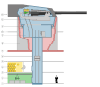 . This one is more realistically drawn, but I don't think it works as well at showing what the parts are, or how they work together. Regards, Ben Aveling 20:10, 11 November 2007 (UTC)


.svg,_not_featured)
_(0421)_-_Relic38.jpg,_not_featured)
.jpg,_featured)
.jpg,_featured)
.jpg,_featured_2)
.jpg,_not_featured)
.jpg,_featured)
.jpg)
.jpg)
![[1]](https://commons.wikimedia.org/w/index.php?title=Image:Ceiling.jpg)
.svg&action=edit§ion=T-1)
.svg,_not_featured)
.svg,_not_featured)
_(0421)_-_Relic38.jpg&action=edit§ion=T-1)
_(0421)_-_Relic38.jpg,_not_featu)
_(0421)_-_Relic38.jpg,_not_featu)
_(0421)_-_Relic38.jpg,_not_featu)
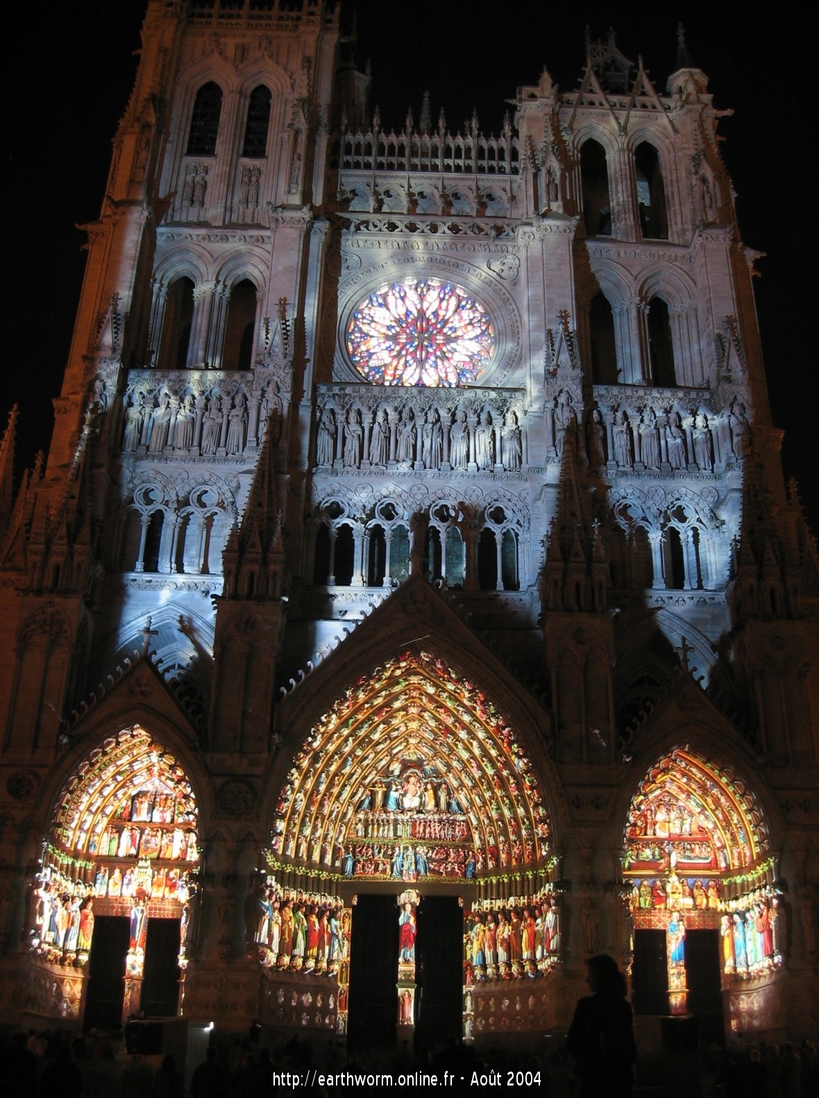


 the black signature, in my eyes it kind of mess up the discussion area.) /Daniel78 20:06, 13 November 2007 (UTC)
.jpg&action=edit§ion=T-1)
.jpg)
.jpg,_featured)
.jpg,_featured)
.jpg,_featured)


.jpg&action=edit§ion=T-1)
.jpg)
.jpg,_featured)
.jpg,_featured)

.jpg,_featured_2)
.jpg,_featured_2)


 could be a QI with a little noise clean-up). -- Relic38 01:40, 20 November 2007 (UTC)

.jpg&action=edit§ion=T-1)
.jpg)
.jpg,_not_featured)
.jpg,_not_featured)


.jpg)
.jpg&action=edit§ion=T-1)

.jpg,_featured)
.jpg,_featured)

 Confirmed -- Slaunger 20:18, 20 November 2007 (UTC)


 has already been featured, I'm surprised this one hasn't been! My only problems are that the walker and plant detract slightly from the atmosphere of the image, but certainly not enough for me to refuse my support. Cpl Syx 17:21, 28 November 2007 (UTC)


