Nomination New Maiden's Convent in Moscow, Russia. Dormition Church. - A.Savin 10:37, 28 November 2012 (UTC)
Promotion Has a slight HDR look, but I like it that way. Good quality. --Tuxyso 11:10, 28 November 2012 (UTC)
Nomination New Maiden's Convent in Moscow, Russia. Lopukhin Tower. - A.Savin 10:37, 28 November 2012 (UTC)
Promotion Very sharp, good quality --Tuxyso 11:10, 28 November 2012 (UTC)
Nomination New Maiden's Convent in Moscow, Russia. Naprudnaya Tower. - A.Savin 10:37, 28 November 2012 (UTC)
Promotion Good quality - no doubts. Even the difficult white area of the tower is not washed out. --Tuxyso 11:10, 28 November 2012 (UTC)
Nomination City Duma Tower in Saint Petersburg, Russia. - A.Savin 10:37, 28 November 2012 (UTC)
Promotion QI, but for me the sky is too blue. In addition the blue of the sky is irregular - did you use a polarzing filter in cominbation with wide-angle lens? --Tuxyso 11:13, 28 November 2012 (UTC) 60° north, it's a normal sky there, no filter - A.Savin 11:20, 28 November 2012 (UTC)
Nomination Auto Union 1000 Sp, Baujahr 1958, 28. Internationales Oldtimer-Treffen, Konz --Berthold Werner 09:32, 28 November 2012 (UTC)
Promotion Good for QI. - A.Savin 10:28, 28 November 2012 (UTC)
Nomination Elephant Hawk-moth --Archaeodontosaurus 08:47, 28 November 2012 (UTC)
Promotion Good. - A.Savin 10:25, 28 November 2012 (UTC)
Nomination Détail de la gravure de la platine d'un fusil --MirandaAdramin 08:36, 28 November 2012 (UTC)
Promotion OK for QI (despite some noise). - A.Savin 10:23, 28 November 2012 (UTC)
Nomination Building in Maracaibo --Rjcastillo 02:55, 28 November 2012 (UTC)
Promotion Looks OK - A.Savin 10:19, 28 November 2012 (UTC)
Nomination Estación central. Tranvía de Maracaibo --Rjcastillo 02:55, 28 November 2012 (UTC)
Promotion Good quality. - A.Savin 10:15, 28 November 2012 (UTC) The last five outdoor photos of you are all (for me) too bright and have too less contrast (in LR 4 ~-0,5EV, +Shadows, -Black). Probably a problem with your monitor? --Tuxyso 10:18, 28 November 2012 (UTC)
Nomination Iglesia Santa Barbara --Rjcastillo 02:55, 28 November 2012 (UTC)
Promotion Good quality. - A.Savin 10:13, 28 November 2012 (UTC)
Nomination Iglesia Santa Barbara --Rjcastillo 02:55, 28 November 2012 (UTC)
DeclineComment blurred and unsharpness imo, Sorry --Rjcastillo 03:01, 28 November 2012 (UTC) Oppose Nice view, but very blurry. - A.Savin 10:17, 28 November 2012 (UTC)
Nomination Castel ruin Salegg in St. Oswald Kastelruth --Moroder 22:31, 27 November 2012 (UTC)
Promotion QI to me --DKrieger 22:38, 27 November 2012 (UTC)
Nomination Walls of the old city of Tallinn, Estonia --Poco a poco 21:04, 27 November 2012 (UTC)
Promotion Good quality. Hübsch --Moroder 21:19, 27 November 2012 (UTC)
Nomination Statue of Louis I of Bavaria, Munich, Germany --Poco a poco 21:04, 27 November 2012 (UTC)
Promotion Good quality. Not bad --Moroder 21:24, 27 November 2012 (UTC)
Nomination Monument to the Discoveries in Belém (Lisbon), Portugal --Poco a poco 21:04, 27 November 2012 (UTC)Comment Ok, but you've got to fix horizontal lines and if you increase lighting and contrast it'll be better --Moroder 21:28, 27 November 2012 (UTC) DonePoco a poco 21:47, 27 November 2012 (UTC)
Promotion Good quality. --Moroder 22:42, 27 November 2012 (UTC)
Nomination Church of Santa Maria de Belém, Lisbon, Portugal --Poco a poco 21:04, 27 November 2012 (UTC)
Decline Insufficient quality. Strange yellow light, lots of noise, sorry! --Moroder 21:15, 27 November 2012 (UTC)
Nomination Moritzburg Castle, taken from south-west. --W like wiki 20:36, 27 November 2012 (UTC)
Decline Insufficient quality. Unsharp strong CA --Moroder 21:07, 27 November 2012 (UTC)
Nomination Old Harburg Elbe bridge in Hamburg. --W like wiki 20:36, 27 November 2012 (UTC)
Decline Good quality, perfect composition, wow-effect. --W like wiki 20:36, 27 November 2012 (UTC) Insufficient quality. Wow effect but below size requirement --Moroder 21:07, 27 November 2012 (UTC) Comment Please go and read the guidelines --Moroder 21:10, 27 November 2012 (UTC) InfoAwesome, but the geotag is missing. Where is this bridge? I found it and put a geotag, but not sure if it is right --Ximeg 21:17, 27 November 2012 (UTC)
Nomination Etgendorf, view from the old avenue. By User:Oakforest --W like wiki 20:36, 27 November 2012 (UTC)
Promotion Good quality. Please consider to mark the photographer if you nominate images not taken by yourself in QIC, so that the bot will notify the right user. I've added it above. - A.Savin 21:29, 27 November 2012 (UTC)
Nomination Duisburg (North Rhine-Westphalia, Germany). By Carschten. --W like wiki 20:36, 27 November 2012 (UTC)
Promotion Good quality. For the same reason as above, I've added the author's username. - A.Savin 21:36, 27 November 2012 (UTC)
Nomination Vista interior de la Catedral de Maracaibo --Rjcastillo 20:33, 27 November 2012 (UTC)
Decline Nice composition but lacks sharpness --Poco a poco 21:52, 27 November 2012 (UTC)
Nomination Iglesia San Francisco de Asís y Monumento Rafael María Baralt --Rjcastillo 20:30, 27 November 2012 (UTC)
Decline Insufficient quality. I miss te bottom of the building it's unfogivable, sorry --Moroder 21:39, 27 November 2012 (UTC)Comment thanks for reviews. The church is surrounded by many hawkers. is the main market in Maracaibo. Dificult , but I'll try again --Rjcastillo 23:56, 27 November 2012 (UTC)
Nomination Saint Mark church, Belgrade - detail --Pudelek 19:28, 27 November 2012 (UTC)
Promotion Good quality. --Poco a poco 21:52, 27 November 2012 (UTC)
Nomination Port-Clos, end of the jetty near 6 PM. Île-de-Bréhat, Côtes-d'Armor, France. --JLPC 19:06, 27 November 2012 (UTC)
Promotion nice. Good Quality --Rjcastillo 20:16, 27 November 2012 (UTC)
Nomination Walkers with backpacks near the Paon lighthouse, Île-de-Bréhat, Côtes-d'Armor, France. --JLPC 19:06, 27 November 2012 (UTC)
Promotion Good quality and useful for the lemma backpack --Moroder 22:37, 27 November 2012 (UTC)
Nomination Coat of arms of Hamburg at balcony of cultural heritage monument Görtz-Palais in Hamburg, Germany. --Ajepbah 18:17, 27 November 2012 (UTC)
Promotion Good quality. --JLPC 19:03, 27 November 2012 (UTC)
Nomination View over Bosphorus from the Fourth Courtyard of Topkapı Palace, Istanbul. --Moonik 16:32, 27 November 2012 (UTC)
Promotion Good quality. --Moroder 22:46, 27 November 2012 (UTC)
Nomination Aerial view of Mülheim an der Ruhr from northeast --Tuxyso 15:41, 27 November 2012 (UTC)
Promotion Good Quality --Rjcastillo 16:00, 27 November 2012 (UTC)
Nomination Real Monasterio de Santo Tomás in Ávila, Spain --Selbymay 15:33, 27 November 2012 (UTC)
Promotion Good quality. --JLPC 19:03, 27 November 2012 (UTC)
Nomination Shot tower of Couëron - Loire-Atlantique, France --Selbymay 15:33, 27 November 2012 (UTC)
Promotion Good quality. --Poco a poco 22:04, 27 November 2012 (UTC)
Nomination Town museum in Vyborg, Russia. - A.Savin 13:27, 27 November 2012 (UTC)
Promotion Good quality. --Selbymay 15:33, 27 November 2012 (UTC)
Nomination Former bank in Vyborg, Russia. - A.Savin 13:27, 27 November 2012 (UTC)
Promotion Good quality. --JLPC 19:05, 27 November 2012 (UTC)
Nomination The Round Tower in Vyborg, Russia. - A.Savin 13:27, 27 November 2012 (UTC)
Promotion Good quality. --Poco a poco 21:58, 27 November 2012 (UTC)
Nomination M/S Vesta outside Styrsö Island in Gothenburg archipelago. --ArildV 13:12, 27 November 2012 (UTC)
Promotion Very good quality. - A.Savin 13:21, 27 November 2012 (UTC)
Nomination Stained glass window in the parish church of St. Ulrich in Gröden - Italy- around 1900 --Moroder 12:57, 27 November 2012 (UTC)
Promotion I'd reduce the highlights a bit, but the quality seems good to me anyway. - A.Savin 13:19, 27 November 2012 (UTC) Comment Thanks for the review, I've tryed it (worked a lot on it - RAW file) but the face of the Saint which is the main object becomes too dark --Moroder 21:53, 27 November 2012 (UTC)
Nomination The Mendel house in Kastelruth. Paintings by Eduard Burgauner (1873-1913) --Moroder 12:57, 27 November 2012 (UTC)
Decline Unpleasant halo around the roof, probably caused by strong lightening of shady areas. - A.Savin 13:15, 27 November 2012 (UTC)
Nomination Austin-Healey Sprite AN5, Mark I 'Frogeye', Baujahr 1959, 50 PS 28. Internationales Oldtimer-Treffen, Konz --Berthold Werner 12:44, 27 November 2012 (UTC)
Promotion Good quality. - A.Savin 13:12, 27 November 2012 (UTC)
Nomination The remains of Flax Bourton railway station. Mattbuck 12:35, 27 November 2012 (UTC)
Promotion Good quality. - A.Savin 13:05, 27 November 2012 (UTC)
Nomination The Aberglaslyn Pass. Mattbuck 12:35, 27 November 2012 (UTC)
Promotion QI - A.Savin 13:10, 27 November 2012 (UTC)
Nomination Cardiff Bay. Mattbuck 12:35, 27 November 2012 (UTC)
Promotion Good enough for QI. --Selbymay 15:33, 27 November 2012 (UTC)
Nomination The beach of Arcachon, France -- MJJR 10:47, 27 November 2012 (UTC)
Promotion Good quality. --JLPC 19:03, 27 November 2012 (UTC)
Nomination Medieval St John's Hospital in Bruges, Belgium -- MJJR 10:47, 27 November 2012 (UTC)
Promotion Good quality. --Berthold Werner 12:44, 27 November 2012 (UTC)
Nomination The road to Sint-Kruis in Oedelem, Belgium -- MJJR 10:47, 27 November 2012 (UTC)
Promotion Very nice. - A.Savin 13:03, 27 November 2012 (UTC)
Nomination « Le Tibre » dans le jardin des Tuileries à Paris. --Thesupermat 07:36, 27 November 2012 (UTC)
Promotion Good quality. - A.Savin 13:00, 27 November 2012 (UTC)
Nomination « Le Tibre » dans le jardin des Tuileries à Paris. --Thesupermat 07:36, 27 November 2012 (UTC)
Decline Significant artifacts on the sky. Overprocessed? - A.Savin 12:51, 27 November 2012 (UTC)
Nomination « Le Tibre » dans le jardin des Tuileries à Paris. --Thesupermat 07:36, 27 November 2012 (UTC)
Decline Same here, overprocessed? - A.Savin 12:54, 27 November 2012 (UTC)
Nomination Encendido de la Estrella. Av. Bella Vista. Maracaibo --Rjcastillo 02:53, 27 November 2012 (UTC)
Promotion Good quality. - A.Savin 12:45, 27 November 2012 (UTC)
Nomination Brahea armata o Palmera azul --Rjcastillo 02:53, 27 November 2012 (UTC)
DeclineComment Overexposed sky. --Iifar 06:58, 27 November 2012 (UTC) Oppose per Iifar - A.Savin 12:43, 27 November 2012 (UTC)
Nomination Secondary school and statute in Hradec Králové, Czech Republic. (by Diketak) --Jklamo 23:34, 26 November 2012 (UTC)
Decline Seems noisy and overprocessed to me. - A.Savin 12:41, 27 November 2012 (UTC)
Nomination Interior view of os San Giovanni churh, in Oneglia, Imperia, Italy --bol2030 00:15, 27 November 2012 (UTC)
Decline Too soft, sorry. Consider using a tripod for bracketing. - A.Savin 12:38, 27 November 2012 (UTC)
Nomination The house Ezelstraat #18 in Bruges, Belgium -- MJJR 21:58, 26 November 2012 (UTC)
Promotion Good quality. --Selbymay 15:49, 27 November 2012 (UTC)
Nomination Notre-Dame-des-Marais church - La Ferté-Bernard, Sarthe, France --Selbymay 20:22, 26 November 2012 (UTC)
Promotion Geotag is missing --Ximeg 20:36, 26 November 2012 (UTC) Why should be geotag important for the quality of a photo? For me the shadow is a little lack but not geotac. -- Lothar Spurzem 20:48, 26 November 2012 (UTC)Comment Good shot, but unsharpness imo --Rjcastillo 02:27, 27 November 2012 (UTC) Done Geotag added and new version uploaded, I tried to improve the sharpness and reduce the darkness of the shadow at left. Thanks for reviewing at the three of you :) --Selbymay 15:49, 27 November 2012 (UTC)Comment better, now QI. --Rjcastillo 17:02, 27 November 2012 (UTC)
Nomination Jubilee Campus. Mattbuck 19:16, 26 November 2012 (UTC)
Promotion CA on column - A.Savin 23:17, 26 November 2012 (UTC) Fixed. Mattbuck 03:44, 27 November 2012 (UTC) It's OK for QI. - A.Savin 13:35, 27 November 2012 (UTC)
Nomination (Vista interior) Cúpula de la Basílica de Nuestra Señora de Chiquinquirá --Rjcastillo 21:07, 25 November 2012 (UTC)
Nomination Commandant Tower of the Kremlin of Moscow, Russia. - A.Savin 10:17, 25 November 2012 (UTC)
Decline Composition not very clever (if there should trees in the foreground than please not only a narrow stripe. Same with the 3 leaves and 7 branchlets on the right top corner.) Colors looking like during sunset, maybe it was. Ur other images of the Kremlin are better.--W like wiki 18:57, 27 November 2012 (UTC)
Nomination Detail of Sprinkenhof office building in Hamburg, Germany. --Ajepbah 09:53, 25 November 2012 (UTC)
Promotion Perspective should be corrected. - A.Savin 10:10, 25 November 2012 (UTC) Info This perspective is chosen so that the facade elements on the left are not truncated and the height of the shown details is noticeable (floors 5-7). Very nice idea for a square format. Picture with "wow" effect! But I agree with A.Savin. You should desicde if the middle line is vertical or diagonally. At the moment it is neither the one nor the other. The upper ending with the small triangle of sky - i don't know. After small changings it has the potencial for a featured image! --W like wiki 19:10, 27 November 2012 (UTC) Info Thanks for hints: New version - middle line is now vertically and sky triangle is removed. --Ajepbah 19:51, 27 November 2012 (UTC) Support Good for QI now. - A.Savin 23:16, 27 November 2012 (UTC)
Nomination Parish church Kastelruth --Moroder 01:50, 24 November 2012 (UTC)
PromotionSupport --Iifar 08:27, 28 November 2012 (UTC)
Nomination Family bakery of Eduard Burgauner in Kastelruth. Paintings by Eduard Burgauner (1873-1913) AD 1907 --Moroder 23:51, 23 November 2012 (UTC)Comment Very disturbing shadow. -- Lothar Spurzem 23:56, 23 November 2012 (UTC) Dito. --W like wiki 02:56, 26 November 2012 (UTC)I withdraw my nomination --Moroder 09:16, 28 November 2012 (UTC)
Decline {{{2}}}
Nomination Former soviet submarine base, Lahemaa National Park, Estonia --Poco a poco 19:29, 23 November 2012 (UTC)
Nomination: Deutsch: Diese Figur des hl. Felix of Cantalice befindet sich in einer Nische des ehemaligen Internierungslager Markl bei Windigsteig. by Duke of W4, proposed by --Herzi Pinki 23:50, 21 November 2012 (UTC)
Review needed
Nomination: Borgward Arabella de Luxe (former Lloyd Arabella), built from 1960 to 1961 -- Lothar Spurzem 22:46, 21 November 2012 (UTC)
Review needed
Nomination Panorama of Stegny neighbourhood, Warsaw. --Sfu 22:06, 21 November 2012 (UTC)
PromotionComment Slight CW tilt. --Iifar 18:42, 27 November 2012 (UTC) Done --Sfu 20:57, 27 November 2012 (UTC) Support --Iifar 08:19, 28 November 2012 (UTC)
Nomination Panorama of Pole Mokotowskie park, Warsaw. --Sfu 21:53, 21 November 2012 (UTC)
PromotionComment Could be QI, but imho noise level on the sky needs to be reduced. --Iifar 18:21, 27 November 2012 (UTC) Done --Sfu 20:57, 27 November 2012 (UTC) Support --Iifar 08:19, 28 November 2012 (UTC)
Nomination Corynephorus canescens --Sfu 21:53, 21 November 2012 (UTC)
DeclineWeak oppose Quality is quite alright, but crop is too tight (seedlings needles are cropped). --Iifar 18:10, 27 November 2012 (UTC)
Nomination: Stained Glasswindow in the church of Vigilius of Trent in Kastelruth. --Moroder 21:33, 21 November 2012 (UTC)
Review Comment The window is a little bit tilted and it should not be so brigth. Perhaps you can correct both. -- Lothar Spurzem 23:04 22 November 2012 (UTC)vertical lines --Moroder 11:49, 22 November 2012 (UTC)
Nomination: Fhaidel presentation --The Photographer 20:27, 21 November 2012 (UTC)
Review needed
Nomination: Lama glama from Barquisimeto Zoo --The Photographer 20:27, 21 November 2012 (UTC)
Review needed
Nomination: Horse from Barquisimeto zoo --The Photographer 20:27, 21 November 2012 (UTC)
Review needed
Nomination View from the observation tower, Brown County State Park, Indiana, USA --Poco a poco 20:21, 21 November 2012 (UTC)
DeclineOppose Weak composition - something like 80% of the image is just a harsh shadow - signs of posterization and "painted" pixels (loss of detail). --Iifar 18:50, 27 November 2012 (UTC)
Nomination: Brown County State Park, Indiana, USA --Poco a poco 20:21, 21 November 2012 (UTC)
Review needed
Nomination: Nativity scene on the main altar in the church of Vigilius of Trent in Kastelruth. --Moroder 18:54, 21 November 2012 (UTC)
Review Comment. Josef is too brigth an the flowers at the left and right are disturbing. -- Lothar Spurzem 23:42 21 November 2012 (UTC)
Nomination: Soft rime and clearing freezing fog (garden and hedge), Saint-Amant, Charente, France. --JLPC 18:44, 21 November 2012 (UTC)
Review needed
Nomination: Virgen de La Chinita --Rjcastillo 17:32, 21 November 2012 (UTC)
Review needed
Nomination: Fuente en la Plaza del Rosario de Nuestra Señora de La Chiquinquira --Rjcastillo 17:32, 21 November 2012 (UTC)
Review needed
Nomination ThePiz Duleda and the Pizes de Puez from Col dala Pieres --Moroder 15:44, 21 November 2012 (UTC)
PromotionSupport --Iifar 08:29, 28 November 2012 (UTC)
Nomination The Exchange, Jubilee Campus. Mattbuck 15:36, 21 November 2012 (UTC)
Promotion Good quality. Very nice Composition! But a little bit unsharp on the right edge. --W like wiki 19:26, 27 November 2012 (UTC)
Nomination: Trains at Euston station. Mattbuck 15:36, 21 November 2012 (UTC)
Review needed
Nomination: Railfest 2012. Mattbuck 15:36, 21 November 2012 (UTC)
Review needed
Nomination: Nature reserve Dobrockovske hadce in the Czech Republic --Chmee2 12:24, 21 November 2012 (UTC)
ReviewComment slightly blurred imo --Rjcastillo 13:08, 21 November 2012 (UTC)
Nomination: Loersfeld Castle in Kerpen (Germany), outer ward. - A.Savin 12:14, 21 November 2012 (UTC)
Review needed
Nomination Loersfeld Castle in Kerpen (Germany), main house. - A.Savin 12:14, 21 November 2012 (UTC)
PromotionSupport --Iifar 19:20, 27 November 2012 (UTC)
Nomination Une statue dans le jardin des Tuileries à Paris. Laurent Honoré Marqueste - Le centaure Nessus enlevant Déjanire. --Thesupermat 10:21, 21 November 2012 (UTC)
Promotion Posterization on the sky. - A.Savin 11:30, 21 November 2012 (UTC) Info It looks more like a strong noise, new version uploaded. --Iifar 19:11, 27 November 2012 (UTC) Thanks, the image has a sufficient quality now. - A.Savin 23:20, 27 November 2012 (UTC)
Nomination: Swedish compay logo for "Motala verkstads nya aktiebolag" --Hangsna 08:33, 21 November 2012 (UTC)
ReviewComment unsharpness --Rjcastillo 13:57, 21 November 2012 (UTC)
Nomination Nederlands: Vuurtoren van Urk --Uberprutser 20:53, 19 November 2012 (UTC)
DeclineComment It has some room for more exposure. --Iifar 07:08, 20 November 2012 (UTC) Not doneWeak oppose --Iifar 12:58, 27 November 2012 (UTC)
Nomination Columns in the Grand Trianon, Versailles Palace, France. --Moonik 06:18, 19 November 2012 (UTC)
DeclineComment There is a dust spot. See note. -Barras 15:42, 19 November 2012 (UTC) Done Thank for review. Dust spot is removed and new file uploaded now. --Moonik 16:10, 19 November 2012 (UTC) Now I just saw that it looks as if you replaced the sky. It looks unnatural, see the new notes. -Barras 16:25, 19 November 2012 (UTC) Done The sky wasn't replaced. White edges is a sign of over sharpness. I tried to fix it in the new uploaded version. Is it better? --Moonik 16:53, 19 November 2012 (UTC) Oppose Composition is not very good (cropped columns), barrel distortion, haloes. --Iifar 13:00, 27 November 2012 (UTC)
Nomination Cultural heritage monument in Anzefahr, Hessen, Germany. --Geiserich77 23:15, 18 November 2012 (UTC)
Promotion Ich denke, vor allem unten müßte etwas abgescshnitten werden. --Berthold Werner 18:22, 19 November 2012 (UTC) Weak support Harsh shadows on the foreground, but the main subject is good enough. --Iifar 12:52, 27 November 2012 (UTC)
Nomination Cultural heritage monument in Anzefahr, Hessen, Germany. --Geiserich77 23:15, 18 November 2012 (UTC)
Promotion Engerer Beschnitt und ein Blickwinkel von der Seite wäre besser gewesen. --Berthold Werner 18:22, 19 November 2012 (UTC) Support --Iifar 12:47, 27 November 2012 (UTC)
Nomination New building of the Magdalen College, Oxford. -- Velvet 22:26, 18 November 2012 (UTC)
Promotion Too much contrast and saturation, IMO--Jebulon 18:23, 23 November 2012 (UTC) -- Done A bit less contrasted Velvet 19:13, 23 November 2012 (UTC) Support --Iifar 12:45, 27 November 2012 (UTC)
Nomination Aerial view of Lörrach-Tüllingen --Taxiarchos228 22:12, 18 November 2012 (UTC)
Decline Too much dust in the air, no clear view. --Tuxyso 17:34, 19 November 2012 (UTC) Oppose Per above. --Iifar 12:45, 27 November 2012 (UTC)
Nomination Saint-Sulpice church seen from the Chapel of the Virgin in - Paris, France --Selbymay 09:04, 18 November 2012 (UTC) Those strong light sources are pretty invasive, have to tried to reduce their brightness? Poco a poco 10:52, 18 November 2012 (UTC)
Decline Yes, I did but not with much success. Thanks for reviewing. --Selbymay 12:25, 19 November 2012 (UTC) Oppose per Poco a poco. --Iifar 12:50, 27 November 2012 (UTC)
Nomination Shell of a Pliocene gastropod, Hystrivasum squamosum --Llez 06:00, 27 November 2012 (UTC)
Promotion Good quality. --Raghith 09:37, 27 November 2012 (UTC)
Nomination Monumento El Angel --Rjcastillo 02:53, 27 November 2012 (UTC)
Promotion QI for me. --JLPC 09:43, 27 November 2012 (UTC)
Nomination Boeing 737 of Air France taking off at Airport Tegel in Berlin --Ximeg 22:06, 26 November 2012 (UTC)
Promotion Good. - A.Savin 23:38, 26 November 2012 (UTC)
Nomination The shop of net manufacturer Larrieu Frères in Bordeaux, France -- MJJR 21:58, 26 November 2012 (UTC)
Promotion QI - A.Savin 23:35, 26 November 2012 (UTC)
Nomination The hall in the main building of the ETH Zürich. --Ximeg 20:30, 26 November 2012 (UTC)
Promotion Good quality (don't mind those ghosts) --Poco a poco 20:51, 26 November 2012 (UTC)
Nomination Exterior of rose window of Notre-Dame-des-Marais church - La Ferté-Bernard, Sarthe, France --Selbymay 20:22, 26 November 2012 (UTC)
Promotion Very good quality in spite or because of shadow -- Lothar Spurzem 20:53, 26 November 2012 (UTC)
Nomination Mechanical micrometer 0-25mm with removed dust spots and chromatic aberration --Lucasbosch 19:41, 26 November 2012 (UTC)
Promotion Good quality. --Selbymay 20:22, 26 November 2012 (UTC)
Nomination Jeronimos Monastery, Lisbon, Portugal --Poco a poco 19:33, 26 November 2012 (UTC)
Promotion nice. Good Quality --Rjcastillo 01:39, 27 November 2012 (UTC)
Nomination Statue of Ludwig IX, Duke of Bavaria, Dreifaltigkeitsplatz, Landshut, Germany --Poco a poco 19:33, 26 November 2012 (UTC)
Promotion Good quality - A.Savin 23:32, 26 November 2012 (UTC)
Nomination Monument to Maximilian I, Munich, Germany --Poco a poco 19:33, 26 November 2012 (UTC)
Promotion Very good quality. Nice. --Selbymay 20:09, 26 November 2012 (UTC)
Nomination Schillerplatz in Stuttgart, Germany. -- Der Wolf im Wald 19:25, 26 November 2012 (UTC)
Promotion Very good quality. Good job. --Selbymay 20:09, 26 November 2012 (UTC)
Nomination Nailsea and Backwell railway station. Mattbuck 19:16, 26 November 2012 (UTC)
Promotion Good. - A.Savin 23:19, 26 November 2012 (UTC)
Nomination This is the red stand stone building located on the western side of Taj Mahal. It is actually a Mosque. --Dey.sandip 18:10, 26 November 2012 (UTC)
Promotion something shadows disturbing, but nice reflex in the fountain. QI for me --Rjcastillo 18:53, 26 November 2012 (UTC)
Nomination Español: Teleférico de Caracas --The Photographer 16:49, 26 November 2012 (UTC)
Promotion Good quality -- Lothar Spurzem 16:51, 26 November 2012 (UTC)
Nomination Español: Iguana (Iguana iguana) de Venezuela --The Photographer 16:49, 26 November 2012 (UTC)
Promotion QI for me. Good sharpness and thus level of detail --Tuxyso 18:18, 26 November 2012 (UTC)
Nomination Loxodonta africana from Venezuela --The Photographer 16:49, 26 November 2012 (UTC)
Decline Recently declined QIC. Excuse me, but I'm strictly against re-nominations of declined QI candidates. - A.Savin 23:14, 26 November 2012 (UTC) I fixed the problem from the last nomination, however, no problem --The Photographer 00:58, 27 November 2012 (UTC)
Nomination Español: Escaleras en Teatro Teresa Carreño --The Photographer 16:49, 26 November 2012 (UTC)
Decline Lacking sharpness and perspective distortion. But interesting view - A.Savin 23:08, 26 November 2012 (UTC)
Nomination Borgward Isabella Coupé converted to cabriolet by Karl Deutsch -- Lothar Spurzem 16:41, 26 November 2012 (UTC)
Promotion Good quality. --Poco a poco 20:51, 26 November 2012 (UTC)
Nomination Imperial Habsburg and spanish heraldic ornaments, Emperor Charles V's palace, Alhambra, Granada, Spain.--Jebulon 16:41, 26 November 2012 (UTC)
Promotion Good quality -- Lothar Spurzem 16:56, 26 November 2012 (UTC)
Nomination The bell tower (former minaret) of church (former mosque) Santa-Maria de la Alhambra, Granada, Spain.--Jebulon 16:39, 26 November 2012 (UTC)
Promotion Very good. - A.Savin 23:04, 26 November 2012 (UTC)
Nomination The former convent San Francisco, now the parador of Granada, Spain.--Jebulon 16:36, 26 November 2012 (UTC)
Promotion Good quality. --Poco a poco 21:21, 26 November 2012 (UTC)
Nomination Ruins at Alhambra, Granada, Spain.--Jebulon 16:34, 26 November 2012 (UTC)
Promotion Good quality -- Lothar Spurzem 18:32, 26 November 2012 (UTC)
Nomination Dobrun monastery, Republika Srpska --Pudelek 16:28, 26 November 2012 (UTC)
Promotion Good Quality --Rjcastillo 16:51, 26 November 2012 (UTC)
NominationOpuntia ficus-indica, barbary fig, Spain.--Jebulon 16:13, 26 November 2012 (UTC)
Promotion QI for me. --JLPC 09:41, 27 November 2012 (UTC)
Nomination Village newsagent's (2012), Montmoreau-Saint-Cybard, Charente, France. --JLPC 16:07, 26 November 2012 (UTC)
Promotion Very good and useful.--Jebulon 16:27, 26 November 2012 (UTC)
Nomination Vineyard and owner's house at Chez Rulier, cognac area, near Champagne-Vigny, Charente, France. --JLPC 16:07, 26 November 2012 (UTC)
Promotion "Bons Bois" ? "Fins Bois" ? "Grande Champagne" ? ;) Good picture.--Jebulon 16:32, 26 November 2012 (UTC)
Nomination Canna × generalis --Rjcastillo 15:15, 26 November 2012 (UTC)
Decline DoF too shallow, sorry --Poco a poco 20:51, 26 November 2012 (UTC)
Nomination Listed house at the Moika in Saint Petersburg, Russia. - A.Savin 12:08, 26 November 2012 (UTC)
Promotion Good quality. --Poco a poco 20:51, 26 November 2012 (UTC)
Nomination Palace of Grand Duchess Xenia in Saint Petersburg, Russia. - A.Savin 12:08, 26 November 2012 (UTC)
Promotion QI for me. --JLPC 09:46, 27 November 2012 (UTC)
Nomination Listed Makarov House in Saint Petersburg, Russia. - A.Savin 12:08, 26 November 2012 (UTC)
Promotion Good quality. --JDP90 13:04, 26 November 2012 (UTC)
Nomination MG A --Berthold Werner 11:57, 26 November 2012 (UTC)
Promotion Very good quality (I like your reflection in the rear-view mirror :) --Selbymay 12:29, 26 November 2012 (UTC)
Nomination Old quarter of Salamanca and the bridge Enrique Estevan seen from south bank of Tormes river, Castile and León, Spain --Selbymay 08:53, 26 November 2012 (UTC)
Promotion Good quality. --JDP90 13:04, 26 November 2012 (UTC)
Nomination Old quarter of Salamanca and the bridge Enrique Estevan seen from south bank of Tormes river, Castile and León, Spain --Selbymay 08:53, 26 November 2012 (UTC)
Promotion Love it! --Moroder 21:18, 26 November 2012 (UTC)
Nomination Castel ruin Hauenstein in Seis Kastelruth --Moroder 01:14, 26 November 2012 (UTC)
Promotion Huge megapixels file. Good quality. --JDP90 08:47, 26 November 2012 (UTC)It is an option not a burden; thanks for the review --Moroder 09:48, 26 November 2012 (UTC) Surely can't be a burden when it is an excellent camera like Nikon D800 --JDP90 13:02, 26 November 2012 (UTC)
Nomination Castel ruin Hauenstein in Seis Kastelruth --Moroder 01:14, 26 November 2012 (UTC)
Decline The upper part has too many quality issues (too bright, too distorted, halos, blurry...), sorry, no QI --Poco a poco 21:21, 26 November 2012 (UTC)
Nomination Romanesque chapel St. Nicholas, first mentioned 1152, Wangen-Untermooweiler, Germany --DKrieger 16:40, 26 November 2012 (UTC)
Promotion Good quality -- Lothar Spurzem 19:16, 26 November 2012 (UTC)
Nomination Monumento Virgen de La Chinita --Rjcastillo 21:07, 25 November 2012 (UTC)
Promotion Just a slight problem, easy to fix (see note). --JLPC 14:37, 26 November 2012 (UTC)Done Thanks --Rjcastillo 17:03, 26 November 2012 (UTC)
Nomination Germany, Kirchheimbolanden, Mozartstraße 4 --Berthold Werner 14:01, 25 November 2012 (UTC)
PromotionComment Please remove chromatic aberration top psart --Rjcastillo 14:20, 25 November 2012 (UTC) Done Better now? --Berthold Werner 16:19, 25 November 2012 (UTC) QI for me --Rjcastillo 14:43, 26 November 2012 (UTC)
Nomination Dansk: Gang i sydsiden af Århus Domkirke
--Villy Fink Isaksen 23:44, 24 November 2012 (UTC) Please, increase sharpness, otherwise is looking good Poco a poco 14:03, 25 November 2012 (UTC) Done added sharpness --Villy Fink Isaksen 15:22, 25 November 2012 (UTC) Why did you darkened it and changed the perspective? Last version was better Poco a poco 21:51, 25 November 2012 (UTC) Done SORRY ... I must have been tired but now it must be ok? --Villy Fink Isaksen 16:14, 26 November 2012 (UTC)
Promotion Now! :) --Poco a poco 20:29, 26 November 2012 (UTC)
Nomination Sea Mills railway station, Bristol. Mattbuck 17:25, 23 November 2012 (UTC) Visible purple/green CA Poco a poco 20:55, 23 November 2012 (UTC) I found R/C CA, no P/G. Fixed. Mattbuck 18:49, 25 November 2012 (UTC)
Promotion Better now Poco a poco 20:21, 26 November 2012 (UTC)
Nomination: Une statue dans le jardin des Tuileries à Paris. Julien Toussait Roux - La Comédie. --Thesupermat 10:21, 21 November 2012 (UTC)
Review needed
Nomination: Une statue dans le jardin des Tuileries à Paris. Laurent Honoré Marqueste - Le centaure Nessus enlevant Déjanire. --Thesupermat 10:21, 21 November 2012 (UTC)
Review needed
Nomination: Bryophyta sp. --ComputerHotline 08:48, 21 November 2012 (UTC)
Review needed
Nomination: Bryophyta sp. --ComputerHotline 08:48, 21 November 2012 (UTC)
Review needed
Nomination: Sculpture "Vingspel" by Bo Englund 1987. Placed in Stadsparken i Eskilstuna. Photo taken november 2012. --Hangsna 08:33, 21 November 2012 (UTC)
Review needed
Nomination: Lichen. --ComputerHotline 07:02, 21 November 2012 (UTC)
Review needed
Nomination: Lichen. --ComputerHotline 07:02, 21 November 2012 (UTC)
Review needed
Nomination: Yellow Lady's-Slipper, an orchid (Cypripedium calceolus) (not reviewed yet) --Tuxyso 06:23, 21 November 2012 (UTC)
Review needed
Nomination: Empleados Alcaldía de Maracaibo --Rjcastillo 02:00, 21 November 2012 (UTC)
Review needed
Nomination: Empleados Alcaldía de Maracaibo --Rjcastillo 02:00, 21 November 2012 (UTC)
Review needed
Nomination: Empleados Alcaldía de Maracaibo --Rjcastillo 02:00, 21 November 2012 (UTC)
Review needed
Nomination: Basílica de Nuestra Señora de Chiquinquirá --Rjcastillo 02:00, 21 November 2012 (UTC)
Review needed
Nomination: Basílica de Nuestra Señora de Chiquinquirá --Rjcastillo 02:00, 21 November 2012 (UTC)
Review needed
Nomination: Belgrade Military Museum - M13/40 tank --Pudelek 22:19, 20 November 2012 (UTC)
Review needed
Nomination: Belgrade Military Museum - Panzerkampfwagen II --Pudelek 22:19, 20 November 2012 (UTC)
Review needed
Nomination: Puerto de Mogan (Gran Canaria): marina -- MJJR 21:37, 20 November 2012 (UTC)
Review needed
Nomination: Gamschol in Gams SG Flurkreuz --Böhringer 21:23, 20 November 2012 (UTC)
Review needed
Nomination: Porto city Hall, Portugal --Poco a poco 20:05, 20 November 2012 (UTC)
Review needed
Nomination: Cristo Rei, Lisbon, Portugal --Poco a poco 20:05, 20 November 2012 (UTC)
Review needed
Nomination: Lichen. --ComputerHotline 19:25, 20 November 2012 (UTC)
ReviewComment interesting, but out focus for me --Rjcastillo 19:35, 20 November 2012 (UTC)
Nomination: Lichen. --ComputerHotline 19:25, 20 November 2012 (UTC)
ReviewComment interesting, but out focus for me --Rjcastillo 19:35, 20 November 2012 (UTC)
Nomination: Vihula Ministry School --Iifar 18:50, 20 November 2012 (UTC)
Review needed
Nomination: Silver marker on Gorm's grave at Jelling church, Denmark. --Ajepbah 18:12, 20 November 2012 (UTC)
Review needed
Nomination: Landscape of Gran Canaria near Fataga -- MJJR 17:26, 20 November 2012 (UTC)
Review needed
Nomination: « L'Hiver » dans le jardin des Tuileries à Paris. --Thesupermat 15:55, 20 November 2012 (UTC)
Review needed
Nomination: « L'Hiver » dans le jardin des Tuileries à Paris. --Thesupermat 15:55, 20 November 2012 (UTC)
Review needed
Nomination: « L'Hiver » dans le jardin des Tuileries à Paris. --Thesupermat 15:55, 20 November 2012 (UTC)
Review needed
Nomination: « L'Hiver » dans le jardin des Tuileries à Paris. --Thesupermat 15:55, 20 November 2012 (UTC)
Review needed
Nomination: Tyrolean costumes at the inauguration of the renewed Chapel on Resciesa in Gröden --Moroder 12:54, 20 November 2012 (UTC)
Review needed
Nomination: The Exchange, Jubilee Campus. Mattbuck 12:21, 20 November 2012 (UTC)
Review needed
Nomination: c2c 357037 at Upminster. Mattbuck 12:21, 20 November 2012 (UTC)
Review needed
Nomination: Euston station. Mattbuck 12:21, 20 November 2012 (UTC)
Review needed
Nomination: Middleton Blvd, Nottingham/ Mattbuck 12:21, 20 November 2012 (UTC)
Review Unfortunate composition: Branches in fore- and background crossing the sharp parts of the flowers. Lack of contrast between sky and white flowers. Focused flowers not accentuated enough (too dark). --Tuxyso 22:50, 20 November 2012 (UTC)
Nomination: Teacher's award medal of Russia, scan by IgorEK II. - A.Savin 12:05, 20 November 2012 (UTC)
Review needed
Nomination The Church of St. Francis of Assisi was built in 1661 by the Portuguese in the Portuguese Vice-royalty of India. The photograph attempts to capture the church and its surrounding environments in the morning. --Dey.sandip 19:10, 19 November 2012 (UTC) The area in the right is overexposed Poco a poco 20:54, 19 November 2012 (UTC) Thats where the sun is coming from, but its not blown out. --Dey.sandip 21:02, 19 November 2012 (UTC) Fixed The overexposed area, Can you please take a re-look? --Dey.sandip 18:42, 26 November 2012 (UTC)
Promotion Better Poco a poco 20:33, 26 November 2012 (UTC)
Nomination Parts of the defensive wall of the castle in Vyborg (Russia). - A.Savin 12:20, 19 November 2012 (UTC)
PromotionComment Made two notes about CA. -Barras 15:38, 19 November 2012 (UTC) Very minor CA, however I've fixed it. - A.Savin 17:06, 19 November 2012 (UTC) Support Good quality, for me --Dey.sandip 19:42, 26 November 2012 (UTC)
Nomination European Wildcat (Felis silvestris silvestris) --Tuxyso 23:57, 17 November 2012 (UTC)
Promotion Slightly dark, but still good for QI. - A.Savin 10:59, 26 November 2012 (UTC) Thanks for the review. Could you mark the dark areas (or do you mean overall brightness)? Local corrections should be possible. --Tuxyso 12:09, 26 November 2012 (UTC) The shadow in the right lower part, it's nothing dramatic. - A.Savin 21:33, 26 November 2012 (UTC)
Nomination Pfleger Barn and castel ruin Aichach in St. Oswald Kastelruth --Moroder 18:18, 17 November 2012 (UTC)
Decline Interesting picture, but chromatic aberration on the roof in the upper left corner, and it seems overexposed to me --DKrieger 22:49, 17 November 2012 (UTC) Comment If you believe that it is relevant for the quality of the pic than decline it --Moroder 23:29, 17 November 2012 (UTC) Why decline, if there is a good chance to fix it? If you have the raw-File it should not be a problem --DKrieger 12:04, 18 November 2012 (UTC)fixed Thanks for the review --Moroder 12:45, 18 November 2012 (UTC) Weak oppose The composition seems a bit weird to me, the overblown area in the upper left corner is small but unpleasant. - A.Savin 11:41, 26 November 2012 (UTC)Comment This composition was the only way to show the straw cover under the roof of the barn --Moroder 11:03, 27 November 2012 (UTC)
Nomination The roof of St Pancras railway station. Mattbuck 13:52, 17 November 2012 (UTC)
Decline Dark and blurred, perspective distortion, looks almost like a random snapshot to me. - A.Savin 10:43, 26 November 2012 (UTC) Perspective distortion? I was looking almost directly up at something which was above my head on all sides! There was no way it could NOT be distorted! Mattbuck 23:39, 26 November 2012 (UTC) No idea how it comes, it looks like a distortion, and that the image does not look like QI anyway. Consider choosing your candidates more carefully. - A.Savin 09:12, 27 November 2012 (UTC)
Nomination Bust of Corot, cemetery Père-Lachaise --~Pyb 08:39, 26 November 2012 (UTC)
Promotion Good quality and nice bokeh. --Selbymay 08:53, 26 November 2012 (UTC)
Nomination Painting in the Parish church of Kastelruth around 1899 --Moroder 07:43, 26 November 2012 (UTC)
Promotion Good quality. - A.Savin 11:04, 26 November 2012 (UTC)
Nomination Fruits and seeds of Calocedrus decurrens --Archaeodontosaurus 07:02, 26 November 2012 (UTC)
Promotion Good quality. --JDP90 08:47, 26 November 2012 (UTC)
Nomination The leisure fishing vessels Maagen and Skagerak beached at Nørre Vorupør, Denmark. --Slaunger 21:54, 25 November 2012 (UTC)
Promotion Good quality. --Moroder 00:32, 26 November 2012 (UTC)
Nomination Ascent to Schilthorn from the west ridge, Bern, Switzerland, in 2012 August --Ximonic 21:21, 25 November 2012 (UTC)
PromotionSupport --Iifar 10:26, 26 November 2012 (UTC)
Nomination Schilthorn, Bern, Switzerland, in 2012 August --Ximonic 21:21, 25 November 2012 (UTC)
Promotion Very nice! --Iifar 10:26, 26 November 2012 (UTC)
Nomination Schilthorn, Bern, Switzerland, in 2012 August --Ximonic 21:21, 25 November 2012 (UTC)
Promotion Very good! --Iifar 10:26, 26 November 2012 (UTC)
Nomination Lifting stage used in chemical laboratories --Lucasbosch 21:19, 25 November 2012 (UTC)
Promotion Good quality. --Smial 23:25, 25 November 2012 (UTC)
Nomination Plaza del Rosario de Nuestra Señora de La Chiquinquira --Rjcastillo 21:07, 25 November 2012 (UTC)
Promotion Good quality. --Moroder 23:50, 25 November 2012 (UTC)
Nomination Fuente de agua --Rjcastillo 21:07, 25 November 2012 (UTC)
Promotion Nice!. Please add English description --Moroder 00:02, 26 November 2012 (UTC)
Nomination San Simeone Piccolo (Venice) --Archaeodontosaurus 18:35, 25 November 2012 (UTC)
Promotion Good quality, nice image overall --Dey.sandip 18:58, 25 November 2012 (UTC)
Nomination Albu manor granary --Iifar 18:09, 25 November 2012 (UTC)
Promotion Good quality. --Moroder 22:09, 25 November 2012 (UTC)
Nomination Jäneda spring lake and manor stable --Iifar 18:09, 25 November 2012 (UTC)
Promotion Good quality. --Moroder 22:09, 25 November 2012 (UTC)
Nomination Roosna-Alliku manor main building --Iifar 18:09, 25 November 2012 (UTC)
Promotion Good quality. --JLPC 18:17, 25 November 2012 (UTC)
Nomination Pseudocraterellus undulatus --Holleday 16:22, 25 November 2012 (UTC)
PromotionSupport QI & Useful --Archaeodontosaurus 18:36, 25 November 2012 (UTC)
Nomination Clitocybe nebularis --Holleday 16:21, 25 November 2012 (UTC)
PromotionSupport QI & Useful --Archaeodontosaurus 18:37, 25 November 2012 (UTC)
Nomination Clitocybe nebularis --Holleday 16:21, 25 November 2012 (UTC)
WARNING: third template parameter added – please remove.
Nomination Pleurotus dryinus --Holleday 16:20, 25 November 2012 (UTC)
PromotionSupport QI & Useful --Archaeodontosaurus 18:39, 25 November 2012 (UTC)
Nomination Tricholoma batschii or Tricholoma fracticum --Holleday 16:19, 25 November 2012 (UTC)
PromotionSupport --Iifar 18:15, 25 November 2012 (UTC)
Nomination Australian Swagman --Pleclown 16:16, 25 November 2012 (UTC)
Promotion Good quality. --JLPC 18:17, 25 November 2012 (UTC)
Nomination View of Tallinn from St. Olaf's church, Estonia --Poco a poco 13:40, 25 November 2012 (UTC)
Promotion Good Quality. Very Good --Rjcastillo 14:24, 25 November 2012 (UTC)
Nomination Church of St. Ludwig, Munich, Germany --Poco a poco 13:40, 25 November 2012 (UTC)
Promotion Good quality. --JLPC 18:20, 25 November 2012 (UTC)
Nomination Lymington Harbour. Mattbuck 13:40, 25 November 2012 (UTC)
Promotion Good quality. --Poco a poco 13:50, 25 November 2012 (UTC)
Nomination House on Oswald-von-Wolkenstein-Platz 7 in Kastelruth --Moroder 10:59, 25 November 2012 (UTC)
Promotion Good quality. --Poco a poco 13:50, 25 November 2012 (UTC)
Nomination Saint Joseph with Jesus and John the Baptist by Melchior Paul von Deschwanden in the parish church of en:Kastelruth --Moroder 10:59, 25 November 2012 (UTC)
Promotion Good quality. But I don't understand the title „Saint Agnes“. -- Lothar Spurzem 12:04, 25 November 2012 (UTC) oops Fixed the title, thanks for the review --Moroder 18:35, 25 November 2012 (UTC)
Nomination Middle Arsenal Tower of the Kremlin of Moscow, Russia. - A.Savin 10:17, 25 November 2012 (UTC)
Promotion Good quality. --Poco a poco 13:50, 25 November 2012 (UTC)
Nomination Shell of a fresh water snail, Melanopsis buccinoidea --Llez 06:25, 25 November 2012 (UTC)
Promotion Good quality. --Poco a poco 13:52, 25 November 2012 (UTC)
Nomination This is the long pier that belongs to the Port Authority in Pondicherry. An early morning shot shows the activities of fishermen. --Dey.sandip 20:32, 24 November 2012 (UTC)
Promotion What's the strange black object just above the pier at the very right? - A.Savin 10:00, 25 November 2012 (UTC) It's a flying bird -- Dey.sandip 13:57, 25 November 2012 (UTC) Fixed That black spot. New version uploaded. Can you take a re-look? --Dey.sandip 14:16, 25 November 2012 (UTC) OK for QI. - A.Savin 17:58, 25 November 2012 (UTC)
Nomination Ambla churchyard enclosure wall --Iifar 19:54, 24 November 2012 (UTC)
Promotion Good quality. --Poco a poco 14:03, 25 November 2012 (UTC)
Nomination Larkspur(Delphinium x cultorum), inflorescence (detail), in a garden, France --JLPC 19:21, 24 November 2012 (UTC)
PromotionSupport Good quality. --JDP90 08:51, 26 November 2012 (UTC)
Nomination Kumquat (Fortunella margarita) : leaves and green fruit in a garden, France. --JLPC 19:21, 24 November 2012 (UTC)
Promotion Good quality. --Poco a poco 14:03, 25 November 2012 (UTC)
Nomination Portrait of "La bela Betina" (beautyful Elisabeth) by Johann Burgauner (1812 - 1891) --Moroder 18:48, 24 November 2012 (UTC)
Promotion OK to me, but a bit blurred to the right. --Villy Fink Isaksen 12:56, 25 November 2012 (UTC)
Nomination The Mendel house in Kastelruth. Paintings by Eduard Burgauner (1873-1913) --Moroder 18:48, 24 November 2012 (UTC)
PromotionSupport Good quality. --JDP90 08:51, 26 November 2012 (UTC)
Nomination Nibley Lane, Yate. Mattbuck 18:18, 24 November 2012 (UTC)
Promotion Dynamic range between sky and darker green of the trees is well managed. Probably slightly oversharpened. --Tuxyso 14:09, 25 November 2012 (UTC)
Nomination St Bruno's church in Bordeaux, France -- MJJR 17:32, 24 November 2012 (UTC) It needs a tilt ACW Poco a poco 14:06, 25 November 2012 (UTC) Comment The CCW tilt is only an optical impression: the vertical lines are perfectly vertical. -- MJJR 19:39, 25 November 2012 (UTC)
Promotion I think you are right, but still something looks unnatural to me Poco a poco 21:55, 25 November 2012 (UTC)
Nomination Patrick Makau Musyoki running world record at Berlin Marathon 2011 -- Avda 17:32, 24 November 2012 (UTC)
Decline Resolution of 621 × 931 much too low (beneath unfortunate crop) --Tuxyso 13:58, 25 November 2012 (UTC)
Nomination Müürivahe Street, Tallinn, Estonia --Poco a poco 11:18, 24 November 2012 (UTC)
Promotion Did you make selective perspective corrections? Something is confusing me here: All lines are straight, but my visual impression is different: Especially the green tower looks slightly CW tilted. --Tuxyso 14:33, 25 November 2012 (UTC) The buildind with the green tower is not at the same plane like the closer building, I cannot help that Poco a poco 21:53, 25 November 2012 (UTC) Support Thanks for the info, then QI for me. Just wanted to make sure that no selective perspective corretion was made. --Tuxyso 22:17, 25 November 2012 (UTC)
Nomination Búho --Rjcastillo 19:09, 22 November 2012 (UTC)
Decline Insufficient quality. Sorry, no good file name, disturbing background. --W like wiki 03:11, 26 November 2012 (UTC)
Nomination Fuente en la Plaza del Rosario de Nuestra Señora de La Chiquinquira --Rjcastillo 17:32, 21 November 2012 (UTC) It needs perspective correction Poco a poco 21:36, 21 November 2012 (UTC) Comment Thanks. Please another look --Rjcastillo 01:11, 22 November 2012 (UTC) The left side got better, the right side much worse and the crop is not as good as before Poco a poco 13:36, 23 November 2012 (UTC)Comment Sorry, I'm wrong. Better now ? --Rjcastillo 04:27, 24 November 2012 (UTC)
Promotion Good to go Poco a poco 13:23, 25 November 2012 (UTC)
Nomination: A spider is making a spiderweb. --ComputerHotline 11:40, 20 November 2012 (UTC)
Review needed
Nomination: A spider. --ComputerHotline 11:40, 20 November 2012 (UTC)
Review needed
Nomination: Saint-Antoine Portal in Versailles, France. --Moonik 08:35, 20 November 2012 (UTC)
Review Unfortunate crop. --Selbymay 10:07, 20 November 2012 (UTC) I could hardly do better it was an impediment on the right --Moonik 10:34, 20 November 2012 (UTC)
Nomination: Spider nest. --ComputerHotline 08:04, 20 November 2012 (UTC)
Review needed
Nomination: Spider nest. --ComputerHotline 08:04, 20 November 2012 (UTC)
Review needed
Nomination: Nederlands: Fogelsanghstate Veenklooster in de herfst --Uberprutser 20:53, 19 November 2012 (UTC)
ReviewComment slightly unsharpness --Rjcastillo 00:42, 20 November 2012 (UTC)
Nomination: Cattail (Typha latifolia), Huermeda, Spain --Poco a poco 20:47, 19 November 2012 (UTC)
Review needed
Nomination: Great Coastal Gate, Tallinn, Estonia --Poco a poco 20:47, 19 November 2012 (UTC)
Review needed
Nomination: Blue-winged grasshopper (Oedipoda caerulescens), Ágreda, Spain --Poco a poco 20:47, 19 November 2012 (UTC)
Review needed
Nomination: Landschaftshaus, Landshut, Germany --Poco a poco 20:47, 19 November 2012 (UTC)
Review needed
Nomination This is a small church in Old Goa, which remains usually deserted. I shot it in one afternoon. This spot is used in many Bollywood films. The photograph attempts to portray the church and the surrounding environments. --Dey.sandip 19:45, 19 November 2012 (UTC)
PromotionQuestion Why black and white? -- JDP90 05:34, 25 November 2012 (UTC) The church was absolutely white and it was a deserted place. I thought the black/white version will convey the mood of the place better :) -- Dey.sandip 14:34, 25 November 2012 (UTC) Ok, convinced. Support. --JDP90 17:59, 25 November 2012 (UTC)
Nomination Germany, Kirchheimbolanden, Kirche St. Peter --Berthold Werner 18:25, 19 November 2012 (UTC)
PromotionComment see notes --Rjcastillo 18:48, 19 November 2012 (UTC) Comment. Support. If you will find CAs look at any photo and you will find them. In my opinion this image of Kirchheimbolanden church is good. -- Lothar Spurzem 11:36 20 November 2012 (UTC)Comment The image is good, but better without CA in imho --Rjcastillo 12:55, 20 November 2012 (UTC) I think ca was not so strong, nevertheless I reduced it. --Berthold Werner 14:41, 20 November 2012 (UTC) QI --Rjcastillo 19:58, 25 November 2012 (UTC)
Nomination: Roofs and towers of the Alhambra, as seen from Generalife gardens, Granada, Spain.--Jebulon 15:51, 19 November 2012 (UTC)
Review needed
Nomination: A leaf in autumn with snow on it. --Barras 15:34, 19 November 2012 (UTC)
Review needed
Nomination Hoar frost remaining in the shadow and melting in the sun. Saint-Amant, Charente, France. --JLPC 18:23, 17 November 2012 (UTC)
Promotion A bit strange, but OK for QI. - A.Savin 10:56, 26 November 2012 (UTC)
Nomination Pumpjacks at sunset by Knipptang --Knipptang 18:13, 21 November 2012 (UTC)
Promotion Good quality, maybe less sky would have been better - A.Savin 10:53, 26 November 2012 (UTC)
Nomination Facade details by Richard Kuöhl at treasury authority building in Hamburg, Germany. --Ajepbah 14:18, 17 November 2012 (UTC)
Nomination Gate to the Hofgarten, Munich, Germany --Poco a poco 14:10, 17 November 2012 (UTC)
Decline Because of the car and the lots of people it seems a somewhat random composition to me, try another time maybe. - A.Savin 10:50, 26 November 2012 (UTC)
Nomination Railway wheelset during the snowfall. --Ximeg 02:34, 17 November 2012 (UTC)
Decline Interesting but blurry, probably you haven't use a tripod? - A.Savin 10:39, 26 November 2012 (UTC)
Nomination Forester's house in Bracht --Hydro 12:36, 16 November 2012 (UTC)
Decline Very nice composition. House is a bit "washed out" (increase Black in LR?), sky too bright (highlight correction?) --Tuxyso 12:41, 16 November 2012 (UTC) Oppose Overblown on the sky and too shady in the lower part. - A.Savin 10:33, 26 November 2012 (UTC)
Nomination Neptune Fountain, Old Botanic Garden, Lenbachplatz, Munich, Germany --Poco a poco 11:08, 16 November 2012 (UTC) According to histogram no OE here but I darkened the brigther areas Poco a poco 15:32, 16 November 2012 (UTC)
Promotion OK to me - A.Savin 10:31, 26 November 2012 (UTC)
Nomination Common squirrel monkey (Saimiri sciureus), Tierpark Hellabrunn, Munich, Germany --Poco a poco 04:35, 14 November 2012 (UTC) Brighter areas were darkened according to Wilfredo's request Poco a poco 04:13, 15 November 2012 (UTC)
Decline Esto es en un zoológico ? --The Photographer 13:30, 22 November 2012 (UTC) Sí, fíjate en la categoría/descripción/título Poco a poco 13:25, 23 November 2012 (UTC) Weak oppose Posterization is visible, esp. in the lower part. - A.Savin 11:35, 26 November 2012 (UTC)
Nomination Jean-François Champollion, by Frédéric-Auguste Bartholdi. --ComputerHotline 19:05, 12 November 2012 (UTC)
Decline It is a plaster copy by Serge Neimer, which is still alive. Copyright ? (+ magenta CA in a noisy background)--Jebulon 17:45, 14 November 2012 (UTC) No, because it' a facsimile, not an original work. --ComputerHotline 10:52, 23 November 2012 (UTC) Oppose Same reason as the one below, also very noisy. - A.Savin 11:31, 26 November 2012 (UTC)
Nomination Jean-François Champollion (détail), by Frédéric-Auguste Bartholdi. --ComputerHotline 19:05, 12 November 2012 (UTC)
Decline Copyrighted ? (and noisy)--Jebulon 17:51, 14 November 2012 (UTC) No, because it' a facsimile, not an original work. --ComputerHotline 10:52, 23 November 2012 (UTC) Oppose Strange shadows on the background; probably a result of retouche or similar. - A.Savin 11:28, 26 November 2012 (UTC)
Nomination The Val dla Roa and the Piz Duleda from Forces de Siëles --Moroder 11:30, 25 November 2012 (UTC)
Promotion Good quality. --Florian Fuchs 11:59, 25 November 2012 (UTC)
Nomination Detail of Sprinkenhof office building's west facade in Hamburg, Germany. --Ajepbah 09:53, 25 November 2012 (UTC)
Decline Too blurry. - A.Savin 10:08, 25 November 2012 (UTC) Info New slightly sharpened version uploaded.
Nomination Sint-Gilliskerkhof street in Bruges, Belgium -- MJJR 09:48, 25 November 2012 (UTC)
Promotion Good quality (+ nice view). - A.Savin 10:06, 25 November 2012 (UTC)
Nomination Predikherenrei street and canal in Bruges, Belgium -- MJJR 09:48, 25 November 2012 (UTC)
Promotion Good quality. - A.Savin 10:04, 25 November 2012 (UTC)
Nomination Maspalomas dunes, Gran Canaria -- MJJR 09:48, 25 November 2012 (UTC)
Promotion Nice! --Moroder 11:03, 25 November 2012 (UTC)
Nomination Berlin: Television Tower, entrance pavillon --Taxiarchos228 22:14, 24 November 2012 (UTC)
Promotion Good quality. --King of Hearts 23:03, 24 November 2012 (UTC)
Nomination The Hôtel de la Bourse in Bordeaux, France -- MJJR 21:40, 24 November 2012 (UTC)
Promotion Good for QI. - A.Savin 10:02, 25 November 2012 (UTC)
Nomination The fishing port in Puerto de Mogán, Gran Canaria -- MJJR 21:40, 24 November 2012 (UTC)
Promotion Nice colors and DEF --The Photographer 23:35, 24 November 2012 (UTC)
Nomination The dunes of Maspalomas, Gran Canaria -- MJJR 21:40, 24 November 2012 (UTC)
Promotion Great colors. --King of Hearts 23:03, 24 November 2012 (UTC)
Nomination Goldberg's villa in Palamuse --Iifar 19:54, 24 November 2012 (UTC)
Promotion Very nice. - A.Savin 09:56, 25 November 2012 (UTC)
Nomination Kurisoo manor main building --Iifar 19:54, 24 November 2012 (UTC)
Promotion Good quality. - A.Savin 09:54, 25 November 2012 (UTC)
Nomination 220033 at Southampton Central. Mattbuck 18:18, 24 November 2012 (UTC)
Promotion OK to me - A.Savin 09:53, 25 November 2012 (UTC)
Nomination The Charco de Maspalomas in Maspalomas, Gran Canaria -- MJJR 17:32, 24 November 2012 (UTC)
Promotion Good quality. - A.Savin 09:47, 25 November 2012 (UTC)
Nomination Opel GT --Berthold Werner 16:23, 24 November 2012 (UTC)
Promotion Perspective distortion on the fence. - A.Savin 09:44, 25 November 2012 (UTC) Done perspective corrected. --Berthold Werner 09:59, 25 November 2012 (UTC) OK now. - A.Savin 10:12, 25 November 2012 (UTC)
Nomination "Our Lady of Fátima". Ceramic tiles (Azulejo) at Ribeira Brava, Madeira. --Llez 15:55, 24 November 2012 (UTC)
Promotion Good quality. --JLPC 16:32, 24 November 2012 (UTC)
Nomination Español: Chimpancé en Parque Zoológico Baradidas --The Photographer 15:26, 24 November 2012 (UTC)
Decline Poor quality: too noisy and undetailed, it looks like an old photo. Why black and white? -- Alvesgaspar 17:17, 24 November 2012 (UTC) Info The black and white expressing my sadness to observe these animals there --The Photographer 17:23, 24 November 2012 (UTC)
Nomination walkway from Olympian City to Tai Kok Tsui, Kowloon, Hong Kong --HK Arun 13:43, 24 November 2012 (UTC)
Decline Soft, and chromatic aberrations. - A.Savin 09:39, 25 November 2012 (UTC)
Nomination Church in Niederwalgern --Hydro 13:26, 24 November 2012 (UTC)
Decline Poor light: too much contrast. - A.Savin 09:42, 25 November 2012 (UTC)
Nomination State Russian Museum in Saint Petersburg, Russia. - A.Savin 12:26, 24 November 2012 (UTC)
Promotion Good quality. --JLPC 16:34, 24 November 2012 (UTC)
Nomination Painting attributed to Eduard Burgauner in the Parish church of Kastelruth around 1899 --Moroder 12:15, 24 November 2012 (UTC)
Promotion A little bit yellow but very good sharpness. Good quality for me -- Lothar Spurzem 14:06, 24 November 2012 (UTC)
Nomination Church San Bartolomé, Granada, Spain.--Jebulon 11:31, 24 November 2012 (UTC)
Promotion Good quality. --Jastrow 17:44, 24 November 2012 (UTC)
Nomination Near the great Waterfall of Tendon. --ComputerHotline 11:29, 24 November 2012 (UTC)
Promotion very nice and QI.--Cj.samson 13:23, 24 November 2012 (UTC)
Nomination The Maltese Falcon moored at Vittoriosa, Malta. --Jastrow 11:27, 24 November 2012 (UTC)
Promotion Good quality. --JLPC 16:34, 24 November 2012 (UTC)
Nomination Façade of the Malta Maritime Museum, Vittoriosa, Malta. --Jastrow 11:27, 24 November 2012 (UTC)
Promotion Very nice and QI. --Moonik 12:25, 24 November 2012 (UTC)
Nomination Rusalka Memorial, Tallinn, Estonia --Poco a poco 11:18, 24 November 2012 (UTC)
Decline Poor lighting: something between a normal lit subject and a silhouette. Alvesgaspar 17:22, 24 November 2012 (UTC)
Nomination Rabelos in the Duero river, Vila Nova de Gaia, Portugal --Poco a poco 11:18, 24 November 2012 (UTC) Re-nominated after improvements
Promotion Nice photo and good quality -- Lothar Spurzem 14:21, 24 November 2012 (UTC)
Nomination Monument to the Discoveries in Belém (Lisbon), Portugal --Poco a poco 11:18, 24 November 2012 (UTC)
Promotion Good quality (and seems to be a VI imo). --JLPC 16:40, 24 November 2012 (UTC)
Nomination Vista interior del techo de la Basílica de la Virgen de Chiquinquirá, Maracaibo --Rjcastillo 03:40, 24 November 2012 (UTC)
Promotion Good quality. --JLPC 16:42, 24 November 2012 (UTC)
Nomination Monument to the Discoveries in Belém (Lisbon), Portugal --Poco a poco 19:24, 22 November 2012 (UTC)
Promotion Quite good, a pity that the framing is so extreme. Otherwise it might be a good FP candidate. Alvesgaspar 17:29, 24 November 2012 (UTC) I have uploaded a more genereous crop, still think of FP? I've missed a bit more of water for the reflexion Poco a poco 23:22, 24 November 2012 (UTC)
Promotion Good quality -- Lothar Spurzem 16:27, 22 November 2012 (UTC) Info I just uploaded a new version, the previous version did not meet the size requirements --The Photographer 16:14, 24 November 2012 (UTC)
Nomination Deutsch: Bei der Brücke über die Zwettl an der Straße zwischen Groß-Gerungs und Dietmanns steht eine Statue Johannes Nepomuks auf einem hohen gotisierenden SteinSockel aus dem Jahr 1859. Sie stellt eine der wenigen bekannten aus Gusseisen gefertigten Statuen des Heiligen dar. by Duke of W4, proposed by --Herzi Pinki 23:50, 21 November 2012 (UTC)
Promotion Good quality -- Lothar Spurzem 23:24, 24 November 2012 (UTC)
Nomination Gamschol in Gams SG Flurkreuz --Böhringer 21:30, 20 November 2012 (UTC)
Promotion Good quality. --JDP90 05:30, 25 November 2012 (UTC)
Nomination Gamschol in Gams SG Flurkreuz --Böhringer 21:24, 20 November 2012 (UTC)
Promotion Good quality. --JDP90 05:30, 25 November 2012 (UTC)
Nomination Aloe broomii, Lisbon, Portugal --Poco a poco 20:05, 20 November 2012 (UTC)
Promotion Good quality. --JDP90 05:31, 25 November 2012 (UTC)
Nomination Railway tracks of the Paris-Bordeaux line, near Iteuil, Vienne, France. --JLPC 20:01, 20 November 2012 (UTC)
Promotion Very nice perspective. --JDP90 05:31, 25 November 2012 (UTC)
Nomination Palace of Kadriorg, Tallinn, Estonia --Poco a poco 20:47, 19 November 2012 (UTC)
Promotion Good quality. --JDP90 05:36, 25 November 2012 (UTC)
Nomination Cathedral de Santa María seen from the Alcázar - Segovia, Spain --Selbymay 11:14, 19 November 2012 (UTC)
Promotion Shame of the crane, but good.--Jebulon 21:47, 24 November 2012 (UTC)
Nomination: Basílica de Nuestra Señora de La Chiquinquirá --Rjcastillo 03:06, 19 November 2012 (UTC)
Review needed
Nomination: Adornos navideños. Tradición en Maracaibo --Rjcastillo 03:06, 19 November 2012 (UTC)
Review needed
Nomination: Tablero de control --Rjcastillo 03:06, 19 November 2012 (UTC)
Review needed
Nomination: Aerial view of town hall in Lörrach --Taxiarchos228 22:12, 18 November 2012 (UTC)
Review needed
Nomination: Belgrade Military Museum - Carro Veloce L3/35 --Pudelek 19:12, 18 November 2012 (UTC)
Review needed
Nomination: Belgrade Military Museum - polish TKF tankette --Pudelek 19:12, 18 November 2012 (UTC)
Review needed
Nomination: Iridescent Halictinae bee collecting pollen. Photo taken in Campinas, São Paulo state, Brazil. --Leonardorejorge 18:18, 18 November 2012 (UTC)
Review needed
Nomination: Panorama seen from Ballon d'Alsace --ComputerHotline 17:38, 18 November 2012 (UTC)
Review needed
Nomination: Winter sport centre in Erfurt. --Ximeg 17:06, 18 November 2012 (UTC)
Review needed
Nomination: Ice polishing in winter sport centre (Erfurt). --Ximeg 17:06, 18 November 2012 (UTC)
Review needed
Nomination: The dead "Sultana's cypress" (see the legend in the file page) in the "garden of the Sultana", Generalife palace, Granada, Spain.--Jebulon 15:57, 18 November 2012 (UTC)
Review needed
Nomination: An alley in the Generalife garden, Granada, Spain.--Jebulon 15:52, 18 November 2012 (UTC)
Review needed
Nomination: An HST set at Nailsea & Backwell. Mattbuck 15:14, 18 November 2012 (UTC)
Review needed
Nomination: Melton Hall. Mattbuck 15:14, 18 November 2012 (UTC)
Review needed
Nomination: SWT 421497 crossing the harbour at Lymington. Mattbuck 15:14, 18 November 2012 (UTC)
Review needed
Nomination: SDJR 88 at Washford on the West Somerset Railway. Mattbuck 15:14, 18 November 2012 (UTC)
Review needed
Nomination: Melton Hall. Mattbuck 15:14, 18 November 2012 (UTC)
Review needed
Nomination: Residence wings of castle Anholt --Tuxyso 14:17, 18 November 2012 (UTC)
Review needed
Nomination: Doller valley under the belt of Venus --ComputerHotline 13:40, 18 November 2012 (UTC)
Nomination: Novodevichy Convent in Moscow (Russia). Church of the Dormition. - A.Savin 12:46, 18 November 2012 (UTC)
Review needed
Nomination: House Valentör in Kastelruth. Frescos dating AD 1822 --Moroder 12:05, 18 November 2012 (UTC)
Review needed
Nomination The old arab (now, gipsy) neighborhood of Albayzín, seen from Alhambra, Granada, Spain.--Jebulon 11:28, 18 November 2012 (UTC)
Promotion Good quality. --Smial 10:02, 25 November 2012 (UTC)
Nomination Fountain of Neptune, Portuguese Center or Photography, Porto, Portugal --Poco a poco 10:07, 18 November 2012 (UTC)
Promotion Somewhat tight crop. Good quality. --Smial 10:02, 25 November 2012 (UTC)
Nomination Gnomon in Saint-Sulpice church - Paris, France --Selbymay 09:04, 18 November 2012 (UTC)
Promotion Good quality. --Smial 10:02, 25 November 2012 (UTC)
Nomination Blandy-les-Tours castle. -- Velvet 08:52, 18 November 2012 (UTC)
Promotion Somewhat high colour saturation, but still good quality. --Smial 10:02, 25 November 2012 (UTC)
Nomination Schoolmaster house in Kastelruth --Moroder 23:29, 17 November 2012 (UTC)
Promotion Good quality. --Smial 17:42, 24 November 2012 (UTC)
Nomination Unfinished new gothic part of Hambach Castle -- Lothar Spurzem 21:34, 17 November 2012 (UTC)
Decline CA and oversharpened. Please use more sophisticated sharpening methods. --Smial 17:42, 24 November 2012 (UTC)
Nomination Vihula manor gate columns --Iifar 20:01, 17 November 2012 (UTC)
Decline Comment I would like to see the gate nearer and less of the street. Further the picture should not so bright. -- Lothar Spurzem 21:44, 17 November 2012 (UTC) * Oppose Composition. Cut off trees. Portrait orientation would have been better. --Smial 17:42, 24 November 2012 (UTC)
Nomination Villa Bergfried in Seis Kastelruth 1901 --Moroder 19:43, 17 November 2012 (UTC)
Promotion Good quality. --Smial 17:42, 24 November 2012 (UTC)
Nomination House Ploner in Kastelruth --Moroder 19:43, 17 November 2012 (UTC)
Promotion Comment. The picture seems much too bright. -- Lothar Spurzem 21:47 17 November 2012 (UTC)Comment I don't see that it is oe --Moroder 23:33, 17 November 2012 (UTC) * Good quality. Exposure is ok. --Smial 17:49, 24 November 2012 (UTC)
Nomination Pfleger Barn and castel ruin Aichach in St. Oswald Kastelruth --Moroder 18:18, 17 November 2012 (UTC)
Promotion Somewhat overexposed sky, but in this special lighting situation acceptable. --Smial 19:50, 24 November 2012 (UTC)
Nomination The small house at L'Hermitage Slave Village Archeological Site --Acroterion 16:58, 17 November 2012 (UTC)
PromotionComment Spot is still there. --Iifar 20:40, 17 November 2012 (UTC) * Support Fixed spot ;-) --Smial 17:57, 24 November 2012 (UTC)
Nomination House Koflgasse 6 in Kastelruth 16th century --Moroder 16:57, 17 November 2012 (UTC)
Promotion Good quality. --Smial 19:42, 24 November 2012 (UTC)
Nomination A Highway in Arizona by Knipptang --Knipptang 18:13, 21 November 2012 (UTC)
Promotion Good quality. --Smial 19:42, 24 November 2012 (UTC)
Nomination A train on the North Yorkshire Moors Railway/ Mattbuck 13:52, 17 November 2012 (UTC)
Decline Insufficient DOF. Should have covered also the engine --Smial 19:59, 24 November 2012 (UTC)
Nomination Clevedon Pier. Mattbuck 13:52, 17 November 2012 (UTC)
Decline Composition. Unclear what shall be shown. cut off black part, what is that and why shown in the image? --Smial 19:59, 24 November 2012 (UTC)
Nomination Jubilee Campus/ Mattbuck 13:52, 17 November 2012 (UTC)
Promotion Good quality. --Smial 19:50, 24 November 2012 (UTC)
Nomination Balcony and plaque celebrating the foundation of the seat of the Real Maestranza de Caballeria, brotherhood of noble men, in Seville, Spain.--Jebulon 12:57, 17 November 2012 (UTC)
Decline Prominent parts of image overexposed --Smial 19:59, 24 November 2012 (UTC)As usual, there is a confusion between "white", and "overexposed". Sorry, but no one could show where details are lost. A wrong review I'm afraid...--Jebulon 22:38, 24 November 2012 (UTC) * Of course there is no confusion. If you look at File:Histogram 1 Foundation plaque Real Maestranza Seville Spain jpg.png you can see the histogram of a masked area where only three significant luminance values exist with the peak at (RGB 255,255,255). In an only slightly darker part of the wall you can find File:Histogram 2 Foundation plaque Real Maestranza Seville Spain jpg.png seven significant values, and the peak is, as expected, in the middle. If we assume that the painters of that wall did not use different colours, or brushes to paint it white, this is a clear sign of digital clipping. If you own the image in raw format, this problem can easily be repaired. -- Smial 09:43, 25 November 2012 (UTC)
NominationVolksbank building in Bad Segeberg, Germany. --Ajepbah 12:47, 17 November 2012 (UTC)
Promotion Good quality. --Smial 20:00, 24 November 2012 (UTC)
Nomination Olav Tower in Vyborg (Russia). - A.Savin 12:46, 17 November 2012 (UTC)
Promotion Good quality. --Smial 19:42, 24 November 2012 (UTC)
Nomination Farmhouse Ladinser in Kastelruth --Moroder 12:43, 17 November 2012 (UTC)
Promotion Some noise to be reduced, IMO.--Jebulon 13:07, 17 November 2012 (UTC) * Support Somewhat more noise as with ISO200, but absolutely acceptable --Smial 19:42, 24 November 2012 (UTC)
Nomination House Plunerschneider in Kastelruth --Moroder 08:58, 17 November 2012 (UTC)
Decline Colour channel clipping in the sky --Smial 19:42, 24 November 2012 (UTC)
Nomination Wittum in Kastelruth --Moroder 00:34, 17 November 2012 (UTC)
Promotion Good quality. --Smial 16:55, 24 November 2012 (UTC)
Nomination NSU Ro 80 – in my opinion one of the most beautiful German cars ever built -- Lothar Spurzem 23:43, 16 November 2012 (UTC)
Decline Leider. Lothar, was haste mit dem Bild gemacht? Die erste Version ist zwar etwas unscharf, aber soweit ok. Die drübergeladene Version sieht völlig kaputt aus im Detail, schau dir mal die Kompressionsartefakte z.B. an den Reifen an. --Smial 16:55, 24 November 2012 (UTC)
Nomination Castel ruin Aichach in St. Oswald Kastelruth --Moroder 23:08, 16 November 2012 (UTC)
Promotion Slight overexposure, but still ok. --Smial 16:55, 24 November 2012 (UTC)
Nomination Former nationalsocialists Ordensburg Vogelsang in Germany: View over thing place and playing field to the Kermeter woods of the Eifel -- Achim Raschka 21:44, 16 November 2012 (UTC)
Promotion Some problems with CA, but not disturbing. --Smial 16:55, 24 November 2012 (UTC)
Nomination Tower at former nationalsocialists Ordensburg Vogelsang in Germany -- Achim Raschka 20:24, 16 November 2012 (UTC)
PromotionComment see notes --Rjcastillo 20:46, 16 November 2012 (UTC) Thanks - removed dust spot -- Achim Raschka 21:23, 16 November 2012 (UTC) Support Good quality. --Smial 17:02, 24 November 2012 (UTC)
Nomination Lymington Town railway station. Mattbuck 13:59, 16 November 2012 (UTC)
PromotionCA fixedMattbuck 02:26, 20 November 2012 (UTC) * Good quality. --Smial 09:51, 25 November 2012 (UTC)
Promotion A bit noisy, but still good quality. --Smial 09:51, 25 November 2012 (UTC)
Nomination Old tram in Porto. --Ximeg 13:53, 16 November 2012 (UTC)
Promotion Geotag --The Photographer 14:25, 16 November 2012 (UTC) Info Done --Ximeg 14:36, 16 November 2012 (UTC) Support Good quality. --Smial 17:02, 24 November 2012 (UTC)
Nomination Hermitage of San Roque at dusk, Calatayud, Spain --Poco a poco 11:08, 16 November 2012 (UTC)
Promotion Se observa forzada la inclusión de la Luna en la composición lo que origina un exceso de cielo, adicionalmente el rancho sobre la pradera se observa desenfocado o poco claro, en el caso de la subexposición de la misma pradera no está del todo mal en fotografías a contraluz de atardeceres --The Photographer 14:33, 16 November 2012 (UTC) ¿Cuál es la conclusión?, a propósito, he mejorado la ligera AC, pero no creo que ese fuera el problema para QI Poco a poco 15:32, 16 November 2012 (UTC) Support Good one! --Smial 17:02, 24 November 2012 (UTC)
Nomination Schloss Bensberg, Cultural monument since 30.06.1988. --Mich.kramer 08:14, 23 November 2012 (UTC)
Promotion Technically not perfect (on the sky there are several soft areas, dead pixels and dust spots visible in 100% view), but very carefully chosen composition, superb light, so all in all a QI to me. - A.Savin 10:16, 23 November 2012 (UTC)
Nomination Recently restored 200-year-old house in upstate NY. --Daniel Case 05:59, 23 November 2012 (UTC)
Nomination III Obispo de las diócesis de Maracaibo (1920-1957) --Rjcastillo 22:03, 22 November 2012 (UTC)
Promotion Much better without that slashing shadow. --Daniel Case 06:25, 23 November 2012 (UTC)
Nomination The leisure fishing boat Maagen on the beach of Nørre Vorupør, Denmark --Slaunger 21:43, 22 November 2012 (UTC)
Promotion Good Quality imo --Rjcastillo 22:52, 22 November 2012 (UTC)
Nomination The USS Ronald Reagan Aircraft Carrier arrived in Hong Kong, in 2011. (It is fourth visit here.) --HK Arun 20:49, 22 November 2012 (UTC)
DeclineComment Sorry, too noise --Rjcastillo 22:44, 22 November 2012 (UTC)
Nomination The USS Ronald Reagan Aircraft Carrier arrived in Hong Kong, in 2011. --HK Arun 20:49, 22 November 2012 (UTC)
DeclineComment Sorry, too noise --Rjcastillo 22:41, 22 November 2012 (UTC)
Nomination Walls of the old city of Tallinn, Estonia --Poco a poco 19:24, 22 November 2012 (UTC)
Promotion Very good quality -- Lothar Spurzem 20:05, 22 November 2012 (UTC)
Nomination Building in Altstadt St., Landshut, Germany --Poco a poco 19:24, 22 November 2012 (UTC)
Promotion Good quality -- Lothar Spurzem 20:07, 22 November 2012 (UTC)Comment see notes --Rjcastillo 20:13, 22 November 2012 (UTC) I removed the minor CA Poco a poco 20:25, 22 November 2012 (UTC)
Nomination Chequered Skipper (Carterocephalus palaemon), Ágreda, Spain --Poco a poco 19:24, 22 November 2012 (UTC)
Promotion Good Quality --Rjcastillo 20:07, 22 November 2012 (UTC)
Nomination Bavarian State Library, Munich, Germany --Poco a poco 19:24, 22 November 2012 (UTC)
Promotion Nice composition. --Selbymay 08:19, 23 November 2012 (UTC)
Nomination Former soviet submarine base, Lahemaa National Park, Estonia --Poco a poco 19:24, 22 November 2012 (UTC)
Promotion Good quality. --Moonik 10:35, 23 November 2012 (UTC)
Nomination Búho --Rjcastillo 19:09, 22 November 2012 (UTC)
Decline Blurry, bad lighting --Poco a poco 19:40, 22 November 2012 (UTC)
Nomination Flowerbeds in Bercy Park, Paris (13th arrondissement), France. --JLPC 18:59, 22 November 2012 (UTC)
Promotion Good Quality --Rjcastillo 19:16, 22 November 2012 (UTC)
Nomination Chestnuts (Castanea sativa). Romagne, Vienne, France. --JLPC 18:59, 22 November 2012 (UTC)
Promotion Good quality. --Poco a poco 20:17, 22 November 2012 (UTC)
Nomination Albu manor stone bridge --Iifar 18:47, 22 November 2012 (UTC)
Promotion Nice. --JLPC 18:52, 22 November 2012 (UTC)
Nomination Torma manor workers house --Iifar 18:47, 22 November 2012 (UTC)
Promotion Good quality. --Poco a poco 20:17, 22 November 2012 (UTC)
Decline unsharp --Pudelek 17:54, 22 November 2012 (UTC) Comment. Please realize that the car is in motion. I ask for discussion. -- Lothar Spurzem 20:00, 22 November 2012 (UTC)
Nomination Auto Union 1000 from 1958 in the paddock of Nürburgring -- Lothar Spurzem 16:20, 22 November 2012 (UTC)
Promotion Good quality. --Poco a poco 19:40, 22 November 2012 (UTC)
Nomination St Pancras railway station. Mattbuck 15:11, 22 November 2012 (UTC)
Promotion Good quality. --Poco a poco 19:40, 22 November 2012 (UTC)
Nomination University Park, Nottingham. Mattbuck 15:11, 22 November 2012 (UTC)
Promotion Good quality -- Lothar Spurzem 16:24 22 November 2012 (UTC)
Nomination Nottingham Eastcroft Depot. Mattbuck 15:11, 22 November 2012 (UTC)
PromotionSupport --Iifar 18:16, 22 November 2012 (UTC)
Nomination Une statue dans le jardin des Tuileries à Paris. Louis Auguste Lévêque - Nymphe. --Thesupermat 13:23, 22 November 2012 (UTC)
PromotionComment Strong noise level on the sky. Support Good quality. --Berthold Werner 07:39, 23 November 2012 (UTC)
Nomination La « Seine et la Marne » dans le jardin des Tuileries à Paris. --Thesupermat 13:23, 22 November 2012 (UTC)
Promotion QI for me. --JLPC 18:50, 22 November 2012 (UTC)
Nomination Temple of Love in the Versailles Gardens. --Moonik 13:16, 22 November 2012 (UTC)
Promotion Good quality. --Poco a poco 20:17, 22 November 2012 (UTC)
Nomination Mucuchies dog in Ávila Mont --The Photographer 13:14, 22 November 2012 (UTC)
Promotion Good quality -- Lothar Spurzem 16:31, 22 November 2012 (UTC)
Nomination Español: Estatuismo en Cerro el Avila --The Photographer 13:14, 22 November 2012 (UTC)
Promotion Good quality -- Lothar Spurzem 16:33, 22 November 2012 (UTC)
Nomination Novodevichy Convent in Moscow, Russia: Mariinskiye Palace. - A.Savin 10:58, 22 November 2012 (UTC)
Promotion Good quality. --JLPC 18:50, 22 November 2012 (UTC)
Nomination Novodevichy Convent in Moscow, Russia: hospital building. - A.Savin 10:58, 22 November 2012 (UTC)
Promotion Good quality. --Cj.samson 14:10, 22 November 2012 (UTC)
Nomination Saint-Pierre cathedral of Maillezais - Vendée, France --Selbymay 09:46, 22 November 2012 (UTC)
Promotion Good quality. --JLPC 18:50, 22 November 2012 (UTC)
Nomination Brown County State Park, Indiana, USA --Poco a poco 20:21, 21 November 2012 (UTC)
Promotion QI for me. --JLPC 18:39, 22 November 2012 (UTC)
Nomination Laiuse castle ruins --Iifar 18:46, 21 November 2012 (UTC)
Promotion QI for me. --JLPC 18:39, 22 November 2012 (UTC)
Nomination Thirsk railway station. Mattbuck 15:36, 21 November 2012 (UTC)
Promotion Good quality. --Poco a poco 20:36, 22 November 2012 (UTC)
Nomination Sundial on the facade of Notre-Dame-des-Marais church - La Ferté-Bernard, Sarthe, France --Selbymay 08:50, 21 November 2012 (UTC)
Promotion Red CA on the shadow at the very right, easily fixable. - A.Savin 11:27, 21 November 2012 (UTC) Done Thanks for reviewing. --Selbymay 09:43, 22 November 2012 (UTC) QI for me now. - A.Savin 19:46, 22 November 2012 (UTC)
Nomination These cows were resting in middle of the bridge, till they got disturbed by the rain which just began to fall.The photograph captures this moment. --Dey.sandip 16:16, 20 November 2012 (UTC)
Promotion QI for me. --JLPC 19:05, 22 November 2012 (UTC)
Nomination Une statue dans le jardin des Tuileries à Paris. Etienne Jules Ramay - Thésée combattant le Minotaure. --Thesupermat 15:55, 20 November 2012 (UTC)
DeclineOppose Unsharp, noisy sky. --Iifar 18:38, 22 November 2012 (UTC)
Nomination Une statue dans le jardin des Tuileries à Paris. Henri Vidal - Caïn venant de tuer son frère Abel. --Thesupermat 15:55, 20 November 2012 (UTC)
Promotion Good although a posterized sky. --Selbymay 13:10, 22 November 2012 (UTC) Comment Sky denoised. --Iifar 18:37, 22 November 2012 (UTC)
Nomination: Railway wheelset during the snowfall. --Ximeg 02:34, 17 November 2012 (UTC)
Review needed
Nomination Cultural heritage monument in Stausebach, Hessen, Germany. --Geiserich77 00:00, 17 November 2012 (UTC)
Promotion Exposure, DOF OK, QI for me. --Isiwal 23:13, 22 November 2012 (UTC)
Nomination: Forester's house in Bracht --Hydro 12:36, 16 November 2012 (UTC)
Review Very nice composition. House is a bit "washed out" (increase Black in LR?), sky too bright (highlight correction?) --Tuxyso 12:41, 16 November 2012 (UTC)
Nomination: Neptune Fountain, Old Botanic Garden, Lenbachplatz, Munich, Germany --Poco a poco 11:08, 16 November 2012 (UTC) According to histogram no OE here but I darkened the brigther areas Poco a poco 15:32, 16 November 2012 (UTC)
Review needed
Nomination Sagadi manor barn --Iifar 17:21, 14 November 2012 (UTC)
Promotion Soft, simple colors and shapes --Daniel Case 06:03, 23 November 2012 (UTC)
Nomination Detail of the great Waterfall of Tendon --ComputerHotline 10:13, 24 November 2012 (UTC)
Promotion Good quality. --Poco a poco 10:51, 24 November 2012 (UTC)
Nomination Gate of Dolmabahçe Palace over Bosphorus in Istanbul, Turkey. --Moonik 09:33, 24 November 2012 (UTC)
Promotion Good quality. --Poco a poco 10:37, 24 November 2012 (UTC)
Nomination Stonehenge, view from the west. -- Velvet 08:35, 24 November 2012 (UTC)
Promotion Good quality. --Poco a poco 10:51, 24 November 2012 (UTC)
Nomination Shell of a Crenulate Auger, Oxymeris crenulata --Llez 06:12, 24 November 2012 (UTC)
Promotion Good quality. --Poco a poco 10:37, 24 November 2012 (UTC)
Nomination Antwerp Central Station --Jahoe 04:13, 24 November 2012 (UTC)
Decline Overblown on the semicircle-shaped window, also lacking some sharpness. - A.Savin 10:36, 24 November 2012 (UTC)
Nomination Vitral de la Virgen de Chiquinquira --Rjcastillo 03:40, 24 November 2012 (UTC)
Promotion Good quality. --Poco a poco 10:37, 24 November 2012 (UTC)
Nomination Flower of a Bird of Paradise (Caesalpinia gilliesi) -- Alvesgaspar 00:25, 24 November 2012 (UTC)
Promotion Good quality. --Poco a poco 11:20, 24 November 2012 (UTC)
Nomination The Hochstein, a mountain in Bavaria. --High Contrast 23:57, 23 November 2012 (UTC)
Promotion Good quality -- Lothar Spurzem 00:13, 24 November 2012 (UTC)
Nomination Styrsö kyrka (church). Styrsö Island, Gothenburg archipelago, Västra Götaland County. Church of Sweden, Diocese of Gothenburg, Styrsö parish. --ArildV 23:16, 23 November 2012 (UTC)
Promotion Good quality. --Poco a poco 11:25, 24 November 2012 (UTC)
Nomination The dunes of Maspalomas, Gran Canaria -- MJJR 22:17, 23 November 2012 (UTC)
Promotion Good quality. --Moonik 02:24, 24 November 2012 (UTC)
Nomination The Charco (lake) of Maspalomas, Gran Canaria -- MJJR 22:17, 23 November 2012 (UTC)
Promotion Good quality. --Moonik 02:24, 24 November 2012 (UTC)
Nomination Gable of Schönhagen manor's east wing, Brodersby, Germany. --Ajepbah 22:16, 23 November 2012 (UTC)
Promotion Good quality. --Poco a poco 11:25, 24 November 2012 (UTC)
Nomination Boundary stone Karby/Dörphof, Germany. --Ajepbah 22:16, 23 November 2012 (UTC)
Promotion Good quality -- Lothar Spurzem 00:00, 24 November 2012 (UTC)
Nomination Passage Barrault, Paris (13th arrondissement), France. --JLPC 20:11, 23 November 2012 (UTC)
Promotion Good quality. --Poco a poco 20:47, 23 November 2012 (UTC)
Promotion Good quality. --Poco a poco 20:47, 23 November 2012 (UTC)
Nomination Torma cemetery chapel --Iifar 19:39, 23 November 2012 (UTC)
Promotion Good quality. --Poco a poco 21:04, 23 November 2012 (UTC)
Nomination Roela manor steward's house --Iifar 19:39, 23 November 2012 (UTC)
Promotion Qi for me. --JLPC 20:11, 23 November 2012 (UTC)
Nomination Pikk Hermann, Toompea castle, Tallinn, Estonia --Poco a poco 19:29, 23 November 2012 (UTC)
Promotion Good quality -- Lothar Spurzem 19:45, 23 November 2012 (UTC)
Nomination University of Tallinn, Estonia --Poco a poco 19:29, 23 November 2012 (UTC)
Promotion Good quality. --JLPC 20:11, 23 November 2012 (UTC)
Nomination Viru bog, Lahemaa National Park, Estonia --Poco a poco 19:29, 23 November 2012 (UTC)
Promotion Well, what do we have here, something taken 5 minutes after your FP ;-) --King of Hearts 19:40, 23 November 2012 (UTC)
Nomination FGW 150261 passes the remains of Flax Bourton railway station. Mattbuck 17:25, 23 November 2012 (UTC)
Promotion QI for me --Rjcastillo 19:00, 23 November 2012 (UTC)
Nomination Parish church Kastelruth --Moroder 17:20, 23 November 2012 (UTC)
Promotion Good quality. --Poco a poco 20:55, 23 November 2012 (UTC)
Nomination Vue du pavillon de Marsan, palais du Louvre, Paris. --Thesupermat 16:23, 23 November 2012 (UTC)
Promotion Good quality. --Poco a poco 21:04, 23 November 2012 (UTC)
Nomination The Barranco de la Tabaquera in Maspalomas, Gran Canaria -- MJJR 16:19, 23 November 2012 (UTC)
Promotion Good quality. --JLPC 20:11, 23 November 2012 (UTC)
Nomination The Barranco de Maspalomas, Gran Canaria -- MJJR 16:19, 23 November 2012 (UTC)
PromotionSupport --Iifar 16:25, 23 November 2012 (UTC)
Nomination The beach of Maspalomas, Gran Canaria -- MJJR 16:19, 23 November 2012 (UTC)
Promotion Nice --Poco a poco 20:55, 23 November 2012 (UTC)
Nomination Statue of Dominique Larray in the churchyard of Val-de-Grâce, Paris. --Moonik 14:26, 23 November 2012 (UTC)
PromotionSupport The sky could be smoother, but nevertheless QI for me. --Iifar 16:21, 23 November 2012 (UTC) It is Dominique-Jean Larrey, and not "Larray". File page corrected. Relevant category added--Jebulon 17:23, 23 November 2012 (UTC)...And maybe the antenna at right could be cloned out... --Jebulon 17:28, 23 November 2012 (UTC) Done I took the liberty to fix this, revert any time, if you are not pleased. --Iifar 18:05, 23 November 2012 (UTC)
Nomination Pediment of Pantheon in Paris. --Moonik 13:49, 23 November 2012 (UTC)
Decline Unsharp, some parts overexposed, magenta CA near the roof and in the sky. Sorry. There is a special category of the pediment (corrected)--Jebulon 18:35, 23 November 2012 (UTC)
Nomination Watermill at the Queen's Hamelet in the Palace of Versailles. --Moonik 13:44, 23 November 2012 (UTC)
Promotion Good quality. --Rzuwig 17:45, 23 November 2012 (UTC)
PromotionComment Some purple CA (notes added), otherwise good. --Iifar 16:16, 23 November 2012 (UTC) Done CA has been removed. - A.Savin 16:37, 23 November 2012 (UTC) Support --Iifar 17:14, 23 November 2012 (UTC)
Nomination Moscow Kremlin (Russia), Water Tower. - A.Savin 12:10, 23 November 2012 (UTC)
PromotionSupport Good quality. --JDP90 18:05, 23 November 2012 (UTC)
Nomination Gargoyles of Notre-Dame-des-Marais church - La Ferté-Bernard, Sarthe, France --Selbymay 08:14, 23 November 2012 (UTC)
PromotionSupport Good quality. --JDP90 18:05, 23 November 2012 (UTC)
Nomination Nili Mosque was build during Khalji Era and still used for friday prayers. --Pallav.journo 05:41, 23 November 2012 (UTC)
Declinechromatic aberration . Tree not completely sharp enough at full resolution. --JDP90 18:00, 23 November 2012 (UTC)
Nomination Roots of a tree --HK Arun 04:23, 23 November 2012 (UTC)
Decline Partial overexposed areas. The picture is partially unsharp. --JDP90 18:00, 23 November 2012 (UTC)
Nomination Placa de reconocimiento. Obispo Marcos Sergio Godoy --Rjcastillo 22:03, 22 November 2012 (UTC)
Promotion Good quality. --JLPC 13:10, 23 November 2012 (UTC)
WithdrawnComment. Very disturbing shadow. It's a pity for this good picture. -- Lothar Spurzem 22:46, 22 November 2012 (UTC)I withdraw my nomination Thanks for review and recommendation. I' will try again capture the picture --Rjcastillo04:16, 24 November 2012 (UTC)[reply]
Nomination Church of Santa Maria de Belém, Lisbon, Portugal --Poco a poco 19:24, 22 November 2012 (UTC)
Promotion Good quality. --JLPC 13:10, 23 November 2012 (UTC)
Nomination Luua manor cavalier's house --Iifar 18:47, 22 November 2012 (UTC)
Promotion Good quality. --Cayambe 15:16, 23 November 2012 (UTC)
Nomination Español: Teleférico de Caracas --The Photographer 13:14, 22 November 2012 (UTC)
Promotion Good quality. --Cayambe 15:20, 23 November 2012 (UTC)
Nomination Château de Vincennes near Paris. --Moonik 09:43, 22 November 2012 (UTC)
PromotionComment Looks a bit oversharpened, the sky has some spots and notable noise level. --Iifar 18:13, 22 November 2012 (UTC) Done New version less oversharpned and noisy was uploaded. Thanks for reviewing. --Moonik 09:28, 23 November 2012 (UTC) Support --Iifar 16:33, 23 November 2012 (UTC)
Nomination View of the Botanical Garden of Coimbra, Portugal, with a Gikgo biloba -- Alvesgaspar 00:25, 22 November 2012 (UTC)
Promotion Good quality. --JLPC 13:10, 23 November 2012 (UTC)
Nomination Maspalomas, Gran Canaria: shopping center "Faro 2" -- MJJR 21:30, 19 November 2012 (UTC)
Promotion Good quality. --JDP90 15:04, 23 November 2012 (UTC)
Nomination Woodshed, Kressbronn, Germany --DKrieger 20:53, 19 November 2012 (UTC)
Promotion Good quality.--JLPC 18:44, 23 November 2012 (UTC)
Nomination Aurélie Filippetti, photo by Thesupermat. --Coyau 20:19, 19 November 2012 (UTC)
Promotion Good colors, nice bokeh. Possibily the highlights on the skin could be minimized and the brightness of the eyes increased. --Tuxyso 20:26, 19 November 2012 (UTC) Done--Thesupermat 07:33, 21 November 2012 (UTC) I see not a real improvement. I think you reduced the overall brightness. Eyes are still to dark. I suggest to make selective corrections (s. notes). --Tuxyso 12:42, 21 November 2012 (UTC) Done Mais pour la couleur des yeux, je n'y arrive pas.--Thesupermat 16:51, 23 November 2012 (UTC) QI for me now. --Tuxyso 08:26, 24 November 2012 (UTC)
Nomination National Park Maasduinen --Tuxyso 18:23, 19 November 2012 (UTC)
Promotion Good quality.--JLPC 18:44, 23 November 2012 (UTC)
Nomination Statue of king David, facade of the basilica of the monastery of San Lorenzo de El Escorial, Spain. Previously unassessed.--Jebulon 15:41, 19 November 2012 (UTC)
Promotion Good quality.--JLPC 18:44, 23 November 2012 (UTC)
Nomination House Valentör in Kastelruth. Frescos dating AD 1822 --Moroder 11:42, 18 November 2012 (UTC)
Promotion Good quality. --JLPC 18:58, 23 November 2012 (UTC)
Nomination: Our Lady Help church in Seis Kastelruth --Moroder 11:42, 18 November 2012 (UTC)
Review needed
Nomination: Pelargonien im eigenen Garten vor dem Fenster --Nichtvermittelbar 11:16, 18 November 2012 (UTC)
Review needed
Nomination: Sun in H-alpha --ComputerHotline 10:33, 18 November 2012 (UTC)
Review needed
Nomination Stadtresidenz, Landshut, Germany --Poco a poco 10:07, 18 November 2012 (UTC)
Promotion Good quality. --JLPC 18:58, 23 November 2012 (UTC)
Nomination Villa Bergfried in Seis Kastelruth 1901 --Moroder 19:43, 17 November 2012 (UTC)
Promotion Good quality -- Lothar Spurzem 19:51, 23 November 2012 (UTC)
Nomination: Knight House in Vyborg (Russia). - A.Savin 12:46, 17 November 2012 (UTC)
Nomination MarkBachJoch Cableway in Wildschönau at sunset. --Ximeg 02:34, 17 November 2012 (UTC)
Decline Unsharp, sorry.--Jebulon 18:21, 23 November 2012 (UTC)
Nomination The coat of arms of the Republic of Guatemala. --K21edgo 07:09, 16 November 2012 (UTC)
Promotion Good, if accurate and real. Need of a specialist, but QI for me.--Jebulon 18:19, 23 November 2012 (UTC)
Nomination Elephantidae from Venezuela --The Photographer 12:41, 15 November 2012 (UTC)
Promotion QI for me, nice portrait. --Chaosbastler 19:33, 23 November 2012 (UTC)
Nomination A cultural heritage monument in Anzefahr, Hessen, Germany. --Geiserich77 22:42, 14 November 2012 (UTC)
PromotionComment There's some CA which needs correcting. see notes --Rjcastillo 02:43, 15 November 2012 (UTC). Tried to fix it. Better now? --Geiserich77 23:25, 16 November 2012 (UTC) Support Looks OK to me. - A.Savin 10:17, 24 November 2012 (UTC)
Nomination Pouteria sapota from Venezuela --The Photographer 17:35, 13 November 2012 (UTC) The DoF ist rather small, isn't it? (f/3.5) --NorbertNagel 18:56, 14 November 2012 (UTC)
Decline You are right --The Photographer 20:19, 16 November 2012 (UTC) Decline per above--Jebulon 18:17, 23 November 2012 (UTC)
Nomination Old stock exchange of Vlissingen --Tuxyso 13:52, 12 November 2012 (UTC)
Promotion The shadows have improved considerably, however, that there are people sitting still underexposed. The court has spoiled the composition, has removed unnecessarily sky, sky to remove both the composition is tight note. I never suggested cutting the picture, I suggested removing the ugly that had labeled zone, this can be accomplished using cloning. --The Photographer 15:20, 19 November 2012 (UTC) I only use LR not PS. Cannot manage cloning in the desired way - give up. Reverted to previous composition (I also prefer it). Feel free to correct it. --Tuxyso 16:05, 19 November 2012 (UTC) Support Good quality imo. - A.Savin 10:22, 24 November 2012 (UTC)
Nomination Scaled model of the monument des Trois Sièges, by Frédéric-Auguste Bartholdi --ComputerHotline 15:39, 11 November 2012 (UTC)
Decline Misuse retouching tool, alters reality to the point that it looks very artificial. --The Photographer 12:58, 15 November 2012 (UTC) Oppose The "halo" caused by retouching the background is too remarkable. - A.Savin 10:14, 24 November 2012 (UTC)
Nomination St. Andrä, part of the muncipality Prägraten, Eastern Tyrol. --Geiserich77 11:22, 11 November 2012 (UTC)
Decline Need WB and blurred, maybe too much noise reduction --The Photographer 12:56, 15 November 2012 (UTC) Oppose Rather soft in full view. - A.Savin 10:11, 24 November 2012 (UTC)
Nomination The Hungarian Parliament from across the Danube at night. --Slaunger 22:12, 9 November 2012 (UTC)
Decline OK, what's with yellow lighting? I've been there and I took photos that have other white balance, showing some colours. Other photos within the category also have nice white balance. I'm not sure, but I believe it should not be a Quality Image.--Tupungato 22:31, 10 November 2012 (UTC) I tried out with different exposures, and found I had to go a few stops down from auto to avoid blowns. That also gave a more yellow light. I do not recall clearly the color of the light. If you think the WB is too yellow, feel free to decline. --Slaunger 19:32, 15 November 2012 (UTC) Oppose Yellow cast, also blurred and some perspective distortion. - A.Savin 10:09, 24 November 2012 (UTC)
Nomination Stairs at the courtyard of Vaalsbroek Castle, in Vaals. --Basvb 16:26, 7 November 2012 (UTC)
Decline Look little sharper, better composition could be achieved here without feeling that something is cut --The Photographer 13:07, 15 November 2012 (UTC) Slightly blurred on the right, and sharpening haloes. Mattbuck 18:11, 23 November 2012 (UTC)
Nomination Novodevichy Convent in Moscow, Russia: Predtechenskaya Tower. - A.Savin 10:58, 22 November 2012 (UTC)
Promotion Good quality. --Moonik 11:08, 22 November 2012 (UTC)
Nomination Green-banded Urania --Archaeodontosaurus 09:10, 22 November 2012 (UTC)
Promotion Very good quality. --Selbymay 09:50, 22 November 2012 (UTC)
Nomination Gothic main altar in the church of Vigilius of Trent in Kastelruth. Polychromed woodcarved statues AD 1872 --Moroder 09:06, 22 November 2012 (UTC)
Promotion Good quality. --Selbymay 09:50, 22 November 2012 (UTC)
Nomination Shell of a Powis's Tibia, Rimellopsis powisii --Llez 05:56, 22 November 2012 (UTC)
Promotion Good quality. --Berthold Werner 09:08, 22 November 2012 (UTC)
Nomination View of the Botanical Garden of Coimbra, Portugal, with a Gikgo biloba -- Alvesgaspar 00:25, 22 November 2012 (UTC)
Promotion Good quality. --King of Hearts 04:18, 22 November 2012 (UTC)
Nomination Convolvulus Hawk-moth (Agrius convolvuli) caterpillar, Madeira, Portugal --LC-de 22:34, 21 November 2012 (UTC)
PromotionSupport QI & Useful --Archaeodontosaurus 09:25, 22 November 2012 (UTC)
Nomination Convolvulus Hawk-moth (Agrius convolvuli) caterpillar, Madeira, Portugal --LC-de 22:33, 21 November 2012 (UTC)
PromotionSupport QI & Useful --Archaeodontosaurus 09:25, 22 November 2012 (UTC)
Nomination Oberes Belvedere Wien --Böhringer 21:42, 21 November 2012 (UTC)
Promotion Good quality. --Moonik 23:10, 21 November 2012 (UTC)
Nomination . Polychromed woodcarved statues with Pietà, Saint Odile and Saint Elizabeth in a gothic altar in the church of Vigilius of Trent in Kastelruth AD 1872 --Moroder 21:33, 21 November 2012 (UTC)
Promotion Good quality. --Berthold Werner 09:12, 22 November 2012 (UTC)
NominationNoble Tour in Lille, France -- Velvet 20:46, 21 November 2012 (UTC)
Promotion Good. --Selbymay 07:51, 22 November 2012 (UTC)
Nomination View from the observation tower, Brown County State Park, Indiana, USA --Poco a poco 20:21, 21 November 2012 (UTC)
Promotion Good and unusual --Archaeodontosaurus 09:27, 22 November 2012 (UTC)
Nomination Laiuse rectory main building --Iifar 18:46, 21 November 2012 (UTC)
Promotion Good quality --Dey.sandip 19:04, 21 November 2012 (UTC)
Nomination Laiuse castle ruins --Iifar 18:46, 21 November 2012 (UTC)
Promotion Good quality. --Poco a poco 21:36, 21 November 2012 (UTC)
Nomination Torma manor steward's house --Iifar 18:46, 21 November 2012 (UTC)
Promotion Nice quality and composition -- Dey.sandip 19:08, 21 November 2012 (UTC)
Nomination Soft rime and clearing freezing fog, Saint-Amant, Charente, France. --JLPC 18:44, 21 November 2012 (UTC)
Promotion Lovely picture and good quality --Dey.sandip 19:24, 21 November 2012 (UTC)
Nomination Taxis in Kolkata --Knipptang 18:16, 21 November 2012 (UTC)
Promotion Interesting view --Poco a poco 21:36, 21 November 2012 (UTC)
Nomination Stolons in the sand --Knipptang 18:16, 21 November 2012 (UTC)
Promotion Good quality. --Poco a poco 21:36, 21 November 2012 (UTC)
Nomination Gothic main altar in the church of Vigilius of Trent in Kastelruth. Polychromed woodcarved statues AD 1872 --Moroder 18:01, 21 November 2012 (UTC)
Promotion Good Quality --Rjcastillo 18:15, 21 November 2012 (UTC)
Nomination Germany, Kirchheimbolanden, Am Wehrgang 11 --Berthold Werner 14:19, 21 November 2012 (UTC)
Promotion Good quality. --Poco a poco 21:36, 21 November 2012 (UTC)
Nomination Panoramic view of Coimbra, Portugal -- Alvesgaspar 14:00, 21 November 2012 (UTC)
Promotion very good. QI imo. --Rjcastillo 14:36, 21 November 2012 (UTC)
Nomination Parc Monceau in Paris. --Moonik 13:32, 21 November 2012 (UTC)
Promotion Good quality. --JLPC 18:15, 21 November 2012 (UTC)
Nomination Loersfeld Castle in Kerpen (Germany), main house (water castle). - A.Savin 12:14, 21 November 2012 (UTC)
Promotion Good Quality --Rjcastillo 13:01, 21 November 2012 (UTC)
Nomination « Le Nil » dans le jardin des Tuileries à Paris. --Thesupermat 10:21, 21 November 2012 (UTC)
Promotion Good quality. --JLPC 18:15, 21 November 2012 (UTC)
Nomination Gargoyles of Notre-Dame-des-Marais church - La Ferté-Bernard, Sarthe, France --Selbymay 08:50, 21 November 2012 (UTC)
Promotion Good quality. --JLPC 18:15, 21 November 2012 (UTC)
Nomination Basílica de Nuestra Señora de Chiquinquirá --Rjcastillo 02:00, 21 November 2012 (UTC)
Promotion QI for me. --JLPC 18:17, 21 November 2012 (UTC)
Nomination Church of St. Martin at Koblenz-Kesselheim -- Lothar Spurzem 21:37, 3 20 November 2012 (UTC)
Promotion Good quality. --JLPC 18:07, 21 November 2012 (UTC)
Nomination Viru Gate, Tallinn, Estonia --Poco a poco 20:05, 20 November 2012 (UTC)
Promotion Good quality. --JLPC 18:07, 21 November 2012 (UTC)
Nomination Sagadi manor, Estonia --Poco a poco 20:47, 19 November 2012 (UTC)
PromotionComment La imagen es agradable y de calidad , pero árbol del lado izquierdo distrae algo. Un poco más adelante o desde el camino de piedra hubiera sido mejor. En mi opinión... --Rjcastillo 23:56, 19 November 2012 (UTC) No vi posibilidad de acercarme desde ese ángulo por no patear el césped. Para tratar de remediarlo he recortado la imagen, Poco a poco 20:34, 20 November 2012 (UTC) better --Rjcastillo 20:49, 21 November 2012 (UTC)
Nomination The Milkman on his motorcycle by Knipptang --
WARNING: third template parameter added – please remove.
Nomination: Detail of a door of Saint-Sulpice church - Paris, France --Selbymay 07:55, 16 November 2012 (UTC)
Review needed
Nomination: Pereslavl, houses at Rostovskaya street. --PereslavlFoto 23:03, 15 November 2012 (UTC)
PromotionSupport QI & Useful --Archaeodontosaurus 09:50, 22 November 2012 (UTC)
Nomination: Church Santa Ana y San Gil, facade, 16th century, Granada, Spain. Renom, improvements by User:Harke, thanks to him !--Jebulon 17:31, 15 November 2012 (UTC)
ReviewNeutral Definitely improvement, color banding is gone and sky looks better, but blue channel is still overexposed. --Iifar 19:16, 15 November 2012 (UTC)Sorry, there is nothing better I can do. Let's wait for another opinion...--Jebulon 20:55, 15 November 2012 (UTC)
Nomination: University Park, Nottingham. Mattbuck 15:41, 15 November 2012 (UTC)
Review needed
Nomination: Nave and choir of Saint-Sulpice church - Paris, France --Selbymay 13:02, 15 November 2012 (UTC)
Review Nice composition, but, Blurred, maybe the noise reduction --The Photographer 19:38, 15 November 2012 (UTC) I tried to sharpen it but it's a long exposure without noise reduction. Thanks for the review! --Selbymay 08:06, 16 November 2012 (UTC)
Nomination: The Schlossberg in Marburg --Hydro 12:57, 15 November 2012 (UTC)
Review needed
Nomination: Tapyrus terrestris from Venezuela --The Photographer 12:41, 15 November 2012 (UTC)
Review needed
Nomination: Novodevichy Convent in Moscow (Russia), Naprudnaya Tower. - A.Savin 12:31, 15 November 2012 (UTC)
Review needed
Nomination The Passage, interior view, in Saint Petersburg (Russia). - A.Savin 10:59, 14 November 2012 (UTC)
Promotion Underexposed? --Esquilo 19:58, 14 November 2012 (UTC) Info Just made a brighter version out of the RAW file, should be OK now. Pls. check - A.Savin 22:29, 14 November 2012 (UTC) Could do with some more sharpening but still definitely QI for me --Kreuzschnabel 18:42, 21 November 2012 (UTC)
Promotion Left third of front side looks a bit overexposured but still QI for me, nice depiction of the product --Kreuzschnabel 18:40, 21 November 2012 (UTC)
Nomination Une statue dans le jardin des Tuileries à Paris. Julien Toussait Roux - La Comédie. --Thesupermat 10:21, 21 November 2012 (UTC)
Promotion OK (though the sky looks not so good either) - A.Savin 11:34, 21 November 2012 (UTC)
Nomination Lake Maren i Ornö, Stockholm. --Hangsna 08:33, 21 November 2012 (UTC)
Decline Overblown parts of the sky. Blurred at the right. - A.Savin 11:21, 21 November 2012 (UTC)
Nomination Empleados Alcaldía de Maracaibo --Rjcastillo 02:00, 21 November 2012 (UTC)
Promotion QI for me. Water makes the photo interesting. --Tuxyso 06:31, 21 November 2012 (UTC)
Nomination Basílica de Nuestra Señora de Chiquinquirá --Rjcastillo 02:00, 21 November 2012 (UTC)
Promotion OK to me. - A.Savin 11:18, 21 November 2012 (UTC)
Nomination Photo at the end of the session --The Photographer 01:26, 21 November 2012 (UTC)
Promotion Good quality. - A.Savin 11:16, 21 November 2012 (UTC)
Nomination Gamschol in Gams SG Panorama --Böhringer 21:57, 20 November 2012 (UTC)
Promotion Very nice, one minor spot (note added). --Iifar 07:21, 21 November 2012 (UTC)
Nomination Puerto de Mogan (Gran Canaria): marina, general view -- MJJR 21:37, 20 November 2012 (UTC)
PromotionSupport --Iifar 07:26, 21 November 2012 (UTC)
Nomination Kadriorg Park, Tallinn, Estonia --Poco a poco 20:05, 20 November 2012 (UTC)
Promotion good quality. --Rjcastillo 21:03, 20 November 2012 (UTC)
Nomination Altja, Lahemaa National Park, Estonia --Poco a poco 20:05, 20 November 2012 (UTC)
Promotion good quality --Rjcastillo 21:03, 20 November 2012 (UTC)
Nomination Altstadt St., Landshut, Germanz --Poco a poco 20:05, 20 November 2012 (UTC)
PromotionComment good picture but slightly tilted, imo ...? --Rjcastillo 21:00, 20 November 2012 (UTC) ImprovedPoco a poco 21:15, 20 November 2012 (UTC)very good. QI. See notes --Rjcastillo 23:57, 20 November 2012 (UTC)
Nomination Station and platform of Lancerf, Côtes-d'Armor, France. --JLPC 20:01, 20 November 2012 (UTC)
Promotion Good quality. --Poco a poco 20:50, 20 November 2012 (UTC)
Nomination Church in Sindersfeld --Hydro 19:00, 20 November 2012 (UTC)
Promotion Good Quality --Rjcastillo 19:29, 20 November 2012 (UTC)
Nomination Aaspere manor main building (previously unassessed) --Iifar 18:50, 20 November 2012 (UTC)
Promotion Good quality. --Poco a poco 20:50, 20 November 2012 (UTC)
Nomination Vihula manor workers house --Iifar 18:50, 20 November 2012 (UTC)
Promotion Good Quality --Rjcastillo 19:29, 20 November 2012 (UTC)
Nomination Laiuse church --Iifar 18:50, 20 November 2012 (UTC)
Promotion Good Quality --Rjcastillo 19:06, 20 November 2012 (UTC)
Nomination Avenida Nazaré in Belém, Brazil. The streets of Belém are famous for their mango trees. --Cayambe 18:37, 20 November 2012 (UTC)
Promotion Good quality. --JLPC 18:47, 20 November 2012 (UTC)
Nomination Weather vane of Jelling church, Denmark. --Ajepbah 18:12, 20 November 2012 (UTC)
Promotion Good quality. --Poco a poco 20:50, 20 November 2012 (UTC)
Nomination Maspalomas (Gran Canaria): the lighthouse seen from the beach -- MJJR 17:26, 20 November 2012 (UTC)
PromotionSupport --Iifar 18:29, 20 November 2012 (UTC)
Nomination King Solomon, statue by Juan Bautista Monegro, facade of the basilica of the monastery San Lorenzo of El Escorial, Spain.--Jebulon 16:09, 20 November 2012 (UTC)
Promotion Good quality. --JLPC 18:46, 20 November 2012 (UTC)
NominationIpomoea alba, moonflower or moon vine, Alhambra of Granada, Spain.--Jebulon 16:05, 20 November 2012 (UTC)
Promotion good quality --Rjcastillo 16:58, 20 November 2012 (UTC)
Nomination « L'Hiver » dans le jardin des Tuileries à Paris. --Thesupermat 15:55, 20 November 2012 (UTC)
Promotion Good quality. --JLPC 18:46, 20 November 2012 (UTC)
Nomination Guildford railway station. Mattbuck 12:21, 20 November 2012 (UTC)
Promotion Good quality. --Poco a poco 21:02, 20 November 2012 (UTC)
Nomination Kiryanovo Estate in Saint Petersburg (Russia). - A.Savin 12:05, 20 November 2012 (UTC)
Promotion nice composition. QI --Rjcastillo 13:01, 20 November 2012 (UTC)
Nomination Stone portal (Plateresque style - XVIth century, unknown origin) - Fine arts Museum - Salamanca --Selbymay 10:07, 20 November 2012 (UTC)
Promotion Good quality. --JLPC 18:46, 20 November 2012 (UTC)
Nomination Dormer windows of Hôtel de Sens in Paris. --Moonik 06:54, 20 November 2012 (UTC)
Promotion Good quality. --Poco a poco 21:02, 20 November 2012 (UTC)
Nomination Shell of a Pliocene gastropod, Fasciolaria apicina --Llez 05:53, 20 November 2012 (UTC)
Promotion Good quality. --JLPC 18:46, 20 November 2012 (UTC)
Nomination Altar de la Virgen de La Chiquinquira (La Chinita) --Rjcastillo 02:42, 20 November 2012 (UTC)
Promotion Good quality. --Berthold Werner 16:30, 20 November 2012 (UTC)
Nomination Virgen de La Chiquinquira (La Chinita) --Rjcastillo 02:42, 20 November 2012 (UTC)
Promotion Good quality. --JLPC 18:46, 20 November 2012 (UTC)
Nomination Borgward P 100 built from 1959 to 1962 -- Lothar Spurzem 22:36, 3 19 November 2012 (UTC)
Promotion Good quality. --Berthold Werner 14:45, 20 November 2012 (UTC)
Nomination Garden near the Kéranroux chapel, Île de Bréhat, Côtes-d'Armor, France. --JLPC 21:13, 19 November 2012 (UTC)
Promotion nice composition. QI --Rjcastillo 13:05, 20 November 2012 (UTC)
Nomination Drive of steam-engine 41 360 built by Jung in 1940 -- Lothar Spurzem 21:07, 19 November 2012 (UTC)
Promotion Good quality. --Berthold Werner 06:35, 21 November 2012 (UTC)
Nomination Nederlands: Volkswagen kever met rieten mandje --Uberprutser 20:53, 19 November 2012 (UTC)
Decline bad light, to much noise, lack of details --Berthold Werner 16:21, 20 November 2012 (UTC)
Nomination Mushrooms --Uberprutser 20:53, 19 November 2012 (UTC)
Decline Only the center of the mushroom is sharp. Too shallow DOF (why 55mm, f3.5 at 1/200 sec ?) --Tuxyso 06:46, 21 November 2012 (UTC)
Nomination Small Arch of Almedina, Coimbra, Portugal --Poco a poco 20:47, 19 November 2012 (UTC)
Promotion QI for me. --JLPC 21:11, 19 November 2012 (UTC)Identification of the CoA (and relevant categorization) please ? (easy) --Jebulon 18:11, 20 November 2012 (UTC) DonePoco a poco 20:44, 20 November 2012 (UTC)
Nomination National Museum Machado de Castro, Coimbra (Portugal). detail of the courtyard -- Alvesgaspar 12:04, 19 November 2012 (UTC)
Promotion Quite satisfactory result. --Vamps 12:50, 19 November 2012 (UTC) -- It is not, there are stitching errors everywhere... Alvesgaspar 00:26, 20 November 2012 (UTC) -- Fixed, a new version was uploaded! Alvesgaspar 20:00, 20 November 2012 (UTC)
Nomination Orthodox Cathedral Saint Alexandre Nevski in Paris. --Moonik 11:46, 19 November 2012 (UTC)
WARNING: third template parameter added – please remove.
Nomination Saut de la Truite waterfall --ComputerHotline 13:40, 18 November 2012 (UTC)
Promotion QI imo. --Rjcastillo 20:06, 20 November 2012 (UTC)
Nomination The Wight Sun ferry at Lymington. Mattbuck 13:59, 16 November 2012 (UTC)
Promotion Some CA, otherwise QI Poco a poco 17:27, 16 November 2012 (UTC)CA fixedMattbuck 02:26, 20 November 2012 (UTC) Not totally gone, but good to go Poco a poco 20:29, 20 November 2012 (UTC)
Nomination Germany, Kirchheimbolanden, entrance of the palace --Berthold Werner 16:43, 15 November 2012 (UTC)
Nomination: Detail of a Renaissance window (end of XVth century), hôtel Louis-XIII. Civray, Vienne, France. --JLPC 19:13, 14 November 2012 (UTC)
Review needed
Nomination: Tabgha, Church of the Primacy of St. Peter --Berthold Werner 18:05, 14 November 2012 (UTC)
ReviewComment unsharp --Rjcastillo 20:04, 14 November 2012 (UTC)
Nomination: Beard. --ComputerHotline 17:56, 14 November 2012 (UTC)
Review needed
Nomination: Savoureuse river, in Belfort --ComputerHotline 17:56, 14 November 2012 (UTC)
Review needed
Nomination: Kirchheimbolanden, Mozartstraße 2 --Berthold Werner 13:27, 14 November 2012 (UTC)
Review needed
Nomination: Greymatter performing at Nottinghamshire Pride. Mattbuck 12:43, 14 November 2012 (UTC)
Review needed
Nomination: St Pancras railway station. Mattbuck 12:43, 14 November 2012 (UTC)
Review needed
Nomination: Long exposure of a waterway. --ComputerHotline 12:05, 14 November 2012 (UTC)
Review needed
Nomination: The monastery Säben (Sabiona) near Klausen (South Tyrol) --Moroder 18:10, 13 November 2012 (UTC)
Review Blurred and WB --The Photographer 18:03, 14 November 2012 (UTC)
Nomination: Español: Caminata anual en favor de los animales celebrada en Maracaibo anualmente, en este caso el 3 de Noviembre de 2012 --The Photographer 17:35, 13 November 2012 (UTC)
ReviewComment strange focal point (on the paws, not on the center e.g. head) --Tuxyso 22:28, 13 November 2012 (UTC) What happened to that cat? I hope, no animal was harmed to make this photo :-) --NorbertNagel 19:08, 14 November 2012 (UTC) Info It is common to see animals killed daily in this city, usually in games with children T_T --The Photographer 19:46, 14 November 2012 (UTC)
Nomination: Español: Caminata anual en favor de los animales celebrada en Maracaibo anualmente, en este caso el 3 de Noviembre de 2012 --The Photographer 17:35, 13 November 2012 (UTC) The nose and tongue are out of focus. --NorbertNagel 19:08, 14 November 2012 (UTC)
Review needed
Nomination: Hussein-Bey, Dey d'Alger, by François Georgin --ComputerHotline 13:13, 11 November 2012 (UTC)
Review I'm afraid the reflection of the glass is visible...Could you try to improve ?--Jebulon 17:57, 14 November 2012 (UTC)
Nomination Pediment and dome of the Pantheon of Paris. --Moonik 11:14, 20 November 2012 (UTC)
Promotion QI to me. - A.Savin 11:59, 20 November 2012 (UTC)
Nomination Lateral altar in the church of Vigilius of Trent in Kastelruth. Polychromed woodcarved statues with Pietà, Saint Ottilia and Saint Elizabeth AD 1872 --Moroder 07:35, 20 November 2012 (UTC)
Promotion Good quality. --Selbymay 10:07, 20 November 2012 (UTC)
Nomination Flock of Lacaune sheep on Causse Méjean, Lozère, France. --Myrabella 07:14, 20 November 2012 (UTC)
PromotionSupport --Iifar 10:17, 20 November 2012 (UTC)
Nomination An Amtrak train leaving Van Nuys station. --King of Hearts 03:41, 20 November 2012 (UTC)
Promotion Although the empty and useless space on the left, quality is ok. --Selbymay 10:07, 20 November 2012 (UTC)
Nomination Hammer Museum in Los Angeles, California. --King of Hearts 03:41, 20 November 2012 (UTC)
Promotion Good - A.Savin 11:56, 20 November 2012 (UTC)
Nomination Altar de la Virgen de La Chiquinquira (La Chinita) --Rjcastillo 02:42, 20 November 2012 (UTC)
Promotion Good quality. --Moonik 06:59, 20 November 2012 (UTC)
Nomination Paolo Corsini major of Brescia at Montisola on the Lake Iseo. --Moroder 22:15, 19 November 2012 (UTC)
Promotion Good quality -- Lothar Spurzem 09:16 20 November 2012 (UTC)
Nomination Maspalomas lighthouse, Gran Canaria -- MJJR 21:30, 19 November 2012 (UTC)
PromotionSupport --Iifar 07:04, 20 November 2012 (UTC)
Nomination Maspalomas, Gran Canaria: nature reserve "Dunas de Maspalomas" -- MJJR 21:30, 19 November 2012 (UTC)
PromotionSupport --Iifar 07:04, 20 November 2012 (UTC)
Nomination La Réaux abbey : outbuildings (XVIIth century), Saint-Martin-l'Ars, France. --JLPC 21:13, 19 November 2012 (UTC)
Promotion good quality --Rjcastillo 23:54, 19 November 2012 (UTC)
Nomination Lorentzsluizen and high way across the Afsluitdijk. --Uberprutser 20:53, 19 November 2012 (UTC)
Promotion Good quality. --JLPC 21:11, 19 November 2012 (UTC)
Promotion Good quality. --JLPC 21:11, 19 November 2012 (UTC)
Nomination Voici ma première proposition de photo, il s'agit d'une photo de sport, lors du Tour de France 2012, et c'est Anthony Roux (FDJ) qui est l'objet de ma candidature. --Denismenchov08 19:57, 19 November 2012 (UTC)
Decline Below 2MP --Poco a poco 20:54, 19 November 2012 (UTC)
Nomination Vihula manor diary kitchen --Iifar 19:34, 19 November 2012 (UTC)
Promotion Good quality -- Lothar Spurzem 11:27 20 November 2012 (UTC)
Nomination Vihula manor workers house --Iifar 19:34, 19 November 2012 (UTC)
Promotion Good quality. --Poco a poco 20:54, 19 November 2012 (UTC)
Nomination Vihula manor watermill --Iifar 19:34, 19 November 2012 (UTC)
Promotion Good quality -- Lothar Spurzem 11:39 20 November 2012 (UTC)
Nomination Vihula manor steward's house --Iifar 19:34, 19 November 2012 (UTC)
Promotion Good quality. --JLPC 20:04, 19 November 2012 (UTC)
Nomination Cortinarius melanotus --Holleday 19:29, 19 November 2012 (UTC)
Promotion Well-choosen DOF, very sharp. For me: QI! --Tuxyso 20:29, 19 November 2012 (UTC)
Nomination Sunrise with fog in the background near Zoutelande --Tuxyso 17:55, 19 November 2012 (UTC)
Promotion Very nice. --King of Hearts 18:58, 19 November 2012 (UTC)
Nomination Nailsea and Backwell railway station. Mattbuck 16:07, 19 November 2012 (UTC)
Promotion Sky is nice. Lens flare does not disturb too much --Ximeg 16:52, 19 November 2012 (UTC)
Nomination Jubilee Campus. Mattbuck 16:07, 19 November 2012 (UTC)
Promotion Good. --Ximeg 16:52, 19 November 2012 (UTC)
Nomination The site of the demolished Chipping Sodbury railway station. Mattbuck 16:07, 19 November 2012 (UTC)
Decline For me details are not brought out sufficiently regarding sharpness (rail bed, trees from up to mid-distance, bridges). --Tuxyso 17:16, 19 November 2012 (UTC)
Nomination A door knocker (and his reflection !) at the main portal of the monastery of San Lorenzo de El Escorial, Spain.--Jebulon 15:56, 19 November 2012 (UTC)
Promotion Good quality. --JLPC 20:04, 19 November 2012 (UTC)
Nomination A moorish house, 15th-century, Alhambra, Granada, Spain.--Jebulon 15:48, 19 November 2012 (UTC)
Promotion Good quality. --Barras 15:48, 19 November 2012 (UTC)
Nomination Fountains in the "Sultana's garden", Generalife palace, Granada, Spain.--Jebulon 15:45, 19 November 2012 (UTC)
PromotionSupport --Iifar 15:47, 19 November 2012 (UTC)
Nomination A red fire hydrant in Thuringia, near the city of Greiz. --Barras 15:34, 19 November 2012 (UTC)
Decline Boring centered composition, too tight crop at the top, overexposed parts --Ximeg 16:52, 19 November 2012 (UTC)
Nomination Pont Alexandre III over the Seine River in Paris. --Moonik 13:55, 19 November 2012 (UTC)
PromotionSupport Nice. --JDP90 18:04, 19 November 2012 (UTC)
Nomination Pont Neuf at the automn sunset light. --Moonik 13:46, 19 November 2012 (UTC)
Promotion Very pretty. --King of Hearts 18:58, 19 November 2012 (UTC)
Nomination Pilgrim flask with St Menas, Roman Egypt. --Jastrow 12:35, 19 November 2012 (UTC)
Promotion Quite good. --Vamps 12:44, 19 November 2012 (UTC)
Nomination Beklemishev Tower of the Kremlin of Moscow (Russia). - A.Savin 12:20, 19 November 2012 (UTC)
Promotion Tip-top --Vamps 12:41, 19 November 2012 (UTC)
Nomination General view of the castle in Vyborg (Russia). - A.Savin 12:20, 19 November 2012 (UTC)
Promotion Good quality, you can increase slightly more exposure compensation. --Vamps 12:36, 19 November 2012 (UTC)
Nomination Statue of King João II, University of Coimbra, Portugal -- Alvesgaspar 12:04, 19 November 2012 (UTC)
Promotion The pedestal does not help: crop or not crop ? Good anyway;)--Jebulon 16:01, 19 November 2012 (UTC)
Nomination View ofthe city of Coimbra, Portugal -- Alvesgaspar 12:04, 19 November 2012 (UTC)
Promotion The right corner below is a bit dark, but very good quality of light and sharpness. Nice view.--Jebulon 16:10, 19 November 2012 (UTC)
Nomination Church of San Pedro - Avila, Spain --Selbymay 11:14, 19 November 2012 (UTC)
Promotion Good quality. --Poco a poco 20:54, 19 November 2012 (UTC)
Nomination Shell of a banded White Garden Snail, Theba pisana --Llez 05:56, 19 November 2012 (UTC)
Promotion Good quality. --Poco a poco 20:54, 19 November 2012 (UTC)
Nomination Jesús de Nazaret orando en el huerto. (Interior de la Basílica de Nuestra Señora de La Chiquinquirá) --Rjcastillo 03:06, 19 November 2012 (UTC)
Promotion QI for me. --JLPC 20:43, 19 November 2012 (UTC)
Nomination Adornos navideños. Tradición en Maracaibo --Rjcastillo 03:06, 19 November 2012 (UTC)
Promotion Good quality. --Poco a poco 20:58, 19 November 2012 (UTC)
Nomination Grey BMW 528. --Vizu 21:10, 18 November 2012 (UTC)
Decline Sorry but there are some issues: too dark, heavy noise, dof to short, strong reflection in the windshield (and the view is not convincing to me) --Berthold Werner 18:31, 19 November 2012 (UTC)
Nomination House Valentör in Kastelruth. Frescos dating AD 1822 --Moroder 20:45, 18 November 2012 (UTC)
Promotion Very good quality. Amazing pixel by pixel quality - and such high resolution. Awesome! camera! --Slaunger 16:52, 19 November 2012 (UTC)
Nomination The church in Schwabendorf (Rauschenberg) --Hydro 20:36, 18 November 2012 (UTC)
Promotion Good quality in 2 Mpx preview. A little so-so at full resolution, where the bricks have a bit weird texture - noise reduction? Good light and DOF. Still OK for QI I think. Maybe you could create and add a Schwarbendorf category? --Slaunger 12:03, 19 November 2012 (UTC)
Nomination North Sea coastline at Nørre Vorupør, Denmark. --Slaunger 20:30, 18 November 2012 (UTC)
Promotion Good quality. --JLPC 20:30, 19 November 2012 (UTC)
Nomination Doller valley under the fog --ComputerHotline 20:02, 18 November 2012 (UTC)
Promotion Good quality. Very nice view! --Slaunger 12:06, 19 November 2012 (UTC)
Nomination Saut de la Truite waterfalls --ComputerHotline 20:02, 18 November 2012 (UTC)
Promotion Hmmm. Looks very beatiful, nice DOF and illumination, but it appears to be heavily Oversaturated for me, especially in the red channel. I suppose the leaves should be brown, but they look very red? --Slaunger 12:10, 19 November 2012 (UTC) There is not post-processing (saturation or other). Maybe an effect created by the polarizant filter. --ComputerHotline 15:50, 19 November 2012 (UTC) Amazing, no postprocessing. Well in that case, promote. --Slaunger 16:44, 19 November 2012 (UTC)
Nomination Belgrade Military Museum - Panzerkampfwagen 35 (tschechische) --Pudelek 19:12, 18 November 2012 (UTC)
Promotion Good quality. --JLPC 20:30, 19 November 2012 (UTC)
Nomination Entrance of tube station Saint-Georges (line 12), place Saint-Georges, Paris, France. --JLPC 18:50, 18 November 2012 (UTC)
Promotion QI for me, well-chosen crop. --Tuxyso 17:27, 19 November 2012 (UTC)
Nomination Manor house Borghees --Tuxyso 13:55, 18 November 2012 (UTC)
Promotion IMHO the cropped horse spoils the composition. --Berthold Werner 15:23, 18 November 2012 (UTC) I've slightly modified the crop. I cannot crop the 2nd horse completely, but I think it is better now (2nd horse is only a dark frame to the scene. Please re-review. Thanks! --Tuxyso 15:22, 19 November 2012 (UTC) IMHO good now. --Berthold Werner 18:19, 19 November 2012 (UTC)
Nomination Hill of Bámbola, Huermeda, Spain --Poco a poco 14:10, 17 November 2012 (UTC)
Decline Sorry no, have to Oppose - it's really overprocessed AFAICS (look at the trees, the grass, the river etc. at 100%, how unnatural it looks...) - A.Savin 20:37, 17 November 2012 (UTC) Strong oppose No further comment. --Iifar 21:01, 17 November 2012 (UTC) Ok, Ok, I got it, something went wrong. By the way, one oppose is more than enough. I reworked the file, though Poco a poco 00:59, 18 November 2012 (UTC) Sadly, I see no significant improvement, you can send me your RAW original if you like, I'd see what I can do. - A.Savin 09:41, 18 November 2012 (UTC) Thanks for the offer!, let's leave I think that the RAW file is not the best either Poco a poco 21:10, 19 November 2012 (UTC)
Nomination Buildings at former nationalsocialists Ordensburg Vogelsang in Germany -- Achim Raschka 20:24, 16 November 2012 (UTC)
PromotionComment see notes --Rjcastillo 20:46, 16 November 2012 (UTC) Thanks again - tried another crop without the CA areas -- Achim Raschka 21:44, 16 November 2012 (UTC) QI --Rjcastillo 12:34, 19 November 2012 (UTC)
Nomination Power line in the hills, near Salles-Lavalette, Charente, France. --JLPC 18:50, 16 November 2012 (UTC)
PromotionComment see notes --Rjcastillo 19:59, 16 November 2012 (UTC) Thanks. Dusposts removed. --JLPC 22:29, 16 November 2012 (UTC)Comment It could be the weather conditions?. Slightly blurr but acceptable. Ok for me --Rjcastillo 12:34, 19 November 2012 (UTC)
Nomination Sagadi manor granary --Iifar 18:18, 16 November 2012 (UTC) Comment Some perspective correction needed IMO, esp. right side Poco a poco 14:29, 17 November 2012 (UTC) Comment Please add a note, where do you see non vertical construction lines. --Iifar 19:00, 17 November 2012 (UTC) Done, Poco a poco 18:32, 18 November 2012 (UTC) Comment Thank you for the note. The wooden fences are sometimes not vertical. I'm looking always buildings. Granary's stone walls are now vertical and if I correct the fence, the granary will have leaning walls. --Iifar 20:01, 18 November 2012 (UTC)
Promotion Ok, convinced --Poco a poco 21:08, 19 November 2012 (UTC)
WithdrawnComment Nice villa, but it has clipped white. Can you reduce exposure? --Iifar 18:26, 16 November 2012 (UTC)Comment You're right. I already did to the maximum --Moroder 19:09, 16 November 2012 (UTC) I withdraw my nomination --Moroder11:08, 20 November 2012 (UTC)[reply]
Nomination: The parish church of Bula Gherdëina. Stations of the cross 18th century --Moroder 07:52, 14 November 2012 (UTC)
Review needed
Nomination: Long exposure of a waterway. --ComputerHotline 07:25, 14 November 2012 (UTC)
Review needed
Nomination: Long exposure of a waterway. --ComputerHotline 07:25, 14 November 2012 (UTC)
Review needed
Nomination: Huermeda, Spain --Poco a poco 04:35, 14 November 2012 (UTC)
Review needed
Nomination: Rua de São Filipe de Nery, Porto, Portugal --Poco a poco 04:35, 14 November 2012 (UTC)
Review needed
Nomination: Balancín petrolero --Rjcastillo 04:34, 14 November 2012 (UTC)
Review needed
Nomination: Balancín petrolero --Rjcastillo 04:34, 14 November 2012 (UTC)
Review needed
Nomination: Tractor --Rjcastillo 04:34, 14 November 2012 (UTC)
Review needed
Nomination: Jewish Cemetery in Lisbon - Rua Afonso III, 44. --Nikodem Nijaki 11:27, 14 November 2012 (UTC)
Review needed
Nomination: Jewish Cemetery in Lisbon - Rua Afonso III, 44. --Nikodem Nijaki 11:27, 14 November 2012 (UTC)
Review needed
Nomination: Jewish Cemetery in Lisbon - Rua Afonso III, 44. --Nikodem Nijaki 11:27, 14 November 2012 (UTC)
Review needed
Nomination: Cliffs in Nahal Kelah, Mount Carmel, Israel. --Gidip 21:31, 13 November 2012 (UTC)
Review needed
Nomination: Kalemegdan, Belgrade - Sveta Petka church --Pudelek 21:27, 13 November 2012 (UTC)
Review needed
Nomination: Kalemegdan, Belgrade --Pudelek 21:27, 13 November 2012 (UTC)
Review needed
Nomination: Kalemegdan, Belgrade --Pudelek 21:27, 13 November 2012 (UTC)
Review needed
Nomination: The Pinery, TX --Fredlyfish4 21:05, 13 November 2012 (UTC)
Review needed
Nomination: Pine Spring Canyon, TX --Fredlyfish4 21:05, 13 November 2012 (UTC)
Review needed
Nomination: Fira and crater rim, Santorini. --NorbertNagel 19:42, 13 November 2012 (UTC)
Review needed
Nomination: Long exposure of a waterway --ComputerHotline 19:37, 13 November 2012 (UTC)
Review needed
Nomination: Noni fruit Parts: 1) Bark or shell (pericarp), 2) Seed (endosperm), 3) Heart (endosperm), 5) Stem. --The Photographer 18:15, 13 November 2012 (UTC)
Review needed
Nomination: Fangtooths(Colepsis longidens). --The Photographer 18:15, 13 November 2012 (UTC)
Review needed
Nomination: Biplane and mouse --The Photographer 18:15, 13 November 2012 (UTC)
Review needed
Nomination: Tux full cleaned of binaries blob --The Photographer 18:15, 13 November 2012 (UTC)
Review needed
Nomination: Yaroslavl Region map. --The Photographer 18:15, 13 November 2012 (UTC)
Review needed
Nomination: Trunk wood --The Photographer 18:15, 13 November 2012 (UTC)
Review needed
Nomination: I, the copyright holder of this work, hereby publish it under the following licenses: --The Photographer 18:15, 13 November 2012 (UTC)
Review needed
Nomination: Fruit from a cactus, picked up in the road to Coro. --The Photographer 18:15, 13 November 2012 (UTC)
Review needed
Nomination: Español: Caminata anual en favor de los animales celebrada en Maracaibo anualmente, en este caso el 3 de Noviembre de 2012 --The Photographer 17:35, 13 November 2012 (UTC)
Review needed
Nomination: Español: Caminata anual en favor de los animales celebrada en Maracaibo anualmente, en este caso el 3 de Noviembre de 2012 --The Photographer 17:35, 13 November 2012 (UTC)
Review needed
Nomination: Español: Caminata anual en favor de los animales celebrada en Maracaibo anualmente, en este caso el 3 de Noviembre de 2012 --The Photographer 17:35, 13 November 2012 (UTC)
Review needed
Nomination: Español: Caminata anual en favor de los animales celebrada en Maracaibo anualmente, en este caso el 3 de Noviembre de 2012 --The Photographer 17:35, 13 November 2012 (UTC)
Review needed
Nomination: Español: Caminata anual en favor de los animales celebrada en Maracaibo anualmente, en este caso el 3 de Noviembre de 2012 --The Photographer 17:35, 13 November 2012 (UTC)
Review needed
Nomination: Español: Caminata anual en favor de los animales celebrada en Maracaibo anualmente, en este caso el 3 de Noviembre de 2012 --The Photographer 17:35, 13 November 2012 (UTC)
Review needed
Nomination: Español: Caminata anual en favor de los animales celebrada en Maracaibo anualmente, en este caso el 3 de Noviembre de 2012 --The Photographer 17:35, 13 November 2012 (UTC)
Review needed
Nomination: Español: Caminata anual en favor de los animales celebrada en Maracaibo anualmente, en este caso el 3 de Noviembre de 2012 --The Photographer 17:35, 13 November 2012 (UTC)
Review needed
Nomination: Español: Caminata anual en favor de los animales celebrada en Maracaibo anualmente, en este caso el 3 de Noviembre de 2012 --The Photographer 17:35, 13 November 2012 (UTC)
Review needed
Nomination: Español: Caminata anual en favor de los animales celebrada en Maracaibo anualmente, en este caso el 3 de Noviembre de 2012 --The Photographer 17:35, 13 November 2012 (UTC)
Review needed
Nomination: Español: Caminata anual en favor de los animales celebrada en Maracaibo anualmente, en este caso el 3 de Noviembre de 2012 --The Photographer 17:35, 13 November 2012 (UTC)
Review needed
Nomination: Español: Caminata anual en favor de los animales celebrada en Maracaibo anualmente, en este caso el 3 de Noviembre de 2012 --The Photographer 17:35, 13 November 2012 (UTC)
Review needed
Nomination: Español: Caminata anual en favor de los animales celebrada en Maracaibo anualmente, en este caso el 3 de Noviembre de 2012 --The Photographer 17:35, 13 November 2012 (UTC)
ReviewComment no clear composition, no clear distraction between foreground and background, f9 too much closed, no clear main subject. --Tuxyso 22:19, 13 November 2012 (UTC)
Nomination: Español: Caminata anual en favor de los animales celebrada en Maracaibo anualmente, en este caso el 3 de Noviembre de 2012 --The Photographer 17:35, 13 November 2012 (UTC)
Review needed
Nomination: Español: Caminata anual en favor de los animales celebrada en Maracaibo anualmente, en este caso el 3 de Noviembre de 2012 --The Photographer 17:35, 13 November 2012 (UTC)
Review needed
Nomination: The Exchange on Jubilee Campus. Mattbuck 15:17, 13 November 2012 (UTC)
Nomination: Jubilee Campus. Mattbuck 15:17, 13 November 2012 (UTC)
Review needed
Nomination: At a game of universitary basketball between the Laval's Rouge et Or and McGill's Redmen. --Letartean 14:35, 13 November 2012 (UTC)
Review needed
Nomination:Ateles hybridus from Venezuela --The Photographer 12:51, 13 November 2012 (UTC)
Review needed
Nomination: Goat breeds from Venezuela --The Photographer 12:51, 13 November 2012 (UTC)
Review needed
Nomination: Español: Iguana de Venezuela --The Photographer 12:51, 13 November 2012 (UTC)
Review needed
Nomination Aerial view of Freiburg/ Breisgau, subdivision Haslach --Taxiarchos228 14:20, 12 November 2012 (UTC)
Decline Blurred --The Photographer 20:53, 15 November 2012 (UTC) Oppose Unsatisfactory result. --Vamps 13:04, 19 November 2012 (UTC)
Nomination Aerial view of Church of the Sacred Heart Church in Freiburg/ Breisgau --Taxiarchos228 14:20, 12 November 2012 (UTC)
Decline Blurred --The Photographer 20:53, 15 November 2012 (UTC) Oppose Unsatisfactory result. --Vamps 13:04, 19 November 2012 (UTC)
Nomination: Estatua Coronel Pedro Lucas Urribarrí --Rjcastillo 04:48, 12 November 2012 (UTC)
ReviewComment Underexposed. --Iifar 13:56, 12 November 2012 (UTC)Done Thanks. Now ? --Rjcastillo 17:24, 13 November 2012 (UTC)
Nomination Rusalka Memorial, Tallinn, Estonia --Poco a poco 00:00, 12 November 2012 (UTC)
Decline Unfortunate composition, we see only the dark side of the sculpture. --Vamps 13:01, 19 November 2012 (UTC)
Nomination Airbus A321-200 take off --Ximeg 18:36, 11 November 2012 (UTC)
DeclineComment Cropped plane! --Iifar 19:22, 11 November 2012 (UTC) Oppose Unsatisfactory result. --Vamps 13:05, 19 November 2012 (UTC)
Nomination Aerial view of Television Tower St. Chrischona --Taxiarchos228 12:37, 11 November 2012 (UTC)
DeclineComment Unsharp! --Iifar 19:24, 11 November 2012 (UTC) Oppose Unsatisfactory result. --Vamps 13:05, 19 November 2012 (UTC)
Nomination: Iguana from Vereda del Lago --The Photographer 18:39, 7 November 2012 (UTC)
ReviewComment You should have used the flash. --Esquilo 21:56, 11 November 2012 (UTC) Info This photograph was taken less than a meter, camouflaged in the branches, a flash would, killed the shock, this animal --The Photographer 13:10, 13 November 2012 (UTC)
Nomination: Freedom square, Tallinn, Estonia --Poco a poco 20:48, 6 November 2012 (UTC)
Review CA --The Photographer 20:59, 6 November 2012 (UTC) Where?! Poco a poco 21:57, 6 November 2012 (UTC) Gone Poco a poco 23:51, 6 November 2012 (UTC) Info I'd like to hear other opinions. --The Photographer 13:14, 13 November 2012 (UTC)
Nomination Cévennes, a view form the edge of Causse Méjean, France. --Myrabella 07:22, 19 November 2012 (UTC)
Promotion Beautiful. --Selbymay 11:14, 19 November 2012 (UTC)
Nomination View of Stanford University from the Oval. --King of Hearts 00:57, 19 November 2012 (UTC)
Promotion Good quality and nice. --Moonik 07:32, 19 November 2012 (UTC)
Nomination Aerial view of "Reissmühle" in Lörrach-Brombach --Taxiarchos228 22:12, 18 November 2012 (UTC)
Promotion It could use a bit of contrast but good to go --Poco a poco 22:46, 18 November 2012 (UTC)
NominationTug at Svindersviken, Nacka, Stockholm, Sweden. --ArildV 20:39, 18 November 2012 (UTC)
PromotionSupport --Iifar 20:44, 18 November 2012 (UTC)
Nomination Belgrade Military Museum - Renault FT-17 --Pudelek 19:12, 18 November 2012 (UTC)
Promotion Good quality. --Rzuwig 21:32, 18 November 2012 (UTC)
Nomination Detail of memorial to painter Paul Gavarni (1804-1866), place Saint-Georges, Paris, France. --JLPC 18:50, 18 November 2012 (UTC)
Promotion Good quality. --Poco a poco 22:46, 18 November 2012 (UTC)
Nomination Kohila watermill with dam on Keila river --Iifar 18:27, 18 November 2012 (UTC)
Promotion Good quality.--ArildV 20:42, 18 November 2012 (UTC)
Nomination Vihula manor miller's house --Iifar 18:27, 18 November 2012 (UTC)
Promotion Good quality. --Poco a poco 22:46, 18 November 2012 (UTC)
Nomination Vihula manor coffeehouse --Iifar 18:27, 18 November 2012 (UTC)
Promotion Good quality -- Lothar Spurzem 23:04 18 November 2012 (UTC)
Nomination Vihula manor icecellar --Iifar 18:27, 18 November 2012 (UTC)
Promotion Good quality -- Lothar Spurzem 23:07 18 November 2012 (UTC)
Nomination Swedish ice hockey defenseman Erik Karlsson. --Teevee 17:50, 18 November 2012 (UTC)
Promotion There are rather strong purple fringes around Erik, which should be removed. Everything else is very nice! --Ximeg 18:31, 18 November 2012 (UTC) Done. I fixed the purple fringing. --Teevee 23:23, 18 November 2012 (UTC)
Nomination Fer à Cheval pool of Parc de Saint-Cloud, France. --Moonik 16:32, 18 November 2012 (UTC)
PromotionSupport --Iifar 18:25, 18 November 2012 (UTC)
Nomination Building in the Garden Society Park, Gothenburg, Sweden. --ArildV 16:02, 18 November 2012 (UTC)
Promotion Good quality. --Moonik 16:32, 18 November 2012 (UTC)
Nomination Fountains in patio de la Acequia, Generalife palace, Granada, Spain.--Jebulon 15:54, 18 November 2012 (UTC)
Promotion Good quality. --JLPC 18:31, 18 November 2012 (UTC)
Nomination The tower of the San Francisco convent, now the parador, Alhambra, Granada, Spain.--Jebulon 15:46, 18 November 2012 (UTC)
PromotionSupport --Iifar 18:13, 18 November 2012 (UTC)
Nomination Germany, Kircheimbolanden, palace --Berthold Werner 15:14, 18 November 2012 (UTC)
PromotionSupport --Iifar 18:15, 18 November 2012 (UTC)
Nomination Novodevichy Convent in Moscow (Russia). Savvinskaya Tower. - A.Savin 12:46, 18 November 2012 (UTC)
Promotion Good quality. --Rzuwig 21:35, 18 November 2012 (UTC)
Nomination Novodevichy Convent in Moscow (Russia). Naprudnaya Tower. - A.Savin 12:46, 18 November 2012 (UTC)
Promotion Good quality. --ArildV 20:49, 18 November 2012 (UTC)
Nomination Novodevichy Convent in Moscow (Russia). The refectory. - A.Savin 12:46, 18 November 2012 (UTC)
Promotion Good quality. --JLPC 18:33, 18 November 2012 (UTC)
Nomination La Samaritaine store in Paris. --Moonik 10:16, 18 November 2012 (UTC)
Promotion Good quality. --JLPC 18:35, 18 November 2012 (UTC)
Nomination Towers, Jaray, Spain --Poco a poco 10:07, 18 November 2012 (UTC)
Promotion Good quality. --ArildV 20:49, 18 November 2012 (UTC)
Nomination Former soviet submarine base, Lahemaa National Park, Estonia --Poco a poco 10:07, 18 November 2012 (UTC)
Promotion Good quality. --JLPC 18:35, 18 November 2012 (UTC)
Nomination Pantheon of Paris. --Moonik 09:37, 18 November 2012 (UTC)
PromotionSupport Good quality. --Jkadavoor 15:47, 18 November 2012 (UTC)
Nomination A view over Český Krumlov with parts of the Little Castle and the old town of Krumlov. --High Contrast 23:38, 17 November 2012 (UTC)
Promotion Good quality. --JLPC 18:38, 18 November 2012 (UTC)
WithdrawnComment Pretty high level of noise, especially on the sky. I recomend reduce it more on the sky and less on the ground (to keep some sharpness). --Iifar 20:40, 17 November 2012 (UTC) Info New version uploaded, but I'm not sure, if it's good enough. --Iifar 07:56, 18 November 2012 (UTC) I agree: I've had trouble getting the sky noise down without harming the detail of the structure: thanks for the review, I withdraw my nomination. Acroterion02:12, 19 November 2012 (UTC)[reply]
Nomination Portal of Volksbank building in Bad Segeberg, Germany. --Ajepbah 13:48, 17 November 2012 (UTC) I'd increase sharpness and still improve the vertical distortion Poco a poco 14:22, 17 November 2012 (UTC) Done, thanks for hint! --Ajepbah 17:15, 17 November 2012 (UTC)
Promotion Goo now --Poco a poco 18:31, 18 November 2012 (UTC)
Nomination Wörgl seen from alpine track near Wildschönau during the sunset. --Ximeg 02:06, 17 November 2012 (UTC)
Promotion Nice, QI for me --Haneburger 19:37, 18 November 2012 (UTC)
Nomination Entrance to the Wittum in Kastelruth --Moroder 00:34, 17 November 2012 (UTC)
Promotion Good quality. --Cayambe 16:19, 18 November 2012 (UTC)
Nomination Listed house at Fontanka, 20 in Saint Petersburg (Russia). - A.Savin 10:15, 16 November 2012 (UTC)
PromotionComment It has some room for exposure. --Iifar 20:04, 18 November 2012 (UTC) Thanks, is it better now? - A.Savin 20:58, 18 November 2012 (UTC) Support --Iifar 06:56, 19 November 2012 (UTC)
Nomination: McKittrick Canyon --Fredlyfish4 23:45, 12 November 2012 (UTC)
Review needed
Nomination: Crater rim and Fira town, Santorini. --NorbertNagel 19:28, 12 November 2012 (UTC)
Review needed
Nomination: Jarred Tinordi during a game between the Hamilton Bulldogs and the Syracuse Crunch at the Bell Centre of Montreal. --Letartean 19:22, 12 November 2012 (UTC)
Review needed
Nomination: Peter Delmas in a game between the Hamilton Bulldogs and the Syracuse Crunch at the Bell Centre of Montreal. --Letartean 19:22, 12 November 2012 (UTC)
Review needed
Nomination: Unusual statue on the balcony of Hôtel de France, Aubeterre, Charente, France. --JLPC 19:05, 12 November 2012 (UTC)
Review needed
Nomination: Le génie dans les griffes de la misère, by Frédéric-Auguste Bartholdi --ComputerHotline 17:42, 12 November 2012 (UTC)
Review needed
Nomination: Detail of a stucco arabesk in the Alhambra of Granada, Spain.--Jebulon 16:23, 12 November 2012 (UTC)
Review needed
Nomination: }Castillo de Santa Bárbara in Alicante, Spain. --Geiserich77 16:12, 12 November 2012 (UTC))
Review needed
Nomination: Détail d'une fresque de Ferdinand Humbert ornant un des plafonds du Petit Palais. --Thesupermat 15:14, 12 November 2012 (UTC)
Review needed
Nomination: Scaled model for the monument des Trois Sièges (détail), by Frédéric-Auguste Bartholdi --ComputerHotline 15:03, 12 November 2012 (UTC)
Review Good sharpness, bokeh and colors, but strange artificial grey frame especially at the left side of the statue --Tuxyso 15:17, 12 November 2012 (UTC)
Nomination: Aerial view of Freiburg/ Breisgau, main station --Taxiarchos228 14:20, 12 November 2012 (UTC)
Review needed
Nomination: Jubilee Campus. Mattbuck 12:49, 12 November 2012 (UTC)
Review needed
Nomination: Railfest 2012. Mattbuck 12:49, 12 November 2012 (UTC)
Review needed
Nomination: Westbury railway station. Mattbuck 12:49, 12 November 2012 (UTC)
Review needed
Nomination Lakšársky river in Malé Leváre, looking upstream from the bridge crossing the river. --Herzi Pinki 22:38, 11 November 2012 (UTC)
Promotion Not sure about overall sharpness. Need of other opinions.--Jebulon 14:21, 13 November 2012 (UTC) Sharpness OK for me. Good composition. --Isiwal 22:17, 18 November 2012 (UTC)
Nomination International Tallinn Airport, Estonia --Poco a poco 04:20, 11 November 2012 (UTC)
Promotion Good quality. However, it would be better to use a neutral gradient filter to darken the sky a bit. --Ximeg 22:59, 18 November 2012 (UTC)
Nomination Busto de Rómulo Gallegos --Rjcastillo 03:25, 11 November 2012 (UTC)
Decline Technically OK, but the composition, as well as the object, is boring (centered) and the street lamp behind the head is very noticeable. --Ximeg 22:59, 18 November 2012 (UTC)
Nomination Mural --Rjcastillo 03:25, 11 November 2012 (UTC)
Promotion Good quality, but please provide description in English. --Ximeg 22:59, 18 November 2012 (UTC)
Withdrawn A stiching error (see note) and maybe a slight perspective correction needed on the left. Otherwise good. --JLPC 09:36, 11 November 2012 (UTC) I don't have the original files anymore, as such I cannot edit this one with a new start. I withdraw it. --High Contrast15:51, 18 November 2012 (UTC)[reply]
ReviewComment An sich schöne Nachtaufnahme, aber ist da Sensordreck im Nachthimmel zu sehen? Und leider aufnahmetechnisch unvermeidbar ein paar unschöne Unschärfen in den Büschen und Bäumen unterhalb der Festung --Nichtvermittelbar 08:53, 13 November 2012 (UTC)
Nomination Former forge at Mitterlobming, Styria. --Ailura 14:28, 10 November 2012 (UTC)
Promotion QI for me. good documentation of bad condition of a monument. --Isiwal 20:50, 18 November 2012 (UTC)
ReviewComment Would be fine to give the exact breed in the description --Kreuzschnabel 13:07, 11 November 2012 (UTC) Done Done, thanks --The Photographer 12:27, 12 November 2012 (UTC)
Nomination: Beach of Ter Hejde, Monster, Niederlande --Ralf Roletschek 14:00, 4 November 2012 (UTC)
Review Please correct the tilt, otherwise QI, IMO !--Jebulon 18:18, 12 November 2012 (UTC)
Nomination The French Consulate is an old building and an important landmark in Pondicherry, India. The building is located at Goubert Avenue which is also known as the Beach Road. --Dey.sandip11:01, 18 November 2012 (UTC)[reply]
Withdrawn
Nomination Goutte d'Ullysse waterfalls --ComputerHotline 10:33, 18 November 2012 (UTC)
Promotion Good quality. --Moonik 11:13, 18 November 2012 (UTC)
Nomination Alexander Nevsky Cathedral, Tallinn, Estonia --Poco a poco 10:07, 18 November 2012 (UTC)
PromotionSupport --Iifar 11:34, 18 November 2012 (UTC)
Nomination Jaani Tooma, Lahemaa National Park, Estonia --Poco a poco 10:07, 18 November 2012 (UTC)
PromotionSupport --Iifar 11:19, 18 November 2012 (UTC)
Nomination Neptune Fountain, Old Botanic Garden, Munich, Germany --Poco a poco 10:07, 18 November 2012 (UTC)
PromotionSupport --Iifar 11:19, 18 November 2012 (UTC)
Nomination West gate of the Stanford University Main Quad. --King of Hearts 08:46, 18 November 2012 (UTC)
Promotion Good quality but dustspots in the sky to remove before promotion. --Selbymay 09:04, 18 November 2012 (UTC) DoneKing of Hearts 10:16, 18 November 2012 (UTC) Support --Iifar 11:27, 18 November 2012 (UTC)
Nomination View of Stanford University Main Quad from Serra St. --King of Hearts 08:46, 18 November 2012 (UTC)
Decline Blurred unfortunately. --Selbymay 09:04, 18 November 2012 (UTC)
Nomination The photograph attempts to capture the Bhutanatha Temple complex along-with the lake. --Dey.sandip 07:38, 18 November 2012 (UTC)
Promotion Nice. --Selbymay 09:04, 18 November 2012 (UTC)
Nomination Shell of a White Garden Snail, Theba pisana --Llez 06:47, 18 November 2012 (UTC)
Promotion Awesome. --Karora 09:11, 18 November 2012 (UTC)
Nomination The Schirmerweg-Villa in Obermenzing (Munich) --High Contrast 00:23, 18 November 2012 (UTC) It looks tilted Poco a poco 01:01, 18 November 2012 (UTC) Done --High Contrast 01:37, 18 November 2012 (UTC)
Promotion Good quality. --Poco a poco 02:26, 18 November 2012 (UTC)
Nomination Muelheim an der Ruhr center, seen from the "Schlossbrücke" (castle bridge) --Tuxyso 22:43, 17 November 2012 (UTC)
Promotion Good quality. --Poco a poco 01:08, 18 November 2012 (UTC)
Nomination Lilium martagon (bottom view), photographed with blue sky in the background --Tuxyso 22:38, 17 November 2012 (UTC)
Decline Too shallow DoF for this kind of photography --Poco a poco 01:01, 18 November 2012 (UTC)
Nomination Northern entrance of electoral palais of Trier -- Lothar Spurzem 21:03, 17 November 2012 (UTC)
Promotion Good quality. --JLPC 22:12, 17 November 2012 (UTC)
Nomination Fontain and sculptures of the great falls in the garden of Vaux-le-Vicomte Castle. -- Velvet 20:45, 17 November 2012 (UTC)
Promotion QI to me. - A.Savin 20:58, 17 November 2012 (UTC)
Nomination Vihula manor cattle barn --Iifar 20:01, 17 November 2012 (UTC)
Promotion Good quality. - A.Savin 20:56, 17 November 2012 (UTC)
Nomination Viitna tavern --Iifar 20:01, 17 November 2012 (UTC)
Promotion Good quality. - A.Savin 20:54, 17 November 2012 (UTC)
Nomination Vihula manor watermill dam --Iifar 20:01, 17 November 2012 (UTC)
Promotion QI for me, nothing to criticize. --Tuxyso 20:21, 17 November 2012 (UTC)
Nomination RheinRuhrZentrum (shopping center in Mülheim an der Ruhr) --Tuxyso 19:59, 17 November 2012 (UTC)
Promotion OK to me. - A.Savin 20:52, 17 November 2012 (UTC)
Nomination Wetter (Ruhr) central station --Tuxyso 19:50, 17 November 2012 (UTC)
PromotionSupport --Iifar 19:56, 17 November 2012 (UTC)
Nomination Schoolmaster house in Kastelruth --Moroder 19:43, 17 November 2012 (UTC)
PromotionSupport --Iifar 19:58, 17 November 2012 (UTC)
Nomination Gehrenberg, near Deggenhausertal-Wendlingen, Germany --DKrieger 19:24, 17 November 2012 (UTC)
Promotion Good quality. --JLPC 22:12, 17 November 2012 (UTC)
Nomination House Ploner in Kastelruth --Moroder 16:57, 17 November 2012 (UTC)
Promotion Good quality. --JLPC 17:05, 17 November 2012 (UTC)
Promotion Good quality. - A.Savin 20:51, 17 November 2012 (UTC)
Nomination The Milkman on his motorcycle (cropped version) --Knipptang 23:11, 17 November 2012 (UTC)
Promotion Good, but a bit of CA on leaves. --Ximeg 23:50, 17 November 2012 (UTC)
Nomination This cave is dedicated to God Shiva or Nataraja. There are many curved figures on the ceiling. This is a view of the "Verandah". --Dey.sandip15:53, 17 November 2012 (UTC)[reply]
Withdrawn
Nomination Bas-relief of Saint-Sulpice church - Paris, France --Selbymay 15:34, 17 November 2012 (UTC)
Promotion QI --Jebulon 15:41, 17 November 2012 (UTC)
Nomination Bas-relief of Saint-Sulpice church - Paris, France --Selbymay 15:34, 17 November 2012 (UTC)
Promotion Good quality. - A.Savin 20:44, 17 November 2012 (UTC)
Nomination Monument to Miguel de Cervantes, Madrid --Selbymay 15:34, 17 November 2012 (UTC)
Promotion Good quality. --JLPC 22:12, 17 November 2012 (UTC)
Nomination Monument to Miguel de Cervantes, Madrid --Selbymay 15:34, 17 November 2012 (UTC)
Promotion Good quality. --JLPC 17:01, 17 November 2012 (UTC)
Nomination GAZ 21 Wolga --Berthold Werner 14:33, 17 November 2012 (UTC)
Promotion Good. --Selbymay 15:34, 17 November 2012 (UTC) Comment. The background needs some perpective correction. Perhaps it is possible to do it for real good quality. -- Lothar Spurzem 20:28 17 November 2012 (UTC)
Nomination Douro river in Porto, Portugal --Poco a poco 14:10, 17 November 2012 (UTC)
Promotion Nice. --Selbymay 15:34, 17 November 2012 (UTC)
Nomination Müürivahe Street, Tallinn, Estonia --Poco a poco 14:10, 17 November 2012 (UTC)
Promotion Good for QI. - A.Savin 20:41, 17 November 2012 (UTC)
Nomination Orthodox Church of Saint Nicholas, Tallinn, Estonia --Poco a poco 14:10, 17 November 2012 (UTC)
Promotion Imo, overexposed parts on the bell tower, maybe it can be fixed. - A.Savin 20:32, 17 November 2012 (UTC) ImprovedPoco a poco 00:59, 18 November 2012 (UTC) OK to me now. - A.Savin 09:48, 18 November 2012 (UTC)
Nomination Former soviet submarine base, Lahemaa National Park, Estonia --Poco a poco 14:10, 17 November 2012 (UTC)
Promotion Very good.--Jebulon 15:37, 17 November 2012 (UTC)
Nomination St. Martin church, Landshut, Germany --Poco a poco 14:10, 17 November 2012 (UTC)
Promotion Good quality but isn't a slight perpective correction needed ? --JLPC 17:12, 17 November 2012 (UTC) DonePoco a poco 19:31, 17 November 2012 (UTC) QI now. --JLPC 21:59, 17 November 2012 (UTC)
Promotion OK to me - A.Savin 20:28, 17 November 2012 (UTC)
Nomination Cathedral and Capilla Real, from Alhambra, Granada, Spain.--Jebulon 13:03, 17 November 2012 (UTC)
Promotion Clearly QI. - A.Savin 13:18, 17 November 2012 (UTC)
Nomination Detail of the ceiling of the Two-sisters hall, Palacio de los Leones, Alhambra, Granada, Spain.--Jebulon 13:01, 17 November 2012 (UTC)
Promotion Good quality. --Poco a poco 14:22, 17 November 2012 (UTC)
Nomination Flag of the Kingdom of Spain, Seville, Spain.--Jebulon 12:59, 17 November 2012 (UTC)
Promotion Good quality. - A.Savin 13:15, 17 November 2012 (UTC)
Nomination Bronze statue of Curro Romero, close to the Real Maestranza bullring, Seville, Spain.--Jebulon 12:54, 17 November 2012 (UTC)
PromotionSupport : good quality. --JLPC 17:01, 17 November 2012 (UTC)
Nomination Royal Monastery of Saint Clare in Murcia, Spain. --Tupungato 12:50, 17 November 2012 (UTC)
Promotion Good quality. - A.Savin 13:13, 17 November 2012 (UTC)
Nomination Lutheran Church in Vyborg (Russia). - A.Savin 12:46, 17 November 2012 (UTC)
Promotion Good quality. --Poco a poco 14:22, 17 November 2012 (UTC)
Nomination Town Hall Tower in Vyborg (Russia). - A.Savin 12:46, 17 November 2012 (UTC)
Promotion There are some artifacts Poco a poco 14:22, 17 November 2012 (UTC) It's not artifacts, it's because of a sloppy retouche of some leaves, now just have uploaded original version without retouche. - A.Savin 16:38, 17 November 2012 (UTC) Good quality. --Poco a poco 01:08, 18 November 2012 (UTC)
Nomination House Koflgasse 6 in Kastelruth 16th century --Moroder 12:43, 17 November 2012 (UTC)
Promotion Really not bad. - A.Savin 13:11, 17 November 2012 (UTC)
Nomination Statue of Lille on the Place de la Concorde in Paris. --Moonik 12:19, 17 November 2012 (UTC)
Promotion Very nice! (Some artifacts (?) on the sky though, otherwise I'd suggest FPC.) - A.Savin 12:37, 17 November 2012 (UTC)
Nomination West facade of Petit Trianon in Versailles. --Moonik 12:15, 17 November 2012 (UTC)
Promotion Very nice. - A.Savin 12:33, 17 November 2012 (UTC)
Nomination Farmhouse Ladinser in Kastelruth --Moroder 11:55, 17 November 2012 (UTC)
Promotion Nice. - A.Savin 12:31, 17 November 2012 (UTC)
Nomination Tower of the town hall in Mülheim an der Ruhr. --Tuxyso 11:28, 17 November 2012 (UTC)
Promotion Good quality to me. - A.Savin 12:28, 17 November 2012 (UTC)
NominationRadiology memorial at St. Georg hospital in Hamburg, Germany. --Ajepbah 11:17, 17 November 2012 (UTC)
Promotion Minor perspective distortion, but OK for QI. - A.Savin 12:26, 17 November 2012 (UTC)
Nomination Boat houses on Cumbu Island, south of Belém, Brazil. --Cayambe 10:19, 17 November 2012 (UTC)
Promotion Good. - A.Savin 12:24, 17 November 2012 (UTC)
Nomination Wittum in Kastelruth --Moroder 00:34, 17 November 2012 (UTC)
Promotion Good quality. --Poco a poco 14:29, 17 November 2012 (UTC)
Nomination Cultural heritage monument in Stausebach, Hessen, Germany. --Geiserich77 00:00, 17 November 2012 (UTC)
Promotion Good quality. --Poco a poco 14:29, 17 November 2012 (UTC)
NominationHagedorn memorial in Hamburg, Germany. --Ajepbah 22:43, 16 November 2012 (UTC)
Promotion Good quality. --JLPC 17:10, 17 November 2012 (UTC)
Nomination Central place in Terneuzen (mainly interesting for compositon) --Tuxyso 07:51, 16 November 2012 (UTC)
Promotion There is some ccw tilt on the buildings - A.Savin 10:04, 16 November 2012 (UTC) Sorry for my inconvenience, but I do not know what a "ccw tilt" is. Can you clarify and/or mark the area(s) on the photo? Many thanks. --Tuxyso 11:27, 16 November 2012 (UTC) It means that vertical lines are not straight, slightly leaning counterclockwise. Should be visible without image notes if you watch the pic at 100%. - A.Savin 10:21, 17 November 2012 (UTC) I've slightly corrected the tilt. OK? Please note: The white high-rise building in the middle in not completely straight in reality. See for instance see (1) and Google StreetView (51.337596,3.832056). Please re-review, thanks! --Tuxyso 19:00, 17 November 2012 (UTC) New version looks OK to me. - A.Savin 23:25, 17 November 2012 (UTC)
Nomination: Scaled model for the monument des Trois Sièges (détail), by Frédéric-Auguste Bartholdi --ComputerHotline 11:40, 12 November 2012 (UTC)
Review needed
Nomination: Placa de reconocimiento. Coronel Pedro Lucas Urribarrí --Rjcastillo 04:48, 12 November 2012 (UTC)
Review needed
Nomination: San Benito de Palermo --Rjcastillo 04:48, 12 November 2012 (UTC)
Review needed
Nomination: Town Hall, Tallinn, Estonia --Poco a poco 00:00, 12 November 2012 (UTC)
Review needed
Nomination: Grindenkarköpfe near Großglockner in Eastern Tyrol. --Geiserich77 23:14, 11 November 2012 (UTC)
Review needed
Nomination: a detail of a chapel, cemetery Père-Lachaise --~Pyb 22:45, 11 November 2012 (UTC)
Review needed
Nomination Parish church Kastelruth --Moroder 22:21, 11 November 2012 (UTC)
Promotion Good quality. --JLPC 17:17, 17 November 2012 (UTC)
Nomination: House Unterpray in Kastelruth --Moroder 21:07, 11 November 2012 (UTC)
Review needed
Nomination: House Greilenstein in Kastelruth. Gothic doorway and ceiling --Moroder 20:31, 11 November 2012 (UTC)
Review needed
Nomination: Cessna 550 Citation II --Ximeg 19:50, 11 November 2012 (UTC)
Review needed
Nomination: A street in Amsterdam --Ximeg 18:36, 11 November 2012 (UTC)
Review needed
Nomination:Picea omorika in Łazienki Królewskie in Warsaw, Poland. --Crusier 18:28, 11 November 2012 (UTC)
Review needed
Nomination:Picea omorika in Łazienki Królewskie in Warsaw, Poland. --Crusier 18:28, 11 November 2012 (UTC)
Review needed
Nomination: Monument of Gratitude to France in Belgrad - detail --Pudelek 13:51, 11 November 2012 (UTC)
Review needed
Nomination: Monument of Gratitude to France in Belgrad --Pudelek 13:51, 11 November 2012 (UTC)
Review needed
Nomination: Knez Mihailova street, Belgrade --Pudelek 13:51, 11 November 2012 (UTC)
Review needed
Nomination: Ikarbus IK 218N and Güleryüz Cobra GD 272 buses, Belgrade --Pudelek 13:51, 11 November 2012 (UTC)
Review needed
Nomination: Soumission d'Abd-el-Kader, by Jean-Baptiste Vanson --ComputerHotline 13:13, 11 November 2012 (UTC)
Review needed
Nomination: Aerial view of Duale Hochschule Baden-Württemberg Lörrach --Taxiarchos228 12:37, 11 November 2012 (UTC)
Review needed
Nomination: The "Radenhaeuser Lache" in district Marburg-Biedenkopf. --Hydro 13:20, 10 November 2012 (UTC)
ReviewComment colour balance is a bit on the yellow side, otherwise fine for me --Kreuzschnabel 13:35, 11 November 2012 (UTC)
Nomination: The Sella and Langkofel group i Val Gardena in South Tyrol. --Moroder 01:33, 10 November 2012 (UTC)
Review Overexposed --The Photographer 02:39, 10 November 2012 (UTC) Comment Thanks for the review, imo OE here is irrelevant --Moroder 09:30, 10 November 2012 (UTC) Too much haze. A skyfilter would have saved this one. --Esquilo 22:15, 11 November 2012 (UTC)
Nomination Plazoleta Estación Chinita --Rjcastillo 01:16, 8 November 2012 (UTC)
PromotionComment The composition is no good. Use Rule of thirds to put the bottom of the wall one third of the picture. That way you don't get so much empty sky. --Esquilo 22:02, 11 November 2012 (UTC)Done Thanks for the review. Please another look --Rjcastillo 01:27, 13 November 2012 (UTC) Better. --Esquilo 22:41, 17 November 2012 (UTC)
Decline Unsharp and strong CA --Poco a poco 17:27, 16 November 2012 (UTC)
Nomination Portishead Marina. Mattbuck 13:59, 16 November 2012 (UTC)
Promotion OK for me. Biopics 10:34, 17 November 2012 (UTC)
Nomination Larus in flight --Ximeg 13:53, 16 November 2012 (UTC)
Promotion Nice moment, QI for me, please only add geotag --The Photographer 14:20, 16 November 2012 (UTC) Info Done --Ximeg 14:36, 16 November 2012 (UTC)
Nomination Old abandoned house near subway line in Porto --Ximeg 13:53, 16 November 2012 (UTC)
Decline 32% of the image is pure white. Biopics 10:25, 17 November 2012 (UTC)
Nomination Details in the bullring of the Real Maestranza de Caballeria. The entrance of the toril, and above, the "box of the Representatives" (el Palco de la Diputacíon), facing the king's box. Seville, Spain--Jebulon 12:56, 16 November 2012 (UTC)
Promotion Qi for me. --JLPC 18:15, 16 November 2012 (UTC)
Nomination The Giralda, over the roofs of the cathedral of Seville, Spain.--Jebulon 12:51, 16 November 2012 (UTC)
Promotion good. QI for me --Rjcastillo 13:43, 16 November 2012 (UTC)
Nomination The main entrance (La Puerta del Principe) of the bullring of the Real Maestranza de Caballeria in Seville, Spain.--Jebulon 12:49, 16 November 2012 (UTC)
Promotion very good. --Rjcastillo 13:40, 16 November 2012 (UTC)
Nomination Keep of the Vincennes castle near Paris. --Moonik 12:34, 16 November 2012 (UTC)
Promotion Good quality. --Poco a poco 17:29, 16 November 2012 (UTC)
Nomination Choir of the church with the tomb of John, Prince of Asturias and altarpiece - Real Monasterio de Santo Tomás in Ávila, Spain --Selbymay 12:23, 16 November 2012 (UTC)
Promotion Good quality. --JLPC 18:19, 16 November 2012 (UTC)
Nomination Don Quixote and Sancho Panza - Monument to Miguel de Cervantes, Madrid --Selbymay 12:23, 16 November 2012 (UTC)
Decline No QI for me. No clear subject seperation - background too disturbing. Shadows too dark. --Tuxyso 12:31, 16 November 2012 (UTC)
Nomination Goat breeds from Venezuela --The Photographer 12:17, 16 November 2012 (UTC)
Promotion Good quality. --Ximeg 19:46, 16 November 2012 (UTC)
Nomination Crocodylus intermedius from Venezuela --The Photographer 12:17, 16 November 2012 (UTC)
Promotion Good quality. --Ximeg 19:46, 16 November 2012 (UTC)
Nomination Sanctuary of the "Petri-Kirche" in Mülheim an der Ruhr with enlightned windows --Tuxyso 11:57, 16 November 2012 (UTC)
Promotionchromatic aberration --The Photographer 14:27, 16 November 2012 (UTC) Very complex CAs because of HDR processing. Tried to fix it. Please re-review. Thanks! --Tuxyso 15:23, 16 November 2012 (UTC) Info QI now, well done --The Photographer 18:20, 16 November 2012 (UTC)
Nomination Opel Admiral --Berthold Werner 11:55, 16 November 2012 (UTC)
Promotion Geotag ? --The Photographer 14:29, 16 November 2012 (UTC) Makes it sense? --Berthold Werner 14:40, 16 November 2012 (UTC) Info Knowing the type of automobile present in a geographic area is important, in the same manner, to identify the zone plate. It is not extremely necessary, however, adds a value, it is worth --The Photographer 15:31, 16 November 2012 (UTC) I added the geotag, perhaps it helps ;-) The license plate ist from Luxmbourg and may be as old as the car. These black plates where used until 1978! --Berthold Werner 17:55, 16 November 2012 (UTC) Info Please, add that information to image description, thanks --The Photographer 18:23, 16 November 2012 (UTC)
Nomination The king's box, 18th-century, bullring of the Real Maestranza of Seville, Spain.--Jebulon 11:36, 16 November 2012 (UTC)
Promotion good quality --Rjcastillo 13:54, 16 November 2012 (UTC)
Nomination Bronze bust of Angel Peralta, famous rejoneador, by Luis Sanguino, museo taurino de la Real Maestranza de Caballeria, Seville, Spain.--Jebulon 11:33, 16 November 2012 (UTC)
Promotion Not found of the white background in this case but very good quality. --Selbymay 12:23, 16 November 2012 (UTC)
Nomination Monument to Almeida Garrett, Porto, Portugal --Poco a poco 11:08, 16 November 2012 (UTC)
Promotion Good. --Selbymay 12:23, 16 November 2012 (UTC)
Nomination Palace of Kadriorg, Tallinn, Estonia --Poco a poco 11:08, 16 November 2012 (UTC)
Promotion Please Add Geotag, QI for me --The Photographer 14:39, 16 November 2012 (UTC) I don't understand, if it is a QI, it is a QI, nothing to do with geotag, that is NOT a prerequisite for QI. I added it though Poco a poco 15:32, 16 November 2012 (UTC) Info Gracias por agregar la geolocalización. Tienes razón, no es un requisito, estás en lo correcto, sin embargo, es un valor agregado, QI for me --The Photographer 17:52, 16 November 2012 (UTC)
Nomination Town Hall Square, Tallinn, Estonia --Poco a poco 11:08, 16 November 2012 (UTC)
Promotion Ca and cuted, please add geotag --The Photographer 14:39, 16 November 2012 (UTC) Cannot see any CA where you added the note (and it is definitely not "cuted" (sic)), I copied the geodata from the category Poco a poco 15:32, 16 November 2012 (UTC) Info Please, see the note, thanks --The Photographer 17:49, 16 November 2012 (UTC) Info QI now, well done --The Photographer 18:34, 16 November 2012 (UTC)
Nomination Statue of D. Joseph, Commerce Square, Lisbon, Portugal --Poco a poco 11:08, 16 November 2012 (UTC)
Nomination Listed house at Fontanka, 26 in Saint Petersburg (Russia). - A.Savin 10:15, 16 November 2012 (UTC)
Promotion IMHO QI for me --The Photographer 20:13, 16 November 2012 (UTC)
Nomination NSU Prima III K, a German Scooter built from 1958 to 1964 -- Lothar Spurzem 21:27, 15 November 2012 (UTC)
WARNING: third template parameter added – please remove.
Nomination Inscription of historic boundary stone from 1726 in Hamburg, Germany - initials of Charles Frederick, Duke of Holstein-Gottorp. --Ajepbah 19:42, 15 November 2012 (UTC)
Promotion Tight crop : could you, please crop the file differently ? --JLPC 20:28, 15 November 2012 (UTC) Unfortunately not, it's the original size - a detail view of this. --Ajepbah 22:10, 15 November 2012 (UTC) Crop is a bit tight but quality is good imo. --JLPC 18:02, 16 November 2012 (UTC)
Nomination Germany, Kirchheimbolanden, entrance of the palace --Berthold Werner 16:43, 15 November 2012 (UTC). Please remove three dustspots in the sky, one at left two small ones at the lower sky at right. --Cayambe 19:57, 15 November 2012 (UTC) Done sky cleaned. --Berthold Werner 10:17, 16 November 2012 (UTC)
Promotion Qi now to me. --Cayambe 10:08, 17 November 2012 (UTC)
Nomination Detail of Chilehaus office building in Hamburg. --Ajepbah 21:45, 14 November 2012 (UTC)
Promotion QI now --The Photographer 19:17, 16 November 2012 (UTC)
Nomination 57303 at Weston-super-Mare. Mattbuck 12:49, 12 November 2012 (UTC)
Promotion Some CA could be fixed, see notes. - A.Savin 13:46, 12 November 2012 (UTC) DoneMattbuck 14:10, 16 November 2012 (UTC) QI for me now. - A.Savin 10:25, 17 November 2012 (UTC)
Nomination: Hussards et chasseurs d'Afrique, by Paul-Adolphe Kaufmann dit Peka --ComputerHotline 11:32, 11 November 2012 (UTC)
Review needed
Nomination: Officier d'artillerie (règne de Louis-Philippe), by Paul-Adolphe Kaufmann dit Peka --ComputerHotline 11:32, 11 November 2012 (UTC)
Review needed
Nomination: Old cemetry of Nußdorf, Eastern Tyrol- --Geiserich77 11:15, 11 November 2012 (UTC)
Review needed
Nomination: Idylle russe (Ier Empire), by Paul-Adolphe Kaufmann --ComputerHotline 11:05, 11 November 2012 (UTC)
Review needed
Nomination: Grand Circus, Saint Petersburg (Russia). - A.Savin 10:09, 11 November 2012 (UTC)
Review needed
Nomination: José de Creeft's Alice in Wonderland, in Central Park (New York City) --Gzzz 23:43, 10 November 2012 (UTC)
Review needed
Nomination: Clavariadelphus pistillaris --Holleday 21:57, 10 November 2012 (UTC)
Review needed
Nomination: Former restaurant in Holzkirchen, Lower Franconia, Germany --Carport 18:50, 10 November 2012 (UTC)
Review needed
Nomination: Former restaurant in Holzkirchen, Lower Franconia, Germany --Carport 18:50, 10 November 2012 (UTC)
Review needed
Nomination: Wayside shrine in Holzkirchen, Lower Franconia, Germany --Carport 18:50, 10 November 2012 (UTC)
Review needed
Nomination: Listed monument in Auxerre, France: Saint Pierre Church --Tupungato 15:11, 10 November 2012 (UTC) It needs a perspective correction Poco a poco 04:43, 11 November 2012 (UTC)
Review needed
Nomination Rugby union player Sébastien Descons during a training session. --Jastrow 14:57, 10 November 2012 (UTC)
Promotion The face is nicely exposed, however the background and the shoulder are very bright. Probably QI --PierreSelim 06:49, 13 November 2012 (UTC)
Nomination: concrete shank of television tower St. Chrischona --Taxiarchos228 13:00, 10 November 2012 (UTC)
Review needed
Nomination: exhaust air duct of television tower St. Chrischona --Taxiarchos228 13:00, 10 November 2012 (UTC)
Review needed
Nomination: St Pancras railway station. Mattbuck 12:50, 10 November 2012 (UTC)
Review needed
Nomination Mortuary from the Cemetary from Surhuisterveen --Basvb 22:24, 9 November 2012 (UTC)
Promotion Perspective problem, please see the note --The Photographer 13:21, 15 November 2012 (UTC) Info QI now, I love the constrast between the sky and trees --The Photographer 12:51, 16 November 2012 (UTC)
Nomination: Español: Flor en Tandil, Argentina --Ezarate 18:44, 7 November 2012 (UTC)
ReviewComment overexposed --Rjcastillo 03:30, 10 November 2012 (UTC) Comment fixed Ezarate 14:15, 10 November 2012 (UTC)
Nomination: War memorial at the backside of St. Joseph in Lippstadt, Germany -- Achim Raschka 21:08, 5 November 2012 (UTC)
Review IMHO Underexposed zones --The Photographer 12:38, 6 November 2012 (UTC) Shadows of the cross are part of the composition and structures below are visible - don't agree about underexposion -- Achim Raschka 07:14, 11 November 2012 (UTC)
Nomination: Kasteel Bouvigne in Breda Süd --Ralf Roletschek 16:15, 4 November 2012 (UTC) Nice but tilted Poco a poco 19:55, 4 November 2012 (UTC) OK, corrected. --Ralf Roletschek 11:49, 5 November 2012 (UTC) Ralf, nun hast du es zu viel gedreht mit dem Ergebnis, dass es wiederum Korrektur in der anderen Richtung braucht Poco a poco 16:16, 5 November 2012 (UTC)Verdammt, das Ding ist schief! Schau mal auf die 2x8 Fenster, die Mauerkanten rechts und links davon sind im Original senkrecht. Die anderen Mauern kippen lustig hin und her. Ich würde das Original bevorzugen. --Ralf Roletschek 18:44, 7 November 2012 (UTC) Agree, original ok Poco a poco 03:39, 11 November 2012 (UTC)
Review needed
Nomination Trausnitz castle, Landshut, Germany --Poco a poco 11:08, 16 November 2012 (UTC)
Promotion Good quality. --Berthold Werner 11:55, 16 November 2012 (UTC)
Nomination Listed house at Fontanka, 22 in Saint Petersburg (Russia). - A.Savin 10:15, 16 November 2012 (UTC)
Promotion Good quality, although the sky colors could be a bit oversaturated --Poco a poco 11:13, 16 November 2012 (UTC)
Nomination Griboedov Canal and Adamini House in Saint Petersburg (Russia). - A.Savin 10:15, 16 November 2012 (UTC)
Promotion Good quality. --Poco a poco 11:13, 16 November 2012 (UTC)
Nomination Fer à Cheval pool in the Saint-Cloud Garden, France. --Moonik 08:06, 16 November 2012 (UTC)
Promotion QI to me. - A.Savin 10:10, 16 November 2012 (UTC)
Nomination Main door of Saint-Sulpice church - Paris, France --Selbymay 07:55, 16 November 2012 (UTC)
Promotion OK to me. - A.Savin 10:08, 16 November 2012 (UTC)
Nomination Columns of Saint-Sulpice church - Paris, France --Selbymay 07:55, 16 November 2012 (UTC)
Promotion Good quality. - A.Savin 10:06, 16 November 2012 (UTC)
Nomination Statue of Strasbourg on the Place de la Concorde, Paris. --Moonik 07:28, 16 November 2012 (UTC)
PromotionSupport --Iifar 07:31, 16 November 2012 (UTC)
Nomination Car barbecue at Wacken Open Air -- Achim Raschka 06:27, 16 November 2012 (UTC)
Decline Interesting but overexposed area in top left and needed perspective correction --Poco a poco 11:13, 16 November 2012 (UTC)
Nomination Belgrade Military Museum - M-30 122 mm howitzer --Pudelek 22:53, 15 November 2012 (UTC)
Promotion QI for me --Rjcastillo 23:33, 15 November 2012 (UTC)
Nomination Castle Linnep, front view --Tuxyso 22:45, 15 November 2012 (UTC)
PromotionComment very well, imo a small tilt, but acceptable. --Rjcastillo 23:42, 15 November 2012 (UTC) Thanks for your positive review. I am not an expert of perfect perspective. Can you specify the direction of the tilt. I have the NEF, so I can easily correct it. --Tuxyso 06:21, 16 November 2012 (UTC)
Promotion VERY sharp, good colors and balance of highlights and shadow. QI! --Tuxyso 23:08, 15 November 2012 (UTC)
Nomination Hydnum repandum --Holleday 21:55, 15 November 2012 (UTC)
Promotion Good quality. --JDP90 04:40, 16 November 2012 (UTC)
Nomination Pholiota squarrosa --Holleday 21:54, 15 November 2012 (UTC)
Promotion Good quality. --JDP90 04:40, 16 November 2012 (UTC)
Nomination Gyromitra infula --Holleday 21:52, 15 November 2012 (UTC)
Promotion Good quality. --Poco a poco 11:23, 16 November 2012 (UTC)
Nomination Zündapp Bella R 154, scooter from 1958 -- Lothar Spurzem 21:27, 15 November 2012 (UTC)
PromotionSupport Good quality. --JDP90 04:43, 16 November 2012 (UTC)
Nomination Empty schoolyard. Brux, Vienne, France. --JLPC 20:52, 15 November 2012 (UTC)
Promotion Good quality. --JDP90 04:40, 16 November 2012 (UTC)
Nomination Hanged walkway above a street, Montmoreau, Charente, France. --JLPC 20:52, 15 November 2012 (UTC)
Promotion OK to me. - A.Savin 21:14, 15 November 2012 (UTC)
Nomination Statue of a Buddha (Tian Tan Buddha) at Ngong Ping, Lantau Island, in Hong Kong. --HK Arun 19:59, 15 November 2012 (UTC)
Decline Insufficient quality (noise, CA and too soft, look at full view). - A.Savin 21:12, 15 November 2012 (UTC)
Nomination Facade detail of historic brick school building Am Lämmermarkt in Hamburg, Germany. --Ajepbah 19:42, 15 November 2012 (UTC)
Promotion Good quality. --JLPC 20:28, 15 November 2012 (UTC)
Nomination Ceramic plates by Richard Kuöhl at historic brick school building Am Lämmermarkt in Hamburg, Germany. --Ajepbah 19:42, 15 November 2012 (UTC)
Promotion Good quality. - A.Savin 21:10, 15 November 2012 (UTC)
Nomination Guard at Sandór Palace, Budapest, Hungary. --Slaunger 19:40, 15 November 2012 (UTC)
Promotion Hi, Slaunger ! -- Good quality. --JLPC 20:28, 15 November 2012 (UTC) Bonsoir JLCP ! Thank You ! --Slaunger 21:01, 15 November 2012 (UTC)
Nomination Sagadi manor park --Iifar 19:10, 15 November 2012 (UTC)
PromotionSupport nice. Comment dust spot in sky (right side) ? --Rjcastillo 19:18, 15 November 2012 (UTC) Fixed thank you! --Iifar 19:31, 15 November 2012 (UTC)
Nomination Sagadi manor gardener's house --Iifar 19:10, 15 November 2012 (UTC)
Promotion Good quality. --JLPC 20:34, 15 November 2012 (UTC)
Nomination Sagadi manor steward's house --Iifar 19:10, 15 November 2012 (UTC)
Promotion QI to me - A.Savin 21:08, 15 November 2012 (UTC)
Nomination Sagadi manor coach house --Iifar 19:10, 15 November 2012 (UTC)
Promotion Good quality. --JDP90 04:40, 16 November 2012 (UTC)
Nomination Fira town, Santorini. --NorbertNagel 18:43, 15 November 2012 (UTC)
Promotion good composition --Rjcastillo 19:15, 15 November 2012 (UTC)
Nomination Grand Celebration cruise ship. --NorbertNagel 18:13, 15 November 2012 (UTC)
Promotion Good image, QI to me --DKrieger 18:59, 15 November 2012 (UTC)
Nomination Alexander tour ship. --NorbertNagel 18:13, 15 November 2012 (UTC)
Promotion Good quality --DKrieger 19:01, 15 November 2012 (UTC)
Nomination Hymenium of Leccinum aurantiacum. --Coyau 17:07, 15 November 2012 (UTC)
Promotion A bit dark, but still very nice! --Ximeg 17:15, 15 November 2012 (UTC)
Nomination Hymenium of Leccinum aurantiacum. --Coyau 17:06, 15 November 2012 (UTC)
Promotion Wonderful! --Ximeg 17:15, 15 November 2012 (UTC)
Nomination FGW 158952 at Bristol Temple Meads. Mattbuck 15:41, 15 November 2012 (UTC)
Promotion Well done --The Photographer 15:47, 15 November 2012 (UTC)
Nomination Park Street, Cardiff. Mattbuck 15:41, 15 November 2012 (UTC)
Promotion Good. - A.Savin 21:05, 15 November 2012 (UTC)
Nomination St Pancras railway station. Mattbuck 15:41, 15 November 2012 (UTC)
Promotion Good quality. --NorbertNagel 18:49, 15 November 2012 (UTC)
Nomination CdTe Quantum dots pumped with green laser --Ximeg 15:32, 15 November 2012 (UTC)
Decline Challenging to review, and I have not been in a laser lab for many years, but the detail level is dissapoiting. Then I noticed the aperture f/18(!) For the 500d you begin to be diffraction limited for apertures smaller than f/7.6, and I think you may have degraded the image quality by choosing such a small aperture. Have you tried a larger aperture? --Slaunger 21:18, 15 November 2012 (UTC)
Nomination Une statue dans le jardin des Tuileries à Paris. Aimé Millet - Cassandre se met sous la protection de Pallas. --Thesupermat 15:08, 15 November 2012 (UTC)
Promotion QI -- Lothar Spurzem 20:40 17 November 2012 (UTC)
Nomination Une statue dans le jardin des Tuileries à Paris. Ambrogio Parisi - Jules César. --Thesupermat 15:08, 15 November 2012 (UTC)
Promotion Ave, Caesar, promoturi te salutant.--Jebulon 17:26, 15 November 2012 (UTC)
Nomination Une statue dans le jardin des Tuileries à Paris. Antoine André - Flore Farnèse. --Thesupermat 15:08, 15 November 2012 (UTC)
Promotion Good quality. --JLPC 20:34, 15 November 2012 (UTC)
Nomination L'arc de triomphe du Carrousel dans le jardin des Tuileries. --Thesupermat 15:08, 15 November 2012 (UTC)
Promotion good quality --Rjcastillo 15:50, 15 November 2012 (UTC)
Nomination Une statue dans le jardin des Tuileries à Paris. Etienne Jules Ramay - Thésée combattant le Minotaure. --Thesupermat 15:08, 15 November 2012 (UTC)
Promotion OK, though the sky is a bit noisy. --NorbertNagel 18:18, 15 November 2012 (UTC)
Nomination Buildings at Styrsö Island in Gothenburg archipelago, Västra Götaland County, Sweden. --ArildV 13:04, 15 November 2012 (UTC)
Promotion Good quality. --NorbertNagel 18:18, 15 November 2012 (UTC)
Nomination Vrångö missionskyrka at Vrångö Island, Gothenburg archipelago, Västra Götaland County. --ArildV 13:04, 15 November 2012 (UTC)
Promotion Good quality. - A.Savin 21:03, 15 November 2012 (UTC)
Nomination Chapel of the Virgin in Saint-Sulpice church - Paris, France --Selbymay 13:02, 15 November 2012 (UTC)
Promotion Good quality. - A.Savin 21:01, 15 November 2012 (UTC)
Nomination Gnomon in Saint-Sulpice church - Paris, France --Selbymay 13:02, 15 November 2012 (UTC)
Promotion Good quality. --JLPC 20:34, 15 November 2012 (UTC)
Nomination Chelonoidis carbonaria from Venezuela --The Photographer 12:41, 15 November 2012 (UTC)
Promotion Good quality. --Poco a poco 11:23, 16 November 2012 (UTC)
Nomination Español: Escaleras en el Palacio de Gobierno de Barquisimeto --The Photographer 12:41, 15 November 2012 (UTC)
Promotion "Stairs in the palace of the governor of Barquisimeto". A bit noisy, but good composition and interesting object.--Jebulon 17:41, 15 November 2012 (UTC)
Nomination Español: Sala Principal del Palacio de Gobierno de Barquisimeto --The Photographer 12:41, 15 November 2012 (UTC)
Promotion Good quality. --Poco a poco 11:23, 16 November 2012 (UTC)
Nomination Quiet sunset at Napoleon courtyard in the Louvre Museum, Paris. --Moonik 12:35, 15 November 2012 (UTC)
Promotion Lack of clarity, some noise, however, a good composition --The Photographer 13:30, 15 November 2012 (UTC)
Nomination Novodevichy Convent in Moscow (Russia), Cathedral of the Theotokos of Smolensk. - A.Savin 12:31, 15 November 2012 (UTC)
Promotion Very good. --Moonik 12:35, 15 November 2012 (UTC)
Nomination Novodevichy Convent in Moscow (Russia), Chebotarnaya Tower. - A.Savin 12:31, 15 November 2012 (UTC)
Promotion Good quality.--ArildV 13:17, 15 November 2012 (UTC)
Nomination Novodevichy Convent in Moscow (Russia), former school. - A.Savin 12:31, 15 November 2012 (UTC)
Promotion Good quality. --Cayambe 19:59, 15 November 2012 (UTC)
Nomination Novodevichy Convent in Moscow (Russia), Nikolskaya Tower. - A.Savin 12:31, 15 November 2012 (UTC)
PromotionSupport --Iifar 13:00, 15 November 2012 (UTC)
Nomination Physalis sp. fruit --ComputerHotline 12:24, 15 November 2012 (UTC)
Promotion Nice. --Selbymay 13:07, 15 November 2012 (UTC)
Nomination Statue of Strasbourg on place de la Concorde, Paris. --Moonik 12:20, 15 November 2012 (UTC)
Promotion Good quality. - A.Savin 12:31, 15 November 2012 (UTC)
Nomination Detail of the facade of the palace of San Telmo, nowadays the seat of the presidency of the Andalusian Autonomous Government (Junta de Andalucía).Seville, Spain.--Jebulon 11:26, 15 November 2012 (UTC)
Promotion Good quality. --Moonik 12:20, 15 November 2012 (UTC)
NominationAilanthus altissima, Tree-of-Heaven, samaras and foliage, Sierra Nevada, August 2012, Spain.--Jebulon 11:23, 15 November 2012 (UTC)
PromotionSupport --Iifar 13:09, 15 November 2012 (UTC)
Nomination Drought in summer in Andalusia. The lake of the dam Embalse de Canales, Sierra Nevada, Spain.--Jebulon 11:20, 15 November 2012 (UTC)
Promotion A small CCW tilt? QI otherwise. --Moonik 12:20, 15 November 2012 (UTC) Thanks for review. Could you please annotate where you see a tilt, with a grid I find vertical what has to be vertical (even with the reflection of the structure in water). I need your help !....--Jebulon 17:23, 15 November 2012 (UTC) OK for QI. --Moonik 19:20, 15 November 2012 (UTC)
Nomination Watchtower of the dam, Embalse de Canales, Sierra Nevada, Andalusia, Spain.--Jebulon 11:17, 15 November 2012 (UTC)
Promotion Nice. --Moonik 12:20, 15 November 2012 (UTC)
Nomination Automobile light trails --ComputerHotline 07:04, 15 November 2012 (UTC)
Promotion Good quality. --Esquilo 15:25, 15 November 2012 (UTC)
Nomination Automobile light trails --ComputerHotline 07:04, 15 November 2012 (UTC)
Decline Unfortunate light-trails on this one. Overexposed. --Esquilo 15:25, 15 November 2012 (UTC)
Nomination Shell of a Purple Pacific Drupe, Drupa morum morum --Llez 05:53, 15 November 2012 (UTC)
PromotionSupport --Iifar 13:12, 15 November 2012 (UTC)
Nomination Small Arch of Almedina, Coimbra, Portugal --Poco a poco 04:34, 15 November 2012 (UTC)
Promotion QI for me. --JLPC 20:37, 15 November 2012 (UTC)
Nomination Town Hall, Tallinn, Estonia --Poco a poco 04:34, 15 November 2012 (UTC)
Promotion Well done --The Photographer 13:28, 15 November 2012 (UTC)
Nomination Palmse manor, Lahemaa National Park, Estonia --Poco a poco 04:34, 15 November 2012 (UTC)
Promotion Good Quality, nice texture in shadowns and composition --The Photographer 13:28, 15 November 2012 (UTC)
Nomination Trummelhof. A cultural heritage monument in Döbling (Grinzing), Vienna. --Geiserich77 22:18, 14 November 2012 (UTC)
PromotionSupport --Iifar 13:18, 15 November 2012 (UTC)
Nomination Balancín petrolero --Rjcastillo 04:34, 14 November 2012 (UTC)
PromotionSupport Good quality. --JDP90 04:46, 16 November 2012 (UTC)
Nomination Bergfried Schloss Unteraufseß, Bavaria. --Geiserich77 23:05, 13 November 2012 (UTC)
PromotionComment good, but object of distraction in top for me. recomend remove --Rjcastillo 00:12, 14 November 2012 (UTC). Tried to remove it. Better now? --Geiserich77 21:36, 14 November 2012 (UTC)Comment better. Good --Rjcastillo 14:46, 15 November 2012 (UTC)
Nomination Donkeys at Fira Skala port. --NorbertNagel 19:42, 13 November 2012 (UTC)
Promotion QI to me --DKrieger 22:17, 15 November 2012 (UTC)
Nomination Papaver somniferum seeds (without close-up, with close-up, with close-up and focus stacking). --ComputerHotline 19:37, 13 November 2012 (UTC)
Promotion Very nice, interesting, and useful for opium. You know that detention of this is forbidden in France ? ;) I'm kidding... Very good job !--Jebulon 17:27, 14 November 2012 (UTC) Only flower are useful for opium. Not seeds. --ComputerHotline 14:53, 15 November 2012 (UTC)
Nomination Español: Caminata anual en favor de los animales celebrada en Maracaibo anualmente, en este caso el 3 de Noviembre de 2012 --The Photographer 17:35, 13 November 2012 (UTC)
Decline Bad crop at top and the eyes look unnatural, maybe due to flash? --Slaunger 20:02, 15 November 2012 (UTC) Info Yes, the flash --The Photographer 20:49, 15 November 2012 (UTC)
NominationCalle Zafra, a street in Albayzín, Granada, Spain.--Jebulon 13:58, 13 November 2012 (UTC)
Promotion Good quality. --Cayambe 19:43, 15 November 2012 (UTC)
Nomination The cemetery gate in Stausebach. --Hydro 12:23, 13 November 2012 (UTC)
Promotion Good quality. --Cayambe 19:51, 15 November 2012 (UTC)
Nomination Church of Santa Maria de Belém, Lisbon, Portugal --Poco a poco 03:30, 13 November 2012 (UTC)
Promotion Good quality. --Cayambe 19:53, 15 November 2012 (UTC)
Nomination In a game between the Hamilton Bulldogs and the Syracuse Crunch at the Bell Centre of Montreal. --Letartean 19:34, 12 November 2012 (UTC)
Promotion Good quality. --Cayambe 19:47, 15 November 2012 (UTC)
Nomination Cemetery chapel in FIra, Santorini. --NorbertNagel 19:28, 12 November 2012 (UTC)
Promotion Good quality. --Cayambe 19:49, 15 November 2012 (UTC)
NominationRussula integra --Holleday 19:17, 12 November 2012 (UTC)
Promotion Good quality species illustration. Biopics 17:57, 15 November 2012 (UTC)
NominationLactarius scrobiculatus --Holleday 19:12, 12 November 2012 (UTC)
Promotion Good quality species illustration. Biopics 17:57, 15 November 2012 (UTC)
NominationTricholoma terreum --Holleday 19:11, 12 November 2012 (UTC)
Promotion Good quality species illustration. Biopics 17:57, 15 November 2012 (UTC)
Nomination Ice hockey player Johan Svedberg.--V-wolf 18:51, 12 November 2012 (UTC)
PromotionComment Colour adjusted version uploaded.--V-wolf 20:32, 15 November 2012 (UTC) Good quality -- Lothar Spurzem 13:09 17 November 2012 (UTC)
Nomination Aerial view of Freiburg/ Breisgau, subdivision Brühl --Taxiarchos228 14:20, 12 November 2012 (UTC)
Promotion Good quality. --Cayambe 19:46, 15 November 2012 (UTC)
Nomination Pikk Hermann, Toompea castle, Tallinn, Estonia --Poco a poco 00:00, 12 November 2012 (UTC)
PromotionComment Whashed-out colours. The original was better. --Esquilo 06:25, 12 November 2012 (UTC) ImprovedPoco a poco 02:35, 13 November 2012 (UTC) Info QI now --The Photographer 13:03, 15 November 2012 (UTC)
Nomination Gratot Castle in Normandy. --Velvet 23:32, 11 November 2012 (UTC)
Promotion Is it possible to darken the sky a bit ? --JLPC 13:54, 13 November 2012 (UTC) -- Done Darkened a bit, tricky to go further Velvet 23:45, 14 November 2012 (UTC) (I think it's possible !) Anyway, QI for me now. --JLPC 20:47, 15 November 2012 (UTC)
Nomination Chasseur de la garde (Ier Empire), by Paul-Adolphe Kaufmann --ComputerHotline 11:05, 11 November 2012 (UTC)
Promotion QI and maybe Valued --The Photographer 13:00, 15 November 2012 (UTC)
Nomination Convento de la Concepción, Ágreda, Spain --Poco a poco 04:20, 11 November 2012 (UTC)
Promotion QI for me --The Photographer 12:55, 15 November 2012 (UTC)
Promotion weak Support. Everything is fine, but it would be much better to have illumination from your side. However, it was not under your control, I suppose --Ximeg 17:26, 15 November 2012 (UTC)
Nomination: The North side of the church of Vilshofen an der Donau. --High Contrast 11:22, 10 November 2012 (UTC)
Review needed
Nomination: Grave of at Arlington National Cementery, View to Washington, D.C. --Ralf Roletschek 11:16, 10 November 2012 (UTC)
Review needed
Nomination: Hoover Tower, Stanford University. --King of Hearts 10:42, 10 November 2012 (UTC)
Review needed
Nomination: Barmer Spitze, Hochgall and Graues Nockl at the border of Eastern Tyrol / South Tyrol. --Geiserich77 10:42, 10 November 2012 (UTC)
Review needed
Nomination: Ohrenspitzen at the border of Eastern Tyrol / South Tyrol. --Geiserich77 10:42, 10 November 2012 (UTC)
Review needed
Nomination: Saint Petersburg (Russia), Baltic railway station. - A.Savin 10:36, 10 November 2012 (UTC)
Review needed
Nomination: Arlington Cementary, VA - View to Washington D.C. --Ralf Roletschek 10:26, 10 November 2012 (UTC)
Review needed
Nomination: a tombstone, cemetery Père-Lachaise --~Pyb 10:22, 10 November 2012 (UTC)
Review needed
Nomination: Cementary Arlington, VA --Ralf Roletschek 09:58, 10 November 2012 (UTC)
Review needed
Nomination: Washington D.C., Capitol View Conference Center 2nd. Street / Constitution Ave. --Ralf Roletschek 09:58, 10 November 2012 (UTC)
Review needed
Nomination: Cementary Arlington, Civil war unknowns monument --Ralf Roletschek 09:58, 10 November 2012 (UTC)
Review needed
Nomination: Monument #11222 Austria,Detail of farm building in Anif, Salzburg --Ralf Roletschek 09:18, 10 November 2012 (UTC)
Review needed
Nomination: Green red pine mushroom (Lactarius deliciosus). --Coyau 00:27, 10 November 2012 (UTC)
ReviewComment unsharpness --Rjcastillo 00:55, 10 November 2012 (UTC)
Nomination: building site of Taunusturm in Frankfurt, Germany -- Der Wolf im Wald 23:18, 9 November 2012 (UTC)
ReviewComment needs perspective correction --Rjcastillo 03:04, 10 November 2012 (UTC)
Nomination: Restaurant "Ruski Car", Knez Mihailova street, Belgrade --Pudelek 22:49, 9 November 2012 (UTC)
Review needed
Nomination: Knez Mihailova street, Belgrade --Pudelek 22:49, 9 November 2012 (UTC)
Review needed
Nomination: Cunerachurch, Rhenen --Basvb 22:24, 9 November 2012 (UTC)
Review needed
Nomination: Momoy. Duendes del folklore venezolano --Rjcastillo 19:05, 9 November 2012 (UTC)
Review needed
Nomination: Español: Castillo San Carlos de la Barra --The Photographer 17:07, 9 November 2012 (UTC)
Review needed
Nomination: Español: Embalse el Burro, Zulia --The Photographer 17:07, 9 November 2012 (UTC)
Review needed
Nomination: Español: Sistema de bombas en Embalse el Burro --The Photographer 17:07, 9 November 2012 (UTC)
Review Perspective problem --The Photographer 20:37, 9 November 2012 (UTC)
Nomination: Polski: Bazylika katedralna św. Michała i św. Floriana w Warszawie --Sfu 21:37, 8 November 2012 (UTC)
Review The towers lean slightly inward. Perspective correction needed. --Esquilo 10:58, 10 November 2012 (UTC)
Nomination Sunrise in Zemun, Belgrad --Pudelek 09:15, 8 November 2012 (UTC)
Promotion Jpg artifacts acceptable. This picture looks good, it would be nice to tell someone to clean the garbage. good composition --The Photographer 13:13, 15 November 2012 (UTC)
Nomination: Sand Harbor main beach on Lake Tahoe. --DimiTalen 14:36, 6 November 2012 (UTC)
Review Hight contrast need be corrected --The Photographer 15:33, 6 November 2012 (UTC) Fixed. Better now? --DimiTalen 11:31, 7 November 2012 (UTC) Info Please, see the notes --The Photographer 01:24, 10 November 2012 (UTC)
Nomination Relief of the CoA of the city, Granada, Spain.--Jebulon 11:15, 15 November 2012 (UTC)
Promotion Good quality. - A.Savin 11:21, 15 November 2012 (UTC)
Nomination Huermeda, España --Poco a poco 04:34, 15 November 2012 (UTC)
Promotion Good quality. - A.Savin 11:19, 15 November 2012 (UTC)
Nomination Chroicocephalus ridibundus in flight. --Coyau 00:39, 15 November 2012 (UTC)
Decline Head lacks detail, small resolution, sorry --Poco a poco 04:34, 15 November 2012 (UTC)
Nomination Timezones in the world, 2012. Created by Poulpy --Jean-Frédéric 23:06, 14 November 2012 (UTC)
Promotion Usefull. Good work. --Esquilo 09:02, 15 November 2012 (UTC)
Nomination A cultural heritage monument in Stausebach, Hessen, Germany. --Geiserich77 22:42, 14 November 2012 (UTC)
Promotion nice. Comment There's some CA which needs correcting, but acceptable. QI for me. --Rjcastillo 02:34, 15 November 2012 (UTC)
Nomination Amur Tiger at Münster Zoo --Tuxyso 22:36, 14 November 2012 (UTC)
Promotion Good composition and good Quality --DKrieger 23:40, 14 November 2012 (UTC)
Nomination Feilerhof. A cultural heritage monument in Döbling (Grinzing), Vienna. --Geiserich77 22:18, 14 November 2012 (UTC)
Promotion Good quality. --Poco a poco 04:45, 15 November 2012 (UTC)
Nomination Amur Tiger at Münster Zoo --Tuxyso 22:17, 14 November 2012 (UTC)
Promotion Good quality. --Poco a poco 04:45, 15 November 2012 (UTC)
NominationHaus Segeberg, former official residence of Segeberg district administrator. --Ajepbah 21:51, 14 November 2012 (UTC)
Promotion Good quality. --JLPC 11:54, 15 November 2012 (UTC)
Nomination Gehrenberg, near Deggenhausertal-Wendlingen, Germany --DKrieger 20:37, 14 November 2012 (UTC)
Promotion Good quality. --Poco a poco 04:45, 15 November 2012 (UTC)
Nomination Spring snowflake (Leucojum vernum) in Heiligenberg, Germany --DKrieger 20:17, 14 November 2012 (UTC)
PromotionComment Below minimum size requirement(2 mp) --Rjcastillo 20:50, 14 November 2012 (UTC) Oops, sorry, that was the version for my calendar, now it is the original image --DKrieger 20:59, 14 November 2012 (UTC) Good quality. --King of Hearts 22:26, 14 November 2012 (UTC)
Nomination Black-and-white colobus with baby, photographed at Münster Zoo --Tuxyso 19:28, 14 November 2012 (UTC)
Promotion Good quality. --Rzuwig 21:41, 14 November 2012 (UTC)
Nomination Pilgrimage church, Birnau, Uhldingen-Mühlhofen, Lake Constance, Germany --DKrieger 19:25, 14 November 2012 (UTC)
Promotion Nice composition and good DoF. --NorbertNagel 19:30, 14 November 2012 (UTC)
Promotion Good. --JLPC 17:52, 14 November 2012 (UTC)
Nomination Sagadi manor weighing house --Iifar 17:21, 14 November 2012 (UTC)
Promotion Very well. --Rjcastillo 17:33, 14 November 2012 (UTC)
Nomination Sagadi manor icecellar --Iifar 17:21, 14 November 2012 (UTC)
Promotion Good quality. --NorbertNagel 19:27, 14 November 2012 (UTC)
Nomination Gothic window at "Capilla Real", with heraldic ornaments of Isabella of Castile and Ferdinand of Aragon, the "Catholic Monarchs", buried in this chapel. Granada, Spain.--Jebulon 17:20, 14 November 2012 (UTC)
Promotion Valued and QI --The Photographer 18:05, 14 November 2012 (UTC)
Nomination Pediment above the exit gate of the "Capilla Real", where are buried the "Catholic Monarchs", with the CoA (variant) of the Spanish Kings, 16th-century. Granada, Spain.--Jebulon 17:16, 14 November 2012 (UTC)
Promotion distraction left side for me, but very good. --Rjcastillo 17:37, 14 November 2012 (UTC)
Nomination Detail of a Renaissance upper gallery, way to the "Capilla Real", Granada, Spain.--Jebulon 17:12, 14 November 2012 (UTC)
Promotion QI for me. --JLPC 17:53, 14 November 2012 (UTC)
Nomination The Real Chancillería (nowadays the Andalusian High Court house), 16-th century, Granada, Spain.--Jebulon 17:10, 14 November 2012 (UTC)
Promotion Very well. --Rjcastillo 17:45, 14 November 2012 (UTC)
Nomination Balancín petrolero --Rjcastillo 04:34, 14 November 2012 (UTC)
Promotion Good quality (despite short caption imo). --JLPC 18:03, 14 November 2012 (UTC)
Nomination "Swiss cottage" of Anholter Schweiz --Tuxyso 23:23, 13 November 2012 (UTC)
Promotion Good quality. --NorbertNagel 18:47, 14 November 2012 (UTC)
Nomination Rathausturm (Town of the town hall) and historical town hall of Mülheim an der Ruhr --Tuxyso 23:10, 13 November 2012 (UTC)
Decline Too tight crop, overexposed --Poco a poco 04:42, 14 November 2012 (UTC) Cannot understand your complete decline. I've slightly corrected exposure and crop. Please note the specificity that is a backlit scene. Please look at the histogram, it is not overexposed. Plesee re-review. --Tuxyso 06:38, 14 November 2012 (UTC)Oppose Disturbing cars and sunshine, sorry --Moroder 12:32, 14 November 2012 (UTC) Crop much better now, but due to the strong light source -that invades the roof- some areas are too dark. I don't think there is much to discuss here, sorry, Poco a poco 04:18, 15 November 2012 (UTC)
Nomination At a hockey game of the QJMHL between the Quebec Remparts and the Cape Breton Screaming Eagles. --Letartean 22:12, 13 November 2012 (UTC)
Promotion IMHO QI --The Photographer 17:51, 14 November 2012 (UTC)
Nomination Tatoosh Range, WA (by Acroterion) --Fredlyfish4 21:05, 13 November 2012 (UTC)
Promotion Good quality. --JLPC 18:08, 14 November 2012 (UTC)
Nomination Español: Caminata anual en favor de los animales celebrada en Maracaibo anualmente, en este caso el 3 de noviembre de 2012. --The Photographer 17:35, 13 November 2012 (UTC)
Promotion Good quality. --NorbertNagel 19:08, 14 November 2012 (UTC)
Nomination Español: Caminata anual en favor de los animales celebrada en Maracaibo anualmente, en este caso el 3 de Noviembre de 2012 --The Photographer 17:35, 13 November 2012 (UTC)
Promotion Good quality. --NorbertNagel 19:08, 14 November 2012 (UTC) I agree, it is QI, but IMO the tilt should be corrected --DKrieger 23:00, 14 November 2012 (UTC)
Nomination maybe a Catalana Fish --The Photographer 17:35, 13 November 2012 (UTC)
Decline Below minimum size requirement and not sufficiently categorized for QI. Category "fish" is not wrong but a bit unspecific. --NorbertNagel 18:51, 14 November 2012 (UTC)
Nomination Class 220 at Nailsea & Backwell. Mattbuck 15:17, 13 November 2012 (UTC)
Promotion Good quality. --NorbertNagel 19:13, 14 November 2012 (UTC)
NominationPavo cristatus from Venezuela --The Photographer 12:51, 13 November 2012 (UTC)
Promotion Good quality. - A.Savin 19:03, 14 November 2012 (UTC)
Nomination Le génie dans les griffes de la misère, by Frédéric-Auguste Bartholdi --ComputerHotline 19:05, 12 November 2012 (UTC)
Promotion Wrong file name, but very good, even if a less distractive background (masking ?) would help, IMO.--Jebulon 17:48, 14 November 2012 (UTC)
Nomination Détail d'une fresque de Ferdinand Humbert ornant un des plafonds du Petit Palais. --Thesupermat 15:14, 12 November 2012 (UTC)
Promotion Not my taste in painting, but good QI.--Jebulon 17:33, 14 November 2012 (UTC)
Nomination A listed house in Vyborg (Russia). - A.Savin 13:54, 12 November 2012 (UTC)
Promotion Good quality--Jebulon 17:36, 14 November 2012 (UTC)
Nomination: The Temppeliaukio Church in Helsinki, Finland --Ralf Roletschek 14:33, 8 November 2012 (UTC)
Review needed
Nomination: Silver Tower in Frankfurt, Germany -- Der Wolf im Wald 14:04, 8 November 2012 (UTC)
Review needed
Nomination: Part of the Tower of London complex, London, UK --Ralf Roletschek 13:36, 8 November 2012 (UTC)
Review needed
Nomination: Peace protesters camping in fron of London's Palace of Westminster; London, UK --Ralf Roletschek 13:36, 8 November 2012 (UTC)
Review needed
Nomination: a kiosk at Marylebone station's main hall, London, UK --Ralf Roletschek 13:36, 8 November 2012 (UTC)
Review needed
Nomination: Pontevea bridge, over Ulla River (Teo, Galicia, Spain).--Iago 11:46, 8 November 2012 (UTC)
ReviewComment needs a perspective correction --Rjcastillo 13:18, 8 November 2012 (UTC)
Nomination Mural Indio Mara --Rjcastillo 01:16, 8 November 2012 (UTC) Is it rectangular? in that case it needs a perspective correction Poco a poco 03:50, 8 November 2012 (UTC)
PromotionDone Thanks. Please anther look --Rjcastillo 12:18, 8 November 2012 (UTC)Comment Trataron de hacerlo rectangular, pero los bordes son malos --Rjcastillo 13:23, 8 November 2012 (UTC) Could you lighten it a bit up? It looks a bit underexposed, sorry for missing that in the first comment Poco a poco 03:58, 9 November 2012 (UTC)Comment now ? --Rjcastillo 17:28, 9 November 2012 (UTC) I see no difference regarding brightness Poco a poco 03:17, 11 November 2012 (UTC)Done Please another look. now ? --Rjcastillo 02:19, 13 November 2012 (UTC) Ok Poco a poco 04:04, 15 November 2012 (UTC)
Nomination A Trinks-Triplex mechanical calculator. --Esquilo 21:11, 7 November 2012 (UTC)
Promotion QI and maybe Valued image --The Photographer 18:01, 14 November 2012 (UTC)
Nomination Choir of the Parish Church of Urtijëi at the procession of the Sacred Heart in Urtijei Gröden --Moroder 18:52, 7 November 2012 (UTC)
Promotion QI for me --The Photographer 17:59, 14 November 2012 (UTC)
Nomination Near the the underground gunpowder room of the Fort du Mont Bart, Bavans, France. --ComputerHotline 08:32, 7 November 2012 (UTC)
Promotion well done --The Photographer 17:56, 14 November 2012 (UTC)
Nomination Elagin Palace in Saint Petersburg (Russia). - A.Savin 10:59, 14 November 2012 (UTC)
Promotion Good crop and quality. --Selbymay 11:28, 14 November 2012 (UTC)
Nomination Neoclassical manor in Saint Petersburg (Russia). - A.Savin 10:59, 14 November 2012 (UTC)
Promotion Nice. --Selbymay 11:28, 14 November 2012 (UTC)
Nomination Wallenberg Hall, Stanford University. --King of Hearts 05:11, 14 November 2012 (UTC)
Promotion Good. --Selbymay 07:41, 14 November 2012 (UTC)
Nomination Tractor --Rjcastillo 04:34, 14 November 2012 (UTC)
Promotion Good quality. --Poco a poco 04:42, 14 November 2012 (UTC)
Nomination Balancín petrolero --Rjcastillo 04:34, 14 November 2012 (UTC)
Promotion Good quality. --Poco a poco 04:42, 14 November 2012 (UTC)
Nomination Gate of castle Anholt in Germany --Tuxyso 23:23, 13 November 2012 (UTC)
PromotionSupport Slightly CA left side. but acceptable. Good Quality --Rjcastillo 23:54, 13 November 2012 (UTC) I've slightly corrected CA now. --Tuxyso 06:56, 14 November 2012 (UTC)
Nomination At a hockey game of the QJMHL between the Quebec Remparts and the Cape Breton Screaming Eagles. --Letartean 22:10, 13 November 2012 (UTC)
Promotion Good quality. --Poco a poco 04:42, 14 November 2012 (UTC)
Nomination Cliffs in Nahal Kelah, Mount Carmel, Israel. --Gidip 21:31, 13 November 2012 (UTC)
Promotion Good quality. --Cayambe 06:40, 14 November 2012 (UTC)
Nomination Cliffs in Nahal Kelah, Mount Carmel, Israel. --Gidip 21:31, 13 November 2012 (UTC)
Promotion Good quality. --Cayambe 06:39, 14 November 2012 (UTC)
Nomination Ting Kau Bridge in Hong Kong --HK Arun 19:55, 13 November 2012 (UTC)
Decline Sorry, several Q issues: Noise, CA, Lack of details, suboptimal crop. Please read QI guidelines or contact me, if you have questions. --NorbertNagel 20:20, 13 November 2012 (UTC)
Nomination Caldera of Santorini. --NorbertNagel 19:42, 13 November 2012 (UTC)
PromotionSupport --Iifar 19:50, 13 November 2012 (UTC)
Nomination Sagadi manor well --Iifar 19:27, 13 November 2012 (UTC)
Promotion Good quality & very nice. --NorbertNagel 20:20, 13 November 2012 (UTC)
Nomination Stone heap in Palmse village. Gathered during the time of the Great Famine of Estonia 1695–1697. --Iifar 19:27, 13 November 2012 (UTC)
Promotion IQ and subject look good to me. -Rjcastillo 04:34, 14 November 2012 (UTC)
Nomination Sagadi manor smithey --Iifar 19:27, 13 November 2012 (UTC)
Promotion Good quality. --Cayambe 06:32, 14 November 2012 (UTC)
Nomination Church of Fontaines (XIIth and XVth centuries) and churchyard. Champagne-et-Fontaine, Dordogne, France. --JLPC 18:58, 13 November 2012 (UTC)
Promotion QI to me --DKrieger 19:07, 13 November 2012 (UTC)
Nomination Crossroad with Ginkgo (Ginkgo biloba) and unusual hanging walkway, Montmoreau, Charente, France. --JLPC 18:58, 13 November 2012 (UTC)
Promotion Good quality. --Cayambe 06:30, 14 November 2012 (UTC)
Nomination Crucifixion Vinazer School first half of 18th century in the Val Gardena Museum in Val Gardena Italy --Moroder 18:10, 13 November 2012 (UTC)
Promotion QI for me. --JLPC 18:46, 13 November 2012 (UTC)
Nomination "Resurrection of Christ" - Central stained glass window of the choir in Saint-Sulpice church - Paris, France --Selbymay 16:47, 13 November 2012 (UTC)
Promotion good quality --Rjcastillo 17:27, 13 November 2012 (UTC)
Nomination Capital and pillar of the nave - Saint-Sulpice church - Paris, France --Selbymay 16:47, 13 November 2012 (UTC)
Promotion Beautiful colors --The Photographer 17:23, 13 November 2012 (UTC)
Nomination Minehead railway station. Mattbuck 15:17, 13 November 2012 (UTC)
Promotion good quality --Rjcastillo 17:44, 13 November 2012 (UTC)
Nomination A fountain, relief of CoA of the city, Granada, Spain.--Jebulon 14:08, 13 November 2012 (UTC)
Promotion QI for me. --JLPC 18:46, 13 November 2012 (UTC)
Nomination Detail of the pediment of the Renaissance church Santa Ana y San Gil, Granada, Spain.--Jebulon 14:06, 13 November 2012 (UTC)
Promotion good quality --Rjcastillo 14:21, 13 November 2012 (UTC)
Nomination Relief of the Phoenix, Casa de Castril plateresque facade, 1539, Granada, Spain.--Jebulon 14:03, 13 November 2012 (UTC)
Promotion good quality --Rjcastillo 14:21, 13 November 2012 (UTC)
NominationCasa de Castril, 1539, nowadays the archaeological museum of Granada, Spain.--Jebulon 14:00, 13 November 2012 (UTC)
Nomination Old two pan balance --Nikodem Nijaki 08:13, 13 November 2012 (UTC)
Promotion Good quality. --Florstein 13:28, 13 November 2012 (UTC)
Nomination Old two pan balance --Nikodem Nijaki 08:13, 13 November 2012 (UTC)
Promotion Good quality. --Jebulon 14:19, 13 November 2012 (UTC)
Nomination Masses --Nikodem Nijaki 08:13, 13 November 2012 (UTC)
Promotion Good quality. --Albertus teolog 13:22, 13 November 2012 (UTC)
Nomination Pietà in the Chapel of the souls of purgatory - Saint-Sulpice church - Paris, France --Selbymay 07:59, 13 November 2012 (UTC)
Promotion Good quality. --JLPC 13:48, 13 November 2012 (UTC)
Nomination Shell of a Pliocene gastropod, Melongena caloosahatcheensis --Llez 05:47, 13 November 2012 (UTC)
Promotion Good quality. --JLPC 13:50, 13 November 2012 (UTC)
Nomination Town Hall, Altstadt St., Landshut, Germany --Poco a poco 03:30, 13 November 2012 (UTC)
Promotion good quality Comment minimum distortion --Rjcastillo 14:51, 13 November 2012 (UTC)
Nomination Altja, Lahemaa National Park, Estonia --Poco a poco 03:30, 13 November 2012 (UTC)
Promotion Good quality. --NorbertNagel 19:59, 13 November 2012 (UTC)
Nomination The Ring and the Charles Hotel, Munich, Germany --Poco a poco 03:30, 13 November 2012 (UTC)
Promotion good quality Comment trace of CA at the ring --Rjcastillo 14:57, 13 November 2012 (UTC)
Nomination Antena / Antenna --Rjcastillo 01:53, 13 November 2012 (UTC)
Promotion Good, but a few words about it (place, use) would be interesting. --JLPC 18:46, 13 November 2012 (UTC)
Nomination Berliner Fernsehturm at Berlin --Ximeg 20:04, 12 November 2012 (UTC) I think, the focus should have been on the pod, not on the parts above it. - A.Savin 23:57, 12 November 2012 (UTC) Info I don't see unfocused parts. I was 310 metres away from the object, so there is NO way that some part of it goes out of focus! --Ximeg 09:33, 13 November 2012 (UTC)
Decline 1) bad crop at botton 2) too noisy for a static object that was made from ground --Taxiarchos228 14:32, 13 November 2012 (UTC)
Nomination Old townhall of Mülheim-Heißen --Tuxyso 13:52, 12 November 2012 (UTC)
PromotionComment perspective distortion --Rjcastillo 15:47, 13 November 2012 (UTC) I've corrected distortion and sharped a bit. Please re-review --Tuxyso 18:14, 13 November 2012 (UTC) SupportComment much better --Rjcastillo 20:48, 13 November 2012 (UTC)
Nomination Haflinger Horse, Tierpark Hellabrunn, Munich, Germany --Poco a poco 04:20, 11 November 2012 (UTC)
Promotion Interesting and good q --The Photographer 15:58, 13 November 2012 (UTC)
Nomination Mont Mastlé in Val Gardena in South Tyrol. --Moroder 18:07, 10 November 2012 (UTC)
Promotion QI for me, despite the fact, that the 36MP sensor reveals the decrease of quality in the corners --Haneburger 12:16, 13 November 2012 (UTC)
Nomination Electric insulators on top of a transformer --High Contrast 11:21, 10 November 2012 (UTC)
Promotion It needs a perspective correction Poco a poco 04:43, 11 November 2012 (UTC) Done as far as it made sense for this objecct. --High Contrast 17:44, 12 November 2012 (UTC) Good quality now. --NorbertNagel 20:03, 13 November 2012 (UTC)
Nomination: Pontevea bridge, over Ulla River (Teo, Galicia, Spain).--Iago 11:46, 8 November 2012 (UTC)
Review needed
Nomination: Alps near Steinbergalm in Kaisergebirge/Karwendel, Austria. --Ximeg 10:49, 8 November 2012 (UTC)
Review needed
Nomination: Töölönlahti, Helsinki --Ralf Roletschek 09:54, 8 November 2012 (UTC)
Review needed
Nomination: Helsinki, Temppeliaukion kirkko --Ralf Roletschek 09:54, 8 November 2012 (UTC)
Review needed
Nomination: Entrance of Rollshausen (Lohra). --Hydro 09:22, 8 November 2012 (UTC)
Review needed
Nomination: Zemun, Belgrade - catholic church --Pudelek 09:15, 8 November 2012 (UTC)
Review needed
Nomination: Alexander Nevsky Cathedral, Tallinn, Estonia --Poco a poco 03:46, 8 November 2012 (UTC)
Review needed
Nomination: Tricana de Coimbra, Coimbra, Portugal --Poco a poco 03:46, 8 November 2012 (UTC)
Review needed
Nomination: Taunusturm in Frankfurt, Germany-- Der Wolf im Wald 21:25, 7 November 2012 (UTC)
Review needed
Nomination: Elektrum, a building in Royal Institute of Technology campus Kista, northen Stockholm. --Esquilo 21:11, 7 November 2012 (UTC)
Review needed
Nomination: Elektrum, a building in Royal Institute of Technology campus Kista, northen Stockholm. --Esquilo 21:11, 7 November 2012 (UTC)
Review needed
Nomination: An old-style Telephone booth in Sandhamn, Stockholm archipelago. --Esquilo 21:11, 7 November 2012 (UTC)
Review needed
Nomination: Sandhamn bakery, Sandhamn, Stockholm archipelago. --Esquilo 21:11, 7 November 2012 (UTC)
Review needed
Nomination:Seashore, oil painting by August Strindberg. --Esquilo 21:11, 7 November 2012 (UTC)
Review needed
Nomination: The smal dining-room in Söderlångvik mansion, Finland. --Esquilo 21:11, 7 November 2012 (UTC)
Review needed
Nomination: Concert band at the procession of the Sacred Heart in Urtijei Gröden --Moroder 18:52, 7 November 2012 (UTC)
Review needed
Nomination: Terrenbo en la Vereda del Lago --Rjcastillo 18:42, 7 November 2012 (UTC)
Review needed
Nomination: Iglesia San Tarcisio / Church Saint Tarcisio --Rjcastillo 18:42, 7 November 2012 (UTC)
Review needed
Nomination: Transport in Maracaibo --The Photographer 18:39, 7 November 2012 (UTC)
Review needed
Nomination: Español: Pobreza en Maracaibo --The Photographer 18:39, 7 November 2012 (UTC)
Review needed
Nomination: Vue d'une statue ornant le portail de la Vierge sur la façade ouest de la cathédrale Notre-Dame de Paris. --Thesupermat 17:15, 7 November 2012 (UTC)
Review needed
Nomination: Vue d'une statue ornant le portail de la Vierge sur la façade ouest de la cathédrale Notre-Dame de Paris. --Thesupermat 17:15, 7 November 2012 (UTC)
Review needed
Nomination: University College Hospital, London. Mattbuck 15:24, 7 November 2012 (UTC)
Review Perspective Distortion --The Photographer 15:43, 7 November 2012 (UTC) I was standing right underneath it. Perspective distortion is inevitable, and so much of it that correction would be impossible. Mattbuck 15:56, 7 November 2012 (UTC)
Nomination: Railfest 2012. Mattbuck 15:24, 7 November 2012 (UTC)
Review People are making distracting --The Photographer 15:36, 7 November 2012 (UTC) It was a public event, they're oart of it. Mattbuck 15:59, 7 November 2012 (UTC)
Nomination: Flash photo of flickr users down in the disused Clifton Rocks Railway. Mattbuck 15:24, 7 November 2012 (UTC)
Review The composition is not understood at first glance, I recommend using someone Model --The Photographer 15:41, 7 November 2012 (UTC) Er... what do you mean? Mattbuck 15:56, 7 November 2012 (UTC) Info Only one person, preferably a woman in back, it's just my opinion --The Photographer 18:41, 7 November 2012 (UTC)
Nomination: Aerial view of the Black Forest apophysis --Taxiarchos228 05:05, 7 November 2012 (UTC)
Review noise in the shadows --The Photographer 15:17, 7 November 2012 (UTC)
Nomination Aerial view of condominium "stadium" in Lörrach --Taxiarchos228 05:05, 7 November 2012 (UTC)
Promotion Good quality & nice. --NorbertNagel 20:06, 13 November 2012 (UTC)
Nomination Croft wine cellar, Vila Nova de Gaia, Portugal --Poco a poco 20:48, 6 November 2012 (UTC)
Promotion CA --The Photographer 20:59, 6 November 2012 (UTC) Harsh review, I fixed some slight CA though, Poco a poco 21:48, 6 November 2012 (UTC) Info Good work, however, one thing does not convince me, I'd like to hear other opinions. --The Photographer 13:14, 13 November 2012 (UTC) Good for QI. Does Lara live here ?--Jebulon 14:47, 13 November 2012 (UTC)
Promotion Good enough for QI, but... Is it a "Rathaus" ? ;)--Jebulon 14:45, 13 November 2012 (UTC)
Nomination Street Child, Srimangal Railway Station, Srimangal, Maulvi Bazar, Bangladesh. --The Photographer 23:18, 5 November 2012 (UTC)
Decline Good picture, but author has to be a commonist --Haneburger 12:20, 13 November 2012 (UTC)
Nomination Abbaye de La Cambre in Brussels. Jopparn 22:51, 5 November 2012 (UTC)
Promotion CA, overexposed and perspective distorsion, nice composition --The Photographer 12:33, 6 November 2012 (UTC) I think, OK. Just the thumbnail apprears too dark. --NorbertNagel 20:11, 13 November 2012 (UTC)
Nomination Cavendish banana from Maracaibo --The Photographer 18:27, 5 November 2012 (UTC)
Promotion QI for me (I would cut away the banana-less top-right corner) --Haneburger 12:25, 13 November 2012 (UTC) Info I will make that change, thanks --The Photographer 13:17, 13 November 2012 (UTC)
Nomination Church of the Val-de-Grâce, rue Saint-Jacques, Paris. --NonOmnisMoriar 12:19, 3 November 2012 (UTC)
Decline Strong red chromatic aberration on the verticals, and perspective distortion, to be corrected. Nice light otherwise.--Jebulon 17:25, 5 November 2012 (UTC) Decline now per above, sorry.--Jebulon 14:23, 13 November 2012 (UTC)
Review Good beside some minor, correctable issues marked in image notes. --Sfu 14:57, 7 November 2012 (UTC)
Nomination Main Street in Beatty, Nevada. --CLI 15:26, 31 October 2012 (UTC)
Decline CA on the mountain at the left. Mattbuck 03:20, 7 November 2012 (UTC) Not doneMattbuck 01:26, 14 November 2012 (UTC)
Nomination In February 2012, a smaller part of Visby City Wall collapsed. From WLM 2012 in Sweden. Photo by Arkland --ArildV 08:47, 31 October 2012 (UTC)
Decline CA in the tree and general light problems, could be -2 light --The Photographer 20:27, 5 November 2012 (UTC) Not doneMattbuck 01:26, 14 November 2012 (UTC)
Nomination Vojna Work Camp memorial --Jagro 00:20, 31 October 2012 (UTC)
Decline CA --The Photographer 20:21, 5 November 2012 (UTC) Needs sharpening. Mattbuck 03:20, 7 November 2012 (UTC) Not doneMattbuck 01:26, 14 November 2012 (UTC)
Nomination This photograph attempts to capture the colorful interior of the Immaculate Conception Cathedral which is a famous church in Pondicherry, India. The shot was taken hand-held which explains the need of high ISO. --Dey.sandip 07:58, 13 November 2012 (UTC)
Decline Unsharp and strong distortion at top. --Selbymay 08:03, 13 November 2012 (UTC)
Nomination Deutsch: St. Jacobi Hamburg, Arp-Schnitger-Orgel --An-d 05:53, 13 November 2012 (UTC)
Promotion Good. --Selbymay 08:03, 13 November 2012 (UTC)
Nomination Pala excavadora --Rjcastillo 01:53, 13 November 2012 (UTC)
Promotion Good quality. - A.Savin 11:12, 13 November 2012 (UTC)
Nomination Castle Unteraufseß in Bavaria. -Geiserich77 23:47, 12 November 2012 (UTC)
Promotion Good quality. --Uberprutser 01:47, 13 November 2012 (UTC)
Nomination Castle Unteraufseß in Bavaria. -Geiserich77 23:47, 12 November 2012 (UTC)
Promotion good quality.Comment small dust spot in top. see note. --Rjcastillo 01:53, 13 November 2012 (UTC)
Nomination Rakvere manor park --Iifar 19:57, 12 November 2012 (UTC)
Promotion Good quality. --Florstein 21:07, 12 November 2012 (UTC)
Promotion Remarkable quality. --Florstein 21:07, 12 November 2012 (UTC)
Nomination View of the caldera from the crater rim in Fira, Santorini. --NorbertNagel 19:28, 12 November 2012 (UTC)
Promotion Very nice composition! QI for me --Ximeg 20:20, 12 November 2012 (UTC)
Nomination Lactarius salmonicolor --Holleday 19:26, 12 November 2012 (UTC)
Promotion Good quality. --Florstein 21:07, 12 November 2012 (UTC)
Nomination Lake Häcklerweiher, Fronreute-Blitzenreute, Germany --DKrieger 19:25, 12 November 2012 (UTC)
Promotion Very cute. --Florstein 21:07, 12 November 2012 (UTC)
Nomination Pleurotus eryngii --Holleday 19:10, 12 November 2012 (UTC)
Promotion good quality --Rjcastillo 19:24, 12 November 2012 (UTC)
Nomination Phaeolepiota aurea --Holleday 19:08, 12 November 2012 (UTC)
Promotion good quality --Rjcastillo 19:24, 12 November 2012 (UTC)
Nomination Sign of Hôtel Cronstadt (being repaired), 10 rue Lamartine, Paris (9th arrondissement), France. --JLPC 19:05, 12 November 2012 (UTC)
Promotion good quality --Rjcastillo 19:24, 12 November 2012 (UTC)
Nomination Macrolepiota procera. Aspromonte. Italy.--Cirimbillo 18:24, 12 November 2012 (UTC)
Promotion Very nice--Holleday 19:01, 12 November 2012 (UTC)
Nomination La Suisse arrive pour aider la population strasbourgeoise, by Frédéric-Auguste Bartholdi. --ComputerHotline 17:42, 12 November 2012 (UTC)
Promotion Good quality. --JLPC 19:07, 12 November 2012 (UTC)
Nomination The Centaur fight, marble sculpture (1888-1900) by Gustave Crauk - Exhibited at the Exposition Universelle (1900) - Now in the city hall of 6th arrondissement, Paris --Selbymay 17:37, 12 November 2012 (UTC)
Promotion Good quality. --JLPC 19:09, 12 November 2012 (UTC)
NominationCarrera del Darro, a street along the Darro river, Granada, Spain.--Jebulon 17:31, 12 November 2012 (UTC)
Promotion Good quality. Maybe a trace of CA at the antennas? --NorbertNagel 19:50, 12 November 2012 (UTC)
Nomination View over the city, and the walkway of Alcazaba, Alhmabra, Granada, Spain.--Jebulon 16:40, 12 November 2012 (UTC)
Promotion Very good. --Florstein 17:00, 12 November 2012 (UTC)
Nomination A niche with stucco arabesks in a threshold of a palace, Alhambra of Granada, Spain.--Jebulon 16:28, 12 November 2012 (UTC)
Promotion Good quality. --Florstein 17:00, 12 November 2012 (UTC)
Nomination Two windows, detail of the mirador de Daraxa, Alhambra, Granada, Spain.--Jebulon 16:25, 12 November 2012 (UTC)
Promotion Good quality. --JLPC 17:38, 12 November 2012 (UTC)
Nomination }Castillo de Santa Bárbara in Alicante, Spain. --Geiserich77 16:12, 12 November 2012 (UTC))
Promotion Nice. - A.Savin 00:00, 13 November 2012 (UTC)
Nomination Castillo de Santa Bárbara in Alicante, Spain. --Geiserich77 16:12, 12 November 2012 (UTC)
Promotion Good quality. --Florstein 17:00, 12 November 2012 (UTC)
Nomination Vue de détail du Grand Palais. Effet d'optique entre la main et le mât. --Thesupermat 15:14, 12 November 2012 (UTC)
Promotion Super !--Jebulon 23:13, 12 November 2012 (UTC)
Nomination Une fresque de Ferdinand Humbert ornant un des plafonds du Petit Palais. --Thesupermat 15:14, 12 November 2012 (UTC)
Promotion Good quality. --JLPC 17:38, 12 November 2012 (UTC)
Nomination Une statue ornant l'entrée du Grand Palais. --Thesupermat 15:14, 12 November 2012 (UTC)
Promotion Good quality. --Selbymay 19:54, 12 November 2012 (UTC)
Nomination Vyborg Castle in Vyborg (Russia). - A.Savin 13:54, 12 November 2012 (UTC)
PromotionSupport --Iifar 14:05, 12 November 2012 (UTC)
Nomination Vyborg Castle in Vyborg (Russia). - A.Savin 13:54, 12 November 2012 (UTC)
Promotion Nice! --Iifar 14:07, 12 November 2012 (UTC)
Nomination A listed house in Vyborg (Russia). - A.Savin 13:54, 12 November 2012 (UTC)
Promotion Good quality. --Florstein 14:50, 12 November 2012 (UTC)
Nomination Clock Tower in Vyborg (Russia). - A.Savin 13:54, 12 November 2012 (UTC)
Promotion Good quality. --NorbertNagel 19:39, 12 November 2012 (UTC)
Nomination Mülheim an der Ruhr central station --Tuxyso 13:52, 12 November 2012 (UTC)
Promotionperspective distortion --Iifar 14:01, 12 November 2012 (UTC) Please re-review, I've corrected distortion, highlights and made a slightly different crop. --Tuxyso 22:05, 12 November 2012 (UTC) Support --Iifar 09:47, 13 November 2012 (UTC)
Nomination Scaled model for the monument des Trois Sièges (détail), by Frédéric-Auguste Bartholdi --ComputerHotline 13:02, 12 November 2012 (UTC)
Promotion Good quality. --Florstein 14:50, 12 November 2012 (UTC)
Nomination Scaled model for the monument des Trois Sièges (détail), by Frédéric-Auguste Bartholdi --ComputerHotline 13:02, 12 November 2012 (UTC)
Promotion Good quality. - A.Savin 13:48, 12 November 2012 (UTC)
Nomination Jubilee Campus. Mattbuck 12:49, 12 November 2012 (UTC)
Promotion Good quality. - A.Savin 13:41, 12 November 2012 (UTC)
Nomination Ruhrtalbrücke sunset --Tuxyso 12:43, 12 November 2012 (UTC)
Promotion Very pretty, but tilted clockwise. Mattbuck 12:49, 12 November 2012 (UTC) I've rotated and sharpened it a bit, plese re-review --Tuxyso 13:33, 12 November 2012 (UTC) Support Fine with me. --Iifar 13:45, 12 November 2012 (UTC)
Nomination Castle Anholt (Germany) --Tuxyso 12:43, 12 November 2012 (UTC)
Promotion Not the best light I guess, but still OK for QI, very nice view. - A.Savin 13:38, 12 November 2012 (UTC) Support --Iifar 13:45, 12 November 2012 (UTC)
Nomination Prosciutto with melon --Nikodem Nijaki 12:08, 12 November 2012 (UTC)
Promotion Good quality. --Florstein 14:50, 12 November 2012 (UTC)
Nomination Prosciutto with melon --Nikodem Nijaki 12:08, 12 November 2012 (UTC)
Promotion Good quality. --Ralf Roletschek 12:53, 12 November 2012 (UTC)
Nomination Scaled model for the monument des Trois Sièges (détail), by Frédéric-Auguste Bartholdi --ComputerHotline 11:40, 12 November 2012 (UTC)
Promotion Some noise, but acceptable for QI. - A.Savin 13:35, 12 November 2012 (UTC)
Nomination Building in Travessa Ocidental do Lago, Setubal, Portugal --Poco a poco 00:00, 12 November 2012 (UTC)
Promotion Good quality. --NorbertNagel 19:46, 12 November 2012 (UTC)
Nomination The statue of a bike is part of a small bridge over small creek Russbach in Wolkersdorf im Weinviertel, Lower Austria. --Herzi Pinki 22:38, 11 November 2012 (UTC)
Promotion I like it! --Ximeg 19:24, 12 November 2012 (UTC)
Nomination Eiffel tower models --Ximeg 21:38, 11 November 2012 (UTC)
Promotion Good quality. --Taxiarchos228 14:22, 12 November 2012 (UTC)
Nomination Ofenpass in Switzerland--Haneburger 19:29, 11 November 2012 (UTC)
Promotion I think you should cut a bit the street on the bottom --Moroder 20:20, 11 November 2012 (UTC) Very nice place and good photo! --Ximeg 20:21, 11 November 2012 (UTC) CommentThanks for the reviews, croped a little bit at the bottom --Haneburger 14:41, 12 November 2012 (UTC)
Nomination Wayside shrine, Hirschau-Ehenfeld, Bavaria, Germany --DKrieger 12:09, 10 November 2012 (UTC)
Promotion Although this file would have deserved a better title, it is definately a QI. Nice image! --High Contrast 17:58, 12 November 2012 (UTC) DoneThank you, I tried to translate the description --DKrieger 20:08, 12 November 2012 (UTC)
Nomination Placing a cannon on Fortress De Schans on Texel (one of the dutch islands) --Basvb 22:24, 9 November 2012 (UTC)
Promotion Cool! --Ximeg 11:51, 13 November 2012 (UTC)
Nomination Tsaritsyno Museum reserve, Moscow (Russia). Grand Palace. - A.Savin 11:50, 9 November 2012 (UTC)
Promotion The building seems to be CCW tilted, very good otherwise. --Selbymay 16:40, 9 November 2012 (UTC) Done New version, pls. check. - A.Savin 18:20, 9 November 2012 (UTC) Better now. --Selbymay 17:34, 12 November 2012 (UTC)
Nomination Exterior of the church of Val-de-Grâce in the 5th arrondissement of Paris in France. --Moonik 07:42, 8 November 2012 (UTC)
PromotionComment object of distraction left side for me --Rjcastillo 13:05, 8 November 2012 (UTC) Done I've croped on the both sides and also at the top to balance the overall. Is it better now? --Moonik 15:16, 8 November 2012 (UTC)THe foreground is in shadow, but it is a QI anyway.--Jebulon 18:20, 12 November 2012 (UTC)
Nomination: Kadriorg Park, Tallinn, Estonia --Poco a poco 10:41, 7 November 2012 (UTC)
Review needed
Nomination: Standard gas mask type MUA used in Polish Army in the 70'ties and 80'ties of the 20th century. --Nikodem Nijaki 08:59, 7 November 2012 (UTC)
Review needed
Nomination: Westbury railway station in Wiltshire, England -- Geof Sheppard 08:43, 7 November 2012 (UTC)
Review needed
Nomination: The underground gunpowder room of the Fort du Mont Bart, Bavans, France. --ComputerHotline 07:11, 7 November 2012 (UTC)
Nomination:Mycena rosea. --NorbertNagel 18:14, 6 November 2012 (UTC)
Review needed
Nomination: Access to the underground gunpowder room of the Fort du Mont Bart, Bavans, France. --ComputerHotline 17:27, 6 November 2012 (UTC)
Review needed
Nomination: Vue d'une statue sur le portail de la Vierge sur la façade ouest de la cathédrale Notre-Dame de Paris. --Thesupermat 15:58, 6 November 2012 (UTC)
Review needed
Nomination: Vue d'une des statues ornant le portail de la Vierge sur la façade ouest de la cathédrale Notre-Dame de Paris. --Thesupermat 15:58, 6 November 2012 (UTC)
Review needed
Nomination: Jewish cemetery in Otwock (Karczew-Anielin) --Nikodem Nijaki 13:25, 6 November 2012 (UTC)
Review needed
Nomination: Jewish cemetery in Otwock (Karczew-Anielin) --Nikodem Nijaki 13:25, 6 November 2012 (UTC)
Review needed
Nomination: Eurostar 373213 at St Pancras. Mattbuck 13:19, 6 November 2012 (UTC)
Review needed
Nomination: Greymatter at Nottinghamshire Pride 2011. Mattbuck 13:19, 6 November 2012 (UTC)
Review needed
Nomination: The Schlossberg in Marburg. --Hydro 12:42, 6 November 2012 (UTC)
ReviewComment unsharp for me --Rjcastillo 14:01, 6 November 2012 (UTC)
Nomination: Arcade yard of the bishop`s castle, city Strassburg, by Johann Jaritz --Iifar 05:04, 6 November 2012 (UTC)
Review Tiled and underexposed --The Photographer 12:26, 6 November 2012 (UTC)
Nomination: Eisenbahnbrücke Linz, HDR by Josef Falkner --Iifar 05:04, 6 November 2012 (UTC)
Review strange in the water areas and slightly tilted to the left --The Photographer 12:28, 6 November 2012 (UTC)
Nomination: Crucifix at the graveyard of Gymnich, Germany -- Achim Raschka 20:29, 5 November 2012 (UTC)
Review Blurred top right, cropped and CA in Christ hand --The Photographer 15:26, 6 November 2012 (UTC)
Nomination: Monument to Jules Ferry, Tuileries Garden, Paris. --NonOmnisMoriar 13:33, 5 November 2012 (UTC)
Review Perspective Distortion --The Photographer 20:45, 6 November 2012 (UTC)
Nomination: "La France de la Renaissance", by Jules-Félix Coutan, pont Alexandre III, Paris. --NonOmnisMoriar 13:33, 5 November 2012 (UTC)
Review Perspective Distortion and blurred --The Photographer 20:45, 6 November 2012 (UTC)
Nomination Airport Rotterdam, Holland --Ralf Roletschek 14:00, 4 November 2012 (UTC)
DeclineComment slightly overexposed for me and dust spot in sky. --Rjcastillo 00:20, 5 November 2012 (UTC)Not done --Rjcastillo 02:03, 13 November 2012 (UTC)
Nomination: The entrance to the North Hall of the Cinquantenaire complex in Brussels. Jopparn 12:52, 4 November 2012 (UTC) Quality is good but it is tilted and needs a perspective correction Poco a poco 19:55, 4 November 2012 (UTC)
Review I have tried uploading another version now. Jopparn 22:45, 5 November 2012 (UTC) The problem is still there, the corners of the building should be vertical, but they are tilted to the center of the image Poco a poco 21:09, 6 November 2012 (UTC)
Nomination Germany, Kirchheimbolanden, Langstraße 15 --Berthold Werner 09:48, 12 November 2012 (UTC)
Promotion OK imo. - A.Savin 11:26, 12 November 2012 (UTC)
Nomination Chapel of the souls of purgatory in Saint-Sulpice church - Paris, France --Selbymay 09:18, 12 November 2012 (UTC)
Promotion Good. - A.Savin 11:24, 12 November 2012 (UTC)
Nomination Stained glass window of the chapel of the souls of purgatory in Saint-Sulpice church - Paris, France --Selbymay 09:18, 12 November 2012 (UTC)
PromotionSupport : good quality. --JLPC 09:21, 12 November 2012 (UTC)
Nomination Various colors of the capsicum fruit (sweet peppers) --Nikodem Nijaki 08:32, 12 November 2012 (UTC)
PromotionSupport --Iifar 08:51, 12 November 2012 (UTC)
Nomination Various colors of the capsicum fruit (sweet peppers) --Nikodem Nijaki 08:32, 12 November 2012 (UTC)
Promotion Good quality.--JLPC 09:19, 12 November 2012 (UTC)
Nomination Scaled model for the monument des Trois Sièges (détail), by Frédéric-Auguste Bartholdi --ComputerHotline 08:25, 12 November 2012 (UTC)
PromotionSupport --Iifar 08:54, 12 November 2012 (UTC)
Nomination Scaled model for the monument des Trois Sièges (détail), by Frédéric-Auguste Bartholdi --ComputerHotline 08:25, 12 November 2012 (UTC)
Promotion Ok for QI. - A.Savin 11:22, 12 November 2012 (UTC)
Nomination Grave at the Sieveringer Cemetery, Vienna. --Geiserich77 07:45, 12 November 2012 (UTC)
Promotion Good quality. - A.Savin 11:20, 12 November 2012 (UTC)
Nomination Iglesia San Benito de Palermo --Rjcastillo 04:48, 12 November 2012 (UTC)
PromotionSupport --Iifar 08:56, 12 November 2012 (UTC)
Nomination Iglesia San José.Municipio Santa Rita. Estado Zulia.Venezuela --Rjcastillo 04:48, 12 November 2012 (UTC)
Promotion Good quality. - A.Savin 11:18, 12 November 2012 (UTC)
Nomination Tanque de almacenamiento --Rjcastillo 04:48, 12 November 2012 (UTC)
Promotion Good quality. --JLPC 09:19, 12 November 2012 (UTC)
Nomination Iguanidae head from Venezuela --The Photographer 03:14, 12 November 2012 (UTC)
Promotion Very good. Some noise reduction and contrast would make it even better. --Jastrow 11:38, 12 November 2012 (UTC)
Nomination Hortensia (Hydrangea macrophylla), Calatayud, Spain --Poco a poco 00:00, 12 November 2012 (UTC)
PromotionSupport --Iifar 08:58, 12 November 2012 (UTC)
Nomination Presidential palace, Tallinn, Estonia --Poco a poco 00:00, 12 November 2012 (UTC)
Promotion Good quality. --JLPC 09:19, 12 November 2012 (UTC)
Nomination Sagadi manor, Estonia --Poco a poco 00:00, 12 November 2012 (UTC)
Promotion good quality --Rjcastillo 04:48, 12 November 2012 (UTC)
Nomination Town Hall, Altstadt St., Landshut, Germany --Poco a poco 00:00, 12 November 2012 (UTC)
Promotion Very good. - A.Savin 11:16, 12 November 2012 (UTC)
Nomination Hotel Salegg in Seis Kastelruth build 1903 --Moroder 22:43, 11 November 2012 (UTC)
Promotion Good quality. --JLPC 09:26, 12 November 2012 (UTC)
Nomination Deutsch: Grünes Lusthaus, Dianatempel. Dieser Pavillon aus der Zeit um 1760 war ein Lieblingsaufenthaltsort der Kaiserin Maria Theresia, die hier des öfteren Karten spielte. Treillagearchitektur (Laubengangarchitektur). by HeinzLW, proposed by Herzi Pinki 22:38, 11 November 2012 (UTC)
Promotion Good quality. --Poco a poco 03:33, 12 November 2012 (UTC)
Nomination The crucifix in front of the rectory in Hohenau an der March, Lower Austria. --Herzi Pinki 22:38, 11 November 2012 (UTC)
PromotionSupport --Iifar 08:19, 12 November 2012 (UTC)
Nomination Irrigation sluice near Malé Leváre, Slovakia. This is in the floodplains of the Morava river. --Herzi Pinki 22:38, 11 November 2012 (UTC)
Promotion QI for me. --JLPC 09:26, 12 November 2012 (UTC)
Promotion Good. - A.Savin 21:28, 11 November 2012 (UTC)
Nomination House Oberpray in Kastelruth --Moroder 20:50, 11 November 2012 (UTC)
Promotion Good quality. - A.Savin 21:25, 11 November 2012 (UTC)
Nomination Boeing 737 taking off --Ximeg 20:21, 11 November 2012 (UTC)
Decline It's way too blurry I'm afraid... It's difficult to get such motif sharp, but QI standards are same for all, so it's no QI for me, sorry. - A.Savin 21:22, 11 November 2012 (UTC)
Nomination Thüringer Landesbibliothek --Ximeg 20:21, 11 November 2012 (UTC)
Decline No QI for me: rather dark and noisy; perspective distortion; unfavorable crop. - A.Savin 21:31, 11 November 2012 (UTC) Info Perspective was corrected--Ximeg 21:49, 11 November 2012 (UTC) As stated, there are several problems (not only perspective), but feel free to put the nomination to CR if you wish further opinions. - A.Savin 22:14, 11 November 2012 (UTC)
Nomination Gothic portal to the house Oberpray in Kastelruth --Moroder 20:07, 11 November 2012 (UTC)
Promotion Good quality. --Poco a poco 03:40, 12 November 2012 (UTC)
Nomination VVO regional train --Ximeg 19:50, 11 November 2012 (UTC)
Promotion QI for me. --JLPC 09:26, 12 November 2012 (UTC)
Nomination Traditional cave houses at Fira - Santorini. --NorbertNagel 19:40, 11 November 2012 (UTC)
Promotion Good quality. --Jastrow 20:55, 11 November 2012 (UTC)
Nomination Vaeküla manor granary-cellar --Iifar 19:35, 11 November 2012 (UTC)
Promotion Good quality. --Óðinn 19:38, 11 November 2012 (UTC)
Nomination Arkna manor main building --Iifar 19:35, 11 November 2012 (UTC)
Promotion Good quality. --Óðinn 19:38, 11 November 2012 (UTC)
Nomination Jõekalda farmstead cattle barn --Iifar 19:35, 11 November 2012 (UTC)
Promotion Good quality. --Óðinn 19:38, 11 November 2012 (UTC)
Nomination Rakvere windmill --Iifar 19:35, 11 November 2012 (UTC)
Promotion Good quality. --Óðinn 19:38, 11 November 2012 (UTC)
Nomination Modillion and reliefs on the facade of the romanesque church (XIIth et XVth centuries), Châteauneuf-sur-Charente, France. --JLPC 19:10, 11 November 2012 (UTC)
Promotion Good quality. --Óðinn 19:38, 11 November 2012 (UTC)
Nomination Kruunuvuorenkatu 5, Helsinki. --Óðinn 19:07, 11 November 2012 (UTC)
Decline Facade too soft, pixelated sky (look at 100 % view). - A.Savin 21:13, 11 November 2012 (UTC)
Nomination Uspenski Cathedral, Helsinki. --Óðinn 19:07, 11 November 2012 (UTC)
Promotion QI for me. --JLPC 19:10, 11 November 2012 (UTC)
Nomination House Unterpray in Kastelruth --Moroder 18:39, 11 November 2012 (UTC)
WARNING: third template parameter added – please remove.
Nomination House Oberpray in Kastelruth --Moroder 18:39, 11 November 2012 (UTC)
Promotion Good quality. --Ximeg 18:49, 11 November 2012 (UTC)
Nomination Street cleaning in Amsterdam --Ximeg 18:36, 11 November 2012 (UTC)
Decline Random composition, also some perspective issues and noise. - A.Savin 21:10, 11 November 2012 (UTC)
Nomination Water drops on the table --Ximeg 18:36, 11 November 2012 (UTC)
Promotion OK to me. - A.Savin 21:08, 11 November 2012 (UTC)
Nomination Boeing 737 of take off --Ximeg 18:36, 11 November 2012 (UTC)
PromotionSupport --Iifar 19:25, 11 November 2012 (UTC)
NominationAlte Oper (Old Opera) in Frankfurt am Main, Hesse. -- Felix Koenig 17:22, 11 November 2012 (UTC)
Promotion Nice, good quality! --Ximeg 18:49, 11 November 2012 (UTC)
Nomination Simson repair kit, outside -- Vera 17:22, 11 November 2012 (UTC)
Promotion Good quality. --Ximeg 18:49, 11 November 2012 (UTC)
Promotion Good quality. --Ximeg 18:49, 11 November 2012 (UTC)
Nomination Parked boats before rain --Dey.sandip 16:05, 11 November 2012 (UTC)
Promotion Very good photo, I like it!
Nomination Autumn in Hemmingen, Germany --Harke 16:03, 11 November 2012 (UTC)
Promotion Quite nice, but would be much better if you correct chromatic aberrations --Ximeg 18:40, 11 November 2012 (UTC) Done Thanks for the comment, I tried a better version.
Nomination Church door in Hemmingen, Germany --Harke 16:01, 11 November 2012 (UTC)
Promotion Good quality. --Poco a poco 03:33, 12 November 2012 (UTC)
Nomination Laurentius church, Hemmingen, Germany --Harke 15:59, 11 November 2012 (UTC)
Promotion QI for me. --JLPC 19:06, 11 November 2012 (UTC)
Nomination Bombardement et prise d'Alger, by François Georgin --ComputerHotline 15:39, 11 November 2012 (UTC)
Promotion Good quality. --Poco a poco 03:33, 12 November 2012 (UTC)
Nomination The Siege Bell war memorial overlooking the Great Harbour of Valletta. --Jastrow 14:22, 11 November 2012 (UTC)
Promotion Nice! --Iifar 19:20, 11 November 2012 (UTC)
Nomination The romanesque portal of the old Cathedral of Coimbra, Portugal. A very difficult shot due to the little available space in front of the subject. Alvesgaspar 13:19, 11 November 2012 (UTC)
Promotion Good quality. --Poco a poco 03:33, 12 November 2012 (UTC)
Nomination View of Coimbra from the University, Portugal --Poco a poco 04:20, 11 November 2012 (UTC)
Promotion Nice shot, needs perspective correction at the right. - A.Savin 09:59, 11 November 2012 (UTC) DonePoco a poco 13:16, 11 November 2012 (UTC) Thanks. Support now - A.Savin 19:53, 11 November 2012 (UTC)
Nomination Charles's Church, Tallinn, Estonia --Poco a poco 04:20, 11 November 2012 (UTC)
Promotion A bit blurry at the top, but OK to me. - A.Savin 21:02, 11 November 2012 (UTC)
Nomination Hoover Tower, Stanford University, at twilight. --King of Hearts 23:32, 10 November 2012 (UTC)
Promotion Very nice. - A.Savin 20:59, 11 November 2012 (UTC)
Nomination Hoover Tower, Stanford University, at twilight. --King of Hearts 23:32, 10 November 2012 (UTC)
Promotion Good quality. --JDP90 04:48, 12 November 2012 (UTC)
Nomination Lincoln MKT stretch limousine, photographed under the New York Marriott Marquis hotel in Manhattan --Gzzz 23:26, 10 November 2012 (UTC)
Promotion Good quality. --Ximeg 20:16, 11 November 2012 (UTC)
Nomination Boat of the New York City Police Department (NYPD), photographed in Upper Bay --Gzzz 23:26, 10 November 2012 (UTC)
Promotion Good quality, but would be nice to correct chromatic aberrations --Ximeg 20:16, 11 November 2012 (UTC). Done Yellow CA corrected... tell me if it's better now. --Gzzz 22:10, 11 November 2012 (UTC)
Nomination Hamilton Bulldogs' player, Aaron Palushaj, in a game against the Syracuse Crunch at the Bell Center, in Montreal --Letartean 21:31, 10 November 2012 (UTC)
Promotion The pic could be brighter, but good quality. It would be nice to keep EXIF data. --Jastrow 00:20, 11 November 2012 (UTC) I uploaded a lighter version. Still QI? Better? Letartean 17:46, 11 November 2012 (UTC) Better I think (and Canadiens FTW). --Jastrow 19:43, 11 November 2012 (UTC)
WARNING: third template parameter added – please remove.
Nomination Paris COA on the facade of former caserne des Petits-Pères, 12 rue de la banque, Paris, France. Architect : Victor Baltard. --JLPC 20:01, 10 November 2012 (UTC)
Promotion Good quality. --Ximeg 20:16, 11 November 2012 (UTC)
Nomination Cableway between harbour and Fira town, Santorini. --NorbertNagel 19:00, 10 November 2012 (UTC)
Promotion Good quality. - A.Savin 20:57, 11 November 2012 (UTC)
Nomination Main street in Dertingen, Germany --Carport 18:50, 10 November 2012 (UTC)
Promotion Good quality. - A.Savin 20:55, 11 November 2012 (UTC)
Nomination Silvester Scharte im Stevia-Massif in Val Gardena in South Tyrol. --Moroder 18:15, 10 November 2012 (UTC)
Promotion Good quality. Jastrow 19:44, 11 November 2012 (UTC)
Nomination Aerial view of Lörrach-Stetten --Taxiarchos228 13:00, 10 November 2012 (UTC)
Promotion OK to me. - A.Savin 20:53, 11 November 2012 (UTC)
Nomination Grindenkarköpfe, near Großglockner in Eastern Tyrol. --Geiserich77 10:56, 10 November 2012 (UTC)
Promotion QI to me. - A.Savin 20:50, 11 November 2012 (UTC)
Nomination Saint Petersburg (Russia), Apraksin Dvor Market. - A.Savin 10:36, 10 November 2012 (UTC)
Promotion Good quality. --JDP90 04:50, 12 November 2012 (UTC)
Nomination Saint Petersburg (Russia), Apraksin Dvor Market. - A.Savin 10:36, 10 November 2012 (UTC)
Promotion Good quality. --JDP90 04:50, 12 November 2012 (UTC)
Nomination Saint Petersburg (Russia), Apraksin Dvor Market. - A.Savin 10:36, 10 November 2012 (UTC)
Promotion Good quality. --Kreuzschnabel 13:44, 11 November 2012 (UTC)
Nomination Arlington Cementary, VA - Grave of Sternberg, Veteran of tree wars --Ralf Roletschek 10:26, 10 November 2012 (UTC)
Promotion Good. - A.Savin 20:46, 11 November 2012 (UTC)
Nomination a detail of a tombstone, cemetery Père-Lachaise --~Pyb 10:22, 10 November 2012 (UTC)
Promotion OK to me. - A.Savin 20:44, 11 November 2012 (UTC)
Nomination Rostral column in the Place de la Concorde, Paris. --Moonik 09:44, 10 November 2012 (UTC)
Promotion Nice one. - A.Savin 20:41, 11 November 2012 (UTC)
Nomination The mountain Piz dal Ras and a train of the Engadine railway in Switzerland --Haneburger 05:59, 10 November 2012 (UTC)
Promotion Good. - A.Savin 20:39, 11 November 2012 (UTC)
Nomination building site of Taunusturm in Frankfurt, Germany -- Der Wolf im Wald 23:18, 9 November 2012 (UTC)
PromotionComment slightly overexposed --Rjcastillo 03:12, 10 November 2012 (UTC) I think it's OK for QI. - A.Savin 20:36, 11 November 2012 (UTC)
Nomination Mõdriku manor distillery --Iifar 19:39, 9 November 2012 (UTC)
Promotion QI for me --The Photographer 20:31, 9 November 2012 (UTC) Again two persons trying to promote the same pic, and I was slower, not the first time .... but I write anyway, because I think the image would be even better without the back of the car. Anyway, I like it --DKrieger 21:00, 9 November 2012 (UTC) Done --Iifar 19:42, 11 November 2012 (UTC)
Nomination Plaque on the building where the newspaper L'Aurore was housed when Emile Zola wrote his famous article "J'accuse", during the Dreyfus affair in 1898. 144, rue Montmartre, Paris , France --JLPC 18:50, 9 November 2012 (UTC)
Promotion Very good. - A.Savin 20:33, 11 November 2012 (UTC)
Nomination Crystal Palace in the Buen Retiro Park, Madrid, Spain. --Kadellar 18:17, 9 November 2012 (UTC)
Promotion Perspective distortion --The Photographer 18:42, 9 November 2012 (UTC) Yes, there ist perspective distortion, but to correct it, would give an unnatural impression --Haneburger 11:25, 12 November 2012 (UTC)
Nomination Vinni manor main building --Iifar 21:30, 8 November 2012 (UTC)
Promotion QI to me. --Esquilo 22:08, 11 November 2012 (UTC)
Nomination Römerberg in Frankfurt, Germany -- Der Wolf im Wald 14:04, 8 November 2012 (UTC) I guess that it needs a perspective correction Poco a poco 03:48, 9 November 2012 (UTC)
Promotion Good quality. --Ximeg 20:59, 11 November 2012 (UTC)
Nomination Farm in Reeuwijk, The Netherlands. --Basvb 16:26, 7 November 2012 (UTC)
Promotion Looks like a QI to me. --Esquilo 21:54, 11 November 2012 (UTC)
Nomination: Pediment and reliefs (facade), second floor of Théâtre de Paris (1891), 15, rue Blanche, Paris, France. --JLPC 18:56, 5 November 2012 (UTC)
Review needed
Nomination: Washington D.C.; Union Station --Ralf Roletschek 15:56, 5 November 2012 (UTC)
Review needed
Nomination Opernturm in Frankfurt, Germany. -- Der Wolf im Wald 15:33, 5 November 2012 (UTC)
Decline Notable perspective distortion. --Iifar 09:27, 12 November 2012 (UTC)
Nomination Stuttgart, Germany. -- Der Wolf im Wald 15:33, 5 November 2012 (UTC)
DeclineOppose Partly overexposed sky. --Iifar 09:22, 12 November 2012 (UTC)
Nomination: Spanish singer Amaia Montero in Rock in Rio Madrid 2012. --Kadellar 15:20, 5 November 2012 (UTC)
Review needed
Nomination: Benjamin Bloom in concert/ Mattbuck 14:47, 5 November 2012 (UTC)
Review needed
Nomination Entrance of the main building of the "new" Sorbonne university, rue des Écoles, Paris. --NonOmnisMoriar 13:33, 5 November 2012 (UTC)
Decline Perspective to be corrected (I know the place, it is difficult...)--Jebulon 15:19, 5 November 2012 (UTC) Not done --Iifar 09:28, 12 November 2012 (UTC)
Decline Bad composition – taken in portrait orientation the entire legs of the dog would be in the frame --Kreuzschnabel 13:07, 11 November 2012 (UTC)
Nomination Deutsch: Fachklinik und Moorbad Bad Freienwalde --Ralf Roletschek 12:37, 5 November 2012 (UTC)
Decline It looks tilted. --Berthold Werner 14:41, 5 November 2012 (UTC) Oppose Lack of fine detail, perspective distortion. --Iifar 09:17, 12 November 2012 (UTC)
Nomination Tsaritsyno Museum Reserve in Moscow (Russia), Orangery Bridge. - A.Savin 12:31, 5 November 2012 (UTC)
PromotionSupport --Iifar 09:19, 12 November 2012 (UTC)
Nomination: Basel, main post office --Ralf Roletschek 12:03, 5 November 2012 (UTC)
Review needed
Nomination Aerial view at summit of Hochblauen --Taxiarchos228 06:24, 5 November 2012 (UTC)
DeclineComment Superb in thumbnail preview, but low detail and sharpness in full resolution. --Iifar 06:41, 5 November 2012 (UTC) Not done --Iifar 09:15, 12 November 2012 (UTC)
Nomination Freudenberg (Baden-Württemberg), seen from the bridge over the river Main. -- Felix Koenig 17:24, 4 November 2012 (UTC)
Promotion Ich sehe einen Blaustich, möchte mich aber nicht festlegen. Andere Meinungen? --Ralf Roletschek 18:15, 4 November 2012 (UTC) Support --Iifar 20:01, 11 November 2012 (UTC)
Nomination Church of Holy Spirit, Tallinn, Estonia --Poco a poco 12:04, 3 November 2012 (UTC)
Promotion Maybe a bit too bright and upper part not straight imo (both are easy to fix). --JLPC 09:51, 11 November 2012 (UTC) ImprovedPoco a poco 23:28, 11 November 2012 (UTC) Good. --JLPC 09:31, 12 November 2012 (UTC)
Nomination Plaza de la Villa, Madrid, Spain. --Kadellar 17:12, 28 October 2012 (UTC)
Promotion Seems tilted. Mattbuck 17:39, 2 November 2012 (UTC) Done Is it ok now? It is a small square. Thanks for the review. --Kadellar 13:00, 4 November 2012 (UTC) Hm, I think it probably needs a crop at the top, rather a lot of blue sky. Mattbuck 02:56, 7 November 2012 (UTC) But then I'll crop the antenna on the right and that will be worse. --Kadellar 10:59, 7 November 2012 (UTC) I considered that but thought it would be worth it. Mattbuck 03:32, 10 November 2012 (UTC) Support A bit noise in the sky, but not disturbing. Good shot considering the wide angle. --Esquilo 17:28, 11 November 2012 (UTC)
Nomination Caldera of Santorini, seen from Fira. --NorbertNagel 10:21, 11 November 2012 (UTC)
Promotion Good quality. --Rzuwig 11:51, 11 November 2012 (UTC)
Nomination Chesme Church, Saint Petersburg (Russia). - A.Savin 10:09, 11 November 2012 (UTC)
Promotion Good quality. --Florstein 10:15, 11 November 2012 (UTC)
Nomination House Greilenstein in Kastelruth. Round arched doorway from the 13th century --Moroder 09:57, 11 November 2012 (UTC)
Promotion Good quality. --Florstein 10:09, 11 November 2012 (UTC)
Nomination Shell of a Chocolate-band Snail, Eobania vermiculata --Llez 06:42, 11 November 2012 (UTC)
Promotion Good quality. --JLPC 09:36, 11 November 2012 (UTC)
Nomination Statue Os Meninos, Avenida dos Aliados, Porto, Portugal --Poco a poco 04:20, 11 November 2012 (UTC)
Promotion Good quality. --Florstein 10:09, 11 November 2012 (UTC)
Nomination Sandeman cellar, Vila Nova de Gaia, Portugal --Poco a poco 04:20, 11 November 2012 (UTC)
Promotion Good quality. --NorbertNagel 10:24, 11 November 2012 (UTC)
Nomination Alexander Nevsky Cathedral, Tallinn, Estonia --Poco a poco 04:20, 11 November 2012 (UTC)
Promotion Good quality. --JLPC 09:39, 11 November 2012 (UTC)
Nomination Venta caña de azúcar --Rjcastillo 03:25, 11 November 2012 (UTC) It is tilted Poco a poco 04:32, 11 November 2012 (UTC)
Promotion Good quality. --Florstein 10:09, 11 November 2012 (UTC)
Nomination Parque atracciones/Amusement parks --Rjcastillo 03:25, 11 November 2012 (UTC)
Promotion Good quality. - A.Savin 10:03, 11 November 2012 (UTC)
Nomination Aquaventura Park (Entrada) --Rjcastillo 03:25, 11 November 2012 (UTC)
Promotion Good quality. --JLPC 09:36, 11 November 2012 (UTC)
Nomination Cañada en Maracaibo --Rjcastillo 03:25, 11 November 2012 (UTC)
Promotion Good quality. --Poco a poco 04:32, 11 November 2012 (UTC)
Nomination Hiker’s Staircase --Fredlyfish4 01:20, 11 November 2012 (UTC)
Promotion Good quality. --Florstein 10:09, 11 November 2012 (UTC)
Nomination Hunter Peak --Fredlyfish4 01:20, 11 November 2012 (UTC)
Promotion Good quality. --Poco a poco 04:32, 11 November 2012 (UTC)
Nomination The castle ruins at Ogrodzieniec. -- Albertus teolog 00:30, 11 November 2012 (UTC)
Promotion Good quality. --Rzuwig 11:53, 11 November 2012 (UTC)
Nomination The town Obernzell as seen from the Danube. --High Contrast 00:23, 11 November 2012 (UTC)
Promotion Good quality. --Poco a poco 04:32, 11 November 2012 (UTC)
Nomination Cloister of Padula Charterhouse (Southern Italy). -- Velvet 00:01, 11 November 2012 (UTC)
Promotion Good quality. --Poco a poco 04:32, 11 November 2012 (UTC)
Nomination Church in Huben, Matrei in Osttirol (Eastern Tyrol). --Geiserich77 23:43, 10 November 2012 (UTC)
Promotion Good quality. --Albertus teolog 00:33, 11 November 2012 (UTC)
Nomination Chapel in Klaunz, Matrei in Osttirol (Eastern Tyrol). --Geiserich77 23:31, 10 November 2012 (UTC)
Promotion Good quality. --Poco a poco 04:43, 11 November 2012 (UTC)
Nomination Stropharia aeruginosa --Holleday 23:01, 10 November 2012 (UTC)
Promotion Looks good to me. --Coyau 23:14, 10 November 2012 (UTC)
Nomination Hygrophoropsis aurantiaca --Holleday 22:48, 10 November 2012 (UTC)
Promotion Looks good to me. --Coyau 23:14, 10 November 2012 (UTC)
Nomination Fish pond, Hirschau-Kindlas, Bavaria, Germany --DKrieger 22:43, 10 November 2012 (UTC)
Promotion Good quality. --Poco a poco 04:51, 11 November 2012 (UTC)
Nomination Clavariadelphus pistillaris --Holleday 22:28, 10 November 2012 (UTC)
Promotion Good quality, nice composition --DKrieger 23:06, 10 November 2012 (UTC)
Nomination Cygnus olor --Böhringer 22:15, 10 November 2012 (UTC)
Promotion QI for me--Holleday 22:28, 10 November 2012 (UTC)
Nomination Macrotyphula fistulosa --Holleday 21:57, 10 November 2012 (UTC)
Promotion Good quality. --NorbertNagel 22:46, 10 November 2012 (UTC)
Nomination Vaeküla manor bird house --Iifar 21:17, 10 November 2012 (UTC)
Promotion Nice, QI to me --DKrieger 22:22, 10 November 2012 (UTC)
Nomination Vaeküla manor distillery --Iifar 21:17, 10 November 2012 (UTC)
Promotion Decent quality. --Tupungato 22:26, 10 November 2012 (UTC)
Nomination Vaeküla manor sauna --Iifar 21:17, 10 November 2012 (UTC)
Promotion Good quality. --JLPC 09:26, 11 November 2012 (UTC)
Nomination Vaeküla manor woodshed --Iifar 21:17, 10 November 2012 (UTC)
Promotion Good quality. --Poco a poco 04:43, 11 November 2012 (UTC)
Nomination The consular justice, (1851) allegory by Francisque-Joseph Duret (1804-1865), before French stock-exchange, place de la Bourse, Paris, France. --JLPC 20:01, 10 November 2012 (UTC)
Promotion Good QI. --Selbymay 20:07, 10 November 2012 (UTC)
Promotion QI for me--Holleday 22:00, 10 November 2012 (UTC)
Nomination Town hall of Dertingen, Germany --Carport 18:50, 10 November 2012 (UTC)
Promotion Decent image. --Tupungato 22:26, 10 November 2012 (UTC)
Nomination Tour boats in Fira, Santorini. --NorbertNagel 18:26, 10 November 2012 (UTC)
Promotion QI to me --DKrieger 20:02, 10 November 2012 (UTC)
Nomination Remains of a windmill,Santorini. --NorbertNagel 18:09, 10 November 2012 (UTC)
Promotion Good shot, QI to me --DKrieger 20:05, 10 November 2012 (UTC)
Nomination The Col dala Pieres in Val Gardena in South Tyrol. --Moroder 17:57, 10 November 2012 (UTC)
Promotion Good quality. --NorbertNagel 18:17, 10 November 2012 (UTC)
Nomination Pulpit of Saint-Sulpice church - Paris, France --Selbymay 17:33, 10 November 2012 (UTC)
Promotion Good quality. --JLPC 21:00, 10 November 2012 (UTC)
Nomination Pulpit of Saint-Sulpice church - Paris, France --Selbymay 17:33, 10 November 2012 (UTC)
Promotion Good quality. --Poco a poco 04:43, 11 November 2012 (UTC)
Nomination Lake Häcklerweiher, Fronreute-Blitzenreute, Germany --DKrieger 17:28, 10 November 2012 (UTC)
Promotion Good quality. --JLPC 21:00, 10 November 2012 (UTC)
NominationBatus barbicornis --Archaeodontosaurus 16:25, 10 November 2012 (UTC)
Promotion Good quality. --NorbertNagel 18:18, 10 November 2012 (UTC)
Nomination Mercedes-Benz E 320 T CDI, 2005 (by Ailura) --Nichtvermittelbar 16:17, 10 November 2012 (UTC)
Promotion endlich mal kein Weitwinkel, kein manipuliertes Nummernschild! --Ralf Roletschek 16:36, 10 November 2012 (UTC)
Nomination Castle in Hemmingen --Harke 15:58, 10 November 2012 (UTC)
Promotion I wonder if the picture is slightly tilted to the right or not ... nevertheless, QI to me, good shot --DKrieger 18:52, 10 November 2012 (UTC)
Nomination A former guesthouse in Hemmingen --Harke 15:56, 10 November 2012 (UTC)
Promotion Good quality. --Berthold Werner 16:37, 10 November 2012 (UTC)
Nomination Church entrance, Hemmingen, Southern Germany--Harke 15:54, 10 November 2012 (UTC)
Promotion Good quality. --Poco a poco 04:51, 11 November 2012 (UTC)
Nomination Building in Vilnius, Lithuania. --Sfu 15:25, 10 November 2012 (UTC)
Promotion Good quality. --Selbymay 17:36, 10 November 2012 (UTC)
Nomination Germany, Mainz, Markt 1 --Berthold Werner 15:20, 10 November 2012 (UTC)
Promotion Good quality. --Poco a poco 04:51, 11 November 2012 (UTC)
Nomination Maxlan Chapel near Allersdorf, Styria. --Ailura 14:28, 10 November 2012 (UTC)
Promotion Good quality. --Ralf Roletschek 14:44, 10 November 2012 (UTC)
Nomination Former forge at Mitterlobming, Styria. --Ailura 14:28, 10 November 2012 (UTC)
Promotion Good quality. --JLPC 21:00, 10 November 2012 (UTC)
Nomination autogyro (cockpit) --Taxiarchos228 13:00, 10 November 2012 (UTC)
Promotion Good quality. --Poco a poco 04:43, 11 November 2012 (UTC)
Nomination Aerial view at Staufen/ Breisgau --Taxiarchos228 13:00, 10 November 2012 (UTC)
Promotion Good quality. --NorbertNagel 19:02, 10 November 2012 (UTC)
Nomination Class 220 units at Nailsea & Backwell. Mattbuck 12:50, 10 November 2012 (UTC)
Decline Very blurry --Poco a poco 04:51, 11 November 2012 (UTC)
Nomination Railfest 2012. Mattbuck 12:50, 10 November 2012 (UTC)
Promotion Good quality. --Poco a poco 04:51, 11 November 2012 (UTC)
Promotion Good quality and useful. --Jastrow 12:53, 10 November 2012 (UTC)
Nomination Arlington Cementary, VA. Monument of the iron Brigade - Rears this Block of Granite - To the Memory of - Loved Commander --Ralf Roletschek 11:16, 10 November 2012 (UTC)
Promotion QI for me. --JLPC 21:00, 10 November 2012 (UTC)
Nomination Stained glass window in the Saint Antony church in St. Ulrich in Gröden - Ortisei Val Gardena Italy. Saint Benedict of Nursia with the book, the snake, pelican, raven? and cross in the crosier --Moroder 11:00, 10 November 2012 (UTC)
Promotion Good quality. --JLPC 21:00, 10 November 2012 (UTC)
Nomination Saint Petersburg (Russia), Fontanka Embankment from Summer Garden. - A.Savin 10:36, 10 November 2012 (UTC)
Promotion Good quality. --NorbertNagel 19:08, 10 November 2012 (UTC)
Nomination a detail on a door, cemetery Père-Lachaise --~Pyb 10:22, 10 November 2012 (UTC)
Promotion Good quality. --JLPC 21:00, 10 November 2012 (UTC)
Nomination Cementery Arlington, VA, Amphitheater --Ralf Roletschek 09:58, 10 November 2012 (UTC)
Promotion good quality --Rjcastillo 19:20, 10 November 2012 (UTC)
Nomination Tallinn Song Festival Grounds, Tallinn, Estonia --Poco a poco 04:17, 9 November 2012 (UTC)
Promotion Good (though I'd prefer more crop at the top). - A.Savin 10:58, 9 November 2012 (UTC) DonePoco a poco 04:02, 11 November 2012 (UTC)
Nomination Polski: Pomnik Charles'a de Gaulle'a w Warszawie - widok z boku --Sfu 21:37, 8 November 2012 (UTC) Looks good but a dust spot needs to be removed first (I added a note) Poco a poco 03:48, 9 November 2012 (UTC) Done --Sfu 11:47, 9 November 2012 (UTC)
Promotion QI now --Poco a poco 03:17, 11 November 2012 (UTC)
Nomination Deutsch: Hauskatze, Red Tabby --Ralf Roletschek 21:23, 8 November 2012 (UTC)
Promotion QI for me--Holleday 22:08, 10 November 2012 (UTC)
Nomination Nan Lian Garden Chinese Temple --HK Arun 18:21, 6 November 2012 (UTC)
Decline Interesting image but noise and overexposed --The Photographer 19:17, 6 November 2012 (UTC) Far less than 2 MP. --JDP90 18:37, 10 November 2012 (UTC)
Nomination Pala manor main building --Iifar 18:18, 6 November 2012 (UTC)
Promotion Nice composition, nice qi but Hight contrast --The Photographer 19:03, 6 November 2012 (UTC) Support I don't find any high contrast here. QI for me. --JDP90 18:37, 10 November 2012 (UTC)
Nomination Postern of Chabotterie castle - Saint-Sulpice-le-Verdon, Vendée, France --Selbymay 17:48, 6 November 2012 (UTC)
Promotion QI and useful. --JLPC 10:01, 11 November 2012 (UTC)
Nomination Estonian History Museum, Tallinn, Estonia --Poco a poco 18:36, 5 November 2012 (UTC)
WARNING: third template parameter added – please remove.
Nomination Deutsch: Autostadt Wolfsburg, Golf VII --Ralf Roletschek 12:03, 5 November 2012 (UTC)
Promotion Solid quality. --Archaeodontosaurus 16:25, 10 November 2012 (UTC)
Nomination Deutsch: Autostadt Wolfsburg, Golf VII --Ralf Roletschek 12:03, 5 November 2012 (UTC)
Promotion Solid quality. --Jastrow 13:57, 10 November 2012 (UTC)
Nomination Deutsch: Autostadt Wolfsburg, Golf VII --Ralf Roletschek 12:03, 5 November 2012 (UTC)
Promotion Solid quality. --Jastrow 13:57, 10 November 2012 (UTC)
Nomination: Detail of an old Brighton open top bus -- Geof Sheppard 09:08, 5 November 2012 (UTC)
Review Not sure, as the perspective is perhaps not very good and the size is few above 2 MP. - A.Savin 10:43, 5 November 2012 (UTC)
Nomination: Długie Ogrody Street in Gdańsk, Poland --Ralf Roletschek 18:52, 4 November 2012 (UTC)
Review needed
Nomination: Picture taken in w:Gdańsk after Wikimania 2010 conference. --Ralf Roletschek 18:00, 4 November 2012 (UTC)
Review needed
Nomination: Detail of Gdańsk Main Town Hall --Ralf Roletschek 18:00, 4 November 2012 (UTC)
Review needed
Nomination: Długie Ogrody Street in Gdańsk --Ralf Roletschek 18:00, 4 November 2012 (UTC)
Review needed
Nomination: Park Valkenberg in Breda, Niederlande --Ralf Roletschek 14:00, 4 November 2012 (UTC)
Review needed
Nomination: old Ford in Hoek van Holland, Niederlande --Ralf Roletschek 14:00, 4 November 2012 (UTC) Needs correction of CA and vertical distortion Poco a poco 19:50, 4 November 2012 (UTC)
Review needed
Nomination: Beach of Ter Hejde, Monster, Niederlande --Ralf Roletschek 14:00, 4 November 2012 (UTC)
Review needed
Nomination Signaldalen swamp landscape, Troms, Norway, in 2012 June --Ximonic 15:09, 3 November 2012 (UTC)
Promotion QI for me. --JLPC 09:47, 11 November 2012 (UTC)
Nomination Anif, Salzburg, Austria --Ralf Roletschek 20:41, 2 November 2012 (UTC) It needs perspective correction Poco a poco 12:17, 3 November 2012 (UTC)OK erledigt. stimmt, hier ist es wirklich angebracht. --Ralf Roletschek 19:20, 7 November 2012 (UTC)
Promotion Good quality. --Poco a poco 03:43, 11 November 2012 (UTC)
Nomination The "Affenfelsen" in Marburg" --Hydro 08:47, 2 November 2012 (UTC)
DeclineComment needs correction CA --Rjcastillo 02:06, 3 November 2012 (UTC)Not done --Rjcastillo 18:03, 10 November 2012 (UTC)
Nomination Hochgall, seen from Feeneregg. --Geiserich77 10:42, 10 November 2012 (UTC)
Promotion Good quality. --Ralf Roletschek 11:17, 10 November 2012 (UTC)
Nomination House Greilenstein in Kastelruth --Moroder 09:54, 10 November 2012 (UTC)
Promotion Good quality. --Ralf Roletschek 09:58, 10 November 2012 (UTC)
Nomination Buland Darwaza or "Gate of Magnificence" is located in Fatehpur Sikri, Agra, India. Here is a up-close view of the wonderful architecture. --Dey.sandip08:27, 10 November 2012 (UTC)[reply]
Withdrawn
Nomination Marakkanam in Tamil Nadu, India has many salt pans where they produce sea salt by drying up sea water that is pumped into pans. The photograph depicts some typical salt pans. --Dey.sandip 08:27, 10 November 2012 (UTC)
Promotion QI for me. --JLPC 08:46, 10 November 2012 (UTC)
Nomination Shell of a Nicobar Hairy Triton, Monoplex nicobaricus --Llez 05:49, 10 November 2012 (UTC)
Promotion Good quality. --JLPC 08:46, 10 November 2012 (UTC)
Nomination Hotel Salegg in Seis Kastelruth build 1903 --Moroder 01:56, 10 November 2012 (UTC)
Promotion good quality Comment without trees side be far better for me. See notes --Rjcastillo 02:28, 10 November 2012 (UTC)Comment Thanks fr the review. The hotel is surrounded by trees, it is one of its peculiarities --Moroder 10:53, 10 November 2012 (UTC)
Nomination Parish church in Seis Kastelruth --Moroder 01:07, 10 November 2012 (UTC)
Promotion good quality --Rjcastillo 01:35, 10 November 2012 (UTC)
Nomination McKittrick Canyon --Fredlyfish4 00:57, 10 November 2012 (UTC)
Promotion QI for me --The Photographer 02:40, 10 November 2012 (UTC)
Nomination Guadalupe Peak from Bowl Trail --Fredlyfish4 00:57, 10 November 2012 (UTC)
Nomination Brandhof in Seis Kastelruth --Moroder 00:47, 10 November 2012 (UTC)
Promotion Some overexposed but QI for me --The Photographer 02:35, 10 November 2012 (UTC)
Nomination Brandhof in Seis Kastelruth --Moroder 00:47, 10 November 2012 (UTC)
Promotion I love this picture, very nice composition --The Photographer 02:35, 10 November 2012 (UTC)
Nomination Green red pine mushroom (Lactarius deliciosus). --Coyau 23:40, 9 November 2012 (UTC)
Promotion QI for me. --JLPC 08:41, 10 November 2012 (UTC)
Nomination Delijska Fountain, Belgrade --Pudelek 22:49, 9 November 2012 (UTC)
Promotion good quality --Rjcastillo 00:51, 10 November 2012 (UTC)
Nomination East entrance bridge to the Hortus Botanicus in Amsterdam --Basvb 22:24, 9 November 2012 (UTC)
Promotion Good quality. Very good light and comosition. I added a few categories to the file page. --Slaunger 22:36, 9 November 2012 (UTC)
Nomination Interior of the Grote of Sint-Maartenskerk, Zaltbommel --Basvb 22:24, 9 November 2012 (UTC)
Promotion QI for me. --JLPC 08:41, 10 November 2012 (UTC)
Nomination Goliath mill, Eemshaven --Basvb 22:24, 9 November 2012 (UTC)
Promotion Lovely composition, colors and light. The noise in the sky is improvable, but acceptable for QI for me. --Slaunger 22:47, 9 November 2012 (UTC)
Nomination The windmills of Kinderdijk --Basvb 22:24, 9 November 2012 (UTC)
Promotion Very good colors, light and composition. --Slaunger 22:50, 9 November 2012 (UTC)
Nomination Lorentzsluizen and high way across the Afsluitdijk. --Basvb 22:24, 9 November 2012 (UTC)
Decline Big wow in preview, but big noise in full resolution. Imo not enough for QI, sorry. - A.Savin 23:13, 9 November 2012 (UTC)
Nomination From the ceiling of the great church in Breda - Grote of Onze-Lieve-Vrouwekerk --Basvb 22:24, 9 November 2012 (UTC)
Promotion Not the sharpest, but still good (imo). - A.Savin 23:16, 9 November 2012 (UTC)
Nomination Autumn in Vorarlberg --Böhringer 20:24, 9 November 2012 (UTC)
Promotion Nice motive, the childrens face is a bit overexposed, QI for me --The Photographer 20:27, 9 November 2012 (UTC)
Nomination Sacré Coeur Riedenburg --Böhringer 19:43, 9 November 2012 (UTC)
Promotion Nice colors --The Photographer 20:27, 9 November 2012 (UTC)
Nomination Mõdriku manor park --Iifar 19:39, 9 November 2012 (UTC)
Promotion QI for me --The Photographer 20:35, 9 November 2012 (UTC)
Nomination Mõdriku manor stable --Iifar 19:39, 9 November 2012 (UTC)
Promotion Good quality. --Rzuwig 21:03, 9 November 2012 (UTC)
Nomination Vaeküla manor smithy --Iifar 19:39, 9 November 2012 (UTC)
Promotion good quality --Rjcastillo 20:23, 9 November 2012 (UTC)
Nomination Río Burate --Rjcastillo 19:05, 9 November 2012 (UTC)
Promotion Light could be better but I like the composition and technical quality is OK for me --Haneburger 08:45, 10 November 2012 (UTC)
Nomination Escultura --Rjcastillo 19:05, 9 November 2012 (UTC)
Promotion Good quality but I'd like to know a bit more about the statue. --JLPC 08:41, 10 November 2012 (UTC)
Nomination Former sign of a coffe roaster's (1890), clearly showing the colonialist ideology of the time, rue des Petits-Carreaux, Paris, France. --JLPC 18:50, 9 November 2012 (UTC)
Promotion good quality --Rjcastillo 19:06, 9 November 2012 (UTC)
Nomination Timber framing in Hemmingen --Harke 18:24, 9 November 2012 (UTC)
Promotion well done --The Photographer 18:40, 9 November 2012 (UTC)
Nomination Timber framing in Hemmingen --Harke 18:23, 9 November 2012 (UTC)
Promotion good Q --The Photographer 18:40, 9 November 2012 (UTC)
Nomination Bronze figure in Hemmingen --Harke 18:22, 9 November 2012 (UTC)
Promotion Good Q --The Photographer 18:39, 9 November 2012 (UTC)
Nomination Post box at the Palace of Communication, Madrid, Spain. --Kadellar 18:17, 9 November 2012 (UTC)
Promotion QI for me. --JLPC 18:36, 9 November 2012 (UTC)
Nomination Male portrait, Roman Egypt. --Jastrow 16:59, 9 November 2012 (UTC)
PromotionSupport QI & Useful --Archaeodontosaurus 17:27, 9 November 2012 (UTC)
Nomination Main portal of Saint-Médard church - Thouars, Deux-Sèvres, France --Selbymay 16:37, 9 November 2012 (UTC)
Promotion Good quality. --Moonik 16:43, 9 November 2012 (UTC)
Nomination 390107 at London Euston. Mattbuck 14:07, 9 November 2012 (UTC)
Promotion QI for me --The Photographer 18:47, 9 November 2012 (UTC)
Nomination Saint-Jacques tower in Paris 4th arrondissement. --Moonik 12:26, 9 November 2012 (UTC)
Promotion Good. --Selbymay 16:37, 9 November 2012 (UTC)
Nomination Tsaritsyno Museum reserve, Moscow (Russia). Church of the Theotokos Life-giving Spring. - A.Savin 11:50, 9 November 2012 (UTC)
PromotionSupport --Iifar 12:30, 9 November 2012 (UTC)
Nomination Tsaritsyno Museum reserve, Moscow (Russia). Figure Bridge. - A.Savin 11:50, 9 November 2012 (UTC)
Promotion Very nice. --Iifar 12:31, 9 November 2012 (UTC)
Promotion Good quality, useful. --Slaunger 22:19, 9 November 2012 (UTC)
Nomination Eberswalde, Germany, City --Ralf Roletschek 09:52, 9 November 2012 (UTC)
Promotion QI for me --The Photographer 20:43, 9 November 2012 (UTC)
Nomination Germany, Kirchheimbolanden, Schloßstraße 18 --Berthold Werner 09:22, 9 November 2012 (UTC)
Promotion Is the corner really that crooked? - A.Savin 10:53, 9 November 2012 (UTC) AFAIR yes, there may be timber framing below the plaster --Berthold Werner 14:01, 9 November 2012 (UTC) OK, you're probably right. OK for QI imo. - A.Savin 18:10, 9 November 2012 (UTC)
Nomination 9th Century Qur’an --Monfie 08:34, 9 November 2012 (UTC)
Decline Glass Reflection --The Photographer 20:44, 9 November 2012 (UTC)
Nomination A Olympus Body Cap lens 15mm/f8. --Jastrow 12:57, 8 November 2012 (UTC)
PromotionSupport DOF is a little on the short side, but with the aperture set to f/22 I guess it doesn't get any better unless you use stitching. --Esquilo 10:55, 10 November 2012 (UTC)
Nomination The Promenade is a 1.5 Km long beach road on one side of which lies the sea and on the other side there are many important french time buildings and landmarks. --Dey.sandip 15:40, 7 November 2012 (UTC)
Promotion I'm not sure if the post is by a fall or tilt. Note Added --The Photographer 15:47, 7 November 2012 (UTC)) I am not sure what can be done with the lamp post. It was like that only. Also, its not a very important element in the overall composition. --Dey.sandip 16:23, 7 November 2012 (UTC) Support That post is not a big problem for me after looking at building and other posts. --JDP90 06:01, 10 November 2012 (UTC)
Nomination Rua de São João, Porto, Portugal --Poco a poco 10:41, 7 November 2012 (UTC)
Promotion Perspective distortion --The Photographer 15:28, 7 November 2012 (UTC) DonePoco a poco 03:26, 8 November 2012 (UTC) Info only fixed the shadows, the inclination is still there, is minimal --The Photographer 13:40, 8 November 2012 (UTC) I also addressed the distortion, the corner of the building in the note you added is NOT straight, please, look again Poco a poco 03:56, 9 November 2012 (UTC) Info each floor seems to have a different level, you're right --The Photographer 13:46, 9 November 2012 (UTC)
Nomination Standard gas mask type MUA used in Polish Army in the 70'ties and 80'ties of the 20th century. --Nikodem Nijaki 08:59, 7 November 2012 (UTC)
Promotion QI for me. --Kadellar 18:25, 9 November 2012 (UTC)
Promotion Maybe a bit more of contrast would be good, but QI for me. --Kadellar 18:28, 9 November 2012 (UTC)
Nomination Common Yellow Russula - Russula ochroleuca. --NorbertNagel 18:14, 6 November 2012 (UTC)
Promotion Good quality. --JDP90 05:58, 10 November 2012 (UTC)
Nomination Pergola in Dzieduszycki family palace in Zarzecze --Kroton 20:58, 3 November 2012 (UTC)
DeclineComment chromatic aberration --Rjcastillo 02:01, 4 November 2012 (UTC)Not done --Rjcastillo 03:37, 10 November 2012 (UTC)
Nomination Distribuidor Ricardo Aguirre --Rjcastillo 19:40, 3 November 2012 (UTC)
Promotion Could be a bit brighter imo. -- JLPC 19:20, 8 November 2012 (UTC)Comment now ? --Rjcastillo 17:33, 9 November 2012 (UTC) Better imo. --JLPC 08:32, 10 November 2012 (UTC)
Nomination: Acrobatic exercises in the Ellen Browning Scripps Park at the beach of La Jolla. --Moroder 17:09, 3 November 2012 (UTC)
Review needed
Nomination: Melton Hall on Jubilee Campus. Mattbuck 16:25, 3 November 2012 (UTC)
Review needed
Nomination: 377155 at Clapham Junction. Mattbuck 16:25, 3 November 2012 (UTC)
Review needed
Nomination: Jubilee Campus. Mattbuck 16:25, 3 November 2012 (UTC)
Review needed
Nomination: St Pancras railway station. Mattbuck 16:25, 3 November 2012 (UTC)
Review needed
Nomination: Facade of the Hôtel de Chenizot, 51 rue Saint-Louis-en-l'Ile, Paris --NonOmnisMoriar 12:19, 3 November 2012 (UTC)
Review needed
Nomination: Postplatz, Landshut, Germany --Poco a poco 12:04, 3 November 2012 (UTC)
Review needed
Nomination: Helsinki Central railway station, Finland --Ralf Roletschek 12:44, 2 November 2012 (UTC) It needs CA and vertical perspective corrections Poco a poco 12:25, 3 November 2012 (UTC)
Review needed
Nomination: Chapel in Innerfeldtal, South Tyrol, Italy. --Steinsplitter 09:35, 2 November 2012 (UTC) There are some issues here: too dark (loosing details in darker areas), chromatic aberration, vertical perspective distortion, wrong white balance Poco a poco 12:17, 3 November 2012 (UTC)
Nomination Door of the former Corneille tannery (late XIXth century), 49, rue du Petit-Fort, Dinan, Côtes-d'Armor, France. --JLPC 21:25, 1 November 2012 (UTC)
Decline Top and bottom blurred --The Photographer 13:48, 8 November 2012 (UTC) Done? (new try). --JLPC 17:37, 8 November 2012 (UTC) Info still having blurred areas, crop the image is a solution, however, in this case, the blur covers an area which affects the composition try again with better approach, the edges --The Photographer 13:52, 9 November 2012 (UTC)
Nomination Sculptures by the doors to the chapell in Gołab, Poland. --Sfu 20:56, 1 November 2012 (UTC)
Promotion Issues of brightness, the contrast is too strong, over/underexposed --The Photographer 20:32, 5 November 2012 (UTC) Better? --Sfu 16:09, 8 November 2012 (UTC) A bit bright on the low levels, but acceptable. Mattbuck 03:41, 10 November 2012 (UTC)
Nomination Sculpture "Deutsche Eiche", Altstadt St., Landshut, Germanz --Poco a poco 19:40, 1 November 2012 (UTC)
Promotion Very good. --Mattbuck 03:41, 10 November 2012 (UTC)
Nomination Lake Tahoe Shakespeare Festival: audience & scenery. --DimiTalen 17:09, 1 November 2012 (UTC)
Decline Unsharp. --Mattbuck 03:41, 10 November 2012 (UTC)
Nomination Observation tower Skalka near Vyžlovka, Czech Republic --Draceane 16:39, 1 November 2012 (UTC)
Decline Dark, haloes and unsharp. --Mattbuck 03:41, 10 November 2012 (UTC)
Nomination World War I Cemetery nr 368 in Limanowa-Jabłoniec --Pudelek 15:12, 1 November 2012 (UTC)
Decline Bad blur top left. --Mattbuck 03:41, 10 November 2012 (UTC)
Nomination World War I Cemetery nr 368 in Limanowa-Jabłoniec --Pudelek 15:12, 1 November 2012 (UTC)
Decline Blur and CA at the top. --Mattbuck 03:41, 10 November 2012 (UTC)
Nomination Vereda del Lago bridge --The Photographer 13:29, 1 November 2012 (UTC)
Promotion OK. --Mattbuck 03:41, 10 November 2012 (UTC)
Nomination Ottoman fortress at Antipatris/Tel Aphek --Poliocretes 11:51, 1 November 2012 (UTC)
DeclineComment Imho more exposure will make it better. --Iifar 12:34, 1 November 2012 (UTC) Comment Done, lighter version uploaded. Poliocretes 13:52, 3 November 2012 (UTC) It's nice, but quite a bit of blur on the left. It's a pity, it's otherwise lovely. Mattbuck 03:41, 10 November 2012 (UTC)
Nomination Un des vitraux de l'église abbatiale. --Thesupermat 16:12, 24 October 2012 (UTC)
Promotion Needs perspective correction. Mattbuck 14:26, 29 October 2012 (UTC) Not doneMattbuck 10:17, 5 November 2012 (UTC) Je rentre de vacance, je m'en occupe le plus rapidement possible--Thesupermat 15:26, 5 November 2012 (UTC) Done--Thesupermat 21:04, 7 November 2012 (UTC) Still a bit distorted out at the bottom right, but good enough. Mattbuck 03:24, 10 November 2012 (UTC)
Nomination Un des vitraux de l'église abbatiale. --Thesupermat 16:12, 24 October 2012 (UTC)
Promotion Saint Bernard of Clairvaux. Please help for ID and categorization !--Jebulon 17:15, 28 October 2012 (UTC) A bit too much perspective correction on this one I think - it leans in a bit on the left towards the bottom. Mattbuck 14:26, 29 October 2012 (UTC) Not doneMattbuck 10:17, 5 November 2012 (UTC) Je rentre de vacance, je m'en occupe le plus rapidement possible--Thesupermat 15:26, 5 November 2012 (UTC) Done--Thesupermat 21:04, 7 November 2012 (UTC) OK. Mattbuck 03:24, 10 November 2012 (UTC)
Nomination Collapsible top hat --Nikodem Nijaki 10:45, 9 November 2012 (UTC)
Promotion Good quality. - A.Savin 11:01, 9 November 2012 (UTC)
Promotion good quality --Rjcastillo 02:12, 9 November 2012 (UTC)
Nomination Cow (Bos taurus) "Blonde d'Aquitaine", valley of Campan, Hautes-Pyrénées, France. --JLPC 19:43, 8 November 2012 (UTC)
Promotion good quality --Rjcastillo 19:47, 8 November 2012 (UTC)
Nomination Aerial view at mountain summit Rosskopf --Taxiarchos228 19:37, 8 November 2012 (UTC)
Promotion Good quality. --JLPC 19:42, 8 November 2012 (UTC)
Nomination Aerial view of "Reissmühle" in Lörrach-Brombach --Taxiarchos228 19:37, 8 November 2012 (UTC)
Promotion Good quality. --Ralf Roletschek 21:23, 8 November 2012 (UTC)
Nomination Aerial view of Castle Inzlingen --Taxiarchos228 19:37, 8 November 2012 (UTC)
PromotionComment Please see note --Rjcastillo 19:58, 8 November 2012 (UTC) sorry, but there is nothing to correct, the view angle is very extreme, the distortion is inevitable --Taxiarchos228 22:12, 8 November 2012 (UTC) OK --Rjcastillo 02:36, 9 November 2012 (UTC)
Nomination Golden tabby and white kitten. Created by Jastrow (I guess DoF may be a bit short?) --Jean-Frédéric 16:24, 8 November 2012 (UTC)
PromotionSupport DoF could be longer yes, nevertheless it's a QI for me. - A.Savin 20:54, 8 November 2012 (UTC)
Nomination Anif, Salzburg, Austria --Ralf Roletschek 15:16, 8 November 2012 (UTC)
Promotion Good quality. --Florstein 18:09, 8 November 2012 (UTC)
Nomination Anif, Salzburg, Austria --Ralf Roletschek 15:16, 8 November 2012 (UTC)
Promotion Your pictures are distortion problems, maybe a incorrect lens? --The Photographer 15:19, 8 November 2012 (UTC) *pro. Good quality. 10mm wide angle HAS a special perspective, yes. Nothing incorrect. I would not use it as often as Ralf does, as it often gives an unfavourable view, but there are no distortion problems, it's just unusual. --Smial 19:05, 8 November 2012 (UTC)
Nomination Deutsch: Fachklinik und Moorbad Bad Freienwalde --Ralf Roletschek 15:16, 8 November 2012 (UTC)
Promotion Good quality. --Florstein 18:09, 8 November 2012 (UTC)
Nomination Römerberg in Frankfurt, Germany -- Der Wolf im Wald 14:04, 8 November 2012 (UTC)
Nomination True color, natural image of Typhoon Tembin(2012), in an eyewall replacement cycle--Earth100 12:45, 8 November 2012 (UTC)
DeclineDeclined Not made by commons user. --Iifar 14:06, 8 November 2012 (UTC)
Nomination Germany, Kirchheimbolanden, Entrance Schloßstraße 34 --Berthold Werner 11:58, 8 November 2012 (UTC)
Promotion Good quality. --JLPC 19:34, 8 November 2012 (UTC)
Nomination Railway station in Pereslavl. --PereslavlFoto
Promotion QI for me. --JLPC 19:34, 8 November 2012 (UTC)
Nomination Professional triathlon bicycle --Ximeg 10:49, 8 November 2012 (UTC)
Decline Crop, background, CA. --Smial 12:11, 8 November 2012 (UTC)
Nomination Helsinki, Alexander II --Ralf Roletschek 09:54, 8 November 2012 (UTC)
PromotionSupport Please add more info to the image description. --Iifar 11:22, 8 November 2012 (UTC)OK--Ralf Roletschek 13:59, 8 November 2012 (UTC)
Nomination Helsinki, Alexander II and lutherian Cathedral --Ralf Roletschek 09:54, 8 November 2012 (UTC)
PromotionComment needs a perspective correction --Rjcastillo 13:15, 8 November 2012 (UTC)OK corrected. --Ralf Roletschek 13:57, 8 November 2012 (UTC) OK --Rjcastillo 02:50, 9 November 2012 (UTC)
Nomination Kadriorg Park, Tallinn, Estonia --Poco a poco 03:46, 8 November 2012 (UTC)
Decline Perhaps some green cast on the sky should be removed - A.Savin 09:38, 8 November 2012 (UTC) Comment Loss of detail, especially on the foreground flowers. --Iifar 10:34, 8 November 2012 (UTC) Oppose With 5D Mark II it could be MUCH better. Flowers are overexposed and quite bad; sky is green. If you have raw file, then may be it can be corrected. --Ximeg 10:54, 8 November 2012 (UTC) Agree on the harsh review, doesn't belong here Poco a poco 03:48, 9 November 2012 (UTC)
Nomination Rookery Building, Chicago -- Velvet 21:39, 7 November 2012 (UTC)
Promotion Nice, but the perspective should be corrected. - A.Savin 22:09, 7 November 2012 (UTC) - Done But might not be that nice. - Velvet 21:39, 8 November 2012 (UTC) Support Good. - A.Savin 23:12, 8 November 2012 (UTC)
Nomination Ian Wachtmeister, a former Swedish politican and party leader. --Esquilo 21:11, 7 November 2012 (UTC)
Promotion Good quality. --Ralf Roletschek 15:00, 8 November 2012 (UTC)
Nomination Single Casemate VIII, Den Oever, the Netherlands --Basvb 16:26, 7 November 2012 (UTC)
Decline Chromatic aberrations and noisy sky. --Esquilo 14:58, 8 November 2012 (UTC)
Nomination Monks collecting alms during Bun Vat Phou 2012, created by User:GuillaumeG. --Jastrow 16:31, 6 November 2012 (UTC)
Promotion CA --The Photographer 18:03, 6 November 2012 (UTC) DoneJastrow 18:35, 7 November 2012 (UTC) Info QI for me --The Photographer 14:57, 8 November 2012 (UTC)
NominationLycoperdon perlatum - Puffball. --NorbertNagel 20:03, 5 November 2012 (UTC)
Promotion Good quality imo. --JLPC 10:09, 9 November 2012 (UTC)
Nomination Stadtresidenz, Landshut, Germany --Poco a poco 18:36, 5 November 2012 (UTC)
Promotion Good quality. --JLPC 19:25, 8 November 2012 (UTC)
Nomination Tsaritsyno Museum Reserve in Moscow (Russia), Kitchen House. - A.Savin 12:31, 5 November 2012 (UTC)
Promotion QI for me. --JLPC 19:25, 8 November 2012 (UTC)
Nomination Cloister of the Collegiate of the Santo Sepulcro, Calatayud, Spain --Poco a poco 19:26, 4 November 2012 (UTC)
Promotion Good quality. --Ralf Roletschek 14:00, 8 November 2012 (UTC)
Nomination Hackney central railway station, London. Mattbuck 12:08, 4 November 2012 (UTC)
Promotion Good quality. --Ralf Roletschek 14:00, 8 November 2012 (UTC)
Nomination Fishing harbour at Träslövsläge, Varberg Municipality, Sweden. --Wolfgangus Mozart 21:05, 2 November 2012 (UTC)
Promotion Good quality. --Ralf Roletschek 14:01, 8 November 2012 (UTC)
Nomination: Anif, Salzburg, Austria --Ralf Roletschek 20:41, 2 November 2012 (UTC)
Review needed
Nomination Atardecer/Sunsets --Rjcastillo 18:23, 2 November 2012 (UTC)
Promotion Good quality. --Ralf Roletschek 14:01, 8 November 2012 (UTC)
Nomination Atardecer/Sunsets --Rjcastillo 18:23, 2 November 2012 (UTC)
Promotion Good quality. --Ralf Roletschek 14:01, 8 November 2012 (UTC)
Nomination: Helsinki, near Main Train station --Ralf Roletschek 15:25, 2 November 2012 (UTC)
Nomination: Helsinki harbor --Ralf Roletschek 12:44, 2 November 2012 (UTC)
Review needed
Nomination Español: Lago de Maracaibo y desechos humanos --The Photographer 01:16, 2 November 2012 (UTC)
Promotion Good quality. --Ralf Roletschek 21:10, 8 November 2012 (UTC)
Nomination Alexander Nevsky Cathedral, Tallinn, Estonia --Poco a poco 19:40, 1 November 2012 (UTC)
Promotion Good quality. --Ralf Roletschek 21:13, 8 November 2012 (UTC)
Nomination 221125 at Bristol Temple Meads. Mattbuck 17:20, 31 October 2012 (UTC)
Promotion Good quality. --Ralf Roletschek 14:09, 8 November 2012 (UTC)
Nomination Redland railway station. Mattbuck 17:20, 31 October 2012 (UTC)
Promotion Good quality. --Ralf Roletschek 14:09, 8 November 2012 (UTC)
Nomination: Pilies Street, Vilnius, Lithuania. --Sfu 15:15, 29 October 2012 (UTC)
Review Haloes and CA, fixable. Mattbuck 02:01, 3 November 2012 (UTC)
Nomination: Español: Poni from Lagomall, Maracaibo --The Photographer 13:18, 29 October 2012 (UTC)
Review I have uploaded a less blue version. Mattbuck 02:01, 3 November 2012 (UTC) Info Your version looks much better balanced color --The Photographer 11:39, 3 November 2012 (UTC) Thankyou. Mattbuck 11:59, 3 November 2012 (UTC)
Nomination: John Chrysostom mosaic, 11 century, in sepia. --Vizu 17:49, 28 October 2012 (UTC)
Review Why sepia? Mattbuck 17:39, 2 November 2012 (UTC)
Nomination Baroniemonument in Park Valkenberg in Breda, Niederlande --Ralf Roletschek 09:16, 26 October 2012 (UTC)
Promotion Many dust spots. Mattbuck 17:04, 2 November 2012 (UTC)OK --Ralf Roletschek 13:35, 4 November 2012 (UTC) Also needs a clockwise rotation (sorry, didn't pick up on it before). Mattbuck 16:06, 5 November 2012 (UTC)OK--Ralf Roletschek 14:13, 8 November 2012 (UTC) OK, albeit a bit oversharp. Mattbuck 03:09, 9 November 2012 (UTC)
Nomination Grass close-up at sunset. --Ximeg 10:49, 8 November 2012 (UTC)
PromotionSupport --Iifar 11:55, 8 November 2012 (UTC)
Nomination Helsinki, Tram No. 3T at main Station --Ralf Roletschek 09:54, 8 November 2012 (UTC)
Promotion Good quality. --JLPC 11:11, 8 November 2012 (UTC)
Nomination The church in Rollshausen (Lohra). --Hydro 09:22, 8 November 2012 (UTC)
Promotion Good quality. - A.Savin 09:55, 8 November 2012 (UTC)
Nomination Sunrise in Zemun, Belgrad --Pudelek 09:15, 8 November 2012 (UTC)
Promotion Nice atmosphere, QI to me. - A.Savin 09:53, 8 November 2012 (UTC)
Nomination Interior of Orsay Museum in Paris. --Moonik 07:44, 8 November 2012 (UTC)
Promotion Seems tilted ccw, maybe it can be solved. - A.Savin 09:51, 8 November 2012 (UTC) Done Thank you for revue, tilt is fixed now.--Moonik 10:11, 8 November 2012 (UTC) Good for QI now. - A.Savin 10:25, 8 November 2012 (UTC)
Nomination Tschanüff castle in Switzerland --Haneburger 07:11, 8 November 2012 (UTC)
PromotionSupport --Iifar 11:36, 8 November 2012 (UTC)
Nomination Shell of a South African Eye, Cymbula oculus --Llez 06:01, 8 November 2012 (UTC)
Promotion Good quality. --JLPC 11:11, 8 November 2012 (UTC)
Nomination Estonian History Museum, Tallinn, Estonia --Poco a poco 03:46, 8 November 2012 (UTC)
Promotion QI to me. - A.Savin 09:43, 8 November 2012 (UTC)
Nomination St. Nicholas' Church, Tallinn, Estonia --Poco a poco 03:46, 8 November 2012 (UTC)
Promotion Good - A.Savin 09:41, 8 November 2012 (UTC)
Nomination Praça do General Humberto Delgado, Porto, Portugal --Poco a poco 03:46, 8 November 2012 (UTC)
Promotion Good quality. --JDP90 05:58, 8 November 2012 (UTC)
Nomination Fat Margaret, Tallinn, Estonia --Poco a poco 03:46, 8 November 2012 (UTC)
Promotion Good quality. --JDP90 05:59, 8 November 2012 (UTC)
Nomination Mural Indio Mara --Rjcastillo 01:16, 8 November 2012 (UTC)
Promotion Good quality. --JDP90 05:58, 8 November 2012 (UTC)
Nomination Monumento Ana María Campos --Rjcastillo 01:16, 8 November 2012 (UTC)
Promotion Good despite the light conditions. QI for me. --JLPC 11:11, 8 November 2012 (UTC)
Nomination Monumento Virgen de la Chinita. Plazoleta Estación Chinita --Rjcastillo 01:16, 8 November 2012 (UTC)
Promotion Good quality. --Poco a poco 03:50, 8 November 2012 (UTC)
Nomination The Mont de Sëura in Val Gardena in South Tyrol. --Moroder 21:44, 7 November 2012 (UTC)
Promotion Good quality. --Poco a poco 04:03, 8 November 2012 (UTC)
Nomination Saint Joseph and Jesus as a child, wooden statue by Ferdinand Demetz ca 1905 St. Ulrich in Gröden - Ortisei Val Gardena Italy. --Moroder 21:13, 7 November 2012 (UTC)
Promotion Good. - A.Savin 22:07, 7 November 2012 (UTC)
Nomination Dalarö Skans, a 17:th century fortress in Stockholm archipelago. --Esquilo 21:11, 7 November 2012 (UTC)
Promotion Very good. - A.Savin 22:02, 7 November 2012 (UTC)
Nomination Access to the electrical connections of former Compagnie continentale Edison (1889-1907), rue de La Rochefoucauld, Paris, France. --JLPC 20:52, 7 November 2012 (UTC)
Promotion Good quality. - A.Savin 22:00, 7 November 2012 (UTC)
Nomination Autumn evening, port des Tuileries, Paris, France. --JLPC 20:52, 7 November 2012 (UTC)
Promotion good quality --Rjcastillo 21:01, 7 November 2012 (UTC)
Nomination Inn sign 'Guesthouse Ship' --Harke 20:51, 7 November 2012 (UTC)
Promotion Good quality. - A.Savin 21:59, 7 November 2012 (UTC)
Nomination Parish hall in Hemmingen, Southern Germany --Harke 20:45, 7 November 2012 (UTC)
Promotion Good quality. --Poco a poco 04:08, 8 November 2012 (UTC)
Nomination In the city center of Hemmingen, Southern Germany --Harke 20:43, 7 November 2012 (UTC)
Promotion good quality --Rjcastillo 20:58, 7 November 2012 (UTC)
Nomination Power masts near Frankfurt. --NorbertNagel 19:42, 7 November 2012 (UTC)
Promotion good quality --Rjcastillo 20:17, 7 November 2012 (UTC)
Promotion Good quality. --JLPC 20:57, 7 November 2012 (UTC)
Nomination Luua manor main building --Iifar 18:39, 7 November 2012 (UTC)
Promotion Good quality. --JLPC 20:57, 7 November 2012 (UTC)
Nomination Porkuni castle gatetower --Iifar 18:39, 7 November 2012 (UTC)
Promotion Tilted to left --The Photographer 18:59, 7 November 2012 (UTC) Fixed --Iifar 19:49, 7 November 2012 (UTC) Info Nice Quality --The Photographer 00:57, 8 November 2012 (UTC)
Nomination Porkuni manor main building --Iifar 18:39, 7 November 2012 (UTC)
Promotion good quality --Rjcastillo 18:45, 7 November 2012 (UTC)
Nomination Porkuni manor distillery --Iifar 18:39, 7 November 2012 (UTC)
Promotion good quality --Rjcastillo 18:45, 7 November 2012 (UTC)
Promotion Sharpness could be a little bit better but IMHO it is enough for good quality -- Lothar Spurzem 21:10 8 November 2012 (UTC)
Nomination Altar in the St. James church in Urtijëi,in Val Gardena. --Moroder 18:12, 7 November 2012 (UTC)
Promotion Good quality. --JLPC 18:18, 7 November 2012 (UTC)
Nomination Vue d'une statue ornant le portail de la Vierge sur la façade ouest de la cathédrale Notre-Dame de Paris. --Thesupermat 17:15, 7 November 2012 (UTC)
Promotion Good quality. --JLPC 18:16, 7 November 2012 (UTC)
Nomination Vue d'une statue ornant le portail de la Vierge sur la façade ouest de la cathédrale Notre-Dame de Paris. --Thesupermat 17:15, 7 November 2012 (UTC)
Promotion Good quality -- Lothar Spurzem 21:18 8 November 2012 (UTC)
Nomination Vue d'une statue ornant le portail de la Vierge sur la façade ouest de la cathédrale Notre-Dame de Paris. --Thesupermat 17:15, 7 November 2012 (UTC)
Decline Unsharp --Poco a poco 04:03, 8 November 2012 (UTC)
Nomination Church from Windesheim, the Netherlands, former brewery from monastery --Basvb 16:26, 7 November 2012 (UTC)
Promotion QI for me --Rjcastillo 00:20, 8 November 2012 (UTC)
Nomination Window with coloured glass against barn from Jagtlust, the Netherlands --Basvb 16:26, 7 November 2012 (UTC)
Promotion Good quality. --Poco a poco 04:03, 8 November 2012 (UTC)
Nomination Oranjemolen, Vlissingen, the Netherlands --Basvb 16:26, 7 November 2012 (UTC)
Promotion QI for me --The Photographer 18:44, 7 November 2012 (UTC)
Nomination FGW 153380 at Westbury. Mattbuck 15:24, 7 November 2012 (UTC)
Promotion QI for me --The Photographer 15:38, 7 November 2012 (UTC)
Nomination The White House and the Marine One. --Kadellar 14:24, 7 November 2012 (UTC)
Promotion Very very nice composition. But Noise, underexposed and CA --The Photographer 15:19, 7 November 2012 (UTC) It's a bit noisy and underexposed because it was getting dark and I had to use a fast shutter speed, there was also a lot of contrast between building and sky. Where do you see CA?? That thing on the tree must be a light for the helicopter. --Kadellar 15:50, 7 November 2012 (UTC) Info This is a light to indicate the landing. This image has a quality sufficient for me. I suggest your nomination as valuable image too --The Photographer 02:02, 8 November 2012 (UTC)
Nomination Kirchwarft auf der Hallig Hooge by Johamar --Iifar 13:46, 7 November 2012 (UTC)
Promotion Nice Shoot, Well done --The Photographer 15:13, 7 November 2012 (UTC)
Nomination Panning to a Porsche 911 Carrera S. --Kadellar 13:43, 7 November 2012 (UTC)
PromotionSupport Good motion control. --Esquilo 14:41, 7 November 2012 (UTC)
Nomination Tsaritsyno Museum Reserve, Moscow (Russia). Wineyard Gate. - A.Savin 12:11, 7 November 2012 (UTC)
Promotion QI for me, well done --The Photographer 15:22, 7 November 2012 (UTC)
Nomination Tsaritsyno Museum Reserve, Moscow (Russia). 3rd Chevalier House. - A.Savin 12:11, 7 November 2012 (UTC)
PromotionSupport --Iifar 12:28, 7 November 2012 (UTC)
Nomination Tsaritsyno Museum Reserve, Moscow (Russia). Main entrance. - A.Savin 12:11, 7 November 2012 (UTC)
PromotionSupport --Iifar 12:27, 7 November 2012 (UTC)
Nomination Tsaritsyno Museum Reserve, Moscow (Russia). Orangery bridge. - A.Savin 12:11, 7 November 2012 (UTC)
Promotion Nice! --Iifar 13:47, 7 November 2012 (UTC)
Nomination Fountain of Cybele, Madrid, Spain. --Kadellar 11:48, 7 November 2012 (UTC)
Promotion Qi for me. --JLPC 18:16, 7 November 2012 (UTC)
Nomination South-west tower of abandoned Goritsky monastery.--PereslavlFoto 11:35, 7 November 2012 (UTC)
Promotion Small CA, QI for me --The Photographer 15:31, 7 November 2012 (UTC)
Nomination Building nr. 1 at Plaza de Erlueta, Calatayud, Spain --Poco a poco 10:41, 7 November 2012 (UTC)
Promotion Tilted --The Photographer 15:26, 7 November 2012 (UTC) DonePoco a poco 03:26, 8 November 2012 (UTC)
Nomination Pikk Street, Tallinn, Estonia --Poco a poco 10:41, 7 November 2012 (UTC)
Promotion Smallest CA, QI for me --The Photographer 15:29, 7 November 2012 (UTC)
Nomination Signs at the entrance of Huermeda, Spain --Poco a poco 10:41, 7 November 2012 (UTC)
Promotion QI for me. --JLPC 18:16, 7 November 2012 (UTC)
Nomination Rusalka Memorial, Tallinn, Estonia --Poco a poco 10:41, 7 November 2012 (UTC)
Promotion Good Quality --The Photographer 15:34, 7 November 2012 (UTC)
Nomination Near the the underground gunpowder room of the Fort du Mont Bart, Bavans, France. --ComputerHotline 07:11, 7 November 2012 (UTC)
Promotion Good quality. --JLPC 18:20, 7 November 2012 (UTC)
Nomination Tsing Ma Bridge in Hong Kong --HK Arun 18:21, 6 November 2012 (UTC)
Promotion CA and noise --The Photographer 19:17, 6 November 2012 (UTC) SupportWhat seems to be CA is sunlight reflecting off the pylon. Some noise, but not disturbing. --Esquilo 15:08, 7 November 2012 (UTC)
Nomination View of the Maison Carrée in Nîmes (France).--Stéphane Cloâtre 18:56, 6 November 2012 (UTC)
Promotion QI for me. --JLPC 17:31, 7 November 2012 (UTC)
Nomination Vue d'une statue sur le portail de la Vierge sur la façade ouest de la cathédrale Notre-Dame de Paris. --Thesupermat 15:58, 6 November 2012 (UTC)
Promotion QI for me. --Kadellar 13:48, 7 November 2012 (UTC)
Nomination Jubilee Campus at night. Mattbuck 13:19, 6 November 2012 (UTC)
Promotion Good quality for a night shot. --NorbertNagel 19:26, 7 November 2012 (UTC)
PromotionPerspective distorsion --The Photographer 18:55, 6 November 2012 (UTC) Not really. - A.Savin 20:46, 6 November 2012 (UTC) I have given a second closer look and I can conclude that I was wrong, I'm sorry --The Photographer 13:35, 7 November 2012 (UTC)
Nomination Sikorsky S-70i Black Hawk at ILA Berlin Air Show 2012. --Julian Herzog 15:33, 5 November 2012 (UTC)
Promotion Good quality. --Ximeg 11:05, 8 November 2012 (UTC)
PromotionComment Nice, but sky needs a bit cleaning (dust spots). --Iifar 20:12, 4 November 2012 (UTC) thx, i can repair this tonight. --Ailura 08:28, 5 November 2012 (UTC)Done--Ailura 17:16, 5 November 2012 (UTC) Support --Iifar 12:22, 7 November 2012 (UTC)
Nomination Gdansk, Poland: port --Ralf Roletschek 18:00, 4 November 2012 (UTC)
Promotion Needs tilt correction and less water. - A.Savin 10:10, 5 November 2012 (UTC)OK erledigt. Sensorfleck ist auch noch weg. --Ralf Roletschek 18:44, 7 November 2012 (UTC) OK now. - A.Savin 10:22, 8 November 2012 (UTC)
Nomination former fish marked in Długie Ogrody Street in Gdańsk --Ralf Roletschek 18:00, 4 November 2012 (UTC)
Decline Sweet, but wrong wb, CA visible, dark areas in the corners and distortions. --Sfu 14:50, 7 November 2012 (UTC)
Nomination East wing (Noah's Ark), Suomenlinna, Finland. --Óðinn 16:05, 4 November 2012 (UTC)
Promotion QI for me. --JLPC 17:58, 7 November 2012 (UTC)
Nomination Walls of the old city of Tallinn, Estonia --Poco a poco 12:04, 3 November 2012 (UTC)
Promotion QI for me. --JLPC 17:55, 7 November 2012 (UTC)
Nomination: Alte Säge --Steinsplitter 09:35, 2 November 2012 (UTC)
Review needed
Nomination: Chapel in Innerfeldtal, South Tyrol, Italy. --Steinsplitter 09:35, 2 November 2012 (UTC)
Review needed
Nomination The Westmeers street in Bruges, Belgium -- MJJR 22:21, 1 November 2012 (UTC)
Promotion Sample ~QI. Biopics 18:59, 2 November 2012 (UTC) Question What do you mean by "Sample ~QI"? -- MJJR 22:29, 3 November 2012 (UTC) QI for me. --Kadellar 12:14, 7 November 2012 (UTC) The crop is a litte odd, a bit too much sky and street, but the quality is ok. --Esquilo 14:34, 7 November 2012 (UTC)
Nomination The Katelijnevest in Bruges, Belgium -- MJJR 22:21, 1 November 2012 (UTC)
PromotionComment chromatic aberration in tree --Rjcastillo 00:14, 2 November 2012 (UTC)Comment I'm sorry. mistake in promotion --Rjcastillo 19:27, 2 November 2012 (UTC) Comment I don't see any CA on my LED screen; other opinions? -- MJJR 22:32, 3 November 2012 (UTC) I can't see anything either. QI for me. --Kadellar 12:16, 7 November 2012 (UTC)
Nomination Switches box in a former soviet submarine base, Lahemaa National Park, Estonia --Poco a poco 19:40, 1 November 2012 (UTC)
Promotion QI for me. --JLPC 17:41, 7 November 2012 (UTC)
Nomination: CrossCountry 170101 at Newport. Mattbuck 12:52, 1 November 2012 (UTC)
Review needed
Nomination: Jubilee Campus. Mattbuck 12:52, 1 November 2012 (UTC)
Nomination Old campus of Moscow State University in Moscow (Russia). - A.Savin 11:51, 1 November 2012 (UTC)
Promotion Qi for me. --JLPC 17:46, 7 November 2012 (UTC)
Nomination Gravestone Schneider/Kalscheurer at the graveyard of Gymnich, Germany; with church St. Kunibert in the background. -- Achim Raschka 11:36, 1 November 2012 (UTC)
Promotion QI for me. --JLPC 17:49, 7 November 2012 (UTC)
Nomination The Horseshoe Bend of the Colorado river in Arizona. --Moroder 22:28, 31 October 2012 (UTC)
Promotion Please look at the left top, there is a white part, I think you need to crop a little from the top. Basvb 23:04, 31 October 2012 (UTC) fixed Many thanks for the hint --Moroder 00:29, 1 November 2012 (UTC) Tilted clockwise IMO, and too bright. Mattbuck 03:20, 7 November 2012 (UTC) Done Corrected tilt and light, thanks for the hint --Moroder 11:15, 7 November 2012 (UTC) I'm not quite happy with the brightness, but I'll assume that you're right about it being reality at fault. Reality needs to be photoshopped. Mattbuck 16:16, 7 November 2012 (UTC)
Nomination Panoramic view to the Cité de Carcassonne --Ondřej Žváček 13:33, 28 October 2012 (UTC)
DeclineComment Please crop out black line on the right. --Iifar 14:43, 28 October 2012 (UTC) Comment Done, thank you! --Ondřej Žváček 19:19, 28 October 2012 (UTC) Nice, but tilted on the left and a bit of CA. Mattbuck 17:39, 2 November 2012 (UTC) Not doneMattbuck 16:13, 7 November 2012 (UTC)
Nomination Freeport Bridge crossing the Grand River, Kitchener (by Ian Furst)-- Achim Raschka 07:15, 28 October 2012 (UTC)
DeclineComment Vignetting. Rather dark. --JDP90 08:56, 28 October 2012 (UTC) vignetting was added in PS to draw in the viewer to the bridge --Ian Furst 18:51, 28 October 2012 (UTC) Bad R/G CAs. Mattbuck 17:39, 2 November 2012 (UTC) Not doneMattbuck 16:13, 7 November 2012 (UTC)
Nomination Town Hall, Altstadt St., Landshut, Germany --Poco a poco 07:08, 28 October 2012 (UTC)
Promotion CAs need fixing. Mattbuck 17:39, 2 November 2012 (UTC) DonePoco a poco 20:41, 3 November 2012 (UTC) OK. Mattbuck 16:13, 7 November 2012 (UTC)
Nomination Residential building in Mörfelden-Walldorf. --NorbertNagel 20:32, 26 October 2012 (UTC)
Decline Tilted a bit anticlockwise I think - go by the building, not the wall. Mattbuck 17:04, 2 November 2012 (UTC) Not doneMattbuck 16:10, 7 November 2012 (UTC)
Nomination La chapelle Saint-Léonard à la périphérie de la ville de Mayenne. --Thesupermat 12:57, 26 October 2012 (UTC)
Decline As above, sky needs cleaning and denoising. Mattbuck 17:04, 2 November 2012 (UTC) Not doneMattbuck 16:10, 7 November 2012 (UTC)
Nomination La chapelle Saint-Léonard à la périphérie de la ville de Mayenne. --Thesupermat 12:57, 26 October 2012 (UTC)
Decline Bit unsharp, fixable. Mattbuck 17:04, 2 November 2012 (UTC) Not doneMattbuck 16:10, 7 November 2012 (UTC)
Nomination Virupaksha temple --Sreejithk2000 09:05, 26 October 2012 (UTC)
Decline Rather a red cast. Also is it off-centre, or is reality at fault? Mattbuck 17:04, 2 November 2012 (UTC) Not doneMattbuck 16:10, 7 November 2012 (UTC)
Nomination Protest against the Anti-Counterfeiting Trade Agreement by the Presidential Palace in Warsaw (11 February 2012). --CLI 08:24, 26 October 2012 (UTC)
Decline CAs need fixing on the statue and left hand. Mattbuck 17:04, 2 November 2012 (UTC) Not doneMattbuck 16:10, 7 November 2012 (UTC)
Nomination Gertraud Goderbauer, german politican --Ralf Roletschek 19:51, 25 October 2012 (UTC)
Promotion Dust spots need fixing. Mattbuck 08:52, 30 October 2012 (UTC)OK --Ralf Roletschek 13:41, 4 November 2012 (UTC) Better, but there's some CA on the shirt. ~~~ Good quality, can't really see any CA. --Jastrow 20:48, 7 November 2012 (UTC)
Nomination: Panoramic view of a part of the Berchtesgaden Alps, Germany (by Alupus) --Thgoiter 12:34, 20 October 2012 (UTC)
Review Very nice, but a few minor problems. There's a spotch in the sky (noted), and the mountains seem to have a sort of halo. Mattbuck 01:20, 25 October 2012 (UTC) This spotch seems to be a cloud structure or a contrail. But despite your remarks this image is a quality image in my opinion. --Thgoiter 08:39, 26 October 2012 (UTC) Sorry, I meant a bit further over to the left, not the clear contrail. There's a slightly darker region. Mattbuck 10:50, 26 October 2012 (UTC) I cannot find anything dark there even in full resolution. --Thgoiter 12:41, 31 October 2012 (UTC) It's quite subtle, you have to move the image back and forth for your eye to pick it up. Mattbuck 17:26, 31 October 2012 (UTC) I am not sure I see the same as you. There might be something but in my eyes this is insignificant. -- 18:49, 1 November 2012 (UTC)
Nomination Standard gas mask type MUA used in Polish Army in the 70'ties and 80'ties of the 20th century. --Nikodem Nijaki 08:59, 7 November 2012 (UTC)
Promotion Good quality. --Poco a poco 10:47, 7 November 2012 (UTC)
Nomination Near the the underground gunpowder room of the Fort du Mont Bart, Bavans, France. --ComputerHotline 08:32, 7 November 2012 (UTC)
Promotion Good quality. --Poco a poco 10:47, 7 November 2012 (UTC)
Nomination The life of a salt pan worker is harsh especially at a daily wage of few hundred rupees. Marakkanam in Tamil Nadu, India has many salt pans where they produce sea salt by drying up sea water that is pumped into pans. --Dey.sandip 07:55, 7 November 2012 (UTC)
Promotion Very good. --Jastrow 10:48, 7 November 2012 (UTC) QuestionCan this be a candidate for FP? Dey.sandip 11:24, 7 November 2012 (UTC)
NominationAdhemarius ypsilon female --Archaeodontosaurus 07:28, 7 November 2012 (UTC)
Promotion Good quality and good EV --PierreSelim 07:38, 7 November 2012 (UTC)
Nomination Tower of aerodrome Freiburg/ Breisgau --Taxiarchos228 05:05, 7 November 2012 (UTC)
Promotion Good quality. --Poco a poco 10:47, 7 November 2012 (UTC)
Nomination Aerial view of Castle Inzlingen --Taxiarchos228 05:05, 7 November 2012 (UTC)
Promotion Good quality. --NorbertNagel 07:21, 7 November 2012 (UTC)
Nomination Wayside shrine, Hirschau-Ehenfeld, Bavaria, Germany --DKrieger 21:17, 6 November 2012 (UTC)
Promotion Good quality. --Poco a poco 22:35, 6 November 2012 (UTC)
Nomination Hortensia (Hydrangea macrophylla), Calatayud, Spain --Poco a poco 20:48, 6 November 2012 (UTC)
Promotion CA --The Photographer 20:59, 6 November 2012 (UTC) Support Good quality. No CA. If you see any, feel free to add image note. - A.Savin 21:15, 6 November 2012 (UTC) After getting a note from The Photographer and amplifying to 200% I saw something, I have tried to fix it. Poco a poco 23:51, 6 November 2012 (UTC)
Nomination Statue at the New Cathedral, Coimbra, Portugal --Poco a poco 20:48, 6 November 2012 (UTC)
Promotion Perspective Distortion --The Photographer 20:59, 6 November 2012 (UTC) Support No distortion, good quality to me, stop nonsense reviews pls. - A.Savin 21:13, 6 November 2012 (UTC) Comment you owe me an apology, the fact that you can not see, not signic that this does not exist, be more assertive, presumably in good faith --The Photographer 22:37, 6 November 2012 (UTC) The Photographer, in my humble opinion, you are overacting and rejecting or commenting issues that are negligible. I have only seen some of your issues in 200%. Poco a poco 23:51, 6 November 2012 (UTC) I'm adjusting my level of demand, I have not rejected any photograph unless it's something that can not be corrected. There is always the possibility of an argument, is just my second day assessing please with me. My idea is to create a section getting better. --The Photographer 01:35, 7 November 2012 (UTC)
Nomination Kadriorg Park, Tallinn, Estonia --Poco a poco 20:48, 6 November 2012 (UTC)
Promotion Nice composition but Hight contrast --The Photographer 20:59, 6 November 2012 (UTC) Is hight contrast a problem? I reworked the curves (looking always for a wide dynamic range) Poco a poco 21:48, 6 November 2012 (UTC) Yes, when HC, the image details are lost --The Photographer 22:59, 6 November 2012 (UTC)
Nomination Rusalka Memorial, Tallinn, Estonia --Poco a poco 20:48, 6 November 2012 (UTC)
Promotion Tiled and underexposed --The Photographer 20:59, 6 November 2012 (UTC) Agree with the underexposure (fixed), cannot see any tilt Poco a poco 21:48, 6 November 2012 (UTC) Dust cleaned Poco a poco 23:51, 6 November 2012 (UTC) QI for me --The Photographer 01:36, 7 November 2012 (UTC)
Nomination Kiiu Castle, Lahemaa National Park, Estonia --Poco a poco 20:48, 6 November 2012 (UTC)
Promotion CA --The Photographer 20:59, 6 November 2012 (UTC) Where?! Poco a poco 21:57, 6 November 2012 (UTC) That CA was not a comment worth but I fixed it Poco a poco 23:51, 6 November 2012 (UTC)
Nomination St. Martin church, Landshut, Germany --Poco a poco 20:48, 6 November 2012 (UTC)
Promotion Nice composition, only fix the underexposed in top --The Photographer 23:14, 6 November 2012 (UTC) What? Underexposed areas in a picture are not a reason not to accept a picture. Shadows do exist and belong to the pictures. I will not manipulate the picture applying a selective addtional exposure, this is not about QI Poco a poco 23:54, 6 November 2012 (UTC) You are right --The Photographer 02:33, 7 November 2012 (UTC)
Nomination tram station in Basel, Swizerland --Ralf Roletschek 20:45, 6 November 2012 (UTC)
Promotion Some blur over there but interesting, QI for me --The Photographer 23:14, 6 November 2012 (UTC)
Nomination Tram for repair in Basel, Swizerland --Ralf Roletschek 20:45, 6 November 2012 (UTC)
Decline cut piece of automotive downside, the main subject of focus --The Photographer 23:14, 6 November 2012 (UTC)
Nomination Sculpted wooden door of the chapel in the Collège des Oratoriens, now Montesquieu high school - Le Mans, Sarthe, France --Selbymay 20:26, 6 November 2012 (UTC)
Promotion Good quality. --JLPC 06:18, 7 November 2012 (UTC)
Nomination Deutsch: Niederalm bei Anif, Salzburg, Austria, Gutshof/Meierhof, Wirtschaftsgebäude des Schlosses Lasseregg, ObjektID: 11229 --Ralf Roletschek 20:20, 6 November 2012 (UTC)
Promotion Good quality. --Taxiarchos228 20:25, 6 November 2012 (UTC)
Promotion Good quality. --Poco a poco 22:35, 6 November 2012 (UTC)
Nomination The main train station in Bremen, Germany-- Alvesgaspar 19:11, 6 November 2012 (UTC)
Promotion Try taking the photo without people. My bells ring and say that is QI for me --The Photographer 19:43, 6 November 2012 (UTC)
Nomination Access to the underground gunpowder room of the Fort du Mont Bart, Bavans, France. --ComputerHotline 18:49, 6 November 2012 (UTC)
Promotion good --Rjcastillo 19:37, 6 November 2012 (UTC)
Nomination Access to the underground gunpowder room of the Fort du Mont Bart, Bavans, France. --ComputerHotline 18:49, 6 November 2012 (UTC)
Promotion QI for me --The Photographer 18:59, 6 November 2012 (UTC)
Nomination St. Paul's Church in Viljandi --Iifar 18:18, 6 November 2012 (UTC)
Promotion good quality --Rjcastillo 18:37, 6 November 2012 (UTC)
Nomination Alatskivi manor smithy --Iifar 18:18, 6 November 2012 (UTC)
Promotion It would be interesting to see one without the car --The Photographer 19:19, 6 November 2012 (UTC)
Nomination Alatskivi manor granary-cereal dryer --Iifar 18:18, 6 November 2012 (UTC)
Promotion good quality --Rjcastillo 18:44, 6 November 2012 (UTC)
Nomination Main entrance of Chabotterie castle - Saint-Sulpice-le-Verdon, Vendée, France --Selbymay 17:48, 6 November 2012 (UTC)
Promotion Except some focus problems on the right side, I think the picture is good and good composition for me --The Photographer 18:08, 6 November 2012 (UTC)
Nomination Chabotterie castle - Saint-Sulpice-le-Verdon, Vendée, France --Selbymay 17:48, 6 November 2012 (UTC)
Nomination Detail of a magnolia flower (Magnolia wieseneri) and honey bees (Apis mellifera) in a public garden, France. --JLPC 17:46, 6 November 2012 (UTC)
Nomination Sunflower (Helianthus annuus), in a field, Charente, France. --JLPC 17:46, 6 November 2012 (UTC)
Promotion good quality --Rjcastillo 18:39, 6 November 2012 (UTC)
Nomination Access to the underground gunpowder room of the Fort du Mont Bart, Bavans, France. --ComputerHotline 17:27, 6 November 2012 (UTC)
Promotion Very good quality (FP perhaps?). --Jastrow 17:36, 6 November 2012 (UTC)
Nomination Vue d'une statue sur le portail de la Vierge sur la façade ouest de la cathédrale Notre-Dame de Paris. --Thesupermat 15:58, 6 November 2012 (UTC)
Promotion Good quality. --JLPC 17:43, 6 November 2012 (UTC)
Nomination Vue d'une statue sur le portail de la Vierge sur la façade ouest de la cathédrale Notre-Dame de Paris. --Thesupermat 15:58, 6 November 2012 (UTC)
Promotion Good quality. --Poco a poco 22:35, 6 November 2012 (UTC)
Nomination Foie gras - food product made of the liver of a duck or goose that has been specially fattened. --Nikodem Nijaki 13:51, 6 November 2012 (UTC)
Promotion QI, well done. --Selbymay 13:55, 6 November 2012 (UTC)
Nomination Foie gras - food product made of the liver of a duck or goose that has been specially fattened. --Nikodem Nijaki 13:51, 6 November 2012 (UTC)
Promotion QI, well done. --Selbymay 13:55, 6 November 2012 (UTC)
Decline Very nice composition, Excellent image, unfortunately is out of focus, maybe it's too much to ask to go to the site and take the picture again in raw. It would be great to make a HDR here at dusk --The Photographer 15:36, 6 November 2012 (UTC)
PromotionSupport Good quality. --JLPC 13:25, 6 November 2012 (UTC)
Nomination Odenthal (Germany), Hotel Altenberger Hof. - A.Savin 12:53, 6 November 2012 (UTC)
Promotion good quality --Rjcastillo 13:53, 6 November 2012 (UTC)
Nomination Odenthal (Germany), Kitchen Yard in Altenberg. - A.Savin 12:53, 6 November 2012 (UTC)
Promotion Good quality. --Poco a poco 22:35, 6 November 2012 (UTC)
Nomination Jonah exits the fish. Relief polichromed wood relief about 1910 in the Parish Church of Urtijëi by sculptor des Josef Welponer-Strëubl --Moroder 12:40, 6 November 2012 (UTC)
Promotion Upper left corner has to be cropped (easy to fix). -- QI for me. --JLPC 13:25, 6 November 2012 (UTC)fixed Thanks for the review and the hint --Moroder 17:21, 6 November 2012 (UTC)
PromotionComment 2 spots on the sky. --Iifar 10:08, 6 November 2012 (UTC) removed them --Taxiarchos228 10:15, 6 November 2012 (UTC) Support Small spot is still there (note). --Iifar 12:53, 6 November 2012 (UTC)
Nomination autogyro --Taxiarchos228 07:19, 6 November 2012 (UTC)
Promotion Color noise --The Photographer 12:19, 6 November 2012 (UTC) reduced --Taxiarchos228 14:06, 6 November 2012 (UTC) Info reduction has been applied with much force, gimp engine generally has a good noise reduction, however, I recommend you use the raw file from lightroom. If you have problems write me at my email for help. --The Photographer 18:25, 6 November 2012 (UTC)
Nomination Aerial view of prison in Freiburg/ Breisgau --Taxiarchos228 07:19, 6 November 2012 (UTC)
PromotionComment CW tilt --Iifar 09:58, 6 November 2012 (UTC) corrected --Taxiarchos228 11:10, 6 November 2012 (UTC) Weak support --Iifar 12:57, 6 November 2012 (UTC)
Nomination Cellarium (Keller) im Stift Lilienfeld. Eine zweischiffige Halle mit drei Pfeilern und Kreuzrippengewölbe. Ursprünglich aus dem 13. Jahrhundert, by Bwag --Iifar 05:04, 6 November 2012 (UTC)
Nomination Tranvía de Maracaibo (Trolleybus) --Rjcastillo 03:38, 6 November 2012 (UTC)
PromotionComment CCW tilt. --Iifar 10:05, 6 November 2012 (UTC)Done Thanks. Please another look. --Rjcastillo 16:39, 6 November 2012 (UTC) Support --Iifar 17:32, 6 November 2012 (UTC)
Nomination Tranvía de Maracaibo (Trolleybus) --Rjcastillo 03:38, 6 November 2012 (UTC)
Promotion QI for me. --JLPC 13:28, 6 November 2012 (UTC)
Nomination Español: Oficinas administrativas de CORPOELEC, Fuerzas Armadas, Maracaibo, Venezuela --The Photographer 01:40, 6 November 2012 (UTC)
Decline Poor stitching (see img. notes), tilt at the left, overall barrel distortion. - A.Savin 11:18, 6 November 2012 (UTC) Info Thanks, someday I will do, is a bit annoying to spend hours joining --The Photographer 14:05, 6 November 2012 (UTC)
Nomination Brunnparksbron in Gothenburg. Jopparn 22:51, 5 November 2012 (UTC)
Decline CA and Noise --The Photographer 12:33, 6 November 2012 (UTC)
Nomination Abbaye de La Cambre in Brussels. Jopparn 22:51, 5 November 2012 (UTC)
Decline CA and blurred --The Photographer 12:33, 6 November 2012 (UTC)
Nomination Old street with timber framework in Ærøskøbing --THWZ 21:58, 5 November 2012 (UTC)
Promotion Lots of pink CA at the windows. Ccw tilt at the very right. - A.Savin 22:33, 5 November 2012 (UTC) OK CA and perspective corrected. --THWZ 18:50, 6 November 2012 (UTC) OK now (there's some noise on the sky, but still acceptable for QI). - A.Savin 10:42, 7 November 2012 (UTC)
Nomination The altar inside the chappel of Castle Blutenburg in Munich. --High Contrast 20:42, 5 November 2012 (UTC)
Promotion Good quality. --JLPC 13:32, 6 November 2012 (UTC)
Nomination Washington D.C.; Union Station (outside) --Ralf Roletschek 19:09, 5 November 2012 (UTC)
Decline tiled and blurred --The Photographer 12:43, 6 November 2012 (UTC)
Nomination Washington D.C., Union Station, Detail --Ralf Roletschek 19:09, 5 November 2012 (UTC)
Decline Blurred and underexposed --The Photographer 12:43, 6 November 2012 (UTC)
Nomination Washington D.C., Capitol --Ralf Roletschek 19:09, 5 November 2012 (UTC) It's tilted Poco a poco 20:51, 5 November 2012 (UTC)*OK correctet --Ralf Roletschek 19:20, 6 November 2012 (UTC)
Promotion Ok, now --Poco a poco 20:58, 6 November 2012 (UTC)
Nomination Salzburg Main Staition, busses at rain --Ralf Roletschek 19:09, 5 November 2012 (UTC)
Promotion Underexposed zones --The Photographer 12:43, 6 November 2012 (UTC)*OK correctet --Ralf Roletschek 19:20, 6 November 2012 (UTC)
Nomination Tallinn Song Festival Grounds, Tallinn, Estonia --Poco a poco 18:36, 5 November 2012 (UTC) Dust spot in the sky (far left). --NorbertNagel 20:27, 5 November 2012 (UTC)
PromotionComment and far right --Rjcastillo 01:59, 6 November 2012 (UTC) No he entendido tu respuesta. Eso sí, he subido una nueva versión tras haber detectado una mota de polvo Poco a poco 20:58, 6 November 2012 (UTC)Comment Disculpa quise decir que del lado derecho tambien habia una mota de polvo --Rjcastillo 01:45, 7 November 2012 (UTC) QI --Rjcastillo 01:48, 7 November 2012 (UTC)
Nomination Castle of Châteaudun - Eure-et-Loir, France --Selbymay 13:38, 5 November 2012 (UTC)
Promotion There is a stitching error. I have set an annotation to it. --Berthold Werner 14:44, 5 November 2012 (UTC) Done You're right, corrected now, thanks. --Selbymay 11:33, 6 November 2012 (UTC) Good now. --Berthold Werner 16:00, 6 November 2012 (UTC)
Nomination Aerial view of Freiburg/ Breisgau, main cemetery --Taxiarchos228 22:43, 4 November 2012 (UTC)
Promotion Good quality. --Ralf Roletschek 19:24, 6 November 2012 (UTC)
Nomination Aerial view of Freiburg/ Breisgau, technical faculty of the Albert-Ludwigs university --Taxiarchos228 22:43, 4 November 2012 (UTC)
Promotion Good quality. --Ralf Roletschek 19:24, 6 November 2012 (UTC)
Nomination Mileševa monastery, Serbia --Pudelek 22:34, 4 November 2012 (UTC)
Promotion Good quality. --Ralf Roletschek 19:24, 6 November 2012 (UTC)
Nomination Tombal inscription in the cemetery at the St. Jacob church in Urtijëi, in Val Gardena. --Moroder 22:11, 3 November 2012 (UTC)
WARNING: third template parameter added – please remove.
Nomination Dzieduszycki family palace in Zarzecze --Kroton 20:58, 3 November 2012 (UTC)
Promotion QI for me --The Photographer 20:55, 6 November 2012 (UTC)
Nomination A shop for rent, Paris, France. --JLPC 20:38, 3 November 2012 (UTC)
WARNING: third template parameter added – please remove.
Nomination Wittelsbacher Fountain, Lenbachplatz, Munich, Germany --Poco a poco 12:04, 3 November 2012 (UTC)
Promotion Overexposed --The Photographer 20:43, 5 November 2012 (UTC) According to the histogramm it was not, but I have uploaded a version darkening the brigther spots Poco a poco 21:14, 6 November 2012 (UTC)
Nomination: Arch bridge in Neskuchny Garden in Moscow (Russia). - A.Savin 11:51, 1 November 2012 (UTC)
Review needed
Nomination: Iced gravelight at the graveyard of Gymnich, Germany, in the morning. -- Achim Raschka 09:20, 1 November 2012 (UTC)
Review needed
Nomination Action shot of stamping Flour -- Basvb 22:01, 31 October 2012 (UTC)
Decline Nice idea but unsharp. --Mattbuck 03:20, 7 November 2012 (UTC)
Nomination Painting on the ceiling of the Chapel Saint Wendelin, Heiligenberg-Ramsberg, Germany --DKrieger 19:07, 31 October 2012 (UTC)
Promotion OK I guess. --Mattbuck 03:20, 7 November 2012 (UTC)
Nomination Hartbasaltwerk in Dreihausen (Ebsdorfergrund). --Hydro 18:53, 31 October 2012 (UTC)
Decline Needs correction of perspective - the street light in the left part and the vertical edge of the building are inclined. --THWZ 11:13, 1 November 2012 (UTC) Not done - also unsharp and probably a bit bright. Mattbuck 03:20, 7 November 2012 (UTC)
Nomination Trees in a winter mist, Hénanbihen, Côtes-d'Armor,France. --JLPC 18:24, 31 October 2012 (UTC)
Decline CA, JPEG artifacts. --Mattbuck 03:20, 7 November 2012 (UTC)
Nomination Saint-Pé-de-Bigorre Bridge, Hautes-Pyrénées, France --Florent Pécassou 16:31, 31 October 2012 (UTC)
Decline Overexposed. --Mattbuck 03:20, 7 November 2012 (UTC)
Nomination Saint Catharine church in Lajener Ried --Moroder 15:39, 31 October 2012 (UTC)
Promotion A slight problem (see note, easy to fix) but QI for me. --JLPC 20:41, 4 November 2012 (UTC) Info Tnanks for the review. Well, it's the lighting rod as you can see on the picture of the church from the side --Moroder 20:50, 5 November 2012 (UTC) OK, note suppressed ! --JLPC 13:31, 6 November 2012 (UTC)
Withdrawn There's a problem on the bottom left. There is some small rainbow: huh? But there's also a small part of the image missing, same as for one of your images above. Basvb 23:25, 31 October 2012 (UTC) Done Fixed inferor left corner and v-h perspective --Moroder10:46, 4 November 2012 (UTC)[reply] It's a bit unsharp. Mattbuck 03:20, 7 November 2012 (UTC)unsharp steeple --Moroder11:17, 7 November 2012 (UTC)[reply]
Nomination Saint Catharine church in Lajener Ried --Moroder 15:39, 31 October 2012 (UTC)
Decline Unsharp. --Mattbuck 03:20, 7 November 2012 (UTC)
Nomination A view of meadow in Bachórz near Saint Lawrence Church. --CLI 15:26, 31 October 2012 (UTC)
Decline Unsharp. --Mattbuck 03:20, 7 November 2012 (UTC)
Nomination Agnieszka Rylik - Polish boxer, world champion, TVN reporter. --CLI 15:26, 31 October 2012 (UTC)
Decline Unfortunate expression and CA on the table. --Mattbuck 03:20, 7 November 2012 (UTC)
Nomination Berlin Festival of Lights -- Der Wolf im Wald 14:59, 31 October 2012 (UTC)
Promotion Good quality. --Mattbuck 03:20, 7 November 2012 (UTC)
Nomination Borgward Arabella --Berthold Werner 14:47, 31 October 2012 (UTC)
Promotion I'd like it sharpened, but acceptable. --Mattbuck 03:20, 7 November 2012 (UTC)
Nomination Water pollution in burro Negro --The Photographer 13:49, 31 October 2012 (UTC)
Decline Seems a bit unsharp and dull to me. --Mattbuck 03:20, 7 November 2012 (UTC)
Nomination Basement of Dormition cathedral at Goritsky monastery --PereslavlFoto 10:55, 31 October 2012 (UTC)
Promotion Feels skewy but I guess that's reality. --Mattbuck 03:20, 7 November 2012 (UTC)
Nomination lighthouse --Jahoe 23:39, 30 October 2012 (UTC)
DeclineComment noise --Rjcastillo 01:52, 31 October 2012 (UTC) Decline - noise, unsharp and a pole in bottom left. Mattbuck 03:04, 7 November 2012 (UTC)
Nomination Wooden church in Męcina, Poland --Pudelek 22:24, 30 October 2012 (UTC)
DeclineComment CA. side right bottom --Rjcastillo 23:01, 30 October 2012 (UTC) Not doneMattbuck 03:04, 7 November 2012 (UTC)
Nomination Panoramic view from Rötteln Castle --Taxiarchos228 08:33, 30 October 2012 (UTC)
Decline There are blurry areas (probably it's a stitching issue). - A.Savin 16:41, 30 October 2012 (UTC) Several areas of blur. Mattbuck 03:04, 7 November 2012 (UTC)
Nomination: Stained glasswindow in the Saint Antony church in St. Ulrich in Gröden - Ortisei Val Gardena Italy. --Moroder 23:22, 28 October 2012 (UTC)
Review Who is that saint man, please ?--Jebulon 10:15, 29 October 2012 (UTC) Info I've done some research on the churches bibliography without any result. Windows are not considered important artwork. Must by a doctor of the church. --Moroder 22:00, 29 October 2012 (UTC) Done Very likely S. Benedict of Nursia wearing sandals (he was a monk) with many of his attributes like the book, and the crosier with the snake, pelican, raven? and cross --Moroder 00:17, 1 November 2012 (UTC)
Nomination Church in Dreihausen (Ebsdorfergrund). --Hydro 18:00, 27 October 2012 (UTC)
Decline Needs sharpening and CA removal for certain, but there's some blur on the right which might be disqualifying. Mattbuck 12:13, 1 November 2012 (UTC) Not doneMattbuck 13:28, 6 November 2012 (UTC)
Nomination Vanhankaupunginlahti in Helsinki, Finland --Kallerna 10:07, 27 October 2012 (UTC)
Declinecolor banding on the sky --Iifar 18:01, 27 October 2012 (UTC) If that can be corrected, please crop off the left side as too bright. Mattbuck 12:13, 1 November 2012 (UTC) Not doneMattbuck 13:28, 6 November 2012 (UTC)
Nomination Yoann Huget diving to score a try during a rugby union match --PierreSelim 07:24, 6 November 2012 (UTC)
Promotion Good quality. The pic could be a tad brighter. Jastrow 10:56, 6 November 2012 (UTC)
Nomination Telecommunication tower seen from Aerodrome Freiburg/ Breisgau --Taxiarchos228 07:19, 6 November 2012 (UTC)
PromotionSupport --Iifar 10:00, 6 November 2012 (UTC)
Nomination Aerial view at Staufen/ Breisgau --Taxiarchos228 07:19, 6 November 2012 (UTC)
PromotionSupport --Iifar 09:51, 6 November 2012 (UTC)
Nomination Shell of a Pliocene gastropod, Semicassis laevigata --Llez 05:44, 6 November 2012 (UTC)
PromotionSupport --Iifar 10:01, 6 November 2012 (UTC)
Nomination Tranvía de Maracaibo (Trolleybus) --Rjcastillo 03:38, 6 November 2012 (UTC)
PromotionSupport --Iifar 10:05, 6 November 2012 (UTC)
Nomination Serbia - Potpeć Lake and road Prijepolje - Priboj --Pudelek 21:04, 5 November 2012 (UTC)
Promotion good quality --Rjcastillo 01:51, 6 November 2012 (UTC)
Nomination Mileševa monastery, Serbia - bell tower --Pudelek 21:04, 5 November 2012 (UTC)
Promotion A bit noisy, however, acceptable for QI. - A.Savin 22:29, 5 November 2012 (UTC)
NominationLycoperdon perlatum - Puffball. --NorbertNagel 20:03, 5 November 2012 (UTC)
Promotion Good quality. --Poco a poco 20:41, 5 November 2012 (UTC)
Nomination Trolleybus Solaris Metrostyle in Salzburg --Ralf Roletschek 19:20, 5 November 2012 (UTC)
Decline Sorry. Lack of sharpness. --THWZ 22:12, 5 November 2012 (UTC)
Nomination Peasants' war (1798) memorial in Luxembourg. --Cayambe 19:06, 5 November 2012 (UTC)
Promotion OK to me. - A.Savin 22:22, 5 November 2012 (UTC)
Promotion Good quality. --Ralf Roletschek 19:09, 5 November 2012 (UTC)
Nomination Detail of memorial to painter Paul Gavarni (1804-1866), place Saint-Georges, Paris (9th arrondissement), France. --JLPC18:56, 5 November 2012 (UTC)[reply]
Promotion Good quality. --Poco a poco 20:41, 5 November 2012 (UTC)
Nomination Marco Polo Tower in Hamburg, Germany. -- Der Wolf im Wald 15:33, 5 November 2012 (UTC)
Promotion Good quality. --Ralf Roletschek 16:31, 5 November 2012 (UTC)
Nomination Cologne, Germany. -- Der Wolf im Wald 15:33, 5 November 2012 (UTC)
Decline Badly tilted. Light conditions are not so good either. - A.Savin 22:15, 5 November 2012 (UTC)
Nomination town hall in Hamburg, Germany. -- Der Wolf im Wald 15:33, 5 November 2012 (UTC)
Promotion Great ! --Jebulon 17:40, 5 November 2012 (UTC)
Nomination The mosaic shows the Curiosity rover at "Rocknest," the spot in Gale Crater where the mission's first scoop sampling took place. --Julian Herzog15:33, 5 November 2012 (UTC)[reply]
Promotion Good for QI. - A.Savin 12:15, 5 November 2012 (UTC)
Nomination Pietro Grasso, Italy's chief anti-mafia prosecutor --Jaqen 11:03, 5 November 2012 (UTC)
Decline Noisy and unsharp, sorry. - A.Savin 12:13, 5 November 2012 (UTC)
Nomination Le viaduc de Morlaix. --Thesupermat 11:02, 5 November 2012 (UTC)
Promotion Good quality. --Ralf Roletschek 12:03, 5 November 2012 (UTC)
Nomination Church in Anif, Salzburg, Austria, Monument #11218 --Ralf Roletschek 09:26, 5 November 2012 (UTC)
Promotion Good quality. --Clarkcj12 18:48, 5 November 2012 (UTC)
Nomination Estación Altos de La Vanega. Metro de Maracaibo --Rjcastillo 02:44, 5 November 2012 (UTC)
Promotion QI for me. --JLPC 17:48, 5 November 2012 (UTC)
Nomination Ancla --Rjcastillo 02:44, 5 November 2012 (UTC)
Promotion It's good, but please add English description in your QI candidates. --Kadellar 15:31, 5 November 2012 (UTC)Done Thanks. Please another look --Rjcastillo 19:32, 5 November 2012 (UTC) Good quality. --NorbertNagel 20:06, 5 November 2012 (UTC) Thanks! QI --Kadellar 21:30, 5 November 2012 (UTC)
Nomination Iguana in the Maracaibo wild --The Photographer 00:45, 5 November 2012 (UTC)
WARNING: third template parameter added – please remove.
Nomination Español: Hoja verde de naranjo amargo (citrus x aurantium) en Tandil, Argentina --Ezarate 22:23, 4 November 2012 (UTC) Info I´m sorry pixeling and general low quality --The Photographer 13:31, 5 November 2012 (UTC)
Decline
Nomination Stained glass window of Saint Matthew, Saint Matthew minor basilica in Mielec --Kroton 20:39, 4 November 2012 (UTC) Info Chromatic aberration and blurred --The Photographer 13:31, 5 November 2012 (UTC)
Decline
Nomination Wayside shrine in Podleszany --Kroton 20:39, 4 November 2012 (UTC) Info I'm sorry, light is not the best, they are underexposed areas, the main object is cuted --The Photographer 13:31, 5 November 2012 (UTC)
Decline
Nomination Window of Oborski family mansion in Mielec --Kroton 20:39, 4 November 2012 (UTC) well done --The Photographer 13:31, 5 November 2012 (UTC)
Promotion
Nomination St. Nicholas' Church, Tallinn, Estonia --Poco a poco 11:06, 2 November 2012 (UTC)
Decline CA and blurred --The Photographer 20:40, 5 November 2012 (UTC)
Nomination Dougong in Youngang Grottoes, Datong, China. --Sfu 20:56, 1 November 2012 (UTC)
Promotion I see some distortion in the windows, however, let it go. QI for me --The Photographer 20:38, 5 November 2012 (UTC)
Promotion good quality --Rjcastillo 02:32, 6 November 2012 (UTC)
Nomination Landschaftshaus, Landshut, Germany --Poco a poco 21:15, 30 October 2012 (UTC)
Promotion Is the building curved, or just distorted due to some parts being closer? Mattbuck 02:33, 3 November 2012 (UTC) The building is not straight and is made out of 2 facades in different angles Poco a poco 18:37, 3 November 2012 (UTC) OK then. Mattbuck 16:14, 5 November 2012 (UTC)
Nomination River cruise ship TUI Sonata in cologne --Rolf H. 14:49, 29 October 2012 (UTC)
Promotion Bit dark, some dust spots and some odd pixellation on the red logos. Probably fixable. Mattbuck 02:01, 3 November 2012 (UTC) Info I tried a revise, but no chance to improve the red logos. --Rolf H. 06:34, 3 November 2012 (UTC) Still a few to fix. Mattbuck 11:59, 3 November 2012 (UTC) Done --Rolf H. 05:25, 4 November 2012 (UTC) OK. Mattbuck 16:13, 5 November 2012 (UTC)
Nomination Nailsea and Backwell railway station. Mattbuck 12:51, 29 October 2012 (UTC)
Decline Backlit, mediocre noise level and sharpness, needs counter-clockwise rotation. --Julian Herzog 16:31, 5 November 2012 (UTC)
Nomination Highbridge and Burnham railway station. Mattbuck 12:51, 29 October 2012 (UTC)
Decline Insufficient depth of field for the subject. --Julian Herzog 16:31, 5 November 2012 (UTC)
Nomination 365521 at King's Cross. Mattbuck12:39, 28 October 2012 (UTC)Info The image appears blurred in general and the shadows generated by the train are underexposed.[reply]
Nomination Nottingham Goose Fair. Mattbuck 12:39, 28 October 2012 (UTC) Info Photographing moving objects at night is not easy, in this case shows a considerable widespread blur, I would recommend using a tripod and manual focus if you can not do with the automatic --The Photographer13:58, 5 November 2012 (UTC)[reply]
Withdrawn Hm, yeah, you're probably right. I do use manual focus, hate hate hate hate hate auto unless there's some reason I can't use manual (eg holding it above my head to see over a wall). OK, no QI here, clearly we need to start PI for pretty images - this one would be an easy promotion there! (Whatever happened to COM:FK...) Mattbuck16:10, 5 November 2012 (UTC)[reply]
Nomination Old harbour in Maasholm, Germany. -- Achim Raschka 07:37, 27 October 2012 (UTC)
Promotion Needs sharpening. Mattbuck 12:13, 1 November 2012 (UTC) Sharpened a bit (too much will make the water looks unnatural) -- Achim Raschka 08:56, 4 November 2012 (UTC) Not brilliant, but acceptable. Mattbuck 16:08, 5 November 2012 (UTC)
Nomination Español: Vistas de Lisboa desde Miradouro da Graça, Portugal --Poco a poco 13:00, 26 October 2012 (UTC)
Promotion CAs need fixing. Mattbuck 17:04, 2 November 2012 (UTC) DonePoco a poco 20:43, 3 November 2012 (UTC) OK. Mattbuck 16:06, 5 November 2012 (UTC)
Nomination Belém Tower, Lisbon, Portugal --Poco a poco 13:00, 26 October 2012 (UTC)
Promotion CAs need fixing. Mattbuck 17:04, 2 November 2012 (UTC) DonePoco a poco 18:38, 3 November 2012 (UTC) OK. Mattbuck 16:06, 5 November 2012 (UTC)
Nomination Tank barge Argonon in cologne --Rolf H. 11:19, 26 October 2012 (UTC)
Promotion Dust spot needs fixing. Mattbuck 17:04, 2 November 2012 (UTC) Done Now, it´s clean, thanks --Rolf H. 05:37, 3 November 2012 (UTC) Good. Mattbuck 16:06, 5 November 2012 (UTC)
Nomination The Waldspirale (Forest Spiral) is the name of a residential complex (105 apartments) in Darmstadt (Germany), designed by Viennese artist Friedensreich Hundertwasser.--NorbertNagel 20:43, 25 October 2012 (UTC)
Decline Tilted. Mattbuck 08:52, 30 October 2012 (UTC) Not doneMattbuck 16:01, 5 November 2012 (UTC)
Nomination City view of Quebec, Canada, with the Chateau Frontenac on the left. --Selbymay 20:32, 25 October 2012 (UTC)
Decline Needs perspective correction, top leans out a bit. Mattbuck 08:52, 30 October 2012 (UTC) Not doneMattbuck 16:01, 5 November 2012 (UTC)
Nomination Pedestal of Bartosz Głowacki monument in Tarnobrzeg --Kroton 19:58, 24 October 2012 (UTC)
Promotion Needs perspective correction to make horizontal lines on the monument horizontal. Mattbuck 14:26, 29 October 2012 (UTC) Done New version uploaded. Kroton 19:27, 1 November 2012 (UTC There's some CA which needs correcting. Mattbuck 13:19, 2 November 2012 (UTC)) DoneKroton 20:22, 3 November 2012 (UTC) Right is still a bit coloured I think, but ok. Mattbuck 16:00, 5 November 2012 (UTC)
Nomination Ruin of castle and chapel in Gossam, Lower Austria--Ailura 18:21, 24 October 2012 (UTC)
Promotion Needs sharpening and dust spot removal. Mattbuck 14:26, 29 October 2012 (UTC) Not doneMattbuck 10:17, 5 November 2012 (UTC)Done--Ailura 17:02, 5 November 2012 (UTC) OK. Mattbuck 19:27, 5 November 2012 (UTC)
Nomination Tombstones at New Jewish cemetery in Łódź, Poland. --Nikodem Nijaki 08:09, 24 October 2012 (UTC)
Decline Needs sharpening. Mattbuck 08:42, 30 October 2012 (UTC) Not doneMattbuck 16:00, 5 November 2012 (UTC)
Nomination Vue d'une statue ornant le portail de la Vierge sur la façade ouest de la cathédrale Notre-Dame de Paris. --Thesupermat 11:02, 5 November 2012 (UTC)
Promotion Very good quality -- Lothar Spurzem 11:38 5 November 2012 (UTC)
Nomination Vue d'une statue ornant le portail de la Vierge sur la façade ouest de la cathédrale Notre-Dame de Paris. --Thesupermat 11:02, 5 November 2012 (UTC)
Promotion Very good quality -- Lothar Spurzem 11:38 5 November 2012 (UTC)
Nomination Statue de la Vierge Marie ornant le portail de la Vierge sur la façade ouest de la cathédrale Notre-Dame de Paris. --Thesupermat 11:02, 5 November 2012 (UTC)
Promotion Very good quality -- Lothar Spurzem 11:38 5 November 2012 (UTC)
Nomination Passage des Princes, a mall listed as historical monuments located in the 2nd arrondissement of Paris in France by Moonik. --Iifar 10:43, 5 November 2012 (UTC)
Promotion Clearly a QI to me. - A.Savin 10:49, 5 November 2012 (UTC)
Nomination Anif, Salzburg, Austria --Ralf Roletschek 09:26, 5 November 2012 (UTC)
Promotion Good. - A.Savin 10:45, 5 November 2012 (UTC)
Nomination Kuznetsovskaya Street in Saint Petersburg --Florstein 08:08, 5 November 2012 (UTC)
Promotion Good. - A.Savin 10:39, 5 November 2012 (UTC)
Nomination Cameron gallery in Catherine park of Tsarskoe Selo --Florstein 08:08, 5 November 2012 (UTC)
PromotionSupport --Iifar 08:34, 5 November 2012 (UTC)
Nomination Alexander Pushkin's monument in Tsarskoe Selo --Florstein 08:08, 5 November 2012 (UTC)
PromotionSupport --Iifar 08:34, 5 November 2012 (UTC)
Nomination Cave 3 is the largest and the most well-maintained cave. This cave is dedicated to Lord Vishnu. The photograph depicts the wonderful rock cut architecture of this cave. --Dey.sandip 07:56, 5 November 2012 (UTC)
Promotion Good quality. --Jastrow 08:32, 5 November 2012 (UTC)
Nomination Aerial view of summit of Hochblauen with Televison Tower --Taxiarchos228 06:24, 5 November 2012 (UTC)
Promotion Good quality. --Iifar 06:41, 5 November 2012 (UTC)
Nomination Aerial view of vineyards at Markgräflerland --Taxiarchos228 06:24, 5 November 2012 (UTC)
Promotion Nice! --Iifar 06:59, 5 November 2012 (UTC)
Nomination Castle of the Janvray (built between 1895 and 1900), Laprade, Charente, France. --JLPC 20:29, 4 November 2012 (UTC)
Promotion good quality --Rjcastillo 00:08, 5 November 2012 (UTC)
Nomination Portal of the church (XIIth century), Étriac, Charente, France. --JLPC 20:29, 4 November 2012 (UTC)
Promotion A bit soft, but still OK. - A.Savin 10:16, 5 November 2012 (UTC)
Nomination A clean river cruise ship in cologne --Rolf H. 20:19, 4 November 2012 (UTC)
Promotion Good quality. --Ralf Roletschek 20:30, 4 November 2012 (UTC)
Nomination Elva station building --Iifar 20:09, 4 November 2012 (UTC)
Promotion Perfectly. --Florstein 20:25, 4 November 2012 (UTC)
Nomination Väägvere village school building --Iifar 20:09, 4 November 2012 (UTC)
Promotion Good quality. --Ralf Roletschek 20:30, 4 November 2012 (UTC)
Nomination Vara church --Iifar 20:09, 4 November 2012 (UTC)
Promotion Good quality. --Florstein 20:25, 4 November 2012 (UTC)
Nomination Vara church --Iifar 20:09, 4 November 2012 (UTC)
Promotion Good quality. --JLPC 20:28, 4 November 2012 (UTC)
Nomination Church of Ommel on Ærø --THWZ 20:03, 4 November 2012 (UTC)
Promotion Good quality. --Rzuwig 20:27, 4 November 2012 (UTC)
Nomination Palace of Kadriorg, Tallinn, Estonia --Poco a poco 19:26, 4 November 2012 (UTC)
Promotion Good quality. --Ralf Roletschek 19:45, 4 November 2012 (UTC)
Nomination Alexander Nevsky Cathedral, Tallinn, Estonia --Poco a poco 19:26, 4 November 2012 (UTC)
Promotion good quality --Rjcastillo 00:17, 5 November 2012 (UTC)
Nomination Cathedral of Porto, Portugal --Poco a poco 19:26, 4 November 2012 (UTC)
Promotion Good quality. --Ralf Roletschek 11:55, 5 November 2012 (UTC)
Nomination Monastery of Andechs, Germany --Poco a poco 19:26, 4 November 2012 (UTC)
Promotion Good for QI. - A.Savin 10:12, 5 November 2012 (UTC)
Nomination Freedom square, Tallinn, Estonia --Poco a poco 19:26, 4 November 2012 (UTC)
Promotion Good quality. --JLPC 19:34, 4 November 2012 (UTC)
Nomination Deutsch: Fotoflug 4. Sept. 2011; Hof zwischen Oesterdeichstrich und Wesselburener Deichhausen, Amt Büsum-Wesselburen, Kreis Dithmarschen, Schleswig-Holstein, Deutschland --Ralf Roletschek 18:52, 4 November 2012 (UTC)
Decline Blurry --Poco a poco 19:41, 4 November 2012 (UTC)
Promotion Good quality. --Ralf Roletschek 14:03, 4 November 2012 (UTC)
Nomination Mainz, Golden-Ross-Kaserne (Golden horse barack) --Berthold Werner 11:07, 4 November 2012 (UTC)
Promotion Good quality (although sharpness couldl be higher) --Poco a poco 19:50, 4 November 2012 (UTC)
Nomination Hawthorn fruits in late Summer 2012. --High Contrast 09:15, 4 November 2012 (UTC)
Decline Out of focus --Poco a poco 19:50, 4 November 2012 (UTC)
NominationNeruda aoede --Archaeodontosaurus 09:04, 4 November 2012 (UTC)
Promotion Very good--Holleday 16:25, 4 November 2012 (UTC)
Nomination Catherine Park in Tsarskoe Selo --Florstein 08:41, 4 November 2012 (UTC)
Promotion Good quality. --JDP90 17:52, 4 November 2012 (UTC)
Nomination Torta de Cumpleaños/Birthday cake --Rjcastillo 00:46, 4 November 2012 (UTC)
Promotion A bit blurry at the bottom, but OK. - A.Savin 10:00, 5 November 2012 (UTC)
Nomination Finnish cruiseferry Mariella. --Óðinn 21:27, 3 November 2012 (UTC)
Promotion Good quality. --Ralf Roletschek 14:04, 4 November 2012 (UTC)
Nomination Musée de la Vie Romantique (Museum of Romantic Life), Scheffer-Renan mansion, Paris (9th arrondissement), France. --JLPC 20:38, 3 November 2012 (UTC)
PromotionComment dust spot remove --Rjcastillo 21:03, 3 November 2012 (UTC) Done --JLPC 10:26, 4 November 2012 (UTC) Good quality. --Óðinn 16:01, 4 November 2012 (UTC)
Nomination Laurentiuskirche in Hemmingen, Germany --Harke 19:22, 3 November 2012 (UTC)
Promotion QI for me. --Kadellar 15:09, 4 November 2012 (UTC)
Nomination Altja, Lahemaa National Park, Estonia --Poco a poco 12:04, 3 November 2012 (UTC)
PromotionSupport --Iifar 07:08, 5 November 2012 (UTC)
Nomination The Sugar Hall in Lille, France. -- Velvet 18:34, 1 November 2012 (UTC)
Promotion Tilted ccw. a bit. - A.Savin 18:47, 1 November 2012 (UTC) - OK, is it better ? - Velvet 23:10, 1 November 2012 (UTC) Yes, but still needs correction at the very right. - A.Savin 13:37, 2 November 2012 (UTC) - DoneVelvet 13:27, 4 November 2012 (UTC) OK now. - A.Savin 18:55, 4 November 2012 (UTC)
Nomination Centre des archives du monde du travail in Roubaix, France. -- Velvet 11:52, 1 November 2012 (UTC)
Promotion Useful and QI for me. --JLPC 20:51, 4 November 2012 (UTC)
Nomination Parish church of St. Ulrich in Gröden - Ortisei build in the second half of the 18th century --Moroder 23:01, 31 October 2012 (UTC)
Promotion Good quality. --Ralf Roletschek 10:50, 5 November 2012 (UTC)
Nomination Viebrug, Utrecht at night -- Basvb 22:05, 31 October 2012 (UTC)
Promotion Good quality. --Ralf Roletschek 10:50, 5 November 2012 (UTC)
Promotion Made FP at English Wikipedia for good reasons --Daniel Case 03:13, 5 November 2012 (UTC)
Nomination Finsbury Park station. Mattbuck 13:58, 30 October 2012 (UTC)
Promotion Good quality. --Ralf Roletschek 18:50, 4 November 2012 (UTC)
Nomination Portal, 17, rue de la Rochefoucauld, Paris, France. --JLPC 18:44, 28 October 2012 (UTC)
Promotion Good quality. --Ralf Roletschek 18:47, 4 November 2012 (UTC)
Nomination Glastonbury-goers on the platform at Taunton. Mattbuck 12:39, 28 October 2012 (UTC)
Promotion Good quality. --Ralf Roletschek 10:52, 5 November 2012 (UTC)
Nomination 395017 at London St Pancras. Mattbuck 12:39, 28 October 2012 (UTC)
Promotion Good quality. --Ralf Roletschek 10:52, 5 November 2012 (UTC)
Nomination Neptune Pool in Hearst Castle. --King of Hearts 01:13, 28 October 2012 (UTC) Comment It's a bit tilted. Some statues look overexposed. --Kadellar 17:25, 2 November 2012 (UTC) FixedKing of Hearts 21:01, 2 November 2012 (UTC)
Promotion OK now. --Kadellar 12:54, 4 November 2012 (UTC)
Nomination Caroline Street, Cardiff. Mattbuck 15:13, 27 October 2012 (UTC)
Promotion Good quality. --Ralf Roletschek 18:45, 4 November 2012 (UTC)
Nomination Melton Hall residents, 2011/12. Mattbuck 15:13, 27 October 2012 (UTC)
Promotion Good quality. --Ralf Roletschek 18:45, 4 November 2012 (UTC)
Nomination Bedminster railway station. Mattbuck 15:13, 27 October 2012 (UTC)
Promotion Good quality. --Ralf Roletschek 18:45, 4 November 2012 (UTC)
Promotion Needs perspective correction. Mattbuck 08:52, 30 October 2012 (UTC) Where and why? Its 50mm. --Ralf Roletschek 12:57, 2 November 2012 (UTC) The background clearly leans outwards at the top. Mattbuck 13:20, 2 November 2012 (UTC)i dont see there any to correct. --Ralf Roletschek 13:41, 4 November 2012 (UTC) you're right :-) its corrected. --Ralf Roletschek 11:38, 5 November 2012 (UTC) Support. Good quality now. -- Lothar Spurzem 11:47 5 November 2012 (UTC)
Nomination: Mer agitée, by Nicolaus Baur --ComputerHotline 10:49, 24 October 2012 (UTC)
Review It's a bit yellow (I think). Mattbuck 08:42, 30 October 2012 (UTC)
Nomination Passenger ship Stolzenfels (evening light) --Rolf H. 08:35, 24 October 2012 (UTC)
Promotion A bit unsharp and rather contrasty. Mattbuck 08:42, 30 October 2012 (UTC) Done better now? --Rolf H. 05:57, 3 November 2012 (UTC) for me its QI --Ralf Roletschek 18:42, 4 November 2012 (UTC)
Nomination Close-up on detail of the Het Steen. Jopparn 19:54, 23 October 2012 (UTC)
Decline Slight tilt, and I'd like more contrast. Mattbuck 21:51, 27 October 2012 (UTC)Done Good comments. I have fixed the tilt and increased the contrast a bit. :). Jopparn 12:33, 4 November 2012 (UTC) It's better, but distorted due to where you were standing... not sure it's really fixable. Mattbuck 10:15, 5 November 2012 (UTC)
Nomination The Emerson Bromo-Seltzer Tower in Baltimore, Maryland --Acroterion 02:23, 23 October 2012 (UTC)
Decline Needs tilt correction, esp. clockwise. - A.Savin 19:31, 27 October 2012 (UTC) Straightened, full tilt correction, recropped. Acroterion 01:48, 28 October 2012 (UTC) Tilt is corrected yes, but now parts of the sky have significant noise and the top of the tower is more blurry, rather than in the previous version. - A.Savin 12:13, 28 October 2012 (UTC) I'll see what I can do about the noise, but the perspective correction tends to introduce blur. Acroterion 19:24, 28 October 2012 (UTC) Not doneMattbuck 10:11, 5 November 2012 (UTC)
Nomination Flock of Basco-béarnaise sheep in the Pyrenees, France. --Myrabella 09:29, 4 November 2012 (UTC)
Promotion Good quality. - A.Savin 10:20, 4 November 2012 (UTC)
Nomination Neva river in Saint Petersburg --Florstein 08:41, 4 November 2012 (UTC)
Promotion Good quality. - A.Savin 10:18, 4 November 2012 (UTC)
Nomination Catherine Park in Tsarskoe Selo --Florstein 08:41, 4 November 2012 (UTC)
Promotion Good quality. --JLPC 09:25, 4 November 2012 (UTC)
Nomination Shell of a small endemic land snail of Tenerife, Canariella hispidula --Llez 06:07, 4 November 2012 (UTC)
Promotion Good quality. --Florstein 08:41, 4 November 2012 (UTC)
Nomination Kunde Family Estate Winery, Sonoma Valley, California, fall 2012. --Frank Schulenburg 03:53, 4 November 2012 (UTC)
Promotion Very nice. - A.Savin 10:16, 4 November 2012 (UTC)
Nomination 15th century fresco of Saint Jerome a Church Father and the lion symbol of the Evangelist Saint Mark on the apsis of the St. Jacob church in Urtijëi, in Val Gardena. --Moroder 00:22, 4 November 2012 (UTC)
Promotion good quality --Rjcastillo 01:52, 4 November 2012 (UTC)
Nomination Lufthansa Airbus A319-100 (D-AILI) takes off from London Heathrow Airport.Photo taken by Arpingstone, nominated by --Danesman1 21:41, 3 November 2012 (UTC)
Promotion Very good quality -- Lothar Spurzem 12:54 4 November 2012 (UTC)
Nomination Bastion Bielke and Curtain Building, Suomenlinna, Finland. --Óðinn 21:27, 3 November 2012 (UTC)
Promotion QI for me. --JLPC 09:29, 4 November 2012 (UTC)
Nomination Dzieduszycki family palace in Zarzecze --Kroton 20:58, 3 November 2012 (UTC)
Promotion QI for me. --JLPC 09:29, 4 November 2012 (UTC)
Nomination Jardin El Monumental --Rjcastillo 19:40, 3 November 2012 (UTC)
Promotion Really nice photo, nice colours and detail, looks a lovely place.--Danesman1 21:18, 3 November 2012 (UTC)
Nomination Timber framing in Heimerdingen, Germany --Harke 19:20, 3 November 2012 (UTC)
Decline Nice light and colours but the crop and the shadowed part are a bit confusing --Moroder 22:18, 3 November 2012 (UTC)
Nomination The Hirsefeldsteg in Marburg. --Hydro 19:02, 3 November 2012 (UTC)
Promotion Good quality. --Óðinn 23:27, 3 November 2012 (UTC)
Nomination Cotton wood tree near Hatch Utah. --Moroder 19:00, 3 November 2012 (UTC)
Promotion Good quality. --Óðinn 23:27, 3 November 2012 (UTC)
Nomination Town hall of Montmirail (Sarthe, France) --Selbymay 18:19, 3 November 2012 (UTC)
Promotion Good quality. --Óðinn 18:31, 3 November 2012 (UTC)
Nomination Sculpture in front of Monastery of Saint John of the Kings - Toledo, Spain --Selbymay 18:19, 3 November 2012 (UTC)
Promotion Good quality. --JLPC 20:22, 3 November 2012 (UTC)
Nomination Sculpture in front of Monastery of Saint John of the Kings - Toledo, Spain --Selbymay 18:19, 3 November 2012 (UTC)
Promotion good quality --Rjcastillo 20:17, 3 November 2012 (UTC)
Nomination Lightship Relandersgrund, Helsinki. --Óðinn 18:16, 3 November 2012 (UTC)
Promotion QI for me. --JLPC 20:22, 3 November 2012 (UTC)
NominationFrühstückstempel, Aschaffenburg, Lower Franconia. -- Felix Koenig 17:30, 3 November 2012 (UTC)
Promotion Good quality. --Óðinn 18:31, 3 November 2012 (UTC)
Nomination Starcross railway station. Mattbuck 16:25, 3 November 2012 (UTC)
Promotion good quality --Rjcastillo 20:17, 3 November 2012 (UTC)
Nomination Hammerfest, Finnmark, Norway, in 2012 June --Ximonic 15:09, 3 November 2012 (UTC)
Promotion Very good and useful panorama. Nice detail level.--ArildV 15:23, 3 November 2012 (UTC)
Nomination Snøhvit natural gas field, Hammerfest, Finnmark, Norway, in 2012 June --Ximonic 15:09, 3 November 2012 (UTC)
Promotion Very good! --Óðinn 18:31, 3 November 2012 (UTC)
Nomination Houses of Sørneset, Troms, Norway, in 2012 June --Ximonic 15:09, 3 November 2012 (UTC)
Promotion Very good! --Óðinn 18:31, 3 November 2012 (UTC)
Nomination Signaldalen swamp landscape, Troms, Norway, in 2012 June (a wider alternative) --Ximonic 15:09, 3 November 2012 (UTC)
Promotion Very good! --Óðinn 18:31, 3 November 2012 (UTC)
Nomination Fishing boat of Storfjorden in evening, Troms, Norway, in 2012 June --Ximonic 15:09, 3 November 2012 (UTC)
Promotion Very good! --Óðinn 18:31, 3 November 2012 (UTC)
Nomination Tetradrachm with Alexander the Great (305–282 BC). --Jastrow 14:35, 3 November 2012 (UTC)
Promotion Good quality. --JDP90 18:00, 3 November 2012 (UTC)
Promotion QI for me. --JLPC 20:26, 3 November 2012 (UTC)
Nomination Cupola of the Collège des Quatre Nations, Paris. --NonOmnisMoriar 12:19, 3 November 2012 (UTC)
Promotion Qi for me. --JLPC 20:26, 3 November 2012 (UTC)
Nomination Blue-winged grasshopper (Oedipoda caerulescens), Ágreda, Spain --Poco a poco 12:04, 3 November 2012 (UTC)
Promotion good quality --Rjcastillo 13:14, 3 November 2012 (UTC)
Nomination Church of the Holy Spirit, Landshut, Germany --Poco a poco 12:04, 3 November 2012 (UTC)
Promotion QI for me. --JLPC 20:26, 3 November 2012 (UTC)
Nomination Jeronimos Monastery, Lisbon, Portugal --Poco a poco 12:04, 3 November 2012 (UTC)
Promotion good quality --Rjcastillo 13:14, 3 November 2012 (UTC)
Nomination The Gardenissima Gherdëina seen from the Saslong --Moroder 22:32, 2 November 2012 (UTC)
PromotionComment There's a big dust spot vertical above the "pic"! --THWZ 00:18, 3 November 2012 (UTC)Done Thanks for the hint! Repaired two spots and some vignetting --Moroder 11:42, 3 November 2012 (UTC) Now good quality --THWZ 15:33, 3 November 2012 (UTC)
Nomination "Castle" of Charmant, formerly a priory (XVIth century) : main entrance. Charmant, Charente, France. --JLPC 20:25, 2 November 2012 (UTC)
Promotion Good quality. --Poco a poco 12:17, 3 November 2012 (UTC)
Nomination La Réau abbey (XIIth century), view from North-West, Saint-Martin l'Ars, Vienne,France. --JLPC 20:25, 2 November 2012 (UTC)
Promotion Good quality. --Poco a poco 12:29, 3 November 2012 (UTC)
Nomination Mercedes-Benz W108 --Berthold Werner 15:49, 2 November 2012 (UTC)
Promotion Good quality. --Poco a poco 12:25, 3 November 2012 (UTC)
Nomination Chapel in Innerfeldtal, South Tyrol, Italy. --Steinsplitter 09:35, 2 November 2012 (UTC)
Decline Blurry, sorry --Poco a poco 12:25, 3 November 2012 (UTC)
Nomination Church (XIIth century) and old well, Étriac, Charente, France. --JLPC 21:25, 1 November 2012 (UTC)
Promotion Good quality. --JDP90 13:54, 3 November 2012 (UTC)
Nomination Craterellus cornucopioides --Holleday 20:16, 1 November 2012 (UTC)
Promotion Good quality. --JDP90 13:54, 3 November 2012 (UTC)
Nomination ancient alpine farmhouse in Bula, Kastelruth --Moroder 18:49, 1 November 2012 (UTC)
Decline Blurry, sorry --Poco a poco 12:41, 3 November 2012 (UTC)
Nomination St. Paul's Church in Frankfurt am Main, Hesse. -- Felix Koenig 17:47, 1 November 2012 (UTC)
Promotion Good quality. --Poco a poco 12:41, 3 November 2012 (UTC)
Nomination One of the entrance signs at Squaw Valley, CA. --DimiTalen 17:09, 1 November 2012 (UTC)
Promotion Good quality. --Poco a poco 12:41, 3 November 2012 (UTC)
Nomination Sheikh Lotf Allah 3D Panorama ----Monfie 16:44, 1 November 2012 (UTC)
Decline The decrease of the quality at the sides is dramatic --Poco a poco 12:41, 3 November 2012 (UTC)
Nomination Gravestone Schneider/Kalscheurer at the graveyard of Gymnich, Germany. -- Achim Raschka 11:36, 1 November 2012 (UTC)
Promotion Good quality. --Poco a poco 12:41, 3 November 2012 (UTC)
Nomination Abel Tasmanbrug, Utrecht at night -- Basvb 22:05, 31 October 2012 (UTC)
Promotion Some noise, but otherwise good quality and nice expouse.-ArildV 15:27, 3 November 2012 (UTC)
Nomination Stained glass window in the Saint Antony church in St. Ulrich in Gröden - Ortisei Val Gardena Italy. --Moroder 11:56, 31 October 2012 (UTC)
Promotion Good quality. --JLPC 20:10, 3 November 2012 (UTC)
Nomination Maria en Ursulakerk --1Veertje 19:13, 28 October 2012 (UTC)
DeclineComment CA and perspective distorsion --Rjcastillo 14:20, 29 October 2012 (UTC) Not doneMattbuck 12:23, 3 November 2012 (UTC)
Nomination: Clock Tower in the Old Port of Montréal at sunrise (by Romanista)-- Achim Raschka 07:15, 28 October 2012 (UTC)
Review What's that strange black halo at the peak of the tower? - A.Savin 21:42, 28 October 2012 (UTC)
Nomination Vanhankaupunginkoski in Helsinki, Finland --Kallerna 10:07, 27 October 2012 (UTC)
Promotion I'm unsure - no real reason to decline, but doesn't feel quite right. Maybe a little too much blue? Unsure. Mattbuck 12:13, 1 November 2012 (UTC) SupportQI for me.--Danesman1 21:24, 3 November 2012 (UTC)
Nomination Billiard room in the Queen's hamlet, Versailles. Created by User:Moonik. --Jastrow 13:11, 23 October 2012 (UTC)
Promotion Oversharpened in the trees, but otherwise good. Can you fix this? Mattbuck 21:51, 27 October 2012 (UTC) Done new file uploaded --Moonik 15:09, 29 October 2012 (UTC) Could you go back to the old version, and just apply the blur to the trees at the back? The rest was ok but is now a bit unsharp. Mattbuck 01:34, 2 November 2012 (UTC) Done new file uploaded with the guasian bluring applied only on the trees --Moonik 09:54, 3 November 2012 (UTC) Better. Mattbuck 17:04, 3 November 2012 (UTC)
Nomination 378216 at Euston. Mattbuck 12:38, 23 October 2012 (UTC)
PromotionComment Too dark for me. --Kreuzschnabel 09:17, 31 October 2012 (UTC) Brightened. Mattbuck 20:02, 31 October 2012 (UTC) OK for me now. --Kreuzschnabel 07:10, 4 November 2012 (UTC)
Nomination Moldova in Prague, CZ. --CherryX 11:41, 23 October 2012 (UTC)
Decline A bit oversharpened. I'd also support a crop of the bottom. Mattbuck 21:51, 27 October 2012 (UTC) Not doneMattbuck 17:06, 3 November 2012 (UTC)
Nomination Keshava Temple of Hoysala Architecture at Somanathapura, Karnataka --Sreejithk2000 10:57, 23 October 2012 (UTC)
Decline It feels tilted (though it isn't). There's quite a red cast as well. Mattbuck 21:51, 27 October 2012 (UTC) Not doneMattbuck 17:06, 3 November 2012 (UTC)
Nomination Nottinghamshire Pride 2011. Mattbuck 15:18, 19 October 2012 (UTC)
Decline The focus seems somewhere on the guitar instead on the face? - A.Savin 20:04, 26 October 2012 (UTC) I've sharpened it, which helped a bit, but you're probably right. Mattbuck 11:52, 27 October 2012 (UTC) Still unsharp face, unfortunate composition including too many distracting objects – sorry, not a QI for me. I know how difficult stage photography can be, but QI standards are the same. --Kreuzschnabel 07:07, 4 November 2012 (UTC)
Nomination Prechistenka Street (Moscow, Russia), listed building (White palace). - A.Savin 10:28, 3 November 2012 (UTC)
Promotion Bit tight crop, but still QI --Smial 10:53, 3 November 2012 (UTC)
Nomination Prechistenka Street (Moscow, Russia), listed building (manor). - A.Savin 10:28, 3 November 2012 (UTC)
Promotion Good quality. --Poco a poco 10:48, 3 November 2012 (UTC)
Nomination Prechistenka Street (Moscow, Russia), listed building (Arts Academy). - A.Savin 10:28, 3 November 2012 (UTC)
Promotion Good quality. --Poco a poco 10:48, 3 November 2012 (UTC)
Nomination Prechistenka Street (Moscow, Russia), listed building (manor). - A.Savin 10:28, 3 November 2012 (UTC)
Promotion Good quality. --Smial 10:56, 3 November 2012 (UTC)
Nomination Crowfoot Mountain and Glacier near Icefields Parkway, Alberta, Canada --Florian Fuchs 10:14, 3 November 2012 (UTC)
Promotion Good quality. - A.Savin 10:21, 3 November 2012 (UTC)
Nomination south west end of Lake Louise --Florian Fuchs 09:45, 3 November 2012 (UTC)
Promotion Good quality. --Smial 10:01, 3 November 2012 (UTC)
Nomination Kikin palace in Saint Petersburg --Florstein 09:01, 3 November 2012 (UTC)
Promotion Good quality. --JLPC 09:13, 3 November 2012 (UTC)
Nomination Catherine Palace in Tsarskoe Selo --Florstein 09:01, 3 November 2012 (UTC)
Promotion Good quality. --Smial 10:04, 3 November 2012 (UTC)
Nomination Upper Bath pavilion in Catherine park of Tsarskoe Selo --Florstein 09:01, 3 November 2012 (UTC)
Promotion Good quality. --Smial 10:04, 3 November 2012 (UTC)
Promotion QI for me. --JLPC 09:15, 3 November 2012 (UTC)
Nomination Gourette cirque in the Pyrenees, France. --Myrabella 08:51, 3 November 2012 (UTC)
Promotion Good quality. --JLPC 09:13, 3 November 2012 (UTC)
Nomination Building in Henriksdalshamnen, Stockholm. --ArildV 08:41, 3 November 2012 (UTC)
Promotion Good quality. --Smial 10:06, 3 November 2012 (UTC)
Nomination Sugar Pine Point State Park, California. --DimiTalen 07:54, 3 November 2012 (UTC)
Promotion Good quality, though somewhat too high colour saturation --Smial 10:01, 3 November 2012 (UTC)
Nomination Three Arch Rocks NWR seen from Cape Meares, Oregon. --DimiTalen 07:54, 3 November 2012 (UTC)
Promotion Good quality, though I'd prefer a version with less colour saturation which would decrease sensor noise. --Smial 10:01, 3 November 2012 (UTC)
Nomination Shell of a Barbara Limpet, Scutellastra barbara --Llez 06:47, 3 November 2012 (UTC)
Promotion Good quality. --Poco a poco 10:48, 3 November 2012 (UTC)
Nomination Transmisión de energía eléctrica/Electric power transmission --Rjcastillo 04:42, 3 November 2012 (UTC)
Promotion Good quality. --Smial 10:01, 3 November 2012 (UTC)
Nomination The Glen Canyon Dam Bridge on the Colorado river in Arizona. --Moroder 23:57, 2 November 2012 (UTC)
Promotion Good quality. --King of Hearts 00:03, 3 November 2012 (UTC)
Nomination The main entrance of Blutenburg Castle. --High Contrast 23:39, 2 November 2012 (UTC)
Promotion Good quality. --Smial 10:20, 3 November 2012 (UTC)
Nomination The beach of la Jolla from Ellen Browning Scripps Park . --Moroder 23:02, 2 November 2012 (UTC)
Promotion Repaired some tilt, should be QI now. --Smial 10:20, 3 November 2012 (UTC)thanks --Moroder 11:34, 3 November 2012 (UTC)
Nomination The tower of the chapel of the Castle Blutenburg in Munich. --High Contrast 22:56, 2 November 2012 (UTC)
Promotion Good quality. --Smial 10:20, 3 November 2012 (UTC)
Nomination El Capitan, also called Agathla by the Navajo people, a peak south of Monument Valley, over 1500 feet (457 meters) high. Seen from State Highway 163. Arizona. --Moroder 22:32, 2 November 2012 (UTC)
Promotion Good quality --THWZ 00:34, 3 November 2012 (UTC)
Nomination Church of Niederalm at Anif, Salzburg, Austria --Ralf Roletschek 21:02, 2 November 2012 (UTC)
Promotion Good quality. --THWZ 00:30, 3 November 2012 (UTC)
Nomination Simon Illmer, austrian politican in Salzburg parliament --Ralf Roletschek 21:02, 2 November 2012 (UTC)
Promotion Good quality. --Smial 10:22, 3 November 2012 (UTC)
Nomination Karl Schnell, austrian politican in Salzburg parliament --Ralf Roletschek 21:02, 2 November 2012 (UTC)
Promotion Good quality. --Smial 10:22, 3 November 2012 (UTC)
Nomination Rosendals palace, Stockholm. --ArildV 20:09, 2 November 2012 (UTC)
Promotion Good quality. --Rzuwig 21:26, 2 November 2012 (UTC)
Nomination Wall painting at the entrance of the Byzantine church in the Benedictine abbey of Niederaltaich --High Contrast 18:53, 2 November 2012 (UTC)
Promotion Very good imo. --JLPC 19:47, 2 November 2012 (UTC)
Nomination Timber framing in Heimerdingen, Germany --Harke 17:43, 2 November 2012 (UTC)
Promotion Good quality. --Smial 18:38, 2 November 2012 (UTC)
Nomination Timber framing in Heimerdingen, Germany --Harke 17:42, 2 November 2012 (UTC)
Promotion Good quality. --Smial 18:38, 2 November 2012 (UTC)
Nomination Timber framing in Heimerdingen, Germany --Harke 17:41, 2 November 2012 (UTC)
Promotion Good quality. --Smial 18:10, 2 November 2012 (UTC)
Nomination Narcissus in the Park of El Capricho, Madrid, Spain. --Kadellar 16:08, 2 November 2012 (UTC)
Promotion OK to me. - A.Savin 20:00, 2 November 2012 (UTC)
Nomination Fountain of Neptune in La Granja de San Ildefonso, Spain (by Ignasilm). --Kadellar 16:01, 2 November 2012 (UTC)
Decline Very nice composition, but burnt highlights. --Smial 18:10, 2 November 2012 (UTC)
Nomination Church of St. Mary, Siurana, Catalonia, Spain (by Mikipons). --Kadellar 15:59, 2 November 2012 (UTC)
Decline Strong CA --Smial 18:10, 2 November 2012 (UTC)
Nomination Helsinki; Kamppi --Ralf Roletschek 15:25, 2 November 2012 (UTC)
Decline Irritating unsharpness in the Trees --Smial 18:38, 2 November 2012 (UTC)
Nomination Helsinki Lutheran Cathedral, Detail --Ralf Roletschek 15:25, 2 November 2012 (UTC)
Promotion Good quality. --Smial 18:38, 2 November 2012 (UTC)
Nomination Statue of Alexander II, in background Helsinki Lutheran Cathedral --Ralf Roletschek 15:25, 2 November 2012 (UTC)
Promotion Good quality. --Smial 18:38, 2 November 2012 (UTC)
Nomination Flowers of Echeveria gibbiflora --Llez 15:07, 2 November 2012 (UTC)
Promotion Very good imo. --JLPC 19:47, 2 November 2012 (UTC)
Nomination The building of the municipal library of Aschaffenburg, Lower Franconia. -- Felix Koenig 14:29, 2 November 2012 (UTC)
PromotionSupport --Iifar 14:43, 2 November 2012 (UTC)
Nomination Old campus of the State University in Moscow (Russia). - A.Savin 14:27, 2 November 2012 (UTC)
PromotionSupport --Iifar 14:38, 2 November 2012 (UTC)
Nomination Old campus of the State University in Moscow (Russia). - A.Savin 14:27, 2 November 2012 (UTC)
PromotionSupport --Iifar 14:38, 2 November 2012 (UTC)
Nomination Glazunov Art Gallery in Moscow (Russia). - A.Savin 14:27, 2 November 2012 (UTC)
Promotion Good quality. --Florstein 18:35, 2 November 2012 (UTC)
Nomination Church of the Visitation in Krosno, Lidzbark County. --CLI 13:48, 2 November 2012 (UTC)
Promotion nice -- Felix Koenig 14:29, 2 November 2012 (UTC)
Nomination Michał Zybert, basist of Noko band. Ursynalia 2012, Warsaw. --CLI 13:48, 2 November 2012 (UTC)
Promotion Good quality. --Smial 18:46, 2 November 2012 (UTC)
Nomination Highway 64, Coconino County, Arizona, 20 miles south of Cameron CDP. --CLI 13:48, 2 November 2012 (UTC)
Promotion A bit noisy, but still good, and impressive. - A.Savin 14:20, 2 November 2012 (UTC)
Nomination Hellenurme manor watermill --Iifar 13:51, 2 November 2012 (UTC)
Promotion Good quality. - A.Savin 14:04, 2 November 2012 (UTC)
Nomination Hellenurme manor park --Iifar 13:51, 2 November 2012 (UTC)
Promotion Good quality. --Smial 18:51, 2 November 2012 (UTC)
Nomination Hellenurme manor diarykitchen --Iifar 13:51, 2 November 2012 (UTC)
Promotion Good quality. --Florstein 18:35, 2 November 2012 (UTC)
Nomination Hellenurme manor main building --Iifar 13:51, 2 November 2012 (UTC)
Promotion Good quality. - A.Savin 14:00, 2 November 2012 (UTC)
Nomination Karelian Trains class Sm6 (Allegro) electric multiple unit at Helsinki Central railway station --Ralf Roletschek 13:32, 2 November 2012 (UTC)
Promotion Good quality -- Lothar Spurzem 20:20 2 November 2012 (UTC)
Nomination Helsinki harbor --Ralf Roletschek 13:32, 2 November 2012 (UTC)
Promotion Good quality. --Smial 18:48, 2 November 2012 (UTC)
Nomination Nibley Lane in Yate. Mattbuck 13:16, 2 November 2012 (UTC)
Promotion OK for QI. - A.Savin 13:57, 2 November 2012 (UTC)
Promotion Good quality. --Ralf Roletschek 13:35, 2 November 2012 (UTC)
Nomination Ruby White at Cardiff Mardi Gras. Mattbuck 13:16, 2 November 2012 (UTC)
Promotion Good quality -- Lothar Spurzem 20:07 2 November 2012 (UTC)
Nomination 158955 at Westbury. Mattbuck 13:16, 2 November 2012 (UTC)
Promotion Good quality. --Ralf Roletschek 13:35, 2 November 2012 (UTC)
Nomination Lubiąż Abbey - Albertus teolog 12:46, 2 November 2012 (UTC)
DeclineComment good composition, but , slightly unsharpness and CA, for me --Rjcastillo 13:42, 2 November 2012 (UTC) Oppose Impressive view, but stitching errors, visible even in preview. Pls. see image notes - A.Savin 13:46, 2 November 2012 (UTC)
Nomination Helsinki; little island Katajanokanluoto --Ralf Roletschek 12:44, 2 November 2012 (UTC)
PromotionSupport --Iifar 14:40, 2 November 2012 (UTC)
Nomination Isar River, Landshut, Germany --Poco a poco 11:06, 2 November 2012 (UTC)
Promotion Very good. - A.Savin 13:54, 2 November 2012 (UTC)
Nomination Viru bog, Lahemaa National Park, Estonia --Poco a poco 11:06, 2 November 2012 (UTC)
Promotion Not sure: nice, but rather blurry in the left part. - A.Savin 13:54, 2 November 2012 (UTC) Agree, that I can see :) cropped outPoco a poco 16:13, 2 November 2012 (UTC) OK now. - A.Savin 19:55, 2 November 2012 (UTC)
Nomination Schmerzensmutter Bild unweit der Europabrücke, Brennerautobahn. --Steinsplitter 09:35, 2 November 2012 (UTC)
Decline A bit noisy, but main problem is focus. Seems to be focused at the tree bark, not the painting --Smial 10:49, 3 November 2012 (UTC)
Nomination Morgenkopf (2493 m) - view from Innerfeldtal (Sextener Dolomites). --Steinsplitter 09:35, 2 November 2012 (UTC)
Decline Bad WB, overexposed clouds. --King of Hearts 00:03, 3 November 2012 (UTC)
Nomination Fiat Abarth, built in 1969, at Oldtimer Festival 2008 of DAMC -- Lothar Spurzem 21:30, 1 November 2012 (UTC)
PromotionComment Sharpness ok, but needs noise reduction and could be a little bit brighter. --THWZ 01:31, 2 November 2012 Done. Please look now. -- Lothar Spurzem 12:00 2 November 2012 (UTC) I felt free to help you a little bit, now I think it's ok! --THWZ 00:01, 3 November 2012 (UTC) Thank you very much! -- Lothar Spurzem 08:18 3 November 2012 (UTC)
Nomination Royal Theatre, Madrid, Spain. --Kadellar 20:23, 1 November 2012 (UTC) The theather is a bit tilted, otherwise good Poco a poco 21:07, 1 November 2012 (UTC) Straight now. Thanks for the review. --Kadellar 15:51, 2 November 2012 (UTC)
Promotion Good now (although sharpness could be higher) --Poco a poco 16:18, 2 November 2012 (UTC)
Nomination Remolque --Rjcastillo 18:42, 1 November 2012 (UTC) Looks fine, but would you crop it a bit?, especially all those cables in the top Poco a poco 21:00, 1 November 2012 (UTC)Done now ? --Rjcastillo 00:07, 2 November 2012 (UTC)
Promotion Good now Poco a poco 12:31, 2 November 2012 (UTC)
Nomination Dawlish, Devon. Mattbuck 12:52, 1 November 2012 (UTC)
Promotion Good quality. --Albertus teolog 12:51, 2 November 2012 (UTC)
Nomination Alexander Nevsky Cathedral, Tallinn, Estonia --Poco a poco 19:44, 31 October 2012 (UTC)
Promotion The car bothers a bit, but nice view otherwise. However, when I look at the sky and parts of the facade, I see artefacts again! Is it possible that you exaggerate with the compression a bit?? - A.Savin 20:38, 31 October 2012 (UTC) Hi, thanks for your comments, can you add a note to an area where the artefacts are obvious to you? --Poco a poco 19:48, 1 November 2012 (UTC) No need for notes imo, watching full resolution I see it everywhere on the sky and the clouds, but maybe it's just me indeed, who knows. - A.Savin 20:28, 1 November 2012 (UTC) Ok, I tried it once more, please, let me know Poco a poco 12:56, 2 November 2012 (UTC) Enough for QI. - A.Savin 19:52, 2 November 2012 (UTC)
Nomination Peyrouse Church, Hautes-Pyrénées, France --Florent Pécassou 16:31, 31 October 2012 (UTC)
Promotion Not very sharp but QI for me. -- A dead pixel (easy to fix) : see note. --JLPC 19:57, 2 November 2012 (UTC)
Nomination Palace of Kadriorg, Tallinn, Estonia --Poco a poco 21:15, 30 October 2012 (UTC)
Promotion OK. --Mattbuck 02:33, 3 November 2012 (UTC)
Nomination The Mühle am Wall, a famous windmill in Bremen -- Alvesgaspar 19:18, 30 October 2012 (UTC)
PromotionComment dust spot remove. side right top --Rjcastillo 19:40, 30 October 2012 (UTC) -- Thank you, fixed! -- Alvesgaspar 13:51, 1 November 2012 (UTC) Looks OK to me. Mattbuck 02:33, 3 November 2012 (UTC)
Nomination Road graffiti dedicated to Andy Schleck in the Tourmalet (D 918), Barèges valley,France. --JLPC 19:01, 30 October 2012 (UTC)
Promotion OK, but how do you know it's not just someone getting married? --Mattbuck 02:33, 3 November 2012 (UTC) -- Thanks. Answer to your question on your discussion page. --JLPC 08:28, 3 November 2012 (UTC)
Nomination An Emirates Airbus A380 (A6-EDS) at Munich Airport --High Contrast 17:42, 30 October 2012 (UTC)
Decline DOF too low IMO - the front of the plane is a bit blurry. --Mattbuck 02:33, 3 November 2012 (UTC)
Nomination Monumento LUZ (Universidad del Zulia) --Rjcastillo 17:32, 30 October 2012 (UTC)
Decline Quite a bit of colour blocking. 15MP at 1.3MB should be a pointer towards too low image quality. --Mattbuck 02:33, 3 November 2012 (UTC)
Nomination Blue-winged grasshopper (Oedipoda caerulescens), Ágreda, Spain --Poco a poco 19:45, 29 October 2012 (UTC)
Promotion Seems ok. --Mattbuck 02:01, 3 November 2012 (UTC)
Nomination Jardin El Monumental. Maracaibo --Rjcastillo 19:22, 29 October 2012 (UTC)
Promotion Tilted a bit anticlockwise, would probably also be better with sharpening. Mattbuck 02:01, 3 November 2012 (UTC)Done now? --Rjcastillo 03:22, 3 November 2012 (UTC) Still a bit unsharp but acceptable. Mattbuck 11:59, 3 November 2012 (UTC)
Nomination Edificio del Paseo Universitario --Rjcastillo 19:22, 29 October 2012 (UTC)
Promotion OK. --Mattbuck 02:01, 3 November 2012 (UTC)
Nomination Plaza de las Madres. Maracaibo --Rjcastillo 18:23, 29 October 2012 (UTC)
Decline Colour blocking on the left. --Mattbuck 02:01, 3 November 2012 (UTC)
Nomination Krylatsky Hills of Moscow, by Daryona. - A.Savin 13:44, 29 October 2012 (UTC)
Promotion Bit low contrasty imo - needs more low levels. Mattbuck 02:01, 3 November 2012 (UTC) Done I've tried to fix it a bit, check the new version. - A.Savin 11:20, 3 November 2012 (UTC) OK. Mattbuck 11:59, 3 November 2012 (UTC)
Nomination Graffiti in Saint Petersburg, by S URALA. - A.Savin 13:44, 29 October 2012 (UTC)
Promotion Good enough. --Mattbuck 02:01, 3 November 2012 (UTC)
Nomination Español: Contaminación en el Lago de Maracaibo, Estado Zulia --The Photographer 13:18, 29 October 2012 (UTC)
Promotion Yuck. --Mattbuck 02:01, 3 November 2012 (UTC)
Nomination Vendedor de Cotufas, Paseo del Lago, Maracaibo --The Photographer 13:18, 29 October 2012 (UTC)
Decline Bit unsharp and unfortunate expression. --Mattbuck 02:01, 3 November 2012 (UTC)
Nomination View from Rodengo-Rodenegg in South Tyrol (Italy)--Llorenzi 11:29, 29 October 2012 (UTC)
Promotion A bit noisy, but I like it. --Mattbuck 02:01, 3 November 2012 (UTC)
Nomination View from Rodengo-Rodenegg in South Tyrol (Italy)--Llorenzi 11:29, 29 October 2012 (UTC)
Decline Very nice view but isn't it a bit noisy? --Kadellar 17:32, 2 November 2012 (UTC)
Nomination a lot of Barges in cologne --Rolf H. 10:13, 29 October 2012 (UTC)
Promotion OK. --Mattbuck 02:01, 3 November 2012 (UTC)
Nomination Berlin Festival of Lights. -- Der Wolf im Wald 03:16, 28 October 2012 (UTC)
Promotion Good. --Mattbuck 17:39, 2 November 2012 (UTC)
Nomination Church of Santa Maria de Belém, Lisbon, Portugal --Poco a poco 15:41, 27 October 2012 (UTC)
Promotion Leans in at the top on the left - please distort and correct. Mattbuck 12:13, 1 November 2012 (UTC) New version uploaded --Poco a poco 20:35, 1 November 2012 (UTC) Better. Mattbuck 15:17, 2 November 2012 (UTC)
Nomination Balistes capriscus --Max Ryazanov 22:32, 26 October 2012 (UTC)
Decline Below 2MB, cf. Commons:Quality_images_candidates#Resolution. --Jastrow 11:16, 29 October 2012 (UTC) Err, no, this photos has 3.16 megapixels. Esquilo 11:24, 30 October 2012 (UTC) I'm quite sorry; I had misread this passage. Objection withdrawn of course. --Jastrow 08:31, 30 October 2012 (UTC) Not all in focus, and lots of mess on the glass. Mattbuck 17:04, 2 November 2012 (UTC)
Nomination The south side of the Kepler Gedächtnishaus in Regensburg (Bavaria), the building in which Kepler lived until he died. --High Contrast 21:47, 26 October 2012 (UTC)
Decline I accpe tthe building on the left is not technically overexposed, but the vast majority of it is 253LUM, so lacks detail. --Mattbuck 17:04, 2 November 2012 (UTC)
Nomination Bedřich Smetana Museum in Prague --High Contrast 21:00, 26 October 2012 (UTC)
Decline I think the focus is more on the museum than the statue, which seems problematic to me. --Mattbuck 17:04, 2 November 2012 (UTC)
DeclineComment dust spot remove --Rjcastillo 20:43, 26 October 2012 (UTC) Not done and bad haloes. Mattbuck 17:04, 2 November 2012 (UTC)
Nomination St. Catharinen, Westensee (by Agnete. -- Achim Raschka 20:39, 26 October 2012 (UTC)
DeclineComment dust spot remove --Rjcastillo 20:43, 26 October 2012 (UTC) Not doneMattbuck 17:04, 2 November 2012 (UTC)
Nomination Electronics components --ComputerHotline 18:32, 26 October 2012 (UTC)
Decline Many error stack. --Archaeodontosaurus 10:48, 27 October 2012 (UTC) I have no idea what "many error stack" means, but many bits of overexposure on the solder. Mattbuck 17:04, 2 November 2012 (UTC)
Nomination Electronics components --ComputerHotline 18:32, 26 October 2012 (UTC)
Decline Many error stack. --Archaeodontosaurus 10:48, 27 October 2012 (UTC) As above with CAs. Mattbuck 17:04, 2 November 2012 (UTC)
Nomination Details of the pulpit of the church Notre-Dame-du Bas of Ronchamp --ComputerHotline 16:22, 26 October 2012 (UTC)
Promotion That's a pulpit? From what angle? --Mattbuck 17:04, 2 November 2012 (UTC)
Nomination City hall of Thouars, part of Saint-Laon ancient abbey - Thouars, France --Selbymay 12:46, 26 October 2012 (UTC)
Decline Unsharp. --Mattbuck 17:04, 2 November 2012 (UTC)
Nomination Le Chant, by Raphaël Collin --ComputerHotline 11:49, 26 October 2012 (UTC)
Decline Bad light reflections. --Mattbuck 17:04, 2 November 2012 (UTC)
Nomination Saint Jean-Baptiste --ComputerHotline 10:51, 26 October 2012 (UTC)
Promotion OK. --Mattbuck 17:04, 2 November 2012 (UTC)
Nomination View of the Temple de l'Amour in the Gardens of Versailles, near the Petit Trianon. --NonOmnisMoriar 09:28, 26 October 2012 (UTC)
Decline CAs, and when perspective corrected will lose the framing columns. --Mattbuck 17:04, 2 November 2012 (UTC)
Nomination Bhutanatha group of temple on the east margin of the tank --Sreejithk2000 09:05, 26 October 2012 (UTC)
Decline Unsharp and tilted. --Mattbuck 17:04, 2 November 2012 (UTC)
Nomination Gateway of India as seen on a full moon light in a long exposure shot. --Sreejithk2000 09:05, 26 October 2012 (UTC)
DeclineComment Nice, but it needs a perspective correction. There's CA too. Btw, next time you should stand exactly in the front, to get a symmetric shot. --Kadellar 20:34, 1 November 2012 (UTC) Decline - perspective correction would ruin the sunbursts. I love the photo and the style, but the perspective, barrel distortion and off-centreness make me say no. Mattbuck 17:04, 2 November 2012 (UTC)
Nomination Shot of Tajmahal from Mehtab Bagh in foreground --Sreejithk2000 09:05, 26 October 2012 (UTC)
Decline Could be nice after removing the dust spots and fixing the CCW tilt. --Selbymay 13:10, 26 October 2012 (UTC) Not doneMattbuck 17:04, 2 November 2012 (UTC)
Nomination The tomb of Mohammed Shah known as Mubarak Khan- Ka-Gumbaz --Sreejithk2000 09:05, 26 October 2012 (UTC)
Decline Overexposure on blue channel, CAs. --Mattbuck 17:04, 2 November 2012 (UTC)
Nomination Ford Taunus 17 m, 1957 --Berthold Werner 09:01, 26 October 2012 (UTC)
Promotion OK. --Mattbuck 17:04, 2 November 2012 (UTC)
Nomination Jagro during Wikiexpedition 2012 in Dudki village. --CLI 08:24, 26 October 2012 (UTC)
Promotion Pretty good. --Mattbuck 17:04, 2 November 2012 (UTC)
Nomination Crowd surfing during Luxtorpeda concert. Ursynalia 2012, Warsaw. --CLI 08:24, 26 October 2012 (UTC)
Promotion Very unusual. Shame about the gum shield. --Mattbuck 17:04, 2 November 2012 (UTC)
Nomination Lycian tombs in Xanthos, Turkey. --Nikodem Nijaki 07:47, 26 October 2012 (UTC)
Decline Seems a bit fluffy to be. --Mattbuck 17:04, 2 November 2012 (UTC)
Nomination Lycian tombs in Xanthos, Turkey. --Nikodem Nijaki 07:47, 26 October 2012 (UTC)
Promotion Not brilliant, but ok. --Mattbuck 17:06, 2 November 2012 (UTC)
Nomination Front entrance and courtyard of the Hotel de Cluny, rue Du Sommerard, Paris. --NonOmnisMoriar 07:22, 26 October 2012 (UTC)
Promotion OK. --Mattbuck 17:04, 2 November 2012 (UTC)
Nomination Lycian tomb in Fethiye (Telmessos), Turkey. --Nikodem Nijaki 07:10, 26 October 2012 (UTC)
Promotion OK. --Mattbuck 17:04, 2 November 2012 (UTC)
Nomination Lycian tomb in Fethiye (Telmessos), Turkey. --Nikodem Nijaki 07:10, 26 October 2012 (UTC)
Promotion OK. --Mattbuck 17:04, 2 November 2012 (UTC)
Nomination Torah ark of Synagogue of El Transito - Toledo, Spain --Selbymay 07:05, 26 October 2012 (UTC)
Decline The people ruin it for me - shutter speed is too slow for them to be static, but too fast for them to be proper blurs, just a little head blur. --Mattbuck 17:04, 2 November 2012 (UTC)
Nomination Un des vitraux de l'église abbatiale. --Thesupermat 13:59, 25 October 2012 (UTC)
Promotion QI for me. --JLPC 18:43, 2 November 2012 (UTC)
Nomination 143620 at Clifton Down. Mattbuck 12:26, 25 October 2012 (UTC)
Promotion QI for me. --Kadellar 17:19, 2 November 2012 (UTC)
Nomination Jubilee Campus. Mattbuck 12:26, 25 October 2012 (UTC)
Promotion QI for me --Rjcastillo 03:47, 3 November 2012 (UTC)
Nomination Mainz, cathedral --Berthold Werner 11:09, 25 October 2012 (UTC)
Promotion CA needs fixing. Mattbuck 21:55, 30 October 2012 (UTC) Done --Berthold Werner 10:11, 1 November 2012 (UTC) OK. Mattbuck 13:21, 2 November 2012 (UTC)
Nomination Tallinn Song Festival Grounds, Tallinn, Estonia --Poco a poco 11:06, 2 November 2012 (UTC)
Promotion Good quality. --Steinsplitter 11:39, 2 November 2012 (UTC)
Nomination Egg of Sparrowhawk --Archaeodontosaurus 09:49, 2 November 2012 (UTC)
Promotion Good quality. --JLPC 11:30, 2 November 2012 (UTC)
Nomination Funchal seen from the Jardim Botânico da Madeira --Llez 05:49, 2 November 2012 (UTC)
Promotion Good quality. --JLPC 11:30, 2 November 2012 (UTC)
Nomination Klosterkirche Lobenfeld bei Heidelberg --Schmelzle 02:13, 2 November 2012 (UTC)
Promotion IMHO Good quality. --Steinsplitter 11:39, 2 November 2012 (UTC)
Nomination A view of the Old town of the UNESCO heritage city Regensburg with the Cathedral of Regensburg. --High Contrast 23:30, 1 November 2012 (UTC)
Promotion Good quality. --JLPC 11:37, 2 November 2012 (UTC)
Nomination The Oostmeers street in Bruges, Belgium -- MJJR 22:21, 1 November 2012 (UTC)
Promotion Good quality. --JLPC 11:37, 2 November 2012 (UTC)
Nomination Dougong in Youngang Grottoes, Datong, China. --Sfu 20:56, 1 November 2012 (UTC)
Promotion Good quality, although I'd reduce exposure a bit --Poco a poco 21:07, 1 November 2012 (UTC)
Decline Overexposed in the left bottom area, I see also an attempt to recover it resulting in a grey halo --Poco a poco 21:00, 1 November 2012 (UTC)
Nomination Amanita rubescens --Holleday 20:16, 1 November 2012 (UTC)
Promotion Good quality. --Poco a poco 20:52, 1 November 2012 (UTC)
Nomination Coprinus atramentarius --Holleday 20:15, 1 November 2012 (UTC)
Promotion Good quality. --Poco a poco 20:52, 1 November 2012 (UTC)
Nomination Amanita excelsa --Holleday 20:14, 1 November 2012 (UTC)
PromotionSupport QI & Useful (Come to VI!) --Archaeodontosaurus 09:54, 2 November 2012 (UTC)
Nomination Chalciporus piperatus --Holleday 20:13, 1 November 2012 (UTC)
Promotion good quality --Rjcastillo 20:56, 1 November 2012 (UTC)
Nomination Walls of the old city of Tallinn, Estonia --Poco a poco 19:40, 1 November 2012 (UTC)
Promotion QI for me. --Kadellar 20:22, 1 November 2012 (UTC)
Nomination Monument to Maximilian I, Munich, Germany --Poco a poco 19:40, 1 November 2012 (UTC)
PromotionComment qood quality for me. Solo elimina dust spot en la parte superior derecha --Rjcastillo 20:05, 1 November 2012 (UTC) DonePoco a poco 20:52, 1 November 2012 (UTC) Comment OK. good quality --Rjcastillo 23:25, 1 November 2012 (UTC)
Nomination Rõngu church --Iifar 19:16, 1 November 2012 (UTC)
Promotion good quality --Rjcastillo 20:12, 1 November 2012 (UTC)
Nomination Palupera manor birdhouse --Iifar 19:16, 1 November 2012 (UTC)
Promotion good quality --Rjcastillo 20:12, 1 November 2012 (UTC)
Nomination Palupera manor granary --Iifar 19:16, 1 November 2012 (UTC)
Promotion QI for me. --JLPC 21:14, 1 November 2012 (UTC)
Nomination Hellenurme manor watermill --Iifar 19:16, 1 November 2012 (UTC)
Promotion Good quality. --Poco a poco 21:00, 1 November 2012 (UTC)
Nomination One of the entrance signs at Squaw Valley, CA. --DimiTalen 17:09, 1 November 2012 (UTC)
Promotion QI for me. --JLPC 17:33, 1 November 2012 (UTC)
Nomination Left-most door in the facade of Bremen Cathedral -- Alvesgaspar 15:49, 1 November 2012 (UTC)
Promotion Good quality. --JDP90 17:52, 1 November 2012 (UTC)
Nomination St. Naum monastery, Macedonia --Pudelek 15:12, 1 November 2012 (UTC)
Promotion Good quality. --JDP90 17:52, 1 November 2012 (UTC)
Nomination Pogona vitticeps in the zoo and botanical garden of Stuttgart, Germany --FF23-fr 14:22, 1 November 2012 (UTC)
Decline Unfortunate lighting with the head in the 'dark'. Also yellow cast. Biopics 16:53, 1 November 2012 (UTC)
Nomination Flowers of Echeveria laui --Llez 14:09, 1 November 2012 (UTC)
Promotion Good quality. --JLPC 17:06, 1 November 2012 (UTC)
Nomination Railfest 2012. Mattbuck 12:52, 1 November 2012 (UTC)
Promotion good quality --Rjcastillo 13:37, 1 November 2012 (UTC)
Nomination VW Typ 3 1600 L --Berthold Werner 12:20, 1 November 2012 (UTC)
PromotionSupport --Iifar 12:30, 1 November 2012 (UTC)
Nomination Pavilion in Neskuchny Garden in Moscow (Russia). - A.Savin 11:51, 1 November 2012 (UTC)
PromotionSupport --Iifar 12:29, 1 November 2012 (UTC)
Nomination University church of St. Tatiana in Moscow (Russia). - A.Savin 11:51, 1 November 2012 (UTC)
PromotionSupport --Iifar 12:29, 1 November 2012 (UTC)
Nomination Death march memorial of the Concentration Camp Dachau in Munich --High Contrast 11:43, 1 November 2012 (UTC)
Promotion ok for me --Rjcastillo 13:33, 1 November 2012 (UTC)
Nomination Photographer at the Horseshoe Bend of the Colorado river in Arizona. --Moroder 22:28, 31 October 2012 (UTC)
PromotionSupport QI for me --Archaeodontosaurus 09:58, 2 November 2012 (UTC)
Nomination Restored NSU 251 OSL from 1941 -- Lothar Spurzem 22:02, 31 October 2012 (UTC)
Promotion If you have a look at the background, the picture seems tilted to the right. Apart from that, a really good and impressive picture, IMO no doubt QI --DKrieger 22:29, 31 October 2012 Done. Look now please. -- Lothar Spurzem 10:22 1 November 2012 (UTC) Support after correction now good quality --THWZ 10:44, 1 November 2012 (UTC) Comment good image, but slightly some chromatic aberration in helmets and lighthouse for me --Rjcastillo 15:40, 1 November 2012 (UTC) QI to me now --DKrieger 17:14, 1 November 2012 ) CA corrected. O. K.? -- Lothar Spurzem 18:29 1 November 2012 (UTC
Nomination Lunettewindow in the St. James church in Urtijëi,in Val Gardena. --Moroder 21:54, 31 October 2012 (UTC)
Promotion A weird grid appears in the darker parts of the image in full resolution, compression artefacts? Looks a little bit like this image is a reproduction of a printed image. --THWZ 10:59, 1 November 2012 (UTC) Info Nothing wierd, no artifact. The grid is real. It is a window screen against entrance of animals in the church --Moroder 18:55, 1 November 2012 (UTC) OK, that's the explanation I was looking for. Good picture! --THWZ 01:02, 2 November 2012 (UTC)
Nomination Macrotyphula fistulosa --Holleday 22:50, 30 October 2012 (UTC)
PromotionSupport QI and very useful (lacks size in the caption) --Archaeodontosaurus 10:03, 2 November 2012 (UTC)
Nomination San Nicolás. Tradicion Navideña --Rjcastillo 17:32, 30 October 2012 (UTC) Too dark Poco a poco 00:14, 31 October 2012 (UTC)
PromotionDone now? --Rjcastillo 01:22, 31 October 2012 (UTC) Has corregido el balance de blancos, que es de agradecer, pero sigue estando demasiado oscura Poco a poco 19:41, 31 October 2012 (UTC) Comment ahora ? --Rjcastillo 23:35, 31 October 2012 (UTC) Ok now --Poco a poco 19:55, 1 November 2012 (UTC)
Nomination Auto Union 1000 S Coupé --Berthold Werner 09:41, 29 October 2012 (UTC) CA needs to be fixed Poco a poco 20:20, 29 October 2012 (UTC) Done --Berthold Werner 11:39, 30 October 2012 (UTC) We're not quite there yet, I added some notes Poco a poco 22:07, 30 October 2012 (UTC) Are you sure you took a look to the new version? --Berthold Werner 09:18, 31 October 2012 (UTC)
Promotion Sorry, I had a cache problem, good for QI now --Poco a poco 19:53, 1 November 2012 (UTC)
Nomination Detail of a wooden door, mudejar style, sala de los Abencerrajes, Alhambra, Granada, Spain.--Jebulon 10:15, 28 October 2012 (UTC)
Promotion QI for me. --JLPC 17:24, 1 November 2012 (UTC)
Nomination Sign in a house inHeilig-Geist-Gasse, Landshut, Germany --Poco a poco 07:08, 28 October 2012 (UTC)
Promotion Qi for me. --JLPC 17:24, 1 November 2012 (UTC)
Nomination Pärsti manor main building --Iifar 18:01, 27 October 2012 (UTC)
Promotion Excellent. --Mattbuck 12:13, 1 November 2012 (UTC)
Nomination Purple crocuses. -- Der Wolf im Wald 16:39, 27 October 2012 (UTC)
Promotion Very good picture, definitely QI, but there should be the scientific name in the description --DKrieger 17:26, 27 October 2012 (UTC) Genus level ID may enough for a cultivar; but it seems just a crop of an existing FP/QI. -- Jkadavoor 05:44, 29 October 2012 (UTC) Guess it's ok then. Mattbuck 12:13, 1 November 2012 (UTC)
Nomination Hauptwache in Frankfurt, Germany. -- Der Wolf im Wald 16:39, 27 October 2012 (UTC)
Promotion Good. --Mattbuck 12:13, 1 November 2012 (UTC)
Nomination Liriodendron tulipifera foliage --ComputerHotline 16:14, 27 October 2012 (UTC)
Decline Notable pixellation around overexposed areas. --Mattbuck 12:13, 1 November 2012 (UTC)
Nomination Lisbon Cathedral, Lisbon, Portugal --Poco a poco 15:41, 27 October 2012 (UTC)
Decline I'm sorry, I know it's impossible but for me the catenary wires ruin it. --Mattbuck 12:13, 1 November 2012 (UTC) Well, I just tried to capture the image with good quality, I cannot do anything to avoid that --Poco a poco 20:35, 1 November 2012 (UTC)
Nomination Feldkreuz Südtirol --Steinsplitter 15:15, 27 October 2012 (UTC) Visible CA that needs correction Poco a poco 15:53, 27 October 2012 (UTC)
Decline Bad CA and it comes out on its side. Mattbuck 12:13, 1 November 2012 (UTC)
Nomination Kanzel - Kath. Filialkirche Maria Himmelfahrt in Anras, Osttirol, Austria. --Steinsplitter 15:15, 27 October 2012 (UTC)
Decline CAs, perspective, and again, on its side. --Mattbuck 12:13, 1 November 2012 (UTC)
Nomination Totenrastkapelle --Steinsplitter 15:15, 27 October 2012 (UTC) Also hier some CA that needs correction Poco a poco 15:53, 27 October 2012 (UTC)
DeclineNot doneMattbuck 12:13, 1 November 2012 (UTC)
Promotion Almost there, but some CA needing correction. Mattbuck 12:13, 1 November 2012 (UTC) Fixed. --Art-top 14:19, 1 November 2012 (UTC) Thanks for the quick response. Mattbuck 13:23, 1 November 2012 (UTC)
Nomination Church tower of the Heilig-Grabkirche St. Peter und St. Paul in Deggendorf, Germany --High Contrast 10:21, 27 October 2012 (UTC)
Promotion A very little bit tilted (or distorded: a vertical line from the top of the upper cross does not follow the middle of the tower), otherwise very good. Could you try to correct ?--Jebulon 15:59, 28 October 2012 (UTC) You are right! I have just done the perspective correction. --High Contrast 20:22, 28 October 2012 (UTC) The clock face is a bit bright, but generally good enough. Mattbuck 12:13, 1 November 2012 (UTC)
Nomination Cross at Bran Castle, Romania (by LibertinaGrim). -- Achim Raschka 07:37, 27 October 2012 (UTC)
Decline Great composition, but noisy and bad quality in the tree. --Mattbuck 12:13, 1 November 2012 (UTC)
Decline Needs significant colour adjustment - I had a go but I couldn't get it to look right. I think this has to be a no. Mattbuck 12:20, 1 November 2012 (UTC)
Withdrawn Too bad the crop on top and on the sides its a pity nice pic otherwise; how about perspective correction? I believe it would help --Moroder 08:12, 24 October 2012 (UTC) Thanks for review and comment, but you know that I always correct the perspectives of my pictures. If I don't for this one, maybe it is on purpose...A perspective correction will make an artificial picture in this case, IMO. I've tried, it looks bad. Sorry--Jebulon23:18, 27 October 2012 (UTC)[reply]
Nomination: Gargoyles on Notre Dame de Paris. Jopparn 00:42, 23 October 2012 (UTC)
ReviewComment CA needs correcting --Rjcastillo 01:30, 23 October 2012 (UTC)) Fixed I've uploaded a new version now. Jopparn 10:49, 23 October 2012 (UTC) Is the sky actually overexposed? Mattbuck 14:58, 26 October 2012 (UTC)
Nomination Church of Aguiño. Ribeira. Galicia, Spain.30 --Lmbuga 21:03, 21 October 2012 (UTC)
Promotion Unsure - the sky is distracting IMO. Mattbuck 01:34, 25 October 2012 (UTC) OK for me. --JLPC 11:50, 2 November 2012 (UTC)
Nomination: Jubilee Campus. Mattbuck 13:04, 20 October 2012 (UTC)
Review I cannot really recognize much, the water was not quite enough to allow a proper reflex effect Poco a poco 20:39, 26 October 2012 (UTC) No, and it rarely ever is. The point wasn't being able to recognise it, it was it being pretty. Mattbuck 00:33, 27 October 2012 (UTC)
Nomination Monument to flooded ships. Photo by AleBurd.--Lystopad 09:31, 1 November 2012 (UTC)
Decline Unsharp and noisy, pls. look at full resolution. - A.Savin 11:37, 1 November 2012 (UTC)
Nomination Kachanivka Palace. Photo by A-designer.--Lystopad 09:31, 1 November 2012 (UTC)
Decline Overexposed sky in the left part, and notable distortion at the very left. - A.Savin 11:30, 1 November 2012 (UTC)
Nomination Kamyanets Podilsky Castle. Photo by RBohdan.--Lystopad 09:31, 1 November 2012 (UTC)
Promotion Very good quality, and impressive atmosphere. Try FPC! - A.Savin 11:27, 1 November 2012 (UTC)
Nomination Jesus Christ the King Statue in Świebodzin, Poland --Rzuwig 09:18, 1 November 2012 (UTC)
Promotion OK to me. - A.Savin 11:24, 1 November 2012 (UTC)
Nomination Memorial stone for the late priest of Illmensee-Ruschweiler, Baden Wurttemberg, Germany --DKrieger 07:58, 1 November 2012 (UTC)
Promotion Good quality. - A.Savin 11:23, 1 November 2012 (UTC)
Nomination Shell of a Green-ridged Turban, Turbo argyrostomus perspeciosus --Llez 06:47, 1 November 2012 (UTC)
Promotion Very good quality --THWZ 10:35, 1 November 2012 (UTC)
NominationDelphine, novel by Madame de Staël, created by User:Coyau. --Jastrow 06:36, 1 November 2012 (UTC)
Promotion Good. - A.Savin 11:33, 1 November 2012 (UTC)
Nomination Col d'Aubisque in the Pyrenees, France. --Myrabella 23:06, 31 October 2012 (UTC)
Promotion Good quality and useful --Moroder 23:13, 31 October 2012 (UTC)
Nomination Bergkamen-Rünthe, Kulturzentrum Schacht III. --Smial 22:49, 31 October 2012 (UTC)
Promotion QI to me. Nice composition. Basvb 23:10, 31 October 2012 (UTC)
Nomination Stadtpark Nürnberg. "Elternskulptur", Teil der "Straße der Kinderrechte", ausgeführt von Andreas Battle --Smial 22:49, 31 October 2012 (UTC)
Promotion QI. bit white, but to the center of the man but not to much. Basvb 23:10, 31 October 2012 (UTC)
Nomination Sculpturette at the graveyard of Gymnich, Erftstadt, Germany -- Achim Raschka 22:38, 31 October 2012 (UTC)
Nomination Viebrug, Utrecht at night -- Basvb 22:05, 31 October 2012 (UTC)
Promotion I removed some tilt, should be QI now. --Smial 23:36, 31 October 2012 (UTC)
Nomination Vault of the Sint-Martinuskerk in Weert the Netherlands -- Basvb 20:56, 31 October 2012 (UTC)
Promotion Very good.--ArildV 21:38, 31 October 2012 (UTC)
Nomination Town Hall, Tallinn, Estonia --Poco a poco 19:44, 31 October 2012 (UTC)
Promotion Good quality. --Rzuwig 21:36, 31 October 2012 (UTC)
Nomination Charles's Church, Tallinn, Estonia --Poco a poco 19:44, 31 October 2012 (UTC)
Promotion Nice detail --Moroder 23:08, 31 October 2012 (UTC)
Nomination Jewish cemetery Heiliger Sand in Worms, oldest gravestone, 1076/1077, Rhineland-Palatinate, Germany --DKrieger 19:22, 31 October 2012 (UTC)
Promotion Good composition, some small blown out parts but nothing disturbing. Basvb 23:25, 31 October 2012 (UTC)
Nomination House in Puka Kesk 6 --Iifar 19:07, 31 October 2012 (UTC)
Promotion Good quality. --Rzuwig 21:37, 31 October 2012 (UTC)
Nomination Pharmacy-house in Puka Kesk 8 --Iifar 19:07, 31 October 2012 (UTC)
Promotion Good quality. --Rzuwig 21:38, 31 October 2012 (UTC)
Nomination Aakre manor granary-icecellar --Iifar 19:07, 31 October 2012 (UTC)
Promotion Good quality. --Poco a poco 19:37, 31 October 2012 (UTC)
Nomination Aakre manor main building --Iifar 19:07, 31 October 2012 (UTC)
Promotion Good quality. - A.Savin 20:32, 31 October 2012 (UTC)
Nomination Woodcarved and polychromed pulpit in the parish church of St. Ulrich in Gröden --Moroder 18:56, 31 October 2012 (UTC)
Promotion QI to me and useful --DKrieger 19:06, 31 October 2012 (UTC)
Nomination Former post-office of Brux, Vienne, France. --JLPC 18:24, 31 October 2012 (UTC)
Promotion Good quality. --Poco a poco 19:37, 31 October 2012 (UTC)
Nomination El Tovar Hotel, Grand Canyon Village, Arizona. --Moroder 18:09, 31 October 2012 (UTC)
Promotion Good quality. --Rzuwig 21:29, 31 October 2012 (UTC)
Nomination Water tower of Virchow Hospital in Berlin (Germany). - A.Savin 17:54, 31 October 2012 (UTC)
PromotionComment Too much street up front, I'd like a better crop --Moroder 18:15, 31 October 2012 (UTC) OK New version uploaded, please check. - A.Savin 19:31, 31 October 2012 (UTC) Good quality. --Moroder 21:59, 31 October 2012 (UTC)
Nomination Bolshoi Theatre in Moscow (Russia). - A.Savin 17:54, 31 October 2012 (UTC)
Promotion QI for me --Rjcastillo 20:58, 31 October 2012 (UTC)
Nomination Saint Basil Cathedral in Moscow (Russia). - A.Savin 17:54, 31 October 2012 (UTC)
Promotion Impressive shot, QI to me --DKrieger 19:10, 31 October 2012 (UTC)
Nomination Español: Toro charoles Salvaje, Sierra Nevada, Venezuela --The Photographer 17:44, 31 October 2012 (UTC)
Promotion Good quality. --Rzuwig 17:56, 31 October 2012 (UTC)
Nomination Melton Hall residents 2011/12. Mattbuck 17:20, 31 October 2012 (UTC)
Promotion Good. - A.Savin 17:43, 31 October 2012 (UTC)
Nomination Street trash bin. Sevastopol, Ukraine --Art-top 17:43, 31 October 2012 (UTC)
Promotion Good quality. - A.Savin 17:41, 31 October 2012 (UTC)
Nomination Saint Catharine church in Lajener Ried --Moroder 15:39, 31 October 2012 (UTC)
Promotion QI, althought it's a very little bit tilted, please correct that. Basvb 23:25, 31 October 2012 (UTC)Done I've tryed my best, thanks for the hint and the review --Moroder 23:49, 31 October 2012 (UTC)
Nomination A palace in Nerwiki. --CLI 15:26, 31 October 2012 (UTC)
Promotion Good quality. --JLPC 17:07, 31 October 2012 (UTC)
Nomination Berlin Festival of Lights -- Der Wolf im Wald 14:59, 31 October 2012 (UTC)
Promotion Good quality. --Poco a poco 19:37, 31 October 2012 (UTC)
Nomination From the Mount Seceda in the Dolomites --Moroder 14:41, 31 October 2012 (UTC)
Promotion Good quality, perhaps a little bit too shady. - A.Savin 17:34, 31 October 2012 (UTC)
Nomination The lake Lech de Crespëina in Gröden --Moroder 14:41, 31 October 2012 (UTC)
Promotion Very pretty. Clouds are slightly overexposed but OK IMO. --King of Hearts 07:28, 1 November 2012 (UTC)
Nomination Poni from LagoMall --The Photographer 13:49, 31 October 2012 (UTC)
Decline Problems with composition and lighting, sorry. - A.Savin 17:32, 31 October 2012 (UTC)
Nomination Wayuu bag --The Photographer 13:49, 31 October 2012 (UTC)
Decline Reflections on the glass in front of the bag. Basvb 21:38, 31 October 2012 (UTC)
Nomination Saint Antony of Padua in the S. Anthony church of St. Ulrich in Gröden - Ortisei Val Gardena - Sculptor unknown, 19th century --Moroder 12:24, 31 October 2012 (UTC)
Promotion Good quality. --JLPC 17:07, 31 October 2012 (UTC)
Nomination St John the Baptist Church, Kerch. Photo by PIRZKHGL --Lystopad 10:41, 31 October 2012 (UTC)
Decline Overprocessed (see the leaves). Not optimal crop (too much at the bottom, too few at the top). - A.Savin 17:29, 31 October 2012 (UTC)
Nomination Yeni-Kale Fortress, Kerch. Photo by PIRZKHGL --Lystopad 10:41, 31 October 2012 (UTC)
Promotion Good quality. --Rzuwig 16:29, 31 October 2012 (UTC)
Nomination Door at Gripsholm castle. From WLM 2012 in Sweden. Photo by Albabos. --ArildV 08:47, 31 October 2012 (UTC)
Promotion Good quality. - A.Savin 09:32, 31 October 2012 (UTC)
Nomination A train passing road coaches parked where there used to be railway sidings at Weston-super-Mare -- Geof Sheppard 08:37, 31 October 2012 (UTC)
Promotion Good quality. --JLPC 17:07, 31 October 2012 (UTC)
Nomination Annkathrin Kammeyer (SPD) (by Peter Weis) -- Achim Raschka 07:17, 31 October 2012 (UTC)
Promotion Very good portrait. Only niggle: the catchlight may be a bit too defined. --Jastrow 08:04, 31 October 2012 (UTC)~
Nomination Vojna Work Camp memorial --Jagro 00:20, 31 October 2012 (UTC)
Promotion Good quality. --ArildV 09:00, 31 October 2012 (UTC)
Nomination Vojna Work Camp memorial --Jagro 00:20, 31 October 2012 (UTC)
Promotion OK to me. - A.Savin 09:28, 31 October 2012 (UTC)
Nomination Tram 5521, Prague --Jagro 00:20, 31 October 2012 (UTC)
Promotion Good quality.--ArildV 08:53, 31 October 2012 (UTC)
Nomination Tremiscus helvelloides --Holleday 22:53, 30 October 2012 (UTC)
Promotion Good quality. --JDP90 12:58, 31 October 2012 (UTC)
Nomination Aleuria aurantia --Holleday 22:52, 30 October 2012 (UTC)
Promotion Good quality. --Poco a poco 00:12, 31 October 2012 (UTC)
Nomination Suillus granulatus --Holleday 22:49, 30 October 2012 (UTC)
Promotion Good quality. --JDP90 12:58, 31 October 2012 (UTC)
Nomination Suillus granulatus --Holleday 22:48, 30 October 2012 (UTC)
Promotion Good quality. --Poco a poco 00:12, 31 October 2012 (UTC)
Nomination Franciscan Church in Sanok by night --Pudelek 22:24, 30 October 2012 (UTC)
Promotion Good quality. --Poco a poco 00:12, 31 October 2012 (UTC)
Nomination The Yser river in Diksmuide, Belgium -- MJJR 22:23, 30 October 2012 (UTC)
Promotion Good quality. - A.Savin 09:11, 31 October 2012 (UTC)
Nomination St Laurentius church in Klerken, Belgium -- MJJR 22:23, 30 October 2012 (UTC)
Promotion Good quality. --Poco a poco 00:12, 31 October 2012 (UTC)
Nomination Alexander Nevsky Cathedral, Tallinn, Estonia --Poco a poco 21:15, 30 October 2012 (UTC)
PromotionSupport Very good immage --THWZ 22:54, 30 October 2012 (UTC)
Nomination Nilgai (Boselaphus tragocamelus), Tierpark Hellabrunn, Munich, Germany --Poco a poco 21:15, 30 October 2012 (UTC)
Promotion Is it just me again who sees strange artefacts? Look at the background grass in 100% view... - A.Savin 21:34, 30 October 2012 (UTC) New version uploaded I processed it again from scratch, what do you think? Poco a poco 22:19, 30 October 2012 (UTC) OK, actually I cannot say that the artefacts are away completely, but for a QI it's now acceptable I think. - A.Savin 09:07, 31 October 2012 (UTC)
Nomination University of Tallinn, Estonia --Poco a poco 21:15, 30 October 2012 (UTC)
Promotion Roof slightly distorted ; otherwise QI. --JLPC 21:54, 30 October 2012 (UTC) FixedPoco a poco 22:38, 30 October 2012 (UTC) Right version uploadedPoco a poco 16:17, 31 October 2012 (UTC) OK. --JLPC 16:51, 31 October 2012 (UTC)
Nomination Kooli Street, Tallinn, Estonia --Poco a poco 21:15, 30 October 2012 (UTC)
Promotion Very good.--ArildV 10:57, 31 October 2012 (UTC)
Nomination Charles's Church, Tallinn, Estonia --Poco a poco 21:15, 30 October 2012 (UTC)
Promotion Some CA on crosses, but good for QI. - A.Savin 21:38, 30 October 2012 (UTC) CA was fixed, though Poco a poco 22:35, 30 October 2012 (UTC)
Withdrawn Perhaps a copyrighted work? - A.Savin21:29, 30 October 2012 (UTC)[reply] Hard to tell. It is the rest of a soviet painting in a submarine base. The soviets left the place 20 years ago, can they ask for copyright? Poco a poco 22:35, 30 October 2012 (UTC) I'm not really sure: Commons has the Precautionary principle, and in critical case you cannot refer to Panorama Freedom since Estonia doesn't have it. - A.Savin09:01, 31 October 2012 (UTC)[reply] Ok, ok, agree, I take it back, I have to find some time to discard all media with concerns regarding FoP from Lithuania and Estonia, Poco a poco16:17, 31 October 2012 (UTC)[reply]
Nomination Sagadi manor, Estonia --Poco a poco 21:15, 30 October 2012 (UTC)
Promotion Good quality. --JDP90 13:00, 31 October 2012 (UTC)
Nomination Kuigatsi manor main building --Iifar 19:42, 30 October 2012 (UTC)
Promotion A bit shady, but still OK. - A.Savin 21:26, 30 October 2012 (UTC)
Nomination Puka station storehouse --Iifar 19:42, 30 October 2012 (UTC)
Promotion Good quality. --Poco a poco 00:19, 31 October 2012 (UTC)
Nomination Puka station workers house --Iifar 19:42, 30 October 2012 (UTC)
Promotion Nice. - A.Savin 21:24, 30 October 2012 (UTC)
Nomination Puka station building --Iifar 19:42, 30 October 2012 (UTC)
Promotion Good quality. --JLPC 21:54, 30 October 2012 (UTC)
Nomination Sign of a restaurant run by a former Tour de France rider. Kayserberg, Haut-Rhin, France. --JLPC 19:01, 30 October 2012 (UTC)
Promotion Good quality. - A.Savin 21:21, 30 October 2012 (UTC)
Nomination Windwill of Riele, Nord-Pas-de-Calais, created in 1756. (by Michel.ragons) -- Achim Raschka 17:34, 30 October 2012 (UTC)
PromotionSupport Little crop from the right would make it better, but nevertheless QI to me. --Iifar 18:20, 30 October 2012 (UTC)
Nomination The Bellagio Hotel & Casino as seen from the Eiffel Tower of Paris - Las Vegas Hotel. FF23-fr 16:48, 30 October 2012 (UTC)
Promotion Good quality. --Rzuwig 18:01, 30 October 2012 (UTC)
Nomination Class 332 unit at London Paddington. Mattbuck 13:58, 30 October 2012 (UTC)
Decline Unsharp / grainy, f number also too low --Poco a poco 00:14, 31 October 2012 (UTC)
Promotion Good quality. --Poco a poco 00:19, 31 October 2012 (UTC)
Nomination The Aberglaslyn pass, viewed from a Welsh Highland Railway train. Mattbuck 13:58, 30 October 2012 (UTC)
Promotion Good quality. - A.Savin 16:44, 30 October 2012 (UTC)
Nomination Melton Hall. Mattbuck 13:58, 30 October 2012 (UTC)
Promotion Good - A.Savin 16:38, 30 October 2012 (UTC)
Nomination Statue of Wilhelm I of Germany at the "Hohenzollernbrücke" in Cologne, Germany (by Nils Thorben) -- Achim Raschka 08:00, 30 October 2012 (UTC)
Promotion OK to me, though could be sharper. - A.Savin 16:35, 30 October 2012 (UTC)
Nomination Old Jewish Cemetery, part of the Central Cemetery in Vienna (Wien) (by HeinzLW) -- Achim Raschka 07:24, 30 October 2012 (UTC)
Promotion Good quality. --Smial 13:44, 30 October 2012 (UTC)
Nomination The ferry M/F Skjoldnæs arriving at Søby harbour. --THWZ 03:39, 30 October 2012 (UTC)
PromotionComment The sky needs little cleaning (notes added). --Iifar 08:07, 30 October 2012 (UTC) OK Done. --THWZ 12:02, 30 October 2012 (UTC) Support --Iifar 18:19, 30 October 2012 (UTC)
Nomination Paseo Universitario --Rjcastillo 19:22, 29 October 2012 (UTC)
Promotion Sufficient for QI. - A.Savin 16:32, 30 October 2012 (UTC)
Promotion Good quality. --Jastrow 08:34, 31 October 2012 (UTC)
Nomination The building Goldenes Kreuz in Regensburg (Germany) with the Justiziabrunnen in front --High Contrast 20:26, 28 October 2012 (UTC)
Promotion Über den Zinnen des linken, niedigeren Gebäudeteils sind merkwürdige Schatten. --Berthold Werner 09:45, 29 October 2012 (UTC) Done Is removed now. --High Contrast 07:56, 30 October 2012 (UTC) Good quality. --Berthold Werner 14:14, 31 October 2012 (UTC)
Nomination Entry of viewpoint Posseltslust (by BonMichel -- Achim Raschka 19:59, 26 October 2012 (UTC)
Promotion QI for me. --JLPC 19:22, 30 October 2012 (UTC)
Nomination 110 kV power line using silicone insulators --Kreuzschnabel 16:17, 26 October 2012 (UTC)
Promotion OK to me. --Myrabella 23:20, 31 October 2012 (UTC)
Nomination Small Waterfall created by rain at Bedse Caves Until around 1861 the caves were regularly maintained - even painted. --Sreejithk2000 09:05, 26 October 2012 (UTC)
Promotion QI for me. --JLPC 19:22, 30 October 2012 (UTC)
Nomination Torah ark of Synagogue of El Transito - Toledo, Spain --Selbymay 07:05, 26 October 2012 (UTC)
Promotion QI for me. --JLPC 19:22, 30 October 2012 (UTC)
Nomination Pont Alexandre III, detail with a mascaron. Paris, France. --JLPC 21:39, 25 October 2012 (UTC)
Promotion The bottom is unsharp, perhaps it should be cropped off. Mattbuck 08:52, 30 October 2012 (UTC) Done Is it better now ? --JLPC 18:51, 30 October 2012 (UTC) Yes. Mattbuck 21:55, 30 October 2012 (UTC)
Nomination Christa Steiger, german politican --Ralf Roletschek 19:51, 25 October 2012 (UTC)
PromotionComment Good quality, but the white balance is unflattering: the light seems too blue (same remark for your other portraits). --Jastrow 08:53, 28 October 2012 (UTC) This day we have done white-balance with all cameras. --Ralf Roletschek 15:19, 30 October 2012 (UTC) A neutral white balance isn't very flattering for portraits: your model here seems very red in the face. Solid quality though. --Jastrow 18:11, 31 October 2012 (UTC)
Nomination Kerstin Schreyer-Stäblein, german politican --Ralf Roletschek 19:51, 25 October 2012 (UTC)
Promotion Same remarks as the other portrait. --Jastrow 18:11, 31 October 2012 (UTC)
Nomination Venta de cepillados. El Popular Jesus Rios --Rjcastillo 19:09, 25 October 2012 (UTC)
Decline Unsharp. Mattbuck 08:52, 30 October 2012 (UTC) Done now? --Rjcastillo 18:43, 31 October 2012 (UTC) I'm sorry, but the new version has significant haloes, and the image quality isn't great at the bottom. Mattbuck 19:49, 31 October 2012 (UTC)
Nomination Pärsti manor park --Iifar 19:01, 25 October 2012 (UTC)
Promotion Tilted. Mattbuck 08:52, 30 October 2012 (UTC) Done --Iifar 09:13, 31 October 2012 (UTC) OK. Mattbuck 19:49, 31 October 2012 (UTC)
Nomination: Un des vitraux de l'église abbatiale. --Thesupermat 13:59, 25 October 2012 (UTC)
Review please leave a blank line between your new entry and any existing entries. Adding more than a couple of images at once may be considered flooding, which is frowned upon.--Jebulon 18:00, 25 October 2012 (UTC)
Nomination Un des vitraux de l'église abbatiale. --Thesupermat 13:59, 25 October 2012 (UTC)
Promotion Please try to help reviewers by giving different names to files to be assessed, Thank you.--Jebulon 18:00, 25 October 2012 (UTC) OK. Mattbuck 21:55, 30 October 2012 (UTC)
Nomination Un des vitraux de l'église abbatiale. --Thesupermat 13:59, 25 October 2012 (UTC)
Promotion OK. Mattbuck 21:55, 30 October 2012 (UTC)
Nomination Strönbron in Stockholm. --kallerna 12:39, 25 October 2012 (UTC)
Promotion Good. --Mattbuck 21:55, 30 October 2012 (UTC)
Nomination Nacka Strand seen from the sea. --kallerna 12:39, 25 October 2012 (UTC)
Promotion Qi for me. --JLPC 19:16, 30 October 2012 (UTC)
Nomination: Jubilee Campus Exchange. Mattbuck 12:26, 25 October 2012 (UTC)
Review needed
Nomination: Stratford railway station. Mattbuck 12:26, 25 October 2012 (UTC)
Review needed
Nomination: 43317 at Nailsea & Backwell. Mattbuck 12:26, 25 October 2012 (UTC)
Review needed
Nomination: La Résurrection, by Pieter Pourbus --ComputerHotline 10:59, 25 October 2012 (UTC)
Review needed
Nomination Saint-Michel terrassant le dragon by Francisque Duret (1804-1865), Fontaine Saint-Michel, Paris. --NonOmnisMoriar 10:05, 25 October 2012 (UTC)
Decline Unsharp/blurry. --Mattbuck 21:55, 30 October 2012 (UTC)
Nomination: Adoration des mages --ComputerHotline 08:12, 25 October 2012 (UTC)
Review needed
Nomination La Fuite en Égypte --ComputerHotline 08:12, 25 October 2012 (UTC)
Promotion Good quality. --Mattbuck 21:55, 30 October 2012 (UTC)
Nomination New Jewish cemetery in Łódź, Poland. --Nikodem Nijaki 07:39, 25 October 2012 (UTC)
Promotion OK. --Mattbuck 21:55, 30 October 2012 (UTC)
Nomination Tombstone at New Jewish cemetery in Łódź, Poland. --Nikodem Nijaki 07:39, 25 October 2012 (UTC)
Promotion QI for me. --JLPC 19:16, 30 October 2012 (UTC)
Nomination Tombstones at New Jewish cemetery in Łódź, Poland. --Nikodem Nijaki 07:39, 25 October 2012 (UTC)
Promotion OK. --Mattbuck 21:55, 30 October 2012 (UTC)
Nomination La sainte parenté, by Anonymous. --ComputerHotline 07:05, 25 October 2012 (UTC)
Promotion Fine. --Mattbuck 21:55, 30 October 2012 (UTC)
Nomination Le Port de Rotterdam, by Jean Barthold Jongkind. --ComputerHotline 07:05, 25 October 2012 (UTC)
Promotion Big frame for a small painting. --Mattbuck 21:55, 30 October 2012 (UTC)
Nomination Cultural heritage monuments in Neufelden, Upper Austria. --Geiserich77 22:48, 24 October 2012 (UTC) CommentNeeds a perspective correction --Moroder 18:22, 25 October 2012 (UTC)Done Better now. --Geiserich77 16:59, 26 October 2012 (UTC) not yet --Moroder 23:41, 26 October 2012 (UTC)
DeclineNot doneMattbuck 17:24, 31 October 2012 (UTC)
Nomination Escultura. Plaza de Toros de Maracaibo --Rjcastillo 21:17, 24 October 2012 (UTC)
Decline Quite dark. Mattbuck 14:26, 29 October 2012 (UTC)Done now? No, afraid not. Haloes, colour blocking, generally bad JPEG quality. Mattbuck 14:34, 30 October 2012 (UTC)
Nomination: Tondu railway station. Mattbuck 14:17, 24 October 2012 (UTC)
Review needed
Nomination Upminster station. Mattbuck 14:17, 24 October 2012 (UTC)
DeclineOppose Nothing in focus --Kreuzschnabel 09:20, 31 October 2012 (UTC)
Nomination: Part of old bridge near Garpenberg castle, Sweden.--V-wolf 12:35, 24 October 2012 (UTC)
Review needed
Nomination The church in Langenstein (Kirchhain). --Hydro 17:24, 23 October 2012 (UTC)Comment A perspective correction would help --Moroder 08:08, 24 October 2012 (UTC)
DeclineNot doneMattbuck 20:04, 31 October 2012 (UTC)
Nomination 55022 at Nailsea & Backwell. Mattbuck 12:38, 23 October 2012 (UTC)
PromotionComment CA on the tracks in the lower part of the pic. A bit S-curving would be nice too. --Jastrow 20:07, 24 October 2012 (UTC) S-curving? I assume you mean playing with the contrast, if so, which way? Mattbuck 23:33, 24 October 2012 (UTC) Sorry, I was referring to this handy trick to make the pic "pop" a bit more. --Jastrow 18:35, 25 October 2012 (UTC) DoneMattbuck 00:18, 27 October 2012 (UTC) Good quality and good timing. --Jastrow 20:03, 31 October 2012 (UTC)
Decline I like the composition, but it all seems a bit blurred. Mattbuck 14:58, 26 October 2012 (UTC) Not doneMattbuck 11:21, 1 November 2012 (UTC)
Nomination A reflection of Humayuns Tomb --Sreejithk2000 06:02, 22 October 2012 (UTC)
Decline Please sharpen. Mattbuck 14:58, 26 October 2012 (UTC) Not doneMattbuck 11:21, 1 November 2012 (UTC)
Nomination Jan Satyagraha 2012 meeting at Agra. --Yann 17:15, 20 October 2012 (UTC)
Promotion Needs sharpening IMO. Mattbuck 01:20, 25 October 2012 (UTC) Not doneMattbuck 17:26, 31 October 2012 (UTC) Done Sharpened a bit. Also tweaked colour balance and fixed the slight lens barrel distortion. --Jastrow 20:17, 31 October 2012 (UTC) OK. Mattbuck 21:22, 31 October 2012 (UTC)
Nomination: Español: Manglares via la Isla de San Carlos --The Photographer 15:33, 20 October 2012 (UTC)
Review Needs sharpening. Mattbuck 01:20, 25 October 2012 (UTC)Done It's ok? --The Photographer 02:45, 25 October 2012 (UTC)
Nomination Abrantes Palace, Madrid, Spain. The street and the building are not perfectly horizontal.--Kadellar 21:15, 17 October 2012 (UTC)
Decline Needs perspective correction. Mattbuck 23:53, 22 October 2012 (UTC) Why? The middle is already straight, the borders almost, if I continue correcting it, the top will be wider than the bottom. The street and the roof are slightly steep as well. --Kadellar 21:44, 23 October 2012 (UTC) I mean to compress the bottom and make the verticals vertical. Mattbuck 23:18, 23 October 2012 (UTC) Not doneMattbuck 20:05, 31 October 2012 (UTC)
Nomination Vesta sewing machine (L.O. Dietrich Altenburg) --Nikodem Nijaki 10:04, 30 October 2012 (UTC)
Promotion Good quality, high EV.--ArildV 10:22, 30 October 2012 (UTC)
Nomination Vesta sewing machine (L.O. Dietrich Altenburg) --Nikodem Nijaki 10:04, 30 October 2012 (UTC)
Promotion Good quality, high EV.--ArildV 10:22, 30 October 2012 (UTC)
Nomination Tzatziki, tzadziki, or tsatsiki - Greek meze or appetizer, also used as a sauce --Nikodem Nijaki 10:04, 30 October 2012 (UTC)
Promotion Satisfactory result. --Vamps 10:20, 30 October 2012 (UTC)
Nomination Berlin: Television Tower main pod and antenna --Taxiarchos228 08:57, 30 October 2012 (UTC)
Promotion Good quality.--ArildV 09:15, 30 October 2012 (UTC)
Nomination The parish church of Bula Gherdëina. --Moroder 08:42, 30 October 2012 (UTC)
Promotion Good quality.--ArildV 09:15, 30 October 2012 (UTC)
Nomination Vreta Abbey Church and the site of the historic Vreta Abbey in operation from the beginning of the 12th century to 1582. From WLM 2012 in Sweden. Photo by Can Burcin Sahin --ArildV 07:39, 30 October 2012 (UTC)
PromotionSupport Very good. --Iifar 07:53, 30 October 2012 (UTC)
Nomination Vaxholms fortress, Vaxholm, Stockholm County. From WLM 2012 in Sweden. Photo by Can Burcin Sahin--ArildV 07:39, 30 October 2012 (UTC)
PromotionSupport Very good. --Iifar 07:53, 30 October 2012 (UTC)
Nomination Vence, Alpes-Maritimes, France. --Myrabella 07:32, 30 October 2012 (UTC)
PromotionSupport --Iifar 07:53, 30 October 2012 (UTC)
NominationSigvard, a historic boat used for timber rafting. From WLM 2012 in Sweden. Photo by PutteHugo. --ArildV 07:24, 30 October 2012 (UTC)
PromotionSupport --Iifar 07:53, 30 October 2012 (UTC)
Nomination Crucifix in the chapel on Resciesa in Gröden. At the Bottom of the cross dated 1704 --Moroder 07:15, 30 October 2012 (UTC)
Promotion Good quality.--ArildV 07:46, 30 October 2012 (UTC)
Nomination Shell of a Pliocene gastropod, Hexaplex rudis --Llez 06:15, 30 October 2012 (UTC)
PromotionSupport --Iifar 08:05, 30 October 2012 (UTC)
Nomination An ancient Roman sarcophagus in Hearst Castle. --King of Hearts 00:26, 30 October 2012 (UTC)
PromotionSupport Nice! --Iifar 08:10, 30 October 2012 (UTC)
Decline Unsatisfactory crop (girl and building on the right). --Vamps 10:25, 30 October 2012 (UTC)
Nomination Angel - cemetery in Sanok --Pudelek 22:46, 29 October 2012 (UTC)
Promotion Good enough. --Vamps 10:27, 30 October 2012 (UTC)
Nomination Artist at the Highland Games 2011 Hörbranz, at the 20th anniversary of The First Leiblach Valley Pipes And Drums, Hörbranz, Vorarlberg, Austria --DKrieger 22:26, 29 October 2012 (UTC)
Promotion Good quality. --Smial 09:49, 30 October 2012 (UTC)
Nomination Viru bog, Lahemaa National Park, Estonia --Poco a poco 19:45, 29 October 2012 (UTC)
Promotion Good quality. --Jastrow 20:15, 29 October 2012 (UTC)
Nomination St. Catherine's Passage, Tallinn, Estonia --Poco a poco 19:45, 29 October 2012 (UTC)
Promotion Good composition and good quality --DKrieger 21:32, 29 October 2012 (UTC)
Nomination Presidential palace, Tallinn, Estonia --Poco a poco 19:45, 29 October 2012 (UTC)
Promotion Good shot, QI to me --DKrieger 21:36, 29 October 2012 (UTC)
Nomination Town Hall, Tallinn, Estonia --Poco a poco 19:45, 29 October 2012 (UTC)
Promotion Good quality. --Smial 09:49, 30 October 2012 (UTC)
Nomination Alexander Nevsky Cathedral, Tallinn, Estonia --Poco a poco 19:45, 29 October 2012 (UTC)
Promotion What a great picture. QI to me --DKrieger 21:26, 29 October 2012 (UTC) Comment Imho it will be better if you add a bit more exposure. --Iifar 06:27, 30 October 2012 (UTC)
Nomination Cathedral of Saint Mary, Tallinn, Estonia --Poco a poco 19:45, 29 October 2012 (UTC)
Promotion Good quality. --Smial 09:49, 30 October 2012 (UTC)
Nomination Palace of Kadriorg, Tallinn, Estonia --Poco a poco 19:45, 29 October 2012 (UTC)
PromotionComment dust spot remove side left.--Rjcastillo 21:01, 29 October 2012 (UTC) Done, gracias no lo vi Poco a poco 22:56, 29 October 2012 (UTC) good quality --Rjcastillo 23:03, 29 October 2012 (UTC)
Nomination Garrigue vegetation in an Autumn afternoon. Porto Covo, Portugal -- Alvesgaspar 19:26, 29 October 2012 (UTC)
Promotion Good quality. --Poco a poco 20:14, 29 October 2012 (UTC)
Nomination Full moon at the end of the day. Porto Covo, Portugal -- Alvesgaspar 19:26, 29 October 2012 (UTC)
PromotionSupport --Iifar 06:54, 30 October 2012 (UTC)
Nomination Sunset at sea. Porto Covo, Portugal -- Alvesgaspar 19:26, 29 October 2012 (UTC)
PromotionComment very nice, please clean the sky from dust spots. --Iifar 19:46, 29 October 2012 (UTC) -- Fixed, thank you! Alvesgaspar 19:54, 29 October 2012 (UTC) Support --Iifar 06:54, 30 October 2012 (UTC)
Nomination California poppy (Eschscholzia californica), detail, in a garden, France. --JLPC 19:17, 29 October 2012 (UTC)
Promotion Good quality. --Poco a poco 20:14, 29 October 2012 (UTC)
Nomination Sangaste cemetery gate --Iifar 19:12, 29 October 2012 (UTC)
Promotion Good quality. --Rzuwig 19:37, 29 October 2012 (UTC)
Nomination Sangaste church --Iifar 19:12, 29 October 2012 (UTC)
Promotion Good quality. --JLPC 19:16, 29 October 2012 (UTC)
Nomination Sangaste cemetery chapel 2 --Iifar 19:12, 29 October 2012 (UTC)
Promotion Good quality. --Rzuwig 19:38, 29 October 2012 (UTC)
Promotion Good quality. --Poco a poco 20:14, 29 October 2012 (UTC)
Nomination Germany, Kirchheimbolanden, Am Wehrgang 13 --Berthold Werner 18:54, 29 October 2012 (UTC)
Promotion Good quality. --JLPC 19:16, 29 October 2012 (UTC)
Nomination University of Helsinki, Faculty of Behavioural Sciences. --Óðinn 17:05, 29 October 2012 (UTC)
Promotion Good quality. --Berthold Werner 18:57, 29 October 2012 (UTC)
Nomination Scandic Grand Marina hotel, Helsinki. --Óðinn 17:05, 29 October 2012 (UTC)
Promotion QI for me. --JLPC 17:34, 29 October 2012 (UTC)
Nomination Peziza succosa --Holleday 16:09, 29 October 2012 (UTC)
Promotion Good quality. --Óðinn 17:09, 29 October 2012 (UTC)
Nomination Pseudohydnum gelatinosum --Holleday 16:08, 29 October 2012 (UTC)
Promotion Good quality. --Óðinn 17:09, 29 October 2012 (UTC)
Nomination Russula integra --Holleday 16:07, 29 October 2012 (UTC)
Promotion Good quality. --Óðinn 17:09, 29 October 2012 (UTC)
Nomination Scleroderma citrinum --Holleday 16:06, 29 October 2012 (UTC)
Promotion Good quality. --Óðinn 17:09, 29 October 2012 (UTC)
Nomination Lycoperdon pyriforme --Holleday 16:06, 29 October 2012 (UTC)
Promotion Good quality. --Óðinn 17:09, 29 October 2012 (UTC)
Nomination Church in Zadybie Stare, Poland. --Sfu 15:15, 29 October 2012 (UTC)
Promotion Good quality. --JLPC 17:41, 29 October 2012 (UTC)
Nomination Manor house in Zadybie Stare, Poland. --Sfu 15:15, 29 October 2012 (UTC)
Promotion Good quality. --Poco a poco 20:14, 29 October 2012 (UTC)
Nomination People praying in the Dawn Gate, Vilnius, Lithuania. --Sfu 15:15, 29 October 2012 (UTC)
Promotion Good quality. --ArildV 15:59, 29 October 2012 (UTC)
Nomination River cruise ship Bellriva in cologne --Rolf H. 14:49, 29 October 2012 (UTC)
Promotion Good quality. --ArildV 15:59, 29 October 2012 (UTC)
Nomination Passenger ship Moby Dick in cologne --Rolf H. 14:49, 29 October 2012 (UTC)
Promotion Good quality. --Poco a poco 20:20, 29 October 2012 (UTC)
Nomination River cruise ship Amelia in cologne --Rolf H. 14:49, 29 October 2012 (UTC)
Promotion Good quality. --JLPC 17:41, 29 October 2012 (UTC)
Nomination Guacamole - avocado-based dip originated in Mexico --Nikodem Nijaki 13:49, 29 October 2012 (UTC)
Promotion Good quality.--ArildV 14:48, 29 October 2012 (UTC)
Nomination Moscow-City towers, by NVO. - A.Savin 13:44, 29 October 2012 (UTC)
Promotion Good quality.--ArildV 14:48, 29 October 2012 (UTC)
Nomination Moscow-City towers, by Dmottl. - A.Savin 13:44, 29 October 2012 (UTC)
Promotion Good quality.--ArildV 11:14, 30 October 2012 (UTC)
Nomination Español: Cañada del Paseo del Lago --The Photographer 13:18, 29 October 2012 (UTC)
Decline Lacks sharpness, noise, CA, perspective distortion of buildings in background --Poco a poco 20:20, 29 October 2012 (UTC)
Nomination Mathematical Sciences Building, University Park. Mattbuck 12:51, 29 October 2012 (UTC)
Decline Unsharp, noise, CA --Poco a poco 20:30, 29 October 2012 (UTC)
Nomination 67017 at Weston-super-Mare. Mattbuck 12:51, 29 October 2012 (UTC)
Promotion qi --Rjcastillo 13:49, 29 October 2012 (UTC)
Nomination Church in Rodeneck, South Tyrol (Italy)--Llorenzi 11:29, 29 October 2012 (UTC)
Decline Well, why not an image in grey sky and bad weather. But very strong perspective distortion. --Smial 12:25, 29 October 2012 (UTC)
Nomination Rodenegg Castle, South Tyrol (Italy)--Llorenzi 11:29, 29 October 2012 (UTC)
Decline out of focus --Rjcastillo 13:49, 29 October 2012 (UTC)
Nomination Panorama of Haldensteiner Calanda, Pfäfers and Untervaz, Switzerland --Capricorn4049 11:28, 29 October 2012 (UTC)
Promotion Impressive! --Óðinn 15:50, 29 October 2012 (UTC)
Nomination Panorama of Piz Palü main summit, Poschiavo and Pontresina, Switzerland --Capricorn4049 11:28, 29 October 2012 (UTC)
Decline Stitching errors, large out of focus area right of centre. --Óðinn 15:50, 29 October 2012 (UTC)
Nomination Panorama of Piz digl Gurschus, Ferrera, Switzerland --Capricorn4049 11:28, 29 October 2012 (UTC)
Promotion Impressive! --Óðinn 15:50, 29 October 2012 (UTC)
Nomination Cairn on Piz digl Gurschus, Ferrera, Switzerland --Capricorn4049 11:28, 29 October 2012 (UTC)
Decline lacks sharpness, overexposed areas, too much noise in the sky --Poco a poco 20:20, 29 October 2012 (UTC)
Nomination Bewachsenes Reetdach in Norderstapel. Thatched roof and dormer window in Norderstapel. --Smial 11:27, 29 October 2012 (UTC)
Promotion good quality --Rjcastillo 13:52, 29 October 2012 (UTC)
NominationAsta av Smögen. From WLM 2012 in Sweden Photo by KatinkaBille. --ArildV 10:58, 29 October 2012 (UTC)
Promotion Good quality. --Smial 12:14, 29 October 2012 (UTC)
Nomination M/S Sunnan. From WLM 2012 in Sweden. Photo by Vindbat --ArildV 10:58, 29 October 2012 (UTC)
Promotion Good quality. --Smial 12:14, 29 October 2012 (UTC)
NominationPaddan 4, historic sightseeing boat in Göteborg. Built in Sjötorp 1947. From WLM 2012 in Sweden Photo by Dcander --ArildV 10:58, 29 October 2012 (UTC)
Promotion Good quality. --Smial 12:14, 29 October 2012 (UTC)
Nomination Tomb of Hayat Bakshi Begum --Sreejithk2000 06:43, 29 October 2012 (UTC)
Decline Overprocessed (sharpening, colur saturation) so sensor noise is amplified. --Smial 12:19, 29 October 2012 (UTC)
Nomination Electricity pylon in Poland, near Miejsce Piastowe --Pudelek 14:57, 28 October 2012 (UTC)
Promotion QI for me. --JLPC 17:45, 29 October 2012 (UTC)
Nomination Facing a lion, "Fountain of the Twelve Lions", patio de los Leones, Alhambra, Granada, Spain.--Jebulon 10:17, 28 October 2012 (UTC)
Promotion good quality --Rjcastillo 14:31, 29 October 2012 (UTC)
Nomination El Tovar Hotel, Grand Canyon Village, Arizona. --Moroder 23:41, 26 October 2012 (UTC)
Promotion Good quality. --Rzuwig 19:49, 29 October 2012 (UTC)
Nomination Villa Rathgeb, Merano, Italy --ManfredK 19:58, 25 October 2012 (UTC)
Decline Overexposure and attandant CAs. --Mattbuck 08:52, 30 October 2012 (UTC)
Nomination Washington D.C., Capitol --Ralf Roletschek 19:51, 25 October 2012 (UTC)
Promotionperspective distortion and many spots --Iifar 06:45, 26 October 2012 (UTC)Dust is eliminated, but i distort my images anyway so this (lens 50mm) it is also unnecessary. --Ralf Roletschek 08:36, 26 October 2012 (UTC) Comment Please the notes. --Iifar 09:52, 26 October 2012 (UTC)OK corrected. --Ralf Roletschek 13:34, 27 October 2012 (UTC) OK to me. Mattbuck 08:52, 30 October 2012 (UTC)
Nomination Cologne-Raderberg (Germany), Art Saloon. - A.Savin 19:08, 25 October 2012 (UTC)
Promotion OK. --Mattbuck 08:52, 30 October 2012 (UTC)
Nomination City Hall in Krosno --Pudelek 16:36, 25 October 2012 (UTC)
Decline Unsharp, especially at bottom, and dark. --Mattbuck 08:52, 30 October 2012 (UTC)
Nomination Church of the Capucine Friars in Krosno --Pudelek 16:36, 25 October 2012 (UTC)
Promotion OK. --Mattbuck 08:52, 30 October 2012 (UTC)
Promotion * Comment The caption does not give much information. Neither the size nor the deposit. There is also a problem tempreature of color as the quartz crystal is never blue. --Archaeodontosaurus 13:45, 26 October 2012 (UTC) DoneNote: The title is in spanish. thanks --The Photographer 15:09, 26 October 2012 (UTC) OK. Mattbuck 14:26, 29 October 2012 (UTC)
Nomination Castillo de Santa Bárbara in Alicante --Geiserich77 22:43, 24 October 2012 (UTC)
Promotion OK. --Mattbuck 14:26, 29 October 2012 (UTC)
Nomination Market Square in Tarnobrzeg --Kroton 19:58, 24 October 2012 (UTC)
Promotion OK. --Mattbuck 14:26, 29 October 2012 (UTC)
Nomination National Archives Building, Panama --Ayaita 18:56, 24 October 2012 (UTC)
Decline Bad CA. --Mattbuck 14:26, 29 October 2012 (UTC)
Nomination Cloisters at the Lilienfeld abbey in Lower Austria --Ailura 18:21, 24 October 2012 (UTC)
Decline Off-centre. --Mattbuck 14:26, 29 October 2012 (UTC)
Nomination Church in Mornshausen (Dautphetal). --Hydro 17:38, 24 October 2012 (UTC)
Decline Overexposed sky. --Mattbuck 14:26, 29 October 2012 (UTC)
Nomination Ruhrstr. 32, Essen-Kettwig --Sjokolade 16:57, 24 October 2012 (UTC)
Decline I like it, but needs perspective correction and is also overexposed. --Mattbuck 14:26, 29 October 2012 (UTC)
Nomination Un des vitraux de l'église abbatiale. --Thesupermat 16:12, 24 October 2012 (UTC)
Promotion St Louis of France.--Jebulon 17:21, 28 October 2012 (UTC) Good quality. --Mattbuck 14:26, 29 October 2012 (UTC)
Nomination Un des vitraux de l'église abbatiale. --Thesupermat 16:12, 24 October 2012 (UTC)
Promotion OK. --Mattbuck 14:26, 29 October 2012 (UTC)
Nomination Carmen Argenziano at SciFi Convention Toulouse, created by User:Guillom. --Jastrow 16:10, 24 October 2012 (UTC)
Promotion Good quality. --Mattbuck 14:26, 29 October 2012 (UTC)
Nomination Berlin-Mitte view from Kollhoff Tower. - A.Savin 12:21, 24 October 2012 (UTC)
Promotion OK. --Mattbuck 08:42, 30 October 2012 (UTC)
Nomination Berlin-Kreuzberg view from Kollhoff Tower. - A.Savin 12:21, 24 October 2012 (UTC)
Promotion OK. --Mattbuck 08:42, 30 October 2012 (UTC)
Nomination DB class 182. -- Der Wolf im Wald 10:46, 24 October 2012 (UTC)
Promotion Minor CAs, but ok. --Mattbuck 08:42, 30 October 2012 (UTC)
Nomination Tombstones at New Jewish cemetery in Łódź, Poland. --Nikodem Nijaki 08:09, 24 October 2012 (UTC)
Promotion Not brilliant but ok. --Mattbuck 08:42, 30 October 2012 (UTC)
Nomination BMW F20. --Vizu 05:58, 24 October 2012 (UTC)
Decline Notable CAs on the right, and the numberplate is unsharp. --Mattbuck 08:42, 30 October 2012 (UTC)
Nomination The three Kranhäuser in Cologne (frontview) --Rolf H. 06:08, 24 October 2012 (UTC)
Decline Slight CA, noisy sky, bit unsharp - a few small things which add up to no. Mattbuck 08:42, 30 October 2012 (UTC)
Nomination Berlin: building "Berolina" and Fernsehturm --Taxiarchos228 06:07, 24 October 2012 (UTC)
DeclineComment Fernsehturm is not vertical --Iifar 09:52, 24 October 2012 (UTC)Not doneMattbuck 08:42, 30 October 2012 (UTC)
Nomination Navajo Generating Station with lake Powell to the right about 4 miles east of Page, Arizona; viewed northwest from SR 98. --Moroder 12:06, 23 October 2012 (UTC)
Promotion Talk about big sky... I think a crop might be in order. Mattbuck 21:51, 27 October 2012 (UTC)Done Thanks for the suggestion, the rule of thirds works --Moroder 23:51, 28 October 2012 (UTC) OK. Mattbuck 12:21, 29 October 2012 (UTC)
Nomination Passenger ship RheinFantasie in cologne --Rolf H. 08:39, 23 October 2012 (UTC)
Promotion Bit dark IMO. Mattbuck 21:51, 27 October 2012 (UTC) Done better now? --Rolf H. 04:32, 29 October 2012 (UTC) OK. Mattbuck 08:28, 30 October 2012 (UTC)
Nomination Hill of Crosses, Lithuania --Poco a poco 01:50, 23 October 2012 (UTC)
Promotion CA needs correcting. Mattbuck 21:51, 27 October 2012 (UTC) new tryPoco a poco 22:18, 27 October 2012 (UTC) Still noticable CA on the right. Mattbuck 12:21, 29 October 2012 (UTC) New versionPoco a poco 22:58, 29 October 2012 (UTC) OK. Mattbuck 08:28, 30 October 2012 (UTC)
Nomination Hill of Crosses, Lithuania --Poco a poco 01:50, 23 October 2012 (UTC)
Promotion CA needs correcting. Mattbuck 21:51, 27 October 2012 (UTC) 4th attemptPoco a poco 22:18, 27 October 2012 (UTC) Better. Mattbuck 12:21, 29 October 2012 (UTC)
Nomination Thikse Monastery. --Sreejithk2000 06:02, 22 October 2012 (UTC)
Nomination Taj and grounds including the Masjid on the west side, the pavilions on the east and west sides of the grounds; great south entrance gateway and great courtyard surrounded by cloisters. --Sreejithk2000 06:02, 22 October 2012 (UTC)
DeclineComment CA needs correcting --Rjcastillo 18:19, 22 October 2012 (UTC) Not doneMattbuck 16:17, 29 October 2012 (UTC)
DeclineComment Great image, small problems, notes added. --Iifar 06:18, 22 October 2012 (UTC) Please also denoise the sky. Mattbuck 14:58, 26 October 2012 (UTC) Not doneMattbuck 16:17, 29 October 2012 (UTC)
Nomination Pavilion opposite the Taj Mahal, Agra, India. --Yann 19:01, 20 October 2012 (UTC)
Decline Seems unsharp and dark to me. Mattbuck 01:20, 25 October 2012 (UTC)
Nomination: Plaza Bolivar. Boconó. Edo. Trujillo --Rjcastillo 12:21, 15 October 2012 (UTC)
Review Needs sharpening. Mattbuck 16:43, 22 October 2012 (UTC) Done Thanks for the recomendation. Please another look --Rjcastillo 23:33, 22 October 2012 (UTC) I don't know, I'm not sold on it. Mattbuck 23:16, 23 October 2012 (UTC) Comment remember of the old water mills. Boosted economic activity in the last century in Boconó. --Rjcastillo 01:29, 24 October 2012 (UTC)
Nomination Boat called Mouette on Lake Geneva. --KlausFoehl 20:50, 21 October 2012 (UTC))
Decline Not sure this is good enough - sky is a bit noisy, all a bit dark, bit unsharp... Mattbuck 01:34, 25 October 2012 (UTC)
Oppose Bad composition. Is it the boat or the fountain that is the subject? This photo would benefit from rule of thirds, see Commons:Image guidelines. --Esquilo 09:40, 1 November 2012 (UTC)
File:Brockenhurst railway station MMB 14 421497.jpg[edit]
Nomination: 421497 at Brockenhurst. Mattbuck 12:07, 7 October 2012 (UTC)
ReviewCommentchromatic aberration, see lamp posts oder the Brockenhurst sign --Kreuzschnabel 15:50, 15 October 2012 (UTC) FixedMattbuck 14:38, 17 October 2012 (UTC) I’m not convinced, sorry … there’s still some CA (not a reason to decline IMHO) and the pic does not look really sharp. Let’s discuss. --Kreuzschnabel 17:49, 24 October 2012 (UTC)
Inconclusive result after 8 consensual review days.
Support good picture. --Ralf Roletschek 13:38, 2 November 2012 (UTC)
Nomination Sikh man, Agra, India. --Yann 18:40, 12 October 2012 (UTC) New version uploaded. Yann 12:06, 14 October 2012 (UTC)
Decline
Oppose Unsharp. --Mattbuck 00:25, 22 October 2012 (UTC)
Comment It is absurd to decline these images with high resuoution because of minor unsharpeness. If I resize it to meet minimum QIC standards, it would be perfectly sharp. Please compare file:Sikh man, Agra 11-edit-2012-23-10.jpg. Do you want only 2 MPix-Images from Yann in the future? Only because of some lack of fine contrast if you zoom in to 400%? -- Smial 11:48, 23 October 2012 (UTC)
No, I want them good quality at 100% zoom. This is not, therefore it is not QI. Mattbuck 22:50, 23 October 2012 (UTC)
Please consider some technical aspects: We are talking about a camera with about 3.8µm pixel pitch. You will hardly find any zoom lens that would be able to deliver such a high resolution. Even primes will be rare. It is simply unfair to decline a photograph where the sensor has more resolution as any lens can give. So you cannot judge on pixel base. -- Smial 20:03, 24 October 2012 (UTC)
It’s my topic any time: What’s the use of uploading an unsharp hi-res image instead of a downscaled sharp version of the same image offering the same amount of detail at a quarter the file size – and being perfectly sharp at 100% view? Whoever wants a higher resolution, though unsharp, may upscale the image to quite the same result as the original unsharp image looked like. --Kreuzschnabel 17:41, 26 October 2012 (UTC)
I agree with Kreuzschnabel.--Jebulon 14:56, 27 October 2012 (UTC)
The more you down-sample, the sharper the image becomes; end up in the minimum threshold limit (2MP). :) -- Jkadavoor 16:23, 28 October 2012 (UTC)
@Jkadavoor: I was talking about downscaling without loss of detail. In other words: Eliminate nothing but your photographic system’s weaknesses. High resulution has no value in itself; if it doesn’t show details of 1 px size, it’s useless resolution.--Kreuzschnabel 16:56, 28 October 2012 (UTC)
I agree with Kreuzschnabel. Again.--Jebulon 21:55, 28 October 2012 (UTC)
I know; but not all photographers are good in post processing (including me); they simply upload without much edits. Nowadays I know a little tricks. :( -- Jkadavoor 04:58, 29 October 2012 (UTC)
If you downscale a photo, you allways lose information. Someone who has great skills in post processing can improve a high resolution image with minor unsharpeness very much. It is impossible to enhance a downscaled image the same way. So it is absurd to promote a downscaled version which looks a bit sharper and to decline the image with the higher resolution, which has, viewed at the same magnification, i.e. as a print of 10 x 15 cm , the same sharpeness, but could be improved to make a print of 60 cm x 90 cm, where the 2MPix-version will only show pixel in the size of sugar cubes. These pixels will be absolutely sharp, yes. -- Smial 11:45, 29 October 2012 (UTC)
Of course you always lose information when downscaling. My point is that, in case of an unsharp image, the information lost was not useful image information, since it bore no detail the downscaled image doesn’t show (if it does, the original image was not unsharp, i.e. there was a loss of detail, and that’s not the case I am talking about). I define „sharpness“ as „showing detail that uses the full resolution“ – in other words, as „downscaling will always lead to loss of image detail“. I’ve uploaded a 50 percent version at File:Sikh man, Agra 11_1.jpg. Do you see any information in the original which does not show up in my downscaled version? If you don’t, the information lost wasn’t useful information (and can be restored in similar quality by upscaling using a reasonable algorithm to avoid pixelage). --Kreuzschnabel 15:12, 29 October 2012 (UTC)
Kreuzschnabel, I agree with you. But is it a must to downscale all images from poor cameras (which is difficult for simple photographers)? The Nikon D3200 is just a fancy revision of D40 with 4x megapixels. -- Jkadavoor 06:32, 30 October 2012 (UTC)
Nomination: Puente sobre el río Burate. Edo. Trujillo. Venezuela --Rjcastillo 12:21, 15 October 2012 (UTC)
Review
Unsure about this, would like more opinions. Weak support I guess. Mattbuck 16:43, 22 October 2012 (UTC)
Oppose Compression artifacts, also some cw tilt. -- Smial 21:13, 24 October 2012 (UTC)
Done upload new version. Please look again --Rjcastillo 16:48, 25 October 2012 (UTC)
Sorry, still the problems with too strong compression. In my experience an image with this amount of detail and resolution should result in a file size of about 4 MB, or more. Please have a look at the edges of the bridge to the sky, there are still those blocky artefacts. -- Smial 12:00, 29 October 2012 (UTC)
Comment it is image not processing. not understand. but respect your opinion. Please show me where they are exactly "there are still those blocky artefacts", . thanks. --Rjcastillo 13:28, 29 October 2012 (UTC)
Please look at File:Puente Burate Example for JPG compression problems.png. I've marked three regions where you can see the JPG artefacts. If you did no post processing to your image then you have chosen a very low quality setting in your camera. Most digital cameras let you chose different resolution (that is pixel count) and quality settings (that is compression). Both should be set to highest quality. If you are post processing your images, that can simply be cropping, you should save the results also with best JPG quality settings. Most image processing software have sliders for this setting, i.e. from 0 to 100. Never use saving options like "optimized for web use" or similar, those also have usually very high compression settings that will give bad results. Does this help? -- Smial 15:39, 29 October 2012 (UTC)
Comment ok. I understanding.Thanks for the explication. --Rjcastillo 13:06, 30 October 2012 (UTC)
Inconclusive result after 8 consensual review days.
Nomination Building in Henriksdalshamnen, Stockholm. different version was declined due to perspective disortion. --ArildV 08:41, 3 November 2012 (UTC)
PromotionSupport Good quality. --Smial 10:06, 3 November 2012 (UTC) Hmm, not really sure - seems noisy to me, also a bit too much sky. Needs discussion imo - A.Savin 10:11, 3 November 2012 (UTC) Info New version uploaded.--ArildV 12:28, 3 November 2012 (UTC)
Support Good quality. --Florian Fuchs 13:50, 3 November 2012 (UTC)
Support OK to me now. - A.Savin 19:01, 3 November 2012 (UTC)
Support QI for me. - Achim Raschka 09:03, 4 November 2012 (UTC)
Nomination This photo shows the place where the rainbow rises (the end of a rainbow), many mythologies were associated with such places.Taken by Wing-Chi Poon on 1st July 2005 in Jasper National Park, Alberta, Canada.Photo taken by Wingchi , Nominated by --Danesman1 12:28, 2 November 2012 (UTC)
Decline
Oppose Interesting, but very noisy, esp. on the water. - A.Savin 13:50, 2 November 2012 (UTC)
Hello, I disagree, i cannot see alot of noise on this picture, i believe IMO this picture is worth QI having already achieved picture of the day.--Danesman1 19:20, 2 November 2012 (UTC)
If you really cannot see noise in this, please open your eyes. Look at the water surface. Chromatic noise all over. Your fine sense for imaging definitely asks for a better equipment. --Kreuzschnabel 19:19, 4 November 2012 (UTC)
Oppose Far from QI threshold: unsharp and strong chromatic noise Poco a poco 21:56, 3 November 2012 (UTC)
Oppose Too noisy and unsharp. --THWZ 18:52, 4 November 2012 (UTC)
Nomination Campfire. -- Der Wolf im Wald 16:39, 27 October 2012 (UTC)
Decline
Support Good quality. - A.Savin 19:55, 27 October 2012 (UTC)
Oppose Total red-channel blowout in much of the image. Single-channel blowout is an area where digital still doesn't hold a candle to film (no pun intended). If shooting fire on digital, deliberately underexposing and then lightening in post-process (while being careful to keep the red channel manageable) will do the trick. --King of Hearts 10:52, 29 October 2012 (UTC)
Using a Wratten 44 or 80 colour filter will also do the trick. /Esquilo 20:01, 31 October 2012 (UTC)
Oppose - pretty, yes, but overexposed red. Mattbuck 02:41, 1 November 2012 (UTC)
Nomination Ilya Belov plays didgeridoo. --PereslavlFoto 10:46, 25 October 2012 (UTC)
Decline
Oppose Unsharp and tilted. --Mattbuck 21:55, 30 October 2012 (UTC)
Where is it unsharp? Tilt is used as an artictic tool.PereslavlFoto 11:25, 31 October 2012 (UTC)
Oppose Flash. -- Smial 00:42, 2 November 2012 (UTC)
Oh yes, dark shadow. This is a real trouble. How can it be avoided? Can you give me some advice?--PereslavlFoto 09:05, 3 November 2012 (UTC)
There is no simple workaround. If you use built-in flash or a flash mounted on the camera and use the flash as main light source you will in any case get those hard and ugly shadows. Shadows will be softer using a soft box. Those small transparent plastic caps don't help much outdoors, as softness depends on the size of the reflecting aera. Another workaround is using High Iso combined with direct flash in a very low setting. Some hints can be found here, sorry I don't know corresponding english wikipages. -- Smial 10:35, 4 November 2012 (UTC)
Nomination Belém Tower, Lisbon, Portugal --Poco a poco 03:37, 24 October 2012 (UTC)
Promotion
Oppose Top and bottom seem a bit blurry to me. --Mattbuck 08:42, 30 October 2012 (UTC) I think that this decline is quite tough, hopefully you don't mind if I move it to CR Poco a poco 22:12, 30 October 2012 (UTC)
Support I can't see any "blurry" parts in this very sharp and detailed picture. QI --THWZ 12:18, 1 November 2012 (UTC)
Oppose I don't get the point of this picture: why two stick figure characters? Why the peculiar design of the character in the left? I don't see how the background complements the light painting. --Jastrow (Λέγετε) 21:00, 1 November 2012 (UTC)
Oppose i dont see any Quality, for me its boring technology and nothink art. --Ralf Roletschek 13:04, 2 November 2012 (UTC)
Comment I challenge this decision. I've never done this before, but in this case I think it's important as we don't have that many photographers here on Commons who are into food photography and I don't want potential newcomers to be scared away by assessments like this. Now, the technique used here is backlighting, which is quited common in food photography and the histogram shows no blown highlights (see screenshot on the right). The depth of field is rather high for this kind of a photo (it's f/4.5). I took a number of exposures with different depth of field and f/2.8 didn't give a convincing result (although the bokeh for the prunes and the pomegranate in the background was much nicer), whereas f/7.1 resulted in almost no bokeh at all, which looked very unfortunate. You can disagree with me when it comes to composition (maybe the prunes are too close) or food choice (why pomegranate) – but I disagree with the assessment of something "being wrong" technically. --Frank Schulenburg 13:19, 30 October 2012 (UTC)
Support Agree, the first comment doesn't apply and makes me wonder if this review was accidentally for another pic. I'd prefer if the whole cheese was in focus, as it is the subject, but looks like it wasn't possible given the close arrangement. -- Colin 13:38, 30 October 2012 (UTC)
Support Good quality and nice picture in a difficult discipline. Perhaps a horizontal composition would be even better? --Jastrow 10:18, 31 October 2012 (UTC)
Support Don't rely too much on histograms, as they do not show small areas of clipping. There is some clipping in small areas, but those are not disturbing, as it does not make unnatural colours. DOF is allways also a matter of personal taste. Many wikipedians demand complete sharpness from foreground to background, others do not. In this image DOF ist perfectly suitable. -- Smial 11:57, 31 October 2012 (UTC)
Neutral This DoF can be a good choice for food, however I'm not convinced by the vertical composition. --PierreSelim 12:31, 31 October 2012 (UTC)
Support I do agree with Frank's arguments in every point. Concerning the composition: This is QI, not FP! --THWZ 12:06, 1 November 2012 (UTC)
Comment I too a fan of big aperture photography in Flickr, but here the purpose is different (only educational contents). So we have a guideline that "Every important object on the picture should be sharp, considering the idea of the image. The overall image should have clearly defined focus, for example, the main subject is in focus and the foreground and background are out of focus, or else, the whole scene is in focus". The DOF is acceptable for me if the subject is "Sonoma Dry Jack"; all others are just to improve the composition. It will be nice if you improve the nomination title in that way. I like OOF items in background; but in foreground is a bit distracting to me (here a few almonds which are too close to your camera). [I have previous experience that you will be very angry if I say you do something wrong, so utmost care is taken to make this review.] Jkadavoor 15:28, 1 November 2012 (UTC)
Support nice picture, its QI. DoF is no optimal but it is good. --Ralf Roletschek 13:28, 2 November 2012 (UTC)
Oppose I was quite surprised that this one has got WLM winner in Germany: it is unsharp, has tilt and chromatic aberrations; the composition is not that convincing either. - A.Savin 20:28, 26 October 2012 (UTC)
Support It's sharp enough at 2000px. Also, the CA can be easily fixed. Usually one just upload a correction over the image at QIC, but I'm not sure what should be done here as we probably shouldn't be making changes directly to a contest winner. --King of Hearts 00:33, 28 October 2012 (UTC)
Oppose+ sky extremely noisy. It is not the first time that I think WLM winners are not good enough, even for QI, it was the case last year in France (IMO), that's why I did not participate in 2012...--Jebulon 16:43, 28 October 2012 (UTC)
Oppose composition is nice, but the quality is not up to it. --Iifar 07:49, 29 October 2012 (UTC)
Oppose sorry even at 2000px it's not a QI for me, lacks of details, lacks of sharpness, and composition could be better (lots of empty spaces that do not magnify anything). --PierreSelim 11:24, 31 October 2012 (UTC)
Oppose Like Nebulon and PierreSelim. I wonder if the jury has judged this image on a mobile phone display? --THWZ 11:52, 1 November 2012 (UTC)
Oppose I totally agree with Pierre. --High Contrast 15:29, 2 November 2012 (UTC)
Oppose keine Ahnung warum aber das ist einfach unscharf. Defekter Wackeldackel? --Ralf Roletschek 20:24, 2 November 2012 (UTC)
Neutral Here's a much sharper version of my image: [1]. Does this change your mind? --Chaosbastler 09:21, 3 November 2012 (UTC)
Looks better indeed, but we still have chromatic aberrations at the edges, also noise in the sky and some sharpening haloes. I'd change to neutral if you fix CA and haloes. But basically, sharpening tools of Photoshop etc. are not a panacea; it's always better to care for better quality while photographing (e. g. by using a tripod). - A.Savin 09:57, 3 November 2012 (UTC)
Nomination Chemin près de Crozant, by Armand Guillaumin --ComputerHotline 18:55, 23 October 2012 (UTC)
Decline
Oppose Very nice photo of the frame, but the lighting reflects too much off the paint. --Mattbuck 21:51, 27 October 2012 (UTC)
Support I think it is not so disturbing, + the balance looks good here.--Jebulon 23:22, 27 October 2012 (UTC)
I can't help but feel you just decided to be contrary with these pictures... saw what I thought and did the opposite. I'm on to you matey. Mattbuck 17:45, 28 October 2012 (UTC)
Oppose Too much reflection. Consider using a polarizing filter. --Esquilo 08:31, 1 November 2012 (UTC)
Support for me its good so it is, with distortion isn't it a QI --Ralf Roletschek 17:52, 28 October 2012 (UTC)
Another time, it is not allowed to vote to make a point. It is forbidden and no more funny. Our (yours and mine) common images guidelines say that perspective must generaly be corrected, there is no current debate about that. If you disagree, please start a discussion to change them, and after that, initiate a vote in the relevant page. Thank you--Jebulon 22:05, 28 October 2012 (UTC)
You can't "correct" it in all pictures, an example. And this photo is also one of this examples, who are better no "corrected". Also this "Correction" is a distortion. People see it so as it is. --Ralf Roletschek 15:31, 30 October 2012 (UTC)
"People see it so as it is". Wrong, sorry. This is due to the lens. The humain eye and brain correct it by itself. Vertical is vertical.--Jebulon 18:40, 2 November 2012 (UTC)
I tried a little to reduce the noise and correct the distortion (file updated). --Aleks G 21:51, 30 October 2012 (UTC)
So you can expect an instant oppose from Ralf. :) Jkadavoor 06:36, 1 November 2012 (UTC)
I have a opinion but i dont will argue. Also this version is pretty to me. --> pro --Ralf Roletschek 13:59, 4 November 2012 (UTC)
Support per new version. -- King of Hearts 03:33, 1 November 2012 (UTC)
Support The new version is much better. --Esquilo 08:28, 1 November 2012 (UTC)
Nomination Commerce Square, Lisbon, Portugal --Poco a poco 02:34, 14 October 2012 (UTC)
Promotion Tilted mildly CW, and very dull. Mattbuck 19:42, 19 October 2012 (UTC) New version uploadedPoco a poco 03:36, 22 October 2012 (UTC) Brighten maybe? Mattbuck 23:02, 23 October 2012 (UTC) Agree, brigtherPoco a poco 17:29, 26 October 2012 (UTC) After both of us got involved, we will need a third opinion Poco a poco 00:08, 27 October 2012 (UTC)
Support Do you want mine ? It is a QI. (Even if I have had removed the crane...)--Jebulon 15:04, 27 October 2012 (UTC)
Support I'm not involved so far. :) -- Jkadavoor 08:40, 28 October 2012 (UTC)
Comment The last version has overexposed sky, especially above the crane. --ℇsquilo 09:43, 1 November 2012 (UTC)
Nomination Pułtusk Town Hall, Poland. --Sfu 21:08, 8 October 2012 (UTC)
DeclineComment Is the tower leaning that way in reality, or is it due to distortion?--V-wolf 20:00, 11 October 2012 (UTC) It's not leaning, it's just staight (maybe too much, but I won't change it). --Sfu 18:11, 14 October 2012 (UTC)
Support Fits all QI criteria. -- Smial 23:36, 20 October 2012 (UTC)
Oppose Too much shadow on the building IMO. --Avenue 23:41, 25 October 2012 (UTC)
Support For me it is good enough for QI -- Achim Raschka 09:03, 27 October 2012 (UTC)
OpposeNo geocode, no detailed and full description, visible noise on dark surfaces. The sharpness must be improved with high pass technology.--PereslavlFoto 11:40, 28 October 2012 (UTC)
Description added. Location added. I don't agree however on the sharpness. I think it's good enougth, and it doesn't have to be improved additionaly. --Sfu 11:47, 29 October 2012 (UTC)
The so called descriptions lacks even the age of building. What about sharpness, we have different opinions, for I see a way to make it better .--PereslavlFoto 13:27, 30 October 2012 (UTC)
A picture of a commonly photographed object is not a place for making detailed descriptions. Article, category maybe, is the right place. If you're interested the tower and the basement of the main building is 16th century. The main building itself is 19th I suppose, judging by the architecture. --Sfu 14:26, 30 October 2012 (UTC)
Any image at Commons wins from a detailed description. The years and centuries may be found with Google Books. Those are the reasons that prevent me from supporting this as QI.--PereslavlFoto 11:29, 31 October 2012 (UTC)
I don't fight over this image. I see it will not pass due to shadow (it just seemed that it's at the limit for me, so I did let people tell if the shadow is too strong). I just think a picture of a building needs just a basic description, an identification. Everything more should be described elsewhere. Of course, the more descriped picture wins, but I don't think it's really necessary, especialy for QI. Basic identification is enougth IMO. --Sfu 15:08, 31 October 2012 (UTC)
Info "A small hill to the south side of the market features a castle with the town hall tower in the middle, which houses a museum. The upper floors feature impressive archaeological exhibits. All of the exhibits come from Pułtusk. Pictures showing archaeological sites accompany them. The objects remained in good condition owing to the moisture. There is a lake four meters underneath the market. Archaeologists have dug out several layers of objects. These include pottery, wooden bowls and other utensils for everyday use. Well-preserved old leather shoes are worthy of attention. The items collected in this part of the museum come from the thirteenth to the seventeenth centuries. When you get to the top floor you can enjoy the view of the countryside through a telescope. The tower was the seat of the municipal government and it was built around 1405. Its founder was Bishop Jakub z Korzwi, called Kurdwanowski. Apart from administrative and judicial functions the tower also played a defensive role. All throughout the fifteenth and sixteenth centuries it was gradually increased, and a more spacious and functional building was added to the eastern side. During the "deluge" in the eighteenth century fires haunted town hall. Later, the building fell into disrepair. Since 1880 it had been the seat of a fire brigade. At the beginning of the twentieth century the building was demolished. Luckily, the tower remained. In 1964 a Regional Museum was opened in the tower." Jkadavoor 05:54, 2 November 2012 (UTC)
Oppose per Avenue. --Vamps 10:13, 30 October 2012 (UTC)
Comment Many dust spots on the sky and I'm not sure, if it's valid in commons (built in 1975-1980, no FOP in Estonia). --Iifar20:18, 4 November 2012 (UTC)[reply]
Nomination New contructed off shore wind farm along the essex coast line which can be seen in the distance, photo location Holland On Sea, Essex, UK. --Danesman1 12:08, 2 November 2012 (UTC)
Decline
Oppose Tilted. Lack of details. Artefacts. Biopics 18:53, 2 November 2012 (UTC)
Hello, please can you tell me what lacks detail and where the artefacts are? I also cant see that the picture is tilted, the horizon is straight and was meant to be pictured like this.--Danesman1 19:12, 2 November 2012 (UTC)
Oppose lack of sharpness. Please, before nominating a bunch of similar pictures and questioning the assessment of other users, nominate only one or two and proceed later on depending on the result Poco a poco 22:04, 3 November 2012 (UTC)
Oppose - general lack of detail. You can see pixellation. Mattbuck 22:34, 5 November 2012 (UTC)
Nomination Saint Panteleimon Church, Shevchenkove, Halych Raion. Photo by Klymenkoy --Lystopad 10:41, 31 October 2012 (UTC)
Decline
Support Good quality.--ArildV 10:55, 31 October 2012 (UTC)
Weak oppose Perspective distortion, disturbing foreground; resolution only just above the minimum of 2 MP. Needs further opinions imo - A.Savin 11:05, 31 October 2012 (UTC)
Oppose Perspective distortion is too much even though I'm not a supporter of full perspective correction (may not look natural). This image should be perspective corrected and cropped. --THWZ 12:30, 1 November 2012 (UTC)
Oppose per other opposers.--Jebulon 22:10, 4 November 2012 (UTC)
Nomination Central part of the ceiling of the Galerie des Batailles at the Palace of Versailles. (by -donald-) -- Achim Raschka 07:24, 30 October 2012 (UTC)
Promotion
Support If it's an FP, it better be good... --King of Hearts 07:27, 30 October 2012 (UTC)
Oppose FP is not a higher quality of QI, typically here the picture is quite soft, and the central part is totally overexposed. --PierreSelim 07:29, 30 October 2012 (UTC)
I'm afraid I'll have to disagree. For modern DSLR photos, I cannot see an image not good enough for QI pass FPC. If you think the defects you mentioned are significant, nominate it for delisting, but FPs are by definition QIs with a "wow" factor IMO. --King of Hearts 07:34, 30 October 2012 (UTC)
I totally disagree with your opinion. FPs are more about composition and wow than quality. Often you'll have both quality and wow because the photographers have made the effort to get a very good picture, sometimes it's just impossible like with this featured picture of Fencing. --PierreSelim 12:24, 31 October 2012 (UTC)
Oppose Not crisp and as Pierre said, blown skylight. Biopics 07:36, 30 October 2012 (UTC)
OpposeComment Even in 800px the picture is too soft for a QI. Owning a 10mm zoom lens I can assure you that f/3.5 will get very soft picture. --PierreSelim (talk) 12:29, 31 October 2012 (UTC)
Support Here the picture is soft due to the chosen aperture and the window is overexposed which is almost unavoidable. The picture may be sharper if a small aperture is used; but the result will be like a flat painting, losing all 3D feel which is the most important feature of this subject. F3.5 at 10mm is not that much shallow; here everything is in focus even though soft. (Hmmm, FP and QI are different; at least my ego says so. Further, it is better not to depend on such previous certifications to make a good review. But I just noticed that most supporters of this picture in FPC are well known reviewers in QIC too.) Jkadavoor 07:11, 1 November 2012 (UTC)
This is not a butterfly shot ;-) where you have to decide fast and shoot fast, this is a none moving item where with a tripod you have all the options like z-stacking, pano stitching and HDR. For all named techniques there is free software available. So no excuse nor mitigation to make a near perfect picture even with limited hardware. QI is all about technical merits, FP carries no weight here. Biopics 08:01, 1 November 2012 (UTC)
My only concern is how to maintain a 3D feel in a whole sharp F>8 picture. I will agree with you, if it is possible. :) Jkadavoor 08:22, 1 November 2012 (UTC)
Support Who cares about the sky in that picture? It is overexposed, so what? Is it really necessary to always use techniques like HDR or stiching in high contrast environments? I don't think you can get a better result, if you just use a single shot. In my opinion this is a great quality image. --Florian Fuchs 17:33, 3 November 2012 (UTC)
Comment Uploaded a version with somewhat more sophisticated denoising which keeps more detail and sharpness. -- Smial 11:32, 4 November 2012 (UTC)
Nomination Trafalgar Square. Mattbuck 12:51, 29 October 2012 (UTC)
Decline
Support Good quality. --Poco a poco 20:20, 29 October 2012 (UTC)
Oppose Please discuss. The composition makes it hard to understand what the picture is about. --Jastrow 11:34, 31 October 2012 (UTC)
Oppose Poor composition. -- Smial 23:03, 31 October 2012 (UTC)
Oppose per above. I was about to say, what are you guys talking about, it's clearly flooding, how obvious does it need to get? And then I read the file description. -- King of Hearts 03:37, 1 November 2012 (UTC)
Oppose per above. The image does not show what the description says. Instead, it shows a safety warning sign and a lot of water around that could be anything. --Kreuzschnabel 20:28, 4 November 2012 (UTC)
It is a photo of one of the fountains in Trafalgar Square - you see that water? THAT'S PART OF THE FOUNTAIN! Mattbuck 15:47, 5 November 2012 (UTC)
Nomination Banded coral shrimp Esquilo 21:53, 27 October 2012 (UTC)
Promotion
Support Good quality. --Rzuwig 19:42, 29 October 2012 (UTC)
Oppose Poor focus, Disturbing light at the back. Biopics 07:21, 30 October 2012 (UTC) Done Focus is on subject. Lightsource dimmed out. Esquilo 10:25, 30 October 2012 (UTC)
Support Good quality, nice colours.--Danesman1 21:54, 1 November 2012 (UTC)
Nomination Japanese trout Esquilo 21:53, 27 October 2012 (UTC)
Promotion
Support Good quality. --Rzuwig 19:45, 29 October 2012 (UTC)
Oppose Noisy and the glass (scratches) show on top of the fish. Biopics 07:23, 30 October 2012 (UTC) DoneNoice reduced and scratch removed. Esquilo 11:18, 30 October 2012 (UTC)
Support Nice good quality close up.--Danesman1 21:56, 1 November 2012 (UTC)
Oppose Heavily over-saturated (14.5%). Biopics 21:01, 27 October 2012 (UTC)
Oppose Same as biopics. Also a vertical composition would have been better I think. Jastrow 10:21, 31 October 2012 (UTC)
Oppose Oversaturated, artifacts due to tone-mapping (see annotations). --THWZ 11:58, 1 November 2012 (UTC)
Support I find it very good. The tone-mapping artefacts are not this disturbing in my view. --High Contrast 23:29, 1 November 2012 (UTC)
Support I agree with High Contrast, nice photo, nice colours and detail IMO quality photo. --Danesman1 12:42, 2 November 2012 (UTC)
Support for me its a QI. --Ralf Roletschek 13:11, 2 November 2012 (UTC)
It is not allowed to vote to make a point. It is forbidden and no longer funny. Our (yours and mine) common images guidelines say that Quality images must have reasonable colours, there is no current debate about that. If you disagree, please start a discussion to change them, and after that, initiate a vote in the relevant page. If you want a facebook style popularity vote system then start a discussion. As it is we adhere to technical verifiable properties. Thank you. Biopics 18:43, 2 November 2012 (UTC)
Where can I look up those rules you are referring to? The #Rules section doesn’t say anything about that. --Kreuzschnabel 22:40, 4 November 2012 (UTC)
OpposeI like the composition, but the colours are really very oversaturated. IMO that can be fixed. --DKrieger 18:09, 4 November 2012 (UTC)
Oppose I also like the composition, but imo it's a bit oversaturated, and the "trunk" is also overexposed. --Kadellar 15:44, 5 November 2012 (UTC)
Nomination Audiovisual. --Colin 22:15, 3 November 2012 (UTC)
Decline
Oppose Very disturbing background and bad crop -- Achim Raschka 08:48, 4 November 2012 (UTC)
Would like another opinion as the framing and background were carefully chosen for the theme. -- Colin 09:58, 4 November 2012 (UTC)
Oppose background disturbs me. its no sharp, its no unsharp. --Ralf Roletschek 13:43, 4 November 2012 (UTC)
Weak oppose I do like the idea and composition, I just don’t like the setup of the background image. The microphone is so large and its head hardly visible, not evident it’s a stage shot – I leave it to everybody’s imagination what else it could be). --Kreuzschnabel 19:07, 4 November 2012 (UTC)
Support - I think it's a bit pink, but it's generally a good photo. As for your argument Kreuzschnabel... please leave the schoolboy jokes at school and vote without devolving into fits of giggles. Mattbuck 15:54, 5 November 2012 (UTC)
Schoolboy jokes – I see. I think I just pointed out the distortion of the background pic is unfortunate. Anyway, I can surely live without reviewing images here. --Kreuzschnabel 18:13, 5 November 2012 (UTC)
Nomination Peziza vesiculosa --Holleday 21:09, 31 October 2012 (UTC)
PromotionOppose The right one seems a bit unsharp towards the top. Basvb 23:08, 31 October 2012 (UTC) Support QI & Useful --Archaeodontosaurus 10:00, 2 November 2012 (UTC) Support Agree with Archaeodontosaurus - for me it's QI -- Achim Raschka 15:05, 4 November 2012 (UTC) Support --JDP90 18:01, 4 November 2012 (UTC)
Nomination Photo taken during a storm forming a rainbow, taken in Holland On Sea, Essex in November 2012.--Danesman1 12:15, 2 November 2012 (UTC)
Decline
Oppose Tilted. Lack of details. Artefacts. Biopics 18:53, 2 November 2012 (UTC)
Hello, please can you tell me what lacks detail and where the artefacts are? I also cant see that the picture is tilted, the horizon is straight and was meant to be pictured like this.--Danesman1 19:12, 2 November 2012 (UTC)
Oppose Unsharp/grainy, strong perspectve distortion Poco a poco 21:56, 3 November 2012 (UTC)
Comment it would be interesting to reunite the two images for the rainbow.--Archaeodontosaurus 09:30, 4 November 2012 (UTC)
Nomination Photo taken during a storm forming a rainbow across the sea, taken in Holland On Sea, Essex in November 2012.--Danesman1 12:14, 2 November 2012 (UTC)
Decline
Oppose Tilted. Lack of details. Artefacts. Biopics 18:53, 2 November 2012 (UTC)
Hello, please can you tell me what lacks detail and where the artefacts are? I also cant see that the picture is tilted, the horizon is straight and was meant to be pictured like this.--Danesman1 19:12, 2 November 2012 (UTC)
Oppose Unsharp/grainy and strong perspective distortion Poco a poco 22:00, 3 November 2012 (UTC)
Comment it would be interesting to reunite the two images for the rainbow. --Archaeodontosaurus 11:58, 4 November 2012 (UTC)
Nomination Photo of the Essex coast line of Holland On Sea, Essex, UK. --Danesman1 12:11, 2 November 2012 (UTC)
Decline
Oppose Tilted. Lack of details. Artefacts. Biopics 18:53, 2 November 2012 (UTC)
Hello, please can you tell me what lacks detail and where the artefacts are? I also cant see that the picture is tilted, the horizon is straight and was meant to be pictured like this.--Danesman1 19:12, 2 November 2012 (UTC)
Oppose Unsharp/grainy, Poco a poco 22:00, 3 November 2012 (UTC)
Comment it would be interesting to reunite the two images for the rainbow. --Archaeodontosaurus 09:31, 4 November 2012 (UTC)
Nomination Old Town Salzburg across the Salzach river (by User:Jiuguang Wang) --Kadellar 20:20, 1 November 2012 (UTC)
Promotion
Support Good quality. --Poco a poco 20:52, 1 November 2012 (UTC)
Oppose Overexposed area in the left side, compression artifacts in the sky (see annotations) --THWZ 01:42, 2 November 2012 (UTC)
I don't see compression artifacts, I think that's a hill. --Kadellar 11:03, 2 November 2012 (UTC)
I think, you're right about this, but I'm not sure how to judge about the overexposed area. For me not bad enough to decline. --THWZ 00:13, 3 November 2012 (UTC)
Weak Support. Overexposed area is disturbing, but otherwise good quality and a nice composition.--ArildV 09:10, 4 November 2012 (UTC)
Support overexposed Area me no disturb. --Ralf Roletschek 13:47, 4 November 2012 (UTC)
Support per ArildV, good (enough) for QI. --Carschten 16:01, 4 November 2012 (UTC)
Support definitely not perfect, but good enough for QI. -- Felix Koenig 16:15, 4 November 2012 (UTC)
Support, but I'd like it sharpened. Mattbuck 22:31, 5 November 2012 (UTC)
Oppose until CA is fixed (upper left corner). Please add English description. --Kadellar 14:19, 4 November 2012 (UTC)
Support very nice picture, QI. I dont need any english description. --Ralf Roletschek 16:39, 4 November 2012 (UTC)
Comment CA removed, English description added --Haneburger 15:03, 5 November 2012 (UTC)
Support Thanks for reworking and for the translation, good now. Ralf, eine Beschreibung auf Englisch ist nötig, damit (fast) alle Leute können sie verstehen ;) --Kadellar 15:13, 5 November 2012 (UTC)
Nomination Fendt 308 LSA, built from 1991 to 1996, at a agricultural market -- Lothar Spurzem 21:55, 31 October 2012 (UTC)
Promotion Blown out roof. Basvb 23:08, 31 October 2012 Commentary: Corrected now. But the metal roof on the right side is very bright in reality. I ask for discussion. -- Lothar Spurzem 13:10 1 November 2012 (UTC)
Support QI tom me. --Ralf Roletschek 13:54, 4 November 2012 (UTC)
Support Good quality now. --THWZ 18:55, 4 November 2012 (UTC)
Nomination: Mural en el Boulevard Urdaneta. Maracaibo --Rjcastillo 23:33, 25 October 2012 (UTC)
Review Too dark. Mattbuck 08:52, 30 October 2012 (UTC) Done now? --Rjcastillo 01:24, 31 October 2012 (UTC) I'm not sure, still fairly dark and I'm not very sanguine about general JPEG quality. I think I'll ask for more comments. Mattbuck 19:49, 31 October 2012 (UTC)
Nomination Ford Consul front. --Vizu 05:55, 24 October 2012 (UTC)
Decline I declined this 4 days ago. --Mattbuck 08:42, 30 October 2012 (UTC) * Not. [2]. --Vizu 22:21, 31 October 2012 (UTC)
Huh. I'm sure I checked. Perhaps there was some issue with thumbnails updating. Anyway, Oppose due to CA and general overexposure. Mattbuck 12:58, 1 November 2012 (UTC)
Oppose wide angle are unfavorable in automobiles. --Ralf Roletschek 16:34, 4 November 2012 (UTC)
Still yellow. Mattbuck 11:57, 23 October 2012 (UTC)
I can't remove the yellow cast, could you do it? (if necessary: I like this picture because it's yellow - but it may be better without this yellow cast, I don't know) --El Caro 18:26, 23 October 2012 (UTC)
Having tried several colour tweaks, I'm not entirely convinced there's a strong yellow cast. The D3S is also known for a reliable auto WB mode. In the whole I think it's good quality so Support. Jastrow 14:59, 31 October 2012 (UTC) (clarified on 20:46, 4 November 2012 (UTC))
Support To me the yellow cast is typical for a sunny afternoon in the autumn, it looks natural (yesterday I had the same light). Therefore I vote QI --DKrieger 17:57, 4 November 2012 (UTC)
Nomination Arc de Triomphe in Paris. Jopparn 19:54, 23 October 2012 (UTC)
Promotion Very pretty, but a bit tilted. Mattbuck 00:18, 27 October 2012 (UTC)DoneThank you. I have fixed the tilt now :) Jopparn 00:47, 2 November 2012 (UTC) Better, but I'm not convinced. Colour me Neutral and let's get more opinions. Mattbuck 10:15, 5 November 2012 (UTC)
Support i thimk, its better to crop ist to square? But its QI. --Ralf Roletschek 13:56, 5 November 2012 (UTC)
Comment Looks overprocessed; lots of noise in the background. Without any context (before a thunderstorm?), it looks rather unrealistic. --Jastrow 08:33, 29 October 2012 (UTC)
I like it, but might be better with perspective correction. Mattbuck 17:39, 2 November 2012 (UTC)
Oppose Strong vigneting and perspective distortion (the image also feels overprocessed) --PierreSelim 13:24, 5 November 2012 (UTC)
Oppose Lots of compression artefacts. --Smial 13:56, 7 November 2012 (UTC)
What about the ubiquitous Eichhornia crassipes? Biopics 01:49, 4 November 2012 (UTC)
Thank Bio, but, please read the reference in image description. Thanks for the help --The Photographer 13:22, 4 November 2012 (UTC)
Comment The flowers look like Eichhornia crassipes; Lemna are very small plants and have no such flowers. Jkadavoor 06:21, 5 November 2012 (UTC)
This study (References in image description) was completed by more than a dozen scientists, I'm no expert on the subject, however, recommend that at least open the document. --The Photographer 13:51, 5 November 2012 (UTC)
I read that pages with the help of Google Translator. But how can I assume they are talking about this plant? I didn't see any picture there. A request is made at Wikipedia talk:WikiProject Plants. -- Jkadavoor 16:44, 5 November 2012 (UTC)
I will listen to the recommendations of the experts. At first I've placed lemna local term due to overcrowded and even in scientific employee, however, because of the evidence, I will proceed to change the identification. Thank you very much to all, especially to Bio. Sorry if I have done wasting time, I was not clear --The Photographer 18:15, 5 November 2012 (UTC)
Support Thanks. Jkadavoor 06:43, 6 November 2012 (UTC)
Support for me its QI. --Ralf Roletschek 19:08, 6 November 2012 (UTC)
Nomination: The Cardiff Millennium Centre. Mattbuck 17:20, 31 October 2012 (UTC)
Review I don't really see what the topic is, it would be nice if the letters were readable as a hole, blown out part bottom left. Basvb 23:25, 31 October 2012 (UTC) I accept the statement about blown-out bottom left, but the letters are something like 10ft high, and readability was not a consideration for this photo - I never meant you to be able to see the whole thing, I just liked the composition. You can get a bit more context by looking at File:WMC at night.jpg. Mattbuck 11:50, 1 November 2012 (UTC)
I know the point wasn't to show the reading. But because of that decision I am missing the subject of this picture. Basvb 16:28, 1 November 2012 (UTC)
Inconclusive result after 8 consensual review days. --Iifar 11:28, 9 November 2012 (UTC)
Nomination: Pichincha. Sector popular de Maracaibo --Rjcastillo 18:23, 29 October 2012 (UTC) it needs perspective correction Poco a poco 20:30, 29 October 2012 (UTC)
ReviewDone now ? --Rjcastillo 12:47, 30 October 2012 (UTC) It got better, but not yet there, I made also a try, feel free too revert if you want. Since I got "involved" I'd like to move it to CR in order to get a third opinion Poco a poco 22:02, 30 October 2012 (UTC)
Inconclusive result after 8 consensual review days. --Iifar 11:28, 9 November 2012 (UTC)
Nomination: Amargosa Opera House in California. --Moroder 23:07, 19 October 2012 (UTC)
Review Tilted and needs perspective correction. Mattbuck 01:07, 25 October 2012 (UTC)Comment Thanks for the review. I checked the pic did not find it tilted (I took the pic with inbuild level) The poles up front and the old structures of the building might be misleading), please look at the sign (private) on the right and the pole on the parking lot --Moroder 16:56, 25 October 2012 (UTC) I don't know what to say, it looks like it's falling over to me. Mattbuck 11:44, 27 October 2012 (UTC)
Yes, a slight CW tilt. About 1° I'd guess. --Esquilo 08:36, 1 November 2012 (UTC)
No, look at the sign on the right, the letters, the windows, the pole on the left - the walls and the pipes, the door are naturally tilt and I repeat I took the picture with the inbuild level in the camera. Thenks for the review anyway --Wolfgang Moroder (talk) 16:11, 1 November 2012 (UTC)
The tilt is propably caused by a slopy perspective correction, not by a tilted camera. --Esquilo 14:31, 8 November 2012 (UTC)
Could you please put a note on the tilted lines? --Moroder 18:52, 8 November 2012 (UTC)
Inconclusive result after 8 consensual review days. --Iifar 11:27, 9 November 2012 (UTC)
File:Liskeard - FGW 150248 passing branch connection to main line.jpg[edit]
Nomination A Looe Valley train arriving at Liskeard station -- Geof Sheppard 08:52, 6 November 2012 (UTC)
Comment I'm not sure. Please more comments --Rjcastillo 02:11, 7 November 2012 (UTC)
Oppose - subject too dark, background too bright, tilt and/or perspective distortion. Mattbuck 16:01, 7 November 2012 (UTC)
Disagree: there's no detail of the house lost by "darkness". The perspective is correct, concerning the left neighbour house. The right neighbour house is displaced to the targeted house, so it isn't possible to correct perspective for this house too. And the sky is bright. Should I paint it grey? --THWZ 16:57, 7 November 2012 (UTC)
No, you should choose an appropriate time of day instead (e.g. early morning for an east facade, or afternoon for a west one). - A.Savin 18:19, 7 November 2012 (UTC)
Oppose Sky overexposure is really not good for a QI. - A.Savin 18:19, 7 November 2012 (UTC)
A new version (a little bit brighter) was uploaded. The sky ist not overexposed, there are just 0,09% overexposed pixels. Under certain circumstances, a snow-white sky is just reality, not a technical fault of the photographer or a problem of equipment. I don't like the high-noon light too, but in this case, another daytime would have helped nearly nothing, cause the front of the building ist in strong northern direction. --THWZ (talk) 21:29, 7 November 2012 (UTC)
In this case, special weather conditions (heavy clouds etc.) may help. But on this image, overexposure should be obvious, and for QI there is no exception based on the fact that northern facades on the northern hemisphere are difficult to lighten well. - A.Savin 21:46, 7 November 2012 (UTC)
Oppose Strong CA, overexposed sky and posterization in the top left corner. Biopics 15:09, 8 November 2012 (UTC)
Nomination University Park, Nottingham. Mattbuck 14:47, 5 November 2012 (UTC)
Decline
Oppose Too dark, underexposed--Jebulon 15:14, 5 November 2012 (UTC)
Done I have brightened it. Mattbuck 16:20, 5 November 2012 (UTC)
Oppose Still underexposed. Lack of sharpness. Target is undefined. No encyclopaedic value. --THWZ 17:15, 7 November 2012 (UTC)
I'll accept criticism on the first stuff, but encyclopaedic value is not relevant given that Commons is not an encyclopaedia. Mattbuck 17:38, 7 November 2012 (UTC)
Nomination La maison Cornic sur les bords de la rivière de Morlaix --Thesupermat 11:02, 5 November 2012 (UTC)
Decline
Support Good quality. --JLPC 17:54, 5 November 2012 (UTC)
Oppose Rather unsharp, I'm afraid. Needs discussion imo - A.Savin 20:02, 5 November 2012 (UTC)
Oppose Agree. Lack of sharpness. --THWZ 17:40, 7 November 2012 (UTC)
Support Smaller aperture would have been better, but it is good enough for QI. Why did you deliberatly put it in aperture-priority mode? --Esquilo 11:05, 10 November 2012 (UTC)
Nomination Timber framing in Heimerdingen, Germany --Harke 19:19, 3 November 2012 (UTC)
Promotion Insufficient quality. Don't like the car up front --Moroder 22:21, 3 November 2012 (UTC) Cropped the car out; might be acceptable. Should be discussed. --Óðinn 16:45, 4 November 2012 (UTC) Comment I do not like your tight crop at the bottom. I tried another crop now and removed the car. Better? --Harke (talk) 18:18, 5 November 2012 (UTC)
Support So didn't I, now it's perfect --Moroder 20:52, 5 November 2012 (UTC)
Support Nearly perfect. The front of the building culd be a little bit darker, with mor contrast. --THWZ 15:24, 7 November 2012 (UTC)
Nomination: Building in Żelechów, Poland. --Sfu 14:38, 26 October 2012 (UTC)
Review I'm not convinced - building seems mildly unsharp (but already haloes around wires), and it just generally seems off... Mattbuck 17:04, 2 November 2012 (UTC)
Support I don't agree. --Esquilo 15:25, 7 November 2012 (UTC)
Oppose It is definitely blurry. Mattbuck 16:16, 7 November 2012 (UTC)
Oppose Original upload has somewhat noise, but much more detail. I suggest not in any case supress sensor noise whatever the cost. I suggest further not in any case decline an image only for some minor sensor noise in the sky or some luminance noise in shadowy parts. We will get sharper images in the future. -- Smial 14:48, 8 November 2012 (UTC)
Thank you for your helpful comment. I will take note of. --Art-top 13:16, 9 November 2012 (UTC)
Nomination Official building in the harbour of Ærøskøbing --THWZ 20:40, 5 November 2012 (UTC)
Decline
Oppose Compression (?) artefacts on the sky (esp. in the upper area). Some tilt at the left. Facade is partially too soft. - A.Savin 22:27, 5 November 2012 (UTC)
Picture corrected. Now ok? --THWZ 22:41, 6 November 2012 (UTC)
Still unsharp and tilted, I doubt that the software may improve it up to QI level. - A.Savin 10:39, 7 November 2012 (UTC)
Could make some further improvements, should be ok now, IMHO --THWZ 12:31, 7 November 2012 (UTC)
Support good for QI in my opinion. --Ralf Roletschek 14:17, 8 November 2012 (UTC)
Oppose Some overprocessing apparent: haloes on dark/light interfaces and places where detail is lost (right side). Also quite a bit of CA. Biopics 15:06, 8 November 2012 (UTC)
NominationFaktoriholmarna with the former weapon factory, in sunset. Eskilstuna, Sweden.--V-wolf 09:59, 24 October 2012 (UTC)
Promotion Could you bring up the low level brightness? Mattbuck 08:42, 30 October 2012 (UTC) Done Brighter version uploaded.--V-wolf 09:47, 31 October 2012 (UTC) I'm sorry, I still don't like it, but I'll put it for discussion. Mattbuck 10:17, 5 November 2012 (UTC) Support The brightness-adjustment should apply to the buildings and maybe the water only, not the sky, but I like it anyway. --Esquilo 08:39, 8 November 2012 (UTC)
Support Beautiful. -- King of Hearts 07:30, 11 November 2012 (UTC)
Nomination Church in Ærøskøbing --THWZ 22:35, 31 October 2012 (UTC)
Decline
Support Good quality. --Moroder 23:16, 31 October 2012 (UTC)
Oppose Heavily overprocessed removing all details: Grass and bark are smooth colours, brick surface structure has all but vanished. Also quite a bit of CA and some haloes. Biopics 17:05, 1 November 2012 (UTC)
I don't understand your critics: the image is nearly like "out of camera", I did a little bit light correction (shadows brightened, light peaks damped), a little bit CA-correction and a whiff of sharpening. The brick-surface has a thin finery, so there isn't more structure to be seen. Don't blame me for the perfect weather on this wonderful day! --THWZ 00:47, 2 November 2012 (UTC)
I don't blame you for anything ;-). Overprocessing can happen in-camera too. There is little you can do about that. Biopics 16:07, 3 November 2012 (UTC)
Support for me its good enouth for QI. --Ralf Roletschek 13:51, 4 November 2012 (UTC)
Oppose After looking at 100 % view, I have to agree with biopics. - A.Savin 09:25, 5 November 2012 (UTC)
Support. Perhaps the photo should not be so bright. But in my opinion it is not overexposed. Further I see no CA or haloes. Therefore: good quality -- Lothar Spurzem (talk) 18:09, 5 November 2012 (UTC)
Please watch the pic carefully and think for yourself. Where did you read "overexposed"? For your interest, overexposure and overprocessing are two quite different things. - A.Savin 20:32, 5 November 2012 (UTC)
Oppose Perspective problem, CA, gausian selective blur excesive --The Photographer 12:56, 6 November 2012 (UTC)
Sorry, had no chainsaw to lay down the trees. And no dynamite to lay down the graveyards wall. So I had to use my wide-angle lens to take the picture. CA doesn't exist. Your criticism is far beyond QI. --THWZ 23:16, 6 November 2012 (UTC)
Oppose CA (see notes) and blurry noise reduction in big parts of the image. Is this really a photo directly from the K20D? I owned the K10D, but never found so strong blurring with that camera. Ok, never used JPG, only Raw. Perspective, composition, and colours are ok. -- Smial 13:05, 7 November 2012 (UTC)
OK Did some minor improvement and uploaded the jpg.-file with 100% quality (I#m used to upload with 90%). I use only RAW and don't ever let the camera convert to jpg. For me it seems ok now. --THWZ 15:45, 7 November 2012 (UTC)
Ich hab das mit dem blur markiert und da einen Vergleich verlinkt mit sehr ähnlichem Objekt und Licht. Ich benutze den Brenzlax-Raw-Konverter, evtl. ist bei deinem acdsee irgendwas unvorteilhaft konfiguriert. Wenn du mir das raw zukommen läßt, kann ich gerne mal versuchen, ob die Pentax-Soft das evtl. besser hinbekommt. -- Smial 10:55, 8 November 2012 (UTC)
Nomination Grave of family Frings at the graveyard of Gymnich, Erftstadt, Germany -- Achim Raschka 21:52, 31 October 2012 (UTC)
Decline
Oppose The trees don't look right, and bad crop on the left. --Mattbuck 03:20, 7 November 2012 (UTC)
Sorry, do not understand what you mean with "The trees don't look right"? Changing the crop will be no problem ... -- Achim Raschka 11:30, 9 November 2012 (UTC)
Nomination Its a well known site in Old Goa and has the relics of St. Francis Xavier. Here is the basilica shot during a morning, when the morning light engulfs it. The photograph attempts to depict the basilica and the surrounding environment and tries to encourage tourists to visit this wonderful place. --Dey.sandip 07:56, 5 November 2012 (UTC)
Decline
Support really a great picture, for me QI --Ralf Roletschek 10:41, 5 November 2012 (UTC)
Oppose The backlighting and the image are nice, but the whole sky is burnt. We need more opinions, sorry. --Kadellar 15:35, 5 November 2012 (UTC)
SupportComment The sky is not relevant in the context of the image. Its a realistic representation of the scene and not a HDR. --Dey.sandip 17:33, 6 November 2012 (UTC)
It's not relevant up to a point, it wouldn't be a problem for me if only a part of the sky was burnt (near the tree), but not everywhere. It shouldn't be so overexposed over the roofs at the right side. --Kadellar 11:17, 7 November 2012 (UTC)
I uploaded a new version today, after some Exposure corrections. Please check the new version. --Dey.sandip 09:39, 10 November 2012 (UTC)
If I try to restore some details over the roof, can it be reconsidered? I shoot in RAW, so I can give it a shot. --Dey.sandip 11:32, 7 November 2012 (UTC)
An improvement can always be reconsidered. Biopics 13:06, 7 November 2012 (UTC)
Oppose As Kadellar. Biopics 07:59, 7 November 2012 (UTC)
Oppose Very nice atmosphere, but the targeted object is blurry, the totally burnt sky could have been avoided --THWZ 15:14, 7 November 2012 (UTC)
The building is covered in sunlight. Its supposed to appear like that. Something like when you shoot through the fog.
You're right, an I like this picture. Bu the blurry church and the overexposed sky reduce the encyclopadic value of the picture too much for QI. My opinion only. --THWZ 16:44, 7 November 2012 (UTC)
Comment I think, I wont be able to restore the sky, to make it a QI. I will probably have to withdraw my nomination. Trying to restore the sky will need serious digital correction and the photo won't remain any more realistic. I'm sorry and I sincerely thank you for your review comments --Dey.sandip 17:17, 7 November 2012 (UTC)
Support Reißt zwar nix mehr raus, aber die sehr spezielle Beleuchtung kann nicht mit 0815-Kriterien bewertet werden. Die Kirche ist übrigens durchaus ausreichend scharf, nur durch das Licht eben sehr kontrastarm, was gerne als mangelnde Schärfe interpretiert wird. --Smial 15:41, 8 November 2012 (UTC)
Comment Putting it back to discussion, as I see someone else supports it. I'll observe the nomination for some more time.
Comment A new version of the file has been uploaded after some Exposure corrections. Please let me know, if the new version looks OK.--Dey.sandip 09:39, 10 November 2012 (UTC)
Support The burnt sky doesn't bother me for this kind of image. -- King of Hearts 09:49, 10 November 2012 (UTC)
Oppose The burnt sky doesn't bother me, but the constrast on the building is too low. --Esquilo 11:02, 10 November 2012 (UTC)
Comment Have you checked both the versions ? There is a new version that was uploaded today. --Dey.sandip 13:53, 10 November 2012 (UTC)
Nomination Waxing gibbous moon --ComputerHotline 07:29, 28 October 2012 (UTC)
Promotion
Oppose CA and rather soft. Biopics 01:05, 1 November 2012 (UTC)
Support This is difficult. Maybe CA can be fixed, I think the rest is ok. Let's discuss. --Kadellar 17:28, 2 November 2012 (UTC)
Support I think this picture is very good detailed quality image IMO.--Danesman1 21:11, 3 November 2012 (UTC)
Oppose until the CA is corrected (maybe just desaturate? It's not as if the moon is very colourful). It is a bit soft, but I think that's to be expected with standard equipment - you'd need F-5 or something to get a properly sharp photo. Mattbuck 19:30, 5 November 2012 (UTC)
I don't understand your remark about F-ratio: how does it impact sharpness? Also it's not easy to figure out the actual F-ratio in an afocal configuration. --Jastrow 13:29, 10 November 2012 (UTC)
Support High resolution, mitigating factors. --King of Hearts 09:48, 10 November 2012 (UTC)
Support Despite some CA and relative softness (bad seeing perhaps?), on account of the very high res. --Jastrow 13:29, 10 November 2012 (UTC)
Nomination Aerial view of Castle Rötteln --Taxiarchos228 12:20, 9 November 2012 (UTC)
Decline
Oppose Main subject OoF and noise --The Photographer 15:19, 9 November 2012 (UTC)
IMO not a significant quality issue for QI --Taxiarchos228 13:01, 10 November 2012 (UTC)
Oppose Can't understand why the castel is not sharp --THWZ (talk) 16:24, 11 November 2012 (UTC)
Comment. Many of your aerial pics lack detail Taxiarchos. Perhaps it's limitation of aerial photography, because of low air transparency? Also, how far would you say you were from your subject? Jastrow (Λέγετε) 19:51, 11 November 2012 (UTC)
Nomination Aerial view of Castle Rötteln --Taxiarchos228 12:20, 9 November 2012 (UTC)
Decline
OpposeMain subject OoF and noise --The Photographer 15:19, 9 November 2012 (UTC) IMO not a significant quality issue for QI --Taxiarchos228 13:01, 10 November 2012 (UTC)
Oppose Can't understand why the castel is not sharp --THWZ 16:25, 11 November 2012 (UTC)
sorry, I can't see lacking sharpness. This picture is for sure a bit more noisy than a normal picture, but this is how to make picture from an aircraft. --Taxiarchos228 14:25, 12 November 2012 (UTC)
Nomination The old Sennalpe Batzen (lower building) and the new Alpe Batzen (upper building), two chalets surrounded by mountain pastures in Schröcken, Bregenzerwald, Vorarlberg. (by Böhringer) -- Achim Raschka 07:24, 30 October 2012 (UTC)
PromotionComment Everything looks almost perfect (only some small stitching errors), but imho visible lens flare could be removed (note added, easy to fix). --Iifar 08:03, 30 October 2012 (UTC) I like it, but there's some haloing around the mountain on the right, and I'd like a crop on the left to remove the overexposure. Mattbuck 03:04, 7 November 2012 (UTC)
Support It's a beautiful picture for me! The color of green leaves is very nice! --Ximeg 21:16, 11 November 2012 (UTC)
Oppose Still perspectiv distorsion. Vertical tilted about 1,5°, a little bit shifted. --THWZ 16:42, 11 November 2012 (UTC)
Please show me where with annotations and what must be straightened in this 16th-century facade. Furthermore, I'm sad that the discussion about this picture is only about a so called minimum distortion.--Jebulon 22:44, 11 November 2012 (UTC)
Support I'm not sure about the perspectiv distorsion, some lines are vertical but some are not. I guess the door-frame is a bit askew. --Esquilo 17:05, 11 November 2012 (UTC)
Support It's difficult to assess perspective issues for this photo, but I guess that's all right. --Florstein 11:32, 12 November 2012 (UTC)
Support For me it is very difficult to see a bug, I think there is an excess of rules apply to levels not seen or subjective --The Photographer 15:17, 13 November 2012 (UTC)
Nomination Image of a Virgin on top of the Hill of Crosses, Lithuania --Poco a poco 13:00, 26 October 2012 (UTC)
Promotion I think DOF is maybe too low, crosses on the left don't appear to be in focus. Mattbuck 17:04, 2 November 2012 (UTC) Does it have to? The F-Number is pretty high (f11) and the subject of the picture is in focus. I can crop the crosses out if they are somehow ditracting, though Poco a poco 18:38, 3 November 2012 (UTC)
SupportMain subject(s) in focus, QI to me. Really impressive picture --DKrieger 23:12, 10 November 2012 (UTC)
Nomination Aerial view at mountain summit Rosskopf --Taxiarchos228 07:19, 6 November 2012 (UTC)
Decline
Oppose WB and Blurred --The Photographer 12:17, 6 November 2012 (UTC) I see nothing blurred and whats wrong with the WB? --Taxiarchos228 14:02, 6 November 2012 (UTC)Info the blue channel should be corrected, there is overexposure in the fan blades and there is little clarity in general --The Photographer 15:30, 6 November 2012 (UTC)
If you want, Send me the RAW file to see what I can do --The Photographer (talk) 17:17, 9 November 2012 (UTC)
Nomination United States Capitol, Washington D.C. --Ralf Roletschek 12:37, 5 November 2012 (UTC)
Decline
Oppose Insufficient quality, also to dark. --Clarkcj12 18:48, 5 November 2012 (UTC)
another picture; 1 minute later
Quality is good enough, but please Ralf, it looks tilted, can you fix that? --Kadellar 21:40, 5 November 2012 (UTC)
Info Please look at the second row of the columns at the capitol, there are left and right outside exactly vertical. I like it to correct but i think, its plumb? --Ralf Roletschek 18:59, 6 November 2012 (UTC)
You are right, most lines look vertical, but I think the problem is the balustrade, which is tilted and I think it shouldn't look like that. The feeling is that the whole image is tilted. It's also the longest line in the image and it's more noticeable. --Kadellar 11:13, 7 November 2012 (UTC)
Question Can someone else please comment about the tilt? Do you think it's ok or not? Thanks. --Kadellar 11:13, 7 November 2012 (UTC)
Comment I agree with Kadellar, there is a slight tilt. Its not a problem for me though, but it would be nice, if it can be straightened slightly. Looks like an easy thing to correct. --Dey.sandip 11:36, 7 November 2012 (UTC)
The balustrade isnt horizontally. If i correct it, the Capitol is tiltet. I also can draw only the balustrade but this had amounted? Or is the balustrade horizontally an the Capitol tiltet? --Ralf Roletschek 14:02, 7 November 2012 (UTC)
I propose: tilt the picture 0,6° to the right. Should be a good compromise. --THWZ 17:22, 7 November 2012 (UTC)
I think that's a good solution. I like your other picture, and I think it's straight. --Kadellar 20:59, 8 November 2012 (UTC)
Ok, what i have to do? draw a little bit? Sorry, my english is too bad to understand all correct :-( --Ralf Roletschek 15:52, 13 November 2012 (UTC)
Das Bild soll im Uhrzeigersinn gedreht werden, aber nur ein bisschen. Die Balustrade ist die längsten Linie des Bildes und es ist nicht horizontal, am Ende scheint es aus als ob das ganzes Bild gebeugt wäre (weil das Kapitol auch ein kleines bisschen vom Lot weicht ab). Ich hoffe, dass ich nicht zu viele Fehler gemacht habe und dass du mich verstanden hast ;) --Kadellar 20:46, 13 November 2012 (UTC)
Nomination Modillion on the facade of the romanesque church (XIIth et XVth centuries), Châteauneuf-sur-Charente, France. --JLPC 19:10, 11 November 2012 (UTC)
Promotion
OpposeGood composition but somewhat oversharpened and burnt highlights. --Smial 22:38, 11 November 2012 (UTC) I don't think highlights are burnt. Anyway, a new file has been uploaded. --JLPC 10:59, 12 November 2012 (UTC)
Support I think it is good.--Jebulon 18:00, 12 November 2012 (UTC)
Nomination Snow in Wraxall. Mattbuck 19:28, 21 October 2012 (UTC)
Decline WB is a bit blueish, don't you think? - A.Savin 20:13, 26 October 2012 (UTC) Disenblueinated. Mattbuck 00:03, 27 October 2012 (UTC) It has got a little bit brighter indeed, but that grey-blue cast is still there. Not sure if it may be fixed without reprocessing the RAW file. - A.Savin 16:13, 27 October 2012 (UTC) I don't shoot RAW, but feel free to redo the curves. Mattbuck 17:50, 28 October 2012 (UTC) Also it was a snowy day, it's bound to be blue/grey. Mattbuck 10:08, 5 November 2012 (UTC)Not done--Jebulon 13:40, 9 November 2012 (UTC) Done Better now? --Esquilo 17:23, 11 November 2012 (UTC)I think it must go in CR now.--Jebulon 22:50, 11 November 2012 (UTC)
Weak oppose Sorry, not convinced. The new version looks like a b/w photo, which is not really an improvement. Also, there is noise on the sky. - A.Savin 10:37, 13 November 2012 (UTC)
Nomination Lake Tahoe Shakespeare Festival stage. --DimiTalen 17:09, 1 November 2012 (UTC)
Decline
Comment Quite funny, looks like somebody has been to Córdoba (I can't decide about the image).--Kadellar 12:11, 7 November 2012 (UTC)
Suggestions as to how I can improve it? --DimiTalen 13:24, 7 November 2012 (UTC)
Not sure. I don't know if you could do it, but maybe avoiding the pole on the right side would have been good. It's also a pity that everything is in shadow, but that's not your fault, exposure is quite right (only one overexposed column). About sharpness and/or image quality, it's not bad but it could be better. I prefer someone else to decide. --Kadellar 20:55, 8 November 2012 (UTC)
I can't decide either, it's neither here nor there. Mattbuck 03:41, 10 November 2012 (UTC)
Oppose The colours are a bit off. Too much green, specially the sky. --Esquilo 08:37, 13 November 2012 (UTC)
Nomination Chinese hibiscus (Hibiscus rosa-sinensis), mill garden, Sierra of Saint Philip, Portugal --Poco a poco 10:41, 7 November 2012 (UTC)
Promotion
OpposeOver and underexposed, distracting background and too dark, high contrast --The Photographer 15:24, 7 November 2012 (UTC) Although you didn't reject the nomination some discussion is needed here IMO. The background is not distracting to me due to the extremely different tone of the hibuscus. "High contrast" says nothing to me. It is not overexposed according to the histogramm (that is a fact) and what you call underexposed are probably the shadows, do you expect none? aren't they emphasizing the hibiscus? Poco a poco 03:37, 8 November 2012 (UTC)
When the sun is at its highest point in the sky the light is at its whitest and strong. The contrast is very high, the shadows are very dark, so dark in fact that emulsions generally shown as black - even with the naked eye may still be possible to see any detail in the bright light sombra.La has the effect of whitening and these colors appear less saturated than during other times of the day. The strong contrast can make it difficult to create attractive images in this light, even in situations where the contrast is lower naturally can work very well. Water, for example, can benefit from this strong light, and many images of tropical seas are taken at noon. The shadows small and light not show particularly strong shape and low saturation is another drawback. --The Photographer 01:40, 10 November 2012 (UTC)
Nomination Foie gras - food product made of the liver of a duck or goose that has been specially fattened. --Nikodem Nijaki 13:51, 6 November 2012 (UTC)
I disagree: why should the DOF be shallow? Support Good quality I think. --Jastrow 16:20, 6 November 2012 (UTC)
Info There is a problem with the approach, certain areas are targeted and not others, eg all green leaves are mostly out of focus, I recommend using a more open, for example 5. --The Photographer 18:27, 6 November 2012 (UTC)
Oppose To leave the green leaves out of the focussed area would be ok for me, but the entire target, the foie gras, should be sharp, and this isn't the case: the foreground is unsharp, too. Focus stacking could help. --THWZ (talk) 14:39, 7 November 2012 (UTC)
For the whole foie gras to be sharp, you would need a tilt lens or a view camera. These are rather specific pieces of equipment. --Jastrow (Λέγετε) 13:53, 8 November 2012 (UTC)
Oppose The crop is too tight. The other two images are better. --Esquilo 15:28, 7 November 2012 (UTC)
Support sorry but i like the crop. --Ralf Roletschek 19:31, 7 November 2012 (UTC)
Support Nice crop. ;-) -- Smial 14:27, 8 November 2012 (UTC)
Oppose Wrong composition IMO due to the angle of view , eyes are catched more by "salad" (?) and berries than by foie gras, which is the main subject.--Jebulon 17:36, 12 November 2012 (UTC)
Oppose The framing is misleading because it does not show the whole slice. It is not "foie gras" but "reconstituted foie gras", which is not the same thing. --Archaeodontosaurus 07:15, 13 November 2012 (UTC)
Tu as raison ! Tu viens goûter le mien quand ?--Jebulon 14:38, 13 November 2012 (UTC)
Nomination: Caribean Fish Chelon labrosus head from Maracaibo --The Photographer 18:27, 5 November 2012 (UTC)
Review Doubtful identification. You should be careful when naming species as a non-naturalist. If in doubt please ask a specialist. C. labrosus is an eastern Atlantic species. Biopics 19:25, 7 November 2012 (UTC)
Info I have done further investigation and concluded that this fish is a Mugil curema, please could you confirm this? --The Photographer 13:55, 8 November 2012 (UTC)
I cannot as yet confirm. There are four Mugil species occurring in the area: M. cephalus, M. liza, M. incilis and M. curema. Unfortunately the key to distinguish the first two from the second two involves counting the soft fin rays of the anal fin, which is not visible here (I used Poissons de mer de Guyane by Marc Léopold from Ifremer, 2007). Biopics 14:38, 8 November 2012 (UTC)
I changed the scope to Mugil, I remember that next time photographing all the fish, thanks --The Photographer 15:17, 8 November 2012 (UTC)
Nomination: Aerial view of town hall in Lörrach --Taxiarchos228 07:19, 6 November 2012 (UTC)
Review
Oppose Sepia balance problem, noise, blurred --The Photographer 12:26, 6 November 2012 (UTC) can't see s.th. significant blurred and noised, WB can be corrected, but seems for me okay. --Taxiarchos228 14:02, 6 November 2012 (UTC) Info there is considerable widespread dirty, please see the slabs of green building. The sepia tone with a violet can be corrected but not blurring, sorry --The Photographer 15:30, 6 November 2012 (UTC) because the building is dirty this picture can't be a QI??? --Taxiarchos228 16:47, 6 November 2012 (UTC) InfoYes --The Photographer 19:10, 6 November 2012 (UTC) you don't mean a dirty building, you mean a noisy picture, please argue carefully to avoid misunderstanding next time. thank you --Taxiarchos228 19:38, 6 November 2012 (UTC)
Comment Ich verstehe die Nachbearbeitung nicht, der erste Upload war doch völlig ok? -- Smial 15:06, 8 November 2012 (UTC)
wenn ich es richtig sehe, ist das Rauschen schon etwas reduziert worden. --Taxiarchos228 19:41, 8 November 2012 (UTC)
Nuja, aber dafür sind die Farben und die Kontraste sch...lechter. Jedenfalls auf meiner Glotze. Das Rauschen im Original fand ich deutlich sichtbar, aber durchaus noch akzeptabel. Aber ok, ich bin da wohl inzwischen auf einer ziemlich einsamen Position, heute wollen es ja alle glatt wie'n Kinderpopo haben, egal, ob Details flöten gehen oder nicht. Kein Vorwurf an dich, aber schau dich mal um, was hier in letzter Zeit an Verschlimmbesserungen vorgestellt wird. Der visuelle Eindruck geht da gern in Richtung 50-EUR-Billigknipse, bei der sich Nachschärfung und Rauschunterdrückung gegenseitig bekämpfen oder in Richtung Aquarellmalerei - und dann liest man Canon 5D oder ähnliches in den Exif. Ganz schlimmer Trend. --Smial 21:31, 8 November 2012 (UTC)
Klingt wie eine gute Entscheidung, aber die Details gehen verloren. Ich empfehle eine niedrigere ISO (ISO 300) und eine größere Öffnung der Linse, wenn möglich. --The Photographer 13:59, 9 November 2012 (UTC)
Mit Verlaub: eine Empfehlung, die mir zeigt, dass Du bisher keine Ahnung von Luftbildern hast. Und leider finde ich Dein neuerliche Beurteilung über angeblich zu hohes Rauschen auch ziemlich daneben. --Taxiarchos228 13:04, 10 November 2012 (UTC)
Wildredo, I don't understand your point: there's no such speed as ISO 300; if you want detail you need more depth of field, not less. As for the picture I much prefer the colour and contrast of your original take, Taxiarchos. Jastrow 14:12, 9 November 2012 (UTC)
Yo no hablo Aleman, creo que hubo un problema con google translator, lo que quiero decir es que la foto fue tomada con ISO 500, con un ISO 300 habría tenido mucho mas detalle y menos ruido, sin embargo, esto depende del factor lente usado. El autor de la fotografía me suministró el archivo RAW por correo, simplemente disminuí las luces y la reducción de ruido con Lightroom --The Photographer 17:16, 9 November 2012 (UTC)
Info Smial has me convinced, I have reverted the picture to the original version. --Taxiarchos228 13:04, 10 November 2012 (UTC)
Compare the note (your version and my version), please --The Photographer 18:09, 12 November 2012 (UTC)
Support Like original version. -- Smial 22:33, 11 November 2012 (UTC)
Oppose Unfortunate composition: Head in the center, right half of frame unused --Kreuzschnabel 13:07, 11 November 2012 (UTC)
Info Thanks, Enough room for the subject's head. Space around their head yet not too much. Too low in the frame (too much headroom) makes them appear short. Not enough headroom makes them look tall and scrunched. Correct headroom gives the subject just enough space around their head to make them look comfortable. --The Photographer 12:27, 12 November 2012 (UTC)
Nomination Landscape from Poland, near Miejsce Piastowe --Pudelek 14:57, 28 October 2012 (UTC)
Promotion Beautiful, but not happy with the grass quality. Other opinions requested. Mattbuck 17:39, 2 November 2012 (UTC)
Oppose Blurred. No target to be identified. Nice atmosphere, but no QI. --THWZ 16:35, 11 November 2012 (UTC)
Support I don't think it is blurred. The powerline is sharp enough. Difficult light-conditions though. A gradual ND-filter would have made this photo better. --Esquilo 17:10, 11 November 2012 (UTC)
Support Don't see blur here, perhaps a bit too much sky, but enough for QI imo. - A.Savin 10:42, 15 November 2012 (UTC)
Nomination Early morning shot of farm with jet trail overhead --Ian Furst 14:27, 8 November 2012 (UTC)
Decline
Comment too noise, CA --Rjcastillo 03:24, 10 November 2012 (UTC) (Rjcastillo initially declined so I guess this should count as an Oppose? Jastrow 11:44, 12 November 2012 (UTC))
Support Noise is acceptable IMO for this low-light pic. It's also rather grain-like and not unpleasant to look at. --Jastrow 13:09, 10 November 2012 (UTC)
Oppose Noise and chromatic aberration. Crop away the jet contrail and most noise would go away with it. --Esquilo 17:16, 11 November 2012 (UTC)
Support Agree with Jastrow --Ximeg 21:07, 11 November 2012 (UTC)
Oppose Dust spot, and CA (please see notes), and not categorized picture (please see guidelines).--Jebulon 14:29, 13 November 2012 (UTC)
I removed the dust spot, added categories, and attempted to fix the noise and colour aberration. About the latter, I suspect it's spherochromatism, as it's visible across the frame and in out-of-focus areas. It can't really be corrected, except for manually painting over the green fringe. --Jastrow (Λέγετε) 19:14, 14 November 2012 (UTC)
Oppose Noise and chromatic aberration. Biopics 08:19, 16 November 2012 (UTC)
Nomination: Helsinki; Temppeliaukio Kirkko --Ralf Roletschek 09:54, 8 November 2012 (UTC)
Review In architectural images building should stay vertically without tilt. Uninteresting composition - I don't see what is the main subject here. --Ximeg 10:49, 8 November 2012 (UTC) Shift repaired --Smial 12:11, 8 November 2012 (UTC) Main object is the Rock, its the roof of the Church --Ralf Roletschek 13:34, 8 November 2012 (UTC) Err, no, this is the roof of the Church. --Esquilo 16:56, 11 November 2012 (UTC)
File:St Pancras railway station MMB G0 395007.jpg[edit]
Nomination: 395007 at St Pancras. Mattbuck 14:07, 9 November 2012 (UTC)
Review Very nice colors and composition, but the focus is not located on the main side of the train, seems to be focused in the middle of the tail, this is a shame, these are the photos I find hardest decline, I propose a discussion --The Photographer 15:24, 9 November 2012 (UTC)
Nomination View to Big Ben from Parliament Square, London, UK --Ralf Roletschek 13:36, 8 November 2012 (UTC)
Decline
Oppose Bad composition and motion blur --The Photographer 13:16, 15 November 2012 (UTC)
1/40 sec - the motion blur is the intention, i have waitet to the moment as a typical London Tacxi is crossing the picture. --Ralf Roletschek 18:47, 15 November 2012 (UTC)
Oppose per The Photographer, perhaps the appearance of the taxi is intentional, but for a quality image it's not a good idea imo. - A.Savin 22:07, 16 November 2012 (UTC)
Oppose CA in the tree on the left. I understand that the taxi and the motion-blur is intentional. Useful as an illustration of motion-blur, but not a QI. Sorry. --Esquilo 11:59, 17 November 2012 (UTC)
Nomination Deutsch: Eine Saab Safir beim Start vom Flugfeld Hahnweide. Created by Ritchyblack, nominated by Ximeg 23:54, 16 November 2012 (UTC)
Promotion
Support Very good.--ArildV 01:37, 17 November 2012 (UTC)
Oppose Nice attempt; pity for all the blown parts. Biopics 10:16, 17 November 2012 (UTC)
Support Perfect motion control! --Esquilo 12:16, 17 November 2012 (UTC)
Support Good quality. Why should it be discussed? -- Lothar Spurzem (talk) 13:17, 17 November 2012 (UTC)
Support -- Felix Koenig 16:54, 17 November 2012 (UTC)
Support - I do not see any issue with the photo. It is very sharp and has a moving smooth bokeh. Consider the difficult shooting situation. Only drawback: Resolution at the low end (2Mpx). However, definitely QI. --Tuxyso 19:25, 17 November 2012 (UTC)
Support Really impressive, very good image and for me doubtless QI --DKrieger 21:01, 17 November 2012 (UTC)
Nomination Stone heap in Palmse village. Gathered during the time of the Great Famine of Estonia 1695–1697. --Iifar 19:27, 13 November 2012 (UTC)
Promotion
Oppose Technically it's fine but I think the subject doesn't come out very well. -Uberprutser 00:00, 14 November 2012 (UTC).
If you deem it technically fine then you should support, that's what QI is for. this is not Facebook ... Biopics 15:28, 14 November 2012 (UTC)
Comment Sorry, but I disagree, main subject is imo well brought out. --Iifar 07:39, 14 November 2012 (UTC)
Support Looks fine to me --Moroder 10:04, 14 November 2012 (UTC)
Support per Moroder. --Cayambe 21:07, 14 November 2012 (UTC)
Support Definitely QI to me, but IMO it would be better to crop out the wire in the upper left corner --DKrieger 22:02, 14 November 2012 (UTC)
Oppose The colours looks very desaturated. Is it because of the non-standard RGB-profile? --Esquilo 15:44, 16 November 2012 (UTC)
It doesn't look desaturated to me. All my images are shooted so far with sRGB color profile. --Iifar 21:14, 16 November 2012 (UTC)
GIMP says it is "Nikon RGB 4.0.0", not "sRGB". The histogram also indicates a strange concentration towards midtones. --Esquilo 11:45, 17 November 2012 (UTC)
Support QI, but per DKrieger. --Carschten 12:15, 17 November 2012 (UTC)
Nomination: Berlin: Television Tower, entrance pavillion --Taxiarchos228 06:07, 24 October 2012 (UTC)
Review
Oppose Needs perspective correction and sharpening. Mattbuck 08:42, 30 October 2012 (UTC)
don´t see a lack of sharpness, what´s wrong with the perspective? --Taxiarchos228 14:00, 2 November 2012 (UTC)
The buildings are leaning in. Mattbuck 22:15, 2 November 2012 (UTC)
sorry, but this is not true, check the building on the right side, the edge is quite vertical, the edges of the tower is reducing, this has nothing to to with leaning --Taxiarchos228 14:11, 6 November 2012 (UTC)
The building on the right is clearly leaning in, as is the one on the left. I am perfectly aware the tower is not vertical, but nor am I blind. Mattbuck 16:08, 7 November 2012 (UTC)
Support i think, this picture is ok so and QI. --Ralf Roletschek 14:15, 8 November 2012 (UTC)
Support I like it. The distortion of buildings is almost not noticeable --Ximeg 21:09, 11 November 2012 (UTC)
Oppose The perspective distortion is correctable and should thus be corrected. Otherwise, no QI. --Esquilo 08:19, 13 November 2012 (UTC)
Better, but there is still some perspective distortion on the buildings at the left and right. Also blown out whites. --Esquilo 08:46, 19 November 2012 (UTC)
Info I have corrected the perspective distortion and replaced the file. --Ximeg 23:22, 15 November 2012 (UTC)
Support I reckon that no one of us carries a lot of tilt lenses around, therefore a slight perspective distortion like this should not be a problem, as the image is, IMO, pretty good and useful. Maybe there is a slight tilt to the left? Anyway QI to me --DKrieger 23:30, 17 November 2012 (UTC)
Oppose per Ximeg. Biopics 22:19, 18 November 2012 (UTC)
If "per Ximeg", then it should be promoted! --Ximeg 22:48, 18 November 2012 (UTC)
Total: 3 support (excluding the nominator), 3 oppose → Inconclusive result after 8 consensual review days --Iifar 09:09, 20 November 2012 (UTC)
Nomination Ateles hybridus from Venezuela --The Photographer 12:17, 16 November 2012 (UTC)
Decline
Support Great! --Ximeg 19:46, 16 November 2012 (UTC)
Oppose Insufficient description and categorization. Zoo? Biopics 10:09, 17 November 2012 (UTC)
Oppose There is something I dislike with this portrait. Possibily the disturbed background and washed out coat. Too much shadows around the eyes. I think at midday sun it is nearly impossible to manage these high contrasts and to bring out the eye sockets properly. --Tuxyso 13:18, 18 November 2012 (UTC)
Nomination Rua de Trinta e Um de Janeiro, Porto, Portugal --Poco a poco 04:17, 9 November 2012 (UTC)
Promotion CA --The Photographer 20:49, 9 November 2012 (UTC) FixedPoco a poco 03:59, 11 November 2012 (UTC) Info Red CA is not fixed --The Photographer 13:08, 13 November 2012 (UTC) I have uploaded a new version but the difference is small since there is not so much room for improvement Poco a poco 04:03, 15 November 2012 (UTC) Info La veo muchísimo mejor, excelente trabajo de postprocesamiento especialmente al color, solamente corrige la nota que te coloqué y la promuevo, especialmente la sobrexposición. --The Photographer 12:49, 15 November 2012 (UTC) I had adressed the notes already, I think that we need a third opinion, your reviews are too harsh to me Poco a poco 17:33, 16 November 2012 (UTC)
Support A bit washed out, possibly because of the midday sun. Very good sharpness and details. CAs nearly unvisible and not an issue here. QI! Not signed comment of TuxysoPoco a poco 18:26, 18 November 2012 (UTC)
Comment Sorry, but the comment of Biopics is not acceptable for me. 1. It is an animal portrait. An important characteristic of portrait is to bring out the main subject with a small DOF (as I have done it here and with other animal portraits as well) and a nice bokeh. 2. The crop is not unfortunate, it is like a head and shoulder portrait, it is not a full body portrait. 3. The background is not confusing, it is well composed. Look at the "V"-shape between front paw and left tree. The black areas repeat at the left and right side of the photo form a frame. --Tuxyso 11:24, 17 November 2012 (UTC)
Support Composition could have been better (think of rule of thirds; eyes one third from the top would have showed more bear) but focus and resolution is wonderfull. --Esquilo 12:06, 17 November 2012 (UTC)
Nomination Dutch reformed church of Waverveen -- Basvb 22:23, 31 October 2012 (UTC)
Promotion Someone added a note but forgot to mention it. Done. --JLPC 20:48, 4 November 2012 (UTC) You haven't fixed it. Mattbuck 03:20, 7 November 2012 (UTC) I'm not a good photo editor so I wont try to mess it up. If somebody wants to help it's welcome, otherwise this one just wont make it to QI. Basvb 09:18, 10 November 2012 (UTC) Info Dust spot suppressed. --JLPC 22:12, 10 November 2012 (UTC) Thank you Basvb 14:36, 12 November 2012 (UTC) Nice. Mattbuck 01:26, 14 November 2012 (UTC) Kerkje leunt een beetje naar rechts. Ook wat CA op het linker doel. Biopics 18:03, 15 November 2012 (UTC)
Info Also sky denoised. --Iifar 20:15, 16 November 2012 (UTC)
Support Some CA, but it could also be the low standing sun. Contrast between white frost, bright sky and dark church handled well. --Esquilo 11:51, 17 November 2012 (UTC)
Oppose Loss of detail in underexposed areas, overexposed ares, bad crop (subject cut off at left side) --Poco a poco 10:50, 18 November 2012 (UTC)
You're right, but only in very few non-inportant areas. Main subject comes out well. Consider the contra-light situation. Other opinions / Discussion? --Tuxyso 08:06, 19 November 2012 (UTC)
Support Ok with me. --Vamps 12:52, 19 November 2012 (UTC)
Oppose A backlight scene on short distance. So why no flash!? --Esquilo 13:48, 19 November 2012 (UTC)
Short distance? Mmmh... Have you looked at the focal length in the metadata? 300mm on DX means 450mm on full frame. That is not short distance. --Tuxyso 14:04, 19 November 2012 (UTC)
About 15 meters I'd guess. Not too far away for a good flash, especially when you only need a litte of it. --Esquilo 15:23, 19 November 2012 (UTC)
Nomination Castlepoint Lighthouse, New Zealand --Karora 09:07, 18 November 2012 (UTC)
Promotion
Oppose Underexposed areas, strong pixelation on right side, overexposed areas, dust spot --Poco a poco 10:50, 18 November 2012 (UTC).
Info New version uploaded. Imho it has amazing composition. --Iifar 10:55, 18 November 2012 (UTC)
Increase bright midtones and try to increase brightness of the tower. If the tower were brighter, it would be a great contrast to the dark sky. Overexposure is marginal. --Tuxyso 12:47, 18 November 2012 (UTC)
Info Is it underexposed or overexposed? To be honest I can't see how I could have improved either situation much from a single shot! When I examine the lighthouse up close I also don't see anywhere that increased brightness would recover features.
I would say that the tower (main object) is a bit underexposed. I would try a selective increasing of the brightness of the tower to form a good contrast to the dark sky. --Tuxyso 08:00, 19 November 2012 (UTC)
Support Good composition (good example of rule-of-thirds), good colours. --Esquilo 06:04, 19 November 2012 (UTC)
Support Very nice and good quality. --Vamps 12:54, 19 November 2012 (UTC)
Support Good quality, great light. --Jastrow 14:09, 19 November 2012 (UTC)
Support Amazing light. --King of Hearts 03:24, 21 November 2012 (UTC)
Support Very nice, good quality --The Photographer 20:40, 21 November 2012 (UTC)
Nomination Clock at Hamburg stock exchange building. --Ajepbah 14:46, 17 November 2012 (UTC)
Promotion
Support Good quality. --Tomer T 15:20, 17 November 2012 (UTC)
OpposeMaybe a scale correction (vertical stretch) is needed, it is too oval IMO, even if I understand that a very round correction should look artificial.--Jebulon 15:32, 17 November 2012 (UTC)
Picture is taken from maximum possible orthogonal distance - it's quite narrow there (see position info, heading is NE) --Ajepbah 16:52, 17 November 2012 (UTC)
Oppose Perspective correction should preserve vertical/horizontal aspect ratio. In this case the correction made the clock even more oval. Better to do the opposite and stretch it a bit. --Esquilo 08:52, 19 November 2012 (UTC)
Info Ratio changed from 4:3 to 5:4 --Ajepbah 18:35, 19 November 2012 (UTC)
Support for the new version. --Esquilo 18:47, 19 November 2012 (UTC)
Nomination Farmhouse Kranebitter in Kastelruth --Moroder 20:45, 18 November 2012 (UTC)
Decline
Oppose DOF too small (f5): only last third of the house is sharp, colors are a bit washed out. --Tuxyso 20:23, 19 November 2012 (UTC)
Comment Sorry, I bag your pardon but you don't know what you are talking about. At that distance with f5 and focal l 48 mm there is DOF to the end. You can read the license # of the car parked in the back of the house! Do you need more DOF for QI? --Moroder 22:25, 19 November 2012 (UTC)
(double opposition? --Moroder 15:09, 22 November 2012 (UTC) Comment Sorry, no double opposition, the oppose was added by Savin (Rev. 83437533), during counting the votes. He refers not to my vote but to the other of Esquilo. I changed the position of the symbol now. --Tuxyso 06:42, 23 November 2012 (UTC)) Please stick to the facts and don't attack me personally. I think the problem here is the focus point relatively at the back of the house (I made some notes to the photo). The DOF goes nearly to infinity behind the focus point, but is much smaller to the front. I guess about 10 meters (depending on your exact distance to the house). No reason to choose f5 with 1/1000sec and ISO 100. You cannot compensate wrong shooting parameters with the resolution of the D800. 100% evaluation for all. In this res, no QI for me. Feel free to put it into CR or waiting for other votes. --Tuxyso 07:55, 20 November 2012 (UTC)
I apologize for my words. But, how can the two areas in your notation be focussed differently when they are at the same distance from the camera? With the 24-70mm/2.8 lens an aperture of f5 with a distance from the object of at least 15 m and a focal length of 48 mm might not be ideal but is more then adequate. These are the facts ;-) --Moroder 12:34, 20 November 2012 (UTC)
Oppose The whole left part of this photos looks unsharp regardles of the distance. I don't think it is caused by a focus problem. I would have said motion-blur if it was not for the 1/1000 shutter speed. --Esquilo 15:29, 20 November 2012 (UTC)
I do not understand how motion blur could affect only half of an image - besides the fact that I use always a tripod, selfrelease after 5 seconds and mirror up. The lens is also OK and clean so is the sensor --Moroder 18:19, 20 November 2012 (UTC)
Review Stimmung und Farben kommen zur Wirkung. --Ueb-at 19:14, 17 November 2012 (UTC)Ueb-at Es mag sein, dass Stimmung und Farben gut zur Wirkung kommen, aber das Brandenburger Tor hängt arg schief im Bild. Ich bitte deshalb um Diskussion. -- Lothar Spurzem 20:33 17 November 2012 (UTC)
Total: 0 support (excluding the nominator), 0 oppose → Inconclusive result after 8 consensual review days A.Savin 09:29, 25 November 2012 (UTC)
The perspective only got worse. Thoe original was better. --Esquilo 15:04, 8 November 2012 (UTC)
Well, I kinda agree, I reverted, it will not get much better with a picture taken close to the bottom of the tower Poco a poco 03:56, 9 November 2012 (UTC)
I gave it another try. Revert again if you don't like it. --Esquilo 12:38, 11 November 2012 (UTC)
Well, I like it, but now we need a third opinion, right? Poco a poco 17:55, 16 November 2012 (UTC)
Support Looks good. King of Hearts 03:23, 21 November 2012 (UTC)
Support Nice photo, very good. -- Lothar Spurzem (talk) 23:36, 22 November 2012 (UTC)
Support The low sun pushes the whitebalance towards lower temp. Personally I would have compensated for this by setting the whitebalance to tungsten or rising the blue channel. But this is a matter of taste, not quality. --Esquilo 14:29, 23 November 2012 (UTC)
Support Nice and QI for me now. --Moonik 14:32, 23 November 2012 (UTC)
Oppose Per Selbymay, inspite of new upload.--Jebulon 18:12, 23 November 2012 (UTC)
Oppose Way too soft for me. Given the fact that the resolution is rather at the low end, I don't think that the quality suffices for QI standards. - A.Savin 20:07, 23 November 2012 (UTC)
Support Quality barely meets my standards. This would have been a great FP candidate in 2005. --King of Hearts 08:01, 24 November 2012 (UTC)
Nomination Hoverfly (Episyrphus balteatus) on a blue flower in Ornö, Stockholm archipelago 2009. --Hangsna 08:33, 21 November 2012 (UTC)
Promotion
(weak) Support Could be sharper, but OK for QI. - A.Savin 11:24, 21 November 2012 (UTC)
Oppose Blown stamens and no id on the flower. Biopics 23:20, 21 November 2012 (UTC)
Flower is Succisa pratensis. --Hangsna 17:12, 22 November 2012 (UTC)
Support QI for me, I like the smooth bokeh and the statement of the photo. Probably little CA (but not crucial) at the very left wesp (see note). --Tuxyso 21:21, 22 November 2012 (UTC)
Please be serious with your assessments. This is not Flickr. How can you judge a nature image if you can't tell a fly from a wasp? :-((. Biopics 23:09, 23 November 2012 (UTC)
Thanks for your private lessons in biology. Don't understand your personal attack to me. Episyrphus balteatus (the fly on the flower) is the main object here and is photographed well. The flower is only background and of minor importance. The DOF stresses the attention to the fly (and not to the flower). QI is about photography and not about zoology or botantic. I observe your comments (nearly always opposing and not constructive, others could benefit from your experience in biological photography) for longer. For you as a very technical oriented biological photographer (see your fauna gallery) it is hard to understand that there are other camera settings possible than 100% DOF in front of an monotone background. I accept both kind of photos, but personally I prefer non-clinic ones (despite my missing knowledge in biology). And exactly for this different assesments is consensual review. Remember Surowiecki's "diversity of opinions" as a condition for the wisdom of crowds. --Tuxyso 03:12, 24 November 2012 (UTC)
Looks as the lesson didn't strike home again. This is QI and not FP. People disappointingly keep on confusing the two fora (or even the three if we add VI to it). QI is all about technical issues, and not about wow or pretty pictures. FP is the wow forum and VI concerns mainly best EV for a particular category. Those things are clearly written in the intros of each of the three topics and have been there for years. Both newbies and seasoned users need to reread these. If you want to change those assessment rules, you are welcome, but be assured to get solid majority support following the discussion for the proposed changes. Biopics 14:10, 24 November 2012 (UTC)
I was not talking about "Wow" here. In the intro of QI I read: "The arrangement of the subject within the image should contribute to the image. Foreground and background objects should not be distracting. Lighting and focus also contribute to the overall result; the subject should be sharp, uncluttered, and well-exposed." What is meant by "contribute to the overall result" is subjective. I can give you reasons why the flower should not be as sharp as the fly (concepts of photography, main subject accentuation), you can also give reasons (mainly derived from biological photography with a scientific and documentary focus). Thus quality (especially DOF and composition) is in the eye of the beholder. I read nothing in the introduction that assesments should be made with regard to a specific domain but with regard to general concepts of photography. Vote with contra (as you've done) if the photograph is not appropriate measured with your requirements but also accept differing opinions (as you should do as a good democrat). And again: DOF and composition is a subjective matter. --Tuxyso 16:15, 24 November 2012 (UTC)
Reflections from the thorax, abdomen, and wings are distracting; but may better than my work. Jkadavoor 17:18, 24 November 2012 (UTC)
Support. It should be have a little bit more contrast. -- Lothar Spurzem (talk) 13:01, 23 November 2012 (UTC)
Nomination Pont des Boulangers at Châtillon-sur-Seine, France -- Velvet 23:38, 12 November 2012 (UTC)
PromotionCommentThere's some CA which needs correcting. nice composition --Rjcastillo 01:56, 13 November 2012 (UTC) -- Done Tried to correct some Velvet 23:43, 14 November 2012 (UTC)Comment Please another opinions --Rjcastillo 12:59, 19 November 2012 (UTC)
Nomination Flower of a Hollyhock (Alcea rosea) -- Alvesgaspar 00:25, 24 November 2012 (UTC)
Promotion
Oppose Very strange background for a flower (a wall?) --Tuxyso 09:32, 24 November 2012 (UTC) -- Please discuss, what is the problem with the unusual background? Alvesgaspar 12:58, 24 November 2012 (UTC)
Support Not a strange, but an unusual background. Good quality IMO --Llez 15:58, 24 November 2012 (UTC)
Support Nothing strange nor unusual for me. Hollyhocks frequently grow along walls (in my country). Good for QI.--Jebulon 16:23, 24 November 2012 (UTC)
Support. The background is not the best but the flower is of very good quality. -- Lothar Spurzem (talk) 12:10, 25 November 2012 (UTC)
Support I like the background. It makes the plant stand out more than a green backgrund with other plats would do. --Esquilo 12:23, 25 November 2012 (UTC)
Support I agree with Jebulon and others -- MJJR 19:46, 25 November 2012 (UTC)
File:Belgrade Military Museum - M3A1 Stuart.JPG[edit]
Nomination Belgrade Military Museum - tank M3A1 Stuart --Pudelek 22:19, 20 November 2012 (UTC)
Promotion
Oppose Sharp photo! But I think the inner parts of the amour are too dark. Slight correction possible? --Tuxyso 06:34, 21 November 2012 (UTC) In my computer this parts aren't too dark. Mayby another opinion? --Pudelek 13:18, 22 November 2012 (UTC)
Support OK for my monitor too.--Jebulon 18:26, 23 November 2012 (UTC)
Sorry, for me still not OK - Discuss?. My monitor is hardware calibrated. It is not a technical issue with the histogram (everything OK there). I made some notes. Local correction can easily help here. --Tuxyso 08:31, 24 November 2012 (UTC)
Support Enough detail. -- Smial 17:26, 24 November 2012 (UTC)
Nomination: Underground Station Heißen Kirche --Tuxyso 23:21, 17 November 2012 (UTC)
Review
Comment - I see some CA on the right side and it needs some vertical perspective correction Poco a poco 01:01, 18 November 2012 (UTC)
I think both issues are corrected now. --Tuxyso 01:37, 18 November 2012 (UTC)
The CA is acceptable but the perspective not yet, please, see the note, Poco a poco 02:26, 18 November 2012 (UTC)
OK, my last attempt. Perspective correction was very complex here. OK now? Done --Tuxyso 11:20, 18 November 2012 (UTC)
Support - Good work, thanks --Poco a poco 12:27, 18 November 2012 (UTC)
Oppose - Fine pic, yet you managed to include some ghosts. See annotations. --Kreuzschnabel 16:08, 18 November 2012 (UTC)
I know of the ghosts, and it is not a problem to remove them with Photomatix. Here they are intendend for underlining the statement that passengers get off the train. --Tuxyso 16:10, 18 November 2012 (UTC)
Support pretty much up to standard. --Vamps 12:53, 19 November 2012 (UTC)
Oppose Fix the ghosts and I'll change my vote to support. Good picture otherwise. --Esquilo 13:52, 19 November 2012 (UTC)
As already mentioned: It is not an techical problem to avoid ghosts. The ghosts support the statement of the photo. --Tuxyso 14:05, 19 November 2012 (UTC)
I do not agree. Ghosts are caused by technical factors (long exposure time) and are therfore a technical problem which should be solved by technical means. --Esquilo 18:45, 19 November 2012 (UTC)
Support Ghosts does'nt matter in this case. --Florstein 18:05, 21 November 2012 (UTC)
Oppose Ghosts. Biopics 12:40, 22 November 2012 (UTC)
Oppose per Biopics, sorry. HDR is actually unnecessary here (imo). If you really want a HDR though, you may try to take it when the platform is empty; or simply make a one-shot (pseudo-)HDR (Photomatix can do it quite good from the RAW file). - A.Savin 20:00, 23 November 2012 (UTC)
Oppose - I'm not against ghosts in principle, in fact I think they can be quite effective. However, the one on the left just looks like an ugly smear. Remove that one and it's QI, because the rest of the photo is frankly breathtaking. Perhaps the lesson is that 2s is too short an exposure here, providing insufficient time for movement. Mattbuck 20:17, 24 November 2012 (UTC)
Support The ghosts are not really disturbing imo. Excellent picture. -- MJJR 09:09, 25 November 2012 (UTC)
Info Oh, my photo seems to be very controversial :) According to the constructive comment of A.Savin I uploaded a new version. This time without HDR. Movements are still visible, but ghosts are massively reduced. What do you think? Is it better? If so, please reconsider your votes. Thanks. --Tuxyso 10:51, 25 November 2012 (UTC)
The ghost effects on the people in front of the escalator are still there (perhaps some less than previously). If the new version is (as stated by you) a non-HDR one, how could it come? Normally, ghosts may appear only in a fused and/or stitched photo. - A.Savin 18:09, 25 November 2012 (UTC)
Take a look on the exposure time: 2 seconds. "Ghosts" (I think the term is not appropriate here) are normal traces from the people moving within 2 seconds of exposure. --Tuxyso 20:02, 25 November 2012 (UTC)
Perhaps it's a motion blur rather than true ghosts. But to me, the blur on that two places is very remarkable (even in preview) and looks like ghosts in a fused image. - A.Savin 20:22, 25 November 2012 (UTC)
Support Ghosts are not really an issue for me. It's a QI. --Dey.sandip 17:35, 25 November 2012 (UTC)
Total: 5 support (excluding the nominator), 5 oppose → Inconclusive result after 8 consensual review days --Iifar 06:47, 27 November 2012 (UTC)
Oppose unsharp --Pudelek 17:54, 22 November 2012 (UTC)
Comment. Please realize that the car is in motion. I ask for discussion. -- Lothar Spurzem 20:00, 22 November 2012 (UTC)
Support The car is not just moving, it is turning. Focus follows the grille but not the rear. Taking the photo a fraction of a second later would probably have been better, but I think the motion is well handled. --Esquilo 15:09, 26 November 2012 (UTC)
Oppose The car just comes out of the corner, but it is not impossible at all to capture a Mercedes W110 200D in full sharpness. Capturing moving objects like cars fully sharp _is_ the tricky part that needs to be done, not an excuse. --Nichtvermittelbar 18:18, 26 November 2012 (UTC) 17:40, 26 November 2012 (UTC)
File:Vincent C Rapide, Bj. 1952 (2009-08-07 Sp).JPG[edit]
Nomination Vincent C Rapide built in 1952 at Oldtimer-Grand-Prix of AvD in 2009 -- Lothar Spurzem 23:50, 23 November 2012 (UTC)
Promotion
Support Good quality. --Poco a poco 11:25, 24 November 2012 (UTC) --
Oppose -- Extreme crop and distracting background, being sharp is not enough. Alvesgaspar 17:25, 24 November 2012 (UTC)
Comment. I can only wonder. The „distracting“ background is typical for the old paddock of Nürburgring. And what part is not sharp enough? -- Lothar Spurzem 18:33, 24 November 2012 (UTC)
I said "being sharp is not enough" ;-) -- Alvesgaspar 12:49, 25 November 2012 (UTC) O yes, my English is not good. But now I understand. Nevertheless I see no important lack in the photo. Best regards -- Lothar Spurzem (talk) 14:25, 25 November 2012 (UTC)
Support Really tight crop, but nevertheless QI to me --DKrieger 23:18, 26 November 2012 (UTC)
File:Wassermühle am Kloster Wienhausen IMG 2111.jpg[edit]
Nomination Mill at Kloster Wienhausen (by Losch) -- Achim Raschka 06:21, 16 November 2012 (UTC)
DeclineComment Could be QI, if the chromatic aberration will be removed. --Iifar 07:34, 16 November 2012 (UTC)
Info Suggested cut version, maybe FP --The Photographer 15:01, 16 November 2012 (UTC)
CA were reduced - but don't see any reason for cropping -- Achim Raschka 17:59, 16 November 2012 (UTC)
Oppose CA is ok, but it looks oversharpened now. --Iifar 18:24, 16 November 2012 (UTC)
DXO Optics Pro used exact parameters for the combination of camera and objectiv to improve quality. And the original was a little bit unsharp. Now it's a little bit sharper but not oversharpened in my opinion.--Hic et nunc 08:05, 19 November 2012 (UTC)
Nomination Flower of a Gazanai rignes cultivar -- Alvesgaspar 00:25, 24 November 2012 (UTC)
Promotion
Support Good Quality --Rjcastillo 03:48, 24 November 2012 (UTC)
Oppose I disagree; nothing in critical focus; even the stamens. --Jkadavoor 05:39, 24 November 2012 (UTC)
Support I do not agreee with Jkadavoor. I like the vaninshing into unsharpness from the pistil and stamens to the petal. The centred position is bit boring, but OK for QI. --Tuxyso 09:36, 24 November 2012 (UTC)
Hmmm; this is a flower profile, and not a single petal in focus. We have too add good bokeh also as an important criteria for QI. Good candidate for Flickr explore. Sharp at 800x600 though. Jkadavoor 17:10, 24 November 2012 (UTC)
Support. Good quality for me. -- Lothar Spurzem (talk) 14:13, 24 November 2012 (UTC)
Technically, that is not true. This is a composite flower and the petals in the center are focused. :) -- Alvesgaspar 12:51, 25 November 2012 (UTC)
Weak oppose Jkadavoor has a point; The petals are not sharp. Even though there is not much detail lost due to this unsharpness, it is still a quality weakness. --Esquilo 07:22, 25 November 2012 (UTC)
I've created a derivative work: Feel free to upload it under the old filename and make it again your photo for QI. IMHO exposure is visibly better in my version. Hopefully you see my point now?! --Tuxyso (talk) 07:34, 25 November 2012 (UTC)[reply]
I agree with Tuxyso and prefer his version. But before upload it under the old filename you better change the file name towards sthg like Nikolai Petrovich Vesyolkin (18.11.2012) or similar. --W like wiki17:44, 27 November 2012 (UTC)[reply]
Oppose Still tilted Poco a poco 19:32, 27 November 2012 (UTC)
Are you referring vertical or horizontal tilt? --Cj.samson 17:06, 28 November 2012 (UTC)
You need to rotate the image in the counter clockwise direction. By the way, I like it very much, I see FP potential Poco a poco 20:26, 28 November 2012 (UTC)
Thanks ! I'll work on the edit and upload edited version --Cj.samson 20:39, 28 November 2012 (UTC)
Done tilt corrected --Cj.samson 06:07, 29 November 2012 (UTC)
Support Good done, Poco a poco 21:30, 29 November 2012 (UTC)
Nomination Español: Boy from Chaguaramal, Estado Miranda, Venezuela --The Photographer 16:49, 26 November 2012 (UTC)
Decline
Support Nice photo and good quality -- Lothar Spurzem 16:54, 26 November 2012 (UTC)
Oppose Unfortunate portrait lightning: Eye sockets are nearly completely shadowed (fixable via selective brightning?). IMHO unfortunate composition: View of boy is comletely straight, no reason to apply rule of thirds in horizontal direction. Remarkable noise (or artefacts from NR reduction), missing sharpness and thus missing details on skin and eyes. Personally I do not like truncated heads in portraiture (but not relevant for QI) --Tuxyso 18:13, 26 November 2012 (UTC)
Oppose Bad lightning (a fill flash would have done the trick) and bad composition/crop. --Esquilo 14:52, 27 November 2012 (UTC)
Oppose Disadvantageous lightning. --W like wiki 17:57, 27 November 2012 (UTC)
Nomination monogram, Père Lachaise Cemetery --~Pyb 08:39, 26 November 2012 (UTC)
Decline
Oppose Lower part is unsharp (see notes) due to wide open aperture (f2.8) combined with focus point at the top. --Tuxyso 18:25, 26 November 2012 (UTC)
Support. Please don't criticize too far. -- Lothar Spurzem 18:41, 26 November 2012 (UTC) Good photo for discussion. To me Sharpness (in contrary to minor CA's which are too often too far critized here) sharpness is essential to a photo. Blur is still visible at 40% view. Avoidable (parameters were 85mm, 1/125sec, f2.8 at ISO 100) - why not ISO 200? --Tuxyso 19:18, 26 November 2012 (UTC)
Oppose I agree with Tuxyso on this one. A flat, stationary object should be sharp all over. --Esquilo 14:55, 27 November 2012 (UTC)
Comment Thanks for reviews. I'll try to take it again ~Pyb 08:38, 28 November 2012 (UTC)
Comment Reviewers may take a look on this pic in 100% view, there is significant posterization on the sky and the clouds. - A.Savin 13:38, 27 November 2012 (UTC)
Neutral No tilt, but unfortunate file name. --W like wiki 17:34, 27 November 2012 (UTC)


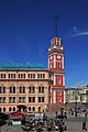


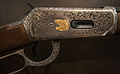


 Comment blurred and unsharpness imo, Sorry --Rjcastillo 03:01, 28 November 2012 (UTC)
 Oppose Nice view, but very blurry. - A.Savin 10:17, 28 November 2012 (UTC)


 Done Poco a poco 21:47, 27 November 2012 (UTC)
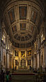


 Info
Info 


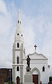


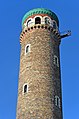

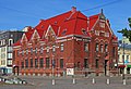


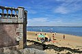


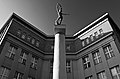


 Support Good for QI now. - A.Savin 23:16, 27 November 2012 (UTC)
 I withdraw my nomination --Moroder 09:16, 28 November 2012 (UTC)


 chromatic aberration and unsharpness --Rjcastillo 02:16, 22 November 2012 (UTC)

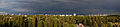


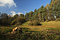


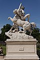

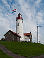
 Not done
  Weak oppose --Iifar 12:58, 27 November 2012 (UTC)

 Weak support Harsh shadows on the foreground, but the main subject is good enough. --Iifar 12:52, 27 November 2012 (UTC)


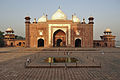


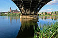

 --JDP90 13:02, 26 November 2012 (UTC)


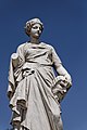


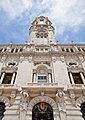


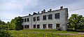


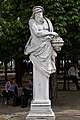


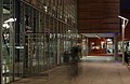
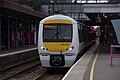


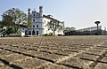
 Fixed The overexposed area, Can you please take a re-look? --Dey.sandip 18:42, 26 November 2012 (UTC)


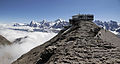


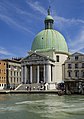


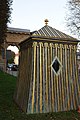


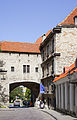


 Question Why black and white? -- JDP90 05:34, 25 November 2012 (UTC)


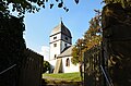


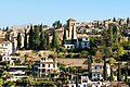


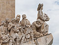


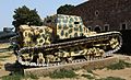


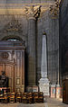


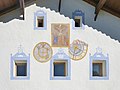


 perspective distortion --Iifar 08:47, 23 November 2012 (UTC)


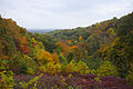


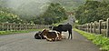


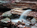


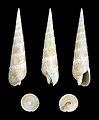


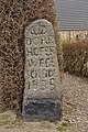
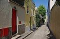
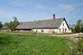
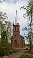


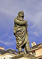


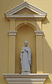


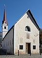


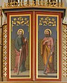


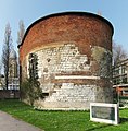


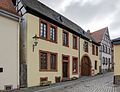


 Neutral Definitely improvement, color banding is gone and sky looks better, but blue channel is still overexposed. --Iifar 19:16, 15 November 2012 (UTC)Sorry, there is nothing better I can do. Let's wait for another opinion...--Jebulon 20:55, 15 November 2012 (UTC)
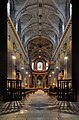


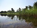


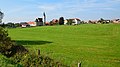


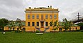
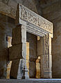

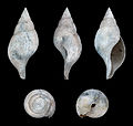


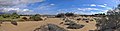

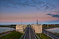


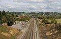


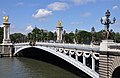


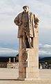
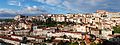


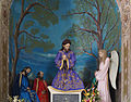


 Oversaturated for me, especially in the red channel. I suppose the leaves should be brown, but they look very red? --Slaunger 12:10, 19 November 2012 (UTC) There is not post-processing (saturation or other). Maybe an effect created by the polarizant filter. --ComputerHotline 15:50, 19 November 2012 (UTC)

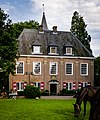

 Strong oppose No further comment. --Iifar 21:01, 17 November 2012 (UTC)
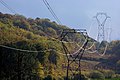
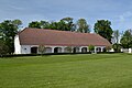


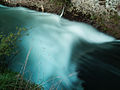


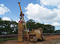


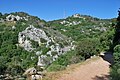


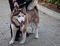


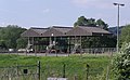
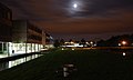


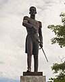


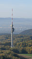

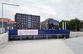
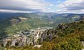


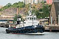


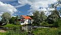

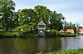


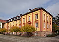


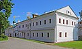


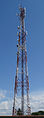

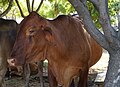

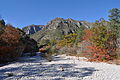


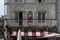

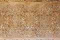


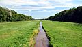


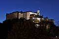


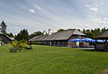
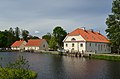


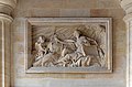


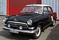
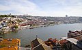


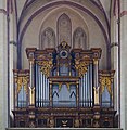

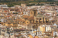


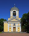


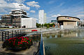


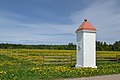


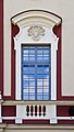


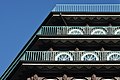


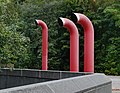

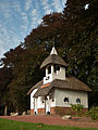


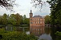
 OK, corrected. --Ralf Roletschek 11:49, 5 November 2012 (UTC)


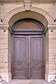
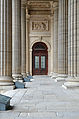

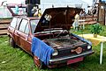
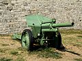


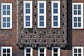


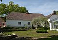


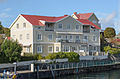


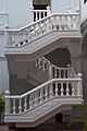

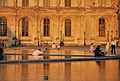


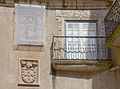


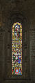


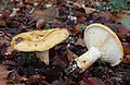


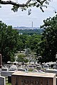


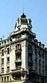


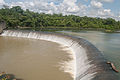


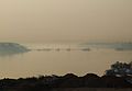

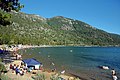


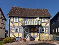


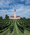

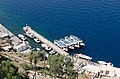


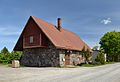
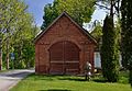


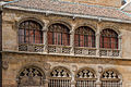
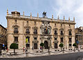


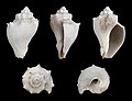
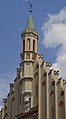


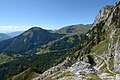
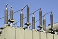


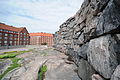
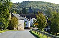
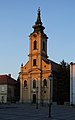
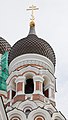


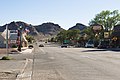
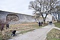


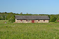

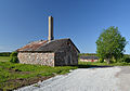


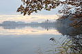


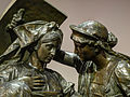
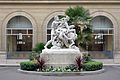


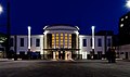


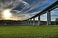


 Overprocessed Please see the notes. --Iifar 08:31, 12 November 2012 (UTC)


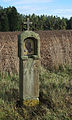


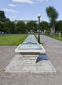


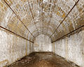


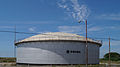


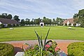
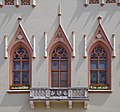


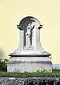


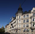
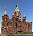


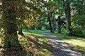


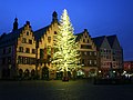
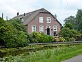


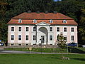


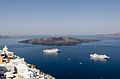


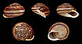


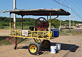


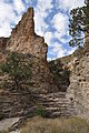
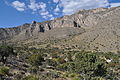
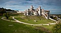


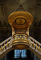
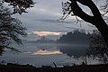


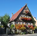


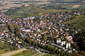


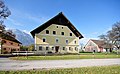


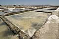


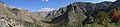


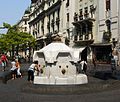


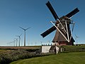


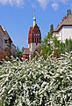


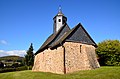


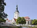


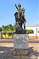
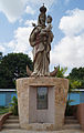


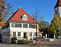


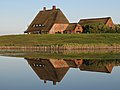

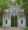
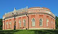


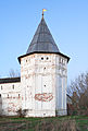


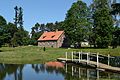
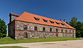


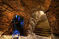


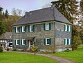


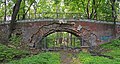


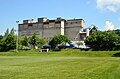


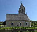


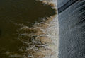


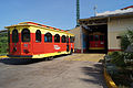


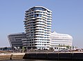


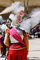


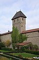


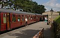


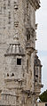


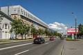


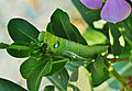

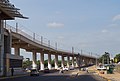


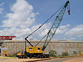
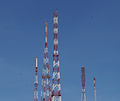


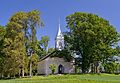


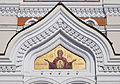

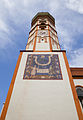


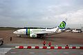


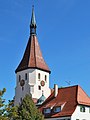


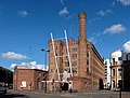


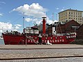


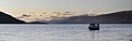


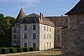


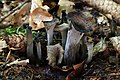
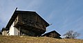


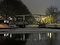


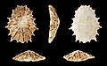


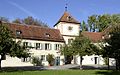


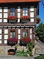

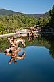


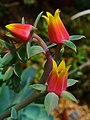

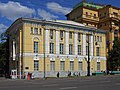


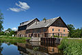


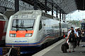


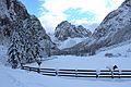


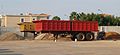


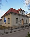


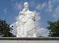


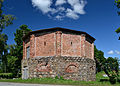


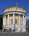


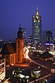


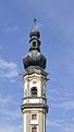


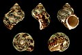


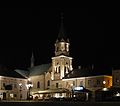


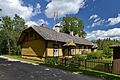


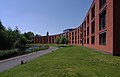


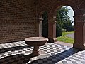


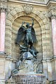


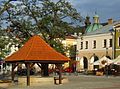


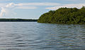


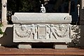


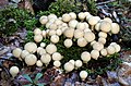


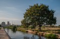
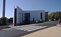


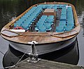


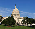


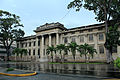
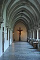


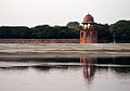
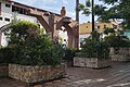


.JPG)


.Wappen.ajb.jpg)


_I.JPG)


_Bas%C3%ADlica_de_Nuestra_Se%C3%B1ora_de_Chiquinquir%C3%A1_IX.JPG)

.Detail.ajb.jpg)


.jpg)


.jpg)


_I.JPG)


.JPG)


_Hofansicht_II.jpg)
_II.jpg)


.jpg)


.JPG)
.jpg)


_II.JPG)


,_%C3%81greda,_Espa%C3%B1a,_2012-08-28,_DD_05.jpg)


.JPG)


.Fassadendetails.3.ajb.jpg)


,_Tierpark_Hellabrunn,_M%C3%BAnich,_Alemania,_2012-06-17,_DD_01.JPG)


.Detail_Westfassade.ajb.jpg)


_Bas%C3%ADlica_de_Nuestra_Se%C3%B1ora_de_Chiquinquir%C3%A1_III_2.jpg)


.JPG)


.ajb.jpg)


.jpg)


_arriving_at_Hong_Kong-02_2011.jpg)


,_%C3%81greda,_Espa%C3%B1a,_2012-08-28,_DD_02.jpg)


.jpg)


_V.jpg)


_II.jpg)


,_Tierpark_Hellabrunn,_M%C3%BAnich,_Alemania,_2012-06-17,_DD01.JPG)


-2.jpg)


.jpg)


.jpg)

_06.JPG)


.jpg)
.jpg)


.jpg)


.JPG)


.jpg)


.JPG)


.JPG)
.JPG)
.JPG)


.jpg)
.jpg)
.jpg)
.jpg)
.jpg)
.jpg)
.jpg)
.jpg)
.jpg)
.jpg)
.jpg)
.jpg)
.jpg)
.jpg)
.jpg)


.jpg)


.Portal.ajb.jpg)


.jpg)
.jpg)


.jpg)


.jpg)


.jpg)


.1.ajb.jpg)


_II.jpg)
.ajb.jpg)


_2.JPG)


..jpg)


_Ausschn.JPG)
.Grenzstein.Detail.ajb.jpg)

.Detail.2.ajb.jpg)


.jpg)
.jpg)
.jpg)


_Seitenansicht_ret.jpg)


.Detail.1.ajb.jpg)
.Detail.2.ajb.jpg)


_IX.jpg)


.jpg)


.jpg)


.jpg)


.JPG)


.JPG)


.svg)
_V.jpg)

_III.jpg)

.1.ajb.jpg)


.jpg)

.jpg)
.jpg)


.jpg)


.jpg)


.jpg)


.JPG)


_Ortseingang.jpg)


.jpg)


,_Main_Street.jpg)


.jpg)


,_Calatayud,_Espa%C3%B1a_2012-05-16,_DD_02.JPG)


.JPG)
.JPG)


.jpg)


.jpg)


.jpg)
.jpg)


.jpg)


.jpg)


.jpg)


.JPG)


_2.JPG)
_1.JPG)


_Aeropuerto_Tallinn,_Estonia,_2012-08-05,_DD_06.jpg)


.jpg)


_3.jpg)


.JPG)


,_Calatayud,_Espa%C3%B1a_2012-05-16,_DD_03.JPG)


.JPG)


.JPG)


.jpg)

.JPG)


.jpg)


.JPG)


.jpg)


_jahim%C3%B5isa_ait.jpg)
_jahim%C3%B5is.jpg)


.jpg)


.jpg)


.jpg)


_004.jpg)


_001.jpg)


.jpg)


_2.JPG)


_001.JPG)


_008.JPG)


_landing_at_London_Heathrow_Airport.jpg)


,_%C3%81greda,_Espa%C3%B1a,_2012-08-28,_DD_08.JPG)


.jpg)
.jpg)


,_zesp%C3%B3%C5%82_pielgrzymkowy_01.jpg)


.JPG)


.JPG)


.jpg)
,_%C3%81greda,_Espa%C3%B1a,_2012-08-28,_DD_02.JPG)
.JPG)

.jpg)

.jpg)


_-_Saint-Alban.JPG)


.JPG)


.JPG)


.jpg)


.jpg)


,_Tierpark_Hellabrunn,_M%C3%BAnich,_Alemania,_2012-06-17,_DD_01.jpg)


.jpg)
_04_mit_Pfarrkirche.jpg)


_2.jpg)


.JPG)


.jpg)


,_Tallin,_Estonia,_2012-08-05,_DD_07.JPG)


.jpg)


_029.jpg)
_005.JPG)
_010.jpg)


_01.JPG)


.JPG)


.jpg)


_096.jpg)


.Grenzstein.1.ajb.jpg)
.jpg)
.jpg)
.JPG)
.jpg)
,_jardín_del_molino,_Sierra_de_San_Felipe,_Setúbal,_Portugal,_2012-05-11,_DD_01.JPG)
.jpg)
.jpg)
.jpg)
.Uhr.2.ajb.jpg)
.JPG)
.JPG)


![[1]](https://upload.wikimedia.org/wikipedia/commons/5/59/Schloss_Moritzburg_von_S%C3%BCd-West_sharpened.jpg)


.jpg)
.jpg)


![[2]](https://upload.wikimedia.org/wikipedia/commons/archive/1/13/20121014042607!Ford_Consul_f.JPG)


.JPG)


.jpg)


,_jard%C3%ADn_del_molino,_Sierra_de_San_Felipe,_Set%C3%BAbal,_Portugal,_2012-05-11,_DD_01.JPG)


.jpg)


 Promoted --Iifar 09:07, 20 November 2012 (UTC)
.jpg)
 Declined A.Savin 09:59, 18 November 2012 (UTC)
.jpg)


 Inconclusive result after 8 consensual review days --Iifar 09:09, 20 November 2012 (UTC)


.Uhr.2.ajb.jpg)


 --Jebulon 22:30, 24 November 2012 (UTC)

.JPG)
.JPG)


