Commons:Quality images candidates/Archives March 01 2022
Jump to navigation
Jump to search

-
- Nomination Alnus glutinosa and goat willows (salix caprea) on lake Dietrichstein in Dietrichstein, Feldkirchen, Carinthia, Austria -- Johann Jaritz 03:38, 27 February 2022 (UTC)
- Promotion
 Support Good quality. Will be useful to indicate which are the goat willows and the alnus glutinosa. --Tagooty 04:39, 27 February 2022 (UTC)
-

- Nomination Grange in Förolach #1, Feldkirchen, Carinthia, Austria -- Johann Jaritz 03:38, 27 February 2022 (UTC)
- Promotion Support Good quality, despite the difficult lighting. --Tagooty 04:41, 27 February 2022 (UTC)
-

- Nomination The players from FC Admira Wacker Mödling swear by the match. --Steindy 00:16, 27 February 2022 (UTC)
- Promotion Support Good quality. --King of Hearts 00:48, 27 February 2022 (UTC)
-

- Nomination Andreas Leitner, goalkeeper of FC Admira Wacker Mödling. --Steindy 00:16, 27 February 2022 (UTC)
- Promotion Support Good quality. --King of Hearts 00:48, 27 February 2022 (UTC)
-

- Nomination Sebastian Bauer, player of FC Admira Wacker Mödling. --Steindy 00:16, 27 February 2022 (UTC)
- Promotion Support Good quality. --King of Hearts 00:48, 27 February 2022 (UTC)
-
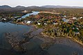
- Nomination Bass Harbor, ME. --King of Hearts 23:58, 26 February 2022 (UTC)
- Promotion Support Good quality. --Steindy 00:17, 27 February 2022 (UTC)
-
- Nomination Londonderry, VT. --King of Hearts 23:58, 26 February 2022 (UTC)
- Promotion Support Good quality. --Steindy 00:17, 27 February 2022 (UTC)
-
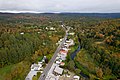
- Nomination Barton, VT. --King of Hearts 23:58, 26 February 2022 (UTC)
- Promotion Support Good quality. --Steindy 00:17, 27 February 2022 (UTC)
-
- Nomination Conversion of St. Paul Church, Barton, VT. --King of Hearts 23:58, 26 February 2022 (UTC)
- Promotion Support Good quality. --Steindy 00:17, 27 February 2022 (UTC)
-

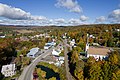
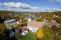
- Nomination Barton, VT. --King of Hearts 23:58, 26 February 2022 (UTC)
- Promotion Support Good quality. --Steindy 00:17, 27 February 2022 (UTC)
-
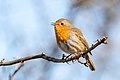
- Nomination An European robin singing on a branch in Créteil, France. --Alexis Lours 22:53, 26 February 2022 (UTC)
- Promotion Support Good quality. --Steindy 00:18, 27 February 2022 (UTC)
-

- Nomination An European robin on a branch in Créteil, France. --Alexis Lours 22:53, 26 February 2022 (UTC)
- Promotion Support Good quality. --King of Hearts 23:18, 26 February 2022 (UTC)
-

- Nomination An Eurasian magpie on a rock in Gennevilliers, France. --Alexis Lours 22:53, 26 February 2022 (UTC)
- Promotion Support Good quality. --King of Hearts 23:18, 26 February 2022 (UTC)
-

- Nomination 1936 built coaster Anda in Groningen, 15 August 2009 --Niels Johannes 20:36, 26 February 2022 (UTC)
- Promotion Support Good quality. --King of Hearts 23:18, 26 February 2022 (UTC)
-

-

- Nomination Statue of Joseph Brotherton in Manchester --Mike Peel 19:01, 26 February 2022 (UTC)
- Promotion Support Good quality. --King of Hearts 23:18, 26 February 2022 (UTC)
-

- Nomination Letters "SGTO" in Plaza de Armas Sntiago. Chile --Rjcastillo 18:31, 26 February 2022 (UTC)
- Promotion Support Good quality. --King of Hearts 23:18, 26 February 2022 (UTC)
-

- Nomination Montt Varas Square, known as Justice Square. Santiago. Chile. --Rjcastillo 18:31, 26 February 2022 (UTC)
- Promotion Support Good quality. --King of Hearts 23:18, 26 February 2022 (UTC)
-

- Nomination Donkey nearby Camaldolese Church in Warsaw --LoMit 15:41, 26 February 2022 (UTC)
- Promotion Support Good quality. --King of Hearts 23:18, 26 February 2022 (UTC)
-

- Nomination Guild of coopers' coat of arms (1767) in Trier. --Palauenc05 08:59, 26 February 2022 (UTC)
- Promotion Support Good quality. --N. Johannes 21:50, 26 February 2022 (UTC)
-

-

- Nomination Belém / Portugal - Padrão dos Descobrimentos --Imehling 07:40, 26 February 2022 (UTC)
- Promotion dust spot on the right side. OK for me. --Rjcastillo 14:31, 26 February 2022 (UTC)
-

- Nomination View of Cacilhas from Cristo Rei Statue / Almada, Portugal --Imehling 07:40, 26 February 2022 (UTC)
- Promotion Support Good quality. --Rjcastillo 14:35, 26 February 2022 (UTC)
-

-

-

- Nomination The parents' bedroom in the Villa Cavrois, in Croix, France --Velvet 07:22, 26 February 2022 (UTC)
- Promotion Support Good quality. --N. Johannes 20:40, 26 February 2022 (UTC)
-
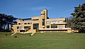
- Nomination South east view of the Villa Cavrois, in Croix, France --Velvet 07:20, 26 February 2022 (UTC)
- Promotion Support Good quality. --Rjcastillo 14:26, 26 February 2022 (UTC)
-

- Nomination Long-tailed tit in a blossoming tree --Alexis Lours 07:14, 26 February 2022 (UTC)
- Promotion Support Good quality. --Rjcastillo 14:23, 26 February 2022 (UTC)
-

- Nomination Long-tailed tit in a blossoming tree --Alexis Lours 07:14, 26 February 2022 (UTC)
- Promotion Good quality. --Imehling 08:09, 26 February 2022 (UTC)
-

-
-
-
- Nomination Our Lady basilica in Ceignac, commune of Calmont, Aveyron, France. --Tournasol7 05:30, 26 February 2022 (UTC)
- Promotion Support Good quality -- Johann Jaritz 05:45, 26 February 2022 (UTC)
-

- Nomination Confessional and stained-glass window in the Saint Peter in chains church in Rignac, Aveyron, France. --Tournasol7 05:30, 26 February 2022 (UTC)
- Promotion Support Good quality -- Johann Jaritz 05:45, 26 February 2022 (UTC)
-

- Nomination Stained-glass window in the Saint Bartholomew church in Varaire, Lot, France. --Tournasol7 05:30, 26 February 2022 (UTC)
- Promotion Support Good quality -- Johann Jaritz 05:45, 26 February 2022 (UTC)
-

- Nomination Assumption of the Virgin Mary church in Bach, Lot, France. --Tournasol7 05:30, 26 February 2022 (UTC)
- Promotion Support Good quality. --XRay 06:45, 26 February 2022 (UTC)
-

- Nomination Bell tower of the Saint Peter in chains church in Vaylats, Lot, France. --Tournasol7 05:30, 26 February 2022 (UTC)
- Promotion Support Good quality. --XRay 06:45, 26 February 2022 (UTC)
-

- Nomination Hattem, Moored boats for clog sailing.
--Agnes Monkelbaan 05:28, 26 February 2022 (UTC) - Promotion Support Good quality. --Tournasol7 05:31, 26 February 2022 (UTC)
- Nomination Hattem, Moored boats for clog sailing.
-

- Nomination Filialkirche hl. Sigmund der Basilika von Mariazell. By --Stepro 04:43, 26 February 2022 (UTC)
- Promotion Support Good quality.--Agnes Monkelbaan 05:25, 26 February 2022 (UTC)
-

-

-

- Nomination Luge on natural track Mariazell: Riccarda Ruetz (AUT). By --Stepro 04:43, 26 February 2022 (UTC)
- Promotion Support Good quality.--Agnes Monkelbaan 05:27, 26 February 2022 (UTC)
-

-

- Nomination A Japanese Maritime Self-Defense Force (JMSDF) Lockheed P-3 Orion landing at the Naha Airport in Naha, Okinawa, Japan, as part of the 2018 Naha Air Show. --Balon Greyjoy 23:39, 25 February 2022 (UTC)
- Promotion Support Good quality. --N. Johannes 20:40, 26 February 2022 (UTC)
-

-

- Nomination Merchant Casino in Čakovec, Međimurje County, Croatia. --Tournasol7 04:56, 25 February 2022 (UTC)
- Promotion Support Good quality -- Johann Jaritz 06:53, 25 February 2022 (UTC) Support good quality --Matutinho 12:20, 26 February 2022 (UTC)
-
- Nomination Bell tower of the reformed church in Körmend, Vas County, Hungary. --Tournasol7 04:56, 25 February 2022 (UTC)
- Promotion Support Good quality. --Agnes Monkelbaan 05:34, 25 February 2022 (UTC)
Support good quality -- Matutinho 12:20, 26 February 2022 (UTC) Support Good quality. --Tagooty 15:21, 26 February 2022 (UTC)
-
- Nomination Dienes Lajos utca in Körmend, Vas County, Hungary. --Tournasol7 04:56, 25 February 2022 (UTC)
- Promotion Good quality --Michielverbeek 06:29, 25 February 2022 (UTC) Support good quality -- Matutinho 12:20, 26 February 2022 (UTC)
-

-

-

-
-
-
-

- Nomination: The gatehouse in the Botanical Garden Karlsruhe.English: Das Torhaus im Botanischen Garten von Karlsruhe. --DavidJRasp 10:46, 20 February 2022 (UTC)
- Review needed
-
- Nomination: The Palais Karlsruhe --DavidJRasp 10:46, 20 February 2022 (UTC)
- Review
Perspective correction necessary. --Steindy 23:48, 20 February 2022 (UTC)
-

- Nomination: Pokrovo-Prigorodnoe village in Russia. --Alexander Novikov 09:48, 20 February 2022 (UTC)
- Review needed
-

- Nomination After the train accident in Ebenhausen from Feb 14, 2022 - damaged window and ladder of the Technisches Hilfswerk --Kritzolina 18:41, 19 February 2022 (UTC)
- Promotion Support Good quality. --King of Hearts 00:48, 27 February 2022 (UTC)
-

- Nomination A silver-washed fritillary (Argynnis paphia) on a flower in the nature reserve Südlicher Bliesgau/Auf der Lohe --DavidJRasp 10:17, 19 February 2022 (UTC)
- Promotion Support Good quality. --King of Hearts 00:48, 27 February 2022 (UTC)
-

- Nomination Immeuble 29 Boulevard Capucines - Paris I (FR75) - 2022-01-22 (by Chabe01) --Sebring12Hrs 20:44, 18 February 2022 (UTC) Support Good quality. --King of Hearts 00:48, 27 February 2022 (UTC)
- Promotion {{{2}}}
- Nomination Immeuble 29 Boulevard Capucines - Paris I (FR75) - 2022-01-22 (by Chabe01) --Sebring12Hrs 20:44, 18 February 2022 (UTC)
-

- Nomination Immeuble 29 Boulevard Capucines - Paris I (FR75) - 2022-01-22 (by Chabe01) --Sebring12Hrs 20:42, 18 February 2022 (UTC) Support Good quality. --King of Hearts 00:48, 27 February 2022 (UTC)
- Promotion {{{2}}}
- Nomination Immeuble 29 Boulevard Capucines - Paris I (FR75) - 2022-01-22 (by Chabe01) --Sebring12Hrs 20:42, 18 February 2022 (UTC)
-

- Nomination Colonne Vendôme Paris 1 (by Chabe01) --Sebring12Hrs 20:33, 18 February 2022 (UTC) Support Good quality. --MB-one 13:06, 26 February 2022 (UTC)
- Promotion {{{2}}}
- Nomination Colonne Vendôme Paris 1 (by Chabe01) --Sebring12Hrs 20:33, 18 February 2022 (UTC)
-

- Nomination Bakoyannis park, Athens. --C messier 19:34, 16 February 2022 (UTC)
- Promotion
CA should be removed. --Ermell 14:51, 19 February 2022 (UTC) Done --C messier 13:58, 24 February 2022 (UTC) Support Good quality. --King of Hearts 00:48, 27 February 2022 (UTC)


.jpg)
.jpg)
.jpg)


_Eingang_--_2022_--_0138.jpg)
.jpg)
.jpg)


_01.jpg)


.jpg)
.jpg)


_-_2022-01-22_-_2.jpg)
_-_2022-01-22_-_1.jpg)


.jpg)
.jpg)
Consensual review[edit]
File:Novocherkassk._Ascension_Cathedral_P9111321_2900.jpg[edit]

- Nomination Novocherkassk. Ascension Cathedral --Alexxx1979 09:46, 19 February 2022 (UTC)
- Promotion
- Support Good quality, very interesting. --Berrely 10:16, 19 February 2022 (UTC)
 Oppose I disagree because of the blown highlights. Sorry. --Ermell 14:41, 19 February 2022 (UTC)
- Support Blown highlights are very difficult to downgrade with stained glasses. Here the quality is very good overall. --Sebring12Hrs 09:33, 20 February 2022 (UTC)
- Support The windows are indeed overexposed but they take up only a little percentage of the photo so I'd let it slide. Still I'd recommend the author to try and improve this if possible. --VileGecko 10:38, 20 February 2022 (UTC)
- Support per others. Very solid quality, overall. -- Ikan Kekek 18:46, 20 February 2022 (UTC)
- Support As Ikan, solid good quality --Mosbatho 20:14, 20 February 2022 (UTC)
- Oppose per Ermell, blown windows spoil it. --Milseburg (talk) 18:12, 21 February 2022 (UTC)
- Oppose The photo impresses with the magnificent furnishings of the church. On closer inspection, I not only notice the outblown windows, but also that the central axis is not correct in the picture (see chandelier and cross on the altar). --Steindy 09:44, 24 February 2022 (UTC)
Total: 5 support (excluding the nominator), 3 oppose →  Promoted --Steindy 22:19, 28 February 2022 (UTC)
File:_Schloss_Schwerin_(Mecklenburg).jpg[edit]
.jpg)
- Nomination Castle of Schwerin from the seaside in Winter-- MVmath20 16:44, 17 February 2022 (UTC)
- Promotion
- Support Good Quality. --Fischer.H 17:57, 17 February 2022 (UTC)
- Oppose I disagree. Nice light, but not sharp enough. Too blurry in full resolution. --Milseburg 10:50, 18 February 2022 (UTC)
 Comment Thanks for your review. Please look at the castle (upper area) I don't think thats unsharp there. The ice and the reflections also seems clear to me. —- MVmath20 13:48, 18 February 2022 (UTC)
- Comment I like the composition and colours. Sharpness is okay given the long exposure at dusk. There is chroma noise in the shadows and sky. Lumina noise in the foreground. Blue-white fringing along the top edge of the castle. If these are corrected, I'll support. --Tagooty 04:56, 20 February 2022 (UTC)
* Comment Thanks for your review. I uploaded a new version.—- MVmath20 19:03, 20 February 2022 (UTC)
- Support It is OK to me.--Rjcastillo 02:14, 22 February 2022 (UTC)
- Oppose Sorry but there is a distracting halo effect around the castle in the current version. --C messier 13:57, 25 February 2022 (UTC)
Total: 3 support (excluding the nominator), 1 oppose → Promoted --Steindy 22:20, 28 February 2022 (UTC)
File:Acheshbok,_Южные_отроги_горы_Ачешбок_на_закате,_драматичные_погодные_условия,_горы_Западного_Кавказа.jpg[edit]

- Nomination Caucasus Biosphere Reserve, Clouds over mountains, setting sun, Adygea, Western Caucasus. --Argenberg 18:57, 31 January 2022 (UTC)
- Promotion Support Good quality. --MB-one 13:15, 7 February 2022 (UTC) Comment Coordinates inconsistent with location description. --MB-one 20:59, 9 February 2022 (UTC) Oppose Not done within a week. --Steindy 18:48, 17 February 2022 (UTC)
- For the time being Support, so that the picture does not disappear here without the factual content being clarified in a way that I can understand. --Smial 13:44, 22 February 2022 (UTC)
- Comment So, the explanation on the talk page is enough for me. So I confirm my "Pro", even if the sky on the right is a bit overexposed. But at least this does not create unnatural color distortions and overall the landscape seems well represented to me. --Smial 11:17, 24 February 2022 (UTC)
- Support Yes, good enough. -- Ikan Kekek 22:31, 25 February 2022 (UTC)
Total: 2 support (excluding the nominator), 1 oppose → Promoted --C messier 07:55, 28 February 2022 (UTC)
File:Buchplakat_vor_Buchladen_in_San_Francisco.JPG[edit]

- Nomination Signboard in front of book shop (by Burkhard Mücke) --Adamant1 05:55, 16 February 2022 (UTC)
- Decline
- Support Good quality. --Peulle 07:33, 16 February 2022 (UTC)
- Oppose Perspective correction is required. Horizontals and verticals are both significantly tilted. --VileGecko 08:07, 16 February 2022 (UTC)
- Its a sign hanging on a wall. In what world would it not be tilted? Or can there just not be any quality images of wall signs? --Adamant1 09:42, 16 February 2022 (UTC)
- Oppose Sorry! With such a simple subject, the incorrect verticals are particularly noticeable. --Steindy 14:01, 16 February 2022 (UTC)
- Comment I have yet to look at this photo beyond the image on this page, but how can anyone change the status to "Decline" when the first comment is "Good quality"? This has to be "Discuss," and please don't do that again. -- Ikan Kekek 17:35, 16 February 2022 (UTC)
- @Ikan Kekek: Comment Apparently the QI voter helper plugin removes promotion template when commenting on a picture that's been previously promoted. Not sure whether this is intentional. --VileGecko 19:09, 16 February 2022 (UTC)
- Comment @Ikan Kekek: What do you want from me? Is it not allowed to me to set a photo to decline? --Steindy 12:13, 17 February 2022 (UTC)
- Not if the first comment is "Good quality," which obviously means the status had been set to "Promotion" at first. -- Ikan Kekek 00:00, 18 February 2022 (UTC)
- @Ikan Kekek:
- Support Perfectly good and normal-looking to me. -- Ikan Kekek 08:07, 17 February 2022 (UTC)
- Support per Ikan. --Granada 12:07, 17 February 2022 (UTC)
- Oppose The subject is absolutely distorded. It needs perspective correction. If it is not possible, it is not our problem. The rules are the rules for QI. Buildings should have a good perspective, sign should have too ! --Sebring12Hrs 17:00, 18 February 2022 (UTC)
- Oppose per Steindy --Kritzolina 08:40, 19 February 2022 (UTC)
- Support The day will come when a perspective correction will be required here even for waving cornfields, because the cornstalks actually grow vertically upwards. A mimimal counter-clockwise rotation could mean a minimal improvement, but for me the photo is good enough as it is. It is not a photo that would have architecture as its theme. -- Smial 19:01, 19 February 2022 (UTC)
- Oppose per Steindy --Lmbuga 21:04, 22 February 2022 (UTC)
Total: 4 support (excluding the nominator), 5 oppose →  Declined --C messier 07:58, 28 February 2022 (UTC)
File:El_Mirador_Hotel_Plaque_(cropped).jpg[edit]
.jpg)
- Nomination A plaque at the El Mirador Hotel tower replica in Palm Springs, California (by Visitor7) --Adamant1 05:36, 16 February 2022 (UTC)
- Decline Too much distortion (vertical and horizontal) for me --Michielverbeek 06:28, 16 February 2022 (UTC) Support I disagree. Good enough for QI. --Steindy 13:56, 16 February 2022 (UTC) Oppose Agree with Michielverbeek --XRay 14:28, 16 February 2022 (UTC)
![]() Oppose A simple sign should have a good perspective. Sorry. --Sebring12Hrs 06:21, 17 February 2022 (UTC)
Oppose A simple sign should have a good perspective. Sorry. --Sebring12Hrs 06:21, 17 February 2022 (UTC)
- Comment Interresting! Whats the difference between this photo and the upper photo from the books? This one is almost vertically straight and bad, the upper is clearly vertically crooked and good. I don't understand anymore. Maybe anyeone can enlighten me? --Steindy 12:19, 17 February 2022 (UTC)
- Both need perspective correction. --Sebring12Hrs 16:57, 18 February 2022 (UTC)
- Support Quite honestly, this is perfectly OK for me. I understand the idea that something stationary on the wall should be perfectly centered, or whatever, but what is really wrong with this view? It seems normal enough. -- Ikan Kekek 03:48, 18 February 2022 (UTC)
- IMO it's cropped at the bottom and I accept at least a little bit the wall all around (and vertical verticals). --XRay 05:35, 18 February 2022 (UTC)
- Oppose Per Sebring12Hrs--Lmbuga 21:06, 22 February 2022 (UTC)
Total: 2 support (excluding the nominator), 4 oppose → Declined --C messier 07:57, 28 February 2022 (UTC)
File:San_Gimignano_-_Torri_degli_Ardinghelli.jpg[edit]

- Nomination San Gimignano / Toscana - Torri degli Ardinghelli --Imehling 14:38, 9 February 2022 (UTC)
- Promotion Support Good quality. --Steindy 18:13, 9 February 2022 (UTC) Oppose From this camera position, the highest of the towers (in the background) looks dwarfish. Another position would have been more suitable. -- ~~~~ --Martinus KE 22:24, 11 February 2022 (UTC) Why? The picture shows the Torri degli Ardinghelli, so they should be the dominant object. And it shows them how they are actually seen by people on the square. --Imehling 09:58, 12 February 2022 (UTC)
 Question Does the tower on the right lean upward to the right? If so, good quality, but let me know. I haven't been to San Gimignano recently. -- Ikan Kekek 08:11, 17 February 2022 (UTC)
- The right one is really leaning. --Imehling 08:52, 17 February 2022 (UTC)
- Support Thanks. Good quality. -- Ikan Kekek 00:01, 18 February 2022 (UTC)
Total: 2 support (excluding the nominator), 1 oppose → Promoted --C messier 07:54, 28 February 2022 (UTC)
File:20200403_Schweriner_Schloss.jpg[edit]

- Nomination View at castle of Schwerin--Matthias Bethke 11:02, 15 February 2022 (UTC)
- Decline
- Support Good quality. --Steindy 13:55, 15 February 2022 (UTC)
- Oppose Great composition, but insufficient sharpness and maybe somewhat tilted. --Tomer T 14:01, 15 February 2022 (UTC)
- Comment Please look at the castle in the crosshairs. I don't think thats tilted. Thanks for your review —- Matthias Bethke 09:55, 16 February 2022 (UTC)
- Oppose per Tomer T. -- Ikan Kekek 05:37, 16 February 2022 (UTC)
Weak Support. Some of the sculptures seem to be crooked, some others are not. The castle itself is straight enough. The image sharpness is not overwhelmingly high, but it is all enough to be printed in good quality in A4 size. Good composition and very nice, vivid lighting. --Smial 10:49, 16 February 2022 (UTC) - Comment There is a new and sharper Version available since today. Sorry it was my first picture that i submitted. —- Matthias Bethke 12:40, 17 February 2022 (UTC)
- Support QI IMO --Lmbuga 12:50, 17 February 2022 (UTC)
- Comment Sky is still too noisy to my mind. -- Ikan Kekek 00:05, 18 February 2022 (UTC)
- Oppose Too noisy and not really sharp enough in full resolution. Looks like flickering in the summer heat. Sorry, no QI in my eyes. --Milseburg 16:33, 18 February 2022 (UTC)
- Oppose per Milseburg.--Peulle 07:57, 22 February 2022 (UTC)
- Comment I uploaded a new file. I hope it is clearer and the sky without noise. Please check it. Thanks! —- Matthias Bethke 18:28, 22 February 2022 (UTC)
- Comment The Schloss is looking overexposed to me. -- Ikan Kekek 18:45, 22 February 2022 (UTC)
- Oppose Comment The revisions have unfortunately destroyed all the positive aspects of the beautiful, albeit with small, tolerable flaws, first version. Many years of observation here on QIC show me that such deteriorations happen frequently, especially when it comes to matters of taste and the photographer is eager to take all such criticisms into account. I do not object in principle to corrections to the image. Obvious technical errors such as dust spots or clearly off white balance or excessive (!) CA should of course be removed. Also too much JPG compression is always a valid reason to offer a better version. But in a landscape shot with f/11 and ISO100, the photographer did nothing wrong. If this shows too much noise in the eyes of some reviewers, it only shows that these people have exaggerated demands. If the image sharpness (without shaking, which I would also criticize) is not quite up to cameras and lenses that cost thousands of dollars - that's normal. So I like to use my private criterion: is it sharp and detailed enough to be printed on A4 (or letter size) or even larger? Do sharpening artifacts and CA remain inconspicuous? If yes, then the image is "good enough". Even if it would be better with $$$$$ equipment. (Exception are photos/stitchings uploaded with very high resolution. There I assume that the photographer has done that with the intention to deliver material for considerably larger output formats. In such cases, of course, I raise my standards accordingly). Finally: I took another close look at the original photo and sent that through my post-processing chain. Unfortunately, the JPG is already too compressed for meaningful, low-destructive denoising (jpg artifacts in the sky masking the "real" noise), only marginal improvements are possible with it. -- Smial 11:54, 23 February 2022 (UTC) Translated with www.DeepL.com/Translator (free version)
- Comment Many thans ecspecilaly to Smial: I fully agree! I'm returned to the 17.2.version and tried to reduce the noise in the sky a bit. I totally understand if the image is rejected here. Hopefully next time it will be better. Greetings —- Matthias Bethke 09:12, 24 February 2022 (UTC)
- Comment I am happy if I could help. Btw: In terms of lighting and exposure, I found the 1.2. version the most appealing. --Smial 10:23, 24 February 2022 (UTC)
- Comment The Schloss is beautiful now, but can you help me with why the reddish trees look sort of empty? -- Ikan Kekek 22:04, 24 February 2022 (UTC)
Total: 2 support (excluding the nominator), 5 oppose → Declined --Steindy 17:59, 27 February 2022 (UTC)