Commons:Quality images candidates/Archives June 2011
-

- Nomination Polish navy tugboat. Photo taken by me. Airwolf 07:22, 28 June 2011 (UTC)
- Promotion Good quality. --Mbdortmund 08:30, 28 June 2011 (UTC)
-
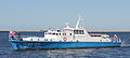
- Nomination Motorboat M-1, Polish Navy. Photo taken by me. Airwolf 07:22, 28 June 2011 (UTC)
- Promotion Good quality. --Mbdortmund 08:30, 28 June 2011 (UTC)
-

- Nomination Model of the sun, "Sternstunden" exhibition at the Gasometer Oberhausen. --Gentry 05:56, 28 June 2011 (UTC)
- Promotion Good quality. --Mbdortmund 08:30, 28 June 2011 (UTC)
-

-

- Nomination Hall of Peace, Versailles. --Coyau 03:25, 28 June 2011 (UTC)
- Promotion *
 Comment it looks like there is a somewhat reflection in the bottom of the painting --Villy Fink Isaksen 07:47, 28 June 2011 (UTC)
 Support Yes, but not a studio work; QI & Useful --Archaeodontosaurus 10:02, 28 June 2011 (UTC)
-

-

-

- Nomination Fish trap, Beach of Louro, Santiago de Louro, Muros, Galicia (Spain)--Lmbuga 21:26, 27 June 2011 (UTC)
- Promotion Good quality. --Saffron Blaze 21:35, 27 June 2011 (UTC)
-

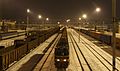
- Nomination Belgian EMU #731 -- MJJR 21:04, 27 June 2011 (UTC)
- Promotion Good quality. You might want to consider fixing the glare from the sun top right of train. Not significant to affect QI though. --Saffron Blaze 21:15, 27 June 2011 (UTC)
-

- Nomination Gravestone of provost Michael Josef Maister († 1696) in the Nepomuk chapel in the parish church of St. Veit in Pöllau --Herzi Pinki 21:09, 27 June 2011 (UTC)
- Promotion Good quality. --Saffron Blaze 21:50, 27 June 2011 (UTC)
-

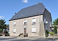
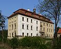
- Nomination The rectory in Stubenberg am See, Styria. --Herzi Pinki 21:09, 27 June 2011 (UTC)
- Decline Right side of house is too overexposed, details are lost. --Saffron Blaze 21:11, 27 June 2011 (UTC)
-

- Nomination Main entrance of the parish church in Stallegg, Styria --Herzi Pinki 21:09, 27 June 2011 (UTC)
- Promotion Is the door frame above really that seafoam green? Saffron Blaze 21:11, 27 June 2011 (UTC) Comment, you are right, too much green. I tried to correct it and uploaded a new version. --Herzi Pinki 21:58, 27 June 2011 (UTC),br. CommentVery nice correction. Good detail even in the white areas. --Saffron Blaze 11:45, 28 June 2011 (UTC)
-
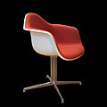
- Nomination Eames plastic chair. -- Rama 19:53, 27 June 2011 (UTC)
- Promotion Good quality. --Saffron Blaze 20:59, 27 June 2011 (UTC)
-

- Nomination Diptera -- Pedroserafin 17:46, 27 June 2011 (UTC)
- Decline Exceedingly noisy --Saffron Blaze 20:59, 27 June 2011 (UTC)
-

- Nomination Ken Hensley. --MrPanyGoff 17:46, 27 June 2011 (UTC)
- Promotion Too small for QI --Saffron Blaze 20:59, 27 June 2011 (UTC) Well above the required size. Otherwise good, too. --Ikar.us 21:27, 27 June 2011 (UTC)
Comment Happy to be wrong on this one as it is a magnificent capture. Saffron Blaze 21:30, 27 June 2011 (UTC)
Then we can set it to simple promotion, I think. --Ikar.us 21:58, 27 June 2011 (UTC)
-

- Nomination Love Parade monument --Carschten 17:27, 27 June 2011 (UTC)
- Decline Blown or overexposed background elements. --Saffron Blaze 20:59, 27 June 2011 (UTC)
-

- Nomination The church of St Mary and Corpus Christi. --Saffron Blaze 15:10, 27 June 2011 (UTC)
- Promotion Good quality. - A.Savin 15:34, 27 June 2011 (UTC) Comment seems underexposed to me. Maybe you can lighten the pic a bit up? --Carschten 17:29, 27 June 2011 (UTC) Done A.Savin 18:03, 27 June 2011 (UTC)
Comment I prefer the original as it frames the church better. Saffron Blaze 21:04, 27 June 2011 (UTC)
-
-

- Nomination Varshets Mineral spa building. --MrPanyGoff 12:36, 27 June 2011 (UTC)
- Promotion Good quality. --Saffron Blaze 21:04, 27 June 2011 (UTC)
-

- Nomination Germany, Koblenz, church St. Kastor --Berthold Werner 11:13, 27 June 2011 (UTC)
- Promotion Good quality. --Saffron Blaze 21:08, 27 June 2011 (UTC)
-
- Nomination Wehr: Catholic Church --Taxiarchos228 06:41, 27 June 2011 (UTC)
- Promotion Good quality. --Cayambe 16:34, 27 June 2011 (UTC)
-

- Nomination Niagara Falls: Skylon Tower --Taxiarchos228 06:41, 27 June 2011 (UTC)
- Promotion nice composition --Carschten 17:30, 27 June 2011 (UTC)
-

- Nomination Dossenbach: Protestant Church --Taxiarchos228 06:41, 27 June 2011 (UTC)
- Promotion Good quality. - A.Savin 15:34, 27 June 2011 (UTC)
-

-

- Nomination Tram in Munich. --High Contrast 21:49, 26 June 2011 (UTC)
- Promotion Good -- George Chernilevsky 08:32, 28 June 2011 (UTC)
-
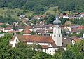
- Nomination Chapel in Bavaria. --High Contrast 21:49, 26 June 2011 (UTC)
- Promotion Good quality. --Saffron Blaze 12:01, 28 June 2011 (UTC)
-

- Nomination Historical building in a German town. --High Contrast 21:49, 26 June 2011 (UTC)
- Decline No part of this image seems to be in focus. Perhaps a sharpening issue? --Saffron Blaze 12:00, 28 June 2011 (UTC)
-
-

- Nomination The Good Friday procession of Riga 2011.--V-wolf 09:52, 26 June 2011 (UTC)
- Promotion Comment Needs a little more perspective correction. --Jovianeye 01:09, 27 June 2011 (UTC) Support No need for prefect architectural photography of background on this subject IMO. Motif is very good. --Ikar.us 21:34, 27 June 2011 (UTC)
-

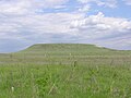
- Nomination Hill fort of San Cibrao de Las, San Amaro, Galicia (Spain)--Lmbuga 23:48, 25 June 2011 (UTC)
- Promotion Good -- George Chernilevsky 08:28, 28 June 2011 (UTC)
-

-

- Nomination Hill fort of San Cibrao de Las, San Amaro, Galicia (Spain)--Lmbuga 23:02, 25 June 2011 (UTC)
- Promotion Very good --George Chernilevsky 08:27, 28 June 2011 (UTC)
-

- Nomination Hill fort of San Cibrao de Las, San Amaro, Galicia (Spain)--Lmbuga 22:59, 25 June 2011 (UTC)
- Promotion Good -- George Chernilevsky 08:29, 28 June 2011 (UTC)
-

- Nomination Three singing bronze angels, Cathedral of Florence, Italy.--Jebulon 16:00, 25 June 2011 (UTC)
- Promotion Good -- George Chernilevsky 08:25, 28 June 2011 (UTC)
-

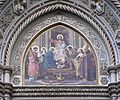
- Nomination Mosaics above the main altar of the Florence Baptistery. The Lamb of God, Prophets and Patriarchs. 13 & 14th centuries.--Jebulon 15:28, 25 June 2011 (UTC)
- Promotion Great quality --Ximonic 12:05, 27 June 2011 (UTC)
-

- Nomination a sarcophagus in the Florence Baptistery. Ancient roman and medieval (cover).--Jebulon 14:31, 25 June 2011 (UTC)
- Promotion Good --Ximonic 12:07, 27 June 2011 (UTC)
-

- Nomination Masonic Hall of the Lodge La Flandre in Bruges (Belgium) -- MJJR 16:22, 24 June 2011 (UTC)
- Promotion QI to me, but needs a little correction of perspective (vertical perspective distortion)--Lmbuga 21:49, 24 June 2011 (UTC) Comment The wall along the water is really leaning to the left. -- MJJR 09:54, 25 June 2011 (UTC)
Comment I'm not sure if I understand you. I only say that the vertical lines aren't stright, but good picture--Lmbuga 23:52, 25 June 2011 (UTC)
See the notes. You can delete the notes when you want--Lmbuga 23:59, 25 June 2011 (UTC)
I agree with your remarks: both indicated lines are not straight. The left one is a slight lens distortion indeed. The right one is not: this wall is actually not straight. -- MJJR 21:03, 27 June 2011 (UTC)
Ok, thanks--Lmbuga 23:14, 27 June 2011 (UTC)
-

- Nomination Solaris Urbino 15 (#8772) on line 112, Trasa Toruńska, Warsaw, Poland. --Crusier 18:25, 23 June 2011 (UTC)
- Promotion Composition: The main object is not "zoomed" enough, too much uninteresting and disturbing space around --Crusier 15:02, 24 June 2011 (UTC) Comment This better: File:Solaris Urbino15 8772 TT crop.JPG ? --Crusier 15:02, 24 June 2011 (UTC) Support I'm more interested in road signs than in buses. --Ikar.us 22:24, 27 June 2011 (UTC)
-
- Nomination Trasa Toruńska in Warsaw, Poland. --Crusier 18:06, 23 June 2011 (UTC)
- Promotion The continuation of File:Solaris Urbino15 8772 TT.JPG. If focal length was 135mm, wasn't it possible to take a view of both together? --Ikar.us 22:30, 27 June 2011 (UTC)
-

- Nomination The Holy Trinity column / Plaque column in Trumau --Herzi Pinki 13:06, 23 June 2011 (UTC)
- Decline Top crop looks arbitrary. Cuts a sculpture head. --Ikar.us 22:19, 27 June 2011 (UTC)
-

- Nomination The former cotton mill in Oberwaltersdorf --Herzi Pinki 13:06, 23 June 2011 (UTC)
- Promotion Good. --Ikar.us 22:02, 27 June 2011 (UTC)
-

-

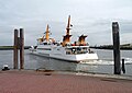
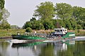
- Nomination Belgian tanker Lady-D: the stern -- MJJR 20:04, 22 June 2011 (UTC)
- Promotion Good quality. --Taxiarchos228 22:06, 27 June 2011 (UTC)
-

- Nomination: Breisach Minster pewage detail. --Taxiarchos228 09:33, 22 June 2011 (UTC)
- Review needed
-

- Nomination: Breisach Minster rood screen detail. --Taxiarchos228 09:33, 22 June 2011 (UTC)
- Review needed
-

- Nomination: Lörrach: Baptist church --Taxiarchos228 09:33, 22 June 2011 (UTC)
- Review needed
-

- Nomination: Countryside souther from Český Středohoří, Czech Republic.--Juan de Vojníkov 07:29, 22 June 2011 (UTC)
- Review needed
-
- Nomination: Part of a clay house in Sedlec, Czech Republic.--Juan de Vojníkov 07:29, 22 June 2011 (UTC)
- Review needed
-

- Nomination: Head of a cat. Old Empire or Middle Empire. Bronze. Assiut. -- Rama 06:04, 22 June 2011 (UTC)
- Review needed
-

- Nomination: Bust of a pharaoh. Middle Kingdom (2134-1797 BCE). Painted Granite. -- Rama 06:04, 22 June 2011 (UTC)
- Review needed
-

- Nomination: Heliconius ismenius butterfly in the Jardin des Papillons, Grevenmacher, Luxembourg. --Viktorhauk 17:56, 21 June 2011 (UTC)
- Review needed
-

- Nomination Lysias by Dedieu, Versailles. --Coyau 16:44, 21 June 2011 (UTC)
- Promotion Good -- George Chernilevsky 08:20, 28 June 2011 (UTC)
-

- Nomination: 319007 at Farringdon. Mattbuck 13:26, 21 June 2011 (UTC)
- Review needed
-

- Nomination: Typhon 16, Kornhamnstorg square number 49.(new version) --Ankara 12:54, 21 June 2011 (UTC)
- Review needed
-

- Nomination: Church tower. Schluchsee, Germany. Sergei 15:48, 21 June 2011 (UTC)
- Review needed
-

- Nomination a Kingdom Hall Ikar.us 16:21, 20 June 2011 (UTC)
- Promotion Please increase the brightness by about 10 points. --Jovianeye 00:56, 27 June 2011 (UTC) What are points?
 Done Enhanced histogram. --Ikar.us 09:34, 27 June 2011 (UTC)
I was referring to 10 points in Photoshop. Now it's better. --Jovianeye 22:51, 27 June 2011 (UTC)
-

- Nomination: Mennoniten kirche.Norden --Vitold Muratov 11:25, 20 June 2011 (UTC)
- Review
 Info Corrected categories. Comment Tight crop on he right. --Ikar.us 17:10, 20 June 2011 (UTC) And an "oil painting effect". Did you perform strong noise reduction and edge amplifying? --Ikar.us 22:18, 21 June 2011 (UTC)
-

- Nomination Inscribed foundation tablet, accompanying a foundation figurine (File:Foundation figurine-MBA Lyon MNB1384-IMG 0082.jpg). Chlorite. Courtesy of Musée des beaux-arts de Lyon -- Rama 06:30, 20 June 2011 (UTC)
- Decline Too harsh masking IMO. Try using a feathering of 1 or 2 pixels at a magnification of 800%-1000%. W.S. 08:35, 28 June 2011 (UTC)
-
-
- Nomination Marble headless statue of a women, 2nd c. BCE, Rhodes, Greece. --Jebulon 21:55, 19 June 2011 (UTC)
- Promotion Good -- George Chernilevsky 08:16, 28 June 2011 (UTC)
-
- Nomination Norddeich.Ferry to Westfriesland Islands. --Vitold Muratov 17:05, 19 June 2011 (UTC)
- Decline Good image, but there's too much pavement here imo. Would promote if removed. --Cayambe 21:41, 20 June 2011 (UTC)
I see cropping has been done. But edges in the image look strange to me. --Ikar.us 22:11, 21 June 2011 (UTC)--To me also.But cropping would ruin the rare picture--Vitold Muratov 13:35, 23 June 2011 (UTC)
It'S not about cropping. Composition is fine now. It's about technical quality. Edges are the borders between e.g. the wooden beams and the background sky. They show results of unfortunate image processing. --Ikar.us 14:08, 24 June 2011 (UTC)
As Ikar.us: in camera processing produced too much artefacts. W.S. 08:32, 28 June 2011 (UTC)
-

- Nomination Graz: Clock Tower --Taxiarchos228 18:35, 18 June 2011 (UTC)
- Decline Strong perspective disortion (right side). Otherwise good. --Ankara 23:28, 26 June 2011 (UTC)
so what? --Taxiarchos228 06:12, 28 June 2011 (UTC) Unnecessary, fixable, disturbing at full resolution.--Ankara 06:42, 28 June 2011 (UTC)
As Ankara. W.S. 08:28, 28 June 2011 (UTC)
-

-

-
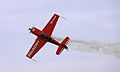
- Nomination Extra 330. Photo taken by me. Airwolf 08:13, 27 June 2011 (UTC)
- Promotion Good quality. --Taxiarchos228 08:22, 27 June 2011 (UTC)
-

- Nomination Super Petrel flying boat. Photo taken by me. Airwolf 08:13, 27 June 2011 (UTC)
- Promotion Good quality. --Taxiarchos228 08:22, 27 June 2011 (UTC)
-

- Nomination Weil am Rhein: Peter and Paul Church, bell tower --Taxiarchos228 06:41, 27 June 2011 (UTC)
- Promotion Good quality!--Ankara 08:52, 27 June 2011 (UTC)
-

- Nomination Wehr: Protestant Church --Taxiarchos228 06:41, 27 June 2011 (UTC)
- Promotion Good.--Ankara 11:05, 27 June 2011 (UTC)
-

-

-

-

-

-

-
-
-

-

-

- Nomination Dragonboat fun regatta in Duisburg Inner Harbour --Carschten 20:33, 26 June 2011 (UTC)
- Promotion Good quality. --Taxiarchos228 20:58, 26 June 2011 (UTC)
-

- Nomination Araneus quatratus --Archaeodontosaurus 19:08, 26 June 2011 (UTC)
- Promotion Good quality. --Taxiarchos228 20:02, 26 June 2011 (UTC)
-

- Nomination Sailors of the Polish Navy. Photo taken by me. --Airwolf 18:33, 26 June 2011 (UTC)
- Promotion Good quality. --Taxiarchos228 19:51, 26 June 2011 (UTC)
-

- Nomination Polish merchant ensign. Photo taken by me. --Airwolf 18:33, 26 June 2011 (UTC)
- Promotion Good quality now, I have deleted the wire on the edge --Taxiarchos228 19:51, 26 June 2011 (UTC)
-

- Nomination Petersenska huset --Ankara 17:34, 26 June 2011 (UTC)
- Promotion Good quality. --Taxiarchos228 20:02, 26 June 2011 (UTC)
-

-

- Nomination Fragment of the ceiling of the "Chambre de la reine", Château de Versailles.--Jebulon 16:01, 26 June 2011 (UTC)
- Promotion Support QI & Useful --Archaeodontosaurus 19:25, 26 June 2011 (UTC)
-

-

- Nomination St.George church in Varshets. --MrPanyGoff 15:08, 26 June 2011 (UTC)
- Promotion Too tight crop (bottom) but otherwise good quality.--Ankara 23:19, 26 June 2011 (UTC)
-

-

- Nomination Aphrodite of Cnidus.Munich --Vitold Muratov 14:10 26 June 2011 (UTC)
- Decline Insufficient quality, sorry, same here, maybe you should proof first your camera adjustment before nominating further pictures --Taxiarchos228 12:14, 26 June 2011 (UTC)-- OK. But what another piece of advice do you please give me?--Vitold Muratov 16:05 26 June 2011 (UTC)
Your image looks like an oil painting; this usually comes from excessive post-processing, either from a sharpen or froma denoise. -- Rama 16:28, 26 June 2011 (UTC)
-

- Nomination Wintersweiler: Protestant Church (interior) --Taxiarchos228 11:19, 26 June 2011 (UTC)
- Decline Unsharp. --Jebulon 13:59, 26 June 2011 (UTC)
-

- Nomination Wehr: Saint Martin Church from South --Taxiarchos228 11:19, 26 June 2011 (UTC)
- Promotion Meets the criteria, imo.--MrPanyGoff 14:03, 26 June 2011 (UTC)
-

- Nomination Münster: harbour (crane) --Taxiarchos228 11:19, 26 June 2011 (UTC)
- Decline Crane is partly hidden. --Ikar.us 12:06, 26 June 2011 (UTC)
-

-

-

-
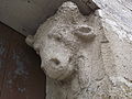
- Nomination Cow corbel, Miélan, Gers, France --Florent Pécassou 17:51, 23 June 2011 (UTC)
- Promotion QI to mooo. --Coyau 22:54, 26 June 2011 (UTC)
-

- Nomination The family mausoleum of Pacher of Theinburg in Schönau an der Triesting, wooden ceiliing --Herzi Pinki 13:06, 23 June 2011 (UTC)
- Promotion There is a little barell distortion, otherwise good quality. --Coyau 17:10, 24 June 2011 (UTC) Comment thanks for the hint, I tried to correct it, uploaded a new version. --Herzi Pinki 23:35, 26 June 2011 (UTC) Support QI now. --Coyau 23:52, 26 June 2011 (UTC)
-

- Nomination Memory plaque to Frances Talbot (la Belle Jennings) in the chapel of the Scots College in Paris.--Jebulon 23:20, 22 June 2011 (UTC) White balance adjusted.--Jebulon 16:22, 26 June 2011 (UTC)
- Promotion Support Good quality and good caption --Archaeodontosaurus 19:17, 26 June 2011 (UTC)
-

- Nomination Palazzo Vecchio in Florence, Italy, by night.--Jebulon 22:53, 21 June 2011 (UTC)
- Promotion Very well dealt with available light. Top of tower looks a bit unsharp. --Ikar.us 22:23, 24 June 2011 (UTC)Thanks. You are right: 200ISO, no tripod, camera "stitched" on a wall, I did my best...--Jebulon 10:06, 27 June 2011 (UTC)
-

- Nomination: Lörrach: Church of Rötteln, choir stalls (detail) --Taxiarchos228 08:44, 21 June 2011 (UTC)
- Review needed
-

- Nomination: Lörrach, reticulated vault in Church of Rötteln --Taxiarchos228 08:44, 21 June 2011 (UTC)
- Review needed
-
- Nomination: Transfer of cattle to be delivered in Basa by Lugalzida. Ca. 2060 BCE. Terra cotta. Girsu, Sumer -- Rama 07:04, 21 June 2011 (UTC)
- Review needed
-

- Nomination: Bark carying a mummy. Old Empire or Middle Empire. Sycomore wood, lacquered and painted. 1969-406. Assiut -- Rama 07:04, 21 June 2011 (UTC)
- Review needed
-

- Nomination Siproeta stelenes butterfly in the Jardin des Papillones, Grevenmacher, Luxembourg --Viktorhauk 18:49, 20 June 2011 (UTC)
- Decline
 Oppose too many blurred areas --Archaeodontosaurus 19:10, 26 June 2011 (UTC)
-

-

- Nomination: Marienkirche in Marienhafe --Vitold Muratov 19:10, 20 June 2011 (UTC)
- Review needed
-

- Nomination: Town center of Albstadt, Germany. --Ikar.us 17:06, 20 June 2011 (UTC)
- Review needed
-

-

- Nomination: University of Cologne, main building (stitched). A.Savin 14:33, 20 June 2011 (UTC)
- Review needed
-

- Nomination: Flowers of Warty euonymus (Euonymus verrucosus) and their pollinator Graphosoma lineatum. --Bff 14:25, 20 June 2011 (UTC)
- Review needed
-

-
- Nomination: Reconstruction of a gord in Biró --Pudelek 12:13, 20 June 2011 (UTC)
- Review needed
-
- Nomination Aircraft in the sky. --High Contrast 14:36, 19 June 2011 (UTC)
- Decline Quality is OK, but theere is really too much empty space. Airwolf 15:36, 19 June 2011 (UTC)
Subject is too small. --Jovianeye 00:37, 27 June 2011 (UTC)
-

-

- Nomination Athen Lemnia --Vitold Muratov 13:20 26 June 2011 (UTC)
- Decline nice picture but Insufficient quality (look 100 % view) --Taxiarchos228 11:41, 26 June 2011 (UTC)
-
- Nomination Germany, Göllheim, city gate "Kerzenheimer Tor" --Berthold Werner 10:53, 26 June 2011 (UTC)
- Promotion could be sharper but good enough for QI --Taxiarchos228 11:42, 26 June 2011 (UTC)
-
- Nomination St. George church in Varshets. --MrPanyGoff 01:34, 26 June 2011 (UTC)
- Promotion very good --Carschten 09:45, 26 June 2011 (UTC)
-

-

-

- Nomination Bust of Cosimo I de' Medici by Bandini, Florence, Italy.--Jebulon 22:59, 25 June 2011 (UTC)
- Promotion Very good to me--Lmbuga 23:04, 25 June 2011 (UTC)
-

-

- Nomination Lighthouse Marhällan outside Mariehamn in the Åland islands. -- Esquilo 19:49, 25 June 2011 (UTC)
- Promotion High quality. --The High Fin Sperm Whale 20:16, 25 June 2011 (UTC)
-
- Nomination The island Ängsholmen in Stockholm archipelago. -- Esquilo 19:49, 25 June 2011 (UTC)
- Promotion Good quality, although maybe a panorama would be better in this case.. --The High Fin Sperm Whale 20:16, 25 June 2011 (UTC)
-

- Nomination Detail from Toldboden, Aarhus, Denmark. --Villy Fink Isaksen 19:06, 25 June 2011 (UTC)
- Promotion Good and QI. Please help reviewers by giving different names to files and/or nominations. And maybe an english (or french, why not ? !!) description in the file page could add, thank you in advance.--Jebulon 23:22, 25 June 2011 (UTC)
-

- Nomination Detail from Toldboden, Aarhus, Denamark. --Villy Fink Isaksen 19:06, 25 June 2011 (UTC)
- Promotion Good quality. - A.Savin 19:39, 25 June 2011 (UTC)
-

-

- Nomination Mineral spa building in Varshets. --MrPanyGoff 17:14, 25 June 2011 (UTC)
- Promotion Good quality. --Coyau 23:08, 25 June 2011 (UTC)
-

- Nomination Group of the Baptism of Christ (copy), Florence Baptistery, Italy.--Jebulon 16:41, 25 June 2011 (UTC)
- Promotion Good--Lmbuga 00:24, 26 June 2011 (UTC)
-

- Nomination Mineral spa building in Varshets. --MrPanyGoff 13:43, 25 June 2011 (UTC)
- Promotion Good quality. --Berthold Werner 15:06, 25 June 2011 (UTC)
-

- Nomination St John the Apostle Church, Sheepscombe, England -- Saffron Blaze 13:43, 25 June 2011 (UTC)
- Promotion Good quality and very beautifull. --Berthold Werner 15:06, 25 June 2011 (UTC)
-

-

-

-

- Nomination Massey Orangery, Tarbes, France --Florent Pécassou 18:38, 24 June 2011 (UTC)
- Promotion Please correct the tilt !--Jebulon 23:15, 24 June 2011 (UTC) I think it's done. Thanks for your comment. Florent Pécassou 08:24, 25 June 2011 (UTC) OK, thanks. QI for me now.--Jebulon 23:02, 25 June 2011 (UTC)
-

- Nomination ENIT Villa, Tarbes, France -- Florent Pécassou 17:02, 24 June 2011 (UTC)
- Promotion Maybe too much denoising, but good enough for QI IMO.--Jebulon 00:21, 26 June 2011 (UTC)
-

- Nomination Orthetrum coerulescens. A Arnoia, Galicia (Spain)--Lmbuga 22:41, 21 June 2011 (UTC)
Only 2,5 megapixels--Lmbuga 23:02, 21 June 2011 (UTC)> - Withdrawn Withdrawn: To me the better image is File:Orthetrum coerulescens. A Arnoia, Galicia (Spain) 3.jpg --Lmbuga 21:41, 25 June 2011 (UTC)
- Nomination Orthetrum coerulescens. A Arnoia, Galicia (Spain)--Lmbuga 22:41, 21 June 2011 (UTC)
-

- Nomination Orthetrum coerulescens. A Arnoia, Galicia (Spain)--Lmbuga 21:14, 21 June 2011 (UTC)
- Promotion Good quality. --Quartl 21:15, 25 June 2011 (UTC)
-
- Nomination Orthetrum coerulescens. A Arnoia, Galicia (Spain)--Lmbuga 20:27, 21 June 2011 (UTC)
- Withdrawn Withdrawn: To me the better image is File:Orthetrum coerulescens. A Arnoia, Galicia (Spain) 3.jpg --Lmbuga 21:41, 25 June 2011 (UTC)
-

- Nomination Orthetrum coerulescens. A Arnoia, Galicia (Spain)--Lmbuga 19:51, 21 June 2011 (UTC)
Only 2,40 megapixels--Lmbuga 20:31, 21 June 2011 (UTC) - Withdrawn Withdrawn: To me the better image is File:Orthetrum coerulescens. A Arnoia, Galicia (Spain) 3.jpg --Lmbuga 21:41, 25 June 2011 (UTC)
- Nomination Orthetrum coerulescens. A Arnoia, Galicia (Spain)--Lmbuga 19:51, 21 June 2011 (UTC)
-

- Nomination: Seal: Divinity with a sparkling vase. Mesopotamy, 1850-1700 BCE. Hematit. Courtesy of Musée des beaux-arts de Lyon -- Rama 06:30, 20 June 2011 (UTC)
- Review needed
-

- Nomination: Seal: devotion scene. First dynasty of Babylone. Black serpentine. Courtesy of Musée des beaux-arts de Lyon -- Rama 06:30, 20 June 2011 (UTC)
- Review needed
-

- Nomination: Aegis of Neith. Late Period, Twenty-sixth dynasty (ca. 664-525 BCE). Goldened bronze. Courtesy of Musée des beaux-arts de Lyon -- Rama 06:30, 20 June 2011 (UTC)
- Review needed
-

- Nomination: Legal document pertaining to the annual rent of a field. Babylonie, reign of Abi-eshuh (1711-1684 BCE). Chlorite. Courtesy of Musée des beaux-arts de Lyon -- Rama 06:30, 20 June 2011 (UTC)
- Review needed
-

- Nomination: Posidonius (?). Rhodes. Greece.--Jebulon 23:16, 19 June 2011 (UTC)
- Review needed
-

- Nomination The belfry of the Panormitis monastery, Symi island, Greece.--Jebulon 15:45, 19 June 2011 (UTC)
- Promotion
 Neutral Would prefer the house on the right cropped away (and on the left to perserve symmetry).--Ikar.us 23:36, 24 June 2011 (UTC) Done Thanks for review ! Is it better now ? --Jebulon 23:12, 25 June 2011 (UTC) Yes, I like this composition more. Quality is good (some halo). --Ikar.us 23:33, 25 June 2011 (UTC)
-
- Nomination: Timelapse of clouds over Belfort (France). --ComputerHotline 15:06, 19 June 2011 (UTC)
- Review needed
-

- Nomination: Seal: scene of devotion. Mesopotamia or Northern Syria, early 2nd millenium BCE. Courtesy of Musée des beaux-arts de Lyon. -- Rama 14:31, 19 June 2011 (UTC)
- Review needed
-
- Nomination: Germany, Bamberg, church St. Gangolf --Berthold Werner 14:13, 19 June 2011 (UTC)
- Review needed
-

- Nomination: Common Stinkhorn (Phallus impudicus) --LC-de 13:45, 19 June 2011 (UTC)
- Review needed
-

- Nomination: Schwörstadt: Catholic Church (bell tower) --Taxiarchos228 12:53, 19 June 2011 (UTC)
- Review needed
-

- Nomination: Schwörstadt: Protestant Church --Taxiarchos228 12:53, 19 June 2011 (UTC)
- Review needed
-

-

-

- Nomination Heliconius charithonia mating --Holleday 20:52, 16 June 2011 (UTC)
- Withdrawn Excellent image... except for the bottom crop, which appears too tight to me. Could you add some background there? --Cayambe 19:15, 24 June 2011 (UTC)
-

- Nomination Corn dog --Jonathunder 22:50, 24 June 2011 (UTC)
- Promotion Good quality. - A.Savin 09:20, 25 June 2011 (UTC)
-

-

-

-

- Nomination St. Nicholas Orthodox Church in Szczecin, Poland. -- Felix Koenig 17:00, 24 June 2011 (UTC)
- Promotion Good quality and background. Perhaps crop on top and bottom? --Ikar.us 22:10, 24 June 2011 (UTC)
-
-

-
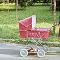
- Nomination Baby car in Russia in 1979.--PereslavlFoto 14:49, 24 June 2011 (UTC)
- Decline Scanned image from 1979 doesn't satisfy QI criteria, I'm afraid. --Ikar.us 21:53, 24 June 2011 (UTC)
Sorry, to me, poor quality: noisy, bad composition, bad luminosity...--Lmbuga 21:53, 24 June 2011 (UTC)
-

-

-

-

- Nomination A Curtiss Jenny replica. Photo taken by me. Airwolf 12:37, 24 June 2011 (UTC)
New version:Less chromatic aberrations (red) at the end of the tail of the airplane. If you want, you can delete the new version. To me, QI with aberrations or without aberrations--Lmbuga 13:10, 24 June 2011 (UTC)
 - Promotion Very good.--Jebulon 14:05, 24 June 2011 (UTC)
- Nomination A Curtiss Jenny replica. Photo taken by me. Airwolf 12:37, 24 June 2011 (UTC)
-
- Nomination Kurumayama-kogen of Kirigamine --663highland 11:40, 24 June 2011 (UTC)
- Promotion Good quality. --Rama 11:07, 25 June 2011 (UTC)
-

- Nomination Shuri Castle in Naha, Okinawa --663highland 11:40, 24 June 2011 (UTC)
- Promotion Good quality. --Jovianeye 02:48, 25 June 2011 (UTC)
-

-

-

- Nomination A massive 11 floor building in the small village of Günselsdorf --Herzi Pinki 13:06, 23 June 2011 (UTC)
- Decline Tight crop. Perspective is incorrect and noise is high. Try maybe from another point of view, and further from the building. --Sfu 23:41, 23 June 2011 (UTC) Comment the building is like a wall in a small village of otherwise only single floor houses, the photo was intended to show the wall-effect. Therefore the tight crop. Perspective, though unnatural, was corrected using ShiftN, so what is incorrect IYO? --Herzi Pinki 08:16, 24 June 2011 (UTC)
It's shurely distorted. Also the color of the sky is unnatural. --Sfu 09:52, 24 June 2011 (UTC) -- The perspective of an object which isn't flat can't be changed correctly. However, I don't notice perspective error here. But the sky shows strong artefacts from enlighting. Should at least be blurred away. --Ikar.us 18:50, 24 June 2011 (UTC) I think you show the wall-effect better if you have something to compare with, the picture does not show that the house is located in a small village (It can as well be a suburb of a big city)--Ankara 06:51, 25 June 2011 (UTC)
-

- Nomination The Hofrichterhaus, a residential building in Trumau --Herzi Pinki 13:06, 23 June 2011 (UTC)
- Promotion Good. --Ikar.us 23:11, 24 June 2011 (UTC)
-

- Nomination A single flower of Bellis perennis. --Grand-Duc 21:59, 22 June 2011 (UTC)
- Promotion Good quality. --Cayambe 00:18, 25 June 2011 (UTC)
-

-
-
-

-
-

-
-

- Nomination: Polish ASW helicopter. Photo taken by myself. --Airwolf 11:30, 19 June 2011 (UTC)
- Review needed
-
- Nomination: Accounting: distribution of food. First half of 2nd millenium BCE. Terra cotta. Girsu, Sumer. Courtesy of Musée des beaux-arts de Lyon -- Rama 07:14, 19 June 2011 (UTC)
- Review needed
-

- Nomination: Flowers Lantana camara on Hedge in Hurghada, Egypt .--Kudak 17:20, 18 June 2011 (UTC)
- Review Please add species information to the image description. This is Lantana camara --LC-de 00:06, 19 June 2011 (UTC)
-

- Nomination: Statue of en:Amerigo Vespucci, Uffizi courtyard, Florence, Italy.--Jebulon 15:16, 18 June 2011 (UTC)
 Question What are the clips on his left foot and on the Iguana's leg? W.S. 15:20, 18 June 2011 (UTC) Tools to avoid birds. Doesn't exist in FPC page. Lol.--Jebulon 15:55, 18 June 2011 (UTC)
 - Review needed
- Nomination: Statue of en:Amerigo Vespucci, Uffizi courtyard, Florence, Italy.--Jebulon 15:16, 18 June 2011 (UTC)
-

- Nomination: Heath Spotted Orchids (Dactylorhiza maculata) in different colors --LC-de 12:51, 18 June 2011 (UTC)
- Review needed
-
-

-

- Nomination Manor Farm House, Ruislip--Harrison49 22:19, 16 June 2011 (UTC)
- Decline Blown areas. Very difficult to catch correctly with the shadows of the tree and the harsh light. --Rama 07:13, 25 June 2011 (UTC)
-

- Nomination Ctenosaura similis, Hotel Bay Prince, Chacumal. Federal highway 307 Cancún-Chetumal. Mexico--Lmbuga 21:40, 16 June 2011 (UTC)
- Promotion Good quality.. Please add geotag. --Cayambe 19:10, 24 June 2011 (UTC)
Thanks, geotag added--Lmbuga 13:00, 24 June 2011 (UTC)
-

-

-
-

-

- Nomination A gym in Waldkirchen, Bavaria. --High Contrast 23:49, 11 June 2011 (UTC)
- Promotion Comment Exposure is a bit at the upper limit with some overexposed spots on the main subject, but still OK for me. What bothers me more is that contrast is rather low on the building, so that the picture looks bleached. Did you perform some post processing to bring up the shadows at the cost of contrast on the bright main region? --Johannes Robalotoff 16:31, 16 June 2011 (UTC)
Hi! Thanks for your annotations. I tested several "contrast levels" but most of them caused a too strong darkening of other parts in the image. I found this one as the best version. --High Contrast 16:50, 18 June 2011 (UTC)
A bit on the light side, but I tend to like dark images, so... --Rama 06:55, 25 June 2011 (UTC)
-

- Nomination Alfa Romeo MiTo, rear view --Maksa 05:08, 24 June 2011 (UTC)
- Decline Sorry, there are too much overexposed areas and the crop on the left side is too tight. --Berthold Werner 06:24, 24 June 2011 (UTC)
-

- Nomination Germany, Memmelsdorf, church "Assumption of Mary" --Berthold Werner 14:34, 23 June 2011 (UTC)
- Promotion A little bit too contrasted, but very nice image though -- MJJR 20:52, 23 June 2011 (UTC)
-

-
- Nomination Road on the edge of the port area of Zeebrugge, Belgium -- MJJR 13:19, 23 June 2011 (UTC)
- Promotion Good quality. --Taxiarchos228 07:09, 24 June 2011 (UTC)
-

- Nomination Dudzele (Belgium): Polder landscape north of Bruges -- MJJR 13:19, 23 June 2011 (UTC)
- Promotion Good quality. --Taxiarchos228 07:09, 24 June 2011 (UTC)
-

- Nomination Leonische Fabrik, Weissenbach an der Triesting --Herzi Pinki 13:06, 23 June 2011 (UTC)
- Promotion Good! --AleXXw 18:11, 23 June 2011 (UTC)
-

- Nomination The rectory in St. Veit an der Triesting was built in 1910/11 by Oscar Fraunlob and is a cultural heritage monument. --Herzi Pinki 13:06, 23 June 2011 (UTC)
- Promotion IMO good. --Berthold Werner 16:54, 23 June 2011 (UTC)
-

- Nomination The water tower of the Neuhirtenberger Kupferhammer, Leobersdorfer Straße 60, St. Veit an der Triesting --Herzi Pinki 13:06, 23 June 2011 (UTC)
- Promotion Very good! --AleXXw 18:11, 23 June 2011 (UTC)
-
-

- Nomination A portrait of a male of Anas platyrhynchos in breeding plumage. --Grand-Duc 21:59, 22 June 2011 (UTC)
- Promotion Good quality. --Carschten 17:19, 23 June 2011 (UTC)
-

- Nomination Conciliation cross near Młynica (Mellendorf), Lower Silesia --Pudelek 12:59, 22 June 2011 (UTC)
- Promotion QI. But what do you mean with "conciliation" cross ?--Jebulon 15:06, 22 June 2011 (UTC)
Versöhnungs Kreuz? ;-) --Berthold Werner 14:46, 23 June 2011 (UTC)
-
- Nomination Bergolo, Italia: Church of Natività di Maria Vergine --Superbass 20:00, 21 June 2011 (UTC))
- Promotion CommentQuite nice, but there is a dustspot on the right of the tower, a little higher of the bell. I'm also not shure about the geometry: the columns in the faced seems to be tilted to the left. Is that in fact, or is the perspective overcorrected? --Sfu 10:37, 23 June 2011 (UTC) CommentSpot removed, I also played a bit with tilt and perspective correction but as there are buildings in different depths of the picture I had to make compromises. Howewer, the worst tilt on any verticular axis should be below 0,5 degrees --Superbass 14:58, 23 June 2011 (UTC) SupportGood now. --Sfu 20:05, 23 June 2011 (UTC)
-

- Nomination: Bit. Bronze, 9th–8th centuries BC. From Luristan. Courtesy of Musée des beaux-arts de Lyon. -- Rama 08:51, 18 June 2011 (UTC)
- Review needed
-

- Nomination: Circumpolar stars. --ComputerHotline 06:27, 18 June 2011 (UTC)
- Review needed
-

- Nomination: ISS flyby. --ComputerHotline 06:27, 18 June 2011 (UTC)
- Review needed
-

- Nomination: ISS flyby. --ComputerHotline 06:27, 18 June 2011 (UTC)
- Review needed
-

- Nomination: St. Wenceslas Basilica in Stará Boleslav (by Boleslav) --Jklamo 23:53, 17 June 2011 (UTC)
- Review Comment Very nice, but the crop is not perfect. Crop the bottom side and than also left side, but better would be more place on the right side (but this is probably impossible). --Daniel Baránek 06:40, 18 June 2011 (UTC) Comment tilted and perspective not corrected, else good --Mbdortmund 10:42, 18 June 2011 (UTC)
-

- Nomination: Photograph taken at the Park of the 'Château de Versailles' in France. --D-Kuru 23:01, 17 June 2011 (UTC)
- Review needed
-

- Nomination: Bikes in Amsterdam --Ianare 22:33, 17 June 2011 (UTC)
- Review needed
-

- Nomination: Shiphol Airport control tower --Ianare 22:33, 17 June 2011 (UTC)
- Review needed
-

- Nomination: Downtown Amsterdam at night --Ianare 22:33, 17 June 2011 (UTC)
- Review needed
-

- Nomination: Pyramidal tower roof of Provost's Church St. Gangolf in Heinsberg, Rhineland --Alupus 22:16, 17 June 2011 (UTC)
- Review needed
-

- Nomination: Froghopper Cercopis vulnerata --Leviathan1983 15:04, 17 June 2011 (UTC)
- Review needed
-

- Nomination Reconstruction of a gord in Birów --Pudelek 20:54, 16 June 2011 (UTC)
- Promotion Comment
The vertical lines of the door aren't straight. chromatic aberrations (see notes, you can delete the notes). The stones of the floor are overexposed. Sorry --Lmbuga 22:29, 16 June 2011 (UTC)
Sorry, new revision and I'm not sure: perhaps the vertical lines of the door are straights, I'm not sure. Sorry--Lmbuga 23:56, 16 June 2011 (UTC)
New version --Pudelek 07:33, 17 June 2011 (UTC)
Good to me--Lmbuga 10:05, 24 June 2011 (UTC)
-

- Nomination Hauingen: valley of Soormatt --Taxiarchos228 11:52, 23 June 2011 (UTC)
- Promotion Good quality. --Carschten 12:01, 23 June 2011 (UTC)
-

- Nomination Kaltenbach: Protestant Church (bell tower) --Taxiarchos228 11:52, 23 June 2011 (UTC)
- Promotion Good quality. --Carschten 12:01, 23 June 2011 (UTC)
-

- Nomination Marzell: Protestant Church --Taxiarchos228 11:52, 23 June 2011 (UTC)
- Promotion Good quality. --Carschten 12:01, 23 June 2011 (UTC)
-

- Nomination Statue of Bacchus, Versailles. --Coyau 04:19, 23 June 2011 (UTC)
- Promotion Support QI & Useful --Archaeodontosaurus 10:28, 23 June 2011 (UTC)
-

-

-

- Nomination The monument for the brain of James II of England, VII of Scotland, in the chapel of the Scots College in Paris.--Jebulon 22:24, 22 June 2011 (UTC)
- Promotion Support QI & Useful --Archaeodontosaurus 08:26, 23 June 2011 (UTC)
-

-

-

- Nomination A hornet's nest with the hornets is building their one --Cody escadron delta 15:41, 22 June 2011 (UTC)
- Decline Oppose Too overexposed areas, poor contrast, the species is not identifiable --Archaeodontosaurus 08:23, 23 June 2011 (UTC)
-

-

- Nomination Wintersweiler: Protestant Church (bell tower) --Taxiarchos228 09:33, 22 June 2011 (UTC)
- Promotion QI imo --Carschten 16:04, 22 June 2011 (UTC)
-

- Nomination Lüneburg: organ at Saint Johannis church --Taxiarchos228 09:33, 22 June 2011 (UTC)
- Promotion very good --Carschten 16:04, 22 June 2011 (UTC)
-

- Nomination Christ in Majesty and other mosaics inside of the Florence Baptistery.--Jebulon 22:12, 21 June 2011 (UTC)
- Promotion Good quality. --Superbass 18:49, 22 June 2011 (UTC)
-

-

-

- Nomination Żelazny aerobatic group. Photo taken by me. Airwolf 14:37, 21 June 2011 (UTC)
I always like your images (I like this image), but in this image there are too much noise (background and, perhaps, right plane, because the rightplane isn't sharp). To me the composition is very good, but I'm not sure. Perhaps not QI--Lmbuga 16:12, 22 June 2011 (UTC) - Decline excellent composition but much to my regret the right plane is blurred. --Superbass 18:54, 22 June 2011 (UTC)
- Nomination Żelazny aerobatic group. Photo taken by me. Airwolf 14:37, 21 June 2011 (UTC)
-
-

- Nomination Bismarck monument.Norden --Vitold Muratov 12:00, 20 June 2011 (UTC)
- Decline Again the oil painting effect. Is this the output of your camera, or have you applied posterior image processing? --Ikar.us 08:25, 22 June 2011 (UTC) --Right You are. That’s processing in panic - fear of noice.Vitold Muratov 19:40, 22 June 2011 (UTC) Info Noise is most disturbing on sky. On a motif like this, noise should be hardly visible, and noise reduction not needed. Can you upload the original? --Ikar.us 20:53, 22 June 2011 (UTC)
-

- Nomination Huttingen: Saint Nicolaus Church --Taxiarchos228 18:35, 18 June 2011 (UTC)
- Promotion Good quality. --Carschten 14:41, 22 June 2011 (UTC)
-
- Nomination Hausen im Wiesental: protestant church (bell tower) --Taxiarchos228 18:35, 18 June 2011 (UTC)
- Promotion nice --Carschten 14:41, 22 June 2011 (UTC)
-
- Nomination: Mummy. Courtesy of Musée des beaux-arts de Lyon. -- Rama 11:00, 17 June 2011 (UTC)
- Review needed
-

- Nomination: Bes. Ptolemaic era (ca 332-30 BCE). Courtesy of Musée des beaux-arts de Lyon. -- Rama 10:47, 17 June 2011 (UTC)
- Review needed
-

- Nomination Germany, Haßfurt, knights chapel, choir --Berthold Werner 09:34, 17 June 2011 (UTC)
- Promotion I see that the lantern and the fence rods aren't parallel. --Ikar.us 20:57, 22 June 2011 (UTC)
-

- Nomination: Epitaph of Appia Zoe. -- Rama 19:39, 16 June 2011 (UTC)
- Review needed
-

- Nomination: Primilla's epitaph. To the manes, in memory of Primilla, his daughter, Terentius Pritto has had this tomb built. AD 362, CIL, XII, 2241. -- Rama 18:55, 16 June 2011 (UTC)
- Review needed
-

- Nomination: Falcon-headed canopic jar. Sais era, 26th Dynasty (ca. 660-525 BCE). Calcite. Courtesy of Musée des beaux-arts de Lyon. -- Rama 14:23, 16 June 2011 (UTC)
- Review needed
-

- Nomination: Anonymous, dog-headed canopic jar. "Catacombs of Cairo". Sais era, 26th Dynasty (ca. 660-525 BCE). Calcite. Courtesy of Musée des beaux-arts de Lyon. -- Rama 14:23, 16 June 2011 (UTC)
- Review needed
-
- Nomination: Vincetoxicum hirundinaria flowers. --Le.Loup.Gris 08:13, 16 June 2011 (UTC)
New version with other cropp and less chromatic aberrations here. Sorry and thanks--Lmbuga 17:50, 16 June 2011 (UTC) - Review needed
- Nomination: Vincetoxicum hirundinaria flowers. --Le.Loup.Gris 08:13, 16 June 2011 (UTC)
-

- Nomination Neuenweg: Protestant Church (epitaph) --Taxiarchos228 18:51, 14 June 2011 (UTC)
- Decline Unsharp, possibly motion blur. You could have used a faster aperture setting, no need for a f/9-DOF, here! BTW: what happened to the ISO field in the EXIF? It's not here. Grand-Duc 22:17, 22 June 2011 (UTC)
-

-

- Nomination St. Nepomuk statue on a bridge --Harke 11:46, 14 June 2011 (UTC)
- Promotion Comment White balance far too blue. (Unreal grass and tree color.) Sky slightly overexposed at the horizon. --Johannes Robalotoff 17:55, 16 June 2011 (UTC).
Wb improved. --Harke 11:21, 17 June 2011 (UTC) Comment Better now, but still a bit blue for me. May I upload a suggestion as new version? --Johannes Robalotoff 11:43, 18 June 2011 (UTC). Ja, gerne (sorry, ich war nicht online am Wochenende) --Harke 06:54, 20 June 2011 (UTC) Done Don't be surprised about the smaller file size: JPEG quality of new version is 95% with gimp, subsampling 1x1x1 and floating-point DCT, so practically nothing should be lost. Is the new WB OK for you too? --Johannes Robalotoff 07:50, 21 June 2011 (UTC). Really good, thanks --Harke 18:27, 21 June 2011 (UTC) Comment As I am involved in image creation now I am afraid that I cannot vote any more. So I recommend the image to the others for promotion. --Johannes Robalotoff 20:55, 22 June 2011 (UTC) Comment I am happy to promote this nice teamwork, great shoot, for me it meets QI criteria --J. Lunau 23:02, 22 June 2011 (UTC)
-

- Nomination Funerary model: two donkey carrying packs. Middle Empire, 12th Dynasty (1990-1786 BCE). Sycomore wood, lacquered and painted. Assiut. Offered by R. Weill, 1913. Courtesy of Musée des beaux-arts de Lyon. -- Rama 08:58, 13 June 2011 (UTC)
- Promotion Good quality. --Raghith 10:40, 13 June 2011 (UTC)
-

- Nomination France, Chapell of former hopital Laennec, Paris (7th arrond). --Siren-Com 09:20, 22 June 2011 (UTC)
- Decline oversaturated and strong artefacts --Taxiarchos228 09:36, 22 June 2011 (UTC)
-
- Nomination Germany, Haßfurt, Holy ghost chapel --Berthold Werner 09:16, 22 June 2011 (UTC)
- Promotion Good quality. --Taxiarchos228 09:36, 22 June 2011 (UTC)
-

- Nomination The upper part of the façade of the Palazzo Vecchio in Florence, showing the clock and the CoA of the history of the city (please see annotations for further explanations).--Jebulon 23:58, 21 June 2011 (UTC)
- Promotion Nice composition, decent sharpness, good colours. --Ankara 09:06, 22 June 2011 (UTC)
-

-

- Nomination germany, Memmelsdorf, church "Assumption of Mary" --Berthold Werner 12:08, 21 June 2011 (UTC)
- Promotion Good quality. - A.Savin 23:24, 21 June 2011 (UTC)
-

- Nomination Church of Rötteln: sepulchral niche of Anna von Freiburg-Neuenburg in burial chapel --Taxiarchos228 08:44, 21 June 2011 (UTC)
- Promotion Good quality. --Coyau 09:07, 22 June 2011 (UTC)
-

- Nomination Church of Rötteln, Lörrach: pulpit --Taxiarchos228 08:44, 21 June 2011 (UTC)
- Promotion Good quality. --Coyau 08:43, 22 June 2011 (UTC)
-

- Nomination Lörrach: Saint Josephs Church (interior) --Taxiarchos228 08:44, 21 June 2011 (UTC)
- Promotion Parts of the windows are overexposed (sunny days aren't suitable for that kind of photographs), but otherwise very good interior view. So: QI though for me. -- MJJR 20:44, 21 June 2011 (UTC)
-

- Nomination Le quai de l'Amiral Jauréguiberry et la Cathédrale vus de l'esplanade du quai Chaho, un jour de tempête-- D Villafruela 06:36, 20 June 2011 (UTC)
- Decline Distorted WB + too tight crop below. - A.Savin 12:38, 21 June 2011 (UTC)
-

- Nomination Fontaine du Point du Jour, Versailles. --Coyau 19:57, 20 June 2011 (UTC)
- Decline Bad composition, the sculpture is not well detached from the background, unnecessary overlap with lamp. Btw file name shouldn't be confused with file description. --Elekhh 23:15, 21 June 2011 (UTC)
That is no description, it is only the place, title and sculptor (there are often several sculpture w/ same name). --Coyau 00:48, 22 June 2011 (UTC)
-

- Nomination Sir Charles Antony Richard Hoare giving a talk at the EPFL on 20th of June 2011. -- Rama 19:47, 20 June 2011 (UTC)
- Promotion Good quality. --Taxiarchos228 07:49, 22 June 2011 (UTC)
-

-

-

- Nomination Détail du calvaire de l'enclos paroissial de Lampaul-Guimiliau - Finistère - France --Thesupermat 21:34, 19 June 2011 (UTC)
- Promotion Comment A picture without a caption, has no interest in our project. We do not know what one looks, neither the place nor the time nor the dimenssions. Shame because the picture is good. --Archaeodontosaurus 08:39, 21 June 2011 (UTC)
The caption is in the image name, but the description could be better indeed. Please add geolocation. Very good image. / Très belle photo. Prière de compléter la description et d'ajouter les coordonnées géographiques (longitude et latitude). -- MJJR 20:56, 21 June 2011 (UTC)
-

- Nomination Vorsäss, Maisäss Schönenbach bei Bizau im Bregenzerwald im Vordergrund sie Subersach der Sevisschrofen 1659m, im Hintergrund Hehle Kopf 2058m und Pellinger Köpfle 1994m. --Tomer T 20:08, 18 June 2011 (UTC)
- Promotion Good quality. --Taxiarchos228 08:58, 22 June 2011 (UTC)
-
- Nomination Statue of Francesco Ferrucci, Florence, Italy.--Jebulon 14:33, 18 June 2011 (UTC)
- Promotion Good quality. --Cayambe 15:04, 21 June 2011 (UTC)
-

- Nomination Bronze to PaoloSarpi in Venice --Archaeodontosaurus 14:18, 18 June 2011 (UTC)
- Promotion QI to me. --Cayambe 15:04, 21 June 2011 (UTC)
-
- Nomination Crashed Škoda car at the Nürburgring --Carschten 13:45, 18 June 2011 (UTC)
- Promotion Good quality. --Taxiarchos228 08:57, 22 June 2011 (UTC)
-

- Nomination Renault Clio Cup at the Nürburgring --Carschten 13:45, 18 June 2011 (UTC)
- Promotion Good quality. --Taxiarchos228 08:57, 22 June 2011 (UTC)
-

- Nomination Ford Focus RS at the Nürburgring --Carschten 13:45, 18 June 2011 (UTC)
- Promotion Good quality. --Taxiarchos228 08:57, 22 June 2011 (UTC)
-

-

-

-

-

-

-

- Nomination Tegernau: Catholic Church --Taxiarchos228 20:05, 13 June 2011 (UTC)
- Promotion Good quality. Nice Schuppen slate roof. --Coyau 17:11, 21 June 2011 (UTC)
-

- Nomination Tegernau: Catholic Church (bell tower) --Taxiarchos228 20:05, 13 June 2011 (UTC)
- Promotion Good quality. --Cayambe 15:11, 21 June 2011 (UTC)
-

- Nomination Neuenweg: Protestant Church (bell tower) --Taxiarchos228 13:40, 13 June 2011 (UTC)
- Promotion QI to me. --Cayambe 15:14, 21 June 2011 (UTC)
-
-

- Nomination Detail of gate at the Eastcote House Walled Garden --Harrison49 18:53, 11 June 2011 (UTC)
Composition seems suboptimal to me:you could crop out a number of distacting elements (notably on top); I would advise using a square format rather than 4:3. -- Rama 06:37, 20 June 2011 (UTC) Comment The flowers and the bars on the gate are all deliberately part of the picture. Harrison49 18:47, 20 June 2011 (UTC)
I was actually thinking of the iron curves on top of the image and of the shadows on the ground. -- Rama 07:13, 21 June 2011 (UTC) - Decline Bad composition. --Elekhh 23:07, 21 June 2011 (UTC)
- Nomination Detail of gate at the Eastcote House Walled Garden --Harrison49 18:53, 11 June 2011 (UTC)
-
- Nomination Germany, Bamberg, statute of "Fortidude" opposite the cathedral --Berthold Werner 11:05, 21 June 2011 (UTC)
can you upload a higher resolution? very nice but below 2 MP --Taxiarchos228 09:32, 21 June 2011 (UTC)
NO ;-) --Berthold Werner 10:11, 21 June 2011 (UTC) - Decline below 2 MP --Taxiarchos228 11:00, 21 June 2011 (UTC)
- Nomination Germany, Bamberg, statute of "Fortidude" opposite the cathedral --Berthold Werner 11:05, 21 June 2011 (UTC)
-

- Nomination Le Soir by Desjardins, Versailles. --Coyau 23:01, 20 June 2011 (UTC)
- Promotion Good quality. --Taxiarchos228 06:42, 21 June 2011 (UTC)
-

- Nomination NGCC Cap Tourmente --Cephas 22:40, 20 June 2011 (UTC)
- Promotion Good quality. --Taxiarchos228 07:17, 21 June 2011 (UTC)
-

- Nomination Ocean Henry Bain --Cephas 22:40, 20 June 2011 (UTC)
- Promotion Good quality. --Taxiarchos228 07:17, 21 June 2011 (UTC)
-

- Nomination Zitronenfalter ♂ Gonepteryx rhamni --Böhringer 21:05, 20 June 2011 (UTC)
- Promotion Good quality. --Mbdortmund 05:57, 21 June 2011 (UTC)
-

- Nomination Fontaine du Point du Jour, Versailles. --Coyau 19:38, 20 June 2011 (UTC)
- Promotion Support QI for me --Archaeodontosaurus 20:14, 20 June 2011 (UTC)
-

- Nomination Fontaine du Point du Jour, Versailles. --Coyau 19:38, 20 June 2011 (UTC)
- Promotion Good but one spot see note --Archaeodontosaurus 20:12, 20 June 2011 (UTC)
Spot removed. --Coyau 20:25, 20 June 2011 (UTC)
Support QI now --Archaeodontosaurus 06:39, 21 June 2011 (UTC)
-
- Nomination Carpocoris purpureipennis --Holleday 18:36, 20 June 2011 (UTC)
- Promotion Support QI & Useful --Archaeodontosaurus 20:15, 20 June 2011 (UTC)
-
- Nomination Sudety in Karpacz, Poland --Kudak 18:20, 20 June 2011 (UTC)
- Decline OpposeOversaturated and many artifacts in the branches --Archaeodontosaurus 20:18, 20 June 2011 (UTC)
-

- Nomination Euthystira brachyptera --Holleday 17:38, 20 June 2011 (UTC)
- Promotion Support QI & Useful --Archaeodontosaurus 20:11, 20 June 2011 (UTC)
-

- Nomination Epipedobates tricolor --Holleday 17:36, 20 June 2011 (UTC)
- Promotion Support QI & Useful --Archaeodontosaurus 20:09, 20 June 2011 (UTC)
-

- Nomination Old rail track in the Moscow area. A.Savin 14:33, 20 June 2011 (UTC)
- Promotion Good quality. --Taxiarchos228 07:22, 21 June 2011 (UTC)
-
- Nomination Saint Coloman Church --Taxiarchos228 12:50, 20 February 2011 (UTC)
- Promotion excellent composition --Carschten 13:06, 20 June 2011 (UTC)
-

- Nomination Ettal Abbey --Taxiarchos228 12:50, 20 February 2011 (UTC)
- Decline blurry at the right and left part of the image --Carschten 13:06, 20 June 2011 (UTC)
-

- Nomination Ettal Abbey (bell tower) --Taxiarchos228 12:50, 20 February 2011 (UTC)
- Promotion very good quality --Carschten 13:06, 20 June 2011 (UTC)
-
-

-

- Nomination Germany, Bamberg, Curia St. Pauli --Berthold Werner 08:31, 20 June 2011 (UTC)
- Promotion Good quality. --Cayambe 21:35, 20 June 2011 (UTC)
-

- Nomination Norden.Altes Zollhaus --Vitold Muratov 09:05, 20 June 2011 (UTC)
- Promotion Good. --Ikar.us 17:16, 20 June 2011 (UTC)
-

-

- Nomination Vancouveria hexandra (White Inside-out-flower), flower --Wsiegmund 22:33, 19 June 2011 (UTC)
- Promotion Support QI & Useful --Archaeodontosaurus 12:10, 20 June 2011 (UTC)
-

-

- Nomination Libellula depressa --Holleday 20:03, 19 June 2011 (UTC)
- Promotion Support QI & Useful --Archaeodontosaurus 12:12, 20 June 2011 (UTC)
-

-
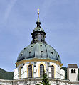
- Nomination Ettal Abbey (dome) --Taxiarchos228 12:53, 19 June 2011 (UTC)
- Promotion Good image. --Cayambe 21:46, 20 June 2011 (UTC)
-
- Nomination Timelapse of clouds over Belfort (France). --ComputerHotline 22:46, 18 June 2011 (UTC)
- Promotion Good quality. --Coyau 20:32, 20 June 2011 (UTC)
-

-

- Nomination Plague monument (1636) in Esch-sur-Sure. --Cayambe 19:06, 18 June 2011 (UTC)
- Promotion Support QI for me --Archaeodontosaurus 08:05, 21 June 2011 (UTC)
-

- Nomination Riedlingen: City Hall --Taxiarchos228 18:35, 18 June 2011 (UTC)
- Promotion Good quality. --Cayambe 00:47, 21 June 2011 (UTC)
-

- Nomination Feuerbach: Protestant Church (bell tower) --Taxiarchos228 18:35, 18 June 2011 (UTC)
- Promotion Good quality. --Cayambe 00:47, 21 June 2011 (UTC)
-
-

-
-
-
- Nomination Germany, Haßfurt, knights chapel --Berthold Werner 08:45, 16 June 2011 (UTC)
- Promotion Good. --Ikar.us 16:08, 20 June 2011 (UTC)
-

- Nomination: Wild onion Allium decipiens in natural habitat. --Le.Loup.Gris 07:43, 15 June 2011 (UTC)
- Review needed
-

- Nomination: Łaziska Średnie, Upper Silesia --Pudelek 21:20, 14 June 2011 (UTC)
- Review needed
-

- Nomination: Łaziska Średnie, Upper Silesia --Pudelek 21:20, 14 June 2011 (UTC)
- Review needed
-

- Nomination: Uppenbarelsekyrkan (Revelation Church) in Saltsjöbaden, outside Stockholm. I'm very unsure about this picture, is it good or just dark? The picture shows the altar in Uppenbarelsekyrkan. The church is dark, and there is almost no artificial light. As a deliberate contrast is an altar of white marble, and the shining cross. The image is exposed to view the altar and the cross correctly. The church was designed by en:Ferdinand Boberg --Ankara 20:44, 14 June 2011 (UTC)
- Review I'm unsure as you and I hesitate... Maybe a crop left and right ?
-

- Nomination: The new Tower from Airport Frankfurt --PS-2507 21:09, 14 June 2011 (UTC)
- Review Comment chromatic aberrations --Lmbuga 00:15, 15 June 2011 (UTC)
-
- Nomination: Lepomis gibbosus. This invasive species was catched by a fisherman in a bayou of the river Donau, Germany --Holleday 19:06, 14 June 2011 (UTC)
- Review needed
-

- Nomination: Tegernau: Protestant Church (Saint Laurentius), plate --Taxiarchos228 18:51, 14 June 2011 (UTC)
- Review Tilt--Jebulon 08:33, 15 June 2011 (UTC)
-

- Nomination: Kaltenbach: Protestant Church (memorial) --Taxiarchos228 18:51, 14 June 2011 (UTC)
- Review needed
-

- Nomination: Leucospermum reflexum --Stickpen 15:41, 14 June 2011 (UTC)
- Review Comment chromatic aberrations, the DOF can be better--Lmbuga 20:49, 14 June 2011 (UTC)
-

- Nomination: Poyke pot. --Tomer T 14:25, 14 June 2011 (UTC)
- Review needed
-
- Nomination: Athens. Virgin with child. ca. 12th century. Bronze. Courtesy of Musée des beaux-arts de Lyon. -- Rama 13:42, 14 June 2011 (UTC)
- Review needed
-

- Nomination: 1920s house in Solsidan, Saltsjöbaden (Nacka). --Ankara 12:15, 14 June 2011 (UTC)
- Review needed
-

- Nomination: Clock tower in Bursa. --Eusebius 12:09, 14 June 2011 (UTC)
- Review needed
-

-
-

-

-

- Nomination Mona Lisa (by Dcoetzee) --Hoangquan hientrang 02:03, 20 June 2011 (UTC)
- Decline Not by a commoner. W.S. 06:32, 20 June 2011 (UTC)
-
-

- Nomination Grille d'Honneur, Versailles. --Coyau 22:20, 19 June 2011 (UTC)
- Promotion Good quality. --Taxiarchos228 22:40, 19 June 2011 (UTC) Crop a bit tight. Tu ne rajouterais pas un peu de ciel, en haut ? ça manque d'air...--Jebulon 23:47, 19 June 2011 (UTC)
OK. Il en faudrait sans doute un peu sur les côtés aussi, mais je manque de grille en bas. Je vais essayer. --Coyau 23:51, 19 June 2011 (UTC) Done. Is it OK? --Coyau 00:21, 20 June 2011 (UTC)
-

- Nomination Grille d'Honneur, Versailles. --Coyau 22:20, 19 June 2011 (UTC)
- Promotion Good quality. --Taxiarchos228 22:40, 19 June 2011 (UTC)
-

-

-

- Nomination Sea-gull --Vitold Muratov 23:25, 19 June 2011 (UTC)
- Decline strong artefacts at 100 % view --Taxiarchos228 21:23, 19 June 2011 (UTC)
-

- Nomination Spanish Tower between La Caletta (Siniscola) and San Giovanni di Posada, Sardinia --Superbass 20:08, 19 June 2011 (UTC)
- Promotion Good quality. --Taxiarchos228 21:23, 19 June 2011 (UTC)
-

- Nomination Schornsteinfeger Aphantopus hyperantus --Böhringer 19:58, 19 June 2011 (UTC)
- Promotion Good quality. --Taxiarchos228 21:23, 19 June 2011 (UTC)
-

-

-
- Nomination Sea-gulls. --Vitold Muratov 18:30, 19 June 2011 (UTC)
- Decline nice picture but very strong artefacts at 100 % view --Taxiarchos228 16:28, 19 June 2011 (UTC)
-

- Nomination Faience aryballoi, 6th c. BCE, Archaeological museum of Rhodes, Greece.--Jebulon 16:12, 19 June 2011 (UTC)
- Promotion Good quality. --Taxiarchos228 16:18, 19 June 2011 (UTC)
-

- Nomination Giant Peacock Moth (Saturnia pyri) --LC-de 14:53, 19 June 2011 (UTC)
- Promotion Support QI & Useful --Archaeodontosaurus 17:40, 19 June 2011 (UTC)
-
- Nomination Cithaerias Esmeralda --Archaeodontosaurus 13:52, 19 June 2011 (UTC)
- Promotion Good --Llez 16:37, 19 June 2011 (UTC)
-

- Nomination Schwörstadt: Catholic Church (candelabrum) --Taxiarchos228 12:53, 19 June 2011 (UTC)
- Promotion Very good. - A.Savin 13:12, 19 June 2011 (UTC)
-

- Nomination Schwörstadt: Catholic Church (interior with organ) --Taxiarchos228 12:53, 19 June 2011 (UTC)
- Promotion Good.--Jebulon 15:15, 19 June 2011 (UTC)
-
- Nomination Ettal Abbey --Taxiarchos228 12:53, 19 June 2011 (UTC)
- Promotion Very good.--Jebulon 14:23, 19 June 2011 (UTC)
-

- Nomination Ettal Abbey (fresco of dome) --Taxiarchos228 12:53, 19 June 2011 (UTC)
- Promotion Very good, inspite of some magenta CA near the windows, unavoidable I'm afraid.--Jebulon 14:21, 19 June 2011 (UTC)
-

- Nomination Castle Neuschwanstein from south --Taxiarchos228 12:53, 19 June 2011 (UTC)
- Promotion Good quality. --Berthold Werner 14:15, 19 June 2011 (UTC)
-

- Nomination Polish medicopter. Photo taken by myself. --Airwolf 11:30, 19 June 2011 (UTC)
- Promotion Meets the QI-criteria. --High Contrast 13:24, 19 June 2011 (UTC)
-

- Nomination Chiesa delle Cappuccine Venice --Archaeodontosaurus 09:51, 19 June 2011 (UTC)
- Promotion Good quality. --Berthold Werner 14:15, 19 June 2011 (UTC)
-

- Nomination Heath Spotted Orchids (Dactylorhiza maculata) --LC-de 22:21, 18 June 2011 (UTC)
- Promotion Support QI & Useful --Archaeodontosaurus 13:44, 19 June 2011 (UTC)
-

-
- Nomination Heath Spotted Orchids (Dactylorhiza maculata) --LC-de 14:24, 18 June 2011 (UTC)
- Promotion Support QI & Useful --Archaeodontosaurus 13:55, 19 June 2011 (UTC)
-

- Nomination The tomb of Machiavelli in Florence, Italy.--Jebulon 12:28, 18 June 2011 (UTC)
- Promotion Support QI & Useful --Archaeodontosaurus 17:42, 19 June 2011 (UTC)
-
- Nomination Grand Canyon North end. --Hendric Stattmann 21:50, 17 June 2011 (UTC)
- Promotion Good quality and a great view --Leviathan1983 10:11, 20 June 2011 (UTC)
-

- Nomination Variety of Croton --Sankarshansen 19:05, 17 June 2011 (UTC)
- Decline Oppose Overexposed areas and too many blurred areas. Need to identify the specimen.--Archaeodontosaurus 13:59, 19 June 2011 (UTC)
-

- Nomination: Highway 87, Israel. --Tomer T 11:51, 14 June 2011 (UTC)
- Review needed
-
- Nomination: An old lime tree in Southern Germany --Harke 11:41, 14 June 2011 (UTC)
- Review needed
-

- Nomination: 143620 at Redland. Mattbuck 11:16, 14 June 2011 (UTC)
- Review needed
-

- Nomination: The Surrey Research Park. Mattbuck 11:16, 14 June 2011 (UTC)
- Review needed
-
- Nomination: "Budanova Gora" butte − a geological nature reserve (near Saratov city, Russia). --Le.Loup.Gris 04:41, 14 June 2011 (UTC)
- Review needed
-

- Nomination: Parshvanath temple, Khajuraho, India. --Sfu 20:10, 13 June 2011 (UTC)
- Review needed
-

- Nomination: Tegernau: Protestant Church --Taxiarchos228 20:05, 13 June 2011 (UTC)
- Review needed
-
- Nomination Baltimore Oriole chick in NY, USA Juliancolton 19:29, 13 June 2011 (UTC)
- Promotion Support QI & Useful --Archaeodontosaurus 14:02, 19 June 2011 (UTC)
-
-

- Nomination: Northern Whitecedar (Thuja occidentalis) foliage. --Crusier 15:24, 13 June 2011 (UTC)
- Review needed
-

- Nomination: Pteruge featuring the face of Jupiter-Amon (from a statue ?). Courtesy of Musée des beaux-arts de Lyon. -- Rama 14:44, 13 June 2011 (UTC)
- Review needed
-

- Nomination: Citadelle de Besançon. --ComputerHotline 13:39, 13 June 2011 (UTC)
- Review needed
-
- Nomination:
- Review Water wells in the Citadelle de Besançon. --ComputerHotline 13:39, 13 June 2011 (UTC)
-

-

- Nomination Tamron Close-up Filter Set --Jovianeye 02:56, 12 June 2011 (UTC)
- Promotion Good quality. --Mbdortmund 23:38, 19 June 2011 (UTC)
-

- Nomination Reflection of light on a window, Versailles. --Coyau 17:35, 10 June 2011 (UTC)
- Promotion Tilt.--Jebulon 17:21, 13 June 2011 (UTC)
In what direction? --Coyau 14:46, 14 June 2011 (UTC)ça penche un poil à gauche, en bas, non ?--Jebulon 14:13, 16 June 2011 (UTC) En fait non, ça ne penche pas. Donc QI.--Jebulon 23:49, 19 June 2011 (UTC)
Comme tu veux. --Coyau 03:57, 20 June 2011 (UTC)
-

- Nomination View at Falera with Saint Remingus Church on the left --Taxiarchos228 09:29, 10 June 2011 (UTC)
- Promotion I think the blown white buildings of the village are making this quite problematic. Also, are they leaning to left a little bit. --Ximonic 19:56, 16 June 2011 (UTC)
Good to me. -- Rama 06:33, 20 June 2011 (UTC)
-

- Nomination Wehr: Saint Martin Church (bell tower) --Taxiarchos228 12:34, 7 June 2011 (UTC)
- Promotion There is a faint dust spot in the sky, see annotation on file page. --Slaunger 21:20, 7 June 2011 (UTC)
removed now --Taxiarchos228 17:09, 9 June 2011 (UTC) Comment Thanks. Very good light, colors, focus, and detail level, but I think the crop is a too tight at the top. --Slaunger 05:12, 10 June 2011 (UTC)
I just wonder why you mentioned the faint spot if there a (in your eyes) serious defects --Taxiarchos228 09:00, 10 June 2011 (UTC)
I noticed the dust spot prior to really thinking about the composition. And independent of the QI status is it not a good thing to improve on an(y) image, if it is simple to do? If I though the tight crop was serious defect I would have opposed. Now I am just uncertain...and would appreciate the opinion of another reviewer. --Slaunger 19:03, 13 June 2011 (UTC)
A bit tight on top but good overall quality. -- Rama 06:32, 20 June 2011 (UTC)
-

- Nomination: Ettal Abbey (pulpit) --Taxiarchos228 12:50, 20 February 2011 (UTC)
- Review needed
-

- Nomination: Nuremberg Transport Museum --Taxiarchos228 12:50, 20 February 2011 (UTC)
- Review needed
-

- Nomination Shell of an Australian landsnail, Thersites fraseri --Llez 08:20, 19 June 2011 (UTC)
- Promotion Support QI & Useful --Archaeodontosaurus 10:00, 19 June 2011 (UTC)
-

- Nomination Tablet and its sealed envelop: employement contract. ca. 2037 BCE. Terra cotta. Girsu, Sumer. Courtesy of Musée des beaux-arts de Lyon -- Rama 07:14, 19 June 2011 (UTC)
- Promotion Support QI & Useful (détourage un peu "dur") --Archaeodontosaurus 10:01, 19 June 2011 (UTC)
-
- Nomination Typical colorful houses of Symi, Symi island, Greece.--Jebulon 22:17, 18 June 2011 (UTC)
- Promotion Some noise, but still good --Mbdortmund 23:20, 18 June 2011 (UTC)
-

- Nomination Dodekanisos Express, passenger catamaran in Panormitis, Symi island, Greece.--Jebulon 22:06, 18 June 2011 (UTC)
- Promotion Good quality. --Mbdortmund 23:20, 18 June 2011 (UTC)
-
- Nomination Egringen: Protestant Church (detail of choir stalls) --Taxiarchos228 18:35, 18 June 2011 (UTC)
- Decline unruhige Komposition --Mbdortmund 23:23, 18 June 2011 (UTC)
-

- Nomination Egringen: Protestant Church (detail of choir stalls) --Taxiarchos228 18:35, 18 June 2011 (UTC)
- Promotion Good quality. --Mbdortmund 23:22, 18 June 2011 (UTC)
-

- Nomination Huttingen: Saint Nicolaus Church --Taxiarchos228 18:35, 18 June 2011 (UTC)
- Promotion Perspective correction is not perfect, but good composition, color and light. -- MJJR 09:41, 19 June 2011 (UTC)
-

- Nomination Wintersweiler: Protestant Church (interior) --Taxiarchos228 18:35, 18 June 2011 (UTC)
- Promotion Support --Archaeodontosaurus 11:53, 19 June 2011 (UTC)
-

- Nomination Hausen im Wiesental: catholic church --Taxiarchos228 18:35, 18 June 2011 (UTC)
- Promotion Good quality. --Cayambe 19:08, 18 June 2011 (UTC)
-

-
- Nomination The mosaic of the central tympanum of the Cathedral of Florence, Italy.--Jebulon 17:34, 18 June 2011 (UTC)
- Promotion Support QI and Useful --Archaeodontosaurus 09:53, 19 June 2011 (UTC)
-

- Nomination One (the ancient roman) of the two Medici lions, in the loggia dei Lanzi, Florence, Italy.--Jebulon 16:58, 18 June 2011 (UTC)
- Promotion Simply good. --Alupus 19:25, 18 June 2011 (UTC)
-

- Nomination Statue of Cosimo de' Medici, Pater Patriae, Uffizi courtyard, Florence, Italy.--Jebulon 15:51, 18 June 2011 (UTC)
- Promotion Good quality. --Cayambe 19:11, 18 June 2011 (UTC)
-
-

- Nomination Pipe organ of church San Marco, Florence, Italy.--Jebulon 14:04, 18 June 2011 (UTC)
- Promotion Good quality. --Taxiarchos228 15:28, 20 February 2011 (UTC)
-

-

-

-

- Nomination Germany, Haßfurt, church St. Kilian and the Four-Seasons-Well --Berthold Werner 09:14, 18 June 2011 (UTC)
- Promotion Support QI for me --Archaeodontosaurus 14:20, 18 June 2011 (UTC)
-
-

- Nomination Lunar eclipse of 2011 June 15 --ComputerHotline 06:27, 18 June 2011 (UTC)
- Decline Noisy. W.S. 14:55, 18 June 2011 (UTC)
-
- Nomination Lunar eclipse of 2011 June 15 --ComputerHotline 06:27, 18 June 2011 (UTC)
- Decline Noisy. W.S. 14:55, 18 June 2011 (UTC)
-

- Nomination Lunar eclipse of 2011 June 15 --ComputerHotline 06:27, 18 June 2011 (UTC)
- Decline Noisy. W.S. 14:55, 18 June 2011 (UTC)
-
- Nomination Lunar eclipse of 2011 June 15 --ComputerHotline 06:27, 18 June 2011 (UTC)
- Decline No assessment procedure for movies. W.S. 14:55, 18 June 2011 (UTC)
-

-
- Nomination Glistening Ink Cap (Coprinellus micaceus, syn. Coprinus micaceus). --Bff 14:32, 17 June 2011 (UTC)
- Promotion Support QI & Useful --Archaeodontosaurus 14:25, 18 June 2011 (UTC)
-

-

- Nomination Paris - Dôme des Invalides - Tombeau de Napoléon ---Thesupermat 10:07, 17 June 2011 (UTC)
- Promotion Very good in my opinion. The crop at the bottom had to be a compromise, of course, and perspective effects are unavoidable with this scene. --Johannes Robalotoff 13:12, 18 June 2011 (UTC)
-

- Nomination Ctenosaura similis, Hotel Bay Prince, Chacumal. Federal highway 307 Cancún-Chetumal. Mexico--Lmbuga 21:38, 16 June 2011 (UTC)
- Promotion Good quality. --Mbdortmund 23:27, 18 June 2011 (UTC)
-

- Nomination: Pharaoh wearing the double crown on an ensign mast-head socket. Late era (712-332 BCE). Courtesy of Musée des beaux-arts de Lyon. -- Rama 11:38, 13 June 2011 (UTC)
- Review needed
-

- Nomination: City gate, Haute-Garonne, France --Florent Pécassou 07:49, 13 June 2011 (UTC)
- Review needed
-
- Nomination: A landscape with Prunus tenella in bloom. --Le.Loup.Gris 07:20, 13 June 2011 (UTC)
- Review needed
-

- Nomination: Dictamnus albus flowers. --Le.Loup.Gris 07:20, 13 June 2011 (UTC)
- Review needed
-
- Nomination: Visker school, Hautes-Pyrénées, France --Florent Pécassou 20:27, 12 June 2011 (UTC) Perspective disortion (also the other pictures, but there is plenty of space to correct). --Ankara 21:10, 12 June 2011 (UTC)
- Review needed
-

- Nomination: Bernadotte birth home, Pau, Pyrénées-Atlantiques, France --Florent Pécassou 20:23, 12 June 2011 (UTC)
- Review needed
-

- Nomination: Extra 300. Photo taken by myself. --Airwolf 17:37, 12 June 2011 (UTC)
- Review needed
-

- Nomination: Extra 300. Photo taken by myself. --Airwolf 17:37, 12 June 2011 (UTC)
- Review needed
-
- Nomination: Högbergsgatan 54/Björngårdsgatan 17. Built 1889-90. Architect: Ernst Stenhammar --Ankara 16:44, 12 June 2011 (UTC)
- Review needed
-
- Nomination: Typhon 16, Kornhamnstorg square number 49. Västerlånggatan number 66, Gamla Stan (Old Town), Stockholm. --Ankara 16:44, 12 June 2011 (UTC)
- Review Looks like if the denoising were too strong...--Jebulon 17:08, 12 June 2011 (UTC) Thanks. You are right. I'll look up the original file and see what went wrong.--Ankara 17:15, 12 June 2011 (UTC) DoneNew version. No denoising.--Ankara 22:08, 12 June 2011 (UTC) Better now?
-
- Nomination: HQ of Alcro-Beckers --Ankara 16:21, 12 June 2011 (UTC)
- Review needed
-

- Nomination: Hammarby Alle. --Ankara 16:17, 12 June 2011 (UTC)
- Review needed
-
- Nomination: Lumafabriken, November 2010. --Ankara 16:17, 12 June 2011 (UTC)
- Review needed
-

- Nomination: Façade of french National Assembly, rare view without cars, Paris.--Jebulon 15:41, 12 June 2011 (UTC)
- Review needed
-

- Nomination: Logo of 6th generation of Cadillac Eldorado --Chmee2 15:31, 12 June 2011 (UTC)
- Review needed
-

- Nomination: Czech actresses Eva Hrušková --Chmee2 15:31, 12 June 2011 (UTC)
- Review needed
-

- Nomination: Czech actor Jan Přeučil with Czech actresses Eva Hrušková --Chmee2 15:31, 12 June 2011 (UTC)
- Review needed
-
- Nomination: Ships in Fredriksdal, Stockholm. --Ankara 15:22, 12 June 2011 (UTC)
- Review needed
-
- Nomination: Office build in Fredriksdal, Stockholm --Ankara 15:22, 12 June 2011 (UTC)
- Review needed
-

- Nomination: Scaeva pyrastri -- Pro2 13:57, 12 June 2011 (UTC)
- Review needed
-
- Nomination: Łaziska Średnie (Mittel Laziska), Upper Silesia --Pudelek 13:13, 12 June 2011 (UTC)
- Review needed
-

- Nomination: Doorway leading to former Park House, RAF Uxbridge --Harrison49 12:19, 12 June 2011 (UTC)
- Review needed
-

-

- Nomination Statue of Guido Aretino (Guido d'Arezzo), Florence, Italy.--Jebulon 11:52, 18 June 2011 (UTC)
- Promotion QI for me, although I would apply less software sharpening, as halo effects begin to evolve in the head region. --Johannes Robalotoff 12:00, 18 June 2011 (UTC)
-

- Nomination Aero 50 Dynamik with Sodomka bodywork--Honza chodec 19:22, 17 June 2011 (UTC)
- Promotion Good quality. --Berthold Werner 07:47, 18 June 2011 (UTC)
-

-

- Nomination Froghopper Cercopis vulnerata --Leviathan1983 15:04, 17 June 2011 (UTC)
- Promotion Excellent! - A.Savin 15:14, 17 June 2011 (UTC)
-

- Nomination A Class 59 diesel on the turntable at Minehead -- Geof Sheppard 07:26, 17 June 2011 (UTC)
- Promotion Good & useful -- MJJR 16:14, 17 June 2011 (UTC)
-

- Nomination Deep-fried cheese curds--Jonathunder 03:51, 17 June 2011 (UTC)
- Promotion Good quality. --Ianare 23:35, 17 June 2011 (UTC)
-

-
-

- Nomination Plafond du dôme des Invalides à Paris. --Thesupermat 20:20, 16 June 2011 (UTC)
- Promotion IMHO good enough for QI --Berthold Werner 10:43, 18 June 2011 (UTC)
-

- Nomination "Here was hanged and burnt Girolamo Savonarola...", Florence, Italy.--Jebulon 22:55, 15 June 2011 (UTC)
- Promotion QI, slight underexposure, but very useful --Archaeodontosaurus 12:48, 16 June 2011 (UTC) Done Thank you --Jebulon 20:48, 17 June 2011 (UTC)
-

- Nomination The tomb of Galileo Galilei in Basilica Santa Croce of Florence, Italy.--Jebulon 22:33, 15 June 2011 (UTC)
- Promotion Comment Contraste insuffisant, j'ai presque choisi d'opposer la promotion. Essaye une amélioration du contraste, l'image en vaut la peine! Grand-Duc 16:49, 16 June 2011 (UTC)Tout àfait juste, ganz richtig, c'est une question de paramétrage d'écran. La même réserve a été faite en VIC. Je m'en occupe dès que possible. Merci beaucoup.--Jebulon 23:07, 16 June 2011 (UTC) Done now. Besser ? --Jebulon 20:50, 17 June 2011 (UTC)
Ja, besser. Merci, j'estime que l'image est au niveau QI, maintenant, j'ai voté en accordance de cela. Grand-Duc 21:48, 17 June 2011 (UTC)
-

-

- Nomination Detail from the medieval defensive wall of Oberwesel. --Johannes Robalotoff 21:03, 12 June 2011 (UTC)
- Promotion Good quality. --Ianare 23:30, 17 June 2011 (UTC)
-
- Nomination Vogelbach: Protestant Church --Taxiarchos228 16:32, 12 June 2011 (UTC)
- Promotion Good quality. --Ianare 23:32, 17 June 2011 (UTC)
-

- Nomination Vogelbach: Protestant Church (solar clock) --Taxiarchos228 16:32, 12 June 2011 (UTC)
- Promotion Good quality, shame there is no shadow though ... --Ianare 23:32, 17 June 2011 (UTC)
-

- Nomination: An Upper Jurassic Ammonite, Rasenia involuta --Llez 09:42, 12 June 2011 (UTC)
- Review needed
-

- Nomination: Strigil sarcophagus. White marble, possibly Christian. Place of origin unknown. 3rd-4rth century CE. Formerly kept at Quai de Serin in Lyon. Espérandieu 1772, on display at Fourvière gallo-Roman museum, Lyon. -- Rama 07:22, 12 June 2011 (UTC)
- Review needed
-

- Nomination: ANTONY GORMLEY Hochalpe --Böhringer 21:51, 11 June 2011 (UTC)
- Review needed
-

- Nomination: Alpenschneehuhn, Lagopus muta --Böhringer 21:47, 11 June 2011 (UTC)
- Review needed
-
- Nomination: Lake Kilpisjärvi as seen from Saana fell, Lapland, Finland, in summer night, June 2011 --Ximonic 20:57, 11 June 2011 (UTC)
- Review needed
-

- Nomination: Warta Riwer in Załęcze Wielkie, Poland --Przykuta 20:38, 11 June 2011 (UTC)
- Review needed
-

- Nomination: Crystals inside a shingle (focus stacking). --ComputerHotline 20:27, 11 June 2011 (UTC)
- Review Some artifact of reconstruction in dark areas. The species must be identified. (quartz crystals) --Archaeodontosaurus 07:34, 12 June 2011 (UTC)
-

- Nomination: Chocolate chip cookies--Jonathunder 20:22, 11 June 2011 (UTC)
- Review needed
-

-

-

- Nomination Church in Ailringen --Harke 10:05, 10 June 2011 (UTC)
- Decline I'm not convinced by the composition. Mattbuck 15:50, 10 June 2011 (UTC) Oppose Yes, the composition is not good. --Daniel Baránek 14:14, 17 June 2011 (UTC)
-

- Nomination Panoramic view of Tbilisi, Georgia. --Hoangquan hientrang 07:25, 17 June 2011 (UTC)
- Promotion Support Good for me. --Daniel Baránek 10:17, 17 June 2011 (UTC)
-

- Nomination Isis-Hathor giving milk to Osiris. The Child, now lost, was fixed to the hand of the statuette by a hinge. Late era, 26th dynasty (ca 664-525 BCE). Bronze, golden incrust at the eyes. Courtesy of Musée des beaux-arts de Lyon. -- Rama 05:55, 17 June 2011 (UTC)
- Promotion Good quality. --Raghith 06:48, 17 June 2011 (UTC)
-

-

- Nomination Caligo martia Muséum sepcimen --Archaeodontosaurus 05:34, 17 June 2011 (UTC)
- Promotion Good quality. --Raghith 06:48, 17 June 2011 (UTC)
-

- Nomination Ateles geoffroyi eating a banana, Quintana Roo, Mexico--Lmbuga 21:49, 16 June 2011 (UTC)
- Promotion Good quality. Harrison49 01:56, 17 June 2011 (UTC)
-

- Nomination Reconstruction of a gord in Birów --Pudelek 20:54, 16 June 2011 (UTC)
- Promotion Good to me. Perhaps chromatic aberrations, but very little important to me (I add notes, you can delete the notes. New version) --Lmbuga 23:07, 16 June 2011 (UTC)
-

- Nomination Buildings in Santiago de Compostela, Galicia (Spain)--Lmbuga 20:53, 16 June 2011 (UTC)
- Promotion Support QI for me --Archaeodontosaurus 05:36, 17 June 2011 (UTC)
-

-

-

-

- Nomination Micral computer. On display at the Musée gallo-romain de Fourvière, Lyon. -- Rama 19:01, 16 June 2011 (UTC)
- Promotion Good quality, but the vertical lines of the left aren't stright: Needs a little perspective correction--Lmbuga 21:11, 16 June 2011 (UTC)
Thank you good point. That gave me the opportunity to redo the crop, of which I was dissatisfied. -- Rama 21:26, 16 June 2011 (UTC)
-

-

- Nomination Flowers of Thalictrum aquilegiifolium. --Bff 15:36, 16 June 2011 (UTC)
- Promotion Very good DOF and good composition--Lmbuga 17:09, 16 June 2011 (UTC)
-

-

-

- Nomination Plaque représentant Saint-Paul exposée au musée national du moyen-âge à Paris. --Thesupermat 12:53, 16 June 2011 (UTC)
- Promotion Good.--Jebulon 14:04, 16 June 2011 (UTC)
-

-

-

- Nomination View of the main reading room of the Bibliothèque Sainte-Geneviève in Paris. -- Jastrow 11:32, 16 June 2011 (UTC)
- Promotion Good for me --Thesupermat 13:08, 16 June 2011 (UTC)
-

- Nomination Rostock, university, department for anatomy and physiology --Grand-Duc 08:49, 16 June 2011 (UTC)
- Promotion QI for me, in spite of slightly decreasing sharpness away from the image center. --Johannes Robalotoff 16:15, 16 June 2011 (UTC)
-

-

- Nomination Ménerbes, France --Pline 13:32, 15 June 2011 (UTC) CommentUn débruitage du ciel serait bienvenu --Archaeodontosaurus 19:53, 15 June 2011 (UTC) Comment Done --Pline 06:43, 17 June 2011 (UTC)
- Promotion Good. --Mattbuck 13:46, 16 June 2011 (UTC)
- Nomination Ménerbes, France --Pline 13:32, 15 June 2011 (UTC)
-

-
-
- Nomination Wild onion Allium decipiens inflorescence. --Le.Loup.Gris 10:47, 15 June 2011 (UTC)
- Promotion Good. --Mattbuck 13:46, 16 June 2011 (UTC)
-

- Nomination Germany, Haßfurt, entrance of the knights chapel --Berthold Werner 07:02, 15 June 2011 (UTC)
- Promotion Support QI for me --Archaeodontosaurus 13:07, 16 June 2011 (UTC) Comment Good image, but, to me, perspective distortion and strong chromatic aberrations (see note about CA, you can delete the note when you want). New version here. Not QI to me--Lmbuga 00:30, 17 June 2011 (UTC)
-

- Nomination Telephone model U43, 1961. Administration des Postes, Télégraphes et Téléphones (PTT). Bakélite. On display at the Musée gallo-romain de Fourvière, Lyon. -- Rama 17:18, 14 June 2011 (UTC)
- Promotion Mon Dieu ! J'ai le même âge... Ai-je l'air aussi vieillot ? Il y a par ailleurs une petite saleté au dessus du combiné (see annotation)--Jebulon 08:16, 15 June 2011 (UTC)
Au moins c'était une époque de beau plastique. Merci pour la remarque ! -- Rama 11:38, 16 June 2011 (UTC)
Bakélite c'est de la bakélite! QI & Useful --Archaeodontosaurus 13:12, 16 June 2011 (UTC)
-

- Nomination Clipper Adventure, in Beagle Channel outside Ushuaia. --Ankara 08:42, 14 June 2011 (UTC)
- Promotion Good quality. Harrison49 01:56, 17 June 2011 (UTC)
-

- Nomination Wintersweiler: Protestant Church (from North) --Taxiarchos228 20:22, 13 June 2011 (UTC)
- Promotion Good quality. Harrison49 01:54, 17 June 2011 (UTC)
-

- Nomination Old tower detail --Kozuch 16:12, 13 June 2011 (UTC)
- Decline Oppose The sky is not blue, but violet (bad colour balance). Furthermore the colour of the sky inside the lion has different colour than the rest of the sky. --Daniel Baránek 11:36, 17 June 2011 (UTC)
-

- Nomination Besançon seen from the Citadelle de Besançon. --ComputerHotline 13:39, 13 June 2011 (UTC)
- Promotion Support Nice, good for me. --Daniel Baránek 11:45, 17 June 2011 (UTC)
-

- Nomination Citadelle de Besançon. --ComputerHotline 13:39, 13 June 2011 (UTC)
- Decline Oppose Quite nice, but 1) blended people, 2) the bridge is too deformed (or is it so round in the reality?). --Daniel Baránek 11:42, 17 June 2011 (UTC)
-

- Nomination Germany, Bamberg, Obere Königstraße 1/3 --Berthold Werner 11:29, 13 June 2011 (UTC)
- Promotion Support QI for me --Archaeodontosaurus 13:22, 16 June 2011 (UTC)
-

- Nomination Germany, Bamberg, old townhall --Berthold Werner 11:28, 13 June 2011 (UTC)
- Promotion Good quality. Harrison49 01:58, 17 June 2011 (UTC)
-

- Nomination Air rescue helicopter Eurocopter BK-117 B2 in Germany --High Contrast 08:36, 13 June 2011 (UTC)
- Promotion Up to QI for me. --Ximonic 20:10, 16 June 2011 (UTC)
-

- Nomination Marzell: Catholic Church --Taxiarchos228 16:32, 12 June 2011 (UTC)
- Promotion Good quality --Ximonic 20:05, 16 June 2011 (UTC)
-

- Nomination Kaltenbach: Protestant Church (interior) --Taxiarchos228 16:32, 12 June 2011 (UTC)
- Promotion QI for me. Some overexposure on the windows is, of course, unavoidable here without HDR. There is still enough detail/color on the windows. --Johannes Robalotoff 18:11, 16 June 2011 (UTC)
-

- Nomination Bassin du Miroir, Versailles. --Coyau 20:27, 11 June 2011 (UTC)
- Promotion Good quality. Harrison49 01:50, 17 June 2011 (UTC)
-

- Nomination: Coal Mine Bolesław Śmiały in Łaziska Górne (Upper Silesia) --Pudelek 10:39, 11 June 2011 (UTC)
- Review needed
-

- Nomination: Blackthorn (Prunus spinosa) in bloom. --Le.Loup.Gris 07:02, 11 June 2011 (UTC)
- Review needed
-

- Nomination: a XVIIIth century chair in Queen's dinning room in Versailles.--Jebulon 21:04, 10 June 2011 (UTC)
- Review needed
-

- Nomination: Vancouveria hexandra (White Inside-out-flower), inflorescence --Wsiegmund 19:15, 10 June 2011 (UTC)
- Review needed
-
- Nomination Water tower in Mikhnevo, Russia. A.Savin 13:41, 10 June 2011 (UTC)
- Promotion Good quality. Harrison49 01:51, 17 June 2011 (UTC)
-
- Nomination Administration building, the former Bath, Pereslavl museum--PereslavlFoto 13:21, 10 June 2011 (UTC)
- Promotion Good quality. Harrison49 01:51, 17 June 2011 (UTC)
-

- Nomination Naples.Klodt group 1 --Vitold Muratov 23:15, 9 June 2011 (UTC)
- Promotion Good quality. Harrison49 01:52, 17 June 2011 (UTC)
-

- Nomination Immature Ruddy Darter. --Quartl 20:48, 9 June 2011 (UTC)
- Promotion Good quality. Harrison49 01:52, 17 June 2011 (UTC)
-

- Nomination Leptotes pirithous, copulation. --Gidip 12:49, 9 June 2011 (UTC)
- Promotion Good quality. Harrison49 01:52, 17 June 2011 (UTC)
-

- Nomination Lörrach: Saint Joseph Church (altar) --Taxiarchos228 10:55, 9 June 2011 (UTC)
- Promotion Good quality. Harrison49 01:52, 17 June 2011 (UTC)
-
- Nomination Wyhlen: Saint Georg Church (choir) --Taxiarchos228 10:55, 9 June 2011 (UTC)
- Promotion Good quality. Harrison49 01:52, 17 June 2011 (UTC)
-

- Nomination Mierlo War Cemetery entrance --Wammes Waggel 19:28, 8 June 2011 (UTC)
- Promotion Good quality --Ximonic 19:52, 16 June 2011 (UTC)
-
- Nomination Slippery Jack mushroom (Suillus luteus) -- George Chernilevsky 19:02, 8 June 2011 (UTC)
- Promotion I think this picture isn't too informative but, anyhow, a QI for the details of the mushroom top. --Ximonic 19:52, 16 June 2011 (UTC)
-

- Nomination Black and White photography--Sankarshansen 17:27, 8 June 2011 (UTC)
- Promotion I like this one. Good quality B/W photograph. --Ximonic 19:52, 16 June 2011 (UTC)
-

- Nomination A Spinning wheel in Sopot convent. --MrPanyGoff 16:54, 8 June 2011 (UTC)
- Promotion Good quality --Ximonic 19:52, 16 June 2011 (UTC)
-
- Nomination Funerary urn shaped as a temple, inscribed A HOSTILIUS NESTOR AUGUST. 1st century CE. Marble. Courtesy of Musée des beaux-arts de Lyon. -- Rama 11:32, 16 June 2011 (UTC)
- Promotion Good quality. --Thunderflash 11:30, 16 June 2011 (UTC)
-

- Nomination The cathedral of Florence, Italy, as seen from the Uffizzi terrace.--Jebulon 23:41, 15 June 2011 (UTC)
- Promotion Good quality. --Thunderflash 11:30, 16 June 2011 (UTC)
-
- Nomination Ponte Vecchio in Florence, Italy.--Jebulon 23:17, 15 June 2011 (UTC)
- Promotion Good quality. --Berthold Werner 08:54, 16 June 2011 (UTC)
-
- Nomination Zeebrugge (Belgium): nature reserve De Fonteintjes; in the background: Zeebrugge -- MJJR 21:05, 15 June 2011 (UTC)
- Promotion Good quality. --Berthold Werner 09:01, 16 June 2011 (UTC)
-

- Nomination Belgian electric loc #2602 (SNCB Class 26) -- MJJR 21:05, 15 June 2011 (UTC)
- Promotion Good quality. --Berthold Werner 09:01, 16 June 2011 (UTC)
-

- Nomination Sant'Alvise Church in Venice--Archaeodontosaurus 19:48, 15 June 2011 (UTC)
- Promotion Good quality. --Berthold Werner 09:01, 16 June 2011 (UTC)
-

- Nomination Still life with bust of Africa, by Jean-Baptiste Oudry, Versailles. --Coyau 17:17, 15 June 2011 (UTC)
- Promotion Support QI & Useful --Archaeodontosaurus 19:50, 15 June 2011 (UTC)
-

- Nomination Ischnura elegans f. rufescens, female --Loz 15:20, 15 June 2011 (UTC)
- Promotion Very good quality, nice capture. --Quartl 20:26, 15 June 2011 (UTC)
-
- Nomination Roofs of Bonnieux, France --Pline 14:25, 15 June 2011 (UTC)
- Promotion Support QI & Useful --Archaeodontosaurus 19:51, 15 June 2011 (UTC)
-

- Nomination Schwörstadt: Catholic Church --Taxiarchos228 06:19, 15 June 2011 (UTC)
- Promotion very nice --Carschten 18:08, 15 June 2011 (UTC)
-

- Nomination Monument to Donatello, Basilica de Santa Croce, Florence, Italy.--Jebulon 23:37, 14 June 2011 (UTC)
- Promotion Support QI & Useful --Archaeodontosaurus 19:54, 15 June 2011 (UTC)
-

- Nomination Dragons on Temple of Chukou, Taiwan --Bgag 11:51, 14 June 2011 (UTC)
- Promotion Good quality. --Mbdortmund 11:48, 16 June 2011 (UTC)
-

- Nomination Flowers of Chelidonium majus. --Bff 11:27, 14 June 2011 (UTC)
- Promotion Good quality. --Mbdortmund 11:47, 16 June 2011 (UTC)
-

-

-

-

-

-

- Nomination Citadelle de Besançon. --ComputerHotline 13:39, 13 June 2011 (UTC)
- Promotion Good -- MJJR 21:11, 15 June 2011 (UTC)
-
- Nomination St Nicholas Church Tower, Karlovo. --MrPanyGoff 16:29, 12 June 2011 (UTC)
- Promotion Support QI & Useful --Archaeodontosaurus 20:00, 15 June 2011 (UTC)
-

- Nomination Detail of a fountain Place de la Concorde, Paris.--Jebulon 16:11, 12 June 2011 (UTC)
- Promotion Support QI & Useful --Archaeodontosaurus 20:03, 15 June 2011 (UTC)
-

- Nomination: Old inflorescence of summer ragwort (Ligularia dentata) ‘Desdemona’. --Bff 10:58, 10 June 2011 (UTC)
- Review needed
-

- Nomination: interior of Salzburg Cathedral --Taxiarchos228 09:29, 10 June 2011 (UTC)
- Review Need correction of perspective --Archaeodontosaurus 10:15, 10 June 2011 (UTC)
-
- Nomination: Huttingen: Saint Nicolaus Church --Taxiarchos228 09:29, 10 June 2011 (UTC)
- Review needed
-

-

-

-

- Nomination Marzell: Protestant Church (bell tower) --Taxiarchos228 18:51, 14 June 2011 (UTC)
- Promotion QI for me--Lmbuga 21:18, 14 June 2011 (UTC)
-

- Nomination Kaltenbach: Protestant Church (pulpit) --Taxiarchos228 18:51, 14 June 2011 (UTC)
- Promotion Please consider there is a relevant Category:Pulpits in Baden-Württemberg. Otherwise good.--Jebulon 08:43, 15 June 2011 (UTC)
-

- Nomination Kaltenbach: Protestant Church --Taxiarchos228 18:51, 14 June 2011 (UTC)
- Promotion Comment The image can be very good, but, to me, it's overexposed and underexposed (with lightroom 3.0). Perhaps, in spite of everything, to me can be QI, but I'm not sure --Lmbuga 21:09, 14 June 2011 (UTC)
-

- Nomination "Larinioides patagiatus".The left picture show the hiding place of the animal (This is one distinctive feature to the similar species "Larinioides cornutus")--Holleday 18:36, 14 June 2011 (UTC)
- Promotion Illustrative and good quality, individual images above 2 mpx. --Quartl 10:47, 15 June 2011 (UTC)
-

-

-

- Nomination High res pic of Platycnemis pennipes, sharpened for source only. --Atelierelealbe 12:28, 14 June 2011 (UTC)
- Decline Unsharp, some parts overexposed, too noisy. --Eusebius 13:01, 14 June 2011 (UTC)
-

- Nomination Germany, Haßfurt, Church St. Kilian --Berthold Werner 12:28, 14 June 2011 (UTC)
- Promotion Sehr gut.--Jebulon 16:47, 14 June 2011 (UTC)
-

-

- Nomination Helix pomatia (edible snail) in natural habitat. --Le.Loup.Gris 04:41, 14 June 2011 (UTC)
- Promotion Good quality --Limmat-2007 12:22, 14 June 2011 (UTC)
-

- Nomination Northern Whitecedar (Thuja occidentalis) foliage.~--Crusier 15:24, 13 June 2011 (UTC)
- Decline Lighting is not correct and has created strong shadows. Please reshoot this if possible. --Jovianeye 13:49, 14 June 2011 (UTC)
-
- Nomination Northern Whitecedar (Thuja occidentalis) foliage. --Crusier 15:24, 13 June 2011 (UTC)
- Decline Lighting is not correct and has created strong shadows. Please reshoot this if possible. --Jovianeye 13:49, 14 June 2011 (UTC)
-

- Nomination A female of Clouded Apollo (Parnassius mnemosyne) feeding on Tufted Vetch Vicia cracca flowers. --Le.Loup.Gris 07:20, 13 June 2011 (UTC)
- Promotion Good Quality --Limmat-2007 12:31, 14 June 2011 (UTC)
-

- Nomination A male of Marsh Fritillary (Euphydryas aurinia). --Le.Loup.Gris 07:20, 13 June 2011 (UTC)
- Promotion Good Quality --Limmat-2007 12:31, 14 June 2011 (UTC)
-
- Nomination Laundry being hanged for drying, in the Panier district of Marseille, France. --Tomer T 15:27, 12 June 2011 (UTC)
- Promotion Comment Great color, and I think could be QI if distracting detail on right cropped out. Jonathunder 21:32, 12 June 2011 (UTC)
Done. Tomer T 12:03, 14 June 2011 (UTC)
Nice image. Jonathunder 16:49, 14 June 2011 (UTC)
-

- Nomination A mating pair of Marsh Fritillary (Euphydryas aurinia). --Le.Loup.Gris 07:02, 11 June 2011 (UTC)
- Promotion Quite good. I'm not sure if it is a little oversharpened. --Ximonic 09:34, 13 June 2011 (UTC) I did not edit this photograph. --Le.Loup.Gris 12:54, 14 June 2011 (UTC)
-

- Nomination: Parablennius gattorugine --Citron 20:06, 8 June 2011 (UTC)
- Review needed
-

- Nomination Sorrent.Torquato Tasso --Vitold Muratov 23:52, 6 June 2011 (UTC)
- Promotion Comment Sorry, to me overprocessed image (perhaps only to me): It's not b&w. See the note about chromatic aberrations. When you want you can delete the note--Lmbuga 18:03, 7 June 2011 (UTC) CommentWy? You are welcome!--Vitold Muratov 18:25 8 June 2011 (UTC)
Comment Thanks. I've seen that you have corrected the chromatic aberrations, but you have not cleared the note: thanks, thank you very much: I've deleted the note --Lmbuga 19:56, 14 June 2011 (UTC)
Comment I can't understand, perhaps you are a excellent friend--Lmbuga 20:02, 14 June 2011 (UTC)
(español) La situación creada en el momento en que un administrador me ha prohibido la realización de notas críticas sobre las imágenes, cuando todo el mundo las hace, me descoloca. Lo siento: I do not have the conditions (rights) that other users have--Lmbuga 20:24, 14 June 2011 (UTC)
QI to me--Lmbuga 20:39, 14 June 2011 (UTC)
-

-

-

-

-
- Nomination Wintersweiler: Protestant Church (from South) --Taxiarchos228 20:22, 13 June 2011 (UTC)
- Promotion Good! -- MJJR 21:13, 13 June 2011 (UTC)
-

-

-

- Nomination Chapel in Luxembourg City. --Cayambe 05:03, 14 June 2011 (UTC)
- Promotion Good quality and very nice --Taxiarchos228 20:05, 13 June 2011 (UTC)
-

-

- Nomination Nemophora metallica --Böhringer 19:21, 13 June 2011 (UTC)
- Promotion Support QI & Useful --Archaeodontosaurus 06:37, 14 June 2011 (UTC)
-

-
- Nomination Coal --ComputerHotline 16:11, 13 June 2011 (UTC)
- Decline Poor stacking reflections, bad stack shadows, no caption. See note --Archaeodontosaurus 06:09, 14 June 2011 (UTC)
-

- Nomination Quartz --ComputerHotline 16:11, 13 June 2011 (UTC)
- Decline Poor stacking reflections, clipping error, no caption. See note. --Archaeodontosaurus 06:05, 14 June 2011 (UTC)
-

- Nomination Neuenweg: Protestant Church --Taxiarchos228 13:40, 13 June 2011 (UTC)
- Promotion Good quality. --Carschten 15:23, 13 June 2011 (UTC)
-

- Nomination Doubs river seen from the Citadelle de Besançon. --ComputerHotline 13:39, 13 June 2011 (UTC)
- Promotion Good quality. --Taxiarchos228 20:06, 13 June 2011 (UTC)
-

- Nomination Doubs river seen from the Citadelle de Besançon. --ComputerHotline 13:39, 13 June 2011 (UTC)
- Promotion Very nice. - A.Savin 13:43, 13 June 2011 (UTC)
-

-

- Nomination Clavatula carinifera -- Raghith 10:55, 13 June 2011 (UTC)
- Promotion Support QI & Useful --Archaeodontosaurus 06:41, 14 June 2011 (UTC)
-

- Nomination Home-made chocolate chip cookies --Jonathunder 21:47, 12 June 2011 (UTC)
- Promotion Good quality. Tasty :) --Tomer T 11:49, 14 June 2011 (UTC)
-

- Nomination Palais Beaumont, Pau, Pyrénées-Atlantiques, France --Florent Pécassou 20:23, 12 June 2011 (UTC)
- Decline Perspective distortion (not well correctable imo due to too tight crop). - A.Savin 13:36, 13 June 2011 (UTC)
-

- Nomination Bust of a notability. Ptolemaic era (332-200 BCE). Diorite. Courtesy of Musée des beaux-arts de Lyon. -- Rama 16:16, 12 June 2011 (UTC)
- Promotion au moins 3 pixels brûlés, 2 violets et 1 rouge --Jebulon 16:15, 12 June 2011 (UTC)
Merci beaucoup ! J'ai supprimé quelques impuretés, j'espère que c'est bon. J'ai vraiment du mal à en voir certaines avec mon daltonisme (et les critiques en sont d'autant plus appréciées). -- Rama 18:58, 12 June 2011 (UTC)Good now. --Jebulon 07:44, 14 June 2011 (UTC)
-

- Nomination Façade of église de la Madeleine, Paris.--Jebulon 15:29, 12 June 2011 (UTC) It might be a small tilt (left part of the building)? Otherwise good.--Ankara 20:55, 12 June 2011 (UTC) Not a tilt, but a slight perspective distortion. Done, Thank you.--Jebulon 17:18, 13 June 2011 (UTC) Ok.--Ankara 08:30, 14 June 2011 (UTC)
- Promotion {{{2}}}
- Nomination Façade of église de la Madeleine, Paris.--Jebulon 15:29, 12 June 2011 (UTC) It might be a small tilt (left part of the building)? Otherwise good.--Ankara 20:55, 12 June 2011 (UTC) Not a tilt, but a slight perspective distortion.
-

-

-

-

- Nomination Saint Johannis Church (christening altar) --Taxiarchos228 10:55, 9 June 2011 (UTC)
- Promotion Good. --Johannes Robalotoff 14:46, 13 June 2011 (UTC)
-
- Nomination: A Bryza-1R marine utility plane of the Polish Navy. Photo taken by myself. --Airwolf 08:40, 8 June 2011 (UTC)
- Review needed
-
- Nomination: Egringen: Protestant Church (detail of choir stalls) --Taxiarchos228 07:33, 8 June 2011 (UTC)
- Review needed
-
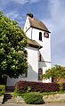
- Nomination: Mappach: Protestant Church (bell tower) --Taxiarchos228 07:33, 8 June 2011 (UTC)
- Review needed
-

- Nomination: Istein: Saint Michaels Church (organ) --Taxiarchos228 07:33, 8 June 2011 (UTC)
- Review needed
-

- Nomination: Sukiennice Gallery - Chełmoński Room --Pudelek 20:23, 7 June 2011 (UTC)
- Review needed
-

- Nomination: Sukiennice Gallery - Chełmoński Room --Pudelek 20:23, 7 June 2011 (UTC)
- Review needed
-

- Nomination: Festicultores group. Activity in defense of the Galician language "Correlingua". A Estrada, Galicia (Spain). 2011--Lmbuga 18:16, 7 June 2011 (UTC)
- Review needed
-
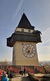
- Nomination: Graz: Clock Tower --Taxiarchos228 12:34, 7 June 2011 (UTC)
- Review needed
-

- Nomination: Flims: observation tower "Il spir" --Taxiarchos228 12:34, 7 June 2011 (UTC)
- Review needed
-
- Nomination: planetary path "Uetliberg-Felsenegg", here: neptun --Taxiarchos228 12:34, 7 June 2011 (UTC)
- Review Comment Good quality, but too tight at bottom for me--Lmbuga 19:03, 7 June 2011 (UTC)
-

- Nomination: Wehr: Saint Martin Church (intersection) --Taxiarchos228 12:34, 7 June 2011 (UTC)
- Review needed
-

- Nomination: Fischingen: Protestant Church (fresco) --Taxiarchos228 12:34, 7 June 2011 (UTC)
- Review needed
-

- Nomination: Swedish fantasy writer Pål Eggert, 2010. -- Raghith 13:40, 7 June 2011 (UTC)
- Review needed
-

- Nomination: White rose --Broc 13:44, 5 June 2011 (UTC)
- Review Comment Hm... I am unsure if this 2007 shot quite lives up to present day QI standards. The flower itself looks nice although the DOF is a little shallow. The lightning and colors are good. The centered composition is boring, but not anything I would decline on. The background is really noisy. You may want to blur (and thereby denoise) the bg - it will also help emphasize the rose. --Slaunger 21:11, 7 June 2011 (UTC)
-

- Nomination Bettingen an Basel: view from Television Tower St. Chrischona --Taxiarchos228 08:46, 31 May 2011 (UTC)
- Promotion Seems to be tilted quite a lot in the CCW direction. The horizon is curved. I presume this is real earth curvature and not a geometric distortion? Although this more saturated edit looks "nice" at first glance I must admit I prefer the more realistic - but perhaps also more dull colors of the original. Concerning sharpness, it is clear that the houses at closes proximity are also the most crisp. But at f/10 the photo should have a reasonably good DOF, yet it looses focus in the distance - maybe natural haze or the focal plane was too close. It is a pity that the EXIF has been lost in the editing process (not to mention the color space). --Slaunger 21:36, 4 June 2011 (UTC)
I can rotate the image but the colours are good IMO, DOF and picture quality is as good as could be when you make a picture through the window --Taxiarchos228 13:05, 6 June 2011 (UTC)
Seems like a reasonable explanation. If you rotate it, I am happy to promote. --Slaunger 19:09, 6 June 2011 (UTC)
done --Taxiarchos228 17:33, 11 June 2011 (UTC)
OK for me now. --Slaunger 18:58, 13 June 2011 (UTC)
-

- Nomination Punic stele decorated with a fish and the sign of Tanit. 3rd - 1st centuries BCE. Limestone. Museum of Fine Arts of Lyon. -- Rama 12:25, 25 May 2011 (UTC)
- Promotion Burned pixels...--Jebulon 16:37, 27 May 2011 (UTC)
I think the image quality is fine, but I think the photo could be improved with a 0.5° CW tilt. --Slaunger 21:13, 4 June 2011 (UTC)
Thank you, done. Rama 07:29, 13 June 2011 (UTC)
OK now. --Slaunger 18:57, 13 June 2011 (UTC)
-
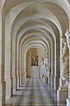
-
-
-

-

- Nomination Ischnocelis hoepfneri --Archaeodontosaurus 07:25, 13 June 2011 (UTC)
- Promotion Good quality. --Raghith 10:40, 13 June 2011 (UTC)
-

- Nomination Male and female of (Protaetia cuprea) feeding on flowers of Chamaecytisus ruthenicus. --Le.Loup.Gris 07:20, 13 June 2011 (UTC)
- Promotion Support QI & Useful --Archaeodontosaurus 08:03, 13 June 2011 (UTC)
-

- Nomination Banded Demoiselle, female. --Quartl 06:23, 13 June 2011 (UTC)
- Promotion Support QI & Useful --Archaeodontosaurus 07:56, 13 June 2011 (UTC)
-

- Nomination Banded Demoiselle, female. --Quartl 06:23, 13 June 2011 (UTC)
- Promotion Support QI & Useful --Archaeodontosaurus 07:55, 13 June 2011 (UTC)
-
- Nomination Asian Lady Beetle, nymph. --Quartl 06:23, 13 June 2011 (UTC)
- Promotion Support QI & Useful --Archaeodontosaurus 07:55, 13 June 2011 (UTC)
-

- Nomination Asian Lady Beetle, moulting. --Quartl 06:23, 13 June 2011 (UTC)
- Promotion Support QI & Useful --Archaeodontosaurus 07:54, 13 June 2011 (UTC)
-

- Nomination Bow-winged Grasshopper, male. --Quartl 06:23, 13 June 2011 (UTC)
- Promotion Support QI & Useful --Archaeodontosaurus 07:53, 13 June 2011 (UTC)
-

- Nomination Comma. --Quartl 06:23, 13 June 2011 (UTC)
- Promotion Support QI & Useful --Archaeodontosaurus 07:52, 13 June 2011 (UTC)
-
- Nomination Tree of Life, unripe cones. --Quartl 06:23, 13 June 2011 (UTC)
- Promotion Support QI & Useful --Archaeodontosaurus 07:51, 13 June 2011 (UTC)
-

- Nomination Nymph of a firebug (one of only two pics in WP) --Genealogist 22:29, 12 June 2011 (UTC)
- Decline Largely out of focus. --Quartl 06:28, 13 June 2011 (UTC)
-

- Nomination Abandoned town hall, Norway Township, Fillmore County, Minnesota --Jonathunder 21:21, 12 June 2011 (UTC)
- WARNING: third template parameter added – please remove.
-

-

- Nomination Palazzo Vecchio, Florence, Italy.--Jebulon 17:57, 12 June 2011 (UTC)
- Promotion Support QI & Useful --Archaeodontosaurus 07:44, 13 June 2011 (UTC)
-

- Nomination Obelisk and Eiffel tower in the same picture.--Jebulon 17:05, 12 June 2011 (UTC
- Promotion Support QI & Useful --Archaeodontosaurus 07:43, 13 June 2011 (UTC)
-

- Nomination Capella, ship. --Ankara 16:44, 12 June 2011 (UTC)
- Promotion Good quality. Harrison49 18:47, 12 June 2011 (UTC)
-

-

- Nomination Lörrach: Bonifatius Church from Southwest --Taxiarchos228 16:32, 12 June 2011 (UTC)
- Decline Bad composition, the tree is distracting. --Daniel Baránek 06:46, 13 June 2011 (UTC)
from southwest there is no other possibility --Taxiarchos228 11:54, 13 June 2011 (UTC)
-

- Nomination Marzell: Protestant Church --Taxiarchos228 16:32, 12 June 2011 (UTC)
- Promotion Very good. Meets the QI-criteria in any aspects. --High Contrast 08:59, 13 June 2011 (UTC)
-

- Nomination Kaltenbach: Protestant Church --Taxiarchos228 16:32, 12 June 2011 (UTC)
- Promotion Good quality. --Tomer T 18:17, 12 June 2011 (UTC)
-

- Nomination Funerary model: milking a cow. Middle Empire, 12th Dynasty (1990-1786 BCE). Sycomore wood, lacquered and painted. Assiut. Offered by R. Weill, 1913. Courtesy of Musée des beaux-arts de Lyon. -- Rama 15:58, 12 June 2011 (UTC)
- Promotion Oh yes ! Obvious QI--Jebulon 16:14, 12 June 2011 (UTC)
-

- Nomination Archduke Maximilian Francis of Austria (1756-1802), brother of queen Marie-Antoinette of France. Workshop of Anton von Maron. Château de Versailles.--Jebulon 14:03, 12 June 2011 (UTC)
- Promotion Support QI & Useful --Archaeodontosaurus 07:39, 13 June 2011 (UTC)
-

-

-

- Nomination Tool of the Aurignacian of deposit reference --Archaeodontosaurus 07:59, 12 June 2011 (UTC)
- Promotion Good quality --Llez 09:09, 13 June 2011 (UTC)
-

- Nomination Roman legionaries. Bas-relief from Glanum (Saint-Rémy-de-Provence). Espérandieu 130. On display at Fourvière Gallo-Roman museum, Lyon. -- Rama 07:14, 12 June 2011 (UTC)
- Promotion Good. --Johannes Robalotoff 20:12, 12 June 2011 (UTC)
-

- Nomination Really like angle, colours. Used in many articles. (by MatthiasKabel) --Eug 08:46, 12 June 2011 (UTC)
- Decline It's tilt --Pudelek 14:03, 12 June 2011 (UTC)
-
-

- Nomination just married, just married, just married and just married....waiting for a picture place de la Concorde in Paris.--Jebulon 23:04, 11 June 2011 (UTC)
- Decline Depth of field is too narrow. Why was this taken at f/4? Under such good lighting conditions it should have been taken under aperture priority between f/8 and f/11. --Jovianeye 12:50, 12 June 2011 (UTC) Yes you are right. The scenery was funny, but I've had obviously some problems with my settings this morning...--Jebulon 14:51, 12 June 2011 (UTC)
-

- Nomination Canon PowerShot A590 IS --Jovianeye 22:05, 11 June 2011 (UTC)
- Promotion Good quality- Harrison49 18:40, 12 June 2011 (UTC)
-

- Nomination A sculpture made by Emmanuel Frémiet,park of Świerklaniec, Poland --Przykuta 20:38, 11 June 2011 (UTC)
- Promotion Good quality-- Harrison49 18:40, 12 June 2011 (UTC)
-

- Nomination Populus alba, bark --Przykuta 20:38, 11 June 2011 (UTC)
- Promotion Good quality-- Harrison49 18:40, 12 June 2011 (UTC)
-

-

- Nomination Coursing in Świerklaniec, Afghan Hound --Przykuta 20:38, 11 June 2011 (UTC)
- Promotion Great shot-- Harrison49 18:43, 12 June 2011 (UTC)
-

- Nomination Coursing in Świerklaniec, Borzoi --Przykuta 20:38, 11 June 2011 (UTC)
- Promotion Great shot-- Harrison49 18:43, 12 June 2011 (UTC)
-

- Nomination "Łazienki" (baths) - an object in park of Parzymiechy, Poland --Przykuta 20:38, 11 June 2011 (UTC)
- Promotion OK for me in spite of the CA on the tree at the right. --Johannes Robalotoff 20:21, 12 June 2011 (UTC)
-
- Nomination Flower beds in the Easthouse House Walled Garden --Harrison49 18:53, 11 June 2011 (UTC)
- Decline Oppose Too many overexposition (leaves of the flowers) --Daniel Baránek 07:01, 13 June 2011 (UTC)
-

-

- Nomination Peanut cactus (Echinopsis chamaecereus) in bloom. --Le.Loup.Gris 07:02, 11 June 2011 (UTC)
- Promotion I like it, but please repair the description box. - A.Savin 13:26, 11 June 2011 (UTC) Done! --Le.Loup.Gris 19:37, 11 June 2011 (UTC) Good now. - A.Savin 15:04, 12 June 2011 (UTC)
-

-

-

- Nomination Graz: opera house --Taxiarchos228 09:29, 10 June 2011 (UTC)
- Decline Nice lighting but I think it would have been better if you were straighter when taking the picture and there is a slightly annoying black shadow thing at the bottom of the frame -- Coyau 17:35, 10 June 2011 (UTC) I'm sorry but the angle and composition makes the photo inharmonious IMO.--Ankara 20:58, 12 June 2011 (UTC)
-

- Nomination PAZ-3205 bus "VIP liner") --Vizu 20:11, 8 June 2011 (UTC)
- Decline Medium quality image of old dirty bus on not-interesting background with tilt and overexposure on sky --Kae 09:35, 11 June 2011 (UTC) Comment Maybe, try to crop it. --Daniel Baránek 07:13, 13 June 2011 (UTC)
-
- Nomination Catholic church, Mulfingen --Harke 13:39, 8 June 2011 (UTC)
- Promotion Good quality. --Taxiarchos228 16:54, 12 June 2011 (UTC)
-

- Nomination Kirchen: Protestant Church (epitaph) --Taxiarchos228 07:33, 8 June 2011 (UTC)
- Promotion Good quality --Ximonic 09:37, 13 June 2011 (UTC)
-

-
-

- Nomination Monclar-sur-Losse Church, Gers, France -- Florent Pécassou 19:55, 6 June 2011 (UTC)
- Promotion Good quality. Harrison49 18:46, 12 June 2011 (UTC)
-

- Nomination Bossòst Church, Spain -- Florent Pécassou 19:55, 6 June 2011 (UTC)
- Promotion Good quality. Harrison49 18:46, 12 June 2011 (UTC)
-
- Nomination Dornach, Switzland: Goetheanum from northwest at dusk --Taxiarchos228 13:55, 6 June 2011 (UTC)
- Promotion Cool. --Mattbuck 22:38, 12 June 2011 (UTC)
-

- Nomination: Graz: clock tower --Taxiarchos228 13:55, 6 June 2011 (UTC)
- Review needed
-
- Nomination en prinsesstårta --Jonathunder 13:13, 6 June 2011 (UTC)
- Promotion Comment white balance is bluish/greenish --Carschten 19:55, 6 June 2011 (UTC)
You have reminded me I missed dinner. Mattbuck 22:29, 12 June 2011 (UTC)
-
-

- Nomination Dornach, Switzland: Goetheanum from west at dusk --Taxiarchos228 09:32, 5 June 2011 (UTC)
- Promotion Good quality. --Jovianeye 12:57, 12 June 2011 (UTC)
-

- Nomination Seiden (main hall) of Shuri Castle in Naha, Okinawa --663highland 02:37, 5 June 2011 (UTC)
- Decline Please correct the vertical perspective and remove the dust spot. --Jovianeye 13:40, 6 June 2011 (UTC)
No response from nominator. --Jovianeye 13:00, 12 June 2011 (UTC)
-

- Nomination Gebouw Batavia, Amsterdam. by Janericloebe --Elekhh 12:37, 4 June 2011 (UTC)
- Promotion Comment I'm uploading a new version with less chromatic aberrations at the roof--Lmbuga 11:52, 5 June 2011 (UTC) Thanks! --Elekhh 06:58, 6 June 2011 (UTC) Good.--Ankara 21:48, 12 June 2011 (UTC)
-

- Nomination: Chapel of the watchtower, Porto do Son, Galicia (Spain)--Lmbuga 23:26, 3 June 2011 (UTC)
- Review Comment Excellent quality (light, sharpness...), but slight CCW tilt and perspective distortion, especially the bell tower. -- MJJR 20:52, 4 June 2011 (UTC)
You're right, but the perspective distortion of the tower is, to me, a problem of the objective and I am not able to solve it. Thanks. I will review the image tomorrow--Lmbuga 21:52, 5 June 2011 (UTC)
New version. I think that it's better, but it is not perfect (sorry, I'm not able)--Lmbuga 19:02, 6 June 2011 (UTC)
-
-

-

- Nomination Place de la Concorde, Paris.--Jebulon 22:03, 11 June 2011 (UTC)
- Promotion Love the sky. Love the framing of the fountin at the front then the place de la Concorde and the fact that you can just see the palace behind it. Wonderful. Framing directing the viewer and of course capturing the peacefulness of a busy corner of Paris -- Good twins 22:22, 11 June 2011 (UTC) Thank you. Happy you enjoy.--Jebulon 23:09, 11 June 2011 (UTC)
-
- Nomination Microfossils (focus stacking). --ComputerHotline 20:27, 11 June 2011 (UTC)
- Decline Oppose No identification of the species, no place of collection, no geological stage, no dimensions. --Archaeodontosaurus 07:38, 12 June 2011 (UTC)
-

- Nomination Seashell (focus stacking). --ComputerHotline 20:27, 11 June 2011 (UTC)
- Decline Oppose Artifact reconstruction. The species must be identified. --Archaeodontosaurus 07:30, 12 June 2011 (UTC)
-

- Nomination A "Bonheur-du-Jour" attributed to J.H. Riesener, Château de Versailles.--Jebulon 20:09, 11 June 2011 (UTC)
- Promotion Support QI & Useful --Archaeodontosaurus 07:27, 12 June 2011 (UTC)
-

- Nomination Castle in Buchenbach --Harke 17:03, 11 June 2011 (UTC)
- Promotion Good quality. Harrison49 18:55, 11 June 2011 (UTC)
-

- Nomination Herrenhaus in Buchenbach, Southern Germany --Harke 17:02, 11 June 2011 (UTC)
- Promotion Good quality. Harrison49 18:55, 11 June 2011 (UTC)
-

- Nomination Francis Xavier landing in China, Joseph Vien, 1753, Château de Versailles--Jebulon 15:18, 11 June 2011 (UTC)
- Promotion Support QI & Useful --Archaeodontosaurus 07:25, 12 June 2011 (UTC)
-

-

- Nomination Empusa fasciata, female --Gidip 13:22, 11 June 2011 (UTC)
- Promotion Support QI & Useful --Archaeodontosaurus 07:24, 12 June 2011 (UTC)
-

- Nomination Gliwce Main Station by night (main entrace) --Pudelek 10:39, 11 June 2011 (UTC)
- Decline Street lights create glare and attract way to much attension. Can not therefore see the object of the picture clearly. --Good twins 16:04, 11 June 2011 (UTC)
-

- Nomination Small mammal skulls (focus stacking). --ComputerHotline 09:07, 11 June 2011 (UTC)
- Decline Comment I think there are plenty of stacking artefacts in higher resolution, aren't they? --Llez 14:37, 11 June 2011 (UTC) I don't know. I'm a beginner in this method of picture post-processing. --ComputerHotline 16:41, 11 June 2011 (UTC)
Oppose Many artifacts, bad clipping. The animal must be identified. --Archaeodontosaurus 07:14, 12 June 2011 (UTC)
-

-

-
- Nomination Prepona licomedes --Archaeodontosaurus 20:10, 9 June 2011 (UTC)
- Promotion Good quality. --Mbdortmund 09:01, 12 June 2011 (UTC)
-
- Nomination Palais-Bourbon, French National Assembly, as seen from the opposite side of the Seine river.--Jebulon 20:40, 8 June 2011 (UTC)
- Withdrawn Wrong settings. I can te-take it easily. Sorry.
 I withdraw my nomination--Jebulon 21:53, 11 June 2011 (UTC)
-

- Nomination Matzah --Jonathunder 13:23, 7 June 2011 (UTC)
- Promotion Comment Good detail and perhaps QI, but to me poor luminosity. Could you increase the luminosity?--Lmbuga 18:19, 7 June 2011 (UTC)
Done.--Jonathunder 12:04, 10 June 2011 (UTC)
Very good details--Lmbuga 18:27, 11 June 2011 (UTC)
-

- Nomination: Lampost in Pereslavl museum. Photo made with a tilt-shift lens. --PereslavlFoto 09:06, 6 June 2011 (UTC)
- Review needed
-

- Nomination: Clock tower in Bursa. --Eusebius 07:01, 6 June 2011 (UTC)
- Review needed
-
- Nomination: Timelapse of clouds seen from Belfort. --ComputerHotline 09:23, 5 June 2011 (UTC)
- Review The transition at 0:31 seems very abrupt. Might this be better split into two clips? --Avenue 14:49, 5 June 2011 (UTC) I can't. --ComputerHotline 17:29, 5 June 2011 (UTC)
-
- Nomination Bulletin board. Museum of "Casa do patrón", Doade, Lalín, Galicia (Spain)--Lmbuga 22:48, 3 June 2011 (UTC)
- Promotion Good quality. Harrison49 19:07, 11 June 2011 (UTC)
-

- Nomination Les Marches des Esclaves, Petit-Canal, Grande-Terre, Guadeloupe. --Slaunger 20:51, 3 June 2011 (UTC)
- Promotion Good quality -- Harrison49 19:10, 11 June 2011 (UTC)
-

- Nomination Mould of a child's face. The epitaph reads: "To the manes and in the memory of Claudia Victoria, dead at the age of 10 years old, one month and eleven days; Claudia Severina, her mother, raised this tomb to her beloved daughter when she was still alive, to herself and dedicated it under the ascia" -- Rama 08:14, 11 June 2011 (UTC)
- Promotion Good quality. --Mbdortmund 11:24, 11 June 2011 (UTC)
-

- Nomination I believe that this is a well executed photograph that has a nice additional aesthetical value. --Grand-Duc 07:38, 11 June 2011 (UTC)
- Promotion Good quality. --Mbdortmund 08:01, 11 June 2011 (UTC)
-

- Nomination Prehnite pseudomorph of laumontite - India --Archaeodontosaurus 07:09, 11 June 2011 (UTC)
- Promotion Good quality. --Mbdortmund 08:01, 11 June 2011 (UTC)
-

- Nomination Gymnocalycium stellatum in full bloom. --Le.Loup.Gris 07:02, 11 June 2011 (UTC)
- Promotion Good quality. --Mbdortmund 08:01, 11 June 2011 (UTC)
-

- Nomination Southern Festoon (Zerynthia polyxena). --Le.Loup.Gris 07:02, 11 June 2011 (UTC)
- Promotion Support QI & Useful --Archaeodontosaurus 07:12, 11 June 2011 (UTC)
-

- Nomination Chamaecytisus ruthenicus flowers. --Le.Loup.Gris 07:02, 11 June 2011 (UTC)
- Promotion Good quality. --Mbdortmund 08:01, 11 June 2011 (UTC)
-

- Nomination A female of Marsh Fritillary (Euphydryas aurinia) feeding on Hawkbit (Leontodon sp.) flowers. --Le.Loup.Gris 07:02, 11 June 2011 (UTC)
- Promotion Good quality. --Mbdortmund 08:01, 11 June 2011 (UTC)
-

- Nomination Dauphine Marie-Antoinette's jewel casket, by Martin Carlin, 1770, Château de Versailles--Jebulon 23:43, 10 June 2011 (UTC)
- Promotion Support QI, very good caption --Archaeodontosaurus 07:14, 11 June 2011 (UTC)
-

-

- Nomination Steam train on the West Somerset Railway. -- Geof Sheppard 13:35, 10 June 2011 (UTC)
- Decline I don't like the composition. --Daniel Baránek 15:51, 10 June 2011 (UTC)
I concur, this is not a quality image. The smoke is overexposed, the sky is grainy, it's barely above the 2MP threshold and I think it's a bit tilted too. Sorry Geoff. Mattbuck 15:41, 10 June 2011 (UTC)
-

-

-

- Nomination Münster: harbour --Taxiarchos228 09:29, 10 June 2011 (UTC)
- Promotion Good quality. --Mbdortmund 02:24, 11 June 2011 (UTC)
-

- Nomination Passenger ship Arion --Orlovic 15:12, 9 June 2011 (UTC)
- Decline Nice picture. But the wheel house is overexposed and the sky is noisy.. No QI. --Elektroschreiber 21:02, 10 June 2011 (UTC)
-
-

-

- Nomination: Rome, park of Gianicolo, bust of Mattia Montecchi (1816-1871), by Emilio Dies (1898). --Tomer T 14:19, 4 June 2011 (UTC)
- Review needed
-

- Nomination Church of Saint Adalbert in Kraków --Pudelek 17:02, 2 June 2011 (UTC)
- Decline Not QI too dark, very difficult to see particually the top of the subject -- Good twins 17:05, 10 June 2011 (UTC)
-

- Nomination Valley Verzasca, Switzerland: Contra-Dam --Taxiarchos228 09:29, 10 June 2011 (UTC)
- Promotion Good quality. --Raghith 09:47, 10 June 2011 (UTC)
-

- Nomination Valley Verzasca, Switzerland: Contra-Dam (frontal view) --Taxiarchos228 09:29, 10 June 2011 (UTC)
- Promotion Good quality. --Raghith 09:47, 10 June 2011 (UTC)
-

- Nomination Holy Trinity Katholikon, Etropole Monastery. --MrPanyGoff 06:25, 10 June 2011 (UTC)
- Promotion Nice work --Elekhh 07:39, 10 June 2011 (UTC)
-

-

-

-
-

- Nomination White-legged Damselfly. --Quartl 20:48, 9 June 2011 (UTC)
- Promotion Support QI & Useful --Archaeodontosaurus 11:53, 10 June 2011 (UTC)
-
- Nomination Comma. --Quartl 20:48, 9 June 2011 (UTC)
- Promotion Support QI & Useful --Archaeodontosaurus 10:20, 10 June 2011 (UTC)
-

- Nomination Essex Skipper. --Quartl 20:48, 9 June 2011 (UTC)
- Promotion Good quality. --Andrei Stroe 09:41, 10 June 2011 (UTC)
-

- Nomination Karhorn Gipfel Panorama --Böhringer 20:39, 9 June 2011 (UTC)
- Promotion Good quality, more than QI --Taxiarchos228 21:11, 9 June 2011 (UTC)
-

- Nomination Alpenmurmeltier Marmota marmota --Böhringer 17:25, 9 June 2011 (UTC)
- Promotion Good quality. --Taxiarchos228 18:15, 9 June 2011 (UTC)
-

- Nomination False Black Widow, Steatoda paykulliana, Family: Theridiidae, Location: Italy, Sardinia -- Raghith 17:16, 9 June 2011 (UTC)
- Decline Hello Raghith, thank you very much for the nomiation of my picture-that was very nice! But sorry for my decline: I think my picture is usefull but it isn´t good enough for a QI. Many greetings--Holleday 20:02, 9 June 2011 (UTC)
-

- Nomination Buds of Nerium oleander. --Bff 16:55, 9 June 2011 (UTC)
- Promotion Good quality. --Raghith 17:13, 9 June 2011 (UTC)
-

- Nomination Coenagrion pulchellum, female --Loz 16:20, 9 June 2011 (UTC)
- Promotion Good quality. --Raghith 17:13, 9 June 2011 (UTC)
-

- Nomination Flower of Nerium oleander. --Bff 15:14, 9 June 2011 (UTC)
- Promotion Good quality. --Raghith 17:13, 9 June 2011 (UTC)
-

-
- Nomination Pereslavl, Lesnoy lane, house 18. Evening shot.--PereslavlFoto 13:50, 9 June 2011 (UTC)
- Promotion Good quality. --Raghith 16:46, 9 June 2011 (UTC)
-
-

-

- Nomination Lüneburg, Saint Johannis Church (altar) --Taxiarchos228 10:55, 9 June 2011 (UTC)
- Promotion Good --Pudelek 12:56, 9 June 2011 (UTC)
-

- Nomination Lörrach: Housing Area "Stadion" --Taxiarchos228 10:55, 9 June 2011 (UTC)
- Promotion Good quality. --Raghith 16:46, 9 June 2011 (UTC)
-

- Nomination Lörrach: Germanus Church --Taxiarchos228 10:55, 9 June 2011 (UTC)
- Promotion nice --Pudelek 12:56, 9 June 2011 (UTC)
-
-

- Nomination The personification of the city of Lille, statue place de la Concorde in Paris. A previous version was declined, this one is a new file.--Jebulon 20:06, 8 June 2011 (UTC)
- Promotion Could have been in slightly tighter. But I like it. Busy corner of Paris and you have managed to capture such peacefulness. Great work. QI much better than your previous version of the same file.-- Good twins 09:27, 10 June 2011 (UTC)
-

- Nomination Central Mineral Bath (fragment), Sofia. --MrPanyGoff 08:52, 5 June 2011 (UTC)
- Promotion Lower crop is rather tight, but good image quality though. -- MJJR 21:06, 9 June 2011 (UTC)
-
- Nomination: Doorway to Park House, RAF Uxbridge --Harrison49 22:23, 3 June 2011 (UTC)
- Review needed
-

-

- Nomination: Skitstöveln (Bastard). By Swedish artist Roland Haeberlein. --Ankara 21:41, 3 June 2011 (UTC)
- Review needed
-

-

- Nomination: Kaipan on Lipno --DeeMusil 19:31, 3 June 2011 (UTC)
- Review Comment chromatic aberrations--Lmbuga 21:16, 3 June 2011 (UTC)
-

- Nomination: Visitors photograph Sicklauddsbron --Ankara 16:42, 3 June 2011 (UTC)
- Review needed
-

- Nomination: Bus station, Hradec Králové — Jagro 15:47, 3 June 2011 (UTC)
- Review needed
-

- Nomination Münster: harbour --Taxiarchos228 06:16, 3 June 2011 (UTC)
- Promotion Qood quality. Near faultless. --Good twins 12:15, 9 June 2011 (UTC)
-

- Nomination Hochblauen: television tower --Taxiarchos228 10:45, 2 June 2011 (UTC)
- Decline Over exposed Sun right behind the tower. You should try to take pictures with the sun behind you. Also you have some noise, spots from the sun light. But nice picture never the less, just not quality standards.--Good twins 12:11, 9 June 2011 (UTC)
-

- Nomination: 2009 Kyoto Jidai Matsuri. --Tomer T 23:24, 3 June 2011 (UTC) (Sign was added later, sorry)
- Review needed
-

- Nomination: Base of a statue of Harsiesis, supreme judge, great preist of the temple of Osiris and Isis in Behbeit el-Haggar. Delta of the delta. -- Rama 19:17, 23 May 2011 (UTC)
- Review Delta of the delta ?--Jebulon 16:29, 27 May 2011 (UTC)
Delta of the Nile of Region of the Delta ^^;; Rama 08:14, 28 May 2011 (UTC)
A little soft in the rear end, but OK for QI I think. Good light. Approximately, how large is this exhibition item? I have difficulties finding anything on it, which gives me a sense of scale. If it is the base of a statue, I reckon it could be fairly large, but somehow I get the impression that it is fairly small (which makes sense if the statue is small of course.)??--Slaunger 10:19, 4 June 2011 (UTC)
-
-

-

-

-

-

-

-
- Nomination Sulphur polypore (Laetiporus sulphureus) -- George Chernilevsky 19:02, 8 June 2011 (UTC)
- Promotion Good and interesting--Lmbuga 19:41, 8 June 2011 (UTC)
-

- Nomination Golofa claviger - Male --Archaeodontosaurus 17:21, 8 June 2011 (UTC)
- Promotion Well done photo. Good QI and good FP candidate IMO -- George Chernilevsky 19:08, 8 June 2011 (UTC)
-

- Nomination La Nourrice, biscuit after Louis Boizot, Versailles. --Coyau 16:58, 8 June 2011 (UTC)
- Promotion Support QI & Useful --Archaeodontosaurus 17:23, 8 June 2011 (UTC)
-

- Nomination Altes Amtshaus, Ailringen --Harke 13:43, 8 June 2011 (UTC)
- Promotion Good -- George Chernilevsky 19:05, 8 June 2011 (UTC)
-
-

-

- Nomination Small monument in Luxembourg City. --Cayambe 22:01, 8 June 2011 (UTC)
- Promotion Good photo -- George Chernilevsky 13:34, 8 June 2011 (UTC)
-

-

- Nomination Efringen: Protestant Church (bell tower) --Taxiarchos228 07:33, 8 June 2011 (UTC)
- Promotion Good quality. --Cayambe 22:17, 8 June 2011 (UTC)
-

- Nomination Egringen: Protestant Church --Taxiarchos228 07:33, 8 June 2011 (UTC)
- Promotion Good quality. --Cayambe 22:18, 8 June 2011 (UTC)
-
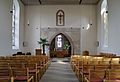
- Nomination Mappach: Protestant Church (interior) --Taxiarchos228 07:33, 8 June 2011 (UTC)
- Promotion QI to me. Perhaps the image needs a little correction of perspective--Lmbuga 19:55, 8 June 2011 (UTC)
-

-

- Nomination Buildings in Santiago de Compostela, Galicia (Spain)--Lmbuga 18:13, 7 June 2011 (UTC)
- Promotion There is a dust spot in the clouds as has already been indicated by an annotation on the file page by Archaeodontosaurus. --Slaunger 21:26, 7 June 2011 (UTC)
Support Good now --Archaeodontosaurus 19:53, 8 June 2011 (UTC)
-

- Nomination Codesedo, Doade, Lalín, Galicia (Spain)--Lmbuga 17:42, 7 June 2011 (UTC)
- Promotion Good quality. --Cayambe 22:22, 8 June 2011 (UTC)
-
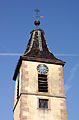
- Nomination Wies: Protestant Church (bell tower) --Taxiarchos228 12:34, 7 June 2011 (UTC)
- Promotion Good quality. --Cayambe 22:25, 8 June 2011 (UTC)
-
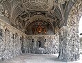
- Nomination Neuburg (Donau). Grot of castle 2. --Vitold Muratov 10:18, 7 June 2011 (UTC)
- Decline To me, with 72 dpi it's very dificult that the image can be promoted. Poor quality and left side overexposed. I think that it's possible to improve it--Lmbuga 17:31, 7 June 2011 (UTC)
I don't know what you mean by 72 dpi (it's just a stored value that doesn't mean anything), but there is very lossy JPEG compression. --King of Hearts 10:44, 8 June 2011 (UTC)In the Exif data of the image you can read 72 dpi (en:Dots per inch). The normal is 240 dpi, the ideal to print can be 300 dpi (I do not know too much on this question). I think that with 72 dpi they appear jpg artifacts. Perhaps -I don't know- 72 dpi can be normal with mobile phones.--Lmbuga 14:54, 8 June 2011 (UTC) Sorry, you're right: I have verified that dpi does not imply jpg artifacts. Thanks--Lmbuga 16:52, 8 June 2011 (UTC)
-

- Nomination layout scheme of Su-25 -- Raghith 06:51, 7 June 2011 (UTC)
- Promotion Question The svg files needs 2 megapixels to be QI?--Lmbuga 18:36, 7 June 2011 (UTC)
No, SVGs can be rendered in bitmap to any size you wish! SVGs dont include the concept of pixels. --Jovianeye 20:44, 7 June 2011 (UTC)
Good work -- George Chernilevsky 06:51, 9 June 2011 (UTC)
-

-

- Nomination Astarac Cinema, Mirande, Gers, France -- Florent Pécassou 19:55, 6 June 2011 (UTC)
- Decline Too tight crop, tilted.--Jebulon 16:17, 8 June 2011 (UTC)
-
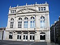
- Nomination Nîmes, France -- Florent Pécassou 19:55, 6 June 2011 (UTC)
- Decline Sorry, no QI to me: strong perspective distortion + blown-out facade due to straight sunlight. - A.Savin 18:07, 8 June 2011 (UTC)
-

- Nomination Coin. Spain, 1756: "Hispaniarum rex". "Ferdinand VI"--Lmbuga 17:51, 6 June 2011 (UTC)
- Promotion Good quality. --Taxiarchos228 20:06, 6 June 2011 (UTC)
I prefer to photograph the coin again. Thanks--Lmbuga 08:15, 9 June 2011 (UTC)
-

-

- Nomination: Peterson Station, Minnesota --Jonathunder 11:35, 3 June 2011 (UTC)
- Review needed
-
- Nomination: Nuremberg Transport Museum --Taxiarchos228 06:16, 3 June 2011 (UTC)
- Review needed
-
- Nomination: Münster: harbour (crane) --Taxiarchos228 06:16, 3 June 2011 (UTC)
- Review needed
-

- Nomination Wehr: Saint Wolfgang Chapel --Taxiarchos228 06:16, 3 June 2011 (UTC)
- Promotion QI to me: good crop and light. - A.Savin 18:00, 8 June 2011 (UTC)
-

- Nomination: Wehr: Saint Martin Church (epitaph) --Taxiarchos228 06:16, 3 June 2011 (UTC)
- Review needed
-

- Nomination: Talbot Tagora --Josue007 22:02, 2 June 2011 (UTC)
- Review needed
-
- Nomination: Still frames from spin echo animation --GavinMorley 17:20, 2 June 2011 (UTC)
- Review needed
-
- Nomination: Grodzka street in Krakow --Pudelek 17:02, 2 June 2011 (UTC)
- Review needed
-

- Nomination: Church of Saint Adalbert in Kraków --Pudelek 17:02, 2 June 2011 (UTC)
- Review needed
-

- Nomination: Interior of SWT unit 455716. Mattbuck 15:57, 2 June 2011 (UTC)
- Review needed
-

- Nomination: 165133 at Oxford. Mattbuck 15:57, 2 June 2011 (UTC)
- Review needed
-

- Nomination Germany, Memmelsdorf, Seehof castle, Northern entrance to the park, viewed from the park --Berthold Werner 10:39, 2 June 2011 (UTC)
- Promotion The statues seema bit soft as if the image hasn't been sharpened yet. Saffron Blaze 12:56, 2 June 2011 (UTC) Maybe a little bit soft, but QI to me.--Jebulon 15:32, 8 June 2011 (UTC)
-

-
- Nomination Diptera sp. is eating. --ComputerHotline 19:19, 31 May 2011 (UTC)
- Promotion Lovely compostion. nice lighting and good close up of the Diptera. Love the way how the picture starts at the bottom left and brings you down the food to the "face" of the animal --Good twins 11:58, 9 June 2011 (UTC)
-

- Nomination Stanford University, from Palm Drive. --King of Hearts 09:36, 7 June 2011 (UTC)
- Promotion Good quality. --Raghith 09:52, 7 June 2011 (UTC)
-

- Nomination Stanford University, from Palm Drive. --King of Hearts 09:36, 7 June 2011 (UTC)
- Promotion Good quality. I like it --Thunderflash 10:28, 7 June 2011 (UTC)
-

- Nomination Stanford University: Hoover Tower and Main Quad. --King of Hearts 09:36, 7 June 2011 (UTC)
- Promotion Good quality. --Raghith 09:52, 7 June 2011 (UTC)
-

- Nomination View of Sopot. --MrPanyGoff 05:22, 7 June 2011 (UTC)
- Promotion Good quality. --Raghith 10:48, 7 June 2011 (UTC)
-

-

-

- Nomination Goosander, female with five ducklings on her back. --Quartl 04:35, 7 June 2011 (UTC)
- Withdrawn Good quality. --Raghith 05:04, 7 June 2011 (UTC) Oppose Blown-out highlights on neck and some of the ducklings. --King of Hearts 05:22, 7 June 2011 (UTC)
You are correct, I'll withdraw this one. --Quartl 05:39, 7 June 2011 (UTC)
-

-

-

-

- Nomination Museum of the Landscape, Doade, Lalín, Galicia--Lmbuga 22:50, 6 June 2011 (UTC)
- Promotion High-quality photo. Very good -- George Chernilevsky 06:20, 7 June 2011 (UTC)
-

-

- Nomination A picture of a Ring-tailed Lemur (Lemur catta). By Kennyannydenny--Lmbuga 21:22, 6 June 2011 (UTC)
- Decline Unfortunate light conditions. --Quartl 05:42, 7 June 2011 (UTC)
-

-

- Nomination A picture of a Ring-tailed Lemur (Lemur catta). --Kennyannydenny 20:29, 6 June 2011 (UTC)
- Decline Unfortunate light conditions. --Quartl 05:42, 7 June 2011 (UTC)
-
-

-

- Nomination Belgian Class 26 loc -- MJJR 19:52, 6 June 2011 (UTC)
- Promotion Good quality. --Taxiarchos228 20:06, 6 June 2011 (UTC)
-
-

- Nomination WW1 monument i Petit-Canal, Guadeloupe. --Slaunger 18:57, 6 June 2011 (UTC)
- Promotion Good. QI to me--Lmbuga 19:08, 6 June 2011 (UTC)
-

- Nomination Mainpod of TV-Tower Nuremberg (Fernmeldeturm Nürnberg) --Taxiarchos228 13:55, 6 June 2011 (UTC)
- Promotion Good quality and composition--Lmbuga 14:11, 6 June 2011 (UTC)
-

- Nomination Niagra Falls, Canada: Mainpod of Konica Minolta Tower --Taxiarchos228 13:55, 6 June 2011 (UTC)
- Promotion Good quality and composition--Lmbuga 14:12, 6 June 2011 (UTC)
-

-

-

- Nomination Name sign for Swakeleys House --Harrison49 22:16, 5 June 2011 (UTC)
- Decline Tilted. --King of Hearts 10:28, 7 June 2011 (UTC)
-

- Nomination Large-leaved Lupine. Invasive species in wild in Ukraine. -- George Chernilevsky 21:12, 5 June 2011 (UTC)
- Promotion QI to me--Lmbuga 14:15, 6 June 2011 (UTC)
-
- Nomination The Stone Bridge, Prizren, Kosovo. --Mdupont 19:05, 5 June 2011 (UTC)
- Promotion Good quality. --Thunderflash 10:31, 7 June 2011 (UTC)
-

- Nomination Corizus hyoscyami --Holleday 18:10, 5 June 2011 (UTC)
- Promotion * Comment a square image would be better for aesthetics and for display. --Archaeodontosaurus 06:00, 6 June 2011* Comment Hi Archaeodontosaurus, nice to hear from you and thank you very much for the tip!I changed it into a square!Many greetings --Holleday 12:13, 6 June 2011 (UTC) (UTC) * Support QI. All OK now -- George Chernilevsky 13:51, 6 June 2011 (UTC)
-

- Nomination 395017 at Stratford International. Mattbuck 10:53, 5 June 2011 (UTC)
- Promotion Good quality. --Thunderflash 10:31, 7 June 2011 (UTC)
-

- Nomination A girl in chibi style. --Niabot 09:13, 5 June 2011 (UTC)
- Promotion Good quality. --Taxiarchos228 14:27, 6 June 2011 (UTC)
-

- Nomination A girl in chibi style with kemonomimi traits. --Niabot 09:13, 5 June 2011 (UTC)
- Promotion Good quality. --Taxiarchos228 14:27, 6 June 2011 (UTC)
-

-

- Nomination A BIOS electronical device. --ComputerHotline 07:31, 4 June 2011 (UTC)
- Promotion A pretty good photo stack. I think the wooden background is a little distracting and it is smeared out in a region behind the chip. With a more neutral BG this would not have been noticeable I think, but OK for QI for me. --Slaunger 19:22, 6 June 2011 (UTC)
-
- Nomination Port of Porto do Son, Galicia (Spain)--Lmbuga 23:29, 3 June 2011 (UTC)
- Promotion Good quality. --Tomer T 21:06, 6 June 2011 (UTC)
-

- Nomination Motor coach in Munich. --High Contrast 23:19, 3 June 2011 (UTC)
- Promotion Good quality. Harrison49 22:01, 6 June 2011 (UTC)
-

- Nomination Port of Porto do Son--Lmbuga 23:17, 3 June 2011 (UTC)
- Promotion Good quality. Harrison49 22:01, 6 June 2011 (UTC)
-
- Nomination Beach in Porto do Son, with Louro mountain (Muros), Galicia (Spain)--Lmbuga 22:59, 3 June 2011 (UTC)
- Promotion Good quality. Jovianeye 01:39, 7 June 2011 (UTC)
-

- Nomination Beach in Porto do Son, Galicia (Spain)--Lmbuga 22:52, 3 June 2011 (UTC)
- Promotion Good quality. Jovianeye 01:39, 7 June 2011 (UTC)
-

-

- Nomination Confederation Bridge, Canada --Taxiarchos228 06:16, 3 June 2011 (UTC)
- Promotion Nice panorama. --King of Hearts 10:58, 7 June 2011 (UTC)
-

- Nomination Bad Kissingen.Arkaden --Vitold Muratov 23:30, 2 June 2011 (UTC)
- Promotion Good quality. --Tomer T 14:26, 6 June 2011 (UTC)
-

-

-

-
-
- Nomination Palazzo dei Trecento in Trevisio --Archaeodontosaurus 17:34, 2 June 2011 (UTC)
- Promotion Good quality. --Cayambe 19:18, 6 June 2011 (UTC)
-

- Nomination Wehr: Saint Wolfgang Chapel --Taxiarchos228 17:16, 2 June 2011 (UTC)
- Promotion Good quality.. Please add geotag. --Cayambe 19:23, 6 June 2011 (UTC)
-

- Nomination Paddington station Mattbuck 15:57, 2 June 2011 (UTC)
- Promotion Nice composition. --King of Hearts 10:56, 7 June 2011 (UTC)
-

- Nomination Pereslavl museum, bell-tower (1768—1777), on Easter 2011.-- PereslavlFoto 15:32, 2 June 2011 (UTC)
- Promotion Good quality. --Cayambe 19:21, 6 June 2011 (UTC)
-

- Nomination The Old Bell Tower, Etropole. --MrPanyGoff 14:41, 2 June 2011 (UTC)
- Promotion Good quality. --Cayambe 19:21, 6 June 2011 (UTC)
-

-

- Nomination Roundabout near the Place des Martyrs and the Shopping Center at Hammamet, Tunisia -- MJJR 21:24, 1 June 2011 (UTC)
- Promotion Good. --King of Hearts 10:55, 7 June 2011 (UTC)
-

- Nomination: Tower of the Michaelskirche in Hochdorf --Harke 11:36, 1 June 2011 (UTC)
- Review needed
-

- Nomination: Ewenny Road station. Mattbuck 10:25, 1 June 2011 (UTC)
- Review needed
-

- Nomination: Paris: observation deck at Eiffel Tower --Taxiarchos228 10:06, 1 June 2011 (UTC)
- Review needed
-

- Nomination Church of San Vicente de Noal, Porto do Son, Galicia (Spain)--Lmbuga 22:05, 31 May 2011 (UTC)
- Promotion Lighting could be better, but QI for me. --King of Hearts 10:29, 7 June 2011 (UTC)
-

- Nomination Panorama seen from the Hohneck. --ComputerHotline 19:19, 31 May 2011 (UTC)
- Promotion Good quality. --King of Hearts 05:23, 7 June 2011 (UTC)
-

- Nomination Panorama seen from the Hohneck. --ComputerHotline 19:19, 31 May 2011 (UTC)
- Promotion Good quality. --King of Hearts 05:23, 7 June 2011 (UTC)
-
- Nomination: Diptera sp. is eating. --ComputerHotline 19:19, 31 May 2011 (UTC)
- Review needed
-
- Nomination: Diptera sp. is eating. --ComputerHotline 19:19, 31 May 2011 (UTC)
- Review needed
-
- Nomination: Two BTR-80 and police automobile in Kharkov. --Vizu 18:55, 31 May 2011 (UTC)
- Review needed
-

- Nomination: Wakishashi, signed by Minamoto Hisamishe. 18th century. -- Rama 14:13, 31 May 2011 (UTC)
- Review Nice framing, lighting is good, but I find this is lacking in detail. Saffron Blaze 18:38, 31 May 2011 (UTC)
-
- Nomination: Altar with a child's bust. Dedicated to a boy who lived in Lyon in the third century CE (clothes and hairstyle). Saint-Irénée nécropolis, found around 1816. Accession number 2001.0.348. -- Rama 14:04, 31 May 2011 (UTC)
- Review Critical details like the date and carvings on the base are lost in the shadows. Saffron Blaze 18:38, 31 May 2011 (UTC)
-

- Nomination Old house (katovna) in Jesenik --Pudelek 11:34, 31 May 2011 (UTC)
- Promotion Good quality. --Andrei Stroe 12:50, 6 June 2011 (UTC)
-

- Nomination Basler Münster: plate showing the martyrdom of --Taxiarchos228 07:31, 31 May 2011 (UTC)
- Promotion QuestionThere appears to be some kind of geometric distortion here. The upper, left and right edges are nicely aligned, but the lower edge seems to be tilted. Is the plate really so non-rectangular? EXIF is missing. --Slaunger 21:03, 4 June 2011 (UTC)
for me it's rectangular, if you want to correct it, feel free to do so. --Taxiarchos228 13:06, 6 June 2011 (UTC)
You are right, it is OK as it is (although EXIF would still be nice, what happened to that)? --Slaunger 19:12, 6 June 2011 (UTC)
-

- Nomination Ancient inscriptions of the Shirvan Dynasty. -- Azeri 22:45, 24 May 2011 (UTC) The uploader goes by the name RetlawSnellac who is Walter in Flickr. We have discussed this issue in Petroglyphs_of_Qobustan section -- Azeri 20:09, 30 May 2011 (UTC)
- Promotion Good quality. --Raghith 09:54, 7 June 2011 (UTC)
-

- Nomination Ancient inscriptions recovered from the Caspian Sea. -- Azeri 22:45, 24 May 2011 (UTC)
- WARNING: third template parameter added – please remove.
-

-

-

-
- Nomination History Museum in Karlovo. --MrPanyGoff 00:23, 8 June 2011 (UTC)
- Promotion Good quality. --Raghith 05:06, 8 June 2011 (UTC)
-

-

-

- Nomination Petržalka district in Bratislava, Slovakia -- MJJR 21:04, 7 June 2011 (UTC)
- Promotion Good -- George Chernilevsky 10:20, 8 June 2011 (UTC)
-

-
- Nomination Belgian Class 26 loc -- MJJR 21:04, 7 June 2011 (UTC)
- Promotion Good -- George Chernilevsky 10:19, 8 June 2011 (UTC)
-

- Nomination Sedan GAZ-24 Volga (1974) in Kharkov. --Vizu 20:02, 7 June 2011 (UTC)
- Promotion Good quality. --Taxiarchos228 09:13, 8 June 2011 (UTC)
-

- Nomination Cerapterus pilipennis --Archaeodontosaurus 19:45, 7 June 2011 (UTC)
- Promotion Very interesting Cerapterus male. --Vizu 20:07, 7 June 2011 (UTC)
-

-

-
- Nomination Pereslavl museum, bell-tower.--PereslavlFoto 13:17, 7 June 2011 (UTC)
- Promotion QI to me--Lmbuga 17:15, 7 June 2011 (UTC)
-

- Nomination Stanford Memorial Church. --King of Hearts 12:03, 7 June 2011 (UTC)
- Promotion QI to me: Good detail and colours, but a bit subexposed--Lmbuga 17:22, 7 June 2011 (UTC)
-

- Nomination Stanford Memorial Church. --King of Hearts 12:03, 7 June 2011 (UTC)
- Promotion I like this perspective better. --Jovianeye 15:58, 7 June 2011 (UTC)
-

- Nomination The Moscow Kremlin Museum director & a daughter of Yuri Gagarin Elena Gagarina in Moscow -- Raghith 10:18, 7 June 2011 (UTC)
- Promotion The background is a little distracting and so is the microphone, but I find it is compensated by a very nice detail level on the face with good light and colors. The expression is caught in a fairly good moment. Nice EXIF with author and license information. --Slaunger 21:16, 7 June 2011 (UTC)
-

- Nomination Permutations of multisets (Some elements are indistinguishable.) --Lipedia 10:15, 7 June 2011 (UTC)
- Promotion Good and very useful. --Jovianeye 15:54, 7 June 2011 (UTC)
-

- Nomination Green and Black Poison Dart Frog, Green and Black Poison Arrow Frog or Mint Poison Frog, -- Raghith 06:26, 7 June 2011 (UTC)
- Promotion Support QI & Useful --Archaeodontosaurus 19:55, 7 June 2011 (UTC)
-

- Nomination Tiger Longwing with cocoon, -- Raghith 06:26, 7 June 2011 (UTC)
- Promotion Good quality. --Thunderflash 10:28, 7 June 2011 (UTC)
Comment Very good detail (QI to me), but -sorry- a bit overexposed and a bit subexposed to me (I have reviewed the image with Adobe lightroom 3.0). I think that it's possible to improve it--Lmbuga 18:31, 7 June 2011 (UTC)
-

- Nomination Blue Poison Dart Frog or Tirio, -- Raghith 06:26, 7 June 2011 (UTC)
- Promotion Support QI & Useful --Archaeodontosaurus 19:55, 7 June 2011 (UTC)
-

- Nomination The Old Radino school in Sopot. --MrPanyGoff 14:47, 6 June 2011 (UTC)
- Promotion Good quality. --Andrei Stroe 12:21, 7 June 2011 (UTC)
-

- Nomination The family of Charles , count of Artois, future King Charles X, 1783, a few years before the French Revolution, by Charles Leclercq (1753-1821).--Jebulon 21:35, 5 June 2011 (UTC)
- Promotion Very good to me--Lmbuga 21:40, 5 June 2011 (UTC) Question Could the frame be protected by copyright? --Avenue 15:07, 6 June 2011 (UTC)No, it is an original one, 18th century. Cannot be cropped out because of the upper edge.--Jebulon 16:22, 6 June 2011 (UTC)
Then I think its age should be mentioned on the image description page, to avoid the question being raised again. Also {{PD-Art}} does not apply, partly because of the frame, but also because you were the photographer. --Avenue 01:00, 7 June 2011 (UTC)Thanks for advices. All done. I'm not sure I understand very well the use of the {{PD-Art}} license template. I'll learn a bit more about...--Jebulon 08:41, 8 June 2011 (UTC)
-

- Nomination Georgian cuisine chahohbili. --Vizu 20:42, 5 June 2011 (UTC)
- Promotion Looks tasty! --King of Hearts 12:26, 7 June 2011 (UTC)
-

- Nomination Sukiennice Gallery in Cracow, Chełmoński Room --Pudelek 20:10, 5 June 2011 (UTC)
- Promotion Nice annotations. --Andrei Stroe 12:24, 7 June 2011 (UTC)
-

- Nomination Phyllopertha horticola --Holleday 18:08, 5 June 2011 (UTC)
- Withdrawn
-

-

- Nomination Cricket being bowled (by lemonlolly) --Harrias 12:11, 5 June 2011 (UTC)
- Promotion Very nice action shot, with minimal motion blur. I think the tilt needs correction, though, and it would be stronger if the sign and pole were edited out of the background. --Avenue 14:44, 5 June 2011 (UTC)
Reply I've rotated the image to remove the tilt (though it's difficult to get a datum point at the ground was on a slight slope, and the stumps were also at an angle). Harrias 15:21, 5 June 2011 (UTC)
I've tried cloning away the distracting background. Now I abstain. --Avenue 09:37, 6 June 2011 (UTC)
Well timed shot and appreciate the cloning job! --Jovianeye 15:50, 7 June 2011 (UTC)
-

- Nomination Counter from a audiocassette player. --ComputerHotline 07:31, 4 June 2011 (UTC)
- Promotion QI to me. --D4m1en 09:28, 8 June 2011 (UTC)
-

- Nomination Electric switch from a videocassette recorder. --ComputerHotline 07:31, 4 June 2011 (UTC)
- Promotion QI to me. --D4m1en 09:28, 8 June 2011 (UTC)
-

-

- Nomination Altenburg. Castle near Bamberg --Vitold Muratov 00:15, 3 June 2011 (UTC)
- Decline JPEG artefacts. --Jovianeye 15:32, 7 June 2011 (UTC)
-

- Nomination: Lörrach: Catholic Church Saint Peter (Bell tower) --Taxiarchos228 10:58, 2 June 2011 (UTC)
- Review needed
-

- Nomination: Germany, Haßfurt, knights chapel --Berthold Werner 10:39, 2 June 2011 (UTC)
- Review needed
-
- Nomination: Germany, Haßfurt, "Main gate" (which got its name from the river Main) --Berthold Werner 17:38, 1 June 2011 (UTC)
- Review needed
-
- Nomination Germany, Haßfurt, main street with maypole --Berthold Werner 17:38, 1 June 2011 (UTC)
- Promotion The top portion of the tree is blurry but everything else is sharp. --Jovianeye 12:13, 7 June 2011 (UTC)
-
- Nomination: Germany, Haßfurt, entrance of the knights chapel --Berthold Werner 17:38, 1 June 2011 (UTC)
- Review needed
-
-

- Nomination Chur: postal bus (MAN Lion's Regio) --Taxiarchos228 09:16, 1 June 2011 (UTC)
- Promotion Good quality. --Jovianeye 12:13, 7 June 2011 (UTC)
-

-

- Nomination Loudoun County Sheriff's Car --Jovianeye 00:57, 6 June 2011 (UTC)
- Promotion Good and useful -- George Chernilevsky 07:12, 6 June 2011 (UTC)
-

- Nomination Relief of the CoA of the Medici Family in Palazzo Vecchio in Florence, Italy.--Jebulon 22:52, 5 June 2011 (UTC)
- Promotion Good -- George Chernilevsky 07:15, 6 June 2011 (UTC)
-

- Nomination Lurid bolete (Boletus luridus) -- George Chernilevsky 21:12, 5 June 2011 (UTC)
- Promotion Very nice--Holleday 05:00, 6 June 2011 (UTC)
-

- Nomination Young lurid bolete (Boletus luridus) -- George Chernilevsky 21:12, 5 June 2011 (UTC)
- Promotion Very nice--Holleday 05:00, 6 June 2011 (UTC)
-

- Nomination Piced edible fungi in bucket. My trophies of a mushroom hunt. -- George Chernilevsky 21:12, 5 June 2011 (UTC)
- Promotion You were lucky !--Jebulon 21:36, 5 June 2011 (UTC)
-

- Nomination Large-leaved Lupine. Invasive species in wild in Ukraine. -- George Chernilevsky 21:12, 5 June 2011 (UTC)
- Promotion QI to me.--Jebulon 21:37, 5 June 2011 (UTC)
-

- Nomination Large-leaved Lupine. Invasive species in wild in Ukraine. -- George Chernilevsky 21:12, 5 June 2011 (UTC)
- Promotion QI to me.--Lmbuga 21:45, 5 June 2011 (UTC)
-

-

-

-

-

-

-

-

- Nomination Anaea archidona --Archaeodontosaurus 17:23, 5 June 2011 (UTC)
- Promotion Very good to me--Lmbuga 19:54, 5 June 2011 (UTC)
-

- Nomination Huttingen: Saint Nicolaus Church --Taxiarchos228 16:57, 5 June 2011 (UTC)
- Promotion Above average quality. --High Contrast 19:36, 5 June 2011 (UTC)
-

- Nomination Camille-Laurin building, Office québécois de la langue française main office in Montréal, Canada --Chicoutimi 14:48, 5 June 2011 (UTC)
- Decline noisy, perspective distortion, disturbing foreground with pedestrians --Taxiarchos228 14:57, 5 June 2011 (UTC)
-
- Nomination Dornach, Switzland: Goetheanum from west --Taxiarchos228 09:32, 5 June 2011 (UTC)
- Promotion Very nice. --H005 12:59, 5 June 2011 (UTC)
-

-
- Nomination Timelapse of clouds near Seloncourt. --ComputerHotline 09:23, 5 June 2011 (UTC)
- Promotion Very interesting. Definitely a breath of fresh air! --King of Hearts 09:38, 6 June 2011 (UTC)
-

-

-

- Nomination Grădinile, Olt County, Romania: lake in the center of the village. By User:Radu Ana Maria and myself. Andrei Stroe 19:39, 4 June 2011 (UTC)
- Decline Very strong CA at the right end, distorted (see horizon line). --H005 13:03, 5 June 2011 (UTC)
-

-

- Nomination Statue of Fridolin of Säckingen --Taxiarchos228 18:55, 4 June 2011 (UTC)
- Promotion Good --H005 13:03, 5 June 2011 (UTC)
-

- Nomination Face of Historis odius --Archaeodontosaurus 10:52, 4 June 2011 (UTC)
- Promotion --Llez 15:31, 5 June 2011 (UTC) Good quality --Llez 15:31, 5 June 2011 (UTC)
-

- Nomination Beach in Porto do Son, with Louro mountain (Muros), Galicia (Spain)--Lmbuga 23:03, 3 June 2011 (UTC)
- Promotion High-quality photo -- George Chernilevsky 07:05, 6 June 2011 (UTC)
-

- Nomination Asneiro river, Doade, Lalín, Galicia (Spain)--Lmbuga 22:19, 3 June 2011 (UTC)
- Promotion Good -- George Chernilevsky 07:10, 6 June 2011 (UTC)
-

-

-

-
-

-
-

- Nomination McWay Falls in Big Sur, California. --King of Hearts 22:26, 4 June 2011 (UTC)
- Promotion Good --H005 00:31, 5 June 2011 (UTC)
-

- Nomination Munich, Neuperlach-Süd: Siemens location Munich-Perlach (by User:LepoRello). --High Contrast 21:21, 4 June 2011 (UTC)
- Decline Significant CA --H005 00:31, 5 June 2011 (UTC)
-

- Nomination Locarno: shipping pier --Taxiarchos228 19:28, 4 June 2011 (UTC)
- Decline Overblown clouds & snow, slight tilt --H005 00:31, 5 June 2011 (UTC)
-

- Nomination Valley Verzasca, Switzerland: Contra-Dam (new version) --Taxiarchos228 17:47, 4 June 2011 (UTC)
- Promotion Good quality. --Mbdortmund 17:53, 4 June 2011 (UTC)
-
- Nomination Lake of Vogorno --Taxiarchos228 17:31, 4 June 2011 (UTC)
- Promotion OK --H005 00:31, 5 June 2011 (UTC)
-

- Nomination Holy Synod Palace in Sofia. --MrPanyGoff 14:46, 4 June 2011 (UTC)
- Promotion Support QI for me --Archaeodontosaurus 18:09, 4 June 2011 (UTC)
-

- Nomination Australia Stadium, Sydney. by Adam.J.W.C. --Elekhh 12:42, 4 June 2011 (UTC)
- Promotion Good quality and very nice --Taxiarchos228 17:03, 4 June 2011 (UTC)
-

-

- Nomination Skeleton of a Magellanic Penguin, Spheniscus magellanicus --Llez 08:05, 4 June 2011 (UTC)
- Promotion Support QI and useful. --Archaeodontosaurus 18:08, 4 June 2011 (UTC)
-

- Nomination Pine, Porto do Son, Galicia (Spain)--Lmbuga 23:58, 3 June 2011 (UTC)
- Promotion QI for me. --Slaunger 08:00, 5 June 2011 (UTC)
-

- Nomination Fish market in Porto do Son, Galicia (Spain)--Lmbuga 23:11, 3 June 2011 (UTC)
- Promotion Very detailed. The composition is a bit cluttered, but this is hard to avoid given the subject. Like the atmosphere with the gulls. Can almost "smell" the photo:-) --Slaunger 08:13, 5 June 2011 (UTC)
-

- Nomination Sculpture in Porto do Son, Galicia (Spain)--Lmbuga 23:05, 3 June 2011 (UTC)
- Promotion Very nice. Since the main subject is a sculpture, and it is taken in Spain, you may want to add {{FoP-Spain}} to the file page. --Slaunger 08:13, 5 June 2011 (UTC)
Thanks, added--Lmbuga 11:10, 5 June 2011 (UTC)
-

- Nomination Parroquial church of Doade, Lalín, Galicia (Spain)--Lmbuga 20:27, 3 June 2011 (UTC)
- Promotion Comment Perhaps the cables (wires) are disturbing--Lmbuga 20:30, 3 June 2011 (UTC)*The cables are not a problem the small black spot a little. --Archaeodontosaurus 11:04, 4 June 2011 (UTC)
Thanks. New version--Lmbuga 20:09, 4 June 2011 (UTC)
Support Very good now --Archaeodontosaurus 07:28, 5 June 2011 (UTC)
-

- Nomination en:Irina Antonova, chief of the Pushkin Museum of Fine Arts. A.Savin 17:02, 3 June 2011 (UTC)
- Promotion Very nice portrait, good detail level, expression, and light and colors. If it wasn't for the somewhat distracting background I would have nominated it for COM:FPC. --Slaunger 08:05, 5 June 2011 (UTC)
-

- Nomination Germany, Bamberg, old residence --Berthold Werner 10:39, 2 June 2011 (UTC)
- WARNING: third template parameter added – please remove.
-

- Nomination Yamaha Rhino in Yyteri, Pori, Finland. --Tomer T 17:36, 1 June 2011 (UTC)
- Promotion Very nice. Looks like those photos in advertising brochures. --High Contrast 16:32, 4 June 2011 (UTC)
-

- Nomination Northern Lights cannabis growing outdoors in Finland (by Sativaindica). --Tomer T 17:56, 30 May 2011 (UTC)
- Decline
Comment This one has limited DOF thus only one portion of the plant is in sharp focus, which you have to hunt around to find. Saffron Blaze 19:20, 30 May 2011 (UTC)
Depth of field (f/2.8) too low, top of plant somewhat blurred. --Slaunger 20:56, 4 June 2011 (UTC)
-

-

- Nomination Istein: Saint Michaels Church --Taxiarchos228 14:18, 30 May 2011 (UTC)
- Promotion Good quality. Crisp and detailed with nice evening light giving nice colors. At this proximity I find the geometric distortion is natural. --Slaunger 20:59, 4 June 2011 (UTC)
-

- Nomination Istein: Saint Michaels Church --Taxiarchos228 14:18, 30 May 2011 (UTC)
- Promotion Good quality. Albeit the shadows leads to difficulties in the exposure, a reasonably good compromise has been found with not too highly exposed sunny areas and not too dark and noisy areas in shadow (hard to avoid the shadows in this environment). Overall nice atmosphere. I would recommend blurring the license plate number of the parked car to protect the privacy of the owner as a courtesy. --Slaunger 20:47, 4 June 2011 (UTC)
-

- Nomination Arlette Laguiller at the demonstration against the Hortefeux law. Paris, 20th of October 2007. -- Rama 14:17, 30 May 2011 (UTC)
- Decline I think it is a decent portrait with a good expression, but the face is not well enough in focus in my opinion for QI. I am OK with an off-centrered position of the face, but in this case it seems a little too extreme, as if Arlette is in the frame by coincidence, but that is just a minor additional observation. --Slaunger 20:40, 4 June 2011 (UTC)
-

- Nomination at Tajima-mihonoura Coast in Shinonsen, Hyogo --663highland 13:24, 25 May 2011 (UTC)
- Decline I like it but I think it's a bit overexposed. Mattbuck 10:29, 1 June 2011 (UTC)
It appears overexposed to me as well, and it is confirmed by its histogram. --Slaunger 21:07, 4 June 2011 (UTC)
-
- Nomination Slatina, Romania, city center seen from Grădişte hill. Andrei Stroe 10:18, 24 May 2011 (UTC)
- Promotion The out of focus branch in the foreground rather spoils it. Mattbuck 16:48, 30 May 2011 (UTC)
I cropped out the bottom part with the branch. Not sure how much better it is now.Andrei Stroe 09:22, 3 June 2011 (UTC)
There are two large, but faint dust spots in the sky near the upper edge, slightly to the right of the middle. --Slaunger 10:25, 4 June 2011 (UTC)
Removed.Andrei Stroe 17:50, 4 June 2011 (UTC)
Looks good to me now. --Slaunger 19:45, 4 June 2011 (UTC)
-

- Nomination Bridge over the river Olt near Slatina, Romania. Andrei Stroe 10:14, 24 May 2011 (UTC)
- Promotion Rather blue. Also can you paint out the planes? Mattbuck 16:48, 30 May 2011 (UTC)
I removed those birds and changed the color balance a bit away from blue.Andrei Stroe 18:32, 2 June 2011 (UTC)
Hmm...it seems oversaturated in green for me. --Slaunger 10:23, 4 June 2011 (UTC)
I readjusted the colors, by using the curves feature on the green channel.Andrei Stroe 17:50, 4 June 2011 (UTC)
I think it is OK now. Nice view. --Slaunger 19:47, 4 June 2011 (UTC)
-

- Nomination View down Les Marches des Esclaves from the church in Petit-Canal, Guadeloupe. --Slaunger 07:47, 4 June 2011 (UTC)
- Promotion Support QI for me --Archaeodontosaurus 10:55, 4 June 2011 (UTC)
-

- Nomination Cultural house in Vrachesh village. --MrPanyGoff 05:55, 4 June 2011 (UTC)
- Promotion Support QI for me --Archaeodontosaurus 10:53, 4 June 2011 (UTC)
-
- Nomination Ria of Arousa. Porto do Son, Galicia (Spain)--Lmbuga 23:20, 3 June 2011 (UTC)
- Promotion Support QI for me --Archaeodontosaurus 10:58, 4 June 2011 (UTC)
-
- Nomination Castanea sativa, Codesedo, Doade, Lalín--Lmbuga 22:34, 3 June 2011 (UTC)
- Promotion Support QI for me --Archaeodontosaurus 11:07, 4 June 2011 (UTC)
-

-

- Nomination Snow groomer in Austria. --High Contrast 21:30, 3 June 2011 (UTC)
- Promotion Good--Lmbuga 22:23, 3 June 2011 (UTC)
-

-
-
-
- Nomination S.Malo.Low tide --Vitold Muratov 20:45, 3 June 2011 (UTC)
- Decline Poor quality, not QI to me. sorry: jpg artifacts, halos,...--Lmbuga 20:33, 3 June 2011 (UTC)
-

-

- Nomination Banya Bashi Mosque in Sofia. --MrPanyGoff 16:07, 3 June 2011 (UTC)
- Promotion QI to me (perhaps a bit of CA at the top of the tower)--Lmbuga 21:25, 3 June 2011 (UTC)
-

- Nomination La vierge à l'enfant- Paris - Musée national du Moyen-âge --Thesupermat 16:02, 3 June 2011 (UTC)
- Promotion Very good.--Jebulon 16:52, 3 June 2011 (UTC)
-

- Nomination Steam engine reflected on a flooded track --Geof Sheppard 16:01, 3 June 2011 (UTC)
- Decline Sorry Geoff, but the fact about 1/4 of the image is overexposed means it's not a QI for me. Mattbuck 21:54, 3 June 2011 (UTC)
-

-

- Nomination Tsarevets Hill, Veliko Tarnovo. --MrPanyGoff 15:31, 3 June 2011 (UTC)
- Promotion Support QI for me --Archaeodontosaurus 17:45, 3 June 2011 (UTC)
-

-

- Nomination Germany, Memmelsdorf, Seehof castle, western entrance to the park, viewed from the fieldside --Berthold Werner 10:58, 3 June 2011 (UTC)
- Promotion Support Slight CA, but for me QI --Archaeodontosaurus 17:50, 3 June 2011 (UTC)
-

- Nomination Germany, Memmelsdorf, Seehof castle, western entrance to the park, viewed from the fieldside --Berthold Werner 10:58, 3 June 2011 (UTC)
- Promotion Support Slight CA, but the sky is beautiful. --Archaeodontosaurus 17:42, 3 June 2011 (UTC)
-

- Nomination Germany, Memmelsdorf, Seehof castle, western entrance to the park, lion with coat of arms --Berthold Werner 10:58, 3 June 2011 (UTC)
- Promotion Support QI for me --Archaeodontosaurus 17:50, 3 June 2011 (UTC)
-
- Nomination Germany, Memmelsdorf, Seehof castle, western entrance to the park, lion with coat of arms --Berthold Werner 10:58, 3 June 2011 (UTC)
- Promotion Support QI for me --Archaeodontosaurus 17:47, 3 June 2011 (UTC)
-

-

-
-
-
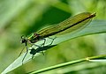
-
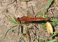
-
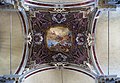
- Nomination Ceiling of Church dell'Angelo Raffaele Venice --Archaeodontosaurus 08:47, 3 June 2011 (UTC)
- Promotion bit noise, but for QI okay, maybe you denoise it --Taxiarchos228 09:48, 3 June 2011 (UTC) Done Thanks --Archaeodontosaurus 18:05, 3 June 2011 (UTC)
-

- Nomination Münster: harbour, right side district heat storage of the public services --Taxiarchos228 06:16, 3 June 2011 (UTC)
- Promotion Impressive view, good quality --Alupus 20:42, 3 June 2011 (UTC)
-

- Nomination The Royal Palace Garden, Sofia. --MrPanyGoff 21:23, 2 June 2011 (UTC)
- Promotion For me QI, but I think that the image needs perspective correction--Lmbuga 23:36, 3 June 2011 (UTC)
-

- Nomination Rosenmontagszug.Nuremberg 8. --Vitold Muratov 16:30, 2 June 2011 (UTC)
- Decline It's grainy and the crop is too tight on the top. --Tomer T 23:20, 3 June 2011 (UTC)
-

- Nomination Boddhisatvas in Longmen Grottoes, China. --WikiLaurent 12:35, 30 May 2011 (UTC)
- Decline Very detailed, but unfortunately, due to the very difficult light conditions with hard sunlight in large fractions of the photo, it is also badly overexposed in some areas. Besides that, there is a bad stich of two persons. --Slaunger 10:41, 4 June 2011 (UTC)
-

- Nomination Part of the vault of the tumb of Bakenranef, vizir of Low Egypt. Extract of a set of royal anthems describing the day and night travels of the sun. Late period, 26th dynasty, reign of Psamtik I, ca. 650 BCE. Saqqara. Museum of Fine Arts of Lyon. -- Rama 12:06, 30 May 2011 (UTC)
- Promotion Almost too dark, but on the other hand the golden light is pleasant and helps highlight many details in the vault part. --Slaunger 10:34, 4 June 2011 (UTC)
-

- Nomination The Dead Sea. --Tomer T 13:48, 29 May 2011 (UTC)
- Decline This is a lovely photo but it does seem to have quite a bit of noise, colours seem oversaturated as well. Saffron Blaze 15:22, 29 May 2011 (UTC)
Too much color noise and/or oversaturated. --Slaunger 10:30, 4 June 2011 (UTC)
-
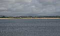
- Nomination Pwllheli Bay. Mattbuck 10:54, 28 May 2011 (UTC)
- Promotion And do you now at least the name of the beach, almost a year later ? ;)--Jebulon 16:10, 28 May 2011 (UTC)
It could be Abererch Sands, in that there's a holiday camp there called Abererch Sands, but that's only a guess. Mattbuck 19:10, 28 May 2011 (UTC)Well, it is time to decide, and it is a good picture. QI. Alleluia. --Jebulon 16:43, 3 June 2011 (UTC).
-

- Nomination A MiG-29 dismantled for a general overhaul. Photo taken by myself. --Airwolf 10:58, 27 May 2011 (UTC)
- Decline Comment Important CA --Archaeodontosaurus 13:34, 28 May 2011 (UTC) Nothing is extremely good; it is disturbing for me that the front part of the aircraft (nose) is not completely visible. --A.Ceta 13:43, 3 June 2011 (UTC)
-

- Nomination A MiG-29 dismantled for a general overhaul. Photo taken by myself. --Airwolf 10:58, 27 May 2011 (UTC)
- Decline Comment Important CA --Archaeodontosaurus 13:34, 28 May 2011 (UTC) Nothing is extremely good; The aircraft (nose) is not completely visible. --A.Ceta 13:43, 3 June 2011 (UTC)
-
- Nomination Punic stele decorated with a palm and the sign of Tanit Tophet of Carthage. 3rd century BCE. Museum of Fine Arts of Lyon. -- Rama 18:15, 23 May 2011 (UTC)
- Promotion There are some burned pixels at the right of the palm--Jebulon 16:31, 27 May 2011 (UTC)
Seems OK for me. --Slaunger 10:14, 4 June 2011 (UTC)
-

- Nomination Historis odius --Archaeodontosaurus 09:44, 3 June 2011 (UTC)
- Promotion Good quality. --Taxiarchos228 09:48, 3 June 2011 (UTC)
-

- Nomination Portrait of a monk. Japan, 16th century. Lacquered wood with rock crystal incrusts for eyes. On display at the Musée des Confluences exhibit of the Musée gallo-romain de Fourvière. -- Rama 09:46, 3 June 2011 (UTC)
- Promotion Good quality. --Taxiarchos228 09:48, 3 June 2011 (UTC)
-

-

- Nomination Gustav Bergemann, german politcan (CDU), Member of Landtag of Thuringia --Alupus 21:47, 2 June 2011 (UTC)
- Promotion It is very sharp and the plane of focus is correct. --Saffron Blaze 23:22, 2 June 2011 (UTC)
-

- Nomination The Koude Keuken manor in Sint-Andries (Bruges, Belgium) -- MJJR 21:02, 2 June 2011 (UTC)
- Promotion Good quality. --Saffron Blaze 21:09, 2 June 2011 (UTC)
-

- Nomination Belgian Class 26 electric loc #2604 -- MJJR 21:02, 2 June 2011 (UTC)
- Promotion Good quality. --Saffron Blaze 23:22, 2 June 2011 (UTC)
-

- Nomination Gloucester Cathedral, England -- Saffron Blaze 20:01, 2 June 2011 (UTC)
- Decline bad white balance, hard shadows, not really sharp, distortions --Carschten 20:56, 2 June 2011 (UTC)
-

- Nomination Taraxacum officinale --Tlusťa 19:17, 2 June 2011 (UTC)
- Promotion Good quality. --Saffron Blaze 20:06, 2 June 2011 (UTC)
-
- Nomination Wehr: Saint Martin Church --Taxiarchos228 17:16, 2 June 2011 (UTC)
- Promotion Good quality. I bet that wasn't easy to PP. Well done. --Saffron Blaze 20:05, 2 June 2011 (UTC)
-
- Nomination Purple Finch, female --Cephas 17:15, 2 June 2011 (UTC)
- Promotion Good quality. --Taxiarchos228 17:17, 2 June 2011 (UTC)
-

- Nomination Entrance of the Museum Neue Pinakothek in München. --High Contrast 16:44, 2 June 2011 (UTC)
- Promotion Good quality. --Taxiarchos228 16:51, 2 June 2011 (UTC)
-
- Nomination Landscape Herscheid, Germany Pro2 16:01, 2 June 2011 (UTC)
- Promotion Good quality and very beautiful. --Saffron Blaze 16:31, 2 June 2011 (UTC)
-

- Nomination Video camera diaphragm (focus stacking). --ComputerHotline 15:38, 2 June 2011 (UTC)
- Promotion Good quality. --Saffron Blaze 16:33, 2 June 2011 (UTC)
-

- Nomination Video camera sensor (focus stacking). --ComputerHotline 15:38, 2 June 2011 (UTC)
- Promotion Good quality. --Saffron Blaze 16:33, 2 June 2011 (UTC)
-

- Nomination Tintern Abbey, est 1131, Wales. -- Saffron Blaze 14:55, 2 June 2011 (UTC)
- Promotion Good quality. --Taxiarchos228 16:51, 2 June 2011 (UTC)
-

- Nomination Helge Schneider live --AngMoKio 14:20, 2 June 2011 (UTC)
- Promotion Good quality. --Taxiarchos228 14:36, 2 June 2011 (UTC)
-

- Nomination Helge Schneider live --AngMoKio 14:20, 2 June 2011 (UTC)
- Promotion Good quality. --Taxiarchos228 14:36, 2 June 2011 (UTC)
-

- Nomination Farewell of race driver Bernd Schneider --AngMoKio 14:20, 2 June 2011 (UTC)
- Promotion Good quality. --Taxiarchos228 14:36, 2 June 2011 (UTC)
-

- Nomination :Kochem.Schloss. --Vitold Muratov 13:37, 2 June 2011 (UTC)Vitold Muratov 15:40, 2 June 2011 (UTC)
- Decline Sorry but the noise is a lot too much for a QI --Berthold Werner 18:22, 2 June 2011 (UTC)
-

- Nomination Gondola on the Grand Canal, Venice. -- Saffron Blaze 13:10, 2 June 2011 (UTC)
- Promotion Good quality and nice view --Taxiarchos228 12:23, 2 June 2011 (UTC)
-

- Nomination Öresunn bridge 2 --Vitold Muratov 14:30, 2 June 2011 (UTC)
- Decline Oppose Pixelization and too much background noise in sky --Archaeodontosaurus 17:42, 2 June 2011 (UTC)
-
- Nomination Hoplia argentea --Holleday 11:19, 2 June 2011 (UTC)
- Promotion Support QI & Useful --Archaeodontosaurus 17:37, 2 June 2011 (UTC)
-

- Nomination Wehr: Saint Martin Church --Taxiarchos228 11:17, 2 June 2011 (UTC)
- Promotion Good quality. --Saffron Blaze 12:53, 2 June 2011 (UTC)
-

- Nomination Pelophylax "esculentus" --Holleday 11:16, 2 June 2011 (UTC)
- Promotion Good quality. --Saffron Blaze 12:53, 2 June 2011 (UTC)
-
-

-
- Nomination Flims: cable car --Taxiarchos228 10:45, 2 June 2011 (UTC)
- Promotion Good quality. A real sense of height. --Saffron Blaze 12:53, 2 June 2011 (UTC)
-

- Nomination Hochblauen: observation tower --Taxiarchos228 10:45, 2 June 2011 (UTC)
- Promotion Good quality. --Tomer T 16:31, 2 June 2011 (UTC)
-

- Nomination Germany, Memmelsdorf, Seehof castle, western entrance --Berthold Werner 10:39, 2 June 2011 (UTC)
- Promotion Good quality. --Saffron Blaze 12:56, 2 June 2011 (UTC)
-

- Nomination Germany, Memmelsdorf, Seehof castle, western entrance, coat of arms --Berthold Werner 10:39, 2 June 2011 (UTC)
- Promotion Support QI & Useful --Archaeodontosaurus 17:38, 2 June 2011 (UTC)
-
![* Nomination Flower of cultivated Oxalis tetraphylla [syn. Oxalis deppei] ‘Iron Cross’. --Bff 09:20, 2 June 2011 (UTC) * Promotion Good --Llez 15:02, 2 June 2011 (UTC)](https://upload.wikimedia.org/wikipedia/commons/thumb/5/5e/Oxalis_tetraphylla_Iron_Cross20110602_05.jpg/120px-Oxalis_tetraphylla_Iron_Cross20110602_05.jpg)
- Nomination Flower of cultivated Oxalis tetraphylla [syn. Oxalis deppei] ‘Iron Cross’. --Bff 09:20, 2 June 2011 (UTC)
- Promotion Good --Llez 15:02, 2 June 2011 (UTC)
-

-

- Nomination Bust of Emperor Caracalla. Marble. Sent by the State (Musée du Louvre). On display at the Musée gallo-romain de Fourvière, Lyon. -- Rama 06:04, 2 June 2011 (UTC)
- WARNING: third template parameter added – please remove.
-
- Nomination Sopot central square. --MrPanyGoff 21:00, 1 June 2011 (UTC)
- Promotion Good quality. --Tomer T 14:06, 2 June 2011 (UTC)
-
- Nomination ANTONY GORMLEY Hochalpe --MrPanyGoff 21:00, 1 June 2011 (UTC)
- Promotion Great quality. --Tomer T 14:06, 2 June 2011 (UTC)
-

- Nomination Congress Center of Freudenstadt, Baden-Württemberg. -- Felix Koenig 18:56, 1 June 2011 (UTC)
- Promotion Can be sharper but good overall quality and meets the criteria, imo.--MrPanyGoff 19:17, 2 June 2011 (UTC)
-

- Nomination Macro Photograph using two lenses --Sankarshansen 12:36, 1 June 2011 (UTC)
- Decline Oppose This technique was abandoned for the Focus stacking --Archaeodontosaurus 07:40, 2 June 2011 (UTC) Comment Agreed, however this technique also works and gives comparable results wrt a macro shot. Sankarshansen 12:20, 2 June 2011 (UTC)
-

- Nomination Tower of Wolfbuschkirche, Stuttgart --Harke 11:32, 1 June 2011 (UTC)
- Promotion Good quality. but could be denoised --Taxiarchos228 11:34, 1 June 2011 (UTC) done--Harke 17:19, 2 June 2011 (UTC)
-

- Nomination Panorama seen from the Hohneck. --ComputerHotline 19:19, 31 May 2011 (UTC)
- Promotion Good quality. --Andrei Stroe 09:45, 3 June 2011 (UTC)
-

-

-

- Nomination Efringen: epitaph at Protestant Church --Taxiarchos228 06:31, 20 May 2011 (UTC)
- Promotion Could you crop it on the right hand side please? Mattbuck 04:11, 26 May 2011 (UTC)
done --Taxiarchos228 13:34, 1 June 2011 (UTC)
Better, thanks. Mattbuck 14:25, 2 June 2011 (UTC)
-

- Nomination Germany, Bamberg, St. Gangolf church --Berthold Werner 10:39, 2 June 2011 (UTC)
- Promotion Good quality. --Taxiarchos228 10:45, 2 June 2011 (UTC)
-

- Nomination Charaxes varanes from Malawi --Archaeodontosaurus 07:16, 2 June 2011 (UTC)
- Promotion Very detailed and useful --Llez 07:57, 2 June 2011 (UTC)
-

-
-

- Nomination Belgian Class 26 electric loc #2622 -- MJJR 21:24, 1 June 2011 (UTC)
- Promotion Very good -- George Chernilevsky 06:26, 2 June 2011 (UTC)
-

- Nomination Germany, Haßfurt, Lower gate, also called Würzburg gate --Berthold Werner 17:38, 1 June 2011 (UTC)
- Promotion Good quality. --Taxiarchos228 18:08, 1 June 2011 (UTC)
-

- Nomination Germany, Haßfurt, former town hall and church --Berthold Werner 17:38, 1 June 2011 (UTC)
- Promotion Meets the criteria, imo.--MrPanyGoff 06:17, 2 June 2011 (UTC)
-

- Nomination Germany, Haßfurt, church --Berthold Werner 17:38, 1 June 2011 (UTC)
- Promotion Good quality. --Taxiarchos228 18:08, 1 June 2011 (UTC)
-

-
- Nomination ANTONY GORMLEY Widderstein --Böhringer 14:03, 1 June 2011 (UTC)
- Promotion Great. Try FP. --Tomer T 15:13, 1 June 2011 (UTC)
Comment I think this is worthy of FP consideration but it will need an English translation. Saffron Blaze 21:36, 1 June 2011 (UTC)
-
-

- Nomination 170515 at Birmingham New Street. Mattbuck 10:25, 1 June 2011 (UTC)
- Promotion Good photo -- George Chernilevsky 16:42, 1 June 2011 (UTC)
-

- Nomination Structural detail of the Eiffel Tower --Taxiarchos228 10:06, 1 June 2011 (UTC)
- WARNING: third template parameter added – please remove.
-

- Nomination Rheinfelden: remaining parts of the old hydroelectric power plant, turbine are partially visible --Taxiarchos228 09:16, 1 June 2011 (UTC)
- Promotion Good quality. --Tomer T 17:40, 1 June 2011 (UTC)
-

- Nomination TARMAC and fields -- Florent Pécassou 06:30, 31 May 2011 (UTC)
- Decline noisy and aslope, in this image it is not clear for me whats the object/ topic --Taxiarchos228 13:10, 1 June 2011 (UTC)
-

- Nomination Burano Island, Venice, Italy. --Saffron Blaze 22:25, 30 May 2011 (UTC)
- Promotion Pretty colors, and the composition pulls the viewer into the scene. Good exposure with some detail visible even in the bright white towel and in the shadows. I worry that a little too much noise reduction has been applied, as some of the surfaces look smoother than I think they should be, but I think that's not enough to block promotion. —David Eppstein 03:55, 31 May 2011 (UTC)
Comment I don't remember applying NR to this. Just in case I checked the original file and there is little detail in the coloured stucco. In fact the green towel has more detail than the stucco. I even looked at some files where I took pictures of the walls and the newer stucco they use is quite flat compared to what used to be on the homes. Much of Burano appears to have been "upgraded" in recent times. Saffron Blaze 09:31, 31 May 2011 (UTC)
Ok, I guess the walls are just smooth. Nice picture, anyway. —David Eppstein 15:41, 31 May 2011 (UTC)
Comment Thanks. Just thought I would add that not all the walls are smooth as evidenced by the first house in the row. I also noted while there that the renovated homes use much brighter/saturated colours than the ones that are yet to be redone. I think it is more than a function of fading and quite a deliberate initiative to "brighten" up the area.Saffron Blaze 08:43, 2 June 2011 (UTC)
-

-

- Nomination Roman Catholic cathedral of Ivan Nepomuk at the Republic square (Trg Republike) in Zrenjanin, Serbia (by Aktron). --Tomer T 19:34, 30 May 2011 (UTC)
- Promotion I sharpened this file before promoting it. It is quite a nice photo. --Saffron Blaze 17:33, 1 June 2011 (UTC)
-

- Nomination Church of Saint Loup de Naud (France).--Pline 19:24, 30 May 2011 (UTC)
- Promotion Good quality. Harrison49 21:20, 1 June 2011 (UTC)
-
- Nomination Tondu railway station. Mattbuck 19:23, 30 May 2011 (UTC)
- Promotion Good quality. Harrison49 21:20, 1 June 2011 (UTC)
-

- Nomination 159018 at Keynsham. Mattbuck 19:23, 30 May 2011 (UTC)
- Promotion Good quality. Harrison49 21:20, 1 June 2011 (UTC)
-

- Nomination 317342 at Cambridge. Mattbuck 19:23, 30 May 2011 (UTC)
- Promotion Good quality. Harrison49 21:20, 1 June 2011 (UTC)
-

-
- Nomination Brillux head office in Münster. --Elektroschreiber 09:34, 30 May 2011 (UTC)
- Promotion Nice colors and composition. The white looks a bit overexposed but I checked the histogram and it's OK. --King of Hearts 07:11, 2 June 2011 (UTC)
-

-
- Nomination The New Measurement Train passes through Patchway. Mattbuck 10:54, 28 May 2011 (UTC)
- Decline Nice composition, but noisy and unsharp. --King of Hearts 07:08, 2 June 2011 (UTC)
-

- Nomination Newton Abbot station. Mattbuck 10:54, 28 May 2011 (UTC)
- Promotion Good quality. Harrison49 21:18, 1 June 2011 (UTC)
-

- Nomination Catholic Church Saint Ulrich in Bollschweil (Black Forrest): statue of the Virgin Mary with child (about 1310) --Taxiarchos228 09:31, 27 May 2011 (UTC)
- Promotion Good quality. Harrison49 21:16, 1 June 2011 (UTC)
-

- Nomination Monastery Saint Trudpert, Münstertal (Black Forrest) --Taxiarchos228 09:31, 27 May 2011 (UTC)
- Promotion Good quality. Harrison49 21:17, 1 June 2011 (UTC)
-

- Nomination Ebringen: Catholic Church Saint Gallus --Taxiarchos228 09:31, 27 May 2011 (UTC)
- Promotion Good quality. Harrison49 21:16, 1 June 2011 (UTC)
-

-
- Nomination Signature Devices HQ. --King of Hearts 06:00, 25 May 2011 (UTC)
- Promotion Good quality. Harrison49 21:14, 1 June 2011 (UTC)
-

- Nomination Hotel Sofitel Redwood City. --King of Hearts 06:00, 25 May 2011 (UTC)
- Promotion Good quality. Harrison49 21:14, 1 June 2011 (UTC)
-

- Nomination Shores Press HQ. --King of Hearts 06:00, 25 May 2011 (UTC)
- Promotion Good quality. Harrison49 21:14, 1 June 2011 (UTC)
-

- Nomination An old woman in Lahic, Azerbaijan. Taken in September 2008. -- Azeri 22:45, 24 May 2011 (UTC) Qquality images must be the work of Commons contributors. Is Walter Callens, a contributor here?--Ankara 22:59, 24 May 2011 (UTC) The uploader goes by the name RetlawSnellac who is Walter in Flickr. We have discussed this issue in Petroglyphs_of_Qobustan section -- Azeri 20:09, 30 May 2011 (UTC)
- Promotion {{{2}}}
-

- Nomination Stanford Main Quad from Hoover Tower. --King of Hearts 19:39, 24 May 2011 (UTC)
- Promotion Good quality. Harrison49 21:12, 1 June 2011 (UTC)
-

- Nomination German politican Katharina König (Die Linke) --Alupus 21:03, 21 May 2011 (UTC)
- Decline I'm not convinced by it - DOF seems slightly too low. Mattbuck 04:20, 26 May 2011 (UTC)
DOF in my opinion is good. A little dark and blue though, easily fixed. --King of Hearts 20:55, 26 May 2011 (UTC)
No response. --King of Hearts 07:03, 2 June 2011 (UTC)
-

- Nomination Michaelskirche in Hochdorf --Harke 11:33, 1 June 2011 (UTC)
- Promotion Good quality. --Taxiarchos228 11:34, 1 June 2011 (UTC)
-

- Nomination Wolfbuschkirche in Stuttgart --Harke 11:31, 1 June 2011 (UTC)
- Promotion Good quality. --Taxiarchos228 11:34, 1 June 2011 (UTC)
-

- Nomination 156413 speeds through the snow of Radcliffe station. Mattbuck 10:25, 1 June 2011 (UTC)
- Promotion Good quality. --Taxiarchos228 10:53, 1 June 2011 (UTC)
-

- Nomination Chur: Saint Martins Church (bell tower) --Taxiarchos228 09:16, 1 June 2011 (UTC)
- Promotion This is very nice setting well captured. --Saffron Blaze 09:19, 1 June 2011 (UTC)
-

- Nomination Veliko Tarnovo old town view. --MrPanyGoff 07:21, 1 June 2011 (UTC)
- Promotion Good quality, a panorama of this buildings would be nice --Taxiarchos228 09:25, 1 June 2011 (UTC)
-

- Nomination Bayhurst Wood --Harrison49 03:35, 1 June 2011 (UTC)
- Decline Too high a contrast: overexposure in the center and underexposure at the left. --Andrei Stroe 10:14, 1 June 2011 (UTC)
-

- Nomination Portrait of Gustav Dürr -- H005 22:11, 31 May 2011 (UTC)
- Promotion Good -- George Chernilevsky 07:02, 1 June 2011 (UTC)
-

- Nomination Wayside crosses in Porto do Son--Lmbuga 21:58, 31 May 2011 (UTC)
- Promotion Good -- George Chernilevsky 07:03, 1 June 2011 (UTC)
-

-

- Nomination Wayside crosses in Porto do Son--Lmbuga 21:58, 31 May 2011 (UTC)
- Promotion Good -- George Chernilevsky 07:04, 1 June 2011 (UTC)
-

- Nomination Toy balloons -- George Chernilevsky 21:30, 31 May 2011 (UTC)
- Promotion Good quality. --Tomer T 03:36, 1 June 2011 (UTC)
-

- Nomination Sand Lizard male -- George Chernilevsky 21:30, 31 May 2011 (UTC)
- Promotion Good quality. --Tomer T 03:36, 1 June 2011 (UTC)
-

- Nomination YuMZ-6KL tractor -- George Chernilevsky 21:30, 31 May 2011 (UTC)
- Promotion Very good to me--Lmbuga 22:01, 31 May 2011 (UTC)
-
- Nomination YuMZ-6KL tractor -- George Chernilevsky 21:30, 31 May 2011 (UTC)
- Promotion I like it. Good. QI--Lmbuga 22:02, 31 May 2011 (UTC)
-

- Nomination YuMZ-6KL tractor -- George Chernilevsky 21:30, 31 May 2011 (UTC)
- Promotion Very good. --Cayambe 04:38, 1 June 2011 (UTC)
-

- Nomination Entrance of the provincial domain Fort van Beieren at Koolkerke (Bruges, Belgium) -- MJJR 20:26, 31 May 2011 (UTC)
- Promotion Good photo -- George Chernilevsky 06:46, 1 June 2011 (UTC)
-

- Nomination The train station of Nabeul (Tunisia) -- MJJR 20:26, 31 May 2011 (UTC)
- Promotion Good. --Andrei Stroe 10:16, 1 June 2011 (UTC)
-

-

- Nomination en:Pavel Rostovtsev, a former biathlete. A.Savin 17:53, 31 May 2011 (UTC)
- Promotion Good quality. --Taxiarchos228 18:43, 31 May 2011 (UTC)
-

- Nomination Wind turbine sticking through clouds. --Tetris L 17:24, 31 May 2011 (UTC)
- Promotion Good quality. Stiking too. --Saffron Blaze 18:38, 31 May 2011 (UTC)
-

- Nomination Bren Hall, UC Irvine —David Eppstein 17:22, 31 May 2011 (UTC)
- Promotion Good quality. --Taxiarchos228 18:43, 31 May 2011 (UTC)
-

- Nomination Dolno Kamartsi village. --MrPanyGoff 16:40, 31 May 2011 (UTC)
- Promotion Good quality. --Raghith 17:09, 31 May 2011 (UTC)
-

- Nomination Germany, Haßfurt, two timber framend buildings --Berthold Werner 15:43, 31 May 2011 (UTC)
- Promotion Good quality. --Saffron Blaze 18:38, 31 May 2011 (UTC)
-
- Nomination Germany, Haßfurt, timber framed building --Berthold Werner 15:43, 31 May 2011 (UTC)
- Promotion Good quality. --Saffron Blaze 18:38, 31 May 2011 (UTC)
-

- Nomination Germany, Haßfurt, two timber framend buildings --Berthold Werner 15:43, 31 May 2011 (UTC)
- Promotion Good quality. --Saffron Blaze 18:38, 31 May 2011 (UTC)
-
- Nomination Germany, Haßfurt, Upper Gate, also called Bamberger Gate --Berthold Werner 15:43, 31 May 2011 (UTC)
- Promotion Good quality. --Saffron Blaze 18:38, 31 May 2011 (UTC)
-

- Nomination Germany, Haßfurt, building --Berthold Werner 15:43, 31 May 2011 (UTC)
- Promotion Good quality. --Saffron Blaze 18:52, 31 May 2011 (UTC)
-

- Nomination Germany, Haßfurt, former town hall and church --Berthold Werner 15:43, 31 May 2011 (UTC)
- Promotion Good quality. --Saffron Blaze 18:38, 31 May 2011 (UTC)
-

- Nomination the common black ant of Europe Formica fusca --Leviathan1983 13:33, 31 May 2011 (UTC)
- Promotion Good quality. --Raghith 17:09, 31 May 2011 (UTC)
-

- Nomination 2 "sleeping" Formica fusca --Leviathan1983 13:33, 31 May 2011 (UTC)
- Promotion Good quality. --Raghith 17:10, 31 May 2011 (UTC)
-

-
-

- Nomination A worker at a Muroano glass factory demonstrates his technique (by Saffron Blaze). --Tomer T 11:03, 31 May 2011 (UTC)
- Decline I like the shot, and I think the motion blur on the horse's extremities is informative. However the image is too noisy for QI IMO. --Avenue 14:57, 31 May 2011 (UTC)
Comment I concur. This was just a snap shot using handheld high ISO and no attempt at PP was actually done. Saffron Blaze 18:49, 31 May 2011 (UTC)
-

- Nomination Dormition of the Theotokos Church in Klisura. --MrPanyGoff 08:24, 31 May 2011 (UTC)
- Promotion Good quality. --Raghith 17:09, 31 May 2011 (UTC)
-

- Nomination David Kopp --Taxiarchos228 07:40, 31 May 2011 (UTC)
- Promotion If the image is to feature the rider shouldn't he be the one in focus not the car? Saffron Blaze 09:41, 31 May 2011 (UTC)
The car holds the sign of his name. Without this you couldn´t hardly identify the rider --Taxiarchos228 19:03, 31 May 2011 (UTC)
Good point. That aside, I like the photo on its own merits. Saffron Blaze 22:33, 31 May 2011 (UTC)
-

- Nomination phase separation section in Basel --Taxiarchos228 07:31, 31 May 2011 (UTC)
- Decline I like the composition, but this does not meet the 2 megapixel resolution requirement, and there appears to be some correctable chromatic aberration especially on the wire mesh in the top part of the image. —David Eppstein 17:37, 31 May 2011 (UTC)
-

- Nomination Coaxial cables, the left one for digital TV-signals, the right for analog TV-signals, used in the --Taxiarchos228 07:31, 31 May 2011 (UTC)
- Promotion Good quality and useful. The slightly-off-horizontal line on the background surface is a bit of a distraction, but not enough of one to block promotion. —David Eppstein 17:31, 31 May 2011 (UTC)
-

-
-

- Nomination: Halifax: sign of Pier 21 --Taxiarchos228 07:52, 26 May 2011 (UTC)
Comment Seems a little on the bright side. Gives the impression the top right is blown.Saffron Blaze 08:01, 26 May 2011 (UTC)
I'll improve this soon --Taxiarchos228 11:29, 26 May 2011 (UTC) - Review needed
- Nomination: Halifax: sign of Pier 21 --Taxiarchos228 07:52, 26 May 2011 (UTC)
-

- Nomination at Tajima-mihonoura Coast in Shinonsen, Hyogo --663highland 13:24, 25 May 2011 (UTC)
- Decline Spray detracts from composition. --Mattbuck 10:29, 1 June 2011 (UTC)
-

- Nomination: Draft of a sculptor: divinité wearing a loincloth and holding the cross Ankh. Coptos. Late period. Late 25th dynasty (?) (ca. 712-664 BCE). Painted limestone. Museum of Fine Arts of Lyon. -- Rama 12:23, 25 May 2011 (UTC)
- Review needed
-

- Nomination Goetheanum from south --Taxiarchos228 11:27, 25 May 2011 (UTC)
- Promotion There is a stitching error on the middle tall sash window. I made an annotation just to show. Feel free to remove the annotation. I hope the error can be fixed. I like this composition. --Elektroschreiber 19:41, 31 May 2011 (UTC)
fixed --Taxiarchos228 20:05, 31 May 2011 (UTC)
Thank you. Now a QI for me. --Elektroschreiber 20:15, 31 May 2011 (UTC)
-

- Nomination Female Red-bellied Woodpecker at Everglades National Park in Miami-Dade County, Florida, U.S.A. (by Biopics). --Raghith 08:48, 24 May 2011 (UTC)
- Decline Not especially sharp. The real killer is the blurry leaf in the foreground covering the bird's tail, though. --Avenue 15:06, 31 May 2011 (UTC)
-

- Nomination Students from the Danish Gymnasium celebrating passing their final exams on Sank Hans Eve with the traditional Danish (yet unlit) bonfire in the background, June 23, 2009 --Slaunger 07:11, 23 May 2011 (UTC)
- Promotion Interesting scene, decent quality. The composition seems a bit cluttered (might have been better from a few paces to the right), and the car in the distance is a bit unfortunate, but QI to me. --Avenue 10:14, 29 May 2011 (UTC)
Question Thanks for the review. Hmm... a bit cluttered composition you say? Besides the inevitable car in the far background (which I had not noticed till now, there is a road there along the brink of the lake), I do not see any irrelevant elements in the photo? I mean, the students are in the boat to witness the bonfire being lit closely thereafter, so both the boat and the bonfire should be there. Just trying to understand your comment :-) --Slaunger 20:56, 30 May 2011 (UTC)
Sorry, I should have said cramped, not cluttered. I was thinking of a slightly tight crop above the "witch", and the student's head overlapping the bonfire platform. Relatively minor issues IMO. --Avenue 14:47, 31 May 2011 (UTC)
Ah, I understand, and fully agree, thanks :-). --Slaunger 19:20, 31 May 2011 (UTC)
-

- Nomination Egringen: Protestant Church (font) --Taxiarchos228 06:31, 20 May 2011 (UTC)
- Promotion Not convinced by the white balance...--Jebulon 21:31, 21 May 2011 (UTC)
and what is the precise problem with it? --Taxiarchos228 12:39, 23 May 2011 (UTC)
Its tilted CCW. I dont see any problems with the white balance. --Jovianeye 13:03, 27 May 2011 (UTC)
Seems like too much magenta to me, and perhaps red too. --Avenue 15:18, 31 May 2011 (UTC)
I've now tried to fix it. --Avenue 15:44, 31 May 2011 (UTC) thanks Avenue, that's exactly what I meant. QI now.--Jebulon 19:51, 31 May 2011 (UTC)
-
- Nomination: Wehr: Saint Martin Church --Taxiarchos228 11:17, 2 February 2011 (UTC)
- Review needed
-
- Nomination: Lörrach: Catholic Church Saint Peter (Bell tower) --Taxiarchos228 10:58, 2 February 2011 (UTC)
- Review needed
-
- Nomination: Flims: cable car --Taxiarchos228 10:45, 2 February 2011 (UTC)
- Review needed
-
- Nomination: Hochblauen: television tower --Taxiarchos228 10:45, 2 February 2011 (UTC)
- Review needed
-
- Nomination: Hochblauen: observation tower --Taxiarchos228 10:45, 2 February 2011 (UTC)
- Review needed
-
- Nomination Peter Kraus performing with the Lumberjack Bigband (by AngMoKio). --Tomer T 10:41, 31 May 2011 (UTC)
- Promotion Good quality. --Saffron Blaze 11:11, 31 May 2011 (UTC)
-

- Nomination A child ploughing the land with a water buffalo in Don Det, Si Pan Don, Laos (by Paulrudd). --Tomer T 10:32, 31 May 2011 (UTC)
- Promotion Very good quality. --Saffron Blaze 11:09, 31 May 2011 (UTC)
-

- Nomination Panorama of the view south from Keys View in the Little San Bernadino Mountains, Joshua Tree National Park, California, USA (by Mfield). Tomer T 10:28, 31 May 2011 (UTC)
- Promotion Brilliant. Not suprised it was FP. --Saffron Blaze 11:10, 31 May 2011 (UTC)
-

- Nomination Dultenaugraben Bridge during construction --Taxiarchos228 07:58, 31 May 2011 (UTC)
- Promotion Good quality. --Saffron Blaze 09:45, 31 May 2011 (UTC)
-

- Nomination Television Tower Stuttgart --Taxiarchos228 07:31, 31 May 2011 (UTC)
- Promotion Good quality. --Saffron Blaze 09:41, 31 May 2011 (UTC)
-

- Nomination mime --Taxiarchos228 07:31, 31 May 2011 (UTC)
- Promotion Good quality. --Tomer T 10:28, 31 May 2011 (UTC)
-
-

-

- Nomination Louis XVII of France by Louis Pierre Deseigne--Jebulon 22:31, 30 May 2011 (UTC)
- Promotion Absolutely wonderful detail --Saffron Blaze 22:33, 30 May 2011 (UTC)
-

- Nomination Metro Transit Ferry, Halifax, Canada. --Saffron Blaze 22:25, 30 May 2011 (UTC)
- Promotion Good quality. --Raghith 04:55, 31 May 2011 (UTC)
-

- Nomination Grain elevator near Moose Jaw, Saskatchewan, Canada. --Saffron Blaze 22:25, 30 May 2011 (UTC)
- Promotion Good quality. --Raghith 04:55, 31 May 2011 (UTC)
-

- Nomination York Redoubt, Halifax, Nova Scotia. --Saffron Blaze 22:25, 30 May 2011 (UTC)
- Promotion Good quality. --Raghith 04:55, 31 May 2011 (UTC)
-

- Nomination Blue Church, Prescott, Ontario. --Saffron Blaze 22:25, 30 May 2011 (UTC)
- Promotion Good quality. --Tomer T 09:43, 31 May 2011 (UTC)
-

- Nomination Sofia Seminary - side risalit. --MrPanyGoff 21:28, 30 May 2011 (UTC)
- Promotion Good overall quality. --Tomer T 09:43, 31 May 2011 (UTC)
-
- Nomination Oparara River (brown due to the tannin) from the path to the Honeycomb Hill Cave --Borvan53 20:54, 30 May 2011 (UTC)
- Decline Highlights are blown even on the sand. --Saffron Blaze 22:32, 30 May 2011 (UTC)
-

- Nomination Treviso - Piazza dei Signori e Palazzo dei Trecento --Archaeodontosaurus 20:22, 30 May 2011 (UTC)
- Promotion Good quality. --Saffron Blaze 20:38, 30 May 2011 (UTC)
-

-

-

- Nomination Alfenzbrücke Lorüns 360° Panorama --Böhringer 20:12, 30 May 2011 (UTC)
- Promotion Very nice work. --Saffron Blaze 20:38, 30 May 2011 (UTC)
-
- Nomination Big River, California —David Eppstein 20:02, 30 May 2011 (UTC)
- Promotion Good quality. --Saffron Blaze 20:38, 30 May 2011 (UTC)
-

- Nomination Araniella cucurbitina --Holleday 19:05, 30 May 2011 (UTC)
- Promotion Support QI & Useful --Archaeodontosaurus 20:24, 30 May 2011 (UTC)
-

- Nomination Diaea dorsata --Holleday 19:04, 30 May 2011 (UTC)
- Promotion Support QI & Useful --Archaeodontosaurus 20:25, 30 May 2011 (UTC)
-

-
- Nomination Nephrotoma appendiculata (couple) --Holleday 19:00, 30 May 2011 (UTC)
- Promotion Support QI & Useful --Archaeodontosaurus 20:26, 30 May 2011 (UTC)
-
- Nomination Sea of Galilee near Tabgha --Berthold Werner 18:02, 30 May 2011 (UTC)
- Promotion Good quality. --Saffron Blaze 18:53, 30 May 2011 (UTC)
-

- Nomination Sea of Galilee near Tabgha --Berthold Werner 18:02, 30 May 2011 (UTC)
- Promotion Good quality. --Saffron Blaze 18:53, 30 May 2011 (UTC)
-

- Nomination Female Lowryder cannabis in flowering phase growing in Finland (by Sativaindica). --Tomer T 17:59, 30 May 2011 (UTC)
- Promotion Good quality. --Saffron Blaze 19:20, 30 May 2011 (UTC)
-

- Nomination Oxymeris dimidiata (by Llez). --Tomer T 17:46, 30 May 2011 (UTC)
- Promotion Support QI & Useful --Archaeodontosaurus 20:28, 30 May 2011 (UTC)
-

- Nomination St. Boniface's Abbey in Munich. --High Contrast 16:22, 30 May 2011 (UTC)
- Promotion Good quality even with the focus being on the urn in front instead of the building :) --Saffron Blaze 18:53, 30 May 2011 (UTC)
-

- Nomination Shell of a Snipe's Bill, Haustellum haustellum --Llez 14:21, 30 May 2011 (UTC)
- Promotion Well done -- George Chernilevsky 14:57, 30 May 2011 (UTC)
-

- Nomination Arlette Laguiller at the demonstration against the Hortefeux law. Paris, 20th of October 2007. -- Rama 14:17, 30 May 2011 (UTC) Support QI for me --Archaeodontosaurus 20:29, 30 May 2011 (UTC)
- Promotion
- Nomination Arlette Laguiller at the demonstration against the Hortefeux law. Paris, 20th of October 2007. -- Rama 14:17, 30 May 2011 (UTC)
-
- Nomination Spin echo decay animation --GavinMorley 13:21, 30 May 2011 (UTC)
- Promotion Good quality. --Saffron Blaze 14:08, 30 May 2011 (UTC)
-

- Nomination Family of black swans. --WikiLaurent 12:39, 30 May 2011 (UTC)
- Decline Insufficient quality (soft and resolution). --Saffron Blaze 12:50, 30 May 2011 (UTC)
-
- Nomination Stele of Sebenu dedicated to Osiris. Middle Kingdom. Painted limestone. Museum of Fine Arts of Lyon. -- Rama 12:10, 30 May 2011 (UTC)
- Promotion Sharp and nicely detailed --WikiLaurent 12:44, 30 May 2011 (UTC)
-

- Nomination Young flower of cultivated Saintpaulia. --Bff 11:54, 30 May 2011 (UTC)
- Promotion Good quality. The highlight in the top left could be darkened a bit. --Saffron Blaze 12:54, 30 May 2011 (UTC)
-

- Nomination Chapel in Luxembourg. --Cayambe 07:02, 31 May 2011 (UTC)
- Promotion Support QI for me --Archaeodontosaurus 20:30, 30 May 2011 (UTC)
-
- Nomination Sea of Galilee, near Capernaum --Berthold Werner 09:23, 30 May 2011 (UTC)
- Promotion Good quality.
--Cayambe 07:35, 31 May 2011 (UTC)Correction of date: --Cayambe 16:37, 30 May 2011 (UTC)
-

- Nomination Silene Dioca flowers, Hortus Botanicus Amsterdam --Léna 09:14, 30 May 2011 (UTC)
- Decline Nice composition and isolation but too soft. --Saffron Blaze 12:55, 30 May 2011 (UTC)
-

- Nomination Egringen: Protestant Church: claviature of organ --Taxiarchos228 08:49, 30 May 2011 (UTC)
- Promotion Good quality. --Cayambe 07:36, 31 May 2011 (UTC)
-

- Nomination Egringen: Protestant Church (bell tower) --Taxiarchos228 08:49, 30 May 2011 (UTC)
- Promotion Good quality. --Saffron Blaze 19:22, 30 May 2011 (UTC)
-

- Nomination Mappach: Protestant Church: choir --Taxiarchos228 08:49, 30 May 2011 (UTC)
- Promotion Good quality. --Saffron Blaze 12:57, 30 May 2011 (UTC)
-

- Nomination Istein: lime works --Taxiarchos228 08:44, 30 May 2011
(UTC) Promotion Insufficient quality. (resolution) --Saffron Blaze 14:15, 30 May 2011 (UTC)
1.992 × 1.104 Pixel is curtly more than 2 MP --Taxiarchos228 14:18, 30 May 2011 (UTC)
I just looked at the file size. Saffron Blaze 14:45, 30 May 2011 (UTC)
- Nomination Istein: lime works --Taxiarchos228 08:44, 30 May 2011
-

- Nomination Anselm Feuerbach grave --User:Vitold Muratov 10:25, 30 May 2011 (UTC)
- Promotion Good quality. --Saffron Blaze 14:15, 30 May 2011 (UTC)
-
- Nomination UC Irvine Science Plaza —David Eppstein 06:28, 30 May 2011 (UTC)
- Promotion Good quality. --Saffron Blaze 14:15, 30 May 2011 (UTC)
-

- Nomination Seagulls in Miami Beach (USA) -- MJJR 20:58, 29 May 2011 (UTC)
- Promotion I like the composition, especially the one gull staring at you, but this is rather soft. Saffron Blaze 21:29, 29 May 2011 (UTC) Comment The background is soft, of course, as the focus is on the gulls. I can sharpen the image, but this would increase the noise, especially in the sky, and that's not desirable, I think. -- MJJR 08:22, 30 May 2011 (UTC)
Comment To be honest, I was talking about the gulls not being very sharp/detailed. Saffron Blaze 09:50, 30 May 2011 (UTC)
-- Alright. It's not DSLR quality indeed. But probably it was the best possible result with that type of (compact) camera and in these (evening) light conditions. -- MJJR 14:50, 30 May 2011 (UTC)
SupportI looked at this again and I am thinking it meets QI standards. --Saffron Blaze 17:24, 30 May 2011 (UTC)
-

- Nomination Seaside at Crucita, Ecuador. --Cayambe 16:03, 30 May 2011 (UTC)
- Promotion Good quality. --Saffron Blaze 19:37, 29 May 2011 (UTC)
-

-
-

- Nomination Renault R4 car -- MJJR 20:03, 28 May 2011 (UTC)
- Promotion Poor little car all covered in bird poop. Shows good detail but could use a different framing. Saffron Blaze 20:23, 28 May 2011 (UTC) Question What do you mean: a different (tighter?) crop, or a different view angle? The crop can be adjusted. For the view angle, it will be more difficult, as the picture was taken during a holiday in Tunisia... -- MJJR 08:34, 30 May 2011 (UTC)
Comment I meant cropping so that the car was tighter to the upper left corner while retaining the 45 degree aspect. In other words crop along the top and left side about equally. I tried it and it looked more "dramatic" :) --Saffron Blaze 22:58, 30 May 2011 (UTC)
-

- Nomination Pinus sylvestris in Beskid Żywiecki, Poland. --Crusier 13:18, 28 May 2011 (UTC)
- Promotion Good quality. Pleasse geotag. --Cayambe 16:51, 30 May 2011 (UTC)
-

-

- Nomination dew on a male Oak spider (Aculepeira ceropegia) --Leviathan1983 15:02, 27 May 2011 (UTC)
- Promotion Good quality. --Cayambe 16:21, 30 May 2011 (UTC)
-

- Nomination Bamberg, building at the river --Berthold Werner 14:16, 27 May 2011 (UTC)
- Promotion Good quality. --Cayambe 16:19, 30 May 2011 (UTC)
-

-

-

- Nomination Rheinfelden: Saint Michaels Church, seen from southeast --Taxiarchos228 09:46, 27 May 2011 (UTC)
- Promotion Good quality. --Tomer T 19:45, 30 May 2011 (UTC)
-

- Nomination Grenzach-Wyhlen: organ at Saint George Church --Taxiarchos228 09:31, 27 May 2011 (UTC)
- Promotion Blown highlights from the window, but overall quality is good. --Tomer T 19:45, 30 May 2011 (UTC)
-

- Nomination Stauffen: City hall --Taxiarchos228 09:31, 27 May 2011 (UTC)
- Promotion Good quality. --Saffron Blaze 23:02, 30 May 2011 (UTC)
-

- Nomination Minster Saint Fridolin, Bad Säckingen: statue of Immaculata --Taxiarchos228 09:31, 27 May 2011 (UTC)
- Promotion Good quality. --Saffron Blaze 23:02, 30 May 2011 (UTC)
-

- Nomination Red Admiral (Vanessa atalanta), Larvik, Norway --Raghith 07:35, 26 May 2011 (UTC)
- Decline Even if this image is below the minimum size requirement, the picture is very nice. --Fandecaisses 19:31, 29 May 2011 (UTC)
below size limit. Wetenschatje 12:04, 30 May 2011 (UTC)
-

- Nomination: staircase at Goetheanum --Taxiarchos228 11:27, 25 May 2011 (UTC)
- Review needed
-

- Nomination: Gates to Swakeleys House, Ickenham. --Harrison49 20:31, 24 May 2011 (UTC)
- Review needed
-

- Nomination: Thutmose III holding the statue of Min carried by a priest as the god goes out. New Kingdom (1480-1430 BCE). Limestone, signs of polychromy. Museum of Fine Arts of Lyon. -- Rama 20:19, 24 May 2011 (UTC)
- Review needed
-

- Nomination: Isis-Hathor giving milk to Osiris. Ptolemaic era (332-30 BCE). Stone. Museum of Fine Arts of Lyon. -- Rama 19:43, 24 May 2011 (UTC)
- Review needed
-

-

-

- Nomination Toronto: Direct Energy Centre --Taxiarchos228 08:25, 24 May 2011 (UTC)
- Promotion Decent. --Mattbuck 16:40, 30 May 2011 (UTC)
-

-

- Nomination Old Lazarov school, Karlovo. --MrPanyGoff 20:48, 23 May 2011 (UTC)
- Promotion Comment CA in left part --Archaeodontosaurus 13:46, 28 May 2011 (UTC)
I couldn't see where is this CA but for each case I apply some defringe option and tiny crop from left to hide the trunk.--MrPanyGoff 06:33, 30 May 2011 (UTC)
see notes for CA. They are minimal and for me the subject is more important than the CA: QI.
-

-
- Nomination Church Convent San Francesco of Treviso. --Tomer T 19:12, 22 May 2011 (UTC)
- Decline The crop is too tight, and the perspective correction looks strange for the tower bell at right.--Jebulon 12:33, 23 May 2011 (UTC)
Absolutely true, impossible to straighten the wall. The church is in a very very narrow space.--Archaeodontosaurus 20:44, 23 May 2011 (UTC)
Decline per Jebulon. Mattbuck 16:30, 30 May 2011 (UTC)
-
-

-
- Nomination A german sailing yacht, as seen through an embrasure in the medieval walls of Rhodes, Greece.--Jebulon 14:54, 22 May 2011 (UTC)
- Promotion Support QI for me --Archaeodontosaurus 20:32, 30 May 2011 (UTC)
-

- Nomination Red Honda Accord. --Vizu 14:25, 22 May 2011 (UTC)
- Decline Blown highights on front end --Saffron Blaze 20:41, 30 May 2011 (UTC)
-

- Nomination Abydos' fiancee, Delacroix. -- Rama 12:46, 15 May 2011 (UTC)
- Promotion The white balance seems very red compared to this copy. The crop seems a bit too tight at right (and loose on top). There are also many hot pixels (white, red, blue, even purple). All perhaps fixable. --Avenue 11:40, 22 May 2011 (UTC)
Fixed (hopefully). -- Rama 09:59, 26 May 2011 (UTC)
Definitely improved. I've pushed the white balance further away from red - please feel free to revert - and I've fixed a few hot pixels. Now I feel too close to it to judge fairly, though, so I hope someone else will chime in. --Avenue 14:05, 26 May 2011 (UTC)
Thank you very much for your help, much appreciated! Rama 14:12, 26 May 2011 (UTC) Comment there is a very small part of the frame visible on the upper edge, and it is tilted !! It needs a small persp correction, and then a crop out, IMO.--Jebulon 08:15, 28 May 2011 (UTC)
Good team work. For me this is a QI. --Elektroschreiber 20:27, 30 May 2011 (UTC)
-
- Nomination Tilapia caught in Lake Hora, Debre Zeyit, Ethiopia. --Tomer T 09:36, 30 May 2011 (UTC)
- Decline Nice picture. The crop on top and on the left is too tight for me. --Elektroschreiber 09:52, 30 May 2011 (UTC) "Killing" crops, indeed, and it is a pity. --Jebulon 09:59, 30 May 2011 (UTC)
-
- Nomination Germany, Bamberg, part of the Old Townhall --Berthold Werner 09:23, 30 May 2011 (UTC)
- Promotion Good quality. --Taxiarchos228 09:31, 30 May 2011 (UTC)
-

- Nomination Germany, Bamberg, part of the Old Townhall --Berthold Werner 09:23, 30 May 2011 (UTC)
- Promotion Good quality. --Taxiarchos228 09:31, 30 May 2011 (UTC)
-

- Nomination Germany, bamberg, Obere Königsstraße 15 (Upper Kings road) --Berthold Werner 09:23, 30 May 2011 (UTC)
- Promotion Good quality. --Taxiarchos228 09:31, 30 May 2011 (UTC)
-

- Nomination Kirchen: Protestant Church from south --Taxiarchos228 08:49, 30 May 2011 (UTC)
- Promotion Good quality. --Andrei Stroe 10:04, 30 May 2011 (UTC)
-
- Nomination Kleinkems: Protestant Church (bell tower) --Taxiarchos228 08:49, 30 May 2011 (UTC)
- Promotion Good quality. --Andrei Stroe 10:04, 30 May 2011 (UTC)
-
- Nomination Mappach: Protestant Church: fresco in choir --Taxiarchos228 08:49, 30 May 2011 (UTC)
- Decline Blown highlights. --Tomer T 09:05, 30 May 2011 (UTC)
I'll improve it --Taxiarchos228 09:32, 30 May 2011 (UTC)
-
- Nomination Huttingen: Saint Nicolaus Church: inscription of founding year --Taxiarchos228 08:49, 30 May 2011 (UTC)
- Promotion Good. --Tomer T 09:06, 30 May 2011 (UTC)
-

- Nomination Welmlingen: Protestant Church (bell tower) --Taxiarchos228 08:49, 30 May 2011 (UTC)
- Promotion Good quality. --Andrei Stroe 10:04, 30 May 2011 (UTC)
-

- Nomination Triptyque - Scène de l'enfance et de la Passion du Christ. --Thesupermat 07:04, 30 May 2011 (UTC)
- Promotion Good overall quality. --Tomer T 09:03, 30 May 2011 (UTC)
-

- Nomination Holy Trinity Katholikon, Etropole Monastery. --MrPanyGoff 05:31, 30 May 2011 (UTC)
- Promotion Good quality. --Raghith 06:32, 30 May 2011 (UTC)
-

- Nomination Institute of Sociology, Sofia. --MrPanyGoff 04:36, 30 May 2011 (UTC)
- Promotion Good quality. --Raghith 05:04, 30 May 2011 (UTC)
-

- Nomination Trembling aspen (Populus tremuloides) at sunset in a wetland. --The High Fin Sperm Whale 00:13, 30 May 2011 (UTC)
- Promotion Good quality. Serene. --Saffron Blaze 01:12, 30 May 2011 (UTC)
-

-

-

- Nomination Church of Rampillon (France) --Pline 21:23, 29 May 2011 (UTC)
- WARNING: third template parameter added – please remove.
-
- Nomination Old greenhouse at Koolkerke (Belgium) -- MJJR 20:58, 29 May 2011 (UTC)
- WARNING: third template parameter added – please remove.
-

-

- Nomination Bust of a young satyre, Versailles. --Coyau 20:14, 29 May 2011 (UTC)
- Promotion Good quality. --Saffron Blaze 21:26, 29 May 2011 (UTC)
-

- Nomination Bust of a Roman lady, Versailles. --Coyau 20:14, 29 May 2011 (UTC)
- Promotion Nice detail here. Sharp. --Saffron Blaze 21:26, 29 May 2011 (UTC)
-
- Nomination NYSME scale model of a Union Pacific locomotive.--Trixt 20:06, 29 May 2011 (UTC)
- Decline Marvelous pic, but currently well below resolution standards for QI. --Saffron Blaze 21:32, 29 May 2011 (UTC)
-
- Nomination Drinking water 2. --User:Vitold Muratov 19:25, 29 May 2011 (UTC)
- Promotion Very nice. --Saffron Blaze 19:38, 29 May 2011 (UTC)
-

- Nomination Notre Dame.Paris --User:Vitold Muratov 19:05, 29 May 2011 (UTC)
- Decline Insufficient quality. --Saffron Blaze 19:32, 29 May 2011 (UTC)
-

- Nomination A Tall Ship passes in front of the Purdy's Wharf development. --Tomer T 17:52, 29 May 2011 (UTC)
- Promotion No distorsion, a good quality. --Fandecaisses 21:23, 29 May 2011 (UTC)
-

- Nomination Rocha Estáncia (354 m) in evening light as seen from an airplane soon landing to Boa Vista, Cape Verde --Ximonic 17:33, 29 May 2011 (UTC)
- Promotion Wonderful capture. --Saffron Blaze 19:37, 29 May 2011 (UTC)
-
- Nomination La Loggia dei Cavalieri in Treviso--Archaeodontosaurus 15:54, 29 May 2011 (UTC)
- Promotion GooEnough detail that I can see her thong and the wonderful paintings. --Saffron Blaze 19:37, 29 May 2011 (UTC)
-

- Nomination 9351 at Stogumber. Mattbuck 15:26, 29 May 2011 (UTC)
- Promotion Excellent. --Saffron Blaze 19:37, 29 May 2011 (UTC)
-

- Nomination 390017 at Euston. Mattbuck 15:26, 29 May 2011 (UTC)
- Promotion Good for QI. --Saffron Blaze 19:42, 29 May 2011 (UTC)
-

- Nomination 395018 at Ebbsfleet. Mattbuck 15:26, 29 May 2011 (UTC)
- Decline I would have to say the chosen DOF is wrong for this picture. --Saffron Blaze 19:42, 29 May 2011 (UTC)
-

- Nomination Germany, Frankenthal, entrande of the music school --Berthold Werner 13:27, 29 May 2011 (UTC)
- Promotion Good quality. --Saffron Blaze 15:21, 29 May 2011 (UTC)
-

- Nomination Germany, Frankenthal, music school --Berthold Werner 13:25, 29 May 2011 (UTC)
- Promotion Good quality. --Saffron Blaze 15:21, 29 May 2011 (UTC)
-
- Nomination Un iguane près de Chichén Itzá. --Fandecaisses 13:17, 29 May 2011 (UTC)
- Decline A combination of the composition (OOF area is too prominent and unbalances the picture) and the slight softness of the Iquana. --Saffron Blaze 21:35, 29 May 2011 (UTC)
-
- Nomination Germany, Frenkenthal, former sugar refinery --Berthold Werner 13:20, 29 May 2011 (UTC)
- Promotion Good quality. --Saffron Blaze 15:21, 29 May 2011 (UTC)
-

- Nomination Germany, Frankenthal, gym --Berthold Werner 13:17, 29 May 2011 (UTC)
- Promotion Good quality. --Saffron Blaze 15:21, 29 May 2011 (UTC)
-

- Nomination Germany, Frankenthal, birthplace of August von Parseval --Berthold Werner 13:15, 29 May 2011 (UTC)
- Promotion Good quality. --Saffron Blaze 15:21, 29 May 2011 (UTC)
-
- Nomination Masada cable car. --Tomer T 13:13, 29 May 2011 (UTC)
- Promotion Good quality. --Fandecaisses 13:58, 29 May 2011 (UTC)
-

-

-

- Nomination Eriogaster lanestris --Tlusťa 09:51, 29 May 2011 (UTC)
- Promotion Comment I don't really understand this picture. Is it upside-down? Is the object hanged on something? --Tomer T 12:44, 29 May 2011 (UTC)
Support No problem for me the image is well oriented, and good quality. --Archaeodontosaurus 15:58, 29 May 2011 (UTC)
-

-

- Nomination Germany, Bamberg, brewery "Fässla" --Berthold Werner 12:41, 28 May 2011 (UTC)
- Promotion Good quality. --Tomer T 11:57, 30 May 2011 (UTC)
-

- Nomination Iris sibirica in natural monument Novoveska draha --Chmee2 10:30, 28 May 2011 (UTC)
- Promotion Good focus, good resolution, good lighting, for me, a quality image. --Fandecaisses 13:01, 29 May 2011 (UTC)
-
- Nomination Picea omorika seed cones. --Iifar 05:54, 28 May 2011 (UTC)
- Decline Nice, but below size requirements --Tomer T 09:41, 30 May 2011 (UTC)
-

- Nomination Abies koreana pollen cones. --Iifar 05:54, 28 May 2011 (UTC)
- Decline Nice, but below size requirements --Tomer T 09:41, 30 May 2011 (UTC)
-

- Nomination Picea mariana pollen cones, cultivated tree in Estonia. --Iifar 20:02, 27 May 2011 (UTC)
- Decline Good quality. --Saffron Blaze 20:32, 27 May 2011 (UTC)
below size limit. Wetenschatje 11:59, 30 May 2011 (UTC)
-

-

- Nomination Israel, Ein Karem, Marys well --Berthold Werner 14:28, 26 May 2011 (UTC)
- Promotion Probably difficult settings, successful IMO.--Jebulon 07:40, 30 May 2011 (UTC)
-

- Nomination Mount Helags in april 2011. --Ankara 21:22, 24 May 2011 (UTC)
- Promotion A very good panorama. Perfect brightness. --Fandecaisses 19:37, 29 May 2011 (UTC)
-

- Nomination Stanford GSB from Hoover Tower. --King of Hearts 19:39, 24 May 2011 (UTC)
- Promotion Good quality. --Fandecaisses 19:43, 29 May 2011 (UTC)
-

- Nomination: The orthodox cathedral in Slatina, Romania. Andrei Stroe 10:20, 24 May 2011 (UTC)
- Review needed
-

- Nomination: Thurs Eisenach - painter. Exhibition opening in the state parliament of Thuringia --Raghith 08:48, 24 May 2011 (UTC)
- Review needed
-
- Nomination: FDP-Country Tags fraction in Thuringia --Raghith 08:48, 24 May 2011 (UTC)
- Review needed
-

- Nomination Patrick Aebischer. -- Rama 21:48, 23 May 2011 (UTC)
- Promotion Good quality. Harrison49 23:12, 29 May 2011 (UTC)
-
- Nomination: Punic stele decorated with an open hand and the sign of Tanit. 3rd - 1st centuries BCE. Museum of Fine Arts of Lyon. -- Rama 18:12, 23 May 2011 (UTC)
- Review needed
-

- Nomination Florida cooter at Everglades National Park in Miami-Dade County, Florida, U.S.A. (by Biopics). --Raghith 17:14, 23 May 2011 (UTC)
- Promotion Good quality. Harrison49 23:14, 29 May 2011 (UTC)
-

-

- Nomination Kirchen: Protestant Church (bell tower) --Taxiarchos228 08:29, 23 May 2011 (UTC)
- Promotion Good quality. Harrison49 23:14, 29 May 2011 (UTC)
-

- Nomination Huttingen: Saint Nicolaus Church (bell tower) --Taxiarchos228 08:29, 23 May 2011 (UTC)
- Promotion Good quality. Harrison49 23:14, 29 May 2011 (UTC)
-

- Nomination Forchheim.Konrad I --Vitold Muratov 21:45, 22 May 2011 (UTC)
- Decline Categorized as "Conrad". Nice and sharp, but ruined by disturbing background IMO.--Jebulon 07:30, 30 May 2011 (UTC)
-

-

- Nomination Pomegranate orchard in Magshimim, Israel. --Tomer T 19:07, 22 May 2011 (UTC)
- Promotion Good quality, but it would be better to go over the barbed wire... --Fandecaisses 13:34, 29 May 2011 (UTC)
-
-

- Nomination Ötlingen: view at Weil am Rhein and the Basel Bight --Taxiarchos228 16:04, 22 May 2011 (UTC)
- Promotion It's good. --Tomer T 11:11, 30 May 2011 (UTC)
-

- Nomination Beer truck in Germany. --High Contrast 13:57, 22 May 2011 (UTC)
- Promotion Good quality. --Taxiarchos228 09:54, 30 May 2011 (UTC)
-

-

- Nomination Automated Drinking Fountain --Jovianeye 00:49, 22 May 2011 (UTC)* Question Is it for dogs or something? Why's it short? :P ZooFari 04:49, 22 May 2011 (UTC) Comment I have had doubts as well! :) --Jovianeye 17:29, 22 May 2011 (UTC)
- Promotion Good quality. --Tomer T 12:00, 30 May 2011 (UTC)
- Nomination Automated Drinking Fountain --Jovianeye 00:49, 22 May 2011 (UTC)*
-

- Nomination Amazona barbadensis. Yellow-shoulder parrot.--Jebulon 16:52, 21 May 2011 (UTC)
- Decline Nice detail on the neck feathers. The pose (facing away, with eye closed), slightly odd crop (tight in front, loose behind), and noisy, cluttered background all count against it, though. --Avenue 10:22, 29 May 2011 (UTC)Thanks for careful review, I was afraid nobody be interested by this animal. I generally agree with your criticisms.--Jebulon 07:26, 30 May 2011 (UTC)


.jpg)


.jpg)
.jpg)

,_%C4%8Cesk%C3%A9_st%C5%99edoho%C5%99%C3%AD_a_krajina_v%C3%BDchodn%C4%9B_od_obce.JPG)
,_hr%C3%A1zd%C4%9Bn%C3%A1_stodola,_detail.JPG)


.jpg)


,_salle_%C3%A0_manger,_chemin%C3%A9e.jpg)


_2.jpg)


.jpg)
.JPG)
.jpg)
_3.jpg)
.jpg)


.jpg)


.JPG)


.jpg)


.jpg)


.jpg)


.jpg)


.jpg)


.JPG)
.jpg)


.JPG)


.JPG)


.JPG)
.JPG)
.JPG)


.jpg)


.jpg)


.jpg)


.jpg)


_01.jpg)


.jpg)
.jpg)


.jpg)


.jpg)


.JPG)
.JPG)


_02.jpg)


.JPG)


.jpg)


,_salle_%C3%A0_manger,_La_Nourrice,_Josse-Fran%C3%A7ois-Joseph_Leriche_d%27ap._Louis_Boizot_02-black_bg.jpg)


._Grot_of_castle_2.jpg)


.JPG)


_Retouched.jpg)

.JPG)


_railway_station_MMB_05.jpg)


.jpg)


.jpg)


.jpg)


.jpg)


![* Nomination Flower of cultivated Oxalis tetraphylla [syn. Oxalis deppei] ‘Iron Cross’. --Bff 09:20, 2 June 2011 (UTC) * Promotion Good --Llez 15:02, 2 June 2011 (UTC)](/wiki/File:Oxalis_tetraphylla_Iron_Cross20110602_05.jpg)


_(face_dorsale).jpg)


.jpg)


.jpg)


.jpg)
.jpg)


_1.jpg)


.jpg)


.jpg)
.jpg)


.JPG)
.jpg)


.jpg)


.JPG)


.jpg)
.jpg)


.jpg)


_flower_-_relative_size.jpeg)
.jpg)
.JPG)
.JPG)
.JPG)
.jpg)
Consensual review[edit]
File:SMR-60-921.svg[edit]

- Nomination Heraldry of an old NATO base. --ComputerHotline 05:33, 23 May 2011 (UTC)
- Decline
- Support Good quality. --Raghith 05:47, 23 May 2011 (UTC)
I remain neutral here.--Jebulon 23:25, 25 May 2011 (UTC)- Error is corrected. --ComputerHotline 16:10, 23 May 2011 (UTC)
- Sorry no...--Jebulon 08:44, 24 May 2011 (UTC)
- It appears corrected to me... is there still an issue? Saffron Blaze (talk) 12:10, 24 May 2011 (UTC)
- Sorry no...--Jebulon 08:44, 24 May 2011 (UTC)
- Error is corrected. --ComputerHotline 16:10, 23 May 2011 (UTC)
- Support Saffron Blaze 14:11, 25 May 2011 (UTC)
- Oppose NO, no no. A simple svg like this one should be near perfect to get the QI seal. The shield is not symmetric: the two 'points' at the bottom do not align. Qiqritiq 07:15, 27 May 2011 (UTC)
- I don't know how to correct it. I'm a beginner in InkScape use. --ComputerHotline 15:56, 27 May 2011 (UTC)
- OpposeAfter reading comments above. I didn't notice this issue.--Jebulon 07:50, 28 May 2011 (UTC)
- Oppose A white spot in an area of black. Not symmetrical.--Adelbrecht 11:16, 28 May 2011 (UTC)
- Neutral I am not competent enough in heraldry --Archaeodontosaurus (talk) 14:29, 28 May 2011 (UTC)
File:Berlin_Potsdamer_Platz_BW_1.jpg[edit]

- Nomination Berlin, Building at Potsdamer Platz --Berthold Werner 12:23, 15 May 2011 (UTC)
- Withdrawn
- Support QI & Useful --Archaeodontosaurus 16:49, 15 May 2011 (UTC)
- Oppose not QI for me: too dark and bad perpective --Taxiarchos228 09:53, 16 May 2011 (UTC)
- Opposezu stark verzerrt, für mich kein QI --Ralf Roletschek 12:35, 16 May 2011 (UTC)
- The building has really a flat iron form (as you can see in G**** maps, follow the link at objekt location). --Berthold Werner (talk) 13:43, 16 May 2011 (UTC)
- Support The photo has no noise.
It transfers the early morning lighting, but this looks innatural for 15:xx, so I think you have to fix the contrast, to chahge the "gamma" value.The picture shows me an ugly building, and if it's really ugly, I do support. If the building is not of this kind, I will reject my vote.--PereslavlFoto 23:25, 17 May 2011 (UTC)
- The camera was set to utc, time was 16:35 (early evening ;-) --Berthold Werner (talk) 08:09, 18 May 2011 (UTC)
- Fine then, it does show the early evening lightning.--PereslavlFoto 12:48, 18 May 2011 (UTC)
- The camera was set to utc, time was 16:35 (early evening ;-) --Berthold Werner (talk) 08:09, 18 May 2011 (UTC)
- Support I like the twilight feeling that I get from the low key exposure, the angles make for a dynamic composition, and there doesn't seem to be much to complain about technically. —David Eppstein 01:17, 20 May 2011 (UTC)
- Support Maybe a bit dark, but QI for me.--Jebulon 15:34, 20 May 2011 (UTC)
- Oppose overdone perspective distortion correction imo, dust spots, underexposed. --Carschten 18:05, 20 May 2011 (UTC)
WeakIs the building really looking this? I mean, come on... :D --Ximonic 03:17, 22 May 2011 (UTC) Neutral- Support Spent quite a while exploring that place and I'm really amazed a building like that is quite much true. --Ximonic 03:31, 22 May 2011 (UTC)
- Oppose Not bad perspective, strong horizontal perspective distortion. And, as Carschten, dust spots and underexposed. To me not sharp enough (but perhaps only to me)--Lmbuga 21:32, 23 May 2011 (UTC)
- Dustspots removed --Berthold Werner 08:05, 24 May 2011 (UTC)
- Support das ist gut für QI --Böhringer 20:41, 27 May 2011 (UTC)
- Oppose The perspective hasn't been corrected successfully, with the top of the building longer than the bottom. Colin 19:06, 28 May 2011 (UTC)
- Oppose Too dark -- H005 22:15, 31 May 2011 (UTC)
- I withdraw my nomination to come to an end. --Berthold Werner 05:31, 1 June 2011 (UTC)
File:Fauteuil Jacob cabinet méridienne Versailles.jpg[edit]

- Nomination A neoclassical Louis XVI armchair by famous cabinet-maker Georges Jacob, belonged to Queen Marie-Antoinette, Château de Versailles.--Jebulon 22:46, 29 May 2011 (UTC)
- Promotion Good quality. --Raghith 06:36, 30 May 2011 (UTC)
Should be titled. --Tomer T 09:01, 30 May 2011 (UTC)
Titled ?--Jebulon 09:53, 30 May 2011 (UTC)
Yes, it is distorted. --Tomer T 19:07, 30 May 2011 (UTC)
Ok you meant tilted! I understand. I'll upload a new version.--Jebulon 20:25, 30 May 2011 (UTC) Done--Jebulon 21:21, 30 May 2011 (UTC)
Sorry, I didn't even notice the typo. It is much better now. Support Tomer T 22:52, 30 May 2011 (UTC) - Thanks.
Please notice that the version shown in thumbnail is wrong and has been corrected.--Jebulon 07:36, 31 May 2011 (UTC)corrected now.--Jebulon 19:38, 31 May 2011 (UTC)
![]() Support QI now Saffron Blaze 09:51, 31 May 2011 (UTC)
Support QI now Saffron Blaze 09:51, 31 May 2011 (UTC)
File:OldClockTower Sevlievo.jpg[edit]

- Nomination The Old Clock Tower, Sevlievo. --MrPanyGoff 05:58, 26 May 2011 (UTC)
- Promotion Support Good quality. --Raghith 07:35, 26 May 2011 (UTC)The main subject itself is fine, but the shadow is disturbing, and the pink cloth too. It needs a discussion IMO.--Jebulon 10:16, 26 May 2011 (UTC)
Partly agree considering the pink cloth. Would it be OK if I change its colour to more neutral one or you want it erased? As for the shadow, I don't think it's a big deal. It doesn't affect the main subject nor the surrounding ones. I can reduce its area by cropping a bit in the bottom.--MrPanyGoff 11:07, 26 May 2011 (UTC) - Please notice that I did'nt really oppose. I juste wished for other opinions, because I didn't want that this picture were "simply" promotted. The issues are minor, but had to be mentioned IMO. I know you'll do your best for improvements.--Jebulon 07:55, 28 May 2011 (UTC)
- The photo is upgraded with the above mentioned corrections.--MrPanyGoff 05:24, 30 May 2011 (UTC)
- Support Obvious QI now to me. Thank you.--Jebulon 07:13, 30 May 2011 (UTC)
- Support QI for me. Saffron Blaze 14:19, 30 May 2011 (UTC)
- The photo is upgraded with the above mentioned corrections.--MrPanyGoff 05:24, 30 May 2011 (UTC)
File:Punica granatum (pomegranate) flower - relative size.jpeg[edit]
_flower_-_relative_size.jpeg)
- Nomination Punica granatum (pomegranate) flower, depicting relative size - India.--Sankarshansen 16:00, 26 May 2011 (UTC)
- Promotion
- Oppose As a thumbnail this looks great but at full res the detail just isn't there even if the isolation is excellent. --Saffron Blaze 20:45, 26 May 2011 (UTC)
- Comment Increased the sharpness Sankarshansen 14:45, 27 May 2011 (UTC)
- Support I like the composition with the hand. The white balance is better on the newer 14:43, 27 May 2011 version. --Colin 18:02, 30 May 2011 (UTC)
- Support As Colin. --Elektroschreiber 19:47, 31 May 2011 (UTC)
- Support The excellent composition and improved sharpness are enough for me to give this a nod yes despite the introduction of noise. Saffron Blaze 22:40, 31 May 2011 (UTC)
File:Sickla_strand_april_2011b.jpg[edit]

- Nomination Sickla strand. Built 1947-48. Arcitects: Tore och Erik ahlsén. --Ankara 19:38, 26 May 2011 (UTC)
- Decline The composition does not showcase the architecture at all. --Saffron Blaze 08:01, 27 May 2011 (UTC) It is a detail image showing colors on the facades and balconies, it is one of the area (which is considered historically and architecturally valuable) qualities. The facade looks exactly like it was built 60 years ago. The image complements the others in the category, the statement that "composition not does showcase the architecture at all" is therefore false.--Ankara 08:30, 27 May 2011 (UTC) Comment I don't know if a standard for architecure photos exist. For me, if you are trying to demonstrate an architectural style most, if not all, of the structure should be in view. If others think what you have offered meets the aim of providing EV than I will be happy to accept that concensus. -- Saffron Blaze 09:13, 27 May 2011 (UTC)
- Oppose I agree with Saffron Blaze. --Tomer T 14:52, 27 May 2011 (UTC)
- Oppose IMO: in QIC the educational value is not the main argument for a promotion. In this case, I think that the composition is ruined by the very disturbing parked cars in foreground. Furthermore, this pictures suffers of a (correctible) vertical distorsion.--Jebulon 08:08, 28 May 2011 (UTC)
- Did you really think that the distortion is a problem here? Usually I do not make any perspective correction when I use my Nikon 50mm f/1.8, a lens known to basically be free from distortion. However, I must admit that the car at the far right is disturbing. Thanks for your reviews.--Ankara 08:26, 28 May 2011 (UTC)
- I think he means tilt. Best demonstrated by the change in the width of the gap on the left side, but it is visible in the window frames as well. Saffron Blaze 10:58, 29 May 2011 (UTC)
- Sorry no, I don't mean "tilt", but perspective distorsion: Put a grid over the picture, you will see that edge of the wall is leaning to the right at left, and the windows at right are leaning to the left. What have to be vertical is not vertical --Jebulon 07:18, 30 May 2011 (UTC)
- Ah yes, I see what you mean. I should have inspected both sides of the image. Saffron Blaze 17:42, 30 May 2011 (UTC)
- Sorry no, I don't mean "tilt", but perspective distorsion: Put a grid over the picture, you will see that edge of the wall is leaning to the right at left, and the windows at right are leaning to the left. What have to be vertical is not vertical --Jebulon 07:18, 30 May 2011 (UTC)
- I think he means tilt. Best demonstrated by the change in the width of the gap on the left side, but it is visible in the window frames as well. Saffron Blaze 10:58, 29 May 2011 (UTC)
- Did you really think that the distortion is a problem here? Usually I do not make any perspective correction when I use my Nikon 50mm f/1.8, a lens known to basically be free from distortion. However, I must admit that the car at the far right is disturbing. Thanks for your reviews.--Ankara 08:26, 28 May 2011 (UTC)
- Oppose If the building should be the main subject of the photograph, then it has to be shown completely. --High Contrast 21:10, 30 May 2011 (UTC)
File:Geoff_Barrow_at_The_Troubadour.jpg[edit]

- Nomination Geoff Barrow from Portishead at The Troubadour --WikiLaurent 12:37, 30 May 2011 (UTC)
- Decline
- Oppose Insufficient quality. Below 2MB --Saffron Blaze 12:50, 30 May 2011 (UTC)
- I'd like to get some more opinions as the image quality is still good. WikiLaurent 02:05, 2 June 2011 (UTC)
- Oppose Sorry, our 2 megapixel requirement for QIs isn't a matter of opinion. But even leaving that aside, I think the quality isn't really there. A tight crop on top, harsh lighting, and an odd facial expression jump out at me. The sharpness isn't bad though. --Avenue 12:53, 2 June 2011 (UTC)
- Comment Below size requirements, declining right away. --Quartl (talk) 12:49, 3 June 2011 (UTC)
File:Ride it.jpg[edit]

- Nomination Cannabis. --Tomer T 17:53, 30 May 2011 (UTC)
- Decline
- Oppose I haven't a clue what this is from the file name nor the description. --Saffron Blaze 18:53, 30 May 2011 (UTC)
- I've changed to a more informative description, although it is succinct. --Tomer T 19:04, 30 May 2011 (UTC)
- Comment Thanks. I am not certain about the detail in this one though. Saffron Blaze 19:16, 30 May 2011 (UTC)
- I've changed to a more informative description, although it is succinct. --Tomer T 19:04, 30 May 2011 (UTC)
- Oppose As it is a living organism, the correct scientific identification is needed.--Jebulon 19:47, 31 May 2011 (UTC)
File:Podgora-4115.jpg[edit]

- Nomination Podgornaya sloboda in Pereslavl. --Tomer T 11:50, 30 May 2011 (UTC)
- Withdrawn
- Support Good view over the town and good quality. --WikiLaurent 12:42, 30 May 2011 (UTC)
- Oppose noisy, tilted, ... --Carschten 13:49, 30 May 2011 (UTC)
- I know how to make such images, and I think this image is not done properly. I will remake it next winter. Alas, this photo is not QI.--PereslavlFoto 22:01, 30 May 2011 (UTC)
- In this case, I withdraw my nomination Tomer T 09:39, 31 May 2011 (UTC)
File:Ausstellungseröffnung Landtag Erfurt DSC 3074 b.jpg[edit]

- Nomination Exhibition opening in the Landtag of Thuringia with paintings of Udo Eisenacher (left). Available light photo under not really easy circumstances: the opening took place in the darkest corner of the widely glazed staircase. --Alupus 11:51, 28 May 2011 (UTC)
- Decline
- Oppose Sorry, but the composition isn't good: it isn't clear what is the photo's subject. --Tomer T 09:37, 30 May 2011 (UTC)
- Sorry, i don't understand, what there should be unclear: the picture shows the painter (left) and the lady, thats spokes the honorary toasts. They stood a few meters away from each other; another composition, thats shows them similiar sized and both sharp seems to me nearly unpossible. --Alupus 15:28, 30 May 2011 (UTC)
- Firsly, it would be helpful if the description would be added to the file's page in English, so that it would be clear who is the lady and who is the man. Secondly, I've opened it for discussion. --Tomer T 19:38, 30 May 2011 (UTC)
- Done, name of lady and english description added. --Alupus 15:12, 31 May 2011 (UTC)
- Firsly, it would be helpful if the description would be added to the file's page in English, so that it would be clear who is the lady and who is the man. Secondly, I've opened it for discussion. --Tomer T 19:38, 30 May 2011 (UTC)
File:Quba 385.jpg[edit]

- Nomination Clear skies and mountainous landscape of Quba in Azerbaijan. -- Azeri 15:14, 28 May 2011 (UTC)
- Decline
- Support There is a kind of softness in this picture, and this is very enjoyable for the eye... --Fandecaisses 19:43, 29 May 2011 (UTC)
- Oppose - we can't promote this as it's below size requirements. Also overexposed. Mattbuck 16:39, 30 May 2011 (UTC)
- Oppose too small - can be declined right away. --Quartl 12:27, 3 June 2011 (UTC)
File:Gm-lampost-6629.jpg[edit]

- Nomination Lampost in Pereslavl museum. New version, sharpness and exposition improved.--PereslavlFoto 14:24, 24 May 2011 (UTC)
- Decline
- Oppose I don't like the focus, and it's too bright. --Mattbuck 16:39, 30 May 2011 (UTC)
- You could not like or dislike the focus, it's an artistic method, it's all about taste. What about brightness, I may underexpose it. Could you please tell me the numbers — gamma, left and right borders of bar chart? Or maybe you'll explain where is a bright point so I could base on it making the image darker and durtier? Thanks.--PereslavlFoto 22:05, 30 May 2011 (UTC)
File:Katharina König DSC 3451.jpg[edit]

- Nomination German politcan Katharina König. --Alupus 21:14, 26 May 2011 (UTC)
- Withdrawn
- Oppose The standards for human portraiture should be different than that which we apply to bugs. This is an unflattering portrait. Unless its intent was to detail every flaw in this woman's face it fails.Saffron Blaze 07:45, 27 May 2011 (UTC)
- Support Good quality. --Raghith 09:36, 27 May 2011 (UTC)
- NeutralI understand very well what means Saffron Blaze and I agree. However, this picture looks technically very good... I really don't know how to vote...--Jebulon 08:11, 28 May 2011 (UTC)
- Support - We are here at QI not FP, and this is definitely one. -- Pro2 14:00, 28 May 2011 (UTC)
- Oppose The lighting is poor with dark shadows on her face and neck. Colin 17:23, 28 May 2011 (UTC)
- Support Tomer T 19:54, 28 May 2011 (UTC)
- Oppose Uflattering portrait, I agree the comment of Saffron Blaze --Archaeodontosaurus 14:45, 30 May 2011 (UTC)
- Oppose Unflattering, and poor composition. --Avenue 04:24, 1 June 2011 (UTC)
- Support A very good documental portrait. Face details are clear and visible.--PereslavlFoto 13:37, 1 June 2011 (UTC)
- Oppose I don't understand what Saffron Blaze means (maybe someone can explain it to me?!?), but the image is definitely underexposed. Otherwise very good. I will support it it's fixed. --Carschten 10:22, 2 June 2011 (UTC)
- Comment: I made an new version, somewhat warmer and lucid, and a little bit cropped on the top. How do you all that new version critize? --Alupus 11:27, 2 June 2011 (UTC)
- The new version seems much better to me. Amazing what a difference the colour change makes. Pores don't jump out as much, and her eyes seem more lively - certainly a more sympathetic portrayal. The composition is also improved. The main remaining flaw I see is that the focal plane is a bit in front of the eyes - not too bad though. --Avenue 12:40, 2 June 2011 (UTC)
- I concur with the new version being a more sympathetic portrayal. To me it seems to cross the threshold into QI. Saffron Blaze 13:04, 2 June 2011 (UTC)
- I agree to your comments. The focus plane could in deed something more near to her eyes, or F 4,8 - 5,6 in lieu of F 3,3. I hereby draw back the candidature of the old version. --Alupus 15:42, 2 June 2011 (UTC)
- Comment: I made an new version, somewhat warmer and lucid, and a little bit cropped on the top. How do you all that new version critize? --Alupus 11:27, 2 June 2011 (UTC)
File:Heizhaus_am_Goetheanum.jpg[edit]

- Nomination boiler house at Goetheanum --Taxiarchos228 14:33, 25 May 2011 (UTC)
- Decline Insufficient definition. --M0tty 08:09, 26 May 2011 (UTC)
please explain what you are meaning, there is indeed an adequate description/ definition --Taxiarchos228 09:26, 26 May 2011 (UTC) Comment The definition of the image is of 1,82mpx. So, she is lower than what is required to reach the status of QI. --M0tty 09:37, 26 May 2011 (UTC)
ok, you wanted to say resolution, not definition, I will upload a new version with bigger resolution >2 MP --Taxiarchos228 09:43, 26 May 2011 (UTC)
now with higher resolution --Taxiarchos228 14:29, 29 May 2011 (UTC)
- Oppose Sorry, but I donot like the composition the tree on the right is distracting. The object is just put in the middle. --Elektroschreiber 07:17, 30 May 2011 (UTC)
- such as you did here: File:Caterpillar325DLN CanalEnlargement GermanyDortmundEmsCanal HDR.JPG. there is no need use in every picture the golden ratio, not even in every FP --Wladyslaw (talk) 10:50, 30 May 2011 (UTC)
- Oppose The centered composition of the house is made very unbalanced by the tree on one side and only the light pole on the other. Cropping the left side at about the same position as the pole (to make the picture tell a story about the similar shapes of the building and the tree) might be an improvement. I also think a lower elevation might be an improvement — looking down on the building makes it look shorter while a lot of the interest in its shape comes from how tall it is — but that might be difficult because of the trees getting in the way. —David Eppstein 20:29, 30 May 2011 (UTC)
- you probably mix up QI criteria with a beauty contest. I would never say this is a FP. --Taxiarchos228 06:35, 31 May 2011 (UTC)
- One of the QI criteria is whether the photo is acceptably well composed. I don't think this one is. —David Eppstein 15:43, 31 May 2011 (UTC)
- You seem not knowing the conditions at this place. An acceptable composition is when an object is showed clearly within the bounds of possibility. And this was done here. --Taxiarchos228 13:23, 1 June 2011 (UTC)
- Support Somewhat weak support, as it lacks some sharpeness, and has tight crop at the bottom. But shows the object as complete as possible, has over all acceptable quality, and so is QI for me. -- Smial 22:04, 3 June 2011 (UTC)
File:Agapanthia-villosoviridescens.jpg[edit]

- Nomination Agapanthia villosoviridescens --Holleday 17:13, 24 May 2011 (UTC)
- Promotion
- SupportGood quality. --Raghith 17:24, 24 May 2011 (UTC)
- Oppose Sorry I need a discussion about the DoF and the tight crop/framing below. --Jebulon 23:27, 24 May 2011 (UTC)
- Support Is it perfect? No. It could have larger dof. Is it good enough to be QI? In my opinion, yes. The focus is on the eyes of the thing, bokeh is good, well named. Letartean 18:07, 25 May 2011 (UTC)
- Oppose Dof and improvable composition--Lmbuga 21:29, 26 May 2011 (UTC)
- Support QI to me. Yes DOF limits detail over the entirety of the subject but unless you can focus stack with bugs I'd say this is about as good as anyone is going to get. Saffron Blaze 15:58, 27 May 2011 (UTC)
File:Petroglyphs of Qobustan.jpg[edit]
- Nomination Petroglyphs in Gobustan dating back to 10,000 BC indicating a thriving culture. by RetlawSnellac. -- Azeri 15:53, 24 May 2011 (UTC))
- Promotion
- Support Good quality. --Raghith 17:26, 24 May 2011 (UTC)
- Yes but is the photographer/author/uploader a contributor of "Commons" ? This image cannot be promoted if not sure. --Jebulon 23:41, 24 May 2011 (UTC)
- Im not the uploader of this picture, RetlawSnellac is. I merely uploaded the full size from his flickr account. Azeri (talk) 19:39, 25 May 2011 (UTC)
- But the source saying that as "Own work". -- Raghith 07:43, 26 May 2011 (UTC)
- I dont know what you mean, the original uploader was RetlawSnellac, who is Walter on Flickr. Azeri 15:44, 26 May 2011 (UTC)
- As in Summary of this picture "Source: Own work" is given. Normally flickr uploaded pictures will make as retlaw snellac(as from flickr user's profile).I think that flickr user is wikipedian, so no problem for the nomination. -- Raghith 17:52, 26 May 2011 (UTC)
File:Manor Farm Ruislip Farm House.JPG[edit]

- Nomination Manor Farm House, Ruislip. --Harrison49 21:16, 23 May 2011 (UTC)
- Decline
- Oppose A slight tilt and/or perspective distortion visible at the left edge of the building. --Andrei Stroe 10:09, 1 June 2011 (UTC)
- Comment Where do you mean? The style of the building means there are some parts which are not straight, such as the white chimney and the wall against the wooden panels. Harrison49 12:53, 2 June 2011 (UTC)
File:GermanyMuensterWestphaliaHeiligGeistChurchEntrance.JPG[edit]

- Nomination Church of the holy spirit in Münster (Westphalia). A building of New Objectivity. --Elektroschreiber 08:35, 30 May 2011 (UTC)
- Promotion
- This needs some perspective correction. Saffron Blaze 14:15, 30 May 2011 (UTC)
- Took another photo without perspective distortion. --Elektroschreiber 18:14, 30 May 2011 (UTC)
- Comment This first pic is actually a better composition and lacks your shadow. Both pics appear distorted to me. I see it mainly in the fact the top of the tower appears wider than the base. Saffron Blaze 20:33, 30 May 2011 (UTC)
- Comment Thank you for the help so far. I took the first file and corrected the perspective with GIMP. --Elektroschreiber 21:14, 30 May 2011 (UTC)
- Took another photo without perspective distortion. --Elektroschreiber 18:14, 30 May 2011 (UTC)
- Support It's a well composed pic and sharp. It has value. Distortion is much improved. That's QI. Saffron Blaze 23:15, 31 May 2011 (UTC)
- Support -- MJJR 21:15, 2 June 2011 (UTC)
File:Fernmeldeturm_Blauen_Plattformen.jpg[edit]

- Nomination Main Pod of telecommunication tower Blauen with stages for antennas --Taxiarchos228 08:25, 24 May 2011 (UTC)
- Decline
- Oppose Too tight, several areas of overexposure. --Mattbuck 16:39, 30 May 2011 (UTC)
- this I can improve but I don't think it is significant for this image --Taxiarchos228 06:32, 31 May 2011 (UTC)
- Oppose Too tight and as Mattbuck--Lmbuga 22:12, 31 May 2011 (UTC)
- what is to tight? please explain. You can see everythink clearly of the main pod and the platforms. --Taxiarchos228 13:18, 1 June 2011 (UTC)
- Oppose as per Lmbuga,
plus insufficient description (no geocode and no information where this tower is).-- H005 22:21, 31 May 2011 (UTC)
- why is the description insufficient? It is written exactly what you are seeing. Geotag is added now. --Taxiarchos228 13:17, 1 June 2011 (UTC)
- As I wrote, the description gives no clue where this tower is. It just says it has the name "Blauen". Thanks for the geocode, with this it's not an issue anymore. But I still do not favor the crop, sorry. The top is cut off, whereas below there's much dead space. I have no problem with the exposure though (as Mattbuck wrote). -- H005 17:36, 1 June 2011 (UTC)
- Support I find the crop not as bad as other users stated above: in my view this image shows the significant and more interesting parts of such towers. Besides, it is of above average technical quality. --High Contrast 22:20, 3 June 2011 (UTC)
File:Dornach_-_Goetheanum4.jpg[edit]

- Nomination Dornach, Switzland: Goetheanum from northwest --Taxiarchos228 21:05, 25 May 2011 (UTC)
- Promotion
- Support Good. --Ankara 08:10, 26 May 2011 (UTC)
- now fixed and better contrast --Taxiarchos228 20:54, 4 June 2011 (UTC)
- Support Ja, ganz besser. Nun QI.--Jebulon 16:15, 5 June 2011 (UTC)
- now fixed and better contrast --Taxiarchos228 20:54, 4 June 2011 (UTC)
File:Macarons Marcolini 01.jpg[edit]

- Nomination Marcolini's Macarons. --M0tty 12:01, 19 May 2011 (UTC)
- Decline
- Oppose Straighten the tray and crop tighter --Saffron Blaze 17:27, 19 May 2011 (UTC)
- Support It definitely does not need to be cropped tighter, I'd say it might even be too tight. And I like the effect created by the perspective and low DOF. --King of Hearts 19:50, 19 May 2011 (UTC)
- I too like the DOF. As to tighter crop, I meant the back nul space could be cropped, but the picture is skewed on perspective with the front fairly straight and the back quite slopped.Saffron Blaze 20:30, 19 May 2011 (UTC)
- Support As King of Hearts. --Elektroschreiber 07:10, 30 May 2011 (UTC)
- Oppose Tilted ccw. I'll support it if that is fixed. -- H005 22:17, 31 May 2011 (UTC)
- Oppose As Saffron Blaze. And I don't like the DOF--Lmbuga 21:45, 3 June 2011 (UTC)
File:Tour Eiffel pont Alexandre III.jpg[edit]

- Nomination Eiffel Tower, from an original point of view, surprisingly new in "Commons", if I'm not wrong.--Jebulon 23:30, 7 June 2011 (UTC)
- Withdrawn Good quality. --Raghith 05:06, 8 June 2011 (UTC)
sorry but the compression artifact are very strong here, nevertheless a nice picture --Taxiarchos228 06:28, 8 June 2011 (UTC) - Comment I don't think it's compression artifacts, just general unsharpness caused by using f/16 on APS-C (f/22 equivalent). I would support a sharpened and/or downsampled version. -- King of Hearts 07:27, 9 June 2011 (UTC) Yes you are right, my settings were wrong and I'm not happy with this picture. I can take easily another a next time. Therefore I withdraw my nomination Thanks you two for review.--Jebulon 13:36, 9 June 2011 (UTC)
File:Dornach_-_Goetheanum2.jpg[edit]

- Nomination Dornach, Switzerland: Goetheanum from northwest before sunset (high resolution 67 MP, 20 MB) --Taxiarchos228 09:46, 5 June 2011 (UTC)
- Decline
- Comment Oversaturated, strong sharpening halos --H005 12:59, 5 June 2011 (UTC)
- intensive light of sunset means not that this picture is oversaturated --Taxiarchos228 13:03, 5 June 2011 (UTC)
- Oppose As H005, and (with lightroom 3.0) clearly subexposed--Lmbuga 20:02, 5 June 2011 (UTC)
- Question Is it normal the halo of luminosity of the left tree?, sorry, I don't know, but I want know--Lmbuga 20:07, 5 June 2011 (UTC)
- Oppose The huge sharpening halos are a problem, but I also find the tree shadows on the walls distracting. —David Eppstein 01:57, 8 June 2011 (UTC)
File:Capitol Building Full View.jpg[edit]

- Nomination US Capitol (Photographer: Noclip) --Taxiarchos228 10:13, 3 June 2011 (UTC)
- Promotion
- Support Certainly deserved its FP status. Should easily be QI and VI. --Saffron Blaze 10:53, 3 June 2011 (UTC)
- Oppose perspective distortion correction needed --Carschten 15:21, 3 June 2011 (UTC)
- I guess you need rather new glasses than this picture a distortion correction --Taxiarchos228 12:53, 5 June 2011 (UTC)
- That's a rather unhelpful comment, especially considering that Carschten is correct in his observation. --Slaunger 13:16, 5 June 2011 (UTC)
- I am not convinced but even if he/ you should be right a distortion less than 2% in such a huge resolution is no reason to oppose this picture. This is not the first time Carschten stands out with curious appreciations. --Taxiarchos228 13:22, 5 June 2011 (UTC)
- Different reviewers have different emphasis on things they look for, and some have higher bars than others. What might seem like a ridiculous detail for one reviewer may not be seen as such by other reviewers. That's a good reason for having CR as part of the QI process. What triggers me is that you respond by getting personal, ridiculing the reviewer for needing glasses. That is completely unnecessary and incivil. If you do not see the perspective distortion yourself, you could ask if the reviewer would mind indicating where and how the distortion manifests itself. It is also OK to disagree with an assessment, just do not get personal. --Slaunger 13:41, 5 June 2011 (UTC)
- Nonsense I call nonsense. EOD --Taxiarchos228 13:44, 5 June 2011 (UTC)
- Different reviewers have different emphasis on things they look for, and some have higher bars than others. What might seem like a ridiculous detail for one reviewer may not be seen as such by other reviewers. That's a good reason for having CR as part of the QI process. What triggers me is that you respond by getting personal, ridiculing the reviewer for needing glasses. That is completely unnecessary and incivil. If you do not see the perspective distortion yourself, you could ask if the reviewer would mind indicating where and how the distortion manifests itself. It is also OK to disagree with an assessment, just do not get personal. --Slaunger 13:41, 5 June 2011 (UTC)
- I am not convinced but even if he/ you should be right a distortion less than 2% in such a huge resolution is no reason to oppose this picture. This is not the first time Carschten stands out with curious appreciations. --Taxiarchos228 13:22, 5 June 2011 (UTC)
- That's a rather unhelpful comment, especially considering that Carschten is correct in his observation. --Slaunger 13:16, 5 June 2011 (UTC)
- I guess you need rather new glasses than this picture a distortion correction --Taxiarchos228 12:53, 5 June 2011 (UTC)
*[1] Support --Taxiarchos228 12:53, 5 June 2011 (UTC)
- Support --H005 13:07, 5 June 2011 (UTC)
- Neutral There is geometric distortion of the leftmost section of the building. The horizontals are alright. But the verticals gets worse and worse as you go to the left, especially behind the trees. This is easily verified with by dragging a vertical line in, e.g., GIMP over the columns in leftmost building. I do not think it will be noticed by 98% of all viewers, but since it is fixable I would like to mention it. So it is not a simple overall tilt or perspective correction which is needed, but perhaps a revisit of the control points in the leftmost parts of the photo used in the stitching process and some inclusion of vertical guidelines in the stitcher. --Slaunger 13:16, 5 June 2011 (UTC)
- Oppose Disortion (even horizontals, "everything leaning towards the middle") visible even in preview.--Ankara 15:23, 5 June 2011 (UTC)
- Support "happy judging, and remember… rules can be broken." is written on COM:I. I find this image so impressive that I don't mind the barrel distortion. --Elektroschreiber (talk) 20:54, 6 June 2011 (UTC)
- Weak oppose Impressive image, but the quality can be improved. Distortion, and messy upper left edge. --Avenue 01:57, 7 June 2011 (UTC)
- Support Quality problems are not significant IMO. --King of Hearts 02:56, 7 June 2011 (UTC)
File:LK6509-Garching-Süd-Luftbild.jpg[edit]

- Nomination Aerial photograph of Garching, Bavaria. (photographed by User:M-Luftbild) --High Contrast 18:49, 2 June 2011 (UTC)
- Promotion
- Comment Very useful and good composition but the technical quality is not enough for QI, imo. It is perfect for VI --MrPanyGoff 19:32, 2 June 2011 (UTC)
- Support I think the quality is sufficient. --King of Hearts 19:50, 2 June 2011 (UTC)
- Neutral Technical quality is indeed a bit strange, I believe a result of postprocessing, but the composition is indeed good. Not sure whether it's acceptable for QI.
* Vignetting, the horizon is curved, but very good composition--Lmbuga 20:34, 5 June 2011 (UTC)
![]() Neutral
Neutral
- Comment Perhaps I have not done well. New version without vignetting, less noise, less unsharp... If you don't like the new version, you can delete it. Thanks and sorry--Lmbuga 20:37, 6 June 2011 (UTC)
- Support I like the new version. For me this is a QI. --Elektroschreiber 20:57, 6 June 2011 (UTC)
File:Taufer_Kilian_in_Herzogenaurach.jpg[edit]

- Nomination Taufer Kilian in Herzogenaurach --User:Vitold Muratov 08:10, 30 May 2011 (UTC)
- Promotion
- Comment Please add geotag and a more thorough description. Andrei Stroe 10:06, 30 May 2011 (UTC)
- The Place of Taufe in 686 AD.Bayern.Mittelfranken.Erlangen-Höchstadt.--User:Vitold Muratov 13:35, 03 Juni 2011 (UTC)
- There is a blown highlight in the window. can't tell the source of the light though. Saffron Blaze 17:26, 1 June 2011 (UTC)
- Lampe is switched off!--User:Vitold Muratov 20:20, 03 Juni 2011 (UTC}
- Support I am happy to support now. Saffron Blaze 20:19, 2 June 2011 (UTC)
- Lampe is switched off!--User:Vitold Muratov 20:20, 03 Juni 2011 (UTC}
- There is a blown highlight in the window. can't tell the source of the light though. Saffron Blaze 17:26, 1 June 2011 (UTC)
- The Place of Taufe in 686 AD.Bayern.Mittelfranken.Erlangen-Höchstadt.--User:Vitold Muratov 13:35, 03 Juni 2011 (UTC)
File:Seal Orant before an altar-MBA Lyon-IMG 0085.jpg[edit]

- Nomination Seal: orant before an altar. Neo-babylonian empire, 600-400 BCE. Chalcedony. Museum of Fine Arts of Lyon. -- Rama 12:08, 30 May 2011 (UTC)
- Decline
- I disagree -- 250K is well below requirements --Saffron Blaze 12:51, 30 May 2011 (UTC)
- Oppose Changed to Decline. Sorry I haven't been on QIC for some time and forgot that the images must be good enough for printing too.WikiLaurent 13:19, 30 May 2011 (UTC)
- Comment Well, it was just pointed out to me that Mb and megapixels are not the same thing. I knew that, but in general I was only looking at file size to judge if the resolution was there. This has lots of pixels. That said, still not convinced the required quality is there. Saffron Blaze 15:17, 30 May 2011 (UTC)
- I disagree -- 250K is well below requirements --Saffron Blaze 12:51, 30 May 2011 (UTC)
- Support to offset the above oppose. The resolution is above 2 mpx. --Quartl (talk) 12:42, 3 June 2011 (UTC)
- Oppose 2 megapixels, but 2 in all the image, when there are, in the image, two images--Lmbuga 23:50, 6 June 2011 (UTC)
File:Okhapkin-6335.jpg[edit]

- Nomination The Mayor of Pereslavl Andrey Okhapkin at the monument on the Trubezh riverbank during Victory Day.--PereslavlFoto 14:21, 27 May 2011 (UTC)
- Decline
- SupportSome lighting problems, but I think it's good enough for a QI. --Tomer T 09:47, 30 May 2011 (UTC)
- Oppose Composition: distracting background. --Elekhh 06:42, 31 May 2011 (UTC)
- Comment A common background (other municipal officers) blurred by aperture f/5. Technically correct.--PereslavlFoto 18:48, 31 May 2011 (UTC)
- Comment I think the portrait aspect of the individual is well done but I think you are under estimating the negative impact of the other individual in the photo. Saffron Blaze 23:18, 31 May 2011 (UTC)
- Comment I tried to reduce his neighbour as far as possible, that's why the photo is squared :-).--PereslavlFoto 13:34, 1 June 2011 (UTC)
- Oppose As per Elekhh, and I do not like the viewing angle. -- H005 21:43, 5 June 2011 (UTC)
- How else can I show the side view of this face?--PereslavlFoto 09:04, 6 June 2011 (UTC)
- No clue. But a quality portrait IMHO usually shouldn't show the "side view". -- H005 21:29, 6 June 2011 (UTC)
- Potraits on coins often show :-))).--PereslavlFoto 23:05, 6 June 2011 (UTC)
- No clue. But a quality portrait IMHO usually shouldn't show the "side view". -- H005 21:29, 6 June 2011 (UTC)
- How else can I show the side view of this face?--PereslavlFoto 09:04, 6 June 2011 (UTC)
File:Lower_Slaughter_Mill_Calm_Cotswolds.jpg[edit]

- Nomination Mill and Cotswold Cottage, Lower Slaughter. -- Saffron Blaze 19:34, 28 May 2011 (UTC)
- Promotion
- Support Good picture with fine reflections on the water and interesting image formation. --Alupus 20:43, 28 May 2011 (UTC)
- Nice image but quality looks poor. Nothings really sharp, colors look like a gif file. I think there must be a better version if it was shot with a D700! Pro2 21:22, 28 May 2011 (UTC)
- Comment Was a bit cartoonish. Pretty cartoon but a cartoon nonetheless. Uploaded one without d-lighting applied. Saffron Blaze 00:48, 29 May 2011 (UTC)
- Support either, but I very much prefer the version with D-Lighting. --King of Hearts 07:34, 29 May 2011 (UTC)
- Oppose I would support the new version (without d-lighting), which has much better contrast in the detail. --Avenue 12:54, 4 June 2011 (UTC)
- Comment There's something odd about this image (both versions). It is only 4M from a 12M pro camera and doesn't look that sharp. Is the lack of colour detail due to being under-exposed and then stretched back? Was too high a JPG compression used? There are jaggies round sharp straight lines like some kind of interference or the result of rotating. The "Version with no D-lighting" is not as good a crop as the earlier one but I agree the D-lighting one was unnatural. --Colin (talk) 16:23, 29 May 2011 (UTC)
- Both versions are crops from a larger landscape image, hence only 4MB. As for jaggies I am not sure as to what you are referring... the roofline is jagged because they use large tiles.Saffron Blaze 17:35, 29 May 2011 (UTC)
- So are you able to widen the latest version to have a similar crop to the previous? The "jaggies" aren't the roofline steps. It's a pixel-level texture on sharp edges. Look at the edges of the iris at the bottom, the ripples near the ducks, the window frames in the house, the lower step of the house. The pixels alternate from light to dark stipple. Looking closely at the birds on the roof and the aerials, I can see a halo so I wonder if this effect is due to over sharpening. It is a pretty scene so I hope it can be improved. [Whoever stuck that "No cyclists" sign there should be shot]. --Colin 18:52, 29 May 2011 (UTC)
- I said something, expletive laden, similar about that sign. It not only spoils the illusion but later in the day it reflects the sun mercilessly. That aside I will go back to the orginal and try to duplicate the original crop as it is better and try to minimise any post processing to see if there is something I am overdoing. Saffron Blaze 19:48, 29 May 2011 (UTC)
- Well, it is cropped more like the original. Sharpness is about the same. It seems fine at 100%. For what folks are seeing when pixel peeping I have no educated explanation. Saffron Blaze 21:21, 29 May 2011 (UTC)
- Crop: I like that the 21:13, 29 May 2011 version gets the whole of the left building but prefer that that the 17:51, 28 May 2011 version gets all the right hedge. Seems to complete the picture better if they aren't cut off, but that's just a personal preference. I agree that extreme pixel peeping comments shouldn't affect a QI vote -- I'm just commenting that there is an odd effect going on. But I see you've reverted to the original turquoise-sky D-Lighting version which I'm not sure about. --Colin 08:44, 30 May 2011 (UTC)
- No worries, I think the original file lacks critical focus on the structures, as opposed to the foreground. Even in NEF (RAW) I can see a lack of definition and those halos you are commenting on. I suspect the latter has to do with the harsh lighting from the early morning sun. To be frank I was never overjoyed with the original as the DR is too wide for one exposure. I needed to arrive 30 minutes earlier before the sun crested the horizon to get the lighting I wanted yet still have the calm air. By mid morning not only does the wind usually pick up but so do the tourists. Saffron Blaze 13:05, 30 May 2011 (UTC)
- Crop: I like that the 21:13, 29 May 2011 version gets the whole of the left building but prefer that that the 17:51, 28 May 2011 version gets all the right hedge. Seems to complete the picture better if they aren't cut off, but that's just a personal preference. I agree that extreme pixel peeping comments shouldn't affect a QI vote -- I'm just commenting that there is an odd effect going on. But I see you've reverted to the original turquoise-sky D-Lighting version which I'm not sure about. --Colin 08:44, 30 May 2011 (UTC)
- Well, it is cropped more like the original. Sharpness is about the same. It seems fine at 100%. For what folks are seeing when pixel peeping I have no educated explanation. Saffron Blaze 21:21, 29 May 2011 (UTC)
- I said something, expletive laden, similar about that sign. It not only spoils the illusion but later in the day it reflects the sun mercilessly. That aside I will go back to the orginal and try to duplicate the original crop as it is better and try to minimise any post processing to see if there is something I am overdoing. Saffron Blaze 19:48, 29 May 2011 (UTC)
- So are you able to widen the latest version to have a similar crop to the previous? The "jaggies" aren't the roofline steps. It's a pixel-level texture on sharp edges. Look at the edges of the iris at the bottom, the ripples near the ducks, the window frames in the house, the lower step of the house. The pixels alternate from light to dark stipple. Looking closely at the birds on the roof and the aerials, I can see a halo so I wonder if this effect is due to over sharpening. It is a pretty scene so I hope it can be improved. [Whoever stuck that "No cyclists" sign there should be shot]. --Colin 18:52, 29 May 2011 (UTC)
- Both versions are crops from a larger landscape image, hence only 4MB. As for jaggies I am not sure as to what you are referring... the roofline is jagged because they use large tiles.Saffron Blaze 17:35, 29 May 2011 (UTC)
 Strong oppose
- Stong LOL... D-lighting is hardly considered "heavily exaggerated retouching". It's a simple feature of Nikon cameras that brings light to shadows. I've quite enjoyed your two reviews though. Saffron Blaze 08:06, 5 June 2011 (UTC)
- Nice that you enjoy my reviews. But I looked e.g. at the tree next to the house and see a difference between the versions [2] and [3]? You ruined a lot of details, and that couldn't come only from D-lighting. But I have to say it's nice to see so much respect about my reviews. However, Support now because of the revert. --Carschten 14:05, 5 June 2011 (UTC)
- Nice that you enjoy my reviews. But I looked e.g. at the tree next to the house and see a difference between the versions [2] and [3]? You ruined a lot of details, and that couldn't come only from D-lighting. But I have to say it's nice to see so much respect about my reviews. However,
- Stong LOL... D-lighting is hardly considered "heavily exaggerated retouching". It's a simple feature of Nikon cameras that brings light to shadows. I've quite enjoyed your two reviews though. Saffron Blaze 08:06, 5 June 2011 (UTC)
![[2]](https://upload.wikimedia.org/wikipedia/commons/archive/3/3a/20110603201118!Lower_Slaughter_Mill_Calm_Cotswolds.jpg)
![[3]](https://upload.wikimedia.org/wikipedia/commons/archive/3/3a/20110603201049!Lower_Slaughter_Mill_Calm_Cotswolds.jpg)
File:Lörrach-St._Peter_-_Winter1.jpg[edit]

- Nomination Lörrach: Catholic Church Saint Peter --Taxiarchos228 12:08, 21 May 2011 (UTC)
- Promotion Hard to decide... But the dark parts are really noisy.--Jebulon 08:24, 28 May 2011 (UTC)
better now? --Taxiarchos228 07:42, 29 May 2011 (UTC) - Please see annotation.--Jebulon 07:21, 30 May 2011 (UTC)
- and IMO acceptable noise, for me no need for further action --Taxiarchos228 07:27, 30 May 2011 (UTC)
- Support I don't find the noise distracting. For me this is a QI. --Elektroschreiber 21:02, 6 June 2011 (UTC)
- Support kuhle hütte --Böhringer 21:16, 9 June 2011 (UTC)
File:Saltängen,_Nacka.jpg[edit]

- Nomination Buildings in Saltängen, Nacka. Built 1940-50s. --Ankara 19:31, 26 May 2011 (UTC)
- Decline
- Oppose There is only a leafless tree and part of a building showcased. If the goal is to provide comprehensive information on that building wouldn't a more inclusive photo be better? --Saffron Blaze 08:01, 27 May 2011 (UTC)
- the picture shows part of the area. The choice to place the houses in this ways and save as much of the trees and nature is a hallmark of Swedish post-war architecture. The image is used on Wikipedia, just as an example of urban design from the postwar period in the article on the Nacka Municipality. It was also one of the few places in the area where it was possible to shoot more than one building in the same image. The variation of different types of houses, and various colors are also part of the architecture in an area. And it distinguishes the area from larger-scale housing estates in the 1960s and 1970s. As the second image, the image should satisfy the technical criteria in terms of image quality. And as I see it, you have misunderstood the purpose of both images. Best regards--Ankara 08:21, 27 May 2011 (UTC)
- Quality is more than just being a sharp photo. However, you obviously put much thought into the picture selection itself. Again, I am happy to accept consensus review. --Saffron Blaze 09:13, 27 May 2011 (UTC)
- the picture shows part of the area. The choice to place the houses in this ways and save as much of the trees and nature is a hallmark of Swedish post-war architecture. The image is used on Wikipedia, just as an example of urban design from the postwar period in the article on the Nacka Municipality. It was also one of the few places in the area where it was possible to shoot more than one building in the same image. The variation of different types of houses, and various colors are also part of the architecture in an area. And it distinguishes the area from larger-scale housing estates in the 1960s and 1970s. As the second image, the image should satisfy the technical criteria in terms of image quality. And as I see it, you have misunderstood the purpose of both images. Best regards--Ankara 08:21, 27 May 2011 (UTC)
- Support For the technical quality of the picture and the reasons mentioned by Ankara. --Cayambe 21:04, 27 May 2011 (UTC)
- Oppose The grey and the yellow/orange building behind the tree are tilted clockwise. --Elektroschreiber (talk) 09:03, 7 June 2011 (UTC)
File:Zootoca_vivipara_02_(MK).jpg[edit]
.jpg)
- Nomination Zootoca vivipara -- Raghith 11:09, 26 May 2011 (UTC)
- Decline
- I personally am inclined to Support, however, I think this requires a discussion as the blurry foreground may be too imposing. --The High Fin Sperm Whale 16:35, 26 May 2011 (UTC)
- Comment Nice capture, but seeing a human clearly in its eye is not what I would consider appropriate for the subject matter.Saffron Blaze 18:09, 26 May 2011 (UTC)
- It is me eye in eye with the monster! ;-) But serious, the most disturbing things for me as the author are the burned out white parts in the foreground. If they won't be there I had allready nominated it for myself cause personally I really like this pic. Greetings Leviathan1983 13:48, 27 May 2011 (UTC)
- Comment It is a live background and foreground, i like it; its beautiful. -- Raghith 18:12, 27 May 2011 (UTC)
- Oppose I agree with the author that the picture does not qualify as QI. It is blurry, hazy and the overexposed foreground is disturbing. --Quartl 12:13, 3 June 2011 (UTC)
- Oppose I acknowledge the difficult conditions, but there are several issues, in summary to many to promote it, sorry. -- H005 21:48, 5 June 2011 (UTC)
File:Nicomekl River through the trees.JPG[edit]

- Nomination A view of the sun and the Nicomekl River through the trees. --The High Fin Sperm Whale 02:48, 26 May 2011 (UTC)
- Decline Support Good quality. --Raghith 05:03, 26 May 2011 (UTC)
Creates a great mood but the flare at the bottom spoils it. Not convinced the harsh contrast offfers anything of EV other than a tangled growth. --Saffron Blaze 08:08, 26 May 2011 (UTC) - In a situation like this, or many pictures with the sun in them, there really is no way to avoid the glare. Could anyone fix this with an image editor? --The High Fin Sperm Whale 16:31, 26 May 2011 (UTC)
- I uploaded a new version with what I hope are some improvements towards the comments I made. If you are fine with it I can put some more effort into it, as it still needs some work; if not just revert. Saffron Blaze 21:43, 26 May 2011 (UTC)
- Yes, thank you, your edits are a great improvement. There is no way I will revert them! --The High Fin Sperm Whale 17:12, 28 May 2011 (UTC)
- Oppose the "things" in background (blue squares) are disturbing to me.--Jebulon 16:04, 27 May 2011 (UTC)
- Comment Those blue squares are the gates on the Nicomekl River Marina. You can see them with Google Earth on coordinates 49° 3′ 23.26″ N 122° 52′ 8.68″ W. --The High Fin Sperm Whale 17:15, 28 May 2011 (UTC)
- Oppose --Taxiarchos228 08:47, 3 June 2011 (UTC)
- Oppose There's not much to see on the image that's worth looking at, and it completely lacks the beauty needed to watch it for aesthetic reasons. Actually, I'd simply delete it from my hard drive even if it was my shot. Btw, I do not think Saffron's edit is an improvement, on the contrary. -- H005 21:54, 5 June 2011 (UTC)
- OpposeUnlike H005, I don't think this is at all ugly. I kind of like the sunlight through trees effect. But the fact that the nominal subject (the river) is barely noticable, the big flare on the ground (or the big dark spot trying to hide the flare), the lack of an obvious illustrative purpose in the photo, the haphazard blue things on the opposite bank, and the way the image breaks up into compression noise in the bottom left are all too big problems for QI. —David Eppstein 01:53, 8 June 2011 (UTC)
File:Egringen_-_Evangelische_Kirche18.jpg[edit]

- Nomination Egringen: Protestant Church (interior) --Taxiarchos228 08:29, 23 May 2011 (UTC)
- Decline Oppose A bit too dark thus missing detail. Angle is awkward too. --Saffron Blaze 10:39, 24 May 2011 (UTC)
everythink in the nave is detailed and clearly, I like this angle because it is not common --Taxiarchos228 10:43, 24 May 2011 (UTC)
Comment If we compare this one to the one just below I think it makes manifest my concern. Saffron Blaze 15:05, 26 May 2011 (UTC)
Comment After looking at this again at home on a good monitor it appears fine. It meets QI but would still recommend a bit of lightening. I am removing my opposition as the angle issue is more a matter of taste than technical. Saffron Blaze 20:51, 26 May 2011 (UTC) - Oppose Underexposed. -- H005 21:57, 5 June 2011 (UTC)
File:Egringen_-_Evangelische_Kirche6.jpg[edit]

- Nomination Egringen: Protestant Church (interior) --Taxiarchos228 06:31, 20 May 2011 (UTC)
- Promotion I like it, but seems to tilted clockwise. --Mattbuck 04:11, 26 May 2011 (UTC) Comment Agree, but easily fixed. It is too nice of an interior capture to be let go. Saffron Blaze 09:37, 26 May 2011 (UTC)
No problem rotating it, but this picture is not tilted if you look exactly. The pillars are exactly vertical. --Taxiarchos228 13:27, 1 June 2011 (UTC)
- Support I can't see any tilt. -- H005 21:58, 5 June 2011 (UTC)
- It's the windows on the left. They are vertical, but they visually blend into one and so two parallel vertical lines blend into one which seems slanted to the center. An unfortunate coincidence. NVO 12:07, 6 June 2011 (UTC)
File:Trilobitenpflaster, Paläontologisches Museum München.JPG[edit]

- Nomination Trilobite Homotelus bromidensis. --High Contrast 19:49, 23 May 2011 (UTC)
- Promotion
- Support Creepy but nicely done. --Saffron Blaze 20:18, 23 May 2011 (UTC)
- Oppose Wrong color temperature, in reality the rock is gray.Can be corrected --Archaeodontosaurus 20:50, 23 May 2011 (UTC)
- this exponat was photographed in darkness and the only light was this yellow one. And no, this rock is not grey either. Here you have an impression of a stone comparable to that one that was photogrpahed by me. --High Contrast 20:22, 24 May 2011 (UTC)
- Negative: I know exactly what deposit, the limestone is gray.--Archaeodontosaurus 18:03, 25 May 2011 (UTC)
- Yes exactly: it is limestone. And no, limestone has not to be grey - yellow variants exist as well. --High Contrast 18:15, 25 May 2011 (UTC)
- Not the limestone of the "Bromide Formation" is gray there is no yellow variant. Cf [4] [5] or [6] --Archaeodontosaurus 14:17, 28 May 2011 (UTC)
- Not necessarily: [7], [8] and as you stated above: [9] --High Contrast (talk) 19:36, 5 June 2011 (UTC)
- Not the limestone of the "Bromide Formation" is gray there is no yellow variant. Cf [4] [5] or [6] --Archaeodontosaurus 14:17, 28 May 2011 (UTC)
- Yes exactly: it is limestone. And no, limestone has not to be grey - yellow variants exist as well. --High Contrast 18:15, 25 May 2011 (UTC)
- Support Very nice. Good photo quality. --A.Ceta 11:30, 25 May 2011 (UTC)
- Comment Poor DOF and the left zone is too dark to me--Lmbuga 21:26, 26 May 2011 (UTC)
- Oppose As Archaeodontosaurus--Lmbuga 22:09, 31 May 2011 (UTC)
- Support Tomer T 14:05, 4 June 2011 (UTC)
File:Graz_-_Franziskanerkirche.jpg[edit]

- Nomination Graz: Franciscan Church --Taxiarchos228 12:34, 7 June 2011 (UTC)
- Promotion
- Comment
Noisy shadows.--PereslavlFoto 13:08, 7 June 2011 (UTC)I'll correct this --Taxiarchos228 13:18, 7 June 2011 (UTC)now denoised --Taxiarchos228 06:27, 8 June 2011 (UTC)- Support No troubles now, QI for me.--PereslavlFoto 13:02, 8 June 2011 (UTC)
File:Aelia-acuminata-spitzling.jpg[edit]

- Nomination Aelia acuminata --Holleday 18:12, 5 June 2011 (UTC)
- Promotion
- Support QI & Useful --Archaeodontosaurus 05:57, 6 June 2011 (UTC)
- OpposeI disagree it doesn't look all sharp to me. --Thunderflash 10:31, 7 June 2011 (UTC)
- can you develop your opinion?--Archaeodontosaurus 20:07, 7 June 2011 (UTC)
- Support Good photo -- George Chernilevsky 13:29, 8 June 2011 (UTC)
File:Азербайджан флаг.jpg[edit]

- Nomination National flag of Azerbaijan. -- Azeri 15:55, 26 May 2011 (UTC)
- Decline
- Comment The file needs an English description. Saffron Blaze 21:19, 26 May 2011 (UTC)
- Support now it has, QI --Taxiarchos228 08:02, 27 May 2011 (UTC)
- The flag itself is good, but it should be better if the pole were straight, and with a crop for useless space at left. Please have a discussion about befor promotion. French caption added.--Jebulon 08:14, 27 May 2011 (UTC)
- The image has been adjusted but the preview thumbnail doesnt show it, please visit the direct page of the image to view it, see here. Azeri 19:16, 27 May 2011 (UTC)
- As a test I did a 1:1 crop and straightened the pole. I thought it looked quite good that way. While your version is improved I did note while editing that the resolution is below what is usually set as a baseline for QI. Saffron Blaze 20:53, 27 May 2011 (UTC)
- Well its technically its still good enough for QI. However if your version is better, please upload it so this image can get the QI. Azeri 20:04, 30 May 2011 (UTC)
- Support You are correct, it is good enough. However, I did upload the alternate 1:1 version. If you don't like it just revert as the current one is good too. Saffron Blaze 10:00, 31 May 2011 (UTC)
- Comment
Please note the thumb view is not correct. Cache issue.Saffron Blaze 10:04, 31 May 2011 (UTC)
- Well its technically its still good enough for QI. However if your version is better, please upload it so this image can get the QI. Azeri 20:04, 30 May 2011 (UTC)
- As a test I did a 1:1 crop and straightened the pole. I thought it looked quite good that way. While your version is improved I did note while editing that the resolution is below what is usually set as a baseline for QI. Saffron Blaze 20:53, 27 May 2011 (UTC)
- The image has been adjusted but the preview thumbnail doesnt show it, please visit the direct page of the image to view it, see here. Azeri 19:16, 27 May 2011 (UTC)
- SupportQI now--Jebulon 23:06, 2 June 2011 (UTC)
- Comment I find it quite good but do you have this file in a higher resolution? It is below 2 megapixels which is the lower limit. --High Contrast 22:34, 3 June 2011 (UTC)
- That's my fault with the cropping. The original file was above the 2 megapixel requirement, but the cropped version is below. Sorry about that. Perhaps as you indicated the original file can be re-cropped and yet maintain the minimum requirement. Saffron Blaze 22:51, 3 June 2011 (UTC)
- I personally would prefer the original version - not only because the 2 MPixel requirement. --High Contrast 23:21, 3 June 2011 (UTC)
- That's my fault with the cropping. The original file was above the 2 megapixel requirement, but the cropped version is below. Sorry about that. Perhaps as you indicated the original file can be re-cropped and yet maintain the minimum requirement. Saffron Blaze 22:51, 3 June 2011 (UTC)
- Oppose The current version is way below 2 mpx. --Quartl (talk) 11:51, 6 June 2011 (UTC)
- Oppose 1,469 megapixels. It's necesary 2,000 megapixels--Lmbuga 23:46, 6 June 2011 (UTC)
- Oppose too small for promotion. Nice colors, but not QI by rules :( -- George Chernilevsky 06:25, 7 June 2011 (UTC)
- Oppose too small --Archaeodontosaurus 20:17, 9 June 2011 (UTC)
File:Kuibusev_sq-1.jpg[edit]
![]()
- Nomination Samara, Kuibishev square -- Raghith 06:50, 7 June 2011 (UTC)
- Promotion Big stitchin error in foreground, multiple small stitching errors in background. I've added notes which you can delete after checking them. --D4m1en 09:10, 8 June 2011 (UTC))
 Fixed--Altoing 10:44, 8 June 2011 (UTC) Support now.D4m1en 15:44, 10 June 2011 (UTC)
File:Kruchinin-2011-1.jpg[edit]

- Nomination Igor Alexandrovich Kruchinin. --PereslavlFoto 09:06, 6 June 2011 (UTC)
- Promotion
- New version. If you don't like it, you can delete the new version. Thanks and sorry--Lmbuga 19:24, 6 June 2011 (UTC)
- Many thanks for the luminosity hint, will fix at my side!--PereslavlFoto 20:47, 6 June 2011 (UTC)
- Sorry. I feel that you don't like my version. Sorry.--Lmbuga 21:41, 6 June 2011 (UTC)
I will reupload the photo today, I made it better looking at your advice.Reuploaded. Less brignt now, some retouch added.--PereslavlFoto 13:12, 8 June 2011 (UTC)
- Sorry. I feel that you don't like my version. Sorry.--Lmbuga 21:41, 6 June 2011 (UTC)
- Many thanks for the luminosity hint, will fix at my side!--PereslavlFoto 20:47, 6 June 2011 (UTC)
- Support Your retouch is better than mine--Lmbuga 08:10, 9 June 2011 (UTC)
.jpg&action=edit&redlink=1)
File:Caterpillar325DLN CanalEnlargement GermanyDortmundEmsCanal HDR.JPG[edit]

- Nomination: Two Caterpillar325 D at the Enlargement of the Dortmund-Ems canal. --Elektroschreiber 08:58, 30 May 2011 (UTC)
- Review
- Support Good quality. --Cayambe 07:36, 31 May 2011 (UTC)
- Oppose the fence is disturbing, besides: to fit the demand of this photographer he should not just put the object the middle --Taxiarchos228 10:52, 30 May 2011 (UTC)
- Comment I like the composition of the two caterpillars and disagree about the comment on "object in the middle". Both cabs are on "rule of thirds" intersections if one cares about these things (Commons isn't just about artistic composition). The machines might be more impressive if the photographer had crouched or held the camera near the ground and filled the space vertically. I agree the fence rather spoils the picture. Next time, bring some wire cutters :-) --Colin 17:51, 30 May 2011 (UTC)
File:Bad_Kissingen.Arkaden.jpg[edit]

- Nomination Bad Kissingen.Arkaden --Vitold Muratov 23:30, 2 June 2011 (UTC)
- Decline
- Support Good quality. --Tomer T 14:26, 6 June 2011 (UTC)
- Oppose I am not sure of this: sky looks pink on my monitor which means the white balance might not be right, the crop of the tower on the upper left is very tight, than there is some CA, the barrel distortion on the bottom and the whole thing is pretty grainy. --Elekhh 07:48, 10 June 2011 (UTC)
- Comment I agree with Elekhh there seems to be a slight pink tinge to the sky -- Good twins 22:32, 11 June 2011 (UTC)
- Oppose Color temperature problem, several area overexposed --Archaeodontosaurus 08:02, 12 June 2011 (UTC)
File:Istein_-_St._Michael2.jpg[edit]

- Nomination Istein: Saint Michaels Church --Taxiarchos228 14:15, 26 May 2011 (UTC)
- Promotion
- It's a little blurry, but I tend to support. I think a discussion is required here. --Tomer T 09:11, 27 May 2011 (UTC)
- Comment It needs a scale correction IMO: the swiss (argauer ?) green VW at left is a bit flat...--Jebulon 16:13, 27 May 2011 (UTC)
- Sorry but the vertical lines of the church are exactly straight here, I don't care about not dinky attachments like the green VW. --Taxiarchos228 13:29, 1 June 2011 (UTC)
- Support Tomer T 12:30, 9 June 2011 (UTC)
- you can't compare the picture File:Istein_-_St._Michael9.jpg with this one which was made directly in front of it. --Taxiarchos228 08:02, 11 June 2011 (UTC)
- Oh, I can compare the pictures. As far as I know the shortening because of the perspective. The roof of the steeple, the ball under the cross and the cross should become smaller and more compressed because they are more away then the cars and the walking frame. But on this picture it is just the other way. The roof becomes longer and longer and the cars on the ground become compressed and even more compressed. That looks really unrealistic. --Elektroschreiber 11:44, 11 June 2011 (UTC)
- But I can't give a way to change the perspective in a correct way. So I withdraw my oppose.--Elektroschreiber 12:13, 11 June 2011 (UTC)
- you can't compare the picture File:Istein_-_St._Michael9.jpg with this one which was made directly in front of it. --Taxiarchos228 08:02, 11 June 2011 (UTC)
File:Graz_-_Opernhaus1.jpg[edit]

- Nomination Graz: opera house --Taxiarchos228 13:55, 6 June 2011 (UTC)
- Decline
- Support Good quality. --Tomer T 21:10, 6 June 2011 (UTC)
- Oppose because of the light (bad contre-jour, then underexposed for parts), and disturbing fragment of a coach at left--Jebulon 16:10, 8 June 2011 (UTC)
- Oppose per Jebulon --Johannes Robalotoff 20:25, 12 June 2011 (UTC)
File:Duomo Brunelleschi Florence terrace Uffizi.jpg[edit]

- Nomination The dome of the Florence cathedral, from the Uffizi terrace.--Jebulon 23:20, 5 June 2011 (UTC)
- Decline
- Comment It is an interesting photo, with an unusual composition. I kind of like the symmetry in the obscuring foreground holes, but I am unsure if it is formally a QI. What is the subject and the idea with the photo? I feel I am missing a point. --Slaunger 14:44, 6 June 2011 (UTC)
- Oppose I have thought about it and although I think the photo both has technical quality and artistic value, I think it has limited informational/educational value, so, sorry, I decline it. Feel free to bring it to CR, if you would like second opinion on that. --Slaunger 21:02, 7 June 2011 (UTC)
- Thanks for your very careful review. But please notice that the lack of educational or informational is not a relevant argument for decline in QIC. Logicaly, your comment should have been conclued by a "support" vote...--Jebulon 08:47, 8 June 2011 (UTC)
- You are formally correct; let me put it differently. In the guideline it is stated concerning focus "Every important object on the picture should be sharp, considering the idea of the image." Since only the background is in focus I conclude the bg is the main subject. Next, regarding composition it says "Foreground ... objects should not be distracting." The foreground is the out-of-focus stone wall with holes. The blurred out foreground blocks visibility of the main subject by over 50% to the object in focus. Thus, I conclude: Not QI. But I think it not clearcut, as this is a quite rigid/mechanic interpretation of the guideline, and all rules can be broken. Thus, I would like to hear other opinions in a CR. --Slaunger 21:33, 8 June 2011 (UTC)
- Thank you. I understand.----Jebulon 14:55, 12 June 2011 (UTC)
- You are formally correct; let me put it differently. In the guideline it is stated concerning focus "Every important object on the picture should be sharp, considering the idea of the image." Since only the background is in focus I conclude the bg is the main subject. Next, regarding composition it says "Foreground ... objects should not be distracting." The foreground is the out-of-focus stone wall with holes. The blurred out foreground blocks visibility of the main subject by over 50% to the object in focus. Thus, I conclude: Not QI. But I think it not clearcut, as this is a quite rigid/mechanic interpretation of the guideline, and all rules can be broken. Thus, I would like to hear other opinions in a CR. --Slaunger 21:33, 8 June 2011 (UTC)
- Thanks for your very careful review. But please notice that the lack of educational or informational is not a relevant argument for decline in QIC. Logicaly, your comment should have been conclued by a "support" vote...--Jebulon 08:47, 8 June 2011 (UTC)
File:Wiktor Brodzki - Pierwsze podszepty miłości.jpg[edit]

- Nomination Wiktor Brodzki, First Whispers of Love --Pudelek 20:10, 5 June 2011 (UTC)
- Decline
- Support QI for me, but the background is a bit noisy and the image can be more sharp--Lmbuga 20:16, 5 June 2011 (UTC)
- I put it in CR, because I need other opinions regarding noise and sharpness.--Jebulon 16:25, 6 June 2011 (UTC)
- Oppose For me the noise is almost nonexistent, but that is because NR has destroyed all the fine details. --King of Hearts 10:46, 8 June 2011 (UTC)
- Oppose + unfortunate bottom crop.--Jebulon 14:54, 12 June 2011 (UTC)
File:Avestafestivalen04.jpg[edit]

- Nomination Panning shot of a "Freak out"-attraction at a mobile funfair in Avesta, Sweden.--V-wolf 18:11, 14 June 2011 (UTC)
- Decline Oppose I don't like it, but I'm not sure: To me, or poor quality or out of scope--Lmbuga 21:23, 14 June 2011 (UTC)
- Oppose Nice idea but the sort of image you probably have to take lots of in order for one to come out good. I assume you were trying to get one car and its passengers to be sharp. But they aren't terribly sharp, the girl has no expression on her face, and the other passenger is hidden. Try setting your camera's drive mode to continuous advance and hold down the shutter to fire off loads of shots. Then you might get lucky. --Colin (talk)
File:Kleinkems_-_Evangelische_Kirche3.jpg[edit]

- Nomination Kleinkems: Protestant Church --Taxiarchos228 07:33, 8 June 2011 (UTC)
- Decline
- Oppose Unfortunate composition/viewpoint: Disturbing wall in foreground. Much of the church is hidden. --Johannes Robalotoff 14:38, 13 June 2011 (UTC)
- sorry but the wall belongs to this church, the wall does not hide much of the bell tower, indeed this image gives a good idea of the habitat --Taxiarchos228 20:10, 13 June 2011 (UTC)
- Comment Good to me, but is tilted the tower? To me it's tilted (the vertical lines of the left side must be straight) or the image needs perspective correction (I don't know). Perhaps QI, but I'm not sure--Lmbuga 19:32, 14 June 2011 (UTC)
File:Rybnaa-076-1.jpg[edit]

- Nomination Pereslavl, Pravaya Naberezhnaya street, no 76. --PereslavlFoto 09:06, 6 June 2011 (UTC)
- Decline
- Oppose Too bright. --Mattbuck 22:38, 12 June 2011 (UTC)
- It is a bright winter day, and the photo makes the brick house visible enough.--PereslavlFoto 11:54, 14 June 2011 (UTC)
- Oppose As Mattbuck. Also, to me, the plants are disturbing; chromatic aberrations (not very important, but I can indicate with a note the CAs (it is not allowed to me to do that)); needs perspective correction to me. Sorry--Lmbuga 19:20, 14 June 2011 (UTC)
- Thanks, I see now. And where is CA?--PereslavlFoto 20:35, 14 June 2011 (UTC)
- The chromatic aberration is very little. For me, to improve the chromatic aberrations is easy (if you wish it, I can do it). I have incorporated two notes in the image. Thanks--Lmbuga 17:01, 16 June 2011 (UTC)
- When you want, you can delete the notes--Lmbuga 17:03, 16 June 2011 (UTC)
- New version here. Perhaps not better. Sorry and thanks--Lmbuga 19:01, 16 June 2011 (UTC)
- It's not better or worse, it's some other place and building. Well, I see the way to happiness now, so next winter I'll get a perfect shooting :-).--PereslavlFoto 20:34, 16 June 2011 (UTC)
- Ok, thanks--Lmbuga 22:33, 16 June 2011 (UTC)
- It's not better or worse, it's some other place and building. Well, I see the way to happiness now, so next winter I'll get a perfect shooting :-).--PereslavlFoto 20:34, 16 June 2011 (UTC)
- New version here. Perhaps not better. Sorry and thanks--Lmbuga 19:01, 16 June 2011 (UTC)
- When you want, you can delete the notes--Lmbuga 17:03, 16 June 2011 (UTC)
- The chromatic aberration is very little. For me, to improve the chromatic aberrations is easy (if you wish it, I can do it). I have incorporated two notes in the image. Thanks--Lmbuga 17:01, 16 June 2011 (UTC)
- Thanks, I see now. And where is CA?--PereslavlFoto 20:35, 14 June 2011 (UTC)
File:Concorde Assemblée Nationale.jpg[edit]

- Nomination The french National Assembly and the Concorde bridge, as seen from Tuileries embankment in Paris--Jebulon 16:51, 12 June 2011 (UTC)
- Decline
- Support Good. --Johannes Robalotoff 19:15, 12 June 2011 (UTC)
- Oppose There are big overexposed places (bridge, columns) --Daniel Baránek 07:16, 13 June 2011 (UTC)
- Comment I do not see such big places. Only isolated pixels and some border lines with one pixel width are slightly overexposed. They do not disturb visually in my opinion. --Johannes Robalotoff 10:45, 13 June 2011 (UTC)
- Technically, You are probably right, but the thing is, that I can't see the structure of stones of the columns and the bridge. --Daniel Baránek 11:52, 13 June 2011 (UTC)
- Oppose Large parts of the bridge are uniformly off-white. It appears to be an attempted highlight recovery from 255 white data. -- King of Hearts 01:19, 14 June 2011 (UTC)
- Comment I withdraw my vote, as King of Hearts is probably right concerning highlight recovery. --Johannes Robalotoff 19:51, 15 June 2011 (UTC)
File:Buchenbach Gasthaus zum Ochsen.jpg[edit]

- Nomination Guesthouse Zum Ochsen --Harke 17:04, 11 June 2011 (UTC)
- Decline
- Support Good quality. - A.Savin 17:35, 11 June 2011 (UTC)
- Oppose Not so good, there are overexposed places (left down corner), chromatic aberration. --Daniel Baránek 06:58, 13 June 2011 (UTC)
- Oppose I don't see the CA, at least there have been pictures with far more CA here. But the whole sky is indeed overexposed. It is not white yet, but it has lost color saturation. White balance is also too much towards blue/green for me. --Johannes Robalotoff 17:42, 16 June 2011 (UTC)
File:Église de Lapeyre (Hautes-Pyrénées, France).JPG[edit]
.JPG)
- Nomination Lapeyre Church, Hautes-Pyrénées, France -- Florent Pécassou 19:55, 6 June 2011 (UTC)
- Decline
- Support Good quality. Harrison49 18:46, 12 June 2011 (UTC)
- Oppose Bad cropped (the cross on the top of the tower) --Daniel Baránek 07:05, 13 June 2011 (UTC)
- Oppose + Disturbing distortion.--Jebulon 08:06, 15 June 2011 (UTC)
File:Galet-silex-1.jpg[edit]

- Nomination Crystals inside a shingle (focus stacking). --ComputerHotline 09:07, 11 June 2011 (UTC)
- Decline
- Support Good work --Llez 14:37, 11 June 2011 (UTC)
- Oppose Too many artifacts of reconstruction see note. The mineral species must be identified --Archaeodontosaurus 07:21, 12 June 2011 (UTC)
- Oppose Needs id. --Quartl 06:41, 13 June 2011 (UTC)
File:Stephanorrhina-guttata.jpg[edit]

- Nomination Stephanorrhina guttata, Family: Scarabaeidae -- Raghith 17:16, 9 June 2011 (UTC)
- Promotion
- I´m not really happy about my first studiophotos. Please can you tell me your opinion?Holleday 18:03, 10 June 2011 (UTC)
- I suppose that en:soft box (de:Lichtwanne illumination may avoid the reflections of the light source. de:Focus stacking may improve depth of field so that f/11 may be used to avoid the diffraction resulting from f/22. User:Richard Bartz, User:Wetenschatje and others may have helpful comments. --Wsiegmund 14:37, 11 June 2011 (UTC)
- Thank you very much for your tips! I will try it! Many greetings--Holleday 19:12, 14 June 2011 (UTC)
- I suppose that en:soft box (de:Lichtwanne illumination may avoid the reflections of the light source. de:Focus stacking may improve depth of field so that f/11 may be used to avoid the diffraction resulting from f/22. User:Richard Bartz, User:Wetenschatje and others may have helpful comments. --Wsiegmund 14:37, 11 June 2011 (UTC)
- Support Good photo -- George Chernilevsky 19:22, 14 June 2011 (UTC)
- Support QI to me--Lmbuga 19:26, 16 June 2011 (UTC)
File:Eudicella-gralli.jpg[edit]

- Nomination Flamboyant Flower Beetle or Striped Love Beetle, --Raghith 17:13, 9 June 2011 (UTC)
- Promotion
- I´m not really happy about my first studiophotos. Please can you tell me your opinion?Holleday 18:03, 10 June 2011 (UTC)
- Support Good photo -- George Chernilevsky George Chernilevsky 19:23, 14 June 2011 (UTC)~
- Support kind of like it. Thunderflash 11:32, 16 June 2011 (UTC)
- Support QI to me--Lmbuga 19:27, 16 June 2011 (UTC)
File:Sara Nuru 01.jpg[edit]

- Nomination Sara Nuru. --Tomer T 12:32, 9 June 2011 (UTC)
- Decline
- Support Good quality. --Raghith 16:46, 9 June 2011 (UTC)
- Oppose Poor quality (focus). Wetenschatje 22:53, 9 June 2011 (UTC)
- Oppose It is a good and valuable portrait with a good expression and composition, but it is too soft and noisy for QI IMO. --Slaunger 20:24, 10 June 2011 (UTC)
- Support Slight focus error but good overall. I don't have any issues with the noise. --King of Hearts 06:29, 11 June 2011 (UTC)
- Oppose Per Slaunger. It would probably be an interesting valued image candidate though. --Eusebius 13:47, 13 June 2011 (UTC)
File:Stairs at Du Loup.jpg[edit]

- Nomination A stairs in a belgium castle. Delay 19:34, 5 June 2011 (UTC)
- Decline Support Good quality. --Thunderflash 10:31, 7 June 2011 (UTC)
- Oppose Overexposed areas, too much background noise --Archaeodontosaurus 20:01, 7 June 2011 (UTC)
* --Elektroschreiber 09:02, 10 June 2011 (UTC)
The file should not have been nominated for deletion since is was released under CC 2.0. The 'all rights reserved" is for Flikr not the image. Saffron Blaze 02:47, 10 June 2011 (UTC)
![]() Oppose The file is nominated for deletion because of copyvio. --Elektroschreiber 20:36, 9 June 2011 (UTC)
Oppose The file is nominated for deletion because of copyvio. --Elektroschreiber 20:36, 9 June 2011 (UTC)
- Comment The file is still nominated because of copyvio. But this should not be discussed here. It is uploaded as the own work of user Delat. There is not much to find aboud this user. And I don't know if it the same as the flickr-User Huib Laurens. On flickr is is licensed with CC-BY-2.0 on commons with cc-by-sa-3.0 and the name Huib Laurens is not named here at commons. --Elektroschreiber 09:02, 10 June 2011 (UTC)
- Oppose As Archaeodontosaurus and, to me, too tight crop at left and at right. Perhaps the image needs a correction of perspective distortion--Lmbuga 20:42, 16 June 2011 (UTC)
File:Iris pseudacorus flowers Russia.jpg[edit]

- Nomination Iris pseudacorus) in natural habitat. --Le.Loup.Gris 07:20, 13 June 2011 (UTC)
- Decline * Support Good quality. Harrison49 02:01, 17 June 2011 (UTC)
- Oppose Unfortunate composition (I would crop the bottom and little bit also the upper side). --Daniel Baránek 10:04, 17 June 2011 (UTC)
- Oppose per Daniel --Mbdortmund 00:03, 18 June 2011 (UTC)
File:École de Pouzac (65).JPG[edit]
.JPG)
- Nomination Pouzac school, Hautes-Pyrénées, France --Florent Pécassou 20:27, 12 June 2011 (UTC)
- Decline * Support Good quality. Harrison49 02:00, 17 June 2011 (UTC)
- Oppose Composition could be little bit better (more crop on the bottom, less on the top) --Daniel Baránek 09:55, 17 June 2011 (UTC)
- Oppose perspective not corrected --Mbdortmund 00:06, 18 June 2011 (UTC)
File:Église Saint-Barthélémy d'Andrest (Hautes-Pyrénées, France).JPG[edit]
.JPG)
- Nomination Andrest church,Hautes-Pyrénées, France --Florent Pécassou 20:23, 12 June 2011 (UTC)
- Decline * Support Good quality. Harrison49 01:59, 17 June 2011 (UTC)
- Oppose Tilted, the right bottom corner is little bit disturbing. --Daniel Baránek 09:57, 17 June 2011 (UTC)
- Oppose perspective not corrected --Mbdortmund 00:06, 18 June 2011 (UTC)
File:Malsburg-Kaltenbach_-_Evangelische_Kirche13.jpg[edit]

- Nomination Kaltenbach: Protestant Church (organ) --Taxiarchos228 18:51, 14 June 2011 (UTC)
- Decline Comment Upper side and botton side without details --Lmbuga 20:58, 14 June 2011 (UTC)
not significant IMO --Taxiarchos228 21:01, 14 June 2011 (UTC) - Oppose Composition poor with a careless crop. Image not sharp. --Colin 19:29, 16 June 2011 (UTC)
File:Pygoplites_diacanthus_01.jpg[edit]

- Nomination A Royal Angelfish. Pygoplites diacanthus --Llez 06:46, 13 June 2011 (UTC)
- Promotion
- Support CA in background, but difficult not to be in an Aquarium. QI for me --Archaeodontosaurus 08:01, 13 June 2011 (UTC)
- Done Thanks for the hint. Some CA-corrections done --Llez 16:30, 13 June 2011 (UTC)
- Oppose Very noisy and not sharp (cf. File:Angelfish Nick Hobgood.jpg). W.S. 06:18, 14 June 2011 (UTC)
- Support Sharpness OK for image size. --Ianare 22:06, 17 June 2011 (UTC)
File:Cypraeidae_-_Lyncina_schilderorum_-_Hawaii-5.JPG[edit]

- Nomination Lyncina schilderorum - Hawaii --Raghith 16:58, 8 June 2011 (UTC)
- Decline
- Support Nicely done. --King of Hearts 10:32, 11 June 2011 (UTC)
- Oppose High pixelation, of background, Low quality image for studio work --Archaeodontosaurus 07:32, 13 June 2011 (UTC)
- Oppose Noised -- George Chernilevsky 09:01, 19 June 2011 (UTC)
File:SNCB_Loc_2303_R01.jpg[edit]

- Nomination Belgian Class 23 loc (detail) -- MJJR 19:52, 6 June 2011 (UTC)
- Decline
- Support Good quality. Harrison49 18:46, 12 June 2011 (UTC)
- Oppose Sorry, I don't like the composition. --Daniel Baránek 07:07, 13 June 2011 (UTC)
- Oppose Composition: Unfortunate narrow horizontal crop. Not only the right is cropped in order to show the front of the locomotive, but also its buffer on the left is cropped. Choosing a landscape aspect ratio would have been better, as the overhead lines are less important for the subject than the pantograph, which is now also cropped. --Johannes Robalotoff 16:44, 16 June 2011 (UTC)
- Support Well I like it. Mattbuck 11:57, 18 June 2011 (UTC)
- Oppose per Johannes Robalotoff --Archaeodontosaurus 14:32, 18 June 2011 (UTC)
File:Cesky Krumlov Tower from Nám. Svornosti.JPG[edit]

- Nomination Tower in Český Krumlov --DeeMusil 20:04, 3 June 2011 (UTC)
- Decline
- Support Good quality -- Harrison49 19:10, 11 June 2011 (UTC)
- Oppose strong CA --Tlusťa 09:24, 12 June 2011 (UTC)
- Comment Where do you see the strong CA? I could not discover any mentionable CA. I would see different problems: The exposure is borderline with many overexposed pixels. The uncorrected perspective distortion of the foreground makes me feel that the tower is slanted, although it is not. --Johannes Robalotoff 16:54, 16 June 2011 (UTC)
- Oppose Yes, the foreground is disturbing. --Daniel Baránek 22:05, 17 June 2011 (UTC)
- Oppose poor quality --Carschten 12:29, 19 June 2011 (UTC)
File:Borgward Isabella Coupé front 20110611.jpg[edit]

- Nomination Borgward Isabella Coupé. -- Randy43 22:23, 15 June 2011 (UTC)
- Decline
- Support good at all. -- M 93 11:55, 18 June 2011 (UTC)
- Oppose Overexposed. --Daniel Baránek 09:14, 20 June 2011 (UTC)
- Oppose Overexposed. --Cayambe 15:15, 21 June 2011 (UTC)
File:DK 81 - Ober Lazisk.jpg[edit]

- Nomination Road 81 in Łaziska Górne, Upper Silesia --Pudelek 21:20, 14 June 2011 (UTC)
- Promotion
- Oppose Noisy--Kudak 12:13 (UTC)
- I don't see... --Pudelek 19:07, 19 June 2011 (UTC)
- Comment I don't see the noise. However, the bilboard on the right is too bright (overexposed) and disturbing. --Daniel Baránek 09:12, 20 June 2011 (UTC)
- Support If billboard are present in reality on Polish roads, why is it disturbing in the picture? And although very bright, it's well readable and IMO acceptable. --Ikar.us 17:36, 21 June 2011 (UTC)
- Support Strongly boring, but technicaly good. QI IMO.--Jebulon 08:56, 22 June 2011 (UTC)
File:Malsburg-Kaltenbach_-_Evangelische_Kirche10.jpg[edit]

- Nomination Kaltenbach: Protestant Church --Taxiarchos228 16:32, 12 June 2011 (UTC)
- Decline Oppose The picture is gray, it should be more colourful. --Daniel Baránek 14:20, 17 June 2011 (UTC)
Sorry, but this picture is not gray --Taxiarchos228 12:24, 19 June 2011 (UTC)
File:Harley Davidson Showroom Door.jpeg[edit]

- Nomination Harley Davidson Logo on Glass Door, Hyderabad, AP, India --Sankarshansen 07:58, 11 June 2011 (UTC)
- Decline nice composition but focus not on main subject --Ianare 23:27, 17 June 2011 (UTC)
Comment Uploaded re-cropped version --Sankarshansen 04:32, 18 June 2011 (UTC)
Comment Sorry, meant to say focus point in terms of the lens ... IMHO composition was better before the crop. --Ianare 00:26, 19 June 2011 (UTC)
Comment Thanks for the review .. Reverted to original, can I request CR ? --Sankarshansen 13:08, 19 June 2011 (UTC)
File:2011-06-15 22-59-37-eclipse.jpg[edit]

- Nomination Lunar eclipse of 2011 June 15 --ComputerHotline 06:27, 18 June 2011 (UTC)
- Decline
- Support wow! --Pudelek 08:10, 18 June 2011 (UTC)
- Oppose WOW is for FP, this is QI and the quality is poor (noise, irregular timings). W.S. 14:55, 18 June 2011 (UTC)
- Oppose per W.S. --Archaeodontosaurus 20:25, 20 June 2011 (UTC)
File:Temple of Chukou 07- Tortoise.jpg[edit]

- Nomination Dragon head tortoise, Taiwan --Bgag 11:51, 14 June 2011 (UTC)
- Decline
- Comment Noisy on the main subject. Otherwise OK. --Johannes Robalotoff 18:00, 16 June 2011 (UTC)
- I have imported a new version. --Bgag 21:01, 17 June 2011 (UTC)
- Comment One can see that more noise reduction has been applied. But I am unsure with respect to QI. I would like to hear the opinion of another reviewer. --Johannes Robalotoff 11:34, 18 June 2011 (UTC)
- Oppose compression artifacts --Carschten 12:09, 19 June 2011 (UTC)
File:Polyommatus coelestinus.jpg[edit]

- Nomination A male of Pontic Blue (Polyommatus coelestinus) feeding on Erysimum sp. flowers. --Le.Loup.Gris 07:20, 13 June 2011 (UTC)
- Decline * SupportGood --Ximonic 20:08, 16 June 2011 (UTC)
- Oppose Lacking details (cf. e.g. Böhringer butterflies. W.S. 15:02, 18 June 2011 (UTC)
- Oppose Too many blurred areas --Archaeodontosaurus 20:28, 20 June 2011 (UTC)
File:Valence-sur-Baïse Church, Gers, France.JPG[edit]

- Nomination Valence-sur-Baïse Church, Gers, France -- Florent Pécassou 19:55, 6 June 2011 (UTC)
- Decline
- Comment Need perspective correction --Archaeodontosaurus 19:57, 7 June 2011 (UTC) Thanks for your comment.
- New version uploaded Florent Pécassou 20:04, 12 June 2011 (UTC)
- Still perspective disortion (or problems on commons?).--Ankara 21:07, 12 June 2011 (UTC)
- (J'ai eu un problème avec l'actualisation de la page.) Best ? Florent Pécassou 20:33, 13 June 2011 (UTC)
- Uploaded new version --Wammes Waggel 14:35, 17 June 2011 (UTC)
- Support good now imo--Ankara 08:37, 18 June 2011 (UTC)
- Still perspective disortion (or problems on commons?).--Ankara 21:07, 12 June 2011 (UTC)
- New version uploaded Florent Pécassou 20:04, 12 June 2011 (UTC)
- Oppose Pixelization of the sky is recognisable even in thumbnail. --Daniel Baránek 10:53, 18 June 2011 (UTC)
- Oppose Per Daniel Baránek. Purple CA is also prominent at the far left side on the building. --Johannes Robalotoff 12:24, 18 June 2011 (UTC)
File:View to Lyngenfjorden from east coast, 2011 06.jpg[edit]

- Nomination Lyngenfjorden from the east coast --Hoangquan hientrang 04:59, 17 June 2011 (UTC)
- Decline
- Support Good quality. --Raghith 06:48, 17 June 2011 (UTC)
- Oppose Overtouched? Unnaturally gray. --Daniel Baránek 10:17, 17 June 2011 (UTC)
- Oppose Per Daniel Baránek. --Johannes Robalotoff 12:12, 18 June 2011 (UTC)
- Support das ist gut --Böhringer 20:43, 18 June 2011 (UTC)
- Oppose Made fake-looking by too much hdr. —David Eppstein 06:40, 19 June 2011 (UTC)
- Oppose bad quality and light (-> very grey and poor details), also disturbing foreground --Carschten 12:13, 19 June 2011 (UTC)
- Oppose Per others. And please notice that this picture is going to pass as FP, with some "oh!" and "ah!" and "wow" !--Jebulon 14:29, 19 June 2011 (UTC)
- Support Tomer T 15:50, 19 June 2011 (UTC)
- Support --Taxiarchos228 16:49, 19 June 2011 (UTC)
- Oppose Poor quality --Archaeodontosaurus 20:29, 20 June 2011 (UTC)
- Oppose Composition and foreground for me ok, but unaturally colours (too "hdr"). --Alupus 19:32, 21 June 2011 (UTC)
File:Koruna palace Prague crown.jpg[edit]

- Nomination Crown of the Koruna Palace, Prague, Czech Republic. --Myrabella 22:37, 15 June 2011 (UTC)
- Promotion
- Support Very good caption --Archaeodontosaurus 12:30, 16 June 2011 (UTC)
- Oppose Very nice composition, but the cloud is unnaturaly red. Try to fix it? --Daniel Baránek 10:12, 17 June 2011 (UTC)
- Support Yes, the cloud at upper left corner has an unusual purple tint. But I consider this a very minor flaw, and as the rest of the image is excellent, it is clearly QI for me. --Johannes Robalotoff 12:17, 18 June 2011 (UTC)
- Done Thanks for your comments. I've tried to fix the purple tint of the cloud. --Myrabella 12:09, 20 June 2011 (UTC)
- Support After the fixing of the purple clouds, good for me now. --Daniel Baránek 16:33, 20 June 2011 (UTC)
File:Hirschkaefer Koesen 1.JPG[edit]

- Nomination Lucanus Cervus in nature. --Genealogist 10:05, 14 June 2011 (UTC)
- Promotion Support Good, useful pic --Limmat-2007 12:22, 14 June 2011 (UTC) Oppose Too overexposed areas, too blurred area --Archaeodontosaurus 13:32, 16 June 2011 (UTC) Support Support Nice pic demonstrating the brightness of this bug.--Kresspahl 20:43, 20 June 2011 (UTC)
File:Stadtmauer-Oberwesel-JR-E-833-2011-05-30.jpg[edit]

- Nomination Medieval defensive wall of Oberwesel. --Johannes Robalotoff 20:01, 12 June 2011 (UTC)
- Decline * Support Good quality. Harrison49 01:59, 17 June 2011 (UTC)
- Oppose Hmm, very nice countryside, however, the wall blends with the background (especially on the left) --Daniel Baránek 09:57, 17 June 2011 (UTC)
- Oppose Die Stadtmauer hebt sich zu wenig vom Stadthintergrund ab, die Schatten im Vordergrund stören. M. E. liegts am Sonnenstand während der Aufnahme. --Alupus 19:25, 21 June 2011 (UTC)
File:Malsburg-Kaltenbach_-_Evangelische_Kirche9.jpg[edit]

- Nomination Kaltenbach: Protestant Church --Taxiarchos228 18:51, 14 June 2011 (UTC)
- Decline
- Comment Good, but -sorry- clearly overexposed and underexposed to me (with lightroom 3.0)--Lmbuga 20:52, 14 June 2011 (UTC)
- sorry, but it is not --Taxiarchos228 21:01, 14 June 2011 (UTC)
- Oppose Crearly overexposed (see clouds) and a bit underexposed (windows)--Lmbuga 21:11, 14 June 2011 (UTC)
- clouds are white, this has nothing to do with overexposure, both clouds and windows you can see structure, if it would be over/underexposured you couln't see this so clearly. --Taxiarchos228 21:18, 14 June 2011 (UTC)
- You can say what you can see, but you can not say what others can see, unless you was god--Lmbuga 21:30, 14 June 2011 (UTC)
- what I say are obvious and provable facts --Taxiarchos228 21:33, 14 June 2011 (UTC)
- (español) La imagen es buena, sus defectos facilmente mejorables si la actitud del autor fuese considerada con cualquier crítica, pero no admite crítica, cosa habitual. Dado el caso y su actitud, no sé qué más puedo hacer para llegar a algún tipo de concordia. No me parece correcto corregir la imagen, pero podría hacerlo--Lmbuga 21:45, 14 June 2011 (UTC)
- what I say are obvious and provable facts --Taxiarchos228 21:33, 14 June 2011 (UTC)
- You can say what you can see, but you can not say what others can see, unless you was god--Lmbuga 21:30, 14 June 2011 (UTC)
- clouds are white, this has nothing to do with overexposure, both clouds and windows you can see structure, if it would be over/underexposured you couln't see this so clearly. --Taxiarchos228 21:18, 14 June 2011 (UTC)
- Oppose I think you are both right in a way (at least in the English text, I don't understand Spanish.) Many technically overexposed spots are unavoidable and nothing is lost there. That the windows are dark and some places under the trees are very dark is also normal. Yet I see two places that disturb me: One of the clouds on the right is overexposed on a larger area, so that its structure is lost in plain white. In the region at the hedge in front of the church darkness is disturbing as structure cannot be seen any more. Apart from that, there is visible noise on the church wall at the left. --Johannes Robalotoff 17:24, 16 June 2011 (UTC)
- Oppose The exposure issues reflect the difficulty of taking such a picture in bright daytime sunlight. If the RAW file is available, then Lightroom may be able to recover some of the extremes and bring out a little detail in the hedge. But I suspect there isn't any significant detail lost in the clouds, which can get so bright they hurt your eyes never mind remain within the limits of a JPG. Lightroom may also be able to eliminate the chroma noise spotted on the church wall. Overall, the exposure is fine and the areas affected minor enough not to trouble me for QI. However, I'm disappointed with the composition. There's too much of the field on the left and half a red house on the right. Crop the photo to just left of the church and on the right to remove the red house and car (keeping the nearby tree) to give a portrait image that IMO is much stronger. --Colin 19:20, 16 June 2011 (UTC)
- sorry, but it is not --Taxiarchos228 21:01, 14 June 2011 (UTC)
- This picture is neither overexposured nor underexposured. I wonder how this one File:Malsburg-Kaltenbach - Evangelische Kirche7.jpg could get QI if the arguments should be valid that I question. --Taxiarchos228 18:44, 18 June 2011 (UTC)
- Support not perfect, but it should be possible to make a normal picture in such a lighting situation. Composition is good. --Mbdortmund 23:42, 19 June 2011 (UTC)
- Support This is what clouds look like. Technically, the bright white area isn't level 255, and it's not all the same level. No overexposure. --Ikar.us 20:55, 20 June 2011 (UTC)
File:Ladugårdsbron_11.jpg[edit]

- Nomination Passage between Nybrokajen and Blasieholmstorg in Stockholm. Built inside a old city block in the 1980s. --Ankara 16:17, 5 June 2011 (UTC)
- Decline
- Good idea, but noisy, and the tiled floor looks not straight.--Jebulon 16:07, 8 June 2011 (UTC)
- I can downsample the image to 2mp and the grain would be invisible. I can also do noise reduction and turn it into a soft Canon look-a-like image. But this is not a digital photo, and the fine grain is a characteristic of the film which has been used by leading photographers for decades. I may get a bad reputation for questioning peoples reviews, so I will not do it here and I respect your opinion. --Ankara 16:31, 8 June 2011 (UTC)
- Then it is not noisy, but very grainy. Is it a scan of an analogic image ? OK, maybe I'm technically incompetent for review this kind of picture, I only spoke with my feeling. As I dislike the grain effect you choosed deliberately to show, I remove my oppose, and this is now only a comment. Let's other have a wiser judgement. --Jebulon 13:47, 9 June 2011 (UTC)
- I can downsample the image to 2mp and the grain would be invisible. I can also do noise reduction and turn it into a soft Canon look-a-like image. But this is not a digital photo, and the fine grain is a characteristic of the film which has been used by leading photographers for decades. I may get a bad reputation for questioning peoples reviews, so I will not do it here and I respect your opinion. --Ankara 16:31, 8 June 2011 (UTC)
- Support Fine with me. --King of Hearts 01:21, 14 June 2011 (UTC)
- Oppose There is in se nothing wrong with grain in old argentic photographs. Here however the grain interferes with the level of detail in the picture, rendering it at time hard to resolve. W.S. 16:05, 15 June 2011 (UTC)
- Oppose It isn't an old photograph. And besides grain, it has many dust spots. Leading photographers of past decades would have avoided that. And for an artistic picture, why is the composition so off-centre? --Ikar.us 20:48, 20 June 2011 (UTC)
File:Blaenau Ffestiniog railway station MMB 07 150264.jpg[edit]

- Nomination: 150264 at Blaenau Ffestiniog. Mattbuck 10:53, 5 June 2011 (UTC)
- Review
- Support Good quality. Harrison49 18:44, 12 June 2011 (UTC)
- Oppose Too dark. --Daniel Baránek 07:10, 13 June 2011 (UTC)
- It wasn't a very bright day, and it's already been lightened once. Mattbuck 11:13, 14 June 2011 (UTC)
File:Amethyste-2.jpg[edit]

- Nomination Amethysts (focus stacking). --ComputerHotline 09:07, 11 June 2011 (UTC)
- Decline
- Support Well done --Llez 14:37, 11 June 2011 (UTC)
- Oppose Too many artifacts of reconstruction --Archaeodontosaurus 07:17, 12 June 2011 (UTC)
- Oppose CombineZM don't works good enough. Your stack session wasn't uniformly exposed. --Alchemist-hp 20:24, 21 June 2011 (UTC)
File:Ailringen Rißbach.jpg[edit]

- Nomination A small river in Ailringen --Harke 17:07, 11 June 2011 (UTC)
- Decline
- Support Good quality. Harrison49 18:55, 11 June 2011 (UTC)
- Oppose Not so good. There are overexposed places (grass around the stream, railing), wheard colours. --Daniel Baránek 06:58, 13 June 2011 (UTC)
- Oppose For me a good composition, but I have to agree to Baránek: highlights are overexposed
and it looks like bit "overprocessed" in saturation and sharpness.Maybe a upload with less processed version can help? --J. Lunau 10:45, 21 June 2011 (UTC)- The only processing was to slightly lighten the shadows. --Harke 07:55, 22 June 2011 (UTC)
- So I am wrong, sorry. To me the colors are not natural, but maybe it comes from sunshine. But I still think, it is little bit overexposed and I can't see any real black in the photo. --J. Lunau 22:45, 22 June 2011 (UTC)
File:Carduelis_tristis_female_2011.jpg[edit]

- Nomination A female Carduelis tristis --Letartean 17:26, 5 June 2011 (UTC)
- Decline
- OpposeToo noisy very difficult to see the subject of the image as it blends into the background -- Good twins 17:00, 10 June 2011 (UTC)
- Comment I've made several changes to the image -- Pro2 13:19, 15 June 2011 (UTC)
- Comment I like the image, perhaps QI (I'm not sure), but it would probably be an interesting valued image candidate though.--Lmbuga 19:50, 16 June 2011 (UTC)
- Oppose Level and colour correction wasn't made properly. White is not white, but pink. --Daniel Baránek 10:57, 18 June 2011 (UTC)
8 days limit reached
- Comment The image was corrected again after the last person that voted, perhaps this could change opinions. Letartean 04:34, 21 June 2011 (UTC)
File:2011-06-15 23-13-00-eclipse.jpg[edit]

- Nomination: Lunar eclipse of 2011 June 15 --ComputerHotline 06:27, 18 June 2011 (UTC)
- Review
- Support very good --Pudelek 08:10, 18 June 2011 (UTC)
- Oppose Low quality (noise). W.S. 14:55, 18 June 2011 (UTC)
- Support for reducing of motion blur, the noise is acceptable imo --Carschten 12:05, 19 June 2011 (UTC)
- Oppose noise, low quality --Tlusťa 08:38, 23 June 2011 (UTC)
- Info Reduced noise -- Pro2 17:44, 24 June 2011 (UTC)
8 days limit reached
- Support to me QI, especially after good denoising by Pro2 --J. Lunau 09:53, 27 June 2011 (UTC)
File:Kobus ellipsyprimus defassa (male portrait).jpg[edit]
.jpg)
- Nomination Kobus ellipsyprimus defassa. W.S. 09:02, 13 June 2011 (UTC)
- Promotion
- SupportGood quality. --Raghith 10:40, 13 June 2011 (UTC)
- Oppose Isn't the crop a bit tight above ? Please let's discuss. --Jebulon 23:43, 14 June 2011 (UTC)
- Comment I do not have problems with the crop above. I find it rather tight below, so I am unsure. Otherwise a good picture, although sharpness decreases a bit on the antlers. --Johannes Robalotoff 17:02, 16 June 2011 (UTC)
- Support For me it´s a good picture of a wildlife animal (I think it was difficult to make with all the problems in the real nature)--Holleday 17:49, 20 June 2011 (UTC)
8 days limit reached
- Support Tomer T 17:50, 22 June 2011 (UTC)
- Oppose poor cropping --Carschten 17:23, 23 June 2011 (UTC)
- Support QI to me, but as Robalotoff--Lmbuga 12:35, 24 June 2011 (UTC)
File:Trehjuling Horndals bruk 01.jpg[edit]

- Nomination Broken tricycle at former ironworks site in Horndal, Sweden.--V-wolf 18:02, 14 June 2011 (UTC)
- Decline I was to support, but the white of the small wheel looks overexposed to me. Thoughts about ? Otherwise good --Jebulon 14:17, 21 June 2011 (UTC)
Oppose As Jebulon and red chromatic aberrations (handlebar superior)--Lmbuga 13:55, 24 June 201 (UTC)
File:Neuenweg_-_Evangelische_Kirche1.jpg[edit]

- Nomination Neuenweg: Protestant Church from South --Taxiarchos228 11:52, 23 June 2011 (UTC)
- Decline * Oppose church looks distorted, sky is blown out --Carschten 12:01, 23 June 2011 (UTC)
* Comment perspective correction was done, the sky was white at time of taking this picture --Taxiarchos228 12:11, 23 June 2011 (UTC) Oppose - the sky can be white, but it wouldn't look overexposed, the clock is unsharp. Felix Koenig 18:39, 24 June 2011 (UTC)
File:Autricourt église.jpg[edit]

- Nomination France, church of Autricourt (Côte-d'Or) --Siren-Com 09:06, 22 June 2011 (UTC)
- Decline
- Oppose nice picture but strong artefacts at 100 % view --Taxiarchos228 09:36, 22 June 2011 (UTC)
- What sort of artefact ? Siren-Com 09:48, 22 June 2011 (UTC) --Siren-Com 09:48, 22 June 2011 (UTC)
- artefacts of Lossy compression --Taxiarchos228 11:16, 22 June 2011 (UTC) -
- - I don't understand, I can't use a RAW file, the jpeg is at 95% and i have made small transformation (only little shappened and contrast) If I download the original file without change, what you think of ? - Siren-Com 14:12, 22 June 2011 (UTC)
- I don't see serious artefacts on the clock (which should be the most sensitive part).
- Support --Ikar.us 15:41, 22 June 2011 (UTC)
- Oppose The perspective could be corrected --Archaeodontosaurus (talk) 05:49, 23 June 2011 (UTC)
File:Anthophora on Podonosma 1.jpg[edit]

- Nomination Female Anthophora foraging on Podonosma --Gidip 19:20, 11 June 2011 (UTC)
- Decline
- Comment Exposure: too dark. Easy to fix. -- Rama 06:40, 20 June 2011 (UTC)
- Comment I don't think it is too dark. What do others think? Gidip 19:01, 20 June 2011 (UTC)
- Comment I think it could be brightened so that the parts of the bumblebee which used to be ”white” would be more white looking. YET not so white that the shades were broken. --Ximonic 14:05, 21 June 2011 (UTC)
- Oppose Dark and harsh flash light. W.S. 11:38, 27 June 2011 (UTC)
- Oppose Backgrond very noisy and as W.S.--Lmbuga 23:21, 27 June 2011 (UTC)
- Oppose Too Dark --Archaeodontosaurus 10:13, 28 June 2011 (UTC)
File:Schwangau_-_St._Coloman1.jpg[edit]

- Nomination St. Coloman Church --Taxiarchos228 22:54, 19 June 2011 (UTC)
- Promotion
- Support Good quality. --Mbdortmund 23:35, 19 June 2011 (UTC)
- Oppose Unfortunate center composition. Try to crop the bottom side? --Daniel Baránek 09:19, 20 June 2011 (UTC)
- no, I like this composition, IMO no reason against QI anyhow --Taxiarchos228 11:41, 20 February 2011 (UTC)
- Support --Archaeodontosaurus 20:23, 20 June 2011 (UTC)
- Support per Wlady!! Good quality, and I like the paraglider :-) --Carschten 20:27, 20 June 2011 (UTC)
- oh Mist, den einen habe ich vergessen wegzuretuchieren :-) --Taxiarchos228 19:31, 20 June 2011 (UTC)
- Support Too much grass, but QI with the paraglider --Jebulon 14:06, 21 June 2011 (UTC)
- Support - QI -- Pro2 14:32, 22 June 2011 (UTC)
- Support--Lmbuga 12:43, 24 June 2011 (UTC)
- Support - very good quality and composition. -- Felix Koenig 18:41, 24 June 2011 (UTC)
File:Nie-6610.jpg[edit]

- Nomination Niennah, Russian and Ellerian writer, poet, composer and singer.--PereslavlFoto 14:49, 24 June 2011 (UTC)
- Promotion
- Comment Red eyes. --Ikar.us 21:59, 24 June 2011 (UTC)
- Support Fixed --Tlusťa 09:38, 26 June 2011 (UTC) & support. --Tlusťa 21:13, 26 June 2011 (UTC)
- Support now. --Ikar.us 12:15, 26 June 2011 (UTC)
File:Hohenschwangau_-_Schloss_Neuschwanstein5.jpg[edit]

- Nomination Castle Neuschwanstein, view from upper courtyard level: Bower (left), Palas front, and Knights' House (right) --Taxiarchos228 22:54, 19 June 2011 (UTC)
- Decline Oppose Tilted. --Daniel Baránek 09:17, 20 June 2011 (UTC)
please make clear what here is tilted. The facade are straight in line --Taxiarchos228 10:53, 20 February 2011 (UTC) I made a note to the picture. The tops of the towers are not direct above center of the bottom part of the towers... as it should be probably. --Daniel Baránek 10:57, 20 June 2011 (UTC)
the location of the camera was left of the center so the spires of the towers has to be like this, this are simple perspective reasons, nothing wrong here --Taxiarchos228 11:40, 20 February 2011 (UTC) - Oppose There are different opinions about vertical camera tilt. But this image is simply rotated. --Ikar.us 19:41, 22 June 2011 (UTC)
- Support There is no remarkable tilt in this picture to see. Like Wlady said, the spires have to be so by perspective reason. Um es genau zu sagen: Die Helme der Erker können so oder so dieser leicht schrägen Ansicht über den Ansatzpunkten der Erker liegen, da die Helme nicht über einen vollkommenen gleichseitigen Grundriss verfügen. Dies ergibt sich zwingend daraus, dass die die einzelnen Dachbahnen der Helme bildenden Dreiecke nicht alle genau gleich groß sind. Es scheint so zu sein, als habe der Architekt den Ansatzpunkt der Erker unten am Baukubus vor den durch die Dachhelme markierten (gedachten) Erkermittelpunkt gesetzt. Da alle anderen senkrechten Linien des Bildes ausgerichtet sind, kann es sich nicht um eine fehlerhafte perspektivische Transformation handeln. --Alupus 22:35, 22 June 2011 (UTC)
- Die anderen senkrechten Linien sind eben nicht senkrecht. Parallel, aber nicht senkrecht. Das Bild ist perspektivisch richtig, aber komplett verdreht. --Ikar.us 22:18, 23 June 2011 (UTC)
- Wo soll da was schief sein? Selbst mit einem Raster in Photoshop versehen und auf 200 % gebeamt, sehe ich von ganz kleinen und irrelevanten Abweichungen hier und da keine "schiefen" Senkrechten. Und ob diese aus der Bildbearbeitung stammen oder evtl. sogar tatsächlich am Bau vorhanden sind (ja, das gibt es, auch an Protzpalästen...), könnte nur eine genaueste Bauaufnahme mit - pardon für die Kamera - besseren Messinstrumenten als eine D 90 klären. Dafür ist C:QIC aber nicht da. In meinen Augen ist das Bild auskorrigiert. Ich fände es eher besser, ein paar wenige Prozent Abweichung Richtung der fallenden Linie zuzulassen. Zu den Gründen vgl. z. B. die Kurvatur am griechischen Tempelbau. Das gilt übertragen auch für Bilder. --Alupus 19:13, 24 June 2011 (UTC)
- Stürzende Linien heißt das. Die Kanten links sind um 1.2° geneigt, die rechts verlaufen senkrecht. Wenn alles um 0.6° nach links gedreht wird, gibt es eine schöne Perspektive. Ein halbes Grad ist sehr viel und fällt dem bloßen Auge stark auf. Wenn die Gebäude gekippt wären, dann nicht so gleichmäßig. --Ikar.us 21:31, 24 June 2011 (UTC)
- Danke für deinen Hinweis, dass es stürzende Linien heißt (falsa demonstratio non nocet?!). Im übrigen bleibe ich meiner Ansicht. Auf meinem Bildschirm befindet sich auch bei 300 % Ansicht die überwiegende Zahl auch der Senkrechten auf der linken Bildhälfte im Lot, sprich parallel zum künstlich erzeugten Raster von Photoshop. Auffällig ist allerdings z. b., daß die Gebäudeecke des linken Flügels nicht im Lot ist, der unmittelbar rechts folgende Pilaster an diesem Flügel aber wohl. Derartige Abweichungen können imho nicht durch eine perspektivische Transformation bei der Bildbearbeitung entstehen, sondern sind evtl. Realität? Übrigens: Das Bild sowie aus der Kamera mit den stürzenden Linien ist eine perspektivisch richtige Darstellung. Schlußfolgerung für mich: weiterhin keine Abweichungen zu erkennen, die den QI-Stempel verhindern würden. --Alupus 08:34, 25 June 2011 (UTC)
- Wo soll da was schief sein? Selbst mit einem Raster in Photoshop versehen und auf 200 % gebeamt, sehe ich von ganz kleinen und irrelevanten Abweichungen hier und da keine "schiefen" Senkrechten. Und ob diese aus der Bildbearbeitung stammen oder evtl. sogar tatsächlich am Bau vorhanden sind (ja, das gibt es, auch an Protzpalästen...), könnte nur eine genaueste Bauaufnahme mit - pardon für die Kamera - besseren Messinstrumenten als eine D 90 klären. Dafür ist C:QIC aber nicht da. In meinen Augen ist das Bild auskorrigiert. Ich fände es eher besser, ein paar wenige Prozent Abweichung Richtung der fallenden Linie zuzulassen. Zu den Gründen vgl. z. B. die Kurvatur am griechischen Tempelbau. Das gilt übertragen auch für Bilder. --Alupus 19:13, 24 June 2011 (UTC)

Die Diskussion ist interessant und wichtig. Meiner Meinung nach ist bei der Korrektur der stürzenden Linien etwas schief gegangen. Das Zentralgebäude wirkt gestaucht und weist eine Konvergenz der waagerechten Linien auf, die wie eine Verzerrung wirkt. Die Treppe rechts scheint zu kippen, sieht aus, wie in sich verdreht. Nun ist das ein subjektiver Eindruck, denn jede 2-D-Darstellung von 3-D-Objekten arbeitet irgendwie mit Verzerrungen, vor allem bei Objekten wie hier, die eine große räumliche Tiefe umfassen und mit Weitwinkel aufgenommen wurden. Dennoch kann man das Problem etwas besser lösen, indem man die waagerechten Linien des Hauptgebäudes etwas geradezieht und dabei darauf achtet, dass die etwa gleichhohen, auffälligen Teile des Gebäudes zueinander passen, einen Grobvergleich der beiden Verfahren habe ich beigefügt. So richtig gut ist es mir nicht gelungen, aber ich glaube, man sieht, was ich meine. Ich bitte um Kommentare. mfg --Mbdortmund 13:47, 27 June 2011 (UTC)
Eight days limit passed on 28/6
- Support Hello everybody ! Sorry for english language, aber wenn ich Deutsch verstehe, it's easier for me to write in (poor) english. Yes it is an interesting and useful debate. I agree with Alupus, there fore I support. For me, this picture is not tilted, nor badly corrected. Maybe be could you notice that I have (almost) the same problem with this unassessed picture. It is not tilted, nor wrongly corrected, but it looks like. The reason in that as photographer I was not really "in front of", or really parallel to, my subject. One can see this when looking to the left (facing) side of the tower. Not only the facing side is visible. Therefore, as it is a looong vertical building, the top looks tilted. I can "correct" horizontal, it should be comfortable for the eyes, but unrealistic. I hope I was clear enough...--Jebulon 09:47, 29 June 2011 (UTC)
File:Malwa kwiat.jpg[edit]

- Nomination Natural Alcea flowers in Poland--Kudak 20:05, 15 June 2011 (UTC)
- Decline Comment Background is rather overexposed, but foreground very good. Not sure what to do with this. Mattbuck 13:46, 16 June 2011 (UTC)
* Comment I would suggest a slight recrop, if possible: more vertical, less wide. Jonathunder 20:51, 21 June 2011 (UTC) - Oppose Needs species identity and Alcea can't be 'natural' in Poland anyway;-). W.S. 08:24, 28 June 2011 (UTC)
File:Gm-trapeznaa-6771.jpg[edit]

- Nomination Pereslavl museum, refectory. After the «Night in Museum» 2011.PereslavlFoto 14:24, 21 June 2011 (UTC)
- Decline Oppose Person on the right is cut. --Ikar.us 23:24, 24 June 2011 (UTC)
- Does that person matter? She was just passing downstairs.--PereslavlFoto 11:50, 27 June 2011 (UTC)
- She's not important and might/should be missing, of course. But it she's present and cut, she's disturbing IMO. --Ikar.us 13:54, 27 June 2011 (UTC)
File:2011-06-16 00-08-23-landscape.jpg[edit]

- Nomination A landscape under the fullmoon. --ComputerHotline 06:27, 18 June 2011 (UTC)
- Decline
- Support ok imo --Carschten 14:41, 22 June 2011 (UTC)
- Oppose Noisy. W.S. 17:21, 24 June 2011 (UTC)
- Oppose Noisy. Looks underexposed. Also this picture is useless: just a land, trees and sky. I can take 100 such empty pictures in a minute. --Kae 08:49, 26 June 2011 (UTC)
- Support Not so empty, not so useless IMO. Nice night picture under fullmoon. And it is physicaly impossible to take 100 such pictures in a minute because of the duration of the exposure !--Jebulon 10:13, 27 June 2011 (UTC)
- Oppose Very good, but the stars have a ghost each. --Ikar.us 21:24, 27 June 2011 (UTC)