Commons:Quality images candidates/Archives December 02 2014
Jump to navigation
Jump to search

-

-

-
-

- Nomination Red Hawk cheese made by Cowgirl Creamery, Point Reyes Station. --Frank Schulenburg 21:21, 29 November 2014 (UTC)
- Promotion Good quality. Even the cheese! --Hubertl 23:15, 29 November 2014 (UTC)
-
-

-

-

-

-
-

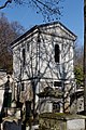
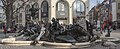
- Nomination Tomb of Panhard and Dufour --Coyau 16:18, 29 November 2014 (UTC)
- Promotion Good quality. --Poco a poco 17:09, 29 November 2014 (UTC)
-

- Nomination A Pot Marigold -- Alvesgaspar 16:00, 29 November 2014 (UTC)
- Promotion Good quality.--Famberhorst 16:37, 29 November 2014 (UTC)
-

- Nomination Karl-Petter Thorwaldsson at the Swedish Social Democratic Youth League's genaral election camp 201. Taken by User:Josve05a. --Josve05a 15:53, 29 November 2014 (UTC)
- Decline Sorry but CA,sky burned and too much noise --Livioandronico2013 17:48, 29 November 2014 (UTC)
-

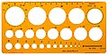
- Nomination Standardgraph lettering guides --Lucasbosch 14:21, 29 November 2014 (UTC)
- Promotion I'm not sure, if a scan of an object is eligible for QIC. --Cccefalon 15:25, 29 November 2014 (UTC)
 Support Good quality -> QI. --Coyau 16:21, 29 November 2014 (UTC)
These are real studio photographs stitched together, no scans. --Lucasbosch 16:50, 29 November 2014 (UTC) Support No need to send to CR, Lucas, I trust your word. The EXIF was just not clear about this issue. --Cccefalon 19:51, 29 November 2014 (UTC)
-

- Nomination Standardgraph nut stencil --Lucasbosch 14:21, 29 November 2014 (UTC)
- Promotion Good quality. --Coyau 16:21, 29 November 2014 (UTC)
-

- Nomination Standardgraph radius stencil --Lucasbosch 14:21, 29 November 2014 (UTC)
- Promotion Good quality. --Coyau 16:21, 29 November 2014 (UTC)
-

- Nomination Standardgraph isometric and dimetric stencil --Lucasbosch 14:21, 29 November 2014 (UTC)
- Promotion Good quality. --Coyau 16:21, 29 November 2014 (UTC)
-
- Nomination Standardgraph circle stencil --Lucasbosch 14:21, 29 November 2014 (UTC)
- Promotion Good quality. --Coyau 16:21, 29 November 2014 (UTC)
-

- Nomination Italy, Paestum, Temple of Athena --Berthold Werner 13:46, 29 November 2014 (UTC)
- Promotion Good quality. --Lucasbosch 14:38, 29 November 2014 (UTC)
-

- Nomination Paris-Plage, summer event along the river Seine --P e z i 13:30, 29 November 2014 (UTC)
- Promotion Good quality. --Lucasbosch 14:38, 29 November 2014 (UTC)
-
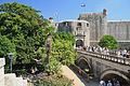
- Nomination St. John Fortress. Dubrovnik, Dubrovnik-Neretva County, Croatia. --Halavar 11:33, 29 November 2014 (UTC)
- Promotion Good quality. --Lucasbosch 14:38, 29 November 2014 (UTC)
-

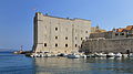
- Nomination Old Port, city walls and the Dominican church. Dubrovnik, Dubrovnik-Neretva County, Croatia. --Halavar 11:33, 29 November 2014 (UTC)
- Promotion Good quality. --Lucasbosch 14:38, 29 November 2014 (UTC)
-

- Nomination The view from the old port on the coast. Dubrovnik, Dubrovnik-Neretva County, Croatia. --Halavar 11:33, 29 November 2014 (UTC)
- Promotion Good quality. --Lucasbosch 14:38, 29 November 2014 (UTC)
-
- Nomination Gate of Pila. Dubrovnik, Dubrovnik-Neretva County, Croatia. --Halavar 11:33, 29 November 2014 (UTC)
- Promotion Good quality. --Jacek Halicki 16:01, 29 November 2014 (UTC)
-

- Nomination Padlocks in Ponte Milvio --Livioandronico2013 10:58, 29 November 2014 (UTC)
- Promotion Good quality. --Poco a poco 11:19, 29 November 2014 (UTC)
-

- Nomination Stone of Napoleon in Kłodzko --Jacek Halicki 10:50, 29 November 2014 (UTC)
- Promotion Good quality. --Livioandronico2013 11:04, 29 November 2014 (UTC)
-

- Nomination 3 Władysława Jagiełły Square in Kłodzko 1 --Jacek Halicki 10:50, 29 November 2014 (UTC)
- Promotion Good quality. --Poco a poco 11:19, 29 November 2014 (UTC)
-

- Nomination 3 Władysława Jagiełły Square in Kłodzko 2 --Jacek Halicki 10:50, 29 November 2014 (UTC)
- Promotion Good quality. --Poco a poco 11:19, 29 November 2014 (UTC)
-

- Nomination 22 and 23 Market Square in Paczków --Jacek Halicki 10:50, 29 November 2014 (UTC)
- Promotion Good quality. --JLPC 20:49, 29 November 2014 (UTC)
-

- Nomination 9 Kościuszki Street in Kłodzko --Jacek Halicki 10:50, 29 November 2014 (UTC)
- Promotion Good quality. --Livioandronico2013 11:04, 29 November 2014 (UTC)
-

- Nomination Buff-tailed bumblebee (Bombus terrestris) digging for polen, Munich, Germany --Poco a poco 10:49, 29 November 2014 (UTC)
- Promotion Good quality. --Jacek Halicki 10:59, 29 November 2014 (UTC)
-

- Nomination Angkor Wat, Cambodia --Poco a poco 10:49, 29 November 2014 (UTC)
- Promotion Good quality. --Lucasbosch 14:41, 29 November 2014 (UTC)
-

- Nomination State Bank of Vietnam, Ho Chi Minh City, Vietnam --Poco a poco 10:49, 29 November 2014 (UTC)
- Promotion Good quality. --Lucasbosch 14:41, 29 November 2014 (UTC)
-
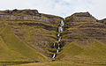
- Nomination Búlandshöfði, Vesturland, Iceland --Poco a poco 10:49, 29 November 2014 (UTC)
- Promotion Good quality. --Livioandronico2013 11:04, 29 November 2014 (UTC)
-

- Nomination Cala Tío Ximo, Benidorm, Spain --Poco a poco 10:49, 29 November 2014 (UTC)
- Promotion Good quality. --Jacek Halicki 10:59, 29 November 2014 (UTC)
-

- Nomination Ponte Flaminio (Rome) --Livioandronico2013 10:39, 29 November 2014 (UTC)
- Promotion Good quality. --Jacek Halicki 10:58, 29 November 2014 (UTC)
-
- Nomination Plate at Ponte Milvio --Livioandronico2013 10:30, 29 November 2014 (UTC)
- Promotion Good quality. --Jacek Halicki 10:58, 29 November 2014 (UTC)
-
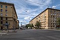
- Nomination Zenitchikov Street in Saint Petersburg --Florstein 09:38, 29 November 2014 (UTC)
- Promotion good quality --Lucasbosch 14:37, 29 November 2014 (UTC)
-

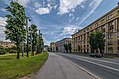
- Nomination Vozrozhdeniya Street in Saint Petersburg --Florstein 09:38, 29 November 2014 (UTC)
- Promotion Good quality. --Lucasbosch 14:37, 29 November 2014 (UTC)
-
- Nomination Zenitchikov Street in Saint Petersburg --Florstein 09:38, 29 November 2014 (UTC)
- Promotion Good quality. --Lucasbosch 14:37, 29 November 2014 (UTC)
-

- Nomination Zaytseva Street in Saint Petersburg --Florstein 09:38, 29 November 2014 (UTC)
- Promotion Good quality. --Jacek Halicki 10:58, 29 November 2014 (UTC)
-

- Nomination Zaytseva Street in Saint Petersburg --Florstein 09:38, 29 November 2014 (UTC)
- Promotion Good quality. --Jacek Halicki 10:58, 29 November 2014 (UTC)
-

-

-

- Nomination Plate of Pope Callistus III ( Borja ) in Ponte Milvio --Livioandronico2013 09:45, 29 November 2014 (UTC)
- Promotion Good quality. --Lucasbosch 14:37, 29 November 2014 (UTC)
-

- Nomination Ron Reyes (voc) of Black Flag at Ruhrpott Rodeo 2013 in Hünxe, Germany. --Smial 09:38, 29 November 2014 (UTC)
- Withdrawn For available light good quality. --Steindy 10:55, 29 November 2014 (UTC)
-

- Nomination Statue of Jesus in Ponte Milvio --Livioandronico2013 09:27, 29 November 2014 (UTC)
- Promotion Good quality. --Poco a poco 11:31, 29 November 2014 (UTC)
-

- Nomination Paitan, Sabah: SMK Simpangan, a newly built secondary school --Cccefalon 08:13, 29 November 2014 (UTC)
- Promotion Good quality. --Poco a poco 11:19, 29 November 2014 (UTC)
-
-

-

- Nomination Kudat, Sabah, Malaysia: Stadium of Kudat Sport Centre --Cccefalon 08:13, 29 November 2014 (UTC)
It is tilted Poco a poco 11:19, 29 November 2014 (UTC) Done --Cccefalon 14:00, 29 November 2014 (UTC)
 - Promotion Support Good quality --Halavar 11:37, 29 November 2014 (UTC)
Not yet, if you took the picture from the center I would expect that horizontals are horizontal Poco a poco 17:04, 29 November 2014 (UTC) Done na, heute bist Du aber pingelig ... --Cccefalon 20:18, 29 November 2014 (UTC)
- Nomination Kudat, Sabah, Malaysia: Stadium of Kudat Sport Centre --Cccefalon 08:13, 29 November 2014 (UTC)
-

-

- Nomination Lower Manhattan skyline. --King of Hearts 07:12, 29 November 2014 (UTC)
- Promotion Good quality. --Yann 09:19, 29 November 2014 (UTC)
-

-
-

- Nomination Clitocybe odora (Clitocybe odora). Location, Hortus (Haren, Groningen)
Famberhorst 05:47, 29 November 2014 (UTC)
Some areas are overexposed Poco a poco 11:31, 29 November 2014 (UTC) Done Small correction.--Famberhorst 16:33, 29 November 2014 (UTC) - Promotion Good quality. --Poco a poco 17:01, 29 November 2014 (UTC)
- Nomination Clitocybe odora (Clitocybe odora). Location, Hortus (Haren, Groningen)
-

- Nomination Hot Air Balloon Festival in Joure province of Friesland in the Netherlands.
--Famberhorst 05:47, 29 November 2014 (UTC) - Promotion Good quality. --Poco a poco 11:31, 29 November 2014 (UTC)
- Nomination Hot Air Balloon Festival in Joure province of Friesland in the Netherlands.
-

- Nomination Ruriko-ji temple --663highland 04:27, 29 November 2014 (UTC)
- Decline Half top left sky is gone (overexposed), lens flare (see note) and lack of detail, especially in the temple, not a QI to me, sorry --Poco a poco 17:07, 29 November 2014 (UTC)
-
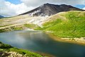
- Nomination Mt. Asahi-dake and Sugatami Pond --663highland 04:27, 29 November 2014 (UTC)
- Promotion Good quality. --Lucasbosch 14:37, 29 November 2014 (UTC)
-

- Nomination Jouei-ji Sesshu Garden --663highland 04:27, 29 November 2014 (UTC)
- Promotion Good quality. --Steindy 10:55, 29 November 2014 (UTC)
-

- Nomination At Ryozenji temple --663highland 04:27, 29 November 2014 (UTC)
- Promotion Good quality. --Lucasbosch 14:37, 29 November 2014 (UTC)
-

- Nomination Plague on the Saint George church in Ziębice --Jacek Halicki 21:33, 28 November 2014 (UTC)
- Promotion Support Good quality. --XRay 12:21, 29 November 2014 (UTC)
-

- Nomination Ponte Milvio --Livioandronico2013 20:42, 28 November 2014 (UTC)
- Promotion Weak Support Good quality. Sharpness could be better. --XRay 12:21, 29 November 2014 (UTC)
-

- Nomination Cirrus clouds by User:LivingShadow --Brackenheim 20:09, 28 November 2014 (UTC)
- Promotion Good quality. --King of Hearts 08:47, 29 November 2014 (UTC)
-

- Nomination Art Institute of Chicago, Chicago, Illinois, USA --Poco a poco 19:03, 28 November 2014 (UTC)
- Promotion Good quality. --Lucasbosch 14:44, 29 November 2014 (UTC)
-

- Nomination River next to the Eldborg crater, Vesturland, Iceland --Poco a poco 19:03, 28 November 2014 (UTC)
- Promotion Could be sharper but OK. Nice composition. --King of Hearts 08:47, 29 November 2014 (UTC)
-
- Nomination Marriage Roundabout (Jürgen Weber, 1984), Nuremberg, Germany --Poco a poco 19:03, 28 November 2014 (UTC)
- Promotion Good quality. --JLPC 20:45, 29 November 2014 (UTC)
-

- Nomination Shamokin Creek in Shamokin, PA. Jakec 18:51, 28 November 2014 (UTC)
Perspective issues (both sides leaning out), CA, oversharpened Poco a poco 19:51, 28 November 2014 (UTC)
The perspective issue should be fixed now. Most of the CA is gone. Jakec 22:09, 28 November 2014 (UTC) - Promotion Cropping was not the suggestion, but overall can pass as QI --Poco a poco 11:35, 29 November 2014 (UTC)
- Nomination Shamokin Creek in Shamokin, PA. Jakec 18:51, 28 November 2014 (UTC)
-
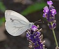
- Nomination Grünader-Weißling - Pieris napi --Hockei 16:29, 28 November 2014 (UTC)
- Promotion QI for me. --Frank Schulenburg 23:12, 29 November 2014 (UTC)
-

- Nomination Prospekt Metalurhiv metrotram station, Kryvyi rih, Ukraine (by --Andrew J.Kurbiko 16:04, 28 November 2014 (UTC)
- Promotion Good quality. --Lucasbosch 14:44, 29 November 2014 (UTC)
-

- Nomination Ioannina Castle --Pudelek 14:07, 28 November 2014 (UTC)
- Promotion Good quality. --Poco a poco 11:39, 29 November 2014 (UTC)
-

- Nomination The FORD RANGER T6 that I used for the research and photo tours in Sabah, Malaysia --Cccefalon 09:21, 28 November 2014 (UTC)
- Promotion Very very good --Livioandronico2013 22:10, 28 November 2014 (UTC)
 Comment. Bad background, rather tight crop und a bit too bright. For me only good but not "very very …". ;-) -- Spurzem 17:13, 29 November 2014 (UTC)
-

- Nomination Eurostars, Brussels-Midi --Bahnfrend 05:14, 28 November 2014 (UTC)
- Withdrawn Comment Please check for perspective issues and CAs in the background.--XRay 08:51, 28 November 2014 (UTC)<br. Comment will do --Bahnfrend 10:46, 29 November 2014 (UTC)
-

- Nomination Panorama from the Semnoz, Haute-Savoie, France. By ArildV and me. --Yann 14:55, 27 November 2014 (UTC)
- Promotion Good quality. --Lucasbosch 14:45, 29 November 2014 (UTC)
-

-

- Nomination Blue Eye, Albania --Pudelek 23:01, 25 November 2014 (UTC)
- Decline Nice view but at 3.5 MP, it really needs to be 100% sharp. --King of Hearts 08:42, 29 November 2014 (UTC)
-

-

- Nomination Panoramic view of caldera Guilherme Moniz, Terceira, Azores. --Ruthven 14:46, 25 November 2014 (UTC)
- Decline Too many areas blurred by noise reduction. --King of Hearts 08:42, 29 November 2014 (UTC)
-

- Nomination 19 Market Square in Paczków --Jacek Halicki 11:13, 24 November 2014 (UTC)
- Promotion Weak Support Good quality. The car is disturbing. --XRay 12:14, 29 November 2014 (UTC)
-

- Nomination: Juist, Lower Saxony, Germany --XRay 04:37, 24 November 2014 (UTC)
- Review needed
-

- Nomination Duel between Marko Arnautović and Sergey Parshivlyuk in the match Ausria vs. Russia. --Steindy 01:02, 24 November 2014 (UTC)
- Promotion Support Good quality. --XRay 12:14, 29 November 2014 (UTC)
-

- Nomination: Holy Mountains Lavra (complex of architecture monuments of national significance, Donetsk region, Sviatohirsk). By User:Ryzhkov Sergey --Ahonc 00:03, 24 November 2014 (UTC)
- Review Comment Tilted to the right. Easy to fix. --Halavar 00:19, 24 November 2014 (UTC)
-

- Nomination Куяльник - aрка, сходи та підпірна стіна. By User:Q-lieb-in --Ahonc 00:03, 24 November 2014 (UTC)
- Promotion Tilted ccw. Fixable. --Cccefalon 06:31, 24 November 2014 (UTC) Support A wonderful photo. It reminds me of those times where I stood for hours in the darkroom. The sensor spot should be removed. --Steindy 22:35, 29 November 2014 (UTC)
-

- Nomination Location, hotel Weiss Horn (2337m). View Grimentz (1570 m) in the Valais Val d'Anniviers.
Famberhorst 16:33, 23 November 2014 (UTC) - Decline
 Oppose Insufficient quality. Sorry. IMO too much dust. --XRay 10:03, 28 November 2014 (UTC)
E daje XRay.What's the problem? do you use a strange keyboard with the S and the O reversed? I joke --Livioandronico2013 13:08, 28 November 2014 (UTC)
@Livioandronico2013: I like the motif, but it's not QI. So I say "no" and the keyboard says "yes". (I like promoting images, not declining.)--XRay 12:05, 29 November 2014 (UTC)
- Nomination Location, hotel Weiss Horn (2337m). View Grimentz (1570 m) in the Valais Val d'Anniviers.
-
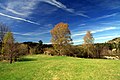
- Nomination National nature reserve Vyšenské kopce in spring, Czech Republic --Chmee2 11:57, 22 November 2014 (UTC)
- Decline Comment Lots of CAs, image needs sharpening. Also, the sky should be denoised. Probably not fixable... --Halavar 17:03, 22 November 2014 (UTC) Oppose too unsharp --Christian Ferrer 15:09, 29 November 2014 (UTC)
-

- Nomination Otterington railway station. Mattbuck 09:52, 22 November 2014 (UTC)
- Promotion 1 dustspot (see note) --Christian Ferrer 10:45, 22 November 2014 (UTC) Done Mattbuck 17:02, 26 November 2014 (UTC) Support --Christian Ferrer 09:13, 29 November 2014 (UTC)
-
- Nomination Smudge the cat. Mattbuck 09:52, 22 November 2014 (UTC) Comment. Nice cat and good composition but unfortunate lighting. -- Spurzem 12:37, 22 November 2014 (UTC)
- Promotion Support per above exept for the light --Christian Ferrer 09:20, 29 November 2014 (UTC)
- Nomination Smudge the cat. Mattbuck 09:52, 22 November 2014 (UTC)
-

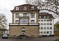
- Nomination Germany, Trier, Thebäerstraße 11 --Berthold Werner 11:15, 18 November 2014 (UTC)
Shadows a bit dark IMO and there is a strange halo (see note) --Christian Ferrer 06:02, 24 November 2014 (UTC) Done Please check again. --Berthold Werner 18:15, 28 November 2014 (UTC) - Promotion Support better --Christian Ferrer 15:01, 29 November 2014 (UTC)
- Nomination Germany, Trier, Thebäerstraße 11 --Berthold Werner 11:15, 18 November 2014 (UTC)


.jpg)


.jpg)
.jpg)
.jpg)


.jpg)

,_M%C3%BAnich,_Alemania,_2012-06-07,_DD_01.jpg)


.jpg)


_in_Ponte_Milvio.jpg)
_(Ruhrpott_Rodeo_2013)_IMGP6054_smial_wp.jpg)


,_Piazza_del_Quirinale_--_2013_--_3650.jpg)

._Locatie,_Hortus_(Haren,_Groningen)_03.JPG)


.JPG)


,_Kolosseum_--_2013_--_3424.jpg)
_02.JPG)


.jpg)


._Zicht_op_Grimentz_(1570_m)_in_het_Walliser_Val_d%27Anniviers_02.JPG)
.JPG)


Consensual review[edit]
File:Tuyau_flexible_usé_et_neuf_01.jpg[edit]

- Nomination new and worn-out plumbing hose --Coyau 19:54, 26 November 2014 (UTC)
- Decline
 Question What is the difference between the QI, that you have nominated yesterday? Only the the size of the crop? --Steindy 20:20, 26 November 2014 (UTC)
- The proportions. Does it make this photo less worthy on QI? --Coyau 20:37, 26 November 2014 (UTC)
- Oppose No difference to yesterdays nomination, just a new crop. --Hubertl 21:03, 26 November 2014 (UTC)
- Please find a quality reason for assessing quality images. --Coyau 21:06, 26 November 2014 (UTC)
- Sorry, this is ridiculous. So I could take a QI, crop it into 10 new versions by trimming one pixel off each time, and make 10 fresh nominations of it? --Kreuzschnabel 09:55, 29 November 2014 (UTC)
- It has been done already, and promoted as QI. --Coyau 22:07, 29 November 2014 (UTC)
- Oppose The reason is value. The most prominent use of the QI badge is when filtering using FastCCI. We are not so restrictive as VI that we don't allow multiple QI for the same scope, but we generally don't allow multiple QI for the same exact subject*. We don't want a FastCCI to fill up the screen with multiple versions of one thing. That's not useful to anyone. One of the images can be a QI, sure, but then use the "other_versions" to reference the other versions. In this way a user can find the base image using FastCCI and then find other versions quite quickly. Ram-Man 03:32, 28 November 2014 (UTC)
- * To clarify: If we QI multiple versions, it should be because there is something usefully different about them. If it were a clock tower on a building, perhaps the east, west, north, and south sides. If it were a flower, perhaps a top vs. side view, high vs. low Depth of Field, etc. In the case of these images, there is very little to distinguish them from each other. It is up to the nominator to show why they are distinct enough to be valuable enough to clog up the filtering and why the existing "other versions" system is insufficient for this purpose. -- Ram-Man 03:40, 28 November 2014 (UTC)
- Comment the FastCCI issue is a software issue, not a quality issue for the photo.
Have you read Commons:Quality images candidates#Guidelines : "Our main goal is to encourage quality images being contributed to Wikicommons, valuable for Wikimedia and other projects." So please explain again why a photo should be discarded regardless to its inherent quality. --Coyau 15:19, 28 November 2014 (UTC)- I did: dilution hurts value. Please add them to the "other_versions" in the {{Information}} template. --Ram-Man 01:49, 29 November 2014 (UTC)
- Oppose Some parts of the upper hose are blurred; compare it to the lower part. --Steindy 21:05, 28 November 2014 (UTC)
File:Tuyau_flexible_usé_et_neuf_02.jpg[edit]

- Nomination new and worn-out plumbing hose --Coyau 19:54, 26 November 2014 (UTC)
- Question What is the difference between the QI, that you have nominated yesterday? Only the the size of the crop? --Steindy 20:20, 26 November 2014 (UTC)
- The proportions. Does it make this photo less worthy on QI? --Coyau 20:37, 26 November 2014 (UTC)
- Decline
- Oppose No difference to yesterdays nomination, just a new crop. --Hubertl 21:03, 26 November 2014 (UTC)
- Please find a quality reason for assessing quality images. --Coyau 21:06, 26 November 2014 (UTC)
- Oppose Ram-Man 03:52, 28 November 2014 (UTC)
- Oppose Some parts of the upper hose are blurred; compare it to the lower part. --Steindy 21:06, 28 November 2014 (UTC)
File:Tuyau_flexible_usé_et_neuf_04.jpg[edit]

- Nomination new and worn-out plumbing hose --Coyau 19:54, 26 November 2014 (UTC)
What is the difference between the QI, that you have nominated yesterday? Only the the size of the crop? --Steindy 20:20, 26 November 2014 (UTC)
The proportions. Does it make this photo less worthy on QI? --Coyau 20:37, 26 November 2014 (UTC) - Decline No difference to yesterdays nomination, just a new crop. --Hubertl 21:03, 26 November 2014 (UTC)
Please find a quality reason for assessing quality images. --Coyau 21:06, 26 November 2014 (UTC) - Oppose Some parts of the upper hose are blurred; compare it to the lower part. --Steindy 21:07, 28 November 2014 (UTC)
File:Clés_à_pipe_05.jpg[edit]

- Nomination Clés à pipe --Coyau 17:27, 25 November 2014 (UTC)
- Withdrawn Support Coyauesque ! Excellent !--Jebulon 21:04, 25 November 2014 (UTC)
I disagree Oppose, there are some relevant problems with the magic wand tool (I presume) See annotations. Also unnecessary unsharpness for a studio work (background tool) f/16 would have been the better choice. --Hubertl 23:46, 26 November 2014 (UTC) Info That is not magic wand, that is how wrenches are done, with text carved on the side. --Coyau 23:52, 26 November 2014 (UTC)
- Comment ok, this argument ist comprehensible. The reason, why it is not QI for me is, that you have enough experience to work on a table, your 100mm-lens ist almost perfect, although, I miss the DOF, this should be standard at studio work. Especially, when all parts in a small distance, reachable for your lens. You can do it better, I think! --Hubertl 16:30, 27 November 2014 (UTC)
- Support as per Jebulon. Yann 12:15, 27 November 2014 (UTC)
- Support per Jebulon. --P e z i 14:16, 27 November 2014 (UTC)
- Oppose Why f/8 for studio work? It doesn't make sense. If you wanted to avoid diffraction to keep the primary subject super sharp, I'd understand, but there isn't anything in this image that is super sharp, but a lot of out of focus areas. Also, you control the composition, so why place something in the background that is going to be out of focus? Ram-Man 04:02, 28 November 2014 (UTC)
- There is a visible difference between f/8 and f/16 with some lenses, but not with the 100mm prime macro lense. I tested it today with my EF 24-70mm 2.8 II L USM, I immediately went back to my beloved EF 100mm 2.8 L Makro IS USM. The best example is this featured picture of a lens.[1] even with a cheap lens it is possible, to work with surprisingly f/29 (what I usualy not recommend!)--Hubertl 06:22, 28 November 2014 (UTC)
- It's true that sometimes Depth of Field is more important than sharpness losses due to diffraction. That f/29 image is quite impressive. Ram-Man 02:02, 29 November 2014 (UTC)
- There is a visible difference between f/8 and f/16 with some lenses, but not with the 100mm prime macro lense. I tested it today with my EF 24-70mm 2.8 II L USM, I immediately went back to my beloved EF 100mm 2.8 L Makro IS USM. The best example is this featured picture of a lens.[1] even with a cheap lens it is possible, to work with surprisingly f/29 (what I usualy not recommend!)--Hubertl 06:22, 28 November 2014 (UTC)
- Oppose Too low DOF and surprisingly low detail overall. Perhaps slight motion blur due to mirror vibration? Also some disturbing clipping areas which are acceptable in action photography, but should be avoided in a studio shot. -- Smial 12:01, 30 November 2014 (UTC)
![[1]](https://commons.wikimedia.org/wiki/File:Canon_EF_70-200mm_F2.8_IS_II_USM_without_hood.jpg)
![]() I withdraw my nomination--Coyau 10:51, 1 December 2014 (UTC)
I withdraw my nomination--Coyau 10:51, 1 December 2014 (UTC)
File:Tuyau_flexible_usé_et_neuf_03.jpg[edit]

- Nomination new and worn-out plumbing hose --Coyau 17:24, 25 November 2014 (UTC)
- Withdrawn
- Support Good quality. --JLPC 18:26, 25 November 2014 (UTC)
- Oppose Please dicuss, there are some significant sharpness problems. One part is sharp, the other (at the same distance), is completely unsharp (for a studio work with this lens!) This is not QI for me. --Hubertl 23:49, 26 November 2014 (UTC)
- Support QI IMO. --P e z i 14:05, 27 November 2014 (UTC)
- Support Good enough, but one of these is enough. Alvesgaspar 18:34, 27 November 2014 (UTC)
- Oppose as per Hubertl. There are sharpness issues visible even at small magnifications. Not only that, but this is obviously an age comparison, but the sharpness of the two subjects needs to be equal for proper comparison. This is a composition issue as well. I would expect better for studio work. Ram-Man 03:51, 28 November 2014 (UTC)
- Oppose Per others, and WB is off IMHO (magenta cast) --Kreuzschnabel 10:09, 29 November 2014 (UTC)
![]() I withdraw my nomination--Coyau 10:50, 1 December 2014 (UTC)
I withdraw my nomination--Coyau 10:50, 1 December 2014 (UTC)
File:Hordeum_vulgare_in_Lancaster,_PA-001.jpg[edit]

- Nomination Hordeum vulgare field Ram-Man 04:32, 20 November 2014 (UTC)
- Decline
- Oppose Much too little DOF for me, sorry. --Hockei 23:43, 21 November 2014 (UTC)
- f/11 is within a third stop of the diffraction limit, so DoF is pretty much maxed if you want the image sharp. Would cropping out the foreground satisfy you? Ram-Man 23:53, 21 November 2014 (UTC)
- Comment I can see only a few ears that are not blurred. Maybe the position of the camera wasn't a good choice. It seems to me there are areas without ears. --Hockei 08:40, 23 November 2014 (UTC)
- f/11 is within a third stop of the diffraction limit, so DoF is pretty much maxed if you want the image sharp. Would cropping out the foreground satisfy you? Ram-Man 23:53, 21 November 2014 (UTC)
- Question I only can say what I think. Why don't you put it in CR in order to get more opinions? --Hockei 15:42, 24 November 2014 (UTC)
- Comment The background is fine, but the foreground should be in focus. Regards, Yann 10:09, 28 November 2014 (UTC)
.jpg)
Total: 0 support (excluding the nominator), 1 oppose →  Declined --Livioandronico2013 08:09, 1 December 2014 (UTC)
File:Архангело-Михайлівська_церква.Краснокутськ.JPG[edit]

- Nomination: Архангело-Михайлівська церква 1880р., смт Краснокутськ Харківська обл. By User:Denis Vitchenko --Ahonc 01:30, 23 November 2014 (UTC)
- Review Insufficient quality. Sorry. It's really too unsharp. --XRay 07:08, 23 November 2014 (UTC)
I have reverted to the original resolution (it was manually stretched from 2.7 to over 12 MP), thus it is not unsharp anymore --NickK 02:38, 25 November 2014 (UTC) Oppose. I won't say "too unsharp", but the crosses are not clear-cut. And the lighting is not lucky, so the colors of church tend to grey. (ru: Не сказал бы, что "слишком нерезко", но кресты, правда, не являются чёткими. И освещение не очень удачное — в результате церковь «сероватая». Может, есть снимки ещё, сделанные днём? --Brateevsky 11:58, 25 November 2014 (UTC)) - Support It looks much better than this one that got support votes, so why would this one fail? It actually looks good, and this on a 10 year old point and shoot camera! Ram-Man 04:49, 26 November 2014 (UTC)
Total: 1 support (excluding the nominator), 1 oppose →  Inconclusive result after 8 consensual review days --Livioandronico2013 08:21, 1 December 2014 (UTC)
File:American_Football_EM_2014_-_AUT-DEU_-_141.JPG[edit]

- Nomination: The gold medal game of the European American Football Championship 2014 was decided on the 7th of July at Ernst-Happel-Stadion in Vienna. Germany won over Austria 30-27 by AleXXw
--Hubertl 02:35, 21 November 2014 (UTC) - Review
- Oppose Insufficient quality. Focus is on his helmet and not his face. --Crisco 1492 11:35, 22 November 2014 (UTC)
- I disagree in this case, it was extremely difficult to get the focus. For me its QI even with this small problem --Hubertl 17:07, 24 November 2014 (UTC)
- Support --Ralf Roletschek 12:43, 25 November 2014 (UTC)
- Oppose I agree with Crisco 1492.--Jebulon 21:59, 25 November 2014 (UTC)
- Weak Support In view of the cage to protect the face, which irritates the autofocus, a good photo. --Steindy 22:53, 25 November 2014 (UTC)
- Support Agree with nominator. It looks good enough according to my normal reviewing standards anyway. Ram-Man 04:48, 26 November 2014 (UTC)
- Comment this is, what the Nikon AF-S VR 300mm 2.8G IF-ED II is able to produce from a situation like this. In a distance of ~ 20 to 30 m. I think, I would ´nt have get it even better with our (our means WMAT) Canon EF 400mm 2.8 L IS II USM lens. --Hubertl 10:37, 27 November 2014 (UTC)
- Oppose Still, a better exposure solution, with a larger F number, could have solved the problem! Also, please let the poor man breathe... Alvesgaspar 18:38, 27 November 2014 (UTC)
- What you are talking about, Alvesgaspar, I havent seen any of your pictures in sport situations of this kind. There you need extremly short exposures, while you have mostly bad light conditions. For that reason, we have two of the best available prime lenses you can get, bought from WMAT. When you look at this picture, there is no sharp area at all, even, while you had best lightning conditions. Above all, we are deciding here about QI and not about FP. --Hubertl 06:42, 28 November 2014 (UTC)
- I am talking about this specific picture. My experience as a sports photographer or the lack of quality of my photos is not relevant here. Also irrelevant is the price of the lenses or the usual exposure solutions for this kind of photos. In this specific case, with an apparently motionless subject, a better exposure would have been possible. As for the extreme crop please remember that framing and composition are also elements of evaluation in QIC. Alvesgaspar 09:30, 28 November 2014 (UTC)
- According to this reasoning, beyond any personal experience, someone can play only the spiritual retreat. Do you think it would have been possible, to move the focus manually 4 cm to the rear with a constant exposure time? In a possible window of time no longer than maybe one second? For me that seems like an expression of utter naivety and ignorance of the feasible.--Hubertl 15:54, 28 November 2014 (UTC)
- Once again you are divagating and distorting what I wrote. I was talking about exposure (that is, aperture and shutter speed), not focusing. If you had your camera set to a high shutter speed and aperture (that is, a low dof), that is your problem, not QIC's. It is also a well established principle here that the difficulty of the shot does not usually mitigate the lack of quality. Finally I don't think it is acceptable to deviate from the object of the discussion (the image) and make bad taste ad hominen comments to the reviewers and their work. Alvesgaspar 21:09, 28 November 2014 (UTC)
- According to this reasoning, beyond any personal experience, someone can play only the spiritual retreat. Do you think it would have been possible, to move the focus manually 4 cm to the rear with a constant exposure time? In a possible window of time no longer than maybe one second? For me that seems like an expression of utter naivety and ignorance of the feasible.--Hubertl 15:54, 28 November 2014 (UTC)
- I am talking about this specific picture. My experience as a sports photographer or the lack of quality of my photos is not relevant here. Also irrelevant is the price of the lenses or the usual exposure solutions for this kind of photos. In this specific case, with an apparently motionless subject, a better exposure would have been possible. As for the extreme crop please remember that framing and composition are also elements of evaluation in QIC. Alvesgaspar 09:30, 28 November 2014 (UTC)
- What you are talking about, Alvesgaspar, I havent seen any of your pictures in sport situations of this kind. There you need extremly short exposures, while you have mostly bad light conditions. For that reason, we have two of the best available prime lenses you can get, bought from WMAT. When you look at this picture, there is no sharp area at all, even, while you had best lightning conditions. Above all, we are deciding here about QI and not about FP. --Hubertl 06:42, 28 November 2014 (UTC)
- Weak Support. Somewhat low DOF, but all in all acceptable as a document. Unfortunately it is usual at QIC to use entirely different criteria in the evaluation of images of other photographers as with own photos. Good enough. -- Smial 20:40, 28 November 2014 (UTC)
![]() Oppose Per Crisco 1492 --Livioandronico2013 08:20, 1 December 2014 (UTC)
Oppose Per Crisco 1492 --Livioandronico2013 08:20, 1 December 2014 (UTC)
Total: 4 support (excluding the nominator), 4 oppose → Inconclusive result after 8 consensual review days --Livioandronico2013 08:20, 1 December 2014 (UTC)
File:São_Paulo_Center.jpg[edit]

- Nomination São Paulo Center
The Photographer 09:07, 23 November 2014 (UTC) - Decline
- Oppose I'm sorry say ever the same things....Noise,too much noise --Livioandronico2013 10:15, 23 November 2014 (UTC)
- Sure, I preffer discuss before apply downsize --The Photographer 13:39, 23 November 2014 (UTC)
- Even with this history of the measurement. My photos are much more of your degree but do not have all this noise! Nothing to do with the measure. --Livioandronico2013 15:11, 23 November 2014 (UTC)
- Even with this history of the measurement. My photos are much more of your degree but do not have all this noise! Nothing to do with the measure. --Livioandronico2013 15:11, 23 November 2014 (UTC)
- Oppose per Livioandronico2013. Why ISO 800? Downsizing will not really fix it, a noisy images gets soft then. --Kreuzschnabel 08:05, 24 November 2014 (UTC)
- Comment Bad weather conditions, without tripod > high ISO. --The Photographer 10:45, 24 November 2014 (UTC)
- I in this condition don't shot....anyway never use more of 400 ISO...the noise is always there with more --Livioandronico2013 11:52, 24 November 2014 (UTC)
- Comment São Paulo is a city of sunny weather almost all year. I hope your premise is a joke, otherwise, we would no images of places with cloudy climates. under certain conditions the noise is acceptable, you can not apply the same rule noise for the day to night.--The Photographer 12:49, 24 November 2014 (UTC)
- Think of it as a joke, meanwhile the noise there. I never use above 400 and in my not there. --Livioandronico2013 13:04, 24 November 2014 (UTC)
- Comment Oh please The Photographer, be reasonable. In Category:Rain there are hundreds of pictures being taken in rainy weather but not showing this noise level. I don’t know your camera, so I don’t know what went wrong here, but something did. It’s nothing personal. This image just does not meet QI standard due to heavy noise, whatever caused this. And sometimes you just need a tripod to take a QI. --Kreuzschnabel 14:37, 27 November 2014 (UTC)
- Weak Support. Somewhat grainy, but no disturbing chroma noise, only luminance noise, which is not a big problem when viewed in normal size. --Smial 21:08, 28 November 2014 (UTC)
- Support uploaded noise reduced version. It´s now ok for me.--Hubertl 03:58, 30 November 2014 (UTC)
- Oppose Sorry but no. This is a too imposing noisy object in the foreground. The rest of the image lacks detail because of denoising. Alvesgaspar 11:27, 30 November 2014 (UTC)
- It was a custom area denoise and nod generalized filter. I dont underestand, --The Photographer 12:28, 30 November 2014 (UTC)
- Please look more carefully at both images, Wilfredo. The excessive noise in the first version was removed (also in the buildings and people), together with some detail. No miracles, unfortunately! -- Alvesgaspar 14:01, 30 November 2014 (UTC)
- Forgive me, I had not seen the last amended version from another user. It would be great, courtesy, ask the author before correcting. --The Photographer 11:16, 1 December 2014 (UTC)
- It was a custom area denoise and nod generalized filter. I dont underestand, --The Photographer 12:28, 30 November 2014 (UTC)
Total: 2 support (excluding the nominator), 3 oppose → Declined --Livioandronico2013 08:09, 1 December 2014 (UTC)
File:Ligularia wilsoniana. Locatie De Kruidhof.JPG[edit]

- Nomination Ligularia wilsoniana. Location The Kruidhof.
Famberhorst 05:50, 23 November 2014 (UTC) - Promotion Oppose Unfortunately too many parts are burned out. --Hockei 09:19, 23 November 2014 (UTC)
Support i desagree,parts are burned out are very few. And I don't be sure that are "burned out" --Livioandronico2013 10:21, 23 November 2014 (UTC) Support Not optimal e.g. the background, but ok --Uoaei1 17:36, 25 November 2014 (UTC) - Support It meets my standards and this is the type of photography I do most. Ram-Man 04:46, 26 November 2014 (UTC)
- Support --Hubertl 18:25, 26 November 2014 (UTC)
- Support Very good. --Steindy 21:56, 26 November 2014 (UTC)
- Support Acceptable --Kreuzschnabel 10:13, 29 November 2014 (UTC)
- Support What should be burned out! -- Spurzem 23:16, 30 November 2014 (UTC)
Total: 7 support (excluding the nominator), 1 oppose →  Promoted --Livioandronico2013 08:09, 1 December 2014 (UTC)
File:Kuyalnik-arc.jpg[edit]

- Nomination The system of retaining walls, stairs, arch, the descent from the cliff (late XIX century). Monument of architecture and urban planning (engineering art) of local significance. Odessa. By User:Q-lieb-in --Ahonc 01:30, 23 November 2014 (UTC)
- Decline SupportGood quality.--Famberhorst 05:56, 23 November 2014 (UTC) Oppose Missing colors and perspectivic distortion. --Berthold Werner 09:16, 23 November 2014 (UTC)
- Support black/white is ok to me and the perspective also. --Ralf Roletschek 12:23, 24 November 2014 (UTC)
- Oppose Absolutely per Berthold Werner (For distortion) --Livioandronico2013 13:09, 24 November 2014 (UTC)
- Oppose Per others, and overprocessed.--Jebulon 23:27, 24 November 2014 (UTC)
- Support „Missing colors“ in an black&white-photo. And when the distortion is much different waved through in the candidacies. For me, this photo is quite successful. The user has other wonderful images with artistic design. --Steindy 23:57, 24 November 2014 (UTC)
- Comment I won't deny that it's a work of art but we are looking for pictures for an encyclopaedia. Therefor colours are important (IMHO) --Berthold Werner 08:31, 25 November 2014 (UTC)
- Commons is not "pictures for an encyclopaedia", commons is a resource for the world with free pictures. --Ralf Roletschek 12:44, 25 November 2014 (UTC)
- ok, but: Commons:Project_scope#Must_be_realistically_useful_for_an_educational_purpose Waiting for more votes, we will see --Berthold Werner 17:01, 25 November 2014 (UTC)
- Allein die Tatsache, dass wir genau über dieses Bild diskutieren, beweist eben diesen "educational purpose". Es scheint doch immer anders zu kommen als man denkt. Wir sind auch ein Teil dessen, was man als "Auszubildende" begreifen muss, wir haben nicht entsprechend eines zu interpretierenden Bildungskanons vorzugeben - wir müssen neutral sein, soferne das überhaupt geht. --Hubertl 03:37, 30 November 2014 (UTC)
- ok, but: Commons:Project_scope#Must_be_realistically_useful_for_an_educational_purpose Waiting for more votes, we will see --Berthold Werner 17:01, 25 November 2014 (UTC)
- Commons is not "pictures for an encyclopaedia", commons is a resource for the world with free pictures. --Ralf Roletschek 12:44, 25 November 2014 (UTC)
- Support There are 256 colors. Perspective? Its a kind of art piece in my opinion. --Hubertl 12:54, 25 November 2014 (UTC)
- Oppose This is not the right category for such artistic pictures. Might be rather suitable for FP, but not QI --Uoaei1 17:42, 25 November 2014 (UTC)
- Not the good website, I would say.--Jebulon 22:03, 25 November 2014 (UTC)
- Support Good quality and obviously useful for an educational purpose: a useful illustration of the arch which is a cultural heritage monument. I am not a big fan of black & white, but this one is nice —NickK 01:00, 26 November 2014 (UTC)
- Support Black and white is usually used to emphasize tones/textures. Additional color might make it accurate, but this still has plenty of use and looks nice as well. -- Ram-Man 02:13, 26 November 2014 (UTC)
- Support Absolutely pro (see all other pro's above) -- DerFussi 05:15, 27 November 2014 (UTC)
- Oppose Very poor image quality. Please open it in full size (some reviewers may not have done that) and see the extensive noise and white haloes. Alvesgaspar 18:48, 27 November 2014 (UTC)
- I looked at it at 100%. I can see the halos, although I really hardly notice them even then. Nothing about the noise characteristics really bothers me. Ram-Man 03:24, 28 November 2014 (UTC)
- Oppose distorted. and if QIC is allowing the excuse "artists impression of whatever", it is nearly imposible to judge about photographic criterions. --Cccefalon 06:50, 30 November 2014 (UTC)
- Oppose Overprocessed. Try FPC. -- Smial 11:03, 30 November 2014 (UTC)
- Oppose Per Alvesgaspar and Cccefalon. --Code 11:55, 30 November 2014 (UTC)
Total: 7 support (excluding the nominator), 8 oppose → Declined --Livioandronico2013 08:09, 1 December 2014 (UTC)