Commons:Quality images candidates/Archives August 22 2014
-

- Nomination Juvenile red-shouldered hawk (Buteo lineatus elegans) at the Presidio, San Francisco, California. --Frank Schulenburg 03:14, 20 August 2014 (UTC)
- Promotion Nice.--Famberhorst 04:52, 20 August 2014 (UTC)
-

-
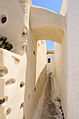
- Nomination Narrow street, Emporeio, Santorini, Greece. --NorbertNagel 20:19, 19 August 2014 (UTC)
- Promotion Good quality. --JLPC 20:41, 19 August 2014 (UTC)
-
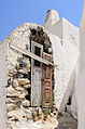
- Nomination Abandoned House in the old town, Emporeio, Santorini, Greece. --NorbertNagel 20:19, 19 August 2014 (UTC)
- Promotion Good quality. --Poco a poco 21:36, 19 August 2014 (UTC)
-

- Nomination Sculpture in O Grove, Galicia (Spain) -135 --Lmbuga 19:43, 19 August 2014 (UTC)
- Promotion Good quality. --Poco a poco 20:00, 19 August 2014 (UTC)
-

- Nomination Sculpture in O Grove, Galicia (Spain) -136 --Lmbuga 19:43, 19 August 2014 (UTC)
- Promotion Good quality. --NorbertNagel 20:23, 19 August 2014 (UTC)
-

- Nomination Sculpture of Saint Peter, church of Saint Peter of Berdoias, Galicia -01 --Lmbuga 19:43, 19 August 2014 (UTC)
- Promotion Good quality. --Poco a poco 20:00, 19 August 2014 (UTC)
-

- Nomination Church of Saint Peter, church of Saint Peter of Berdoias, Vimianzo, Galicia -04 --Lmbuga 19:43, 19 August 2014 (UTC)
- Promotion Good quality. --Poco a poco 20:04, 19 August 2014 (UTC)
-

- Nomination Probably old elevator.--Juandev 19:34, 19 August 2014 (UTC)
- Promotion Good quality. --Poco a poco 19:55, 19 August 2014 (UTC)
-

- Nomination Panorama from Gemeindealpe Mitterbach (Lower Austria) westwards --Uoaei1 19:37, 19 August 2014 (UTC)
- Promotion Good quality. --Poco a poco 19:55, 19 August 2014 (UTC)
-

-

- Nomination Rozafa Castle, Shkodra, Albania --Poco a poco 19:07, 19 August 2014 (UTC)
- Promotion
 Support QI for me--Lmbuga 19:31, 19 August 2014 (UTC)
-

- Nomination Mes Bridge, Mes, Albania --Poco a poco 19:07, 19 August 2014 (UTC)
- Promotion Support Good quality--Lmbuga 19:33, 19 August 2014 (UTC)
-

- Nomination Old city of Dubrovnik, Croatia --Poco a poco 19:07, 19 August 2014 (UTC)
- Promotion Good quality. --JLPC 20:41, 19 August 2014 (UTC)
-

- Nomination Ta Som, Angkor, Cambodia --Poco a poco 19:07, 19 August 2014 (UTC)
- Promotion Good quality. --NorbertNagel 20:27, 19 August 2014 (UTC)
-

- Nomination Dresden, Germany: Memorial plate, commemorating the civil upraise in 1849. The plate is indicating the location in Wilsdruffer Gasse, where the main barricade was erected upon the advices of Gottfried Semper --Cccefalon 18:41, 19 August 2014 (UTC)
- Promotion Support Good quality--Lmbuga 19:35, 19 August 2014 (UTC)
-

- Nomination Reiterstandbild König Johann in front of the Semperoper, Dresden --Cccefalon 18:41, 19 August 2014 (UTC)
- Promotion Good quality. --Poco a poco 19:41, 19 August 2014 (UTC)
-

- Nomination Dresden, Germany: Gate to Kunstakademie Dresden --Cccefalon 18:41, 19 August 2014 (UTC)
- Promotion Good quality. --Poco a poco 19:41, 19 August 2014 (UTC)
-

- Nomination Handcrafted rag dolls of Mercado Artesanal, Guayaquil, Ecuador --Edjoerv 18:24, 19 August 2014 (UTC)
- Decline Low DoF, missing categories --Poco a poco 19:55, 19 August 2014 (UTC)
-
- Nomination Architectural detail, 19th-century pavillion, Cauterets, Hautes-Pyrénées, France. --JLPC 16:37, 19 August 2014 (UTC)
- Promotion Good quality.--Famberhorst 16:40, 19 August 2014 (UTC)
-

-

-

- Nomination Eryngium yuccifolium (Edeldistel) Location De Kruidhof.
Famberhorst 16:36, 19 August 2014 (UTC) - Decline Strong overexposure, not a QI --Poco a poco 19:41, 19 August 2014 (UTC)
- Nomination Eryngium yuccifolium (Edeldistel) Location De Kruidhof.
-

- Nomination Jacob church in Wolfartsweier, cultural heritage monument of Karlsruhe --Ireas 14:28, 19 August 2014 (UTC)
- Promotion Support Good quality.
The lamppost of the left has minor--Lmbuga 17:24, 19 August 2014 (UTC) chromatic aberrations, but almost imperceptibles
Thanks for the new versión. Much better--Lmbuga 19:07, 19 August 2014 (UTC)
-

-

- Nomination Bust of Mikhail Lomonosov in Saint Petersburg --Florstein 16:27, 19 August 2014 (UTC)
- Promotion Good quality. --Poco a poco 19:41, 19 August 2014 (UTC)
-
- Nomination Lomonosova Square in Saint Petersburg --Florstein 16:27, 19 August 2014 (UTC)
- Promotion Good quality. --Poco a poco 20:04, 19 August 2014 (UTC)
-

-

- Nomination ATR-72 of air Lituanica in Tallinn, Estonia --Ralf Roletschek 15:49, 19 August 2014 (UTC)
- Promotion Good quality. --Florstein 16:32, 19 August 2014 (UTC)
-

- Nomination Embraer-175 of air Lituanica in Vilnius, Lithuania --Ralf Roletschek 15:49, 19 August 2014 (UTC)
- Promotion Good quality. --Olaf Kosinsky 16:41, 19 August 2014 (UTC)
-

- Nomination Embraer-175 of air Lituanica, Winglet in evening sun --Ralf Roletschek 15:49, 19 August 2014 (UTC)
- Promotion Good quality. --Olaf Kosinsky 16:41, 19 August 2014 (UTC)
-

- Nomination Embraer-175 of air Lituanica in Vilnius, Lithuania --Ralf Roletschek 15:49, 19 August 2014 (UTC)
- Promotion Good quality. --Olaf Kosinsky 16:41, 19 August 2014 (UTC)
-

- Nomination ATR-72 of air Lituanica in Vilnius, Lithuania --Ralf Roletschek 15:49, 19 August 2014 (UTC)
- Promotion Good quality. --Olaf Kosinsky 16:43, 19 August 2014 (UTC)
-

- Nomination Championnat de France de cyclisme handisport - 20140614 - Course en ligne catégorie B --Pleclown 11:25, 19 August 2014 (UTC)
- Promotion Good quality. --Poco a poco 19:57, 19 August 2014 (UTC)
-

-

-

-
-

-

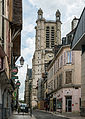
- Nomination Rue Emile Zola in Troyes --DXR 09:27, 19 August 2014 (UTC)
- Promotion Good quality. --Berthold Werner 11:03, 19 August 2014 (UTC)
-
- Nomination The Rue de la Cité in Troyes --DXR 09:27, 19 August 2014 (UTC)
- Promotion Good quality. --Berthold Werner 11:03, 19 August 2014 (UTC)
-
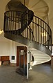
- Nomination Basel: Spiral stairs at Watertower Bruderholz --Taxiarchos228 08:36, 19 August 2014 (UTC)
- Promotion Good quality. --Ralf Roletschek 16:16, 19 August 2014 (UTC)
-
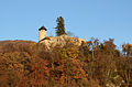
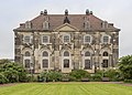
- Nomination Arlesheim: Castle Birseck --Taxiarchos228 08:36, 19 August 2014 (UTC)
- Promotion Good quality. --Poco a poco 19:57, 19 August 2014 (UTC)
-

- Nomination Basel: Roche Tower during construction at 29th may 2014 --Taxiarchos228 08:36, 19 August 2014 (UTC)
- Promotion Good quality. --JLPC 16:32, 19 August 2014 (UTC)
-
-

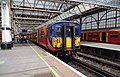
- Nomination Stratford station. Mattbuck 07:50, 19 August 2014 (UTC)
- Decline more than 50% strong shadow --Taxiarchos228 08:37, 19 August 2014 (UTC)
-

- Nomination Tower Bridge. Mattbuck 07:50, 19 August 2014 (UTC)
- Promotion Nice.--Famberhorst 17:19, 19 August 2014 (UTC)
-

- Nomination choisya ternata. Mattbuck 07:50, 19 August 2014 (UTC)
- Promotion Good quality. --Poco a poco 20:04, 19 August 2014 (UTC)
-

- Nomination Germany, Heppenheim, Marktstraße 3 --Berthold Werner 07:46, 19 August 2014 (UTC)
- Promotion Good quality. --Joydeep 11:54, 19 August 2014 (UTC)
-

-

- Nomination Hortus Haren. Fountain with waterfall in English garden.
Famberhorst 04:58, 19 August 2014 (UTC) - Promotion Good quality. --Ralf Roletschek 16:16, 19 August 2014 (UTC)
- Nomination Hortus Haren. Fountain with waterfall in English garden.
-
-
- Nomination Blockhaus, Neustädter Wache in Dresden --Cccefalon 04:16, 19 August 2014 (UTC)
- Promotion Good quality.--Famberhorst 05:08, 19 August 2014 (UTC)
-
- Nomination Dresden, Germany: Detail of "Fürstenzug Scraffito" --Cccefalon 04:16, 19 August 2014 (UTC)
- Promotion Good quality. --Poco a poco 20:04, 19 August 2014 (UTC)
-
-

- Nomination Street light, Cologne, North Rhine-Westphalia, Germany --XRay 03:35, 19 August 2014 (UTC)
- Promotion A little bit more space at the top would be great, if possible. Anyhow QI. --Cccefalon 04:58, 19 August 2014 (UTC)
 Comment Sorry, there is no more space. Next time in Cologne ... --XRay 16:23, 19 August 2014 (UTC)
-

-

-

- Nomination American Civil War reenactors in a parade in Plainview, Minnesota --Jonathunder 22:17, 18 August 2014 (UTC)
- Promotion Good quality. --JLPC 16:27, 19 August 2014 (UTC)
-

- Nomination Red Eyed Frogs mating. (was rejected a few days ago for a lack of pixels. I uploaded a new version.) -- XtoF 21:46, 18 August 2014 (UTC)
- Promotion Good quality. --NorbertNagel 20:31, 19 August 2014 (UTC)
-
- Nomination Stołowe Mountans --Jacek Halicki 21:43, 18 August 2014 (UTC)
- Promotion Support Good quality. (Geo position would be nice.) --XRay 16:26, 19 August 2014 (UTC)
-

-

- Nomination Ratstrinkstube in Rothenburg ob der Tauber --Tuxyso 21:06, 18 August 2014 (UTC)
- Promotion Good quality.--Famberhorst 05:05, 19 August 2014 (UTC)
-
- Nomination The new pedestrian bridge Kirjastosilta (Library Bridge) over the Aura River and Kauppiaskatu (street), Turku Finland. Makele-90 20:44, 18 August 2014 (UTC) CommentThis picture shows a new route for cyclists and walkers from east side of Aura River to west side of Aura River and directly to Turku Market Square via Kauppiaskatu (street on the photo). Makele-90 18:11, 19 August 2014 (UTC)
- Decline No clear subject in the picture to me (the bridge, as stated in the description is only partially visible) and the branches in the foreground are not helping either --Poco a poco 21:46, 19 August 2014 (UTC)
- Nomination The new pedestrian bridge Kirjastosilta (Library Bridge) over the Aura River and Kauppiaskatu (street), Turku Finland. Makele-90 20:44, 18 August 2014 (UTC)
-

-
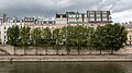
- Nomination River Seine (near Pont Neuf), Paris, France --XRay 18:27, 18 August 2014 (UTC)
- Promotion Good quality and very atmospheric. Please upright the verticals on the left side. --Cccefalon 18:46, 18 August 2014 (UTC)
 Fixed Thanks for your advise. It's fixed (and a very little bit darker).--XRay 16:24, 19 August 2014 (UTC)
-

- Nomination 15, Dobroljubova avenue, Saint Petersburg --Florstein 18:14, 18 August 2014 (UTC)
- Promotion Good quality. --Poco a poco 21:48, 19 August 2014 (UTC)
-

-

- Nomination Barcis - 20140402 - Palazzo Centis 2 --Pleclown 11:25, 18 August 2014 (UTC)
- Promotion Good quality. --Poco a poco 21:48, 19 August 2014 (UTC)
-

- Nomination Annenkirche, gate to the former hospital "Hospital zu St. Annen" --Cccefalon 04:10, 18 August 2014 (UTC)
- Promotion Good quality. --Poco a poco 21:49, 19 August 2014 (UTC)
-

-

- Nomination Labuan, Malaysia: Financial Park Complex --Cccefalon 18:07, 17 August 2014 (UTC)
- Promotion Car at the bottom right is cropped --Jacek Halicki 08:42, 19 August 2014 (UTC)
-

- Nomination Northern frontage of the market and the town hall tower in Klodzko 2 --Jacek Halicki 21:45, 16 August 2014 (UTC)
- Promotion Support QI for me--Lmbuga 17:32, 19 August 2014 (UTC)
-
- Nomination Northern frontage of the market and the town hall tower in Klodzko 3 --Jacek Halicki 21:45, 16 August 2014 (UTC)
- Promotion Good quality. --DXR 09:24, 19 August 2014 (UTC)
-

- Nomination Kłodzko, view from the fortress 2 --Jacek Halicki 21:45, 16 August 2014 (UTC)
- Promotion Support QI for me--Lmbuga 17:30, 19 August 2014 (UTC)
-

- Nomination Tour de l'Ain 2014 - Stage 4 (start, Nantua). --Agamitsudo 21:36, 16 August 2014 (UTC)
- Promotion Support QI for me--Lmbuga 17:30, 19 August 2014 (UTC)
-

-

- Nomination Germany, Heppenheim, Friedrichstraße 21 --Berthold Werner 14:01, 16 August 2014 (UTC)
- Promotion Good quality. But please expand the file description. Where is Heppenheim? --Cayambe 14:15, 19 August 2014 (UTC)
-

- Nomination 185117 at Scarborough. Mattbuck 10:38, 16 August 2014 (UTC)
- Withdrawn Good, but please handle the magenta issues (see notes) --Cccefalon 13:18, 16 August 2014 (UTC)
Not sure I believe this is QI after all. Mattbuck 16:00, 19 August 2014 (UTC)
-

-

- Nomination Tour de l'Ain 2014 - Stage 1, evening at hotel: Rémy Di Grégorio. --Agamitsudo 21:11, 13 August 2014 (UTC)
- Promotion Good quality. --Ralf Roletschek 16:20, 19 August 2014 (UTC)
-

- Nomination Tour de l'Ain 2014 - Stage 1, evening at hotel: Grégoire Tarride. --Agamitsudo 21:11, 13 August 2014 (UTC)
- Promotion Good quality. --Ralf Roletschek 16:20, 19 August 2014 (UTC)
-

- Nomination: Cape of Santo Agostinho, Pernambuco - Brazil --Alfredo Borba 19:55, 13 August 2014 (UTC)
- Review Horizon tilted cw. Too much vignetting. Too much blue (please watch WB). The bird has to be cloned out (looks like film scratch). Needs a general brightening. All fixable. --Cccefalon 04:25, 14 August 2014 (UTC)~
-
- Nomination: Carneiros Beach, Pernambuco - Brazil --Alfredo Borba 19:50, 13 August 2014 (UTC)
- Review Too much vignetting. And please raise the shadows. --Cccefalon 04:22, 14 August 2014 (UTC)
-

-

- Nomination: New Focus Photoreceiver for cold atoms experiments. --Démosthène 20:42, 12 August 2014 (UTC)
- Review Chroma noise has to be reduced; the black needs to be black and the panel left side needs to be white. I wonder, why you did not use an extra light from left side to illuminate the panel. For a studio setting, I rate this photo as middle-rate. --Cccefalon 10:16, 13 August 2014 (UTC)
-

- Nomination Kłodzko, harvest in Kościelniki district 1 --Jacek Halicki 15:23, 12 August 2014 (UTC)
- Decline Might be the dust, but it's kind of noisy in the background --Daniel Case 04:35, 20 August 2014 (UTC)
-

- Nomination Signalfabriken (swedish The Signal Factory) is a old industrial block in Sundbyberg. --ArildV 07:14, 12 August 2014 (UTC)
- Promotion Nice detail all around --Daniel Case 04:32, 20 August 2014 (UTC)
-

- Nomination Basel: view through Gates of Saint Alban --Taxiarchos228 05:53, 12 August 2014 (UTC)
- Decline Overprocessed sky; out of focus background --Daniel Case 04:39, 20 August 2014 (UTC)
-

- Nomination Thames and part of the City of London at night --Carschten 15:05, 11 August 2014 (UTC)
- Promotion Good quality. --Ralf Roletschek 16:24, 19 August 2014 (UTC)
-

- Nomination Germany, Heppenheim, Großer Markt 6 --Berthold Werner 09:41, 11 August 2014 (UTC)
- Promotion Good quality. --Ralf Roletschek 16:24, 19 August 2014 (UTC)
-
- Nomination Markings for underground cables on a newly built drive, Schwäbisch Gmünd, Germany. --Kreuzschnabel 09:02, 11 August 2014 (UTC)
- Promotion OK --Pleclown 11:38, 19 August 2014 (UTC)
-

- Nomination Łąkowa Street in Kłodzko --Jacek Halicki 08:43, 11 August 2014 (UTC)
- Promotion OK --Pleclown 11:38, 19 August 2014 (UTC)
-
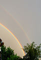
- Nomination Rainbows over Belfort, France. --ComputerHotline 07:24, 11 August 2014 (UTC)
- Promotion Good quality. --Ralf Roletschek 16:24, 19 August 2014 (UTC)
-

- Nomination Rainbows over Belfort, France. --ComputerHotline 07:24, 11 August 2014 (UTC)
- Promotion OK --Pleclown 11:28, 19 August 2014 (UTC)
-
- Nomination Operations room in an old NATO radar station, at Belfort, France. --ComputerHotline 07:05, 11 August 2014 (UTC)
- Promotion Good quality. --Pleclown 11:28, 19 August 2014 (UTC)
-

- Nomination Nowy Świat Street in Kłodzko 1 --Jacek Halicki 09:39, 10 August 2014 (UTC)
- Promotion Comment IMO too much empty street at the bottom.--XRay 18:31, 18 August 2014 (UTC) Done--Jacek Halicki 08:51, 19 August 2014 (UTC) Support OK now. Thank you.--XRay 16:17, 19 August 2014 (UTC)
-

- Nomination Nowy Świat Street in Kłodzko 2 --Jacek Halicki 09:39, 10 August 2014 (UTC)
- Promotion Comment IMO too much empty street at the bottom.--XRay 18:31, 18 August 2014 (UTC) Support OK now. Thank you.--XRay 16:17, 19 August 2014 (UTC)
-
- Nomination The Commentators Tower at Kamasa Drag Race Week, Alastaro Circuit, Finland. Makele-90 17:31, 5 August 2014 (UTC)
Tilted clockwise. Mattbuck 22:33, 12 August 2014 (UTC)
Done: new file uploaded. Makele-90 22:34, 14 August 2014 (UTC)
Better, but could you please sharpen it? After that it'll be QI. Mattbuck 12:46, 17 August 2014 (UTC)
Better now? Makele-90 20:52, 18 August 2014 (UTC) - Promotion Good enough. Mattbuck 15:18, 19 August 2014 (UTC)
- Nomination The Commentators Tower at Kamasa Drag Race Week, Alastaro Circuit, Finland. Makele-90 17:31, 5 August 2014 (UTC)


_Locatie_De_Kruidhof.JPG)


.JPG)


.jpg)


.JPG)


.JPG)
.jpg)
.JPG)
_074.JPG)
.JPG)
,_Kamasa_Drag_Race_Week,_Alastaro,_30.6.2012_(5).JPG)
Consensual review[edit]
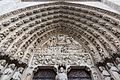
File:Paris,_Sainte-Ursule_de_la_Sorbonne_--_2014_--_1653.jpg[edit]

- Nomination Chapelle Sainte-Ursule de la Sorbonne, Paris, France --XRay 03:27, 20 August 2014 (UTC)
- Promotion Ok, but remove the magenta line under the cross (yes, it's only a tiny part).. --Cccefalon 05:39, 20 August 2014 (UTC) --Cccefalon 05:39, 20 August 2014 (UTC)
 Oppose
- Support --Livioandronico2013 17:03, 21 August 2014 (UTC)
File:Dresden_Germany_Katholisch-Hofkirche-03.jpg[edit]

- Nomination Dresden, Germany: Silhouette of Katholische Hofkirche (Cathedral Sanctissimae Trinitatis), seen from the other side of River Elbe --Cccefalon 09:52, 19 August 2014 (UTC)
- Withdrawn Good quality. --Ralf Roletschek 16:16, 19 August 2014 (UTC) Oppose Very interesting idea, but the blurry main subject doesn't work for me. And the subject in the focus is what? --Iifar 18:02, 20 August 2014 (UTC)
- Oppose Main subject is OOF - a silhouette is dark, often one color, and usually with a better defined outline. The foreground flowers have a too narrow DOF, and the white petals in several places are not well separated from the light sky. The orphan leaves in the upper left corner are not well placed. --Generic1139 16:46, 21 August 2014 (UTC)
- You guys got a point.
 I withdraw my nomination --CEphoto, Uwe Aranas (talk) 19:10, 21 August 2014 (UTC)
File:Paris,_Pont_des_Arts_--_2014_--_1421.jpg[edit]

- Nomination Love padlocks at the Pont des Arts, Paris, France --XRay 03:30, 14 August 2014 (UTC)
- Promotion
{{o}} Sorry, composition: The pink padlock cropped at bottom is too prominent. Too tight at bottom--Lmbuga 12:08, 14 August 2014 (UTC) Fixed Crop improved. Thanks for the advice.--XRay 17:23, 14 August 2014 (UTC) - Comment The subject is very sharp if it's only one padlock, perhaps QI, but I don't like the crop: Too much space at right (not focused area) and top. See note about possible crop. Sorry If I cause you discomfort. I would avoid the object that shows (or looming on) in the lower left corner--Lmbuga 17:35, 15 August 2014 (UTC)
- Comment Not important IMO: I'm not sure, but it might be better that the vertical lines of the padlock were straights.--Lmbuga 17:46, 15 August 2014 (UTC)
- Fixed Thanks. Crop changed.--XRay 06:31, 16 August 2014 (UTC)
- Support Good quality--Lmbuga 20:24, 16 August 2014 (UTC)
- Support QI for me -- XtoF 21:08, 18 August 2014 (UTC)
File:Tick_removal_forceps.jpg[edit]

- Nomination Tick removal forceps --Kreuzschnabel 15:24, 13 August 2014 (UTC)
- Promotion
- CommentThis has been done by purpose to put some depth into the image and focus on the important part. May I ask for some more opinions? --Kreuzschnabel 05:17, 14 August 2014 (UTC)
- SupportFor me the picture is fine like this. I mean the WB is perfect, the first part of the forceps is top sharp, I did not find any dust spot. So technically speaking, it's a QI. The only discussion here is about the artistic/encyclopedic point of view : is it a good idea or not to put the back part of the forceps out of focus ? I think that the defocus is not a problem for comprehension and focus the attention on the most important part. I think that this should be promoted as QI--Gormé 20:38, 14 August 2014 (UTC)
- Oppose I'm sorry,but I prefer all the object be in focus. --Livioandronico2013 11:23, 15 August 2014 (UTC)
- Done OK, I took a new shot now by focus-stacking 15 single frames. Cccefalon, Livioandronico2013, may I invite you to reconsider your vote? --Kreuzschnabel 17:02, 15 August 2014 (UTC)
- Support Sure,now is very good.
 --LivioAndronico talk 17:45, 15 August 2014 (UTC)
 - Support Much better!
It does not seem the same photo. Good quality--Lmbuga 17:54, 15 August 2014 (UTC) - Support Awesome. --Cccefalon 20:26, 15 August 2014 (UTC)
- Support -- Spurzem 19:10, 16 August 2014 (UTC)
File:Ullswater MMB 06.jpg[edit]

- Nomination Ullswater, Cumbria. Mattbuck 06:32, 11 August 2014 (UTC)
- Decline Opposetoo dark, wrong WB, tinge of red --Taxiarchos228 06:35, 11 August 2014 (UTC)
You're quite right. I have tried to correct this, but I'm not convinced myself, so please feel free to decline this immediately if you do not feel it is up to scratch. --Mattbuck 21:27, 12 August 2014 (UTC) - Support OK to me. --Kreuzschnabel 14:16, 13 August 2014 (UTC)
- Oppose This photo is very "flat" due to the poor lighting. XtoF 21:20, 18 August 2014 (UTC)
- Comment This is not FPC. Since this image meets all main QI guidelines, I don’t see any reason to oppose for aesthetic issues. --Kreuzschnabel 09:01, 19 August 2014 (UTC)
File:2014_Kłodzko,_ul._Noworudzka.jpg[edit]

- Nomination Noworudzka Street in Kłodzko --Jacek Halicki 20:35, 7 August 2014 (UTC)
- Promotion I'm sorry. IMO it's too blurry. --XRay 12:11, 10 August 2014 (UTC)
Please, other reviews --Jacek Halicki 11:20, 12 August 2014 (UTC)
Sharpening would help, but this is probably OK IMO. Mattbuck 22:48, 12 August 2014 (UTC) Done--Jacek Halicki 12:56, 13 August 2014 (UTC) - Support Nothing to complain about. --Tuxyso 14:22, 13 August 2014 (UTC)
- Support : OK now.--JLPC 07:44, 14 August 2014 (UTC)
File:2014_Kłodzko,_ul._Objazdowa_03.jpg[edit]

- Nomination Objazdowa Street in Kłodzko --Jacek Halicki 20:35, 7 August 2014 (UTC)
- Promotion Oppose I'm sorry. IMO it's too blurry. --XRay 12:11, 10 August 2014 (UTC)
Please, other reviews --Jacek Halicki 11:20, 12 August 2014 (UTC)
Needs to be brighter and more vibrant, and a little sharpening would help. Mattbuck 22:48, 12 August 2014 (UTC) Done--Jacek Halicki 13:06, 13 August 2014 (UTC) - Support OK for me. --Tuxyso 14:24, 13 August 2014 (UTC)
- Support Looks fine. --Generic1139 21:41, 18 August 2014 (UTC)
File:Schleswig-Holstein,_Brokstedt,_Naturdenkmal_NIK_7889.JPG[edit]

- Nomination Natural monument (No. 29) in the Steinburg district in Brokstedt. A maybe 300-400 year old oak. --Nightflyer 22:16, 6 August 2014 (UTC)
- Promotion Support Good quality. --XRay 08:15, 10 August 2014 (UTC) Oppose Not sharp enough IMO, left side a bit blurry. --Mattbuck 22:42, 12 August 2014 (UTC)
Linke Seite geschärft --Nightflyer 22:09, 13 August 2014 (UTC) - Support --Ralf Roletschek 16:31, 19 August 2014 (UTC)
File:London MMB »0D3 Marsh Wall.jpg[edit]

- Nomination Marsh Wall, London. Mattbuck 21:02, 3 August 2014 (UTC) Comment Please have a look to the building. It's leaning out.--XRay 04:53, 9 August 2014 (UTC)
- Promotion Perspective correction overdone, not fixed. --Smial 14:29, 11 August 2014 (UTC)
Come on, you gave me less than 3 days to fix it. I have reworked this completely. --Mattbuck 21:56, 12 August 2014 (UTC) - Support OK now --Kreuzschnabel 14:18, 13 August 2014 (UTC)
File:Lion in Todi.jpg[edit]

- Nomination Lion in Todi --Livioandronico2013 20:11, 11 August 2014 (UTC)
- Promotion Bad crop at the bottom. Otherwise very good. --Smial 22:22, 11 August 2014 (UTC)
Fixed --Livioandronico2013 22:49, 11 August 2014 (UTC)
![]() Support : Per Smial but enough for QI imo. --JLPC 07:27, 14 August 2014 (UTC)
Support : Per Smial but enough for QI imo. --JLPC 07:27, 14 August 2014 (UTC)
- Weak Support, won't be nitpicking. -- Smial 09:52, 14 August 2014 (UTC)
File:Lok 01 1066 in Koblenz (2010-04-03 46).jpg[edit]
.jpg)
- Nomination Steam-locomotive 01 1066 at Koblenz, Germany -- Spurzem 15:44, 11 August 2014 (UTC)
- Decline
- Support - Good quality. --JLPC 17:53, 11 August 2014 (UTC)
- Oppose Considerable motion blur. Not sharp enough for a QI of only 4.6 megapixels. --Kreuzschnabel 19:26, 11 August 2014 (UTC)
- Oppose - not crisp enough. Mattbuck 06:48, 13 August 2014 (UTC)
- @ Mattbuck: Would you kindly explain what you will say? -- Spurzem 11:09, 13 August 2014 (UTC)
- Same as me, I suppose. --Kreuzschnabel 12:50, 13 August 2014 (UTC)
- @ Mattbuck: Would you kindly explain what you will say? -- Spurzem 11:09, 13 August 2014 (UTC)
File:2014 Kłodzko, ul. Forteczna.jpg[edit]

- Nomination Forteczna Street in Kłodzko --Jacek Halicki 08:43, 11 August 2014 (UTC)
- Promotion
{{o}}Same as other pictures. Bad description. The subject is not the street, is the building. What kind of building is this?--Lmbuga 13:39, 11 August 2014 (UTC) Done--Jacek Halicki 15:10, 11 August 2014 (UTC) - Support Good quality IMO--Lmbuga 09:38, 13 August 2014 (UTC)
File:2014_Kłodzko,_ul._Tetmajera_01.JPG[edit]

- Nomination Buildings at Tetmajera Street in Kłodzko 1 --Jacek Halicki 08:43, 11 August 2014 (UTC)
- Promotion
{{o}} Sorry, bad description. The street is not visible. The subject is not the street. Name of the river?, name of the neighborhood or the district? The image must be categorized in Commons:Quality images/Recently promoted and it's impossible a good categorization. What if someone categorizes it as street?--Lmbuga 13:10, 11 August 2014 (UTC) Done--Jacek Halicki 15:37, 11 August 2014 (UTC)
Weak ![]() Support Perhaps, the composition is worse than in the other photo, but is sharper--Lmbuga 09:54, 13 August 2014 (UTC)
Support Perhaps, the composition is worse than in the other photo, but is sharper--Lmbuga 09:54, 13 August 2014 (UTC)
File:2014_Kłodzko,_ul._Tetmajera_02.JPG[edit]

- Nomination: Buildings at Tetmajera Street in Kłodzko 2 --Jacek Halicki 08:43, 11 August 2014 (UTC)
- Review Support Good quality. --Berthold Werner 12:40, 11 August 2014 (UTC)
{{o}} Sorry, bad description. The street is not visible. The subject is not the street. Name of the river?, name of the neighborhood or the district? The image must be categorized in [[:Commons:Quality images/Recently promoted]] and it's impossible a good categorization. What if someone categorizes it as street?--[[User:Lmbuga|Lmbuga]] 13:10, 11 August 2014 (UTC)<br> {{Comment}} You have changed the description: "Tetmajera Street in Kłodzko, view from Nysa Kłodzka river", but I don't understand what is the subject of the picture. There isn't a street, I don't see a street. The data "street" is the principal data of your picture description--[[User:Lmbuga|Lmbuga]] 14:36, 11 August 2014 (UTC)<br> In my opinion you must change the proposals--[[User:Lmbuga|Lmbuga]] 14:47, 11 August 2014 (UTC) Done--Jacek Halicki 15:37, 11 August 2014 (UTC) - Weak oppose. Sorry, it's a bit blurry, see the other picture--Lmbuga 10:01, 13 August 2014 (UTC)
File:2014-08-01_11-30-47_belfort.jpg[edit]

- Nomination Belfort, France, in long exposure. --ComputerHotline 07:26, 11 August 2014 (UTC)
- Decline SupportGood quality. --Jacek Halicki 08:49, 11 August 2014 (UTC)
Oppose Blues oversaturated IMO, unnatural colors, overprocessed.--Lmbuga 13:58, 11 August 2014 (UTC) - Oppose Sorry,but the colours are very unnatural,especially the sky --Livioandronico2013 15:55, 12 August 2014 (UTC)
- Support The final purpose of neutral density 1000+16+polarizer is to give an high impact colors and cancelling all moving objects. The goal is absolutely achieved and I like this picture. Its peculiarity is artistic, non documentary. --Fulvio314 07:18, 13 August 2014 (UTC)
- Weak Support. Polarizer effect overdone resp. used somewhat awkward. Can often be seen if polarizer was used with wide angle lenses. -- Smial 10:18, 14 August 2014 (UTC)
- Oppose - The polarising effect is very odd, and the post spoils the composition. Mattbuck 22:40, 14 August 2014 (UTC)
- Oppose per other --Archaeodontosaurus (talk) 13:46, 15 August 2014 (UTC)
File:Argiope_trifasciata_nest,_1985_slide_scan.jpg[edit]

- Nomination Argiope trifasciata, nest (slide scan). --Fulvio314 09:29, 10 August 2014 (UTC)
- Decline Oppose Sorry, picture is not sharp --Jacek Halicki 09:52, 10 August 2014 (UTC) Comment@Jacek Halicki It is not sharp on field planes out of focus, this is a normal limit for macro photography were focus planes are very thin, if you check the very center of the picture you can see the spider's eyes. The mean spider's body is less than 2 millimiters large. --Fulvio314 15:25, 10 August 2014 (UTC)
- Oppose @Fulvio314, you are correct about narrow DOF, but, there are so few pixels in this image that are in focus, it is hard to see what it is, or what we're supposed to be looking at. The colors are harsh, the histogram looks like the image has been overprocessed, and still has washed out highlights with no detail in the yellow/white areas. --Generic1139 21:12, 10 August 2014 (UTC)
- @Generic1139, the process was intended improving the poor colors came from home-made slide repro. Do you think a better reproduction would give a better digital result or, the original itself is affected by problems and it is better to give up? Thanks. --Fulvio314 06:06, 11 August 2014 (UTC)
- It might help the color problem, but I don't think it will fix the DOF problem. See what others say before you give up on it. --Generic1139 07:37, 11 August 2014 (UTC)
- @Generic1139, the process was intended improving the poor colors came from home-made slide repro. Do you think a better reproduction would give a better digital result or, the original itself is affected by problems and it is better to give up? Thanks. --Fulvio314 06:06, 11 August 2014 (UTC)
- Oppose - Mostly out of focus. Mattbuck 22:38, 14 August 2014 (UTC)
- Oppose Per Jacek Halicki and Mattbuck,mi spiace.--Livioandronico2013 17:50, 15 August 2014 (UTC)
File:Southend-on-Sea MMB 13.jpg[edit]

- Nomination Southend on Sea. Mattbuck 06:31, 4 August 2014 (UTC)
- Decline Oppose Insufficient quality. Blurred on the left, lacks fine detail, dark fence --Moroder 14:01, 9 August 2014 (UTC)
It is indeed a dark fence, though I have brightened it a bit. I have mostly fixed the blur, fixed the CA, and done a little crop. Not sure what fine detail you think it's missing though. --Mattbuck 23:35, 9 August 2014 (UTC) - Support ok IMO --Christian Ferrer 05:20, 10 August 2014 (UTC)
- Oppose Blurred --Livioandronico2013 07:06, 11 August 2014 (UTC)
- Could you add an image note to show where? Mattbuck 22:04, 12 August 2014 (UTC)
- As said moroder enough that you see on the left side --Livioandronico2013 23:15, 12 August 2014 (UTC)
File:Wanderer W 240, Bj. 1935 (2014-08-02 B bearb).JPG[edit]
.JPG)
- Nomination Wanderer W 240 from 1935 at ADAC Mittelrhein Classic in the château park of Sayn, Germany -- Spurzem 20:03, 3 August 2014 (UTC)
- Decline Oppose Overexposed, oversharpened, low DOF. --Mattbuck 20:12, 8 August 2014 (UTC)
Where? What do you mean? I ask for discussion. -- Spurzem 08:15, 9 August 2014 (UTC) Oppose Poor sharpness; blurred almost everywhere. --A.Savin 12:39, 9 August 2014 (UTC)
The care looks in focus to me. undefined 01:16, 12 August 2014 (UTC)
- Support --Ralf Roletschek 16:35, 19 August 2014 (UTC)
File:Lörrach_-_Müller-Markt.jpg[edit]

- Nomination Lörrach: "Müller" store --Taxiarchos228 12:55, 1 August 2014 (UTC)
- Promotion The perspective could be done a little bit better. The shadows should be risen or the crop reduced to avoid the big RGB 0 area. See my note. --Cccefalon 13:05, 1 August 2014 (UTC) Oppose
 Not done Mattbuck 20:00, 8 August 2014 (UTC)
I dont't see a sufficient point against QI --Taxiarchos228 20:46, 9 August 2014 (UTC)
- Me neither. This photo just waited for your response to the adressed issues but probably it slipped through your attention and Matt marked it after more than a week as "not done". --Cccefalon 19:54, 10 August 2014 (UTC)
- I don't think your point is legitim and relevant for QI. Sorry, but the RGB 0 area is out of the main perception and main object. Let's hear more opinions. --Taxiarchos228 11:06, 11 August 2014 (UTC)
- I did not declined. I added a comment and waited for your answer. I think that is more than legitim. You know that I am not stubborn and that people can talk to me. I was more than willing to support the image but I don't like to be ignored. Peace! Here is a Support --Cccefalon 21:41, 11 August 2014 (UTC)
- Cccefalon: I never called you stubborn and I never ignore you but some answers could take a few days. Don't have so much time to edit here always "in time". Peace too --Taxiarchos228 07:28, 19 August 2014 (UTC)
- I did not declined. I added a comment and waited for your answer. I think that is more than legitim. You know that I am not stubborn and that people can talk to me. I was more than willing to support the image but I don't like to be ignored. Peace! Here is a
- I don't think your point is legitim and relevant for QI. Sorry, but the RGB 0 area is out of the main perception and main object. Let's hear more opinions. --Taxiarchos228 11:06, 11 August 2014 (UTC)
- Support There’s some deep shadow but still far from RGB 0, leaving the main object very well exposed and highly detailed. QI for sure. --Kreuzschnabel 14:27, 11 August 2014 (UTC)
- Support QI for me with or without the crop. --Lewis Hulbert (talk) 16:02, 11 August 2014 (UTC)
- Oppose It needs perspective correction IMO: buildings of the left and vertical lines of the right are tilted. Strong shadows--Lmbuga 01:32, 22 August 2014 (UTC)
File:2014-07-26_Corvus_Corax_(Amphi_festival_2014)_074.JPG[edit]
_074.JPG)
- Nomination Corvus Corax, Amphi festival 2014 --Atamari 11:45, 1 August 2014 (UTC)
- Decline
- Oppose - Clearly tilted. --Mattbuck 20:00, 8 August 2014 (UTC)
- not really clearly tilted, for me a QI Support --Taxiarchos228 20:48, 9 August 2014 (UTC)
- I have marked on the image several things which should be vertical. Mattbuck 19:13, 10 August 2014 (UTC)
- It's absolutly not necessary for a concert photography to have straight verticality. This is not a architectual image. Beside of this you could be wrong because we have no reference. The pillar may be diagonal. --Taxiarchos228 11:09, 11 August 2014 (UTC)
- I have marked on the image several things which should be vertical. Mattbuck 19:13, 10 August 2014 (UTC)
- not really clearly tilted, for me a QI
- Oppose Per Mattbuck,sorry--Livioandronico2013 15:27, 13 August 2014 (UTC)
- Support Tilt is not disturbing and possibly intended. There are concert images with much more tilt that are already QI. --Smial 11:28, 18 August 2014 (UTC)
- Oppose Sorry, too tight at left. Not QI for me. And tilted. to me it's not intended: too tight. It seems a random shot (I do not mean it to be)--Lmbuga 01:12, 22 August 2014 (UTC)
File:Mallorca_-_Palma_de_Mallorca_-_Castell_de_Bellver_1.jpg[edit]

- Nomination Palma de Mallorca: Castell de Bellver --Taxiarchos228 20:48, 31 July 2014 (UTC)
There is a strange dark area in the middle top and I see some artifacts in the sky, otherwise very good Poco a poco 21:21, 31 July 2014 (UTC)
should be all fixed now --Taxiarchos228 08:54, 1 August 2014 (UTC)
Support The sky is still ab it pixalated but ok, could you improve the left crop (a person is cut by half) to make it QI (sorry for not seeing that earlier)? Poco a poco 16:30, 1 August 2014 (UTC) - Promotion I still see a big black smudge at the top. --Mattbuck 19:52, 8 August 2014 (UTC)
not sufficient arguments against QI--Taxiarchos228 20:50, 9 August 2014 (UTC)
Then fix it? Mattbuck 23:24, 9 August 2014 (UTC) - Comment I suggest to crop out the upper part of the sky, because it has signs of poor cloning. And please improve left crop as was suggested by Diego. This current version is not QI for me. --Iifar 18:16, 10 August 2014 (UTC)
Not every inhomogenity is a cloning error. Natural structures (also sky) are not always clinic and monochromatic, so keep calm, Iifar & Mattbuck. Croping out a hardly seeable half-body does not improve a picturte of this big size significant. Nevertheless I have uploaded a new version. But well known nitpicking come always from the same audiance we already know very well. --Taxiarchos228 18:36, 10 August 2014 (UTC)
- OpposeI don't doubt that, but it was a remarkably dark patch. Also your attempt to fix it leaves something to be desired - the sky is mostly grainy, as one would expect and is fine, except right at the top where suddenly blur-brushstrokes are easily visible. Mattbuck 20:56, 10 August 2014 (UTC)
![]() Support Good :) --Livioandronico2013 07:04, 11 August 2014 (UTC)
Support Good :) --Livioandronico2013 07:04, 11 August 2014 (UTC)
File:VW Käfer, Bj. 1969, getunt (2014-08-02).JPG[edit]
.JPG)
- Nomination Very souped up VW Käfer from 1969 at ADAC Mittelrhein Classic in the château park of Sayn, Germany -- Spurzem 20:03, 3 August 2014 (UTC)
- Promotion
- Support QI --Livioandronico2013 07:05, 8 August 2014 (UTC)
- Oppose CA needs fixing. --Mattbuck 20:12, 8 August 2014 (UTC) Done! -- Spurzem 12:38, 9 August 2014 (UTC)
- Support ok --Livioandronico2013 19:58, 9 August 2014 (UTC)
- Second vote by same user struckthrough. Mattbuck 23:12, 9 August 2014 (UTC)
- Support May be better with more DoF, but IMO still QI. Geo position would be nice.--XRay 12:58, 10 August 2014 (UTC)
- Support QI --Rjcastillo 21:15, 16 August 2014 (UTC)
File:Appia Antica plate.jpg[edit]

- Nomination Appia Antica plate--Livioandronico2013 08:56, 3 August 2014 (UTC)
- Withdrawn
- Oppose Motion blur. --Mattbuck 20:12, 8 August 2014 (UTC)
but why decline for reasons so trivial? things are easily repairable --Livioandronico2013 20:20, 8 August 2014 (UTC)
Fixed --Livioandronico2013 20:53, 8 August 2014 (UTC) - Support I don't seem Motion blur, maybe it could be centered a little better, but still quality. --Idontfindaoriginalname (talk) 08:23, 10 August 2014 (UTC)
- Oppose Poor sharpness, and since when blur is fixable? --A.Savin 09:10, 10 August 2014 (UTC)
- Fixed Hello savin, I never said that the "Motion blur" is fixable, I just said, even you yourself do not mentioning it, I don't see it. Not seeing it I could not say that it was fixable, but on the contrary it is possible to work with the sharpness, as you pointed out. :) привет --Livioandronico2013 20:24, 10 August 2014 (UTC)
- Oppose Sorry, but it is now very much over sharpened. It overemphasizes the grains in the rock and texture of the leaves. Perhaps just a high pass filter over only the sign, which is the main subject. --Generic1139 18:18, 20 August 2014 (UTC)
File:Heppenheim_BW_2014-05-13_14-30-35.jpg[edit]

- Nomination: Germany, Heppenheim, Kellereigasse 3 --Berthold Werner 07:54, 3 August 2014 (UTC)
- Review OpposeProportions severely distorted by straightening. Better leave the converging lines when shooting at such a small distance. --Kreuzschnabel 10:54, 3 August 2014 (UTC) Support A bit dark but OK. Mattbuck 20:12, 8 August 2014 (UTC)
- Ok. I made it a bit brighter. --Berthold Werner 16:06, 9 August 2014 (UTC)
File:Niebo_nad_budynkami_klasztoru_Erdene_Dzuu_02.jpg[edit]

- Nomination: The sky over buildings of the Erdene Zuu Monastery. Kharkhorin, Övörkhangai Province, Mongolia. --Halavar 15:39, 1 August 2014 (UTC)
- Review Oppose Too must contrast, unnatural clouds. --Mattbuck 20:00, 8 August 2014 (UTC) Comment Unnatural clouds?? I did not create them. Sorry, but you exaggerated. We need another opinions. --Halavar 20:20, 8 August 2014 (UTC)
![]() Support : better now imo. --JLPC 14:31, 14 August 2014 (UTC)
Support : better now imo. --JLPC 14:31, 14 August 2014 (UTC)
File:Niebo_nad_budynkami_klasztoru_Erdene_Dzuu_03.jpg[edit]

- Nomination The sky over buildings of the Erdene Zuu Monastery. Kharkhorin, Övörkhangai Province, Mongolia. --Halavar 15:39, 1 August 2014 (UTC)
- Promotion Oppose Too must contrast, unnatural clouds. --Mattbuck 20:00, 8 August 2014 (UTC) Comment Unnatural clouds?? I did not create them. Sorry, but you exaggerated. We need another opinions. --Halavar 20:20, 8 August 2014 (UTC)
![]() Support : better now imo. --JLPC 14:32, 14 August 2014 (UTC)
Support : better now imo. --JLPC 14:32, 14 August 2014 (UTC)
- Support --Ralf Roletschek 21:13, 21 August 2014 (UTC)
File:Composicion-Cardiologia.jpg[edit]

- Nomination Photocomposition on cardiology --Ivan2010 12:02, 31 July 2014 (UTC)
- Decline
- Oppose The glare reflections are intrusive and unnatural. --Cccefalon 12:09, 31 July 2014 (UTC)
- Support I rather like it. Mattbuck 19:52, 8 August 2014 (UTC)
- Oppose Cccefalon have right --Livioandronico2013 07:10, 11 August 2014 (UTC)
- Support Well-done photograph. The glare star is a matter of taste IMHO. I quite like it, and it doesn’t kill any information from the image. --Kreuzschnabel 14:32, 11 August 2014 (UTC)
- Support As far as I've been understanding since I contribute here, QI focus on quality, not taste. So I support it. -- DerFussi 06:32, 16 August 2014 (UTC)
- Comment Perhaps you guys should remember, that we have the Image guidelines. The guidelines clearly adress Unnecessary or inappropriate use of artistic filters and effects. and of such an effect we are talking about. While digital manipulation for the purpose of correcting flaws in a photographic image is generally acceptable, the said glare reflection is a deceiving element and should be handled similar as lense flares. As I already mentioned earlier today, if we want to press the "Like" button, we better go to Facebook. There are a lot of images here, where I happily can say "I like it" but which I have to decline with tears in my eyes because of photographic flaws or breaking the QIC rules. --Cccefalon 19:02, 16 August 2014 (UTC)
- Oppose I agree with Cccefalon. --Rjcastillo 21:10, 16 August 2014 (UTC)
- Oppose The glare star looks like it was added in PP, and is a distraction from the main subject. While I "like" the rest of this image, I think the added element makes this not QI. --Generic1139 21:46, 18 August 2014 (UTC)
- Support nice picture, I like it. --Ralf Roletschek 16:45, 19 August 2014 (UTC)
- Oppose Per others: The glare reflections are intrusive and unnatural (Cccefalon). Overprocessed, not QI IMO, perhaps FP --Lmbuga 01:20, 22 August 2014 (UTC)
File:Super Twin Top Fuel, Trond Jostein Hoiberget (ST 96), Kamasa Drag Race Week, Alastaro, 30.6.2012 (5).JPG[edit]
,_Kamasa_Drag_Race_Week,_Alastaro,_30.6.2012_(5).JPG)
- Nomination Super Twin Top Fuel driver Trond Jostein Hoiberget (ST 96) at Kamasa Drag Race Week, Alastaro Circuit, Finland. Makele-90 17:31, 5 August 2014 (UTC)
Comment CAs (see wheels) and I don't have problem with the DOF, but it can be better IMO--Lmbuga 18:06, 5 August 2014 (UTC) - Decline Support In my opinion it is a very good photo of this racer. CAs are neglectable. -- Spurzem 18:04, 6 August 2014 (UTC)
Oppose It's a good picture, but improvable: Sorry, "Discuss" (See said before)--Lmbuga 01:24, 7 August 2014 (UTC)  Neutral This is longitudinal chromatic aberration which cannot easily be improved. It's rather small and not really disturbing. -- Smial 11:10, 10 August 2014 (UTC)
- I'm was seeing the picture with Lightroom to fix CAs and there are big areas overexposed, for example, white areas of the biker. CAs improbables. I was intending to upload a new version, but seeing overexposure, I have not dared--Lmbuga 05:29, 11 August 2014 (UTC)
- Oppose - Fair amount of CA, bit on the bright side. Mattbuck 22:31, 14 August 2014 (UTC)
File:Dolomites_Val_Gardena_from_Mont_de_Seura.jpg[edit]

- Nomination The Dolomites in Val Gardena from "Mont de Sëura" --Moroder 15:47, 25 July 2014 (UTC)
Bit blurry bottom left corner, and it looks like the left side is leaning in. Mattbuck 17:40, 25 July 2014 (UTC) Comment The reddish walls of the Dolomites do lean in (in German it's called Überhang) --Moroder 22:13, 25 July 2014 (UTC)
Yes, but it seems unlikely that they built a house at an angle to the vertical. Mattbuck 10:27, 2 August 2014 (UTC) Question Please kindly let me know where in these houses the lines are not vertical
I disagree, irrelevant issue for declining --Moroder 07:13, 3 August 2014 (UTC) - Promotion
Comment Mattbuck is right, the verticals on the house/ski lodge(I used the windows to the right) need to be adjusted nearly 3 degrees CCW to be vertical. This, to be sure, is pixel peeping at its finest, but it does show that the rest of the image is also tilted, although this is less apparent to the eye. If you do make that adjustment, the base of the clouds over the house become level as well (not sure how much that matters compositionally, some, I think). The Überhang is emphasized. You will lose the closest white rocks on the left, but they aren't in focus anyway. The focus is somewhat soft, unfortunate in a stitched, sweeping panorama. It is sharp enough to see the windows in the ski lodge, though. I'm on the fence. --Generic1139 21:33, 4 August 2014 (UTC) - Comment Could you please put a note on the wrong verticals - thanks--Moroder 10:11, 5 August 2014 (UTC)
- Support The buildings are microscopic tiny, and it is disputable whether they lean in or out or not. Some seem to do so, some not. This is possibly caused by athmospheric turbulence due to the wide distance and is not a reason to decline. @Moroder: Scale down to about 6 MPix or even 2 MPix, which is minimum standard here, and nobody would even discover the buildings ;-) -- Smial 12:44, 5 August 2014 (UTC)
- Yesss. To beat the pixelpeeper, keep your pixels deeper--Moroder 05:26, 6 August 2014 (UTC)
- Neutral I'm not going to argue about something 2km away that subtends 191 pixels in a 12478 wide image. I will say that the image is too soft, and with that camera/lens everything from 4m to infinity could have been in focus. The nearest white rock would not have been, but the rest could have. The back range of mountains has nice light and the central green peak (with its disputed building) is also nice. I won't oppose. --Generic1139 15:22, 5 August 2014 (UTC)
- Support For me it is acceptable --Livioandronico2013 15:36, 12 August 2014 (UTC)
File:Cosplayer_as_Mad_Hatter_at_j-pop-con_2014-03-29.jpg[edit]

- Nomination A cosplayer in Mad Hatter (Alice in Wonderland) costume at the main entrance at Øksnehallen in Copenhagen participating in j-popcon 2014. --Slaunger 15:47, 30 July 2014 (UTC)
- Promotion
- Support Good quality. --Poco a poco 18:13, 30 July 2014 (UTC)
- Oppose Unsharp, artefacts. --Iifar 10:02, 31 July 2014 (UTC)
- Question@Iifar: Have you considered this is an 18 Mpixel photo of a walking person? Can you annotate or further describe the artifacts you are talking about? --Slaunger 20:11, 31 July 2014 (UTC)
- Comment I think those are sharpening artefacts, especially good to see all over the face and on the background. As for sharpness, maybe focusing wasn't good enugh, or camera wasn't steady at the shooting moment. This image is not QI for me, sorry. --Iifar 06:18, 1 August 2014 (UTC)
- Thanks for taking your time to explain, Iifar. I cannot see the artifacts, but that is probably because my eyes are not sufficiently trained. The only modifications done are simple ones in the raw converter, like correcting for CA, color blur, and highlightning of the partial shadow from his hat in the face. --Slaunger 16:05, 1 August 2014 (UTC)
- Support QI for me --Halavar 12:45, 1 August 2014 (UTC)
- Support Looks overprocessed but not too bad considering the large pixelage --Kreuzschnabel 10:47, 2 August 2014 (UTC)
- Support Yes, it is oversharpened, but some of the face issues are also pancake makeup over beard stubble. I would have preferred to see it a bit less sharpened, but close enough. --Generic1139 21:52, 4 August 2014 (UTC)
- Oppose Neutral As for Iifar: Slight motion blur oversharpened gives some double contours which are unpleasant. Some downscaling and lesser sharpening should address the problem. -- Smial 13:22, 5 August 2014 (UTC)
- Comment Smial Regarding your proposal to downsample, I object in principle to this, as information is lost in the process. If you do a large scale print it is always best not to downsample, although the per-pixel quality may not be as good as if the photo had been downsampled. When revieweing a photo it is the responsibility of the reviewer to not only consider the per-pixel quality, but also the resolution of the image, for instance by choosing a review size of about 4 Mpixels or something which matches approximately full screen resolution on a monitor. That said, I am pragmatic and I do downsample a little at times (I usually never downsample more, that to half the original number of pixels), especially in stitched panoramas, when I feel that the information loss by downsampling is so small that it is counteracted by the convenience in viewing and downloading a file with smaller resolution or when parts of a stitched photo has poor pixel quality because it has been stretched in a projection, or originates from a corner in a single frame where lens effects gives reduced quality. However, in this case I do not feel that downsampling is warranted at all, as it would compromise, e.g., the fine details in the texture of the textiles visible, and bear stubbles in the face as well as single strands of red hair. --Slaunger 10:00, 17 August 2014 (UTC)
- I agree with your thoughts on principle. I did not ask to halve the image size, but wanted to suggest to seek a compromise to save the really very beautiful snapshot. -- Smial 10:37, 17 August 2014 (UTC) Btw: The reworked version is much better, but I'm not absolutely convinced. So I change my vote to neutral.
- Oppose Per Iifar and Smial.— Preceding unsigned comment added by Vamps (talk • contribs)
 Info for Poco a poco, Iifar, Halavar, Kreuzschnabel, Generic1139, Smial, Vamps: I have uploaded a new version, where the unsharp mask in the raw converter is set more gentle and where "sharpness" is lowered. I think the edit addresses some of the concerns raised by some of you, and I hope the edit does not change the mind of the supporters. Feel free to review again, if and when you have the time. Thanks
 . --Slaunger 19:06, 14 August 2014 (UTC)
- Oppose - Way too much motion blur for me. Mattbuck 22:04, 14 August 2014 (UTC)
- Support Per Kreuzschnabel and Generic1139 --Livioandronico2013 11:12, 15 August 2014 (UTC)
- Support I really hate that pixelcussion! It's an excellent picture--Moroder 05:24, 17 August 2014 (UTC)