Commons:Quality images candidates/Archives August 2010
-
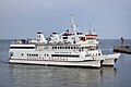
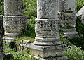
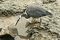
- Nomination Żegluga Gdańska in Hel, Poland. --DerHexer 09:11, 29 August 2010 (UTC)
- Promotion Some would miss "crispness" at full resolution, but it is still QI for me. --Johannes Robalotoff 10:37, 29 August 2010 (UTC)
-
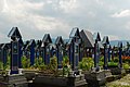
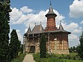
- Nomination Crosses in the Merry Cemetery in Săpânţa, Romania. --Andrei Stroe 22:30, 28 August 2010 (UTC)
- Promotion
 Support QI and Useful --Archaeodontosaurus 10:00, 29 August 2010 (UTC)
-

- Nomination Rhine near Sankt Goarshausen, Germany. --Johannes Robalotoff 15:21, 28 August 2010 (UTC)
- Promotion Support QI for me --Archaeodontosaurus 09:58, 29 August 2010 (UTC)
-

-

- Nomination Entrance of Forum des Halles Paris --Pline 14:12, 28 August 2010 (UTC)
- Promotion Support QI for me --Archaeodontosaurus 09:56, 29 August 2010 (UTC)
-
-

-

-

-

- Nomination The north-eastern tower on the Reichstag building --Carschten 10:40, 28 August 2010 (UTC)
- Withdrawn The white of the platform is overexposured --Mbdortmund 18:41, 28 August 2010 (UTC)
 Comment File:Reichstagsgebäude I (SZL 2010-CN-Berlin)-retouched.jpg, derivate without overexposure. --DerHexer 00:11, 29 August 2010 (UTC)
-

-
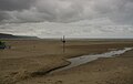
- Nomination Looking out to sea from Barmouth. Mattbuck 02:46, 28 August 2010 (UTC)
- Decline Image is too dark, will be good wait for better weather -> noisy Chmee2 12:04, 28 August 2010 (UTC)
The weather isn't always good, and sometimes weather that's not-so-great can look more interesting than brilliant sunshine. Mattbuck 03:15, 29 August 2010 (UTC)
-

- Nomination Lake Tal-y-llyn. Mattbuck 02:46, 28 August 2010 (UTC)
- Promotion good --Mbdortmund 18:47, 28 August 2010 (UTC)
-

-

- Nomination Nieder-Werbe, Hesse. --Bartiebert 18:53, 27 August 2010 (UTC)
- Decline
 Oppose Frame. Yann 11:51, 29 August 2010 (UTC)
-

- Nomination Ramphastos toco at Kobe kachoen --663highland 12:33, 27 August 2010 (UTC)663highland 14:02, 28 August 2010 (UTC)~
- Promotion Comment please add description of the shown animal. --Quartl 13:04, 27 August 2010 (UTC)
A bit soft but qualifies IMO. --Nevit 11:09, 29 August 2010 (UTC)
-

- Nomination Ramphastos toco at Kobe kachoen --663highland 12:33, 27 August 2010 (UTC)663highland 14:02, 28 August 2010 (UTC)~
- Decline Comment please add description of the shown animal(s). --Quartl 13:04, 27 August 2010 (UTC) Oppose blurry eye and beak, focused on body --Chmee2 12:23, 28 August 2010 (UTC)
-

-

-

-
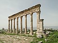
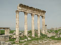
- Nomination Apamea, Syria --Bgag 22:22, 25 August 2010 (UTC)
- Promotion good detail there --Ianare 21:09, 26 August 2010 (UTC) CommentThe "Landscape" composition does not suit the vertical subject well. IMO framing a single column in "Portrait" mode, would be better. --Nevit 22:25, 28 August 2010 (UTC)
-
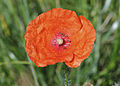
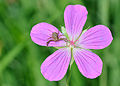
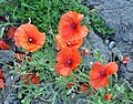
- Nomination Corn Poppy flower. --Quartl 20:18, 24 August 2010 (UTC)
- Decline OpposeShallow DOF. --Nevit 10:08, 25 August 2010 (UTC)...and overexposure of the main subject due to inappropriate colour space (sRGB instead of wider gamut RGB). --Ikiwaner 15:24, 25 August 2010 (UTC)
 Question okay, the image may be hopeless concerning dof, but is the color space correct now? --Quartl 17:31, 25 August 2010 (UTC)
unfortunately not really, the histogram still shows significant clipping in the red channel. I assume this would not have happened with Adobe RGB or or its corresponding Nikon profile. --Ikiwaner 11:54, 28 August 2010 (UTC)
Ah, I understand now. Well, the profile was already Nikon sRGB but that didn't prevent red from clipping. I reduced saturation now appropriately, thanks for your help. --Quartl 16:06, 28 August 2010 (UTC)
-
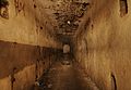
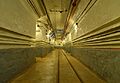
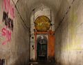
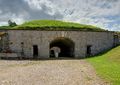
- Nomination Underground in fort du Bois d'Oye --ComputerHotline 18:09, 23 August 2010 (UTC)
- Promotion Nice. Mattbuck 21:50, 28 August 2010 (UTC)
-
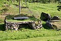
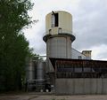
- Nomination The remains of the foundry in Skommarhyttan, Sweden --Ainali 18:37, 22 August 2010 (UTC)
- Promotion QI for me. --Johannes Robalotoff 11:02, 29 August 2010 (UTC)
-

- Nomination: Arch in the High Castle of Malbork, Poland. --DerHexer 15:50, 22 August 2010 (UTC)
- Review needed
-

- Nomination Middle keystone in the Chapel of St. Anne in Malbork, Poland, showing Jesus Christ. --DerHexer 15:50, 22 August 2010 (UTC)
- Promotion Comment Please fix the tilting. Pitke 17:37, 22 August 2010 (UTC) The face of Christ is correct. The columns are irregular. DerHexer 17:41, 22 August 2010 (UTC)
Oh, I see... but I still think the face is a little tilted. The vertical and horizontal midlines of the face don't meet at right angle, so it's a bit tricky... I'll leave it for others. The image seems tad blurred for me though. Pitke 17:49, 22 August 2010 (UTC) The face is also irregular, and it's imho not too blurred. DerHexer 18:20, 22 August 2010 (UTC) Support (Unimportant) parts away from the center of the image appear a bit blurred, but only at full resulution, and not in a disturbing way. Christ is sharp enough for me. Also I see no tilt or distortion of the round Christ image in the center. --Johannes Robalotoff 10:58, 29 August 2010 (UTC)
-

- Nomination Playground in Dortmund --Mbdortmund 08:03, 21 August 2010 (UTC)
- Promotion Comment Not sure about the crop (not enough below, and too tight right, IMO). Thoughts ? However, very good light.--Jebulon 09:04, 21 August 2010 (UTC)
L'orage nous a "surpris" alors que nous étions encore la... --Mbdortmund 23:02, 21 August 2010 (UTC) Support - mild areas of overexposure, but nice. Mattbuck 21:50, 28 August 2010 (UTC)
-

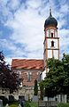
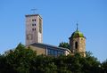
- Nomination Stiftskirche in Stuttgart, Germany. -- Felix Koenig 15:13, 20 August 2010 (UTC)
- Promotion Could do with sharpening, but generally good. Mattbuck 21:48, 28 August 2010 (UTC)
-

-

- Nomination The seal of the Hotel Intercontinental, placed outside od the hotel. --High Contrast 09:35, 20 August 2010 (UTC)
- Promotion CommentI did not like the low angle shot of logo. A planar shot as you did for WV photo suites more to this kind of subject. --Nevit 11:32, 25 August 2010 (UTC)
I think it could do with some cropping on the right, but generally good. Mattbuck 21:48, 28 August 2010 (UTC) Comment I tried a perspective correction, but without success.--Jebulon 09:51, 29 August 2010 (UTC)
-

- Nomination perspective in the Gardens of Generalife, Alhambra, Granada, Spain.--Jebulon 22:20, 19 August 2010 (UTC)
- Promotion The far side of the bassin seems tilted, any idea why? Rama 21:25, 26 August 2010 (UTC)Because... it is ! Thanks for review, I didn't notice. I'll upload a rotated version soon.--Jebulon 16:35, 27 August 2010 (UTC)
 Done Tilt corrected.--Jebulon 11:52, 28 August 2010 (UTC) Support Good now. --Johannes Robalotoff 10:48, 29 August 2010 (UTC)
-

- Nomination Ikuno Station in Asago --663highland 22:13, 19 August 2010 (UTC)
- Decline Comment - Perspective needs to be corrected at the left... and there is a dust spot in the lower sky at right. --Cayambe 17:11, 20 August 2010 (UTC) Oppose - bad composition and needs perspective correction. Mattbuck 21:45, 28 August 2010 (UTC)
-

- Nomination The church of Monastery Popăuţi (Botoşani County, Romania), XV century Cezarika1 09:40, 19 August 2010 (UTC)
- Decline CommentThis image does not display on my monitor. I had to download to see it. --Nevit 16:46, 26 August 2010 (UTC)
I feel the pole rather spoils it. Mattbuck 21:45, 28 August 2010 (UTC)
-

-

-

-

- Nomination Fratercula arctica in Norway. -- Ludo29 14:21, 27 August 2010 (UTC)
- Decline OpposeI love the composition and the water drop from tale. But it is overexposed and all the detail in white areas are lost. There might be a chance of correction if you have the raw. --Nevit 15:09, 27 August 2010 (UTC)
-

-

- Nomination Fresco of Apollo. --Cody escadron delta 13:43, 27 August 2010 (UTC)
- Promotion Support QI. Yann 14:46, 27 August 2010 (UTC)
-

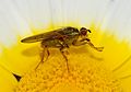
- Nomination Marmelade Hoverfly. --Quartl 04:38, 27 August 2010 (UTC)
- Promotion QI & Useful --Archaeodontosaurus 12:06, 27 August 2010 (UTC)
-

-

-

- Nomination Kenelis at Nottingham Pride. Mattbuck 22:53, 26 August 2010 (UTC)
- Decline As other versions, too busy composition, and subject not clearly enough distinguished from background. --Elekhh 10:13, 27 August 2010 (UTC) Why nominate everyday a new picture of exactly the same subject? Take the best and drop the others. Nobody will print them all nor do we need more than one of this to illustrate a wp-article. --Ikiwaner 15:25, 27 August 2010 (UTC)
Please see my rant on your talk page. Mattbuck 08:27, 28 August 2010 (UTC)
-

-

- Nomination The village of Merghindeal, Sibiu County, Romania; by Radu Ana Maria.Andrei Stroe 21:22, 26 August 2010 (UTC)
- Promotion Nice place, good image. --Cayambe 09:27, 28 August 2010 (UTC)
-

-

-

-

-

- Nomination Cessna 182N Skylane -- Felix Koenig 09:02, 24 August 2010 (UTC)
- Promotion QI to me. --Cayambe 09:03, 28 August 2010 (UTC)
-

- Nomination Bedroom in fort du Bois d'Oye --ComputerHotline 18:09, 23 August 2010 (UTC)
- Promotion Good. --Cayambe 08:59, 28 August 2010 (UTC)
-

- Nomination Bedroom in fort du Bois d'Oye --ComputerHotline 18:09, 23 August 2010 (UTC)
- Promotion Good. Would you like to sleep here? :-) --Cayambe 08:59, 28 August 2010 (UTC)
-

-

- Nomination Trier, Simeonstrasse 30, building from 1879 --Berthold Werner 08:34, 23 August 2010 (UTC)
- Promotion QI to me. --Cayambe 08:51, 28 August 2010 (UTC)
-

- Nomination Bahnhofsturm Stuttgart -- Felix Koenig 18:11, 22 August 2010 (UTC)
- Promotion Support QI. Yann 14:56, 27 August 2010 (UTC)
-

-
-

-

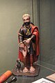
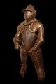
- Nomination Footman's armour in Savoyard style, ca. 1600-1610. On display at Morges military museum. -- Rama 11:10, 20 August 2010 (UTC)
- Promotion Idea: As you showed us some of other very good pictures of this armour, maybe could you crop this one and keep only the helm, which profile is very interesting and has alone a real encyclopedic value. IMO, the rest of the armour does not add here... Well, only an idea.--Jebulon 16:08, 23 August 2010 (UTC)
Actually, there are several sets of armour; this armour has only this photograph. Rama 21:30, 26 August 2010 (UTC) Oui je me suis aperçu trop tard de ma confusion, désolé. N'empêche, le casque isolé...ça pourrait être intéressant! --Jebulon 16:38, 27 August 2010 (UTC) QI--Jebulon 17:16, 27 August 2010 (UTC)
-

-
-

- Nomination Public entry at the Ouvrage of Schoenenbourg --ComputerHotline 18:34, 19 August 2010 (UTC)
- Decline hard overexposure at the sky/trees --Carschten 10:17, 28 August 2010 (UTC)
-

- Nomination Inside the Ouvrage of Schoenenbourg --ComputerHotline 18:34, 19 August 2010 (UTC)
- Promotion In the bunker, I was already :-D --Carschten 10:17, 28 August 2010 (UTC)
-
- Nomination Inside the Ouvrage of Schoenenbourg --ComputerHotline 18:34, 19 August 2010 (UTC)
- Promotion Nice. — Jagro 13:21, 27 August 2010 (UTC)
-
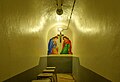
- Nomination The chapel inside the Ouvrage of Schoenenbourg --ComputerHotline 18:34, 19 August 2010 (UTC)
- Promotion super --Carschten 10:17, 28 August 2010 (UTC)
-

-

-
- Nomination Suizenji-jojuen in Kumamoto --663highland 13:08, 19 August 2010 (UTC)
- Decline Question why the blurred faces? --Quartl 14:52, 26 August 2010 (UTC) Unsharp, blured trees and a bit noisy. — Jagro 13:21, 27 August 2010 (UTC)
-
- Nomination Panoramic view of Neckarwestheim Nuclear Power Plant. -- Felix Koenig 12:56, 19 August 2010 (UTC)
- Decline backlighting, quality imo not good enough --Carschten 10:17, 28 August 2010 (UTC)
-

- Nomination Mel Sanson of Kenelis performs at Nottingham pride. Mattbuck 14:26, 18 August 2010 (UTC)
- Decline It's a bit softish, though not redhibitorily so; but it really need a bit of cropping to a more dynamic composition, and maybe a colour adjustment; I'd do something like File:Nottingham Pride MMB 65 Kenelis-b.jpg. Rama 21:21, 26 August 2010 (UTC) A bit unfortunate crop of the legs, mouth not visible and we already have a QI of exactly the same subject. --Ikiwaner 15:21, 27 August 2010 (UTC)
-

- Nomination Monument of Frederick I at the at the island of Mainau --Harke 09:46, 15 August 2010 (UTC)
- Decline sculpture imo overexposured --Mbdortmund 11:52, 15 August 2010 (UTC)
kleine Korrektur, mehr geht leider nicht. --Harke 18:41, 15 August 2010 (UTC)Not sure it is overexposed. Maybe due to the quality of the white marble. Funny shadow of the photographer on the pedestal. Hard to promote, but hard to decline too...--Jebulon 15:33, 23 August 2010 (UTC) Reflection of photographer over the writing is a real minus, per Jebulon, so it seems that is just below the mark. --Elekhh 21:50, 27 August 2010 (UTC)
-

-

- Nomination Palmyra theatre. --Eusebius 08:07, 27 August 2010 (UTC)
- Promotion I am not sure how it occurred but the sky has sepia tone here. EXIF data about white balance are missing, so I have to get your opinion. --Nevit 08:30, 27 August 2010 (UTC)
 Info The picture was taken in a windy and almost stormy day, and there was much sand in the air (another picture taken the same day). The original is much more orange, I tried to correct the white balance to partly cancel that effect, but it seemed interesting to keep a touch of it anyway. --Eusebius 09:21, 27 August 2010 (UTC) SupportIt has a nice sepia tone. --Nevit 11:26, 27 August 2010 (UTC)
-
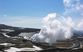
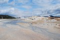
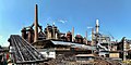
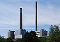
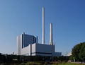
- Nomination Krafla geothermal power plant, Iceland, by Hansueli Krapf --Elekhh 07:16, 27 August 2010 (UTC)
- Promotion SupportGood enough. --Nevit 08:19, 27 August 2010 (UTC)
-

-

-

-
-

- Nomination Looking down on the down of Conwy from the castle. Mattbuck 22:53, 26 August 2010 (UTC)
- Promotion QI --Mbdortmund 23:55, 26 August 2010 (UTC)
-

- Nomination The River Conwy at Tal-y-Cafn. Mattbuck 22:53, 26 August 2010 (UTC)
- Promotion good --Mbdortmund 23:56, 26 August 2010 (UTC)
-

-

- Nomination Detail of the town hall of the 10e arrdt (Paris). --Coyau 18:00, 26 August 2010 (UTC)
- Promotion lighting is interesting --Mbdortmund 23:58, 26 August 2010 (UTC)
-

- Nomination Dresden --Kolossos 16:55, 26 August 2010 (UTC)
- Promotion gute Komposition und Detailauflösung --Mbdortmund 00:00, 27 August 2010 (UTC)
-

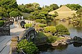
- Nomination Gdansk. --Kolossos 16:55, 26 August 2010 (UTC)
- Promotion very good --Mbdortmund 00:02, 27 August 2010 (UTC)
-
-

- Nomination Cat on Popradské pleso, High Tatras, Slovakia — Rl91 05:52, 26 August 2010 (UTC)
- Decline
-

- Nomination Prison of Mikluš from 13th century, Košice, Slovakia — Rl91 05:38, 26 August 2010 (UTC)
- Promotion Comment Error perspective and under exposure, all can be corrected --Archaeodontosaurus 08:20, 26 August 2010 (UTC) Comment corrected, but the wall on the right side is not exactly in 90° angle in real (very old building ;)).--Rl91 09:00, 26 August 2010 (UTC) Support good now --Archaeodontosaurus 17:05, 26 August 2010 (UTC)
-
- Nomination Apartments in Aurinkolahti, Helsinki. --kallerna 19:47, 24 August 2010 (UTC)
- Decline OpposeSeems tilted. The way bot is cropped disturbed me. --Nevit 10:26, 25 August 2010 (UTC) No tilt IMO. Barrel distortion and perspective problem left. Can easyly be corrected.--Jebulon 16:53, 25 August 2010 (UTC) Comment What about the other version? --kallerna 12:43, 26 August 2010 (UTC)
-
-

-

- Nomination Cessna 182N Skylane -- Felix Koenig 16:48, 23 August 2010 (UTC)
- Promotion Good to me. Rama 21:34, 26 August 2010 (UTC)
-

-

-

- Nomination Callistemon citrinus, flowers, fruits, branches, leaves, ...and a bee at work--Jebulon 22:25, 18 August 2010 (UTC)
- Decline Plants are difficult and there is a lot to see in this image, but only the center leaves are sharp; the fruit are all oof, the flower is blurry for whatever reason (wind?) and the background is partially blown. --Quartl 07:19, 25 August 2010 (UTC) Yes you are right.--Jebulon 12:11, 26 August 2010 (UTC)
-

-

-

- Nomination One of the earliest examples of stone industry. --Archaeodontosaurus 20:08, 25 August 2010 (UTC)
- Promotion I'd prefer a plain black background, but good nonetheless. --The High Fin Sperm Whale 21:26, 25 August 2010 (UTC)
-

- Nomination Desiccation cracks in dried sludge. --The High Fin Sperm Whale 20:08, 25 August 2010 (UTC)
- Promotion Interesting and good made --Haneburger 05:56, 26 August 2010 (UTC)
-

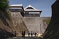
- Nomination Kumamoto Castle --663highland 15:33, 25 August 2010 (UTC)
- Promotion QI & Useful --Archaeodontosaurus 20:12, 25 August 2010 (UTC)
-

-

-

-

-

-
-
-

-

-

-

- Nomination Crowned Lapwing Vanellus coronatus in Serengeti --Nevit 20:54, 24 August 2010 (UTC)
- Decline
Oppose Too much ado about QI, but it is the best image we have of this species. I propose to move in VI. --Archaeodontosaurus 12:14, 25 August 2010 (UTC)
-

- Nomination Great Green Bush-Cricket. --Quartl 19:53, 24 August 2010 (UTC)
- Promotion
Support QI for me --Archaeodontosaurus 12:07, 25 August 2010 (UTC)
-

- Nomination Larva of a Dock Bug. --Quartl 19:53, 24 August 2010 (UTC)
- Promotion
Support QI for me --Archaeodontosaurus 12:02, 25 August 2010 (UTC)
-

- Nomination Larva of a Box Bug. --Quartl 19:53, 24 August 2010 (UTC)
- Promotion
Support Position very interresting that simulates some spiders. QI even though it lacks a leg. --Archaeodontosaurus 11:58, 25 August 2010 (UTC) Comment Yes, I thought so as well. The missing leg is not the fault of the photographer but of mother nature, btw. --Quartl 15:11, 25 August 2010 (UTC)
-

-

- Nomination Relief of CoA of Emperor Charles V over a gate in Cordoba, Spain--Jebulon 10:31, 22 August 2010 (UTC)
- Decline OpposeLight, composition. These are easy to photograph static subjects. You should take more time to find ideal light conditions. --Nevit 11:21, 25 August 2010 (UTC) Thanks for the lesson. I'll try to do better another year.--Jebulon 14:52, 25 August 2010 (UTC)
-

- Nomination Superb Starling Lamprotornis superbus --Nevit 09:12, 21 August 2010 (UTC)
- Decline CommentI'd prefer a more cropped and slightly brighened edition of the superb starling. --Ikiwaner 10:27, 21 August 2010 (UTC) CommentTnx. I have a cropped version. I will try that later. --Myrabella 20:52, 21 August 2010 (UTC) Comment Cropped & brightened. --Nevit 07:19, 25 August 2010 (UTC) Oppose The brigthened version is much worse (see, e.g., the border of the orange breast). --Quartl 07:36, 25 August 2010 (UTC) CommentFixed. --Nevit 09:36, 25 August 2010 (UTC)
Honestly, the original is the best version of all (still no QI, imho); in this one, both black and white are blown in the head of the bird. --Quartl 14:56, 25 August 2010 (UTC)
-

- Nomination: Adivasi farmer with turban, Umaria district, M.P., India. Yann 10:28, 20 August 2010 (UTC)
- Review needed
-
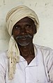
- Nomination: Adivasi farmer with turban, Umaria district, M.P., India. Yann 10:28, 20 August 2010 (UTC)
- Review needed
-

-

- Nomination The belltower of Monastery Popăuţi (Botoşani County, Romania), XV century Cezarika1 09:40, 19 August 2010 (UTC)
- Promotion Comment Please add a description and geocode to the image. --Iotatau 21:11, 19 August 2010 (UTC) SupportSharp image of a building. Already has a description. --Nevit 09:37, 26 August 2010 (UTC)
-

-

- Nomination Windows of the legend of the Blessed Sacrament, Sts-Michel-et-Gudule at Brussels. --M0tty 21:38, 17 August 2010 (UTC)
- Promotion Something wrong in the perspective, which must be corrected in the right above side IMO.--Jebulon 08:18, 21 August 2010 (UTC) Info I have modified the perspective. Better ? --M0tty 16:20, 23 August 2010 (UTC) Info A new version, again... --M0tty 11:19, 25 August 2010 (UTC)much better now. Last questions: Are you sure of the scale (wideness)? Is the rosace above oval in reality ? ;)--Jebulon 14:45, 25 August 2010 (UTC) Yes, i'm sure, the rosace is circular ;) thx ! --M0tty 16:39, 25 August 2010 (UTC)
-

-

- Nomination Larva of a Dock Bug, early stage. --Quartl 05:33, 25 August 2010 (UTC)
- Promotion QI & Useful -- Archaeodontosaurus 06:01, 25 August 2010 (UTC)
-

- Nomination Larva of a Green Shield Bug. --Quartl 05:33, 25 August 2010 (UTC)
- Promotion QI for me --Haneburger 05:45, 25 August 2010 (UTC)
-
- Nomination Piz Julier --Jean0604 00:26, 25 August 2010 (UTC)
- Decline Nice and very usefull picture, but not a QI for me because of the sensor dust, visible in the sky and the picture seems not very sharp --Haneburger 05:49, 25 August 2010 (UTC)
-
- Nomination MOffice (Migros) pocket computer on its expansion dock. On display at the Musée Bolo, EPFL, Lausanne. -- Rama 22:28, 24 August 2010 (UTC)~
- Decline White spots on the black background. The light is not uniform on the metallic parts.--Jebulon 22:43, 24 August 2010 (UTC)
I've touched up the spots on the background. The lightning can't really be helped, I'll try to redo this photograph under a mosquito net. Rama 22:53, 24 August 2010 (UTC) OpposeAs per Jebulon --Nevit 10:17, 25 August 2010 (UTC)
-

- Nomination Castle in Nordkirchen, portal in the garden --Mbdortmund 19:57, 24 August 2010 (UTC)
- Promotion Gut -- George Chernilevsky 20:19, 24 August 2010 (UTC)
-

- Nomination Castle in Nordkirchen --Mbdortmund 19:57, 24 August 2010 (UTC)
- Promotion Sehr gut -- George Chernilevsky 20:19, 24 August 2010 (UTC)
-

-
-

- Nomination Flint Biface of South Africa -- Archaeodontosaurus 19:36, 24 August 2010 (UTC)
- Promotion very good --George Chernilevsky 19:44, 24 August 2010 (UTC)
-

-

- Nomination One adult and two juvenile elephants in Serengeti. --Ikiwaner 18:12, 24 August 2010 (UTC)
- Promotion Very good work! - Darius Baužys 19:12, 24 August 2010 (UTC)
-

-

- Nomination Sotomo in Obama --663highland 15:58, 24 August 2010 (UTC)
- Promotion Good other Obama.--Jebulon 23:44, 24 August 2010 (UTC)
-

- Nomination Sotomo in Obama --663highland 15:58, 24 August 2010 (UTC)
- Promotion Good. --Iotatau 20:13, 24 August 2010 (UTC)
-

- Nomination Kumagawa-juku --663highland 15:58, 24 August 2010 (UTC)
- Decline Also nice and clean, but leaning to the left, main subject in the shadow. --Ikiwaner 18:12, 24 August 2010 (UTC)
-

-

- Nomination White-browed Sparrow-weaver Plocepasser mahali in Tanzania --Nevit 14:07, 24 August 2010 (UTC)
- Decline Bird is unsharp - Darius Baužys 19:09, 24 August 2010 (UTC)
-

- Nomination A dry harvest-field of Goatgrass -- Alvesgaspar 00:09, 24 August 2010 (UTC)
- Promotion Good. Please, correct Aegilops in the file descr. :-)--Cayambe 17:05, 24 August 2010 (UTC)
-

-
- Nomination A grey squirrel in Saint James's Park. --M0tty 22:12, 23 August 2010 (UTC)
- Decline I have to be unpopular here, because the squirrel is so cute, but the whole image is tilted, the lamppost in the background is blown and the long grass in the foreground disturbingly obstructs the animal. --Quartl 07:44, 25 August 2010 (UTC)
-

-

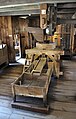
- Nomination Reflecta CS slide tray --Harke 17:33, 23 August 2010 (UTC)
- Promotion CommentNice "historical" image :) I had one of these. Can you desaturate to remove purple tint in shadow? --Nevit 23:05, 23 August 2010 (UTC) Comment Done. --Harke 15:38, 24 August 2010 (UTC) Support --Nevit 21:25, 24 August 2010 (UTC)
-

-

-

-
-

-
- Nomination Gallinula-chloro in Dortmund --Mbdortmund 14:47, 20 August 2010 (UTC)
- Decline Focus is behind the head. --Quartl 07:31, 25 August 2010 (UTC)
-

- Nomination The summit cross of the Mountain Großer Rachel in Bavaria. --High Contrast 09:35, 20 August 2010 (UTC)
- Promotion Support--Nevit 11:28, 25 August 2010 (UTC)
-

- Nomination The Volkswagen logo on the power station of the Volkswagen factory in Wolfsburg. --High Contrast 09:35, 20 August 2010 (UTC)
- Promotion One deleted here sometimes the "Cavallino rampante" of Ferrari, which was QI candidate, I think because of copyright...--Jebulon 10:12, 20 August 2010 (UTC)
There was once led a deletion discussion about this here. The Volkswagen logo is not considered to reach the threshold of originality. --High Contrast 10:15, 20 August 2010 (UTC) Support--Nevit 11:27, 25 August 2010 (UTC)
-
- Nomination Omiya-hachimangu in Miki --663highland 22:13, 19 August 2010 (UTC)
- Decline I was to support, but I feel the crop of the feet unfortunate.--Jebulon 17:20, 20 August 2010 (UTC) Oppose Per Jebulon. --kallerna 20:08, 24 August 2010 (UTC)
-

-

-

- Nomination Rodin's "Jean de Fienne. Nu (Les burghers of Calais)" in front of the Kobe City Museum --663highland 14:14, 18 August 2010 (UTC)
- Decline nice composition but sculpture not treally sharp, perehaps a bit of contrast and sharpening can help --Mbdortmund 15:32, 19 August 2010 (UTC) OpposeI did not like the low angle, wide shot of statue. It creates a lot of distortion that might be artistic but not the best way to display the subject in an encyclopedia. Plus unsharpness. --Nevit 10:58, 25 August 2010 (UTC)
-
- Nomination Honmaru-goten of Kumamoto Castle --663highland 14:14, 18 August 2010 (UTC)
- Promotion SupportQI for me. --Nevit 11:00, 25 August 2010 (UTC)
-

-
-

- Nomination Bow-winged Grasshopper. --Quartl 09:24, 14 August 2010 (UTC)
- Decline CommentFocus OK. It is blue tinted and low contrast due to shadow. Some corrections are needed. If you have a shot with better light conditions submit that one. --Nevit 10:31, 22 August 2010 (UTC)
Unfortunately, no. I adjusted white balance and contrast a bit. --Quartl 19:41, 22 August 2010 (UTC) Oppose--Nevit 11:06, 25 August 2010 (UTC)
-

-

-

-

-
-
- Nomination Porto Covo, Portugal. detail of the coast -- Alvesgaspar 18:10, 23 August 2010 (UTC)
- Promotion Good. --Cayambe 10:40, 24 August 2010 (UTC)
-
-

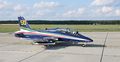
- Nomination North American AT-6D -- Felix Koenig 16:48, 23 August 2010 (UTC)
- Promotion Support QI. Yann 08:48, 24 August 2010 (UTC)
-

- Nomination Beppu Bay --663highland 15:29, 23 August 2010 (UTC)
- Promotion Support Nice composition, beautiful colors. Yann 08:48, 24 August 2010 (UTC)
-

- Nomination Matsumoto Castle --663highland 15:29, 23 August 2010 (UTC)
- Promotion QI & Useful --Archaeodontosaurus 18:03, 23 August 2010 (UTC)
-

- Nomination Matsumoto Castle --663highland 15:29, 23 August 2010 (UTC)
- Promotion QI & Useful --Archaeodontosaurus 18:03, 23 August 2010 (UTC)
-

-

- Nomination Wildlife Buffalo in the morning sun. --Ikiwaner 10:50, 23 August 2010 (UTC)
- Promotion Support QI & Useful --Archaeodontosaurus 12:41, 23 August 2010 (UTC)
-
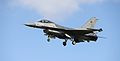
- Nomination Belgian F-16 --Airwolf 10:24, 23 August 2010 (UTC)
- Promotion CommentIt's abit soft, I'm afraid. Rama 11:16, 23 August 2010 (UTC) Support I can read: Push button to open the door. Nice balance of ISO 160, 1/800 sec, f/6.3. Can easily be used in any WP project. Qualifies IMO. --Nevit 20:30, 23 August 2010 (UTC)
-
-
-

-

- Nomination Mel Sanson of Kenelis performs at Nottingham pride. Mattbuck 17:33, 22 August 2010 (UTC)
- Promotion Comment Could you lighten it up a little? --King of Hearts 19:34, 22 August 2010 (UTC) Done Mattbuck 21:48, 22 August 2010 (UTC)
OK, Support --King of Hearts 19:45, 23 August 2010 (UTC)
-

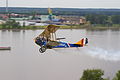
- Nomination A gyrocopter in Löchgau, Germany. -- Felix Koenig 15:51, 22 August 2010 (UTC)
- Promotion Support QI. Interesting vehicle for avoiding traffic jam... ;o) Yann 08:54, 24 August 2010 (UTC)
-

-

-
- Nomination CoA of King Charles I of Spain, Emperor Charles V of the Holy Roman German Empire, Choir of Cathedral of CORDOBA (not Granada), Spain.--Jebulon 19:12, 21 August 2010 (UTC)
- Decline unsharp, bad composition --Carschten 13:24, 22 August 2010 (UTC)Unsharp maybe, but what is wrong in the compo ?--Jebulon 16:19, 23 August 2010 (UTC)
-
- Nomination The Church Cemetery St. Michael in Bad Griesbach, Germany. --High Contrast 09:35, 20 August 2010 (UTC)
- Promotion Comment - I find the clouds a bit distracting. Mattbuck 21:58, 20 August 2010 (UTC)Not a problem to me for a QI.--Jebulon 16:01, 23 August 2010 (UTC)
-

- Nomination A view of the danube in Regensburg. --High Contrast 09:35, 20 August 2010 (UTC)
- Decline Vignetting in the central part of the sky, overexposure of the sky right, and of the white wall of the houses left. Sorry--Jebulon 15:58, 23 August 2010 (UTC)
-
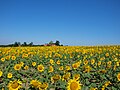
- Nomination Sunflower fields in Šumadija, central Serbia. --PetarM 17:03, 19 August 2010 (UTC)
- Promotion OK. Nice colors -- George Chernilevsky 11:29, 24 August 2010 (UTC)
-

- Nomination Zuihoji Park in Arima Onsen --663highland 13:08, 19 August 2010 (UTC)
- Promotion Support Beautiful colors. Yann 09:07, 24 August 2010 (UTC)
-

- Nomination Wide open plains of Holland country side --Virtualage 06:36, 19 August 2010 (UTC)
- Promotion So close! But please add better categories and the location. --High Contrast 13:12, 23 August 2010 (UTC)
-

- Nomination Landscape in the Siegerland, Germany. --Bartiebert 19:25, 18 August 2010 (UTC)
- Promotion Comment border disturbing, houses on the right leaning to the right, should be corrected --Mbdortmund 15:29, 19 August 2010 (UTC)Ich finde es gut...--Jebulon 15:46, 23 August 2010 (UTC)
-

- Nomination: Ursula-Klaus (IMO 4502190). --Iotatau 09:38, 18 August 2010 (UTC)
- Review needed
-
- Nomination: Damme, Belgium: the (former) Herring Market -- MJJR 20:42, 17 August 2010 (UTC)
- Review needed
-
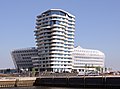
- Nomination: Marco-Polo-Tower in Hamburg, Germany. -- Der Wolf im Wald 19:56, 17 August 2010 (UTC)
- Review right part of the building overexposured --Mbdortmund 23:53, 17 August 2010 (UTC)
-

- Nomination: Gyeonghui palace, Seul, Korea --Sfu 20:04, 17 August 2010 (UTC)
- Review needed
-

- Nomination: Kurayoshi Park Square --663highland 13:56, 17 August 2010 (UTC)
- Review needed
-

-

-

-

- Nomination Starting gyrocopter. -- Felix Koenig 09:58, 23 August 2010 (UTC)
- Promotion very good --Carschten 10:05, 23 August 2010 (UTC)
-
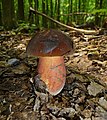
- Nomination Dotted Stem Bolete Boletus erythropus --George Chernilevsky 06:15, 23 August 2010 (UTC)
- Promotion Support QI & Useful -- Archaeodontosaurus 07:38, 23 August 2010 (UTC)
-

- Nomination Dotted Stem Bolete Boletus erythropus --George Chernilevsky 06:15, 23 August 2010 (UTC)
- Promotion Unusual, interesting mushroom. --Iotatau 09:46, 23 August 2010 (UTC)
-

- Nomination Tatra KT8D5R.N2P, Jiráskovo náměstí in Prague — Jagro 22:47, 22 August 2010 (UTC)
- Promotion Good -- George Chernilevsky 06:30, 23 August 2010 (UTC)
-

- Nomination Roadsign near Cayambe, Ecuador, announcing a monument placed on the Equator. --Cayambe 19:34, 22 August 2010 (UTC)
- Promotion QI --George Chernilevsky 06:24, 23 August 2010 (UTC)
-

- Nomination Female Meadow Grasshopper, brown variety. --Quartl 18:56, 22 August 2010 (UTC)
- Promotion Good, although some parts on the animal are slightly overexposed. --Johannes Robalotoff 19:06, 22 August 2010 (UTC)
-

- Nomination Mel Sanson of Kenelis performs at Nottingham pride. Mattbuck 17:33, 22 August 2010 (UTC)
- Decline Ahh, the classic "mic blowjob"... :/ Would do with more sharpness (sharpening might be enough), has slight CA all over. The crop/composition is unfortunate, her elbows have been cut off and there's too much interest-less emptiness at the right. The BG also has some noise. Altogether, it seems to have too many small problems. Sorry. Pitke 17:40, 22 August 2010 (UTC)
Fair enough. Mattbuck 21:39, 22 August 2010 (UTC)
-

- Nomination Tower in Dortmund --Mbdortmund 17:02, 22 August 2010 (UTC)
- Promotion hellere Version nach Anregungen von Hexer und smial... --Mbdortmund 21:09, 22 August 2010 (UTC) Gut --George Chernilevsky 06:21, 23 August 2010 (UTC)
-

- Nomination Telekom Tower in Dortmund --Mbdortmund 17:02, 22 August 2010 (UTC)
- Promotion I liked the tight composition. Seems to fit criteria. --Nevit 19:24, 22 August 2010 (UTC)
-

- Nomination American Black Duck --Cephas 16:10, 22 August 2010 (UTC)
- Promotion Well done! -- George Chernilevsky 16:52, 22 August 2010 (UTC)
-
-
- Nomination Tombstone of the knight Wolf von der Oelsnitz in Malbork, Poland. --DerHexer 15:50, 22 August 2010 (UTC)
- Promotion QI for me. --Johannes Robalotoff 19:12, 22 August 2010 (UTC)
-

-

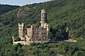
- Nomination Rheinfels castle in high resolution. --Johannes Robalotoff 13:29, 22 August 2010 (UTC)
- Promotion Support QI for me --Archaeodontosaurus 17:28, 22 August 2010 (UTC)
-

-

-

- Nomination Circular stairs in the lighthouse of Hel, Poland. --DerHexer 13:01, 22 August 2010 (UTC)
- Promotion interesting --Mbdortmund 13:16, 22 August 2010 (UTC)
-

-

-

-

- Nomination Matsumoto Castle --663highland 12:57, 22 August 2010 (UTC)
- Promotion nice --Carschten 13:15, 22 August 2010 (UTC)
-

-
-

-
-

- Nomination The Seine River and 7th arrondissement of Paris at sunset. --King of Hearts 00:35, 22 August 2010 (UTC)
- Promotion Comment IMO, Auto white balance has ruined the beautiful warmness of sunset. Increasing saturation in your second upload had increased the blue tint too. If you have the raw, try saving with settings for shadow or cloudy. --Nevit 10:54, 22 August 2010 (UTC) Comment Luckily I did shoot it in raw, and I've bumped up the color temperature to 7000 K. --King of Hearts 19:07, 22 August 2010 (UTC) Support--Nevit 19:18, 22 August 2010 (UTC)
-

- Nomination Flamingo in Dortmund, Westfalenpark --Mbdortmund 22:48, 21 August 2010 (UTC)
- Decline small noise, unsharpness --Carschten 13:24, 22 August 2010 (UTC)
-

-

-

- Nomination baroque vault, Cordoba cathedral--Jebulon 19:57, 21 August 2010 (UTC)
- Promotion Comment - Is the image slightly skewy, or is the ceiling like that? Mattbuck 11:32, 22 August 2010 (UTC) Thanks for review. Both. The photographer was not in the center of the site (it's the vault of the choir), but the stucco work is not regular. There is a natural optical distortion, but what looks skewy is skewy.--Jebulon 11:40, 22 August 2010 (UTC)
Fair enough then. Mattbuck 22:52, 22 August 2010 (UTC)
-

- Nomination Apamea, Syria --Bgag 00:17, 21 August 2010 (UTC)
- Promotion Beautiful - and hier without tourist, the native doesn't disturb me --Haneburger 06:50, 21 August 2010 (UTC)How do you know its a native ? Prejudice ? --Jebulon 08:52, 21 August 2010 (UTC)FP material to me. --Ikiwaner 17:16, 22 August 2010 (UTC)
-

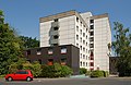
- Nomination Administrative building in Nagorye village, Russia. -- PereslavlFoto 16:38, 20 August 2010 (UTC)
- Promotion OK to me. --Cayambe 14:03, 22 August 2010 (UTC)
-

-
- Nomination Scolia hirta --Böhringer 18:29, 18 August 2010 (UTC)
- Promotion Support I like it! --Kuli 20:49, 19 August 2010 (UTC) CommentIf you want to promote you have to change the word "Nomination" to "Promotion" --Mbdortmund 14:53, 20 August 2010 (UTC) Support Like it, too. --Quartl 14:08, 22 August 2010 (UTC)
-
- Nomination Curtiss Jenny. --Airwolf 09:23, 18 August 2010 (UTC)
- Promotion QI -- George Chernilevsky 06:00, 23 August 2010 (UTC)
-

- Nomination ORP Arctowski. --Airwolf 09:23, 18 August 2010 (UTC)
- Promotion OK -- George Chernilevsky 06:00, 23 August 2010 (UTC)
-

-

-

-

-

- Nomination The port of Porto Covo (detail), west coast of Portugal -- Alvesgaspar 10:01, 17 August 2010 (UTC)
- Promotion Good. --Cayambe 14:09, 22 August 2010 (UTC)
-

- Nomination: Tunnel between the fort du Salbert and the Ouvrage "G". --ComputerHotline 08:55, 17 August 2010 (UTC)
- Review needed
-
- Nomination: Reinforced door inside the tunnel between the fort du Salbert and the Ouvrage "G". --ComputerHotline 08:55, 17 August 2010 (UTC)
- Review needed
-
- Nomination: Statuette (behind a glass) representing Saint Rochus, Hospices de Beaune, France.--Jebulon 22:17, 16 August 2010 (UTC)
- Review needed
-

- Nomination: Main arena in Yyteri Beachfutis. --kallerna 15:00, 16 August 2010 (UTC)
- Review needed
-
-
- Nomination Church in Wernau, Germany. -- Felix Koenig 16:11, 15 August 2010 (UTC)
- Promotion not 100% sharp, but nice composition --Carschten 09:46, 23 August 2010 (UTC)
-
-
- Nomination Königsbau in Stuttgart, Germany. -- Felix Koenig 10:07, 15 August 2010 (UTC)
- Decline Has weird failure in the middle top windows (seems like copy-paste edges), also uncategorised. Umbrellas in the middle have staircased outer contours at places. Building lacks sharpness and is distorted in a complex way (stitched from different, individually distorted images?) Marking the problems. Pitke 17:29, 22 August 2010 (UTC)
-

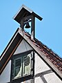
- Nomination: The Glöckle in Münchinhen. Germany --Harke 09:45, 15 August 2010 (UTC)
- Review Comment Hier scheinen mir die Schatten etwas verrauscht zu sein (stark aufgehellt?) und der Blauanteil im Himmel ist hier evtl. schon an der Grenze. --Berthold Werner 17:55, 16 August 2010 (UTC)
-
- Nomination The memorial to John Cobb, Scotland. --Mike Peel 21:02, 7 August 2010 (UTC)
- Promotion Comment Not bad and interesting, but could be better if perspective corrected, IMO --Jebulon 23:07, 15 August 2010 (UTC) CommentHard to impossible to correct this perspective. Perhaps you should nominate another shot with different perspective. --Nevit 09:59, 22 August 2010 (UTC) CommentWell, it is surely not perfect, especially about the scale I'm not sure, but I tried to do this. I put it in CR now. Thoughts ?--Jebulon 17:27, 22 August 2010 (UTC) SupportAt least for your hard effort to correct distortion. --Nevit 19:11, 22 August 2010 (UTC) Comment The perspective choice was deliberate. ;) But kudos to Jebulon on his impressive perspective correction. I've reuploaded the original to File:Memorial to John Cobb 3.jpg. Thanks. Mike Peel 10:29, 23 August 2010 (UTC)
-

-

-

- Nomination File:Tarangire Kirk-Dikdik3.jpg by Ikiwaner , --Nevit 07:58, 22 August 2010 (UTC)
- Promotion QI for me --Archaeodontosaurus 10:39, 22 August 2010 (UTC)
-

- Nomination Wild male Elephant --Ikiwaner 06:44, 22 August 2010 (UTC)
- Promotion SupportQualifies IMO. --Nevit 07:50, 22 August 2010 (UTC)
Support Support too. Perfect! -- George Chernilevsky 07:54, 22 August 2010 (UTC)
-

- Nomination Stained glass window in Cordoba Cathedral, Spain (hard for the mother, hard for the Son...) --Jebulon 23:45, 21 August 2010 (UTC)
- Promotion Very good --George Chernilevsky 07:49, 22 August 2010 (UTC)
-

-

- Nomination Christopher Colombus and the catholic monarchs, Garden of Alcazar of Cordoba, Spain. --Jebulon 22:51, 21 August 2010 (UTC)
- Promotion QI. Interesting --George Chernilevsky 07:57, 22 August 2010 (UTC)
-

- Nomination Flamingo in Dortmund, Westfalenpark --Mbdortmund 22:48, 21 August 2010 (UTC)
- Promotion QI -- George Chernilevsky 08:02, 22 August 2010 (UTC)
-

- Nomination Corseque, ca. late 16th - early 17th century. On display at Morges military museum. -- Rama 22:37, 21 August 2010 (UTC)
- Promotion good , would be nice to know something about the length --Mbdortmund 22:56, 21 August 2010 (UTC)
About 2.75 metres from the tip of the blade to the end of the shaft. Rama 00:32, 22 August 2010 (UTC)
-

-

- Nomination A Common Whitetail (Libellula lydia). --The High Fin Sperm Whale 20:17, 21 August 2010 (UTC)
- Decline Comment Eyes are not in focus. --Nevit 09:06, 22 August 2010 (UTC)
The abdomen is oof as well. --Quartl 10:27, 22 August 2010 (UTC)
-

- Nomination Cherry-faced Meadowhawk (Sympetrum internum). --The High Fin Sperm Whale 20:17, 21 August 2010 (UTC)
- Decline Sorry, too out of focus. --Quartl 10:24, 22 August 2010 (UTC)
-

- Nomination Golden chanterelle fungi (Cantharellus cibarius) --George Chernilevsky 18:56, 21 August 2010 (UTC)
- Promotion Nice ! --Jebulon 19:59, 21 August 2010 (UTC)
-

- Nomination Emperor butterflies eat a moisture on the lost frog --George Chernilevsky 17:02, 21 August 2010 (UTC)
- Promotion Good. --The High Fin Sperm Whale 21:37, 21 August 2010 (UTC)
-

- Nomination Emperor butterflies eat a moisture on the lost frog --George Chernilevsky 17:02, 21 August 2010 (UTC)
- Promotion Good. --Cayambe 19:37, 21 August 2010 (UTC)
-

- Nomination Emperor butterflies eat a moisture on the lost frog --George Chernilevsky 17:02, 21 August 2010 (UTC)
- Promotion Good. --Cayambe 19:37, 21 August 2010 (UTC)
-

- Nomination Telekom tower Dortmund --Mbdortmund 16:44, 21 August 2010 (UTC)
- Promotion OK -- George Chernilevsky 17:09, 21 August 2010 (UTC)
-

- Nomination Television tower Dortmund behind sculpture --Mbdortmund 16:44, 21 August 2010 (UTC)
- Promotion Gut -- George Chernilevsky 17:06, 21 August 2010 (UTC)
-

- Nomination Coypu, wild animal. --Quartl 16:08, 21 August 2010 (UTC)
- Promotion OK -- George Chernilevsky 17:03, 21 August 2010 (UTC)
-
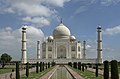
- Nomination Taj Mahal, Agra, India. Thanks to Finemann for perspective correction. Yann 15:27, 21 August 2010 (UTC)
- Promotion Good -- George Chernilevsky 17:09, 21 August 2010 (UTC)
Strongly tilted !--Jebulon 19:17, 21 August 2010 (UTC) Rotated 0.85 CW. I wouldn't call that "strongly tilted". Yann 19:49, 21 August 2010 (UTC). O yes it was (to my eyes of course) ! Anyway, it's very good now, thank you ! --Jebulon 20:42, 21 August 2010 (UTC)
-
- Nomination Multi-storey car park from the mal LOOP5 in Weiterstadt. --PS-2507 15:05, 21 August 2010 (UTC)
- Decline Vertical lines on the building not upright, blurry apart from the image center, CA. --Johannes Robalotoff 19:01, 21 August 2010 (UTC)
-

- Nomination Train station from Erzhausen. --PS-2507 15:05, 21 August 2010 (UTC)
- Decline Perspective could be (and would have to be) corrected. But there is very (!) strong CA. Also there are many overexposed pixels. --Johannes Robalotoff 18:54, 21 August 2010 (UTC)
-
-

-

-

- Nomination Dock Bug. --Quartl 10:31, 21 August 2010 (UTC)
- Promotion Very good. --The High Fin Sperm Whale 21:28, 21 August 2010 (UTC)
-

-

- Nomination Gallinula-chloro in Dortmund --Mbdortmund 23:32, 20 August 2010 (UTC)
- Promotion QI -- George Chernilevsky 17:11, 21 August 2010 (UTC)
-

- Nomination Gallinula-chloro in Dortmund --Mbdortmund 23:32, 20 August 2010 (UTC)
- Decline Too noisy. --The High Fin Sperm Whale 21:39, 21 August 2010 (UTC)
-

- Nomination Partial view of the garden of the fortress of the Christian Kings in Cordoba, Spain.--Jebulon 22:35, 20 August 2010 (UTC)
- Promotion Good. --The High Fin Sperm Whale 21:39, 21 August 2010 (UTC)
-

- Nomination One of the baroque altarpieces in the Catedral de la Incarnacion in Granada, Spain--Jebulon 21:43, 20 August 2010 (UTC)
- Decline
Comment Not really sharp. Rather tight framing. --Johannes Robalotoff 19:39, 21 August 2010 (UTC) Oppose Per Johannes Robalotoff. --Nevit 11:03, 22 August 2010 (UTC)
-
- Nomination Illicium verum (star aniseed), dried as a spice.--Jebulon 20:48, 20 August 2010 (UTC)
- Promotion Good. --The High Fin Sperm Whale 21:40, 21 August 2010 (UTC)
-

- Nomination Dried flowers of lavender--Jebulon 20:41, 20 August 2010 (UTC)
- Promotion Good. --The High Fin Sperm Whale 21:40, 21 August 2010 (UTC)
-

- Nomination La Alhambra (The Red) of Granada, Spain.--Jebulon 00:31, 18 August 2010 (UTC)
- Promotion QI good definition --Archaeodontosaurus 07:06, 22 August 2010 (UTC)
-

-

-

- Nomination tower of the city hall in Hamburg, Germany -- Der Wolf im Wald 18:40, 17 August 2010 (UTC)
- Decline Weißabgleich etwas rötlich, imo, ansonsten sehr gute Auflösung. --Mbdortmund 09:52, 18 August 2010 (UTC) Oppose per Mbdortmund --Carschten 13:49, 21 August 2010 (UTC)
-
- Nomination Paper mill in Gemmrigheim, Germany. -- Felix Koenig 10:59, 17 August 2010 (UTC)
- Promotion okay --Carschten 13:44, 21 August 2010 (UTC)
-

- Nomination Snellegem (Belgium): pond of the Boerenmolen -- MJJR 20:31, 15 August 2010 (UTC)
- Promotion great view but house and building look a little bit tilted/distorted CW --Mbdortmund 21:14, 15 August 2010 (UTC)
Done Tilt corrected, image restitched -- MJJR 13:31, 16 August 2010 (UTC)
Great view. Not entirely sure it's level, but no real way to tell. Mattbuck 14:08, 21 August 2010 (UTC)
-

-

- Nomination: Museum of the Liptov village in Pribylina --Pudelek 20:04, 15 August 2010 (UTC)
- Review I'm afraid the file name and the file description are not good. It's a nice picture, but what does it show exactly ? It's seems to be a broken cross (in a cemetery ?) and not a museum...--Jebulon 22:35, 15 August 2010 (UTC)
-

- Nomination: Street in Seoul. --Sfu 16:49, 15 August 2010 (UTC)
- Review needed
-
-
-

-

- Nomination Fishing in the port of Sada, Galicia (Spain)--Lmbuga 18:17, 14 August 2010 (UTC)
- Promotion very good --Carschten 17:12, 21 August 2010 (UTC)
-
- Nomination Mount Kusatsu-Shiranesan --663highland 14:10, 14 August 2010 (UTC)
- Promotion weak support: it's also pixelated like a lot of your pics, but imo good enough --Carschten 17:12, 21 August 2010 (UTC)
-

-

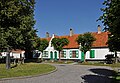
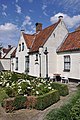
- Nomination Classic old Swedish building. --Ainali 09:22, 14 August 2010 (UTC)
- Promotion Comment - could you lighten it please? It's all rather dark. Mattbuck 10:13, 14 August 2010 Comment fixed. --Ainali 11:40, 14 August 2010 (UTC)(UTC) OK now. --Johannes Robalotoff 19:29, 21 August 2010 (UTC)
-

-
-

-

- Nomination Münster, sculptures at St. Lamberti --Mbdortmund 18:06, 12 August 2010 (UTC)
- Promotion Very good and interesting. Modern statues ? Wer sind sie ?--Jebulon 08:01, 21 August 2010 (UTC)
I will try to find it out, the one on the left should be Gothe imo --Mbdortmund 20:18, 21 August 2010 (UTC) Yes, I agree about Goethe, That's was the reason of my question !! --Jebulon 11:53, 22 August 2010 (UTC)
-

- Nomination The signer for Canine Feline dances at Nottingham Pride 2010. Mattbuck 23:28, 7 August 2010 (UTC)
- Decline Comment I see personality rights problems here, she's just a signer after all. Maybe she doesn't qualify as part of the performance, I don't know about UK law. --Quartl 07:09, 16 August 2010 (UTC)
She was in a public location at a public location, pretty much on the stage, so I don't see an issue. PR tagged anyway. Mattbuck 13:37, 18 August 2010 (UTC) Oppose Face is not sharp. Focus on T shirt. --Nevit 09:56, 22 August 2010 (UTC)
-

- Nomination Playground in Dortmund, alternative crop --Mbdortmund 09:51, 21 August 2010 (UTC)
- Promotion Gut -- George Chernilevsky 11:30, 21 August 2010 (UTC)
-

- Nomination Thomson's Gazelle in Serengeti --Ikiwaner 07:57, 21 August 2010 (UTC)
- Promotion interesting --Mbdortmund 08:05, 21 August 2010 (UTC)
-
- Nomination Teichrallenjunge in Dortmund --Mbdortmund 07:23, 21 August 2010 (UTC)
- Promotion Ja, gut für mich--Jebulon 09:01, 21 August 2010 (UTC)
-
- Nomination Four-spotted Chaser (Libellula quadrimaculata) --The High Fin Sperm Whale 03:18, 21 August 2010 (UTC)
- Promotion Good to me. --Quartl 07:19, 21 August 2010 (UTC)
-

-

- Nomination Zinnia with solitary bee (cf. Halictus sp.) -- Alvesgaspar 23:53, 20 August 2010 (UTC)
- Decline Severe clipping both at high and low levels. sRGB is the wrong profile for saturated colours like this, Adobe RGB would be better. Try again! The shot is great. --Ikiwaner 08:16, 21 August 2010 (UTC)
-

-

-

- Nomination Abandoned Bedford TJ truck, Portugal -- Alvesgaspar 18:29, 20 August 2010 (UTC)
- Promotion geocoding would be nice --Mbdortmund 07:36, 21 August 2010 (UTC) -- Done -- Alvesgaspar 09:00, 21 August 2010 (UTC)
-
- Nomination A Yellow Dung-fly, Scatophaga stercoraria. -- Alvesgaspar 18:09, 20 August 2010 (UTC)
- Promotion OK for me. --Nevit 23:13, 20 August 2010 (UTC)
-
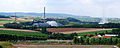
- Nomination Völklingen Ironworks; World Heritage Sites, Germany -- Rainer Lippert 16:55, 20 August 2010 (UTC)
- Promotion Not perfect, but very interesting and useful. -- Felix Koenig 17:18, 20 August 2010 (UTC)
-

- Nomination View of Haigerloch, Germany. -- Felix Koenig 15:39, 20 August 2010 (UTC)
- Promotion Good --Haneburger 06:56, 21 August 2010 (UTC)
-
- Nomination Gallinula-chloro in Dortmund --Mbdortmund 14:47, 20 August 2010 (UTC)
- Promotion Minor parts of the duck are out of focus, but that's OK. --King of Hearts 18:23, 20 August 2010 (UTC)
-

- Nomination Gallinula-chloro in Dortmund --Mbdortmund 14:47, 20 August 2010 (UTC)
- Promotion OK -- George Chernilevsky 18:45, 20 August 2010 (UTC)
-

- Nomination Gallinula-chloro in Dortmund --Mbdortmund 14:47, 20 August 2010 (UTC)
- Promotion Cute. Mattbuck 17:19, 20 August 2010 (UTC)
-

-
-

- Nomination Rhamphorhynchus munsteri --M0tty 12:48, 20 August 2010 (UTC)
- Promotion I would erase the number --Mbdortmund 15:03, 20 August 2010 (UTC) Info Removed number, thx ! --M0tty 15:16, 20 August 2010 (UTC)
-

- Nomination Framing of the Saint-Girons church in Monein, France. --Myrabella 11:39, 20 August 2010 (UTC)
- Promotion Good DOF, well done -- George Chernilevsky 13:00, 20 August 2010 (UTC)C'était sûr !! Ah, tu vois bien, j'avais raison, ça n'a pas mis longtemps !!--Jebulon 14:38, 20 August 2010 (UTC)
-

- Nomination Grant's Gazelle
near Lake Manyarain Ngorongoro, Tanzania. --Ikiwaner 11:28, 20 August 2010 (UTC) - Promotion Comment Why ISO 400 was used? Noised result -- George Chernilevsky 13:03, 20 August 2010 (UTC)
and overexposured --Mbdortmund 13:23, 20 August 2010 (UTC)
IMO high ISO is needed to prevent camera shake while shooting in nature and using long focal lengths. I looked at histogram and exposure seems OK. QI for me. --Nevit 23:04, 20 August 2010 (UTC) I uploaded a new version with more denoising and 0.1 EV less exposure. I'm sorry for the cunfusion with the taxonomy and place. --Ikiwaner 09:11, 21 August 2010 (UTC)
- Nomination Grant's Gazelle
-

- Nomination The oil power plant "Pleinting" in Bavaria. --High Contrast 09:35, 20 August 2010 (UTC)
- Promotion Sehr schön, und das nicht nur, weil ich Kraftwerke mag ;-) Interessante Farben übrigens. -- Felix Koenig 14:04, 20 August 2010 (UTC)
-

- Nomination Footman's armour in Savoyard style, ca. 1600-1610. On display at Morges military museum -- Rama 08:54, 20 August 2010 (UTC)
- Promotion very good --Mbdortmund 14:51, 20 August 2010 (UTC)
-

-

-

-

- Nomination Kumamoto Castle --663highland 13:08, 19 August 2010 (UTC)
- Promotion Good.--Jebulon 08:25, 21 August 2010 (UTC)
-
-
-

- Nomination Trier, Simeonstr., Building fromthe 19th century --Berthold Werner 12:40, 17 August 2010 (UTC)
- Promotion Good to me.--Jebulon 08:15, 21 August 2010 (UTC)
-

- Nomination Kozenji Garden in Tottori --663highland 14:20, 16 August 2010 (UTC)
- Decline The light is not good IMO (contrast ?)--Jebulon 08:10, 21 August 2010 (UTC)
-

- Nomination: The Glöckle in Münchingen, Germany --Harke 09:44, 15 August 2010 (UTC)
- Review needed
-
- Nomination Sculpture dedicated to the emigrant, Sada, Galicia (Spain)--Lmbuga 15:46, 14 August 2010 (UTC)
- Promotion There is a dustspot at the upper left border. --Berthold Werner 12:09, 19 August 2010 (UTC)Good to me.--Jebulon 08:03, 21 August 2010 (UTC)
-
-

-

-

- Nomination The river Dubna in Russia enclosed in morning fog. --High Contrast 09:35, 20 August 2010 (UTC)
- Promotion Good and usefull (Geocoding?)--Haneburger 11:22, 20 August 2010 (UTC)
-
- Nomination Footman's armour in Savoyard style, ca. 1600-1610. On display at Morges military museum -- Rama 08:00, 20 August 2010 (UTC)
- Promotion nice --Mbdortmund 08:14, 20 August 2010 (UTC)
-
-

-

- Nomination Apamea, Syria --Bgag 01:28, 20 August 2010 (UTC)
- Promotion good --Mbdortmund 08:24, 20 August 2010 (UTC)
-

- Nomination A window in the Garden of Partal, Alhambra, Granada, Spain--Jebulon 23:15, 19 August 2010 (UTC)
- Promotion good composition and details --Mbdortmund 08:25, 20 August 2010 (UTC)
-
- Nomination Tudumi-ga-taki Park in Kobe --663highland 22:13, 19 August 2010 (UTC)
- Promotion good compo and colors. QI to me.--Jebulon 22:23, 19 August 2010 (UTC)
-

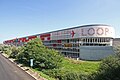
- Nomination WetterOnline office building. --Iotatau 20:55, 19 August 2010 (UTC)
- Promotion I think it needs perspective correction, but otherwise good. Mattbuck 23:05, 19 August 2010 (UTC) Comment New version uploaded. --Iotatau 23:29, 19 August 2010 (UTC)
good quality --Mbdortmund 08:28, 20 August 2010 (UTC)
-

- Nomination Inside the Ouvrage of Schoenenbourg --ComputerHotline 18:34, 19 August 2010 (UTC)
- Promotion Good. --Cayambe 09:48, 20 August 2010 (UTC)
-
- Nomination The kitchen inside the Ouvrage of Schoenenbourg --ComputerHotline 18:34, 19 August 2010 (UTC)
- Promotion good --Mbdortmund 08:36, 20 August 2010 (UTC)
-

- Nomination Cleg fly (Haematopota pseudolusitanica) showing the blade-like mouth parts, used to draw blood from mammals (including man) -- Alvesgaspar 17:26, 19 August 2010 (UTC)
- Promotion Very impressive and good. --Cayambe 21:08, 19 August 2010 (UTC)
-
-

-

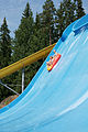
- Nomination Water slide in water park Serena. --kallerna 15:30, 19 August 2010 (UTC)
- Withdrawn I'm not convinced by the composition - it's a bit off-centre. Mattbuck 23:05, 19 August 2010 (UTC)
-
-

- Nomination Trier, Pietà at Liebfrauenstraße --Berthold Werner 12:03, 19 August 2010 (UTC)
- Promotion Good... please, add Trier to the file description. --Cayambe 21:02, 19 August 2010 (UTC)
-

- Nomination Bahnhofsturm Stuttgart, Germany. -- Felix Koenig 11:19, 19 August 2010 (UTC)
- Decline Too many distracting elements in the foreground. Also by such a straight building perspective correction would be beneficial. --Elekhh 01:03, 20 August 2010 (UTC)
-
- Nomination The church of Monastery Popăuţi (Botoşani County, Romania), XV century Cezarika1 09:40, 19 August 2010 (UTC)
- Promotion OK --Mbdortmund 08:33, 20 August 2010 (UTC)
-

-

-

-

-

-

-

- Nomination Lake Yumi-ike--663highland 14:10, 14 August 2010 (UTC)
- Promotion Slightly tight on the left, but otherwise nice composition. --Elekhh 01:20, 20 August 2010 (UTC)
-

- Nomination Male parasitic wasp, Colpa sexmaculata. -- Alvesgaspar 10:43, 19 August 2010 (UTC)
- Promotion QI & Useful --Archaeodontosaurus 11:10, 19 August 2010 (UTC)
-

- Nomination European Mole, albino form. --Archaeodontosaurus 09:43, 19 August 2010 (UTC)
- Promotion Precise to a hairsplit. Rama 09:53, 19 August 2010 (UTC)
-

- Nomination A tourist's bicycle with a long stretch of lonely beach in the background in Texel, Netherlands --Virtualage 06:34, 19 August 2010 (UTC)
- Decline Bad composition, bicyle is cutted. Sorry --Chmee2 08:30, 19 August 2010 (UTC)
-

- Nomination A Grey-crowned crane in Tanzania --Ikiwaner 04:23, 19 August 2010 (UTC)
- Promotion good --Mbdortmund 07:43, 19 August 2010 (UTC)
-

- Nomination Young gallinula chloro (Teichralle) in a park in Dortmund --Mbdortmund 02:04, 19 August 2010 (UTC)
- Promotion Gut -- George Chernilevsky 06:47, 19 August 2010 (UTC)
-

-

- Nomination Spider Dolomedes fimbriatus--Lucarelli 22:53, 18 August 2010 (UTC)
- Promotion Support QI & Useful --Archaeodontosaurus 09:46, 19 August 2010 (UTC)
-

- Nomination Spider Thomisus onustus--Lucarelli 22:52, 18 August 2010 (UTC)
- Promotion Support QI & Useful --Archaeodontosaurus 07:40, 19 August 2010 (UTC)
-
- Nomination Zerynthia cassandra--Lucarelli 22:50, 18 August 2010 (UTC)
- Promotion OK --Mbdortmund 02:10, 19 August 2010 (UTC)
-
- Nomination Melitaea didyma--Lucarelli 22:49, 18 August 2010 (UTC)
- Decline flowers overexposured --Mbdortmund 02:06, 19 August 2010 (UTC)
-

- Nomination Melanargia galathea--Lucarelli 22:48, 18 August 2010 (UTC)
- Promotion nice --Mbdortmund 02:09, 19 August 2010 (UTC)
-

- Nomination Arch of the mirhab of the mosque (now cathedral) of Cordoba, Spain--Jebulon 21:14, 18 August 2010 (UTC
- Promotion Support QI and Useful --Archaeodontosaurus 07:52, 19 August 2010 (UTC))
-

- Nomination Wrocław, Poland city hall. --Andrei Stroe 20:58, 18 August 2010 (UTC)
- Promotion Ok -- Smial 23:22, 18 August 2010 (UTC)
-

- Nomination Funicular car on Petřín hill, Prague.--Andrei Stroe 20:26, 18 August 2010 (UTC)
- Promotion Ok -- Smial 23:22, 18 August 2010 (UTC)
-

- Nomination The Parliament of Hungary in Budapest.Andrei Stroe 20:07, 18 August 2010 (UTC)
- Promotion Support Good perspective! --Kuli 20:56, 18 August 2010 (UTC)
-

-

- Nomination Street in Oyambaro, Ecuador. --Cayambe 16:04, 18 August 2010 (UTC)
- Promotion Support QI for me --Archaeodontosaurus 07:44, 19 August 2010 (UTC)
-

- Nomination Cloud at the twilight in Roma. --Cody escadron delta 14:55, 18 August 2010 (UTC)
- Decline Oppose Resolution too low --Archaeodontosaurus 15:32, 18 August 2010 (UTC)
-

-

-

- Nomination Lewes Wave. --Quartl 12:57, 18 August 2010 (UTC)
- Promotion Support QI & Useful --Archaeodontosaurus 13:12, 18 August 2010 (UTC)
-
- Nomination Pforzheim heating plant, Germany. -- Felix Koenig 12:41, 18 August 2010 (UTC)
- Promotion A bit dark but otherwise good and useful. Please add geocode. --Iotatau 13:39, 18 August 2010 (UTC)
-

-

- Nomination Houses along the 'Gave d'Aspe' in Oloron, France. --Myrabella 09:33, 18 August 2010 (UTC)
- Promotion Support Nice place, although a bit humid in winter --Archaeodontosaurus 13:11, 18 August 2010 (UTC)
-

- Nomination Gate of Schloss Liebenstein, Germany. -- Felix Koenig 09:31, 18 August 2010 (UTC)
- Promotion Support Nice place, QI --Archaeodontosaurus 13:02, 18 August 2010 (UTC)
-

-

- Nomination Young tabby cat -- Alvesgaspar 10:01, 17 August 2010 (UTC)
- Promotion Good. --PetarM 16:17, 18 August 2010 (UTC)
-

-

- Nomination Polish soldiers. --Airwolf 21:28, 15 August 2010 (UTC)
- Promotion Composition is a bit tight on the right side. Rama 07:17, 16 August 2010 (UTC) ... a matter of taste to me. Go as close as possible, especially for action shots! --Ikiwaner 18:30, 17 August 2010 (UTC)
Oh yes, but with a short lens then. Rama 09:32, 19 August 2010 (UTC)
-
- Nomination Maus castle, Rhine, Germany. --Johannes Robalotoff 16:55, 15 August 2010 (UTC)
- Promotion Comment Contrast could be better, imho. --Berthold Werner 18:20, 15 August 2010 (UTC) Thank you for reviewing. I will try to convert with more local contrast from the RAW file tomorrow. --Johannes Robalotoff 21:15, 15 August 2010 (UTC) Done New version uploaded. Please review again. --Johannes Robalotoff 21:48, 17 August 2010 (UTC)
Ok. --Berthold Werner 15:00, 18 August 2010 (UTC)
-

- Nomination Entrance of the Church of Acheres la Foret, Ile de France --Pline 10:10, 15 August 2010 (UTC)
- Promotion QI (Style "Roman" of the twelfth century) --Archaeodontosaurus 08:00, 19 August 2010 (UTC)
-
- Nomination The Red Arrows --Airwolf 08:49, 14 August 2010 (UTC)
- Withdrawn Comment - there are several dust spots visible, and it could do with a crop at the bottom. Mattbuck 10:12, 14 August 2010 (UTC)
I'll upload a corrected version soon. Airwolf 11:19, 19 August 2010 (UTC)
-

-

-

- Nomination: Protestant church in haigerloch, Germany. -- Felix Koenig 13:21, 12 August 2010 (UTC)
- Review needed
-

- Nomination Gothic portal of the Sarmental, Cathedral of Burgos, Spain --Jebulon 00:23, 18 August 2010 (UTC)
- Promotion good --Mbdortmund 09:00, 18 August 2010 (UTC)
-

- Nomination The enemies of Don Quijote, Consuegra, Castile-la Mancha, Spain.--Jebulon 00:02, 18 August 2010 (UTC)
- Promotion QI good composition --Archaeodontosaurus 08:48, 18 August 2010 (UTC)
-

- Nomination Access to Port of Bonn. --Iotatau 21:22, 17 August 2010 (UTC)
- Promotion OK --Mbdortmund 23:51, 17 August 2010 (UTC)
-

- Nomination Wall lizard on Fira, Santorini, Greece --null 21:21, 17 August 2010 (UTC)
- Decline sorry, all highlights are blown --Mbdortmund 23:49, 17 August 2010 (UTC)
+ bad focus. --kallerna 05:05, 18 August 2010 (UTC)
-

- Nomination Windows of the legend of the Blessed Sacrament, Sts-Michel-et-Gudule at Brussels. --M0tty 21:11, 17 August 2010 (UTC)
- Promotion Very Good. -- Der Wolf im Wald 21:55, 17 August 2010 (UTC)
-
-

-

-

- Nomination Hotel Królewski and Filharmonia Bałtycka in Gdańsk, Poland. --DerHexer 19:38, 17 August 2010 (UTC)
- Promotion Good. -- Der Wolf im Wald 21:55, 17 August 2010 (UTC)
-

- Nomination Egyptian stele. --Eusebius 19:15, 17 August 2010 (UTC)
- Promotion Good. --Johannes Robalotoff 19:35, 17 August 2010 (UTC)
-

- Nomination Church vaults. --Eusebius 18:55, 17 August 2010 (UTC)
- Promotion good --Mbdortmund 23:55, 17 August 2010 (UTC)
-
- Nomination Trachyphonus erythrocephalus from Tanzania --Ikiwaner 18:04, 17 August 2010 (UTC)
- Promotion Very good. --Johannes Robalotoff 19:31, 17 August 2010 (UTC)
-

- Nomination Barneys New York in Kobe --663highland 13:56, 17 August 2010 (UTC)
- Promotion good --Mbdortmund 09:02, 18 August 2010 (UTC)
-

- Nomination Kannonin Garden in Tottori --663highland 13:56, 17 August 2010 (UTC)
- Decline Chromatic aberration on the roof of the right side, and error of perspective --Archaeodontosaurus 15:09, 17 August 2010 (UTC)
-

-

-

- Nomination Devonian shell in pyrite --Archaeodontosaurus 09:07, 17 August 2010 (UTC)
- Promotion nice composition --Mbdortmund 09:06, 18 August 2010 (UTC)
-

-
- Nomination Diesel locomotive #7798 of the Begian State Railways -- MJJR 16:02, 16 August 2010 (UTC)
- Promotion Good -- George Chernilevsky 06:58, 17 August 2010 (UTC) no: excellent ->FP-nom! --Ikiwaner 18:48, 17 August 2010 (UTC)
-

- Nomination Flower of the Spotted Joe-pye Weed (Eupatorium maculatum 'Riesenschirm') -- MJJR 16:02, 16 August 2010 (UTC)
- Promotion Good... please, give name of location and geotag in the file description. --Cayambe 07:14, 17 August 2010 (UTC) Comment Location is Bruges, Belgium. As the picture is taken in a private garden, no geotagging is added for privacy reasons. -- MJJR 16:09, 17 August 2010 (UTC)
-

- Nomination Kurashiki Ivy Square --663highland 14:20, 16 August 2010 (UTC)
- Decline barrel distortion ? Need to be re-centered, IMO--Jebulon 15:59, 17 August 2010 (UTC)
Unfortunately, perspective correction won't fix it, since the right pillar is slightly cut off. --King of Hearts 19:40, 17 August 2010 (UTC)
-

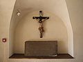
- Nomination: Museum of the Liptov village in Pribylina --Pudelek 21:24, 11 August 2010 (UTC)
- Review needed
-

- Nomination: at Tatsuno in Hyogo pref. --663highland 12:29, 11 August 2010 (UTC)
- Review needed
-

- Nomination: at Tatsuno in Hyogo pref. --663highland 12:29, 11 August 2010 (UTC)
- Review needed
-

- Nomination: at Tatsuno in Hyogo pref. --663highland 12:29, 11 August 2010 (UTC)
- Review needed
-

- Nomination: Ring to tie horses at the Caravanserai of Qalat el-Mudiq, Syria --Bgag 00:45, 10 August 2010 (UTC)
- Review I do not think that the centred composition is really adequate here. Rama 07:06, 10 August 2010 (UTC) CommentHmm I'm not sure, but if I crop the picture on both side I think it would be better. What do you think? --Bgag 20:14, 10 August 2010 (UTC) I have cropped it. --Bgag 23:17, 11 August 2010 (UTC)
-

- Nomination Yak-52. --Airwolf 10:26, 17 August 2010 (UTC)
- Promotion Good -- George Chernilevsky 11:42, 17 August 2010 (UTC)
-
- Nomination Pied Heron. --99of9 06:58, 17 August 2010 (UTC)
- Promotion Support Useful --Archaeodontosaurus 08:46, 17 August 2010 (UTC)
-

-
- Nomination Castle in Nordkirchen --Mbdortmund 18:35, 16 August 2010 (UTC)
- Promotion Ok. --kallerna 21:30, 16 August 2010 (UTC)
-

- Nomination Castle in Nordkirchen --Mbdortmund 18:35, 16 August 2010 (UTC)
- Promotion Ok. --kallerna 21:30, 16 August 2010 (UTC)
-

- Nomination Bruges (Belgium): tower of the Jerusalem church -- MJJR 16:02, 16 August 2010 (UTC)
- Promotion Ok -- Smial 00:58, 17 August 2010 (UTC)
Support Good -- George Chernilevsky 07:00, 17 August 2010 (UTC)
-

- Nomination Breitling Team's L-39. --Airwolf 16:02, 16 August 2010 (UTC)
- Promotion Very good -- George Chernilevsky 07:05, 17 August 2010 (UTC)
-

- Nomination Yak-18. --Airwolf 16:02, 16 August 2010 (UTC)
- Promotion Good -- George Chernilevsky 07:06, 17 August 2010 (UTC)
-

- Nomination EC-135, Polish air ambulance. --Airwolf 16:02, 16 August 2010 (UTC)
- Promotion QI -- George Chernilevsky 07:07, 17 August 2010 (UTC)
-

-

- Nomination Mens final in Yyteri BeachFutis: BF Mesikämmen - GFT Team Beach. --kallerna 15:00, 16 August 2010 (UTC).
I'm willing to promote... but please, provide description in English and geotag. --Cayambe 16:48, 16 August 2010 (UTC) Done --kallerna 20:52, 16 August 2010 (UTC) - Promotion . Ok... though I don't understand the English in the file description :-). --Cayambe 21:47, 16 August 2010 (UTC)
- Nomination Mens final in Yyteri BeachFutis: BF Mesikämmen - GFT Team Beach. --kallerna 15:00, 16 August 2010 (UTC).
-

-

- Nomination Himeji Castle --663highland 14:20, 16 August 2010 (UTC)
- Promotion interesting and useful --Mbdortmund 22:57, 16 August 2010 (UTC)
-

-

- Nomination statue of Herkules in a chestnut --Mbdortmund 10:18, 16 August 2010 (UTC)
- Promotion Very good --George Chernilevsky 07:03, 17 August 2010 (UTC)
-
- Nomination Church dome in Nagorye village. --PereslavlFoto 09:40, 16 August 2010 (UTC)
- Decline Overexposed. --kallerna 14:54, 16 August 2010 (UTC) QuestionWhere? Why do you think white colour means «overexposed»? In reality there is white colour.--PereslavlFoto 17:29, 16 August 2010 (UTC)
-
- Nomination Fort des Basses Perches --ComputerHotline 09:38, 16 August 2010 (UTC)
- Promotion I like it.--Gaeser 17:27, 16 August 2010 (UTC)
-

- Nomination Fort des Basses Perches : powder room --ComputerHotline 09:38, 16 August 2010 (UTC)
- Decline Oppose Trop sombre. Yann 13:33, 16 August 2010 (UTC)
-

-

- Nomination: Yyteri beach during Yyteri Beachfutis. --kallerna 11:39, 11 August 2010 (UTC)
- Review needed
-
- Nomination: Lisa Scott-Lee performs at Nottingham Pride. Mattbuck 19:31, 10 August 2010 (UTC)
- Review needed
-

- Nomination: Mel Sanson of Kenelis performs at Nottingham Pride. Mattbuck 19:31, 10 August 2010 (UTC)
- Review needed
-

- Nomination: Tsuga caroliniana, Rogów Arboretum, Poland. --Crusier 18:14, 10 August 2010 (UTC)
- Review needed
-
- Nomination: Mens second final in Yyteri Beachfutis: Operaatio Meidän Vuosi - GFT/ YDIN. --kallerna 13:48, 10 August 2010 (UTC)
- Review needed
-

- Nomination Yosuien Garden in Wakayama --663highland 14:37, 9 August 2010 (UTC)
- Promotion Some noise in the darker parts of the water, but otherwise O.K. -- MJJR 19:12, 16 August 2010 (UTC)
-
- Nomination Yosuien Garden in Wakayama --663highland 14:37, 9 August 2010 (UTC)
- Decline Nice view, but too much noise, especially in the water. Colors seem also a little bit oversaturated. -- MJJR 19:15, 16 August 2010 (UTC)
-
- Nomination Snufkin in Muumimaailma, Naantali. --kallerna 06:47, 23 July 2010 (UTC)
- Decline Good job keeping private faces out of the picture while keeping it "whole". Could use slight sharpening. Pitke 18:50, 3 August 2010 (UTC)
Declined as unsharp --Herbythyme 14:47, 10 August 2010 (UTC)
-

- Nomination Fort des Basses Perches --ComputerHotline 09:38, 16 August 2010 (UTC)
- Promotion Support here resembles the ecclesiastical art --Archaeodontosaurus 11:52, 16 August 2010 (UTC)
-
- Nomination Sarrebourg, Chapelle des cordeliers, museum displaying a famous stained glass by Marc Chagall. --Cayambe 08:28, 16 August 2010 (UTC)
- Promotion Support QI & Useful --Archaeodontosaurus 11:50, 16 August 2010 (UTC)
-

- Nomination Bruges (Belgium): Jerusalem church -- MJJR 20:31, 15 August 2010 (UTC)
- Promotion perhaps cropping of the half red traffic sign would look better? --Mbdortmund 21:05, 15 August 2010 (UTC) Done cropped -- MJJR 09:38, 16 August 2010 (UTC)
good --Mbdortmund 10:20, 16 August 2010 (UTC)
-

- Nomination Sint-Kruis (Bruges, Belgium): Holy Cross church -- MJJR 20:31, 15 August 2010 (UTC)
- Promotion sharp, good colours and details --Mbdortmund 21:07, 15 August 2010 (UTC)
-
-
-

-
-
-
- Nomination Altbach Power Station, Germany. -- Felix Koenig 16:11, 15 August 2010 (UTC)
- Promotion Weißabgleich verschoben in Richtung Blau, wenn ich richtig geguckt habe, ist das Teil aus Alu und sollte eher grau aussehen, ansonsten sehr schön --Mbdortmund 21:19, 15 August 2010 (UTC)
Jein, die Oberfläche ist spiegelnd. Ich schwöre jedenfalls, dass die Farben so absolut authentisch sind. -- Felix Koenig 08:46, 16 August 2010 (UTC)
OK --Mbdortmund 10:14, 16 August 2010 (UTC)
-

- Nomination Portrait of common carder bee --Archaeodontosaurus 15:45, 15 August 2010 (UTC)
- Promotion perhaps it would be slightly betterwith a little bit lesss sharpening, but still impressive --Mbdortmund 21:02, 15 August 2010 (UTC)
-

- Nomination at Mount Kusatsu-Shiranesan --663highland 15:32, 15 August 2010 (UTC)
- Promotion Good.--Gaeser 07:55, 16 August 2010 (UTC)
-

- Nomination at Mount Kusatsu-Shiranesan --663highland 15:32, 15 August 2010 (UTC)
- Promotion Pretty nice.--Gaeser 07:55, 16 August 2010 (UTC)
-

- Nomination Katz castle, Rhine, Germany. --Johannes Robalotoff 14:24, 15 August 2010 (UTC)
- Promotion Question The central tower, leaning slightly, I think it's natural. Can you confirm? --Archaeodontosaurus 15:32, 15 August 2010 (UTC) The tower is deformed in reality. (The medieval walls have weakened.) The left wall leans inside at the top, so that the tower is no longer cylindrical there. The right wall is completely upright on the image as is the house on the right. So there is no tilt or deformation in the image itself. --Johannes Robalotoff 16:47, 15 August 2010 (UTC)* Support QI for me --Archaeodontosaurus 06:01, 16 August 2010 (UTC)
-

-

- Nomination Breitling Team's L-39. --Airwolf 13:24, 15 August 2010 (UTC)
- Promotion Very good -- George Chernilevsky 15:39, 15 August 2010 (UTC)
-

-
-

- Nomination A cup of espresso --Berthold Werner 11:49, 15 August 2010 (UTC)
- Promotion Die Tasse sieht sehr gut aus, nur da, wo der Hintergrund unscharf wird, wirkt er wie verrauscht, vielleicht per Weichzeichner verbessern? --Mbdortmund 13:34, 15 August 2010 (UTC)
Besser? --Berthold Werner 18:19, 15 August 2010 (UTC)
Ich finde schon --Mbdortmund 20:59, 15 August 2010 (UTC)
-

- Nomination German politician Eberhard Gienger (CDU). -- Felix Koenig 10:07, 15 August 2010 (UTC)
- Promotion das Portrait ist gut, nur der obere Hintergrund stört, haste mal nen Beschnitt versucht? --Mbdortmund 21:22, 15 August 2010 (UTC)
Would benefit from a tighted crop; the area on the right, notably, is distracting and brings nothing. Rama 08:43, 16 August 2010 (UTC)
I cropped a bit, I hope it's better. -- Felix Koenig 09:03, 16 August 2010 (UTC)
klar besser --Mbdortmund 10:14, 16 August 2010 (UTC)
-

- Nomination The Hengelhaus in Münchingen, Germany --Harke 09:42, 15 August 2010 (UTC)
- Promotion Sorgfältig gewählter Standpunkt, scharf, korrekt belichtet und gut beschrieben. Das Tüpfchen auf dem I wäre eine Quellenangabe für die Bildbeschreibung. Weiter so! --Ikiwaner 16:47, 15 August 2010 (UTC)
Danke für das Lob! --Harke 18:44, 15 August 2010 (UTC)
-

- Nomination Schwerte, St. Viktor --Mbdortmund 09:33, 15 August 2010 (UTC)
- Promotion Ich finde die Zweige oben und links störend, zumal sie unscharf sind. Die oberen würde ich abschneiden ;-) (nein auf dem Bild) und die links wegretuschieren. --Berthold Werner 11:52, 15 August 2010 (UTC)
Weg sind sie. --Mbdortmund 12:48, 15 August 2010 (UTC)
Good. --Berthold Werner 13:51, 15 August 2010 (UTC)
-

- Nomination Schwerte, St. Viktor, door handle --Mbdortmund 09:33, 15 August 2010 (UTC)
- Withdrawn This composition excites me! Reduced to the max. Sharpness could be better though. --Ikiwaner 16:42, 15 August 2010 (UTC) Oppose Unsharp (motion blur). Steady subject so should be sharper. --kallerna 20:31, 15 August 2010 (UTC)
sharpnes problems, sorry --Mbdortmund 08:57, 16 August 2010 (UTC)
-

-

-

- Nomination A TKS tankette. --Airwolf 21:34, 13 August 2010 (UTC)
- Decline There is a weird bar-like sharpening effect in the image; otherwise it's too unsharp. The light seems too yellow, and another crop would also been good. May be salvageable if this was made from a RAW and something odd happened. Jebulon 23:36, 15 August 2010 (UTC) INFO: Please notice that I'm NOT the reviewer above ! --Jebulon 23:38, 15 August 2010 (UTC)
-

- Nomination Door of the church of San Pedro de Oza dos Ríos--Lmbuga 21:33, 13 August 2010 (UTC)
- Promotion QI to me--Jebulon 23:36, 15 August 2010 (UTC)
-

-

- Nomination Museum of the Liptov village in Pribylina - church from village Liptovska Mara --Pudelek 21:24, 11 August 2010 (UTC)
- Promotion There are parts that are a bit overexposed, but given the setting it is understandable; the crop could be looser on the bottom, but it's not redhibitory. Rama 07:30, 16 August 2010 (UTC)
-

-

-

- Nomination: Tourism and work in China --Sfu 18:15, 9 August 2010 (UTC)
- Review needed
-
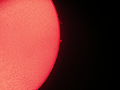
- Nomination: Solar prominences viewed through a hydrogen-alpha filter. --ComputerHotline 15:43, 9 August 2010 (UTC)
- Review needed
-

- Nomination Epée de François 1er, exposée au musée de l'Armée à Paris.--Thesupermat 09:32, 9 August 2010 (UTC)
- Promotion Upper part of the sword of king François 1st of France, ca. 1510, in the Musée de l'Armée in Paris. On the other side one may read the beginning of the verse of the "Magnificat": Fecit potentiam. The end of the verse is visible here: in brachio suo (He hath shewed might in his arm). Good to me. --Jebulon 23:22, 15 August 2010 (UTC)
-

- Nomination Canal de l'Ourcq, France. --Pline 19:14, 8 August 2010 (UTC)
- Promotion really nice composition but exposure should imo be a bit darker --Mbdortmund 22:23, 8 August 2010 (UTC) I agree on the excellent composition but brightness and exposure are ok for me. --Ikiwaner 14:19, 14 August 2010 (UTC) Very good. Identifiable by me as a french landscape even in thumbnail.--Jebulon 23:09, 15 August 2010 (UTC)
-

- Nomination at Tatsuno City, Hyogo pref --663highland 23:59, 7 August 2010 (UTC)
- Decline Composition looks a bit off balance. --The High Fin Sperm Whale 21:57, 15 August 2010 (UTC)
-

- Nomination Kagakuji in Ako --663highland 23:59, 7 August 2010 (UTC)
- Promotion Good. --The High Fin Sperm Whale 21:57, 15 August 2010 (UTC)
-
- Nomination Gorce - trig point --Pudelek 14:45, 7 August 2010 (UTC)
- Promotion Good. --The High Fin Sperm Whale 21:57, 15 August 2010 (UTC)
-
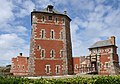
- Nomination La tour Vauban à Camaret, photo de Mike bzh. --Thesupermat 09:53, 5 August 2010 (UTC)
- Promotion Sharpness and such adequate, but it's really distorted - please fix the verticals, otherwise this is a QI for me. Pitke 09:59, 5 August 2010 (UTC) Done--Thesupermat 20:36, 7 August 2010 (UTC)
A bit unfortunate crop on the bottom right, but otherwise OK. Rama 07:24, 16 August 2010 (UTC)
-

- Nomination: Panorama of Lindos --M0tty 22:08, 3 August 2010 (UTC)
- Review Stitching error with the cable in front, left half of image tilted to the left. Central part blurry. Nice composition, though. --Quartl 08:25, 9 August 2010 (UTC) Info Fixed bugs of cable. --M0tty 12:30, 9 August 2010 (UTC)
Better, the left part is still tilted, though. Change to neutral. --Quartl 18:56, 9 August 2010 (UTC)
-
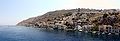
- Nomination: Panorama of Symi --M0tty 22:03, 3 August 2010 (UTC)
- Review Tilted and severely distorted (see top right houses). --Quartl 08:27, 9 August 2010 (UTC) Info Reassembled with a mercator projection--M0tty 12:30, 9 August 2010 (UTC)
Much better, the overexposed sky prevents me from supporting, though. Change to neutral. --Quartl 18:56, 9 August 2010 (UTC)
-

- Nomination: Bart hill fortifications : panoramic seen from the viewpoint, above the fort. --ComputerHotline 07:41, 3 August 2010 (UTC)
- Review The central part of the image looks tilted to the right. --Quartl 08:06, 9 August 2010 (UTC) Info Wrong. It's only the mountains. --ComputerHotline 11:06, 9 August 2010 (UTC)
Please check the houses near Stade Auguste-Bonal. --Quartl 11:51, 9 August 2010 (UTC) Info I can't make more with Autopano pro. --ComputerHotline 15:40, 9 August 2010 (UTC)
Maybe I'm too critical and someone else supports. --Quartl 09:51, 10 August 2010 (UTC)
-
- Nomination: Bart hill fortifications : panoramic seen from the viewpoint, above the fort. --ComputerHotline 07:41, 3 August 2010 (UTC)
- Review The central part of the image looks tilted to the right. --Quartl 08:06, 9 August 2010 (UTC) Info Wrong. It's only the mountains. --ComputerHotline 11:06, 9 August 2010 (UTC)
Please check the houses in the foreground. --Quartl 11:51, 9 August 2010 (UTC) Info I can't make more with Autopano pro. --ComputerHotline 15:40, 9 August 2010 (UTC)
Maybe I'm too critical and someone else supports. --Quartl 09:51, 10 August 2010 (UTC)
-

-

- Nomination television tower in Hamburg, Germany -- Der Wolf im Wald 15:05, 14 August 2010 (UTC)
- Promotion QI for me--Lmbuga 16:27, 14 August 2010 (UTC)
-

- Nomination at Shiga highlands --663highland 14:10, 14 August 2010 (UTC)
- Promotion Support Beautiful light --Archaeodontosaurus 14:30, 14 August 2010 (UTC)
-
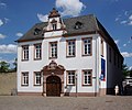
- Nomination Trier, "Dompropstei" from the 17th and 18th century --Berthold Werner 14:02, 14 August 2010 (UTC)
- Promotion Good. --Cayambe 19:08, 14 August 2010 (UTC)
-

- Nomination A warthog posing for picture... --Ikiwaner 14:01, 14 August 2010 (UTC)
- Promotion QI & Useful --Archaeodontosaurus 14:26, 14 August 2010 (UTC)
-
- Nomination Frankfurt am Main, Germany. -- Der Wolf im Wald 13:20, 14 August 2010 (UTC)
- Promotion Very good. --Cayambe 19:59, 14 August 2010 (UTC)
-

- Nomination Westarkade in Frankfurt am Main, Germany. -- Der Wolf im Wald 13:20, 14 August 2010 (UTC)
- Promotion Sharp and good. --Cayambe 19:10, 14 August 2010 (UTC)
-

- Nomination Mainfest with fireworks in Frankfurt am Main, Germany. -- Der Wolf im Wald 13:20, 14 August 2010 (UTC)
- Promotion Very good. --Cayambe 14:13, 14 August 2010 (UTC)
-

- Nomination facade of Tower 185 in Frankfurt am Main, Germany. -- Der Wolf im Wald 13:16, 14 August 2010 (UTC)
- Promotion interesting --Mbdortmund 09:18, 15 August 2010 (UTC)
-

-

- Nomination Panorama of water park Serena. --kallerna 12:44, 14 August 2010 (UTC)
- Promotion Good. -- Der Wolf im Wald 16:15, 14 August 2010 (UTC)
-
- Nomination Yyteri beach during Yyteri Beachfutis. --kallerna 12:44, 14 August 2010 (UTC)
- Promotion Very good. -- Der Wolf im Wald 16:15, 14 August 2010 (UTC)
-

- Nomination Schloss Hohentübingen, Germany. -- Felix Koenig 10:55, 14 August 2010 (UTC)
- Promotion distortion on the left side, please correct vertical lines, perhaps use shift-n --Mbdortmund 13:05, 14 August 2010 (UTC)
Thank you for the comment, now corrected by Regi51. -- Felix Koenig 14:19, 14 August 2010 (UTC)
OK now --Mbdortmund 09:20, 15 August 2010 (UTC)
-

- Nomination Su-31 --Airwolf 08:49, 14 August 2010 (UTC)
- Promotion good --Mbdortmund 13:07, 14 August 2010 (UTC)
-

- Nomination Sanctuary of A Angustia, Betanzos, Galicia (Spain)--Lmbuga 23:08, 13 August 2010 (UTC)
- Promotion Good. --Cayambe 19:19, 14 August 2010 (UTC)
-

- Nomination Reflecta CS slide tray --Harke 20:25, 13 August 2010 (UTC)
- Promotion seems to be magnetic for dust... --Mbdortmund 13:02, 14 August 2010 (UTC)
...ich habe es wirklich geputzt!--Harke 09:41, 15 August 2010 (UTC)
-

- Nomination Railway station in Münchingen, Germany --Harke 20:21, 13 August 2010 (UTC)
- Promotion Ok. --Berthold Werner 14:06, 14 August 2010 (UTC)
-

- Nomination Schlössle in Schwieberdingen, Germany --Harke 20:19, 13 August 2010 (UTC)
- Promotion nice --Mbdortmund 12:39, 14 August 2010 (UTC)
-
- Nomination St. Viktor in Schwerte --Mbdortmund 18:51, 13 August 2010 (UTC)
- Promotion Ok. --Berthold Werner 14:06, 14 August 2010 (UTC)
-
- Nomination Ruhrtalmuseum in Schwerte --Mbdortmund 18:51, 13 August 2010 (UTC)
- Promotion Good and nice. --null 21:18, 13 August 2010 (UTC) Info Signature correction, sorry. --Cayambe 19:22, 14 August 2010 (UTC)
-
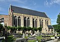
-

- Nomination Roggenmarkt Münster, germany --Mbdortmund 18:06, 12 August 2010 (UTC). There are 4 'dustspots' in the sky. Will promote if removed :-). --Cayambe 08:47, 13 August 2010 (UTC)
could you please mark them per notice, I don't see them. thx --Mbdortmund 11:56, 13 August 2010 (UTC) Comment 3 spots marked in the sky. Nr 4 is very faint, let it be. --Cayambe 21:33, 13 August 2010 (UTC)
seems to be a kind of noise, tried to remove it --Mbdortmund 13:00, 14 August 2010 (UTC) - Promotion Good now. --Cayambe 14:05, 14 August 2010 (UTC)
- Nomination Roggenmarkt Münster, germany --Mbdortmund 18:06, 12 August 2010 (UTC). There are 4 'dustspots' in the sky. Will promote if removed :-). --Cayambe 08:47, 13 August 2010 (UTC)
-

- Nomination: The Museum of the Liptov Village in Pribilina --Pudelek 10:46, 9 August 2010 (UTC)
- Review needed
-

- Nomination: The Museum of the Liptov Village in Pribilina --Pudelek 10:46, 9 August 2010 (UTC)
- Review needed
-

- Nomination: The Museum of the Liptov Village in Pribilina --Pudelek 10:46, 9 August 2010 (UTC)
- Review needed
-

- Nomination: Statue of Juraj Jánošík in Terchová --Pudelek 10:46, 9 August 2010 (UTC)
- Review needed
-
- Nomination: A woman takes photos of Kenelis at Nottingham Pride. Mattbuck 09:21, 9 August 2010 (UTC)
- Review needed
-

- Nomination: James Chilton of Kenelis performs at Nottingham pride. Mattbuck 00:25, 9 August 2010 (UTC)
- Review needed
-

- Nomination: Andy Henry of Kenelis performs at Nottingham pride. Mattbuck 00:15, 9 August 2010 (UTC)
- Review needed
-
- Nomination: Mel Sanson of Kenelis performs at Nottingham pride. Mattbuck 00:07, 9 August 2010 (UTC)
- Review needed
-

- Nomination: María Mariño, poetess of Galicia (Spain), bust in Noia--Lmbuga 00:05, 9 August 2010 (UTC)
- Review needed
-
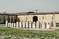
- Nomination: Caravanserai of Qalat el-Mudiq, Syria --Bgag 00:04, 9 August 2010 (UTC)
- Review needed
-

- Nomination: Women's beach football in Yyteri Beachfutis. --kallerna 13:30, 8 August 2010 (UTC)
- Review needed
-

- Nomination: Men's beach football in Yyteri Beachfutis (BF Mesikämmen - GFT Team Beach). --kallerna 13:30, 8 August 2010 (UTC)
- Review needed
-
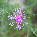
-
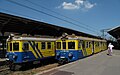
- Nomination Trains in Gdansk, Poland. --Juan de Vojníkov 09:06, 3 August 2010 (UTC)
- Promotion Comment Good image, but cropping the lower part (uninteresting foreground) would improve the composition -- MJJR 20:55, 6 August 2010 (UTC) Comment I was not sure, so I did 3. Could you have a look, please.--Juan de Vojníkov 07:27, 8 August 2010 (UTC)
Cropping #003 is good IMO, so I promoted this one. -- MJJR 19:07, 14 August 2010 (UTC)
-
- Nomination Blue-winged Grasshopper. --Quartl 09:24, 14 August 2010 (UTC)
- Promotion --ComputerHotline 09:51, 14 August 2010 (UTC)
-

- Nomination Nursery Web Spider. --Quartl 09:24, 14 August 2010 (UTC)
- Promotion --ComputerHotline 09:51, 14 August 2010 (UTC)
-
- Nomination Larva of a Green Shield Bug. --Quartl 09:24, 14 August 2010 (UTC)
- Promotion --ComputerHotline 09:51, 14 August 2010 (UTC)
-

- Nomination Willow Emerald Damselfly. --Quartl 09:24, 14 August 2010 (UTC)
- Promotion --ComputerHotline 09:51, 14 August 2010 (UTC)
-

- Nomination Common Darter. --Quartl 09:24, 14 August 2010 (UTC)
- Promotion --ComputerHotline 09:51, 14 August 2010 (UTC)
-

- Nomination Speckled Wood. --Quartl 09:24, 14 August 2010 (UTC)
- Promotion --ComputerHotline 09:51, 14 August 2010 (UTC)
-

- Nomination Pale Clouded Yellow. --Quartl 09:24, 14 August 2010 (UTC)
- Promotion --ComputerHotline 09:51, 14 August 2010 (UTC)
-
- Nomination Sympetrum sanguineum --ComputerHotline 08:17, 14 August 2010 (UTC)
- Promotion Good focus on head. --Quartl 08:40, 14 August 2010 (UTC)
-

- Nomination Argiope bruennichi --ComputerHotline 08:17, 14 August 2010 (UTC)
- Decline I think the dof is too short here, also the lighting is not optimal and the purple background is distracting. --Quartl 08:40, 14 August 2010 (UTC)
-

- Nomination Argiope bruennichi --ComputerHotline 08:17, 14 August 2010 (UTC)
- Promotion Very nice. --Quartl 08:40, 14 August 2010 (UTC)
-

- Nomination Lestes viridis --ComputerHotline 08:17, 14 August 2010 (UTC)
- Promotion Good focus and dof. --Quartl 08:40, 14 August 2010 (UTC)
-

- Nomination Sympetrum sanguineum --ComputerHotline 08:17, 14 August 2010 (UTC)
- Promotion Good, could be cropped a bit maybe. --Quartl 08:40, 14 August 2010 (UTC)
-

- Nomination House in Schwerte --Mbdortmund 18:51, 13 August 2010 (UTC)
- Promotion Good--Lmbuga 20:52, 13 August 2010 (UTC)
-

-
- Nomination Water slides and outdoor swimming pool in water park Serena. --kallerna 14:12, 13 August 2010 (UTC)
- Promotion Well taken. -- Felix Koenig 18:43, 13 August 2010 (UTC)
-

- Nomination A frame grabber card. -- Smial 13:08, 13 August 2010 (UTC)
- Promotion Very interesting and high resolution. -- Felix Koenig 13:35, 13 August 2010 (UTC)
-
- Nomination Entomological views of Coreus marginatus --Archaeodontosaurus 13:05, 13 August 2010 (UTC)
- Promotion Of course, Very nice! Totodu74 13:48, 13 August 2010 (UTC)
-

- Nomination The castle in Haigerloch, Germany. -- Felix Koenig 10:05, 13 August 2010 (UTC)
- Promotion Not absolutely perfect in every technical manner, but very good composition, and lighting. -- Smial 13:20, 13 August 2010 (UTC)
-
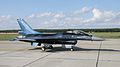
- Nomination Belgian Demo Team F-16. --Airwolf 08:48, 13 August 2010 (UTC)
- Promotion Good -- George Chernilevsky 16:31, 13 August 2010 (UTC)
-

- Nomination Two women cuddle at Nottingham pride, with a toy (meerkat? Your guess is as good as mine) in the foreground. Mattbuck 22:31, 12 August 2010 (UTC)
- Decline Sorry, with this description the main subject is OOF, low EV... Interesting idea but maybe not QI. --kallerna 14:10, 13 August 2010 (UTC)
-

- Nomination Tube slide in water park Serena. --kallerna 08:17, 12 August 2010 (UTC)
- Promotion I like the composition, but I feel the child's face is rather unfortunate. Mattbuck 09:46, 12 August 2010 (UTC)
I think it's a good candid expression actually. His face adds to the general fast-paced nature of the composition IMO. Juliancolton 22:52, 12 August 2010 (UTC) Support I like the expression and the colours --Mbdortmund 00:47, 13 August 2010 (UTC)
Support I love it. I cannot understand the criterion of the face, is it according to the guidelines? --Lmbuga 00:57, 13 August 2010 (UTC)
Support Very good --Archaeodontosaurus 13:52, 13 August 2010 (UTC)
-

-
- Nomination Temple of Apollo, in the acropolis of Rhodos. --M0tty 22:03, 3 August 2010 (UTC)
- Decline Oversaturated. -- King of Hearts 03:57, 11 August 2010 (UTC) Info Correction of saturation. Better ? --M0tty 08:32, 11 August 2010 (UTC)
Addionally there is a strong barrel distortion and the upright format fitts not so good. Some parts of the stairs are cropped. --King of Hearts 04:03, 14 August 2010 (UTC)
-

- Nomination Church in Eclaron, France. --Eusebius 20:32, 3 August 2010 (UTC)
- Promotion Overall, a good picture. --King of Hearts 04:03, 14 August 2010 (UTC)
-

-

-

- Nomination Infrutescence of the Common Dandelion (Taraxacum officinale) --Llez 18:32, 12 August 2010 (UTC)
- Promotion nice --Mbdortmund 21:44, 12 August 2010 (UTC)
-

- Nomination Roggenmarkt Münster, germany --Mbdortmund 18:06, 12 August 2010 (UTC)
- Promotion Gut --George Chernilevsky 04:12, 13 August 2010 (UTC)
-

- Nomination Roggenmarkt Münster, germany --Mbdortmund 18:06, 12 August 2010 (UTC)
- Promotion Sehr gut -- George Chernilevsky 04:10, 13 August 2010 (UTC)
-

- Nomination Roggenmarkt Münster, germany --Mbdortmund 18:06, 12 August 2010 (UTC)
- Promotion Good. --Cayambe 08:53, 13 August 2010 (UTC)
-

- Nomination Drubbel Münster, germany --Mbdortmund 18:06, 12 August 2010 (UTC)
- Promotion Gut --George Chernilevsky 04:07, 13 August 2010 (UTC)
-

- Nomination Paleolithic artefact --Archaeodontosaurus 13:55, 12 August 2010 (UTC)
- Promotion Very good -- George Chernilevsky 14:45, 12 August 2010 (UTC)
-

- Nomination Turkish Stars' F-5 airplane. --Airwolf 11:27, 12 August 2010 (UTC)
- Promotion Good -- George Chernilevsky 13:08, 12 August 2010 (UTC)
-

- Nomination Römerturm in Haigerloch, Germany. -- Felix Koenig 11:06, 12 August 2010 (UTC)
- Promotion Ok. --kallerna 12:15, 12 August 2010 (UTC)
-

- Nomination L-39 of the Breitling Jet Team --Airwolf 10:20, 12 August 2010 (UTC)
- Promotion Good --George Chernilevsky 13:10, 12 August 2010 (UTC)
-

-

-

- Nomination Uranium cubes in Haigerloch, Germany. -- Felix Koenig 11:42, 11 August 2010 (UTC) I did not know uranium came in cubes.... slightly OOF I think. Mattbuck 09:49, 12 August 2010 (UTC)
- Decline Comment - Sorry, but I don't understand your comment. It's the fuel for a nuclear reactor and yes, it's in cubes. -- Felix Koenig 10:01, 12 August 2010 (UTC) Oppose Very interesting, but I don't like the harsh light + OOF. --kallerna 12:18, 12 August 2010 (UTC)
Comment It is not a real uranium; it is a replica in museum --Kae 20:37, 12 August 2010 (UTC)
-

- Nomination Sanatorium orphanage at Kuhmar. --PereslavlFoto 20:18, 9 August 2010 (UTC)
- Decline Overexposed. Mattbuck 09:53, 12 August 2010 (UTC)
Question Where?--PereslavlFoto 13:04, 12 August 2010 (UTC)
-

- Nomination: Blue-tailed Damselfly. --Quartl 06:56, 7 August 2010 (UTC))
- Review needed
-

-

- Nomination: Northern bastion of Kuressaare Castle.--WooteleF 01:54, 7 August 2010 (UTC)
- Review needed
-

- Nomination: Castle ruin Nippenbung, inner ward --Harke 17:29, 6 August 2010 (UTC)
- Review needed
-

- Nomination: Barn at Nippenburg, Germany --Harke 17:26, 6 August 2010 (UTC)
- Review needed
-
- Nomination: Batterie des Roches : entry. --ComputerHotline 14:01, 6 August 2010 (UTC)
- Review needed
-

- Nomination: Batterie des Roches : inside the double caponnier. --ComputerHotline 14:01, 6 August 2010 (UTC)
- Review needed
-

- Nomination: Batterie des Roches --ComputerHotline 14:01, 6 August 2010 (UTC)
- Review needed
-

- Nomination: Batterie des Roches : stairs --ComputerHotline 14:01, 6 August 2010 (UTC)
- Review composition imo unbalanced --Mbdortmund 21:14, 6 August 2010 (UTC)
-

- Nomination: Batterie des Roches : bedroom --ComputerHotline 14:01, 6 August 2010 (UTC)
- Review needed
-
- Nomination Lake Halkjärvi --Petritap 18:41, 4 August 2010 (UTC)
- Promotion Not convinced about the colour balance --Mbdortmund 01:56, 5 August 2010 (UTC)
Pic was taken after eight in the evening as sun was setting. This is how the colors and lighting were at that time. --Petritap 06:14, 5 August 2010 (UTC) Comment I see nothing weird, we have scenes like this all the time here in Finland. Pitke 07:37, 5 August 2010 (UTC)
I agree the lighting is weird, but if this is realistic then promotion. Mattbuck 21:10, 12 August 2010 (UTC)
-

-
-

- Nomination Horst castle, Belgium -- MJJR 20:21, 9 August 2010 (UTC)
- Promotion nice view --Mbdortmund 07:04, 10 August 2010 (UTC)
-

- Nomination Common Blues mating (replacement for the one below). --Quartl 18:36, 9 August 2010 (UTC)
- Promotion --ComputerHotline 07:48, 10 August 2010 (UTC)
-

- Nomination The sun. --ComputerHotline 15:43, 9 August 2010 (UTC)
- Decline It's a nice sunspot, but the solar disc is cut off at the top, which considering the rest of the disc is in-frame is bad composition. Mattbuck 16:13, 9 August 2010 (UTC)
-

- Nomination The sun, through a hydrogen-alpha filter. --ComputerHotline 15:43, 9 August 2010 (UTC)
- Promotion Not really a fan of HA filters, but there are nice patterns around the sunspot in the bottom right quadrant. Mattbuck 16:13, 9 August 2010 (UTC)
-

- Nomination Kitzingen, Bavaria, Synagogue --Berthold Werner 09:19, 9 August 2010 (UTC)
- Promotion Rooftop (towers) could be sharper. --PetarM 14:22, 9 August 2010 (UTC)
-

-

- Nomination die 1. Schneewanderung, Bielerkopf --Böhringer 21:09, 8 August 2010 (UTC)
- Promotion Comment This picture is truly beautiful, but it appears to be tilted to the left. --Quartl 07:22, 9 August 2010 (UTC) Done 1,8° --Böhringer 18:10, 9 August 2010 (UTC)
Much better! --Quartl 09:47, 10 August 2010 (UTC)
-

- Nomination Common Blues mating. --Quartl 08:33, 8 August 2010 (UTC)
- Decline Too much at the top end, which coupled with the noise leads me to decline. Mattbuck 09:18, 9 August 2010 (UTC)
I agree and uploaded a different image from the series with less noise and exposure (see above). --Quartl 18:50, 9 August 2010 (UTC)
-

- Nomination Datura inoxia --Crusier 15:49, 7 August 2010 (UTC)
- Promotion Comment Quality is ok, but the composition is confusing; I'd prefer a tighter crop on the central plant. --Quartl 07:12, 9 August 2010 (UTC) Done? --Crusier 18:18, 9 August 2010 (UTC)
Good for me now. --Quartl 19:05, 9 August 2010 (UTC)
-

- Nomination Ribes divaricatum (Spreading Gooseberry) flowers, leaves and thorns.--Wsiegmund 18:27, 6 August 2010 (UTC)
- Promotion Comment The quality is – at least in parts – very good, but the overall composition is confusing. Maybe a crop would help? --Quartl 07:52, 9 August 2010 (UTC) Comment I cropped the bottom right and made other minor adjustments. Thank you for the comments.--Wsiegmund 04:11, 10 August 2010 (UTC)
Thanks, I support now. --Quartl 09:43, 10 August 2010 (UTC)
-

-

- Nomination: Netham weir in Bristol. Mattbuck 10:09, 4 August 2010 (UTC)
- Review needed
-

- Nomination: The Feeder Canal in Bristol. Mattbuck 10:09, 4 August 2010 (UTC)
- Review needed
-

- Nomination The next 13 images were taken in the Frankfurt Zoo, have fun reviewing! Eyed Dabb Lizard. --Quartl 09:17, 4 August 2010 (UTC)
- Promotion A white balance is globally necessary for the 13 pictures to remove the grey smog. --M0tty 10:06, 4 August 2010 (UTC)
I adjusted contrast for 10 of the 13 images (exceptions: klipspringers and vulture) - better now? --Quartl 11:10, 4 August 2010 (UTC)
Yes it's very better ! good good ! --M0tty 11:52, 4 August 2010 (UTC)
If you like it, you should change the word "Nomination" to "Promotion" and sign again below this --Mbdortmund 22:02, 6 August 2010 (UTC) Promote --M0tty 12:40, 9 August 2010 (UTC)
-

- Nomination: Bearded Vulture. --Quartl 09:17, 4 August 2010 (UTC)
- Review needed
-

-

- Nomination: Goeldi's Marmoset. --Quartl 09:17, 4 August 2010 (UTC)
- Review needed
-

- Nomination: Castle in Malbork, stained-glass window in the church. --Lvova 20:32, 3 August 2010 (UTC)
- Review needed
-
- Nomination: Church in Eclaron, France. --Eusebius 20:32, 3 August 2010 (UTC)
- Review needed
-

- Nomination: Trier information bureau --Berthold Werner 17:08, 3 August 2010 (UTC)
- Review needed
-
- Nomination: Defensive Wall and Ramparts of the Market-Town of Bellinzone ,Switzerland --Jnn 16:37, 3 August 2010 (UTC)
- Review needed
-

- Nomination: Old Ikuno Mine Company House in Asago --663highland 14:04, 3 August 2010 (UTC)
- Review needed
-

- Nomination: Adam Mickiewicz Monument in Cracow --Pudelek 13:04, 3 August 2010 (UTC)
- Review needed
-

- Nomination: Vidnava (Weidenau) - market square --Pudelek 13:04, 3 August 2010 (UTC)
- Review needed
-

- Nomination Strasbourg: Lycée international des pontonniers. --Cayambe 09:17, 11 August 2010 (UTC)
- Promotion Nice place QI --Archaeodontosaurus 10:28, 11 August 2010 (UTC)
-

- Nomination MS Deutschland in Bergen harbour, by Ludovic Péron. -- Rama 21:20, 10 August 2010 (UTC)
- Promotion Good -- George Chernilevsky 06:09, 11 August 2010 (UTC)
-

-

-
-

- Nomination Chlamydoselachus anguineus head --Citron 19:56, 10 August 2010 (UTC)
- Promotion Good --The High Fin Sperm Whale 21:11, 10 August 2010 (UTC)
-

- Nomination Slide tray with Kodachrome slides --Harke 18:10, 10 August 2010 (UTC)
- Promotion Perhaps DOF a bit short but ok for QI. --Berthold Werner 07:54, 11 August 2010 (UTC)
-

- Nomination Castle ruin Nippenburg, tower remains --Harke 18:08, 10 August 2010 (UTC)
- Promotion Ok. --Berthold Werner 07:54, 11 August 2010 (UTC)
-

- Nomination Castle ruin Nippenburg, Southern Germany --Harke 18:06, 10 August 2010 (UTC)
- Promotion Ok. --Berthold Werner 07:54, 11 August 2010 (UTC)
-

- Nomination Castle ruin Nippenburg, Southern Germany --Harke 18:04, 10 August 2010 (UTC)
- Promotion Ok. --Berthold Werner 07:54, 11 August 2010 (UTC)
-

- Nomination Carpocoris purpureipennis with regards to A. :-). --Quartl 16:08, 10 August 2010 (UTC)
- Promotion Support Ok. --Berthold Werner 16:40, 10 August 2010 (UTC) Support Sincère admiration pour ton travail --Archaeodontosaurus 06:35, 11 August 2010 (UTC)
Thank you, much the same to your work. --Quartl 06:57, 11 August 2010 (UTC)
-

- Nomination Uranium phosphate (Trobernite) --Archaeodontosaurus 15:41, 10 August 2010 (UTC)
- Promotion Very good. --Cayambe 09:57, 11 August 2010 (UTC)
-

- Nomination Ako Castle --663highland 14:27, 10 August 2010 (UTC)
- Promotion beautiful composition and lighting, QI IMO --Croucrou 11:16, 11 August 2010 (UTC)
-

-

- Nomination Carpocoris purpureipennis --Archaeodontosaurus 13:28, 10 August 2010 (UTC)
- Promotion Impressive QI --Llez 14:33, 10 August 2010 (UTC)
-

-

- Nomination Horst castle, Belgium -- MJJR 20:21, 9 August 2010 (UTC)
- Promotion Composition is really good but picture tilted a bit CW --Mbdortmund 07:03, 10 August 2010 (UTC) Done Tilt corrected -- MJJR 08:50, 10 August 2010 (UTC)
good --Mbdortmund 16:37, 10 August 2010 (UTC)
-

- Nomination Horst castle, Belgium -- MJJR 20:21, 9 August 2010 (UTC)
- Promotion QI for me --Archaeodontosaurus 15:05, 10 August 2010 (UTC)
-

- Nomination Coconut cookies with almonds and candied fruit -- Jonathunder 12:14, 9 August 2010 (UTC)
- Decline White balance, underexposure. -- King of Hearts 04:04, 11 August 2010 (UTC)
-

-

-

-

- Nomination Lisa Scott-Lee performs at Nottingham pride with a red heart balloon (held by a small child) in front of her. Mattbuck 22:22, 7 August 2010 (UTC)
- Decline Question Is that halo photoshopped? --kallerna 13:32, 8 August 2010 (UTC)
Yes, the original is File:Nottingham Pride MMB 04 Lisa Scott-Lee.jpg. Mattbuck 16:14, 9 August 2010 (UTC) Oppose I cannot understand the purpose of the halo. The other version is good, would like it QI in case you can fix the sharpness of the balloon. Both versions have it lacking sharpness. Pitke 16:01, 10 August 2010 (UTC)
I think I did sharpen it once already, but I can do it again. As for the halo I just thought it was a nice effect considering who's in the background. Mattbuck 16:54, 10 August 2010 (UTC)
-

- Nomination Gorce (Poland) - old wooden hut --Pudelek 14:45, 7 August 2010 (UTC)
- Promotion QI for me --Archaeodontosaurus 10:35, 11 August 2010 (UTC)
-

- Nomination Saqqara - Pyramid of Djoser complex - Heb-sed Court - chapel Egypt --Lansbricae 14:57, 6 August 2010 (UTC)
- Decline * Oppose Several overexposed areas, problems of perspective. No caption in English. Everything can be corrected. --Archaeodontosaurus 14:21, 9 August 2010 (UTC)
Thank´s, I'll try to correct it. I uploaded a new version.--Lansbricae 19:36, 10 August 2010 (UTC)
-

- Nomination: Theater BRAVA! in Osaka --663highland 14:49, 4 August 2010 (UTC)
- Review needed
-
- Nomination: Kim Herold, Finnish model and singer-songwriter, playing beach soccer in Yyteri beachfutis. --kallerna 14:46, 4 August 2010 (UTC)
- Review needed
-

- Nomination: Yyteri beach during Yyteri Beachfutis. --kallerna 14:46, 4 August 2010 (UTC)
- Review needed
-

- Nomination Port of Fisterra, Galicia (Spain)--Lmbuga 14:03, 4 August 2010 (UTC)
- Decline Sorry, too much contrast. --kallerna 13:51, 8 August 2010 (UTC)
OK. Soon I will try to upload the image with less contrast, but I think that it is not QI--Lmbuga 19:59, 10 August 2010 (UTC)
-

-
- Nomination Temple of Apollo, in the acropolis of Rhodos. --M0tty 22:03, 3 August 2010 (UTC)
- Decline Oversaturated. -- King of Hearts 03:57, 11 August 2010 (UTC) Info Correction of saturation. Better ? --M0tty 08:32, 11 August 2010 (UTC)
Addionally there is a strong barrel distortion and the upright format fitts not so good. Some parts of the stairs are cropped. --~~~~
-

- Nomination Statue of Piñeiro aviator, Sanxenxo, Galicia (Spain)--Lmbuga 16:58, 31 July 2010 (UTC)
- Decline crop too tight imo--Mbdortmund 17:07, 2 August 2010 (UTC)
OK. New image. Is it better?--Lmbuga 17:41, 5 August 2010 (UTC)
New image with 2,816 × 5,177 pixels--Lmbuga 17:53, 5 August 2010 (UTC) Oppose Crop too tight on bottom. --kallerna 14:05, 8 August 2010 (UTC)
Ok, Thanks to all--Lmbuga 20:04, 10 August 2010 (UTC)
-

- Nomination at Kamikochi in Japan --663highland 09:08, 12 August 2010 (UTC)
- Decline Partially too dark, posterized and noisy. --kallerna 09:17, 12 August 2010 (UTC)
-
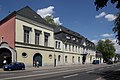
- Nomination Trier, Former monastry from the 18th century --Berthold Werner 08:10, 12 August 2010 (UTC)
- Promotion Good, perhaps a tiny bit too dark. --Cayambe 11:28, 12 August 2010 (UTC)
-
- Nomination Opernturm in Frankfurt am Main, Germany -- Der Wolf im Wald 02:33, 12 August 2010 (UTC)
- Promotion Good. --kallerna 08:18, 12 August 2010 (UTC)
-
- Nomination American shorthair in French garden --Ianare 00:17, 12 August 2010 (UTC)
- Promotion Very good... but I'd like to question the 'brand' name American shorthair for a cat in France (?). --Cayambe 08:42, 12 August 2010 (UTC)
-

-

- Nomination The nature reserve Vils-Engtal in Bavaria, Germany. --High Contrast 22:08, 11 August 2010 (UTC)
- Promotion Good... though too much grass is shown here imo. Please, add geotag. --Cayambe 11:43, 12 August 2010 (UTC)
-

- Nomination Museum of the Liptov village in Pribylina --Pudelek 21:24, 11 August 2010 (UTC)
- Decline unfortunate lighting --Mbdortmund 01:41, 12 August 2010 (UTC)
-

- Nomination Abbaye des Vaux-de-Cernay, Ile-de-France --Pline 21:20, 11 August 2010 (UTC)
- Promotion Very good --Haneburger 08:46, 12 August 2010 (UTC)
-

- Nomination Schluchsee, Black Forest. --Cayambe 21:19, 11 August 2010 (UTC)
- Promotion QI & Useful --Archaeodontosaurus 07:07, 12 August 2010 (UTC)
-

-

-

-

-

-

-

- Nomination Silybum marianum --Chmee2 11:32, 11 August 2010 (UTC
- Promotion Comment Underexposed, but easy to correct --Archaeodontosaurus 07:04, 12 August 2010 (UTC) * I tried to fix it, better now? --Chmee2 08:47, 12 August 2010 (UTC) * Support Noisy background but QI for me --Archaeodontosaurus 12:00, 12 August 2010 (UTC)
-

- Nomination Church of Santa Mariña de Ribasar, Rois, Galicia (Spain)--Lmbuga 09:31, 11 August 2010 (UTC)
- Promotion Sharp and good. --Cayambe 13:36, 11 August 2010 (UTC)
-

- Nomination Beach of Nemiña, Muxía, Galicia (Spain)--Lmbuga 21:09, 10 August 2010 (UTC)
- Promotion Good. --Cayambe 14:28, 11 August 2010 (UTC)
-
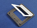
- Nomination Reflecta CS slide frame --Harke 18:13, 10 August 2010 (UTC)
- Promotion
 Neutral I think the white part is blown out. --Berthold Werner 07:54, 11 August 2010 (UTC) Support QI for me --George Chernilevsky 07:00, 12 August 2010 (UTC)
-

- Nomination Jofuku Park in Shingu, Wakayama --663highland 14:27, 10 August 2010 (UTC)
- Promotion good --Ianare 00:59, 12 August 2010 (UTC)
-

- Nomination Jofuku Park in Shingu, Wakayama --663highland 14:27, 10 August 2010 (UTC)
- Decline poor composition : not centered and cut off on left ; tilted --Ianare 01:05, 12 August 2010 (UTC)
-
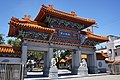
- Nomination Jofuku Park in Shingu, Wakayama --663highland 14:27, 10 August 2010 (UTC)
- Promotion also good --Ianare 00:59, 12 August 2010 (UTC)
-

-
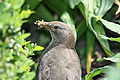
-

-

- Nomination Doyo-no-komichi in Tatsuno --663highland 14:59, 8 August 2010 (UTC)
- Decline
* Comment Chromatic aberrations in the branches. If the image is taken in RAW, the repair is easy. --Archaeodontosaurus 16:00, 8 August 2010 (UTC) Oppose IMO too busy composition, CA, burnt sky. --kallerna 15:36, 11 August 2010 (UTC)
-

-
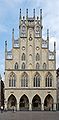
-

-

-

-

-
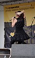
-

- Nomination Schloss Schönbrunn, Vienna, Panorama. --DerFalkVonFreyburg 22:15, 7 August 2010 (UTC)
- Decline Colour balance, tilted. --kallerna 15:39, 11 August 2010 (UTC)
-

-

- Nomination: Jodoji in Ono, Hyogo --663highland 10:23, 6 August 2010 (UTC)
- Review needed
-

- Nomination: Kakurinji in Kakogawa, Hyogo--663highland 10:23, 6 August 2010 (UTC)
- Review needed
-
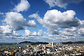
- Nomination: Wakayama city view from Kimiidera --663highland 21:16, 5 August 2010 (UTC)
- Review Perspective should be corrected --Mbdortmund 02:12, 6 August 2010 (UTC)
-

- Nomination Weather Radar Towers from German weather services DWD in Dreieich-Offenthal. --PS-2507 20:42, 5 August 2010 (UTC)
- Decline a bit tilted CW, CA on top --Mbdortmund 02:14, 6 August 2010 (UTC) Oppose Per Mbdortmund. --kallerna 15:41, 11 August 2010 (UTC)
-

- Nomination Old barn at Nippenburg, Germany --Harke 17:38, 5 August 2010 (UTC)
- Decline Odd colours IMO. --kallerna 17:13, 6 August 2010 (UTC) Can you explain? --Harke 17:23, 6 August 2010 (UTC)
IMO the colours doesn't look natural. --kallerna 13:34, 8 August 2010 (UTC)
I tried to improve. OK now? --Harke 19:07, 10 August 2010 (UTC) Comment Sorry, looks still odd...too green or something. --kallerna 15:42, 11 August 2010 (UTC)
-

-

-
- Nomination: Yyteri beach during Yyteri Beachfutis. --kallerna 12:33, 5 August 2010 (UTC)
- Review needed
-
- Nomination: Unibet Dream Team playing beach soccer in Yyteri beachfutis. --kallerna 12:33, 5 August 2010 (UTC)
- Review needed
-

- Nomination: Speedwayrider Teemu Lahti. --kallerna 12:33, 5 August 2010 (UTC)
- Review needed
-
- Nomination: Sniff in Muumimaailma, Naantali. --kallerna 12:33, 5 August 2010 (UTC)
- Review needed
-
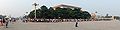
-
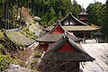
- Nomination Chomeiji in Omihachiman --663highland 14:49, 4 August 2010 (UTC)
- Decline IMO bad composition, burnt parts. --kallerna 15:46, 11 August 2010 (UTC)
-

- Nomination Stairwells in Fenixpalatset. --Ankara 18:12, 1 August 2010 (UTC)
- Decline to bad even to decline?--Ankara 11:12, 9 August 2010 (UTC)
Decline - I love the composition, but the levels just don't strike me as right - the outside is too bright. There's also some minor chromatic aberration. Mattbuck 21:54, 11 August 2010 (UTC)
-

- Nomination Otava River in Vojníkov. --Juan de Vojníkov 12:43, 1 August 2010 (UTC)
- Decline Comment The sky to the right is overexposed. Also the foreground is a bit dark. Maybe a crop would help? --Quartl 08:11, 9 August 2010 (UTC)
Decline as the sky is, as noted, overexposed. I'd also prefer the background trees to be a bit darker. Mattbuck 21:54, 11 August 2010 (UTC)
-
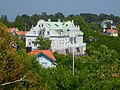
- Nomination Summer house in Dalarö, built 1884-86.--Ankara 09:04, 1 August 2010 (UTC)
- Decline Main object imo overexposured --Mbdortmund 11:05, 1 August 2010 (UTC)New version uploaded. Better?--Ankara 14:00, 1 August 2010 (UTC) Someone who has an opinion about the new version?Ankara 11:12, 9 August 2010 (UTC) Oppose Sorry, looks unnatural IMO. --kallerna 15:48, 11 August 2010 (UTC)
-
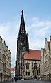
- Nomination St. Lamberti, Münster --Mbdortmund 02:00, 1 August 2010 (UTC)
- Promotion Looking good! Pitke 19:16, 3 August 2010 (UTC)
If you want to promote you have to replace the word "Nomination" with "Promotion" --Mbdortmund 15:10, 11 August 2010 (UTC) Support Ok, although don't like "1.2 only". --kallerna 15:49, 11 August 2010 (UTC)
-
- Nomination Coat of arms. Church of A Nosa Señora das Dádivas e do Bo Parto, Noia, Galicia (Spain)--Lmbuga 01:18, 9 August 2010 (UTC)
- Promotion Good --The High Fin Sperm Whale 01:37, 9 August 2010 (UTC)
-

- Nomination Caravanserai of Qalat el-Mudiq, Syria --Bgag 00:32, 9 August 2010 (UTC)
- Decline Too soft, tilited. --The High Fin Sperm Whale 01:37, 9 August 2010 (UTC)
-

- Nomination Muskrat --Cephas 00:30, 9 August 2010 (UTC)
- Promotion Good --The High Fin Sperm Whale 01:34, 9 August 2010 (UTC)
-

- Nomination Northern Flicker with a deformed beak. --Cephas 00:18, 9 August 2010 (UTC)
- Promotion Very good --The High Fin Sperm Whale 01:40, 9 August 2010 (UTC)
-

- Nomination Caravanserai of Qalat el-Mudiq, Syria --Bgag 00:04, 9 August 2010 (UTC)
- Promotion What are all those specs in the sky? --The High Fin Sperm Whale 01:40, 9 August 2010 (UTC) Birds --Bgag 03:06, 9 August 2010 (UTC)
Ok for me. --Berthold Werner 09:25, 9 August 2010 (UTC)
-

-

- Nomination Cercidiphyllum japonicum trunk, Warsaw University Botanical Garden, Poland. --Crusier 18:42, 8 August 2010 (UTC)
- Decline The trunk lacks contrast and sharpness. Also, the fore- and background are distracting and contain many overexposed areas. --Quartl 07:29, 9 August 2010 (UTC)
-

- Nomination Extinct species of crab from the Miocene --Archaeodontosaurus 16:50, 8 August 2010 (UTC)
- Promotion very nice --Tasto 17:03, 8 August 2010 (UTC)
-

- Nomination Higashimaru Shoyu co. in Tatsuno --663highland 14:59, 8 August 2010 (UTC)
- Decline The perspective makes it feel tilted, and there are areas of overexposure. Mattbuck 09:18, 9 August 2010 (UTC)
-
- Nomination Hyogo Prefectural Tatsuno Senior High School --663highland 14:59, 8 August 2010 (UTC)
- Decline Large area of overexposure. Mattbuck 09:18, 9 August 2010 (UTC)
-

- Nomination Helix pomatia (Burgundy Snail, Roman Snail, Edible Snail) --Llez 10:30, 8 August 2010 (UTC)
- Promotion Support QI & Useful --Archaeodontosaurus 16:59, 8 August 2010 (UTC)
-

-
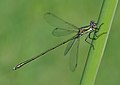
- Nomination Willow Emerald damselfly. --Quartl 08:33, 8 August 2010 (UTC)
- Promotion for me QI --Alchemist-hp 18:43, 8 August 2010 (UTC)
-

- Nomination Flower of Lantana camara. --Quartl 08:33, 8 August 2010 (UTC)
- Promotion for me QI --Alchemist-hp 18:43, 8 August 2010 (UTC)
-

- Nomination Ibo River at Tatsuno --663highland 23:59, 7 August 2010 (UTC)
- Decline Severe pincushion distortion. --Quartl 07:06, 9 August 2010 (UTC)
-

-

-

- Nomination Tip of the Sõrve peninsula. --WooteleF 00:33, 8 August 2010 (UTC)
- Promotion Ok, good picture ; will be better with geotag. --Manuguf 16:44, 7 August 2010 (UTC) Done Geotag added.--WooteleF 15:37, 8 August 2010 (UTC)
-
-

- Nomination Common Darter. --Quartl 19:09, 6 August 2010 (UTC)
- Promotion Very good. --Johannes Robalotoff 15:51, 8 August 2010 (UTC)
-
-

- Nomination Yakushiyu in Yumura Onsen --663highland 21:16, 5 August 2010 (UTC)
- Decline Comment Perspective correction needed --Archaeodontosaurus 07:22, 6 August 2010 (UTC)
Partially burnt, CA, distortion, don't like the composition. --kallerna 13:39, 8 August 2010 (UTC)
-

-

- Nomination Cow in Olveiroa, Dumbría. Galicia (Spain)--Lmbuga 18:19, 5 August 2010 (UTC)
- Decline Disturbing background?, cropped?--Lmbuga 18:19, 5 August 2010 (UTC)
your crops seem to be often a bit tight; background not harmonic but perhaps OK because it shows reality... --Mbdortmund 11:18, 6 August 2010 (UTC)
Thanks, interesting commentary (I can upload the image without "crop", but I do not know if it will be better)--Lmbuga 17:59, 6 August 2010 (UTC)
Please, your opinion interests to me: File:Olveiroa - Olveiroa - Dumbría - Galiza - vaca.jpg--Lmbuga 18:51, 6 August 2010 (UTC)
I prefer the wider crop. More harmonious, gives context. Pitke 19:13, 6 August 2010 (UTC)
composition looks better but now I understand the crop, background is unsharp in a distracting way, sorry --Mbdortmund 21:20, 6 August 2010 (UTC) Oppose Sorry, the background distracts me too much. --kallerna 13:45, 8 August 2010 (UTC)
OK--Lmbuga 22:20, 8 August 2010 (UTC)
-

- Nomination Young Welsh Part Bred mare. Pitke 17:44, 5 August 2010 (UTC)
- Promotion why did you take the wrong side? --Mbdortmund 15:49, 6 August 2010 (UTC)
Is this a joke or serious critique...? The rear view is valuable to those estimating the animal's overall heaviness and condition, and does not have to deal with the issue of having the handler's face visible. This was the better direction, the other would have been riddled with counterlight and a busy background (there were dozens of photographers present, there's a reason you don't see them in the background - everyone knew it was the worst direction possible). Rear shots with the horse's face visible are harder to get than front shots, you see, and IMHO this horse peering behind her shoulder is quite appealing. Pitke 17:22, 6 August 2010 (UTC)
ah, now I see, there is a horse, too ;-) --Mbdortmund 21:22, 6 August 2010 (UTC)
Nice view :-). --Quartl 09:05, 9 August 2010 (UTC)
-

- Nomination Nursing mare's udder. Pitke 17:44, 5 August 2010 (UTC)
- Decline DOF too short --Mbdortmund 15:49, 6 August 2010 (UTC)
Would cropping help? Pitke 14:09, 7 August 2010 (UTC)
This is certainly a difficult and valuable shot, but the udder is too blurry and badly lit. A crop won't help here, sorry. --Quartl 09:02, 9 August 2010 (UTC)
-

- Nomination Acre, Hospitallers' citadel --Berthold Werner 08:20, 5 August 2010 (UTC)
- Decline Unsharp, noisy. --kallerna 13:40, 8 August 2010 (UTC)
-

-

-

- Nomination Port of Sanxenxo, Galicia (Spain)--Lmbuga 14:11, 4 August 2010 (UTC)
- Promotion Ok, althought partially burnt and bit noisy. --kallerna 13:51, 8 August 2010 (UTC)
-
-

-

-

-
- Nomination Male Klipspringer. --Quartl 09:17, 4 August 2010 (UTC)
- Decline Too much contrast, posterized, distracting background. --kallerna 13:47, 8 August 2010 (UTC)
Unfortunately, I cannot provide a better version. The fur of this animal seems quite difficult to capture. Probably the lighting was not optimal. --Quartl 19:30, 8 August 2010 (UTC)
-

-
-

-

- Nomination Mt. Barujari and Segara Anak Lake, Lombok, Indonesia. by Midori --Elekhh 16:26, 3 August 2010 (UTC)
- Promotion This view looks interesting. Good quality for the given atmospheric conditions. I would advise a crop of the dull top 10% of the image, though. --Quartl 08:50, 9 August 2010 (UTC)
-

- Nomination: Penychain railway station. Mattbuck 11:08, 3 August 2010 (UTC)
- Review needed
-
- Nomination A CrossCountry HST passes Narroways Junction. Mattbuck 11:08, 3 August 2010 (UTC)
- Promotion Nice composition, including all junction point-work, on an exceptionally clear day so background very clear. Like it very much. Wonder if cropping out less interesting right side, including the crane like machine, would improve it. Rwendland 17:14, 8 August 2010 (UTC)
-

- Nomination: Merddin Emrys at Tan-y-Bwlch. Mattbuck 11:08, 3 August 2010 (UTC)
- Review needed
-
- Nomination: Vermo racetrack main building. --Pitke 09:35, 3 August 2010 (UTC)
- Review needed
-
- Nomination Bart hill fortifications : panoramic seen from the viewpoint, above the fort. --ComputerHotline 07:41, 3 August 2010 (UTC)
- Promotion Looks good to me. --Quartl 08:06, 9 August 2010 (UTC)
-

- Nomination Bart hill fortifications : panoramic seen from the viewpoint, above the fort. --ComputerHotline 07:41, 3 August 2010 (UTC)
- Promotion Looks good to me. --Quartl 08:06, 9 August 2010 (UTC)
-

- Nomination Jinpukaku in Tottori, Japan. --663highland 15:20, 31 July 2010 (UTC)
- Decline Seems overexposed, has slight CA. Fix? Pitke 19:30, 5 August 2010 (UTC) Oppose Overexposed, CA, too much contrast. --kallerna 14:06, 8 August 2010 (UTC)
-
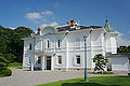
- Nomination Jinpukaku in Tottori, Japan. --663highland 15:20, 31 July 2010 (UTC)
- Decline Strong perspective distortion. Fix it and it's good for me. Pitke 19:14, 3 August 2010 (UTC) Oppose Perspective distortion, CA. --kallerna 14:07, 8 August 2010 (UTC)
-

- Nomination Długa river in Warsaw, Poland. --Crusier 14:38, 31 July 2010 (UTC)
- Decline Soft, CA, sky partially overexposed. --kallerna 14:08, 8 August 2010 (UTC)
-
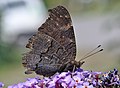
- Nomination Peacock butterfly. --Quartl 08:33, 8 August 2010 (UTC)
- Promotion Support QI & Useful --Archaeodontosaurus 08:42, 8 August 2010 (UTC)
-

- Nomination Peacock butterfly. --Quartl 08:33, 8 August 2010 (UTC)
- Promotion Support QI & Useful --Archaeodontosaurus 08:41, 8 August 2010 (UTC)
-

- Nomination Peacock butterfly. --Quartl 08:33, 8 August 2010 (UTC)
- Promotion Support QI & Useful --Archaeodontosaurus 08:40, 8 August 2010 (UTC)
-

- Nomination Willow Emerald damselfly. --Quartl 08:33, 8 August 2010 (UTC)
- Promotion Support QI & Useful --Archaeodontosaurus 08:38, 8 August 2010 (UTC)
-

- Nomination Bus in Syria --Bgag 00:14, 8 August 2010 (UTC)
- Promotion interesting --Mbdortmund 00:39, 8 August 2010 (UTC)
-
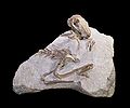
- Nomination Oligocene rabbit -- Archaeodontosaurus 16:44, 7 August 2010 (UTC)
- Promotion Very good -- George Chernilevsky 18:13, 7 August 2010 (UTC)
-
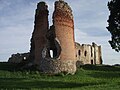
- Nomination Ruins of the Laiuse Castle in Estonia.--WooteleF 00:33, 8 August 2010 (UTC)
- Decline The top of tower is almost out of the frame. --Manuguf 16:44, 7 August 2010 (UTC)
-

- Nomination Gorce - old wooden huts --Pudelek 14:45, 7 August 2010 (UTC)
- Promotion OK --Mbdortmund 00:40, 8 August 2010 (UTC)
-

-

-

-
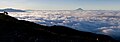
-

-

- Nomination: 60163 Tornado rounds a bend on the West Somerset Railway near Washford. Mattbuck 11:16, 2 August 2010 (UTC)
- Review needed
-

- Nomination: Abererch railway station in Wales. Mattbuck 11:16, 2 August 2010 (UTC)
- Review needed
-
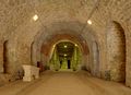
- Nomination: Fort du Mont Bart : at the entry of the main building --ComputerHotline 11:00, 2 August 2010 (UTC)
- Review needed
-
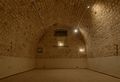
- Nomination: Fort du Mont Bart : powder room --ComputerHotline 11:00, 2 August 2010 (UTC)
- Review needed
-
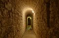
- Nomination: Fort du Mont Bart : corridor --ComputerHotline 11:00, 2 August 2010 (UTC)
- Review needed
-

- Nomination: Fort du Mont Bart : other powder room --ComputerHotline 11:00, 2 August 2010 (UTC)
- Review needed
-

- Nomination: Physically calculated fieldlines around a bar magnet --Geek3 17:03, 1 August 2010 (UTC)
- Review needed
-

- Nomination Right river bank of Otava River. --Juan de Vojníkov 12:43, 1 August 2010 (UTC)
- Promotion Good composition. --Manuguf 16:31, 7 August 2010 (UTC)
-

- Nomination: Tottori City Historical Museum --663highland 12:31, 1 August 2010 (UTC)
- Review perspective should be corrected --Mbdortmund 20:21, 1 August 2010 (UTC)
-

- Nomination Mating wheel of two Blue-tailed Damselflies. --Quartl 06:56, 7 August 2010 (UTC))
- Promotion Support QI & Useful --Archaeodontosaurus 08:45, 7 August 2010 (UTC)
-

- Nomination Hoverfly Helophilus trivittatus . --Quartl 06:56, 7 August 2010 (UTC))
- Promotion Support QI & Useful --Archaeodontosaurus 08:44, 7 August 2010 (UTC)
-

- Nomination Meadow Brown. --Quartl 06:56, 7 August 2010 (UTC))
- Promotion good --Mbdortmund 11:18, 7 August 2010 (UTC)
-

- Nomination Six-spot Burnet. --Quartl 06:56, 7 August 2010 (UTC))
- Promotion Support QI & Useful -- Archaeodontosaurus 08:24, 7 August 2010 (UTC)
-

- Nomination Ruddy Darter. --Quartl 06:56, 7 August 2010 (UTC))
- Promotion Support QI & Useful -- Archaeodontosaurus 08:23, 7 August 2010 (UTC)
-

- Nomination Street in Münster --Mbdortmund 00:08, 7 August 2010 (UTC)
- Promotion QI for me --Archaeodontosaurus 06:55, 7 August 2010 (UTC)
-

- Nomination Lambertikirche in Münster --Mbdortmund 00:08, 7 August 2010 (UTC)
- Promotion Good. Nice perspective -- George Chernilevsky 08:03, 7 August 2010 (UTC)
-
-

- Nomination A mosque in Hama, Syria --Bgag 23:01, 6 August 2010 (UTC)
- Promotion good --Mbdortmund 00:54, 7 August 2010 (UTC)
-

- Nomination Spa town Bad Griesbach in Bavaria, Germany. --High Contrast 19:20, 6 August 2010 (UTC)
- Promotion good --Mbdortmund 23:14, 6 August 2010 (UTC)
-

-

- Nomination Manor house Nippenburg, Germany --Harke 17:25, 6 August 2010 (UTC)
- Promotion OK --Mbdortmund 18:49, 6 August 2010 (UTC)
-

- Nomination Benitoite From San Benito Co. -Archaeodontosaurus 16:55, 6 August 2010 (UTC)
- Promotion white parts imo overexposured --Mbdortmund 16:59, 6 August 2010 (UTC) Done --Archaeodontosaurus 08:41, 7 August 2010 (UTC)
Really nice :)--Gaeser 10:09, 7 August 2010 (UTC)
-
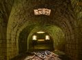
- Nomination Batterie des Roches : inside the double caponnier. --ComputerHotline 14:01, 6 August 2010 (UTC)
- Promotion OK --Mbdortmund 15:54, 6 August 2010 (UTC)
-
- Nomination Blue-tailed damselfly with prey. --Quartl 13:53, 6 August 2010 (UTC)
- Promotion --ComputerHotline 14:18, 6 August 2010 (UTC)
-

-

- Nomination -HD Focus Stacking of Misumena Vatia. -Archaeodontosaurus 13:14, 6 August 2010 (UTC)
- Promotion --ComputerHotline 14:18, 6 August 2010 (UTC)
-

- Nomination Mating wheel of blue-tailed damselflies. --Quartl 13:10, 6 August 2010 (UTC)
- Promotion --ComputerHotline 14:18, 6 August 2010 (UTC)
-
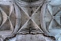
- Nomination Crossing vaults of the church of Eclaron - NB: the whole church is assymetric, nothing architecturally aligned. --Eusebius 12:33, 6 August 2010 (UTC)
- Promotion QI for me --Archaeodontosaurus 14:37, 6 August 2010 (UTC)
-

- Nomination Ono City Hall Complex --663highland 10:23, 6 August 2010 (UTC)
- Promotion Sharp and interesting. -- Lipedia 13:53, 6 August 2010 (UTC)
-
- Nomination Assisi, Rocca Maggiore --Berthold Werner 08:59, 6 August 2010 (UTC)
- Promotion OK --Mbdortmund 21:17, 6 August 2010 (UTC)
-
- Nomination The public clock of Pucallpa seen frontally --Diego Sanguinetti 21:40, 5 August 2010 (UTC)
- Decline noisy --Mbdortmund 02:11, 6 August 2010 (UTC) Oppose Overall low quality. --kallerna 17:08, 6 August 2010 (UTC)
-

- Nomination Seaside restaurant in Hiyoriyama Coast, Toyooka --663highland 21:16, 5 August 2010 (UTC)
- Decline Overexposed, dust spot. --kallerna 17:05, 6 August 2010 (UTC)
-

-

- Nomination Statue of milk saleswoman, Santiago de Compostela, Galicia (Spain)--Lmbuga 19:19, 5 August 2010 (UTC)
- Promotion Good quality. --kallerna 17:12, 6 August 2010 (UTC)
-

-

- Nomination Blackbird female --Romate 18:30, 4 August 2010 (UTC)
- Promotion background is a bit distracting but else good --Mbdortmund 21:27, 6 August 2010 (UTC)
-

-

- Nomination Larus fuscus in north of Norway. --Ludo29 15:08, 3 August 2010 (UTC)
- Decline A bit of noise reduction would be nice, else really good --Mbdortmund 17:10, 3 August 2010 (UTC)
I like it, but too much noise--Lmbuga 01:06, 4 August 2010 (UTC) Oppose nice comp, but far too noisy and some CA, sry --Carschten 10:25, 7 August 2010 (UTC)
-

- Nomination Yoroi-no-sode in Kasumi Coast --663highland 12:44, 2 August 2010 (UTC)
- Promotion QI & Useful --Archaeodontosaurus 14:45, 6 August 2010 (UTC)
-

-

- Nomination: Überwasserkirche, Münster --Mbdortmund 02:00, 1 August 2010 (UTC)
- Review needed
-
- Nomination: Irisbus Citelis 12M in Prague — Jagro 22:17, 31 July 2010 (UTC)
- Review washed out sky --Mbdortmund 23:28, 31 July 2010 (UTC)
-
- Nomination: Guest harbour of Naantali, Finland. --kallerna 12:20, 31 July 2010 (UTC)
- Review needed
-

- Nomination: Hemulen in Muumimaailma, Naantali. --kallerna 12:20, 31 July 2010 (UTC)
- Review needed
-

- Nomination Imagoura in Kasumi Coast --663highland 15:42, 28 July 2010 (UTC)
- Decline I'm not sure I like the colour of the sky - a bit light. Mattbuck 17:38, 30 July 2010 (UTC) Oppose Overexposed, CA. --kallerna 17:03, 6 August 2010 (UTC)
-

-

- Nomination Hammerfest church, by User:Ludo29 -- Rama 08:28, 19 July 2010 (UTC)
- Decline Comment Find it a good idea to take the church from the shadow side but with the enlightend tower. Could you correct the spot (sensor dust?) in the upper left part of the sky? --Haneburger 12:54, 24 July 2010 (UTC)
Is it tilted? Seems to me. Pitke 15:26, 29 July 2010 (UTC) Comment It is not tilted, but there is a perspective effect that makes the columns at the entrance and the electric lights on the left lean slightly inward. Would support if this were corrected. --Johannes Robalotoff 21:33, 2 August 2010 (UTC) Oppose It's an appealing picture, but has "triangle" distortion. Pitke 07:14, 7 August 2010 (UTC)
-

- Nomination Orostachys japonicus --663highland 11:42, 6 August 2010 (UTC)
- Decline Too shallow DOF, overexposed bg. Pitke 11:43, 6 August 2010 (UTC)
-

- Nomination Marble copy of Michelangelo's David in Florence. --Eusebius 09:38, 6 August 2010 (UTC)
- Promotion good --Mbdortmund 11:13, 6 August 2010 (UTC)
-

- Nomination Zimba --Böhringer 22:18, 5 August 2010 (UTC)
- Promotion The "skyline" of Vorarlberg - beautiful --Haneburger 05:08, 6 August 2010 (UTC)
-

- Nomination Statue at Alte Börse, Frankfurt, photo by Mylius. -- Smial 19:40, 5 August 2010 (UTC)
- Promotion technically good, imo terrible sculpture ... --Mbdortmund 02:16, 6 August 2010 (UTC)
-

- Nomination Qalat el-Mudiq, Syria. --Eusebius 17:46, 5 August 2010 (UTC)
- Promotion QI for me --Archaeodontosaurus 07:28, 6 August 2010 (UTC)
-

- Nomination Coat of arms at Bruckmühle, Schwieberdingen, Germany --Harke 17:40, 5 August 2010 (UTC)
- Promotion Good. --Berthold Werner 18:32, 5 August 2010 (UTC)
-

- Nomination Ship "Concerto", Japan --Jnn 15:16, 5 August 2010 (UTC)
- Decline Lack of sharpness and too much noise. --Berthold Werner 09:08, 6 August 2010 (UTC)
-
- Nomination Ship "Concerto", Japan --Jnn 15:16, 5 August 2010 (UTC)
- Decline Lack of sharpness and too much noise. --Berthold Werner 09:08, 6 August 2010 (UTC)
-
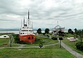
- Nomination Musée maritime du Québec, Canada --Bgag 15:12, 5 August 2010 (UTC)
- Promotion QI & Useful --Archaeodontosaurus 16:00, 5 August 2010 (UTC)
-

- Nomination Port crane in Odessa. --George Chernilevsky 13:54, 5 August 2010 (UTC)
- Promotion good --Mbdortmund 11:23, 6 August 2010 (UTC)
-

- Nomination Port Crane in Sevastopol --George Chernilevsky 13:54, 5 August 2010 (UTC)
- Promotion QI & Useful --Archaeodontosaurus 16:01, 5 August 2010 (UTC)
-
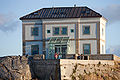
- Nomination Building in the cape of Fisterra at sunset--Lmbuga 12:08, 5 August 2010 (UTC)
- Promotion Very good, only the photographing tourist I find expendable --Haneburger 05:16, 6 August 2010 (UTC)
-

-

- Nomination On the foothills of the Aspe Valley in the Pyrénées. --Myrabella 06:35, 5 August 2010 (UTC)
- Promotion Not very spectacular, nevertheless very good --Haneburger 05:26, 6 August 2010 (UTC)
-
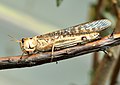
-
- Nomination Facade in Hama, Syria --Bgag 23:27, 3 August 2010 (UTC)
- Promotion Ok. --Berthold Werner 13:18, 5 August 2010 (UTC)
-

- Nomination new and old near Überwasserkirche Münster --Mbdortmund 18:58, 3 August 2010 (UTC)
- Promotion Good composition, bat what is the one and what is the other?, I can't understand German--Lmbuga 01:02, 4 August 2010 (UTC)
File:XN Ueberwasserkirche 61 ov.jpg from the other side --Mbdortmund 09:03, 4 August 2010 (UTC)
Thanks--Lmbuga 14:51, 5 August 2010 (UTC)
-

- Nomination Fishing in Sanxenxo, Galicia (Spain)--Lmbuga 16:28, 31 July 2010 (UTC)
- Decline Sorry, disturbing background. --kallerna 12:37, 5 August 2010 (UTC)
OK--Lmbuga 17:42, 5 August 2010 (UTC)
-

-

-

-

-

-

- Nomination: Trier, two buildings from the 17th century --Berthold Werner 15:20, 30 July 2010 (UTC)
- Review needed
-

- Nomination Mallard drake, hen, and ducklings --Jonathunder 12:22, 30 July 2010 (UTC)
- WARNING: third template parameter added – please remove.
-

- Nomination --Pline 21:49, 29 July 2010 (UTC)
- Decline white parts imo overexposured --Mbdortmund 19:01, 1 August 2010 (UTC)
Overexposed, could be sharper. Pitke 07:56, 6 August 2010 (UTC)
-

-

-

-

-

- Nomination Javorník (Jauernig) - old building --Pudelek 23:57, 27 July 2010 (UTC)
- Decline Comment Building needs to be identifyable (name, street address or geocode). --Elekhh 14:40, 28 July 2010 (UTC) Info It's location --Pudelek 09:54, 5 August 2010 (UTC) Sorry, too much of the building is out of focus for my taste. Pitke 17:46, 5 August 2010 (UTC)
-

-

- Nomination European Hedgehog. --Alchemist-hp 23:50, 4 August 2010 (UTC)
- Promotion Good quality despite the late hour. --Quartl 05:35, 5 August 2010 (UTC)
-
- Nomination Yungang grottoes, China. --Sfu 21:44, 4 August 2010 (UTC)
- Promotion QI and Useful --Archaeodontosaurus 05:32, 5 August 2010 (UTC)
-
-

- Nomination Arrowhead from the late Neolithic --Archaeodontosaurus 17:54, 4 August 2010 (UTC)
- Promotion Very good. --Cayambe 11:40, 5 August 2010 (UTC)
-
-

- Nomination Giant Grasshopper nymph. --Quartl 09:17, 4 August 2010 (UTC)
- Promotion Support QI for me --Archaeodontosaurus 15:36, 4 August 2010 (UTC)
-

- Nomination Southern Tamandua. --Quartl 09:17, 4 August 2010 (UTC)
- Promotion cute --Mbdortmund 01:40, 5 August 2010 (UTC)
-

- Nomination Mudskipper Periophthalmus novemradiatus. --Quartl 09:17, 4 August 2010 (UTC)
- Decline Oppose Too chromatic aberration on the face --Archaeodontosaurus 15:39, 4 August 2010 (UTC)
-

- Nomination Victoria Crowned Pigeon. --Quartl 09:17, 4 August 2010 (UTC)
- Promotion good --Mbdortmund 01:43, 5 August 2010 (UTC)
-

- Nomination St Andrew, St. Peter, Münster --Mbdortmund 18:58, 3 August 2010 (UTC)
- Promotion Gut --George Chernilevsky 05:29, 5 August 2010 (UTC)
-

- Nomination Madonna and child, Münster --Mbdortmund 22:35, 3 August 2010 (UTC)
- Promotion Sehr gut --George Chernilevsky 05:29, 5 August 2010 (UTC)
-

- Nomination Fort du Mont Bart : access to the double caponnier --ComputerHotline 11:00, 2 August 2010 (UTC)
- Decline Too strong sidelight. Pitke 07:39, 5 August 2010 (UTC)
-

- Nomination Lappeenranta harbour, Finland. --Petritap 15:51, 31 July 2010 (UTC)
- Decline Building on the left distorted --Mbdortmund 23:33, 31 July 2010 (UTC)
That's quite right - I'll decline this myself. --Petritap 12:50, 4 August 2010 (UTC)
-

-

-

-

- Nomination: 158956 at Filton Abbey Wood. Mattbuck 11:24, 30 July 2010 (UTC)
- Review needed
-

- Nomination: 60163 "Tornado" near Washford. Mattbuck 11:24, 30 July 2010 (UTC)
- Review needed
-

- Nomination: 175113 arrives at Deganwy. Mattbuck 11:24, 30 July 2010 (UTC)
- Review needed
-

- Nomination: Palace of Diputación Provincial of Pontevedra (1882-1890) - Galicia (Spain). --Lansbricae 11:10, 30 July 2010 (UTC)
- Review needed
-

- Nomination: Town hall Großbottwar. Now the third version from a better original. -- Felix Koenig 09:01, 30 July 2010 (UTC)
- Review needed
-
- Nomination: Genchuji temple in Tottori --663highland 15:48, 29 July 2010 (UTC)
- Review needed
-

-

- Nomination: Freiberg Cathedral --Leviathan1983 12:39, 29 July 2010 (UTC)
- Review You have flare. Rama 12:52, 29 July 2010 (UTC)
distortedd --Mbdortmund 16:08, 29 July 2010 (UTC)
-

- Nomination Pisaura mirabilis with prey --Leviathan1983 12:39, 29 July 2010 (UTC)
- Decline Needs sharpening. Pitke 12:40, 29 July 2010 (UTC)
Nice image, but too unsharp. --Quartl 07:47, 5 August 2010 (UTC)
-

- Nomination: Duck hunting rifle, made in Vaud circa 1740-1750 by Boyer, in Rolle. -- Rama 12:25, 29 July 2010 (UTC)
- Review needed
-

- Nomination: Flintlock rifle, made in Vaud circa 1785 by Jacob Guignard. -- Rama 12:25, 29 July 2010 (UTC)
- Review needed
-
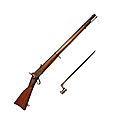
- Nomination Peabody rifle, model 1867, rifled, 10.4mm. -- Rama 12:25, 29 July 2010 (UTC)
- Promotion QI For me --Archaeodontosaurus 05:34, 5 August 2010 (UTC)
-
- Nomination A flower of Bellis (Daisy). --Juan de Vojníkov 07:11, 28 July 2010 (UTC)
- Decline Comment Should be identified to species level. --Quartl 10:54, 29 July 2010 (UTC) Comment It is already identified. See the category. I additionally specified it to the description.--Juan de Vojníkov 18:55, 29 July 2010 (UTC)
Thank you, I still cannot support this image due to low dof and darkness. --Quartl 07:45, 5 August 2010 (UTC)
Declining, I too would like the whole blossom focused. Focus stacking next time? Pitke 09:30, 5 August 2010 (UTC)
-
-

- Nomination Virgin Thunderbird 57307 "Lady Penelope" at Rugby. Mattbuck 17:12, 27 July 2010 (UTC)
- Promotion good --Mbdortmund 01:50, 5 August 2010 (UTC)
-

-

-
- Nomination The Tara is a polar schooner for research expedition through the ice of the Arctic --null 23:43, 26 July 2010 (UTC)
- Decline It's beautiful, but it has minor en:Chromatic aberration and suffers from some noise. If these could be tweaked I'd be happy to promote. Pitke 12:33, 27 July 2010 (UTC)
Overexposure. Please fix issues mentioned and renominate, I'd like to see this promoted! Pitke 09:21, 5 August 2010 (UTC)
-

- Nomination Laothoe populi,Pappelschwärmer --Böhringer 21:16, 24 July 2010 (UTC)
- Decline Seems out of focus, needs sharpening. Pitke 13:10, 29 July 2010 (UTC)
These nocturnal moths are certainly hard to capture, but this image is too out of focus for QI. --Quartl 07:17, 5 August 2010 (UTC)
-

-

- Nomination Albite Austria --Archaeodontosaurus 08:35, 4 August 2010 (UTC)
- Promotion The blue reflection on the right behing the sampe might gain to being removed, but otherwise perfect. Rama 09:00, 4 August 2010 (UTC) Done --Archaeodontosaurus 09:14, 4 August 2010 (UTC)
-

- Nomination Fruit market in Hama, Syria --Bgag 23:27, 3 August 2010 (UTC)
- Promotion sharp for 1/30 Sek --Mbdortmund 01:01, 4 August 2010 (UTC)
-

- Nomination Manganji green pepper, Japan --Jnn 16:37, 3 August 2010 (UTC)
- Decline disturbing reflections --Mbdortmund 17:22, 3 August 2010 (UTC)
-
- Nomination Moselle River at the tripoint border Luxembourg, Germany and France. --Cayambe 14:33, 3 August 2010 (UTC)
- Promotion OK --Mbdortmund 21:48, 3 August 2010 (UTC)
-
- Nomination Jinpukaku in Tottori --663highland 14:04, 3 August 2010 (UTC)
- Promotion QI for me --Archaeodontosaurus 07:21, 4 August 2010 (UTC)
-

- Nomination Tenement house in Cracow --Pudelek 13:04, 3 August 2010 (UTC)
- Promotion good --Mbdortmund 17:24, 3 August 2010 (UTC)
-

- Nomination "Café bar Trafalgar", in Travesa do Franco street, Santiago de Compostela, Galicia--Lmbuga 12:08, 3 August 2010 (UTC)
- Promotion sharp --Mbdortmund 17:25, 3 August 2010 (UTC)
-

- Nomination The waters of Aberglaslyn from the Welsh Highland Railway. Mattbuck 11:08, 3 August 2010 (UTC)
- Promotion goood view, interesting landscape --Mbdortmund 00:00, 4 August 2010 (UTC)
-

- Nomination Portonaccio sarcophagus with battle scene between Romans and Germans. Marble, Roman artwork, 180–190 CE. Palazzo Massimo alle Terme - Roma --Lansbricae 10:34, 3 August 2010 (UTC)
- Promotion QI & Useful --Archaeodontosaurus 14:26, 3 August 2010 (UTC)
-
-

- Nomination Samechov train station, Czech Republic. --Juan de Vojníkov 09:06, 3 August 2010 (UTC)
- Decline Lacks sharpness, has CA and overexposure. Nice composition though. Pitke 19:18, 3 August 2010 (UTC)
-

- Nomination Old Swedish Bessemer converter --Ainali 09:56, 31 July 2010 (UTC)
- Decline sky overexposured --Mbdortmund 09:06, 4 August 2010 (UTC)
-

- Nomination The rushing waters of the Aberglaslyn Pass. Mattbuck 11:24, 30 July 2010 (UTC)
- Decline Unsharp, don't think it can be helped. How come it's "Unidentified bodies of water" if you know where it's from? Pitke 19:13, 3 August 2010 (UTC)
At a guess it was in category water and someone moved it without noticing it was in the Aberglaslyn category. Mattbuck 20:50, 3 August 2010 (UTC)
-
- Nomination Reichenberg castle, Germany. --Johannes Robalotoff 14:07, 29 July 2010 (UTC)
- Promotion white building not really sharp, perhaps a bit overexposured --Mbdortmund 19:00, 1 August 2010 (UTC) Done Reprocessed the image from RAW file with different parameters. Issues should be solved now. Please review again. --Johannes Robalotoff 21:11, 2 August 2010 (UTC)
OK --Mbdortmund 09:08, 4 August 2010 (UTC)
-

- Nomination: The footbridge at Filton Abbey Wood railway station. Mattbuck 01:48, 29 July 2010 (UTC)
- Review needed
-

-

- Nomination Banded demoiselle. --Quartl 17:50, 25 July 2010 (UTC)
- Decline composition and colous really good but head unsharp --Mbdortmund 21:53, 25 July 2010 (UTC) Comment Slightly sharpened the image. --Quartl 19:18, 31 July 2010 (UTC)
So sorry, but the head's still too blurry. Be proud for this shot though. Pitke 18:55, 3 August 2010 (UTC)
-

- Nomination Children of Lidice, by Marie Uchytilová. --Juan de Vojníkov 07:13, 24 July 2010 (UTC)
- Decline I think nobody promotes because the clipping looks casual --Mbdortmund 11:08, 1 August 2010 (UTC) Comment So you can read in peoples minds or you like to influence everbody?--Juan de Vojníkov 09:10, 3 August 2010 (UTC)
Unfortunate cropping. Would like more room around the children. Pitke 18:54, 3 August 2010 (UTC)
-

- Nomination Wybrzeże Gdańskie Street in Warsaw, Poland. --Crusier 08:00, 3 August 2010 (UTC)
- Decline Poor sharpness -- 320td 10:58, 3 August 2010 (UTC)
-

- Nomination Iomega-disc from 1994 --Mbdortmund 02:27, 3 August 2010 (UTC)
- Promotion Support QI for me --Archaeodontosaurus 10:05, 3 August 2010 (UTC)
-

- Nomination Hantala ravine, Finland. --Petritap 18:50, 2 August 2010 (UTC)
- Promotion QI for me. --Johannes Robalotoff 21:18, 2 August 2010 (UTC)
-

- Nomination Elementary school entrance portal --Kozuch 16:48, 2 August 2010 (UTC)
- Promotion composition is good but details e.g. of the sculptures could be better --Mbdortmund 17:53, 2 August 2010 (UTC)
-

- Nomination Twin golden zucchini -- Jonathunder 15:15, 2 August 2010 (UTC)
- Promotion good --Mbdortmund 17:53, 2 August 2010 (UTC)
-

- Nomination Typha sp. in University Library Garden in Warsaw. --Crusier 14:03, 2 August 2010 (UTC)
- Promotion OK --Mbdortmund 02:27, 3 August 2010 (UTC)
-

- Nomination Münster, Überwasserkirche, Madonna and child --Mbdortmund 13:53, 2 August 2010 (UTC)
- Promotion Good. --Johannes Robalotoff 21:23, 2 August 2010 (UTC)
-

- Nomination Münster, Überwasserkirche, Madonna and child --Mbdortmund 13:53, 2 August 2010 (UTC)
- Promotion Good. --Cayambe 19:20, 2 August 2010 (UTC)
-

- Nomination Münster, Überwasserkirche, angel below the statue of Mary --Mbdortmund 17:01, 2 August 2010 (UTC)
- Promotion Very sharp and otherwise also good. --Cayambe 19:20, 2 August 2010 (UTC)
-

- Nomination Münster, Überwasserkirche, key as symbol of St. Peter --Mbdortmund 17:04, 2 August 2010 (UTC)
- Promotion Sorry, but I don't like the composition - IMO it's not a good idea to leave half of the head...If I am mistaken, let anyone correct me. --Gaeser 19:40, 2 August 2010 (UTC)
StG1990 provided a cropped version, thx from here --Mbdortmund 00:49, 3 August 2010 (UTC)
Support now.--Gaeser 06:31, 3 August 2010 (UTC)
-

- Nomination Münster, Überwasserkirche, door handle --Mbdortmund 17:01, 2 August 2010 (UTC)
- Promotion Good. --Cayambe 08:58, 3 August 2010 (UTC)
-

- Nomination Garden on University Library in Warsaw roof. --Crusier 13:44, 2 August 2010 (UTC)
- Promotion Good. --Cayambe 08:58, 3 August 2010 (UTC)
-

- Nomination Mount Oku-dainichi --663highland 12:44, 2 August 2010 (UTC)
- Decline Impressive photo, but please consider reducing CA, which is very disturbing in this nearly monochrome picture, see image note. -- Smial 23:13, 2 August 2010 (UTC)
-

- Nomination Kannonin in Tottori --663highland 12:44, 2 August 2010 (UTC)
- Promotion Support QI for me --Archaeodontosaurus 10:03, 3 August 2010 (UTC)
-
- Nomination Flint blade - Upper Paleolithic --Archaeodontosaurus 12:10, 2 August 2010 (UTC)
- Promotion Very good. --Cayambe 16:54, 2 August 2010 (UTC)
-

- Nomination 378005 arrives into Hackney Central. Mattbuck 11:16, 2 August 2010 (UTC)
- Promotion good --Mbdortmund 17:54, 2 August 2010 (UTC)
-

- Nomination Fort du Mont Bart : inside the main building --ComputerHotline 11:00, 2 August 2010 (UTC)
- Promotion good --Mbdortmund 17:38, 2 August 2010 (UTC)
-

- Nomination Radiometer, The Crookes radiometer, also known as the light mill or solar engine --Nevit 20:31, 1 August 2010 (UTC)
- Promotion Excellent animation. --King of Hearts 20:34, 2 August 2010 (UTC)
-

-

- Nomination Centaurium erythraea --Alchemist-hp 22:54, 30 July 2010 (UTC)
- Promotion Comment Should be cropped IMO --Llez 05:39, 31 July 2010 (UTC) Now croped. --Alchemist-hp 18:42, 1 August 2010 (UTC)
Better now --Llez 16:57, 2 August 2010 (UTC)
-

- Nomination Rhinitis phlegm with gas bubbles in light microscope.--Juan de Vojníkov 05:00, 30 July 2010 (UTC)
- Decline Left side out of focus. -- King of Hearts 20:36, 2 August 2010 (UTC)
-

- Nomination: Memorial to Frank Whittle in Rugby. Mattbuck 12:00, 28 July 2010 (UTC)
- Review needed
-

- Nomination: Reconstruction of the Charles Bridge. --Juan de Vojníkov 07:11, 28 July 2010 (UTC)
- Review needed
-
- Nomination: Border between Czech Republic (right) and Poland (left) near Vidnava --Pudelek 23:57, 27 July 2010 (UTC)
- Review needed
-

- Nomination: Vidnava (Weidenau) - tower of St. Catherine church and part of city walls --Pudelek 23:57, 27 July 2010 (UTC)
- Review needed
-

- Nomination: River lock --Pline 19:15, 27 July 2010 (UTC)
- Review needed
-

- Nomination: 221104 rushes north through Rugby. Mattbuck 17:12, 27 July 2010 (UTC)
- Review needed
-

- Nomination: Virgin Trains 390048 "Virgin Harrier" at Rugby. Mattbuck 17:12, 27 July 2010 (UTC)
- Review needed
-

- Nomination: London Midland 321430 at Rugby. Mattbuck 17:12, 27 July 2010 (UTC)
- Review needed
-

- Nomination Sculptures on Lamertikirche Münster -- Mbdortmund 18:17, 26 July 2010 (UTC)
- Promotion I like the perspective and Quality is high -> OI --J. Lunau 19:30, 2 August 2010 (UTC)
-

-
-

- Nomination: Kasumi Coast --663highland 10:58, 25 July 2010 (UTC)
- Review Comment - the grass looks a slightly strange shade to me. Could also do with a minor sharpening. Mattbuck 21:24, 27 July 2010 (UTC)
-
- Nomination Church decorated for a wedding. --Eusebius 08:32, 24 July 2010 (UTC) tilted to the left and imo unsharp part too big --Mbdortmund 22:41, 26 July 2010 (UTC)
- Decline Per Mbdortmund, i.e. unsharp part too dominant. --Johannes Robalotoff 21:36, 2 August 2010 (UTC)
-
- Nomination Château de Pommard aging in oak barrels.--Jebulon 23:47, 22 July 2010 (UTC)
- Decline Would benefit from cropping and tilting (is tilted to the right). Körnerbrötchen 19:09, 28 July 2010 (UTC) Oppose tilted, should perhaps be cropped. ~~~~
-

- Nomination Sculpture with 17 meters by Francisco Leiro, Sanxenxo, Galicia.--Lmbuga 08:46, 2 August 2010 (UTC)
- Promotion Wondering where he would find shoes :)--Gaeser 08:51, 2 August 2010 (UTC)
-

-

-

-

-
-

-

- Nomination Münster, Überwasserkirche, gotic portal --Mbdortmund 16:34, 1 August 2010 (UTC)
- Promotion Ok --Berthold Werner 17:56, 1 August 2010 (UTC)
-

- Nomination Münster, statue of St. Peter --Mbdortmund 16:34, 1 August 2010 (UTC)
- Promotion Ok. --Berthold Werner 17:56, 1 August 2010 (UTC)
-

- Nomination Münster, statue of St. Andrew --Mbdortmund 16:34, 1 August 2010 (UTC)
- Withdrawn Seems to be not so sharp as the others (?) --Berthold Werner 17:56, 1 August 2010 (UTC)
-

-
- Nomination 60163 Tornado arrives at Crowcombe Heathfield. Mattbuck 14:33, 1 August 2010 (UTC)
- Promotion looks tilted cw or is reality tilted there? --Mbdortmund 20:16, 1 August 2010 (UTC)
Reality is always tilted, but I have now rotated it by 0.88 degrees - does it look better now? Mattbuck 20:28, 1 August 2010 (UTC)
OK now --Mbdortmund 09:36, 2 August 2010 (UTC)
-

- Nomination 60163 Tornado passes Flax Bourton. Mattbuck 14:33, 1 August 2010 (UTC)
- Promotion good --Mbdortmund 20:17, 1 August 2010 (UTC)
-

- Nomination Statue of Cosimo de Medici in Florence. --Eusebius 13:32, 1 August 2010 (UTC)
- Promotion Support QI for me --Archaeodontosaurus 13:50, 1 August 2010 (UTC)
-

- Nomination Imagoura in Kasumi Coast --663highland 12:31, 1 August 2010 (UTC)
- Promotion Good.--Gaeser 18:27, 1 August 2010 (UTC)
-

- Nomination Tabanus sudeticus, a very large Tabanid fly (or Horse-fly). Serra do Caramulo, Portugal -- Alvesgaspar 12:08, 1 August 2010 (UTC)
- Decline Oppose too many unsharp areas --Archaeodontosaurus 12:59, 1 August 2010 (UTC)
-

- Nomination Heteropteran bug of the Coreidae family. Serra do Caramulo, Portugal -- Alvesgaspar 12:02, 1 August 2010 (UTC)
- Decline Oppose too many unsharp areas --Archaeodontosaurus 12:59, 1 August 2010 (UTC)
-
- Nomination Fly of the Calliphoridae family. Serra do caramulo, Portugal. -- Alvesgaspar 12:02, 1 August 2010 (UTC)
- Promotion QI & Useful --Archaeodontosaurus 12:53, 1 August 2010 (UTC)
-
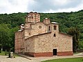
-

- Nomination Reichenberg castle, Germany. --Johannes Robalotoff 14:07, 29 July 2010 (UTC)
- Promotion good --Mbdortmund 19:00, 1 August 2010 (UTC)
-

- Nomination Paddle steamer Vevey departing the eponimous city. -- Rama 12:04, 29 July 2010 (UTC)
- Promotion QI for me --Archaeodontosaurus 01:29, 2 August 2010 (UTC)
-

- Nomination: Fort de Mutzig --ComputerHotline 10:42, 27 July 2010 (UTC)
- Review needed
-

- Nomination: Fort de Mutzig --ComputerHotline 10:42, 27 July 2010 (UTC)
- Review needed
-
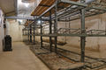
- Nomination: Fort de Mutzig : bedroom --ComputerHotline 10:42, 27 July 2010 (UTC)
- Review needed
-

- Nomination: Fort de Mutzig --ComputerHotline 10:42, 27 July 2010 (UTC)
- Review needed
-

- Nomination: Poličany village square, Czech Republic. --Juan de Vojníkov 08:33, 27 July 2010 (UTC)
- Review needed
-

- Nomination: Thunbergia mysorensis in Cairns botanical gardens. --99of9 05:57, 27 July 2010 (UTC)
- Review needed
-

- Nomination: Muumijuna (Moomin train) in front of the gate of Muumimaailma, Naantali. --kallerna 20:41, 26 July 2010 (UTC)
- Review needed
-
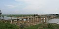
- Nomination: Bridge on Chambal river, India. Yann 19:21, 26 July 2010 (UTC)
- Review needed
-

- Nomination: Bay Finnhorse and Standardbred horses grazing on summer pasture. -- Pitke 17:14, 26 July 2010 (UTC)
- Review needed
-

- Nomination: Japanese everyday straw sandals for women. -- Pitke 17:14, 26 July 2010 (UTC)
- Review a bit of noise-reduction would be nice --Mbdortmund 18:21, 26 July 2010 (UTC) Comment Tried to but didn't find a good way to do it, it either did nothing or ate up the velvet texture. Pitke 18:44, 26 July 2010 (UTC)
-

- Nomination: Silk kanzashi (traditional Japanese hair accessory). -- Pitke 17:14, 26 July 2010 (UTC)
- Review needed
-
- Nomination: Neckarwestheim Nuclear Power Plant, Germany. -- Felix Koenig 15:18, 26 July 2010 (UTC)
- Review needed
-

- Nomination: Old russian lady. --kallerna 17:30, 25 July 2010 (UTC)
- Review didn't we have this one already? --Mbdortmund 23:03, 25 July 2010 (UTC) Comment No, only the alternative version. --kallerna 14:43, 26 July 2010 (UTC)
-

- Nomination: A Virgin Pendolino blasts south through Tamworth. Mattbuck 10:13, 19 July 2010 (UTC)
- Review A better crop would be, imo, just above the heads of the people at the right bottom. Will promote if done. --Cayambe 17:06, 26 July 2010 (UTC)
I like this as-is, as an overview shot, but I'll take your advice and upload it as a derivative, then re-nom. Mattbuck 18:25, 26 July 2010 (UTC)
-
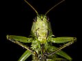
- Nomination HD portrait of Great Green Bush Cricket --Archaeodontosaurus 07:43, 1 August 2010 (UTC)
- Promotion Excellent. Rama 09:17, 1 August 2010 (UTC)
-

-

- Nomination Überwasserkirche, Münster --Mbdortmund 02:00, 1 August 2010 (UTC)
- Promotion Sharp and otherwise also good. Why the personality rights warning? --Cayambe 09:43, 1 August 2010 (UTC)
cut&paste... now removed --Mbdortmund 11:03, 1 August 2010 (UTC)
-

- Nomination Summit region of Großer Arber by Avarim— Herzi Pinki 23:50, 31 July 2010 (UTC)
- Decline Tilt, overprocessed. -- Smial 00:06, 1 August 2010 (UTC)
-
- Nomination Juvenile Egyptian Goose. --Quartl 20:18, 31 July 2010 (UTC)
- Promotion a little bit oversharpened? (not shure) QI --Mbdortmund 20:35, 31 July 2010 (UTC)
Indeed, sharpening now reduced. --Quartl 20:44, 31 July 2010 (UTC)
-
- Nomination Hoverfly Helophilus trivittatus side view. --Quartl 18:00, 31 July 2010 (UTC)
- Promotion Good --The High Fin Sperm Whale 20:41, 31 July 2010 (UTC)
-
- Nomination Hoverfly Helophilus trivittatus top view. --Quartl 18:00, 31 July 2010 (UTC)
- Decline Good, but I'd rather see it from the front and with the head in focus. --The High Fin Sperm Whale 20:41, 31 July 2010 (UTC)
The focus is on wings and abdomen markings here. --Quartl 20:48, 31 July 2010 (UTC)
-

- Nomination Landscape somewhere near Belfort, France. --ComputerHotline 17:08, 31 July 2010 (UTC)
- Promotion Good --The High Fin Sperm Whale 20:45, 31 July 2010 (UTC)
-

- Nomination Head of a Sympetrum sanguineum. --ComputerHotline 17:08, 31 July 2010 (UTC)
- Promotion Lighting could be better, but still good. --Quartl 18:05, 31 July 2010 (UTC)
-

- Nomination Argiope bruennichi. --ComputerHotline 17:08, 31 July 2010 (UTC)
- Promotion In parts a little oof, but still good. --Quartl 18:05, 31 July 2010 (UTC)
-

- Nomination Argiope bruennichi is catching a dragonfly (anisoptera sp.). --ComputerHotline 17:08, 31 July 2010 (UTC)
- Promotion Dramatic – the damselfly is Ischnura elegans. --Quartl 18:05, 31 July 2010 (UTC)
-

- Nomination Argiope bruennichi is catching a dragonfly (anisoptera sp.). --ComputerHotline 17:08, 31 July 2010 (UTC)
- Promotion The spider is really impressive. --Quartl 18:12, 31 July 2010 (UTC)
-

- Nomination Bishop's Mitre Bug's (Aelia acuminata) nymph - Darius Baužys 16:36, 31 July 2010 (UTC)
- Promotion Good --George Chernilevsky 21:10, 31 July 2010 (UTC)
-

- Nomination Panorama of Xemxija, Malta. -- Felix Koenig 16:20, 31 July 2010 (UTC)
- Decline Partially overexposured --Mbdortmund 23:31, 31 July 2010 (UTC)
-

- Nomination Jinpukaku in Tottori, Japan. --663highland 15:20, 31 July 2010 (UTC)
- Promotion QI for me -- Archaeodontosaurus 15:32, 31 July 2010 (UTC)
-

- Nomination Fish fossil of Cenomanian -- Archaeodontosaurus 14:41, 31 July 2010 (UTC)
- Promotion Good -- George Chernilevsky 15:19, 31 July 2010 (UTC)
-
-

- Nomination Focus stacking demo, photos by Muhammad Mahdi Karim -- Smial 11:09, 31 July 2010 (UTC)
- Promotion Very good -- George Chernilevsky 15:20, 31 July 2010 (UTC)
-

- Nomination Magnetite and Pyrite -- Archaeodontosaurus 10:16, 31 July 2010 (UTC)
- Promotion Good -- George Chernilevsky 21:12, 31 July 2010 (UTC)
-

- Nomination Imagoura in Kasumi Coast --663highland 15:42, 28 July 2010 (UTC)
- Promotion Isn't ita bittilted? Rama 23:19, 28 July 2010 (UTC)
I think it's a composition problem dragging your eye. Mattbuck 17:38, 30 July 2010 (UTC) Support I think so; But QI for me --Archaeodontosaurus 20:02, 31 July 2010 (UTC)
-

- Nomination: Main road in Poličany village, Czech Republic. --Juan de Vojníkov 08:20, 26 July 2010 (UTC)
- Review needed
-

- Nomination: Long way to the church of St. Martin, Kostelní Střimelice, Czech Republic. --Juan de Vojníkov 08:20, 26 July 2010 (UTC)
- Review needed
-
- Nomination SIG SG 510 photographed behind a display glass at Morges military museum. Assembly of 5 photographs. -- Rama 22:06, 25 July 2010 (UTC)
- Promotion QI for me --Archaeodontosaurus 15:34, 31 July 2010 (UTC)
-

- Nomination: Garden feature in Kirjurinluoto. --kallerna 17:30, 25 July 2010 (UTC)
- Review needed
-
-

-
-

-

- Nomination Cutway diagram of a turbojet engine --The High Fin Sperm Whale 19:38, 30 July 2010 (UTC)
- Promotion QI and very useful! --Jovianeye 01:48, 31 July 2010 (UTC)
-

- Nomination An iron statue of Saint Andrew (Andreas) on the Töpperbrücke in Lunz am See --Herzi Pinki 19:12, 30 July 2010 (UTC)
- Promotion good --Tasto 20:53, 30 July 2010 (UTC)
-

- Nomination Tatra T3SUCS at Most Legií, Prague — Jagro 19:22, 30 July 2010 (UTC)
- Promotion QI -- George Chernilevsky 10:02, 31 July 2010 (UTC)
-

- Nomination Tatra T3R.PLF at Mánesův most, Prague — Jagro 19:22, 30 July 2010 (UTC)
- Promotion Good -- George Chernilevsky 10:02, 31 July 2010 (UTC)
-

-

- Nomination St. Elisabeth in Bergkamen -- Smial 13:34, 30 July 2010 (UTC)
- Promotion Ok. --Berthold Werner 15:25, 30 July 2010 (UTC)
-

- Nomination Tanyo Shinkin bank Hall in Asago --663highland 13:05, 30 July 2010 (UTC)
- Promotion Informative and good quality. -- Smial 13:39, 30 July 2010 (UTC) CommentIs it just the right part of the builing that is the bank? --V-wolf 07:56, 31 July 2010 (UTC)
-
- Nomination Izutsuya in Asago --663highland 13:03, 30 July 2010 (UTC)
- Decline Quality technically ok, but don't like the composition. -- Smial 13:39, 30 July 2010 (UTC)
-

-
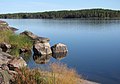
-

- Nomination Train face at Danzig train station, Poland.--Juan de Vojníkov 05:00, 30 July 2010 (UTC)
- Promotion The crop is a tinsy bit tight, any chance you'd have anything wider? Rama 09:16, 30 July 2010 (UTC) Comment. Unfortunately not. I have already deleted the former image.--Juan de Vojníkov 19:38, 30 July 2010 (UTC) --
Despite the tight crop: QI for me -- MJJR 21:08, 30 July 2010 (UTC)
-

-

-

-

- Nomination „Gleichtag“, sculpture by Igael Tumarkin --Körnerbrötchen 19:11, 28 July 2010 (UTC)
- Decline Overexposure in the clouds. Mattbuck 17:38, 30 July 2010 (UTC)
-

- Nomination Datsun 260Z --Berthold Werner 08:36, 27 July 2010 (UTC)
- Promotion QI to me --V-wolf 08:02, 31 July 2010 (UTC)
-
-

-

-

- Nomination: Bridge over the Austrian Traisen river. The Y-monument stands for the holy Hippolyt, patron saint of St. Pölten --AleXXw 01:06, 25 July 2010 (UTC)
- Review needed
-

- Nomination: Bridge over the Austrian Traisen river near the Viehofner Seen --AleXXw 01:06, 25 July 2010 (UTC)
- Review needed
-

- Nomination: Bridge over the Austrian Traisen river, in the background parts of the Landhausviertel --AleXXw 23:57, 24 July 2010 (UTC)
- Review needed
-

- Nomination: Bridge over the Austrian Traisen river, in the background Schloss Ochsenburg --AleXXw 23:34, 24 July 2010 (UTC)
- Review needed
-

- Nomination Lammas growth on Pseudotsuga menziesii --Crusier 06:56, 24 July 2010 (UTC)
- Promotion QI. 99of9 12:58, 30 July 2010 (UTC)
-
- Nomination Lammas growth on Pseudotsuga menziesii --Crusier 06:42, 24 July 2010 (UTC)
- Promotion QI. --99of9 12:58, 30 July 2010 (UTC)
-

-

-

- Nomination Church of "Santa Baia de Dumbría", Dumbría, Galicia (Spain)--Lmbuga 02:34, 30 July 2010 (UTC)
- Promotion Good --Berthold Werner 10:34, 30 July 2010 (UTC)
-
- Nomination Horst castle, Belgium -- MJJR 21:11, 29 July 2010 (UTC)
- Promotion nice view --Mbdortmund 23:38, 29 July 2010 (UTC)
-

- Nomination Polyommatus icarus mating --Böhringer 21:01, 29 July 2010 (UTC)
- Promotion QI anyway, perhaps a crop on left and top would be even better --Mbdortmund 23:40, 29 July 2010 (UTC)
-

- Nomination Crisp mage of Geum rivale --Ainali 18:47, 29 July 2010 (UTC)
- WARNING: third template parameter added – please remove.
-

- Nomination Coat of Arms ofGeorgian Orthodox Church.--Gaeser 18:10, 29 July 2010 (UTC)
- Promotion Very good. Pitke 02:05, 30 July 2010 (UTC)
-

- Nomination Kasumi port --663highland 15:48, 29 July 2010 (UTC)
- Promotion Wonderful colours.--Gaeser 18:38, 29 July 2010 (UTC)
-

- Nomination Obiki-no-hana in Kasumi Coast --663highland 15:48, 29 July 2010 (UTC)
- Promotion Good. --Johannes Robalotoff 19:49, 29 July 2010 (UTC)
-

- Nomination Stereolithography (3D printing) the inner ear of a fossil baboon (2.8millions year) --Archaeodontosaurus 13:58, 29 July 2010 (UTC)
- Promotion Very good, promotion-worthy if you remove the ghost lines and spots in the black backdrop. Pitke 15:01, 29 July 2010 (UTC) * Done "Bien vu" --Archaeodontosaurus 16:11, 29 July 2010 (UTC)
Promoting. You missed one white fleck near the top triangle's left edge btw :) Pitke 18:49, 29 July 2010 (UTC)* Done promised I change my glasses --Archaeodontosaurus 06:01, 30 July 2010 (UTC)
-

- Nomination Dune du Pyla --Pline 12:57, 29 July 2010 (UTC)
- Promotion QI for me, although the sky is slightly overexposed (still without a disturbing visual effect) and the sharpening halos around the people on the dune are only just bearable at full resolution. --Johannes Robalotoff 15:50, 29 July 2010 (UTC)
-

- Nomination Pisaura mirabilis sideview --Leviathan1983 12:48, 29 July 2010 (UTC)
- Decline The exposed side of the subject is not completely sharp (insufficient DOF). Rama 12:53, 29 July 2010 (UTC)
-

- Nomination Freiberg Cathedral --Leviathan1983 12:39, 29 July 2010 (UTC)
- Promotion QI (I prefer the museum) --Archaeodontosaurus 14:42, 29 July 2010 (UTC)
-

- Nomination Vetterli system repeating mousqueton, 10.4mm, made by SIG circa 1870. -- Rama 12:25, 29 July 2010 (UTC)
- Promotion Support QI for me --Archaeodontosaurus 14:03, 29 July 2010 (UTC)
-

- Nomination Town hall of Großbottwar, Germany. -- Felix Koenig 09:53, 29 July 2010 (UTC)
- Withdrawn already nominated below --Mbdortmund 12:06, 29 July 2010 (UTC) No, why? -- Felix Koenig 14:40, 29 July 2010 (UTC) Comment Not identical; this one's crop and perspective are better, but it still needs sharpening. Pitke 14:59, 29 July 2010 (UTC)
-
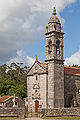
- Nomination Church of "San Pedro de Coucieiro", Muxía, Galicia (Spain)--Lmbuga 09:02, 29 July 2010 (UTC)
- Promotion Very sharp --Berthold Werner 17:32, 29 July 2010 (UTC)
-

- Nomination Human hair with sufrace defects.--Juan de Vojníkov 07:25, 29 July 2010 (UTC)
- Decline * Oppose Subject interresting but too low quality photo --Archaeodontosaurus 06:03, 30 July 2010 (UTC)
-

- Nomination Human hair root.--Juan de Vojníkov 07:25, 29 July 2010 (UTC)
- Decline * Oppose Subject interresting but too low quality photo --Archaeodontosaurus 06:03, 30 July 2010 (UTC)
-

-

- Nomination Le château des Montgommery à Ducey dans la Manche en France. --Thesupermat 20:29, 28 July 2010 (UTC)
- Promotion perspective should be corrected --Mbdortmund 22:19, 28 July 2010 (UTC)
done. ;-) --Berthold Werner 17:53, 29 July 2010 (UTC)
Promoted. Pitke 18:47, 29 July 2010 (UTC)
-

- Nomination Luxembourg, forest reserve in the Sure valley. --Cayambe 18:27, 28 July 2010 (UTC)
- Promotion QI for me --Archaeodontosaurus 06:06, 30 July 2010 (UTC)
-

- Nomination Railway excavatory-things at Rugby. Mattbuck 17:12, 27 July 2010 (UTC)
- Decline Composition looks random; disturbing metal plank on left
--Johannes Robalotoff 19:12, 29 July 2010 (UTC) Comment Sorry, but I did not review this picture and will not do so at the moment. Someone else (who?) failed to expand his/her signature before, so it was expanded by the Mediawiki software without my attention when I promoted 15-07-44-f-mutzig.jpg yesterday. --Johannes Robalotoff 09:47, 30 July 2010 (UTC)
-
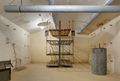
- Nomination Fort de Mutzig : bedroom --ComputerHotline 10:42, 27 July 2010 (UTC)
- Promotion Good. --Johannes Robalotoff 19:12, 29 July 2010 (UTC)
-
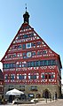
- Nomination Town hall in Großbottwar, Germany. -- Felix Koenig 15:38, 25 July 2010 (UTC)
- Decline Better version has been nominated. Pitke 15:33, 29 July 2010 (UTC)
-

- Nomination Trail blazings on a tree. --Juan de Vojníkov 06:53, 25 July 2010 (UTC)
I like it, but the snow's overexposed at the bottom corners. Maybe a crop down to just the arrows and a bit of surrounding would be good. Mattbuck 21:24, 27 July 2010 (UTC) Comment Cropped. Is it better?--Juan de Vojníkov 07:30, 29 July 2010 (UTC) Comment For me it would be OK now --Haneburger 12:09, 29 July 2010 (UTC) - Promotion Very good now. Pitke 12:34, 29 July 2010 (UTC)
- Nomination Trail blazings on a tree. --Juan de Vojníkov 06:53, 25 July 2010 (UTC)
-

-

- Nomination: Swimmingroom in Muumimaailma, Naantali. --kallerna 07:29, 24 July 2010 (UTC)
- Review needed
-

- Nomination: Water pump of the washing machine. --Juan de Vojníkov 07:13, 24 July 2010 (UTC)
- Review needed
-

- Nomination: 165123 heads 165114 at Oxford with a terminating service. Mattbuck 23:24, 23 July 2010 (UTC)
- Review needed
-

- Nomination: Reflections of passengers in the window of 165133 at Oxford. Mattbuck 23:24, 23 July 2010 (UTC)
- Review needed
-

- Nomination: Reflections of passengers in the window of 165133 at Oxford. Mattbuck 23:24, 23 July 2010 (UTC)
- Review needed
-

- Nomination Kofukuji in Nara --663highland 21:35, 21 July 2010 (UTC)
- Decline Tilted to the right. Pitke 17:58, 26 July 2010 (UTC)
-

- Nomination Lestes sponsa. --ComputerHotline 14:18, 21 July 2010 (UTC)
- Decline Should be cropped. Pitke 17:58, 26 July 2010 (UTC)
-
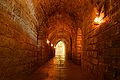
- Nomination Inside the Fort de Bois l'Abbé. --ComputerHotline 14:05, 21 July 2010 (UTC)
- Decline Slightly tilted to the right. Pitke 17:58, 26 July 2010 (UTC)
-

- Nomination Inside the Fort de Bois l'Abbé : Powder room --ComputerHotline 14:05, 21 July 2010 (UTC)
- Promotion OK. Rama 13:02, 29 July 2010 (UTC)
-
- Nomination: Kobe Port Tower in Kobe --663highland 13:44, 21 July 2010 (UTC)
- Review Very pretty, but a bit noisy? Mattbuck 02:29, 24 July 2010 (UTC)
-

- Nomination Church of Salome, Santiago de Compostela, Galicia--Lmbuga 14:04, 20 July 2010 (UTC)
- Promotion Tilted. Pitke 09:43, 29 July 2010 (UTC)
New image, but now I doubt that it is QI. Thanks--Lmbuga 13:08, 29 July 2010 (UTC)
I agree --Berthold Werner 17:56, 29 July 2010 (UTC)
-

- Nomination: 66021 leads a chemical train through Nottingham. If you believe the truck, the chemical being transported is Tea. Mattbuck 18:29, 16 July 2010 (UTC) Comment Maybe Triethylaluminium. Be careful, dont drink it.--Ankara 07:27, 24 July 2010 (UTC)
- Review needed
- Nomination: 66021 leads a chemical train through Nottingham. If you believe the truck, the chemical being transported is Tea. Mattbuck 18:29, 16 July 2010 (UTC)
-

- Nomination 43047 arrives at Nottingham leading a service from London. Mattbuck 19:56, 15 July 2010 (UTC)
- Promotion Would prefer a tighter crop at the top. --Cayambe 14:52, 22 July 2010 (UTC)
I did consider that, but decided it made the image seem unbalanced. Mattbuck 22:16, 23 July 2010 (UTC)
I'd also favour a tighter crop at the top, but it's good anyhow. Rama 12:58, 29 July 2010 (UTC)


.jpg)


.jpg)


.JPG)


.jpg)


.jpg)


_Choeur_Cathedrale_Cordoue.jpg)


.jpg)


.jpg)


.png)
.png)


_male.jpg)
.JPG)


_-_castle.jpg)


.jpg)


.JPG)


.jpg)


_in_2007.JPG)


.jpg)


.jpg)


.jpg)


.JPG)


.jpg)


.jpg)


_-_city_center2.JPG)

.jpg)


.jpg)


.JPG)


.jpg)


.JPG)


.jpg)


.jpg)


_-_old_building.JPG)


_chicks_2_days_old.jpg)


,_Turku,_11.7.2010_(3).JPG)
,_Turku,_11.7.2010_(6).JPG)


.jpg)
.JPG)


_-_kv%C4%9Bt_(bo%C4%8Dn%C3%AD_pohled).jpg)


.jpg)


.JPG)


.JPG)

_-_city_center1.JPG)


.JPG)


.jpg)


_Brochdorf_-_KL_-_Gleichtag_04_ies.jpg)


.JPG)
.jpg)


-retouched.jpg)
_4.jpg)
_3.jpg)
.JPG)
Consensual review[edit]
File:Jaroměř Základní skola Na ostrově.JPG[edit]

- Nomination Elementary school in Jaroměř, CZ --Kozuch 21:18, 27 July 2010 (UTC)
- Decline
- Comment Tilt can be corrected --Archaeodontosaurus 05:47, 28 July 2010 (UTC)
- Comment Tilt was corrected already, see the photo (thumbnail is still cached)--Kozuch 08:44, 28 July 2010 (UTC)
- Support QI for me --Archaeodontosaurus 10:50, 28 July 2010 (UTC)
- Oppose Composition: Facade in shadow and very tight crop; also slight CA. --Elekhh 14:34, 28 July 2010 (UTC)
- Oppose horizontal lines still distorted --Mbdortmund 09:11, 30 July 2010 (UTC)
File:Hevoset kesälaitumella 10.jpg[edit]

- Nomination Haematopota pluvialis on a finnhorse. --kallerna 21:21, 21 July 2010 (UTC)
- Decline The text of the nomination does not discribe the subject very well...--Jebulon 16:54, 22 July 2010 (UTC) Comment Oops... --Kallerna 13:11, 23 July 2010 (UTC) Comment Requested rename to File:Haematopota pluvialis on horse.jpg. Pitke (talk) 16:43, 26 July 2010 (UTC)
- Fixed the description. Ok now? Pitke 13:59, 27 July 2010 (UTC)
- Oppose If the focus of the image is on the horseflies, then it is out of focus. --Quartl 11:21, 29 July 2010 (UTC)
File:Percussion revolver Adams system IMG 3246.jpg[edit]

- Nomination Adams revolver. -- Rama 14:14, 19 July 2010 (UTC)
- Promotion
- Support Good quality, very useful. -- Felix Koenig 15:42, 19 July 2010 (UTC)
- Oppose dont like the cutout, which gives the borders an artificial color. Lighting is also not good. --Niabot 09:40, 20 July 2010 (UTC)
- Oppose Agree to Niabot --Berthold Werner 17:28, 21 July 2010 (UTC)
- Support I think it's very nice, sharp, with a lot of details. It's a QI to me. I see one issue: at highest resolution, there are some strange green reflections on the metal, probably due to the original background. maybe a soft-green background could help ? However, otherwise good.--Jebulon 15:09, 22 July 2010 (UTC)
- Comment Dessature le vert et ce sera une très bonne photo --Archaeodontosaurus 19:39, 26 July 2010 (UTC)
Done, thank you! Rama 07:27, 27 July 2010 (UTC)
- Support good now --Archaeodontosaurus 13:14, 28 July 2010 (UTC)
- Support. Good for me--Lmbuga 12:20, 29 July 2010 (UTC)
File:Junghans Mega.jpg[edit]

- Nomination worldwide frist radio clock wrist watch, JUNGHANS MEGA (analog model) --J. Lunau 12:09, 1 August 2010 (UTC)
- Promotion Valuable image,
but below minimum resolution and oversharpened. Old version has better lighting, but is also too small.-- Smial 15:06, 1 August 2010 (UTC)
;-) --Berthold Werner 16:01, 1 August 2010 (UTC)
: Done higher res. to be over 2 megapixel
: Done bit softer light from opposite direction
: Done no post-sharpening --J. Lunau 17:48, 1 August 2010 (UTC)
I would support, if you remove the black border. --Mbdortmund 18:56, 1 August 2010 (UTC)
: Done black border removed - looks better, I think --J. Lunau 19:58, 1 August 2010 (UTC) Support --Mbdortmund 20:22, 1 August 2010 (UTC)
File:Kasumi Coast Okami park04st3200.jpg[edit]

- Nomination Kasumi Coast --663highland 13:03, 30 July 2010 (UTC)
- Decline
- Support Good view and good quality. -- Smial 13:39, 30 July 2010 (UTC)
- Oppose Unsharp and overexposed --V-wolf 07:56, 31 July 2010 (UTC)
- Oppose Not overexposed really - the clipping is very minimal - but the sharpness is not good. --Herbythyme 12:10, 1 August 2010 (UTC)
File:Podgora-0830.jpg[edit]

- Nomination Podgornaya sloboda in Pereslavl --PereslavlFoto 13:10, 29 July 2010 (UTC)
- Decline * Oppose Very low DOF. Low contrast. --Johannes Robalotoff 15:41, 29 July 2010 (UTC) ** Comment Low DOF is a special effect to produce a toy-scene. Contrast fixed now.--PereslavlFoto 13:06, 30 July 2010 (UTC)
- Oppose Too little in focus for me. Not a very appropriate for this scene --Herbythyme 12:12, 1 August 2010 (UTC)
- Support to explanation of PereslavlFoto I consider this for QI tilt-shift maker photo with scale model look (see examples in flickr) --J. Lunau 14:21, 1 August 2010 (UTC)
File:2010-Catedral de Santiago de Compostela-Galicia (Spain) 4.jpg[edit]
_4.jpg)
- Nomination Cathedral of Santiago de Compostela, Santiago de Compostela, Galicia--Lmbuga 13:21, 20 July 2010 (UTC)
- Promotion
![]() Comment the vertical lines on the right tower are slightly distorted to the right imo --Mbdortmund 11:49, 27 July 2010 (UTC)
Comment the vertical lines on the right tower are slightly distorted to the right imo --Mbdortmund 11:49, 27 July 2010 (UTC)
New image. Thanks--Lmbuga 12:45, 29 July 2010 (UTC)
I disagree to mbdortmund. The first version was ok --Berthold Werner 17:49, 30 July 2010 (UTC)
New image with 3509 × 5265 pixels. Thanks, I'm learning: I can do this photo another day, but I need to know the errors of this image--Lmbuga 14:53, 31 July 2010 (UTC)
![]() Support --Berthold Werner 18:28, 31 July 2010 (UTC)
Support --Berthold Werner 18:28, 31 July 2010 (UTC)
![]() Support --Mbdortmund 23:40, 31 July 2010 (UTC)
Support --Mbdortmund 23:40, 31 July 2010 (UTC)
File:2010-Catedral de Santiago de Compostela-Galicia (Spain) 3.jpg[edit]
_3.jpg)
- Nomination Cathedral of Santiago de Compostela, Santiago de Compostela, Galicia--Lmbuga 13:21, 20 July 2010 (UTC)
- Promotion Comment Shouldn't the horizontal lines be straight (see notice)? else good --Mbdortmund 11:41, 27 July 2010 (UTC)
New image. Do you think that it`s better? Thanks--Lmbuga 12:33, 29 July 2010 (UTC)
Also here I think the first version was ok. You have to use the verticals to check if the picture is tilted. Horizontal lines are not usable unless you stand exactly in front of building. --Berthold Werner 17:49, 30 July 2010 (UTC)
New image with 5456 × 3638 pixels. Thanks--Lmbuga 15:01, 31 July 2010 (UTC)
![]() Support --Berthold Werner 18:29, 31 July 2010 (UTC)
Support --Berthold Werner 18:29, 31 July 2010 (UTC)
![]() Support --Mbdortmund 23:44, 31 July 2010 (UTC)
Support --Mbdortmund 23:44, 31 July 2010 (UTC)
File:♂ Aeshna cyanea and Exuvie.JPG[edit]

- Nomination :♂ Aeshna cyanea and Exuvie --Böhringer 22:10, 28 July 2010 (UTC)
- Decline
- Oppose Too soft. --The High Fin Sperm Whale 00:59, 29 July 2010 (UTC)
- Comment Looks fine at half resolution. --Quartl 10:46, 29 July 2010 (UTC)
- Question Could it be sharpened? Pitke 11:18, 29 July 2010 (UTC)
- It looks to me as if it's slightly out of focus, and oversharpened, so the result is a noise ridden, blurry image. --The High Fin Sperm Whale 19:31, 30 July 2010 (UTC)
- Comment This is really not oversharpened, but lacks DOF. If shrinked to 3 MPix and slightly sharpend it looks quite well. -- Smial 21:18, 30 July 2010 (UTC)
File:Cave Pommard.jpg[edit]

- Nomination: "Château de Pommard 2007" in cellar, Pommard, Burgundy, France--Jebulon 15:36, 14 July 2010 (UTC)
- Review -- Question -- May we try it first, before the review? Alvesgaspar 16:00, 14 July 2010 (UTC) Would be a pity, it's too young ! But I bought here some older bottles and you are welcome, but be careful, maybe you will find this pic fine enough, after tasting ! ;) --Jebulon 16:49, 14 July 2010 (UTC).
- Support Ok to me. :-) --Cayambe 14:59, 22 July 2010 (UTC)
- Oppose Sorry, but I don't like the flash. Partially too harsh light and partially too dark + quite blurry. Interesting subject nevertheless... --kallerna 07:34, 24 July 2010 (UTC)
File:Pistolet-IMG 3196-b.jpg[edit]

- Nomination Silex pistol of the Revolutionary Wars, made by Ateliers Nationaux in France circa 1790-1795. -- Rama 19:26, 19 July 2010 (UTC)
- Promotion Same as for the other ones (fake shadow, cutout, green flection) --Niabot 17:38, 21 July 2010 (UTC)Same as for te other ones: need a CR IMO.--Jebulon 16:26, 22 July 2010 (UTC)
- Comment Can this be sharpened a bit? Pitke 13:50, 27 July 2010 (UTC)
- Support Good work --Archaeodontosaurus 07:29, 1 August 2010 (UTC)
File:Damme_Schellemolen_R01.jpg[edit]

- Nomination Damme (Belgium): the canal and the windmill -- MJJR 21:03, 21 July 2010 (UTC)
- Promotion Support Good -- George Chernilevsky 03:39, 22 July 2010 (UTC) Oppose Why the centred composition, why so much of the uninteresting foreground? --Eusebius 05:54, 22 July 2010 (UTC)
- Support I like it. --The High Fin Sperm Whale 00:58, 23 July 2010 (UTC)
- Support --Archaeodontosaurus 13:01, 25 July 2010 (UTC)
- Oppose Per Eusebius - way too much foreground. --Herbythyme 08:16, 26 July 2010 (UTC)
- Support Image description says: canal & Schellemolen and this is shown. Foreground shows canal bank, so it is ok. -- Smial 19:34, 26 July 2010 (UTC)
- Oppose Composition. --kallerna 22:19, 26 July 2010 (UTC)
- Oppose Composition. Crop and renominate. Pitke 13:51, 27 July 2010 (UTC)
- Support per smial --Mbdortmund 11:12, 1 August 2010 (UTC)
File:Luxembourg Beaufort château 02.jpg[edit]

- Nomination Ruins of Beaufort Castle, Luxembourg. --Cayambe 09:20, 1 August 2010 (UTC)
- Promotion
- Oppose Overprocessed, colours and contrast look unnatural. -- Smial 15:08, 1 August 2010 (UTC)
- Info New version uploaded, with natural colours. --Cayambe 17:52, 1 August 2010 (UTC)
![]() Support Ok for me --Berthold Werner 18:00, 1 August 2010 (UTC)
Support Ok for me --Berthold Werner 18:00, 1 August 2010 (UTC)
![]() Support --Mbdortmund 17:50, 2 August 2010 (UTC)
Support --Mbdortmund 17:50, 2 August 2010 (UTC)
![]() Support Current version is OK. --Johannes Robalotoff 21:56, 2 August 2010 (UTC)
Support Current version is OK. --Johannes Robalotoff 21:56, 2 August 2010 (UTC)
File:Speedway Extraliiga 22. 5. 2010 - Timo Lahti erässä 13.jpg[edit]

- Nomination Speedwayrider Timo Lahti. --kallerna 12:20, 31 July 2010 (UTC)
- Promotion Oppose Blurred. Crusier 14:38, 31 July 2010 (UTC)
Good composition. Movement, not blurred for me--Lmbuga 18:05, 31 July 2010 (UTC)
Support Composition--Lmbuga 18:14, 31 July 2010 (UTC) - Support QI fo me --Archaeodontosaurus 14:48, 3 August 2010 (UTC)
File:Red Tower Mellieha.JPG[edit]

- Nomination St. Agatha's Tower/Red Tower, Malta. -- Felix Koenig 14:39, 29 July 2010 (UTC)
- Decline Oppose lack of sharpness --Berthold Werner 15:32, 29 July 2010 (UTC)
Looks bearable for me, and I'd like to see how it looks like after a bit of sharpening. Pitke 19:17, 30 July 2010 (UTC) - Comment I sharpened it a little bit, applied CS5 correction of object lens and perspective --Mbdortmund 17:08, 3 August 2010 (UTC)
File:Dingli Radar Station.JPG[edit]

- Nomination Dingli Radar Station, Malta. -- Felix Koenig 16:36, 16 July 2010 (UTC)
- Decline
- Oppose Too low DOF → not sharp and perspective correction needed. Lycaon 00:43, 17 July 2010 (UTC)
- Support Good quality for a QI. Alofok 11:01, 17 July 2010 (UTC)
- Support At that resolution sharp enough in comparison to other images --Niabot 13:17, 19 July 2010 (UTC)
- Support This picture is good: also sharf enough and a good perspective. --Timk70 13:20, 19 July 2010 (UTC)
- Oppose not sharp enough. --A.Ceta 08:37, 21 July 2010 (UTC)
- Oppose not sharp enough --Archaeodontosaurus 06:09, 22 July 2010 (UTC)
- Oppose not sharp enough--Lmbuga 15:51, 23 July 2010 (UTC)
- Support good image, very hight quality --ChNPP 20:42, 23 July 2010 (UTC)
- Oppose Good image but shartness inadequate for QI for me. --Herbythyme 08:10, 26 July 2010 (UTC)
- Oppose Sharpness, white burnt through. Maybe fixable? Pitke 13:55, 27 July 2010 (UTC)
- Oppose Difficult to understand the lack of details because all values of the camera are good. Detail of a bigger picture? --Mbdortmund 00:15, 28 July 2010 (UTC)
- No, it's the original picture from the camera, no detail of a bigger picture. -- Felix Koenig 09:52, 29 July 2010 (UTC)
- Vielleicht ein Gegenlichteffekt? Das Schild an der Mauer ist ja wirklich fast völlig aufgelöst. --Mbdortmund 11:54, 29 July 2010 (UTC)
- Möglich, das Schild sieht tatsächlich aus wie verwackelt. -- Felix Koenig 15:25, 29 July 2010 (UTC)
- Verwackelt bei 1/250s? Eher nicht. Benutzt du ein Nikon Objektiv? Es soll Nikons geben, die mit einigen Fremdobjektiven Probleme bei der Fokusierung haben. Ich beobachte das schon öfter bei deinen Fotos, dass es Probleme mit der Fokusierung gibt. --Berthold Werner 18:37, 31 July 2010 (UTC)
- Vielleicht auch zu hastig den Auslöser durchgedrückt? --Mbdortmund 23:47, 31 July 2010 (UTC)
- Dass die Kamera keine Zeit mehr zum fokussieren hat? Mag sein. --Berthold Werner 08:07, 1 August 2010 (UTC)
- Vielleicht auch zu hastig den Auslöser durchgedrückt? --Mbdortmund 23:47, 31 July 2010 (UTC)
- Verwackelt bei 1/250s? Eher nicht. Benutzt du ein Nikon Objektiv? Es soll Nikons geben, die mit einigen Fremdobjektiven Probleme bei der Fokusierung haben. Ich beobachte das schon öfter bei deinen Fotos, dass es Probleme mit der Fokusierung gibt. --Berthold Werner 18:37, 31 July 2010 (UTC)
- Möglich, das Schild sieht tatsächlich aus wie verwackelt. -- Felix Koenig 15:25, 29 July 2010 (UTC)
- Vielleicht ein Gegenlichteffekt? Das Schild an der Mauer ist ja wirklich fast völlig aufgelöst. --Mbdortmund 11:54, 29 July 2010 (UTC)
- No, it's the original picture from the camera, no detail of a bigger picture. -- Felix Koenig 09:52, 29 July 2010 (UTC)
Vielleicht eher ein Problem der Tiefenschärfe: Vergleiche die Nieten an der Kugel und unten das Schild, die Steine und das Gras. Fingalo 18:24, 1 August 2010 (UTC)
- Das Bild habe ich mir nun schon seit Tagen immer mal wieder angeschaut und komme zu keinem eindeutigen Schluß. Verwackelt ist es nicht, es gibt genügend Bildteile, die im Rahmen der Objektivfähigkeiten einwandfrei scharf sind. Tärfenschiefenproblem sollte es zumindest für den Turm selbst auch nicht sein (die Wiese im Vordergrund darf ja ruhig unschärfer sein als der Rest), da bei f8/55mm alles ab etwa 9 m Distanz ausreichend scharf ist, wenn die Kamera auf Unendlich fokussiert hat (hier nachzurechnen). Nach den Exif ist also eigentlich alles perfekt. Auffällig ist, daß die Unschärfen ungleichmäßig übers Bild verteilt sind: Hier im Hochformat ist sie in der rechten unteren Ecke am stärksten ausgeprägt, nach links wird es besser. Auch weiter oben im Bild ist die rechte Seite unschärfer als die linke. Das läßt auf ein dezentriertes Objektiv schließen. Ich kenne mich mit dem Nikon-System nicht aus: Ist das eine Linse mit Bildstabilisator? Vielleicht hat der ja auch einen Hau. Letzte Erklärungsvariante: Das Objektiv fokussiert über Unendlich hinaus, das Problem hatte ich bei meiner alten *istds gelegentlich, das kann ganz kuriose Effekte ergeben, z.B. Bilder, die am Rand oder in einem ringförmigen Bereich schärfer sind als in der Bildmitte. -- Smial 16:31, 2 August 2010 (UTC)
- Also: Das Ding ist das Original-Nikon-Objektiv (18-55mm). Hastig durchgedrückt habe ich nach dem Aufbau sicher nicht. Bildstabilisator dürfte keiner drin sein. Grüße, Felix Koenig 16:47, 3 August 2010 (UTC)
- Die Nikon-Software kann Dir meistens den Fokuspunkt anzeigen, vielleicht war's die Antenne obendrauf oder die obere Gebäudekante, vielleicht guckste mal. --Mbdortmund 16:50, 3 August 2010 (UTC)
- Also: Das Ding ist das Original-Nikon-Objektiv (18-55mm). Hastig durchgedrückt habe ich nach dem Aufbau sicher nicht. Bildstabilisator dürfte keiner drin sein. Grüße, Felix Koenig 16:47, 3 August 2010 (UTC)
- Das Bild habe ich mir nun schon seit Tagen immer mal wieder angeschaut und komme zu keinem eindeutigen Schluß. Verwackelt ist es nicht, es gibt genügend Bildteile, die im Rahmen der Objektivfähigkeiten einwandfrei scharf sind. Tärfenschiefenproblem sollte es zumindest für den Turm selbst auch nicht sein (die Wiese im Vordergrund darf ja ruhig unschärfer sein als der Rest), da bei f8/55mm alles ab etwa 9 m Distanz ausreichend scharf ist, wenn die Kamera auf Unendlich fokussiert hat (hier nachzurechnen). Nach den Exif ist also eigentlich alles perfekt. Auffällig ist, daß die Unschärfen ungleichmäßig übers Bild verteilt sind: Hier im Hochformat ist sie in der rechten unteren Ecke am stärksten ausgeprägt, nach links wird es besser. Auch weiter oben im Bild ist die rechte Seite unschärfer als die linke. Das läßt auf ein dezentriertes Objektiv schließen. Ich kenne mich mit dem Nikon-System nicht aus: Ist das eine Linse mit Bildstabilisator? Vielleicht hat der ja auch einen Hau. Letzte Erklärungsvariante: Das Objektiv fokussiert über Unendlich hinaus, das Problem hatte ich bei meiner alten *istds gelegentlich, das kann ganz kuriose Effekte ergeben, z.B. Bilder, die am Rand oder in einem ringförmigen Bereich schärfer sind als in der Bildmitte. -- Smial 16:31, 2 August 2010 (UTC)
File:Cardiff Bay Panorama.JPG[edit]
![]()
- Nomination: Cardiff Bay panorama in Wales. WikiLaurent 20:19, 23 July 2010 (UTC)
- Review
Tilted. Pitke 15:27, 29 July 2010 (UTC)
Sorry but as far as I can tell it's not tilted. Look at the edges of the building in the centre - they are all perfectly vertical. WikiLaurent 18:32, 30 July 2010 (UTC)
True... But looking at the vertical edges of the buildings at the far right and far left, it reveals "triangular" perspective distortion. The churches are distorted to the point it's clear to the naked eye. Pitke 19:10, 30 July 2010 (UTC)
Ok please give me a few days and I'll try to fix the distortion if I can (I keep being told that my pictures are distorted so I really need to find out how to fix it). WikiLaurent 22:32, 30 July 2010 (UTC) - Comment maybe it helps, when you use the software ShiftN on single shoots before stitching - take a look, if you like: ShiftN: automatic correction of converging lines --J. Lunau 12:27, 1 August 2010 (UTC)
File:Helogale undulata qtl1.jpg[edit]

- Nomination Dwarf Mongoose (dental formula 3.1.4.2). --Quartl 09:17, 4 August 2010 (UTC)
- Withdrawn
- Support good --Mbdortmund 12:40, 5 August 2010 (UTC)
- Oppose Very noisy, blurred, backlight. Pitke
- Oppose Very useful but not QI --Archaeodontosaurus 08:47, 8 August 2010 (UTC)
- I agree with Archaeodontosaurus - Nomination withdrawn. --Quartl (talk) 09:15, 8 August 2010 (UTC)
File:Chevaux estive Pyrenees.jpg[edit]

- Nomination Herd of horses on summer mountain pasture in the Pyrenees --Myrabella 09:50, 2 August 2010 (UTC)
- Promotion
- Support QI --Archaeodontosaurus 12:12, 2 August 2010 (UTC)
- Oppose Very low sharpness -- 320td 10:43, 3 August 2010 (UTC)
- Question And I thought my screen was high res. How come "very low"?? Pitke 04:56, 4 August 2010 (UTC)
- Support QI --Berthold Werner 13:06, 3 August 2010 (UTC)
- Support QI for me, nice composition and good sharpness. Pitke (talk) 07:07, 4 August 2010 (UTC)
- Support Beautiful image. --Quartl 07:12, 5 August 2010 (UTC)
- Support Beautiful--Lmbuga 18:19, 6 August 2010 (UTC)
File:VW Tiguan 2.0 TDI front 20100801.jpg[edit]

- Nomination VW Tiguan Track & Field 2.0 TDI -- S 400 HYBRID 10:26, 2 August 2010 (UTC)
- Decline Very well done! High-Qualtity image -- 320td 10:29, 2 August 2010 (UTC)
- Oppose Busy composition, background distracting. --Elekhh 00:50, 3 August 2010 (UTC)
- Oppose same opinon --Archaeodontosaurus 10:08, 3 August 2010 (UTC)
- Support I thought that a „QI“ has only to do something with the Quality. The background goes with a SUV. Composition: A car is a car which should fill the whole image. What's that for a composition? --320td 10:54, 3 August 2010 (UTC)
- If you revisit the QI guidelines you'll notice that composition is well part of it. --Elekhh 15:44, 3 August 2010 (UTC)
- Comment I would prefer you to show us a picture of your composition. But maybe you can do it. The relationship between S 400 HYBRID and 320td seem to me suspicious. --Archaeodontosaurus 14:39, 3 August 2010 (UTC)
- Comment Yes, this seems curios. An here nearly unknown user (with the retired template on his user page) nominates an image and another unknown user sets it to promoted 3 minutes later. This looks somewhat strange. --Berthold Werner 16:18, 3 August 2010 (UTC)
![]() Comment The background can be edited with little effort to mask away the wall's top and the vertical element. Would probably be QI for me if done. Pitke (talk) 07:06, 4 August 2010 (UTC)
Comment The background can be edited with little effort to mask away the wall's top and the vertical element. Would probably be QI for me if done. Pitke (talk) 07:06, 4 August 2010 (UTC)
- Oppose "Claustrophobic" composition, without space around the center or focus--Lmbuga 18:16, 6 August 2010 (UTC)
File:VW Tiguan 2.0 TDI rear 20100801.jpg[edit]

- Nomination VW Tiguan Track & Field 2.0 TDI -- S 400 HYBRID 10:26, 2 August 2010 (UTC)
- Decline
- Support Very well done! High-Qualtity image -- 320td 10:29, 2 August 2010 (UTC)
- Oppose Busy composition, background distracting. --Elekhh 00:50, 3 August 2010 (UTC)
- Oppose same opinon --Archaeodontosaurus 10:08, 3 August 2010 (UTC)
- Just one vote per user. --Elekhh 08:51, 7 August 2010 (UTC)
- If you revisit the QI guidelines you'll notice that composition is well part of it. --Elekhh 15:46, 3 August 2010 (UTC)
- Comment I would prefer you to show us a picture of your composition. But maybe you can do it. The relationship between S 400 HYBRID and 320td seem to me suspicious. --Archaeodontosaurus 14:40, 3 August 2010 (UTC)
- Oppose Claustrophobic composition. Could be higher res and sharper too, and I have to agree about the background. This should be relatively easy to reproduce. Pitke (talk) 07:53, 6 August 2010 (UTC)
- Oppose Per Pitke. "Claustrophobic" composition, without space around the center or focus--Lmbuga 18:14, 6 August 2010 (UTC)
File:Trier Palais Kesselstadt rueckseite.jpg[edit]

- Nomination Trier, Palais Kesselstadt, back yard --Berthold Werner 16:01, 1 August 2010 (UTC)
- Decline
- SupportGood. --Cayambe 18:11, 1 August 2010 (UTC)
- Oppose poor sharpness at the roof -- 320td 11:00, 3 August 2010 (UTC)
- Oppose Need broader DOF for buildings. Also has vertical distortion outwards. Pitke 07:48, 6 August 2010 (UTC)
File:Hiyoriyama Coast Toyooka Hyogo pref07n4380.jpg[edit]

- Nomination Hiyoriyama Coast --663highland 12:31, 1 August 2010 (UTC)
- Decline Support Nice :)--Gaeser 18:27, 1 August 2010 (UTC)
![]() Oppose Chromatic aberrations top left and horizon too curved. --Archaeodontosaurus 01:23, 2 August 2010 (UTC)
Oppose Chromatic aberrations top left and horizon too curved. --Archaeodontosaurus 01:23, 2 August 2010 (UTC)
- Horizon should be fixable, will you oppose if it's done? Pitke 18:56, 2 August 2010 (UTC)
- CA should also be fixed, visible at 100% view without magnification. -- Smial 19:39, 2 August 2010 (UTC)
- If the horizon is corrected I change my vote!--Archaeodontosaurus 14:44, 3 August 2010 (UTC)
- CA should also be fixed, visible at 100% view without magnification. -- Smial 19:39, 2 August 2010 (UTC)
![]() Neutral If the mentioned issues are fixed I might support this. I would have liked a broader DOF however, this being a landscape. Pitke (talk) 07:09, 4 August 2010 (UTC)
Neutral If the mentioned issues are fixed I might support this. I would have liked a broader DOF however, this being a landscape. Pitke (talk) 07:09, 4 August 2010 (UTC)
![]() Oppose per Archaeodontosaurus & subexposure (left part)--Lmbuga 18:24, 6 August 2010 (UTC)
Oppose per Archaeodontosaurus & subexposure (left part)--Lmbuga 18:24, 6 August 2010 (UTC)
File:128-ov-Friisin-Raketti-03.jpg[edit]

- Nomination The handler's trousers and gloves were *really* white. Pitke 09:18, 5 August 2010 (UTC)
- Decline
![]() Oppose Sorry, partially burnt. --kallerna 17:10, 6 August 2010 (UTC)
Oppose Sorry, partially burnt. --kallerna 17:10, 6 August 2010 (UTC)
- I turned down the highlights a bit. Let's see what the others think. --King of Hearts 18:54, 7 August 2010 (UTC)
- Comment Could have been better result if the same would have done to RAW-file? --kallerna 14:13, 8 August 2010 (UTC)
- Info sadly the camera is not able to create RAWs. I can't say that the newer version looks good, the fixes should have been applied locally, now the woman's figure is full of weird stuff. Pitke 18:09, 8 August 2010 (UTC)
File:6875 Neoplan N4020td.jpg[edit]

- Nomination Neoplan N4020 in Warsaw, Poland. --Crusier 17:20, 2 August 2010 (UTC)
- Decline Strong tilt. -- Smial 23:08, 2 August 2010 (UTC)
- Comment Now better? --Crusier 07:12, 3 August 2010 (UTC)
- Oppose Noisy. You should make such a picture in a better lighting conditions. --Sfu 11:52, 5 August 2010 (UTC)
- Comment The reason for the noise is ISO 500, considering the 1/640 seconds that was not necessary --Mbdortmund 21:58, 6 August 2010 (UTC)
- Oppose too noisy. --High Contrast 14:16, 8 August 2010 (UTC)
File:Ichikawa river Ikuno Asago Hyogo01s5bs4272.jpg[edit]

- Nomination Ichikawa river in Asago --663highland 14:49, 4 August 2010 (UTC)
- Support Very sharp and otherwise also good. --Cayambe 16:58, 8 August 2010 (UTC)
- Decline
- Comment The right part of the image looks quite tilted and not very sharp. --Quartl 08:35, 9 August 2010 (UTC)
- Oppose The houses are fine, but the mountains are too soft and have too much CA. --The High Fin Sperm Whale 20:07, 9 August 2010 (UTC)
- Oppose The ca on the mountains makes it unacceptable to me for QI I'm afraid. --Herbythyme 14:41, 10 August 2010 (UTC)
- Comment Applied red-cyan CA correction. At 100% it is barely visible. --King of Hearts 04:16, 11 August 2010 (UTC)
File:Kamikochi Mt Roppyakusan01n3200.jpg[edit]

- Nomination at Kamikochi in Japan --663highland 09:08, 12 August 2010 (UTC)
- Decline
- Oppose - White parts overexposed. --kallerna 09:17, 12 August 2010 (UTC)
- Support - Yes, a little, but the rest of the image makes up for it. --Quartl 04:36, 13 August 2010 (UTC)
- Oppose - Per Kallerna. Mattbuck 10:13, 13 August 2010 (UTC)
File:Doughnut burger.jpg[edit]

- Nomination Doughnut burger with cheese -663highland 14:59, 8 August 2010 (UTC)
- Decline
- Oppose Only in America would that be considered food.... Decline on grounds of taste, waist and overexposure at the top right. Mattbuck 09:18, 9 August 2010 (UTC)
- Support A personal dislike for the subject is not a valid reason to oppose, unless it is unencyclopedic, but here it does have a Wikipedia article. The shiny frosting should be slightly clipped to produce the appearance of luster. --King of Hearts 04:03, 11 August 2010 (UTC)
- I didn't decline it because I hate American culture, I declined it because I don't think it's a quality image. Mattbuck 07:21, 11 August 2010 (UTC)
- Oppose The white bg shines onto the object and eats its borders. For me, it's a re-shoot with a non-white bg, then, if needed, the bg can be removed by some editing software. Pitke 14:36, 11 August 2010 (UTC)
- Oppose Too tihgt crop. Yarl 15:41, 15 August 2010 (UTC)
File:Obiki-no-hana Kasumi Coast Hyogo pref01bs5s4200.jpg[edit]

- Nomination Obiki-no-hana in Kasumi Coast --663highland 14:04, 3 August 2010 (UTC)
- Promotion
- On second sight, it is probably ok. --Quartl 06:45, 12 August 2010 (UTC)
- Support I don't find it unsharp at all. --King of Hearts 03:56, 11 August 2010 (UTC)
File:Officer carbin-Reymond-circa 1780.jpg[edit]

- Nomination Officer carbin, made in Vaud by Reymond circa 1780. -- Rama 12:25, 29 July 2010 (UTC)
- Promotion
- It seems somewhat out of focus, and the reflection from the original background distracts me somewhat. Can't decide though. Pitke 17:52, 5 August 2010 (UTC)
- Support Ok IMO. --kallerna 14:11, 8 August 2010 (UTC)
{{opp}}Bad mask: You can see note in the image. If you correct it, possibly I will agree--Lmbuga 00:31, 13 August 2010 (UTC)- Support It seems to me that they are part of metal.--Archaeodontosaurus 07:18, 14 August 2010 (UTC)
- Comment It seems to me a small error, but the image is excellent--Lmbuga 15:55, 14 August 2010 (UTC)
- Comment It is actually a metal plate held by screws, but I don't have close-ups from a different angle to prove it, sorry. ~ Rama (talk)
- Support Very nice. Yarl 17:02, 15 August 2010 (UTC)
- Support Good to me. Agree with Archeo and with Rama about the "bad mask". Not sure a white background is the best, but it is only an aesthetic and personal opinion.--Jebulon 22:47, 15 August 2010 (UTC)
- Support Good, QI, sorry--Lmbuga 10:17, 16 August 2010 (UTC)
File:Wakayama Yosuien13n4272.jpg[edit]

- Nomination Yosuien Garden in Wakayama --663highland 14:37, 9 August 2010 (UTC)
- Decline
- Support Nice nature.--PetarM 19:22, 9 August 2010 (UTC)
- Oppose Has disturbingly much noise in the water, not too sharp, also seems tilted. Pitke 19:39, 9 August 2010 (UTC)
- noise and CA should be reduced but composition is good --Mbdortmund 19:47, 9 August 2010 (UTC)
- Oppose Sorry, but the lens gets pretty unsharp in the corners. --King of Hearts 04:11, 11 August 2010 (UTC)
File:Bréhec - côte.JPG[edit]

- Nomination Breton coast. --Eusebius 10:32, 5 August 2010 (UTC)
- Promotion
- Oppose Sorry, don't like the composition. No encyclopedical value. --kallerna 13:44, 8 August 2010 (UTC)
- I request another opinion. --Eusebius 19:06, 9 August 2010 (UTC)
- Support Remarkable comment really. Good image of the coast. Good light and colours, Maybe a little soft in the distant parts but quite definitely of value. --Herbythyme 14:45, 10 August 2010 (UTC)
- Oppose No encyclopedic value? However, I oppose due to high amounts of noise and posterizeation. --The High Fin Sperm Whale 21:22, 10 August 2010 (UTC)
- SupportCriteria satisfied, in my opinion. I don't agree with the criticisms. --Wsiegmund 04:45, 12 August 2010 (UTC)
{{opp}}the part of back is too blurry. Not natural color--Lmbuga 21:08, 12 August 2010 (UTC)
- I don't want to look like I'm fighting for this picture to gain QI status (it's not my best one), but: - It's strange to see "blurry background" as a reason to oppose, and - Colours are pretty natural IMO, they're the reason why I took the picture. --Eusebius 07:59, 13 August 2010 (UTC)
- Ok. I am not safe to dominate the voting criteria nor to value the images suitably--Lmbuga 16:00, 14 August 2010 (UTC)
- Support Good value encyclopedic. The light is special interest in image QI for me --Archaeodontosaurus 08:26, 13 August 2010 (UTC)
- Support good to me. Very breton, indeed.--Jebulon 22:41, 15 August 2010 (UTC)
File:Thymelicus lineola qtl1.jpg[edit]

- Nomination Essex Skipper. --Quartl 06:56, 7 August 2010 (UTC))
- Promotion
- Oppose Good detail, good DOF, but partly overexposed. --Johannes Robalotoff 12:34, 7 August 2010 (UTC)}
- Support Yes, a little, but I don't find it to be a huge problem. Let's discuss. --King of Hearts 18:54, 7 August 2010 (UTC)
- You are probably right regarding the wings. But if the tail and the "knee" of the animal appear pure white although they are not white in reality, I would not call this "a little" overexposed. --Johannes Robalotoff 15:35, 8 August 2010 (UTC)
- I uploaded a new version with reduced brightness, better now? --Quartl 19:18, 8 August 2010 (UTC)
- You are probably right regarding the wings. But if the tail and the "knee" of the animal appear pure white although they are not white in reality, I would not call this "a little" overexposed. --Johannes Robalotoff 15:35, 8 August 2010 (UTC)
- Support Good now --Archaeodontosaurus 08:33, 9 August 2010 (UTC)
- Support --Mbdortmund 07:08, 10 August 2010 (UTC)
- Support --Wsiegmund 04:50, 12 August 2010 (UTC)
File:065 Musée archéologique de Grenoble.jpg[edit]

- Nomination Sarcophaguses in the former Saint Martin church of Grenoble, Archaeological museum of Grenoble --Otourly 18:59, 4 August 2010 (UTC)
- Decline
*If I understand the description right, the picture is not by a wikipedian. --Mbdortmund 21:25, 6 August 2010 (UTC)
*The author is a collective UID of a museum, so there's no guarantee this particular picture was created by someone who actually uses Commons. Pitke 14:11, 7 August 2010 (UTC)
*Well, they use commons but they don't have lot time for this. Otourly 08:48, 8 August 2010 (UTC) - Oppose It is particularly important that institutions, like museums, working with Commons. We must encourage this process. Unfortunately this image is in IQ because there are too overexposed areas and aberrations of prospects in the background..--Archaeodontosaurus (talk) 14:03, 8 August 2010 (UTC)
- Oppose Overexposed areas in the foreground. --Cayambe 14:22, 10 August 2010 (UTC)
File:Palkinnot.jpg[edit]

- Nomination Prizes at a horse show. Pitke 17:44, 5 August 2010 (UTC)
- Decline
- Underexposure?--Lmbuga 19:31, 5 August 2010 (UTC)
- Not so much I think, her hands were really tanned and the items were placed under her shadow to keep the shine from overexposing. Can be a problem with the brightly lit background though. Pitke 19:41, 5 August 2010 (UTC)
- With photoshop lightroom I see underexposure, and a little overexposure in the brightness of the trophy--Lmbuga 23:08, 5 August 2010 (UTC)
- Not so much I think, her hands were really tanned and the items were placed under her shadow to keep the shine from overexposing. Can be a problem with the brightly lit background though. Pitke 19:41, 5 August 2010 (UTC)
- Fix attempt made. Pitke 08:27, 6 August 2010 (UTC)
- File:Palkinnot - retouched.jpg has an alternative version, with data corruption near the hand edges though. Pitke 11:17, 6 August 2010 (UTC)
- Oppose Underexposure and noisy in the hands shades. Also, I don't like the crop--Lmbuga 00:39, 13 August 2010 (UTC)
==[edit]
- Nomination Spear fisherman in Hawaii--Mbz1 01:26, 28 July 2010 (UTC)
- Decline Comment - Cool, but not entirely sure it's QI. Mattbuck 17:38, 30 July 2010 (UTC)
Honestly, I am not either, so let's discuss it.--Mbz1 04:30, 2 August 2010 (UTC)
![]() Oppose It's below the 2Mb minimum, and
Oppose It's below the 2Mb minimum, and
- Are you sure you know what are you talking about? The image is 3.0 megapixel.--Mbz1 18:44, 4 August 2010 (UTC)
- Apparently I have been confusing file weight with file dimensions. Pitke 19:51, 4 August 2010 (UTC)
- Support Good for me. Yann 15:24, 6 August 2010 (UTC)
{{support}} I do not understand of this type of images, but it seems to me QI--[[User:Lmbuga|Lmbuga]] 18:27, 6 August 2010 (UTC)I don't understand--Lmbuga (talk) 00:21, 13 August 2010 (UTC)- Oppose until the tilt of the water surface is corrected. Wsiegmund 23:46, 6 August 2010 (UTC)
- Comment to correct the tilt isn't easy, because the water horizan is sidled. I've tried it (and rotated ~5°), see here. Looks like a cw tilt now, but the correction is very close to reality. --kaʁstn Disk/Cat 12:37, 7 August 2010 (UTC)
- Comment Better, and I could probably support the corrected version, but I agree that the correction looks a bit cw tilted. The reflections of the diving trunks, as well as the tilt of the water horizon, provides cues. Thank you. Wsiegmund 16:37, 7 August 2010 (UTC)
- Oppose Too soft. --kallerna 14:16, 8 August 2010 (UTC)
File:Azusa River01bs4272.jpg[edit]

- Nomination at Kamikochi in Japan --663highland 09:08, 12 August 2010 (UTC)
- Promotion
- Support Unsharp, posterized and noisy (there must be something wrong with your camera or lens), but man I love the composition. --kallerna 09:15, 12 August 2010 (UTC)
- Oppose This is QI not FP, it is about the quality of the image --Herbythyme 16:25, 13 August 2010 (UTC)
- Support Quality looks a bit strange, but not too bad imo. Nice image! --Carschten 20:30, 14 August 2010 (UTC)
File:San Xacobe na igrexa de San Martiño de Noia - Noia - Galiza.jpg[edit]

- Nomination Saint James the Greater in the church of San Martiño, Noia, Galicia (Spain)--Lmbuga 14:19, 10 August 2010 (UTC)
- Promotion I'm not sure: 3200 ISO, hard shades?--Lmbuga 14:19, 10 August 2010 (UTC)ISO may be OK with this camera but the harsh light isn't. The statue itself is beautiful. --Ikiwaner 14:16, 14 August 2010 (UTC)
Thanks--Lmbuga 15:51, 14 August 2010 (UTC) Support I don't agree with the criticisms above. To me, this pic is good enough for a QI. And I like the little coins.--Jebulon 23:28, 15 August 2010 (UTC)
File:Steyr-PinzgauerAR.JPG[edit]

- Nomination Pinzgauer High Mobility All-Terrain Vehicle. --Manuguf 13:34, 7 August 2010 (UTC)
- Decline SupportGood. --The High Fin Sperm Whale 21:57, 15 August 2010 (UTC). Comment Bad exposure IMO. Needs a discussion.--Jebulon 23:05, 15 August 2010 (UTC)
I think that the exposition is correct, and actually quite a success, given that you have a dull and dark military vehicle against a background of bright sky and mountains. Rama 07:27, 16 August 2010 (UTC) - Oppose The vehicle is too dark. The flash of a compact camera as DMC-LX2 is for this kind of photos too weak. Joadl 18:06, 17 August 2010 (UTC)
- Oppose unfortunate lighting --Mbdortmund 09:16, 18 August 2010 (UTC)
Kitzingen town church[edit]

- Nomination Kitzingen, Bavaria, town church --Berthold Werner 15:29, 29 July 2010 (UTC)
- Decline
- Comment Light was not best on that day obviously. I would have tried a curve correction to bring a bit more light to the main subject, perhaps masking the sky in order not to loose too much of its structure. Unfortunately the region under the trees on the right is also severely underexposed. However the main problem that would make me decline at the moment is something that looks like strong barrel distortion. (Take a ruler and measure the tower. It is not tilted, but bent to the left. Also the top of the tower in background looks a bit squeezed.) --Johannes Robalotoff 14:59, 6 August 2010 (UTC)
- Info I tried to corecct it. --Berthold Werner 21:08, 7 August 2010 (UTC)
- Comment You definitely succeeded with the light conditions, and the barrel distortion is also gone. But the towers look very overstretched now. If you use hugin, could you try a different projection? Although rectilinear is correct in theory, another method could look more natural and could avoid the stretching problem. --Johannes Robalotoff 16:08, 8 August 2010 (UTC)
- Or we let it as non-QI. ;-) --Berthold Werner 17:41, 8 August 2010 (UTC)
- Support This is the way we want people to do perspective correction: Also with correction of perspective foreshortening. The light actually is very good - it makes soft shadows. However one could correct the colour aberrations on the roof of the left building. --Ikiwaner 17:18, 15 August 2010 (UTC)
- Oppose I aggree with Ikiwaner that perspective shortening should be corrected in pictures of that kind. But here the end result looks so unnatural that I have to oppose. As the facade is not in parallel with the image plane, the correction produced angles that are more inconsistent than before. Thus the geometry looks rather unpleasant for me. --Johannes Robalotoff 21:32, 15 August 2010 (UTC)
- Oppose Agree with Johannes Robalotoff (please see annotation). Furthermore, the purple CA on the roof left is very visible (the one on the cross too)--Jebulon 15:40, 17 August 2010 (UTC)
File:Kath. Kirche Helminghausen.jpg[edit]

- Nomination Catholic Church „St. Maria von der Immerwährenden Hilfe“ in Helminghausen, Marsberg, NRW, Germany --Carschten 14:31, 13 August 2010 (UTC)
- Promotion
- Oppose Somewhat overprocessed, blown out clouds. Are the upper parts of the tower, and the roof really darker than the lower? -- Smial 15:50, 13 August 2010 (UTC)
- Comment mir wurde mitgeteilt, dass mit overprocessed „zu stark bearbeitet“ gemeint ist. Wo bitte soll das im Bild der Fall sein? Dafür, das Wolken von der Sonne angestrahlt werden, kann ich nichts. Die Kirche wird auf jeden Fall real, wie auf den Einzelbildern, nicht überbelichtet und auch vom Licht her korrekt wiedergegeben. --Carschten 16:27, 13 August 2010 (UTC)
- (zu stark?) aufgehellte Schatten unter dem Turmhelm wirken etwas grünlich, der Turm leicht rosa im Vergleich zur übrigen Kirche, das Rosa der Wolken gefällt mir auch nicht so richtig, auch wenn der "Farbstich" Natur ist. Sonst schön. mfg --Mbdortmund 17:04, 13 August 2010 (UTC)
- Das der Turm unterschiedlich farbig ist hat einen recht einfachen Grund. Schau dir die Wolkenschatten im Hintergrund links und rechts an. Die Turmspitze bekommt gerade etwas Schatten davon ab. Stammt also nicht von einer Bearbeitung. --Niabot 17:19, 13 August 2010 (UTC)
- Ich meinte die grün verfärbte Kante unter dem Turmdach, ich will aber nicht den Besserwisser spielen, vielleicht ist es auch Moos und der Kirchturm kantenscharf in einer etwas anderen Farbe gestrichen als der übrige Baukörper. Sonst gefällt mir das Bild. --Mbdortmund 23:46, 13 August 2010 (UTC)
- Der Grünton sollte vollkommen normal sein. Der stammt vom Licht aus der Umgebung, das üblicherweise grünlich ist. Anderes Licht kommt an diese Stelle auch kaum hin. Direktes Sonnenlicht ist es nicht. Allseitiges Licht aus der Athmosphäre strahlt auch nicht wirklich von unten. Zur Verdeutlichung habe ich mal dieses Bild mit LuxRender erstellt. Kommt zu einem ähnlichen Ergebnis. --Niabot 13:08, 14 August 2010 (UTC)
- Ich meinte die grün verfärbte Kante unter dem Turmdach, ich will aber nicht den Besserwisser spielen, vielleicht ist es auch Moos und der Kirchturm kantenscharf in einer etwas anderen Farbe gestrichen als der übrige Baukörper. Sonst gefällt mir das Bild. --Mbdortmund 23:46, 13 August 2010 (UTC)
- Das der Turm unterschiedlich farbig ist hat einen recht einfachen Grund. Schau dir die Wolkenschatten im Hintergrund links und rechts an. Die Turmspitze bekommt gerade etwas Schatten davon ab. Stammt also nicht von einer Bearbeitung. --Niabot 17:19, 13 August 2010 (UTC)
- (zu stark?) aufgehellte Schatten unter dem Turmhelm wirken etwas grünlich, der Turm leicht rosa im Vergleich zur übrigen Kirche, das Rosa der Wolken gefällt mir auch nicht so richtig, auch wenn der "Farbstich" Natur ist. Sonst schön. mfg --Mbdortmund 17:04, 13 August 2010 (UTC)
- Support - high resolution, nice view and high quality. -- Felix Koenig 12:44, 14 August 2010 (UTC)
- Support - good. (Wir sind doch hier nicht bei KEB ;-) --Berthold Werner 14:01, 15 August 2010 (UTC)
- Support - Darf ich auch auf deutsch mitspielen ? Scheint mir gut zu sein. Maybe a little dustspot im Himmel, oder ?--Jebulon 15:14, 17 August 2010 (UTC)
- Support - A perfect photo for a building. A beautiful cloud formation or evening or morning mood is for this type of assessment not necessary. Joadl 17:43, 17 August 2010 (UTC)
File:Girl playing drum, Gurgaon, India.jpg[edit]

- Nomination Girl playing drum, Gurgaon, India. Yann 16:59, 16 August 2010 (UTC)
- Decline
- Oppose Flash makes hard shadows, and reflections. -- Smial 00:58, 17 August 2010 (UTC)
- Oppose in this case I see no harsh shadows, flash is used in portraits because the reflections make the eyes living. To me the contre-jour lighting and the scattered background speak against qi. --Ikiwaner 18:25, 17 August 2010 (UTC)
- Comment This is not a stage picture. I cannot choose the light and the direction. Yann 06:33, 18 August 2010 (UTC)
- Comment There are some circumstances that make it impossible to shoot a really good picture. If you had enough time you could have asked the girl to move a bit, just as an esample. --Ikiwaner 13:40, 18 August 2010 (UTC)
File:Boletus_impolitus_2010_G1.jpg[edit]

- Nomination Iodine bolete Boletus impolitus --George Chernilevsky 17:54, 21 August 2010 (UTC)
- Withdrawn
- Oppose Underexposed, sorry! --The High Fin Sperm Whale 21:37, 21 August 2010 (UTC)
- New version --Archaeodontosaurus 07:22, 22 August 2010 (UTC)
- Thanks to Archaeodontosaurus!
- I will try renominate it later (improved version) -- George Chernilevsky 11:45, 23 August 2010 (UTC)
File:Westfalenpark-100818-16933-Gallinula-chloro.jpg[edit]

- Nomination young Gallinula-chloro in Dortmund --Mbdortmund 02:34, 20 August 2010 (UTC)
- Promotion
- Oppose I don't like the composition - the lillies distract from the subject of the image. Shame, because the images are otherwise technically good. Mattbuck 09:20, 20 August 2010 (UTC)
- Support In the opposite, I think that the lillies add something here. Yann 10:31, 20 August 2010 (UTC)
- Support Natural background is very good IMO. -- George Chernilevsky 11:14, 20 August 2010 (UTC)
- Support--Nevit 23:21, 20 August 2010 (UTC)
File:Theobroma_cacao_001.JPG[edit]

- Nomination Flower of the Cocoa / Cacao, Theobroma cacao --Llez 20:03, 16 August 2010 (UTC)
- Decline
- Oppose Looks overprocessed (denoising?). --Quartl 13:33, 18 August 2010 (UTC)
- Oppose Too noisy. --The High Fin Sperm Whale 16:57, 20 August 2010 (UTC)
File:Gaspard, marquis de Clermont-Tonnerre.jpg[edit]

- Nomination Gaspard de Clermont-Tonnerre (1688-1781) by Augustin Pajou, Hôtel-Dieu de Beaune, France--Jebulon 23:44, 16 August 2010 (UTC)
- Decline
- Oppose Noisy and unrealistic white balance. -- Smial 00:54, 17 August 2010 (UTC)
- Sorry, what do you mean with "unrealistic" ?--Jebulon 08:42, 17 August 2010 (UTC)
- Done Changes made, I can not vote. Go to the discussion.-- Archaeodontosaurus 12:15, 17 August 2010 (UTC)
- @Archaeodontosaurus: you deleted the exif data --Berthold Werner 13:04, 17 August 2010 (UTC)
- Then you have to vote with your eyes only !--Jebulon 15:02, 17 August 2010 (UTC)
- Hops Sorry --Archaeodontosaurus 15:16, 17 August 2010 (UTC)
- Comment sculpture not really sharp, partially overexposured --Mbdortmund 09:08, 18 August 2010 (UTC)
*
![]() Oppose Too soft. --The High Fin Sperm Whale 16:57, 20 August 2010 (UTC)
Oppose Too soft. --The High Fin Sperm Whale 16:57, 20 August 2010 (UTC)
File:Kusatsu-Shiranesan01s5s4272.jpg[edit]

- Nomination at Mount Kusatsu-Shiranesan --663highland 15:32, 15 August 2010 (UTC)
- Promotion
- Support Wonderful. --Gaeser 07:55, 16 August 2010 (UTC)
- Oppose No details on lake, noisy, unsharp, posterized. --kallerna 20:55, 16 August 2010 (UTC)
- Support Posterized but QI for me --Archaeodontosaurus 12:28, 17 August 2010 (UTC)
- Support--Jebulon 15:45, 17 August 2010 (UTC)
- Support The blue white of the crater lake makes it hard not to keep it for snow, but otherwise ok. --Joadl 19:11, 19 August 2010 (UTC)
File:Castle in Malbork, stained-glass window in the church02.jpg[edit]

- Nomination Castle in Malbork, stained-glass window in the church. --Lvova 20:32, 3 August 2010 (UTC)
- Promotion
- Needs to be straightened. --King of Hearts 04:03, 14 August 2010 (UTC)
- Straightened. Check again, please. --Rave 16:58, 14 August 2010 (UTC)
- Support Good now -- George Chernilevsky 14:29, 15 August 2010 (UTC)
- Comment Too wide In my opinion. The correction is not enough. Look at the helm, very "fat", isn't it ?--Jebulon 23:01, 15 August 2010 (UTC)
- Comment Please add to the description the approximate date of fabrication of the stained-glass window to avoid questions regarding copyright infringement. Wsiegmund 01:17, 16 August 2010 (UTC)
- Info Width fixd. --Rave 20:17, 17 August 2010 (UTC)
- Comment I think the copyright tag should be {{PD-Art}}. Please see Commons:When to use the PD-Art tag.
- Support good to me now.--Jebulon 08:36, 19 August 2010 (UTC)
- Support Wsiegmund 23:56, 19 August 2010 (UTC)
File:Escudo de Santiago de Compostela-2.jpg[edit]

- Nomination Coat of arms, Mazarelos square, Santiago de Compostela, Galicia (Spain)--Lmbuga 13:58, 10 August 2010 (UTC)
- Promotion
- Support Really sharp. At the upper left windows you can see there are different screws used! --Berthold Werner 16:44, 10 August 2010 (UTC
- Oppose Looks overexposed IMO. --kallerna 12:20, 12 August 2010 (UTC)
- Comment It is not overexposed with photoshop lightroom 3. What program you use? It is possible that the author varies the exposition. But he will not do it by a personal feeling--Lmbuga 20:34, 12 August 2010 (UTC)
- Support It's bright, but not overexposed. Quality of the images differs depending on the computer monitors; on my screen it's OK. -- MJJR 19:16, 14 August 2010 (UTC)
- Support Good to me. The name of the file is wrong maybe. It is an "Escudo IN Santiago", but not "Escudo DE Santiago". The COA above is of the king of Spain, but I cannot identify the below one (of a bishop or archbishop, because of the hat). Could somebody help ?--Jebulon 22:55, 15 August 2010 (UTC)
- Comment I have proposed it to rename--Lmbuga 10:59, 16 August 2010 (UTC)
- Where is the pic ?--Jebulon 15:08, 17 August 2010 (UTC)
- Question Wait: are we voting on
 or
or  ? --King of Hearts 19:49, 17 August 2010 (UTC)
 - Comment It´s the coat of arms of archbishop Yermo and the King Charles III in the facade of "Casa de Ejercitantes" (old Jesuit School. --Lansbricae 11:23, 23 August 2010 (UTC)
File:Westfalenpark-100818-16976-Gallinula-chloro.jpg[edit]

- Nomination young Gallinula-chloro in Dortmund --Mbdortmund 02:34, 20 August 2010 (UTC)
- Decline
- Oppose I don't like the composition - the lillies distract from the subject of the image. Shame, because the images are otherwise technically good. Mattbuck 09:20, 20 August 2010 (UTC)
- Support In the opposite, I think that the lillies add something here. Yann 10:31, 20 August 2010 (UTC)
- Support Natural background is very good IMO. -- George Chernilevsky 11:14, 20 August 2010 (UTC)
- Oppose Unsharp, same as first one. --PetarM 15:44, 21 August 2010 (UTC)
- Oppose Low DOF. Head of left bird is out of focus. Only the lilly behind it is sharp. --Johannes Robalotoff 18:09, 21 August 2010 (UTC)
File:Datong Traffic.jpg[edit]

- Nomination Street in Datong, China, --Sfu 16:49, 15 August 2010 (UTC)
- Decline
- Oppose Poor composition. --King of Hearts 19:53, 17 August 2010 (UTC)
- Support A good urban photo of a chaotic intersection IMO. --Elekhh 01:25, 20 August 2010 (UTC)
File:Saint-Antoine-l'Abbaye - voûtes du choeur.jpg[edit]

- Nomination Gothic vaults. --Eusebius 21:51, 19 August 2010 (UTC)
- Promotion
- Support good quality --Mbdortmund 13:25, 20 August 2010 (UTC).
because of the need of a little crop right for better centering, andbecause of the (little)purple CA visible at high resolution around the stained glass windows.--Jebulon 08:43, 20 August 2010 (UTC)- Info The axis of the church in centred, but the intersection with the borders of the picture is not 100% perfect (perspective not fully symmetrical: perhaps a bad positionning of the camera, but please admit that from the lamp cable it looks pretty much in the axis). --Eusebius 09:22, 20 August 2010 (UTC)
- Comment Nice image, but CA correction is definitely needed (and should be easy). Would support if CA were corrected (although the chandelier at the bottom is cropped). --Johannes Robalotoff 18:47, 21 August 2010 (UTC)
- Info Updated. That's the best I can do regarding CA, I'm afraid. Now the image seems to suffer from our current thumbnail issues, but the original's there. --Eusebius 10:31, 22 August 2010 (UTC)
- Support Your correction helped a lot. QI for me now. --Johannes Robalotoff 12:38, 22 August 2010 (UTC)
- Support Agree with above. No more reasons to oppose. I change my vote.--Jebulon 17:06, 22 August 2010 (UTC)
File:Peter Stehlik 2010.08.21 012.jpg[edit]

- Nomination Multi-storey car park from the mal LOOP5 in Weiterstadt . --PS-2507 14:15, 21 August 2010 (UTC)
- Decline
- Oppose Unsharp, noisy, very blurry, CA --Carschten 14:40, 21 August 2010 (UTC)
- Comment It is sharp at full screen, don't punish the uploader for uploading 10 MP resolution. The composition is excellent, a classic triangle composition. However I consider a correction of the chromatic aberrations as mandatory. Same applies for the perspective correction. But this is fixable. The composition of this image is better than here because there the street is visible but cropped too much. --Ikiwaner 16:35, 23 August 2010 (UTC)
File:Nottingham Pride MMB 86 Kenelis.jpg[edit]

- Nomination Mel Sanson of Kenelis performs at Nottingham pride. Mattbuck 11:26, 22 August 2010 (UTC)
- Decline
- Support - interesting pose, nice quality --Carschten 13:19, 22 August 2010 (UTC)
- Oppose - would be inconsistent with previous decisions to decline this type of composition. --Elekhh 21:16, 22 August 2010 (UTC)
- Comment - Maybe the previous ones should be revisited then - decisions have gone both ways. Mattbuck 21:39, 22 August 2010 (UTC)
- Oppose Hair, hand, microphone, closed eye (only one visible): frankly impssible to recognize who's that girl. Pretty sure not my daughter, but who knows ?...--Jebulon 14:17, 23 August 2010 (UTC)
- Oppose same reason as Jebulon --Ikiwaner 14:53, 23 August 2010 (UTC)
File:Nottingham Pride MMB 88 Kenelis.jpg[edit]

- Nomination Mel Sanson of Kenelis performs at Nottingham pride. Mattbuck 11:26, 22 August 2010 (UTC)
- Decline
- Support - very good --Carschten 12:52, 22 August 2010 (UTC)
- Oppose would be inconsistent with previous decisions to decline this type of composition. --Elekhh 21:16, 22 August 2010 (UTC)
- Comment - Maybe the previous ones should be revisited then - decisions have gone both ways. Mattbuck 21:39, 22 August 2010 (UTC)
- Oppose The placement of the head in the upper third is good. However it's still a rather boring centered composition. DOF could be shallower to blur the uninteresting background more. --Ikiwaner 14:49, 23 August 2010 (UTC)
- Cropped, blurred the background. Mattbuck 15:10, 23 August 2010 (UTC)
File:Sympetrum sanguineum qtl3.jpg[edit]

- Nomination Ruddy darter, head detail. --Quartl 08:57, 17 August 2010 (UTC)
- Promotion
- SupportQI IMO. --Nevit 10:38, 22 August 2010 (UTC)
- Oppose Only head is sharp, most of the image is blurred. Pitke 17:31, 22 August 2010 (UTC)
File:Common Whitetail (Libellula lydia).JPG[edit]
.jpg)
- Nomination A Common Whitetail (Libellula lydia). --The High Fin Sperm Whale 19:52, 21 August 2010 (UTC)
- Promotion
- Support Good vision of the sepcimen --Archaeodontosaurus 07:27, 22 August 2010 (UTC)
- Oppose Focus is on hind wing. Eyes are out of focus.--Nevit 09:01, 22 August 2010 (UTC)
- Support Good enough to me. --Quartl 10:36, 22 August 2010 (UTC)
- Question Sure about the species? --Quartl 19:08, 22 August 2010 (UTC)
Temporary. I agree with User:Quartl. I will remove my oppose after correct identification and file renaming -- George Chernilevsky 11:44, 23 August 2010 (UTC) Oppose. Incorrect biological id IMO
- Now ok identification --George Chernilevsky 21:25, 23 August 2010 (UTC)
File:Women in adivasi village, Umaria district, M.P., India.jpg[edit]

- Nomination Women in adivasi village, Umaria district, M.P., India. Yann 13:45, 20 August 2010 (UTC)
- Decline
- Support - This one good. Other portraits too noised IMO -- George Chernilevsky 18:43, 20 August 2010 (UTC)
- Oppose - Overexposed on the left hand side. Mattbuck 21:54, 20 August 2010 (UTC)
- Support - I don't find the overexposure to be too much of a problem. Good use of DOF. -- King of Hearts 19:50, 21 August 2010 (UTC)
- Oppose I find the foreground object at left, distracting. --Nevit 10:03, 22 August 2010 (UTC)
- Oppose Lacks sharpness in the centre of focus, so even cropped it wouldn't do methinks. Pitke 17:22, 22 August 2010 (UTC)
- Info I cropped the image, to remove the overexposed part. Yann 12:42, 23 August 2010 (UTC)
File:Armure savoyarde IMG 3810.jpg[edit]

- Nomination Footman's armour in Savoyard style, ca. 1600-1610. On display at Morges military museum. -- Rama 10:42, 20 August 2010 (UTC)
- Promotion Support perfect --Mbdortmund 14:49, 20 August 2010 (UTC)
Oppose I realy don't like this kind of cutouts, since the colors of the edges are wrong, because the environment is missing. --Niabot 15:11, 20 August 2010 (UTC)
Is there another sort of cutout that does not feature this colour problem? Rama 16:13, 20 August 2010 (UTC)
- Black is not a colour :-) --Ikiwaner 14:39, 23 August 2010 (UTC)
![]() Support Maybe I would have preferred a version with the original background, not a cutout. But the cutout is well made and the picture is otherwise very good. Some slightly overexposed regions are probably unavoidable with such a reflecting metal subject, and they do not disturb here at all. --Johannes Robalotoff 18:29, 21 August 2010 (UTC)
Support Maybe I would have preferred a version with the original background, not a cutout. But the cutout is well made and the picture is otherwise very good. Some slightly overexposed regions are probably unavoidable with such a reflecting metal subject, and they do not disturb here at all. --Johannes Robalotoff 18:29, 21 August 2010 (UTC)
- I have uploaded the unedited original at File:Armure savoyarde IMG 3810-original.jpg; I though that the background wasa bitdistracting and messy, hence the cutout. Rama 22:46, 21 August 2010 (UTC)
- In a way you are right, but it is a matter of taste. The original picture also has a value of its own. So it is good to have both now. --Johannes Robalotoff 12:30, 22 August 2010 (UTC)
- Support Carefully done Freisteller, very high resolution, the image is much more encyclopedic as the original. --Ikiwaner 14:39, 23 August 2010 (UTC)
File:Czech Sokół 8496.JPG[edit]

- Nomination A Czech Sokół SAR helictopter. --Airwolf 17:38, 19 August 2010 (UTC)
- Decline
- Oppose - distracting background --Mbdortmund 08:31, 20 August 2010 (UTC)
- Support - I think it's good. Consensual review, then.--Jebulon 17:18, 20 August 2010 (UTC)
- Oppose - Nice photo of a helicopter, but the sky really doesn't suit it. Mattbuck 17:23, 21 August 2010 (UTC)
- Oppose Has several issues. Helicopter is exposed correctly. BG is overexposed. If you have the raw you can correct it by making an HDR, tone mapped image. Helicopter is in shade and blue tinted. BG clouds are sun lit and correctly tinted. IMO white balance should be made for main subject helicopter not the BG. --Nevit 10:13, 22 August 2010 (UTC)
- Comment HDR toning is not a type of correction, but an invasion into the image structure. Balance between under-, correct and over- exposure in given circumstances create proper overall exposure and you can clearly observe that here, so this argument is simply missed. Chalger 12:44, 22 August 2010 (UTC)
- CommentIt depends on the type of tone mapping you use. The aim of HDR mapping is to fit a tonal range that does not fit in normal tone latitude. --Nevit 21:23, 23 August 2010 (UTC)
File:Westfalenpark-100818-16996-Gallinula-chloro.jpg[edit]

- Nomination young Gallinula-chloro in Dortmund --Mbdortmund 02:34, 20 August 2010 (UTC)
- Decline
- Oppose I don't like the composition - the lillies distract from the subject of the image. Shame, because the images are otherwise technically good. Mattbuck 09:20, 20 August 2010 (UTC)
- They are living there and sometimes walking on them with their oversized feet --Mbdortmund 10:46, 20 August 2010 (UTC)
- Support Natural background is very good IMO. -- George Chernilevsky 11:14, 20 August 2010 (UTC)
- Support --Cayambe 15:20, 20 August 2010 (UTC)
- Support--Nevit 23:20, 20 August 2010 (UTC)
- Oppose Very unsharp, see the head, eye... bottom photo is much sharper. --PetarM 15:42, 21 August 2010 (UTC)
- Oppose Sorry, but user PetarM is right. --Johannes Robalotoff 18:14, 21 August 2010 (UTC)
- Oppose Dies ist bestimmt nicht eines der besten Bilder von Mbdortmund. Die Placierung des Vogels oben rechts finde ich zwar gut. Unverzeihlich hingegen die Perspektive von oben, welche dem Bild zusammen mit der kommunen Ente schnappschusscharakter gibt. Auch ist der Konstrast nicht besonders hoch und der abgeschnittene Entena.... oben rechts stört mich. --Ikiwaner 13:32, 23 August 2010 (UTC)
- Comment Ich hab nen Haufen Bilder von den wertguten Rallen gemacht, aber es ist verdammt schwer, die ins Bild zu kriegen, die sind sehr klein und bewegen sich ungeheuer schnell, vor allem machen die nickende Kopfbewegungen, die noch bei ner 200stel Bewegungsunschärfe erzeugen. Hier hab ich von oben aufgenommen, um die lustigen Füße draufzukriegen, aber die Kritik ist trotz aller Ausreden berechtigt, sorry. --Mbdortmund 11:15, 25 August 2010 (UTC)
- Oppose The subject's head is very unsharp. Pitke 10:21, 26 August 2010 (UTC)
File:Trier Simeonstrasse 60 1.jpg[edit]

- Nomination Trier information bureau --Berthold Werner 17:08, 3 August 2010 (UTC)
- Decline The building is crooked. --King of Hearts 04:03, 14 August 2010 (UTC)
Barrel or pincushion? Maybe the roof is crooked in reality. --Berthold Werner 17:40, 14 August 2010 (UTC)
![]() Comment Why f/19, its sharpless. --PetarM 16:20, 18 August 2010 (UTC)
Comment Why f/19, its sharpless. --PetarM 16:20, 18 August 2010 (UTC)
- I'm still learning. --Berthold Werner 11:57, 19 August 2010 (UTC)
- Comment Aren't we all ;). --PetarM 15:46, 21 August 2010 (UTC)
- Oppose Die Summe der Details lässt mich dagegen stimmen: Es soll wohl symmetrisch sein, ist aber nicht genau von vorne. Das Licht ist suboptimal, die obere Fensterzeile versäuft im Schatten. Viele Leute lenken vom Subjekt ab, die abgeschnittenen Personen rechts und das angeschnittene Velo links sind besonders störend. Ich hätte eine perspektivische Ansicht mit weniger Leuten und diffuserem Licht bevorzugt. Das Haus läuft ja nicht weg... --Ikiwaner 13:17, 23 August 2010 (UTC)
File:Popradské pleso 2008.jpg[edit]

- Nomination Popradské pleso, High Tatras, Slovakia — Rl91 05:49, 26 August 2010 (UTC)
- Decline
- Comment tilt, part may be corrected --Archaeodontosaurus 08:17, 26 August 2010 (UTC)
- Comment corrected--Rl91 09:00, 26 August 2010 (UTC)
- Oppose halo, below size minimum, I'm sorry :( Nice compo through --Carschten 09:50, 26 August 2010 (UTC)
- CommentWithdraw my support. --Nevit 13:07, 26 August 2010 (UTC)
- Oppose A very good shot... but unfortunately below size requirement (< 2MP). --Cayambe 14:52, 26 August 2010 (UTC)
- Comment I'm speedy closing as it does not qualify. --Elekhh (talk) 21:10, 26 August 2010 (UTC)
File:Woman in adivasi village, Umaria district, India.jpg[edit]

- Nomination Woman in tribal village, Umaria district, India. Yann 13:43, 23 August 2010 (UTC)
- Decline
- OpposeMea culpa, I focused on the subject, and missed the background noice. Sorry. --Drbug 23:29, 26 August 2010 (UTC)
- OpposeSoft and noisy. --Nevit 08:00, 26 August 2010 (UTC)
- Oppose regretfully agree with Nevit --Ianare 21:23, 26 August 2010 (UTC)
File:Superb_Starling_Lamprotornis_superbus_3541_cropped_Nevit.jpg[edit]

- Nomination Superb Starling, Lamprotornis superbus--Nevit 07:48, 22 August 2010 (UTC)
- Decline
- Oppose unsharp, pixelated. Looks like a Camera failure?! --Carschten 12:52, 22 August 2010 (UTC)
- Comment We should not be that hard with our comments. This one was done with 4500US$-equipment while the image here is shot with a 450$ camera. That's a factor of 10, no wonder the image is less sharp and has fewer resolution! To me this composition is good and sharpness at full screen acceptable. However the colours are not that popping as I had them in mind when I saw the bird a few weeks ago. Therefore I don't promote and ask for other opinions. --Ikiwaner 11:45, 23 August 2010 (UTC)
- We consider result (photo), not a camera. Result is weak, sorry. By talk way: all my QI and FP taken with compact cameras --George Chernilevsky 15:31, 23 August 2010 (UTC)
- Comment Considering the photo, It was shot in nature from inside a vehicle with some unavoidable shake. I can see the some feathers in the mouth of bird. It might be called soft. But I can not accept unsharp, nor camera failure. I can see detail in the eye, nostrils of the bird etc. etc. All the details might be needed to identify a bird in a project are visible. Considering the noise, I usually accept some amount of noise, and do not use noise reduction software as long as it does not interfere with using the picture online or printed. But the amount of tolerable noise varies to taste, so I accept your evaluations. Considering the colors. The bird was lit from above and front. So the red breast is partly in shadow, not as metallic red as you might have seen in Serengeti. --Nevit 21:18, 23 August 2010 (UTC)
- Oppose Good and certainly valuable shot, the noise is ok to me, but for QI it is not sharp enough, imho. --Quartl 06:45, 25 August 2010 (UTC)
File:ImmaculataAndrášihoPalác.jpg[edit]

- Nomination Main Street (Hlavná ulica) in Košice, Slovakia --Rl91 18:34, 21 August 2010 (UTC)
- Decline
- Support Good. --Cayambe 19:35, 21 August 2010 (UTC)
- Oppose noisy, oversaturated, tilted --Carschten 09:39, 23 August 2010 (UTC)
- Comment Since the picture is taken at ISO 100, I think the noise and saturation is introduced by manipulation. I can see no tilt. --Nevit 23:31, 23 August 2010 (UTC)
- Oppose --Nevit 07:10, 25 August 2010 (UTC)
- Oppose The noise appears to have been introduced by oversharpening. Halos are visible around the statues. --King of Hearts 07:45, 25 August 2010 (UTC)
File:Capilla real granada1.jpg[edit]

- Nomination Symbols of the catholic kings on the "Capilla Real" in Granada, Spain--Jebulon 21:33, 25 August 2010 (UTC)
- Withdrawn
- Oppose Composition + overexposed. --Nevit 07:43, 26 August 2010 (UTC)
- No, I strongly disagree. --Jebulon 08:42, 26 August 2010 (UTC)
- Oppose I also strongly disagree about the composition (it's interesting, if slightly distorted), but the sky is incurably bright white (overexposed), eating into the bulding's contours. It also has some CA. --Pitke 10:15, 26 August 2010 (UTC)
- CommentI see that a cropped version of this file is added as new nomination. EXIF data says it is the same file. --Nevit 13:21, 26 August 2010 (UTC)
- Comment Yes. Indeed.--Jebulon 15:48, 26 August 2010 (UTC)
- Oppose per Pitke, indeed the white sky is not ideal backgrund and the CA is affecting an outstanding element of the subject. --Elekhh 22:01, 27 August 2010 (UTC)
Other version available above, thank you.--Jebulon (talk) 10:05, 28 August 2010 (UTC)
File:Crowned Lapwing Vanellus coronatus in Tanzania 3190 Nevit.jpg[edit]

- Nomination Crowned Lapwing Vanellus coronatus in Serengeti --Nevit 21:34, 24 August 2010 (UTC)
- Decline
- Oppose Main subject too small. Sorry. --kallerna 10:09, 25 August 2010 (UTC)
- CommentI showed the BG, since according to our guide, plains are being burned by National parks adminstration. Which creates an unnatural environment for animals. Read image description. --Nevit 10:37, 25 August 2010 (UTC)
- Comment Subject is bird and habitat. --Elekhh 20:55, 25 August 2010 (UTC)
- Oppose Bird as well as habitat too soft for QI, imho. --Quartl 09:23, 26 August 2010 (UTC)
File:Mosque cordoba mihrab background.jpg[edit]

- Nomination Inside the former mosque of Cordoba, Spain. In background, the Mihrab--Jebulon 22:50, 18 August 2010 (UTC)
- Decline
- OpposeCropping, composition. --Nevit 10:53, 25 August 2010 (UTC)
- I need another opinion please.--Jebulon 16:16, 25 August 2010 (UTC)
- Comment Cordoba mosque/cathedral is like a forest, composition should be judged as such. There are two supposedly human heads ambigously petruding in the image. --Elekhh 21:10, 25 August 2010 (UTC)
File:Mezquita cordoba 1.jpg[edit]

- Nomination view of the hypostyle hall of the cathedral (former mosque) of Cordoba, Spain--Jebulon 20:54, 18 August 2010 (UTC)
- Decline
- Oppose A lot of underexposed areas. Composition. ie. the column in front and placed in 1/3 is dark, occupies a lot of space and adds nothing to image. --Nevit 11:04, 25 August 2010 (UTC)
- Yes, there are columns and some darkness in the mosque of Cordoba... May I have another opinion from somebody else, please ?--Jebulon 16:19, 25 August 2010 (UTC)
- Comment Cordoba mosque/cathedral is like a forest, composition should be judged as such. --Elekhh 21:10, 25 August 2010 (UTC)
File:Zuihoji park12n3200.jpg[edit]

- Nomination Zuihoji Park in Arima Onsen --663highland 14:14, 18 August 2010 (UTC)
- Decline
- SupportQI for me. --Nevit 11:00, 25 August 2010 (UTC)
- Oppose Nice nature, but some over exposured parts on the structure of the building.--Jebulon 16:26, 25 August 2010 (UTC)
- Oppose Agree with Jebulon, also the description is insufficient. --Quartl 09:57, 26 August 2010 (UTC)
File:Bonaparte buste musée légion d'honneur.jpg[edit]

- Nomination Bust of 1st Consul Bonaparte, as founder of the Legion of Honor. --Jebulon 23:17, 23 August 2010 (UTC)
- Promotion
- Comment A little dark, and WB a bit too blue. Could you fix it? --King of Hearts 05:59, 24 August 2010 (UTC)I'll try.--Jebulon 14:27, 24 August 2010 (UTC)
- Done. Thanks for review. Better now ?--Jebulon 21:21, 24 August 2010 (UTC)
- Oppose Low contrast. --Nevit 10:28, 25 August 2010 (UTC)
- Why in CR ? There is no support vote...--Jebulon 14:37, 25 August 2010 (UTC)
- Support Interesting image or insignia of Republics are light source and the tyrant in the shade. QI --Archaeodontosaurus 15:32, 25 August 2010 (UTC)
- Support --George Chernilevsky 07:33, 26 August 2010 (UTC)
File:Rhesus Macaque with bottle, Agra.jpg[edit]

- Nomination Rhesus Macaque, Agra, India. Yann 18:50, 17 August 2010 (UTC)
- Decline
- Oppose The small details make this image interesting, but the image lacks contrast and sharpness. --Quartl 07:00, 25 August 2010 (UTC)
File:Rhesus Macaque, Red Fort, Agra.jpg[edit]

- Nomination Rhesus Macaque, Agra, India. Yann 12:14, 17 August 2010 (UTC)
- Decline
- Oppose Lacks contrast, sharpness, background is blown. --Quartl 07:00, 25 August 2010 (UTC)
File:Rhesus Macaque, Red Fort, Agra, India.jpg[edit]

- Nomination Rhesus Macaque, Agra, India. Yann 12:14, 17 August 2010 (UTC)
- Decline
- Oppose The face of this one is ok, but the overall image is soft, lacks contrast and also the background is blown. With a crop it might get support as a portrait (not sure though). --Quartl 07:00, 25 August 2010 (UTC)
File:Louis Antoine d'Artois, duc d'Angoulême.jpg[edit]

- Nomination: Louis-Antoine d'Artois, duc d'Angoulême, (1775-1844), Louis XIX. --Jebulon 21:47, 22 August 2010 (UTC)
- Review
- SupportGood result -- George Chernilevsky 07:11, 23 August 2010 (UTC)
- Oppose Overexposed and underexposed (see histogram); bad quality: smallest details (for example, crack) are 3 pixels wide (must be ~1). Looks like scaled image or image not in focus, but with sharpness. --Kae 12:19, 23 August 2010 (UTC)
- Comment I'm really unlucky to take pics over- and underexposed in the same time. It's a painting in a room of a museum, with artificial light, but I like the effect on the frame. The canvas is really dark and clear some parts. Furthermore I wonder that one have time to measure wideness of cracks (1 to 3 pixels !! Wow ! Shame !). Info: yes, there is a perspective correction due to the angle necessary for taking this image without reflexion. At the end, not perfect, but may I say that it is not a FP candidate ?--Jebulon 13:35, 23 August 2010 (UTC)
- Oppose Per Kae. Does not qualify IMO. --Nevit 06:40, 24 August 2010 (UTC)
- Support QI. Yann 08:54, 24 August 2010 (UTC)
File:Helix Lussatite.jpg[edit]

- Nomination Snail fossil opal --Archaeodontosaurus 10:59, 22 August 2010 (UTC)
- Promotion
- Oppose Discarding the label, and black area, the main subject, Snail fossil opal is 800x700 pixels. --Nevit 12:41, 22 August 2010 (UTC)
- Comment The label is also important that this poor snail. There is no knowledge without a history of knowledge. --Archaeodontosaurus 14:14, 22 August 2010 (UTC)
- SupportIMO, we have to "judge" the entire pic. I know that Archaeodontosaurus is very careful of the background of his images. Even "simply" black, the background is very important, and in this case, the label too. To me, the whole composition is good. Despite the name of the file, there is no really "main subject" in this image. QI to me. Then, CR.--Jebulon 16:59, 23 August 2010 (UTC)
- Support considering the size of the fossil, the image is quite good. --Quartl (talk) 06:51, 25 August 2010 (UTC)
- Comment We have very nice images of small objects. Size should not be an excuse. --Nevit 14:21, 25 August 2010 (UTC)
- Comment No need for excuse in this case, IMO.--Jebulon 14:33, 25 August 2010 (UTC)
File:Nottingham Pride MMB 89 Kenelis.jpg[edit]

- Nomination
Mel Sanson of Kenelis performs at Nottingham pride. Mattbuck 17:33, 22 August 2010 (UTC)
- Decline
- Oppose - Face partially obscured by hair. --King of Hearts 19:34, 22 August 2010 (UTC)
- Support - Picture imo OK, the background of the stage is not your fault, management of the event should have done better --Mbdortmund 21:14, 22 August 2010 (UTC)
- Comment - I quite liked the hair covering the face. Mattbuck 21:39, 22 August 2010 (UTC)
- Support Good for me, although a crop on the right would be better. Yann 12:32, 23 August 2010 (UTC)
- Done Mattbuck 13:06, 23 August 2010 (UTC)
- Oppose I must admit this is the best of this series of three currently in CR. However the girl is not looking into the camera and the viewing angle is too wide and DOF too deep. Also the viewing angle makes me think of the other 200 point and shoot cameras hold by one hand over the heads of the fans, shooting randomly or even worse filming. Technically it's a good image. --Ikiwaner 15:17, 23 August 2010 (UTC)
- Well there's not much that can really be done about the angle - I didn't have a pass to take photos onstage, I was just in the front row. I'd like to think my photos are a little better than the crap teenies squee over on forums. Mattbuck 16:29, 23 August 2010 (UTC)
- Sorry I did not want to be offending. Your pictures of this series are technically very good. However if you take pictures of subjects that are popular on Facebook and the forums you can be as good as you want - you must go for something unusual (light, perspective, composition) so that people don't get the first impression this is a snapshot. --Ikiwaner 16:58, 23 August 2010 (UTC)
- Oppose Per above --Nevit 07:09, 25 August 2010 (UTC)
- Oppose Per above. --Jebulon 08:41, 25 August 2010 (UTC)
- Oppose I like the picture composition and DOF wise, but the lack of sharpness makes it inavertably non-QI. Pitke 10:19, 26 August 2010 (UTC)
File:Matsumoto Castle09n4592.jpg[edit]

- Nomination
a Gate of Matsumoto Castle --663highland 12:57, 22 August 2010 (UTC)
- Promotion
- Support - okay --Carschten 13:15, 22 August 2010 (UTC)
- Oppose There are errors of perspective, which can be corrected. --Archaeodontosaurus 14:32, 22 August 2010 (UTC)
- Support No need for an unreal looking perspective correction. --Niabot 20:46, 22 August 2010 (UTC)
- Comment correction of the verticals would imo look better --Mbdortmund 23:36, 22 August 2010 (UTC)
- Support Looks good for me.--Kae 12:24, 23 August 2010 (UTC)
- Oppose agree with Archeo and Mbdortmund. The wooden pillars are not vertical, especially the left one. It's very disturbing to me, even in thumbnail. Could be easily corrected, which would look absolutely not unreal IMO.--Jebulon 16:49, 23 August 2010 (UTC)
- Support OK for me. --Nevit 14:22, 25 August 2010 (UTC)
- Support Perspective looks quite natural. --King of Hearts 20:09, 25 August 2010 (UTC)
File:Bob Brown and Richard Di Natale DSC 2958.JPG[edit]

- Nomination Australian politicians Bob Brown and Richard Di Natale, by User:Peter Campbell --Elekhh 00:57, 20 August 2010 (UTC)
- Promotion
- Comment I am not sure if framing two politicians in one shot would make it more useful in any projects. It has made photographing more difficult too. The two persons are not in same plane. Left one is in focus while the eyes of the right one is not in focus. Instead the ears are in focus. --Nevit 11:11, 22 August 2010 (UTC)
- I am very glad finally somebody cares to comment about usefulness when assessing QI! It is long overdue to take this criteria more seriously. As usually is not much talk about this I did not provide more detail, but now that you raise it: the guy on the left has just been elected Senator after this image was taken, while the one on the right is the leader of the party with the highest gain of votes, so it has some historical value in illustrating the 2010 Australian electoral campaign. Also note that is currently in use in four Wikipedia articles, while most images promoted here are not in use in any. --Elekhh 12:32, 23 August 2010 (UTC)
- QI is not about usefulness, it's about photographic excellence. Mattbuck 14:28, 23 August 2010 (UTC)
- If you revisit the guidelines you'll find under Value: "Our main goal is to encourage quality images being contributed to Wikicommons, valuable for Wikimedia and other projects." --Elekhh 14:32, 23 August 2010 (UTC)
- QI is not about usefulness, it's about photographic excellence. Mattbuck 14:28, 23 August 2010 (UTC)
- I am very glad finally somebody cares to comment about usefulness when assessing QI! It is long overdue to take this criteria more seriously. As usually is not much talk about this I did not provide more detail, but now that you raise it: the guy on the left has just been elected Senator after this image was taken, while the one on the right is the leader of the party with the highest gain of votes, so it has some historical value in illustrating the 2010 Australian electoral campaign. Also note that is currently in use in four Wikipedia articles, while most images promoted here are not in use in any. --Elekhh 12:32, 23 August 2010 (UTC)
- Support The right politician is not in perfect focus (only one point can be considered as such) but is within the depth of field. Since this is QIC, not VIC, any reasonably useful image is acceptable. --King of Hearts 19:41, 22 August 2010 (UTC)
- Support, and I agree with Elekhh's comments about usefulness of QI in general. This one in particular is of course useful. If not because of two persons, one can crop it !--Jebulon 14:00, 23 August 2010 (UTC)
- Support - good quality and useful, I think. -- Felix Koenig 16:44, 25 August 2010 (UTC)
File:Museum of Modern Art Saitama 2010.jpg[edit]

- Nomination Museum of Modern Art, Saitama by User:Wiiii --Elekhh 00:57, 20 August 2010 (UTC)
- Promotion * Opposedisturbing crop on the left side --Mbdortmund 08:24, 20 August 2010 (UTC)
- Comment Don't understand, the subject is uncropped. --Elekhh 08:30, 20 August 2010 (UTC)
- Comment Mbdortmund means that the image cuts off at the left in a disturbing place, ie it disrupts the composition. Mattbuck 09:20, 20 August 2010 (UTC)
- Comment Well, what I was saying was that I disagree.--Elekhh 12:10, 20 August 2010 (UTC)
- Comment I set it to discuss so that you can get other opinions --Mbdortmund 13:21, 20 August 2010 (UTC)
- Comment - I'd support if you paint out the left hand side of the streetlight on the left. Mattbuck 17:27, 22 August 2010 (UTC)
- The streetlamp is just framing the building, not intended to be equal part of the composition. It is cropped as the tree on the right is. If fully visible it would have a more distracting presence, while if more narrowly cropped, the framing of the building would be too squeezed IMO. --Elekhh 13:35, 23 August 2010 (UTC)
- Support I think it is not bad, the framing is not disturbing to me, and you are happy to enjoy no copyright problems for that kind of pics (which is not the case in my country...)--Jebulon 21:29, 24 August 2010 (UTC)
- Support --Cayambe 20:02, 25 August 2010 (UTC)
File:Compo garden alcazar cordoba.jpg[edit]

- Nomination gardens of Alcazar in Cordoba, Spain--Jebulon 22:21, 24 August 2010 (UTC)
- Decline
- Oppose Overexposed IMO. --Nevit 10:05, 25 August 2010 (UTC)
- I'm sorry, no. The sky was so.--Jebulon 16:08, 25 August 2010 (UTC)
- Oppose Agree with Nevit, see, e.g., the top leaves of the trees to the left. --Quartl 09:19, 26 August 2010 (UTC)
File:Luxemb Kockelscheuer Alnus glutinosa.jpg[edit]

- Nomination Luxembourg, pond scum: pollen and further remains of the flowers of Alnus glutinosa. --Cayambe 08:33, 25 August 2010 (UTC)
- Promotion
- Support Good picture, very good caption --Archaeodontosaurus 12:19, 25 August 2010 (UTC)
- Info Now rotated 3.2 ° to the right. --Cayambe 06:44, 26 August 2010 (UTC)
- fixed, Support --Ikiwaner 13:52, 27 August 2010 (UTC)
- fixed,
- Support--Nevit 07:30, 26 August 2010 (UTC)
- Support a bit overcorrected imho, though. --Quartl 10:49, 26 August 2010 (UTC)
File:Blaenau Ffestiniog railway station MMB 05 Merddin Emrys.jpg[edit]

- Nomination Merddin Emrys arrives at blaenau Ffestiniog. Mattbuck 22:37, 25 August 2010 (UTC)
- Promotion
- Support My first promotion for a train picture !! Very nice, good light and composition.--Jebulon 22:51, 25 August 2010 (UTC)
- OpposeComposition. Too much space from left side could be used to see more from train. --Nevit 13:10, 26 August 2010 (UTC)
- Support not FP but QI for me. --Elekhh 07:22, 27 August 2010 (UTC)
- Support --Archaeodontosaurus 12:15, 27 August 2010 (UTC)
- Support Lead room is appropriate here. --Ikiwaner 14:01, 27 August 2010 (UTC)
File:MOS KIM-1 IMG 4211.jpg[edit]

- Nomination OS KIM-1 computer. On display at the Musée Bolo, EPFL, Lausanne. -- Rama 22:23, 25 August 2010 (UTC)
- Promotion
- Support very good --Ianare 21:09, 26 August 2010 (UTC)
- should imo be cropped --Mbdortmund 00:07, 27 August 2010 (UTC)
File:Kitchen spit Beaune.jpg[edit]

- Nomination Automatic old kitchen spit in historical kitchen of Hôtel-Dieu de Beaune, France --Jebulon 22:49, 16 August 2010 (UTC)
- Promotion
- SupportCute device and I prefer minor noise to direct flash. --Iotatau 20:57, 24 August 2010 (UTC)
- OpposeNoise and softness. --Nevit 08:58, 27 August 2010 (UTC)
- Support Noisy but QI --Archaeodontosaurus 12:17, 27 August 2010 (UTC)
File:Door albayzin granada.jpg[edit]

- Nomination A door. Albayzin. Granada. Spain.--Jebulon 23:05, 24 August 2010 (UTC)
- Promotion
- OpposeOver exposed. --Nevit 10:04, 25 August 2010 (UTC)
- Support No area is overexposed on my monitor recalibrated. --Archaeodontosaurus 15:20, 25 August 2010 (UTC).
- Info "White" does not mean "overexposured"...--Jebulon 16:06, 25 August 2010 (UTC)
- Comment Exposition is OK but cropping to remove the things in the upper left and right would be better. Yann 12:40, 26 August 2010 (UTC)
- Comment Cloned out the distraction. And it's definitely not overexposed. --King of Hearts 05:01, 27 August 2010 (UTC)
- Support now. Yann 06:33, 27 August 2010 (UTC)
- Comment Many thanks to Kings of Hearts ! --Jebulon 08:54, 27 August 2010 (UTC)
File:Legion honneur diamants.jpg[edit]

- Nomination Breast plaque of Légion d'Honneur. Diamonds. --Jebulon 22:40, 24 August 2010 (UTC)
- Promotion
- Support QI to me. Rama 23:10, 24 August 2010 (UTC)
- Oppose Focus is on BG cloth. Nice but not QI. --Nevit 14:40, 25 August 2010 (UTC)
- Support OK for me. Yann 12:42, 26 August 2010 (UTC)
- Comment Can any one comment about focus? Not just OK or BAD. --Nevit 16:22, 26 August 2010 (UTC)
- It seems to me that the camera is pointed and focused at the centre of the medal; given the angle, part of the background comes in focus, but that's an inevitable consequence of the orientation of the camera (which is not an absurd orientation). The closest part of the medal are out of focus because miracles don't happen at f/4.5, but I don't find it too disturbing here. You could argue that attention is drawn from the medal to the background; it didn't happen to me, but if is does to a majority of viewers, it could be remedied by editing the background out. Rama 21:05, 26 August 2010 (UTC)
- Oppose Focus is on foreground cloth. --Elekhh 21:04, 26 August 2010 (UTC)
- Comment Focus is part on BG, part on center, according to opinions of Nevit and Rama. Due to the angle of view. This angle was a mandatory, because of the risk of reflections of the glass (there is a glass...). I agree it is not perfect, I just wanted to make you know this rare and impressive jewel.--Jebulon 07:56, 27 August 2010 (UTC)
- Support good result IMO -- George Chernilevsky 09:15, 27 August 2010 (UTC)
File:Apamea 18 - Human head.jpg[edit]

- Nomination: Sculpture in Apamea, Syria --Bgag 23:25, 24 August 2010 (UTC)
- Review
- Support Very impressive subject and very good picture. How old ?--Jebulon 23:42, 24 August 2010 (UTC)
- Oppose Unfortunate lightning, low contrast, cropping. --Nevit 10:00, 25 August 2010 (UTC)
File:Landscape andalusia pinar.jpg[edit]

- Nomination Landscape in Andalusia, Spain, 42°celsius. --Jebulon 23:25, 25 August 2010 (UTC)
- Promotion
- OpposeDistracting foreground plants. --Nevit 07:27, 26 August 2010 (UTC)
- Comment I don't mind the plants in the foreground, but the image looks tilted (see the trees in the center, all leaning to the right). --Quartl 09:06, 26 August 2010 (UTC)
- Support This image deserves a discussion ... between gentlmen --Archaeodontosaurus 12:26, 26 August 2010 (UTC)
- Support QI for me. Good composition --George Chernilevsky 19:00, 27 August 2010 (UTC)
- Info Tilt corrected, sky cropped for proportions. I'm afraid there is unacceptable censorship in comments here. Some of them disappeared. I'm not against appeasement, but I'm against anonymity.--Jebulon 10:12, 28 August 2010 (UTC)
- Support now. For information: I deleted your comment "Oh ! Look ! Opposition too !! ;)" as inappropriate since it only served to heat up emotions and did not advance the discussion about this image. If this was wrongly done, please exuse my action. --Quartl 10:29, 28 August 2010 (UTC)
- Comment alles gut.--Jebulon 10:44, 28 August 2010 (UTC)
- Support looks much better now to me with the new format. Not excellent, but QI nevertheless. Another good example how a consensual review can improve quality. --Ikiwaner 10:50, 28 August 2010 (UTC)
- Comment I strongly agree. I like consensual review very much, it is the most interesting IMO. Very much better than a definitive "decline" vote for a tilt or an improvable framing.--Jebulon 14:56, 28 August 2010 (UTC)
File:Cats August 2010-2.jpg[edit]

- Nomination Young street cats -- Alvesgaspar 10:04, 17 August 2010 (UTC)
- Promotion
- CommentThe subject is not hard to find and capture, so I expect better Q from such a photo. Focus is on front cat and the rear cat is not completely sharp. --Nevit 10:44, 22 August 2010 (UTC)
- yes cats are lazy, but they are not models and you wouldn't find those white steps in any country. --Elekhh 22:05, 27 August 2010 (UTC)
- Oppose The composition is very good, but concerning quality I agree with Nevit. --Quartl 06:53, 25 August 2010 (UTC)
- Support Color and composition are very good, quality is OK. --Ianare 21:21, 26 August 2010 (UTC)
- Support Composition and quality OK with me. --Elekhh 22:05, 27 August 2010 (UTC)
File:Ilex aquifolium qtl1.jpg[edit]

- Nomination Leaves of European Holly. --Quartl 05:33, 25 August 2010 (UTC)
- Promotion
- OpposeShallow DOF. --Nevit 14:37, 25 August 2010 (UTC)
- Comment This is already f/11 and you wouldn't get more dof without losing detail. This implies to me that you can only get QIs of flowers with any 3-d structure using focus stacking (ok to me and good to know). --Quartl 15:07, 25 August 2010 (UTC)
- Support Some areas overexposed to show the shiny appearance of young leaves. DOF correct. --Archaeodontosaurus 15:13, 25 August 2010 (UTC)
- CommentOnly tree leaves at the center are in focus. Other leaves are progressively blurred. This is an static easy to capture object. DOF could easily increased. --Nevit 16:11, 25 August 2010 (UTC)
- Info Highlights reduced. --Quartl 17:43, 25 August 2010 (UTC)
- Support Even if diffraction didn't exist at smaller apertures, the background would get pretty distracting if we were to be able to see the lower leaves. -- King of Hearts 04:51, 27 August 2010 (UTC)
- Support QI to me.--Jebulon 10:40, 28 August 2010 (UTC)
File:Niche under an arch alhambra granada.jpg[edit]

- Nomination: Niche under an arch, polychrome stucco, XIVth century, Alhambra, Granada.--Jebulon 21:50, 24 August 2010 (UTC)
- Review
- Oppose Center object is cropped at top. --Nevit 10:12, 25 August 2010 (UTC)
- I'm sorry, no.--Jebulon 15:35, 25 August 2010 (UTC)
- Comment Ambiguous, but as author disagrees should be discussed. --Elekhh 21:00, 25 August 2010 (UTC)
- Support OK for me. Yann 12:44, 26 August 2010 (UTC)
File:Carpocoris fuscispinus qtl1.jpg[edit]

- Nomination Shield bug Carpocoris fuscispinus. --Quartl 19:53, 24 August 2010 (UTC)
- Promotion
- Oppose Motion blur, eyes not sharp. --Nevit 10:15, 25 August 2010 (UTC)
- Support QI for me --Archaeodontosaurus 12:16, 25 August 2010 (UTC)
- Comment color space corrected; I don't think there's much motion blur (the bug has two wings which only partially overlap). --Quartl 18:02, 25 August 2010 (UTC)
- If you look at white spots on the bug you can see they have all converted to lines 3-6 pixel in length. Motion can be from the subject move or camera shake. --Nevit 18:13, 25 August 2010 (UTC)
- Support Very enough for QI, IMO.--Jebulon 10:36, 28 August 2010 (UTC)