Commons:Quality images candidates/Archives April 2010
-

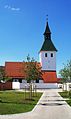
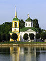
- Nomination View of the Decumanus Maximus of Palmyra, Syria --Bgag 21:26, 27 April 2010 (UTC)
- Promotion Ok. --Berthold Werner 11:46, 28 April 2010 (UTC)
-

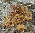
- Nomination Crab Xantho poressa. This crab has chelae (claws) of uncommon brown color (typically is black). --George Chernilevsky 19:43, 27 April 2010 (UTC)
- Promotion good --Mbdortmund 21:55, 27 April 2010 (UTC)
-

- Nomination Crab Xantho poressa. Animal of violet color. --George Chernilevsky 19:43, 27 April 2010 (UTC)
- Promotion Nice contrast with the background. Minor burnt highlights are unobjectionable; QI to me. --Avenue 00:35, 28 April 2010 (UTC)
-

-

- Nomination The Brompton Oratory in London /Dcastor 18:16, 27 April 2010 (UTC)
- Promotion good --Mbdortmund 21:56, 27 April 2010 (UTC)
-

-

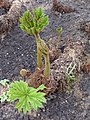
- Nomination Reconstructed village of the Bronze age at the open-air museum in Unteruhldingen, Germany. --AFBorchert 07:03, 27 April 2010 (UTC)
- Promotion
 Comment There are some dustspots above of the "House of Questions" --Berthold Werner 10:54, 27 April 2010 (UTC)
Thanks for noting this, Berthold. I've uploaded a new version, hopefully with no dust spots left. --AFBorchert 17:45, 27 April 2010 (UTC)
Ok. --Berthold Werner 11:40, 28 April 2010 (UTC)
-

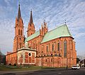
- Nomination Cathedral of the Resurrection --Lodo27 06:33, 27 April 2010 (UTC)
- Decline Comment Too much noise in the sky --Berthold Werner 10:56, 27 April 2010 (UTC)
It's tilt --Pudelek 22:10, 27 April 2010 (UTC)
-

-
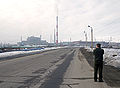
- Nomination: Photographing factories in Monchegorsk. --kallerna 11:36, 22 April 2010 (UTC)
- Review needed
-

- Nomination Church in Samarovo village, near Pereslavl.--PereslavlFoto 21:21, 26 April 2010 (UTC)
- Promotion Good photo, subject has a lot of character. QI to me. --Avenue 02:41, 27 April 2010 (UTC)
-

- Nomination Port of Hamburg --Mbdortmund 19:47, 26 April 2010 (UTC)
- Promotion Good. --Cayambe 09:48, 27 April 2010 (UTC)
-

-

- Nomination Santa Maria Magdalena di Pazzi, detail. Estrela basilica, Lisbon. -- Alvesgaspar 15:58, 26 April 2010 (UTC)
- Promotion good --Mbdortmund 19:49, 26 April 2010 (UTC)
-

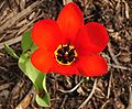
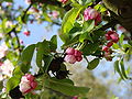
- Nomination A sunny day for flowers. I will identify the species as soon as I can.--Letartean 21:54, 24 April 2010 (UTC)
- Withdrawn Maybe you could renominate after identification. Lycaon 18:37, 26 April 2010 (UTC)
Changed the description and ask for a change of name so I put it on discuss. Letartean 19:28, 26 April 2010 (UTC)
Rename works horribly slow. Just reupload with correct name and tag the old one with {{badname}} template. — Lycaon 20:08, 26 April 2010 (UTC) Ok, I'll withdraw these ones and will come back. I withdraw my nomination--Letartean 20:34, 26 April 2010 (UTC)
-
- Nomination A sunny day for flowers. I will identify the species as soon as I can.--Letartean 21:54, 24 April 2010 (UTC)
- Withdrawn Maybe you could renominate after identification. Lycaon 18:37, 26 April 2010 (UTC) Ok, I'll withdraw these ones and will come back. I withdraw my nomination--Letartean 20:34, 26 April 2010 (UTC)
-

- Nomination A sunny day for flowers. I will identify the specie as soon as I can.--Letartean 21:54, 24 April 2010 (UTC)
- Withdrawn --
 Info - Narcissus sp. (N. aureus?) -- Alvesgaspar 22:10, 24 April 2010 (UTC)
Changed the description and ask for a change of name. Letartean 19:28, 26 April 2010 (UTC) Ok, I'll withdraw these ones and will come back I withdraw my nomination--Letartean 20:34, 26 April 2010 (UTC)
-

- Nomination A sunny day for flowers. I will identify the species as soon as I can.--Letartean 21:54, 24 April 2010 (UTC)
- Withdrawn Maybe you could renominate after identification. Lycaon 18:37, 26 April 2010 (UTC)
Changed the description and ask for a change of name so I put it on discuss. Letartean 19:28, 26 April 2010 (UTC) Ok, I'll withdraw these ones and will come back I withdraw my nomination--Letartean 20:34, 26 April 2010 (UTC)
-

-

- Nomination buds and leaves of camellia japonica cultivar "Adolphe Audusson" in Parc Floral de Paris--Jebulon 21:56, 22 April 2010 (UTC)
- Promotion Looks fine to me. Lycaon 08:40, 27 April 2010 (UTC)
-

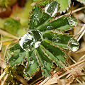
- Nomination: Dew droplets --ComputerHotline 08:03, 17 April 2010 (UTC)
- Review
 Questionthis picture is made with 2 or More Picture ? --Croucrou 21:37, 17 April 2010 (UTC) Info It's only one shot. --ComputerHotline 15:40, 20 April 2010 (UTC) Question if this picture is made in only one shot, I don't understand the flash reflection in the top left droplet. On this droplet the flash reflection wasn't in the same way than the other reflection --Croucrou 21:44, 20 April 2010 (UTC). Info I have used only one cobra flash. It's probably a reflexion phenomenon. --ComputerHotline 22:52, 20 April 2010 (UTC)
-
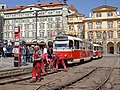
- Nomination Włocławek Cathedral. --Pko 17:25, 26 April 2010 (UTC)
- Promotion -- A bit soft but very good nevertheless. What is that guy doing?... -- Alvesgaspar 17:57, 26 April 2010 (UTC)
-

- Nomination Portal in Nordkirchen --Mbdortmund 04:36, 26 April 2010 (UTC)
- Promotion Ok. --Berthold Werner 06:29, 26 April 2010 (UTC)
-

- Nomination Snow Goose --Cephas 23:50, 25 April 2010 (UTC)
- Promotion good --Mbdortmund 04:37, 26 April 2010 (UTC)
-
-
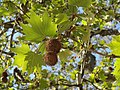
- Nomination a fruit and seeds from the historical platanus orientalis planted by Buffon in the Jardin des Plantes of Paris in 1785 Jebulon 18:18, 25 April 2010 (UTC)
- Promotion Nice and interesting.--Mbz1 20:47, 25 April 2010 (UTC)
-

-

- Nomination Statue of Diana --Mbdortmund 16:16, 25 April 2010 (UTC)
- Promotion OK.--Mbz1 16:28, 25 April 2010 (UTC)
-

-

-

-
- Nomination Fruit of a Smooth Sow-Thistle (Sonchus oleraceus) -- Alvesgaspar 12:48, 25 April 2010 (UTC)
- Promotion QI and Best in scope ... --Archaeodontosaurus 11:59, 26 April 2010 (UTC)
-
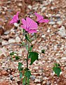
- Nomination Annual Lavatera (Lavatera trimestris) -- Alvesgaspar 12:48, 25 April 2010 (UTC)
- Promotion Very sharp and otherwise also good. --Cayambe 20:55, 25 April 2010 (UTC)
-
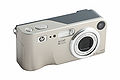
- Nomination HP M407 (third and last version). --Eusebius 12:18, 25 April 2010 (UTC)
- Promotion good --Mbdortmund 12:39, 25 April 2010 (UTC)
-

- Nomination Teviec Human Skull - Mesolithic (-6740 ; -5680) --Archaeodontosaurus 09:46, 25 April 2010 (UTC)
- Promotion Excellent. --Cayambe 11:22, 25 April 2010 (UTC)
Perhaps you should nominate it as FPI --Mbdortmund 12:43, 25 April 2010 (UTC)
-

- Nomination Upper part of the church tower of St. Peter in Munich. --High Contrast 09:39, 25 April 2010 (UTC)
- Promotion Little noise against the sky imo acceptable --Mbdortmund 12:45, 25 April 2010 (UTC)
-
- Nomination Church in Upper Bavaria. --High Contrast 09:39, 25 April 2010 (UTC)
- Promotion Good. --Cayambe 20:58, 25 April 2010 (UTC)
-

- Nomination Hello, I'm back ! Buffon, new version.---Jebulon 21:39, 24 April 2010 (UTC)
- Promotion Good image. It would have been interesting to take one more with the real pigeons present. I could see they are frequent quests there :) --Mbz1 04:11, 25 April 2010 (UTC) I asked for cleaning, but no answer...;)--Jebulon 17:34, 25 April 2010 (UTC)
-

- Nomination a bronze lion by H.A.Jacquemart (1824-1896), Jardin des Plantes, Paris.--Jebulon 21:23, 24 April 2010 (UTC)
- Promotion I wish there was a different background, but assuming it is not possible, it's QI for me.--Mbz1 04:11, 25 April 2010 (UTC). It's in the wild, not a zoo capture :)--Jebulon 17:32, 25 April 2010 (UTC)
-

-

-

- Nomination Palace in Trier --Berthold Werner 10:50, 24 April 2010 (UTC)
- Promotion I like it, more interesting than other versions IMO. But maybe vegetation could be cropped a bit at the both sides ?--Jebulon 14:02, 24 April 2010 (UTC)
So? --Berthold Werner 08:08, 25 April 2010 (UTC)
Yes ! (IMO)--Jebulon 17:23, 25 April 2010 (UTC)
-

- Nomination Flower of a Hawkweed (Hieracium sp.) -- Alvesgaspar 15:02, 23 April 2010 (UTC)
- WARNING: third template parameter added – please remove.
-
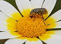
- Nomination Beetle feeding on a Crown Daisy -- Alvesgaspar 15:02, 23 April 2010 (UTC)
- Promotion Also good. --Cayambe 21:03, 25 April 2010 (UTC)
-

-

-

- Nomination: View to Murmansk from Omni Hotel Murmansk. --kallerna 14:25, 19 April 2010 (UTC)
- Review needed
-

- Nomination sign at a railroad car of the former Hedjas railway, now parked in Wadi Rum --Berthold Werner 08:15, 26 April 2010 (UTC)
- Promotion QI for me --Archaeodontosaurus 15:03, 26 April 2010 (UTC)
-

- Nomination View of the Zuidas business district in Amsterdam, Holland. --Arthena 22:31, 25 April 2010 (UTC)
- Decline Infothere is at least 2 switch errors, i put mark on it --Croucrou 08:35, 26 April 2010 (UTC). There are more stitching errors, the verticals are screwed up, and overall quality is not that great for a panoramic image. --Dschwen 14:58, 26 April 2010 (UTC)
-

- Nomination IDF Namer APC. --MathKnight 16:38, 23 April 2010 (UTC)
- Decline This would be a QI, IMO, if it wasn't for the half man on the left side. Sorry. --Avenue 15:36, 26 April 2010 (UTC)
-
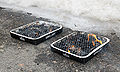
- Nomination: Two grills. --kallerna 12:29, 20 April 2010 (UTC)
- Review needed
-

- Nomination High pure chromium crystals. --Alchemist-hp 11:46, 25 April 2010 (UTC)
- Promotion QI + useful --Carschten 11:58, 25 April 2010 (UTC)
-
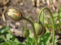
- Nomination a bud of papaver alpinum ssp. alpinum "wonderland", noding a greeting to Alvesgaspar.----Jebulon 11:03, 25 April 2010 (UTC)
- Promotion Who can resist a personalized compliment? IMO good enough for QI though certain parts are blown (I had the same problem with my 20+ bud pics...), Now I would like to see the flower! -- Alvesgaspar 11:16, 25 April 2010 (UTC)
-

-
- Nomination Branch, leaves and fruits of the historical platanus orientalis planted by Buffon in the Jardin des Plantes de Paris in 1785.---Jebulon 21:55, 24 April 2010 (UTC)
- Promotion La légende de la photo est un peu minimaliste. QI for me --Archaeodontosaurus 09:22, 25 April 2010 (UTC)
 Done corrected (the file has three different photos/versions of the same tree--Jebulon 10:41, 25 April 2010 (UTC)
-

-

-
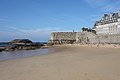
- Nomination Beach in Saint-Malo. --Eusebius 21:38, 24 April 2010 (UTC)
- Promotion QI for me --Archaeodontosaurus 09:48, 25 April 2010 (UTC)
-

-

- Nomination Jasna Góra, Częstochowa. Yarl 17:08, 24 April 2010 (UTC)
- Promotion Face could show a bit more details, else OK, nice composition --Mbdortmund 17:55, 24 April 2010 (UTC)
-

- Nomination Iron chips and 1cm3 cube. --Alchemist-hp 15:38, 24 April 2010 (UTC)
- Promotion Solid quality. --Dschwen 15:50, 24 April 2010 (UTC)
-

- Nomination Andradite single crystal --Archaeodontosaurus 15:38, 24 April 2010 (UTC)
- Promotion perfect --Alchemist-hp 15:42, 24 April 2010 (UTC)
-
- Nomination Branch, leaves, buds, flowers & fruits of Malus x zumi pommier à fleurs 'Golden Hornet', Parc Floral de Paris.--Jebulon 14:45, 24 April 2010 (UTC)
- Promotion Not a goodwill support, but actually a goodimage support. Good exposure and sharpness even at the large image size. --Dschwen 14:58, 24 April 2010 (UTC), P.S.: capitalized file extensions look ugly. --Dschwen 15:00, 24 April 2010 (UTC) Done corrected--Jebulon 20:39, 24 April 2010 (UTC)
-

-

- Nomination Anjar, Lebanon. --Eusebius 14:32, 24 April 2010 (UTC)
- Promotion QI for me --Archaeodontosaurus 15:03, 24 April 2010 (UTC)
-

-
-
-
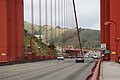
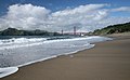
- Nomination Golden Gate from Baker Beach. --Dschwen 12:14, 24 April 2010 (UTC)
- Promotion I have supported the discussed one below, and maybe this one is better. Good composition. Sky is beautiful, sand is visible, the wave is nice and general sharpness good. And...I love the bird.--Jebulon 14:09, 24 April 2010 (UTC)
-

- Nomination "Foxroom" in Runeberg Museum. --kallerna 10:17, 24 April 2010 (UTC)
- Decline Strange crop at left, looks artificial (why only 4 foxes ? Is it a problem with the sofa or with the other chair left ?) --Jebulon 13:59, 24 April 2010 (UTC)
The photo is just about the attitude in that house, and I wanted to consentrate to that chair (another photo of the room). --kallerna 14:59, 24 April 2010 (UTC) Oppose Addionally one fox and the luster is cropped --Berthold Werner 15:12, 24 April 2010 (UTC)
-
- Nomination Acer saccharinum young leaves --Crusier 06:49, 24 April 2010 (UTC)
- Promotion Quality ok, not too thrilled by the bg (but this is not FP). --Dschwen 15:04, 24 April 2010 (UTC)
-

- Nomination Cross section of the cochlea by Fred the Oyster --Jovianeye 04:57, 24 April 2010 (UTC)
- Decline Oppose Simplistic and not QI --Archaeodontosaurus 15:16, 24 April 2010 (UTC)
-
-
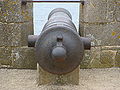
- Nomination Cannon.--Jebulon 20:48, 23 April 2010 (UTC)
- Promotion nice, but should be geocoded --Mbdortmund 21:57, 23 April 2010 (UTC) Done Bitte schön.--Jebulon 22:29, 23 April 2010 (UTC)
nice, thx --Mbdortmund 23:00, 23 April 2010 (UTC), And interestingly enough we see no oppose from Alves for unnecessary downsampling... --Dschwen 13:43, 24 April 2010 (UTC) That's because love, can you understand ? . Please could you kill you each other with Alves (or Avenue, or...) somewhere else ? I don't want unnecessary blood on my pictures, Thanks.--Jebulon 17:54, 24 April 2010 (UTC)
-

- Nomination Schanerlochbrücke featured with Chicago Athenaeum International Architecture Awards 2008. FOR THE BEST NEW GLOBAL DESIGN. --Böhringer 19:22, 23 April 2010 (UTC)
- Promotion No substantial problems (sharpness issues in the corners are mitigated by the large size IMO). --Dschwen 15:10, 24 April 2010 (UTC)
-
-

-
![* Nomination St. Peter and Paul church, Yasenevo, Moscow --S[1] 11:00, 23 April 2010 (UTC) * Decline Oppose Too dark, CA, not sharp enough. With 350D noise reduction us necessary due to small sensor size.--PereslavlFoto 02:02, 25 April 2010 (UTC)](https://upload.wikimedia.org/wikipedia/commons/thumb/7/73/%D0%A6%D0%B5%D1%80%D0%BA%D0%BE%D0%B2%D1%8C_%D0%9F%D0%B5%D1%82%D1%80%D0%B0_%D0%B8_%D0%9F%D0%B0%D0%B2%D0%BB%D0%B0_%D0%B2_%D0%AF%D1%81%D0%B5%D0%BD%D0%B5%D0%B2%D0%B5.jpg/120px-%D0%A6%D0%B5%D1%80%D0%BA%D0%BE%D0%B2%D1%8C_%D0%9F%D0%B5%D1%82%D1%80%D0%B0_%D0%B8_%D0%9F%D0%B0%D0%B2%D0%BB%D0%B0_%D0%B2_%D0%AF%D1%81%D0%B5%D0%BD%D0%B5%D0%B2%D0%B5.jpg)
- Nomination St. Peter and Paul church, Yasenevo, Moscow --S[1] 11:00, 23 April 2010 (UTC)
- Decline Oppose Too dark, CA, not sharp enough. With 350D noise reduction us necessary due to small sensor size.--PereslavlFoto 02:02, 25 April 2010 (UTC)
-

-
- Nomination Shop in Kupanskoe village, Russia.--PereslavlFoto 17:41, 21 April 2010 (UTC)
- Decline Overexposed --Carschten 18:53, 21 April 2010 (UTC)
Shiny day.--PereslavlFoto 18:59, 21 April 2010 (UTC)
yeah, but then you had choosed a lower shutter speed --Carschten 19:51, 21 April 2010 (UTC) Comment Should be possible to correct the exposure. --Mbdortmund 11:38, 22 April 2010 (UTC)) Comment I respect your comment and I have made another version with many corrections. Please check this out.--PereslavlFoto 01:34, 25 April 2010 (UTC)
-

-

- Nomination Amman, ruins of the throne hall on the citadel --Berthold Werner 16:48, 16 April 2010 (UTC)
- Promotion Comment There are several dust spots on the sky that should be fixed. --Dein Freund der Baum 12:26, 22 April 2010 (UTC)
Sky cleaned ;-) --Berthold Werner 16:59, 23 April 2010 (UTC). Ok quality for the given size. --Dschwen 15:55, 24 April 2010 (UTC)
-
- Nomination Nautelankoski is one of the most magnificent rapids of the Aura River. In a distance of half a kilometre, the drop is 17 metres. Is located Lieto, by the Aura River about 16 km from Turku, Finland. --Makele-90 16:35, 16 April 2010 (UTC)
- Decline Blown sky, too small. --Dschwen 15:54, 24 April 2010 (UTC)
-

-

- Nomination Embarcadero view from_Coit Tower, San Francisco. 92MP. --Dschwen 22:34, 23 April 2010 (UTC)
- Promotion many details --Mbdortmund 22:58, 23 April 2010 (UTC)
-

- Nomination Bluebonnet (Lupinus texensis), state flower of Texas. --Loadmaster 21:13, 23 April 2010 (UTC)
- Promotion QI for me.---Jebulon 22:32, 23 April 2010 (UTC)
-

-

- Nomination Pavo cristatus --Böhringer 20:00, 23 April 2010 (UTC)
- Promotion Very nice. --Loadmaster 21:10, 23 April 2010 (UTC)
-

- Nomination Mother and daughter, with the mother a little aged already? The funny thing is that no floret is missing in the middle flowers. They all have 13 (a number of Fibonacci, as usual in flowers) -- Alvesgaspar 18:50, 23 April 2010 (UTC)
- Promotion nice composition --Mbdortmund 22:00, 23 April 2010 (UTC)
-

-

- Nomination Jacaranda mimosifolia. --MathKnight 12:49, 23 April 2010 (UTC)
- Decline -too disturbing background I'm sorry.--Jebulon 22:19, 23 April 2010 (UTC)
-

-

- Nomination Typical food bar under tokyo railway
- Decline Oppose anonymous nomination --Jebulon 14:34, 23 April 2010 (UTC) * Comment Just so the uploader knows, because I guess he will come back here, there is a contradiction between is liscence choice and metafile who says permission needed to reuse. I can't be free to use and have to ask permission. Too bad because it is a good picture...--Letartean 21:19, 23 April 2010 (UTC)~
-

-

-

-

-

- Nomination Composition on greens. Bud and leaves of a Milk Thistle -- Alvesgaspar 12:01, 22 April 2010 (UTC)
- Promotion Good. --Cayambe 16:41, 23 April 2010 (UTC)
-

-

-

-

- Nomination Castle Náchod - gate with relief --Pudelek 09:35, 20 April 2010 (UTC)
- Promotion I, Ottavio Piccolomini y Aragon (1599-1655), first duke of Amalfi, Prince Piccolomini & of the Holy Empire, Fielmarshal of the Empire, Knight of the Toison d'Or, owner of the CoA visible here, hereby decides to promote this picture, because it's my good pleasure.--Jebulon 21:54, 23 April 2010 (UTC)
-

-

- Nomination Lake Fuschlsee in Austria --Dein Freund der Baum 08:19, 19 April 2010 (UTC)
- Decline The sky looks funny, in part overexposured. The colour of the grass is suddently changing where it meets the sky. --Elekhh 01:48, 24 April 2010 (UTC)
-

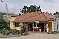
- Nomination Hurlstone Park Hotel. No choice on the powerlines unfortunately. -- 99of9 05:59, 19 April 2010 (UTC)
- Promotion Not perfect, but no major flaws either. Interesting subject. Powerlines are no problem IMO: it's just part of the reality. Certainly acceptable for QI. -- MJJR 19:20, 23 April 2010 (UTC)
-

- Nomination Not so good, but it's a gift for ComputerHotline, our Grand-Master of Droplets and many other things.--Jebulon 18:04, 18 April 2010 (UTC)
- Promotion Info Thanks a lot ;-) --ComputerHotline 20:02, 18 April 2010 (UTC) Comment Hey, it's a candidate image too ! --Jebulon 22:42, 21 April 2010 (UTC)
QI IMO.--Elekhh 01:42, 24 April 2010 (UTC)
-

-

-

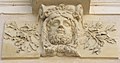
- Nomination: My neighbouring mascaron.--Jebulon 23:11, 17 April 2010 (UTC)
- Review needed
-

- Nomination: Water works Urfahr in Linz --Dein Freund der Baum 21:00, 17 April 2010 (UTC)
- Review needed
-

- Nomination: Water works Urfahr in Linz --Dein Freund der Baum 21:00, 17 April 2010 (UTC)
- Review needed
-
-
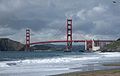
- Nomination Baker Beach wider angle, San Francisco. --Dschwen 00:59, 23 April 2010 (UTC)
- Promotion Awesome composition. Juliancolton 01:13, 23 April 2010 (UTC)
-

-

-

- Nomination pieris japonica "cupido", flowers & leaves.--Jebulon 21:41, 22 April 2010 (UTC)
- Promotion Sarp and well exposed QI IMO --Croucrou 10:54, 23 April 2010 (UTC)
-

-

- Nomination Tall ship in port of Łeba. Yarl 14:49, 22 April 2010 (UTC)
- Promotion this is imo better --Mbdortmund 18:23, 22 April 2010 (UTC)
-
-

- Nomination A Yellow Dung-fly feeding on ... a flower -- Alvesgaspar 14:25, 22 April 2010 (UTC)
- Promotion this is à beautiful picture QI IMO --Croucrou 21:51, 22 April 2010 (UTC)
-

-

- Nomination Flower of a Galactites elegans -- Alvesgaspar 13:08, 22 April 2010 (UTC)
- Promotion I wish there was no other flower at the top, but still QI--Mbz1 13:44, 22 April 2010 (UTC)
-

- Nomination Aquapark Liberc - water slide Tornado --Pudelek 12:59, 22 April 2010 (UTC)
- Decline Nice illustration, but poor lighting and composition is not ideal. Sorry. Juliancolton 16:58, 22 April 2010 (UTC)
-

- Nomination Study on yellow and purple: two different spring species of flowers. The shot looks trivial but was not easy to make, due the need for a generous DOF, the large dynamic range and the windy conditons -- Alvesgaspar 11:40, 22 April 2010 (UTC)
- Promotion Very good. Juliancolton 17:00, 22 April 2010 (UTC)
-

- Nomination BMW 320i -05 (E90) in Kirrinsanta. --kallerna 11:36, 22 April 2010 (UTC)
- Promotion Quality image! --Dein Freund der Baum 13:06, 22 April 2010 (UTC)
-
- Nomination Some parts of a magnolia soulangiana during a shiny sunday----Jebulon 22:02, 21 April 2010 (UTC)
- Promotion Nice and very good. --Cayambe 12:34, 22 April 2010 (UTC)
-

- Nomination BMW 320i -05 (E90) in Kirrinsanta. --kallerna 12:32, 21 April 2010 (UTC). Comment More than half of the unattractive and unnecessary foreground should be cropped away imo. Otherwise good. --Cayambe 10:55, 22 April 2010 (UTC) Info Cropped. Better now? --kallerna 11:39, 22 April 2010 (UTC)
- Promotion Ok now. --Cayambe 12:10, 22 April 2010 (UTC)
- Nomination BMW 320i -05 (E90) in Kirrinsanta. --kallerna 12:32, 21 April 2010 (UTC).
-

-

-

- Nomination Panorama of the landscape near Petit-Croix --ComputerHotline 12:07, 18 April 2010 (UTC)
- Decline white balance and sharpness issues. --Ianare 03:36, 23 April 2010 (UTC)
-
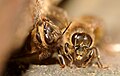
- Nomination: Apis mellifera --ComputerHotline 08:03, 17 April 2010 (UTC)
- Review needed
-

- Nomination: Formicidae sp. --ComputerHotline 08:03, 17 April 2010 (UTC)
- Review needed
-
- Nomination: Formicidae sp. --ComputerHotline 08:03, 17 April 2010 (UTC)
- Review needed
-

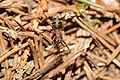
- Nomination Formicidae sp. --ComputerHotline 08:03, 17 April 2010 (UTC)
- Promotion good and informative --Ianare 03:35, 23 April 2010 (UTC)
-

- Nomination: View on Alexander Nevsly cathedral in Tallinn --Скампецкий 20:36, 16 April 2010 (UTC)
- Review Comment Seems a bit unsharp to me.--Fred the Oyster 00:12, 17 April 2010 (UTC) Comment I thought to reduce size of the image to fix it, but decided to leave it like this to keep details. Скампецкий 09:01, 17 April 2010 (UTC)
-
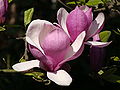
- Nomination Flower of a magnolia soulangiana during a shiny sunday--Jebulon 21:58, 21 April 2010 (UTC)
- Promotion Very sharp and nice colors, white parts are hard for the eye but I feel it is that way in the garden! Good shot --Letartean 22:59, 21 April 2010 (UTC)
-

-

-

-

-

-

- Nomination Red-rumped parrots (males) --99of9 12:06, 21 April 2010 (UTC)
- Decline Good composition but unfortunately the main object is not sharp enough. --Dein Freund der Baum 23:53, 21 April 2010 (UTC)
-

- Nomination The fruits of a Mallow-Leaved Strok's-Bill -- Alvesgaspar 09:48, 21 April 2010 (UTC)
- Promotion QI for me. --Dein Freund der Baum 23:56, 21 April 2010 (UTC)
-

- Nomination Church tower of 'Our Lady of the Chapel' in Brussels. --Myrabella 08:08, 21 April 2010 (UTC)
- Promotion QI for me --Archaeodontosaurus 19:24, 21 April 2010 (UTC)
-

- Nomination Stone calendars of the Cañaris and Incas at Ingapirca, Ecuador. --Cayambe 07:33, 21 April 2010 (UTC)
- Promotion Good --George Chernilevsky 11:16, 22 April 2010 (UTC)
-

- Nomination Portrait of Oswald Burger, a German historian. --AFBorchert 06:51, 21 April 2010 (UTC)
- Promotion Ok. --kallerna 12:52, 21 April 2010 (UTC)
-

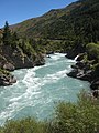
- Nomination Northwest end of Lake Wakatipu. --Avenue 00:58, 21 April 2010 (UTC)
- Promotion Ok, although IMO too much denoised and downsampled. --kallerna 12:52, 21 April 2010 (UTC)
My mistake - I used a canvas size in Hugin that wasn't optimal for the projection I eventually chose. I've now uploaded a higher resolution version, with lighter noise reduction. --Avenue 01:53, 22 April 2010 (UTC)
-

- Nomination Rangers of the french Army. --HAF 932 15:44, 21 April 2010 (UTC)
- Promotion Good quality! --Dein Freund der Baum 23:48, 21 April 2010 (UTC), This should be JPG. --Dschwen 03:02, 22 April 2010 (UTC) Question What's the problem with a PNG and the transparent background? --Dein Freund der Baum 09:59, 22 April 2010 (UTC)
-

- Nomination Sculpture of a girl --Mbdortmund 23:50, 20 April 2010 (UTC)
- Promotion Very good. --Cayambe 12:22, 21 April 2010 (UTC)
-

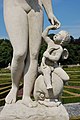
- Nomination Venus and Cupido --Mbdortmund 23:50, 20 April 2010 (UTC)
- Promotion QI --Pudelek 12:10, 21 April 2010 (UTC)
-
- Nomination Venus and Cupido, detail --Mbdortmund 23:50, 20 April 2010 (UTC)
- Promotion Also good. --Cayambe 16:02, 21 April 2010 (UTC)
-
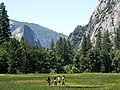
- Nomination A family of tourists wander across a clearing in Yosemite National Park. --The Hedonist 14:33, 20 April 2010 (UTC)
- Decline Below size minimum. --Dschwen 18:06, 20 April 2010 (UTC) CommentIt is very close to the limit and very nice IMO; Maybe you croped the original and could add a little more... --Letartean 02:22, 21 April 2010
Unfortunately that's the full frame. I'd been taking some lo-res pics the previous day and forgot to up the resolution. The whole trip to the park were taken at that resolution unfortunately. --The Hedonist 10:22, 22 April 2010 (UTC)(UTC)
-

- Nomination Utility poles in Monchegorsk. --kallerna 12:29, 20 April 2010 (UTC)
- Promotion At thumbnail the wires look like they have CA, but at full resolution it goes away. Odd... Juliancolton 13:57, 21 April 2010 (UTC)
The scene looks slightly bizarre - why don't they put the wooden poles directly into the ground? QI to me, anyway. (I often find that thumbnails show horrible artifacts that aren't in the full image, so I'm not surprised there.) --Avenue 23:36, 21 April 2010 (UTC) Info I suppose that the poles are elevated to protect the wood from ground moisture. /Dcastor 23:56, 21 April 2010 (UTC)
-

- Nomination River near Monchegorsk in Russia, crossing M18-road. --kallerna 12:29, 20 April 2010 (UTC)
- Promotion Shame the utility wires distract from the natural scene; but since you can't help that, the image is fine. Juliancolton 13:59, 21 April 2010 (UTC)
-

- Nomination Panorama of Murmansk from Omni Hotel Murmansk. --kallerna 12:29, 20 April 2010 (UTC)
- Decline Panorama is tilted and bent. This is easy to fix: Please restitch with vertical guides. --Dschwen 21:55, 20 April 2010 (UTC)
Sorry, dunno how. :( --kallerna 11:59, 21 April 2010 (UTC). Contact me on my talk page. --Dschwen 12:59, 21 April 2010 (UTC)
-

-

-

- Nomination Crossroads in Koetschette, Luxembourg. Info Please, wait to see the image become sharp. --Cayambe 13:57, 19 April 2010 (UTC)
- Decline Sorry, oversharpened or something gone wrong with editing. --kallerna 12:55, 21 April 2010 (UTC)
- Nomination Crossroads in Koetschette, Luxembourg.
-

- Nomination Elizabeth Street, Melbourne.-- Elekhh 11:33, 19 April 2010 (UTC)
- Decline Nothing special, ordinary tourist snapshot: too dark and unsharp. --High Contrast 13:52, 20 April 2010 (UTC) Comment I agree with this judgement about technical quality, some parts are really unsharp and too dark. But as French, I disagree with other comments : for me it's special, encyclopedic, informative and useful to know how a street is made in Melbourne, down under--Jebulon 22:51, 21 April 2010 (UTC)
-

-

- Nomination Jordan, Ruins of Kerak castle --Berthold Werner 15:31, 18 April 2010 (UTC)
- Decline Some parts unsharp in the background I think, sorry.--Jebulon 22:36, 21 April 2010 (UTC)
-
- Nomination A part of the trunk of an historical tree.--Jebulon 23:19, 17 April 2010 (UTC)
- Withdrawn tilted ? --Ianare 02:39, 20 April 2010 (UTC) I think no. But strong perspective distorsions in the background, sorry. I I withdraw my nomination.--Jebulon 22:31, 21 April 2010 (UTC)
-

- Nomination Water in long exposure --ComputerHotline 08:03, 17 April 2010 (UTC)
- Decline White balance is off (too blue), please fix --Ianare 02:39, 20 April 2010 (UTC)
-

-

- Nomination Got you too! A beetle (Oxythyrea funesta) feeding on a Coleostephus myconis flower -- Alvesgaspar 09:30, 16 April 2010 (UTC)
- Decline QuestionDid you want to shoot the leg of the beetle? Most of the picture is unsharp and you know it. Скампецкий 08:00, 18 April 2010 (UTC) -- Info - I wanted to shoot its back and funny posture but the DOF at this small distance is really shallow -- Alvesgaspar 13:25, 18 April 2010 (UTC) Oppose: too shallow DOF, sorry. Otherwise it would be an interesting idea. --Dein Freund der Baum 00:04, 22 April 2010 (UTC)
-

- Nomination A cluster of spiny tubeworms (Pomatoceros caeruleus). --Avenue 08:01, 16 April 2010 (UTC)
- Decline Oppose much of the image is out of focus, it has noisy areas, weak composition. that is one of a very rare thing to photograph, ilike your subject .but it is still not a QI-LadyofHats 08:50, 21 April 2010 (UTC)
Good points; I'm sorry I couldn't do the subject justice. Thanks for your review. --Avenue 21:04, 21 April 2010 (UTC)
-

- Nomination Sculpture of a vase, detail --Mbdortmund 23:50, 20 April 2010 (UTC)
- Promotion Well done. --AFBorchert 06:54, 21 April 2010 (UTC)
-

- Nomination Lemur catta in Zoo Vienna --Dein Freund der Baum 19:56, 20 April 2010 (UTC)
- Promotion Good and useful. --Cayambe 07:36, 21 April 2010 (UTC)
-
- Nomination Martyr's Square in Shatila. --Vladanr 18:55, 20 April 2010 (UTC)
- Decline Important subject buut strongly tilted, unsharp and overexposured --Mbdortmund 20:40, 20 April 2010 (UTC) Comment The posters look overexposed but they have in fact been bleached by the sun. As for the tilt, I feel it adds to the composition. Will doublecheck on the sharpness issue --Vladanr 21:16, 20 April 2010 (UTC)
-

- Nomination IDF Namer APC. --MathKnight 16:58, 20 April 2010 (UTC)
- Decline Noisy --Carschten 17:36, 20 April 2010 (UTC)
-
- Nomination Oxalis acetosella in front of the sun. --Bartiebert 16:52, 20 April 2010 (UTC)
- Promotion beautiful composition QI IMO --Croucrou 17:27, 20 April 2010 (UTC)
-

- Nomination Drinking --Mbdortmund 16:16, 20 April 2010 (UTC)
- Promotion Very good. --Cayambe 18:02, 20 April 2010 (UTC)
-

-
- Nomination Cañari structures at the Cañari-Incan site at Ingapirca, Ecuador. --Cayambe 14:04, 20 April 2010 (UTC)
- Promotion Interesting --George Chernilevsky 15:02, 20 April 2010 (UTC)
-
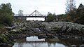
- Nomination Public artwork "Begynnelsen" (Genesis) in Eslöv, Sweden, reflecting the setting sun. /Dcastor 13:31, 20 April 2010 (UTC)
- Promotion nice --Mbdortmund 20:38, 20 April 2010 (UTC)
-

- Nomination The inflorescence of Tussilago farfara with pollinator. --Bff 13:22, 20 April 2010 (UTC)
- Promotion Good. --Cayambe 14:30, 20 April 2010 (UTC)
-

-

-

-

-
-

-

-

-

- Nomination St. Ambrosius church in Trier --Berthold Werner 10:46, 20 April 2010 (UTC)
- Promotion Excellent composition. With some acceptable noise. --Cayambe 07:46, 21 April 2010 (UTC)
-

-

- Nomination Tuxedo cat, five months old.--Loadmaster 01:14, 20 April 2010 (UTC)
- Decline Comment Is that CA along the nose or a result of over-sharpening? --Fred the Oyster 01:18, 20 April 2010 (UTC)
Comment No modifications were made to the original camera image. --Loadmaster 01:24, 20 April 2010 (UTC) Oppose sorry, but very bad crop and overexposed parts --Carschten 16:41, 20 April 2010 (UTC)
-

- Nomination Exposition of «Ganshin's Manor» museum. --PereslavlFoto 17:02, 19 April 2010 (UTC)
- Decline the composition of this picture is rather ackward, by placing the bring window on the front you got a kind of a tunel view wich doesnt allow the eye to "rest" in any object.. i would decline, but maybe someone else wants to say something about it -LadyofHats 11:56, 20 April 2010 (UTC) I agree, also tilted IMO.--Ankara 17:36, 20 April 2010 (UTC)
-

-

- Nomination Cañari-Incan ruins seen from the nearby town of Ingapirca, Ecuador. Info Please, wait to see the image become sharp. --Cayambe 13:47, 19 April 2010 (UTC)
- Promotion Comment There is a slender grey triangle in the lower right corner. --Avenue 12:22, 20 April 2010 (UTC) Info Triangle removed. Thanks for noticing. --Cayambe 13:19, 20 April 2010 (UTC)
Sharp, clean image of interesting subject - QI to me. --Avenue 22:51, 20 April 2010 (UTC)
- Nomination Cañari-Incan ruins seen from the nearby town of Ingapirca, Ecuador.
-
- Nomination Dried infructescences of Arctium lappa in spring. --Bff 11:58, 19 April 2010 (UTC)
- Promotion Ok for me. --Dein Freund der Baum 20:01, 20 April 2010 (UTC)
-

- Nomination Castle in Nordkirchen --Mbdortmund 14:54, 18 April 2010 (UTC)
- Promotion Good. --Berthold Werner 16:00, 18 April 2010 (UTC) ) Oppose Obvious tilt.--PereslavlFoto 18:07, 19 April 2010 (UTC)
*"Obvíous" means in numbers and direction? --Mbdortmund 23:42, 20 April 2010 (UTC)
-

- Nomination Houses next to the city square Schärding in Upper Austria -High Contrast 10:27, 17 April 2010 (UTC)
- Decline Good idea, but colors unnatural and contrast too stark. Daniel Case 04:50, 21 April 2010 (UTC)
-
- Nomination Dew droplets --ComputerHotline 08:03, 17 April 2010 (UTC)
- Promotion Good picture! --Dein Freund der Baum 21:08, 20 April 2010 (UTC)
-

- Nomination The Bucharest Gate in Târgovişte, Romania. Andrei Stroe 17:46, 15 April 2010 (UTC)
- Decline Info I straightened some lines (a background powerline made an odd convex path, giving support in finding better perspective). Please revert if you disagree. /Dcastor 13:48, 19 April 2010 (UTC)
It's better, you're right.Andrei Stroe 06:41, 20 April 2010 (UTC) Commentisnt it a bit blury in full view?-LadyofHats 12:22, 20 April 2010 (UTC) Oppose because it's not really sharp – sorry. But otherwise it would be ok, I think. --Dein Freund der Baum 20:05, 20 April 2010 (UTC)
-

- Nomination life cycle of the mosquite "culex",--LadyofHats 08:23, 20 April 2010 (UTC)
- Promotion Good and useful. --Cayambe 11:51, 20 April 2010 (UTC)
-

- Nomination The keep of Pendennis Castle in Falmouth, UK.--Nilfanion 23:04, 19 April 2010 (UTC)
- Promotion good quality --Archaeodontosaurus 07:08, 20 April 2010 (UTC)
-

- Nomination Tourists feeding a Grey Seal in Newquay harbour, Cornwall, UK.--Nilfanion 23:04, 19 April 2010 (UTC)
- Promotion This works for me.--Fred the Oyster 01:06, 20 April 2010 (UTC)
-

- Nomination Start Point lighthouse in the south of Devon, UK.--Nilfanion 23:04, 19 April 2010 (UTC)
- Promotion crop on top of the lighthouse a bit tight, but else good --Mbdortmund 23:31, 19 April 2010 (UTC)
-
- Nomination gunnera manicata Lind ex André, Parc Floral de Paris.--Jebulon 22:28, 19 April 2010 (UTC)
- Promotion QI and........Useful --Archaeodontosaurus 07:08, 20 April 2010 (UTC)
-

- Nomination Bonsai Acer palmatum Seigen Tachiki 1960, Parc Floral de Paris.--Jebulon 22:14, 19 April 2010 (UTC)
- Decline *Is it my old eyes or does this seem overly sharpened/processed?--Fred the Oyster 01:19, 20 April 2010 (UTC)
Oppose *it is also overexposed-LadyofHats 11:50, 20 April 2010 (UTC)
-

- Nomination BMW S1000 RR by Ritchyblack --Carschten 14:34, 19 April 2010 (UTC)
- Promotion Of course, good picture! --Dein Freund der Baum 15:11, 19 April 2010 (UTC)
-
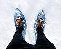
- Nomination Snowshoes. --kallerna 14:25, 19 April 2010 (UTC)
- Promotion Interesting view and good quality! --Dein Freund der Baum 18:24, 19 April 2010 (UTC)
-
- Nomination bud, leaves and flowers of rhododendron arboreum Sm., ssp. Album, Parc Floral de Paris--Jebulon 22:59, 18 April 2010 (UTC)
- Promotion It is close to be overexposed but still i find it quite nicely made.-LadyofHats 09:28, 20 April 2010 (UTC)
-

- Nomination Feet of an ostrich --Скампецкий 21:25, 18 April 2010 (UTC)
- Decline Very soft, very noisy. Looks like the effects of a low-quality CCD. --Fred the Oyster 12:07, 19 April 2010 (UTC)
-

- Nomination White tiger in Moscow zoo --Скампецкий 21:25, 18 April 2010 (UTC)
- Decline Comment Color Temperature abnormal. Can we reduce the cyan? --Archaeodontosaurus 12:00, 19 April 2010 (UTC) Oppose Colour balance all wrong, very soft, very noisy. --Fred the Oyster 12:05, 19 April 2010 (UTC)
-

- Nomination Former military reconnaissance tower (Attention, large image!) --Mr.checker 20:42, 18 April 2010 (UTC). Comment Will support after the file has been categorized. :-). --Cayambe 11:28, 19 April 2010 (UTC). Comment Done ;) --Mr.checker 12:52, 19 April 2010 (UTC).
- Promotion Ok now, I have added it to the more specific cat. Fichtelgebirge. --Cayambe 14:41, 19 April 2010 (UTC)
- Nomination Former military reconnaissance tower (Attention, large image!) --Mr.checker 20:42, 18 April 2010 (UTC).
-

- Nomination Water in long exposure --ComputerHotline 08:03, 17 April 2010 (UTC)
- Decline White balance is off (too blue), looks overexposed --Ianare 02:39, 20 April 2010 (UTC)
-
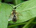
- Nomination Male solitary bee (Eucera sp.). Notice the damaged wings. Not possible to identify the species of this large genus by a photo -- Alvesgaspar 12:02, 14 April 2010 (UTC)
- Promotion Some movement apparent in the antennae, but QI otherwise. --Ianare 02:32, 20 April 2010 (UTC)
-

- Nomination Railway carriage in station Tanečník, Slovakia --Pudelek 21:14, 13 April 2010 (UTC)
- Decline Comment Seems a bit washed out to me. Juliancolton 11:21, 14 April 2010 (UTC). Question Please, does "washed out" mean "fog in the background" ? I don't understand the word.--Jebulon 21:04, 14 April 2010 (UTC)
Sorry, it means some of the image looks white or overexposed. Juliancolton 13:15, 16 April 2010 (UTC). Thank you, I understand now. I agree with you.--Jebulon 09:19, 18 April 2010 (UTC) Oppose poor lighting --Ianare 02:30, 20 April 2010 (UTC)
-

-

-
-

-
- Nomination male flowers and buds of the Castor Oil Plant (Ricinus comunis) -- Alvesgaspar 23:53, 18 April 2010 (UTC)
- Promotion QI and useful --Archaeodontosaurus 06:07, 19 April 2010 (UTC)
-

- Nomination Eastern part of Nordkirchen castle --Mbdortmund 22:52, 18 April 2010 (UTC)
- Promotion Good composition, quality and useful. --Elekhh 04:29, 19 April 2010 (UTC)
-

- Nomination Astronomical clock --Mbdortmund 22:52, 18 April 2010 (UTC)
- Promotion Nice. Good point of look --George Chernilevsky 05:49, 19 April 2010 (UTC)
-

-

- Nomination Castle in Nordkirchen --Mbdortmund 14:54, 18 April 2010 (UTC)
- Promotion Good. --Berthold Werner 16:00, 18 April 2010 (UTC)
-

- Nomination Female tree weta. --Avenue 14:20, 18 April 2010 (UTC)
- Promotion Perfect for in vivo --Archaeodontosaurus 16:39, 18 April 2010 (UTC)
-
-

- Nomination Low clearance in Vinslöv, Sweden /Dcastor 11:10, 18 April 2010 (UTC)
- Promotion beautiful Framing QI IMO --Croucrou 12:02, 18 April 2010 (UTC)
But imo tilted cw --Mbdortmund 13:08, 18 April 2010 (UTC) Comment My original upload was tilted ccw, I am pretty sure that this one is not tilted, though it may at first glance give that impression because the top of the carts are not even (which is, I think, why I uploaded a tilted version in the first place). /Dcastor 13:29, 18 April 2010 (UTC)
My idea was really caused by the top of the carts --Mbdortmund 14:57, 18 April 2010 (UTC)
-

- Nomination Chewing Lemur Catta (taken by EmmanuelFAIVRE) --Dein Freund der Baum 10:50, 18 April 2010 (UTC)
- Decline Gorgeous animal in a funny pose, but spoiled by a general lack of sharpness. I'm presuming it's camera shake from being handheld? --Fred the Oyster 17:51, 18 April 2010 (UTC)
-

- Nomination Neuer Dom in Linz, Austria --Dein Freund der Baum 10:00, 18 April 2010 (UTC)
- Promotion DOF imo a bit short but main object is in focus --Mbdortmund 13:10, 18 April 2010 (UTC)
-

- Nomination Cover of Ogoniok illustrated magazine. --Скампецкий 22:20, 17 April 2010 (UTC)
- Decline It is not correct to classifie this scan as "own work" --Mbdortmund 04:29, 19 April 2010 (UTC) Question and how should it be classified? Скампецкий 06:09, 19 April 2010 (UTC)
Not your own work perhaps? A scan isn't deemed to be your own work, designing the magazine cover is. --Fred the Oyster 09:17, 19 April 2010 (UTC)
-
-

- Nomination Walking on the beach -- Alvesgaspar 23:10, 16 April 2010 (UTC)
- Promotion Comment Nice image, though it seems to be a little over-sharpened as evidenced by the 'ringing halo' around the right-hand man. --Fred the Oyster 00:05, 17 April 2010 (UTC) -- Done -- Fixed, together with white balance correction -- Alvesgaspar 23:45, 17 April 2010 (UTC)Everything ok now. I like the composition. --High Contrast 12:04, 18 April 2010 (UTC)
Yes, nicely done --Fred the Oyster 14:05, 18 April 2010 (UTC)
-

- Nomination Freedom Square in Tallinn --Скампецкий 20:36, 16 April 2010 (UTC)
- Promotion QI and useful for me. Is there a problem with the wall in foreground ?--Jebulon 17:22, 18 April 2010 (UTC) Comment No, that's intentional distortion. Скампецкий 20:46, 18 April 2010 (UTC)
-

- Nomination Jordan, Madaba, rolling stone --Berthold Werner 04:59, 15 April 2010 (UTC)
- Decline Very distracting shadow,. --Fred the Oyster 16:14, 18 April 2010 (UTC)
-

- Nomination Mimeograph of a hand-cranked style. --PereslavlFoto 01:32, 15 April 2010 (UTC)
- Decline CommentThe cover seems to be overexposed. --Berthold Werner 05:02, 15 April 2010 (UTC) Oppose Over-exposed, badly framed/composed and at a strange angle. --Fred the Oyster 22:45, 18 April 2010 (UTC)
-

- Nomination Twin Dwarf Convolvulus flowers -- Alvesgaspar 12:02, 14 April 2010 (UTC)
- Promotion Just two other flowers... Just a QI ;), Sharp twice, nice twice. Maybe a little bit overprocessed, if I'm not wrong--Jebulon 23:41, 18 April 2010 (UTC)
-
- Nomination A church in Pointe-au-Pic, Qc, Canada at sundown --Letartean 16:31, 12 April 2010 (UTC)
- Promotion Comment tilt CW, correction need. Nice colors --George Chernilevsky 05:41, 13 April 2010 (UTC) Done I corrected it the best I can. Hope it's good enough.--Letartean 13:08, 13 April 2010 (UTC) QI to me --Dein Freund der Baum 12:51, 18 April 2010 (UTC)
-

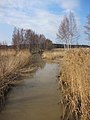
- Nomination Jaaninoja is a small ditch in Turku Finland. It flows to the Aura River. In the picture is one of the two art bridges. --Makele-90 13:12, 11 April 2010 (UTC)
- Decline Nice bridge and good technical quality, but for me the building on the left side is quite distracting, so I would say it's not really up to QI standard – sorry. --Dein Freund der Baum 18:08, 18 April 2010 (UTC)
-

- Nomination Bours Church, Hautes-Pyrénées, France — Florent Pécassou 11:24, 11 April 2010 (UTC)
- Decline Comment The sharpness of the upper part is ok, but in the lower part especially on the right it is not. --Berthold Werner 14:30, 11 April 2010 (UTC) Oppose because of the quality problems on the right side of the church; further more this picture would need a perspective correction. --Dein Freund der Baum 18:02, 18 April 2010 (UTC)
-

- Nomination Locomotive boiler — Jagro 23:51, 10 April 2010 (UTC)
- Promotion CommentInteresting shot and I think could be a QI with a tad bit more contrast and saturation (if nominator has Adobe Camera Raw or PS CS4 then a dose of "vibrance" could do the trick). --Fred the Oyster 16:02, 16 April 2010 (UTC) Done A bit higher contrast and saturation. — Jagro 00:00, 18 April 2010 (UTC)
That works for me --Fred the Oyster 14:01, 18 April 2010 (UTC)
-

- Nomination Reconstructed stone age stilt house in an open-air museum on Lake Constance in Germany --AFBorchert 08:46, 18 April 2010 (UTC)
- Promotion are the plane and the spotlight stone-aged too ;) ? But QI & useful for me.--Jebulon 09:43, 18 April 2010 (UTC)
-

- Nomination Microscope "Nachet et Fils" 1854 --Archaeodontosaurus 07:38, 18 April 2010 (UTC)
- Promotion Les QI appartiennent à ceux qui se lèvent tôt ! Magnifique & useful !--Jebulon 09:40, 18 April 2010 (UTC)
-

- Nomination Portrait of Anne Gaviola in 2010 Blurpeace 04:46, 18 April 2010 (UTC)
- Decline A nice portrait, but there is no indication that the uploader is the photographer. QI is for user-created images. --Avenue 06:51, 18 April 2010 (UTC)
-

- Nomination Female mallard with ducklings--Mbz1 18:33, 17 April 2010 (UTC)
- Promotion Good --George Chernilevsky 18:51, 17 April 2010 (UTC)
-

- Nomination a vanadium disc. --Alchemist-hp 15:55, 17 April 2010 (UTC)
- Promotion Good quality. --Makele-90 16:33, 17 April 2010 (UTC)
-

-

- Nomination Church in Nordkirchen --Mbdortmund 12:25, 17 April 2010 (UTC)
- Promotion Sehr schön nice colors --George Chernilevsky 15:35, 17 April 2010 (UTC)
-

- Nomination House in Nordkirchen --Mbdortmund 12:25, 17 April 2010 (UTC)
- Promotion Clear QI --George Chernilevsky 15:36, 17 April 2010 (UTC)
-

- Nomination Mensa school of finance Nordkirchen --Mbdortmund 12:25, 17 April 2010 (UTC)
- Promotion Good --George Chernilevsky 15:38, 17 April 2010 (UTC) -- Comment Would it be worthwhile cloning out those two birds? An easy 10 second job. --Fred the Oyster 15:56, 17 April 2010 (UTC)
-

- Nomination Park in Nordkirchen --Mbdortmund 12:25, 17 April 2010 (UTC)
- Promotion Good. --Cayambe 17:50, 17 April 2010 (UTC)
-

- Nomination The village of Cincu, Braşov County, Romania. By Radu Ana Maria.Andrei Stroe 10:03, 17 April 2010 (UTC)
- Promotion Good. --Cayambe 13:12, 17 April 2010 (UTC)
-

- Nomination Chindia Tower, Târgovişte, Romania. Andrei Stroe 09:48, 17 April 2010 (UTC). QI for me--Jebulon 22:57, 17 April 2010 (UTC)
- Promotion {{{2}}}
-
- Nomination Water droplets --ComputerHotline 08:03, 17 April 2010 (UTC)
- Promotion Very strange picture. Diamonds ? I don't know if it is an "absolute" QI, but it is QI for me, cause I'm fascinated --Jebulon 23:00, 17 April 2010 (UTC)
-

- Nomination Female tree weta - about 7 cm long. --Avenue 02:37, 17 April 2010 (UTC)
- Promotion Infothere are at least three dead pixe, and the low light is a bit noisy --Croucrou 06:45, 17 April 2010 (UTC)
I've fixed one of the dead pixels - thanks for that. The other two are not dead pixels, as they appear in other shots of the same insect. I've also reduced the noise somewhat. --Avenue 08:33, 17 April 2010 (UTC) Support now it can be QI IMO --Croucrou 21:40, 17 April 2010 (UTC)
-
- Nomination Wall of Pühtitsa convent in Estonia --Скампецкий 20:36, 16 April 2010 (UTC)
- Promotion good --George Chernilevsky 15:52, 17 April 2010 (UTC)
-

-
- Nomination Flower of Opium Poppy showing a bud and fruit in the background -- Alvesgaspar 11:00, 16 April 2010 (UTC)
- Promotion Very nice. Скампецкий 08:00, 18 April 2010 (UTC)
-

- Nomination BMW 320i -05 (E90) in Kirrinsanta. --kallerna 16:16, 14 April 2010 (UTC)
- Promotion Comment It's hard to tell the car is the main subject to be honest. I find myself more interested in the windmill, which doesn't seem to have a mention on the file page. Juliancolton 16:31, 14 April 2010 (UTC) Info I edited the file page. --kallerna 18:12, 14 April 2010 (UTC)
That's better, but I'm still a bit confused as to what the main subject is. If it's the car, the windmill wouldn't seem very relevant, and vice-versa. Juliancolton 18:30, 14 April 2010 (UTC) * Support Good DOF and composition. An image doesn't have a limit of one subject. To be even clearer, it could be renamed to 'BMW 320i and Windmill' or similar. --Ianare 19:18, 14 April 2010 (UTC)
But it seems to me that the main subject should have prominence; it seems to me that while the car may be more in focus, the windmill occupies more of the image even though it's not relevant to the car. I dunno; I'm not going to object, since it's a nice picture, just seems a little off to me. Juliancolton 03:10, 15 April 2010 (UTC) * Comment I see your point, and it might have been the photographer's intention of making the car the main subject. However I don't see it as such, for me it is really about both objects. It could be a representation of early 21st century technology, or other such themes. --Ianare 19:44, 15 April 2010 (UTC) For me, it's a nice picture of a windmill. Why a car in foreground? Modern ad ? But technically good for me.--Jebulon 09:27, 18 April 2010 (UTC)
-

- Nomination Gothic madonna at "Obere Pfarre" in Bamberg. --Berthold Werner 13:29, 12 April 2010 (UTC)
- Promotion Why not already promoted ? QI for me.--Jebulon 16:17, 17 April 2010 (UTC)
-

-

- Nomination White Clover (Trifolium repens) -- Alvesgaspar 17:28, 9 April 2010 (UTC)
- Promotion Fine shot of the flowers. The plant behind the upper flower is a bit close, but this is still a QI to me. --Avenue 01:05, 18 April 2010 (UTC)
-

- Nomination With C.von Linné, this famous man is a great friend of a lot of photographers on these pages !!----Jebulon 21:55, 6 April 2010 (UTC) Another version uploaded, due to Archaeodontosaurus, thanks.---Jebulon 09:51, 11 April 2010 (UTC)
- Decline Overprocessed, sorry --Ianare 15:29, 13 April 2010 (UTC) Comment There's no accounting for tastes. Maybe another opinion would be interesting ?---Jebulon 20:49, 14 April 2010 (UTC) CommentIt looks like there's been a bit of sub-par masking going on, possibly to blur the background but it's actually introduced a slight drop shadow around the head which makes it seem wrong even if people can't identify why. --Fred the Oyster 19:49, 15 April 2010 (UTC) Comment OK when the time is over, I'll be back with another version of this photo.--Jebulon 16:11, 17 April 2010 (UTC)
-
![* Nomination The inflorescence of Nerium oleander. --Bff 14:51, 6 April 2010 (UTC) * Promotion Comment - This is not a inflorescence but some simple flowers -- Alvesgaspar 20:55, 13 April 2010 (UTC) Comment No, this is just inflorescence. See, for example, [1]. --Bff 17:23, 14 April 2010 (UTC) - This plant does not produce inflorescences, no matter what the article says. What we have in the picture is a typical (of the species) cluster of simple flowers -- Alvesgaspar 08:08, 16 April 2010 (UTC) SupportA hint of overexposure in the left part, but sharp and naturally framed. Good enough for QI imo. /Dcastor 21:04, 17 April 2010 (UTC)](https://upload.wikimedia.org/wikipedia/commons/thumb/1/17/Nerium_oleander20090811_025.jpg/120px-Nerium_oleander20090811_025.jpg)
- Nomination The inflorescence of Nerium oleander. --Bff 14:51, 6 April 2010 (UTC)
- Promotion Comment - This is not a inflorescence but some simple flowers -- Alvesgaspar 20:55, 13 April 2010 (UTC) Comment No, this is just inflorescence. See, for example, [1]. --Bff 17:23, 14 April 2010 (UTC) - This plant does not produce inflorescences, no matter what the article says. What we have in the picture is a typical (of the species) cluster of simple flowers -- Alvesgaspar 08:08, 16 April 2010 (UTC) SupportA hint of overexposure in the left part, but sharp and naturally framed. Good enough for QI imo. /Dcastor 21:04, 17 April 2010 (UTC)
-
-

-
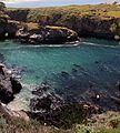
- Nomination The Island of Pessegeiro. Porto Covo, Portugal. -- Alvesgaspar 13:57, 16 April 2010 (UTC)
- Promotion Good. --Cayambe 18:06, 16 April 2010 (UTC)
-

-

- Nomination Hârtibaciu River in central Romania, crossing the town of Agnita.Andrei Stroe 12:42, 16 April 2010 (UTC)
- Decline unsharp, overexposed --Carschten 16:35, 16 April 2010 (UTC)
-

- Nomination A horse of the Lusitano race. Seia, Portugal. -- Alvesgaspar 09:30, 16 April 2010 (UTC)
- Decline Blurry, unsharp --Carschten 16:35, 16 April 2010 (UTC)
-

- Nomination Djurgårdsvarvet, a historic shipyards in Djurgården.--Ankara 21:44, 15 April 2010 (UTC)
- Promotion QI to me. --Cayambe 17:05, 16 April 2010 (UTC)
-

- Nomination untitled.---Jebulon 23:14, 14 April 2010 (UTC)
- Promotion Info It's a beautiful picture, but if the subjet is the crow, the picture is missed, the crow is really underexpose, if the subjet is star and crescent with a crow, it could be QI --Croucrou 07:30, 15 April 2010 (UTC). OK, I changed the title.--Jebulon 14:04, 16 April 2010 (UTC) Support Now it could be QI --Croucrou 21:37, 16 April 2010 (UTC)
-

- Nomination Pyongyang metro station, DPR Korea (North Korea) --Lawboy25 13:38, 13 April 2010 (UTC)
- Decline Rare and amazing subject, good composition, but very noisy, unsharp and tilted I'm afraid. Sorry.---Jebulon 14:29, 13 April 2010 (UTC) * Comment you could try for valuable picture, where these issues may be overlooked. --Ianare 19:40, 14 April 2010 (UTC) * Comment Picture is tilted on purpose to show detail in the wall. Moreover, long exposures and tripods are not permitted in the DPRK. In any event, the metro station is in fact a fairly dark place; a reality this photo conveys. --Lawboy25 15:56, 16 April 2010 (UTC)
-

- Nomination Church of the Nativity (Suvorovo) --Lodo27 09:07, 8 April 2010 (UTC) Info The tower appears to be slightly tilted to the right. Maybe it's just perspective distortion.Andrei Stroe 12:06, 9 April 2010 (UTC) Distortion fixed --Lodo27 04:46, 16 April 2010 (UTC)
- Promotion OK now - Скампецкий 09:23, 17 April 2010 (UTC)
- Nomination Church of the Nativity (Suvorovo) --Lodo27 09:07, 8 April 2010 (UTC)
-

- Nomination Saint Barthelemy church of Gérardmer --ComputerHotline 07:29, 16 April 2010 (UTC)
- Promotion Sharp, good exposure and framing, QI --Croucrou 07:47, 16 April 2010 (UTC)
-

- Nomination The bell tower of the Metropolitan Church in Târgovişte, Romania.Andrei Stroe 18:00, 15 April 2010 (UTC)
- Promotion Nice, though shame about the light in front. Maedin 09:58, 16 April 2010 (UTC)
-
- Nomination The root of lobo (Raphanus sativus convar. lobo). --Bff 17:52, 15 April 2010 (UTC)
- Promotion Very good --Carschten 18:22, 15 April 2010 (UTC)
-

-

- Nomination Espouey Town Hall, Pyrénées-Atlantiques, France --Florent Pécassou 14:54, 15 April 2010 (UTC)
- Promotion Good. -- MJJR 20:30, 15 April 2010 (UTC)
-

-

- Nomination Freesia alba - Very small and delicate flowers -- Alvesgaspar 09:58, 15 April 2010 (UTC)
- Decline I think it isn't sharp enough for QI. And imo it's a litte bit overexposed, too --Carschten 18:19, 15 April 2010 (UTC)
-
- Nomination Bud of Ficus. -- Etienne 19:17, 14 April 2010 (UTC)
- Promotion Info there is a dead pixel and at 100% it's a litle bit blur perhaps due to too low speed and wind ? i put à mark on the dead pixel if you want to correct it --Croucrou 20:58, 14 April 2010 (UTC) Done Thank you! -- Etienne 06:32, 15 April 2010 (UTC) Supportnow it's QI IMO --Croucrou 16:53, 15 April 2010 (UTC)
-

- Nomination Mega-Moll shopping center in 2008. --George Chernilevsky 18:45, 12 April 2010 (UTC)
- Promotion Sharp and otherwise also good. --Cayambe 16:44, 15 April 2010 (UTC)
-
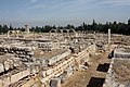
- Nomination Bar-restaurant at the archaeological site of Ingapirca, Ecuador. --Cayambe 22:01, 14 April 2010 (UTC)
- Promotion Very good --George Chernilevsky 06:58, 15 April 2010 (UTC)
-

-

- Nomination Canari and Inca ruins at Ingapirca, Ecuador. --Cayambe 17:13, 14 April 2010 (UTC)
- Promotion QI and Useful Archaeodontosaurus
-

-
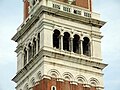
- Nomination Campanile of St. Mark's Basilica viewing platform detail --Kozuch 16:33, 14 April 2010 (UTC)
- Decline
 chromatic aberration on left side of tower, tourists are annoying --Ianare 19:38, 14 April 2010 (UTC)
-

-

- Nomination Got you! -- Alvesgaspar 14:40, 14 April 2010 (UTC)
- Promotion Funny, sharp, saturated, QI IMO --Croucrou 20:09, 14 April 2010 (UTC)
-

- Nomination Female tipulid fly (Nephrotoma quadrifaria) -- Alvesgaspar 12:02, 14 April 2010 (UTC)
- Promotion perhaps it could be better with a strong DOF : f16 or more but it realy Sharp QI IMO --Croucrou 20:48, 14 April 2010 (UTC)
-

- Nomination Iodine bolete Boletus impolitus dried mushrooms. --George Chernilevsky 09:17, 14 April 2010 (UTC)
- Promotion QI and Useful --Archaeodontosaurus 12:05, 14 April 2010 (UTC)
-

-

-

-

- Nomination Unimog with snowplow, in the background the German municipality Willingen --Carschten 18:16, 9 April 2010 (UTC)
- Promotion Das Kaff im Hintergrund wirkt doch arg verzerrt und nach links gekippt. --Mbdortmund 23:51, 9 April 2010 (UTC) Comment verzerrt ist da gar nichts. Dass das Bild schief ist stimmt, habs behoben aber kann es irgendwie nicht drüberladen über die aktuelle Version, da klappt immer was nicht. Aus dem Chat, wo ich fragte, habe ich bis jetzt noch keine Rückmeldungen bekommen... --Carschten 12:57, 10 April 2010 (UTC)
Könnte für meinen Geschmack auch knapper beschnitten sein. --Berthold Werner 14:43, 10 April 2010 (UTC) Info I uploaded a cropped and rotated version --Carschten 15:16, 14 April 2010 (UTC) Support --Berthold Werner 17:54, 14 April 2010 (UTC)
-

- Nomination Pond in park in Bytom. Yarl 16:34, 9 April 2010 (UTC)
- Promotion Ok. --Berthold Werner 17:56, 14 April 2010 (UTC)
-

- Nomination Hochheideturm --Carschten 15:22, 9 April 2010 (UTC)
- Promotion Would support but a couple dustpsots in the upper left should be removed first. --Ianare 20:53, 11 April 2010 (UTC) Question I'm sorry but I can't see them. Could you mark them please? --Carschten 15:16, 14 April 2010 (UTC) InfoI marked them. /Dcastor 16:37, 14 April 2010 (UTC) Info Thanks, I corrected the dust --Carschten 19:24, 14 April 2010 (UTC) * Support OK --Ianare 19:34, 14 April 2010 (UTC)
-

- Nomination The Contactoare SA factory in Buzău, Romania. by User:Radu Ana Maria Andrei Stroe 09:09, 9 April 2010 (UTC)
- Promotion QI --George Chernilevsky 18:44, 14 April 2010 (UTC)
-

- Nomination: Prehistoric Maori kumara pits (for food storage). --Avenue 05:22, 9 April 2010 (UTC)
- Review needed
-

- Nomination Matches --George Chernilevsky 07:57, 14 April 2010 (UTC)
- Promotion Nice illustration. Juliancolton 11:20, 14 April 2010 (UTC)
-

- Nomination Carmelo Formation at Point Lobos --Mbz1 02:48, 14 April 2010 (UTC)
- Promotion Very good --George Chernilevsky 04:37, 14 April 2010 (UTC)
-

-

-

- Nomination Point Lobos--Mbz1 19:26, 13 April 2010 (UTC)
- Promotion Nice --George Chernilevsky 20:10, 13 April 2010 (UTC)
-

-

-

-

-
-
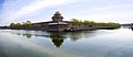
- Nomination The northwest cornor of the Forbidden City,Beijing,China — Charlie fong 07:50, 11 April 2010 (UTC)
- Decline Tilt! --Simonizer 23:43, 13 April 2010 (UTC)
-

- Nomination: Sea mark in Reposaari. --kallerna 23:20, 7 April 2010 (UTC)
- Review needed
-

- Nomination: University of Bochum --Tasto 21:18, 7 April 2010 (UTC)
- Review needed
-

-

-

- Nomination Former pump house at Black Moshannon State Park in Pennsylvania, built by the Civilian Conservation Corps. -- Ruhrfisch 15:32, 3 April 2010 (UTC)
- Decline Maybe a crop to focus the composition on the subject would be good? Juliancolton 16:05, 6 April 2010 (UTC) Done Thanks, cropped version uploaded, Ruhrfisch 23:45, 6 April 2010 (UTC)
The cropped version falls below the 2MegaPixel requirement! --Jovianeye 03:58, 12 April 2010 (UTC) Comment OK, back to the original version then Oppose The image seems to be tilted (unless the hut itself is) and the background car is distracting. --Dcastor 13:08, 13 April 2010 (UTC)
-

-

- Nomination Tatra T3R.PV tram in Prague — Jagro 22:26, 12 April 2010 (UTC)
- Promotion Good photo --George Chernilevsky 05:33, 13 April 2010 (UTC)
-
- Nomination Hagenhausen --Simonizer 22:07, 12 April 2010 (UTC)
- Promotion Good result --George Chernilevsky 05:35, 13 April 2010 (UTC)
-

- Nomination Museum Klostermühle Gnadenberg --Simonizer 21:03, 12 April 2010 (UTC)
- Promotion Very good photo with soft illumination --George Chernilevsky 05:37, 13 April 2010 (UTC)
-
- Nomination Basilica Santo Antonio in Padova. --PetarM 19:27, 12 April 2010 (UTC)
- Promotion QI --George Chernilevsky 06:23, 13 April 2010 (UTC)
-

- Nomination Espoey war memorial, Pyrénées-Atlantiques, France Florent Pécassou 18:54, 12 April 2010 (UTC)
- Promotion QI --George Chernilevsky 05:51, 13 April 2010 (UTC)
-

- Nomination Mega-Moll shopping center in 2010. --George Chernilevsky 18:45, 12 April 2010 (UTC)
- Promotion QI for me -- Archaeodontosaurus 19:54, 12 April 2010 (UTC)
-

- Nomination A fly on a Yellow Chamomile -- Alvesgaspar 14:57, 12 April 2010 (UTC)
- Promotion The flower is too centre, but it's sharp with beautiful colours, QI IMO --Croucrou 17:29, 12 April 2010 (UTC)
-

- Nomination Flower of Opium Poppy -- Alvesgaspar 11:57, 12 April 2010 (UTC)
- Promotion QI --George Chernilevsky 13:04, 12 April 2010 (UTC)
-

- Nomination The metropolitan church in Târgovişte, Romania.Andrei Stroe 18:32, 11 April 2010 (UTC)
- Promotion Comment Dust spots at top, correction need --George Chernilevsky 20:11, 11 April 2010 (UTC)
Dust spots removed.Andrei Stroe 06:52, 12 April 2010 (UTC)
Support Good result --George Chernilevsky 12:46, 12 April 2010 (UTC)
-

- Nomination Crab Xantho poressa, male. --George Chernilevsky 19:05, 10 April 2010 (UTC)
- Promotion QI for me -- Archaeodontosaurus 17:36, 12 April 2010 (UTC)
-
-

- Nomination A historic building in Buzău, România, where playwright George Ciprian was born.Andrei Stroe 11:54, 9 April 2010 (UTC)
- Decline Heavy cyan-coloured CA visible, especially at the wires --Simonizer 22:16, 12 April 2010 (UTC)
-

-

-

- Nomination Churche of Čertižné in Slovakia. By User:Pierre Bona. --High Contrast 09:12, 7 April 2010 (UTC)
- Decline Info There is a ghost in the midle of your picture. I put a mark to localisez the ghost --Croucrou 10:52, 7 April 2010 (UTC)
delcined stitching is out of alignment tagged another point on the same line further down but whole join is also blurred. Gnangarra 02:39, 13 April 2010 (UTC)
-

- Nomination: Lapko performing at Bar Kino, Pori, Finland. --kallerna 07:24, 7 April 2010 (UTC)
- Review needed
-
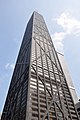
- Nomination: John Hancock Center in Chicago, USA. --Jovianeye 04:51, 7 April 2010 (UTC)
- Review needed
-
- Nomination: A mascaron showing Hercules in a street of Paris.---Jebulon 23:10, 5 April 2010 (UTC)
- Review Comment Right side seems a little out of focus. Is there a good reason? Adam Cuerden 17:16, 6 April 2010 (UTC)- Did'nt saw before your review, but you're right. The good reason ? : bad photographer I'm afraid !!--Jebulon 21:59, 6 April 2010 (UTC)
-

- Nomination: Jasna Góra monastery, Poland --Pudelek 22:49, 5 April 2010 (UTC)
- Review Question Is that extremely bright source of light in the centre a reflection from the wall? --Jovianeye 23:50, 5 April 2010 (UTC) Answer there are articifal candles before holy painting --Pudelek 14:07, 6 April 2010 (UTC)
-

- Nomination St. cristopher Church, Bordes, Hautes-Pyrénées, France. --Florent Pécassou 09:04, 3 April 2010 (UTC)
- Decline Pas mal, mais ici, ils sont obsédés de verticalité, il faut avoir un logiciel de "perpective correction" à cause de la "distorsion" --Jebulon 09:43, 3 April 2010 (UTC) Comment Ne pas obsédé de verticalité, mais la distorsion d'un batiment comme ca peut être corrigée simplement. Voyez Guide des images. --Elekhh 09:59, 3 April 2010 (UTC) Comment Done Une nouvelle version a été téléversée afin de changer celà. Pour moi, c'est avant tout l'église qui doit être bien droite. J'attends vos commentaires. Florent Pécassou 15:33, 4 April 2010 (UTC)* Oppose AMA, la première version est meilleure, l'église étant le sujet principal. Malheureusement, je ne peux pas promouvoir à cause de la surexposition de l'entrée de l'église et la façade gauche de l'obélisque. (first version is better, but all slightly overexposed) --Ianare 15:08, 12 April 2010 (UTC)
-

- Nomination Flower of a Lavatera sp. -- Alvesgaspar 10:14, 12 April 2010 (UTC)
- Promotion very good --George Chernilevsky 11:52, 12 April 2010 (UTC)
-

- Nomination Flower of a Centaurea sphaerocephala -- Alvesgaspar 10:14, 12 April 2010 (UTC)
- Promotion good --George Chernilevsky 11:53, 12 April 2010 (UTC)
-

- Nomination Historic narrow gauge railway Tanečník-Beskyd, Slovakia --Pudelek 10:01, 12 April 2010 (UTC)
- Promotion Nice atmosphere --George Chernilevsky 11:55, 12 April 2010 (UTC)
-

- Nomination A red flower taken at Stafford. These flowers appears to be a modern garden en:primula en:cultivar. --Tyw7 04:19, 12 April 2010 (UTC)
- Decline -- Very poor quality. I'm afraid a mobile phone camera is not enough -- Alvesgaspar 08:12, 12 April 2010 (UTC)
-
-
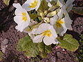
- Nomination A white flower taken at Stafford. These flowers appears to be a modern garden en:primula en:cultivar. --Tyw7 04:19, 12 April 2010 (UTC)
- Decline -- Out of focus -- Alvesgaspar 08:12, 12 April 2010 (UTC)
-

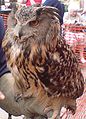
- Nomination An European Eagle Owl with its trainer. --Tyw7 04:19, 12 April 2010 (UTC)
- Decline -- Wrong framing, poor lighting -- Alvesgaspar 08:12, 12 April 2010 (UTC)
-
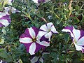
- Nomination Some petunias taken at a roundabout in Stafford--Tyw7 04:19, 12 April 2010 (UTC)
- Decline -- Very poor quality. I'm afraid a mobile phone camera is not enough -- Alvesgaspar 08:12, 12 April 2010 (UTC)
-

- Nomination Some Swans swimming in a river at Stafford --Tyw7 04:28, 12 April 2010 (UTC)
- Decline -- Very poor quality (sharpness, lighting, composition) -- Alvesgaspar 08:14, 12 April 2010 (UTC)
-

- Nomination N900 system info --Ianare 19:41, 11 April 2010 (UTC)
- Promotion Very good photo --George Chernilevsky 20:09, 11 April 2010 (UTC)
-

- Nomination CCTV in tree --Ianare 18:12, 11 April 2010 (UTC)
- Promotion I didn't know they grow on trees. --Von.grzanka 19:10, 11 April 2010 (UTC)
-

-
![* Nomination Cepaea nemoralis on moss, hiding. --Von.grzanka 15:13, 11 April 2010 (UTC) * Promotion the grass mask the subject --Croucrou 17:44, 11 April 2010 (UTC) Comment It's not grass but stalks supporting the capsules of mosses. :) I think that's the point of this picture; showing this beautiful snail in its natural habitat. But I'm not complaining though. If you really think this picture doesn't deserve QI status, be free to decline this nomination. :]. Agree with unsigned comment above, disagree with Croucrou. QI for me--Jebulon 20:31, 11 April 2010 (UTC)](https://upload.wikimedia.org/wikipedia/commons/thumb/c/c8/Cepaea_nemoralis_on_moss_2.jpg/120px-Cepaea_nemoralis_on_moss_2.jpg)
- Nomination Cepaea nemoralis on moss, hiding. --Von.grzanka 15:13, 11 April 2010 (UTC)
- Promotion the grass mask the subject --Croucrou 17:44, 11 April 2010 (UTC) Comment It's not grass but stalks supporting the capsules of mosses. :) I think that's the point of this picture; showing this beautiful snail in its natural habitat. But I'm not complaining though. If you really think this picture doesn't deserve QI status, be free to decline this nomination. :]. Agree with unsigned comment above, disagree with Croucrou. QI for me--Jebulon 20:31, 11 April 2010 (UTC)
-

- Nomination Unidentified species of Prunus (plum) in New York, United States. Juliancolton 13:42, 11 April 2010 (UTC)
- Promotion Nice --Ianare 20:48, 11 April 2010 (UTC)
-

- Nomination Montesquiou, Gers, France. --Florent Pécassou 20:28, 10 April 2010 (UTC)
- Decline Nice view, but white balance is off, some houses unsharp and overexposured, noise --Mbdortmund 13:12, 11 April 2010 (UTC)
-

- Nomination Church of the Exaltation of the Holy Cross --Lodo27 18:34, 10 April 2010 (UTC)
- Decline Titled, some chromatic aberration fringes --Ianare 20:49, 11 April 2010 (UTC)
-
- Nomination Bamberg cathedral at night --Berthold Werner 14:53, 10 April 2010 (UTC)
- Promotion Comment There's an awful lot of perspective distortion. The steeple looks like it's falling over backwards. --Fred the Oyster 18:45, 10 April 2010 (UTC) Support Its OK,details good enough, distortion not problem. I miss metafile. --PetarM 18:06, 11 April 2010 (UTC)
-

-
- Nomination 250 Megapixel Panorama of San Francisco from Twinpeaks. Let's continue the farce... --Dschwen 21:36, 9 April 2010 (UTC)
- Promotion Question Geocode? --Slaunger 22:48, 9 April 2010 (UTC). On the image page. --Dschwen 07:31, 11 April 2010 (UTC)* Support A little undersized, but OK otherwise ;-) BTW when are you going to submit to FP ?--Ianare 16:32, 11 April 2010 (UTC), With the discouraging reaction below: Probably not at all. But anybody is welcome to nominate other peoples' pictures. It would be better than the constant self-nominations. --Dschwen 17:31, 11 April 2010 (UTC) Support very nice, but where is the famous San Francisco fog? :)--Mbz1 00:26, 12 April 2010 (UTC)
-

- Nomination Flower of a Opium Poppy -- Alvesgaspar 17:28, 9 April 2010 (UTC)
- Promotion QI and Useful --Archaeodontosaurus 15:18, 11 April 2010 (UTC)
-

- Nomination: 2 Pelecanus occidentalis --Ianare 23:39, 5 April 2010 (UTC)
- Review needed
-

- Nomination: Sculpture in Częstochowa by night, Poland --Pudelek 22:49, 5 April 2010 (UTC)
- Review needed
-

- Nomination: Poncirus trifoliata (L.) Raf. the short time between buds and flowers.--Jebulon 14:29, 5 April 2010 (UTC)
- Review needed
-

-

-

- Nomination Wheels of locomotive Albatros — Jagro 23:51, 10 April 2010 (UTC)
- Promotion nice --Mbdortmund 02:54, 11 April 2010 (UTC)
-

- Nomination Motel office in Key West--Ianare 22:52, 10 April 2010 (UTC)
- Promotion QI --George Chernilevsky 07:24, 11 April 2010 (UTC)
-

- Nomination Old house in Key West --Ianare 22:52, 10 April 2010 (UTC)
- Promotion Very good photo --George Chernilevsky 07:23, 11 April 2010 (UTC)
-

- Nomination 1870 War memorial, Charles-de-Gaulle Alley, Mirande, Gers, France. --Florent Pécassou 20:28, 10 April 2010 (UTC)
- Promotion Je pense que c'est une QI. Belles couleurs, belle composition. Netteté. Sujet peu traité.--Jebulon 22:21, 10 April 2010 (UTC)
-

-

- Nomination Cetonia aurata (rose chafer) -- Archaeodontosaurus 10:35, 10 April 2010 (UTC)(UTC)
- Promotion QI for me --George Chernilevsky 14:19, 10 April 2010 (UTC)
-

- Nomination Herring Gull (Larus argentatus) --WikedKentaur 06:43, 10 April 2010 (UTC)
- Decline Sorry, but overexposed and the composition is somewhat "strange" (disturbing waste) --Berthold Werner 14:56, 10 April 2010 (UTC)
-

- Nomination Flower of a White Clover -- Alvesgaspar 17:30, 9 April 2010 (UTC)
- Promotion Good --George Chernilevsky 14:18, 10 April 2010 (UTC)
-

-

- Nomination Bochum university, streetlamps --Mbdortmund 20:43, 6 April 2010 (UTC)
- Promotion Some minor overexposure, but good overall --Ianare 22:44, 10 April 2010 (UTC)
-

- Nomination Nature reserve Hainberg --Simonizer 22:26, 5 April 2010 (UTC)
- Decline Composition: tree cut off on top (unfortunate, this is a nice photo otherwise).
-

- Nomination Nature reserve Hainberg --Simonizer 22:26, 5 April 2010 (UTC)
- Decline Electrical wires ruin the composition IMO (unfortunate, this is a nice photo otherwise).
-
-

- Nomination: Charminar at Hyderabad, India by DidierTais. --Jovianeye 05:34, 5 April 2010 (UTC)
- Review needed
-

- Nomination: Park in Dortmund --Mbdortmund 22:17, 4 April 2010 (UTC)
- Review needed
-
- Nomination: Young Pseudotsuga menziesii --Crusier 15:46, 4 April 2010 (UTC)
- Review needed
-

- Nomination: Pseudotsuga menziesii branch 1 --Crusier 15:27, 4 April 2010 (UTC)
- Review needed
-

- Nomination: Pseudotsuga menziesii branch 2 --Crusier 15:27, 4 April 2010 (UTC)
- Review needed
-

- Nomination: Rocky Mountain Douglas-fir cone. --Crusier 14:34, 4 April 2010 (UTC)
- Review needed
-

- Nomination: Outcrop in Reposaari. --kallerna 14:32, 4 April 2010 (UTC)
- Review needed
-

- Nomination: People in Kallo. --kallerna 14:32, 4 April 2010 (UTC)
- Review needed
-
- Nomination: Sea mark in Reposaari. --kallerna 14:32, 4 April 2010 (UTC)
- Review needed
-

- Nomination Jordan, Amman, Ruins of the temple of Hercules --Berthold Werner 11:51, 4 April 2010 (UTC)
- Promotion Some slight CA fringes on the left, but OK overall --Ianare 22:40, 10 April 2010 (UTC)
-

- Nomination Some flowers of a pyrus caucasica, Jardin des Plantes, Paris.--Jebulon 23:13, 9 April 2010 (UTC)
- Promotion QI and useful --Archaeodontosaurus 08:54, 10 April 2010 (UTC)
-

- Nomination A Ruddy Quail-Dove (Geotrygon montana) at Parc des Mamelles, Guadeloupe. --Slaunger 22:42, 9 April 2010 (UTC)
- Promotion QI and useful --Archaeodontosaurus 08:48, 10 April 2010 (UTC)
-

- Nomination Electric multiple unit ER2-1290 "Karelia". Photo by Alex Alex Lep --George Chernilevsky 19:37, 9 April 2010 (UTC)
- Decline Image is way below 2 Megapixels. --Jovianeye 21:12, 9 April 2010 (UTC)
-
- Nomination Church of the Merciful Saviour --Lodo27 18:53, 9 April 2010 (UTC)
- Promotion good --Mbdortmund 23:49, 9 April 2010 (UTC)
-

-

- Nomination Two flowers of the Asteracea family: Glebionis coronaria (Crwon Daisy) and Coleostephum miconis. A difficult shot because of the different lighting needed in each case -- Alvesgaspar 17:28, 9 April 2010 (UTC)
- Promotion Very good --Ianare 19:21, 9 April 2010 (UTC)
-

- Nomination Ice plant (Carpobrotus edulis) on black sand dune. --Avenue 06:26, 9 April 2010 (UTC)
- Promotion good. Is the sand came from lava?--Mbz1 00:48, 10 April 2010 (UTC)
It's from old volcanoes along the west coast of NZ's North Island. Partly from lava, but not fresh lava. --Avenue 01:04, 10 April 2010 (UTC)
-
-

-

- Nomination Old Townhall of Bamberg --Berthold Werner 08:26, 8 April 2010 (UTC)
- Promotion Question Sind weisse Pünkte im Himmel 'lens dust' oder Sternen von 'Ursa Major' ?----Jebulon 22:52, 8 April 2010 (UTC)
This are stars, they made small lines due to the exposure time. (Das sind Sterne. Man sieht das daran, dass sie wegen der langen Belichtungszeit keine Punkte sondern kurze Striche erzeugten) --Berthold Werner 07:02, 9 April 2010 (UTC). Thanks for answering. very nice Image. QI for me.--Jebulon 22:47, 9 April 2010 (UTC)
-

-

- Nomination Key West fire hydrant --Ianare 04:20, 6 April 2010 (UTC)
- Withdrawn Maybe a bit overexposed? Good otherwise. --kallerna 11:16, 6 April 2010 (UTC) * Comment thanks, I'll see if it can be fixed or is truly overexposed --Ianare 14:40, 9 April 2010 (UTC)
-

-
- Nomination: An assortment of french up-to-sale goat's (and ewe's) milk cheeses.--Jebulon 16:26, 3 April 2010 (UTC)
- Review needed
-

- Nomination: Different fish fillets.----Jebulon 16:22, 3 April 2010 (UTC)
- Review needed
-

- Nomination: Red, yellow and white onions ( Allium cepa) in a supermarket.--Jebulon 14:31, 3 April 2010 (UTC)
- Review needed
-
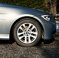
- Nomination: Front tire of BMW 320i -05.. --kallerna 14:24, 3 April 2010 (UTC)
- Review Comment shows highlight clipping, needs to be dealt with. --Herbythyme 14:39, 3 April 2010 (UTC)
-
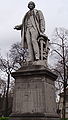
- Nomination: A statue of Henri Bouley, 1812-1885, famous french veterinarian, friend of Pasteur.----Jebulon 10:36, 3 April 2010 (UTC)
- Review Question There looks to be a definite tilt here to me? --Herbythyme 16:13, 3 April 2010 (UTC). Done another version uploaded. Thanks.----Jebulon 17:28, 3 April 2010 (UTC)
-

-

-
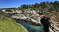
-

- Nomination Partial 3D-surface profile of a 1-Euro coin
 --Xorx 14:36, 8 April 2010 (UTC)
 - Promotion Nice work --George Chernilevsky 15:16, 8 April 2010 (UTC)
- Nomination Partial 3D-surface profile of a 1-Euro coin
-

- Nomination Catholic church in Nižný Komárnik, Slovakia. (by User:Pierre Bona) --High Contrast 08:36, 8 April 2010 (UTC)
- Decline Resolution is borderline, strong perspective distortion, harsh light with dark shadows --Berthold Werner 12:16, 8 April 2010 (UTC)
-

-

- Nomination Blood flow diagram of the human heart (English version). See description for more info. ZooFari 00:22, 7 April 2010 (UTC)
- Promotion Good --George Chernilevsky 12:42, 8 April 2010 (UTC)
-
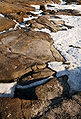
-

-

- Nomination Himalayan Balsam (Impatiens glandulifera). --kallerna 11:04, 6 April 2010 (UTC)
- Promotion Question This has been submitted before and the file is unchanged? --Herbythyme 11:08, 6 April 2010 (UTC) Comment Yep, but nobody reviewed it. --kallerna 11:11, 6 April 2010 (UTC)- Done now. Very nice.---Jebulon 22:41, 8 April 2010 (UTC)
-

-

-

-

- Nomination: Serra da Estrela, Portugal. View to west, from Lagoa Comprida -- Alvesgaspar 10:58, 3 April 2010 (UTC)
- Review needed
-

- Nomination: Serra da Estrela, Portugal. View from Lagoa Comprida -- Alvesgaspar 10:58, 3 April 2010 (UTC)
- Review needed
-

- Nomination: Tomb Tower near Palmyra, Syria. —High Contrast 07:09, 3 April 2010 (UTC)
- Review Comment Previous comments by Avenue (tight crop, geocoding, perspective correction) haven't been addressed. --Elekhh 08:25, 3 April 2010 (UTC)
-

- Nomination: Iced Dew droplet. --ComputerHotline 16:58, 2 April 2010 (UTC)
- Review Comment Some part of the frost is strangely blurred as if the image had been retouched --Croucrou 20:37, 2 April 2010 (UTC)
-

-

- Nomination Inside the Salbert fortifications. --ComputerHotline 18:26, 7 April 2010 (UTC)
- Promotion QI IMO --Croucrou 20:05, 7 April 2010 (UTC)
-

- Nomination Inside the Salbert fortifications. --ComputerHotline 18:26, 7 April 2010 (UTC)
- Promotion QI For Me --Croucrou 20:25, 7 April 2010 (UTC)
-

- Nomination Inside the Salbert fortifications. --ComputerHotline 18:26, 7 April 2010 (UTC)
- Promotion QI For Me --Croucrou 20:25, 7 April 2010 (UTC)
-

-

-

- Nomination one of the gardens of the Generalife, Granada, Spain.----Jebulon 22:50, 2 April 2010 (UTC)
- Decline tilted. --High Contrast 12:06, 7 April 2010 (UTC)
-
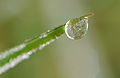
- Nomination Iced Dew droplet. --ComputerHotline 16:58, 2 April 2010 (UTC)
- Promotion Nice, QI to me. --Avenue 00:14, 8 April 2010 (UTC)
-

- Nomination: Railway line of Tatra Electric Railways — Jagro 00:24, 2 April 2010 (UTC)
- Review needed
-

- Nomination: EMU 425.95 near Danielov dom — Jagro 00:24, 2 April 2010 (UTC)
- Review needed
-

- Nomination: Pedestrian zone of a Bavarian town. --High Contrast 22:14, 1 April 2010 (UTC)
- Review needed
-

-

- Nomination Bochum university, entrance institute for sports --Mbdortmund 20:43, 6 April 2010 (UTC)
- Promotion Nice picture for me. Useful.----Jebulon 22:41, 6 April 2010 (UTC)
-

-

- Nomination Trier, St. Irminen monastry --Berthold Werner 12:27, 6 April 2010 (UTC)
- Promotion I like this kind of barocco architecture. The picture is good IMO. French description added.--Jebulon 22:38, 6 April 2010 (UTC)
-

- Nomination Physalia physalis --Ianare 03:58, 6 April 2010 (UTC)
- Promotion Good QI of very poisonous animal --George Chernilevsky 13:43, 6 April 2010 (UTC)
-
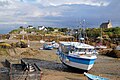
-

- Nomination Robert the Bruce in Stirling. --Eusebius 10:35, 4 April 2010 (UTC)
- Promotion Wish the sky were blue! --Jovianeye 00:45, 5 April 2010 (UTC) Support It's Scotland. We are not known for our cloudless skies. Anyway, I know that statue well, and that's quite a good reproduction of it, at least for that angle (I think it looks better from a slight tilt) It's maybe a teeny bit blurred around the shield, but Bruce himself is good. Of course, it's a fairly modern sculpture - I think 19th century - but I don't think there are many better, as Sterling is the site of the Battle of Stirling Bridge, one of his more important battles. Adam Cuerden 18:52, 6 April 2010 (UTC) Comment This statue is more related to Bannockburn than to Stirling bridge... --Eusebius 21:32, 6 April 2010 (UTC)
-

- Nomination A view of Salcombe and the estuary there from the beach at East Portlemouth. --Herbythyme 12:47, 1 April 2010 (UTC)
- Withdrawn
-

- Nomination Hall of Prayer for Good Harvest in Temple of Heaven,Beijing --Charlie fong 11:26, 6 April 2010 (UTC)
- Promotion QI IMO. --kallerna 11:30, 6 April 2010 (UTC)
-

-

-

-
-
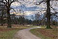
-

- Nomination Château de Laréole (Haute-Garonne, France). --Florent Pécassou 20:26, 5 April 2010 (UTC)
- Decline Sky is extremely pixelated --Ianare 23:36, 5 April 2010 (UTC)
-

-

- Nomination Hairy Woodpecker --Cephas 19:18, 5 April 2010 (UTC)
- Promotion good --Mbdortmund 21:28, 5 April 2010 (UTC)
-

- Nomination Panorama from Eilean Donan, Scotland. --Eusebius 18:55, 5 April 2010 (UTC)
- Promotion great atmosphere --Mbdortmund 21:30, 5 April 2010 (UTC)
-

-

- Nomination Cut-away view of sun-dried kelp (Durvillaea antarctica), showing internal honeycomb structure.--Avenue 00:37, 5 April 2010 (UTC)
- Promotion Good to me --Herbythyme 12:41, 5 April 2010 (UTC)
-

- Nomination Balsamorhiza deltoidea, showing pollen in the center. --Shirik 14:42, 4 April 2010 (UTC)
- Promotion Very good --Ianare 23:33, 5 April 2010 (UTC)
-

-

- Nomination EMU 425.95 of Tatra Electric Raulways — Jagro 23:48, 2 April 2010 (UTC)
- Promotion Comment Nice image but the area above the tram is noticeably over exposed to me --Herbythyme 16:11, 3 April 2010 (UTC) Done There is a bit problem with WB of sun, but fixed in new version. — Jagro 23:37, 4 April 2010 (UTC)
Yes I think that is ok now --Herbythyme 17:20, 5 April 2010 (UTC)
-
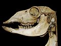
- Nomination An old (XIXth century) lama skull in a veterinarian museum.----Jebulon 23:13, 2 April 2010 (UTC) -- Another version now. Very great job done by Archaeodontosaurus. Black background, and work with colors. Many thanks.--Jebulon 21:26, 4 April 2010 (UTC)
- Promotion Nice work. QI to me. --Avenue 12:31, 5 April 2010 (UTC)
-
-

-

- Nomination The flower of cultivated Aquilegia vulgaris. --Bff 12:40, 1 April 2010 (UTC)
- Decline looks pixelated / compressed --Ianare 23:18, 5 April 2010 (UTC)
-
- Nomination Wooden church in Palowice village, Upper Silesia --Pudelek 08:17, 1 April 2010 (UTC)
- Promotion Nice. It seems tilted CW by about 0.9°, though, and there may be a faint dust spot left of the upper tower.--Avenue 04:44, 2 April 2010 (UTC)
The tilt was fixed days ago, and I've only just noticed. Now QI to me. --Avenue 11:17, 6 April 2010 (UTC)
-

- Nomination: Fish seller at market in Sainte-Anne, Guadeloupe. --Slaunger 02:06, 31 March 2010 (UTC)
- Review needed
-

- Nomination Bourlémont fortifications. --ComputerHotline 07:20, 31 March 2010 (UTC)
- Decline Door is blurry. --Ianare 23:13, 5 April 2010 (UTC)
-

- Nomination Bourlémont fortifications. --ComputerHotline 07:20, 31 March 2010 (UTC)
- Promotion OK --Ianare 23:13, 5 April 2010 (UTC)
-

- Nomination Bourlémont fortifications. --ComputerHotline 07:20, 31 March 2010 (UTC)
- Promotion nice view --Ianare 23:13, 5 April 2010 (UTC)
-

- Nomination Bourlémont fortifications. --ComputerHotline 07:20, 31 March 2010 (UTC)
- Promotion tu as bien progressé ... --Ianare 23:13, 5 April 2010 (UTC)
-

- Nomination: Horse feces, in the Horse Society of Veterinarian High School of Maison-Alfort near Paris.---Jebulon 21:46, 30 March 2010 (UTC)
- Review needed
-

- Nomination Parking lot, Tel-Aviv port, Tel-Aviv-Yaffo, Israel --Rastaman3000 18:19, 30 March 2010 (UTC)
- Decline Nice pavemenet. Needs CW rotation to become horizontal. Also looks a bit too strongly compressed, and shadows are a bit too dark. --Elekhh 19:49, 30 March 2010 (UTC)
No other comments/changes and I agree with Elekhh --Herbythyme 17:18, 5 April 2010 (UTC)
-

-

- Nomination Cemetery from WW I - nr 91 in Gorlice, Poland. Monument of German officer --Pudelek 17:03, 29 March 2010 (UTC)
- Promotion Such photos should allways be b/w! Imo QI --Skipper Michael 19:49, 5 April 2010 (UTC)
-

- Nomination Vinca minor. --Bff 14:59, 24 March 2010 (UTC)
- Decline
 Neutral not sure about sahrpness of the whole plant. Could anybody help with another advice, please ?----Jebulon 18:29, 27 March 2010 (UTC) Comment Not quite there IMO. Composition is not ideal either. --Elekhh 22:34, 30 March 2010 (UTC)*cental composition is borng, plus the background is really distracting. not a QI. even when it is really close to one -LadyofHats 20:42, 5 April 2010 (UTC)
-
- Nomination National Theater. Used in wikis. --Fred Hsu 20:42, 21 March 2010 (UTC)
- Decline Comment Some CA at corners of roof, and on the tree to the right.-- Avenue 22:06, 29 March 2010 (UTC)
Decline I guess as no other comments --Herbythyme 17:16, 5 April 2010 (UTC)
-

- Nomination Park in Dortmund --Mbdortmund 22:17, 4 April 2010 (UTC)
- Promotion Good photo, imo QI --Skipper Michael 23:22, 4 April 2010 (UTC)
-

- Nomination Whole plant of Bellis perennis L., "Robella", Jardin des Plantes, Paris---Jebulon 21:41, 4 April 2010 (UTC)
- Promotion Qi and Useful --Archaeodontosaurus 07:52, 5 April 2010 (UTC)
-

- Nomination The lighthouse of Kallo. --kallerna 14:32, 4 April 2010 (UTC)
- Promotion Nice image, qi to me --Herbythyme 14:43, 4 April 2010 (UTC)
-

- Nomination 360°-panorama of Kallo. --kallerna 14:32, 4 April 2010 (UTC)
- Decline Lovely idea but left and right sides both badly overexposed, maybe restitch loosing the sides for QI? --Herbythyme 14:40, 4 April 2010 (UTC) Comment But then we would lose view in 360° panoramic viewer. :( Could it be QI if cropped? --kallerna 14:47, 4 April 2010 (UTC)
In my opinion, yes. There's easily more than enough there to make up for the lack of total 360° viewing.
-

- Nomination Scots Pine (Pinus sylvestris) on outcrop in Reposaari. --kallerna 14:32, 4 April 2010 (UTC)
- Promotion Looks ok to me --Herbythyme 14:44, 4 April 2010 (UTC)
-

- Nomination The nunatck of Cântaro Magro, Serra da Estrela, Portugal -- Alvesgaspar 13:12, 4 April 2010 (UTC)
- Promotion I like that (and it shows how interesting images can be in less good weather ;)) --Herbythyme 13:47, 4 April 2010 (UTC)
-

-
- Nomination Cerastoderma edule alive.--Jebulon 00:11, 4 April 2010 (UTC)
- Promotion Good photo, imo QI--Skipper Michael 23:22, 4 April 2010 (UTC)
-

-

- Nomination Serra da estrela, Portugal. The road to Lagoa Comprida -- Alvesgaspar 10:58, 3 April 2010 (UTC)
- Promotion Excellent QI. --Elekhh 20:44, 4 April 2010 (UTC)
-

- Nomination St. Jacob Church, Lasséran, Gers, France. --Florent Pécassou 09:04, 3 April 2010 (UTC)
- Decline Comment Please don't do this: this image has been declined last month. Same reason is still valid. --Elekhh 09:21, 3 April 2010 (UTC) Comment Sorry, I've forgotten it. Florent Pécassou 15:30, 4 April 2010 (UTC)
No worries. -- Elekhh 08:21, 5 April 2010 (UTC)
-

-

- Nomination Stormy sky over the roof of the palace of Carlos Quinto, Alhambra, Granada, Spain. ----Jebulon 21:36, 30 March 2010 (UTC)
- Decline The composition is too strange for me. Is always painfull to see half-croped classic columns, and the sky-building proportion is also unconvincing. --Elekhh 22:30, 30 March 2010 (UTC) After further contemplation is a decline for me. --Elekhh 22:12, 4 April 2010 (UTC)
-

- Nomination: Chata M. R. Štefánika pod Ďumbierom - mountain hostel in Low Tatras, Slovakia --Pudelek 17:03, 29 March 2010 (UTC)
- Review needed
-

- Nomination Another view of Valluvar Kottam at Chennai, India --Jovianeye 00:41, 28 March 2010 (UTC)
- Promotion Intrest, good photo, imo QI --Skipper Michael 23:42, 4 April 2010 (UTC)
-
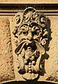
- Nomination Mascaron in Melantrichova street, Prague. --Jedudedek 01:05, 4 April 2010 (UTC)
- Promotion good --George Chernilevsky 09:36, 4 April 2010 (UTC)
-

- Nomination Flowers and young leaves of a Prunus sp. -- Alvesgaspar 21:54, 3 April 2010 (UTC)
- Promotion Quality image. Interesting "impressionist" background.---Jebulon 00:02, 4 April 2010 (UTC)
-
- Nomination Pürevjav Sambuu of Altai Khairkhan (an overtone singing ensemble from Mongolia) playing a morin khuur near Centre Georges Pompidou in 2005. --Wesha 20:48, 3 April 2010 (UTC)
- Decline It's to small to be QI you need 2Mpix --Croucrou 22:01, 3 April 2010 (UTC)
-

-

-

-

- Nomination Osmium crystals. --Alchemist-hp 14:24, 3 April 2010 (UTC)
- Promotion QI and Useful --Archaeodontosaurus 16:12, 3 April 2010 (UTC)
-
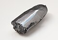
- Nomination a half Ruthenium bar. --Alchemist-hp 13:45, 3 April 2010 (UTC)
- Promotion QI and Useful --Archaeodontosaurus 14:04, 3 April 2010 (UTC)
-
- Nomination Lion Rock, at Piha, near Auckland, New Zealand. --Avenue 08:05, 3 April 2010 (UTC)
- Promotion Comment it's a bit tilted, see at the water. If you correct it I would support --Carschten 11:30, 3 April 2010 (UTC)
Corrected now. --Avenue 15:43, 3 April 2010 (UTC) Support nice resulution, sharpness okay and I think I can connive at the noise in the sky --Carschten 16:07, 3 April 2010 (UTC)
-
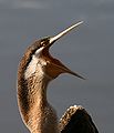
-

- Nomination Australian darter --99of9 22:07, 3 April 2010 (UTC)
- Promotion Comment beautiful picture, but there is dust on this one too, could you correct it before i promot it --Croucrou 22:42, 2 April 2010 (UTC) Comment Thanks for marking the spots, I can hardly even see them even with your help. I've uploaded a new version with cloning in all those areas, see if they're fixed. --99of9 02:49, 4 April 2010 (UTC) Comment you've done au great correction, it rest 3 dusts, but they are difficult to see, I've mark it if you want to correct it --Croucrou Done thanks again. --99of9 10:23, 4 April 2010 (UTC)
-
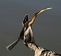
- Nomination Australian darter. --99of9 13:18, 3 April 2010 (UTC)
- Promotion Comment there is many dust on your sensor, could you delete them before promotion --Croucrou 16:25, 2 April 2010 (UTC) Comment The background is water, not sky, so it is expected to be patchy. Or are you seeing spots elsewhere? Could you mark an example you are worried about? --99of9 21:02, 3 April 2010 (UTC) *I've fixed dustspots.Good capturing.--PetarM 21:33, 2 April 2010 (UTC) Comment Thanks PetarM - it does look better with the floating debris spots removed. --99of9 21:50, 3 April 2010 (UTC) Comment good job there is one dust yet. i mark it
--Jebulon 22:50, 2 April 2010 (UTC)...WARNING: the last comment (just above) was NOT made by ME !!--Jebulon 23:00, 2 April 2010 (UTC)--Croucrou 23:12, 2 April 2010 (UTC) CommentThanks for that note Croucrou, I've removed what I think you were getting at, but you might want to check it. --99of9 02:14, 4 April 2010 (UTC) Comment great job, it rest some but now there are note realy visible, I have juste mark it if you want to be perfectionist --Croucrou 09:50, 3 April 2010 (UTC) Done thanks again. --99of9 10:23, 4 April 2010 (UTC)
-

- Nomination Post War Lionel. ..JMSchneid 16:24, 1 April 2010 (UTC)
- Promotion I like the composition, especially the use of portrait mode. But the image is very noisy for a still life: without EXIF data I'm not sure what the settings were, but a tripod would allow for a lower ISO. - Bilby 12:32, 2 April 2010 (UTC) Comment I uploaded a new version processed from the original raw file. The exposure was made at the lowest ISO, it suffered from poor processing on my part. --JMSchneid 00:43, 3 April 2010 (UTC) Comment That fixed it - I rather like the wisp of smoke. :) - Bilby 12:20, 3 April 2010 (UTC)
-

- Nomination Cerambyx cerdo (Male) --Archaeodontosaurus 19:23, 31 March 2010 (UTC)
- Promotion Great, but the back-left leg seems to be unsharp for me, if I'm right.----Jebulon 23:01, 1 April 2010 (UTC). Although observed. There are three photographs here it would have taken four to be complete. --Archaeodontosaurus 08:59, 2 April 2010 (UTC)
I find it ok. --High Contrast 18:47, 3 April 2010 (UTC)
-

-

- Nomination Bell of a piccolo trumpet. --Eusebius 10:46, 3 April 2010 (UTC)
- Promotion QI to me and useful --Herbythyme 11:20, 3 April 2010 (UTC)
-

- Nomination Lesser Antillean Bullfinch (Loxigilla noctis), female, photographed at a house in Lamarre, near Sainte-Anne (Guadeloupe). --Slaunger 02:12, 3 April 2010 (UTC)
- Decline Unsharp. Also would have been better to have more contrast between the bird and the background. --Elekhh 08:20, 3 April 2010 (UTC)
Accepted. Thanks for your review. --Slaunger 11:05, 3 April 2010 (UTC)
-

-

- Nomination A green corridor, without tourists (rare view), in the generalife Gardens, Granada, Spain.---Jebulon 23:39, 2 April 2010 (UTC)
- Decline Looks like it was overexposured and you tried to fix it by manipulating the tone curve, however the flat grey areas on the ground look odd. --Elekhh 08:13, 3 April 2010 (UTC) Yes, you're right.--Jebulon 09:40, 3 April 2010 (UTC)
-
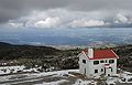
- Nomination Serra da Estrela, Portugal. View to West from Lagoa Comprida -- Alvesgaspar 21:45, 2 April 2010 (UTC)
- Promotion Good composition, nice lighting. --Elekhh 08:17, 3 April 2010 (UTC)
-

-
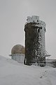
- Nomination The highest point in continental Portugal, in Serra da Estrela .. Alvesgaspar 20:23, 2 April 2010 (UTC)
- Promotion QI and usefull.---Jebulon 22:55, 2 April 2010 (UTC)
-
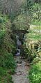
- Nomination Detail of a garden (vertical panorama) -- Alvesgaspar 20:22, 2 April 2010 (UTC)
- Promotion Very nice. ZooFari 20:33, 2 April 2010 (UTC)
-

- Nomination Iced Dew droplet. --ComputerHotline 16:58, 2 April 2010 (UTC)
- Promotion The most interesting of the three, IMO. QI for me.----Jebulon 22:58, 2 April 2010 (UTC)
-

- Nomination Tlapanaloya, Mexico — Marrovi 16:45, 2 April 2010 (UTC)
- Decline Nice scene and composition - I especially like the line of the stream. However, the camera has gone for f2.5 and there's strong purple fringing in the high contrast areas. You might want to make sure it was set to landscape mode and see if that helps. - Bilby 23:18, 2 April 2010 (UTC)
-
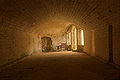
- Nomination Bourlémont fortifications. --ComputerHotline 07:20, 31 March 2010 (UTC)
- Promotion Very Good. --Berthold Werner 17:16, 2 April 2010 (UTC)
-

- Nomination Bourlémont fortifications. --ComputerHotline 07:20, 31 March 2010 (UTC)
- Promotion Good. --Berthold Werner 17:16, 2 April 2010 (UTC)
-

- Nomination Orange tulip (Tulipa kuschkensis) at the Dallas Arboretum. --Loadmaster 01:35, 27 March 2010 (UTC)
- Decline Comment Composition problems. Fred Hsu 03:56, 27 March 2010 (UTC) Busy composition; strong light-shadow contrast distracting. Overlap with other similar flower unfortunate. --Elekhh 08:03, 3 April 2010 (UTC)
-

- Nomination DKW Junior de Luxe --Berthold Werner 09:05, 2 April 2010 (UTC)
- Promotion Fine to me --Herbythyme 11:28, 2 April 2010 (UTC)
-

- Nomination Whangara, location of the film Whale Rider. --Avenue 04:25, 2 April 2010 (UTC)
- Promotion Nice --George Chernilevsky 05:20, 2 April 2010 (UTC) Support--Kuvaly 10:55, 2 April 2010 (UTC)
-

- Nomination Blue and white clothing shop in Sainte-Anne (Guadeloupe). --Slaunger 01:33, 2 April 2010 (UTC)
- Promotion Nice. (Could perhaps be better with ISO 100) --Berthold Werner 10:29, 2 April 2010 (UTC) Info why do you think it would be better à 100 ISO, Some sensor are natively 200 iso and if you use 100 iso, you lose quality --Croucrou 11:31, 2 April 2010 (UTC) Comment Other way around - low iso gives better quality. Some new dslrs have very good high iso performance but for most of us the lower the better. Regards --Herbythyme 12:01, 2 April 2010 (UTC)
-

- Nomination San Sebastian Bernal, Querétaro — Marrovi 04:48, 2 April 2010 (UTC)
- Decline Nice composition, but too much noise in the shadow and lack of the details in the bright parts. Seems the photographer is better than his camera. --Berthold Werner 09:08, 2 April 2010 (UTC)
-
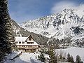
-

- Nomination A view of Salcombe and the estuary there from East Portlemouth. --Herbythyme 12:47, 1 April 2010 (UTC)
- Promotion good --George Chernilevsky 13:06, 1 April 2010 (UTC)
-

- Nomination A view of Salcombe looking north up the estuary from the eastern side. --Herbythyme 12:47, 1 April 2010 (UTC)
- Promotion Very good --George Chernilevsky 13:24, 1 April 2010 (UTC)
-
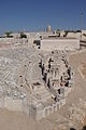
- Nomination Jerusalem Model, The city of David, the Pool of Siloam and the southern wall of Mount Moriah --Berthold Werner 09:19, 1 April 2010 (UTC)
- Promotion QI --George Chernilevsky 13:26, 1 April 2010 (UTC) -- Added french description ----Jebulon 16:08, 1 April 2010 (UTC)
-

- Nomination Muzeul Naţional de Istorie Naturală "Grigore Antipa" (Natural History National Museum) and skyscraper (BTC), Bucharest --Pudelek 08:17, 1 April 2010 (UTC)
- Promotion ok. --Berthold Werner 13:03, 1 April 2010 (UTC)
-

-

- Nomination Traffic in Oslo (E18 Bjørvika) --Pudelek 08:17, 1 April 2010 (UTC)
- Promotion ok. --Berthold Werner 13:03, 1 April 2010 (UTC)
-
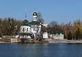
- Nomination Orthodox church in Vinnitsa, the Southern Bug river bank. --George Chernilevsky 06:48, 1 April 2010 (UTC)
- Promotion ok. --Berthold Werner 13:01, 1 April 2010 (UTC) Thanks! It is my 200th QI photo --George Chernilevsky 13:12, 1 April 2010 (UTC) It WOULD be, or it COULD be... Voting period is not at the end... But don't worry, my friend. IT IS a QI (for me. I Support)!!--Jebulon 15:44, 1 April 2010 (UTC)
-
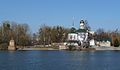
- Nomination Orthodox church in Vinnitsa, the Southern Bug river bank. --George Chernilevsky 06:48, 1 April 2010 (UTC)
- Promotion ok --Berthold Werner 13:01, 1 April 2010 (UTC)
-

-
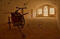
- Nomination Bourlémont fortifications. --ComputerHotline 07:20, 31 March 2010 (UTC)
- Promotion nice --Pudelek 11:30, 2 April 2010 (UTC)
-

- Nomination Bourlémont fortifications. --ComputerHotline 07:20, 31 March 2010 (UTC)
- Decline IMO the fire extinguisher and the blue board are quite distracting. --Jovianeye 17:54, 1 April 2010 (UTC)
-

- Nomination Owatonna, Minnesota fire station in the rain --Jonathunder 04:14, 30 March 2010 (UTC)
- Promotion QI for me, despite the washed out sky. -- Avenue 11:28, 2 April 2010 (UTC)
-

- Nomination Hepatica nobilis growing out of leaf litter.--Von.grzanka 20:50, 27 March 2010 (UTC)
- Promotion Good work--Kuvaly 10:52, 2 April 2010 (UTC)
-

- Nomination Beilngries Airport (EDNC) as seen from Arzberg. --Blackfalcon 20:22, 27 March 2010 (UTC)
- Decline Not a QI IMO. --Jovianeye 18:02, 1 April 2010 (UTC)
-
- Nomination: Remains of Al Karak --Berthold Werner 10:47, 27 March 2010 (UTC)
- Review needed
-

- Nomination: Orange tulip (Tulipa kuschkensis) at the Dallas Arboretum. --Loadmaster 01:44, 27 March 2010 (UTC)
- Review Comment Composition problems. Fred Hsu 03:56, 27 March 2010 (UTC)
-

- Nomination: Roman remains in Petra, Jordan. --High Contrast 00:04, 27 March 2010 (UTC)
- Review CommentMusn't it be "Wadi Musa" in the description? And adding geocode would be nice. But imho it could not be a QI because of the cropped bottom. (Look at: File:Petra Roman Gate.jpg) --Berthold Werner 10:39, 27 March 2010 (UTC)
-
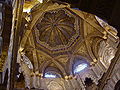
- Nomination: The Maqsura of the mosque (now cathedral) of Cordoba, Spain.---Jebulon 20:33, 26 March 2010 (UTC)
- Review needed
-

- Nomination Building of Trier University of Applied Sciences at Paulusplatz (St. Pauls place) --Berthold Werner 13:51, 25 March 2010 (UTC)
- Promotion It'd be nicer without the cars, but it's still a QI for me. --Avenue 11:43, 2 April 2010 (UTC)
-
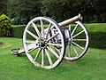
- Nomination Cannon at Ooty Botanical Garden --Jovianeye 06:47, 1 April 2010 (UTC)
- Decline Too much noise. --Berthold Werner 09:24, 1 April 2010 (UTC)
-

- Nomination Road sign in Guadeloupe Creole. "Slow down, children are playing here". --Slaunger 19:58, 31 March 2010 (UTC)
- Promotion , Nice, QI to me.--Avenue 08:16, 1 April 2010 (UTC)
-

- Nomination Drawing of a russian mobile ballistic missile. (by User:Mike1979 Russia) --High Contrast 17:13, 31 March 2010 (UTC)
- Promotion Good drawing! --Jovianeye 20:26, 31 March 2010 (UTC)
-

- Nomination Campanula persicifolia, wild plant. --Bff 17:00, 31 March 2010 (UTC)
- Decline Overly busy background, composition as a whole just not that interesting. — Daniel Case 01:48, 1 April 2010 (UTC)
-

-

- Nomination Crab Xantho poressa. --George Chernilevsky 13:33, 31 March 2010 (UTC)
- Promotion QI and Useful --Archaeodontosaurus 17:05, 31 March 2010 (UTC)
-
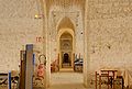
- Nomination Bourlémont fortifications. --ComputerHotline 07:20, 31 March 2010 (UTC)
- Decline too many disturbing or distracting objects IMO.----Jebulon 15:56, 31 March 2010 (UTC)
-

- Nomination Bourlémont fortifications. --ComputerHotline 07:20, 31 March 2010 (UTC)
- Promotion QI for me --George Chernilevsky 13:35, 31 March 2010 (UTC)
-

- Nomination Bourlémont fortifications. --ComputerHotline 07:20, 31 March 2010 (UTC)
- Promotion QI for me. Usefull for "Commons".--Jebulon 16:00, 31 March 2010 (UTC)
-

- Nomination Bourlémont fortifications. --ComputerHotline 07:20, 31 March 2010 (UTC)
- Decline Seems to be tilted, IMO.---Jebulon 16:02, 31 March 2010 (UTC)
-

- Nomination Bourlémont fortifications. --ComputerHotline 07:20, 31 March 2010 (UTC)
- Promotion QI to me. --Jovianeye 20:35, 31 March 2010 (UTC)
-

- Nomination Cygnus olor portrait. Focus is on its eye --Carschten 15:56, 30 March 2010 (UTC)
- Decline Comment The bird's face is nicely captured, but the tip of the beak is blurry. Two effects of the flash also bother me: the bright reflections from the water drops, and the shadow on its body below the beak. On balance, not a QI IMO, sorry. -- Avenue 23:50, 31 March 2010 (UTC)
-

- Nomination Belfry in Lohärad, Sweden, photo by EnDumEn. --Wolfgangus Mozart 14:45, 30 March 2010 (UTC)
- Promotion Nice, English description and geocoding would be useful. --Elekhh 19:56, 30 March 2010 (UTC) Support good now --George Chernilevsky 14:10, 31 March 2010 (UTC)
-

- Nomination Flowers at the place of recent terrorist attack in Moscow, at the "Park Kultury" metro station --Скампецкий 04:54, 30 March 2010 (UTC)
- Decline
Sorry, but I think this image is too dark!--Jovianeye 13:59, 30 March 2010 (UTC) My monitor was apparently at the lowest brightness levels! --Jovianeye 12:21, 31 March 2010 (UTC) Comment That's because the station is painted in black, not because of the quality. - Скампецкий 14:55, 30 March 2010 (UTC) Comment I don't think it is underexposed but in my opinion the picture is too noisy and not sharp enough for QI. --Dein Freund der Baum 16:18, 30 March 2010 (UTC)--agree with Dein Freund der Baum. Impressive and full of sadness document, not too dark IMO, but unfortunately unsharp & noisy. -----Jebulon 16:30, 30 March 2010 (UTC) Comment OK. --Скампецкий 20:09, 30 March 2010 (UTC)
-

- Nomination South Milton Ley (a Site of Special Scientific Interest) in Devon, UK.--Nilfanion 23:30, 29 March 2010 (UTC)
- Promotion Good --George Chernilevsky 14:14, 31 March 2010 (UTC)
-

- Nomination Mountain hut Rycerzowa in Żywiec Beskids, Poland --Pudelek 17:03, 29 March 2010 (UTC)
- Promotion Crisp detail and clear lines. -- Daniel Case 01:16, 1 April 2010 (UTC)
-

-
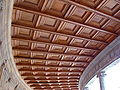
- Nomination Wooden ceiling in the Palace of Carlos Quinto, Alhambra, Granada, Spain.----Jebulon 21:38, 30 March 2010 (UTC)
- Decline Very nice ceiling, but is a pitty that the sky is so massively overexposured. Unfortunately a crop would compromise the composition. --Elekhh 22:26, 30 March 2010 (UTC). Alas you're right, my friend. I knew that, but I liked to show this ceiling...--Jebulon 22:31, 30 March 2010 (UTC)
-

- Nomination the larva of the mosquito Cluex restuans-LadyofHats 18:43, 30 March 2010 (UTC)
- Promotion Well done, interesting, usefull, I support this QI. --Jebulon 21:34, 30 March 2010 (UTC)
-
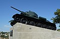
- Nomination T-34/76 was the Soviet tank, monument in Sevastopol. --George Chernilevsky 12:02, 29 March 2010 (UTC)
- Promotion Qi for me -- Archaeodontosaurus 18:50, 30 March 2010 (UTC)
-

- Nomination Huka Falls.--Avenue 04:02, 29 March 2010 (UTC)
- Promotion Qi for me -- Archaeodontosaurus 18:50, 30 March 2010 (UTC)
-

- Nomination Close up of an islamic mosaic,overloaded with the symbol of Emperor Charles. Alhambra, Granada, Spain----Jebulon 18:44, 27 March 2010 (UTC)
- Promotion Comment Please sharpen just a tiny bit, and I'll promote. Fred Hsu 04:57, 28 March 2010 (UTC) Done --Jebulon 17:07, 28 March 2010 (UTC) Comment Jebulon, does your sharpening tool only have only two seetings: 'off' and 'very strong'? The original was one of the rare images of yours that you did not sharpen. This was an image with great potential for sharpening, but I did say 'a tiny bit'... :) Fred Hsu 20:27, 28 March 2010 (UTC) I don't understand what you really mind. If it is only a cursor problem with a "trick" tool, please fix the level yourself, or decline, or both...
 ----Jebulon 22:20, 28 March 2010 (UTC) Comment I uploaded a version with sharpness between your v1 and v2. --Fred Hsu 03:20, 31 March 2010 (UTC)
-

- Nomination: unidentified white rose. --Jebulon 22:37, 24 March 2010 (UTC)
- Review needed
-

- Nomination Alster in Hamburg --IqRS 22:09, 22 March 2010 (UTC)
- Promotion Comment The edges are less sharp than I would like but I actually think it is a good image and possibly QI --Herbythyme 14:14, 26 March 2010 (UTC)
QI to mee. --Elekhh 22:39, 30 March 2010 (UTC)
-

- Nomination Farmer on a manure heap --Dein Freund der Baum 10:28, 30 March 2010 (UTC)
- Decline sorry but sky is overexposured --Mbdortmund 10:32, 30 March 2010 (UTC)
-
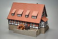
- Nomination Faller Modell of the "Mäulesmühle" in size H0 --Berthold Werner 06:56, 30 March 2010 (UTC)
- Promotion good --Carschten 09:28, 30 March 2010 (UTC)
-

-

-

- Nomination Baroque altarpiece -- Florent Pécassou 16:18, 29 March 2010 (UTC)
- Decline Already declined in February. Sorry but this photograph is beeing far from QI. (Overexposed areas, unsharp, noisy) --Berthold Werner 16:46, 29 March 2010 (UTC)
-

-

- Nomination T-34/76 was the Soviet tank, monument in Sevastopol. --George Chernilevsky 12:02, 29 March 2010 (UTC)
- Promotion Good. --Berthold Werner 16:52, 29 March 2010 (UTC)
-
- Nomination Project 775 Ropucha-I class russian tank landing ship Yamal. --George Chernilevsky 12:02, 29 March 2010 (UTC)
- Promotion Good image, useful --Herbythyme 16:48, 29 March 2010 (UTC)
-

-

- Nomination Baptismal font, Trinity Church, Kristianstad, Sweden --Wolfgangus Mozart 18:15, 23 March 2010 (UTC)
- Decline CA on far side on metal bowl. --Avenue 23:04, 29 March 2010 (UTC)
-

- Nomination: A Ground Beetle (Scarites sp.) -- Alvesgaspar 17:55, 23 March 2010 (UTC)
- Review needed
-

- Nomination: Portrait of a Muscovy Duck -- Alvesgaspar 17:48, 23 March 2010 (UTC)
- Review needed
-

- Nomination The inflorescence of Aster alpinus. --Bff 14:13, 23 March 2010 (UTC)
- Promotion Nice, QI for me. -- Avenue 23:10, 29 March 2010 (UTC)
-

-

- Nomination: Public map of the canal locks of Yser/Ijzer river in Belgium. The panel is naturally tilted.--Jebulon 20:06, 19 March 2010 (UTC) Question What about the copyright here? There is no freedom of panorama in Belgium? -- Comment Who speaks ? I don't know, about the freedom of panorama in Belgium. It's a public map... official answer is welcome.--Jebulon 23:43, 23 March 2010 (UTC)
- Review needed
- Nomination: Public map of the canal locks of Yser/Ijzer river in Belgium. The panel is naturally tilted.--Jebulon 20:06, 19 March 2010 (UTC)


_02.jpg)


.jpg)


.JPG)


.jpg)
.jpg)


.jpg)
![* Nomination St. Peter and Paul church, Yasenevo, Moscow --S[1] 11:00, 23 April 2010 (UTC) * Decline Oppose Too dark, CA, not sharp enough. With 350D noise reduction us necessary due to small sensor size.--PereslavlFoto 02:02, 25 April 2010 (UTC)](/wiki/File:%D0%A6%D0%B5%D1%80%D0%BA%D0%BE%D0%B2%D1%8C_%D0%9F%D0%B5%D1%82%D1%80%D0%B0_%D0%B8_%D0%9F%D0%B0%D0%B2%D0%BB%D0%B0_%D0%B2_%D0%AF%D1%81%D0%B5%D0%BD%D0%B5%D0%B2%D0%B5.jpg)
_08.jpg)


.JPG)


.jpg)


.JPG)


.JPG)
.JPG)


.jpg)

.jpg)
.jpg)


_at_Piha.jpg)

.JPG)


.jpg)


.jpg)


.jpg)


.JPG)

,_backlit.jpg)


.JPG)
.JPG)


.jpg)


.jpg)


![* Nomination The inflorescence of Nerium oleander. --Bff 14:51, 6 April 2010 (UTC) * Promotion Comment - This is not a inflorescence but some simple flowers -- Alvesgaspar 20:55, 13 April 2010 (UTC) Comment No, this is just inflorescence. See, for example, [1]. --Bff 17:23, 14 April 2010 (UTC) - This plant does not produce inflorescences, no matter what the article says. What we have in the picture is a typical (of the species) cluster of simple flowers -- Alvesgaspar 08:08, 16 April 2010 (UTC) SupportA hint of overexposure in the left part, but sharp and naturally framed. Good enough for QI imo. /Dcastor 21:04, 17 April 2010 (UTC)](/wiki/File:Nerium_oleander20090811_025.jpg)


_03.jpg)


_36.jpg)


.JPG)


.JPG)


![* Nomination Cepaea nemoralis on moss, hiding. --Von.grzanka 15:13, 11 April 2010 (UTC) * Promotion the grass mask the subject --Croucrou 17:44, 11 April 2010 (UTC) Comment It's not grass but stalks supporting the capsules of mosses. :) I think that's the point of this picture; showing this beautiful snail in its natural habitat. But I'm not complaining though. If you really think this picture doesn't deserve QI status, be free to decline this nomination. :]. Agree with unsigned comment above, disagree with Croucrou. QI for me--Jebulon 20:31, 11 April 2010 (UTC)](/wiki/File:Cepaea_nemoralis_on_moss_2.jpg)


.JPG)


_in_Muriwai_sand_dunes_IMG_102_1378.JPG)


.jpg)


.jpg)
.jpg)


_(1).jpg)


_cathedral_in_Yelokhovo_51.jpg)


_-_cut-away_and_cross-section_2.jpg)

.JPG)


_-_cut-away_view.jpg)


_(3).jpg)
_(7).jpg)
_(9).jpg)
.jpg)


.JPG)


_(2).jpg)

_(4).jpg)
_(8).jpg)


_(5).jpg)
_(6).jpg)


.jpg)

_(1).jpg)
_(10).jpg)
_(11).jpg)
_(2).jpg)
.jpg)


.JPG)


_-_city_center_with_St._Margaret_Church.jpg)
.jpg)
_(18).jpg)
.jpg)
.jpg)
_flowers_and_buds.jpg)
_619.jpg)
.jpg)
.jpg)
Consensual review[edit]
File:Cheetah_portrait_side.jpg[edit]

- Nomination Portrait of a Cheetah --Bilby 11:47, 27 March 2010 (UTC)
- Decline
- Comment because of the missing sharpness --Carschten 17:00, 27 March 2010 (UTC)
- Comment As per the Meerkat, I placed the focus at the eye and front of the face. - Bilby 22:12, 27 March 2010 (UTC)
- Comment Sharpeness is acceptable. Can be enhanced by software, but this is not necessary for QI. -- Smial 22:28, 27 March 2010 (UTC)
- Comment I've uploaded a slightly sharper version.- Bilby 00:40, 28 March 2010 (UTC)
- Oppose Eye is hardly visible, and nose isn't sharp either. --Ikar.us 00:44, 28 March 2010 (UTC)
- Oppose Same problem as with the Meercat. V2 of this image is oversharpened (look at the whiskers), yet eye and nose are still not right. It's beyond sharpening. It's still a great image, just not QI. I have many images like this myself. Sigh. Fred Hsu 20:40, 28 March 2010 (UTC)
- Oppose see my comment at the top --Carschten 09:01, 29 March 2010 (UTC)
File:Castelbouc Gorges du Tarn.jpg[edit]

- Nomination Castelbouc, in the Gorges du Tarn (France). --Myrabella 07:46, 25 March 2010 (UTC)
- Promotion
- Support Nice spot - nice image --Herbythyme 07:53, 25 March 2010 (UTC)
- Question is it me, or I see a part of the left side of the ruins unsharp ? --Jebulon 23:13, 25 March 2010 (UTC)
- Info Do you think so? The photo has been taken with F Number=f/9. — Preceding unsigned comment added by Myrabella (talk • contribs) 2010-03-29T10:45:57 (UTC)
- Support The plants and stones near the tip are sharp, only the tip shows little structure. But now I think it's just too dark. --Ikar.us 11:57, 29 March 2010 (UTC)
File:Feldhase, Lepus europaeus 5a.JPG[edit]

- Nomination Lepus europaeus --Böhringer 19:34, 21 March 2010 (UTC)
- Promotion
- Info Numerical size is sufficient. 1500² = 2250000 > 2000000 --Ikar.us 10:53, 27 March 2010 (UTC)
- Support Size is suitable for nominee. Good capturing.--PetarM 17:44, 27 March 2010 (UTC)
- Oppose 2 megapixels is normally the lower limit. The subject is also unsharp --Carschten 18:40, 27 March 2010 (UTC)
- Info Pixel is not bit nor byte. Photo is according to rules. (See Ikar.us calculation) --PetarM 22:03, 27 March 2010 (UTC)
- Support Maybe a little unsharp, yes. But a wonderful shot. I support.--Jebulon 16:46, 28 March 2010 (UTC)
- Support the dificulty of the subjectdoes for the flaws i believe. -LadyofHats 08:18, 30 March 2010 (UTC)
File:Mediaş (Mediasch, Medgyes) - city center with St. Margaret Church.jpg[edit]
_-_city_center_with_St._Margaret_Church.jpg)
- Nomination Mediaş (Mediasch, Medgyes) - city center with St. Margaret Church --Pudelek 23:16, 24 March 2010 (UTC)
- Decline
- Oppose Busy and confusing composition. Fred Hsu 03:55, 25 March 2010 (UTC)
- Comment This is QI not FP --Pudelek 11:33, 26 March 2010 (UTC)
- Oppose I agree this is QI not FP however the foreground does distract attention from the church which is the intended subject of the image. --Herbythyme 12:05, 26 March 2010 (UTC)
- Oppose The big three mash the tower ... --Croucrou 12:08, 26 March 2010 (UTC)
- Oppose Per Fred and Herbythyme --Ankara 12:14, 26 March 2010 (UTC)
![]() I withdraw my nomination -Pudelek 12:17, 26 March 2010 (UTC)
I withdraw my nomination -Pudelek 12:17, 26 March 2010 (UTC)
- Support Who says church is subject? Title and description say city center is subject. I like the composition. --Ikar.us 19:05, 26 March 2010 (UTC)
- Comment The title say City center With ST. Margaret Church. For me the subject is the city center and the church --Croucrou 22:17, 26 March 2010 (UTC)
- Support see above – nice work --Carschten 19:12, 26 March 2010 (UTC)
- Oppose Overlap of tree with tower is very unfortunate. Could have made one step to the right for a better angle. --Elekhh 00:02, 27 March 2010 (UTC)
File:Flowers of New Zealand flax (Phormium cookianum).jpg[edit]
.jpg)
- Nomination New Zealand flax flowers (Phormium cookianum). -- Avenue 13:57, 24 March 2010 (UTC)
- Decline
- SupportGood to me --Herbythyme 17:41, 24 March 2010 (UTC)
- Comment IMO needs more contrast and the colors need adjusting. --kallerna 16:26, 25 March 2010 (UTC)
- Comment Agree with kallerna. --Elekhh 00:01, 26 March 2010 (UTC)
- CommentI've updated a new version with more contrast, which has incidentally heightened the colours. --Avenue 10:52, 26 March 2010 (UTC)
- Oppose the background is overexpose --Croucrou 12:16, 26 March 2010 (UTC)
- Comment You can actually take the image up in exposure half a stop before you get highlight clipping. I think it is still qi to me. --Herbythyme 12:24, 26 March 2010 (UTC)
- Support Subject is good, background not disturbing. --Ikar.us 19:08, 26 March 2010 (UTC)
- Oppose Background imo distracting --Mbdortmund 20:30, 26 March 2010 (UTC)
- Oppose Still odd colours. --kallerna 16:27, 27 March 2010 (UTC)
- I think the true colours were somewhere between these two versions. Can you be more specific about how this differs from what you'd expect? Here are a few other photos of this species: [2][3][4] -- Avenue 21:00, 27 March 2010 (UTC)
- The whole image is purple. --kallerna 11:23, 28 March 2010 (UTC)
- Now it's obvious - thank you! I was too focussed on the flowers before to notice. I've uploaded yet another version, with the colours adjusted; my apologies to the earlier reviewers. --Avenue 12:12, 28 March 2010 (UTC)
- Now it is too green. I'll make new version. --kallerna 13:33, 28 March 2010 (UTC)
- Now it's obvious - thank you! I was too focussed on the flowers before to notice. I've uploaded yet another version, with the colours adjusted; my apologies to the earlier reviewers. --Avenue 12:12, 28 March 2010 (UTC)
- Don't know nothing about the real colours of the down under flowers. But if Avenue is happy now with improvements, it's a QI for me. Support--Jebulon 14:04, 29 March 2010 (UTC)
![[2]](http://www.nzplantpics.com/sfeature_galleries/phormium/phormium_cookianum_08.jpg)
![[3]](http://www.stockphotopro.com/photo-thumbs-2/B0PX6K.jpg)
![[4]](http://www.landcareresearch.co.nz/research/biosystematics/plants/weaving/images/Wharariki2_500.jpg)
- Oppose Overexposured background distracting per Croucrou and Mbdortmund . --Elekhh 00:06, 30 March 2010 (UTC)
- Oppose dont like the background -LadyofHats 08:15, 30 March 2010 (UTC)
File:Eastereggs ostereier.jpg[edit]

- Nomination Easter eggs by --Nyks, nominated by --Anna reg 10:42, 23 March 2010 (UTC)
- Promotion
- Support Sharp and beautiful colors and i dont find the framing so poor --Croucrou 25 March 2010
- Oppose Poor framing --Alvesgaspar 22:23, 23 March 2010 (UTC)
- Comment for now. I didn't understand the framing comment but now I look at it I think maybe I understand. The handle of the basket would have/should have been rotated by 90 deg to make a far better composition --Herbythyme 14:08, 26 March 2010 (UTC)
- I thought Alvesgaspar ment that there isn't a lot of space around the basket (especially on the bottom) - but well, I'm not claiming any 'artistical knowledge' - I just really liked the picture... (which is in my opinion one of the best Easter pictures - perhaps that will change during the next weeks? ;-) ) --Anna reg 16:23, 26 March 2010 (UTC)
- Info - Exactly, let the poor thing breathe!... -- Alvesgaspar 16:34, 26 March 2010 (UTC)
- Support Subject is the eggs, the basket is enough frame for me. --Ikar.us 19:23, 26 March 2010 (UTC)
- Support Framing looks ok to me! --Jovianeye (talk) 05:31, 29 March 2010 (UTC)
- Support - Framing is fine for me as well. Juliancolton 13:42, 29 March 2010 (UTC)
File:Madaba BW 8.JPG[edit]

- Nomination The famous mosaic floor in Madaba, this part shows Jerusalem --Berthold Werner 18:27, 12 March 2010 (UTC)
- Decline * Comment Very valuable but unsharp at full size and even downsampled to 2 megapixels still unsharp in the bottom left corner. --Elekhh 20:46, 20 March 2010 (UTC)
- Comment It is the best image from the Category:Madaba map category. With default NoiseNinja settings I got a reasonable image. Fred Hsu 22:55, 20 March 2010 (UTC)
- Comment Das Original ohne Entzerrung gefällt mir besser! -- Smial 09:02, 25 March 2010 (UTC)
- Above comment was "I like the original without the perspective correction better". OK let's discuss. --Elekhh 00:06, 26 March 2010 (UTC)
- Oppose Such a static, flat motif should be sharper. --Ikar.us 21:10, 28 March 2010 (UTC)
- Oppose I agree with Ikar -LadyofHats 08:10, 30 March 2010 (UTC)
File:MHPF avers.JPG[edit]

- Nomination Medal of Honour of the French Police, with reduction, face.----Jebulon 21:49, 23 March 2010 (UTC)
- Promotion Resolution and sharpness ok,
but tinted and some noise.-- Smial 08:14, 25 March 2010 (UTC) Noise and tint reduced. -- Smial 08:53, 25 March 2010 (UTC) - Support- i would accept it as it is -LadyofHats 08:08, 30 March 2010 (UTC)
File:MHPF revers.JPG[edit]

- Nomination Medal of Honour of the French Police, with reduction, back. Name cancelled by nominator. ----Jebulon 21:51, 23 March 2010 (UTC)
- Decline Resolution and sharpness ok,
but tinted and some noise.-- Smial 08:14, 25 March 2010 (UTC) Now noise and tint reduced. -- Smial 08:53, 25 March 2010 (UTC) - Oppose- to me it is a bit anoying that both ends of the medal are out of focus wich isnt the case in your other entry -LadyofHats 08:07, 30 March 2010 (UTC)
File:SugarCookie.JPG[edit]

- Nomination Sugar cookie --Jonathunder 15:06, 22 March 2010 (UTC)
- Decline
- Support Tight crop but tasty --Herbythyme 17:30, 22 March 2010 (UTC)
- Oppose -- Too tight, in my opinion. Framing is an important element of quality - Alvesgaspar 21:36, 23 March 2010 (UTC)
- Recropped; less tight now. Jonathunder (talk)
- Not enough, in my opinion. A bit of context around the subject usually adds to the value and aesthetics -- Alvesgaspar 16:36, 26 March 2010 (UTC)
- Recropped; less tight now. Jonathunder (talk)
- Support Ok now.--Ankara 18:51, 25 March 2010 (UTC)
- Support for QI. Would be too close for FP though. Juliancolton 17:14, 26 March 2010 (UTC)
- Oppose The cloth is sharp everywhere. Not the cookie, I'm afraid...--Jebulon 16:57, 27 March 2010 (UTC)
- Oppose Agree, not sharp. --Ikar.us 00:39, 28 March 2010 (UTC)
- Oppose Easy subject, DOF should be better. --kallerna 11:24, 28 March 2010 (UTC)
File:Circulatory System en.svg[edit]

- Nomination Circulatory system --LadyofHats 08:02, 30 March 2010 (UTC)
- Promotion
- Support Great work! Well done --George Chernilevsky 08:14, 30 March 2010 (UTC)
- could you be more especific. wich problem do you have ? for me it shows correctly -LadyofHats 18:42, 30 March 2010 (UTC)~
- i uploaded new with a diferent font. twice. i even dowloaded the fonts that wikipedia sugest and the text keeps apearing in a diferent place. i can not upload it as paths as i usually do becouse it was a request on the feature picture in the english wikipedia.. do you have any sugestions? -LadyofHats 19:56, 30 March 2010 (UTC)
- Support now. Seems to be fixed. I saw this file first on another computer, maybe it was wrong ? Now it is perfect with this font. Many thanks.--Jebulon (talk) 21:21, 30 March 2010 (UTC)
- ended up outlining text since it started to show wrong on my own computer-LadyofHats 21:46, 30 March 2010 (UTC)
File:North over Start Bay from Beesands.jpg[edit]

- Nomination Looking north up Start Bay from Beesands, Devon, UK. --Herbythyme 16:39, 29 March 2010 (UTC)
- Promotion * Support Nice. --Berthold Werner 16:50, 29 March 2010 (UTC)
- Oppose 19° CW tilt. Lycaon 18:06, 29 March 2010 (UTC)
- Comment Reuploaded --Herbythyme 08:23, 30 March 2010 (UTC)
- Comment It still looks slightly tilted to me, about 0.35° CW. --Avenue 20:48, 1 April 2010 (UTC)
- Support Nice image. A good show of the english weather (background, not foreground ! )----Jebulon 21:23, 30 March 2010 (UTC)
File:Kerak BW 5.JPG[edit]

- Nomination Jordan, Al Karak, a reused capital in a wall --Berthold Werner 12:42, 28 March 2010 (UTC)
- Promotion
- Oppose Blurry in the top --Carschten 19:42, 28 March 2010 (UTC)
- Comment Made a tighter crop. --Berthold Werner 16:53, 29 March 2010 (UTC)
- Support good work --Carschten 19:09, 30 March 2010 (UTC)
File:Mors quatre anneaux.JPG[edit]

- Nomination Mors quatre anneaux. Four annels bit.----Jebulon 17:56, 28 March 2010 (UTC)
- Promotion
- Sorry, very badly posterized. --kallerna 21:33, 28 March 2010 (UTC).
- Comment Sorry, I'm not sure you really understand what is the subject of this picture. I would like to show the specific metallic part of this horsebit, which is unusual. (unknown in "Commons", IMO).--Jebulon 22:01, 28 March 2010 (UTC)
- Comment Noise reduction and sharpening are too strong. Bring it back a little bit, so that the hair looks normal. It's not like you have noise problems as I do with my gorilla image. Fred Hsu 22:08, 28 March 2010 (UTC) .
- Done.----Jebulon 22:24, 28 March 2010 (UTC)
- Support --Mbdortmund 18:57, 29 March 2010 (UTC)
- Support I think the new version is good enough. But if I have your original file before any noise reduction and sharpening, I volunteer to take a shot at making it even better. I think you still have too much noise reduction (see whiskers), and now too little sharpening. Fred Hsu 02:46, 30 March 2010 (UTC)
- Support, high-quality and useful. Juliancolton 14:57, 30 March 2010 (UTC)
- Support --Elekhh 22:40, 30 March 2010 (UTC)
File:TVN24 Łyse 2.JPG[edit]

- Nomination TVN24 OB Van --Crusier 16:58, 28 March 2010 (UTC)
- Promotion
- Question And what happen if I am the girl left, and if I disagree to have my photo in "Commons" ? ----Jebulon 09:59, 29 March 2010 (UTC)
- CommentTemplate:Personality rights/pl say: Zezwolenia nie wymaga również rozpowszechnianie wizerunku (...) osoby stanowiącej jedynie szczegół całości takiej jak zgromadzenie, krajobraz, publiczna impreza. translation from Google tranlator (my English is bad): authorization does not require dissemination of the image (...) a person constituting only a detail of a whole, such as a meeting, landscape, public event. --Crusier 11:36, 29 March 2010 (UTC)
- Support persons are unavoidable. Nice picture, nice resulution → QI --Carschten 13:28, 29 March 2010 (UTC)
- Thanks for answering. Not sure about unavoidability of the persons right and left. Not sure they are a detail, even they are not the subject of the picture. Maybe something to do with the framing ? Never mind, it's a nice picture. I Support --Jebulon 14:15, 29 March 2010 (UTC)
File:ComputerHotline - Fort de Roppe (by) (18).jpg[edit]
_(18).jpg)
- Nomination Underground under Roppe fortifications. --ComputerHotline 17:22, 14 March 2010 (UTC)
- Promotion
- Support Sarp & well expose QI for me --Croucrou 22:45, 24 March 2010 (UTC)
- Oppose slightly better than the other tunnel image. But still not QI IMHO. --Fred Hsu 22:06, 21 March 2010 (UTC)
- Comment Not bad I guess but I really don't like the floor lights and their effect - not sure I'd be happy with it being QI. --Herbythyme 14:05, 26 March 2010 (UTC)
- Comment As Herbythyme said, the lights bothered me. So did uneven lighting. I did say I think in the other image that I knew lighting was very hard. Fred Hsu 20:54, 28 March 2010 (UTC)
- Support even when i agree about the lights i can hardly see how he could have aboided those problems. i would make it a QI. -LadyofHats 08:13, 30 March 2010 (UTC)
- Comment I think it is titled counter clockwise (or is the tunnel oblique?), could you fix that? --Dein Freund der Baum 16:26, 30 March 2010 (UTC)
File:Ripon Building panorama.jpg[edit]

- Nomination Panorama of Ripon Building in Chennai by Planemad. --Jovianeye 02:22, 26 March 2010 (UTC)
- Promotion
- Comment I like this. But do you have a not-so-oversharpened version? Fred Hsu 03:52, 27 March 2010 (UTC)
- Comment Unfortunately, no :( cant seem to find my originals --Planemad 10:01, 27 March 2010 (UTC)
- Support QI for me --Carschten 11:39, 3 April 2010 (UTC)
- Support QI for me too --Elekhh 22:01, 3 April 2010 (UTC)
- Support --Mbdortmund 22:29, 4 April 2010 (UTC)
File:Beetle May 2009-1.jpg[edit]

- Nomination A beetle of the Scarabidae family (Rhizotrogus aestivus ) showing the backwings below the elytra --Alvesgaspar 18:00, 23 March 2010 (UTC)
- Decline
- SupportGood useful image to me --Herbythyme 16:53, 29 March 2010 (UTC)
- Comment I see nothing wrong with the background - natural surely? --Herbythyme 12:05, 1 April 2010 (UTC)
- Oppose For me some part is unsharp. Perhaps DOF ?
and i don't like the background--Croucrou 20:59, 1 April 2010 (UTC) - Sorry for forgetting the signature unsigned comment & I cannot find who it was- Comment This is QI not FP - not about whether you "like" the background but whether it is a "quality image", thanks --Herbythyme 10:42, 2 April 2010 (UTC)
- Comment You're right, I'm not a natural English speaker, so some time it's difficult to find the right word. For me the composition it's to centred and the background distracting the reading --Croucrou 11:11, 2 April 2010 (UTC)
- Oppose Backwings and backleg unsharp, IMO. Not a QI for me. But very usefull. Maybe a VI ? --Jebulon 15:30, 1 April 2010 (UTC)
File:Monastery of El Escorial 04.jpg[edit]

- Nomination Monastery of El Escorial, Spain --Bgag 04:05, 22 March 2010 (UTC)
- Promotion
- For the fans of verticality. But looks to me like the sharpening and noise reduction result. Like a panting effect. However, the sky is still noisy - am I wrong? --Ikar.us 21:18, 28 March 2010 (UTC)
- Support Noise reduction and sharpening is allways a problem with cameras of high resolution, and small sensors. This photo is not absolutely perfect, but of high quality, accetable lighting, good exposure, and composition. -- Smial 00:06, 2 April 2010 (UTC)
- Support. Agree with Smial. QI to me too.--Jebulon 17:43, 3 April 2010 (UTC)
- Support and QI to me too. --George Chernilevsky 20:12, 3 April 2010 (UTC)
- Support Very nice! --High Contrast 09:59, 4 April 2010 (UTC)
File:Cerambyx cerdo (couple).jpg[edit]
.jpg)
- Nomination Cerambyx cerdo Great Capricorn Beetle --Archaeodontosaurus 09:18, 3 April 2010 (UTC) (UTC)
- Promotion
- SupportFor me a great QI, very useful, as usual.----Jebulon 10:42, 3 April 2010 (UTC)
- Oppose - Sorry but this is really too dark, Few details are visible. -- Alvesgaspar 11:00, 3 April 2010 (UTC)
- Done Absolutely true, changing the brightness it brings to light many more details.--Archaeodontosaurus 13:37, 3 April 2010 (UTC)
- Support Oh yes, now is better. Very nice, and stylish :) --Elekhh 22:10, 4 April 2010 (UTC)
- Support like it, still next time, try to leave the same amount of open space on both left and right side of the image -LadyofHats 20:39, 5 April 2010 (UTC)
- Support - nice. Jonathunder 20:55, 5 April 2010 (UTC)
File:Donau in Regensburg.jpg[edit]

- Nomination River Danube in Regensburg in the evening. --High Contrast 22:13, 1 April 2010 (UTC)
- Withdrawn
- Support OK --George Chernilevsky 05:16, 2 April 2010 (UTC)
- Oppose for me it's underexpose --Croucrou 11:23, 2 April 2010 (UTC)
- IMO this photo is correct for image in the evening. --George Chernilevsky 19:11, 2 April 2010 (UTC)
- Support QI for me --Archaeodontosaurus 14:06, 3 April 2010 (UTC)
- Oppose Chosing the right moment for taking an image is also part of a QI. I don't think is enough to have good exposure and focus regardless of how one holds the camera and under what light conditions one choses to take the image. This is an unappealing composition to me, with a bright sky attracting attention, while the subject is in the dark. That being said, there is a second issue here: this image has been declined already one year ago. There seem to be some users which
will simplyrepeatedly resubmit their picturesin the hope of a lucky promotion. I am not sure if there are any rules about this procedure, but I find it somewhat unfair to the reviewers, and can affect how serious this project is seen. --Elekhh (talk) 21:59, 3 April 2010 (UTC) - Oppose. Per Elekhh. Shocking. --Jebulon 11:58, 4 April 2010 (UTC)
![]() Comment High Contrast is an experienced and reliable user, I'm shure that he would never deliberately nominate a picture twice. So the critique should not be that harsh. --Mbdortmund 22:28, 4 April 2010 (UTC)
Comment High Contrast is an experienced and reliable user, I'm shure that he would never deliberately nominate a picture twice. So the critique should not be that harsh. --Mbdortmund 22:28, 4 April 2010 (UTC)
![]() Comment about the
Comment about the ![]() Comment : Maybe. Hope so. Sorry for the hardness of critique if you're right.--Jebulon 22:48, 4 April 2010 (UTC)
Comment : Maybe. Hope so. Sorry for the hardness of critique if you're right.--Jebulon 22:48, 4 April 2010 (UTC)
- Comment High Conrast's contributions count nearly 3.000 pictures and many of them are really good and useful... --Mbdortmund 12:37, 5 April 2010 (UTC)
- Comment I missed this discussion totally. Sorry for that. The re-nomination of this image happened accidently not deliberately, as others assumed. As Mbdortmund already stated: I have uploaded lots of images that I have created. And occasionly I add some of the in the QI-candidate-list. And sometimes, I lose track, unfortunately. But I think other user do have the same problem. All in all, I withdraw the nomination of File:Donau in Regensburg.jpg. --High Contrast (talk) 23:12, 6 April 2010 (UTC)
- Thanks. I amended my comments above. It was the third nomination of this type in one day, hence my sangvinic overreaction. There was no intention of personal offence. --Elekhh 00:47, 7 April 2010 (UTC)
- Oppose Underexposed. --kallerna 21:15, 5 April 2010 (UTC)
File:Egbert van der Poel - Marine, effet de lune.jpg[edit]

- Nomination Marine painting. --Eusebius 12:08, 3 April 2010 (UTC)
- Withdrawn
- Oppose I'm sorry, but the painting itself - ignoring all the white space and the frame - is well under the required size. Adam Cuerden 16:31, 6 April 2010 (UTC)
- I can understand the principle of the argument about the wall, but why do you wish to ignore the frame??? It has been carefully chosen to fit the painting, this is how the work is presented to the public, I chose to show it (not only for minimum size reasons), it's part of the picture. --Eusebius 05:57, 7 April 2010 (UTC)
- Is the frame even original? It looks fairly modern to me. Adam Cuerden 06:30, 7 April 2010 (UTC)
- And?? I really don't understand. --Eusebius 07:30, 7 April 2010 (UTC)
- I think what Adam means is that if the frame is modern, a photo including it is a derived work, so the full image would not be in the public domain. Sorry if I am teaching my grandmother to suck eggs here. --Avenue 12:42, 7 April 2010 (UTC)
- OK, let's nominate for deletion. --Eusebius 13:04, 7 April 2010 (UTC)
File:Volvo B7R Sentosa.jpg[edit]

- Nomination Volvo Bus in Singapore --Jovianeye 06:02, 1 April 2010 (UTC)
- Withdrawn Sorry, too much CA IMO. --kallerna 11:26, 6 April 2010 (UTC)
I have cropped the image to remove the areas with CA --Jovianeye 01:54, 7 April 2010 (UTC) Oppose There's still a lot of CA and the composition is now worse. --kallerna 11:51, 7 April 2010 (UTC)
File:Carabe doré recto-verso.jpg[edit]

- Nomination Carabus auratus. --Archaeodontosaurus 16:30, 5 April 2010 (UTC)(UTC)
- Promotion
- Support QI IMO now --Croucrou 21:52, 6 April 2010 (UTC)
- Done great idea --Archaeodontosaurus 09:08, 6 April 2010 (UTC)
- Support Nice. Jonathunder 21:05, 5 April 2010 (UTC)
- Support --Mbdortmund 20:32, 7 April 2010 (UTC)
File:Kulich20100404 12.jpg[edit]

- Nomination Kulichs (a kind of Easter cake, traditional in the Orthodox Christian faith). --Bff 12:43, 5 April 2010 (UTC)
- Decline
- Comment I'm sure I'd like these cakes as I like this picture. But let's discuss about the background...---Jebulon 14:36, 5 April 2010 (UTC)
- Oppose Appear to be cut out from the original photo and put onto an artsy background. Fails "Composition" for being distracting. Adam Cuerden 16:51, 6 April 2010 (UTC)
- Oppose, but would reconsider with different background. Jonathunder 03:22, 7 April 2010 (UTC)
- Oppose Cut background --Croucrou 10:40, 7 April 2010 (UTC)
- Oppose Horrible background. --kallerna 11:52, 7 April 2010 (UTC)
File:Aufgeschossene Leine.jpg[edit]

- Nomination Coil knot / aufgeschossene Leine / bout lové --Skipper Michael 22:56, 4 April 2010 (UTC)
- Withdrawn
- Opposefor there is too much dust who need to be clean, before promotion, and the back off the white boat seem to be highligh --Croucrou 22:15, 5 April 2010 (UTC)
- Oppose per Croucrou --Ianare 03:25, 6 April 2010 (UTC)
- Oppose Per Croucrou + quite noisy also. --kallerna 11:53, 7 April 2010 (UTC)
I withdrew. --Skipper Michael 03:10, 8 April 2010 (UTC)
File:Battle for Reichstag 1945 map-eng.png[edit]

- Nomination Map of Battle for the Reichstag--Ivengo(RUS) 18:32, 25 March 2010 (UTC)
- Decline
- I agree it's big enough to be a high quality illustration, so I'm striking my initial opposition. --Avenue 00:44, 29 March 2010 (UTC)
- Support IMO, big enough. Ignore all rules--Ankara 19:50, 26 March 2010 (UTC)
- Comment I see various labelling issues - see its talk page for details.--Avenue 11:26, 27 March 2010 (UTC)
- Ivengo has now addressed these. --Avenue 00:42, 28 March 2010 (UTC)
- Oppose shouldnt such a diagram be in svg? -LadyofHats 08:19, 30 March 2010 (UTC)
- Highly valuable images should be nominated on VIC (Valuable Image Candidates), the measure on this page is Quality. --Dschwen 13:57, 7 April 2010 (UTC)
- Accept your argument and withdraw my support. Recomend it for Valued image candidates. --Elekhh 00:04, 8 April 2010 (UTC)
- Oppose should be SVG or substantially larger. We are not doing a service to our users if they cannot rely on the simple quality measures of QI. This is neither VIC nor FPC, so however "useful" it may be, the center of QI is technical quality. --Dschwen 14:43, 6 April 2010 (UTC)
- Would you, based on that principle, support delisting of all images which have been promoted in the past to QI despite not meeting the 2 megapixel criteria? --Elekhh 00:36, 7 April 2010 (UTC)
- Oppose Per Dschwen. --kallerna 22:38, 7 April 2010 (UTC)
File:Tours - René Descartes.jpg[edit]

- Nomination Descartes statue. --Eusebius 12:12, 2 April 2010 (UTC)
- Decline Unsharpness of foreground (flowers) distracting, and ugly urban background disturbing (not the fault of the photographer). Need other opinions please.---Jebulon 22:11, 6 April 2010 (UTC)
- Oppose Would be better with low DOF, maybe. --kallerna 22:35, 7 April 2010 (UTC)
- Oppose Composition issue: the subject is not clearly distinguished from the background. The vegetation is far more apparent than the subject. Better angle, framing or low DOF could have mitigated it. --Elekhh 12:37, 8 April 2010 (UTC)
- Oppose It is quite unfortunate that the statue and the building blend into each other. --Jovianeye 19:48, 8 April 2010 (UTC)
File:Festung kufstein 2 sk.jpg[edit]

- Nomination Kufstein. --Simonizer 18:45, 6 April 2010 (UTC)
- Promotion
- Comment Déja vu, isn't it ?;)--Let's discuss another time. Why not ?---Jebulon 22:44, 6 April 2010 (UTC)
- Why a discussion? Promote it or decline it. Yes there is a similar picture (see other version) but the composition is a little bit different --Simonizer 15:49, 7 April 2010 (UTC)
- 1) I'm not sure of my opinion, then...2)Did you not remark that the comments of the community about "yellow framed" pictures are far more interesting and various than these about the "blue framed" ? ----Jebulon 22:18, 8 April 2010 (UTC)
- Support good composition and provides a broader framing than the already promoted QI. --Elekhh (talk) 00:44, 8 April 2010 (UTC)
- Support All in all, I liked this picture. But it would have been perfect without those footprints in the lower left corner. --Jovianeye 19:53, 8 April 2010 (UTC)
File:San_Francisco_1.jpg[edit]

- Nomination San Francisco from Twin Peaks. 100MP. --Dschwen 06:48, 6 April 2010 (UTC)
- Promotion
- Oppose interesting picture but unfortunately for me the main subject the town is too in the mist --Croucrou 21:45, 6 April 2010 (UTC)
- Support Nice. --kallerna 11:07, 6 April 2010 (UTC)
- Support Frisco without fog is not Frisco. Mythic city, mythic point of view. QI for me. French description added.---Jebulon 22:50, 6 April 2010 (UTC)
- Oppose I'm not sure if it's fog or just urban haze, but whatever it is, it detracts too much from the image for me. Some picturesque fog adding to the atmosphere would be different. Impressive resolution though. --Avenue 12:24, 7 April 2010 (UTC)
- I cannot believe this insanity! I upload a 100MP high quality image, tack sharp, tons of details, accurately showing the urban atmospheric conditions with everything clearly visible. And this ends up in the fracking "discuss" section! Are you kidding me? Hold, on, I have to pinch myself, this might just be a fever dream. OUCH!! Nope, it apparently isn't. --Dschwen 21:33, 9 April 2010 (UTC)
- Yes, it's impressively sharp, so on that and resolution I agree it scores highly. Probably accuracy too. I think that the atmospheric and lighting conditions should be considered too, but that is just my opinion. Take it for whatever it is worth. --Avenue 01:11, 10 April 2010 (UTC)
- I cannot believe this insanity! I upload a 100MP high quality image, tack sharp, tons of details, accurately showing the urban atmospheric conditions with everything clearly visible. And this ends up in the fracking "discuss" section! Are you kidding me? Hold, on, I have to pinch myself, this might just be a fever dream. OUCH!! Nope, it apparently isn't. --Dschwen 21:33, 9 April 2010 (UTC)
- Support Interesting picture, fantastic city --Pedroserafin 19:39, 7 April 2010 (UTC)
- Support Composition may not be fitting for a post card or an artistic photo, but this image does a great job of documenting this area of SF. --Ianare 15:02, 9 April 2010 (UTC)
- Support Except for the old lady getting mugged on the left side of the image and the cars on the wrong side of the road :) it's QI the detail is wonderful, the lighting is balanced(exceptional for the image size/detail). IMHO I'd support at FP as well. Gnangarra 03:04, 10 April 2010 (UTC)
File:Man statue in Lazenki.JPG[edit]

- Nomination
Zeus, Łazienki Królewskie in Warsaw --Lvova 21:23, 5 April 2010 (UTC) - Promotion *
Oppose: Would be better without the people in the background, and the description, translated from Russian, just says "Statue in Royal Baths Park". I've added in a little more clarification in an English version, but we don't know who made the statue, and, while I'm willing to buy this may well be Zeus, I'd like to know how that conclusion was reached. Adam Cuerden 18:45, 6 April 2010 (UTC) Comment I think, that full description is not necessary for this nomination. And sign up, please. --Rave 18:19, 6 April 2010 (UTC)
Sorry, forgot to sign. But I do think that we need to at least credit the sculptor, if only to allow the image to be effectively used. Adam Cuerden 18:45, 6 April 2010 (UTC)
It is Bachus, probably; I'm looking for description. Lvova 04:17, 7 April 2010 (UTC)
I've found and added description. If anybody want to see how old conclusions were reached - here, in russian. In fact it is (polska) Alegoria rzeki Bug, posąg na tarasie przed Pałacem na Wyspie w Łazienkach Królewskich w Warszawie. Rzeźba autorstwa Ludwika Kaufmanna z 1855 r. Lvova 10:22, 7 April 2010 (UTC) Support Accurate identification makes this special: It can now be used in articles on the Bug River, or Ludwig Kaufmann. Adam Cuerden 13:42, 8 April 2010 (UTC)
- I admit that I was wrong. Correct description increased the value of picture. --Rave 19:24, 8 April 2010 (UTC)
- Comment Yes, but I'm not sure it is a QI : noise reduction seems to be too strong. But picture not so bad though... well... Neutral--Jebulon 22:14, 8 April 2010 (UTC)
File:Golden_Gate_1.jpg[edit]

- Nomination Golden Gate. --Dschwen 22:07, 4 April 2010 (UTC)
- Decline
- Support Very nice, QI. --Elekhh 02:31, 5 April 2010 (UTC)
- Question Why is the sky so dark in the middle, compared to the sides? I might expect that for a 360° view, but this seems more like 180°. --Avenue 07:42, 5 April 2010 (UTC)
- Your expectation is wrong. Basic knowledge of light polarization should tell you that -180 and +180 degree are identical polarizations, and thus you should expect two dark areas in the sky. The image is perfectly normal. --Dschwen 21:17, 9 April 2010 (UTC)
- Maybe I am wrong, but so far I don't follow your explanation. We have two light areas here, not two dark areas. Two light areas make sense if the sun is behind you, but this shot is looking more south than north, so if anything I think the sun would be in front. Why does polarisation matter? Were you using a polarized filter? --Avenue 01:24, 10 April 2010 (UTC)
- Your expectation is wrong. Basic knowledge of light polarization should tell you that -180 and +180 degree are identical polarizations, and thus you should expect two dark areas in the sky. The image is perfectly normal. --Dschwen 21:17, 9 April 2010 (UTC)
- Oppose Not a QI for me, sorry, due to uneven brightness. --Avenue 23:24, 6 April 2010 (UTC)
- Oppose per Avenue --Herbythyme 16:31, 7 April 2010 (UTC)
File:Porin merivartioasema 2010.jpg[edit]

- Nomination Pori Coast Guard Station in Kallo. --kallerna 14:24, 3 April 2010 (UTC)
- Promotion
![]() Comment shows significant highlight clipping, not easy to recover. --Herbythyme 14:35, 3 April 2010 (UTC)
Comment shows significant highlight clipping, not easy to recover. --Herbythyme 14:35, 3 April 2010 (UTC)
- Support looks good to me --Ianare 04:32, 6 April 2010 (UTC)
- Oppose Over exposed as it is & not fixable I think. --Herbythyme 16:32, 7 April 2010 (UTC)
- Comment IMO it's not too badly overexposed and the small parts could be fixed with RAW-files. Yep, but the problem is IMO minor. --Kallerna 22:33, 7 April 2010 (UTC)
- Support Overexposure is minor IMO, and arguably could be croped out without compromising the composition. --Elekhh (talk) 13:03, 8 April 2010 (UTC)
- Question Have you actually checked the extent of the over exposure in image software? I have. --Herbythyme 17:43, 8 April 2010 (UTC)
- Yes, I have, and is just a small triangular area in the right. --Elekhh 10:06, 10 April 2010 (UTC)
- Support IMO the little overexposure is an interesting part of the particular light of this picture.---Jebulon (talk) 22:08, 8 April 2010 (UTC)
File:Bruxelles Notre-Dame du Sablon.jpg[edit]

- Nomination Gothic church facade in Brussels. --Myrabella 06:55, 2 April 2010 (UTC)
- Promotion
- Comment It seems that the left part of the picture fails... ----Jebulon 22:52, 4 April 2010 (UTC)
- Support Good composition, left side goes for a bridge to far to capture it, wouldnt make any sense since its focus on portal and tower. I did some noise fix and contrast. --PetarM 21:33, 7 April 2010 (UTC)
- The intent was to show this facade in the morning sun, with light coming from the right. Thanks to Mile for his kind help. However, I have restored the 1st version, because of the issue with the top edges noticed by Elekhh. But I keep in mind the suggestion of improvement. More contrast, noise control, and final decontrast of clouds, isn't it? I may try (but I couldn't today, not even tonight :). --Myrabella (talk) 06:12, 8 April 2010 (UTC)
File:Aleja Solidarnosci.jpg[edit]

- Nomination Aleja Solidarnosci in Warsaw --Lvova 21:23, 5 April 2010 (UTC)
- Promotion
- Thanks for removing the "triangle". I do Support now, because of the very nice light.---Jebulon 20:47, 6 April 2010 (UTC)
File:Papaver April 2010-1.jpg[edit]

- Nomination Bud of a Common Poppy - Alvesgaspar 16:33, 4 April 2010 (UTC)
- Decline
- Support QI and Useful --Archaeodontosaurus 16:39, 4 April 2010 (UTC)
- Oppose Interesting but unfortunatly at 100% it's realy unsharp --Croucrou 22:54, 5 April 2010 (UTC)
- Oppose Too low DOF. --kallerna 11:54, 7 April 2010 (UTC)
File:Anhinga novaehollandiae snake necked.jpg[edit]

- Nomination Australian darter. --99of9 10:21, 4 April 2010 (UTC)
- Promotion
- Support Qi for me --Archaeodontosaurus 14:02, 3 April 2010 (UTC)
- Oppose A little blurry and oversharpened --Ianare 23:25, 5 April 2010 (UTC)
- Support QI For me --Croucrou 07:00, 7 April 2010 (UTC)
- Comment It would be nice to see a version which is lesser sharpened. --Mbdortmund 18:09, 7 April 2010 (UTC)
File:Western Lowland Gorilla at Bronx Zoo 1.jpg[edit]

- Nomination Western Lowland Gorilla. May be above folk's noise tolerance for dark areas. I can't reduce noise without introducing artifacts and destroying hairs. -- Fred Hsu 22:05, 28 March 2010 (UTC)
- Decline
- Oppose- i am inclined to opose this image becouse far too much of it is out of focus or has no real information, specially the whole right half of it. on the other hand i know that it has to do with composition. so it is more a lightoppose and would prefer someone else to give their opinion on this one-LadyofHats 20:50, 5 April 2010 (UTC)
- Oppose - Not a QI to me either, primarily due to composition, although the angle of view and contrasting light on the subject's face also seem problematic. I am not really worried by the noise (not obtrusive when the image takes up my full screen) or the focus (subject is sharp). A portrait orientation crop could improve the composition, but I think the other issues (angle and lighting) would still leave me hesitant. --Avenue 12:57, 6 April 2010 (UTC)
File:CGN 4695.JPG[edit]

- Nomination Paddle steamer Vevey--Jnn 15:39, 31 March 2010 (UTC)
- Decline
- OpposeToo dark --Simonizer 21:16, 31 March 2010 (UTC)
- SupportNot too dark for me. Seems to be QI for me. Let's discuss with others !--Jebulon 16:45, 2 April 2010 (UTC)
- Oppose Underexpose for me, but it can easily correct --Croucrou 22:33, 3 April 2010 (UTC)
- Comment OK for the "histogram". Thanks to Elekhh. But in spite of the histogram, if my eyes and my brain don't find this picture too dark, are they wrong? Am I ill ? And why may histograms judge and appreciate my photos ? That's the point... Our (your and my) opinions are non-perfect because they are humans. And I find this very well. So for me, this picture is not too dark.----Jebulon 23:48, 3 April 2010 (UTC)
- Comment If nothing else, you'll find that variations between monitors, monitor settings, and, to a lesser extent, operating systems will affect the apparent brightness. The histogram gives a much better idea of the actual dynamic range, and provides a non-arbitrary judge. - Bilby 00:06, 4 April 2010 (UTC)
- Comment I agree that it is currently underexposed, but it corrects fairly well - this would be better done with the original, though. - Bilby 00:06, 4 April 2010 (UTC)
- Comment Too dark and white balance not OK --Mbdortmund 22:21, 4 April 2010 (UTC)
- Oppose as it stands. --Elekhh 00:56, 7 April 2010 (UTC)
File:Osteospermum dandenong (yellow).jpg[edit]
.jpg)
- Nomination Osteospermum dandenong yellow variety. ZooFari 18:32, 30 March 2010 (UTC)
- Promotion
- Support QI Nice composition.--Elekhh 19:51, 30 March 2010 (UTC)
- Oppose The inferior half part of the flower seems to be unsharp to me.--Jebulon 21:30, 30 March 2010 (UTC)
- Well, maybe not 100% perfect but QI for me, the composition is very good with the blury background.--Elekhh 22:21, 30 March 2010 (UTC)
- Support I like it. --Mbdortmund 22:30, 4 April 2010 (UTC)
- Comment Me too, sure... And then ? "I like it" seems not to be a relevant argument for choosing a QI, IMO.
- And a Question : because of the position of the buds, it looks like this picture were initially a portrait picture, am I wrong ?----Jebulon 22:44, 4 April 2010 (UTC)
- You're right again, but primarily is a top-down image so rotation is not so essential and I kind of like it like this... Elekhh 02:35, 5 April 2010 (UTC)
- And a
- Comment @ Jebulon: What is the real question: You think everything on the picture should be sharp; I think the short DOF is a good way to bring out the main object: the blossom of the flower. Seem's to be a matter of taste, isn't it? Therefore I wrote that I like it... --Mbdortmund 12:46, 5 April 2010 (UTC)
![]() Comment @ Elekhh: I agree with you excerpt for the buds, looks a bit unnatural. It was just only a question. Thanks for answering.--Jebulon 13:57, 5 April 2010 (UTC)
Comment @ Elekhh: I agree with you excerpt for the buds, looks a bit unnatural. It was just only a question. Thanks for answering.--Jebulon 13:57, 5 April 2010 (UTC)
![]() Comment @ Mbdortmund : OK, now I understand your 'I like it', because you gave now an explanation of it. In fact, you like the short DOF
Comment @ Mbdortmund : OK, now I understand your 'I like it', because you gave now an explanation of it. In fact, you like the short DOF ![]() . For me, the unsharpness of the flower (not of everything on the picture...) is a problem for an encyclopedic use, because there is only one flower visible. Thanks for answering.---Jebulon (talk) 14:09, 5 April 2010 (UTC)
. For me, the unsharpness of the flower (not of everything on the picture...) is a problem for an encyclopedic use, because there is only one flower visible. Thanks for answering.---Jebulon (talk) 14:09, 5 April 2010 (UTC)
- Support--LadyofHats 20:32, 5 April 2010 (UTC)
- Oppose Good..., but would be better as square, partially OOF and the other flower in upper part is distracting. And bokeh isn't ideal. Sorry. --Kallerna 21:22, 5 April 2010 (UTC)
File:Jaffa_train.JPG[edit]

- Nomination Old Train at old Jaffa Train station, Tel-Aviv-Yaffo, Israel. --Rastaman3000 18:26, 28 March 2010 (UTC)
- Promotion
- Support That is QI to me --Herbythyme 16:49, 29 March 2010 (UTC)
- Oppose Not a QI to me, sorry, due to the dark shadows on the train.--Avenue 00:02, 31 March 2010 (UTC)
- Support Shadows are not a problem to me. That is a QI to me.--Jebulon 17:39, 3 April 2010 (UTC)
- Neutral Shadows are too dark on the train and trees, but it doesn't compromise the overal quality of the image (the subject is the train station, not the train only). Composition is good and and the image is sharp. Sort of on the limit... --Elekhh 22:04, 3 April 2010 (UTC)
- Support I think it has enough quality to be QI-LadyofHats 20:30, 5 April 2010 (UTC)
- Oppose With this angle of view, the shadows is a problem --Croucrou (talk) 22:00, 5 April 2010 (UTC)
File:Porin rautatieasema.jpg[edit]

- Nomination Pori railway station. --kallerna 16:07, 15 March 2010 (UTC)
- Promotion Comment Perspective must be corrected --Herbythyme 19:12, 15 March 2010 (UTC) Comment I really don't know what is wrong with perspective and I can't unfortunelately correct it. You can decline it or try to fix it by yourself. --kallerna 22:41, 15 March 2010 (UTC)
Perspective doesn't looks wrong to me (I'm against the dictatorship of pure and absolute verticality). Nice "northern" light, good frame and sharpness. Usefull for "Commons". Promotion seems evident to me.--Jebulon 17:52, 20 March 2010 (UTC)
- Support Why discussed, when there wer no supporters nor opponents? Don't see the perspective a problem here. --Ikar.us 23:18, 22 March 2010 (UTC)
- Support For me the perspective is normal, Good Picture --Croucrou (talk) 22:10, 23 March 2010 (UTC)
- Oppose -- Geometric distortion -- Alvesgaspar 22:27, 23 March 2010 (UTC)
- Oppose I am not a fan of the perspective police however this is wrong to me --Herbythyme 07:39, 24 March 2010 (UTC)
TemporaryPerspective correction need --George Chernilevsky 14:43, 24 March 2010 (UTC) Oppose.- Support I Gave an opinion some days ago, but didn't vote, I mean. So, I support.----Jebulon 22:50, 24 March 2010 (UTC)
- Comment - Come on guys! Geometric distortion is one of the issues specifically mentioned in the guidelines. In certain cases it can be used to emphasize or dramatize the subject (e.g. very large or tall buidings), which is not the case IMO. -- Alvesgaspar 16:41, 26 March 2010 (UTC)
- Oppose I agree with Alvesgaspar. Geometric distortion is error. --George Chernilevsky 05:34, 27 March 2010 (UTC)
- Done As requested by author, I tried to fix it. Not to lose to much on the sides, I had to crop bottom.--Ikar.us 14:15, 27 March 2010 (UTC)
- Question The opinion of the author would be now interesting...--Jebulon 16:54, 27 March 2010 (UTC)
- Comment I would have uploaded the new version to separate filepage. But if you like it, it's ok. --kallerna 20:25, 27 March 2010 (UTC)
- Support With the correction it looks acceptable for QI. -- Blackfalcon 21:01, 27 March 2010 (UTC)
- Comment. I mean that opponents due to perspective distortion must reconsider their votes, and support now...----Jebulon 22:25, 27 March 2010 (UTC)
- Oppose corrected version per Smial. The composition was much better before IMO. --Avenue 11:23, 29 March 2010 (UTC)
- Question and, in fact how does REALLY look this station ? ----Jebulon 13:44, 29 March 2010 (UTC)?
- So: File:Porin rautatieasema.JPG --Berthold Werner 12:32, 30 March 2010 (UTC)
- Comment perspective correction is OK but too much has been croped from the bottom. --Elekhh 05:52, 31 March 2010 (UTC)
- Support I like it. --Mbdortmund 22:33, 4 April 2010 (UTC)
- Support QI to me. --Jovianeye 20:56, 5 April 2010 (UTC)
- Support I find it good enough for QI. --High Contrast 07:30, 8 April 2010 (UTC)
File:Former Kunio Maekawa House 2009.jpg[edit]
File:Former Kunio Maekawa House 2009.jpg
- Nomination Kunio Maekawa House, Tokyo by Wiiii--Elekhh 13:15, 8 April 2010 (UTC)
- Decline Oppose lack of sharpness, noisy, compression artefacts --Berthold Werner 14:57, 8 April 2010 (UTC)
- Comment Can you explain what you mean by compression artefacts? Is a 4.5 megapixel image, compressed to 3.9. Doesn't seem too massive and is well above the QI standard of 2.0 megapixels --Elekhh 02:07, 9 April 2010 (UTC)
- I added two annotations one where you can see a good example of compression artefacts (sawtooths in the trees) and one where I think sharpness and noise are not good. And I set it to discuss too get more opions (perhaps I'm too strict) --Berthold Werner 06:38, 9 April 2010 (UTC)
![]() Oppose I'm not sure about the sharpness, but I do see the noise and compression artefacts, which I think are enough to disqualify it. --Avenue 20:04, 9 April 2010 (UTC)
Oppose I'm not sure about the sharpness, but I do see the noise and compression artefacts, which I think are enough to disqualify it. --Avenue 20:04, 9 April 2010 (UTC)
File:Brindavan Gardens.JPG[edit]

- Nomination Brindavan Gardens at Mysore, India --Jovianeye 21:35, 31 March 2010 (UTC)
- Decline
- Support Nice composition and colours. QI to me, despite a somewhat washed-out sky on the left. --Avenue 15:18, 8 April 2010 (UTC)
- Oppose Composition not so good. Would be better for me with an entire footpath, on the right side.--Jebulon 22:23, 8 April 2010 (UTC)
- Oppose I agree about the composition and the image overall appears soft. --Ianare 15:08, 9 April 2010 (UTC)
File:Toetoe plumes and Lion Rock.JPG[edit]

- Nomination Toetoe plumes in the evening sunlight.--Avenue 22:53, 29 March 2010 (UTC)
- Promotion
- OpposeToo noisy IMO. --kallerna 11:21, 6 April 2010 (UTC)
- You're right - sorry. I've uploaded a new version with the noise reduced. --Avenue 13:24, 6 April 2010 (UTC)
- Support Now it's QI for me --Croucrou 12:46, 8 April 2010 (UTC)
- Support QI for me --Archaeodontosaurus 07:39, 11 April 2010 (UTC)
- Support--Mbz1 03:45, 13 April 2010 (UTC)
File:Swan plant (Asclepias fruiticosa) flowers and buds.jpg[edit]
_flowers_and_buds.jpg)
- Nomination Swan plant Asclepias fruiticosa flowers and buds. --Avenue 13:39, 2 April 2010 (UTC)
- Decline
- Support QI and useful --Archaeodontosaurus 16:33, 5 April 2010 (UTC)
- Comment Buds are quite good, but flowers seems to be OOF IMO. Let's discuss ?----Jebulon 22:15, 6 April 2010 (UTC)
- Oppose per Jebulon. --Elekhh 12:44, 8 April 2010 (UTC)
- Oppose buds are overexposed also. --Ianare 14:54, 9 April 2010 (UTC)
File:Doubly breaking wave, North Piha.jpg[edit]

- Nomination Doubly breaking wave. -- Avenue 11:26, 28 March 2010 (UTC)
- Decline
- OpposeAt 100% it realy Blur IMO --Croucrou 07:34, 7 April 2010 (UTC)
- Support good photo with lot of atmosphaer, imo QI --Skipper Michael 23:42, 4 April 2010 (UTC)
- Oppose good composition and atmosphere but it really is a little blurry/pixelated at full resolution. --Ianare 14:53, 9 April 2010 (UTC)
- Oppose not convinced on the composition focus is a little blurry across the main subject Gnangarra 14:20, 10 April 2010 (UTC)
File:Anas platyrhynchos (Praha, Rašínovo nábřeží) 619.jpg[edit]
_619.jpg)
- Nomination Anas platyrhynchos in Rašínovo nábřeží, Prague. --Jedudedek 01:05, 4 April 2010 (UTC)
- Decline
- Support Good photo, QI --George Chernilevsky 09:37, 4 April 2010 (UTC)
- Oppose Head OOF. --kallerna 14:33, 4 April 2010 (UTC)
- Oppose for me it's not QI l'est talk about it --Croucrou 22:37, 5 April 2010 (UTC)
- I Support it. --High Contrast 23:38, 6 April 2010 (UTC)
- Oppose head should be in focus --Ianare 14:43, 9 April 2010 (UTC)
- I too Support it. --Jovianeye 23:32, 9 April 2010 (UTC)
- Oppose Head and eye defocussed but wing in sharp focus. It should be the other way round.--Fred the Oyster 15:45, 10 April 2010 (UTC)
File:Monstera deliciosa flower and buds.jpg[edit]

- Nomination Flower and buds of Monstera deliciosa. --Avenue 23:59, 30 March 2010 (UTC)
- Promotion
- SupportQI and Useful --Archaeodontosaurus 16:38, 5 April 2010 (UTC)
- Oppose for me the background is too present --Croucrou 22:48, 5 April 2010 (UTC)
- Support subject is clear, lighting is good Gnangarra 14:27, 10 April 2010 (UTC)
File:Bréhec - pano.jpg[edit]

- Nomination Bréhec, Brittany. --Eusebius 07:23, 5 April 2010 (UTC)
- Promotion
- Comment I like this. However there are some sharpness issues on the left and the right is rather underexposed? Maybe the weather was not quite perfect that day... --Herbythyme 08:52, 5 April 2010 (UTC)
- Comment Weather is always perfect in Brittany. Besides, the weather is what made this picture interesting. It is true that the left part has sharpness issues (made more obvious by the downsampling in this zone due to the chosen projection). About the right part, I wanted to keep the same EV for the whole panorama. I'm not sure I can make something out of this right part, but I'll try. --Eusebius 09:02, 5 April 2010 (UTC)
- Info Dark parts lightened a little bit --Eusebius 09:27, 5 April 2010 (UTC)
- Support left edge soft but only at full resolution lighting ok with detail in the shade Gnangarra 14:39, 10 April 2010 (UTC)
File:Byodoin Phoenix Hall Uji 2009.jpg[edit]

- Nomination Byōdō-in Phoenix Hall, Kyoto by Wiiii--Elekhh 13:15, 8 April 2010 (UTC)
- Promotion
- Oppose lack of sharpness, noisy, compression artefacts --Berthold Werner 14:57, 8 April 2010 (UTC)
- Support Sorry but at 100% I don't saw any sharpness, noisy or artefacts Problem, QI IMO --Croucrou 21:52, 8 April 2010 (UTC)
- Support QI for me --Archaeodontosaurus 10:41, 10 April 2010 (UTC)
- Support for me too.---Jebulon 14:49, 11 April 2010 (UTC)
File:Bouziès chateau.jpg[edit]

- Nomination Castle in the rook at Bouzies - LOT - France --Croucrou 20:42, 2 April 2010 (UTC)
- Promotion
- Comment Nice image but showing some highlight clipping on the lower part of the building and rocks on the left. Fixable I think and worth it :) --Herbythyme 11:24, 3 April 2010 (UTC)
- Done I found the orignal Raw and i correct the highlight --Croucrou 20:01, 4 April 2010 (UTC)
- Then could be promoted ;)--Jebulon 22:19, 6 April 2010 (UTC)
- Oppose A bit too strong compressed, and particularly a bit too dark. The right part of the picture fails. --High Contrast 12:04, 7 April 2010 (UTC)
- Comment could you mark on the picture where you find to strong compression ? this images is made from a uncompressed RAW and the jpeg he's 95% quality Jpeg. perhaps there is some problem in my picture, but I don't saw compression problem --Croucrou 12:56, 8 April 2010 (UTC)
- Comment Imo tilted cw --Mbdortmund 23:55, 9 April 2010 (UTC)
- Support QI for me --Archaeodontosaurus 10:44, 10 April 2010 (UTC)
- Support QI for me too. --Jebulon 20:22, 11 April 2010 (UTC)
File:Mammillaria vetula ssp gracilis 14.jpg[edit]

- Nomination The flower of Mammillaria vetula ssp. gracilis. --Bff 22:58, 2 April 2010 (UTC)
- Promotion
- Comment Petals unsharp, or it's me ? Need other advices please.---Jebulon 22:21, 6 April 2010 (UTC)
- Comment The front petals are unsharp, yes, but some of the spines are quite sharp. (ouch! :) Could it be a QI if reinterpreted as a photo of "the flower and spines of ..."? --Avenue 23:40, 6 April 2010 (UTC)
- Comment No more than 5% of the image is sharp subject... Looks good at tumbnail size though. --Elekhh 12:48, 8 April 2010 (UTC)
- Support enough of the subject is in focus IMO --Ianare 14:57, 9 April 2010 (UTC)
- Support beautiful background, the flower is enough sharp QI IMO --Croucrou 19:22, 11 April 2010 (UTC)
File:Cepaea_nemoralis_on_moss.jpg[edit]

- Nomination Cepaea nemoralis on moss. --Von.grzanka 15:13, 11 April 2010 (UTC)
- Decline
- Support Sharp and beautiful --Croucrou 17:44, 11 April 2010 (UTC)
- Oppose A part of the shell seems to be overexposured. Other advices needed for me.--Jebulon 20:31, 11 April 2010 (UTC)
- Oppose I see it too. --Ianare 14:28, 12 April 2010 (UTC)
File:Calendula officinalis L.JPG[edit]

- Nomination Flower of Calendula officinalis. -- Etienne 17:32, 14 April 2010 (UTC)
- Promotion
- Support QI for me--Jebulon 19:03, 14 April 2010 (UTC)
- Info it's beautiful but for me there is some small things who need to be correct before promotion. I put some mark on the picture there is a dead pixel, a hair and 2 dusts --Croucrou 20:18, 14 April 2010 (UTC)
- Info I've tried to fix them. Thank you very much for the advice! -- Etienne 20:49, 14 April 2010 (UTC)
- Support Now it's QI form me
but i don't known if it could be promotied directly or it it need to pass by consensulal revew--Croucrou 07:43, 15 April 2010 (UTC) - Support very good --Ianare 19:55, 15 April 2010 (UTC)
- Support Now OK. Yarl 14:57, 17 April 2010 (UTC)
- Oppose Over-saturated. --Lawboy25 14:59, 17 April 2010 (UTC)
- Support Sharp, contrasty, saturated, nice image. --Fred the Oyster 15:48, 17 April 2010 (UTC)
File:Church of Saint Nicholas in Kotelniki 04+.jpg[edit]

- Nomination Church of Saint Nicholas --Lodo27 18:38, 11 April 2010 (UTC)
- Promotion
- Support Looks good. Juliancolton 11:26, 14 April 2010 (UTC)
- CommentThere is a yellow aura on the left of both spires. I think it should be fixed for QI status. --Dcastor 12:31, 14 April 2010 (UTC)
- Done --Lodo27 14:06, 14 April 2010 (UTC)
- Oppose tilt, building in background is cut off --ianaré (talk) 19:51, 15 April 2010 (UTC)
- Support I have corrected distortion and geotagged. Photo looks good. --PetarM 21:12, 15 April 2010 (UTC)
- Support Now: Yes!--Jebulon (talk) 23:39, 15 April 2010 (UTC)
- Info I uploaded a new version. --Lodo27 12:17, 16 April 2010 (UTC)
- Support Now the fourth version is good --Croucrou 21:43, 16 April 2010 (UTC)
- Support OK. Yarl 18:31, 17 April 2010 (UTC)
File:Cepaea_nemoralis_on_moss_edited.jpg[edit]

- Nomination
- Promotion
- Comment I've done some changes to this picture. How about the new version? --Von.grzanka (talk) 16:34, 12 April 2010 (UTC)
- It looks better, but overexposure isn't really fixable, since there is nothing to work with (because all detail is washed out in white). --Ianare 17:04, 12 April 2010 (UTC)
- Unless you have a 5000$ camera. :) I agree with you, I was just curious if something could be done to improve this photo. I wonder if someone could replace the old photo with the new one? --Von.grzanka 17:32, 12 April 2010 (UTC)
- If you don't already, you can try shooting in raw mode ... --Ianare 14:44, 13 April 2010 (UTC)
- Unless you have a 5000$ camera. :) I agree with you, I was just curious if something could be done to improve this photo. I wonder if someone could replace the old photo with the new one? --Von.grzanka 17:32, 12 April 2010 (UTC)
- It looks better, but overexposure isn't really fixable, since there is nothing to work with (because all detail is washed out in white). --Ianare 17:04, 12 April 2010 (UTC)
- Support now this new version. Congratulations to the photographer for the work (minoring the overexposure without changing all the picture was not easy, I mean).---Jebulon 21:42, 12 April 2010 (UTC)
- Support Sharp and beautiful too --Croucrou 21:40, 13 April 2010 (UTC)
- Support what a work and then the superior quality --Carschten 19:40, 14 April 2010 (UTC)
- Support Very nice. Yarl 18:34, 17 April 2010 (UTC)
- Support Great shot! --Dein Freund der Baum 09:49, 18 April 2010 (UTC)
File:Mushroom Säppi kallerna.jpg[edit]

- Nomination Birch bolete (Leccinum scabrum) and Polytrichastrum formosum in Säppi. --kallerna 12:59, 18 March 2010 (UTC)
- Decline
- Oppose The moss (grass) before this mushroom has very accurately, it is the focal length point. Mushroom as the main object most total not sharp. Really sad, nice object. --George Chernilevsky 13:26, 18 March 2010 (UTC)
- Support Interesting pic, nice habitat. --PetarM 23:05, 18 March 2010 (UTC)
- Agree about interesting, but not quality --George Chernilevsky 16:33, 19 March 2010 (UTC)
- Oppose Per George. Good useful picture but the mushroom is not the sharp part. --Herbythyme 16:36, 19 March 2010 (UTC)
- Comment Why the moss couldn't be the object also? IMO the composition of version 1 is better, what do u think? --kallerna 13:53, 20 March 2010 (UTC)
- Comment Now? --kallerna 10:54, 23 March 2010 (UTC)
- Support Now I support this nomination. In fact, I changed your nomination title here as well. I hope that is kosher. I also renominated your v1. Fred Hsu 01:59, 24 March 2010 (UTC)
- Support beautiful boken in background, beautiful picture --Croucrou 22:22, 24 March 2010 (UTC)
- Joining the "Sharpness Party", I'll Oppose, I'm sorry. In spite of renaming, the mushroom was (is ?) the main subject, and it is unsharp, I'm affraid. I agree with George and Herbythyme, in fact. ----Jebulon 15:46, 26 March 2010 (UTC)
- Comment I would crop the top, to make it a square. That would improve the sharp/unsharp ratio. --Elekhh 05:55, 31 March 2010 (UTC)
- Comment Better now? --kallerna 16:15, 5 April 2010 (UTC)
- I believe so. --Elekhh 02:46, 6 April 2010 (UTC)
- Support I like the different shades of green in this picture. --Makele-90 16:34, 10 April 2010 (UTC)
- Oppose Mushroom as the eye-catching element is unsharp. --Pjt56 21:31, 13 April 2010 (UTC)
- Oppose Wrong DOF, perfect crop. Hope this will be redone.--PereslavlFoto 01:39, 15 April 2010 (UTC)
- Oppose Unsharp. Too bad on an otherwise good shot. --Dcastor 14:15, 15 April 2010 (UTC)
File:Digitale.JPG[edit]

- Nomination Flowers of digitalis purpurea.----Jebulon 23:11, 16 March 2010 (UTC)
- Promotion
- Support Enough DOF for much of the plant to be sharp, nevertheless well detached from background. --Ikar.us 02:49, 17 March 2010 (UTC)
- Oppose Petals are overexposed. --Johannes Robalotoff 18:11, 17 March 2010 (UTC)
- Support Agree,DOF good. Croping such flower is not easy and flower is so nice. --PetarM 21:14, 19 March 2010 (UTC)
- Oppose Overexposed, bad crop and framing. --kallerna 13:55, 20 March 2010 (UTC)
- Support Good for "in vivo" --Archaeodontosaurus 16:31, 20 March 2010 (UTC)
- Oppose Many small issues add up: minor overexposure on petals, too busy background (brown line disturbing), not so good framing. --Elekhh 00:06, 22 March 2010 (UTC)
- Comment...Many SMALL issues..., It's not a FP candidate !...-----Jebulon 16:50, 27 March 2010 (UTC)
- No, at FPC it would have failed for any single of these IMO. --Elekhh 00:08, 30 March 2010 (UTC)
- Oppose The background is disturbing --Croucrou 11:33, 9 April 2010 (UTC)
- Support QI for me. --Berthold Werner 13:37, 12 April 2010 (UTC)
- Support QI for me too. --George Chernilevsky 14:32, 13 April 2010 (UTC)
- Support Sharp enough, brown line adds some life while petals are detached finely, nothing is overexposed (well, the petals usually are this bright in real life, and white has to be white). Perfect DOF helps to see the sharp details and also the smooth expression.--PereslavlFoto 01:44, 15 April 2010 (UTC)
- Support Slightly overexposed and not a perfect crop, but still good enough for QI imo. --Dcastor 14:12, 15 April 2010 (UTC)
File:Mercedes-Benz Welt pan.jpg[edit]

- Nomination Mercedes-Benz museum and sales center, Stuttgart, Germany --Pjt56 17:25, 13 April 2010 (UTC)
- Withdrawn
- Support good framing QI IMO --Croucrou 21:54, 13 April 2010 (UTC)
- Oppose stitching errors --Carschten 15:30, 14 April 2010 (UTC)
- you've got bionic eyes ;), I think it could be correct easily by Pjt56 --Croucrou 20:29, 14 April 2010 (UTC)
- I've looked hard and didn't find errors before I uploaded the file, but of course you are right. Thanks! Give me a day or two and I'll fix the errors. --Pjt56 20:37, 14 April 2010 (UTC)
- I looked one time at the image and saw immediately one stitching error, und da war mein Spürsinn geweckt ;-) But of course I would remove my oppose if the errors were fixed. --Carschten 13:42, 15 April 2010 (UTC)
- Kann es sein, dass das Bild etwas nach links kippt? --Carschten 18:44, 15 April 2010 (UTC)
- I looked one time at the image and saw immediately one stitching error, und da war mein Spürsinn geweckt ;-) But of course I would remove my oppose if the errors were fixed. --Carschten 13:42, 15 April 2010 (UTC)
- I've looked hard and didn't find errors before I uploaded the file, but of course you are right. Thanks! Give me a day or two and I'll fix the errors. --Pjt56 20:37, 14 April 2010 (UTC)
- you've got bionic eyes ;), I think it could be correct easily by Pjt56 --Croucrou 20:29, 14 April 2010 (UTC)
![]() I withdraw my nomination I checked the verticals and they seem to be ok. But I was never really content with the lighting. So before I spend precious time on cloning away these stitching errors I'll try to shoot a better series. I'll be back! Thanks again, Carschten! --Pjt56 (talk) 09:15, 17 April 2010 (UTC)
I withdraw my nomination I checked the verticals and they seem to be ok. But I was never really content with the lighting. So before I spend precious time on cloning away these stitching errors I'll try to shoot a better series. I'll be back! Thanks again, Carschten! --Pjt56 (talk) 09:15, 17 April 2010 (UTC)
File:Worker of Korea Party Monument.jpg[edit]

- Nomination A Socialist statue on the Juche Tower, Pyongyang. By User:Gilad.rom. --High Contrast 08:42, 7 April 2010 (UTC)
- Promotion
- Info There is 3 dust on you sensor and on your picture. I have put a mark on each --Croucrou 10:55, 7 April 2010 (UTC)
- Comment On my sensor and on my "picture"? You must be kidding. --High Contrast 12:09, 7 April 2010 (UTC)
- sorry but i don't kidding, there is dusts on the picture you nominated. I put mark on each if you want to clean it, there is information on dust on sensor here : [[5]] --Croucrou 19:58, 7 April 2010 (UTC)
- dust point are there can be cloned out given the location of them then it'd be qi. Gnangarra 02:41, 13 April 2010 (UTC)
- Info I put a message on the author's talk page the 14 April. No answer...--Jebulon 16:00, 17 April 2010 (UTC)
- Support I removed dust spots, I think it's QI. Yarl ✉ 18:44, 17 April 2010 (UTC)
- Support you've done a good job, now it could be QI --Croucrou 21:54, 17 April 2010 (UTC)
File:Walk_of_Stars_Vinnitsa_2005_G1.jpg[edit]

- Nomination Walk of Stars in the Vinnitsa. --George Chernilevsky 16:27, 13 April 2010 (UTC)
- Withdrawn
- Support Good. --Cayambe 22:39, 13 April 2010 (UTC)
- Oppose Tilted, framing not so good. Sorry.--Jebulon 13:59, 14 April 2010 (UTC)
- Comment For horizontal object (roadway) tilt isn't so important, it is native point of look IMO --George Chernilevsky 18:05, 14 April 2010 (UTC)
- Oppose I'm not convinced by the composition - from straight up would be better, but if taken at an angle the image should be symmetrical. This looks too much like a snapshot. --Ianare 19:28, 14 April 2010 (UTC)
- Oppose per Jebulon and Ianare. --Elekhh (talk) 02:23, 19 April 2010 (UTC)
I withdraw my nomination --George Chernilevsky 14:32, 19 April 2010 (UTC)
File:Flower April 2010-1.jpg[edit]

- Nomination Flower of a Coleosptephum myconis -- Alvesgaspar 11:52, 12 April 2010 (UTC)
- Decline
- Support QI for me -- Archaeodontosaurus 12:05, 12 April 2010 (UTC)
- Oppose for me it's underexposed --Croucrou 10:46, 14 April 2010 (UTC)
- Oppose idem --Ianare 19:24, 14 April 2010 (UTC)
- Oppose too dark -LadyofHats 10:12, 16 April 2010 (UTC)
- Oppose Too dark. --Lawboy25 15:01, 17 April 2010 (UTC)
File:Wild flowers and erosion in Pacifica.jpg[edit]

- Nomination Wild flowers and erosion in Pacifica--Mbz1 23:22, 15 April 2010 (UTC)
- Decline
- Support Nice --George Chernilevsky 06:37, 16 April 2010 (UTC)
- Info it's beautiful except a small part. the problem is due to retouch or siwich ? i put a mark on it if you want to correct it --Croucrou 07:54, 16 April 2010 (UTC)
- Oppose after a second look, this picture was an assembly of 2 pictures taken with à different angle of view. --Croucrou 08:04, 16 April 2010 (UTC)
- Oppose because of the blurry and the stitch-error part --Carschten 20:43, 15 April 2010 (UTC)
- Oppose Stiching errors. --kallerna 12:59, 16 April 2010 (UTC)
- Oppose freaky blur, copy-paste of flowers, inclined. Скампецкий 21:53, 18 April 2010 (UTC)
- Oppose Strange things going on...--Elekhh 00:43, 20 April 2010 (UTC)
- Oppose As above. Yarl 19:19, 20 April 2010 (UTC)
File:Estrela Março 2010-36a.jpg[edit]

- Nomination Old observatory at the top of Serra da Estrela, Portugal --Alvesgaspar 14:04, 17 April 2010 (UTC)
- Promotion I like it, but IMO there's some CA there. I added a note. Could you please remove it, or it is not CA?--Mbz1 14:26, 17 April 2010 (UTC) -- Done Yes, that is the aditional price I have to pay for this expensive lens... I tried to remove it at the place you spotted
Alvesgaspar 14:42, 17 April 2010 (UTC)
![]() Support Good job. I like the image. The bad weather added some mood to it.--Mbz1 15:32, 17 April 2010 (UTC)
Support Good job. I like the image. The bad weather added some mood to it.--Mbz1 15:32, 17 April 2010 (UTC)
![]() Oppose Poor contrast, soft focus and bad lighting due to poor weather--Lawboy25 12:39, 18 April 2010 (UTC)
Oppose Poor contrast, soft focus and bad lighting due to poor weather--Lawboy25 12:39, 18 April 2010 (UTC)
![]() Support What it is and where it is is accentuated by the low contrast, almost monochromatic colouring. It maybe needs a touch increase of the gamma, but nice as it is. --Fred the Oyster 14:12, 18 April 2010 (UTC)
Support What it is and where it is is accentuated by the low contrast, almost monochromatic colouring. It maybe needs a touch increase of the gamma, but nice as it is. --Fred the Oyster 14:12, 18 April 2010 (UTC)![]() Support Nice photo. The lighting helps convey the situation, and the details seem clear enough. --Avenue 14:24, 18 April 2010 (UTC)
Support Nice photo. The lighting helps convey the situation, and the details seem clear enough. --Avenue 14:24, 18 April 2010 (UTC)![]() Support Per Avenue. Beautiful photo, ok quality. --Ankara 19:29, 19 April 2010 (UTC)
Support Per Avenue. Beautiful photo, ok quality. --Ankara 19:29, 19 April 2010 (UTC)
File:Nordkirchen-100415-12397-Park.jpg[edit]

- Nomination Park in Nordkirchen --Mbdortmund 12:25, 17 April 2010 (UTC)
- Promotion
- Support Good --George Chernilevsky 15:49, 17 April 2010 (UTC)
- Oppose Disagree. It's a really nice shot but the fact it's off-centre is unsettling. I realise why it is (the lamps) but a shot like this should either be symmetrical or following the rule of thirds. --Fred the Oyster 14:15, 18 April 2010 (UTC)
- Support Yes, the Composition is not perfect but IMO it's enough for QI --Croucrou 16:56, 19 April 2010 (UTC)
- Support Composition has weeknesses but QI. --Elekhh 00:20, 20 April 2010 (UTC)
- Support I understand and agree with Mbdortmund's choice for composition. Don't change anything, please---Jebulon 08:33, 20 April 2010 (UTC)
File:Belarus-Poland border 01.jpg[edit]

- Nomination Belarus-Poland border. Yarl 16:34, 9 April 2010 (UTC)
- Decline
- Support QI for me--Jebulon 16:12, 17 April 2010 (UTC)
- Oppose Overexposed and a rather poor composition/framing /Dcastor 22:07, 18 April 2010 (UTC)
- Oppose Poor composition--Ankara 19:31, 19 April 2010 (UTC)
- Comment crop on the bottom would slightly improve composition. --Elekhh 00:09, 20 April 2010 (UTC)
- If you want you can overwrite cropped image. Yarl 19:17, 20 April 2010 (UTC)
- Info I made a crop (including a slight ccw tilt and some colour adjustments when I was at it). The overexposure of the socles still is an unfortunate drawback. As allways, please revert if you disagree with my changes. /Dcastor 23:35, 21 April 2010 (UTC)
- If you want you can overwrite cropped image. Yarl 19:17, 20 April 2010 (UTC)
- Oppose-- overexposed --LadyofHats 11:59, 20 April 2010 (UTC)
File:Pond turtles and mallard duck in Golden Gate park 1.jpg[edit]

- Nomination Pond turtles and mallard duck in Golden Gate Park--Mbz1 00:14, 17 April 2010 (UTC)
- Promotion
- Support Not the best view of the duck, but the interaction is nicely captured. QI to me. --Avenue 02:42, 17 April 2010 (UTC)
- You correct the overexposure, now i can Support it --Croucrou 10:35, 19 April 2010 (UTC)
- You correct the overexposure, now i can
- Oppose Good composition but to me it is tilted very strong (if you look at the water) --Dein Freund der Baum 12:59, 18 April 2010 (UTC)
- Support Audentes fortuna juvat. To be here with a camera in such a moment is the mark of a great photographer, I mean.--Jebulon 17:09, 18 April 2010 (UTC)
- Comment if the image was rotated to 'flatten' the water and re-cropped I think this could be a QI, although I do prefer the other image. --Fred the Oyster 17:58, 18 April 2010 (UTC)
File:Church of Saint Nikita in Shvivaya Gorka 06.jpg[edit]

- Nomination Church of Saint Nikita --Lodo27 18:29, 12 April 2010 (UTC)
- Decline strong perspective distortion (the two towers)---Jebulon 19:41, 14 April 2010 (UTC)
Distortion fixed --Lodo27 06:40, 16 April 2010 (UTC). Ok, thank you. I see other problems. Let's discuss.--Jebulon 09:21, 18 April 2010 (UTC) - Oppose overexposed sky, disturbing cable --Berthold Werner 16:58, 18 April 2010 (UTC)
- Oppose Overexposed sky, light reflection in the lens and subject in shadow. If the building is facing East, an image taken in the morning might have better lighting. --Elekhh (talk) 02:16, 19 April 2010 (UTC)
File:Trifolium April 2010-4.jpg[edit]

- Nomination Flower of a White Clover --Alvesgaspar 12:02, 14 April 2010 (UTC)
- Decline
- Support QI and Useful --Archaeodontosaurus 17:25, 14 April 2010 (UTC)
- Oppose At 100% there is some highlight point perhaps due to reflection of the flash on drop of water --Croucrou 21:04, 14 April 2010 (UTC)
- Oppose per Croucrou. Also seems a little soft, probably due to the high F number. --Ianare 19:58, 15 April 2010 (UTC)
- Oppose Background is distracting. --Lawboy25 15:01, 17 April 2010 (UTC)
File:Cemetery in OL - monument.jpg[edit]

- Nomination Cemetery in Łaziska Górne (Ober Laziska), Upper Silesia. Tomb of priest --Pudelek 11:43, 7 April 2010 (UTC)
- Decline
- Support meets QI, Gnangarra 02:35, 13 April 2010 (UTC)
- Oppose IMO it's underexposed --Croucrou 10:51, 14 April 2010 (UTC)
- Oppose per Croucrou --Ianare 19:22, 14 April 2010 (UTC)
File:ComputerHotline_-_Fort_de_Bourlémont_(by).jpg[edit]
.jpg)
- Nomination Bourlémont fortifications. --ComputerHotline 07:20, 31 March 2010 (UTC)
- Decline
- withholding support until rectangle is fixed. Did not notice, woops. --Ianare 18:56, 9 April 2010 (UTC)
- Comment What is that blue rectangle? --kallerna 11:28, 6 April 2010 (UTC)
- Looks like an attempt to undo washing-out from the abundance of light from the windows, but it's not done very well. Do we have the unedited version, or was this done in camera? It's probably fixable, but it'd be far better to work from the original. Adam Cuerden 16:54, 6 April 2010 (UTC)
- That triangle really should be fixed... Juliancolton 11:28, 14 April 2010 (UTC)
- Oppose- the blue rectangle is really out of place, and in general the area arround the windows is problematic -LadyofHats 10:04, 16 April 2010 (UTC)
- Oppose- the nominator/author seems to be uninterested by removing this rectangle... I oppose, per LadyofHats --Jebulon (talk) 15:55, 17 April 2010 (UTC)
File:Papaver March 2010-4.jpg[edit]

- Nomination Capsule of a Common Poppy - Alvesgaspar 16:33, 4 April 2010 (UTC)
- Decline * Support QI and Useful --Archaeodontosaurus 16:39, 4 April 2010 (UTC)
- Comment At thumbnail size nice but pretty unsharp when you zoom in. --Elekhh 08:18, 5 April 2010 (UTC)
- Oppose I agree at 100% it unsharp --Croucrou 22:28, 5 April 2010 (UTC)
- Oppose not sharp enough for a QI. Tip a bit overexposured IMO. (Harsh, but the nominator is a high rank specialist !)--Jebulon 19:08, 14 April 2010 (UTC)
- Oppose nice colours but blurry and unsharp --Carschten 19:30, 14 April 2010 (UTC)
- Support sharp enough, imho. -- Скампецкий 09:44, 17 April 2010 (UTC)
- Oppose Very un-sharp. --Lawboy25 15:02, 17 April 2010 (UTC)
- Comment Lawboy25 's neutrality here is questionable as he/she is in a confrontation with Alvesgaspar. Deleting messages of other users from a talk page like here [6], do not appear as good faith. Elekhh 01:08, 19 April 2010 (UTC)
- It is his personal talk page, it was not an administrative notice, and he could have perceived the friendly hint as condescending. --Dschwen 13:10, 21 April 2010 (UTC)
- Oppose. Wouldn't call it very unsharp, but at the given size it is certainly not sharp enough for QI in my opinion. --Dschwen 13:10, 21 April 2010 (UTC)
File:Montsaunèsstatue.JPG[edit]

- Nomination Religious statue, Montsaunès, France Florent Pécassou 18:54, 12 April 2010 (UTC)
- Decline
- looks like your camera doesn't like sunshine on white surfaces, they are often overexposed ... maybe a setting somewhere ? --Ianare 17:05, 13 April 2010 (UTC) Comment
- I've corrected shadow/highlight. Yarl 18:52, 17 April 2010 (UTC)
- Oppose i still think it has overexposed areas -LadyofHats 12:18, 20 April 2010 (UTC)
File:BMW E90 from inside.jpg[edit]

- Nomination Inside of BMW E90. Hard one to take because of the harsh light from outside. --kallerna 15:59, 18 April 2010 (UTC)
- Decline Good Idea, but IMO some plastic parts look noisy, some other parts are not very sharp (I can't read the mark of the autoradio, for example). Need other opinions.---Jebulon 17:42, 18 April 2010 (UTC)
- Oppose Good idea but spoilt, in my view, by the view out the front window and the vertical/portrait aspect. --Fred the Oyster 17:48, 18 April 2010 (UTC)
- Oppose per others --Ianare 02:27, 20 April 2010 (UTC)
- Support lightly-- it is true that the image is too centered and that the wind mills post are rather anoying view. but i dont find any noise and i think that has reasonable quality -LadyofHats 12:13, 20 April 2010 (UTC)
- Oppose Angle and push seats back, and go panoramic, with all window and kokpit. --PetarM 13:59, 20 April 2010 (UTC)
File:Pyongyang DPR Korea.jpg[edit]

- Nomination Pyongyang in the morning fog, DPR Korea (North Korea) --Lawboy25 13:38, 13 April 2010 (UTC)
- Withdrawn
- Oppose -- Little can be seen in this picture; the horizon is tilted -- Alvesgaspar 15:20, 13 April 2010 (UTC)
- Support I admire artistic value of photo, good capturing. I can rotate horizon a bit if autor agree, but its not so problematic. Photo is just fine.--PetarM 20:05, 15 April 2010 (UTC)
- Comment Fog is a natural climatic condition which commonly affects this city; such a representation is apropos and instructive in my view--Lawboy25 11:21, 16 April 2010 (UTC)
- Oppose per Alvesgaspar. --Ianare 13:29, 16 April 2010 (UTC)
- Oppose Bland composition, nothing to catch the eye (50% sky, 30% water, the rest is masked with mist). Unsaturated, skewed horizon. Sorry. --Fred the Oyster 13:37, 16 April 2010 (UTC)
- Comment Citing fog as a detraction is not very credible. This city is often shrouded in fog: it is another aspect of the reality of life there. Moreover, the horizon is not tilted (cf. the bridges and tower of Juche); rather, the topography is different on the left and right of the river. --Lawboy25 15:51, 16 April 2010 (UTC)
- Comment The picture was indeed tilted a little bit – I have just uploaded a slightly improved version (rotated, and colors and contrast a little bit improved). --Dein Freund der Baum 17:52, 18 April 2010 (UTC)
- Oppose I agree with Fred the Oyster this is a Bland composition, there is only fog blue sky and blue water, perhaps if you crop, the composition could be more interesting --Croucrou 10:49, 20 April 2010 (UTC)
- SupportPas parfait, mais je trouve que ça peut passer.--HAF 932 20:02, 21 April 2010 (UTC)
![]() I withdraw my nomination --Lawboy25 21:10, 22 April 2010 (UTC)
I withdraw my nomination --Lawboy25 21:10, 22 April 2010 (UTC)
File:Close-up of a cat.JPG[edit]

- Nomination Close-shot of an adult female cat --Laveol 23:54, 12 April 2010 (UTC)
- Decline
- Support Shallow DOF ok eys are focused, not sure what relevance saying its female has Gnangarra 02:12, 13 April 2010 (UTC)
- Oppose For me it's underexpose and there is some Dust
due to scan--Croucrou 21:57, 13 April 2010 (UTC) - Oppose lots of colour noise in out of focus areas --Ianare 19:26, 14 April 2010 (UTC)
- Weak support: Two points could be corrected: the little underexposure and the two strange points. And for the next time I would choose a better crop. But more important for me is sharpness und resolution, which are good enough for QI --Carschten 13:51, 15 April 2010 (UTC)
- Oppose The point of focus is on the nose which is sharp, the eyes themselves are slightly out of focus. This is always a no-no when faces are photographed. Sorry. --Fred the Oyster 15:17, 15 April 2010 (UTC)
- Comment Not that it's that relevant, but I think the first comment is also a "support" since ot was a vote to promote the picture to QI.--Laveol 00:33, 20 April 2010 (UTC)
- Sorry, corrected count. -Elekhh 03:25, 20 April 2010 (UTC)
- Oppose, per Fred the Oyster; moreover there's too less contrast/light. --Dein Freund der Baum 20:18, 20 April 2010 (UTC)
File:Écharpe tricolore de commissaire de police, symbole de la Nation (ancien modèle).jpg[edit]
.jpg)
- Nomination Tricolor sash of a french police officer (Commissaire de Police). ---Jebulon 20:57, 11 April 2010 (UTC)
- Promotion
- Oppose Its technically good, I'm not so sure about the presentation, to me it appears to be a crumpled heap which I would have thought isnt a good way to present it unless there some under lying reason I'd decline. Gnangarra 02:24, 13 April 2010 (UTC)
- Oppose I rather like the composition, but the lighting is too harsh. --Ianare 14:48, 13 April 2010 (UTC)
- Support Yes there is some small highlight, but it's really sharp, good DOF, beautiful color, QI IMO --Croucrou 21:49, 13 April 2010 (UTC)
- It's a completely controlled environment; the lighting should be perfect. --Ianare 19:21, 14 April 2010 (UTC)
- Support don't see any critical issues. Скампецкий 21:58, 18 April 2010 (UTC)
- Neutral I think the lighting did need to be more diffuse (and possibly warmer) as the highlights on the white cords are blown out and the whole thing looks like it's been sharpened too much. --Fred the Oyster 22:55, 18 April 2010 (UTC)
- Support looks OK for me --Mbdortmund 23:38, 20 April 2010 (UTC)
File:Nordkirchen-090806-9279.jpg[edit]

- Nomination Castle in Nordkirchen --Mbdortmund 14:54, 18 April 2010 (UTC)
- Promotion
- Support Good. --Berthold Werner 16:00, 18 April 2010 (UTC)
- Oppose Disagree - Off-centre --Fred the Oyster 16:10, 18 April 2010 (UTC)
Would be easy to repair but I am no fan of centered composition, I'll think it over... --Mbdortmund 22:54, 18 April 2010 (UTC)
- Composition is ambiguous, neither symmetric nor clearly non-symmetric. --Elekhh 00:34, 20 April 2010 (UTC)
- now symmetric ... --Mbdortmund 04:47, 20 April 2010 (UTC)
- CommentNo symmetric at all, I think... now (only now) compo is ambiguous IMO. For me, the first version was better, because I'm not a fan of centered compositions too. I would have to support the first one...--Jebulon 08:50, 20 April 2010 (UTC)
- Comment It can't be sorted with a crop as the house is now off centre from the gate posts. --Fred the Oyster 11:34, 20 April 2010 (UTC)
- i really agree with jebulon the first version was clearly non-centered and more interesting. now it seems forced to be centered wich makes whe whole look rather boring-LadyofHats 12:10, 20 April 2010 (UTC)
- LadyofHats is right, I set the picture back to the nonsymmetric version. --Mbdortmund 13:41, 20 April 2010 (UTC)
- Sorry, I wasn't suggesting to be centered, but that it would be better more clearly non-symmetrical. I stay Neutral. --Elekhh 01:17, 22 April 2010 (UTC)
- Sorry, I wasn't suggesting to be centered, but that it would be better more clearly non-symmetrical. I stay
- LadyofHats is right, I set the picture back to the nonsymmetric version. --Mbdortmund 13:41, 20 April 2010 (UTC)
- Composition is ambiguous, neither symmetric nor clearly non-symmetric. --Elekhh 00:34, 20 April 2010 (UTC)
- Support Chose promise, chose due, I support This new-old version. Now it's clearly non-centered and non-symmetric, and everybody can see that it's the expression of the will of the photographer. And I like this technically good picture. Being encyclopedic doesn't mean being allways "traditionnaly correct" too IMO. --Jebulon 10:07, 21 April 2010 (UTC)
- Support Je le pense aussi --Archaeodontosaurus 19:32, 21 April 2010 (UTC)
File:Coucher-lune.jpg[edit]

- Nomination Moonset --ComputerHotline 12:07, 18 April 2010 (UTC)
- Decline
- CommentCan somebody add an English description? --Pko 12:57, 18 April 2010 (UTC)
- Support QI and very useful --Archaeodontosaurus 16:46, 18 April 2010 (UTC).
- Oppose but the description is absolute nonsense. First must be corrected! It isn't possible to take moon images at one day with a different sizes of the moon. How it is made??? --Alchemist-hp 20:40, 18 April 2010 (UTC).
- Info It's very simple : in the night, install your reflex camera on a tripod, take a photo of 30 seconds of exposure time, wait 2 minutes, take a photo of 30 seconds (or 13 secondes) of exposure time, wait 2 minutes, etc, and post process all images in an image processing software. --ComputerHotline 21:26, 18 April 2010 (UTC).
- OK, thanks for the info. The idea is great but the implementation isn't OK for me. I think a Photo after a >5 min min period will be better and a exposure time less then 30 seconds too, ideal perhaps 10 s for more sharpness. --Alchemist-hp 23:00, 18 April 2010 (UTC)
- Support Its not bad. --PetarM 14:02, 20 April 2010 (UTC)
- Oppose not much to learn from this. Intervals are not evenly spaces, Moon is severely overexposed, first couple of exposures are lumped together, exposure time varies too much and is too long (this smears the moon and makes the sickle vary in thickness). Should be redone more carefully. --Dschwen 15:58, 20 April 2010 (UTC)
- Oppose Per Dschwen. --kallerna 13:16, 21 April 2010 (UTC)
- Oppose I'd say it is a very very good idea, but IMO it doesn't give a good result. I'd expose less and leave a longer interval between shots. We should be able to see the details on moon surface. But a second try will surely be a fantastic shot! --Letartean 19:26, 21 April 2010 (UTC)
File:Hebebühne in München.jpg[edit]

- Nomination stucco plasterer on an aerial work platform in Munich. --High Contrast 20:47, 17 April 2010 (UTC)
- Decline
- Support Sharp and otherwise also good. The geotag is missing. Could you also put it in a subcat of the cat Munich? --Cayambe 09:09, 18 April 2010 (UTC) Done Added coord., and some Munich-related categories. --High Contrast 12:02, 18 April 2010 (UTC)
- Oppose I disagree. It's nicely composed and an interesting shot, but what should be the main focus point is missing, i.e. the workman. Without him the point of the caption is missing. --Fred the Oyster 14:08, 18 April 2010 (UTC)
- Oppose One could argue that the machine is the subject, but than again the bottom is missing... I agree about the shortcommings of the composition. Elekhh 00:28, 20 April 2010 (UTC)
- Oppose a bit tilted too, IMO.---Jebulon 22:23, 21 April 2010 (UTC)
File:Forsythiax.JPG[edit]

- Nomination bush of Forsythia x intermedia with flowers and buds.----Jebulon 23:31, 2 April 2010 (UTC)
- Promotion
- Comment looks underexposed.--Ianare 22:14, 10 April 2010 (UTC)
- Support it could be a litte underexposed, but the sharpness is very good. --Carschten 19:36, 14 April 2010 (UTC)
- Support it is a bit underexposed, but with the yellow flowers more light would be triky-LadyofHats 10:08, 16 April 2010 (UTC)
- Comment Should be a bit brighter to show the typical colours of the plant --Mbdortmund 23:36, 20 April 2010 (UTC)
- Comment I think it's not really underexposed, but there is the effekt of dull light. --Berthold Werner 14:14, 21 April 2010 (UTC)
File:Breaking wave, North Piha.jpg[edit]

- Nomination Wave breaking at North Piha, near Auckland, New Zealand. --Avenue 02:59, 30 March 2010 (UTC)
- Decline
- Oppose At 100% it realy blur IMO --Croucrou 07:36, 7 April 2010 (UTC)
- Support Sharp even in single drops of water, wave-surface like a foile - and nevertheles a lot of motion and power! QI! --Skipper Michael 19:47, 5 April 2010 (UTC)
- Oppose good composition and atmosphere but it really is a little blurry/pixelated at full resolution. --Ianare 14:52, 9 April 2010 (UTC)
- Support composition, atmosphere are good, focus is at point of the wave curl breaking, QI Gnangarra 14:23, 10 April 2010 (UTC)
- Support per Gnangarra. And nice, too.--Jebulon 19:13, 14 April 2010 (UTC)
- Oppose I think it's too noisy for QI. The crop is imo also not very good --Carschten 19:33, 14 April 2010 (UTC)
- Oppose also think is rather noisy -LadyofHats 10:06, 16 April 2010 (UTC)
- Oppose way too noisy at that size. --Dschwen 13:06, 21 April 2010 (UTC)
File:Hoverfly April 2010-1a.jpg[edit]

- Nomination Hoverfly on flower (male Episyrphus balteatus). A difficult exposure due to the very bright flower and darker fly. I tried to correct the inevitable constrast and this is the best I could do -- Alvesgaspar 00:08, 20 April 2010 (UTC)
- Promotion
- Support LMAO, it just proves that when one creates a portrait photograph the eyes should be in focus, and they are, perfectly!--Fred the Oyster 01:08, 20 April 2010 (UTC)
- Oppose I'm sorry, but the green background looks noisy.--Jebulon 23:05, 21 April 2010 (UTC)
- Support I don't saw noise problem in the background, and it's a beautiful composition QI IMO --Croucrou 21:39, 22 April 2010 (UTC)
- Support Per Croucrou, and IMO it's a good picture of two interesting things, what more can you ask! --Letartean 03:06, 23 April 2010 (UTC)
- Support --Elekhh 01:20, 24 April 2010 (UTC)
- Support Jafeluv 17:22, 24 April 2010 (UTC)
File:Berner Fasnacht 2010 033.jpg[edit]

- Nomination Participant in the Bernese Carnival 2010 by user:Sandstein--Mbz1 03:12, 25 April 2010 (UTC)
- Promotion
- Support OK --Mbdortmund 07:21, 25 April 2010 (UTC)
- Comment personnal rights ? It's a very young person...--Jebulon 10:46, 25 April 2010 (UTC)
- Comment I put in a Personality rights-template; Pictures of street-carneval are normally accepted on the commons --Mbdortmund 12:54, 25 April 2010 (UTC)
- Support based on the quality of the image... and Mbdortmund's remark. --Cayambe 13:55, 25 April 2010 (UTC)
- Support too. Good image. Useful too. Thanks for answering about this legal question.---Jebulon 17:08, 25 April 2010 (UTC)
- Support Nice, although tight frame. Yarl 17:49, 26 April 2010 (UTC)
File:SF_Chinatown_street_sign_Clay.jpg[edit]

- Nomination Bilingual street sign in Chinatown, San Francisco. --Dschwen 00:00, 24 April 2010 (UTC)
- Promotion
- Support Good. --Cayambe 10:59, 24 April 2010 (UTC)
- Oppose Sorry, IMO the background is too busy and the angle is bad. --kallerna 11:20, 24 April 2010 (UTC)
- Well, the background shows traces of Chinatown architecture, and lanterns. And I contorted myself quite a bit to select this specific angle. IMO the diagonals running through the frame look interesting. --Dschwen 12:01, 24 April 2010 (UTC)
- Support Good. --Archaeodontosaurus 15:22, 24 April 2010 (UTC)
- Support Good for me too. The background is not too busy for me, and the angle is interesting for me, because it was chosen by the photographer, and shows something of (my idea about) Chinatown's atmosphere. I agree with Dschwen explanations.--Jebulon 17:37, 24 April 2010 (UTC)
- Support - Angle and background add to its value. Juliancolton 01:39, 25 April 2010 (UTC)
File:Pyongyang DPR Korea2b.jpg[edit]

- Nomination Taedong River (Pyongyang) DPR Korea (North Korea) in the early morning fog. --Lawboy25 21:34, 22 April 2010 (UTC)
- Decline
- SupportQI IMO --Croucrou 10:58, 23 April 2010 (UTC)
- Oppose Nothing is sharp. --kallerna 11:35, 23 April 2010 (UTC)
- Oppose - Noisy, almost no detail, horizon is tilted -- Alvesgaspar 13:40, 23 April 2010 (UTC)
- Comment This is the version with the corrected horizon (done by another member)... you can't even tell the difference, can you? --Lawboy25 14:54, 25 April 2010 (UTC)
- Oppose near the bare minimum size and still the technical quality is not very good. All buildings seem perfectly vertical though, and given that you cannot see the horizon (as you cannot see very much at all in the image) I think it is quite a leap to state that it is tilted. --Dschwen 16:02, 23 April 2010 (UTC)
File:Dog in Kuolojarvi 1.jpg[edit]

- Nomination Dog in Kuolojarvi, near Finnish border. --kallerna 12:29, 20 April 2010 (UTC)
- Decline Nice quailty --Carschten 16:32, 20 April 2010 (UTC) Oppose because of unbalanced composition and distracting fore- and background (point of view should be lower). --Dein Freund der Baum 12:15, 22 April 2010 (UTC)
- still Support because of the very good quality. I also think the composition isn't so bad to give oppose --kaʁstn Disk/Cat 17:45, 23 April 2010 (UTC)
![]() Question does the dog sit just on the borderline ?--Jebulon 20:56, 23 April 2010 (UTC)
Question does the dog sit just on the borderline ?--Jebulon 20:56, 23 April 2010 (UTC)
- No, this was a petrol station near border. It's like 10 kilometres till border. --kallerna 11:14, 24 April 2010 (UTC)
- Oppose Not a quality composition. --Elekhh 01:23, 24 April 2010 (UTC)
- Oppose Not a quality composition --Schlurcher 17:32, 27 April 2010 (UTC)
File:Golden Gate Bridge from Baker Beach 1.jpg[edit]

- Nomination Baker Beach with GGB, San Francisco. --Dschwen 00:59, 23 April 2010 (UTC)
- Promotion
- Support Very good. Why such a small file size? --Cayambe 10:17, 23 April 2010 (UTC).
- Well, you cannot do right by everyone. A whole bunch of reviewers has proven themselves as unable or unwilling to take image resolution into account when judging noise, sharpness, etc. The full resolution version is in the file history, this is a dummy version for those dummy reviewers. A compromise. I'm just tired of trying to explain my point about downsampling. --Dschwen 11:50, 23 April 2010 (UTC)
- Oppose - No valid reason for downsampling (I'm not a dummy reviewer ;-) ) -- Alvesgaspar 13:36, 23 April 2010 (UTC)
- Since you aren't you can surely figure out how to look at the fullsize version in the file history, right? --Dschwen 16:36, 23 April 2010 (UTC)
- Well, the fact is I don't sympathize with the expedient. It may be considered offensive to some reviewers or some kind of intimidating argument to hide the low quality of the larger version (please note that I'm not saying you did it with such purpose!). If and when original comes here for review, then we'll see. -- Alvesgaspar 17:15, 23 April 2010 (UTC)
- Ok, switched. --Dschwen 17:16, 23 April 2010 (UTC) P.S.: I'm sure you'll always be able to find somebody who fingds any given thing offensive. Should our behavior be completely dictated by that. I find Avenue's review offensive too, does anybody give a crap? --Dschwen 17:18, 23 April 2010 (UTC)
- I do. I didn't mean to offend you, and I'm sorry you found what I said offensive. --Avenue 17:39, 23 April 2010 (UTC)
- Actually I switched it back. We have no rule in the guidlines that would allow for an oppose based on the fact that I uploaded a smaller version over the full size. You oppose is simply invalid. The image is with its 3.66 MP well above the minimum size requirement, almost doubling it. Full stop. --Dschwen 17:24, 23 April 2010 (UTC)
- Ok, switched. --Dschwen 17:16, 23 April 2010 (UTC) P.S.: I'm sure you'll always be able to find somebody who fingds any given thing offensive. Should our behavior be completely dictated by that. I find Avenue's review offensive too, does anybody give a crap? --Dschwen 17:18, 23 April 2010 (UTC)
- Well, the fact is I don't sympathize with the expedient. It may be considered offensive to some reviewers or some kind of intimidating argument to hide the low quality of the larger version (please note that I'm not saying you did it with such purpose!). If and when original comes here for review, then we'll see. -- Alvesgaspar 17:15, 23 April 2010 (UTC)
- Since you aren't you can surely figure out how to look at the fullsize version in the file history, right? --Dschwen 16:36, 23 April 2010 (UTC)
- Comment I think what Dschwen is trying to express in a bit insulting way is that if you look at a 100% any picture with full resolution you won't find clear edges and perfection so he doesn't want to have to deal with reviews at this level. I do agree with him in a way because you rarely look at 10% of a picture at a time (you look at the big picture) but there is no reason to lose information just to cut corners... --Letartean 19:07, 23 April 2010 (UTC)
- Yeah, that is pretty much it. After dealing with these types of reviews for at least 4 years now I found that it is completely futile to attempt to educate people about this issue. This may not be true for individual users, but as we have a fluctuation here there are always new users who have little clue. And I do not think it is offensive at all. It is a simple fact that some users are more competent in judging images than others. I do not mean it in a personal way, and I do by no means think that anybody who opposes my images is automatically incompetent (so don't even start with that please). But trying to pretend that every user is equally an expert and is reviewing pictures objectively to good technical and photographical standards is not only nonsense it is plain ignorant. Quality of reviews fluctuates. If I can get out of a numbing discussion by additionally providing a lower resolution version (and mind you, it is additionally, I am not keeping it for myself alone!!!) then I am now willing to take this route. Unfortunately it did not work and I am just replacing the type of annoying, exhausting discussion, that is starting to make participation in this project for me more and more painful. --Dschwen 18:07, 23 April 2010 (UTC)
- I get your point and I get that you're feeling a bit frustrated by the way this is done. But I think you should be careful with such words as: "plain ignorant", "dummy version", etc. I would propose we use this discussion in a more productive way by talking about what we could do to make this procedure right. I hope you don't stop contributing to this project because we need more people to review, not less!! And just to be clear, I like your picture I think it is very sharp and usefull so I Support for this picture! --Letartean 19:07, 23 April 2010 (UTC)
- I get your point and I get that you're feeling a bit frustrated by the way this is done. But I think you should be careful with such words as: "plain ignorant", "dummy version", etc. I would propose we use this discussion in a more productive way by talking about what we could do to make this procedure right. I hope you don't stop contributing to this project because we need more people to review, not less!! And just to be clear, I like your picture I think it is very sharp and usefull so I
- Yeah, that is pretty much it. After dealing with these types of reviews for at least 4 years now I found that it is completely futile to attempt to educate people about this issue. This may not be true for individual users, but as we have a fluctuation here there are always new users who have little clue. And I do not think it is offensive at all. It is a simple fact that some users are more competent in judging images than others. I do not mean it in a personal way, and I do by no means think that anybody who opposes my images is automatically incompetent (so don't even start with that please). But trying to pretend that every user is equally an expert and is reviewing pictures objectively to good technical and photographical standards is not only nonsense it is plain ignorant. Quality of reviews fluctuates. If I can get out of a numbing discussion by additionally providing a lower resolution version (and mind you, it is additionally, I am not keeping it for myself alone!!!) then I am now willing to take this route. Unfortunately it did not work and I am just replacing the type of annoying, exhausting discussion, that is starting to make participation in this project for me more and more painful. --Dschwen 18:07, 23 April 2010 (UTC)
- The information isn't really lost, since Dschwen has uploaded a higher resolution version underneath this one. I Oppose on composition, though, because the subject seems to be the bridge more than than the beach, and the wave interferes with the near end of the bridge. --Avenue 15:58, 23 April 2010 (UTC).
- Oh come on, give me a break. Enough already! This is not FPC. Get some perspective here! This looks like you are arbitrarily redefining the subject to justify an oppose at all cost. Have I done anything to you? --Dschwen 16:03, 23 April 2010 (UTC)
- I honestly don't like the composition. I was trying to give you the benefit of the doubt, because if this photo is meant to be of the beach and the bridge, I don't think the beach is shown well enough, and to me that is worse than the lack of clearance between the wave and the bridge. (I do like the clouds, though.) Maybe I'm way off base here; if so, I'm sure enough other people will chime in to outweigh me. --Avenue 17:10, 23 April 2010 (UTC)
- Oh come on, give me a break. Enough already! This is not FPC. Get some perspective here! This looks like you are arbitrarily redefining the subject to justify an oppose at all cost. Have I done anything to you? --Dschwen 16:03, 23 April 2010 (UTC)
- Support A very good shot IMO (even the full res version is rather crisp). /Dcastor 19:56, 23 April 2010 (UTC)
- Support Some of my own pictures, more bad than this one, have been promoted here ! IM(veryH)O, everybody knows that boiling his own blood is not good for health and non-useful. I know that I'm a plain ignorant and a dummy reviewer. I just speak with my heart, and I see what I see. And I'll continue, in spite of those who are "more competents in judging images than others". This photo looks good and useful for me, and I (Me, Jebulon, Myself, newbie and incompetent) judges that his technical quality is good enough for a QI (even the waves are not absolutely sharp). And I don't really understand why continuing here if "that is starting to make participation in this project (..) more and more painful." If so unhappy, leave ! I'me here for entertainment, I hope others too. If not, I repeat, it could be very dangerous for health !--Jebulon 21:19, 23 April 2010 (UTC)
- Support Is a good composition and the image is large enough. The downsampling demonstartes that is sharp enough for QI standards, but is not necessary. Let's be serious and leave provocations aside. --Elekhh 01:32, 24 April 2010 (UTC)
- Neutral Very good composition, but shutter speed should have been adjusted IMO : either shorter for a crisper image, or on tripod at long exposure to get that dreamy feeling. As it is it falls somewhere in between ... --Ianare 03:49, 24 April 2010 (UTC)
- Support - It's a picture of the view from Baker Beach, which means it's within the scope of Baker Beach. Works for me. Juliancolton 21:50, 26 April 2010 (UTC)
File:Pond turtles and mallar duck in Golden Gate park.jpg[edit]

- Nomination Pond turtles and mallard duck in Golden Gate Park.--Mbz1 22:32, 16 April 2010 (UTC)
- Promotion This looks like a QI to me, though may I ask why you chose to encode it as a progressive jpg? --Fred the Oyster 00:10, 17 April 2010 (UTC)
I postprocessed the image as you suggested. Probably needs another review. Thanks.--Mbz1 18:47, 17 April 2010 (UTC) - Oppose well compose but there is some highlights, perhaps it could be correct if you have the raw files --Croucrou 21:47, 17 April 2010 (UTC)
![]() Neutral I agree with Croucrou but I don't oppose : it will be corrected i'm sure.--Jebulon 17:11, 18 April 2010 (UTC)
Neutral I agree with Croucrou but I don't oppose : it will be corrected i'm sure.--Jebulon 17:11, 18 April 2010 (UTC)
- Support I like the image and I think it's unusual enough to ignore the only real technical problem (the blown out highlights). --Fred the Oyster 17:55, 18 April 2010 (UTC)
- Support per Fred the Oyster. --Cayambe 10:09, 19 April 2010 (UTC)
- Support per Fred the Oyster. Very nice. --Avenue 10:46, 19 April 2010 (UTC)
- It is not so easy to correct blown out highlights in that image. So please do oppose it, if you consider that to be a problem. Thank you.--Mbz1 16:31, 19 April 2010 (UTC)
- Oppose now, according to the request of the nominator. But I'm very deeply sorry.--Jebulon 22:18, 21 April 2010 (UTC)
- Oppose Sorry, but I think the plant in front of the duck is a distracting element and the crop at the right edge is too tight. --Dein Freund der Baum 12:38, 22 April 2010 (UTC)
- Support per Fred --Ianare 07:42, 24 April 2010 (UTC)
File:Close-up of a cat-CN.jpg[edit]

- Nomination Retouched the hair and the dust spots, low-sharpening in the eyes and light-correcting. --Carschten 15:33, 20 April 2010 (UTC)
- Decline
- Maybe a bit better? --Carschten 15:33, 20 April 2010 (UTC)
- Oppose The color noise is still there, focus isn't something you can really change via software. Sorry. --Ianare 03:57, 24 April 2010 (UTC)
- Support I still feel that the DOF makes it enough of a quality image (not a feature one). Thanks for the removal of the dust and hair and for the other improvements. It's something I can't do (as yet). --Laveol 21:48, 24 April 2010 (UTC)
- Oppose Sorry, contrast is a bit low, crop on the left side not so good, DOF really a bit short --Mbdortmund 12:59, 25 April 2010 (UTC)
File:Ondřejník, východ, les 01.jpg[edit]

- Nomination Czech Republic, Moravian-Silesian Region, forest in a slope of hill Onřejník --Daniel Baránek 08:32, 20 March 2010 (UTC)
- Promotion * Support A bit sharpless but great habitat and atmosphere. --PetarM 17:47, 27 March 2010 (UTC)
- Oppose Sorry, IMO too noisy and unsharp + CA and something distracting white in foreground. --kallerna 21:04, 28 March 2010 (UTC)
- Oppose Because of the "white thing" in foreground, sorry.--Jebulon 21:12, 30 March 2010 (UTC)
- The "white thing" is snow. If you know, what it is ;) --Daniel Baránek 22:31, 30 March 2010 (UTC)
- Because just a small part of it is visible, and the there is not enough detail/sharpness to recognise the texture, it looks like plastic at first sight. It's a great athmosphere otherwise. --Elekhh 22:43, 30 March 2010 (UTC)
- "Snow" ? What do you mean ? Aoh, the cold white thing which falls slowly and silently from sky in wintertime in the Xmas tales ? Yes, I suppose I see...I didn't want to hurt you, Daniel Baranek. Sorry. But this snow is distracting, and it's a pitty, because of the very impressive athmosphere of this picture. I agree with Elekhh. ----Jebulon 09:18, 31 March 2010 (UTC)
- I understand, You didn't hurt me. The photo is really unsharp, I've tried to do something with it in some editors, but the result wasn't much better (rather worse). Never mind, I'm glad that you all liked the atmospehre :) --Daniel Baránek (talk)
- The "white thing" is snow. If you know, what it is ;) --Daniel Baránek 22:31, 30 March 2010 (UTC)
- Atmosphere is really great --Mbdortmund 00:10, 2 April 2010 (UTC)
- Support Good image, transports good atmosphere. --High Contrast 20:49, 3 April 2010 (UTC)
- Support Because of the atmosphere --Mbdortmund 22:31, 4 April 2010 (UTC)
- Support QI to me --Carschten 19:28, 14 April 2010 (UTC)
- Oppose I agree that the atmosphere is great, but the blur and noise pulls it down for me. /Dcastor 14:21, 15 April 2010 (UTC)
- Question more than a month here... Is it normal ?--Jebulon 21:36, 28 April 2010 (UTC)