Commons:Quality images candidates/Archives April 2007
-

- Nomination Beatiful typical houses at the village of Porto Covo, Portugal. Alvesgaspar 14:50, 23 April 2007 (UTC)
- Promotion Not much happening in Porto Covo, or is there? Solid technical quality, ok for the harsh lighting conditions. --Dschwen 16:39, 25 April 2007 (UTC)
-

- Nomination Fragile dandelion clock (Taraxacum officinale). Alvesgaspar 14:50, 23 April 2007 (UTC)
- Promotion Slight noise and blur issues, but looks good at lower sizes. --Dschwen 16:39, 25 April 2007 (UTC)
-

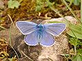
- Nomination Wallaby --Benjamint444 12:35, 23 April 2007 (UTC)
- Promotion Sharp. No major problems. --Dschwen 16:42, 25 April 2007 (UTC)
-

- Nomination Portrait of the judge and folksong-writer Wilhelm Ganzhorn --Joachim Köhler 16:53, 23 April 2007 (UTC)
- Promotion Everything ok! --Simonizer 17:09, 25 April 2007 (UTC)
-

-

- Nomination Sanctuary of Madonna dei campi, Stezzano, Italy --Luigi Chiesa 20:09, 23 April 2007 (UTC)
- Decline Tilt of the building. Too bad cause otherwise beautiful piece of architecture --Diligent 23:11, 23 April 2007 (UTC)
-

- Nomination A black and white-coloured male cat --Orlovic (talk) 17:15, 22 April 2007 (UTC)
- Decline Bad framing, unfortunate backgroud. A little more care is welcome - Alvesgaspar 08:19, 23 April 2007 (UTC)
-

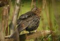
- Nomination Female Chaffinch --Thermos 10:21, 22 April 2007 (UTC)
- Promotion Superb :-) --Tony Wills 12:31, 22 April 2007 (UTC)
-

- Nomination Mushroom and debris it has emerged through. --Tony Wills 09:53, 21 April 2007 (UTC)
- Promotion Well- detailed and beautiful --Orlovic (talk) 12:28, 21 April 2007 (UTC)
-
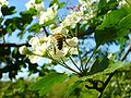
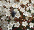
- Nomination Bee and flower today. --Pokrajac 16:10, 20 April 2007 (UTC)
- Decline Interesting photo, but neither bee nor flowers in sharp focus (f2.8 too small, try larger f-stop). Over-exposed petals resulting in loss of detail. --Tony Wills 08:46, 22 April 2007 (UTC)
-

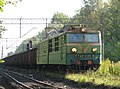
- Nomination A maintenance train in Croatia --Orlovic (talk) 21:50, 15 April 2007 (UTC)
- Promotion Another good train pic. Blue channel in sky severely over exposed but not to detriment. --Tony Wills 09:45, 22 April 2007 (UTC)
-

-

- Nomination Lower Ribbon Falls in Grand canyon by user:Kkaufman11 --Dschwen 16:01, 19 April 2007 (UTC)
- Promotion Didn't quite figure it from the thumbnail, but it is good --Thermos 15:20, 20 April 2007 (UTC)
-

- Nomination A Mexican Parrot in Xcaret (Yucatan, Mexico)--Pedroserafin 17:58, 19 April 2007 (UTC)
- Decline Too small (resolution), also JPG would be a more appropriate fileformat --Dschwen 18:01, 19 April 2007 (UTC).
-

- Nomination A Mexican Parrot in Xcaret (Yucatan, Mexico)JPG version 2 milon pixel--Pedroserafin 17:58, 19 April 2007 (UTC)
- Decline The number of pixels is not all. In this case the image quality is quite low: blurry, noisy and with artifacts. Better use the full resolution of the camera to avoid compression. Alvesgaspar 19:36, 19 April 2007 (UTC)
-
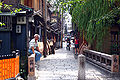
- Nomination Kyoto Gion. sign with time and date please! --Dschwen 08:49, 19 April 2007 (UTC)
- Decline Quality so-so but messy composition. Would be much better only with the man at left. Alvesgaspar 11:19, 20 April 2007 (UTC)
-

- Nomination F-5 Freedom Fighter model aircraft --Orlovic (talk) 15:01, 18 April 2007 (UTC)
- Decline Poor quality, pixelated in full resolution, distracting shadows. Alvesgaspar 11:16, 20 April 2007 (UTC)
-

- Nomination Dictyophorus spumans, Kopula, West Coast National Park, Südafrika --Masteraah 21:56, 15 April 2007 (UTC)
- Promotion Severe over exposure of background, plus loss of details in dark areas too. What do others think? --Tony Wills 08:27, 17 April 2007 (UTC), BG is fine with me, makes the subject stand out. The image is sharp (DOF could be better), and I cannot confirm a loss of details in the dark areas. I set the nomination to a promition. Just move it to consensual if you disagree. --Dschwen 18:06, 19 April 2007 (UTC)
-

- Nomination Goat--Arad 14:37, 14 April 2007 (UTC)
- Decline Striking pic. but: Framing - front hoof. White not over-exposed, but at expense of eye & ear detail- might support if those mid-ranges brought up a bit. --Tony Wills 11:50, 15 April 2007 (UTC)
Decline until authorship is clarified. Cannot be here ifdownuploader doesn't hold copyright. Alvesgaspar 11:26, 20 April 2007 (UTC)
-

-

- Nomination The Mediterranean Sea (A point between Minorca and Barcelona) --87.217.249.64 15:11, 18 April 2007 (UTC)
- Decline Boring composition, blurry sea --Orlovic (talk) 16:08, 18 April 2007 (UTC)
-

- Nomination Hallstatt (Austria) --Pedroserafin 10:34, 18 April 2007 (UTC)
- Decline Tilted, incredibly blurry, and overexposed sky. --Dschwen 10:44, 18 April 2007 (UTC)
-

- Nomination Oberpfälzer Jura, landscape in bavaria, germany --Simonizer 09:26, 18 April 2007 (UTC)
- Promotion Beautiful composition, perfect focus. Maybe a little oversaturated though. Alvesgaspar 10:51, 18 April 2007 (UTC)
-

-

-
- Nomination Antonio Machado's grave at Cotlliure cemetery--80.39.180.97 10:28, 17 April 2007 (UTC)
- Decline Bad framing (too tight), messy composition. What about cleaning the grave a little before shooting? Alvesgaspar 11:00, 18 April 2007 (UTC)
-

- Nomination A sight from a Dorset's Beach England--80.39.180.97 10:28, 17 April 2007 (UTC)
- Decline Resolution too low --Orlovic (talk) 13:57, 17 April 2007 (UTC)
-

- Nomination Underground station Chodov, Prague --Packa 13:41, 15 April 2007 (UTC)
- Decline Poor quality: blurry, too much grain - Alvesgaspar 10:58, 18 April 2007 (UTC)
-

- Nomination Uniwersity of Silesia - Faculty of chemistry. --Lestat 12:26, 15 April 2007 (UTC)
- Decline Framed as though looking at whole building, but only 1/3 is visible. If the focus is just the interesting stairwell? windows then maybe re-frame? --Tony Wills 08:58, 17 April 2007 (UTC)
Part of building in deep shadow (wrong time of day), purple fringing, distracting car at right - Alvesgaspar 10:56, 18 April 2007 (UTC)
-

- Nomination Streetperformer in front of Bath Abbey by user:Diliff --Dschwen 14:57, 11 April 2007 (UTC)
- Promotion Nice but what's that thing on the lower left? --Orlovic (talk) 21:45, 11 April 2007 (UTC) I guess a head ;-) good quality. ---donald- 21:05, 17 April 2007 (UTC)
-

- Nomination Goana --Benjamint444 04:17, 10 April 2007 (UTC)
- Promotion Wonderful quality! ---donald- 21:02, 17 April 2007 (UTC)
-
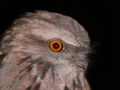
- Nomination Tawny Frogmouth --Benjamint444 03:43, 10 April 2007 (UTC)
- Promotion Good sharpness. ---donald- 21:02, 17 April 2007 (UTC)
-
- Nomination Some point in Galicia (Spain--80.39.180.97 10:28, 17 April 2007 (UTC)
- Promotion Sharp focus, low noise, good DOF. Small areas overexposed (eg right archway) but causing no significant loss of detail. --Tony Wills 10:50, 17 April 2007 (UTC)
-

-

- Nomination Chennai Mathematical Institute building --Kprateek88 17:02, 16 April 2007 (UTC)
- Decline Overexposed Lycaon 07:21, 17 April 2007 (UTC)
-

-

- Nomination Castle of Clervaux, Luxembourg. Joachim Köhler 20:02, 15 April 2007 (UTC)
- Decline Over exposed walls and roof resulting in loss of detail. (others might also demand perspective correction) --Tony Wills 08:43, 17 April 2007 (UTC)
-

- Nomination Everlöv Church in Sweden Väsk 12:37, 14 April 2007 (UTC)
- Decline Nice pic, but verticals not vertical (ie tilted) and green/purple colour fringing on edges visible even at 50%. --Tony Wills 07:59, 17 April 2007 (UTC)
-

- Nomination: Lemon sole - Microstomus kitt -- Lycaon 08:15, 18 April 2007(UTC)
- Review needed
-
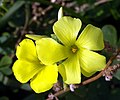
- Nomination Beatiful yellow flowers of wood sorrel (oxalia pes-caprae) -- Alvesgaspar 22:45, 13 April 2007 (UTC))
- Promotion Nice colors and soft background. ---donald- 15:45, 14 April 2007 (UTC)
-
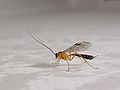
- Nomination Spider hunting wasp (Pompilidae) --Tony Wills 10:06, 13 April 2007 (UTC)
- Promotion Good quality, could be a little more DoF. ---donald- 15:45, 14 April 2007 (UTC)
-

- Nomination Lincoln's Inn Fields, London by user:Diliff --Dschwen 14:57, 11 April 2007 (UTC)
- Promotion Well exposed, well focused, really shows how crowded the place is. --che 15:52, 15 April 2007 (UTC)
-

- Nomination Agnes Scott College, Georgia by user:Diliff --Dschwen 14:57, 11 April 2007 (UTC)
- Decline The main object is too dark. ---donald- 10:12, 16 April 2007 (UTC)
-

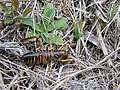
- Nomination Large brown mantid--Arad 14:46, 14 April 2007 (UTC)
- Decline Head and thorax out of focus compared to sharp abdomen. Small DOF accepted, but head is important. Also minor editing artefacts from removal of background, and I suspect some bristles/knobs edited off --Tony Wills 11:16, 15 April 2007 (UTC)
-

- Nomination NZ Red Admiral Butterfly --Tony Wills 13:42, 14 April 2007 (UTC)
- Promotion Sharp focus on the butterfly and good composition. --YooChung 14:04, 14 April 2007 (UTC)
-

-

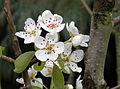
- Nomination Flowers and trunk of a prunus species tree-- Alvesgaspar 22:51, 13 April 2007 (UTC)
- Promotion Good sharpness on the first some flowers.---donald- 15:45, 14 April 2007 (UTC)
-

-

- Nomination Benoit Mandelbrot by user:Rama --Dschwen 14:57, 11 April 2007 (UTC)
- Decline Too much fractal noise in full resolution. Downsample (and decrease fractal dimension)?... Alvesgaspar 16:13, 11 April 2007 (UTC). (very droll ;-) --Tony Wills 11:58, 15 April 2007 (UTC)
-
- Nomination Daejeon Culture and Arts Center --YooChung 01:06, 12 April 2007 (UTC)
- Promotion Good composition and quality although focus is on the soft side. Difficult decison. Alvesgaspar 22:06, 13 April 2007 (UTC)
-

- Nomination Evening light in the Parc of the Fontainebleau Chateau --Donarreiskoffer 07:10, 13 April 2007 (UTC)
- Decline Too small and poor quality (152Kb!). Please check the guidelines. Alvesgaspar 07:54, 13 April 2007 (UTC)
-

- Nomination City Hall in Emden, Germany --Dschwen 21:39, 12 April 2007 (UTC)
- Promotion Good picture, crisp and clear. But according to the map, is almost falling in the water, at the other side of the street... Alvesgaspar 23:07, 12 April 2007 (UTC)
-

- Nomination Simply a Compact Disc. --norro 18:58, 12 April 2007 (UTC)
- Decline Unsharp and pixelated in full resolution. - Alvesgaspar 21:27, 12 April 2007 (UTC)
-

-

-
- Nomination: Chennai Mathematical Institute building --Kprateek88
- Review needed
-

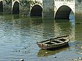
- Nomination Delicate colors in a hazy afternoon near the Tejo river, Portugal. Alvesgaspar 15:17, 7 April 2007 (UTC))
- Decline Composition un-interesting, the central subject, the boat, isn't very sharp and there seems to be a blue cast over everything. --Tony Wills 12:34, 11 April 2007 (UTC)
-

- Nomination Red billed gull --Tony Wills 13:27, 5 April 2007 (UTC)
- Decline Location of subject makes it seem to be a minor part of the image. Otherwise a good picture. --YooChung 01:24, 12 April 2007 (UTC)
-

-
- Nomination Female tree weta (Hemideina crassidens) --Tony Wills 12:32, 1 April 2007 (UTC)
- Decline Unsharp, probably due to poor exposure choice: large aperture, high shutter speed - Alvesgaspar 09:22, 10 April 2007 (UTC). Yes I agree :-) --Tony Wills 12:52, 11 April 2007 (UTC)
-
- Nomination Fly (probably Sarcophaga carnaria) feeding on the nectar of a prunus spec flower - Alvesgaspar 16:41, 31 March 2007 (UTC)
- Promotion The previous blossom photo was a clear yes, this one more difficult. I would like more detail on the flys head - slightly in shadow and it's face ill defined. The focus, DOF and resolution are good, and composition interesting - so on balance a QI :-) --Tony Wills 12:50, 11 April 2007 (UTC)
-

- Nomination A beautiful sea/coast/sky photo --Orlovic (talk) 21:04, 10 April 2007 (UTC)
- Decline Unsharp, tilted, visible artifacts, trivial composition. Alvesgaspar 11:26, 11 April 2007 (UTC)
-

- Nomination Illustration of a wind turbine. --norro 16:18, 7 April 2007 (UTC)
- Decline Colours too light, should be more vivid. Ugly labels, should be smaller and uncircled. Alvesgaspar 11:31, 11 April 2007 (UTC)
-

- Nomination Detail of Roman-era art --Orlovic (talk) 22:57, 9 April 2007 (UTC)
- Decline Poor framing, harsh lighting, unsharp. - Alvesgaspar 08:45, 10 April 2007 (UTC)
-

- Nomination A CD-R. --Kulshrax 02:24, 10 April 2007 (UTC)
- Decline Why the trouble of rendering a phtograph as a svg file? The result is a fuzzy drawing and an enormous file. Alvesgaspar 09:00, 10 April 2007 (UTC)
-

- Nomination Photo taken from my window. Colors not altered.--Orlovic 10:20, 7 April 2007 (UTC)
- Promotion Quality good enough although the composition is a little messy - Alvesgaspar 09:17, 10 April 2007 (UTC)
-

-

-
- Nomination Winch --Luigi Chiesa 17:59, 5 April 2007 (UTC)
- Decline Harsh shadows, image tilted. Artsy aspect is not enough IMO for promotion - Alvesgaspar 09:27, 10 April 2007 (UTC)
-

- Nomination Electric fire clam or flame scallop. Unidentified limidae species. Mantle had electric sparks. --Jnpet 06:53, 5 April 2007 (UTC)
- Decline Resolution! --Dschwen 06:55, 5 April 2007 (UTC). Decline per reason above - Alvesgaspar 09:24, 10 April 2007 (UTC)
-

- Nomination Man on the moon Buzz Aldrin. Maybe a bit noisy, but shot under very difficult lighting. -- Bryan (talk to me) 18:50, 7 April 2007 (UTC)
- Decline Good subject & resolution, but not QI due to noise and colour balance. Maybe a graphics lab could help. --Tony Wills 04:44, 8 April 2007 (UTC)
-
- Nomination A strain gauge -- Bryan (talk to me) 18:44, 7 April 2007 (UTC)
- Decline Not quite in focus, resolution a bit low (see guidelines) and not very interesting or informative ;-) --Tony Wills 03:51, 8 April 2007 (UTC)
-
- Nomination Female Blackbird. Taken with an MTO300, focus-bracketed from two shots. --Dschwen 14:00, 6 April 2007 (UTC)
- Promotion Superb effect :-).
Movement of the camera between shots? - background branches have echoes, but thisbokeh nicely adds to the background blurring. The background is a bit noisy - artefacts left from the blending?. --Tony Wills 22:49, 6 April 2007 (UTC)
-

- Nomination Difficult to photograph operating camera with one hand :-) --Tony Wills 02:20, 6 April 2007 (UTC)
- Promotion Beautiful butterfly, ugly finger... Too short DOF but it can't be avoided, I suppose. - Alvesgaspar 22:37, 6 April 2007 (UTC)
-
![* Nomination General layout of the malacostracan bauplan. -- Lycaon 18:45, 3 April 2007 (UTC) * Promotion I know it is only diagrammatic, but not up to the standard of your previous similar nominations. The boxy look of the thoracic segments, head and antennule, looks wrong - is this based on an actual animal? --Tony Wills 23:46, 4 April 2007 (UTC) Pure schematical based on [1], and books (Brusca & Brusca, Barnes) Lycaon 21:28, 5 April 2007 (UTC). New version QI --Tony Wills 12:27, 6 April 2007 (UTC)](https://upload.wikimedia.org/wikipedia/commons/thumb/1/15/General_malacostracan_en.svg/120px-General_malacostracan_en.svg.png)
- Nomination General layout of the malacostracan bauplan. -- Lycaon 18:45, 3 April 2007 (UTC)
- Promotion
I know it is only diagrammatic, but not up to the standard of your previous similar nominations. The boxy look of the thoracic segments, head and antennule, looks wrong - is this based on an actual animal? --Tony Wills 23:46, 4 April 2007 (UTC)Pure schematical based on [1], and books (Brusca & Brusca, Barnes) Lycaon 21:28, 5 April 2007 (UTC). New version QI --Tony Wills 12:27, 6 April 2007 (UTC)
-

- Nomination Replica of the "Easy-Rider- Chopper" Harley Davidson from 1987 in the Deutsches Zweirad- und NSU-Museum --Joachim Köhler 14:57, 1 April 2007 (UTC)
- Promotion Good quality, sharp and good composition. ---donald- 21:45, 6 April 2007 (UTC)
-
- Nomination Example from Commons:Quality images guidelines, so is it a QI? --Tony Wills 11:26, 5 April 2007 (UTC)
- Promotion Since its already an FP, and its a guideline example for QI. Gnangarra 00:07, 6 April 2007 (UTC). Now QI example can be made QI :-) --Tony Wills 02:31, 6 April 2007 (UTC)
-

- Nomination Example from Commons:Quality images guidelines, so is it a QI? --Tony Wills 11:26, 5 April 2007 (UTC)
- Promotion Since its already an FP, and it an example of good perspective, I suppose its good enough for QI.Gnangarra 05:03, 6 April 2007 (UTC)
-

-

-

-
- Nomination Unidentified prunus spec flowers, leaves and trunk (probably prunus avium)photographed after a rain shower - Alvesgaspar 15:15, 31 March 2007 (UTC)
- Promotion Great depth of field, great focus, great detail (including back of leaves) looks QI to me :-). It would be good to find the species though. --Tony Wills 12:29, 4 April 2007 (UTC)
-

- Nomination Telecommunications microwave tower silhouette --Tony Wills 10:00, 31 March 2007 (UTC)
- Promotion Nice a sunset and good silhouette, edges of tower little soft Gnangarra 12:13, 4 April 2007 (UTC)
-

- Nomination Julier Pass, Switzerland. Crisp and high-res. --Dschwen 15:28, 27 March 2007 (UTC) Hesitant because of the weather? That's how it can be up there. Check the quality of the picture. --Dschwen 06:45, 4 April 2007 (UTC)
- Promotion Under the circunstances, I agree this is close to the best we can get and to what we see with our own eyes. And I wouldn't dare to say anything about the overexposed white snow... Alvesgaspar 19:03, 4 April 2007 (UTC)
-

- Nomination Mute Swan (Cygnus olor). Edited by Wj32: fixed colours, added some bloom. --wj32 talk
- Decline Corny fake look. The original is already QI. --Dschwen 11:37, 4 April 2007 (UTC). I agree, seems to have taken a sharp image and turned it into a darker, blurred version :-( --Tony Wills 12:10, 4 April 2007 (UTC)
-

-

- Nomination A church in Moscow --grendel|khan 18:22, 2 April 2007 (UTC)
- Decline The original light range was better, now some bits pushed into overexposed, I think I prefer the original framing. Your straightening up is about right. (ps there is a bright green spot on the wall between the front windows) --Tony Wills 04:39, 3 April 2007 (UTC)
-
- Nomination ET42, Polish freight electric locomotive --Nemo5576 16:53, 31 March 2007 (UTC)
- Decline Sorry, but the upper part of the image is way overexposed. Look at the sky and at the wires near the upper left corner - Alvesgaspar 11:11, 2 April 2007 (UTC)
-

- Nomination Smew drake taking off --Thermos 17:01, 31 March 2007 (UTC)
- Promotion A little dark, and noisy background but great focus and freeze motion - quality :-) --Tony Wills 21:28, 31 March 2007 (UTC)
-

- Nomination Chapel in the mountain. Serra da Estrela, Portugal - Alvesgaspar 15:15, 31 March 2007 (UTC)
- Promotion Nice composition, but what is that dark smudge in the sky (mid left) and on cloud below? --Tony Wills 21:34, 31 March 2007 (UTC).
That was dirt in the lens, it is fixed now (I can't see anything in the cloud below) - Alvesgaspar 22:12, 31 March 2007 (UTC). QI! :-) --Tony Wills 06:20, 1 April 2007 (UTC)
-

- Nomination Reed Bunting in natural habitat --Thermos 14:02, 31 March 2007 (UTC)
- Promotion With a little better contrast behind the head might have been FP material, but certainly QI --Tony Wills 21:47, 31 March 2007 (UTC)
-

- Nomination North West view of Futuna Chapel --Tony Wills 10:00, 31 March 2007 (UTC)
- Promotion Nice composition, good exposure and colours, no obvious flaws. Alvesgaspar 22:24, 31 March 2007 (UTC)
-
![* Nomination got one too :-), Gambelia wislizenii (Long-Nosed Leopard lizard) --Dschwen 14:59, 28 March 2007 (UTC) * Promotion Nice DOF good detail with favourable background. Gnangarra 13:36, 29 March 2007 (UTC). Is that WhiteBalance ok?! --Tony Wills 12:47, 30 March 2007 (UTC) Understandable suspicion, but check [2] for the color of the sand.--Dschwen 13:35, 30 March 2007 (UTC)](https://upload.wikimedia.org/wikipedia/commons/thumb/1/12/Reptile_az_usa.jpg/120px-Reptile_az_usa.jpg)
- Nomination got one too :-), Gambelia wislizenii (Long-Nosed Leopard lizard) --Dschwen 14:59, 28 March 2007 (UTC)
- Promotion Nice DOF good detail with favourable background. Gnangarra 13:36, 29 March 2007 (UTC). Is that WhiteBalance ok?! --Tony Wills 12:47, 30 March 2007 (UTC) Understandable suspicion, but check [2] for the color of the sand.--Dschwen 13:35, 30 March 2007 (UTC)
-

- Nomination Detail of „Kramerfenster“ at Ulmer Münster --Joachim Köhler 00:05, 25 March 2007 (UTC)
- Decline Beautiful but colours are severely over-saturated, this gives strange effects eg the bright red clothing looks out of focus yet surroundings are in focus --Tony Wills 00:37, 27 March 2007 (UTC). Reverted from decline, anyone else care to comment? --Tony Wills 13:12, 30 March 2007 (UTC) Soft focus, blown-out areas, purple fringing. Difficult subject, but at least it wont run away like the reptile above :-) --Dschwen 13:31, 30 March 2007 (UTC)
-

- Nomination One Racehorse Goanna, one photo he didnt wait for the second. Gnangarra 14:35, 28 March 2007 (UTC)
- Decline Nice shot with an unfortunate background! Looks easy, but the animal is too long to get more detail than this. I need other opinions - Alvesgaspar 21:53, 28 March 2007 (UTC) subject size approximately 2-3ft long head about 4-6in off ground. -Gnangarra. Great shot, looks like almost got whole tail in, but focus appears to be on road behind rather than on it --Tony Wills 09:10, 30 March 2007 (UTC)
-

- Nomination Grave slot marker on a swiss cemetary --Dschwen 08:39, 28 March 2007 (UTC)
- Promotion Looks to be a good clear illustration of whatever they are :-) --Tony Wills 09:41, 30 March 2007 (UTC)
-

- Nomination Iceberg in Patagonia, by Lucag. --Überraschungsbilder 13:42, 28 March 2007 (UTC)
- Promotion good picture. --donald- 17:45, 29 March 2007 (UTC)
-
 khan 19:08, 27 March 2007 (UTC)
- Promotion DOF could be higher, but ear, eye, and whiskers are reasonably sharp. --Dschwen 17:00, 28 March 2007 (UTC). Cropped rather close above the ears --Tony Wills 11:11, 30 March 2007 (UTC)
-
 khan 03:25, 27 March 2007 (UTC)
- Promotion Some focus issues at the top, otherwise ok. Please second.--Dschwen 17:00, 28 March 2007 (UTC). Not as sharp as it ought to be, but quality in all other respects --Tony Wills 11:24, 30 March 2007 (UTC)
-
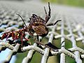
- Nomination Spider hunting wasp, with its prey --Tony Wills 12:25, 26 March 2007 (UTC)
- Promotion Good sharpness of the details. --donald- 17:41, 29 March 2007 (UTC)
-

-

- Nomination Colapteryx virgo in Belgium --Luc Viatour 14:07, 28 March 2007 (UTC)
- Promotion Could be crisper and individual channels are clipped in several areas, but that's just me being picky. --Dschwen 17:06, 28 March 2007 (UTC)
-

-

-
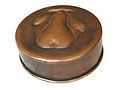
- Nomination Copper pudding mould --Luigi Chiesa 21:50, 27 March 2007 (UTC)
- Promotion Sharp low noise, good pic. --Dschwen 17:01, 28 March 2007 (UTC)
-

- Nomination Angel on graveyard in Piotrków. --Lestat 13:40, 26 March 2007 (UTC)
- Decline Could be crisper. No detail on the stone and moss. --Dschwen 17:19, 28 March 2007 (UTC). Lack of contrast, worsen by a distracting background - Alvesgaspar 21:18, 28 March 2007 (UTC)
-

- Nomination Piotr Rogucki from polish rock band Coma. --Lestat 21:48, 24 March 2007 (UTC)
- Decline Face is blurry, light cutting through left hand and wrist, double chins. I understand with the difficulty this is a good shot, but not a quality image for those reasons. MECU≈talk 17:11, 28 March 2007 (UTC)
-


.JPG)
.jpg)


.jpg)


.jpg)


.JPG)


.jpg)


.JPG)


.JPG)


.JPG)

.jpg)


.JPG)


.jpg)
![* Nomination General layout of the malacostracan bauplan. -- Lycaon 18:45, 3 April 2007 (UTC) * Promotion I know it is only diagrammatic, but not up to the standard of your previous similar nominations. The boxy look of the thoracic segments, head and antennule, looks wrong - is this based on an actual animal? --Tony Wills 23:46, 4 April 2007 (UTC) Pure schematical based on [1], and books (Brusca & Brusca, Barnes) Lycaon 21:28, 5 April 2007 (UTC). New version QI --Tony Wills 12:27, 6 April 2007 (UTC)](/wiki/File:General_malacostracan_en.svg)


.jpg)
.JPG)


![* Nomination got one too :-), Gambelia wislizenii (Long-Nosed Leopard lizard) --Dschwen 14:59, 28 March 2007 (UTC) * Promotion Nice DOF good detail with favourable background. Gnangarra 13:36, 29 March 2007 (UTC). Is that WhiteBalance ok?! --Tony Wills 12:47, 30 March 2007 (UTC) Understandable suspicion, but check [2] for the color of the sand.--Dschwen 13:35, 30 March 2007 (UTC)](/wiki/File:Reptile_az_usa.jpg)


_Lago_Argentino_Brazo_Norte_Patagonia_Argentina_Luca_Galuzzi_2005.JPG)


![[1]](http://content.answers.com/main/content/img/McGrawHill/Encyclopedia/images/CE401700FG0010.gif)
![[2]](http://www.schwen.de/wikisource/IMG_8222_640.jpg)
Consensual Review[edit]

- Nomination Lemon sole - Microstomus kitt -- Lycaon 08:15, 18 April 2007 (UTC)
- Decline Too bad, the picture is too soft on most of its parts. It's like the background is in focus. Worth a reshoot if can catch one similar subject again. Benh 17:19, 26 April 2007 (UTC)
- This species of fish has actually has a very smooth skin with the scales imbedded in a slime layer, giving a soft focus impression. The highest point in the picture is the eyes, which should therefore appear more out of focus than e.g. the top side of the fish, which isn't the case. The picture was taken with manual focus on the aft deck of our research vessel during very calm weather. The fish was covered by about 1 cm of water, to avoid reflections, and was of course very much alive. Lycaon 13:04, 28 April 2007 (UTC)
- this image File:Microstomus_kitt.jpg of the same subject by you is sharper and we can see much more of the texture of the "fish", so I believe the overall softness of the "fish" is a technical flaw and I keep opposing this to be a QI. Benh 23:44, 28 April 2007 (UTC)
- Given that you had some control of the photography conditions, I'd expect better lighting (more even) and at least the eyes in sharp focus (or are they covered with slime too?). Image might be useful for identifying the species, but doesn't really seem to have anything crying out Quality Image :-) --Tony Wills 21:27, 28 April 2007 (UTC)
Result: 0 support (excluding the nominator), 2 oppose -> not promoted to QI --Tony Wills 21:02, 30 April 2007 (UTC)

- Nomination Detail of a sewing machine. --Dschwen 14:25, 26 April 2007 (UTC)
- Decline Little excuse for the poor DOF, looks like the exposure solution is not the best (a tripode might help) Alvesgaspar 20:18, 26 April 2007 (UTC)
- I Shot the pic 19 months ago to illustrate the advancement shoe in the article. My feeling was that the choice of DOF pulls the attention to the right spot. --Dschwen 23:03, 26 April 2007 (UTC)
- The sharpest focus seems to be on the bar behind the needle (has a sharp edge often used to cut the thread), none of the other parts (the needle, shoe etc) seem to be completely in focus, my eye isn't drawn to anything apart from that bit behind the needle. --Tony Wills 13:35, 28 April 2007 (UTC)
Result: 0 support (excluding the nominator), 2 oppose -> not promoted to QI --Tony Wills 21:02, 30 April 2007 (UTC)

- Nomination Snail coming out of its shell. Actual size 1cm. --Adamantios 20:14, 26 April 2007 (UTC)
- Decline Distracting bacground --Orlovic (talk) 23:02, 26 April 2007 (UTC)
- A natural background should be acceptable for animal and plant shots, or do you expect all living to be taken to a studio? --Dschwen 06:33, 27 April 2007 (UTC)
- I agree with Dschwen, but :-) I don't know that newly dug ground (or is that compost) is actually its natural habitat (I presume it was placed there upside down to get the shot) - but that doesn't matter much. I think the over exposure on parts of the snail and lack of focus on the eyes and shell, small DOF, mean that although interesting it's not QI --Tony Wills 00:02, 28 April 2007 (UTC)
Result: 1 support (excluding the nominator), 2 oppose -> not promoted to QI --Tony Wills 21:02, 30 April 2007 (UTC)

- Nomination Portland aerial tram by user:Cacophony --Dschwen 14:57, 11 April 2007 (UTC)
- Promotion
On the left side it's a bit tilted. Would there help a correction? ---donald- 10:12, 16 April 2007 (UTC)
- Overexposed sky Lycaon 07:28, 17 April 2007 (UTC)
 Support Looks well-exposed to me. grendel|khan 15:46, 20 April 2007 (UTC)
 Comment There are indeed about 20000 over exposed pixels in the sky (2 small areas out of 3000000 pixels), but changing the exposure would just mean there was a tiny bit more cloud detail in the sky (another shade of white), certainly no significant improvement to the image. --Tony Wills 05:07, 21 April 2007 (UTC)
- Ok, this is getting technical but: no. How did you determine it's 20000 overexposed pixels? You counted the white ones. That would be mean that #ffffff pixels are forbidden in any picture. This is just wrong, a certain amount of white pixels is acceptable, and we do not know whether all of them are overexposed. Many of them might be exposed just right. Plus the discussion should not revolve around pixels but around possibly lost image detail (I know, you alluded to that. just a general remark). --Dschwen 06:54, 21 April 2007 (UTC)
- I'm not quite that simplistic :-). If I see a distribution curve of pixel counts per brightness level and it is abruptly cut off (ie no smooth fall off) then I assume something's intervened. On your image there were 31774 pixels at that highest brightness level, when the preceding value only had 23691. From the (average) rapid fall off of the curve I guesstimated that a count of 10000 to 15000 might have been expected. Hence my estimate of max 20000 overexposed. So no more than 0.7% over-exposed -> 99.3% well exposed -> almost perfectly exposed :-). I was trying to agree with both of you, and pointing out that any over-exposure and loss of cloud detail was trivial and I whole-heartedly agree that loss of image detail is the important point :-)
- (PS Of course those figures are just my opinion and may be wildly inaccurate :-) --Tony Wills 12:13, 23 April 2007 (UTC)
- I see you put a lot of thought into it. The flaw of the argument is expecting a smooth falloff in the first place. If this smooth fall-off is not present in the subject it shouldn't be present in the picture. So first you'd have to make the argument that a cloudy sky has a smooth fall off. Let me make the counter argument: A cloudy sky has a sharp fall off as it posesses a backbround given by diffuse light from higher cloud layers whith spatially uniform maximum brightnes. This background is modulated by low clouds. If these clouds have holes and overproportinate amount of maximum brightness background should be visible. :-) --Dschwen 06:27, 24 April 2007 (UTC)
- Yes, indeed my assumptions about what is a natural falloff may be misguided, but natural phenomena tend to be continuously variable, so a hole in a cloud is not completely empty or transparent and there will be a graduation at the edges. Come to think about it, I know very little about what makes clouds whiter, is it the cloud's density, the light angle? I'll go look it up ... hmmmm ... maybe I'll look on wikipedia (they'll probably have some nice cloud pics if nothing else :-) --Tony Wills 11:29, 24 April 2007 (UTC)
- I see you put a lot of thought into it. The flaw of the argument is expecting a smooth falloff in the first place. If this smooth fall-off is not present in the subject it shouldn't be present in the picture. So first you'd have to make the argument that a cloudy sky has a smooth fall off. Let me make the counter argument: A cloudy sky has a sharp fall off as it posesses a backbround given by diffuse light from higher cloud layers whith spatially uniform maximum brightnes. This background is modulated by low clouds. If these clouds have holes and overproportinate amount of maximum brightness background should be visible. :-) --Dschwen 06:27, 24 April 2007 (UTC)
- Ok, this is getting technical but: no. How did you determine it's 20000 overexposed pixels? You counted the white ones. That would be mean that #ffffff pixels are forbidden in any picture. This is just wrong, a certain amount of white pixels is acceptable, and we do not know whether all of them are overexposed. Many of them might be exposed just right. Plus the discussion should not revolve around pixels but around possibly lost image detail (I know, you alluded to that. just a general remark). --Dschwen 06:54, 21 April 2007 (UTC)
Running total: 1 support (excluding the nominator), 2 oppose -> decline? --Tony Wills 22:16, 24 April 2007 (UTC)
- miscount
donalds vot was not an oppose, just a question [3], my (implicit) support was not counted.
- It would be a real shame not to promote a perfectly sharp and well exposed picture of less represented region on QI. I can only urge everyone here to perform a reality check and think about the other pics that have been promoted lately. A minimum of consistency should be up-held. --Dschwen 12:05, 25 April 2007 (UTC)
- Agree with Dschwen. I haven't quite got all the very technical discussion but I don't believe there is overexposition here, and if there is, this isn't that big an issue. I don't like colors (because taken at cloudy time) but it is good technically. So I'll give it a (weak) support. Benh 07:58, 28 April 2007 (UTC)
Result: 2 support (excluding the nominator), 1 oppose -> promoted to QI --Tony Wills 21:02, 30 April 2007 (UTC)

- Nomination Male tree weta on a fence --Tony Wills 09:54, 12 April 2007 (UTC)
- Promotion
- New version now cropped and uploaded under same name. --Tony Wills 09:54, 12 April 2007 (UTC)
- The new version is fine with me. --Dschwen 06:06, 20 April 2007 (UTC)
Running total: 1 support (excluding the nominator), 0 oppose -> promote? --Tony Wills 05:07, 21 April 2007 (UTC)
- Support - Alvesgaspar 22:20, 30 April 2007 (UTC)
Result: 2 support (excluding the nominator), 0 oppose -> Promoted to QI - Alvesgaspar 22:20, 30 April 2007 (UTC)

- Nomination Railroad crossing in Mount Shasta village, restitch with proper verticals --Dschwen 22:57, 26 April 2007 (UTC)
- Promotion
Result: 1 support (excluding the nominator), 0 oppose -> promoted to QI --Tony Wills 21:43, 29 April 2007 (UTC)

- Nomination Railroad crossing in Mount Shasta village, CA, USA --Dschwen 14:18, 26 April 2007 (UTC)
- Decline I decline this one in the hope you'll fix the vertical lines issue. Otherwise great ! Benh 16:48, 26 April 2007 (UTC).
The telephonepoles were really all out of whack!I try and see if I can get the houses straighter, but all in all the alignment is not far off. --Dschwen 16:53, 26 April 2007 (UTC)
Result: 0 support (excluding the nominator), 1 oppose -> not promoted to QI --Tony Wills 10:11, 29 April 2007 (UTC)

- Nomination A beatiful dandelion flower of the same species as the "dandelion clock" below (Taraxacum officinale), by Bdesham - Alvesgaspar 23:43, 24 April 2007 (UTC)
- Decline Hmm tough one, but I'll decline (hopefully, this will be moved to consensual review section because I think some other opinions are needed) because of slight under exposure and low contrast which makes details hardly distinguishable even though it's sharp. Benh 16:44, 26 April 2007 (UTC)
- I think you are right, I was blinded by the beauty of the flower and didn't pay much attention to the details. The exposure choice is wrong, DOF could be much better under these light conditions with a smaller aperture. Alvesgaspar 20:31, 26 April 2007 (UTC)
Result: 0 support (excluding the nominator), 1 oppose -> not promoted to QI --Tony Wills 10:11, 29 April 2007 (UTC)

- Nomination Venezuela Division Politica Territorial --libertad0 16:12, 25 April 2007 (UTC)
- Decline No scale, no geographical coordinates, no North direction indication, labels too large, colours too strong. The inclusion of a claimed territory which now belongs to Guyana is, in my opinion, an unacceptable polytical POV.Alvesgaspar 11:02, 26 April 2007 (UTC)
- Moving to CR to get other opinions on this last issue. Alvesgaspar 11:02, 26 April 2007 (UTC)
- The border between guyana and brazil is missing. And the way the (internationally unrecognized!) territorial claim is pictures is highly questionable. Venezualan nationalist POV. --Dschwen 12:26, 26 April 2007 (UTC)
Result: 0 support (excluding the nominator), 2 oppose -> not promoted to QI --Tony Wills 10:11, 29 April 2007 (UTC)

- Nomination Lars-Hendrik Röller german economist (picture by the ESMT).
- Promotion Perfect? --Tony Wills 09:42, 17 April 2007 (UTC)
- Very nice. The crop definetely is an enhancement. --Dschwen 19:41, 19 April 2007 (UTC)
- Well, I wouldn't have gone so far with the crop, this way it looks like an ID card photo. But it is OK, support promotion. Alvesgaspar 08:18, 20 April 2007 (UTC)
- Doing a 4:3 crop you end up with either sidebars visible or an undesirably close crop to his head. If you don't mind something somewhat squarer a reasonable crop can be made that cuts through the knot of his tie and a reasonable height above his head. But considering Grendelkhan's following comment, I won't bother to nominate it. --Tony Wills 05:07, 21 April 2007 (UTC)
- Objection. The guidelines say "Quality images have to be uploaded to Commons by copyright holder under suitable license." This wasn't uploaded by the copyright holder; permission was granted by the website it came from, but that's not the same. grendel|khan 15:57, 20 April 2007 (UTC)
- I think you're right. --Tony Wills 05:07, 21 April 2007 (UTC)
- I support this image to QI. Lestat 15:55, 25 April 2007 (UTC)
Result: 3 support (excluding the nominator), 2 oppose -> promoted to QI (even though the origin of this image seems to violate guidelines it appears that people want to promote it anyway) --Tony Wills 10:24, 28 April 2007 (UTC)

- Nomination Kitschy sunset. I just hope that many nominations in a row don't make people automatically decline ... --Dschwen 14:45, 24 April 2007 (UTC)
- Decline
Tilted horizon, composition uninteresting, image quality not good enough (the sea). Alvesgaspar 09:15, 25 April 2007 (UTC), you are right abt the tilt, sloppy me. But I completely disagree on both the composition and the image quality. Compare it directly to your beach QI canditate. I think we have to be very careful to keep a consistent standard. --Dschwen 11:48, 25 April 2007 (UTC)
- Better take it to consensual review. I still think the photographic quality is not good enough. Look at the sky and sea. Alvesgaspar 12:32, 25 April 2007 (UTC)
- Yes, certainly not comparable to the DSLR mosaics, but let's keep a perspective here (sample Special:Random/Image)), and please, compare to the blown detail and the blurry seagulls in the above picture. You nominated your picture, and it is well above the average on commons, but I really have trouble understanding how you could decline this one based on technical shortcomings. --Dschwen 13:22, 25 April 2007 (UTC)
- Then again we probably both are (subconciously) biased, so let's hear for other peoples' opinions. --Dschwen 13:23, 25 April 2007 (UTC)
- Fair enough, I'm reseting the box to blue. Let's see the famous Wikipedia consensus work! - Alvesgaspar 14:38, 25 April 2007 (UTC)
- I have to agree with Alvesgaspar about the tilt and the bad quality, especially at the seaparts of the picture. Additional i dont like the glare at the left border of the picture. I would decline this picture, too. ;-) --Simonizer 14:53, 25 April 2007 (UTC)
- Just to make sure, you did look at the full size (new version uploaded over the old one)? As the image page still shows the old version (for some obscure cacheing reasons). Even if the glare spoils it anyways :-) --Dschwen 17:27, 25 April 2007 (UTC)
- I'm in oppose. Not QI. Lestat 15:53, 25 April 2007 (UTC)
- No major flaws, but not outstanding enough to deserve QI to my mind. it's tilted, there are a bit of chromatic aberration on the horizon line, and it's overall a bit soft. Benh 21:23, 25 April 2007 (UTC)
- I fear I'm loosing my mind. I just don't see a tilt. Anyway I'm just going to write this one off. Too bad I really liked the pic. --Dschwen 21:34, 25 April 2007 (UTC)
- You're right actually ! only the left side gives the impression it's tilted, but the right part (horizon) isn't. I should have looked more carefully... Still, not enough for QI status to me for the other reasons stated above. Sorry :( Benh 21:55, 25 April 2007 (UTC)
- Ok, it's not a complete waste of time after all: Now I know the lens correction filter in Gimp :-). --Dschwen 22:39, 25 April 2007 (UTC)
- You're right actually ! only the left side gives the impression it's tilted, but the right part (horizon) isn't. I should have looked more carefully... Still, not enough for QI status to me for the other reasons stated above. Sorry :( Benh 21:55, 25 April 2007 (UTC)
- I fear I'm loosing my mind. I just don't see a tilt. Anyway I'm just going to write this one off. Too bad I really liked the pic. --Dschwen 21:34, 25 April 2007 (UTC)
Result: 0 support (excluding the nominator), 3 oppose -> not promoted to QI --Tony Wills

- Nomination A pocket watch made in the USSR --Orlovic (talk) 12:26, 21 April 2007 (UTC)
- Decline Careless photo. Watch needs cleaning and file is heavily compressed. Alvesgaspar 08:21, 23 April 2007 (UTC)
- I dispute the decline to this photo I nominated. I would like to hear other thoughts. --Orlovic (talk) 21:14, 25 April 2007 (UTC)
- I'm sorry for my harsh comment, I think it was one those days... Alvesgaspar 22:37, 25 April 2007 (UTC)
- (Yes, we could tell ;-) --Tony Wills 01:32, 26 April 2007 (UTC))
- The initial verdict (Careless photo) was indeed a bit harsh in my opinion. I don't see obvious impact of the compression. Focus is a tad soft, but resolution is easily enough for the subject. The lighting could have been chosen more pleasant (without the deep shadow to the left), and I'd prefer a more neutral, less textured background. Let me suggest a reshoot of the picture. If this whole discussion leads to a better pic being uploaded (and nominated and supported) it's a win for everybody. --Dschwen 21:20, 25 April 2007 (UTC)
Result: 0 support (excluding the nominator), 1 oppose -> not promoted to QI --Tony Wills 10:24, 28 April 2007 (UTC)
- Nomination Castillo de San Marcos Panorama in St. Augustine, Florida. --Digon3 16:19, 25 April 2007 (UTC)
- Decline
Ok quality, but minor stitching artifacts (and ghosting). --Dschwen 16:33, 25 April 2007 (UTC) - I'm finding the picture is too blurry on large parts. Otherwise composition is good... too bad. Benh 17:17, 25 April 2007 (UTC)
- Please tell me where on my talk page so I can fix them. --Digon3 19:24, 25 April 2007 (UTC)
- Hmm I'm afraid the "whole" picture is blurry. This looks like an extrapolated lower res picture, which I think is strange. Maybe the source photos share the same faults ? Benh 21:23, 25 April 2007 (UTC)
- I have to agree with Benh. Also there is some fringing, most visible around the palm trees. I don't know how Dilif gets such detail and quality in his panos. Talent behind the camera and with Photoshop is not enough, the equipment must be superior (and quite expensive). Alvesgaspar 20:10, 25 April 2007 (UTC)
- Yeah, or the alternative is compensating through diligence. Take two rows of zoomed in portrait images for a pano like this and downsample afterwards. For most compact digital cams 1:1 is trash (this became particularly apparent to me with smaller/older Kodak models, sorry). --Dschwen 21:30, 25 April 2007 (UTC)
Result: 0 support (excluding the nominator), 3 oppose -> not promoted to QI --Tony Wills 02:00, 28 April 2007 (UTC)

- Nomination AMR and PCI slots --grendel|khan 15:42, 20 April 2007 (UTC)
- Decline Blurry and messy --Orlovic (talk) 12:27, 21 April 2007 (UTC)
- I disagree on the 'blurry' part, and would like a second opinion. grendel|khan 14:47, 25 April 2007 (UTC)
- Decline. For this kind of subject the picture should be much sharper. Alvesgaspar 16:06, 25 April 2007 (UTC)
- Agree with Alvesgaspar! --Simonizer 21:40, 25 April 2007 (UTC)
- Comment The focus on the board isn't bad, but it is covered with a layer of fine dusk, a good vacuum would help. The tops of the sockets aren't sharply on focus. --Tony Wills 01:32, 26 April 2007 (UTC)
Result: 0 support (excluding the nominator), 3 oppose -> not promoted to QI --Tony Wills 01:46, 28 April 2007 (UTC)

- Nomination Minimalist seasight, with sand, sea and sky. Porto Covo, west coast of Portugal. Yes, there are some blown whites in the surf, but those are blown even for our eyes...Alvesgaspar 14:52, 23 April 2007 (UTC)
- Decline
You should point out the photoshopped horizon on the image page. And (conflict of interests / WP:POINT alert!) the pic has a soft focus. I'll abstain from further voting on this pic. --Dschwen 11:53, 25 April 2007 (UTC). No need or interest in abstaining, your critic is needed and welcome. Alvesgaspar 12:25, 25 April 2007 (UTC)
- Better take this one also, so they can be reviewed side by side, so to speak... Alvesgaspar 12:38, 25 April 2007 (UTC)
- Sorry but i see no reason for a vertical picture format,the surf is overexposed ;-) and i dont like the cut horizon. So i would decline. --Simonizer 14:53, 25 April 2007 (UTC)
- Nobody understands my minimalist artistic soul... Alvesgaspar 20:12, 25 April 2007 (UTC)
- You have my commiseration! ;-) --Simonizer 21:39, 25 April 2007 (UTC)
- Nobody understands my minimalist artistic soul... Alvesgaspar 20:12, 25 April 2007 (UTC)
- Picture is soft, which makes the "fake" horizon even more weird. I decline too. Benh 21:23, 25 April 2007 (UTC)
- That is the result of my inability to work with editing software. I just wanted to correct for a curved horizon... Alvesgaspar 23:11, 25 April 2007 (UTC)
Result: 0 support (excluding the nominator), 2 oppose -> not promoted to QI --Tony Wills 00:24, 28 April 2007 (UTC)

- Nomination Math department, University of Göttingen, Germany --Dschwen 21:39, 12 April 2007 (UTC)
- Decline You don't mentioned it's stitched. Stitching/blending problem in foreground on pavement near flag pole, and up thru bike (blurred). Will support if stitching fixed. --Tony Wills 12:19, 15 April 2007 (UTC)
- it's still sharper than many of the pictures that get promoted here. --Dschwen 11:05, 19 April 2007 (UTC)
- The issue is not that part of the foreground is blurred, it is the very obvious discontinuity on the pavement where the two halves meet (less obvious further up) ... stitching artefacts seem to almost invariably disqualify images from QI or FP. But it is a good picture, so I'm willing to be persuaded :-). What do others think? --Tony Wills 06:47, 22 April 2007 (UTC)
- I like the composition and the soft HDR-effect. The stitching problem is visible even at thumbnail size, that's too much for QI. It looks like a common panorama problem: You go to manual mode to get the same exposure but the camera still makes auto white balance. This can be fixed by either switching to the same white balance in RAW or by carefully aplying the photo filter on the image with the sky. Fix it and I'll support. --Ikiwaner 17:55, 22 April 2007 (UTC)
- Ok, I'll go for a reshoot if I find the time. Thanks for the comments. --Dschwen 08:36, 23 April 2007 (UTC)
Result: 0 support (excluding the nominator), 2 oppose -> not promoted to QI --Tony Wills 13:35, 27 April 2007 (UTC)

Nice composition and excellent DOF. I'll support after the geometric distortion is corrected and despite other minor flaws - Alvesgaspar 11:01, 6 April 2007 (UTC)
- Moving to CR, to get further opinions. Alvesgaspar 07:42, 17 April 2007 (UTC)
![]() Support I am very suspicious of trying to correct 'geometric distortion' on 3 dimensional objects (2D façades is fine). Exposure great, focus & DOF fine, noise great, composition great -> equals QI --Tony Wills 09:51, 17 April 2007 (UTC)
Result: 1 support (excluding the nominator), 0 oppose -> promoted to QI --Tony Wills 12:30, 27 April 2007 (UTC)
Support I am very suspicious of trying to correct 'geometric distortion' on 3 dimensional objects (2D façades is fine). Exposure great, focus & DOF fine, noise great, composition great -> equals QI --Tony Wills 09:51, 17 April 2007 (UTC)
Result: 1 support (excluding the nominator), 0 oppose -> promoted to QI --Tony Wills 12:30, 27 April 2007 (UTC)

- Nomination Nautical star. Are there guidelines for vector images anywhere? --grendel|khan 15:54, 20 April 2007 (UTC)
- Decline Too low resolution --Orlovic(talk) 12:29, 21 April 2007 (UTC)
- Resolution is not an issue with vector drawings. Lycaon 13:47, 21 April 2007 (UTC)
- Comment Of course you're right the point of SVGs being that they're scalable to any resolution.
 InfoMoved to consensual review as it's not procedurally appropriate to reverse someone else's review (even when you're right :-). Reverted Lycaeon's reversion to Nomination back to the Orlovic's Decline. --Tony Wills 06:26, 22 April 2007 (UTC)
 Oppose - A nautical star?... Alvesgaspar 08:23, 23 April 2007 (UTC)
- Comment Yes, a nautical star. I made it to replace an unfree image that was on that page. (I hadn't known what it was called, but they're a popular tattoo design.) grendel|khan 14:47, 25 April 2007 (UTC)
- Comment - I think we are formulating our first guideline for vector images ... "The figure needs to be non trivial, eg simple geometric shapes are unlikely to get voted Quality Images" --Tony Wills 11:05, 23 April 2007 (UTC)
Result: 0 support (excluding the nominator), 2 oppose -> not promoted to QI --Tony Wills 12:23, 27 April 2007 (UTC)

- Nomination Lars-Hendrik Röller german economist (picture by the ESMT). Perfect focus. --Dschwen 14:57, 11 April 2007 (UTC)
- Decline Agree on the focus and quality in general. But will be much better without that background at right and left. Alvesgaspar 16:10, 11 April 2007 (UTC)
- Moving to CR. Maybe this way someone says something - Alvesgaspar 07:39, 17 April 2007 (UTC)
- Oppose Lestat 15:55, 25 April 2007 (UTC)
Result 0 support (excluding the nominator), 1 oppose -> not promoted to QI --Tony Wills 12:03, 27 April 2007 (UTC)

- Nomination Male tree weta on a fence --Tony Wills 11:56, 11 April 2007 (UTC)
- Decline Where the halo from? Did you process the bg? --Dschwen 13:05, 11 April 2007 (UTC).
- Nah, a nice clean background like that's got to be natural ;-) --Tony Wills 14:50, 11 April 2007 (UTC)
- Two things then: please mark retouched pictures with {{RetouchedPicture}} or at least state that it has been tampered with, secondly the halo ruins it for me. Do you have the original somewhere? --Dschwen 17:19, 11 April 2007 (UTC)
- P.S.: a nice clean background can be created with a simple sheet of paper, too... --Dschwen 17:21, 11 April 2007 (UTC)
- Two things then: please mark retouched pictures with {{RetouchedPicture}} or at least state that it has been tampered with, secondly the halo ruins it for me. Do you have the original somewhere? --Dschwen 17:19, 11 April 2007 (UTC)
- Yes, if only the weta would stand in front of a nice clean sheet of paper ;-) --Tony Wills 00:30, 12 April 2007 (UTC)
- Ahhrrgghh, don't make this more wearisome than it needs to be. You don't need a crane to haul around a sheet of paper. Anyways the white bg in the original is not a problem, you should apply the same crop to that picture though. --Dschwen 06:59, 12 April 2007 (UTC)
- Seriously, trying to stick a sheet of paper behind an living wild insect is highly impractical, they run away fast enough as it is!! ;-) --Tony Wills 09:59, 17 April 2007 (UTC)
- Yes, if only the weta would stand in front of a nice clean sheet of paper ;-) --Tony Wills 00:30, 12 April 2007 (UTC)
- Ok, here is the original. Perhaps I should describe it as a deliberate example of the use of over-exposure to highlight the subject. The background is a shiny sheet metal part of the fence but the weta is somewhat in the shadows - hence a 1/15th second exposure that blew out the background (the feelers have moved slightly during exposure, but apart from that I love the detail :-). --Tony Wills 00:30, 12 April 2007 (UTC)
Result: 0 support (excluding the nominator), 1 oppose -> not promoted to QI --Tony Wills 11:50, 27 April 2007 (UTC)
- Nomination Drawing of 4th Century Hoplite --Malene Thyssen 07:04, 9 April 2007 (UTC)
- Decline Nice and clean. But authorship is not clear. If he is not a wikipedian, then the picture cannot be nominated here Alvesgaspar 08:57, 10 April 2007 (UTC). Why is it not clear? guidelines say it must be uploaded by copyright holder, don't say you can only nominate your own work??? --Tony Wills 11:55, 10 April 2007 (UTC)
- Moving to Consensual Review to clarify. There is nothing linking the uploader to the claimed author. Alvesgaspar 14:36, 10 April 2007 (UTC)
- A picture by the same artist was nominated here w:Wikipedia:Featured_picture_candidates#Slinger_from_the_Balearic_isles, the uploader and the artist are the same person. Apart from that nice work. Promote. --Dschwen 14:54, 10 April 2007 (UTC)
- Ok, I see the usernames are not exactly the same. Let's leave w:User:Peltast or shumate_j@bellsouth.net a note. --Dschwen 14:57, 10 April 2007 (UTC)
- A picture by the same artist was nominated here w:Wikipedia:Featured_picture_candidates#Slinger_from_the_Balearic_isles, the uploader and the artist are the same person. Apart from that nice work. Promote. --Dschwen 14:54, 10 April 2007 (UTC)
Copyright violation: http://community.imaginefx.com/fxpose/johnny_shumates_portfolio/default.aspx unsigned comment by 05:23, 11 April 2007 User:LycaonWithdraw opposition Lycaon 07:17, 17 April 2007 (UTC)
- Those images were uploaded there after they were uploaded here, therefore not the source. --Tony Wills 22:46, 10 April 2007 (UTC)
- Apparently uploaded by author, see [4] --Tony Wills 22:39, 10 April 2007 (UTC)
![]() Support As far as I can see the uploader is the copyright holder, who has given a valid license, and contact details. Others have apparently contacted him over other uploads and are satisfied. Unless someone has contacted the author and been told otherwise, I see no reason to assume the license is invalid. --Tony Wills 13:16, 11 April 2007 (UTC)
Support As far as I can see the uploader is the copyright holder, who has given a valid license, and contact details. Others have apparently contacted him over other uploads and are satisfied. Unless someone has contacted the author and been told otherwise, I see no reason to assume the license is invalid. --Tony Wills 13:16, 11 April 2007 (UTC)
- Oppose
 Neutral superb drawing but opposed on historical grounds : i really doubt greek hoplites had the interior of their shields enameled in blue. --Diligent 15:01, 11 April 2007 (UTC)
- Um, historical accuracy isn't a QI criteria (and this isn't FP). So that's an objection on the basis of unreasonable colours? The shields were apparently covered with leather on the inside (and often leather and/or bronze on the outside), so it might well be shiny. Do you have evidence that blue was not a colour available to 4th century Hopolites, or perhaps that it was against their uniform code? --Tony Wills 00:42, 12 April 2007 (UTC)
- hm, no evidence, hic et nunc and no desire to enter a debate on historical accuracy as a valid criteria or not. changed vote accordingly.
- Um, historical accuracy isn't a QI criteria (and this isn't FP). So that's an objection on the basis of unreasonable colours? The shields were apparently covered with leather on the inside (and often leather and/or bronze on the outside), so it might well be shiny. Do you have evidence that blue was not a colour available to 4th century Hopolites, or perhaps that it was against their uniform code? --Tony Wills 00:42, 12 April 2007 (UTC)
Result: 2 support (excluding the nominator), 1 oppose ==> promoted to QI --Tony Wills 09:42, 19 April 2007 (UTC)

- Nomination: Superb fairy-wren --Benjamint444 13:58, 5 April 2007 (UTC)
- Review Unnatural look, probably due to oversharpening (see purple fringing at the bird's head). Need other opinions. Alvesgaspar 11:07, 6 April 2007 (UTC) Hasn't been sharpened at all, fringing will be from my lens. Benjamint
- Moving to Consensual Review to get other opinions. Alvesgaspar 14:42, 10 April 2007 (UTC)
- Doesn't matter where the fringing is from, it degrades the picture. Some areas are blown too, not everywhere on all channels, but it looks oversaturated or badly exposed. --Dschwen 14:49, 10 April 2007 (UTC)
![]() Support I think there are only a few over blown pixels on the birds head and on the wire fence. I think the purple 'fringing' is the same colour as seen on some of the blue head feathers, there is no similar 'fringing' apparent anywhere else that I can see. The DOF leaves the end of the tail, and grasshopper out of focus, but on the whole I think it is a pass :-) --Tony Wills 13:16, 11 April 2007 (UTC)
Support I think there are only a few over blown pixels on the birds head and on the wire fence. I think the purple 'fringing' is the same colour as seen on some of the blue head feathers, there is no similar 'fringing' apparent anywhere else that I can see. The DOF leaves the end of the tail, and grasshopper out of focus, but on the whole I think it is a pass :-) --Tony Wills 13:16, 11 April 2007 (UTC)
- Oppose ack Dschwen Lycaon 07:31, 17 April 2007 (UTC)
Result: 1 support (excluding the nominator), 2 oppose ==> not promoted to QI --Tony Wills 09:42, 19 April 2007 (UTC)
.jpg)
- Nomination: House gecko (Hemidactylus mabouia) at home on the floor in Dominica, W.I. -- Lycaon 18:38, 3 April 2007 (UTC)
- Review White balance needs fixing (artificial lighting) colours are wrong. Head a little out of focus? - skin details disappear. Many over exposed spots on floor though that doesn't seem to detract from image --Tony Wills 10:40, 4 April 2007 (UTC) The gecko was outside on the terras just before sunset, so natural light. Head is indeed al tad out of focus (they are fast so it's a one shot event) Lycaon 19:13, 4 April 2007 (UTC)
- My main objection was the colour balance, but given that it is natural evening light then, going by the last reptile that was promoted despite being rather red due to the reflection of the sand it may be aceptable (perhaps retitled "House Gecko at Sunset" :-) - so I have withdrawn my decline to see what other people think about it :-) --Tony Wills 23:59, 4 April 2007 (UTC)
Result: 0 support (excluding the nominator), 0 oppose ==> not promoted to QI --Tony Wills 09:42, 19 April 2007 (UTC)

Maybe good example, but very bad cropping. --Lestat 19:52, 12 April 2007 (UTC)
- Agree with Lestat. Also, white balance seems off and the backgroud is not the best. Alvesgaspar 23:11, 12 April 2007 (UTC)
Result: 1 support (excluding the nominator), 2 oppose ==> not promoted to QI --Tony Wills 09:19, 17 April 2007 (UTC)

- Nomination Male Ostrich (Struthio camelus) on a farm --Tony Wills 12:32, 1 April 2007 (UTC)
- Decline Too much light, uninteresting composition - Alvesgaspar 09:19, 10 April 2007 (UTC)

- A second (more specific) opinion please :-) --Tony Wills 12:55, 11 April 2007 (UTC)
- Not quite QI in my opinion. It lacks detail and the framing of the ostrich is suboptimal. --Dschwen 13:03, 11 April 2007 (UTC)
- How much detail do you want? you can see individual hairs on the neck of two metre tall bird. The photo is depicting the bird, the containing fence, and a view of the farm and surrounds (doesn't quite look like the plains of Africa :-). I might accept that the bird isn't quite as sharp as he ought to be, and yes he is advancing on me rather rapidly so he's a bit closer than I'd like ;-).
- How much detail do you want? you can see individual hairs on the neck of two metre tall bird. The photo is depicting the bird, the containing fence, and a view of the farm and surrounds (doesn't quite look like the plains of Africa :-). I might accept that the bird isn't quite as sharp as he ought to be, and yes he is advancing on me rather rapidly so he's a bit closer than I'd like ;-).
- Hmmm, how to frame it? What do you think is best, should I have included the post and only a little of the wire fence on the right, cut down the height and given a bit of space in front of his feet? (if only he'd stop running after me :-). --Tony Wills 13:37, 11 April 2007 (UTC)
- Yeah, more space at the bottom. Its all small things, but they add up for me to just oppose it. --Dschwen 15:25, 11 April 2007 (UTC)
- Ok, I'll have to try again :-) --Tony Wills 22:15, 11 April 2007 (UTC)
- Yeah, more space at the bottom. Its all small things, but they add up for me to just oppose it. --Dschwen 15:25, 11 April 2007 (UTC)
Result: 0 support (excluding the nominator), 2 oppose ==> decline --Tony Wills 09:10, 17 April 2007 (UTC)

- Nomination: Mating grasshoppers caught in the act --Tony Wills 02:57, 26 March 2007 (UTC)
- Review Subject fills only a small portion of the frame, and is partially occluded. Could have been a great shot otherwise. --Dschwen 17:21, 28 March 2007 (UTC)
- InfoPartial occlusion was deliberate, I was trying to be creative :-).--Tony Wills 23:43, 28 March 2007 (UTC)
Running total: 0 support (excluding the nominator), 0 oppose -> decline? --Tony Wills 06:46, 2 April 2007 (UTC)

Here is a crop of the third in a series I took before they thought I was being too intrusive and hopped away. --Tony Wills 23:43, 28 March 2007 (UTC)
- Ah, what the heck, the second version is actually a pretty good picture! You can really see a difference between the two hoppers. So I guess it's male and female? --Dschwen 00:15, 29 March 2007 (UTC)
- InfoI think it is male on top, female beneath. Colouration seems to vary, I've seen couples with a brown one on top, green underneath, and brown on brown - but always a smaller one on top. These guys are fairly small, 10 to 20mm so when I look at full screen versions of my pics they are about 10x normal size :-) --Tony Wills 01:33, 29 March 2007 (UTC)
- Support --> promote (decline other two) Lycaon 06:20, 2 April 2007 (UTC)
- Support well balanced Gnangarra 06:53, 2 April 2007 (UTC)
Running total: 2 support (excluding the nominator), 0 oppose -> promote? --Tony Wills 04:23, 31 March 2007 (UTC)

- This third version is what I would have submitted if there weren't people who demand 1600px minimum whatever else the picture may offer - it is a crop of the first version because that's sharper than the second one. --Tony Wills 02:14, 29 March 2007 (UTC)
- I disagree. Compare them at full size and you will see that the grasshoppers in the second image are of the highest resolution (and sharpness for that matter). --Dschwen 08:03, 29 March 2007 (UTC)
- Second image is slightly closer, so yes slightly better resolution, I was looking at things like the back leg of the top hopper - 3rd image seems to have better DOF as that area looks clearer. I find it hard to detect much difference in their faces though. --Tony Wills 09:24, 29 March 2007 (UTC)
- this image the end of the log is harsh to view, so i oppose this one Gnangarra
Running total: 0 support (excluding the nominator), 2 oppose -> decline? --Tony Wills 06:46, 2 April 2007 (UTC)
- Could someone else please close this nomination - thanks --Tony Wills 22:57, 4 April 2007 (UTC)

- whats not straight the view is of a range the foreground is hills the back ground is hill Gnangarra 07:15, 13 March 2007 (UTC)
- It is almost impossible to judge whether this picture is straight or not, so it should not matter for QI. I am for promotion. Lycaon 20:07, 18 March 2007 (UTC)
Result: 1 support (excluding the nominator), 1 oppose >> not promoted to QI --Tony Wills 22:57, 4 April 2007 (UTC)
.jpg)
- Comment Here is a version rotated 2 degrees clockwise based on the verticallity of the Cordyline australis type trees. (Sorry, never sure what to put in derived image summary info boxes so have copied most info from original into edited version including custom license - feel free to edit :-)
- the concern of tilt was addressed by the edit, I'm not convinced there is/was a tilt the xanthorrhoea appears to be in its natural shape in both images. The range is a single line formation so the dimishing hills to the top left is a natural view from the central location. Either image is fine, since the concern has been addressed IMHO the oppose should be discounted. Either way someone needs to make a decision and close these reviews Gnangarra 01:44, 2 April 2007 (UTC)
Result: 0 support (excluding the nominator), 0 oppose >> not promoted to QI --Tony Wills 22:57, 4 April 2007 (UTC)
- This image is straight. --Lestat 18:39, 28 March 2007 (UTC)
- It's just a degree and can be fixed easily (in about the time we spend discussing here :-) ) --Dschwen 18:49, 28 March 2007 (UTC)
- More like half a degree... --Dschwen 18:59, 28 March 2007 (UTC)
- It's just a degree and can be fixed easily (in about the time we spend discussing here :-) ) --Dschwen 18:49, 28 March 2007 (UTC)
Result: 0 support (excluding the nominator), 1 oppose >> not promoted --Tony Wills 22:57, 4 April 2007 (UTC)

- CommentI say you've gone too far, 0.41 degree was enough :-P --Tony Wills 22:35, 28 March 2007 (UTC)
- And I say you are right. Darn it. I also did a tiny bit of downsampling and selective sharpening on my version. --Dschwen 00:18, 29 March 2007 (UTC)
- I uploaded a new version over the old one. But there is only so much I can do. The source image quality frankly is quite low. There is virtually no detail in the grass or in the trees, just mockdetail from the compression scheme and/or raw-image conversion of the camera. --Dschwen 12:19, 30 March 2007 (UTC)
- And I say you are right. Darn it. I also did a tiny bit of downsampling and selective sharpening on my version. --Dschwen 00:18, 29 March 2007 (UTC)
- CommentOk, the revised 'MECU' version is probably the best, but is it good enough? can people explicitly vote on it? --Tony Wills 04:23, 31 March 2007 (UTC)
- Support MECU image now rotated the composition is balanced, Gnangarra 06:53, 2 April 2007 (UTC)
Result: 1 support (excluding the nominator), 0 oppose >> promoted to QI--Tony Wills 22:57, 4 April 2007 (UTC)
I agree too, the "MECU" one shown is just slightly over-rotatedimage changed --Tony Wills 06:16, 2 April 2007 (UTC). I like the "Wills" one rotationally. MECU≈talk 00:42, 29 March 2007 (UTC)- Yes the "MECU" one is sharper and has a slightly better sky, perhaps Dschwen could redo his magic on a slightly less rotated version (I suggest 0.41degree :-) --Tony Wills 12:04, 30 March 2007 (UTC)
- Oppose Latest "MECU" one is better --Tony Wills 06:53, 2 April 2007 (UTC)
Result: 1 support (excluding the nominator), 1 oppose >> not promoted to QI --Tony Wills 22:57, 4 April 2007 (UTC)

- Nomination Wind turbine and radio mast at sunset --Tony Wills 12:25, 25 March 2007 (UTC)
- Decline The antenna is the second eyecather next to the turbine. --donald- 19:54, 26 March 2007 (UTC)
.jpg)
- So the problem is with the title then? I have changed it to mention the radio mast so that you won't be shocked ;-) --Tony Wills 21:58, 26 March 2007 (UTC)
- It also has sharpness and noise issues. Wouldn't bother me if it wasn't just barely the minimum resolution. --Dschwen 17:12, 27 March 2007 (UTC)
- Yes, not as sharp as I would like. I'll have to get a tripod so I can go for longer exposure times to reduce noise. Thanks for a meaningful critique :-) --Tony Wills 22:52, 27 March 2007 (UTC)
- For -donald- I had the radio mast removed (took a few hours to dismantle ;-) --Tony Wills 01:42, 29 March 2007 (UTC)
- So i can Support the image. ---donald- 17:34, 29 March 2007 (UTC)
- So i can
- I don't think it is the point of QIC to invent new realities that are more pleasing to the eye. And I must strongly oppose this kind of image manipulation. --Dschwen 09:26, 30 March 2007 (UTC)
- I agree, I oppose the second version :-) --Tony Wills 12:09, 30 March 2007 (UTC)
Original image running total: 0 support (excluding the nominator), 2 oppose -> decline? --Tony Wills 04:23, 31 March 2007 (UTC)
Edited version running total: 1 support, 1 oppose (excluding the nominator) -> draw? --Tony Wills 04:23, 31 March 2007 (UTC)
-
Result: 0 support (excluding the nominator), 2 oppose >> not promoted to QI --Tony Wills 03:57, 2 April 2007 (UTC)


In my opinion, the problem with the perspective should be solved before promoting it as QI. This picture is currently in a graphics lab. Hopefully, this problem can be resolved there, because it's a great picture. Maybe it could also be a FP candidate after that. --Leyo 13:46, 24 February 2007 (UTC)
- Yeah, it could be a FP candidate. --Arad 15:08, 25 February 2007 (UTC)
- I promote the retouched version. --Leyo 08:53, 15 March 2007 (UTC)
Result: 2 support, 0 oppose >> promoted to QI --Leyo 23:17, 20 March 2007 (UTC) I am not sure, which image is promoted. I would prefer the retouched version. --217.11.34.119 18:03, 29 March 2007 (UTC)
- At first glance it looks ok, but looking closer it is odd, especially when you compare the retouched front right tower with back right tower it looks skewed. The modification disregards that due to the perspective we are not looking straight at the front face of the towers, but at an angle. So I can only oppose the retouched version. --Dschwen 21:07, 29 March 2007 (UTC)
- You might tell your opinion to the producer of the retouched version (here. Maybe he is able to correct that. --217.11.34.119 08:46, 30 March 2007 (UTC)
- There actually is no need to. We already have a correct version, it's the original! Any modyfication wich attemts to change perspective only in parts of the image will always yielad an incorrect version. --Dschwen 08:53, 30 March 2007 (UTC)
- I note the author of that picture stitched it together from 23 images! So it is already a highly modified view (en:FP). Unless it can be demonstrated that the tops of those towers are actually on strange angles, I don't think there is a problem with trying to correct an abberation of the stitching. (perhaps should check with author) --Tony Wills 12:39, 30 March 2007 (UTC)
- No, absolutely not. The stitching does not modify the perspective inconsistently if all pictures were taken from the same spot (which they are). --Dschwen 19:57, 30 March 2007 (UTC)
- I note the author of that picture stitched it together from 23 images! So it is already a highly modified view (en:FP). Unless it can be demonstrated that the tops of those towers are actually on strange angles, I don't think there is a problem with trying to correct an abberation of the stitching. (perhaps should check with author) --Tony Wills 12:39, 30 March 2007 (UTC)
- There actually is no need to. We already have a correct version, it's the original! Any modyfication wich attemts to change perspective only in parts of the image will always yielad an incorrect version. --Dschwen 08:53, 30 March 2007 (UTC)
Running total 1st: 2 support, 1 oppose -> promote? --Tony Wills 21:18, 31 March 2007 (UTC)
Running total 2nd: 1 support (excluding anon), 1 oppose -> draw? --Tony Wills 21:18, 31 March 2007 (UTC)
-
Result: 2 support, 1 oppose >> promote to QI --Tony Wills 04:30, 2 April 2007 (UTC)


- This picture is an support example in the QI guidlines Commons:Quality images guidelines for a "shallow depth of field serving a purpose"-picture. So what do we do now? Review this image again or change the guidlines? My opinion is this: DOF is ok, because the main theme of this picture is the cats glance. But i agree with Dschwen that the eyes could be sharper. --Simonizer 10:40, 12 March 2007 (UTC)
- I agree too. We can even down sample it and then we get a very sharp eye. --Arad 21:58, 12 March 2007 (UTC)
- I played with down sampling it, but it is still clear that the focus is at the end of its nose, not the eyes. I don't see any problem with it being used as an example of creative DOF even if it is not a QI. Of course we should find a QI using this technique for a better example. --Tony Wills 23:44, 23 March 2007 (UTC)
- Support On balance I think it is a quality image - DOF deliberate, focus error only minor, cropping produces striking picture --Tony Wills 13:23, 25 March 2007 (UTC)
Running total: 1 support (excluding the nominator), 1 oppose, 2 comments? -> not sure whether the two comments are for or against. --Tony Wills 13:23, 25 March 2007 (UTC)
- Edit 1 I downsampled and sharpened the image. It looks sharp now. Also removed red-eye. --Arad 17:59, 25 March 2007 (UTC)
- I could live with edit1. Shallow DOF can be ok, its just that the eyes are still a tad to unsharp. --Dschwen 17:16, 27 March 2007 (UTC)
- Support I could also live with edit 1. --Leyo 21:33, 27 March 2007 (UTC)
- Support As per original image --Tony Wills 04:23, 31 March 2007 (UTC)
Running total 1st: 2 support (excluding the nominator), 2 oppose -> draw? --Tony Wills 04:23, 31 March 2007 (UTC)
Running total 2nd: 4 support (excluding the nominator), 0 oppose -> promote? --Tony Wills 04:23, 31 March 2007 (UTC)
-
Result: 4 support (excluding the nominator), 0 oppose >> promoted to QI --Tony Wills 04:30, 2 April 2007 (UTC)

- Nomination Silesia Parlament Inn. --Lestat 18:22, 25 March 2007 (UTC)
- Decline I think taking the image closer to the red carpet to have hidden the heater in the bottom left, and show more of the flags on the first landing and the text at the top would have been better. There's also an optical illusion that the top of the image seems wider than the top, possibly due to the lighting on the right top of the image. MECU≈talk 17:17, 28 March 2007 (UTC)
- Support MECU you are asking for a different photo that emphasises different aspects of the scene, but the photo of the scene as depicted is a quality image - depicting the stairs and floor levels above. --Tony Wills 11:49, 30 March 2007 (UTC)
- Oppose Perspective lets all pillars and walls look as if they are leaning. Lycaon 13:01, 30 March 2007 (UTC)
- I like the composition and quality is OK. Will support after geometric distortion is fixed. Alvesgaspar 19:24, 30 March 2007 (UTC)
Result: 1 support (excluding the nominator), 3 oppose >> not promoted to QI --Tony Wills 03:40, 2 April 2007 (UTC)

- AngMoKio, please explain your reasons for contesting the decision. I agree with the decline, it may be "artsy", but I wouldn't say the image is very valuable to other Wikimedia projects (there is certainly a better way to shoot the Basilica). --Pharaoh Hound 20:13, 7 February 2007 (UTC)
- Sorry that i have to disagree as the nominator and author of this picture. This keyhole (at Villa Malta) through which you can see the Vatican is a tourist attraction in Rome. Behind the keyhole is a path which is surrounded by those high bushes. This picture shows more or less exactly what you see when you look through that keyhole. The picture is actually taken through that keyhole which has a diameter of maybe 1-2cm (which is quite a challenge:) ). This dark and bright contrast is in my opinion the main thing that makes this view so special. --AngMoKio 20:17, 7 February 2007 (UTC)
- Btw..i first moved the picture and then wrote my reasons, that's the reason for the delay...sorry.--AngMoKio 20:19, 7 February 2007 (UTC)
- without knowing the complication of the whole size. i do not think the picture is too dark. i would think is good enough to be QI-LadyofHats 13:20, 8 February 2007 (UTC)
- I liked the image and its composition, commons isnt just a repository of images for wikipedia's is it? even though thats the greatest consumer of the images. I think the abstract, artful and interesting perspective images are something that needs to be explored. Yet at both FP and QI the comment that "encyclopedic value isnt a consideration here" is all too common. Is this QI? i think so the composition and the lighting are good, maybe a tighter crop but since its artistic thats debatable until the cows come home. Gnangarra 12:35, 9 February 2007 (UTC)
2 support (excluding the nominator), 2 oppose --> draw, 1 more vote needed --Leyo 22:20, 12 March 2007 (UTC)
- Sorry, but definitely an oppose: Way too small, lacking detail and sharpness. Nice composition though... --Dschwen 17:18, 27 March 2007 (UTC)
- I do support the image, judging it on itself, not because there are better ways to illustrate it on wikipedia. The image, as it is, it's good. -- Drini 02:11, 28 March 2007 (UTC)
- yet it does not comply with the criteria set forth on this page --Dschwen 07:15, 28 March 2007 (UTC)
- yet Commons:Quality images guidelines says "This is the detailed requirement for Quality Image candidates. These are only guidelines, not rules.". I think we're turning this into a checklist without considering the image itself. This is not FP yet we're having more strict rules than FP. -- Drini 15:32, 28 March 2007 (UTC)
- Exactly, we have stricter rules in the technical department. QI should be a reliable source for high quality images which are up to a given technical standard. No matter how you turn it, this picture is lacking in size and sharpness, especially if you consider that most of it is dead area. FP is a different game, they are way stricter in terms of subject matter and composition. --Dschwen 16:06, 28 March 2007 (UTC)
- yet Commons:Quality images guidelines says "This is the detailed requirement for Quality Image candidates. These are only guidelines, not rules.". I think we're turning this into a checklist without considering the image itself. This is not FP yet we're having more strict rules than FP. -- Drini 15:32, 28 March 2007 (UTC)
- yet it does not comply with the criteria set forth on this page --Dschwen 07:15, 28 March 2007 (UTC)
- Oppose Too small. Can not be promoted. Lycaon 11:59, 28 March 2007 (UTC)
- Comment Minimum image dimensions are a guideline, in itself not sufficient reason to decline an image. --Tony Wills 23:04, 28 March 2007 (UTC)
- Then where do you draw the line? And why do we bother with guidelines? Lycaon 23:16, 28 March 2007 (UTC)
- Few pictures are perfect. A single flaw shouldn't exclude it if other requirements were met. --Tony Wills 04:23, 31 March 2007 (UTC)
- Then where do you draw the line? And why do we bother with guidelines? Lycaon 23:16, 28 March 2007 (UTC)
- Oppose Much better than another image of the same scene on the web that describes itself as perfect (and mentions the scene shows three countries), but main subject lacks clarity (haze? lack of focus, noise?) --Tony Wills 23:04, 28 March 2007 (UTC)
- Comment I think it's atmospheric haze due to the distance. Morven 00:49, 31 March 2007 (UTC)
Result: 3 support (excluding the nominator), 5 oppose >> not promoted to QI --Tony Wills 04:30, 2 April 2007 (UTC)