Quality images must have reasonable colors and shouldn’t be too bright. Note that this does not necessarily mean natural colors.
Color balance can be often corrected by editing programs.
When taking Photographs in a RAW image format, it is possible to adjust the white-balance in post-production, i.e. on the computer, without any loss in quality.
Every important object on the picture should be sharp, considering the idea of the image.
The overall image should have clearly defined focus, for example, the main subject is in focus and the foreground and background are out of focus, or else, the whole scene is in focus.
Depth of field is often low intentionally. If in doubt, ask.
"Depth of field" (DOF) refers to the area in focus in front of and beyond main subject. Depth of field is chosen according to the specific needs of every picture.
Large or small DOF can add to or detract from the quality of the image. Low depth of field can be used to bring attention to the main subject, separating it from the general environment. High depth of field can be used to emphasize space. At a given subject distance, short focal length lenses (wide angles) yield larger DOF than longer focal length lenses (telephotos). Narrow apertures (high f-numbers) yield larger DOF than wide apertures (low f-numbers).
Bad problem with focus.
Correct focus and depth of field.
Shallow depth of field serving a purpose.
Motion Blur
Too long exposure: image has become blurred because of hand shaking or subject moving too fast.
Motion blur should have a purpose, most often to emphasize motion.
"Movement control" refers to the manner in which motion is represented in the image.
Motion can be frozen or blurred. Neither is better over the other by itself – it's representation that matters. Movement is relative within the objects of the image. For example, photographing a race car that appears frozen in relation to the background does not give us a sense of speed or motion, so technique dictates to represent the car in a frozen manner but with a blurred background, thus creating a sense of motion. This is called "panning". On the other hand, representing a basketball player in a high jump frozen in relation to everything else, due to the "unnatural" nature of the pose may well be a good photograph.
Adequately handled motion.
Subjects blurred.
Lighting
Distracting reflections (usual problem with built-in flash)
Lighting should be appropriate for portraying the subject.
Light is said to be the most important ingredient of a photograph, and quality images are expected to have it right. The quality of a shot may depend on conditions beyond the photographer’s control, like weather at outdoor shots or stage light.
Contrary to general belief, front lighting is not usually the best light as it flattens the subject. Side lighting often gives a better “texture” to surfaces. The best daylight is often early morning or late afternoon, or on a slightly cloudy day.
When photographing in strong light, you may want to soften the shadows by using “fill flash”.
Soft, nicely blended shadows, and lighting from different angles shows that subject is not flat.
Harsh and flat lighting resulting from the camera's pop-up flash.
Editing
Unnecessary or inappropriate use of artistic filters and effects. Editing programs have wonderful artistic filters and scripts. Unnecessary use of these, however, can be detrimental to the image.
Digital manipulation for the purpose of correcting flaws in an image is generally acceptable, provided it is limited, well-done, and not intended to deceive. Typical acceptable manipulations include cropping, perspective correction, sharpening/blurring, colour/exposure correction, and removal of distracting background elements.
Extensive manipulations must be clearly described in the image text, for example by means of the {{Retouched picture}} template. Unmentioned or misrepresented manipulations, or manipulations which cause the main subject to be misrepresented are never acceptable.
A part of post-processing includes HDR and tonemappings. Some like using strong HDR effects for images shared online, but the possibilities of such techniques are often used in a way that means that images have little resemblance with reality.
On the other side, some subjects such as church interiors often require further editing work and the combination of multiple images to avoid over- or underexposure. In such cases, extensive post-processing can even be desirable if done with appropriate care.
Overprocessed.
Well-handled dynamic range.
Composition
Unbalanced composition
Unclear subject
Non-existent subject
Too tight crop
Too busy
The arrangement of the elements within the image should support depiction of the subject, not distract from it.
Foreground and background objects should not be distracting.
The subject should not be cropped, unless it is only a specific part of the subject that is of interest. Foreground and background objects should not be distracting. Objects in front of the subject shouldn't hide important elements and background elements shouldn't spoil the composition (for example that the streetlight doesn't "stand" on someone's head).
The Golden Ratio and Rule of Thirds are common guidelines for composition that have been inherited from painting. Centering the subject is often considered a negative practice. Subjects of interest are placed in one of the "interest points", where horizontal and vertical lines intersect (4 interest points are created). Horizons are almost never placed in the middle, for they "cut" the image in half. They are placed either in the upper or lower horizontal line. The main idea here is NOT to center the subject without a very good reason (such as symmetry).
Typical use of the rule of thirds.
Distortions
Tilt
Perspective distortion
Barrel distortion
Images should not be unintentionally tilted.
Images of architecture should usually be rectilinear.
Perspective distortion should either have a purpose or be insignificant.
The human brain is a sensitive detector capable of spotting even a small tilt. Falling trees, towers and inclined water surfaces rarely improve landscape photography.
Tilt can be easily corrected in almost any photo editing software. Various more complicated distortions can be adjusted in programs such as hugin and Panorama Tools. If you don't have access to suitable programs or don't understand them, ask at the Commons:Graphics village pump and someone may be able to process the image.
Distorted perspective.
Perspective corrected.
Stitched images, panoramas
Height
Guideline: Panoramic images need to have a minimum height of 800px.
Stitching
Common problems: Stitching artifacts. Colors or luminance are not consistent across the image. Horizon line sinusoidal or even more complicated shape.
Guideline: Getting a good panorama ready takes time. Recent releases of programs like hugin and Enblend make simple errors like bad alignment and ghosts at blurred seam lines less common than they used to be, but parallax errors and more intricate quality problems still occur. Two examples:
The ingredient photos were taken with a camera not in panorama mode, and camera-bundled software was used for the top stitch. One notices that the left part is darker, due to the camera exposing each photo individually. This could be dealt with by adjusting brightness before stitching.
More subtle errors are at the right of the castle, where there appear to be two vertical bands in the sky. Look where these bands touch the hill, at the middle one the stitching program misaligned, producing a ghost. Also, the program feathers the transitions. While this avoids a visible edge, one can see that in such feathering region, image noise is reduced, which makes these parts stand out from the rest of the image.
The bottom image shows that using different software, the photos can be stitched without such errors.
Lighting
Common problem: different exposure in different images, leading to overexposure or visible differences in brightness and posterisation.
Guideline: Even when photos are taken with the camera in panorama mode, unless one chooses an overall exposure for all images to handle the brightest part of the brightest image, then blown highlights are likely.
Ciemniak panorama.jpg
If possible, set for underexposure, as well as panorama mode. Expected advances in software based exposure correction may soon make panorama construction viable from a photo series not shot in panoramic mode. Until then, use the brightest part of your panoramic scene to set the in-camera exposure when shooting.
Some software provides blending algorithms that make the seamline invisible. But if the brightness of the original photos differs significantly, one still notices a transition in between photos. A few minor misalignments notwithstanding, this is what the top photo shows.
Some programs incorporate brightness adjustment for the photos, but the algorithm has to be designed carefully otherwise one can end up with posterisation effects like the purple and light blue patches in the clouds on the left in the bottom image.
Vignetting
Blending-only programs can do away with seam lines and smooth structure using feathered overblending, but to correct lens vignetting one needs a radius-dependent brightness correction.
Deliberately strong vignetting
The left image shows a technically acceptable stitch, except for the vignetting effect which has been strongly exaggerated. Good stitching programs incorporate vignetting correction. Make sure to incorporate good vignetting correction. Pre-processing the input images is less elegant, but one can obtain good results. In the sky can be seen three bright areas, separated by two darker bands. These correspond to the middles and the sides of the three original images. Although programs like Enblend remove visible seam lines, they do not remove vignetting effects. In the sequence hugin-enblend it is at the hugin stage where vignetting has to be corrected, either inside a recent hugin version or as already corrected input.
On the right is a more subtle example of vignetting, most visible in the sky, where one can see three bright areas from left to right separated by two darker bands. These correspond to the middle and the sides/corners of the three original images.
See in the photo below how the sky brightness spans the spectrum without being burnt out, but still the sky brightness has a wavy structure, most noticeable in the left part.
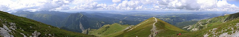
Tatra Mountains Panorama 01.jpg
Camera positioning
For the left stitch, the photographer captured the bottom part of the church, then stepped left and took a photo of the top part. The seam line is visible in the windows just below the clock, and one sees shifts in different directions in the middle and on the tower structures. Stitching software is not meant to cope with such parallax error as the problem here is located behind the camera, and the way out in this case was the availability of matching photos, albeit from a different perspective, to create the image on the right.
Image alignment
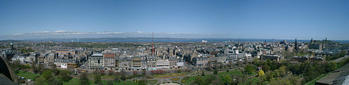
Proper alignment of images is a crucial first step and has been achieved in this view taken in the Western Scottish Highlands. But the exposure differs between images and cameras have vignetting, both make seamlines visible. And as these photos have been aligned regarding the distant features, some parallax errors can be seen at seamlines in the foreground. There exists software that makes such seams disappear and the parallax errors can be concealed by choosing a suitable seamline.
Composition
Common problems: Panoramas frequently lack a central focal point. If taken within urban settings, much of the scene may be uninteresting with unattractive features such as rubbish bins and light poles almost impossible to avoid.
Color space
Different color spaces cover different colors and yield different rendering.
Different color spaces exist, which determine how the colors in an image are stored and displayed. sRGB is most common and compatible, while other color spaces, notably Adobe RGB, allow more colors but are less compatible, and must be correctly supported by users' computers.
Simplest is to use sRGB, which is usually default on Windows and Linux, but must be selected when saving files on Mac (prior to OS X 10.6). For further options, read on.
Images should either be in sRGB (either untagged, or specifically tagged as sRGB), or, if in another color space, explicitly tagged as such. Tagging means either including an Exif tag with the name of the color space (options are "sRGB", "Adobe RGB", and "other"), or including an ICC profile, which explicitly specifies the color space. Including an embedded profile is safer, as Exif tags are not always respected by web browsers. Untagged non-sRGB images ("mystery meat") will not render correctly on the vast majority of computers.
For most Windows and Linux users, sRGB is default unless changed, and untagged images will generally be sRGB. However, Mac users should take care that their images are exported in sRGB, and not "Generic RGB" or "Apple RGB".
Best color spaces are sRGB or, optionally, Adobe RGB, which is wider, as these are standard color spaces and hence easiest to support and for other editors to use. If using a non-sRGB color space – say for greater color range – consider making an sRGB version of the image for greater compatibility.
Technical details
It is safest to use sRGB: which is the default on most computers, including Windows and Mac OS X 10.6 and later. Images in other color spaces will not render correctly at all in many web browsers; color profile support is included and enabled by default in Safari, and in Firefox 3.5, but not in all browsers.
Untagged non-sRGB images will not render correctly except by chance. Notably, untagged Mac images prior to OS X 10.6 used a different color space (Apple RGB prior to OS X, "Generic RGB" in OS X prior to 10.6), which notably included a gamma of 1.8, rather than 2.2; these images thus appearing dark when viewed on non-Mac computer that assumes sRGB (with gamma of 2.2).
If the location is difficult to obtain (eg. in the wilderness areas), you may have the choice of giving the general location (to 3 decimal places or fewer, as appropriate), use {{Location estimated}} or simply mentioning a nearby geographical feature (eg. valley, river, mountain range) or a settlement that would help to identify the location.
Photos that can't or shouldn't be geocoded include those which would show the locations of endangered plants and animals, military installations, studio photos or locations that should be hidden to respect rights of privacy. To communicate this in the image, you may wish to use {{Location withheld}} template.
Exif
See Commons:Exif for help on using and editing Exif metadata.


_(8118611842).jpg)


