Commons:Graphic Lab School/Images to improve/Archive/Jul 2008
Stale
[edit]Both these projects are looking for new logos. I know artists haunt this page, so please please send us new submissions! – Mike.lifeguard | @en.wb 22:00, 12 January 2008 (UTC)
- Post the current logos maybe -- like a point of reference or two. -- carol 10:59, 13 January 2008 (UTC)
- There is no Wikijunior logo currently; the Wikibooks logo is show at the right. We want something new; see the meta pages for guidelines (and a few hard rules). – Mike.lifeguard | @en.wb 20:40, 27 January 2008 (UTC)
- There are only 10 alternatives remaining for the Wikibooks logo and 6 for the Wikijunior logo. Input for the alternatives is appreciated. /Lokal_Profil 14:28, 19 May 2008 (UTC)
- There is no Wikijunior logo currently; the Wikibooks logo is show at the right. We want something new; see the meta pages for guidelines (and a few hard rules). – Mike.lifeguard | @en.wb 20:40, 27 January 2008 (UTC)
In the Category:Video repair needed videos need to be repaired mainly because the first screenshot shows a red x. Is somebody able to fix this? Davin7 17:18, 19 May 2008 (UTC)
China earthquake
[edit]
Article(s): en:2008 Sichuan earthquake
Request: The border between Laos and Vietnam is missing. BrightRaven 07:24, 21 May 2008 (UTC)
Graphist opinion:
ComicCon
[edit]Article(s):en:Image Comics
Request: The image coloring seems off. I don't know if someone can clean it up? -- Hiding 21:51, 27 May 2008 (UTC)
- Graphist opinion:
- I brightened the colors some -- an image taken in a not so well lit place -- there is only so much that can be done to improve it. Warning, I uploaded over the existing image, which is not always welcome by the natives here.... -- carol 23:56, 27 May 2008 (UTC)
- Many thanks. I think I've uploaded over originals as well, and I notice a bot is too so... -- Hiding 00:41, 28 May 2008 (UTC)
- It is easy enough to undo -- in fact, it is easy enough to download the improved image, revert to the original and reupload the improved version with a new name if that is what is wanted. Not everyone on the wiki-commons A list seems to be able to function that way though ;) -- carol 01:16, 28 May 2008 (UTC)
- Considering that the instructions on the Commons:Graphic Lab main page says "Cleaned up images: upload over the original. Derivative works: should be uploaded to a new name." I don't think there should be any problems. /Lokal_Profil 02:49, 28 May 2008 (UTC)
- The original image is still available in the case that a different graphics artist (or even the same one later as skills increase) or improved/different software is able to further improve this image. I have on occasion retrieved the original upload and rerepaired the image and have no feel or sense that my repair is the best ever. The {{Retouched}} template is as the page implies a little picky but all of the information necessary can be included within it. In my opinion, some of these templates are more useful than others. The "extracted from" and family of templates is also really good for not repeating a cropping of the same image. (I learned of those templates here....) -- carol 03:43, 28 May 2008 (UTC)
- Well, you inspired me to upload all the images from which I cropped my latest additions and tag them all with "extracted from". Although they changed the upload form halfway through and it was incompatible with the info the flickertool was spitting out. That threw me a while until I worked out how to customise my css. Hiding 18:23, 28 May 2008 (UTC)
- The original image is still available in the case that a different graphics artist (or even the same one later as skills increase) or improved/different software is able to further improve this image. I have on occasion retrieved the original upload and rerepaired the image and have no feel or sense that my repair is the best ever. The {{Retouched}} template is as the page implies a little picky but all of the information necessary can be included within it. In my opinion, some of these templates are more useful than others. The "extracted from" and family of templates is also really good for not repeating a cropping of the same image. (I learned of those templates here....) -- carol 03:43, 28 May 2008 (UTC)
- Considering that the instructions on the Commons:Graphic Lab main page says "Cleaned up images: upload over the original. Derivative works: should be uploaded to a new name." I don't think there should be any problems. /Lokal_Profil 02:49, 28 May 2008 (UTC)
- It is easy enough to undo -- in fact, it is easy enough to download the improved image, revert to the original and reupload the improved version with a new name if that is what is wanted. Not everyone on the wiki-commons A list seems to be able to function that way though ;) -- carol 01:16, 28 May 2008 (UTC)
- Many thanks. I think I've uploaded over originals as well, and I notice a bot is too so... -- Hiding 00:41, 28 May 2008 (UTC)
- The Image extracted template is quite usefull but it can get rediculous sometimes, see e.g. Image:Oeufs002b.jpg. /Lokal_Profil 19:43, 28 May 2008 (UTC)
- Heh, it is good to know when too much is too much. I wonder if that stuff might be more useful on the talk page for that image? -- carol (tomes) 03:53, 30 May 2008 (UTC)
- Tried but it looks as though the template only works in the image namespace... /Lokal_Profil 16:37, 30 May 2008 (UTC)
- Heh, it is good to know when too much is too much. I wonder if that stuff might be more useful on the talk page for that image? -- carol (tomes) 03:53, 30 May 2008 (UTC)
Fixed the colours a bit more, still not fantastic but better than the bright orange ;) -- Editor at Large • talk 03:31, 30 May 2008 (UTC)
- Yeah, nice work there! -- carol (tomes) 03:53, 30 May 2008 (UTC)
Glen Class Naval Tugs
[edit]

Article(s):W:en:Glen_class_tugs
Request: Last year I took a series of photos that are in Category:Naval_Tugboats_of_Canada I like the composition of the image on the left but prefer the brightness/contrast/colour of the image on the right. I also don't like the way the sky fades to white in the left image. What steps would improve the left image. -- KenWalker 02:47, 30 May 2008 (UTC)
Graphist opinion: It can definitely be cleaned up... my version at right, it might be too dark but is that the sort of cleanup you were looking for? -- Editor at Large • talk 03:23, 30 May 2008 (UTC)

- You are right, it may be a bit too dark. It certainly brings up the sky, the background scenery and the light house nicely. The water is changed but I am neutral about its colour. But in the new version the boats look too dark to my eye. I thought I would give it a try myself, using Gimp and my original version. Played with a bunch of things but ended up without changing it much, mostly white balance I think. --KenWalker 04:02, 30 May 2008 (UTC)

2Glen tugs2 kgw edit.jpg

Mediawiki doesn't handle this SVG correctly
[edit]-
 Thumbnail of SVG image
 -
 PNG
PNG


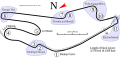
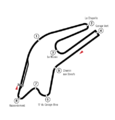
Please compare the automatically generated PNG thumbnail with the PNG version. Both are above. I created both in Inkscape. The PNG version (on the right) is correct. Mediawiki doesn't handle the position of the text on paths correctly. Will (Talk - contribs) 03:23, 3 June 2008 (UTC)
- Update: I got the text on paths working by converting the text to paths. However, there is still a black box that I need to kill. Also, I found that the start/finish line uses a fill color based on pattern. Firefox doesn't appear to have implemented that until 3.x. If you know of a work around for that, it would help. Will (Talk - contribs) 08:31, 3 June 2008 (UTC)
- If you convert the text to paths then please first upload a version with the text as text. That way even if the last (and therefore the only visible) version has text as path there is a version with proper text available for derivative maps etc. To make things explicit you can always mention this in the upload comment, e.g. "use this version for translations and derivative works" or "converted text to paths, use previous version for translations and derivative works". /Lokal_Profil 11:06, 3 June 2008 (UTC)
Too late. I didn't save that version locally. If needed I could redownload it and go from there. What changes did you make? BTW: The start/finish line problem is still there. 11:54, 3 June 2008 (UTC)
- No worries, now you know for next time =). Didn't do any edits, think Rocket001 made some though. /Lokal_Profil 12:08, 3 June 2008 (UTC)
- Wait. What's wrong with the first version uploaded? That's text. Rocket000 12:45, 3 June 2008 (UTC)
It would appear that Rocket didn't provide any comments. :( Also, Genie attempted to make changes. Will (Talk - contribs) 12:20, 3 June 2008 (UTC)
- Sorry, I thought it would be obvious what I was doing :) Rocket000 12:40, 3 June 2008 (UTC)
- There's an error on one spelling : it's "Chemin aux Bœufs" (note also that the "o" and "e" stick together). You may check it on the official site (p. 8). Sting 12:25, 3 June 2008 (UTC)
Sting, once Rocket tells me how to fix the version with text on paths, I will change it. Will (Talk - contribs) 12:49, 3 June 2008 (UTC)
2 Barnstar Requests
[edit]Article(s): COM:BS
Request: Here's the deal GL crew. I'd really like to get 2 graphics for 2 barnstars that are commons specific, if someone can make the graphics I'll put together the barnstar right quick. #1 (the most important) Is a "Video Barnstar" (similar to the {{The Audio Barnstar}} and {{The Photographer's Barnstar}} ). #2 is a "Deletion Spoon Barnstar" for those admins that tirelessly delete copyvio's and the like (Don't ask me why it is a "deletion spoon" - it just is). Feel free to poke me with questions. Oh, and thanks in advance. --ShakataGaNai Talk 07:15, 3 June 2008 (UTC)
- You're saying you need moar barnstars!?! ;) Rocket000 12:48, 3 June 2008 (UTC)
- Always need MOAR barnstars!!! No, but seriously. Alot of those aren't very useful for Commons. I went through the list previously and didn't see anything of use, but this time I found 3 images that would work for the "video" barnstar 1, 2 & 3. Don't know why I didn't see those before. But I suppose you can scratch #1 off the list from above. --ShakataGaNai Talk 18:15, 3 June 2008 (UTC)
- Hey, perfect timing! Those were uploaded just right before your request (same day!). Oh well, I guess you can never have enough barnstars (I believe I was the one who brought over the first barnstar template to Commons[1] :) What I would really like to see is a well-done and accurate SVG version to use as a base. Rocket000 16:05, 4 June 2008 (UTC)
- Yes, that would be awesome also. If anyone can make a good SVG barnstar. I had previously found Image:Barnstar.svg and used it to make Image:Barnstar rust.svg (It is terrible, but it got the job done). --ShakataGaNai Talk 18:18, 4 June 2008 (UTC)
- Hey, perfect timing! Those were uploaded just right before your request (same day!). Oh well, I guess you can never have enough barnstars (I believe I was the one who brought over the first barnstar template to Commons[1] :) What I would really like to see is a well-done and accurate SVG version to use as a base. Rocket000 16:05, 4 June 2008 (UTC)
- Always need MOAR barnstars!!! No, but seriously. Alot of those aren't very useful for Commons. I went through the list previously and didn't see anything of use, but this time I found 3 images that would work for the "video" barnstar 1, 2 & 3. Don't know why I didn't see those before. But I suppose you can scratch #1 off the list from above. --ShakataGaNai Talk 18:15, 3 June 2008 (UTC)
Graphist opinion:
False red-eye?
[edit]I was very excited to find Image:Yeux vairon.JPG, a cat with eyes of different colors. The different color irises has a natural explanation: it happens. However, the different color pupils is much harder to explain. On examining the pixels in the image, I now suspect the image has been manipulated and the red pupil is false. What do you think? --Una Smith 16:38, 3 June 2008 (UTC)
- Looking at the histogram and with a greater zoom, it doesn't seem the picture was post-processed on this area. The opening of the pupil is slightly larger for the blue iris, enough to introduce an undesired red eye effect caused by the harsh, direct and close flash lightning. Sting 00:20, 7 June 2008 (UTC)
NASA TV to SVG
[edit]
Article(s): w:NASA TV, any other related material.
Request: Conversion to SVG. This will allow for a cleaner appearance and make the logo appear less dated that it currently does. Alternate versions of this image are located here and here, and this may be the preferred version to work from, as it incorporates fewer of the unnecessary reflective elements. I'll leave it up to the Graphist whether or not to use a black or transparent background. -- Huntster T • @ • C 01:35, 9 June 2008 (UTC)
Graphist opinion:
Resolved
[edit]Jennifer Love Hewitt portrait
[edit]Request: This image of Jennifer seems "flat" especially compared to the earlier used Image:JenniferLoveHewitt.jpg, which unfortunately is a rather poor composition. I guess the lighting of the location was less than ideal. I presume this can easily be cleaned up just a little bit, and it would be a much more flattering image that could probably surpass the our earlier flickr image. Any takers? -- TheDJ 13:07, 20 March 2008 (UTC)
Graphist opinion: Image was underexposed making it look flat/washed out and black levels not high enough. Improved the contrast between the background and her, increased levels to reduce washed out look of the image. Slightly refocused and colours enhanced in LAB colour. Hope this helps! ;D -- Tango22 01:24, 3 April 2008 (GMT)
- this image has been deleted (Copyvio, no OTRS permissions) /Marmelad (talk) 07:29, 27 June 2008 (UTC)
 Done Earl of Athlone
[edit]
please flip - wrong way round. Pharrar (talk) 18:16, 24 July 2008 (UTC)
- Done ¦ Reisio (talk) 05:43, 26 July 2008 (UTC)