Commons:Featured picture candidates/Set/Notre-Dame de Montréal Basilica
Jump to navigation
Jump to search

Notre-Dame de Montréal Basilica, featured[edit]
Voting period is over. Please don't add any new votes.Voting period ends on 24 Sep 2017 at 06:27:14 (UTC)
-
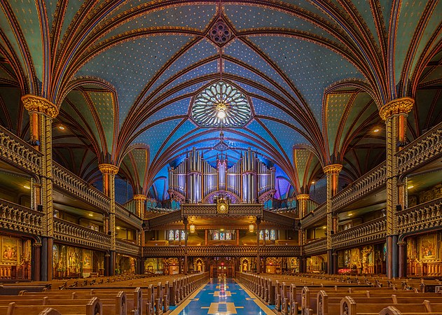
 Front view of the main nave
 -
 Back view of the main nave
 -
 Main altar
 -
 Pipe organ
 -
 General view including the side of the main nave
 -
 Ceiling


 Info Set of images of the interior of the Notre-Dame Basilica, located in the historic district of Old Montreal, in Montreal, Quebec, Canada. The interior of basilica, built in Gothic Revival style, is impressive with vivid colors, stars and filled with hundreds of intricate wooden carvings and several religious statues. It was built between 1823 and 1829 after a design of James O'Donnell and it has become one of the landmarks of the city. All by me, Poco2 06:27, 15 September 2017 (UTC)
- Info I've seen many churches in my life but this one is one of those that really impressed me after I visited it in 2007, but the pictures I took back then didn't make it justice. Poco2 06:27, 15 September 2017 (UTC)
 Support -- Poco2 06:27, 15 September 2017 (UTC)
 Comment First let me say I'm very happy to see you contributing new images again. I recall Diliff's version File:Notre-Dame Basilica Interior, Montreal, Canada - Diliff.jpg (which actually dates from 2006) and his comments at the FPC: "It's quite a dark interior and to preserve the highlight details, I've chosen not to bump the shadows too much. As is often the case, the full size image doesn't look as dark as it does in the thumbnail so please view at 100%". This last comment is true: if one makes his image full-screen, the eye adjusts to the lower ambient light compared to a thumbnail on white. My first thoughts on seeing this collection was "who turned the lights up max" and "why is everything so yellow". Aside from the HDR brightness and colours, I don't think the pulpit shot is at FP level. You've shot it too close and the extreme perspective distortion is too much. I'll have a closer study of the set later. -- Colin (talk) 06:56, 15 September 2017 (UTC)
- Colin: You're probably right about the pulpit, but there was not much playroom behind me. Either this way or with a partial view of the pulpit due to the benches (as there was no possibility to get to the upper level of the basilica). The pulpit is not essential part of the set, though, I could remove it. Poco2 07:27, 15 September 2017 (UTC)
- Good point by Colin. This set looks as shiny as Las Vegas lights. Comparing to Diliff version, it is clear that naturally this place is not that shiny. EDIT : Support the new version of the set. -- Pofka (talk) 07:38, 15 September 2017 (UTC)
- Yes, I have to say it never looked anything like this when I visited. I will freely admit that I visited in January late in the afternoon where there was no ambient light filtering through the windows, whereas there is in Poco's version, but I don't think it needed to be processed with so much luminosity. It seems much too bright and saturated, not just compared to my recollection of the scene, but also aesthetically speaking. I think all the images would benefit from a more low-key approach to processing but that is just my gut feeling. Diliff (talk) 08:19, 15 September 2017 (UTC)
- Well, from my point of view, your version, David looks too dark to me, to be honest. Yes, we had daylight coming into the church, as you can see here, but still I feel that the lighting in the church was stronger. These pictures do reflect pretty much what I recall, I can surely reduce the exposition a bit, but not to that level. Regarding saturation I've to say that the colors of this basilica are really vivid, specially the altar. It would be great to hear the opinion of somebody who has been recently there. Poco2 08:58, 15 September 2017 (UTC)
- I'm not saying you should reduce it to the levels of my image. As I said, mine was taken without any ambient light as it was dark outside. The lighting was very different so I'm not saying it should look like mine. My image looks as it looked when I visited (very dark, just the lights of the altar and a few lights on the columns). Yours obviously had more ambient light during your visit, and I can see that more of the lights in the stalls were turned on, as well as more lights on the altar too. I'm just saying that regardless of how it was when you visited, it appears a little too bright in these images (objectively speaking). The colours are a bit washed out and some highlights blown or nearly blown (perhaps just one colour channel blown, which results in a flat area of no detail). Look at the altar and ceiling, there's a lot of detail missing there. Look at the rays of light coming from the middle of the spires in the centre - there's shades of yellow that are almost completely missing - it looks almost white. I just think this is the result of overexposure (or at least processing so that it is too bright). We don't perceive really luminous colours as 'blown' in the same way a camera and display with limited dynamic range portrays them. I can't imagine that this is how it really looked in person. Diliff (talk) 10:10, 15 September 2017 (UTC)
- David, I checked the sources of light again. Apart from the fact that apparently all lamps were on, when I visited it, there are several light inlets in the church not just in the walls, but in the roof, some are over those lamps in the middle of the nave and a bigger one over the main altar. About your comments on overexposure will check that closely this evening. Poco2 12:29, 15 September 2017 (UTC)
- I'm not saying you should reduce it to the levels of my image. As I said, mine was taken without any ambient light as it was dark outside. The lighting was very different so I'm not saying it should look like mine. My image looks as it looked when I visited (very dark, just the lights of the altar and a few lights on the columns). Yours obviously had more ambient light during your visit, and I can see that more of the lights in the stalls were turned on, as well as more lights on the altar too. I'm just saying that regardless of how it was when you visited, it appears a little too bright in these images (objectively speaking). The colours are a bit washed out and some highlights blown or nearly blown (perhaps just one colour channel blown, which results in a flat area of no detail). Look at the altar and ceiling, there's a lot of detail missing there. Look at the rays of light coming from the middle of the spires in the centre - there's shades of yellow that are almost completely missing - it looks almost white. I just think this is the result of overexposure (or at least processing so that it is too bright). We don't perceive really luminous colours as 'blown' in the same way a camera and display with limited dynamic range portrays them. I can't imagine that this is how it really looked in person. Diliff (talk) 10:10, 15 September 2017 (UTC)
- Well, from my point of view, your version, David looks too dark to me, to be honest. Yes, we had daylight coming into the church, as you can see here, but still I feel that the lighting in the church was stronger. These pictures do reflect pretty much what I recall, I can surely reduce the exposition a bit, but not to that level. Regarding saturation I've to say that the colors of this basilica are really vivid, specially the altar. It would be great to hear the opinion of somebody who has been recently there. Poco2 08:58, 15 September 2017 (UTC)
- Yes, I have to say it never looked anything like this when I visited. I will freely admit that I visited in January late in the afternoon where there was no ambient light filtering through the windows, whereas there is in Poco's version, but I don't think it needed to be processed with so much luminosity. It seems much too bright and saturated, not just compared to my recollection of the scene, but also aesthetically speaking. I think all the images would benefit from a more low-key approach to processing but that is just my gut feeling. Diliff (talk) 08:19, 15 September 2017 (UTC)
 Oppose HDRish colors, temperature, with last one flare problems. --Mile (talk) 08:52, 15 September 2017 (UTC)
- Comment - I was there last summer (that is, summer of 2016), on an afternoon. There was some light coming in, but if I remember correctly, it wasn't nearly as bright as depicted in these photos, although it was brighter than when Diliff was there. I feel like the atmosphere in the church was closer to Diliff's version, though. I hope my girlfriend, a former resident of Montreal, has a chance to look at these photos, because she could say whether it ever looked this bright in her experience. I'll let you know what she has to say when I'm able to show these to her. -- Ikan Kekek (talk) 10:36, 15 September 2017 (UTC)
- Oppose Need perspectives fix, color temperature and wrong light processing. I know this building and how it look and the pictures are not showing the reality --The Photographer 10:55, 15 September 2017 (UTC)
- The Photographer: could you be more concrete about those perspective issues (maybe adding some notes if you don't mind)? Poco2 12:06, 15 September 2017 (UTC)
- Por ejemplo, las columnas en la parte superior parecen estiradas hacia las esquinas. --The Photographer 15:25, 16 September 2017 (UTC)
- The Photographer: what you refer to are not perspective issues (as verticals are verticals), but rather "distortion issues", which IMHO are unavoidable in the corners. Poco2 17:05, 16 September 2017 (UTC)
- Por ejemplo, las columnas en la parte superior parecen estiradas hacia las esquinas. --The Photographer 15:25, 16 September 2017 (UTC)
- Oppose I'm puzzled with the colors. The top of the pulpit is deformed.--Jebulon (talk) 16:39, 15 September 2017 (UTC)
- Comment I've uploaded a new version of the series with less saturation and exposure, the difference should be visible but not dramatic. I've also removed the pulpit picture from the series, I agree with the comments in that case. David, the dynamic range in the church was considerable, my darkest frames do in fact have some overexposed dots (lamps) but not in the altar. Poco2 18:55, 15 September 2017 (UTC)
- It's normal to have blown highlights in the lamps. It's nearly impossible to process lamps properly anyway from my experience, because Lightroom doesn't actually provide enough control to reduce the highlights enough - partly due to the sliders not going far enough, and partly because the processing engine seems to have trouble with extreme highlight reduction. So if there was no overexposure in the altar then it was just processed too brightly I think. At least no information was lost, you just needed to reduce the luminosity a bit. I think it's an improvement now, the altar's colours look more natural and the exposure looks closer to natural. Diliff (talk) 08:03, 19 September 2017 (UTC)
- Support the new versions as an acceptable compromise between what was and what can be achieved. Daniel Case (talk) 22:29, 15 September 2017 (UTC)
- Much better, but i wont support set because last is still out, last two are maybe out. First two are best. --Mile (talk) 08:10, 16 September 2017 (UTC)
- Support per Daniel --Martin Falbisoner (talk) 10:04, 16 September 2017 (UTC)
- Support per Daniel. What's much better than in the previous version is that the paintings are not blown out. There are some parts of some photos that could be a bit sharper, but I am content to leave you to your own devices to do something or nothing. -- Ikan Kekek (talk) 19:31, 16 September 2017 (UTC)
- Support - while perfection may be hairline elusive the aesthetics and overall dynamics are not. Atsme 📞 23:17, 16 September 2017 (UTC)
- Support -- King of ♥ ♦ ♣ ♠ 05:27, 17 September 2017 (UTC)
- Support -- --Ermell (talk) 20:19, 17 September 2017 (UTC)
- Support --Zhangzhugang (talk) 11:45, 18 September 2017 (UTC)
- Support. Well done. Zhangj1079 (Bonjour!) 23:06, 19 September 2017 (UTC)
- Support Agree with Jebulon but is a great job for me --LivioAndronico (talk) 08:21, 20 September 2017 (UTC)
- Support -- George Chernilevsky talk 16:55, 22 September 2017 (UTC)
- Support Saffron Blaze (talk) 00:17, 23 September 2017 (UTC)
Confirmed results:
This image will be added to the FP gallery: Places/Interiors/Religious buildings#Canada