본 지침은 알찬 그림과 고화질 그림을 선정할 데 대한 기준을 담고 있다. 고화질 그림 후보는 반드시 아래의 요구사항을 모두 만족하여야 하고 위키미디어 공용에 로그인한 사용자에 의해 생성된 그림이어야 한다. Featured pictures candidates는 아래의 요구사항을 모두 만족하여야 하고, "놀랄만한 요소"를 포함하고 있어야 하나, 고화질 그림 후보와는 다르게 반드시 위키미디어 공용에 로그인한 사용자에 의해 생성된 그림이 아니어도 된다. "놀랄만한 요소"를 포함하여 주위를 놀라게하는 사진은 기술적 측면에서 단점을 갖고 있어도 알찬 그림으로 선정될 수 있다.
만일 기존의 고화질 그림보다 더 나은 버전이 있다면 더 나은 버전으로 대체되어야 한다. 알찬 그림의 목적은 그 그림을 통해 피사체의 가치를 최대한으로 전달하여 현재감이 느껴지게 하는 것이다. 전반적인 그림의 질이 진보됨에 따라, 동일한 피사체를 묘사한 이전의 그림 더 나은 버전으로 대체될 수도 있다. 만일 어떠한 알찬 그림이 피사체의 창조의 순간을 포착하고 있거나, 기타 놀라운 상황을 묘사하기 위해 노력한 점이 현격히 드러나는 경우 나중의 버전이 더 좋다고 하더라도 삭제되지 아니할 수 있다.
유사한 피사체를 묘사하는 그림의 수에는 한정이 없으며 기존의 그림을 삭제하는 규범화된 체계는 존재하지 아니한다.
어떤 이미지는 서로 다른 사람에게 서로 다르게 "이야기"하며, 지루함, 게으름, 욕망, 거부, 행복, 슬픔과 같은 인간의 감정을 일깨우기도 한다. 좋은 사진작가는 기쁜 감정을 일깨우는데 그치지 않는다.
알찬 그림을 만드는 과정에서 많은 기여자들이 비일상적인 주제를 일반 기법으로 촬영한 사진은 일반적인 주제를 특별한 기법으로 촬영한 사진보다 훨씬 더 가치 있다고 믿고 있다. 또 어떤 기여자들은 개별 이미지는 반드시 이미지 자신의 특징을 지녀야 한다고 주장하기도 한다. 예를 들어, 중요한 순간을 기술적으로 구성한 사진은 중요한 사건을 담았으며, 또 양적으로도 희귀하기 때문에 찬사를 얻을 것이다.
전반적으로, 겸손해져라. 귀하가 판정하는 사진은 어떤 다른 사람의 작업일 수도 있다. "이 것은 매우 끔찍하군."이나 "본인은 이것을 싫어해."와 같은 말의 사용을 피해야 한다. 만일 귀하가 그 사진에 대해서 반대의 입장을 갖고 있다면, 신중하게 그 사진에 대한 단점에 대해서 논해야 한다. 또 위키미디어 공용의 모든 사용자가 귀하의 언어를 사용하는 것이 아님을 고려하여 언어의 사용에 주의를 기하여야 할 것이다.
Images should have at least 2 real megapixels of information, for example, 1600x1250. For “easy to take” images, reviewers may choose to demand more if the image would benefit from it.
Images should not be downsampled (sized down in order to appear of better quality). Downsampling reduces the amount of information stored in the image file.
Graphics located on Commons may be used in ways other than viewing on a conventional computer screen. They may be also used for printing or for viewing on very high resolution monitors. We can't predict what devices may be used in the future, so it is important that our best pictures have as high a resolution as possible.
This photo is of high quality and just above the 2 megapixel minimum.
Low JPEG quality settings in camera or when saving
Visible JPEG artifacts
Images should not use too strong compression.
Use high quality settings in your camera and imaging software. For example, set JPEG quality "superfine" in camera, or shoot in a lossless image format such as RAW or NEF, or save with 95% quality in image editing programs. If editing a JPEG multiple times, perform all edits starting with the original, or use a lossless format (such as XCF). Repeatedly editing and saving a JPEG image will gradually lose quality. And do not save edited JPEGs with a significantly higher quality than the original—doing so increases an image's file size but not its quality.
Noise
Chromatic noise
Luminance noise
Visible grain
Scratches, dust and dirt
Spots
Images should not have distracting amount of noise when viewed in full size.
To reduce noise, use the lowest practical sensitivity or film speed (for example: 200 ISO film is less grainy than 1600 ISO!). If the photo was taken in unique circumstances and cannot be repeated, the image can sometimes be improved by filtering. Quality noise reduction software is expensive and algorithms computationally intensive. If you don't have access to suitable programs and equipment, ask at the Commons:Graphics_village_pump.
Scan with dust and dirt
No noise here, crisp and well-detailed.
Exposure
Overexposure
Blown out highlights
Underexposure
Lost details in shadow areas, replaced by JPEG maps.
Considering the circumstances, images should be correctly and appropriately exposed.
In correctly exposed images, details in a significant part of image are retained. It should be noted that exposure may serve a creative purpose, and this guideline should be evaluated with understanding of the idea or intent of the image. Exposure refers to the shutter diaphragm combination that renders an image with a tonal curve that ideally is able to represent in acceptable detail shadows and highlights within the image. This is called exposure latitude. Images can be on the low side of the tonal curve (low range), the middle (middle range) or high side (upper range). Digital cameras (or images) have a narrower latitude than film. Lack of shadow detail is not necessarily a negative characteristic. In fact, it can be part of the desired effect. Burned highlights in large areas are a distracting element. When shooting with a digital camera, inspect the histogram. In challenging circumstances you may be forced to use overlap several photographs with different exposures – this is called HDR stitching.
Every important object on the picture should be sharp, considering the idea of the image.
The overall image should have clearly defined focus, for example, the main subject is in focus and the foreground and background are out of focus, or else, the whole scene is in focus.
Depth of field is often low intentionally. If in doubt, ask. "Depth of field" (DOF) refers to the area in focus in front of and beyond main subject. Depth of field is chosen according to the specific needs of every picture. Large or small DOF can add to or detract from the quality of the image. Low depth of field can be used to bring attention to the main subject, separating it from the general environment. High depth of field can be used to emphasize space. At a given subject distance, short focal length lenses (wide angles) yield larger DOF than longer focal length lenses (telephotos). Narrow apertures (high f-numbers) yield larger DOF than wide apertures (low f-numbers).
bad problem with focus
correct focus and depth of field
shallow depth of field serving a purpose
Motion Blur
Too long exposure: image has become blurred because of hand shaking or subject moving too fast.
Motion blur should have a purpose, most often to emphasize motion.
"Movement control" refers to the manner in which motion is represented in the image. Motion can be frozen or blurred. Neither is better over the other by itself – it's representation that matters. Movement is relative within the objects of the image. For example, photographing a race car that appears frozen in relation to the background does not give us a sense of speed or motion, so technique dictates to represent the car in a frozen manner but with a blurred background, thus creating a sense of motion. This is called "panning". On the other hand, representing a basketball player in a high jump frozen in relation to everything else, due to the "unnatural" nature of the pose may well be a good photograph.
Adequately handled motion
Subjects blurred.
Lighting
Distracting reflections (usual problem with built-in flash)
Lighting should be appropriate for portraying the subject.
Light is said to be the most important ingredient of a photograph, and quality images are expected to have it right. The quality of a shot may well depend on weather conditions beyond the photographer's control. Contrary to general belief, front lighting is not usually the best light as it flattens the subject. Side lighting often gives a better 'texture' to surfaces. The best light is often early morning or late afternoon, or on a slightly cloudy day. When photographing in strong light, you may want to soften the shadows by using “fill flash”.
Soft, nicely blended shadows, and lighting from different angles shows that subject is not flat.
Harsh and flat lighting resulting from the camera's pop-up flash.
Editing
Unnecessary or inappropriate use of artistic filters and effects. Editing programs like Gimp have wonderful artistic filters and scripts. Unnecessary use of these, however, can be detrimental to the image.
Digital manipulation for the purpose of correcting flaws in a photographic image is generally acceptable, provided it is limited, well-done, and not intended to deceive. Typical acceptable manipulations include cropping, perspective correction, sharpening/blurring, colour/exposure correction, and removal of distracting background elements.
Extensive manipulations must be clearly described in the image text, for example by means of the {{Retouched picture}} template. Unmentioned or misrepresented manipulations, or manipulations which cause the main subject to be misrepresented are never acceptable.
Composition
Unbalanced composition
Unclear subject
Non-existent subject
Too tight crop
Too busy
The arrangement of the elements within the image should support depiction of the subject, not distract from it.
Foreground and background objects should not be distracting.
The subject should not be cropped, unless it is only a specific part of the subject that is of interest. Foreground and background objects should not be distracting. Objects in front of the subject shouldn't hide important elements and background elements shouldn't spoil the composition (for example that the streetlight doesn't "stand" on someone's head). The Golden Ratio and Rule of Thirds are common guidelines for composition that have been inherited from painting. Centering the subject is often considered a negative practice. Subjects of interest are placed in one of the "interest points", where horizontal and vertical lines intersect (4 interest points are created). Horizons are almost never placed in the middle, for they "cut" the image in half. They are placed either in the upper or lower horizontal line. The main idea here is NOT to center the subject without a very good reason.
Typical use of the rule of thirds
Distortions
Tilt
Perspective distortion
Barrel distortion
Images should not be unintentionally tilted.
Images of architecture should usually be rectilinear.
Perspective distortion should either have a purpose or be insignificant.
The human brain is a sensitive detector capable of spotting even a small tilt. Falling trees, towers and inclined water surfaces rarely improve landscape photography. Tilt can be easily corrected in almost any photo editing software. Various more complicated distortions can be adjusted in programs such as hugin and Panorama Tools. If you don't have access to suitable programs or don't understand them, ask at the Commons:Quality images helpdesk and someone may be able to process the image.
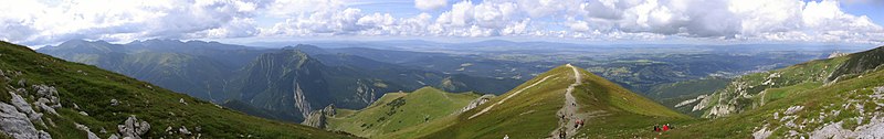
Guideline: Panoramic images need to have a minimum height of 800px.
Stitching
Common problems: Stitching artifacts. Colors or luminance are not consistent across the image. Horizon line sinusoidal or even more complicated shape.
Guideline: Getting a good panorama ready takes time. Recent releases of programs like hugin and Enblend make simple errors like bad alignment and ghosts at blurred seam lines less common than they used to be, but parallax errors and more intricate quality problems still occur. Two examples:
The ingredient photos were taken with a camera not in panorama mode, and camera-bundled software was used for the top stitch. One notices that the left part is darker, due to the camera exposing each photo individually. This could be dealt with by adjusting brightness before stitching.
More subtle errors are at the right of the castle, where there appear to be two vertical bands in the sky. Look where these bands touch the hill, at the middle one the stitching program misaligned, producing a ghost. Also, the program feathers the transitions. While this avoids a visible edge, one can see that in such feathering region, image noise is reduced, which makes these parts stand out from the rest of the image.
The bottom image shows that using different software, the photos can be stitched without such errors.
Lighting
Common problem: different exposure in different images, leading to overexposure or visible differences in brightness and posterisation.
Guideline: Even when photos are taken with the camera in panorama mode, unless one chooses an overall exposure for all images to handle the brightest part of the brightest image, then blown highlights are likely.
Ciemniak panorama.jpg
If possible, set for underexposure, as well as panorama mode. Expected advances in software based exposure correction may soon make panorama construction viable from a photo series not shot in panoramic mode. Until then, use the brightest part of your panoramic scene to set the in-camera exposure when shooting.
Some software provides blending algorithms that make the seamline invisible. But if the brightness of the original photos differs significantly, one still notices a transition in between photos. A few minor misalignments notwithstanding, this is what the top photo shows.
Some programs incorporate brightness adjustment for the photos, but the algorithm has to be designed carefully otherwise one can end up with posterisation effects like the purple and light blue patches in the clouds on the left in the bottom image.
Vignetting:
Blending-only programs can do away with seam lines and smooth structure using feathered overblending, but to correct lens vignetting one needs a radius-dependent brightness correction.
Deliberately strong vignetting
The left image shows a technically acceptable stitch, except for the vignetting effect which has been strongly exaggerated. Good stitching programs incorporate vignetting correction. Pre-processing the input images is less elegant, but one can obtain good results. In the sky can be seen three bright areas, separated by two darker bands. These correspond to the middles and the sides of the three original images. Although programs like Enblend remove visible seam lines, they do not remove vignetting effects. In the sequence hugin-enblend it is at the hugin stage where vignetting has to be corrected, either inside a recent hugin version or as already corrected input.
On the right is a more subtle example of vignetting, most visible in the sky, where one can see three bright areas from left to right separated by two darker bands. These correspond to the middle and the sides/corners of the three original images.
See in the photo below how the sky brightness spans the spectrum without being burnt out, but still the sky brightness has a wavy structure, most noticeable in the left part.
Tatra Mountains Panorama 01.jpg
Camera positioning
For the left stitch, the photographer captured the bottom part of the church, then stepped left and took a photo of the top part. The seam line is visible in the windows just below the clock, and one sees shifts in different directions in the middle and on the tower structures. Stitching software is not meant to cope with such parallax error as the problem here is located behind the camera, and the way out in this case was the availability of matching photos, albeit from a different perspective, to create the image on the right.
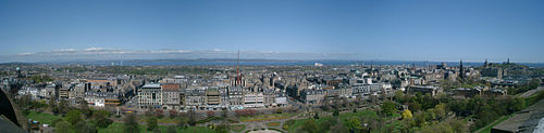
Image alignment
Proper alignment of images is a crucial first step and has been achieved in this view taken in the Western Scottish Highlands. But the exposure differs between images and cameras have vignetting, both make seamlines visible. And as these photo have been aligned regarding the distant features, some parallax errors can be seen at seamlines in the foreground. There exists software that makes such seams disappear and the parallax errors can be concealed by choosing a suitable seamline.
Composition
Common problems: Panoramas frequently lack a central focal point. If taken within urban settings, much of the scene may be uninteresting with unattractive features such as rubbish bins and light poles almost impossible to avoid.
Different color spaces cover different colors and yield different rendering.
Different color spaces exist, which determine how the colors in an image are stored and displayed. sRGB is most common and compatible, while other color spaces, notably Adobe RGB, allow more colors but are less compatible, and must be correctly supported by users' computers.
Simplest is to use sRGB, which is usually default on Windows and Linux, but must be selected when saving files on Mac (prior to OS X 10.6). For further options, read on.
Images should either be in sRGB (either untagged, or specifically tagged as sRGB), or, if in another color space, explicitly tagged as such. Tagging means either including an EXIF tag with the name of the color space (options are "sRGB", "Adobe RGB", and "other"), or including an ICC profile, which explicitly specifies the color space. Including an embedded profile is safer, as EXIF tags are not always respected by web browsers. Untagged non-sRGB images ("mystery meat") will not render correctly on the vast majority of computers.
For most Windows and Linux users, sRGB is default unless changed, and untagged images will generally be sRGB. However, Mac users should take care that their images are exported in sRGB, and not "Generic RGB" or "Apple RGB".
Best color spaces are sRGB or, optionally, Adobe RGB, which is wider, as these are standard color spaces and hence easiest to support and for other editors to use. If using a non-sRGB color space – say for greater color range – consider making an sRGB version of the image for greater compatibility.
Safest is to use sRGB, which is the default on most computers, including Windows and Mac OS X 10.6 and later. Currently (as of June 2010), images in other color spaces will not render correctly except at full resolution, because their color profile information is stripped in the thumbnail. This is Wikimedia bug #19960, and will be fixed when the Wikimedia version of imagemagick is upgraded. Further, images in other color spaces will not render correctly at all in many web browsers; color profile support is included and enabled by default in Safari, and in Firefox 3.5, but not in all browsers.
Untagged non-sRGB images will not render correctly except by chance. Notably, untagged Mac images prior to OS X 10.6 used a different color space (Apple RGB prior to OS X, "Generic RGB" in OS X prior to 10.6), which notably included a gamma of 1.8, rather than 2.2; these images thus appearing dark when viewed on non-Mac computer that assumes sRGB (with gamma of 2.2).