User talk:W163
internet censorship picture[edit]
Hello, I noticed you are the creator of the Internet Censorship map that's being used in wikipedia articles. I was wondering if it'd be possible to change some of the colors on the map. The colors you used, specifically the white, light gray and light pink, are very hard to see. Would it be possible to change these three colors on the map to something that can be seen better? Thanks --Turn685 (talk) 12:03, 2 December 2011 (UTC)
- We can try. Moving this discussion to File talk:Internet Censorship World Map.svg.
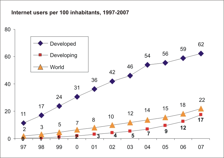
Internet users per 100 inhabitants[edit]
Hi, I saw you have a file uploaded (Internet_users_per_100_inhabitants_ITU.svg) that contains data starting from 1997. The reference listed on the file info page links to two sources: http://www.itu.int/ITU-D/ict/statistics/material/excel/2011/Internet_users_01-11.xls and http://www.itu.int/en/ITU-D/Statistics/Documents/statistics/2012/ITU_Key_2006-2013_ICT_data.xls
but these sources only contain information from 2001.
I could not find a direct data-file (excel, csv, etc) for this data, but I did find a visual representation of the data from 1997 through 2000 in the following image: http://www.itu.int/ITU-D/ict/statistics/ict/graphs/internet.jpg at the following page: http://www.itu.int/ITU-D/ict/statistics/ict/
I updated the reference on the file info page.
- Thanks. This graph is based on an earlier version which is also available in the Commons at File:Internet users per 100 inhabitants 1997-2007 ITU.svg and that graph was based on the graph from the ITU that you found which is available at: http://www.itu.int/ITU-D/ict/statistics/ict/graphs/internet.jpg. While this was before I started to update this graph myself, the ITU graph is the source for the first several years. --Jeff Ogden, W163 (talk) 06:30, 18 November 2013 (UTC)

|
File:BobParnesSept2004-1.jpg has been listed at Commons:Deletion requests so that the community can discuss whether it should be kept or not. We would appreciate it if you could go to voice your opinion about this at its entry.
If you created this file, please note that the fact that it has been proposed for deletion does not necessarily mean that we do not value your kind contribution. It simply means that one person believes that there is some specific problem with it, such as a copyright issue. Please see Commons:But it's my own work! for a guide on how to address these issues. |
-mattbuck (Talk) 14:59, 19 November 2013 (UTC)
- This got sorted out some time ago and the image file in question was kept. --Jeff Ogden, W163 (talk) 03:31, 13 March 2014 (UTC)
Nudge[edit]
I'm giving you a little nudge to let you know that I've added a comment to File talk:Internet Censorship World Map.svg#Internet censorship picture. If you would want to comment on that before I upload the new version, please do so asap. Joeytje50 (talk) 03:26, 11 January 2014 (UTC)
- Thanks for the nudge. I added a reply over on File talk:Internet Censorship World Map.svg#Internet censorship picture. --Jeff Ogden, aka W163 (talk) 06:09, 11 January 2014 (UTC)
Languages used on the Internet[edit]
Just wanted to let you know I've replace the pie charts on Languages used on the Internet with bar charts as part of a group effort to introduce more perceptually accurate charts. See Save the Pies for Dessert, among others. The first table in particular is ill-suited for a pie chart because some sites use multiple languages and so the percents sum to more than 100%. I also updated the data in the first table. I will update other occurrences of those charts if you have no objections. Daggerbox (talk) 02:29, 13 March 2014 (UTC)
- I'm fine with switching from pie charts to bar graphs.
- I'll note that both pie charts showed percentages, but with the new bar graphs, one shows percentages and one shows millions of users. Is there a reason for the switch? Shouldn't they both be based on the same thing? Or perhaps we need four graphs?
- I've thought for sometime that it would be good if this article could be based on figures from the first of a month, since there is some history associated with the first of the month figures and there is no history to use for verification for the other days of the month. Of course, while I thought about this, I never did anything about it.
- In the upper bar graph a percentage figure is given for English, but no similar figures are given for other languages. Why is that? Seems like we should give the percentage for all languages or none.
- Captions and other labels in English are included as part of the graphs. It might be better to minimize the use of English in the graphs to facilitate the use of the graphs in other language versions of Wikipedia.
- --Jeff Ogden, W163 (talk) 03:29, 13 March 2014 (UTC)
- Good to see your comments, Jeff. I'll address each one.
- I prefer to include actual numbers with real life units where possible, relying on the graphic elements to provide the feel for the relative values. The first data source only provides percentages, of course. The graphs do not have to agree, especially since they don't necessarily appear together, but I can see value both in using a percent scale and in having the charts agree. I'll update if you have a preference since you're closer to the subject matter. Maybe a count axis with percentage labels would work best if both are useful to the message.
- Good idea on first-of-the-month data. I was a little concerned that since the data is updated the daily, the graph and table will never really keep up. Would 1-Jan be even better? Looks like it's present in the monthly historical trend page at W3Techs.
- In general, I don't like to label every graph element. Somehow it feels like the graph is not doing its job if you have to repeat the table text in the graph. I labeled the English bar to highlight the strongest point from the bar chart, which is that English is used by over half of the sites, and because that bar is pretty far removed from the axes. The other bars are roughly labeled by the reference line.
- I agree with your sentiment about localization, but I'm not sure what the remedy might be. Is there a way to support localization in SVG, for instance? Looks like it is by using the systemLanguage attribute -- is that what you meant? Or maybe you mean to leave out the axis titles and leave the language names in English. "Language" is certainly not adding anything.
- I would go with the percentage based chart for both. That is what the pie charts that are being replaced were doing. I think mixing percentages and counts in one graph is likely to be confusing.
- Using January 1st data would be fine. Or July 1st.
- I'd omit the percentage label. The fact that English dominates comes across OK without it.
- I'd omit as many of the labels from the chart itself as you can. I understand that it isn't possible to omit the language names. Much or even all of the other stuff can be left to the caption that is added by the articles themselves.
- --Jeff Ogden, W163 (talk) 02:28, 14 March 2014 (UTC).
- OK, I'll make another pass this week-end. Daggerbox (talk) 02:20, 15 March 2014 (UTC)
I copied this discussion over to en:Talk:Languages used on the Internet#Pie charts vs. bar graphs? where more folks who are interested in this are likely to see it. Lets continue the discussion there. --Jeff Ogden, W163 (talk) 18:32, 15 March 2014 (UTC)
Updated image request at Internet Censorship World Map[edit]
I've left a message on the image's talk page with a request for an update. You have done great work in previous updates to this image, and it would be appreciated if you could update it again as time permits. Mamyles (talk) 21:41, 20 January 2015 (UTC)
- OK. I haven't been doing much work on Wikipedia for the last several months. I'll see if I can get back to doing more. -Jeff Ogden, W163 (talk) 06:41, 21 January 2015 (UTC).
I would also like an update on this map. I'm posting this on 20/07/2017 and a lot has changed in 3 years. I would do it myself, but overwriting the file is forbidden and it's in SVG format so I can't download it. — Preceding unsigned comment was added by 85.150.164.29 (talk) 14:26, 20 July 2017 (UTC)
Dear W163,
may you also update this map to 2013 data (http://www.itu.int/en/ITU-D/Statistics/Documents/statistics/2014/Individuals_Internet_2000-2013.xls ) ?--Kopiersperre (talk) 12:08, 31 March 2015 (UTC)
- I'm not spending too much time on Wikipedia these days, so I don't know how soon I'll get to this. Others should feel free to make the update, if they have the time. -Jeff Ogden (W163 (talk) 18:42, 31 March 2015 (UTC))
Internet censorship data[edit]
Is it possible to get access to the data you have synthesized to create the map of internet censorship? — Preceding unsigned comment added by R8ant8an (talk • contribs) 08:05, 22 October 2015 (UTC)
- File:Internet Censorship and Surveillance World Map.svg is a summary of the Wikipedia:Internet censorship and surveillance by country article. That article is in turn a summary of several sources as explained in the article itself. The available sources are changing. See Wikipedia:Talk:Internet_censorship_and_surveillance_by_country#Main_sources_for_this_article_going_away.2C_what_should_be_done.3F. --W163 (talk) 11:55, 22 October 2015 (UTC)
|
|
File:CensoredBurmeseNewspaper.jpg has been listed at Commons:Deletion requests so that the community can discuss whether it should be kept or not. We would appreciate it if you could go to voice your opinion about this at its entry.
If you created this file, please note that the fact that it has been proposed for deletion does not necessarily mean that we do not value your kind contribution. It simply means that one person believes that there is some specific problem with it, such as a copyright issue. Please see Commons:But it's my own work! for a guide on how to address these issues. |
PhyoWP *click 10:10, 3 April 2016 (UTC)
I think you missed a few countries...[edit]
I'm pretty sure Turkey is supposed to be Pink or Purple because the entire Wikipedia is still blocked over there, and Edrogan is still censoring, jailing and killing anyone criticizing him more brutally than the Russians.
Belarus is supposed to be Yellow because it's been already proven that they censored less in the last 5 years than Russia did in the last year since Putin established new laws all around.
I also think Pakistan is on the same level today as India is, mostly because they started having a more lenient outlook towards internet materials, and they started caring less about "Islam Criticism" since they finally unblocked and localised YouTube.
And Ecuador went very light since that Wheelchair Vice President took over years of suppression and started improving since.
But that's my opinion. If this is really how the Freedom of The Press classifies it, let it be so. — Preceding unsigned comment added by SurrogateSlav (talk • contribs) 12:34, 6 April 2018 (UTC)
- The map summarizes the classifications in the article en:Internet censorship and surveillance by country. If the map doesn't match the classifications in that article, the map should be updated. If the map does match the article, but you don't agree with the classifications in the article, you'll need to go over and work on the article. The article spells out what sources it uses and how the classifications are done. We need to stick to the sources. What we as individuals think doesn't matter very much unless it is backed up by reliable sources. Let us know what you find. --Jeff Ogden, W163 (talk) 12:51, 6 April 2018 (UTC)
Changes in Freedom of the Press Classifications 1989-2015[edit]
Hello, would you considered updating this graphic to the 2019 info? If not, would you mind if I did it? — Preceding unsigned comment was added by 98.207.49.86 (talk) 20:52, 22 November 2019 (UTC)
- I'm not spending too much time on Wikipedia these days, so I don't know how soon I'll get to this. Feel free to make the update, if you have the time. -Jeff Ogden, W163 (talk) 14:41, 11 January 2020 (UTC)