This is an archive of past discussions. Do not edit the contents of this page. If you wish to start a new discussion or revive an old one, please do so on the current talk page.
Kelvin: am nearing the end (I think) of the process of drawing a male C elegans nematode and am considering putting it up for featured picture candidacy— but wanted to have it vetted first by someone with more experience than I have. And I thought of you. Here is the file. Any feedback would be much appreciated— let me know if you have any suggestions or if you have any questions about it. Thank you! KDS444 (talk) 01:40, 15 August 2013 (UTC)
Okay, I just looked at the uploaded file and some weird things happened during the upload: the body fill was made all gray, the 0.5mm was moved around, and a coupla other things. Yeesh. Sorry about those, will try to upload again and see if I can get it to come through better for you. KDS444 (talk) 01:42, 15 August 2013 (UTC)
Ok, some things I'm noticing:
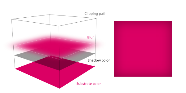
1 In the blue–black worm body, you are using concentric solid rings to make a gradient. This should be an absolute last resort. You should try using solid color, then if that doesn't work, a gradient, and if that doesn't work, a Gaussian blur. Only then should you do the stairstep isolines. It looks like the effect you're trying to do can be done with an inset gaussian blur (Web designers know this as "box-shadow: 0 0 XXpx rgba(0,0,0,0.5) inset;"). (See picture) You can also make the shadow lighter than the substrate and blur for the opposite effect. You may be interested in this inkscape rope tutorial.
2 Same problem with the meiotic germ cell shadows. I think this is really slowing down your file. You're using concentric circles when you can do it much more efficiently and prettier with a radial gradient.
3 Path quality is much better than last time, but I still think you can get away with fewer points.
4 Why are you using filled geometry for the worm body outline? It's much easier to use a stroke outline.
5 Arrows are too thick. I made the same mistake when I first started drawing diagrams. The arrows/lines look a lot better thinner. Aim for 1/2 the pixel width at the picture's intended display size in a Wikipedia article. (So if the diagram is 400px wide, the label lines should be 0.5 pixels wide.)
6 The shading on the germ cells as usual, is extremely impressive (but maybe unnecessary?) :)
7 I'm seeing a lot of "Linked Image Not Found" errors, make sure all your bitmaps are embedded. If I can't see them, Wikimedia's servers can't either. Plus, you should really only be using embedded bitmaps for actual embedded images (Like in File:Plant cell types.svg) and not just for effects.
8 "mm" should have a space before it. So the scalebar should read "~0.5 mm", not "~0.5mm"
9 In the miniworm on the right, you're using some kind of SVG filter that's not displaying right in Inkscape. It doesn't even seem necessary, maybe you should remove it and replace with solid color?
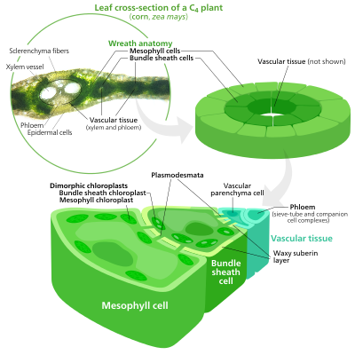
10 The "posterior portion of intestine" label is colliding with the lower edge of the 'zoom-in' inset thingy. You want to break that lower edge to make room for the label. See File:C4 photosynthesis is less complicated.svg for an example (involving text labels and the edge of the green circle). You may also want to adopt a new style for zoom-ins (I use arrows), but that's up to you. It should just be subtle.
So to summarize, most of the problems with the file are technical and only applicable for people who may want to edit the picture. Your picture is very detailed and intricately shaded and the people at Commons:FPC seem to value detail over efficiency, so I think it would have a good chance of passing Featured Picture review.
Lots of good advice— thank you. I have gone over the image rather thoroughly. Am interested in knowing what you think of it at this point, if you get a moment to check it out. KDS444 (talk) 00:08, 17 August 2013 (UTC)
That's much better! A few final quibbles—
1Germ cells Omg they're beautiful and sooo intricately shaded. Unfortunately that also makes them heavy, especially cause there's like hundreds of them. Seeing as there are only like five unique "types", can you use referenced clones instead? Inkscape actually has a tool that lets you literally spray copies of an object. That would cut down on the filesize a lot, with the added benefit of making them easier to edit (change the original and all the clones change with it).
2Embedded bitmaps Any reason why the Vas deferens is an embedded bitmap?
3Overflowing strokes Some of the strokes (and pseudostrokes) overflow the worm's body outline (like the blue outline of the intestine overflows the worm's body at the top of the diagram). Consider grouping all the "guts" and using a copy of the worm's body as a clipping path on it.
4Outlines The miniworm on the right has an outline. Any reason for it? (Of course I'm a minimalist so I avoid borders unless they're necessary, but it's fine if you want to use a different style. User:LadyofHats uses borders; I don't. It's up to you.)
5Shifted labels Did you accidentally bump the labels layer a little to the right? It seems off balance ever since the fourth version.
6Diagram size There's a lot of empty space—I think this diagram can be made a bit narrower. This helps make the worm bigger when used in an article.
So yeah, fix those things (#2 is the only showstopper), and it's definitely FPC ready. I would definitely Support though SVG voters seem to be an endangered species over there.—Love, Kelvinsongtalk01:31, 17 August 2013 (UTC)
First off, you are most welcome for the em dash! I use Autohotkey to convert any double dash I type into an em dash instantly. I am handy with semicolons too, but that's another story.
You made another good set of recommendations here. I now have a few of my own comments in response:
The germ cells. Okay, here's the story: yes, there are only five types, and yes, they are kind of graphics-heavy and therefore take up a lot of file space. I think I can arrange for most of them to be consolidated into a "symbol" in Adobe Illustrator and then stamped around the image rather than copied and pasted as I have done, with the exception of the early meiotic cells. See, the thing is, I "tilted" each individual cell (i.e., I used 2 or 3 fills inside each path) in a unique way in order to make them each appear to have a bright yellow side facing inward (towards what would be the "rachis", which I eventually took out 'cause it was causing visual complications) and a darker green side facing outward (away from the rachis)... There are six of these cells arranged in circles that together create a cylinder of cells (as would be close to the case in a real worm) and there are 32 circles, so while the ones in the background didn't get precise attention and some of the others are similar enough in style that I could just copy them, there remain about 50 or 50 unique cells in this portion of the germ line in terms of their fills. Not that there had to be— I could have depicted these cells as all identical and just varied their position and layer order and the drawing would also have been just as technically accurate. But I wanted to suggest the connection that all of these cells actually have to the rachis, and this seemed like a way to do it. Lord help me, I have even made minor changes to them once or twice, meaning I had to follow up with 50-60 unique edits! But the other cells in the germ line can totally become symbols (I think... I have never actually used symbols before now, so wish me luck).
The vas deferens should not have been a bitmap. It is totally a set of three overlapping strokes in my original Illustrator version, and something funny was happening to it during my attempts to upload it to Wikimedia Commons (in one recent upload, it didn't appear at all). I don't know what has happened there but will tweak it and see if I can get illustrator to change its mind.
Clipping paths are still new to me. I need to appreciate them more. Let me see if I can fix.
Borders often make me happy, though I share your overall philosophy of simplicity. Let me see what I think about removing them.
Whitespace may need some reduction, and the labels may totally have accidentally shifted at some point, which will need correcting.
If you're talking about the bitmap conversion, I don't really know how to help you, it sounds like an illustrator issue. Have you tried using an SVG viewer (like RSVG or Firefox) to see if Illustrator exports the broken SVG?—Love, Kelvinsongtalk20:06, 17 August 2013 (UTC)
This is definitely an Illustrator issue, I've fought with it for months and still do not fully understand it. But! It forces me to be creative! Check out the most recent upload: I was able to make the vas deferens appear like a cut-away hollow tube with its lumen running all the way through it. Not to mention the spermatids. With which I am really, really happy. But am not done working on things yet, more later. KDS444 (talk) 02:34, 18 August 2013 (UTC)
Okay, fairly major overhaul: have now used different sized fonts to distinguish between major organ components and their minor parts; shifted much of the text to the animal's left to consolidate and reduce white space; drew and/ or added labels for several new items including the germ line itself; created a gradient between background worm (border now gone, thanks) and blow-up to convey scale and overall wholé worm shape; image is [finally] rendering with no jagged edges/ bitmaps (that I could see) or isobars anywhere (because I took all of those out); germ cells are eye-popping up and down the line!; seminal vesicle "scoop"/ section feels like a major visual accomplishment; am using clipping masks in several places now (are you proud of me? :-));and probably a few more things I forgot. You are free to stop advising me any time, of course, and I will take no offense— I am very grateful to have gotten as much of your attention as I have, and will continue to accept any additional commentary you have to give on it from here. But I don't want to annoy either. So you are under no obligation to me, and I know that, and it's all good from here. But I am feeling pretty good about this as it stands and am bracing to offer it up for FP candidacy.
Also: I noticed that my previous image of the hermaphrodite worm has a scheduled future date to be a Commons "Picture of the Day"! September 8th, I think! I just figured a featured picture was a featured picture... A prerequisite to be P.o.t.D., of course, but not necessarily a stepping stone on any even indirect route to that status. Mom would be proud if she cared at all about nematodes. She'll be proud anyway. I think. KDS444 (talk) 18:25, 18 August 2013 (UTC)
Section break
Wow! That's beautiful. I really like the zoom inset thing you did.
On my crusade against embedded bitmaps It seems that all the blurs you use are embedded bitmaps? Why? SVG (and mediawiki's renderer to some degree) supports Gaussian blur. You also seem to be using an embedded bitmap as a mask in the Vas deferens tube (I didn't even know mediawiki allowed masks, so thanks for that). You can get the same effect with a clipping path and opacity gradient. (See the pink cube example I have above).
Some other stuff I think the label shift still needs to be corrected, and while I'm glad you're establishing a label hierarchy, it probably isn't a good idea to use size differences to do that cause you want to keep it legible at article size. That's why I use different font weights for that (One of the many reasons I convert texts to paths before uploading).
And it's fine, I don't mind at all if you come to me with any future diagrams for critique. Also, not to rain on your parade or anything but Picture of The Day is actually pretty easy for an FP 😉—it comes with the Featured Picture status—all you have to do is add it to the queue and it will be Picture of the Day in about a month. 😏—Love, Kelvinsongtalk14:52, 19 August 2013 (UTC)
I am back, and with yet another updated image of the worm. You know, I am trying very hard to kick the bitmaps out of my images, and I keep thinking I am successful, only to discover that Illustrator is regenerating them behind my back. Is the vas deferens tube fixed in this version? Can you point out some other specific places where you are detecting them? Can you help me to somehow detect them before I upload them? Because I go over the SVG version of the file before my uploads but clearly I am still missing these buggers and I would rather they were all gone (now that I understand clipping masks better, perhaps I need to completely abandon Illustrator's "glow" and "mesh distort" capabilities, the latter of which I am sure has caused me problems in the past). I will also see if I can revise the text using the hierarchy suggestion you made above— I agree: the text should all be legible at the same zoom level. Do you still detect a problem with the arrangement of the labels? On my side, they are looking good as far as placement goes, but I am not sure how they are looking to others and I have been experiencing a significant dissonance between what I see in the Illustrator SVG, the same SVG as seen through Internet Explorer, the SVG as seen as a PNG through Firefox on Wikimedia Commons, and the exact same SVG seen as a raw SVG image on Firefox (in which, for example, the contents of virtually all of the germ cells are removed, but not their outlines, making the testis look like a bunch of empty letter O's). KDS444 (talk) 22:36, 20 August 2013 (UTC)
Wait, there's more! I just tried opening the file using Inkscape and NOW I can see all the ragged bitmaps. Crap. I have also now tried composing a four-tiered clipping mask/ blur like you did in the pink cube— but when I check it out in Inkscape, it still shows a raster of the blur color. I believe this is because I am making one of the four levels into a Gaussian blur, which is just another raster effect. I am at a loss as to how to create a blurred path that is not also Gaussian (or am I just not getting something about Gaussian blurs vs. other kinds of blurs?). Any hints on that one would be appreciated. KDS444 (talk) 02:18, 21 August 2013 (UTC)
Okay, now... I have given the image a pretty major overhaul, including adding some new details to the tail and waging (sp.?) war on Illustrator's attempts to slip bitmaps into the image. I also decided that you were right with respect to the meiotic cells, and converted all of them into symbols without exception (and am not displeased with the result). ALSO: check this part out: I made the intestine, which is in one of the lowest layers of the image, appear to slide over the vas deferens, as it does in the actual worm, despite the fact that the vas deferens is on a higher layer. I cheated to accomplish this, sure... But the result is, to me, a convincing change in layering (and one which I do not know how to accomplish otherwise... Do you??). I think I am ready to submit it to FP candidacy, but wanted to know if you think I overlooked anything first. I got the image down to only 409KB, which is a record for me. I decided to not convert the text to paths, as I am happy with the text the way it is. I had some difficulty getting different browsers to display the tail correctly, let me know if you have any problems on your end (I think this has something to do with either the Symbol function in Illustrator or the SVG gradient function in HTML or even both, but perhaps the problem is now gone). Am looking forward to hearing your thoughts! KDS444 (talk) 20:58, 25 August 2013 (UTC)
Aa you no doubt know, the image made it through to becoming a featured picture! (Yay! That makes two, now!). I am working on a revision of a previous image I created a few months ago of a limpet, and would very much like to have your thoughts on that when it is nearing presentation stage— your comments above have been invaluable, and I am now using clipping masks and SVG Gaussian blurs all the time. A follow-up item: although my second (male) worm diagram— which I think is a better overall diagram than the hermaphrodite— is now a featured picture, it has not been scheduled to become a Picture of the Day yet... I suspect that you are used to having your brilliant diagrams go on to become Picture of the Day as a matter of course, but it doesn't look like the process is quite as routine for some of us without quite as much skill (yet!). Anyhow, let me know if you'd be willing to check out my limpet diagram, when it is ready. Thank you! KDS444 (talk) 03:43, 18 September 2013 (UTC)
Sorry, I had totally forgotten about that. Hope it's not because of my late reply that it didn't get much votes so far :( —El Grafo (talk) 09:31, 16 August 2013 (UTC)
Thanks for your support! Though seeing as its day 6 and it only has three votes (all support), I guess its headed for failure. I guess when people see a wall of text they assume its disputed and don't vote.—Love, Kelvinsongtalk14:43, 16 August 2013 (UTC)
*sigh* That was close … I'll try to avoid things like that in the future, but if for some reason a similar situation should arise: Please don't hesitate to give me a wakeup-buttkick or something. —El Grafo (talk) 12:18, 19 August 2013 (UTC)
Seems like you weren't too wrong with you "wall of text" theory. I'm wondering how to handle this, since for non-photographic works like maps, drawings, "infographics", etc. it's only natural that discussions about minor details arise (think about the Mærsk Triple-E). Maybe some kind of optional pre-nomination discussion/review (possibly at Commons:Graphics village pump) could help to prepare for the actual nomination? Cheers, —El Grafo (talk) 10:00, 22 August 2013 (UTC)
But it only seems to happen to SVGs—These photo nominations [1][2] both survived giant comment blocks. Guess it's proof that the FPC process is broken. & Who visits the Graphics Village pump? The place is practically deserted. Experimentally the double FPC nomination way looks like the best path.—Love, Kelvinsongtalk13:28, 22 August 2013 (UTC)
Wrong spelling in files shall remain?
Hi Kelvinsong, you think that files should remain on names with wrong spelling and that this is no reason for renaming? [1], [2] You are pointing to Commons:File_renaming, but there at Commons:File_renaming#Which files should be renamed? the number 5 says: "Correct obvious errors in file names (e.g. wrong proper nouns or false historical dates)" with the example "Ayres_Rock" which shall be renamed to "Ayers_Rock". "Sanfranzisco" is also such an obvious error. Or which language shall this spelling be? In English it is San Francisco with c, in German it ist San Francisco or San Franzisko with k, but not at all San Franzisco. The description is in German with "Aquarell", so it has to be either San Francisco or San Franzisko, but not a misspelling. According to the Renaming rules, it has to be renamed and the correction of obvious errors surely is an improvement. Shall I revert you because of your obvious error? The guidelines say, they shall be renamed. Or which language shall this spelling be? This is just a typo, and noone knows, if the uploader wanted to write San Francisco or San Franzisko or just didn’t know at all, so both is right (in German). And the uploader wrote the description in German. The correct spelling San Franzisko is nearer at his wrong spelling San Franzisco, so I took this one. See http://www.duden.de/rechtschreibung/San_Francisco which I already linked to in the requests, both spellings are equally correct, because it doesn’t matter at all for the German spelling rules which one the Duden (or another German editorial team) prefers, so there is no reason for removing these correct requests. See also http://www.dict.cc/?s=San+Franzisko. There are just these two spelling variations. Or is San Franzisco a correct spelling in English? And 1987 stands for the year, so 19874 and 19877 are also misleading. --Typokorrektör (talk) 23:45, 17 August 2013 (UTC)
mobile edit Hi, sorry I assumed that you were just adding a space between 19874 (The guidelines reccomend against date formatting); I thought the 'San Franzisco' was just a foreign spelling (I don't know any German). I'll move them when Im near a real computer.—Love, Kelvinsongtalk00:07, 18 August 2013 (UTC)
Ok, thanks. I don’t know, perhaps any language might have such a spelling, there seem to be a few different spellings in other languages. But which one is meant? And the uploader did write the description in German, so it doesn’t fit together.
Date formatting: This wasn't the main reason for renaming anyway. But some thoughts about that nevertheless.
19874 looks like any kind of number in a list of files from 1 to about 20000 (or even more) files, but not like a date anymore. I didn't realize at all that this should be a date, as I clicked upon the file, so this is misleading, too. So it's also right to change that while renaming. If it looked a bit more like a date (f.ex. 19870401 with month and day), then it surely would be otherwise, but the 4 isn't part of the date anyway. The year is mixed up with a number for the files. If this alone would be reason enough for renaming, I don't know. Maybe, maybe not. At least this is not listed at Commons:File renaming#Which files should not be renamed?, especially not at all at number 1. It's just a misleading number.
It might be that this number doesn't matter in the file name anyway. But this would mean that the year doesn't matter in the file name. I don't think so, because just the city and nothing more is too less information for the file to differ from many other files. This would mean that file names like "San Franzisko1,jpg" or "San Franzisko00001,jpg" up to "San Franzisko99999.jpg" would be perfect, but they are quite useless because of so many (other) files about the city. It's more like number 5 "false historical dates", because the year 1987 isn't the same as the year 19874, and there is no month 4 in the file name. I hope, you understand this. Kind regards --Typokorrektör (talk) 01:42, 18 August 2013 (UTC)
Very good idea to add "aquarell" to that, too. I thought about that because of this other file of the same uploader, but I didn't know, if it is possible (if it is wanted or not) in a rename request because of misspelling to change a name so much, so I let it be. Thank you, much better now. :) --Typokorrektör (talk) 09:28, 18 August 2013 (UTC)
Your graphics and diagrams are absolutely amazing, Kelvin! Please accept this barnstar as a small token of my appreciation. Although sometimes overlooked, graphic designers like you are a huge part of why Wikimedia Commons is such an amazing resource. Thanks so much! Michael Barera (talk) 00:10, 31 August 2013 (UTC)
....and a big hello from germany! today i learned that the german expression "markige Bemerkung" can be directly translated into "pithy statement". in order to illustrate pith if found lots of junk - until (german hyphen, sorry) i found your fictional plant with annotated pith. annotated pith, what a wonderful term. anyway, i credited you here. my wp home is here —good for contacting me, if need be. i'd also like to point your interest to this illustration by my friend hans. best, Maximilian (talk) 15:02, 5 September 2013 (UTC)
Hi, in an attempt to close all FPCs that were due I also targeted this one but I had to give up (my first time...). I have no clue what to do with it. Actually, I think that the nomination is not right because that picture was not a FP but part of a FP set. To be process conformed there should be a delist nomination for the set and a new nomination with a replacement of one of the pictures. The nomination was very straightfoward and now I see no easy way to archive it, any ideas?. Cheers Poco222:40, 14 September 2013 (UTC)
I'd just like to say thank you for making the 'Biology' series of diagrams - I've just started a Biosciences degree at university (college) and I can tell these will be a lifesaver to have on my tablet.
Please put any more biological diagrams you make on the commons!
Hello again, could you please do some diagrams on respiration/glycolysis and metabolism? Also some diagrams of DNA and other biological molecule's structure would be amazing! I really appreciate the time you must have poured into this :) --Samcooke343 (talk) 00:21, 1 October 2013 (UTC)
Hello Kelvin,
I try to download the .svg-file of Sun_poster.svg. (stunning images you make)
I fail, the .png-file I can't use because I need the image without text.
Could you send me the .svg-file (or .eps) via email?
The file might be used in an educational book in the Netherlands.
My e-mail address is hubi51@xs4all.nl.
Thank you,
hubertina
While Diwali is popularly known as the "festival of lights", the most significant spiritual meaning behind it is "the awareness of the inner light". It is the belief that there is something beyond the physical body and mind which is pure, infinite, and eternal, called the Atman. The celebration of Diwali as the "victory of good over evil” refers to the light of higher knowledge dispelling all ignorance, the ignorance that masks one's true nature, not as the body, but as the unchanging, infinite, immanent and transcendent reality. With this awakening come compassion and the awareness of the oneness of all things (higher knowledge). This brings Satcitananda (joy or peace). Just as we celebrate the birth of our physical being, Diwali is the celebration of this Inner Light. While the story behind Diwali and the manner of celebration varies from region to, the essence is the same – to rejoice in the Inner Light! And this year Diwali and All Souls' Day come together to fully defeat the Evil! "Happy Diwali!" – JKadavoorJee06:20, 2 November 2013 (UTC)
Great work
Really great work you are doing there. I like the simple shapes. Is that really just inkscape or are you using 3D software as well and then vectorize the results or something? Btw, are you also a science illustrator in real life or just here on wikipedia? Splette (talk) 02:29, 6 December 2013 (UTC)
Hello. I would like to inform you that I have granted you editor flag at the Arabic Wikipedia, all your edits there will be automatically marked as patrolled. Best regards.--Avocato(talk)07:12, 6 December 2013 (UTC)
I'm a freelance journalist. I'm wondering if you can skype me to discuss a collaboration project on a rare genetic disease involving mitochondion cells.
Could you upload another version of your pictures without any words?
I'm sorry because I'm a Chinese and my English is weak. I would like to use some your pictures(they're really great!) but I must add Chinese words on them. So could you please upload another version of your pictures without any words or numbers? --119.140.31.10313:08, 19 January 2014 (UTC)
There's at least 21 pictures there, and most of them are fairly meaningless without the words. My diagrams were actually not designed for non latin/cyrillic scripts & I'm utterly clueless with nonalphabetic writing systems, but why not try working with other Chinese users who can translate and switch out the labels? You don't need me for that—the font I use doesn't support chinese…characters(? if that's what they're called) so you can go ahead and replace it!—Love, Kelvinsongtalk18:47, 25 January 2014 (UTC)
Thanks & thanks for adding them to articles!! It's annoying when my pictures get FP here and they sit around unused on any wikis.—Love, Kelvinsongtalk17:00, 2 February 2014 (UTC)
Thanks for your work!
I just found out about your work on the Chlorophyll page and I can't believe how much you contribute to this page. Your work is awesome, being of professional quality and free. I can easily imagine all those images being featured on a textbook or something. Thank you for contributing. —190.189.169.8312:43, 4 February 2014 (UTC)
I was deeply moved to see someone contributing such well executed work to the commons. It's a small token but I personally feel this page should be swamped with these. Inspiring illustrations, Kelvin, keep up the amazing work! StereoTypo (talk) 03:52, 10 February 2014 (UTC)
Thanks so much!! But I only have one weight of the cyrillic version of the font I use (Neue Frutiger) 😕 I'll see what I can do tho—Love, Kelvinsongtalk04:41, 27 February 2014 (UTC)
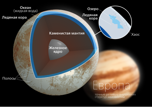
Splendid! I also made a Russian translation of the picture of the Earth that you made. Here is another legend.
Don't be alarmed that the translations for ocean (Океан) and oceanic (Морская) are completely different; that's just how Russian works. Воображение (talk) 23:57, 27 February 2014 (UTC)
K I simply could not find the rest of the weights of the font I use so I just typeset the Europa diagram with a monoweight. (Cyrillic fonts are actually surprisingly difficult to obtain!¡ && it's not as easy as flipping the Ns and Rs around to build them yourself) I also took the chance to update the typographical style to better match my other pictures—Love, Kelvinsongtalk00:13, 1 March 2014 (UTC)
Got the fonts, Did the earth! (The cyrillic letters did not come easy!) Thanks for the translations! I'll redo the Europa poster laterr—Love, Kelvinsongtalk03:00, 1 March 2014 (UTC)
Keep up the good work! I'll probably come by again with translations for the same pictures but in a different language soon enough. Воображение (talk) 17:00, 1 March 2014 (UTC)
Just wanted to leave you a quick thank you for your drawings! They are going to be very useful in my 9th-grade class. Qfl247 (talk) 17:53, 1 March 2014 (UTC)
Iron and iron sulphide core (liquid) - Железо и ядро сулфида железа (жидкое)
Iron core - Железное ядро
Also, I noticed I made a mistake on the Europa picture.
Europa:
1. exact sizes of internal structures unknown - I accidentally added one more letter than I should have; just delete the final e of the final word. Воображение (talk) 00:17, 4 March 2014 (UTC)
Hey Kelvinsong, I have a question, How much effort would it take to create a svg that shows highlighted counties between 2 states? I have provide liks to the counties that would need to represent a "single" entity....It is of course related to WV, BUT I thought of all the people who had the skills and talent, why not ask you? Besides, I did initiate a graphics request, BUT I thought I would ask the level of effort required of you could of course say, hey, go to location x and do this...ANY feedback would ofg course be appreciated. It is for the boundaries of the Pocahontas Coalfield on English Wiki. Here are the links, JUST in case....*McDowell County West Virginia
Hi Kelvinsong, I noticed you've made tons of superb SVG diagrams; I'm sort of a newbie SVG editor and I'd like to improve the visual appeal of one I made since it's being used on a FAC (which will eventually be an FA unless I experience an untimely death) at the moment.
Seppi333 (talk·contribs) Sure¡ I'm like too lazy to format paragraphs so I'm just going to make a list of problems. I hope it doesn't come across as too harshh
1 You seem to be stuck in that awkward spot in between "schematic" and "drawing". It's too flat and primitive ("primitive" as in geometric primitives; like the circle, square, triangle, etc) to be a drawing, but too irregular to be a schematic diagram. Consider simplifying it to a stylized schematic (try to draw inspiration from other sources for ideas, anything from kids cartoons to sci-fi movies to airports to website designs can work). Or you can redraw it to better represent a 3D synapse (but protein complexes are really hard to make attractive in a drawing so I'd suggest making it into a schematic)
2 You have a key. Eww. Try to incorporate it better into the diagram. Use integrated labels, colors, shape, etc. Be creative! A legend is the most basic way to present this kind of information.
3 The color scheme seems amaturish. You seem to grasp some concepts like using off-peak colors (ie not pulled to the edge of the Saturation-Value triangle) but lime green, grass green, daffodil, black, and indigo don't go together. While anyone who tries to teach you rules about color choice probably has no idea what they're talking about, color is something that you should really experiment with more. Don't neglect it. Color is probably the second most important design element there is (the first is shape/space). I can give you a set of colors and you'd immediatly think 'Retro" or "Haute couture" or "Sci fi". Color sets tone, & not just ones like "warmth" or "christmas".
4 Thick black borders are so 8 years ago. They came into favor a while ago in certain kids shows like the Powerpuff girls and since they've become quite outdated. That's also why color's become so important these days—now that you can't rely of thick black boundaries to delineate spaces you have to put thought into using color contrast to do that. Most trends are usually pretty stupid (like longshadow, grunge, kawaii, etc) but the move toward cleaner shape and color based design has been pretty enduring. Black lines haven't gone away, but if you use them they need to have more character in their stroke weight variations. Monotonous black outlines just doesn't cut it anymore.
5 this might be a personal thing but I would make the dashed lines solid. Dashed lines draw attention so save them for stuff where a dashed line makes sense. If you want to make the lines more subtle, use transparency. Also, make the arrow heads the same color as the arrow stems. Sorry I'm like OCD with that.
6 Typesetting needs work. Is the Legend a region like the Axon terminal or the Synapse? What's more important, the names of the molecules, or the names of the processes? How am I supposed to tell them apart? Are L-phenathaline & Dopamine types of Reduced post-synaptic receptor fireing rates? Is the red spiky thing in the upper left called a From axon? For example, use italics to represent "verb labels", roman type for "noun labels", semibold type for category names, large thin type for display headings, etc. Just keep it consistent and keep a dominant type style (like use regular roman type for 70% of your labels). This is also why you need to use a good font to label your diagrams, one that has all the italics, fontweights, etc. that you need to create a subtle categorization system and hierarchy. Deja Vu serif just doesn't cut it.
This probably sounds mean but I'm just dredging up any issue I can possibly think of for this image. It's okay to disagree with some of these, I break the rules all the time! Bonne chance !—Love, Kelvinsongtalk02:12, 26 March 2014 (UTC)
No, I think this was very helpful feedback! I'll do my best to address these as I get a chance. Thanks for taking the time to review it. Seppi333 (Insert 2¢) 03:38, 26 March 2014 (UTC)
Quality Image Promotion
Your image has been reviewed and promoted
Congratulations! Jupiter diagram.svg, which was produced by you, was reviewed and has now been promoted to Quality Image status.
When do you suppose there will ever be a category for "Diagram of the Year" or "Illustration of the Year" to which no photographed images may be submitted and for which only user-generated content may be considered? I say in 2025. Only because I am an optimist (actually, I am not an optimist; I just said that for no reason because I am actually an anarchist— wait, no, scratch that, back that up, reverse it... What was I talking about? Oh yeah: "D.o.t.Y" I think it also sounds a lot nicer than "P.o.t.Y."!) -KDS4444 (talk) 09:35, 1 April 2014 (UTC)
Hi Kelvin, I have some good news for you. Your diagram of the Sun has been used at the other side of the Earth in Singapore in a astronomy knowledge booklet at an astronomy competition, namely the Astrigue. :) Although there was no acknowledgements (can't expect much from secondary school students). I'm taking part in it, day 1 is today 19 April, day 2 is next saturday 26. I was pleasantly surprised when I saw your diagram in the booklet this morning. ;) (✉→ArcticKangaroo←✎) 15:35, 19 April 2014 (UTC)
What excellent artwork. I was initially just looking at the planets, but then started discovering other things you had done. Great work, keep it up. — Preceding unsigned comment added by 90.142.141.101 (talk • contribs)
This is an archive of past discussions. Do not edit the contents of this page. If you wish to start a new discussion or revive an old one, please do so on the current talk page.


 Support though SVG voters seem to be an endangered species over there.—Love, Kelvinsong talk 01:31, 17 August 2013 (UTC)


-en.svg/2)
![[1]](/wiki/Commons:Featured_picture_candidates/File:MGM_Grand,_Macao,_2013-08-08,_DD_14.jpg)
![[2]](/wiki/Commons:Featured_picture_candidates/File:Clerodendrum_speciosissimum_Tropenhaus_Gruga.jpg)
![[1]](https://commons.wikimedia.org/w/index.php?title=File:Sanfranzisco19874.jpg&curid=25962687&diff=102132501&oldid=102118861)
![[2]](https://commons.wikimedia.org/w/index.php?title=File:Sanfranzisco19877.jpg&curid=25962464&diff=102133355&oldid=102118821)
-en.svg/2)
 Done I'll do Europa laterr—Love, Kelvinsong talk 00:38, 7 March 2014 (UTC)

 —Love, Kelvinsong talk 23:36, 12 March 2014 (UTC)


