Help:スキャニング

'スキャニングはコモンズに掲載する画像や文書を比較的簡単に作成します。皆さんがスキャニングの方法を知っていて歴史に興味があるのなら、素晴らしい方法で興味を世界とシェアする事が出来ます。
パブリックドメイン下の作品は以下にある資料を含みます。
- 図書館(とりわけ大都市の図書館、さらに良いのは大学図書館。その大学の学生かどうかを問わず、蔵書の利用が許されている大学図書館では、通常、一般人が入手できる資料よりも古い書籍を自由に閲覧できます。)
- 歴史研究団体
- 古書店
一般的なアドバイス[edit]
Check your monitor is adjusted properly, particularly the brightness and contrast settings. Too bright, or too low-contrast and your images will tend to have a grey tinge to them on better-adjusted monitors. You should ideally be able to see three circles on this image, which tests monitor calibration. Commons:Image guidelines#Your Monitor provides more advice.
Unless your scanner is incapable of it, never scan at below 300dpi. The file sizes may be large, but for engravings, illustrations, paintings, and illustrations of any complexity, this is about the minimal resolution to let it be reproduced to a reasonable quality. Commons files must be under 20MB in size. (Commons gives a warning at 5MB, however, almost every featured picture-quality scan is going to, by necessity, go over this, so just ignore it and hit the "Upload anyway" button. The limit is more for diagrams and photographs, which compress a bit better.)
That said, 400dpi is quite good enough for most scans, 600 or (even rarer) 800dpi may be useful for scanning some very detailed engravings from the originals or high-quality copies, as master engravers (such as William Hogarth and Gustave Doré) often included details smaller than the naked eye can make out. 500dpi to 800dpi may also be convenient for images at around the size of a postcard or smaller (about 3" by 4" / 8 cm by 10cm), as allows for some degree of scaling up above the original size. 1200dpi is almost always excessive, unless you're scanning slides or microfilm. If you are, consult your scanner's manual.
Clean your scanner glass off before scanning, particularly if you have pets—hairs, dust, and the like have a tendency to get on the scanner bed.
Use your scanner software's preview option (if it has one) to get the image as straight as possible. Rotation can be done afterwards, but it's often a headache, and if you can get it straight before you scan, you'll have a much easier time of it. Also, every piece of scanner software is different, so learn what functions your scanner software offers [Switch to "Professional" or "Advanced" mode if given the choice], and play around with them until you understand how to use them well.
If you have a large work that will not fit on a scanner in one piece, don't worry: Graphics labs, such as en:WP:GL/IMPROVE, Commons:Graphics village pump and Commons:Graphic Lab are available, and the people there are usually quite happy to stitch together an image from multiple scans. Tip: It makes things much more easy for them if you use the edge of your scanner's glass to straighten whatever you're scanning against, so that all scans that go into the image are at the same angle. However, if you can't do this, they can usually cope. Also, scan the parts at a fairly large, resolution (though not more than 600dpi, as a general rule); it'll make it easier for the joins between the images to be concealed if it can be scaled down a bit afterwards.
When scanning images from books, it can be useful to put a black piece of paper behind the page being scanned. This helps prevent text from the other side of the page showing through. If your scan does show shining-through text, it can sometimes be corrected using image manipulation software. A technique that works quite well for grayscale images is explained at Commons:Pearson Scott Foresman.
PNGかJPEGか[edit]
PNG is a lossless method of saving images; GIFs and JPEGs (sometimes called .jpg because of a DOS file name limitation) can add artefacts (ugly errors, pretty much) to your picture. Generally, GIFs are mainly used for animated images, and JPEGs and PNGs are the main choices for still images. As most scanners are not set up to capture moving images, let's concentrate on PNG and JPEG.
PNG is a safe bet in most cases, but if a PNG is very large (more than 12.5 million pixels, or roughly speaking, more than about 4000x3000) Wikimedia software can't show it, and you'd best switch to JPEG. A full-colour PNGs can also be quite large in size, and above 15 megabytes or so, this can be a problem. Programs such as Optipng or PNGcrush can help make your PNG files smaller at no loss of quality. In any case, it's usually best to scan to a lossless format, such as PNG, TIFF, or, if you have to, BMP first. A JPEG has already lost quality, and with some settings, may have lost a significant amount, and switching to PNG will not bring that back. In addition, if you edit a JPEG and save it, particularly if you do this repeatedly, artefacts start to accumulate. By starting with a lossless format, even if you have to go to JPEG in the end due to size issues, you won't lose any more quality than could be avoided.
In better image editing programs, you will get the choice of quality vs. compression for your JPEGs. In general, if the scale is 1 to 100 (with 100 being best quality), don't go under 85 or so (and keep it at 100 unless file size issues force you to go lower), and check the image at full resolution before uploading to make sure it still looks okay. This old version of Sadko.jpg, viewed at full resolution, appears to be made up of thousands of little squares, which is one of the things that can happen if the quality is set too low. The current version has twice the file size, but avoids these problems.
モノクロかグレースケールかカラーか[edit]
If your image is in colour, the answer is of course going to be to scan it in colour. For black-and-white images, the decision is a little more complex.
True black and white is usually not a good idea—a grayscale scan tends to provide smoother curves, and provides anti-aliasing to smooth out pixelisation. However, there's something to be said for both the other choices.
This image is scanned in grayscale, with the contrast adjusted upwards in order to provide a smooth, white background, and to get the main parts of the lines pure black. This puts the emphasis squarely on the picture, and, as the lines that make this image up are fairly thick (for an engraving: the smallest are about the width of a line from a ballpoint pen, and are all visible to the naked eye if you look closely), no real loss of detail would come about from such adjustments.
However, in this one, some of the lines are so fine that they're hardly visible to the naked eye (at its original size), the ink is slightly tinted from age, and the paper has a nice feel of oldness to it. Some of the detail in the very delicate fine lines might be lost from too much post-processing, and the ink and paper add to the interest of the piece, so this one is best kept in colour.
If in doubt, try it both ways, and then decide which one you like best.
ハーフトーン[edit]
Half-toned images are used in most modern printing. In them, an array of dots is spaced at even intervals, with the size of the dot determining how dark it is. Unfortunately, half-toning can look awful if you zoom in too far. Consider this image:
In the original, this was made by using engraving for the black lines, followed, as I understand it, by either hand-tinting or several additional plates for each colour. However, this version was clearly scanned from a modern book, and at full-view, all the dots that went into the half-toning are visible.
If possible, try to go to the original sources. This, of course, isn't always possible, so if your work is half-toned, but is still under a free licence, please do scan it for commons! Half-toning can be fixed with a little manipulation afterwards, and, even if the image ends up, by necessity, at a lowish resolution, it's still showing things that would otherwise be unavailable to Wikipedia projects.
"Remove moiré", or "descreen" functions of scanner software make a start towards fixing half-toning. Turn them on.
A half-toned image cannot have more detail than the spacing of the dots that make it up, so if your work is half-toned, it's best to manipulate it in a photo editing program afterwards. The easiest way is to first use the blur tool, which will smooth out the dots a bit, then scale it down a bit until the dots are no longer visible. In pure black-and-white half-toned images, however, you may be able to get away with just blurring it a bit, then using the sharpen tool and upping the contrast. You should probably downscale it a bit afterwards, but this can salvage a black and white half-toned image to good effect with practice.
Software is available from Cornell University and Picture elements to automatically fix black and white halftone images, if scanned at 600dpi.
版画、エッチング、またはそれに類する作品[edit]
Engravings are, perhaps, the easiest type of art to work with, and, if you have access to a good library, 19th century illustrated newspapers were common, often had very good quality engravings, used quite a lot of them, and are often fairly-well preserved.
There are two main types of engraving:
The first is to make it out of individual lines, as in this (originally approximately 2" / 5 cm tall) small engraving of Charles Dickens from the Entr'acte, a Victorian theatrical newspaper. This technique is also used for far more complex drawings, for instance:
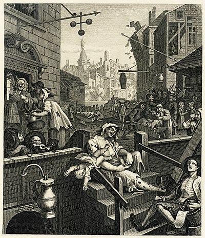
If you look at this image of William Hogarth's Gin Lane at full size, you will see that all the shading, all the detail comes down to fine lines and crosshatching. This is actually a re-engraving by Samuel Davenport, shrunk down to only about 5"x6" (about 12cm x 16cm). The fine lines are actually invisible to the naked eye, instead blending into shading.
This is perhaps the most common form of black and white engraving.
Now consider this engraving:
Technically, this is actually not an engraving, but an etching. An acid-resistant coating was put over the plate, then areas were scratched away to allow acid to get at and texture the plate. The longer the acid is in contact, the rougher the plate's surface gets, and so the more ink it holds. By using several baths, changing what is covered as you go, you can create delicately-shaded works such as this one, with the shading made up of a sea of irregularly-shaped pits. Etching generally cannot get as much detail as an engraving proper, as a certain amount of randomness comes into play from the acid pitting the surface irregularly. An etching is inherently "noisy", with irregular dimpling of black and white, as it's altering how much "noise" there is in any one area that actually makes up the art.
This distinction matters to scanning: In a scan of an engraving proper, every line should be distinct at full resolution, unless the engraving is extremely large, but in an etching, the artist did not physically choose the *exact* texture that creates the colours or grayscale, so a slightly lower resolution is fine. You can upload files up to about 15 megabytes or more in size. (The recommendation that files be under 5 megabytes does not apply to complicated works of art that do not compress well, and engravings, etchings, and paintings generally don't.) For large engravings, you may well have to use this.
A good scan of engraving, etching, or similar should:
- Show every line that makes it up distinctly, if an engraving (If it's really large, though, say more than 3 ft / 1 metre wide, just try and get it so all important detail can be seen and all text can be read). In an etching, it's basically made out of noise/static/irregularly shaped pits, with the location not precisely chosen by the artist. Just scan them at a reasonably high resolution.
- If it's a black and white engraving, and you've decided not to show the paper texture, adjust the levels so that the background is smooth, pure white, and the ink (at least where there's plenty of it) is a nice dark black. If you're scanning in colour, still make sure the paper is reasonably light in colour, and black areas do not look washed out, but reasonably black. This will make it look far better when scaled down for viewing on Wikipedia and other projects.
- For colour engravings, see also the advice of the next section.
木版画に関する注意[edit]
Woodblock engravings, particularly from Victorian periodicals, often contain fine white lines that show the divisions between the woodblocks that were glued together to make the full image. (Example Image:Design for an Aesthetic theatrical poster.png is fairly cleanly divided into four smaller rectangles.) There are multiple views on whether it is best to edit the image to remove them or to keep them in for authenticity. Graphics labs, such as en:WP:GL/IMPROVE, Commons:Graphics village pump and Commons:Graphic Lab are probably the most useful places to go for restoration work; describing how to do extensive restoration work yourself is probably out of the scope of this tutorial.
絵画、フルカラーイラストレーション、及びそれに類する作品[edit]
The methods for scanning full-colour illustrations, paintings (however, see below in this case), and similar are not greatly different from engravings, but it's best to adjust the colours afterwards to make it look as much like the original as possible.
- Scan at a minimum of 300dpi.
- Using a graphics editing program, adjust the levels, brightness and contrast, and so on, until the colours are as similar to those in the actual picture as possible. Keep a copy of the untweaked scan, and compare it with the final version to make sure you haven't accidentally messed something up. Also, this was said in the general advice section already, but make sure your monitor is appropriately calibrated, as described in Commons:Image_guidelines#Your_Monitor - otherwise, what looks realistic to you and what looks realistic to everyone else will be different.
A warning about paintings: For paintings done on a canvas (e.g. most oil paintings, acrylics, and so on, in most cases, it's not going to be possible to get the original to a scanner, and, if the painting is old, it might damage it even if you could get it to one. If, however, it is possible, and damage is unlikely—e.g. a painting you've just made yourself, hence in good condition, note the texture of it. A little texture is fine, but if some parts stick out much more than a couple millimetres from the surface, you're probably best photographing it.
In many cases, though, you'll be scanning a painting from a modern reproduction. This can lead to mixed results. In lower-quality reproductions, you'll be dealing with #Half-toning, as described in the earlier section on it. Use the advice given there to attempt to ameliorate it. However, really good reproductions, as can be found in some high-quality art books may not have half-toning, or have it so fine that it doesn't matter except at the most ridiculously high of resolutions. In these cases, scan it at at least 300dpi then adjust it in a graphics program as described for scanning from an original painting.
As always, Graphics labs such as en:WP:GL/IMPROVE, Commons:Graphics village pump and Commons:Graphic Lab can assist you if you find this difficult. Also, check the copyright status first. Bridgeman Art Library v. Corel Corp. and similar rulings in other countries mean that, in most cases, if the original is in public domain, a copy is as well. However, note that the United Kingdom has unusually strict copyright laws that may protect a heavily-restored image produced there. If in doubt, Commons:Licensing attempts to explain the full rules related to copyright, and Commons:Village pump may be able to help you if you are still uncertain.
切り取り[edit]
Try and leave a little whitespace around the image when you're scanning it in full. This makes sure you don't accidentally remove useful parts of the image, or (just as easy, I'm afraid) give the impression you have. Obviously, this may not be possible if the image goes right to the edge of the paper, but putting a piece of blank white paper behind it can help. Scan the image in multiple parts, if necessary—as mentioned in #General advice, support is available to stitch an image together from its parts.
When giving a detail from a larger image, try and trim it so that distracting details you do not intend to draw attention to are minimised in visual effect. For example:
This is a detail from a Punch cartoon—this Punch cartoon, in fact—that was being cropped for the English Wikipedia article on Gilbert and Sullivan As such, The main image of Sullivan, and the tiny W. S. Gilbert were the important parts. Part of someone who is probably F. C. Burnand can be seen in the upper left-hand corner, but the crop avoids showing his face, so it doesn't attract too much attention. This detail is also from the lower-right corner of the original, so it's fairly sharply cropped on the right and bottom to avoid including (most of) the black line that frames the image as a whole, as having a thick black line on only two sides of an image would unbalance it. Serendipitously, the tiny bit of the black line that got left in on the lower edge and the bit of Burnand's moustache in the upper left completes the frame, creating a nice, even rectangle.
外部リンク[edit]
- Scantips
- Halftone scanning
- Scanning tips, tricks, tutorials and techniques - list of links
- SANE FAQ - SANE (Scanner Access Now Easy) - API for Linux scanner software such as XSANE


