File talk:Suicide rates map-en.svg
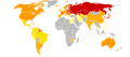
The data here is much more detailed than the four bins you've divided it up into. Can you do a more accurate version that shows that gradations? — Omegatron 04:27, 12 December 2007 (UTC)
- Sure, it's possible. What intervals for the bins shall I use then? Bamse 03:42, 13 December 2007 (UTC)
Thanks for the SVG map. Could you add an additional top range as at File:SuicideRates.PNG? A range for areas with more than 40 suicides per 100,000 people. --Timeshifter (talk) 23:01, 17 April 2009 (UTC)
Here is a map that is current to the data provided currently on Wikipedia as of Aug 27 09. The the ranges are smaller and the data matches what is currently on the main article, provided the data was given with the last ten years.
Alternatives[edit]
Created the following alternatives from the 1978-2008 data (i.e. the latest WHO data). /Lokal_Profil 11:44, 6 November 2009 (UTC)
-
 Total
Total -
 Male
Male -
 Female
 -
 Female (with same colour scheme/scale as for male)


