File talk:COVID-19 cases in Greater China.svg
 | This file was nominated for deletion on 6 November 2023 but was kept. If you are thinking about re-nominating it for deletion, please read that discussion first. |
 | This file was nominated for deletion on 7 February 2020 but was kept. If you are thinking about re-nominating it for deletion, please read that discussion first. |
Qinghai now confirmed[edit]
--Charsum (talk) 11:37, 25 January 2020 (UTC)
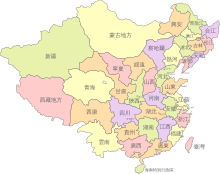
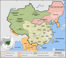
Boundaries of Greater China[edit]


How was it confirmed that these are the boundaries of Greater China? What about Mongolia? --Geographyinitiative (talk) 00:18, 26 January 2020 (UTC)
- This page is actually a map of the PRC claim, not a map of Greater China. --Geographyinitiative (talk) 00:32, 26 January 2020 (UTC)
scaling to allow >1000[edit]
Now that cases in 湖北 have exceeded 1000, how about the colours are changed so that 1000+ can have a different colour. Also make the colours lighter so there is more room for 10000+ or 100000+. Graeme Bartlett (talk) 10:58, 26 January 2020 (UTC)
The colors should be less dark altogether. A suitable red scale would be:
Or shorter
Hello @董辰兴: I have adjusted the border color of the provinces for better visibility. --Furfur ⁂ Diskussion 21:21, 26 January 2020 (UTC)
- Thanks, but in your version some of the shapes are slightly shifted. You also alternated the coding scheme totally and removed all previous comments in the file. Please do not alternate the coding scheme and use the original tool (vim or other text editor) as much as possible in future updates. Thanks! --董辰兴 (talk) 22:04, 26 January 2020 (UTC)
Updating the file[edit]
@Ratherous and A962315220: Thanks everyone for the effort in updating the file. But as stated in the summary section, the file was created with Vi IMproved. For updating, please use the same tool or other text editors as much as possible. Using Inkscape or Adobe Illustrator will change the coding scheme of the file. Thus it will possibly not pass the code check well (e.g. in the previous version there are 2 warnings). Thanks for your cooperation. --董辰兴 (talk) 14:30, 27 January 2020 (UTC)
@董辰兴: 我觉得我需要解释一下,我一直是用文本编辑器 Sublime Text 3 进行编辑,所以不会破坏文本结构。但有时候,在我之前的编者可能已经修改了结构,如果我发现了我也会把它改回来,但有时候没发现也就直接在其之上作改动了。不过有一个142KB的版本,那个版本也只是把阁下源文件中不规范的 DTD 改成标准的 SVG DTD,我认为这个改动或许是可以接受的。
I think I need to explain that I edit this file with the text editor Sublime Text 3, it will not break the coding scheme. But sometimes, the contributers before me may have modified the scheme. If I found it, I would change it back. While sometimes I didn't, then I just made a change on the basis of it. However, there is a version with a size of 142KB, which just replace the non-standard DTD in the source file by a standard SVG DTD. I think that change may be acceptable.
A962315220 (talk) 10:54, 28 January 2020 (UTC)
- @A962315220: Yeah your edits are mostly fine. I only found this issue in your previous version when you were updating Ratherous' one, so I mentioned you incidentally. Thanks a lot for helping updating! --董辰兴 (talk) 13:46, 28 January 2020 (UTC)
- @董辰兴: 我建议您不必太过于纠结格式问题,至少不必向其他编者去强调。首先我先提出我的两个个人观点,您看看是否能达成共识:第一,图像的时效性比格式的完整性更为重要,只要格式问题不影响到正常显示;第二,相当一部分的编者并不知道怎么使用文本编辑器去处理SVG图像,但我们不该阻止这些编者去用图形化编辑器来做贡献。如果您认同以上两点,但还是对格式问题拥有执念的话,我建议您可以这样处理:不去理会其它用什么方式、什么工具做编辑,而只是在您作编辑的时候把数据格式恢复到您理想的样子。如果您需要,我也可以帮助您作这件事。A962315220 (talk) 15:24, 28 January 2020 (UTC)
- @A962315220: 同意。我一直是这么做的,也没有撤销过别人的编辑。谢谢帮忙!--董辰兴 (talk) 15:30, 28 January 2020 (UTC)
董辰兴, thanks for letting me know. I started using a text editor to update the file. I hope it's okay now. --Ratherous (talk) 04:57, 29 January 2020 (UTC)
- It looks perfect! Thanks so much! --董辰兴 (talk) 05:06, 29 January 2020 (UTC)
About the color scheme[edit]
@董辰兴:
各地疫情愈发严重,不排除湖北省很快就会突破10,000例的可能性,在这种情况下目前的颜色差别会不会太小了,让一些人看不清楚?或许采用类似于丁香园的配色会更加清晰明了?(如果修改的话,请注意各语言维基百科上面的图例也需要修改。或者也可以考虑参考丁香园,把不带文字的、纯数字的图例附在旁边?)
The epidemic situation is getting worse all over the area. The possibility that Hubei Province will soon exceed 10,000 cases is not ruled out. In this case, is the current color difference too small to identify? Will it be more clear if we use a color scheme similar to the Dingxiang-yuan? (If somebody modify it, please note that the legend on Wikipedia in each languages also need to be modified. Or maybe we can consider adding the legend with pure numbers but no text next to it referring to the map of Dingxiang-yuan?)
--A962315220 (talk) 16:33, 29 January 2020 (UTC)
- I'm pro changing color scheme but not necessarily now. Feel free to go ahead and change it if you want! --董辰兴 (talk)

- A new color scheme example (I also removed the ocean color) --Furfur ⁂ Diskussion 00:51, 31 January 2020 (UTC)
- Support. Lighter colorsheme is better. Yug (talk) 15:04, 31 January 2020 (UTC)
- Color scheme applied. --董辰兴 (talk)
- A new color scheme example (I also removed the ocean color) --Furfur ⁂ Diskussion 00:51, 31 January 2020 (UTC)
Greater China (excluding Mongolia) + Arunachal Pradesh problem[edit]
Greater China includes Mongolia (see Greater China). Also, the Arunachal Pradesh figures have to be sourced. --Geographyinitiative (talk) 11:53, 31 January 2020 (UTC)
- Arunachal Pradesh does not make sense. Even this official Chinese map does not include Arunachal Pradesh. --Furfur ⁂ Diskussion 14:21, 31 January 2020 (UTC)
- @董辰兴: Agree. Arunachal Pradesh doesn't make sense. Please blank it out. Yug (talk) 15:03, 31 January 2020 (UTC)
Greater China reads: "The area described by this informal term is not always entirely clear, but it normally encompasses mainland China, Hong Kong, Macau, and Taiwan." It has nothing to do with Mongolia.
The area in the map is South Tibet, not Arunachal Pradesh. It is claimed but not controlled by China, so using a different color is rational. --董辰兴 (talk) 15:19, 31 January 2020 (UTC)
- No epidemiological data exist for the north of Arunachal Pradesh. The coloration is irritating. It can be indicated that this area is claimed by China but not with an area coloration. This is not the right place to promulgate one-sided views. Obviously this area is not under Chinese control. --Furfur ⁂ Diskussion 19:14, 31 January 2020 (UTC)
No epidemiological data is assigned to that color. It is clearly stated that the map is a derived work from File:China blank map grey.svg, where the area is colored like that. If you don't like the coloring, please raise the topic in the original file. --董辰兴 (talk) 20:35, 31 January 2020 (UTC)
- You misunderstand something. The map File:China blank map grey.svg is a political map taken out of a series of files which have the same coloration etc. Here it is clear for the viewer that Arunachal Pradesh and Taiwan are claimed by the People’s Republic of China and are not under her control. Your map is an epidemiological map. Areas are coloured according to the numbers of infections. There are no epidemiological data for the former North-East Frontier Agency area. You can show political claims on the map but don`t design it in a way that people could think that these areas are actually part of the PRC. If you don't change the map, I will consider suggesting to create a new map that is less politically biased. Even official Chinese maps do not show the North of Arunachal Pradesh colored. --Furfur ⁂ Diskussion 11:34, 1 February 2020 (UTC)
If I wanted people to think that these areas are actually part of the PRC, I would paint it the same color as Tibet. Take an eye on the official Chinese map you referred again and see if the North of Arunachal Pradesh is included. --董辰兴 (talk) 16:55, 1 February 2020 (UTC)
- There is currently a discussion ongoing at the English Wikipedia here about the boundaries of this map. Consensus so far has been to update this map to use a more neutral implementation of the disputes border in Arunachal Pradesh, and the remove the coloring on Taiwan. --Haha169 (talk) 19:36, 6 February 2020 (UTC)
The original version of the document does not seem to describe Greater China, but more like the legal territory of the People's Republic of China.[edit]
Because original version of the document of Hong Kong, Macao and Taiwan only the epidemic overall description, but of mainland China's provinces to do a very detailed description.--420peace (talk) 16:03, 11 March 2020 (UTC)
Per capita map[edit]
On Wikipedia, we should really be switching to a per capita map for most use cases, not this one, per the RfC here. The per capita version of this map (the used at en-WP), at File:COVID-19_attack_rate_in_Mainland_China.svg, could use an update/improvements; please see its talk page. Sdkb (talk) 02:43, 5 April 2020 (UTC)