Commons:Quality images candidates/Archives September 2007
-

-

- Nomination A new and much improved version of the Pythagorian theorem. If we take some time to appreciate the "proof" we'll be amazed by its simplicity and elegance - Alvesgaspar 17:45, 27 September 2007 (UTC)
- Promotion Hooray for math! Calibas 05:33, 28 September 2007 (UTC)
-
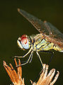
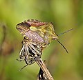
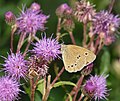
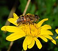
- Nomination Red-veined darter in teneral stage, not showing yet the gender characteristic colouring (Sympetrum fonscolombei). Detail of the head, thorax and legs. Alvesgaspar 14:50, 27 September 2007 (UTC)
- Promotion Good detail on head and thorax. Calibas 05:36, 28 September 2007 (UTC)
-

- Nomination diferent plastids that can apear in plant cells- LadyofHats 14:03, 27 September 2007 (UTC)
- Decline What is the meaning of the blue lines connecting the various elements? That should be explained in the image file. Also, the letters are too big and the legends are not aligned, as they should. Finally, I think that the explanatory text needs some improvement - Alvesgaspar 18:34, 27 September 2007 (UTC)
-

- Nomination Allegory of peace and heaven - Prunksaal - Austrian National Library. --Alberto Fernandez Fernandez 13:36, 27 September 2007 (UTC)
- Promotion Nice detail, hard to get good lighting for these kind of pictures but you pulled it off. Might want to nominate this for FP. Calibas 05:31, 28 September 2007 (UTC)
-

- Nomination Awesome GIF of the evolution of Canada's provinces. By Golbez, not me. Doodledoo 20:34, 26 September 2007 (UTC)
- Promotion Of course - Alvesgaspar 22:30, 27 September 2007 (UTC)
-

- Nomination Hikers on the way to the Schneeberg (5 pictures stiching). Left: summit with the radar station and mountain lodge on the left. Right: mountain lodge - Alberto Fernandez Fernandez 15:05, 26 September 2007 (UTC)
- Decline
 Comment Excellent stitch. I am in doubt concerning the sharpness and light and ask for another reviewes opinion. -- Slaunger 21:33, 26 September 2007 (UTC) - Agree with Slaunger. The picture lacks detail and suffers from the side effects of oversharpening: please notice the black fringing of the snow patches. Alvesgaspar 08:27, 28 September 2007 (UTC)
 I withdraw my nomination You're right about oversharpening. I need to check my automatic workflow. I'll upload a new version asap. With respect to details, I wanted to include the hike trail I was on in my panorama. Any suggestions to have the foreground sharp and the background sharp without a tripod after 4 hours of hiking? ;-)Alberto Fernandez Fernandez 09:47, 28 September 2007 (UTC)
-

- Nomination A photographer trap if I ever saw one, no need for that tree arrangement otherwise. --Dori - Talk 03:15, 26 September 2007 (UTC)
- Promotion Comment off center? and the way the trees are not planted directly across from each other makes this image seem tilted -- probably would take too long to replant them correctly... Should it be re-cropped so the center of the path is in the center of the image?carol 04:21, 26 September 2007 (UTC)
I've shaved off about 20px from the left. Dori - Talk 04:35, 26 September 2007 (UTC)
How about 3 more pixels? It is nicer if that green line at the end of the path is centered.carol 06:09, 26 September 2007 (UTC)
OK, done :) Dori - Talk 13:02, 26 September 2007 (UTC) Comment the tops of the trees seem to be leaning outwards? Ben Aveling 10:20, 27 September 2007 (UTC)
I believe they do lean somewhat, I didn't notice while there, but from other shots. Dori - Talk 01:37, 28 September 2007 (UTC)
-

- Nomination View of of the courtyard - Mosteiro dos Jerónimos - Belém--Szilas 18:20, 25 September 2007 (UTC)
- Decline Please rotate your photo! --Beyond silence 20:29, 26 September 2007 (UTC)Reloaded--Szilas 18:01, 27 September 2007 (UTC)
The photo is too unsharp, specially in the darker parts, and noisy (in the sky). Also it needs a correction of the lens geometric distortion (not a rotation) - Alvesgaspar 08:23, 28 September 2007 (UTC)
-
- Nomination S. Otxandategi --Lestat 15:45, 24 September 2007 (UTC)
- Decline Artifacts, unfortunate crop - Alvesgaspar 22:32, 27 September 2007 (UTC)
-

- Nomination Plant buds clasification--LadyofHats 18:45, 26 September 2007 (UTC)
- Promotion Fascinating and valuable. Doodledoo 20:35, 26 September 2007 (UTC)
Is it possible to get a larger version of this? Calibas 03:50, 27 September 2007 (UTC)- sure it is, but why do you need it? it is an svg file you can make the thumb as big as you want without loosing quality.-LadyofHats 09:51, 27 September 2007 (UTC)
-
![* Nomination Monument on the top of mountain Śnieżnik (Glatzer Schneeberg). -- Pudelek 18:41, 26 September 2007 (UTC) * Promotion Monumental. Calibas 03:54, 27 September 2007 (UTC) Please geocode. Is it not Glatzer Schneegebirge instead of Schneeberg? See [1] Alberto Fernandez Fernandez 07:47, 27 September 2007 (UTC) Geocode done. This is exactly Glatzer Schneeberg [2], Pudelek 09:27, 27 September 2007 (UTC)](https://upload.wikimedia.org/wikipedia/commons/thumb/b/b4/Glatzer_Schneeberg_01.JPG/90px-Glatzer_Schneeberg_01.JPG)
- Nomination Monument on the top of mountain Śnieżnik (Glatzer Schneeberg). -- Pudelek 18:41, 26 September 2007 (UTC)
- Promotion Monumental. Calibas 03:54, 27 September 2007 (UTC)
Please geocode. Is it not Glatzer Schneegebirge instead of Schneeberg? See [1] Alberto Fernandez Fernandez 07:47, 27 September 2007 (UTC)
Geocode done. This is exactly Glatzer Schneeberg [2], Pudelek 09:27, 27 September 2007 (UTC)
-

- Nomination An old barn and wind turbines in Illinois. --Dori - Talk 04:44, 26 September 2007 (UTC)
- Promotion This image is doing well as a FP candidate. -- carol 05:41, 26 September 2007 (UTC)
That is not a valid reason to promote, Carol.
But although on the small size, the image meets technical requirements for QI. Lycaon 04:35, 27 September 2007 (UTC)
-
- Nomination Carnegie Library of Pittsburgh, autumn.--Piotr Konieczny aka Prokonsul Piotrus Talk 23:13, 25 September 2007 (UTC)
- Decline May you must cut the parking lot. --Beyond silence 20:30, 26 September 2007 (UTC) Bad crop, trees, description. --Lestat 21:12, 26 September 2007 (UTC)
-

- Nomination Juvenile common gull taking off from a shore near Świnoujście, Poland --Leafnode 06:24, 25 September 2007 (UTC)
- Promotion Looks great. Wing in foreground just a tad unsharp but otherwise, fine. Doodledoo 20:01, 26 September 2007 (UTC)
-

- Nomination Yawning Vervet Monkey, Samburu National Reserve, Kenya --Wwelles14 04:50, 24 September 2007 (UTC)
- Promotion Near acceptable ligt and detail, valuable. --Beyond silence 18:21, 26 September 2007 (UTC)
-

- Nomination Headphone amplifier, please see description. --Adamantios 22:23, 22 September 2007 (UTC)
- Decline dislike the tilted composition, has minimal jpg aberrations -LadyofHats 19:16, 26 September 2007 (UTC)
-

- Nomination City walls and castle in Prószków / Proskau (Silesia) --Pudelek 20:29, 22 September 2007 (UTC)
- Decline bad lighting and poor composition -LadyofHats 19:16, 26 September 2007 (UTC)
-

- Nomination A photograph of a dam by 河川一等兵 --carol 09:45, 25 September 2007 (UTC)
- Decline
 Oppose Overexposed. --Siipikarja 19:08, 25 September 2007 (UTC)
-

- Nomination Great photo of an Eastern Reef Egret. By Glen Fergus. Doodledoo 21:18, 24 September 2007 (UTC)
- Promotion Good photo of a difficult (white) subject. Could have used a bit more resolution, but meets requirements. -- (Relic38 21:39, 25 September 2007 (UTC))
-
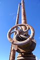
- Nomination Rusty valve. --moralist 11:44, 22 September 2007 (UTC)
- Promotion acceptable technical condition. --Beyond silence 19:40, 25 September 2007 (UTC)
-

-
-

-

- Nomination The missing square puzzle - Another version of the missing square puzzle - Alvesgaspar 16:40, 24 September 2007 (UTC)
- Promotion Simple and effective. Well done! -- MJJR 20:29, 24 September 2007 (UTC)
-

- Nomination The missing square puzzle - A funny and misterious animation whose geometric principle is explained here - Alvesgaspar 16:40, 24 September 2007 (UTC)
- Promotion Simple, effective and really didactic. Very nice, professor! -- MJJR 20:29, 24 September 2007 (UTC)
-

-

- Nomination Zinnia with bumblebee. --Simonizer 15:30, 24 September 2007 (UTC)
- Promotion Beautiful image and nice quality. Shall we expect macro competition fom Simon?... Alvesgaspar 16:55, 24 September 2007 (UTC)
-

-

-

-

- Nomination Statue of goddess, sandstone, from Cambodia. Vassil 22:46, 22 September 2007 (UTC)
- Decline Because of extreme crop - Alvesgaspar 18:40, 24 September 2007 (UTC)
-

- Nomination Museum Station, Hyde Park, Sydney, Australia --gobeirne 10:05, 22 September 2007 (UTC)
- Promotion Acceptable detal. --Beyond silence 16:01, 24 September 2007 (UTC)
-

-
-

-

- Nomination Uploaded by Jóna Þórunn. Picture of the smallest church in Iceland. --Steinninn ♨ 23:25, 23 September 2007 (UTC)
- Decline Nice composition but over-processed: white fringes on light/dark interfaces. Lycaon 23:35, 23 September 2007 (UTC)
-

- Nomination Self-portrait by moonlight with 15 sec. time exposure.--Alessandro Zangrilli 21:46, 23 September 2007 (UTC)
- Decline Sorry but the composition and photographic quality are not up to the standards of QIC. Also, there is no clear subject in this picture. The interesting thing in this image is to notice how much the celestial sphere has moved in 15 seconds... Alvesgaspar 22:59, 23 September 2007 (UTC)
-

- Nomination Luxembourg Palace at sunset -- Benh 21:10, 23 September 2007 (UTC)
- Promotion Good picture, but the thing in the lower right corner should be cloned off - Alvesgaspar 22:54, 23 September 2007 (UTC)
-

- Nomination Volkswagen Export II, photo by AlexanderFPbusse --carol 20:40, 23 September 2007 (UTC)
- Decline Not sharp, glare of the spots. Lycaon 20:43, 23 September 2007 (UTC)
-

-

-

-

- Nomination Headphones. --Adamantios 22:23, 22 September 2007 (UTC)
- Decline Very tight crop, background could be better, also position of headphones hides most of the details --Leafnode 10:17, 24 September 2007 (UTC)
-

- Nomination Lauzon lake, in the Valgaudemard (French Alps)Berrucomons 20:00, 22 September 2007 (UTC)
- Promotion A bit soft but good enough, and beautiful ! Benh 21:04, 23 September 2007 (UTC)
-

-

- Nomination SVG diagram of a vacuum-pot coffee brewer. By Einar Faanes, not me. Doodledoo 22:01, 22 September 2007 (UTC)
- Decline Sloppy detailing. Or you make an obvious caricature, or you make perfect technical drawing (matching lines, symmetrical, etc.). this one is neither. Lycaon 00:13, 23 September 2007 (UTC)
-

- Nomination Brugge (Belgium): detail of a tomb at the Steenbrugge Cemetery. -- MJJR 21:07, 22 September 2007 (UTC)
- Promotion Nice composition, acceptable technical condition. --Beyond silence 23:12, 22 September 2007 (UTC)
-

-

- Nomination Młynówka (Mühlgraben) channel in Opole (Silesia) --Pudelek 10:46, 22 September 2007 (UTC)
- Decline Very large and many dust spots and equally distracting JPEG artifacts. --Florian Prischl 23:46, 22 September 2007 (UTC)
-

- Nomination St. Peter's Basilica, early morning, Vatican City --gobeirne 10:05, 22 September 2007 (UTC)
- Decline Stitching errors (see figures left of the obelisk, lettering "PONTMAXANMDC"). --Florian Prischl 23:46, 22 September 2007 (UTC).
 Info The whole alignment from the white lines between the paving bricks in the foreground up through that lettering is miles out. I like the way the woman taking photos is captured in two different places :-) --Tony Wills 01:03, 23 September 2007 (UTC)
-

-

-

- Nomination Jadrolinija Ferry Zadar, Ancona, Italy --gobeirne 10:05, 22 September 2007 (UTC)
- Decline Clockwise tilt (see at the edge of the buildings on the left) that is a matter of persective within the other photo of which this one is a cut. In this cut, it looks like regular tilt, not perspective curving. Added to that, the picture is stretched, at least in the --Florian Prischl 19:14, 22 September 2007 (UTC)
add to that some obvious stitching errors and unsharpness. Lycaon 21:09, 22 September 2007 (UTC)
-

- Nomination Cottesloe Beach, Western Australia --gobeirne 10:05, 22 September 2007 (UTC)
- Decline Very problematic stitching "bands" in the right half. --Florian Prischl 19:14, 22 September 2007 (UTC)
-

-

- Nomination Ancient Egyptian sculpture, from about 2400 BC--Szilas 03:57, 22 September 2007 (UTC)
- Decline Unsharp/out of focus. --Florian Prischl 19:14, 22 September 2007 (UTC)
-

- Nomination A great picture of a man washing his cows in Kerala, India. By Wouter Hagens. --Doodledoo 22:35, 21 September 2007 (UTC)
- Decline With an exposure time of 1/2000s, you should have increased the aperture number. This would have added the DOF this photo is missing (only the head of the closer cow is in focus). --Florian Prischl 18:48, 22 September 2007 (UTC). Info Shutter is 1/500s. --Tony Wills 01:31, 23 September 2007 (UTC)
-

- Nomination A less distracting skies version of an earlier nomination by Orlovic -- carol 16:06, 21 September 2007 (UTC)
- Decline The crop and composition do not emphasize the subject well. It seems washed out and is tilted to the right. --Florian Prischl 18:48, 22 September 2007 (UTC)
-

- Nomination Papilio glaucus. -- Ram-Man 02:12, 21 September 2007 (UTC)
- Promotion Nice colours and sharpness. The wings are in a pretty bad condition. Following the latest bio-ethics concerns I hope you didnt inflict the damage ;-) -- Slaunger 20:58, 22 September 2007 (UTC)
-

- Nomination Asclepias curassavica flowers. -- Ram-Man 02:12, 21 September 2007 (UTC)
- Decline I very much like the colours, lightning and composition in this photo. However, I think there is too much noise and the idea of using a shallow DOF to seperate the frontmost flowers from the BG has backfired into a somewhat unsharp subject in itself. -- Slaunger 20:52, 22 September 2007 (UTC)
-

- Nomination Red panda (Ailurus fulgens) in a zoo. Vassil 23:01, 20 September 2007 (UTC)
- Decline Borderline, but too many artifacts and too little sharpnes in the skin of the animal. --Florian Prischl 20:14, 22 September 2007 (UTC)
-

- Nomination Cat, Oza dos Ríos, Galicia, Spain. --Lmbuga gl, pt, es: contacta comigo 02:01, 20 September 2007 (UTC)
- Decline No way, I'm afraid we are a bit conservative regarding extreme manipulations. If the picture doens't have a chance in FPC, it will be even worse here - Alvesgaspar 16:28, 20 September 2007 (UTC) Comment Extreme manipulations are OK if they have a purpose and are done well and are disclosed. I won't take this one to review, but only because the top of the cat's head blurs into the background. Ben Aveling 21:26, 22 September 2007 (UTC)
-

- Nomination Lichenostomus penicillatus (White-plumed Honeyeater) nest with 2 eggs --pfctdayelise (说什么?) 08:10, 22 September 2007 (UTC)
- Decline Under/overexposed, not sharp, and above all: I can not support nest photography, without a proven license or in countries where this not required, a very compelling reason. Lycaon 08:15, 22 September 2007 (UTC)
-

-

- Nomination New version-Scan of an Pavo cristatus feather--Beyond silence 13:42, 21 September 2007 (UTC)
- Decline Dull colours, background. Lycaon 08:20, 22 September 2007 (UTC)
-

- Nomination A remarkable mountain panorama, by Nicolas Sanchez - Alvesgaspar 22:42, 21 September 2007 (UTC)
- Promotion Humina, humina, humina. Flawless. --Doodledoo 22:58, 21 September 2007 (UTC)
 Support Beautiful! An unbelievable photo. So many details, clean colors, the feel of space, no stitching errors... Just amazing. It doesn't get much better than this. Love the little details one is able to find after looking the picture a while longer: the people walking on a trail down in the valley on the left side, people ascending/descending the mountain slope in the middle and the second mountain hut in the middle. It takes ages to load, but every bit is worth waiting. --Siipikarja 01:09, 22 September 2007 (UTC)
-

- Nomination Jacksonville Skyline Panorama. --Digon3
- Promotion QI without a doubt though it could be sharper. You have to offer yourself a new SLR camera, the sharpness of these panoramas would certainly benefict from it - Alvesgaspar 20:44, 21 September 2007 (UTC) I know, I know, I am trying desperately to get a Canon 400D but I am having problems with the website. It will eventually get here... --Digon3
-
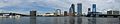
- Nomination Jacksonville Skyline Panorama. --Digon3
- Promotion QI without a doubt though it could be sharper. You have to offer yourself a new SLR camera, the sharpness of these panoramas would certainly benefict from it - Alvesgaspar 20:44, 21 September 2007 (UTC)
-

-

- Nomination A technically excellent photo of a group of protesters on World Environment Day. Photo by Peter Halasz, not me. --Doodledoo 22:56, 21 September 2007 (UTC)
- Promotion Good composition and detail. Calibas 00:13, 22 September 2007 (UTC)
-

-

-
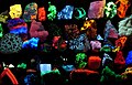
- Nomination Collection of various fluorescent minerals under UV-A, UV-B and UV-C light. Picture by Hgrobe. Adamantios 14:17, 21 September 2007 (UTC)
- Promotion Interesting. --Kolossos 19:56, 21 September 2007 (UTC)
Would it be possible to get a version with less compression? Really bad jpeg artifacts. Calibas 00:09, 22 September 2007 (UTC)
-
- Nomination Scan of an Pavo cristatus feather--Beyond silence 13:42, 21 September 2007 (UTC)
- Decline Black right border. --Kolossos 19:56, 21 September 2007 (UTC)
-

- Nomination Panoramic View of Haute Séveraisse Valley Berrucomons 09:39, 21 September 2007 (UTC)
- Promotion Nice view, acceptable tech detail. --Beyond silence 13:54, 21 September 2007 (UTC)
-

-

- Nomination Lilium 'Marco Polo' flower. -- Ram-Man 02:12, 21 September 2007 (UTC)
- Promotion Light, sharpness. --Beyond silence 07:21, 22 September 2007 (UTC)
-
- Nomination Repost (Is this allowed anyway?). Removed the noise in most prominent, added a little sharpness, dodged slightly underexposed areas, removed the thin microphone entering the image from the left --Phil Strahl 00:21, 21 September 2007 (UTC). EDIT Now in half res again (5 megapixels). Looks better. --Phil Strahl
I don't know, full view don't looks pretty. But it has big resolution, may you resize it. --Beyond silence 08:16, 21 September 2007 (UTC)
Please do not resize it. All resizing does is delete data, and while some of that will make the picture look better, you never will obtain more than what you started with. Thegreenj 20:01, 21 September 2007 (UTC) - Decline Dull colours, not sharp, lots of noise in the hair. Lycaon 08:29, 22 September 2007 (UTC)
- Nomination Repost (Is this allowed anyway?). Removed the noise in most prominent, added a little sharpness, dodged slightly underexposed areas, removed the thin microphone entering the image from the left --Phil Strahl 00:21, 21 September 2007 (UTC). EDIT Now in half res again (5 megapixels). Looks better. --Phil Strahl
-

- Nomination white-handed gibbons, mother and young, in a zoo. Vassil 22:50, 20 September 2007 (UTC)
- Promotion The faces are underexposed (naturally, since they are black), but the image overall is OK. --Florian Prischl 10:32, 22 September 2007 (UTC)
-

- Nomination Thatched house, Valgaudemard, Southern French Alps. High ynamic range picture.Berrucomons 20:08, 20 September 2007 (UTC)
- Decline Too much artefacts in the greens. Lycaon 21:04, 20 September 2007 (UTC) Comment ... and it's tilted. - Till 14:11, 21 September 2007 (UTC)
-

- Nomination Boulogne (France): castle bridge. -- MJJR 19:22, 20 September 2007 (UTC)
- Promotion The next time, please categorize it at upload. The image is well shot and shows a good angle of the bridge. --Florian Prischl 10:32, 22 September 2007 (UTC)
-

- Nomination Wimereux (France): the Slack dunes. -- MJJR 19:22, 20 September 2007 (UTC)
- Decline Unsharp/blurred (was this downsampled?), somewhat overexposed. --Florian Prischl 10:32, 22 September 2007 (UTC)
-

- Nomination St. Augustine Lighthouse. --Digon323:58, 19 September 2007 (UTC)
- Promotion Very unusual angle, but I think it could still be very valuable. Technical quality is acceptable. It seems to lack detail somewhat (notice the person in front of the house), but the roof is pictured well. --Florian Prischl 10:32, 22 September 2007 (UTC)
-

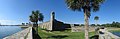
- Nomination Castillo de San Marcos Fort Wall. --Digon3 23:58, 19 September 2007 (UTC)
Could you first please crop/clone away the rope in the foreground? Lycaon 04:44, 20 September 2007 (UTC) Done --Digon3 13:41, 20 September 2007 (UTC)
 - Promotion I am not entirely sure about the selection of the subject, but the technical quality is good, and the detail (selection of the subject) acceptable. --Florian Prischl 10:32, 22 September 2007 (UTC)
- Nomination Castillo de San Marcos Fort Wall. --Digon3 23:58, 19 September 2007 (UTC)
-

- Nomination Longhaired cat, Boiro (Galicia) --Lmbuga gl, pt, es: contacta comigo 00:46, 20 September 2007 (UTC)
- Decline not a good crop: the head alone is fine, the whole cat too, but not something in between. Lycaon 08:32, 22 September 2007 (UTC)
-

- Nomination Spider web. --Lestat 22:01, 19 September 2007 (UTC)
- Decline I believe this is the web of a spider in the Agelenidae family. It illustrates the subject very well. I'd complain about it not having a category but instead I'll just add one myself. Calibas 23:32, 19 September 2007 (UTC)
Indeed not very valuable without some taxonomical information. Needs confirmation of at least family level id. (Species would be ideal, but as the animal itself is not depicted, this is not essential here). Lycaon 04:49, 20 September 2007 (UTC)
Why should this picture be useless without taxonomical classification? It's a good illustration of a funnel web. --LC-de 12:18, 20 September 2007 (UTC)
Decline because the focus is in the upper left part of the photo. The web itself is out of focus. A precice taxonomical categorization would probably not be neccessary, as LC-de correctly explains. --Florian Prischl 23:50, 21 September 2007 (UTC)
-

- Nomination Gate to the cemetary in the Greenlandic settlement Upernavik Kujalleq -- Slaunger 20:50, 19 September 2007 (UTC)
- Decline Comment The hills shows very little texture, is it caused by the extensive use of denoise algorithms or techniques such as "smart blur" ? --LC-de 10:27, 21 September 2007 (UTC) Comment The original, which is quite noisy has quite a blurred BG as well due to a shallow DOF, and this has been further amplified by selective "threshold" blurring as you mention: Furthermore, I have resampled from 6M to 3M to get rid of more noise. Personally, I find that it adds depth, which helps bringing out the subject (the gate). -- Slaunger 10:47, 21 September 2007 (UTC)
Decline due to very clear posterization in the sky and deadly downsampling (see the hills mentioned by LC-de). ---Florian Prischl 23:47, 21 September 2007 (UTC)
-

- Nomination cropped version of a picture I had already nominated in the past. Click to see the original version. Alessio Damato 10:09, 19 September 2007 (UTC)
- Decline Nice colours, but seems a bit overexposed on the castle. It's also very soft, especially in the borders. Did you use rectilinear projection ? Benh 12:33, 19 September 2007 (UTC)
 Question yes, I used rectilinear projection. How did you notice it? what do you mean by "soft" borders?? thanks Alessio Damato 08:09, 20 September 2007 (UTC) I mean the image hasn't much detail "per pixel". The image is streched on the border (kind of upscaled) and my experience tells me it's often due to rectilinear projection :) Benh 10:24, 22 September 2007 (UTC)
-

- Nomination Bartek Woźniczko from band Gutierez. --Lestat 21:47, 16 September 2007 (UTC)
- Decline Unacceptable noise (look at his face). --Florian Prischl 23:33, 21 September 2007 (UTC)
-

- Nomination NZ Red Admiral --Tony Wills 05:16, 16 September 2007 (UTC)
- Decline The focus appears to be on the layer of the leaf closer to the camera, right below the butterfly. The butterfly itself is unsharp. Also, the crop is too wide. --Florian Prischl 23:33, 21 September 2007 (UTC)
-

- Nomination Magpie moth caterpillar --Tony Wills 12:01, 15 September 2007 (UTC)
- Decline Unsharp, the focus is on the lower edge of the leaf, this leaves the caterpillar out of focus. --Florian Prischl 23:28, 21 September 2007 (UTC)
-

- Nomination Young night heron (Nycticorax nycticorax). --Calibas 03:02, 21 September 2007 (UTC)
- Promotion Good composition. Acceptable detail, high resolution.--Beyond silence 08:13, 21 September 2007 (UTC)
-

-

- Nomination View of the street from above--Szilas 18:22, 20 September 2007 (UTC)
- Promotion Nice view, may technicaly can be improved.--Beyond silence 19:26, 20 September 2007 (UTC)
-
- Nomination Lilium 'Citronella' flower. -- Ram-Man 01:52, 20 September 2007 (UTC)
- Promotion Definitely QI, nice --Richard Bartz 04:10, 20 September 2007 (UTC) I certainly agree, and I encourage you to nominate it for FP. Good to have you back! -- Slaunger 10:48, 20 September 2007 (UTC) Support This is a QI by almost all measures. Maybe a little bit too much space on the right side, however. --Siipikarja 18:38, 20 September 2007 (UTC)
-

- Nomination Longhaired cat, Boiro (Galicia) --Lmbuga gl, pt, es: contacta comigo 00:57, 20 September 2007 (UTC)
- Promotion Good enough for QI considering the nice catch and composition, and despite a lttle noise and overexposure - Alvesgaspar 16:28, 20 September 2007 (UTC)
-

- Nomination St. Augustine Lighthouse version 2 --Digon3 20:33, 18 September 2007 (UTC)
- Promotion I would prefer not to have so much geometric distortion and a little more light on the lighthouse. But I think it is good enough for QI - Alvesgaspar 16:32, 20 September 2007 (UTC)
-

-

-

-

-
-
- Nomination (I'm not sure) - Segestria florentina in Oza dos Ríos, Galicia, Spain. --Lmbuga gl, pt, es: contacta comigo 23:51, 19 September 2007 (UTC)
- Promotion Sharpness is borderline, but colours and POV are quite good. There are only three species in this family in Europe, with S. florentina the largest and most commonly found in Southern Europe. The genus typically has only six eyes instead of the usual eight in spiders.
If the picture had been a bit larger and crisper, I'd happily would have supported it on FP. Lycaon 04:38, 20 September 2007 (UTC)
-

- Nomination Psittacus erithacus --Lmbuga gl, pt, es: contacta comigo 23:58, 19 September 2007 (UTC)
- Promotion Adequate quality. Lycaon 04:40, 20 September 2007 (UTC)
-

-

- Nomination Top of Schneeberg --Beyond silence 17:25, 19 September 2007 (UTC)
- Decline Too much cut people and a bit dark. Lycaon 04:52, 20 September 2007 (UTC)
-

- Nomination Top of Schneeberg --Beyond silence 17:25, 19 September 2007 (UTC)
- Decline Oppose The sky is overexposured i.e. has burned-out highlights. Also, the picture is too tightly cropped from right. The group of people nearest to the camera should be positioned near or at Golden ratio. --Siipikarja 22:18, 19 September 2007 (UTC)
-

- Nomination Photo of Manfred Nowak --Phil Strahl 02:31, 19 September 2007 (UTC)
- Decline Nice expression but poor quality. The face is out of focus - Alvesgaspar 20:55, 19 September 2007 (UTC)
-

- Nomination Main street of Dubrovnik --Beyond silence 17:52, 17 September 2007 (UTC)
- Promotion Nice image, seems to capture what city life is like there (lots of tourists). Calibas 23:46, 17 September 2007 (UTC)
I support too, although I'm curious to see what it would have given with the sunlight coming from the side. Do you think you could shoot this again ? Benh 17:05, 19 September 2007 (UTC)
-

- Nomination Walls of Dubrovnik --Beyond silence 17:52, 17 September 2007 (UTC)
- Promotion Looks good to me ! When I'll be rich I'll go there :) I like composition but can you give it a try with a bit more of the mountain behind ? Benh 17:00, 19 September 2007 (UTC)
-

- Nomination Katowice. --Lestat 21:47, 16 September 2007 (UTC)
- Promotion Interesting image. Meets QI limits. Lycaon 14:28, 17 September 2007 (UTC)
Comment -I wonder if someone will be able to apply some denoising filter to the sky - Alvesgaspar 21:01, 19 September 2007 (UTC)
-

- Nomination Dew on a spider web --LC-de 17:18, 16 September 2007 (UTC)
- Promotion Comment A nice picture, but suffers from a greenish palette. I did some color correction and reduced noise, see how you like it: --Siipikarja 18:23, 16 September 2007 (UTC)
Very good subject, acceptable detail overall. --Beyond silence 18:26, 19 September 2007 (UTC)
-
- Nomination Adidas Absolado shoe--Beyond silence 15:13, 18 September 2007 (UTC)
- Decline copyrighted. Lycaon 19:06, 18 September 2007 (UTC)
-

- Nomination Male Fiery Skipper (Hylephila phyleus) on a lantana.--Calibas 05:01, 17 September 2007 (UTC)
- Decline Composition is fine but few things are in perfect focus here - Alvesgaspar 21:50, 18 September 2007 (UTC)
-
-

- Nomination Panoramic view above clouds, French Alps. Benh 14:08, 16 September 2007 (UTC)
- Promotion Comment Please categorize this image. - Till 16:11, 17 September 2007 (UTC) Support - Beautiful pano of a difficult subject (the clouds seem to attract noise). What is the stain at left, a blotch or the Moon? The gift of ubiquity (being at more than one place at the same time) was given to the plane in the sky ;-) - Alvesgaspar 10:13, 18 September 2007 (UTC) Comment It's a great picture, and I will support it when categorized and geotagged. But until then I decline. - Till 10:50, 18 September 2007 (UTC) InfoI categorized the pano chief ! The stain is the moon, but just above, there seems to be a plane I've just noticed thanks to you ;) Benh 19:47, 18 September 2007 (UTC) Not that one! Alvesgaspar 20:24, 18 September 2007 (UTC)
-
-

- Nomination Orbicular jasper, Madagascar. Vassil 10:59, 15 September 2007 (UTC)
- Decline Oppose This photo has some encyclopedic value, but for me the picture is a little bit dull and uninteresting. The gray background is blunt. --Siipikarja 12:55, 18 September 2007 (UTC)
Decline is not valid until signed. Lycaon 12:34, 18 September 2007 (UTC) Comment My bad, forgot to sign. --Siipikarja 12:55, 18 September 2007 (UTC)
-

- Nomination Church of the Assumption in Lviv. --Lestat 13:24, 13 September 2007 (UTC) CommentTry work on lighting and sharpness. --Beyond silence 17:59, 17 September 2007 (UTC)
- Decline due to lacking sharpnes (especially in the lower parts of the tower). --Florian Prischl 20:23, 18 September 2007 (UTC)
- Nomination Church of the Assumption in Lviv. --Lestat 13:24, 13 September 2007 (UTC)
-

- Nomination This is a quite small and beautiful solitary bee, of the Megachilidae family (Megachile sp.), about 8mm in lenght. The pollen is carried under the abdomen - Alvesgaspar 13:00, 9 September 2007 (UTC) Comment Nice image, but stem and bud on the left is distracting. You should also link in to Category:Megachilidae for relevance. --(Relic38 03:22, 15 September 2007 (UTC)). But the image is cathegorized as Megachilidae - Alvesgaspar 09:10, 15 September 2007 (UTC)
Oops, only checked links; pls ignore my category comment above. --(Relic38 12:01, 15 September 2007 (UTC)) - Decline due to heavy shake in the left part of the picture (probably caused by the bee, unfortunately). --Florian Prischl 20:20, 18 September 2007 (UTC)
- Nomination This is a quite small and beautiful solitary bee, of the Megachilidae family (Megachile sp.), about 8mm in lenght. The pollen is carried under the abdomen - Alvesgaspar 13:00, 9 September 2007 (UTC)
-

-

-

- Nomination Walls of Dubrovnik --Beyond silence 17:52, 17 September 2007 (UTC)
- Promotion Interesting composition, decent quality. S Sepp 23:02, 17 September 2007 (UTC)
-

- Nomination Cathedral of Dubrovnik --Beyond silence 17:52, 17 September 2007 (UTC)
- Decline Chock full of JPEG artifacts. Calibas 01:03, 18 September 2007 (UTC)
-

- Nomination Look at some norwegian mountains --Tackbert 15:34, 17 September 2007 (UTC)
- Decline Exposure problems. The sky to the left is overexposed with blown areas and a large fraction of the image is in shadow and very dark making it very hard to discern any details. In addition the image page is not categorized. I can recommend adding geodata to the image page, although this is not a requirement. -- Slaunger 20:43, 17 September 2007 (UTC)
-

- Nomination en:Benjamin Mako Hill at Wikimania 2007 --Joi 12:42, 17 September 2007 (UTC)
- Decline Poor Benjamin is out of focus ;-) Lycaon 14:22, 17 September 2007 (UTC) Comment-) His closest eye is in focus so in the world of f/1 available light, he's in focus. But I suppose it is not "sharp"... focus is so overrated. heh. --Joi 22:19, 17 September 2007 (UTC)
-

- Nomination This image shows the Johannisbad baths in Zwickau. Just good colors. ← Körnerbrötchen - @ 12:39, 17 September 2007 (UTC)
- Promotion Good light, detail. --Beyond silence 17:55, 17 September 2007 (UTC)
-

-
- Nomination Butterfly on a flower --Ssriraman 09:34, 17 September 2007 (UTC)
- Decline Quality is fine. Sharp, noise level is good. In my opinion a QI --JuliusR 11:20, 17 September 2007 (UTC) Oppose True, but the top most flower is horribly cropped. Also there's too much empty space in the picture - after all we want to concentrate on the butterfly, don't we. Perhaps a re-crop would do it? --Siipikarja 11:54, 17 September 2007 (UTC) Oppose no id whatsoever. Lycaon 14:22, 17 September 2007 (UTC) CommentI have croped the picture now. But still i am not aware of what id refer to as Lycaon mentions. I am new to wiki. Please clarify.--Ssriraman 15:52, 17 September 2007 (UTC) There is no identification (id) of either butterfly or flower. 62.195.239.22 17:10, 17 September 2007 (UTC)
-
- Nomination Female Fiery Skipper (Hylephila phyleus). --Calibas 05:19, 17 September 2007 (UTC)
- Promotion Nice light and colours, acceptable QI detail. --Beyond silence 08:15, 18 September 2007 (UTC)
-
- Nomination Castillo de San Marcos Fort --Digon3 23:04, 16 September 2007 (UTC)
- Promotion The picture is very contrasted, with rather dark shadows (but no loss of details). The turret and the wooden stairs at the right seem to be a little bit tilted... or are they really leaning? Anyhow, I like the view, and I think it meets QI standards. -- MJJR 19:58, 17 September 2007 (UTC)
-

- Nomination A last panoramic view from top of Aiguille du Midi for tonight :). Benh 23:40, 15 September 2007 (UTC)
- Promotion As wonderful as others. Nice detail. --Beyond silence 18:02, 17 September 2007 (UTC)
-

- Nomination Vanessa gonerilla, head down --Tony Wills 00:02, 14 September 2007 (UTC)
- Decline At this fairly low resolution I expect the subject to be more crisp in full scale. There is something about the colours of the butterfly that just doesn't seem right. Dark areas seem too dark and bright areas almost look blown... -- Slaunger 21:14, 17 September 2007 (UTC)
-

-

-

- Nomination A female robber fly (Dioctria linearis while sucking a bug (Anthocoris nemorum) --S.λukαs 19:17, 16 September 2007 (UTC)
- Decline Nice picture but size doesn't meet the standards - Alvesgaspar 19:33, 16 September 2007 (UTC)
-

-

-

- Nomination Castro de Baroña, Galiza, España -- Lmbuga gl, pt, es: contacta comigo 11:15, 16 September 2007 (UTC)
- Promotion Acceptable quality for QI, may be a little more contrast? Lycaon 18:07, 16 September 2007 (UTC)
-

-

-

- Nomination lof dof is part of the composition. maybe a candidate for Category:Green (100% crop) Fabelfroh 11:35, 16 September 2007 (UTC)
- Decline Maybe for green, but surely not for QI, there is hardly a pixel in focus. Lycaon 18:06, 16 September 2007 (UTC)
-

-

- Nomination Great image, with great lights... --← Körnerbrötchen - @ 21:50, 15 September 2007 (UTC)
- Decline Very bad JPEG artifacts. --Florian Prischl 22:05, 15 September 2007 (UTC)
Oppose Too grainy. --Siipikarja 17:59, 16 September 2007 (UTC)
-

- Nomination Rossio - Lisbon--Szilas 13:30, 15 September 2007 (UTC)
- Promotion Comment A nice picture, but might get better with Photoshop autolevels or manual levels adjustment. --Siipikarja 13:44, 15 September 2007 (UTC) CommentThanks for the advice, Siipikarja, I've done it.--Szilas 16:07, 15 September 2007 (UTC)) Comment It's better now. --Siipikarja 16:39, 15 September 2007 (UTC) Support I'll promote this one now that you have done the levels correction. Although it must be noted that there already is a very similar picture available in Commons:
 . This new one, however, is better. --Siipikarja 17:31, 16 September 2007 (UTC)
This is QI, if you want 100 pictures of the same topic, that's OK, as long as they are top quality. Lycaon 18:18, 16 September 2007 (UTC)
-

- Nomination Élővíz-csatorna canal --Beyond silence 13:22, 14 September 2007 (UTC)
- Decline Too dark, no real topic. Lycaon 18:19, 16 September 2007 (UTC)
-
- Nomination Close-up on flower of Dwarf Mountain Fleabane (Erigeron compositus), Ilulissat, Greenland. -- Slaunger 22:39, 12 September 2007 (UTC)
- Promotion Ad some expose to makes living, and reduce noise.--Beyond silence 18:44, 13 September 2007 (UTC) Done - or at least I tried. I also downsampled a little to reduce noise further. -- Slaunger 21:18, 14 September 2007 (UTC) Now acceptable tech. condition. --Beyond silence 09:10, 17 September 2007 (UTC)
-

- Nomination Gasteruptiidae is one of the more distinctive among the Apocritan wasps. As shown a Gesteruption assectator--Richard Bartz 16:56, 11 September 2007 (UTC)
- Decline Not sharp and detailed enough. I know it is difficult, I've tried myself with this critter ;-) Alvesgaspar 14:18, 16 September 2007 (UTC)
-
- Nomination Museum in Tsaritsino park, Moscow --D.wine 16:40, 11 September 2007 (UTC)
- Decline The building is interesting but the quality of the image is not good enough. Geometric distortion, unsharpness (due to wrong exposure choice) and distracting elements in the composition (people, arm, cable) - Alvesgaspar 10:15, 17 September 2007 (UTC)
-

- Nomination Highland Park Metra station, Highland Park, Illinois --JeremyA 00:18, 16 September 2007 (UTC)
- Promotion Support Nice composition, is of good quality and has good colors. I especially like how the railway escapes to the distance. Nice use of the golden ratio. --Siipikarja 00:56, 16 September 2007 (UTC)
-

- Nomination A(nother !) panoramic view from top of Aiguille du Midi. Benh 22:29, 15 September 2007 (UTC)
- Promotion Good panorama and description. It completely lacks categorization (and geotagging would be nice, too). Please add this, then it should be promoted. --Florian Prischl 22:39, 15 September 2007 (UTC)
Done for categories. I'll geolocalise all my panoramas from Aiguille du Midi when they are all uploaded. Benh 23:02, 15 September 2007 (UTC)
Thank you. I changed the template accordingly. --Florian Prischl 23:20, 15 September 2007 (UTC)
-

- Nomination Nice front of a newly renovated building of Cracow University of Economics. --Piotr Konieczny aka Prokonsul Piotrus Talk 19:50, 15 September 2007 (UTC)
- Decline Underexposed. Also, for such a subject, I think you should get a straighter angle (right angle if possible). This would create a better view. --Florian Prischl 21:40, 15 September 2007 (UTC)
-

- Nomination Picture from Longwood Gardens. --Boricuaeddie (talk · contribs)
- Promotion It seems slightly underexposed, but still acceptable. --Florian Prischl 21:40, 15 September 2007 (UTC)
-

- Nomination Mountaineers descending Aiguille du Midi -- Benh 15:53, 15 September 2007 (UTC)
- Promotion Majestic view, acceptable technical condition. --Beyond silence 16:08, 15 September 2007 (UTC)
-

- Nomination Mountaineers descending Aiguille du Midi 2 -- Benh 15:53, 15 September 2007 (UTC)
- Promotion Majestic view, acceptable technical condition. --Beyond silence 16:08, 15 September 2007 (UTC) Support I think this one has the best composition. We're looking at an quality image. --Siipikarja 16:20, 15 September 2007 (UTC)
-

- Nomination Mountaineers descending Aiguille du Midi 3 (and last one :) ) -- Benh 15:53, 15 September 2007 (UTC)
- Promotion Majestic view, acceptable technical condition. --Beyond silence 16:08, 15 September 2007 (UTC)
-

- Nomination 7cm long Puriri moth (wingspan approx 15cm) --Tony Wills 11:05, 15 September 2007 (UTC)
- Promotion Original but I have the feeling the angle of view doesn't give a nice idea of how a "Puriri moth" looks like (Am I right ?). Also a bit soft and noisy. Benh 15:53, 15 September 2007 (UTC) I don't see any large enough issues to prevent this from being a QI. How is this not a nice idea of what the moth looks like? Calibas 18:37, 15 September 2007 (UTC). Benh - did you look at it relative to the associated series of images? --Tony Wills 19:12, 15 September 2007 (UTC)
I couldn't figure out the shape of the subject. When I see a butterfly, one wing is enough for me to extrapolate because I know how butterfly looks like. Here, I couldn't extrapolate, so I just felt that the picture didn't show enough of the beast to me. Tony, I didn't see the associated pictures sorry. Now it's much better thanks :) I support. Benh 22:35, 15 September 2007 (UTC)
-

- Nomination A rail track by night --Orlovic (talk) 16:00, 14 September 2007 (UTC)
- Decline The lights spoil the picture. Lycaon 17:52, 14 September 2007 (UTC) Oppose Agreed, the light is too bright. --Siipikarja 13:27, 15 September 2007 (UTC)
-

- Nomination Seabourn Spirit ship in Pula, Croatia --Orlovic (talk) 13:29, 14 September 2007 (UTC)
- Decline The light spoils the picture. Lycaon 17:52, 14 September 2007 (UTC) Oppose Agreed, the light is too bright. --Siipikarja 13:27, 15 September 2007 (UTC)
-

- Nomination My take at Berlin cathedral. Unfortunately not the awesome light Lestat had. --Dschwen 19:09, 13 September 2007 (UTC)
- Promotion I like the lighting, it gives your picture a dramatic atmosphere. I think composition could be improved though (this would make a nice FP candidate to me). Benh 15:58, 15 September 2007 (UTC)
-

- Nomination Male solitary bee (Anthidium florentinum). This is the sharpest of all bee pictures I have submitted recently. It will also be the last, I think... Alvesgaspar 18:51, 13 September 2007 (UTC)
- Promotion Support A QI for sure, but the other picture of yours of the same subject is even better. --Siipikarja 13:38, 15 September 2007 (UTC)
-

- Nomination The second highest educational building in the world, University of Pittsburgh's Cathedral of Learning, during a cloudy day in autumn (close-up variant). --Piotr Konieczny aka Prokonsul Piotrus Talk 23:46, 14 September 2007 (UTC)
- Decline not sharp, bad crop. Lycaon 07:28, 15 September 2007 (UTC)
-

- Nomination The second highest educational building in the world, University of Pittsburgh's Cathedral of Learning, during a cloudy day in autumn (distant variant). --Piotr Konieczny aka Prokonsul Piotrus Talk 23:44, 14 September 2007 (UTC)
- Decline not sharp, tilted. Lycaon 07:28, 15 September 2007 (UTC)
-

- Nomination Surface texture on a black ice growler from a recently calved iceberg near Upernavik, Greenland. -- Slaunger 23:44, 14 September 2007 (UTC)
- Promotion Good encyclopedic value plus artsy. Calibas 00:03, 15 September 2007 (UTC) Removed promotion, I can find no reference of this type of ice being called black ice in English. Calibas 00:07, 15 September 2007 (UTC)
w:Black ice? Thegreenj 00:11, 15 September 2007 (UTC) Comment Yes, this type of maritime black ice is not descriped currently in w:Black ice, but I do believe that is the correct name. In Danish it is also called sortis, which means black ice when translated directly. It is called black because it can be very hard to see when submerged in water. -- Slaunger 00:28, 15 September 2007 (UTC) Promoted Calibas 03:28, 15 September 2007 (UTC)
-

- Nomination Pinus radiata needles and spike detail --Tony Wills 22:02, 14 September 2007 (UTC)
- Promotion Good quality! Lycaon 22:04, 14 September 2007 (UTC)
-

- Nomination A little church in Alentejo, Portugal, by MarioM. I like very much this composition and the almost pure white of the walls, so characteristic of the buildings in this region - Alvesgaspar 19:58, 14 September 2007 (UTC)
- Promotion Image slightly tilted (could you correct this yet?), but nevertheless QI: composition and colors are OK and render the atmosphere of southern Portugal very well, as Alvesgaspar already stated. -- MJJR 20:40, 14 September 2007 (UTC) Done Slight tilt corrected Alvesgaspar 21:05, 14 September 2007 (UTC)
I'd like to see another version, where the size of the image doesn't jump with 23% after a single perspective correction. Lycaon 07:26, 15 September 2007 (UTC) Done Previous version had 0% jpeg compression - Alvesgaspar 11:18, 15 September 2007 (UTC)
-

- Nomination View from Predjama Castle --Beyond silence 13:22, 14 September 2007 (UTC)
- Decline Too small, too noisy. Lycaon 16:06, 14 September 2007 (UTC)
-

- Nomination Inquisitive juvenile Larus scopulinus --Tony Wills 11:10, 14 September 2007 (UTC)
- Promotion Good enough though a higher DOF should be better. I can't see anything to eat either... Alvesgaspar 16:41, 14 September 2007
... oh yes, there is food, I see a gaping bivalve (tellinid?)... Lycaon 20:31, 14 September 2007 (UTC) (UTC)
-
![* Nomination Painting of J-L David, colurs re-checked as to the original, noise reduction by Ikiwaner--Szilas 03:49, 14 September 2007 (UTC) * Decline I'm not convinced about the colours [3], [4], [5], [6], etc. But I'm even more concerned about the lack of detail caused by the soft focus and the noise reduction. Lycaon 18:01, 14 September 2007 (UTC)](https://upload.wikimedia.org/wikipedia/commons/thumb/d/d7/Jacques-Louis_David_-_Mars_desarme_par_Venus.JPG/101px-Jacques-Louis_David_-_Mars_desarme_par_Venus.JPG)
- Nomination Painting of J-L David, colurs re-checked as to the original, noise reduction by Ikiwaner--Szilas 03:49, 14 September 2007 (UTC)
- Decline I'm not convinced about the colours [3], [4], [5], [6], etc. But I'm even more concerned about the lack of detail caused by the soft focus and the noise reduction. Lycaon 18:01, 14 September 2007 (UTC)
-

- Nomination Berlin Main Station on the Spree river. --Dschwen 09:00, 13 September 2007 (UTC). P.S.: just uploaded an edit (clear your cache), brightens the foreground. --Dschwen 14:49, 13 September 2007 (UTC)
- Promotion Comment
There are several circular spots in the sky, for instance in the upper right corner.(they are removed now) S Sepp 17:17, 13 September 2007 (UTC). Are you sure you checked the new version? --Dschwen 18:13, 13 September 2007 (UTC). Yes, it is in both versions. It's a bit hard to see, but I count at least seven darker circles in the air. I'm not an expert, but maybe it is dust on the lens? S Sepp 19:23, 13 September 2007 (UTC)) Sure looks like dust to me, easily removed in Photoshop. Small and quite hard to see, you have good eyes S Sepp. Calibas 02:44, 14 September 2007 (UTC). Well looking long and hard I found 3 spots, but they really are trivial blemishes, if someone cares to remove them that would be nice, but hardly the sort of defect to prevent promotion --Tony Wills 11:41, 14 September 2007 (UTC). I guess that would be me, since I'm the one who made a fuss about it :). I took the liberty of removing the (more obvious) spots. S Sepp 13:24, 14 September 2007 (UTC) Promoted. Calibas 23:52, 14 September 2007 (UTC)
-

- Nomination Kramgasse in Berne, Switzerland. --Dschwen 13:57, 13 September 2007 (UTC)
- Promotion Nice light, composition. --Beyond silence 13:31, 14 September 2007 (UTC)
-

- Nomination Noctuidae family, possibly Autographa sp --Calibas 21:51, 9 September 2007 (UTC)
- Decline DOF (subject out of focus in several areas) and background/lighting creates a distracting shadow. Also, it should be linked in to the relevant category or specimen page. --(Relic38 11:56, 15 September 2007 (UTC)))
-
-

-

-

-

- Nomination My first photo stiching. Castle and village of Gourdon (close to Cannes, France) obtained after stitching 4 pictures taken from the valley. -- Alberto Fernandez Fernandez 14:33, 13 September 2007 (UTC)
- Promotion Not bad for a first stitch. Lacks a bit of crispness, and has a lot of rocks, but passes the QI test. Lycaon 15:52, 13 September 2007 (UTC)
-

- Nomination An "Aksakkal" from Khinalug village--xinaliq.azAbasov 23:20, 12 September 2007 (UTC)
- Decline Illustrates the subject very well but needs a real description and categories. Calibas 02:05, 13 September 2007 (UTC)
Bad cropping. Lycaon 20:51, 13 September 2007 (UTC)
-

- Nomination Close-up on Dwarf fireweed (Chamerion latifolium), national flower of Greenland. - Slaunger 21:43, 11 September 2007 (UTC)
- Decline Good as thumbnail, not sharp full size. Lycaon 20:54, 13 September 2007 (UTC)
-

- Nomination The tiger beetles are a large group of beetles known for their predatory habits. As shown a Sandlaufkäfer 'Cicindela hybrida' from top --Richard Bartz 18:15, 10 September 2007 (UTC)
- Decline Good view, but the poor thing is missing the claws on its middle right tarsus! Was it still alive? Lycaon 20:42, 11 September 2007 (UTC) Comment You have a good eye ;) Claw? Fixed! It was a stitching error. I fastly took 6 pictures in a row with 1/400 to get some layers for dof postpro. Here there was a layer for the ground and one for the beetle. I have to use this technique often on high resolutions. Normaly on a photoprint you dont see the noise, but for this online-picture i had to interpolate the picture to 2500px because of iso800 noise. Dead? Chilled outside with icespray, that works! --Richard Bartz 22:59, 11 September 2007 (UTC)
I have some reservations on close inspection. Lycaon 18:53, 12 September 2007 (UTC)Which would`? --Richard Bartz 20:18, 12 September 2007 (UTC) I really like this image, but there are a couple of areas out of focus. The main one is on the lower back, near the light marking on the right. -- (Relic38 17:52, 13 September 2007 (UTC))
Undisclosed manipulations. Lycaon 20:57, 13 September 2007 (UTC)
-

- Nomination Camp Marmal in Afghanistan. Aerial view. Not my photo.--Doodledoo 19:10, 9 September 2007 (UTC) Comment If you correct the CW tilt, this could be QI. Lycaon 19:15, 9 September 2007 (UTC) Question Would there be anyone out there who could do this? I'd probably screw it up. --Doodledoo 19:27, 9 September 2007 (UTC)
You could ask the uploader of the image (and please indicate on nomination if you are not the original author/uploader of the image). Lycaon 19:33, 9 September 2007 (UTC) - Decline Tilt stays. Lycaon 20:58, 13 September 2007 (UTC)
- Nomination Camp Marmal in Afghanistan. Aerial view. Not my photo.--Doodledoo 19:10, 9 September 2007 (UTC)
-

- Nomination Statue of III Amenemhet--Szilas 17:49, 9 September 2007 (UTC)
- Decline Unfortunate lighting. Lycaon 20:59, 13 September 2007 (UTC)) Question Do you mean the shadows? I left them deliberately inside the crop because I felt that it adds a kind of mystery to the image--Szilas 03:40, 14 September 2007 (UTC)
-
-

- Nomination HDR image from 4 different exposures of Upper Antelope Canyon, Page, Arizona. My 1st try in HDR --LucaG 22:14, 12 September 2007 (UTC)
- Promotion I've seen worse ;-) Great result, certain QI. Lycaon 22:42, 12 September 2007 (UTC)
Wow! - Alvesgaspar 23:04, 12 September 2007 (UTC)
-

- Nomination Khinalug Museum in the summer of 2007 --xinaliq.az Abasov 20:59, 12 September 2007 (UTC)
- Decline Burned out whites and some chroma noise. Lycaon 22:42, 12 September 2007 (UTC)
-

- Nomination A handsome solitary bee of the Megachilidae family (Anthidium florentinum) feeding in a Lantana camara flower. The long tongue and part of the head are sunk inside one of the florets. - Alvesgaspar 19:48, 12 September 2007 (UTC)
- Promotion QI, no doubt. Lycaon 19:55, 12 September 2007 (UTC)
-

-

-

- Nomination A freight train departing Pula, Croatia --Orlovic (talk) 14:45, 12 September 2007 (UTC)
- Promotion Although the viewpoint is not optimum (light, view of the locomotive), this is a very suggestive railroad picture (with the smoke of the diesel engine!), and quality is sufficient for QI. -- MJJR 20:18, 12 September 2007 (UTC)
-
-

-

- Nomination pretty rare photo of a FFH species. (cropped) Fabelfroh 14:47, 12 September 2007 (UTC)
- Decline Not sharp enough, may also have benefited of a 90° CW turn, although the plant is laying down. Lycaon 18:48, 12 September 2007 (UTC)
- I already tried a CW rotation. I shot this photo from above. It wasn't easy otherwise I'd drown in mud. :-) Fabelfroh 20:50, 12 September 2007 (UTC)
-

- Nomination Volucella zonaria is one of the largest and most beautiful hoverflies (Syrphidae). This one is about 25 mm long - Alvesgaspar 13:33, 12 September 2007 (UTC)
- Promotion One of your better ones, only DOF may have been slightly higher. Lycaon 18:48, 12 September 2007 (UTC)
-

-

-
- Nomination Gasteruptiidae is one of the more distinctive among the Apocritan wasps. As shown a Gesteruption assectator--Richard Bartz 16:56, 11 September 2007 (UTC)
- Decline Not sharp and detailed enough (I know these fellows are hard to ctach). Also I don't like the crop and the aspect ratio of the picture Alvesgaspar 15:21, 12 September 2007 (UTC) CommentConcerns about the aspect ratio?, cmon! Even if everybody starts opposing every picture with my "trademark" aspect ratio, i wouldnt stop using it. This goes to far. --Richard Bartz 20:16, 12 September 2007 (UTC) Comment The crop bothers me, the blurry flower on the left is sorta distracting. I don't think there's any problem with the aspect ratio itself, it just might not be right for this particular crop. Calibas 01:58, 13 September 2007 (UTC)
-

- Nomination The tiger beetles are a large group of beetles known for their predatory habits. As shown a Sandlaufkäfer 'Cicindela hybrida' at sideview --Richard Bartz 18:15, 10 September 2007 (UTC)
- Decline Too bright and could use a little more DOF. Calibas 01:45, 13 September 2007 (UTC)
-

- Nomination The tiger beetles are a large group of beetles known for their predatory habits. As shown a Sandlaufkäfer 'Cicindela hybrida' closeup of the head --Richard Bartz 18:15, 10 September 2007 (UTC)
- Promotion Good enough for QI though the colours are a bit washed out and the crop too tight. May I suggest a little more stauration? - Alvesgaspar 15:26, 12 September 2007 (UTC)
-

- Nomination Hermannsdenkmal, monument near Detmold, Germany. --Dschwen 18:00, 8 September 2007 (UTC)
- Promotion Composition, detail acceptable. --Beyond silence 21:34, 12 September 2007 (UTC)
-

- Nomination Jahnplatz, city center of Bielefeld, Germany. --Dschwen 18:00, 8 September 2007 (UTC)
- Promotion A good view, and resolution - tech. acceptable. --Beyond silence 21:32, 12 September 2007 (UTC)
-
- Nomination Fiery Skipper (Hylephila phyleus) --Calibas 17:20, 8 September 2007 (UTC)
- Promotion Good light, sharp. --Beyond silence 21:30, 12 September 2007 (UTC)
-

- Nomination Chinese Ho-go (19th cent.) #!George Shuklin 11:51, 8 September 2007 (UTC)
- Decline The foreground is OK, sharp and clear. But I don't like the background and the framing is too tight. Alvesgaspar 23:13, 12 September 2007 (UTC)
-

- Nomination Replica of VOC ship Amsterdam. --S Sepp 22:47, 7 September 2007 (UTC)
- Promotion This one is on the borderline: there is some noise (artifacts?) in the water and the image is not very crisp. But the composition is OK and I love tall ships (once I participated in a long race in one of them)! - Alvesgaspar 23:19, 12 September 2007 (UTC)
-

- Nomination Hoverfly on flower (Eristalis tenax) - Alvesgaspar 22:25, 7 September 2007 (UTC)
- Promotion Something I can't quite put my finger on bothers me about this image (maybe the colors) but it's good enough for QI. Calibas 01:41, 13 September 2007 (UTC)
-

- Nomination Planetarium in Donetsk --Butko 09:52, 6 September 2007 (UTC)
- Decline I like the shadows of the trees in the dome. But the image is noisy and lacks sharpness in full size - Alvesgaspar 15:30, 12 September 2007 (UTC)
-
- Nomination Ringlet (Aphantopus hyperantus) --LC-de 19:07, 5 September 2007 (UTC)
- Decline Not sharp enough. This combined with a fairly low resolution makes me decline. I suggest improving the existing image page by adding some geodata or at least mention the location in writing in the descrption. -- Slaunger 21:19, 12 September 2007 (UTC)
-

- Nomination Close-up on Maiden's Tower (Maiden Tower), xinaliq.az Abasov 22:32, 11 September 2007 (UTC)
- Decline Too small. Please read guidelines. Lycaon 22:52, 11 September 2007 (UTC)
-
- Nomination Solitary dwarf fireweed (Chamerion latifolium). - Slaunger 21:43, 11 September 2007 (UTC)
- Promotion Bit strange perspective, but nice in situ image of this species. Lycaon 21:49, 11 September 2007 (UTC)
-

- Nomination A beautiful hoverfly (Xanthogramma pedissequum). - Alvesgaspar 16:59, 11 September 2007 (UTC)
- Promotion QI, yes, but I still miss a little crispness. Lycaon 20:40, 11 September 2007 (UTC)
-

- Nomination A sundial in Herrenhäuser Gärten, Hannover Raamin 15:02, 11 September 2007 (UTC)
- Decline The sun dial is beautiful and it is sharp. But the framing and DOF are not well chosen - Alvesgaspar 19:38, 11 September 2007 (UTC)
-

- Nomination Male blackbird posing--Tony Wills 11:34, 11 September 2007 (UTC)
- Promotion A good picture of a nice bird. Correct exposure, which is not always easy with the blacks - Alvesgaspar 19:43, 11 September 2007 (UTC)
-

- Nomination Male chaffinch posing--Tony Wills 11:34, 11 September 2007 (UTC)
- Promotion Even for this avid granivore, the beans are a bit too big. Nice shot. Lycaon 20:38, 11 September 2007 (UTC)
-

- Nomination Male song thrush posing--Tony Wills 11:10, 11 September 2007 (UTC)
- Promotion Good, correct shot. They are posing beacuse of the beans, of course (which seem too big for this fellow) - Alvesgaspar 19:43, 11 September 2007 (UTC). They turned up their nose at the beans, they wanted grain but I had none :-) --Tony Wills 20:22, 11 September 2007 (UTC)
Even with seeds he would have starved. Song thrushes mainly eat invertebrates with the odd berry in winter. Try snails next time ;-) Lycaon 20:35, 11 September 2007 (UTC)
-

- Nomination Solitary bee of the Halictidae family, probably a Halictus scabiosa. I think it is time to return home and unload the pollen... - Alvesgaspar 13:00, 9 September 2007 (UTC)
- Promotion Excellent quality, interesting subject--Szilas 06:54, 12 September 2007 (UTC)
-

- Nomination: «Topaz» factory in Donetsk--Butko 09:52, 6 September 2007 (UTC)
- Review needed
-

-

- Nomination The second highest educational building in the world, University of Pittsburgh's Cathedral of Learning, during a cloudy day in autumn. --Piotr Konieczny aka Prokonsul Piotrus Talk 18:58, 10 September 2007 (UTC)
- Decline Not sharp, tilt, perspective... Lycaon 08:43, 11 September 2007 (UTC)
-
- Nomination The tiger beetles are a large group of beetles known for their predatory habits. As shown a Sandlaufkäfer 'Cicindela hybrida' closeup of the head --Richard Bartz 18:15, 10 September 2007 (UTC)
- Promotion Nice! Calibas 00:43, 11 September 2007 (UTC)
-

- Nomination A sample of cobalt (Co). Not originial uploader.--Doodledoo 19:25, 9 September 2007 (UTC)
- Decline Wrong exposure solution resulting in a poor DOF - Alvesgaspar 18:18, 10 September 2007 (UTC)
-

-
![* Nomination Robert's Helmet BMW (2007)--Anuskafm 18:26, 9 September 2007 (UTC) * Decline Nice attempt, but still some mistakes. E.g. lettering of 'Credit Suise' is not aligned as in ([7]). Lycaon 18:37, 9 September 2007 (UTC)](https://upload.wikimedia.org/wikipedia/commons/thumb/5/58/Casco_Kubica_BMW.svg/120px-Casco_Kubica_BMW.svg.png)
-
-

- Nomination Leaf of raspberry (rubus idaeus) - D.wine 15:35, 9 September 2007 (UTC)
- Decline Harsh lighting and crop too tight on the leaves - Alvesgaspar 18:38, 9 September 2007 (UTC)
-

-

- Nomination Panorama of German bunker --China Crisis 17:09, 8 September 2007 (UTC)
- Promotion Acceptable quality, though a bit small for a 'panorama'. -- Lycaon 15:49, 9 September 2007 (UTC)
-

-
![* Nomination Painting of Van Gogh, own photo--Szilas 15:21, 8 September 2007 (UTC) * Decline A small strip is cropped top and bottom, and I'm not too convinced about the colours neither. ([8]). -- Lycaon 15:45, 9 September 2007 (UTC)](https://upload.wikimedia.org/wikipedia/commons/thumb/1/10/Van_Gogh_-_Country_road_in_Provence_by_night.jpg/93px-Van_Gogh_-_Country_road_in_Provence_by_night.jpg)
-

- Nomination Flying kites --User:arjun 02:08, 8 September 2007 (UTC) remember to sign with ~~~~ (name & date) --Tony Wills 05:15, 8 September 2007 (UTC)
- Decline Topic too small + noise, sharpness and lighting issues. -- Lycaon 15:51, 9 September 2007 (UTC)
-
- Nomination The tiger beetles are a large group of beetles known for their predatory habits. As shown a Dünen-Sandlaufkäfer Cicindela hybrida --Richard Bartz 18:17, 7 September 2007 (UTC)
- Promotion Nice sharpness. --Beyond silence 21:29, 9 September 2007 (UTC)
-

- Nomination Daisy (I think) seed parachute with scale. Anyone know the latin name? --Inductiveload 18:04, 6 September 2007 (UTC)
- Decline Don't have really good detail, sorry. --Beyond silence 09:18, 10 September 2007 (UTC)
-

- Nomination: The Brimstone Gonepteryx rhamni is a butterfly of the Pieridae family. --Richard Bartz 16:07, 3 September 2007 (UTC)
- Review needed
-

- Nomination Jugendstil Mosaic St John - Alberto Fernandez Fernandez 09:35, 2 September 2007 (UTC)
- Decline Perspective distortion needs to be corrected. The same happens with other photos below. Alvesgaspar 10:06, 2 September 2007 (UTC) - I withdraw my nomination The mosaic is actually curved. I agree it could be improved by being in front of the mosaic altough it is not always possible ;-). Time permitting, I will retake the picture and resubmit it. Alberto Fernandez Fernandez 20:46, 3 September 2007 (UTC)
-

- Nomination A great picture of the sun reflected in binoculars. Wikipedia FP. --Doodledoo 23:28, 8 September 2007 (UTC)
- Decline not eligible (not by wikipedian), and poor quality to boot. Lycaon 22:50, 8 September 2007 (UTC) Support I don't see any problem. --Beyond silence 08:41, 9 September 2007 (UTC)
per first line of the guidelines! Lycaon 09:24, 9 September 2007 (UTC)
-
 Alvesgaspar}}
- Promotion Gorgeous. Thegreenj 16:29, 8 September 2007 (UTC)
-

-

- Nomination Bee on flower (Anthidium florentinus) - Alvesgaspar 22:25, 7 September 2007 (UTC)
- Decline Overexposed Calibas 16:49, 8 September 2007 (UTC)
-
- Nomination Hoverfly on flower (Eristalinus taeniops) - Alvesgaspar 22:25, 7 September 2007 (UTC)
- Promotion Sufficient detail and excellent exposure. Calibas 16:49, 8 September 2007 (UTC)
-
-

- Nomination Moniuszki Street in Katowice. --Lestat 17:09, 5 September 2007 (UTC)
- Promotion Good light, acceptable. --Beyond silence 18:53, 8 September 2007 (UTC)
-

- Nomination Conjunction of gate, bridge, and tower at Expo Science Park. --YooChung 11:46, 4 September 2007 (UTC)
- Decline Poor composition and cropping. None of the three elements is clearly depicted - Alvesgaspar 18:57, 8 September 2007 (UTC)
-

-

- Nomination This picture aroused very little enthusiasm as FPC, but it can perhaps pretend a QI status? -- MJJR 21:06, 7 September 2007 (UTC)
- Promotion Not FP, but reasonably good for QI. Composition is a little weak, but it is sharp and nicely illustrativve. Compare to this excellent, IMHO, car pic. Thegreenj 22:18, 7 September 2007 (UTC)
-

- Nomination The tiger beetles are a large group of beetles known for their predatory habits. As shown a Dünen-Sandlaufkäfer Cicindela hybrida --Richard Bartz 18:17, 7 September 2007 (UTC)
- Promotion Excellent quality. -- MJJR 20:54, 7 September 2007 (UTC)
-
- Nomination The tiger beetles are a large group of beetles known for their predatory habits. As shown a Dünen-Sandlaufkäfer Cicindela hybrida --Richard Bartz 18:17, 7 September 2007 (UTC)
- Promotion This is not a QI, but a super QI ! -- MJJR 20:54, 7 September 2007 (UTC)
-

-

- Nomination A sullied Warthog (Phacochoerus africanus) taking break from the hot sun sanjay_ach 03:15, 7 September 2007 (UTC)
- Promotion Shame it is obviously in a zoo so no FP. Very good details. QI for sure. Please add EXIF data. Lycaon 06:56, 7 September 2007 (UTC)
Done: Uploaded image with exif data. Sanjay Acharya 14:43, September 7 2007 (UTC) Very good picture, congrats! --Richard Bartz 18:37, 7 September 2007 (UTC)
-

-

- Nomination Arrghhhbarf, what was that! --Tony Wills 13:49, 6 September 2007 (UTC)
- Promotion Part of the head slightly overexposed, but picture is undoubtedly QI. -- MJJR 20:44, 7 September 2007 (UTC)
-

- Nomination Someone's been here before me --Tony Wills 13:49, 6 September 2007 (UTC)
- Promotion Parts of the bird slightly overexposed, but picture is funny and also undoubtedly QI. -- MJJR 20:44, 7 September 2007 (UTC)
-

- Nomination Élővíz-canal at Békés--Beyond silence 07:06, 6 September 2007 (UTC)
- Promotion Good enough for QI. -- MJJR 20:47, 7 September 2007 (UTC)
-

-

- Nomination Front of the Basilica of Saint Paul Outside the Walls - Roma - Alberto Fernandez Fernandez 13:47, 31 August 2007 (UTC)
- Promotion Needs to be in a category that actually exists ... - YooChung 10:47, 6 September 2007 (UTC)
I added the categories, good enough for QI Calibas 00:58, 7 September 2007 (UTC)
Categories are rather unspecific. Would Category:San Paolo fuori le Mura (Rome) and Category:Statues of Paul of Tarsus be the correct categories? Otherwise no problem with this being QI. YooChung 13:21, 7 September 2007 (UTC)
-

-

-
-
-

- Nomination Closeup of a Amano or Yamatonuma Shrimp (Caridina multidentata) --Richard Bartz 16:49, 6 September 2007 (UTC)
- Decline Lack of details/sharpness. Tough subject. Lycaon 17:15, 6 September 2007 (UTC)
-

- Nomination The White-faced Whistling-duck (Dendrocygna viduata) is natural to the Americas and Africa. --Richard Bartz 16:49, 6 September 2007 (UTC)
- Promotion DOF could have been slightly higher, but the rest is top notch. Lycaon 17:15, 6 September 2007 (UTC)
-

- Nomination Feathers of a Blue Peafowl (Pavo cristatus) --LC-de 11:34, 5 September 2007 (UTC)
- Promotion Nice composition & technical detail. --Beyond silence 09:11, 7 September 2007 (UTC)
-

- Nomination pretty sharp. Fabelfroh 07:42, 5 September 2007 (UTC)
- Promotion Near acceptable for QI. --Beyond silence 09:11, 7 September 2007 (UTC)
-

- Nomination A Koala Bear (Phascolarctos cinereus) sleeping on a tree top, at San Diego Zoo, California USA -- sanjay_ach 15:49, 4 September 2007 (UTC)
- Promotion Very good quality.---donald- 20:52, 6 September 2007 (UTC)
-
- Nomination St. Andrew's Cotton Stainers, Dysdercus andreae from the beach of Le Gosier, Guadeloupe -- Lycaon 13:57, 4 September 2007 (UTC)
- Promotion Nice colours and sharpness. Resolution is near the lower pain limit, but OK for QI IMO because the subject is very eye-catching. The photo is taken with a 6MP camera, why is the uploaded ver only 2MP (crop or resampled)? --Slaunger 21:01, 6 September 2007 (UTC)
Actually both crop and resample. This is the quality limit of that cheap camera. I didn't have my DSLR at that time yet. Lycaon 05:11, 7 September 2007 (UTC)
-

- Nomination A Van Veen grab used for marine sediment sampling. Sampling surface of 0.1m². -- Lycaon 09:05, 4 September 2007 (UTC)
- Promotion Clear illustration of the subject. What software was used? Inductiveload 18:07, 6 September 2007 (UTC)
It is an old (1995) Autocad drawing (I used to teach that), that I converted to svg via Coreldraw :-). Lycaon 20:56, 6 September 2007 (UTC)
-

- Nomination Cemetary with artificial flower decoration in Upernavik, Greenland. --Slaunger 08:30, 4 September 2007 (UTC)
- Promotion sharp, well illuminated, ok for QI --LC-de 05:42, 7 September 2007 (UTC)
-

- Nomination Cricket (genus: Ceuthophilus?) Thegreenj 02:38, 3 September 2007 (UTC)
- Promotion Needs location to confirm/improve on identification. Lycaon 20:29, 3 September 2007 (UTC)
Eastern United States. Thegreenj 21:14, 3 September 2007 (UTC)
Had a hard think (and look) on this one. ID is sufficient as there are tens of species (some undescribed) of this genus in the U.S.. DOF is just on the limit, but overall still QI. Lycaon 05:17, 7 September 2007 (UTC)
-

-

- Nomination Jugendstil Mosaic - Alberto Fernandez Fernandez 13:27, 31 August 2007 (UTC)
- Decline Why is the grey border not uniform? Perspective distortion? - Alvesgaspar 10:09, 2 September 2007 (UTC)
Declined per Alvesgaspar Calibas 00:58, 7 September 2007 (UTC)
-
- Nomination Élővíz-canal at Békés--Beyond silence 07:06, 6 September 2007 (UTC)
- Promotion Technically excellent image of the "living water"--Szilas 10:19, 6 September 2007 (UTC)
-

- Nomination One horned Indian Rhinoceros (Rhinoceros unicornis ) --sanjay_ach 3:00, 6 September 2007 (UTC)
- Promotion Technically very good, and the beast is a beauty, my favourite animal...--Szilas 06:40, 6 September 2007 (UTC)
-

-

-

-

-

-

-
-

- Nomination Black Crowned Crane: Not featured, 6+, 4-, good enough as a Quality Image? (I found this site too late)--Nightflyer 20:33, 31 August 2007 (UTC)
- Promotion Good detail on interesting bird head. -- Infrogmation 14:52, 1 September 2007 (UTC)
-

- Nomination Detail of the ceiling fresco by Johann Michael Rottmayr (1721) - Melk Abbey (Austria) Alberto Fernandez Fernandez 14:20, 30 August 2007 (UTC)
- Promotion Info:I'm not sure with the composition. --Kolossos 15:53, 1 September 2007 (UTC)
-- Done: I recentered the picture. Alberto Fernandez Fernandez 13:16, 4 September 2007 (UTC) Meets QI requirements. --LC-de 20:12, 5 September 2007 (UTC)
-

- Nomination Flowers and leaves of Lantana camara. I know I have shot lantana before but these two looked so exuberant today that I can't resist to share it with you - Alvesgaspar 18:30, 29 August 2007 (UTC)
- Promotion Nice colours, resolution, DOF and sharpness. But let's change the subject now, OK ;-) -- Slaunger 20:44, 5 September 2007 (UTC)
-

- Nomination Great Masterwort Astrantia major near El Serrat in Andorra. -- Lycaon 11:06, 29 August 2007 (UTC)
- Promotion Comment It is somewhat dark IMO. Could it be brightened up a bit? --Slaunger 20:44, 5 September 2007 (UTC) Done! Lycaon 20:52, 5 September 2007 (UTC). OK, very nicely detailed in full res, DOF a little shallow, but I think it is difficult to make it much better. QI IMO -- Slaunger 21:21, 5 September 2007 (UTC)
-

-

-

- Nomination These beautiful clay cliffs are located on Martha's Vineyard in Dukes County, close to Aquinnah, Martha's Vineyard, MA-- Alberto Fernandez Fernandez 13:23, 4 September 2007 (UTC)
- Promotion These beautiful cliffs are a QI. Lycaon 13:59, 4 September 2007 (UTC)
-

-

- Nomination The Brimstone Gonepteryx rhamni is a butterfly of the Pieridae family. --Richard Bartz 16:07, 3 September 2007 (UTC)
- Decline Too small for QI (and not up to MakroFreak standards: crispness not to good, light is very nice though). Lycaon 07:51, 5 September 2007 (UTC)
-

- Nomination Cosmos sulphureus flower close-up --Doodledoo 18:42, 2 September 2007 (UTC)
- Decline Too small Lycaon 18:51, 2 September 2007 (UTC). Pretty good for a 1.3Mpixel camcorder though :-) --Tony Wills 12:05, 5 September 2007 (UTC)
-

- Nomination Animation of titration with base titrant --Luigi Chiesa 21:27, 3 September 2007 (UTC)
- Decline Nice idea but too fast and too small. Lycaon 08:45, 4 September 2007 (UTC)
-

- Nomination Sligachan Bridge on Skye. -- Klaus with K 18:35, 3 September 2007 (UTC)
- Promotion Sharp, well stitched. Perhaps a bit dark? But anyway: definitely QI. - Till 18:43, 3 September 2007 (UTC)
-

-

- Nomination Sandscape Thegreenj 02:51, 3 September 2007 (UTC)
- Decline Comment Looks odd because of the orientation — we are accustomed to expecting the light from above, and here the scene is lighted from below. Can be easily fixed by a 180° rotation. - Till 16:14, 3 September 2007 (UTC)
No real topic. Lycaon 19:41, 3 September 2007 (UTC)
-

-

- Nomination Panorama of Talamone, Italy. Alessio Damato 18:28, 2 September 2007 (UTC)
- Decline Believe it or not: stitching errors (left of bell tower). Lycaon 21:50, 2 September 2007 (UTC) Infouff... I guess I have to stop stitching pictures for a while... Alessio Damato 23:01, 2 September 2007 (UTC) Comment Wait a minute... That doesn't look like a stitching error to me, more like if the choir of the church is a little offset from the nave, which wouldn't be too unusual... - Till 18:27, 3 September 2007 (UTC)
Then the choir runs down all the way to the grass ;-) Lycaon 19:58, 3 September 2007 (UTC)
Right. I looked too far to the left - the offset starts in the middle of the roof and goes down from there. - Till 21:22, 3 September 2007 (UTC)
-

- Nomination Young Common Shag in Croatia --JuliusR 12:10, 1 September 2007 (UTC)
- Promotion Looks under-exposed, but I suppose this probably preseves detail on the feathers. Nice and sharp. Thegreenj 03:07, 3 September 2007 (UTC) Info I replaced the Image with a lighter version. I had some color space problems with my Photoshop. But anyway, thanks for your promotion! - JuliusR 14:24, 3 September 2007 (UTC)
-

- Nomination Jugendstil Mosaic St Matthew - Alberto Fernandez Fernandez 13:27, 31 August 2007 (UTC)
- Decline Perspective distortion - Alvesgaspar 10:09, 2 September 2007 (UTC) I withdraw my nomination The mosaic is actually curved. Time permitting, I will retake the picture and resubmit it. Alberto Fernandez Fernandez 20:50, 3 September 2007 (UTC)
-

- Nomination I think I'm becoming addicted to hoverflies. This one (Eristalis arbostorun) is gorgeous! - Alvesgaspar 14:23, 30 August 2007 (UTC)
- Decline Not enough details in e.g. hairs. Lycaon 19:46, 3 September 2007 (UTC)
-

- Nomination Mantis religiosa, Lisboa, Portugal. Another portrait. - Alvesgaspar 13:57, 28 August 2007 (UTC)
- Promotion Nice detail, excellent picture of subject. Calibas 05:12, 4 September 2007 (UTC)
-

- Nomination Mantis religiosa, Lisboa, Portugal. Notice the perfect colour camouflage. Alvesgaspar 13:18, 28 August 2007 (UTC)
- Decline Overexposed head is too distracting. Calibas 05:12, 4 September 2007 (UTC)
-

-

- Nomination The trailing suction hopper dredger Pallieter, while dredging at Zeebrugge port, Belgium. Lycaon 22:05, 27 August 2007 (UTC)
- Decline I think the compositions fine, the exposure a good balance that allows for those bright whites and the shadows. But I find the sky, shadowy parts of the ship and foreground sea quite noisy. The foreground sea is quite disturbing --Tony Wills 10:26, 3 September 2007 (UTC)
No contest: cheap camera ;-) Lycaon 14:07, 3 September 2007 (UTC)
-

- Nomination Unknown flower growing in wild --Tony Wills 05:06, 27 August 2007 (UTC)
- Promotion You said it all:"Unknown". Lycaon 12:22, 27 August 2007 (UTC). It is a hint to others with more knowledge that I need some help, how about a review of other technical details while we're waiting :-) --Tony Wills 12:26, 27 August 2007 (UTC)
While we wait, very good macro with good colours and focus. If identified surely QI. Lycaon 18:49, 27 August 2007 (UTC). Info Bracteantha bracteata syn. Helichrysum bracteatum --Tony Wills 00:49, 4 September 2007 (UTC)
As promised. Lycaon 08:04, 4 September 2007 (UTC)
-

-

- Nomination Peter Garrett, Australian politician and former lead singer for Midnight Oil. Ben Aveling 10:58, 2 September 2007 (UTC)
- Decline Somewhat interesting photo, but subject facing more away than towards camera. -- Infrogmation 15:12, 2 September 2007 (UTC)
-
-

- Nomination Alte Mühle in Warendorf --Doodledoo 21:03, 1 September 2007 (UTC)
- Promotion I think it is good enough though we could pass without the car and the amorphous mass of blurred trees in the background - Alvesgaspar 16:14, 2 September 2007 (UTC)
-

- Nomination Himikov street in Saint Petersburg. #!George Shuklin 21:15, 31 August 2007 (UTC)
- Promotion Interesting view. Detail is pretty low, but OK given the resolution. Thegreenj 03:11, 3 September 2007 (UTC)
-
- Nomination Flower of Lantana camara. This one is sharp and detailed, and it is ment to show the details of the florets (there is a tiny ant inside) - Alvesgaspar 18:30, 31 August 2007 (UTC)
- Promotion I've seen too many Lantanas recently. But for QI that doesn't matter and this one meets the requirements. Lycaon 18:57, 2 September 2007 (UTC)
-

-
-

- Nomination Hot-air baloons --AngMoKio 20:59, 26 August 2007 (UTC)
- Decline Quite a pretty image, but as presented most of it is black, and there are lots of over exposed bits. If you play with the levels and bring up the shadows you can make out the foreground grass and more people and get a better sense of depth. So I say it is nice, but not QI :-) --Tony Wills 10:40, 3 September 2007 (UTC)
-

- Nomination A reindeer (Rangifer tarandus) strolling in Swedish Lappland. --Nattfodd 19:06, 25 August 2007 (UTC)
- Decline I think the previous version is good enough for FP, maybe for QI too. But neither is very sharp. Original has better visible detail. Maybe you should nominate a 1830x1370 (approx) cropped version of original --Tony Wills 11:23, 3 September 2007 (UTC)
-
-

- Nomination Bedstraw Broomrape Orobanche caryophyllacea -- Lycaon 20:29, 23 August 2007 (UTC)
- Promotion Only real problem is DOF. Noise level good, exposure good, composition good, detail good. Overall QI :-) --Tony Wills 12:38, 2 September 2007 (UTC)
-

- Nomination Jugendstil lamp Alberto Fernandez Fernandez 13:27, 31 August 2007 (UTC)
- Decline Perspective distortion - Alvesgaspar 10:09, 2 September 2007 (UTC)
-
- Nomination Leaf of a sweet chestnut tree (Castanea sativa). Vassil 22:19, 30 August 2007 (UTC)
- Decline A photo of such a common subject should have a better lighting and composition - Alvesgaspar 10:12, 2 September 2007 (UTC)
-

- Nomination Detail of the ceiling fresco by Johann Michael Rottmayr (1721) Alberto Fernandez Fernandez 14:20, 30 August 2007 (UTC)
- Promotion Looks nice. Kolossos 15:53, 1 September 2007 (UTC)
-

- Nomination Ceiling painting of the Marble hall of the Melk Abbey by Paul Troger (1731) and the architectural painting by Gaetano Fanti - Melk Abbey (Austria) Alberto Fernandez Fernandez 13:38, 30 August 2007 (UTC)
- Promotion Looks nice. --Kolossos 15:53, 1 September 2007 (UTC)
-

- Nomination Uploaded by me. A great picture of an Icelandic church just before a wedding. --Steinninn 20:53, 29 August 2007 (UTC)
- Decline Harsh lighting, poor composition, jpeg artifacts - Alvesgaspar 10:18, 2 September 2007 (UTC)
-

- Nomination Charlotte Wessels & Ronald Landa from Delain on Westerpop 2007. -- Bryan (talk to me) 14:38, 29 August 2007 (UTC)
- Decline Blurred, noisy, jpeg artifacts - Alvesgaspar 10:22, 2 September 2007 (UTC)
-

- Nomination Charlotte Wessels from Delain on Westerpop 2007. -- Bryan (talk to me) 14:38, 29 August 2007 (UTC)
- Decline Blurred (out of focus, motion blur?) where it shouldn't be: the face of the artist - Alvesgaspar 10:22, 2 September 2007 (UTC)
-

- Nomination Convolvulus. Vassil 22:42, 28 August 2007 (UTC)
- Decline Good exposure of the flower (not always easy). But I don't like the composition, with the whitered leaves and the wire - Alvesgaspar 10:25, 2 September 2007 (UTC)
-

- Nomination Telemarksvegen, Norway. --Aconcagua 16:14, 28 August 2007 (UTC)
- Decline There is a strong feeling of a ccw tilt, confirmed by the trees at right. Also, a larger F number should be uses to get a sharper image. Finally, why using a size just below the minimum suggested by the guidelines ? - Alvesgaspar 10:31, 2 September 2007 (UTC)
-

- Nomination Black Poplar (Populus nigra) --Beyond silence 03:52, 23 August 2007 (UTC)
- Decline Crop. --Lestat 13:20, 1 September 2007 (UTC)
-

- Nomination Wentworth Castle. -- Klaus with K 17:40, 27 August 2007 (UTC)
- Discussion Weird perspective: verticals are perfect, horizontals look tilted to different degrees. -- Lycaon 18:40, 27 August 2007 (UTC) Time permitting, I shall look into where the stitch went wrong (assuming it is not the building itself that does have a geometry problem). I withdraw my nomination -- Klaus with K 11:29, 31 August 2007 (UTC)
-

- Nomination Well, there is only one of this type of daisy as a QI, perhaps another? --Tony Wills 12:34, 31 August 2007 (UTC)
- Promotion Number of similar QI's is not relevant. Good whites, good exposure, sharpness acceptable. Lycaon 16:49, 31 August 2007 (UTC)
-

-

- Nomination Ostend (Belgium): sea front. -- MJJR 20:34, 29 August 2007 (UTC)
- Promotion Haha, if it wasn't for the clouds, I might have been on the picture in the top left corner ;-) Lycaon 20:39, 29 August 2007 (UTC) Good view. --Beyond silence 16:22, 31 August 2007 (UTC)
-

-
-

- Nomination Wasp mimicking hoverfly (Ceriana vespiformis). Notice the unusual form of the antennae, I've never seen anything like that in hoverflies - Alvesgaspar 15:59, 24 August 2007 (UTC)
- Decline Looks very good in smaller sizes but a 100% really not sharp enough. Lycaon 20:19, 31 August 2007 (UTC)
-

-

-

-

-

- Nomination The Shedd Aquarium, as seen from the northwest in early dawn light. Kelly Martin 16:49, 30 August 2007 (UTC)
- Decline Nothing sharp. Lycaon 21:46, 30 August 2007 (UTC)
-

- Nomination A vew of Mont Aiguille near the Vercors plateau, in France. - Berrucomons 14:33, 30 August 2007 (UTC)
- Promotion Correct composition and nice quality. But the houses are tilted to the left! - Alvesgaspar 16:24, 30 August 2007 (UTC). Thanks for the input. I fixed the tilt. Can I resubmit or my picture has other big flows?Berrucomons 07:09, 31 August 2007 (UTC)
Je pense qu'elle est belle votre photo - Alvesgaspar 11:36, 31 August 2007 (UTC)
-

- Nomination water-meadow landscape --Simonizer 23:05, 29 August 2007 (UTC)
- Promotion An exercise of aesthtetics?... - Alvesgaspar 16:27, 30 August 2007 (UTC)
-

- Nomination Inside the Neue Wache war victims memorial, Berlin. --Dschwen 22:35, 29 August 2007 (UTC)
- Promotion Acceptable technical condition, good view. --Beyond silence 13:37, 30 August 2007 (UTC)
-

- Nomination the castle of Talamone (Italy) during sunset; 3 stitched pics (should I crop away part of the sea??) Alessio Damato 20:51, 29 August 2007 (UTC)
- Decline Sorry but the quality is not goog enough (look at the right side of the picture). Also, the composition is a bit boring with the horizon at the middle and too much sea and sky. Did the swimmer survived?... Alvesgaspar 16:31, 30 August 2007 (UTC)
-

- Nomination Common Darter, Sympetrum striolatum, close to Zwarte Kiezel, De Haan, Belgium. -- Lycaon 20:36, 29 August 2007 (UTC)
- Decline I would crop the picture to show only the head, which is the main subject and it is detailed and sharp. Like it is I don't like the composition and the unsharpness of vast parts of the image - Alvesgaspar 16:34, 30 August 2007 (UTC) : guess you're right, I'll give it another try later. Lycaon 18:30, 30 August 2007 (UTC)
-
- Nomination Helophilus trivittatus, close to Zwarte Kiezel, De Haan, Belgium. -- Lycaon 20:36, 29 August 2007 (UTC)
- Promotion Beautiful fly, pity that the wings are a bit noisy. After all you don't need to leave your country to find good photo subjects... Alvesgaspar 20:48, 29 August 2007 (UTC)
-
- Nomination Common Hollyhock (Alcea rosea). -- MJJR 20:29, 29 August 2007 (UTC)
- Promotion Very good sharpness and colours. The composition could be better though - Alvesgaspar 21:43, 29 August 2007 (UTC)
-

-
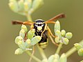
- Nomination A head of a "French paper wasp" (Polistes gallicus). The sun was hidden and the guy was taking a nap, that's why I could focus on the head with care. - Alvesgaspar 18:24, 29 August 2007 (UTC)
- Decline This one's DOF is really too shallow. If only the head was very crisp... Lycaon 18:44, 29 August 2007 (UTC) The colors are very nice, but the composition is unfortunate because of low DoF on the Wasp. Therefore, the flowers appearing distracting and give more picture guidiance than the head of the Wasp will do. Furthermore the noise level is on the borderline, not to mention the slight overexposure. --Richard Bartz 18:47, 29 August 2007 (UTC)
-

- Nomination Verbascum sinuatum. These are small and fragile flowers, in the morning they are beautiful and in the afternoon already withered. Alvesgaspar 17:35, 29 August 2007 (UTC)
- Promotion Great! Had to promote! Lycaon 17:51, 29 August 2007 (UTC)
-

- Nomination Cape Ground Squirrel (Xerus inauris) close to Solitaire, Namibia. -- Lycaon 11:23, 29 August 2007 (UTC)
- Promotion Good light. --Beyond silence 13:50, 30 August 2007 (UTC)
-

- Nomination The Field Museum, as seen from the north in pre-dawn light. Kelly Martin 00:10, 29 August 2007 (UTC)
- Decline very blurred. Lycaon 21:55, 30 August 2007 (UTC)
-

- Nomination Green-bottle fly resting - a female Lucilia sericata. The good news is that this species is rarely seen indoors... Alvesgaspar 09:57, 28 August 2007 (UTC)
- Promotion Good light, sharp. --Beyond silence 13:48, 30 August 2007 (UTC)
-
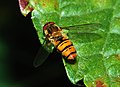
- Nomination Hoverfly resting (Episyrphus balteatus). This is a very beautiful species about 1cm long. Alvesgaspar 09:57, 28 August 2007 (UTC)
- Promotion Good light, sharp. --Beyond silence 13:48, 30 August 2007 (UTC)
-

- Nomination San (the 'dancing' Kudu) and Khoekhoen (the abstract figures) art at Twyfelfontein, Namibia. Lycaon 22:05, 27 August 2007 (UTC)
- Promotion Good technical condition. --Beyond silence 13:45, 30 August 2007 (UTC)
-

- Nomination Volucella pellucens, Taxo picture --Richard Bartz 13:15, 27 August 2007 (UTC)
- Promotion It is dead, isn't it? Lycaon 18:47, 27 August 2007 (UTC) Yes i found her dead in my kitchen --Richard Bartz 20:06, 27 August 2007 (UTC)Good sharpness. --Beyond silence 13:45, 30 August 2007 (UTC)
-

- Nomination Young servals (Leptailurus serval) in a zoo.Vassil 21:27, 26 August 2007 (UTC)
- Promotion Nice photo. Acceptable technical condition. --Beyond silence 13:43, 30 August 2007 (UTC)
-

- Nomination Hot-air baloons --AngMoKio 20:59, 26 August 2007 (UTC)
- Promotion Beautiful. I will promote it when the little stain (or is it a bird?) below the right Marktkauf ballon is removed --Simonizer 15:51, 28 August 2007 (UTC)Done..let's hope it was a bird and not dust :) --AngMoKio 20:42, 30 August 2007 (UTC) Acceptable technical condition. --Beyond silence 13:43, 30 August 2007 (UTC)
-

- Nomination Bridge Nový most over the Danube taken at sunset (Bratislava) - Alberto Fernandez Fernandez 17:18, 26 August 2007 (UTC)
- Promotion Dark, but good view and athmosphere. --Beyond silence 13:43, 30 August 2007 (UTC)
-

- Nomination Alcea rosea --moralist 15:17, 25 August 2007 (UTC)
- Decline White part on the left greatly disturbs. Lycaon 13:53, 30 August 2007 (UTC)
-
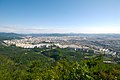
- Nomination: Cityscape of Daejeon. --YooChung 08:32, 25 August 2007 (UTC)
- Review needed
-

- Nomination: Stainborough Castle in Yorkshire. -- Klaus with K 19:11, 24 August 2007 (UTC)
- Review needed
-

- Nomination: A calvary in Brittany. Vassil 16:13, 24 August 2007 (UTC)
- Review needed
-

- Nomination: Walls of Dubrovnik --Beyond silence 13:22, 24 August 2007 (UTC)
- Review )
-

- Nomination: Walls of Dubrovnik --Beyond silence 13:22, 24 August 2007 (UTC)
- Review )
-

-

-

- Nomination Dark bush cricket (Pholidoptera griseoaptera) of the family Tettigoniidae, known in American English as katydids and in British English as bush-crickets. --Hsuepfle 20:15, 23 August 2007 (UTC)
- Decline Legs are too noisy and too much out of focus. Lycaon 22:05, 30 August 2007 (UTC)
-
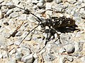
- Nomination Female of the Longhorm Beetle Monochamus sartor --Hsuepfle 20:15, 23 August 2007 (UTC)
- Decline Good details but too harsh light. Should have levels adjusted. Lycaon 22:03, 30 August 2007 (UTC)
-

- Nomination sharp and clean detail of a blossom which is important for determination. Fabelfroh 06:26, 23 August 2007 (UTC)
- Promotion Acceptable. --Beyond silence 11:33, 31 August 2007 (UTC)
-

- Nomination Path in Békés --Beyond silence 03:52, 23 August 2007 (UTC)
- Decline Crop and severe halos. Lycaon 21:59, 30 August 2007 (UTC)
-

- Nomination Black Poplars next to Élővíz-csatorna canal --Beyond silence 03:52, 23 August 2007 (UTC)
- Decline Crop, light. Lycaon 21:59, 30 August 2007 (UTC)
-

-

- Nomination Mantis religiosa, Lisboa, Portugal. It's like a portrait, while I was shooting the guy always looked at me (brr..). Alvesgaspar 13:18, 28 August 2007 (UTC)
- Promotion Nice portrait! Now it's sure: next August I'll spend my holidays in Portugal!! (Bavaria is for another time, Richard ;-)). Lycaon 13:40, 28 August 2007 (UTC)
-
-

- Nomination Yellow flower of Gazania rignes with critters - Alvesgaspar 09:57, 28 August 2007 (UTC)
- Promotion Excellent quality -- MJJR 20:56, 28 August 2007 (UTC)
-

- Nomination Twin flowers of Ipomoea acuminata. I love this colouring and texture, it's like silk - Alvesgaspar 23:59, 27 August 2007 (UTC)
- Promotion Very nice indeed, and sharp! Rather tight cropping, however -- MJJR 21:04, 28 August 2007 (UTC)
-
- Nomination Portrait of a female Black-faced Impala (Aepyceros melampus petersi). Lycaon 22:05, 27 August 2007 (UTC)
- Promotion Nice and sharp. Pity that the light (and shadows) is a bit harsh. Alvesgaspar 16:14, 28 August 2007 (UTC)
I know, African sun: twilight lasts mere minutes at these latitudes... Lycaon 20:38, 28 August 2007 (UTC)
-
- Nomination Wild rose (Rosa canina). Lycaon 22:05, 27 August 2007 (UTC)
- Promotion Good light, sharp. --Beyond silence 15:40, 28 August 2007 (UTC)
-

- Nomination Marbled Swimming Crab Liocarcinus marmoreus. Lycaon 22:05, 27 August 2007 (UTC)
- Promotion sharp. --Beyond silence 15:40, 28 August 2007 (UTC)
-

-
- Nomination "So, naturalists observe, a fly - Hath smaller flys that on him prey; And these have smaller still to bite 'em; And so proceed ad infinitum” --Tony Wills 12:30, 27 August 2007 (UTC)
- Promotion Acceptable technical condition. --Beyond silence 15:42, 28 August 2007 (UTC)
-

- Nomination Fireworks --AngMoKio 20:59, 26 August 2007 (UTC)
- Promotion Acceptable technical condition. --Beyond silence 15:45, 28 August 2007 (UTC)
-

- Nomination This is a high resolution 3x magnification shot of a Clover leaf weevil Hypera zoilus --Richard Bartz 16:46, 26 August 2007 (UTC)
- Promotion With the correct name (nice find!) surely a QI. Lycaon 09:45, 29 August 2007 (UTC)
-
![* Nomination High Brown Fritillary ([Argynnis adippe]) butterfly feeding on Cabbage thistle (Cirsium oleraceum) --Hsuepfle 13:34, 26 August 2007 (UTC) * Promotion Acceptable technical condition. --Beyond silence 15:45, 28 August 2007 (UTC)](https://upload.wikimedia.org/wikipedia/commons/thumb/d/d8/Argynnis_adippe_-_Feuriger_Perlmutterfalter_04_%28HS%29.JPG/120px-Argynnis_adippe_-_Feuriger_Perlmutterfalter_04_%28HS%29.JPG)
- Nomination High Brown Fritillary ([Argynnis adippe]) butterfly feeding on Cabbage thistle (Cirsium oleraceum) --Hsuepfle 13:34, 26 August 2007 (UTC)
- Promotion Acceptable technical condition. --Beyond silence 15:45, 28 August 2007 (UTC)
-

- Nomination Museum of Natural History, in the garden of plants, in Paris - Benh 17:16, 25 August 2007 (UTC)
- Promotion Acceptable technical condition. --Beyond silence 15:43, 28 August 2007 (UTC)
-

- Nomination Mating water striders --Aconcagua 08:15, 21 August 2007 (UTC)
- Promotion Well timed capture, still water showing displacement caused by the spiders legs is the clincher for me Gnangarra 14:46, 24 August 2007 (UTC)
they are not spiders but bugs (Hemiptera). ;-) Lycaon 21:05, 28 August 2007 (UTC)
-

-

-

- Nomination Bee landing on flower (ditto!). --Adamantios 19:33, 27 August 2007 (UTC)
- Decline Lots of artefacts, nothing crisp. -- Lycaon 19:38, 27 August 2007 (UTC)
-

-

-

- Nomination A fossilized ammonite. Vassil 17:09, 27 August 2007 (UTC)
- Decline Very nice, but id (some id), age, location...? -- Lycaon 18:33, 27 August 2007 (UTC)
Unfortunately unknown !Vassil 19:59, 27 August 2007 (UTC)
Shame, can you upload a picture of the rear so that someone (me?) can have a go at identification? Lycaon 08:02, 28 August 2007 (UTC)
-

-

-

- Nomination Motorway M1 in the UK. -- Klaus with K 17:40, 27 August 2007 (UTC)
- Promotion A bit soft focus, but acceptable for QI. -- Lycaon 18:42, 27 August 2007 (UTC)
-

- Nomination Volucella pellucens, head --Richard Bartz 13:15, 27 August 2007 (UTC)
- Promotion Great macro!--Beyond silence 19:10, 27 August 2007 (UTC)
-

- Nomination Volucella pellucens, head --Richard Bartz 13:15, 27 August 2007 (UTC)
- Promotion Great macro!--Beyond silence 19:10, 27 August 2007 (UTC)
-

- Nomination Coenonympha arcania --MichaD | Michael Apel 09:09, 26 August 2007 (UTC)
- Promotion Quality of the butterfly just offsets the noisy background. Not an easy decision, try some noise reduction. -- Lycaon 19:16, 27 August 2007 (UTC)
-

- Nomination Elands (Taurotragus oryx) in a zoo. Vassil 22:36, 25 August 2007 (UTC)
- Decline With some noise reduction may can be acceptable. --Beyond silence 14:15, 26 August 2007 (UTC)
Lots of artefacts. Lycaon 12:24, 27 August 2007 (UTC)
-
-

-

-

- Nomination John of Nepomuk on the facade of Körnermarkt 4 in Krems am der Donau. Alberto Fernandez Fernandez 19:04, 23 August 2007 (UTC)
- Decline The composition is not so good: Objects on the left are cropped, the viewpoint is too low - Till 17:10, 27 August 2007 (UTC)


![* Nomination Monument on the top of mountain Śnieżnik (Glatzer Schneeberg). -- Pudelek 18:41, 26 September 2007 (UTC) * Promotion Monumental. Calibas 03:54, 27 September 2007 (UTC) Please geocode. Is it not Glatzer Schneegebirge instead of Schneeberg? See [1] Alberto Fernandez Fernandez 07:47, 27 September 2007 (UTC) Geocode done. This is exactly Glatzer Schneeberg [2], Pudelek 09:27, 27 September 2007 (UTC)](/wiki/File:Glatzer_Schneeberg_01.JPG)


-edited.jpg)


.jpg)


-7.jpg)


.JPG)


.jpg)


-6.jpg)


.jpg)


.JPG)


![* Nomination Painting of J-L David, colurs re-checked as to the original, noise reduction by Ikiwaner--Szilas 03:49, 14 September 2007 (UTC) * Decline I'm not convinced about the colours [3], [4], [5], [6], etc. But I'm even more concerned about the lack of detail caused by the soft focus and the noise reduction. Lycaon 18:01, 14 September 2007 (UTC)](/wiki/File:Jacques-Louis_David_-_Mars_desarme_par_Venus.JPG)


.JPG)
.JPG)


.jpg)


.jpg)
.jpg)


.jpg)
![* Nomination Robert's Helmet BMW (2007)--Anuskafm 18:26, 9 September 2007 (UTC) * Decline Nice attempt, but still some mistakes. E.g. lettering of 'Credit Suise' is not aligned as in ([7]). Lycaon 18:37, 9 September 2007 (UTC)](/wiki/File:Casco_Kubica_BMW.svg)


![* Nomination Painting of Van Gogh, own photo--Szilas 15:21, 8 September 2007 (UTC) * Decline A small strip is cropped top and bottom, and I'm not too convinced about the colours neither. ([8]). -- Lycaon 15:45, 9 September 2007 (UTC)](/wiki/File:Van_Gogh_-_Country_road_in_Provence_by_night.jpg)


_09.JPG)


.JPG)


.jpg)


.jpg)


.jpg)


.jpg)


-5.jpg)


![* Nomination High Brown Fritillary ([Argynnis adippe]) butterfly feeding on Cabbage thistle (Cirsium oleraceum) --Hsuepfle 13:34, 26 August 2007 (UTC) * Promotion Acceptable technical condition. --Beyond silence 15:45, 28 August 2007 (UTC)](/wiki/File:Argynnis_adippe_-_Feuriger_Perlmutterfalter_04_(HS).JPG)


.jpg)

![[3]](http://art.mygalerie.com/les%20maitres/jldavid/mars.jpg)
![[4]](http://www.artunframed.com/images/artmis39/jdavid70.jpg)
![[5]](https://upload.wikimedia.org/wikipedia/fr/d/d2/David_Mars_1824.jpg)
![[6]](http://www.universalis.fr/images/corpus/medias/mini/v11/musee.swf/ph99i050.jpg)
![[7]](http://www.credit-suisse.com/framework/img/logo_cs.gif)
Consensual review[edit]
Brown Hare[edit]

- Nomination Brown Hare --Benjamint 12:45, 22 September 2007 (UTC)
- Decline
- Support Very nice. Sharp. (BTW, scary huge eye on that thing.) Doodledoo 12:52, 22 September 2007 (UTC)
- Oppose Unfortunate tight crop. Lycaon 13:26, 22 September 2007 (UTC)
- Oppose - Agree - Alvesgaspar 19:05, 22 September 2007 (UTC)
- Oppose - Yep, the crop isn't good. -- Slaunger 19:47, 22 September 2007 (UTC)
- Oppose due to the unfortunate crop - even some hairs of its right ear are cut off. Otherwise a very good picture. --Florian Prischl 20:13, 22 September 2007 (UTC)
- Support Nice light and sharpness, not a bad composition! --Beyond silence 22:22, 22 September 2007 (UTC)
- Oppose crop --Leafnode 06:39, 25 September 2007 (UTC)
Result: 2 support (excluding the nominator), 5 oppose -> not promoted to QI --Tony Wills 07:48, 28 September 2007 (UTC)
Adidas Absolado shoe[edit]

- Nomination Adidas Absolado shoe--Beyond silence 15:13, 18 September 2007 (UTC)
- Decline copyrighted. Lycaon 19:06, 18 September 2007 (UTC)
The deletion request is not understandable. --Kolossos 09:30, 20 September 2007 (UTC)
The request is understandable, but disputable. After all we can discuss the quality of the image, after we came to a descission about the request for deletion, because it is useless to promote a deleted picture... --LC-de 13:22, 20 September 2007 (UTC)Deletion request is gone.--Beyond silence 14:21, 20 September 2007 (UTC) - 'Oppose'Decline due to the bad crop (not even one shoe is wholly visible) and lighting (I realize the shoe is very reflective, but a better setting should have been used). --Florian Prischl 23:45, 21 September 2007 (UTC)
- Oppose borderline copyright case and bad cropping. Lycaon 07:57, 22 September 2007 (UTC)
- Oppose Bad lighting. Doodledoo 12:48, 22 September 2007 (UTC)
- Oppose Unfortunate crop and other problems. -- Slaunger 20:10, 22 September 2007 (UTC)
- Oppose --Lestat 18:03, 25 September 2007 (UTC)
Result: 0 support (excluding the nominator), 5 oppose -> not promoted to QI --Tony Wills 07:47, 28 September 2007 (UTC)
Cathedrale de Metz[edit]

- Nomination An HDR+pano picture of the Cathedral of Metz. -- Benh 12:33, 19 September 2007 (UTC)
- Promotion
- Support Perfect composition, good detail. Looks a bit narrow at center. --Beyond silence 17:08, 19 September 2007 (UTC)
- Narrow at the centre ?? maybe because of the perspective ?? Benh 21:03, 19 September 2007 (UTC)
- I don't see any tilt. Can you spot me the litigious area please ? I could make the vertical lines appearing as vertical but this would amplify the geometric distortion you find already extreme. Also, I think this is a more natural view (similar to what you would get in a single shot with a very wide angle and distortion free lens) and I think it emphasizes well the height of the Cathedral (third highest in France), or how small we are by comparison... I'll upload a picture to let you check soon. But I hope this one gets QIfied, I really think it deserves it (although it's always hard to judge a self work :) ). Benh 21:03, 19 September 2007 (UTC)
- You are right, the tilt feeling is due to the assymemtry mentioned by Slaunger - Alvesgaspar 22:45, 19 September 2007 (UTC)
- Support I don't see any noticeable tilt either. The vertical centerline is not 100% vertical (off by a pixel or so). I do not hink the other verticals have to be vertical in this projection. However, the crop on the left and right hand sides are slightly asymmetric. I think it would look slightly better if the lamps on the left and right image borders were cut at the same heigth (or ideally not cut at all, but i doubt that is possible?) and I think this is what can give a sense that there is tilt. However, these are IMO pedantic details and I find the quality fully acceptable for QI. -- Slaunger 21:45, 19 September 2007 (UTC)
 Neutral due to asymetry which leads to a seemingly counter-clockwise tilt. The height of the cathedral unfortunately emphasises this very strongly. It would be great if you could produce a rotated or otherwise corrected version, because this picture should be a clear QI. --Florian Prischl 23:18, 21 September 2007 (UTC)
- Support I think this is definitely good enough for a QI, if the distortion problems weren't there I'd call this an FP. Calibas 00:18, 22 September 2007 (UTC)
- I couldn't avoid distortion, this pano is taken from two wide angle shots, which makes it a very wide angle image, hence the distortions (and it was even worse on the top part I cropped out !) Benh 09:55, 22 September 2007 (UTC)
- Info I cropped out the right part of the picture to give it symetry. Benh 09:55, 22 September 2007 (UTC)
- It is much better now. I have accordingly changed my vote (see above) to neutral and will think about support (it seems to lean a little to the left now). --Florian Prischl 10:57, 22 September 2007 (UTC)
- Yes, that helped. Now my support is whole-hearted. -- Slaunger 20:31, 22 September 2007 (UTC)
Result: 3 support (excluding the nominator), 0 oppose -> promoted to QI --Tony Wills 02:02, 26 September 2007 (UTC)
Calliphora vicina[edit]

- Nomination Calliphora vicina, a blowflie species. -- Aleph 16:49, 14 September 2007 (UTC)
- Promotion
- Oppose The image is too noisy. Also, the use of extension tubes to get closer to the subject probably made the DOF too shallow. Notice that only the eye is focused. It is possible to get a much better DOF with this subject. Finally, I don't like the extreme crop. Alvesgaspar 17:33, 14 September 2007 (UTC)
- Support DOF is fine with me - it's a macro picture, and the subject is in focus. If I understand this correctly, much better DOF is pretty much impossible. Extension tubes do not have any direct effect on DOf; they do the exact same thing normal focussing does - vary the distance from lens to body. Therefore, any macro picture results in this, whether by macro lens or extension tube. I agree with Alvesgaspar that the crop is too tight, but I think that the noise is quite reasonable. Remeber that the guidelines are only 2MP - punishing people for uploading slightly noisy 3.6MP images makes little sense. Thegreenj 15:44, 15 September 2007 (UTC)
- Support I think it's good enough (for QI) too. The OOF parts don't bother me on this pic and neither does the noise. Benh 16:00, 15 September 2007 (UTC)
- Oppose I think the DOF could be a little better at least. Not even the mouth part is sharp. The crop does not bother me too much, but it is very tight. --Florian Prischl 20:05, 18 September 2007 (UTC)
- Umm... It's at f/16 already. And again, as I understand this, closer focussing through tubes (ie not internal focussing) actually increases focal length, so that f/16 could actually be even smaller. Unless you want to defy the laws of physics, I cannot see how more DOF can be obtained. That's not to say, however, that more of the subject could be made in focus by, say, a different angle. Thegreenj 03:14, 19 September 2007 (UTC)
- Info It would be kind to recognise the effort, which was neccessary to take this photograph. This fly is really small, so the depth of field is rather small, too. It would not have been adequate to stop more down than to f/16 (which it is already!), because the sharpness of the eyes would be worse then due to diffraction. Please don't forget that we are talking about Quality Images, not Featured Pictures here! You might want to compare to these images: File:XN Sympetrum sanguineum w prey 658.jpg (featured picture), File:Episyrphus balteatus - head close-up (aka).jpg (featured, too), File:CH Hen 1.jpg (quality image). -- Aleph 14:02, 19 September 2007 (UTC)
- Comment - To Thegreenj: the extension tube does not affect the optical properties of the objective, including the focal length. It only allows the subject to be focused at a closer distance (with the drawback of making impossible to focus to infinity). But at a closer distance the DOF is even smaller. For that reason, it is not always the best solution, as it happens in the present case. There are two ways to increase DOF: increase the distance between the subject and the focal plane (using or not a larger focal length) or put more light into the system (one or more flash units), so that a larger f number can be used.
To Aleph: this kind of fly is not "that small", I have shot similar ones about 10mm long. It is not difficult to obtain better results, with patience, care and a bit of knowledge. Please check this one and this one, which are not even Quality Images. - Alvesgaspar 20:40, 19 September 2007 (UTC)- Okay, soI'm wrong (though I believe that focussing closer changes apparent focal length, or something like that). However, the picture remains at f/16 - no matter what f number, significant change in DOF will not be obtained. Moving farther away decreases resolution because of cropping, so neither is really all that much better. The images you linked mostly have more in focus because of a flatter angle, which is unrelated to DOF. Thegreenj 20:57, 19 September 2007 (UTC)
- Oppose Its a very nice and interesting picture. If it was just the DOF issue I would support but the unfortunate noise amount and the crop is a bit too much for my personal taste. It is not high quality but i know how much work it is to do such shots, therefore its allways a odd feeling for me to oppose on such subjects. --Richard Bartz 04:07, 20 September 2007 (UTC)
- Support I like the sharp areas. --Beyond silence 14:29, 20 September 2007 (UTC)
- Support I don't mind the DOF issue and for me the crop is OK and the noise is acceptable considering how small and fast the subejct is. -- Slaunger 20:31, 20 September 2007 (UTC)
.jpg)
Result: 4 support (excluding the nominator), 3 oppose -> promoted to QI --Tony Wills 23:48, 22 September 2007 (UTC)
Pythagorian theorem[edit]

- Nomination There are several geometrical proofs of the Pythagorian theorem. This animation depicts one of the simplest and more elegant - Alvesgaspar 09:13, 26 September 2007 (UTC)
- Discussion
- Oppose Good animation, but poor at showing proof. Runs a bit fast and edges are not labeled throughout sequence, hard to follow, therefore does not live up to description. --Tony Wills 21:09, 26 September 2007 (UTC)
- Moving to CR to get other opinions -Alvesgaspar 21:41, 26 September 2007 (UTC)
- As its about the sum of the squares of the sides of the triangles, at the very least one of the triangles needs to have its sides labeled 'a' and 'b' from the start --Tony Wills 06:56, 27 September 2007 (UTC)
- And in my opinion it would be a good idea to start out with a single triangle, then duplicate it to assemble the square. - Till 07:27, 27 September 2007 (UTC)
- As its about the sum of the squares of the sides of the triangles, at the very least one of the triangles needs to have its sides labeled 'a' and 'b' from the start --Tony Wills 06:56, 27 September 2007 (UTC)
![]() Thanks for the suggestions. I'm working on a new version - Alvesgaspar 10:18, 27 September 2007 (UTC)
Thanks for the suggestions. I'm working on a new version - Alvesgaspar 10:18, 27 September 2007 (UTC)
Blue-tailed Damselfly[edit]

- Nomination photo with great composition of the Blue-tailed Damselfly. Fabelfroh 08:09, 22 September 2007 (UTC)
- Decline
- Oppose Strong posterization and artifacts, especially in the wings. --Florian Prischl 19:14, 22 September 2007 (UTC)
- Support May it is acceptable at QI standads. --Beyond silence 22:52, 22 September 2007 (UTC)
- Comment Please do not object a first assessment by just changing the template to {{Discuss}} but leaving the image in the regular gallery. Move it to CR instead. Thank you. --Florian Prischl 23:33, 22 September 2007 (UTC)
- Oppose - This particular subject is very difficult to shoot, I know that from self experience. An though this is indeed a good composition and a nice picture (a lot better than mine), the "insect bar" has been put quite high, even in QIC. I believe it is possible to get a sharper and cleaner picture - Alvesgaspar 09:24, 23 September 2007 (UTC)
- There is no need for QI to get more picky, this is about promoting good quality images, not just selecting the cream off the top. --Tony Wills 04:13, 24 September 2007 (UTC)
- Support A good quality image of the species --Tony Wills 04:13, 24 September 2007 (UTC)
- Oppose No need to be too picky unless the image is at the lower range of size limits. Lycaon 04:48, 24 September 2007 (UTC)
Result: 2 support (excluding the nominator), 3 oppose -> not promoted to QI --Tony Wills 04:49, 26 September 2007 (UTC)
Reservoir Šance in Beskydy[edit]

- Nomination Reservoir Šance in Beskydy / Czech Republic --Pudelek 15:58, 21 September 2007 (UTC)
- Decline
- Oppose Unfortunate composition, the building is obscured by the strong blue hue and the positioning in the center. --Florian Prischl 18:48, 22 September 2007 (UTC)
- Support The tech quality isn't the best, but the composition not a bad, not an acceptable decline reason - I think. --Beyond silence 22:45, 22 September 2007 (UTC)
- Comment Please do not object a first assessment by just changing the template to {{Discuss}} but leaving the image in the regular gallery. Move it to CR instead. Thank you. --Florian Prischl 23:33, 22 September 2007 (UTC)
- Oppose not very sharp, especially at the lower limit of acceptable size. Lycaon 00:01, 23 September 2007 (UTC)
Result: 1 support (excluding the nominator), 2 oppose -> not promoted to QI --Tony Wills 04:44, 26 September 2007 (UTC)
Hikers, in French Alps[edit]

- Nomination Hikers, in French Alps -- Benh 23:12, 21 September 2007 (UTC)
- Decline
- Oppose The picture is tilted. That is obvious from the position of three of the hikers, specially the one who is far off - Alvesgaspar 19:04, 22 September 2007 (UTC)
- Support I don't think it's really tilt, but the mountain really has... :) --Beyond silence 22:45, 22 September 2007 (UTC)
- Comment Please do not object a first assessment by just changing the template to {{Discuss}} but leaving the image in the regular gallery. Move it to CR instead. Thank you. --Please sign with name and date (four tildes) Florian Prischl 23:33, 22 September 2007 (UTC
- Oppose Alvesgaspar is right: the picture is tilted (to the left, I would say). Apart from that, it's technically OK, but I'm missing a geotag, and the image should be categorized better. - Till 08:25, 23 September 2007 (UTC)
- Comment It will be hard to geotag it, but I'll try to correct the tilt quickly enough. Benh 21:15, 23 September 2007 (UTC)
Result: 1 support (excluding the nominator), 2 oppose -> not promoted to QI --Tony Wills 04:43, 26 September 2007 (UTC)
Blue Line Ferry Ancona[edit]

- Nomination Blue Line Ferry Ancona, Ancona, Italy --gobeirne 10:05, 22 September 2007 (UTC)
- Decline
- OpposeObtrusive stitching errors, CA fringing. Lycaon 21:04, 22 September 2007 (UTC)
- I don't see errors, may near QI. --Beyond silence 22:58, 22 September 2007 (UTC)
- I am notoriously bad a spotting stitching errors because I have very limited experience with stitching - could you please point them out for me so I can learn? And what does the acronym "CA" mean? Thank you, Florian Prischl 23:17, 22 September 2007 (UTC)
- I recently started stitching myself, so I've recently started noticing them. There is a big one at the start of the thick blue line underneath the B of Blue, it runs down to the railing of the ship of the observer. There is also a ghost of the water tower, just right of the aftmost radar, that one is minor. CA is chromatic aberration especially towards the stern of the ship. Lycaon 23:57, 22 September 2007 (UTC)
- Ah, yes, I found them now. Thank you for pointing them out to me. --Florian Prischl 10:32, 23 September 2007 (UTC)
- I don't see errors, may near QI. --Beyond silence 22:58, 22 September 2007 (UTC)
- Oppose and concur with Lycaon. --Florian Prischl 10:32, 23 September 2007 (UTC)
Result: 0 support (excluding the nominator), 2 oppose -> not promoted to QI --Tony Wills 04:42, 26 September 2007 (UTC)
Pavo cristatus feather[edit]

- Nomination Newer version-Scan of an Pavo cristatus feather--Beyond silence 22:23, 22 September 2007 (UTC)
- Decline
- Oppose Still dull colours and uneven background. Is this really a scan? Lycaon 22:37, 22 September 2007 (UTC)
- Really scan. I think the colours are not bad now, and I like the soft background. May others don't. --Beyond silence 22:49, 22 September 2007 (UTC)
- Oppose The background is distracting from the subject - too much2. Also, the very unsharp lower part of the feather seems even stranger when considering this is a scan. --Florian Prischl 23:15, 22 September 2007 (UTC)
Result: 0 support (excluding the nominator), 2 oppose -> not promoted to QI --Tony Wills 04:42, 26 September 2007 (UTC)
Cathedral St. Lawrence-Trogir[edit]

- Nomination Cathedral of St. Lawrence in Trogir --Beyond silence 07:16, 22 September 2007 (UTC)
- Decline
- OpposeSuch a detail should contain, in its description, where exactly it is from. I also think the angle does not illustrate the subject at hand well. It might be artistically interesting, but not architecturally or encyclopedically. --Florian Prischl 19:14, 22 September 2007 (UTC)
- 1. Value isn't the main promotion view. 2. I think it's well showing the small piece of cathedral and architecture. --Beyond silence 22:36, 22 September 2007 (UTC)
- While value may not be the single most important aspect when assessing an image, it should be considered. I think this photo lacks some value because the angle does, in my opinion, not illustrate the subject very well - to illustrate the capital, it is cropped to tightly and the right side is hardly visible. To illustrate the arch, the angle creates a distortion in the bow of the arch that I think makes it not very usable for that objective. I may summarize this as being too little of two things - thus the decline/oppose. --Florian Prischl 23:11, 22 September 2007 (UTC)
- 1. Value isn't the main promotion view. 2. I think it's well showing the small piece of cathedral and architecture. --Beyond silence 22:36, 22 September 2007 (UTC)
- Oppose Tight crop at confusing angle. Lycaon 00:03, 23 September 2007 (UTC)
Result: 0 support (excluding the nominator), 2 oppose -> not promoted to QI --Tony Wills 04:41, 26 September 2007 (UTC)
Elephants in water[edit]
- Nomination Panorama of an elephant swimming hole at an elephant orphanage in Sri Lanka. Photo by Wouter Hagens, not me. --Doodledoo 22:56, 21 September 2007 (UTC)
- Decline
- SupportIs this a stitched pano ? If so, How did he managed to do that with so many (probably moving) people on the fov without stitching errors ? wow ! too bad it's a bit soft. I'd like to nominate for FP. (unsigned) Please sign with name and date (four tildes) Benh 19:12, 21 September 2007
- Oppose Sharpening artefacts and poor cropping. Lycaon 07:44, 22 September 2007 (UTC)
- Oppose Stitch error in the middle just above the guy with the striped shirt (detached arm), and a little soft on the elephant above that. With those fixed, this is a QI. -- (Relic38 12:11, 22 September 2007 (UTC))
- Comment Those vertical bars near the right border are an eyesore and could be cropped without making the image too small. - Till 18:54, 22 September 2007 (UTC)
- Oppose due to the poles on the right side, posterization of the sky and general unsharpnes (nothing in the photo is really sharp). --Florian Prischl 20:12, 22 September 2007 (UTC)
RResult: 1 support (excluding the nominator), 3 oppose -> not promoted to QI --Tony Wills 04:40, 26 September 2007 (UTC)
Lycoperdon perlatum[edit]

- Nomination Gem-studded puffball (Lycoperdon perlatum) --LC-de 20:58, 18 September 2007 (UTC)
- Decline
- Support Could be sharper, but nevertheless QI. -- MJJR 19:30, 20 September 2007 (UTC)
- Oppose not sharp enough. Lycaon 08:36, 22 September 2007 (UTC)
- Question A little too unsharp at 3M res IMO. The photo is taken with an 8Mpixel camera AFAIK. Why is the uploaded photo only 3M. Cropped or downsampled? Is the fungus very small?
- Oppose Not sharp enough, especially in the top part of the fungus. --Florian Prischl 20:10, 22 September 2007 (UTC)
Result: 1 support (excluding the nominator), 2 oppose -> not promoted to QI --Tony Wills 04:39, 26 September 2007 (UTC)
FS E656 and E646 series locomotives[edit]

- Nomination FS E656 and E646 series locomotives - Italian electric locos - Trieste - clouded day --Orlovic (talk) 20:52, 20 September 2007 (UTC)
- Decline
- SupportAcceptable composition and tech detail.--Beyond silence 13:59, 21 September 2007 (UTC)
- Oppose and moved to CR. Bad crop (too much space on the right), angle (the closer engine is not visible well enough) and lighting (a station with roofing like here simply casts too much shadow - photos of engines are better shot in the open). --Florian Prischl 10:43, 22 September 2007 (UTC)
- Oppose Lighting - too much in shadow. -- Slaunger 20:08, 22 September 2007 (UTC)
Result: 1 support (excluding the nominator), 2 oppose -> not promoted to QI --Tony Wills 04:38, 26 September 2007 (UTC)
Castillo de San Marcos[edit]
![]()
- Nomination Castillo de San Marcos Fort --Digon3 23:04, 16 September 2007 (UTC)
- Decline
- Oppose The quality of the image is poor specially in the shadowed areas. There is an obvious stitching error near the stairs. Finally, the composition seems unbalanced. Alvesgaspar 10:03, 18 September 2007 (UTC)
- I don't see the stitching error, perhaps it was the ghosting? --Please sign with name and date (four tildes) Digon3
- Info - There is a vertical lighter band coming from the ground, where a person is standing, up to the sky above - Alvesgaspar 13:14, 18 September 2007 (UTC)
- That is glare from the sun, I'll see if I can get rid of that. --Please sign with name and date (four tildes) Digon3
- Support Alvesgaspar is probably talking about the stitching error on the right part of the green area, next to the stairs, not about the glare from the sun (this was another topic). And to me, this picture is worth QI status, so I change its template to "Discuss" :). Benh 19:32, 18 September 2007 (UTC)
- Comment - Moved to CR. Are you sure that is a glare from the Sun? As for the stitching error in the grass, it is quite obvious and not acceptable in a QI imo. - Alvesgaspar 16:40, 20 September 2007 (UTC)
- I looked at the source pictures and the glare is definitly from the sun. Also the stitching error in the grass isn't actually a stitching error, that is just the way it looked. But there was a stitching error in the pavement beside the grass, and I tried to fix that, the grass, and the ghosting in the new upload. --Digon3 18:47, 20 September 2007 (UTC)
- Oppose due to the cramped perspective (the tight crop adds to this) and the high noise levels. --Florian Prischl 23:26, 21 September 2007 (UTC)
- Oppose Much of the subject is in shadow making it hard to discern details. -- Slaunger 20:14, 22 September 2007 (UTC)
Result: 1 support (excluding the nominator), 3 oppose -> not promoted to QI --Tony Wills 02:07, 26 September 2007 (UTC)
Chapelle de Languidou[edit]

- Nomination Ruins of Languidou Chapel, Brittany. Vassil 11:54, 15 September 2007 (UTC)
- Decline
- Comment Has encyclopedic value, but is a little bit unsharp on the edges.--Siipikarja 13:20, 15 September 2007 (UTC)
- Support I'm finding it not so soft. My biggest concern here is what seems to me to be overexposure, but I like the pic enough to want it promoted QI. Please sign with name and date (four tildes) Benh 15:53, 15 September 2007 (UTC
- Oppose purple fringes in the trees, overexposed. Lycaon 18:14, 16 September 2007 (UTC))
- Support Acceptable sharpness. --Beyond silence 14:24, 20 September 2007 (UTC)
- Oppose Strong fringing (also on the borders of light and shadowy areas, overexposed. --Florian Prischl 23:23, 21 September 2007 (UTC)
- Oppose Fringing. -- Slaunger 20:18, 22 September 2007 (UTC)
Result: 2 support (excluding the nominator), 3 oppose -> not promoted to QI --Tony Wills 02:06, 26 September 2007 (UTC)
Upper Silesian Ethnographic Park.[edit]

- Nomination Upper Silesian Ethnographic Park. --Lestat 21:47, 16 September 2007 (UTC)
- Decline
- Oppose Beautiful composition, Lestath! Unfortunately the exposure choice is wrong (high shutter speed, low F number) making the picture unsharp. Should have been the other way around. - Alvesgaspar 20:50, 18 September 2007 (UTC)
- Is it really unsharp?? --Lestat 21:58, 19 September 2007 (UTC)
- I get decline for simillar sharpness... --Beyond silence 14:27, 20 September 2007 (UTC)
- Neutral Really a very nice picture: subject, light, colors, composition! But unfortunately the grasses are too unsharp... I know by experience that it's not easy to get them sharp! -- MJJR 19:38, 20 September 2007 (UTC)
- Oppose The phot lacks the DOF that should be achieved with such a shot. --Florian Prischl 23:20, 21 September 2007 (UTC)
Result: 0 support (excluding the nominator), 2 oppose -> not promoted to QI --Tony Wills 02:03, 26 September 2007 (UTC)
Panorama Unterscheibe[edit]

- Nomination Gasometer Oberhausen, Germany, exhibition area at the first floor. Great lights... ← Körnerbrötchen - @ 13:27, 17 September 2007 (UTC)
- Decline
- Oppose Interesting motive with concise image page but has quite some technical problems: unsharp (sign at stairs), stitching error (a person has a ghost), noise (especially the darker parts of the image), sorry. -- Slaunger 20:51, 17 September 2007 (UTC)
- Support This is a wonderfully stitched pano, and I like the composition, lighting, mood... The unsharpness is only at the extreme right. Ghost isn't an error to me (this happens in long exposure shots). The only flaw of this picture is a fairly high level of noise, but I like it so much I think it's OK for QI (Noise appart, I would have nominated for FP). Two things though : you could scale it down, this won't remove details and get rid of some noise if well done (also could use NR software). Also, I your sensor seems to have a dead pixel (there's a repetitive blue dot on the bottom part of the pano). Benh 16:38, 19 September 2007 (UTC)
- Oppose technical issues (mainly noise). Lycaon 08:51, 20 September 2007 (UTC)
- Oppose Too much noise, apparently a dead pixel in the bottom part of the sensor. --Florian Prischl 23:15, 21 September 2007 (UTC)
Result: 1 support (excluding the nominator), 3 oppose -> not promoted to QI --Tony Wills 02:00, 26 September 2007 (UTC)
Sarcophagidae fly[edit]

- Nomination A Flesh Fly. --Calibas 01:27, 19 September 2007 (UTC)
- Decline
- Support Nice light and detail. --Beyond silence 11:59, 19 September 2007 (UTC)
- Oppose - I don't agree with the promotion, the DOF is too shallow due to a less than optimal exposure solution. Please check this picture of an identical fly (not a QI), where a much larger F number was used. The fly is probably of the Sarcophaga genus, it is not possible to identify these species from photos alone.Alvesgaspar 13:48, 19 September 2007 (UTC)
- Oppose The lighting is too harsh and DOF too shallow. --Florian Prischl 23:13, 21 September 2007 (UTC)
Result: 1 support (excluding the nominator), 2 oppose -> not promoted to QI --Tony Wills 02:00, 26 September 2007 (UTC)
Cicindela hybrida sideview[edit]

- Nomination The tiger beetles are a large group of beetles known for their predatory habits. As shown a Sandlaufkäfer 'Cicindela hybrida' from the side --Richard Bartz 18:15, 10 September 2007 (UTC)
- Discussion
- SupportNot quite so amazing as some of the others of this species but still a QI. Calibas 01:47, 13 September 2007 (UTC)
- Oppose I have a bio-ethical problem with the pictures of this series. Richard states that he chills his beetles before photographing1. Also the background is artificial (the grains are not from a natural local sand IMO, and too course for the species' habitat). There is also (al least one) not divulged manipulation in one of the pictures in the series. The retouched template is nowhere seen. Lycaon 10:17, 14 September 2007 (UTC)
- I agree, there is too long a history of humans collecting specimens without regard for the plants/animals, and now we are continuing the process by collecting photographs without regard to our subjects. What is the long term effects of being blasted with a freezing solution?, insects for instance don't have eye-lids. Admittedly this is at the bottom of the scale when we consider what is done to produce food, what is done in the name of hunting 'sports' and the all out destruction wrought by war ... but things start small :-) --Tony Wills 11:57, 14 September 2007 (UTC)
- To me, the most impressive component of getting great shots of elusive creatures is to do it without interfering too much (ex. removing from their environment, altering it's normal bio-functions, etc.). Otherwise, the image is less impressive to me. I also think that post alterations are acceptable as long as they are disclosed so the viewer can take it into account. --(Relic38 23:57, 14 September 2007 (UTC))
- I agree fully with Lycaon, harming the animals so you can show people how beautiful they are seems hypocritical to me. There is a human-induced mass extinction going on right now and unfortunately most people would rather ignore it. If someone wants to put up ethical requirements for QI/FP pictures I'd support it. Calibas 00:19, 15 September 2007 (UTC)
- Comment First of all i want to thank lycaon for his concerns. Iam not sure if bio-ethic is the right term. The question is in what amount you harm the insects for making pictures. If you kill or hardly damage them I fully agree with you, this is against ethic. What is with this picture by lycaon ? This animal was caught and brought to the deck of a ship. This animal cant move or breath on the surface, even if you release it after a while, was it harmed?. I have no problem with this. What we have here ? A caught spider on a artificial backgound by Fir. I have no problem with this. A ant chilled with food by myself? I have no problem with. Or here, a tick which i erased from my dog with a tweezer. When i took the shot the tick was caught in the tweezer. I have no problem with this although iam buddhist. If there is a mosquito on my skin i give him a slap, thats my instinct. Its a good suggestion but this picture is a wrong example for bio-ethic. --Richard Bartz 00:07, 17 September 2007 (UTC)
- I think this picture is in a different category, as I presume the animal was not dredged up just for him to take a photo (the ethics of dredging it up for study, or food is a different matter :-). Taking animals out of their natural habitat just for a photo is very questionable, but I expect taking a tick off your dog does not quite qualify as you were liable to remove his ticks anyway (I hope :-). I am not sure how you 'chilled' an ant with food (very cold food?). Anyway do you have evidence (from a third party) that ice-spray will not hurt insects? Whether or not people decide this treatment of insects is acceptable, the discussion serves as a reminder to consider the side-effects our photography has. --Tony Wills 09:20, 17 September 2007 (UTC)
- If you use ice spray on yourself it doesnt hurt if used properly. Its not that i use this anytime, and it would make me disapointing if you think that. Its a technique of a few dozens which you can learn in forums if you are interested in macro photography. --Richard Bartz 10:32, 17 September 2007 (UTC)
- The animal was hurt all right: it lost part of its right tarsus (which was later photoshopped as a rotated copy of the left middle tarsus, BTW - here).
- Concerning the dredged animals: this is done in the framework of a watchdog monitoring programme, where we do ecological studies on the possible harmful effects of dredging and dredge depositing (maintenance dredging for ports). If effects become noticeably detrimental, we can (and do) stop those activities2. Lycaon 17:50, 17 September 2007 (UTC)
- I cant remember that I broke the right tarsus in a intended manner althought i garantee that i wasnt touching this animal because of his jaws :). Here is a example that it is not unusual that insects loosing parts of their extremities. It would be the same absurd allegation to make me responsible for this. Finally i will keep this concern in mind, its a realistic topic to think about. --Richard Bartz 18:42, 17 September 2007 (UTC)
- Freezing the insects takes all the sport out of it. Calibas 01:01, 18 September 2007 (UTC)
- For me, photographing insects or contributing to wikipedia is not a sport but now i recognize that some users see this in that manner. A good example was when i said to alvesgaspar that i took a picture in the early morning when it was cold and the insect was clumsy. Giving him a productive idea was later turned against me, where he said that i had an advantage when making this photo and he compared it with his situation. This is a contraproductive behaviour, causing me to remain silent in the future, doing my thing for me alone. And here we have the same, this time in a chorus: But, where did i said that i freeze insects ? I said that (under certain circumstances) sometimes i chill them, this is a big difference. This must be done very careful and i will continuing this whenever i think its necessary. Enough said. --Richard Bartz 11:09, 18 September 2007 (UTC)
- Freezing the insects takes all the sport out of it. Calibas 01:01, 18 September 2007 (UTC)
- I cant remember that I broke the right tarsus in a intended manner althought i garantee that i wasnt touching this animal because of his jaws :). Here is a example that it is not unusual that insects loosing parts of their extremities. It would be the same absurd allegation to make me responsible for this. Finally i will keep this concern in mind, its a realistic topic to think about. --Richard Bartz 18:42, 17 September 2007 (UTC)
- If you use ice spray on yourself it doesnt hurt if used properly. Its not that i use this anytime, and it would make me disapointing if you think that. Its a technique of a few dozens which you can learn in forums if you are interested in macro photography. --Richard Bartz 10:32, 17 September 2007 (UTC)
- I think this picture is in a different category, as I presume the animal was not dredged up just for him to take a photo (the ethics of dredging it up for study, or food is a different matter :-). Taking animals out of their natural habitat just for a photo is very questionable, but I expect taking a tick off your dog does not quite qualify as you were liable to remove his ticks anyway (I hope :-). I am not sure how you 'chilled' an ant with food (very cold food?). Anyway do you have evidence (from a third party) that ice-spray will not hurt insects? Whether or not people decide this treatment of insects is acceptable, the discussion serves as a reminder to consider the side-effects our photography has. --Tony Wills 09:20, 17 September 2007 (UTC)
- Support acceptable technical condition. --Beyond silence 12:01, 16 September 2007 (UTC)
- Did do you actually read the above statements? Lycaon 18:25, 16 September 2007 (UTC)
- I think you overstate the thing. I don't want to think on the insects and other animals I hurted when I was lying on the ground photographing a fungi or a plant. In fact I have to confess that I did cut off leaves in full intention if they disturb the subject. I don't think that an insect is badly hurt by the icespray. Ok, I didn't try it yet because most insects I photographed were chilled by a natural icespray called dew. --LC-de 06:51, 21 September 2007 (UTC)
- That's not the point, isn't it? Everybody kills invertebrates inadvertently every single day. But not on purpose. The ethical issue here is about hurting animals just for the sake of taking a better picture for FP. These pictures are not going to be used for any scientific research, just to embellish a web page. The picture of the mite, e.g., gets on these page after having published in a scientific paper that happens to be GFDL. It is like you pull the wing of a butterfly, just to have an up close look at it. It is not about the killing it is about the reason for hurting animals. Lycaon 08:12, 22 September 2007 (UTC)
- I think you overstate the thing. I don't want to think on the insects and other animals I hurted when I was lying on the ground photographing a fungi or a plant. In fact I have to confess that I did cut off leaves in full intention if they disturb the subject. I don't think that an insect is badly hurt by the icespray. Ok, I didn't try it yet because most insects I photographed were chilled by a natural icespray called dew. --LC-de 06:51, 21 September 2007 (UTC)
![]() I withdraw my nomination This goes way too far. What this has to do with the quality of this image. smells like misusage for me :( --Richard Bartz 11:09, 18 September 2007 (UTC)
I withdraw my nomination This goes way too far. What this has to do with the quality of this image. smells like misusage for me :( --Richard Bartz 11:09, 18 September 2007 (UTC)
- Please assume good faith and not accuse us of misusage. I still support this as a QI, if you hadn't withdrawn your nomination it most likely would have gone though. I just feel you should question the ethics of what you are doing, does it bother you at all? Calibas 17:47, 18 September 2007 (UTC)
- I think i stated my point of view very exactly. --Richard Bartz 19:31, 18 September 2007 (UTC)
- I agree with Richard. IMO Richard has given quite some balanced feedback to all the criticism raised, stated "If you kill or hardly damage them I fully agree with you, this is against ethic.", that he will "keep the concern in mind", and that "its a realistic topic to think about". And that the damage done to the particular insect was unintentional. How much more can anyone demand? Still everyone continues. With the critical remarks reaching a more and more high-pitched tone, I do understand if Richard's replies get a harder tone and that finally he decides to withdraw the nomination. In my opinion a detail has been blown completely out of proportions - at least considering how many insects I kill with my car every morning, how much I enjoy being carnivorous, how many spiders i kill everyday because my wife is scared to death of them. An insect can handle to have it's temperature dropped - it does so every night if not near a heat source. And if this should be a problem, then why has nobody complained about the bioethics in this mite electron microscopy image, which is currently a featured picture candidate. To prepare the specimen it has to be put under vacuum and a thin metal layer is evaporated on its surface to make it electrical conducting. Then it is again placed under vacuum and a high flux beam of charged electrons are scanned in a narrow beam over the mite. Well, it is for sure dead and will not recover. But is that really a problem? The only scenario I can think about where these moderate insect manipulations cause an ethical problem is when you manipulate endangered species og species, which are rare on the location under study. If there are 1000 ants of the same species in a given location I do not see a problem in manipulating one or a few of them. -- Slaunger 21:05, 18 September 2007 (UTC)
Result: nomination withdrawn -- Tony Wills 10:45, 22 September 2007 (UTC)
1 The comment was made here.
2 Reference on a stopped dredging activity.
Paper wasp[edit]

- Nomination A little Paper Wasp resting on a leaf (Polistes sp.). I'm nominating this picture mainly because of the composition - Alvesgaspar 16:59, 11 September 2007 (UTC)
- Promotion
- Support I want it to be promoted mainly because of it's composition :) (but it also has nice colours, and subject is impressive to me). Benh 16:05, 15 September 2007 (UTC)
- Sorry can't really promote it until exact ID is established (should be doable). The quality is top notch. Lycaon 18:21, 16 September 2007 (UTC)
- Info - There are more than 300 species in the Polistes genus, some of them are being merged. I did some further research and Polistes gallicus is indeed my best guess. It is quite common in Europe and several visual characteristics match perfectly including the all yellow face, which occurs in many individuals (please see here). - Alvesgaspar 19:20, 16 September 2007 (UTC)
- Support I think it is unreasonable to expect an exact ID, placing it in "Polistes" should be sufficient for QI purposes, we can then add our educated guesses. If we are not experts in this field, with the specimen in-hand to examine, it really can only be an educated guess. Do you have other pictures of this beast? The face looks a little over-exposed so it is difficult to see fine details, but "Polistes gallicus" seems to have a dark spot (frown :-) between the eyes. Have you checked out 'Polistes nimpha'? It is a male of whatever species we decide. :-) --Tony Wills 06:26, 17 September 2007 (UTC)
- I've replaced Polistes gallicus with Polistes sp. again. Though there is a strong match with the sources I've consulted one can't be sure, there are too many similar species in this genus. As for the colouring and marks of the face I'm afraid it is not possible to use it as a identification element because there is a large variation. I start to have doubts about the other wasps Lycaon and me have classified as Polistes gallicus :-( - Alvesgaspar 10:47, 17 September 2007 (UTC)
Result: 2 support, 1 oppose >> promoted to QI --Tony Wills 10:21, 22 September 2007 (UTC)
Walking cat[edit]

- Nomination Walking (stray) cat. #!George Shuklin 21:02, 7 September 2007 (UTC)
- Decline
- SupportEverybody who likes cats will appreciate this picture. Sharpness, composition, lighting and colors are O.K. -- MJJR 21:15, 7 September 2007 (UTC)
- Oppose Sharpness issues and please upload with a descriptive name if you want to nominate for QI or FP. BTW, what happened to the EXIF? -- Lycaon 15:55, 9 September 2007 (UTC)
- Oppose - Though I love cats I have to agree with Lycaon, some aditional information is needed (species, race, gender,...). Also, I would prefer the head to be clearly visible - Alvesgaspar 10:53, 17 September 2007 (UTC)
- Oppose As you can clearly see on the image this is a male street cat (Felis catus). Feel free to complete the information. But I don't like the somewhat miscarried composition. --LC-de 18:33, 18 September 2007 (UTC)
Result: 1 support, 3 oppose >> Not promoted -Alvesgaspar 10:46, 21 September 2007 (UTC)
Baska Voda-beach[edit]

- Nomination Beach in Baška Voda--Beyond silence 16:22, 15 September 2007 (UTC)
- Decline
- Oppose Too big contrast difference between the trees and the water. --Siipikarja 16:33, 15 September 2007 (UTC)
- It's a typical contre-jour photo. --Beyond silence 16:58, 15 September 2007 (UTC)
- Oppose This isn't the most appropriate scene for contre-jour, without any real subject or emphasis added by the effect, and the tilt just kills it for me. Thegreenj 18:36, 16 September 2007 (UTC)
Result: 0 support, 2 oppose >> Not promoted -Alvesgaspar 10:43, 21 September 2007 (UTC)
Berlin Cathedral[edit]

- Nomination Berlin Cathedral. --Lestat 20:08, 12 September 2007 (UTC)
- Decline
- Oppose I was going to promote this picture, I promise! But then I opened it in full resolution and saw the heavy noise in the sky and the overall unsharpness. A shame. - Alvesgaspar 23:08, 12 September 2007 (UTC)
- Was it really noisy? It was made on ISO 100. --Lestat 16:44, 15 September 2007 (UTC)
- weak Oppose I have to agree with Alvesgaspar, clouds really are not a mixture of purple, black and white dots :-) --Tony Wills 00:01, 16 September 2007 (UTC)
- Oppose and agree with Alvesgaspar. Especially the cathedral itself looks very unsharp. --Florian Prischl 20:16, 18 September 2007 (UTC)
Result: 0 support (excluding the nominator), 3 oppose -> Not promoted - Alvesgaspar 10:42, 21 September 2007 (UTC)
Armenian Cathedral[edit]

- Nomination Armenian Cathedral in Lviv. --Lestat 13:24, 13 September 2007 (UTC)
- Decline
- Oppose Several problems: geometric distortion, noise and overall unsharpness - Alvesgaspar 19:23, 14 September 2007 (UTC)
- Do You see all this problems on this photo? I'm not sure. Please for another opinion. --Lestat 08:47, 15 September 2007 (UTC)
- Comment The geometric distortion (perspective) is obvious on the left and it could be sharper, but I don't see much noise. commons:Image guidelines mentions a way to fix distortion. --Relic38 11:42, 15 September 2007 (UTC))
- You may rotate. --Beyond silence 13:28, 15 September 2007 (UTC)
- Oppose Geometric distortion, some rotation might help. It seems to be somewhat noisy and unsharp, especially in the upper left corner. --Florian Prischl 19:59, 18 September 2007 (UTC)
Result: 0 support, 2 oppose >> Not promoted - Alvesgaspar 10:39, 21 September 2007 (UTC)
Oriental poppy[edit]

- Nomination An Oriential Poppy (Papaver orientale) --Relic38 02:04, 13 September 2007 (UTC) Info Modified image to correct colour saturation (red) -- (Relic38 14:31, 13 September 2007 (UTC))
- Decline
- Support Good comosition, tech. acceptable.--Beyond silence 09:48, 14 September 2007 (UTC)
- Oppose - The image is overcontrasted by the use of the flash at close distance, to the point of not being obvious it is a flower (the petiole is not clearly visible). I don't like the composition and framing either - Alvesgaspar 15:08, 14 September 2007 (UTC)
- Oppose The light is not good. I didn't see it was a flower until I read the description.S Sepp 17:20, 15 September 2007 (UTC)
- Oppose Heavily oversaturated. --Florian Prischl 19:57, 18 September 2007 (UTC)
Result: 1 support (excluding the nominator), 2 oppose -> Not promoted - Alvesgaspar 10:38, 21 September 2007 (UTC)
Erigeron compositus ilulissat[edit]

- Nomination A bunch of Dwarf Mountain Fleabane (Erigeron compositus), Ilulissat, Greenland - new species in Commons. -- Slaunger 22:39, 12 September 2007 (UTC)
- Decline
- Oppose Once again I was going to promote this picture for its beatiful composition. But when opened in full siz the quality flaws are obvious: noise, artifacts and lack of detail. Alvesgaspar 23:46, 12 September 2007 (UTC)
- Comment Probably reflects flaws in my editing capabilities of the original, which was taken on a rainy day. I am, however, encouraged by your remarks about the composition. Thank you! -- Slaunger 06:32, 13 September 2007 (UTC)
- Info I have re-edited the original to give a similar level of brightness to Slaunger's edit, any better? --Tony Wills 07:33, 13 September 2007 (UTC)
- Comment Thank you for helping me out! IMO your edit does not look as overprocessed as my edit, but let's see what the reviewers think... -- Slaunger 07:52, 13 September 2007 (UTC)
- Oppose I specially miss detail in what I think is the Androecium. There are artifacts and bad noise. --Florian Prischl 22:59, 15 September 2007 (UTC)
![]() Thank you all for commenting and taking your time to review it. -- Slaunger 07:08, 16 September 2007 (UTC)
Result: Withdrawn nomination -> Not promoted - Alvesgaspar 10:31, 21 September 2007 (UTC)
Thank you all for commenting and taking your time to review it. -- Slaunger 07:08, 16 September 2007 (UTC)
Result: Withdrawn nomination -> Not promoted - Alvesgaspar 10:31, 21 September 2007 (UTC)
Erigeron compositus ilulissat - Edit[edit]

- Nomination A bunch of Dwarf Mountain Fleabane (Erigeron compositus), Ilulissat, Greenland - new species in Commons. -- Slaunger 22:39, 12 September 2007 (UTC)
- Decline
- Support Near acceptable. Some brightness can makes better.--Beyond silence 18:36, 13 September 2007 (UTC)
- Oppose now here and there overexposed and still not crisp enough. Lycaon 21:02, 13 September 2007 (UTC)
- Yes not as sharp as it ought to be, I brightened it, then sharpened it which pushed some pixels into over-exposure, I should have done it the other way around (but still wouldn't be any sharper). Maybe 'down-sampling' would help --Tony Wills 03:01, 14 September 2007 (UTC)
- Oppose I have similar concerns with this edit, although it got better. Now it seems oversharpened, though. --Florian Prischl 22:59, 15 September 2007 (UTC)
Result: 1 support (excluding the nominator), 2 oppose -> Not promoted - Alvesgaspar 10:29, 21 September 2007 (UTC)
ASUS P4P800 SE[edit]

- Nomination ASUS P4P800 SE motherboard--Beyond silence 21:26, 12 September 2007 (UTC)
- Decline
- Oppose Not a bad idea, but DOF is really too small here. Lycaon 22:38, 12 September 2007 (UTC)
- Is there any supporting opinion?--Beyond silence 06:07, 13 September 2007 (UTC)
![]() Info If you are taking photos of static objects but have a too limited DOF, why not try the technique of taking a number of photos with the focus moved slightly between each one and then using some application to combine them into one image. Eg CombineZM (I have not tried this technique myself, but other here do such things) --Tony Wills 09:46, 13 September 2007 (UTC)
Info If you are taking photos of static objects but have a too limited DOF, why not try the technique of taking a number of photos with the focus moved slightly between each one and then using some application to combine them into one image. Eg CombineZM (I have not tried this technique myself, but other here do such things) --Tony Wills 09:46, 13 September 2007 (UTC)
- Oppose Such an angle does not illustrate the subject well. Maybe it could look nice, but the tilt and limited DOF prohibit that. --Florian Prischl 22:52, 15 September 2007 (UTC)
Result: 0 support (excluding the nominator), 2 oppose -> Not promoted - Alvesgaspar 10:29, 21 September 2007 (UTC)
Silesia City Center 2[edit]
.jpg)
- Nomination Silesia City Center--Lestat 12:31, 14 September 2007 (UTC)
- Promotion
- Info Straighten and corrected version. --Lestat 12:31, 14 September 2007 (UTC)
- Support much better (though the halos are still there!!). Lycaon 12:44, 14 September 2007 (UTC)
- Support I support it too. --Beyond silence 06:51, 15 September 2007 (UTC)
- Support The tilt is much better now. I do not notice any bad halos - Lycaon, would you point them out for me, please? --Florian Prischl 23:08, 15 September 2007 (UTC)
- There are still whitish halos around about every dark surface bordering the blue sky. Probably caused by sharpening and easily (if painstakingly) remediated with a 'replace colour' tool. Lycaon 04:22, 16 September 2007 (UTC)
- Support nice Calibas 01:40, 19 September 2007 (UTC)
Result: 4 support (excluding the nominator), 0 oppose -> Promoted to QI - Alvesgaspar 10:32, 21 September 2007 (UTC)
Silesia City Center[edit]
- Nomination Silesia City Center --Lestat 17:09, 5 September 2007 (UTC)
- Decline
- Distortion from wide angle lens very apparent on the right side. A 1° or so clock-wise rotation would make it less noticeable Calibas 00:00, 6 September 2007 (UTC)
- Support Good light, acceptable quality--Beyond silence 21:28, 9 September 2007 (UTC).
- Oppose ack Calibas. Tilting pavement and (sharpening?) halos. Lycaon 08:39, 14 September 2007 (UTC)
- Oppose because the edited version is better. --Florian Prischl 23:07, 15 September 2007 (UTC)
Result: 1 support (excluding the nominator), 2 oppose -> Not promoted - Alvesgaspar 10:33, 21 September 2007 (UTC)
Nerium oleander[edit]

- Nomination White flower of an oleander (Nerium oleander). I like the symmetry of the flower and its delicate colouring. Alvesgaspar 18:33, 9 September 2007 (UTC)
- Promotion
- Comment There are several problems with the image page. The species name is misspelled, it has not been added to the Nerium oleander species gallery, the oleander category is misleading and does btw not even exist. I also propose to add some geodata, or at least specify the location in words. -- Slaunger 19:03, 10 September 2007 (UTC)
- Done - Fully agree with all recommendations. The location of the exact shrub is now given ;-) - Alvesgaspar 20:36, 10 September 2007 (UTC)
- Question Glad we agree, but are you sure all categories are meaningful? ;-) -- Slaunger 12:01, 11 September 2007 (UTC)
- Comment Yes, I think that all cathegories are meaningful and useful, including the "White flowers" one. - Alvesgaspar 12:57, 11 September 2007 (UTC)
- Comment I do not think the Nerium oleander category is very meaningful. You will see why if you follow the cat link. I know there are different opinions on this, but I suggest you just add it to the Nerium oleander species gallery as you have already done and forget about a species cat - it is sort of redundant information. -- Slaunger 14:05, 11 September 2007 (UTC)
- This sounds like one of those galleries vs categories arguments. There are good reasons for ensuring every image is in a relevant category tree, please do not remove it from a category just because it is in a gallery :-) --Tony Wills 09:37, 13 September 2007 (UTC) 09:36, 13 September 2007 (UTC)
- My real problem with the current image page is that if you follow the existing Nerium oleander cat link you are directed to a cat page telling you that the cat is being moved to the Nerium cat. I do not know the reasoning behind this, but that made me think that Nerium was a more adequate cat than Nerium oleander - or the existing species cat shall not be moved to the more general genera cat. I am aware that currently there is no consensus in the community about species galleries vs. species cat. I may have my own personal preferences for species galleries associated with genera cats, but I agree with you that this alone is not relevant for arguing pro or con. -- Slaunger 09:55, 13 September 2007 (UTC)
- This sounds like one of those galleries vs categories arguments. There are good reasons for ensuring every image is in a relevant category tree, please do not remove it from a category just because it is in a gallery :-) --Tony Wills 09:37, 13 September 2007 (UTC) 09:36, 13 September 2007 (UTC)
- Support Excellent detail and exposure on the flower. Calibas 01:32, 13 September 2007 (UTC)
- Support The photo itself is good. On metadata: The description could probably be expanded, but it contains all vital information. Categorization looks OK, at least if the one mentioned issue is resolved soon. --Florian Prischl 22:49, 15 September 2007 (UTC)
Result: 2 support (excluding the nominator), 0 oppose -> Promoted to QI -- Tony Wills 09:50, 22 September 2007 (UTC)
Dead Phalacrocorax carbo[edit]
_in_Belosarayskaya_kosa_reserve_2007.jpg)
- Nomination Dead Phalacrocorax carbo in Belosarayskaya kosa reserve --Butko 09:52, 6 September 2007 (UTC)
- Decline
- Support Impressive picture. The harsh lighting contributes to the dramatism of the composition - Alvesgaspar 17:37, 8 September 2007 (UTC)
- Oppose Unacceptable colour cast. Lycaon 08:33, 9 September 2007 (UTC)
- Comment If you mean that it is brown rather than black, I think it is an immature one, eg look at this illustration of the NZ subspecies. The white area hasn't developed around the base of the bill, and the plumage is brownish, with a light coloured breast (not visible here). There seems to be a mixture of ages in his other version File:Ab_bird_021.jpg. --Tony Wills 10:03, 11 September 2007 (UTC)
- I'm not really talking about the bird itself, but about the whole picture. There is a pinkish hue overlaying the photograph (IMO, I sincerely hope it's not my monitors). Lycaon 10:39, 11 September 2007 (UTC)
- You are right about the pinkish hue. That can be easily corrected, I believe - Alvesgaspar 12:59, 11 September 2007 (UTC)
- I am doubtful it is a simple colour cast. Examine 'white' areas, eg bits of shell in shadow like the bit of triangular shaped shell above the birds crown, with a pebble on it - they are bluish! Enlarge any area in the shadow of the bird, there is a bluish cast in these areas (including the shadowed part of the beak). Due to the severe over-exposure it is no use looking at white areas in full sunlight as they have been clipped and colour info has been lost. You can 'correct' the colour of the background, but this would incorrectly show the birds plumage and make shadow areas even bluer. If you are happy to accept the over-exposure of the background, then you will have to ignore the resulting colour cast :-) (I suppose a skilled person could correct the colour of the whole image based on the shadow area (making it redder), then use layer masks to select off the bright areas and 'correct' them in the other direction (back towards white) :-) --Tony Wills 10:40, 12 September 2007 (UTC)
- Comment I don't have a big problem with the colour cast (which definitely exists), as the main subject is well lit and coloured. What I have a problem with is the JPEG quality, which does not seem so good. I'll think about it. --Florian Prischl 22:44, 15 September 2007 (UTC)
- OpposeI've decided to oppose this picture due to the already mentioned color cast and JPEG quality. --Florian Prischl 19:32, 18 September 2007 (UTC)
Result: 1 support (excluding the nominator), 2 oppose -> Not promoted - Alvesgaspar 10:27, 21 September 2007 (UTC)
Hermh - Bart[edit]

- Nomination Bart from polish metal band Hermh --Lestat 21:21, 2 September 2007 (UTC)
- Decline
- Oppose Too dark. Lycaon 19:43, 3 September 2007 (UTC)
- Comment Disagree - black metal is dark ;) --WarX 20:04, 5 September 2007 (UTC)
- This was Support vote! --WarX 19:00, 14 September 2007 (UTC)
- This was
- Comment Then the background is not dark enough to let the main topic figure. The contrast is lacking IMO. Lycaon 09:09, 10 September 2007 (UTC)
- Comment Was that really a support? I thought WarX intended it as a joke, seeing as he neither used the support tag or changed to the discuss template, added later by Lestat. Thegreenj 20:25, 10 September 2007 (UTC)
- Weak Support Yes, it is very dark, and, yes, the subject is not well separated from the BG as both are very black. However, for me that is overcompensated by the expression of the face - especially the hair and develish eyes - and the difficult conditions. -- Slaunger 21:13, 12 September 2007 (UTC)
- Support I think this captures the essence of black metal perfectly, dark and kind of disturbing. Calibas 01:23, 13 September 2007 (UTC)
- Weak Oppose The merits are really merits for FP, not QI. It really doesn't show the subject well --Tony Wills 02:53, 14 September 2007 (UTC)
- Weak Oppose Don't looks so good, not too detailed. --Beyond silence 14:49, 14 September 2007 (UTC)
- Oppose The picture is not lighted well. It looks as if only the flash was used. Ideally the subject should be luminated by at least another light (spotlight in this case). This is what creates the bad contrast. I think the colours are off, too (because of this, most likely). To the left and the top of the subject is too much space - the way he is holding the trident, the picture and subject should have an angle "pointing to the top right", if you get what I mean. --Florian Prischl 22:35, 15 September 2007 (UTC)
Result: 3 support (excluding the nominator), 4 oppose -> Not promoted - Alvesgaspar 10:26, 21 September 2007 (UTC)
Some monument in St.Petersburg[edit]

- Nomination Berth at St. Peter and Paul Fortress in Saint Petersburg #!George Shuklin 11:21, 8 September 2007 (UTC)
- Decline
- Oppose Tilt and missing English description. Lycaon 15:47, 9 September 2007 (UTC)
- Comment Sorry, I MUST put an english description for russian photo of russian museum? Some times I'm really think about language disrimination (Whould you like to put a RUSSIAN description for EVERY QI? Why not? If you say me to make description in foregn language, why you do not whant do learn other languages? After you words I'm really think, that english desription (even, if one was on museum notes) should not be added to image description (to avoid fanservice for english-speaking people). Or, just stop upload to commons and move back to russian wikipedia. P.S. Main question: is a language of description is a part of image quality? (i.e. english is a quality description, and all others are NOT quality description?) #!George Shuklin 00:40, 10 September 2007 (UTC)
- Comment All the information about this picture is in Cyrillic alphabet, and the image is not categorized at all. This greatly diminishes the usability of this image. With my limited knowledge of Russian, I can only guess that it is something in St.Peterburg. IMO description is an integral part of quality. How can you properly judge an image if you don't know what it is about? To put it extremely: if you see a picture of the tower of Pisa and the only caption is in cuneiform script, you may think: "what a bad photograph, that tower is horribly tilted". :-) Oh yes, and BTW, English is also a foreign language for me, and I do whish I knew Russian (or Chinese or any other language for that matter) well enough to understand it. -- Lycaon 08:54, 10 September 2007 (UTC)
- Comment I do not think an English filename or English description should be a QI criteria (although I only speak English). Of course if people can not read the description then they may not be able to properly review the image and it will sit here for eight days and drop off the bottom unreviewed - so it is an advantage to have translations to maximise the chances of it being properly reviewed. --Tony Wills 19:44, 12 September 2007 (UTC)
- Oppose Slightly tilted. The presence of a few people is distracting IMO. Somewhat dark. The flat-on view makes the composition somewhat trivial. Adding it all together I have to oppose. Concerning the image page description, I do not understand it either, but I agree with Tonys view on this - that an English description is not a requirement, but it makes life easier to the majority of reviewers, and improves chances of passing. One thing you could do, which has nothing to do with the language is to add some geodata. With this, everyone, independent of language skills would have a fast track into at least localizing the building, and that is quite valuable IMO. -- Slaunger 21:06, 12 September 2007 (UTC)
- Comment About the use of the English language: I think for most of the people here on QI English is not their mother language. Personally I strongly oppose unreflected use of English words in everyday life, which unfortunately has become more and more popular in Germany. But for commons.wikipedia.org things are different IMO: We want to share resources among all the language-dependent wikipedias, and it's a fact that English is among the languages that are widely understood, as is the Latin alphabet. And yes, I also think that each resource uploaded should come with a brief description that can be read and understood by most Wikimedians. Otherwise chances are that the -let's say- French version of the article on a monument in Russia will not be accompanied by the best images available on Commons. So for me a legible description belongs to a QI. - Till 05:52, 13 September 2007 (UTC)
- Comment Could you say me what exaclty is tilt? I try to read en:tilt, but not found any useful. In guideline for QI no anything too. #!George Shuklin 11:22, 13 September 2007 (UTC)
- Comment This is when the image is rotated relative to the real subject of the image. For instance in your photo, there are horizontal lines in the building which ought to be horizontal in the image as well. It can often be seen immediately on a thumb-mail image and checked by e.g. scrolling a full size photo over the screen and notice if horizontal lines are parallel to the edge of the screen. In your case the tilt is quite small. -- Slaunger 11:36, 13 September 2007 (UTC)
- Oppose Tilted to the left, not symetric (which this subject would need, the tilt only amplifies this issue), lacking any categorization. Geotag would be good, too. --Florian Prischl 22:31, 15 September 2007 (UTC)
- Comment I think an image does not always need an English (or latin script) description, but lack thereof can decide an image that is on the edge. What definitely every image should have is proper categorization. Not wanting to write an English description (for whatever reason) is no excuse for the lack of categorization. On a personal note to #!George Shuklin: It would be sad to lose your talent as evidences by photos such as [[9]]. However, only because someone thought your image lacked something, you should not try to threaten the community with your leaving. We can work it out, OK? --Florian Prischl 22:31, 15 September 2007 (UTC)
![[9]](https://commons.wikimedia.org/wiki/File:Церковь_Пантелеимона.jpg%7C//commons.wikimedia.org/wiki/File:Церковь_Пантелеимона.jpg)
Result: 0 support (excluding the nominator), 2 oppose -> Not promoted - Alvesgaspar 10:25, 21 September 2007 (UTC)
RAM memory 2[edit]

- Nomination An RAM memory--Beyond silence 16:40, 9 September 2007 (UTC)
- Decline
- Oppose Why the crop?? It should be complete and in focus all over. -- Lycaon 16:43, 9 September 2007 (UTC)
- I don't think it's a really bad crop. Why can only good a full view?--Beyond silence 21:22, 9 September 2007 (UTC)
- Oppose It is a studio photo of a basically flat object, is there a reason for it not to all be in focus? --Tony Wills 21:50, 10 September 2007 (UTC)
- I have an amateor camera, that's the reason... :( --Beyond silence 08:15, 11 September 2007 (UTC)
- ??? Your camera, with a smaller sensor and shorter focal length/longer distance will capture more of the picture in focus for a given aperture. What you need is an to have the subject perpendicular to the camera to make it as flat as possible. Although, you may be right about camera issues on the first image - it looks like it may partially be from bad corners in the lens, similar to the strange corners in peafowl pic. Thegreenj 01:44, 12 September 2007 (UTC)
- I have an amateor camera, that's the reason... :( --Beyond silence 08:15, 11 September 2007 (UTC)
- Oppose Unfortunate crop, not sharp, careless composition. -- Slaunger 20:35, 12 September 2007 (UTC)
- Oppose This picture is restless. --Siipikarja 13:29, 15 September 2007 (UTC)
- Oppose Bad focus, crop, tilt...it has been said before. --Florian Prischl 21:50, 15 September 2007 (UTC)
Result: 0 support (excluding the nominator), 5 oppose -> Not promoted - Alvesgaspar 10:24, 21 September 2007 (UTC)
Danburite[edit]

- Nomination Danburite cristal, Mexico. Vassil 12:15, 28 August 2007 (UTC)
- Promotion
- Support This looks OK for me for QI, but I would like a second opinion from a mineral-proficient person. -- Slaunger 20:52, 5 September 2007 (UTC)
- Comment As per vote on the discuss page, to avoid so many entries in CR, please no longer send things to CR until there is a dispute over the review. You can put a comment on the nomination without promotion/decline and let others review it. Or in this case you could decline the nomination if you dispute the identification and let the nominator bring it to CR if they know otherwise. --Tony Wills 00:22, 7 September 2007 (UTC)
- Comment OK. I'll put a comment in the next time without moving it to CR. I took it to CR because I found it sufficient for QI but wanted a professional second opinion concerning the mineralogy - as I found it a pity that noone reviewed the photo. I certainly agree with the new fast track procedure. -- Slaunger 10:12, 7 September 2007 (UTC)
- Comment We do not seem to have any experts coming forward but to me it looks like other pictures of Danburite crystals on the web --Tony Wills 02:39, 9 September 2007 (UTC)
- Support --Lestat 08:48, 15 September 2007 (UTC)
Result: 2 support, 0 oppose >> Promoted to QI - Alvesgaspar 10:23, 21 September 2007 (UTC)
Oakland Mormon Temple[edit]
- Nomination Mormon temple in Oakland, California --Calibas 05:01, 7 September 2007 (UTC)
- Decline
- Oppose Heavy posterization artifacts --LC-de 05:46, 7 September 2007 (UTC)
- I don't see any overly disturbing artifacts. Where ? --Agrajag 11:58, 7 September 2007 (UTC)
- CommentI think he's talking about the trees at the bottom, I uploaded a new version. Calibas 20:31, 7 September 2007 (UTC)
- Info Please vote on revised version below --Tony Wills 21:01, 7 September 2007 (UTC)
Result: withdrawn --Tony Wills 02:45, 14 September 2007 (UTC)

- Nomination Mormon temple in Oakland, California --Calibas 05:01, 7 September 2007 (UTC)
- Decline
- CommentI think he's talking about the trees at the bottom, I uploaded a new version. Calibas 20:31, 7 September 2007 (UTC)
- Comment I note from the smear of the lights in the background that there has been some camera movement (horizontally) --Tony Wills 21:01, 7 September 2007 (UTC)
- Support If the faults in the image (posterisation) is such that I don't see them at all, despite looking, and others have to resort to "I think he's talking about...", then it's not much of a fault. This is IMHO a quality image. It's not a *perfect* image, but it doesn't have to be to qualify as quality. --Agrajag 08:06, 10 September 2007 (UTC)
- Oppose sorry... but I think it's too soft for a night shot. Benh 16:03, 15 September 2007 (UTC)
- Oppose I can definitely see posterization in the picture (in the sky) and do not like the shake even the main subject is suffering from. --Florian Prischl 21:46, 15 September 2007 (UTC)
Running total: 1 support (excluding the nominator), 2 oppose -> Not promoted - Alvesgaspar 10:24, 21 September 2007 (UTC)
Representation of Honorius III[edit]
- Nomination Portrait of Honorius III - Detail of the apse mosaic of the Basilica of Saint Paul Outside the Walls (1220) - Roma - Italy -- Alberto Fernandez Fernandez 14:13, 31 August 2007 (UTC)
- Decline Umm... are you being serious? This is a quite unusual composition, to say the least. - Till 14:45, 31 August 2007 (UTC)
- Comment Few pictures of Pope Honorius III are left. I could have cropped the figure down Pope Honorius III. But I wanted to keep its strong symbolic message intact. Alberto Fernandez Fernandez 15:44, 31 August 2007 (UTC)
- Comment Religious art of the 13th Century often represents Popes, donators, ... next to Christ or Evangelists. At that time, it was mandatory to represent a living person (even the Pope) prostrated or in pray next to a "huge" Christ. You will see were this small detail is coming from on this picture [10]. It is very difficult to see this detail from the Church. It is very often the only way historians have to know who payed for it. Alberto Fernandez Fernandez 15:44, 31 August 2007 (UTC)
- Oppose I was referring to the composition of your image, not the composition of the original work of art. In my opinion it is not appropriate to crop the upper part of the body of Christ (and I'm not talking as a religious person) — you can't even identify the sitting figure as Christ, and that way the meaning of this part of the mosaic is lost. - Till 18:00, 31 August 2007 (UTC)\
- Oppose --Lestat 08:59, 2 September 2007 (UTC)
- Comment If it were framed so that you could just see Pope Honorius and a some or all of one foot, that would work. (Size allowing). Regards, Ben Aveling 11:03, 2 September 2007 (UTC)
- Oppose Confusing composition (rotation and crop). -- Slaunger 19:58, 3 September 2007 (UTC)
![[10]](https://commons.wikimedia.org/wiki/File:Roma-sanpaolo4.jpg)
Result: 0 support (excluding the nominator), 3 oppose -> not promoted to QI -- Lycaon 07:49, 6 September 2007 (UTC)
Edited[edit]

- Nomination Portrait of Honorius III - Detail of the apse mosaic of the Basilica of Saint Paul Outside the Walls (1220) - Roma - Italy -- Alberto Fernandez Fernandez 09:31, 4 September 2007 (UTC)
- Decline
- Done I recentered the picture on its main topic. Please revote. Thanks Alberto Fernandez Fernandez 09:31, 4 September 2007 (UTC)
- Question Huh? I am confused here. You have the exact same image here as above. Is that intentional? -- Slaunger 20:25, 6 September 2007 (UTC)
- That's the nature of uploading new versions over top of the original, we can no longer see the original. I have changed the image above to a link to the original. --Tony Wills 23:55, 6 September 2007 (UTC)
- Support Composition, detail acceptable. --Beyond silence 15:32, 8 September 2007 (UTC)
- Oppose The pope has not enough room downwards. Parts of his clothes are very nearly cropped. Besides that I am still not convinced about the composition, sorry. -- Slaunger 20:45, 12 September 2007 (UTC)
- Oppose per Slaunger. Lycaon 21:04, 13 September 2007 (UTC)
- Oppose The crop is too tight at the bottom. I also think that for this to be useful, a photo of the larger context is essential. If you have one, please link me to it - it should be linked on the image page as well. --Florian Prischl 21:44, 15 September 2007 (UTC)
- Comment I linked to the general view of the apse mosaic I took for the wikipedia page [11]. Thanks for the hint. Doesn't solve the composition issue but the usability of the picture. Regarding cropping, I sacrificed composition to the quality of the detail. Cropping details out of a large hemispherical mosaic without a single straight line is very often a trade-off. Alberto Fernandez Fernandez 09:03, 20 September 2007 (UTC)
![[11]](https://commons.wikimedia.org/wiki/File:Apse_mosaic_of_the_Basilica_of_Saint_Paul_Outside_the_Walls.jpg#Summary)
Result: 1 support (excluding the nominator), 3 oppose -> Not promoted - Alvesgaspar 10:58, 21 September 2007 (UTC)
RAM memory 1[edit]

- Nomination An RAM memory--Beyond silence 16:40, 9 September 2007 (UTC)
- Decline
- Oppose Why the crop?? It should be complete and in focus all over. -- Lycaon 16:43, 9 September 2007 (UTC)
- I don't think it's a really bad crop. Why can only good a full view?--Beyond silence 21:22, 9 September 2007 (UTC)
- Oppose regardless of the crop, it should all be in focus --Tony Wills 10:17, 10 September 2007 (UTC)
- Oppose Not sharp enough IMO, especially at the lower edge. Confusing crop, what's the subject? -- Slaunger 20:54, 12 September 2007 (UTC)
![]() --Beyond silence 12:03, 13 September 2007 (UTC)
--Beyond silence 12:03, 13 September 2007 (UTC)
laserpitium_prutenicum_staengel[edit]

- Nomination hairy sprout of a plant. Fabelfroh 06:29, 7 September 2007 (UTC)
- Decline
- Oppose Insufficient DOF (your camera has a 3888 x 2592 resolution, why posting such a small image?). Lycaon 06:56, 7 September 2007 (UTC)
- Comment This is a 90% crop. Why insufficient DOF? Every part of the sprout is very much clear and sharp. Fabelfroh 14:46, 7 September 2007 (UTC)
- Comment I am not sure how to describe them, but the bits at the top foreground of the picture are indeed well out of focus. If the picture is meant to be just of the hairy 'stem' part, then its a composition question, the eye is led upwards and hits the out of focus bits. (and yes, the size is adequate) --Tony Wills 23:16, 7 September 2007 (UTC)
- Comment Interesting. I've never thought that way. Would it help if I'd upload a version with just the sprout? But wouldn't the photo then just be "boring"? Fabelfroh 07:16, 8 September 2007 (UTC)
- QI accepts boring, but then some might see it as a composition question. I would expect a real detailed close-up of the hairy sprout would be accepted, but it might be hard to get a low detail version (like a cropped version of this) accepted --Tony Wills 02:47, 9 September 2007 (UTC)
- Support Good sharpness, composition, light - acceptable dof. --Beyond silence 15:29, 8 September 2007 (UTC)
- Oppose - I don't like the composition and the exposure choice is wrong, resulting in a poor DOF - Alvesgaspar 19:00, 8 September 2007 (UTC)
Result: 1 support (excluding the nominator), 2 oppose -> not promoted to QI -- Lycaon 18:55, 12 September 2007 (UTC)
juncus_ranarius_detail[edit]

- Nomination detail of the 1mm small fruits which are important for determination. Fabelfroh 06:29, 7 September 2007 (UTC)
- Decline
- Oppose Insufficient DOF (your camera has a 3888 x 2592 resolution, why posting such a small image?). Lycaon 06:56, 7 September 2007 (UTC)
- Comment I'd upload larger images but this a 100% crop. Technically the image fits the requirements for QI. Fabelfroh 14:46, 7 September 2007 (UTC)
- Comment I am tempted to support it, the size is adequate and not surprising given the difficulty of getting close enough to a 1mm subject to get a larger image without a super-macro lens. I am surprised at the small file-size of your images, far too compressed in my opinion, even allowing for the fact that a lot of the image is black, a higher 'quality' mode is needed. The lack of depth of field means the ripe fruit in the foreground is out of focus, I don't think the focus on the rest of the image matters much, but as the subject is the fruits it would be good to see them completely :-) --Tony Wills 23:31, 7 September 2007 (UTC)
- Oppose DOF, composition - sorry --Beyond silence 15:26, 8 September 2007 (UTC)
Result: 0 support (excluding the nominator), 2 oppose -> not promoted to QI -- Lycaon 18:56, 12 September 2007 (UTC)
Mentha aquatica[edit]

- Nomination Water-mint (Mentha aquatica) --LC-de 20:23, 6 September 2007 (UTC)
- Decline
- Support Quality and encyclopedic value are O.K. -- MJJR 21:21, 7 September 2007 (UTC)
- Oppose It appears to me that the flowers are overexposed and not sufficiently sharp. In addition, I find the background quite messy and distracting. -- Slaunger 21:56, 7 September 2007 (UTC)
- Oppose distracting background resulting from a low focal length of the lens. try to "zoom in" next time. Fabelfroh 04:56, 9 September 2007 (UTC)
- Never guessed that 150mm is a low focal length... --LC-de 19:53, 9 September 2007 (UTC)
Result: 1 support (excluding the nominator), 2 oppose -> not promoted to QI -- Lycaon 18:57, 12 September 2007 (UTC)
Signac - La Calanque[edit]

- Nomination Painting of Paul Signac in the Brussels Museum of Fine Arts--Szilas 19:00, 4 September 2007 (UTC)
- Discussion Excellent quality but it seems a bit dark to me. Maybe some brightness and a dash of contrast? Calibas 03:31, 5 September 2007 (UTC)----- Thank you for your proposals, Calibas; here is the new version, I hope it is better--Szilas 11:43, 5 September 2007 (UTC)
- Support Lovely picture, good scan. Calibas 23:46, 5 September 2007 (UTC)
- Oppose edit blew the whites in a good part of the picture. I have an edit from the original here that I much prefer. Thegreenj 01:24, 6 September 2007 (UTC)
- Oppose Blown whites. Lycaon 05:28, 6 September 2007 (UTC)
- I withdraw this nomination, you find below the better variant.--Szilas 06:23, 7 September 2007 (UTC)
Result: Withdrawn --Tony Wills 08:33, 7 September 2007 (UTC)
Edit[edit]

- Nomination
- Support Edited from the original. Thegreenj 19:51, 6 September 2007 (UTC)
- Promotion
- Support I think this is the right balance.--Szilas 06:19, 7 September 2007 (UTC)
- Info Only one of the above 2 votes will be counted depending on who we count the nominator as :-) --Tony Wills 08:35, 7 September 2007 (UTC)
- Support Calibas 21:46, 7 September 2007 (UTC)
- Oppose Needs colour calibration. Lycaon 15:57, 9 September 2007 (UTC)
Result: 2 support (excluding the nominator), 1 oppose --> promoted to QI -- Lycaon 18:59, 12 September 2007 (UTC)
Jugendstil painted decor[edit]

- Nomination Jugendstil painted decor - Alberto Fernandez Fernandez 13:27, 31 August 2007 (UTC)
- Discussion
- Comment Sharp, good colors. But the image is vertically compressed (a result of perspective?). Could you correct this? - Till 14:56, 31 August 2007 (UTC).
- Comment The motif (angel+wings) is periodically repeated over the whole length of the column. I corrected for perspective by forcing vertical parallelism. Two angels are fully while the third one is not complete. Alberto Fernandez Fernandez 12:54, 2 September 2007 (UTC)
- Comment The faces appear quite stout, I would expect them to be more delicate. Also the volutes probably have a circular shape in reality, which they don't have in your picture. These are the reasons for my impression that the image is distorted. You have done a good job in aligning the verticals, there is only one more step to do... - Till 14:07, 2 September 2007 (UTC)
- Question It seems like the image has a saturation which increases as we go up - especially visible in the border. Does the decor really look like that in the church? Is it due to some non-uniform lightning on the decor? -- Slaunger 19:53, 3 September 2007 (UTC)
- Support Acceptable detail. --Beyond silence 08:11, 7 September 2007 (UTC)
- Oppose Not QI as long as the picture is distorted like this. - Till 14:14, 7 September 2007 (UTC)
- Oppose There has been no reply to my question. I assume until the opposite is stated that the saturation gradient is an artifact. -- Slaunger 20:50, 12 September 2007 (UTC)
- I withdraw my nomination I was a few days off. There is a slight non uniform lightning on the decor due to sun light. Although distortion could be corrected with post-processing, I will go back this week-end and give another try.;-) Alberto Fernandez Fernandez 09:45, 13 September 2007 (UTC)
Result: withdrawn --Tony Wills 02:20, 14 September 2007 (UTC)
Göttweig Abbey[edit]
- Nomination Church of the Göttweig Abbey - Austria. The two clocks on the right are fake. Alberto Fernandez Fernandez 10:02, 29 August 2007 (UTC)
- Decline
- Oppose It is a shame to decline such a beautiful picture, but it appears to have been over processed (and compressed?). Please notice the grass and ground, in the foreground, and the church's roofs. Is the original still available? - Alvesgaspar 16:40, 30 August 2007 (UTC) -- Done Thanks! I uploaded the new version without post-processing. Alberto Fernandez Fernandez 20:00, 30 August 2007 (UTC)
- Comment - Better now, moved to CR to get other opinions. Sorry to keep you working but I think that the lens distortion should also be corrected - Alvesgaspar 11:43, 31 August 2007 (UTC)
- Comment If the vertical lines were fixed, I'd support. -- Slaunger 20:01, 3 September 2007 (UTC)
Result: 0 support (excluding the nominator), 1 oppose -> not promoted to QI --Tony Wills 00:01, 7 September 2007 (UTC)
Göttweig Abbey edit[edit]

- Nomination Church of the Göttweig Abbey - Austria. The two clocks on the right are fake. Alberto Fernandez Fernandez 10:02, 29 August 2007 (UTC)
- Discussion
- Done Here is the corrected image. What do you think? -- Alberto Fernandez Fernandez 09:01, 4 September 2007 (UTC)
- Support Resolution, acceptable sharpness. --Beyond silence 15:36, 8 September 2007 (UTC)
- Oppose Strange outlining (black lines!), not sharp enough and very tightly cropped at the top. Lycaon 08:40, 9 September 2007 (UTC)
- Weak Oppose In my review of the first version I did not notice that the apex(?) on the tower to the right is missing. It should be possible to retake that image and get that apex included too. The colours are very nice and I think the sharpness and DOF are good enough. -- Slaunger 22:51, 12 September 2007 (UTC)
- I withdraw my nomination You're right. Picture should be retaken and my other pictures of the serie are crowded with people. A sufficient reason to go back to Krems. ;-)
Result: withdrawn --Tony Wills 02:16, 14 September 2007 (UTC)
AverMedia RM-RH Remote control[edit]
.jpg)
- Nomination AverMedia TV tuner remote control (again!) Barcex 17:59, 23 August 2007 (UTC)
- Decline
- Comment Can you adjust some contrast? --Beyond silence 02:15, 24 August 2007 (UTC)
- Has been developed with "high contrast film" in COne, and added 1 step of contrast. Perhaps you're talking about levels. Barcex 13:26, 24 August 2007 (UTC)
- Oppose I think the dull gray background creates the illusion of poor contrast. Maybe a white background? Calibas 02:21, 31 August 2007 (UTC)
- Support Certainly the background is now better than it was before (remember, it was orange). For me the image meets the QI requirements. - Till 11:10, 4 September 2007 (UTC)
- Support QI detail.--Beyond silence 11:03, 6 September 2007 (UTC)
- Question I was just wondering? Are there any copyright infringement issues here with the Avermedia company (I admit it, I am an ignorant in these matters, I was just wondering). -- Slaunger 20:39, 6 September 2007 (UTC)
- Question Is the colour correct? I note the red background version had a different colour to the keypad, did you edit the colour when changing the background? --Tony Wills 23:47, 6 September 2007 (UTC)
- Just my guess - the camera, set to AWB, gave skewed WB on the red picture because of the prominent, shall I say, background. Both look acceptably accurate (having never seen the remote control) to me, though. Thegreenj 01:41, 7 September 2007 (UTC)
- Probably right, but this is an illustration of the remote, so should show its colour correctly. So what is its actual colour? --Tony Wills 03:27, 7 September 2007 (UTC)
- Oppose: BG. Lycaon 05:21, 7 September 2007 (UTC)
Result: 2 support (excluding the nominator), 2 oppose -> Not promoted to QI (alternate promoted) -- Lycaon 08:58, 10 September 2007 (UTC)
Edit[edit]
_edit.jpg)
- Nomination AverMedia TV tuner remote control edit
- Promotion
- SupportBg whitened. Thegreenj 03:13, 7 September 2007 (UTC)
- Now I can Support! -- Lycaon 05:20, 7 September 2007 (UTC)
- Support --Beyond silence 08:09, 7 September 2007 (UTC)
- Support So much better. --Doodledoo 20:50, 7 September 2007 (UTC)
Result: 4 support (excluding the nominator), 0 oppose -> Promoted to QI -- Lycaon 08:56, 10 September 2007 (UTC)
Nacka Strand Fountain[edit]

- Nomination The "God, our Father, on the Rainbow" fountain in Nacka Strand, Sweden --Inductiveload 12:50, 25 August 2007 (UTC)
- Promotion
- Support I don't know about quality, but this is a really good photo. #!George Shuklin 13:24, 25 August 2007 (UTC)
- InfoI reduced the noise Inductiveload 14:37, 25 August 2007 (UTC)
- Oppose The idea is very good, but the burned out sky kills it imho, especially as the eye is directed there. I'd decline, sorry. --Nattfodd 21:27, 25 August 2007 (UTC)
- Support Acceptable technical condition, good atmosphere. --Beyond silence 13:40, 30 August 2007 (UTC)
- Oppose per Nattfodd. quality is not up to QI standards. Lycaon 08:17, 4 September 2007 (UTC)
- Support In this particular case it does not bother me that the sky is blown because it gives a nice, sharp contrast to the almost black figure on the fountain. -- Slaunger 20:36, 6 September 2007 (UTC)
Result: 3 support (excluding the nominator), 2 oppose -> promoted to QI --Tony Wills 02:27, 9 September 2007 (UTC)
The road M36, in the Namib desert near to the Tropic of Capricorn[edit]
_tropic_of_capricorn.jpg)
- Nomination The road M36, near to the Tropic of Capricorn in Namibia. -- Lycaon 07:55, 3 September 2007 (UTC)
- Promotion
- Comment There are dark blotches in the sky on the right side of the pic. Can they be removed? - Till 08:34, 3 September 2007 (UTC)
- Done You were very much correct. I removed them. Thanks for noticing. Lycaon 09:11, 3 September 2007 (UTC)
- Oppose This was hard to decide. Technically OK, i.e. sharpness, light, the lot. But the composition doesn't appeal to me. I do see the landscape is not very interesting by itself, but with this point of view nearly half of the picture is road, which is even less interesting to me. Nevertheless: a well-done panorama. - Till 18:36, 3 September 2007 (UTC)
- Comment The road is the whole point in this picture: from a wide front view to a dust spewing van arriving in the far distance. And, BTW, QI is primarily about technical value. Composition and wow are more an FP thing... Lycaon 20:18, 3 September 2007 (UTC)
- Support For FP i would say composition is a bit weak to "wow" me, but composition is good enough for QI --Simonizer 15:03, 4 September 2007 (UTC)
- Support I like the composition...sheer barren wasteland. For me I would knock it from FP because it's got slight color noise. But I think it's a pass for QI.--Trounce 15:14, 4 September 2007 (UTC)
- Support awe-inspiring, beside the technical qualities.--Szilas 12:20, 5 September 2007 (UTC)
- Neutral Nice, but the amount of noise in the sky is reaching a level where it is distracting IMO. -- Slaunger 20:32, 6 September 2007 (UTC)
Result: 3 support (excluding the nominator), 1 oppose -> promoted to QI --Tony Wills 02:24, 9 September 2007 (UTC)
Gears on a rear bicycle wheel[edit]

- Nomination Rear gears on a bicycle wheel Thegreenj 03:04, 3 September 2007 (UTC)
- Promotion
- Oppose Good sharpness and DoF, but I find the background distracting — wouldn't it be easy to choose a more uniform background? - Till 16:06, 3 September 2007 (UTC)
- I think that the backgroud adds a little more feel a uniform backgroud, as well as being far enough out of focus not to distract. Thegreenj 19:41, 3 September 2007 (UTC)
- Support background does not really disturb. Lycaon 19:48, 3 September 2007 (UTC)
- Oppose Unfortunately the background is distracting. Its fine apart from that.--Trounce 15:17, 4 September 2007 (UTC)
- Support QI detail.--Beyond silence 11:04, 6 September 2007 (UTC)
- Support Background no problem for me. I find the composition a little trivial, but Ok for QI. --Slaunger 20:28, 6 September 2007 (UTC)
- Support works for me --Richard Bartz 18:43, 7 September 2007 (UTC)
Result: 4 support (excluding the nominator), 2 oppose -> Promoted to QI -- Lycaon 18:43, 9 September 2007 (UTC)
Trondheim[edit]

- Nomination A fine view from the old bridge in Trondheim --Tackbert 23:24, 23 August 2007 (UTC)
- Promotion
- Please try to fix the tilt! Thanks --Beyond silence 02:23, 24 August 2007 (UTC)
- Comment Think I fixed the tilt -- TACKBERT 11:06, 22 August 2007 (UTC)
- Support I think now it's ok! Thanks --Beyond silence 06:01, 25 August 2007 (UTC)
- Oppose Lots of oversharpening fringing (white lines on top of the roofs, which can be fixed!!). Lycaon 08:34, 26 August 2007 (UTC)
- Support Some oversharpening but still QI worthy. Fine view otherwise. --Nattfodd 11:51, 1 September 2007 (UTC)
- Oppose Not-so-subtle sharpening, borderline detail. Thegreenj 21:48, 2 September 2007 (UTC)
- Support Good enough for QI IMO. --Slaunger 20:19, 6 September 2007 (UTC)
- Neutral It is a pretty picture, and free of large defects. It is only moderately sharp though. --Agrajag 11:13, 7 September 2007 (UTC)
Result: 3 support (excluding the nominator), 2 oppose -> promoted to QI --Tony Wills 12:07, 9 September 2007 (UTC)
Salvia officinales[edit]

- Nomination Blossoms of Common sage (Salvia officinalis) --LC-de 18:25, 3 September 2007 (UTC)
- Decline
- Support Excellent sharpness. Good colours. --Doodledoo 19:50, 3 September 2007 (UTC).
- Oppose I do not agree. The top of the left flower is out of focus when viewed in full scale and the crop is unfortunate in the right and lower edges (leaves cut). Also I am in doubt what the subject is (plant or flowers)? -- Slaunger 20:21, 5 September 2007 (UTC)
- Subject is the whole inflorescence. What makes you believe something else? --LC-de 05:44, 6 September 2007 (UTC)
- Well, if the subject is the whole inflorescence I would personally have moved a little closer to the subject to get more more visible details in the inflorescence anatomy - like cutting away 25% of the bottom part or so. However, this is just a subjective personal opinion and not really my main objection to the image. The sharpness and crop problems are the real killers in my opinion. -- Slaunger 10:54, 6 September 2007 (UTC)
- Subject is the whole inflorescence. What makes you believe something else? --LC-de 05:44, 6 September 2007 (UTC)
- Oppose Overexpose flowers. Sorry --Beyond silence 08:13, 7 September 2007 (UTC)
Result: 1 support (excluding the nominator), 2 oppose -> not promoted to QI --Tony Wills 12:11, 9 September 2007 (UTC)
Hoverfly[edit]

- Nomination Wasp mimicking hoverfly (Ceriana vespiformis). This version has a little better quality though the POV is worse - Alvesgaspar 16:55, 24 August 2007 (UTC)
- Decline
- Comment Perhaps rotate 90 degress clockwise. I'm also concerned about the noise in the background.Inductiveload 13:07, 25 August 2007 (UTC)
- Done - Rotation and noise - Alvesgaspar 19:55, 1 September 2007 (UTC).
- Oppose Low sharpness. --Beyond silence 11:07, 6 September 2007 (UTC)
- Support I think the sharpness is acceptable and other technical aspects are OK too. -- Slaunger 20:42, 6 September 2007 (UTC)
- Weak Oppose Sharpness isn't great, especially given that it is "only" 2MP, but it's not terrible either. A pretty good shot given the circumstances. Thegreenj 01:36, 7 September 2007 (UTC)
- Oppose I love the hoverfly and composition but lack of details disqualifies it for me for QI. Lycaon 15:30, 7 September 2007 (UTC)
- Oppose The composition is great and the subject, too. The lack of detail is unacceptable for QI --Richard Bartz 18:42, 7 September 2007 (UTC)
Result: 1 support (excluding the nominator), 3.5 oppose -> not promoted to QI -- Lycaon 18:44, 9 September 2007 (UTC)
Rhinanthus angustifolius[edit]

- Nomination Greater Yellow-rattle Rhinanthus angustifolius -- Lycaon 20:29, 23 August 2007 (UTC)
- Decline
- Oppose Crop. --Beyond silence 13:29, 24 August 2007 (UTC)
- Comment Maybe yes, maybe no. Guess it depends on its use. It was taken for identification purposes so that the one flower was nicely in focus. Some reviewers may think that all other factors (size, focus, lighting, lack of noise) outweigh the crop. Or not... ;-) Lycaon 14:38, 24 August 2007 (UTC)
- Oppose Tough decision. It certainly has its qualities and it is also the best photo in its species gallery, but the crop is too unfortunate for my taste. -- Slaunger 20:10, 6 September 2007 (UTC)
Result: 0 support (excluding the nominator), 2 oppose -> not promoted to QI --Tony Wills 01:58, 9 September 2007 (UTC)
Angela Merkel signing autographs[edit]

- Nomination Angela Merkel, signing autographs. --Dschwen 09:28, 28 August 2007 (UTC)
- Promotion
- Oppose Composition --Lestat 13:23, 1 September 2007 (UTC)
- Support I think the composition is good, ok it shows more the situation than only the person. --Kolossos 16:03, 1 September 2007 (UTC)
- Support Good use of DOF, main topic (A. Merkel) is nicely in focus. Lycaon 06:54, 5 September 2007 (UTC)
Result: 2 support (excluding the nominator), 1 oppose -> Promoted to QI -- Lycaon 19:58, 7 September 2007 (UTC)
Security guard, Nepal[edit]

- Nomination Security guard, Nepal, by User:Seeteufel --Infrogmation 16:44, 30 August 2007 (UTC)
- Promotion
- Oppose Lens distortion of the face, poor composition - Alvesgaspar 10:15, 2 September 2007 (UTC)
- Support Decent quality pic of an unusual subject. Composition is good enough for QI IMO and I don't see the lens distortion. --Dschwen 18:09, 2 September 2007 (UTC)
- Comment 'unusual subject' sounds suspiciously like an FP argument :-) --Tony Wills 12:28, 3 September 2007 (UTC)
- Support Quality is fine for me too. Lycaon 18:14, 2 September 2007 (UTC)
- Comment - Come on, and what about the lack of sharpness of the face and hair? Being an unusual subject shouldn't be a mitigating factor here. If it were an american male cop it wouldn't be promoted for sure. Alvesgaspar 22:36, 2 September 2007 (UTC)
- Oppose ack Alvesgaspar. --Slaunger 19:47, 3 September 2007 (UTC)
- Support Interesting subject. I can't see any lens distortion on the face --Trounce 15:23, 4 September 2007 (UTC)
Result: 3 support (excluding the nominator), 2 oppose -> promoted to QI --Tony Wills 00:11, 7 September 2007 (UTC)
USB Type A Plug[edit]

- Nomination Type A USB Plug. Coloured version also. --Inductiveload 01:31, 30 August 2007 (UTC)
- Promotion
- Oppose This image is completely transparent, which means it won't show at all on a black background and very faint on any dark background!!. Lycaon 11:03, 30 August 2007 (UTC) Support resolved Lycaon 17:00, 31 August 2007 (UTC)
- Comment I've made the fill white now. What colour should the coloured version be if it is currently too dark? In my experience most USB plugs are black, so dark grey made sense to me for a realistic drawing. Also, should I submit other drawings like this? Thanks Inductiveload 21:00, 30 August 2007 (UTC)
- Support I renew my support. Concerning the colour, a medium gray would do in my opinion. And yes, why not have some more technical drawings for a change? After all, it's about images for an encyclopaedia. - Till 21:27, 30 August 2007 (UTC)
- Support Wow, what an attractive SVG. Never in my fiddlings have I ever made something that good. Looks great. --Doodledoo 21:16, 1 September 2007 (UTC)
- Support --Lestat 08:59, 2 September 2007 (UTC)
- Support Very nice SVG. I agree with Till above. The more high quality technical drawings, the better -- Alberto Fernandez Fernandez 08:55, 4 September 2007 (UTC)
Result: 5 support (excluding the nominator), 0 oppose -> promoted to QI --Tony Wills 00:08, 7 September 2007 (UTC)
Tokyo Ska Paradise Orchestra[edit]

- Nomination Tokyo Ska Paradise Orchestra --Rama 14:23, 9 August 2007 (UTC)
- Decline
- weak support there is noise in full view, yet i think this is normal becouse of the lighting. i do enjoy the composition and it has some interesting color effects. yet a second opinion on this one would be nice-LadyofHats 16:06, 20 August 2007 (UTC)
- Oppose Too much noise and not very sharp neither. Interesting colour pallet though. Lycaon 10:35, 22 August 2007 (UTC)
- Oppose The timing, composition and colours are lovely, but it is very noisy. I do not know if some of it can be removed in postprocessing without ruining the atmosphere? -- Slaunger 20:08, 3 September 2007 (UTC)
- Support I think high ISO is the way to go for natural light night/indoor concerts. -- Lerdsuwa 10:00, 5 September 2007 (UTC)
Result: 1.5 support (excluding the nominator), 2 oppose -> Not promoted to QI -- Lycaon 19:55, 7 September 2007 (UTC)
Chiesa del Gesù (Roma, Italy)[edit]
Restitched version[edit]

- Nomination It's the 3rd time I nominate it, this time I have corrected stitching errors, perspective and white balance. Alessio Damato 17:10, 21 August 2007 (UTC)
- Discussion
- Comment nice stitch, but two things : it's too soft on the borders (because of projection used) and you should have corrected horizontal lines as well (done!). Do other people agree ?? Benh 20:59, 19 August 2007 (UTC)
- Support Nice job! Proportions and symetry of the Chiesa del Gesù very well repected. Where did you take it from? Next to the newspaper stand in front of the Church? Alberto Fernandez Fernandez 21:13, 22 August 2007 (UTC)
- Oppose Still excessive noise. Lycaon 21:21, 22 August 2007 (UTC)
![]() Comment I took it from the bar in front of it. I was on the left side (I have corrected perspective) and the whole façade didn't fit in one view, that's why I had to stitch 4 different pics. Alessio Damato 09:01, 23 August 2007 (UTC)
Comment I took it from the bar in front of it. I was on the left side (I have corrected perspective) and the whole façade didn't fit in one view, that's why I had to stitch 4 different pics. Alessio Damato 09:01, 23 August 2007 (UTC)
- Support OK it is noisy but this picture is difficult to obtain. It is the first time I see a picture with the church and the international college next to it with a good perspective. Taking a picture of this church with the right light without people sitting on stairs and cars, buses or Vespas rushing around it is not trivial. Thanks for your efforts. May be reducing the image size down to 2000 px and removing noise would help to gain support from more wikimedians... Alberto Fernandez Fernandez 15:45, 23 August 2007 (UTC)
- Oppose still some minor stitching errors, and the borders are too soft to me. Benh 20:48, 23 August 2007 (UTC)
- Question where are the minor stitching errors?? I can try to fix them Alessio Damato 10:21, 24 August 2007 (UTC)
- Support There is significant noise, but other than that it is good. The noise is not disturbing unless very much magnified. --Agrajag 13:22, 6 September 2007 (UTC)
- Oppose It has a pretty bad stitching error on the left side of the facade around the large spiral structure half way down (appears as a diagonal dislocation). And the sky is too noisy IMO. --Slaunger 20:16, 6 September 2007 (UTC)
Running total: 3 support (excluding the nominator), 3 oppose -> (more votes?) --Slaunger 20:16, 6 September 2007 (UTC)
Chiesa gesu facade edit[edit]

- Nomination I made a reduced noise version. Any takers? Lycaon 16:32, 23 August 2007 (UTC)
- Decline
- Support Ok for me. Alberto Fernandez Fernandez 17:16, 23 August 2007 (UTC)
- Oppose still some minor stitching errors, and the borders are too soft to me. Benh 20:49, 23 August 2007 (UTC)
- Support Nice light & sharpness, big resolutuon. --Beyond silence 01:53, 24 August 2007 (UTC)
- Oppose sorry, hadn't seen the stitching errors. Lycaon 09:31, 24 August 2007 (UTC)
- Question where are the minor stitching errors?? I can try to fix them Alessio Damato 20:29, 24 August 2007 (UTC)
- Oppose There is a bad stitch (a diagonal dislocation) around the big spiral structure on the left side of the building approx. half way up. In the opposite spiral on the right hand side of the building the structure seems blurred, which could be due to a bad stitch too. -- Slaunger 20:27, 3 September 2007 (UTC)
Result: 2 support (excluding the nominator), 3 oppose -> not promoted to QI -- Lycaon 05:33, 6 September 2007 (UTC)
Upper reaches of the Rhone river[edit]

- Nomination Upper reaches of the Rhone river. --Dschwen 15:58, 19 August 2007 (UTC)
- Promotion
- OpposeI think after some postprocessing it can be a QI, but now it has too much problem. --Beyond silence 20:28, 19 August 2007 (UTC).
- Comment Can you be more specific about problems? -Tony Wills 01:38, 20 August 2007 (UTC)
- Comment Of course. Sky overexp., fog, sharpness.--Beyond silence 01:54, 20 August 2007 (UTC)
- Support - I agree with Dschwen below. It is not difficult to imagine that this was the way it looked like when the shot was made. Alvesgaspar 10:48, 21 August 2007 (UTC)
- It's unbelivable, when my photo have overexposed sky everybodies oppose because of it! --Beyond silence 18:31, 21 August 2007 (UTC)
- The difference is the clipping of the highlights. In the pic you refer to there is no recoverable detail in the sky, it's all #ffffff white pixels. This pic has shades of light gray. Anyway we shouldn't get all worked up over one or two pics, with a quick process like QI there will always be hits and misses. --Dschwen 18:52, 21 August 2007 (UTC)
- It's unbelivable, when my photo have overexposed sky everybodies oppose because of it! --Beyond silence 18:31, 21 August 2007 (UTC)
*weak see below --Tony Wills 11:30, 5 September 2007 (UTC)
![]() Oppose Sadly, to break the deadlock, I will oppose due to the two large areas of over-exposed clouds (indeed #ffffff white) --Tony Wills 11:20, 2 September 2007 (UTC)
Oppose Sadly, to break the deadlock, I will oppose due to the two large areas of over-exposed clouds (indeed #ffffff white) --Tony Wills 11:20, 2 September 2007 (UTC)
- Oppose Severely over-exposed sky. -- Slaunger 20:35, 3 September 2007 (UTC)
- I'm not hung on contesting the outcome of this whole vote, however, I must point out that the sky is not severely overexposed. You might want to double check your monitor settings as it seems to clip light shades of gray to white. --Dschwen 07:50, 4 September 2007 (UTC)
- Support - I agree with Alvesgaspar (can't white clouds be #ffffff white then?). Lycaon 07:03, 5 September 2007 (UTC)
- Support Well, yes some will be that bright white. But the shape of the histogram will tell you that some would have been brighter still but have been clipped. Looking at the separate histograms for red and green shows this clearly. Looking at the blue histogram make me think that some of those bright white areas should in fact be blue, but the over exposure has blown them out to being almost white. But I have been looking at it again, and again and have to ask what improvement would there be with a couple more shades of white or blue in those areas, and the answer is not much. Overall the image is outstanding, so should be promoted to QI. :-) --Tony Wills 11:30, 5 September 2007 (UTC)
Result: 3 support (excluding the nominator), 2 oppose -> Promoted to QI -- Lycaon 19:56, 7 September 2007 (UTC)
Edited[edit]

- Nomination Upper reaches of the Rhone river. Edited by --Beyond silence 20:26, 20 August 2007 (UTC)
- Decline
- Oppose - Posterization and artifacts in the sky (please see the top of the mountains) - Alvesgaspar 09:54, 21 August 2007 (UTC)
- Comment this edit is over the top for my taste. It does not represent the scene as I have witnessed it. I still think that the original is more than sufficient for QI. Weather conditions should not affect eligibility if they are common in the depicted area and as long as the exposure is right. The sky looks bright in the original, but if this edit shows anything, it's that the original still has lots of detail and is not overexposed. --Dschwen 10:30, 21 August 2007 (UTC)
- I don't think the natural view is as bright as the original capture. --Beyond silence 18:11, 21 August 2007 (UTC)
![]() Done The artifacts are fixed. Thanks. Please revote! --Beyond silence 18:31, 21 August 2007 (UTC)
Done The artifacts are fixed. Thanks. Please revote! --Beyond silence 18:31, 21 August 2007 (UTC)
- Nope, they are still there, like small drops of milk. Also, notice the bands of gray in the cloud at left - we call that "posterization". In the present case it should be the result of a wild contrast enhancement - Alvesgaspar 19:27, 21 August 2007 (UTC)
- Oppose over-contrasted. Lycaon 10:32, 22 August 2007 (UTC)
- CommentThe contrast didn't touched, only change on bright parts. --Beyond silence 21:18, 22 August 2007 (UTC)
Result: 0 support (excluding the nominator), 2 oppose -> not promoted to QI --Tony Wills 12:27, 26 August 2007 (UTC)
Duolbagorni in Kebnekaise valley.jpg[edit]

- Nomination Mt Duolbagorni in the Kebnekaise valley, Lappland, Sweden. --Nattfodd 12:43, 31 August 2007 (UTC)
- Decline
- Oppose Not sharp enough. Lycaon 16:47, 31 August 2007 (UTC)
- Support I think it stands the QI standard. --Beyond silence 09:29, 1 September 2007 (UTC)
- Oppose As Lycaon. --Digon3 talk 14:01, 3 September 2007 (UTC)
Result: 1 support (excluding the nominator), 2 oppose -> not promoted to QI -- Lycaon 07:52, 6 September 2007 (UTC)
Reindeer in the Kebnekaise valley[edit]

- Nomination Reindeer in the Kebnekaise valley, Sweden. --Nattfodd 17:32, 2 September 2007 (UTC)
- Decline
- Oppose Photo very noisy - foreground, subject. --Doodledoo 18:45, 2 September 2007 (UTC)
- Noisy? I can't see any noise, here. Subject is reasonably sharp and clean and background is blurry without any noise. --Nattfodd 23:11, 2 September 2007 (UTC)
- Oppose Noise isn't that much of a problem in my opinion — but sharpness and composition are. The head is not reasonably sharp, and the hind is cropped. - Till 15:58, 3 September 2007 (UTC)
Result: 0 support (excluding the nominator), 2 oppose -> not promoted to QI -- Lycaon 07:51, 6 September 2007 (UTC)
Dullahan[edit]

- Nomination Celtic band Dullahan. --Lestat 18:43, 20 August 2007 (UTC)
- Decline
- Oppose A good picture composition and exposure wise but a dull subject and angle --Calibas 02:00, 31 August 2007 (UTC)
- Comment I don't agree with decline, please for another opinion. --Lestat 19:56, 31 August 2007 (UTC)
- Oppose Composition fails for me with this big almost empty stage. Lycaon 20:24, 31 August 2007 (UTC)
- Oppose ack Lycaon and too many distracting elements in the background for my taste. -- Slaunger 19:55, 3 September 2007 (UTC)
Result: 0 support (excluding the nominator), 3 oppose -> not promoted to QI -- Lycaon 07:50, 6 September 2007 (UTC)
Nescio bridge, Amsterdam[edit]
original version with stitching error:

new version:[edit]

- Nomination A panorama (stitched) of the Nescio bridge in Amsterdam. --S Sepp 18:00, 25 August 2007 (UTC)
- Promotion
- Support Great view! Good sharpness & resolutuon. --Beyond silence 14:15, 26 August 2007 (UTC).
- Comment I'll try to fix it. S Sepp 11:03, 31 August 2007 (UTC)
- Oppose Support Bad seam looks to me like enblend3.0 (nothing wrong with that), it only makes it harder to find the seam continuation underneath.
The problem I see is that on the cable and bridge underneath in the background I cannot find a similar offset. That suggests a parallax error with the photos been taken at different heights. One could try to fudge it with photoediting, but do not blame the stitching program here.Good luck with your photoediting attempts, S Sepp.-- Klaus with K 11:18, 31 August 2007 (UTC)It was a stitching error, found the offset in the far bridge as well. When optimising in hugin there are good and bad choices of parameter sets in the pull-down menu. New stitch now looks ok to me. -- Klaus with K 15:42, 31 August 2007 (UTC) - Comment I took the photos with a tripod so they were not taken at different heights. I used hugin with emblend 3. S Sepp 11:42, 31 August 2007 (UTC)
- Comment I created a new version, now using PTgui. The stitch is better now. Please reconsider your votes :) S Sepp 13:11, 31 August 2007 (UTC)
- Neutral I find all the objects (boats etc.) to the right under the brigde somewhat distracting, and the sky is a little too noisy IMO. -- Slaunger 22:40, 2 September 2007 (UTC)
Result: 2 support (excluding the nominator), 0 oppose, 1 neutral -> Promoted to QI -- Lycaon 06:57, 5 September 2007 (UTC)
New Town Hall, Munich[edit]

- Nomination New Town Hall, Munich. --Lerdsuwa 17:15, 17 August 2007 (UTC)
- Decline
- Comment It has a strange distortion, how did you make it? --Beyond silence 02:21, 18 August 2007 (UTC)
- It's from ultrawide angle lens (16mm equiv.). I fixed some perspective but leave some distortion in the photo. Complete fix makes it unrealistic. --Lerdsuwa 07:05, 18 August 2007 (UTC)
- Oppose Distortion. --Lestat 21:47, 18 August 2007 (UTC)
- I feel that an architectural view (vertical features fully aligned) would look unnatural. Seen that in similar cases -- Klaus with K 17:55, 20 August 2007 (UTC)
- Oppose The distortion isnt nice and less details like the Glockenspiel. Why you dont took it from the 4th floor of "Hochcafe" which is exactly on the opposite side of the townhall. Greets from Munich --Richard Bartz 18:32, 29 August 2007 (UTC)
- Oppose Concerning the perspective, I certainly like it better when verticals are corrected to be parallel, like in this one: [12]. - Till 21:38, 31 August 2007 (UTC)
![[12]](https://commons.wikimedia.org/wiki/File:Emden_Rathaus.jpg)
Result: 0 support (excluding the nominator), 3 oppose -> not promoted to QI -- Lycaon 08:13, 4 September 2007 (UTC)
Main street of Dubrovnik[edit]

- Nomination Main street of Dubrovnik--Beyond silence 00:31, 21 August 2007 (UTC)
- Decline
- Oppose Lightning and exposure problems. Also, I think the colors are too pale --Orlovic (talk) 10:04, 23 August 2007 (UTC)
- Comment Why is this on CR? Please when moving an image to CR state a reason. Thanks Lycaon 06:01, 24 August 2007 (UTC)
- Because I think need more opinion. Enough for reason? --Beyond silence 07:42, 24 August 2007 (UTC)
- Oppose Composition OK, but too harsh light and partially blown sky. Sorry. -- Slaunger 20:12, 3 September 2007 (UTC)
Result: 0 support (excluding the nominator), 2 oppose -> not promoted to QI -- Lycaon 05:31, 6 September 2007 (UTC)
Fortifications at Ston[edit]

- Nomination Fortifications at Ston --Beyond silence 04:11, 22 August 2007 (UTC)
- Decline
- OpposeI feel mitigated. I don't see any obvious flaw, but colors seem washed out, and contrast a bit low, resulting in not so many detailed despite the hi res. what should we do ? Benh 20:28, 23 August 2007 (UTC)
- Comment Please when moving an image to CR state a reason. Thanks Lycaon 06:03, 24 August 2007 (UTC)
- Why I think need more opinion. Enough for reason? --Beyond silence 07:42, 24 August 2007 (UTC)
- Yep, that's reason enough, but you should explicitly state it. Thanks Lycaon 14:31, 24 August 2007 (UTC)
- Why I think need more opinion. Enough for reason? --Beyond silence 07:42, 24 August 2007 (UTC)
![]() Support narrowly passes for QI for me. Lycaon 15:58, 24 August 2007 (UTC)
Support narrowly passes for QI for me. Lycaon 15:58, 24 August 2007 (UTC)
- Oppose Unattractive hard light and the presence of tourists disturbs the composition IMO. If possible, I would recommend taking the same shot in the morning or in the evening, with no tourists and softer ligthning. The EXIF tells that this photo is taken around lunch-time. -- Slaunger 20:19, 3 September 2007 (UTC)
Result: 1 support (excluding the nominator), 2 oppose -> not promoted to QI -- Lycaon 05:32, 6 September 2007 (UTC)
Ceiling painting with trompe-l'oeuil[edit]
- Nomination Ceiling painting with trompe-l'oeuil by Andrea Pozzo - Jesuit Church (Vienna) --Alberto Fernandez Fernandez 13:28, 22 August 2007 (UTC)
- Decline
- OpposeReally noisy, sorry. It has an impressive view, may after some noise reducation It can be a QI. --Beyond silence 00:12, 23 August 2007 (UTC)
- NeutralA little noisy but well within my tolerable range, especially given the resolution. Fix the tilt, and you've got my vote. Thegreenj 00:55, 23 August 2007 (UTC)
- Oppose indeed too noisy. Lycaon 07:30, 23 August 2007 (UTC)
Result: 0 support (excluding the nominator), 2 oppose -> not promoted to QI --Tony Wills 12:42, 26 August 2007 (UTC)
Edited 2[edit]

- Nomination Ceiling painting with trompe-l'oeuil by Andrea Pozzo - Jesuit Church (Vienna) --Alberto Fernandez Fernandez 13:28, 22 August 2007 (UTC)
- Promotion
- Done Thanks for input. Tilt corrected (based on the main altar) and noise reduced. Alberto Fernandez Fernandez 10:02, 23 August 2007 (UTC)
- Support Looks great! I forgot where was the noise and now I don't find realy problems. --Beyond silence 01:56, 24 August 2007 (UTC)
- Support Thegreenj 14:37, 26 August 2007 (UTC)
- Oppose The noise reduction process has wiped out too many details (there were already some missing in the first place). Lycaon 09:50, 29 August 2007 (UTC)
- Done Thanks for suggestions. Here is a new version with new crop without noise reduction. Only applied fade correction to emphasize the trompe-l'-oeil. Please revote. Thanks -- Alberto Fernandez Fernandez 10:06, 30 August 2007 (UTC)
- Neutral Hmmm.... still some blown areas in the golden figures to the lower left and in the windows...borderline for me. -- Slaunger 22:48, 2 September 2007 (UTC)
Running total: 2 support (excluding the nominator), 1 oppose -> Promoted to QI -- Lycaon 07:01, 5 September 2007 (UTC)
Male blackbird[edit]

- Nomination Male Blackbird --Tony Wills 07:22, 21 August 2007 (UTC)
- Decline
- Question Can your improve on bill's bright? Thanks --Beyond silence 20:55, 21 August 2007 (UTC)
- Oppose It looks as if the whole picture is suffering from a magenta cast. Lycaon 10:49, 22 August 2007 (UTC)
- Info Have adjusted the bills brightness slightly and fixed colour balance. --Tony Wills 13:28, 22 August 2007 (UTC)
- Oppose Bill is distracting, now too. --Beyond silence 21:16, 22 August 2007 (UTC)
- Well, yes the bill is shiny and so was over-exposed, so I've taken the edge off its brightness. But the head is the focal point of the image, so is the beak really 'distracting'? Is one small deficiency sufficient to decline, are there other faults? --Tony Wills 07:17, 23 August 2007 (UTC)
Result: 0 support (excluding the nominator), 2 oppose -> not promoted to QI --Tony Wills 12:38, 26 August 2007 (UTC)
edited version

- Nomination Male Blackbird with Beyond silence editted beak, better? --Tony Wills 11:29, 23 August 2007 (UTC)
- Promotion
- Support Enough detailed to QI. --Beyond silence 01:57, 24 August 2007 (UTC)
- Support I like the colours and composition. Cute bird too. --Doodledoo 21:12, 1 September 2007 (UTC)
- Support ack Doodledoo. Head is sharp. DOF a little shallow and resolution is on the low side but enough for QI considering the subject. -- Slaunger 20:31, 3 September 2007 (UTC)
Result: 3 support (excluding the nominator), 0 oppose -> Promoted to QI -- Lycaon 05:35, 6 September 2007 (UTC)
Nice view on Schneeberg[edit]

- Nomination Nice view on Schneeberg (Austria) --Beyond silence 01:20, 16 August 2007 (UTC)
- Decline
- Support this images are rather hard to evaluate, on one side i really love the diferent light and shadows. on the other hand the image has overexposed areas, wich is to be suposed on such a landscape.. still would like a second opinion -LadyofHats 16:26, 20 August 2007 (UTC)
![]() Done Thank you very much for your feedback! I improved on overexpose, and reduced the noisy. So the land is dark, but the main subject isn't that ;). --Beyond silence 17:47, 20 August 2007 (UTC)
Done Thank you very much for your feedback! I improved on overexpose, and reduced the noisy. So the land is dark, but the main subject isn't that ;). --Beyond silence 17:47, 20 August 2007 (UTC)
- Oppose - It is a shame that a beautiful composition is spoiled by extreme post-processing (and jpg compression?). There are numerous ugly artifacts in the image. Please try to be a little more subtle in manipulating the pictures. Alvesgaspar 15:39, 21 August 2007 (UTC)
- See the original version! May be I am blind but I don't see any artifacts on the image, because I don't use extrem post-processing. Some minor problem is on the original too, that I can't fix. But I reduced the noise and overexpose. I don't think I can more subtle in manipulating. May you can more permissive on QI voting, sorry. --Beyond silence 18:28, 21 August 2007 (UTC)
- Please look carefully at the base of the dark cloud. You see both posterization and artifacts, probably due to contrast manipulation. This is the kind of sin severely punished here in QIC... Alvesgaspar 19:33, 21 August 2007 (UTC)
- Ok, PUNISH! --Beyond silence 20:31, 21 August 2007 (UTC)
- Neutral IMO the technical problems with this image are not that severe. Concerning the image page I would suggest to add some geodata to the image (location and heading) or at least add some details to the written description (where on Schneeberg, looking in which direction?). -- Slaunger 20:46, 3 September 2007 (UTC)
- OpposeIn my oppinion the technical problems are severe. After all the landscape's to dark while parts of the clouds are a little bit overexposed. In scenes like this HDR-imaging or similar techniques would make sense. --LC-de 05:47, 4 September 2007 (UTC)
Result: 1 support (excluding the nominator), 2 oppose -> Not promoted to QI -- Lycaon 07:47, 6 September 2007 (UTC)
Grossular Garnet[edit]

- Nomination Grossular Garnet --Digon3 talk 18:46, 8 August 2007 (UTC)
- Decline
- Comment Are you sure this is grossular garnet? I have never heard of a colourless variety. They tend to be brownish red in colour. Lycaon 19:05, 8 August 2007 (UTC)
- Comment Looks to me like Calcite. --LC-de 19:14, 8 August 2007 (UTC)
- You can test it with an UV-lamp: calcite shows fluorescence, garnet does not. --LC-de 08:25, 9 August 2007 (UTC)
- Comment I don't have a UV lamp. Is there another way I can tell? --Digon3 talk 16:13, 9 August 2007 (UTC)
- Comment Garnet has a hardness of 6½ to 7½. Some research taught me that colourless garnets do exist, and a second look at your sample, makes me balance towards garnet crystal forms. It is most likely not calcite (that one you can scratch with a copper coin (hardness 3½) and surely with a penknife (hardness 5½). Lycaon 16:32, 9 August 2007 (UTC)
- Maybe this is no calcite, but the crystals doesn't look like a garnet to me. In most cases the habit is a rhombic dodecahedra wich I didn't see on the image. http://www.mindat.org/min-1651.html provides some good informations. --LC-de 17:16, 9 August 2007 (UTC)
Running total: 0 support (excluding the nominator), 0 oppose -> (a vote needed) --Tony Wills 06:33, 11 August 2007 (UTC)
- Info Archived too soon. Need to wait 12 more days. --Tony Wills 02:19, 25 August 2007 (UTC)
- Comment While colorless garnet does exsist is it very rare. The trigonal faces in the picture most closly resemble the terminations of quartz crystals and theat would fit the hardness range. --Kevmin 21:24, 19 August 2007 (UTC)
- weak Oppose, looks like quartz to me, doesn't look like the shape of garnet crystals. I'm no expert but oppose unless there is a positive id on this one --Tony Wills 10:48, 2 September 2007 (UTC)
Running total: 0 support (excluding the nominator), 0.5 oppose -> not promoted to QI -- Lycaon 07:07, 5 September 2007 (UTC)
NZ Red Admiral (Vanessa gonerilla)-4[edit]
-4.jpg)
- Nomination Vanessa gonerilla wing underside view --Tony Wills 12:22, 19 August 2007 (UTC)
- Promotion
- Oppose Size on the limit, noisy and to few details. Lycaon 15:58, 19 August 2007 (UTC)
- CommentIt isn't too small!--Beyond silence 16:20, 19 August 2007 (UTC)
- Comment Well first there is no size limit and the difference between the 1600x1250 guideline and 1600x1200 is negligible, it is entirely 'adequate' for QI! The camouflage colours of the underside of the wings are clearly illustrated - which is the purpose of the picture. The noise is only in the out of focus background, and I don't have an expensive camera that processes such things into fashionably smooth colours - if that is a problem can someone help me edit it? --Tony Wills 21:51, 19 August 2007 (UTC)
- The butterfly is less sharp than the foreground plants, which reduces the visible details. The size, although within the limits, does not help in discerning those details. (BTW, I quote "2 megapixels is normally the lower limit, but for 'easy to take' images, reviewers may demand more"). Lycaon 22:21, 19 August 2007 (UTC)
- I will revert that guideline ;-) --Tony Wills 01:33, 20 August 2007 (UTC)
- Support I think tech. acceptable, because it isn't a 'easy to take'. --Beyond silence 22:40, 19 August 2007 (UTC)
- Support Size is close enough, noise is tolerable, enough detail for QI I think. Ben Aveling 07:37, 25 August 2007 (UTC)
- Info I have uploaded a revised version with the background noise smoothed out. --Tony Wills 12:11, 27 August 2007 (UTC)
- The BG noise didn't bother me as much as the lack of detail on the butterfly itself. Promises together with the smallish size, no possibilities for improvement. Lycaon 21:15, 28 August 2007 (UTC)
- Will be happy to provide a higher resolution and more detail when someone sends me a better camera :-) --Tony Wills 12:57, 31 August 2007 (UTC)
Result: 2 support (excluding the nominator), 1 oppose -> promoted to QI -- Lycaon 08:08, 4 September 2007 (UTC)
♀ Oedipoda caerulescens[edit]

- Nomination ♀ Oedipoda caerulescens, Spain. Lycaon 12:55, 21 August 2007 (UTC)
- Promotion
- I'd like to promote, but I there is what I believe to be blur from shake - Benh 20:23, 23 August 2007 (UTC).
- Comment I think the photo was taken on an angle to the insect, then rotated so DOF is inconsistent along the insects length. Whatever the cause it does not look sharp. --Tony Wills 13:01, 24 August 2007 (UTC)
- Comment There was no rotation and negligible shake, but some movement of the critter. I could of course, like so many here, resort to 1600x1200 resampling (see bottom sample), but sorry, that I refuse as too much information would be lost. Post processors can still decide on doing that later if it fits there purposes, but once uploaded as a resampled version, there is no way back. Lycaon 09:02, 26 August 2007 (UTC)
- Support IMO Lycaon has a good point. Although not perfect, I find that the original photo has a sufficient sharpness for QI. -- Slaunger 22:10, 29 August 2007 (UTC)
Result: 1 support (excluding the nominator), 0 oppose -> promoted to QI --Tony Wills 11:32, 2 September 2007 (UTC)
Ceiling painting with trompe-l'oeuil (Upper Belvedere)[edit]

- Nomination Ceiling painting with trompe-l'oeuil: Prince Eugene as a new Apollo - Marble Hall (Belvedere, Vienna) --Alberto Fernandez Fernandez 13:28, 22 August 2007 (UTC)
- Decline
- Oppose Overexposed and heavily noisy Alessio Damato 17:27, 22 August 2007 (UTC)
- Comment OK. You're right. Here is the non-cropped version. The only "real thing" are the two window frames on the left and the four lamps. Any thing else is illusion on an almost flat ceiling. Upper right "over-exposition" creates the illusion of light entering the top-right window. Alberto Fernandez Fernandez 19:06, 22 August 2007 (UTC)
- Comment much better, but it's blurred. Alessio Damato 19:57, 22 August 2007 (UTC)
- Comment I would like a second opinion on that. Blur is employed to recreate some DOF but I am not 100% sure. Camera was laying on the floor to take full benefit of perspective.
Result: 0 support (excluding the nominator), 1 oppose -> not promoted to QI --Tony Wills 11:28, 2 September 2007 (UTC)
Edited[edit]
- Nomination Non-cropped version of the ceiling painting with trompe-l'oeil. The only "real thing" are the two window frames on the left and the four lamps. Anything else is illusion on an almost flat ceiling. Upper right "over-exposition" creates the illusion of light entering the top-right window Alberto Fernandez Fernandez 11:19, 24 August 2007 (UTC)
- Decline
- Comment much better, but it's blurred. Alessio Damato 19:57, 22 August 2007 (UTC)
- Weak Oppose Sorry, I think a bit more sharpness need to QI. --Beyond silence 06:05, 25 August 2007 (UTC)
- You're right. I will go back to the Belvedere Museum for another run of pictures. I hope they will let me in with my tripod ;-) Alberto Fernandez Fernandez 09:21, 30 August 2007 (UTC)
Result: Nomination withdrawn -> not promoted to QI -- Lycaon 09:10, 2 September 2007 (UTC)
Black Poplar[edit]

- Nomination Black Poplar (Populus nigra) (better composition) --Beyond silence 07:36, 23 August 2007 (UTC)
- Decline
- Oppose Better composition indeed, but your main topic (the tree) should be really crisp. It isn't. Lycaon 07:51, 23 August 2007 (UTC)
- Looks like today you have decling tone. May it enough sharp, what do else think? --Beyond silence 08:12, 23 August 2007 (UTC)
- Oppose Subject not sufficiently sharp IMO. -- Slaunger 22:23, 29 August 2007 (UTC)
Result: 2 support (excluding the nominator), 2 oppose -> not promoted to QI --Tony Wills 11:26, 2 September 2007 (UTC)
Giulianova porto[edit]

- Nomination Giulianova, Italy - View of port --Luigi Chiesa 21:47, 13 August 2007 (UTC)
- Discussion
- Comment This is a very good composition. But the colours are a little washed out and it could be sharper. Can it be fixed? - Alvesgaspar 22:41, 14 August 2007 (UTC)
- Neutral --Beyond silence 07:20, 19 August 2007 (UTC)
Running total: 0 support (excluding the nominator), 0 oppose -> (probably doesn't matter as other version promoted) --Tony Wills 10:56, 2 September 2007 (UTC)

- Nomination Is the color of this new version better? --Luigi Chiesa 08:08, 19 August 2007 (UTC)
- Promotion
![]() Support I think the composition is a little odd, but if Alves thinks its good then it must be :-). I think the second version has been ttastefully improved. :-) --Tony Wills 09:06, 27 August 2007 (UTC)
Result: 1 support (excluding the nominator), 0 oppose -> promoted to QI --Tony Wills 10:56, 2 September 2007 (UTC)
Support I think the composition is a little odd, but if Alves thinks its good then it must be :-). I think the second version has been ttastefully improved. :-) --Tony Wills 09:06, 27 August 2007 (UTC)
Result: 1 support (excluding the nominator), 0 oppose -> promoted to QI --Tony Wills 10:56, 2 September 2007 (UTC)
Peter Garrett 7939[edit]


- Nomination Peter Garrett. Ben Aveling 13:01, 1 September 2007 (UTC)
- Decline
- Oppose Dark --Beyond silence 13:09, 1 September 2007 (UTC)
- Comment I've lightened it a little and uploaded another version. Ben Aveling 22:31, 1 September 2007 (UTC)
- Oppose still very dark, but also not sharp enough. Lycaon 22:42, 1 September 2007 (UTC)
- Oppose --Lestat 08:58, 2 September 2007 (UTC)
- I withdraw my nomination Ben Aveling 10:45, 2 September 2007 (UTC)
Talamone panorama bottom[edit]


- Nomination Landscape of the town called Talamone, Italy; 2 stitched pics. Alessio Damato 20:41, 30 August 2007 (UTC)
- Decline
- Oppose Stitching errors. Lycaon 21:37, 30 August 2007 (UTC)
- Question where?! I can't see any! Alessio Damato 12:17, 31 August 2007 (UTC)
- on the two-coloured houses, left of the bell tower. Lycaon 22:07, 31 August 2007 (UTC)
![]() Infothere are no stitching errors, that's the way it is. Look at File:Talamone sea and rocks.jpg, it's the same subject, but it's a single picture (i.e. no stitching) and the view is exactly the same.Alessio Damato 09:44, 1 September 2007 (UTC)
Infothere are no stitching errors, that's the way it is. Look at File:Talamone sea and rocks.jpg, it's the same subject, but it's a single picture (i.e. no stitching) and the view is exactly the same.Alessio Damato 09:44, 1 September 2007 (UTC)
- Oh yes there are ;-)) Lycaon 10:12, 1 September 2007 (UTC)
- now I see the stitching errors... thanks for being clear Alessio Damato 21:05, 1 September 2007 (UTC)
Result: Nomination withdrawn -> not promoted to QI -- Lycaon 06:15, 2 September 2007 (UTC)