Commons:Quality images candidates/Archives November 2011
-

-

-

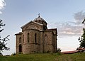
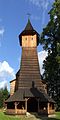
- Nomination Grenzach-Wyhlen: Saint Georgs Church, nave --Taxiarchos228 07:56, 28 November 2011 (UTC)
- Promotion Good quality-- Jean-Pol GRANDMONT 08:02, 28 November 2011 (UTC)
-

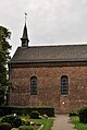
- Nomination Saint Joseph church in Rheinfelden, nave --Taxiarchos228 07:56, 28 November 2011 (UTC)
- Promotion Good quality -- Jean-Pol GRANDMONT 08:02, 28 November 2011 (UTC)
-

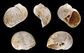
- Nomination Coelacanth Whiteia woodwardi --PierreSelim 07:05, 28 November 2011 (UTC)
- Promotion Good quality. --Berthold Werner 07:23, 28 November 2011 (UTC)
-

-

-

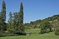
- Nomination The "Tombeau du Géant" and the Semois river in Botassart, Belgium. -- Jean-Pol GRANDMONT 19:28, 27 November 2011 (UTC)
- Promotion Good quality. --Berthold Werner 07:35, 28 November 2011 (UTC)
-
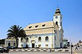
- Nomination Evangelical Lutheran Church in Swakopmund Namibia. --Alchemist-hp 17:18, 27 November 2011 (UTC)
- Promotion wirkt teilweise etwas körnig/rauschig/pixelig, keine Ahnung (schwierig zu definieren), aber ein sehr schönes Bild, klares QI: Da kommt doch Urlaubsstimmung auf - im kalten schulpflichtigen Deutschland :-/ --Carschten 17:44, 27 November 2011 (UTC)
-

- Nomination The marble replica of Michelangelo's "David", piazza della Signoria, Florence, Italy.--Jebulon 14:07, 27 November 2011 (UTC)- QI for me -- Jean-Pol GRANDMONT 19:00, 27 November 2011 (UTC)
- Promotion
 Neutral I am sceptical if the black bakground is enough encyclopedic. I am used to see the David in the natural environment of Pzza della Signoria--Moroder 18:47, 27 November 2011 (UTC)
It's useful to have both versions available (original and whithout background)~Pyb 20:36, 27 November 2011 (UTC)We have many versions with the natural background, a special category, in fact. But we did'nt have a version without background. That is new in 'Commons', and maybe useful for projects. That was the purpose of this nomination. It is encyclopedic IMO. Anyway, thanks to all for review and opinions.--Jebulon 01:46, 28 November 2011 (UTC)
-
-

- Nomination Parish church St. Jakobus d.Ä in Schalchen, Upper Austria --Herzi Pinki 01:05, 27 November 2011 (UTC)
- Promotion Good quality. - nice ceiling shoot, QI for me --J. Lunau 12:26, 27 November 2011 (UTC)
-

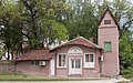
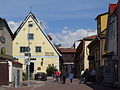
- Nomination The House of culture: Kulturhaus Römerfeld, Windischgarsten --Herzi Pinki 01:05, 27 November 2011 (UTC)
- Promotion Schöne satte Farben, interessante Perspektive --Haeferl 16:05, 27 November 2011 (UTC)
-

-

-

-

- Nomination A medieval fresco of St John of Rila - St George church museum, Kyustendil. --MrPanyGoff 20:40, 26 November 2011 (UTC)
- Promotion Good quality. --Berthold Werner 07:20, 28 November 2011 (UTC)
-

- Nomination Cathedral of Saint Sava, Belgrade, Serbia--WhiteWriter 17:36, 26 November 2011 (UTC)
- Decline Not by Commons user. See guidelines
-

-
-

-

-

- Nomination A panorama showing a car shop of Renault located in Colmar, France. --Fandecaisses 17:22, 23 November 2011 (UTC)
- Decline I see no stitching errors, the panorama is well made in my opinion. But the overall compo does not work: too much empty space at left, and a badly cropped car at right. + Very bad quality of the picture for some parts (please see annotations for an example)--Jebulon 14:36, 27 November 2011 (UTC)
-

-
- Nomination The altarpiece in Gothenburg Cathedral, Sweden. Jopparn 12:41, 23 November 2011 (UTC)
- Decline Unsharp. + this kind of picture needs a well centered composition IMO.--Jebulon 14:25, 27 November 2011 (UTC) You are right about the centred composition. There was some stuff standing in the middle section of the balcony from which I took the picture, that I did not have time to move but I tried to make the most of it. I will see if I can go back there and take another picture some day. I used a tripod but the lightning in the church is pretty bad so it is hard to get sharper photos. Jopparn 16:40, 27 November 2011 (UTC)
-

-

- Nomination: St Nicholas Church in Karlovo. --MrPanyGoff 11:01, 22 November 2011 (UTC)
- Review needed
-

- Nomination: Mont Bégo, (Monte Bego in italian), Provence-Alpes-Côte d'Azur, France --Riotforlife 10:33, 22 November 2011 (UTC)
- Review needed
-

- Nomination: Farm of the rue du Point du Jour in Spiennes, Belgium. -- Jean-Pol GRANDMONT 09:53, 22 November 2011 (UTC)
- Review needed
-

- Nomination: Bark of the maritime pine (Pinus pinaster) - Cucuruzzu site in (Corse-du-Sud) - France. -- Jean-Pol GRANDMONT 09:45, 22 November 2011 (UTC)
- Review needed
-

- Nomination: Window of an antic shop in Bruges , Belgium -- Jean-Pol GRANDMONT 09:05, 22 November 2011 (UTC)
- Review needed
-

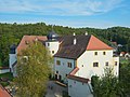
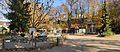
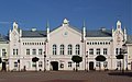
- Nomination: Lörrach: Villa Aichele with park --Taxiarchos228 09:02, 22 November 2011 (UTC)
- Review needed
-
- Nomination: Lörrach: Park "Rosenfels" with vivaria --Taxiarchos228 09:02, 22 November 2011 (UTC)
- Review needed
-

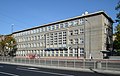
- Nomination: Lörrach: secondary school "Hans Thoma", connecting bridge --Taxiarchos228 09:02, 22 November 2011 (UTC)
- Review needed
-

- Nomination: Lörrach: secondary school "Hans Thoma", clock tower --Taxiarchos228 09:02, 22 November 2011 (UTC)
- Review needed
-

- Nomination Craft guild statue of the Bleacher (Launderer) by the sculptor Jef Lambeaux in the Petit Sablon Square -Brussels, Belgium. -- Jean-Pol GRANDMONT 08:56, 22 November 2011 (UTC)
- Promotion Oui.--Jebulon 14:22, 27 November 2011 (UTC)
-
- Nomination: Evangelical Church in Pirdop. --MrPanyGoff 07:06, 22 November 2011 (UTC)
- Review needed
-

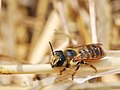
- Nomination: ♀ Pholidoptera aptera --Haeferl 02:19, 22 November 2011 (UTC)
- Review needed
-

- Nomination: Epiphany church under the bell-tower in Pereslavl museum. Side view.--PereslavlFoto 00:27, 22 November 2011 (UTC)
- Review needed
-

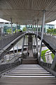
- Nomination: Pedestrian bridge in Hammarby sjöstad, Stockholm.--ArildV 21:00, 21 November 2011 (UTC)
- Review needed
-

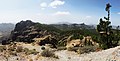
- Nomination: Roque Nublo, Gran Canaria, seen from Cuevas Caidas --Llez 19:25, 21 November 2011 (UTC)
- Review needed
-

- Nomination: Basement of Dormition cathedral in Pereslavl, window detail --PereslavlFoto 15:21, 21 November 2011 (UTC)
- Review needed
-

- Nomination: Basement of Dormition cathedral in Pereslavl, window detail --PereslavlFoto 15:21, 21 November 2011 (UTC)
- Review needed
-

- Nomination: Theater in Altusried --Brackenheim 13:21, 21 November 2011 (UTC)
- Review needed
-

- Nomination: Castle ruins in Yazlovets, Ukraine. --Ahonc 13:16, 21 November 2011 (UTC)
- Review needed
-

- Nomination: Castle ruins in Yazlovets, Ukraine. --Ahonc 13:16, 21 November 2011 (UTC)
- Review needed
-

- Nomination: View at the lake in Ternopil, Ukraine. --Ahonc 13:16, 21 November 2011 (UTC)
- Review needed
-

- Nomination: Church in teofipol, Ukriane. --Ahonc 13:16, 21 November 2011 (UTC)
- Review needed
-

- Nomination: Decoration on a ceiling in Lin An Tai Historical House, Taipei --Bgag 13:00, 21 November 2011 (UTC)
- Review needed
-

- Nomination: Tea plantation in Pinglin, Taiwan --Bgag 13:00, 21 November 2011 (UTC)
- Review needed
-
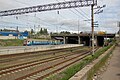
- Nomination: Sviatoshyn train station in Kiev. Author: user:AMY 81-412 --Ahonc 12:39, 21 November 2011 (UTC)
- Review needed
-

- Nomination: Sviatoshyn train station in Kiev. Author: user:AMY 81-412 --Ahonc 12:39, 21 November 2011 (UTC)
- Review needed
-

-

- Nomination: Bremen Hbf by Vanitaslux --Mbdortmund 07:01, 21 November 2011 (UTC)
- Review Too centered composition IMO. Too many foreground, with a disturbing shadow left. Needs a severe crop. No opposition for now, because it is improvable.--Jebulon 22:36, 21 November 2011 (UTC)
-

-
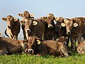
![* Nomination abondance cow profile in the Aravis mountain (France) (by Walpole) -- Achim Raschka 18:59, 13 November 2011 (UTC) * Promotion Comment What does "abondance" mean? --Gidip 20:03, 20 November 2011 (UTC) Abondance is the race of catte, see [1] -- Achim Raschka 07:24, 21 November 2011 (UTC) Bit unsharp but good enough. Mattbuck 20:40, 27 November 2011 (UTC)](https://upload.wikimedia.org/wikipedia/commons/thumb/d/d0/Abondance_cow_profile.jpg/120px-Abondance_cow_profile.jpg)
- Nomination abondance cow profile in the Aravis mountain (France) (by Walpole) -- Achim Raschka 18:59, 13 November 2011 (UTC)
- Promotion
 Comment What does "abondance" mean? --Gidip 20:03, 20 November 2011 (UTC)
Abondance is the race of catte, see [1] -- Achim Raschka 07:24, 21 November 2011 (UTC)
Bit unsharp but good enough. Mattbuck 20:40, 27 November 2011 (UTC)
-

- Nomination: Hechingen: Minster Saint Luzen, epitaph --Taxiarchos228 12:35, 7 November 2011 (UTC)
- Review It has something blueish over it. The top and the childrens head on the bottom seem very blue, also the background varies between blue on top and white on the bottom. Mvg, Basvb 22:52, 15 November 2011 (UTC)
light depends on the local light conditions --Taxiarchos228 21:52, 21 November 2011 (UTC)
-

- Nomination: Toronto: aerial view to the Don Valley Parkway eastwards from helicopter --Taxiarchos228 12:35, 7 November 2011 (UTC)
- Review I've some doubts on the composition (why crop the city part. And some of the buildings (lower centre) are overexposed/blown out. Mvg, Basvb 22:52, 15 November 2011 (UTC)
please look at the discretion, picture is showing the Don Valley Parkway --Taxiarchos228 21:53, 21 November 2011 (UTC)
-

-

- Nomination The Mastle Alp in the Dolomites --Moroder 10:26, 27 November 2011 (UTC)
- Promotion Good quality and nice --Taxiarchos228 11:49, 27 November 2011 (UTC)
-

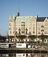
- Nomination Folksamhuset (The Folksam building), Stockholm. --ArildV 10:00, 27 November 2011 (UTC)
- Promotion Good quality. --Taxiarchos228 11:49, 27 November 2011 (UTC)
-

- Nomination Mountain range in the Gröden Valley --Moroder 09:53, 27 November 2011 (UTC)
- Promotion Nice Jean-Pol GRANDMONT 09:55, 27 November 2011 (UTC)
-

- Nomination Pleurotus ostreatus -- Jean-Pol GRANDMONT 09:40, 27 November 2011 (UTC)
- Promotion QI.--ArildV 10:06, 27 November 2011 (UTC)
-
- Nomination Dormition of the Theotokos Church in Dragovishtitsa village. --MrPanyGoff 09:27, 27 November 2011 (UTC)
- Promotion QI.--ArildV 11:43, 27 November 2011 (UTC)
-

- Nomination A hut at the location Sonnseite in Steinbach am Ziehberg, Upper Austria --Herzi Pinki 01:05, 27 November 2011 (UTC)
- Promotion QI for me -- Véronique PAGNIER 07:48, 27 November 2011 (UTC)
-

- Nomination Train in Hedemora, Sweden.--V-wolf 22:24, 26 November 2011 (UTC)
- Promotion Good and nice light.hade varit ännu bättre om kompositionen inte hade varit så centrerad, jag hade gärna haft loket lite längre till vänster i bilden.--ArildV 10:06, 27 November 2011 (UTC) Jag hade den möjligheten vid behandlingen, men tyckte att just det hade gjort loket och därmed bilden för centrerad. --V-wolf 11:30, 27 November 2011 (UTC)
-

-

-

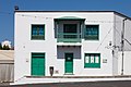
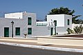
- Nomination Building, Yaiza, Lanzarote, Spain--Lmbuga 21:48, 26 November 2011 (UTC)
- Promotion
 Support QI for me --Archaeodontosaurus 07:43, 27 November 2011 (UTC)
-

- Nomination Church of the town of Yaiza, Lanzarote, Spain--Lmbuga 21:48, 26 November 2011 (UTC)
- Promotion Support Qi fo me --Archaeodontosaurus 08:19, 27 November 2011 (UTC)
-
- Nomination Ariasa colombiae --Archaeodontosaurus 17:34, 26 November 2011 (UTC)
- Promotion QI and useful. Nice to me--Lmbuga 19:56, 26 November 2011 (UTC)
-
-

-

- Nomination Angel bearing the crown of thorns, copy of Bernini by Paolo Naldini, western side of the Ponte Sant'Angelo in Rome, Italy. -- Jean-Pol GRANDMONT 09:41, 26 November 2011 (UTC)
- Promotion Nice, but the sky is a bit noisy, and there is a slight CA. Could you please remove the many dust spots (some are annotated). All correctible IMO.--Jebulon 17:15, 26 November 2011 (UTC)
 Done suivant conseils prodigués -- Jean-Pol GRANDMONT 09:12, 27 November 2011 (UTC)For me, good now, thank you.--Jebulon 11:35, 27 November 2011 (UTC)
-

- Nomination Germany, Dettelbach, townhall --Berthold Werner 06:57, 26 November 2011 (UTC)
- Promotion QI to me--Lmbuga 13:15, 26 November 2011 (UTC)
-

- Nomination St Athanasius Church in Sovolyano village. --MrPanyGoff 14:03, 25 November 2011 (UTC)
- Promotion QI to me--Lmbuga 13:21, 26 November 2011 (UTC)
-

-

- Nomination Air Berlin Airbus A319 D-ABGO at Düsseldorf International Airport --Carschten 17:10, 24 November 2011 (UTC)
- Promotion Gute Aufnahme! --Haeferl 23:47, 25 November 2011 (UTC)
I disagree, the entire aircraft has a red halo around it with soft edges.--Saffron Blaze 13:29, 26 November 2011 (UTC) Done you're right, thanks. It was a result of NR, I revert it. Please have a look a the new version! --Carschten 14:59, 26 November 2011 (UTC)
-

- Nomination The Van Gheyt pond in Hensies, Belgium -- Jean-Pol GRANDMONT 09:15, 24 November 2011 (UTC)
- Promotion Too excessive
noisegrain reduction? Lost a lot of detail. See also images note.--ArildV 09:32, 24 November 2011 (UTC) Done Please check the new version -- Jean-Pol GRANDMONT 09:32, 27 November 2011 (UTC) OK now IMO.--ArildV 09:44, 27 November 2011 (UTC)
-
- Nomination Pavilion of Hope in Expo Park (Hannover, Germany) --Misburg3014 21:44, 23 November 2011 (UTC)
- Promotion Schön scharf und gut belichtet --Haeferl 18:12, 26 November 2011 (UTC)
-

- Nomination The Coat of Arms of Oni municipality, Georgia.--Melberg 09:03, 22 November 2011 (UTC)
- Promotion Good quality. - meets all QI for scalapbel vector graphics in my opinion; it is even valide, so you may add the template {{Valid SVG}} --J. Lunau 11:58, 27 November 2011 (UTC)
-

- Nomination St Menas Church in Kyustendil. --MrPanyGoff 07:16, 23 November 2011 (UTC)
- Promotion Good quality, maybe a left crop?--ArildV 10:27, 27 November 2011 (UTC)
-

- Nomination Royal Museum for Central Africa's main building. Jopparn 15:25, 22 November 2011 (UTC)
- WARNING: third template parameter added – please remove.
-

- Nomination: View from the garden of the Villa Ephrussi de Rothschild to Villfranche sur mer --Berthold Werner 09:50, 21 November 2011 (UTC)
- Review needed
-

- Nomination: Malta, Hagar Qim temple --Berthold Werner 09:45, 21 November 2011 (UTC)
- Review needed
-
- Nomination Lörrach: Villa Rosenfels --Taxiarchos228 07:18, 21 November 2011 (UTC)
- Promotion Some noise, but i think its ok for QI.--ArildV 11:47, 27 November 2011 (UTC)
-

- Nomination: Lörrach: Parc "Rosenfels", acoustical shell --Taxiarchos228 07:18, 21 November 2011 (UTC)
- Review needed
-

- Nomination: Lörrach: Statue at Park "Rosenfels" --Taxiarchos228 07:18, 21 November 2011 (UTC)
- Review needed
-

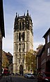
- Nomination: Arlesheim: view at Cathedral of Arlesheim --Taxiarchos228 07:18, 21 November 2011 (UTC)
- Review needed
-

- Nomination: Rhododendron hirsutum - found at Hohe Veitsch in Styria, Ausria--Haeferl 02:12, 21 November 2011 (UTC)
- Review needed
-
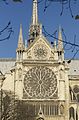
- Nomination: South rose window of Notre-Dame de Paris, exterior.--Jebulon 22:40, 20 November 2011 (UTC)
- Review needed
-

- Nomination: Panorama of Marktplatz --Mdupont 20:27, 20 November 2011 (UTC)
- Review needed
-

- Nomination: puits Arthur de Buyer Magny Danigon --Bourgeois.A 20:23, 20 November 2011 (UTC)
- Review needed
-

- Nomination: Arlesheim: Street sign "Domgasse" --Taxiarchos228 19:21, 20 November 2011 (UTC)
- Review needed
-

- Nomination: Arlesheim: Cathedral of Arlesheim, frontal view --Taxiarchos228 19:21, 20 November 2011 (UTC)
- Review There are some visible traces of brush/cloning in the very top middle. Also maybe I've rather like the church to be more symethric, as there is some perspective, but it's not crucial. Otherwise very good. --Sfu 20:53, 20 November 2011 (UTC)
-
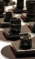
- Nomination: Pentax SMC-DA 10-17/3,5-4,5 ED IF fisheyezoom surrounded by other Pentax lenses --ArildV 18:41, 20 November 2011 (UTC)
- Review needed
-
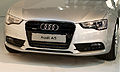
- Nomination: Audi A5 (front) --ArildV 18:33, 20 November 2011 (UTC)
- Review needed
-

-
- Nomination: Saint Peter & Paul Cathedral, Saint Petersburg. --Aleks G 20:57, 20 November 2011 (UTC)
- Review needed
-

- Nomination: Old postal wagon in France. -- Ludo29 16:48, 20 November 2011 (UTC)
- Review needed
-
- Nomination: Megachile albisecta, female --Gidip 15:23, 20 November 2011 (UTC)
- Review needed
-

- Nomination: Radomir Old Town Hall. --MrPanyGoff 15:12, 20 November 2011 (UTC)
- Review needed
-

- Nomination: church in Murrhardt --Brackenheim 14:36, 20 November 2011 (UTC)
- Review needed
-

- Nomination: Dry ice --Brackenheim 14:36, 20 November 2011 (UTC)
- Review needed
-

- Nomination: Italian Garden in Łańcut --Pudelek 13:06, 20 November 2011 (UTC)
- Review needed
-

- Nomination: Beach in Pärnu, Estonia --Pudelek 13:06, 20 November 2011 (UTC)
- Review needed
-
- Nomination: Street in Pärnu, Estonia --Pudelek 13:06, 20 November 2011 (UTC)
- Review needed
-

- Nomination Oskar Lafontaine in 2011 election campaign --Jdsteakley 20:16, 19 November 2011 (UTC)
- Promotion I think it is a QI.--Jebulon 21:50, 26 November 2011 (UTC)
-
-

- Nomination Scène installée dans la cour d'honneur des Invalides à Paris. --Thesupermat 17:01, 18 November 2011 (UTC)
- Promotion Good quality. --Coyau 17:28, 26 November 2011 (UTC)
-

-

- Nomination: Hauingen: sign of the electric utility cooperative of Hauingen --Taxiarchos228 09:49, 17 November 2011 (UTC) I would reduce the amount of blue in the picture. It seem to be a bit much of it. Jopparn 07:32, 21 November 2011 (UTC)
- Review needed
-

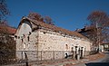
- Nomination Cultural heritage monument in Unna. Own photo. --Smial 15:54, 13 November 2011 (UTC)
- Promotion Comment Dust spot removed -- Smial 09:06, 23 November 2011 (UTC) Support a bit noisy (ISO 400) and I don't like the harsh shadow, but it's ok for QI IMHO --Carschten 15:04, 26 November 2011 (UTC)
-

- Nomination Shell of an endemic landsnail of Gran Canaria, Hemicycla glasiana --Llez 06:19, 26 November 2011 (UTC)
- Promotion Good quality. --Berthold Werner 07:03, 26 November 2011 (UTC)
-

-

-

-
- Nomination Yaiza, Lanzarote, Spain.--Lmbuga 20:02, 25 November 2011 (UTC)
- Promotion Comment please check categories and extend the description. Seems a bit too dark IMHO, too. --Carschten 20:08, 25 November 2011 (UTC)
Done and new version--Lmbuga 21:55, 25 November 2011 (UTC)
Good quality, very sharp. --Berthold Werner 07:01, 26 November 2011 (UTC)
-
- Nomination Yaiza, Lanzarote, Spain.--Lmbuga 20:02, 25 November 2011 (UTC)
- Promotion Good quality. --Taxiarchos228 20:07, 25 November 2011 (UTC) Comment please check categories and extend the description. --Carschten 20:08, 25 November 2011 (UTC)
The image was taken in the town of Yaiza, I don't see other category--Lmbuga 20:12, 25 November 2011 (UTC)
Category:Buildings in Yaiza should it be at least. --Carschten 20:47, 25 November 2011 (UTC)
New category: Category:Yaiza (town)--Lmbuga 20:54, 25 November 2011 (UTC)
Thanks, also Category:Buildings in Yaiza--Lmbuga 20:55, 25 November 2011 (UTC)
-

- Nomination The Dingli Cliffs, a natural monument and the highest point of Malta. -- Felix Koenig 19:33, 25 November 2011 (UTC)
- Promotion Good quality. --Taxiarchos228 20:07, 25 November 2011 (UTC)
-
- Nomination Typical landscape of a small valley in Dordogne, France.--Jebulon 18:26, 25 November 2011 (UTC)
- Promotion Good quality. --Berthold Werner 18:41, 25 November 2011 (UTC)
-

- Nomination Yaiza, Lanzarote, Spain--Lmbuga 18:14, 25 November 2011 (UTC)
- Promotion Good quality. --Berthold Werner 18:41, 25 November 2011 (UTC)
-

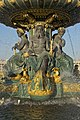
- Nomination "Fountain of the Rivers", Concorde square, Paris. Detail. A triton.--Jebulon 14:35, 25 November 2011 (UTC)
- Promotion Super. --Berthold Werner 18:41, 25 November 2011 (UTC)
-

- Nomination American Chestnut (Castanea dentata) leaves. -- Jean-Pol GRANDMONT 11:16, 25 November 2011 (UTC)
- Promotion Good. I would do a less tight crop. --Gidip 10:47, 26 November 2011 (UTC)
-

- Nomination American tulip tree (Liriodendron tulipifera). -- Jean-Pol GRANDMONT 11:16, 25 November 2011 (UTC)
- Promotion Good quality. --Taxiarchos228 12:33, 25 November 2011 (UTC)
-

- Nomination Ilya Sergeevich Iryshkov, colonel from Pereslavl, at the Victory celebration 9/V-2011. --PereslavlFoto 11:49, 25 November 2011 (UTC)
- Promotion Good quality. --Taxiarchos228 12:33, 25 November 2011 (UTC)
-
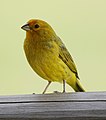
- Nomination Sicalis flaveola in Esteros del Iberá, Argentina. --Leyo 14:48, 24 November 2011 (UTC)
- WARNING: third template parameter added – please remove.
-

- Nomination Jordan, Amman, Ruins of the byzantine church on the citadel --Berthold Werner 14:43, 24 November 2011 (UTC)
- Withdrawn unscharf; wofür war hier Blende 22 nötig? --Haeferl 00:04, 26 November 2011 (UTC)
Stimmt, das war wohl ein Versehen und ist jetzt auch nicht mehr zu korrigieren. Ich setzte es von Discus auf Withdrawn. --Berthold Werner 09:22, 26 November 2011 (UTC)
-

- Nomination Dunedin, New Zealand --Poco a poco 21:57, 23 November 2011 (UTC)
- Decline Bad name (it is not "Dunedin", but a church (I think), aberration of perspective, too dark. Sorry.--Jebulon 18:31, 25 November 2011 (UTC)
-

- Nomination Dunedin, New Zealand --Poco a poco 21:57, 23 November 2011 (UTC)
- Promotion very nice. --Saffron Blaze 14:09, 25 November 2011 (UTC)
-
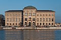
- Nomination Nationalmusem, Stockhom. --ArildV 09:14, 21 November 2011 (UTC)
- Promotion QI for me -- Véronique PAGNIER 12:05, 25 November 2011 (UTC)
-

- Nomination Nikon D3s --ArildV 20:09, 20 November 2011 (UTC)
- WARNING: third template parameter added – please remove.
-

- Nomination: Lufthansa Flight Training Center - Frankfurt - Germany. --NorbertNagel 12:00, 20 November 2011 (UTC)
- Review needed
-

- Nomination: Panorama of the Barranco de Fataga, Gran Canaria --Llez 10:11, 20 November 2011 (UTC)
- Review needed
-

- Nomination: St Demetrius Church in Radomir. --MrPanyGoff 09:53, 20 November 2011 (UTC)
- Review needed
-

- Nomination: Old silk weaving factory in Stockholm. --ArildV 08:59, 20 November 2011 (UTC)
- Review needed
-

- Nomination: The 1871 Trempealeau Hotel in Wisconsin --Jonathunder 03:29, 20 November 2011 (UTC)
- Review needed
-

- Nomination: Taj Mahal, Agra, India --Poco a poco 23:42, 19 November 2011 (UTC)
- Review needed
-

- Nomination: Megachile montenegrensis, female --Gidip 21:57, 19 November 2011 (UTC)
- Review needed
-

- Nomination: Thuja plicata, Rogów Arboretum, Poland. --Crusier 14:40, 19 November 2011 (UTC)
- Review needed
-

- Nomination Hôtel de la Marine, Concorde square, Paris.--Jebulon 11:38, 25 November 2011 (UTC)
- Promotion QI for me -- Jean-Pol GRANDMONT 11:38, 25 November 2011 (UTC)
-

- Nomination Hornbeam Maple (Acer spicatum) leaves -- Jean-Pol GRANDMONT 11:16, 25 November 2011 (UTC)
- Promotion Nice, sharp and clear--Stu Phillips 23:42, 25 November 2011
-

- Nomination The pediment and the tower of the Sacred Heart Church in Niš. --MrPanyGoff 10:04, 25 November 2011 (UTC)
- Promotion Good quality. --Taxiarchos228 10:09, 25 November 2011 (UTC)
-

- Nomination Bateau-mouche waiting for tourists at Paris --Moonik 03:09, 25 November 2011 (UTC)
- Promotion Good quality. --Taxiarchos228 10:09, 25 November 2011 (UTC)
-

- Nomination Nationalmuseum, Stockholm. --ArildV 00:00, 25 November 2011 (UTC)
- Promotion QI for me -- Jean-Pol GRANDMONT 11:41, 25 November 2011 (UTC)
-

- Nomination Statue of woman, cemetery of Père-Lachaise, France --~Pyb 21:36, 24 November 2011 (UTC)
- Promotion Good quality. --PierreSelim 08:45, 25 November 2011 (UTC)
-

- Nomination Rubik's Cube --Carschten 17:38, 24 November 2011 (UTC)
- Promotion Good quality. --PierreSelim 08:48, 25 November 2011 (UTC)
-

-

- Nomination Kindergarten «Little Oakery» in the Dubrovitsy village --PereslavlFoto 12:30, 24 November 2011 (UTC)
- Promotion Good quality. --Smial 17:12, 24 November 2011 (UTC)
-
- Nomination St Demetrius Church in Dragovishtitsa village. --MrPanyGoff 12:17, 24 November 2011 (UTC)
- Promotion QI for me --Véronique PAGNIER 14:40, 24 November 2011 (UTC)
-
- Nomination Malta, Mdina, St. Paul's cathedral --Berthold Werner 12:03, 24 November 2011 (UTC)
- Promotion QI for me Jean-Pol GRANDMONT 12:21, 24 November 2011 (UTC)
-

- Nomination Obélisque de la Concorde, Paris, France --Poco a poco 21:57, 23 November 2011 (UTC)
- Decline Insufficient quality. - too noisy for QI (because of ISO 1600) --J. Lunau 09:37, 25 November 2011 (UTC)
-

- Nomination Australian pelican (Pelecanus conspicillatus), St Helens, Tasmania, Australia --Poco a poco 21:57, 23 November 2011 (UTC)
- Promotion Good quality., QI for me --J. Lunau 09:37, 25 November 2011 (UTC)
-

- Nomination Torre del agua, Zaragoza, Expo 2008, Zaragoza, Spain --Poco a poco 21:57, 23 November 2011 (UTC)
- Promotion OI for me, I like the perspective --J. Lunau 10:07, 25 November 2011 (UTC)
-

- Nomination Moulin Rouge, Paris, France --Poco a poco 21:57, 23 November 2011 (UTC)
- Decline Insufficient quality. - too noisy, party blured --J. Lunau 09:37, 25 November 2011 (UTC)
-

- Nomination Dunedin, New Zealand --Poco a poco 21:57, 23 November 2011 (UTC)
- Decline framing issues (tight bottom crop, object on the right) and too strong perspective distortion. Could be also sharper. --Elekhh 08:51, 25 November 2011 (UTC)
-

- Nomination Ferris wheel, Concorde square, Paris.--Jebulon 17:31, 23 November 2011 (UTC)
- Promotion Glad to promote one of Jebulons photos - first I was bit unsure because of the color, but I think the yellow / red colorcast was caused by deep sun. --J. Lunau 10:07, 25 November 2011 (UTC) It is very kind of you, thank you ! Yes, It was an evening with a very nice deep sun.--Jebulon 11:41, 25 November 2011 (UTC)
-

- Nomination Les Angles Keep. Florent Pécassou 16:24, 22 November 2011 (UTC)
- Promotion QI for me -- Véronique PAGNIER 11:59, 25 November 2011 (UTC)
-

- Nomination af Chapman --ArildV 13:45, 22 November 2011 (UTC)
- Promotion QI for me -- Jean-Pol GRANDMONT 00:07, 25 November 2011 (UTC)
-
- Nomination Bali Bey Mosque at Niš Fortress. --MrPanyGoff 12:56, 22 November 2011 (UTC)
- Promotion QI for me -- Véronique PAGNIER 11:59, 25 November 2011 (UTC)
-

- Nomination Petri dishes at a laboratory (by User:Annie Losku) --WooteleF 22 November 2011
- Decline Why is it blurred behind the dishes? --Fandecaisses 20:16, 24 November 2011 (UTC)
-

- Nomination Lörrach: secondary school "Hans Thoma", schoolyard --Taxiarchos228 09:02, 22 November 2011 (UTC)
- Promotion Very nice --Crusier 16:08, 24 November 2011 (UTC)
-
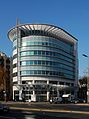
- Nomination Lörrach: AOK office building --Taxiarchos228 20:55, 20 November 2011 (UTC)
- Promotion Good composition and lighting. Bit too grainy, probably no need for ISO 400. --Elekhh 08:56, 25 November 2011 (UTC)
-

-

- Nomination: Panorama of the Sphinx and the Great Pyramid of Giza. --kallerna 11:42, 19 November 2011 (UTC)
- Review needed
-

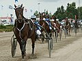
- Nomination: Harness racing starting car. --kallerna 11:42, 19 November 2011 (UTC)
- Review needed
-

- Nomination: The courtyard of the Muhammad Ali Mosque. --kallerna 11:42, 19 November 2011 (UTC)
- Review needed
-
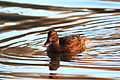
- Nomination Mallard duck (platyrhynchos) female in lake in Toulouse --PierreSelim 11:05, 19 November 2011 (UTC)
- Promotion Comment A bit dark, IMHO, especially for a common and non-shy animal. Nice and sharp otherwise. --V-wolf 21:38, 19 November 2011 (UTC) Comment Increased brightness Done. PierreSelim 09:30, 20 November 2011 (UTC) -- QI for me now -- Jean-Pol GRANDMONT 11:26, 25 November 2011 (UTC)
-

- Nomination: Small railer for liquid manure -- Achim Raschka 09:04, 19 November 2011 (UTC)
- Review needed
-

- Nomination: Prieuré St Romain le Puy --Amenomade421 08:40, 19 November 2011 (UTC)
- Review needed
-

- Nomination: cyclist on the road of the Ventoux Mount --Véronique PAGNIER 06:08, 19 November 2011 (UTC)
- Review needed
-

- Nomination: Stijn Vanderbergh starting a race --Véronique PAGNIER 06:01, 19 November 2011 (UTC)
- Review needed
-

- Nomination: Juan Jose Cobo Acebo starting a race --Véronique PAGNIER 06:01, 19 November 2011 (UTC)
- Review needed
-

- Nomination: View of stairs in Lourmarin's castle --Véronique PAGNIER 05:55, 19 November 2011 (UTC)
- Review needed
-

- Nomination: Megachile parietina, male --Gidip 23:00, 18 November 2011 (UTC)
- Review needed
-

- Nomination Balneario de Cádiz (by Yildori -- Achim Raschka 22:48, 18 November 2011 (UTC)
- Decline Below the min. 2 Mpix resolution. --Elekhh 09:01, 25 November 2011 (UTC)
-
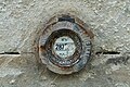
- Nomination: Benchmark in Vosges (France). --Coyau 20:51, 18 November 2011 (UTC)
- Review needed
-
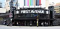
- Nomination: FirstAvenue nightclub in Minneapolis, Minnesota -Jonathunder 19:36, 18 November 2011 (UTC)
- Review needed
-

- Nomination: Western portal of the Überwasserkirche in Münster --Carschten 18:20, 18 November 2011 (UTC)
- Review needed
-

- Nomination: Tripoint Czech republic-Austria-Germany. --High Contrast 16:48, 18 November 2011 (UTC)
- Review Tilted ccw and imo perspective should be corrected (sides could be vertical). --Coyau 17:14, 18 November 2011 (UTC) ? Perspective correction has been proceeded. This object is only 1.50 metres high. --High Contrast 17:20, 18 November 2011 (UTC)
Right side is vertical and left side is not. --Coyau 17:24, 18 November 2011 (UTC)
-

- Nomination: 360° panoramic between two villages, Vosges (France). --Coyau 15:24, 18 November 2011 (UTC)
- Review needed
-

- Nomination: Kirchhain-Großseelheim, An der Bach 2 --Emha 13:51, 18 November 2011 (UTC)
- Review needed
-

- Nomination: Coat of arms on balcony of Capitole de Toulouse --PierreSelim 23:23, 17 November 2011 (UTC)
- Review Please correct barrel distortion --Mbdortmund 06:46, 18 November 2011 (UTC) I don't see it, but you might be right. PierreSelim 16:36, 18 November 2011 (UTC)
I added a notice to show what I mean. Have you gota tool to repair that? --Mbdortmund 17:43, 18 November 2011 (UTC) I think it's not barrel distortion but a default on the window (see this crapy picture of the window)--PierreSelim 23:37, 18 November 2011 (UTC)
-
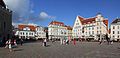
- Nomination Tallinn - Town Hall Square (Raekoja plats) --Pudelek 22:59, 17 November 2011 (UTC)
- Promotion W sumie w porządku. Ładne miejsce. Dlaczego jednak przeskalowane? --Sfu 08:32, 19 November 2011 (UTC)
Co masz na myśli z tym przeskalowaniem? --Pudelek 13:04, 20 November 2011 (UTC)
Wydaje mi się, że zdjęcie ma zmniejszoną rozdzielczość. --Sfu 19:23, 20 November 2011 (UTC)
Faktycznie, zdjęcie musiałem to nieco zmniejszyć - ciężko złożyć panoramę z takiego ujęcia przy takiej bliskości budynków, trzeba było czasem coś naprostować, widoczne było CA po bokach. Nie miało sensu wrzucać rozdzielczości oryginalnej, bo zdjęcie nie byłoby już tak ładne przy zbliżeniu - a obecna rozdzielczość nie wydaje mi się zła --Pudelek 12:24, 22 November 2011 (UTC)
Dzięki za odpowiedź. --Sfu 10:12, 25 November 2011 (UTC)
-
- Nomination Pre-Romanesque bell gable of the Church of Sant Romà dels Vilars. (by Simonjoan)-- Achim Raschka 19:28, 17 November 2011 (UTC)
- Decline Below 2 Mpix. --Elekhh 09:06, 25 November 2011 (UTC)
-

- Nomination Détail du clocher de l'église de Lampaul-Guimiliau dans le Finistère. --Thesupermat 11:06, 17 November 2011 (UTC)
- Promotion Good quality. --Vassil 21:45, 24 November 2011 (UTC)
-

- Nomination Russian olive in Russia. --Le.Loup.Gris 10:42, 17 November 2011 (UTC)
- Promotion Good quality. --Vassil 21:49, 24 November 2011 (UTC)
-
-
- Nomination Monument for Otto IV --Ralf Roletschek 11:29, 16 November 2011 (UTC)
- Decline Comment tilted? --Crusier 18:56, 22 November 2011 (UTC) Yes, tilted. --PereslavlFoto 14:30, 24 November 2011 (UTC)
-
- Nomination Nakkedalen towards south, Troms, Norway, in 2011 October --Ximonic 00:09, 15 November 2011 (UTC)
- Promotion Colours don't seem natural. Mvg, Basvb 22:09, 15 November 2011 (UTC) Seems they are. Mvg, Basvb 08:08, 17 November 2011 (UTC)Tilted to the right, according the background trees and the snow level on the mountains. --Vassil 21:37, 24 November 2011 (UTC) Done Tried to correct it. --Ximonic 04:32, 25 November 2011 (UTC)Yes, it's ok now. I think the WB is good, it's the strange Nordic light, with the sun low even at noon. --Vassil 07:19, 25 November 2011 (UTC)
-

- Nomination Nakkedalen towards north, Troms, Norway, in 2011 October --Ximonic 00:09, 15 November 2011 (UTC)
- Promotion Colours don't seem natural. Mvg, Basvb 22:09, 15 November 2011 (UTC) Seems they are. Mvg, Basvb 08:08, 17 November 2011 (UTC)Good quality. The sky is blue, so I think the WB is ok. --Vassil 21:18, 24 November 2011 (UTC)
-

- Nomination Toronto: Rogers Centre --Taxiarchos228 12:35, 7 November 2011 (UTC)
- Promotion I've some doubts with the cropping of the car and building on the right side. And some with the crop at the top, althought that last one is more of a subject choice. Mvg, Basvb 22:52, 15 November 2011 (UTC)
improved now --Taxiarchos228 21:52, 21 November 2011 (UTC)
Looks good. --Ahonc 14:41, 24 November 2011 (UTC)
-

- Nomination The big pond in Strépy-Bracquegnies, Belgium -- Jean-Pol GRANDMONT 09:19, 24 November 2011 (UTC)
- Promotion Very nice. --ArildV 09:58, 24 November 2011 (UTC)
-
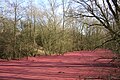
- Nomination Little pond completely covered by little parts of poplars male catkins in Harchies, Belgium -- Jean-Pol GRANDMONT 09:09, 24 November 2011 (UTC)
- Promotion QI imo (analog photos?).--ArildV 09:30, 24 November 2011 (UTC)
-

- Nomination Fersen Palace, Stockholm.--ArildV 09:04, 24 November 2011 (UTC)
- Promotion QI for me -- Jean-Pol GRANDMONT 11:00, 24 November 2011 (UTC)
-

- Nomination Shell of a Prince Latiaxis, Babelomurex princeps --Llez 07:23, 24 November 2011 (UTC)
- Promotion Again very good --Haneburger 08:15, 24 November 2011 (UTC)
-

- Nomination St Demetrius Church in Radomir. --MrPanyGoff 06:46, 24 November 2011 (UTC)
- Promotion Good and QI for me --Haneburger 08:15, 24 November 2011 (UTC)
-

- Nomination Carriage in Sweden --An-d 21:21, 23 November 2011 (UTC)
- Promotion QI for me Jean-Pol GRANDMONT 09:01, 24 November 2011 (UTC)
-

-

- Nomination Schönau: Churches of the Assumption --Taxiarchos228 18:33, 23 November 2011 (UTC)
- Promotion I don't like the shades, but good quality to me--Lmbuga 19:50, 23 November 2011 (UTC)
-

- Nomination Schönau: Churches of the Assumption, bell tower --Taxiarchos228 18:33, 23 November 2011 (UTC)
- Promotion I don't like the crop (sorry), but the quality is very good--Lmbuga 19:54, 23 November 2011 (UTC)
-

- Nomination Woodcarved angel by Johann Baptist Moroder --Moroder 18:27, 23 November 2011 (UTC)
- Promotion Good quality. --Taxiarchos228 18:33, 23 November 2011 (UTC)
-

-

- Nomination Part of the Quai des Orfèvres, in Paris.--Jebulon 17:56, 23 November 2011 (UTC)
- Promotion Good quality. --Taxiarchos228 18:33, 23 November 2011 (UTC)
-

-

- Nomination Barn and alpine farm in the Dolomites --Moroder 15:30, 23 November 2011 (UTC)
- Promotion Good quality, good brightness and nice colors. --Fandecaisses 17:25, 23 November 2011 (UTC)
-

- Nomination Dorisiana bicolor French Guyana --Archaeodontosaurus 15:17, 23 November 2011 (UTC)
- Promotion Good quality. --Fandecaisses 17:25, 23 November 2011 (UTC)
-

- Nomination Coats of arms of Benckendorff and Brevern noble families on pediment of Kiltsi manor, Estonia.--WooteleF 10:15, 23 November 2011 (UTC)
- Decline Overexposed.--PereslavlFoto 12:13, 23 November 2011 (UTC)
-

-

-

- Nomination Military brass band performing at the «Night in Museum» 2011 in Pereslavl --PereslavlFoto 21:52, 22 November 2011 (UTC)
- Decline Color noise, see the clothes--Lmbuga 21:11, 23 November 2011 (UTC)
-
- Nomination Chevalement du puits Sainte Marie à RONCHAMP, Charles Tournay--Bourgeois.A 20:16, 22 November 2011 (UTC)
- Decline Unsharp top. --PereslavlFoto 12:16, 23 November 2011 (UTC)
-

- Nomination Chevalement du puits n° 1 bis de la fosse n° 1 - 1 bis - 1 ter des mines de Liévin --JÄNNICK Jérémy 13:58, 22 November 2011 (UTC)
- Promotion QI for me.--PereslavlFoto 12:14, 23 November 2011 (UTC)
-

-
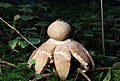
- Nomination Geastrum rufescens --Holleday 13:37, 22 November 2011 (UTC)
- Promotion Support QI & Useful --Archaeodontosaurus 14:34, 23 November 2011 (UTC)
-
- Nomination Araschnia levana, f. prorsa (by User:Heiti Paves) --WooteleF 22 November 2011
- Decline Already nominated and declined in the past --Gidip 15:20, 22 November 2011 (UTC) Very noisy image.--PereslavlFoto 12:17, 23 November 2011 (UTC)
-

- Nomination: malata, harbour of Marsaxlokk --Berthold Werner 09:25, 18 November 2011 (UTC)
- Review needed
-

- Nomination: St. Mang Basilica Füssen, weather vane at roof top of the nave --Taxiarchos228 07:51, 18 November 2011 (UTC)
- Review needed
-

- Nomination: St. Mang Basilica Füssen --Taxiarchos228 07:51, 18 November 2011 (UTC)
- Review needed
-
- Nomination: St. John of Rila Church in Sennik village. --MrPanyGoff 07:40, 18 November 2011 (UTC)
- Review needed
-

-

- Nomination: Dortmund, opera --Mbdortmund 23:46, 17 November 2011 (UTC)
- Review needed
-

- Nomination: Angel on top of the organ of Basilique Saint-Sernin in Toulouse --PierreSelim 23:45, 17 November 2011 (UTC)
- Review needed
-
- Nomination: Folksamhuset (The Folksam building), Stockholm . --ArildV 22:22, 17 November 2011 (UTC)
- Review needed
-
- Nomination: Hallwyl Palace, Stockholm --ArildV 21:56, 17 November 2011 (UTC)
- Review needed
-

- Nomination: Les Angles, Hautes-Pyrénées, France -- Florent Pécassou 21:23, 17 November 2011 (UTC)
- Review needed
-

- Nomination: Nicrophorus humator mit phoresic mites (by Kulac. -- Achim Raschka 20:20, 17 November 2011 (UTC)
- Review needed
-

- Nomination: Main gate of Fo Guang Shan Monastery, Taiwan --Bgag 19:33, 17 November 2011 (UTC)
- Review needed
-

- Nomination: Kassari Chapel, Hiiumaa. (by Anvelt)-- Achim Raschka 19:28, 17 November 2011 (UTC)
- Review needed
-

- Nomination: Court of Appeal for Northern Norrland, Umeå, Sweden. Jopparn 19:01, 17 November 2011 (UTC)
- Review needed
-

- Nomination: Grave of a child named Achim in Berlin -- Achim Raschka 18:57, 17 November 2011 (UTC)
- Review needed
-

- Nomination: Malta, entrance of the Hagar Quim temple --Berthold Werner 13:53, 17 November 2011 (UTC)
- Review needed
-

- Nomination: Orchidaceae at the Jardim Botânico do Rio de Janeiro --JonnyBrazil 13:00, 17 November 2011 (UTC)
- Review needed
-

- Nomination: Orchidaceae at the Jardim Botânico do Rio de Janeiro --JonnyBrazil 13:00, 17 November 2011 (UTC)
- Review needed
-

- Nomination: Orchidaceae at the Jardim Botânico do Rio de Janeiro --JonnyBrazil 13:00, 17 November 2011 (UTC)
- Review needed
-

- Nomination: Orchidaceae at the Jardim Botânico do Rio de Janeiro --JonnyBrazil 13:00, 17 November 2011 (UTC)
- Review needed
-

- Nomination: Suspension bridge in Novo Panicharevo village. --MrPanyGoff 12:21, 17 November 2011 (UTC)
- Review needed
-
![* Nomination: Oudemansiella mucida --Raghith 09:10, 16 November 2011 (UTC) * Review Needs id. --Quartl 19:56, 16 November 2011 (UTC) added to German identification project -- Achim Raschka 07:25, 17 November 2011 (UTC) Identified as Oudemansiella mucida via [2], don't sure about the quality. -- Achim Raschka 17:56, 17 November 2011 (UTC)](https://upload.wikimedia.org/wikipedia/commons/thumb/1/19/Oudemansiella_mucida%2C_%D0%93%D1%80%D0%B8%D0%B1%D1%8B_%D0%BD%D0%B0_%D0%94%D0%B5%D0%BC%D0%B5%D1%80%D0%B4%D0%B6%D0%B8_010.jpg/120px-Oudemansiella_mucida%2C_%D0%93%D1%80%D0%B8%D0%B1%D1%8B_%D0%BD%D0%B0_%D0%94%D0%B5%D0%BC%D0%B5%D1%80%D0%B4%D0%B6%D0%B8_010.jpg)
- Nomination: Oudemansiella mucida --Raghith 09:10, 16 November 2011 (UTC)
- Review Needs id. --Quartl 19:56, 16 November 2011 (UTC)
added to German identification project -- Achim Raschka 07:25, 17 November 2011 (UTC)
Identified as Oudemansiella mucida via [2], don't sure about the quality. -- Achim Raschka 17:56, 17 November 2011 (UTC)
-
- Nomination: Harenberg Center in Dortmund --Mbdortmund 00:01, 16 November 2011 (UTC)
- Review Comment Too strong perspective correction? I, subjectively, have the impression, that the buildings become more broad in the upper parts.--Haneburger 07:19, 18 November 2011 (UTC)
-
- Nomination: Breivikeidet, Troms, Norway, in 2011 October --Ximonic 00:09, 15 November 2011 (UTC)
- Review Colours don't seem natural. Mvg, Basvb 22:09, 15 November 2011 (UTC)
How should they be to be natural? To seem natural or to be natural? I've tried to auto white balance many ways but it didn't make the appearance more natural. The colours haven't been adjusted here. --Ximonic 21:48, 16 November 2011 (UTC)
If they are natural then my comment can be ignored, sorry. Mvg, Basvb 08:08, 17 November 2011 (UTC) No worries. Only thing is that I'm not really sure how someone expects to see this. I tried my best to white balance all of them but it is difficult to me because they quite much do present the way I experienced the places. I admit the weather and conditions are having somewhat extraordinary colors so it's more difficult to estimate them than usually. --Ximonic 16:16, 17 November 2011 (UTC)
-
- Nomination Daniel Mangeas. A man whose voice is probably more famous than him. Kyro 07:39, 23 November 2011 (UTC)
- Promotion Nice picture despite dark conditions. QI for me. Ludo29 18:58, 22 November 2011 (UTC)...But who nominates ?--Jebulon 23:03, 22 November 2011 (UTC)
-

- Nomination Ascocoryne sarcoides --Holleday 13:37, 22 November 2011 (UTC)
- Promotion QI for me -- Jean-Pol GRANDMONT 15:07, 22 November 2011 (UTC)
-

- Nomination Stropharia caerulea --Holleday 13:37, 22 November 2011 (UTC)
- Promotion Nice and useful -- Jean-Pol GRANDMONT 15:07, 22 November 2011 (UTC)
-
- Nomination
- WARNING: third template parameter added – please remove.
-

- Nomination Beach in Pärnu, Estonia --Pudelek 12:30, 22 November 2011 (UTC)
- Promotion QI for me -- Jean-Pol GRANDMONT 15:24, 22 November 2011 (UTC)
-

- Nomination Palace in Łańcut, Poland --Pudelek 12:30, 22 November 2011 (UTC)
- Promotion QI for me -- Jean-Pol GRANDMONT 15:24, 22 November 2011 (UTC)
-

-

- Nomination Anther of thale cress (Arabidopsis thaliana), fluorescence micrograph (by User:Heiti Paves) --WooteleF 22 November 2011
- Promotion QI for me--Holleday 13:40, 22 November 2011 (UTC)
-

- Nomination Sundial of the castle in Clervaux, Luxembourg. -- Jean-Pol GRANDMONT 09:25, 22 November 2011 (UTC)
- Promotion Comment Good quality & useful, I would crop the shadow on the right. PierreSelim 13:33, 22 November 2011 (UTC) Done -- Jean-Pol GRANDMONT 14:55, 22 November 2011 (UTC) Useful and Good quality. --PierreSelim 16:06, 22 November 2011 (UTC)
-

-

-

- Nomination The spire and the rose window of the south transept of Notre-Dame de Paris.--Jebulon 22:53, 20 November 2011 (UTC)
- Promotion QI for me Jean-Pol GRANDMONT 15:17, 22 November 2011 (UTC)
-

- Nomination Mosaic of waning crescent moon. --ComputerHotline 13:46, 19 November 2011 (UTC)
- Promotion Good quality of the moon. Its better improved also. --Katarighe 16:26, 19 November 2011 (UTC)
Image looks good, but you should add English description.--Ahonc 14:41, 22 November 2011 (UTC) Done --PierreSelim 15:36, 22 November 2011 (UTC)
-

- Nomination Mallard duck male (Anas platyrhunchos) in flight --PierreSelim 11:05, 19 November 2011 (UTC)
- Promotion QI for me--Holleday 13:50, 22 November 2011 (UTC)
-

- Nomination Mallard duck (platyrhynchos) male landing in a lake in Toulouse --PierreSelim 11:05, 19 November 2011 (UTC) QI for me--Holleday 13:50, 22 November 2011 (UTC)
- Promotion {{{2}}}
-
- Nomination: Muscari longipes --Gidip 11:45, 17 November 2011 (UTC)
- Review needed
-

- Nomination: St Michael the Archangel church in Etropole. --MrPanyGoff 11:26, 17 November 2011 (UTC)
- Review needed
-

- Nomination Astragalus testiculatus in bloom. --Le.Loup.Gris 10:42, 17 November 2011 (UTC)
- Promotion QI for me--Holleday 13:53, 22 November 2011 (UTC)
-

- Nomination: Strandvägen 35-39, Stockholm --ArildV 09:59, 17 November 2011 (UTC)
- Review needed
-

- Nomination: Cooperative State University Lörrach --Taxiarchos228 09:49, 17 November 2011 (UTC)
- Review needed
-

- Nomination: Powerline towers in Lörrach --Taxiarchos228 09:49, 17 November 2011 (UTC)
- Review needed
-

- Nomination: Hauingen: Primary School --Taxiarchos228 09:49, 17 November 2011 (UTC)
- Review needed
-

- Nomination: L'esplanade du fer à cheval dans le parc du château de Versailles --Thesupermat 08:26, 17 November 2011 (UTC)
- Review needed
-

- Nomination: Le dôme des Invalides à Paris. --Thesupermat 08:23, 17 November 2011 (UTC)
I like this church very much but this is a very idiosyncratic composition, furthermore it is aslope and distorted, nearly the same for the other pictures --Taxiarchos228 09:52, 17 November 2011 (UTC) - Review needed
- Nomination: Le dôme des Invalides à Paris. --Thesupermat 08:23, 17 November 2011 (UTC)
-
- Nomination: Le dôme des Invalides à Paris. --Thesupermat 08:23, 17 November 2011 (UTC)
- Review needed
-

- Nomination: Le dôme des Invalides à Paris. --Thesupermat 08:05, 17 November 2011 (UTC)
- Review needed
-

- Nomination: Trempealeau Mountain and River in Wisconsin --Jonathunder 23:08, 16 November 2011 (UTC)
- Review needed
-

- Nomination: Porte de Brisach, in Belfort, France. --ComputerHotline 20:06, 16 November 2011 (UTC)
- Review needed
-

- Nomination: Details above the Porte de Brisach, in Belfort, France. --ComputerHotline 20:06, 16 November 2011 (UTC)
- Review needed
-

- Nomination: Acer mono foliage, Rogów Arboretum, Poland. --Crusier 18:58, 16 November 2011 (UTC)
- Review needed
-

- Nomination Wolfsburg Main Staition and Volkswagen factory --Ralf Roletschek 11:29, 16 November 2011 (UTC)
- Decline Plant looks good, but station and tracks are blured. P.S. Are CC-BY-NC-SA works accepted here? --Ahonc 12:32, 22 November 2011 (UTC)
-

- Nomination: Fomes fomentarius --Raghith 09:10, 16 November 2011 (UTC)
- Review Needs id. --Quartl 19:56, 16 November 2011 (UTC)
Identified as Fomes fomentarius, don't sure about the quality. -- Achim Raschka 07:25, 17 November 2011 (UTC)
-

- Nomination A plaque, Paris. --Coyau 23:05, 15 November 2011 (UTC)
- Withdrawn CommentNot sure about the compo : maybe remove the door or add more door :) Léna 16:27, 22 November 2011 (UTC)
Save that kind of comments for FP. --Coyau 16:45, 22 November 2011 (UTC). Composition is part of the QI guideline. Please note I didn't decline, just added a comment. Léna 17:55, 22 November 2011 (UTC)
Fine. --Coyau 18:57, 22 November 2011 (UTC)
-

- Nomination Rugby union scrum during Heineken cup match between Stade toulousain and Gloucester RFC --PierreSelim 22:19, 15 November 2011 (UTC)
- Promotion Could you upload a wider crop? the crop on the left and top seems a bit tight. And what is the story between those two (non-ruby) shoes on top? Mvg, Basvb 22:32, 15 November 2011 (UTC) Comment Done removed medic's shoes and wider crop (slightly wider) PierreSelim 22:39, 15 November 2011 (UTC)
Composition is good now, I leave it open so that somebody can decide on the white reflecting parts. Mvg, Basvb 23:17, 15 November 2011 (UTC)
Promoted. Mvg, Basvb 23:38, 22 November 2011 (UTC)
-

- Nomination Brazilian Bush Cricket --Archaeodontosaurus 16:13, 12 November 2011 (UTC)
- Promotion CommentThe images looks very bright, but I'm not sure.--ArildV 01:24, 13 November 2011 (UTC)* Effectively background is white.--Archaeodontosaurus 06:34, 13 November 2011 (UTC)
It's indeed a bit hard to see the subject due to the brigness, don't know how it looks like with a bit less bright/white background? Mvg, Basvb 10:41, 13 November 2011 (UTC)
It's a good point I changed the background.--Archaeodontosaurus 13:37, 13 November 2011 (UTC) Support Good quality. --PierreSelim 11:01, 23 November 2011 (UTC)
-

- Nomination Lycoperdon perlatum, Common Puffball mushroom, taken in Enfield, UK.--Stu Phillips 00:41, 22 November 2011 (UTC)
- Promotion Good light, colors and details. --Haeferl 04:58, 22 November 2011 (UTC)
-

- Nomination Lörrach: secondary school "Hans Thoma", schoolyard and new wing --Taxiarchos228 07:18, 21 November 2011 (UTC)
- Promotion Good quality. --Sfu 17:52, 21 November 2011 (UTC)
-

- Nomination St. Peter in winter --Mbdortmund 07:01, 21 November 2011 (UTC)
- Decline sorry, nice composition, but very noisy and pixelized in 100% view --Taxiarchos228 21:35, 21 November 2011 (UTC)
-

- Nomination Bremen pier A by XenonX3 --Mbdortmund 07:01, 21 November 2011 (UTC)
- Promotion Good quality. --Taxiarchos228 21:34, 21 November 2011 (UTC)
-

- Nomination racing helmet and gloves of Tom Kristensen --Byggxx 14:41, 21 November 2011 (UTC)
- Decline below 2 MP --Taxiarchos228 21:34, 21 November 2011 (UTC)
-

-

- Nomination Arlesheim: Castle Birseck and surroundings --Taxiarchos228 19:21, 20 November 2011 (UTC)
- Promotion Good quality and very nice.--ArildV 21:45, 21 November 2011 (UTC)
-

-

-
- Nomination Natatorium II of Herschel spa, Mannheim, Baden-Württemberg (by Mr Marc -- Achim Raschka 22:48, 18 November 2011 (UTC)
- Decline Im sorry, its a very nice photo but only 1,365 × 1,024 pixels.--ArildV 21:52, 21 November 2011 (UTC)
-
- Nomination: bridge to "Car City" in Wolfsburg --Ralf Roletschek 11:29, 16 November 2011 (UTC)
- Review needed
-

- Nomination: House in Hechingen --Ralf Roletschek 11:29, 16 November 2011 (UTC)
- Review needed
-

- Nomination: Jernkontoret (Swedish Steel Producers' Association) old building in Stockholm. --ArildV 09:04, 16 November 2011 (UTC)
- Review needed
-

- Nomination: Tegernau: Catholic Church --Taxiarchos228 08:22, 16 November 2011 (UTC)
- Review needed
-

- Nomination: St. Mang Basilica Füssen, cross of altar --Taxiarchos228 08:22, 16 November 2011 (UTC)
- Review needed
-
- Nomination: St. Mang Basilica Füssen: Reliquienkreuz --Taxiarchos228 08:22, 16 November 2011 (UTC)
- Review needed
-

- Nomination: Dortmunder U --Mbdortmund 00:54, 16 November 2011 (UTC)
- Review needed
-

- Nomination: Gisant - Chappelle royale de Dreux --Gpesenti 23:05, 15 November 2011 (UTC)
- Review needed
-

- Nomination: Groupe de la mise au tombeau, crypte de la cathédrale de Nevers --Gpesenti 23:02, 15 November 2011 (UTC)
- Review needed
-
- Nomination: Hantverksstenen (swedish Crafts Stone). --ArildV 21:02, 15 November 2011 (UTC)
- Review needed
-

- Nomination: F.T.J.M. (Frans) Backhuijs mayer of Nieuwegein, The Netherlands --Abigor 19:10, 15 November 2011 (UTC)
- Review needed
-

-
- Nomination: Roque Nublo seen from Pico de las Nieves, Gran Canaria --Llez 16:18, 15 November 2011 (UTC)
- Review needed
-

- Nomination: Fog --Ralf Roletschek 14:25, 15 November 2011 (UTC)
- Review I suppose you have entered the road to have view form car's perspective, but I really think you should have use tripod here. --Sfu 21:51, 15 November 2011 (UTC)
-

- Nomination: Opel electric Car --Ralf Roletschek 14:25, 15 November 2011 (UTC)
- Review Lot of noise? Mvg, Basvb 22:17, 15 November 2011 (UTC)
-

- Nomination: Night in Moscow, Patriarshy Bridge. --Aleks G 17:35, 15 November 2011 (UTC)
- Review needed
-

-

- Nomination: Abashiri Bus headquarters building --663highland 13:31, 11 November 2011 (UTC)
- Review QI if perspective where corrected. --Sfu 21:35, 15 November 2011 (UTC)
-
-
-

- Nomination: Altocumulus --Przykuta 22:21, 4 November 2011 (UTC)
- Review Comment Too much empty blue on the left and bottom of the picture for me. Léna 00:20, 13 November 2011 (UTC)
Not empty, just Altocumulus :) Przykuta 16:58, 13 November 2011 (UTC)
Composition seems fine to me. The amount of blue (altocumulus) is perfect, but I can't say a lot about the technical stuff. Mvg, Basvb 22:37, 15 November 2011 (UTC)
-
- Nomination Shell of a Pliocene gastropod, Notocochlis tigrina --Llez 08:45, 20 November 2011 (UTC)
- Promotion Good quality & Useful. --PierreSelim 11:30, 20 November 2011 (UTC)
-

-

- Nomination Malta, temple Hagar Qim --Berthold Werner 14:35, 19 November 2011 (UTC)
- Promotion Support QI & Useful --Archaeodontosaurus 07:31, 20 November 2011 (UTC)
-

- Nomination Interior of the Überwasserkirche in Münster --Carschten 12:48, 19 November 2011 (UTC)
- Promotion Good quality. --Berthold Werner 14:35, 19 November 2011 (UTC)
-

- Nomination Châteauroux orgue by Croquant --Mbdortmund 01:08, 19 November 2011 (UTC)
- Promotion Crop is tight, but good quality overall --PierreSelim 17:56, 19 November 2011 (UTC)
-

- Nomination dream catcher --Mbdortmund 01:01, 19 November 2011 (UTC)
- Decline noisy, short DOF, blurry. Why didn't you use ~f/9 and ISO 100? --Carschten 12:50, 19 November 2011 (UTC)
-

- Nomination Volkswohl ensurance Dortmund --Mbdortmund 01:00, 19 November 2011 (UTC)
- Promotion sehr gut --Carschten 12:50, 19 November 2011 (UTC)
-

- Nomination Statue sur l'ossuaire de l'enclos paroissial de Lampaul-Guimiliau dans le Finistère. --Thesupermat 17:05, 18 November 2011 (UTC)
- Promotion Also QI for me -- Achim Raschka 10:09, 20 November 2011 (UTC)
-

-

- Nomination St Petka Church in Etropole. --MrPanyGoff 15:29, 18 November 2011 (UTC)
- Promotion Good quality. --Sfu 12:58, 19 November 2011 (UTC)
-

- Nomination: Half-timbered thatched cottage in Normandy (France). --Pline 11:22, 14 November 2011 (UTC)
- Review needed
-

- Nomination: Lörrach: Bridges over the river Wiese near railway station Lörrach-Haagen --Taxiarchos228 07:30, 14 November 2011 (UTC)
- Review needed
-

- Nomination: Toronto: aerial view eastwards to harbour area from helicopter (new version) --Taxiarchos228 07:30, 14 November 2011 (UTC)
- Review needed
-

- Nomination: Steinen-Weitenau: birdpark, entrace --Taxiarchos228 07:30, 14 November 2011 (UTC)
- Review needed
-
- Nomination: Maulburg: Protestant Church, epitaph --Taxiarchos228 07:30, 14 November 2011 (UTC)
- Review needed
-

- Nomination: Strandvägen 57 built 1895-99. --ArildV 07:00, 14 November 2011 (UTC)
- Review needed
-
- Nomination: Choir stall in the church of Burgdorf, Switzerland (by Iseli). -- Achim Raschka 06:56, 14 November 2011 (UTC)
- Review needed
-

- Nomination: Carving of Tānemāhuta, a Maori god. --Avenue 23:53, 13 November 2011 (UTC)
- Review needed
-
- Nomination: Fersenska palatset (Swedish: Fersen Palace), November 2011. --ArildV 23:33, 13 November 2011 (UTC)
- Review needed
-

- Nomination: Villa Jägarhyddan november 2011 --ArildV 21:55, 13 November 2011 (UTC)
- Review needed
-

- Nomination: Tram at Djurgårdsvägen, Djurgården (Stockholm). --ArildV 21:55, 13 November 2011 (UTC)
- Review needed
-

- Nomination: Djurgårdsvarvet, a historic shipyard, at Djurgården (Stockholm). --ArildV 21:55, 13 November 2011 (UTC)
- Review needed
-

- Nomination: The church of the Holy Cross in Wrocław --Kroton 19:17, 13 November 2011 (UTC)
- Review needed
-

- Nomination: church in Stücken, Brandenburg (by Lienhard Schulz) -- Achim Raschka 18:59, 13 November 2011 (UTC)
- Review needed
-

- Nomination: Tower of the Catholic church St. Matthias in Krefeld-Hohenbudberg --Carschten 18:16, 13 November 2011 (UTC)
- Review needed
-

- Nomination: Saint Christopher in front of the Catholic Church St. Christophorus in Ratingen --Carschten 18:16, 13 November 2011 (UTC)
- Review needed
-

- Nomination: Vorburg of the castle Schloss Lembeck --Carschten 18:16, 13 November 2011 (UTC)
- Review needed
-

- Nomination: Vorburg of the castle Schloss Lembeck --Carschten 18:16, 13 November 2011 (UTC)
- Review needed
-

- Nomination: Evening view over Willingen (Upland), Hesse --Carschten 18:16, 13 November 2011 (UTC)
- Review needed
-
- Nomination: Woodcarved angel by Johann Baptist Moroder --Moroder 17:11, 13 November 2011 (UTC)
- Review needed
-

- Nomination: Epitaph at Parochialkirchhof in Berlin (2005) -- Achim Raschka 16:58, 13 November 2011 (UTC)
- Review needed
-

- Nomination: Epitaph at Parochialkirchhof in Berlin (2005) -- Achim Raschka 16:58, 13 November 2011 (UTC)
- Review needed
-

- Nomination: Crosses at Parochialkirchhof in Berlin (2005) -- Achim Raschka 16:58, 13 November 2011 (UTC)
- Review needed
-

- Nomination: Cultural heritage monument in Delve (Dithmarschen), own photo. --Smial 15:54, 13 November 2011 (UTC)
- Review needed
-
- Nomination: Cultural heritage monument in Unna. Own photo. --Smial 15:54, 13 November 2011 (UTC)
- Review needed
-

- Nomination: elephant sculpture in the gaden of the Ivorian embassy in Berlin. -- Achim Raschka 14:40, 13 November 2011 (UTC)
- Review needed
-

- Nomination: Harley-Davidson Sportster 883 in Berlin 2011. -- Achim Raschka 13:44, 13 November 2011 (UTC)
- Review needed
-

- Nomination: Kobe Biennale 2011 --663highland 12:26, 13 November 2011 (UTC)
- Review needed
-

- Nomination: Notre-Dame-des-Grâces de Plougonvelin --Eusebius 09:01, 13 November 2011 (UTC)
- Review It seems tilted, but that might be the actual gate. Mvg, Basvb 10:45, 13 November 2011 (UTC). Comment It is actually difficult to tell the exact verticals and horizontals in this medieval Breton chapel whose architecture might be less strictly geometric than the one of Chartres cathedral... --Eusebius 18:20, 13 November 2011 (UTC)
-
- Nomination: Brazilian Bush Cricket --Archaeodontosaurus 16:13, 12 November 2011 (UTC)
- Review CommentThe images looks very bright, but I'm not sure.--ArildV 01:24, 13 November 2011 (UTC)* Effectively background is white.--Archaeodontosaurus 06:34, 13 November 2011 (UTC)
It's indeed a bit hard to see the subject due to the brigness, don't know how it looks like with a bit less bright/white background? Mvg, Basvb 10:41, 13 November 2011 (UTC)
It's a good point I changed the background.--Archaeodontosaurus 13:37, 13 November 2011 (UTC)
-

- Nomination: Röda sten (Red stone) art center in Gothenburg. West facade. --ArildV 11:45, 11 November 2011 (UTC)
- Review How about cropping just below the bridge? Mvg, Basvb 10:58, 13 November 2011 (UTC) The bridge makes the composition more interesting IMO and the relationship between the building and the bridge is interesting (and you can not avoid seeing the bridge if you visit the site). Removing the bridge gives in a sense a false picture of the place.--ArildV 12:42, 13 November 2011 (UTC)
-
- Nomination Building at Chałubińskiego Street, Warsaw. --Sfu 21:14, 20 November 2011 (UTC)
- Promotion Good quality. --Taxiarchos228 21:16, 20 November 2011 (UTC)
-

- Nomination Building at Chałubińskiego Street, Warsaw. --Sfu 21:14, 20 November 2011 (UTC)
- Promotion Good quality. --Taxiarchos228 21:16, 20 November 2011 (UTC)
-

- Nomination Zuckerhutbunker Goldenbergwerk, Hürth-Knapsack -- Achim Raschka 23:05, 18 November 2011 (UTC)
- Promotion A lot of CA. The roof on the top-left corner should be removed IMO. Also some spots on the right, close to the cables. --Sfu 08:28, 19 November 2011 (UTC)
the roof and spots are retouched now - what ist CA? -- Achim Raschka 08:44, 19 November 2011 (UTC)
Chromatic aberration. --Sfu 08:48, 19 November 2011 (UTC)
You have removed most of that by removig the roof. --Sfu 08:50, 19 November 2011 (UTC)
CA were reduced by H&N -- Achim Raschka 15:36, 20 November 2011 (UTC)
Ok --Sfu 19:29, 20 November 2011 (UTC)
-

- Nomination Basement of Dormition cathedral, Pereslavl -- PereslavlFoto 12:51, 18 November 2011 (UTC)
- Promotion Good and QI for me --Haneburger 17:58, 20 November 2011 (UTC)
-

- Nomination Holy Trinity Monastery church in Apriltsi. --MrPanyGoff 09:44, 18 November 2011 (UTC)
- Promotion QI for me --Archaeodontosaurus 14:48, 20 November 2011 (UTC)
-

- Nomination St. Mang Basilica Füssen, altar --Taxiarchos228 07:51, 18 November 2011 (UTC)
- Promotion tolle Kirche und das Bild ist IMHO gut genug für QI --Carschten 18:02, 20 November 2011 (UTC)
-

- Nomination St. Mang Basilica Füssen, fresco --Taxiarchos228 07:51, 18 November 2011 (UTC)
- Promotion very good --Carschten 18:02, 20 November 2011 (UTC)
-
- Nomination Kurfürstendamm 119/120 in Berlin -- Achim Raschka 18:50, 17 November 2011 (UTC)
- Promotion CA and Moire pattern. --Sfu 08:36, 19 November 2011 (UTC)
CA and Moire were reduced by H&N -- Achim Raschka 15:37, 20 November 2011 (UTC)
Ok. --Sfu 19:26, 20 November 2011 (UTC)
-

- Nomination: Wilhelm Haverkamp: Handwerker mit Sohn; Sculpture in Berlin-Friedrichshain -- Achim Raschka 21:06, 14 November 2011 (UTC)
- Review needed
-

- Nomination: Chałubińskiego Street, Warsaw. --Sfu 20:50, 14 November 2011 (UTC)
- Review needed
-

- Nomination: Chałubińskiego Street, Warsaw. --Sfu 20:50, 14 November 2011 (UTC)
- Review needed
-
- Nomination: Old town hall in Sanok --Pudelek 18:10, 14 November 2011 (UTC)
- Review needed
-

- Nomination: Open air museum i Sanok - oil drilling rig --Pudelek 18:10, 14 November 2011 (UTC)
- Review needed
-

- Nomination Pori horse racing track panorama. --kallerna 18:07, 14 November 2011 (UTC)
- Promotion I think that this a good photo in the events category.--MrPanyGoff 13:19, 20 November 2011 (UTC)
-

- Nomination Start number 5 in Pori horse racing track 6.8.-11. --kallerna 18:07, 14 November 2011 (UTC)
- Promotion Meets the criteria, imo.--MrPanyGoff 13:19, 20 November 2011 (UTC)
-
- Nomination: Harness racer Ari Kela with William Step. --kallerna 18:07, 14 November 2011 (UTC)
- Review needed
-

- Nomination: Solar panels in Dedinghausen, Germany -- Achim Raschka 12:55, 14 November 2011 (UTC)
- Review needed
-
- Nomination: Solar panels in Dedinghausen, Germany -- Achim Raschka 12:55, 14 November 2011 (UTC)
- Review needed
-

- Nomination: Detail of a solar panel in Dedinghausen, Germany -- Achim Raschka 12:55, 14 November 2011 (UTC)
- Review needed
-
- Nomination Strandvägen 49 built 1894-1895. --ArildV 07:00, 14 November 2011 (UTC)
- Promotion I find it OK for QI.--MrPanyGoff 13:23, 20 November 2011 (UTC)
-

- Nomination Les Angles Wash Home, hautes-Pyrénées, France --Florent Pécassou 20:22, 13 November 2011 (UTC)
- Promotion Good quality. --Sfu 20:48, 20 November 2011 (UTC)
-

- Nomination: Wooden church from Bączal Dolny in Skansen in Sanok --Pudelek 22:48, 12 November 2011 (UTC)
- Review I uploaded a new version.ArildV 01:09, 13 November 2011 (UTC)
I think that my version is better - now photo is noisy --Pudelek 12:48, 14 November 2011 (UTC) Please restore your version, but i cant support for QI (left part is to dark).--ArildV 12:58, 14 November 2011 (UTC)
-

- Nomination St Michael the Archangel church in Shishkovtsi. --MrPanyGoff 13:41, 21 November 2011 (UTC)
- Promotion Looks good--Ahonc 14:51, 21 November 2011 (UTC)
-

- Nomination Basement of Dormition cathedral in Pereslavl --PereslavlFoto 12:05, 21 November 2011 (UTC)
- Promotion Good an QI for me --Haneburger 12:58, 21 November 2011 (UTC)
-

- Nomination Basement of Dormition cathedral in Pereslavl --PereslavlFoto 12:05, 21 November 2011 (UTC)
- Promotion Nice composition and technical well done --Haneburger 12:58, 21 November 2011 (UTC)
-

- Nomination The belfry of St Demetrius Church in Radomir. --MrPanyGoff 07:45, 21 November 2011 (UTC)
- Promotion Good.--ArildV 08:36, 21 November 2011 (UTC)
-
- Nomination Lörrach: Villa Aichele --Taxiarchos228 07:18, 21 November 2011 (UTC)
- Promotion Nice composition --Haneburger 12:58, 21 November 2011 (UTC)
-
- Nomination Dreischeibenhaus, August-Thyssen-Straße 1 in Düsseldorf-Stadtmitte, Germany by Jörg Wiegels --Mbdortmund 07:01, 21 November 2011 (UTC)
- Promotion Good composition (but why ISO 400 that makes the picture noisy) --Haneburger 07:15, 21 November 2011 (UTC)
-
- Nomination Schwabstedt by smial --Mbdortmund 07:01, 21 November 2011 (UTC)
- Promotion Good quality. --Berthold Werner 09:53, 21 November 2011 (UTC)
-
- Nomination St Athanasius Church in Sovolyano. --MrPanyGoff 22:39, 20 November 2011 (UTC)
- Promotion Maybe the previous version is better, I'm not sure the color balance was wrong.--Jebulon 22:55, 20 November 2011 (UTC)
Previous one was somehow too bluish. Now it is OK, I think.--MrPanyGoff 07:47, 21 November 2011 (UTC) It is a QI, anyway.--Jebulon 12:43, 21 November 2011 (UTC)
-
- Nomination Korbach: Amtsgericht --Carschten 20:29, 20 November 2011 (UTC)
- Promotion Good quality. --Taxiarchos228 20:39, 20 November 2011 (UTC) Support Agree ! ;) --Jebulon 22:16, 20 November 2011 (UTC) Comment Very well done, good colors and sharpness, but I think, it was too much perspective correction, the building appears to tilt forward --Haeferl 02:34, 21 November 2011 (UTC)
-

- Nomination Aracynthus sanguineus French Guyana --Archaeodontosaurus 15:33, 20 November 2011 (UTC)
- Promotion Support Good quality --Llez 09:12, 21 November 2011 (UTC)
-

- Nomination Ca'Loredan in Venice --Archaeodontosaurus 07:24, 20 November 2011 (UTC)
- Promotion Support Good--Jebulon 22:20, 20 November 2011 (UTC)
-

- Nomination MS Väddö July 2011 --ArildV 21:21, 19 November 2011 (UTC)
- Promotion Good quality. --Taxiarchos228 10:30, 21 November 2011 (UTC)
-

- Nomination Svitzer Freja tug --ArildV 21:18, 19 November 2011 (UTC)
- Promotion Good quality. --Taxiarchos228 10:30, 21 November 2011 (UTC)
-
-

- Nomination View of Srinagar seen from the hills by KennyOMG --Katarighe 03:12, 19 November 2011 (UTC)
- Promotion I have some minor remarks but as a whole it is OK for QI, imo.--PierreSelim 10:19, 21 November 2011 (UTC)
-

- Nomination: Detail of Hyundai Car --Ralf Roletschek 14:25, 15 November 2011 (UTC)
- Review needed
-

- Nomination: Detail of Volkswagen --Ralf Roletschek 14:25, 15 November 2011 (UTC)
- Review needed
-

- Nomination: german Village Glambeck --Ralf Roletschek 14:25, 15 November 2011 (UTC)
- Review needed
-

- Nomination: de:Parsteiner See - and it's not tilt! --Ralf Roletschek 14:25, 15 November 2011 (UTC)
- Review needed
-

- Nomination: Strandvägen 35, Stockholm. --ArildV 11:44, 15 November 2011 (UTC)
- Review needed
-

- Nomination: Une des colonnes du pont Alexandre III à Paris --Thesupermat 10:25, 15 November 2011 (UTC)
- Review needed
-

- Nomination: Wetterling gallery, Kungsträdgården (Stockholm). --ArildV 09:43, 15 November 2011 (UTC)
- Review needed
-
- Nomination: Annex to Svindersvik mansion. --ArildV 09:29, 15 November 2011 (UTC)
- Review needed
-

- Nomination: Historic brewery building belonging to Svindersvik mansion. --ArildV 09:29, 15 November 2011 (UTC)
- Review needed
-

- Nomination: St. Mang Basilica Füssen, baptismal font --Taxiarchos228 07:13, 15 November 2011 (UTC)
- Review needed
-

- Nomination: Schopfheim: Evangelical City Church --Taxiarchos228 07:13, 15 November 2011 (UTC)
- Review needed
-

- Nomination: Schopfheim: Old City Church, coat of arms over door --Taxiarchos228 07:13, 15 November 2011 (UTC)
- Review needed
-
- Nomination: Small chapel in Klisura monastery. --MrPanyGoff 07:05, 15 November 2011 (UTC)
- Review needed
-

- Nomination: Patriarchal bridge railing, Moscow. --Aleks G 23:24, 14 November 2011 (UTC)
- Review needed
-

- Nomination: Plaza di la Reina, Valencia --Vitold Muratov 12:30, 8 November 2011 (UTC)
- Review What happened to the palmtree? --Coyau 15:23, 15 November 2011 (UTC)
-

- Nomination: M/S Emelie, november 2011. --ArildV 15:41, 15 November 2011 (UTC)
- Review needed
-

- Nomination Gloriette in Łańcut --Pudelek 22:59, 17 November 2011 (UTC)
- Promotion Good quality. --Mbdortmund 06:46, 18 November 2011 (UTC)
-

- Nomination Dagoth, the singer and guitarist of Otargos. --Vassil 22:11, 17 November 2011 (UTC)
- Promotion Good quality, perhaps a bit too dark --Mbdortmund 06:51, 18 November 2011 (UTC)
-
- Nomination Buddha statue in Fo Guang Shan Monastery, Taiwan --Bgag 19:33, 17 November 2011 (UTC)
- Promotion Good quality. --Mbdortmund 06:49, 18 November 2011 (UTC)
-

- Nomination Buddha statuea in Fo Guang Shan Monastery, Taiwan --Bgag 19:33, 17 November 2011 (UTC)
- Promotion I really like this, QI for me -- Achim Raschka 19:57, 17 November 2011 (UTC)
-

- Nomination Roman Catholic parish church Saint Ulrich in Obertilliach, East Tyrol (by Thoodor)-- Achim Raschka 19:28, 17 November 2011 (UTC)
- Promotion I find it very valuable and OK for QI.--MrPanyGoff 20:59, 17 November 2011 (UTC)
-

- Nomination Rio de Janeiro Sulphur--Archaeodontosaurus 17:00, 17 November 2011 (UTC)
- Promotion QI for me --Llez 21:18, 17 November 2011 (UTC)
-

- Nomination Basement of Dormition cathedral in Pereslavl --PereslavlFoto 13:00, 17 November 2011 (UTC)
- Promotion интересный взгляд..., good and QI for me --Haneburger 05:15, 18 November 2011 (UTC)
-

- Nomination Basement of Dormition cathedral in Pereslavl --PereslavlFoto 13:00, 17 November 2011 (UTC)
- Promotion Interesting view, composition and technical OK --Haneburger 05:15, 18 November 2011 (UTC)
-

- Nomination Basement of Dormition cathedral, Pereslavl museum-preserve --PereslavlFoto 20:42, 16 November 2011 (UTC)
- Promotion Good quality.--ArildV 22:27, 17 November 2011 (UTC)
-
- Nomination Veliko Tarnovo old town. --MrPanyGoff 08:40, 16 November 2011 (UTC)
- Promotion Good and usefull picture, QI for me --Haneburger 07:12, 18 November 2011 (UTC)
-

- Nomination: Young Virginia Opossum. Innotata 02:08, 8 November 2011 (UTC)
- Review So cute ! But needed a denoising : I uploaded an edit, but I'm not sure about the sharpness. --Vassil 18:43, 8 November 2011 (UTC)
Source warning should be fixed first. Mvg, Basvb 15:54, 9 November 2011 (UTC)
Own work by enwiki uploader ("transferred from enwiki" is OK in such cases, and something like {{Own}} doesn't seem appropriate to me). Innotata 01:52, 12 November 2011 (UTC)
-

- Nomination East view of the Château de Quéribus (by Groumfy69 -- Achim Raschka 22:48, 18 November 2011 (UTC)
- Promotion Good quality. --PierreSelim 23:11, 18 November 2011 (UTC)
-

- Nomination Closed flower of an Old Man Cactus, Cephalocereus senilis --Llez 21:59, 18 November 2011 (UTC)
- Promotion Very good! How do you get such high DOF with f/2.8?! --Gidip 22:08, 18 November 2011 (UTC)
 Info With a Panasonic Lumix DMC-LZ1. It is a simple camera, but I often use it for such purposes --Llez 07:37, 19 November 2011 (UTC)
-

- Nomination Statue sur l'église de Lampaul-Guimiliau dans le Finistère. --Thesupermat 17:03, 18 November 2011 (UTC)
- Promotion Fine, QI for me -- Achim Raschka 23:09, 18 November 2011 (UTC)
-

- Nomination Shell of a Greek landsnail, Xeromunda candiota --Llez 08:47, 18 November 2011 (UTC)
- Promotion Good work, QI for me -- Achim Raschka 22:40, 18 November 2011 (UTC)
-
- Nomination Ehrenfeld Venloer Str 304, Cologne (by ElsaYaskovskaya)-- Achim Raschka 18:47, 17 November 2011 (UTC)
- Decline Unsharp in the top. Noise and artifacts in the bottom. --Sfu 08:39, 19 November 2011 (UTC)
-

-

- Nomination: Bavarian Lion at the harborentrance of Lindau --Taxiarchos228 11:52, 13 November 2011 (UTC)
- Review needed
-

- Nomination: Construction site of Tour Total Berlin in November 2011. -- Achim Raschka 11:43, 13 November 2011 (UTC)
- Review needed
-

- Nomination: Construction site of Tour Total Berlin in November 2011. -- Achim Raschka 11:43, 13 November 2011 (UTC)
- Review needed
-

- Nomination: Construction site of Tour Total Berlin in November 2011. -- Achim Raschka 11:43, 13 November 2011 (UTC)
- Review needed
-

- Nomination: Construction site of Tour Total Berlin in November 2011. -- Achim Raschka 11:43, 13 November 2011 (UTC)
- Review needed
-

- Nomination: Construction site of Tour Total Berlin in November 2011. -- Achim Raschka 11:43, 13 November 2011 (UTC)
- Review needed
-

- Nomination: Construction site of Tour Total Berlin in November 2011. -- Achim Raschka 11:43, 13 November 2011 (UTC)
- Review needed
-

- Nomination: Kiltsi manor. --WikedKentaur 11:43, 13 November 2011 (UTC)
- Review needed
-

- Nomination: The dome of St. Paraskeva Petka Church in Troyan. --MrPanyGoff 11:15, 13 November 2011 (UTC)
- Review needed
-

- Nomination: The view from Prophet's Rock near the site of the Battle of Tippecanoe. --Huwmanbeing 11:09, 13 November 2011 (UTC)
- Review needed
-

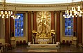
- Nomination: Montréal: Saint Joseph's Oratory of Mount-Royal --Taxiarchos228 10:01, 13 November 2011 (UTC)
- Review needed
-

- Nomination: Montréal: Saint Joseph's Oratory of Mount-Royal, altar --Taxiarchos228 10:01, 13 November 2011 (UTC)
- Review needed
-

- Nomination: Deux Merveilleuses, detail of the painting. Léna 23:39, 12 November 2011 (UTC)
- Review needed
-

- Nomination: The old barn from Jasienica Rosielna (about 1850) --Pudelek 22:48, 12 November 2011 (UTC)
- Review Comment I think it would be better without the "thing with weels" on the left.
-
- Nomination: "Santa Maria della Grazia" Island (Venice) --Archaeodontosaurus 17:46, 12 November 2011 (UTC)
- Review The main object (the iceland) is not in focus. Instead, the dolphin is in focus. --ArildV 00:32, 13 November 2011 (UTC)* I do not think so. --Archaeodontosaurus 06:20, 13 November 2011 (UTC)
-

- Nomination: Geotrupes stercorosus --WikedKentaur 10:06, 12 November 2011 (UTC)
- Review CommentThe main object is a small part of the picture and there are reflections on the shell (flash?)--ArildV 01:29, 13 November 2011 (UTC)
-

- Nomination: Farm in Rozendaal, The netherlands -- Basvb 23:40, 11 November 2011 (UTC) CommentThe house and the trees look good but the fence in the foreground (see images note)? --ArildV 00:10, 13 November 2011 (UTC)
The fence is indeed unsharp, but is that a problem? That's the chosen DoF, the farm being the main subject. Mvg, Basvb 10:31, 13 November 2011 (UTC) It is not just unsharp (out of focus foreground is not normally a problem), but the fence looks really terrible and takes up a relatively large part of the picture (also due to post-processing?). It would have been easy to avoid it with a different angle. Regards,--ArildV 11:01, 13 November 2011 (UTC) - Review needed
- Nomination: Farm in Rozendaal, The netherlands -- Basvb 23:40, 11 November 2011 (UTC)
-

-
- Nomination: Exposition at the the «Crossing» festival. --PereslavlFoto 15:06, 11 November 2011 (UTC)
- Review Comment maybe a crop to just the case, though I'm not sure about the exposure Gnangarra 13:35, 12 November 2011 (UTC)
-

- Nomination Hobie Cat 16 catamaran at Iskar reservoir. --MrPanyGoff 14:40, 11 November 2011 (UTC)
- Promotion Good quality. --Ralf Roletschek 18:36, 18 November 2011 (UTC)
-

- Nomination: Entrance to Nederlandet mindre 9. --ArildV 11:59, 11 November 2011 (UTC)
- Review Comment this would be suited to a geometric crop, the left edge is distracting from a beautiful entrance Gnangarra 13:41, 12 November 2011 (UTC) Done.--ArildV 21:26, 12 November 2011 (UTC)
On the left side their seems more on the bottom then on the top? Is it somehow tilted? Mvg, Basvb 10:58, 13 November 2011 (UTC) I dont think so, just an old building that is not completely straight (see also image notes).--ArildV 11:10, 13 November 2011 (UTC)
-

- Nomination Shell of a Vibex Bonnet, Casmaria erinaceus --Llez 09:07, 14 November 2011 (UTC)
- Promotion Doubtless a QI for me --Haneburger 11:02, 14 November 2011 (UTC)
-

- Nomination Hammetschwand lift and Rigi mountain in the background above the clouds, Bürgenstock, LU, Switzerland. (by user:Leiju) -- Ludo29 07:08, 14 November 2011 (UTC)
- Promotion Good quality. --Taxiarchos228 07:14, 14 November 2011 (UTC)
-
- Nomination Strandvägen 53 built 1895-1897. --ArildV 07:00, 14 November 2011 (UTC)
- Promotion Good and technical well done --Haneburger 08:31, 14 November 2011 (UTC)
-
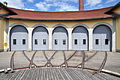
- Nomination Railway station of Uster (by Roland zh). -- Achim Raschka 06:52, 14 November 2011 (UTC)
- Promotion QI, nice composition.--ArildV 07:01, 14 November 2011 (UTC)
-

- Nomination St. Secundus-Kirche, Cultural heritage monument in Hennstedt (Dithmarschen). Own photo. --Smial 23:56, 13 November 2011 (UTC)
- Promotion Good quality --Haneburger 08:26, 14 November 2011 (UTC)
-

-
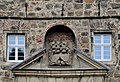
-

- Nomination Helvella crispa (older darker form) --Holleday 16:49, 13 November 2011 (UTC)
- Promotion Good quality for me -- Achim Raschka 16:56, 13 November 2011 (UTC)
-
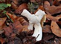
- Nomination Helvella crispa --Holleday 16:49, 13 November 2011 (UTC)
- Promotion Good quality for me -- Achim Raschka 16:56, 13 November 2011 (UTC)
-

- Nomination Malta, a fisherboat in the harbour of Marsaxlokk --Berthold Werner 15:15, 13 November 2011 (UTC)
- Promotion Very good quality. --Vassil 21:54, 13 November 2011 (UTC)
-

- Nomination Air France A380 F-HPJA --Jovianeye 13:02, 13 November 2011 (UTC)
- Promotion Good quality. --Taxiarchos228 13:11, 13 November 2011 (UTC)
-

- Nomination Panoramic view of Lindau harbour --Taxiarchos228 11:52, 13 November 2011 (UTC)
- Promotion Good quality IMHO --Moonik 18:37, 13 November 2011 (UTC)
-

- Nomination Lindau: Mang tower at harbour --Taxiarchos228 11:52, 13 November 2011 (UTC)
- Promotion Nice and QI for me --Haneburger 17:50, 13 November 2011 (UTC)
-

- Nomination Saula blue springs. --WikedKentaur 11:43, 13 November 2011 (UTC)
- Decline Disturbing reflections on the water, (pol-filter?!) --Haneburger 18:15, 13 November 2011 (UTC)
-

- Nomination Longinus Tower --Carschten 21:32, 12 November 2011 (UTC)
- Promotion CommentCould be a small CW tilt here ((see the antennas on the roof). --ArildV 01:22, 13 November 2011 (UTC)
After looking at some other images of the tower, I think the antennas are not completely straight, but the building is IMHO --Carschten 11:16, 13 November 2011 (UTC) Ok. You're probably right. --ArildV 07:04, 14 November 2011 (UTC)
-
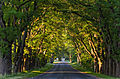
- Nomination Suuremõisa manor avenue. (Author Maigi) --Iifar 15:00, 12 November 2011 (UTC)
- Promotion Comment Looks good. Why downsampling to 2,2 mp?--ArildV 00:56, 13 November 2011 (UTC). CommentNew version with higher resolution is uploaded. --Iifar 17:00, 13 November 2011 (UTC)
Great! --ArildV 07:04, 14 November 2011 (UTC)
-
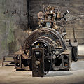
-

- Nomination Galician market square in Sanok --Pudelek 16:05, 9 November 2011 (UTC)
- Promotion Good quality, QI for me -- Achim Raschka 10:23, 14 November 2011 (UTC)
-

- Nomination: Unimog-based drilling machine --High Contrast 11:56, 8 November 2011 (UTC)
- Review needed
-

- Nomination: Theatre mask from Java. --Vassil 08:42, 8 November 2011 (UTC)
- Review needed
-

- Nomination: Hand of Britannicus. --M0tty 08:05, 8 November 2011 (UTC)
- Review needed
-

- Nomination: Monument to Liberators in Nish. --MrPanyGoff 07:22, 8 November 2011 (UTC)
- Review needed
-

- Nomination Venus Fountain in Paris, Champs-Elysées --Moonik 03:50, 8 November 2011 (UTC)
- Promotion Why not a "portrait" framing ?--Jebulon 16:23, 12 November 2011 (UTC) Done It's better? --Moonik 14:53, 13 November 2011 (UTC)
I like it, QI for me -- Achim Raschka 17:48, 13 November 2011 (UTC)
-

- Nomination: "The House of Fairy Tale" (an apartment house Z.A. Pertsovoy), Moscow -- Aleks G 00:10, 8 November 2011 (UTC)
- Review needed
-
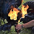
- Nomination A vintage Lanz Bulldog gets started --High Contrast 18:35, 5 November 2011 (UTC)
- Promotion I really like it, QI for me -- Achim Raschka 18:35, 13 November 2011 (UTC)
-

- Nomination: Toronto: King's Landing Condominium --Taxiarchos228 08:30, 5 November 2011 (UTC)
- Review Nice building, but too tight crop at right IMO. And there is overall a perspective distortion you cannot correct, because if done you will have a tighter crop... That's life...--Jebulon 17:47, 7 November 2011 (UTC)
-

-

- Nomination Portal of the parish church hl. Joseph der Arbeiter (Saint Joseph the Worker), at Rohrbach an der Lafnitz, Styria. --Herzi Pinki 14:55, 1 November 2011 (UTC)
- Promotion barrel distortion should be corrected --Mbdortmund 03:29, 6 November 2011 (UTC) Comment it is now corrected --Herzi Pinki 19:24, 10 November 2011 (UTC) Good so --Haneburger 11:16, 14 November 2011 (UTC)
-

- Nomination The Anschlussdenkmal in Oberschützten, built in 1939. --Herzi Pinki 14:55, 1 November 2011 (UTC)
- Promotion zu blau imo --Mbdortmund 03:31, 6 November 2011 (UTC)Tried something...--Jebulon 16:10, 12 November 2011 (UTC) Now QI for me --Haneburger 18:20, 13 November 2011 (UTC)
-
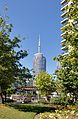
- Nomination: Toronto: Harbourfront --Taxiarchos228 07:11, 1 November 2011 (UTC)
- Review Annotated dust spot. Not sure with the composition, because it hesitates too much between the greenery and the buildings, and so do I. But it can be a QI nevertheless...--Jebulon 17:37, 7 November 2011 (UTC)
-
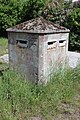
-

- Nomination Un des lampadaires du pont Alexandre III à Paris --Thesupermat 10:25, 15 November 2011 (UTC)
- Promotion QI for me -- Jean-Pol GRANDMONT 10:46, 15 November 2011 (UTC)
-
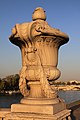
- Nomination Un vase décoratif sur le pont Alexandre III à Paris --Thesupermat 10:25, 15 November 2011 (UTC)
- Promotion QI for me -- Jean-Pol GRANDMONT 10:46, 15 November 2011 (UTC)
-

- Nomination Détail d'un portrait de Nicolas Ier --Thesupermat 09:10, 15 November 2011 (UTC)
- Promotion QI for me -- Jean-Pol GRANDMONT 10:41, 15 November 2011 (UTC)
-

- Nomination St. Mang Basilica Füssen, pulpit --Taxiarchos228 07:13, 15 November 2011 (UTC)
- Promotion Good.--ArildV 08:31, 15 November 2011 (UTC)
-

- Nomination St. Mang Basilica Füssen, fresco of Saint Magnus fighting with dragon --Taxiarchos228 07:13, 15 November 2011 (UTC)
- Promotion Very good job.--ArildV 08:44, 15 November 2011 (UTC)
-

- Nomination St. Mang Basilica Füssen, Magnus crypt --Taxiarchos228 07:13, 15 November 2011 (UTC)
- Promotion QI for me -- Jean-Pol GRANDMONT 10:41, 15 November 2011 (UTC)
-
- Nomination Kreuz aus Konglomerat --Böhringer 21:23, 14 November 2011 (UTC)
- Promotion Nice staging --Haneburger 09:13, 15 November 2011 (UTC)
-

-

- Nomination Lörrach-Haagen: distribution substations (build 1951) --Taxiarchos228 07:30, 14 November 2011 (UTC)
- Promotion Good quality.--ArildV 08:56, 15 November 2011 (UTC)
-

- Nomination Musée de l'Ariana (Genève, Suisse). (by user:Gfuerst) -- Ludo29 07:02, 14 November 2011 (UTC)
- Promotion The photo is QI for me, my only problem is the very short description without saying what can be seen here (I suppose a roof of a staircase in the museum) -- Achim Raschka 13:50, 14 November 2011 (UTC))
-

- Nomination 1959 Land Rover series II --ArildV 22:43, 13 November 2011 (UTC)
- Promotion Good quality. --Berthold Werner 17:48, 14 November 2011 (UTC)
-
-

- Nomination Lateral altar in the Catholic Church St. Christophorus in Ratingen --Carschten 18:16, 13 November 2011 (UTC)
- Promotion Seems OK to me.--MrPanyGoff 13:25, 14 November 2011 (UTC)
-

- Nomination Historic hotel and brewery ruins in Wisconsin. --Jonathunder 14:49, 13 November 2011 (UTC)
- Promotion Maybe not the best light but good quality. --Sfu 21:30, 14 November 2011 (UTC)
-
- Nomination The Naval Club in Varna. --MrPanyGoff 08:26, 13 November 2011 (UTC)
- Promotion Good quality. --Sfu 15:57, 14 November 2011 (UTC)
-

- Nomination House from Dumbrăveni, Suceava County, exhibited in the National Village Museum in Bucharest, Romania.Andrei Stroe 15:14, 9 November 2011 (UTC)
- Promotion Maybe not the most fortunate lght but good quality. --Sfu 20:43, 14 November 2011 (UTC)
-

- Nomination: A36 motorway in Montbéliard, France. --ComputerHotline 10:53, 9 November 2011 (UTC)
- Review needed
-
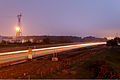
- Nomination: A36 motorway in Montbéliard, France. --ComputerHotline 10:53, 9 November 2011 (UTC)
- Review needed
-

- Nomination: A36 motorway in Montbéliard, France. --ComputerHotline 10:53, 9 November 2011 (UTC)
- Review needed
-

- Nomination: Todtnauberg: Church of Saint James, son of Zebedee, bell tower --Taxiarchos228 10:35, 9 November 2011 (UTC)
- Review needed
-
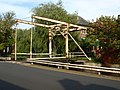
- Nomination: K. & J. Wilkens bridge, Boven Oosterdiep, Veendam - Basvb 09:04, 9 November 2011 (UTC)
- Review needed
-
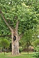
- Nomination: The silver maple (Acer saccharinum), a natural monument in Oborskis' park in Mielec --Kroton 20:45, 8 November 2011 (UTC)
- Review needed
-

- Nomination: The Orthodox church in Kotań --Kroton 20:45, 8 November 2011 (UTC)
- Review needed
-

- Nomination: The statue of Atlas (located at Rockefeller Center in New York City) in front of Saint Patrick's Cathedral. Jopparn 17:07, 8 November 2011 (UTC)
- Review needed
-

- Nomination: Steinen-Endenburg: Protestant Church: war memorial --Taxiarchos228 13:26, 8 November 2011 (UTC)
- Review needed
-

- Nomination Vogelbach: Protestant Church, ridge turret --Taxiarchos228 08:22, 16 November 2011 (UTC)
- Promotion nice. --Ralf Roletschek 10:19, 16 November 2011 (UTC)
-

- Nomination Fischingen: Protestant Church, altar --Taxiarchos228 08:22, 16 November 2011 (UTC)
- Promotion Good quality. --Ralf Roletschek 10:19, 16 November 2011 (UTC)
-
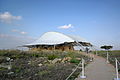
- Nomination Malta, temple Hagar Qim --Berthold Werner 08:07, 16 November 2011 (UTC)
- Promotion Good quality. --Ralf Roletschek 10:19, 16 November 2011 (UTC)
-

- Nomination The Town Gallery in Veliko Tarnovo. --MrPanyGoff 07:43, 16 November 2011 (UTC)
- Promotion Good quality. --Berthold Werner 08:09, 16 November 2011 (UTC)
-
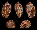
- Nomination Shell of a Minor Harp, Harpa amouretta --Llez 07:42, 16 November 2011 (UTC)
- Promotion Good quality and very useful --PierreSelim 07:47, 16 November 2011 (UTC)
-

- Nomination Dortmunder U --Mbdortmund 00:03, 16 November 2011 (UTC)
- Promotion nice lines --Ralf Roletschek 10:19, 16 November 2011 (UTC)
-

- Nomination Rugby union warm-up Gloucester RFC --PierreSelim 22:19, 15 November 2011 (UTC)
- Promotion This one is good, althought it's a bit tightly cropped as well. Mvg, Basvb 22:32, 15 November 2011 (UTC)
-

-

-

-

- Nomination A pile of granite setts, Paris --~Pyb 18:01, 15 November 2011 (UTC)
- Promotion Good quality. --PierreSelim 22:39, 15 November 2011 (UTC)
-

- Nomination Stambolov Street in Veliko Tarnovo. --MrPanyGoff 17:23, 15 November 2011 (UTC)
- Promotion Good quality. --Sfu 20:08, 15 November 2011 (UTC)
-

- Nomination Malta, Marsaxlokk, church "Our lady of Pompei" --Berthold Werner 16:01, 15 November 2011 (UTC)
- Promotion Very good.--ArildV 16:15, 15 November 2011 (UTC)
-

- Nomination Banya Bashi Mosque in Sofia. --MrPanyGoff 15:34, 15 November 2011 (UTC)
- Promotion Good quality.--ArildV 16:15, 15 November 2011 (UTC)
-

- Nomination on a roof in Berlin --Ralf Roletschek 14:25, 15 November 2011 (UTC)
- Decline The composition with the brench. It's not fully in the image but to much to be just a side thing. Mvg, Basvb 22:14, 15 November 2011 (UTC)
-

- Nomination Land Rover Defender at IAA 2011 --Ralf Roletschek 14:25, 15 November 2011 (UTC)
- Promotion Good, althought it would've been better if the other car was fully on the picture. Mvg, Basvb 22:17, 15 November 2011 (UTC)
-

- Nomination Varusha quarter of Veliko Tarnovo. --MrPanyGoff 13:27, 15 November 2011 (UTC)
- Promotion Good quality, I like the composition. Mvg, Basvb 22:19, 15 November 2011 (UTC)
-

- Nomination Basement of Dormition cathedral at Goritsky monastery, Pereslavl museum-preserve. --PereslavlFoto 13:22, 15 November 2011 (UTC)
- Promotion Good.--ArildV 12:55, 15 November 2011 (UTC)
-

- Nomination Vue du Petit Palais à Paris --Thesupermat 10:25, 15 November 2011 (UTC)
- Decline Only part of the building (why this part?) And trees in front of the subject. Mvg, Basvb 22:20, 15 November 2011 (UTC)
-
- Nomination St. Mang Basilica Füssen, general view --Taxiarchos228 07:13, 15 November 2011 (UTC)
- Promotion hey, da war ich schon :-) und werde im Januar auch wieder sein. Schöner Ort, schöne Bauwerke, schönes Foto, schöne Komposition --Carschten 15:14, 15 November 2011 (UTC) - Support wunderschön! --Ralf Roletschek 10:20, 16 November 2011 (UTC)
-

- Nomination Flora by Arcis and Mazières, Versailles. --Coyau 03:57, 15 November 2011 (UTC)
- Promotion QI IMO, small part of laurel wreath (?) is out of focus, otherwise good quality. --ArildV 08:31, 15 November 2011 (UTC)
Flowers, not laurel. It's Flora, a goddess of flowers and the season of spring. --Coyau 16:46, 15 November 2011 (UTC)
-

- Nomination Sørbotn (Ramfjorden), Troms, Norway, in 2011 October --Ximonic 00:09, 15 November 2011 (UTC)
- Promotion Good quality. Very nice composition.--ArildV 08:31, 15 November 2011 (UTC)
Colours don't seem natural. Mvg, Basvb 22:09, 15 November 2011 (UTC) Colours haven't been changed at all. The sun stays quite low the few hours it is above the horizon here in the north. Usually on a bright cloudless day the colour of different lights range from somewhat ultramarine/violet to warm yellowish (is usually the snow on the mountains when sun shines there). However, here the clouds and mountains block much of the light and affect it, but it has still somewhat the same mood it has been there. However, the raising fog caused by the nightly frost and fresh snow make the air more grayish where the ultramarine tones of the mountains in shadow get fainter. The latest trips I have made to northern Norway I have really taken focus on the colors and what kind of tone is there coming to my eye. Afterwards I tried my best to keep the same mood and colors as I actually saw without any technical equipment modifying the impression. One might consider to disagree but I warmly recommend to visit and witness these interesting places! --Ximonic 23:31, 15 November 2011 (UTC)
-

- Nomination Dolomites range - file has disappeared from the nomination list --Moroder 23:08, 14 November 2011 (UTC)
- Promotion Very good and useful (also god annotations).--ArildV 13:00, 15 November 2011 (UTC) Now i see, its already QI but the bot had problem yesterday, I think you should delete this nomination, and wait and see what happens. but anyway, a very nice photo.--ArildV 13:03, 15 November 2011 (UTC)
-

-

-

- Nomination St Demetrius Church in Apriltsi. --MrPanyGoff 13:07, 14 November 2011 (UTC)
- Promotion I see you have taken the picture south of the building, wheather looks nice, why then didn't you wait for the sun?
-------
The sky above and behind me was cloudy and I have no more than 10 minutes here. Anyway, I think that the object is clear enough.--MrPanyGoff 08:19, 16 November 2011 (UTC) Yes it is, would be better with sunlight though. --Sfu 09:32, 16 November 2011 (UTC)
-

- Nomination Warttürmchen (little watch-tower) in the Hohenrode Park, Nordhausen (Thuringia) (by Jwaller). -- Achim Raschka 07:02, 14 November 2011 (UTC)
- Promotion ich habs ja nominiert... --Ralf Roletschek 10:23, 16 November 2011 (UTC)
-
- Nomination Trametes gibbosa --Holleday 16:49, 13 November 2011 (UTC)
- Promotion Support QI & Useful --Archaeodontosaurus 14:26, 15 November 2011 (UTC)
-

-
- Nomination Hypholoma fasciculare --Holleday 16:49, 13 November 2011 (UTC)
- Promotion Support QI & Useful --Archaeodontosaurus 14:29, 15 November 2011 (UTC)
-

- Nomination The historical marker Denkzeichen Georg Elser, Berlin (by Lienhard Schulz). -- Achim Raschka 13:22, 13 November 2011 (UTC)
- Promotion {{{2}}}
-

- Nomination The church of the Immaculate Conception in Jaślany --Kroton 14:55, 11 November 2011 (UTC)
- WARNING: third template parameter added – please remove.
-

- Nomination The River Vils with broad-leaved trees in Autumn. --High Contrast 17:16, 10 November 2011 (UTC)
- Promotion Good quality. --Ralf Roletschek 11:33, 16 November 2011 (UTC)
-

- Nomination Zell: Old Catholic Church, bell tower --Taxiarchos228 14:24, 10 November 2011 (UTC)
- Promotion Good quality. --Ralf Roletschek 11:33, 16 November 2011 (UTC)
-

- Nomination: Tyrol: Stones and bricks in the wall of a ruin --Haneburger 10:43, 10 November 2011 (UTC)
- Review needed
-

- Nomination St.Felio de Goixols Beach --Vitold Muratov 17:45, 9 November 2011 (UTC)
- Decline Chromatic abberations, posterisation, noise. --Sfu 21:17, 15 November 2011 (UTC)
-

- Nomination: Muggenbrunn: Saint Cornelius Church, interior --Taxiarchos228 10:35, 9 November 2011 (UTC)
- Review Comment Picture seems slightly tilted. Otherwise it's QI for me. PierreSelim 12:38, 9 November 2011 (UTC)
-
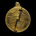
-

- Nomination "Miotacz" ("Shot putter") sculpture in Mielec --Kroton 20:45, 8 November 2011 (UTC)
- Promotion Good quality. --Ralf Roletschek 11:34, 16 November 2011 (UTC)
-

- Nomination Kardovsky manor, main building -- PereslavlFoto 11:50, 8 November 2011 (UTC)
- Promotion QI IMO.--ArildV 16:12, 15 November 2011 (UTC)
-

-

- Nomination Malta, Marsaxlokk, bow of a Luzzu --Berthold Werner 10:31, 8 November 2011 (UTC)
- Promotion Nice colors. --Coyau 15:25, 15 November 2011 (UTC)
-

-

- Nomination Nish Fortress - Lapidarium. --MrPanyGoff 20:30, 7 November 2011 (UTC)
- Promotion Small resolution, but good quality. --Sfu 21:09, 15 November 2011 (UTC)
-
- Nomination The Saint Teresa fountain (XVIIIth century) - Domaine de Mariemont in Morlanwelz, Belgium.-- Jean-Pol GRANDMONT 15:31, 7 November 2011 (UTC)
- Promotion Nice composition, good quality. Mvg, Basvb 22:52, 15 November 2011 (UTC)
-

- Nomination Wehr: Protestant Church and surrounding --Taxiarchos228 12:35, 7 November 2011 (UTC)
- Decline 50% of the subject is hidden by trees. Mvg, Basvb 22:52, 15 November 2011 (UTC)
-

- Nomination Lörrach: Bridge bearing of the Wiesenbrücke of the Bundesstraße 317 --Taxiarchos228 12:35, 7 November 2011 (UTC)
- Promotion Good quality. Mvg, Basvb 22:52, 15 November 2011 (UTC)
-

- Nomination Hauingen: Town hall --Taxiarchos228 12:35, 7 November 2011 (UTC)
- Decline unsharp to the right, 2 tiny overexposed areas (license plate and thing on roof). Mvg, Basvb 22:52, 15 November 2011 (UTC)
-
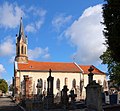
- Nomination: Église de Brasse of Belfort, France. --ComputerHotline 18:40, 6 November 2011 (UTC)
- Review Comment I would have crop the tree PierreSelim 19:12, 9 November 2011 (UTC)
-

- Nomination: High speed catamaran in the harbour of Rouen (France) --Pline 13:39, 6 November 2011 (UTC)
- Review Comment crop is really tight on the right PierreSelim 19:12, 9 November 2011 (UTC)
-

-
- Nomination Beaucaire, Oratory covered cross -- Véronique PAGNIER 17:26, 4 November 2011 (UTC)
- Promotion Comment The sky is a little noisy. Is it the "real" angle of the building ? Léna 00:17, 13 November 2011 (UTC) -- About the sky, full Mediterranean sun of September! For the angle, the building has a triangular base. Véronique PAGNIER 18:33, 14 November 2011 (UTC). -- Ok, QI for me :) Léna 23:41, 15 November 2011 (UTC)
-

- Nomination Populus × canescens (gray poplar), autumn leaves. --Le.Loup.Gris 10:42, 17 November 2011 (UTC)
- Promotion Good quality. --Ralf Roletschek 11:14, 17 November 2011 (UTC)
-

- Nomination Cooperative State University Lörrach --Taxiarchos228 09:49, 17 November 2011 (UTC)
- Promotion Meets the criteria, imo.--MrPanyGoff 11:30, 17 November 2011 (UTC)
-

- Nomination Vrachesh Monastery. --MrPanyGoff 07:50, 17 November 2011 (UTC)
- Promotion Good quality. --Taxiarchos228 09:13, 17 November 2011 (UTC)
-

- Nomination Château des Angles, Hautes-Pyrénées, France --Florent Pécassou 20:24, 16 November 2011 (UTC)
- Promotion Good quality. --Ralf Roletschek 22:11, 16 November 2011 (UTC)
-

- Nomination Paper Kite. --Quartl 19:54, 16 November 2011 (UTC)
- Promotion Very good quality and useful, QI for me -- Achim Raschka 09:03, 17 November 2011 (UTC)
-

- Nomination Des escaliers aux Invalides à Paris --Thesupermat 11:06, 16 November 2011 (UTC)
- Promotion Althought one blown out window I really like the setting. Mvg, Basvb 08:23, 17 November 2011 (UTC)
-

- Nomination Horse --Raghith 09:10, 16 November 2011 (UTC)
- Decline Nice composition but overexposed -- Achim Raschka 09:03, 17 November 2011 (UTC)
-

- Nomination Niedereggenen: Protestant Church, nave from gallery --Taxiarchos228 08:22, 16 November 2011 (UTC)
- Promotion Meets the criteria, imo.--MrPanyGoff 22:55, 16 November 2011 (UTC)
-

- Nomination Heurtoir de la porte de l'hôtel de Gournay, monument historique à Paris --Thesupermat 07:55, 16 November 2011 (UTC)
- Promotion Meets the criteria, imo.--MrPanyGoff 22:55, 16 November 2011 (UTC)
-

-

- Nomination Harness racer Pentti Tikkinen with Win Can Valley. --kallerna 18:07, 14 November 2011 (UTC)
- Promotion Meets the criteria, imo.--MrPanyGoff 11:42, 17 November 2011 (UTC)
-

- Nomination Malta, Tarxien Tempels, stone with spiral design --Berthold Werner 11:51, 14 November 2011 (UTC)
- Promotion Good enough for QI, imo.--MrPanyGoff 11:46, 17 November 2011 (UTC)
-

- Nomination Kingston: Town hall --Taxiarchos228 07:30, 14 November 2011 (UTC)
- Promotion Good quality. --kallerna 19:55, 16 November 2011 (UTC)
-

-
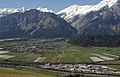
- Nomination View to Mils in the Inn-Valley --Haneburger 17:44, 13 November 2011 (UTC)
- Promotion For me it's QI. I don't see problems. --T137 11:11, 17 November 2011 (UTC)
-
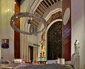
- Nomination: Montréal: Saint Joseph's Oratory of Mount-Royal, altar --Taxiarchos228 07:53, 11 November 2011 (UTC)
- Review needed
-
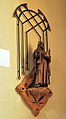
- Nomination: Zell im Wiesental: Statue of Saint Fridolin at Church Saint Fridolin --Taxiarchos228 07:53, 11 November 2011 (UTC)
- Review needed
-

- Nomination: Lourdes - Albertus teolog 23:13, 10 November 2011 (UTC)
- Review needed
-

- Nomination: Blonde d'Aquitaine Florent Pécassou 15:57, 10 November 2011 (UTC)
- Review needed
-
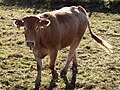
- Nomination: Blonde d'Aquitaine Florent Pécassou 15:57, 10 November 2011 (UTC)
- Review needed
-

- Nomination: The entrance to the North Hall of the Cinquantenaire complex in Brussels. Currently an Aerospace Museum (2011). Jopparn 15:26, 10 November 2011 (UTC)
- Review needed
-

- Nomination: A closeup on the ornament on the Bandstand in . Jopparn 15:26, 10 November 2011 (UTC)
- Review needed
-

- Nomination: Paréac Church -- Florent Pécassou 15:22, 10 November 2011 (UTC)
- Review needed
-

- Nomination: Zell: Old Catholic Church --Taxiarchos228 14:24, 10 November 2011 (UTC)
- Review needed
-

- Nomination: Zell: Protestant Church --Taxiarchos228 14:24, 10 November 2011 (UTC)
- Review needed
-
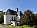
- Nomination: Zell im Wiesental: Church of the Assumption in Atzenbach --Taxiarchos228 14:24, 10 November 2011 (UTC)
- Review needed
-
- Nomination: Artificial waterfall in the Garden of Bagatelle in Paris --Moonik 12:02, 10 November 2011 (UTC)
- Review needed
-

- Nomination Afternoon sunlight on a Black Forest town --Jdsteakley 13:19, 17 November 2011 (UTC)
- Promotion very nice light, great! --Ralf Roletschek 13:27, 17 November 2011 (UTC)
-

- Nomination Yannick Nyanga starring at the ball after Freddy Burns made his pass --PierreSelim 12:37, 17 November 2011 (UTC)
- Promotion Do you have a wider crop at the top and the right? Mvg, Basvb 15:44, 17 November 2011 (UTC) Good action shot, good quality, and good composition (we do not need more grass here IMO).--ArildV 17:20, 17 November 2011 (UTC)
-

- Nomination Roundabout with the symbol of the town Hedemora, Sweden. --V-wolf 11:15, 17 November 2011 (UTC)
- Promotion Good quality. --Ralf Roletschek 13:56, 17 November 2011 (UTC)
-

- Nomination Le dôme des Invalides à Paris. --Thesupermat 08:23, 17 November 2011 (UTC)
- Promotion schön unsymmetrisch --Ralf Roletschek 13:57, 17 November 2011 (UTC)
-
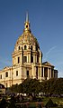
- Nomination Le dôme des Invalides à Paris. --Thesupermat 08:23, 17 November 2011 (UTC)
- Promotion CommentI fixed the distortion. --PierreSelim 16:11, 17 November 2011 (UTC) Good quality. --PierreSelim 16:11, 17 November 2011 (UTC)
-

- Nomination Porte de Brisach, in Belfort, France. --ComputerHotline 20:06, 16 November 2011 (UTC)
- Promotion Good quality. --PierreSelim 12:59, 17 November 2011 (UTC)
-

- Nomination Porte de Brisach, in Belfort, France. --ComputerHotline 20:06, 16 November 2011 (UTC)
- Promotion its HDR but i dont see ist - but the sky :-( is too light. --Ralf Roletschek 14:20, 17 November 2011 (UTC) The sky is too light because there is some light pollution. --ComputerHotline 18:51, 17 November 2011 (UTC)
-

- Nomination Heurtoir sur la porte d'un monument historique à Paris --Thesupermat 07:46, 16 November 2011 (UTC)
- Promotion Good quality. --PierreSelim 12:59, 17 November 2011 (UTC)
-

- Nomination Poignée de la porte d'un monument historique à Paris --Thesupermat 07:19, 16 November 2011 (UTC)
- Promotion Good quality. --PierreSelim 12:59, 17 November 2011 (UTC)
-

- Nomination Office building Kurfürstendamm 119-120, Berlin -- Achim Raschka 22:05, 14 November 2011 (UTC)
- Promotion oben ein bißchen eng aber sonst ok. --Ralf Roletschek 14:22, 17 November 2011 (UTC)
-

- Nomination Mitella breweri (Brewer's Miterwort) --Wsiegmund 17:04, 14 November 2011 (UTC)
- Promotion Support QI & Useful --Archaeodontosaurus 17:10, 17 November 2011 (UTC)
-
- Nomination Lörrach: Vally Wiese bridge (Wiesentalbrücke),bridge bearings --Taxiarchos228 07:30, 14 November 2011 (UTC)
- Promotion interisting detail --Ralf Roletschek 14:30, 17 November 2011 (UTC)
-

- Nomination The church of the Immaculate Conception in Jaślany --Kroton 14:55, 11 November 2011 (UTC)
- WARNING: third template parameter added – please remove.
-

- Nomination: Cultural centre in Apriltsi. --MrPanyGoff 12:17, 11 November 2011 (UTC)
- Review needed
-

-

-

-

-
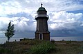
-

- Nomination Exposition at the the «Crossing» festival. --PereslavlFoto 14:17, 9 November 2011 (UTC)
- Decline Bad crop, disturbing elements on the left and the right, blue thing is cut. --Léna 17:10, 17 November 2011 (UTC)
-

- Nomination Targovishte central square. --MrPanyGoff 14:12, 9 November 2011 (UTC)
- Promotion QI for me. --Léna 17:10, 17 November 2011 (UTC)
-
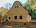
- Nomination House from Sârbova, Timiş County, exhibited in the National Village Museum in Bucharest, Romania.Andrei Stroe 12:04, 9 November 2011 (UTC)
- Decline Building is nice, but the sky on the left part is really disturbing (blue close to the tree and grey otherwise). --Léna 17:10, 17 November 2011 (UTC)
-

-
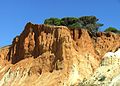
- Nomination Albufeira coast in Portugal. --High Contrast 01:53, 12 November 2011 (UTC)
- Promotion Good an usefull to demonstrate erosion --Haneburger 06:19, 12 November 2011 (UTC)
-
- Nomination Mountain range in Corvara - Dolomites --Wolfgang Moroder 00:05, 12 November 2011 (UTC)
- Promotion Good and QI for me --Haneburger 06:25, 12 November 2011 (UTC)
-

- Nomination Dromedaris, Enkhuizen, the Netherlands -- Basvb 23:40, 11 November 2011 (UTC)
- Promotion Nice atmosphere and composition --Haneburger 06:27, 12 November 2011 (UTC)
-

- Nomination St Athanasius Church in Lozen village. --MrPanyGoff 16:47, 11 November 2011 (UTC)
- Promotion Nice comp, good colours. --Saffron Blaze 18:17, 11 November 2011 (UTC)
-

- Nomination St Paraskeva Petka Church in Troyan. --MrPanyGoff 12:56, 11 November 2011 (UTC)
- Promotion Good quality. --Taxiarchos228 13:51, 11 November 2011 (UTC)
-

- Nomination Mindepartementet, a historic navy building at Skeppsholmen in Stockholm. --ArildV 12:51, 11 November 2011 (UTC)
- Promotion Good quality. --Taxiarchos228 13:51, 11 November 2011 (UTC)
-

- Nomination Fontaine des Quatre-Saisons in Paris --Moonik 12:28, 11 November 2011 (UTC)
- Promotion Good quality. --Taxiarchos228 13:51, 11 November 2011 (UTC)
-

- Nomination Sanguszko Palace in Iziaslav, Ukraine. --Bulka UA 10:26, 11 November 2011 (UTC)
- Decline Very impressive and good picture, but not compatible to the guidelines for QIs --Haneburger 12:02, 11 November 2011 (UTC)
-

- Nomination chess pieces --Mbdortmund 02:35, 11 November 2011 (UTC)
- Promotion Comment A good picture, but me disturbs one figure standing on two fields - thats an unpossible situation in chess games --Haneburger 12:11, 11 November 2011 (UTC) Once more I've taken a look at this picture: Technical and lighting I find well done, therefore it's a QI for me (For the combination bishop/pawn I would prefer a diagonal sight?!)--Haneburger 06:47, 12 November 2011 (UTC)
-

- Nomination Zell im Wiesental: Saint Fridolin, bell tower --Taxiarchos228 14:24, 10 November 2011 (UTC)
- Promotion Meets the criteria, imo.--MrPanyGoff 12:21, 11 November 2011 (UTC)
-
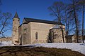
- Nomination Church of Haapsalu Castle --WikedKentaur 10:39, 10 November 2011 (UTC)
- Promotion QI for me --Haneburger 06:37, 12 November 2011 (UTC)
-

-

- Nomination Wasserburg (moated castle) in Kapellendorf (Thüringen, Germany). --Misburg3014 21:48, 8 November 2011 (UTC)
- Decline Bad lighting: façade mostly in shadow. Also the perspective from further left would be better showing more of the entry. --Elekhh 12:40, 11 November 2011 (UTC)
-

- Nomination: Xavier Galezowski's tombstone in Père Lachaise Cemetery, in Paris. --~Pyb 21:51, 5 November 2011 (UTC)
- Review
 chromatic aberrations. Can the image be more sharp and less noisy?--Lmbuga 22:13, 5 November 2011 (UTC). Thx for your comment. I've removed some CA. I'll need more time for the sharpness & noise. ~Pyb 23:43, 5 November 2011 (UTC)
-

- Nomination: The church of St. Nicolaus in Zgórsko --Kroton 18:45, 5 November 2011 (UTC)
- Review needed
-

- Nomination: Parish cemetery in Mielec, the grave of Wojciech Lis, the commander of guerrilla group --Kroton 18:45, 5 November 2011 (UTC)
- Review needed
-

- Nomination: Stuifen in the Swabian Alps --Harke 17:34, 5 November 2011 (UTC)
- Review needed
-

- Nomination: Konrad-Kocher-Straße in Ditzingen --Harke 17:29, 5 November 2011 (UTC)
- Review needed
-
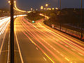
- Nomination: A36 motorway near Brognard, France, in night. --ComputerHotline 17:07, 5 November 2011 (UTC)
- Review needed
-
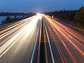
- Nomination: A36 motorway near Brognard, France, in night. --ComputerHotline 17:07, 5 November 2011 (UTC)
- Review needed
-
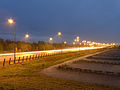
- Nomination: A36 motorway near Brognard, France, in night. --ComputerHotline 17:07, 5 November 2011 (UTC)
- Review needed
-

- Nomination: Toronto: Skyline from Toronto Island --Taxiarchos228 08:30, 5 November 2011 (UTC)
- Review Comment The image could really do with a correction of perpective, the tower slopes noticeably to the left even in thumbnail, the leftmost building to the right. Grand-Duc 15:24, 5 November 2011 (UTC)
-

-
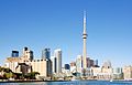
- Nomination: Toronto: Skyline with Canada Malting Silos on left side --Taxiarchos228 11:46, 28 October 2011 (UTC)
- Review Comment Is that moiré effect visible on the building right of the tower ? D4m1en 12:22, 2 November 2011 (UTC)
you are right, I guess it stems from the special pattern of the facade interfering with s.th. else I can not explain --Taxiarchos228 12:36, 2 November 2011 (UTC)
Isn't it a bit on the overexposed side? Seems to me that the top of the spire, for instance, is blown. -- Rama 07:52, 6 November 2011 (UTC)
-

- Nomination Montréal: Saint Joseph's Oratory of Mount-Royal, dome as seen from interior of the church --Taxiarchos228 10:01, 13 November 2011 (UTC)
- Decline Unsharp lamp in bottom, could be cropped, but also disturbing shadows on the dome. Mvg, Basvb 10:45, 13 November 2011 (UTC)
-

-

-

- Nomination Open air museum in Sanok - oil drilling rig --Pudelek 22:48, 12 November 2011 (UTC)
- Promotion * CommentNot a very good composition IMO, dark background.--ArildV 00:26, 13 November 2011 (UTC)* Support No technical problem --Archaeodontosaurus 06:17, 13 November 2011 (UTC)
I don't see dark background 01:09, 13 November 2011 (UTC)
-

-

-

-
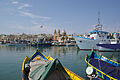
- Nomination Malta, harbour of Marsaxlokk --Berthold Werner 19:03, 12 November 2011 (UTC)
- Promotion QI.--ArildV 23:51, 12 November 2011 (UTC)
-

-
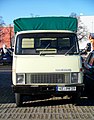
- Nomination Hanomag F in Germany. --High Contrast 16:18, 12 November 2011 (UTC)
- Promotion QI.--ArildV 00:37, 13 November 2011 (UTC)
-

-

- Nomination Egg of White-backed Vulture.--Archaeodontosaurus 13:17, 12 November 2011 (UTC)
- Promotion Very good --Llez 21:18, 12 November 2011 (UTC)
-

- Nomination Koala in the Wild Life Zoo in Sydney. --Poco a poco 11:53, 12 November 2011 (UTC)
- Decline backlighting, over exposed fur combined with only the nose being in focus Gnangarra 13:18, 12 November 2011 (UTC)
-
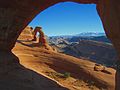
- Nomination Delicate arch located in Arches Ntal Park, it is the symbol of the US state Utah. --Poco a poco 11:53, 12 November 2011 (UTC)
- Promotion CommentBeautiful view. But I am not convinced by the quality. More opinions?--ArildV 01:03, 13 November 2011 (UTC)* Support Chromatic aberration around the hole, but good choice of angle.--Archaeodontosaurus 06:37, 13 November 2011 (UTC)
-
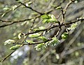
- Nomination Salix caprea in Spring. --High Contrast 11:28, 12 November 2011 (UTC)
- Promotion Ok.ArildV 01:03, 13 November 2011 (UTC)
-

- Nomination The courtyard of the Castle Hohenwerfen in Austria. --High Contrast 11:13, 12 November 2011 (UTC)
- Promotion CommentI do not like the composition here, with the mountain out of focus. I can not see what aperture you chose, but I would have liked to have had even the mountain in focus. --ArildV 01:03, 13 November 2011 (UTC)* Support The subject of the image is in focus. --Archaeodontosaurus 06:41, 13 November 2011 (UTC)
-

-

-

- Nomination Blue tit --WikedKentaur 10:06, 12 November 2011 (UTC)
- Promotion Ok.--ArildV 00:44, 13 November 2011 (UTC)
-

- Nomination Testudo horsfieldii in wild. --Yuriy75 10:22, 12 November 2011 (UTC)
- Decline insufficient depth of field IMO. --ArildV 00:23, 13 November 2011 (UTC)
By that reason: declined. Mvg, Basvb 10:51, 13 November 2011 (UTC)
-
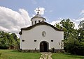
- Nomination Holy Trinity Monastery church in Apriltsi. --MrPanyGoff 07:08, 12 November 2011 (UTC)
- Promotion Ok. --ArildV 00:23, 13 November 2011 (UTC)
 Oppose disturbing leafs on the top right for me. (The picture is of good quality otherwise). --Léna 00:48, 13 November 2011 (UTC) Done-Leaves are removed.--MrPanyGoff 08:22, 13 November 2011 (UTC)
Quality picture now :). Léna 09:37, 13 November 2011 (UTC)
-

- Nomination Shell of an Eocene gastropod, Volutospina spinosa --Llez 06:37, 12 November 2011 (UTC)
- Promotion Support & Useful --Archaeodontosaurus 16:28, 12 November 2011 (UTC)
-
-
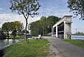
-

-

- Nomination Rhododendron, (family ericaceae). --Aleks G 00:05, 12 November 2011 (UTC)
- Decline Comment Very nice, but i see too noise and insufficient depth of field. Other opinion? --T137 12:59, 12 November 2011 (UTC) I'm sorry but I have to agree, insufficient depth of field.--ArildV 23:54, 12 November 2011 (UTC)
-

- Nomination Bust of Cesare Battisti by Adolfo Wildt in the Bolzano Victory Monument. --Wolfgang Moroder 23.55, 11 November 2011 (UTC)
- Decline poor composition and over exposed Gnangarra 13:26, 12 November 2011 (UTC)
-

-

-

- Nomination Norra Hammarbyhamnen, Stockholm. --ArildV 21:23, 11 November 2011 (UTC)
- Promotion Comment Not sure about the combo, element in the bottom left is either too close to the border or should be removed. Léna 01:05, 13 November 2011 (UTC) Maybe i should remove some water?--ArildV 01:31, 13 November 2011 (UTC)* SupportThe composition is excellent and the image was not technically easy. --Archaeodontosaurus 06:53, 13 November 2011 (UTC)
-

-

-

- Nomination Aquis Querquennis, roman castra at Os Baños, Bande (Ourense, Galiza).--Lmbuga 22:51, 10 November 2011 (UTC)
- Promotion Support Successful completion with two images --Archaeodontosaurus 16:24, 12 November 2011 (UTC)
-

-
- Nomination Jewish Cemetry Diemen, Field A-7 - Basvb 16:05, 9 November 2011 (UTC)
- Decline Very excellent composition, but why ISO 1.600? This makes the picture too noisy for a QI, also without tripod at least 1/250s would be possible with 135 mm --Haneburger 19:03, 12 November 2011 (UTC)
-

- Nomination Corylus avellana --WikedKentaur 19:11, 8 November 2011 (UTC)
- Promotion Support QI & Useful --Archaeodontosaurus 16:20, 12 November 2011 (UTC)
-

- Nomination The Sacred Heart Church in Nish. --MrPanyGoff 13:14, 8 November 2011 (UTC)
- Decline Sorry no, because of the shadow and the disturbing car.--Jebulon 15:41, 12 November 2011 (UTC)
-

-

-

- Nomination: de:Ragöse near Sandkrug --Ralf Roletschek 20:52, 6 November 2011 (UTC)
- Review needed
-
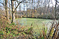
- Nomination: de:Ragöse near Sandkrug --Ralf Roletschek 20:52, 6 November 2011 (UTC)
- Review needed
-
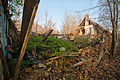
- Nomination: former farmer-house near Sandkrug --Ralf Roletschek 20:52, 6 November 2011 (UTC)
- Review needed
-

- Nomination: Milestone near Sandkrug --Ralf Roletschek 20:52, 6 November 2011 (UTC)
- Review needed
-

- Nomination: cemetery, war memorial Sandkrug --Ralf Roletschek 20:52, 6 November 2011 (UTC)
- Review needed
-
- Nomination: Muscari longipes --Gidip 20:27, 6 November 2011 (UTC)
- Review needed
-

- Nomination: Tarragona beach --Vitold Muratov 22:15, 6 November 2011 (UTC)
- Review needed
-
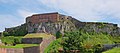
- Nomination The castle of Belfort, France. --ComputerHotline 18:33, 6 November 2011 (UTC)
- Promotion Very good.--Jebulon 16:17, 12 November 2011 (UTC)
-

- Nomination: Inside the castle of Belfort, France. --ComputerHotline 18:33, 6 November 2011 (UTC)
- Review needed
-
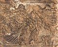
- Nomination: Relief in Baalbek. --Eusebius 16:56, 6 November 2011 (UTC)
- Review needed
-
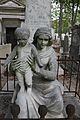
- Nomination: Jean Simon Billout's tombstone in Père Lachaise Cemetery, in Paris. --~Pyb 21:51, 5 November 2011 (UTC)
- Review C'est le "Garnier" de l'Opéra, derrière ?--Jebulon 22:47, 5 November 2011 (UTC) Non, Garnier est enterré au cimtière du Montparnasse ~Pyb 22:55, 5 November 2011 (UTC). Merci.--Jebulon 14:37, 6 November 2011 (UTC)
-

-
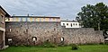
-

-

-

-

- Nomination Carpentras, old hospital stairs -- Véronique PAGNIER 17:01, 4 November 2011 (UTC)
- Decline Oppose Blurry, and aberration of perspective. --Archaeodontosaurus 13:49, 12 November 2011 (UTC)
-

- Nomination Nishava River in Nish. --MrPanyGoff 15:50, 4 November 2011 (UTC)
- Promotion Good to me--Jebulon 16:12, 12 November 2011 (UTC)
-

- Nomination Zeppelin-Sennebogen excavator in Germany --High Contrast 15:24, 4 November 2011 (UTC)
- Decline Disturbing background for me (too much deep of field and/or bad compo for the background). --Léna 00:17, 13 November 2011 (UTC)
-
- Nomination Cryptographic slide rule table used by the Swiss Army between 1949 and 1973 for frontline tactical communications. Cryptography collection of the Swiss Army headquarters. -- Rama 13:25, 4 November 2011 (UTC)
- Promotion Support --Archaeodontosaurus 13:46, 12 November 2011 (UTC)
-

- Nomination Nish University. --MrPanyGoff 13:17, 4 November 2011 (UTC)
- Promotion Support --Archaeodontosaurus 13:44, 12 November 2011 (UTC)
-

- Nomination Malta, Marsaxlokk, harbour --Berthold Werner 12:07, 4 November 2011 (UTC)
- Decline Sky a little noisy, nice sky/water equilibrium but disturbing parts on the left and the right. --Léna 00:17, 13 November 2011 (UTC)
-

-

-

- Nomination The Ascension of Jesus Church Tower in Botevgrad. --MrPanyGoff 11:15, 9 November 2011 (UTC)
- Promotion Good quality. --Andrei Stroe 12:13, 9 November 2011 (UTC)
-

- Nomination Wieden: All Saints Church --Taxiarchos228 10:40, 9 November 2011 (UTC)
- Promotion The front wall seems a bit overexposed, but no detail is lost apparently. --Andrei Stroe 12:13, 9 November 2011 (UTC)
-

- Nomination Cap Ferrat, Building an the entrance of the garden of the Villa Ephrussi de Rothschild --Berthold Werner 08:38, 9 November 2011 (UTC)
- Promotion Good quality. --Andrei Stroe 12:13, 9 November 2011 (UTC)
-

- Nomination Fragment of the Holy Trinity Cathedral in Niš. --MrPanyGoff 07:44, 9 November 2011 (UTC)
- Promotion Good quality. --Andrei Stroe 12:13, 9 November 2011 (UTC)
-
- Nomination Berguddens fyrplats on Holmön, Sweden, minutes before a rain hits it. Jopparn 17:37, 8 November 2011 (UTC)
- Decline CommentDark image --Véronique PAGNIER 12:02, 9 November 2011 (UTC)
-

- Nomination Kardovsky manor, outbuilding -- PereslavlFoto 10:42, 8 November 2011 (UTC)
- Promotion How russian ! Maybe a bit soft, but QI--Jebulon 17:14, 8 November 2011 (UTC)--Russian ? With so industrial-type fenster ? !--Vitold Muratov 10:55, 10 November 2011 (UTC)
-
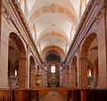
- Nomination Inside the cathedral Saint-Christophe of Belfort, France. --ComputerHotline 18:33, 6 November 2011 (UTC)
- Decline Lens distortion on the left and on the right --PierreSelim 19:14, 9 November 2011 (UTC)
-

- Nomination: 2nd try for this golden clematis in autumn, previously unassessed.--Jebulon 23:49, 3 November 2011 (UTC)
- Review needed
-

- Nomination: Plaque on a vintage BTG-tractor. --High Contrast 23:43, 3 November 2011 (UTC)
- Review needed
-

- Nomination: An old forge bellows--Jebulon 23:08, 3 November 2011 (UTC)
- Review needed
-
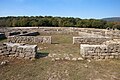
- Nomination: Aquis Querquennis, roman castra at Os Baños, Bande (Ourense, Galiza).--Lmbuga 21:09, 3 November 2011 (UTC)
- Review needed
-

- Nomination: Tractor parade in Aidenbach --High Contrast 19:21, 3 November 2011 (UTC)
- Review needed
-

- Nomination: Pt100 Resistor --Harke 18:47, 3 November 2011 (UTC)
- Review needed
-

-

- Nomination: Okhotsk Cultural Exchange Center in Abashiri --663highland 14:21, 3 November 2011 (UTC)
- Review Needs a very little perspective correction IMO--Lmbuga 21:45, 3 November 2011 (UTC)
-

- Nomination: Okhotsk Cultural Exchange Center in Abashiri --663highland 14:21, 3 November 2011 (UTC)
- Review The image needs perspective correction. chromatic aberrations--Lmbuga 21:39, 3 November 2011 (UTC)
-
- Nomination: Kobe Biennale 2011 --663highland 14:21, 3 November 2011 (UTC)
- Review needed
-

- Nomination: A headshot of a polar bear à Quebec City's Aquarium du Québec, in Canada --Letartean 14:11, 3 November 2011 (UTC)
- Review needed
-

- Nomination: Cherry picker, Paris. --Coyau 03:44, 28 October 2011 (UTC)
- Review Can you explain what distinguishes these three images of each other? The same exposure, same scene, same aperture, taken at the same time, etc. --Ankara 09:14, 3 November 2011 (UTC)
Maybe I should have uploaded only one, but I couldn't choose which (and same with nominations I suppose). --Coyau 03:46, 4 November 2011 (UTC)
-

- Nomination Montréal: Saint Joseph's Oratory of Mount-Royal --Taxiarchos228 07:53, 11 November 2011 (UTC)
- Promotion Mes oui! --Saffron Blaze 09:49, 11 November 2011 (UTC)
-

- Nomination Montréal: Statue in front of Saint Joseph's Oratory of Mount-Royal --Taxiarchos228 07:53, 11 November 2011 (UTC)
- Promotion Good quality.--ArildV 11:50, 11 November 2011 (UTC)
-

- Nomination Crocosmia — Steven Pavlov 20:36, 10 November 2011 (UTC)
- Decline There is not enough DoF, but more important the background with the same colour as the foreground makes it hard to see it. Mvg, Basvb 21:34, 10 November 2011 (UTC)
-

- Nomination Football -- Ludo29 14:28, 10 November 2011 (UTC)
- Promotion good action photograph --Mbdortmund 02:39, 11 November 2011 (UTC)
-

- Nomination Alexander Nevsky Cathedral in Sofia. --MrPanyGoff 13:59, 10 November 2011 (UTC)
- Promotion Good quality. --Taxiarchos228 14:24, 10 November 2011 (UTC)
-

- Nomination Pagode at the Garden of Bagatelle in Paris --Moonik 12:02, 10 November 2011 (UTC)
- Promotion good picture --Taxiarchos228 14:26, 10 November 2011 (UTC)
-

- Nomination View from Oleviste Church --WikedKentaur 10:49, 10 November 2011 (UTC)
- Promotion Good quality. --Taxiarchos228 14:26, 10 November 2011 (UTC)
-
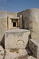
- Nomination Malta, Tarxien temples, altar. --Berthold Werner 09:38, 10 November 2011 (UTC)
- Promotion Good quality.--ArildV 16:17, 10 November 2011 (UTC)
-

- Nomination The central military club in Sofia. --MrPanyGoff 06:31, 10 November 2011 (UTC) Good quality.--ArildV 13:26, 10 November 2011 (UTC)
- Promotion
-

- Nomination Saint-Nicolas church on sunday on Vlieland - Basvb 16:05, 9 November 2011 (UTC)
- Promotion good and nice --Albertus teolog 23:11, 10 November 2011 (UTC)
-

- Nomination Muggenbrunn: Saint Cornelius Church, founding plate --Taxiarchos228 10:35, 9 November 2011 (UTC)
- Promotion Good quality.--ArildV 16:22, 10 November 2011 (UTC)
-

- Nomination Fireworks for opening the Three Countries Bridge --Taxiarchos228 13:26, 8 November 2011 (UTC)
- Promotion Good IMO. Nice composition. --ArildV 15:54, 10 November 2011 (UTC)
-
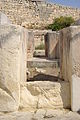
- Nomination Malta, part of tarxien temples --Berthold Werner 11:49, 7 November 2011 (UTC)
- Promotion Good quality.--ArildV 16:25, 10 November 2011 (UTC)
-

- Nomination: Volcanic layers at Pico de Badama, Gran Canaria --Llez 09:44, 5 November 2011 (UTC)
- Review needed
-

- Nomination: Śląsk Song and Dance Ensemble - dancers --Przykuta 08:44, 5 November 2011 (UTC)
- Review needed
-

- Nomination: Śląsk Song and Dance Ensemble - dancers --Przykuta 08:44, 5 November 2011 (UTC)
- Review needed
-

- Nomination: Śląsk Song and Dance Ensemble - singer --Przykuta 08:44, 5 November 2011 (UTC)
- Review needed
-

- Nomination: Śląsk Song and Dance Ensemble - singer --Przykuta 08:44, 5 November 2011 (UTC)
- Review needed
-

- Nomination: Śląsk Song and Dance Ensemble - choir --Przykuta 08:44, 5 November 2011 (UTC)
- Review needed
-

- Nomination: Śląsk Song and Dance Ensemble - dancer --Przykuta 08:44, 5 November 2011 (UTC)
- Review needed
-

- Nomination: Toronto: Skyline from Toronto Island --Taxiarchos228 08:30, 5 November 2011 (UTC)
- Review needed
-

- Nomination: Castle in Nowy Wiśnicz, Poland --Pudelek 23:22, 4 November 2011 (UTC)
- Review needed
-

-

-

- Nomination Whirlpool in a slowly rotating cylinder of water, about 2 m high with a diameter of about 70 cm. Found at Ökopark Hartberg, Styria. --Herzi Pinki 14:55, 1 November 2011 (UTC)
- Decline It seems unsharp. Mvg, Basvb 15:29, 9 November 2011 (UTC) Comment it is unsharp, water in motion, the structure is interesting. --Herzi Pinki 19:24, 10 November 2011 (UTC)
-

- Nomination: CHOGM protest --Gnangarra 13:17, 29 October 2011 (UTC)
Lots of disturbing elements on this one. I'd crop out the tree branch, the top of the street lamp and the signpost at the right (maybe like that). -- Rama 14:56, 4 November 2011 (UTC) cropped, with a lsight rotation to strighten background verticles Gnangarra 09:49, 5 November 2011 (UTC) - Review needed
- Nomination: CHOGM protest --Gnangarra 13:17, 29 October 2011 (UTC)
-

- Nomination: CHOGM protester --Gnangarra 13:17, 29 October 2011 (UTC)
I've got mixed feelings on this one. The diagonal handling of the camera works just nicely here. On the other side, it's a bit soft and it would seem that the focus is on the woman chatting on the phone, which does not seem to be the main subject, from the composition (it'd rather be the had-wearing woman). Also, we have very different attitudes and focuses of attention from these people, so it's a bit hard to tell what impression the crowd is convoying. Rama 15:03, 4 November 2011 (UTC) alternative crop here but people being disjointed and unfocused was the very essence of the march Gnangarra 10:03, 5 November 2011 (UTC) - Review needed
- Nomination: CHOGM protester --Gnangarra 13:17, 29 October 2011 (UTC)
-

- Nomination Abandoned ZiL-157. --MrPanyGoff 09:59, 9 November 2011 (UTC)
- Promotion Good quality. --Taxiarchos228 10:08, 9 November 2011 (UTC)
-
- Nomination Araschnia levana --WikedKentaur 19:07, 8 November 2011 (UTC)
- Decline Nice shot, composition and detail, but unfortunately your camera is not up to the usual standards here: the image is very noisy and has a yellow color cast. --Quartl 05:27, 9 November 2011 (UTC)
-

- Nomination Bruchsal, castle courtyard , 5 pictures stitched --Brackenheim 17:35, 8 November 2011 (UTC)
- Decline Nice job on the sitching, however the building is quite distorted and the ground appears "wobbly". This should be easy to fix, if you are using Hugin for the panorama, you could add some horizontal / vertical guide lines to help the software straighten the building. --D4m1en 18:11, 8 November 2011 (UTC)
-

-

- Nomination Steinen-Endenburg: Protestant Church --Taxiarchos228 13:26, 8 November 2011 (UTC)
- Promotion Meets the criteria, imo.--MrPanyGoff 21:01, 8 November 2011 (UTC)
-

- Nomination Steinen-Endenburg: Protestant Church --Taxiarchos228 13:26, 8 November 2011 (UTC)
- Promotion Meets the criteria, imo.--MrPanyGoff 21:01, 8 November 2011 (UTC)
-

- Nomination Head of Britannicus. --M0tty 08:05, 8 November 2011 (UTC)
- Promotion Good, even with this high resolution. For a better composition, it needs maybe a crop above because of too much empty space. IMO, try to have the same distance between ears and edge, and between top of head and edge.--Jebulon 16:46, 8 November 2011 (UTC)
-

-
- Nomination Milena performing at „Flower for Gosho Fest 2011“. --MrPanyGoff 13:38, 7 November 2011 (UTC)
- Promotion Good composition and sharpness. A little lack of contrast and the left arm is slightly overexposed, but it may be a QI IMO. --Vassil 22:33, 8 November 2011 (UTC)
-
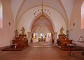
- Nomination Inside of Église de Brasse of Belfort, France. --ComputerHotline 18:40, 6 November 2011 (UTC)
- Promotion Meets the criteria, imo.--MrPanyGoff 21:13, 8 November 2011 (UTC)
-

-

- Nomination Dormer window of the Palais de Justice, Paris. --Coyau 14:21, 5 November 2011 (UTC)
- Promotion Meets the criteria, imo.--MrPanyGoff 21:17, 8 November 2011 (UTC)
-
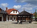
- Nomination Galician market square in Skansen, Nowy Sącz --Pudelek 23:22, 4 November 2011 (UTC)
- Promotion Meets the criteria, imo.--MrPanyGoff 21:22, 8 November 2011 (UTC)
-

- Nomination Trier, Palmatiusstraße 3 --Berthold Werner 17:20, 3 November 2011 (UTC)
- Promotion Meets the criteria, imo.--MrPanyGoff 21:26, 8 November 2011 (UTC)
-

- Nomination: Wehr: Saint Martin Church, entrance --Taxiarchos228 09:23, 3 November 2011 (UTC)
- Review needed
-
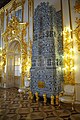
- Nomination: Interiors of Catherine Palace, Tsarskoye Selo --Aleks G 11:17, 3 November 2011 (UTC)
- Review needed
-

- Nomination: typewriter Famos, front view. --DerGraueWolf 21:37, 2 November 2011 (UTC)
- Review needed
-

- Nomination: Forage Kochia (Bassia prostrata) stem and leaves. --Le.Loup.Gris 21:04, 2 November 2011 (UTC)
- Review needed
-

- Nomination: Puddling in Polyommatus coridon. --Le.Loup.Gris 21:04, 2 November 2011 (UTC)
- Review needed
-

- Nomination: Eberswalde Hauptbahnhof --Ralf Roletschek 18:03, 2 November 2011 (UTC)
- Review needed
-

- Nomination: Details of the roof of "Ecole Militaire" under sunset, Paris.--Jebulon 15:24, 2 November 2011 (UTC)
- Review needed
-

- Nomination: Sunset over Ecole Militaire.--Jebulon 14:55, 2 November 2011 (UTC)
- Review needed
-

- Nomination: Two views of a Cryptophon, a device to scramble radio communications, showing the panel that hides the day key in th open and closed positions. -- Rama 14:25, 2 November 2011 (UTC)
- Review needed
-

- Nomination: Wenceslas Square in Prague --Ralf Roletschek 13:44, 2 November 2011 (UTC)
- Review needed
-

- Nomination: Tram T3R stanice Národní třída --Ralf Roletschek 13:44, 2 November 2011 (UTC)
- Review needed
-

- Nomination: Tram stanice Pražský hrad --Ralf Roletschek 13:44, 2 November 2011 (UTC)
- Review needed
-

- Nomination: Underground galleries of the fort de Roppe, Roppe, France. --ComputerHotline 13:06, 2 November 2011 (UTC)
- Review needed
-

- Nomination: Underground galleries of the fort de Roppe, Roppe, France. --ComputerHotline 13:06, 2 November 2011 (UTC)
- Review needed
-
- Nomination: Underground galleries of the fort de Roppe, Roppe, France. --ComputerHotline 13:06, 2 November 2011 (UTC)
- Review needed
-

- Nomination: Wash house of the fort de Roppe, Roppe, France. --ComputerHotline 13:06, 2 November 2011 (UTC)
- Review needed
-
- Nomination Switchgrass, Panicum virgatum, bush with seeds, Jardin des Plantes, Paris.--Jebulon 17:38, 1 November 2011 (UTC)
- Promotion Good quality --WhiteWriter 11:21, 9 November 2011 (UTC)
-

- Nomination Pirot Town Hall. --MrPanyGoff 12:38, 1 November 2011 (UTC)
- Promotion Good quality --WhiteWriter 11:21, 9 November 2011 (UTC)
-

- Nomination Southeastern walls of the Pirot Fortress. --MrPanyGoff 10:36, 1 November 2011 (UTC)
- Promotion Good quality --WhiteWriter 11:21, 9 November 2011 (UTC)
-

-
- Nomination In an underground gunpowder room of the fort d'Arches, Pouxeux, France. --ComputerHotline 19:41, 31 October 2011 (UTC)
- Promotion Good quality. --Mbdortmund 20:13, 8 November 2011 (UTC)
-

- Nomination View of the town of Dimitrovgrad, Serbia. --MrPanyGoff 16:42, 31 October 2011 (UTC)
- Promotion Good quality. --WhiteWriter 11:19, 9 November 2011 (UTC)
-
- Nomination Vox V251 guitorgan. -- Rama 17:37, 24 October 2011 (UTC)
- Decline Il y a un "trait" noir de découpe autour de l'objet (pas assez net, je le crains...), visible même sur la miniature. --Jebulon 17:05, 27 October 2011 (UTC)
J'ai enboyé une version sans le trait, est-ce que tu as essayé en vidant ton cache ? Pour le reste, décidément, je n'arrive à rien sans ouvrir les vitrines et installer un trépied... Rama 07:23, 29 October 2011 (UTC) J'ai beau purger...--Jebulon 18:09, 5 November 2011 (UTC)
Pour citer une phrase historique de l'histoire de l'informatique, « chez moi ça marche »... Rama 07:38, 6 November 2011 (UTC)
Je le vois également et j'ai ouvert la photo pour la première fois à l'instant. C'est un trait qui passe à bonne distance des contours de la guitare.--Pline 16:03, 6 November 2011 (UTC)
* Sorry, but noisy in full solution, CA, mask not so good --Mbdortmund 20:03, 8 November 2011 (UTC)
-
- Nomination Land Forces Command Staff in Niš. --MrPanyGoff 09:03, 8 November 2011 (UTC)
- Promotion Good quality. --Berthold Werner 10:37, 8 November 2011 (UTC)
-
-

-

-

-

- Nomination The summit of the "Bayerischer Plöckenstein" --High Contrast 20:12, 7 November 2011 (UTC)
- Promotion I should have prefered a less centered composition, but good quality, QI IMO. --Vassil 21:44, 7 November 2011 (UTC)
-

- Nomination Hafendrehbrücke in Krefeld-Linn --Carschten 19:09, 7 November 2011 (UTC)
- Promotion Good quality. --Taxiarchos228 19:50, 7 November 2011 (UTC)
-
- Nomination Portal of the Catholic church St. Josef in Krefeld-Traar --Carschten 18:13, 7 November 2011 (UTC)
- Promotion Good quality. --Taxiarchos228 19:50, 7 November 2011 (UTC)
-

-

- Nomination Persian Ironwood Tree (Parrotia persica) in Domaine de Mariemont, Belgium-- Jean-Pol GRANDMONT 15:31, 7 November 2011 (UTC)
- Promotion Good quality. --Taxiarchos228 19:50, 7 November 2011 (UTC)
-

- Nomination The pond of the "Longue Queue" - Domaine Solvay in La Hulpe, Belgium.-- Jean-Pol GRANDMONT 15:31, 7 November 2011 (UTC)
- Promotion Nice--Lmbuga 01:25, 8 November 2011 (UTC)
-

- Nomination For equal opportunity: Virgin Mary, relief by Martin Vinazer (* 1674 in St. Ulrich in Gröden; † 1744) --Wolfgang Moroder 13:00, 7 November 2011 (UTC)
- Promotion for me QI. --Alchemist-hp 20:54, 7 November 2011 (UTC)
-

-
-

-

-

- Nomination Ara at the "Bird-Park" in Brasil --JonnyBrazil 08:01, 7 November 2011 (UTC)
- Decline Bad light (flash, I guess) and the attitude of the ara is not really interesting (I mean, we don't really see it correctly even if the behaviour is interesting) --TwoWings 20:28, 7 November 2011 (UTC)
-

-

- Nomination Niš Fortress. --MrPanyGoff 07:39, 7 November 2011 (UTC)
- Promotion Good quality. --Vassil 22:06, 7 November 2011 (UTC)
-
- Nomination de:Ragöse near Sandkrug --Ralf Roletschek 20:52, 6 November 2011 (UTC)
- Promotion Poésie d'automne, nice. Maybe lack of contrast, but maybe the light was so... QI in my opinion--Jebulon 17:56, 7 November 2011 (UTC)
-

-
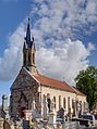
- Nomination Église de Brasse of Belfort, France. --ComputerHotline 18:40, 6 November 2011 (UTC)
- Promotion Belle qualité. (SVP, pensez à donner un titre descriptif à vos photos.) --Vassil 22:26, 7 November 2011 (UTC)
-
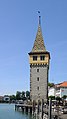
- Nomination Lindau: Mang tower at harbour --Taxiarchos228 11:43, 6 November 2011 (UTC)
- Promotion Nice picture but tilted/distorted clockwise --Mbdortmund 16:58, 6 November 2011 (UTC)
I don't think so and have measured the verticals, they are straight, please have a look again. --Taxiarchos228 17:01, 6 November 2011 (UTC)Agree with nominator, looks good to me, and QI.--Jebulon 17:50, 7 November 2011 (UTC)
-

- Nomination Lindau: New lighthouse --Taxiarchos228 11:43, 6 November 2011 (UTC)
- Promotion Maybe a bit "less good" than the other one of the same subject, but it is a QI too, nevertheless.--Jebulon 17:50, 7 November 2011 (UTC)
-
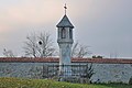
- Nomination Lichtsäule (wayside shrine) at Pfarrkirchen bei Bad Hall by Isiwal --Herzi Pinki 23:25, 5 November 2011 (UTC)
- Promotion very nice --Pudelek 22:06, 7 November 2011 (UTC)
-

- Nomination Knyaz Milosh street in Pirot. --MrPanyGoff 07:20, 4 November 2011 (UTC)
- Promotion To me, the image can be QI, but the left vertical lines aren't stright--Lmbuga 21:32, 4 November 2011 (UTC)
Done I hope that I understood your remark and have done some correction.--MrPanyGoff 11:00, 6 November 2011 (UTC)
QI to me--Lmbuga 18:51, 7 November 2011 (UTC)
-
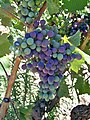
- Nomination Grappe veraison. --Véronique PAGNIER 05:59, 4 November 2011 (UTC)
- Decline Sorry, unsharp.--Jebulon 10:22, 8 November 2011 (UTC)
-

- Nomination Gigabit Switch --Harke 18:44, 3 November 2011 (UTC)
- Decline distorted. --Alchemist-hp 07:30, 8 November 2011 (UTC)
-

- Nomination: Pedagogic school in Pirot. --MrPanyGoff 10:50, 2 November 2011 (UTC)
- Review needed
-

- Nomination: Toronto: street signs at Yonge Street --Taxiarchos228 10:01, 2 November 2011 (UTC)
- Review needed
-
- Nomination Lörrach-Haagen: distribution substations (build 1951) --Taxiarchos228 10:01, 2 November 2011 (UTC)
- Decline While the composition is extremely well-balanced, and the image is crisp and well-focussed, unfortunately the darkness of the trees on the right really stands out in a bad way. --Specious 22:37, 7 November 2011 (UTC)
-

- Nomination Lörrach: Vally Wiese bridge (Wiesentalbrücke), founding plate --Taxiarchos228 10:01, 2 November 2011 (UTC)
- Promotion Unusual and strange, but nice and good.--Jebulon 17:40, 7 November 2011 (UTC)
-

- Nomination: Ecole Militaire, from Champ-de-Mars, Paris.--Jebulon 10:04, 2 November 2011 (UTC)
- Review needed
-

- Nomination: female syrphid fly (Sphaerophoria scripta) -- Alvesgaspar 23:52, 1 November 2011 (UTC)
- Review needed
-

- Nomination: Oborskis' mansion in Mielec --Kroton 19:01, 1 November 2011 (UTC)
- Review needed
-

- Nomination: Maserati Quattroporte, front view --Maksa 18:42, 1 November 2011 (UTC)
- Review needed
-

- Nomination: Maserati Quattroporte, rear-side view --Maksa 18:42, 1 November 2011 (UTC)
- Review needed
-

- Nomination: Fringed Water-Lily, Nymphoides peltata, Jardin des Plantes de Paris.--Jebulon 18:08, 1 November 2011 (UTC)
- Review needed
-

- Nomination Halifax Town Clock --Taxiarchos228 14:38, 1 November 2011 (UTC)
- Promotion The red bus is a bit intrusive, but QI nevertheless.--Jebulon 10:20, 8 November 2011 (UTC)
-

- Nomination Rheinfelden: Pulpit in Gallus Church --Taxiarchos228 14:38, 1 November 2011 (UTC)
- Decline Unsharp.--Jebulon 09:42, 8 November 2011 (UTC)
-
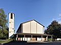
- Nomination: The Christ Church in Lörrach --Taxiarchos228 14:38, 1 November 2011 (UTC)
- Review needed
-

- Nomination: Metro Praha #2 --Ralf Roletschek 13:50, 1 November 2011 (UTC)
- Review needed
-

- Nomination: Metro in Prague; station Malostranska --Ralf Roletschek 13:50, 1 November 2011 (UTC)
- Review needed
-

- Nomination: Metro in Prague; station Malostranska --Ralf Roletschek 13:50, 1 November 2011 (UTC)
- Review needed
-

-
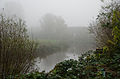
- Nomination: Morning fog in Neuhaus (Oste), near the North Sea --Ralf Roletschek 12:21, 1 November 2011 (UTC)
- Review needed
-
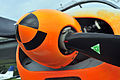
- Nomination: part of a propeller Dornier Do-27 --Ralf Roletschek 12:21, 1 November 2011 (UTC)
- Review needed
-

- Nomination: Detail Jaguar S-Type --Ralf Roletschek 12:21, 1 November 2011 (UTC)
- Review needed
-

- Nomination: Calocedrus decurrens, cultivar. Dompierre-sur-mer, France.--Jebulon 12:16, 1 November 2011 (UTC)
- Review needed
-

- Nomination Inside the fort d'Arches, Pouxeux, France. --ComputerHotline 09:09, 1 November 2011 (UTC)
- Promotion Good quality. --Vassil 22:36, 7 November 2011 (UTC)
-

- Nomination An underground gallerie of the fort d'Arches, Pouxeux, France. --ComputerHotline 19:41, 31 October 2011 (UTC)
- Promotion Good shot. Especially considering the challenge of the light in such places. --TwoWings 20:41, 7 November 2011 (UTC)
-

- Nomination: Toronto: ferry boat between Harbourfront and Billy Bishop Toronto City Airport --Taxiarchos228 06:43, 24 October 2011 (UTC)
- Review Overexposed sky at right--Jebulon 09:59, 24 October 2011 (UTC)
Bin mir bei dem Weißabgleich auch nicht ganz sicher (zu viel Magenta IMHO). Da sollte sich aus dem RAW ncoh mehr rausholen lassen. --Carschten 14:08, 31 October 2011 (UTC)
durch eine Glasscheibe fotografiert, daher schwierig aber ich versuche es noch mal --Taxiarchos228 14:41, 1 November 2011 (UTC)
-
- Nomination: Toronto: aerial view eastwards to harbour area from helicopter --Taxiarchos228 09:27, 23 October 2011 (UTC)
- Review Comment overexposed --Carschten 14:04, 23 October 2011 (UTC)
correct, improved now --Taxiarchos228 15:45, 23 October 2011 (UTC)
Much better now, but I'm not really convinced. Soft vignetting, strange blurry fields (see annotations), so-so sharpness and perspective distortions. I know and I recognise it's a shot taken from helicopter so I don't know if it can be a QI. Maybe someone of the others here can and will decide --Carschten 20:26, 29 October 2011 (UTC)
the little problems are a result of the curved heli cabine, but I think the worth and quality of this pictures should be enough for QI, aerial photos are always difficult --Taxiarchos228 14:43, 1 November 2011 (UTC)
-
![* Nomination Helsinki, Uspenski Cathedral and Stora Enso headquarter --Ralf Roletschek 14:19, 22 October 2011 (UTC) * Decline Comment Building falls to the right. The car hanging in on the left slightly disturbing. Again: file description inadequate, file name not very descriptive, and the endless copyright-notices.... --Elekhh 10:07, 27 October 2011 (UTC) the building no falls. and what the name and descr. has to do with the quality? --Ralf Roletschek 11:50, 1 November 2011 (UTC) Info maybe is time for you to read the QI criteria. For your convenience here an excerpt: "Quality images must [...] have a meaningful title and description." --Elekhh 04:07, 3 November 2011 (UTC) Comment the borders contain unfortunate elements that distract from the subject. Rama 14:44, 4 November 2011 (UTC)Per all above and no improvements--Jebulon 10:11, 8 November 2011 (UTC)](https://upload.wikimedia.org/wikipedia/commons/thumb/5/59/11-07-29-helsinki-by-RalfR-177.jpg/120px-11-07-29-helsinki-by-RalfR-177.jpg)
- Nomination Helsinki, Uspenski Cathedral and Stora Enso headquarter --Ralf Roletschek 14:19, 22 October 2011 (UTC)
- Decline Comment Building falls to the right. The car hanging in on the left slightly disturbing. Again: file description inadequate, file name not very descriptive, and the endless copyright-notices.... --Elekhh 10:07, 27 October 2011 (UTC) the building no falls. and what the name and descr. has to do with the quality? --Ralf Roletschek 11:50, 1 November 2011 (UTC) Info maybe is time for you to read the QI criteria. For your convenience here an excerpt: "Quality images must [...] have a meaningful title and description." --Elekhh 04:07, 3 November 2011 (UTC) Comment the borders contain unfortunate elements that distract from the subject. Rama 14:44, 4 November 2011 (UTC)Per all above and no improvements--Jebulon 10:11, 8 November 2011 (UTC)
-

- Nomination PCC Car #1006 of The Hague (the Netherlands), built in 1952 -- MJJR 22:01, 6 November 2011 (UTC)
- Promotion Good quality. --Taxiarchos228 22:03, 6 November 2011 (UTC)
-

- Nomination PCC Car #1006 of The Hague (the Netherlands), built in 1952: rear side -- MJJR 22:01, 6 November 2011 (UTC)
- Promotion Good quality. --Taxiarchos228 22:03, 6 November 2011 (UTC)
-

- Nomination Bolshoi Theatre --DmitriyGuryanov 20:36, 6 November 2011 (UTC)
- Promotion Good quality. --Ralf Roletschek 20:57, 6 November 2011 (UTC)
-

- Nomination Ambasador Hotel in Niš. --MrPanyGoff 20:30, 6 November 2011 (UTC)
- Promotion Good quality. --Taxiarchos228 07:52, 7 November 2011 (UTC)
-

- Nomination White Rhino by Gossipguy --Elekhh 20:12, 6 November 2011 (UTC)
- Promotion Good quality. --Taxiarchos228 07:53, 7 November 2011 (UTC)
-

- Nomination Pseudocordylus melanotus by Amada44 --Elekhh 20:12, 6 November 2011 (UTC)
- Promotion Like that, good quality --Herzi Pinki 20:27, 6 November 2011 (UTC)
-

- Nomination Ramenskoye. Trinity Church --Aleks G 23:48, 6 November 2011 (UTC)
- Promotion Good quality. --Taxiarchos228 08:18, 7 November 2011 (UTC)
-

- Nomination European beech forest alongside the pond of the "Longue Queue" - Domaine Solvay in La Hulpe, Belgium..-- Jean-Pol GRANDMONT 19:39, 6 November 2011 (UTC)
- Promotion Good quality. --Taxiarchos228 20:06, 6 November 2011 (UTC)
-

- Nomination Sweetgum (Liquidambar styraciflua) - Domaine Solvay in La Hulpe, Belgium.-- Jean-Pol GRANDMONT 19:39, 6 November 2011 (UTC)
- Promotion Good quality. --Taxiarchos228 20:06, 6 November 2011 (UTC)
-

- Nomination Caucasian Wing-Nut seeds (Pterocarya fraxinifolia) - Domaine Solvay, Belgium.-- Jean-Pol GRANDMONT 19:39, 6 November 2011 (UTC)
- Promotion Good quality. --Taxiarchos228 20:06, 6 November 2011 (UTC)
-
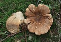
- Nomination Tapinella atrotomentosa --Holleday 18:01, 6 November 2011 (UTC)
- Promotion Sehr gut -- George Chernilevsky 19:59, 6 November 2011 (UTC)
-

- Nomination Meripilus giganteus --Holleday 18:00, 6 November 2011 (UTC)
- Promotion Gut -- George Chernilevsky 19:58, 6 November 2011 (UTC)
-

- Nomination Thelephora palmata --Holleday 17:58, 6 November 2011 (UTC)
- Promotion Gut -- George Chernilevsky 19:56, 6 November 2011 (UTC)
-

- Nomination Pholiota populnea --Holleday 17:57, 6 November 2011 (UTC)
- Promotion Sehr gut -- George Chernilevsky 19:54, 6 November 2011 (UTC)
-

- Nomination Cortinarius varius --Holleday 17:55, 6 November 2011 (UTC)
- Promotion Sehr gut -- George Chernilevsky 19:53, 6 November 2011 (UTC)
-
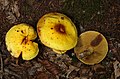
- Nomination Suillus grevillei --Holleday 17:47, 6 November 2011 (UTC)
- Promotion Gut -- George Chernilevsky 20:02, 6 November 2011 (UTC)
-

- Nomination Scots pine (Pinus sylvestris), detail under rain, Dordogne, France.--Jebulon 15:28, 6 November 2011 (UTC)
- Promotion QI for me -- Jean-Pol GRANDMONT 16:21, 6 November 2011 (UTC)
-

- Nomination Summersberg Castle in South Tyrol (Italy) --Haneburger 14:03, 6 November 2011 (UTC)
- Promotion Nice view and atmosphere --Mbdortmund 16:55, 6 November 2011 (UTC)
-

- Nomination Lindau: Entrance of harbour with lighthouse --Taxiarchos228 11:43, 6 November 2011 (UTC)
- Promotion Good quality. --Ralf Roletschek 21:02, 6 November 2011 (UTC)
-

- Nomination Bavarian Lion at the harborentrance of Lindau --Taxiarchos228 11:43, 6 November 2011 (UTC)
- Promotion Good quality. --Ralf Roletschek 21:02, 6 November 2011 (UTC)
-

- Nomination Bavarian Lion at the harborentrance of Lindau (detail) --Taxiarchos228 11:43, 6 November 2011 (UTC)
- Promotion Sehr gut -- George Chernilevsky 19:46, 6 November 2011 (UTC)
-

- Nomination Lindau: New lighthouse --Taxiarchos228 11:43, 6 November 2011 (UTC)
- Promotion QI for me. Nice light, proportion, etc. --TwoWings 19:51, 6 November 2011 (UTC)
-

- Nomination The Old Fountain in Niš. --MrPanyGoff 11:09, 6 November 2011 (UTC)
- Promotion Good quality. --Taxiarchos228 13:20, 6 November 2011 (UTC)
-

- Nomination Panoramic view of Puerto de Mogán, Gran Canaria --Llez 07:53, 6 November 2011 (UTC)
- Promotion Good quality. --Taxiarchos228 13:20, 6 November 2011 (UTC)
-

- Nomination Human skull of a boy - age unknown --High Contrast 01:47, 6 November 2011 (UTC)
- Promotion Good quality. --Taxiarchos228 13:20, 6 November 2011 (UTC)
-
- Nomination Observation tower in Upper Austria. --High Contrast 00:51, 6 November 2011 (UTC)
- Promotion Good quality. --Taxiarchos228 13:20, 6 November 2011 (UTC)
-

- Nomination Chess piece --Mbdortmund 00:31, 6 November 2011 (UTC)
- Promotion Good quality. --Taxiarchos228 13:17, 6 November 2011 (UTC)
-

- Nomination Main door at the left from the inside, Aquis Querquennis, roman castra at Os Baños, Bande (Ourense, Galiza).--Lmbuga 22:00, 5 November 2011 (UTC)
- Promotion There is a (very little) annotated dust spot in the sky, just above the cloud.--Jebulon 22:54, 5 November 2011 (UTC)
Done Thanks, Jebulon, good work: New version--Lmbuga 23:10, 5 November 2011 (UTC) QI now, no doubt.--Jebulon 14:41, 6 November 2011 (UTC)
-
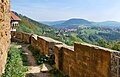
- Nomination View from the Hohenrechberg --Harke 17:32, 5 November 2011 (UTC)
- Promotion Good quality. --Taxiarchos228 13:17, 6 November 2011 (UTC)
-

- Nomination A pavilion of the Palais de Justice, Paris. --Coyau 14:21, 5 November 2011 (UTC)
- Promotion Good quality. --Mbdortmund 17:02, 6 November 2011 (UTC)
-

- Nomination Toledo Panorama --Vitold Muratov 14:45, 5 November 2011 (UTC)
- Decline It is a very pleasant picture at screen size, but the technical quality is not sufficient in my opinion: most of the panorama is tilted, many white facades are overexposed and the picture is not really sharp. --Eusebius 17:01, 6 November 2011 (UTC)
-
-
-

- Nomination Autumnal tree --Taxiarchos228 08:30, 5 November 2011 (UTC)
- Promotion Needs id. --Quartl 16:46, 5 November 2011 (UTC) QI for me now -- Jean-Pol GRANDMONT 16:33, 6 November 2011 (UTC)
-

- Nomination "Sphinx Pocket Cryptograph", 1930s. Cryptography collection of the Swiss Army headquarters. -- Rama 07:34, 5 November 2011 (UTC)
- Promotion Good quality. --Mbdortmund 17:04, 6 November 2011 (UTC)
-

- Nomination Cathedral of Christ the Saviour, Moscow --Aleks G 00:18, 5 November 2011 (UTC)
- Promotion Exposure and cut out well done - отлично --Haneburger 14:19, 6 November 2011 (UTC)
-

- Nomination Fruits of Prunus stepposa. --Le.Loup.Gris 21:04, 2 November 2011 (UTC)
- Promotion QI for me--Holleday 18:10, 6 November 2011 (UTC)
-
-

- Nomination A female Marmelade Fly -- Alvesgaspar 23:40, 1 November 2011 (UTC)
- Promotion QI for me --Holleday 18:13, 6 November 2011 (UTC)
-

-

- Nomination: Special Drill bit --Brackenheim 10:14, 1 November 2011 (UTC)
- Review needed
-
- Nomination: Water well inside the fort d'Arches, Pouxeux, France. --ComputerHotline 09:09, 1 November 2011 (UTC)
- Review needed
-
- Nomination: Inside the fort d'Arches, Pouxeux, France. --ComputerHotline 09:09, 1 November 2011 (UTC)
- Review needed
-

- Nomination: A bedroom inside the fort d'Arches, Pouxeux, France. --ComputerHotline 09:09, 1 November 2011 (UTC)
- Review needed
-

- Nomination: Inside the fort d'Arches, Pouxeux, France. --ComputerHotline 09:09, 1 November 2011 (UTC)
- Review needed
-

- Nomination: Inside the fort d'Arches, Pouxeux, France. --ComputerHotline 09:09, 1 November 2011 (UTC)
- Review needed
-

- Nomination: Inside the fort d'Arches, Pouxeux, France. --ComputerHotline 09:09, 1 November 2011 (UTC)
- Review needed
-

- Nomination: Toronto: King's Landing Condominium (apartment buildings) --Taxiarchos228 07:11, 1 November 2011 (UTC)
- Review needed
-

- Nomination: Powerline towers in Lörrach --Taxiarchos228 07:11, 1 November 2011 (UTC)
- Review needed
-

- Nomination: Detail of the monument to Eugène Delacroix, by Dalou. The bust of the painter. Bronze. Jardin du Luxembourg, Paris.--Jebulon 00:32, 1 November 2011 (UTC)
- Review needed
-

-

-

- Nomination: In a Counterscarp batteries of the fort d'Arches, Pouxeux, France. --ComputerHotline 19:41, 31 October 2011 (UTC)
- Review needed
-

- Nomination: In a Counterscarp batteries of the fort d'Arches, Pouxeux, France. --ComputerHotline 19:41, 31 October 2011 (UTC)
- Review needed
-

-

- Nomination Malta, Marsaxlokk, church "Our lady of Pompei" --Berthold Werner 08:17, 6 November 2011 (UTC)
- Promotion Good.--Jebulon 11:38, 6 November 2011 (UTC)
-

-

- Nomination The Ox, figure of the Chinese Zodiac, 17th century. --Vassil 22:10, 5 November 2011 (UTC)
- Promotion Good quality. --Mbdortmund 00:39, 6 November 2011 (UTC)
-

-

- Nomination Château de Pignerolle. --Eusebius 21:48, 5 November 2011 (UTC)
- Promotion Lack of light maybe, but QI nevertheless--Jebulon 22:44, 5 November 2011 (UTC)
QI to me also,but the image needs a little perspective correction IMO--Lmbuga 22:48, 5 November 2011 (UTC)
Error, sorry, no problem--Lmbuga 22:51, 5 November 2011 (UTC)
-

- Nomination Lufthansa Flight Training Center in Frankfurt/Germany --NorbertNagel 19:14, 5 November 2011 (UTC)
- Decline Aim lower. Use a tripod and make sure it is steady and horizontal. Watch out for chromatic aberration. --Specious 00:29, 6 November 2011 (UTC)
-

- Nomination Puppet Theatre in Wrocław --Kroton 18:45, 5 November 2011 (UTC)
- Promotion Good quality. Could even be better with a bit more contrast. --Mbdortmund 00:42, 6 November 2011 (UTC)
-

-

- Nomination Porphyromma speciosa --Archaeodontosaurus 18:26, 5 November 2011 (UTC)
- Promotion Really nice, and very good job.--Jebulon 22:49, 5 November 2011 (UTC)
-

-

-

- Nomination General Joseph Gallieni, by Roybet, detail. Scan of a picture from "L'Illustration" , 1930.--Jebulon 17:20, 5 November 2011 (UTC)
- Promotion Support QI & Useful --Archaeodontosaurus 18:24, 5 November 2011 (UTC)
-

-

-

- Nomination building of the first theater in Avignon -- Véronique PAGNIER 14:46, 5 November 2011 (UTC)
- Decline Perspective distortion and perhaps too tight (with the perspective correction)--Lmbuga 22:41, 5 November 2011 (UTC)
-
- Nomination A door of the Palais de Justice, Paris. --Coyau 14:21, 5 November 2011 (UTC)
- Promotion Good quality. --Mbdortmund 15:25, 5 November 2011 (UTC)
-

- Nomination Malta, Megaliths at the temple of Tarxien --Berthold Werner 13:46, 5 November 2011 (UTC)
- Promotion Support QI & Useful --Archaeodontosaurus 18:31, 5 November 2011 (UTC)
-

- Nomination Hypericum libanoticum --Gidip 10:55, 5 November 2011 (UTC)
- Promotion Support QI & Useful --Archaeodontosaurus 18:32, 5 November 2011 (UTC)
-

- Nomination The NEMA, cryptographic machine used by the Swiss Army from 1947. Cryptography collection of the Swiss Army headquarters. -- Rama 10:42, 5 November 2011 (UTC)
- Promotion Good quality. --Mbdortmund 13:48, 5 November 2011 (UTC)
-

- Nomination The NEMA, cryptographic machine used by the Swiss Army from 1947. Cryptography collection of the Swiss Army headquarters. -- Rama 10:42, 5 November 2011 (UTC)
- Promotion Good quality. --Mbdortmund 13:48, 5 November 2011 (UTC)
-

- Nomination The NEMA, cryptographic machine used by the Swiss Army from 1947. Cryptography collection of the Swiss Army headquarters. -- Rama 10:42, 5 November 2011 (UTC)
- Promotion Good quality. --Mbdortmund 13:44, 5 November 2011 (UTC)
-

- Nomination The NEMA, cryptographic machine used by the Swiss Army from 1947. Cryptography collection of the Swiss Army headquarters. -- Rama 10:42, 5 November 2011 (UTC)
- Promotion Good quality. --Mbdortmund 13:48, 5 November 2011 (UTC)
-

- Nomination A36 motorway near Brognard, France, in night. --ComputerHotline 17:07, 5 November 2011 (UTC)
- Promotion Good quality. --Mbdortmund 00:45, 6 November 2011 (UTC)
-

- Nomination Kingston: Town hall at night --Taxiarchos228 09:11, 5 November 2011 (UTC)
- Decline Very beautiful, but it's also got problems. A lot of blooming around the light sources, especially near the sides. Some artifacts left of the left-most tower? A lot of noise, but it's a night-time shot. --Specious 15:22, 5 November 2011 (UTC)
-

- Nomination Chapel in Częstochowa --Przykuta 22:21, 4 November 2011 (UTC)
- Decline distortion too sstrong --Mbdortmund 00:50, 6 November 2011 (UTC)
-
- Nomination Collegium Minus in Poznań --Przykuta 22:21, 4 November 2011 (UTC)
- Promotion Good quality. --Mbdortmund 01:12, 6 November 2011 (UTC)
-

- Nomination Arles town hall -- Véronique PAGNIER 16:54, 4 November 2011 (UTC)
- Promotion Awsome place, and difficult to photograph. QI for me. --Coyau 07:50, 6 November 2011 (UTC)
-

- Nomination Toronto Fire Aerial 312 --Taxiarchos228 21:23, 3 November 2011 (UTC)
- Promotion Good quality. --Ralf Roletschek 21:13, 4 November 2011 (UTC) Comment Noise! Check your ISO setting. --Specious 15:29, 5 November 2011 (UTC)
denoised now --Taxiarchos228 16:07, 5 November 2011 (UTC)
-

- Nomination Cucurbita moschata, cultivar. Jardin des Plantes, Paris.Anonymous, but not copyrighted decoration--Jebulon 17:22, 1 November 2011 (UTC)
- Promotion Good quality. --Mbdortmund 03:26, 6 November 2011 (UTC)
-

- Nomination Hagelin CD-57 cryptographic machine -- Rama 15:17, 1 November 2011 (UTC)
- Promotion Good quality. --Mbdortmund 03:27, 6 November 2011 (UTC)
-

- Nomination Hagelin CD-57 cryptographic machine -- Rama 15:17, 1 November 2011 (UTC)
- Promotion Good quality. --Mbdortmund 03:27, 6 November 2011 (UTC)
-
- Nomination Eugène Delacroix, bust by Alfred Lepère, Musée du Luxembourg.--Jebulon 12:46, 1 November 2011 (UTC)
- Promotion Maybe subject is a bit small, but good quality. --Coyau 15:25, 5 November 2011 (UTC)
-

- Nomination Toronto: Mainpod of CN Tower --Taxiarchos228 07:13, 1 November 2011 (UTC)
- Promotion very good --Mbdortmund 03:24, 6 November 2011 (UTC)
-
- Nomination ... Once again, I know, but... this one is not so bad, I hope.--Jebulon 22:51, 31 October 2011 (UTC)
- Promotion The bus for pictures of this tower normally stops on the other side! --Mbdortmund 03:22, 6 November 2011 (UTC)
-

- Nomination Gohhic windows of the cathedral of St. John the Baptist in Wrocław --Kroton 14:30, 31 October 2011 (UTC)
- Promotion Good quality. --Mbdortmund 03:33, 6 November 2011 (UTC)
-

- Nomination: Automobile light trails in Belfort. --ComputerHotline 21:04, 30 October 2011 (UTC)
- Review needed
-

- Nomination: Automobile light trails in Belfort. --ComputerHotline 21:04, 30 October 2011 (UTC)
- Review needed
-

- Nomination: The interior of the Church of Peace in Jawor --Kroton 18:38, 30 October 2011 (UTC)
- Review needed
-

- Nomination: Basilica of Saint Apostles Peter and Paul in Strzegom --Kroton 18:38, 30 October 2011 (UTC)
- Review needed
-
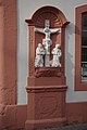
- Nomination Trier, Karl-Marx-Straße 48: „Im Herrgottchen“ --Berthold Werner 15:08, 30 October 2011 (UTC)
- Decline Sorry, it is not sharp enough (the upper third part), in my opinion--Jebulon 17:43, 5 November 2011 (UTC)
-

- Nomination Painting of St. Florian at castle Reitenau, Styria --Herzi Pinki 12:52, 30 October 2011 (UTC)
- Promotion Good.--Jebulon 17:52, 5 November 2011 (UTC)
-

- Nomination: The garden house of the monastery in Vorau, paintings by Johann Cyriak Hackhofer (~1720) --Herzi Pinki 12:52, 30 October 2011 (UTC)
- Review needed
-

- Nomination Bust of Ottokar Kernstock at the Volksschule in Wenigzell. --Herzi Pinki 12:52, 30 October 2011 (UTC)
- Promotion Good quality (issue with the high size, needs a rotation).--Jebulon 17:39, 5 November 2011 (UTC)
-
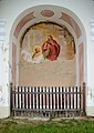
- Nomination Churchyard chapel at the cemetery church hl. Kreuz (Holy Cross), in Vorau. --Herzi Pinki 12:52, 30 October 2011 (UTC)
- Promotion Sharpness not perfect, but good for QI. Added in another category.--Jebulon 17:50, 5 November 2011 (UTC)
-

- Nomination Churchyard chapel at the cemetery church hl. Kreuz (Holy Cross), in Vorau. --Herzi Pinki 12:52, 30 October 2011 (UTC)
- Promotion Good for QI--Jebulon 17:50, 5 November 2011 (UTC)
-

- Nomination Sgraffito at Ottokar Kernstock Volksschule in Wenigzell. --Herzi Pinki 12:52, 30 October 2011 (UTC)
- Promotion Good. Hope not protected by copyright.--Jebulon 17:40, 5 November 2011 (UTC)
-

- Nomination: Flood protection dam at Waldbach, Styria. --Herzi Pinki 12:52, 30 October 2011 (UTC)
- Review needed
-

- Nomination: Sgraffito on the wall of the Hauptschule in Waldbach, Styria --Herzi Pinki 12:52, 30 October 2011 (UTC)
- Review needed
-

- Nomination: Memorial for Andreas Weißenbäck at St. Lorenzen am Wechsel, Styria. --Herzi Pinki 12:52, 30 October 2011 (UTC)
- Review needed
-

- Nomination: Detail of the statue, part of the fountain in front of the municipial office and the Raiffeisenbank at St. Lorenzen am Wechsel, Styria. --Herzi Pinki 12:52, 30 October 2011 (UTC)
- Review needed
-

- Nomination Memorial plaque for Ottokar Kernstock, at Festenburg, Styria. --Herzi Pinki 12:52, 30 October 2011 (UTC)
- Decline Sorry no, too noisy.--Jebulon 17:55, 5 November 2011 (UTC)
-

- Nomination Unknown Soldier memorial at Mönichwald. --Herzi Pinki 12:52, 30 October 2011 (UTC)
- Promotion Good.--Jebulon 17:59, 5 November 2011 (UTC)
-

-

-

- Nomination Central part of Circus Maximus and ruins of the Domus Augustana on Palatine Hill in Rome, Italy.-- Jean-Pol GRANDMONT 08:35, 29 October 2011 (UTC)
- Promotion Good to me. -- Rama 07:55, 6 November 2011 (UTC)
-

- Nomination Main buildings of the Bonne-Espérance Abbey in Vellereille-les-Brayeux, Belgium.-- Jean-Pol GRANDMONT 08:35, 29 October 2011 (UTC)
- Promotion Good to me. -- Rama 07:55, 6 November 2011 (UTC)
-
- Nomination A checker taxi in NYC --Pilettes 08:18, 29 October 2011 (UTC)
- Promotion What happened with the left wheel? Mvg, Basvb 12:00, 31 October 2011 (UTC)
Good to me. -- Rama 07:55, 6 November 2011 (UTC)
-
- Nomination Mill in Tubbergen, the Netherlands -- Basvb 20:55, 28 October 2011 (UTC)
- Promotion Looks a bit tilted to the right. --Quartl 16:57, 5 November 2011 (UTC)
Not a problem to me, could be like that in reality, and makes the photograph more dynamic. I'd promote if there's no objection. -- Rama 07:49, 6 November 2011 (UTC)
-

- Nomination An old house in the town of Varshets. --MrPanyGoff 15:13, 28 October 2011 (UTC)
- Promotion Good quality. --Vassil 16:19, 5 November 2011 (UTC)
-
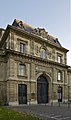
- Nomination Ecole Militaire, Paris, entry building "Artillery".--Jebulon 21:26, 26 October 2011 (UTC)
- Promotion I'm under the impression there is a slight barell distortion and more important a perspective problem (vertical lines are not, specialy on the right side). --Coyau 17:33, 3 November 2011 (UTC)Yes you are right, thanks. I'll rework this asap.--Jebulon 09:35, 4 November 2011 (UTC) Done new version uploaded--Jebulon 11:17, 5 November 2011 (UTC)
Better now. QI for me. --Coyau 13:04, 5 November 2011 (UTC)
-

- Nomination Apple MessagePad 100. On display at the Musée Bolo, EPFL, Lausanne. -- Rama 17:13, 26 October 2011 (UTC)
- Decline Rama, you usually take such excellent photos! How come the DOF is so horribly inadequate on a stationary object? Composition is nice. --Specious 07:32, 2 November 2011 (UTC)
Thank you, you make me blush. Very probably, the Newton is significantly smaller than the other computers, which entails that I had to come closer and with the same aperture, the DoF is much smaller. I'll go back and redo this one with focus stacking to ensure a better DoF, thank you for the input! Rama 14:22, 2 November 2011 (UTC) Et il y a des petits points-pixels rouges et bleus sur la partie noire de l'objet, ainsi que de la pixellisation grise en haut. Je crains que cette photo-ci ne soit pas "sauvable"... --Jebulon 18:06, 5 November 2011 (UTC)
-

- Nomination Rundāle Palace (Ruhental) - detail of dropped ceiling --Pudelek 17:06, 25 October 2011 (UTC)
- Promotion Are you sure about the White Balance ? I tried to ajust it with the reflection on the chandelier and I got something different. --Vassil 17:38, 25 October 2011 (UTC)I uploaded my edit, let's wait and see... --Vassil 20:08, 2 November 2011 (UTC) Yes Vassil, far much better IMO. Good job for QI--Jebulon 18:07, 5 November 2011 (UTC)
-

- Nomination A door at the mosque (now cathedral) of Cordoba, Spain.--Jebulon 23:55, 4 November 2011 (UTC)
- Promotion fine details --Mbdortmund 00:30, 5 November 2011 (UTC)
-

- Nomination Aquis Querquennis, roman castra at Os Baños, Bande (Ourense, Galiza).--Lmbuga 23:44, 4 November 2011 (UTC)
- Promotion Good quality. --Mbdortmund 00:32, 5 November 2011 (UTC)
-

-

- Nomination The Catholic kings (Ferdinand of Aragon and Isabel of Castile) with Christopher Columbus, statues in the garden of Alcazar of Cordoba, Spain.--Jebulon 23:31, 4 November 2011 (UTC)
- Promotion Comment There are some tiny noisy parts in the sky in full solution, easy to correct. --Mbdortmund 00:34, 5 November 2011 (UTC)You are right. Done I hope it is better now.--Jebulon 01:45, 5 November 2011 (UTC)
Good --Mbdortmund 11:43, 5 November 2011 (UTC)
-

-

- Nomination Terra sigillata. Aquis Querquennis - Galicia (Spain)--Lmbuga 23:02, 4 November 2011 (UTC)
- Promotion Interesting and good quality.--Jebulon 23:59, 4 November 2011 (UTC)
-

- Nomination chess pieces --Mbdortmund 21:56, 4 November 2011 (UTC)
- Promotion Old and horn made. Ehrwürdig und gut. QI --Jebulon 00:04, 5 November 2011 (UTC)
-

- Nomination chess clock --Mbdortmund 21:23, 4 November 2011 (UTC)
- Promotion ...Made in eastern "Democratic" Germany (Nostalgie ? remembers me the movie Good bye Lenin). Little perspective distortion above (not horizontal), QI nevertheless.--Jebulon 00:10, 5 November 2011 (UTC)
The chess table is leaning against the wall as a background, so here again reality is distorted... The GARDE-chess-clocks were really cheap but had a mechanical problem: If they were used for bullet-chess they were destroyed quickly... --Mbdortmund 00:23, 5 November 2011 (UTC)
-

-

-
- Nomination ~Cotes-du-Rhone bottle of Saint Maurice -- Véronique PAGNIER 17:48, 4 November 2011 (UTC)
- Promotion in vino veritas--Jebulon 23:05, 4 November 2011 (UTC)
-

- Nomination Orange-barred Sulphur --Archaeodontosaurus 16:56, 4 November 2011 (UTC)
- Promotion QI to me and usefull--Lmbuga 01:46, 5 November 2011 (UTC)
-

-

- Nomination Cryptographic slide rule used by the Swiss Army between 1914 and 1940. Cryptography collection of the Swiss Army headquarters. -- Rama 12:48, 4 November 2011 (UTC)
- Promotion Support QI & Useful --Archaeodontosaurus 18:01, 4 November 2011 (UTC)
-

- Nomination Cooperative State University Lörrach --Taxiarchos228 10:59, 4 November 2011 (UTC)
- Promotion QI to me--Lmbuga 21:35, 4 November 2011 (UTC)
-
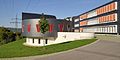
- Nomination Cooperative State University Lörrach --Taxiarchos228 10:59, 4 November 2011 (UTC)
- Promotion Nice composition, excellent lighting, and well executed! I like the birds too :) --Specious 12:18, 4 November 2011 (UTC)
-

- Nomination Toronto: Four Seasons Centre (concert hall and opera house) --Taxiarchos228 10:43, 4 November 2011 (UTC)
- Promotion QI to me--Lmbuga 21:29, 4 November 2011 (UTC)
-

-

- Nomination Terra sigillata. Aquis Querquennis, roman castra at Os Baños, Bande (Ourense, Galiza).--Lmbuga 21:53, 3 November 2011 (UTC)
- Promotion Good quality. --Ralf Roletschek 21:13, 4 November 2011 (UTC)
-

- Nomination Aquis Querquennis, roman castra at Os Baños, Bande (Ourense, Galiza).--Lmbuga 21:12, 3 November 2011 (UTC)
- Promotion Very good and useful.--Jebulon 23:38, 3 November 2011 (UTC)
Thanks. (es) Tus palabras sobre la foto han provocado que la haya visto de nuevo. Al verla, he observado unas ligeras, aunque considerables, aberraciones cromáticas. Las he corregido y he subido una nueva versión. Gracias--Lmbuga 21:19, 4 November 2011 (UTC)
-

-

- Nomination Another try for this previously (july 2010) unassessed picture of broadcasting vans in Paris.--Jebulon 16:28, 3 November 2011 (UTC)
- Promotion Support QI or me --Archaeodontosaurus 18:02, 4 November 2011 (UTC)
-
- Nomination Kia Rio hatchback. — Maksa 22:53, 2 November 2011 (UTC)
- Promotion Good quality. --Ralf Roletschek 21:51, 4 November 2011 (UTC)
-

- Nomination Church of the Nativity of Christ in Pirot. --MrPanyGoff 16:13, 2 November 2011 (UTC)
- Promotion QI for me --Vassil 21:35, 4 November 2011 (UTC)
-

- Nomination Patrick Pelloux talking to journalists after the fire at Charlie Hebdo. --Coyau 15:38, 2 November 2011 (UTC)
- Withdrawn Belle qualité, mais pourriez-vous supprimer le visage à droite ? --Vassil 19:44, 2 November 2011 (UTC)
Je peux, mais franchement… non, je ne le ferai pas (ce n'est pas un portrait en studio). --Coyau 16:03, 3 November 2011 (UTC)
I have created a cropped version. --TwoWings 20:13, 3 November 2011 (UTC)
I'd go for a square format... Rama 15:12, 4 November 2011 (UTC)
-

- Nomination Port in Salacgrīva. Lighthouse --Pudelek 10:15, 2 November 2011 (UTC)
- Promotion Good quality. --Ralf Roletschek 21:51, 4 November 2011 (UTC)
-

- Nomination Lörrach-Hauingen: Newapostolic Church --Taxiarchos228 10:01, 2 November 2011 (UTC)
- Promotion Good quality. --Ralf Roletschek 21:51, 4 November 2011 (UTC)
-

- Nomination Yellow dung-fly -- Alvesgaspar 23:49, 1 November 2011 (UTC)
- Promotion Very good. You can see two types on pollen on his body. --Gidip 22:29, 4 November 2011 (UTC)
-

- Nomination A female Marmelade Fly -- Alvesgaspar 23:42, 1 November 2011 (UTC)
- Promotion Good --Gidip 22:27, 4 November 2011 (UTC)
-

- Nomination Little bell tower of the church of St. Adalbert in Gawłuszowice --Kroton 14:30, 31 October 2011 (UTC)
- Promotion Good quality. --Ralf Roletschek 21:54, 4 November 2011 (UTC)
-

-

- Nomination: Havnbjerg Windmill, Als, Denmark.. -- Basvb 10:50, 30 October 2011 (UTC)
- Review needed
-
- Nomination: Lörrach: Bridge bearing of the Wiesenbrücke of the Bundesstraße 317 --Taxiarchos228 10:18, 30 October 2011 (UTC)
- Review needed
-

- Nomination: A MAN TGM truck in Munich --High Contrast 21:53, 29 October 2011 (UTC)
- Review needed
-
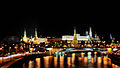
- Nomination Night in Moscow, Kremlin--Aleks G 22:38, 29 October 2011 (UTC)
- Promotion Good quality. --Ralf Roletschek 21:56, 4 November 2011 (UTC)
-

- Nomination: The Palach and Zajíc memorial in Prague in 2010. --High Contrast 16:28, 29 October 2011 (UTC)
- Review needed
-
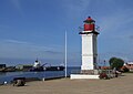
- Nomination: Port in Salacgrīva, Latvia --Pudelek 14:11, 29 October 2011 (UTC)
- Review needed
-

- Nomination: Port in Salacgrīva, Latvia --Pudelek 14:11, 29 October 2011 (UTC)
- Review needed
-

- Nomination: Beach near Salacgrīva in the evening, Latvia --Pudelek 14:11, 29 October 2011 (UTC)
- Review needed
-

-
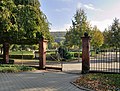
- Nomination Lörrach: Main cementery, entrance gate --Taxiarchos228 09:16, 29 October 2011 (UTC)
- Promotion Good quality. --Ralf Roletschek 21:56, 4 November 2011 (UTC)
-

- Nomination Jesus Christ, relief by Martin Vinazer (* 1674 in St. Ulrich in Gröden; † 1744) --Wolfgang Moroder 14:39, 28 October 2011 (UTC)
Good! Rama 14:53, 4 November 2011 (UTC) - Promotion
- Nomination Jesus Christ, relief by Martin Vinazer (* 1674 in St. Ulrich in Gröden; † 1744) --Wolfgang Moroder 14:39, 28 October 2011 (UTC)
-

- Nomination Door, 6 boulevard Saint-Michel (Paris). --Coyau 23:50, 27 October 2011 (UTC)
- Promotion I've some problems with the crop on the right side, it seems a bit to much, but if you take it away it would be weirdly cropped. Doubts. Mvg, Basvb 12:07, 31 October 2011 (UTC)
I've croped the right shop window, I don't think it's so bad. --Coyau 01:39, 1 November 2011 (UTC)
Looks good to me. Obviously there were disturing elements on the sides and the crop eliminates them nicely. Rama 14:51, 4 November 2011 (UTC)
-

- Nomination The boat in the clouds - Beach of Bray-Dunes (Nord), France.-- Jean-Pol GRANDMONT 10:12, 27 October 2011 (UTC)
- Promotion Comment ISO 9.264???? --Carschten 10:23, 27 October 2011 (UTC) If anyone can explain why this strange information is given by the metadata, I would appreciate. Jean-Pol GRANDMONT 12:38, 27 October 2011 (UTC)
Me too! --Carschten 15:00, 27 October 2011 (UTC)At least one, maybe more, dust spot(s) in the sky.--Jebulon 15:11, 27 October 2011 (UTC))
Done -- Jean-Pol GRANDMONT 21:45, 27 October 2011 (UTC)
Looks OK to me. Rama 14:49, 4 November 2011 (UTC)
-

- Nomination Pittosporum tobira, Jardin des Plantes de Paris.--Jebulon 22:12, 21 October 2011 (UTC)
- Promotion Comment Sharp and well lit, but you could select a more interesting composition. --Gidip 10:59, 26 October 2011 (UTC) But this one shows a bush...--Jebulon 08:47, 28 October 2011 (UTC)
Looks OK to me. Good sense of depth through DoF, too. -- Rama 14:43, 4 November 2011 (UTC)
-
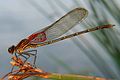
- Nomination Damselfly Hetaerina americana (by Bruce Marlin). -- Achim Raschka 07:45, 4 November 2011 (UTC)
- Decline Less than 2 mpx. --Quartl 08:15, 4 November 2011 (UTC)
-

- Nomination Shell of an Eocene gastropod Crommium willemeti --Llez 06:11, 4 November 2011 (UTC)
- Promotion Good quality. --Taxiarchos228 08:16, 4 November 2011 (UTC)
-

- Nomination The desert castle Qasr Kharana in Jordan. --High Contrast 00:34, 4 November 2011 (UTC)
- Promotion Good quality. --Taxiarchos228 08:16, 4 November 2011 (UTC)
-

- Nomination cicada in Provence -- Véronique PAGNIER 06:12, 4 November 2011 (UTC)
- Decline Sorry, the image is blurry and quite noisy. Also lacks proper id. --Quartl 08:14, 4 November 2011 (UTC)
-

- Nomination A street in Les Eyzies, Dordogne, France.--Jebulon 23:35, 3 November 2011 (UTC)
- Promotion Nice lighting conditions and interesting composition. --High Contrast 09:11, 4 November 2011 (UTC)
-

- Nomination Police van in Munich --High Contrast 19:41, 3 November 2011 (UTC)
- Promotion Very good --Jebulon 23:36, 3 November 2011 (UTC)
-

-

-

- Nomination Kochi City Culture-Plaza CUL-PORT in Kochi --663highland 14:21, 3 November 2011 (UTC)
- Decline Too tight and the perspective distortion is disturbing--Lmbuga 21:41, 3 November 2011 (UTC)
-
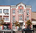
- Nomination Pirot Employment Service building. --MrPanyGoff 13:59, 3 November 2011 (UTC)
- Promotion Good quality. --Berthold Werner 17:32, 3 November 2011 (UTC)
-

- Nomination A-10 Thunderbolt II --Airwolf 13:40, 3 November 2011 (UTC)
- Promotion Good quality. --Ralf Roletschek 13:45, 3 November 2011 (UTC)
-
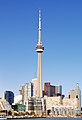
- Nomination Toronto: Skyline with CN Tower --Taxiarchos228 09:23, 3 November 2011 (UTC)
- Promotion QI to me--Lmbuga 21:14, 3 November 2011 (UTC)
-
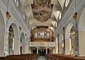
- Nomination Wehr: Saint Martin Church, nave --Taxiarchos228 09:23, 3 November 2011 (UTC)
- Promotion full QI. --Alchemist-hp 00:41, 4 November 2011 (UTC)
-

- Nomination M-209B with lid opened, exposing the rotors and printing system. Cryptography collection of the Swiss Army headquarters. -- Rama 08:34, 3 November 2011 (UTC)
- Promotion Good quality. --Berthold Werner 17:32, 3 November 2011 (UTC)
-

-
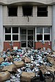
-

- Nomination A dragonfly at the Botanical Garden in Rio de Janeiro. --JonnyBrazil 13:32, 2 November 2011 (UTC)
- Decline Less than 2 mpx, also lacks proper id. --Quartl 08:18, 4 November 2011 (UTC)
-
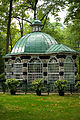
-

-
-

- Nomination: Lörrach: Main cementery, war memorial --Taxiarchos228 09:16, 29 October 2011 (UTC)
- Review needed
-

- Nomination Manna Ash Fraxinus ornus sub. rotundifolia - Arboretum Robert Lenoir in Rendeux, Belgium.-- Jean-Pol GRANDMONT 10:12, 27 October 2011 (UTC)
- Decline very difficult light conditions, but most of the trunk is underexposed and lots of parts of the sky in the crown are blown. There are CA, too, sorry. --Carschten 10:23, 27 October 2011 (UTC)
-

- Nomination The central pedestrian area in Pirot. --MrPanyGoff 10:49, 3 November 2011 (UTC)
- Promotion Good quality, and good managed. Some would oppose because of the shadow, I don't. --Taxiarchos228 11:05, 3 November 2011 (UTC)
-

- Nomination The belfry of the Church of the Nativity of Christ in Pirot. --MrPanyGoff 08:32, 3 November 2011 (UTC)
- Promotion Good quality. --Taxiarchos228 09:23, 3 November 2011 (UTC)
-

- Nomination Church of the Saviour on the Blood, (St.-Petersburg) --Aleks G 11:23, 3 November 2011 (UTC)
- Promotion Good quality. --Taxiarchos228 09:23, 3 November 2011 (UTC)
-
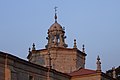
- Nomination As Marabillas, Cartelle, Galicia (Spain), at sunset--Lmbuga 01:32, 3 November 2011 (UTC)
- Promotion Good quality. --Taxiarchos228 09:23, 3 November 2011 (UTC)
-

- Nomination Hyundai i30 at Dead Sea. — Maksa 22:535, 2 November 2011 (UTC)
- Promotion Meets the criteria, imo. The resolution is just above the required.--MrPanyGoff 11:22, 3 November 2011 (UTC)
-

- Nomination A part of the Pagan Wall on the Mont Sainte-Odile, France.--Vassil 21:55, 2 November 2011 (UTC)
- Promotion a little bit dark but QI for me. --Ralf Roletschek 22:00, 2 November 2011 (UTC)
-

- Nomination The forest of the Mont Sainte-Odile in Autumn at sunset. --Vassil 19:33, 2 November 2011 (UTC)
- Promotion nice colors! --Ralf Roletschek 19:55, 2 November 2011 (UTC)
-

- Nomination Virgin Mary church in Wrocław --Kroton 19:06, 2 November 2011 (UTC)
- Promotion Good quality. --Ralf Roletschek 21:47, 2 November 2011 (UTC)
-
- Nomination train sign and clock --Ralf Roletschek 18:03, 2 November 2011 (UTC)
- Decline too tight crop (zu enger Schnitt) --Alchemist-hp 23:50, 2 November 2011 (UTC)
-

- Nomination BR 185 der HGK --Ralf Roletschek 18:03, 2 November 2011 (UTC)
- Promotion Good image quality. Please add some more information about the locomotive (type, constructor...). -- MJJR 19:31, 2 November 2011 (UTC)
 OK, i have ask in german WP, this number no exist in our article. --Ralf Roletschek 19:40, 2 November 2011 (UTC)
-

- Nomination 2nd nomination for this globe artichoke seedhead, previously unassessed.--Jebulon 18:05, 2 November 2011 (UTC)
- Promotion Nice image. Full QI. --Alchemist-hp 23:48, 2 November 2011 (UTC)
-

-

- Nomination Door knocker in Pérouges (France). --TwoWings 17:34, 2 November 2011 (UTC)
- Promotion Good quality. --Ralf Roletschek 19:14, 2 November 2011 (UTC)
-

- Nomination Trier, formerly barracks "Maximinkaserne" --Berthold Werner 16:13, 2 November 2011 (UTC)
- Promotion Good quality. --Ralf Roletschek 21:30, 2 November 2011 (UTC)
-

- Nomination Dispolok ITL --Ralf Roletschek 15:22, 2 November 2011 (UTC)
- Promotion Good quality. --Taxiarchos228 15:30, 2 November 2011 (UTC)
-

- Nomination Tignous talking to journalists after the fire at Charlie Hebdo. --Coyau 15:00, 2 November 2011 (UTC)
- Promotion Good quality. --Ralf Roletschek 15:10, 2 November 2011 (UTC)
-

- Nomination Top view of a Swiss-K Enigma, with lid open to reveal the rotors and the battery compartment. -- Rama 14:25, 2 November 2011 (UTC)
- Promotion Good quality. --Taxiarchos228 15:30, 2 November 2011 (UTC)
-

-
- Nomination Rotor of an Enigma-K machine. Cryptography collection of the Swiss Army headquarters. -- Rama 14:19, 2 November 2011 (UTC)
- Promotion Good quality. --Taxiarchos228 15:30, 2 November 2011 (UTC)
-

- Nomination Tram #22 in Prague near Pražský hrad --Ralf Roletschek 13:44, 2 November 2011 (UTC)
- Promotion Good quality. --Taxiarchos228 15:30, 2 November 2011 (UTC)
-

- Nomination Tram T4 stanice Národní třída --Ralf Roletschek 13:44, 2 November 2011 (UTC)
- Promotion Good quality. --Vassil 19:52, 2 November 2011 (UTC)
-
- Nomination Tram T4 stanice Národní třída --Ralf Roletschek 13:44, 2 November 2011 (UTC)
- Promotion Good quality. --Vassil 19:49, 2 November 2011 (UTC)
-

- Nomination Toronto: City Hall --Taxiarchos228 10:01, 2 November 2011 (UTC)
- Decline to strongly distorted --Ralf Roletschek 21:30, 2 November 2011 (UTC)
-

- Nomination Ferry at Saguenay River nearby Tadoussac --Taxiarchos228 10:01, 2 November 2011 (UTC)
- Promotion Good quality. --Ralf Roletschek 21:30, 2 November 2011 (UTC)
-

- Nomination Lörrach-Hauingen: city limit sign --Taxiarchos228 10:01, 2 November 2011 (UTC)
- Promotion Technically it is QI IMHO. --T137 14:52, 2 November 2011 (UTC)
-

- Nomination Lower Gardens of Peterhof. -- Aleks G 13:58, 2 November 2011 (UTC)
- Promotion Good quality. --Ralf Roletschek 11:07, 2 November 2011 (UTC)
-

- Nomination The main square of Porto Covo (detail), Portugal -- Alvesgaspar 22:37, 1 November 2011 (UTC)
- Promotion Meets the criteria, imo.--MrPanyGoff 11:33, 3 November 2011 (UTC)
-
- Nomination Dipsacus laciniatus. Jardin des Plantes de Paris.--Jebulon 15:11, 1 November 2011 (UTC)
- Promotion nice --Ralf Roletschek 21:33, 2 November 2011 (UTC)
-

-

-

- Nomination Entrance gate of Lembeck Castle in Dorsten --Carschten 13:12, 31 October 2011 (UTC)
- Promotion Good quality. --Ralf Roletschek 21:36, 2 November 2011 (UTC)
-

- Nomination Cultural centre in Dimitrovgrad, Serbia. --MrPanyGoff 12:43, 31 October 2011 (UTC)
- Promotion Good quality. --Ralf Roletschek 21:36, 2 November 2011 (UTC)
-

- Nomination Birds, Duck (Anas platyrhynchos) -- Aleks G 16:28, 31 October 2011 (UTC) It would be useful to name the duck --Archaeodontosaurus 08:07, 1 November 2011 (UTC)
Done --aleks G 22:14, 2 November 2011 (UTC) - Promotion Good quality. --Ralf Roletschek 21:49, 2 November 2011 (UTC)
- Nomination Birds, Duck (Anas platyrhynchos) -- Aleks G 16:28, 31 October 2011 (UTC) It would be useful to name the duck --Archaeodontosaurus 08:07, 1 November 2011 (UTC)
-
- Nomination Trier, St. Bonifatius church --Berthold Werner 12:04, 31 October 2011 (UTC)
- Promotion Good quality. --Ralf Roletschek 21:36, 2 November 2011 (UTC)
-

- Nomination Cooperative State University Lörrach, laptop sculpture --Taxiarchos228 07:12, 31 October 2011 (UTC)
- Promotion very good with the shadow --Ralf Roletschek 21:36, 2 November 2011 (UTC)
-

- Nomination Aqueduct of Hauingen --Taxiarchos228 07:12, 31 October 2011 (UTC)
- Promotion Good quality. --Ralf Roletschek 21:36, 2 November 2011 (UTC)
-

- Nomination The interior of the Church of Peace in Jawor --Kroton 18:38, 30 October 2011 (UTC)
- Decline sorry but the flash...! --Ralf Roletschek 21:38, 2 November 2011 (UTC)
-

- Nomination Statue Mary and child in the parish church Sankt Laurentius in Sankt Lorenzen am Wechsel, Styria. --Herzi Pinki 12:52, 30 October 2011 (UTC)
- Promotion Good quality. --Vassil 23:45, 2 November 2011 (UTC)
-

- Nomination TS-11 Iskra. Airwolf 17:19, 29 October 2011 (UTC)
- Promotion Good quality. --Ralf Roletschek 21:39, 2 November 2011 (UTC)
-

- Nomination Airbus A319. Airwolf 17:19, 29 October 2011 (UTC)
- Promotion Good quality. --Ralf Roletschek 21:39, 2 November 2011 (UTC)
-
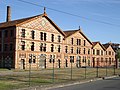
- Nomination Former factory in Aureilhan, Hautes-Pyrénées --Florent Pécassou 12:36, 29 October 2011 (UTC))
- Promotion Good quality. --Ralf Roletschek 21:41, 2 November 2011 (UTC)
-

- Nomination The station Seealpe of the cableway on the mountain Nebelhorn in Bavaria --High Contrast 12:15, 29 October 2011 (UTC)
- Promotion Good quality. --Ralf Roletschek 21:41, 2 November 2011 (UTC)
-

- Nomination Toronto: Rogers Centre, entrance area --Taxiarchos228 09:16, 29 October 2011 (UTC)
- Promotion Good quality. --Ralf Roletschek 21:41, 2 November 2011 (UTC)
-

- Nomination Hauingen: Unterdorfstraße --Taxiarchos228 09:16, 29 October 2011 (UTC)
- Promotion Good quality. --Ralf Roletschek 21:41, 2 November 2011 (UTC)
-

- Nomination Picture gallery, the former spiritual school, in Pereslavl museum. --PereslavlFoto 14:24, 28 October 2011 (UTC)
- Promotion Good quality. --Ralf Roletschek 21:42, 2 November 2011 (UTC)
-

- Nomination Neļķu klints (Carnation cliff), Salaca rivier --Pudelek 12:56, 28 October 2011 (UTC)
- Promotion Good quality. --Ralf Roletschek 21:42, 2 November 2011 (UTC)
-

- Nomination: Previous farm of the Solvay castle actual Folon museum in La Hulpe, Belgium.-- Jean-Pol GRANDMONT 10:04, 28 October 2011 (UTC)
- Review needed
-

- Nomination: Fountain of Neptune, Piazza Navona, Rome, Italy.-- Jean-Pol GRANDMONT 10:04, 28 October 2011 (UTC)
crop on left side a bit tight --Taxiarchos228 10:12, 28 October 2011 (UTC) - Review needed
- Nomination: Fountain of Neptune, Piazza Navona, Rome, Italy.-- Jean-Pol GRANDMONT 10:04, 28 October 2011 (UTC)
-

- Nomination: Liberty enlightening the world, by Bartholdi, Jardin du Luxembourg, Paris. It is not a "copy" but an original. Please have a look to the file description page for further informations --Jebulon 08:55, 28 October 2011 (UTC)
- Review needed
-
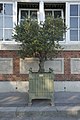
- Nomination: Olea europaea cultivar. Jardin du Luxembourg, Paris.--Jebulon 08:35, 28 October 2011 (UTC)
- Review needed
-

- Nomination: Bust to the french poet Gabriel Vicaire, by Injalbert, Jardin du Luxembourg, Paris.--Jebulon 08:32, 28 October 2011 (UTC)
- Review needed
-
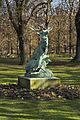
- Nomination: Bronze deers, by Le Duc, Jardin du Luxembourg, Paris.--Jebulon 08:26, 28 October 2011 (UTC)
- Review needed
-

- Nomination: Hauingen: Church of Saint Nicolaus at sunset --Taxiarchos228 06:11, 28 October 2011 (UTC)
- Review needed
-
- Nomination: Hauingen: Town hall --Taxiarchos228 06:11, 28 October 2011 (UTC)
- Review needed
-
- Nomination: Toronto: Rogers Centre --Taxiarchos228 06:11, 28 October 2011 (UTC)
- Review needed
-

- Nomination: Cherry picker, Paris. --Coyau 03:44, 28 October 2011 (UTC)
- Review needed
-
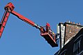
- Nomination: Cherry picker, Paris. --Coyau 03:44, 28 October 2011 (UTC)
- Review needed
-

- Nomination: Cherry picker, Paris. --Coyau 03:44, 28 October 2011 (UTC)
- Review needed
-

-

- Nomination: Campanula retrorsa --Gidip 21:01, 27 October 2011 (UTC)
- Review needed
-

- Nomination Aqueduct of Hauingen --Taxiarchos228 20:55, 27 October 2011 (UTC)
- Promotion Good quality. --Ralf Roletschek 22:03, 2 November 2011 (UTC)
-

- Nomination: Thomson TO7 computer. On display at the Musée Bolo, EPFL, Lausanne. -- Rama 19:43, 27 October 2011 (UTC)
- Review needed
-

- Nomination: Marguerite d'Angoulême, queen of Navarra, by Joseph Lescorné. Jardin du Luxembourg, Paris.--Jebulon 15:08, 27 October 2011 (UTC)
- Review needed
-

- Nomination Ceiling painting of the church in Schloß Ricklingen (Lower Saxony, Germany) --misburg3014 14:30, 27 October 2011 (UTC)
- Promotion Sorry, where is the church ? I see a (ceiling ?) painting of a crucifixion. Please take care of files names, categories, and name of nominations. According to the guidelines, bad names are a good enough-reason to decline... (would be a pity because it is a good image !!)--Jebulon 15:15, 27 October 2011 (UTC) DoneI Added various categories to the picture. The description itself already was sufficient, so I do not understand the objection. The church is in Schloß Ricklingen, Schloß Ricklingen is a village in Lower Saxony which is a part of Germany, and that's what the description states. --misburg3014, 2 November 2011} Good now, thank you. The description in the file page, + the categorization were bad, it is no more the case. To be a QI formerly, a picture must have 1) a good and valid file name, 2) a good categorization at the good level, 3)a relevant description in the file page and 4) a good name in the QIC nomination page. This one is QI--Jebulon 15:09, 2 November 2011 (UTC)
-

- Nomination Trier, House of the bishop --Berthold Werner 09:19, 26 October 2011 (UTC)
- Promotion Finaly, I think it is good enough for QI.--MrPanyGoff 11:44, 3 November 2011 (UTC)
-

- Nomination: A street lamp, Champ-de-Mars, Paris.--Jebulon 09:11, 26 October 2011 (UTC)
- Review Comment one tiny step to the left and the lamp wouldn't have been confused with the tree. I like the bird though. --Elekhh 09:56, 27 October 2011 (UTC)Thanks for review. I don't think it is soooo disturbing or confusing, maybe another reviewer could agree with me ?--Jebulon 15:28, 27 October 2011 (UTC)
-

- Nomination The Maiden of Anzio, Greek artwork, ca. 250-230 BC - Palazzo Massimo alle Terme, Italy.-- Jean-Pol GRANDMONT 08:07, 26 October 2011 (UTC)
- Promotion Good quality. --Ralf Roletschek 21:44, 2 November 2011 (UTC)
-

- Nomination Asimina triloba autumn leaves, Jardin des Plantes de Paris.--Jebulon 21:46, 21 October 2011 (UTC) Comment Same remark here. Sharp and beautiful light, but you could select a more interesting composition. --Gidip 10:59, 26 October 2011 (UTC) I really don't know how...--Jebulon 08:47, 28 October 2011 (UTC)
- Promotion for me its QI --Ralf Roletschek 21:46, 2 November 2011 (UTC)
- Nomination Asimina triloba autumn leaves, Jardin des Plantes de Paris.--Jebulon 21:46, 21 October 2011 (UTC)
-

- Nomination Boundary marker of Latvia --Pudelek 10:15, 2 November 2011 (UTC)
- Promotion Good quality. --Ralf Roletschek 11:07, 2 November 2011 (UTC)
-

- Nomination Lörrach: Vally Wiese bridge (Wiesentalbrücke) --Taxiarchos228 10:01, 2 November 2011 (UTC)
- Promotion sehr schön! --Ralf Roletschek 11:07, 2 November 2011 (UTC)
-

- Nomination T-34-76 tank in Khmelnytskyi -- George Chernilevsky 08:39, 2 November 2011 (UTC)
- Promotion Good quality. --Taxiarchos228 08:47, 2 November 2011 (UTC)
-

- Nomination T-34-76 tank in Khmelnytskyi -- George Chernilevsky 08:39, 2 November 2011 (UTC)
- Promotion Good quality. --Taxiarchos228 08:47, 2 November 2011 (UTC)
-

- Nomination T-34-76 tank in Khmelnytskyi -- George Chernilevsky 08:39, 2 November 2011 (UTC)
- Promotion Good quality. --Taxiarchos228 08:47, 2 November 2011 (UTC) Support - достаточно долго для 76-пистолет? --Ralf Roletschek 08:49, 2 November 2011 (UTC)
Yes, 76 mm gun (cannon) look too long for this tank. -- George Chernilevsky 09:02, 2 November 2011 (UTC)
-

- Nomination Pirot Courthouse. --MrPanyGoff 06:56, 2 November 2011 (UTC)
- Promotion Good quality.--ArildV 08:41, 2 November 2011 (UTC)
-

- Nomination Village of Sablet (Vaucluse, France) Véronique PAGNIER 03:32, 2 November 2011 (UTC)
- Promotion Good quality. --Ralf Roletschek 11:09, 2 November 2011 (UTC)
-

-

- Nomination House in Mielec --Kroton 19:01, 1 November 2011 (UTC)
- Promotion I find it good enough for QI.--MrPanyGoff 09:37, 2 November 2011 (UTC)
-
- Nomination Enigma-K machine of the Swiss Army. Cryptography collection of the Swiss Army headquarters. -- Rama 18:54, 1 November 2011 (UTC)
- Promotion Good quality and I like this calculation maschines --Taxiarchos228 18:56, 1 November 2011 (UTC)" I like " is a personal leaning, isn't it ?--Jebulon 19:51, 1 November 2011 (UTC)
it is, but not basis of my judging --Taxiarchos228 20:07, 1 November 2011 (UTC)
-

- Nomination Enigma-K machine of the Swiss Army. Cryptography collection of the Swiss Army headquarters. -- Rama 18:54, 1 November 2011 (UTC)
- Promotion Good quality. --Taxiarchos228 18:56, 1 November 2011 (UTC)
-

-

- Nomination Hagelin CD-57 cryptographic machine -- Rama 15:17, 1 November 2011 (UTC)
- Promotion Good quality. --Taxiarchos228 19:01, 1 November 2011 (UTC) The photo is very good but there is a little white "halo" around the object, i think, a white or transparent background is better ??? --Ralf Roletschek 19:15, 1 November 2011 (UTC)
-

- Nomination Wöhrdenerhafen, Nordermeldorf, Kreis Dithmarschen, Schleswig-Holstein, Deutschland --Ralf Roletschek 15:00, 1 November 2011 (UTC)
- Promotion A bit noisy and maybe dark, but good and interesting QI, IMO.--Jebulon 15:14, 1 November 2011 (UTC)
-

- Nomination Hubertus chapel in Grafendorf bei Hartberg --Herzi Pinki 14:55, 1 November 2011 (UTC)
- Promotion Good quality. --Taxiarchos228 19:01, 1 November 2011 (UTC)
-

- Nomination Building in Großseelheim, # 21 from German Wiki Loves Monuments Contest --Emha 14:49, 1 November 2011 (UTC)
- Promotion hey, das war doch mein Motiv!!! --Ralf Roletschek 15:26, 1 November 2011 (UTC)
-

- Nomination Phidias, statue by Aimé Millet, Jardin du Luxembourg, Paris.--Jebulon 13:55, 1 November 2011 (UTC)
- Promotion QI for me --Carschten 13:57, 1 November 2011 (UTC)
-

- Nomination Metro Praha #1 --Ralf Roletschek 13:50, 1 November 2011 (UTC)
- Promotion creepy... :-) --Carschten 13:56, 1 November 2011 (UTC)
-

- Nomination Metro Praha #3 --Ralf Roletschek 13:50, 1 November 2011 (UTC)
- Decline This is nothing compared to Praha #1 and #2. So dark you can't see most of the conduits. I know you're proud of the whole series, but please submit only your best shots for QI. --Specious 10:46, 2 November 2011 (UTC)
-

- Nomination old Toyota in Helsinki --Ralf Roletschek 13:50, 1 November 2011 (UTC)
- Promotion Good quality. --Carschten 13:56, 1 November 2011 (UTC)
-

- Nomination escalator in Prague metro --Ralf Roletschek 13:50, 1 November 2011 (UTC)
- Promotion good --Carschten 13:56, 1 November 2011 (UTC) Yes, inspite of the little tilt, easy to be corrected.--Jebulon 14:01, 1 November 2011 (UTC)
I would not rotate, it looks good and realistic like it is IMHO. The tilt is so slight, it doesn't disturb. --Carschten 14:11, 1 November 2011 (UTC) Agree. That's why I didn't put the picture in CR. But the tilt exists, even not disturbing.--Jebulon 14:15, 1 November 2011 (UTC)
-

- Nomination Edersee Dam --Carschten 13:34, 1 November 2011 (UTC)
- Promotion good view and angle. --Ralf Roletschek 13:45, 1 November 2011 (UTC)
-

- Nomination Beach at sunset. Costa da Caparica, Portugal. Alvesgaspar 13:01, 1 November 2011 (UTC)
- Promotion nice colors! --Ralf Roletschek 16:33, 1 November 2011 (UTC)
-

- Nomination Conspectus of the figured windows of the Cathedral Santa Ana, Las Palmas de Gran Canaria --Llez 12:32, 1 November 2011 (UTC)
- Promotion Very Good quality. --Ralf Roletschek 16:33, 1 November 2011 (UTC)
-

- Nomination exhaust Dornier Do-27 --Ralf Roletschek 12:21, 1 November 2011 (UTC)
- Promotion Nice picture for sure, but bad file name and bad description in file page. Therefore useless. Could be declined only for that (please see guidelines). A pity...--Jebulon 17:44, 1 November 2011 (UTC) OK, Description corrected. --Ralf Roletschek 22:13, 1 November 2011 (UTC)Thanks. Nice detail picture, very interesting. QI now.--Jebulon 09:45, 2 November 2011 (UTC)
-

- Nomination Rain --Ralf Roletschek 12:21, 1 November 2011 (UTC)
- Promotion O Yes !! Very nice and very good idea --Jebulon 14:04, 1 November 2011 (UTC)
-

-

- Nomination Saint Peter & Paul Cathedral Interior. --Aleks G 15:26, 1 November 2011 (UTC)
- Promotion Good technical quality, I think it meets the criteria though it is not quite symmetric.--MrPanyGoff 09:46, 2 November 2011 (UTC)
-

- Nomination Toronto: CN Tower from South --Taxiarchos228 07:13, 1 November 2011 (UTC)
- Promotion Good framing, adequate depth of field gives excellent details, shadows accentuate the architecture, thumbnail looks great as well. --Specious 08:47, 1 November 2011 (UTC) Wow ! I cannot be so dithyrambic, because of annotated dust spots, perspective distortions, sky and dark parts very noisy...--Jebulon 11:16, 1 November 2011 (UTC)
(1) nobody forces you to be thrilled by this picture, completely dispensable commend (2) dustspots are removed, noise is reduced (3) distortion is absolutely okay for this view point, the main object is after all over 0,5 kilometers high --Taxiarchos228 19:08, 1 November 2011 (UTC)
-

-

- Nomination Lörrach: Vally Wiese bridge (Wiesentalbrücke) --Taxiarchos228 07:12, 31 October 2011 (UTC)
- Promotion good picture with typical parts of the bridge --Ralf Roletschek 12:25, 1 November 2011 (UTC)
-
- Nomination Somewhere in Belfort in night. --ComputerHotline 21:04, 30 October 2011 (UTC)
- Promotion nicht so langweilig wie sonst immer I like that. difficult light, well-implemented --Ralf Roletschek 12:28, 1 November 2011 (UTC)
-

- Nomination A street near the ramparts of Belfort, in night. --ComputerHotline 21:04, 30 October 2011 (UTC)
- Promotion nicht so langweilig wie sonst immer I like that. difficult light, well-implemented --Ralf Roletschek 12:28, 1 November 2011 (UTC)
-

-

- Nomination Floating drydock in the harbour of Rouen --Pline 18:29, 30 October 2011 (UTC)
- Promotion Good quality. --Ralf Roletschek 15:29, 1 November 2011 (UTC)
-

- Nomination Fontaine de l'Archevêché in Paris --Moonik 16:51, 30 October 2011 (UTC)
- Promotion Nice picture, a bit overprocessed IMO (saturation), but really leaning to the left, with a need of perspective correction. All correctible.--Jebulon 18:22, 1 November 2011 (UTC) Done I hope will be good now --Moonik 05:57, 2 November 2011 (UTC)Better, indeed. La flèche de Notre-Dame penche encore un peu, but it is good for QI.--Jebulon 09:56, 2 November 2011 (UTC)
-

-

- Nomination War memorial in Waldbach, Styria --Herzi Pinki 12:52, 30 October 2011 (UTC)
- Promotion Good quality. --Ralf Roletschek 15:29, 1 November 2011 (UTC)
-

- Nomination Hagbølle dolmen and tumulus on Langeland in Denmark. -- Basvb 10:50, 30 October 2011 (UTC)
- Promotion nice! --Ralf Roletschek 15:29, 1 November 2011 (UTC)
-

- Nomination Lörrach: Bridge bearings --Taxiarchos228 09:58, 30 October 2011 (UTC)
- Promotion das Geschmiere hätte ich ja eliminiert aber auch so QI. --Ralf Roletschek 15:30, 1 November 2011 (UTC)
-

- Nomination Lörrach: Bridge connecting the Bundesautobahn 98 --Taxiarchos228 09:56, 30 October 2011 (UTC)
- Promotion schöne Übersichte der Widerlager. --Ralf Roletschek 15:30, 1 November 2011 (UTC)
-
- Nomination Tilia insularis leaves and flowers.-- Jean-Pol GRANDMONT 09:06, 30 October 2011 (UTC)
- Promotion Very nice and useful.--Jebulon 14:27, 1 November 2011 (UTC)
-

- Nomination The big pond in Strépy-Bracquegnies, Belgium.-- Jean-Pol GRANDMONT 09:06, 30 October 2011 (UTC)
- Promotion i like it, very nice! --Ralf Roletschek 15:31, 1 November 2011 (UTC)
-

- Nomination Ferula communis.-- Jean-Pol GRANDMONT 09:06, 30 October 2011 (UTC)
- Promotion Good quality. --Ralf Roletschek 15:29, 1 November 2011 (UTC)
-

- Nomination Trier, Karl-Marx-Straße 48: „Im Herrgottchen“ --Berthold Werner 15:06, 29 October 2011 (UTC)
- Promotion Meets the criteria, imo.--MrPanyGoff 16:43, 1 November 2011 (UTC)
-

- Nomination Rue de la Falaise" alongside the Eau Noire river in Couvin, Belgium.-- Jean-Pol GRANDMONT 08:35, 29 October 2011 (UTC)
- Promotion Good quality. --Ralf Roletschek 16:37, 1 November 2011 (UTC)
-
- Nomination Castle Ooijen, the Netherlands -- Basvb 20:50, 28 October 2011 (UTC)
- Promotion Good quality. --Ralf Roletschek 16:44, 1 November 2011 (UTC)
-

- Nomination Trier, Liebfrauenstraße 1, Portal --Berthold Werner 11:24, 28 October 2011 (UTC)
- Promotion nice detail --Ralf Roletschek 16:44, 1 November 2011 (UTC)
-

-

- Nomination Toronto: Skyline --Taxiarchos228 06:11, 28 October 2011 (UTC)
- Promotion great! --Ralf Roletschek 16:44, 1 November 2011 (UTC)
-
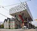
- Nomination Sharp Centre for Design, Toronto --Taxiarchos228 06:11, 28 October 2011 (UTC)
- Promotion Good quality. --Ralf Roletschek 14:57, 1 November 2011 (UTC)
-

- Nomination Hauingen: Lingertstraße --Taxiarchos228 20:55, 27 October 2011 (UTC)
- Promotion Good quality. --Ralf Roletschek 16:48, 1 November 2011 (UTC)
-

- Nomination Hauingen: Town hall --Taxiarchos228 20:55, 27 October 2011 (UTC)
- Promotion einfach ein ordentliches Foto. --Ralf Roletschek 14:58, 1 November 2011 (UTC)
-

- Nomination Gallery of the church in Schloß Ricklingen (Lower Saxony, Germany) --misburg3014 14:30, 27 October 2011 (UTC)
- Decline Composition looks random. Why not symmetric? --Coyau 22:52, 1 November 2011 (UTC)
Looking at an angle of 90 degrees at the gallery would give no imagination of depth, it would appear flat then instead of three dimensional. So the picture may be ugly, but it's definitely not random. --misburg3014, 2 November 2011
-
- Nomination: Bauska castle over Mūsa river --Pudelek 10:34, 27 October 2011 (UTC)
- Review needed
-

- Nomination: Bauska castle over Mūsa river --Pudelek 10:34, 27 October 2011 (UTC)
- Review needed
-

- Nomination: en:Sex in advertising --Ralf Roletschek 10:26, 27 October 2011 (UTC)
- Review needed
-

- Nomination: Marimekko-Store in Helsinki --Ralf Roletschek 10:22, 27 October 2011 (UTC)
- Review needed
-

- Nomination: the Laocoön Group. Marble, copy after an Hellenistic original from ca. 200 BC. Vatican Museum.-- Jean-Pol GRANDMONT 10:12, 27 October 2011 (UTC)
- Review needed
-

- Nomination: Alabaster statue of the Christ performed by Jacques du Broeucq in Saint Waltrude collegiate church of Mons., Belgium.-- Jean-Pol GRANDMONT 10:12, 27 October 2011 (UTC)
- Review needed
-

- Nomination: Tangerine Dream --Ralf Roletschek 10:04, 27 October 2011 (UTC)
- Review needed
-
-
-
-

-
- Nomination: A nest box, Jardin du Luxembourg, Paris.--Jebulon 08:27, 27 October 2011 (UTC)
- Review needed
-

- Nomination: Toronto: Union Station, interior --Taxiarchos228 06:21, 27 October 2011 (UTC)
- Review needed
-
- Nomination: Toronto: aerial view to the Don Valley Parkway eastwards from helicopter --Taxiarchos228 06:21, 27 October 2011 (UTC)
- Review needed
-

- Nomination: Statue to Valentina of Milan, by Victor Huguenin, Jardin du Luxembourg, Paris.--Jebulon 22:31, 26 October 2011 (UTC)
- Review needed
-

- Nomination: Ceratina cucurbitina, copulation --Gidip 21:08, 26 October 2011 (UTC)
- Review needed
-

- Nomination: Anthophora nesting site --Gidip 21:06, 26 October 2011 (UTC)
- Review needed
-
- Nomination: Muscari longipes --Gidip 20:55, 26 October 2011 (UTC)
- Review needed
-
- Nomination: The Sun Fountain, Amore on a dolphin, two sculpture groups (Peterhof). --Aleks G 22:33, 26 October 2011 (UTC)
- Review needed
-

- Nomination Saint Christopher in front of the Catholic Church St. Christophorus in Ratingen --Carschten 16:52, 26 October 2011 (UTC)
- Promotion interessantes Spiel von Farben und Formen --Ralf Roletschek 15:33, 1 November 2011 (UTC)
-
- Nomination: Saint Christopher in front of the Catholic Church St. Christophorus in Ratingen --Carschten 16:52, 26 October 2011 (UTC)
- Review needed
-

- Nomination: Courtyard and garden at Petit Palais in Paris, France --Moonik 15:32, 26 October 2011 (UTC)
- Review needed
-

- Nomination: Stain glass at Petit Palais in Paris, France --Moonik 15:32, 26 October 2011 (UTC)
- Review needed
-

- Nomination: Protest sign against medical budget shortage (15-O, Madrid, Spain). --Kadellar 13:00, 26 October 2011 (UTC)
- Review needed
-

-

-

- Nomination St Athanasius Church in Lozen village. --MrPanyGoff 09:11, 26 October 2011 (UTC)
- Promotion Good quality. --Ralf Roletschek 15:34, 1 November 2011 (UTC)
-

- Nomination Sunset over the "Ecole Militaire", Paris.--Jebulon 22:03, 25 October 2011 (UTC)
- Decline nice light, but I'm not convinced: the composition does not work with the cut off spout IMO, the quality is so-so, too (low details). Sorry --Carschten 14:28, 31 October 2011 (UTC) No need to be sorry. You are right. I'll upload soon another picture of the same subject, I hope better. Thanks.--Jebulon 22:47, 1 November 2011 (UTC)
-

-

- Nomination Lens Sigma 2,8/50 Macro --Ralf Roletschek 08:58, 25 October 2011 (UTC)
- Decline For such a staged shot, why have so much dust on the (subject) lens, as well as the slight noise on the sensor? The depth of field could be a tad bit deeper too. --Specious 10:27, 2 November 2011 (UTC)
-

- Nomination Steinen-Hüsingen: Protestant Church, founding plate over the door --Taxiarchos228 06:43, 24 October 2011 (UTC)
- Promotion die Qualität ist gut, das Motiv... na ja ;) --Carschten 14:08, 31 October 2011 (UTC)
das Motiv ist ein enzyklopädisches Zeitdokument --Taxiarchos228 14:40, 1 November 2011 (UTC)
-

- Nomination Eurofighter Typhoon --Airwolf 17:15, 23 October 2011 (UTC)
- Decline tight crop at right, the aircraft doesn't seem to be in focus very well --Carschten 13:44, 31 October 2011 (UTC) Oppose The snap is good on the action, but the focus as well as the depth-of-field is inadequate. The composition is good. --Specious 10:21, 2 November 2011 (UTC)
-

- Nomination Mill in Stommeln, Germany --Superbass 17:09, 22 October 2011 (UTC)
- Decline die Mühle sich nicht wirklich gut fokussiert aus --Carschten 18:40, 22 October 2011 (UTC) Oppose --Carschten 14:17, 30 October 2011 (UTC) Oppose In English, I'd say the mill isn't in focus either. Please take the photo more carefully :) --Specious 10:18, 2 November 2011 (UTC)
-
-

- Nomination Egg of Syrrhaptes paradoxus--Archaeodontosaurus 08:04, 1 November 2011 (UTC)
- Promotion Nice, interesting and useful--Jebulon 10:52, 1 November 2011 (UTC)
-

- Nomination Pirot Fortress. --MrPanyGoff 07:28, 1 November 2011 (UTC)
- Promotion Support QI & Useful --Archaeodontosaurus 08:13, 1 November 2011 (UTC)
-
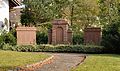
- Nomination Hauingen: war memorial --Taxiarchos228 07:11, 1 November 2011 (UTC)
- Promotion Meets the criteria, imo, though I would prefer to crop the eaves in the upper left corner and the satellite dish.--MrPanyGoff 07:43, 1 November 2011 (UTC)
-
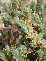
- Nomination Crucianella maritima --Gidip 21:57, 31 October 2011 (UTC)
- Promotion Support QI & Useful --Archaeodontosaurus 08:12, 1 November 2011 (UTC)
-
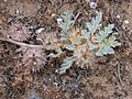
- Nomination Neurada procumbens --Gidip 21:57, 31 October 2011 (UTC)
- Promotion Support QI & Useful --Archaeodontosaurus 08:11, 1 November 2011 (UTC)
-

- Nomination Looking up the south pillar of the Eiffel Tower, through the center.--Jebulon 17:50, 31 October 2011 (UTC)
- Promotion Support Good quality, good idea --Archaeodontosaurus 08:09, 1 November 2011 (UTC)
-

- Nomination Anthony of Padua window of the chapel Antoniuskapelle in Monschau-Kalterherberg --Carschten 15:57, 31 October 2011 (UTC)
- Promotion very nice with the black frame. --Ralf Roletschek 16:29, 31 October 2011 (UTC)
-

- Nomination A Tulipa flower, three days after blossoming in Santiago, Chile. --Jorgebarrios 15:57, 31 October 2011 (UTC)
- Promotion Good, QI for me.--Jebulon 21:47, 31 October 2011 (UTC)
-

- Nomination The tower of the Holy Mother of God Church in Dimitrovgrad, Serbia. --MrPanyGoff 15:11, 31 October 2011 (UTC)
- Promotion Good quality. --Carschten 15:57, 31 October 2011 (UTC)
-

-

- Nomination Eifel Cathedral St. Lambertus in Monschau-Kalterherberg during sunset --Carschten 13:12, 31 October 2011 (UTC)
- Promotion Good quality. --Taxiarchos228 13:32, 31 October 2011 (UTC)
-

- Nomination Tower of the Evangelical Church St. Nikolaus in Waldeck --Carschten 13:12, 31 October 2011 (UTC)
- Promotion Good quality. --Taxiarchos228 13:32, 31 October 2011 (UTC)
-

-
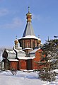
-

- Nomination Trabant 600 wrack --LutzBruno 16:45, 30 October 2011 (UTC)
- Promotion Good quality. --Ralf Roletschek 08:53, 1 November 2011 (UTC)
-

- Nomination Portal of the Casa de Colón, Las Palmas de Gran Canaria --Llez 15:37, 30 October 2011 (UTC)
- Promotion After all I think it meets the criteria.--MrPanyGoff 07:56, 1 November 2011 (UTC)
-

- Nomination Polish neuroscientist pl:Jerzy Vetulani --Czonek 15:15, 30 October 2011 (UTC)
- Promotion yes, good portrait, qi --Ralf Roletschek 15:12, 31 October 2011 (UTC)
-

- Nomination Hauingen: Lingertstraße (street sign) --Taxiarchos228 06:11, 28 October 2011 (UTC)
- Promotion Good, althought it seems little little tilted. Mvg, Basvb 12:04, 31 October 2011 (UTC)
-

-

- Nomination: Dianthus pendulus --Gidip 09:56, 26 October 2011 (UTC)
- Review needed
-

- Nomination: German Ford Taunus from 1960 --Berthold Werner 09:13, 26 October 2011 (UTC)
- Review needed
-

- Nomination: Toronto: Lincoln Town Car --Taxiarchos228 08:02, 26 October 2011 (UTC)
- Review needed
-
![* Nomination: "The new Hewlett-Packard 9100A personal computer" is "ready, willing, and able... to relieve you of waiting to get on the big computer." [3] (1968) -- Rama 07:49, 26 October 2011 (UTC) * * Review needed](https://upload.wikimedia.org/wikipedia/commons/thumb/b/b2/HP9100A-IMG_0393.jpg/120px-HP9100A-IMG_0393.jpg)
-

- Nomination: FC Thun vs FC Lausanne on 23 of October 2011: Sekou Junior Sanogo (13) -- Rama 06:24, 26 October 2011 (UTC)
- Review needed
-

-

-

-
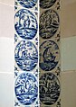
- Nomination: Rundāle Palace (Ruhental) - tiles --Pudelek 17:06, 25 October 2011 (UTC)
- Review needed
-

-

-

- Nomination Weil am Rhein: Sundgau house --Taxiarchos228 09:31, 25 October 2011 (UTC)
- Promotion sehr, sehr schönes Licht --Carschten 14:28, 31 October 2011 (UTC)
-

- Nomination Aftersteg: Saint Anna Church, bell tower --Taxiarchos228 09:31, 25 October 2011 (UTC)
- Promotion Good quality. --Carschten 14:28, 31 October 2011 (UTC)
-
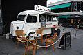
- Nomination Café "Camionette" in Helsinki --Ralf Roletschek 08:58, 25 October 2011 (UTC)
- Promotion nice --Carschten 14:28, 31 October 2011 (UTC)
-
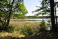
- Nomination Dovinsee, Germany --Ralf Roletschek 08:58, 25 October 2011 (UTC)
- Promotion Good quality. --Carschten 14:28, 31 October 2011 (UTC)
-
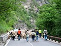
- Nomination The transhumance in the gorges du Cians – Rigaud, Alpes-Maritimes, France. Jean-Pol GRANDMONT 17:35, 25 October 2011 (UTC)
- Decline too small and overexposed --Carschten 14:28, 31 October 2011 (UTC)
-

-

- Nomination Manor Farm Cow Byre in Ruislip --Harrison49 18:20, 24 October 2011 (UTC)
- Decline CA, bad crop (at top and bottom) - sorry! --Carschten 14:08, 31 October 2011 (UTC)
-

- Nomination The double-headed eagle on the gates of the Winter Palace, St Petersburg, Russia (made by Михаил Славский). --Kaganer 17:55, 24 October 2011 (UTC)
- Decline I know that it is really difficult to take photos of gold - but there are too many blown parts. Also colour noise --Carschten 14:08, 31 October 2011 (UTC)
-

-
-

-

- Nomination: The Comtesse de Ségur, marble bust by Jean Boucher, Jardin du Luxembourg, Paris.--Jebulon 09:50, 24 October 2011 (UTC) Info New version uploaded, better light.--Jebulon 00:34, 26 October 2011 (UTC)
- Review needed
- Nomination: The Comtesse de Ségur, marble bust by Jean Boucher, Jardin du Luxembourg, Paris.--Jebulon 09:50, 24 October 2011 (UTC)
-

-
- Nomination Juggler -- Albertus teolog 08:46, 24 October 2011 (UTC)
- Promotion Info New a bit denoised version uploaded, QI in my opinion, but I cannot vote now...--Jebulon 23:46, 26 October 2011 (UTC) Support very good point of view --Carschten 14:08, 31 October 2011 (UTC)
-

- Nomination Toronto: Fire and Marine Service --Taxiarchos228 06:43, 24 October 2011 (UTC)
- Decline Overexposed IMO.--Jebulon 16:23, 24 October 2011 (UTC) Oppose ja, leider unrettbar überbelichtet --Carschten 14:08, 31 October 2011 (UTC)
-

- Nomination Toronto: Toronto Star building, Yonge Street 1 --Taxiarchos228 06:43, 24 October 2011 (UTC)
- Decline Halo.--Jebulon 09:59, 24 October 2011 (UTC) Oppose yes --Carschten 14:08, 31 October 2011 (UTC)
-

- Nomination Toronto: Westin Harbour Castle Hotel --Taxiarchos228 06:43, 24 October 2011 (UTC)
- Promotion small, but QI to me --Carschten 14:08, 31 October 2011 (UTC)
-
-

-

-

- Nomination Airbus A321 D-ALSD at Düsseldorf International Airport --Carschten 21:23, 23 October 2011 (UTC)
- Promotion The crop is too generous at the top and bottom. Airwolf 22:19, 23 October 2011 (UTC)
I see what you mean, but it's difficult to crop because of the two red&white-buildings and the other runway. If I would cut off all three, it would be too tight. So I think it's better to preserve the crop, I don't think it should be a huge problem for QI. Regards --Carschten 12:16, 24 October 2011 (UTC)
I accept your reasoning. Airwolf 16:19, 31 October 2011 (UTC)
-

-

-

-

- Nomination Cross, Orincles, Hautes-Pyrénées, France Florent Pécassou 15:15, 23 October 2011 (UTC)
- Decline low details (see e.g. the grass at bottom) --Carschten 13:44, 31 October 2011 (UTC)
-
- Nomination Praha, Staroměstské náměstí --Ralf Roletschek 14:19, 22 October 2011 (UTC)
- Decline too many blown lights IMHO --Carschten 14:17, 30 October 2011 (UTC)ok akzeptiert - aber die waren nunmal da. Guck mal hier. --Ralf Roletschek 11:49, 1 November 2011 (UTC)
-

- Nomination Shell of a Bat Volute, Cymbiola vespertilio mitis --Llez 07:56, 31 October 2011 (UTC)
- Promotion Good quality. --Taxiarchos228 08:06, 31 October 2011 (UTC)
-

- Nomination Dimitrovgrad Town Hall, Serbia. --MrPanyGoff 07:41, 31 October 2011 (UTC)
- Promotion Good quality. --Taxiarchos228 08:06, 31 October 2011 (UTC)
-

- Nomination Cooperative State University Lörrach --Taxiarchos228 07:12, 31 October 2011 (UTC)
- Promotion QI to me. --D4m1en 11:26, 31 October 2011 (UTC)
-
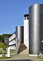
- Nomination Cooperative State University Lörrach --Taxiarchos228 07:12, 31 October 2011 (UTC)
- Promotion QI to me. --D4m1en 11:26, 31 October 2011 (UTC)
-

- Nomination Cooperative State University Lörrach --Taxiarchos228 07:12, 31 October 2011 (UTC)
- Promotion QI to me. --D4m1en 11:26, 31 October 2011 (UTC)
-
-

- Nomination Cathedral of Christ the Saviour, Gate --Aleks G 19:28, 30 October 2011 (UTC) 23:28, 30 October 2011 (UTC)
- Promotion Great --Herzi Pinki 20:25, 30 October 2011 (UTC)
-

- Nomination Deliberate deformity of the skull --Archaeodontosaurus 16:56, 30 October 2011 (UTC)
- Promotion Good quality. --Berthold Werner 17:19, 30 October 2011 (UTC)
-

- Nomination Scleroderma verrucosum --Holleday 15:14, 30 October 2011 (UTC)
- Promotion Support QI and Useful --Archaeodontosaurus 16:58, 30 October 2011 (UTC)
-

- Nomination Xylaria hypoxylon --Holleday 15:13, 30 October 2011 (UTC)
- Promotion Support QI and Useful --Archaeodontosaurus 17:00, 30 October 2011 (UTC)
-

- Nomination Coprinus micaceus --Holleday 15:12, 30 October 2011 (UTC)
- Promotion Support QI and Useful --Archaeodontosaurus 17:02, 30 October 2011 (UTC)
-
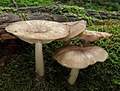
- Nomination Collybia platyphylla --Holleday 15:11, 30 October 2011 (UTC)
- Promotion Support QI and Useful --Archaeodontosaurus 17:03, 30 October 2011 (UTC)
-

-
- Nomination Hemikyptha marginata --Archaeodontosaurus 13:41, 30 October 2011 (UTC)
- Promotion QI for me--Holleday 14:53, 30 October 2011 (UTC)
-
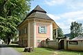
- Nomination The garden house of the monastery in Vorau. Main problem was to get rid of the annoying tree. --Herzi Pinki 12:52, 30 October 2011 (UTC)
- Promotion Good quality. --Taxiarchos228 15:43, 30 October 2011 (UTC)
-
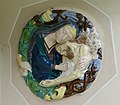
- Nomination Wayside shrine in Vorau: Mary, Jesus, the pelikan and the octopus. --Herzi Pinki 12:52, 30 October 2011 (UTC)
- Promotion Good quality. --LutzBruno 16:45, 30 October 2011 (UTC)
-

- Nomination Wayside shrine in Vorau from 1663, with a hole from 1945 shooting. --Herzi Pinki 12:52, 30 October 2011 (UTC)
- Promotion Good quality. --Taxiarchos228 15:43, 30 October 2011 (UTC)
-
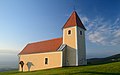
- Nomination Small church St.Pankrazen on the eastern slope of Masenberg, Styria. --Herzi Pinki 12:52, 30 October 2011 (UTC)
- Promotion Good quality. --Taxiarchos228 15:43, 30 October 2011 (UTC)
-

- Nomination The entrace building to the churchyard in Mönichwald, Styria. --Herzi Pinki 12:52, 30 October 2011 (UTC)
- Promotion Good quality. --Taxiarchos228 15:43, 30 October 2011 (UTC)
-
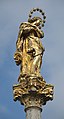
- Nomination Maria column in front of the town hall in Vorau, Styria. --Herzi Pinki 12:52, 30 October 2011 (UTC)
- Promotion Good quality. --Taxiarchos228 15:43, 30 October 2011 (UTC)
-
- Nomination Dredge ship on the Danube --High Contrast 22:35, 29 October 2011 (UTC)
- Promotion Good, althought the composition is a bit wild. Mvg, Basvb 10:05, 30 October 2011 (UTC) Comment Well, it was the best from this angle. Six ships were towed together. --High Contrast 13:46, 30 October 2011 (UTC)
-

-

-

-

-

-

-

- Nomination Pediment and part of the roof of the main building of Ecole Militaire in Paris.--Jebulon 22:25, 25 October 2011 (UTC)
- Promotion I think it meets the criteria.--MrPanyGoff 08:45, 31 October 2011 (UTC)
-
- Nomination: Weil am Rhein: Schlaich tower (detail) --Taxiarchos228 09:31, 25 October 2011 (UTC)
- Review needed
-

- Nomination: Weil am Rhein: Bundesstraße 317 near Schlaich tower --Taxiarchos228 09:31, 25 October 2011 (UTC)
- Review needed
-
- Nomination: The village in the springtime Daussois, Belgium.-- Jean-Pol GRANDMONT 08:03, 25 October 2011 (UTC)
- Review needed
-
- Nomination: Tree Trunks for wallpaper. --M0tty 06:40, 25 October 2011 (UTC)
- Review needed
-

- Nomination: Two Lufthansa Airbus A330-343X at Düsseldorf International Airport --Carschten 15:12, 24 October 2011 (UTC)
- Review needed
-

- Nomination: Hawker 400XP and taking off Airbus A330-343X at Düsseldorf International Airport --Carschten 15:12, 24 October 2011 (UTC)
- Review needed
-

- Nomination Airbus A330 D-AIKG at Düsseldorf International Airport --Carschten 15:12, 24 October 2011 (UTC)
- Promotion Meets the criteria, imo.--MrPanyGoff 11:28, 31 October 2011 (UTC)
-

- Nomination Boeing 737 D-ABBW at Düsseldorf International Airport --Carschten 12:27, 24 October 2011 (UTC)
- Promotion Meets the criteria, imo.--MrPanyGoff 11:28, 31 October 2011 (UTC)
-

- Nomination Airbus A321 D-ALSD at Düsseldorf International Airport --Carschten 12:27, 24 October 2011 (UTC)
- Promotion Also good, I think.--MrPanyGoff 11:30, 31 October 2011 (UTC)
-
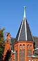
- Nomination: Tower at a building of the deaconry in Düsseldorf-Kaiserswerth --Carschten 12:27, 24 October 2011 (UTC)
- Review needed
-

- Nomination Germany, Igel, Hotel "Igeler Säule" --Berthold Werner 08:41, 24 October 2011 (UTC)
- Promotion I think it is OK for QI.--MrPanyGoff 08:55, 31 October 2011 (UTC)
-

- Nomination: Toronto: concrete shaft of CN Tower --Taxiarchos228 06:43, 24 October 2011 (UTC)
- Review Not vertical nor symmetric, + strange white "thing" in the sky all along the right part of the structure --Jebulon 16:23, 24 October 2011 (UTC)
"strange white thing" are ropes to fly flages --Taxiarchos228 16:24, 24 October 2011 (UTC) OK, I understand. BtW, I annotated a dust spot.--Jebulon 22:51, 24 October 2011 (UTC)
DS removed --Taxiarchos228 09:39, 25 October 2011 (UTC)
-

- Nomination West entrace to Gothenburg central station.--ArildV 22:02, 22 October 2011 (UTC)
- Promotion I think it meets the criteria.--MrPanyGoff 09:01, 31 October 2011 (UTC)
-

-

-

-

-
-

- Nomination Egg of Pterocles orientalis--Archaeodontosaurus 10:19, 30 October 2011 (UTC)
- Promotion Good quality. --Taxiarchos228 10:23, 30 October 2011 (UTC)
-
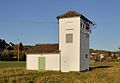
- Nomination Lörrach-Haagen: distribution substations (build 1951) --Taxiarchos228 09:56, 30 October 2011 (UTC)
- Promotion Good. Mvg, Basvb 10:15, 30 October 2011 (UTC)
-
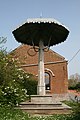
- Nomination pillory of the Lords in Rouveroy, Belgium.-- Jean-Pol GRANDMONT 09:06, 30 October 2011 (UTC)
- Decline Subject very dark. Mvg, Basvb 10:15, 30 October 2011 (UTC)
-

- Nomination Four shaggy inkcaps (Coprinus comatus).
- Promotion Good quality. --Raghith 07:13, 30 October 2011 (UTC)
-

- Nomination A fly agaric (Amanita muscaria). --The High Fin Sperm Whale 05:11, 30 October 2011 (UTC)
- Promotion Good quality. --Raghith 07:13, 30 October 2011 (UTC)
-

- Nomination Fly agaric again. --The High Fin Sperm Whale 05:11, 30 October 2011 (UTC)
- Promotion Good quality. --Raghith 07:13, 30 October 2011 (UTC)
-
- Nomination A large Bald-faced hornet (Dolichovespula maculata) nest. --The High Fin Sperm Whale 05:11, 30 October 2011 (UTC)
- Promotion Good quality. --Raghith 07:13, 30 October 2011 (UTC)
-

-

-

-

- Nomination Pomegranate Fruits (solar light only).--T137 17:08, 29 October 2011 (UTC)
- Promotion Support QI & Useful --Archaeodontosaurus 10:17, 30 October 2011 (UTC)
-

- Nomination Pomegranate Fruits (solar light only).--T137 17:08, 29 October 2011 (UTC)
- Promotion Support QI & Useful --Archaeodontosaurus 10:17, 30 October 2011 (UTC)
-

- Nomination HP 85 computer. On display at the Musée Bolo, EPFL, Lausanne. -- Rama 16:34, 29 October 2011 (UTC)
- Promotion Oldie but Goldie. Good photograph. --High Contrast 00:19, 30 October 2011 (UTC)
-

-

- Nomination Hydroelectric power plant in Besigheim --Brackenheim 11:42, 29 October 2011 (UTC)
- Promotion Good. Mvg, Basvb 10:10, 30 October 2011 (UTC)
-
-
- Nomination Flatolystra verrucosa--Archaeodontosaurus 17:13, 27 October 2011 (UTC)
- Promotion QI for me --Llez 12:02, 29 October 2011 (UTC)
-

- Nomination Peugeot 607 in Paris --Taxiarchos228 08:02, 26 October 2011 (UTC)
- Decline Blurry, two lens spots -- M 93 20:00, 29 October 2011 (UTC)
-

-

- Nomination: Graffiti stencil on a walled door in Namur, Belgium.-- Jean-Pol GRANDMONT 10:38, 24 October 2011 (UTC)
- Review needed
-
- Nomination: PZL M18B Dromader --Airwolf 10:12, 24 October 2011 (UTC)
- Review needed
-

- Nomination Lake Geneva and a boat. -- Ludo29 07:58, 24 October 2011 (UTC)
- Decline Sorry but the right part of the pier is out of focus -- Focus finder 08:33, 24 October 2011 (UTC)
-

- Nomination: Breidsæterdalen, Oppland, Norway, in 2011 August --Ximonic 22:45, 23 October 2011 (UTC)
- Review needed
-

-

- Nomination: Dutch AH-64 Apache --Airwolf 17:15, 23 October 2011 (UTC)
- Review needed
-

- Nomination: Panoramic view from the Sacré-Coeur de Monmartre, Paris. Alvesgaspar 11:24, 23 October 2011 (UTC)
- Review Comment sky OE --Carschten 14:04, 23 October 2011 (UTC)
-

- Nomination Aquis Querquennis, roman castra at Os Baños, Bande (Ourense, Galiza)-7.--Lmbuga 19:01, 19 October 2011 (UTC)
- Promotion Distortion should be corrected. --Quartl 14:56, 26 October 2011 (UTC)
I don't know what distortion, imho ok. --Berthold Werner 15:09, 29 October 2011 (UTC)


.jpg)


![* Nomination abondance cow profile in the Aravis mountain (France) (by Walpole) -- Achim Raschka 18:59, 13 November 2011 (UTC) * Promotion Comment What does "abondance" mean? --Gidip 20:03, 20 November 2011 (UTC) Abondance is the race of catte, see [1] -- Achim Raschka 07:24, 21 November 2011 (UTC) Bit unsharp but good enough. Mattbuck 20:40, 27 November 2011 (UTC)](/wiki/File:Abondance_cow_profile.jpg)


.JPG)


.JPG)


.jpg)


.jpg)


.jpg)


.JPG)


![* Nomination: Oudemansiella mucida --Raghith 09:10, 16 November 2011 (UTC) * Review Needs id. --Quartl 19:56, 16 November 2011 (UTC) added to German identification project -- Achim Raschka 07:25, 17 November 2011 (UTC) Identified as Oudemansiella mucida via [2], don't sure about the quality. -- Achim Raschka 17:56, 17 November 2011 (UTC)](/wiki/File:Oudemansiella_mucida,_%D0%93%D1%80%D0%B8%D0%B1%D1%8B_%D0%BD%D0%B0_%D0%94%D0%B5%D0%BC%D0%B5%D1%80%D0%B4%D0%B6%D0%B8_010.jpg)

_%26_Fv91,_2011_October.jpg)
-_Six_jours_de_Grenoble_2011.jpg)


_3.jpg)


,_num%C3%A9ro_58,_plaque.jpg)


_Backhuijs.jpg)


.JPG)


,_Willingen,_Panorama,_2011-08_CN-01.jpg)


_september_2011.jpg)


.JPG)
.JPG)


.jpg)


,_2011,_regnr_18053.jpg)


.JPG)

_-_Mostra_di_Nerone_-_Palatin_hill.jpg)


,_1886_%D0%B3.jpg)


,_num%C3%A9ro_44,_porte_de_garage_sous_tenture.jpg)


,_2011_October.jpg)


_-_Kroton_001.jpg)


.jpg)


.jpg)


.jpg)


.jpg)


.jpg)


.jpg)
.jpg)


_04.jpg)


.JPG)


_-_Mostra_di_Nerone_-_Palatin_hill.jpg)


.jpg)


.JPG)
.JPG)


![* Nomination Helsinki, Uspenski Cathedral and Stora Enso headquarter --Ralf Roletschek 14:19, 22 October 2011 (UTC) * Decline Comment Building falls to the right. The car hanging in on the left slightly disturbing. Again: file description inadequate, file name not very descriptive, and the endless copyright-notices.... --Elekhh 10:07, 27 October 2011 (UTC) the building no falls. and what the name and descr. has to do with the quality? --Ralf Roletschek 11:50, 1 November 2011 (UTC) Info maybe is time for you to read the QI criteria. For your convenience here an excerpt: "Quality images must [...] have a meaningful title and description." --Elekhh 04:07, 3 November 2011 (UTC) Comment the borders contain unfortunate elements that distract from the subject. Rama 14:44, 4 November 2011 (UTC)Per all above and no improvements--Jebulon 10:11, 8 November 2011 (UTC)](/wiki/File:11-07-29-helsinki-by-RalfR-177.jpg)


.JPG)
.JPG)
.JPG)


_4.jpg)


.jpg)


.jpg)


,_num%C3%A9ro_6,_porte.jpg)

_W._T._Aliton_JdP.jpg)


.jpg)


.-%D0%9F%D0%B5%D1%82%D0%B5%D1%80%D0%B3%D0%BE%D1%84.jpg)


.jpg)


.JPG)


,_Salaca_river.JPG)

.JPG)


_05.jpg)
_03.jpg)
_02.jpg)


_Dunal_JdP.jpg)


.jpg)


.jpg)


.jpg)


,_num%C3%A9ro_4.jpg)


![* Nomination: "The new Hewlett-Packard 9100A personal computer" is "ready, willing, and able... to relieve you of waiting to get on the big computer." [3] (1968) -- Rama 07:49, 26 October 2011 (UTC) * * Review needed](/wiki/File:HP9100A-IMG_0393.jpg)


.jpg)


.jpg)


_-_ko%C5%9Bci%C3%B3%C5%82_Naj%C5%9Bwi%C4%99tszego_Serca_Pana_Jezusa_-_Kroton_001.jpg)
_-_ko%C5%9Bci%C3%B3%C5%82_Naj%C5%9Bwi%C4%99tszego_Serca_Pana_Jezusa_-_Kroton_002.jpg)
_-_ko%C5%9Bci%C3%B3%C5%82_Naj%C5%9Bwi%C4%99tszego_Serca_Pana_Jezusa_-_Kroton_003.jpg)
_-_ko%C5%9Bci%C3%B3%C5%82_Naj%C5%9Bwi%C4%99tszego_Serca_Pana_Jezusa_-_Kroton_004.JPG)


.jpg)


.JPG)
_3.JPG)
_2.JPG)
_nest.JPG)


.jpg)
.jpg)


.jpg)

_-_Paris.jpg)


.jpg)
_-_church.JPG)
_perched.JPG)
_–_Heckansicht_(2),_25._Oktober_2011,_Düsseldorf.jpg)
Consensual review[edit]
File:Peresecenie2011-expo-2083.jpg[edit]

- Nomination Exposition at the the «Crossing» festival. Costumes from Hypno Design. --PereslavlFoto 15:06, 11 November 2011 (UTC)
- Decline {{{2}}}
File:Peresecenie2011-expo-2085.jpg[edit]

- Nomination Exposition at the the «Crossing» festival. Costumes from Hypno Design. --PereslavlFoto 15:06, 11 November 2011 (UTC)
- Decline {{{2}}}
File:Peresecenie2011-expo-2088.jpg[edit]

- Nomination Exposition at the the «Crossing» festival. Costumes from Hypno Design. --PereslavlFoto 15:06, 11 November 2011 (UTC)
- Decline {{{2}}}
File:Florence_Duomo_-_main_gate.jpg[edit]

- Nomination Main gate of the Duomo in Florence. --Eusebius 14:15, 11 November 2011 (UTC)
- Promotion
- Support Good quality. --Kroton 14:59, 11 November 2011 (UTC)
- OpposeI am pretty much disappointed that QI is given to pictures of artwork where no attempt is even made to mention or research the name of the artist--Moroder 23:23, 11 November 2011 (UTC)
- The author of the central gate of the portal is not mentionned in the Wikipedia articles linked from the image caption. However, the category of the portal makes a reference to some Italian artist. I guess somebody who knew better than me provided the information. I see no point in writing a full article in the image page when the architecture of the wiki gives better information than the one I could provide, and in a structured way. I will add some date information in the portal category, though. --Eusebius 21:24, 12 November 2011 (UTC)
- Support QI to me, very goog quality--Lmbuga 03:47, 12 November 2011 (UTC)
- Support QI for me, but the caption is a bit low. --Archaeodontosaurus 13:39, 12 November 2011 (UTC)
- Support I was there, it looks so. I've added two illustrated notes of details, please delete if inappropriate. Yes the caption could be better, but links are good. I agree that we should be in QI less lenient (in general, not regarding this picture) with the file names, the description pages and the categories...--Jebulon 15:59, 12 November 2011 (UTC)
File:2011-10-22 23-11-57-belfort-in-night.jpg[edit]

- Nomination Ramparts of Belfort, in night. --ComputerHotline 21:04, 30 October 2011 (UTC)
- Decline
- Support nicht so langweilig wie sonst immer I like that. difficult light, well-implemented --Ralf Roletschek 12:28, 1 November 2011 (UTC)
- Oppose Very blurry in my opinion. + some technical issues annotated. Maybe a QI (after corrections), but I ask for a discussion, please. --Jebulon 18:18, 1 November 2011 (UTC)
- I've corrected the perspective of this picture with ShiftN before upload in WikiCommons. --ComputerHotline 18:48, 1 November 2011 (UTC)
- Oppose Indeed it is really blury, for me it's not OK. Same as Jebulon, maybe it is a QI and I'm being too harsh, but please let's discuss about it. PierreSelim 12:58, 9 November 2011 (UTC)
- Comment I think the blur is just ok, but the HDR errors have to be fixed. Maybe some denoising in the sky would be good, too. --Carschten 11:36, 10 November 2011 (UTC)
- Oppose Sky is too noisy. Léna 23:50, 12 November 2011 (UTC)
File:2011-09-05 10-44-16-PA00101134.jpg[edit]

- Nomination Inside of Église de Brasse of Belfort, France. --ComputerHotline 18:40, 6 November 2011 (UTC)
- Decline Meets the criteria, imo.--MrPanyGoff 21:13, 8 November 2011 (UTC)
What is the subject ? The altar is totally out of focus + the color is very red (the next one looks a bit better) --PierreSelim 19:12, 9 November 2011 (UTC)
* Oppose White balance is imo off --Mbdortmund 02:47, 11 November 2011 (UTC)
File:Fontaine Saint-Sulpice Paris 6.jpg[edit]

- Nomination Saint-Sulpice Fountain in Paris --Moonik 05:58, 8 November 2011 (UTC)
- Promotion
- Support Good quality --Ximonic 10:00, 8 November 2011 (UTC)
- Comment Hey, what happened with the people's faces? Otherwise good quality indeed.--MrPanyGoff 10:12, 8 November 2011 (UTC)
- Hi, to protect the prived live, faces were a little bit noised --Moonik 10:55, 8 November 2011 (UTC)
- Comment I don't understand the framing...--Jebulon 15:22, 9 November 2011 (UTC)
- I sacrificed the bottom of the fountain to have the bigger top. It isn't good? --Moonik 15:32, 9 November 2011 (UTC)
File:Canoe vézère.jpg[edit]

- Nomination Canoeists on the Vézère river, after a storm.--Jebulon 22:40, 5 November 2011 (UTC)
- Promotion
- Support Good quality--Lmbuga 23:13, 5 November 2011 (UTC)
- Oppose bad lighting conditions and poor dymanic --Taxiarchos228 12:48, 6 November 2011 (UTC)
- Comment Poor review. I don't understand "poor dynamic", because it "moves" more than any ...skyline of a city, for instance. Yes the "lighting conditions" where not so good just after a storm, that's just why this picture was particularly difficult to take ! And ? btw, maybe could you decline (or discuss) sometimes other pictures than mine, then you may hide better that your negative reviews are a bit "personal"... Anyway, I'm not afraid by Consensual Review--Jebulon 14:37, 6 November 2011 (UTC)
- Support QI for me.Exposure, sharpness and DOF are good. The colours are natural for a river surrounded by trees under a grey sky.--Vassil 23:07, 7 November 2011 (UTC)
- Support I don't see problems, QI IMHO. --T137 10:59, 8 November 2011 (UTC)
- Comment Please stop reviewing your pictures vice versa for a time to find back to better cooperation. You both are delivering important pictures for our project. --Mbdortmund 19:54, 8 November 2011 (UTC)
- +1 --Carschten 11:47, 10 November 2011 (UTC)
File:Salacgrīva (Salismünde) - church.JPG[edit]
_-_church.JPG)
- Nomination Salacgrīva (Salismünde) - evangelical church --Pudelek 12:56, 28 October 2011 (UTC)
- Decline
- Support Good quality. --Ralf Roletschek 16:44, 1 November 2011 (UTC)
- Oppose What about the white lines around the roof of the tower?--MrPanyGoff 19:14, 1 November 2011 (UTC)
- yes, correct, whats this? --Ralf Roletschek 21:27, 1 November 2011 (UTC)
- Comment I don't now whats this... mayby reflection of the sun? --Pudelek 10:13, 2 November 2011 (UTC)
- Oppose overall too soft in my opoinion, sorry. --Carschten 11:33, 10 November 2011 (UTC)
File:Melitaea trivia syriaca 1.jpg[edit]

- Nomination Melitaea trivia --Gidip 21:16, 17 October 2011 (UTC)
- Promotion
- Comment Melitaea trivia nana (Staudinger, 1871) is the correct name. Melitaea trivia syriaca is a synonym. --Archaeodontosaurus 08:10, 23 October 2011 (UTC)
- But it is not a wrong name, or is it? --Gidip 16:55, 23 October 2011 (UTC)
- Melitaea trivia nana is a good name.--Archaeodontosaurus 10:30, 26 October 2011 (UTC)
- But it is not a wrong name, or is it? --Gidip 16:55, 23 October 2011 (UTC)
- Support Naming, description and categorization is ok to me. The image could be more detailed but considering the small size of this butterfly the quality to me is good enough. --Quartl 14:41, 26 October 2011 (UTC)
File:Larix decidua - cones - Kroton 001.jpg[edit]

- Nomination Cones of European larch --Kroton 14:24, 22 October 2011 (UTC)
- Decline
- Support Nice shot! Meets the criteria! --High Contrast 09:51, 25 October 2011 (UTC)
- Oppose In my opinion, very noisy and full of artefacts at high resolution, probably due to the camera. I ask for a discussion, please.--Jebulon 15:39, 26 October 2011 (UTC)
- Support -- 320td 12:20, 27 October 2011 (UTC)
- Support --Jordiferrer 12:57, 27 October 2011 (UTC)
- Oppose nothing really sharp. Blurry and noisy. White balance too green. --Carschten 20:13, 27 October 2011 (UTC)
- Oppose As Carschten. Sorry. --T137 09:44, 28 October 2011 (UTC)
- Oppose as Carschten. Sorry too. --Alchemist-hp 19:48, 30 October 2011 (UTC)
File:Segway Champ-de-Mars.jpg[edit]

- Nomination A "Segway", Champ-de-Mars, Paris.--Jebulon 09:57, 24 October 2011 (UTC)
- Promotion
- Oppose bad crop --Taxiarchos228 15:34, 24 October 2011 (UTC)
- Really ? I do not see any crop on the main subject...--Jebulon 15:46, 24 October 2011 (UTC)
- Support we dont need the man to illustrate a segway. let us diskuss! --Ralf Roletschek 06:37, 25 October 2011 (UTC)
- Support good --Carschten 12:06, 25 October 2011 (UTC)
- Oppose bad crop --Jordiferrer 13:46, 26 October 2011 (UTC)
 Question Revenge for the sagrada familia ? It is curious that the only review of this contributor is against this picture ! There are many other unassessed pictures in QIC... Stupid childlike behaviour...--Jebulon 15:45, 26 October 2011 (UTC)
- OK, the crop is not bad if you want to simply focus on the segway. However, in my modest opinion this spefic photo is not having anything special compared to other ones.--Jordiferrer 12:56, 27 October 2011 (UTC)
- Sorry, this argument is an irrelevant criterium in QIC page. Please have a look to our guidelines, it helps very much!--Jebulon 14:34, 27 October 2011 (UTC)
- OK, the crop is not bad if you want to simply focus on the segway. However, in my modest opinion this spefic photo is not having anything special compared to other ones.--Jordiferrer 12:56, 27 October 2011 (UTC)
- Oppose composition, tilt. --Quartl 14:45, 26 October 2011 (UTC)
- Support the crop is ok. The main subject is the Segway itself and this one is shown completely. --High Contrast 15:31, 26 October 2011 (UTC)
- Support per High Contrast. Cropping out a man's head is a classic composition to display equipment (a cop belt, paramedics, etc.) ; I'd go as far as saying that a wider drop would probably be less good, as the face would attract attention and distrct from the Segway which is the subject. -- Rama 06:23, 27 October 2011 (UTC)
- Support Airwolf 21:22, 29 October 2011 (UTC)
- Support Could be better, but there's nothing wrong with it. Crop is good, if you want to avoid personality rights :) --Specious 07:19, 2 November 2011 (UTC)
File:Den Haag - Wassenaarseweg 80 v2.JPG[edit]

- Nomination Main office from the Bataafsche Import Maatschappij in The Hague -- Basvb 10:44, 30 October 2011 (UTC)
- Promotion
- Oppose Sorry but picture with perspective distorsion + tilt -- Focus finder 12:00, 30 October 2011 (UTC)
- Support - the correct perspective do not disturb --Ralf Roletschek 11:19, 31 October 2011 (UTC)
- Comment image has a green cast --Carschten 13:26, 31 October 2011 (UTC)
- Support Done for perspective correction! --Alchemist-hp 20:23, 1 November 2011 (UTC)
- Thanks for demonstrating that Alchemist-hp. Tiny things: crop is slightly unsymmetrical and somebody lost of paper bag. --Elekhh 20:38, 1 November 2011 (UTC)
- Of course it would be better, if the crop would be symmetrical, but not so important for a QI. The paper bag is not the photographer's fault, but I agree here, that it's disturbing, but no need to retouch it out for QI status IMHO. But I insist on my green cast. --Carschten 22:31, 1 November 2011 (UTC)
- Done again. symmetric cut + color correction. --Alchemist-hp 22:47, 1 November 2011 (UTC)
- Of course it would be better, if the crop would be symmetrical, but not so important for a QI. The paper bag is not the photographer's fault, but I agree here, that it's disturbing, but no need to retouch it out for QI status IMHO. But I insist on my green cast. --Carschten 22:31, 1 November 2011 (UTC)
- Thanks for demonstrating that Alchemist-hp. Tiny things: crop is slightly unsymmetrical and somebody lost of paper bag. --Elekhh 20:38, 1 November 2011 (UTC)
- Support good and QI now --Archaeodontosaurus 06:54, 2 November 2011 (UTC)
- Support Good now. --Berthold Werner 16:08, 2 November 2011 (UTC)
File:IGP5480.JPG[edit]

- Nomination Distribution substation in Groningen, the Netherlands -- Basvb 10:44, 30 October 2011 (UTC)
- Decline
- Oppose Sorry but the composition is bad and too busy -- Focus finder 12:00, 30 October 2011 (UTC)
- Composition seems pretty much fine to me, the background has colours, but nothing disturbing. Mvg, Basvb 12:51, 30 October 2011 (UTC)
- Oppose poor white balance, artifacts (noise) --Carschten 12:29, 31 October 2011 (UTC)
- Oppose sky overexposure, perspective distortion. Also the chosen 45 degree angle is ambiguous: if the heritage building is the subject than more of the facade with the gable would have been beneficial, if the "vandalising" of heritage through the billboards was the subject than more of the other facade. In both cases the strong red trash-bin is distracting. But not a bad picture overall. --Elekhh 20:16, 1 November 2011 (UTC)
- One little thing: I think the 45 degree is just ok, it gives a good view on both sides of the small building. The building is showed in it's suroundings, the building is the subject in how it is. So with advertisement, but the vandalising is not the topic. This specific heritage is. Mvg, Basvb 16:55, 2 November 2011 (UTC)
File:Lörrach_-_Hauptfriedhof8.jpg[edit]

- Nomination Lörrach: Main cementery, war memorial --Taxiarchos228 09:16, 29 October 2011 (UTC)
- Decline
- Oppose Don't like that half is dark half is in full light. Mvg, Basvb 10:10, 30 October 2011 (UTC)
- are personal leanings a criteria for QI? --Taxiarchos228 10:12, 30 October 2011 (UTC)
- personal leanings? one part dark and one part not makes it hard to read. I think with other light quality would be good. Mvg, Basvb 10:17, 30 October 2011 (UTC)
- "I don't like" is a personal leaning. I am not convinced that QI have to be without shadows, especially when everything is visible clearly --Taxiarchos228 10:21, 30 October 2011 (UTC)
- I just expressed it with caution. Lighting is one of the criteria. Shadow is ok, but full shadow then, not half. Mvg, Basvb 10:28, 30 October 2011 (UTC)
- let´s see what other user say --Taxiarchos228 10:30, 30 October 2011 (UTC)
- Oppose per Basvb -- Focus finder 12:18, 31 October 2011 (UTC)
- Support its nice with half-and-half. not as boring as it otherwise always --Ralf Roletschek 11:59, 1 November 2011 (UTC)
- Comment Difficult to assess. The shadow is disturbing at thumbnail, but not at full size. I tend to agree with Ralf Roletschek--Jebulon 14:23, 1 November 2011 (UTC)
- Oppose der Schatten stört doch zu sehr. --Alchemist-hp 19:20, 1 November 2011 (UTC)
- fragt sich nur wobei --Taxiarchos228 19:22, 1 November 2011 (UTC)
- Ist doch klar: um das QI Baperl zu bekommen. Grüße, --Alchemist-hp 19:40, 1 November 2011 (UTC)
- was für eine geistreich-unsachliche Antwort --Taxiarchos228 19:52, 1 November 2011 (UTC)
- Ist doch klar: um das QI Baperl zu bekommen. Grüße, --Alchemist-hp 19:40, 1 November 2011 (UTC)
- Comment Tricky one, I think is the tight crop in combination with the shadow which is the problem. If more trees were included than the image would be more about the place as a whole and the shadow relevant, with the very tight crop is perceived as disturbing. --Elekhh 20:06, 1 November 2011 (UTC)
- Oppose nervy shadow --A.Ceta 08:57, 6 November 2011 (UTC)
File:Oisterwijk-KVL-5826-rm519948.jpg[edit]

- Nomination Factory from the Koninklijke Verenigde Leder B.V. in Oisterwijk, the Netherlands -- Basvb 20:50, 28 October 2011 (UTC)
- Promotion
- Support Good quality. --Mbdortmund 22:35, 28 October 2011 (UTC)
- Oppose The image is looking like it was edited with an effect tool by photoshop. Also there is perspective distortion. --Pilettes 08:40, 29 October 2011 (UTC)
- Comment very nice, but I agree that it should be straightened and maybe the cut off pillar at left should be cropped, too. --Carschten 12:12, 31 October 2011 (UTC)
- Support --Carschten 22:27, 1 November 2011 (UTC)
- Support now corrected: perspective distortion. --Alchemist-hp 19:35, 1 November 2011 (UTC)
File:Toronto_-_ON_-_New_City_Hall11.jpg[edit]

- Nomination Toronto: City Hall --Taxiarchos228 06:21, 27 October 2011 (UTC)
- Decline
- Support Good quality. --Ralf Roletschek 09:31, 27 October 2011 (UTC)
- Oppose I am not sure of the composition: the crop on the right seems really random, with a flag post hanging in and the base of the tower cropped. --Elekhh 09:49, 27 October 2011 (UTC)
- Support good quality. -- 320td 12:12, 27 October 2011 (UTC)
- Oppose noisy shadows, I'm not really convinced about the crop at right --Carschten 10:42, 31 October 2011 (UTC)
- Oppose Per Elekhh -- Focus finder 12:14, 31 October 2011 (UTC)
- Oppose Composition. Is this even a good location to take a picture of this building from? On a windy day, at least you could catch the flags unravelled. --Specious 05:15, 3 November 2011 (UTC)
- No, but the intention of this picture wasn't to show the representative front view. Such pictures I have made too. The intention of the picture was to show the backside and windowless facade. May Quality images only show the "the sunny side"? --Taxiarchos228 07:19, 3 November 2011 (UTC)
- You can shoot the boring side, but for QI it still needs to look good. The wall and tree subtract rather than add to the shot, and the flags are in their limp state. Maybe the best view would be possible if you climb on top of the wall (yeah right)? If you geocode it, I might take a closer look. --Specious 12:22, 3 November 2011 (UTC)
- geotaged now --Taxiarchos228 13:01, 3 November 2011 (UTC)
- You can shoot the boring side, but for QI it still needs to look good. The wall and tree subtract rather than add to the shot, and the flags are in their limp state. Maybe the best view would be possible if you climb on top of the wall (yeah right)? If you geocode it, I might take a closer look. --Specious 12:22, 3 November 2011 (UTC)
File:W50L_Kipper.JPG[edit]

- Nomination IFA W50L Dump truck --LutzBruno 18:24, 25 October 2011 (UTC)
- Decline
- Support QI IMO --Vassil 19:25, 26 October 2011 (UTC)
- Oppose blurry -- M 93 11:55, 27 October 2011 (UTC)
- Oppose per M 93 -- Focus finder 12:07, 30 October 2011 (UTC)
- Oppose The truck is blurry towards the back because the depth of field is too shallow. Try using f-stop 11 or so. --Specious 07:11, 2 November 2011 (UTC)
File:Toronto_-_ON_-_CN_Tower.jpg[edit]

- Nomination Toronto: CN Tower from North --Taxiarchos228 06:11, 28 October 2011 (UTC)
- Promotion Support good composition --Ralf Roletschek 16:44, 1 November 2011 (UTC) Oppose Not that I would be against perspective correction, but this one is overdone. Check out both edges, the image falls apart. --Elekhh 04:14, 3 November 2011 (UTC)
- Support Good quality. Yann 18:17, 3 November 2011 (UTC)
File:Åre, Läkarvillan.jpg[edit]

- Nomination Villa Jamtbol or The Doctor's Villa, built in 1911 (by Ulff. -- Achim Raschka 15:40, 21 October 2011 (UTC)
- Decline Oppose I know it is the winner of the WLM2011 in Sweden, but I find it a bit dark. Other opinions ? --Jebulon 14:42, 27 October 2011 (UTC)
Darkness doesn't really seems like an issue here to me. Mvg, Basvb 12:11, 31 October 2011 (UTC)
really, it is dark. for me QI. --Ralf Roletschek 16:51, 1 November 2011 (UTC)
 Strong oppose Sorry but NO, a very bad, noisy, dark and shadowed HDR image with visible CA or false HDR color artefacts and also bad grey shadow arround the chimneys. --Alchemist-hp 23:42, 2 November 2011 (UTC)
 - Oppose As Alchemist-hp. --T137 10:57, 4 November 2011 (UTC)
File:Steinen_-_Evangelische_Kirche7.jpg[edit]

- Nomination Steinen: Protestant Church, epitaph --Taxiarchos228 07:51, 18 October 2011 (UTC)
- Decline Right upper corner overexposed?--Lmbuga 22:20, 18 October 2011 (UTC)
Looks OK to me, but I think that the photograph would benefit from a perspective correction. -- Rama 06:25, 27 October 2011 (UTC)
Oppose right part overexposed, need also a perspective correction. --Alchemist-hp 23:44, 2 November 2011 (UTC)
File:Buste Th. Rousseau.jpg[edit]

- Nomination Théodore Rousseau (1812-1867), french painter, bust by Henri Levasseur. Jardin du Luxembourg, Paris.--Jebulon 23:25, 31 October 2011 (UTC)
- Promotion
- Support Meets the criteria, imo.--MrPanyGoff 07:46, 1 November 2011 (UTC)
- Oppose bad crop of the windows, let's discuss --Taxiarchos228 15:24, 1 November 2011 (UTC)
- Please notice that a comment by me was removed by the reviewer above, against the rules and civility, only because he thought that this comment was "out of place". I think he did not have the right to do so...--Jebulon 22:01, 1 November 2011 (UTC)
- Comment I think the image is good, but a square crop would be also worth a try. --Elekhh 03:51, 3 November 2011 (UTC)
- Question You mean: a crop left and right ?--Jebulon 09:25, 3 November 2011 (UTC)
- Support Good quality. Yann 18:18, 3 November 2011 (UTC)
File:Hauingen_-_Fasnachtsbrunnen.jpg[edit]

- Nomination Hauingen: carnival water well (new version) --Taxiarchos228 20:25, 31 October 2011 (UTC)
- Promotion
- Support Als Profi hättste eigentlich noch den Wagen abschleppen müssen --Carschten 21:12, 31 October 2011 (UTC)
- Oppose The main subject is nice and sharp (maybe tilted a little), but the cropped car makes the background confusing and disturbing, in my opinion. What think others in Consensual Review ?--Jebulon 15:19, 1 November 2011 (UTC)
- Support The car is a sign of the times, but it's not a bad part of the composition. The DOF is very good. I say QI. --Specious 10:38, 2 November 2011 (UTC)
- Support for me also QI. --Ralf Roletschek 12:17, 2 November 2011 (UTC)
- Oppose unfortunate background. Good photography involves choosing the right moment as well. --Elekhh 03:57, 3 November 2011 (UTC)
- Support As Specious. --T137 12:05, 3 November 2011 (UTC)
==[edit]
- Nomination Interior of the church St. Christophorus in Ratingen --Carschten 14:52, 27 October 2011 (UTC)
- Decline
- Oppose Sorry but left part of the picture is underexposed and some windows are overexposed-- Focus finder 17:04, 27 October 2011 (UTC)
- Support difficult lighting situation - for me its QI --Ralf Roletschek 16:48, 1 November 2011 (UTC)
- Oppose Per Focus finder, Maybe QI, but needs a discussion IMO.--Jebulon 09:53, 2 November 2011 (UTC)
- Oppose I understand there is difficult light condition and i understand that overexposure is inevitable, but the subject is too underexposed IMHO. Sorry. For this shot needs alternative natural light. --T137 15:08, 2 November 2011 (UTC)
File:Lörrach_-_Anschlussbrücke_zur_BAB_98_5.jpg[edit]

- Nomination Lörrach: Bridge bearing --Taxiarchos228 10:00, 30 October 2011 (UTC)
- Promotion Good. Althought main subject (the connection) is a bit dark to the left. Mvg, Basvb 10:15, 30 October 2011 (UTC) Sorry but there are some part also overexposed -- Focus finder 12:34, 31 October 2011 (UTC)
- Support perfect bridge detail, nothing too dark. --Ralf Roletschek 14:48, 1 November 2011 (UTC)
- Comment I don't see an exposure problem. I'd be more of a stickler about the noise, if anything. The composition is good, given the boring subject (to most people). It looks like it would require extra equipment to situate the camera where the entire subject (the bridge joint) would be visible unhindered. That's why I can't support it for QI. Thanks for taking this photo. --Specious 10:08, 2 November 2011 (UTC)
- I'll reduce the noise --Taxiarchos228 10:11, 2 November 2011 (UTC)
- Support To be honest, I have to support this useful, interesting and good picture.--Jebulon 14:58, 3 November 2011 (UTC)
File:Makros-Schach-DSC_0834-093-cor.jpg[edit]

- Nomination GARDE chess clock --Mbdortmund 07:36, 31 October 2011 (UTC)
- Decline
- Support Good quality. --Taxiarchos228 08:06, 31 October 2011 (UTC)
- Oppose Sorry, but the right side is out of focus, I'd like to see some more opinions. Mvg, Basvb 11:56, 31 October 2011 (UTC)
- Oppose DOF too short --Carschten 13:17, 31 October 2011 (UTC)
- Comment The photo is like I wanted to have it, but I will take another picture just exactly symmetric and everything sharp... --Mbdortmund 02:02, 1 November 2011 (UTC)
File:Ratingen, Schloss Linnep, 2011-10 CN-01.jpg[edit]

- Nomination Linnep Castle --Carschten 14:52, 27 October 2011 (UTC)
- Promotion
- Oppose Sorry but underexposed foreground and leaves of shrubs out of focus. -- Focus finder 17:04, 27 October 2011 (UTC)
- Comment of course the leaves are out of focus - it's f/6,3?! The the sun didn't shine, it was dark and I think the pic illustrates the mood very well, but I lighten it a bit. Better now? --Carschten 17:23, 27 October 2011 (UTC)
- Support For me it`s a QI. It`s sharp and has nice colours (next time take a garden clippers with you to cut those leaves ;) --Pilettes 09:13, 29 October 2011 (UTC)
- Support of course, it leave out of focus, its better so. --Ralf Roletschek 12:01, 1 November 2011 (UTC)
File:Iris vartanii 1.JPG[edit]

- Nomination Iris vartanii --Gidip 21:25, 20 October 2011 (UTC)
- Promotion
- Comment Could be a slope, but nevertheless looks quite tilted to me. --Quartl 15:06, 26 October 2011 (UTC)
- It's a slope. The flower is horizontal. --Gidip 21:51, 26 October 2011 (UTC)
- Oppose background is too distracting to me --Carschten 11:12, 31 October 2011 (UTC)
- Support For me it's ok. The backgrount is not a problem. Also the subject is the plant and not only the flower. --T137 16:19, 1 November 2011 (UTC)
- SupportPer T137.--Jebulon 15:05, 3 November 2011 (UTC)
File:11-09-10-kartoffel-DSC 5412.jpg[edit]

- Nomination red potatoes --Ralf Roletschek 12:39, 19 October 2011 (UTC)
- Promotion
- Support Not sure about the white balance (a bit "pink", see the other colored potatoes picture), but QI nevertheless --Jebulon 15:54, 26 October 2011 (UTC)
- Oppose Sorry but you can see some dust spots on the picture -- Focus finder 13:23, 28 October 2011 (UTC)
- Support now, dust cleaned. --Alchemist-hp 22:06, 30 October 2011 (UTC)
- Wieso hast du den Dreck denn von der Originalversion entfernt und nicht von der mit dem korrigierten Farbton? --Carschten 11:10, 31 October 2011 (UTC)
- Daran ist Commons schuld: der Cache :-( Und ich habe es zu spät, bereits nach getaner Arbeit gemerkt. Mal sehen, ich ändere den Farbton noch einmal etwas später. --Alchemist-hp 16:32, 31 October 2011 (UTC)
- Das wäre schön, weil dann gibt's auch ein Pro von mir. --Carschten 16:37, 31 October 2011 (UTC)
- Done --Alchemist-hp 22:33, 31 October 2011 (UTC)
- Support Danke! --Carschten 22:43, 31 October 2011 (UTC)
- Support --Archaeodontosaurus 08:15, 1 November 2011 (UTC)
File:Halictus resurgens male 1.jpg[edit]

- Nomination Halictus resurgens, male --Gidip 21:25, 20 October 2011 (UTC)
- Decline
- Oppose Not bad, but the central spike is too distracting to me. --Quartl 15:09, 26 October 2011 (UTC)
- Comment For me the spike is part of a nice "crown" of spikes around the flower and bee, and anyway it hardly conceals the bee. What do others think? --Gidip 20:34, 27 October 2011 (UTC)
- SupportI understand Quartl's comment, but I agree with Gidip's argument.--Jebulon 15:07, 3 November 2011 (UTC)
- Oppose As Quartl--Lmbuga 21:23, 3 November 2011 (UTC)
File:Wehr_-_St._Martin17.jpg[edit]

- Nomination Wehr: Saint Martin Church, fresco --Taxiarchos228 09:23, 3 November 2011 (UTC)
- Decline
- Support Good quality. --Vassil 12:39, 5 November 2011 (UTC)
- Oppose Needs a discussion about the composition, IMO. The "tilt" may be disturbing (and useless if not random, IMO), and the crop of the frame of the fresco (the node) is unfortunate. It is a shame, because of the overall good quality of the light and sharpness--Jebulon 17:35, 5 November 2011 (UTC)
- Oppose Either too tilted or not enough ! --TwoWings 20:35, 7 November 2011 (UTC)
- Oppose The sharpness and balance of the lighting is good, and the nonstandard tilt actually goes well with this subject. But the view could be shifted up just a tad, as per Jebulon's criticism of the crop. It is really unfortunate. --Specious 23:02, 7 November 2011 (UTC)
File:Hillman_Imp_BW_2011-09-03_14-10-18.JPG[edit]

- Nomination Hillman Imp --Berthold Werner 09:21, 1 November 2011 (UTC)
- Decline
- Support I find it ok for QI.--MrPanyGoff 13:27, 1 November 2011 (UTC)
- Oppose Are the other cars part of the design? Then why not move the view a bit up and to the left? Otherwise, step back and zoom in to isolate the subject. The whole view is at a slight clockwise tilt. The front of the car is in the shadow. --Specious 14:30, 1 November 2011 (UTC)
- 1. Yes, you are right for the slight tilt. 2. The shadow is not prohibited by the rules as far as it doesn't have influence on the technical quality. Here it is OK. 3. Yes, the perfect shot would be without the background cars but this project doesn't require the best possible composition. It requires well presented main object and that's all. Stop confusing it with the FP.--MrPanyGoff 10:06, 2 November 2011 (UTC)
- I'd say the difference is that FP must be breathtaking on top of good quality. QI is not a license to slack off on quality. The shadow wasn't unavoidable, the sun makes a full rotation every day. --Specious 10:11, 2 November 2011 (UTC)
- 1. Yes, you are right for the slight tilt. 2. The shadow is not prohibited by the rules as far as it doesn't have influence on the technical quality. Here it is OK. 3. Yes, the perfect shot would be without the background cars but this project doesn't require the best possible composition. It requires well presented main object and that's all. Stop confusing it with the FP.--MrPanyGoff 10:06, 2 November 2011 (UTC)
- Oppose Schatten und Hintergrund stören sehr. Außerdem hätte eine etwas längere Brennweite gewählt werden sollen. -- Spurzem 13:53, 7 November 2011 (UTC)
File:Akoopal-wlm-da-tejn-postmill-1.JPG[edit]

- Nomination Cow with windmill in background. -- Basvb 10:50, 30 October 2011 (UTC)
- Decline
- Oppose Sorry, the top of the picture is completely out of focus -- Focus finder 12:00, 30 October 2011 (UTC)
- Support - the main object (cow) is in focus. --Ralf Roletschek 11:19, 31 October 2011 (UTC)
- Oppose too much empty sky at top and grass at bottom. If the cow is the main motive (than of course the mill is oof at top!), it needs an identification; it's also underexposed. Tourist at right is cut off. --Carschten 13:23, 31 October 2011 (UTC)
- Oppose Per Carschten Especially the cow is underexposed --Archaeodontosaurus 08:22, 1 November 2011 (UTC)
- Oppose As Carschten. Sorry. --T137 16:13, 1 November 2011 (UTC)
- Oppose the sky is blown out --A.Ceta 08:55, 6 November 2011 (UTC)
- Oppose The whole picture is unsharp, even the cow is somewhat blurry. The slight bokeh on the windmill is awkward. The composition is so-so, though the margins look good. The person on the very right is actually distracting. The cow is too dark. On the whole... this is how to take a picture of a cow. --Specious 13:07, 7 November 2011 (UTC)
File:Lörrach_-_Elisabethenkrankenhaus4.jpg[edit]

- Nomination Lörrach: Saint Elisabeth Hospital --Taxiarchos228 07:51, 18 October 2011 (UTC)
- Decline
![]() Support -- Jean-Pol GRANDMONT 08:57, 26 October 2011 (UTC)
Support -- Jean-Pol GRANDMONT 08:57, 26 October 2011 (UTC)
![]() Oppose I'm sorry, to me the light is bad. The dark parts (shadow in foreground) looks too dark, the children area seems overexposed to me, and the building needs a perspective correction at right in my opinion. Please let's discuss about that.--Jebulon 09:35, 26 October 2011 (UTC)
Oppose I'm sorry, to me the light is bad. The dark parts (shadow in foreground) looks too dark, the children area seems overexposed to me, and the building needs a perspective correction at right in my opinion. Please let's discuss about that.--Jebulon 09:35, 26 October 2011 (UTC)
- subject of this picture are not the children but the building --Taxiarchos228 06:27, 27 October 2011 (UTC)
- Then, the composition is wrong !--Jebulon 14:31, 27 October 2011 (UTC)
- your opinion, not mine --Taxiarchos228 14:40, 27 October 2011 (UTC)
- Yes indeed, my opinion, but if you submit your pictures here, that's because you think they are QI (your opinion), but also because you ask for opinions of others, isn't it ? If not, What is the purpose of all your candidacies ? Why not regard all your pictures as QI because of your opinion ? --Jebulon 08:45, 28 October 2011 (UTC)
- I only commend or question arguments that are not comprehensible and did not persuade me. I guess this is my right to do so. Thank you for your attention. --Taxiarchos228 08:47, 28 October 2011 (UTC)
- Yes indeed, my opinion, but if you submit your pictures here, that's because you think they are QI (your opinion), but also because you ask for opinions of others, isn't it ? If not, What is the purpose of all your candidacies ? Why not regard all your pictures as QI because of your opinion ? --Jebulon 08:45, 28 October 2011 (UTC)
- your opinion, not mine --Taxiarchos228 14:40, 27 October 2011 (UTC)
- Then, the composition is wrong !--Jebulon 14:31, 27 October 2011 (UTC)
- Oppose Per Jebulon -- Focus finder 12:08, 31 October 2011 (UTC)
- is it possible that you are not looking at the picture but about who photographs the pictures? smells like pitiful socket puppeting --Taxiarchos228 12:50, 31 October 2011 (UTC)
- Is it an accusation ? Please prove what it "smells", it is very easy. And what about canvassing ? Pitiful, indeed...--Jebulon 17:57, 31 October 2011 (UTC)
- Very interesting Jebulon that you feel concerned although I didn`t accused you. --Taxiarchos228 19:54, 31 October 2011 (UTC)
- Sorry, do you (Taxiarchos228 aka Wladyslaw) take me for a fool ?--Jebulon 21:51, 31 October 2011 (UTC)
- Very interesting Jebulon that you feel concerned although I didn`t accused you. --Taxiarchos228 19:54, 31 October 2011 (UTC)
- Is it an accusation ? Please prove what it "smells", it is very easy. And what about canvassing ? Pitiful, indeed...--Jebulon 17:57, 31 October 2011 (UTC)
- is it possible that you are not looking at the picture but about who photographs the pictures? smells like pitiful socket puppeting --Taxiarchos228 12:50, 31 October 2011 (UTC)
- Support good, QI for me --Carschten 14:11, 31 October 2011 (UTC)
- Support per Focus finder ;) --Ralf Roletschek 15:49, 31 October 2011 (UTC)
- Support Maybe the lighting could be better, but no one here will bother to go there and do it better. I see quality in it. --Specious 09:52, 2 November 2011 (UTC)
- The light couldn't be better because the other building parts are throwing shadows. The view point was the inner courtyard of the hospital. --Taxiarchos228 10:16, 2 November 2011 (UTC)
- OpposeDontworry 09:57, 3 November 2011 (UTC) ???
- Dontworry, what is your objection? --Specious 12:14, 4 November 2011 (UTC)
- Oppose Perspective distortion and as Jebulon--Lmbuga 22:01, 4 November 2011 (UTC)
- Oppose Agree with Jebulon. --Elekhh 20:21, 5 November 2011 (UTC)
- Oppose Agree with Jebulon too. --Alchemist-hp 01:22, 6 November 2011 (UTC)
File:Barred Owl (Strix varia) perched.JPG[edit]
_perched.JPG)
- Nomination Barred owl (Strix varia). --The High Fin Sperm Whale 05:11, 30 October 2011 (UTC)
- Decline
- Comment The image has already been nominated and declined in the past. If you disagree with the reviewer, go for a discussion, but don't nominate the image a second time, it's really inappropriate. --Gidip 20:44, 3 November 2011 (UTC)
- I apologize, I did not know it had been declined. --The High Fin Sperm Whale 20:59, 9 November 2011 (UTC)
- Oppose No improvement over previous version. --Quartl 16:54, 5 November 2011 (UTC)
- Oppose No improvement over previous nomination, which was already declined. Also agree with the position expressed by Gidip. --Elekhh 20:26, 5 November 2011 (UTC)
- Oppose The subject is blurry, and even if it weren't, the bokeh is extremely distracting. --Specious 22:49, 7 November 2011 (UTC)
 I withdraw my nomination --The High Fin Sperm Whale 20:59, 9 November 2011 (UTC)
File:CHOGM_2011_protest_gnangarra-110.jpg[edit]

- Nomination Jo Vallentine --Gnangarra 13:17, 29 October 2011 (UTC)
- Decline
- SupportGood quality. --Ralf Roletschek 21:41, 2 November 2011 (UTC)
- Oppose Too averexposed, also on the subject IMHO. --T137 11:20, 4 November 2011 (UTC)
- Oppose to overexposed for me too. --Alchemist-hp 14:46, 4 November 2011 (UTC)
- Oppose Overexposure and composition. --Elekhh 20:28, 5 November 2011 (UTC)
File:Toronto_-_ON_-_New_City_Hall4.jpg[edit]

- Nomination Toronto: New City Hall, plenary hall --Taxiarchos228 10:01, 2 November 2011 (UTC)
- Promotion Good quality. --Ralf Roletschek 21:30, 2 November 2011 (UTC) Oppose Too tight crop right and left.--Jebulon 00:44, 3 November 2011 (UTC)
- Support Good quality. Yann 18:16, 3 November 2011 (UTC)
- Comment Maybe too noise? --T137 10:55, 4 November 2011 (UTC)
- now denoised moderately --Taxiarchos228 09:52, 5 November 2011 (UTC)
- Support Now OK for me. --T137 12:49, 5 November 2011 (UTC)
File:Bentley Continental GTC (II) – Heckansicht (2), 25. Oktober 2011, Düsseldorf.jpg[edit]
_%E2%80%93_Heckansicht_(2),_25._Oktober_2011,_D%C3%BCsseldorf.jpg)
- Nomination Bentley Continental GTC (2nd generation) M 93 20:05, 25 October 2011 (UTC)
- Decline
- Support Good quality. --Ralf Roletschek 11:30, 26 October 2011 (UTC)
- Oppose I am sure car fans like it, but if you look to the background is really not convincing, and than there is a lot of reflection on the car as well. --Elekhh 10:00, 27 October 2011 (UTC)
- Support The reflections are not really disturbing because of the dark color. Furthermore: Good Quality. -- 320td (talk) 12:08, 27 October 2011 (UTC)
- Oppose picture is good, but tha background dont mach, sorry --LutzBruno 10:39, 28 October 2011 (UTC)
- "the picture is good" is normally the exact criteria for a QI. --Taxiarchos228 11:06, 28 October 2011 (UTC)
- well then it is not good, I even agree with Elekhh, the reflections are very noisy... sorry--LutzBruno 12:24, 28 October 2011 (UTC)
- Support No technical problem, this image is QI. If you do not like the background had to tell me... I'll move the car. --Archaeodontosaurus 13:48, 30 October 2011 (UTC)
- Info composition is part of the QI criteria even if is stronger related to human perception and art and therefore not purely technical. There is no reason to assume that any properly exposured image taken with a good camera is Quality photography. I am not saying this is a bad image, but I would not use it in a Wiki article. --Elekhh 02:42, 31 October 2011 (UTC)
- Oppose as Elekkhh -- Focus finder 12:54, 31 October 2011 (UTC)
- Comment for the next time please carry the car to a hall with no windows and soft white light to take a Quality image, lol. Zwei Kritikpunkte hätte aber auch ich aufzuführen: 1. wurde offensichtlich beim Nachbearbeiten übertrieben, da ein Halo erzeugt wurde (gut sichtbar an der Schrift links oben. 2. könnte man den Hintergrund etwas unschärfer maskieren, denn auch ich finde ihn etwas zu aufdringlich und scharf. --Carschten 13:30, 31 October 2011 (UTC)
- Oppose Per Elekhh. And "Düsseldorf" is distracting.--Jebulon 11:14, 8 November 2011 (UTC)
File:Lincoln_Towncar_in_Toronto.jpg[edit]

- Nomination Lincoln Town Car in Toronto--Taxiarchos228 08:16, 4 November 2011 (UTC)
- Decline
- Oppose to harsh light. --Alchemist-hp 07:11, 8 November 2011 (UTC)
I don't think so, but it would be easy to correct --Taxiarchos228 07:13, 8 November 2011 (UTC) - Oppose reflections are disturbing -- M 93 19:12, 8 November 2011 (UTC)
File:Serre Jardin des Plantes.jpg[edit]

- Nomination One of the most ancient greenhouses in the world, 1834-1836, restoration 2010, Jardin des Plantes, Paris.--Jebulon 14:56, 1 November 2011 (UTC)
problems with symmetrie and distortion on the bottom, otherwise nice --Taxiarchos228 19:01, 1 November 2011 (UTC) Done Hope it is better now.--Jebulon 22:18, 1 November 2011 (UTC) - Promotion And done. -- Rama 15:10, 4 November 2011 (UTC)
sorry, but this picture is obviously still not symmetric, look at the annotation. I guess the angle of view was not straight so it's impossible to correct this picture --Taxiarchos228 18:17, 6 November 2011 (UTC) Sorry but this review is obviously still harassing. Yes the angle of view was not straight and then ? Please notice the stairs balcony (Don't know how to call this) is not straight, but slightly round. I've uploaded a new version, the perspective will look maybe good enough for fair reviewers.--Jebulon 18:47, 6 November 2011 (UTC)
be careful with viciously assumptions. to criticise a inclined plane that has to be in real horizontal is not harassing but the truth, maybe a truth you can not endure but still truth. --Taxiarchos228 18:52, 6 November 2011 (UTC)
![]() Support Perhaps the image needs a very little perspective correction (I can do this correction), but QI to me--Lmbuga 01:45, 8 November 2011 (UTC)
Support Perhaps the image needs a very little perspective correction (I can do this correction), but QI to me--Lmbuga 01:45, 8 November 2011 (UTC)
- Comment (es) Si la página Category:Quality images by user solamente sirve para que se realicen guerras o guerrillas personales, quizas debería de ser borrada--Lmbuga 01:52, 8 November 2011 (UTC) Translation with automatic translator: If the page is only good for personal wars are made, perhaps should be deleted--Lmbuga 02:03, 8 November 2011 (UTC)
File:La Liberté éclairant le Monde Jardin du Luxembourg blanc.jpg[edit]

- Nomination La Liberté éclairant le monde (sans flamme...), version with no disturbing background. Please see explanations on the file description page.--Jebulon 01:29, 5 November 2011 (UTC)
- Promotion
- Support It's not New York...but very good ;-) --Llez 12:17, 6 November 2011 (UTC)
- Oppose I did not agree with this type of processing, deleting the background of a statue that is placed in a natural environmental is less encyclopaedic worth. this sort of pictures are only acceptable for exhibits in museums. --Taxiarchos228 13:16, 6 November 2011 (UTC)
- -1) Please explain "why" you think it is "less encyclopaedic" ?-2) If you like the "natural environment", why did'nt you support (or decline, or assess !!) this version of the same picture ? when it was candidate ?...Please notice that the Jardin du Luxembourg is completely "unnatural", and is an open air museum. The "decline" arguments are wrong, and not following the guidelines, furthermore, sorry.--Jebulon 14:37, 6 November 2011 (UTC)
- Info New version uploaded.--Jebulon 14:44, 6 November 2011 (UTC)
- nonsense, (1) Monuments live with their environment even if the parc is an museum, apart from that every parc and every building is "unnatural", so I see no logic in your argument. The combination of statue in open air and its position is important, this combination is not as important in a museum. (2) Don't think that I have to account for s.th., a fortiori as your question has nothing to do with this candidate. --Taxiarchos228 14:52, 6 November 2011 (UTC)
- Please stop wright "nonsense" everytime I have another opinion than yours. It is a personal attack, and I'm not sure the nonsense is mine, in this case.--Jebulon 15:00, 6 November 2011 (UTC)
- it is no personal attack but evaluates an opinion, an opinion I bring arguments, you not. EOD --Taxiarchos228 15:08, 6 November 2011 (UTC)
- " you not. EOD. "...lol...--Jebulon 18:33, 6 November 2011 (UTC)
- Support for me QI. I think you are both right. Commons isn't only an image galery for an encyclopedia. Commons is an image library for a lot of a different uses. --Alchemist-hp 15:38, 6 November 2011 (UTC)
- Support QI IMO--Lmbuga 01:36, 8 November 2011 (UTC)
- Support QI for me, (I like also with a natural background) --Moonik 13:15, 8 November 2011 (UTC)
File:Père-Lachaise_-_François_Bazin_02.jpg[edit]

- Nomination François Bazin's tombstone in Père Lachaise Cemetery, in Paris. --~Pyb 21:51, 5 November 2011 (UTC)
- Decline Support Sharpness of head not perfect, but good for QI.--Jebulon 22:41, 5 November 2011 (UTC)
Oppose The head is fundamental in the image. Out of focus--Lmbuga 22:45, 5 November 2011 (UTC) Oppose How Lmbuga said, the head out of focus is not acceptable for QI --Haneburger 14:16, 8 November 2011 (UTC)
File:Schachspringer-Horn-Hochformat.jpg[edit]

- Nomination chess knight --Mbdortmund 14:31, 5 November 2011 (UTC)
- Decline
- Comment Crop too tight on the right, and the whole image is a little too dark. The shadow on the piece itself isn't the best (use two light sources?). The DoF is ok. --Specious 15:11, 5 November 2011 (UTC)
- Comment I think this must be discussed, it looks QI to my taste. --Jebulon 17:25, 5 November 2011 (UTC)
- Oppose The crop is much better in the original version, in which I also adjusted the light levels. Nominate that one? --Specious 23:32, 5 November 2011 (UTC)
- Comment Changed to oppose, since the better version has been nominated. --Specious 23:12, 7 November 2011 (UTC)
- Comment Indee the original seems better to me. But I don't hate this one either (at least I have nothing bad to say about the crop, maybe just the light levels) --TwoWings 20:34, 7 November 2011 (UTC)
File:Wehr_-_St._Martin13.jpg[edit]

- Nomination Wehr: Saint Martin Church, interior --Taxiarchos228 10:59, 4 November 2011 (UTC)
- Promotion QI to me. To me the image can be very good, but the left vertical lines aren't stright, otherwise good--Lmbuga 21:40, 4 November 2011 (UTC)
*Too strong horizontal distortion, easy to fix, but can be QI only after correction, IMO. I'll remove my opposition when done.--Jebulon 23:09, 4 November 2011 (UTC)
*
![]() Oppose per Jebulon. I think ist is simple to correct it. Otherwise nice. Ich würde es selbst tun, aber am Original sollte es doch besser ausfallen. --Alchemist-hp 12:44, 6 November 2011 (UTC)
Oppose per Jebulon. I think ist is simple to correct it. Otherwise nice. Ich würde es selbst tun, aber am Original sollte es doch besser ausfallen. --Alchemist-hp 12:44, 6 November 2011 (UTC)
- I've uploaded an edit, I hope it may help. The capitals are on the same line now. --Vassil 20:06, 6 November 2011 (UTC)
- Now Support I upload a better correction. I hope it. --Alchemist-hp 20:38, 6 November 2011 (UTC)
- Thanks Alchemist-hp. Opposition removed, as promised. Can be a QI now.--Jebulon 21:04, 6 November 2011 (UTC)
- Now
- Support With the objection removed this should automatically be promoted but I offer my support. Saffron Blaze 12:55, 9 November 2011 (UTC)
File:Infiniti Etherea IAA 2011.JPG[edit]

- Nomination Concept Car Infiniti Etherea on Frankfurt Motor Show 2011. -- Felix Koenig 09:32, 30 October 2011 (UTC)
- Decline
- Oppose Reflecting lights. Mvg, Basvb 10:15, 30 October 2011 (UTC)
- Support This is a live photo, not a photo studio work. For me QI. --Alchemist-hp 11:20, 30 October 2011 (UTC)
- Support Per Alchemist-hp --Archaeodontosaurus 08:17, 1 November 2011 (UTC)
- Oppose What's with the angle? One door right over the other? It hides as much as it shows. The subject is not situated well within its surroundings. Nice car, nice camera, but the photo is very mediocre. --Specious 07:06, 2 November 2011 (UTC)
- The picture shows how the car was presented at International Automobile Exhibition, and it was presented this way and not with a closed door and not with other surroundings. Felix Koenig 17:38, 2 November 2011 (UTC)
- That's not what I meant. The doors are open, so why not show a more oblique angle (more like this), so more is visible, and less is hidden. The image would be less confusing. I know there are two doors, but they are visually not obvious. What I meant about the surroundings is you can make a better composition out of them by slightly shifting your viewpoint until the surroundings make a good two-dimensional design on the final image, which is flat. At the very least, if you raise the camera a little, the railing wouldn't so brutally cut through the tires. You could really do something cool with the floor reflection. --Specious 04:55, 3 November 2011 (UTC)
- The picture shows how the car was presented at International Automobile Exhibition, and it was presented this way and not with a closed door and not with other surroundings. Felix Koenig 17:38, 2 November 2011 (UTC)
- Support per Alchemist --Ralf Roletschek 17:40, 2 November 2011 (UTC)
- Oppose per Specious. --Elekhh 20:15, 5 November 2011 (UTC)
- Oppose angle -- M 93 19:18, 8 November 2011 (UTC)