Nomination Cucurbitacea --Diligent 13:18, 12 November 2006 (UTC)
Promotion Resolution, sharpness, colours and composition are good -- Simonizer 13:55, 13 November 2006 (UTC)
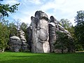
Nomination Old coal mine "Katowice" --Lestat 10:17, 12 November 2006 (UTC)
Decline I really like the atmosphere and colouring. But noise and artifacts are too much. Alvesgaspar 13:32, 12 November 2006 (UTC)
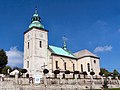
Nomination small church in Ruzomberok, Slovakia --Anna reg 21:58, 10 November 2006 (UTC)
Decline strong color fringes in the corners, much noise in the sky, could be fixed. I recommend partial perspective correction too. --Ikiwaner 18:31, 13 November 2006 (UTC)
Promotion Clear image, good composition. Diligent 14:15, 11 November 2006 (UTC)
Nomination Hollyhock flower --Kprateek88 14:15, 10 November 2006 (UTC)
Promotion It didn't make it to Featured pictures for aesthetic reasons but very OK for QI. Diligent 14:15, 11 November 2006 (UTC)
Nomination View over adirondack park -- Simonizer 12:47, 10 November 2006 (UTC)
Promotion Very good composition, correct exposure, careful focus. Seems a little bluish but I may be wrong. Alvesgaspar 23:30, 11 November 2006 (UTC)
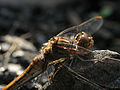
Nomination bat --Pomakis 19:19, 9 November 2006 (UTC)
Decline Aggressive use of flash light. Not speaking about the consequent "flashing" of the animal genitals ;-) --Diligent 10:02, 15 November 2006 (UTC)
Nomination Blason in human bones in Kutná Hora --Diligent 12:41, 9 November 2006 (UTC)
Decline Perspective distortion, caused by a tilt camera position and a small focal length! Simonizer 15:59, 9 November 2006 (UTC)
Nomination Blue Jay sitting on the fence by User:Calyponte nomination by Gnangarra 08:16, 9 November 2006 (UTC)
Decline Technically fine, but I don't think that it shows off the bird very well due to the posture of the bird. I also find the dark horizontal bar in the background to the left of the bird very distracting. —JeremyA 02:49, 17 November 2006 (UTC)
Nomination Statue of mask seller Diligent 21:59, 8 November 2006 (UTC)
Promotion Good composition, nice picture. In this case, the first plan is clearly detached from the background although they are both focused. Alvesgaspar 00:00, 9 November 2006 (UTC)
Nomination Cloudy day at Nature Reserve Hainberg -- Simonizer 09:19, 8 November 2006 (UTC)
Promotion simple cmposition, clear image, with character sky feature. One for the technical section on composition Gnangarra 00:56, 9 November 2006 (UTC)
Nomination View from Sunnig Grat summit -- Simonizer 09:19, 8 November 2006 (UTC)
Promotion Nice composition, beautiful picture! Could be FP if you correct the stain at the upper left corner (done). Alvesgaspar 10:28, 8 November 2006 (UTC)
Nomination Four young european hedgehogs --Keqs 12:20, 8 November 2006 (UTC)
Decline hedgehogs are out of focus -- Simonizer 12:37, 8 November 2006 (UTC)
Nomination Pain au chocolat --Diligent 10:18, 7 November 2006 (UTC)
Promotion sharp picture, nice colours and light, but background is a little confusing -- Simonizer 12:10, 8 November 2006 (UTC)
Nomination Stained glass in Sułkowski castle in Bielsko-Biała --Lestat 18:18, 5 November 2006 (UTC)
Promotion Very nice, no problems --Digon3 01:33, 6 November 2006 (UTC)
Nomination Prague landscape at dusk. Diligent 14:42, 5 November 2006 (UTC)
Decline Most part of the picture is filled with an ugly dark mass in the foreground. The cathedral, which is an important subject in the photo, is unfocused. - Alvesgaspar 17:15, 5 November 2006 (UTC)
Nomination traditionnal Czech Easter eggs (Off season proposal ;-). --Diligent 11:11, 5 November 2006 (UTC)
Promotion Beatiful picture, no flagrant technical flaws. I would advise a little crop at the top. - Alvesgaspar 17:12, 5 November 2006 (UTC)
Nomination Café in Obecní Dům (Municipal house) in Prague. Diligent 18:01, 3 November 2006 (UTC)
Decline Angle makes everything look tilted --Digon3 20:48, 3 November 2006 (UTC)
Promotion Nice composition and colour. I just don't like the tall trees right in the middle, but nothing can be done about that. Alvesgaspar 08:44, 15 November 2006 (UTC)
Decline Sorry, there are serious stiching errors at left - Alvesgaspar 22:59, 13 November 2006 (UTC)
Nomination Example of a half-hipped roof, Hamlets castle --Ikiwaner 06:44, 13 November 2006 (UTC)
Promotion Good picture, no problems -- Simonizer 08:58, 13 November 2006 (UTC)
Nomination Decent halo picture by commons user Wing-Chi Poon, not from NOAA as usually. --Wikimol 21:58, 16 November 2006 (UTC)
Promotion Good night pictures are difficult to get but this one is excellent, even without the halo Alvesgaspar 23:36, 16 November 2006 (UTC)
Nomination Church in Będzin (Poland) --Lestat 23:13, 15 November 2006 (UTC)
Decline In full resolution, image is noisy and has little detail. Also, vertical lines should be made parallel. Alvesgaspar 12:33, 17 November 2006 (UTC)
Nomination Saint Justinus church in Frankfurt-Höchst --Eva K.Message 21:59, 16 November 2006 (UTC)
Decline I'd prefer this with some contrast adjustments --Ikiwaner 17:58, 18 November 2006 (UTC) better perspectives available. --Ikiwaner 18:59, 23 November 2006 (UTC)
Nomination Air forced psychrometer --Luigi Chiesa 21:13, 15 November 2006 (UTC)
Decline Too much out of focus, we can't see the temperature scales. Alvesgaspar 12:29, 17 November 2006 (UTC)
Nomination Stuffed tiger wearing a sombrero --Pomakis 15:34, 15 November 2006 (UTC)
Promotion esthical example of DOF play and «Aufhellblitz» --Ikiwaner 21:07, 15 November 2006 (UTC)
Nomination Powder Tower in Prague --Diligent 09:53, 15 November 2006 (UTC)
Decline Resolution not large enough. --Digon3 17:03, 15 November 2006 (UTC)
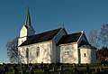
Nomination Church in Norway --Wikimol 12:36, 15 November 2006 (UTC)
Promotion A little too dark, but otherwise good --Digon3 17:30, 15 November 2006 (UTC)
Nomination Wanderer Above the Sea of Fog :-) --Ikiwaner 21:07, 15 November 2006 (UTC)
Promotion Very nice picture. I like the composition and the grades of grey in the mountains. I like less the shadow from the stake - Alvesgaspar 10:04, 16 November 2006 (UTC)
Nomination high rise in Zurich --Ikiwaner 06:51, 14 November 2006 (UTC)
Promotion Boringly perfect (how swiss! ;-) --Diligent 10:07, 15 November 2006 (UTC)The architect Jakob Zweifel became doctor honoris causa yesterday. This is one of his main buildings. --Ikiwaner 11:59, 19 November 2006 (UTC)
Decline Resolution not large enough --Digon3 17:04, 15 November 2006 (UTC)
Nomination Edyta Geppert. --Lestat 23:15, 16 November 2006 (UTC)
Promotion The face is not focused, I know. But it is a superb portrait anyway: composition, colour, expression. Alvesgaspar 22:51, 19 November 2006 (UTC)
Nomination Tito - an adopted black street cat - Alvesgaspar 23:29, 17 November 2006 (UTC)
Decline focal point appears to be in front of the cat, DOF blurrs to quickly across the head Gnangarra 05:57, 25 November 2006 (UTC)
Nomination 700yo tower HDR at sunrise --Ikiwaner 21:41, 21 November 2006 (UTC)
Decline tower is hidden by the pine tree Gnangarra 05:52, 25 November 2006 (UTC)
Nomination Bryce Canyon Hoodoos --Digon3 18:02, 20 November 2006 (UTC)
Promotion Very nice picture. I like the composition and contrasts. --Diligent 23:06, 20 November 2006 (UTC)
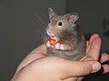
Nomination Hamster in hand --Pomakis 15:18, 20 November 2006 (UTC)
Promotion good composition with the carrot. Sharpness exposure and res OK. Noise was slightly too high. Try a bigger light source next time to make the eyes look bigger. --Ikiwaner 21:36, 21 November 2006 (UTC)
Nomination Market in Funchal, Madeira --Diligent 12:13, 20 November 2006 (UTC)
Decline Nice picture as a thumbnail, really noisy when looked at full resolution. Might improve with donwsampling. Alvesgaspar 00:09, 21 November 2006 (UTC)
Nomination Prague's Old Town seen from Charles bridge --Diligent 15:11, 20 November 2006 (UTC)
Promotion I like the aspect ratio and the levels of haze blur. Noise is on the limit in the midtones --Ikiwaner 21:29, 21 November 2006 (UTC)
Nomination autumn evening --Ikiwaner 13:57, 19 November 2006 (UTC)
Decline The mouth of the water-hose is out of focus. --Diligent 16:14, 30 November 2006 (UTC)
Nomination Edible mushrooms, by Nevit Dilmen. Also nice colours. --Wikimol 13:13, 19 November 2006 (UTC)
Promotion QI by the book. Nice light and colours. --Diligent 16:14, 30 November 2006 (UTC)
Nomination Treasury in Malbork castle --Lestat 23:15, 16 November 2006 (UTC)
Decline Lighting (harsh, unnatural) and composition (twisted) --Diligent 15:57, 30 November 2006 (UTC)
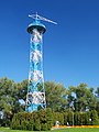
Nomination The Parachute Tower in Katowice. --Lestat 23:15, 16 November 2006 (UTC)
Decline Distortion too visible in the street lamp and sign on the right. --Diligent 15:57, 30 November 2006 (UTC)
Nomination Bishop palace in Katowice. --Lestat 23:15, 16 November 2006 (UTC)
Decline Composition: tree in the foreground hiding the main subject (facade). try reshoot from another angle. --Diligent 15:57, 30 November 2006 (UTC) PS: sorry for being so negative but this has been unassessed for two weeks and looks like nobody had the heart to do it :-(
Nomination Cabin at Vally Forge. --Oden 08:15, 27 November 2006 (UTC)
Promotion Correct picture -- Simonizer 14:27, 27 November 2006 (UTC)
Decline Beautiful picture but guidelines say: All nominated images should be the work of Commons users, which it is not. --Diligent 10:37, 26 November 2006 (UTC)
Nomination Pug --Pomakis 21:28, 25 November 2006 (UTC)
Decline I am disturbed by the usage of flash and impact in (otherwise cute!) dog's eyes - re-shoot in normal/not so harsh light? --Diligent 10:40, 26 November 2006 (UTC)
Nomination Hofgartentempel by Kurmis --Ikiwaner 22:47, 24 November 2006 (UTC)
Promotion Good compostition, quality and resolution. Its a pity that the group of tourists are there Simonizer 11:12, 29 November 2006 (UTC)
Nomination Numbat at Perth Zoo, part of the breeding program thats returning these animals back to the wild Gnangarra 06:06, 23 November 2006 (UTC)
Decline Too dark, bad crop, animal and background in the same color. Lestat 12:16, 25 November 2006 (UTC)
Nomination Head of Meduza by Bernini --Diligent 23:19, 22 November 2006 (UTC)
Promotion Informative, and well separated from background CyrilB 20:52, 27 November 2006 (UTC)
Nomination Altar of St-Peter's church in Vienna. --Diligent 22:04, 22 November 2006 (UTC)
Decline Nice church and remarkable sharpness but extreme colour fringes around the lamps (sensor quality) --Ikiwaner 12:57, 3 December 2006 (UTC)
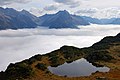
Nomination View from Sunniggrätli hut -- Simonizer 10:22, 22 November 2006 (UTC)
Promotion sharp, well exposed and good composition. Would prefer to see the whole lake though. --Ikiwaner 22:36, 22 November 2006 (UTC)
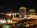
Nomination Halifax at night --Pomakis 14:02, 22 November 2006 (UTC)
Promotion a good night shot with nice stars around lights, sharp and not too noisy --Ikiwaner 12:57, 3 December 2006 (UTC)
Nomination Baroque altar in Torun, Poland --Diligent 16:56, 30 November 2006 (UTC)
Decline Nor really bad, but oversharpened, rather noisy, non harmonic aspect ratio. --Ikiwaner 18:58, 4 December 2006 (UTC)
Nomination Swiss SAR helicopter --Ikiwaner 18:49, 29 November 2006 (UTC)
Decline inappropriate DOF. Only the R of Rega is really sharp -- Simonizer 10:15, 7 December 2006 (UTC)
Nomination Paradise fish by user Aka, nomination by Thermos 20:10, 28 November 2006 (UTC)
Promotion I find the see-weed a wee disturbing but the image otherwise perfect. --Diligent 17:05, 29 November 2006 (UTC)
Nomination Pelican statue on the roof of well in castle in Malbork --Lestat 17:39, 5 November 2006 (UTC)
Decline Composition: should be vertical and not cut the well below, or should take a wider part of the socle. Crop closer?--Diligent 07:35, 8 November 2006 (UTC)
I don't think so. For me this crop is good. Firstly, it isn't photo of well, but photo of statue. Secondly, background of statue don't disturb me. WarX17:00, 8 November 2006 (UTC)[reply]
I ack Diligent, the subject is to small, the background should be out of focus to emphasize the statue more and a vertical composition would be better in this case. - Simonizer23:28, 8 November 2006 (UTC)[reply]
Agree with opposers. The funny thing is the most interesting part of the picture (in aesthetical terms) seems to be the background, not the sculpture... - Alvesgaspar23:33, 8 November 2006 (UTC)[reply]
Nomination Cancun Beach --Pomakis 18:21, 27 October 2006 (UTC)
Decline The beach is overexposed and the image unsharp. - Alvesgaspar 11:25, 1 November 2006 (UTC)
I'm not sure if it's considered acceptable protocol for the nominator of a photo to request consensual review, but in this particular case I feel that I must. I don't believe the beach to be overexposed. It's white sand on a sunny day. I carefully considered the exposure of this photograph when I took it, and believe it to be appropriate. There are no blown out highlights. --Pomakis16:56, 1 November 2006 (UTC)[reply]
I might be wrong but if you look at the rocks in the beach you can't see much detail due to excessive light. If somenoe show me that it is not so, I'll be happy to reverse my vote. - Alvesgaspar10:49, 4 November 2006 (UTC)[reply]
I'm a still baby photo-judge trying to understand DOF and noise, over-exposure etc. so count my vote as neutral but aesthetically, i find the hotels UGLY and they are the main part of the picture. The architects, the investors should be sued for visual pollution of such a beautiful white (or overexposed ;-) sand beach... --Diligent17:29, 9 November 2006 (UTC)[reply]
I agree about the architects, yet the image is technically QI. The ugly buildings are so dominant that its hard see the overall aesthetics. Gnangarra05:43, 10 November 2006 (UTC)[reply]
Technically speaking, the white sand is within the tonal range, with an occasional washing out due to reflection angle. The sky falls nicely into a zone VI value, which according to Zone System photography is where it belongs, skin tones are also within acceptable range, so this indicates good exposure. Blown out highlights can always occur, they are called specular highlights, reflections of metal surfaces or water. These are practically imposible to bring into the tonal range. Remenber that texture range in shorter than tonal range. The basic problem with digital photography is that the dynamic, or tonal range, is shorter than analog photograhy. So while the sand may appear to be burned out due to the lack of apparent texture, it is within the tonal range, but outside the texture range.--Tomascastelazo16:14, 11 November 2006 (UTC)[reply]
Nomination Candle with colour-shift --Roger McLassus 08:24, 23 October 2006 (UTC)
Promotion Beautiful image. This is much more an art picture than an encyclopedic one, which is OK for me. What is the temperature corresponding to each colour?... - Alvesgaspar 13:33, 23 October 2006 (UTC)
The noise is just a result of an inadequate capturing device, it has no physical meaning. Also the presentation seems to suggest a temperature coding in the image. This is not the case, you'd need a thermal imaging device for that. --Dschwen10:34, 25 October 2006 (UTC)[reply]
We are obviously evaluating the image from distinct perspectives. Yours, from the technical side and mine from the aesthetical one (you might of course tell me this is not the right place for artistic pictures and that would lead us to a very lenghty discussion...). Of course, I was not serious when I referred to the correspondance between colour and temperature! - Alvesgaspar10:45, 25 October 2006 (UTC)[reply]
Yes, but my verdict on the aesthetics of the image would even harsher. Of course it is somewhat subjective, but the colors look downright ugly to me and the noise just doesn't fit the cleaner look of flame and wax. --Dschwen11:10, 25 October 2006 (UTC)[reply]
Nomination A group of soldiers at Whitesands --Dschwen 14:15, 28 October 2006 (UTC)
Decline I have looked at this picture several times with the same feeling: it is underexposed, too dark. But that is easily corrected, is it not? - Alvesgaspar 23:49, 28 October 2006 (UTC)
Sorry, you are plain wrong here. The exposure is to the point. The picture was taken shortly after a rainshower leaving the white gypsum sand dunes wet and dark. --Dschwen18:38, 29 October 2006 (UTC)[reply]
I'm sorry, I didn't notice the title. For me it looks like a group of military walking in the snow with t-shirts (for endurance). Also, in full resolution, there is visible noise in the mountains (due to high ISO)? I like the composition though. - Alvesgaspar20:40, 29 October 2006 (UTC)[reply]
In this case, overcast weather made it possible to capture the sand with evident tonal differences in the first plane, at the limit of the texture range, well below the limits of the tonal range. It is particular difficult to photograph white subjects in sunlight and retain texture or tonal differences without sacrificing texture or tonal detail in the lower end of the scale. Basically the overcast weather shortened the dynamic range of the image in general thus allowing a normal representation in tone values of the objects depicted within the image. If for example, this pic had been taken in sunlight conditions, in order to retain the tonal range of the white sand, the skin tones would have been represented much darker, well outside the normal representation according to Zone System photography and acceptable visual representation, this is due to the fact that the tonal scale would have been lengthened. Something like turning a blond into a brunnett. Given a scene within the photographic media, all subjects exist in light values with regards to others, and if you slide the representation value of one subject through exposure, the others are affected as well, like a sliding scale. In a few words, this picture has, in my opinion, a very good exposure.--Tomascastelazo16:37, 11 November 2006 (UTC)[reply]
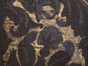
I have a problem with that picture too. If it represents a "wallpaper" in cordwain the composition is too close / not showing the motive, if it represents leather work only, it is too dull, dark, flat - maybe technically ok, but what's the merit of having a correct DOF on a flat surface and not tilt on bended motives? --Diligent23:13, 20 November 2006 (UTC)[reply]
exact quote from top this page Copyright status. Quality images have to be uploaded to Commons by copyright holder under suitable license. Full license requirements are at COM:CTGnangarra
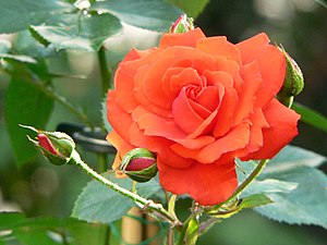
Nomination Rosa „Ave Maria“ --Eva K.Message 19:29, 16 November 2006 (UTC)
Decline Good composition and DOF but the rose is mostly orange than red because reds are overexposed. There are also colour fringes around the rose because of overexposure. --Ikiwaner 18:16, 17 November 2006 (UTC)
I agree with Ikinawer on the coloured fringes. Also, there is too much visible noise in full resolution. If we don't look too close it is a nice picture tough :) Alvesgaspar16:39, 18 November 2006 (UTC)[reply]
I agree with both :-) Of course the rose is overexposed and make the rose look more yellow than ist was. It doesn't have to be a red rose though. --Ikiwaner17:49, 18 November 2006 (UTC)[reply]
How do you evaluate it? I mean, usually the sharpness is evaluated on hard edges and tiny details. Clouds are "naturally unsharp", sea surface should be naturally blurred due to it's motion. Not much is left here, I looked on the lightning path and the horizon line, which look ok to me. --Wikimol09:57, 17 November 2006 (UTC)[reply]
I can nominate the corrected version (thanks, Ikiwaner) if that's considered the appropriate protocol, but for me to do so, wouldn't it make sense to keep the corrected version in place? --Pomakis18:41, 20 November 2006 (UTC)[reply]
I'm a bit confused. I'm fine with your edit (even though IMO there was no vignetting in the original; that's really the way the lighting was; the edges that I cropped were much darker still), so isn't that the version that I should be re-nominate? There's no point in me re-nominating the original, and there's no point in me re-doing the editing work that has already been done. --Pomakis15:29, 22 November 2006 (UTC)[reply]


.jpg)


 Info I did some noise reduction and vignetting correction. Could pass as QI imo now. --Ikiwaner 13:46, 19 November 2006 (UTC)