Commons:Quality images candidates/Archives May 2007
-
-

- Nomination A Muscovy duck (Cairina moschata) - Alvesgaspar 18:12, 26 May 2007 (UTC)
- Promotion QI for me, better exposure than your FP candidate. --Dschwen 08:23, 27 May 2007 (UTC)
-

- Nomination Golden Angel building in Prague --Diligent 08:42, 26 May 2007 (UTC)
- Decline Nothing seriously wrong, but no wow factor either. The people at the base of the building are slightly out of focus, and I think would have prefered a different crop, either less sky, or less foreground. Sorry, Ben Aveling 22:32, 26 May 2007 (UTC)
-
 -->
-->- Nomination Closeup of Deltoid Balsamroot. --Cacophony 00:06, 26 May 2007 (UTC)
- Promotion Marvelous picture! - Alvesgaspar 14:13, 26 May 2007 (UTC)
-

-

- Nomination High-end CD player. --Adamantios 21:51, 25 May 2007 (UTC)
- Decline Blurry (artificial at the edges), noisy. --Florian Prischl 23:16, 25 May 2007 (UTC)
-

- Nomination Entry-level turntable. --Adamantios 21:51, 25 May 2007 (UTC)
- Decline Out of focus/blurry, very noisy. --Florian Prischl 23:16, 25 May 2007 (UTC)
-

- Nomination Taipei International Convention Center. Rico Shen 15:43, 25 May 2007 (UTC)
- Decline Tilted. --Florian Prischl 23:02, 25 May 2007 (UTC)
-

- Nomination Mount McKinley. -- Ram-Man 15:22, 25 May 2007 (UTC)
- Decline Overexposed. --Florian Prischl 23:02, 25 May 2007 (UTC)
-

- Nomination Globeflower (Trollius laxus) -- Ram-Man 12:32, 25 May 2007 (UTC)
- Promotion Nice composition and detail, but the picture seems a bit dark - Alvesgaspar 15:29, 25 May 2007 (UTC)
I've uploaded a new version. -- Ram-Man 15:47, 25 May 2007 (UTC)
Much better now, I like the detail and "wet" looking of the center - Alvesgaspar 19:16, 25 May 2007 (UTC)
-
- Nomination Mountain Laurel (Kalmia latifolia). -- Ram-Man 12:32, 25 May 2007 (UTC)
- Decline Too much out of focus. --Florian Prischl 23:02, 25 May 2007 (UTC)
-

- Nomination Painted Hills, Oregon. --Cacophony 06:04, 25 May 2007 (UTC)
- Promotion Beautiful, looks like an alien landscape! But I would try to increase saturation of the greens a little bit. Alvesgaspar 15:33, 25 May 2007 (UTC)
-

- Nomination Anholt Castle, Germany MJJR 21:02, 24 May 2007 (UTC)
- Decline Trees cover the subject too much, overexposed. --Florian Prischl 22:33, 25 May 2007 (UTC)
-

- Nomination Park of Anholt Castle, Germany MJJR 21:02, 24 May 2007 (UTC)
- Decline Confusing angle, white balance seems to be off, some noise (in the red coat of arms). --Florian Prischl 22:33, 25 May 2007 (UTC)
-
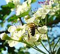
- Nomination A hoverfly (Sphaerophoria scripta )feeding on a Yellow chamomile (Anthemis tinctoria). The red creatures are velvet mites (Trombidium spec.) - Alvesgaspar 16:37, 24 May 2007 (UTC)
- Decline The focus seems to be on the stem, which is distracting. --Florian Prischl 22:33, 25 May 2007 (UTC)
-

- Nomination Love this but don't know the species. -- Ram-Man 12:20, 24 May 2007 (UTC)
- Decline No categorization, somewhat strange focus. Maybe you can ask somewhere at Wikipedia for help with identifying it, then it would be OK. --Florian Prischl 22:33, 25 May 2007 (UTC)
-

- Nomination Red Buckeye flower head. -- Ram-Man 12:16, 24 May 2007 (UTC)
- Promotion Nice and crisp, plant over the whole height of the photo (that's good). --Florian Prischl 22:33, 25 May 2007 (UTC)
-

- Nomination Pink Azalea leaf formation. -- Ram-Man 12:16, 24 May 2007 (UTC)
- Promotion All criteria fulfilled. --Florian Prischl 22:33, 25 May 2007 (UTC)
-

- Nomination Begonia leaf. -- Ram-Man 12:16, 24 May 2007 (UTC)
- Decline Too noisy/grainy, especially in the background. --Florian Prischl 22:33, 25 May 2007 (UTC)
-
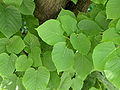
- Nomination Young leaves of the horse-chestnut (Aesculus hippocastanum) MJJR 21:02, 24 May 2007 (UTC)
- Promotion Nice picture of a very beautiful tree, with the green of the leaves enhanced by the special lighting. But don't eat the chestnuts, they are toxic... - Alvesgaspar 21:24, 24 May 2007 (UTC)
-

- Nomination Anguis fragilis (the slowworm or blind worm) is a limbless reptile native to Eurasia. Size: 8cm , i like the clarity a lot, plus it was hard work (a 6h session) to get that snake allways in his position. The pose as shown is my argument --Makro Freak 17:33, 24 May 2007 (UTC)
- Decline Far too small, and it is not a snake but a legless lizard. Lycaon 18:43, 24 May 2007 (UTC)
-

- Nomination This is a wonderful picture of a katamaran which is a sailing boat. This happened at Starnberger See which is a large lake in the south of munich. I like the colors and the composition. --Makro Freak 17:29, 24 May 2007 (UTC)
- Promotion It's easy to like this picture. Composition, colours and quality are good. - Alvesgaspar 17:47, 24 May 2007 (UTC)
-

- Nomination This is a sharp and crispy night picture of the Basilika Sankt Paul in Munich, where its the 5th largest building. Please read the description for further informations. Especially during nighttimes the building is wonderful lit. --Makro Freak 17:24, 24 May 2007 (UTC)
- Promotion Is is indeed wonderful, both tecnically and aesthetically. Who said the photographer was a macro freak? - Alvesgaspar 17:47, 24 May 2007 (UTC)
-

- Nomination I think this is an interesting and illustrative picture because it shows the flower
, budand fruit of a Taraxacum officinale - Alvesgaspar 16:37, 24 May 2007 (UTC) - Promotion Yes, I completely agree. --Dschwen 06:03, 25 May 2007 (UTC)
PS - I think that is not the bud at left, but the fruit with the seed filaments coming out - Alvesgaspar 07:45, 25 May 2007 (UTC)
- Nomination I think this is an interesting and illustrative picture because it shows the flower
-

- Nomination A dandelion clock (Taraxacum officinale ), formed by flying seeds - Alvesgaspar 16:37, 24 May 2007 (UTC)
- Promotion The seeds show very well. --Florian Prischl 21:05, 24 May 2007 (UTC)
-

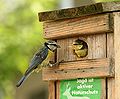
- Nomination Blue tit chick. It was very active, out of 30 shots or so this is the only one without motion blur, I could not stop down further. DOF is ok IMO. --Dschwen 13:35, 24 May 2007 (UTC)
- Promotion This is borderline: slight unsharpness or blur and shallow DoF, but I think it's just enough for a QI. If someone disagrees, they can send it to CR. -- Ram-Man 22:16, 24 May 2007 (UTC)
-
-
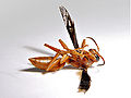
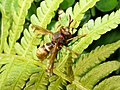
- Nomination An unidentified wasp --Thegreenj 01:21, 24 May 2007 (UTC)
- Decline It's dead... --Dschwen 07:42, 24 May 2007 (UTC). The taxonomic classification of some wasps depends upon whether their antenna curl up when they're dead --Tony Wills 08:34, 24 May 2007 (UTC)
Better quality can be achieved on a dead object, and it is not identified. Lycaon 08:39, 24 May 2007 (UTC) What does whether it's identified or not have to do with this? Thegreenj 23:00, 24 May 2007 (UTC)
The image page requirements: "meaningful title and description. This should include the Taxa naming for plants and animals." Benjamint
-

-

-
-

-

-

- Nomination El Gouna, Egypt -- MJJR 15:53, 20 May 2007 (UTC)
- Decline Too much noise clearly visible, specially in the darker zones - Alvesgaspar 00:06, 24 May 2007 (UTC)
-

- Nomination Anagallis foemina from Crete close to Heraklion airport -- Lycaon 13:17, 20 May 2007 (UTC)
- Decline The picture seems sharp and no one wanted to comment on it. I think that's because it's a sharp picture overall, but the camera didn't properly render the saturated blues and yellows particularly well, so it makes them look soft and unsharp. The composition is a little cluttered too. -- Ram-Man 01:54, 24 May 2007 (UTC)
-
- Nomination Abutilon x hybridum 'Moonchimes' flower. -- Ram-Man 04:20, 19 May 2007 (UTC)
- Promotion Clear and detailed photo, with the focus on the spots where it is needed. Alvesgaspar 00:02, 24 May 2007 (UTC)
-

-

- Nomination Scandinavian grey wolf --Malene Thyssen 22:07, 24 May 2007 (UTC)
- Discussion Don't know why this one hasn't been promoted. Definitely QI. Lycaon 12:49, 25 May 2007 (UTC). It was promoted in March ;-) --Tony Wills 11:53, 27 May 2007 (UTC) Ups sorry I must have been tired..it was the Goeldi's Marmoset I wanted to promote :-) --Malene Thyssen 14:40, 27 May 2007 (UTC)
-
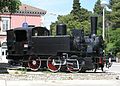
- Nomination An Italian 1920s era steam loco --Orlovic (talk) 21:37, 22 May 2007 (UTC)
- Decline Maybe a tad overexposed and not in good focus - can you take another shot? --Florian Prischl 22:59, 22 May 2007 (UTC)
-

- Nomination Everglades National Park, Florida, U.S.A. -- MJJR 20:23, 22 May 2007 (UTC)
- Promotion Meets the guidelines, I say. --Florian Prischl 22:59, 22 May 2007 (UTC)
-

- Nomination Detmold (Germany): The Neustadt (street and canal) near the Palaisgarten -- MJJR 20:23, 22 May 2007 (UTC)
- Promotion Composition is OK. --Florian Prischl 22:59, 22 May 2007 (UTC)
-
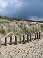
- Nomination Dunes near the Zwin at Cadzand (the Netherlands) -- MJJR 20:23, 22 May 2007 (UTC)
- Promotion Nice colours. --Florian Prischl 22:59, 22 May 2007 (UTC)
-

- Nomination Unidentified Lizard. Could someone please help at identifying it? I don't know where to start. --Digon3 16:04, 22 May 2007 (UTC)
- Decline The subject is too hard to spot/identify. --Florian Prischl 22:59, 22 May 2007 (UTC)
-

- Nomination Rainbow Lorikeet. A little noisy, but maybe it's ok? -- Ram-Man 13:05, 22 May 2007 (UTC)
- Decline A nice photo, save for the much too shallow DOF --Florian Prischl 22:46, 22 May 2007 (UTC)
-

-

-
- Nomination little wasp -- MFbay 20:11, 20 May 2007 (UTC)
- Decline Not sharp, some compression, the light is very harsh and a species identification would be nice. --Pharaoh Hound 11:25, 23 May 2007 (UTC)
-

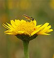
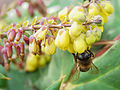
- Nomination Yellow calendula with little fly - Alvesgaspar 09:31, 22 May 2007 (UTC)
- Promotion Exposure is good, details sharp. -- Ram-Man 11:41, 22 May 2007 (UTC)
-
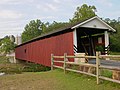
- Nomination Lancaster County covered bridge. -- Ram-Man 12:34, 21 May 2007 (UTC)
- Promotion Not extraordinary enough for FP, but it complies with the QI requirements. --Simonizer 14:33, 21 May 2007 (UTC)
-

- Nomination Sweetbay Magnolia leaf. -- Ram-Man 02:36, 21 May 2007 (UTC)
- Promotion Good light and detail, illustrative - Alvesgaspar 15:54, 21 May 2007 (UTC)
-

- Nomination Monarch butterfly on a Zinnia. -- Ram-Man 02:36, 21 May 2007 (UTC)
- Promotion Beautiful composition and colours, good quality - Alvesgaspar 15:54, 21 May 2007 (UTC)
-
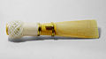
- Nomination A bassoon reed --Thegreenj 01:32, 21 May 2007 (UTC)
- Decline Sorry, but it seems overexposed (look at the white thread), not sharp enough and a bit noisy (note the shadow). A studio shot like this one ought to be perfect! - Alvesgaspar 09:22, 22 May 2007 (UTC)
-

-

- Nomination villa of a patrician --Ikiwaner 21:37, 19 May 2007 (UTC)
- Promotion Good quality, sharp e detailed picture (symmetrical composition a little boring though). But why is the door unfocused? - Alvesgaspar 15:57, 21 May 2007 (UTC)
-

-
- Nomination Leaves and trunk of a common lime (Tillia x europaea) - Alvesgaspar 23:26, 20 May 2007 (UTC)
- Promotion Great lighting, high DoF, and good detail. -- Ram-Man 02:30, 21 May 2007 (UTC)
-
- Nomination End of day near the sea when light and colours are soft - Alvesgaspar 23:21, 20 May 2007 (UTC)
- Promotion Very nice lighting. Evening lighting always seems to look nice. -- Ram-Man 01:14, 21 May 2007 (UTC)
-

- Nomination Another lady bug. - Alvesgaspar 23:21, 20 May 2007 (UTC)
- Promotion Meets the quality guidelines, but isn't one of the better lady bug pictures (and there are a lot!). -- Ram-Man 01:14, 21 May 2007 (UTC)
-

- Nomination El Rocío, Spain -- MJJR 15:19, 20 May 2007 (UTC)
- Promotion Nice composition and quality. Improved from the first version. Alvesgaspar 23:17, 20 May 2007 (UTC)
-

-

-
-

-

-

-

-
-

- Nomination Agave victoriae-reginae -- Ram-Man 05:13, 18 May 2007 (UTC)
- Promotion Fullfills QI requirements. Nice colours. Lycaon 00:07, 21 May 2007 (UTC)
-

- Nomination Mountains in Zion National Park --Digon3 15:48, 18 May 2007 (UTC)
- Promotion nice green/red/blue composition. Why not a broader aspect ratio for landscapes next time? --Ikiwaner 21:40, 19 May 2007 (UTC) Unfortunately, I didn't know about panoramas when I took this picture. In fact, almost all of my pictures were taken before I knew about panoramas. If I ever go back I will definitely try to have broader aspect ratio for my pictures. --Digon3 00:47, 20 May 2007 (UTC)
-

- Nomination Horse looking out of stable window. -- Adamantios 09:45, 18 May 2007 (UTC)
- Promotion Nice framing and good quality. -- YooChung 06:24, 20 May 2007 (UTC)
-
-

- Nomination Horse head. -- Adamantios 09:45, 18 May 2007 (UTC)
- Decline The focus is on the buckle, not the horse. It's an awkward composition. -- Ram-Man 16:10, 18 May 2007 (UTC)
-

-

- Nomination Flowers and leaves of Carpobrotus edulis, a plant which grows in the dunes, near the beach - Alvesgaspar 15:29, 16 May 2007 (UTC)
- Decline It's been said a million times, but this camera is just a tad too unsharp with certain colors. A little bit overexposed too. Sorry. -- Ram-Man 16:20, 18 May 2007 (UTC)
-

- Nomination Bell on a wall. -- Ram-Man 05:13, 18 May 2007 (UTC)
- Promotion Nice, simple composition and good quality - Alvesgaspar 10:27, 18 May 2007 (UTC)
-

- Nomination I like the textures in this one (photo by Daplaza). Adamantios 10:06, 18 May 2007 (UTC)
- Promotion Sharp, textured, interesting. My type of picture. -- Ram-Man 11:51, 18 May 2007 (UTC)
-
- Nomination Foamflower. -- Ram-Man 05:33, 17 May 2007 (UTC)
- Promotion Good use of depth-of-field. --Florian Prischl 17:12, 17 May 2007 (UTC)
-

- Nomination Dried Summersweet. -- Ram-Man 05:33, 17 May 2007 (UTC)
- Promotion Very crisp, good center composition. --Florian Prischl 17:12, 17 May 2007 (UTC)
-

- Nomination Two flowers. -- Ram-Man 05:33, 17 May 2007 (UTC)
- Promotion Good colours. --Florian Prischl 17:12, 17 May 2007 (UTC)
-
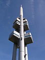
- Nomination Žižkov TV tower --Diligent 00:47, 17 May 2007 (UTC)
- Decline Strange tilt, unclear focus. --Florian Prischl 17:26, 17 May 2007 (UTC)
-

- Nomination WTC site, 2007--Arad 00:34, 17 May 2007 (UTC)
- Decline Strange colours and bad tilting on the World Financial Center buildings. --Florian Prischl 17:17, 17 May 2007 (UTC)
-

- Nomination Armor section of the Met --Arad 00:25, 17 May 2007 (UTC)
Please categorize photo --Orlovic (talk) 10:28, 17 May 2007 (UTC) - Decline Artifacts, unclear focus, partly overexposed. --Florian Prischl 17:20, 17 May 2007 (UTC)
- Nomination Armor section of the Met --Arad 00:25, 17 May 2007 (UTC)
-

- Nomination Blue Pufferfish -- Ram-Man 05:09, 16 May 2007 (UTC)
- Decline Lots of noise, fins are out of focus, aquarium glass is scratched. --Florian Prischl 17:57, 17 May 2007 (UTC)
-

- Nomination Trunk bark and an unexpected guest (look close). -- Ram-Man 05:01, 16 May 2007 (UTC)
- Decline Out of focus or shake. --Florian Prischl 17:44, 17 May 2007 (UTC)
-

-

-

- Nomination A bug of the Pentatomidae family, possibly a Raphigaster nebulosa - Alvesgaspar 15:11, 16 May 2007 (UTC)
- Promotion Very sharp closeup. -- Ram-Man 05:12, 17 May 2007 (UTC)
-

- Nomination White flowers of Osteospermum ecklonis - Alvesgaspar 15:09, 16 May 2007 (UTC)
- Promotion good job on not blowing out the whites. Reminds me of this picture. -- Ram-Man 05:25, 17 May 2007 (UTC)
-

- Nomination Shallow DOF but enough to convey flower (Erigeron annuus) without distracting elements --Thegreenj 21:27, 16 May 2007 (UTC)
- Decline Unfocused buds are distracting, I'm unfraid - Alvesgaspar 23:42, 16 May 2007 (UTC)
-

-

- Nomination "Uptown Munich" building --Afrank99 20:28, 15 May 2007 (UTC)
- Promotion Good composition, fine quality and detail - Alvesgaspar 15:14, 16 May 2007 (UTC)
-

-

- Nomination Funfair "Unterländer Volksfest" in Heilbronn - --Joachim Köhler 18:50, 15 May 2007 (UTC)
- Decline Tilted. -- Ram-Man 05:18, 17 May 2007 (UTC)
-

- Nomination Pink Dahlia -- Ram-Man 05:02, 16 May 2007 (UTC)
- Promotion Sensual pic, smart focus and good detail - Alvesgaspar 07:38, 16 May 2007 (UTC)
-
- Nomination Ground beetle on a flower - Alvesgaspar 15:33, 15 May 2007 (UTC)
- Promotion Sharp. Interesting Composition. -- Ram-Man 04:56, 16 May 2007 (UTC)
-

- Nomination Hoverfly feeding with little companion - Alvesgaspar 15:33, 15 May 2007 (UTC)
- Promotion Beautiful. -- Ram-Man 15:57, 15 May 2007 (UTC)
-

- Nomination Sunflower in Autumn. -- Ram-Man 14:40, 15 May 2007 (UTC)
- Promotion Great composition and detail. I also like the colourfull background - Alvesgaspar 15:36, 15 May 2007 (UTC)
-

- Nomination Stuartia pseudocamellia trunk base. -- Ram-Man 14:30, 15 May 2007 (UTC)
- Decline Potentially good subject, but uninteresting composition.
-

- Nomination Pansy Viola tricolor closeup. -- Ram-Man 01:33, 13 May 2007 (UTC)
- Decline Good composition but not sharp enough. Focus seems to be at the centre of the flower but DOF is really small with this aperture. Alvesgaspar 17:45, 15 May 2007 (UTC)
f/3.3 at this sensor size is equivalent to the DoF of f/8 or f/9 on the 1.5x crop Nikon SLR that I have. f/4.4 is the diffraction limited aperture. See this article. -- Ram-Man
-

-

-

-

- Nomination Benedictine Abbey in Mogilno, Poland -- Pko 21:23, 6 May 2007 (UTC)
- Decline Can you fix the slight tilt/perspective distortion? --Digon3 00:38, 8 May 2007 (UTC)
I've corrected the perspective. --Pko 12:54, 9 May 2007 (UTC)
I find the trees and power lines to be distracting. It's hard to see the main subject adequately. -- Ram-Man 12:31, 15 May 2007 (UTC)
-

-

-

- Nomination NZ_Red_Admiral sans flower --Tony Wills 00:32, 13 May 2007 (UTC)
- Promotion The sharpness is a little off, but it's nice enough for a QI. -- Ram-Man 00:41, 13 May 2007 (UTC)


.JPG)


.png)


.jpg)

-2.jpg)

- Nomination mist in Ensay region --Benjamint444 10:04, 12 May 2007 (UTC)
- Promotion
- it's going to be a FP, so does it need to be a QI too? -- Ram-Man 23:30, 12 May 2007 (UTC).
- Are you saying you don't think it is QI? --Tony Wills 00:32, 13 May 2007 (UTC)
- Nope. It's better than a QI, its a FP. Being new to these things, I don't know what common practice is. Shouldn't all FPs be at least QI quality? -- Ram-Man 00:37, 13 May 2007 (UTC).
- No around here we consider QI more stringent than FP, FP is just a popularity contest ;-) (Yes it is fine to have both QI & FP :-) --Tony Wills 05:56, 13 May 2007 (UTC)
 Support Phew. I have trouble keeping these things straight. Popularity or not, it's easily a QI. -- Ram-Man 15:03, 13 May 2007 (UTC)
-

- Nomination Flowering Dogwood emerging leaf. -- Ram-Man 23:24, 12 May 2007 (UTC)
- Promotion Usual mumble about DoF, but already at f11, No other problems, shows good detail, QI :-). --Tony Wills 08:11, 13 May 2007 (UTC)
-
-

-

-
-

- Nomination Saint George, Byzantine icon replica --Orlovic (talk) 15:13, 10 May 2007 (UTC)
- Decline Sorry, obvious scan from a book, marks of printing are clearly visible. Alvesgaspar 17:21, 10 May 2007 (UTC)
-

- Nomination Externsteine in Teutoburg Forrest near Horn-Bad Meinberg by Dschwen. Slightly overexposed, but good quality. --norro 13:38, 10 May 2007 (UTC)
- Promotion stunning as often. Maybe a bit overexposed and tilted on the right part (horizontal guidelines needed ??). I'm also finding the top part of the front rock is soft. Strange. Is it because one of the pic used for stitching was misfocused or motion blurred ? Anyways overall, it's great. Benh 21:10, 10 May 2007 (UTC), yes, one of the pics had a soft focus and the lighting conditions were very difficult. To get detail on the rocks I had to up the exposure a bit. --Dschwen 21:28, 10 May 2007 (UTC)
-

-

- Nomination Keychain by User:AndonicO --Orlovic (talk) 09:54, 10 May 2007 (UTC)
- Promotion An excellent and detailed example of a keychain. I find the DoF to be perfect here with wonderful sharpness of the important elements. -- Ram-Man 14:56, 10 May 2007 (UTC)
-

- Nomination MLRS «Smerch» --One half 3544 09:08, 10 May 2007 (UTC)
- Decline Poor composition, it is not clear what belongs to this particular car and what doesn't - Alvesgaspar 18:40, 10 May 2007 (UTC)
-

- Nomination British Columbia parliament --grendel|khan 01:46, 10 May 2007 (UTC)
- Decline Clearly tilted ccw. Please fix the rotation and submit again. Alvesgaspar 16:18, 10 May 2007 (UTC)
-

- Nomination Stuartia pseudocamellia bud closeup -- Ram-Man 17:17, 10 May 2007 (UTC)
- Promotion at least it's a clear QI :) Benh 21:11, 10 May 2007 (UTC)
I have a confession to make: I tried with my editing application to darken the background and I was unable to do it, so close are the colours to the subject's. My clumsiness, for sure. Alvesgaspar 22:05, 10 May 2007 (UTC)
-

-

-

-

-
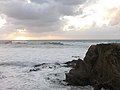
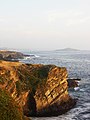
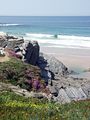
- Nomination Winter evening at Porto Covo, west coast of Portugal (not a sunset!). Is it obvious that the sea is one of my passions? - Alvesgaspar 17:13, 29 April 2007 (UTC)
- Promotion This is a stunning image in both beauty and simplicity. Technical quality is good too. -- Ram-Man 15:23, 10 May 2007 (UTC)
-

-

-

- Nomination Roman catholic church in Polish village Boronów --Przykuta 10:07, 8 May 2007 (UTC)
- Decline Tree parts on the edges distracting --Orlovic (talk) 12:31, 8 May 2007 (UTC). Poor composition, with distracting cropped graves in the foreground and tree branches in the upper left corner. I don't like the geometric distortion either - Alvesgaspar 14:41, 8 May 2007 (UTC)
-

- Nomination Silvereye juvenile --Benjamint444 08:53, 5 May 2007 (UTC)
- Decline Jpeg artifacts around the bird, seems like its oversharpened --Digon3 00:50, 8 May 2007 (UTC)
-

-

- Nomination Observatory in Goettingen. --Dschwen 18:58, 1 May 2007 (UTC)
- Promotion It would look alot better if the building to the right was cropped out. --Digon3 00:54, 8 May 2007 (UTC), The point of the picture is to show thw whole complex (which no pic did so far) --Dschwen 06:38, 8 May 2007 (UTC) Isn't this picture a bit tilted ? Hard to check but I feel so when looking at it. Benh 06:41, 8 May 2007 (UTC) Don't look tilted to me. Nice composition showing the whole object. Btw cropping the image in the way suggested by Digon3 would result in a very strange composition. --LC-de 06:57, 8 May 2007 (UTC)
-

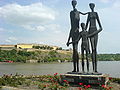
- Nomination Silesian Uprising Monument --Lestat 19:28, 28 April 2007 (UTC)
- Decline I think the composition would be better afeter cropping most of the plinth at the bottom of the picture. -- Pko 17:05, 7 May 2007 (UTC)
I'm opposing beacuse this seems to be the wrong angle to shoot the sculpture. Alvesgaspar 22:39, 7 May 2007 (UTC)
-

- Nomination Serra da Estrela, the highest mountains in continental Portugal. Alvesgaspar 22:23, 27 April 2007 (UTC)
- Decline This is a hard one, but it looks a little overexposed, the composition seem bland, and the lighting seems harsh. --Digon3 00:45, 8 May 2007 (UTC)
-
- Nomination: Mural in Brooklyn. --Dschwen 14:25, 26 April 2007 (UTC)
- Review needed
-

- Nomination Motorbike "Standard Rex Sport" (1935) --Joachim Köhler 20:08, 6 May 2007 (UTC)
- Promotion Correct picture, good quality though it would be better with a neutral background. Alvesgaspar 10:19, 7 May 2007 (UTC)
-

- Nomination Large Fly Agaric mushroom (9cm dia) --Tony Wills 02:44, 3 May 2007 (UTC)
- Promotion Nice colours and sharp image, though the framing is a little too tight. Is this one poisonous? Alvesgaspar 20:36, 3 May 2007 (UTC). Usually listed as poisonous, and hallucinogenic --Tony Wills 21:58, 4 May 2007 (UTC)
-

- Nomination Sour cherry (Prunus cerasus), blossom --LC-de 18:45, 2 May 2007 (UTC)
- Promotion Nice composition but lighting a bit too harsh and background a bit distracting. Not sure of the veredict... Alvesgaspar 20:41, 3 May 2007 (UTC). Maybe not FP, but surely technically QI --Tony Wills 12:29, 4 May 2007 (UTC)
-

- Nomination Expo Science Park in Daejeon, South Korea. --YooChung 01:25, 2 May 2007 (UTC)
- Decline Not sharp enough, lack of detail. But composition is good and colours nice. Alvesgaspar 23:29, 4 May 2007 (UTC)
-

- Nomination Another train. Slovenian this time --Orlovic (talk) 22:09, 2 May 2007 (UTC)
- Promotion Correct composition, good quality, no obvious flaws. Alvesgaspar 20:38, 3 May 2007 (UTC)
-

- Nomination Common frog (Rana temporaria), female adult --LC-de 16:18, 2 May 2007 (UTC)
- Promotion Very good. But what is that dull patch on the frogs side? --Tony Wills 09:47, 3 May 2007 (UTC)
It's a dull patch on the frogs side ;o) Can't remember the frogs details in natura but I'm sure he was colored this way. --LC-de 19:34, 3 May 2007 (UTC). Doesn't appear wet just there, maybe just dirty frog, but great pic --Tony Wills 04:52, 4 May 2007 (UTC)
-

-

-

- Nomination Flower and leaves of Lantana camara - Alvesgaspar 22:35, 1 May 2007 (UTC)
- Promotion Beautiful composition, nice colours, maybe a little too dark --Simonizer 13:09, 2 May 2007 (UTC)
-

- Nomination Auditorium of Göttingen University (10 Megapixel, but a rogue shadow to be upfront) --Dschwen 17:14, 30 April 2007 (UTC)
- Promotion I won't suggest geometric correction for this fish-eye view :), there are some minor aberrations up the flag-pole and the lamp-post, but a very high quality photo overall --Tony Wills 09:22, 3 May 2007 (UTC)
-

- Nomination: Tawny Frogmouth 3 --Benjamint444 09:27, 22 April 2007 (UTC)
- Review needed
-

-
-

- Nomination Tawny Frogmouth 4 --Benjamint444 09:27, 22 April 2007 (UTC)
- Promotion Sharp focus on face. YooChung 01:38, 2 May 2007 (UTC)
-

- Nomination Rapeseed field. This year the blossom started threee weeks early. --Dschwen 20:20, 30 April 2007 (UTC)
- Promotion That is a sign of our times, not knowing anymore when the seasons start and end. By the way, the pic is beatiful. Alvesgaspar 21:49, 30 April 2007 (UTC)
-

-

- Nomination M3 Stuart tank. Photo taken by User:Marko M --Orlovic (talk) 16:55, 28 April 2007 (UTC)
- Decline Harsh lighting, comosition, and tilt (or perspective distortion). It also does not meet resolution requirements--Digon3 01:23, 1 May 2007 (UTC)
-

- Nomination Girl (Inês) walking in the beach. Porto Covo, Portugal. Alvesgaspar 10:49, 28 April 2007 (UTC)
- Promotion No encyclopedic value (Not sure if that is required, so no decline yet) --Orlovic (talk) 17:46, 28 April 2007 (UTC)
Enc value is not required in Commons FP or QI. Alvesgaspar 18:06, 28 April 2007 (UTC) *Technical quality is good, no problems --Digon3 01:23, 1 May 2007 (UTC)
-

- Nomination Lacrosse field diagram --Yarnalgo 17:19, 27 April 2007 (UTC)
- Decline Can simple diagrams be QI? --Digon3 01:14, 1 May 2007 (UTC)
I think they can if they are of very good quality, which is not the case. Alvesgaspar 09:55, 1 May 2007 (UTC)
-
- Nomination Kyotos Trainstation --Tackbert 05:09, 27 April 2007 (UTC)
- Decline I don't like to see the image tilted, but that is maybe a question of taste. I also wonder how is it possible to have this sharpness with a f-stop number of 2.4. Alvesgaspar 11:16, 27 April 2007 (UTC) Composition (tilt) --Digon3 01:12, 1 May 2007 (UTC)
-

-
- Nomination Sand, sea, rocks and flowers at Spring. Porto Covo, west coast of Portugal. Alvesgaspar 00:29, 25 April 2007 (UTC)
- WARNING: third template parameter added – please remove.
-

-

-

-

- Nomination Dunes near Provincetown airport, Cape Cod. --Dschwen 14:45, 24 April 2007 (UTC)
- Decline Good composition and nice atmosphere. However the image is too blurry, specially the vegetation (too dark and windy to use a larger f number?) - Alvesgaspar 23:04, 29 April 2007 (UTC)
-

- Nomination Crane machine --libertad0 16:12, 25 April 2007 (UTC)
- Decline Sorry, but this looks like a sketch, not good enough for QI. Wrong font type, unequal segments in labels, wrong type of lines in crane, crude human figure. Quality Images should also serve as examples of good technique for beginners. Alvesgaspar 11:32, 27 April 2007 (UTC)
-

- Nomination Rompeolas en el Muelle de Juan Griego --libertad0 16:12, 25 April 2007 (UTC)
- Decline Tilted, watermark, great timing though. --Dschwen 16:33, 25 April 2007 (UTC)
Watermark not acceptable, subject uncertain (what is a "rampeola"?), tilted - Alvesgaspar 17:22, 25 April 2007 (UTC)
-

-

-

- Nomination Municipio Antonio Diaz Nueva Esparta Map --libertad0 16:12, 25 April 2007 (UTC)
- Decline No scale, no legend, no geographic coordinates, no continuity with adjacent regions, frame too tight on the represented region. Do the roads really end at the border? Sorry, quite poor map. - Alvesgaspar 18:45, 25 April 2007 (UTC)
-

-

-

-

- Nomination This guy has a few more pretty good pics. Fountain in the garden of Luxembourg, Paris by User:benh. Perfect sharpness. --Dschwen 12:17, 25 April 2007 (UTC)
- Promotion Qi for me - Alvesgaspar 10:03, 26 April 2007 (UTC)
-

- Nomination Rock Pigeon in Parc Monceau by User:benh. --Dschwen 12:17, 25 April 2007 (UTC)
- Promotion Excellent picture and amazing detail. I would crop the image a little, the background is somehow distracting. Alvesgaspar 08:20, 26 April 2007 (UTC)
-

-
 .
.- Nomination The castle of Champs-sur-Marne, not so far from Paris. A very high resolution picture by user:benh. I think the stitching is good and overall quality is good too, though maybe lighting and shadows may be unpleasing to some... please sign with time and date!!!! (oops sorry Benh 17:27, 25 April 2007 (UTC))
- Promotion Great resolution sharpness and exposure. --Dschwen 12:10, 25 April 2007 (UTC)
-

- Nomination A manor on Cape Cod, MA.--Dschwen 14:45, 24 April 2007 (UTC)
- Promotion Beatiful composition and nice atmosphere. I would prefer the geometric distortion to be corrected but that is a question of taste, I suppose. Alvesgaspar 12:28, 25 April 2007 (UTC)
-

- Nomination Kitschy sunset --Dschwen 14:45, 24 April 2007 (UTC)
- Decline Tilted horizon, speckles in the sky and sand (water droplets?). - Alvesgaspar 09:12, 25 April 2007 (UTC)
-

-
- Nomination Ultra wide angle inside the tower of castle Sparrenburg. --Dschwen 14:22, 24 April 2007 (UTC)
- Promotion Though I deslike the grafitti and the aluminium stairs. The atmosphere is creepy with the geometric distortion. Alvesgaspar 23:52, 24 April 2007 (UTC)
-
- Nomination A kitschy spring seasight with Carpobotus edulis flowers at the foreground. Porto Covo, west coast of Portugal - Alvesgaspar 13:53, 24 April 2007 (UTC)
- Promotion sharp, nice colours and good composition. Light conditions weren´t optimal --Simonizer 14:12, 24 April 2007 (UTC)
-

- Nomination In the Bratislava's sky --Pedroserafin 08:06, 24 April 2007 (UTC)
- Decline Noisy background, overexposed. --norro 12:02, 24 April 2007 (UTC)
-

- Nomination Space needle in Seattle by User:Cacophony. --norro 12:01, 24 April 2007 (UTC)
- Promotion Great quality. (I added Cacophony's name so he gets the notification, to spread the word about QI) --Dschwen 14:18, 24 April 2007 (UTC)
-

- Nomination NZ North Island Robin --Tony Wills 06:52, 29 April 2007 (UTC)
- Promotion Very good, sharp and clear. Only need to crop the branch at right. Alvesgaspar 11:06, 29 April 2007 (UTC). Done --Tony Wills 12:05, 29 April 2007 (UTC)
-

- Nomination NZ North Island Robin --Tony Wills 06:52, 29 April 2007 (UTC)
- Promotion Very good, sharp and clear. Alvesgaspar 11:06, 29 April 2007 (UTC)
-

- Nomination typical farmhouse in the Black Forest mountains near the Schauinsland --Tackbert 17:02, 28 April 2007 (UTC)
- Decline Poor quality: blurry, no detail, artifacts, vigneting. Alvesgaspar 17:58, 28 April 2007 (UTC)
-

-

-

-

-

- Nomination Claws of an adult Large Brown Mantid --80.39.180.97 10:28, 17 April 2007 (UTC)
- Promotion Sharp, good quality macro. Great photo. --Yarnalgo 20:21, 27 April 2007 (UTC)
-

- Nomination Black backed gull on a dark and stormy day --Tony Wills 10:33, 27 April 2007 (UTC)
- Promotion I think it's good enough for QI though the focus in on the soft side. Alvesgaspar 11:12, 27 April 2007 (UTC)
-
- Nomination Danube near Vienna --Pedroserafin 17:06, 26 April 2007 (UTC)
- Decline There are so many artifacts that the picture looks like a watercolor. Unless that was on purpose! If that is the case, a much better job is needed. Please start by correcting the horizon tilt. Alvesgaspar 20:49, 26 April 2007 (UTC)
-

- Nomination Mainmast --Pedroserafin 17:48, 26 April 2007 (UTC)
- Decline Looks nice as a thumbnail but the quality is quite poor in full size, particularly near the top of the mast: noise, colour fringing and pixelation. Part of the problem is explained by a poor exposure choice: a higher f-stop number and a lower shutter speed should have been used. Alvesgaspar 20:55, 26 April 2007 (UTC)
-

-

- Nomination Berlin central station. --Dschwen 14:25, 26 April 2007 (UTC)
- Promotion I think you are not enough praised for your outstanding panos. Had this one been a bit sharper, I would have nominated it for FP. Benh 16:40, 26 April 2007 (UTC) I'd like to add that the softness of the picture would have normally make me decline it, but composition so impressive to me. Benh 16:56, 26 April 2007 (UTC)
-

- Nomination Neve-Adarim neighborhood, Kfar-Saba, Israel --Levg 02:37, 26 April 2007 (UTC)
- Decline Poor quality: blurry, pixelated, some artifacts. Alvesgaspar 11:20, 27 April 2007 (UTC)


.jpg)


.jpg)


.JPG)


.JPG)


.JPG)


,_Pula_archeological_museum.JPG)


Consensual Review[edit]

- Nomination he Common Frog (Rana temporaria) also known as the European Common Frog. This is my alltime favourite Picture. Nature pure! --Makro Freak 17:33, 24 May 2007 (UTC)
- Promotion
- Support Tenderness... Do I see a little stick between the lovers? - Alvesgaspar 18:38, 24 May 2007 (UTC)
 Oppose
- Support Sometimes shallow focus is used to draw the attention to the important aspects. I think in this case the shallow DoF is a good thing. -- Ram-Man 02:44, 28 May 2007 (UTC)
- Support OK. I guess it does make them look even slimier. Ben Aveling 05:49, 28 May 2007 (UTC)
Result: 3 support (excluding the nominator), 0 oppose -> promoted to QI --Tony Wills 08:58, 31 May 2007 (UTC)

- Nomination I like it because of the camouflage which makes the photo really authentic. This guy was hard to find ;) My Argument - Its razorsharp with a propper balance of the DoF to balance the distractness and makes it good looking. A picture which enfolds his glance on the 2nd view --Makro Freak 17:44, 24 May 2007 (UTC)
- Promotion
- Question: Was this oversharpened in photoshop? -- Ram-Man 22:18, 24 May 2007 (UTC)
 Comment No sir, you can see it on the smooth background. This image is unprocessed. I was surprised of the optical skills on the cheap sigma 18-50 macro lens. Maybe i found the best setting for this lens .Makro Freak
- Support In that case, this is amazingly crisp. Almost too crisp, but what can you do. Impressive. I don't care about the overexposure, as this scene is great. -- Ram-Man 02:17, 25 May 2007 (UTC)
- Support I have seldomly seen such a crisp photo - this is great! --Florian Prischl 08:30, 25 May 2007 (UTC)
- Oppose overexposed, almost looks BW Lycaon 12:51, 25 May 2007 (UTC)
- Support unique scene --Orlovic (talk) 23:37, 25 May 2007 (UTC)
Result: 3 support (excluding the nominator), 1 oppose -> Promoted to QI --Tony Wills 12:06, 28 May 2007 (UTC)

- Nomination Paper corrosion by ink chemicals on ancient manuscript. --Drini 18:32, 23 May 2007 (UTC)
- Promotion
- I'm moving the pic to CR because I don't know what to think. Yes, it is good quality, but I'm not sure what is the main subject: the wonderful gregorian chant manuscript or the corrosion caused by (modern?) chemicals on it? In either case, the crop seems to tight. - Alvesgaspar 17:54, 24 May 2007 (UTC)
- I don't think that it is modern ink that caused this. But maybe the creator can tell us more about it - I left a comment on his talk page. --Florian Prischl 20:49, 24 May 2007 (UTC)
- The crop is definitely very tight, especially at this angle. Also I'm wondering about the black parts (ink) - they seem to be grainy and/or have very noticable artifacts. I'm still pondering, though. The subject is very insteresting...--Florian Prischl 20:49, 24 May 2007 (UTC)
- This is one of the more interesting QI nominations. I am on the fence myself. I love certain aspects of it, but not others. -- Ram-Man 22:13, 24 May 2007 (UTC)
- Support. Hmm, this is a clear cut case for me. Good image quality (sharpness, lighting, etc.) and good framing, not too tight at all, as the subject are the hollow letters. The paper is gone where the ink used to be. Very illustrative. --Dschwen 06:53, 25 May 2007 (UTC)
Result: 1 support (excluding the nominator), 0 oppose -> promoted to QI --Tony Wills 12:06, 28 May 2007 (UTC)
.jpg)
- Nomination Clouded Yellow: Colias croceus, Lepidoptera on Cornus mas, Dordogne, France Lycaon 19:09, 24 May 2007 (UTC)
- Decline
- Shallow DoF, otherwise it would be perfect: worthy of both FP and QI. -- Ram-Man 22:23, 24 May 2007 (UTC)
- I 'ld love a second opinion. Lycaon 06:31, 25 May 2007 (UTC)
- Looks sharper at full size that the thumbnail might suggest. I'd say this is a borderline DOF case too, the eyes are sharp, and at 2000px the out of focus regions are merely an annoyance but do not impact the enc value too much. QI for me, but not necessarily FP though. --Dschwen 06:50, 25 May 2007 (UTC)
- Oppose due to DoF, but it is a borderline case. --Florian Prischl 08:30, 25 May 2007 (UTC)
 Question Do we have a category for borderline cases ? ;-)) Lycaon 07:31, 30 May 2007 (UTC)
Result: 1 support (excluding the nominator), 2 oppose -> not promoted to QI --Tony Wills 12:06, 28 May 2007 (UTC)

- Nomination Female Wellington Tree Weta --Wolfgang K 00:53, 23 May 2007 (UTC)
- Decline
- Oppose
 Neutral Great focus on face, but for a posed shot under controlled conditions it is let down by being very grainy. Why an ISO setting of 800? --User:Tony Wills 02:20, 23 May 2007 (UTC)
- Sounds like the weta wasn't being very co-operative and posing for the shot but was moving, and the lighting & background weren't controlled either. So a lucky shot :-) with only one fault, I have changed my vote to neutral. (I do not consider the cropped antenna to be a fault as they are often longer than the body, so you can't get a good closeup and see their whole length) --Tony Wills 20:56, 24 May 2007 (UTC)
- Quick answer: photo by accident on my (white) desk, not controlled conditions at all, all camera settings 'auto' -- Cheers Wolfgang K 00:53, 24 May 2007 (UTC)
- Support - I don't agree with the opposition and think the picture has enough quality for QI. The grain does not affect the focused head. With a lesser ISO, maybe the shot wouldn't be possible. - Alvesgaspar 23:59, 23 May 2007 (UTC)
- Oppose have to agree with Tony. Also left antenna is cut. Lycaon 15:48, 24 May 2007 (UTC)
- Oppose Antennae are cut off, too grainy (ack Tony and Lycaon). --Florian Prischl 20:49, 24 May 2007 (UTC)

 Info See illustration showing length of Weta antenna, with the antenna sticking out sideways you would have to be a long way back to get them completely in the shot, so you couldn't have close-up detail of the face. --Tony Wills 21:21, 24 May 2007 (UTC))
- Support The noise isn't visible and/or important enough at 2MP. As it stands, it's a good quality example of the head. -- Ram-Man 22:13, 24 May 2007 (UTC)
- Comment I just realised the colour balance is way off, just look at those red shadows. The whole background would probably be red except that it is fantastically over exposed. --Tony Wills 02:41, 25 May 2007 (UTC)
- I Oppose that shadow along the top, even overexposed as it is, it could look okay without that shadow. --Benjamint444 08:55, 25 May 2007 (UTC)
Result: 2 support (excluding the nominator), 3 oppose -> not promoted to QI' --Tony Wills 12:06, 28 May 2007 (UTC)

- Nomination Four-spotted chaser. --Dschwen 08:15, 23 May 2007 (UTC)
- Promotion
- Support Cool. --norro 11:18, 23 May 2007 (UTC)
- Support DoF too narrow, large parts of the wings and body are not in focus. --Florian Prischl 13:21, 23 May 2007 (UTC)
- I changed my mind after Ram-Man's explanation. --Florian Prischl 16:26, 23 May 2007 (UTC)
- Support Dragonflies are difficult shots to get because they move so fast, yet this was captured at a slow aperture of f/11 and the key parts of the animal are in focus. An aperture of, say, f/16 would have increased the depth of field a very little bit, but then the shot might have been missed (especially if time was spent fiddling with the camera settings!) and a little diffraction degradation would kick in. This is a great, high quality image, even at 100%. Macro shots have shallow depth of field, and it's unreasonable to expect photographers to get around lens and light physics limitations. -- Ram-Man 13:25, 23 May 2007 (UTC)
- I do not know very much about macro photography, but to me it seemed shallow even for a macro shot. Besides the DoF, I agree with you and Tony Wills that the photo is great. --Florian Prischl 14:13, 23 May 2007 (UTC)
- No, the DoF here is very high relative to the sharpness. More depth of field would be possible, but at the expense of overall sharpness. I'd rather have the sharpness than the little bit of DoF. At really close magnifications (1:1), the difference in DoF becomes almost invisible because changes are a couple millimeters or less. The reason the DoF is shallow here is because of the "extreme" distance from the back of the bug to the front of the bug. Notice how in this picture the plane of the bug is perpendicular to the lens, maximizing the use of DoF. However, in that picture, the stick is blurry because the depth of field is so shallow and the bug appears flat. The key difference is not the depth of field, but the orientation of the camera and the resulting composition. Both compositions are different views for different purposes, but they are both excellant technically for what they represent. One excels in overall sharpness, the other in scale. -- Ram-Man 16:09, 23 May 2007 (UTC)
- Thank you for this in-depth explanation - I get it now. Maybe I should read up again on photographic basics, it's been a while...--Florian Prischl 16:26, 23 May 2007 (UTC)
- I made a slight mistake in my explanation. The diffraction limited aperture for this camera is f/13, which is very close to f/11. However, this only applies if the resolution is the full 12MP. At 4.4MP (this image), you could use an aperture of f/22 without diffraction effects being visible, so technically more depth of field was possible at the expense of the real resolution that we'll never have because this image was downsampled. Maybe this affects your vote. If the image was uploaded at full resolution, then the criticism wouldn't apply, but with the downsampled version it may still be valid. (There is a direct tradeoff between resolution and DoF due to light diffraction). -- Ram-Man 17:06, 23 May 2007 (UTC)
- Except it is not downsampled but cropped :-). The bugger didn't let me get any closer... --Dschwen 21:14, 23 May 2007 (UTC), P.S.: I don't really believe in downsampling just to make a picture sexier for pixel-peepers. The endusers can do their own information-degrading postprocessing when needed. --Dschwen 21:17, 23 May 2007 (UTC)
- I wondered if it was cropped. I just assumed because of the standard aspect ratio, but if I would have checked, I would have realized that the cropped aspect ratio is not that of the camera. Oh well, mistakes mistakes mistakes. In any case, it's a great picture and I find no fault in it. -- Ram-Man 01:07, 24 May 2007 (UTC)
- I made a slight mistake in my explanation. The diffraction limited aperture for this camera is f/13, which is very close to f/11. However, this only applies if the resolution is the full 12MP. At 4.4MP (this image), you could use an aperture of f/22 without diffraction effects being visible, so technically more depth of field was possible at the expense of the real resolution that we'll never have because this image was downsampled. Maybe this affects your vote. If the image was uploaded at full resolution, then the criticism wouldn't apply, but with the downsampled version it may still be valid. (There is a direct tradeoff between resolution and DoF due to light diffraction). -- Ram-Man 17:06, 23 May 2007 (UTC)
- Thank you for this in-depth explanation - I get it now. Maybe I should read up again on photographic basics, it's been a while...--Florian Prischl 16:26, 23 May 2007 (UTC)
- No, the DoF here is very high relative to the sharpness. More depth of field would be possible, but at the expense of overall sharpness. I'd rather have the sharpness than the little bit of DoF. At really close magnifications (1:1), the difference in DoF becomes almost invisible because changes are a couple millimeters or less. The reason the DoF is shallow here is because of the "extreme" distance from the back of the bug to the front of the bug. Notice how in this picture the plane of the bug is perpendicular to the lens, maximizing the use of DoF. However, in that picture, the stick is blurry because the depth of field is so shallow and the bug appears flat. The key difference is not the depth of field, but the orientation of the camera and the resulting composition. Both compositions are different views for different purposes, but they are both excellant technically for what they represent. One excels in overall sharpness, the other in scale. -- Ram-Man 16:09, 23 May 2007 (UTC)
- I do not know very much about macro photography, but to me it seemed shallow even for a macro shot. Besides the DoF, I agree with you and Tony Wills that the photo is great. --Florian Prischl 14:13, 23 May 2007 (UTC)
- Support Focus perhaps a little soft, but an excellent picture --Tony Wills 13:31, 23 May 2007 (UTC)
Result: 4 support (excluding the nominator), 0 oppose -> promoted to QI --Tony Wills 09:15, 26 May 2007 (UTC)

- Nomination Ridge View in Arches National Park. --Digon3 15:56, 22 May 2007 (UTC)
- Promotion
- Oppose Too much noise in the shadows, artifacts in the sky. --Florian Prischl 22:59, 22 May 2007 (UTC)
- Could I have a second opinion? --Digon3 02:06, 23 May 2007 (UTC)
- Hm, maybe I should try to reduce my subjective criteria and evaluate QI candidates more "objectively" (based on technical qualities), if that is possible - seeing how my judgment seems to be not generally approved of. --Florian Prischl 10:28, 23 May 2007 (UTC)
- Support I don't agree with the oppose, for me it is a QI. Lycaon 11:52, 23 May 2007 (UTC)
- Support As a QI, this image is very good technically when evaulated at the standard 1600x1200 (2MP) resolution. With regards to Florian, I think that your evaulation is correct otherwise. It does have all those technical flaws that you mention. The reason I do not oppose is because they are not visible at the resolution that is considered useful, that is, 2MP. I would only oppose if the evaluation standards were changed to be more strict. -- Ram-Man 12:12, 23 May 2007 (UTC)
Result: 2 support (excluding the nominator), 1 oppose -> promoted to QI --Tony Wills 09:15, 26 May 2007 (UTC)


- Nomination Red Cliff in Zion National Park. --Digon3 15:56, 22 May 2007 (UTC)
- Promotion
- JPEG artifacts make it blurry. --Florian Prischl 22:46, 22 May 2007 (UTC)
- Could I have a second opinion? --Digon3 02:06, 23 May 2007 (UTC)
- Support My version. I see no JPEG artifacts. The image is just somewhat soft straight out of the camera. I made a few minor adjustments (on right), and it looks much crisper now. Thegreenj 03:18, 23 May 2007 (UTC)
- Support This new version. --Florian Prischl 10:28, 23 May 2007 (UTC)
Result: 2 support (excluding the nominator), 0 oppose -> (2nd version) promoted to QI --Tony Wills 09:15, 26 May 2007 (UTC)


- Nomination Creeping buttercup (Ranunculus repens) --LC-de 18:31, 20 May 2007 (UTC)
- Promotion
- Support
- The flowers were colored in this high saturated yellow and had this glossy surface. That's why the flowers were called "buttercup". The stamen has the same color as the petals. I would had got better results if there were some direct light to cast some shadows, but I don't think that the flowers were overexposed. They were colored this way. --LC-de 06:10, 21 May 2007 (UTC)
- I have these things growing around my house, or at least ones that look just like it. I can take it and show you what I mean. Aside from that, I did download the image and check the histogram. Most of the flower is squashed into a luminance range of only 5 out of 255. That's not really very much at all and indicates overexposure due to clipping of the highlights. At an effective 100% luminance, these are as bright as snow in this picture. Here is an example image of a buttercup that isn't overexposed: File:Kruipende boterbloem bloem (Ranunculus repens).jpg -- Ram-Man 12:10, 21 May 2007 (UTC)
- I've added an example image that I just took, as an example of what I mean. See also this example. -- Ram-Man 16:46, 21 May 2007 (UTC)
- The original RAW-picture was underexposed and there wasn't more luminance contrast in the center flowers. I'm sure there would be more contrast, if there were an direct light source, wich cast shadows as seen in your examples. I had bad lighting that day because of the dull sky. Ok, I reprocessed the RAW data with different parameters and combined the results to enhance the contrast. Hope this would suit your taste better. --LC-de 19:07, 21 May 2007 (UTC)
- The new version has much better visible detail and tone in the flowers and it's not overly bright either. Clearly there was more detail in that RAW file afterall. In this case there was overexposure, but it was not done in camera, it was done in post-processing. -- Ram-Man 19:20, 21 May 2007 (UTC)
- The original RAW-picture was underexposed and there wasn't more luminance contrast in the center flowers. I'm sure there would be more contrast, if there were an direct light source, wich cast shadows as seen in your examples. I had bad lighting that day because of the dull sky. Ok, I reprocessed the RAW data with different parameters and combined the results to enhance the contrast. Hope this would suit your taste better. --LC-de 19:07, 21 May 2007 (UTC)
- The flowers were colored in this high saturated yellow and had this glossy surface. That's why the flowers were called "buttercup". The stamen has the same color as the petals. I would had got better results if there were some direct light to cast some shadows, but I don't think that the flowers were overexposed. They were colored this way. --LC-de 06:10, 21 May 2007 (UTC)
- Support Good composition, good use of DoF. --Florian Prischl 23:28, 22 May 2007 (UTC)
.jpg)
Result: 2 support (excluding the nominator), 0 oppose -> promoted to QI --Tony Wills 09:02, 26 May 2007 (UTC)

- Nomination Granny smith apples --Benjamint444 10:04, 12 May 2007 (UTC)
- Promotion
- That's QI. --norro 10:46, 13 May 2007 (UTC)
- Disclosing the photoshopping on the image page would be appreciated... --Dschwen 13:44, 13 May 2007 (UTC)
- Still Oppose from me. The newest evidence just shows that the pic is a complete editing mess. Lots of area specific curves and levels adjustments and retouching. It also explains the extending shadow. --Dschwen 12:16, 14 May 2007 (UTC)
- Still
- Change my vote to Neutral after the author's explanation. How much simpler all this would have been if the retouched template were inserted in the file. - Alvesgaspar 15:26, 14 May 2007 (UTC)
- Change my vote to
- It's no more 'cheating' than say using double exposure to create a composite image with analogue photography. Unlike the composite bird images where you are at risk of producing a composition that may misrepresent bird behaviour, it makes little different to inanimate objects. One should of course declare such manipulation (in both cases). In this case if the shadows are an important part of the representation of an apple inside and out, it might be a criteria to deny QI to a technically good photo (or set of photos :-). --Tony Wills 22:53, 13 May 2007 (UTC)
- Oppose The shadows do look wrong. The past history and user page are important. -- Ram-Man 19:40, 13 May 2007 (UTC).
- Why not just state that Benjamint likes making composite images :-). --Tony Wills 22:53, 13 May 2007 (UTC)
- Comment I wish people would stop jumping upon Benjamint like a ton of bricks, and instead give his obvious talents a bit more encouragement :-), and simply encourage him to declare any digital image manipulation other than trivial corrections (ack Dschwen). QI is not a competition where we need to try and find reasons to disqualify images, its a forum to promote good quality images. Generally one flaw is not enough to disqualify an image from QI, but assuming he's got more apples I suppose it's an easy enough error to fix. </soapbox> --Tony Wills 22:53, 13 May 2007 (UTC)
- Neutral When I'm on my soapbox, like now, I make great declarations about how I think photoshopping destroys the heart and soul of photography and that QI should be about photography not image editing. Blah blah blah. I'm done with my soapbox now. Let me say that it's a good picture, and were I not on the fence, I'd support. Based on the newest evidence, it doesn't look like the shadow is fake, but it is unnatural due to the setup. That said, Benjamint444 is very good at this sort of photography and I shouldn't have jumped to opposition. I'd prefer this image that didn't have such strange lighting. -- Ram-Man 12:05, 14 May 2007 (UTC)
- Support It shows the subject very well, manipulation is probably an ideological question... --Florian Prischl 23:28, 22 May 2007 (UTC)
- No, it's an ethical question. Big difference! --Dschwen 06:12, 25 May 2007 (UTC)
Result: 2 support (excluding the nominator), 1 oppose -> promoted to QI --Tony Wills 09:02, 26 May 2007 (UTC)

- Nomination Wood in Petrified Forest National Park. --Digon3 15:56, 22 May 2007 (UTC)
- Decline
- Oppose The subject is too small. --Florian Prischl 22:46, 22 May 2007 (UTC)
- Could I have a second opinion? --Digon3 02:06, 23 May 2007 (UTC)
- Oppose The subject is small, but in its current composition you get a better sense of scale due to inclusion of the surroundings. I would not oppose due to the size of the subject, but I would oppose because the image appears a little distractingly unsharp, especially on the petrified wood itself. -- Ram-Man 12:12, 23 May 2007 (UTC)
Result: 0 support (excluding the nominator), 2 oppose -> not promoted to QI --Tony Wills 09:15, 26 May 2007 (UTC)

- Nomination The Wolf River at Germantown, Tennessee --Thegreenj 04:00, 22 May 2007 (UTC)
- Decline
Strong fringing, confusing composition --Florian Prischl 22:46, 22 May 2007 (UTC)
- I have re-uploaded an edit with fringing reduced. However, I cannot understand what this lacks in composition that this, which you reviewed positively, has. Thegreenj 00:06, 23 May 2007 (UTC)
- Fringing is better now. The reason I liked this picture better is because in your photo, much more is "going on" (too many branches that form a very dense net). Besides that (composition), all technical criteria are met. However, I still Oppose, sorry. --Florian Prischl 10:28, 23 May 2007 (UTC)
- Fringing is better now. The reason I liked this picture better is because in your photo, much more is "going on" (too many branches that form a very dense net). Besides that (composition), all technical criteria are met. However, I still
- Oppose ack Florian -- Ram-Man 12:02, 23 May 2007 (UTC)
Result: 0 support (excluding the nominator), 2 oppose -> not promoted to QI --Tony Wills 09:15, 26 May 2007 (UTC)

- Nomination Panorama of an Oak tree with Virginia creeper (Parthenocissus quinquefolia, Thanks Lycaon). --Digon3 14:53, 16 May 2007 (UTC)
- Decline
- The vine shows well, but composition and artifacts are problematic. --Florian Prischl 17:44, 17 May 2007 (UTC) *Where are the artifacts?--Digon3 21:30, 17 May 2007 (UTC)
- My mistake, I meant fringing. You might want to get it into consensual review. ..Florian Prischl 11:50, 18 May 2007 (UTC)
- Why did you cut off the bottom? Plus image quality at 100% is pretty bad. At 50% it looks ok though. --Dschwen 15:05, 18 May 2007 (UTC)
- I cut off the top and the bottom because there were distortions. The good thing is, this tree is in my yard so I can easily create a new one.--20:48, 18 May 2007 (UTC)
- Then may I suggest you do that? Use landscape frames for the new pano (I suspect this version used portrait). --Dschwen 14:13, 19 May 2007 (UTC)
- What does "landscape frames" and "this version used portrait" mean? --Digon3 15:32, 19 May 2007 (UTC)
- The way you hold the camera, with the long side horizontal or vertical. --Dschwen 15:35, 19 May 2007 (UTC)
- So landscape is horizontal and portrait is vertical? I used landscape frames for this image; I think the problem is in Hugin. I will upload a new pano of this tree soon. --16:25, 19 May 2007 (UTC)
- Oppose Please do that, I am sure there are better ways to capture the tree. --Florian Prischl 23:28, 22 May 2007 (UTC)
- Hm, I guessed portrait because of the unsharp regions at the top of the picture (the short edges of the sensor are further away from the center and more prone to lens shortcomings). --Dschwen 01:04, 24 May 2007 (UTC)
- So landscape is horizontal and portrait is vertical? I used landscape frames for this image; I think the problem is in Hugin. I will upload a new pano of this tree soon. --16:25, 19 May 2007 (UTC)
- The way you hold the camera, with the long side horizontal or vertical. --Dschwen 15:35, 19 May 2007 (UTC)
- What does "landscape frames" and "this version used portrait" mean? --Digon3 15:32, 19 May 2007 (UTC)
Result: 0 support (excluding the nominator), 1 oppose -> not promoted to QI --Tony Wills 09:15, 26 May 2007 (UTC)

- Nomination Nicer colors than in here --Orlovic (talk) 18:35, 16 May 2007 (UTC)
- Decline good perspective, but I don't like teenage scribblings on trains. Couldn't you find one without? --Ikiwaner 21:46, 19 May 2007 (UTC)
.JPG)
- no, but I think that doesn't bring to lower quality to the pic --Orlovic (talk) 14:59, 20 May 2007 (UTC)
- Oppose Focus seems a little strange, maybe you can get another shot? Also, I think the angle should show just a little more of the train's side. --Florian Prischl 23:28, 22 May 2007 (UTC)
Result: 0 support (excluding the nominator), 1 oppose -> not promoted to QI --Tony Wills 09:02, 26 May 2007 (UTC)

- Nomination A Dianthus plumaris --Thegreenj 22:50, 18 May 2007 (UTC)
- Decline
![]() Oppose Parts of center and fringe are out of focus. Needs better categorization. -- YooChung 06:24, 20 May 2007 (UTC)
Oppose Parts of center and fringe are out of focus. Needs better categorization. -- YooChung 06:24, 20 May 2007 (UTC)
- The picture was taken with a Sony DSC-F717 (2/3" sensor) at f/8, equivilant to about f/20 on a 1.6x DSLR (here), so DOF is about as large as its going to get. Categorisation should not factor into judging the merits of the actual picture. Thegreenj 03:37, 22 May 2007 (UTC)
![]() Support I concur, the DoF is here is at a maximum, although I have no way to verify it due to lack of EXIF information (which I suppose could be faked anyway). I also had a few pictures I needed identified and they happened to be dianthus, so thanks! My pictures are taken from the top down and are sharper, but I like this angle as it shows certain details better. -- Ram-Man 04:19, 22 May 2007 (UTC)
Support I concur, the DoF is here is at a maximum, although I have no way to verify it due to lack of EXIF information (which I suppose could be faked anyway). I also had a few pictures I needed identified and they happened to be dianthus, so thanks! My pictures are taken from the top down and are sharper, but I like this angle as it shows certain details better. -- Ram-Man 04:19, 22 May 2007 (UTC)
- Is there any way to tack on EXIF data once it has be removed? Adobe Photoshop 5.0 seems to erase it. If ways exist to do this, I will add the EXIF data to all my uploaded pictures. Thegreenj 20:04, 22 May 2007 (UTC)
- Oppose I concur with YooChung. --Florian Prischl 23:28, 22 May 2007 (UTC)
Result: 1 support (excluding the nominator), 2 oppose -> not promoted to QI --Tony Wills 09:02, 26 May 2007 (UTC)

- Nomination Tithonia rotundifolia 'Fiesta Del Sol' -- Ram-Man 05:13, 18 May 2007 (UTC)
- Decline Yes, the quality is good. But why is the poor flower cropped? - Alvesgaspar 18:18, 18 May 2007 (UTC)
You're always asking me that! I suppose I just prefer this type of image. Here is another version. Before I got involved with FP and QI, I had no idea this was such a concern. This image is very dramatic because it has the edges of the petals cropped. It keeps the eyes drawn towards the center. -- Ram-Man 19:35, 18 May 2007 (UTC) - Moving to CR for space. I really prefer the alternative version, where some leaves are seen and the flower has enough space to "breathe". The second example is a different thing because the centre of the flower is the subject and, as you say, our eyes are naturally driven towards it. Another difference bewteen the two images is also that the first is more "encyclopedic" and the second more "artistic". - Alvesgaspar 22:13, 18 May 2007 (UTC)
- Yes I took the wider picture as the "encyclopedic" shot, however, I did want this shot to be encyclopedic as well, showing the detail in the center. If you go too close in the center, you lose context, so this seems like a good tradeoff to me. -- Ram-Man 04:14, 19 May 2007 (UTC) -- Ram-Man 04:14, 19 May 2007 (UTC)
- Oppose tightly cropped version. Lycaon 13:09, 20 May 2007 (UTC)
- Oppose Cropped too tightly. --Florian Prischl 23:28, 22 May 2007 (UTC)
Result: 0 support (excluding the nominator), 2 oppose -> not promoted to QI

- Nomination Grand Central Terminal--Arad 00:27, 17 May 2007 (UTC)
- Decline
- Oppose Interesting picture, but the angle to the subject is too steep. -- Ram-Man 05:28, 17 May 2007 (UTC)
- I think that if the view to the subject is too steep, that's a matter of taste and not Quality. Don't you think so? --Arad 20:53, 18 May 2007 (UTC)
- Composition is both a matter of quality and of subjective personal taste. I do not mean this as an insult: the content is interesting and the image sharp, but the composition is awkward. The lines of the building are not straight and part of the wording is cut off. -- Ram-Man 21:03, 18 May 2007 (UTC)
- I think the angle is great. I think if you can cut off petals in flower pics, then you can cut off words in a picture that is not really of the building, but of the ornamentation and the sky. --Tony Wills 05:20, 19 May 2007 (UTC)
- If that (the word cutting) was the only reason for opposition, you would have a point. But in this case it is just one weakness and not the key one. -- Ram-Man 02:00, 20 May 2007 (UTC)
- I think the angle is great. I think if you can cut off petals in flower pics, then you can cut off words in a picture that is not really of the building, but of the ornamentation and the sky. --Tony Wills 05:20, 19 May 2007 (UTC)
- Composition is both a matter of quality and of subjective personal taste. I do not mean this as an insult: the content is interesting and the image sharp, but the composition is awkward. The lines of the building are not straight and part of the wording is cut off. -- Ram-Man 21:03, 18 May 2007 (UTC)
- I think that if the view to the subject is too steep, that's a matter of taste and not Quality. Don't you think so? --Arad 20:53, 18 May 2007 (UTC)
- I find the composition fascinating and the clouds absolutely wonderful! I'll support promotion (and suggest the picture to be nominated to "higher flights") if and when the purple fringing is fixed and the crop corrected to allow the whole wording to be seen. - Alvesgaspar 22:24, 18 May 2007 (UTC)
- I can't see any colour fringing
, although there is a white balance problem in that the stonework is presumably not actually purplish(looked at it from another monitor - it's my monitor that needs it's white balance corrected :-(). I think the image would also look good if you rotated it 2.5 degrees CCW and cropped it to just above the engraved wording (but then it would be too small by some standards) --Tony Wills 05:20, 19 May 2007 (UTC)
- I can't see any colour fringing
- Support This is the sort of image that could probably make FP even if it didn't make QI. The halo like area around the head, the bright sky in the direction of the out stretched arm, quite dramatic. The building is rather secondary and not well lit, and horizontal lines distorted due to the camera angle, but that really would have to be forgiven as it would be unlikely to line up the statue with the clouds, AND have the angle to the building perfect. The lighting of the clock face is an added bonus. --Tony Wills 05:20, 19 May 2007 (UTC)
- Strong Oppose for undeclared image manipulation. (for now - that can be fixed of course). --Dschwen 10:28, 19 May 2007 (UTC)
- The edge problem is because there was purple fringing around the statue and I tried to fix it. But, maybe because of my amateur skills, I made it too sharp. If that helps. --Arad 13:43, 19 May 2007 (UTC)
- Oppose Lettering cropped off, angle too steep. --Florian Prischl 23:28, 22 May 2007 (UTC)
- Correct me If i'm wrong. There is something people should seriously undersnatd before even vonsider voting here. This IS QI. It's NOT FP. So What we care about here is Quality not the best we can offer. Thank you. --Arad 02:30, 23 May 2007 (UTC)
- I think there is some mis-understanding of QI. QI is not meant to be a lesser standard than FP. But FP requires an extra 'wow' factor not just technically good (Technically good includes composition aspects as well). Maybe we've been letting too many things through and people are getting the impression QI are images that can't quite make FP standards. --Tony Wills 02:59, 23 May 2007 (UTC)
Result: 1 support (excluding the nominator), 3 oppose -> not promoted to QI --Tony Wills 09:02, 26 May 2007 (UTC)

- Nomination Prague's airport. --Diligent 00:28, 17 May 2007 (UTC)
- Decline
- Good composition, colour and lighting. However, there is some shake, and the focus is not very sharp. --Florian Prischl 17:31, 17 May 2007 (UTC)
- I now decided to Oppose this and concur with Ram-Man. --Florian Prischl 23:28, 22 May 2007 (UTC)
- I now decided to
- Oppose It is a nice coposition, but in a evening/nighttime shot one of the most important things is for it to be sharp (to help offset the extra noise). -- Ram-Man 19:45, 18 May 2007 (UTC)
Result: 0 support (excluding the nominator), 2 oppose -> not promoted to QI --Tony Wills 09:02, 26 May 2007 (UTC)

- Nomination Lions in the snow. -- Ram-Man 14:31, 15 May 2007 (UTC)
- Decline It is a nice subject and a beautiful composition. Why such a tight framing? Alvesgaspar 15:02, 15 May 2007 (UTC)
- Greater detail. Also: the aethetic preference for tight, intimate shots (whole male/female thing too). Also, longer focal length compresses distance between the two lions. -- Ram-Man 15:17, 15 May 2007 (UTC)
- Moving to CR. I wouldn't blink before promoting this picture if the framing weren't so extremely tight. Just for the record, don't you have a more convencional version?... Alvesgaspar 15:19, 16 May 2007 (UTC)
- I'll check my image collection to see what I have. It was snowing oodles of really big flakes and we were trying to move fast to keep our cameras from being destroyed by moisture :) This was also the day I discovered that little point-and-shoots have more DoF than SLRs. The two lions were spaced apart by at least a foot, and on the SLRs the female is not in sharp focus. At f/3.5 on that little Canon point-and-shoot, it's close to f/11 or f/16 on the SLRs, but without the downside of the slower shutter speeds from the smaller aperture. All of the SLR shots were taken at ~f/8, and they don't look as good, thus the reason for this image. -- Ram-Man 15:41, 16 May 2007 (UTC)
- Sorry, I don't have any other comparable versions. They either suffer from the problems listed above or have auto-focus issues, such as focusing on the falling snow. -- Ram-Man 03:07, 17 May 2007 (UTC)
- Comment Even my poor eye for framing says that lioness needs a bit more head room. There is very marked fringing on the background and even snow flakes in the foreground, though if an image's background is out of focus (ie not a significant part of the image) then I don't really care whether it has fringing, noise, or is over exposed. --Tony Wills 11:04, 17 May 2007 (UTC)
- I like it and thus Support it. Minor technical glitches can be excused when the picture is taken under difficult conditions. Adamantios 09:59, 18 May 2007 (UTC)
- Oppose for tight crop. Lycaon 13:12, 20 May 2007 (UTC)
- Oppose The lioness needs more room - cropped to tightly. --Florian Prischl 23:28, 22 May 2007 (UTC)
Result: 1 support (excluding the nominator), 2 oppose -> not promoted to QI' --Tony Wills 09:02, 26 May 2007 (UTC)

- Nomination Inflorescence (umbela) of unknown species. It's an amazing example of a natural fractal and a challenge to most cameras (starting with mine...) - Alvesgaspar 10:45, 15 May 2007 (UTC)
- Decline
- Oppose due to unsharpness. I have to be consistent. However, I'd prefer if this went to consensual review, because I may be alone in this opinion. -- Ram-Man 15:54, 15 May 2007 (UTC)
- Oppose due to heavy noise in background. Beside that I don't share Ram-mans opinion about the unsharpness. I think the image is sharp enough. --LC-de 08:39, 16 May 2007 (UTC)
- Comment I agree that at full resolution it isn't sharp, maybe a bit of movement. As per Lions I don't much worry about the noisy out of focus background. --Tony Wills 11:04, 17 May 2007 (UTC)
- Oppose Unsharp and too noisy in the background. --Florian Prischl 23:28, 22 May 2007 (UTC)
Result: 0 support (excluding the nominator), 3 oppose -> not promoted to QI --Tony Wills 09:02, 26 May 2007 (UTC)
.JPG)
- Nomination Detail of a hotel in Pula --Orlovic (talk) 13:31, 11 May 2007 (UTC)
- Decline
- Oppose I find the slight tilt distracting. -- Ram-Man 23:11, 14 May 2007 (UTC)
- Oppose - Me too. I might support after the tilt is fixed. Alvesgaspar 17:41, 15 May 2007 (UTC)
- Rotation is not enough, the "distort" tool should be used. With one handle at each corner of the picture, you might be able to adjust (enlarge) the length of the upper edge, thus compensating for the geometric distortion and keeping vertical lines vertical Alvesgaspar 07:46, 16 May 2007 (UTC)
- Oppose Strange tilt. --Florian Prischl 23:28, 22 May 2007 (UTC)
Result: 0 support (excluding the nominator), 3 oppose -> not promted to QI --Tony Wills 09:02, 26 May 2007 (UTC)

- Nomination Castillo de San Marcos Panorama. This is a different version than before. --Digon3 13:08, 29 April 2007 (UTC)
- Promotion I don't like the composition, looks unbalanced. Lacks sharpness too. But I'll remain neutral with this one, I understand that a lot of work has been put into it. Alvesgaspar 20:52, 3 May 2007 (UTC)
- Moving pic to CR to attract further comments. QI doesn't seem very popular theses days... Alvesgaspar 22:42, 7 May 2007 (UTC)
- I oppose this one for the same reason I opposed the previous nomination of the same picture. Benh 06:49, 8 May 2007 (UTC)
- My memory is not that good, why not just state why you oppose :-) --Tony Wills 11:50, 8 May 2007 (UTC)
- sorry, but when I write something here, I just have the feeling I'm talking directly to Tony Wills, that's why I thought you knew the reasons already ;). This pano from Digon3 is great but too unsharp. Looks extrapolated. Benh 21:13, 9 May 2007 (UTC)
- Would downsampling help? --Digon3 17:48, 10 May 2007 (UTC)
- It doesn't look extrapolated to me
and downsampling would be a mistake even if it was. At 1748px of vertical resolution, it's not the highest possible, but it is well within the requirements for a QI. At 100% it looks pretty good to me. It's not great, but at that viewing size it would be 4.5 feet (1.4 meters) wide in physical size. In my view, its a QI when viewed at normal sizes. -- Ram-Man 17:51, 10 May 2007 (UTC)
- I read the discussion you had with Fir002 on a similar issue. A lower resolution version of this picture would probably carry as much information as this one. Why keeping such high amount of useless pixels ? I believe the overal impression of a picture when looked at real size is important. Benh 21:21, 10 May 2007 (UTC)
- If this image was really upsampled, then downsampling it should have little effect on the overall quality. It might introduce some generational error though. I'm not sure I know what "real size" is, but if you mean that images should not be upsampled, I can't agree with that more and it does waste space and pixels, like the way that the camera upsampled the data in this picture. This is not quite the same as in Fir's case: upsampled images should be downsampled to eliminate the artifical data which often looks bad. I prefer for all other images to be left at their native resolution. -- Ram-Man 22:21, 10 May 2007 (UTC)
- Question: When you say extrapolate, what do you mean? Upsampling is "interpolation". If you meant real extrapolation where edges are expanded artificially, then I would oppose this image on that principle alone. -- Ram-Man 22:32, 10 May 2007 (UTC)
- I don't think this image was upscaled. I said it looks so because it's very soft/blurred. Not much details comes out from it. Look at the texture of the wall, I believe there should be much more than what we can see here. Overall, the detail/pixels ratio here is so low that a downsampling wouldn't be a penalty and would give a much better impression of quality since real size would present the viewer with a neat image. Benh 22:10, 11 May 2007 (UTC)
- I thought upsampling was extrapolation (but apparently I'm wrong) so yes, when I talked about extrapolation, I meant upsampling. Sorry for my ignorance ! Benh 22:16, 11 May 2007 (UTC)
- Upsampling/down sampling? does it matter what is here is a fine panorama light across the image is consistant, no obvious stitching, decent size picture on the verticle. Well presented subject matter, clear sharp, and verticals are vertical. Is it a quality image? IMHO it is Gnangarra 04:36, 16 May 2007 (UTC)
Result: 2 support (excluding the nominator), 1 oppose -> promoted to QI --Tony Wills 12:43, 18 May 2007 (UTC)

- Nomination Male Kodiak Bear --grendel|khan 20:55, 7 May 2007 (UTC)
- Promotion
- Size too small, sharpness could be better, and artifacts and color fringing on its left shoulder --Digon3 00:41, 8 May 2007 (UTC)
- I disagree. 1600px is large enough, it looks sharp to me at full size, and I don't know what you're talking about with regards to artifacts and color fringing. Second opinion? grendel|khan 15:01, 10 May 2007 (UTC)
- A lot of 1600px images look terrible at full screen, but this one was clearly downsampled in a fashion that retained sharpness maximally. It looks fine to me, even at 100%. -- Ram-Man 17:31, 10 May 2007 (UTC)
- Support - Sure the animal is not very pretty, but the quality of the picture is good enough IMO. I only disapprove the tight framing. Alvesgaspar 18:52, 10 May 2007 (UTC)
- Support --Orlovic (talk) 11:10, 12 May 2007 (UTC)
Result: 3 support (excluding the nominator), 1 oppose -> promoted to QI --Tony Wills 12:24, 15 May 2007 (UTC)

- Nomination Silkie hen - ornamental chicken --Benjamint444 10:52, 5 May 2007 (UTC)
- Promotion
- Good picture --Simonizer 21:27, 9 May 2007 (UTC)
- Sorry, but I don't agree. Framing is terrible and the background distracting. Alvesgaspar 08:39, 10 May 2007 (UTC)
- CommentI won't comment on framing as that's not my strong point :-). I think the background is appropriate, a bit of 'chicken mesh' fencing and garden - and easily fixed by retitling the image 'Silkie hen in typical back garden chicken run' (ie this isn't just a picture of a prize hen in a sterile setting :-). I think the focus is a bit soft - white feathers are very annoying to photograph. --Tony Wills 10:20, 10 May 2007 (UTC)
- Support White flowers are technically very difficult to do, and this is a good job. The chicken mesh doesn't bother me either. -- Ram-Man 00:55, 13 May 2007 (UTC)
Result: 2 support (excluding the nominator), 1 oppose -> promoted to QI --Tony Wills 12:24, 15 May 2007 (UTC)


- Nomination Viola riviniana, whole plant --LC-de 12:59, 2 May 2007 (UTC)
- Promotion
- Messy composition, main subject not enough conspicuous. Alvesgaspar 20:47, 3 May 2007 (UTC)
- I don't understand the critics. The main object is the plant as a whole, not only the blossom. My intention was to show the habit of that violet with some relevant details like leaves and bud. Because I can't paint the violet in red to get some color contrasts and point out the plant, I have to work with depth of field... as I did it. --LC-de 12:04, 4 May 2007 (UTC)
- CommentYes the leaves, unopened and open flower are all well depicted, but I see Alvesgaspar's point (I know plants are really annoying things to photograph 'in-situ'). You could crop the image a lot tighter (which would probably annoy some people as well :-), across the top of the back flower and outside of the right most leaf. You could move around a little so there was more brown behind? You could do some gardening and remove offending grass. You could use macro mode to get a sharper DOF cut-off. You could insert a sheet of something behind the plant as an artificial background. (Forgive me if you know all this, I'm thinking out loud as there's a few plants that I need to photograph :-) --Tony Wills 13:16, 4 May 2007 (UTC)
- Ok, unterstood. I did some "gardening" in Photoshop and hope, the alternative picture would suit your taste better. --LC-de 21:37, 4 May 2007 (UTC)
- Neutral
Overexposed/colour balance problem. Viola riviniania is normally much darker and has a warmer (more violet) colour. Lycaon
- These violets had this pale blue color in real. This is not uncommon for the species (other examples). Do you mean Viola odorata (Sweet violet)? They are normally darker. The flowers of Viola reichenbachiana are not so dark, but both are easy to differ from Viola riviniania because of there colored hook. The hook of Viola riviniana is white as you can see it on the picture (important detail). Beside these facts, Violas are very variable, there are white specimens of Viola odorata known. Take a look at the diversity of Viola x wittrockiana. --LC-de 20:01, 4 May 2007 (UTC)
- You may be right about the colour, though the locals ones are quite a bit darker. Lycaon 09:16, 5 May 2007 (UTC)
- These violets had this pale blue color in real. This is not uncommon for the species (other examples). Do you mean Viola odorata (Sweet violet)? They are normally darker. The flowers of Viola reichenbachiana are not so dark, but both are easy to differ from Viola riviniania because of there colored hook. The hook of Viola riviniana is white as you can see it on the picture (important detail). Beside these facts, Violas are very variable, there are white specimens of Viola odorata known. Take a look at the diversity of Viola x wittrockiana. --LC-de 20:01, 4 May 2007 (UTC)
- Support the second version. I've taken dozens or hundreds of pictures like this and appreciate the difficulty in a great enough DoF to show the entire plant but eliminate the distracting background. It is often impossible without introducing a fake background. I also don't normally support heavily photoshopped images, but the second one looks pretty good. -- Ram-Man 13:49, 10 May 2007 (UTC)
Result: 2 support (excluding the nominator), 1 oppose -> promoted to QI --Tony Wills 01:25, 14 May 2007 (UTC)

- Nomination Göran Persson, former prime minister of Sweden. Väsk 17:30, 1 May 2007 (UTC)
- Promotion
- How about this? Downsampled, performed noisereduction, lightened --Dschwen 14:05, 10 May 2007 (UTC)
- Support The second image is good due mostly to the noise reduction, the first one obviously is not. -- Ram-Man 17:33, 10 May 2007 (UTC)
Result: 1 support (excluding the nominator), 0 oppose -> promoted to QI --Tony Wills 01:25, 14 May 2007 (UTC)

- Nomination Göran Persson, former prime minister of Sweden. Väsk 17:30, 1 May 2007 (UTC)
- Decline
- Distracting background with half a head, quite noisy in full resolution (suggest downsampling) - Alvesgaspar 15:25, 8 May 2007 (UTC)
- The second image is good due mostly to the noise reduction, the first one obviously is not. -- Ram-Man 17:33, 10 May 2007 (UTC)
Result: 0 support (excluding the nominator), 2 oppose -> not promoted to QI --Tony Wills 01:25, 14 May 2007 (UTC)

- Nomination Crocus tommasinianus --LC-de 19:25, 3 May 2007 (UTC)
- Decline I like this composition though the focus in on the soft side and the background a bit distracting. Let's wait for other opinions. Alvesgaspar 23:27, 4 May 2007 (UTC)
- Moving pic to CR to attract further comments. QI doesn't seem very popular theses days... Alvesgaspar 22:45, 7 May 2007 (UTC)
- Oppose The focus is off on all the flowers except for one. --Digon3 00:35, 8 May 2007 (UTC)
- Oppose The focus isn't very good and the lighting is very harsh. -- Ram-Man 17:38, 10 May 2007 (UTC)
Result: 0 support (excluding the nominator), 2 oppose -> not promoted to QI --Tony Wills 01:25, 14 May 2007 (UTC)

- Nomination Looks like Venice, but it's Hamburg, Germany. --Dschwen 12:09, 8 May 2007 (UTC)
- Promotion Good composition and nice detail. But there some small stitching errors that you might be able to correct: in the first white house with a single balcony, in the column left to the balcony; in the 10th arch from left; in the line separating the last white house from the dark one. Alvesgaspar 14:38, 8 May 2007 (UTC), Good eye but bordeline nit-picking. I uploaded a new version over the old one, but 1h work to fix some 1px stitching faults is quite honestly a gigantic waste of my time. I feel I'm putting a lot more work into my images than the average here. And yet the more I try the more the judges try to find a hair in the soup. It would probably save us all some time if I just upload downsampled single frame snapshots, wouldn't it? But that wouldn't be any fun...--Dschwen 22:16, 8 May 2007 (UTC)
- Moving to CR for space. To each one according to his needs and from each one according to his skills (Karl Marx). Alvesgaspar 00:46, 9 May 2007 (UTC)
- He he, yeah, I was expecting something like this. But is this mode of justness appropriate for QI? It seems too contributor-centered to me. It will lead to a similar fraction of pictures promoted for each nominator. Great, so everyone will have the same honor, joy, gratification and no one has to be sad and envious. Stop. I thought QI was about building a library of pictures adhering to a certain technical standard, which the end user can rely about. This has nothing to do with the needs and skills of the honorable Mr. Marx, it just has to do with the cold, hard technical specs outlined on top of this page. --Dschwen 07:52, 9 May 2007 (UTC)
- The truth is I wouldn't forgive myself for looking the other way if you were to be humiliated at FPC just because of these minor flaws, which you are perfectely capable of fixing. I'm happy this isn't really a cold, hard technical evaluation. It wouldn't be fun at all and we wouldn't have the opportunity of meeting interesting people and disagree with them... Alvesgaspar 16:39, 9 May 2007 (UTC)
- CommentI presume the error is the small displacement in the pillar, which is of course completely insignificant and is not sufficient to disqualify it as QI (just as a slight DOF problem, or insignificant over-exposed items aren't sufficient). But of course we know that these errors can probably be corrected if they're pointed out :-), and of course we want to help you create the best image possible :-) ! So I think Alvesgaspar is quite right to bring it to your attention as you might be able to fix it, but it should not be the criteria upon which the QI determination is based. --Tony Wills 05:53, 9 May 2007 (UTC)
Result: 1 support (excluding the nominator), 0 oppose -> promoted to QI --Tony Wills 12:11, 12 May 2007 (UTC)

- Nomination Brush tailed possum --Benjamint444 11:51, 22 April 2007 (UTC)
- Discussion Well, if I promote one I have to promote both... --Dschwen 16:43, 25 April 2007 (UTC)
- Sorry this is a bit belated, but these two images are crying out to have the white balance corrected. The flash lighting has left everything un-attractively pink and I have seen quite enough possums (noxious pests that they are here ;-) to know what the colouring ought to be. --Tony Wills 22:03, 29 April 2007 (UTC)
Running total: 1 support (excluding the nominator), 1 oppose -> undecided? --Tony Wills 12:59, 10 May 2007 (UTC)
If no decision by 14th May this will pass to un-assessed imagesSecond thoughts I'll just archive it with the other version. --Tony Wills 01:25, 14 May 2007 (UTC)

- Nomination Brush tailed possum --Tony Wills 13:14, 30 April 2007 (UTC)
- Promotion
- The same adjustment can be done with this image, but it's not as good an image, the
eyespupils show pronounced red-eye which would probably need to be fixed too. --Tony Wills 13:14, 30 April 2007 (UTC)
- The same adjustment can be done with this image, but it's not as good an image, the
- Added an alternative with the best 'colour correction' I've been able to do --Tony Wills 01:09, 1 May 2007 (UTC)
- Support edited version. Alvesgaspar 11:42, 7 May 2007 (UTC)
- Support for the edited version. --Leyo 10:25, 9 May 2007 (UTC)
Result: 2 support (excluding the nominator), 0 oppose -> promoted to QI --Tony Wills 12:11, 12 May 2007 (UTC)

- Nomination Muscari neglectum (Grape hyacinth) --Daniel78 22:09, 2 May 2007 (UTC)
- Decline Composition not good enough due to tight framing and background grapes of same colour - Alvesgaspar 20:45, 3 May 2007 (UTC)
- Moving pic to CR to attract further comments. QI doesn't seem very popular theses days... Alvesgaspar 22:37, 7 May 2007 (UTC)
- Oppose the resolution is just too small. --Digon3 00:35, 8 May 2007 (UTC)
- Oppose agree with Digon3. It's good, but given the low resolution, I expect more sharpness. Benh 06:49, 8 May 2007 (UTC)
Result: 0 support (excluding the nominator), 3 oppose -> not promoted to QI --Tony Wills 12:11, 12 May 2007 (UTC)

- Nomination Blue fly of unknown species, probably of genus Caliphora (any help?). Alvesgaspar 14:50, 23 April 2007 (UTC)
- Decline not so sharp where it should be and noisy areas. otherwise nice to me. Benh 17:13, 25 April 2007 (UTC)
- Having photographed a few insects, I consider this one to be very good, practically every part of the fly in focus, good detail - So support for QI. Although, as it's cleaning its front legs, they've moved slightly and aren't sharp. I mainly see problems with the background: some over exposed petals, and noisy shadows, including the petals in the foreground. I probably would have cropped some of that out, but then we'd run into the minimum resolution guidelines. Alvesgaspar has been known to point out the noise in other peoples images, perhaps he'll be hoisted by his own petard :-)--Tony Wills 13:35, 28 April 2007 (UTC)
- Maybe the subject is difficult, but there are out there other much sharper pictures of insect. So I think it can be sharper. I expect macro shots to deliver more details than this one does. That's why I oppose. Benh 23:44, 28 April 2007 (UTC)
- That's a point, is it actually a macro mode shot?, depth of field and resolution suggest to me that it's not. --Tony Wills 09:31, 29 April 2007 (UTC)
- Not quite right. I never claimed against the backgroud noise in macro shots because that is almost inevitable (except in Fir0002 photos, since he uses an artificial white background) Alvesgaspar 14:07, 28 April 2007 (UTC)
- Ok, I'll hold you to that :-) --Tony Wills 22:01, 28 April 2007 (UTC)
- Oppose If this had both sharpness and excellent lighting it would perhaps be a FP. If it had one of them, I'd say it was a QI. In this case, it just isn't sharp or beautiful enough for QI. -- Ram-Man 13:51, 10 May 2007 (UTC)
Result: 1 support (excluding the nominator), 2 oppose -> not promoted to QI --Tony Wills 12:11, 12 May 2007 (UTC)

- Nomination Aum calligraphy --libertad0 16:12, 25 April 2007 (UTC)
- Decline I don't understand the connection between this symbol and the picture referred to in the image file: File:Venezuela politica copy.png - Alvesgaspar 23:05, 25 April 2007 (UTC)
- Moving to CR, I don't feel capable of reviewing hindu caligraphy (the other issue has been fixed by the author) - Alvesgaspar 23:38, 30 April 2007 (UTC)
![]() Comment Evaluating it from the point of view of image quality, we have the question of whether it's a trivial SVG, are we going to evaluate every letter of every language rendered as an SVG? (and there are 11 other images linked as other versions of this symbol) --Tony Wills 01:45, 1 May 2007 (UTC)
Comment Evaluating it from the point of view of image quality, we have the question of whether it's a trivial SVG, are we going to evaluate every letter of every language rendered as an SVG? (and there are 11 other images linked as other versions of this symbol) --Tony Wills 01:45, 1 May 2007 (UTC)
weak ![]() Oppose ack Tony Wills. Lycaon 17:31, 4 May 2007 (UTC)
Result: 0 support (excluding the nominator), 1 oppose -> not promoted to QI --Tony Wills 07:41, 7 May 2007 (UTC)
Oppose ack Tony Wills. Lycaon 17:31, 4 May 2007 (UTC)
Result: 0 support (excluding the nominator), 1 oppose -> not promoted to QI --Tony Wills 07:41, 7 May 2007 (UTC)

- Nomination Altar by Hans Seyfer, Kilianskirche (Heilbronn) --Joachim Köhler 21:03, 29 April 2007 (UTC)
- Decline Good composition and lighting, meets size requirements--Digon3 00:55, 1 May 2007 (UTC)
- Oppose IMO the focus is not good enough for this kind of picture and there is some geometric distortion which needs to be corrected. Alvesgaspar 10:42, 1 May 2007 (UTC)
- Comment Although there seems to be four or five lights on the subject he was obviously struggling with the exposure, 1/4sec with aperture wide open at f2.8. --Tony Wills 11:51, 1 May 2007 (UTC)
- weak oppose Ok, I see the geometric distortion, but I still think the focus is good --Digon3 13:53, 1 May 2007 (UTC)
- Comment Yes, there are for or five lights in the church. The Lightning was not optimal. But the use of the flashlight makes no sense in this situation because the distance was ca. 15 to 20 m. --Joachim Köhler 18:38, 3 May 2007 (UTC)
Result: 0 support (excluding the nominator), 2 oppose -> not promoted to QI --Tony Wills 21:47, 5 May 2007 (UTC)

- Nomination Have uploaded alternative, maybe not perfect but more like the real colours --Tony Wills 22:33, 29 April 2007 (UTC)
- Promotion
- Come to think of it, is that actually a flash picture (small pupils in eyes, no red-eye)? Looks more like an incandescent light - high powered torch maybe? --Tony Wills 23:11, 29 April 2007 (UTC)
- yes, it was just my built in flash, but I also had a powerfull torch for focusing, it's light would not show up in the photo but it's eyes would have contracted from having the torch shone in it's face, but I support your edit benjamint
- I just looked at it from someone elses monitor by the way, and the original looks terrible, my monitor is an old CRT which is dying and unreliable so I normally don't attempt white balance modifications but that will be the source of the colour (editing with inferior monitor). I just got a new computer so hopefully this will not happen again. benjamint
- I think it probably is the torch light that has skewed the colour (can you get a quartz-halogen bulb for it perhaps?), but if it was your editing, then of course you can revert to the un-edited original that one always saves before processing photos :-)
- I've had a bit of a play, Gimp's white-balance correction produces a brighter image, but I think it introduced other processing artefacts. --Tony Wills 13:14, 30 April 2007 (UTC)
- InfoRemoved minor red-eye --Tony Wills 02:21, 1 May 2007 (UTC)
Result: 2 support (excluding the nominator), 0 oppose -> promoted to QI --Tony Wills 01:50, 5 May 2007 (UTC)

- Nomination Milk thistle flowerhead. --Lestat 19:31, 28 April 2007 (UTC)
- Decline Excellent flower shot, unhappy background. Moving to CR to get other opinions. Alvesgaspar 23:51, 28 April 2007 (UTC)
- Technically very well done, background a bit distracting, but DOF used very well with everything but the subject being out of focus. Given that it was taken 6 months ago a re-shoot will have to wait another 6 months until they are in flower again (and clean off the cobwebs next time :-). I suppose that unless the background can be incorporated in the image description (eg 'Milk thistle - a common urban garden favourite' ;-), it detracts from the depiction of the thistle - weak oppose --Tony Wills 09:20, 29 April 2007 (UTC)
- Weak oppose for background --Digon3 01:35, 1 May 2007 (UTC)
Result: 0 support (excluding the nominator), 2 oppose -> not promoted to QI --Tony Wills


- Nomination Brush tailed possum --Benjamint444 11:51, 22 April 2007 (UTC)
- Decline Sharp. The flash lighting is not super attractive, but the subject is depicted in a clear manner. --Dschwen 16:43, 25 April 2007 (UTC)
- Sorry this is a bit belated, but these two images are crying out to have the white balance corrected. The flash lighting has left everything un-attractively pink and I have seen quite enough possums (noxious pests that they are here ;-) to know what the colouring ought to be. --Tony Wills 22:03, 29 April 2007 (UTC)
- I was looking for other possum pictures to compare, and one of the best colour-wise was another one of yours :-), added it next to the others so people can compare. --Tony Wills 13:14, 30 April 2007 (UTC)
- Oppose - Wrong colours. Alvesgaspar 22:16, 30 April 2007 (UTC)
- Oppose - Wrong colors --01:30, 1 May 2007 (UTC) -- unsigned comment by Digon3 01:30, 1 May 2007 (UTC)
Result: 1 support (excluding the nominator), 3 oppose -> not promoted to QI --Tony Wills 01:31, 5 May 2007 (UTC)

- Nomination Aerial tram near St. Moritz, Swizerland. --Dschwen 14:31, 24 April 2007 (UTC)
- Promotion Good technically, but the picture looks too average to me and even though we're not at FP candidate here, I believe QI picture should be a minimum above average. I'm not sure of the policy to adopt here, so I ask for other opinions. Benh 22:06, 27 April 2007 (UTC)
- Very good detail of mechanism on the wire, the car and even the people inside. I'm not sure what you mean by 'average', too 'ordinary' perhaps, un-interesting composition? Looks to be a high quality image that would illustrate an article on such things well, so I'd call it QI --Tony Wills 23:43, 27 April 2007 (UTC)
- Yes, I meant "ordinary" (is "banal" appropriate too ?), thanks :). Though a good technical achievement, the picture isn't very beautiful to me, mostly because of unpleasant colours and lighting (cloudy weather). But maybe this shouldn't prevent it from being promoted. Benh 07:36, 28 April 2007 (UTC)
- Yes I think we're trying to improve the technical quality & usefulness of images (including composition aspects), but things like interesting subject matter and pleasing colours are a bit more a matter of personal taste --Tony Wills 10:39, 28 April 2007 (UTC)
- I agree for the colours. But lighting is to me a "technical aspect". Anyways, I'm not sure this is why I
oppose(I say further that I don't oppose ;) ) don't support. I just feel like if this picture is promoted QI, then a lot of others could be too. And I don't oppose I am neutral on that one. Benh 23:44, 28 April 2007 (UTC)
- I agree for the colours. But lighting is to me a "technical aspect". Anyways, I'm not sure this is why I
- Neutral There is something else, which prevented me from promoting the picture: the mountain in the background is so overexposed that we can hardly notice it. There is also a speckle in the sky, to the left of the hanging mechanism. Alvesgaspar 11:46, 28 April 2007 (UTC)
- Is that over-exposed or just shrouded in mist/low-cloud? Yes there are a couple of rain smears on the lens that could be cleaned up. --Tony Wills 22:16, 28 April 2007 (UTC)
- There is also purple fringing on the wires. --Digon3 13:57, 28 April 2007 (UTC)
- Fringing on the wires seems to be barely noticeable, perhaps more noticeable on the top of the mechanism riding on the wires - desaturate perhaps? --Tony Wills 22:16, 28 April 2007 (UTC)
- This has to stop!!!!!! 100% zoom pixelcounting is inappropriate. Do you want me to start uploading cripple ware 1600px versions instead of 12.8 Megapixel originals? Resample down to any reasonable size and tell me if you see a shred of purple fringing. You won't. It frankly is annoying me a little that my equipment is hold to my disadvantage here. Were that picture taken with a compact point and shoot it would have been promoted in a heartbeat. Apparently the bar is set higher for me. The bg is clearly not overexposed, it is foggy. Who cares about th bg anyways. Other pictures are declined because the bg is distracting, now people complain that they cannot see the mountains. What is going on? --Dschwen 20:09, 29 April 2007 (UTC)
- I agree, down-sampling to produce a 'better image' is a non-sense. Perhaps we need to revisit the guidelines about how to examine images ... take this discussion back to the talk page? --Tony Wills 21:16, 29 April 2007 (UTC)
- It is good enough for QI for me --Digon3 01:35, 1 May 2007 (UTC)
Result: 2 support (excluding the nominator), 0 oppose -> promoted to QI --Tony Wills 01:31, 5 May 2007 (UTC)

- Nomination Castle Sparrenburg in Bielefeld, Germany. Plenty of detail in 20MP, sharp to the pixel. --Dschwen 20:54, 23 April 2007 (UTC)
- Promotion
- There is something wrong with the sky, as if it was colored in bands - Alvesgaspar 10:37, 24 April 2007 (UTC),
- Uploaded a new version, please check. --Dschwen 14:23, 24 April 2007 (UTC)
- Support Nice detail, beautiful place to pic-nic. But why is it necessary to have a composite sky? - Alvesgaspar 20:59, 24 April 2007 (UTC)
- Use of a polarizer filter, slight vignetting (due to the filter rim), variable exposure. original --Dschwen 22:00, 24 April 2007 (UTC)
- I'm in oppose. Problems with perspective. Lestat 14:34, 28 April 2007 (UTC)
- Has it perhaps had its 'perspective corrected'? Maybe that's why the flag pole isn't vertical. If so I'd like to see an 'uncorrected' version --Tony Wills 22:01, 28 April 2007 (UTC)
- Support nice quality to me. We are not at FP --Orlovic (talk) 16:50, 28 April 2007 (UTC)
- I support too, I think this could even be FP. I don't see any problem with perspective. Benh 23:50, 28 April 2007 (UTC)
Result: 3 support (excluding the nominator), 1 oppose -> promoted to QI --Tony Wills 01:45, 1 May 2007 (UTC)