Commons:Quality images candidates/Archives March 2008
-
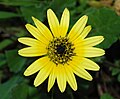
- Nomination I found this plant in the wild (in Lisbon), though it is a south-african species(Arctotis sp.), it may have propagated from some garden. The interesting thing in this flower are the cylindrical anthers and the black centre - Alvesgaspar 19:58, 28 March 2008 (UTC)
- Promotion A bit dark IMO but excellent detail.--Berrucomons 21:39, 28 March 2008 (UTC)
-
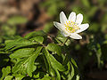
- Nomination At last spring is coming back after an Easter week with snow and cold rain. These flowers are wood anemones (Anemone nemorosa) --LC-de 22:15, 28 March 2008 (UTC)
- Promotion Good quality and a nice use of available DOF. I would have cropped the image at left and botton though -- Alvesgaspar 23:58, 28 March 2008 (UTC)
-

- Nomination Yellow ginkgo leaves, by Ram-Man. Arria Belli 12:25, 27 March 2008 (UTC)
- Promotion Good work--Berrucomons 21:42, 28 March 2008 (UTC)
-

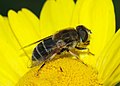
- Nomination Hoverfly on a daylily (Hemerocallis) in the Imperial Garden, Innsbruck, Austria --Thisisbossi 04:17, 25 March 2008 (UTC)
- Decline The crop is too tight on the upper part and the hoverfly (a Episyrphus balteatus) is completely out of focus (and/or motion blurred?). This is a very difficult subject for a small camera like yours, maybe it is time to offer yourself a DSLR... -- Alvesgaspar 19:40, 28 March 2008 (UTC)
I couldn't agree more: I'm planning on getting a DSLR after this year's trip. --Thisisbossi 20:49, 28 March 2008 (UTC)
-

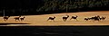
- Nomination Two volcanoes on Réunion island --B.navez 04:50, 22 March 2008 (UTC)
- Promotion Lovely colors. Was this at dawn/sunset or is the earth this color there? Arria Belli 01:04, 29 March 2008 (UTC) Light of late afternoon enhanced the stones colors, all natural except one, the colouring of the road surface which I chose to be mixed into the tar. --B.navez 10:07, 28 March 2008 (UTC)
-

- Nomination A delicate fruit of a Sonchus oleraceus (Smooth Sow-Thistle) -- Alvesgaspar 00:58, 23 March 2008 (UTC)
- Promotion It seems human who rising whom hands to me, and that is your idea? Very funny image :) . Focus, DOF, lighting, composition, color, perfect. _Fukutaro 11:08, 27 March 2008 (UTC)-- Thank you. No, that was not my idea but now that you mention it, it looks like an old man with a big moustache -- Alvesgaspar 19:22, 28 March 2008 (UTC)
-
- Nomination: A female hoverfly (Eristalis arbustorum) -- Alvesgaspar 00:58, 23 March 2008 (UTC)
- Review needed
-

- Nomination Island of Houat --Toubabmaster 13:12, 23 March 2008 (UTC)
- Decline Too small -- Alvesgaspar 09:56, 28 March 2008 (UTC)
It really needs some more description, a location and a category or two.-- CarolSpears 19:59, 28 March 2008 (UTC)
-
- Nomination: Gewoehnlicher Seidelbast (Daphne mezereum) is a very poisenous plant --Richard Bartz 15:53, 22 March 2008 (UTC)
- Review needed
-
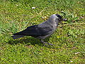
- Nomination: Corvus monedula. --Lestath 11:33, 22 March 2008 (UTC)
- Review needed
-

- Nomination Seattle panorama seen from Puget Sound. -- Klaus with K 12:41, 27 March 2008 (UTC)
- Promotion Nicely done. --JDrewes 11:50, 28 March 2008 (UTC)
-

- Nomination Bees on a honeycomb, by Waugsberg. Arria Belli 12:25, 27 March 2008 (UTC)
- Promotion Nice sharp macro, good colors, central compo good in this case. --Matl 16:17, 27 March 2008 (UTC)
fine colors, sharp FRZ 19:05, 27 March 2008 (UTC)
-

-

- Nomination Praying Mantis Mating, by OliverKoemmerling. --Mbdortmund 20:32, 27 March 2008 (UTC)
- Decline A wonderful composition. But can't be promoted due to small size and the unfortunate crop exactly above the really interesting spot... - Alvesgaspar 21:43, 27 March 2008 (UTC)
-

- Nomination This image shows a Narcissus pseudonarcissus --Super.lukas 21:18, 26 March 2008 (UTC)
- Decline The photographic quality is not good enough: too much noise and artifacts. The camera is to blame, I believe -- Alvesgaspar 23:39, 27 March 2008 (UTC)
-

- Nomination Cathedral in Spišská Kapitula (this scan, but i love this photo) - Pudelek 18:07, 26 March 2008 (UTC)
- Decline I find the composition unbalanced. Also, the sky is noisy and posterized -- Alvesgaspar 23:43, 27 March 2008 (UTC)
-

-

- Nomination Cathedral and Capital Square, Salzburg, Austria. --Thisisbossi 00:57, 26 March 2008 (UTC)
- Decline composition looks random, the light isn't good FRZ 19:18, 27 March 2008 (UTC)
-

- Nomination Matterhorn viewed from the Gornergratbahn near Riffleberg, Zermatt, CH. --Thisisbossi 00:57, 26 March 2008 (UTC)
- Promotion a bit hazy, but maybe unavoidable FRZ 19:16, 27 March 2008 (UTC)
-
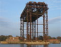
- Nomination Destroyed lift bridge in Karnin, Germany -- Gerolsteiner91 20:50, 26 March 2008 (UTC)
- Decline Image too noisy, both in the sky and in the main subject, which affects the detail -- Alvesgaspar 09:55, 28 March 2008 (UTC)
-

- Nomination Euphorbia pulcherrima cultivar, by Wildfeuer. Arria Belli 20:35, 25 March 2008 (UTC)
- Decline Yes, it may have some artistic value but the quality is not good enough: the crop is excessive and the image is too dark -- Alvesgaspar 09:42, 28 March 2008 (UTC)
-

- Nomination A Pilatus PC-6 Turbo Porter, variant B2-H4, taking off with a group of skydivers onboard.--JDrewes 17:02, 25 March 2008 (UTC)
- Withdrawn I withdraw in favor of a better edit, thank you Alvesgaspar. --JDrewes 13:02, 30 March 2008
-

- Nomination Euphorbia milii --D-Kuru 20:13, 25 March 2008 (UTC)
- Decline Unbalanced composition with the foreground flowers ouyt of focus -- Alvesgaspar 09:49, 28 March 2008 (UTC)
-

- Nomination This image shows a Hyacinthus orientalis. --Super.lukas 12:42, 25 March 2008 (UTC)
- Decline There is so much noise and artifacts that the image looks like a crayon drawing. Always use the best available image size and quality in these point-and-shoot cameras (sometimes that is not enough)! -- Alvesgaspar 09:47, 28 March 2008 (UTC)
-

-

- Nomination Memorial wall in the Kenwick Pioneer Cemetery Gnangarra 10:29, 23 March 2008 (UTC)
- Decline not sharp --Mbdortmund 18:33, 27 March 2008 (UTC)
-

- Nomination Port of Sauzon --Toubabmaster 13:10, 23 March 2008 (UTC)
- Decline The image lacks detail, not only due to the small size but also to the extreme jpeg compression. Always use the best available size and quality in these small cameras! Also, the horizon is tilted and curved due to lens distortion -- Alvesgaspar 10:00, 28 March 2008 (UTC)
-
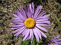
- Nomination Aster alpinus on Gornergrat, Zermatt, CH --Thisisbossi 04:13, 27 March 2008 (UTC)
- Promotion Good quality. Do you have shots of the full plant too? --Dschwen 04:40, 27 March 2008 (UTC)
Alas, it never occurred to me at the time; but I'll certainly keep that in mind for my next trip! --Thisisbossi 12:04, 27 March 2008 (UTC)
-

- Nomination Petunia in Thun, CH --Thisisbossi 04:13, 27 March 2008 (UTC)
- Promotion Not as good as the Aster, but ok. Same question: Any shots of the full plant (for encyclopedic value)? --Dschwen 04:43, 27 March 2008 (UTC)
-

- Nomination Petunia near the Obere Schleuse in Thun, CH. I suspect DOF will lead this down the road to rejection, but I still wanted to give it a shot at the limelight. --Thisisbossi 04:13, 27 March 2008 (UTC)
- Decline The limelight is here, but the DOF really is too low, plus the focus is set unfortunately (center of attention is all blurry). --Dschwen 04:40, 27 March 2008 (UTC)
-
- Nomination Flowers --D-Kuru 20:13, 25 March 2008 (UTC)
- Decline I am quite certain that the flowers need to be identified for QI, and there are sharpening artifacts in the background and some DOF issues. I would also suggest to choose a descriptive name for the file, unless the name of the flowers is the same as the author. --JDrewes 22:58, 26 March 2008 (UTC)
-

-

-

-

- Nomination End of track. --Dschwen 21:54, 21 March 2008 (UTC)
- Promotion Very cool picture. -- CarolSpears 01:35, 27 March 2008 (UTC)
-

- Nomination Miniature park Miniuni (Ostrava) - model of "Santa Fe" train-- Pudelek 15:53, 21 March 2008 (UTC)
- Promotion I don't know if it a good model of a Santa Fe train but it is a good photograph of a model train layout. -- CarolSpears 01:35, 27 March 2008 (UTC)
-
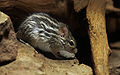
- Nomination Harvest Mouse (Micromys minutus) -- Richard Bartz 12:17, 21 March 2008 (UTC)
- Promotion Sharp, clear and licensed more generously than other mice. -- CarolSpears 01:35, 27 March 2008 (UTC)
-

- Nomination Vitelline Masked Weaver (Textor vitellinus) -- Richard Bartz 12:17, 21 March 2008 (UTC)
- Promotion That bird, is it in a state of disbelieve at what it is looking at or is it (perhaps) offended? It doesn't look scared at all.... -- CarolSpears 01:35, 27 March 2008 (UTC)
-
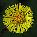
- Nomination Coltsfoot (Tussilago farfara) --Richard Bartz 23:39, 25 March 2008 (UTC)
- Promotion Looks sharp and in focus, though a tad on the dark side. --Thisisbossi 01:03, 26 March 2008 (UTC)
-

- Nomination Coltsfoot (Tussilago farfara) Richard Bartz 16:19, 24 March 2008 (UTC)
- Promotion Very delicate, btw how did you manage to get this ray just in the center ? --B.navez 18:25, 24 March 2008 (UTC)
I dont know .. i thought about this before, too :-) --Richard Bartz 18:46, 25 March 2008 (UTC)
-

- Nomination Redbelly Turtles. -Tibor Duliskovich 15:13, 5 March 2008 (UTC)
- Promotion Obviously. --Aqwis 11:17, 24 March 2008 (UTC)
I like it very much .. great picture --Richard Bartz 18:48, 25 March 2008 (UTC)
-

- Nomination "Bud Types" this is the new version of it, it is so diferent from the old one that i thought i should nominate it again.. by LadyofHats --Dschwen 15:03, 23 March 2008 (UTC)
- Promotion informative, valid well presented svg Gnangarra 00:07, 26 March 2008 (UTC)
-

-
- Nomination A moldavian girl at the mirror--Alessandro Zangrilli 10:02, 25 March 2008 (UTC)
- Decline Mirror frame is tilted and the lighting/composition does not work well with the subject - Peripitus 10:10, 25 March 2008 (UTC)
-
-

- Nomination View from Mitteldorf, Vaduz, Liechtenstein --Thisisbossi 04:17, 25 March 2008 (UTC)
- Decline Quality is only acceptable when viewing it at 50%, due to size I'd say that's good enough, but the overexposed parts make me want to decline. --Dschwen 04:57, 25 March 2008 (UTC)
-
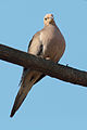
- Nomination Another mourning dove with a cleaner composition Dori 02:24, 25 March 2008 (UTC)
- Promotion Wonderful image; one of the best I've ever seen here--Alessandro Zangrilli 12:44, 24 March 2008 (UTC)
-

- Nomination A faceoff in an icehockey game --HenrikRomby 20:53, 24 March 2008 (UTC)
- Promotion Given the size the quality is (just) ok IMO. --Dschwen 23:54, 24 March 2008 (UTC)
-
- Nomination Aegyptian Goose (Alopochen aegyptiacus) --Richard Bartz 20:49, 24 March 2008 (UTC)
- Promotion Good solid quality. --Dschwen 23:54, 24 March 2008 (UTC)
-

- Nomination Wood Duck (Aix sponsa) Richard Bartz 16:25, 24 March 2008 (UTC)
- Promotion Good solid quality. --Dschwen 23:54, 24 March 2008 (UTC)
-
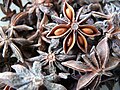
- Nomination Illicium verum (star anise). Arria Belli 16:39, 24 March 2008 (UTC)
- Decline Nice colors and composition. But the camera jitter blurs it a bit too much. --Dschwen 17:34, 24 March 2008 (UTC)
-

- Nomination Cucurbita pepo, end of vine. Arria Belli 16:39, 24 March 2008 (UTC)
- Promotion Good quality. Framing could be improved (more space at the bottom, less on top), and DOF could be a tad higher, but I like it anyways. --Dschwen 17:34, 24 March 2008 (UTC)
-

- Nomination Unidentified Rubiaceae in HDR (non-HDR version available upon request). Arria Belli 16:39, 24 March 2008 (UTC)
- Decline Several comments: if you use HDR you'll have to do a better job aligning the frames. HDRs novelty bonus has worn off, if there is no clear benefit compared to a regular exposure it just looks gimmicky. In this image the whites of the flowers are blown and the sharpness is suboptimal (in part due to misalignment of the frames). --Dschwen 17:16, 24 March 2008 (UTC)
OK then. Thanks. Arria Belli 17:23, 24 March 2008 (UTC)
-
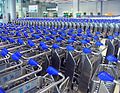
- Nomination Baggage carts at airport, by User:Mattes. Arria Belli 17:52, 24 March 2008 (UTC)
- Decline Chromatic noise, unsharp, odd retouching of overexposed elements, and a bit oversaturated. --Dschwen 18:02, 24 March 2008 (UTC)
-

- Nomination Plastic boxes, by User:Nino Barbieri. Arria Belli 17:52, 24 March 2008 (UTC)
- Promotion Mundane subject, but very well executed. --Dschwen 18:02, 24 March 2008 (UTC)
-
-

- Nomination Panorama Manhattan. --AngMoKio 16:32, 23 March 2008 (UTC)
- Promotion
Nice composition and colors but the skyscrapers seem to fall out of the picture. Restitching with a different (higher) horizon level should solve the problem. Chmehl 22:06, 23 March 2008 (UTC)
I'm not really sure what you mean. Do you mean the pic should show more of the lower parts of the towers? --AngMoKio 22:47, 23 March 2008 (UTC)
No, in PTGui I have the option to set the position of the horizon. If the position of the horizon is set correctly, you obtain this, otherwise this. Your image looks bended like my second example, so I think the horizon level in your pano should be set higher. Chmehl 23:12, 23 March 2008 (UTC)
Is it better? My pano-SW doesnt have that feature...so i had help myself with other tools. --AngMoKio 10:27, 24 March 2008 (UTC)
Yes much better. :) Chmehl 14:16, 24 March 2008 (UTC)
-
- Nomination Space Shuttle Endeavour --Milk's Favorite Cookie 02:40, 22 March 2008 (UTC)
- Decline Sorry, the guidelines state All nominated images should be the work of Commons users. --Dschwen 13:07, 24 March 2008 (UTC)
-

- Nomination A cat with an ocular prosthetic. --Aqwis 19:09, 21 March 2008 (UTC)
- Promotion Would it be possible to add information about the type of prosthetic? Arria Belli 16:29, 24 March 2008 (UTC)
-

- Nomination: Replica of old crane (Gdańsk/Danzig) in miniature park "Miniuni" in Ostrava -- Pudelek 13:50, 18 March 2008 (UTC)
- Review needed
-

- Nomination Ravinia Metra station. —JeremyA 21:49, 23 March 2008 (UTC)
- Decline I was going to promote this picture! But then I opened it in full size and realized how terrible the image quality is. How is it possible to obtain this result with a DSLR? Another thing I don't understand is the exposure choice: 1/1250 and ISO 800? What is the aperture? -- Alvesgaspar 23:41, 23 March 2008 (UTC)
-

- Nomination Rockhopper Penguins preening. --Chris huh 16:43, 23 March 2008 (UTC)
- Decline Confusing composition and crop too tight, difficult to see what's going on -- Alvesgaspar 9:50, 24 March 2008 (UTC)
-

- Nomination Oxya yezoensis -- Laitche 12:20, 23 March 2008 (UTC)
- Promotion Richard Bartz Yep 13:08, 23 March 2008 (UTC)
-
- Nomination A rare Yellow-eyed Penguin crying to the sky, picture taken in Curio Bay / New Zealand --Chmehl 06:40, 23 March 2008 (UTC)
- Promotion Good Richard Bartz 13:08, 23 March 2008 (UTC)
-

-

- Nomination Detail of the Gateway arch, St. Louis. --Dschwen 17:06, 22 March 2008 (UTC)
- Promotion The color and especially composition are super. But that's exactly what I can see some dust? spots. _Fukutaro 16:01, 23 March 2008 (UTC), dust removed (selectively brightened it away without cloning, DS)
-

- Nomination Vitelline Masked Weaver (Textor vitellinus) -- Richard Bartz 12:17, 21 March 2008 (UTC)
- Promotion Dieser Dotterweber scheint mir etwas grämlich und missmutig zu sein... -- MJJR 21:15, 23 March 2008 (UTC)
-

- Nomination Flowers of acacia (Acacia cf. cyanophilla) -- Alvesgaspar 12:17, 21 March 2008 (UTC)
- Promotion The cropping is a little bit tight at the top, but otherwise a nice picture with a sunny spring atmosphere -- MJJR 21:27, 23 March 2008 (UTC)
-
- Nomination Controlling the traffic in Chicago (2nd try). I think the blurred car in the background adds to the interest of the picture - Alvesgaspar 23:44, 19 March 2008 (UTC)
- Promotion Technically very nice, but I think there is a lack of composition (golden cut)... on the other Hand I wold rather like an encouraged "Trafficcontroler" like in the Mars-Commercial... ;) --Stefan-Xp 16:20, 21 March 2008 (UTC) While Stefan-Xp has a point, this is QIC, not FPC, and the quality of this picture is more than good enough for QI status. --Aqwis 00:01, 24 March 2008 (UTC)
-

-
-

-

-

- Nomination Coat of arms of the province of Huesca (Aragon) --Willtron 23:28, 17 March 2008 (UTC)
- Promotion Nice job. No major problem IMHO user:Afernand74
sure, photographers and artists can't read instructions and follow them but supporters need to be able to do this. -- carol 02:47, 21 March 2008 (UTC)
-
-

-

-

-

- Nomination Downtown Philo, IL. --Dschwen 14:58, 17 March 2008 (UTC)
- Promotion -- Nice picture of a typical small American place. Could you please correct the wide angle distortion? -- MJJR 21:55, 20 March 2008 (UTC), uploaded an edit over the old version, please flush cache and review :-), P.S.: the streetlight is crooked. --Dschwen 21:57, 21 March 2008 (UTC) -- O.K., thanks. MJJR 20:58, 23 March 2008 (UTC)
-
-

- Nomination Detail of a hand pump in Turkish --Manco Capac 08:53, 17 March 2008 (UTC)
- Promotion My understanding of Turkish is very limited, but from what I can read it seems accurate. --Aqwis 23:55, 23 March 2008 (UTC)
-

-

- Nomination Ostrava (Ostrau, Ostrawa) - Masarykovo náměstí (market square) --Pudelek 18:05, 22 March 2008 (UTC)
- Decline The geometric distortion is disturbing and should be corrected. Also, the sharpning process was a little overdone, there is visible fringing -- Alvesgaspar 0:42, 23 March 2008 (UTC)
-
- Nomination Ostrava (Ostrau, Ostrawa) - 28 rijna ulice (28 rijna street) in the evening --Pudelek 17:27, 22 March 2008 (UTC)
- Promotion Nice composition and atmosphere. The sharpening is a little overdone though -- Alvesgaspar 0:45, 23 March 2008 (UTC)
-

- Nomination Gewoehnlicher Seidelbast (Daphne mezereum) is a very poisonous plant --Richard Bartz 15:53, 22 March 2008 (UTC)
- Promotion Very fine work. I prefer this one because naked stem with flowers is more distinguable and because color of background is really like this after snow has vanished and daphne are flowering--B.navez 19:53, 22 March 2008 (UTC)
-

-

- Nomination A solitary bee collecting nectar from a Lantana camara flower, probably a male Eucera longicornis -- Alvesgaspar 11:24, 22 March 2008 (UTC)
- Promotion Good quality and nice composition --Anuskafm 16:30, 22 March 2008 (UTC)
-

- Nomination Macro of Skittles sweets in HDR. Arria Belli 20:23, 20 March 2008 (UTC)
- Decline Mostly out of focus, noisy, some CA, odd composition. --Dschwen 18:20, 22 March 2008 (UTC)
The composition was on purpose (the camera really was pointed that way), but I'll grant you the rest is not great. Oh well, at least I tried. Arria Belli 18:37, 22 March 2008 (UTC)
-
- Nomination Ostrava (Ostrawa, Ostrau) - Masarykovo namesti (market square) --Pudelek 12:28, 18 March 2008 (UTC)
- Decline This is a beautiful picture and I'm sorry not to promote it right away. But it needs some geometric correction and noise reduction first -- Alvesgaspar 23:52, 21 March 2008 (UTC)
 Comment geometry is ok - market square in Ostrava is little tilt -Pudelek 14:23, 22 March 2008 (UTC)-- Not really ;-) -- Alvesgaspar 0:49, 23 March 2008 (UTC)
-

-

-

- Nomination Mosaic in St. Louis Cathedral. --Dschwen 21:54, 21 March 2008 (UTC)
- Promotion Stunning. Nice work :) Fvasconcellos 02:21, 22 March 2008 (UTC)
-

- Nomination Common Bluetail -- Laitche 14:21, 21 March 2008 (UTC)
- Promotion Considering the image size the quality is good. --Dschwen 21:54, 21 March 2008 (UTC)
-

- Nomination Keeshond Sibirian Husky crossbreed -- Richard Bartz 12:17, 21 March 2008 (UTC)
- Promotion Good quality, nice setup --Dschwen 21:54, 21 March 2008 (UTC)
-
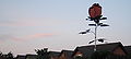
- Nomination The "Rose of Meckenheim". Körnerbrötchen 11:32, 21 March 2008 (UTC)
- Decline Nice Thing, but the Representation in this photograph lacks sharpness, and lacks something or shows to much... Someone who sees this Images can't imagine the Surrounding and even has no clear view on the Subject. --Stefan-Xp 16:16, 21 March 2008 (UTC) Ac Stefan-X + CA, lighting and generally bad quality. --Lestath 11:23, 22 March 2008 (UTC)
-

- Nomination German police officer norro 22:34, 20 March 2008 (UTC)
- Promotion No doubt great quality in terms of resolution and composition. --~~~~
sure, photographers and artists can't read instructions and follow them but supporters need to be able to do this. -- carol 02:47, 21 March 2008 (UTC)
I Like the Composition, Image has good sharpness and low Noise. --Stefan-Xp 16:16, 21 March 2008 (UTC) --Wasn't this FP (or is that another version of the file)? Dori 21:23, 21 March 2008 (UTC)
-

- Nomination A crane-fly (Nephrotoma quadrifaria) -- Alvesgaspar 16:00, 18 March 2008 (UTC)
- Promotion Nice. -- Laitche 14:39, 21 March 2008 (UTC)
-

- Nomination A crane-fly (Nephrotoma quadrifaria) -- Alvesgaspar 16:00, 18 March 2008 (UTC)
- Promotion Nothing wrong with it. --Dschwen 21:56, 21 March 2008 (UTC)
-

- Nomination A white-tail doe in the woods. I understand if people want to oppose because of the composition, but I like it. --Dori 15:13, 18 March 2008 (UTC)
- Promotion I like it too. The composition is justified. A shy animal hiding in the woods. (Bokeh could be better though) --Dschwen 21:56, 21 March 2008 (UTC)
-

- Nomination A european honeybee collecting nectar (Apis mellifera) -- Alvesgaspar 12:42, 18 March 2008 (UTC)
- Promotion It's OK, good DOF and sharpness, and I like this colours. --Lestath 11:29, 22 March 2008 (UTC)
-

- Nomination Door --Nevit 11:06, 18 March 2008 (UTC)
- Decline Poor quality (noise), cryptic meaning (if any) -- Alvesgaspar 23:56, 21 March 2008 (UTC)
-

-

- Nomination Grainelevator and "downtown" Thomasboro, IL. --Dschwen 14:58, 17 March 2008 (UTC)
- Promotion The technique (tone mapping) does not fit the subject (industrial documentation). --~~~~
sure, photographers and artists can't read instructions and follow them but decliners need to be able to do this. -- carol 02:47, 21 March 2008 (UTC). Subject is a rural agriculture town, the image does not use tonemapping, just exposure blending, and I cannot see why it wouldn't fit --Dschwen 12:16, 21 March 2008 (UTC) - The quality is good enough (a little sharpening fringing though) and I like the atmosphere and composition. For me, a clear QI - ALvesgaspar 22:01, 21 March 2008
-

- Nomination Viburnum opulus. --Lestat 22:34, 18 March 2008 (UTC)
- Promotion I like the colors in this one as well as the soft DOF. Arria Belli 20:18, 20 March 2008 (UTC)
-

-

- Nomination River Ostravica in Ostrava (Czech Republic) -Pudelek 18:51, 17 March 2008 (UTC)
- Decline I am sure the place is very nice but the day light is not good and not sharp enough --Manco Capac 08:22, 21 March 2008 (UTC)
-

- Nomination Watertower in Philo, IL. --Dschwen 14:58, 17 March 2008 (UTC)
- Promotion Wonderful but, there is white some dust spots on the left part. _Fukutaro 10:18, 18 March 2008 (UTC) -- Some white spots in the blue sky indeed (birds? insects?), but they can easily be removed. Otherwise excellent picture. Certainly QI for composition, colours and sharpness. -- MJJR 21:46, 20 March 2008 (UTC)
-
- Nomination Humbolt penguin at whipsnade zoo Chris_huh 00:58, 15 March 2008 (UTC)
- Promotion A humble penguin trying with little success to draw attention. Good enough for QI -- Alvesgaspar 0:54, 23 March 2008 (UTC)
-

-
-

- Nomination: arm diagram, left the names of the individual bones, right the names of the main bone characteristics-- LadyofHats 13:52, 9 March 2008 (UTC)
- Review Comment W3C refers to that is not Valid SVG.. _Fukutaro 14:11, 11 March 2008 (UTC) for me it marks it as valid...and for all this what is W3C? i didnt add that tag LadyofHats15:12, 11 March 2008 (UTC)
 Support I meant this. This is for judge whether the correct XML description. But.... It's not much important for QI? Now showing is very good for me and vote support. And I want to some opinions about W3C for QI. _Fukutaro
I just stripped 2 enable-background="new" that didn't have coordinates from that file and it passed. What happened to the camera svg to get it to validate was much more impressive, imho. -- carol 22:25, 14 March 2008 (UTC)
-

-

-
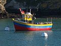
- Nomination Nice boat & great colors. -Toubabmaster 01:14, 16 March 2008 (UTC))
- Decline The composition is nice but the image has very poor photographic quality - Alvesgaspar 20:56, 21 March 2008
-

- Nomination: A male bee (Eucera longicornis) -- --Alvesgaspar 11:49, 14 March 2008 (UTC)
- Review needed
-

- Nomination Liverpool Premier League seasons --Laziale93 14:18, 13 March 2008 (UTC)
- Decline Because the image is not self-explanatory, I have no idea what this is - Alvesgaspar 20:54, 21 March 2008
-

-

- Nomination: Handwriting in the Icelandic language. --Max Naylor 22:30, 8 March 2008 (UTC)
- Review Comment Isn't this copyrighted? A significant portion is readable, and there is no real reason that a CR song needed to be used as opposed to, say, an older public domain work or your own writing. Thegreenj 00:14, 14 March 2008 (UTC)
-

- Nomination A high quality photograph of a bare flame with minimal noise. --victorrocha 23:25, 7 March 2008 (UTC)
- Decline CommentI`m not sure about it. Most of the picture is dark. Most of the flame is overexposed. user:sfu 22:36, 15 March 2008 (UTC), minimal noise, but also minimal information content. ack sfu.--Dschwen 17:23, 5 March 2008 (UTC)
-
-

-

-

- Nomination: A Xysticus sp. spider waiting for prey - Alvesgaspar 09:43, 13 March 2008 (UTC)
- Review needed
-

-

-

- Nomination A high res panoramic image of the City of Industry, CA. --victorrocha 16:01, 6 March 2008 (UTC) Humm.. Very large...._Fukutaro 12:26, 10 March 2008 (UTC)
- Promotion It is huge -- my computer complained. The foliage seems posterized but the electrical things and the sticks in the foliage are sharp, as is the ladder in the tree and the silhouette of the person with the dogs. -- carol 03:08, 19 March 2008 (UTC)
-

- Nomination Crevasses in Deux Alpes (France) --Willtron 23:38, 17 March 2008 (UTC)
- Promotion Good use of DOF. -- User:Ianare 00:26, 18 March 2008 (UTC)
-

- Nomination Cathedral of Granada, Nicaragua. Seen from La Merced Church --Sebastian888 15:46, 17 March 2008 (UTC)
- Promotion nice composition - Pudelek 16:26, 17 March 2008 (UTC)
-

- Nomination Railroad crossing, overview. --Dschwen 14:58, 17 March 2008 (UTC)
- Promotion Appropriate use of wide angle, despite perspective distortion. Does not look very safe! -- User:Ianare 00:28, 18 March 2008 (UTC)
-

- Nomination coat of arms of Bulawayo a province of Zimbawe--LadyofHats 10:30, 17 March 2008 (UTC)
- Promotion It's super work! excellent SVG. _Fukutaro 10:18, 18 March 2008 (UTC)
-

- Nomination: Branch of a purple leaf plum (Prunus cerasifera) with flowers, buds and leaves -- Alvesgaspar 21:18, 11 March 2008 (UTC)
- Review needed
-

-
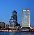
- Nomination Jacksonville Skyline --Digon3 19:23, 7 March 2008 (UTC)
- Promotion Comment There is very light black spot(lens dust?) at the upper left. And slight perspective distortion. Could you have intention of correct this perspective distortion? _Fukutaro 14:11, 11 March 2008 (UTC) *I can corrected the spot, but I have no idea how to correct the perspective distortion any more than I already have. Digon3 14:28, 11 March 2008 (UTC) Then, would you have remove this spot? _Fukutaro 12:14, 16 March 2008 (UTC) *Done. ----Digon3 15:33, 16 March 2008 (UTC) Thanks. Nice color and night view. _Fukutaro 14:23, 17 March 2008 (UTC)
-
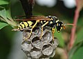
- Nomination A formal portrait of a paper wasp (Polistes dominumus) at the entrance of its house -- Alvesgaspar 12:04, 13 March 2008 (UTC
- Promotion A really great shot... definitely meets the basic quality standards. Ragesoss 22:58, 16 March 2008 (UTC)
-

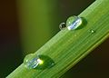
- Nomination A frozen droplet of water. Thegreenj 22:01, 11 March 2008 (UTC)
- Promotion It's excellent. Though sorry for just one thing, I can see a dust(?) spot on the lower middle(on the lower left of the droplet). _Fukutaro 10:09, 13 March 2008 (UTC)
Done. Thegreenj 03:48, 15 March 2008 (UTC) Thanks:)._Fukutaro 12:14, 16 March 2008 (UTC)
-

- Nomination A part of the huge and beautiful Champagne Pool in Wai-O-Tapu Thermal Wonderland. Chmehl 16:52, 11 March 2008 (UTC)
- Promotion Can't be sure if it's straight or not, but I like it. I'd support for FP as well. --Dori - Talk 04:16, 13 March 2008 (UTC) Comment From the reflections on the water it is clear that the image is tilted. Should be easy to fix though. --Stefan Vladuck 11:27, 13 March 2008 (UTC)
I rotated the image 2° to the left. I think its straight now. Besides the reflections, also have a look at the trees in the background. Chmehl 16:28, 13 March 2008 (UTC)
Rotation is good. I think that does it. WikiWookie 09:04, 17 March 2008 (UTC)
-

- Nomination: Rheinfall is the largest waterfall in germany Richard Bartz 20:20, 10 March 2008 (UTC)
- Review needed
-

- Nomination: A very tiny Delphacidae larvae Richard Bartz 20:20, 10 March 2008 (UTC)
- Review needed
-

-

- Nomination: Mosaic in the Pergamonmuseum --
- Review Lestat 19:36, 10 March 2008 (UTC)
-

-

-

- Nomination: Electrophone, by Romanceor 15:27, 10 March 2008 (UTC)
- Review needed
-

- Nomination: Jardins au dessus de la gare de Lyon-Perrache, France, by Romanceor 15:27, 10 March 2008 (UTC)
- Review needed
-

- Nomination: Green iguana showing darker phase. ianaré 22:22, 10 March 2008 (UTC)
- Review needed
-

- Nomination A Tropheus duboisi at Tiergarten Schönbrunn. - Tsui 01:17, 8 March 2008 (UTC)
- Decline Very noisy sfu 22:33, 15 March 2008 (UTC)
I was just going to discuss this, because he has a nice face but I thought that perhaps the tail was too blurry. -- carol 22:47, 15 March 2008 (UTC)
It doesn`t look nice for me, especially ... let`s call it - the mouth. But ok, let`s discuss it. sfu 00:11, 16 March 2008 (UTC)
I was undecided, I only mentioned this because I saw other problems. -- carol 22:35, 16 March 2008 (UTC)
-

-
-

-
-

- Nomination 360° view of the Bussumerheide, Bussum, The Netherlands. Sebastian888 11:28, 15 March 2008 (UTC)
- Promotion Mooi! -- MJJR 22:17, 15 March 2008 (UTC)
-
-

- Nomination A red berry. Koernerbroetchen 09:03, 13 March 2008 (UTC)
- Decline Too shallow DOF, not identified. -- User:Ianare 18:51, 12 March 2008 (UTC)
-

- Nomination Schizophyllum commune with Pollenia sp. male on Betula --Richard Bartz 19:36, 10 March 2008 (UTC)
- Promotion No doubt about it. Quality+composition perfect. --AngMoKio 09:07, 18 March, 2008 (UTC)
-

-

- Nomination: Allianz arena @ daylight Richard Bartz 01:52, 10 March 2008 (UTC)
- Review needed
-

- Nomination Allianz arena @ golden hour Richard Bartz 01:52, 10 March 2008 (UTC)
- Promotion Useful and well-executed -- Ragesoss 04:47, 16 March 2008 (UTC)
-

- Nomination: Plan of the village Casalvasco, actually in Vila Bela da Santíssima Trindade, Mato Grosso, Brazil.(Collection of Casa da Ínsua, Portugal) -- Mateus Hidalgo 16:55, 9 March 2008 (UTC)
- Review needed
-

- Nomination Cell junction, desmosome--LadyofHats 11:36, 14 March 2008 (UTC)
- Promotion Good again. Can you just capitalize the p of plasma membrane? Lycaon 10:41, 15 March 2008 (UTC)
-

- Nomination Katta Lemur catta Richard Bartz 01:52, 10 March 2008 (UTC)
- Promotion Pretty pose. -- carol 22:27, 14 March 2008 (UTC)
-

-

-

- Nomination A very tiny Delphacidae larvae Richard Bartz 20:20, 10 March 2008 (UTC)
- Promotion Your camera is microscope? Amazing macro shot. _Fukutaro 10:09, 13 March 2008 (UTC)
-

-

-

- Nomination: Ogrodzieniec Castle, Poland - ruins. --Piotrus 12:19, 6 March 2008 (UTC)
- Review needed
-

- Nomination: Ruins of Krzyztopor Castle. --Piotrus 12:19, 6 March 2008 (UTC)
- Review needed
-

- Nomination: Ruins of Krzyztopor Castle. --Piotrus 12:19, 6 March 2008 (UTC)
- Review needed
-

- Nomination Old nautical chart by Portuguese cartographer Fernão Vaz Dourado, 1570 (Huntington Library, San Marino, USA) -- Alvesgaspar 15:28, 6 March 2008 (UTC)
- Promotion Looks Good. --Dori - Talk 04:01, 13 March 2008 (UTC)
-

- Nomination City of Lévis and the Saint Lawrence river in winter, Québec, Canada --Bgag 14:43, 6 March 2008 (UTC)
- Promotion Comment Very nice landscape view but sky is little noisy. Could you remove noise and add location? _Fukutaro 12:26, 10 March 2008 (UTC)
 Done corrected. _Fukutaro 12:20, 11 March 2008 (UTC) Looks good to me. --Dori - Talk 04:01, 13 March 2008 (UTC)
-

-
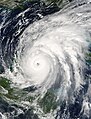
- Nomination Hurricane Wilma about to cross Cozumel, a small island just off the Yucatan Peninsula coast -~~~~
- Decline A nice picture, but not created by a Commons user and hence ineligible for QI. --bdesham 17:59, 11 March 2008 (UTC)
-

- Nomination life cycle of the entamoeba histolica, the parasite responsable for the Amoebiasis.LadyofHats 15:07, 11 March 2008 (UTC)
- Promotion Comment A few minor (yet important) comments: CW: contaminated food, ...from each cyst, Encystation (no t), immature cyst. Lycaon 15:18, 11 March 2008 (UTC). er....done
 -LadyofHats15:34, 11 March 2008 (UTC).
  Thanks. Great image again. Lycaon 21:34, 11 March 2008 (UTC)
-

- Nomination: Winter in Żywiec Beskids --Pudelek 15:22, 5 March 2008 (UTC)
- Review needed
-

-

-

- Nomination Green iguana showing darker phase. ianaré 22:22, 10 March 2008 (UTC)
Cute! Richard Bartz 01:52, 10 March 2008 (UTC) - Promotion
- Nomination Green iguana showing darker phase. ianaré 22:22, 10 March 2008 (UTC)
-

- Nomination Aphidoidea Richard Bartz 01:52, 10 March 2008 (UTC)
- Promotion Amazing! -- ianaré 22:27, 10 March 2008 (UTC)
-

- Nomination Black Swallowtail caterpillar --He Who Laughs Last 05:13, 9 March 2008 (UTC)
- Decline Noisy, blurry -- ianaré 22:27, 10 March 2008 (UTC)
-

-

-

- Nomination: This section of the trail along the rim of a caldera is going skyward; taken at Cinder Cone, Lassen Volcanic National Park, California, USA --Wing-Chi Poon 00:15, 4 March 2008 (UTC)
- Review Comment It's impressive. But your four images that are need to be correct tilted and add location on these image's pages. _Fukutaro 14:23, 4 March 2008 (UTC)
-

- Nomination Three Paper Birch (Betula papyrifera) trees with white bark. Taken at McDonald Lake, Going-to-the-Sun Road, Glacier National Park, Montana, USA --Wing-Chi Poon 00:15, 4 March 2008 (UTC)
- Decline Comment It`s tilted. Version without trees is better. sfu 13:54, 5 March 2008 (UTC)--
 Oppose not only tilted also has exposure problems- --LadyofHats18:03, 10 March 2008 (UTC)
-

- Nomination Allianz arena @ night Richard Bartz 01:52, 10 March 2008 (UTC)
- Promotion High technical quality as well as esthetic value. Great! --rampensau 14:57, 10 March, 2008 (UTC)
-
![* Nomination Coat of arms of the Sovereign Military Order of Malta--Willtron 14:25, 6 March 2008 (UTC) * Decline shouldnt the coat cover on top of the white crosses? shouldnt you either use outlines or not outlies, using both looks rather artificial and build up, also the black spots on the coat should also be visible behind the white croses snce it is suposed to be a pattern. It also seems funny to me that the patern inside doesnt follow the bendings of the coat. was it this way in your source?-LadyofHats 14:11, 9 March 2008 (UTC) Yes, that's the source check yourself --Willtron 14:44, 9 March 2008 (UTC)-- when posible try to use more than one source, that way you can remove the individual mistakes: [1], [2],[3]and[4].-LadyofHats08:37, 10 March 2008 (UTC)](https://upload.wikimedia.org/wikipedia/commons/thumb/8/86/Coat_of_Arms_of_the_Sovereign_Military_Order_of_Malta.svg/105px-Coat_of_Arms_of_the_Sovereign_Military_Order_of_Malta.svg.png)
- Nomination Coat of arms of the Sovereign Military Order of Malta--Willtron 14:25, 6 March 2008 (UTC)
- Decline shouldnt the coat cover on top of the white crosses? shouldnt you either use outlines or not outlies, using both looks rather artificial and build up, also the black spots on the coat should also be visible behind the white croses snce it is suposed to be a pattern. It also seems funny to me that the patern inside doesnt follow the bendings of the coat. was it this way in your source?-LadyofHats 14:11, 9 March 2008 (UTC)
Yes, that's the source check yourself --Willtron 14:44, 9 March 2008 (UTC)-- when posible try to use more than one source, that way you can remove the individual mistakes: [1], [2],[3]and[4].-LadyofHats08:37, 10 March 2008 (UTC)
-

- Nomination A ship model hanging from the ceiling. The ship model is an copy of the original "votivskeppet" and made in 1950s. The original ship model was built around 1600, it is now in the Museum of Maritime History and was given to the church as a sacrifice. The ship-type is an Elizabethian gallion, as at the end of the 1500 century. --Wing-Chi Poon 23:56, 3 March 2008 (UTC)
- Decline Oppose- it is quite blury- was the ship moving?-LadyofHats 14:00, 9 March 2008 (UTC)
-

- Nomination Lush vegetation around Summit Lake, with a fallen log lying at the front. --Wing-Chi Poon 23:56, 3 March 2008 (UTC)
- Decline It's tilted. --Calibas 03:13, 5 March 2008 (UTC)- Oppose- agree, it is also overexposed LadyofHats 14:04, 9 March 2008 (UTC)
-
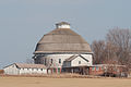
- Nomination University of Illinois Experimental Dairy Farm Historic District. --Dori - Talk 22:47, 2 March 2008 (UTC)
- Promotion i cant find any tecnical problems in this one -LadyofHats13:54, 9 March 2008 (UTC)
-
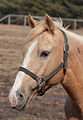
- Nomination Domestic horse. --Dori - Talk 22:47, 2 March 2008 (UTC)
- Promotion straight foward (rather boring) composition, but tecnically it is ok -LadyofHats08:37, 10 March 2008 (UTC)
-

-
- Nomination La pointe et le phare de la Corbière, Jersey.Bernard Danguy 13:18, 5 March 2008 (UTC)
- Decline Overexposed sky, tilt (?), no license selected --Ianare 1:22, 5 March 2008 (UTC)
-

- Nomination 2 sticks of pc6400 RAM with integrated heat sinks. --victorrocha 21:47, 6 March, 2008 (UTC)
- Promotion Good photo, no noise, good background. --Lestath 10:52, 7 March 2008 (UTC)
-

-

- Nomination close up to the metacarpals.LadyofHats 4 March 2008 13:18 (UTC)
- Promotion Clean, neat, clear and wellmade - Peripitus 00:00, 7 March 2008 (UTC)
-
-

- Nomination: Ruins of the medieval St Eligius church at Ettelgem (Belgium) -- (MJJR) 19:46, 29 February 2008 (UTC)
- Review needed
-

- Nomination Photo of Cerro de la Silla; recently defeatured on en. -- Spangineer 17:47, 29 February 2008 (UTC)
- Decline Too small, not sharp. Lycaon 23:09, 6 March 2008 (UTC)
-

-

- Nomination Westerplatte Monument (Gdańsk, Poland). -- Wisnia6522 16:18, 1 March 2008 (UTC)
- Decline I was going to promote the whole day but this one is too small --carol 16:30, 5 March 2008 (UTC)
-

-

- Nomination A wild Euphorbia (E. serrata ?). I like the yellow-greenish tones, unusual in a flower - Alvesgaspar 12:28, 1 March 2008 (UTC)
- Promotion Very pretty less square would have been nice. -- carol 16:30, 5 March 2008 (UTC)
-

- Nomination The London Eye and County Hall an overcast afternoon in February. -- Slaunger 01:02, 1 March 2008 (UTC)
- Promotion With a moon instead of mars! -- carol 16:30, 5 March 2008 (UTC)
-

- Nomination A small Halictus sp. solitary bee with a full load of pollen - Alvesgaspar 01:29, 1 March 2008 (UTC)
- Promotion Looks like the bee was enjoying himself. ID the flower? -- carol 16:30, 5 March 2008 (UTC) -- Done ~~~~
-

- Nomination: Port of Antwerp (Belgium) -- Lviatour 08:25, 29 February 2008 (UTC)
- Review needed
-

- Nomination Cathédrale Notre-Dame de Paris seen from Saint-Michel bridge, by Romanceor 17:00, 25 February 2008 (UTC)
- Promotion The image is tilted, should be fixed first --Richard Bartz 12:26, 26 February 2008 (UTC) Tilted corrected. Romanceor 00:13, 27 February 2008 (UTC)- Supporti like the deepness of this picture- LadyofHats how can i know the UTC? (It is in the middle of the page, above where the images start --fred) 4 march 2008 LadyofHats 12:31, 5 March 2008 (UTC)
-

- Nomination Fall Colors on the Coosa River near Wetumpka, Alabama, by Mike Cline 25 February 2008 (UTC)-
- Decline Oppose noisy, out of focus, color aberrations, a "bit" overexposed - LadyofHats 12:31, 5 March 2008 (UTC)
-

- Nomination Warsaw skyline in the evening Sfu 18:37, 22 February 2008 (UTC)
- Withdrawn Comment slightly tilt to the right and bottom trees are unsharp and not good detail. _Fukutaro 16:17, 26 February 2008 (UTC) Comment I`ve rotated the image.-- Opposerather noisy, probably from low light conditions, it is also blury. i would decline the nomination, but would like someone else to confirm this -~~~~ -LadyofHats CommentI can withdraw it. It`s not good enugh. sfu 14:51, 5 March 2008 (UTC)
-

-
-
-

- Nomination: Canon EF-S 17-55mm in 3D You need a Anaglyph

to view this picture --User:Richard Bartz 18:48, 27 February 2008 (UTC) - Review needed
- Nomination: Canon EF-S 17-55mm in 3D You need a Anaglyph
-

- Nomination: Tamron 180mm Makro in 3D You need a Anaglyph
to view this picture -User:Richard Bartz 18:18, 27 February 2008 (UTC) - Review needed
- Nomination: Tamron 180mm Makro in 3D You need a Anaglyph
-
![* Nomination: EF 70-300mm in 3D You need a Anaglyph to view this picture -User:Richard Bartz 18:18, 27 February 2008 (UTC) * Review Humm. Just one thing Okey? :) Red dot mark at under the MF/AF swich that seems flickering.[5] _Fukutaro 11:54, 28 February 2008 (UTC)](https://upload.wikimedia.org/wikipedia/commons/thumb/2/2a/Canon_EF_70-300mm_anaglyph.jpg/120px-Canon_EF_70-300mm_anaglyph.jpg)
- Nomination: EF 70-300mm in 3D You need a Anaglyph
to view this picture -User:Richard Bartz 18:18, 27 February 2008 (UTC) - Review Humm. Just one thing Okey? :) Red dot mark at under the MF/AF swich that seems flickering.[5] _Fukutaro 11:54, 28 February 2008 (UTC)
- Nomination: EF 70-300mm in 3D You need a Anaglyph
-

- Nomination: Canon MP-E65mm in 3D You need a Anaglyph
to view this picture User:Richard Bartz 15:25, 27 February 2008 (UTC) - Review You are wonderful but it could not judge this series without 3D glass. _Fukutaro 18:39, 27 February 2008 (UTC)
:-) You must not review it --User:Richard Bartz 21:03, 27 February 2008 (UTC)
- Nomination: Canon MP-E65mm in 3D You need a Anaglyph
-

-

- Nomination The white spiral bark of the dead tree stands out before the dark bark of the living tree. Taken at Sun Notch, Crater Lake National Park, Oregon, USA --Wing-Chi Poon 00:15, 4 March 2008 (UTC)
- Promotion Good illustration of topic --Ianaré Sévi 21:17 5 March 2008 EDT
-
-

- Nomination Water going down in a well. ABF 19:57, 27 February 2008 (UTC)
- Decline dark, blury, noisy. .. i would try a faster foto- LadyofHats 4 march 2008
-

- Nomination: Race between Samson and Tail-Gator Monstertrucks during a Monstertruck event at UIUC Assembly Hall. Image by User:Dschwen, nom by User:Piotrus 23:23, 26 February 2008 (UTC)
- Review needed
-

- Nomination Pantheon de Paris (distortion checked), by Romanceor, 00:03, 27 February 2008 (UTC)
- Decline Opposetoo dark and blury- LadyofHats 4 march 2008
-

- Nomination diagram of a Flagellum - LadyofHats 03:23, 3 March 2008 (UTC) (signatures dont seem to work)
- Promotion Oh, come on, it's a Lady of Hats diagram. Was there any doubt it wouldn't be accurate, clear, useful, and well-executed? Might want to tweak the colours a bit before FPC - that green is a little livid - but it's certainly quality. Minor problem does not specify type of flagellum - it should be explicitly labelled as Bacterial. Adam Cuerden 07:11, 3 March 2008 (UTC)
-

- Nomination Domestic horse. --Dori - Talk 22:47, 2 March 2008 (UTC)
- Promotion Been a while, but this is the portrait that makes the equine industry happy (giddy?). --CarolSpears 23:54, 2 March 2008 (UTC)
-

-

- Nomination Taken by User:MatthiasKabel. Noy 16:46, 1 March 2008 (UTC)
- Decline What happend to the sky on the left side? Quite big noise sfu 18:47, 2 March 2008 (UTC)
-

- Nomination Roasted Coffee Beans Food and drink--
- Decline I like the subject, and framing, but image itself is too noisy sfu 17:23, 2 March 2008 (UTC)
-

- Nomination Canon EF-S 17-55mm User:Richard Bartz 18:48, 27 February 2008 (UTC)
- Promotion excellent technical image. _Fukutaro 18:38, 2 March 2008 (UTC)
-

- Nomination Tamron 180mm Makro User:Richard Bartz 18:18, 27 February 2008 (UTC)
- Promotion excellent technical image. _Fukutaro 18:38, 2 March 2008 (UTC)
-

- Nomination EF 70-300mm User:Richard Bartz 18:18, 27 February 2008 (UTC)
- Promotion excellent technical image. _Fukutaro 18:38, 2 March 2008 (UTC)
-

- Nomination Canon MP-E65mm User:Richard Bartz 15:25, 27 February 2008 (UTC)
- Promotion excellent technical image. _Fukutaro 18:38, 2 March 2008 (UTC)
-
- Nomination Ruins of Holy Spirit Church in Szydłów. Nom by User:Piotrus 23:23, 26 February 2008 (UTC)
- Decline Sky is overexposed. I really don`t like framing here. What the picture was supposing to show? If all the building - framing is bad. sfu 17:35, 2 March 2008 (UTC)
-

- Nomination Ruins of Krzyztopor Castle. Nom by User:Piotrus 23:23, 26 February 2008 (UTC)
- Decline Image is noisy, sky is overexopsed, chromatic aberration is visible. Image seems not sharp for me. sfu 18:21, 2 March 2008 (UTC)
-

-
- Nomination: Electrophone, by Romanceor 16:29, 25 February 2008 (UTC)
- Review needed
-
- Nomination: Very short exposition on animal's legs in Brijuni National Park (Croatia), by Romanceor 16:42, 25 February 2008 (UTC)
- Review needed
-

- Nomination Park of Bercy during winter 2007-2008 in Paris, by Romanceor 16:56, 25 February 2008 (UTC)
- Decline Nice composition and place. But I don`t like this element in bottom left corner - it`s out of focus and it`s breaking the composition. Image seems to be tilted to the left (the bridge is tilted. sfu 17:46, 2 March 2008 (UTC)
-
- Nomination: Musée national du Moyen Âge (Hôtel des abbés de Cluny) in Paris, by Romanceor 17:00, 25 February 2008 (UTC)
- Review needed
-

- Nomination Phalaenopsis orchid, white cultivar (alternate version) -- Ianaré 16:56, 24 February 2008 (UTC)
- Withdrawn Composition is nice, sharpness is good. sfu 18:00, 2 March 2008 (UTC) Comment I see there is a version of this image two days later. I will wait now. sfu 18:05, 2 March 2008 (UTC)
 I withdraw my nomination This is the bad one Ianaré 22:32 4 March 2008 (UTC)
-
![* Nomination Winter in Żywiec Beskids, Poland. -- Pudelek 13:23, 24 February 2008 (UTC) * Decline not enough size. _Fukutaro 11:27, 27 February 2008 (UTC) - Comment 1600x1200 -> this is enough - [6] - --Pudelek-- Oppose Too dark, and noisy . it misses contrast and not the best composition -~~~~ -LadyofHats Comment dark? this photo? - Pudelek](https://upload.wikimedia.org/wikipedia/commons/thumb/c/cc/Osrodek_Narciarski_Pilsko.jpg/120px-Osrodek_Narciarski_Pilsko.jpg)
- Nomination Winter in Żywiec Beskids, Poland. -- Pudelek 13:23, 24 February 2008 (UTC)
- Decline
not enough size. _Fukutaro 11:27, 27 February 2008 (UTC) --- Comment 1600x1200 -> this is enough - [6] - --Pudelek Oppose Too dark, and noisy . it misses contrast and not the best composition -~~~~ -LadyofHats Comment dark? this photo? - Pudelek
-

- Nomination Phalaenopsis orchid, white cultivar in a garden -- Ianaré 15:39, 23 February 2008 (UTC)
- Withdrawn Comment I think, the first uploaded version that is more beautiful than now this. _Fukutaro 11:06, 24 February 2008 (UTC) I agree in an artistic sense, but it removed some of the detail in the flower, and altered the colors. I felt that for an encyclopedic photo a more accurate depiction of the subject would be more valuable. --Ianaré 16:48, 24 February 2008 (UTC) I see. If you don't mind, I would upload that is the I tried corrected contrast version? _Fukutaro 13:24, 25 February 2008 (UTC) * I will not have internet at home for a few days :(, if you want to replace the alternate version of 02-24 above please do. Ianaré 16:23, 28 February 2008 I withdraw my nomination Posting again above Ianaré 22:32 4 March 2008 (UTC)
-

-

- Nomination A tutorial for building a good working photolamp (spotlight) for less than 15 Euros -- Richard Bartz 17:08, 29 February 2008 (UTC)
- Promotion If it could be possible to promote everything except the carpet, I would. -- carol
-

-

-
- Nomination Krakowskie Przedmieście Street in Warsaw. sfu 21:31, 27 February 2008 (UTC)
- Promotion i think - enough for QI - Pudelek 17:22, 29 February 2008 (UTC)
-

- Nomination Clock in Przypkowscy Clock Museum. Nom by User:Piotrus 23:23, 26 February 2008 (UTC)
- Decline I'm sorry, I'd love to support this, but it's really badly out of focus. Could you have another try at photographing it? Adam Cuerden 23:26, 29 February 2008 (UTC)
-

- Nomination: Brown anole eating a spider -- Ianaré 23:53, 23 February 2008 (UTC)
- Review needed
-

- Nomination: Brown anole eating a spider -- Ianaré 18:49, 23 February 2008 (UTC)
- Review needed
-
- Nomination: Piracetam (medical drug). (It's my first photo in shadeless box) #!George Shuklin 13:39, 23 February 2008 (UTC)
- Review needed
-

-
-

-

-

- Nomination Oxalis triangularis --Richard Bartz 17:19, 25 February 2008 (UTC)
- Promotion Blatantly obvious QI. --Ram-Man 03:15, 26 February 2008 (UTC)
-
- Nomination Madison river in October, near Sevenmile bridge, YNP User:Mike Cline 25 February 2008 (UTC)
- Decline Realy beatifull place and nice framing. But chromatic aberration is very strong and snow seems to be overexposed. Sadly. sfu 22:29, 27 February 2008 (UTC)
-

-

- Nomination: Ski lift in Korbielów, Poland -- Pudelek 22:28, 22 February 2008 (UTC)
- Review needed
-
- Nomination: Brijuni National Park in Croatia, by Romanceor 12:20, 22 February 2008 (UTC)
- Review needed
-

- Nomination: Sommet de la tour de Beurre de la Cathédrale, Rouen, France, by Romanceor 12:20, 22 February 2008 (UTC)
- Review needed
-
- Nomination: Jardins au dessus de la gare de Lyon-Perrache, France, by Romanceor 12:20, 22 February 2008 (UTC)
- Review needed
-
- Nomination: Ponton sur un bord de Marne, Aisne, France, by Romanceor 12:20, 22 February 2008 (UTC)
- Review needed
-

- Nomination Church of St. Władysław in Szydłów. Nom by User:Piotrus
- Decline Sky is overexposed. guillom 15:50, 27 February 2008 (GMT)
-
- Nomination Ruins of Krzyztopor Castle. Nom by User:Piotrus
- Decline Underexposed. guillom 15:50, 27 February 2008 (GMT)


.JPG)


.JPG)


.jpg)


.jpg)


.jpg)


.jpg)


.jpg)


![* Nomination Coat of arms of the Sovereign Military Order of Malta--Willtron 14:25, 6 March 2008 (UTC) * Decline shouldnt the coat cover on top of the white crosses? shouldnt you either use outlines or not outlies, using both looks rather artificial and build up, also the black spots on the coat should also be visible behind the white croses snce it is suposed to be a pattern. It also seems funny to me that the patern inside doesnt follow the bendings of the coat. was it this way in your source?-LadyofHats 14:11, 9 March 2008 (UTC) Yes, that's the source check yourself --Willtron 14:44, 9 March 2008 (UTC)-- when posible try to use more than one source, that way you can remove the individual mistakes: [1], [2],[3]and[4].-LadyofHats08:37, 10 March 2008 (UTC)](/wiki/File:Coat_of_Arms_of_the_Sovereign_Military_Order_of_Malta.svg)


![* Nomination: EF 70-300mm in 3D You need a Anaglyph to view this picture -User:Richard Bartz 18:18, 27 February 2008 (UTC) * Review Humm. Just one thing Okey? :) Red dot mark at under the MF/AF swich that seems flickering.[5] _Fukutaro 11:54, 28 February 2008 (UTC)](/wiki/File:Canon_EF_70-300mm_anaglyph.jpg)


![* Nomination Winter in Żywiec Beskids, Poland. -- Pudelek 13:23, 24 February 2008 (UTC) * Decline not enough size. _Fukutaro 11:27, 27 February 2008 (UTC) - Comment 1600x1200 -> this is enough - [6] - --Pudelek-- Oppose Too dark, and noisy . it misses contrast and not the best composition -~~~~ -LadyofHats Comment dark? this photo? - Pudelek](/wiki/File:Osrodek_Narciarski_Pilsko.jpg)


.gif)
![[1]](http://www.emmsaid.com/images/x.jpg)
![[3]](http://www.crwflags.com/fotw/images/s/smom)arm.jpg)
![[4]](http://www.doles.org/Newsletters/grafx-11/smom4.gif)
![[5]](http://bp3.blogger.com/_70T2c8qQ2HA/R8aZ74J8b8I/AAAAAAAAABU/jmqC9s41n_8/s1600-h/111.jpg)
Consensual review[edit]
Offroad Jeep 05760 2[edit]

- Nomination Image of moving Jeep with splashed mud. Nevit 20:08, 18 March 2008 (UTC)
- Promotion
- Comment This one is better because of better lighting. Too strong contrast here. --~~~~.
- Support Sufficient quality. Wonderful composition. --Norro 11:56, 22 March 2008 (UTC)
- Oppose Unnatural sharpness. The unsharp-mask too work, maybe. _Fukutaro 15:20, 23 March 2008 (UTC)
- Support High res. --Beyond silence 13:26, 27 March 2008 (UTC)
- Oppose Background is noisy. It is like this image has had too much processing. -- CarolSpears 00:45, 28 March 2008 (UTC)
- Support - This one is on the borderline. But this time I like the composition and tight framing -- Alvesgaspar 19:25, 28 March 2008 (UTC)
Result: 3 support (excluding the nominator), 2 oppose -> promoted -- carol 00:16, 31 March 2008 (UTC)
Kezmarok CoA.png[edit]

- Nomination Coat of arms of Kezmarok city (Slovakia) - Pudelek 23:16. 7 March 2008 (UTC)
- Decline
- Oppose- shouldnt it be a SVG?-LadyofHats 14:00, 9 March 2008 (UTC)
- Comment SVG isn't required. in my opinion PNG is better - Pudelek
 Info please read Category:Images that should use vector graphics. ty-LadyofHats.
- Comment Out of curiosity, why do you prefer PNG? In any case, you can have both. Some maps with very large filesizes have a PNG version for accessibility—I've even done so with some of my uploads; I don't see why there couldn't be an SVG and a PNG of this image. Fvasconcellos 13:52, 28 March 2008 (UTC)
Result: 0 support (excluding the nominator), 1 oppose -> not promoted -- carol 00:13, 31 March 2008 (UTC)
Roman Baths[edit]

- Nomination "Roman Baths" in Sanssouci park. Second version. --Lestat 22:34, 18 March 2008 (UTC)
- Decline
- Oppose Too unsharp, sorry. Possibly due to aggressive denoising? --Aqwis 23:59, 23 March 2008 (UTC)
- I don't agree, photo is sharp. If somebody want sharper one may resize it (it is bigger than minimum size for FP). --Lestath 23:36, 24 March 2008 (UTC)
- Oppose the grass looks very unnatural FRZ 19:29, 27 March 2008 (UTC)
- Support - Due to good composition and despite not-so-good image quality -- Alvesgaspar 19:27, 28 March 2008 (UTC)
Result: 1 support (excluding the nominator), 2 oppose -> not promoted -- carol 00:11, 31 March 2008 (UTC)
Paper mill in downtown Danville, IL[edit]

- Nomination Paper mill in downtown Danville, IL. Hooray depressing pictures! --Dschwen 15:53, 22 March 2008 (UTC)
 Question is this Danschwenville? -- CarolSpears 23:37, 30 March 2008 (UTC)
- Promotion
- Info I reuploaded a version which corrects for the distortion. I didn't notice it before you mentioned it, but now I agree it looked very disturbing. --Dschwen 17:11, 24 March 2008 (UTC)
- Support - Good -- Alvesgaspar 18:22, 24 March 2008 (UTC)
- Support The snowflakes remind me of a town I visited long long ago which had a coal plant that rained down chunks of soot. --Thisisbossi 04:21, 25 March 2008 (UTC)
- Support maybe a bit dark though FRZ 19:28, 27 March 2008 (UTC)
Result: 3 support (excluding the nominator), 0 oppose -> promoted -- carol 00:09, 31 March 2008 (UTC)
- Support In my area of the "midwest" (quite mis-named) there were always many more winter days that looked like this than not. The photograph is not even depressing to me as this is just how things are there. -- carol 23:35, 30 March 2008 (UTC)
- This last vote doesn't count as it was cast after the 2 days rule that I think I read somewhere; but this does not affect the outcome. -- carol 00:09, 31 March 2008 (UTC)
Marching[edit]

- Nomination Anti-war protest in Washington, D.C. --Ragesoss 04:42, 16 March 2008 (UTC)
- Promotion
- Support Good depth of Field, very Impressive to me! --Stefan-Xp 16:27, 5 March 2008 (UTC)
- Oppose Sorry but, once again, I cannot agree this is a quality image. There are visible artifacts all over the picture, which suggests that the camera was not used at it's best capacity. The worst is the background -- Alvesgaspar 21:09, 21 March 2008 (UTC)
- Support for now, Alvesgaspar can you be a bit more specific on the artifacts? Dori 21:33, 21 March 2008 (UTC)
- With the picture opened in full size, look at the arm of the man with a dark shirt -- Alvesgaspar 21:55, 21 March 2008 (UTC)
- So the skin detail in the shadow? That doesn't seem a big deal to me as overall the image is good. It's a DSLR and it can't get that detail, we'd have to accept only MkIII's and D3's if we were to go that far. Dori 1:47, 22 March 2008 (UTC)
- With the picture opened in full size, look at the arm of the man with a dark shirt -- Alvesgaspar 21:55, 21 March 2008 (UTC)
- Oppose overexposed parts. --Lestath 11:26, 22 March 2008 (UTC)
- Support Nice composition, high resolution, detailed foreground. --Beyond silence 13:51, 22 March 2008 (UTC)
- Support per Dori. --Aqwis 00:09, 24 March 2008 (UTC)
- Support - Pudelek 14:30, 27 March 2008 (UTC)
Result: 5 support (excluding the nominator), 2 oppose -> promoted -- carol 00:02, 31 March 2008 (UTC)
Cucurbita[edit]

- Nomination Cucurbita pepo, new bud. Arria Belli 16:52, 16 March 2008 (UTC)
- Decline
- Support Well Done! Very nice focus! --Stefan-Xp 16:27, 5 March 2008 (UTC)
- Oppose Sorry, I don't agree. The centered composition is boring, the background is distracting and there are visible artifacts - Alvesgaspar 21:01, 21 March 2008 (UTC)
- Oppose I agree with Alvesgaspar: the background has too much detail and the color similarities with the subject. --Thisisbossi 02:22, 28 March 2008 (UTC)
Result: 1 support (excluding the nominator), 2 oppose -> 'declined -- CarolSpears 23:59, 30 March 2008 (UTC)
Stable[edit]

- Nomination Hdr image --Nevit 12:05, 17 March 2008 (UTC)
- Decline
- Support Love the green. Arria Belli 20:12, 20 March 2008 (UTC)
- Oppose Too unnaturall. --Lestat 11:10, 21 March 2008 (UTC)
- Oppose HDR effect is overdone. Thegreenj 16:16, 21 March 2008 (UTC)
- Oppose HDR alone doesn't carry a picture. In this case it actually ruins it. Plus it is just fake HDR, real HDR needs several bracketed exposures. --Dschwen 17:25, 5 March 2008 (UTC)
- Comment Bracketed exposures are available on request. --Nevit 23:14, 21 March 2008 (UTC)
- If you don't mind, would you upload them? This doesn't look like a scene that would require a very large dynamic range, just a little headroom, perhaps, for the sky. Thegreenj 03:47, 22 March 2008 (UTC)
- The pre tone-map images are now available here: File:Stable_P1000984.JPG, File:Stable_P1000985.JPG, File:Stable_P1000986.JPG --Nevit 21:24, 23 March 2008 (UTC)
- Oh I see. From the end result I assumed it was tonemapped from a single raw frame. The exposure brackets only span a small range, and the tone mapping tries to boost more contrast and saturation than the raw frames provide. --Dschwen 00:09, 24 March 2008 (UTC)
- The pre tone-map images are now available here: File:Stable_P1000984.JPG, File:Stable_P1000985.JPG, File:Stable_P1000986.JPG --Nevit 21:24, 23 March 2008 (UTC)
- If you don't mind, would you upload them? This doesn't look like a scene that would require a very large dynamic range, just a little headroom, perhaps, for the sky. Thegreenj 03:47, 22 March 2008 (UTC)
- Oppose The green is absolutely fantastic, but it's otherwise a bit overprocessed. --Thisisbossi 02:25, 28 March 2008 (UTC)
Result: 1 support (excluding the nominator), 4 oppose -> declined -- carol 23:58, 30 March 2008 (UTC)
Fernão Vaz Dourado 1575[edit]

- Nomination Old nautical chart by Portuguese cartographer Fernão Vaz Dourado, 1575 (British Museum, London) -- Alvesgaspar 15:28, 6 March 2008 (UTC)
- Promotion
- Not convinced by the background, maybe it can be cropped better. --Dori - Talk 04:01, 13 March 2008 (UTC)
- Perhaps an SVG would be better. -- carol 02:55, 19 March 2008 (UTC)
- Hmm, its a reproduction of an old map, I don't think an SVG would give a faithful representation. The sharpness is borderline, some of the labels are hard to read, but that might be due to the handwriting. --Dschwen 17:41, 5 March 2008 (UTC)
- The problem is the quality of the printed reproduction that was shot. I don't think it is possible to do better this way -- Alvesgaspar 18:08, 21 March 2008 (UTC)
- Hmm, so it looks like someone has to take a trip to the British Museum :-) --Dschwen 18:11, 5 March 2008 (UTC)
- The problem is the quality of the printed reproduction that was shot. I don't think it is possible to do better this way -- Alvesgaspar 18:08, 21 March 2008 (UTC)
- Support I honestly was joking when I made the previous suggestion -- carol 20:07, 21 March 2008 (UTC)
Result: 1 support (excluding the nominator), 0 oppose -> (more vote?) --Fukutaro 09:44, 26 March 2008 (UTC)
Camara de fotos[edit]

- Nomination Cross-section view of a single-lens reflex camera --Anuskafm 19:44, 6 March 2008 (UTC)
- Promotion
- CommentIt should get a Information template with a good discription. Kolossos --12:57, 8 March 2008 (UTC)
- CommentW3C,DTD,labels and prism.... -- carol 22:41, 14 March 2008 (UTC)
- IF the description page is fixed i would support it.-LadyofHats 10:42, 17 March 2008 (UTC)
- I have questions about what I learned from the validator.
- If the image were a bitmap -- the original upload would have been similar to a .psd or .xcf or whatever native file format the application that makes the file uses. Native files from software applications like this do not display in browsers -- making it easier to figure it all out and convert it into a format that does display (like jpg, png, gif) and don't include any of the application-specific information. This file as an example, 983KB with the inkscape stuff, 288KB without it -- both with the same image being displayed.
- The validator should have respected the other namespaces and while I like removing the application information, I am very unhappy with the fact that it doesn't allow embedding license information that is properly namespaced. On a personal level, if I were ever to make such a beautiful and original image, I would want my name and my license choices to go with it wherever it went; I would skip the validator 'stamp of approval' and include the cc licensing xml.
-- carol 11:58, 17 March 2008 (UTC)
- Comment Description page fixed --Anuskafm 20:40, 20 March 2008 (UTC)
- Support This could become FP after some modifications and therefore deserves QI status. For FP several things are missing:
- graphical quality of the zoom and focus ring
- graphical quality of the threads inside the lens.
- The Diaphragm label is on the wrong place. You don't see the blades.
- The autofocus sensor is missing
- The Exposure meter is missing.
- The bajonet is not labeled.
Good luck with ameliorating the drawing! --Ikiwaner 22:27, 20 March 2008 (UTC)
- Support - Agree with Ikiwaner on the details but think this is a very nice illustration deserving well the QI tag - Alvesgaspar 19:30, 28 March 2008 (UTC)
Result: 1 support (excluding the nominator), 0 oppose -> (more vote?) --Fukutaro 09:44, 26 March 2008 (UTC)
Caligo memnon[edit]

- Nomination Caligo memnon by Lilly M. Yarl Talk • PL 12:27, 23 February 2008 (UTC)
- Promotion
- SupportGood colours and sharpness -- Lestat 18:17, 24 February 2008 (UTC)
- OpposeAs much i like the pictures of Lilly M, but the deph of field/focus is not satisfactory for QI in my eyes --RichardBartz
- Supportfield/focus depend a lot on the subject of the foro, and even when it is true that part of the body is out of focus, the image has quality enough to be in QI. INMO -LadyofHats
- Oppose It was focused on slight front of the butterfly, and so her body is out of focus. _Fukutaro 12:27, 10 March 2008 (UTC)
- Support Enough good. --Beyond silence
- Support Good enough. --Aqwis 14:03, 22 March 2008 (UTC)
Fukutaro 21:53, 25 March 2008 (UTC)
- Support Agreed with the DOF on the body, but my opinion is that the wings serve as the primary subject; and the DOF is good on those. --Thisisbossi 04:26, 25 March 2008 (UTC)
Result: 5 support (excluding the nominator), 2 oppose -> Promotion -- carol 23:41, 30 March 2008 (UTC)
Hala Miziowa hostel[edit]

- Nomination Hala Miziowa hostel (Żywiec Beskids, Poland) -- Pudelek 15:22, 5 March 2008 (UTC)
- Promotion
- Comment Slight tilted to right.. _Fukutaro 12:26, 10 March 2008 (UTC)
- Supportis it tilted or it is just that is a hill side? in any case i find it good enough. --LadyofHats hh:mm, d March, 2008 (UTC)
- Support It's OK --Lestat 11:21, 21 March 2008 (UTC)
Result: 2 support (excluding the nominator), 0 oppose -> promoted to QI --Fukutaro 15:02, 30 March 2008 (UTC)
Jacek Malczewski - Pithia[edit]


- Nomination Jacek Malczewski - Pithia --Lestat 19:36, 10 March 2008 (UTC)
- Promotion
- Oppose bit tilt (first picture), Support second picture without frame - Pudelek 00:38, 15 March 2008 (UTC)
- Support frameless version -- Ianare 00:06, 18 March 2008 (UTC)
- Question Did you set Camera position what was in correctly front of the Art? I also see the frame is tilted or perspective. _Fukutaro 10:20, 18 March 2008 (UTC)
Left ver. Result: 0 support (excluding the nominator), 1 oppose -> not promoted to QI --Fukutaro 15:02, 30 March 2008 (UTC) Right ver. Result: 2 support (excluding the nominator), 0 oppose -> promoted to QI --Fukutaro 15:02, 30 March 2008 (UTC)
Jerzy Gorzelik[edit]

- Nomination Jerzy Gorzelik --Lestat 18:29, 10 March 2008 (UTC)
- Decline
- Oppose Poor lighting, sorry. _Fukutaro 12:14, 16 March 2008 (UTC)
- What's wrong with lighting? --Lestat 13:03, 16 March 2008 (UTC)
- i think he refers to the overexposed clock,hands and book on the table.. and maybe at the greenish wall.. i myself find it more worring the dark red of the ears.. is that always so? - Oppose--LadyofHats 10:39, 17 March 2008 (UTC)
- Poor lighting : I meant just front light. And improper his shadow, some of overexposed points, cause by lighting. _Fukutaro 14:25, 17 March 2008 (UTC)
- i think he refers to the overexposed clock,hands and book on the table.. and maybe at the greenish wall.. i myself find it more worring the dark red of the ears.. is that always so? -
- What's wrong with lighting? --Lestat 13:03, 16 March 2008 (UTC)
Result: 0 support (excluding the nominator), 2 oppose -> not promoted to QI --Fukutaro 09:44, 26 March 2008 (UTC)
Phalaenopsis white cultivar[edit]

- Nomination Phalaenopsis orchid, white cultivar (Corrected version) -- Ianare 22:32, 4 March 2008 (UTC)
- Promotion
- Support The DOF is a bit shallow, but I think it's QI. --Dori - Talk 04:01, 13 March 2008 (UTC)
- Oppose Poor lighting. Lycaon 06:46, 13 March 2008 (UTC)
- Well, these plants grow in the shade ... --Ianare 17:01, 15 March 2008 (UTC)
- Support High resol. it's QI --Beyond silence 18:43, 15 March 2008 (UTC)
Result: 2 support (excluding the nominator), 1 oppose -> promoted to QI --Fukutaro 09:44, 26 March 2008 (UTC)
Horse headshot 4409[edit]

- Nomination Domestic horse. --Dori - Talk 22:47, 2 March 2008 (UTC)
- Promotion
- Oppose Not so good. -- carol 10:59, 4 March 2008 (UTC)
- Rethinking. --carol 15:55, 4 March 2008 (UTC)
- Support So good! --Beyond silence 17:52, 12 March 2008 (UTC)
- Support no problem (DOF, exposition, composition - all ok). #!George Shuklin 10:05, 13 March 2008 (UTC)
- Support Nice _Fukutaro 10:15, 13 March 2008 (UTC)
- Support, good quality, but a cruel title ;-) --Dschwen 17:42, 5 March 2008 (UTC)
- Yeah I realized that as soon as I was done uploading the series. Until an easy rename is implemented, I'm not bothering renaming them. Dori 19:56, 5 March 2008 (UTC)
Result: 4 support (excluding the nominator), 1 oppose -> promoted to QI --Fukutaro 11:08, 27 March 2008 (UTC)
- {{rename|new name.jpg|reason}} works eventually -- good luck with the wording of the reason, CarolSpears 00:50, 28 March 2008 (UTC)
Port Anvers 5 Luc Viatour[edit]

- Nomination Port of Antwerp (Belgium) -- Lviatour 08:25, 29 February 2008 (UTC)
- Decline
- Comment Spot on upper right hand side, should be easy fix. -- Ianaré 21:19, 29 February 2008 (UTC)
- Comment It is corrected Lviatour
- Oppose not sharp and white and CA fringes. Lycaon) 03:39, 3 March 2008 (UTC)
- Support Sharpness good enough, high resolution -- Ianare 18:35, 15 March 2008 (UTC)
- Oppose Too dark. Toubabmaster 13:34, 16 March 2008 (UTC)
Result: 1 support (excluding the nominator), 2 oppose -> not promoted to QI --Fukutaro 09:44, 26 March 2008 (UTC)
Port Anvers 3 Luc Viatour[edit]

- Nomination Port of Antwerp (Belgium) -- Lviatour 08:25, 29 February 2008 (UTC)
- Decline
- Spot on upper right hand side, should be easy fix. -- Ianaré 21:19, 29 February 2008 (UTC)It is corrected Lviatour
- Oppose not sharp and fringes. Lycaon) 03:39, 3 March 2008 (UTC)
- How do you see c/a on a b/w image? And what is "white", white balance? In b/w? Maybe your monitor is broken?
- He is right, not a drop of colour (256 shades of grey), maybe a monitor convergence fault? --Tony Wills 11:49, 3 March 2008
- How do you see c/a on a b/w image? And what is "white", white balance? In b/w? Maybe your monitor is broken?
- Support--it is a bit noisy in full view but still good enough -LadyofHats08:48, 10 March 2008 (UTC) (UTC)
- Oppose I'm OK with this kind of noise, but I don't think B&W goes with quality anymore (at least not in this case, I'm not saying I'd automatically oppose every B&W for QI). It's more artistic, but I think colors would make for better quality. --Dori - Talk 04:26, 13 March 2008 (UTC)
Result: 1 support (excluding the nominator), 2 oppose -> not promoted to QI --Fukutaro 09:44, 26 March 2008 (UTC)
FireholeRiverFountainFlats[edit]

- Nomination Firehole River in YNP Fountain Flats 09/04 by Mike Cline 25 February 2008 (UTC)
- Decline
- Comment nice color and view. But then, softly detail. And it need to add location. _Fukutaro 11:27, 27 February 2008 (UTC)
- Oppose I dont really like the "ghost" person walking. the image is reasonable good but that details make me inclined to decline the nomination- LadyofHats 12:31, 5 March 2008 (UTC)
- Support nice composition and light. --Beyond silence 17:59, 12 March 2008 (UTC)
- Oppose. Washed out, no detail. --Dschwen 18:04, 5 March 2008 (UTC)
Result: 1 support (excluding the nominator), 2 oppose -> not promoted to QI --Fukutaro 09:44, 26 March 2008 (UTC)
Oiseau hein[edit]

- Nomination Juvenile gulls (Brijuni archipelago, Croatia), possibly yellow-legged gull (Larus michahellis), by Romanceor 16:23, 25 February 2008 (UTC)
- Decline
- Support Composition is nice, sharpness seems to be good enough. sfu 18:27, 2 March 2008 (UTC)
- Oppose very noisy, and id not sufficient. Lycaon 20:18, 2 March 2008 (UTC)
- Oppose very noisy, sorry --Beyond silence 17:53, 12 March 2008 (UTC)
- Question I don't understand that noise ; isn't it just water vapor ? Romanceor 12:12, 13 March 2008 (UTC)
Result: 1 support (excluding the nominator), 2 oppose -> not promoted to QI --Fukutaro 11:08, 27 March 2008 (UTC)
Sommet de la tour de Beurre de la cathédrale de Rouen[edit]

- Nomination Sommet de la tour de Beurre de la Cathédrale, Rouen, France, by Romanceor 15:27, 10 March 2008 (UTC)
- Decline
- Oppose A vertical composition would be more appropriate --ianaré 13:02, 10 March 2008 EDT
- Comment Well, in fact the subject of the photo is the top of the tower and not the tower herself... Romanceor 20:18, 10 March 2008 (UTC)
- Comment I think for an encyclopedia there is greater value in showing more of the tower. --ianaré 01:34, 11 March 2008 EDT
- Comment I agree with the fact that it is important to have the whole tower, but I don't think it has to be the only photo : it is possible that a part of the article about the Cathédrale de Rouen is specific about the top of this famous tower, which has a very rare structure : an octogonal crown instead of the top initialy planed. Romanceor 11:55, 11 March 2008 (UTC)
- Oppose Agree with ianare. _Fukutaro 14:17, 11 March 2008 (UTC)
- Support nice, good detail. --Beyond silence 17:58, 12 March 2008 (UTC)
- Oppose Not enough space in the top of the image. The very top of the tower seems to be cut off. sfu 10:28, 17 March 2008
Result: 1 support (excluding the nominator), 3 oppose -> not promoted to QI --Aqwis 00:16, 24 March 2008 (UTC)
Hôtel des abbés de Cluny[edit]

- Nomination Musée national du Moyen Âge (Hôtel des abbés de Cluny) in Paris, by Romanceor 15:27, 10 March 2008 (UTC)
- Promotion
- Comment Very nice composition, but it could be lightened, there are 2 spots in the sky (clone out), and it's a little blurry (try shrinking ?) --ianaré 13:20, 10 March 2008 EDT
- Comment Blurriness is probably due to small aperture (f/29), but there is still a high level of detail that would be destroyed by downsampling. --Stefan Vladuck 17:45, 10 March 2008 (UTC)
- Comment Wow, you made me discover it ! That's crazy... i'll use less my 29 for now on. Romanceor 13:30, 11 March 2008 (UTC)
- Comment I think you have blown some highlights in your lightened version. How did you do the lightening? Maybe try using curves to lighten only the dark parts a little bit... --Stefan Vladuck 23:33, 10 March 2008 (UTC)
- Info That's right ; I had done it with a photoshop brush. I just corrected that (better lightened) and distortion. Romanceor 13:30, 11 March 2008 (UTC)
- Support Looks nice, not very good detail but high resolution. --Beyond silence 17:57, 12 March 2008 (UTC)
Result: 1 support (excluding the nominator), 0 oppose -> promoted to QI --Aqwis 00:15, 24 March 2008 (UTC)
FlamingoSD[edit]

- Nomination A close-up of a flamingo facing backwards at the San Diego Zoo in San Diego, California. --Nehrams2020 05:15 4 March 2008 (UTC)
- Promotion
 Neutral Slight overexposure in white and red channels. Lycaon 20:24, 7 March 2008 (UTC)
- Supportyes a bit overexposed, but it looks good enough to me--LadyofHats08:40, 10 March 2008 (UTC)
- Support Lycaon told so, indeed. Even so it's very nice detail and excellent for me. _Fukutaro 14:17, 11 March 2008 (UTC)
Result: 2 support (excluding the nominator), 0 oppose -> promoted to QI -- Lycaon 19:06, 13 March 2008 (UTC)
Kos wisnia6522[edit]

- Nomination Turdus merula in forest. -- Wisnia6522 13:31, 1 March 2008 (UTC)
- Decline
- Support The beak is not sharp and there is noise on the head, but black is a difficult color to capture. -- carol 16:30, 5 March 2008 (UTC)
- Oppose It looks like the focus is slightly behind the bird, on the twigs. -- Ianaré 16:40, 5 March 2008 EDT
- Opposethere is a lot of problems with the focus , but also there is noise -LadyofHats 15:11, 19 March 2008 (UTC)
Result: 1 support (excluding the nominator), 2 oppose -> not promoted to QI --Aqwis 00:13, 24 March 2008 (UTC)
Ettelgem StEligius Plafond[edit]

- Nomination Ettelgem (Belgium): medieval St Eligius church, ceiling of the choir. --MJJR 21:28, 28 February 2008 (UTC)
- Decline
- Comment Perspective is slightly awkward, but on the whole it's quite good. --Adam Cuerden 22:20, 29 February 2008 (UTC)-
- Oppose the image has color aberrations (green shadows) and is in general too dark. it has a strange prespective, like mentioned before. i woulnt accept it- user:ladyofHats 23:28, 7 March 2008 (UTC)
Result: 0 support (excluding the nominator), 1 oppose -> not promoted to QI -- Lycaon 06:44, 13 March 2008 (UTC)
La Cathédrale Notre-Dame de Paris vue du pont d'Arcole[edit]

- Nomination Cathédrale Notre-Dame de Paris seen from Arcole bridge, by Romanceor 17:00, 25 February 2008 (UTC)
- Decline
- Comment The image is tilted, should be fixed first -- Richard Bartz 12:26, 26 February 2008 (UTC)
- Comment Tilted corrected. Romanceor 00:36, 27 February 2008 (UTC)
- Comment I feel circular lens flare, slightly detail, lens distortion of right building. And could you add location? _Fukutaro 11:27, 27 February 2008 (UTC)
- CommentLens flare and lens distortion corrected -- Romanceor 14:48, 27 February 2008 (UTC)
- OpposePersonally i dislike the "ghost" that is standing in the midle of the image -user:LadyofHats 10:31, 7 March 2008 (UTC)
- Oppose as per LadyofHats -- ianaré 12:52, 10 March 2008 EDT
Result: 0 support (excluding the nominator), 2 oppose -> not promoted to QI -- Lycaon 06:43, 13 March 2008 (UTC)
Babia Góra - view from Hala Miziowa[edit]

- Nomination Mount Babia Góra in winter - view from Hala Miziowa -- Pudelek 13:23, 24 February 2008 (UTC)
- Promotion
- Comment It's super view, but slightly tilt? _Fukutaro 11:27, 27 February 2008 (UTC)
- Info no tilt - ground is rough --Pudelek
- Comment Nothing with ground. I seem to tilt in about 0.3 degrees to left[7]. _Fukutaro 11:54, 28 February 2008 (UTC)-
- Support- noisy and with some small color aberrations. i find it is good but still would want someone to second this (or denying it) --LadyofHats
![[7]](http://bp2.blogger.com/_70T2c8qQ2HA/R8adeoJ8b9I/AAAAAAAAABc/gdr-GqQ5lbA/s1600-h/121.jpg)
Result: 1 support (excluding the nominator), 0 oppose -> promoted to QI -- Lycaon 06:40, 13 March 2008 (UTC)
Osrodek Narciarski Pilsko1[edit]

- Nomination Winter in Żywiec Beskids, Poland. -- Pudelek 13:23, 24 February 2008 (UTC)
- Decline
- Oppose not enough size. _Fukutaro 11:27, 27 February 2008 (UTC) -
- Comment 1600x1200 -> this is enough - [8] - --Pudelek
"guideline: Images should have at least 2 real megapixels of information, for example, 1600x1250." at en version.. _Fukutaro 12:46, 28 February 2008 (UTC)--
- Oppose Dark, some few jpg color aberrations, noisy. even when it is much better composition that the next one. so maybe someone wants to second this opinion? --LadyofHats
Result: 0 support (excluding the nominator), 1 oppose -> not promoted to QI -- Lycaon 06:40, 13 March 2008 (UTC)
- Nice picture, and the darkness could be recovered by simple histogram stretching (the upper and lower ends are not used). Unfortunately the picture is not worth the effort due to its small size. Such a correction would have to be done on the original. --Dschwen 18:08, 5 March 2008 (UTC)
Attacus atlas female Indonezja 001[edit]

- Nomination Attacus atlas by Lilly M. Yarl Talk • PL 12:27, 23 February 2008 (UTC)
- Promotion
- Support Good colours and sharpness -- Lestat 18:17, 24 February 2008 (UTC)
- OpposeSame here. Flashlight and blur with distracting elements. From the aesthetical side i would say its unbeautiful--RichardBartz
- SupportI think it is good enough, since the light doesnt remove any detail from the buterfly itself -LadyofHats
Result: 2 support (excluding the nominator), 1 oppose -> promoted to QI --Aqwis 00:11, 24 March 2008 (UTC)
Grand Trianon[edit]

- Nomination Grand Trianon, dans le parc du château de Versailles, France, by Romanceor 12:20, 22 February 2008 (UTC)
- Decline
- Oppose Did you correct color or contrast? I think this is artificialy color. And tilt. _Fukutaro 16:17, 26 February 2008 (UTC)
- No, it's the original picture, the colors are real. Romanceor 17:53, 26 February 2008 (UTC)
- Not retouched: If so, did you use proper white-balance when time you shoot this? I seem still that slightly too amber (and tilt) Fukutaro 10:34, 27 February 2008 (UTC)
- The photo has been taked arround 19h. Could it be the sunset that gives you this impression ? Romanceor 12:19, 27 February 2008 (UTC)
- Not retouched: If so, did you use proper white-balance when time you shoot this? I seem still that slightly too amber (and tilt) Fukutaro 10:34, 27 February 2008 (UTC)
- No, it's the original picture, the colors are real. Romanceor 17:53, 26 February 2008 (UTC)
- Support- I think it is on the edge of being acepted, i wouldnt try to fix the color. it may end seeming even more artificial -- LadyofHats
- Neutral Good composition and color, support if slight tilt is corrected -- ianaré 16:51 5 March 2008 EDT
- Comment - hmmm... a little dark - Pudelek 11:57, 6 March 2008 (UTC)
- Oppose bad perspective, bad crop, too dark. --Lestat 10:54, March 7, 2008 (UTC)
- Info bright and tilt corrected. --Romanceor 15:40, March 9, 2008 (UTC)
- Oppose the very tight crop bothers me. --Rampensau 13:41, 10 March 2008 (UTC)
Result: 1 support (excluding the nominator), 3 oppose -> not promoted to QI -- Lycaon 06:42, 13 March 2008 (UTC)
Ogrodzieniec Castle[edit]

- Nomination Ogrodzieniec Castle, Poland - tower. Original author: Piotr Konieczny aka Prokonsul Piotrus|Talk ; edited by Ianare
- Decline
- you can't promote as (co-)author. Lycaon 11:36, 23 February 2008 (UTC)
- Oppose Too noisy on the sky, and compression artifacts. -- Lestat 18:11, 24 February 2008 (UTC)
Result: 0 support (excluding the nominator), 1 oppose -> decline -- carol 16:56, 12 March 2008 (UTC)
Conciergerie in Paris[edit]

- Nomination Conciergerie in Paris, by Romanceor 12:20, 22 February 2008 (UTC)
- Decline
- Support A really good and pleasant illustration of nocturn long time exposure B.navez 22 February 2008 (UTC)
- Oppose Nice typical image that is the slow shutter shot at the night time. But I think that at the left buildings are not good sharpness. And it need to add some [[Category:]] and some location. _Fukutaro 14:01, 23 February 2008 (UTC)
- Location et categorization done. Are you sure sharpness of the walls of the building is what makes quality or not of thess kinds of long exposure pictures with moving objects ? --B.navez 18:57, 23 February 2008 (UTC)
- Yes. I meant historic building's sharpness for QI. The road at the lower right in focused. _Fukutaro 11:06, 24 February 2008 (UTC)
- Location et categorization done. Are you sure sharpness of the walls of the building is what makes quality or not of thess kinds of long exposure pictures with moving objects ? --B.navez 18:57, 23 February 2008 (UTC)
- Oppose I think it's too dark and too soft (coincidence btw : I shot a panorama of this from the same location, but threw it because one of my pics was blurred... ;) ) -- Benh 21:33, 26 February 2008 (UTC)
- Comment It dearly needs a better filename --Bossi (talk • gallery • contrib) 02:53, 3 March 2008 (UTC)
Result: 1 support (excluding the nominator), 2 oppose -> decline -- carol 16:55, 12 March 2008 (UTC)
Ecluse du bord de Marne arround Dormans[edit]

- Nomination Ecluse du bord de Marne arround Dormans, Aisne, France, by Romanceor 12:20, 22 February 2008 (UTC)
- Promotion
- Support Good timing, QI -- Ianaré 22:56, 23 February 2008 (UTC)
- Oppose Not sharp and CCW tilt. Lycaon 08:52, 24 February 2008 (UTC)
- Done Sharped and tilt corrected. Romanceor 12:35, 27 February 2008 (UTC)
- Support now is ok - Pudelek 10:50, 1 March 2008 (UTC)
Result: 2 support (excluding the nominator), 1 oppose -> promote -- carol 16:54, 12 March 2008 (UTC)
- Support --Lestat 10:55, 7 March 2008 (UTC)
- this last vote doesn't count since it wasn't a draw but nothing changes with or without it. -- carol 16:54, 12 March 2008 (UTC)
Sausage making-H-5[edit]

- Nomination Sausage making --Beyond silence 21:55, 9 February 2008 (UTC)
- Promotion
- Oppose seems really pink. -- carol 23:59, 9 February 2008 (UTC)
- And decline? --Beyond silence 12:57, 10 February 2008 (UTC)
- ? -- carol 19:29, 10 February 2008 (UTC)
- And decline? --Beyond silence 12:57, 10 February 2008 (UTC)
- Oppose too pink, moved. --Lestat 22:53, 10 February 2008 (UTC)
- Looks like too much blue to me. --WikiWookie 01:06, 13 February 2008 (UTC)
![]() First version. --Beyond silence 08:20, 13 February 2008 (UTC)
First version. --Beyond silence 08:20, 13 February 2008 (UTC)
- Support Edit - I love the edited version and supported it in FPC. QI is supposed to be a more friendly forum for receiving and improving good images (although, I am curious at the reason that both forum cannot be like that). Approving a lot of sunset and unsharp photographs in QI probably will not do much to raise the standards in FPC again -- competition among craftsmen and women should. Sausages are a tried and true way to manage offal -- one that doesn't need an expensive fine dining experience to enjoy. Beating up women or encouraging a biased wrestling match between them online is a way to make those other sausages -- groups of straight guys who were too willing to express their manliness by subordinating women. What century is it? Every little bit of my involvement with this image is emotionally inspired and lacking any effort on my part to be impartial and look and judge just the image. -- carol 20:37, 11 February 2008 (UTC)
- Question Which is the masenta colored hands and arms are whether natural color or artificaly color? _Fukutaro 10:05, 14 February 2008 (UTC)
- Support - A nice job, though the theme is not very appealing... -- Alvesgaspar 15:10, 14 February 2008 (UTC)
Result edit: 2 support (excluding the nominator), 0 oppose -> promoted to QI -- Lycaon 15:13, 23 February 2008 (UTC)
- Question The version of this which was promoted is due to be deleted? -- carol 10:11, 4 March 2008 (UTC)
- Newer version Edit2 is better, there is no need for this. --Beyond silence 10:41, 4 March 2008 (UTC)
- This is a very unusual situation. At least some of the people who put their images here take this process somewhat seriously. I spend my time with this because I take it seriously, for example. Others really look at the images before supporting or declining. From my limited view of how this works, anyone looking for a photographer or an image editor could look on talk pages for QI templates and perhaps find one. This particular image has an atmosphere around it in which another similar review process was taken much more seriously; and perhaps it should have been -- I have no opinion about that. I do have the opinion that I don't want to include an image which is scheduled to be deleted -- it is a problem in the gallery of images it will be included in. -- carol 12:10, 17 March 2008 (UTC)
- Both images displayed here are scheduled to be deleted. I would really like to see the opinion of people who spend time with the review system here and leave a trail of respect and enjoyment of it. -- carol 14:39, 17 March 2008 (UTC)
- Hm, odd, they are pretty similar. Just a slight rotation. But I cannot see the colorbalance issues being adressed. By the way, the duplicate template does not imply that both versions should be deleted. IMO neither one should be deleted, as the template does not apply (not exact duplicates). And comparing it to the bottom of the commons pile this image is stellar. So why delete it? --Dschwen 12:58, 20 March 2008 (UTC)
- The duplicate template was applied to both images that are here. I guess that QIC is expected to not only simply agree with whatever FPC says is a good image but to also hunt for the image that is not to be deleted and that won an FPC nomination and trust that that image will not be deleted after it is manually inserted into a gallery. Correct me if I am wrong about the process that I am assuming was assumed here.... -- carol 21:03, 21 March 2008 (UTC)
- Hm, odd, they are pretty similar. Just a slight rotation. But I cannot see the colorbalance issues being adressed. By the way, the duplicate template does not imply that both versions should be deleted. IMO neither one should be deleted, as the template does not apply (not exact duplicates). And comparing it to the bottom of the commons pile this image is stellar. So why delete it? --Dschwen 12:58, 20 March 2008 (UTC)
- Both images displayed here are scheduled to be deleted. I would really like to see the opinion of people who spend time with the review system here and leave a trail of respect and enjoyment of it. -- carol 14:39, 17 March 2008 (UTC)
- This is a very unusual situation. At least some of the people who put their images here take this process somewhat seriously. I spend my time with this because I take it seriously, for example. Others really look at the images before supporting or declining. From my limited view of how this works, anyone looking for a photographer or an image editor could look on talk pages for QI templates and perhaps find one. This particular image has an atmosphere around it in which another similar review process was taken much more seriously; and perhaps it should have been -- I have no opinion about that. I do have the opinion that I don't want to include an image which is scheduled to be deleted -- it is a problem in the gallery of images it will be included in. -- carol 12:10, 17 March 2008 (UTC)
- Newer version Edit2 is better, there is no need for this. --Beyond silence 10:41, 4 March 2008 (UTC)
Jacksonville Skyline at Night[edit]

- Nomination Jacksonville Skyline at Night --Digon3 18:22, 20 February 2008 (UTC)
- Promotion
- Support I feel somewhat unsharp details cause by Chromatic Aberration. But, I think include that in all of the other daytime version too, so interesting and enough to QI. _Fukutaro 13:52, 25 February 2008 (UTC)
- Oppose I'm not sure, but I'd say something is wrong with stitching, river seems curved when I feel it shouldn't. Isn't anchor point set a bit too high ? Otherwise, nice stitching. -- Benh 21:50, 26 February 2008 (UTC)
- Support --Beyond silence 13:32, 29 February 2008 (UTC)
Result orginal: 2 support (excluding the nominator), 1 oppose -> promoted to QI -- carol 09:29, 4 March 2008 (UTC)
Rubbish on a street[edit]
- Nomination Rubbish on a street. ABF 12:55, 19 February 2008 (UTC)
- Decline
- Oppose Resultion lower than 2Mpixel, bad light and most important it's rubbish --Kolossos 20:35, 19 February 2008 (UTC)
- Done Uploaded Higher resolution. Its rubbish means nothing. ABF 12:42, 20 February 2008 (UTC).
- Oppose Full size it looks blurred, nothing in sharp focus --Tony Wills 09:03,23 February 2008 (UTC)
Result orginal: 0 support (excluding the nominator), 2 oppose -> not promoted to QI -- carol 09:28, 4 March 2008 (UTC)
Lentos Linz[edit]

- Nomination Lentos Museum in Linz. --Rampensau 23:50, 12 February 2008 (UTC)
- Decline
- Oppose Nice gradation color and composition, but serious perspective distortion (and even if I would't point out "overexposure", probably somebody will say so). --Fukutaro 13:13, 13 February 2008 (UTC)
- Support enough for QI. --Beyond silence 22:06, 14 February 2008 (UTC)
- Oppose per Fukutaro. Thegreenj 01:44, 23 February 2008 (UTC)
- Support i think it meets all qi standards. --Frauerika 00:01, 24 February 2008 (UTC)
- Oppose noise, perspective, overexposure, ... Lycaon 01:34, 24 February 2008 (UTC)
- Support For me it looks ok. --Kolossos 09:58, 25 February 2008 (UTC)
- Support It is a bit noisy, but I like the lighting effects and the perspective. --Libelle 11:38, 29 February 2008 (UTC)
- Oppose as per Fukutaro sfu 14:26, 5 March 2008 (UTC)
- Comment 2 votes struck, CU shows connection with nominator Herby 13:39, 3 March 2008 (UTC)
Result orginal: 2 support (excluding the nominator), 3 oppose -> decline -- carol 09:21, 4 March 2008 (UTC)
Time lapse animated gif[edit]


- Nomination Time lapse animated gif. Not high enough res, but incredibly descriptive. Maybe there's another place to nominate this? -- Skoch3 16:27, 17 February 2008 (UTC)
- Promotion
- Support Wow, nice. For animated gifs the resolution isn't as important. --Calibas 20:55, 17 February 2008 (UTC)
- Oppose but for organisms, identification is! Lycaon 22:34, 17 February 2008 (UTC)
- SupportGreat!--Beyond silence 14:30, 18 February 2008 (UTC).
- Oppose Nice idea, but given the patterned background, wouldn't it have been possible to align the images before making a gif, too much camera jiggle. --Tony Wills 09:06, 23 February 2008 (UTC)
- Done -- carol 11:54, 25 February 2008 (UTC)
- Support Nice editted version. _Fukutaro 13:54, 25 February 2008 (UTC)
- Support - Till 17:24, 25 February 2008 (UTC)
- Comment There is a suggestion at FPC to have the last frame pause instead of the first as I have chosen it. Any thoughts about this? -- carol 12:29, 26 February 2008 (UTC)
- Does anyone know what happened to the entry of this image at the ohso respectable FPC? -- carol 01:50, 28 February 2008 (UTC)
- Declined, Commons:Featured picture candidates/File:Cicada molting animated.gif. But there's a new version that was recently nominated, looks like it will be promoted. Calibas 01:00, 1 March 2008 (UTC)
- A belated thanks for the update. -- carol 09:27, 4 March 2008 (UTC)
- Declined, Commons:Featured picture candidates/File:Cicada molting animated.gif. But there's a new version that was recently nominated, looks like it will be promoted. Calibas 01:00, 1 March 2008 (UTC)
- Does anyone know what happened to the entry of this image at the ohso respectable FPC? -- carol 01:50, 28 February 2008 (UTC)
Result orginal: 4 support (excluding the nominator), 2 oppose -> promoted to QI -- carol 09:27, 4 March 2008 (UTC)
Laysan Albatross[edit]

- Nomination Laysan Albatross Phoebastria immutabilis feeding its chick in the typical manner of all petrels by Sabine's Sunbird. -carol 02:37, 19 February 2008 (UTC)
- Decline
- Support a Bit fuzzy but QI --Ianare 21:31, 19 February 2008 (UTC)
- Oppose exposition and sharpness not at top (with these kinds of birds you have time to set your camera the best) --B.navez 08:52, 20 February 2008 (UTC)
- Support --Beyond silence 15:26, 21 February 2008 (UTC)
- Oppose per B.navez. Lycaon 15:19, 23 February 2008 (UTC)
- Oppose It used Reflex Lens? Background bokeh is unique.. A bit digital noise is there. _Fukutaro 13:47, 24 February 2008 (UTC)
Result orginal: 2 support (excluding the nominator), 3 oppose -> not promoted to QI -- carol 09:19, 4 March 2008 (UTC)
Flowers of Dombeya[edit]

- Nomination Flowers of Dombeya acutangula --B.navez 07:25, 9 February 2008 (UTC)
- It's a bit darkness, I think. --Fukutaro 21:00, 10 February 2008 (UTC)
- Sun came back--B.navez 08:23, 11 February 2008 (UTC)
- Withdrawn
- OpposeHummm... I feel that very flat lighting destroy the 3D effect of white flowers, sorry. I suggest use the flash-diffuser or some kind of diffuser panel, when next time. --Fukutaro 22:43, 12 February 2008 (UTC)
- I'm not sure to understand what you mean by flat lighting. Shallower DOF could have given 3D effect but that was not my aim --B.navez 16:11, 13 February 2008 (UTC)
- You know, 3D effect is given from shallow DOF and "light and shade" (and etc...). The both light part and shade part at this flowers that closely resemble lightness. So I seem to about "2D flowers". If it would have been little more good contrast of flower, it would be beautiful image. _Fukutaro 09:32, 14 February 2008 (UTC)
- Support I still think they are good enough (just) for QI. Lycaon 10:39, 14 February 2008 (UTC)
- Support I still think they are good enough (just) for QI. --Beyond silence 22:05, 14 February 2008 (UTC)
- Oppose Lighting and focus could be better, noisy. --Ianare 23:34, 18 February 2008 (UTC)
Running total: 2 support (excluding the nominator), 2 oppose -> draw -- carol 10:35, 4 March 2008 (UTC)
- I withdraw my nomination--B.navez 14:50, 4 March 2008 (UTC)