Commons:Quality images candidates/Archives March 2007
-

- Nomination The trailing suction hopper dredger Alexander von Humboldt, after dumping dredged material off Zeebrugge, Belgium. -- Lycaon 08:42, 26 March 2007 (UTC)
- Promotion Good detail, good exposure (e.g. fluorescent lights on the deck). In addition, good to have a picture of a ship in less than perfect weather.--Thermos 12:41, 26 March 2007 (UTC)
-

- Nomination Tibia insulaechorab. Röding, 1798, Arabian Tibia -- Lycaon 07:23, 26 March 2007 (UTC)
- Promotion To my eye a flawless picture. Presumably the background has been edited out, very well executed --Tony Wills 12:33, 26 March 2007 (UTC)
-

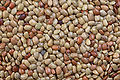
- Nomination High-res image of red kidney beans --sanjay_ach 01:16, 26 March 2007 (UTC)
- Promotion Excellent surface detail, highlights kept well under control --Thermos 04:37, 26 March 2007 (UTC)
-
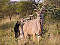
- Nomination Kudu in South Africa. --Überraschungsbilder 23:15, 25 March 2007 (UTC)
- Promotion It's all there, it's sharp, it is properly documented, it's in its natural environment: it's QI. Lycaon 06:04, 26 March 2007 (UTC)
-
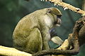 khan 06:37, 25 March 2007 (UTC)
- Decline Composition good. Lighting bad - green colour cast (even a green shadow on the monkeys arm), low light on face. Not quite in focus (or is that camera movement - only 1/100th shutter speed) --Tony Wills 08:23, 25 March 2007 (UTC)
-
 khan 15:47, 23 March 2007 (UTC)
- Promotion I doubt the species identification, I see it was taken in a zoo so I guess you got the ID from there but I have lived in close proximity with red-necks and swamp wallabys (which I suspect this is) all my life, see the two red-necked wallaby photos of mine down lower on this page, they are much lighter and have a rufus coloring behind the ears and back of the neck, It's possible that this is a very dark phase, perhaps caused by the environment in the zoo or climate, but it is extremely dark for a red-neck benjamint Location of the animal suggest that ID is correct, I like hte composition. Gnangarra 14:10, 24 March 2007 (UTC)
-
 khan 03:38, 19 March 2007 (UTC)
- Promotion what a monster image 8000px I could find any stitching issues. Gnangarra 14:04, 24 March 2007 (UTC)
-

- Nomination Radar dome at dusk --Tony Wills 21:16, 24 March 2007 (UTC)
- Promotion Good quality. --donald- 19:55, 26 March 2007 (UTC)
-

- Nomination Farmed ostrich --Tony Wills 12:43, 24 March 2007 (UTC)
- Promotion Assuming the wire is part of the story ie farmed for meat as it really adds feeling, if it isnt then the wire is distracting the bird is over exposed, but in good faith promote Gnangarra 14:13, 24 March 2007 (UTC). Yes the 2m high fence, that he is looking at, is part of the story :-). Not really over exposed but a few blown highlights --Tony Wills 20:46, 24 March 2007 (UTC)
-

- Nomination Camouflaged grasshopper on tree stump --Tony Wills 21:11, 23 March 2007 (UTC)
- Promotion WOW factor nice DOF Gnangarra 14:10, 24 March 2007 (UTC)
-

- Nomination Iceland Bridge --Überraschungsbilder 08:32, 23 March 2007 (UTC)
- Promotion nice balanced image Gnangarra 14:10, 24 March 2007 (UTC)
-

-

-

-

- Nomination red-necked wallaby --Benjamint444 11:57, 16 March 2007 (UTC)
- Decline use of the flash to fill has given an unnatural feel to the subject Gnangarra 13:56, 24 March 2007 (UTC)
-

- Nomination red-necked wallaby --Benjamint444 11:57, 16 March 2007 (UTC)
- Promotion Slightly lost in the background, good focus and clarity on the feature from which it derives its name Gnangarra 13:57, 24 March 2007 (UTC)
-

- Nomination Louvre interior courtyard with pyramid. --Diligent 21:32, 15 March 2007 (UTC)
- Decline Good quality, but floating torsos, ghosts and legs without bodies. This may be fixable with a restitch. --Dschwen 22:07, 15 March 2007 (UTC)
I would support it if an effort was made to remove the translucent people in the bottome left and elsewhere. The smaller people aren't a big deal, as this photo is very good. --Steevven1 22:38, 15 March 2007 (UTC) agree leg on bottom left are a problem Gnangarra 14:00, 24 March 2007 (UTC)
-

- Nomination Binturong head --Überraschungsbilder 08:24, 23 March 2007 (UTC)
- Promotion Good Quality. --donald- 08:28, 23 March 2007 (UTC)
-

- Nomination Sunset. Randers, Denmark --Malene Thyssen 20:13, 21 March 2007 (UTC)
- Promotion Great colours --Simonizer 09:48, 23 March 2007 (UTC)
-

- Nomination Old popular verses to St Anthony at São Martinho do Porto chapel, west coast of Portugal - Alvesgaspar 00:15, 17 March 2007 (UTC)
- Promotion Nice pic from Portugal as I remember it - blue sky, white wall, red roof and blue tiles. Nice composition and exposure. Ok sharpness. --Malene Thyssen 08:01, 23 March 2007 (UTC)
-

-
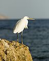
- Nomination Great White egret (Ardea alba alba) hunting for fish in Sharm el Sheikh, Egypt. --Chris huh 11:35, 22 March 2007 (UTC)
- Decline Sharpness is not too good, but could be improved using an unsharp mask. A higher or lower viewpoint would have avoided the horizon cutting through the subject just at the wrong point. --MichaelMaggs 16:10, 22 March 2007 (UTC) And very noisy.---donald- 17:20, 22 March 2007 (UTC)
-

- Nomination Blue Tit Cyanistes caeruleus (often still Parus caeruleus) --Luc Viatour 06:27, 22 March 2007 (UTC)
- Promotion Very nice shot. Subject is shown off well by the uncluttered background. --MichaelMaggs 16:15, 22 March 2007 (UTC)
-

- Nomination Grey wolf (Canis lupus) --Malene Thyssen 20:13, 21 March 2007 (UTC)
- Promotion Very good. --donald- 20:41, 21 March 2007 (UTC)
-

-

- Nomination The Gymnasium in Katowice. --Lestat 22:57, 8 March 2007 (UTC)
- Decline An attractive image, but it is let down by lighting. Poor lighting to the side and top half (there are many unlit features). Street light in foreground is obtrusive. --Tony Wills 11:39, 24 March 2007 (UTC))
-

-
 khan 01:27, 21 March 2007 (UTC)
- Decline Good shot, but low resolution and somewhat grainy. --Steevven1 03:12, 21 March 2007 (UTC)
-

-

- Nomination Piotr "Chypis" Pachulski from polish rock band Normalsi. --Lestat 21:58, 18 March 2007 (UTC)
- Decline An ok composition but the poor stage lighting has resulted in over exposure on the hands and guitar with a dark face, not lit of the singer. You need to wait until the singer moves into better light or get the stage crew to light the person not the microphone. Gnangarra 05:54, 21 March 2007 (UTC)
-

-

- Nomination Coccothraustes vespertinus --Pharaoh Hound 19:44, 19 March 2007 (UTC)
- Promotion Of course QI. --Leyo 21:04, 19 March 2007 (UTC)
-

- Nomination Les Invalides, Paris. --Diligent 17:08, 19 March 2007 (UTC)
- Promotion Meets QI guidelines as far as I can see. --Leyo 21:04, 19 March 2007 (UTC)
-

- Nomination Trombidium holosericeum Acarii (3mm to long) --Luc Viatour 07:28, 19 March 2007 (UTC)
- Promotion QI, even though it needs cropping on the right side. --Leyo 09:12, 19 March 2007 (UTC)
-
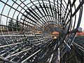
- Nomination Rebar --Luigi Chiesa 22:57, 18 March 2007 (UTC)
- Promotion A striking image that easily meets the QI criteria --MichaelMaggs 17:18, 19 March 2007 (UTC)
-

- Nomination Sepiola atlantica, from the Belgian continental shelf
Picture taken on board of the RV Belgica, of a live specimen to preserve colour and structure of chromophores -- Lycaon 13:54, 18 March 2007 (UTC) - Promotion Can't see anything wrong here. Very encyclopedic. --startaq 23:22, 18 March 2007 (UTC)
- Nomination Sepiola atlantica, from the Belgian continental shelf
-

- Nomination General layout of cumacean bodyplan (after Diastylis laevis) -- Lycaon 13:54, 18 March 2007 (UTC)
- Promotion Clear, simple, useful diagram and appears to be anatomically correct. A scale would be good. --Tony Wills 21:36, 20 March 2007 (UTC)
-

-

- Nomination Near the sea at Porto Covo, west coast of Portugal - Alvesgaspar 00:15, 17 March 2007 (UTC)
- Decline Overexposed surf and why do you use a vertical format for this theme? --Simonizer 10:48, 20 March 2007 (UTC)
-

- Nomination The coast at São Martinho do Porto, Portugal - Alvesgaspar 00:17, 17 March 2007 (UTC)
- Decline Overexposed surf! --Simonizer 10:48, 20 March 2007 (UTC)
-

- Nomination The village of São Martinho do Porto, Portugal - Alvesgaspar 00:17, 17 March 2007 (UTC)
- Promotion Exposure ok, composition ok, good quality. Good picture of a small alley --Simonizer 11:33, 19 March 2007 (UTC)
-

-
-

- Nomination Larus argentatus --Pharaoh Hound 20:17, 12 March 2007 (UTC)
- Decline Soft Focus across the back of the head, weak composition due to image size Gnangarra 05:09, 19 March 2007 (UTC)
-

-

-

-

-

-

- Nomination Davis Mountains, Texas --Dschwen 09:20, 6 March 2007 (UTC)
- Promotion Seamless stitching, more a cloudscape than a landscape, low noise, good exposure, interesting composition --Tony Wills 22:47, 20 March 2007 (UTC)
-

- Nomination DTŚ - Tunnel. --Lestat 21:50, 12 March 2007 (UTC)
- Decline I like the composition, but the quality is not good enough: for example, check the people at left - Alvesgaspar 00:33, 13 March 2007 (UTC)
-

-

- Nomination A macro shot of a pine cone.--Arjun 16:15, 12 March 2007 (UTC)
- Decline Distracting background, DOF too narrow resulting in very ugly bokeh on the cone, the colours seem a touch blue --Pharaoh Hound 20:17, 12 March 2007 (UTC)
-

-

- Nomination Mongolia deserts--Arad 19:12, 10 March 2007 (UTC)
- Decline The colours are strange and the photo is too dark, probably due to most part of it being in the shadow. Also, there is a clear cw tilt - Alvesgaspar 00:38, 13 March 2007 (UTC)
-

- Nomination Brush tail possum --Benjamint444 11:22, 7 March 2007 (UTC)
- Decline Not a QI for me. Partly covered and very dark. --norro 15:45, 12 March 2007 (UTC)
-
-

-

-

- Nomination Statue "Family" in Katowice. --Lestat 13:24, 3 March 2007 (UTC)
- Promotion Nice composition and good exposure, but I'm starting to think that you should increase the quality setting of your camera. The ground looks washed out, and the sky has noise/artefacts. --Dschwen 14:01, 9 March 2007 (UTC) QI for me. Clear shot. --norro 15:51, 12 March 2007 (UTC)
-

-

- Nomination: A panoramic view of Lake Titicaca, Peru --S23678 17:28, 2 March 2007 (UTC)
- Review needed
-
- Nomination La Coruna port (Galicia, Spain) --Willtron 23:02, 10 March 2007 (UTC)
- Decline Poor photographic quality: noise and unbalanced (bluish) white - Alvesgaspar 12:13, 11 March 2007 (UTC)
-

-

-

-

-

-

- Nomination An Australian short beaked echidna --Benjamint444 11:22, 7 March 2007 (UTC)
- Promotion Good detail, illustrative --Thermos 17:07, 8 March 2007 (UTC)
-
- Nomination Horse Gram Beans --Sanjay ach 4:34, 7 March 2007 (UTC)
- Promotion Good quality, it can be QI. --Lestat 23:05, 8 March 2007 (UTC)
-

-

-

-

-

-

- Nomination Duck in freshwater spring --Steevven1 02:24, 5 March 2007 (UTC)
- Promotion From the guidelines: “Quality images must be categorized, have meaningful title and description. This should include the Taxa naming for plants and animals.” Please add this. --Leyo 21:19, 5 March 2007 (UTC)
I have added all of that now. Thanks. --Steevven1 01:29, 6 March 2007 (UTC) Meets QI requirements now. --Leyo 09:23, 6 March 2007 (UTC)
-

-

-

-

-

-

-

- Nomination Baltic Cup, Denmark 2006 --Malene Thyssen 23:33, 3 March 2007 (UTC)
- Decline Messy composition, tight crop, blown-out tent. The BG should be more out of focus to concentrate on the FG. --Dschwen 09:47, 4 March 2007 (UTC)
-

- Nomination Grib Forest. New beech leaves May 2005 --Malene Thyssen 23:33, 3 March 2007 (UTC)
- Promotion Beatiful and original contre-jour. I believe there are strong mitigating reasons to ignore the obvious focus flaws and the overexposed parts - Alvesgaspar 14:10, 4 March 2007 (UTC)
-

-

- Nomination Four-segment panoramic shot of New York City --Dschwen 17:57, 1 March 2007 (UTC)
- Promotion Although not photographically perfect (some signs of compression or diffraction), the composition and angle are ASTOUNDING, and this photo is solidly great.—the preceding unsigned comment is by Steevven1 (talk • contribs) . Thanks :-), I wish I already had my new camera back then. --Dschwen 09:04, 6 March 2007 (UTC)
.jpg)


.jpg)


.jpg)


.jpg)


.JPG)


Consensual Review[edit]

- Nomination Fishing at Foz do Arelho beach, west coast of Portugal - Alvesgaspar 00:15, 17 March 2007 (UTC)
- Decline Good composition, but the surf is overexposed --Simonizer 10:48, 20 March 2007 (UTC)
 Support I disagree that the blown highlights on some of the surf is a problem. Examining the surf shows it is very, very white but relatively few bits are actually over blown. There are a couple of reflections off the water that are over blown highlights. The overall image is not detracted from by these bright points, I would nominate it as QI. --Tony Wills 21:45, 24 March 2007 (UTC)
- Hmm, the surf isn't bothering me that much either, but there is considerable chrominance noise on the beach and there are precedences of QI declines for that. --Dschwen 17:14, 27 March 2007 (UTC)
 Comment - Dschwen is right, but I have no idea what is the cause of the noise. This was originally a pretty big image (8Mb) and even with a downsample it wasn't possible to get rid of it. After all, the sun was to too strong for this kind of picture. Alvesgaspar 21:25, 28 March 2007 (UTC)
- Well upload the original and see if someone else can produce a better version! :-) --Tony Wills 22:00, 28 March 2007 (UTC)
Result: 1 support, 2 oppose >> not promoted to QI --Tony Wills 20:58, 31 March 2007 (UTC)


- Nomination Memorial at the former site of the Synagogue in Goettingen, Germany. --Dschwen 15:28, 27 March 2007 (UTC)
- Promotion I vote for the abstract beauy of this picture despite some obvious photographic flaws. I think Escher would have liked this geometric pattern - Alvesgaspar 21:15, 28 March 2007 (UTC)
- I'm not disputing your promotion, but wondered if you want to transfer it to the alternative that I asked Dschwen to find - one that doesn't cut the corners of the 'star of david' geometric pattern. --Tony Wills 09:53, 29 March 2007 (UTC)
Result: 1 support, 0 oppose >> promoted to QI --Tony Wills 21:03, 31 March 2007 (UTC)

- Nomination: Bryce Canyon Hoodoos Amphitheater Panorama --Digon3 19:31, 17 February 2007 (UTC)
- Review needed

- i have a question refering this picture and this other one who was already promoted. . i was about to decline the promotion of the first becouse it is overexposed. then by chance looked at the one already promoted, and it is also overexposed. so that i can not decline this one, in order to be fair i would have to promote it.
we have not a section to discuss weather or not images should be depromoted. so before making a mistake i wanted to ask your opinion. should it be promoted or not?
- also we have several cases of pictures being simple crops from other QI. how far can this go?-LadyofHats 08:09, 27 February 2007 (UTC)
- From what I know about histograms, the second picture the red is a bit overexposed, but the panorama is not overexposed. Second, the other picture is not a simple crop of the panorama. It is a version of a picture that was included to make the panorama. --Digon3 16:39, 1 March 2007 (UTC)
Unassessed image. --Leyo 09:47, 28 March 2007 (UTC)

- Not sure what he meant by that. I would like a second opinion. --Digon3 14:55, 16 February 2007 (UTC)
- [1] - I think about this. Two near identically QI of the same object is meaningless for me. Lestat 15:21, 16 February 2007 (UTC)
![[1]](https://commons.wikimedia.org/wiki/File:Bryce_Canyon_Hoodoos_4_perspective.jpg)
- You're right. I forgot that version was a QI. Thanks --Digon3 15:48, 16 February 2007 (UTC)
- Since this is the best edit, is it possible to transfer the QI tag from *this to this edit? --Digon3 15:52, 16 February 2007 (UTC)
- QI aren't FP, hundrends of neraly identical QIs of the same object aren't a a problem. --89.102.143.110 17:45, 26 February 2007 (UTC)
- But several times essentially the same pic is counter productive. Transfer the tag. Fine by me. --Dschwen 17:54, 26 February 2007 (UTC)
- You might also upload the edited pic as a new version to the QI pic. Then, tag the unused copy for deletion. I would favor this version merging instead of transferring the tag. --Leyo 18:31, 26 February 2007 (UTC)
- I'll do that, thanks --Digon3 22:29, 26 February 2007 (UTC)
Result: 2 support, 1 oppose >> promoted to QI Please merge the versions --Leyo 19:17, 15 March 2007 (UTC)

- Bad is a bit harsh, there is no other way to depict this station with an equally wide viewing angle. --Dschwen 20:58, 11 March 2007 (UTC)
- Plus it has decent quality and resolution and flawless stitching. --Dschwen 12:40, 15 March 2007 (UTC)
- This picture meets the QI guidelines as far as I can see. --Leyo 19:09, 15 March 2007 (UTC)
- Agree with Leyo -- Lycaon 01:12, 24 March 2007 (UTC)
- Support --MichaelMaggs 10:58, 24 March 2007 (UTC)
Result: 3 support (excluding the nominator), 1 oppose >> promoted to QI --Tony Wills 00:04, 26 March 2007 (UTC)

- Nomination A Siberian Husky exhibiting heterchromia. --Pharaoh Hound 13:31, 15 February 2007 (UTC)
- Decline in my opinion a little out of focus --Simonizer 10:29, 16 February 2007 (UTC)

The eyes resp. the uneuqal coloring seem to be the subject here. I don't see them out of focus so that the quality of this image meets the criteria in my opinion. norro 12:02, 17 February 2007 (UTC)
- Ok this one is certainly a good image. The subject are the eyes and they are perfectly captured. --Arad 06:57, 18 February 2007 (UTC)
Please look at they eyes of File:Owczarek kraski głowa 454.jpg. Those are sharp. Then look again at this picture. --Simonizer 14:52, 19 February 2007 (UTC)
- Maybe this one is a bit blurry but for the subject of eyes, I still prefer this one. And also this one has two eye color which is the most important factor of this image in my opinion. --66.36.139.108 22:59, 20 February 2007 (UTC)
- Don´t misunderstand me. Iam not prefering the other picture, i mentioned that only for the comparison of the sharpness. I know that the two eye color thing is the important factor of this picture. But the two eye color thing could be sharper in my opinion.
But i said in my review "a little out of focus", so it was only a weak oppose. Go ahead make it QI. --Simonizer 09:17, 21 February 2007 (UTC)
- If the main subject are the eyes, than the picture is not good enough due to poor lighting (the right one is in the shadow) and unsharpness. - Alvesgaspar 15:37, 21 February 2007 (UTC)
- I've added an edit which I feel addresses the unsharpness and lighting faults. --Pharaoh Hound 13:57, 25 February 2007 (UTC)
Result: 2 support, 1 oppose >> promoted to QI --Leyo 21:38, 25 March 2007 (UTC)

- Nomination A row of glasses with a tilting water level Benjamint revised description
- Promotion I would rather say a row of glasses glued to a tilted base... or a row of glasses in an acelerating platform Alvesgaspar 00:28, 13 March 2007 (UTC) Revised description again --benjamint - Nice quality, why did you have to put the glases in the freezer before the experience?... Alvesgaspar 08:20, 15 March 2007 (UTC). There is another possibility which might explain the frost: a frozen fluid inside the glasses. Are you sure about the present description? - Alvesgaspar 23:32, 15 March 2007 (UTC)They wern't frozen and niether was the water, I asume your commenting on the smokey look which I would guess is just reflection --Benjamint444 07:42, 16 March 2007 (UTC)
- OK I'm not going to let this pass until it's clarified how it's made. We need a detailed information on the image page. Because the image claims it's impossible to have this in nature and it still doesn't say exactly what it is. When that is included by Benjamint444, I would support. If not, then the image is nothing special (we don't know what it is) and the quality can be much better. And those reflections which look like frost are also a major issue. --Arad 22:07, 16 March 2007 (UTC)
- I Agree theres a claim its impossible but look heres the photo, To be a QI it needs to have a description that makes the image useful to others. Without methods thats lacking, the haze around the glasses becomes a serious flaw that should result in it not being promoted unless it's cause is explained Gnangarra 11:58, 17 March 2007 (UTC)
- This looks fishy and I withdraw my support vote until the subject is clarified. It is OK to puzzle the users with our pictures, it is not OK trying to fool the reviewers. The author claims that the glasses were in an accelerating platform at the moment of the shot. However, that does not explain the frost or the weird texture of the "water" surface, as if it were frozen or made of some plastic material. Alvesgaspar 14:28, 17 March 2007 (UTC)
 Info I withdrew the claim that it was impossible when I revised the description, I wasn't trying to hoodwink anyone by that. Anyone looking at it would see imediately that it was just taken with the subject and camera on an angle. As to the smokey reflections, it could be from the surface they were sitting on (which was not completely white) or nearly anything else since it was taken outside. It was water in a liquid state in the glasses though. --Benjamint444 03:39, 18 March 2007 (UTC)
 Oppose Another thing you forgot to say is that this is a composite image, formed by three images of a single glass. I'm really having some difficulty in believing in your good faith. By the way, there is still an explanation in the picture file claiming the glasses are in an acelerating platform - Alvesgaspar 10:03, 18 March 2007 (UTC)
- OK, I still don't see any information explaining how it's made. Subject and the camera on an angle? What does that mean? And the image page should be updated when it's cleared. --Arad 14:29, 18 March 2007 (UTC)
- Oppose I'm afraid I have difficulty in approving images where the uploader is unwilling to be open with the community. --MichaelMaggs 08:04, 19 March 2007 (UTC)
- I have added information about how it was made on the image page (and had already done so when you opposed this MichaelMaggs). I only uploaded this image to get some feedback, It obviously wasn't good enough for fpc so I just made up a simple description. The second time all I did was copy and paste the description sugested by Alvesgaspar, an image like this is not worth the effort; it's just the prototype of an image I would like to do with more ornate glasses. I've got the feedback I wanted (watch out for reflections) from putting it here so either turn it down or delete it --Benjamint444 11:08, 19 March 2007 (UTC)
Result: 0 support (excluding the nominator), 4 oppose >> not promoted to QI --Tony Wills 01:09, 24 March 2007 (UTC)

- I don't see the tilt. Can you specify please? --Arad 11:55, 15 March 2007 (UTC)
- Its tilt to the right. I would rotate the picture about 0,5 degrees anticlockwise --Simonizer 12:25, 15 March 2007 (UTC)
- Ack Simonizer, its small, but its there. --Digon3 17:59, 15 March 2007 (UTC)
- I'll be happy if you can fix it. Because I can't see it. --Arad 20:53, 15 March 2007 (UTC)
I don't see the tilt either,but even if it were there it would be a small problem compared to the washed out look. The pic looks like overcompressed and smoothed to get rid of JPG artifacts. Or heavily denoised, you tell me. --Dschwen 21:08, 15 March 2007 (UTC)- Odd, the verticals are absolutely vertical. But the top edge is very slightly tilted. The lightig also plays tricks on you and creates the illusion of a much larger tilt in the thumbnail. --Dschwen 21:11, 15 March 2007 (UTC)
- There is no tilt, That's for sure. The top (if your talking about the roof) has a tilt because the building's roof is not flat. (Or we can fix it and create a new architecture. --Arad 01:19, 16 March 2007 (UTC)
- ok the verticals are vertical and the horizontals are horizontals, i checked that too. But that doesnt change the fact that it looks like it is tilt. And also like Dschwen allready mentioned, the overall quality could be better. So i will not change my vote. Sorry. --Simonizer 12:34, 16 March 2007 (UTC)
- There is no tilt, That's for sure. The top (if your talking about the roof) has a tilt because the building's roof is not flat. (Or we can fix it and create a new architecture. --Arad 01:19, 16 March 2007 (UTC)
- Odd, the verticals are absolutely vertical. But the top edge is very slightly tilted. The lightig also plays tricks on you and creates the illusion of a much larger tilt in the thumbnail. --Dschwen 21:11, 15 March 2007 (UTC)
- I oppose this because the tilt is very visible, but more so because the quality is quite low, and it looks washed out. --Steevven1 22:41, 15 March 2007 (UTC)
Result: 0 support (excluding the nominator), 4 oppose >> not promoted to QI --Tony Wills 00:47, 24 March 2007 (UTC)

- Overexposed? Wil be glad to hear more. --Arad 11:55, 15 March 2007 (UTC)
- Lestath is right. The picture is overexposed. Look at the left sides of the towers and the upper building, there is only white area left with no detail. That is caused by overexposure. --Simonizer 12:25, 15 March 2007 (UTC)
- Oppose As was discussed in this image's (failed) FP attempt on En Wikipedia, the image is noticeably oxerexposed. --Pharaoh Hound 19:18, 18 March 2007 (UTC)
- The Reason it's here is because this is QI not FP. It's not supposed to be perfect right? --Arad 21:07, 18 March 2007 (UTC)
- True, this isn't FP. But overexposure is specifically mentioned as a problem on the guidelines, and I find it very annoying. The "halo" effect around the building is also a reason I am opposing. --Pharaoh Hound 12:56, 19 March 2007 (UTC)
- Agree with opposers, the image is heavily overexposed (I don't know if that is the fault of the original non-digital photo or of posterior editing). Also, there is some posterizationin (in the clouds, for example). Both things contribute to the lack of detail. Alvesgaspar 15:41, 19 March 2007 (UTC)
Result: 0 support (excluding the nominator), 4 oppose >> not promoted to QI --Tony Wills 00:41, 24 March 2007 (UTC)
.JPG)
- I don't agree. ISO speed = 100, noises aren't high and depth of field is on enough level. It isnt't FP candidate, but QI candidate. --Lestat 23:11, 8 March 2007 (UTC)
Result: 0 support (excluding the nominator), 1 oppose >> not promoted to QI --Tony Wills 23:26, 23 March 2007 (UTC)

.jpg)

Too much noise and a slightly skewed colour balance. Too little post processing has been attempted to make this potential candidate into a quality image. I'm not an expert, but had a go at denoising and downsampling in version 2 Lycaon 15:50, 14 February 2007 (UTC)
- I agree that your version is better. norro 16:12, 14 February 2007 (UTC)
- I actually did use a photo editing tool for this image before uploading it. However, I didn't downsample it. I'm still getting used to the editing software and I'm sure I'll get better at it, but I'm not sure I agree with downsampling. As a thumbnail, the images look identical. There is a discussion going on regarding this on the talk page. --Jnpet 00:59, 15 February 2007 (UTC)
- The downsampling I did was only minor, the denoising more substantial. Pictures will never be "used" as thumbnails (except on a website, ofcourse). Lycaon 18:17, 15 February 2007 (UTC)
- I confess, I'm having a hard time seeing the difference between the two images. I see some shadows reduced, but not much else. The editing I had done was substantial, you should see the original image. Anyway, I would appreciate if you could tell me where this "noise" is so I can identify this in the future. Like I said, I'm still learning. --Jnpet 08:43, 16 February 2007 (UTC)
- Is this more clear (look at the detail comparison in full res please)? I'm also learning, but I think the original image can be improved... Lycaon 20:07, 18 February 2007 (UTC)
- I confess, I'm having a hard time seeing the difference between the two images. I see some shadows reduced, but not much else. The editing I had done was substantial, you should see the original image. Anyway, I would appreciate if you could tell me where this "noise" is so I can identify this in the future. Like I said, I'm still learning. --Jnpet 08:43, 16 February 2007 (UTC)
- The downsampling I did was only minor, the denoising more substantial. Pictures will never be "used" as thumbnails (except on a website, ofcourse). Lycaon 18:17, 15 February 2007 (UTC)
I drop my opposition and go for neutral, so that the image can be promoted. Lycaon 06:17, 21 March 2007 (UTC)
Result: 1 support, 0 oppose >> promoted to QI --Leyo 08:04, 21 March 2007 (UTC)
- Promoted original not edited version as that seems to be what Lycaon meant --Tony Wills 02:25, 27 March 2007 (UTC)

- I think that resolution is enought and it can be QI. Lestat 14:52, 16 February 2007 (UTC)
- i also think that the resolution is ok for such a photo. What i dont like is that there is a whole living room reflecting in the lense. This somehow doesn't fit to the white (artificial?) background of the photo. --AngMoKio 22:06, 16 February 2007 (UTC)
- Hmm, I hasn't noticed it earlier. In that case I'm
 Neutral. —the preceding unsigned comment is by Lestath (talk • contribs)
 - Quality is very good IMO. Reflections and size are minor flaws in this particular subject - Alvesgaspar 23:47, 20 February 2007 (UTC)
- The resolution is plenty large to show all details of this lens, and the photographic quality is superb. The reflection isn't even an issue at all for me; I don't think it affects anything. --Steevven1 13:47, 9 March 2007 (UTC)
- Promote - Quality is excellent - details are clearly defined. a l τ o n .ıl 04:17, 11 March 2007 (UTC)
Result: 3 support, 2 oppose >> promoted to QI --Leyo 23:17, 20 March 2007 (UTC)

We talked about this image on talk page and people agree. This image has far more quality than many other QI. And by the way I don't see a problem with the "starry" effect. I think it's rather personal taste. And I removed all of the noise on this image (compare it to the original). --Arad 06:52, 18 February 2007 (UTC)
- Photographic quality is not good enough for QI. Look at the other margin of the river - Alvesgaspar 14:56, 24 February 2007 (UTC)
- Other margin of the river? where is that exactly in the image? --Arad 15:05, 25 February 2007 (UTC)
- See, for example, at the right end side of the image. Alvesgaspar 16:14, 25 February 2007 (UTC)
- Plus has no one complained about the distortion? The buildings on the left and verticals on the bridge are not vertical due to perspective distortion and horizon is appears to be bowed slightly - probably some pincushion distortion. Mfield 17:46, 28 February 2007 (UTC)
Result: 0 support, 2 oppose >> not promoted to QI --Leyo 23:17, 20 March 2007 (UTC)

- Nomination The title page of the Book of Isaiah--Trounce 15:20, 14 February 2007 (UTC)
- Decline Good quality, but the depth of field is irritatingly small and there's some grain in the shadows. --Pharaoh Hound 13:57, 14 February 2007 (UTC)
The narrow depth of field is deliberate. The idea was to draw the eye to "The Book Of Isaiah" text and give a sense of depth to what could have been a flat, plain image of text.I am not sure what Pharaoh Hound means about the grain in the shadows. There is text from the underside of the page slightly showing through. This is a characteristic of Bibles which use a lighter than standard paper. I liked this effect.
That sort of leads me to a question (not sure if this is the place). On this Quality Image candidate page if one person likes (or dislikes the image for whatever reason) is that it? Its the opinion of whoever gets to the photo first? For example in my photo here of the Isaiah page, Pharaoh Hound found the depth of field irritating, whereas I tried hard to achieve the narrow depth of field and quite like it. Am I right thinking that if by chance someone who liked the effect came across the image before Pharaoh Hound and tagged it for promotion, then it would have been accepted?
Sorry for the question, this is my first time doing this.--Trounce 15:07, 14 February 2007 (UTC)
- You think you have an QI photo. The idea of this QI-page is to let the photo check from a second person. So you are right. The one who reviewed it first is the one who decideds if the photo is QI or not. But he should not judge it by personal liking, but by the guidlines (http://commons.wikimedia.org/wiki/Commons:Quality_images_guidelines). If you or another reviewer think he might be wrong with his decision, then you have the consensual review. Now other reviewers can give there opinion, and depending on whether they are supporting the decision of the reviewer or not your image will become QI.--Simonizer 12:11, 15 February 2007 (UTC)
- Thanks for clarifying that.--Trounce 14:46, 15 February 2007 (UTC)
- I like the images idea a lot but the way this lens renders unsharp image parts (bookeh) is bad. There is heavy grain in the middle of the book. The DOF coud be even smaller to point out the title. Play with the lightening! --Ikiwaner 18:28, 15 February 2007 (UTC)
- I don't find the DOF that good. It could be a lot better. And it's not special in anyway. --Arad 06:40, 18 February 2007 (UTC)
- QI for me. --norro 17:27, 20 February 2007 (UTC)
- Would we take this picture as a good example of a book QI ? Certainly not since the main subject is cropped and out of focus. I see this picture as an experiment on DOF, not more than that Alvesgaspar 15:52, 21 February 2007 (UTC)
- Decline because of shallow DOF Lycaon 23:42, 22 February 2007 (UTC)
- Comment This is a great example of artistic perception and purpose. I personally would have said nothing about Depth of Field because to me the focus is on something that must be seem from its context in in the book, and either a whole shot of the entire book or a close-up of text alone would have detracted from its purpose. A picture does not have to be a grandiose panorama of the Grand Canyon to qualify. I also find it puerile to repeatedly comment on things that have already been said, per Arad's and Lycaon's comments. a l τ o n .ıl 06:56, 4 March 2007 (UTC)
Result: 1 support, 4 oppose >> not promoted to QI --Leyo 23:17, 20 March 2007 (UTC)

- I don't agree. Crop is too tight - normal 4:3 or 3:2 crop should be better. --Lestat 23:00, 8 March 2007 (UTC)
- I cropped it that way only to illustrate the facial expression. I have a full-sized version of this where the entire head and a lot of background is visible, but I like this better. Also, User:Dschwen stated on Commons:Featured picture candidates/candidate list "tight crop, good QI but no FP for me," supporting this image as a QI. --Steevven1 13:40, 9 March 2007 (UTC)
- I'll be happy if you can crop just a bit less. It's too much IMHO. The quality is good. (and it's a toddler, not infant ;-) ) --Arad 02:11, 10 March 2007 (UTC)
- It's well sharp with an appropriate DOF and good noise. But violates several rules for a good portrait: Centered eyes, no closed lines, disturbing background and the chin almost falls out of the image. --Ikiwaner 17:29, 10 March 2007 (UTC)
- Now that an uncropped cersion is nominated I retract my support, oppose this one and support the new version. --Dschwen 12:35, 15 March 2007 (UTC)
Result: 0 support, 3 oppose >> not promoted to QI --Leyo 21:08, 19 March 2007 (UTC)

- Nomination Eugenes fulgens --Pharaoh Hound 13:54, 19 February 2007 (UTC)
- Decline Nice pic, but unfortunately to small according to guidelines. --Leyo 17:21, 23 February 2007 (UTC)
- Those are guidelines not rules. We have a brain and we can use it. We can't just say this is not QI because it falls short of 50px from the guidelines. They are guidelines as you said. This image is 1536px by 1536px. So if it was 1600pxX500px you would promote it? Come on. --Arad 21:40, 25 February 2007 (UTC)
- Promote, in fact he main Commons:Quality images guidelines state the image has to be 1.92Mpix, which is fullfiled here. --89.102.143.110 17:45, 26 February 2007 (UTC)
- OK then. I withdraw my objection to the promotion. --Leyo 18:31, 26 February 2007 (UTC)
Result: 2 support, 0 oppose >> promoted to QI --Leyo 01:23, 17 March 2007 (UTC)

- Nomination Mergus merganser --Pharaoh Hound 13:54, 19 February 2007 (UTC)
- Decline Nice pic, but unfortunately to small according to guidelines. --Leyo 17:21, 23 February 2007 (UTC)
- Same as above. --Arad 21:40, 25 February 2007 (UTC)
- Just to put that vote in context, Arad's comment on previous picture was "We can't just say this is not QI because it falls short of 50px from the guidelines." so that vote is in support --Tony Wills 23:10, 23 March 2007 (UTC)
- Decline, doesn't meet the exact criteria. --89.102.143.110 17:45, 26 February 2007 (UTC)
- Promote, size is sufficient here Lycaon 18:39, 26 February 2007 (UTC)
Result: 2 support, 1 oppose >> promoted to QI --Leyo 01:23, 17 March 2007 (UTC)

I think it's very hard to get a shot like this under water (correct me if i'm wrong), and it's pretty sharp and big. So maybe a downsampling can help. We went through this in talk page. This image is very big and we are looking at it in full size. Downsample it to 1600px and you'll see a very sharp image. --Arad 06:43, 18 February 2007 (UTC)
- Downsampling is one part, the colour balance is a far more serious problem! Have you ever seen a turtle in real life? I wouldn't promote a purple buttercup neither, sorry. Lycaon 19:35, 18 February 2007 (UTC)
- Ok, now I see your reason. And I agree. --Arad 22:24, 18 February 2007 (UTC)
Result: 0 support, 2 oppose >> not promoted to QI --Leyo 01:23, 17 March 2007 (UTC)

- weather it is a good illustration or not has nothing to do with quality standars. the image has quality. it wi well done, true is maybe a bit dark but ot enough not to be promoted.-LadyofHats 14:02, 16 February 2007 (UTC)
- It isn't QI - flare is too visible. Lestat 14:48, 16 February 2007 (UTC)
- That's part of the composition here. --norro 17:31, 17 February 2007 (UTC)
- I don't think this picture should be considered as an example of a good quality image. Aesthetical considerations aside, the photographic quality is poor due to unsharpness and excessive grain. Alvesgaspar 15:43, 21 February 2007 (UTC)
Result: 1 support, 3 oppose >> not promoted to QI --Leyo 01:23, 17 March 2007 (UTC)

- Nomination Lampornis castaneoventris --Pharaoh Hound 13:54, 19 February 2007 (UTC)
- Decline Nice pic, but unfortunately to small according to guidelines. --Leyo 17:21, 23 February 2007 (UTC)
- Same as above. --Arad 21:40, 25 February 2007 (UTC)
- Decline, doesn't meet the exact criteria. --89.102.143.110 17:45, 26 February 2007 (UTC) No voting rights. --Leyo 16:54, 12 March 2007 (UTC)
- Promote, size is sufficient here Lycaon 18:39, 26 February 2007 (UTC)
- We're not here for Exact criteria, we're here to compare the photo with the criteria and 50px short of size is not enough to reject. --22:41, 26 February 2007 (UTC)
- If the guidelines are not so strict, I'm fine. As it is an excellent picture, I would Support it
as soon as it is categorized. --Leyo 23:12, 26 February 2007 (UTC)
Result: 3 support, 0 oppose --> promoted --Leyo 16:54, 12 March 2007 (UTC)

Yeah, beautiful dog and mystical colours, but the resolution is too small and it seems a little out of focus! --Simonizer 11:31, 24 February 2007 (UTC)
- Agree with Simonizer, also a bit overexposed. Lycaon 11:45, 24 February 2007 (UTC)
- Decline, doesn't meet resolution criteria. --89.102.143.110 17:45, 26 February 2007 (UTC) No voting rights. --Leyo 22:33, 12 March 2007 (UTC)
Result: 1 support, 2 oppose --> not promoted --Leyo 22:33, 12 March 2007 (UTC)

- Nomination Carvin in Sułkowski castle in Bielsko-Biała (Poland). --Lestat 15:23, 12 February 2007 (UTC)
- Decline it is cut out below, but not above. and it mises just a tic contrast. speacially the stone againt the red-LadyofHats 22:43, 18 February 2007 (UTC)
- I don't agree with this opinion. Contrast and crop is good. Below is end of carvin. --Lestat 23:41, 18 February 2007 (UTC)
- Agree with LadyofHats on the crop, image is also slightly tilted CW. Not a QI. Lycaon 22:05, 19 February 2007 (UTC)
- I would love to support this if the background wasn't red and it had a higher resolution to show more detail. Maybe we can edit it with photoshop and put a more balanced background? --66.36.139.108 23:00, 20 February 2007 (UTC) No voting rights. --Leyo 22:33, 12 March 2007 (UTC)
- Agree with LadyofHats on the crop, image is also slightly tilted CW. Not a QI. Lycaon 22:05, 19 February 2007 (UTC)
Result: 0 support (excluding the nominator), 2 oppose --> not promoted --Leyo 22:33, 12 March 2007 (UTC)