Commons:Quality images candidates/Archives July 29 2019
Jump to navigation
Jump to search

-
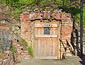
- Nomination Objekt in der Kellergasse in Kleinsierndorf (Niederösterreich). --Manfred Kuzel 03:51, 27 July 2019 (UTC)
- Promotion Good quality. --Isiwal 04:22, 27 July 2019 (UTC)
-

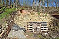
- Nomination Objekt in der Kellergasse in Kleinsierndorf (Niederösterreich). --Manfred Kuzel 03:51, 27 July 2019 (UTC)
- Promotion Good quality. --GT1976 04:24, 27 July 2019 (UTC)
-

- Nomination Objekt in der Kellergasse in Kleinsierndorf (Niederösterreich). --Manfred Kuzel 03:51, 27 July 2019 (UTC)
- Promotion Good quality. --GT1976 04:24, 27 July 2019 (UTC)
-
- Nomination Objekt in der Kellergasse in Kleinsierndorf (Niederösterreich). --Manfred Kuzel 03:51, 27 July 2019 (UTC)
- Promotion Good quality. --Isiwal 04:22, 27 July 2019 (UTC)
-

- Nomination Old barrel at the wine cellar of Schramsberg Vineyards, Napa Valley, California --Frank Schulenburg 02:47, 27 July 2019 (UTC)
- Promotion Good quality. -- Johann Jaritz 02:49, 27 July 2019 (UTC)
-

- Nomination Rosé champagne bottles at the cellar of Schramsberg Vineyards, Napa Valley, California --Frank Schulenburg 02:45, 27 July 2019 (UTC)
- Promotion Good quality. --Seven Pandas 02:46, 27 July 2019 (UTC)
-

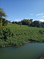
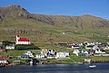
- Nomination View of Feldkirchen from Waiern, Feldkirchen, Carinthia, Austria -- Johann Jaritz 02:44, 27 July 2019 (UTC)
- Promotion Good quality. --Seven Pandas 02:49, 27 July 2019 (UTC)
-

- Nomination House Abendruh on Martin-Luther-Strasse #7 in Waiern, Feldkirchen, Carinthia, Austria -- Johann Jaritz 02:44, 27 July 2019 (UTC)
- Promotion Good quality. --Seven Pandas 02:48, 27 July 2019 (UTC)
-

- Nomination Memorial to Franz Joseph I at the park on Martin-Luther-Strasse #7 in Waiern, Feldkirchen, Carinthia, Austria -- Johann Jaritz 02:44, 27 July 2019 (UTC)
- Promotion Good quality. --Seven Pandas 02:48, 27 July 2019 (UTC)
-

- Nomination Memorial to Franz Joseph I at the park on Martin-Luther-Strasse #7 in Waiern, Feldkirchen, Carinthia, Austria -- Johann Jaritz 02:44, 27 July 2019 (UTC)
- Promotion Good quality. --Seven Pandas 02:48, 27 July 2019 (UTC)
-

- Nomination Cemetery gate on Martin-Luther-Strasse #7 in Waiern, Feldkirchen, Carinthia, Austria -- Johann Jaritz 02:44, 27 July 2019 (UTC)
- Promotion Good quality. --Seven Pandas 02:49, 27 July 2019 (UTC)
-

- Nomination Wine cellar of Schramsberg Vineyards, Napa Valley, California --Frank Schulenburg 02:30, 27 July 2019 (UTC)
- Promotion Good quality. FP? --Seven Pandas 02:43, 27 July 2019 (UTC)
-
- Nomination Brackish water.--Filo gèn' 02:23, 27 July 2019 (UTC)
- Decline Insufficient quality. Sorry, but all 3 images have insufficient quality for QI. Low level of details and lack of sharpness It's hard for cell phones to meet QI standards. --Seven Pandas 02:32, 27 July 2019 (UTC)--Seven Pandas 02:32, 27 July 2019 (UTC)
-

- Nomination Right bank.--Filo gèn' 02:18, 27 July 2019 (UTC)
- Decline Insufficient quality. --Seven Pandas 02:32, 27 July 2019 (UTC)
-

- Nomination Streambed of la sarcelle river.--Filo gèn' 02:10, 27 July 2019 (UTC)
- Decline Insufficient quality. --Seven Pandas 02:32, 27 July 2019 (UTC)
-

- Nomination Navajo Sandstone outcrop, Kane County, Utah, USA. --СССР 01:06, 27 July 2019 (UTC)
- Promotion Good quality. -- Johann Jaritz 02:47, 27 July 2019 (UTC)
-

- Nomination Eastern tent caterpillar (Malacosoma americanum). --СССР 01:06, 27 July 2019 (UTC)
- Promotion Good quality. -- Johann Jaritz 02:47, 27 July 2019 (UTC)
-

- Nomination Forum of Nerva, Rome. --СССР 01:06, 27 July 2019 (UTC)
- Promotion Good quality. -- Johann Jaritz 02:47, 27 July 2019 (UTC)
-

- Nomination Building 3 (grist mill) of the Distillery District, Toronto. --СССР 01:06, 27 July 2019 (UTC)
- Promotion Good quality. -- Johann Jaritz 02:47, 27 July 2019 (UTC)
-

- Nomination Colossus of Constantine, Rome. --СССР 01:06, 27 July 2019 (UTC)
- Promotion Good quality. -- Johann Jaritz 02:48, 27 July 2019 (UTC)
-

-

- Nomination Red-legged honeycreeper (Cyanerpes cyaneus carneipes) male, Panama --Charlesjsharp 18:04, 26 July 2019 (UTC)
- Promotion Good quality. --СССР 01:10, 27 July 2019 (UTC)
-

- Nomination Rufescent tiger heron (Tigrisoma lineatum lineatum) young adult head, Panama --Charlesjsharp 18:04, 26 July 2019 (UTC)
- Promotion Good quality. --СССР 01:10, 27 July 2019 (UTC)
-

- Nomination Rufous-collared sparrow (Zonotrichia capensis costaricensis), Panama --Charlesjsharp 18:04, 26 July 2019 (UTC)
- Promotion Good quality. --СССР 01:10, 27 July 2019 (UTC)
-

- Nomination Mangrove swallow (Tachycineta albilinea) immature, Panama --Charlesjsharp 18:04, 26 July 2019 (UTC)
- Promotion Good quality. --СССР 01:10, 27 July 2019 (UTC)
-
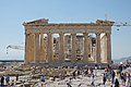
- Nomination Greece, Athen, Acropolis, Parthenon, from east --Berthold Werner 14:42, 26 July 2019 (UTC)
- Promotion
 Support
good quality. --Manfred Kuzel 16:09, 26 July 2019 (UTC)
-

-

- Nomination Tree Sparrow (Passer montanus). --Nirmal Dulal 09:23, 26 July 2019 (UTC)
- Promotion Support Good quality. --Nabin K. Sapkota 10:28, 26 July 2019 (UTC)
-

- Nomination Trenčín Castle from Vah river --Imehling 09:22, 26 July 2019 (UTC) Support Good quality. --Tournasol7 14:24, 26 July 2019 (UTC)
- Promotion {{{2}}}
- Nomination Trenčín Castle from Vah river --Imehling 09:22, 26 July 2019 (UTC)
-

- Nomination Red-wattled lapwing (Vanellus indicus) in Nepal. --Nirmal Dulal 09:01, 26 July 2019 (UTC)
- Promotion Support Good quality. --Tournasol7 14:25, 26 July 2019 (UTC)
-
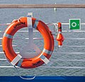
- Nomination Lifebuoy of Superstar Tallinn, West Harbour, Helsinki, Finnland --Poco a poco 08:27, 26 July 2019 (UTC)
- Promotion Good quality --Armenak Margarian 11:39, 26 July 2019 (UTC)
-

- Nomination Rolls-Royce Silver Spirit, Helsinki, Finnland --Poco a poco 08:27, 26 July 2019 (UTC)
- Decline Das Nummernschild --Ralf Roletschek 19:05, 26 July 2019 (UTC)
Außerdem wirkt das Auto verzerrt. Oder haben die Vorderräder tatsächlich so starken negativen Sturz, wie es scheint? -- Spurzem 20:16, 26 July 2019 (UTC)
-
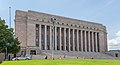
- Nomination Parliament House, Helsinki, Finnland --Poco a poco 08:27, 26 July 2019 (UTC)
- Promotion Good quality. --Bijay chaurasia 09:47, 26 July 2019 (UTC)
-

- Nomination Freight rail yard in Baku, Azerbaijan --MB-one 07:40, 26 July 2019 (UTC)
- Promotion Good quality. --Bijay chaurasia 09:47, 26 July 2019 (UTC)
-
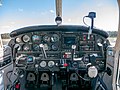
- Nomination Cockpit of a Piper Archer II --MB-one 07:40, 26 July 2019 (UTC)
- Promotion Good quality. --Bijay chaurasia 09:48, 26 July 2019 (UTC)
-

-
-

- Nomination Borgward Isabella Coupé at the Oldtimer Meeting Ebern --Ermell 06:56, 26 July 2019 (UTC)
- Promotion Support Good quality. --Nirmal Dulal 08:18, 26 July 2019 (UTC)
-

- Nomination Chevrolet Pickup Truck 1946 at the Oldtimer Meeting Ebern --Ermell 06:56, 26 July 2019 (UTC)
- Promotion Support Good quality. --Nirmal Dulal 08:18, 26 July 2019 (UTC)
-
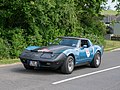
- Nomination Chevrolet Corvette C3 at the Sachs Franken Classic 2018 Rally, Stage 2 --Ermell 06:56, 26 July 2019 (UTC)
- Promotion Support Good quality. --Nirmal Dulal 08:18, 26 July 2019 (UTC)
-

- Nomination Cadillac Fleetwood 75 Limousine 1962 at the Oldtimer Meeting Ebern --Ermell 06:56, 26 July 2019 (UTC)
- Promotion Good quality --Armenak Margarian 11:42, 26 July 2019 (UTC)
-

- Nomination Chevrolet Camaro at the Oldtimer Meeting Ebern --Ermell 06:56, 26 July 2019 (UTC)
- Promotion Support Good quality. --Nabin K. Sapkota 10:28, 26 July 2019 (UTC)
-

- Nomination Detail of the door of the Saint Martial Church in Gabriac, Aveyron, France. --Tournasol7 06:05, 26 July 2019 (UTC)
- Promotion Good quality. --Berthold Werner 06:46, 26 July 2019 (UTC)
-

- Nomination Lake of Villefranche-de-Panat, Aveyron, France. --Tournasol7 06:05, 26 July 2019 (UTC)
- Promotion Support Good quality. --Dktue 16:18, 26 July 2019 (UTC)
-
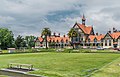
- Nomination Exterior of the Rotorua Museum in Rotorua, New Zealand. --Tournasol7 06:05, 26 July 2019 (UTC)
- Promotion Support Good quality.--Famberhorst 15:14, 26 July 2019 (UTC)
-

- Nomination View of Nuces, commune of Valady, Aveyron, France. --Tournasol7 06:05, 26 July 2019 (UTC)
- Promotion Support Good quality.--Famberhorst 15:16, 26 July 2019 (UTC)
-

- Nomination Shell of a Variable Mitre, Quasimitra variabilis --Llez 05:54, 26 July 2019 (UTC)
- Promotion Good quality.--Agnes Monkelbaan 05:57, 26 July 2019 (UTC)
-

- Nomination A Common redshank, Tringa totanus --Llez 05:54, 26 July 2019 (UTC)
- Promotion The bird's legs are not very sharp. But the head and body are nicely sharp.--Famberhorst 15:12, 26 July 2019 (UTC)
-

- Nomination Electricity pylons in Lake Ketelmeer
--Famberhorst 05:46, 26 July 2019 (UTC) - Promotion Support Good quality. --Tournasol7 06:09, 26 July 2019 (UTC)
- Nomination Electricity pylons in Lake Ketelmeer
-

- Nomination Polyporus varius on a dead Sorbus. Location. Natuurterrein De Famberhorst.
--Famberhorst 05:46, 26 July 2019 (UTC) - Promotion Good quality --User:Llez 05:55, 26 July 2019 (UTC)
- Nomination Polyporus varius on a dead Sorbus. Location. Natuurterrein De Famberhorst.
-

- Nomination Back side of Statue of Lord Buddha located at Syambhunath, Kathmandu. --Nirmal Dulal 05:05, 26 July 2019 (UTC)
- Promotion Support Good quality. --Nabin K. Sapkota 10:29, 26 July 2019 (UTC)
-

- Nomination Monument afsluitdijk and surroundings. Memorial plaque.
--Agnes Monkelbaan 04:54, 26 July 2019 (UTC) - Promotion Support
Good quality. --Manfred Kuzel 05:00, 26 July 2019 (UTC)
- Nomination Monument afsluitdijk and surroundings. Memorial plaque.
-

- Nomination Poldermolen De Boezemvriend Octagonal polder mill.
--Agnes Monkelbaan 04:54, 26 July 2019 (UTC) - Promotion Support Good quality. --XRay 05:26, 26 July 2019 (UTC)
- Nomination Poldermolen De Boezemvriend Octagonal polder mill.
-

- Nomination 1957 Chevrolet Bel Air 4-Door Sedan in the Presidio of San Francisco. --Frank Schulenburg 00:34, 26 July 2019 (UTC)
- Promotion Someone may complain about the car being too close to the bottom of the frame, but I'd consider it as a FP. Feel free nominate it. --Tobias ToMar Maier 00:48, 26 July 2019 (UTC)
@Tobias ToMar Maier: What bothers me a lot more than the tight cropp at the bottom is that the car is hanging heavily distorted. For me it is not a quality image. -- Spurzem 20:30, 26 July 2019 (UTC)
-

- Nomination A passenger train with the locomotive Skoda ChS4-061 -- George Chernilevsky 22:13, 25 July 2019 (UTC)
- Promotion Good quality. --Dirtsc 14:13, 26 July 2019 (UTC)
-

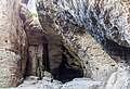
- Nomination House of "Urmeer Sironahöhle" in Austria. --PantheraLeo1359531 19:13, 25 July 2019 (UTC)
- Promotion Support
good quality. --Manfred Kuzel 16:14, 26 July 2019 (UTC)
-

- Nomination Stever River in Senden, North Rhine-Westphalia, Germany --XRay 17:43, 25 July 2019 (UTC)
- Withdrawn The branches of the trees in the upper part are partially doubled. CAn you check it? Greetings --Dirtsc 14:13, 26 July 2019 (UTC)
 I withdraw my nomination It may be better, but not really good. Thank for your review. --XRay 14:26, 26 July 2019 (UTC)
-

-

- Nomination Chinstrap penguin (Pygoscelis antarcticus) on Barrientos Island, in Antarctica. --GRDN711 19:44, 24 July 2019 (UTC)
- Promotion Support Good quality. --Ermell 22:17, 24 July 2019 (UTC) Support Good quality. --Nirmal Dulal 08:20, 26 July 2019 (UTC)
-

- Nomination: A part of Lennon Wall in Hong Kong book fair --SCP-2000 15:13, 20 July 2019 (UTC)
- Review needed
-
- Nomination: Historical arqueological national preserve of Madara, Bulgaria --Poco a poco 14:37, 20 July 2019 (UTC)
- Review needed
-
- Nomination: Mandelbrot set zoom into the depth of the Mandelbrot set. 3840*2160p@60 FPS. 00:08:42 hrs.By User:PantheraLeo1359531 --Jahobr 10:47, 20 July 2019 (UTC)
- Review needed
-

- Nomination: Museummolen De Wachter (Zuidlaren) Factory chimney with rotating windmill blade.
--Agnes Monkelbaan 04:39, 20 July 2019 (UTC) Comment: Ich würde den störenden Flügel der Windmühle entfernen und den Schornstein senkrecht stellen. --Manfred Kuzel 05:39, 20 July 2019 (UTC)
 - Review Answer: Thank you for your comment. I deliberately took the photo when the windmill blade came to the top right. And pointed to the factory tower. Like multiple opinions about this photo.--Agnes Monkelbaan 09:17, 20 July 2019 (UTC)
- Nomination: Museummolen De Wachter (Zuidlaren) Factory chimney with rotating windmill blade.
-

- Nomination: Lviv Theatre of Opera and Ballet. By User:Brizhnichenko --Ahonc 21:52, 19 July 2019 (UTC)
- Review Good quality. --Rbrechko 23:51, 19 July 2019 (UTC)
Seems a bit tilted to the right. --大诺史 10:03, 20 July 2019 (UTC)
-

- Nomination Tour d'Arles in Caussade, Tarn-et-Garonne, France. --Tournasol7 06:30, 19 July 2019 (UTC) CommentThe bird in the roof looks overprocessed or shows pixelization --Cvmontuy 00:29, 25 July 2019 (UTC)
Done. --Tournasol7 14:32, 26 July 2019 (UTC) - Promotion Good quality. --Cvmontuy 17:22, 26 July 2019 (UTC)
- Nomination Tour d'Arles in Caussade, Tarn-et-Garonne, France. --Tournasol7 06:30, 19 July 2019 (UTC)
-

- Nomination Window of the church of Balsac, Aveyron, France. --Tournasol7 06:33, 13 July 2019 (UTC))
- Promotion
Slightly leaning in IMO --Ermell 07:18, 15 July 2019 (UTC) Done --Tournasol7 09:25, 22 July 2019 (UTC) Support Good quality. --Ermell 07:05, 26 July 2019 (UTC)


_of_the_Distillery_District.jpg)

_male.jpg)
_young_adult_head.jpg)
.jpg)
_immature.jpg)


,_Nepal_02.jpg)

_2019_013.jpg)


.jpg)
.jpg)


._08.jpg)
_op_een_dode_lijsterbes_(Sorbus)._Locatie._Natuurterrein_De_Famberhorst._08-07-2019._(d.j.b)._03.jpg)
.jpg)
_16.jpg)
_04.jpg)


.jpg)

_22-06-2019._(actm.)_10.jpg)


.jpg)
Consensual review[edit]
File:Paraphidippus_aurantius_male_01.jpg[edit]

- Nomination Adult male Paraphidippus aurantius jumping spider in Allegheny County, Pennsylvania --Kaldari 20:53, 20 July 2019 (UTC)
- Decline
![]() Oppose DOF too low --Dirtsc 16:02, 22 July 2019 (UTC)
Oppose DOF too low --Dirtsc 16:02, 22 July 2019 (UTC)
![]() Support I disagree, eyes are in focus, this is a outdoors photo of a live spider so focus stacking is impossible --Cvmontuy 00:32, 25 July 2019 (UTC)
Support I disagree, eyes are in focus, this is a outdoors photo of a live spider so focus stacking is impossible --Cvmontuy 00:32, 25 July 2019 (UTC)![]() Oppose - The eyes are haunting but the spider is not in focus. -- Ikan Kekek 06:19, 25 July 2019 (UTC)
Oppose - The eyes are haunting but the spider is not in focus. -- Ikan Kekek 06:19, 25 July 2019 (UTC)![]() Oppose as above, athough focus-stacking is certainly possible though difficult. Charlesjsharp 11:55, 25 July 2019 (UTC) Charlesjsharp 11:54, 25 July 2019 (UTC)
Oppose as above, athough focus-stacking is certainly possible though difficult. Charlesjsharp 11:55, 25 July 2019 (UTC) Charlesjsharp 11:54, 25 July 2019 (UTC)
File:OutDoor_2018,_Friedrichshafen_(1X7A0535).jpg[edit]
.jpg)
- Nomination Model tent at OutDoor 2018 --MB-one 13:54, 14 July 2019 (UTC)
- Decline
- Comment Tilted --Poco a poco 20:55, 14 July 2019 (UTC)
- Comment Try to cut a little on the left, maybe --Dktue 13:21, 19 July 2019 (UTC)
- Why do you move it to CR? if changes are applied I see no need to start a CR --Poco a poco 17:34, 19 July 2019 (UTC)
 Oppose Per Dktue, trimming the dark strip on the left would help but this image would still not be QI to me. --GRDN711 12:56, 21 July 2019 (UTC)
- CommentDescription is lacking. Is it a modell on a cupboard?Tobias ToMar Maier 02:04, 24 July 2019 (UTC)
- Oppose Perspective could probably be repaired, the horrible illumination not. --Smial 11:38, 24 July 2019 (UTC)
- Support - "Tent" is not a model (I don't understand how a cupboard is relevant to tents), and I don't really understand the strong opposition. This photo is hardly the best we'll ever see, but it's perfectly OK to my eyes. -- Ikan Kekek 14:28, 25 July 2019 (UTC)
File:Hudson Pacemaker de 1950, Helsinki, Finlandia, 2012-08-14, DD 01.jpg[edit]

- Nomination Hudson Hornet of 1954, Helsinki, Finnland --Poco a poco 13:22, 15 July 2019 (UTC)
- Decline
- Support Good quality --Michielverbeek 17:37, 15 July 2019 (UTC)
- Oppose
The black grease on the bonnet(meanwhile removed), the blackened, probably already fictitious license plate and the information sheet in the windshield are very disturbing. Besides, the car is unnaturally distorted. For me, the photo would not be a quality picture. -- Spurzem 21:47, 15 July 2019 (UTC)- So, IMO more reviews --Michielverbeek 17:22, 16 July 2019 (UTC)<br/
- Comment As it's obvious that you, Spurzem, cannot handle a criticism (or a contra to one of your images) I already stated, that I wouldn't review any of your images. I expect though the same from you otherwise I consider this a provocation! Don't play with me. Poco a poco 18:21, 16 July 2019 (UTC)
- Support --Ermell 07:15, 17 July 2019 (UTC)
- Oppose I must say that I find those black smudges a bit disturbing.--Peulle 08:03, 17 July 2019 (UTC)
- Peulle, one of them was there by mistake, I removed it. Poco a poco 18:13, 17 July 2019 (UTC)
- OK, I still feel that the other one should be fixed too, though. What I mean by "fixed" is that if you're going to anonymize license plates, it should be done in a way that looks a bit more professional.--Peulle 13:49, 21 July 2019 (UTC)
- Oppose Per Peule. Also somewhat low DOF. --Smial 10:56, 17 July 2019 (UTC)
- Comment Kaldari asked in the talk page of the file why I smudged the license plate. My motivation to do that was this, whether it's a must and why I cannot really say. Poco a poco 17:13, 17 July 2019 (UTC)
- I don't object to the changing of license plates per se, but the way it has been done in this case.--Peulle 17:48, 17 July 2019 (UTC)
- Support --Tournasol7 06:45, 18 July 2019 (UTC)
- Please provide a reason. --Smial 11:16, 18 July 2019 (UTC)
 Question was ist mit dem Nummernschild passiert? Irgendwie zu weitwinklig... --Ralf Roletschek 21:42, 18 July 2019 (UTC)
- Comment The image looks good to me overall. As for the plates: the background of the frame is gray with the (presumably) white letters and numbers. If that particular shade of gray was used instead of black to cover the symbols, the result would be much more pleasing to the eye. Just my two cents. --Stoxastikos 16:50, 21 July 2019 (UTC)
- Oppose Per Spurzem. --Kallerna 07:23, 26 July 2019 (UTC)