Commons:Quality images candidates/Archives January 28 2024
Jump to navigation
Jump to search

-

-

-

-

- Nomination Ulugh Beg Observatory Museum, Samakand, Uzbekistan --Bgag 04:14, 26 January 2024 (UTC)
- Promotion
 Support Good quality. --JoachimKohler-HB 04:55, 26 January 2024 (UTC)
-

- Nomination Reed bed at the «Edelweiß bath» on Hauptstraße in Winklern, Pörtschach, Carinthia, Austria -- Johann Jaritz 03:04, 26 January 2024 (UTC)
- Promotion Support Good quality. --XRay 04:51, 26 January 2024 (UTC)
-

- Nomination Plaque and house numbers at the fence of villa Almrausch on Hauptstraße #110 in Winklern, Pörtschach, Carinthia, Austria -- Johann Jaritz 03:04, 26 January 2024 (UTC)
- Promotion Support Good quality. --Tagooty 03:42, 26 January 2024 (UTC)
-

- Nomination Villa Almrausch on Hauptstraße #110 in Winklern, Pörtschach, Carinthia, Austria -- Johann Jaritz 03:04, 26 January 2024 (UTC)
- Promotion Support Good quality. --Bgag 04:14, 26 January 2024 (UTC)
-

- Nomination Villa Edelweiß on Hauptstraße #106 in Winklern, Pörtschach, Carinthia, Austria -- Johann Jaritz 03:04, 26 January 2024 (UTC)
- Promotion Support Good quality. --Bgag 04:14, 26 January 2024 (UTC)
-

- Nomination Marienvilla on Hauptstraße #112 in Winklern, Pörtschach, Carinthia, Austria -- Johann Jaritz 03:04, 26 January 2024 (UTC)
- Promotion Support Good quality. --Tagooty 03:42, 26 January 2024 (UTC)
-

-
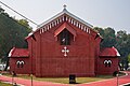
- Nomination Rear (east) facade, St. Thomas Orthodox Syrian Church, Cantonment, Allahabad --Tagooty 02:02, 26 January 2024 (UTC)
- Promotion Support Good quality. --Johann Jaritz 03:04, 26 January 2024 (UTC)
-

-

-
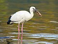
- Nomination Asian openbill stork (Anastomus oscitans) drinking in the river, Ranganathittu Bird Sanctuary --Tagooty 02:02, 26 January 2024 (UTC)
- Promotion Support Good quality. --Johann Jaritz 03:04, 26 January 2024 (UTC)
-

- Nomination Red clouds over the Mekong banks with dwellings and pirogues at sunrise in Don Det, Si Phan Don, Laos. --Basile Morin 01:55, 26 January 2024 (UTC)
- Promotion Support Good quality. --Tagooty 02:03, 26 January 2024 (UTC)
-

- Nomination Tempi Madonna - Raphael --GoldenArtists 19:25, 25 January 2024 (UTC)
- Promotion Support Good quality. --Tagooty 02:58, 26 January 2024 (UTC)
-

- Nomination Mercedes-Benz EQS SUV in Stuttgart --Alexander-93 19:09, 25 January 2024 (UTC)
- Promotion Support Good quality. --GoldenArtists 19:34, 25 January 2024 (UTC)
-
- Nomination CPEF 193 “Jiboia”. By User:Mike Peel --XRay 14:44, 25 January 2024 (UTC)
- Promotion Support Good quality. --Johann Jaritz 17:01, 25 January 2024 (UTC)
-

- Nomination Agave shawii at Jardin de Cactus in 2022. By User:Mike Peel --XRay 14:44, 25 January 2024 (UTC)
- Promotion Support Good quality. --Johann Jaritz 17:01, 25 January 2024 (UTC)
-
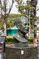
- Nomination Bust of Manuel Magariños Castaños. By User:Mike Peel --XRay 14:44, 25 January 2024 (UTC)
- Promotion Support Good quality. --Johann Jaritz 17:01, 25 January 2024 (UTC)
-

- Nomination AMX International at Memorial Aeroespacial Brasileiro. By User:Mike Peel --XRay 14:44, 25 January 2024 (UTC)
- Promotion Support Good quality. --Johann Jaritz 17:01, 25 January 2024 (UTC)
-

- Nomination Matka canyon seen from road leading to Sveta Petka dam. --Kallerna 14:19, 25 January 2024 (UTC)
- Promotion Support Good quality. --Johann Jaritz 17:01, 25 January 2024 (UTC)
-
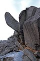
- Nomination "Trollpikken" rock formation in Magma UNESCO Global Geopark. --Kallerna 14:19, 25 January 2024 (UTC)
- Promotion Support Good quality. --GoldenArtists 19:34, 25 January 2024 (UTC)
-

- Nomination Brown booby (Sula leucogaster plotus) female --Charlesjsharp 11:16, 25 January 2024 (UTC)
- Promotion Support Good quality. --Thi 18:46, 25 January 2024 (UTC)
-

- Nomination Brown booby (Sula leucogaster plotus) pair --Charlesjsharp 11:16, 25 January 2024 (UTC)
- Promotion Support Good quality. --Basile Morin 01:58, 26 January 2024 (UTC)
-

- Nomination Brown honeyeater (Lichmera indistincta) --Charlesjsharp 11:16, 25 January 2024 (UTC)
- Promotion Support Good quality. --Plozessor 19:25, 25 January 2024 (UTC)
-
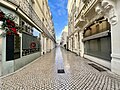
- Nomination Rue Charles Gide (Poitiers) en janvier 2024. --Benoît Prieur 09:59, 25 January 2024 (UTC)
- Promotion Support Good quality. --Plozessor 19:25, 25 January 2024 (UTC)
-

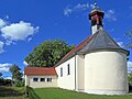
- Nomination Wayside cross (1784) near Wiltingen, Germany. --Palauenc05 09:00, 25 January 2024 (UTC)
- Promotion Good quality -- Spurzem 10:57, 25 January 2024 (UTC)
-

- Nomination Wayside cross (1788) near Wiltingen, Germany. --Palauenc05 09:00, 25 January 2024 (UTC)
- Promotion Good quality -- Spurzem 10:57, 25 January 2024 (UTC)
-

- Nomination Wayside cross (1882) near Konz-Oberemmel, Germany. --Palauenc05 09:00, 25 January 2024 (UTC)
- Promotion Good quality -- Spurzem 10:57, 25 January 2024 (UTC)
-

- Nomination OA Mk 30 at Bahna 2018 military show, by Adam Hauner --Draceane 08:48, 25 January 2024 (UTC)
- Promotion Good quality -- Spurzem 10:59, 25 January 2024 (UTC)
-

- Nomination LT 38 at Bahna 2018 military show, by Adam Hauner --Draceane 08:48, 25 January 2024 (UTC)
- Promotion Good quality -- Spurzem 10:59, 25 January 2024 (UTC)
-

- Nomination LT 38 at Bahna 2018 military show, by Adam Hauner --Draceane 08:48, 25 January 2024 (UTC)
- Promotion Good quality -- Spurzem 11:06, 25 January 2024 (UTC)
-

- Nomination LT 38 at Bahna 2018 military show, by Adam Hauner --Draceane 08:48, 25 January 2024 (UTC)
- Promotion Good quality -- Spurzem 11:06, 25 January 2024 (UTC)
-

- Nomination Plassenburg in Kulmbach --Ermell 07:50, 25 January 2024 (UTC)
- Promotion Support Good quality. --Palauenc05 10:35, 25 January 2024 (UTC)
-

- Nomination Plassenburg in Kulmbach --Ermell 07:50, 25 January 2024 (UTC)
- Promotion Support Good quality. --Palauenc05 10:35, 25 January 2024 (UTC)
-

-

-

- Nomination Wayside shrine between Breitenlesau and Zochenreuth --Ermell 07:50, 25 January 2024 (UTC)
- Promotion Support Good quality. --Palauenc05 10:37, 25 January 2024 (UTC)
-

- Nomination Morpho peleides at Mariposario del Drago --Mike Peel 07:39, 25 January 2024 (UTC)
- Decline
 Oppose noisy and unfortunate background --Charlesjsharp 11:14, 25 January 2024 (UTC)
-

- Nomination Aloe claviflora at Jardin de Cactus --Mike Peel 07:39, 25 January 2024 (UTC)
- Promotion Support Good quality. --GoldenArtists 19:35, 25 January 2024 (UTC)
-

-

- Nomination Dalila Ali Rajah at the 40th Sundance Film Festival --Frank Schulenburg 07:10, 25 January 2024 (UTC)
- Promotion Support Good quality. --Plozessor 07:33, 25 January 2024 (UTC)
-

- Nomination Synthia Okorafor at the 40th Sundance Film Festival --Frank Schulenburg 07:10, 25 January 2024 (UTC)
- Promotion Support Good quality. --Thi 18:46, 25 January 2024 (UTC)
-

- Nomination Detail Tarasp municipality Scuol gemeente Scuol in Lower Engadin, Graubünden. House on Sparsels street. (Wooden door)
--Agnes Monkelbaan 05:19, 25 January 2024 (UTC) - Promotion Support Good quality. --Johann Jaritz 05:53, 25 January 2024 (UTC)
- Nomination Detail Tarasp municipality Scuol gemeente Scuol in Lower Engadin, Graubünden. House on Sparsels street. (Wooden door)
-

- Nomination Tarasp municipality Scuol gemeente Scuol in Lower Engadin, Graubünden. House on Sparsels street.
--Agnes Monkelbaan 05:19, 25 January 2024 (UTC) - Promotion Support Good quality. --Johann Jaritz 05:53, 25 January 2024 (UTC)
- Nomination Tarasp municipality Scuol gemeente Scuol in Lower Engadin, Graubünden. House on Sparsels street.
-

- Nomination Tarasp Castle Scuol, in Lower Engadin, Graubünden (outbuilding)
--Agnes Monkelbaan 05:19, 25 January 2024 (UTC) - Promotion Support Good quality. --Johann Jaritz 05:53, 25 January 2024 (UTC)
- Nomination Tarasp Castle Scuol, in Lower Engadin, Graubünden (outbuilding)
-

- Nomination Building at Pass 9 in Zwingenberg, Hesse, Germany. --Tournasol7 05:14, 25 January 2024 (UTC)
- Promotion Support Good quality.--Agnes Monkelbaan 05:22, 25 January 2024 (UTC)
-

- Nomination Aul in Zwingenberg, Hesse, Germany. --Tournasol7 05:14, 25 January 2024 (UTC)
- Promotion Support Good quality.--Agnes Monkelbaan 05:24, 25 January 2024 (UTC)
-

- Nomination Königstraße 42 in Bad Bergzabern, Rhineland-Pal., Germany. --Tournasol7 05:14, 25 January 2024 (UTC)
- Promotion Support Good quality.--Agnes Monkelbaan 05:23, 25 January 2024 (UTC)
-

-

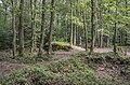
- Nomination Natural monument "Jackdaw beech" near Humprechtshausen --Plozessor 05:00, 25 January 2024 (UTC)
- Promotion Support Good quality.--Agnes Monkelbaan 05:14, 25 January 2024 (UTC)
-

- Nomination Silene vulgaris at "Wachstein" mountain in Franconian Switzerland --Plozessor 05:00, 25 January 2024 (UTC)
- Promotion Support Good quality. --GoldenArtists 19:35, 25 January 2024 (UTC)
-
-

- Nomination Shrine in Chapel of Our Lady of Sorrows in Trappstadt --Plozessor 05:00, 25 January 2024 (UTC)
- Promotion Support Good quality. --GoldenArtists 19:35, 25 January 2024 (UTC)
-

- Nomination Glass sculpture “Body and Soul” (Duk-Kyu Ryang, 2015) on the LVM campus in Münster, North Rhine-Westphalia, Germany/The shot used the creative technique of intentional camera movement. --XRay 04:09, 25 January 2024 (UTC)
- Promotion Support Good quality.--Agnes Monkelbaan 05:11, 25 January 2024 (UTC)
-

-

-

- Nomination Front views of Jatiyo Smriti Soudho, Bangladesh. By User:Nasirkhan --আফতাবুজ্জামান 23:31, 24 January 2024 (UTC)
- Promotion Support Good quality. --Plozessor 05:04, 25 January 2024 (UTC)
-

- Nomination Aerial view of Ramsagar National Park, Dinajpur, Bangladesh. By User:Abdulmominbd --আফতাবুজ্জামান 23:31, 24 January 2024 (UTC)
- Promotion Support Good quality. --Plozessor 05:04, 25 January 2024 (UTC)
-

- Nomination Mixed Salad. By User:Munni Akter Mim --আফতাবুজ্জামান 23:31, 24 January 2024 (UTC)
- Promotion Support Good quality. --Plozessor 05:04, 25 January 2024 (UTC)
-

-
- Nomination Battle of the Bulge Memoria Trail in Luxembourg. --Cayambe 19:55, 24 January 2024 (UTC)
- Promotion Support Good quality. --GoldenArtists 19:35, 25 January 2024 (UTC)
-
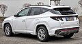
- Nomination Hyundai Tucson (NX4, SWB) PHEV in Stuttgart --Alexander-93 18:37, 24 January 2024 (UTC)
- Promotion Support Good quality. --Plozessor 05:06, 25 January 2024 (UTC)
-
-

- Nomination Alpina B4 (F33) in Stuttgart --Alexander-93 17:55, 24 January 2024 (UTC)
- Promotion Support Good quality. --Velvet 07:37, 25 January 2024 (UTC)
-

- Nomination Tank LT 38 at Bahna 2018 military show, by Adam Hauner --Draceane 09:51, 24 January 2024 (UTC)
- Promotion Support Good quality. --Mike1979 Russia 17:52, 25 January 2024 (UTC)
-

- Nomination Eurasian spoonbill (Platalea leucorodia) --Charlesjsharp 08:53, 24 January 2024 (UTC)
- Promotion Support Good quality. --Velvet 07:35, 25 January 2024 (UTC)
-

- Nomination A linear representation of the visible light spectrum (by User:Gringer). --Artoria2e5 05:22, 24 January 2024 (UTC)
- Promotion
This is one of the better rendering of the visible spectrum. The author has taken care to preserve the color appearance using the Jch model. --Artoria2e5 05:24, 24 January 2024 (UTC) Support Good quality. --Thi 18:46, 25 January 2024 (UTC)
-

- Nomination Bust of Cândido Mendes, Rio de Janeiro --Mike Peel 17:50, 23 January 2024 (UTC)
- Promotion
Can you fix the dust spot in the left? --Draceane 11:40, 24 January 2024 (UTC)
@Draceane: Done, does that look better? Thanks. Mike Peel 08:38, 25 January 2024 (UTC) Support Good quality now. --Draceane 08:40, 25 January 2024 (UTC)
-

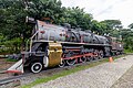
- Nomination T-34-76 produced by the Stalingrad Tractor Plant (STZ). --Mike1979 Russia 09:07, 23 January 2024 (UTC)
- Promotion Good quality. --Jacek Halicki 13:13, 25 January 2024 (UTC)
-

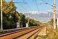
- Nomination Sudoverf railway station --Mike1979 Russia 09:07, 23 January 2024 (UTC)
- Promotion
Again, the blue colour should be fixed. --Draceane 11:40, 24 January 2024 (UTC)
Fixed. I'm colorblind. I saw dark blue not purple. Thank you. --Mike1979 Russia 08:31, 25 January 2024 (UTC) Support Good quality now. --Draceane 22:31, 25 January 2024 (UTC)
-

- Nomination Triumph Herald 1200 --JoachimKohler-HB 17:46, 22 January 2024 (UTC)
- Promotion Support Good quality. --Mike1979 Russia 17:57, 25 January 2024 (UTC)
-
- Nomination Krasnoarmeyskaya railway station --Mike1979 Russia 10:37, 22 January 2024 (UTC)
- Promotion
Needs some color and shadows correction (чуть прибрать фиолетовое и желтое и высветлить тени слева) -- --Екатерина Борисова 23:21, 23 January 2024 (UTC)
Tryed to fix. --Mike1979 Russia 13:32, 25 January 2024 (UTC) Support OK now --Екатерина Борисова 23:17, 25 January 2024 (UTC)
-

- Nomination Altenbanz in the district of Lichtenfels --Ermell 07:08, 22 January 2024 (UTC)
- Promotion
That has a strong blue tint ... --Plozessor 07:24, 22 January 2024 (UTC)
That's how it is at blue hour. --Ermell 08:15, 22 January 2024 (UTC) Support Personally I'd make it warmer, but my personal taste doesn't matter here. Picture is good. --Plozessor 06:14, 25 January 2024 (UTC)
-

- Nomination New Zealand fur seal (Arctocephalus forsteri) female with suckling pup --Charlesjsharp 10:39, 21 January 2024 (UTC)
- Promotion Support Good quality. --C messier 20:17, 25 January 2024 (UTC)
-

- Nomination: Cat sleeping at the concrete block at Volodarskogo street. Zelenogradsk, Kaliningrad Oblast, Russia. By User:Avsolov --Красный 04:47, 20 January 2024 (UTC)
- Review needed
-

- Nomination Cat lying on a bench at the corner of Pogranichnaya street and Kurortny avenue. Zelenogradsk, Kaliningrad Oblast, Russia. By User:Avsolov --Красный 04:47, 20 January 2024 (UTC)
- Decline Insufficient quality. --Smial 17:42, 25 January 2024 (UTC)
-

- Nomination Cat lying on a bench at the corner of Pogranichnaya street and Kurortny avenue. Zelenogradsk, Kaliningrad Oblast, Russia. By User:Avsolov --Красный 04:47, 20 January 2024 (UTC)
- Decline Insufficient quality. --Smial 17:42, 25 January 2024 (UTC)
-

- Nomination: Detail of Geirot wooden house, Peterhof, Saint Petersburg, Russia --Екатерина Борисова 03:14, 20 January 2024 (UTC)
- Review needed
-

- Nomination: Catalyst Science Discovery Centre --Mike Peel 01:06, 20 January 2024 (UTC)
- Review needed
-

- Nomination: Pavilion in Gongsanseong Fortress, Gongju, South Korea --Bgag 00:07, 20 January 2024 (UTC)
- Review needed
-

- Nomination: Footpath parallel to Hans-Stützle-Straße and stairs south of S-Bahnhof Freiham, Munich --Kritzolina 17:31, 19 January 2024 (UTC)
- Review needed
-

- Nomination: Tower crane depot at Centa-Hafenbrädl-Straße in the newly developping quarter of Freiham, Munich --Kritzolina 17:31, 19 January 2024 (UTC)
- Review needed
-

- Nomination: Paddy fields captured near Pulla village --IM3847 16:05, 19 January 2024 (UTC)
- Review needed
-

- Nomination: A church in Georgia, USA --Nheyob 15:07, 19 January 2024 (UTC)
- Review needed
-

- Nomination: Grave of the Alexandru de Linche de Moissac Family in the Bellu Cemetery in Bucharest, Romania --Neoclassicism Enthusiast 14:21, 19 January 2024 (UTC)
- Review needed
-

- Nomination: Grave of the D.H.A. Solacolu Family in the Bellu Cemetery in Bucharest, Romania --Neoclassicism Enthusiast 14:21, 19 January 2024 (UTC)
- Review needed
-

- Nomination: Grave of the D.H.A. Solacolu Family in the Bellu Cemetery in Bucharest, Romania --Neoclassicism Enthusiast 14:21, 19 January 2024 (UTC)
- Review needed
-
- Nomination: Tree spurge (Euphorbia dendroides) --Robert Flogaus-Faust 12:06, 19 January 2024 (UTC)
- Review needed
-

- Nomination: Banded lapwing (Vanellus tricolor) --Charlesjsharp 09:21, 19 January 2024 (UTC)
- Review
This seems extremely overprocessed somehow (in high resolution it looks strange). --Plozessor 16:55, 19 January 2024 (UTC)
-

- Nomination: Siproeta stelenes on an orange at Chester Zoo --Mike Peel 07:36, 19 January 2024 (UTC)
- Review needed
-

- Nomination: Siproeta stelenes on a plant at Chester Zoo --Mike Peel 07:36, 19 January 2024 (UTC)
- Review needed
-

- Nomination: Phoenicopterus ruber in Chester Zoo --Mike Peel 07:36, 19 January 2024 (UTC)
- Review needed
-

- Nomination Grave of Gheorghe Grigore Cantacuzino in the Bellu Cemetery in Bucharest, Romania --Neoclassicism Enthusiast 16:50, 17 January 2024 (UTC)
- Promotion Support Good quality. --C messier 20:06, 25 January 2024 (UTC)
-

- Nomination Journal of Society of Chemical Industry volumes, Catalyst --Mike Peel 09:38, 17 January 2024 (UTC)
- Promotion
IMHO you should get the shelfs horizontal. --C messier 18:19, 24 January 2024 (UTC)
@C messier: Thanks for looking, perspective redone, does that look better? Thanks. Mike Peel 08:43, 25 January 2024 (UTC) Support Good quality. --Thi 18:46, 25 January 2024 (UTC)
-

-

-

-

-

- Nomination: Grave on the Zell cemetery --Kritzolina 11:56, 12 January 2024 (UTC)
- Review
Could be a bit brighter and sharper. --Plozessor 19:30, 19 January 2024 (UTC)
-
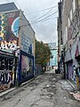
- Nomination: Graffiti Alley, Toronto --Another Believer 05:44, 12 January 2024 (UTC)
- Review
Needs PC and better filename --Plozessor 19:22, 19 January 2024 (UTC)
-

- Nomination: Rail tracks at Bahnhof Ebenhausen-Schäftlarn - looking along the tracks towards Icking --Kritzolina 16:25, 11 January 2024 (UTC)
- Review
Would be ok but is tilted and way too dark --Plozessor 19:26, 19 January 2024 (UTC)
-
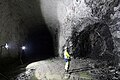
- Nomination: Geological mapping in Onkalo spent nuclear fuel repository. --Kallerna 19:07, 9 January 2024 (UTC)
- Review
IMHO the unsharp corners can be cropped and can you recover the highlights at the vest? --C messier 22:23, 17 January 2024 (UTC)
As you can see, the light conditions were challenging. I prefer it as it is. --Kallerna 18:13, 19 January 2024 (UTC)

_01.jpg)


_at_Wat_Si_Khom_Kham_Jan_2024.jpg)


_female_in_flight_Michaelmas_Cay.jpg)
_pair_Michaelmas_Cay.jpg)
_Darwin_2.jpg)
_en_janvier_2024.jpg)


_04.jpg)
_05.jpg)
_Scuol,_18-09-2023._(actm.)_04.jpg)
.jpg)
.jpg)
.jpg)


_(2).jpg)
.jpg)


_PHEV_1X7A1859.jpg)

_1X7A1866.jpg)

_breeding_2.jpg)


.jpg)


_female_with_suckling_pup_Kangaroo_Island.jpg)
.jpg)
.jpg)
.jpg)


_-_exterior_1.jpg)
.jpg)
.jpg)
.jpg)

_Scottsdale.jpg)


.jpg)


.jpg)


Consensual review[edit]
File:Sundance_Film_Festival_2024_-_Layla_-_Darkwah-104A1471.jpg[edit]

- Nomination Actor Darkwah at the premiere of the movie Layla at the 40th Sundance Film Festival in Park City, Utah --Frank Schulenburg 01:25, 19 January 2024 (UTC)
- Decline Support Good quality. --Johann Jaritz 02:57, 19 January 2024 (UTC)
 Question Shouldn't persons' hair be complete on portraits? Most of these images have the heads cut off. --Plozessor 06:30, 19 January 2024 (UTC)
 Comment Cropping the hair at the top is a very common portait style. Of course this is a matter of taste, but IHMO we should not decline images just because they use a common style. --Aristeas 10:59, 19 January 2024 (UTC)
- Comment I tend to disagree with the "cropping the hair at the top is a very common portait style" statement. I could not find any reference that states that, and just checking a random portrait category like [Category:2011 portrait photographs of men], there are hardly any photos with the hair cropped. --Plozessor 14:03, 20 January 2024 (UTC)
- Comment Here are some websites of commercial photographers (almost arbitrary selection) which show that cropping the hair is common with “headshots”:
- We could find many more examples. I am not saying that one should do that, I just want to emphasize that this is a common style. Best, --Aristeas 19:21, 20 January 2024 (UTC)
- Oppose Depends on how you define "common", but the majority of portraits out there do not have the hair cut off. Anyway, in this particular case, the crop is really disturbing. Might be because that person's dark skin blends with the hair, so the photo gives the impression that the head is cut off. --Plozessor 05:01, 21 January 2024 (UTC)
- Oppose There is insufficient categorization and other data. No caption, no "depicts" statement in the structured data, just a category for the event, nothing at all about the person on the photo. O.k., you can probably still find this image with the information from the file name and the description. And even if cutting a part of the hair off may be common style, this crop may impair the usability of the image, at least in my opinion. E.g., I would probably refrain from using this image for a Wikipedia article of the depicted person if I could find a good alternative image without this kind of crop. Sorry. --Robert Flogaus-Faust (talk) 11:59, 20 January 2024 (UTC)
- Support. Good image -- Spurzem 13:41, 20 January 2024 (UTC)
- Support Great portrait. Cutting off the top of the head is done to keep the eys on the upper portion of the frame, which is flattering for most face types. One is of course free to dislike the result, but technically it serves a purpose. --Julesvernex2 19:39, 20 January 2024 (UTC)
- Comment Thanks for your attempt to explain the intention of the crop. However, the downward shift of the eyes by not cutting off some hair would have been tiny in this case. IMO this is obvious from other (commercial) photos of the same person at the same event that can be found on the web. --Robert Flogaus-Faust 00:26, 21 January 2024 (UTC)
- I don't find the difference negligible, particularly if the photographer needs to stick to a 3:2 aspect ratio (often a requirement for this type of images, so they can be quickly added to a pre-formatted publication). Compare it to Getty's Darkwah Sundance image ([1]), for instance. The same 3:2 aspect ratio, but with no chopped off head and placing the eyes on the one-third line. It's also a perfectly fine portrait, but personally I prefer Frank's: a more intimate close-up, better skin tones, no shadow, and it doesn't cost €475 :-). I understand that you have a different preference, that's fine. From a technical perspective, however, I don't see why this image should fail QI (apart perhaps due to the plane of focus, which is not quite on the eyes). --Julesvernex2 09:45, 21 January 2024 (UTC)
- Oppose Well exposed and, given the available lighting, quite well shot. Unfortunately, the focus is on the necklace and the hair, not the eyes. The cropping is a matter of taste, in my opinion it does not contribute to a better image effect in this case. Whether the landscape format is due to any agency specifications or production processes is, in my opinion, irrelevant for commons or QIC. --Smial 12:04, 22 January 2024 (UTC)
- Oppose Per Smial. --Tagooty 09:01, 23 January 2024 (UTC)
Total: 3 support (excluding the nominator), 4 oppose →  Declined --Robert Flogaus-Faust 11:51, 27 January 2024 (UTC)
File:Senden,_Dortmund-Ems-Kanal,_Brücke_am_Kappenberger_Damm_--_2024_--_9875.jpg[edit]

- Nomination Bridge (Kappenberger Damm) over the Dortmund-Ems Canal near Senden, North Rhine-Westphalia, Germany/The shot used the creative technique of intentional camera movement. --XRay 04:01, 18 January 2024 (UTC)
- Decline
- Support Good quality.--Agnes Monkelbaan 05:15, 18 January 2024 (UTC)
- Oppose Outstanding. Unfortunately, the purpose of this technology remains a mystery to me. Even with perfect control, I consider them to be incompatible with the criteria for quality images. I don't see any benefit in such a distorted view of this bridge, even when it's intended. --Milseburg 14:06, 18 January 2024 (UTC)
- Oppose
 Neutral Per Milseburg. Piece of art: Yes, QI: No. Also, even if ICM pictures would quality, this might not be a good example (it's tilted, the movement seems irregular). It's burned out and overcontrasted and has nothing to do with natural colors (which is ok for an artwork but not for QI.) --Plozessor 05:46, 19 January 2024 (UTC)
  Info Two things I can understand (even well): Criticism of the design of a photo, even if it was made with techniques such as ICM, and a certain discomfort with the evaluation. Thanks to those who give their criticism here objectively. I am aware that these pictures are much more difficult to judge and that opinions are likely to differ widely. Our rules have exceptions to the evaluation (e.g. for SVG) and not all criteria can apply to photos taken with ICM. The rules apply to FPC and QIC. Not everyone likes artistic photos, but they should also find a gap. They are an expression of creative photography and thus part of our Wikimedia Commons world. The topic can be discussed in principle, but I see no reason to do so with this image. We must also remember that in addition to creative photographers, we also have those who take realistic pictures and have other Wikimedia projects in mind. --XRay 08:58, 19 January 2024 (UTC)
- @XRay: I'd appreciate a general discussion on the Discussions page about the question: What kind of images QI is about. My personal opinion is that QI should be somehow usable to illustrate Wikipedia. This would, however, rule out this type of pictures which are not useful to illustrate anything except the artistic technology used to create them. But, maybe that would be enough? Would be interesting to hear other opinions on that. --Plozessor 10:12, 19 January 2024 (UTC)
- I don't want to offend anyone. To put it bluntly: if our goal here was exclusively Wikipedia, I would say goodbye. I'm passionate about photography and its diversity and possibilities. It's important to me to try things out, to develop. This also includes creative approaches. I also take the more concrete photos that are suitable for Wikipedia. Not every photo is successful. But that's not everything for me. As has already been mentioned here, the Wikipedia-only approach is outdated and we should critically revise the rules for the FPC and QIC. --XRay 11:43, 19 January 2024 (UTC)
- First of all, the images here (including QIs) also serve all the other Wikipedia's sister projects. List: Template:Wikipedia's sister projects, so let's put out the notion that images should only be for Wikipedias. Take a look at how wide the WikiProject really is, and how many different sorts of images this requires. Second, even artistic images like ICM can be used to illustrate Wikipedia articles. --W.carter 12:33, 19 January 2024 (UTC)
- Comment Changing my vote to neutral for now, until we get a consensus whether this type of photo qualifies for QI. Still, @XRay: is the tilt in this picture intentional? --Plozessor 13:53, 19 January 2024 (UTC)
- I also thought about whether it was really tilted or not. It's difficult with this type of picture. The bridge is curved and this can at least create the effect. No tripod is used. --XRay 13:58, 19 January 2024 (UTC)
- Support The QI rules have been formulated in a time when Commons was mostly a repository for Wikipedia illustrations – functional, tidy, and mostly very mediocre photographs (please don’t take this personally: all of my own photographs are very mediocre and boring, too). Over time Commons has matured to a general archive of free media for many purposes. If we punish creative photography, we turn away exactly our best photographers. So the QI rules certainly need an update. However IMHO we can already assess photos like this one when we follow the idea of a “quality image” idea and interpret the rules in that spirit. For a photo like this one, we may ask: Is the overall technical quality OK? Has the creative technique, here: the intentional camera movement, been selected for a subject for which it is fitting? Has the creative technique been used successfully, i.e. has it enriched the photography to express something or to give an impression which would not have been possible with a “normal” photograph? IMHO the answer is yes in this case. Best, --Aristeas 11:17, 19 January 2024 (UTC)
- Comment What is the content that this image wants to communicate? The image stands out clearly from the others and is therefore certainly interesting. But if such alienation becomes fashionable in the future and all possible motifs are presented in this or a similar way, a separate award should be set up for it. There seems to be more focus on art and creativity than objective quality standards. Certainly this is not what anyone looking for a quality image of this bridge needs. --Milseburg 17:27, 19 January 2024 (UTC)
- Does every picture have to convey content? And maybe someone is just looking for an abstract representation of the bridge and is happy to find these pictures here too. Who knows? --XRay 08:23, 20 January 2024 (UTC)
- Just to be clear, at least for me there's no doubt that your picture should be in Commons. The only question is whether it can be a QI, mainly because it's impossible to apply most of the relevant criteria to it. --Plozessor 10:36, 20 January 2024 (UTC)
- How do you judge "exposure" for an image that is intentionally overexposed?
- How do you judge "color" for an image that intentionally uses false colors?
- How do you judge "focus" for an image that is out of focus intentionally?
- How do you judge "blur" for an image that is intentionally blurred?
- How do you judge "distortion" for an image that is intentionally distorted?
- --Plozessor 10:40, 20 January 2024 (UTC)
- To be honest, that sounds like a desperate search for a set of rules. I certainly remember such discussions, e.g. for image resolution in wildlife photography. Certainly some things are difficult to name. Is the shot just blurred or is it a design element? We even have categories for both: Intentionally blurred images and Blurred images. --XRay 10:49, 20 January 2024 (UTC)
- Exactly, "a set of rules" is required to decide whether something is a QI or not. Obviously the existing "rules" - exposure, color, focus, blur, etc. - are not really suitable for judging artistic images like yours. So we need some criteria: What makes an artistic image an artistic quality image? Do you have suggestions? --Plozessor 14:00, 20 January 2024 (UTC)
- Support For me this is a kind of photographic quality I would like to see more of --Kritzolina 08:42, 20 January 2024 (UTC)
- Oppose I can't see anything. --Sebring12Hrs 13:15, 20 January 2024 (UTC)
- Support If we want to be objective, given the constraints foreseen for Q.I., the conditions should not exist because they mainly involve overcoming technical aspects. I think there needs to be an overhaul when it comes to creativity. Movement or, more precisely, blur have always been viewed with horror, as one of the mistakes to absolutely avoid. Through blurring we can create fairy-tale atmospheres or give a particular dynamism to the photos and, why not, use the camera as if it were a brush with which to spread colors on a canvas. Photography thus (in my opinion) becomes art. Photos don't just have to be documentation. I believe that xRay has the right to "create" emotions and sensations through photography that go beyond the simple subject photographed. In these cases the objective standards leave room for subjective sensations, so I don't feel like criticizing those who voted negatively, simply because they did not receive sufficient emotions or they were not convinced by the creator's work. --Terragio67 21:40, 20 January 2024 (UTC)
- Neutral I have a similar opinion as User:Plozessor. I just cannot understand what the criteria should be for evaluation of the quality of such an image. --Robert Flogaus-Faust (talk) 00:39, 21 January 2024 (UTC)
- Comment If you look at other pictures done with that technique, you will soon see the differences. This one has very clear lines that speak of the intent (many don't). The coloring is very interesting, nothing ist just an unclear mushy grey or brown. We can see the bridge and something I would call the idea of the bridge. This is really high quality. --Kritzolina 17:26, 21 January 2024 (UTC)
- Oppose The picture is quite pretty, but the blurring serves no technical purpose or to emphasise a particular feature of an object. A canal bridge like this is not usually travelling very fast. I don't think QIC is the right place to judge artistic expression. And even if I am of the opinion that a photo can become QI even if the photographer does not slavishly adhere to the usual, customary rules of composition, I do not feel called upon to judge artistic value. Apart from that, a photo of this type should not show any image noise (if blurred, then at least consistently) and no overexposed areas. --Smial 07:42, 22 January 2024 (UTC)
- Oppose Per Milseburg. --Augustgeyler 13:13, 22 January 2024 (UTC)
- Oppose Per Milseburg and Smial. I think QI as it exists is not the place for this image. --Tagooty 09:05, 23 January 2024 (UTC)
Total: 4 support (excluding the nominator), 5 oppose → Declined --Robert Flogaus-Faust 11:53, 27 January 2024 (UTC)