Commons:Quality images candidates/Archives January 2011
-

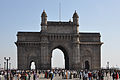
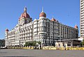
- Nomination Main tower of Municipal Corporation Building, Mumbai in India. --Jovianeye 02:43, 29 January 2011 (UTC)
- Promotion Good. --Taxiarchos228 11:51, 29 January 2011 (UTC)
-

-
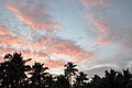
- Nomination Sunset in Angamaly, Kerala, India. --Jovianeye 20:37, 28 January 2011 (UTC)
- Promotion
 Support Qi for me --Archaeodontosaurus 08:55, 29 January 2011 (UTC)
-
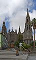
- Nomination The Iglesia de San Juan Bautista (Church of John the Baptist) in Arucas, Gran Canaria. -- Felix Koenig 17:59, 28 January 2011 (UTC)
- Promotion nice. Alofok 18:03, 28 January 2011 (UTC)
-

- Nomination A monument in Arucas, Gran Canaria. -- Felix Koenig 17:59, 28 January 2011 (UTC)
- Promotion okey. Alofok 18:03, 28 January 2011 (UTC)
-

- Nomination The bell gable at the top of one of the highest towers of the Alhambra, Granada, Spain. Please see annotation.--Jebulon 14:34, 28 January 2011 (UTC)
- Promotion nice composition. George Chernilevsky 18:42, 28 January 2011 (UTC)
-

- Nomination Sanatorium orphanage at Kukhmar, near Pereslavl. --PereslavlFoto 13:34, 28 January 2011 (UTC)
- Promotion The pole is disturbing, but no way to destroy it... Otherwise good. I added the picture in some categories for a better use of it.--Jebulon 14:52, 28 January 2011 (UTC)
-

- Nomination A ring to tie horses. Palacio de Carlos V, Alhambra, Granada, Spain.--Jebulon 11:31, 28 January 2011 (UTC)
- Promotion Good quality. --Mbdortmund 12:33, 28 January 2011 (UTC)
-
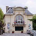
- Nomination Theater in Coulommiers, France. --Myrabella 07:34, 28 January 2011 (UTC)
- Promotion Good --George Chernilevsky 16:11, 28 January 2011 (UTC)
-

- Nomination Koski Mehmed Pasha Mosque in Mostar --Pudelek 00:17, 28 January 2011 (UTC)
- Promotion Support QI for me --Archaeodontosaurus 14:42, 28 January 2011 (UTC)
-

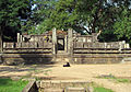
- Nomination Some walls of the Alcazaba, the fortress of the Alhambra, Granada, Spain.--Jebulon 18:42, 27 January 2011 (UTC)small spot in the sky, 2 / 3 upper right edge --Archaeodontosaurus 09:57, 28 January 2011 (UTC)
 Done Vu. Merci. --Jebulon 11:12, 28 January 2011 (UTC)
 - Promotion Support Good now --Archaeodontosaurus 14:02, 28 January 2011 (UTC)
- Nomination Some walls of the Alcazaba, the fortress of the Alhambra, Granada, Spain.--Jebulon 18:42, 27 January 2011 (UTC)small spot in the sky, 2 / 3 upper right edge --Archaeodontosaurus 09:57, 28 January 2011 (UTC)
-

- Nomination St. Basil cathedral, Moscow. --PetarM 07:43, 27 January 2011 (UTC)
- Promotion Nice, but needs perspective correction; left side tilts inward. Perhaps consider a tighter crop at left, and cloning away the lamppost intruding on the right edge. --Avenue 12:58, 27 January 2011 (UTC)
 Info Done. Croping wont be good, since church is almost to the left end, would cut it if so. That blue table is tilted in real. --PetarM 16:44, 28 January 2011 (UTC)very good now--Jebulon 18:45, 28 January 2011 (UTC)
-

- Nomination Paris: Spire of Eiffel Tower --Taxiarchos228 19:08, 26 January 2011 (UTC)
- Promotion vllt. etwas dunkler, etwas mehr Kontrast? --Mbdortmund 19:32, 26 January 2011 (UTC)
besser? --Taxiarchos228 19:46, 27 January 2011 (UTC)
Ich finde schon. --Mbdortmund 12:56, 28 January 2011 (UTC)
-

- Nomination Isunnguata Sermia glacier in Eastern Greenland (before it will melt out due to global warming...) --Chmee2 14:29, 25 January 2011 (UTC)
- Promotion nice -- Felix Koenig 16:37, 28 January 2011 (UTC)
-

- Nomination: A The Haunted concert in Falun, Sweden.--V-wolf 08:07, 23 January 2011 (UTC)
- Review needed
-

- Nomination: Dolmen of Büdelsdorf, Germany --Holger rix 09:41, 23 January 2011 (UTC)
- Review needed
-

-

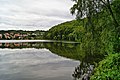
- Nomination Lake Asdorf, Germany. --Bartiebert 17:47, 22 January 2011 (UTC)
- Decline Some overexposure, and cloud on the left edge spoils it a bit. Mattbuck 10:39, 29 January 2011 (UTC)
-
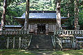
- Nomination Wakasa-jinja in Wakasa, Tottori Pref. --663highland 13:06, 20 January 2011 (UTC)
- Decline I like it, but it's a bit overexposed and somewhat wonky. Mattbuck 10:34, 29 January 2011 (UTC)
-

-

-

- Nomination Paris: The church at the Invalides -- Taxiarchos228 19:58, 27 January 2011 (UTC)
- Promotion Sehr gut.--Jebulon 11:47, 28 January 2011 (UTC)
-

- Nomination Paris: Basilique du Sacré-Cœur de Montmartre -- Taxiarchos228 19:58, 27 January 2011 (UTC)
- Promotion Sehr gut.--Jebulon 11:48, 28 January 2011 (UTC)
-

- Nomination Lüneburg: St. Johannis, detail of the altar -- Taxiarchos228 19:58, 27 January 2011 (UTC)
- Promotion Good (very)--Jebulon 11:40, 28 January 2011 (UTC)
-

- Nomination Church of Saint Peter in Teruel, Spain.--Snaevar 17:50, 27 January 2011 (UTC)
- Decline Sorry, but Flickr images are ineligable --Herzi Pinki 20:20, 27 January 2011 (UTC)
-

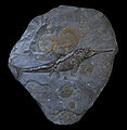
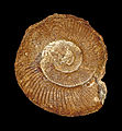
- Nomination The Middle Jurassic Ammonite Hyperlioceras discites --Llez 17:48, 27 January 2011 (UTC)
- Promotion Good --George Chernilevsky 11:49, 28 January 2011 (UTC)
-

- Nomination Landscape in Andalusia (Sierra Nevada). After a previous withdrawn nomination of another version of this view.--Jebulon 23:54, 26 January 2011 (UTC)
- Promotion Support good version --Archaeodontosaurus 16:05, 27 January 2011 (UTC)
-

- Nomination Amanita muscaria --Dcastor 16:54, 26 January 2011 (UTC)
- Decline Very nice colors, but unhappy blurred foreground --George Chernilevsky 11:47, 28 January 2011 (UTC)
-

- Nomination The former Royal Palace in Sofia.--MrPanyGoff 15:40, 26 January 2011 (UTC)
- Promotion Support QI for me --Archaeodontosaurus 16:13, 27 January 2011 (UTC)
-

- Nomination The Royal Gramma, Gramma loreto --Llez 17:51, 23 January 2011 (UTC)
- Promotion That is a pretty fish. However, there is some strange fringeing going on around the nose in orange and on the background to the left in blue. Mattbuck 12:51, 26 January 2011 (UTC) Info Colour corrections done as proposed --Llez 15:01, 26 January 2011 (UTC) Support Good now --Archaeodontosaurus 09:58, 28 January 2011 (UTC)
-

-

- Nomination Fountain at the Freedom sq. in Brno, Czech Rep. --Mercy 09:17, 21 January 2011 (UTC)
- Promotion Nice, but needs a crop left, and more space below IMO.--Jebulon 17:30, 25 January 2011 (UTC) Thanks for your review. At least I have cropped the image from the left. --Mercy 21:00, 25 January 2011 (UTC)
Good enough IMO. --Avenue 13:09, 27 January 2011 (UTC)
-

-

- Nomination Lysefjorden, Norway --Mercy 21:54, 16 January 2011 (UTC)
- Decline nice view but left side partially too dark --Mbdortmund 12:15, 18 January 2011 (UTC) I have attempted to make the dark part a bit brighter, however, it seems as if the image looked worse than its previous version... --Mercy 21:23, 25 January 2011 (UTC)
 chromatic aberrations --Lmbuga 21:49, 27 January 2011 (UTC)
-

- Nomination St. Nicholas wooden church in Vinnitsa, build in 1746 -- George Chernilevsky 09:16, 27 January 2011 (UTC)
- Promotion Support QI & Useful --Archaeodontosaurus 10:50, 27 January 2011 (UTC)
-

- Nomination Statue in Strasbourg. --Coyau 00:22, 27 January 2011 (UTC)
- Promotion Support QI & Useful --Archaeodontosaurus 10:47, 27 January 2011 (UTC)
-

- Nomination Cracow: Place Mary Magdalene --Taxiarchos228 19:08, 26 January 2011 (UTC)
- Promotion Good quality inspite of the distortion --Mbdortmund 20:04, 26 January 2011 (UTC)
-

- Nomination Cracow: Main Post Office --Taxiarchos228 19:08, 26 January 2011 (UTC)
- Promotion saubere Arbeit --Mbdortmund 19:28, 26 January 2011 (UTC)
-

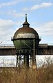
- Nomination Huningue: Water Tower --Taxiarchos228 19:08, 26 January 2011 (UTC)
- Promotion Good quality. --Mbdortmund 19:32, 26 January 2011 (UTC)
-

- Nomination Lüneburg/ Germany: St. Johanniskirche --Taxiarchos228 19:08, 26 January 2011 (UTC)
- Promotion Good quality. Vllt. wäre eine Kategorie für diese leicht verdrehten Kirchtürme interessant,ich kenn einen in Hamm und einen in Schwerte --Mbdortmund 19:29, 26 January 2011 (UTC)
-

- Nomination Costa Tropical, lanscape in front of the Mediterranean sea, Spain.--Jebulon 16:58, 26 January 2011 (UTC)
- Promotion Good quality. --Berthold Werner 17:42, 26 January 2011 (UTC)
-

- Nomination Kuehneromyces mutabilis --Dcastor 16:54, 26 January 2011 (UTC)
- Promotion Good quality. --Mbdortmund 18:59, 26 January 2011 (UTC)
-

- Nomination Xylem of Luffa aegyptiaca --Archaeodontosaurus 15:43, 26 January 2011 (UTC)
- Promotion Good quality. --Berthold Werner 17:47, 26 January 2011 (UTC)
-

- Nomination Egypt, Saqqara, entry of the Southern House --Berthold Werner 15:24, 26 January 2011 (UTC)
- Promotion Support QI & Useful --Archaeodontosaurus 18:09, 26 January 2011 (UTC)
-
- Nomination The Commercial Trochus, Tectus niloticus --Llez 14:43, 26 January 2011 (UTC)
- Promotion Support QI & Useful --Archaeodontosaurus 15:48, 26 January 2011 (UTC)
-

- Nomination Coypu a.k.a. Nutria (Myocastor coypus) in its habitat. --PetarM 13:55, 26 January 2011 (UTC)
- Promotion QI for me --George Chernilevsky 10:26, 27 January 2011 (UTC)
-

-

- Nomination Veterinarian art. Cross section of an intestinal stone of a horse. ca.30cm diam. Hard to digest IMO. Thanks to Archaeodontosaurus for improvements of original file.--Jebulon 01:25, 26 January 2011 (UTC)
- Promotion QI for me and very interesting object --George Chernilevsky 10:30, 27 January 2011 (UTC)
-

- Nomination Small chapel in Hodonice village, South Bohemia, Czech Republic --Chmee2 14:10, 25 January 2011 (UTC)
- Promotion Perspective should be corrected --Sfu 20:52, 25 January 2011 (UTC) fixed --Tlusťa 21:50, 25 January 2011 (UTC)
something wrong here: right side of picture is now curved down --Sfu 22:11, 25 January 2011 (UTC) fixed --Tlusťa 22:32, 25 January 2011 (UTC)
Whole church is tilted toward right. Especially visible on the tower --Sfu 22:42, 25 January 2011 (UTC) Support - I think it is ok.--MrPanyGoff 10:09, 26 January 2011 (UTC) OpposeThe tower is still tilted. Done --Chmee2 08:05, 27 January 2011 (UTC) Support good now --Sfu 08:38, 27 January 2011 (UTC)
-

-

- Nomination Male peacock's back. --Avenue 12:55, 25 January 2011 (UTC)
- Decline The composition is bad here due to missing head. However if you crop the image and there will be only body of it, it has change. But not this version. --Chmee2 20:05, 25 January 2011 (UTC)
Thanks, now cropped. --Avenue 13:41, 26 January 2011 (UTC)
-

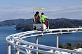
- Nomination Aerial cradle performance. --Myrabella 09:28, 25 January 2011 (UTC)
- Promotion
 Comment I don't like the composition--Lmbuga 13:22, 25 January 2011 (UTC) Needs maybe a crop left, but otherwise very good, IMO.--Jebulon 17:00, 25 January 2011 (UTC) Comment I think that the crop is good. There needs to be some room to the left to swing back into. --Dcastor 16:41, 26 January 2011 (UTC)
-

- Nomination Santiago apostle. Palace of Raxoi, Santiago de Compostela, Galicia (Spain)--Lmbuga 08:39, 25 January 2011 (UTC)
- Promotion A black spot in the sky at the top right --Archaeodontosaurus 13:02, 25 January 2011 (UTC)
New verion without black spot and CA--Lmbuga 19:28, 26 January 2011 (UTC) Support Good now --Archaeodontosaurus 06:38, 27 January 2011 (UTC)
-

-

- Nomination Caterpillar of the Broad-bordered Bee Hawk-moth (Hemaris fuciformis). --Hsuepfle 21:17, 24 January 2011 (UTC)
- Decline Not sharp enough IMO (please see annotations). Maybe a bad DoF ?--Jebulon 17:46, 25 January 2011 (UTC) InfoThis part of the caterpillar is farther away, actually a little bit behind the stem. --Hsuepfle 20:30, 26 January 2011 (UTC)
-

-

- Nomination Steinadler Augenschlag --Böhringer 21:49, 19 January 2011 (UTC)
- Promotion very nice, but the border should imo be much smaller --Mbdortmund 23:32, 19 January 2011 (UTC) *I share that opinion, because the editing is very interesting. May be a gray color for the border. --Archaeodontosaurus 15:32, 21 January 2011 (UTC)
Good now. --Mbdortmund 20:00, 26 January 2011 (UTC)
-

- Nomination Lac de Longemer --ComputerHotline 16:49, 19 January 2011 (UTC)
- Promotion Shame of the yellow things, but otherwise good. --Jebulon 17:21, 25 January 2011 (UTC) I forgot to promote, sorry.--Jebulon 18:41, 26 January 2011 (UTC)
-

-

- Nomination Església Nova in Son Servera, Majorca. --Oltau 11:07, 18 January 2011 (UTC)
- Promotion perspective should be corrected --Mbdortmund 12:21, 18 January 2011 (UTC) Done Have a new file uploaded. --Oltau 18:12, 18 January 2011 (UTC) Nice --Jebulon 11:02, 27 January 2011 (UTC)
-

- Nomination Traditional house in the mountains of the department of Cundinamarca, Colombia.--Elberth 00001939 18:57, 17 January 2011 (UTC)
- Decline Looks like if the photo were taken through the glass of a moving car... There is an artefact right, please see annotation--Jebulon 17:13, 25 January 2011 (UTC)
The biggest flaw is the lack of sharpness. Too much of the image is blurred. The composition, while in thirds, is the Japanese flag composition. Pitke 16:06, 26 January 2011 (UTC)
-

-

- Nomination Axe with wood block and firewood --Chmee2 21:14, 25 January 2011 (UTC)
- Promotion acceptable --Mbdortmund 23:06, 25 January 2011 (UTC)
-

-

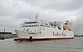
- Nomination Oil products tanker Maersk Riesa near port of Odessa --George Chernilevsky 19:16, 25 January 2011 (UTC)
- Promotion Support QI for me --Archaeodontosaurus 11:18, 26 January 2011 (UTC)
-

- Nomination Oil products tanker Maersk Riesa near port of Odessa --George Chernilevsky 19:16, 25 January 2011 (UTC)
- Promotion Nice image --Chmee2 20:31, 25 January 2011 (UTC)
-

- Nomination BMW K1300R. Es lebe deutsche Technologie !--Jebulon 16:44, 25 January 2011 (UTC)
- Promotion Comment Nice image, however maybe it will be good take out the reflection of trees from left mirror. It looks like broken now. --Chmee2 17:15, 25 January 2011 (UTC) Done Funny: That is exactly what said Mrs Jebulon during uploading, and our son too...--Jebulon 18:09, 25 January 2011 (UTC) Support Good So maybe I am Mrs. Jebulon :) Who knows? :)) --Chmee2 18:49, 25 January 2011 (UTC)I'm sure no: she speaks czech very bad--Jebulon 01:30, 26 January 2011 (UTC)
-

- Nomination Toronto: CN Tower at night. --Taxiarchos228 13:50, 25 January 2011 (UTC)
- Promotion Not perfect but QI.--Jebulon 16:56, 25 January 2011 (UTC)
-

- Nomination Tadoussac: Presbyterian Church --Taxiarchos228 13:50, 25 January 2011 (UTC)
- Promotion Good.--Jebulon 16:50, 25 January 2011 (UTC)
-
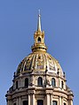
- Nomination Paris: Dome of the church at the Invalides --Taxiarchos228 13:50, 25 January 2011 (UTC)
- Promotion Nice, even if the reworking of the sky is visible at high resolution.--Jebulon 16:47, 25 January 2011 (UTC)
there is no reworking of the sky --Taxiarchos228 17:18, 25 January 2011 (UTC) Then I'm wrong, sorry.--Jebulon 18:15, 25 January 2011 (UTC)
-
-
-
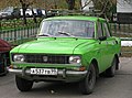
- Nomination Moskvitch 2140 in Moscow. Sidik iz PTU 12:46, 25 January 2011 (UTC)
- Promotion Good to me.--Jebulon 16:48, 25 January 2011 (UTC)
-

-

-

- Nomination Egypt, Kairo, a door in the Gayer Anderson Museum --Berthold Werner 10:31, 25 January 2011 (UTC)
- Promotion Comment chromatic aberrations. If you want, I can clear the aberrations (or to try it)--Lmbuga 13:10, 25 January 2011 (UTC)
Good quality to me--Lmbuga 13:30, 25 January 2011 (UTC)
Of course you can try it. --Berthold Werner 16:57, 25 January 2011 (UTC)
New version. If you want you can delete the new version, thanks: I like to be useful--Lmbuga 21:11, 25 January 2011 (UTC).
You must see the borders of the lateral little columns--Lmbuga 21:26, 25 January 2011 (UTC)
-

- Nomination A nipple clamp clamping a nipple. Mattbuck 01:15, 25 January 2011 (UTC)
- Promotion What is the connection to your trains? --Mbdortmund 01:42, 25 January 2011 (UTC)
If I ever get on a train with my slutkitty, I'll make sure he's wearing it. Mattbuck 12:08, 25 January 2011 (UTC)
sounds common-sense --Mbdortmund 23:03, 25 January 2011 (UTC)
-

-

- Nomination National Museum of Modern Art, Kyoto, by User:Wiiii. --Elekhh 22:05, 24 January 2011 (UTC)
- Promotion Shame of the front shadow, but good enough for QI.--Jebulon 17:53, 25 January 2011 (UTC)
-

-

-

- Nomination Fruit of Cassia fistula --Archaeodontosaurus 20:18, 24 January 2011 (UTC)
- Promotion Good and high EV IMO. --Jebulon 17:06, 25 January 2011 (UTC)
-

-

- Nomination The so-called "pulpit rock", Norway --Mercy 10:18, 24 January 2011 (UTC)
- Decline Sorry for it, but this image has strong CA in the clouds (or whole upper part is going to violet) and it's unsharp in upper and downer part. --Chmee2 20:21, 25 January 2011 (UTC) I agree. But nice composition.--Ankara 10:37, 26 January 2011 (UTC)
-

-

- Nomination Marmot (Marmota marmota) seating in front of its burrow, Gavarnie, france. Bobleponge31 17:38, 24 January 2011 (UTC)
- Decline Oppose Too much noise especially on the background --Archaeodontosaurus 20:13, 24 January 2011 (UTC) The animal needs a better identification, and the file a better categorization to be useful.--Jebulon 17:43, 25 January 2011 (UTC) I tried to reduce the noise using GIMP, but result not convincing... Categorization and identification is done in comments. Bobleponge31 10:27, 26 January 2011 (UTC)
-

- Nomination Karsoy cargo ship and tugboat Trud -- George Chernilevsky 21:34, 23 January 2011 (UTC)
- Promotion Good.--Jebulon 17:41, 25 January 2011 (UTC)
-

- Nomination Tugboat Trud push cargo ship Karsoy -- George Chernilevsky 21:34, 23 January 2011 (UTC)
- Promotion Good and EV, IMO.--Jebulon 17:42, 25 January 2011 (UTC)
-

-

-
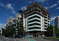
- Nomination Apartment buildings, Melbourne. --Elekhh 02:31, 23 January 2011 (UTC)
- Promotion Support - Meets the criteria for me.--MrPanyGoff 10:15, 26 January 2011 (UTC)
-
-

- Nomination Cairo, seen from the minaret of the Mosque of Ibn Tulun --Berthold Werner 11:13, 22 January 2011 (UTC)
- Promotion Support Meets the criteria for me.--MrPanyGoff 10:18, 26 January 2011 (UTC)
-

- Nomination Honey bee on German chamomile --Schizoschaf 14:46, 22 January 2011 (UTC)
- Promotion In my opinion composition is not ideal because some flowers are distorting the image, but main flower with bumble bee is sharp and it counts. QI criteria passed :) Congrats! --Chmee2 20:42, 25 January 2011 (UTC)
-

- Nomination Common Brimstone feeding in Phlox.--Schizoschaf 15:03, 22 January 2011 (UTC)
- Decline Not sharp enough (wings)--Jebulon 17:33, 25 January 2011 (UTC)
-

- Nomination Black Iguana in Chichén Itzá, Mexico. --Schizoschaf 19:35, 22 January 2011 (UTC)
- Promotion QI to me.--Jebulon 17:32, 25 January 2011 (UTC)
-

- Nomination Marugame Castle in Marugame, Kagawa Pref. --663highland 23:50, 21 January 2011 (UTC)
- Promotion Good--Jebulon 17:26, 25 January 2011 (UTC)
-

- Nomination St. John's Lutheran, Rosemount, Minnesota --Jonathunder 18:07, 21 January 2011 (UTC)
- Decline Looks unsharp. Not sure.--Jebulon 17:29, 25 January 2011 (UTC) I have the same feeling like Jebulon, sorry --Chmee2 20:47, 25 January 2011 (UTC)
-

-

- Nomination Fudoin Iwayado in Wakasa, Tottori Pref. --663highland 13:06, 20 January 2011 (UTC)
- Promotion Good enough for QI.--Jebulon 17:25, 25 January 2011 (UTC)
-
- Nomination Panorama Rätikon, Lünersee --Böhringer 19:10, 19 January 2011 (UTC)
- Promotion Support Meets the criteria for me.--MrPanyGoff 10:21, 26 January 2011 (UTC)
-

- Nomination: Old man's beard (Clematis vitalba) in Troja, Prague.--Juan de Vojníkov 17:42, 19 January 2011 (UTC)
- Review needed
-
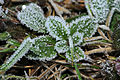
- Nomination Hard rime --ComputerHotline 16:49, 19 January 2011 (UTC)
- Promotion oui.--Jebulon 17:22, 25 January 2011 (UTC)
-

- Nomination: Landscape under the moonlight. --ComputerHotline 16:49, 19 January 2011 (UTC)
- Review needed
-

- Nomination: Panorama seen from the Hohneck. --ComputerHotline 16:49, 19 January 2011 (UTC)
- Review needed
-

- Nomination: Utsubuki-Tamagawa town in Kurayoshi, Tottori Pref.--663highland 14:02, 19 January 2011 (UTC)
- Review needed
-

- Nomination: Kuchiganaya town in Asago, Hyogo Pref. --663highland 14:02, 19 January 2011 (UTC)
- Review needed
-

- Nomination: Kuroiwa Falls in Kamikawa Hyogo Pref. --663highland 14:02, 19 January 2011 (UTC)
- Review needed
-

-
- Nomination Former station building in Isselhorst, Germany. A.Savin 12:53, 19 January 2011 (UTC)
- Decline Comment Leider links das Gebäude abgeschnitten, das ist schon fast ein KO Kriterium --Berthold Werner 18:25, 24 January 2011 (UTC) Too tight crop, IMO --Jebulon 17:16, 25 January 2011 (UTC)
-

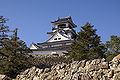
- Nomination Matsue Castle --663highland 14:34, 18 January 2011 (UTC)
- Promotion I find it good. --Jebulon 17:15, 25 January 2011 (UTC)
-

- Nomination Lake Shirakaba in Tateshina --663highland 15:16, 17 January 2011 (UTC)
- Decline Sorry, but the hill is grey and also the sky is not ideal. I don't think so that this should be QI, however you have my acknowledgment for 1/3 composition. --Chmee2 08:47, 26 January 2011 (UTC)
-
-

-

-

-

- Nomination Mercedes-Benz SLS (C 197) --AngMoKio 14:58, 22 January 2011 (UTC)
- Promotion Dark parts looks a bit noisy, but still good. --Berthold Werner 18:17, 24 January 2011 (UTC)
-

- Nomination: Wasserturm and Kapellbrücke in Lucerne, Switzerland. --Murdockcrc 20:11, 18 January 2011 (UTC)
- Review needed
-
- Nomination: Yate railway station. Mattbuck 19:36, 18 January 2011 (UTC)
- Review needed
-
- Nomination: Shiominawate Street in Matsue --663highland 14:34, 18 January 2011 (UTC)
- Review needed
-

- Nomination: Russian wikipedians at Wikipedia 10th anniversdary celebrations. --Rave 18:17, 15 January 2011 (UTC)
- Review (ru:) красивую фото, но почему 16мм? Люди направо и налево, слишком широкий. Это должно быть исправлено. Google-translation: beautiful picture, but why 16mm? People left and right, too wide. This should be corrected. --Ralf Roletschek 04:22, 16 January 2011 (UTC)
I don't know how. --Rave 21:14, 18 January 2011 (UTC)
-

- Nomination: Moika River. --Butko 09:09, 14 January 2011 (UTC)
- Review 1/800 f/4 is a bad combination for a static object -> loss of details in some parts --Mbdortmund 16:30, 18 January 2011 (UTC)
-

- Nomination Facade of Praterias square, Cathedral of Santiago de Compostela, Galicia (Spain)--Lmbuga 21:59, 23 January 2011 (UTC)
- Promotion Good quality. --Mbdortmund 00:22, 24 January 2011 (UTC)
-

- Nomination Bucket dredger ship Maykan (IMO 7391616) and port tender MZ-11 -- George Chernilevsky 21:34, 23 January 2011 (UTC)
- Promotion Good quality. --Mbdortmund 00:21, 24 January 2011 (UTC)
-

- Nomination Bucket dredger ship Maykan (IMO 7391616) and port tender MZ-11 -- George Chernilevsky 21:34, 23 January 2011 (UTC)
- Promotion Good quality. --Mbdortmund 00:21, 24 January 2011 (UTC)
-

- Nomination Karsoy cargo ship -- George Chernilevsky 21:34, 23 January 2011 (UTC)
- Promotion Support QI for me --Archaeodontosaurus 09:20, 24 January 2011 (UTC)
-

- Nomination Sadhu in Varanasi, India by Peboiton --Jovianeye 20:43, 23 January 2011 (UTC)
- Promotion Altogether: yes to me! --Bartiebert 20:57, 23 January 2011 (UTC)
-

-
-

- Nomination Old horse skull, with articulated mandible, used for veterinarian studies.--Jebulon 16:24, 23 January 2011 (UTC)
- Promotion Good quality. --Mbdortmund 00:24, 24 January 2011 (UTC)
-

- Nomination Skull of North american beawer --Archaeodontosaurus 15:03, 23 January 2011 (UTC)
- Promotion Very good --George Chernilevsky 16:17, 23 January 2011 (UTC)
-
-
- Nomination Harbour of Lysebotn, Norway --Mercy 09:01, 23 January 2011 (UTC)
- Promotion geocoding would be nice --Mbdortmund 12:29, 23 January 2011 (UTC) Added. --Mercy 12:52, 23 January 2011 (UTC)
good work --Mbdortmund 00:24, 24 January 2011 (UTC)
-

- Nomination Amman Odeon, Jordan --Bgag 18:55, 22 January 2011 (UTC)
- Promotion Support QI and Useful --Archaeodontosaurus 09:21, 24 January 2011 (UTC)
-

- Nomination: Beach of Hotel Bahía Príncipe, Quintana Roo, Mexico--Lmbuga 00:50, 18 January 2011 (UTC)
- Review needed
-

- Nomination: City Palace, Jaipur, India --Sfu 23:08, 17 January 2011 (UTC)
- Review needed
-

- Nomination: Maizuru Red Brick Warehouses in Maizuru --663highland 15:16, 17 January 2011 (UTC)
- Review needed
-
- Nomination: Bältarbo brickyard, Hedemora, Sweden.--V-wolf 13:52, 17 January 2011 (UTC)
- Review needed
-

- Nomination: Pinus ponderosa in Mt. Charleston, Nevada. --ZooFari 05:31, 17 January 2011 (UTC)
- Review Comment The background trees are mostly leaning inward. That may be an artifact of a wide angle lens, but there is no metadata to confirm this. About 8% of the pixels are saturated in the blue channel (808,000 pixels) indicating mild overexposure and loss of detail. The snow-covered background helps to draw the eye to the subject, not withstanding the tree to the right. Wsiegmund 18:28, 17 January 2011 (UTC) Thanks for your comments. It is a stitched photograph, but a piece shows that the tree to the left is naturally leaning towards the right (sun). You might be right about overexposure, since this one was a hasty shot to test how well a stitched tree would work. The results came out good for little effort, which will encourage me to take more, but of course this one could have been better. ZooFari 20:07, 17 January 2011 (UTC)
-

- Nomination Tram Moderus Beta MF 01 (N8C) (#1135) in Gdańsk, Poland. --Crusier 18:49, 15 January 2011 (UTC)
- Promotion Widać trochę CA, ale biorąc pod uwagę rozdzielczość wydaje mi się, że QI się należy. --Sfu 13:43, 23 January 2011 (UTC)
-

- Nomination Australian Technical College, Launceston --Elekhh 02:31, 23 January 2011 (UTC)
- Promotion Support Good composition --Archaeodontosaurus 09:59, 23 January 2011 (UTC)
-

-

- Nomination Facade of Praterias square, Cathedral of Santiago de Compostela, Galicia (Spain)--Lmbuga 18:38, 22 January 2011 (UTC)
- Promotion the head is funny :-) --Carschten 19:10, 22 January 2011 (UTC)
-

-
- Nomination Facade of Praterias square, Cathedral of Santiago de Compostela, Galicia (Spain)--Lmbuga 18:23, 22 January 2011 (UTC)
- Promotion Support QI & Useful --Archaeodontosaurus 09:57, 23 January 2011 (UTC)
-

- Nomination Facade of Praterias square, Cathedral of Santiago de Compostela, Galicia (Spain)--Lmbuga 18:09, 22 January 2011 (UTC)
- Promotion Support QI & Useful --Archaeodontosaurus 09:57, 23 January 2011 (UTC)
-

- Nomination Facade of Praterias square, Cathedral of Santiago de Compostela, Galicia (Spain)--Lmbuga 18:08, 22 January 2011 (UTC)
- Promotion also a lot chromatic aberrations, but quality is otherwise good enough --Carschten 19:10, 22 January 2011 (UTC)
Thanks, you're right. New version. I think that it's better ( chromatic aberrations), but I'm not sure (cache)--Lmbuga 19:28, 22 January 2011 (UTC)
Wow, really much better. Thanks! --Carschten 19:34, 22 January 2011 (UTC)
-

-

- Nomination Salvatorkirche Duisburg --Carschten 17:52, 22 January 2011 (UTC)
- Decline Sorry, fog over the upper part of the tower, weiter sieht der Turm aus, als ob er oben breiter wird (Korrekturfehler oder Wirklichkeit)?
-

-

- Nomination Portrait of the Central Bearded Dragon, Pogona vitticeps --Llez 15:29, 22 January 2011 (UTC)
- Promotion Support QI & Useful --Archaeodontosaurus 17:30, 22 January 2011 (UTC)
-

- Nomination Campanian oyster --Archaeodontosaurus 10:43, 22 January 2011 (UTC)
- Promotion Good quality. --Mbdortmund 14:33, 22 January 2011 (UTC)
-
- Nomination Back with my favorite subject, the Château Frontenac.Letartean 20:35, 21 January 2011 (UTC)
- Promotion wow!! --Carschten 20:59, 21 January 2011 (UTC) a bit tilted ?--Jebulon 10:27, 22 January 2011 (UTC) CommentI looked at all straight lines with a ruler in photoshop and they all seem straight to me... Letartean 15:37, 22 January 2011 (UTC)
-
- Nomination War memorial, Germany. --Bartiebert 17:27, 21 January 2011 (UTC) Comment Baum und Tafel sind imo leicht unterbelichtet. Könntest du diese Stellen bitte aufhellen? --Carschten 18:06, 21 January 2011 (UTC) DoneBetter now? --Bartiebert 12:31, 22 January 2011 (UTC)
- Promotion yes --Carschten 17:55, 22 January 2011 (UTC)
- Nomination War memorial, Germany. --Bartiebert 17:27, 21 January 2011 (UTC)
-

- Nomination Perca fluviatilis, common perch, stuffed specimen.--Jebulon 14:40, 21 January 2011 (UTC)
- Promotion CommentIn generell I like it. But imo it is not QI because I'm not very happy with the sharpness (especially at the head) and with the flash effect. Maybe I'm wrong. --Bartiebert 15:59, 21 January 2011 (UTC)
Support I don't think it's a lack of sharpness but rather a thin layer of dust, which sometimes occurs in objects presented for years in a museum and can't be corrected by the photographer. Therefore QI to me. --Llez 06:49, 22 January 2011 (UTC) Many thanks for reviews and feedbacks from you two. Info I didn't use flash. There is only natural light, due to a window at left. It is indeed an old object in a museum, and the impression of lack of sharpness is probably due to the combination of old varnish, and of the glass between the subject and the photographer !--Jebulon 10:12, 22 January 2011 (UTC)
All right. That's why I said that I'm wrong perhaps and didn't vote. I wasn't sure. --Bartiebert 12:18, 22 January 2011 (UTC)
-

- Nomination: Lanhydrock Gardens in Cornwall, England. --Oltau 04:10, 17 January 2011 (UTC)
- Review needed
-

-

-

-
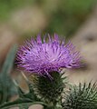
- Nomination: Cirsium vulgare. --Bartiebert 17:47, 16 January 2011 (UTC)
- Review needed
-

- Nomination: View of the alps of central Switzerland from Rigi Kulm. --Murdockcrc 17:02, 16 January 2011 (UTC)
- Review needed
-

- Nomination: at Hiyama in Tatsuno, Hyogo Pref. --663highland 16:45, 16 January 2011 (UTC)
- Review needed
-

- Nomination: Seiryudo Cave in Toyooka, Hyogo Pref. --663highland 16:45, 16 January 2011 (UTC)
- Review needed
-

- Nomination: at Nunobiki Herb Ggarden in Kobe --663highland 16:45, 16 January 2011 (UTC)
- Review needed
-

- Nomination: The flower of Pinguicula esseriana --Llez 13:42, 16 January 2011 (UTC)
- Review needed
-

- Nomination: 390017 departs London Euston. Mattbuck 13:04, 16 January 2011 (UTC)
- Review needed
-

- Nomination: Giant's Causeway in Northern Ireland --Chmee2 14:44, 13 January 2011 (UTC)
- Review The photo is tilted which should get fixed. --AngMoKio 19:21, 13 January 2011 (UTC) Fixed (?) --Chmee2 07:42, 14 January 2011 (UTC)
the black stripe at the top should get cropped away. --AngMoKio 11:55, 15 January 2011 (UTC) Done it. Thx for notice. --Chmee2 14:18, 15 January 2011 (UTC) Because you rotated the picture to correct the slight tilt, there is still a black stripe left, and below too. IMO you forgot to re-frame after rotation. --Jebulon 11:02, 16 January 2011 (UTC) So I hope so that now is it OK :) Sorry for it, I had black screen in my graphic editor and I did not see this problem if I cropped... --Chmee2 15:13, 16 January 2011 (UTC)
-

- Nomination: Church St. Nikolaus, Lörrach-Hauingen -- Taxiarchos228 13:41, 13 January 2011 (UTC)
- Review IMO better with a crop out of the streetlamp.--Jebulon 00:08, 17 January 2011 (UTC)
-

-

-

- Nomination Sea water under the rain --Romanceor 00:29, 22 January 2011 (UTC)
- Promotion great atmosphere --Mbdortmund 00:59, 22 January 2011 (UTC)
-

- Nomination Church of Santo Domingo in Oaxaca, Mexico --Romanceor 00:29, 22 January 2011 (UTC)
- Promotion Good quality. --Mbdortmund 00:59, 22 January 2011 (UTC)
-

- Nomination Takamatsu Castle in Takamatsu, Kagawa Pref. --663highland 23:50, 21 January 2011 (UTC)
- Promotion Good, despite of some CA--Jebulon 10:23, 22 January 2011 (UTC)
-

- Nomination Kasajima town in Shiwaku Islands --663highland 23:50, 21 January 2011 (UTC)
- Promotion Shame of the bicycle, but good.--Jebulon 10:25, 22 January 2011 (UTC)
-

- Nomination The love and its pains (1916). By Corredoira (Lugo 1889 - Santiago de Compostela 1939)--Lmbuga 23:37, 21 January 2011 (UTC)
- Promotion Good quality. --Mbdortmund 01:00, 22 January 2011 (UTC)
-
-

-

-

- Nomination: Tram Moderus Beta MF 01 (N8C) (#1117) in Gdańsk, Poland. --Crusier 08:16, 16 January 2011 (UTC)
- Review needed
-

- Nomination: Tram Moderus Beta MF 01 (N8C) (#1117) (detail) in Gdańsk, Poland. --Crusier 08:16, 16 January 2011 (UTC)
- Review needed
-

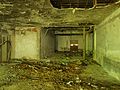
- Nomination: Kupari, Croatia - destroyed hotel Goričina --Pudelek 00:22, 16 January 2011 (UTC)
- Review needed
-
- Nomination: Kupari, Croatia - destroyed hotel Goričina --Pudelek 00:22, 16 January 2011 (UTC)
- Review needed
-

- Nomination: Franciscan Church of Füssen, Bavaria. -- Felix Koenig 19:05, 15 January 2011 (UTC)
- Review Baum vor Turm find ich nicht so gut --Mbdortmund 01:14, 16 January 2011 (UTC)
-

-
-

- Nomination Tower of the church in Gemmrigheim, Baden-Württemberg. -- Felix Koenig 16:37, 21 January 2011 (UTC)
- Promotion very good --Carschten 17:03, 21 January 2011 (UTC)
-

-

- Nomination Bogsta church (photo by user:kavelgrisen).--Ankara 14:59, 21 January 2011 (UTC)
- Promotion nice composition --Carschten 17:03, 21 January 2011 (UTC)
-

- Nomination Tysteberga church (photo by user:kavelgrisen).--Ankara 14:59, 21 January 2011 (UTC)
- Promotion very good --Carschten 17:03, 21 January 2011 (UTC)
-

-

-

-

-
- Nomination The church of Gemmrigheim, Baden-Württemberg. -- Felix Koenig 19:03, 20 January 2011 (UTC)
- Decline noisy sky, bad bottom crop --Carschten 16:51, 21 January 2011 (UTC)
-

- Nomination A pyritic specimen of Pleuroceras solare --Llez 18:00, 20 January 2011 (UTC)
- Promotion Support QI & Useful --Archaeodontosaurus 15:05, 21 January 2011 (UTC)
-

- Nomination Pereslavl museum, entrance to Epiphany church, on Christmas 2011. --PereslavlFoto 14:27, 20 January 2011 (UTC)
- Promotion good --Carschten 16:51, 21 January 2011 (UTC)
-
-

- Nomination: Tram Moderus Beta MF 01 (N8C) (#1143) in Gdańsk, Poland. --Crusier 18:49, 15 January 2011 (UTC)
- Review needed
-

- Nomination: A snow sculpture, near Notre-Dame de Paris, Seine embankments.--Jebulon 17:06, 15 January 2011 (UTC)
- Review needed
-
- Nomination: Garrigue in the northeast of the island of Majorca, Spain. --Oltau 15:23, 15 January 2011 (UTC))
- Review needed
-

- Nomination: Cairo, Gayer Anderson Museum --Berthold Werner 13:38, 15 January 2011 (UTC)
- Review needed
-

- Nomination: Steeple of the St Patroc Church in Padstow, England. --Oltau 05:05, 15 January 2011 (UTC)
- Review Comment Eigentlich ganz gut, leider ist ein Teil des Himmels ganz ausgeblichen und da gibt's am baum rechts ein blauen Rand. --Berthold Werner 15:13, 15 January 2011 (UTC)
-

- Nomination: An overview of electromagnetic radiation absorption. Original illustration with annotations. -- Jkwchui 17:22, 11 January 2011 (UTC)
- Review Very complicated, especially for non english speaking people...If so many annotations are needed, then the diagram is not good enough (IMO)--Jebulon 18:58, 15 January 2011 (UTC) * Science is a complex network of knowledge and the annotations links the reader to concepts that s/he may not be familiar with. Jkwchui
-
- Nomination: The Busena Terrace in Nago, Okinawa Pref. --663highland 15:35, 8 January 2011 (UTC)
- Review Perspective correction is needed IMO.--Jebulon 18:06, 15 January 2011 (UTC)
-

- Nomination Iron cross on the way to the top of Moldoveanu, Romania --Mercy 20:01, 20 January 2011 (UTC)
- Promotion Good quality. --Mbdortmund 01:27, 21 January 2011 (UTC)
-

- Nomination Kupari, Croatia - destroyed hotel Goričina --Pudelek 18:35, 20 January 2011 (UTC)
- Promotion beach partially a bit overexposured but imo still QI --Mbdortmund 01:29, 21 January 2011 (UTC)
-

-

- Nomination Saint Catherine's Monastery, Sinai, Egypt --Berthold Werner 14:16, 20 January 2011 (UTC)
- Promotion QI & Useful --Archaeodontosaurus 16:01, 20 January 2011 (UTC)
-

- Nomination Old, but new in "Commons", donkey (Equus asinus) skull. Museum photo--Jebulon 00:20, 20 January 2011 (UTC)
- Promotion Good quality. --Mbdortmund 18:21, 20 January 2011 (UTC)
-
- Nomination Kupari, Croatia - destroyed hotel Grand (interior) --Pudelek 19:48, 17 January 2011 (UTC)
- Promotion Good quality. --Mbdortmund 01:39, 21 January 2011 (UTC)
-

- Nomination 150121 passes the Yatton level crossing. Mattbuck 13:04, 16 January 2011 (UTC)
- Promotion Good quality. --Mbdortmund 18:23, 20 January 2011 (UTC)
-

- Nomination: Young Coast Douglas-firs in Duszniki-Zdrój, Poland --Crusier 07:06, 15 January 2011 (UTC)
- Review background imo overexposured --Mbdortmund 08:23, 15 January 2011 (UTC)
-

- Nomination: Coast Douglas-fir in Duszniki-Zdrój, Poland --Crusier 07:06, 15 January 2011 (UTC)
- Review needed
-

- Nomination: at Tatsuno city --663highland 00:00, 15 January 2011 (UTC)
- Review needed
-

- Nomination: Jododo of Jodoji in Ono. It is National Treasure of Japan --663highland 00:00, 15 January 2011 (UTC)
- Review needed
-

- Nomination: at Ushimado Port in Setouchi, Okayama Pref.--663highland 16:18, 14 January 2011 (UTC)
- Review needed
-

- Nomination: Mt. Subari-Dake peaks and Mt. Harinoki-Dake peaks view from Kurobe-daira plateau--663highland 16:18, 14 January 2011 (UTC)
- Review needed
-
- Nomination: Port of Plakias on Crete, Greece. --Oltau 15:03, 14 January 2011 (UTC)
- Review needed
-

- Nomination: Cliff at the beach of Plakias on Crete, Greece. --Oltau 15:03, 14 January 2011 (UTC)
- Review needed
-

- Nomination A mosaic in Madaba, Jordan --Bgag 14:20, 14 January 2011 (UTC)
- Promotion White parts in the lower left show no details --Mbdortmund 16:25, 18 January 2011 (UTC) Comment I have imported a new version. --Bgag 23:04, 18 January 2011 (UTC)
OK --Mbdortmund 18:25, 20 January 2011 (UTC)
-

- Nomination Pereslavl museum decorated at Christmas 2011.--PereslavlFoto 15:36, 11 January 2011 (UTC)
- Decline Perspective distortion --Jebulon 18:54, 15 January 2011 (UTC)
What do you mean? Where is the distortion?--PereslavlFoto 23:35, 15 January 2011 (UTC)Please see annotations.--Jebulon 11:20, 17 January 2011 (UTC)
blown lights, white balance off, distortion --Mbdortmund 01:34, 21 January 2011 (UTC)
-
- Nomination Zimba --Böhringer 20:54, 19 January 2011 (UTC)
- Promotion Good quality. --Mbdortmund 23:34, 19 January 2011 (UTC)
-
- Nomination Taufers Castle -- KlausFoehl 20:27, 19 January 2011 (UTC)
- Promotion Good quality. --Mbdortmund 20:45, 19 January 2011 (UTC)
-
- Nomination MV Larkspur leaving the harbour of Ostend, Belgium -- MJJR 20:22, 19 January 2011 (UTC)
- Promotion Good quality. --Mbdortmund 20:45, 19 January 2011 (UTC)
-

- Nomination Scheelite from China --Archaeodontosaurus 20:19, 19 January 2011 (UTC)
- Promotion very good --Mbdortmund 20:45, 19 January 2011 (UTC)
-

- Nomination Taj Mahal Tower --Jovianeye 18:50, 19 January 2011 (UTC)
- Promotion Good quality. Perhaps a bit more contrast would be even better --Mbdortmund 18:58, 19 January 2011 (UTC)
-

- Nomination 360° Panorama seen from the Hohneck. --ComputerHotline 18:24, 19 January 2011 (UTC)
- Decline Sloppy stitching; errors and lines throughout. Juliancolton 19:57, 19 January 2011 (UTC)
-

- Nomination A woman's eye. --PetarM 18:07, 19 January 2011 (UTC)
- Promotion Good quality. --Mbdortmund 18:58, 19 January 2011 (UTC)
-

- Nomination Roche du diable, near Xonrupt-Longemer --ComputerHotline 16:49, 19 January 2011 (UTC)
- Promotion nice HDR --Mbdortmund 20:47, 19 January 2011 (UTC)
-

- Nomination Pereslavl museum, bell-tower, Christmas 2011. PereslavlFoto 13:16, 19 January 2011 (UTC)
- Promotion A bit overexposed, but i like ambience.--PetarM 17:59, 19 January 2011 (UTC)
-

- Nomination Historian Hans Mommsen. A.Savin 12:53, 19 January 2011 (UTC)
- Promotion Good portrait von dem alten Griesgram inspite of some CA --Mbdortmund 19:00, 19 January 2011 (UTC)
-

- Nomination The Red Helmet, Cypraecassis rufa --Llez 12:35, 19 January 2011 (UTC)
- Promotion Good quality. --Mbdortmund 19:02, 19 January 2011 (UTC)
-

-

- Nomination Beach of Hotel Bahía Príncipe, Quintana Roo, Mexico--Lmbuga 00:31, 18 January 2011 (UTC)
- Promotion OK; strange building... --Mbdortmund 23:36, 19 January 2011 (UTC)
-

- Nomination: Kalamita fortress --Butko 09:09, 14 January 2011 (UTC)
- Review needed
-
- Nomination: Kalamita fortress --Butko 09:09, 14 January 2011 (UTC)
- Review needed
-

- Nomination: Sorbus mougeotii --Butko 09:09, 14 January 2011 (UTC)
- Review needed
-

- Nomination: Destroyed house in Srebreno, Croatia --Pudelek 17:54, 13 January 2011 (UTC)
- Review needed
-

- Nomination: Church of the Good Shepherd (bell tower), Weil am Rhein-- Taxiarchos228 13:41, 13 January 2011 (UTC)
- Review needed
-
- Nomination: Domestic cat, 5 year old male -- George Chernilevsky 17:46, 12 January 2011 (UTC)
- Review Comment Good quality, except in the composition. The composition is, for me, bad. To me it's not QI, but...--Lmbuga 01:21, 14 January 2011 (UTC)
-

-

-

-

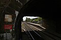
- Nomination A tunnel in Frankfurt-Höchst --Smial 22:22, 18 January 2011 (UTC)
- Promotion Good quality. --Mbdortmund 01:03, 19 January 2011 (UTC)
-
- Nomination Marine reptile from Jurassic --Archaeodontosaurus 20:05, 18 January 2011 (UTC)
- Promotion Nice. Makele-90 20:10, 18 January 2011 (UTC)
-

- Nomination 172005 arrives at Leytonstone High road. Mattbuck 19:36, 18 January 2011 (UTC)
- Promotion Good quality. --Mbdortmund 01:23, 19 January 2011 (UTC)
-

-
-
- Nomination Cape Hinomisaki in Izumo --663highland 14:34, 18 January 2011 (UTC)
- Promotion good --Alupus 20:01, 18 January 2011 (UTC)
-

-

- Nomination L train and CNA Center in Chicago Antoinetav 17:02, 17 January 2011 (UTC)
- Promotion A bit unsharp, but I love the composition here. Also that building is really pink. Mattbuck 19:40, 18 January 2011 (UTC)
-

- Nomination The Wrigley Building in Chicago Antoinetav 16:59, 17 January 2011 (UTC)
- Decline Tilted, perspective distortion, bad crop at left --Lmbuga 23:59, 17 January 2011 (UTC)
I think that's meant to be artistic, but I'd decline on grounds of noise due to high ISO rating. ~~~
I'm not agree, Mattbuck, this is not art for me--Lmbuga 20:14, 18 January 2011 (UTC)
-

- Nomination A pat of butter --Jonathunder 23:27, 16 January 2011 (UTC)
- Decline piece of butter not really sharp --Mbdortmund 12:18, 18 January 2011 (UTC)
There is a reason why butter is not often the weapon in a stabbing. Mattbuck 19:42, 18 January 2011 (UTC)
-

- Nomination Belgian coast tram -- MJJR 23:02, 16 January 2011 (UTC)
- Promotion Good quality. --Mbdortmund 12:17, 18 January 2011 (UTC)
-

- Nomination Bebenhausen, Baden-Württemberg, Germany --Mercy 21:42, 16 January 2011 (UTC)
- Decline below 2 MP, else good --Mbdortmund 15:51, 18 January 2011 (UTC)
-

- Nomination Hawa Mahal, Jaipur, India --Sfu 20:14, 16 January 2011 (UTC)
- Promotion Good quality, fine details. --Mbdortmund 12:16, 18 January 2011 (UTC)
-

-

- Nomination Asian fan dance --AngMoKio 16:13, 15 January 2011 (UTC)
- Promotion Good quality. --Mbdortmund 15:56, 18 January 2011 (UTC)
-

- Nomination Vintertullsparken.--Ankara 12:17, 14 January 2011 (UTC)
- Promotion Good quality. --Mbdortmund 16:27, 18 January 2011 (UTC)
-

- Nomination class 185.5, near Erzhausen. --PS-2507 23:47, 13 January 2011 (UTC)
- Promotion Good quality. --Mbdortmund 16:31, 18 January 2011 (UTC)
-

- Nomination Esja mountain in Iceland. --Snaevar 17:46, 12 January 2011 (UTC)
Was ist denn mit dem Bild passiert? Wenn ich mal schnelles Internet habe, hole ich mir das, werde etwas entrauschen und verkleinern. Die Vignettierungen können wohl beseitigt werden. --Ralf Roletschek 12:13, 13 January 2011 (UTC) - Decline It is a huge image (5300x4300!) but even downsampled to 4 mp it is some colour noise. But it is also beautiful colors and details. However, vignetting is an issue here.--Ankara 12:49, 15 January 2011 (UTC)
It's kind of cool, but significant quality issues. Mattbuck 19:44, 18 January 2011 (UTC)
- Nomination Esja mountain in Iceland. --Snaevar 17:46, 12 January 2011 (UTC)
-
- Nomination Bay of Dubrovnik - boats --Pudelek 10:36, 11 January 2011 (UTC)
- Promotion Does somebody know the name of the big five-masts in background ?--Jebulon 18:48, 15 January 2011 (UTC)
Comment This is sailing ship Club Med 2 --Pudelek 20:21, 16 January 2011 (UTC) Are you sure it's not Royal Clipper?--Ankara 21:56, 16 January 2011 (UTC)
You are right, this is Royal Clipper --Pudelek 22:38, 16 January 2011 (UTC) QI IMO.--Ankara 11:26, 19 January 2011 (UTC)
-

-

- Nomination Petra by night Antoinetav 17:05, 17 January 2011 (UTC)
- Decline Tilted, blurry, perspective distortion, unsharp, too red... bad quality to me--Lmbuga 23:55, 17 January 2011 (UTC)
-

- Nomination Lake Shirakaba in Tateshina --663highland 15:16, 17 January 2011 (UTC)
- Promotion Good enough for QI imo. --Bartiebert 16:31, 17 January 2011 (UTC)
-

- Nomination View over Lanhydrock in Cornwall, England. --Oltau 04:10, 17 January 2011 (UTC)
- Promotion CommentIs it a little bit crooked (I'm not so sure; look at the chimneys)? If it is, I guess it would be correctable(?)... Basically QI imo. --Bartiebert 16:42, 17 January 2011 (UTC) Done New version now, --Oltau 19:45, 17 January 2011 (UTC)
Yes, better now. I'm not sure if it is enough... Anyway, it gets my promotion. --Bartiebert 20:17, 17 January 2011 (UTC)
-

- Nomination Coast Guard cutter breaking up ice along the Hudson River. Juliancolton 02:37, 17 January 2011 (UTC)
- Promotion great, definitely QI! But why ISO 2000, 1/800s...? You can see that the quality suffered, maybe with F10, ISO 100 and 1/320s the picture could be FP. Because the composition, lighting and angle of view are very good... I'm not sure if it could FP now... Well... --Carschten 16:41, 17 January 2011 (UTC)
Thanks. Unfortunately, that can be attributed purely to operator failure, as I had forgotten to readjust the ISO after some night shooting the previous evening. :( I think it's still worth QI though, so I'm glad to see your positive review. Juliancolton 01:05, 18 January 2011 (UTC)
-

- Nomination Christmas illuminations in Schöckingen, Germany --Harke 17:22, 16 January 2011 (UTC)
- Promotion Good quality. --Berthold Werner 18:49, 17 January 2011 (UTC)
-

- Nomination Christmas illuminations in Schöckingen, Germany --Harke 17:20, 16 January 2011 (UTC)
- Promotion Good quality. --Berthold Werner 18:49, 17 January 2011 (UTC)
-

-

- Nomination Dreigiebelhaus in Ditzingen, Germany, with christmas illuminations--Harke 18:18, 14 January 2011 (UTC)
- Promotion Comment perhaps the part of a building on the left side should be cropped.--Berthold Werner 15:02, 15 January 2011 (UTC) done --Harke 17:18, 16 January 2011 (UTC)
Ok now. --Berthold Werner 16:22, 17 January 2011 (UTC)
-

- Nomination Church St. Georg, Weil am Rhein-- Taxiarchos228 13:41, 13 January 2011 (UTC)
- Promotion (de:) Saubere Arbeit, gute Dokumentation. Wo sind die EXIF? Google-Translation: Good work, good documentation. Where are the EXIF? --Ralf Roletschek 23:12, 17 January 2011 (UTC)
-

- Nomination Landtag of Saxony, Dresden, by User:Kolossos --Elekhh 23:21, 12 January 2011 (UTC)
- Promotion (de:) starke Helligkeitskontraste gut umgesetzt Google-Translation: strong brightness contrasts well implemented --Ralf Roletschek 23:18, 17 January 2011 (UTC)
-

- Nomination: Lomographic ActionSampler --Lvova 22:14, 11 January 2011 (UTC)
- Review needed
-

- Nomination: Panorama of Dobrovnik, Old Town --Tlusťa 20:58, 11 January 2011 (UTC)
- Review needed
-

- Nomination Dubrovnik, Croata - Adriatic sea near city wall --Pudelek 10:36, 11 January 2011 (UTC)
- Decline Interesting place, but unfortunate crop. Jonathunder 22:48, 17 January 2011 (UTC)
-

- Nomination: Roof figure on the St. Mang's Abbey, Füssen --Carschten 17:36, 9 January 2011 (UTC)
- Review Needs a rotation IMO. There is a strange disturbing thing (snow ? see annotation) in the corner below left. All correctible, that's why I do not oppose for the moment.--Jebulon 18:58, 9 January 2011 (UTC) Comment The strange thing is snow. I'm not sure if I should rotated it, because me angle of view was very steep and a bit askew, the building is built on a hill and the roof isn't straight. So I don't really know how far I should rotated the image... That's the reason why I let in the original tilt way. --Carschten 20:57, 11 January 2011 (UTC)
-
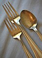
- Nomination Silverware --Jonathunder 22:57, 16 January 2011 (UTC)
- Decline Too much out of focus, should have a greater depth of field for this angle, imho.--V-wolf 23:17, 16 January 2011 (UTC)
-

- Nomination Creedite From Mexico --Archaeodontosaurus 17:42, 16 January 2011 (UTC)
- Promotion Very good --Jebulon 23:42, 16 January 2011 (UTC)
-

- Nomination Skull of Warthog --Archaeodontosaurus 16:09, 16 January 2011 (UTC)
- Promotion Impressive --Llez 17:06, 16 January 2011 (UTC)
-

- Nomination The Pallid Carrier Shell, Xenophora pallidula --Llez 13:42, 16 January 2011 (UTC)
- Promotion Support Good version --Archaeodontosaurus 08:11, 17 January 2011 (UTC)
-

- Nomination Molar of stegodon (Pleistocene) --Archaeodontosaurus 08:37, 16 January 2011 (UTC)
- Promotion Very good --Llez 14:43, 16 January 2011 (UTC)
-
- Nomination Epilobium anagallidifolium (Pimpernel Willowherb) --Wsiegmund 06:25, 16 January 2011 (UTC)
- Promotion QI & Useful --Archaeodontosaurus 16:11, 16 January 2011 (UTC)
-

-

- Nomination The Dreikreuzkapelle in Nesselwängle --Carschten 14:04, 15 January 2011 (UTC)
- Decline overexposed snow. --High Contrast 20:06, 16 January 2011 (UTC)
-

- Nomination at Nekozaki Peninsula in Toyooka, Hyogo Pref. --663highland 00:00, 15 January 2011 (UTC)
- Promotion Nice --Jebulon 00:09, 17 January 2011 (UTC)
-

- Nomination Church St. Fridolin, Lörrach-Stetten-- Taxiarchos228 13:41, 13 January 2011 (UTC)
- Promotion Strange perspective but good.--Jebulon 00:06, 17 January 2011 (UTC)
-

- Nomination Château Stetten, Lörrach-Stetten-- Taxiarchos228 13:41, 13 January 2011 (UTC)
- Decline Composition: too tight crop, especially left.--Jebulon 00:02, 17 January 2011 (UTC)
-

- Nomination bridge construction. --KlausFoehl 23:40, 12 January 2011 (UTC)
- Promotion Good to me.--Jebulon 23:55, 16 January 2011 (UTC)
-

-

-

-

- Nomination Firemen and a journalist at a fire scene in Sweden.--V-wolf 16:09, 6 January 2011 (UTC)
- Promotion Good composition. I like the interaction between the journalist and firefighters. The sky is maybe not perfect, but overall a very good picture.--Ankara 17:39, 14 January 2011 (UTC) Comment The smoke made the sky white over the whole village.--V-wolf 11:03, 17 January 2011 (UTC)
-
- Nomination Regiswindis church, Lauffen/Neckar, Baden-Württemberg. -- Felix Koenig 19:43, 15 January 2011 (UTC)
- Promotion Wirklich schön. --Mbdortmund 01:13, 16 January 2011 (UTC)
-

- Nomination Moabite sarcophagus in Jordan Archaeological Museum, Amman --Bgag 17:46, 15 January 2011 (UTC)
- Promotion QI & Useful --Archaeodontosaurus 08:00, 16 January 2011 (UTC)
-

- Nomination Bone tools of the Mousterian -- Archaeodontosaurus 16:59, 15 January 2011 (UTC)
- Promotion Good --George Chernilevsky 17:04, 15 January 2011 (UTC)
-

-

- Nomination St. Paul statue --AngMoKio 16:13, 15 January 2011 (UTC)
- Promotion No question: QI --Berthold Werner 18:36, 15 January 2011 (UTC)
-

- Nomination Green anole. Second try. At first try it didn't get a vote. --Bartiebert 14:21, 15 January 2011 (UTC)
- Promotion a bit noisy, but otherwise good --Carschten 14:30, 15 January 2011 (UTC)
-

- Nomination Snowed-in tree in Austria --Carschten 13:13, 15 January 2011 (UTC)
- Promotion Nice to me. It's a Betula sp., I guess B. pendula. --Bartiebert 14:23, 15 January 2011 (UTC)
Vielen Dank! Ich hätte nicht gedacht, dass sich ein blätterloser und in Schnee eingepackter Baum überhaupt bestimmen lässt... --Carschten 14:30, 15 January 2011 (UTC)
-

- Nomination Russian mechanical calculator "Feliks M" --ElHeineken 11:29, 15 January 2011 (UTC)
- Promotion Good quality. --Mbdortmund 13:55, 15 January 2011 (UTC)
-

- Nomination Steneosaurus from Jurassic --Archaeodontosaurus 07:08, 15 January 2011 (UTC)
- Promotion Very large Border, slight motion blur reversed by strong sharpening (still OK though). Comment Usage license is missing (!) -- ElHeineken 12:12, 15 January 2011 (UTC) Done Thanks ! --Archaeodontosaurus 14:31, 15 January 2011 (UTC) Support Good work, qualifies for me. --ElHeineken 15:39, 15 January 2011 (UTC)
-

-

-

-

- Nomination at Takachiho-gawara in Kirishima, Kagoshima Pref. --663highland 16:18, 14 January 2011 (UTC)
- Promotion The light is not perfect, but QI to me. (Interesting and useful too)--Jebulon 17:18, 15 January 2011 (UTC)
-

- Nomination Crane de Carnotaurus. --Thesupermat 13:37, 14 January 2011 (UTC))
- Decline Oppose Poor lighting, excessive noise, chromatic error --Archaeodontosaurus 14:41, 15 January 2011 (UTC)
-

-

- Nomination Zuishinin in Kyoto, Kyoto Pref. --663highland 15:37, 13 January 2011 (UTC)
- Promotion Good, QI IMO--Jebulon 11:09, 16 January 2011 (UTC)
-

- Nomination Fukiya town in Takahashi, Okayama Pref. --663highland 15:37, 13 January 2011 (UTC)
- Decline Shame of the noise on dark parts.--Jebulon 11:11, 16 January 2011 (UTC)
-

-

-

- Nomination Edersee, Hesse. --Bartiebert 14:37, 13 January 2011 (UTC)
- Decline Nice pic, but the composition looks not so good, I miss a small part of the lake right.--Jebulon 11:05, 16 January 2011 (UTC)
-

- Nomination Figure on Longshan Temple, Taipei, Taiwan Figure on Longshan Temple, Taipei, Taiwan --AngMoKio 14:14, 13 January 2011 (UTC)
- Promotion very good composition but I would prefer an exposure with a bit more contrast --Mbdortmund 00:35, 14 January 2011 (UTC)
any better? --AngMoKio 12:42, 15 January 2011 (UTC)
Yes --Mbdortmund 01:16, 16 January 2011 (UTC)
-

-

- Nomination Panorama of Vistula in Cracow with Wawel Hill -- Taxiarchos228 13:41, 13 January 2011 (UTC)
- Decline Good point of view, and interesting try, but it is unsharp, and there is some noise. A geocode would be useful too. --Jebulon 11:22, 16 January 2011 (UTC)
-

- Nomination Eiffeltower -- Taxiarchos228 13:41, 13 January 2011 (UTC)
- Promotion Rare: I like the distortion !--Jebulon 11:17, 16 January 2011 (UTC)
-

-
-
-
- Nomination The Marble Beach in Izumisano, Osaka Pref. --663highland 15:11, 12 January 2011 (UTC)
- Promotion Good--Jebulon 11:33, 16 January 2011 (UTC)
-

-

- Nomination at Yumura Onsen Resort --663highland 15:15, 11 January 2011 (UTC)
- Promotion QI--Jebulon 18:53, 15 January 2011 (UTC)
-
- Nomination at Hotel Naha Terrace in Naha, Okinawa Pref. --663highland 15:15, 11 January 2011 (UTC)
- Decline Dark parts are really very noisy.--Jebulon 18:52, 15 January 2011 (UTC)
-

-

-

-

- Nomination Monastery of Saint Bishoy, Wadi Natrun, Egypt --Berthold Werner 08:38, 11 January 2011 (UTC)
- Promotion Gut.--Jebulon 18:40, 15 January 2011 (UTC)
-

-

-

-

-

-

- Nomination: Underground troop shelter of the Ouvrage du Haut-Bois. --ComputerHotline 19:23, 9 January 2011 (UTC)
- Review needed
-

- Nomination Neckarsulm TDS Office Tower, Baden-Württemberg. Felix Koenig 17:24, 9 January 2011 (UTC)
- Promotion Ja, sehr gut.--Jebulon 18:28, 15 January 2011 (UTC)
-
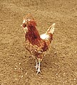
- Nomination: Gallus gallus domesticus, called "polish chicken" in english, "poule padoue" in french.--Jebulon 15:02, 9 January 2011 (UTC)
- Review needed
-

- Nomination Amanohashidate in Miyazu, Kyoto Pref. --663highland 09:09, 9 January 2011 (UTC)
- Promotion Good to me.--Jebulon 18:24, 15 January 2011 (UTC)
-

-

-

-

- Nomination Dubrovnik - street Stradun --Pudelek 22:53, 8 January 2011 (UTC)
- Promotion I'm not convinced by the image quality - seems a bit noisy and blocky. Mattbuck 15:26, 15 January 2011 (UTC) Comment Isn't noisy --Pudelek 16:19, 15 January 2011 (UTC) Good perspective. Nice (I mean: the girl at left is nice)--Jebulon 18:13, 15 January 2011 (UTC)
-

- Nomination Thymelicus lineola Very detailed and well exposed. Taken by User:David Perez --Cookie 20:28, 8 January 2011 (UTC)
- Promotion Bit noisy and unsharp buy good enough. Mattbuck 15:26, 15 January 2011 (UTC)
-

-

-

- Nomination Small Tortoiseshell (Aglais urticae) --Ken Billington 19:46, 8 January 2011 (UTC)
- Decline Not sharp enough to me (top part of the left wing should be in focus, IMO) --Jebulon 18:10, 15 January 2011 (UTC)
-
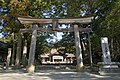
- Nomination Tosa-jinja in Kochi City --663highland 15:35, 8 January 2011 (UTC)
- Promotion Nice spotty lighting but not overexposed --ElHeineken 16:07, 15 January 2011 (UTC)
-

- Nomination Tosa-jinja in Kochi City --663highland 15:35, 8 January 2011 (UTC)
- Decline Noise in dark parts--Jebulon 18:08, 15 January 2011 (UTC)
-

- Nomination The Busena Terrace in Nago, Okinawa Pref. --663highland 15:35, 8 January 2011 (UTC)
- Decline The CA are acceptable, the distortion is correctible, but not the noise...--Jebulon 18:05, 15 January 2011 (UTC)
-

-

- Nomination Flame of the War Memorial Donaldytong 12:00, 8 January 2011 (UTC)
- Decline Lovely at thumbnail but at full size the image seems blurred. --Jovianeye 12:45, 8 January 2011 (UTC) and perspective distortion of the buildings in background.--Jebulon 18:01, 15 January 2011 (UTC)
-

-
- Nomination Shiva Dewalaya Temple, Polonnaruwa, Sri Lanka --Bgag 19:08, 7 January 2011 (UTC)
- Decline I don't know, not really a fan of the composition, but can't see any real technical issues. Mattbuck 15:21, 15 January 2011 (UTC) Too tight crop left and right, and strong CA (annotations).--Jebulon 17:57, 15 January 2011 (UTC)
-
- Nomination Nunobiki Falls in Kobe --663highland 12:54, 7 January 2011 (UTC)
- Promotion A bit unsharp maybe? Mattbuck 15:21, 15 January 2011 (UTC) Yes, at the edges. Shame of the noisy-CA tourist, but otherwise good.--Jebulon 17:54, 15 January 2011 (UTC)
-
- Nomination Kochi Castle--663highland 12:54, 7 January 2011 (UTC)
- Decline Overexposure on the facia boards. Mattbuck 15:21, 15 January 2011 (UTC)
-

-
-

- Nomination The False Elephant's Snout, Cymbium cymbium --Llez 07:36, 15 January 2011 (UTC)
- Promotion Support Very nice. --ElHeineken 11:34, 15 January 2011 (UTC)
-

- Nomination The Jurassic Ammonite Parkinsonia parkinsoni --Llez 20:20, 14 January 2011 (UTC)
- Promotion Support Very detailed and without blur. --ElHeineken 11:44, 15 January 2011 (UTC)
-

-

-

- Nomination DB class 101 pulls an Intercity train, near Erzhausen. --PS-2507 23:48, 13 January 2011 (UTC)
- Promotion (de:) Schärfe liegt genau richtig, schön unscharf im Hintergrund, formatfüllend, selbst Fahrleitungen gut erkennbar --Ralf Roletschek 15:51, 14 January 2011 (UTC) Google-Translation: Sharpness is just right, nice blur in the background, full frame, even overhead lines clearly visible
-

-

- Nomination Nishinomaru Garden of Osaka Castle --663highland 15:37, 13 January 2011 (UTC)
- Promotion Support Simple and nice. --ElHeineken 11:57, 15 January 2011 (UTC)
-
- Nomination Opera Stuttgart --AngMoKio 14:14, 13 January 2011 (UTC)
- Promotion Support Nice colours, but why can't people mind the "Parkverbot".. --ElHeineken 11:50, 15 January 2011 (UTC)
-

- Nomination Town Hall Tower, Cracow -- Taxiarchos228 13:41, 13 January 2011 (UTC)
- Promotion ein weiteres schönes Phallusobjekt... --Mbdortmund 16:34, 14 January 2011 (UTC)
-

- Nomination Skylon Tower, Canada --Taxiarchos228 12:05, 11 January 2011 (UTC)~
- Promotion Good quality. --Mbdortmund 23:09, 14 January 2011 (UTC)
-
- Nomination Funaya (boat house) at Ine, Kyoto Pref. --663highland 00:23, 10 January 2011 (UTC)
- Decline
 Question It seems that this is a scan of a printed work. Is this work covered by copyright? --Archaeodontosaurus 15:50, 10 January 2011 (UTC) Sorry, I do not know. This photograph is a work of FITM. --663highland 15:30, 11 January 2011 (UTC)
CA, source unclear, uploader should have been named in nomination --Mbdortmund 23:11, 14 January 2011 (UTC)
-

- Nomination Speckled Wood (Pararge aegeria) --Ken Billington 19:46, 8 January 2011 (UTC)
- Promotion Good, I like it. --David Perez 18:59, 14 January 2011 (UTC)
-
- Nomination: Algae on dog beach in Mäntyluoto, Pori, Finland. --kallerna 13:38, 8 January 2011 (UTC)
- Review Comment A bit tilt CCW, correction needed --George Chernilevsky 15:16, 8 January 2011 (UTC)
-

-

-

-

- Nomination Lake Hotaka on Mt. Rokko --663highland 14:26, 6 January 2011 (UTC)
- Decline Overexposure. Mattbuck 18:44, 14 January 2011 (UTC)
-

- Nomination Fruita entrance of the Colorado National Monument --Dschwen 19:22, 4 January 2011 (UTC)
- Promotion I find the bush to the right of the sign irritating - it's all very bright. Mattbuck 12:53, 11 January 2011 (UTC)
In my defense: it was very sunny :-) --Dschwen 17:09, 12 January 2011 (UTC) Support Dschwen, you really should have torn that bush out! :-) -- H005 22:22, 14 January 2011 (UTC)
-

- Nomination Balos Lagoon on Crete, Greece. --Oltau 22:45, 13 January 2011 (UTC)
- Promotion Good quality. --Mbdortmund 00:22, 14 January 2011 (UTC)
-

- Nomination Ischnura elegans, male --Loz 16:16, 13 January 2011 (UTC)
- Promotion Gut --George Chernilevsky 18:10, 13 January 2011 (UTC)
-

- Nomination Ischnura elegans f. rufescens, female --Loz 16:16, 13 January 2011 (UTC)
- Promotion Gut --George Chernilevsky 18:11, 13 January 2011 (UTC)
-

- Nomination Nesselwängle --Carschten 16:07, 13 January 2011 (UTC)
- Promotion Sehr gut --George Chernilevsky 18:11, 13 January 2011 (UTC)
-

-

-

-

- Nomination Common frog in Norway --Chmee2 14:26, 13 January 2011 (UTC)
- Promotion OK --Mbdortmund 00:37, 14 January 2011 (UTC)
-

- Nomination Eiffeltower -- Taxiarchos228 13:41, 13 January 2011 (UTC)
- Promotion off course --Pudelek 13:52, 13 January 2011 (UTC)
-

- Nomination Eiffeltower, first platform -- Taxiarchos228 13:41, 13 January 2011 (UTC)
- Promotion well done --AngMoKio 14:20, 13 January 2011 (UTC)
-

- Nomination Old Crane, Lüneburg -- Taxiarchos228 13:41, 13 January 2011 (UTC)
- Decline too noisy --Carschten 14:51, 13 January 2011 (UTC)
-

- Nomination Panorama of Lörrach -- Taxiarchos228 13:41, 13 January 2011 (UTC)
- Promotion Very good quality. Nice! --Dschwen 17:21, 13 January 2011 (UTC)
-

- Nomination TV-Tower, Münster-- Taxiarchos228 13:41, 13 January 2011 (UTC)
- Promotion well done --AngMoKio 14:22, 13 January 2011 (UTC)
-

- Nomination Church of the Good Shepherd, Weil am Rhein -- Taxiarchos228 13:41, 13 January 2011 (UTC)
- Promotion Good quality. --Mbdortmund 00:32, 14 January 2011 (UTC)
-
- Nomination Church St. Georg, Weil am Rhein-- Taxiarchos228 13:41, 13 January 2011 (UTC)
- Decline distortion imo too strong --Mbdortmund 00:32, 14 January 2011 (UTC)
-
- Nomination Water tower, Weil am Rhein-- Taxiarchos228 13:41, 13 January 2011 (UTC)
- Promotion Good quality. --Mbdortmund 00:30, 14 January 2011 (UTC)
-

- Nomination Rheinhaufen Köln, by User:Raymond. --Elekhh 23:21, 12 January 2011 (UTC)
- Decline Oversaturated, halos. --Dschwen 15:17, 13 January 2011 (UTC)
-

- Nomination Thomas cat, my nice pet (Felis silvestris catus) -- George Chernilevsky 17:46, 12 January 2011 (UTC)
- Promotion Good quality and good composition. I don't like the image, but for me the image is QI--Lmbuga 01:24, 14 January 2011 (UTC)
-

- Nomination Underneath the Tranebergsbron (Tranebergs bridge)--Ankara 11:55, 11 January 2011 (UTC)
- Promotion nice idea --Mbdortmund 11:33, 14 January 2011 (UTC)
-
-

-
- Nomination Taj Mahal Palace Hotel --Jovianeye 18:55, 9 January 2011 (UTC)
- Promotion Comment Perspective correction needed. For me the image, to real size, is little clear or perhaps unsharp--Lmbuga 20:07, 9 January 2011 (UTC) Comment Attention! , the building of the right can disturb--Lmbuga 20:23, 9 January 2011 (UTC)
Perspective has been corrected further. The building on the right is an integral part of this place and IMO is not disturbing! --Jovianeye 03:57, 10 January 2011 (UTC)
Support Good result now --George Chernilevsky 17:49, 12 January 2011 (UTC)
Ok. But the title of the proposal is "Taj Mahal Palace Hotel" and the building of the right is disturbing (The title is not a place). Thanks, Jovianeye, for the "!"--Lmbuga 00:00, 14 January 2011 (UTC)
-
- Nomination Sanxenxo, Galicia (Spain)--Lmbuga 03:09, 9 January 2011 (UTC)
- Withdrawn I withdrawn my nomination--Lmbuga 00:43, 14 January 2011 (UTC)
-

- Nomination Starling (Sturnus vulgaris) --Ken Billington 19:46, 8 January 2011 (UTC)
- Decline Sorry, for my taste sharpness and lighting not sufficient. --AngMoKio 14:30, 13 January 2011 (UTC)
-

- Nomination Egypt, Saqqara, entry of the Southern House --Berthold Werner 08:57, 13 January 2011 (UTC)
- Promotion Very good image, although the crop at the upper side could be less tight -- MJJR 10:10, 13 January 2011 (UTC)
-
- Nomination Nieder-Werbe, Germany. --Bartiebert 20:28, 12 January 2011 (UTC)
- Promotion Gut --George Chernilevsky 21:02, 12 January 2011 (UTC)
-

- Nomination Second try. In December it was declined because there is no taxo.
But taxonomic identification is impossible, unfortunately.(I got help: calss Bryopsida). But there are other, excellent pics - without exactly identification like this one in German Wiki. Is that an argument? --Bartiebert 19:22, 12 January 2011 (UTC) - Promotion It is good for QI. This image is of above-average quality - definately. --High Contrast 20:39, 12 January 2011 (UTC)
- Nomination Second try. In December it was declined because there is no taxo.
-

- Nomination Inside the Naturtherme Templin in Germany. --Oltau 16:23, 12 January 2011 (UTC)
- Decline The highlights are totally blown out, plus there are shadow areas on the right with no texture (see annotations). --Murdockcrc 17:28, 12 January 2011 (UTC)
-
-

- Nomination at Kobe Nunobiki Herb Garden --663highland 15:06, 12 January 2011 (UTC)
- Promotion I think this image would have been even better in landscape orientation. Great job.--Murdockcrc 17:32, 12 January 2011 (UTC)
-

- Nomination Shikagatsubo in Himeji, Hyogo Pref. --663highland 15:06, 12 January 2011 (UTC)
- Decline Unbalanced composition and unclear subject.--Murdockcrc 17:34, 12 January 2011 (UTC)
-
- Nomination at Amanohashidate View Land --663highland 15:06, 12 January 2011 (UTC)
- Promotion strange subject, very good quality --Carschten 15:21, 12 January 2011 (UTC)
-
- Nomination Srebreno, Croatia - hotel destroyed in 1991 year --Pudelek 15:03, 12 January 2011 (UTC)
- Decline Per QI composition criteria, "unclear subject". This is very subjective though, if someone wants to discuss it, please go ahead and get opinions from other people. --Murdockcrc 17:38, 12 January 2011 (UTC)
-

- Nomination Marienchurch in Großenhain --LutzBruno 09:59, 12 January 2011 (UTC)
- Decline Sorry, the image ist tilted and has CA at the windows and the perpsective needs correction. --Berthold Werner 09:32, 13 January 2011 (UTC)
-
-

- Nomination Wood in autumn in Upper Austria --Haneburger 09:36, 12 January 2011 (UTC)
- Promotion not perfect, but nice atmosphere --Carschten 15:21, 12 January 2011 (UTC)
-
- Nomination: Wahner Heath in Cologne. A.S. 11:39, 7 January 2011 (UTC)
- Review needed
-

- Nomination: Great Pyramid of Giza --Berthold Werner 09:25, 7 January 2011 (UTC)
- Review needed
-

- Nomination: Panoramic view of Trento, Italy. --Ianezz 09:30, 7 January 2011 (UTC)
- Review needed
-
- Nomination: Anolis carolinensis. --Bartiebert 07:38, 7 January 2011 (UTC)
- Review needed
-

- Nomination: Anolis carolinensis. --Bartiebert 07:38, 7 January 2011 (UTC)
- Review needed
-

- Nomination: Anolis carolinensis. --Bartiebert 07:38, 7 January 2011 (UTC)
- Review needed
-

- Nomination: Preveli Beach in the south of the island of Crete, Greece. --Oltau 00:16, 7 January 2011 (UTC)
- Review needed
-
- Nomination Preveli Beach in the south of the island of Crete, Greece. --Oltau 00:16, 7 January 2011 (UTC)
- Promotion good --George Chernilevsky 20:13, 12 January 2011 (UTC)
-
- Nomination: Franciscan Church of Füssen, Bavaria. -- Felix Koenig 17:12, 6 January 2011 (UTC)
- Review needed
-
- Nomination Village in Norway, by User:Andewa. --Elekhh 22:37, 5 January 2011 (UTC)
- Promotion Not very spectacular - but gives good impression of the landscape there.--Haneburger 10:24, 13 January 2011 (UTC)
-

- Nomination Hamar episcopal castle, by User:Jensens. --Elekhh 22:37, 5 January 2011 (UTC)
- Decline Good picture, but minimum requirement for QI is 2MP --Haneburger 10:24, 13 January 2011 (UTC)
-

-

- Nomination Ikarus-280.33M in Moscow Sidik iz PTU 18:48, 11 January 2011 (UTC)
- Promotion good quality --Carschten 19:07, 11 January 2011 (UTC)
-

-
- Nomination Tojinbo in Sakai, Fukui Pref. --663highland 15:15, 11 January 2011 (UTC)
- Promotion good. Alofok 17:03, 11 January 2011 (UTC)
-

- Nomination grass. -- Der Wolf im Wald 14:08, 11 January 2011 (UTC)
- Promotion well done --AngMoKio 15:48, 11 January 2011 (UTC)
-

- Nomination 43198 tails an InterCity service at Patchway. Mattbuck 12:44, 11 January 2011 (UTC)
- Promotion Good composition with romantic flair --Haneburger 05:54, 12 January 2011 (UTC)
-

- Nomination Porta Maggiore, narrow gauge unit — Jagro 00:25, 11 January 2011 (UTC)
- Promotion Good quality. --Mbdortmund 18:53, 11 January 2011 (UTC)
-

-

- Nomination Konica Minolta Tower, Canada --Taxiarchos228 12:05, 11 January 2011 (UTC)~
- Promotion Good quality. --Dschwen 04:16, 12 January 2011 (UTC)
-

- Nomination Skylon Tower, Main Pod, Canada --Taxiarchos228 12:05, 11 January 2011 (UTC)~
- Promotion Good quality. --Mbdortmund 18:51, 11 January 2011 (UTC)
-
- Nomination Tower, Montreal, Canada --Taxiarchos228 12:05, 11 January 2011 (UTC)~
- Promotion Quality at the top of the tower suffered a bit from the distortion, but overall ok. --Dschwen 04:16, 12 January 2011 (UTC)
-

- Nomination Skyline of Montreal, Canada --Taxiarchos228 12:05, 11 January 2011 (UTC)~
- Promotion The broders are a bit unsharp but still ok. which lense did you use? --AngMoKio 15:46, 11 January 2011 (UTC)
-

- Nomination CN Tower, Main Pod, Canada --Taxiarchos228 12:05, 11 January 2011 (UTC)~
- Promotion Nice work --Jovianeye 13:12, 11 January 2011 (UTC)
-

- Nomination GO Transit diesel locomotive, Canada --Taxiarchos228 12:05, 11 January 2011 (UTC)~
- Promotion Good --Jovianeye 13:12, 11 January 2011 (UTC)
-

- Nomination St Patrick's Cathedral-Gothic Revival Style (East Side) Donaldytong 10:56, 10 January 2011 (UTC)
- Promotion very nice -Pudelek 12:33, 10 January 2011 (UTC)
nice view --Taxiarchos228 12:59, 11 January 2011 (UTC)
-
- Nomination Monastery of Saint Anthony, Egypt --Berthold Werner 16:00, 9 January 2011 (UTC)
- Promotion the towers leam a bit to the right imo --Mbdortmund 00:08, 10 January 2011 (UTC)
Die Türme kippten nach außen, weil die Kamera nach unten geneigt war. Ich habe shiftn nochmal drübergeschickt und dabei nur die Türme berücksichtigt, jetzt sollte es eigentlich passen. --Berthold Werner 09:56, 10 January 2011 (UTC) Mir gefällt es so sehr gut --Haneburger 05:43, 12 January 2011 (UTC)
-

- Nomination Tank cars in Vinnitsa --George Chernilevsky 18:40, 8 January 2011 (UTC)
- Promotion Gives a good impression, QI for me --Haneburger 09:45, 12 January 2011 (UTC)
-

- Nomination Swallows Canyon with the Megalopotamos river on Crete, Greece. --Oltau 06:00, 7 January 2011 (UTC)
- Promotion QI for me --Haneburger 05:49, 12 January 2011 (UTC)
-

- Nomination Top of Frýdlantské cimbuří / Friedländer Zinne --Herzi Pinki 00:41, 7 January 2011 (UTC)
- Promotion Good composition --Haneburger 05:49, 12 January 2011 (UTC)
-

- Nomination: Srebreno / Kupari, Croatia - main street (state road nr 8) --Pudelek 19:07, 5 January 2011 (UTC)
- Review needed
-

- Nomination: Salona (Solin), Croatia - amphitheatre --Pudelek 19:07, 5 January 2011 (UTC)
- Review needed
-

- Nomination: Instruments and silhouette of dist pedal on a smoky stage.--V-wolf 17:21, 5 January 2011 (UTC)
- Review needed
-

- Nomination: Detail of Basilika (left building) and St. Mary's Chapel (right building) in St. Odilienberg, Netherlands --Alupus 16:40, 5 January 2011 (UTC)
- Review needed
-

- Nomination: Bridge over the Megalopotamos river in the south of Crete, Greece. --Oltau 15:14, 5 January 2011 (UTC)
- Review needed
-

- Nomination: Church in Kostroma, Russia. A.S. 14:25, 5 January 2011 (UTC)
- Review needed
-

-

-
-

- Nomination Panorama seen from the Ballon d'Alsace --ComputerHotline 18:01, 4 January 2011 (UTC)
- Promotion Truly some lovely colours. Mattbuck 12:53, 11 January 2011 (UTC)
-

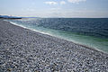
- Nomination A picture of the sea front at Southwold, Suffolk. --The High Fin Sperm Whale 17:49, 4 January 2011 (UTC)
- Promotion Why the small size? --Dschwen 19:18, 4 January 2011 (UTC)
Since when has 2 MP been small? --The High Fin Sperm Whale 20:00, 4 January 2011 (UTC)
Gee, only like 5 years or so. --Dschwen 23:22, 4 January 2011 (UTC)
Small for a QI, but still above the bar. --The High Fin Sperm Whale 06:05, 5 January 2011 (UTC)
Small but decent. Mattbuck 12:53, 11 January 2011 (UTC)
-

- Nomination Dunlin (Calidris alpina) --Ken Billington 18:55, 4 January 2011 (UTC)
- Decline Unfortunate lighting, coming from behind the bird and leaving the head in significant shadow. --Eusebius 09:44, 11 January 2011 (UTC)
I don't see the lighting as an issue, to me the problem is the unsharpness and the high ISO rating. Mattbuck 12:53, 11 January 2011 (UTC)
-
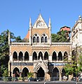
- Nomination David Sassoon Library --Jovianeye 07:37, 10 January 2011 (UTC)
- Promotion Good quality. --Mbdortmund 00:11, 11 January 2011 (UTC)
-

- Nomination 172005 approahces Leytonstone High Road. Mattbuck 01:47, 10 January 2011 (UTC)
- Decline composition imo not so good --Mbdortmund 00:12, 11 January 2011 (UTC)
-

- Nomination Lake Kurobe --663highland 00:23, 10 January 2011 (UTC)
- Promotion Ok. --Jovianeye 06:05, 11 January 2011 (UTC)
-

- Nomination Hakozakigu in Fukuoka --663highland 00:23, 10 January 2011 (UTC)
- Decline Too small (0.96 Mpix) --Jovianeye 06:15, 11 January 2011 (UTC)
-

- Nomination Underground troop shelter of the Ouvrage du Haut-Bois. --ComputerHotline 19:23, 9 January 2011 (UTC)
- Promotion Possible tilt (could just be the walls wonky) but great effect. Mattbuck 13:40, 10 January 2011 (UTC) Info I've corrected the tilt and distortion with shiftN. --ComputerHotline 17:24, 10 January 2011 (UTC)
-
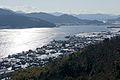
- Nomination Aso Bay in Miyazu, Kyoto Pref. --663highland 09:09, 9 January 2011 (UTC)
- Decline Severely overexposed. --Eusebius 11:50, 11 January 2011 (UTC)
-

-

- Nomination Electric locomotive Škoda ChS8-075 --George Chernilevsky 15:00, 8 January 2011 (UTC)
- Promotion Nice! --Jovianeye 03:23, 11 January 2011 (UTC)
-

-

- Nomination: Tokushima Castle lordly Front Palace Garden --663highland 11:11, 5 January 2011 (UTC)
- Review needed
-
- Nomination: Asakura Yakata of Ichijodani Asakura Family Historic Ruins --663highland 11:11, 5 January 2011 (UTC)
- Review needed
-

- Nomination: Utsubuki-Tamagawa in Kurayoshi Tottori Pref. --663highland 11:11, 5 January 2011 (UTC)
- Review needed
-

- Nomination: Algae on dog beach in Mäntyluoto, Pori, Finland. --kallerna 11:10, 5 January 2011 (UTC)
- Review needed
-

- Nomination: Panorama of Kallo. --kallerna 11:10, 5 January 2011 (UTC)
- Review needed
-
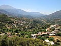
- Nomination: The Amari Valley on the island of Crete, Greece. --Oltau 05:19, 5 January 2011 (UTC)
- Review needed
-

- Nomination: Seats of the hippodrome of Jerash, Jordan --Bgag 00:26, 5 January 2011 (UTC)
- Review needed
-

- Nomination Black scorpionfish Scorpaena porcus. --George Chernilevsky 18:15, 4 January 2011 (UTC)
- Decline Wrong point of view in my opinion, wrt both the lighting and the fish position. --Eusebius 09:47, 11 January 2011 (UTC)
-

-

-

-

-

- Nomination Chiang Kai-shek Memorial Hall, Taipei --AngMoKio 10:45, 4 January 2011 (UTC)
- Promotion Good quality in difficult light situation --Mbdortmund 00:17, 11 January 2011 (UTC)
-

- Nomination Ruin of the ancient theatre of Pollentia in Alcúdia, Majorca. --Oltau 22:21, 3 January 2011 (UTC)
- Decline I think the levels on this are not quite right - you seem to have very little contrast on the seats, but the background is almost black. I think this needs tinkering with. Mattbuck 13:39, 10 January 2011 (UTC)
-
-

- Nomination Panorama seen from Ballon d'Alsace --ComputerHotline 20:22, 3 January 2011 (UTC)
- Promotion Beautiful. Mattbuck 13:39, 10 January 2011 (UTC)
-

- Nomination View across San Francisco from Twin Peaks --Dschwen 18:33, 3 January 2011 (UTC)
- Promotion Comment IMO bit too bright? --kallerna 13:31, 4 January 2011 (UTC), no, exposure is correct for a hazy day, no overexposure . --Dschwen 15:48, 4 January 2011 (UTC)
Excellent depth of focus. Mattbuck 13:39, 10 January 2011 (UTC)
-

- Nomination A family preparing fossils which found on vacation. The Children's Museum of Indianapolis. --Dschwen 18:33, 3 January 2011 (UTC)
- Promotion High ISO level leads to some noise, but I'm willing to promote as it would have been impossible at a lower level. Mattbuck 13:39, 10 January 2011 (UTC)
-

- Nomination Einot Zukim, Israel. --MathKnight 17:50, 3 January 2011 (UTC)
- Decline JPEG artifacts too prominent. --Eusebius 09:00, 11 January 2011 (UTC)
-

-

- Nomination Shikagatsubo in Himeji, Hyogo Pref. --663highland 05:29, 3 January 2011 (UTC)
- Decline Some CA on the leaves, but more important the shutter timing is wrong - it's too long to capture the waterfall in a moment, but too short to capture it as a silky sheet. DOF also too short - the waterfall's wall isn't quite in focus. Mattbuck 13:39, 10 January 2011 (UTC)
-

- Nomination Shikagatsubo in Himeji, Hyogo Pref. --663highland 05:29, 3 January 2011 (UTC)
- Decline Distracting foreground, not very sharp (where is the focus?), unsure shutter speed (either too slow or too fast, probably much too fast). --Eusebius 08:58, 11 January 2011 (UTC)
-

- Nomination Venn diagram representing Modus Barbara - the black areas are marked as empty. --Lipedia 12:47, 2 January 2011 (UTC)
- Promotion Support ––Opensofias 06:04, 11 January 2011 (UTC)
-

- Nomination The church St. Lorenz at the market time in Kempten. Alofok 10:56, 31 December 2010 (UTC)
- Promotion perspective correction needed --Archaeodontosaurus 14:44, 31 December 2010 (UTC)
Done, Alofok 10:09, 4 January 2011 (UTC) Forgot to upload the new version? --Ankara 22:09, 9 January 2011 (UTC)
Sorry, my fault. you can see a new version. Alofok 20:26, 10 January 2011 (UTC) Ok now. --Ankara 20:28, 10 January 2011 (UTC)
-

-

- Nomination almandine garnet from Austria --Archaeodontosaurus 18:52, 9 January 2011 (UTC)
- Promotion Good quality. --Mbdortmund 00:02, 10 January 2011 (UTC)
-

- Nomination Portal of Iglesia de San Juan Bautista in Telde, Gran Canaria. -- Felix Koenig 17:24, 9 January 2011 (UTC)
- Decline wall overexposured, distortion --Mbdortmund 00:03, 10 January 2011 (UTC)
-

- Nomination Skyline of Frankfurt, Germany -- Der Wolf im Wald 14:44, 9 January 2011 (UTC)
- Promotion Wunderschön !--Jebulon 23:22, 9 January 2011 (UTC)
-

- Nomination Paléolithic Microliths --Archaeodontosaurus 14:31, 9 January 2011 (UTC)
- Promotion Oui.--Jebulon 18:55, 9 January 2011 (UTC)
-

- Nomination Miyazu Bay in Miyazu, Kyoto Pref. --663highland 09:09, 9 January 2011 (UTC)
- Promotion Good --Jebulon 14:25, 9 January 2011 (UTC)
-

-

- Nomination Chicago Lakefront --Dschwen 01:33, 9 January 2011 (UTC)
- WARNING: third template parameter added – please remove.
-

-

- Nomination Nohoch Mul group, pyramid of Cobá, Quintana Roo, Mexico--Lmbuga 15:18, 7 January 2011 (UTC)
- Withdrawn Comment Perhaps too tight crop (with my camara it seems to me impossible other image)--Lmbuga 15:23, 7 January 2011 (UTC), Good quality. --Dschwen 15:42, 7 January 2011 (UTC)
Withdrawn: I think that I have not had to propose this image, is not of quality for me--Lmbuga 21:23, 9 January 2011 (UTC)
-

- Nomination Mexican property, "Hotel Bahía Príncipe", Quintana Roo, Mexico--Lmbuga 13:39, 7 January 2011 (UTC)
- WARNING: third template parameter added – please remove.
-

- Nomination: Temple of Kom Ombo, Egypt --Oltau 10:55, 4 January 2011 (UTC)
- Review needed
-

- Nomination: Panorama seen from Ballon d'Alsace --ComputerHotline 19:52, 3 January 2011 (UTC)
- Review Horizon is not straight. --Dschwen 20:49, 3 January 2011 (UTC)
-

- Nomination: Panorama seen from Ballon d'Alsace --ComputerHotline 19:41, 3 January 2011 (UTC)
- Review Horizon is not straight. --Dschwen 20:49, 3 January 2011 (UTC)
-

-

- Nomination Detail of a Smoke Jacket sewn from cigar bands. Collection of the Children's Museum of Indianapolis. --Dschwen 19:08, 1 January 2011 (UTC)
- Decline * Difficult. Very warm colors,perhaps slight motion blur? -- Smial 16:02, 2 January 2011 (UTC), No, the colors are authentic (the white band is very close to white, discoloration is due to age). The blure is minute, it is a 12MP imag and you can clearly se the texture of the fabric. Minimum resolution is 2MP, please take that into account. --Dschwen 13:14, 3 January 2011 (UTC) Oppose - I agree, it is a bit too blurred. The colours are lovely, but the DOF is insufficient. Mattbuck 01:51, 10 January 2011 (UTC)
-

- Nomination Black stapler. ZooFari 22:50, 30 December 2010 (UTC)
- Decline Comment - silver parts imo overexposured --Mbdortmund 23:02, 7 January 2011 (UTC) Oppose per mbdortmund. Mattbuck 01:48, 10 January 2011 (UTC)
-

- Nomination Water park Serena. --kallerna 07:15, 21 December 2010 (UTC)
- Promotion Question Could you add a geocode, or at least a more detailed description where this is? -- H005 22:36, 23 December 2010 (UTC) Done
 --kallerna 10:06, 29 December 2010 (UTC)
Thanks! Looks tilted cw to me, otherwise ok. -- H005 16:42, 2 January 2011 (UTC) Comment How much? --kallerna 13:06, 4 January 2011 (UTC)
Good--Lmbuga 21:13, 9 January 2011 (UTC)
-
- Nomination Shell of a female of the Common Spider Conch --Llez 07:23, 9 January 2011 (UTC)
- Promotion Support QI & Useful --Archaeodontosaurus 11:14, 9 January 2011 (UTC)
-

-
- Nomination General view of the cardo maximus of Jerash, Jordan --Bgag 05:12, 9 January 2011 (UTC)
- Promotion Support QI & Useful --Archaeodontosaurus 09:20, 9 January 2011 (UTC)
-
- Nomination Boston city hall --Dschwen 01:33, 9 January 2011 (UTC)
- Promotion Good quality, nice composition --Mbdortmund 02:45, 9 January 2011 (UTC)
-

-

- Nomination Trump Tower in Chicago, under construction --Dschwen 01:33, 9 January 2011 (UTC)
- Promotion Good quality. --Mbdortmund 02:45, 9 January 2011 (UTC)
-

-

- Nomination A yellow-green sample of Adamite with an information card about the sample/mineral. --Ks0stm 22:19, 8 January 2011 (UTC)
- Decline Oppose Chromatic aberrations --Archaeodontosaurus 09:23, 9 January 2011 (UTC)
-

- Nomination First appearance in "Commons" of the Cancer bellianus. Stuffed specimen.--Jebulon 21:21, 8 January 2011 (UTC)
- Promotion Good --George Chernilevsky 21:35, 8 January 2011 (UTC)
-

- Nomination Molar of Platybelodon (Profil) -- Archaeodontosaurus 18:29, 8 January 2011 (UTC)
- Promotion Good --George Chernilevsky 18:41, 8 January 2011 (UTC)
-
- Nomination A sunfish (Mola mola), stuffed specimen, museum of natural history, La Rochelle, France --Jebulon 16:21, 8 January 2011 (UTC)
- Promotion Good --George Chernilevsky 16:42, 8 January 2011 (UTC)
-

- Nomination Neolithic Lithic core --Archaeodontosaurus 14:29, 8 January 2011 (UTC)
- Promotion Very good --George Chernilevsky 15:14, 8 January 2011 (UTC)
-

-

- Nomination Sunset in Kallo. --kallerna 13:38, 8 January 2011 (UTC)
- Promotion Nice --George Chernilevsky 15:17, 8 January 2011 (UTC)
-

- Nomination Global Vipassana Pagoda --Jovianeye 11:50, 8 January 2011 (UTC)
- Promotion Good --George Chernilevsky 16:22, 8 January 2011 (UTC)
-

- Nomination Young of Mexican pig, Quintana de Roo, México--Lmbuga 01:06, 8 January 2011 (UTC) Support QI & Useful --Archaeodontosaurus 14:31, 8 January 2011 (UTC)
- Promotion
- Nomination Young of Mexican pig, Quintana de Roo, México--Lmbuga 01:06, 8 January 2011 (UTC)
-

-

- Nomination Bones from human body --Niabot 18:46, 7 January 2011 (UTC)
- Promotion Support QI & useful --Archaeodontosaurus 14:20, 8 January 2011 (UTC)
-

-

- Nomination Skeleton of the Dicynodont Tetragonias njalilus --Llez 06:55, 7 January 2011 (UTC)
- Promotion Support QI, very good job of trimming. --Archaeodontosaurus 09:29, 9 January 2011 (UTC)
-

- Nomination Electric multiple unit ED9M-0071 in Vinnitsa railway station. --George Chernilevsky 21:39, 6 January 2011 (UTC)
- Promotion Support QI & Useful --Archaeodontosaurus 14:24, 8 January 2011 (UTC)
-

- Nomination Salona (Solin), Croatia - ancient tomb --Pudelek 14:37, 4 January 2011 (UTC)
- Promotion OK --George Chernilevsky 12:43, 8 January 2011 (UTC)
-

- Nomination: Mummy of a shrew, The Children's Museum of Indianapolis. --Dschwen 19:08, 1 January 2011 (UTC)
- Review Very interesting topic. But the background could be improved it is a little pink with spots. You could, however, remove noise only on the shadow. --Archaeodontosaurus 09:12, 2 January 2011 (UTC)
Oh come on! Take a look around on this page and then think again before you complain about noise in the shadows in this image. --Dschwen 14:13, 2 January 2011 (UTC)
Noise is no problem with this image, but the slight pink background is. -- Smial 16:02, 2 January 2011 (UTC)
-
- Nomination The castle at market time in Kempten. Alofok 10:56, 31 December 2010 (UTC)
- Promotion Perspective disortion. It is Possible to fix.--Ankara 12:06, 31 December 2010 (UTC)
... and the lamp is disturbing. --Berthold Werner 12:41, 31 December 2010 (UTC)
done Alofok 10:09, 4 January 2011 (UTC)
There is a dustspot, that i didn't see before. --Berthold Werner 15:19, 5 January 2011 (UTC)
Good now. --Berthold Werner 09:59, 9 January 2011 (UTC)
-

-

-

- Nomination Winter in Vorarlberg --Böhringer 22:05, 7 January 2011 (UTC)
- Promotion Sehr gut! --George Chernilevsky 11:41, 8 January 2011 (UTC)
-

-

- Nomination Window detail, Grace Episcopal Church, Decorah, Iowa. -- Jonathunder 18:12, 7 January 2011 (UTC)
- Promotion Good quality. --Mbdortmund 19:07, 7 January 2011 (UTC)
-

- Nomination The Perlachturm, Augsburg, Bavaria. -- Felix Koenig 16:57, 7 January 2011 (UTC)
- Promotion Good perspective corection. — Jagro 12:00, 8 January 2011 (UTC)
-

-

-

-
- Nomination Mt Tateyama view from Murodo --663highland 12:54, 7 January 2011 (UTC)
- Promotion I see no problems, nice. --Dschwen 15:42, 7 January 2011 (UTC)
-
- Nomination The Museum of Art Kochi --663highland 12:54, 7 January 2011 (UTC)
- Promotion Nice colors, maybe a bit warmer will be better. — Jagro 12:00, 8 January 2011 (UTC)
-

- Nomination Rail terminal on SVO airport in Moscow. A.S. 11:39, 7 January 2011 (UTC)
- Decline Strong CA at the roof --Berthold Werner 12:15, 7 January 2011 (UTC)
-

-

- Nomination The church St. Anna of Reutte, Tyrol. -- Felix Koenig 11:33, 7 January 2011 (UTC)
- Promotion Good quality. --Berthold Werner 12:26, 7 January 2011 (UTC)
-
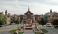
- Nomination Hospital de Sant Pau, Barcelona --Bgag 02:00, 7 January 2011 (UTC)
- Promotion Good quality. --Mbdortmund 19:11, 7 January 2011 (UTC)
-

- Nomination Pflerscher Tribulaun from SW Pflerscher Tribulaun from SW --Herzi Pinki 00:41, 7 January 2011 (UTC)
- Promotion good quality, interesting view --Alupus 16:44, 7 January 2011 (UTC)
-

- Nomination Electric multiple unit ED9M-0071 in Vinnitsa railway station. --George Chernilevsky 21:39, 6 January 2011 (UTC)
- Promotion Good quality. --Mbdortmund 19:14, 7 January 2011 (UTC)
-

- Nomination Borne des Trois Puissances site. --ComputerHotline 19:34, 6 January 2011 (UTC)
- Promotion good --George Chernilevsky 11:45, 8 January 2011 (UTC)
-

- Nomination Greyhound racing --AngMoKio 11:45, 6 January 2011 (UTC)
- Promotion dynamic view --Mbdortmund 19:13, 7 January 2011 (UTC)
-

- Nomination Wild male Green Iguana posing at Portoviejo, Ecuador. The colour of this species varies from (bright) green to brown and red. --Cayambe 09:42, 6 January 2011 (UTC)
- Promotion Good --George Chernilevsky 11:48, 8 January 2011 (UTC)
-

- Nomination Warty crab Eriphia verrucosa, old male. --George Chernilevsky 19:05, 3 January 2011 (UTC)
- Promotion Good. --Cayambe 09:57, 8 January 2011 (UTC)
-

- Nomination Warty crab Eriphia verrucosa, old male. --George Chernilevsky 19:05, 3 January 2011 (UTC)
- Promotion Also good. --Cayambe 09:57, 8 January 2011 (UTC)
-

- Nomination Monastery of Saint Anthony, Egypt --Berthold Werner 12:52, 3 January 2011 (UTC)
- Promotion Good. --Cayambe 09:55, 8 January 2011 (UTC)
-
-

-

- Nomination Bell Tower on the campus of the University of Illinois at Urbana-Champaign --Dschwen 19:08, 1 January 2011 (UTC). 8 spot in sky --Archaeodontosaurus 09:35, 2 January 2011 (UTC), fixed, refresh cache. --Dschwen 23:21, 7 January 2011 (UTC)
- Promotion Ok to me now. --Cayambe 09:50, 8 January 2011 (UTC)
-

- Nomination: Chinese shoes for bound feet, The Children's Museum of Indianapolis. --Dschwen 19:08, 1 January 2011 (UTC)
- Review Very interesting topic. But the background could be improved it is a little pink, with a spot in the upper left corner --Archaeodontosaurus 09:17, 2 January 2011 (UTC)
-

- Nomination Amish clothesline --Dschwen 19:05, 1 January 2011 (UTC). I like this one very much. A bit noisy. Please try to remove dust spots (annotations) --Jebulon 11:08, 2 January 2011 (UTC),, Done spots removed. --Dschwen 02:26, 3 January 2011 (UTC)
- Promotion QI to me now. --Cayambe 09:47, 8 January 2011 (UTC)
- Nomination Amish clothesline --Dschwen 19:05, 1 January 2011 (UTC). I like this one very much. A bit noisy. Please try to remove dust spots (annotations) --Jebulon 11:08, 2 January 2011 (UTC),,
-

-

- Nomination Rock formation at Zion National Park --LeavXC 21:58, 31 December 2010 (UTC)
- Promotion Nice detail and lighting. There is some chromatic aberration on the bottom of rocks down low, but IMO it is within the acceptable bounds. --99of9 12:57, 7 January 2011 (UTC)
-

-

-
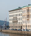
- Nomination Norra Hamngatan (North Harbour Street) 2 --Ankara 22:57, 30 December 2010 (UTC).
- Promotion Needs a perspective correction at the left side. Also: the crane at the left is distracting and should be removed imo. Both issues are fixable. --Cayambe 20:55, 6 January 2011 (UTC) Done. New version uploaded.--Ankara 09:27, 8 January 2011 (UTC). QI to me now. --Cayambe 09:39, 8 January 2011 (UTC)
-
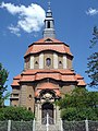
- Nomination Church in Biesenthal in Brandenburg, Germany. --Oltau 19:35, 30 December 2010 (UTC)
- Promotion Slight tilt to the left could be corrected. --Dschwen 21:44, 30 December 2010 (UTC) Info O.k., new version. --Oltau 17:54, 31 December 2010 (UTC). QI to me now. --Cayambe 09:38, 8 January 2011 (UTC)
-

-

-

-

- Nomination Tatsuno City view --663highland 14:26, 6 January 2011 (UTC)
- Decline Tilted CW. --Dschwen 02:21, 7 January 2011 (UTC)
-

- Nomination Mt. Oku-dainichi peaks --663highland 14:26, 6 January 2011 (UTC)
- Promotion Good. --Cayambe 17:19, 6 January 2011 (UTC)
-

- Nomination Murotsu Port view from Murotsu Museum of Sea Port in Tatsuno --663highland 14:26, 6 January 2011 (UTC)
- Promotion Also good, with acceptable chromatic aberration (violet fringes) at left. --Cayambe 17:19, 6 January 2011 (UTC)
-

-

-
- Nomination: Wakasa-jinja in Wakasa, Tottori Pref. --663highland 01:09, 1 January 2011 (UTC)
- Review needed
-

- Nomination: Mt. Bizan view from Kenchopia in Tokushima City --663highland 01:09, 1 January 2011 (UTC)
- Review needed
-

- Nomination: Kinpusenji in Yoshino, Nara Pref. --663highland 01:09, 1 January 2011 (UTC)
- Review needed
-
- Nomination: Cape Tigani and the Bay of Balos on Crete, Greece. --Oltau 20:00, 31 December 2010 (UTC)
- Review needed
-

-

-

-

- Nomination Inside the bedrooms of the fort du Salbert. --ComputerHotline 07:54, 30 December 2010 (UTC)
- Promotion Ok to me. --Cayambe 20:47, 6 January 2011 (UTC)
-

- Nomination Roman theatre of Palmyra, Syria --Bgag 00:45, 6 January 2011 (UTC)
- Promotion Ok. --Berthold Werner 07:28, 6 January 2011 (UTC)
-

- Nomination Roman theatre of Palmyra, Syria --Bgag 00:45, 6 January 2011 (UTC)
- Promotion Quality is ok but value should be higher with a panorama. --Berthold Werner 07:28, 6 January 2011 (UTC)
-

- Nomination Mosque of Ibn Tulun at Cairo --Berthold Werner 18:20, 5 January 2011 (UTC)
- Promotion Support QI for me --Archaeodontosaurus 19:14, 5 January 2011 (UTC)
-

-
-
-

- Nomination A gravestone in Leipzig. A.S. 14:25, 5 January 2011 (UTC)
- Decline Oppose CA in tree; The flash and the rain gives a bad light --Archaeodontosaurus 19:11, 5 January 2011 (UTC)
-

-

-

- Nomination Independence monument in Colorado National Monument with Fruita, Colorado in the background --Dschwen 19:22, 4 January 2011 (UTC)
- Promotion Support QI & Useful, Good caption --Archaeodontosaurus 19:17, 5 January 2011 (UTC)
-

- Nomination Pizzeria Uno and Due in Chicago --Dschwen 19:22, 4 January 2011 (UTC)
- Promotion TILTED CW --Mbdortmund 12:13, 5 January 2011 (UTC), By how much? 0 degrees? --Dschwen 16:18, 5 January 2011 (UTC) Good quality. Die Ampel ist einfach schief, sorry. --Mbdortmund 22:44, 5 January 2011 (UTC)
Kommentartext erst ausgeblendt, weil der QIVoter helper einen weiteren senkrechten Strich gesetzt hatte
-

- Nomination Chicago skyline with the CNA Center showing the Chicago Blackhawks' logo, the Smurfit Stone Building saying "Go Hawks" and the Blue Cross Blue Shield Tower saying "Hawks Win" the night after the 2009–10 Chicago Blackhawks won the 2010 Stanley Cup Finals, viewed from the Petrillo Music Shell lawn in Grant Park. --Dschwen 19:22, 4 January 2011 (UTC)
- Promotion Good pano with very interesting mood lighting --Alupus 16:46, 5 January 2011 (UTC)~
-

- Nomination Statue of Jeanne d'Arc (Ballon d'Alsace) --ComputerHotline 19:08, 3 January 2011 (UTC)
- Promotion Very good --George Chernilevsky 19:12, 3 January 2011 (UTC) Info Statue by Mathurin Moreau. --Jebulon 15:22, 5 January 2011 (UTC)
-
- Nomination Cultural heritage building in Kamen, Northrhine-Westphalia --Smial 11:10, 3 January 2011 (UTC)
- Promotion Comment IMHO the branches in the upper right corner should be removed (no, not with a saw :-) --Berthold Werner 12:39, 3 January 2011 (UTC)
Nah, that would be unnecessary manipulation. Quality is ok. --Dschwen 21:41, 5 January 2011 (UTC)
-

- Nomination: Ordning&Reda shop in Stockholm.--Ankara 10:22, 31 December 2010 (UTC)
- Review needed
-
- Nomination: Nativity scene on the Buenos Aires Metropolitan Cathedral (Argentina). ----Elemaki 04:40, 31 December 2010 (UTC)
- Review needed
-

-

- Nomination: View from MS Allure of the Seas at STX Europe shipyard Turku, Finland. In the foreground is located Naantali refinery owned by Neste Oil in the city of Naantali. --Makele-90 17:43, 30 December 2010 (UTC)
- Review needed
-
- Nomination: Sphinxes at the Temple of Karnak in Luxor, Egypt. --Oltau 17:38, 30 December 2010 (UTC)
- Review needed
-
- Nomination Hippodrome of Jerash, Jordan --Bgag 00:26, 5 January 2011 (UTC)
- Promotion good --Mbdortmund 01:50, 5 January 2011 (UTC)
-

-
- Nomination Kleine Zinne seen from Große Zinne by Svíčková --Herzi Pinki 20:54, 4 January 2011 (UTC)
- Promotion nice --Mbdortmund 01:51, 5 January 2011 (UTC)
-

- Nomination Chicago Theatre. Exposure blended from three shots. --Dschwen 19:22, 4 January 2011 (UTC)
- Promotion good --Mbdortmund 01:52, 5 January 2011 (UTC)
-

- Nomination Crested Tit (Lophophanes cristatus) --Ken Billington 18:55, 4 January 2011 (UTC)
- Decline Sorry, fairly low resolution, soft focus, and washed out details. --Dschwen 19:31, 4 January 2011 (UTC)
-

- Nomination Curlew (Numenius arquata) --Ken Billington 18:55, 4 January 2011 (UTC)
- Promotion This one is better. --Dschwen 19:31, 4 January 2011 (UTC)
-

- Nomination Black scorpionfish Scorpaena porcus. --George Chernilevsky 18:15, 4 January 2011 (UTC)
- Promotion Good quality. --Dschwen 19:31, 4 January 2011 (UTC)
-

- Nomination Black scorpionfish. Poisonous thorns are well visible. --George Chernilevsky 18:15, 4 January 2011 (UTC)
- Promotion Good quality. --The High Fin Sperm Whale 20:01, 4 January 2011 (UTC)
-

-

-

-

-

- Nomination The Spider Conch Lambis lambis --Llez 14:07, 4 January 2011 (UTC)
- Promotion good --Mbdortmund 01:55, 5 January 2011 (UTC)
-

-
- Nomination OEBB 1016 Taurus locomotive, Austrian Federal Railways. --Murdockcrc 12:43, 4 January 2011 (UTC)
- Promotion Not the sharpest one, but ok. --kallerna 13:26, 4 January 2011 (UTC)
-

- Nomination Naruto Whirlpools --663highland 11:48, 4 January 2011 (UTC)
- Promotion Nice. --kallerna 13:26, 4 January 2011 (UTC)
-

- Nomination Seto-naikai view at Kagawa Pref. --663highland 11:48, 4 January 2011 (UTC)
- Decline The main subject is too noisy. --kallerna 13:26, 4 January 2011 (UTC)
-

- Nomination Takeno Beach in Toyooka, Hyogo Pref. --663highland 11:48, 4 January 2011 (UTC)
- Decline Lovely composition and beautiful place, but the beach is overexposed. --kallerna 13:26, 4 January 2011 (UTC)
-

-
-
- Nomination Central Library, Taipei --AngMoKio 10:45, 4 January 2011 (UTC)
- Promotion Support Great picture!--Murdockcrc 12:46, 4 January 2011 (UTC)
-

-

- Nomination Male wild Green Iguana at Portoviejo, Ecuador. --Cayambe 20:53, 3 January 2011 (UTC). Did you forget to disclose some image manipulation? There are odd step artifacts in the bottom right. --Dschwen 23:01, 3 January 2011 (UTC) Info Thanks for noticing. New and improved version uploaded with a different file name. Speedy deletion request for the 'old' file. --Cayambe 11:10, 4 January 2011 (UTC), You still have not disclosed the image manipulation. --Dschwen 15:47, 4 January 2011 (UTC) Done See file descr. --Cayambe 15:58, 4 January 2011 (UTC)
- Promotion Happy now. --Dschwen 16:00, 4 January 2011 (UTC)
- Nomination Male wild Green Iguana at Portoviejo, Ecuador. --Cayambe 20:53, 3 January 2011 (UTC). Did you forget to disclose some image manipulation? There are odd step artifacts in the bottom right. --Dschwen 23:01, 3 January 2011 (UTC)
-

- Nomination The sea in a winter day. Porto Covo, Portugal. -- Alvesgaspar 18:57, 3 January 2011 (UTC)
- Promotion Good. --Cayambe 18:07, 4 January 2011 (UTC)
-
- Nomination Main square of Porto Covo (detail), Portugal. -- Alvesgaspar 18:57, 3 January 2011 (UTC)
- Promotion God. --Cayambe 18:09, 4 January 2011 (UTC)
-

-

-

-

- Nomination Yasugi-hama Beach in Kami, Hyogo Pref. --663highland 09:21, 2 January 2011 (UTC)
- Decline oversaturation visible --Archaeodontosaurus 09:26, 2 January 2011 (UTC)
Agreed. --kallerna 13:09, 4 January 2011 (UTC)
-

- Nomination View of the "Tour de la Lanterne" in La Rochelle, France.--Jebulon 15:19, 31 December 2010 (UTC)
- Promotion Very slight tilt to the right (looking at just lanterns and fence posts!) --Dschwen 15:26, 31 December 2010 (UTC) You are right. Thank you. Done Corrected now.--Jebulon 00:52, 1 January 2011 (UTC)
Good. QI for me --George Chernilevsky 12:28, 4 January 2011 (UTC)
-

- Nomination: Sumitomo Rubber Industries Ltd headquarters building in Kobe --663highland 01:43, 30 December 2010 (UTC)
- Review needed
-

- Nomination: Shōryō-in of Hōryū-ji in Ikaruga, Nara Pref. --663highland 01:43, 30 December 2010 (UTC)
- Review needed
-
-
- Nomination Ganshin's manor, where a book by Lenin was printed secretly, a museum now. Gorki village, Pereslavl district. --PereslavlFoto 18:02, 29 December 2010 (UTC)
- Decline Interesting subject, but too much of the image is overexposed + the brances are quite distracting. --kallerna 13:16, 4 January 2011 (UTC)
-

- Nomination Juvenile Black Redstart (Phoenicurus ochruros) --Ken Billington 20:34, 29 December 2010 (UTC)
- Promotion Ok. --kallerna 13:16, 4 January 2011 (UTC)
-

- Nomination Daigenkan of Sanboin in Kyoto --663highland 14:19, 29 December 2010 (UTC)
- Promotion Ok. --kallerna 13:16, 4 January 2011 (UTC)
-

- Nomination Pagoda of Daigoji in Kyoto --663highland 14:19, 29 December 2010 (UTC)
- Promotion Ok. --kallerna 13:16, 4 January 2011 (UTC)
-
- Nomination Nuthatch (Sitta europaea) --Ken Billington 20:34, 29 December 2010 (UTC)
- Decline Sorry, IMO this one is too unsharp. --kallerna 13:16, 4 January 2011 (UTC)
-

-

- Nomination Great Cormorant standing on one leg in Hard, Austria (air temperature minus 10 degrees Celsius!) --Ken Billington 14:41, 27 December 2010 (UTC)
- Decline Oppose I'm not sure. To me, noise, color noise, unsharp. But not too much. Composition too tight at bottom. I'm not sure, but I think that it's not QI.--Lmbuga 01:13, 3 January 2011 (UTC) Done Image now corrected as suggested. --Ken Billington 21:02, 4 January 2011 (UTC)
Sorry, Ken, I had to revert that. The new version has blow out and underexposed areas lacking detail. You probably ruined it in postprocessing by yanking the contrast up waaaaay to much. --Dschwen 21:24, 4 January 2011 (UTC)
-

-

- Nomination Clouds sea seen from Ballon d'Alsace --ComputerHotline 20:10, 3 January 2011 (UTC)
- Promotion Soft focus, but otherwise ok. --Dschwen 20:49, 3 January 2011 (UTC)
-

- Nomination Warty crab Eriphia verrucosa. by George Chernilevsky--Lmbuga 20:02, 3 January 2011 (UTC)
- Promotion Good --Mbdortmund 10:58, 4 January 2011 (UTC)
-

- Nomination Warty crab Eriphia verrucosa, old male. --George Chernilevsky 19:05, 3 January 2011 (UTC)
- Promotion Very good DOF--Lmbuga 20:03, 3 January 2011 (UTC)
-
- Nomination Warty crab Eriphia verrucosa, old male. --George Chernilevsky 19:05, 3 January 2011 (UTC)
- Promotion good --Mbdortmund 10:58, 4 January 2011 (UTC)
-

- Nomination Warty crab Eriphia verrucosa, old male. --George Chernilevsky 19:05, 3 January 2011 (UTC)
- Promotion Good to me. Very good DOF--Lmbuga 19:57, 3 January 2011 (UTC)
-

- Nomination The sea in a winter day. Porto Covo, Portugal. -- Alvesgaspar 18:57, 3 January 2011 (UTC)
- Promotion Nice colors, like painting --George Chernilevsky 19:20, 3 January 2011 (UTC)
-

- Nomination Collared Lizard (Crotaphytus collaris) in Black Canyon of the Gunnison National Park --Dschwen 18:33, 3 January 2011 (UTC)
- Promotion Very good. Nice colors -- George Chernilevsky 19:07, 3 January 2011 (UTC)
-

- Nomination Independence monument in Colorado National Monument with Fruita, Colorado in the background --Dschwen 18:33, 3 January 2011 (UTC)
- Promotion Good --George Chernilevsky 19:10, 3 January 2011 (UTC)
-
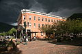
- Nomination Aspen, Colorado before a thunderstorm --Dschwen 18:33, 3 January 2011 (UTC)
- Promotion Excellent atmosphere, very good --George Chernilevsky 19:18, 3 January 2011 (UTC)
-

- Nomination Grace Gospel Chapel church. --Admrboltz 17:23, 3 January 2011 (UTC)
- Decline Blurry in the lower and left parts of the image, low resolution does not help. --Dschwen 17:39, 3 January 2011 (UTC)
-

- Nomination Laciniate conch (Strombus sinuatus) -- George Chernilevsky 16:25, 3 January 2011 (UTC)
- Promotion Good quality. --Dschwen 17:39, 3 January 2011 (UTC)
-

- Nomination Laciniate conch (Strombus sinuatus) -- George Chernilevsky 16:25, 3 January 2011 (UTC)
- Promotion Good quality. --Dschwen 17:39, 3 January 2011 (UTC)
-

- Nomination Steinriegel, Fischbacher Alpen, Styria. --Herzi Pinki 15:35, 3 January 2011 (UTC)
- Promotion Good quality. Maybe a tad on the dark side. --Dschwen 17:39, 3 January 2011 (UTC)
-

- Nomination Detail of tablet in Cobá that presents fossils that show the origin of the Yucatan Peninsula, by User:Lmbuga. --Lmbuga 00:49, 3 January 2011 (UTC)
- Promotion Good. Could you please add to the file descr. how large the fossils are? --Cayambe 17:56, 3 January 2011 (UTC)
Ok. approximately 3 cm., a little greater than the cockles--Lmbuga 19:37, 3 January 2011 (UTC)
-

- Nomination Mojiko Hotel, Fukuoka Japan, by User:Wiiii. --Elekhh 00:34, 3 January 2011 (UTC)
- Promotion Very sharp and othersie also good. --Cayambe 17:47, 3 January 2011 (UTC)
-

- Nomination: Landscape with spruces from Yyteri. --kallerna 10:04, 29 December 2010 (UTC)
- Review needed
-

- Nomination: A wind swept pine on a quartzite hill, Killarney Provincial Park, Ontario, Canada. --Óðinn 07:34, 29 December 2010 (UTC)
- Review needed
-
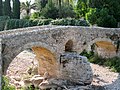
- Nomination: Roman Bridge (Pont Romà) in Pollença, Majorca, Spain --Oltau 21:32, 28 December 2010 (UTC)
- Review needed
-

- Nomination: Distribution substation in Avesta, Sweden.--V-wolf 16:32, 28 December 2010 (UTC)
- Review needed
-

- Nomination: Šibenik, Croatia - cathedral of St. Jacob --Pudelek 16:23, 28 December 2010 (UTC)
- Review needed
-

- Nomination: Ikarugadera in Taishi, Hyogo Pref. --663highland 15:55, 28 December 2010 (UTC)
- Review Good but spot in the sky see annotation --Archaeodontosaurus 18:36, 28 December 2010 (UTC)
-
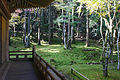
- Nomination: at Jinguji in Obama, Fukui Pref. --663highland 15:55, 28 December 2010 (UTC)
- Review needed
-

- Nomination Our Lady of the Braes, former Roman Catholic Church, Lochailort, Highland, Scotland. --Patriot8790 06:30, 3 January 2011 (UTC)
- Decline From the Guidelines: Pictures must have been created by a Wikimedian --Berthold Werner 12:35, 3 January 2011 (UTC)
-

- Nomination Hamasui Beach in Toyooka, Hyogo Pref. --663highland 05:29, 3 January 2011 (UTC)
- Promotion Good quality. --Berthold Werner 12:57, 3 January 2011 (UTC)
-

- Nomination Amundsenhöhe and Pretul, mountains in Styria, Austria. Wind turbine. --Herzi Pinki 23:51, 2 January 2011 (UTC)
- Promotion Assorted dust spots, otherwise good. -- Smial 11:23, 3 January 2011 (UTC) Comment thanks, dust removed. --Herzi Pinki 12:49, 3 January 2011 (UTC)
Now ok for me. --Smial 13:07, 3 January 2011 (UTC)
-
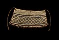
-
-
-
-

-

-

-

-

- Nomination Old tram VBZ Be 4/6 «Mirage». -- George Chernilevsky 14:29, 2 January 2011 (UTC)
- Promotion Good -- Smial 19:38, 2 January 2011 (UTC)
-

- Nomination Old tram VBZ Be 4/6 «Mirage» in the evening. -- George Chernilevsky 14:29, 2 January 2011 (UTC)
- Decline Blurred -- Smial 19:38, 2 January 2011 (UTC)
-
- Nomination Near-elegant Frog Shell -- George Chernilevsky 14:29, 2 January 2011 (UTC)
- Promotion Support Good --Llez 17:04, 2 January 2011 (UTC)
-

-
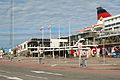
- Nomination Viking Line terminal in Stockholm.-Ankara 14:19, 2 January 2011 (UTC)
- Decline I don't know if there is a better view possible, but subject is imho not shown well. -- Smial 20:32, 2 January 2011 (UTC)
-

-

-

-
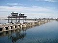
-

-
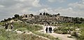
-

- Nomination TakenoBeach in Toyooka, Hyogo Pref. --663highland 15:28, 31 December 2010 (UTC)
- Decline Comment Strong vertical distortion --Lmbuga 18:13, 31 December 2010 (UTC)
See above--Lmbuga 02:38, 3 January 2011 (UTC)
-

- Nomination The main entry (seen from inside) of the fort du Salbert. --ComputerHotline 07:54, 30 December 2010 (UTC)
- Promotion Ok to me. --Cayambe 09:11, 3 January 2011 (UTC)
-

- Nomination Three Sutra Hall and West Dormitory of Hōryū-ji in Ikaruga, Nara Pref. --663highland 01:43, 30 December 2010 (UTC)
- Promotion Good. --Cayambe 09:14, 3 January 2011 (UTC)
-

-

-

- Nomination Adam Lindsay Gordon Statue (1833-1870) Donaldytong 13:46, 28 December 2010 (UTC)
- Decline CA and strong halos from sharpening. -- Smial 17:15, 2 January 2011 (UTC)
-

- Nomination: Geode of Kutnhorite --Archaeodontosaurus 13:27, 28 December 2010 (UTC)
- Review needed
-

- Nomination: Also the Aiguilles de Chamonix in evening light. --Ximonic 12:22, 28 December 2010 (UTC)
- Review needed
-

- Nomination: Aiguille Verte and Aiguille du Dru in evening light. --Ximonic 12:22, 28 December 2010 (UTC)
- Review needed
-

- Nomination: Vaults of Saint-Antoine-l'Abbaye. --Eusebius 10:51, 28 December 2010 (UTC)
- Review There magenta shadows, is that ca or from colured windows? --Berthold Werner 12:40, 28 December 2010 (UTC)
-

- Nomination: Kitano Street in Kobe --663highland 16:00, 27 December 2010 (UTC)
- Review needed
-

- Nomination: Kyoto International Conference Center view from Takaragaike Park --663highland 16:00, 27 December 2010 (UTC)
- Review needed
-

- Nomination Nikolauskirche in Köln by User:A.Savin proposed by --Mbdortmund 23:10, 25 December 2010 (UTC)
- Promotion White balance is a little too blue. --King of Hearts 19:37, 30 December 2010 (UTC) Done A.S. 01:13, 31 December 2010 (UTC)
Better. --King of Hearts 22:45, 2 January 2011 (UTC)
-

- Nomination Nikolauskirche in Köln by User:A.Savin proposed by --Mbdortmund 23:10, 25 December 2010 (UTC)
- Promotion White balance is a little too blue. --King of Hearts 19:37, 30 December 2010 (UTC) Done A.S. 01:13, 31 December 2010 (UTC)
Better. --King of Hearts 22:45, 2 January 2011 (UTC)
-

-

- Nomination South Wharf & Melbourne Convention and Exhibition Centre Donaldytong 12:52, 23 December 2010 (UTC)
- Decline I love the concept, but it's very unsharp. Could you downsample and sharpen the image? --King of Hearts 19:34, 30 December 2010 (UTC) Done, Reverted, looked terrible. Downsampling is nonsense too. --Dschwen 15:43, 1 January 2011 (UTC)
Sorry, it already shows strong sharpening halos and "Fransen", I don't think this can be helped. -- H005 16:46, 2 January 2011 (UTC)
-

- Nomination The moat and the outer exterior of Schloss Bloemersheim in Neukirchen-Vluyn, Germany --Carschten 22:35, 22 December 2010 (UTC)
- Decline Good use of line. Just fix the tilt (currently a little clockwise) and it'll be all right! --King of Hearts 18:34, 27 December 2010 (UTC) Oppose Bad perspective, poor light. -- H005 16:43, 2 January 2011 (UTC)
-

- Nomination Chorakuji-daibutsu in Kami, Hyogo Pref. --663highland 09:21, 2 January 2011 (UTC)
- Decline Oppose CA on both windows. Too overexposed areas. Aberration of perspective. --Archaeodontosaurus 09:28, 2 January 2011 (UTC)
-

- Nomination Miss Shimane japanese doll, The Children's Museum of Indianapolis. --Dschwen 19:08, 1 January 2011 (UTC)
- Promotion Support QI for me --Archaeodontosaurus 09:22, 2 January 2011 (UTC)
-

- Nomination At the Children's Museum Backstage Pass event with the Wikipedia GLAM initiative. --Dschwen 19:08, 1 January 2011 (UTC)
- Decline Oppose Photo very difficult to succeed: too many areas overexposed and underexposed areas. It can not be improved. --Archaeodontosaurus 09:21, 2 January 2011 (UTC)
-

-

-

-

- Nomination Magdalenian flint blade --Archaeodontosaurus 14:28, 1 January 2011 (UTC)
- Promotion Good and useful. --Cayambe 09:50, 2 January 2011 (UTC)
-

-

- Nomination Japanese Macaque in Tasmania, by User:Flying Freddy. --Elekhh 03:29, 1 January 2011 (UTC)
- Promotion Support QI & Useful --Archaeodontosaurus 10:04, 1 January 2011 (UTC)
-
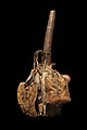
- Nomination Hunter's calabash from Dem.Rep. of Congo. Museum of natural history of La Rochelle, France.--Jebulon 01:13, 1 January 2011 (UTC)
- Promotion good --Mbdortmund 04:13, 1 January 2011 (UTC)
-

- Nomination Woodmouse (Germany). --Gridnorth 12:26, 1 January 2011 (UTC)
- Decline Too much noise --Berthold Werner 15:30, 1 January 2011 (UTC), (Edit conflict) Little detail, clumsy denoising (visible mask edge), very low resolution in the subject. --Dschwen 15:32, 1 January 2011 (UTC)
-

-

- Nomination Neolithic axe in Denmark --Archaeodontosaurus 14:58, 31 December 2010 (UTC)
- Promotion Good detail. --Dschwen 15:26, 31 December 2010 (UTC)
-
-
- Nomination Aspen trees near... Aspen! --Dschwen 00:55, 31 December 2010 (UTC)
- Promotion Good quality. --Mbdortmund 04:22, 1 January 2011 (UTC)
-

-

-

- Nomination Guy running down a dune at Great Sand Dunes National Park. --Dschwen 00:55, 31 December 2010 (UTC)
- Promotion spot in sky (left corner) --Archaeodontosaurus 09:13, 31 December 2010 (UTC) Support, mais un recadrage pour éviter le truc noir au coin suppérieur gauche.--HAF 932 14:11, 31 December 2010 (UTC) Comment No cropping needed, just remove the dust spot in the upper left corner. Then it will be QI indeed. -- MJJR 16:47, 31 December 2010 (UTC), Info Spot removed, and I also lightend the image a bit. --Dschwen 17:12, 31 December 2010 (UTC) Support good now --Archaeodontosaurus 10:12, 1 January 2011 (UTC)
-

-
- Nomination A geologic fault exposed by a roadcut, Red Rock Canyon National Conservation Area, Nevada, USA. --Óðinn 06:07, 30 December 2010 (UTC)
- Promotion Support QI & Useful --Archaeodontosaurus 15:03, 31 December 2010 (UTC)
-
-
-

- Nomination Female Bullfinch (Pyrrhula pyrrhula) eating grass seeds--Ken Billington 09:50, 28 December 2010 (UTC)
- Decline Mauvaise couleur de l'herbe, irréelle.--HAF 932 14:17, 31 December 2010 (UTC)
-

- Nomination Gannet (Morus bassanus) at Brow Head, Co. Cork, Republic of Ireland --Ken Billington 09:50, 28 December 2010 (UTC)
- Promotion Comment Too much noise in the background, but can be corrected --Archaeodontosaurus 14:37, 28 December 2010 (UTC) Done image noise now corrected --Ken Billington 20:26, 28 December 2010 (UTC) Support good now --Archaeodontosaurus 14:48, 31 December 2010 (UTC)
-

- Nomination Till cliff, lake Ontario, Clarington, Ontario, Canada --Óðinn 05:13, 27 December 2010 (UTC)
- Promotion Support QI & Useful --Archaeodontosaurus 15:05, 31 December 2010 (UTC)
-

- Nomination: Šibenik, Croatia - old guns --Pudelek 00:01, 27 December 2010 (UTC)
- Review needed
-

- Nomination: Starigrad-Paklenica, Croatia - small boat on the Velebitski kanal --Pudelek 00:01, 27 December 2010 (UTC)
- Review needed
-

- Nomination: The municipal stadium in Targovishte. --MrPanyGoff 18:32, 26 December 2010 (UTC)
- Review needed
-
- Nomination St. Petersburg by User:A.Savin proposed by --Mbdortmund 23:10, 25 December 2010 (UTC)
- Promotion Needs a little brightening. --King of Hearts 19:37, 30 December 2010 (UTC) Done A.S. 01:13, 31 December 2010 (UTC) Ok now IMO. --Ankara 12:10, 31 December 2010 (UTC)
-
- Nomination Hydroelectrical-powerplant in Kempten near memorial buildings of the Illervalley. Alofok 10:56, 31 December 2010 (UTC)
- Promotion Maybe a bit tilted? Otherwise very good. -- Felix Koenig 11:30, 31 December 2010 (UTC)
-

- Nomination Monastery of Saint Pishoy, Egypt --Berthold Werner 18:46, 30 December 2010 (UTC)
- Promotion good -- Felix Koenig 11:30, 31 December 2010 (UTC)
-

-

- Nomination Takeno Beach in Toyooka, Hyogo Pref. --663highland 01:12, 31 December 2010 (UTC)
- Promotion Good quality. --Dschwen 02:30, 31 December 2010 (UTC)
-

- Nomination Tottori Sand Dune in Tottori, Tottori Pref. --663highland 01:12, 31 December 2010 (UTC)
- Decline Oppose Spot in sky see note --Archaeodontosaurus 08:58, 31 December 2010 (UTC)
-

- Nomination Pagoda of Ikarugadera in Taishi ,Hyoto Pref. --663highland 01:12, 31 December 2010 (UTC)
- Promotion Good quality. --Dschwen 02:30, 31 December 2010 (UTC)
-
-

- Nomination Audouin’s Gull (Ichthyaetus audouinii), Majorca. --Oltau 19:01, 30 December 2010 (UTC)
- WARNING: third template parameter added – please remove.
-
- Nomination Head of great Sphinx of Giza, Egypt. --Oltau 18:49, 30 December 2010 (UTC))
- Promotion --ComputerHotline 19:19, 30 December 2010 (UTC)
-

- Nomination Great Sphinx of Giza against Khafra’s pyramid, Egypt. --Oltau 18:47, 30 December 2010 (UTC)
- Promotion --ComputerHotline 19:19, 30 December 2010 (UTC)
-

- Nomination Janina Uhse during the conferment of the JETIX Award --Raymond 17:40, 30 December 2010 (UTC)
- Promotion Good quality. --Dschwen 21:44, 30 December 2010 (UTC)
-

- Nomination Lexington Bridge during the conferment of the JETIX Award --Raymond 16:01, 30 December 2010 (UTC)
- Promotion good quality --Mbdortmund 16:14, 30 December 2010 (UTC)
-

-

- Nomination Biwako-Bunkakan Museum in Otsu, Shiga Pref. --663highland 13:47, 30 December 2010 (UTC)
- Promotion Support looks good to me. Slight distortion and bottom edgeds. --Niabot 15:47, 30 December 2010 (UTC)
-

- Nomination A stall at a fair --663highland 13:45, 30 December 2010 (UTC)
- Decline Oppose noisy and not sharp enough --Niabot 15:46, 30 December 2010 (UTC)
-

- Nomination The oil-fired Marbach III Power Plant near Marbach, Germany. -- Felix Koenig 11:39, 30 December 2010 (UTC)
- Promotion Good. Alofok 18:14, 30 December 2010 (UTC)
-

- Nomination Duvignau monumental fountain, Tarbes, Hautes-Pyrénées, France --Florent Pécassou 23:15, 29 December 2010 (UTC)
- Decline Oppose overexposed --Niabot 15:49, 30 December 2010 (UTC)
-

-

- Nomination Golden Hall of Daigoji in Kyoto --663highland 14:19, 29 December 2010 (UTC)
- Promotion Good quality for the given resolution. --Dschwen 00:41, 31 December 2010 (UTC)
-

- Nomination Pelagia noctiluca in Cala Tuent, Escorca, Majorca, Spain --Oltau 21:49, 28 December 2010 (UTC)
- Decline The bar for underwater sharpness is lower, but this is visibly unsharp even at preview size. Sorry. --King of Hearts 19:43, 30 December 2010 (UTC)
-

-

- Nomination Lowlands of Litoměřice District, Czech Republic.--Juan de Vojníkov 05:37, 28 December 2010 (UTC)
- Decline Overexposed sky. --King of Hearts 19:41, 30 December 2010 (UTC)
-

- Nomination Sego Lily (Calochortus nuttallii) --LeavXC 22:57, 27 December 2010 (UTC)
- Decline Front petal is glaringly out of focus. Try again with a higher f-number or from a different angle! --King of Hearts 19:41, 30 December 2010 (UTC)
-
- Nomination Road in Sedlec, Litoměřice District, Czech Republic.--Juan de Vojníkov 11:26, 27 December 2010 (UTC)
- Decline Extremely overexposed sky. --King of Hearts 19:47, 30 December 2010 (UTC)
-

- Nomination Český Krumlov, Czech Republic — Jagro 21:15, 26 December 2010 (UTC)
- Promotion A little unsharp, but nice composition and not bad for a compact. --King of Hearts 19:49, 30 December 2010 (UTC)
-

-

- Nomination Sandpiper (Actitis hypoleucos) feeding on the Rheinspitz, Vorarlberg, Austria --Ken Billington 14:01, 26 December 2010 (UTC)
- Decline Motion blur, not very sharp, little detail. --Dschwen 21:50, 30 December 2010 (UTC)
-

- Nomination Ikuno Station in Asago --663highland 02:05, 26 December 2010 (UTC)
- Promotion There is a large dust spot in the sky at right. Also needs a perspective correction at the left. Otherwise good. --Cayambe 17:15, 27 December 2010 (UTC), Fine as it is. --Dschwen 21:50, 30 December 2010 (UTC)
-
- Nomination Izutsuya is a famous traditional building in Asago --663highland 02:05, 26 December 2010 (UTC)
- Promotion Needs a perspective correction at the left side. Otherwise good. --Cayambe 17:16, 27 December 2010 (UTC, Fine as it is. --Dschwen 21:50, 30 December 2010 (UTC))
-

- Nomination: Chapel of St. Peter in Starigrad-Paklenica (9-10 century) --Pudelek 22:16, 24 December 2010 (UTC)
- Review needed
-

- Nomination: Inner Gate of Horyu-ji in Ikaruga, Nara Pref. --663highland 16:08, 24 December 2010 (UTC)
- Review needed
-
- Nomination Nandaimon Gate of Horyu-ji in Ikaruga, Nara Pref. --663highland 16:08, 24 December 2010 (UTC)
- Promotion A tiny bit of CA, but no big deal. Overall a nice picture. --King of Hearts 19:39, 30 December 2010 (UTC)
-

- Nomination Yakushiji in Nara Nara Pref. --663highland 16:08, 24 December 2010 (UTC)
- Promotion Ok. --Dschwen 21:53, 30 December 2010 (UTC)
-

- Nomination: Kibitsu Jinja in Okayama --663highland 14:18, 23 December 2010 (UTC)
- Review Comment Your subject is backlit, so the temple is mostly under heavy shadows and there is very little texture to see. Otherwise, the composition is amazing. --Murdockcrc 18:12, 23 December 2010 (UTC) Comment It is Reggaeman's subject. Yes, the composition is amazing.--663highland 16:14, 24 December 2010 (UTC)
-
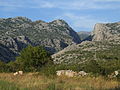
- Nomination NP Paklenica, Croatia - entrance to Mala Paklenica canyon --Pudelek 09:41, 23 December 2010 (UTC)
- Promotion Good shot. --King of Hearts 19:35, 30 December 2010 (UTC)
-

- Nomination: Golden Hall of Hōryū-ji in Ikaruga, Nara Pref. --663highland 15:28, 22 December 2010 (UTC)
- Review Comment Strong chromatic aberrations, can you fix them? -- H005 17:23, 22 December 2010 (UTC) Comment Thank you for advice --663highland 16:11, 24 December 2010 (UTC)
-
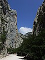
- Nomination National Park Paklenica - canyon Velika Paklenica --Pudelek 11:42, 20 December 2010 (UTC)
- Decline Underexposed. Could you correct that? --King of Hearts 18:25, 27 December 2010 (UTC)
No reply in 3 days - decline. --King of Hearts 19:26, 30 December 2010 (UTC)
-

- Nomination: Victoria Memorial in London --Carschten 18:10, 17 December 2010 (UTC)
- Review Comment I think the image can be improved if the levels are adjusted. --Murdockcrc 20:33, 17 December 2010 (UTC) Comment Could you describe me more exact what I should change? --Carschten 13:04, 18 December 2010 (UTC)
If you use Photoshop for post-processing, go to Image - Adjustments - Levels. There you can set the correct white and black points, and move the gray slider to make the image less flat. This is, of course, just a suggestion, I'm not going to oppose the nomination if you don't do that. --Murdockcrc 18:42, 18 December 2010 (UTC) Info I don't have Photoshop... but I tried to make some corrections... Any better? --Carschten 13:42, 24 December 2010 (UTC)
-
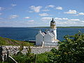
- Nomination Holburn Head Lighthouse near Scrabster Harbour, Scotland. --Gestumblindi 03:47, 30 December 2010 (UTC)
- Promotion Good quality. --Dschwen 04:15, 30 December 2010 (UTC)
-

-

-

- Nomination Necropolis of Son Real at the north coast of Majorca. --Oltau 22:28, 29 December 2010 (UTC)
- Decline Overexposed sky. --King of Hearts 09:37, 30 December 2010 (UTC)
-
-

- Nomination Flowers of Buckwheat --Alupus 21:54, 29 December 2010 (UTC)
- Decline The in-focus subject occupies only a small part of the frame. The out-of-focus background is very similar to the subject and is distracting. The image is a bit overexposed. About 10% of the pixels of the subject have a value of 255 in the red channel. Wsiegmund 03:29, 30 December 2010 (UTC)
-

- Nomination Garden Spider (Araneus diadematus) spins a web --Ken Billington 20:34, 29 December 2010 (UTC)
- Decline Pretty good closeup. Could you get rid (crop or clone out) of the out-of-focus flower? That would make it better. --King of Hearts 09:39, 30 December 2010 (UTC)
-

-

- Nomination Digitalis purpurea. --Bartiebert 16:03, 29 December 2010 (UTC)
- Decline Oppose Depth of field too low: you have to work manually --Archaeodontosaurus 18:03, 29 December 2010 (UTC)
-

- Nomination Neolithic tool --Archaeodontosaurus 14:18, 29 December 2010 (UTC)
- Promotion very good --Mbdortmund 16:27, 29 December 2010 (UTC)
-

-
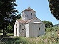
-

- Nomination Church St. Quintin, Mainz, Rhineland-Palatinate. -- Felix Koenig 11:56, 29 December 2010 (UTC)
- Promotion Good quality. --Dschwen 23:36, 29 December 2010 (UTC)
-

-

- Nomination An unnamed lake, Killarney Provincial Park, Ontario, Canada. --Óðinn 07:34, 29 December 2010 (UTC)
- Promotion Yes to me. --Bartiebert 16:29, 29 December 2010 (UTC)
-

- Nomination Geese at Takaragaike Park in Kyoto --663highland 16:00, 27 December 2010 (UTC)
- Promotion QI for me. --Jovianeye 05:04, 30 December 2010 (UTC)
-

- Nomination Mall in Golutvin by User:A.Savin proposed by --Mbdortmund 23:10, 25 December 2010 (UTC)
- Promotion Good quality. --Dschwen 23:49, 29 December 2010 (UTC)
-

- Nomination Scarborough Bluffs panorama, Toronto, Canada. --Óðinn 04:56, 25 December 2010 (UTC)
- Promotion Sporadically diffuse/blurred but beautiful composition altogether in my opinion. --Bartiebert 16:33, 29 December 2010 (UTC)


.JPG)


_13.jpg)


_in_flight,_from_above.jpg)

.JPG)


.JPG)


.jpg)
.jpg)


_v_b%C3%BDval%C3%A9_zahr%C3%A1dk%C3%A1%C5%99ek%C3%A9_kolonii_v_Troji_(002).jpg)


.JPG)


.jpg)


.jpg)


.jpg)

_railway_station_MMB_04.jpg)


.jpg)


.JPG)


.JPG)


.jpg)


.JPG)


.jpg)
.jpg)


.jpg)


.jpg)
_(12).JPG)


.jpg)


_(19).jpg)


.jpg)


.jpg)


.JPG)


_(8).JPG)
_(12).jpg)


_(4).jpg)


_(12).JPG)
_(17).jpg)


.jpg)


.jpg)


_(14).JPG)
_(11).JPG)


.jpg)
.jpg)


.JPG)


,_krajina_jihov%C3%BDchodn%C4%9B_od_obce.JPG)

,_silnice_od_Hazmburka.JPG)


_(23).jpg)


.JPG)


.JPG)


_03.jpg)


_(4).jpg)
,_Turku,_11.7.2010_(4).JPG)
_(6).JPG)
_Panorama.jpg)
.JPG)
.jpg)
.jpg)
Consensual review[edit]
File:Tjeldsundbrua, 2009 09.jpg[edit]

- Nomination Tjeldsund Bridge over Tjeldsundet in Nordland, Norway. -- Ximonic 10:32, 24 December 2010 (UTC)
- Promotion
- Support that looks ok to me --Carschten 13:33, 24 December 2010 (UTC)
- Done Atleast some of those fringes have been removed now. --Ximonic (talk) 02:17, 26 December 2010 (UTC)
- Support OK now, although the posterization of the clouds still is an issue. I think less light and colour tweaking would have been better here. -- H005 21:04, 26 December 2010 (UTC)
File:Backhaus Helfenberg-2.JPG[edit]

- Nomination The bakehouse of Helfenberg (Ilsfeld), Baden-Württemberg. -- Felix Koenig 09:21, 24 December 2010 (UTC)
- Decline
- Oppose poor lightning --Carschten 13:33, 24 December 2010 (UTC)
Bad joke? I thought the lightning was very good when I took the photo. -- Felix Koenig 14:25, 24 December 2010 (UTC)
- There couldn't be a very good lightning when you see so many underexposed and thereby disturbing (especially at thumb) areas. So no joke, just facts. --Carschten 16:35, 25 December 2010 (UTC)
- I don't see any underexposure. It's inpossible to take a photo without the shadow, and I don't think the shadow is disturbing. -- Felix Koenig 17:41, 25 December 2010 (UTC)
- It's disturbing imo and it's of course not impossible, take a photo at cloudy weather. --Carschten 18:58, 25 December 2010 (UTC)
- Ah, I forgot. A photo at cloudy weather would be very nice... how could I forgot that the best photos were taken at cloudy weather?? And of course the lighting is nearly perfect - at cloudy weather! I don't understand how I could forgot that. Felix Koenig 14:18, 26 December 2010 (UTC)
- It's disturbing imo and it's of course not impossible, take a photo at cloudy weather. --Carschten 18:58, 25 December 2010 (UTC)
- I don't see any underexposure. It's inpossible to take a photo without the shadow, and I don't think the shadow is disturbing. -- Felix Koenig 17:41, 25 December 2010 (UTC)
- Oppose Sorry, to me the shadow is disturbing--Lmbuga 21:07, 29 December 2010 (UTC)
File:Murgjo Sharr Mountain Dog Nedi Limani.jpg[edit]

- Nomination Sharri Mountain Dogs with Sheep ---- Mdupont 12:37, 17 December 2010 (UTC)
- Decline
- Does not conform to the 2MP minimum resolution requirement, sorry. --Murdockcrc 20:44, 17 December 2010 (UTC)
- Info now updated check new resolution --Mdupont 16:09, 18 December 2010 (UTC)
- Agreed, resolution is now over 2MP, I'm switching it back to nomination. Thanks. --Murdockcrc 17:28, 18 December 2010 (UTC)
- Underexposed image, but this is very easy to fix --Archaeodontosaurus 09:25, 19 December 2010 (UTC)
- Info Rtouched image now uploaded ----Mdupont 12:37, 19 December 2010 (UTC)
- Support Good now --Archaeodontosaurus 09:17, 21 December 2010 (UTC)
- Oppose -- Sorry but the subjects are blurry and with little detail. No QI in my opinion. -- Alvesgaspar 00:02, 23 December 2010 (UTC)
- Oppose Noised in the heads of dogs: Poor detail where the detail interests. To me (perhaps only to me) too tight crop: I need to see de horizon--Lmbuga 13:15, 23 December 2010 (UTC)
File:Quito Proc del Jesus del Gran Poder 2010 e.jpg[edit]

- Nomination Street procession in Quito, Ecuador. --Cayambe 18:44, 19 December 2010 (UTC)
- Promotion
- OpposeInteresting, but IMO too much going on. Can't concentrate on anything. Sorry. --kallerna 12:14, 20 December 2010 (UTC)
- Support No technical problem and that image is very rich --Archaeodontosaurus 15:14, 21 December 2010 (UTC)
- Support Plus very good white balance, no overexposure. Agree with Archeo.--Jebulon 16:53, 22 December 2010 (UTC)
- Support --Carschten 15:05, 23 December 2010 (UTC)
File:Red Fox (Vulpes vulpes) (4).jpg[edit]
_(4).jpg)
- Nomination Two fox cubs out to play -- Ken Billington 10:23, 19 December 2010 (UTC)
- Promotion Not perfectly sharp, but good enough--Jebulon 10:29, 19 December 2010 (UTC) Oppose 1,600 × 1,200. --kallerna 08:33, 21 December 2010 (UTC)
- Done A larger crop has now been uploaded (2,000 x 1,500). Hope this resolves this problem -- Ken Billington 18:18, 21 December 2010 (UTC)
- Support another time, if needed.--Jebulon 23:52, 21 December 2010 (UTC)
- Support I like it. Perhaps the image could be more sharp. Good composition--Lmbuga 13:01, 23 December 2010 (UTC)
- Support Ok. --Makele-90 17:26, 25 December 2010 (UTC)
- Support --PetarM 18:46, 25 December 2010 (UTC)
File:Kärsämäen eritasoliittymä, Turun ohikulkutie (kantatie 40), Turku, 11.7.2010 (4).JPG[edit]
,_Turku,_11.7.2010_(4).JPG)
- Nomination Kärsämäki interchange at Finnish national road 40 (part of European route E18) in Turku, Finland. --Makele-90 17:37, 11 December 2010 (UTC)
- Decline
- Better if almost half of the sky be cropped out.--Jebulon 01:11, 18 December 2010 (UTC)
- Oppose Technical quality is good, but I do not know what the image is for. Neither does it illustrate the subject appropriately, nor is this a particularly beautiful or interesting view. Also I find the front area too dark. -- H005 17:37, 22 December 2010 (UTC)
- Support - good quality. -- Felix Koenig 10:44, 24 December 2010 (UTC)
- Oppose composition not good: very ambiguous, unclear what the intention was. PS. sky crop would indeed help, per Jebulon. --Elekhh 20:59, 24 December 2010 (UTC)
- Oppose Echoing the comments above, unclear composition. The picture is in three disjoint parts: the sky, the road, and the hill; not sure what it's depicting. -- King of Hearts 19:13, 30 December 2010 (UTC)
File:Sanderling (Calidris alba) (6).JPG[edit]
_(6).JPG)
- Nomination Sanderling has short stopover in Austria during circumpolar migration -- Ken Billington 10:05, 19 December 2010 (UTC)
- Promotion Ok. Nice colours. --Ankara 23:00, 19 December 2010 (UTC) Needs a discussion IMO because of the grey disturbing thing in foreground (and maybe small overexposure of the back of the bird)--Jebulon 23:36, 21 December 2010 (UTC)
- Oppose Nice composition altogether! But: 1,92 MB, isn't it a little too small? Moreover the legs, the beak and the face are a little diffuse. And the stone in the foreground is disturbing. Sorry. --Bartiebert 17:25, 24 December 2010 (UTC)
- Support: Despite the size and the "stone" (which appears as a shell to me), still a good image. -- H005 21:11, 26 December 2010 (UTC)
- Question Such a shell in Austria ?--Jebulon 00:53, 27 December 2010 (UTC)
- Info It's definitely a stone and not a shell. --Ken Billington 13:25, 27 December 2010 (UTC)
- Support Good enough for QI imo, despite the disturbing stone. --Cayambe 17:00, 27 December 2010 (UTC)
- Support Size is 4.3 M pixel. QI for me --Archaeodontosaurus 08:28, 29 December 2010 (UTC)
- Support Bartiebert does raise some valid concerns, but they are minor and I feel this is an excellent image overall. -- King of Hearts 09:27, 30 December 2010 (UTC)
File:Linnanmäen Vonkaputous 4.jpg[edit]

- Nomination Vonkaputous in Linnanmäki, Helsinki. --kallerna 09:09, 8 December 2010 (UTC)
- Promotion
- Oppose Composition - too much uninteresting empty sky. Mattbuck 04:36, 16 December 2010 (UTC)
- As it was an aesthetic choice I like, I ask for a discussion, please.--Jebulon 00:56, 18 December 2010 (UTC)
- Support Per my opinion above.--Jebulon 10:02, 23 December 2010 (UTC)
- Oppose Sorry, I don't like the composition--Lmbuga 00:59, 24 December 2010 (UTC)
- Support Interesting use of rule of thirds. LeavXC (talk) 21:02, 29 December 2010 (UTC)
- Support Composition is a breath of fresh air (no pun intended). -- King of Hearts 09:30, 30 December 2010 (UTC)
File:Liss-Ellas mustard and Vika crispbread.jpg[edit]

- Nomination Mustard and crispbread in stall.--V-wolf 16:13, 7 December 2010 (UTC)
- Decline
- SupportSome mild overexposure, but I really like the composition and the warmth here. Mattbuck 19:55, 15 December 2010 (UTC)
- OpposeThe "pole" in foreground disturbs the composition IMO.--Jebulon 00:55, 18 December 2010 (UTC)
- Comment It's a stall with roof and as a such it has supporters in the ends.--V-wolf (talk) 19:23, 18 December 2010 (UTC)
- Support The composition is good for QI, imo. More important is that it is technically OK too.--MrPanyGoff 16:24, 20 December 2010 (UTC)
- Oppose per Jebulon. Composition is equally important with "technically OK". If is bad composition is not going to be used. --Elekhh 01:31, 23 December 2010 (UTC)
- Oppose Bad composition --Archaeodontosaurus 10:41, 24 December 2010 (UTC)
- Support This is a really good photo! For me a quality image. --A.Ceta 17:33, 26 December 2010 (UTC)
- Oppose Bad composition--Lmbuga 20:51, 29 December 2010 (UTC)
- Oppose Composition is a little messy. -- King of Hearts 09:32, 30 December 2010 (UTC)
File:Monet - un bras de Seine près de Vétheuil.jpg[edit]

- Nomination A Monet painting in Tours. --Eusebius 11:53, 31 December 2010 (UTC)
- Promotion Support Very good and useful.--Jebulon 15:21, 31 December 2010 (UTC)
- Support Good quality,
but shouldn't the frame be cropped to ensurer it is a 2D reproduction of a 2D artwork (frame is 3D!). --Dschwen 15:26, 31 December 2010 (UTC)- CommentWho cares? It is not PD-Art, it is PD-self: I am the photographer and I choose to release it under a free license, like many other photographs of 3D scenes. We can make a version without frame of course, but we're not forced to do that by "legally technical" reasons. --Eusebius 10:16, 1 January 2011 (UTC)
- Comment Indeed. The frame would only be a problem if the uploader weren't the photographer. PD-Art is for 2D photographs of artwork taken by third-party photographers. This, however, is a PD-old painting by Monet, photographed by a Commons user who releases his own photograph into the public domain. So, no need to crop. Gestumblindi 02:41, 2 January 2011 (UTC)
- Ok, good point. Sorry for the holdup then. --Dschwen 04:02, 2 January 2011 (UTC)
File:Borjomi's Park.JPG[edit]

- Nomination Nice photo from Borjomi-Kharagauli National Park in Georgia. --Geagea 21:40, 23 December 2010 (UTC)
- Promotion
- Oppose Unfortunately, NR has destroyed the textures of the greenery. In general compact cameras need to be shot at ISO 100 or lower for a good signal-to-noise ratio. --King of Hearts 20:17, 27 December 2010 (UTC)
- Support OK with your comment, but it isn't too drastic to ask such technical requirement? It is only QI... Borvan53 (talk) 22:29, 28 December 2010 (UTC)
- I don't find it all that drastic. If the ISO 200 were necessary given the light value, then I wouldn't mind. But here we have a shutter speed of 1/100, which could be lowered instead of raising the ISO. -- King of Hearts 09:18, 30 December 2010 (UTC)
- Support--Jebulon 15:57, 31 December 2010 (UTC)
File:Green turtles at Black Sand Beach.jpg[edit]

- Nomination Green turtles at Black Sand Beach--Mbz1 16:32, 27 December 2010 (UTC)
- Withdrawn No composition & not horizontal --Borvan53 23:41, 27 December 2010 (UTC) What is not horizontal? Shoreline? Please see how it looks.--Mbz1 00:50, 28 December 2010 (UTC)
- Yes, the shorline is not horizontal, as well as the canopy. But it is more a perspective effect than a mistake: the scene is unbalanced and not built. Nothing to stop the eye at right, left turtle is cut,... Sorry, in my opinion, rotating the image is necessary but should be not enough. Waiting for opinion from someone else... --Borvan53 (talk) 12:43, 28 December 2010 (UTC)
- The turtle is cut? It is not cut at all.--Mbz1 12:47, 28 December 2010 (UTC)
![]() — Preceding unsigned comment added by Mbz1 (talk • contribs) 2 January 2011 (UTC)
— Preceding unsigned comment added by Mbz1 (talk • contribs) 2 January 2011 (UTC)
File:Privlaka (Dalmatien) Panorama.jpg[edit]
_Panorama.jpg)
- Nomination Privlaka (Dalmatien) Panorama --Böhringer 22:57, 19 December 2010 (UTC)
- Decline
- Oppose It's tilt! --Pudelek 13:57, 23 December 2010 (UTC)
- Support it isn't tilt, you don't have a real even water horizon. QI for me. --Alchemist-hp 15:18, 23 December 2010 (UTC)
- Comment I see water horizon and on the left is tilted! --Pudelek 17:23, 24 December 2010 (UTC)
- Oppose tilt is obvious to me. Should be easy to fix. --Dschwen 22:44, 28 December 2010 (UTC)
- Oppose If the image is not tilted, there are distortion. Rule of thirds: Too much sky. I don't like the composition: Too tight al bottom--Lmbuga 18:31, 31 December 2010 (UTC)
File:Glenview Station.jpg[edit]

- Nomination Glenview Amtrak/Metra Station --Jovianeye 03:51, 14 December 2010 (UTC)
- Decline
- Comment A bit tilted and a bit of perspective distortion (to me)--Lmbuga 19:03, 14 December 2010 (UTC)
- See if it's better now (this is much harder than I thought!) --Jovianeye 05:33, 15 December 2010 (UTC)
- The crop is too tight, especially left.--Jebulon 23:45, 21 December 2010 (UTC)
- Oppose Too tight crop (at left and at bottom)--Lmbuga 13:20, 23 December 2010 (UTC)
File:Schwafheimer Meer, Feld Sonnenuntergang, CN-2010-12.jpg[edit]

- Nomination Sunset at a snowy field in Moers --Carschten 12:11, 18 December 2010 (UTC)
- Decline
- Oppose Sorry, uninteresting composition. --kallerna 12:39, 18 December 2010 (UTC)
- I think you confound FP and QI. --Carschten 13:02, 18 December 2010 (UTC)
- Oppose The composition is part of the image quality. Yann 15:05, 18 December 2010 (UTC)
- Comment Yann, of course. But boring composition, uninteresting composition and no wow factor aren't QI criteria imo, that's FP. Bad composition would be one, but if there's bad composition, please tell me what's bad. And if you tell me uninteresting composition is a QI criterion I know my vote decisions at a lot of the candidates here, e.g. File:Porto July 2009-10.jpgFile:Okochi Sanso32n4592.jpgFile:N Connector.jpgFile:Coral reefs in the Red Sea.jpg etc. --Carschten 15:21, 18 December 2010 (UTC)
- Comment At least you should follow the rule of thirds for the sun. Better you could also try playing with the tracks on the ground. Yann 15:38, 18 December 2010 (UTC)
- Comment so you mean yes, boring composition is a QIC criterion?!? --Carschten 16:01, 18 December 2010 (UTC)
- Comment Agree with Carschten: "uninteresting composition" is not a QI argument, only "bad composition" is. The image could be cropped if you would like to achieve rule of thirds, so is no reason to oppose IMHO. --Elekhh 01:35, 23 December 2010 (UTC)
File:Edfu Tempel 42.jpg[edit]

- Nomination Sunken-relief in the Temple of Edfu, Egypt. --Oltau 17:38, 30 December 2010 (UTC)
- Promotion
- Support Good quality. --Dschwen 21:44, 30 December 2010 (UTC)
- Needs a slight perspective correction IMO.--Jebulon 01:16, 1 January 2011 (UTC)
- Support It is not always necessary and sometimes counterproductive to correct pespective in a compulsive manner. In this case it would crop essential parts of the relief. Good image as it is. -- Smial 15:26, 2 January 2011 (UTC)
- Perspective correction ready, --Oltau 18:10, 2 January 2011 (UTC)
- Support I like it now--Lmbuga 02:28, 3 January 2011 (UTC)
- Support for this, by Oltau himself perspectively corrected, version. --Alupus 10:31, 3 January 2011 (UTC)
- Support now, with this slight enough (and not compulsive) perspective correction. Nothing essential lost. Much better.--Jebulon 16:24, 3 January 2011 (UTC)
[edit]
.JPG)
- Nomination Working glass mould.--Juan de Vojníkov 11:26, 27 December 2010 (UTC)
- Promotion
- Comment Noise is visible in the person's shorts. Denoising might help! --Jovianeye 05:04, 30 December 2010 (UTC) Support NR has clearly been applied already, and in any case being absolutely noise-free is not a requirement. I think overall this is a good image. --King of Hearts 19:56, 30 December 2010 (UTC)
- Support QI for me ; but a caption in English is recommended --Archaeodontosaurus 15:10, 31 December 2010 (UTC)
- Support No relevant noise problem. -- Smial 17:58, 2 January 2011 (UTC)
File:Sjöstadskapellet december 2010.jpg[edit]

- Nomination New Chapel in Stockholm.--Ankara 21:27, 17 December 2010 (UTC)
- Decline
- sin't it a white balance problem ? I think it is too "blue-grey"--Jebulon 00:44, 18 December 2010 (UTC)
- New version uploaded.--Ankara 01:04, 18 December 2010 (UTC)
- Thank you, better now, but not good enough, I'm afraid. Let's discuss--Jebulon 09:15, 24 December 2010 (UTC)
- Comment Are you still concerned about the colours? Remember that the photo was taken at two o'clock in the afternoon (sunset 14:47) in Stockholm (59 degrese North) in 17 of December. It was also a dark day with low cloud cover. I think the image now reflects the natural light and colours of the day. Regards--Ankara 10:28, 24 December 2010 (UTC)
- You are not wrong. That's why I didn't oppose...--Jebulon 16:54, 25 December 2010 (UTC)
- Oppose White balance isnt't ideal, but what concerns me more are other factors such as dull light, the tree hiding part of the building, the lines that go straight through the image. The fact that the weather was this way doesn't mitigate for the issues resulting from it. It just wasn't the rigth time to shoot a QI. -- H005 13:48, 24 December 2010 (UTC)
- Oppose It's just not possible to create a QI for some subjects in certain types of weather. -- King of Hearts 09:22, 30 December 2010 (UTC)
File:Wall-038.jpg[edit]

- Nomination Wall of a war memorial. --Bartiebert 16:48, 1 January 2011 (UTC)
- Promotion
- Good quality. --Dschwen 17:38, 1 January 2011 (UTC)
- Oppose; overexposed sky. A.S. 17:44, 1 January 2011 (UTC)
- A little better now? Please note there are possibly influences by weather too. It was not a clear and blue sky - not all through. --Bartiebert 20:56, 1 January 2011 (UTC)
- Perhaps, but on the other side, a wall cannot run away; I suppose that it's possible to shot the same motive to a more appropriate time. Imho, the upper third of the pic is still much too white; it may hardly be corrected by software. A.S. 21:47, 1 January 2011 (UTC)
- Remove the upper third?--Ankara 23:34, 1 January 2011 (UTC)
- Perhaps, but on the other side, a wall cannot run away; I suppose that it's possible to shot the same motive to a more appropriate time. Imho, the upper third of the pic is still much too white; it may hardly be corrected by software. A.S. 21:47, 1 January 2011 (UTC)
- A little better now? Please note there are possibly influences by weather too. It was not a clear and blue sky - not all through. --Bartiebert 20:56, 1 January 2011 (UTC)
- Support There is not any over exposure in both images. Please adjust your tft settings. Image meets QI requirements. This is not FP. Please do not crop without need. -- Smial 17:28, 3 January 2011 (UTC)
File:Evaristo Nugkuag - Rathaus Köln (7177).jpg[edit]
.jpg)
- Nomination Evaristo Nugkuag, a Peruvian environmentalist --Raymond 21:10, 28 December 2010 (UTC)
- Decline
- Support Ok. --kallerna 10:32, 29 December 2010 (UTC)
- Oppose Red eyes and exotic colors in glasses and black parts. --すけ 17:05, 30 December 2010 (UTC)
- Oppose per すけ. The hair (dark color) is messed up --Niabot 22:18, 31 December 2010 (UTC)
- Support. I don't see "messed up" colors. This is an above average portrait and certainly QI to me. --Dschwen 18:25, 3 January 2011 (UTC)
- Oppose for QI at least red eye reduction should be done and I see disturbing reflections on glasses and skin, caused by flash --J. Lunau 19:52, 3 January 2011 (UTC)
File:Saqqara BW 7.jpg[edit]

- Nomination The way to the pyramid of Unas, Saqqara, Egypt --Berthold Werner 16:48, 20 December 2010 (UTC)
- Promotion
- Oppose Nothing special; this kind of composition should have something interesting in the middle. --King of Hearts 18:19, 27 December 2010 (UTC)
- Comment 1st This is not FPC. 2nd The interesting part is the light gap in the ceiling. --Berthold Werner 09:33, 28 December 2010 (UTC)
- What I'm saying is, it does not depict its subject well in that case, which is a QIC requirement. -- King of Hearts 09:20, 30 December 2010 (UTC)
- Support solid quality. --Dschwen 22:42, 28 December 2010 (UTC)
- Support--Jebulon 15:53, 31 December 2010 (UTC)
- Support Good composition. -- Elekhh (talk) 02:30, 1 January 2011 (UTC)
- Support Well, it seems to show the way to the pyramid of Unas, and it does it fine. -- Smial 18:25, 3 January 2011 (UTC)
File:Storfjorden autumn, 2009 09.jpg[edit]

- Nomination Autumn at Storfjorden, Troms, Norway. -- Ximonic 10:32, 24 December 2010 (UTC)
- Promotion
- Oppose oversaturated, chromatic aberrations --Carschten 13:33, 24 December 2010 (UTC)
Carschten is right but would be nice if corrected --Mbdortmund 23:23, 25 December 2010 (UTC)
- Done I had some time removing the chromatic aberrations and also the saturation has been reduced in some color ranges. Any saturation wasn't added in the first place, but I think you were right about the bit too harsh colors anyway. --Ximonic 13:38, 26 December 2010 (UTC)
- Support looks good for me now --Mbdortmund 23:42, 26 December 2010 (UTC)
- Support Seems to be a good and vivid landscape shot. LeavXC 21:42, 27 December 2010 (UTC)
- Strong Oppose Oversaturated, us Carschten--Lmbuga 18:36, 31 December 2010 (UTC)
- Overexposed at left--Lmbuga 18:47, 31 December 2010 (UTC)
- To me beautiful. Beautiful, beautiful, but not QI--Lmbuga 18:50, 31 December 2010 (UTC)
- I think it would be quite easy to go and fix if I knew which color is still oversaturated and where? I've desaturated it quite much all over already (I will soon make it just gray piece of work) Maybe I just desaturate it all over again. --Ximonic 16:36, 1 January 2011 (UTC)
- Done Overall desaturation - still oversaturated? Before the doom, I would really like to give this photo all I can because I personally like it. --Ximonic 17:14, 1 January 2011 (UTC)
- colors are best now --Archaeodontosaurus 09:44, 2 January 2011 (UTC)
- Comment The colors are at the moment indecuate to me. I would like to see the original image--Lmbuga 02:05, 3 January 2011 (UTC)
- The original is very close to the first version in file history. During the photograph it was very strongly a colorful moment. So the original photograph might look like ”strongly oversaturated” to people here. Yet the original pictures are also quite dark to overexposure the bright sky at the right as little as possible. --Ximonic 14:49, 3 January 2011 (UTC)
- So all I had done to the first file in file history after the stitching of original pictures was mostly just lightness increasing to make the picture not to look as dark. Not much anything else. So, if you would like to make your own version you would as well just edit the first file in the history. --Ximonic 15:05, 3 January 2011 (UTC)
- Support I can not judge the colors without knowing the real locations, but in general for me a great shot in high Qualitiy --J. Lunau 19:56, 3 January 2011 (UTC)
- Support Good. Please add geo info. -- Smial 00:02, 4 January 2011 (UTC)
- Done Location tag added. It was very diffucult to find just the right spot from the satellite pictures but I think I found it. Atleast I'm very sure about the part of the coastline. --Ximonic 00:36, 4 January 2011 (UTC)
File:Ford Focus RS WRC IAA 2009.JPG[edit]

- Nomination: Ford Focus RS WRC, IAA 2009. -- Felix Koenig 12:09, 28 December 2010 (UTC)
- Review Good image. --King of Hearts 19:45, 30 December 2010 (UTC) bad white balance IMO. Please discuss--Jebulon 16:18, 31 December 2010 (UTC)
You may call it "bad white balance", but the car was in blue light, and it would be nonsense to correct that. -- Felix Koenig 17:47, 31 December 2010 (UTC)
File:Trosky, věž Panna.jpg[edit]

- Nomination Castle Trosky, Czech Republic — Jagro 12:23, 27 December 2010 (UTC)
- Decline A bit undersaturated and unsharp. Not the best weather for this shot, unfortunately. --King of Hearts 19:47, 30 December 2010 (UTC) Not so bad. Please discuss --Jebulon 16:10, 31 December 2010 (UTC)
Oppose Beautiful picture, bat us King of Hearts--Lmbuga 02:58, 3 January 2011 (UTC) - Nicht typisch für Trosky; Grauschleier über dem Bild --Ralf Roletschek 16:40, 7 January 2011 (UTC)
File:Ritz Cracker.jpg[edit]

- Nomination Ritz Cracker that I just ate. ZooFari 03:36, 30 December 2010 (UTC)
- Promotion Support QI - please does not photo of what has become --Archaeodontosaurus 10:55, 30 December 2010 (UTC) Oppose Shadow and border does not look good to me. --Niabot 15:40, 30 December 2010 (UTC)
- Support QI to me.--Jebulon 16:04, 31 December 2010 (UTC)
 Neutral I don't like it. Perhaps too yellow (or orange), but i'm not sure--Lmbuga 18:56, 31 December 2010 (UTC)
- Comment The color of the cookie looks ok. I was actually pleased with the shadow, but others' opinion count too. Not sure what border Niabot refers to though. ZooFari 19:45, 31 December 2010 (UTC)
- Support--Mbz1 17:21, 4 January 2011 (UTC)
![[1]](http://www6.pic-upload.de/31.12.10/v1kd59agdcif.png)
File:Bastion Valletta.jpg[edit]

- Nomination Bastion of Valletta with the Hastings Garden on it. -- Felix Koenig 20:37, 15 December 2010 (UTC)
- Decline Comment left side seems to be tilted/distorted ccw --Mbdortmund 07:29, 16 December 2010 (UTC)
Nicht unbedingt. Das Ding ist definitiv schief, vgl. auch hier, fragt sich nur, wie sehr. -- Felix Koenig 15:32, 16 December 2010 (UTC) Oppose too tight crop at bottom imo --Carschten 15:10, 23 December 2010 (UTC)
Sorry, I don't think so. The whole bastion is shown. -- Felix Koenig 19:02, 23 December 2010 (UTC)
- Comment Slight perspective correction applied -- Smial 23:39, 3 January 2011 (UTC)
- Thank you, I'm not sure whether it is totally realistic, but good rework I think. Felix Koenig 16:16, 6 January 2011 (UTC)
File:Friedhofskapelle Bönnigheim-2.JPG[edit]

- Nomination Cemetery chapel in Bönnigheim, Baden-Württemberg. -- Felix Koenig 11:41, 31 December 2010 (UTC)
- Promotion
- Shadow in the bottom right is a bit dark, but good quality otherwise. --Dschwen 15:26, 31 December 2010 (UTC)
Oppose Underexposed at right and at windows, see notes--Lmbuga 02:46, 3 January 2011 (UTC)
- Perhaps too tight crop only at right, but to me it's not QI with this crop--Lmbuga 00:32, 10 January 2011 (UTC)
- Support Good view, only very slight under exposure. Details in shadowy parts are visible. Please adjust your monitor. -- Smial 16:43, 10 January 2011 (UTC)
- die Schatten haben Zeichnung und können bei Bedarf auch problemlos aufgehellt werden. --Ralf Roletschek 12:25, 11 January 2011 (UTC)
- Support good composition. Alofok 17:00, 11 January 2011 (UTC)
File:Amphiperca_multiformis_01.jpg[edit]

- Nomination Amphiperca multiformis from the Messel Fossil Pit Site --Llez 16:20, 30 December 2010 (UTC)
- Decline
- OpposeA bit too small, too little resolution on the subject (padding left and right) --Dschwen 21:44, 30 December 2010 (UTC)
- Support The support is rarely symmetric, which explains the fossil plate of the framings sometimes unsightly. Fish is perfect. --Archaeodontosaurus 09:04, 31 December 2010 (UTC)
- Support--Jebulon 16:05, 31 December 2010 (UTC)
- Guys this image barely has 2 Megapixel and some of the space is wasted by padding. --Dschwen 13:18, 3 January 2011 (UTC)
- The space around the fish is very interesting. It's plastic, not stone. The fossilization of this field is amazing including extraction techniques that are complex. The fish itself is absolutely true! --Archaeodontosaurus (talk) 18:19, 3 January 2011 (UTC)
- Then go nominate it at VIC. This is QIC and the quality of this image is substandard. --Dschwen 18:24, 3 January 2011 (UTC)
- Oppose Per Dschwen. Should be centered. --kallerna 13:36, 4 January 2011 (UTC)
- Oppose Per Dschwen. Subject is too small and should be centred. Besides, reflexions are overexposed, although this might be unavoidable. --Eusebius 10:02, 11 January 2011 (UTC)
- Oppose Per Eusebius. --Makele-90 20:08, 11 January 2011 (UTC)
File:Nippenburg Burgtor West.jpg[edit]

- Nomination On the castle ruin Nippenburg, Germany --Harke 17:20, 17 December 2010 (UTC)
- Promotion
- Oppose Bad orientation of the light. Disturbing shadow in foreground right--Jebulon 09:20, 24 December 2010 (UTC)
- Support I like it, imo the shadow isn't disturbing. Let's discuss. -- Felix Koenig 17:43, 25 December 2010 (UTC)
- Support light is ok IMO, shadow in the foreground definitely not disturbing. --Elekhh 02:24, 1 January 2011 (UTC)
- Oppose Sorry, your subject is not backlit, but the shadows are disturbing--Lmbuga 01:00, 3 January 2011 (UTC)
- Oppose even it is a nice shoot in good quality, I agree with Jebulon and Lmbuga: disturbing shadows in foreground. (could be avoided by better crop, I think) --J. Lunau 19:20, 3 January 2011 (UTC)
- Support If there is light, there will be shadow. Excellent composition, good lighting that enhances the old masonry, details in shadowy parts still good visible. Sharp, no CA, no blur, perfect exposure. -- Smial 23:55, 3 January 2011 (UTC)
- Support Good image. However, it could be cropped a little bit, to make the shadow smaller. But the composition is more important than that. -- Lipedia 03:00, 11 January 2011 (UTC)
- Oppose Per others: distracting shadows. --Eusebius 09:55, 11 January 2011 (UTC)
- Support There are shadows, but those are vivid shadows. Real life landscapes have some shadows in Summer, yes.--PereslavlFoto 15:40, 11 January 2011 (UTC)
- Support shadow isn't disturbing. Alofok 16:58, 11 January 2011 (UTC)
- Support Per Alofok. --Makele-90 20:03, 11 January 2011 (UTC)
File:Henriksdals station december 2010.jpg[edit]

- Nomination Henriksdal station.--Ankara 18:36, 18 December 2010 (UTC)
- Decline
- Support I like it --Mbdortmund 22:21, 18 December 2010 (UTC)
- Oppose I don't like those brances, the focus is not in the station. The right side is too messy. --kallerna 12:16, 20 December 2010 (UTC)
- Comment The bus stop is of course related to the station. I was not trying to create an artistic image, but to show the place as it looks. The area around the station is messy, and when the image is intended for use on Wikipedia, it should portray the site as it looks..--Ankara 20:27, 20 December 2010 (UTC)
- Support Is a good illustration of a train station-bus stop interchange. The time of taking the shot is ideal (winter, two trains and a bus of the same colour) to make it look as unmessy as possible, although I think a vantage point from further right might have been better, to avoid some of the branches. --Elekhh (talk) 01:47, 23 December 2010 (UTC)
- Oppose as per kallerna. -- H005 23:40, 25 December 2010 (UTC)
- Oppose The branches are quite distracting. Per Elekhh, a view from further right would be better. --LeavXC 22:27, 27 December 2010 (UTC)
- Support Standing further right would mean standing in the middle of the tracks ... I think this depicts the subject well. -- King of Hearts 09:29, 30 December 2010 (UTC)
- Oppose As Kallerna. In addition, the branches and others are disturbing. Not sharp enough--Lmbuga 02:02, 3 January 2011 (UTC)
- Support--Mbz1 17:19, 4 January 2011 (UTC)
- unten und links radikal beschneiden, dann wäre das was. Zuviel unwichtiges Gestrüpp auf dem Bild --Ralf Roletschek 11:38, 8 January 2011 (UTC)
- Oppose Lack of composition, distracting branches on a significant portion of the picture, subject centred. --Eusebius 09:51, 11 January 2011 (UTC)
- Oppose per kallerna. --Makele-90 20:00, 11 January 2011 (UTC)
File:Sean_Astin_1.jpg[edit]

- Nomination The actor Sean Astin giving a talk at the University of Illinois at Urbana-Champaign --Dschwen 15:22, 13 January 2011 (UTC)
- Promotion Support Very good portrait! --AngMoKio 15:41, 13 January 2011 (UTC) Comment Less than 6 megapixels and unsharp. Let's discuss. I'm not sure--Lmbuga 01:14, 14 January 2011 (UTC) Support Sharp enough for me and already a featured picture...Letartean 18:12, 14 January 2011 (UTC) Support Weak support. The face isn't entirely in focus, but ok for QI (but not FP) IMO.--Ankara (talk) 21:30, 14 January 2011 (UTC) Support focus not perfect, but otherwise a very good job, especially for an indoor portrait picture. --Carschten 22:06, 14 January 2011 (UTC)
File:Siřejovice, střecha domu.JPG[edit]

- Nomination Roof covered by "bobrovka" in Litoměřice District, Czech Republic.--Juan de Vojníkov 00:30, 10 January 2011 (UTC)
- Decline
- Support Good quality and useful -- Smial 12:35, 11 January 2011 (UTC)
- Oppose See the detail of transition between roof and black colour. Image is nice and should be QI, however it needs more work to be QI. Not now and not this version. --Chmee2 15:49, 12 January 2011 (UTC)
- Oppose Per Chmee2-- --Archaeodontosaurus (talk) 15:02, 13 January 2011 (UTC)
- Oppose Per Chmee2-- --Kyknos 16:26, 13 January 2011 (UTC)
File:Chicago_lifeguard.jpg[edit]

- Nomination Lifeguard at North Ave Beach in Chicago --Dschwen 01:33, 9 January 2011 (UTC)
- Decline
- Oppose Image quality is fine but the guy with the DSLR is stealing all the attention from the lifeguard. --Jovianeye 03:16, 11 January 2011 (UTC)
- Uhm, ok, now we are really drifting off into the realm of COM:FPC! --Dschwen 20:28, 11 January 2011 (UTC)
- Oppose no, in this case we don't drift off to the FPC. Composition is part of the QIC, too, and I also think that the composition is not good enough (the man in foreground, lifeguard tower cutted off at the left) --Carschten 14:56, 13 January 2011 (UTC)
- Oppose Per Carschten. Makele-90 20:10, 14 January 2011 (UTC)
- So if the filename of the image would have been Photographer on a Chicago city Beach, it would have been fantastic, considering that I went out of my way (into the water) to include the lifeguard tower with the Chicago city flag, and an iconic Building (Hancock Center)? This review is confusing to me. --Dschwen 21:55, 14 January 2011 (UTC)
- Oppose In this case not convinced that the composition is OK (framing: left side of the construction and of the man standing there cut off; no concentration on the main object; random background)
File:National Park Service ranger vehicle.jpg[edit]

- Nomination National Park Service ranger vehicle in Mesa Verde. --Dschwen 00:55, 31 December 2010 (UTC)
- Promotion
- schönes Foto, mach doch die Vignettierung/das Rauschen in den oberen Ecken wech, vor allem links oben. --Mbdortmund 04:20, 1 January 2011 (UTC)
{{o}}I can't understand your language. To me, good picture, but too tight crop. And the car of the right is disturbing--Lmbuga 01:28, 3 January 2011 (UTC)- Sigh, this is not FP. --Dschwen 02:14, 3 January 2011 (UTC)
- Ok, I only understood half of that, but a) how is this crop too tight? b) there is no disturbing foreground, c) the background is hardly disturbing, it does not interfere with the bright car at all. --Dschwen 23:04, 3 January 2011 (UTC)
- Perhaps you are right. I will be able to learn with the opinion of others users, if I am able. Thanks and sorry--Lmbuga 12:14, 4 January 2011 (UTC)
- Ok, I only understood half of that, but a) how is this crop too tight? b) there is no disturbing foreground, c) the background is hardly disturbing, it does not interfere with the bright car at all. --Dschwen 23:04, 3 January 2011 (UTC)
- Support On FP, reviewers may object to the crop on the sides, but I think it satisfies the criteria for QI where the emphasis is more on technical quality than composition. A tight crop makes an image more useful as a thumbnail. Vignetting on a 5D at f/9 and 75 mm FL is not a reasonable explanation; sky brightness variation occurs and is the probable cause, in my judgment. I don't think a polarizing filter could be responsible over the corresponding FOV and no such filter was mentioned on the file page. Walter Siegmund (talk) 18:20, 9 January 2011 (UTC)
- Comment I can't understand, Wsiegmund, perhaps I can't understand English. Is the concept of composition writed in Commons:Image guidelines? Why does the composition, in QI, have less value? For me too tight crop at right and at left--Lmbuga 20:51, 9 January 2011 (UTC)
- But the image is good (perhaps QI). Only I wish to understand and I do not understand the explanation. The explanation, I think, would have to be present in the policies --Lmbuga 21:01, 9 January 2011 (UTC)
- Commons:Quality_images_candidates#Purpose implies that QI is a more inclusive set than FP. I find no detailed guidance to distinguish the two. In the absence of more explicit guidance and as long as the explicit criterion is satisfied ("The subject should not be cropped"), I will likely support an image that some may consider cropped too tightly. It is one component of five of the "Composition" item, which is, in turn, one of eleven criteria (please see Commons:Image_guidelines). Operationally, a QI is whatever a majority of reviewers decide. That said, I think explanations and criteria for QI and FP could and should be improved. Changes may be proposed at Commons_talk:Quality_images_candidates. Wsiegmund 22:07, 9 January 2011 (UTC)
- I think (all users think) that QI is a more inclusive set than FP, but I don't will likely, habitually, support an image that some may consider cropped too tightly. I can do this if there are policies that express it--Lmbuga 00:09, 10 January 2011 (UTC)
- Commons:Quality_images_candidates#Purpose implies that QI is a more inclusive set than FP. I find no detailed guidance to distinguish the two. In the absence of more explicit guidance and as long as the explicit criterion is satisfied ("The subject should not be cropped"), I will likely support an image that some may consider cropped too tightly. It is one component of five of the "Composition" item, which is, in turn, one of eleven criteria (please see Commons:Image_guidelines). Operationally, a QI is whatever a majority of reviewers decide. That said, I think explanations and criteria for QI and FP could and should be improved. Changes may be proposed at Commons_talk:Quality_images_candidates. Wsiegmund 22:07, 9 January 2011 (UTC)
I have changed my vote {{o}}: Too tight crop at left and at right. Not much, but the background are disturbing (black car at right)--Lmbuga 00:18, 10 January 2011 (UTC)
- Perhaps too tight crop only at right, but I must see the new image--Lmbuga 00:38, 10 January 2011 (UTC)
- Support good quality. Alofok 20:36, 11 January 2011 (UTC)
- Support IMO the framing is acceptable for a vehicle. --Jovianeye 00:28, 12 January 2011 (UTC)
- New opinion Support--Miguel Bugallo 23:38, 12 January 2011 (UTC)
- Support Good quality. Car at right is not too disturbing. Makele-90 20:05, 14 January 2011 (UTC)
File:Destroyed hotel in Srebreno.jpg[edit]

- Nomination Srebreno, Croatia - hotel destroyed in 1991 year --Pudelek 15:03, 12 January 2011 (UTC)
- Withdrawn good --Carschten 15:21, 12 January 2011 (UTC)
- Oppose Per the other picture nominated, I don't think this image meets the composition criteria of QI. Let's discuss. --Murdockcrc 17:40, 12 January 2011 (UTC)
- Oppose The composition does not worry me, but the darkness of the interior combined with the extremely blown lights in the "windows". This is a scene that calls for HDRI. -- H005 22:12, 14 January 2011 (UTC)
- this is HDR!! (make in Dynamic Photo HDR) --Pudelek 23:51, 14 January 2011 (UTC)
- Comment The name of the hotel and an exact location are missing. --ŠJů 13:38, 15 January 2011 (UTC)
- I do not know the name of the hotel --Pudelek 16:21, 15 January 2011 (UTC)
- Oppose Blow up at right, and CA. --Jebulon 17:35, 15 January 2011 (UTC)
![]() I withdraw my nomination --Pudelek 19:03, 15 January 2011 (UTC)
I withdraw my nomination --Pudelek 19:03, 15 January 2011 (UTC)
- I think it's really much too pedantic too oppose the image because it's dark (what do you expect for a lighting in a ruin??), blown highlights (omg, maybe 5% or even less are too bright, omg...) and chromatic aberrations, for which I need a magnifier too see them (just for you information: [2][3]etc. are all supported pictures)... Head-shaking and still a lonely Support from --Carschten 19:19, 15 January 2011 (UTC)
![[2]](https://commons.wikimedia.org/wiki/File:Peter_Stehlik_2010.12.25_022a.jpg)
![[3]](https://commons.wikimedia.org/wiki/File:Peter_Stehlik_2010.06.13_058a.jpg)
- +1 for Carschten's comment. Letartean 16:28, 17 January 2011 (UTC)
File:Aspen_trees_1.jpg[edit]

- Nomination Aspen trees near Aspen, Colorado --Dschwen 01:30, 9 January 2011 (UTC)
- Decline The trees on the right-hand side seem to lean to the left - probably due to perspective distortion. - Till.niermann 20:19, 11 January 2011 (UTC)
No. Probably because the really leaned to the left. It is quite obvious (or so I thought) that this cannot be the result of perspective distortion. All trees on the left and center of the image are fairly straight. Asking for perspective correction on such a subject would be quite inappropriate. --Dschwen 04:19, 12 January 2011 (UTC)
![]() Comment I can't help it, it looks strange. Trees don't normally grow like this, except on landslides or other instable ground. - Till.niermann 20:12, 12 January 2011 (UTC)
Comment I can't help it, it looks strange. Trees don't normally grow like this, except on landslides or other instable ground. - Till.niermann 20:12, 12 January 2011 (UTC)
![]() Oppose Strong CA on white trees must be fixed. Also lack of sharpness can be fixed with unsharp mask tool, but what can be done at the right corner? Maybe dull colours could be fixed in raw processing, maybe a bit more contrast can help. Looks like the alternate corrected variant of this photo can be QI. And what is the aim of this picture?--PereslavlFoto 21:22, 12 January 2011 (UTC)
Oppose Strong CA on white trees must be fixed. Also lack of sharpness can be fixed with unsharp mask tool, but what can be done at the right corner? Maybe dull colours could be fixed in raw processing, maybe a bit more contrast can help. Looks like the alternate corrected variant of this photo can be QI. And what is the aim of this picture?--PereslavlFoto 21:22, 12 January 2011 (UTC)
File:Philae Temple of Isis coptic cross 2.JPG[edit]

- Nomination Coptic cross and Greek inscriptions on Egyptian hieroglyphs, Philae, Egypt. -- Till Niermann 19:10, 9 January 2011 (UTC)
- Promotion
![]() Oppose Excessive contrast or/and clarity. The shades are disturbing--Lmbuga 20:28, 9 January 2011 (UTC)
Oppose Excessive contrast or/and clarity. The shades are disturbing--Lmbuga 20:28, 9 January 2011 (UTC)
![]() Comment The photo was taken inside a dark temple, with a streak of sunlight from the side, so imo the relief comes out nicely and the picture has a mystic touch to it. Any other opinions? -- Till.niermann 18:25, 10 January 2011 (UTC)
Comment The photo was taken inside a dark temple, with a streak of sunlight from the side, so imo the relief comes out nicely and the picture has a mystic touch to it. Any other opinions? -- Till.niermann 18:25, 10 January 2011 (UTC)
![]() Support I actually like this effect. --Jovianeye 15:45, 11 January 2011 (UTC)
Support I actually like this effect. --Jovianeye 15:45, 11 January 2011 (UTC)
![]() Support i see it like jovianeye. Alofok 17:01, 11 January 2011 (UTC)
Support i see it like jovianeye. Alofok 17:01, 11 January 2011 (UTC)
![]() Oppose this is not an effect: it is a failed photo --Archaeodontosaurus (talk) 18:00, 11 January 2011 (UTC)
Oppose this is not an effect: it is a failed photo --Archaeodontosaurus (talk) 18:00, 11 January 2011 (UTC)
![]() Comment In fact, I think these are the ideal lighting conditions to show the subtleties of shallow reliefs like this one. But thanks anyway for your opinion. Now that Opposers and Supporters are even, I'm curious about what others think. - Till.niermann 18:40, 11 January 2011 (UTC)
Comment In fact, I think these are the ideal lighting conditions to show the subtleties of shallow reliefs like this one. But thanks anyway for your opinion. Now that Opposers and Supporters are even, I'm curious about what others think. - Till.niermann 18:40, 11 January 2011 (UTC)
![]() Support I think the lighting fits the subject very well. -- H005 22:08, 14 January 2011 (UTC)
Support I think the lighting fits the subject very well. -- H005 22:08, 14 January 2011 (UTC)
![]() Oppose The two shades are disturbing. I see some CA. Not perfectly sharp--Jebulon 17:26, 15 January 2011 (UTC)
Oppose The two shades are disturbing. I see some CA. Not perfectly sharp--Jebulon 17:26, 15 January 2011 (UTC)
![]() Comment I think the two shadows help to interpret the relief - they make it clear that the light comes from the upper right. - Till.niermann 21:50, 15 January 2011 (UTC)
Comment I think the two shadows help to interpret the relief - they make it clear that the light comes from the upper right. - Till.niermann 21:50, 15 January 2011 (UTC)
![]() Support This technical imperfection fits the image very well in my opinion. -- ElHeineken 22:09, 15 January 2011 (UTC)
Support This technical imperfection fits the image very well in my opinion. -- ElHeineken 22:09, 15 January 2011 (UTC)
File:2010-02-20-kickboxen-by-RalfR-01.jpg[edit]

- Nomination Kickboxing. --Oltau 21:22, 29 December 2010 (UTC)
- Promotion
- Oppose Interesting and dynamic, but just too much motion blur and noise. Sorry. --kallerna 13:16, 4 January 2011 (UTC)
- Support I disagree, please take into account that the image has 10MP. Noise is pretty much irrelevant here and the motion blur should be judged on an appropriate scale, not looking at the image at 100%. --Dschwen 17:04, 4 January 2011 (UTC)
- Support You can freeze motions by short exposure or flash. You can also express dynamic bei motion blur. In this photo the latter works fine, QI for me. -- Smial 04:56, 9 January 2011 (UTC)
- Oppose -- Poor framing. Alvesgaspar 13:51, 9 January 2011 (UTC)
- Support per Dschwen. --Alchemist-hp 20:40, 10 January 2011 (UTC)
- Support +1 Alofok 16:57, 11 January 2011 (UTC)
- Support and the next German... Very good image, interesting and superb figure of the dynamics and force of Kickboxing. And I see no problems with the framing. --Carschten 15:26, 12 January 2011 (UTC)
- all comments and votes under the line are given after the maximum time period of 8 days --Carschten 14:51, 17 January 2011 (UTC)
- Oppose As Kallerna and Alvesgaspar--Lmbuga 00:30, 14 January 2011 (UTC)
- Oppose per others.--Jebulon 17:24, 15 January 2011 (UTC)
- Oppose Too much buzy area --Archaeodontosaurus 16:23, 16 January 2011 (UTC)
File:Trait breton La Rochelle.jpg[edit]

- Nomination Breton draft horse (Trait breton). Background blurred and darkened by me--Jebulon 23:34, 2 January 2011 (UTC)
- Decline Oppose Sorry, to me the horse is flying. I don't like your work with the background. The background is disturbing--Lmbuga 01:48, 3 January 2011 (UTC)Thanks for feedback. It was an attempt...If you are interested, you may see the original file (I mean: without manipulations) on the description page.--Jebulon 16:02, 3 January 2011 (UTC)
I can't understand what happens. I change "decline" by "discuss"--Lmbuga 12:08, 4 January 2011 (UTC)
- Oppose Inappropriate rework. Background disturbing anyway. -- Smial 04:59, 9 January 2011 (UTC)
- Oppose as per others. Nice idea, but I find it confusing. -- H005 22:03, 14 January 2011 (UTC)
- I agree...Let's forget this image...--Jebulon 17:22, 15 January 2011 (UTC)
File:Water_pump_1.jpg[edit]


- Nomination Water pump --Dschwen 19:05, 1 January 2011 (UTC)
- Promotion
- Support QI to me --Jebulon 11:03, 2 January 2011 (UTC)
- Oppose Sorry, are you sure: The pump looks tilted counter-clockwise. The corners look vignetted, as if a mask was applied to brighten the center. The colors look dull. --Gridnorth 13:33, 2 January 2011 (UTC)
- Comment No, the colors look realistic (too much flickr recently?}, the vignetting is a result of the open aperture to reduce DOF and serves to accentuate the main subject. --Dschwen 14:00, 2 January 2011 (UTC)
- Support no technical problem for this picture: QI for me --Archaeodontosaurus 14:30, 2 January 2011 (UTC)
{{o}}Tecnical problem: Inappropriate vignetting. Us Gridnorth. The dark line at the top is disturbing--Lmbuga 02:16, 3 January 2011 (UTC) - Kommentar: ich würde oben noch etwas beschneiden, die dunkle Kante stört mich etwas. Ansosnten nichts auszusetzen. Vignette ist leicht zu entfernen. --Ralf Roletschek (talk) 15:40, 7 January 2011 (UTC)
- Grazas, Roletschek, polo teu comentario incomprensible. Pregúntome (a min mesmo) se o que debo é empregar aquí, nestas páxinas, sempre, é a miña lingua de instalación. Abofé que maior desexo por defender a propia identidade lingüística non o van ter outros, outros que nin sequera empregan a cotío linguas minorizadas--Lmbuga 23:08, 11 January 2011 (UTC)
- Actually, I think Ralf speaks Spanish fairly well (This was galician though, right?). Anyhow, check out the new GoogleTranslate gadget in your preferences! English is the preferred language here, but of course commons is an international project, so people without sufficient english skills should be allowed to participate in any language they like. There is of course no guarantee your comments will be understood. --Dschwen 23:38, 11 January 2011 (UTC)
- Sorry but my english is too bad to discuss here. But I'm no write here in Catalá, why you are writing Gallego? We can speak Castellano, english is for me too difficult. --Ralf Roletschek 08:17, 12 January 2011 (UTC)
- Actually, I think Ralf speaks Spanish fairly well (This was galician though, right?). Anyhow, check out the new GoogleTranslate gadget in your preferences! English is the preferred language here, but of course commons is an international project, so people without sufficient english skills should be allowed to participate in any language they like. There is of course no guarantee your comments will be understood. --Dschwen 23:38, 11 January 2011 (UTC)
- Grazas, Roletschek, polo teu comentario incomprensible. Pregúntome (a min mesmo) se o que debo é empregar aquí, nestas páxinas, sempre, é a miña lingua de instalación. Abofé que maior desexo por defender a propia identidade lingüística non o van ter outros, outros que nin sequera empregan a cotío linguas minorizadas--Lmbuga 23:08, 11 January 2011 (UTC)
- Support I agree with the first image (The English is to me difficult, but I can be understood using automatic translators. If you write in other language, please, you must say the language in what you write, there are automatic translators. Thanks and sorry)--Lmbuga 23:37, 13 January 2011 (UTC)
- Support Das erste Bild ist gut, das zweite nicht. Ich hoffe, der Bot versteht das. -- H005 22:05, 14 January 2011 (UTC)
- Comment An exact location (the name of the park, or coordinates) is missing, no information about a type or manufacturer, categories were completely missing. The modified version was wrongly described (as a pump instead as a faucet). Insufficiently described photo can be good as a decoration but not for educational or documentation purposes. --ŠJů 13:29, 15 January 2011 (UTC)
File:Stadtbahn Bochum - Rensingstrasse.jpg[edit]

- Nomination Light rail in Bochum. A.S. 22:27, 11 January 2011 (UTC)
- Decline
- Comment - I feel dizzy... Mattbuck 00:47, 12 January 2011 (UTC)
- Support Good composition. --Mbdortmund 05:24, 13 January 2011 (UTC)
- Oppose I love the composition, excellent, but there's strong colour noise that could and should be removed easily. A geocode would be appreciated. -- H005 23:44, 14 January 2011 (UTC)
- Done A.Savin 21:57, 15 January 2011 (UTC)
- Oppose Per H005. Fixable. --Jebulon 17:51, 15 January 2011 (UTC)
File:Lomer-Gouin-Traversier.jpg[edit]

- Nomination The Lomer-Gouin ferry over the St-Lawrence River in Québec (Canada)--Letartean 16:03, 11 January 2011 (UTC)
- Promotion
- Oppose Noisy, no geocode.--PereslavlFoto 16:08, 11 January 2011 (UTC)
- Support Noise is no issue in this fifteen megapixel(!!!) image. --Dschwen 21:53, 14 January 2011 (UTC)
- Neutral Luminance noise is no issue, indeed, but colour noise is, and sharpness especially to the left. -- H005 22:17, 14 January 2011 (UTC)
- Comment Well, I can't understand... you could almost read the licence plate on the cars on the ferry in a picture taken at falling night of subject you couldn't get much closer and still I get comments that it's unsharp. Plus it's a 15 megapixels picture... I could downsize it and it would look sharp and nice but I don't. Same for my other picture. Next time, i'll give you that instead and you'll be the judge. It's still a 4 megapixel picture but now you can't go and tell me it's noisy... I know I won't make any friends now but it's been enough for me. I think those are pretty good pictures above the standard of what is shown here. Thanks and have a good night. Letartean 01:53, 15 January 2011 (UTC)
- Support imo OK --Mbdortmund 08:30, 15 January 2011 (UTC)
- Support Pour moi, très bon.--Jebulon 17:40, 15 January 2011 (UTC)
File:Alphonse-Desjardins-Traversier.jpg[edit]

- Nomination The Alphonse-Desjardins ferry over the St-Lawrence River in Québec (Canada)--Letartean 16:03, 11 January 2011 (UTC)
- Decline
- Oppose Noisy, no geocode.--PereslavlFoto 16:08, 11 January 2011 (UTC)
- Comment Maybe for the noise which I have a hard time seeing unless I look at a 100% but I don't see any guideline that requires a picture to be geocoded Letartean 16:20, 11 January 2011 (UTC)
- Comment geocode would be useful --Mbdortmund 18:36, 11 January 2011 (UTC)
- Support there is some noise, but it keeps within reasonable limits and I see not really another opportunity to make a evening photo of a driving object without motion blur. Should be discussed. --Carschten 19:07, 11 January 2011 (UTC)
- Comment Noire can be reduced with software.--PereslavlFoto 21:14, 12 January 2011 (UTC)
- Feel free to do it, if you are used to do it. Letartean 02:32, 13 January 2011 (UTC)
- New version uploaded, better? Letartean 18:39, 13 January 2011 (UTC)
- OK, half way done. Second step — to return some sharpness with «unsharp mask» tool, and the 3rd step — use «levels» tool to change gamma value. The latter will maybe make this image a bit clearer, or maybe it appears to be useless.--PereslavlFoto 21:48, 13 January 2011 (UTC)7
- Followed your instructions for both pictures hope this is cool now. Thanks again for your help. Letartean 22:12, 13 January 2011 (UTC)
- How about sharpness (i. e. «unsharp mask» tool)?--PereslavlFoto 15:31, 14 January 2011 (UTC)
- Followed your instructions for both pictures hope this is cool now. Thanks again for your help. Letartean 22:12, 13 January 2011 (UTC)
- OK, half way done. Second step — to return some sharpness with «unsharp mask» tool, and the 3rd step — use «levels» tool to change gamma value. The latter will maybe make this image a bit clearer, or maybe it appears to be useless.--PereslavlFoto 21:48, 13 January 2011 (UTC)7
- Oppose I appreciate the geocode (which is not required btw, although I'd prefer such a rule). However, the background is so distractiong that you hardly see the vessel, sharpness isn't the greatest, particularly on the left side, and the left crop is too tight. -- H005 22:01, 14 January 2011 (UTC)
- Support I do not find the background overly distracting when viewing the image at reasonable size. And pixelpeeping is just driving people to upload downsampled versions, which are by nature of substantially lower quality. This is detrimental to the project. --Dschwen 04:21, 15 January 2011 (UTC)
![]() Oppose Per H005.--Jebulon 17:33, 15 January 2011 (UTC)
Oppose Per H005.--Jebulon 17:33, 15 January 2011 (UTC)
File:Melbourne Old Post Office (Shopping Mall Interior).jpg[edit]
.jpg)
- Nomination Melbourne Old Post Office Hall Interior Donaldytong 12:54, 14 January 2011 (UTC)
- Promotion
- Support QI for me. Makele-90 17:37, 14 January 2011 (UTC)
- Oppose Overexposed top. --Berthold Werner 15:20, 15 January 2011 (UTC)
- Support The photo would have to be HDR if the the roof windows were to be correctly exposed. In my opinion what is beyond those windows is of little importance, as the focus of interest clearly is the room inside. - Till.niermann 17:24, 17 January 2011 (UTC)
File:Fairy ring on Iceland.jpg[edit]

- Nomination Fairy rings on moose in Iceland --Chmee2 14:38, 13 January 2011 (UTC)
- Decline
- Neutral Interesting phenomenon, but it looks unsharp to me. Not sure, I need other opinions.--Jebulon 10:57, 16 January 2011 (UTC)
- Oppose I think it's sharp enough in the lower half. But I'm missing something to make clear the scale of what we're seeing - something of known dimensions that is easily recognized. - Till.niermann 17:19, 17 January 2011 (UTC)
- Neutral The flowers provide enough scale IMO, and are much nicer than throwing in an ugly backpack (for instance). I agree the subject is interesting and rare, but I'm concerned about the unsharp upper half. --Avenue 13:20, 18 January 2011 (UTC)
File:Giant Wild Goose Pagoda, 2008.JPG[edit]

- Nomination The The Giant Wild Goose Pagoda in Xi'an. --High Contrast 13:53, 12 January 2011 (UTC)
- Decline
- Comment Why is the resolution so low? --Berthold Werner 09:34, 13 January 2011 (UTC)
- The usual stuff: cropped out from a bigger image, rotated and then cropped again. But the reolution is above the requred 2 MP - this was important to guarantee quality. --High Contrast 14:23, 13 January 2011 (UTC)
- Support Ok. --Berthold Werner 16:18, 14 January 2011 (UTC)
- Oppose too tight crop at top and bottom --Carschten 19:22, 15 January 2011 (UTC)
- Oppose As Carschten--Lmbuga 01:16, 18 January 2011 (UTC)
File:Osaka Castle 02bs3200.jpg[edit]

- Nomination Osaka Castle in Osaka --663highland 09:21, 2 January 2011 (UTC)
- Decline
- Oppose Aberration of perspective. Spots in the sky. The image can be improved --Archaeodontosaurus 09:31, 2 January 2011 (UTC)
- I'm not sure if those are spots or just near-blue clouds. Mattbuck 01:54, 10 January 2011 (UTC)
- No, spots linked to dust on the sensor visible to the left of the first building --Archaeodontosaurus 09:48, 10 January 2011 (UTC)
- I'm not sure if those are spots or just near-blue clouds. Mattbuck 01:54, 10 January 2011 (UTC)
- For me, good image, but needs perspective correction, or the correction of the perspective has been excessive--Lmbuga 01:46, 14 January 2011 (UTC)
- Definitely, there's a strong pincushion distortion. -- H005 22:20, 14 January 2011 (UTC)
- Support The image is of very nice composition and exposure, even though I agree on the perspective errors. It's considered an Excellent Picture on the Spanish Wikipedia. --ElHeineken (talk) 16:19, 15 January 2011 (UTC)
- Oppose To me, perspective distortion, good image, but not QI--Lmbuga 01:13, 18 January 2011 (UTC)
do not touch, please! reinserted candidates for reprocessing after bot error
File:Schwalefeld pano stitch1-2.jpg[edit]

- Nomination Panorama over Schwalefeld (Willingen, Upland, Hesse, Germany) --Carschten 13:01, 13 January 2011 (UTC)
- Withdrawn
- Oppose too noisy, muddy impression --Taxiarchos228 16:28, 13 January 2011 (UTC)
- I can't see any noise: Support Alofok 16:59, 13 January 2011 (UTC)
- Pile on Support. Noise is not an issue here. --Dschwen 17:20, 13 January 2011 (UTC)
- Comment stitching error, see notice, else good --Mbdortmund 00:28, 14 January 2011 (UTC)
- That's true, thanks for the information. I will inform the Wikipedian who stitched the image. --Carschten 21:50, 14 January 2011 (UTC)
- Oppose Cannot be promoted, due to the error.--Jebulon 17:46, 15 January 2011 (UTC)
- of course it can not. But how I siad, I informed the Wikipedian who stitched the image. Plase have some patience... --Carschten 19:12, 15 January 2011 (UTC)
- I was afraid of a too quick bot... I am very patient.--Jebulon 11:36, 16 January 2011 (UTC)
do not touch, please! reinserted candidates for reprocessing after bot error
File:Porto Covo January 2011-4a.jpg[edit]

- Nomination Flowers of Agave in contre-jour -- Alvesgaspar 18:57, 3 January 2011 (UTC)
- Decline
- Comment Slight anticlockwise tilt. Promotion upon correction. Mattbuck 13:39, 10 January 2011 (UTC)
- Support--Too much slight for me. Lmbuga 01:35, 14 January 2011 (UTC)
- Support Could be better with a geocode, EV not sure, but QI.--Jebulon 17:37, 15 January 2011 (UTC)
- Seems the supports and opposes needs a new assignment? --Berthold Werner (talk)
- Oppose I'm not convinced by the lighting. Too much of the plant is too dark. --Berthold Werner 12:34, 16 January 2011 (UTC)
- Oppose per Berrthold + plant not really sharp --Mbdortmund 01:24, 19 January 2011 (UTC)
- Oppose per Mbdortmund, sorry --George Chernilevsky 11:25, 19 January 2011 (UTC)
do not touch, please! reinserted candidates for reprocessing after bot error
File:Staatsgallerie_Stuttgart_amk.jpg[edit]

- Nomination Staatsgalerie Stuttgart --AngMoKio 14:14, 13 January 2011 (UTC)
- Decline
- Oppose I don't understand the composition, looks random to me. --Jebulon 00:00, 17 January 2011 (UTC)
- It is a quite typical view on the Staatsgalerie in Stuttgart. --AngMoKio 13:14, 17 January 2011 (UTC)
- Support I like the composition, which highlights the gallery's pink handrails (which are mentioned in our de wiki article as an element of its post-modern architecture). The overexposed clouds are tolerable IMO. --Avenue 11:43, 19 January 2011 (UTC)
- Oppose clouds overexposed --Archaeodontosaurus 20:26, 19 January 2011 (UTC)
- Oppose I am sorry because I would prefer to promote. But I also think the overexposure (in the area at/above the border between sky and building on the right side) is not tolerable. --Bartiebert 16:14, 21 January 2011 (UTC)
File:Peter Stehlik 2010.12.25 022a.jpg[edit]

- Nomination Weiterstadt-Gräfenhausen (Hesse), protestant church --PS-2507 16:28, 14 January 2011 (UTC)
- Decline
- Support ein wenig CA und die Äste links oben würde ich entfernen --Mbdortmund 11:02, 15 January 2011 (UTC)
- Oppose Entschuldigung. Too much CA, especially in the trees, really. Bad composition because of the angle of the roof (?) disturbing at left. The white balance seems wrong (too blue) to me. The picture is noisy. It needs a discussion IMO --Jebulon 17:12, 15 January 2011 (UTC)
- Comment I have upload a new picture. --PS-2507 22:28, 17 January 2011 (UTC)
- Oppose Sorry, but nowhere near QI to me: white balance way off, very noisy, low contrast, and still some CA. /Dcastor 15:23, 21 January 2011 (UTC)
File:South Melbourne Townhall.jpg[edit]

- Nomination South Melbourne Townhall Donaldytong 22:21, 20 January 2011 (UTC)
- Promotion
- Support Good quality. --Mbdortmund 01:26, 21 January 2011 (UTC)
- Done Good point, a corrected version has been uploaded to see whether improved image would meet the criteria of QI. Donaldytong 02:12, 22 January 2011 (UTC)
- Support Thank you. Very nice now.--Ankara 14:07, 22 January 2011 (UTC)
File:Greyhound_Racing_4_amk.jpg[edit]

- Nomination Panning shot of a greyhound during a race --AngMoKio 11:16, 13 January 2011 (UTC)
- Decline (de:) Zu kurze Belichtungszeit. Kamera ist mitgezogen aber die Beine des Hundes müßten doch etwas Bewegung zeigen, da fehlt Unschärfe. Google-translation: At short exposure time. Camera is pulled but the legs of the dog but should show some movement, it lacks focus. --Ralf Roletschek 23:08, 17 January 2011 (UTC)
Das Problem ist, dass die Hunde sehr schnelle vertikale Bewegungen beim Rennen machen, so dass man eine relativ kurze Belichtungszeit wählen muss, da man natürlich nur die horizontale Bewegung durch Mitziehen ausgleichen kann. --AngMoKio 15:12, 18 January 2011 (UTC)
File:Freudenberg-9014.jpg[edit]

- Nomination Freudenberg, Germany. A tailored/fitted version of this one. --Bartiebert 18:15, 22 January 2011 (UTC)
- Decline
- looks like it's just a cropped version of File:Freudenberg-014.jpg, so I don't know if it's ok that the same image which is just cropped should be also a QI. Let's discuss --Carschten 19:06, 22 January 2011 (UTC)
- You are right, but I didn't make it a secret... My thought was that this new version is a more usefull format because there are less environs and sky. So I guess in an article the historic district would be more visible. But I don't know if there is a prohibiting rule in Commons. --Bartiebert 20:38, 22 January 2011 (UTC)
- looks like it's just a cropped version of File:Freudenberg-014.jpg, so I don't know if it's ok that the same image which is just cropped should be also a QI. Let's discuss --Carschten 19:06, 22 January 2011 (UTC)
- Comment Oppose There was a precedent where the decision was to QI tag only the largest version not the crops. This crop is anyway linked to the original which has a QI tag, so anybody understands this is a QI derivative. You could further emphasise this by placing a
 seal in front of the link to the original. Otherwise I think is a useful crop, as landscape format tends to fit better in article layouts. --Elekhh 22:50, 23 January 2011 (UTC)
 - Comment Can someone vote, please?--Lmbuga 13:03, 25 January 2011 (UTC)
- I vote Oppose (after a contemplation) per my Elekhh above and per Elekhhs statement. --Carschten 20:30, 25 January 2011 (UTC)
- Comment Thanks. Now I know what I must do. I do not wish to vote because I am not against of the decision--Lmbuga 18:51, 26 January 2011 (UTC)
- Oppose, in my opinion, no need to promote this one, it is already a QI... Both are already very good--Jebulon 10:57, 27 January 2011 (UTC)