Commons:Photography critiques/June 2007
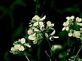
- This is the first time I have taken a close up picture of a flower and I would like some feedback on it. Also, if someone could identify it that would be great. ----Digon3 talk 15:54, 18 June 2007 (UTC)
- Very nice shot. Attractive colors. The lighter blossom is the sharper. This is good. Consider cropping a good deal from the right. You might even crop both sides to make this a vertical. For future photographs, experiment with controlling the point of focus and the depth of field to draw attention to whatever you consider most important, whether it's the petals, the structures in the middle, or the flower in its environment. Fg2 21:15, 18 June 2007 (UTC)
- I like the composition and the flowers are beautiful. But I would try to saturate the colours a bit more (nothing wrong with that, just replace a cloudy day with a sunny one). I have also tried to identify the plant with no success. It will pass the QIC test without problems - Alvesgaspar 00:41, 23 June 2007 (UTC)

I uploaded this image of a Mother Anas platyrhynchos duck and her clan of babies, and thought it looked really nice, and I was gonna nominate it for Quality Image, but something seemed off that I can't quite put my finger on. Does anyone think I need to edit the picture or is it QI status? Ṣ₡ЯՄՊՏɧѱᎦ ☎/ ∑ 22:21, 9 June 2007 (UTC)
- It does look rather dark...It's funny you have the same theme as my picture below :). S Sepp 23:33, 9 June 2007 (UTC)
Swan with nine cygnets[edit]


The first image is quite dark. I brightened it, which made it look much nicer, but then the brightness on the parent swan is too much and reduces visible detail. I also tried to brighten everything but the parent swan but that created an ugly line at the edge of the brightening. It seems the first image is more encyclopedic because it does not lose the detail on the parent swan, but the second one looks much better? Is there a solution? Any other critiques? S Sepp 17:38, 9 June 2007 (UTC)
- It's cropped too close to the last cygnet. But probably not much to be done about that. Of the two, the original is better. The edit brings out the background better, but you don't really need the background, it's the swan and cygnets that are the stars of the show. Something in between the two might work, a little lightening, but not so much. Another option might be to crop away a bit of the top and bottom of the picture? Regards, Ben Aveling 23:52, 9 June 2007 (UTC)
- Thanks for the advice. I decided to go with cropping the image:
 S Sepp 20:19, 17 June 2007 (UTC)
- Thanks for the advice. I decided to go with cropping the image:

Tyne Cot Cross[edit]


Rotated, cropped and a bit of mucking with the levels. Thoughts? Ben Aveling 05:19, 9 June 2007 (UTC)
-
 Scottish Parliament Building - out-of-camera
 -
 Scottish Parliament Building - vertically aligned
 -
 crop out most of the road
 -
 crop on the complex
 -
 crop on the main buildings
 -
 pretty much #4, regenerated however from the hugin TIFF
 -
 panorama of the photography situation


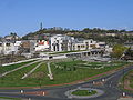
Hello, with the right version of the photo having the vertical features properly aligned, I wonder whether a crop could improve the image composition. A different camera position might be a long term alternative, but the position has also been chosen not to obstruct the neoclassical Royal High School building on the shoulder of Calton Hill, a previous candidate for the parliament building. --Klaus with K 09:15, 8 June 2007 (UTC)
Ignoring the fact that the picture's already too small,I think so. If I could, I'd lose the road in the foreground, the green car in the car park by the lake and everything to the right of that, about the same on the left, maybe, and enough sky to make the central buildings stand out. I think that would give a picture with one big thing, rather than lots of little things which is what it looks like to me at the moment. And it would make the neo-greek structures more visible, which would be good. IMHO, of course. :-) Regards, Ben Aveling 09:49, 8 June 2007 (UTC) misread the size of the picture, didn't I? :-)
- Now the image only shows the centre part of the parliament buildings. At the bottom right some road remains., but I opted not to cut into the two concrete paths in the foreground, is that wise? (And it is still 2.2Mpixel) --Klaus with K 10:11, 8 June 2007 (UTC)
- I think I'd crop them out as well. Let the viewer assume they go to infinity, so to speak. I might even go for a tigher crop. It depends on whether you want to show the whole complex, or the main buildings. Anyway, I've gotta run. I'm curious to see what other people think as well. Cheers, Ben Aveling 10:50, 8 June 2007 (UTC)
- PS. Image:Edinburgh Scottish Parliament01 2006-04-29 crop1.jpg is just large enough for QI, I think (largest dimension exceeding 1600px, which it just does, though that's chance, not something I was aiming at). Image:Edinburgh Scottish Parliament01 2006-04-29 crop2.jpg isn't big enough for QI. Image:Edinburgh Scottish Parliament01crop1 2006-04-29.jpg is big enough for FP (it's more than 1600 x 1250), though of course, there are other hurdles as well. My sense is this could produce a crop that would pass at QI but not FP. I could be wrong. Regards, Ben Aveling 11:04, 8 June 2007 (UTC)
- So far I think I like Image:Edinburgh Scottish Parliament01 2006-04-29 crop1.jpg best, possibly I'll look into rerunning hugin and cropping the TIFF output (maybe with 3:2 aspect ratio). Will keep you posted. --Klaus with K 12:13, 8 June 2007 (UTC)
- Good luck! And thanks for your advice below. I'll try it. Ben Aveling 12:36, 8 June 2007 (UTC)
- Thank you. See the 6th image for my regeneration of your crop in position 4. --Klaus with K 09:41, 9 June 2007 (UTC)
- I did. It's nice. I intent to vote for it. But I think it would be unfair for me to be the first to vote on it. I'm no longer completely impartial, am I? :-) Ben Aveling 23:27, 9 June 2007 (UTC)
- See the panorama at #7 for the circumstances when changing the viewpoint. --Klaus with K 10:26, 11 June 2007 (UTC)

Hi all! My kea photo was kindly commented on here and here, but I was left wondering how to fix the chromatic aberration. Any helpful suggestions as to improve the photo would be much appreciated. –Dilaudid 22:51, 7 June 2007 (UTC)
- What software do you have? When I'm using my (old) copy of Photoshop 5.0, I find that using "repace color" selectively and carefully works wonders. See before and after. This was a quick fix, and you may note that I made some pretty bad mistakes in the first version, but it may give you an idea of what you can do. Thegreenj 02:34, 9 June 2007 (UTC)
- Thermos has uploaded a revised version with significantly less fringing. You will probably have to do a shift-refresh or similar in your browser to clear the cached version --Tony Wills 07:55, 9 June 2007 (UTC)

It's OK. But what could I have done to get a better shot?
Camera model Canon PowerShot A610 Exposure time 1/80 sec (0.0125) F Number f/4
A shorter exposure would have given a better sky, but then everything else gets darker.
I'm pretty sure it was on a tripod. Overkill?
Apart from getting a better camera (which I am going to do), what could/should I have done to make it sharper?
I'm trying to work out what lenses and filters and whatever I need. Is there anything that would have helped here? (I think a polarizing filter would only have helped with reflected light, which wasn't the problem here?)
Lots of questions. All feedback welcome. Regards, Ben Aveling 12:55, 7 June 2007 (UTC)
- Your sky is a blown highlight. Try to underexpose half a stop or 2/3. Also look at the histogram immediately after taking the photo (on my Canon A95 press DISPLAY with a second or two after the shot, then press again) which tells you whether you overexposed, hence the chance to redo the shot. Yes, your original photo will then be underexposed, but then in GIMP > Tools > Colour Tools > Curves you can then increase the brightness with a straight line for the darker part and the curving towards the top right point without clipping the top line. A more basic way would be to adjust the brightness gamma value. On the focus side, sometimes cameras fail to focus properly, some (my A95 does, probably your A610 as well) allow to set the distance manually. --Klaus with K 09:53, 8 June 2007 (UTC)

It's a quality image. But is it worth nominating for FP? And is there any post processing that should be done? Ben Aveling 12:55, 7 June 2007 (UTC)
Church Ceiling[edit]
-
 The ceiling of the church of Sant'Ignazio in Rome, Italy (maybe overexposed)
 -
 2nd attempt: sharper, more saturated colors, not overexposed.


The widows were very bright, so I have used HDR to try to get rid of too strong contrasts; maybe I had to take more pictures to catch more darker details... I was also thinking about cropping away the windows from the picture, in order to focus the attention on the painting. Any comments? Alessio Damato 12:10, 6 June 2007 (UTC)
- I seems way overexposed (and maybe under-saturated) to me. Also, the image is not as sharp and detailed as it should be. I have some trouble in understanding the geometry of the ceiling due to the "trompe l'oeil" picture. Could the unsharpness be a DOF problem? - Alvesgaspar 13:48, 6 June 2007 (UTC)
- maybe it looks a bit blurry because the camera was not perfectly still. The picture looks overexposed because I wanted to make the colors look brighter. My original picture was more like Image:Triumph St Ignatius Pozzo.jpg and Image:PozzoIgnazio01.jpg, while I wanted to get something similar to Image:Sant'Ignazio - affresco soffitto -antmoose.jpg (I really don't have a clue how the author could get such bright colors! maybe there was a brighter artificial light...). I think I'll go there and I will try again. Thanks for your comment. Alessio Damato 20:49, 6 June 2007 (UTC)
- Image:Sant'Ignazio - affresco soffitto -antmoose.jpg looks edited, probably increased contrast and lighting, which could explain the bright colors. I'll have a look at your photographs and see if I can improve the lighting. --Digon3 21:13, 6 June 2007 (UTC)
and what about the other version? I have used a darker HDR rendering, but I have heavily post-processed it with Gimp. Alessio Damato 12:52, 7 June 2007 (UTC)
I am very new to the Commons, but I have some pretty nice looking images and I was going to nominate my Image:Group purple flowers.JPG image to Quality Image status, but I realised that I didn't have the Taxonomy name, or its scientific name. If anyone knows the name, please tell me! And if you have any other suggestions to this image or my others below, please tell me. I'm only 13 years old and I'm new to this photography game, so any constructive criticism would be most appreciated. Ṣ₡ЯՄՊՏɧѱᎦ ☎/ ∑ 05:01, 5 June 2007 (UTC)
-
 1. The image of no scientific name! *gasp* An orchid of some kind? I suggest you ask on the talk page, see if anyone there can help. Ben Aveling 13:16, 7 June 2007 (UTC)
 -
 2. Would be better if you could see the paw as well. Ben Aveling 13:16, 7 June 2007 (UTC)
 -
 3
3 -
 4. Low quality when zoomed up; gets blurry
 -
 5
5 -
 6
6 -
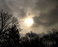 7 - Very nice picture. It would be much better with a non-centered sun and the noise in the sky minimized. Alvesgaspar 13:50, 6 June 2007 (UTC)
 -
 8
8 -
 9. Wavy air near the person's legs in the background. Would be better with the whole of the disk in the shot, or cropped a bit more tightly so that there is stone to the edge of the shot left, right and below. And I think it would be a better shot without the tripod legs behind the flame. Ben Aveling 13:16, 7 June 2007 (UTC)
 -
 10
10 -
 11. Gets blurry under heavy magnification
 -
 12. Per previous
 -
 13. A bit crooked Yes. If you hadn't zoomed in so much you could rotate it. As is, oh well. Ben Aveling 13:16, 7 June 2007 (UTC)
 -
 14. Doesn't thumbnail well
 -
 15. My personal best in my opinion I like it, I think it has a wow factor. It might be a chance at QI, despite the noise. Next time, maybe use a stand and a longer exposure? Ben Aveling 13:16, 7 June 2007 (UTC)
 -
 16 Nice subject, but a bit blurred. I guess they were moving a fair bit, a faster shutter speed might have helped if you could have? Ben Aveling 13:16, 7 June 2007 (UTC)
 -
 !7. Thumbnails terribly, only good view is under magnification at full size view


This one turned out nice. I'm thinking about nominating it for quality image, but I'm quite new to photography so I thought I would ask here first what people think. S Sepp 20:05, 22 June 2007 (UTC)
Archives[edit]
manually added these links (subpages exist, but are not linked...) February, March, April, May, June