Commons:Photography critiques/July 2007
 | This is an archive of past discussions. Do not edit the contents of this page. If you wish to start a new discussion or revive an old one, please do so on the current talk page. |
Railway Viaduct
-
 cylindrical
 -
 equirectangular
 -
 rectilinear
 -
 opposite site


Three different projections of the same material, and a photo from another point.
Personally I find the first image the most amazing.
In the second image the grid looks distorted in the middle section, in the third image the pillars at the sides look very fat, which is obvious when one compares a more distant view possible from the opposite side, but from there one does not get decent sunlight onto the structure. -- Klaus with K 18:18, 25 July 2007 (UTC)
 Question What type of camera do you use? --Digon3 talk 18:34, 25 July 2007 (UTC)
 Info Canon Powershot A95 (incidentially freshly repaired yesterday). This stitched image is composed of 21 photos, 7 horizontally times 3 vertically. Right image is 2-photo-stitch based on FUJI MX-2700 camera 2003-vintage shots. -- Klaus with K 20:08, 25 July 2007 (UTC)
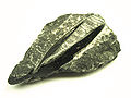
Macro Photos
-
 Unknown Quartz
 -
 Amethyst
 -
 Amethyst
 -
 Silurian Orthoceras
 -
 Pyrite


First time I have tried a macro shot and removed the background. I would like some feedback on it and how I can do it better. Thanks. --Digon3 talk 00:17, 25 July 2007 (UTC)
- On the photo 2nd left I find the layered (colour bands) shadow unnatural, the jagged edge looking to me like the result of a "similar colour" selection. It is slightly tricky, one may have to go to 16bit/channel colour space before applying selection tools to smoothed low contrast regions. The shadows in the other photos look more continuous. -- Klaus with K 20:17, 25 July 2007 (UTC)
- B.T.W., the unknown fossil is an Ordovician or Silurian Orthoceras. -- Lycaon 00:04, 26 July 2007 (UTC)
- The BG removal was done with a fill or with an automatic selection tool, and that shows here and there. You should start with an image with high DOF, that has a sharp edge (focus) all around, otherwise you will always see the cutting. Compare e.g. Image:Arctica islandica 1.jpg (not good) with Image:Arctica islandica valves.jpg (good). Lycaon 00:12, 26 July 2007 (UTC)
- Thanks for the critique and the identification. --Digon3 talk 00:21, 26 July 2007 (UTC)
HDR statue
-
 Fattal algorithm
 -
 Reinhard 04 algorithm


it's a rendered HDRI of a statue. I have been testing several tone-mapping settings to get a compromise between realistic and cool look, what do you think about the results? Alessio Damato 10:27, 24 July 2007 (UTC)
- Would be nice to be able to compare with an non HDR version. Lycaon 11:54, 24 July 2007 (UTC)
- ehm... unfortunately I have deleted the original LDR versions, keeping only the HDR. Just to be able to compare, I have found other versions of the picture on internet, it's not exactly the same view, but they are ok to get an idea [1] [2] [3]. It's not a common subject, so there are few pics on internet. Moreover, I have added another version rendered with a different more realistic algorithm. Alessio Damato 17:07, 24 July 2007 (UTC)
Santini's Baroque church in Zvole, the Czech Republic

Any feedback on the above picture of Johann Blasius Santini-Aichel's church in Zvole would be appreciated. Thanks.
-df- 08:46, 12 July 2007 (UTC)
Good composition --Simonizer 11:30, 12 July 2007 (UTC)
- Good composition, and nice, moody lighting. However, it seems tilted. --Digon3 talk 15:55, 12 July 2007 (UTC)
I like the light, but I think that the church deserves a bit more space above it. --che 02:18, 13 July 2007 (UTC)
- very good exposure, but the church is tilted and I wouldn't have cropped the small lake in front of it. Staying a bit further would have helped. Alessio Damato 08:45, 13 July 2007 (UTC)
dont crop the lake away. Its part of the good composition. Otherwise its just a boring picture of a church.misunderstood Alessio But i agree about the tilt. --Simonizer 10:14, 13 July 2007 (UTC)
- Great picture. A shame about the car on the left. It is also cropped very close to the top of the church, it might have been nice to have just a bit more air there. S Sepp 19:09, 13 July 2007 (UTC)
- Quite a good picture. Best is the composition with the lake in front and good lighting. Worst is the thight crop on the church tower. Then I'd retouch the car on the left. Last but not least there is quite a lot of chromatic aberration visible on the church tower. --Ikiwaner 20:09, 23 July 2007 (UTC)
Vaccinium uliginosum photograped in midnight sun
-
 Original
 -
 Trimmed, colour-corrected and sharpened


I got some usefull feedback on a flower photos a few days ago. Now I try agin with another photo, which I think is free of the flaws the first photo had. This time another species.
The photo is taken 11 mins past midnight with specular sunlight. To my mind good things about the photo is the composition, the colours and the fairly good sharpness of the main object. One thing that bothers me is the blurred leaf in the foreground of the original image. Is that distracting or does it add depth to the image to your mind? I've tried to remove it in the second image by simple trimming. Is that an improvement?
Also, the flowers may be a little over-exposed. Can that be fixed by post-processing or is it just "too bad"?
Is the photo anywhere near QI level? Slaunger 01:13, 9 July 2007 (UTC)
- about the original: yes, the blurred leaf in the foreground is definitely distracting, since it's almost as big as the main subject, cropping it away was a good choice. About the cropped version, the picture is heavily overexposed (look at the histogram!), and it can't be recovered: the flat-colored areas lack of details you can't recover in any way! The DOF looks OK, but I find the overall setting quite confusing. I can hardly see which one is the main subject. I believe the reason is that part of the "floor" is focused like the flower. In other pictures of flowers I have seen, everything but the flower is blurred, here it's not. Did you take it at "midnight" with sunlight?! did you mean midday? :-) I suggest to take the next picture using a flower that has nothing so close to itself. Alessio Damato 19:16, 9 July 2007 (UTC)
- Hi Alessio. Thank you for your feedback. Concerning the composition, I agree that most other flower images are just the flower with everything else blurred. The idea here was to do something different by having the branch and the beutifully coloured leaves in focus as well. But i can certainly see your point also - that it gets a bit messy. I do mean at midnight. See the timestanp of the photo. It is 00:11. It is because it is taken 800 km north of the polar circle. I have now found the 'button' on my easy-to-use fool-proof camera, which lets me manually adjust the exposure, and I will use it the next time.... Thanks again for your feed-back. Slaunger 00:05, 10 July 2007 (UTC)
- I actually really like the cropped picture aside from the slight overexposure. The lighting and setting really add depth and mood to the photo; I'd like to see a similar one with the exposure lowered just enough to avoid "blown" areas. Thegreenj 19:06, 12 July 2007 (UTC)
- Hi Thegreenj. Thank you for taking your time to comment on my photo. I am glad to hear that you like the photo with its lightning and setting. Concerning the over-exposure it is quite hard to retake with a lower exposure though. First of all getting the composition again is hard. The plant is a very dense and small bush with minuscule flowers. Getting the same specular sun-light again is hard. The nice, red fringed leaves are only there on fresh leaves (I have been told it is a compound, which protects the fresh leaves from too much of the 24-7 sunlight), the large swarms of aggressive, arctic mosquitos makes it hard (for me) to get the time to carefully adjust the camera and the composition. So, the best I can do about the photo now is to mingle with the colour-balance curves to partially compensate for the slight over-exposure. I have uploaded a new version of the cropped photo with adjusted colour-balance and also sharpened the image slightly. Is that better? (You may have to reload the page to see it.) Slaunger 05:05, 13 July 2007 (UTC)
Bottle of home-made limoncello
-
 original
 -
 background removed, improved colors

It's a bottle of home-made limoncello. It's the first time I try to remove the background: what do you think about it? can I go for QI?? thanks Alessio Damato 15:44, 6 July 2007 (UTC)
- I can see three specks in the background that you forgot to remove. All three are at the upper right, there is one small speck, one large speck, and what looks like a shadow near the large speck. S Sepp 19:47, 8 July 2007 (UTC)
- Also, the large black speck on the bottle near the top of the fluid is a bit distracting (it would be very easy to remove with photoshop/gimp/..). And a shame about the big fluorescent lamp reflection at the neck of the bottle. I'm also wondering if/how the removed background has affected the bottle. It would be nice to have the image without removed background so we can compare. S Sepp 19:55, 8 July 2007 (UTC)
- thanks for your comments. I have uploaded the original picture as well, without any post-processing. I didn't see the specks you had noticed, but now I have removed them. The black speck belonged to the original bottle, it was a dirty spot, I have removed that, too. The reflection is due to the window that was next to the bottle, so it's natural light. In order to have an homogeneous light, I have put a curtain on the window, to limit the strength of the source of light. I could limit the light more, but doing so I have noticed that is was possible to see the surroundings reflected on the bottle. This way you can't see any detail of the light and you can enjoy the bright yellow of the liquor. I want to say that the original color is closer to the bright yellow of the post-processed image than to the grayish color of the original picture.
- do you think I should try to remove the flat white of the light using a cloning tool? how could I re-take the picture to get a better light? do you think I should crop part to the pure white surrounding the bottle? thanks again for your help. Alessio Damato 11:21, 9 July 2007 (UTC)
- I noticed another small speck on the left side, just below the start of the 'neck' of the bottle. There is also a very pronounced 'shadow' to the right and bottom of the bottle on the image with the background removed, but I don't really see that big shadow on the original, I don't really understand that. I don't know the answers to most of your questions, I can just tell you what I see :). I once photographed a glass object, and the reflections were a big problem too. I tried to change the lighting using different lamp setups, and with/without natural lighting, but there was always a reflection, I just got different reflections. Then I thought that instead of trying to get rid of the reflections in the object I should try to get a setup in which it is easy to remove the reflections using software. I still had reflections in the end result, but it was the best solution I could think of. I'm not sure if this is any use to you, and I'm rather new to photography myself, but I think some comments are better than no comments, and this place can be rather quiet. I don't understand your question about cropping, the pure white? S Sepp 20:44, 9 July 2007 (UTC)
- do you think I should try to remove the flat white of the light using a cloning tool? how could I re-take the picture to get a better light? do you think I should crop part to the pure white surrounding the bottle? thanks again for your help. Alessio Damato 11:21, 9 July 2007 (UTC)
- you are very good at finding small specks: I have been watching carefully but I couldn't find any! now I have removed all of them, I think... I have added the shadow with GIMP, this way the image looks more natural. About the cropping, I have replaced the background with a flat white surface (i.e. each pixel is 255, 255, 255), I had to choose its size, i.e. how big I wanted the white part to be. I was wondering whether such a white frame was too big or not. Thanks for your suggestions, I think I'll try to candidate it as QI anyway, just to get more feedback and to try to re-take it. Alessio Damato 07:06, 10 July 2007 (UTC)
I just saw the comment in the QI review: overesposed! If she had known ... I would try a different approach: A bottle of limoncello on a white background is not very sexy. A bottle of something without any shadows looks unnatural too. Therefore you have to try to get the right mood by chosing the right light in the studio. Do not remove backgrounds in GIMP. The studio setup was good. I would recommend a focal length of about 85 mm for a shot like this. Your shot seems to be quite wide anguled so you had to crop the image because the background was too small. The bottle is missing a label with "Limoncello" on it. Some limes around the bottle would do very good. --Ikiwaner 20:20, 23 July 2007 (UTC)
- thanks for your suggestions. I'll try to set up a more professional "studio". Moreover, is the refraction on the glass OK? It creates a small white overexposed spot, but I couldn't do better. Using a smoother light causes the glass to reflect the surroundings... Alessio Damato 10:24, 24 July 2007 (UTC)
- For reflection-less lighting, I point a desk lamp at a wall or ceiling and adjust to avoid reflection. This was a hard picture not to get significantly blown areas, and in the end I resorted to bounced lighting and underexposure. For the background, I use masking to selectively brighten the background, although I'm still getting better at this - some of my work in the linked image is obvious if you play with it! Thegreenj 20:59, 25 July 2007 (UTC)

Personally, I like this photo, but I would like to hear what I could do better. I guess one problem could be the resolution as it has been trimmed quite a lot (the flower is very small and I could not get any closer and keep the focus with my camera). Is it close to being a quality image? Slaunger 12:42, 6 July 2007 (UTC)
- Unfortunately, it has too small resolution to be a QI. It needed to be at least 2 mega pixels (e.g. 1800 x 1200). If it was bigger I would promote, but a larger DOF would be nice. --Digon3 talk 14:10, 6 July 2007 (UTC)
- Thank you for your feed-back, Digon. Question about the DOF (which, I, a photographer ignorant assumes means Depth-of-Field?).I learned something about photography 20 years ago in an evening course, but just to refresh my memory: To get a larger DoF I ned a smaller aperture, right? Now, my camera (Canon IXUS 800 IS) )is one of those easy-to-use cameras which does not allow the user to mingle explicitly with the aperture setting. However if I set it to manual, I can adjust the ISO setting, and I can also choose a "normal" or "long" shutter period. Since the flower objects are very static I can use a "long" shutter period and by choosing the lowest ISO setting (which is 60) I should get a very small aperture and thus a large DOF if there is enough light. Is that about the best I can do concerning settings on my camera? Slaunger 17:13, 6 July 2007 (UTC)
- As below, if you haven't tried the macro mode, do that. Low ISO means slow. That means more light is needed, which means a wider aperture or a longer exposure which isn't what you want. A higher ISO means faster, which can be good, but also means more noise. It's all about tradeoffs. Regards, Ben Aveling 07:08, 20 July 2007 (UTC)
- My only camera (a Canon PowerShot S400) is also one of those those easy-to-use cameras which does not allow the user to mingle at all with the aperture setting. I have no idea how to get a larger DOF. Best I can do is change to macro mode :) --Digon3 talk 20:44, 6 July 2007 (UTC)
- Ha! I just do the macro mode too, and we have almost similar cameras, from which I can conclude after seing your *very nice* featured imaged that I just need to practise, practise, practise, practise... Slaunger 03:12, 7 July 2007 (UTC)
Lake Mansarovar and Tibetan Himalayas

Comments Please Greatestprateek 10:16, 3 July 2007 (UTC)
Too many highlights in the clouds, it lacks of sharpness and it is tilt. But the colours are great --Simonizer 12:47, 6 July 2007 (UTC)
- I find the land at the bottom right to be distracting. Perhaps you should either show more land or no land at all... S Sepp 19:58, 8 July 2007 (UTC)
Icy Cactaceae, shot in the Himalayas

Comments anyone? Greatestprateek 12:31, 3 July 2007 (UTC)
June 2007
Magpie swooping kookaburra
-
 The original. Too dark.
 -
 Adjust the levels.
 -
 Adjust the levels again and crop


Thoughts? Ben Aveling 22:41, 29 June 2007 (UTC)
- The flying birds wing is cut off in the pictures. Personally I think the third picture is the best. --Digon3 talk 14:19, 6 July 2007 (UTC)
-
 Making the Chromatic Abberations visible

I adjusted the brightness even a little bit more. So now you can see the effect of CA's in the blue channel very drastically. Here is a nice tutorial to remove it. Try this --Makro Freak talk 12:14, 31 July 2007 (UTC)
Swatch Irony Watches
-
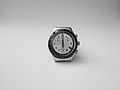 A Swatch Irony in Black and White
 -
 The same watch viewed from below...
 -
 Do you mean like this? It has now been sharpened...
 -
 Like this?


Please tell me what are the improvements (if any) I could make to these images Thanks, Booksworm 16:39, 25 June 2007 (UTC)
- Would I need to re-take the pictures? Booksworm 19:05, 25 June 2007 (UTC)
- Well this depends what kind of picture you want to have. Somehow i like the first one...when you see the whole picture it looks very elegant...but then you zoom in and you see that the watch is used and has a long life behind itself already. And you have a nice neutral background. Is it a real one or did u put it there afterwards with a software? The second might also look nicer in b/w....do u have a Polarization filter? It might help (i am not really sure) against the reflection on the glass. --AngMoKio 19:35, 25 June 2007 (UTC)
- See gallery, for a b/w version of angle from below Booksworm 16:02, 26 June 2007 (UTC)
- The b/w version of the second pic is really much better. I also like the composition of it. But with the sharpening you did a bit more than necessary. There are already some oversharpening artifacts visible.--AngMoKio 18:38, 26 June 2007 (UTC)
- I tried to fix the image, as per your comments Booksworm 08:22, 30 June 2007 (UTC)
- Would I need to re-take the pictures? Booksworm 19:05, 25 June 2007 (UTC)
- From a photographic point of view this version is excellent. You could just use a polarizer filter to avoid the reflections on the top part of the glass. On the other hand I wouldn't do a picture of a watch in 00:00 position. The glass is in a very bad shape too. The watch is not so old that I would expect scratches in the glass. --Ikiwaner 20:27, 23 July 2007 (UTC)
Edited and unedited crocodile
-
 unedited version
 -
 edited version


The first version of this crocodile version had this disturbing shadow in the upper right corner. I reduced this shadow a bit. Is it acceptable now? Thanks for comments. --AngMoKio 15:40, 25 June 2007 (UTC)
- Question Why do you think the upper right shadow was a problem? And when you acceptable, acceptable for what purpose? Regards, Ben Aveling 22:41, 29 June 2007 (UTC)
- I got that feedback when i proposed this pic as QIC here --AngMoKio 08:35, 30 June 2007 (UTC)
- Oh I see. I guess it's better, but I still don't think it'd pass QI. It needs to be a bit more pleasing to the eye. The blob above the crocodile distracts. Ben Aveling 13:21, 20 July 2007 (UTC)
- I got that feedback when i proposed this pic as QIC here --AngMoKio 08:35, 30 June 2007 (UTC)