Commons:Photography critiques/August 2007
 | This is an archive of past discussions. Do not edit the contents of this page. If you wish to start a new discussion or revive an old one, please do so on the current talk page. |
Various photos
I'd appreciate general comments on whether any photos (about a dozen or so) found at User:Piotrus/Image gallery are above-average, and should I bother listing them for Quality Images?--Piotr Konieczny aka Prokonsul Piotrus Talk 12:18, 1 August 2007 (UTC)
-

-

-
 Timing...
 -
 Teamwork!


- First photo looks reasonably alright. Second photo the clouds are overexposed. I like the dolphin photos, pity thet the guy's face is in the shadow. I wonder what to make of the dolphins jumping away from the camera, possibly then the water splash would be in the shadow. Maybe some gentle cropping on images 3 and 4 (but keep the uncropped version)?-- Klaus with K 15:49, 1 August 2007 (UTC)
July
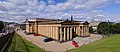
National Gallery of Scotland
-
 Museum buildings on The Mound in Edinburgh
 -
 cropping suggestion
 -
 new image after restitching


I plan to recreate this stitch as currently some vertical features lean over. I feel that some cropping may also improve the composition and get rid of distorted edge parts due to the rectangular projection, I wonder, however, whether others would prefer a different crop to the one I am suggesting. -- Klaus with K 13:55, 31 July 2007 (UTC)
- The crop is good and removes any distortion, but the image itself seems pretty compressed. --Digon3 talk 16:06, 1 August 2007 (UTC)
- Compressed as in JPEG compression or compressed geometrically? -- Klaus with K 19:02, 1 August 2007 (UTC)
- JPEG compression. It may not be that, but the picture lacks detail in places (especially in the grass). --Digon3 talk 19:19, 1 August 2007 (UTC)
- I'll look into that one. There is some smaller effect
It could also bethat at the edges one photo pixel has to cover more than one image pixel, rectangular projection, you know. -- Klaus with K 20:34, 1 August 2007 (UTC)
- I'll look into that one. There is some smaller effect
- JPEG compression. It may not be that, but the picture lacks detail in places (especially in the grass). --Digon3 talk 19:19, 1 August 2007 (UTC)
- Compressed as in JPEG compression or compressed geometrically? -- Klaus with K 19:02, 1 August 2007 (UTC)
- Done so, I realised that I have taken the photos with my backup Olympus camera, which seems to be a little less than careful about some details but overcompensates this with visible sharpening artifacts. In order to avoid empty magnification at the sides, I have chosen a smaller image size. How does this version come out? -- Klaus with K 15:15, 2 August 2007 (UTC)
- It looks alot better. --Digon3 talk 16:09, 6 August 2007 (UTC)
Cricket

Any advice on how to get this guy on an undistracting surface? I tried to herd it onto a sheet of paper, but it's practically impossible. It jumps all over the place. Is it okay for QI despite the background and messy composition? Any help with ID would be nice too - I can't get pass the family Rhaphidophoridae. Thegreenj 19:45, 22 July 2007 (UTC)
- Post-processing will be difficult because of the soft focused parts. They tend to blend in some of the background, making cutting out the cricket near to impossible. This is easy to do when the image is sharp overall (at least the contours). Lycaon 20:20, 23 July 2007 (UTC)
- You could try to lure it with some food, which can be cloned away afterwards alternatively ;-) Lycaon 20:22, 23 July 2007 (UTC)
- Catch'em and put him (Ensifera) in the fridge for 1-2 minutes. You have to be very careful with this, and this needs a little bit experience. This procedure is similar when taking photos of insects in the early morning when its cold. After this, the cricket will be very clumsy and you can place him whereever you like. --Makro Freak talk 11:44, 31 July 2007 (UTC)
- Hmmm... I'll have to try that. Don't know that my parents will go for a bug in the fridge, though! Thegreenj 00:51, 2 August 2007 (UTC)
- Catch'em and put him (Ensifera) in the fridge for 1-2 minutes. You have to be very careful with this, and this needs a little bit experience. This procedure is similar when taking photos of insects in the early morning when its cold. After this, the cricket will be very clumsy and you can place him whereever you like. --Makro Freak talk 11:44, 31 July 2007 (UTC)
Tour Dreyfus, Kourou
-
 A Sunday evening at the beach
 -
 The girl in red
 -
 The Salvation Islands (îles du Salut)


Hello. I would like to see what people think of this HDR image of the Dreyfus Tower in the town I live in. I think the colors are good, and that the lighter blue around the palm tree leaves add a nice touch, but this may be distracting to some. It's a miracle the camera didn't move, as I had no tripod yet and it was very windy. Any and all suggestions are welcome. Thank you. Arria Belli | parlami 14:14, 8 August 2007 (UTC) (I have more photos at Category:Tour Dreyfus, where the only photo that isn't mine is the one called Tour Dreyfus.jpg.)
- Hi. I wouldn't use PNG for a photograph, JPG is much smaller and at 5%-10% compression you won't notice any artefacts -- Lycaon 17:47, 8 August 2007 (UTC)
- Being new to HDR images (Rama kindly introduced me to them), I remember having some problems saving the image under .jpg. Perhaps it's due to something a newbie could easily overlook; I don't remember anymore as it's been weeks since I took these pictures and blended them. I may try to do it again soon and see what I can do about replacing the .png. Arria Belli | parlami 13:50, 9 August 2007 (UTC)
Hi, I'm afraid that I found the blue patch around palm leaves distracting, and looking at the full resolution, I can see some preety weird blending artifacts (such as edges of leaves visible in the sky and headless kids near the bottom of the photo). Maybe the best approach would be to take a regular photo and use a polarizer to darken the sky. --che 22:54, 8 August 2007 (UTC)
- The leaves in the sky and the (almost) invisible kids' heads is what I like about the image. ^^ No hard feelings.
- I have lots of regular photos of the tower (see the category). Is there any one you'd like to see polarized?
- I think I like this HDR image mostly because the tower has been photographed so often (it is a symbol of French Guiana and of the prisons), that something different is refreshing. Arria Belli | parlami 13:50, 9 August 2007 (UTC)
This was the first picture of the tower I have seen in my life, so that may be source of our different views. Actually in terms of composition, I like this photo as the best in the category. I just don't like HDR :-) --che 23:45, 9 August 2007 (UTC)
- Heh, I know it doesn't look like much, but it used to be the only way to communicate with the prisons on the islands. If you've heard of, read or seen Papillon, you know of the tower and of the islands. Arria Belli | parlami 11:41, 10 August 2007 (UTC)
Aurlandsfjorden

Three pictures taken using a Canon Powershot A700, manually stitched together. I would especially like some advice on the colors; the center part does not look well compared to the left and right part. -- Bryan (talk to me) 21:00, 7 August 2007 (UTC)
- There is a lot of noise, overexposed sky, and a stitching error in the hill and water (but water is hard to stitch anyway). But as for the colors I really do not see much difference in color throughout the panorama. I also noticed three small dots in the lower parts, one for each photo, what are those? --Digon3 talk 23:24, 7 August 2007 (UTC)
- Hmm, didn't notice them before, I guess they are dead pixels. I believe I photographed it with the lowest possible ISO value. Is there anything else I can do to reduce noise? -- Bryan (talk to me) 08:46, 8 August 2007 (UTC)
- Noise can be cause by underexposure or it could just be your camera. There are some things in photoshop that can be done to reduce the noise. --Digon3 talk 13:12, 8 August 2007 (UTC)
- Hmm, didn't notice them before, I guess they are dead pixels. I believe I photographed it with the lowest possible ISO value. Is there anything else I can do to reduce noise? -- Bryan (talk to me) 08:46, 8 August 2007 (UTC)
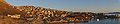
Stiching photos with Hugin
-
 Everything automated in Hugin
 -
 Best fit vignetting polynomium applied prior to enblending in Hugin ver. 0.7beta4 for Windows.
 -
 Further fidlling with crop setting in Hugin, selecting a panorama projection , doing some Smart Sharpening in Gimp and Gaussian luminousity blurring of the sky.
I've just had my first experiences with Hugin, and I would like some feedback on the process. The fish-eye projection photo shown has been been stiched from +20 handheld photos (two rows) taken at maximum zoom on my small compact camera (Canon IXUS 800 IS). The purpose was to produce a highly detailed panoramic view of a pitoresque Greenlandic town that I am currently staying in. I used the stiching mode on the camera to assure uniform lightning conditions in all images. The stiching process went nicely with Hugin using autopan for creating automated connection points with a good fit. After cropping the output automatically enblended 250 MB tif file in Gimp I got a large image with more than +2000 pixels in height. Since each hand-held image does not have a fantastic resolution due to the motion blur I resampled the image to 1600 in pixel height, and I'm quite satisfied with the end result regarding sharpness and resolution. Any comments on that?
However one thing bothers me: the enblending of individual images in sky regions, where there are patches of darker and light blue. Can that be avoided in Hugin? Or should it be postprocessed? How?
Are there other processing artefacts, which I just haven't noticed?
Finally the output image is quite dark. I have done a little levelling adjusting, but since the image is taken with the sun very close to the horizon I find it OK. Any other opinions on that? -- Slaunger 04:21, 6 August 2007 (UTC)
- Regarding the "patches of darker and light blue", this is vignetting. Postprocessing would not be the right approach. I assume you saved the .pto file, make a copy and load it, otherwise you'd need to start over. If you are using hugin 0.6, you can set a vignetting correction manually, accessible by a button bottom left on the Camera&Lenses tab. Choose division, and the polynomial should read someting like 1 + r^2*0 + r^4*(-0.2) + r^6*0, it may not be optimal but at least that is a reasonable start. If you are using hugin 0.7 (I know 0.7beta5 on my Mac), there is an exposure tab second right. Sometimes exposure optimisation just works, but if photos have little overlap and same exposure I would recommend to choose "custom" in the drop-down menu and uncheck everything except the checkmark at the vignetting. Then optimise, have a look at the preview and stitch as usual, making sure you or hugin involves enblend at some point. -- Klaus with K 12:00, 6 August 2007 (UTC)
- Hi Klaus. Thank you for your detailed advice concerning vignetting. I am using ver. 0.7 beta 4 for Windows (most recent beta release on that platform) and neither of your descriptions match exactly to the options available in the user interface. However, in the Camera&lenses tab, there was a disabled "Edit parameters..." button in a vignetting section on the tab. To enable it, I selected one image (the first upper right corner image) and clicked "Load EXIF". This filled the design parameter values and enabled the button. In the dialog, I then tried to do the automated best fit polynomium and after some minues of processing and after realigning the panorama I got a much better preview with almost no vignetting in the sky. I then pressed "Create panorama..." which launched enblend in the proces and after 5-10 minutes of thinking it was done. After a bit of cropping, resizing and colour adjustment in Gimp I got the new panorama shown below. I can't see any vignetting in the new photo, can you? Any other comments to the vignet optimized photo? -- Slaunger 16:23, 6 August 2007 (UTC)
- Did you use a tripod for this? Some of the buildings are blurred in spots and very sharp in others, which is possibly due to stitching. Also, I would suggest cropping about 1/6th off the left side. --Digon3 talk 16:08, 6 August 2007 (UTC)
- Didn't use a tripod (don't have one) and a tripod is not readily available here in the town way up north. The blurred spots probably originate from individual photos taken with a somewhat shaken hand. In the new version, I've cropped more to the left side (which I figured out worked better in the process of redoing the crop). I guess I better get a tripod if I want to do this seriously. -- Slaunger 16:23, 6 August 2007 (UTC)
- You should definitly get a tripod, it is well worth the $30 for a very nice one. If it wasn't for the blurred areas I would recommend this at COM:FPC. --Digon3 talk 16:36, 6 August 2007 (UTC)
- Short of using a tripod, you could rest the camera onto a solid object. But regarding the blurring, I miss some telltale signs of camera shake like anisotropy or dual lines (caustics) — I instead suspect your camera did not focus properly. This can happen at long focal lengths, and with my camera I remember that for an inside shot with a featureless ceiling part my camera did not want to focus at all and I had to set the distance manually, something my camera allows. Maybe your camera tried to focus onto something in the featureless sky and failed, or defaulted to set the distance to the hyperfocal distance or even something shorter. -- Klaus with K 18:57, 6 August 2007 (UTC)
- P.S. I spot a couple of faint dust specks in the image. Trained eye, because I had the problem much worse, and before a clean inside lense I had to resort to a flatfield correction. It may not be there in a recent hugin beta, as the vignetting is now taken care of differently, but I emailed the developper making the case for such a speck removal possibility to include it again. Of course one could preprocess each image manually in gimp... -- Klaus with K 19:43, 6 August 2007 (UTC)
- You may be right, Klaus. I have experienced these kinds of problems in some macro shots with the camera even when there are clear edges to focus on. I cannot adjust the distance manually though, only set it to infinity (which gives lousy results). However, I have the option of choosing different focusing strategies, I could try adjusting that - and it will be much easier to test that out if I have a tripod or some primitive alternative. -- Slaunger 19:10, 6 August 2007 (UTC)
- Can you pre-focus (like aiming at a good structure, half-pressing the button and then actually turn to where you really want)? And a quick note on the dust specks.
-
 with in-lense dirt
 -
 flatfield-corrected


Compare the two images, on the left you see some dust specks, for instance directly above the bright red church roof. On the right I have used a flatfield for correction, no greyish spots any more. -- Klaus with K 19:29, 6 August 2007 (UTC)
- Two last comments for this evening. First @Digon, I have done most of my panorama shots without tripod. Some with the camera on a smooth surface, yes, but with a standard tripod you do not rotate around the nodal point. Second @Slaunger, in your case I would use a cylindrical projection, I think it is the most adequate for your motive. -- Klaus with K 19:50, 6 August 2007 (UTC)
- Wow, Klaus, that was a lot of information and stuff I could try out. I've been working hard all day to try most of it out. Yes, I can pre-focus exactly as you describe it. However it is hard to figure out that something is wrong while taking the images as I leave the stiching mode on my camera and thus a fixed exposure, if I try to inspect the photos while taking them. On close inpection of the individual photos it is actually revealed that all but one image is well focused at least at one interesting distance in each shot. However, due to the max zoom the DOF is shallow meaning that other sections of the same image can be quite blurred. Luckily, there is a large overlap between the photos, and I have been able to rid of almost all blurred areas in the original photos by using the crop tab in Hugin to exclude blurred areas in final output. In this proces I also learned that it is a very bad idea to crop the images prior to loading them in Hugin - gives worse stiches and the nice vignetting compensation goes haywire. However, the single bad photo still has some unique area, which cannot be overlapped by other images. Concerning the overall sharpness I gave up on your suggestion to sharpen the individual images excluding sky areas prior to stiching. It took too long time with +20 images (I've never tried to do selective filtering in Gimp before). I also changed from fish-eye to panorama projection (that's a cylindrical projection, right?) in Hugin, and I agree it gives better results. After a litle twinkling with the saturation and brightness I cropped the image (height 2100 pixels) and downscaled to 1500 pixels height using bicubic spline interpolation. Here I gave it a shot with some Smart Sharpening, where I LAB-decomposed, created an mask using edge detection and applied that as selective mask for sharpening the luminosity channnel. The inverted mask (basically the sky) was used to perform a selective gaussian blur on the sky in the luminosity channel to reduce noise here. Combining it all I got the third image. Finally, your last point concerning dust specks. Where has your trained eye seen dust specks in the photo? I've been looking at that photo all day and haven't seen any. Also, I did not quite get what you meant concerning doing a flatfield correction? Pheeew...that was a lot of blood, sweat and...fun, I learned a lot today. Again, thank you for your detailed and vigorouos feedback. I guess it would not qualify for a QI since it still has a local sharpness problem?-- Slaunger 02:54, 8 August 2007 (UTC)
- Just a quick remark (need to hurry off soon): I meant to sharpen only this one bad photo, pretty much in the way of your smart sharpening (I just read the tutorial ;-), "panorama projection" have not seen that yet, usual the choice is rectilinear, cylindrical, equirectangular, and then possibly quite a few more recent projections. Regarding the sky, I felt noise not too problematic. Dust (very faint) make an equalsided triangle with the violet house on the horizon and the antenna. Flatfield, the idea is that the dust speck is also there if you photograph a white surface. Then you divide the two photos. See you -- Klaus with K 17:38, 8 August 2007 (UTC)
- P.S. The dust spot is gone/(cannot spot it) in your 3rd version, but now you have posterisation in the sky. -- Klaus with K 17:42, 8 August 2007 (UTC)
White arctic fox
-
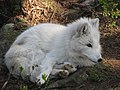 White arctic fox (Alopex lagopus)
.jpg)
This is my first time, so be gentle. :) I haven't modified it at all. Is there anything I can do or could have done? It wasn't my usual camera, so I just went with the "standard" settings and made some shots. This is the best (in my opinion) and I would like to see if it would qualify as a QI or not.. --Stigmj 06:26, 19 August 2007 (UTC)
- Not bad for a first ;-). There are a few issues though, of which some are related. Like the light: the fox is in the shadow which required he camera to use a high ISO (not seen in the EXIF). High ISOs typically give a lot of noise (grain). Some of that noise can be filtered away by post processing but here there is quite a bit. So low light situations with a relative high shutter speed (1/400s) yield a lot of noise because of the high ISO.
- Furthermore, the image is quite sharp, so that's OK, but the crop is rather centred and tight: let your subject breath and keep the rule of 1/3 mind, which often helps to produce pleasing composition.
- And a last personal (as a biologist) hint: in your captions, always write genus and species names in italics, genera capitalized, species not :-). Lycaon 07:50, 19 August 2007 (UTC)
- Thanks for the feedback. I'll try to make better compositions for my next photos.. The lighting is not always easy to control and the camera wasn't mine so I opted for the automatic settings to be able to shoot quick photos in different settings (looking for that wolf to come out... where is that darn moose! :) --Stigmj 01:41, 22 August 2007 (UTC)
Hovercraft on the Firth of Forth


These photos of a hovercraft trial run are from a 5Mpixel (2592x1944) camera, brightness adjusted , 1 & 3 rotated, and cropped, but not sharpened or resized. The second left is stitched. In particular I'd like opinions about the cropping (tighter, different position?), resolution and the noise situation. -- Klaus with K 17:10, 10 August 2007 (UTC)
- I like 3 and 2 the best. Not much you can do about composition except maybe the angle. The crop is fine in all of them IMO. --Digon3 talk 20:06, 13 August 2007 (UTC)
- I've added a 5th image, ideally I would like to have a similar view with the skirts inflated but security folk would have prevented me from taking such photo that close big time. How does this no.5 compare to no.2? -- Klaus with K 17:02, 16 August 2007 (UTC)
- Number 5 is better than nr. 2 IMO. Would it be possible to make that picture (panorama) with inflates skirts anyway? Taking all the movement of the craft in mind when it's inflated? For the other angles I agree with Digon3. Lycaon 07:52, 19 August 2007 (UTC)
- Partial Yes and Nonono. Well, in principle as long as the craft were only hovering and not moving one might have a fighting chance of taking two photos that might stitch reasonably well, although it would be much better to go for a dedicated wide angle lense. I have a photo with inflated skirts, but from the 7:30 position only and not 9:30. No several times, (1) a one-photo only would show the security fence in the foreground, (2) the security guards were already calling me back from the fence as passengers had boarded, and (3) this trial is already over. I am not talking about sunshine and the need to protect the camera from sand and spray. -- Klaus with K 12:36, 20 August 2007 (UTC)
Macro Photo
-
 Chorthippus Albomarginatus

I took this with my 50mm macro lens and a 2x teleconverter. I am playing a bit with my camera and trying to get better. If you have some good hints, tell me.JuliusR 19:53, 25 July 2007 (UTC)
- When using TC's you loosing 1-2 apperatures. This results in longer exposure time, like here with 1/15s. To prevent blurring between 1s and 1/100s you should use the option "pre mirror locking" or in german "Spiegelvorauslösung". This prevents mechanical vibrations on the body/sensor when the mirror flaps upwards. You should test this. Regards --Makro Freak talk 12:00, 31 July 2007 (UTC)
- I did this for the shot! But thanks for the hint -JuliusR 23:26, 12 August 2007 (UTC)
Two sunsets
.jpg)
.jpg)
The first photo is unmodified, the second is modified. Which would fit better as QI or FP? --Orlovic (talk) 14:54, 20 August 2007 (UTC)
- I like the second one alot better. Do a slight noise reduction and it should pass QI, however, for FP, a sunset needs to be really special in order to pass. Digon3 13:36, 24 August 2007 (UTC)
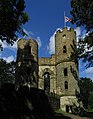
Wentworth Castle views
-
 Wentworth Castle
 -
 after stitch, no luminance correction
 -
 brightness-corrected
 -
 Color fringing removed


On the right side of the facade, a rectilinear view stitched from four photos, I see blue fringing affecting the branches in the sky, turning them into a shade of blue instead of dark green. Is there a good way of post-processing that one away?
Regarding the castle, built as folly, then ruined and recently partially restored, looking at my "original" (two-photo stitch) in the middle and then comparing it to the brightness-corrected right version, have I possibly overdone the correction? -- Klaus with K 14:20, 20 August 2007 (UTC)
- Im going to try and get rid of the blue fringing and tell you how it goes. As for the other pictures, the corrected version looks just fine. --Digon3 talk 21:55, 20 August 2007 (UTC)
- Thanks Digon, looking forward to it. -- Klaus with K 11:49, 24 August 2007 (UTC)
- OK, I have tried everything I know and I had a little success with Replace color and the selection tool. It doesn't look perfect, but at least it is a mixture of dark colors instead of bright blue and looks natural. I'll upload it if you want. --Digon3 talk 13:19, 24 August 2007 (UTC)
- Thanks Digon, looking forward to it. -- Klaus with K 11:49, 24 August 2007 (UTC)
- I also had a lot more success with the blue fringing on the supports for handles on top. It looks great now. --Digon3 talk 13:26, 24 August 2007 (UTC)
- Ok, here it is (on top). Digon3 13:33, 24 August 2007 (UTC)
- Thanks for tackling the fringing. Digon, in your edit I see some horizontal and vertical seem lines in the sky, just left of the top left building corner. Do you spot them as well? -- Klaus with K 14:36, 24 August 2007 (UTC)
- Yes, I do, and its my fault. That would be from the selection tool. Should be gone now. --Digon3 talk 16:28, 24 August 2007 (UTC)
- Maybe I was unsuccessful, but I think I made sure to reload the image, and these edges are still there. See this enhanced corner for the structures. -- Klaus with K 18:58, 24 August 2007 (UTC)
- Yes, I do, and its my fault. That would be from the selection tool. Should be gone now. --Digon3 talk 16:28, 24 August 2007 (UTC)
- Thanks for tackling the fringing. Digon, in your edit I see some horizontal and vertical seem lines in the sky, just left of the top left building corner. Do you spot them as well? -- Klaus with K 14:36, 24 August 2007 (UTC)
- I redid the whole thing more carefully, so it should be gone now (even with 0 brightness :). --Digon3 talk 13:13, 26 August 2007 (UTC)
- Thank you Digon3, I take it this time you also used Selection Tool and Replace Colour. While using selection tool or colour picker as well, I had thought more in line of hue change instead of simple colour replacement. In any case, the result is what counts. -- Klaus with K 15:34, 27 August 2007 (UTC)