Commons:Graphic Lab/Illustration workshop/Archive/2011

Seals of Michigan[edit]
-
 Seal of Michigan
 -
 Secretary of State,
 Done
Done -
 Attorney General, Done
 -
 Department of Treasury, Done
 -
 Governor, Done


Request: Please recreate in SVG the seals of the Government of Michigan. They are all a slightly-altered version of the Seal of Michigan, and can be seen on the following websites: The Governor, the Secretary of State, the Attorney-General, and the Treasury.
Thanks Fry1989 (talk) 01:31, 3 December 2010 (UTC)
Graphist opinion(s):
![]() Request taken by ZooFari
Done, except Governor. Wouldn't that be just the coat of arms, uploaded here? Or does it need to be the same color scheme as it is on that website? --ZooFari 02:20, 5 January 2011 (UTC)
Request taken by ZooFari
Done, except Governor. Wouldn't that be just the coat of arms, uploaded here? Or does it need to be the same color scheme as it is on that website? --ZooFari 02:20, 5 January 2011 (UTC)
- Damn, they redesigned the website. When I made the request it had a seal in the upper-left corner that looked just like the Sec's, but with "GOVERNOR" in the bottom. Would you be willing to still make it? Fry1989 (talk) 17:07, 5 January 2011 (UTC)
- Are you looking for this? It's somewhat funny though, the governor walks in on his first day in office, and his first order is: "I want a black header with a big seal in dark gray." hmmm. Regards, -- Orionist ★ talk 19:17, 5 January 2011 (UTC)
- Yes Sir, that's the one! Thanks for finding the page. That is rather funny :D Fry1989 (talk) 21:18, 5 January 2011 (UTC)
- Have a look above. Is that ok? --ZooFari 23:29, 14 January 2011 (UTC)
- Well, that page doesn't work properly for me anymore, but I think it was the same design as the other executive seals, but I can fix that. Thanks Zoo :) Fry1989 (talk) 02:08, 15 January 2011 (UTC)
- It was actually black border with a white ring inside. The only difference in my version to the one in the web page was the font, which I don't know. But up to you of course :) --ZooFari 02:12, 15 January 2011 (UTC)
- Well, that page doesn't work properly for me anymore, but I think it was the same design as the other executive seals, but I can fix that. Thanks Zoo :) Fry1989 (talk) 02:08, 15 January 2011 (UTC)
- Interesting. I'll try and find more images of it, but sadly it's not on the new Governor's webpage. I'm glad I saw it before they redesigned the page so I knew it even existed, since I haven't found any other images of it so far. You'd think there'd be an image of it on the front of a lectern when the Governor is giving a speech, like with the Presidential seal, or the Governor's seal of California, but so far I've not seen that with Michigan's. Thanks again mate :) (marking as RESOLVED! whoo!) Fry1989 (talk) 02:20, 15 January 2011 (UTC)
- Have a look above. Is that ok? --ZooFari 23:29, 14 January 2011 (UTC)
- Damn, they redesigned the website. When I made the request it had a seal in the upper-left corner that looked just like the Sec's, but with "GOVERNOR" in the bottom. Would you be willing to still make it? Fry1989 (talk) 17:07, 5 January 2011 (UTC)
Topographic Map of India[edit]
-
 Map of India, missing some disputed regions

Request: The map of India in Russian is missing some disputed regions, namely the Aksai Chin and Trans-Karakoram tract that are found in the other variants of this image, such as File:India topo big.jpg. I have uploaded a version with these regions to MediaFire (url: http://www.mediafire.com/?20c2gglfda2b4cw), I would appreciate it if a registered user could then upload it. Many Thanks. 92.3.239.11 14:11, 16 January 2011 (UTC)
Graphist opinion(s): ![]() Done Jon C (talk) 20:53, 19 January 2011 (UTC)
Done Jon C (talk) 20:53, 19 January 2011 (UTC)
Naruto evolution chart - English to Japanese[edit]


Request: This needs to have a Japanese translation for use on the Japanese Wikipedia.
- Senjutsu is "仙術"
- Kyubi is "九尾"
- Senjutsu Kyubi would be "仙術九尾"
- WhisperToMe (talk) 05:38, 17 November 2010 (UTC)
Graphist opinion(s):
- Do you want to keep the English text and just add the Japanese below, or do you want to make it Japanese only? If you want the latter, you need to provide translation for "Normal" and "Naruto's eye evolution". -- Orionist ★ talk 11:51, 22 December 2010 (UTC)
- Done Took a stab at this (based on Japanese classes 20 years ago) - please advise if translation errs. Jon C (talk) 17:43, 4 January 2011 (UTC)
- Thank you very much! WhisperToMe (talk) 05:15, 6 January 2011 (UTC)
Small mistake in .png pie chart[edit]
-
 World energy consumption pie chart
 -
 World energy consumption pie chart in svgPetroleum 3527 -35,43%Coal 2802 -28,15%Dry natural gas 2335 -23,46%Hydro-electricity 624 -6,27%Nuclear electricity 576 -5,79%Geothermal, wind, solar, biomass 86 -0,86Biomass, solar not used for electricity 5 -0,05%Total: 9955


Request: The tiny purple sliver at the top of the pie should be a tiny cyan sliver instead, according to the key. Or probably much easier, the purple and cyan squares in the key should be swapped. Also, SVG? Ginger Conspiracy (talk) 03:04, 27 November 2010 (UTC)
Graphist opinion(s):
![]() Request taken by Kbentekik
Request taken by Kbentekik
Here a version in svg and fixed the mistake, but whats the unit of the figures on the chart?
 Comment Just some advice, you might want to remove the labels and use the following in the file page:
{{Legend|#cccccc|label}} {{Legend|#ffbc66|label2}}
- Which will render:
This works better especially for translation. ZooFari 22:50, 29 November 2010 (UTC)
Thanks for the explenation of the legend. i changed it in that way, though it would be beter if the legend is at the right side of the immage. Also i woud like to have the colorspots smaller, but i can't seem to get it right.
Kbentekik
- I think both the size and position of the legend is fixed by the underlying template. Jon C (talk) 06:43, 19 January 2011 (UTC)
Blason de la famille de Gournay[edit]
-
 same as this
 -
 but without the chain


Request: Remove the chain and rename as suggested. Diligent (talk) 20:17, 25 September 2010 (UTC)
Graphist opinion(s):
- Do you mean upload the new version under the new name or under the old name but rename it afterwards? ZooFari 20:47, 25 September 2010 (UTC)
- upload the new version under the new name, please. --Diligent (talk) 22:43, 4 January 2011 (UTC)
- Done. Modify the description if needed. --ZooFari 01:31, 5 January 2011 (UTC)
- Thank you ! --Diligent (talk) 08:47, 7 January 2011 (UTC)
- upload the new version under the new name, please. --Diligent (talk) 22:43, 4 January 2011 (UTC)
Stamford coat of arms[edit]
-

This is the best I could do so far.Fixed! Thanks!!

Request: Per pale dexter side Gules three Lions passant guardant in pale Or and the sinister side chequy Or and Azure. I had a go at this myself all was going (reasonably) well until the "chequy" part. I was able to "cheq" but all over the alpha region.... I am not yet proficient in this stuff. The chequy could be a little better anyway. Rich Farmbrough, 12:15 5 January 2011 (GMT).
Graphist opinion(s): I don't quite understand what it is that you're trying to do - are you vectorizing an existing image? If so, do you have a link to the source? Jon C (talk) 16:11, 14 January 2011 (UTC)
- I think he just wants the checkerboard pattern at right to be confined within a symmetrical shield shape, so that the image can actually be used on an article, and doesn't care too much how that's done (PNG or SVG all fine). AnonMoos (talk) 18:37, 14 January 2011 (UTC)
- Anyway, I thought of a quick-and-dirty way to symmetrize the transparent areas in Photoshop (without creating an alpha-channel gradient, which I don't know how to do...). -- AnonMoos (talk) 15:53, 15 January 2011 (UTC)
- Excellent, many thanks. Rich Farmbrough, 00:55 1 February 2011 (GMT).
- I made that from another shield and a cut-and pasted (and re-coloured) lion and a bunch of squares. Rich Farmbrough, 00:58 1 February 2011 (GMT).
By the way, a reference image can be found here (scroll to the bottom of the page). Of course, each depiction is correct, but I was wondering how one can fill the empty space below the lions. Regards, -- Orionist ★ talk 13:59, 16 January 2011 (UTC)
- Thanks, I did find that, I beleive it's a scan from a 1960s tourist information office book, that I have a copy of somewhere, and sadly copyright. Rich Farmbrough, 00:55 1 February 2011 (GMT).
![]() Done
Done
William Playfair's Time Series[edit]
-
 William Playfair's Time Series of Exports and Imports of Denmark and Norway
 -
 Colour cleaned
 -
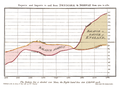 Colour cleaned and straightened


Request: Rotate and Crop, smooth color variations which hint at text on the previous page (esp. behind "Balance in Favour of England) and scanning artifacts (discoloration in corner) MarsInSVG (talk) 18:10, 6 January 2011 (UTC)
Graphist opinion(s):
Colour is an easy fix, see above, although it looses much of the feel of the original document in my opinion. Rotation is more of a problem, since the image is actually distorted (assuming all the lines were parallel and perpendicular to start with) - you can rotate so that a given line is vertical or horizontal, but the others will be off. There is a tool called "Hugin" or "Huggin" which can resolve these types of issues. Rich Farmbrough, 04:08 12 January 2011 (GMT).
- Ok I rotated the three elements independently, and then skewed the graph until the right side is vertical. I resisted the temptation to centre the top caption. Rich Farmbrough, 15:25 12 January 2011 (GMT).
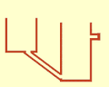
SVG diagram doesn't scale[edit]
-
 Spider internal anatomy, Slovene translation

Request: when saving, Inkscape again inserted links to some external resource, so Commons cannot resize the file and says librsvg-ERROR **: _rsvg_acquire_xlink_href_resource called for external resource: " base: (null) . Could someone please fix this file's header? Thank you, — Yerpo Eh? 16:10, 27 January 2011 (UTC)
Graphist opinion(s):
![]() Done: I removed " entities which are incompatible with RSVG, a problem which has been cropping up in the past few months (presumably when a new version of Inkscape was released)... AnonMoos (talk) 19:54, 27 January 2011 (UTC)
Done: I removed " entities which are incompatible with RSVG, a problem which has been cropping up in the past few months (presumably when a new version of Inkscape was released)... AnonMoos (talk) 19:54, 27 January 2011 (UTC)
WP Essex Barnstar[edit]
-
 WP Essex Barnstar

Request: Could you please remove the white background? Thanks, Thomas888b (talk) 20:54, 9 February 2011 (UTC)
Graphist opinion(s):
- Done —Quibik (talk) 21:18, 9 February 2011 (UTC)
- Thanks Thomas888b (talk) 06:57, 10 February 2011 (UTC)
23rd World Scout Jamboree[edit]


Request: Please redraw the svg, treat the whole as an image, not as a font or text. png is correct stylistically. please match png.Kintetsubuffalo (talk) 15:34, 2 February 2011 (UTC)
Graphist opinion(s):
- Good start! Shouldn't have the rounded corners, and needs the small bottom text yet.--Kintetsubuffalo (talk) 14:00, 10 February 2011 (UTC)
- Just found a version that I've never uploaded - does this work? Jon C (talk) 19:47, 11 February 2011 (UTC)
- That is really nice! The brackets need to be the square Japanese ones, and around the kanji, not the WA. "A" in "A spirit" needs to be decapped, and it's perfect! Thanks so much!--Kintetsubuffalo (talk) 13:54, 12 February 2011 (UTC)
- Much better, thank you! One last thing I hadn't thought of. Can you overwrite the existing svg so we don't have two? Thanks!--Kintetsubuffalo (talk) 14:43, 14 February 2011 (UTC)
- Hi K - At some few kb, I don't see much harm in leaving that in place - I'll leave that with the requester or the graphist who made the other version. Jon C (talk) 18:23, 14 February 2011 (UTC)
File:Denkmalplakette Nordrhein-Westfalen 2010.svg[edit]
-

Original SVG, badly renderedNow fixed

Request: I’ve uploaded an image to commons since ages. (I know why I don’t do that too often.) Everything looked finde on my computer in InkScape and Firefox, but after uploaded to Commons the text in it suddenly looks very strange. Help! Alex (talk) 19:51, 7 February 2011 (UTC)
- Easiest would just be to "Convert text to paths" inside InkScape. Another problem is that it should presumably be white inside the shield (not transparent). AnonMoos (talk) 20:23, 7 February 2011 (UTC)
- *puzzled* Help:SVG says “please do consider […] not converting fonts to path [as this] will increase file dimension”. And it feels like that I’ve rather stumbled accross some subtle mistake than taking the sledgehammer. Anyway: thanks for the hint with the transparent background. --Alex (talk) 22:35, 8 February 2011 (UTC)
- It's not the most elegant solution, but sometimes it's a quick shortcut through RSVG font rendering hell and/or Inkscape peculiarities. The text in that image doesn't need to be translated into different languages, which is the main advantage to text as text in SVG. AnonMoos (talk) 01:54, 9 February 2011 (UTC)
- I agree that the text should be converted to path Richardprins (talk) 21:56, 9 February 2011 (UTC)
- Using just one x-coordinate for the text fixed the problem. Thanks anyway. --Alex (talk) 13:58, 10 February 2011 (UTC)
Graphist opinion(s):
URGENT - CHANGE LIBYA FLAG - DON"T SHOW GADDAFI'S FLAG AS OFFICIAL FLAG[edit]
-

-
-

-
 Resembles flags seen on TV news reports -- ~~~~

.svg)
.svg)
Request: Do something with them... FreeLibyaMedia (talk) 08:48, 28 February 2011 (UTC)
Here it is, pls change the all green flag for our true flag of independence of red/black/green: http://www.google.com/imgres?imgurl=http://www.myweku.com/wp-content/uploads/2011/02/Flag_of_Libya_1951_svg.png&imgrefurl=http://www.myweku.com/2011/02/libyas-flag-wars/&usg=__Exn9uBugd05ZEvu1RqZ5LHvgM5s=&h=400&w=800&sz=8&hl=en&start=0&zoom=1&tbnid=U4d7RjXia8p36M:&tbnh=85&tbnw=169&ei=vWBrTbyhL4KAswakufjpAQ&prev=/images%3Fq%3Dlibya%2Bflag%26hl%3Den%26biw%3D1680%26bih%3D843%26gbv%3D2%26tbs%3Disch:10%2C3&itbs=1&iact=hc&vpx=528&vpy=152&dur=983&hovh=159&hovw=318&tx=173&ty=81&oei=vWBrTbyhL4KAswakufjpAQ&page=1&ndsp=28&ved=1t:429,r:2,s:0&biw=1680&bih=843
Graphist opinion(s):
We really don't get ahead of events -- when there's a new officially-recognized government, then we'll change the flag... AnonMoos (talk) 13:32, 28 February 2011 (UTC)
- However, I've been thinking of making and uploading an image more similar to what is commonly seen on TV -- three equal width stripes, with a fatter crescent than in the center image above... AnonMoos (talk) 13:36, 28 February 2011 (UTC)
- Did so (see above). AnonMoos (talk) 16:05, 28 February 2011 (UTC)
![]() Done (as far as I'm concerned).., AnonMoos (talk) 16:07, 28 February 2011 (UTC)
Done (as far as I'm concerned).., AnonMoos (talk) 16:07, 28 February 2011 (UTC)
- Agreed, showing the protest flag seperately is enough, but we do not change a country's flag until it is officially changed by that country. Fry1989 (talk) 01:50, 1 March 2011 (UTC)
Former COA of Republika Srpska[edit]
-
 PNG Version
 -
 SVG Version
 -
 Army CoA SVG


Request: Can someone create SVG version of the COA? Also, the eagle is used in COA of Army of Republika Srpska, so can someone make svg version of this, too? Bojan Talk 22:03, 19 November 2010 (UTC)
Graphist opinion(s): Isn't it the same as this? -- Orionist ★ talk 21:24, 11 December 2010 (UTC)
- No, it is not. Republika Srpska and Republic of Serbian Krajina weren't same entities. Al tough there are slight differences in feathers (compare neck and wings), Krajina svg COA can be used. The second COA that is needed is coat of Army of Republika Srpska, now defunct army, therefore I believe there are no copyright restrictions. -- Bojan Talk 00:11, 14 December 2010 (UTC)
- Sorry for the long wait - this is a tough nut to crack. The vector version of the CoA is in the above gallery. Someone else can finish the Army CoA... too much Illustrator in a day :) Jon C (talk) 07:17, 19 January 2011 (UTC)
Presidential Standard of Finland[edit]
-
 The flag

Request: We have a new version of the Cross of Liberty in the Presidential standard of Finland. It is based off of the medal seen here. I've fixed it as best I could, but it needs help that I don't have the skills for. The yellow Swastika arms need to fit exactly inside the blue triangles, like how the square coat of arms of Finland fits exactly inside the blue of the nordic cross of the flag. Thank you to who can fix this. Fry1989 (talk) 23:23, 17 March 2011 (UTC)
Graphist opinion(s):
This area is for wikigraphists:
Gregors (talk · contribs): when you accept the request ;
![]() Done: when the request is done. ~
Done: when the request is done. ~
I changed the hue of the red too! please advise if that was beyond reason!
- Well, the red is already set out a certain way, but thanks so much for fixing the Cross. Fry1989 (talk) 20:37, 19 March 2011 (UTC)
Bad SVG seals need fix (easy)[edit]
-
 Arms of Puerto Rico
 -
 Seal of the Secretary of State (bad SVG)
 -
 Redrawn Governor seal
 -
 Redrawn Secretary of State seal


Request: The above two seals are bad. Can you please remake them in TRUE SVG format, and upload over? The Governor's Seal is based off of the Presidential Seal of the US, while the Secretary of State's is based off the Vice-Presidential Seal of the United States. Above is also provided the Coat of Arms of Puerto Rio, so this should be an easy job. Thanks Fry1989 (talk) 01:07, 28 January 2011 (UTC)
Graphist opinion(s):
- Done. How's that? --ZooFari 17:19, 26 March 2011 (UTC)
- PERFECTO! Thanks ZooFari! :D Fry1989 (talk) 17:24, 26 March 2011 (UTC)
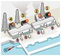
Electrical safety illustrations[edit]
Request: This image was done by adding photos from textbook about electrical safety; but as I'am not knight of the brush, quality of this image became too bad. So, I want to redraw image with the same meaning of all illustrations to more quality image with more beautiful and more quality illustrations. Here is need to draw silhouettes of the people, but more quality and fit all of them into equal dimensions. Great thanks for doing it and helping me! Dmitry G (talk) 22:01, 28 December 2010 (UTC)
Graphist opinion(s): Have you seen the first aid diagrams? There are some of the ink style that may be suitable for your needs. I agree that high-quality first-aid related illustrations are needed in the Wiki-world - but original content is time-consuming (and thankless). Too bad the Philip Greenspun project is now defunct, otherwise it would be good to have a single hand work on the entire series. Jon C (talk) 07:47, 19 January 2011 (UTC)
Celesteial sphere[edit]
-
 Celestial sphere in es
 -
 Celestial sphere in fr
 -
 Celestial sphere in en but this image is a very different version


Request: please convert them to SVG file,Thanks Amir (talk) 20:08, 26 January 2011 (UTC)
Graphist opinion(s):I created a similar svg file: here Amir (talk) 19:35, 5 February 2011 (UTC)
![]() Question Does this mean this request is completed? Jon C (talk) 18:30, 7 February 2011 (UTC)
Question Does this mean this request is completed? Jon C (talk) 18:30, 7 February 2011 (UTC)
Invisible pictures[edit]
-
 As you can see, the file cannot be seen...
 -
 Same here


Request: For no apparent reason, the image stopped to be visible in articles. At least at some computers. Avalokitesvara (talk) 15:07, 22 February 2011 (UTC)
Graphist opinion(s): ![]() Comment To help troubleshoot, on OSX 10.6/Firefox 3.6 I can see both images. Jon C (talk) 16:18, 22 February 2011 (UTC)
Comment To help troubleshoot, on OSX 10.6/Firefox 3.6 I can see both images. Jon C (talk) 16:18, 22 February 2011 (UTC)
- Comment It's all fine client side and server side, no fault! --Perhelion (talk) 09:37, 23 February 2011 (UTC)
Watermark removal[edit]
-
 Ottanthullal

Request: Please remove creditline on the image... Vssun (talk) 05:13, 25 February 2011 (UTC)
Graphist opinion(s):
- Done —Quibik (talk) 14:26, 2 March 2011 (UTC)
C.A. Peñarol[edit]
Need SVG illustrations:
- Old Coat of C.A. Peñarol - example here
- New Coat and Flag of C.A. Peñarol - example here
Request: Hi, can somebody make a SVG version of each coat and the flag, please? thanks in advance Kineto007 (talk) 00:15, 8 March 2011 (UTC)
Graphist opinion(s): Already done on WP Graphic Lab. -- Orionist ★ talk 14:30, 27 March 2011 (UTC)
Wiltshire and West Midlands flags[edit]
-

-
 Remove the black line that appears on the top and left hand sides.


Request: Two requests here, but both relating to SVG English flags. Wiltshire flag should be made scalable and a true SVG (upload to File:County Flag of Wiltshire.svg). The West Midlands flag just needs fixing slightly by way of having the erroneous and surplus black line removed from the upper and left sides of the image. Jza84 (talk) 11:22, 7 March 2011 (UTC)
Graphist opinion(s):
- Tided up the basic SVG code of File:Flag of the West Midlands County.svg (the criss-cross shapes are still slightly irregular...). -- AnonMoos (talk) 02:51, 18 March 2011 (UTC)
- Done
- How's that? NikNaks talk - gallery - wikipedia 13:29, 27 March 2011 (UTC)
- A source much better than the one you were given can be found here, it has the exact pantone numbers for the colors, and a higher resolution image that can help you refine the shape of the bird. The flag overall needs a bit of tweaking so the ratio could become exactly 3:5. Sorry for not posting these earlier :-) Regards! -- Orionist ★ talk 14:26, 27 March 2011 (UTC)
- That ought to do it, then. :D NikNaks talk - gallery - wikipedia 16:57, 27 March 2011 (UTC)
- A source much better than the one you were given can be found here, it has the exact pantone numbers for the colors, and a higher resolution image that can help you refine the shape of the bird. The flag overall needs a bit of tweaking so the ratio could become exactly 3:5. Sorry for not posting these earlier :-) Regards! -- Orionist ★ talk 14:26, 27 March 2011 (UTC)
- Fixed second flag per request Fry1989 (talk) 20:30, 28 March 2011 (UTC)
Logo of Territorial Defense Forces (Yugoslavia)[edit]
-
 Logo of Territorial Defense Forces (Yugoslavia)/TO
 -
 Logo of Yugoslav People's Army
 -


Request: Can someone make SVG version of first COA? Logo of YPA can by used Bojan Talk 13:02, 13 March 2011 (UTC)
Graphist opinion(s):
- As SVG version now exists. Marking as resolved Fry1989 (talk) 22:08, 28 March 2011 (UTC)
![]() Done:
Done:
Wiki Loves Monuments Polish-language logo[edit]
-
 Wiki Loves Monuments logo in English
Request: A simple request related to the above WLM logo. Please draw another version of the logo, replacing the English name with „WIKI LUBI ZABYTKI“ — two first words in the first line, the last one in a line below, just like in the original version. I would like the name of the file to be File:Wikilovesmonuments logo PL.svg, please.
I would draw it myself, but unfortunately I couldn't find the font used in the original logo (there's no information in the file source); as far as I have checked, the font may be included in the Mac; the most similar one that I was able to find was the CentSchbookEU. Thank you, odder (talk) 18:58, 27 March 2011 (UTC)
Graphist opinion(s):
![]() Request taken by Gregors:
Request taken by Gregors:
![]() Done: when the request is done.
Done: when the request is done.
-
 Wiki Loves Monuments logo in Polish
I had to fake the typeface, couldn't find one that was really good either; some of the letters have been tweaked to mimic the original some have been left as slightly stretched "Kinnari Bold" Hope it's good enough...
- That's perfect, thank you again. odder (talk) 09:21, 29 March 2011 (UTC)
Error in Inkscape Chinese characters[edit]
-
 There are errors in these Inkscape files
 -


Request: Fix the errors in these Inkscape files. — Cheers, JackLee –talk– 16:31, 2 April 2011 (UTC)
Graphist opinion(s): Is the error simply the black box obscuring the letters? If so, I'll do it now. NikNaks talk - gallery - wikipedia 17:23, 2 April 2011 (UTC)
- Voila. NikNaks talk - gallery - wikipedia 17:30, 2 April 2011 (UTC)
- Brilliant. Thanks very much! (I have no idea how Inkscape works.) — Cheers, JackLee –talk– 17:51, 2 April 2011 (UTC)
Patriarchal cross[edit]
-
 Patriarchal cross
 -
 Red version


Request: Could you make a copy of this file, but with the cross as red, and without the white background please. Thomas888b (talk) 20:48, 20 March 2011 (UTC)
Graphist opinion(s): I made a red version. Is there a specific hue of red you want? Richardprins (talk) 21:33, 20 March 2011 (UTC)
- No, that's good thanks :-) Thomas888b (talk) 20:17, 1 April 2011 (UTC)
Cardiff, Belfast and Edinburgh flags[edit]
-
 Belfast: SVGification of this flag (and of Cardiff and Edinburgh)
 -
 Cardiff
 -
 Edinburgh
 -
 Edinburgh could have a flag derived (and modified) from this file


.svg)


Need SVG illustrations for the following:
- Flag of Belfast - examples here and here Done
- Flag of Cardiff - examples here and here Done
- Flag of Edinburgh - examples here and here Done
Request: Hi all, we have a File:Flag of the City of London.svg, but we don't have illustrations for the other three British capitals (Belfast for Northern Ireland; Cardiff for Wales; and Edinburgh for Scotland). SVG flags of these would be greatly appreciated. Jza84 (talk) 02:01, 2 February 2011 (UTC)
Graphist opinion(s):
Well, I've altered the Edinburgh one to something that seems reasonable enough. The rocks could still use a lot of work, but I don't have time to do so now. NikNaks talk - gallery - wikipedia 15:20, 27 March 2011 (UTC)
- Belfast done. NikNaks talk - gallery - wikipedia 14:58, 4 April 2011 (UTC)
- Above I posted the official versions of the Cardiff and Edinburgh flags that are kept at the UK flag registry. I hope they can help with the job along with the other linked images. Regards, -- Orionist ★ talk 17:26, 4 April 2011 (UTC)
- Thanks for that, Orionist! I've done Cardiff now. Took a while! I'll revisit Edinburgh at some point. NikNaks talk - gallery - wikipedia 18:28, 5 April 2011 (UTC)
- Look great! Really pleased with how accurate these are. Noticed that the Edinburgh one is under reconstruction - not sure if it's work in progress but the white is showing as transparent and some of the rocks aren't displaying. But these are really great! Jza84 (talk) 10:52, 8 April 2011 (UTC)
- I think I was actually uploading the updated file as you posted that! How's that? Any changes you can see? NikNaks talk - gallery - wikipedia 11:17, 8 April 2011 (UTC)
- Spot on! Thank you for taking up this request! Jza84 (talk) 20:41, 8 April 2011 (UTC)
- I think I was actually uploading the updated file as you posted that! How's that? Any changes you can see? NikNaks talk - gallery - wikipedia 11:17, 8 April 2011 (UTC)
- Look great! Really pleased with how accurate these are. Noticed that the Edinburgh one is under reconstruction - not sure if it's work in progress but the white is showing as transparent and some of the rocks aren't displaying. But these are really great! Jza84 (talk) 10:52, 8 April 2011 (UTC)
- Thanks for that, Orionist! I've done Cardiff now. Took a while! I'll revisit Edinburgh at some point. NikNaks talk - gallery - wikipedia 18:28, 5 April 2011 (UTC)
-
 Hydroforming animated gif

Request: That motion picture is grossly innaccurate, anyone interested in revising it so that the edges of the metal (red rectangle) stay clamped (under the grey clamps)? Once water can get behind the sheet it's just going to relieve pressure and no longer deform. Original comment by David Casale at w:talk:hydroforming. Wizard191 (talk) 15:58, 12 May 2011 (UTC)
Graphist opinion(s):
- Done. Should be OK now. —Quibik (talk) 19:29, 12 May 2011 (UTC)
- Many thanks, it looks aweseom! Wizard191 (talk) 16:05, 13 May 2011 (UTC)
1/2 symbol[edit]

Request: This image renders properly for me in Inkscape and in my browser (Chrome), but when Mediawiki is converting it to PNG, seems to be making it too wide (cf. [1] [2]). I'm assuming an error in the SVG text itself that makes it ambiguous, and which is confusing mediawiki. Someone familiar enough with SVG formatting: any help would be appreciated. Text of the SVG posted below for ease.
<?xml version="1.0"?>

<!DOCTYPE svg PUBLIC '-//W3C//DTD SVG 1.0//EN' 'http://www.w3.org/TR/2001/REC-SVG-20010904/DTD/svg10.dtd'>
<svg fill-opacity="1" xmlns:xlink="http://www.w3.org/1999/xlink" color-rendering="auto" color-interpolation="auto" stroke="black" text-rendering="auto" stroke-linecap="square" stroke-miterlimit="10" stroke-opacity="1" shape-rendering="auto" fill="black" stroke-dasharray="none" font-weight="normal" stroke-width="1" xmlns="http://www.w3.org/2000/svg" font-family="'Dialog'" font-style="normal" stroke-linejoin="miter" font-size="12" stroke-dashoffset="0" image-rendering="auto">
  <!--Unicode Character 'VULGAR FRACTION ONE HALF' (U+00BD)-->
  <defs id="genericDefs" />
  <g>
    <g>
      <path d="M137.5312 335.1094 L137.5312 317.9531 Q146.8125 301.7812 163.125 287.1562 L172.9688 278.4375 Q183.7969 268.7344 189.2812 259.7344 Q194.7656 250.7344 194.7656 242.2969 Q194.7656 231.8906 189.0703 226.6172 Q183.375 221.3438 171.9844 221.3438 Q158.4844 221.3438 140.625 231.0469 L140.625 214.5938 Q158.3438 207.1406 176.0625 207.1406 Q194.3438 207.1406 205.5938 216.6328 Q216.8438 226.125 216.8438 241.5938 Q216.8438 251.4375 210.375 261.7031 Q203.9062 271.9688 191.1094 282.5156 L183.6562 288.5625 Q164.9531 303.8906 161.7188 317.9531 L216.4219 317.9531 L216.4219 335.1094 L137.5312 335.1094 ZM13.9219 340.3125 L166.9219 121.7812 L185.9062 121.7812 L33.0469 340.3125 L13.9219 340.3125 ZM38.25 251.8594 L38.25 145.125 L10.4062 152.0156 L10.4062 135.9844 L59.0625 123.75 L59.0625 251.8594 L38.25 251.8594 Z" stroke="none" />
    </g>
  </g>
</svg>
Magog the Ogre 02:42, 30 April 2011 (UTC)
Graphist opinion(s):
- You provided absolutely no width= or height= or viewBox= information of any kind, so RSVG had to take a wild guess. Fixed... AnonMoos 09:01, 30 April 2011 (UTC)
- I didn't provide it at all. I found it on the web. Magog the Ogre (talk) 18:34, 30 April 2011 (UTC)
- Nevertheless, the file was lacking information necessary to display it correctly. AnonMoos (talk) 00:52, 1 May 2011 (UTC)
- What is with: Template:Symb or
- -- 18:06, 1 May 2011 User:Perhelion

Nameless[edit]
-
 I would like this image to be recreated in the style (colour, font etc) of the Fastpass icon and re-uploaded as a new version.
 -
 A similar scenario with this one however, I'd like it have either a yellow or gold background. It could be based off either the Single Rider or the Fastpass icon.


Request: I was wondering if someone could please redo these images based on the Single Rider icon and the Fastpass icon. Thanks Themeparkgc Talk 08:07, 15 May 2011 (UTC)
Graphist opinion(s):
- Done How's that? Let me know if you need anything else. --ZooFari 15:38, 22 May 2011 (UTC)
- Thank you so much. They both look great. Themeparkgc Talk 22:06, 22 May 2011 (UTC)
Grito de Asencio[edit]
-
 Grito de Asencio (one)
 -
 Grito de Asencio (two)


Request: As you can see, we have two versions of the same portrait. The first is of very low quality, almost like a bad TV screenshot, the second one has better details but the site hosting it added a disrupting watermark to it. Is it possible to remove it? Cambalachero (talk) 03:12, 12 June 2011 (UTC)
Graphist opinion(s):![]() Done: -- Amada44 talk to me 10:09, 13 June 2011 (UTC)
Done: -- Amada44 talk to me 10:09, 13 June 2011 (UTC)
SVG translation[edit]
-
 Missing cover (en)
 -
 Missing cover (pt)


Request: I've tried to create a Portuguese version of the image above using Inkscape, but the result wasn't satisfactory. The translated image is displayed correctly in the computer but not on Commons if the size is different from the original (the words of the phrase "Precisa-se de uma capa sob Copyleft" overlap each other). Any tips on how to fix this? Helder 13:05, 10 June 2011 (UTC)
Graphist opinion(s):
 Fixed. It is okay to convert the text to path on a translated version. There was a slight increase in size as of result, but it is no big deal since it is a small graphic. Also, if people want to translate it, they would have to use the English version to do so. --ZooFari 15:26, 10 June 2011 (UTC)
- Thank you! Helder 22:28, 10 June 2011 (UTC)
CIExy1931.svg[edit]
-
 SVG rendering mangled text in some previews and thumbnails
 -
 Original PNG image

Request: Wikimedia renders thumbnails and preview of the SVG file on the left as a mangled mess. The actual SVG file renders fine on Firefox and Opera but wikimedia renders it as a mess. Is there a way to fix this? It is used in wikipedia pages from several languages. 84user (talk) 13:53, 3 June 2011 (UTC)
Graphist opinion(s): ![]() Request taken by Amada44: Its strange. I can't get the color part to render properly in the thumbnail if the size is smaller than 127 pixels. Everything above is fine. everything below not. Looks like a bug!
Request taken by Amada44: Its strange. I can't get the color part to render properly in the thumbnail if the size is smaller than 127 pixels. Everything above is fine. everything below not. Looks like a bug!  - Amada44 talk to me 07:30, 9 June 2011 (UTC)
- Temporary file: I mean it works? --Perhelion (talk) 09:51, 9 June 2011 (UTC)
Yea, looking better. I just realized, that the graphic is an embedded raster-graphic. We should make it svg only. I guess thats quite a challenge though... Amada44 talk to me 20:04, 9 June 2011 (UTC)
- Yes indeed, my skills are not sufficient, to do this. Is this even possible? In addition, you can see, on closer inspection, JPEG artifacts (specially red). --Perhelion (talk) 11:25, 10 June 2011 (UTC)
Black line[edit]
-
 Remove black line around border...
 -
 ... so that it appears like this.


Request: Remove black line from border as more compliant with commonest form of flag Jza84 (talk) 06:19, 22 June 2011 (UTC)
Graphist opinion(s): ![]() Done: Black border removed. However, per the blazon, shouldn't this be four columns of "three two three two", rather than five columns of two? — Huntster (t @ c) 07:29, 22 June 2011 (UTC)
Done: Black border removed. However, per the blazon, shouldn't this be four columns of "three two three two", rather than five columns of two? — Huntster (t @ c) 07:29, 22 June 2011 (UTC)
Fix animation[edit]
-
 Diffusion welding animation
 -
 2. corrupt scaling


Request: Can someone help make this animation work. It only seems to work when it's at it's neutral size, which is way too big for any Wikipedia article. Thanks! Wizard191 (talk) 20:46, 15 June 2011 (UTC)
Graphist opinion(s):
1,181 × 827 × 15 = 14,650,305 and it's a policy that only animated GIF images with a total pixel count less than 12,500,000 will preserve animation on resizing... AnonMoos (talk) 00:15, 16 June 2011 (UTC)
- Done: Cut caption and white border. --Perhelion (talk) 22:45, 16 June 2011 (UTC)
- Why is this 2. (to thumb size 220px) scaled animation (only on unedited pages) not displayed (seams cache issue)? Where is here an animation guideline? Sorry for many crappy versions (an admin could delete them!?) --Perhelion (talk) 20:00, 17 June 2011 (UTC)
- Thanks! Wizard191 (talk) 18:56, 20 June 2011 (UTC)
- Why is this 2. (to thumb size 220px) scaled animation (only on unedited pages) not displayed (seams cache issue)? Where is here an animation guideline? Sorry for many crappy versions (an admin could delete them!?) --Perhelion (talk) 20:00, 17 June 2011 (UTC)
Arabic Wikiversity[edit]
-->
-
 Arabic Wikiversity logo
Request: Please resize this image as 135x135 to be used as the logo of Arabic Wikiversity. Meno25 (talk) 15:42, 9 July 2011 (UTC)
Graphist opinion(s):
- Done by w:User:Derfel73. --Meno25 (talk) 19:21, 9 July 2011 (UTC)
White background on SVG[edit]
-
 Raising the flag at Iwo Jima

Request: It's my first SVG (well, it's just a vector-remake of File:Raising the Flag outline.png). Can anyone please set the background to be white? Or explain me what I must do to do so. I can't manage to do that. Thanks! Aeoris (talk) 02:23, 15 June 2011 (UTC)
Graphist opinion(s):
![]() Done: Just set a white rectangle, the same size as the overall image, behind all other elements... AnonMoos (talk) 06:01, 15 June 2011 (UTC)
Done: Just set a white rectangle, the same size as the overall image, behind all other elements... AnonMoos (talk) 06:01, 15 June 2011 (UTC)
Clean up this Logo (SVG)[edit]
Request: Cleanup this SVG, remove unnecessary elements Connormah (talk | contribs) 03:11, 29 May 2011 (UTC)
Graphist opinion(s): ![]() Request taken by Joe Gazz84 I will gladly do this, what are you thinking you want removed though? Joe Gazz84 (talk) 14:19, 20 June 2011 (UTC)
Request taken by Joe Gazz84 I will gladly do this, what are you thinking you want removed though? Joe Gazz84 (talk) 14:19, 20 June 2011 (UTC)
- Looks good, thanks. Connormah (talk | contribs) 23:18, 20 June 2011 (UTC)
spelling in svg[edit]
-
 Stacheldraht DDoS Attack

Request: The title is misspelt. But this is also part of the image. See http://en.wikipedia.org/wiki/Stacheldraht QuentinUK (talk) 11:40, 14 June 2011 (UTC)
Graphist opinion(s):
Would have fixed it, except that text has been converted to paths (which is necessary for good text display in some cases with RSVG, but annoying when a fix like this has to be made...). -- AnonMoos (talk) 06:03, 15 June 2011 (UTC)
In use the title in the image is repeated as the caption underneath the image. The top line could be removed completely. Would this be any easier? QuentinUK (talk) 15:15, 15 June 2011 (UTC)
- Much! Done NikNaks talk - gallery - wikipedia 16:31, 25 June 2011 (UTC)
Seals of Texas[edit]
-
 example
 -
 example


Request: (Neccesary elements provided above) There are several seals of Texas that should be made available in SVG. Most of the neccesary elements are provided above. The seal of the Lt. Governor , the seal of the State Senate, the seal of the House of Representatives, the seal of the Speaker of the House. the seal of the Attorney General, and the seal of the Secretary of State.
I know it's a big request, so thank you to whoever or all who do this request for me. Greatly appreciated. Fry1989 (talk) 19:28, 29 March 2011 (UTC)
- Looking great, Zoofari! :D Fry1989 (talk) 23:47, 23 June 2011 (UTC)
Graphist opinion(s):
- File:Seal of Lt. Governor of Texas.svg Done. --ZooFari 00:47, 26 May 2011 (UTC)
- File:Seal of State Senate of Texas.svg Done. --ZooFari 01:52, 26 May 2011 (UTC)
- File:Seal of Texas House of Representatives.svg Done. --ZooFari 18:29, 23 June 2011 (UTC)
- File:Seal of Speaker of the House of Texas.svg Done. --ZooFari 19:44, 23 June 2011 (UTC)
- File:Seal of Texas Attorney General.svg Done. If you see a dark ring in preview, it might be related to the thumbnail issue. --ZooFari 20:25, 15 July 2011 (UTC)
And... File:Seal of Texas Sectretary of State.svg ![]() Done. I messed up the first time so the thumbnail will take a while to update. All done! --ZooFari 01:58, 18 July 2011 (UTC)
Done. I messed up the first time so the thumbnail will take a while to update. All done! --ZooFari 01:58, 18 July 2011 (UTC)
- Woo hoo! Fry1989 (talk) 02:51, 18 July 2011 (UTC)
Civil Air Patrol WWII logo[edit]
-
 WWII logo for CAP
 -
 vector

_%E2%80%93_Civil_Air_Patrol.svg)
Request: Requesting an SVG version of this logo be made. Above image is of terrible quality, but as it will soon be the only highly recognisable symbol of Civil Air Patrol left on Commons, it would be very useful to have a scalable and high-quality version for the projects. Please make elements have radial symmetry; above logo has some visible printing imperfections. Thanks muchly! — Huntster (t @ c) 09:37, 22 July 2011 (UTC)
Graphist opinion(s):
![]() Done --Fred the Oyster (talk) 16:29, 22 July 2011 (UTC)
Done --Fred the Oyster (talk) 16:29, 22 July 2011 (UTC)
- Thanks Fred, it looks great! — Huntster (t @ c) 01:45, 23 July 2011 (UTC)
New Shield for Fijian flags[edit]
-
 Fijian Arms

Request: Please replace the shields in the following Fijian flags with the shield from our new SVG version of the Fijian arms shown above, as well as re-create in SVG the last flag.
- File:Flag of Fiji.svg Done --Fred the Oyster (talk) 11:00, 23 July 2011 (UTC)
- File:Civil Ensign of Fiji.svg Done --Fred the Oyster (talk) 11:15, 23 July 2011 (UTC)
- File:Government Ensign of Fiji.svg Done --Fred the Oyster (talk) 11:21, 23 July 2011 (UTC)
- File:Naval Ensign of Fiji.svg Done --Fred the Oyster (talk) 11:27, 23 July 2011 (UTC)
- File:Civil Air Ensign of Fiji.svg - I'll have to redo this one from scratch as some weird clipping mask has been used. --Fred the Oyster (talk) 11:50, 23 July 2011 (UTC) Done
- File:Flag of Fiji 1924-1970.gif Done --Fred the Oyster (talk) 11:49, 23 July 2011 (UTC)
Fry1989 (talk) 01:12, 20 July 2011 (UTC) Graphist opinion(s):
![]() Request taken by Fred the Oyster
Request taken by Fred the Oyster ![]() Done --Fred the Oyster (talk) 17:13, 23 July 2011 (UTC)
Done --Fred the Oyster (talk) 17:13, 23 July 2011 (UTC)
- Perfect, thanks mate! Fry1989 (talk) 20:37, 23 July 2011 (UTC)
Creating SVG[edit]
Could somebody create a SVG version of the following image File:UMD icon.jpg? I don't know how to handle SVG. Thanks in advance. Mizunoryu (talk) 03:42, 11 July 2011 (UTC)
- Nope sorry, the file is copyrighted and will more than likely be deleted. --Fred the Oyster (talk) 09:05, 11 July 2011 (UTC)
I dont see this getting deleted, so I'll work on it. Pbroks13 (talk) 17:30, 12 July 2011 (UTC)
- Done The file's done, but I'm going to wait to upload it until the sd request is over. Pbroks13 (talk) 17:58, 12 July 2011 (UTC)
Here you are! File:UMD icon.svg. Pbroks13 (talk) 06:46, 19 July 2011 (UTC)
- Thank you very much for your kindness^^. I got so upset that I forgot to comeback here to see and ask to do it without background...Mizunoryu (talk) 17:45, 19 July 2011 (UTC)
Inkscape SVG text rendering problems[edit]
-
 Text scales wrongly
 -
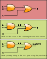 text scales wrongly

Request: I was recommended to ask you guys to see if you could help. I'm making some images in inkscape for a wikibook I'm working on. you can find the rest of the images here. Unfortunately the text I see in inkscape is resized once it is png format on wikicommons, as you can see above. Looking at the SVG in chrome 12.0.742.112 renders the text correctly . Any idea how to fix this? I'm using inkscape 0.48.0 portable apps version and windows xp. I have also tested in on 0.48.1 and it works fine.. Thanks Pluke (talk) 21:23, 6 July 2011 (UTC)
- I think I might know what is going wrong. I have it under the "Sans" font in Inkscape, which apparently defaults to Arial in Windows, the font that wikipedia replaces it with is slightly larger, hence the misalignment. Is the only way to fix this to go through each image individually and change the font to dejavu sans? Surely I can't be the only experiencing this issue?Pluke (talk) 22:08, 6 July 2011 (UTC)
- Thanks for the help. I'll get to fixing the other images Pluke (talk) 10:19, 10 July 2011 (UTC)
Graphist opinion(s):
- First, I would set the symbol to a unit (because it can always shift when scaled). Then, I would try specific Arial as font (it is being converted to a similar Font). If you don't know, read for more information Help:SVG (there should be linked everything more specific). If you then still have questions, go ahead. PS: You can group fonts: “It is always recommended that such generic fonts (Sans) as a last indication of a value assignment”. -- Perhelion
»♥›23:41, 6 July 2011 (UTC)- I still see a problem with the wikipedia rendering of: http://commons.wikimedia.org/wiki/File:CPT-logic-gate_example.svg I've tried to change the font and optimise it, but not having any luck. Pluke (talk) 10:55, 10 July 2011 (UTC)
- First, I would set the symbol to a unit (because it can always shift when scaled). Then, I would try specific Arial as font (it is being converted to a similar Font). If you don't know, read for more information Help:SVG (there should be linked everything more specific). If you then still have questions, go ahead. PS: You can group fonts: “It is always recommended that such generic fonts (Sans) as a last indication of a value assignment”. -- Perhelion

Governor's Seals[edit]
-
 Arms of Alabama
 -
 Seal of Alabama
 -
 Arms of Connecticut
 -
 Seal of Utah


-
 Alabama
 -
Texas
-
 Connecticut
 -
 Utah
Utah


Request: Please recreate the Governor's seals(as seen on their official websites) of the States of Alabama, Connecticut 1 & 2, Texas, and Utah. The neccesary vector elements are provided above. Thank you. Fry1989 (talk) 04:44, 21 January 2011 (UTC)
Graphist opinion(s): It's been a while, but I figure I could start again. xD Are the ones that appear black-and-white on the websites meant to be that way, or should they be coloured like the arms/seals themselves? NikNaks talk - gallery - wikipedia 21:02, 14 February 2011 (UTC)
- EXCELLENT! Utah's I would assume is exactly the same as the State Seal colour-wise, it looks like it's just a graphic, similar to what they've done to the Michigan coat of arms on that state's Governor's website. Texas, I'm not so sure, I can't find any other pics of the Governor's seal for that one. I'd go with the same colouring as the State seal as well though, but of course, you're the artist :) I think Connecticut's will be the most difficult one though, with it's escalloped outer ring and such, so I'm really grateful for you're taking this. Fry1989 (talk) 00:39, 15 February 2011 (UTC)
- Update, based on this pic, perhaps it is supposed to be only black and white for Texas. I'm not sure, it's a tough call for me, so it's your decision :) Fry1989 (talk) 03:37, 16 February 2011 (UTC)
- How's the seals coming mate? :) Fry1989 (talk) 05:30, 3 March 2011 (UTC)
- Finally I have some free time and energy! Here's the first. If you'd like to, feel free to fix up the kerning a bit better. I was having some trouble getting it to look right. More incoming. If you have any ideas what the fonts are, that would be a great help! NikNaks talk - gallery - wikipedia 20:10, 26 March 2011 (UTC)
- Haha, I'm sorry I was so impatient. Thanks for putting up with me :D. Looking good. As for fonts, I don't really know anything about them, sorry. Fry1989 (talk) 22:03, 26 March 2011 (UTC)
- Well, I've used Times for this one and it looks OK. Connecticut does look the trickiest. I wonder if there are existing seals with that edging. NikNaks talk - gallery - wikipedia 12:05, 27 March 2011 (UTC)
- Hello NikNaks93! Regarding the fonts, the one on Texas seal is "Quant Antiqua Bold", although it looks like the "Regular" is used on the governor's seal. For Connecticut I think it's "Century", looks like a "semibold" or "extended" variation. For Utah it looks like "Bookman Old Style", albeit condensed, and you'll find a much clearer image of the seal on page 1 of this file. Finally Alabama looks like "Times new Roman". Hope that helps. Regards, -- Orionist ★ talk 13:50, 27 March 2011 (UTC)
- Just a note for Utah's btw. I noticed in the PDF that Orionist provided, it has some roman numerals at the bottom instead of the 1896 on the State Seal. If my suspicions are correct, those roman numerals represent the Governor himself, and changes with every governor, as the roman numerals on the California Governor's seal does. THerefore, we have 3 options. Include the numerals, and change them when the next Governor comes in, leave it blank, or put in the 1896 from the State seal. Since you're the artist, I'll leave that to you however. Fry1989 (talk)
- Okay, I'm coming back to these this weekend now I have more time. I'll fix the font on Texas, too. NikNaks talk - gallery - wikipedia 17:31, 2 April 2011 (UTC)
- I do not have the Quant Antiqua font or any of its variations, so I cannot do those correctly as I can't afford to pay, either! I'll work on the rest, though. NikNaks talk - gallery - wikipedia 18:34, 5 April 2011 (UTC)
- Okay, I'm coming back to these this weekend now I have more time. I'll fix the font on Texas, too. NikNaks talk - gallery - wikipedia 17:31, 2 April 2011 (UTC)
- Just a note for Utah's btw. I noticed in the PDF that Orionist provided, it has some roman numerals at the bottom instead of the 1896 on the State Seal. If my suspicions are correct, those roman numerals represent the Governor himself, and changes with every governor, as the roman numerals on the California Governor's seal does. THerefore, we have 3 options. Include the numerals, and change them when the next Governor comes in, leave it blank, or put in the 1896 from the State seal. Since you're the artist, I'll leave that to you however. Fry1989 (talk)
- Hello NikNaks93! Regarding the fonts, the one on Texas seal is "Quant Antiqua Bold", although it looks like the "Regular" is used on the governor's seal. For Connecticut I think it's "Century", looks like a "semibold" or "extended" variation. For Utah it looks like "Bookman Old Style", albeit condensed, and you'll find a much clearer image of the seal on page 1 of this file. Finally Alabama looks like "Times new Roman". Hope that helps. Regards, -- Orionist ★ talk 13:50, 27 March 2011 (UTC)
Felix Ivo Leicher[edit]

Request: Redraw this picture of very poor quality to a better one. --Petrus Adamus (talk) 20:03, 28 April 2011 (UTC)
Graphist opinion(s):
- Not a redraw but I did reduce the amount of noise in the image. —Quibik 20:38, 29 April 2011 (UTC)
Alphabet of Esperanto[edit]
-
 Print and script Esperanto letters
 -
 (svg) Automatic tracing results

Request: Could somebody talented vectorise the picture? Thanks, Petrus Adamus (talk) 10:14, 6 May 2011 (UTC)
Graphist opinion(s):
- I doubt that image is clear enough for automatic tracing to do much good, and tracing it by hand would be a major pain. The easiest way to recreate it in SVG would be to find some existing fonts that match the letter shapes used in the book and retype the text using them. Alas, I didn't manage to get anything useful out of either WhatTheFont or Identifont. —Ilmari Karonen (talk) 16:43, 29 May 2011 (UTC)
- Yes, I have tried automatic tracing with unusable result and also my searching for similar fonts was not successful, that is why I wrote the request here. --Petrus Adamus (talk) 21:06, 29 May 2011 (UTC)
- For the first section, you could presumably use almost any sans-serif font with Esperanto-character support, and it would serve much the same purpose; the tricky part is duplicating the second section (handwriting). AnonMoos (talk) 22:50, 10 June 2011 (UTC)
- I played around with the automatic tracing and this here was the best results. Needs still lots of hand work to be good. but its a start. Feel free to optimize :) . Amada44 talk to me 13:05, 23 June 2011 (UTC)
- It looks reasonably good as a display chart (as opposed to characters to be used in an actual TTF etc. font), except that "j", "l", and "ŭ" are broken into two parts... AnonMoos (talk) 17:45, 25 June 2011 (UTC)
- I think the easiest way would be (for somebody talented for it) to redraw the letters according the image (the difference between such a result and the outcome of the tracing would be similar but the redrawn one would look better). --Petrus Adamus (talk) 19:18, 25 June 2011 (UTC)
- Yea, except that redrawing this manually will take about 5 to 8 hours. But feel free to give it a go. Inkscape is free and all you need :) cheers, Amada44 talk to me 19:30, 25 June 2011 (UTC)
- Sorry in this case, I thought it's much faster. Inkscape is perfect, but unfortunatelly it cannot set off the absence of talent at me. --Petrus Adamus (talk) 19:38, 25 June 2011 (UTC)
- Those of us who regularly deal with the interface between Inkscape and RSVG are very aware that Inkscape is far from perfect! AnonMoos (talk) 21:14, 26 June 2011 (UTC)
- Sorry in this case, I thought it's much faster. Inkscape is perfect, but unfortunatelly it cannot set off the absence of talent at me. --Petrus Adamus (talk) 19:38, 25 June 2011 (UTC)
- Yea, except that redrawing this manually will take about 5 to 8 hours. But feel free to give it a go. Inkscape is free and all you need :) cheers, Amada44 talk to me 19:30, 25 June 2011 (UTC)
- I think the easiest way would be (for somebody talented for it) to redraw the letters according the image (the difference between such a result and the outcome of the tracing would be similar but the redrawn one would look better). --Petrus Adamus (talk) 19:18, 25 June 2011 (UTC)
- It looks reasonably good as a display chart (as opposed to characters to be used in an actual TTF etc. font), except that "j", "l", and "ŭ" are broken into two parts... AnonMoos (talk) 17:45, 25 June 2011 (UTC)
- I played around with the automatic tracing and this here was the best results. Needs still lots of hand work to be good. but its a start. Feel free to optimize :) . Amada44 talk to me 13:05, 23 June 2011 (UTC)
- For the first section, you could presumably use almost any sans-serif font with Esperanto-character support, and it would serve much the same purpose; the tricky part is duplicating the second section (handwriting). AnonMoos (talk) 22:50, 10 June 2011 (UTC)
USPS mail flow through national infrastructure.svg[edit]
-
 USPS mail flow

Request: This image needs some tweak on fonts I guess... Kozuch (talk) 21:32, 11 August 2011 (UTC)
Graphist opinion(s):
- Font-family: Helvetica and Times are not really supported. There is also Kerning and Shifting (from PDF export) which is also not supported by Mediawiki. It can be fixed, but I don't know a helping tool for this yet!? The last choice is always to convert all text to path (if you have the correct font). -- πϵρήλιο ℗ 16:23, 12 August 2011 (UTC)
- "Destinating Mail"? Really, even though there's no such word? I know it's on the original but I'd have thought that the USPS designers would have a little better literacy. Heheheheh. --Fred the Oyster (talk) 12:48, 15 August 2011 (UTC)
illustration of damage to Fukushima I reactors[edit]
-
 Cartoon illustration of damage to Fukushima I reactors
 -
 Possible alternative for diagrams


Request: Please create another image similar in intent to my amateur effort above showing the damage shown in this copyrighted photograph by Digital Globe. Any artistic illustration would be useful, as long as the image does not infringe the copyright of Digital Globe. Some simple images are at Category:Fukushima I Nuclear Power Plant and reference images via Google here. 84user (talk) 15:22, 17 March 2011 (UTC) Models and closeup images from NHK Television News can be seen in the first three minutes of video archived here (Real Video file, plays Ok in SMPlayer and VLC). -84user (talk) 18:33, 17 March 2011 (UTC)
Graphist opinion(s): There is a similar request here so, if that wasn't already you, perhaps adding this request there would be wise if it's not worked on here. NikNaks talk - gallery - wikipedia 12:35, 4 April 2011 (UTC)
Thanks, I have added this request at w:Wikipedia:Graphic_Lab/Illustration_workshop#illustration of damage to Fukushima I reactors. -84user (talk) 14:21, 5 April 2011 (UTC)
Update it seems we could close my request as it seems the original was already CC-BY-SA via OTRS, and a good alternative diagram was later uploaded as File:Fukushima I nuclear accidents diagram.svg. To the gallery I have added the two images which are now freely licensed. -84user (talk) 15:22, 9 April 2011 (UTC)
Signatures[edit]
-
 Done
Done -
 Done
Done -
 Done
Done -
 Done
Done -
 Done
Done -
 Done
Done -
 Done
Done -
 Done
Done -
 Done
Done -
 Done
Done -
 Done
Done -
 Done
Done -
 Done
Done -
 Done
Done -
 Done
Done -
 Done
Done -
 Done
Done -
 Done
Done -
 Done
Done -
 Done
Done -
 Done
Done -
 Done
Done -
 Done
Done -
 Done
Done -
 Done
Done -
 Done
Done -
 Done
Done -
 Done
Done -
 Done
Done -
 Done
Done -
 Done
Done -
 Done
Done -
 This is going to be a difficult one


-
 Done already
 -
 Done already
 -
 Done already
 -
 Done already
 -
 Done already
 -
 Done already
 -
 Done already
 -
 Done already
 -
 Done already
 -
 Done already
 -
 Done already
 -
 Done already
 -
 Done already
 -
 Done already
 -
 Done already
 -
 Done already
 -
 Done already
 -
 Done already
 -
 Done already
 -
 Done already
 -
 Done already
 -
 Done already
 -
 Done already
 -
 Done already
 -
 Done already
 -
 Done already
 -
 Done already
 -
 Done already
 -
 Done already
 -
 Done already
 -
 Done already
 -
 Done already


Article(s): many
Request: Please create a svg image of these signatures and remove letters unrelated to the name out and change the JPG images to a white background. Thanks.KAVEBEAR (talk) 11:52, 12 July 2011 (UTC)
Graphist opinion(s):
Supposed Serbian Empire flag[edit]

Request: Fix the feather ornaments who are missing on the eagle There are 2 feathers that arent connected properly on the eagle... Drax90 (talk) 05:47, 28 June 2011 (UTC)
Graphist opinion(s): Which ornaments are missing? Do you have a reference picture to help? NikNaks talk - gallery - wikipedia 18:08, 28 June 2011 (UTC)
- I had to search the bird. Apparently there were two overlapping feathers on the breast. Fry1989 eh? 02:44, 26 August 2011 (UTC)
Flags and coat of arms of San Marino[edit]
-
 Flag (3:4)
 -
 Coat of arms Done Replaced with official version
 -
 Civil flag (3:4) Done
 -
 Supposed merchant flag (3:4) Done
 -
 Flag (2:3) Done


.svg)
.svg)
.svg)
Requests:
- Replace the flag and the coat of arms with the official models found in the following PDF: Law on the flag and coat of arms of San Marino. Make sure the new SVGs use the officialy prescribed CMYK/Pantone colors and the coat of arms has the right proportions on the flag (page 3).
Replace the blue color in the supposed civil flag, and also create the supposed merchant flag, according to this model: [3] Done- All the flags above should have a proportion of 3:4. The law also gives proportions for a 2:3 state flag (page 3): The official flag can have the proportion 2:3 for international use and/or when specified. At this proportion, the arms will occupy the central third of the flag's length (arms' width equals 1/3 of the flag's width) and the line that passes through the center of the cross on the top of the crown will be at 1/6 of the flag's height below the upper edge. I believe it's easy to create a variant with proportion of 2:3 from the 3:4 model. --Alex:D (talk) 11:24, 10 August 2011 (UTC)
- I would also like a separate SVG construction sheet extracted from the same PDF. --Alex:D (talk) 11:40, 10 August 2011 (UTC)
- No one has Inkscape or any other solution to extract the vectors from the PDF? --Alex:D (talk) 21:48, 14 August 2011 (UTC)
- I just did the CoA, but what do you mean by a "construction sheet"? Couldn't you just upload the relevant pages as PDFs? All presupposing that copyright isn't being infringed. --Fred the Oyster (talk) 23:07, 14 August 2011 (UTC)
- There is a construction sheet of the flag on page 3, it can be modified a little to eliminate the problem of copyright. An image is more accessible than a PDF. --Alex:D (talk) 20:05, 15 August 2011 (UTC)
- I just did the CoA, but what do you mean by a "construction sheet"? Couldn't you just upload the relevant pages as PDFs? All presupposing that copyright isn't being infringed. --Fred the Oyster (talk) 23:07, 14 August 2011 (UTC)
Graphist opinion(s):
Iron cross replacement on flag[edit]


Request: Please replace the iron cross in the flag on the left with the iron cross from the flag on the right. I can't do it myself without possibly distorting it. Fry1989 eh? 21:59, 19 September 2011 (UTC)
Graphist opinion(s):![]() Request taken by Fred the Oyster
Request taken by Fred the Oyster![]() Done
Done
Ve haf done zis image vith Teutonic dexterity, speed und precision. --Fred the Oyster (talk) 23:12, 19 September 2011 (UTC)
- Thanks mate :) Fry1989 eh? 23:28, 19 September 2011 (UTC)
Hettenrodt's coat of arms[edit]

Request: I'd do a simple thing like this by myself, but I haven't the means to deal with svg files. The problem with this coat of arms is simply that the "chequy" field on the dexter (armsbearer’s right, viewer’s left) side has its tinctures transposed; the red squares should be silver and the silver ones red. It seems to be usual in German heraldry to render a chequy field thus, with the colour first, whereas, I realize, in English heraldry, the opposite rule, with the metal first, is observed. Can somebody please make this slight but important change? The proper form of this coat of arms can be seen here and here (two versions, both from official sources). Thanks. Kelisi (talk) 05:52, 19 September 2011 (UTC)
- Although the request is easy, this file is one of the weirdest SVG files I've ever seen. It looks like it's been, at some point in its life, a PNG file then run through some sort of converter. This accounts for its filesize. For anyone who wants to diddle with this image just check out the stroke around the tree/leaves. Each red square has around 30+ points defining it. On top of all that it's not even correctly defined as an SVG. Just plain weird. IMHO this should be done from scratch. --Fred the Oyster (talk) 07:17, 19 September 2011 (UTC)
- Sod it, I did it myself. Done --Fred the Oyster (talk) 07:31, 19 September 2011 (UTC)
- Thanks. Kelisi (talk) 07:41, 19 September 2011 (UTC)
- Sod it, I did it myself.
Having trouble with graphics/text errors once uploaded to Commons[edit]
-
 A light outline of an example four-bar linkage with labeled vectors overlayed on top. Used for illustrating the mathematical description of the linkage geometry.

Request: I generated this image using Inkscape; however, it seems to get interpreted differently between what it looks like in Inkscape and what it looks like once uploaded. For example the arrow head near the point labeled "A" is oriented incorrectly and the fonts seem incorrect. Any suggestions on what I may be doing wrong? Devinberg (talk) 18:15, 20 June 2011 (UTC)
- Managed to get a version working with the correct orientation of the arrowhead. Devinberg (talk) 18:22, 30 June 2011 (UTC)
- Convert the texts to paths in inkscape using "Convert object to path" (shift + ctrl + C). Then combine them to reduce the size of the svg (ctrl + K). That way your text is a path, independant of the viewer and its installed fonts.
- The best practice is also to keep the original text object in the image. Place it outside of the border of the image for instance.
- Good luck ! Arnaud.ramey (talk · contribs) 10:48, 25 August 2011 (UTC)
Graphist opinion(s):
Old coat of arms of San Marino[edit]
-
 CoA before 2011
.svg)
Request: Fix the appearance of the first gate, it should look like the other 2. Alex:D (talk) 07:20, 15 September 2011 (UTC)
Graphist opinion(s):![]() Done - Fred the Oyster (talk)
Done - Fred the Oyster (talk)
Crop svg image[edit]
Article(s): en:Johanna Marau Ta‘aroa
Request: Crop extra all unnessary white spaces away to the borderline of the signature but retaining entire signature make a higher resolution. Please and thank you. --KAVEBEAR (talk) 06:48, 25 September 2011 (UTC)
Graphist opinion(s):
![]() Request taken by gauravjuvekar
Request taken by gauravjuvekar
![]() Done
Done
Seal of the President of South Africa[edit]
-
Presidential Seal
-
Done
Request: Please update the Presidential Seal using the full-colour coat of arms of South Africa, to match this official source. If possible, could you also please align the 9 triangles that make up one larger triangle (below the head of the Secretary bird) so that they properly "fit" with each other, that would be most appreciated. Thank you Fry1989 eh? 22:48, 6 October 2011 (UTC)
Graphist opinion(s):
All done. --Fred the Oyster (talk) 23:18, 9 October 2011 (UTC)
- While I thank you, I must ask you put in the coat of arms with the colours I uploaded on 14:40, October 9, 2011 (the most recent version). The South African Corporate Identity Guide has set out very strict and specific guidelines on the exact colours of every single element of the coat of arms (and according to the PDF, the Presidential Seal is supposed to match). Could you also re-do the seal itself, so it's actually a circle rather than an oval, and redo the inscription to fit? I was also hoping you would upload it over the B&W version, as it's defective anyways. Fry1989 eh? 00:08, 10 October 2011 (UTC)
- The colours I used were sampled directly from the official PNG you linked to above, though I didn't re-colour the existing svg. I didn't notice it was an oval, I just used the outer from the black and white version and recoloured it according to the official colours. One thing I did notice was that the official version uses bold type, whereas the b/w version has regular type - which is outlined so am not totally sure which font was used. It's late so I'll have a look at it tomorrow. --Fred the Oyster (talk) 01:13, 10 October 2011 (UTC)
- I'm sorry, but the coat of arms in the seal must to match the latest version of the Coat of arms as I have uploaded. http://www.gcis.gov.za/services/govt/corpid.pdf is very precise about the 11 separate colours to be used on Page 4, and it states that all representations must follow it. I can not explain why the source I listed on the presidential seal shows it different, I can only assume these two PDFs were produced at different dates, and that is why they contradict each other. I really am greatful for your taking this request, please finish whenever you have spare time, I don't mean to rush you. Fry1989 eh? 01:30, 10 October 2011 (UTC)
- The most likely reason for the different colours is dodgy colour space conversion. All the colours given in the PDF are either CMYK or Pantone. The PNG file is in sRGB, so there's a possibility the conversion wasn't done correctly. The next question that arises though is what colour space I should use for the SVG? --Fred the Oyster (talk) 01:51, 10 October 2011 (UTC)
- I'm sorry, what do you mean by "colour space"? Fry1989 eh? 02:21, 10 October 2011 (UTC)
- If you mean the colour for the ring and wording of the seal, I would personally use the same green as used in the Coat of arms. Fry1989 eh? 16:25, 10 October 2011 (UTC)
- No sorry I meant the colour space as in RGB or CMYK or any of the variants. Given that all the colours in the PDF relate to the CMYK colour space there's going to be slight colour changes if they need to be converted to RGB. A quick and dirty explanation is that anything that is computer-based output or input e.g. monitors, scanners, cameras is RGB, anything that is printed uses the CMYK colour space. --Fred the Oyster (talk) 16:32, 10 October 2011 (UTC)
- Oh I see. I thought I avoided that issue by taking the PDF palette and directly pasting it into my Inkscape, and copying the colours. As far as I can tell, they're the same as the PDF prescribes. Fry1989 eh? 16:38, 10 October 2011 (UTC)
- No sorry I meant the colour space as in RGB or CMYK or any of the variants. Given that all the colours in the PDF relate to the CMYK colour space there's going to be slight colour changes if they need to be converted to RGB. A quick and dirty explanation is that anything that is computer-based output or input e.g. monitors, scanners, cameras is RGB, anything that is printed uses the CMYK colour space. --Fred the Oyster (talk) 16:32, 10 October 2011 (UTC)
- If you mean the colour for the ring and wording of the seal, I would personally use the same green as used in the Coat of arms. Fry1989 eh? 16:25, 10 October 2011 (UTC)
- I'm sorry, what do you mean by "colour space"? Fry1989 eh? 02:21, 10 October 2011 (UTC)
- The most likely reason for the different colours is dodgy colour space conversion. All the colours given in the PDF are either CMYK or Pantone. The PNG file is in sRGB, so there's a possibility the conversion wasn't done correctly. The next question that arises though is what colour space I should use for the SVG? --Fred the Oyster (talk) 01:51, 10 October 2011 (UTC)
- I'm sorry, but the coat of arms in the seal must to match the latest version of the Coat of arms as I have uploaded. http://www.gcis.gov.za/services/govt/corpid.pdf is very precise about the 11 separate colours to be used on Page 4, and it states that all representations must follow it. I can not explain why the source I listed on the presidential seal shows it different, I can only assume these two PDFs were produced at different dates, and that is why they contradict each other. I really am greatful for your taking this request, please finish whenever you have spare time, I don't mean to rush you. Fry1989 eh? 01:30, 10 October 2011 (UTC)
- The colours I used were sampled directly from the official PNG you linked to above, though I didn't re-colour the existing svg. I didn't notice it was an oval, I just used the outer from the black and white version and recoloured it according to the official colours. One thing I did notice was that the official version uses bold type, whereas the b/w version has regular type - which is outlined so am not totally sure which font was used. It's late so I'll have a look at it tomorrow. --Fred the Oyster (talk) 01:13, 10 October 2011 (UTC)
All done, I created a custom palette in Illustrator with the official numbers. I made it truly circular and re-did the curved text with the official Gill Sans text. I hope that does the job? --Fred the Oyster (talk) 16:15, 11 October 2011 (UTC)
- Yes, I thank you, you have been extremely helpful, thank you so much (especially for putting up with my nit-picking) Fry1989 eh? 19:25, 11 October 2011 (UTC)
Electronic structure of buckminsterfullerene[edit]
-
 Description of image

Request: For some reason all the arrows that nicely point up in my inkscape program come out as having their heads pointing sideways once I uploaded them to commons. I have no clue why or how to fix it and would appreciate some help Jcwf (talk) 19:06, 8 October 2011 (UTC)
Graphist opinion(s):
![]() Done: Save only as Inkscape SVG if really needed. I saved with Optimized Inkscape (0.48). -- πϵρήλιο ℗ 20:56, 8 October 2011 (UTC)
Done: Save only as Inkscape SVG if really needed. I saved with Optimized Inkscape (0.48). -- πϵρήλιο ℗ 20:56, 8 October 2011 (UTC)
vectorize[edit]
<
-
 logo
logo
Request: please vectorize. Gauravjuvekar (talk) 09:02, 9 October 2011 (UTC)
Graphist opinion(s):
![]() Done File:Wabag logo.svg
Done File:Wabag logo.svg
reduce size[edit]
-
 vector version
 -
 gif version
Request: Please reduce the file size if possible the original gif is abt 2kb and the svg is 62kb this completely undermines the purpose of transition to svg Gauravjuvekar (talk) 13:05, 9 October 2011 (UTC)
![]() Done --Fred the Oyster (talk) 13:41, 9 October 2011 (UTC)
Done --Fred the Oyster (talk) 13:41, 9 October 2011 (UTC)
Graphist opinion(s):
- Are 605 Byte sufficient (which is more than a hundred times smaller)? The version from Fred the Oyster had also a color fail!? -- πϵρήλιο ℗ 14:58, 9 October 2011 (UTC)
thnx Gauravjuvekar (talk) 17:16, 9 October 2011 (UTC)
- that entire things looks really odd in inkscapeGauravjuvekar (talk) 17:18, 9 October 2011 (UTC)
- Yes I'm also not sure what it is. The librsvg seems have also a small problem to render patterns (or generally stripe pattern). -- πϵρήλιο ℗ 18:14, 9 October 2011 (UTC)
- I see also now, that in 80px the pattern don't appear, (its a bug) so I think we must replace the stripe pattern again with real lines. -- πϵρήλιο ℗ 20:54, 9 October 2011 (UTC)
- It rendered fine with my version of the file. --Fred the Oyster (talk) 22:17, 9 October 2011 (UTC)
- Done -- πϵρήλιο ℗ 10:48, 10 October 2011 (UTC)
- It rendered fine with my version of the file. --Fred the Oyster (talk) 22:17, 9 October 2011 (UTC)
- I see also now, that in 80px the pattern don't appear, (its a bug) so I think we must replace the stripe pattern again with real lines. -- πϵρήλιο ℗ 20:54, 9 October 2011 (UTC)
- Yes I'm also not sure what it is. The librsvg seems have also a small problem to render patterns (or generally stripe pattern). -- πϵρήλιο ℗ 18:14, 9 October 2011 (UTC)
please verify curves[edit]
-
 diagram of solenoid
Request: the magnetic lines of force don't render properly as vectors and appear as rasters at first glance. please verify that they are vectors and replace/redraw if they are rasters. please also verify that they are bezier curves and not paths Gauravjuvekar (talk) 13:27, 10 October 2011 (UTC)
- Yes they are vectors not raster. I'm not sure what you mean bezier curves vs paths. They are basically the same thing, a bezier curve is a path that curves. If you mean are they curves without multiple points (vertices) then no, each line is made up from multiple points rather than the minimum necessary. --Fred the Oyster (talk) 13:53, 10 October 2011 (UTC)
- The true shape of the fieldlines always has to be approximated in a vector image. One option is a linear approximation by straight segments, another is a cubic approximation by Bezier curves. The Bezier approximation is more efficient when it comes to very high precision. However, when the required precision is only some fraction of a pixel, the linear approximation is efficient enough. But it is much simpler and straightforward. This is why I deliberately chose it over Bezier curves here. With a decent renderer, the image will be flawless. --Geek3 (talk) 15:04, 1 November 2019 (UTC)
Graphist opinion(s):
![]() Done
Done
National Organization of Scouts of Ukraine[edit]
-

-
 Done
Done


Request: national should not have an "e" at the end, vectorize... Kintetsubuffalo (talk) 02:33, 10 October 2011 (UTC)
Graphist opinion(s):![]() Done --Fred the Oyster (talk) 16:22, 13 October 2011 (UTC)
Done --Fred the Oyster (talk) 16:22, 13 October 2011 (UTC)
- Fantastic, thank you Fred, glad you came back!--Kintetsubuffalo (talk) 11:41, 14 October 2011 (UTC)
Old flag of Alabama's Governor[edit]
-
 Current flag
 -
 Seal of Alabama (1868–1939)
 -
 Done
Done

.svg)
.svg)
Request: Please recreate the old flag of the Governor of Alabama. It was the same as the current one, but with the central elements of the State seal of 1868-1939 in the top instead of the Coat of Arms, as you can see in this illustration. You can make the flag itself square as well like the illusstration, or leave it in the same ratio as the current standard, which it was probably manufactured in anyways, I will leave that to whoever accepts my request. Please upload as "Standard of the Governor of Alabama (1868–1939).svg". Thank you Fry1989 eh? 02:39, 28 September 2011 (UTC)
- All done --Fred the Oyster (talk) 21:23, 16 October 2011 (UTC)
- Sorry Fred, but you put in the whole seal. It should just be the central elements like in the illustration. But thank you. Fry1989 eh? 21:38, 16 October 2011 (UTC)
- Not one of my better days I'm afraid. All sorted now though. --Fred the Oyster (talk) 22:15, 16 October 2011 (UTC)
- Thanks. I wish I could re-size things myself, but idk how without the risk of distortion. Fry1989 eh? 22:37, 16 October 2011 (UTC)
- I don't know how you do it on Inkscape, but all I do in Illustrator is select the relevant bits, or do a control-A, then use the black arrow selection tool to grab one of the corner selection handles, hold down alt and shift (shift to maintain proportion, alt to expand/contract from the centre) then drag in whichever direction I want. You just have to find the correct modifier key in Inkscape. --Fred the Oyster (talk) 23:25, 16 October 2011 (UTC)
- I see. That does help me, there seems to be a similar process in inkscape. Fry1989 eh? 23:59, 16 October 2011 (UTC)
- I found it! It's the CTRL key. I can't thank you enough, I never would have thought of that. This will make it possible for me to do several works now without requesting them. I still can't do text, but this will cut down my requests greatly. Fry1989 eh? 00:06, 17 October 2011 (UTC)
- I see. That does help me, there seems to be a similar process in inkscape. Fry1989 eh? 23:59, 16 October 2011 (UTC)
- I don't know how you do it on Inkscape, but all I do in Illustrator is select the relevant bits, or do a control-A, then use the black arrow selection tool to grab one of the corner selection handles, hold down alt and shift (shift to maintain proportion, alt to expand/contract from the centre) then drag in whichever direction I want. You just have to find the correct modifier key in Inkscape. --Fred the Oyster (talk) 23:25, 16 October 2011 (UTC)
- Thanks. I wish I could re-size things myself, but idk how without the risk of distortion. Fry1989 eh? 22:37, 16 October 2011 (UTC)
- Not one of my better days I'm afraid. All sorted now though. --Fred the Oyster (talk) 22:15, 16 October 2011 (UTC)
- Sorry Fred, but you put in the whole seal. It should just be the central elements like in the illustration. But thank you. Fry1989 eh? 21:38, 16 October 2011 (UTC)
Graphist opinion(s):
Cumbria flag[edit]
-
 This is the original.
 -
 Roses on here are more like the official version of the flag

.svg)
Request: Simplify the roses on the Flag of Cumbria so that they are more like those in this photograph. Jza84 (talk) 00:33, 16 April 2011 (UTC)
Graphist opinion(s):![]() Done --Fred the Oyster (talk) 13:56, 18 October 2011 (UTC)
Done --Fred the Oyster (talk) 13:56, 18 October 2011 (UTC)
vectorize ribbons[edit]
Request: please vectorize these
the aspect ratio MUST be maintained
the file size MUST be smaller than raster version
Gauravjuvekar (talk) 05:25, 11 October 2011 (UTC)
Graphist opinion(s):
- SVG is not a MUST, I mean PNG is really sufficient for this simply graphics. -- πϵρήλιο ℗ 17:29, 11 October 2011 (UTC)
- Agreed, there are far more important images that require vectorising than these ribbons. --Fred the Oyster (talk) 17:41, 11 October 2011 (UTC)
svg animation[edit]
-
 The blue dot moves at the speed of the ripples, the phase velocity; the green dot moves with the speed of the envelope, the group velocity; and the red dot moves with the speed of the foremost part of the pulse, the front velocity

Request: Could someone recreate using svg animation Gauravjuvekar (talk) 10:33, 7 November 2011 (UTC)
Graphist opinion(s):
- You do know that animated SVG images will not currently display as animated in articles or on image description pages...? -- AnonMoos (talk) 12:37, 7 November 2011 (UTC)
Vikimedya Türkiye logo font problem[edit]
- Re-reverted. WTF?! -- とある白い猫 ちぃ? 14:57, 5 November 2011 (UTC)
- It broke the rules of what is permissible with the Wikimedia logo. --Fred the Oyster (talk) 15:19, 5 November 2011 (UTC)
-
 New svg (VİKİMEDYA)
 -
 Old svg (WIKIMEDIA)
 -
 Wikimedia Foundation
Request: There seems to be a problem with the font the new svg should have a font much similar to the actual Wikimedia Foundation logo. -- とある白い猫 ちぃ? 13:28, 5 November 2011 (UTC)
Graphist opinion(s):
File:Current event olympic games.svg[edit]
-
 Original image
 -
 Without text


Request: I want to remove texts "OLYMPIC GAMES". Please make a image without text 'OLYMPIC GAMES'. Thanks. --Min's (talk) 13:24, 3 November 2011 (UTC)
Graphist opinion(s):
![]() Done. --Robot8A (talk) 16:41, 4 November 2011 (UTC)
Done. --Robot8A (talk) 16:41, 4 November 2011 (UTC)
- Thanks:-) --Min's (talk) 23:35, 4 November 2011 (UTC)
Clear "color" to white (svg)[edit]
-
 Can we make the middle stripe white instead of clear?
 -
 ... like this one is?


Request: Can someone help me with File:Flag-map of Iowa.svg? I'd like to change the background color of the middle stripe from transparent/clear to white, as at File:Flag of Iowa.svg, since that is the actual color of the Flag of Iowa. Unfortunately, I'm not quite sure how to do that. --Philosopher Let us reason together. 10:36, 30 October 2011 (UTC)
- I've tried, but there is something wrong with the flag map, it blows up my Inkscape and freezes my computer. Fry1989 eh? 23:01, 30 October 2011 (UTC)
- There's nothing wrong with it per se, the clipping mask making the shape of the state is very complicated with an excessive number of anchor points. The image was created with Quicktime (which doesn't help the situation). I've had a quick try at it but that damn clipping mask gets in the way when converting to or from SVG. --Fred the Oyster (talk) 23:46, 30 October 2011 (UTC)
- I've tried, but there is something wrong with the flag map, it blows up my Inkscape and freezes my computer. Fry1989 eh? 23:01, 30 October 2011 (UTC)
Graphist opinion(s):
![]() Done --Robot8A (talk) 20:04, 31 October 2011 (UTC)
Done --Robot8A (talk) 20:04, 31 October 2011 (UTC)
error in rendering[edit]
-
 chemical formula
 -
 raster version


Request: the formula right at the bottom should be .CH3SO3H
If you open the file, then it shows CH3SO3H without subscript.
Please Fix
Also fix the other CH3 with 3 as subscript
Gauravjuvekar (talk) 07:37, 24 October 2011 (UTC)
Graphist opinion(s): ![]() Done but your image description could be better. --Fred the Oyster (talk) 11:05, 24 October 2011 (UTC)
Done but your image description could be better. --Fred the Oyster (talk) 11:05, 24 October 2011 (UTC)
Please vectorize these signs[edit]
-
 Already exists
 -

-

-
-

-

-
-

-

-

-

-

-

-

-

-


Request: vectorize and maintain aspect ratio Gauravjuvekar (talk) 06:12, 14 October 2011 (UTC)
Graphist opinion(s):
![]() Request taken by -- πϵρήλιο ℗ 18:56, 24 October 2011 (UTC)
Request taken by -- πϵρήλιο ℗ 18:56, 24 October 2011 (UTC)
![]() Done File:A12.jpg and File:CZ-A12_Děti.jpg has a fault as you can see here. -- πϵρήλιο ℗ 10:14, 25 October 2011 (UTC)
Done File:A12.jpg and File:CZ-A12_Děti.jpg has a fault as you can see here. -- πϵρήλιο ℗ 10:14, 25 October 2011 (UTC)
- I give up, I never was any good at "Spot the Difference" puzzles. What is the fault? --Fred the Oyster (talk) 10:26, 25 October 2011 (UTC)
- The boy has a thread
 . I could more symbols extract from the PDF. -- πϵρήλιο ℗ 11:46, 25 October 2011 (UTC)
- The boy has a thread
BBC blocks[edit]
-
 Original BBC blocks logo (50s/60s)
 -
 Done
Done -
 2nd blocks logo (60s/70s)
 -
 Done
Done -
 (70s/80s)
 -
 Done
Done
Request: Hoping someone could vectorise these logos to provide clean versions compared to these scanned images. Techtri (talk) 17:40, 16 October 2011 (UTC)
Graphist opinion(s): ![]() Request taken by Fred the Oyster --Fred the Oyster (talk) 00:58, 17 October 2011 (UTC)
Request taken by Fred the Oyster --Fred the Oyster (talk) 00:58, 17 October 2011 (UTC)
- Done --Fred the Oyster (talk) 17:42, 17 October 2011 (UTC)
- Done --Fred the Oyster (talk) 14:39, 18 October 2011 (UTC)
- Done --Fred the Oyster (talk) 14:14, 19 October 2011 (UTC)
Thanks, much appreciated! Techtri (talk) 21:27, 19 October 2011 (UTC)
vectorize this (urgh) image[edit]
-
 urgh
urgh -


Request: vectorize it (every point is connected to every other point) Gauravjuvekar (talk) 05:19, 21 October 2011 (UTC)
Graphist opinion(s):
![]() Done: It's fairly simple with the proper tool (which is not Inkscape!). AnonMoos (talk) 06:05, 21 October 2011 (UTC)
Done: It's fairly simple with the proper tool (which is not Inkscape!). AnonMoos (talk) 06:05, 21 October 2011 (UTC)
- And that tool is? --Fred the Oyster (talk) 13:12, 21 October 2011 (UTC)
- I used PostScript, as indicated on the file description page File:Cross graph 10b.svg itself. I first wrote the 340-byte program given there (%!
306 396 translate/A{18 mul dup cos 280 mul exch sin 280 mul}def gsave 20{1 1 9{A moveto 0 A lineto stroke}for 0 0 moveto 0 A lineto stroke 18 rotate}repeat grestore 0 1 19{A 7 0 360 arc closepath gsave 1 0 0 setrgbcolor fill grestore stroke}for 0 0 7 0 360 arc closepath gsave 1 .5 0 setrgbcolor fill grestore stroke showpage %EOF which you can view in a suitable interpreter such as Ghostscript), then I used various personal ad-hoc methods (which I can relate in boring detail if you really want) to convert the vector PostScript to vector SVG. I used PostScript because I've been working with it since the early 1990's, and I'm comfortable using it, but other people might use various mathematical or function-plotting type languages to do the same thing. Somehow I seem to be responsible for the great majority of images in Category:Generated by PostScript (though not for those in the subcategories of that category). AnonMoos (talk) 13:42, 21 October 2011 (UTC)
- I used PostScript, as indicated on the file description page File:Cross graph 10b.svg itself. I first wrote the 340-byte program given there (%!
- P.S. A tool I sometimes use to clean up and simplify vector outlines is Fontforge (I guess technically not a PostScript tool, though closely-related). My SVG working methods are eccentric in comparison to most people's, since I use Inkscape to test and convert SVG files, but almost never to edit SVG files... AnonMoos (talk) 14:12, 21 October 2011 (UTC)
- That's all a bit beyond me, I'm a designer, not a mathematician/programmer (although I do a mean PHP :) ). When you said tool I was hoping for something with a gui like Mathematica, only simpler. Ah well, back to Illustrator for me, though I do think I have FontForge somewhere. I usually use Fontographer though if, on the odd occasion, I have to create a custom font. Thanks for the info though. It won't go to waste. --Fred the Oyster (talk) 15:33, 21 October 2011 (UTC)
Karnaugh maps[edit]
-
-
 second line from bottom (++ is wrong → + should be between the letters


Request: The + is at the wrong position. Firefox and inkscape renders it correctly.
I could find a trink how to fix it with inkscape.
Apparently a problem of the svg renderer (svg→png) which didn't exist with a older renderer version since it first occured only at some thumbnail sizes of File:K-map_6,8,9,10,11,12,13,14.svg. Then I did a purge and then it was at all thumbnail sizes.
Probably this problem exists with all other maps with + between letters at en:Karnaugh map. Thank you! --Saibo (Δ) 02:39, 13 October 2011 (UTC)
- The "+"s should be dividing the color coded letter sections. It is a sum of products expression, and I have personally verified the answer is correct once the "+"s are placed in the correct position between the color coded letters/apostrophes. The Product of Sums expressions (e.g. "(A+B)(A+C')(B'+C'+D')") appear fine as far as formatting is concerned. I have not verified their logical correctness. Kaell (talk) 02:50, 13 October 2011 (UTC)
- Saibo -- this problem usually occurs when there are different levels of inclusion within <tspan>...</tspan>. For example, in <text><tspan>AAA</tspan>BBB<tspan>CCC</tspan></text>, "AAA" and "CCC" are in a tspan element, but "BBB" isn't. AnonMoos (talk) 15:14, 13 October 2011 (UTC)
- In German there is a SVG problem page (where this mentioned I mean), is there an English? -- πϵρήλιο ℗ 17:28, 13 October 2011 (UTC)
- The following is a list of the ones I see incorrectly (they start with a + when they shouldn't):
- http://en.wikipedia.org/wiki/File:K-map_6,8,9,10,11,12,13,14_don%27t_care.svg
- http://en.wikipedia.org/wiki/File:K-map_2x2_2,3.svg
- http://en.wikipedia.org/wiki/File:K-map_2x2_1,4.svg
- http://en.wikipedia.org/wiki/File:K-map_2x2_1,2,3.svg
- http://en.wikipedia.org/wiki/File:K-map_2x2_1,2,4.svg
- http://en.wikipedia.org/wiki/File:K-map_2x2_1,3,4.svg
- http://en.wikipedia.org/wiki/File:K-map_2x2_2,3,4.svg
Kaell (talk) 21:10, 14 October 2011 (UTC)
Graphist opinion(s):
 Request taken by Kaell: I'm working on them as I'm able, not really a 'graphist'
- Done Kaell (talk) 07:10, 19 October 2011 (UTC)
Air Force ensigns of South Africa[edit]
.svg)
Request: Please recreate the South African Air Force ensign of 1940-1951, as according to this source. You will need the above flag and the roundel is available in Category:Roundels of South Africa. Please use the naming scheme already set out.
File:Ensign of the South African Air Force 1940-1951.svg
Graphist opinion(s):![]() Request taken by Fred the Oyster (talk) And I could have sworn there were others to do here earlier. --Fred the Oyster (talk) 07:20, 25 November 2011 (UTC)
Request taken by Fred the Oyster (talk) And I could have sworn there were others to do here earlier. --Fred the Oyster (talk) 07:20, 25 November 2011 (UTC)
- Yes there were, but I figured out how to do them ;) However, I can't do the different ratio (1:2) with this one. Thanks Fry1989 eh? 20:52, 25 November 2011 (UTC)
- Btw, the source shows it using the Type A roundel, as on File:Ensign of the Royal Air Force.svg rather than the Type D roundel in the South African roundels category, so you might want to just recolour the one from the UK ensign. Fry1989 eh? 20:55, 25 November 2011 (UTC)
- Looks like I won't have to do it at all now :) and btw ratios are easy. Just find a nice and easy to divide number for the width of the flag, then increase/decrease using the ratio as a divisor. --Fred the Oyster (talk) 10:38, 26 November 2011 (UTC)
- Sorry, that went completely over my head. How do I do that?? Fry1989 eh? 21:06, 26 November 2011 (UTC)
- Say for example a flag has a ratio of 3:2. Just choose the width to be easily divisible by 3, e.g. 600. That means each 3 'unit' is 200. So the right hand number of the ratio is 2. So multiply the 'unit' (200) you created earlier by 2. Ergo the dimensions of the flag should be 600 x 400. I'm not much of a teacher and/or explainer but I hope you got the gist of it. --Fred the Oyster (talk) 21:30, 26 November 2011 (UTC)
- I figured it out :D Fry1989 eh? 00:37, 27 November 2011 (UTC)
- Say for example a flag has a ratio of 3:2. Just choose the width to be easily divisible by 3, e.g. 600. That means each 3 'unit' is 200. So the right hand number of the ratio is 2. So multiply the 'unit' (200) you created earlier by 2. Ergo the dimensions of the flag should be 600 x 400. I'm not much of a teacher and/or explainer but I hope you got the gist of it. --Fred the Oyster (talk) 21:30, 26 November 2011 (UTC)
- Sorry, that went completely over my head. How do I do that?? Fry1989 eh? 21:06, 26 November 2011 (UTC)
- Looks like I won't have to do it at all now :) and btw ratios are easy. Just find a nice and easy to divide number for the width of the flag, then increase/decrease using the ratio as a divisor. --Fred the Oyster (talk) 10:38, 26 November 2011 (UTC)
- Btw, the source shows it using the Type A roundel, as on File:Ensign of the Royal Air Force.svg rather than the Type D roundel in the South African roundels category, so you might want to just recolour the one from the UK ensign. Fry1989 eh? 20:55, 25 November 2011 (UTC)
- Yes there were, but I figured out how to do them ;) However, I can't do the different ratio (1:2) with this one. Thanks Fry1989 eh? 20:52, 25 November 2011 (UTC)
Seal of Mali[edit]
-
 Original

Request: Two slight modification according to [4]: Remove the inner black circle and change the color of the interior of the sun from yellow to blue. Antemister (talk) 09:38, 27 November 2011 (UTC)
Graphist opinion(s):
![]() Request taken by Perhelion (talk)
Request taken by Perhelion (talk) ![]() Done -- πϵρήλιο ℗ 11:40, 27 November 2011 (UTC)
Done -- πϵρήλιο ℗ 11:40, 27 November 2011 (UTC)
Signature[edit]
-
 José Gervasio Artigas 1813 signature.
 -
 José Gervasio Artigas 1813 signature traced and converted to SVG)
Article: en:José Gervasio Artigas
Request: Hi, could somebody vectorize this signature please, thanks in advance. Kineto (talk) 17:11, 15 September 2011 (UTC)
Graphist opinion(s):
![]() Done: Traced in Inkscape and saved as File: José Gervasio Artigas 1813 signature.svg.
Done: Traced in Inkscape and saved as File: José Gervasio Artigas 1813 signature.svg.
Seal of Joan II, Countess of Burgundy[edit]
-

-
 Transparent png version


Request: Can someone remove the partial seal at the top right corner, the two horizontal lines on the right side, and the blue cast at the bottom? Thanks. — Cheers, JackLee –talk– 18:03, 7 November 2011 (UTC)
Graphist opinion(s):
![]() Done --Accountalive (talk) 15:00, 13 November 2011 (UTC)
Done --Accountalive (talk) 15:00, 13 November 2011 (UTC)
- Thanks very much! — Cheers, JackLee –talk– 15:17, 13 November 2011 (UTC)
- Strictly speaking though, this should be a png (or even an SVG if it can be traced accurately enough) rather than a jpg. If I get a minute later I do a conversion and upload a new file. --Fred the Oyster (talk) 15:56, 13 November 2011 (UTC)
- Sure, by all means. Thanks! — Cheers, JackLee –talk– 17:55, 13 November 2011 (UTC)
- All done. I nuked the "2" at the upper left as it didn't seem relevant to the main image. I just noticed as well that the gallery thumbnail looks cack too, although it doesn't represent the full size image. --Fred the Oyster (talk) 18:24, 13 November 2011 (UTC)
- Sure, by all means. Thanks! — Cheers, JackLee –talk– 17:55, 13 November 2011 (UTC)
- Strictly speaking though, this should be a png (or even an SVG if it can be traced accurately enough) rather than a jpg. If I get a minute later I do a conversion and upload a new file. --Fred the Oyster (talk) 15:56, 13 November 2011 (UTC)
Watermarks[edit]


.jpeg)
Request: Please remove watermarks from these images.Anatoliy (talk) 00:28, 16 September 2011 (UTC)
Graphist opinion(s): This should have been added to the Photograph Workshop really --Fred the Oyster (talk) 14:21, 2 December 2011 (UTC)
![]() Done —Quicksilver@ 07:37, 3 December 2011 (UTC)
Done —Quicksilver@ 07:37, 3 December 2011 (UTC)
vectorize FP candidate logo[edit]
-
 Commons FPC logo
 -
 SVG Done πϵρήλιο


Request: please vectorize and save as 'File:FPCandiateicon.svg'
then ask an admin to add {{Vva}} in the png version
replace it with the new vector version at
Commons:Barnstars
Commons:Featured picture candidates
Commons:WikiProject Arts/Groups/Image promotion
Commons talk:Featured picture candidates/Archive 10
Template:FPC-welcome
Template:The Featured Picture Candidate Barnstar
Gauravjuvekar (talk) 12:42, 13 November 2011 (UTC)
Graphist opinion(s):
![]() Done -- πϵρήλιο ℗ 16:26, 28 November 2011 (UTC)
Done -- πϵρήλιο ℗ 16:26, 28 November 2011 (UTC)
SVG correction[edit]
-
 Correct PNG image of flag
 -
 Done SVG image of flag
 -
 COA
COA -
 Done COA


Request: Please coorect the SVG image according the PNG images and this (some elemnts of eagle: eye, elements between wings and legs, between tail and wings should be not yellow, but crimson). And make coat of arms image in SVG.Anatoliy (talk) 11:54, 21 November 2011 (UTC)
Graphist opinion(s):
![]() Request taken by Perhelion (talk):
Request taken by Perhelion (talk): ![]() Done: -- πϵρήλιο ℗ 15:50, 21 November 2011 (UTC)
Done: -- πϵρήλιο ℗ 15:50, 21 November 2011 (UTC)
Kharkiv Oblast symbols[edit]


Request: Please remove background from image 1, remove watermark from image 2, make SVG for coat of arms using images 1,2,3,4, and svg for flag, using CoA image.Anatoliy (talk) 21:26, 22 November 2011 (UTC)
Graphist opinion(s):
![]() Request taken by Perhelion (talk)
Request taken by Perhelion (talk)
- Done -- πϵρήλιο ℗ 17:32, 26 November 2011 (UTC)
- Nice work! Connormah (talk | contribs) 01:37, 2 December 2011 (UTC)
Vectorize from GA[edit]
-
 x-ray crystallography
 -


Request:
Vectorize Gauravjuvekar (talk) 14:31, 27 November 2011 (UTC)
Graphist opinion(s):
![]() Done New file was named "Bragg_diffraction_2.svg", because "Bragg_diffraction.svg" was already in use. Line weights were difficult to estimate from the small PNG prototype. They can easily be modified with Inkscape, if needed.
Done New file was named "Bragg_diffraction_2.svg", because "Bragg_diffraction.svg" was already in use. Line weights were difficult to estimate from the small PNG prototype. They can easily be modified with Inkscape, if needed.
RT logo modification[edit]
-
 Modify or remove green background
Request: Modify. Which is better? The logo seen on their website (Squared RT logo) or just only "RT" letters? 112.202.3.153 11:13, 29 November 2011 (UTC)
- The green is part of their logo, so it must stay, However it should indeed be square. Fry1989 eh? 19:48, 29 November 2011 (UTC)
- I choose the Squared RT logo. 112.202.3.153 23:23, 29 November 2011 (UTC)
- Please vectorise the logos on my request at WP GL/I. --112.202.3.153 23:51, 29 November 2011 (UTC)
- I choose the Squared RT logo. 112.202.3.153 23:23, 29 November 2011 (UTC)
- The green is part of their logo, so it must stay, However it should indeed be square. Fry1989 eh? 19:48, 29 November 2011 (UTC)
Graphist opinion(s):
![]() Done I changed the background dimensions to match the 1:1 aspect ratio (square) of the prototype found at the RussiaToday site and changed it to a linear gradient fill, sampling near the top and bottom of the prototype to get the two extreme shades of green. —Quicksilver@ 21:15, 1 December 2011 (UTC)
Done I changed the background dimensions to match the 1:1 aspect ratio (square) of the prototype found at the RussiaToday site and changed it to a linear gradient fill, sampling near the top and bottom of the prototype to get the two extreme shades of green. —Quicksilver@ 21:15, 1 December 2011 (UTC)
Reordering of frames in animated GIF[edit]
-
 Example of hypotrochoid

Request: I'd like to feature this animated GIF at the WP Mathematics Portal (specifically, at w:Portal:Mathematics/Featured picture/2012 01), but the image will be scaled down slightly (not as much as shown here, of course) when displayed on the Portal page. Unfortunately, large images like this don't animate when they're reduced in size, so only the first frame of the animation will be displayed. As you can see above, the first frame shows only two circles with no hypotrochoid; I need it to show the completed curve, which is seen in the last few frames (see the File page for the animated version). In other words, I need the last 1 or 2 frames of the animation moved to the beginning of the sequence. This should be trivial to do with the right software. - dcljr (talk) 18:45, 29 November 2011 (UTC)
Graphist opinion(s):
- Done: Additional I've cropped the animation to fix the limit. I hope this edge was not important!? -- πϵρήλιο ℗ 15:31, 30 November 2011 (UTC)
- Cool. Thanks. The cropping is fine with me... I guess Sam Derbyshire (creator of original image) can modify it differently if he wishes, when he returns to editing. dcljr (talk) 09:24, 1 December 2011 (UTC)
Selena Gomez's Signature[edit]
Request: Vectorize and blacken. 112.202.3.153 07:10, 3 December 2011 (UTC)
Graphist opinion(s):![]() Done I only did the signature, not the affectation. --Fred the Oyster (talk) 12:37, 3 December 2011 (UTC)
Done I only did the signature, not the affectation. --Fred the Oyster (talk) 12:37, 3 December 2011 (UTC)
BNMAU flag[edit]
.svg)
Request: Match the colors of File:Flag of Mongolia.svg. 112.202.3.153 11:06, 3 December 2011 (UTC)
Graphist opinion(s):![]() Done --Fred the Oyster (talk) 12:12, 3 December 2011 (UTC)
Done --Fred the Oyster (talk) 12:12, 3 December 2011 (UTC)
Seals of Alabama[edit]
-
-
-
 Coat of Arms
 -
 Lieutenant Governor seal
 -
 Unified Judicial System
.svg)


Request: Please recreate the following Alabamian seals in SVG. The erroneous "Coat of Arms Seal"* (please upload under the name "Coat of arms of Alabama (seal)" ), Seal of the Lieutenant Governor*, Seal of the Speaker of the House, Seal of the Unified Courts System. Thank You. Fry1989 (talk) 02:25, 26 July 2011 (UTC)
Graphist opinion(s): ![]() Request taken by NikNaks93 I take the ones marked with asterisks to begin with.
Request taken by NikNaks93 I take the ones marked with asterisks to begin with.
- Anybody else up to taking these? Sadly Niknaks is very busy, and it has been many months. Fry1989 eh? 00:17, 6 December 2011 (UTC)
- I can take a stab at these. Connormah (talk | contribs) 04:37, 9 December 2011 (UTC)
- Thanks mate! You can get the same font for LG's seal by using the second upload version of the Governor's seal (before Niknaks set it to a Path), that might be a nice shortcut for you :) Fry1989 eh? 04:47, 9 December 2011 (UTC)
- LG down hopefully. Will attempt the CoA one next. Connormah (talk | contribs) 04:54, 9 December 2011 (UTC)
- CoA one down too hopefully. Feel free to tinker with the stars, I'm horrible at adding stars. Not sure if my skills can fulfill the others, but I'll give them a try. Connormah (talk | contribs) 05:05, 9 December 2011 (UTC)
- Was able to do the Unified Judicial System one. Not sure about the Speaker one, though. Connormah (talk | contribs) 05:28, 9 December 2011 (UTC)
- I'm bad at stars too. There's a couple problems with the rendering, I'll see if there's any tricks I can do, but I'm greatful for your taking this. Fry1989 eh? 05:39, 9 December 2011 (UTC)
- I'm going to mark this as resolved, and ask for the Speaker's seal in a separate request. Thanks Connormah! Fry1989 eh? 01:04, 12 December 2011 (UTC)
- I'm bad at stars too. There's a couple problems with the rendering, I'll see if there's any tricks I can do, but I'm greatful for your taking this. Fry1989 eh? 05:39, 9 December 2011 (UTC)
- LG down hopefully. Will attempt the CoA one next. Connormah (talk | contribs) 04:54, 9 December 2011 (UTC)
- Thanks mate! You can get the same font for LG's seal by using the second upload version of the Governor's seal (before Niknaks set it to a Path), that might be a nice shortcut for you :) Fry1989 eh? 04:47, 9 December 2011 (UTC)
- I can take a stab at these. Connormah (talk | contribs) 04:37, 9 December 2011 (UTC)
- Anybody else up to taking these? Sadly Niknaks is very busy, and it has been many months. Fry1989 eh? 00:17, 6 December 2011 (UTC)
Seals of Pennsylvania[edit]
-
 State Seal
 -
 Coat of Arms
 -
 Keystone Symbol
 -
 Seal
Seal -
 Governor
 -
 Secretary of the Commonwealth
 -
 Auditor General
 -
 Auditor General (Jack Wagner)
 -
 Supreme Court
 -
 Supreme Court 2
 -
 House of Representatives
 -
 Senate
 -
 Superior Court


.svg)


.svg)

.svg)


Request: Please recreate the following seals of Pennsylvania in SVG. The erroneous Coat of Arms Seal* (please use the coat of arms in full colour though as shown above, and upload as "Coat of arms of Pennsylvania (seal)"), the Seal of the Governor (please also use the coat of arms in full colour, and a white background like the State Seal), the Seal of the Secretary of the Commonwealth (you'll need the keystone symbol provided above), the Seal of the Auditor General (please replace the name with "Pennsylvania"), the seal of the Superior Court, the seal of the Supreme Court (please also do in full colour similar to the Superior Court seal), the seal of the House of Representatives, and the seal of the Senate (I'd do it in full colour like the House seal, just for ease). Thank You. Fry1989 (talk) 02:41, 26 July 2011 (UTC)
- Will try these too. Governor done. Connormah (talk | contribs) 05:50, 9 December 2011 (UTC)
- Ah, but the Governor and Secretary both use the greater coat of arms ;) Fry1989 eh? 06:02, 9 December 2011 (UTC)
- I was able to put in the greater arms. The trick was that they had weird strokes on them, so if you shrank the arms to fit the seal, they would get gummed up, so I had to enlarge the seal to fit the arms. I hope you're not terribly offended if I remove the tongues, they're usually just fanciness added to the impression paper, rarely part of the seal design itself. Thank you again, I know it looks like I'm good at inkscape, but there's still alot that's beyond me, so making these fully by myself is still a bit beyond my abilities, so I truly am greatful for your assistance. Fry1989 eh? 06:23, 9 December 2011 (UTC)
- Oops, sorry. Totally missed that. Feel free to tinker with whatever I make, I'm definitely not perfect at these. Connormah (talk | contribs) 14:25, 9 December 2011 (UTC)
- As for the strokes, I find that outlining them usually works when scaled down. Was pretty late when I made this one, so that's probably why I missed the Greater Arms. Connormah (talk | contribs) 14:30, 9 December 2011 (UTC)
- I was able to put in the greater arms. The trick was that they had weird strokes on them, so if you shrank the arms to fit the seal, they would get gummed up, so I had to enlarge the seal to fit the arms. I hope you're not terribly offended if I remove the tongues, they're usually just fanciness added to the impression paper, rarely part of the seal design itself. Thank you again, I know it looks like I'm good at inkscape, but there's still alot that's beyond me, so making these fully by myself is still a bit beyond my abilities, so I truly am greatful for your assistance. Fry1989 eh? 06:23, 9 December 2011 (UTC)
- Ah, but the Governor and Secretary both use the greater coat of arms ;) Fry1989 eh? 06:02, 9 December 2011 (UTC)
- There were a few technical probs with the CoA so I tweaked it and optimised the code, and as I'd done that I thought I may as well redo the seal too. I wish I knew what the original font used was, it would make it easier to do the others. --Fred the Oyster (talk) 15:06, 9 December 2011 (UTC)
- Secretary one down. Connormah (talk | contribs) 23:24, 9 December 2011 (UTC)
- House of Reps done. Connormah (talk | contribs) 00:13, 10 December 2011 (UTC)
- Supreme Court as well. Feel free to tinker with them. Edit: Saw your note about making it similar to the Superior Court style. Can't get it to match the style as it stands, sorry. If anyone wants to upload over it with the styling, feel free. The font I used was Georgia Bold. Connormah (talk | contribs) 23:50, 9 December 2011 (UTC)
- Thanks, I'm going to tinker a little, but over-all they're wonderful! Fry1989 eh? 00:22, 10 December 2011 (UTC)
- No problem. Senate and Auditor General now up. Connormah (talk | contribs) 00:36, 10 December 2011 (UTC)
- There were a few technical probs with the CoA so I tweaked it and optimised the code, and as I'd done that I thought I may as well redo the seal too. I wish I knew what the original font used was, it would make it easier to do the others. --Fred the Oyster (talk) 15:06, 9 December 2011 (UTC)
- Also did a variant for the current Auditor General, Jack Wagner. Connormah (talk | contribs) 00:40, 10 December 2011 (UTC)
- Thank you, Christmas comes early :D. Fry1989 eh? 01:04, 10 December 2011 (UTC)
- Sorry to be picky, but in both the Auditor General seals the words "Auditor General" need to have their kerning increased as the letters are colliding due to the curve. --Fred the Oyster (talk) 01:56, 10 December 2011 (UTC)
- Any chance you could give that a try at fixing? The font is Georgia bold, I believe a default font that you should have. Never been great at text. Connormah (talk | contribs) 02:05, 10 December 2011 (UTC)
- Was able to do the Superior court.
Let me know if you still want the Supreme Court one in the style, I have one done.Supreme Court as well. Connormah (talk | contribs) 01:54, 10 December 2011 (UTC)
- Seal one done. Request complete? Connormah (talk | contribs) 02:16, 10 December 2011 (UTC)
- Yes, I think we can deffinately call this request complete. Apparently there is a variant of the Governor's seal though (I just discovered it). You can take it, or I can put it up in another request, which ever your prefer. Interestingly, all impressions of the Governor's seal use the first version I requested, but the only photograph of the seal used on a podium I've been able to find is this one variant. Atleast it's not like Puerto Rico though, so far I've found four variants of their Governor's seal! Fry1989 eh? 02:19, 10 December 2011 (UTC)
Graphist opinion(s): ![]() Request taken by NikNaks93
Request taken by NikNaks93
- Thanks Fred, yeah idk what was wrong with the CoA, except that if you shrink it, it gets messed up, so I had to enlarge the seal to fit th earms. If you and Connormah would like to continue, I'd be very greatful. I can do alot of things, but font and some other issues are still a bit past me. Fry1989 eh? 21:28, 9 December 2011 (UTC)
- I didn't have that problem, but I think what is happening for you is that you haven't set inkscape to scale strokes and fills (and maybe patterns too) when you do a transform. But no, those aren't the problems I was referring too. The original author only used basic vector techniques in the artwork and bodged them to make them look right. For example the transparent strip between the horses' manes and the body, wasn't actually transparent originally, it was a strip of white overlaying the mane. I had problems using that strip to 'cut through' to the background transparency. In doing so I had to get a load of other elements onto different layers. That led to other problems such as the belt buckle on the top of the rope not being a compound shape, but was a black rectangle with the centre not being transparent but simply another whit rectangle on top. This then led to the ropes not being a custom brush stroke following a path. The stroke, the fill and all the little black lines were all separate elements instead of all being part of the same element. What should have been a 5-minute job became a 30-minute job. --Fred the Oyster (talk) 21:54, 9 December 2011 (UTC)
- Oh yeah, I see what you mean. The arms to have alot of choppy parts, the eagle most noticeably. It'd be awesome if we could get them completelyu re-done, but that's a tall order. I am satisfied with the way they are now though. I just need all these seals done, I have a bookmark list of probably 150 seals and coats of arms that I'd like to see come to Commons, mostly US state government, but also some other countries too. Anyhow, gottta take it slow, so just requesting these ones for now :) Fry1989 eh? 22:18, 9 December 2011 (UTC)
- I didn't have that problem, but I think what is happening for you is that you haven't set inkscape to scale strokes and fills (and maybe patterns too) when you do a transform. But no, those aren't the problems I was referring too. The original author only used basic vector techniques in the artwork and bodged them to make them look right. For example the transparent strip between the horses' manes and the body, wasn't actually transparent originally, it was a strip of white overlaying the mane. I had problems using that strip to 'cut through' to the background transparency. In doing so I had to get a load of other elements onto different layers. That led to other problems such as the belt buckle on the top of the rope not being a compound shape, but was a black rectangle with the centre not being transparent but simply another whit rectangle on top. This then led to the ropes not being a custom brush stroke following a path. The stroke, the fill and all the little black lines were all separate elements instead of all being part of the same element. What should have been a 5-minute job became a 30-minute job. --Fred the Oyster (talk) 21:54, 9 December 2011 (UTC)
- Thanks Fred, yeah idk what was wrong with the CoA, except that if you shrink it, it gets messed up, so I had to enlarge the seal to fit th earms. If you and Connormah would like to continue, I'd be very greatful. I can do alot of things, but font and some other issues are still a bit past me. Fry1989 eh? 21:28, 9 December 2011 (UTC)
- Anybody else up to taking these? Sadly Niknaks is very busy, and it has been many months. Fry1989 eh? 00:17, 6 December 2011 (UTC)
- Thanks guys! Fry1989 eh? 01:05, 12 December 2011 (UTC)
galvanometer[edit]
-
 structure of a galvanometer
 -
 Done
Done


Request: pls vectorize Gauravjuvekar (talk) 12:59, 29 November 2011 (UTC)
Graphist opinion(s):![]() Request taken by Fred the Oyster (talk)
Request taken by Fred the Oyster (talk)
Will this do? --Fred the Oyster (talk) 12:44, 2 December 2011 (UTC)
- Fundamentally yes but there is just one tiny problem.-
The south pole of the permanent magnet(red one)-the near end of the inside curve(i have annotated the image(you need to click edit on the annotation to see it)-the ends aren't joined neatly.Please correct them. Also, if you have time please make the blue strips true spirals(and not as though they have been bent by hand).Gauravjuvekar (talk) 16:20, 5 December 2011 (UTC)
- Corrected misalignment of south pole, tidied up winding a bit, but you get what you pay for. That's virtually how the original looked. In any case I took an artistic decision that this particular galvanometer was hand made, and so was the winding! --Fred the Oyster (talk) 22:00, 5 December 2011 (UTC)
OK-![]() DoneGauravjuvekar (talk) 09:06, 6 December 2011 (UTC)
DoneGauravjuvekar (talk) 09:06, 6 December 2011 (UTC)
image[edit]
-
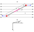 dipole in an electric field.
 -
 Done
Done


Request: If possible, I would like to have a image made that is very similar to the above. This image is to be called "dipole in uniform H field". The modifications I would need is:
- remove the entire bottom part labeled (b) (The direction of tau is confusing.)
- remove the label "(a)" from top
- replace E with H, p with m, +Q with +qm, -Q with -qm, and 2a with d.
I am going to use this image to replace a less pertinent image in the magnetic field article in en.wikipedia.org. Thanks for any help you can give.
TStein (talk) 20:10, 6 December 2011 (UTC)
Graphist opinion(s):![]() Request taken by Fred the Oyster (talk)
Request taken by Fred the Oyster (talk)![]() Done
Done
You'll have to fill in the description yourself as it's all gobbledegook to me :) --Fred the Oyster (talk) 10:39, 8 December 2011 (UTC)
- Thanks! It is perfect. 24.32.50.178 01:53, 9 December 2011 (UTC)
Pugna Nautica inter Melitenses, et Turcos, in Mari Mediteraneo (1707, original).jpg[edit]
— Cheers, JackLee –talk– 03:57, 8 December 2011 (UTC)
-

-
 had a go at it
.jpg)
.png)
Request: Could you please produce a cropped version of this image with the crease removed as much as possible, and upload it as "Pugna Nautica inter Melitenses, et Turcos, in Mari Mediteraneo (1707).jpg"? Thanks very much. — Cheers, JackLee –talk– 10:50, 7 December 2011 (UTC)
Graphist opinion(s):
- Losslessly cropping away outside the rectangular frame would be quite easy, but trying to undo the effects of the incompletely-opened book spine could be rather tricky... AnonMoos (talk) 15:19, 7 December 2011 (UTC)
- If the spine issue cannot be resolved, then I guess a simple crop is fine. It's been brought to my attention that the image also appears at [5] (not possible to link to the page itself – the image is on Tafel 34 after p. 808) and at [6], but these images are not very clear. Thanks. — Cheers, JackLee –talk– 15:21, 7 December 2011 (UTC)
- Not saying that nothing could be done, but fixing the spine issue would require rather specialized skills which I don't have... Anyway, I did a lossless crop... AnonMoos (talk) 15:50, 7 December 2011 (UTC)
- I had a go at it (its not perfect...). cheers, Amada44 talk to me 16:32, 7 December 2011 (UTC)
- That's pretty good! Thanks very much. — Cheers, JackLee –talk– 16:54, 7 December 2011 (UTC)
- I had a go at it (its not perfect...). cheers, Amada44 talk to me 16:32, 7 December 2011 (UTC)
- Not saying that nothing could be done, but fixing the spine issue would require rather specialized skills which I don't have... Anyway, I did a lossless crop... AnonMoos (talk) 15:50, 7 December 2011 (UTC)
- If the spine issue cannot be resolved, then I guess a simple crop is fine. It's been brought to my attention that the image also appears at [5] (not possible to link to the page itself – the image is on Tafel 34 after p. 808) and at [6], but these images are not very clear. Thanks. — Cheers, JackLee –talk– 15:21, 7 December 2011 (UTC)
WikiProject Scouting trefoil[edit]
-
 Done
Done -
 minus outer ring and white background
 -
 Solid
Solid -
 similar to this


Request: Overwrite the trefoil file with a greyscale version. Do not make a separate file. Repeat, please overwrite this same file, as the grey variant is useful to the project, and the present one in this form is not. Kintetsubuffalo (talk) 13:36, 15 November 2011 (UTC)
Graphist opinion(s): When viewed up close this is terrible quality. Give me a day or so and I'll do a new one from scratch. Been a little tied up over on en for the last couple of days or I would have done it by now. --Fred the Oyster (talk) 02:01, 19 November 2011 (UTC)
- Thank you! You can leave off the outer ring, and you can fill it in grey like the example, if you would, thank you!--Kintetsubuffalo (talk) 15:23, 21 November 2011 (UTC)
- Will this do or would you like an additional one with the clover but sans ring? --Fred the Oyster (talk) 14:07, 2 December 2011 (UTC)
- That is fantastic, much better than the original (which was my crude example someone decided to send to Commons against my wishes, and then vectorized the crude one!) Can you drop the stars down to be closer to center in their fields? And yes, may I have a version sans ring, solid clover, filled in dark grey like the other example? Thank you so much!--Kintetsubuffalo (talk) 12:39, 3 December 2011 (UTC)
- All done... hopefully ;) --Fred the Oyster (talk) 13:09, 3 December 2011 (UTC)
- Thank you, very close, I gotta get something sent to head office, I will explain when I get back.--Kintetsubuffalo (talk) 14:16, 3 December 2011 (UTC)
- "Solid" as requested :) --Fred the Oyster (talk) 11:58, 4 December 2011 (UTC)
- Thank you, please see your talkpage!--Kintetsubuffalo (talk) 12:43, 7 December 2011 (UTC)
- Much closer! Thin black keyline border, and we're set! Thank you for your patience on this!--Kintetsubuffalo (talk) 00:11, 9 December 2011 (UTC)
- There is a thin black border, on everything. Blow it up and have a look. --Fred the Oyster (talk) 00:15, 9 December 2011 (UTC)
- Many thanks, not least of which for overwriting the previous horrid thing!--Kintetsubuffalo (talk) 05:16, 12 December 2011 (UTC)
- Much closer! Thin black keyline border, and we're set! Thank you for your patience on this!--Kintetsubuffalo (talk) 00:11, 9 December 2011 (UTC)
Break Dance[edit]
-
 Symbol of break dance

Request: Hello, This image has 2 big problems first it must be cropped (Easy!) and second the fill between leg and body must be transparent not white I couldn't correct it. If you can't please redraw it Amir (talk) 01:31, 19 November 2011 (UTC)
Graphist opinion(s):![]() Request taken by Fred the Oyster (talk)
Request taken by Fred the Oyster (talk) ![]() Done --Fred the Oyster (talk) 01:55, 19 November 2011 (UTC)
Done --Fred the Oyster (talk) 01:55, 19 November 2011 (UTC)
Altay CoA[edit]
-
 Coat of Arms of Altai Republic.png
 -
 AltaiRepublicCoatofArms.png
 -
 Done Coat of Arms of Altai Republic.svg


Request: Vectorize 112.202.3.153 13:13, 2 December 2011 (UTC)
Graphist opinion(s): Perhaps you'd like to consider instead making the SVG from a larger, sharper version found on Commons, File:AltaiRepublicCoatofArms.png. It shows more detail, although the colors are slightly different. Regardless, once the SVG is created, correcting the colors should be relatively easy, provided someone can provide guidance on what they should be. —Quicksilver@ 01:42, 3 December 2011 (UTC)
- I choose vectorized File:AltaiRepublicCoatofArms.png with colors from File:Coat of Arms of Altai Republic.png! --112.202.3.153 05:32, 3 December 2011 (UTC)
![]() Request taken by Perhelion (talk):
Request taken by Perhelion (talk): ![]() Done -- πϵρήλιο ℗ 15:18, 28 December 2011 (UTC)
Done -- πϵρήλιο ℗ 15:18, 28 December 2011 (UTC)
RNZN Queen's Colour[edit]

Request: The Union Jack needs to be a proper square, with the St. George's Cross not "scrunched" vertically compared to it's horizontal bar. The stars also need to not be scrunched. File:Naval Ensign of New Zealand.svg is the flag the Queen's Colour is based upon, and a source for how it should look is [7] and [8]. Fry1989 eh? 03:04, 3 December 2011 (UTC)
Graphist opinion(s): Scratch that. I've made it too square. I'll have another go later. NikNaks talk - gallery - wikipedia 16:51, 24 December 2011 (UTC)
![]() Done
Done
Facepalm icon[edit]
-
 facepalm icon
 -
 current facepalm SVG
 -
 ditto
ditto -
 Crappy drawing
 -
 Better?


.svg)
Request: Please use the GIF as a basis for making an SVG icon which works much better at small sizes (compare {{Facepalm}} / ![]() ). The current SVGs are simply too complex; the GIF has the right idea. It might of course be tweaked in some way, if you have a suggestion; the basic point is to keep it simple but effective. Thanks! Rd232 (talk) 01:46, 12 December 2011 (UTC)
). The current SVGs are simply too complex; the GIF has the right idea. It might of course be tweaked in some way, if you have a suggestion; the basic point is to keep it simple but effective. Thanks! Rd232 (talk) 01:46, 12 December 2011 (UTC)
Graphist opinion(s):
- Use new filenames... AnonMoos (talk) 16:48, 14 December 2011 (UTC)
- ? yes please. Now what? Rd232 (talk) 21:10, 14 December 2011 (UTC)
- I'll have a try tomorrow, but my drawing skills are shite. I've got a couple of images in mind I'll just have to see if I can transport them from my head into Illustrator. --Fred the Oyster (talk) 21:49, 14 December 2011 (UTC)
- Cool, thanks. Rd232 (talk) 23:25, 14 December 2011 (UTC)
- So... it didn't work? Should we try and get someone else to have a go? Rd232 (talk) 14:32, 19 December 2011 (UTC)
- Hm. I was expecting something like a tracing of the GIF. The "crappy drawing" has the same issues of being overly complex as the existing SVGs. Rd232 (talk) 16:20, 19 December 2011 (UTC)
- Any better? --Fred the Oyster (talk) 16:54, 19 December 2011 (UTC)
- Yes! That's exactly what I had in mind. If it's not too much trouble you might just try if the clarity is better at small sizes if you make the hand a bit smaller and more central, so that the finger tips don't overlap the edge of the face. (However, it might well look weird, I'm not sure...) Thanks. Rd232 (talk) 17:07, 19 December 2011 (UTC)
- I tried it and it did look weird. At these sizes the smallest movement of a line has drastic effect even though I'm working in sub-pixel units. The more you move the fingers and decrease the size of the hand the more it becomes obvious that there isn't a face behind the hand, and strangely enough the complexity goes up. --Fred the Oyster (talk) 17:37, 19 December 2011 (UTC)
- OK then. Happy to use the new file then. Thank you! Rd232 (talk) 17:53, 19 December 2011 (UTC)
- I tried it and it did look weird. At these sizes the smallest movement of a line has drastic effect even though I'm working in sub-pixel units. The more you move the fingers and decrease the size of the hand the more it becomes obvious that there isn't a face behind the hand, and strangely enough the complexity goes up. --Fred the Oyster (talk) 17:37, 19 December 2011 (UTC)
- Yes! That's exactly what I had in mind. If it's not too much trouble you might just try if the clarity is better at small sizes if you make the hand a bit smaller and more central, so that the finger tips don't overlap the edge of the face. (However, it might well look weird, I'm not sure...) Thanks. Rd232 (talk) 17:07, 19 December 2011 (UTC)
- Any better? --Fred the Oyster (talk) 16:54, 19 December 2011 (UTC)
- Hm. I was expecting something like a tracing of the GIF. The "crappy drawing" has the same issues of being overly complex as the existing SVGs. Rd232 (talk) 16:20, 19 December 2011 (UTC)
- So... it didn't work? Should we try and get someone else to have a go? Rd232 (talk) 14:32, 19 December 2011 (UTC)
- Cool, thanks. Rd232 (talk) 23:25, 14 December 2011 (UTC)
Broken SVG[edit]
-
 Broken SVG
.svg)
Request: SVG broke when transferred from en.wiki to commons... Could someone fix it? Also, this is the second time this has happened with CommonsHelper. Should I not use CommonsHelper for SVGs? Calliopejen1 (talk) 04:33, 12 December 2011 (UTC)
Graphist opinion(s):
![]() Done It is not commonshelper's fault - as long as you see the duplicate notice on the file page in the source wiki the file was transferred correctly. The error you notice is probably (guess based on past cases) due to a block by the svg parser here. It should have also happened like this if you had purged the file in the source wiki. This is because our new svg parser is more strict on some stuff (the thumbnails in the source wiki were old). --Saibo (Δ) 04:50, 12 December 2011 (UTC)
Done It is not commonshelper's fault - as long as you see the duplicate notice on the file page in the source wiki the file was transferred correctly. The error you notice is probably (guess based on past cases) due to a block by the svg parser here. It should have also happened like this if you had purged the file in the source wiki. This is because our new svg parser is more strict on some stuff (the thumbnails in the source wiki were old). --Saibo (Δ) 04:50, 12 December 2011 (UTC)
US Constitution in Georgian[edit]
-
 US Constitution in the Georgian language
Request: This document could definitely use a crop. Also, while I don't speak Georgian, several of the pages clearly have the wrong orientation, either upside down or sideways. It's used in a featured article. Any takers? Dominic (talk) 19:26, 14 December 2011 (UTC)
Graphist opinion(s): ![]() Request taken by Fred the Oyster (talk)
Request taken by Fred the Oyster (talk)
![]() Done All done as requested, I also renamed the file more appropriately (File:US Constitution translated to the Georgian language.pdf) a redirect was left behind for anything the CommonsDelinker bot misses. --Fred the Oyster (talk) 20:43, 14 December 2011 (UTC)
Done All done as requested, I also renamed the file more appropriately (File:US Constitution translated to the Georgian language.pdf) a redirect was left behind for anything the CommonsDelinker bot misses. --Fred the Oyster (talk) 20:43, 14 December 2011 (UTC)
All-Ukrainian organization Sich (Січ)[edit]
-
 Is it OK?
.svg)
Request: Please vectorize... Kintetsubuffalo (talk) 20:26, 17 December 2011 (UTC)
Graphist opinion(s):
![]() Request taken by Jembezmamy (talk) 23:23, 5 January 2012 (UTC)
Request taken by Jembezmamy (talk) 23:23, 5 January 2012 (UTC) ![]() Done
Done
- It's great, thank you!--Kintetsubuffalo (talk) 02:20, 7 January 2012 (UTC)
BNMAU flag[edit]
Request: Please fix the color red, mostly on the Soyombo area. Chtak Yuno (talk) 08:42, 20 December 2011 (UTC)
- The red was recently requested here to be matched with the red of File:Flag of Mongolia.svg, which was done by myself. So unless you can narrow down what you mean by "fix" this request isn't likely to be carried out. --Fred the Oyster (talk) 23:07, 20 December 2011 (UTC)
- On some computers, some seen the red circle in between sun, moon and fire on the Soyombo area. --Chtak Yuno (talk) 12:55, 21 December 2011 (UTC)
Graphist opinion(s):![]() Done --Fred the Oyster (talk) 14:00, 21 December 2011 (UTC)
Done --Fred the Oyster (talk) 14:00, 21 December 2011 (UTC)
Gradients Help[edit]
Bit strange of me to be posting instead of responding, but if anyone can help explain why my gradients have gone wrong, please do!
-

-
 Sorted


As you can see, the gradient of the SVG that MediaWiki has rendered (on the left here) is wildly different from how I created it in Inkscape (right). Any ideas? NikNaks talk - gallery - wikipedia 19:47, 21 December 2011 (UTC)
Graphist Opinions:
- The issue seems to be the gradient definitions in that SVG use non-standard tags "<a:midPointStop>", which should be from Adobe Illustrator. Can't help you any further than that right now, unfortunately (I have no vector graphics program installed). —Quibik (talk) 20:49, 21 December 2011 (UTC)
- Ah, that likely stems from me hijacking an existing gradient to make that. I'll try recreating one from scratch. Thanks! NikNaks talk - gallery - wikipedia 21:19, 21 December 2011 (UTC)
- Just out of interest I took the svg, opened it in AI, saved it as an .ai file then saved it back as an svg, then removed anything Inkscape related using Notepad++. Now to me it looks the same in the renderer as it does in AI and when I open it locally in IE. Is this the effect you were after? Incidentally, "<a:midPointStop>" is no longer in the code. --Fred the Oyster (talk) 21:26, 21 December 2011 (UTC)
- Ah, now looking back at the png above I see that everytime I've seen it, in the renderer, locally in IE and in Illustrator it's always looked like the version on the left. --Fred the Oyster (talk) 21:29, 21 December 2011 (UTC)
- Sussed it. The gradient is still there, but the centre of the dark 'strip' has moved across to the left, outside the viewbox. Well at least that's what is happening, as for why it's happening I have no clue, sorry. I'm not really au fait with the mathematical side of svg code. --Fred the Oyster (talk) 21:36, 21 December 2011 (UTC)
- Excellent, thanks! :) How did you solve it? NikNaks talk - gallery - wikipedia 12:55, 23 December 2011 (UTC)
- When looking at the gradients in Illustrator I noticed that the centre point of the left-hand gradient was mapped to a point outside the left edge of the viewbox. All I did was just move them back to roughly where they should be. I haven't checked the file in Inkscape though, so I don't know how the image appears there. --Fred the Oyster (talk) 20:26, 23 December 2011 (UTC)
- Sussed it. The gradient is still there, but the centre of the dark 'strip' has moved across to the left, outside the viewbox. Well at least that's what is happening, as for why it's happening I have no clue, sorry. I'm not really au fait with the mathematical side of svg code. --Fred the Oyster (talk) 21:36, 21 December 2011 (UTC)
- Ah, now looking back at the png above I see that everytime I've seen it, in the renderer, locally in IE and in Illustrator it's always looked like the version on the left. --Fred the Oyster (talk) 21:29, 21 December 2011 (UTC)
- Just out of interest I took the svg, opened it in AI, saved it as an .ai file then saved it back as an svg, then removed anything Inkscape related using Notepad++. Now to me it looks the same in the renderer as it does in AI and when I open it locally in IE. Is this the effect you were after? Incidentally, "<a:midPointStop>" is no longer in the code. --Fred the Oyster (talk) 21:26, 21 December 2011 (UTC)
- Ah, that likely stems from me hijacking an existing gradient to make that. I'll try recreating one from scratch. Thanks! NikNaks talk - gallery - wikipedia 21:19, 21 December 2011 (UTC)
SVG fix[edit]
-
 Anthracene Clar rule
 -
 Chrysene Clar rule
 -
 Clar rule
 -
 Phenanthrene Clar rule


Request: Can someone make visible (or tell how to make visible) this table? Here is a relevant bugzilla bug and discussion. However, reading it didn't help me much, as "my" files apparently contain "stroke=black". They don't pass validator, but pass Commons check. Thanks. Materialscientist (talk) 04:11, 23 December 2011 (UTC)
Graphist opinion(s):That has to be the weirdest svg code I've seen. Why, for example, are clipping paths being used for something as basic as this? Also, why are all the text formatting tags stuffed in the svg header tag? But the strangest thing, given how much font information is in that file, is why there is no plain text output? Another question related to that is point size. Why have point size to a precision of 15? What are you using to produce this rubbish code? Marvin? I do hope you haven't paid for it. --Fred the Oyster (talk) 10:16, 23 December 2011 (UTC)
- I have no relation to these images, and only wish to have them displayed. Redrawing is fine, if this is easier than fixing the code (yes, it is obviously Marvin with Batik, which is used by some uploaders and apparently becomes invisible due to the recent software update). The only requirement is to have the molecular structures as they are now, with line length/width appropriate for a general chemical formula - all other graphical details on point size precision, etc., are optional. Materialscientist (talk) 10:42, 23 December 2011 (UTC)
- I don't mind redoing them properly but I have no idea what they are supposed to look like, especially given that I'm not a chemist. Are these images supposed to have text in them, eg chemical names etc? I'm guessing so given all the font info in the files. So are there png equivalents that I can copy to svg and then overwrite the versions you already have? --Fred the Oyster (talk) 11:25, 23 December 2011 (UTC)
- Every image becomes visible upon clicking, and my firefox displays them well when saved locally. Overwriting is fine (I would redraw myself, but my svg skills are rudimentary, and I wasn't sure about code-fixing when posting this). They are for thumb use, and thus margins can be kept to minimum. Materialscientist (talk) 12:06, 23 December 2011 (UTC)
- Yes I can see shapes when I click on them/download them, but I'm not seeing any text. Is that correct? --Fred the Oyster (talk) 12:47, 23 December 2011 (UTC)
- I pulled them up in Inkscape, and ungrouped EVERYTHING pressing ctrl+shft+g and i draged over the image and out came a rectangle(a path actually) with white fill and white border(probably used as background). uploaded it again and the issues persist. Deleted all the text elements and problem still persists.Gauravjuvekar (talk) 15:29, 23 December 2011 (UTC)
- Yes I can see shapes when I click on them/download them, but I'm not seeing any text. Is that correct? --Fred the Oyster (talk) 12:47, 23 December 2011 (UTC)
- Every image becomes visible upon clicking, and my firefox displays them well when saved locally. Overwriting is fine (I would redraw myself, but my svg skills are rudimentary, and I wasn't sure about code-fixing when posting this). They are for thumb use, and thus margins can be kept to minimum. Materialscientist (talk) 12:06, 23 December 2011 (UTC)
- I don't mind redoing them properly but I have no idea what they are supposed to look like, especially given that I'm not a chemist. Are these images supposed to have text in them, eg chemical names etc? I'm guessing so given all the font info in the files. So are there png equivalents that I can copy to svg and then overwrite the versions you already have? --Fred the Oyster (talk) 11:25, 23 December 2011 (UTC)
- I went back to the original version and started from that, and now all sorted. There was a clipping mask preventing the renderer from rendering the shapes. There were also lots of redundant points/nodes which I can only assume used to be, at one point, text objects. Anyway, all four files now render correctly albeit with no text. Adding the text from these versions would now be simple for anyone, once we know what the correct text is of course. --Fred the Oyster (talk) 20:11, 23 December 2011 (UTC)
- Many thanks. While text might have been planned for some intermediate versions, the final ones do not require any text. Materialscientist (talk) 22:31, 23 December 2011 (UTC)
- I went back to the original version and started from that, and now all sorted. There was a clipping mask preventing the renderer from rendering the shapes. There were also lots of redundant points/nodes which I can only assume used to be, at one point, text objects. Anyway, all four files now render correctly albeit with no text. Adding the text from these versions would now be simple for anyone, once we know what the correct text is of course. --Fred the Oyster (talk) 20:11, 23 December 2011 (UTC)
Various flags[edit]
-
 Done
Done -
 Done
Done -
 Done
Done -
 Done
Done -
 Done
Done -
 Done
Done -
 Done
Done -
 Done
Done -
 Done
Done -
 Done
Done -
 Done
Done -
 Done
Done -
 Done
Done -
 Done
Done


.jpg)
.png)
![[1]](https://upload.wikimedia.org/wikipedia/commons/2/25/One-half.svg)
![[2]](https://upload.wikimedia.org/wikipedia/commons/thumb/2/25/One-half.svg/500px-One-half.svg.png)
.svg)
.jpg&action=edit&redlink=1)
![[8]](http://www.crwflags.com/fotw/images/g/gb'uj-qcrn.gif)
.gif)
Request: Needs SVG code cleanup and validation. 112.202.94.91
Graphist opinion(s):